Hang on… these screenshots are in the wrong aspect ratio? I just upgraded mpv, and everything was going so swimmingly, but these are definitely wrong. They’re 1.5:1, while what’s on the screen is 1.37:1. How annoying.
That’s better.
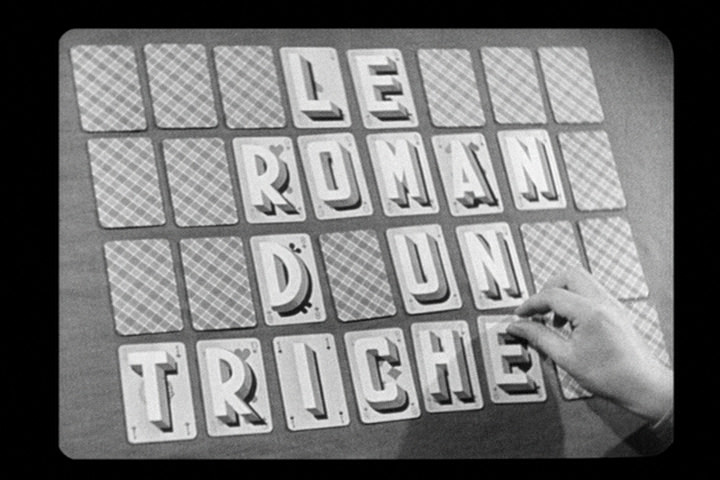
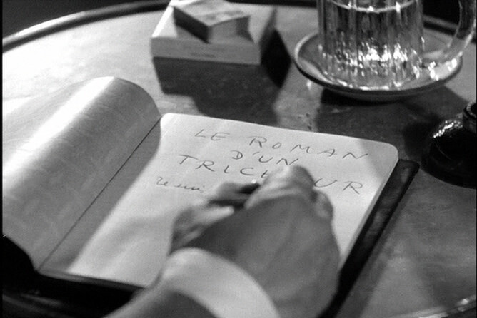
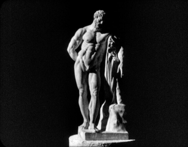
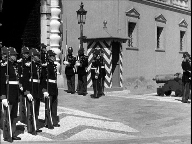
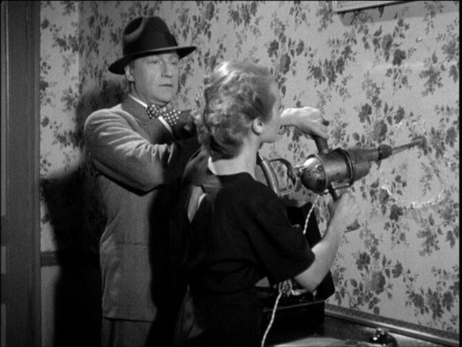
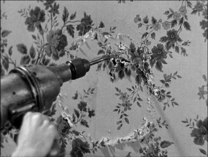
This is totally wild. It’s perhaps not a very technically proficient movie (I’m assuming it was made on a very small budget? it’s an 80% silent movie with just a voiceover), and the shots are frequently out of focus, but it’s just… kinda amazing?
It seems incredible that it’s from 1936.
This is such a fascinating, witty movie. I’m not sure that it’s actually… “good”? But it’s great.
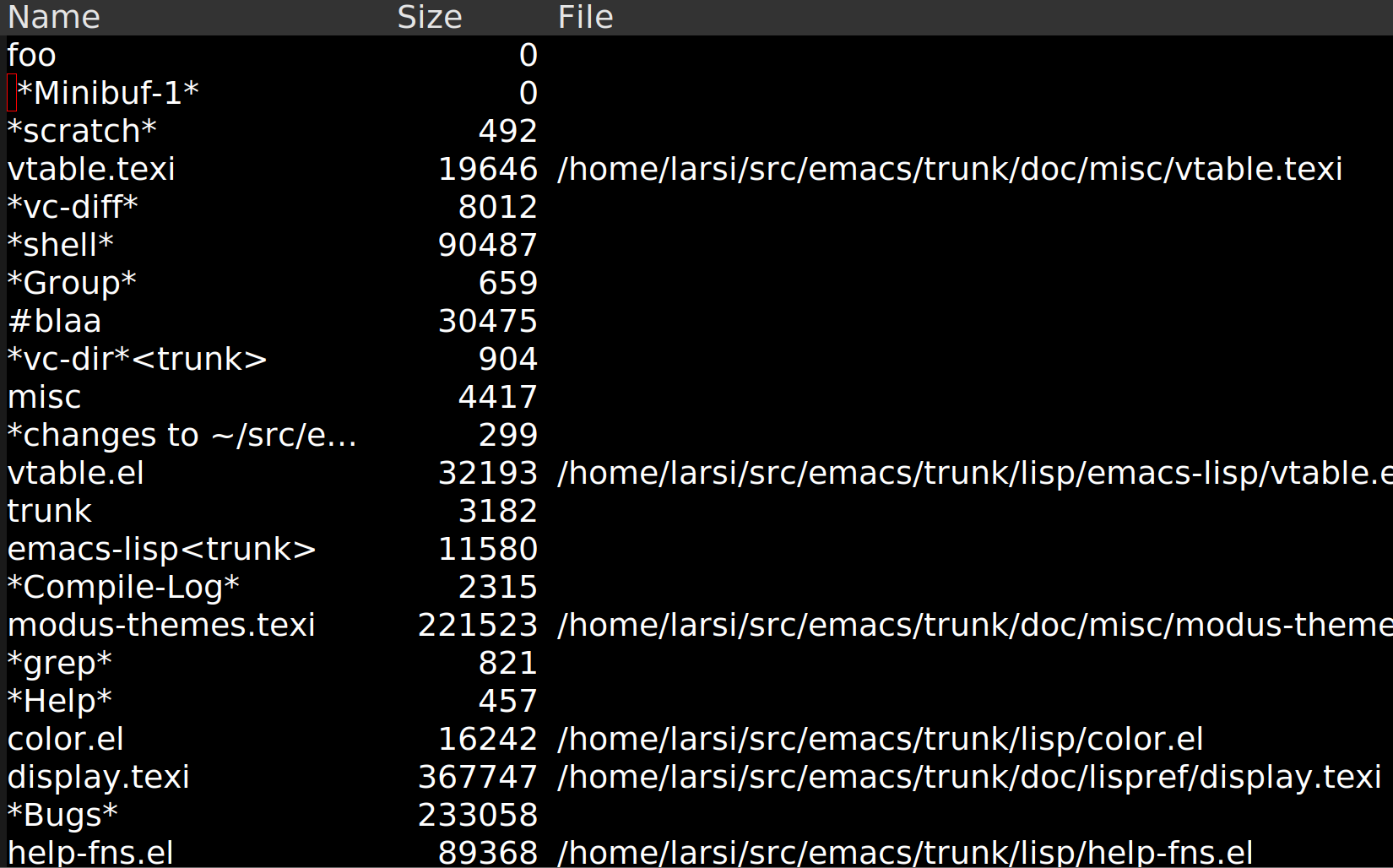
I was inspired by a bug report on tabulated-list-mode to do more work on vtable. (Funny how that works.)
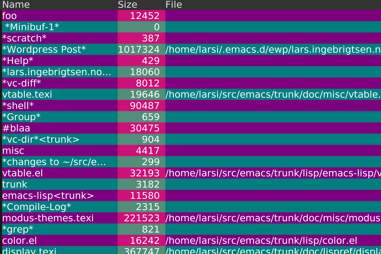
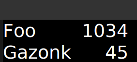
As you probably won’t remember, vtable is a new library in Emacs 29 that aims at being a replacement for tabulated-list-mode, but with a much easier interface. For instance, the following is a toy replacement for C-x C-b:
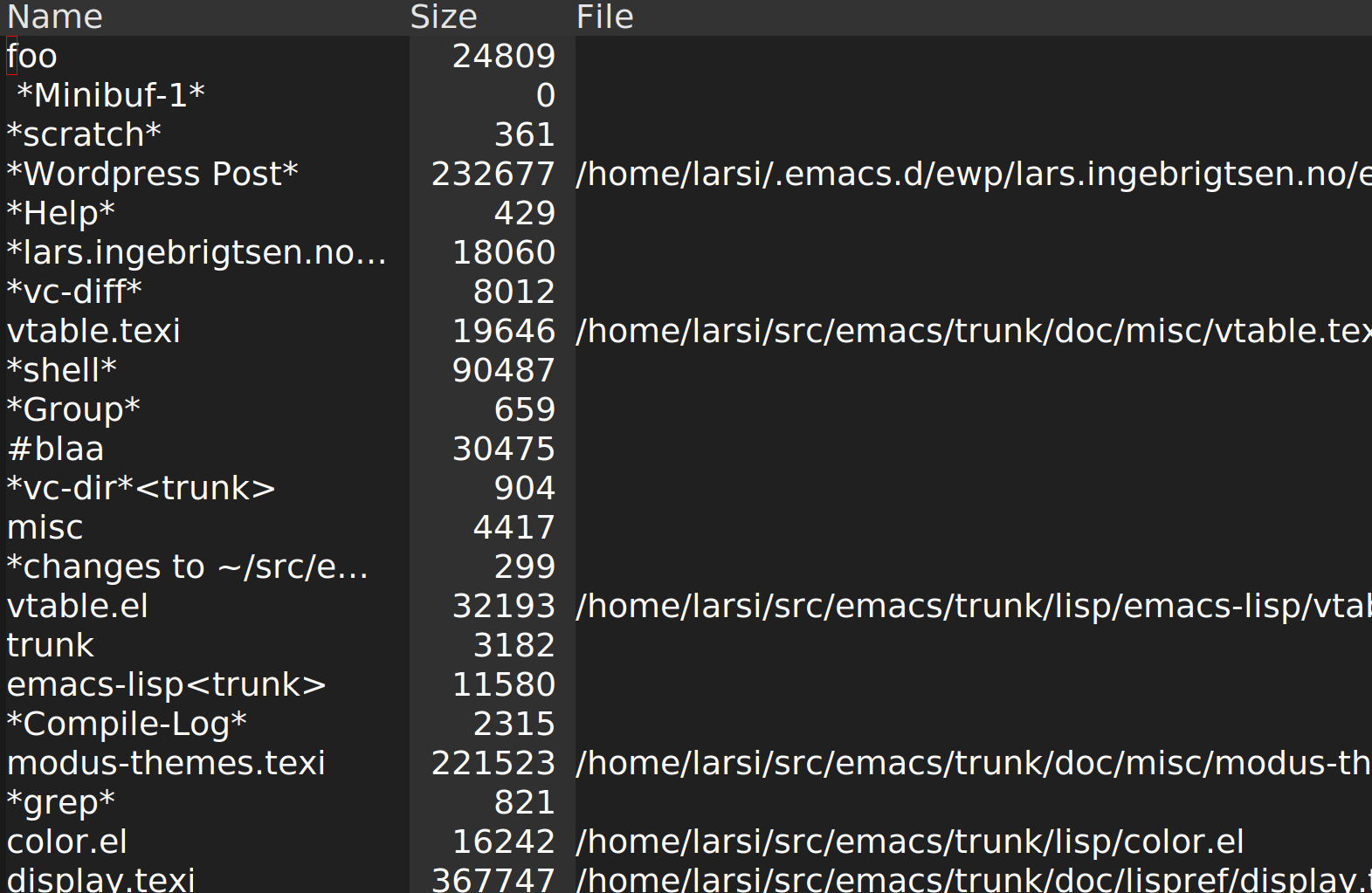
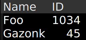
The bug report pointed out that tabular displays might be more readable if columns had alternating colours, especially if they are very dense. This example doesn’t really have that problem, but it’s a nice test, anyway. So I’ve now made it possible to say:
:column-colors '("#202020" "#404040")
And then you get:
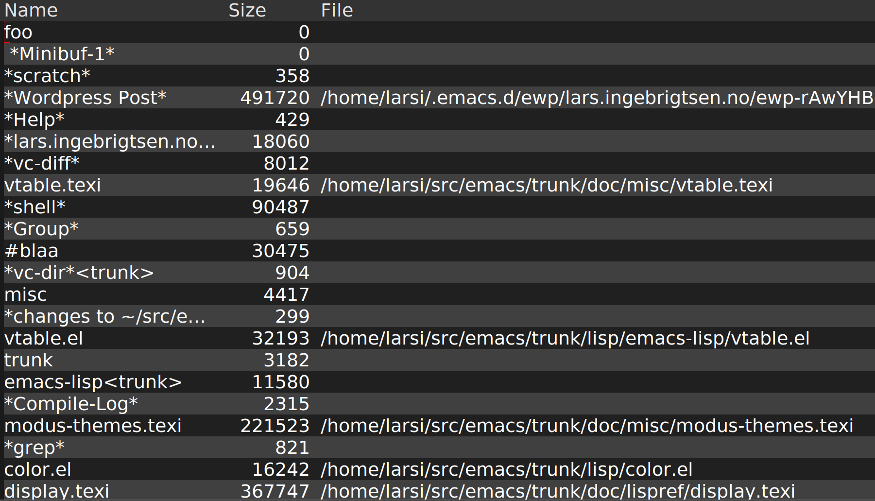
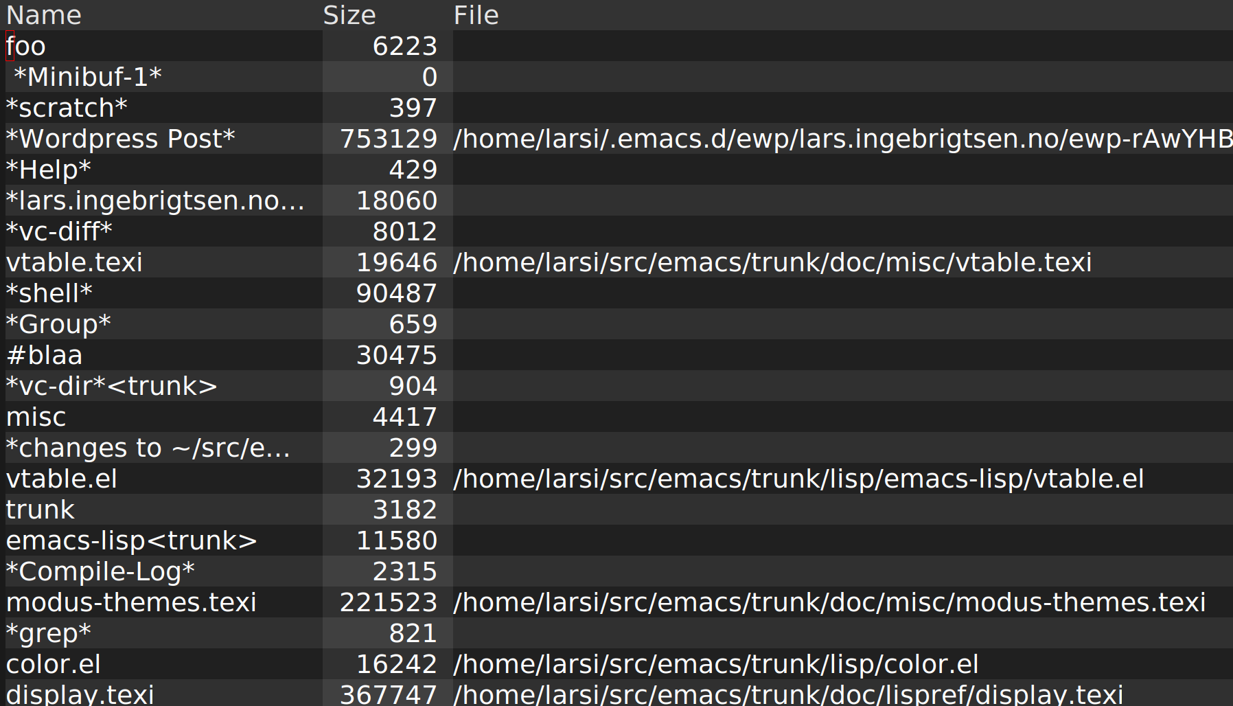
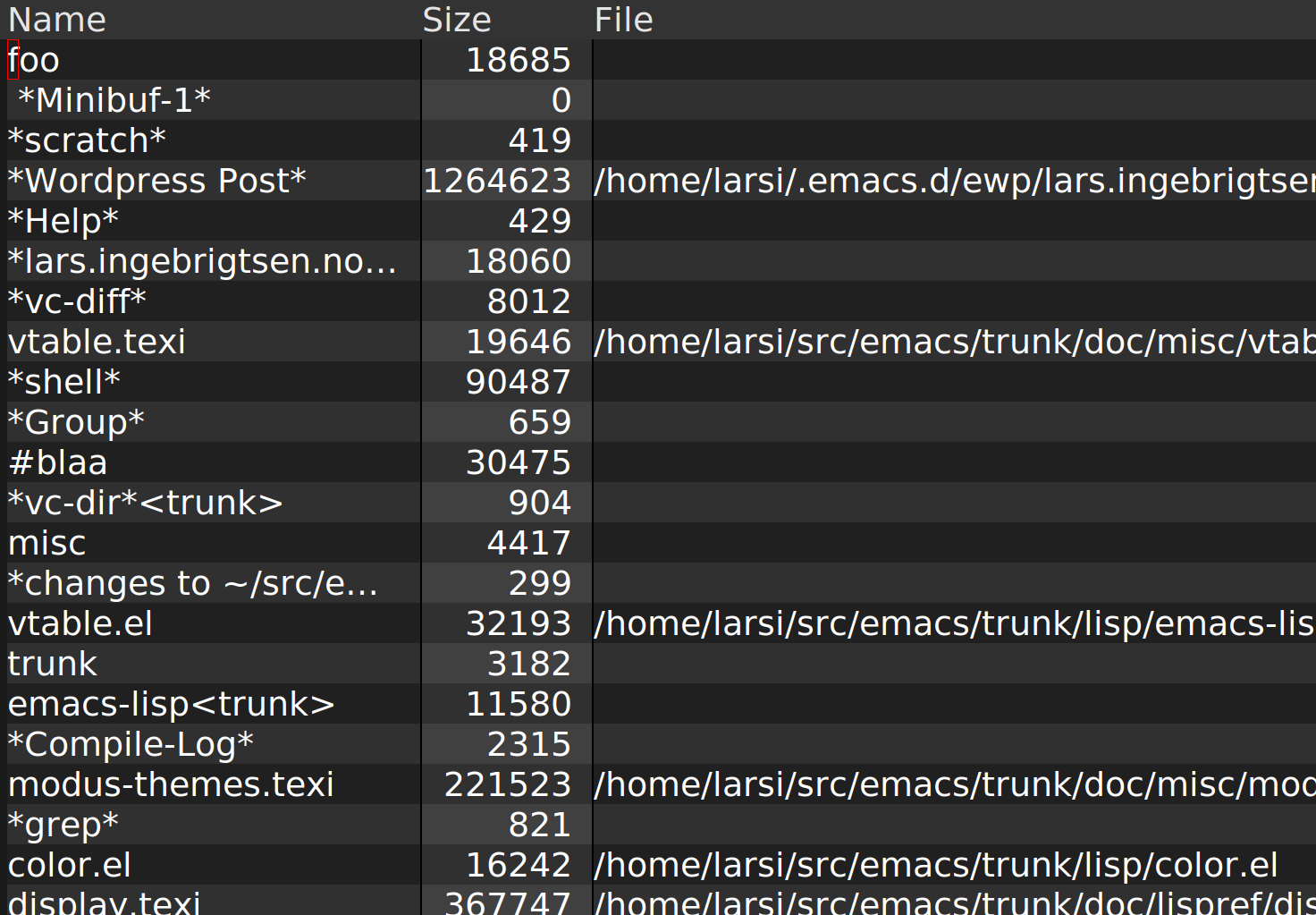
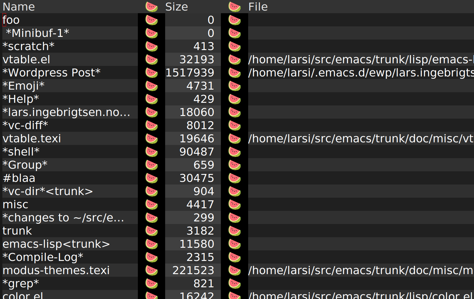
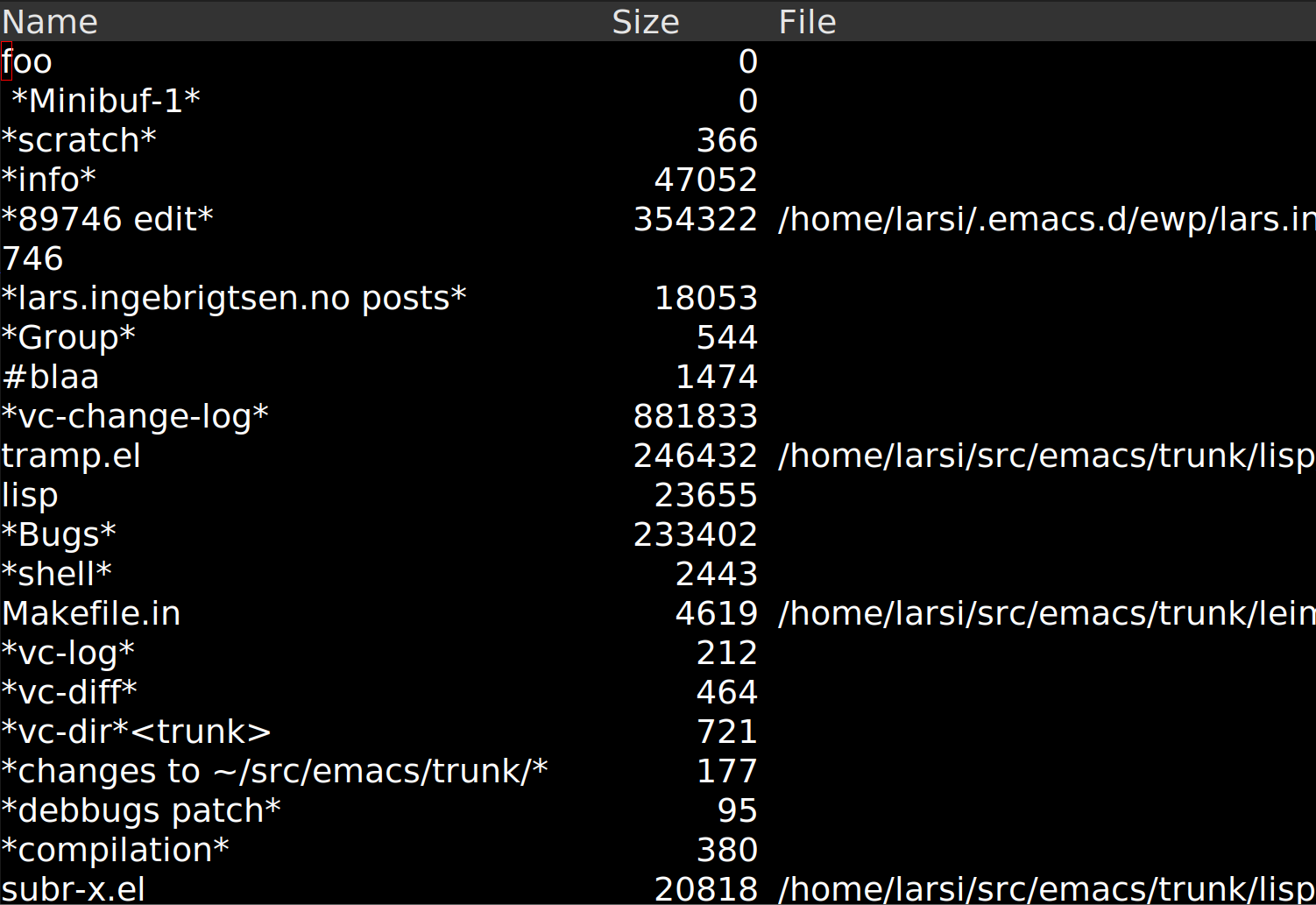
Conversely, the readability problem might be with the rows instead of the columns, so:
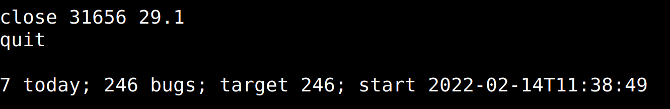
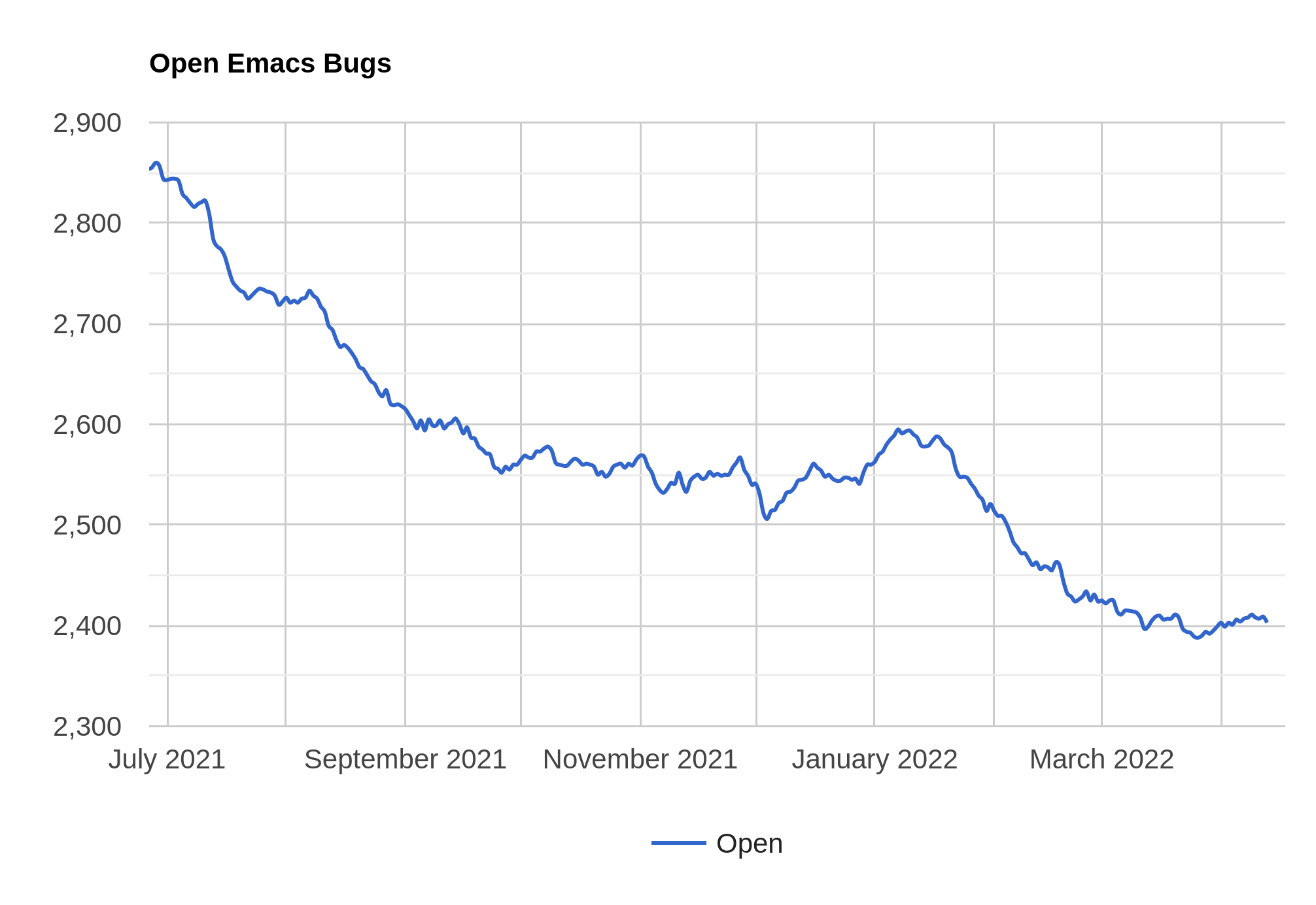
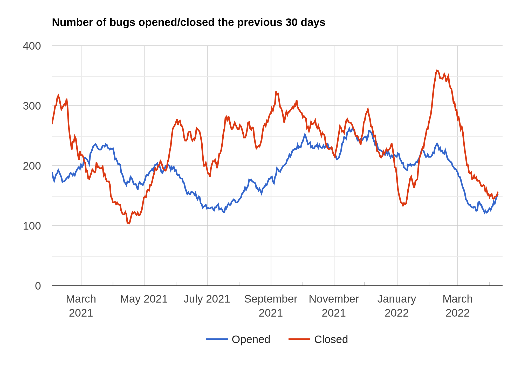
Time for another one of these posts about Emacs development, I guess? It’s been two months since the last one, and I’ve basically been slacking off, mostly dealing with new bug reports instead of going dumpster diving. I mean, bug triage.
We started at 2460 open bugs in this stretch, and we’re now at 2402, so that’s not too bad. It’s been unusually quiet in the bug tracker, actually, and I’m not sure how to interpret that. Did we finally perfect Emacs so that there’s nothing to report, or did the war against Ukraine make people less apt to poke at Emacs, or did finally everybody start using TextPad Pro?
On the other other other hand, the bug tracker has been unusually active the preceding months, so perhaps it’s just a regression towards the mean.
And Emacs 28.1 has been released, so I’d expected a bump in the bug inflows from that, but nothing huge.
So instead of digging into the bug data more, let’s just look at some of the new stuff in Emacs 29 since the last blog post.
Less Recursive GC
I think the most important fix these past couple of months on the trunk has been the GC fixes courtesy of Mattias Engdegård. It’s been a long-standing er embarrassment that you can segfault Emacs by just consing up some structures. Since basically forever (at least the 80s, I think?) Emacs’ garbage collection has been implemented in a pretty recursive way. Not for normal lists, but there’s nothing, in principle, stopping anybody from creating lists that have the “rest” in the car cell. This makes the GC recurse, and if it recurses sufficiently, Emacs would just segfault.
*poof*
Now, people learned to Just Not Do That, so these segfaults are rare in practice, but still… yuck.
Mattias has now fixed this for Emacs 29, and the resulting GC is even slightly faster to boot.
Drag and Drop
Emacs has long had some basic support for dragging and dropping things into Emacs, but not really much support for dragging things out of Emacs.
Courtesy of Po Lu, you can now drag files from Dired to other programs, and of course, drag text from Emacs to other programs. This requires support on all the different operating systems and different window systems, so it’s a pretty daunting task implementing it across the board.
Animated webp support
There was a bug report about some webp images not working in Emacs 29. Emacs got native support (via libwebp courtesy of Stefan Kangas) earlier this year, and it mostly worked fine — except with animated webp images, which didn’t display at all. (As an aside, it’s kinda amusing that the webp format was developed from the VP8 video format… and now there’s animated webp images, which aren’t VP8 videos.) It turns out that parsing those files requires using the demux interface in libwebp, which is in a separate library file.
I thought that sounded like a fun little project, so I started reading the libwebp documentation, and a couple of days later:
Easy peasy lemon squeezy — the resulting code is short and nice, because the libwebp interface functions here are sane and well thought out. However, it took me several nights poking at this to actually find what interface to use, because the documentation doesn’t give any guidance on this.
If you look at the demux documentation, it starts with the WebPIterator iterator, so that was what I tried to use. After some head scratching, I had this:
Freddy is displayed fine, because his webp file is all “complete” frames, but the more advanced nyan cat is all garbled. That’s because this interface is the low-level interface that requires you to do the blending between frames yourself. What you’re supposed to do is use WebPAnimInfo instead, which does all the heavy lifting for you.
I’m not the only one confused by this. Here’s how ImageMagick displays the nyan cat:
I’m guessing the ImageMagick people implemented this with a test file that has only complete frames (like the Freddy webp file), so they didn’t catch the problem.
So: Good documentation, but it would have been helpful with some implementation guidance as a preamble, mm-kay?
Anyway, after poking away at the webp animation code, I realised that it would be pretty easy to finally fix the GIF animation code, too. I mean, it’s functionally OK, but it’s dog slow. After putting in the same sort of animation cache mechanism here, displaying an animated GIF is… a lot faster? Here’s the display from top while displaying the same GIF in Emacs 28.1 and in Emacs 29:
So it’s not fabulously fast or anything, but it’s 10x faster than before. (And more importantly, doesn’t slow down quadratically with the length of the GIF, which made looking at long GIFs in Emacs impossible.)
Hm… this reminds me… wasn’t there some other issue with the image cache when doing animated images? Yes! We were stashing data in the image object and that made display-level caching fail!
So with that fixed, we’re down to:
OK, now it’s really starting to help. 🙃 With a torture test page, containing dozens of animated GIFs:
100% in Emacs 28.1 (which means that it doesn’t have a chance to actually animate all the GIFs) and 14% in Emacs 29.
Nice!
Open Closures
A more internal new thing is the “open closure” concept, courtesy of Stefan Monnier. It’s like a struct that you can funcall? Or like a function object that you can interrogate about various data and metadata.
So — a closure that’s open, so it has the best name ever.
Variable Pitch Tables
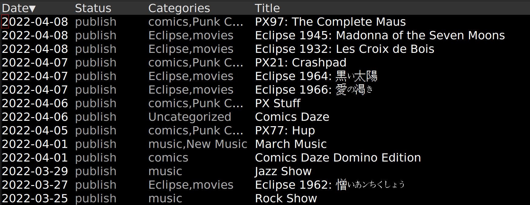
Mixing fonts, images and text size in tabular displays has always been a pain in Emacs, so I’ve now written a new package for that: vtable. The thing I’ve been using to test it is the ewp package, which I’m writing this very blog post from:
All nice and lined up.
Emacs has had tabulated-list-mode for quite a while, but in addition to not dealing with proportional fonts, it’s also just awkward interface-wise: It expects to own the entire buffer it lives in, so you can’t have a table in the middle of some other text, and it stores all the data in buffer-local variables, so you can’t have several tables in the same buffer. And interacting with the table always seems to happen via setting some obscure variable and then calling some other obscure function, so I wanted to make an interface that fixes all of that, in addition to making it trivial to create simple tables, and easy to create complex tables.
My inspiration for the interface design was originally the Common Lisp/LispWorks table library developed for my former employer by Espen Vestre, but it diverged quite a bit in the end. The idea is basically still the same: You have data, you have the formatted data, and then you have the data that’s being presented, and you can alter these things at several levels. (Which is important when resizing a column and you also want to resize images shown in a column, for instance.)
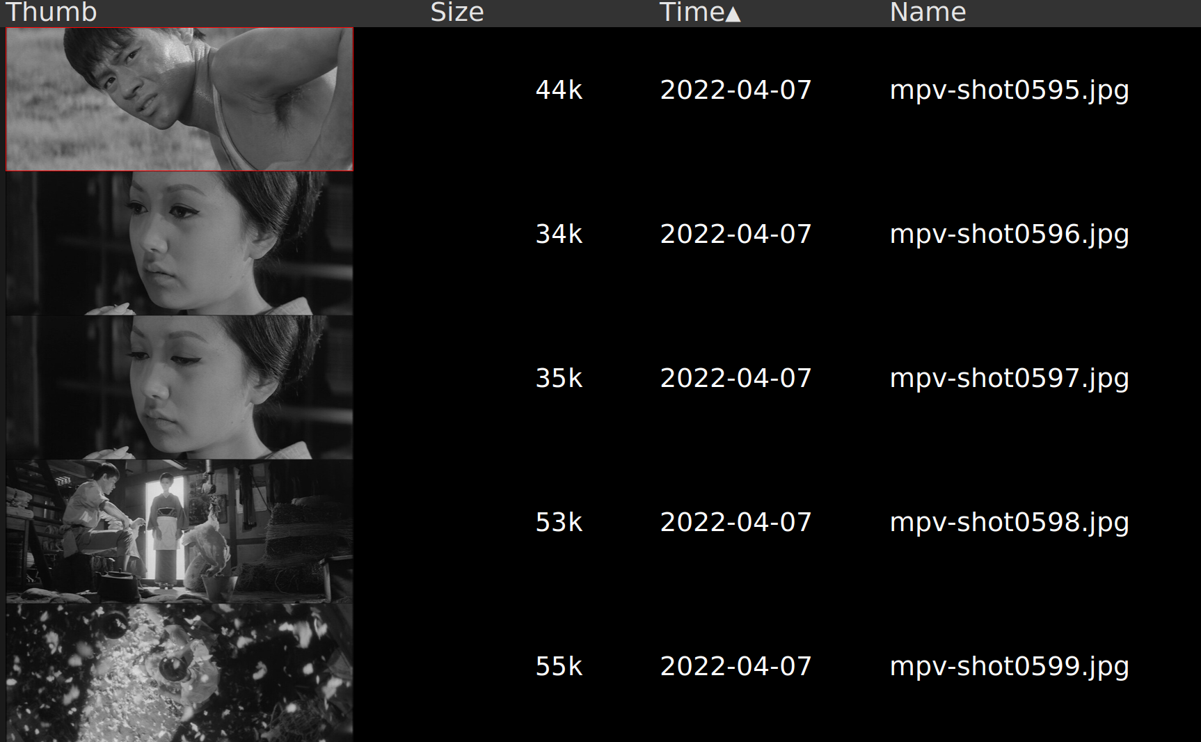
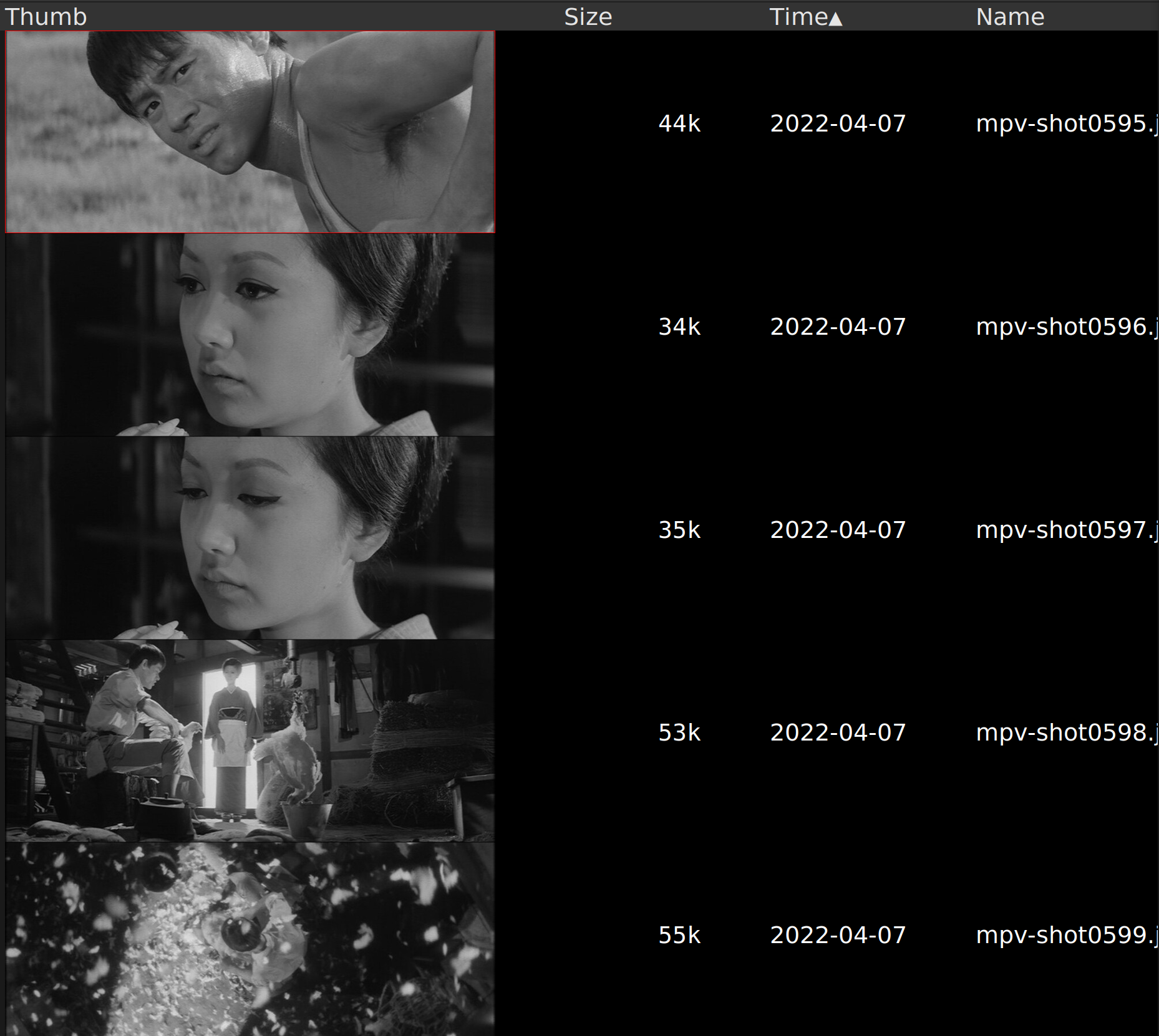
This results in (if you’ve been watching Japanese 60s movies):
And increasing the size of the first column allows the displayer to resize the thumbnails:
And so on.
Make Commands Query
You can now make any command query you before it’s executed. For instance, if you want to be queried before doing C-x C-c, you can just say
(command-query 'save-buffers-kill-terminal)
in your init file.
More Electric Completion
M-<down> and M-<up> can now be used to navigate completions directly, which makes for quicker selection between candidates. This, and many other user interface improvements in completion is courtesy of Juri Linkov and Jimmy Aguilar Mena.
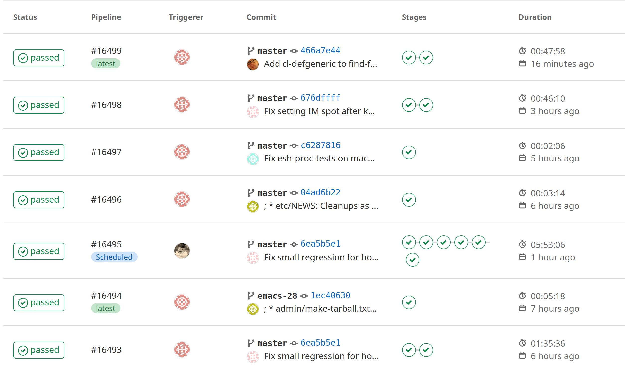
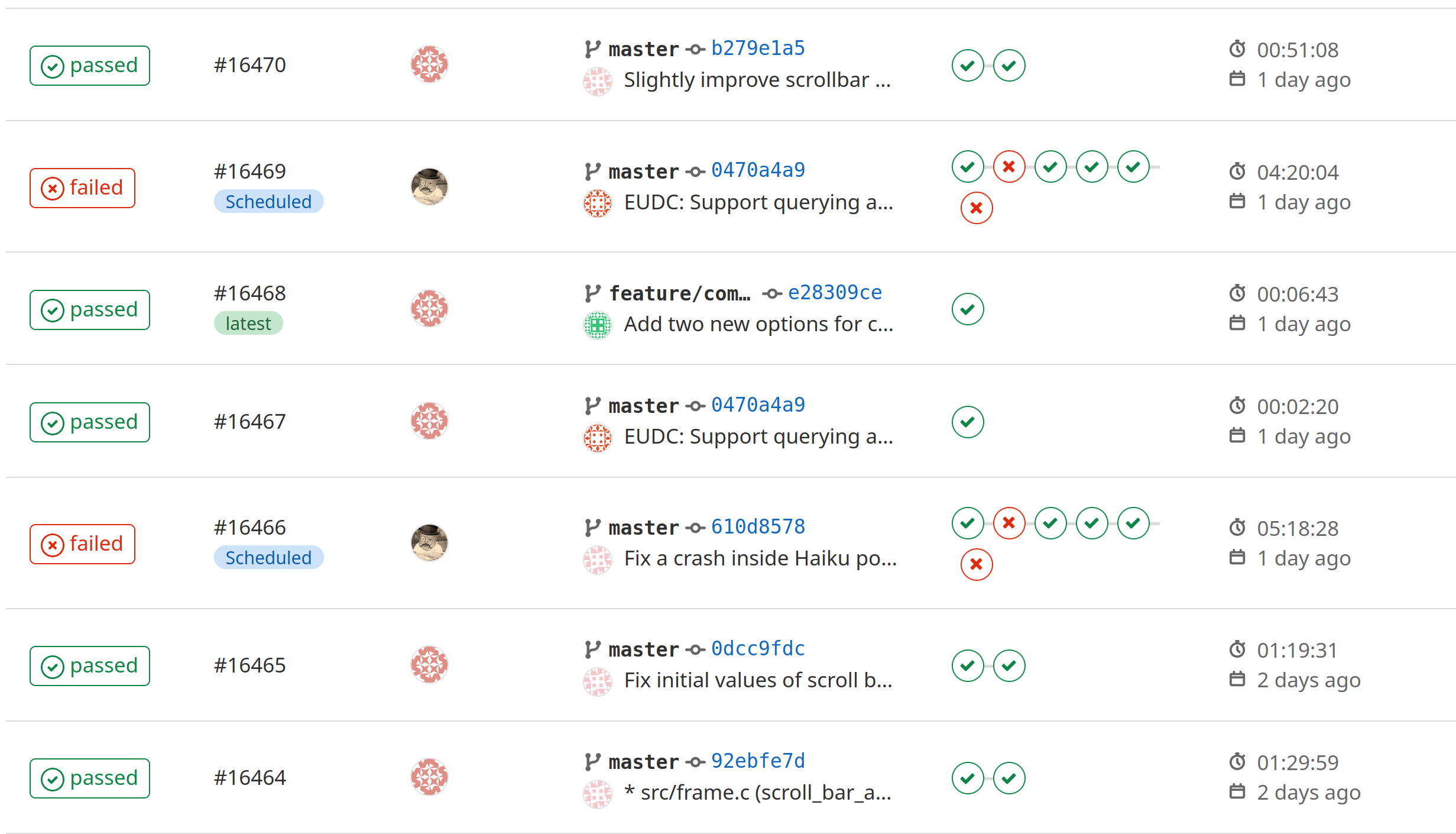
Clean CI
After fixing some obscure bugs (only appearing in a few configurations) and a couple of not-so-obscure bugs (along with some judicious disabling of some tests that were timing out on EMBA), we now have a green board:
Whoho! That means that we hopefully can start to send out nagging mails to people that commit something that makes things go red.
(We should, of course, refactor the tests that take too long and re-enable them on EMBA, but having those timing-out (that were only triggering on EMBA) wasn’t productive.)
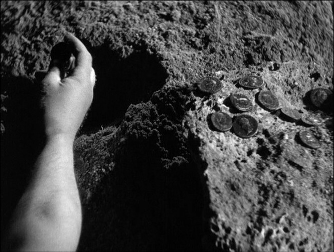
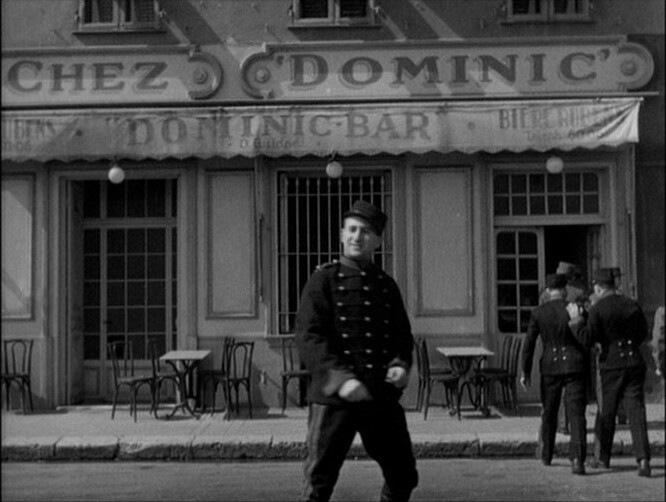
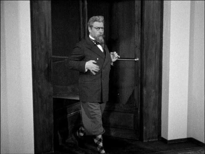
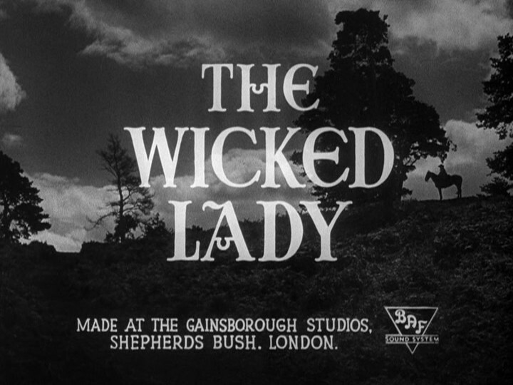
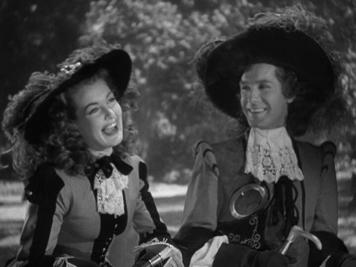
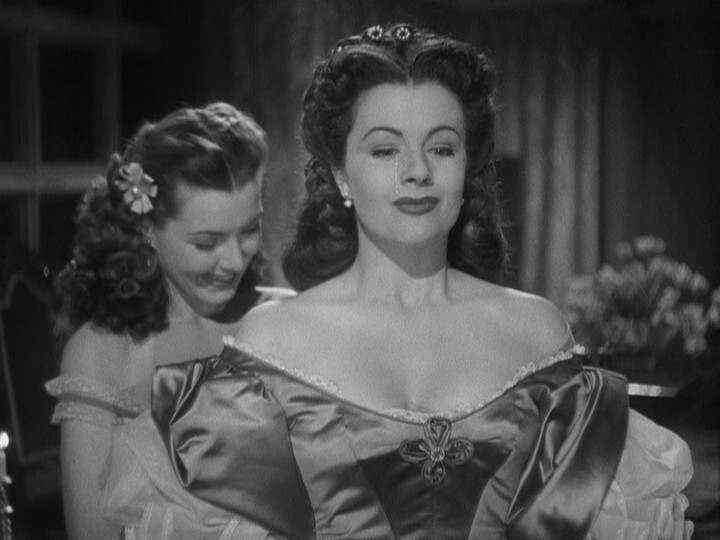
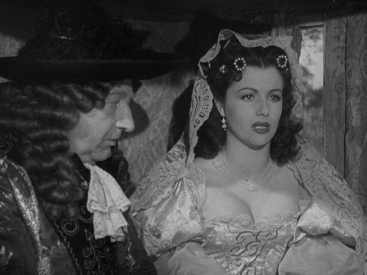
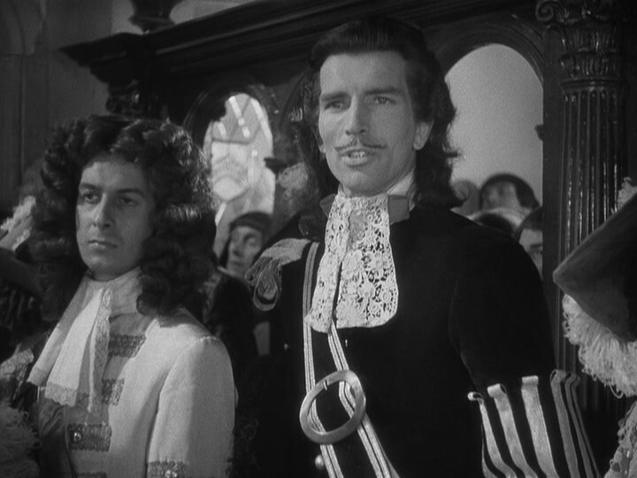
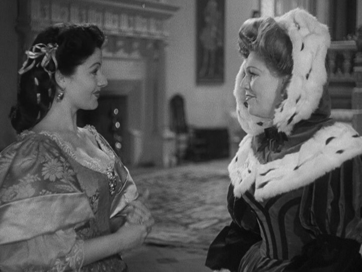
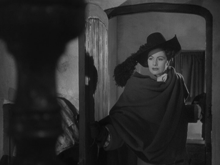
This is a lot of fun. It’s totally over the top and delighting in its own absurdeties. This was released just after WWII, and was the highest-grossing movie in the UK of the year, and I can totally see why.
(They had to reshoot scenes like this for the US release because of the excessive Margaret Lockwood boobage on display.)
George Harrison!?
It’s a bitch-off!
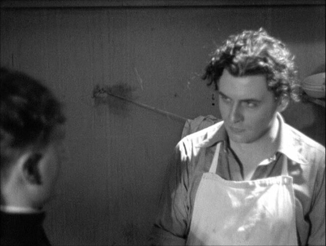
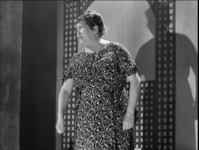
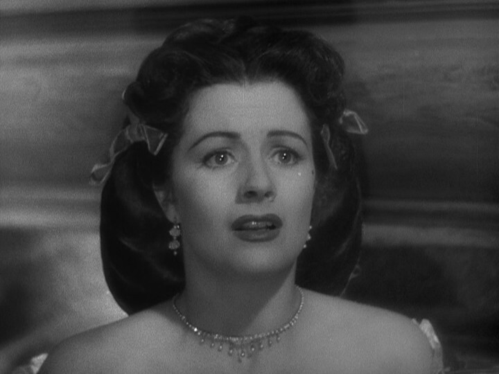
I feel like I should love this, but I just don’t. The performances are great, and the plot is a lot of fun, but I’m not really feeling it.
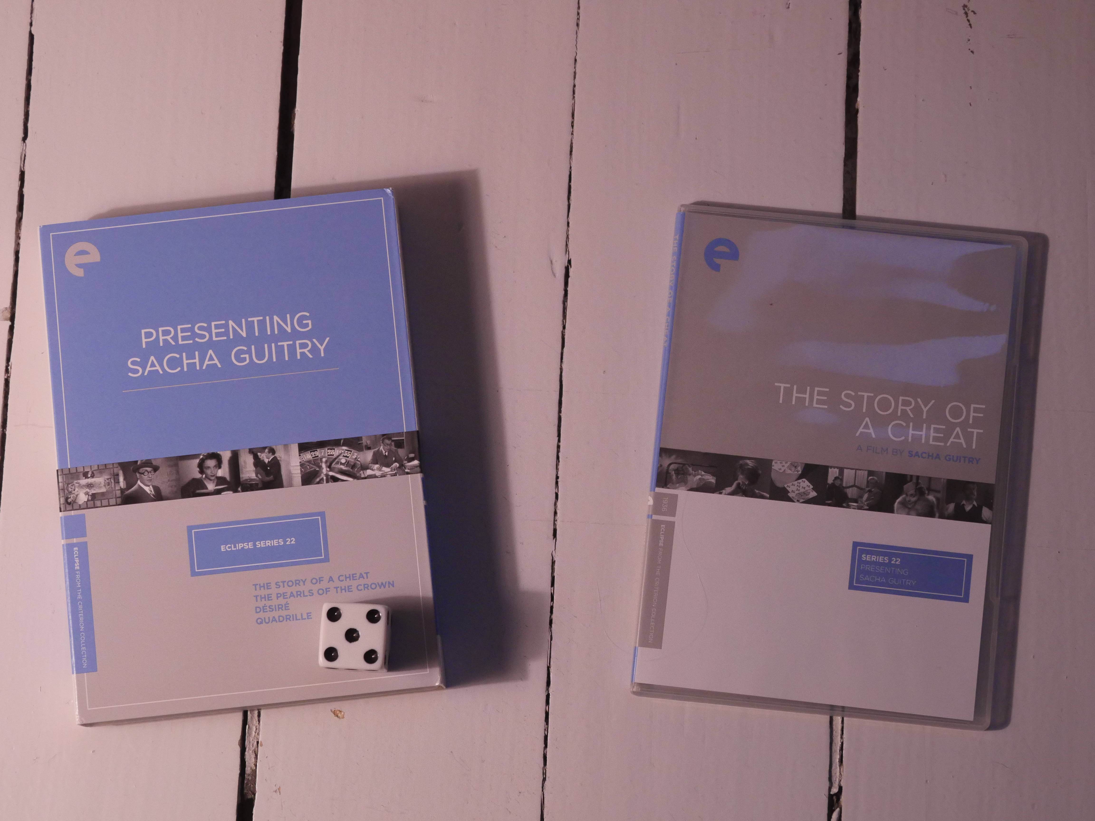
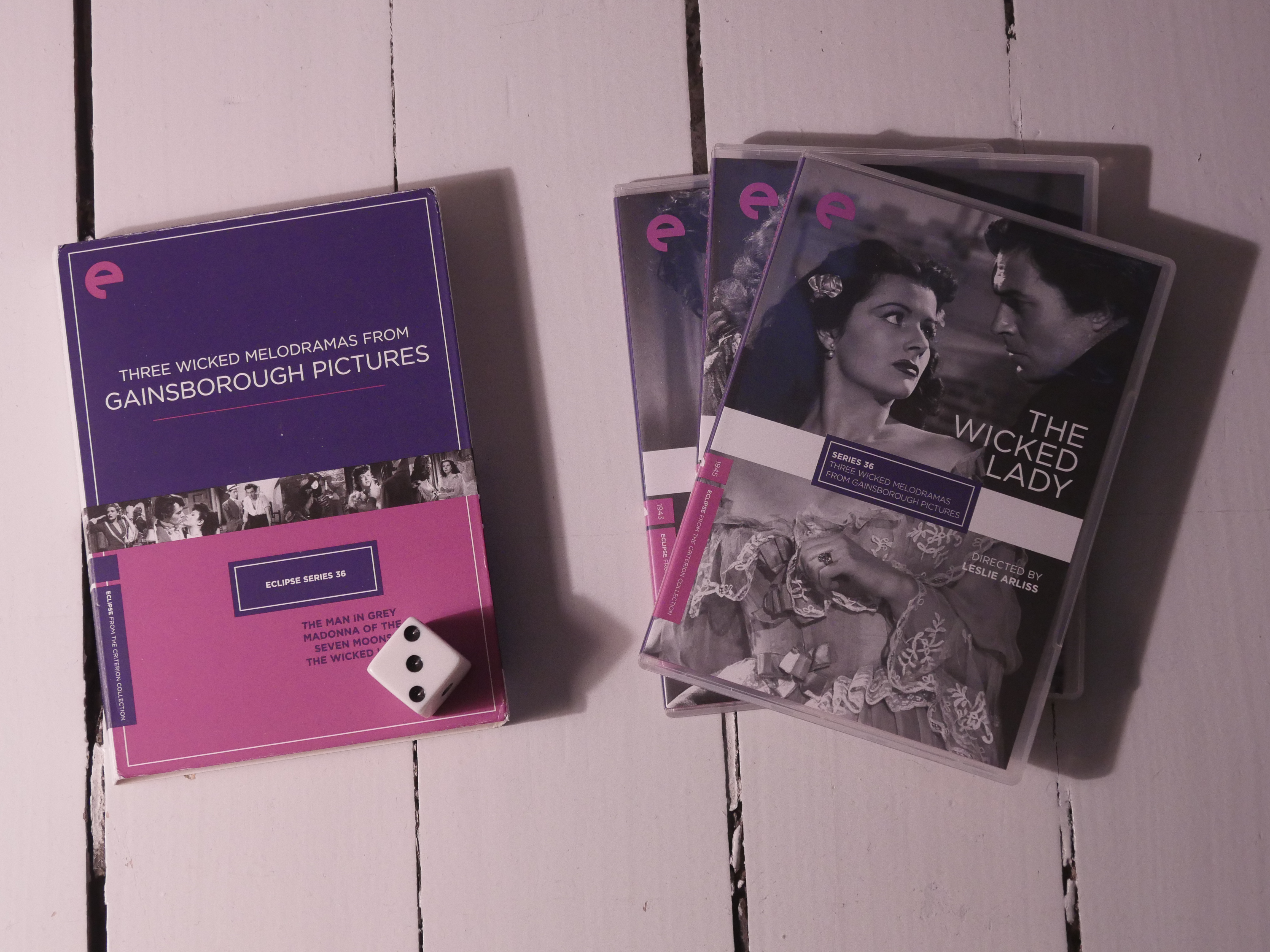
I had really expected more French movies in the Eclipse series from Criterion. But it’s… mostly Japanese and British movies?
I think we have a theme.
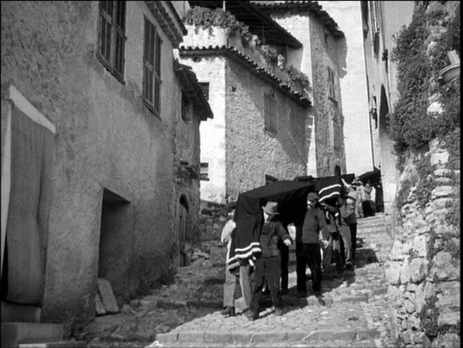
Was this filmed as a silent movie originally? It kinda seems like it — it’s got scenes with speeded-up action and stuff.
And these bits.
But then it totally changes into a modern aesthetic. Well. 30s modern? That’s modern, isn’t it?
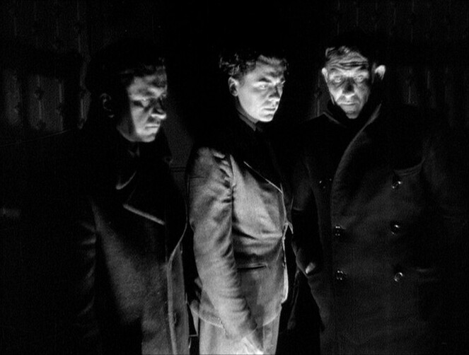
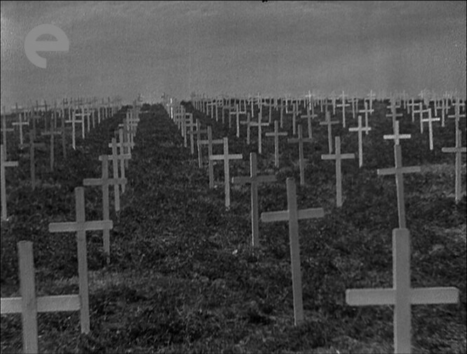
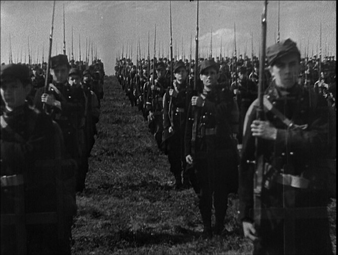
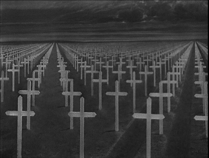
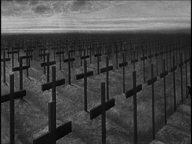
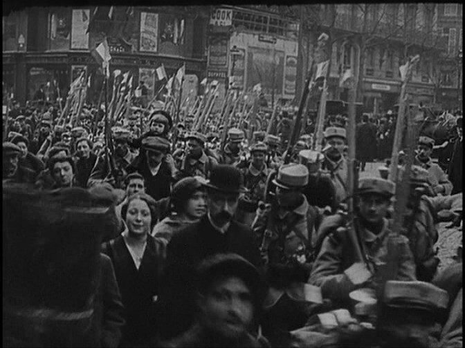
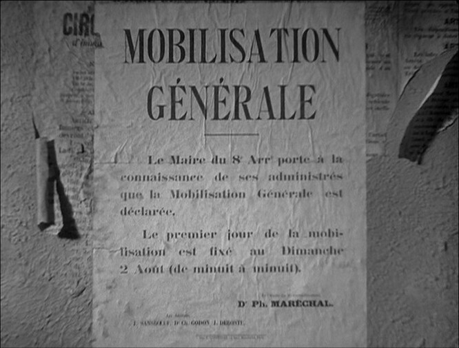
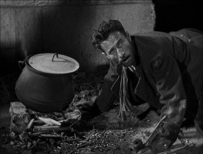
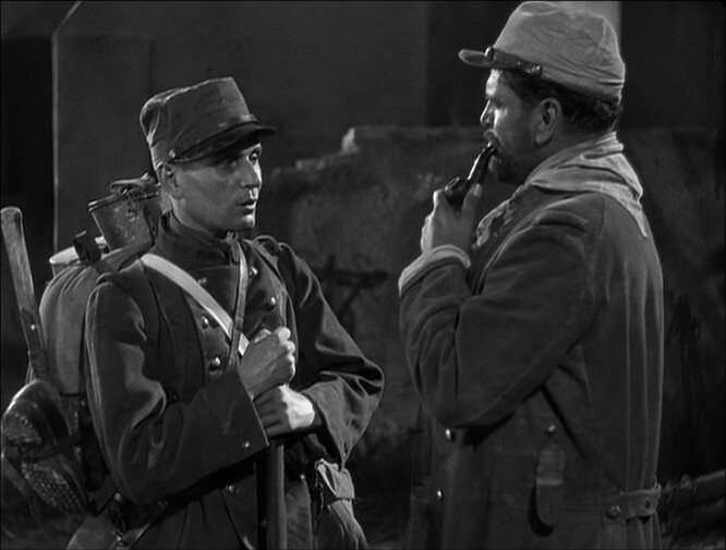
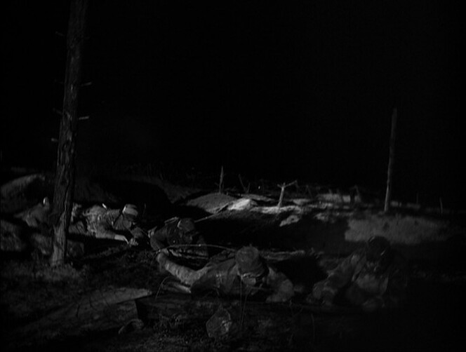
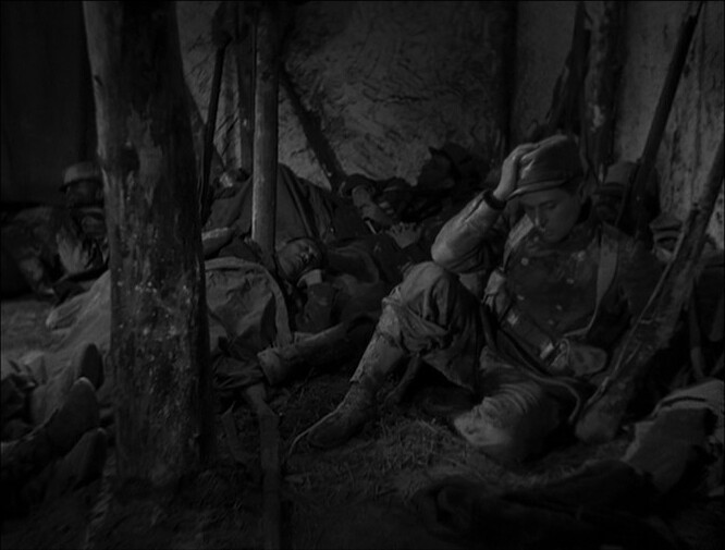
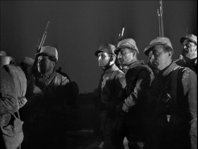
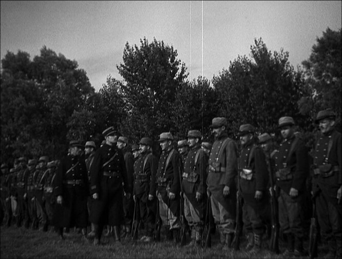
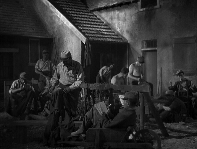
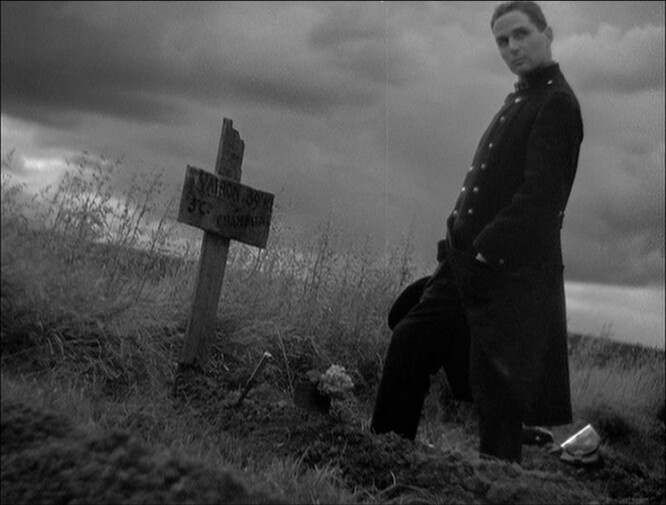
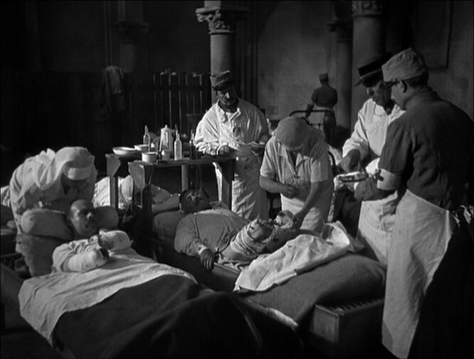
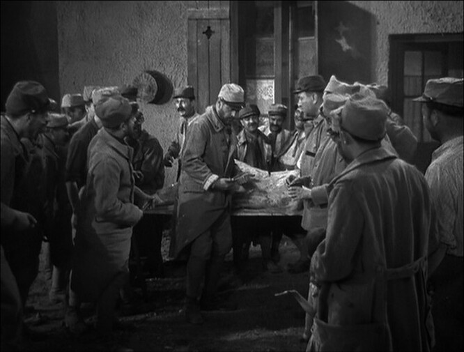
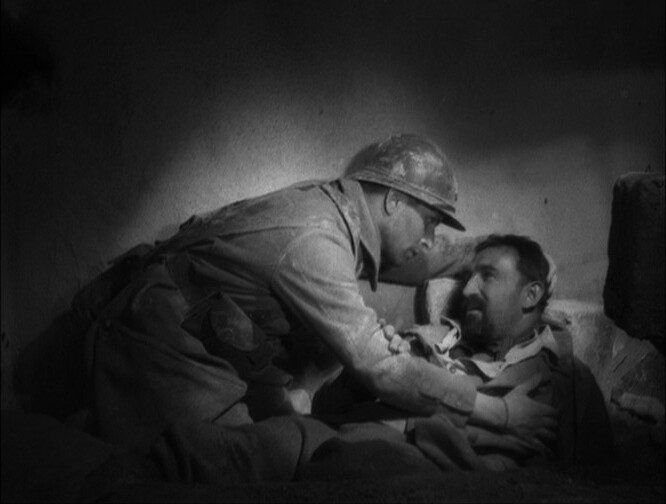
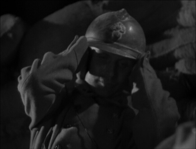
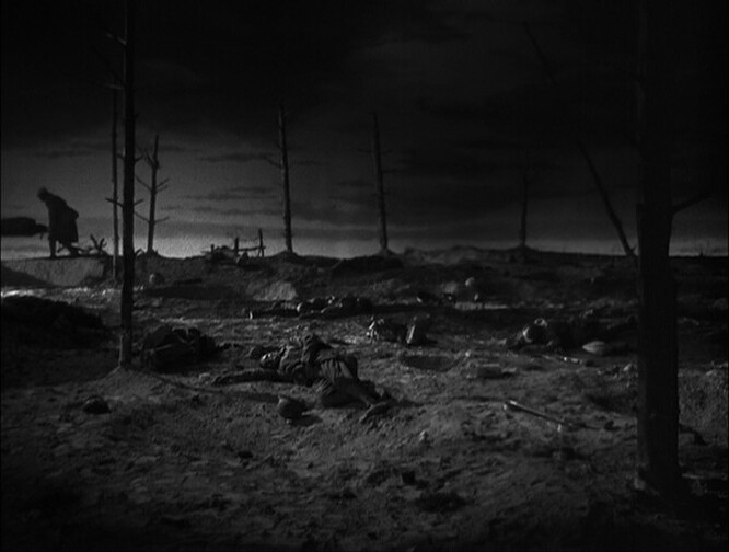
This is a film about the Great War — seen from the trenches. And you’d expect something more upbeat than this in 1932? But it’s all about mud, stenches, lice and people dying for no particular reason.
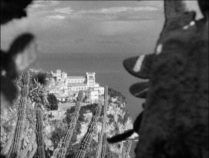
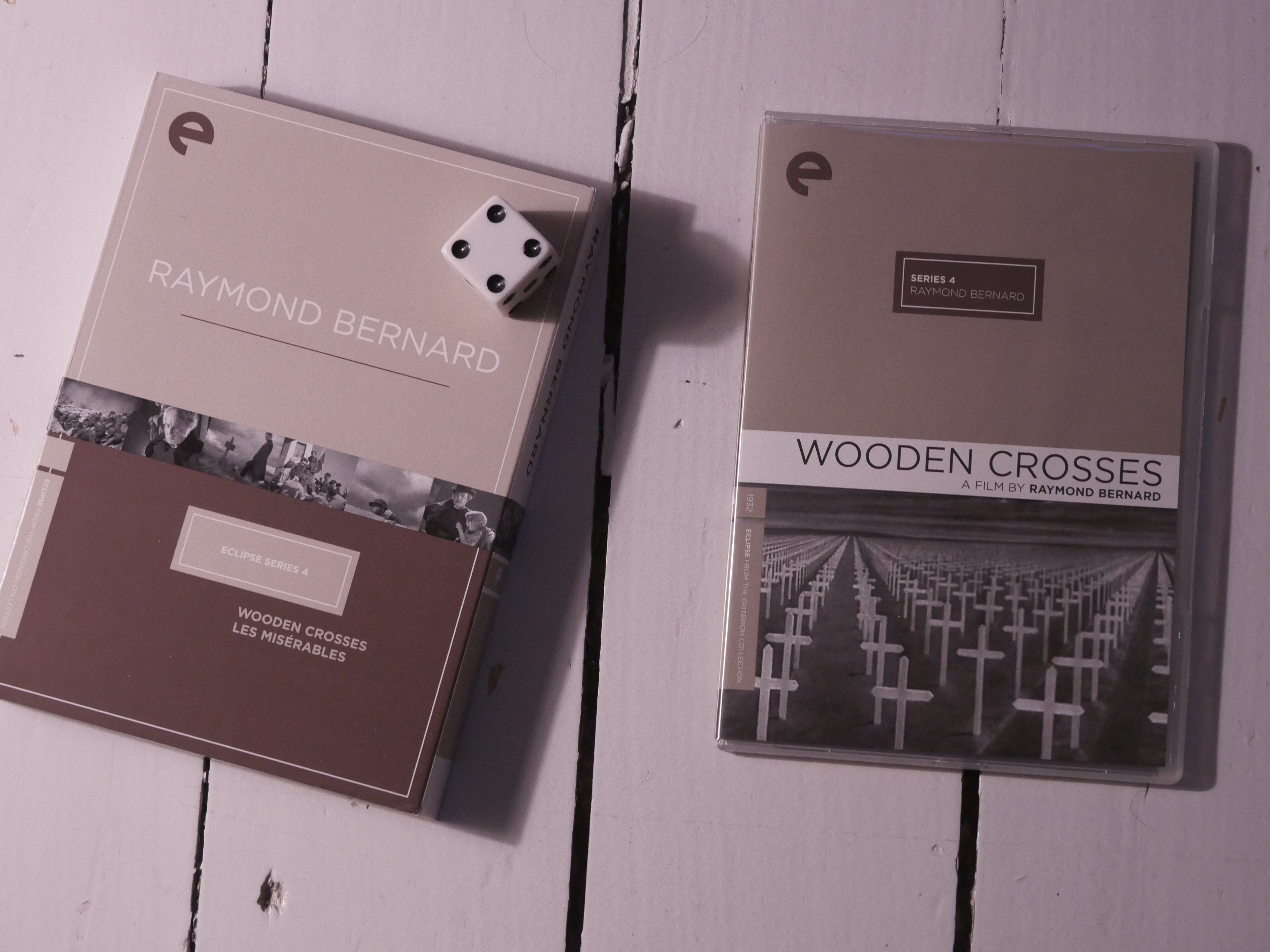
This looks great… the other movie in this Eclipse box set is Les Misérables, the four-and-a-half hour movie from 1934. Which has gotten a new restoration and is has been released on blu-ray after Criterion did their DVD release. So I think I’m gonna skip the Eclipse version of that, and get the Eureka blu-ray instead.