After being exhausted by the Fantagraphics marathon I’ve somewhat avoided comics, but all exhaustion must come to an end, so I bought House of Women by Sophie Goldstein.
I don’t really want to review it (it’s a sci-fi gothic horror story, I guess), because I don’t really have much to say other than “I liked it a lot”, but I just wanted to appreciate how great these books look.
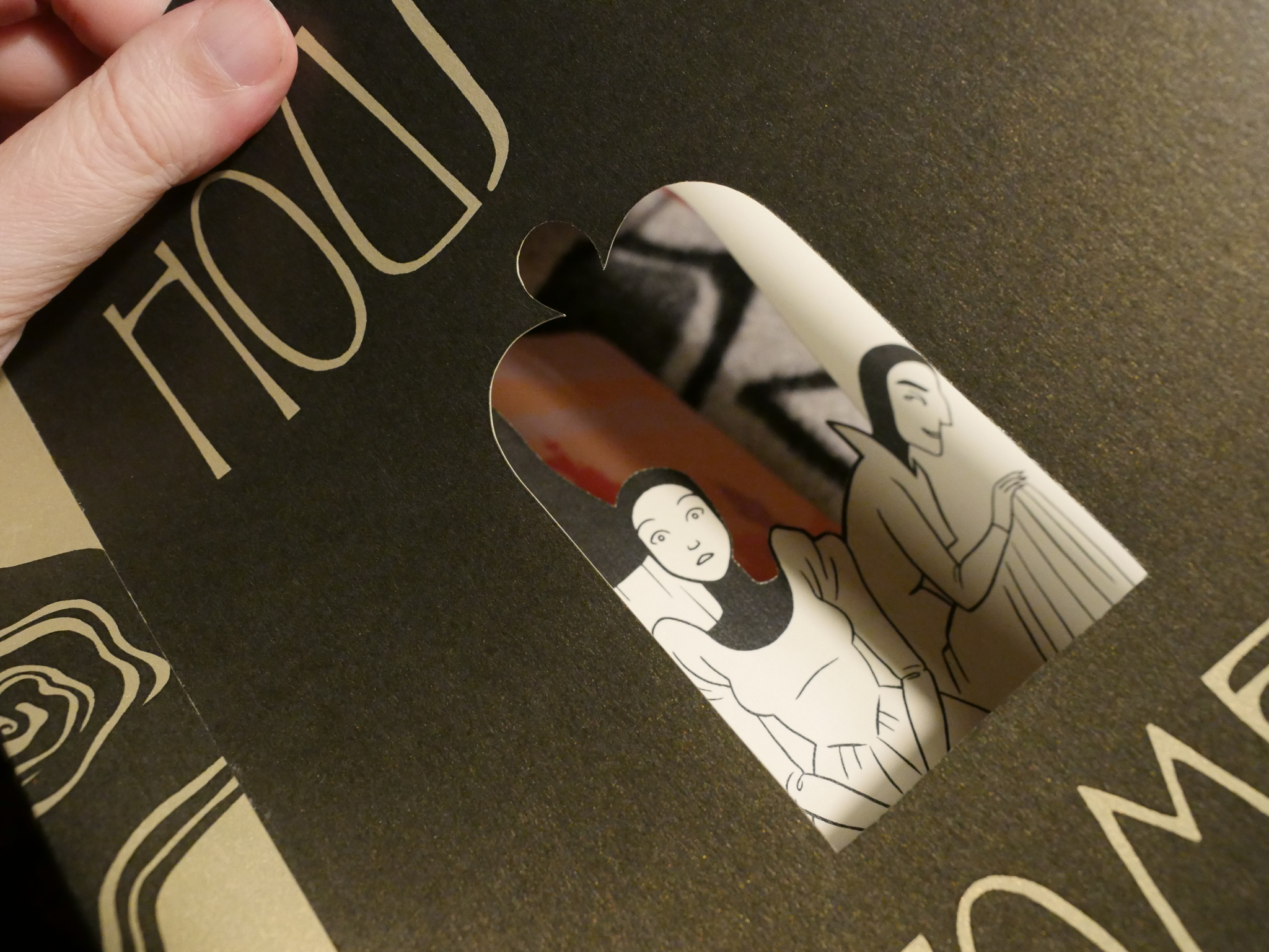
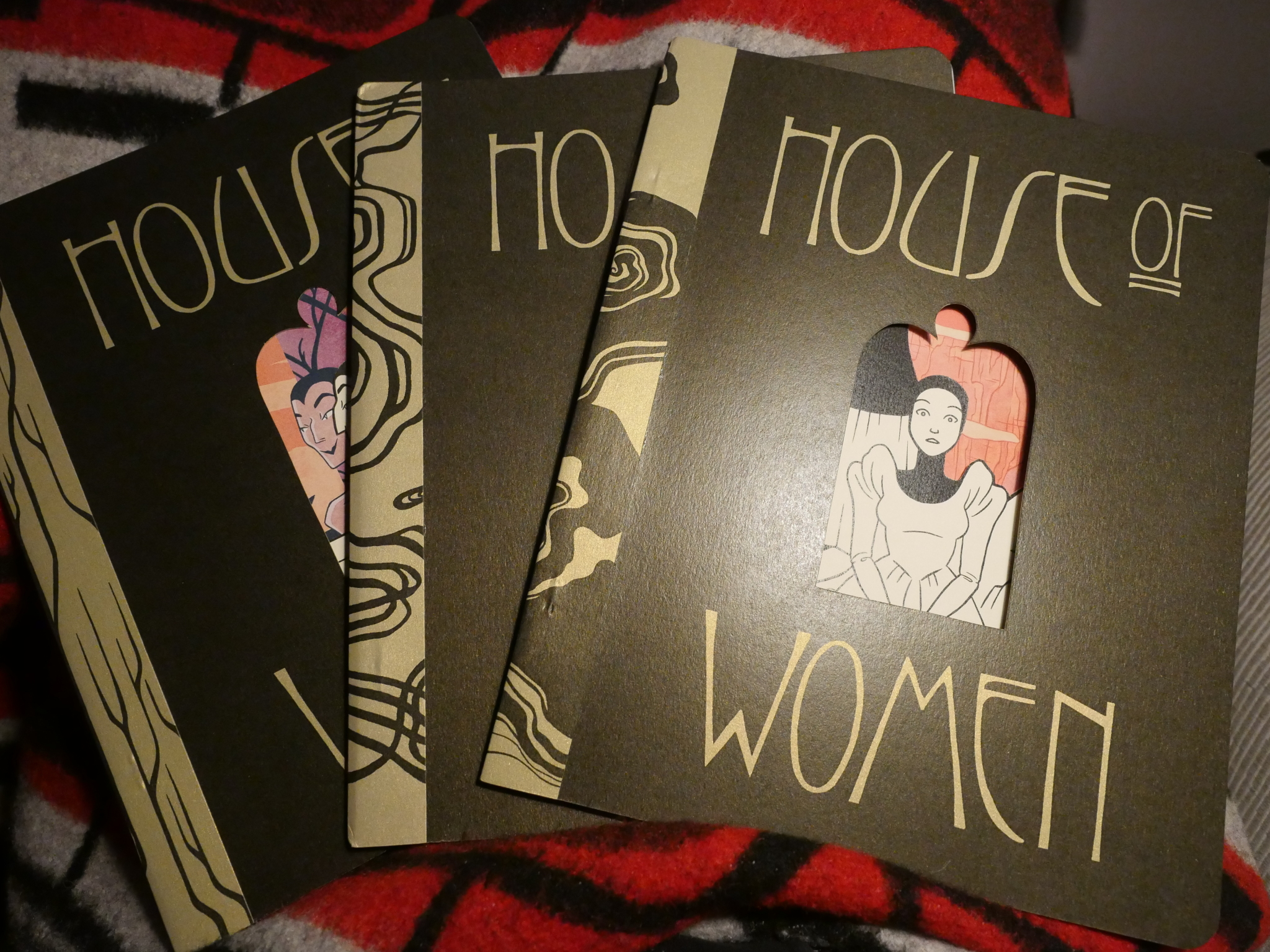
The covers and the first inside page all have these die cuts, so you can see parts of the first and second pages (I mean third…) The die cuts looks like windows or mirrors…
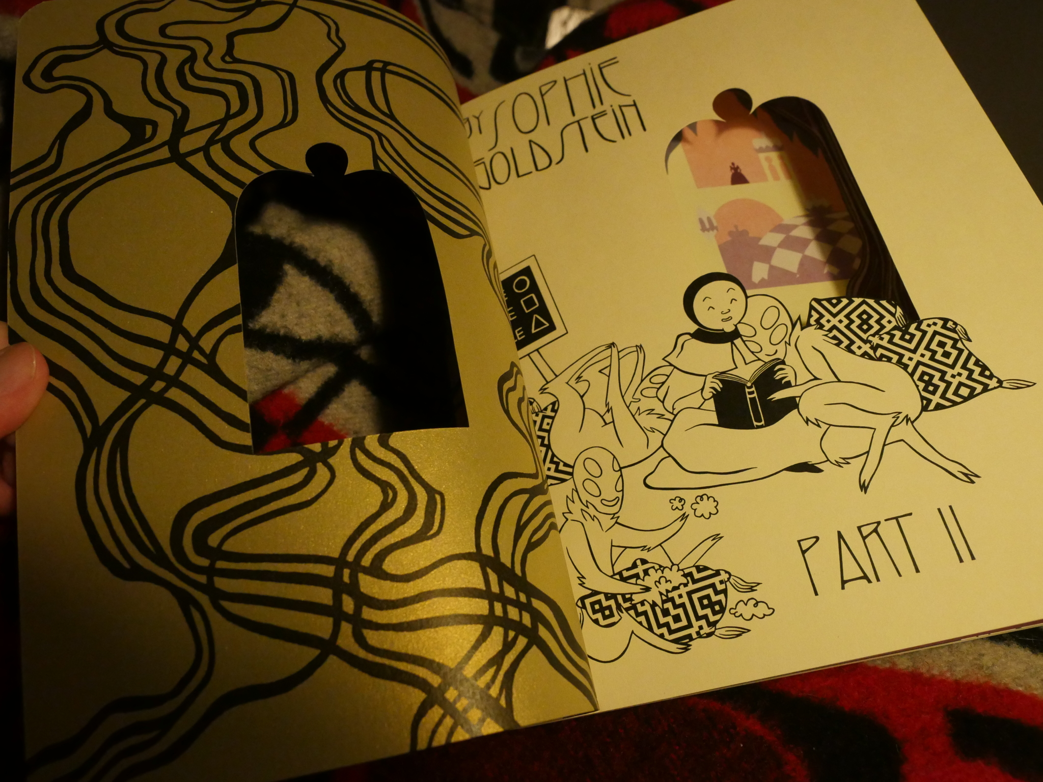
The extravaganza doesn’t end there: There’s also gold ink on the inside covers, rounded pages, and a paper binding glued to the outside spine. Which makes me wonder: Were these books partially hand-made? They’re so handsomely and exactingly put together that I kinda doubt it, but, on the other hand, I’ve seen quite nothing else printed like this…
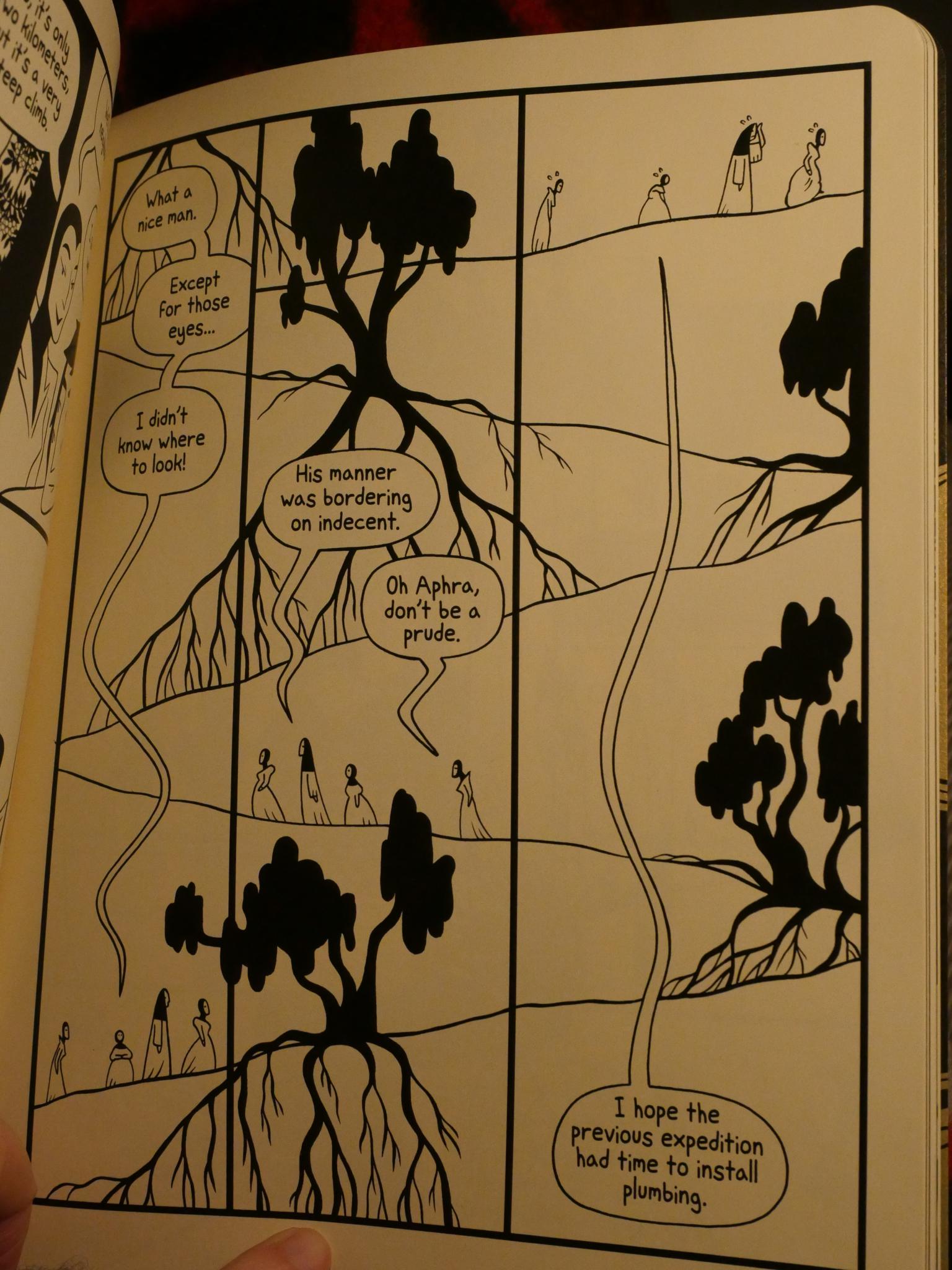
Oh! The insides. Well, I wasn’t really going to get into that, but it’s formally very interesting, like this page where the titular women are climbing towards their titular house…
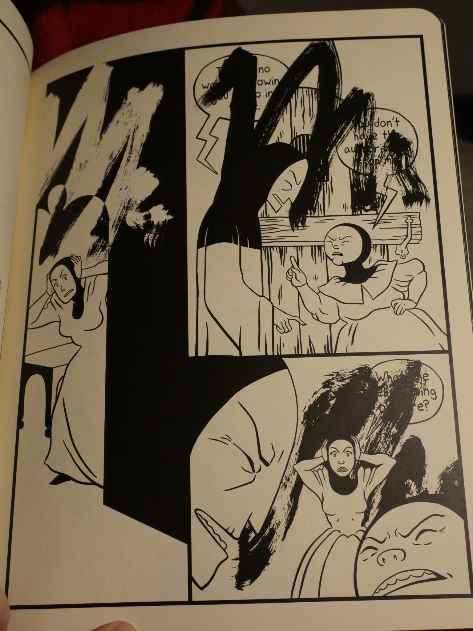
And here’s another thing I don’t think I’ve quite seen before done quite this way: There’s an individual on the other side of the door crying, obliterating the words of the people we can see on this side of the door.
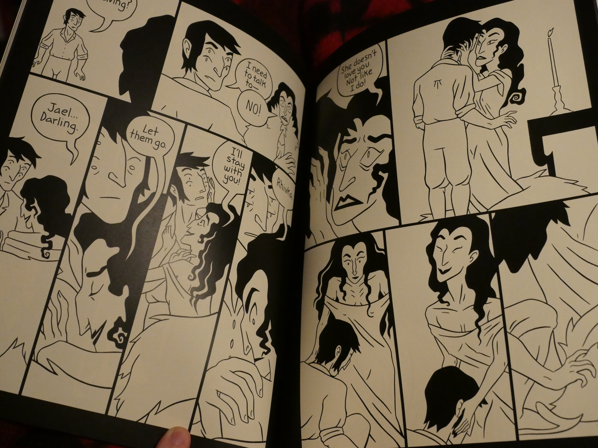
It’s not all formal fun, though: It’s mostly straightforward, and it’s very readable.
Fantagraphics will be publishing a collected edition later this year, but I would guess that it’ll look less extravagant than the original editions.
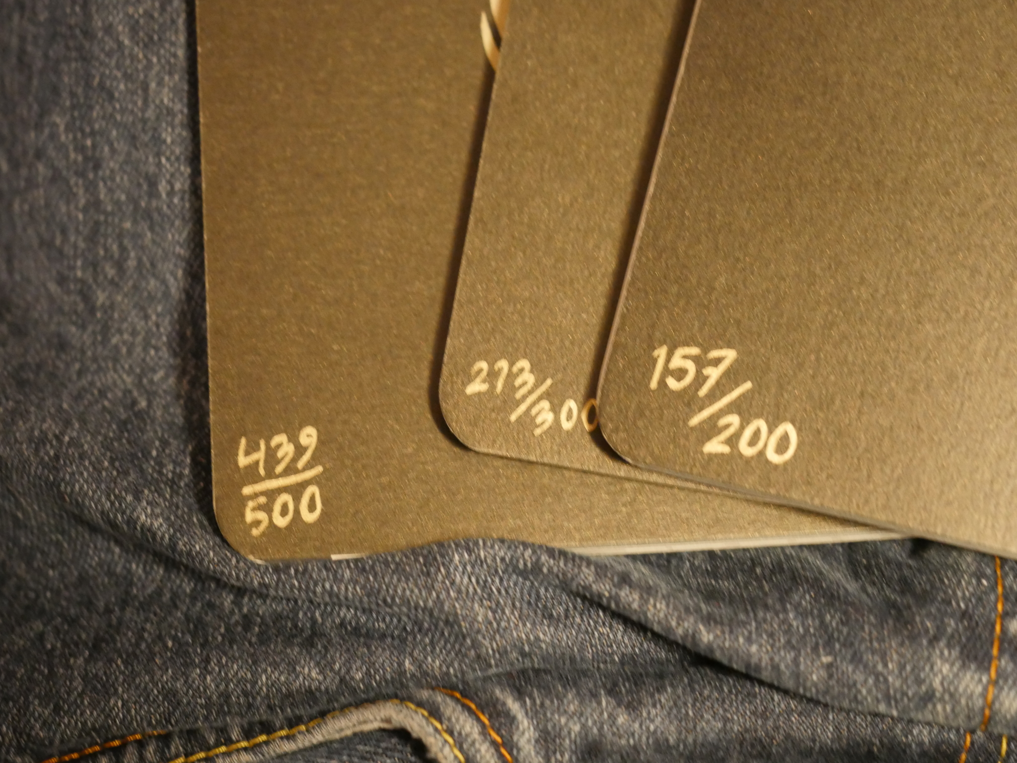
I’m quite late to the party, but these numbers of the back here raise a couple of questions. First of all, who are those 300+ weirdos that bought the first volume that didn’t buy the subsequent volumes? And second: Perhaps making these books were so much work that Goldstein decided to make fewer copies of volume 2 and 3?
In any case, there’s probably a couple dozen copies left in her web shop now, so get buying if you want to fondle the books yourself.