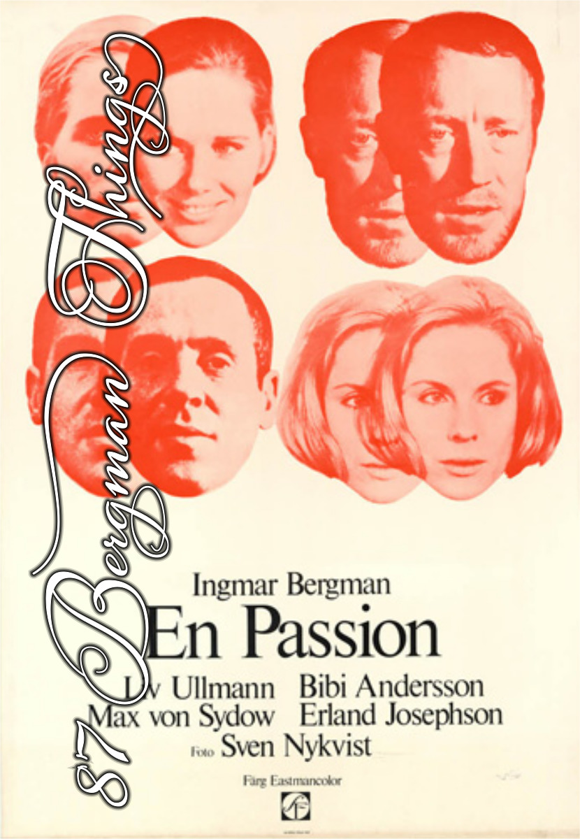
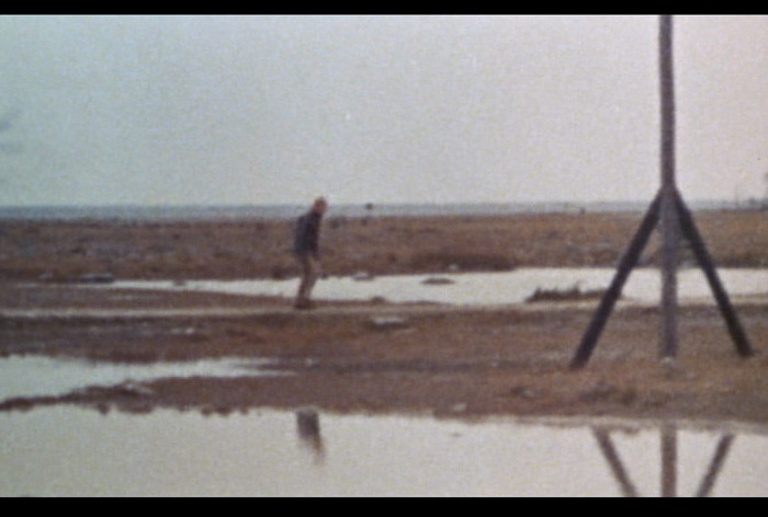
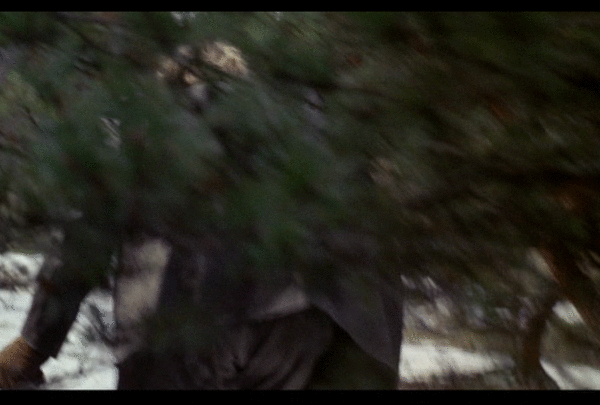
The Passion of Anna (En passion). Ingmar Bergman. 1969. ⭐⭐⭐⭐★★.
Whaa? This film is not in 4:3? It’s more like… 16:11? At least the DVD is.
And it’s in colour, too, but Bergman’s already done that.
You kinda think of Bergman as being extremely distinctive and set in his own ways, but viewing his films chronologically, you really get a feel for how he changes with the times. It’s obvious that he’s seen a lot of Jean-Luc Godard before making this one, for instance.
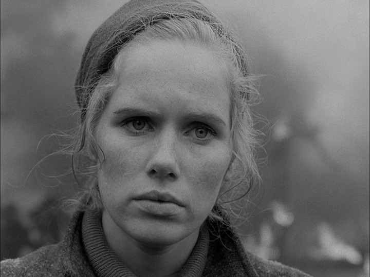
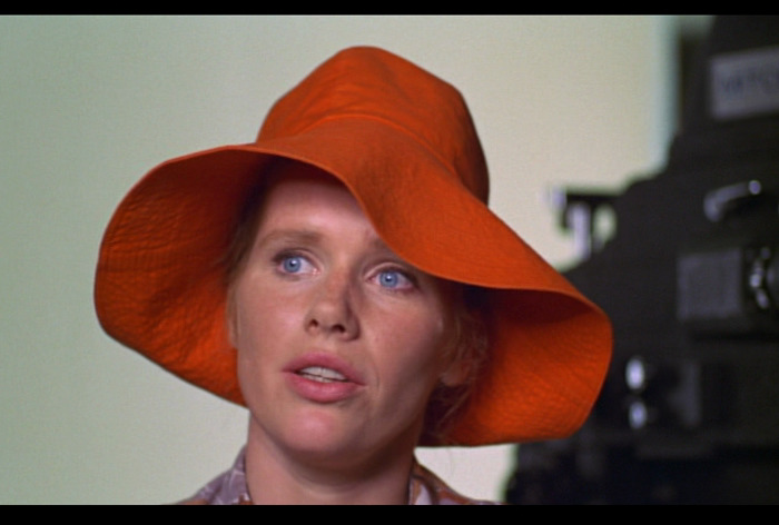
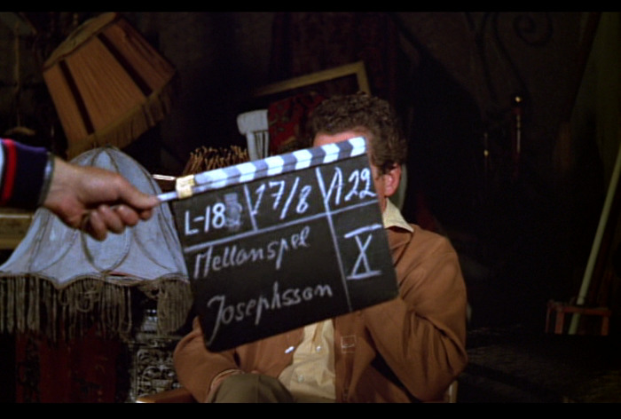
(The bit where Liv Ullmann talks to the camera rather shows Bergman’s pettiness. He cuts her off mid-sentence, as if to make fun of her. It’s a childish act of aggression.)
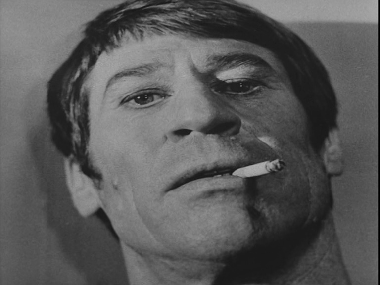
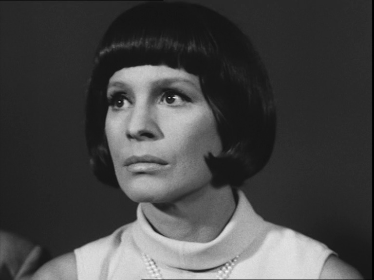
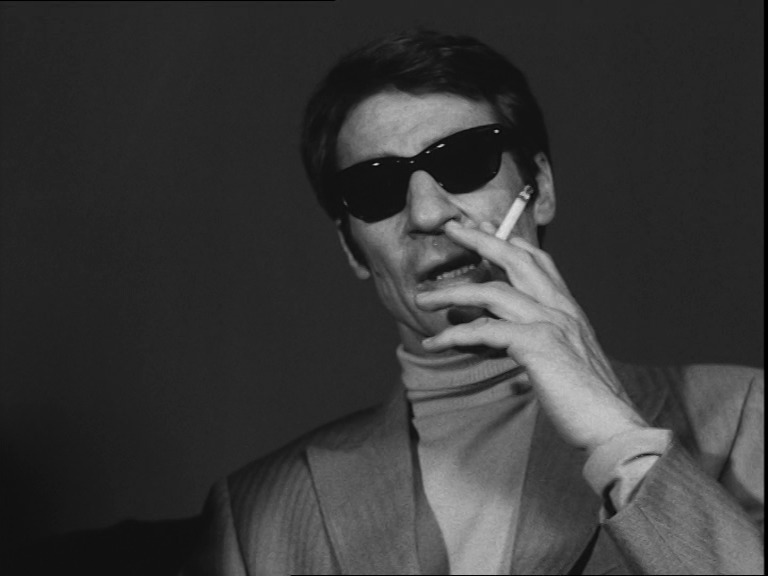
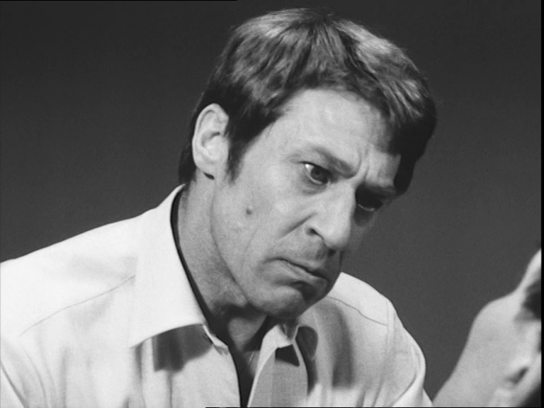
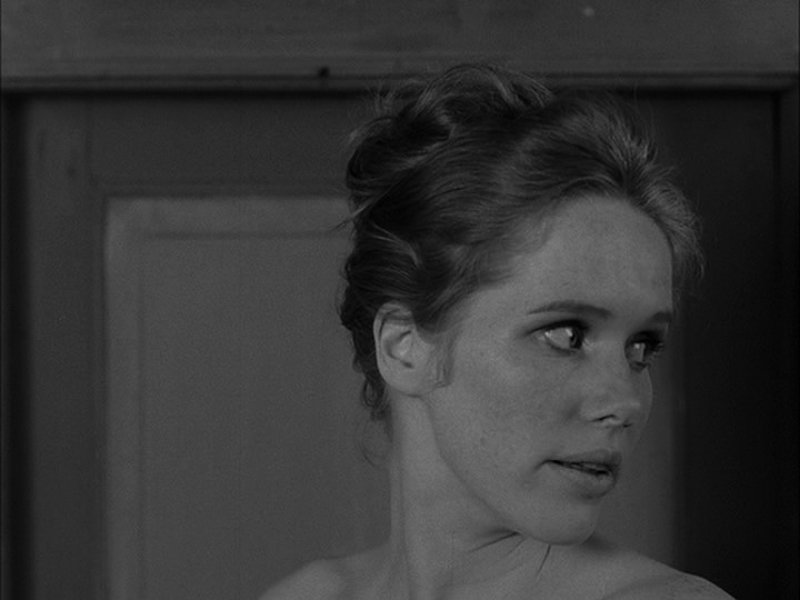
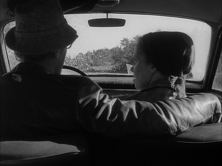
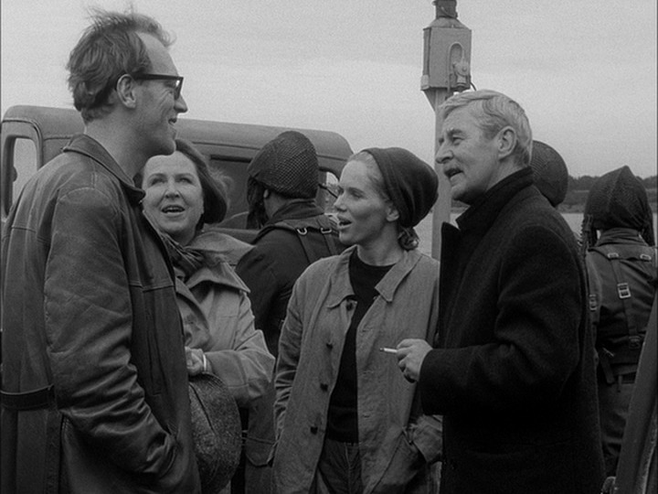
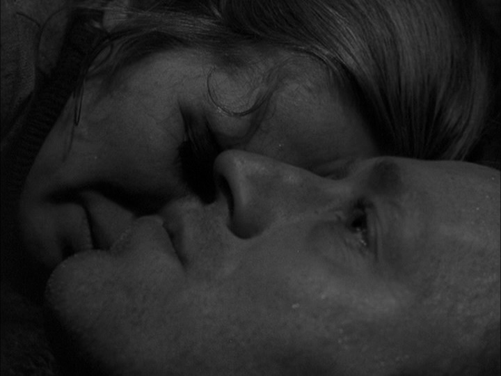
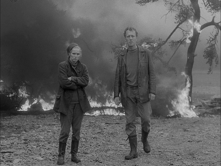
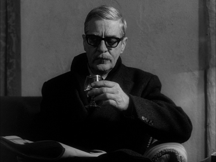
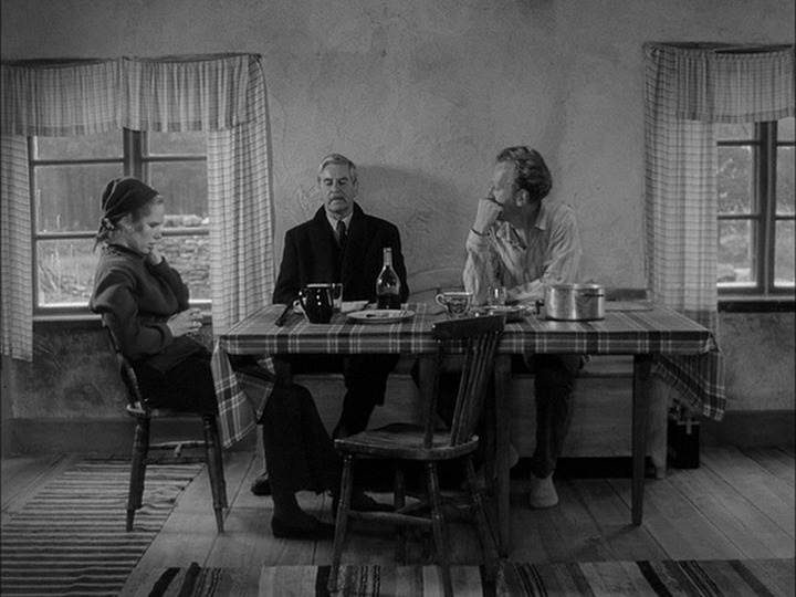
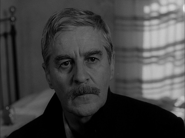
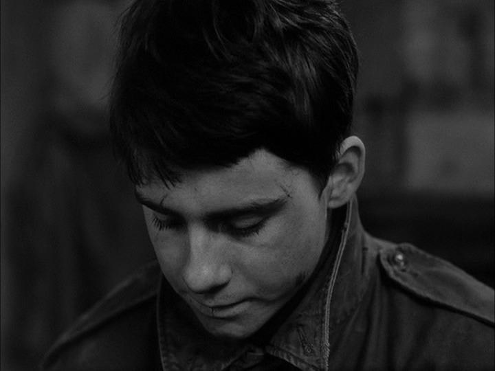
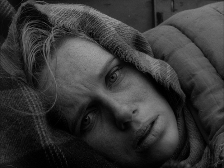
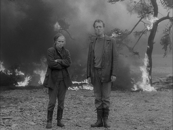
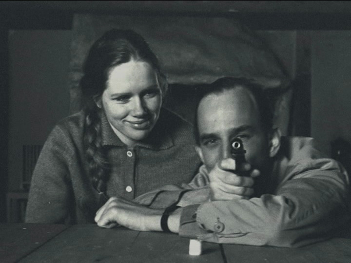
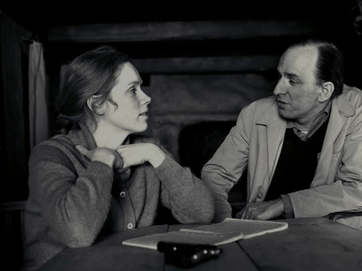
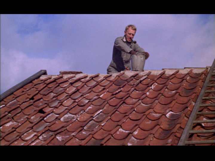
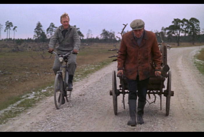
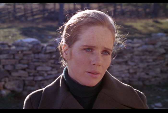
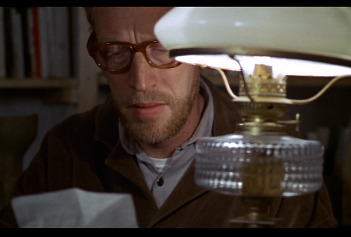
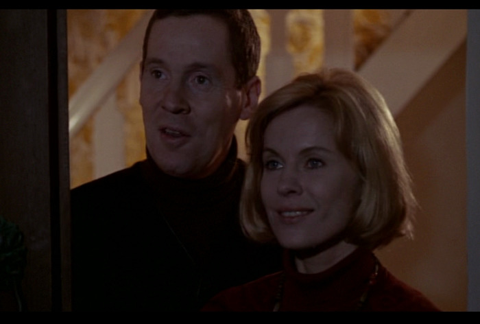
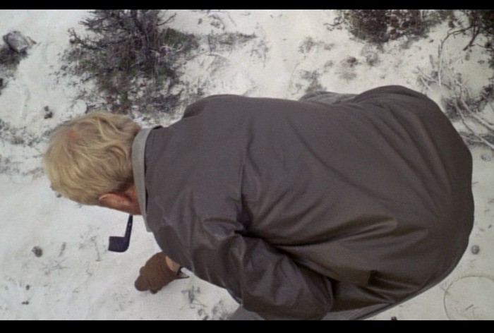
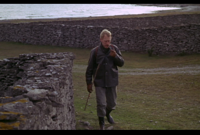
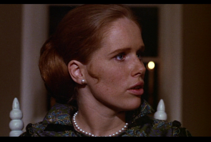
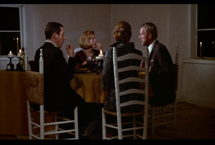
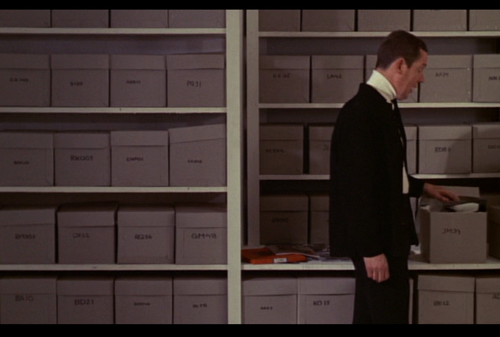
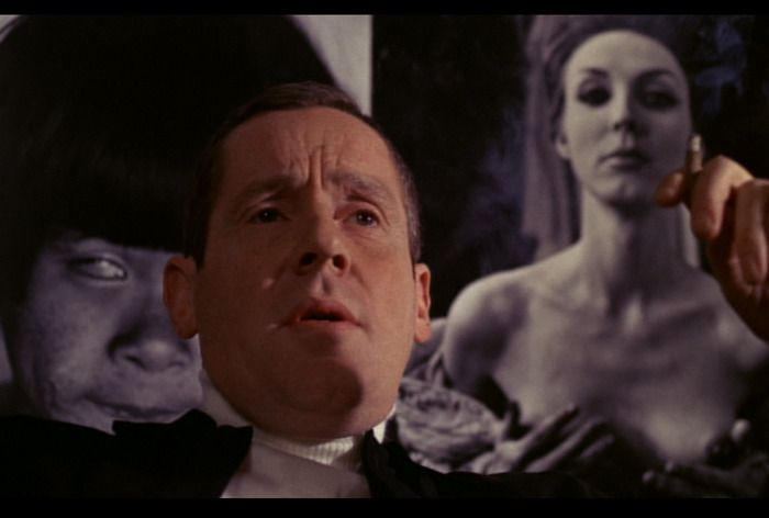
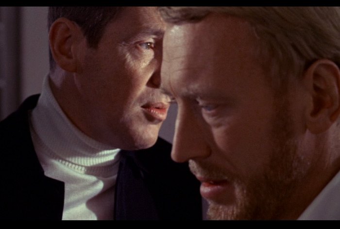
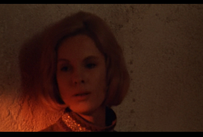
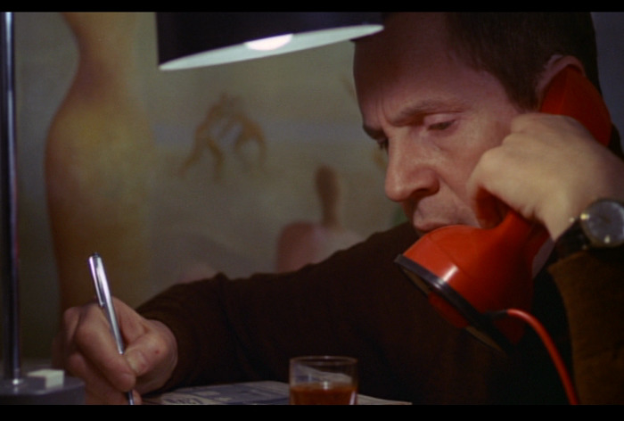
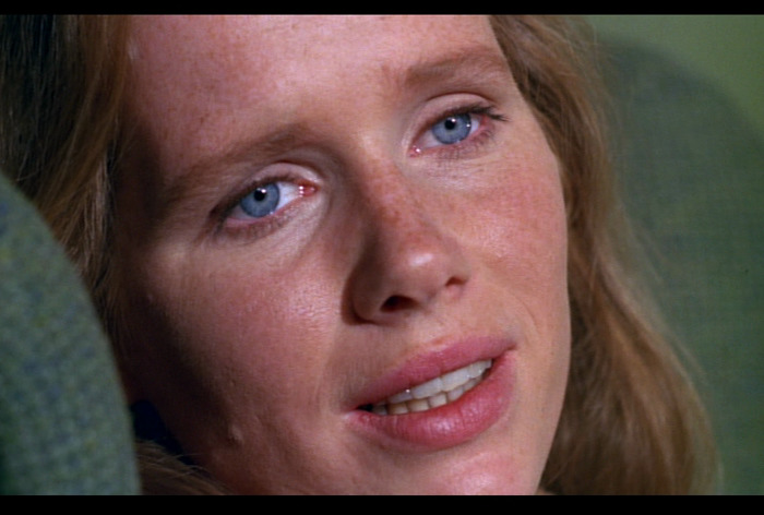
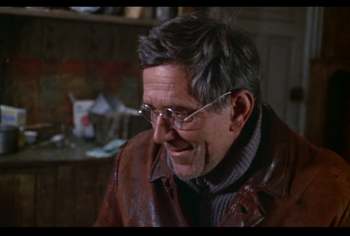
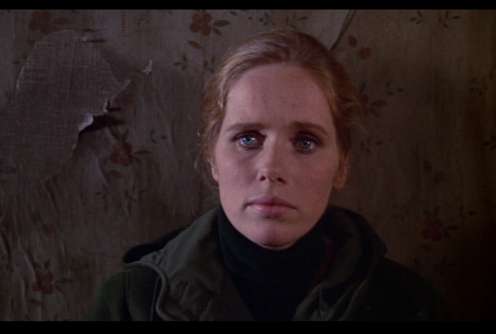
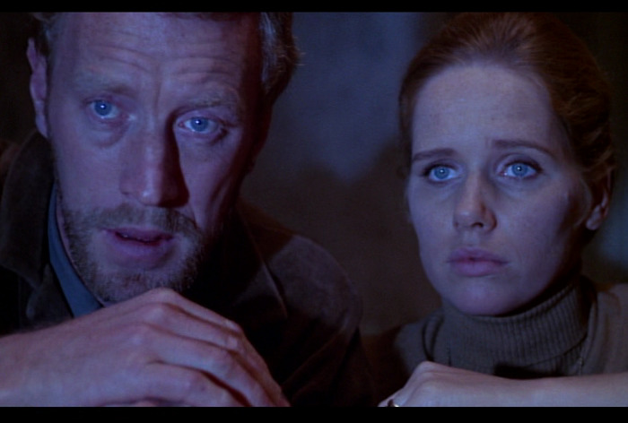
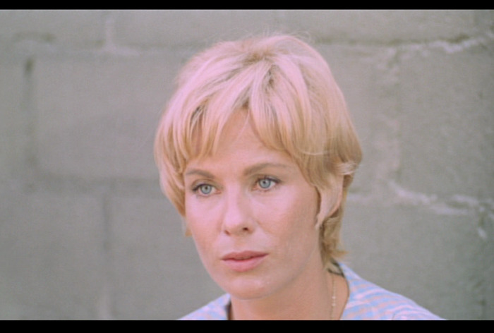
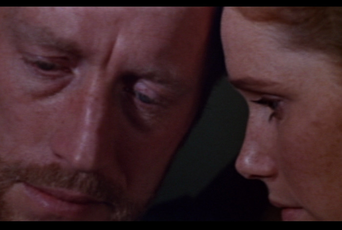
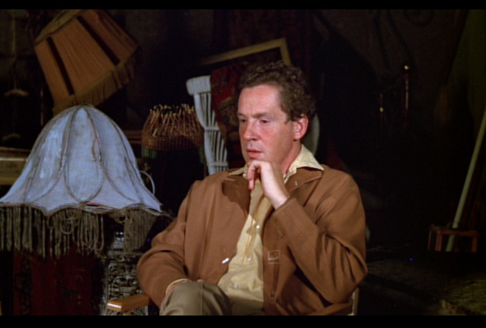
It’s another chamber piece, but with some excursions. But what an amazing cast: Liv Ullmann, Bibi Andersson, Max von Sydow and (relative Bergman newcomer) Erland Josephson. They’re scintillating.
But somehow… it’s doesn’t quite come together.
United Artists was the company responsible for international distribution of The Passion of Anna. The Swedish newspaper Expressen was far from happy with the company’s marketing: ‘Despite their new style of language, the same old clichés are being trotted out: A film from Sweden – that nation of suicidal sex addicts who find the temperature cold outside but all the more warm in bed.’
Miaow.
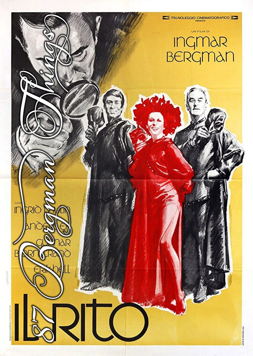
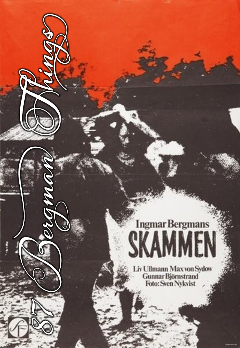
This post is part of the 87 Bergman Things series.


)
)

)


)