I maintain a web site (and a gaggle of apps) that scrape event lists of all the clubs and concert venues in Oslo. The other day, I was told that it missed a bob hund concert and I was all whaaa?
It turned out that the reason was that Facebook is now blocking all non-logged-in access to their event lists.
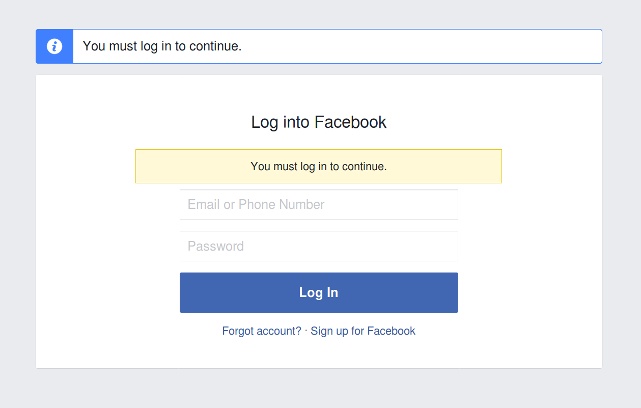 Because nobody who has a venue wants anybody but people on Facebook to show up when they have a concert. I guess that’s what you get when you’re gardening in a walled garden.
This made about a dozen sites disappear off of CSID, so I had to get real and figure out how to deal with the Facebook “Graph” API. And it turned out to be really easy to work with. After I read “howto” web sites for half an hour, implementing it was just a matter of connecting app secrets with app IDs with client tokens with access tokens with long-lived access tokens.
It all makes sense.
It’s all on github as usual, but it’s trivial, really. And I guess it’ll work until Facebook feels like they should cut off more access to the data, whenever they feel like that’ll make more sense for their quarterly outlook.


)
)