In my 20s, I bought a bunch of cheap but fun watches. While tidying up the other month, I came across the watch cache, and I thought it might be fun to start wearing them again.
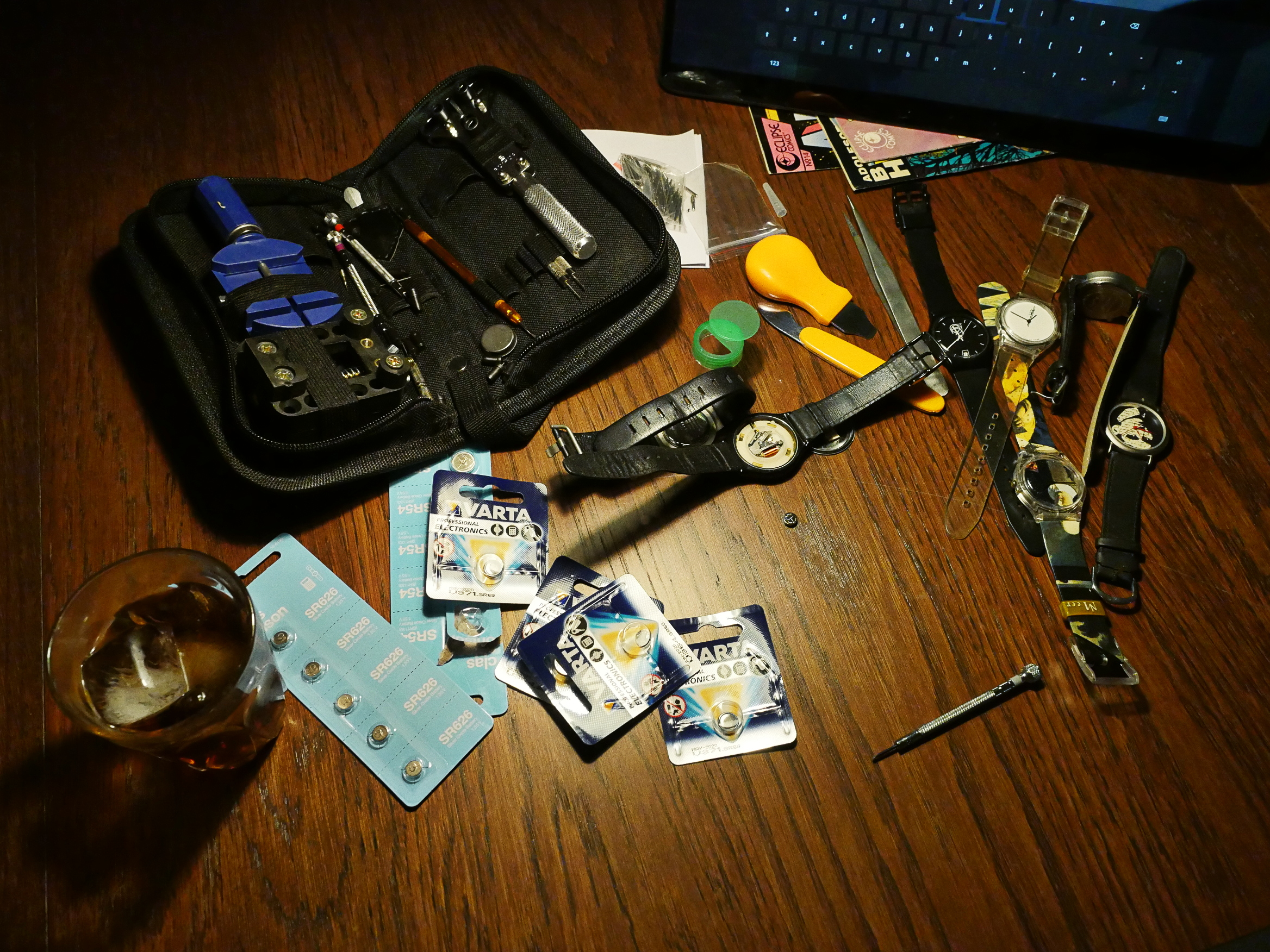
The batteries had all expired decades ago, of course, and taking them all to the watchmaker sounded kinda silly, because changing the batteries would cost most than the watches themselves. Well. Almost.
And it turns out the batteries by themselves cost virtually nothing, so I bought all the required types and a watch repair set.
And a rum and coke.
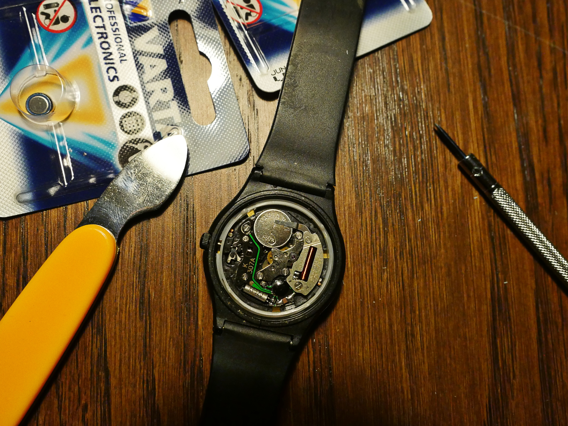
Popping open the back cover of the watches is trivial if you have the right tool (seen to the left there): It’s a kinda blunt knife. And then you need a teensy screwdriver to push stuff around inside the watch to make the battery pop out.
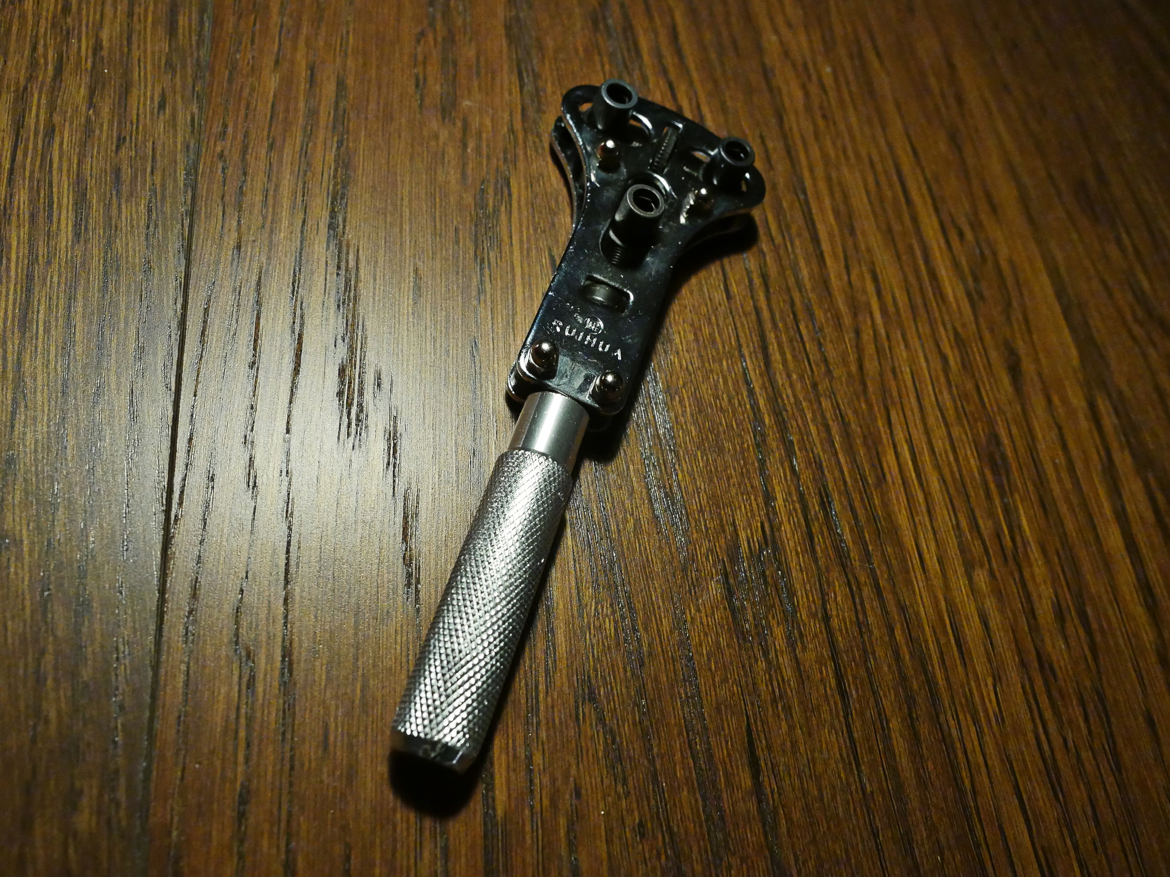
If you have a watch with a screw-on back, you need the tool above. It’s pretty obvious if the watch is of that type, because the back has notches going around the circumference. It’s, however, not completely obvious to use this tool, so search Youtube for a how-to. It’s really easy when you understand the concept.
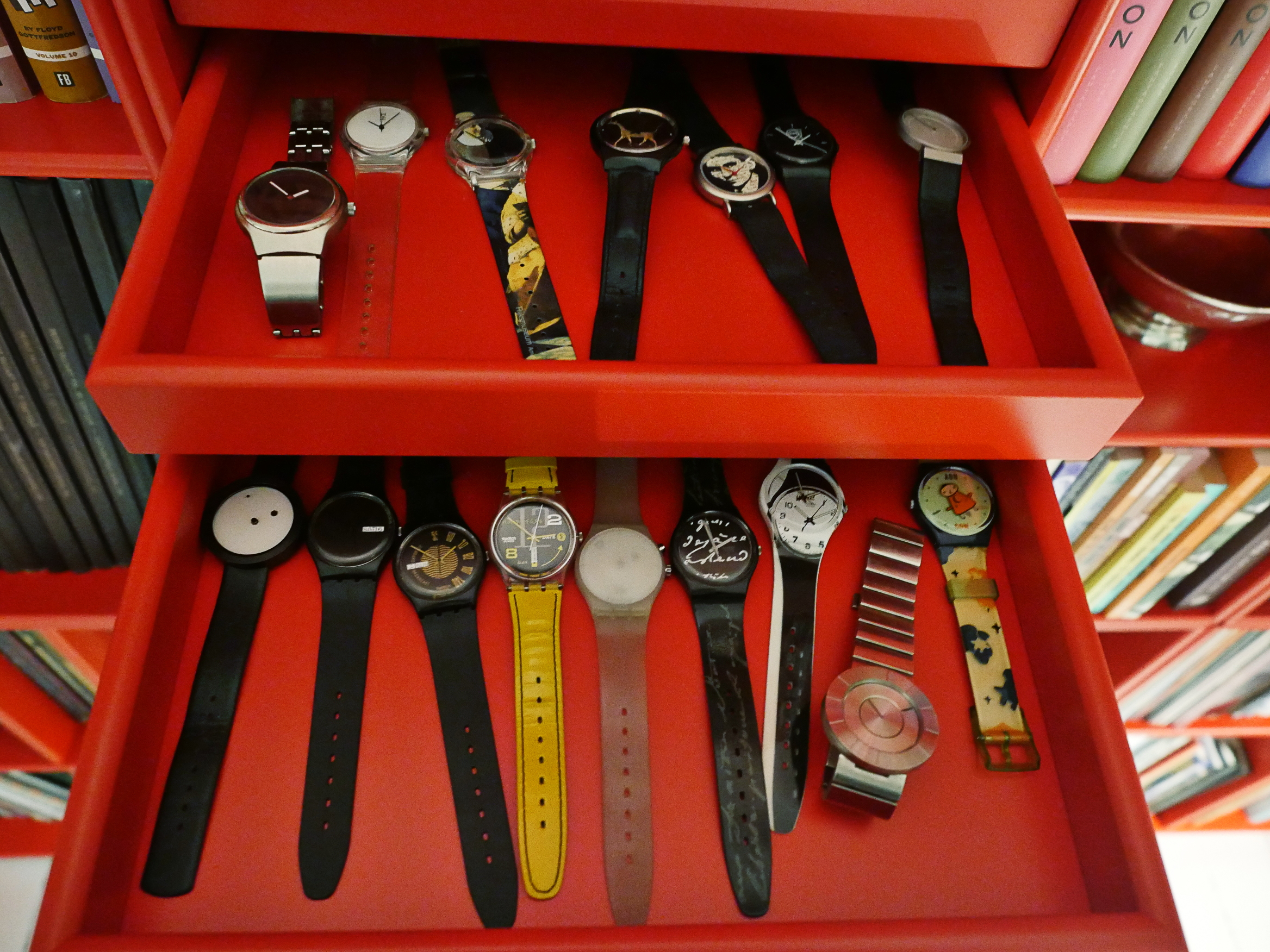
Look! Watches! Telling approximately the correct time! Now I don’t have to wear the same one more than twice a month!
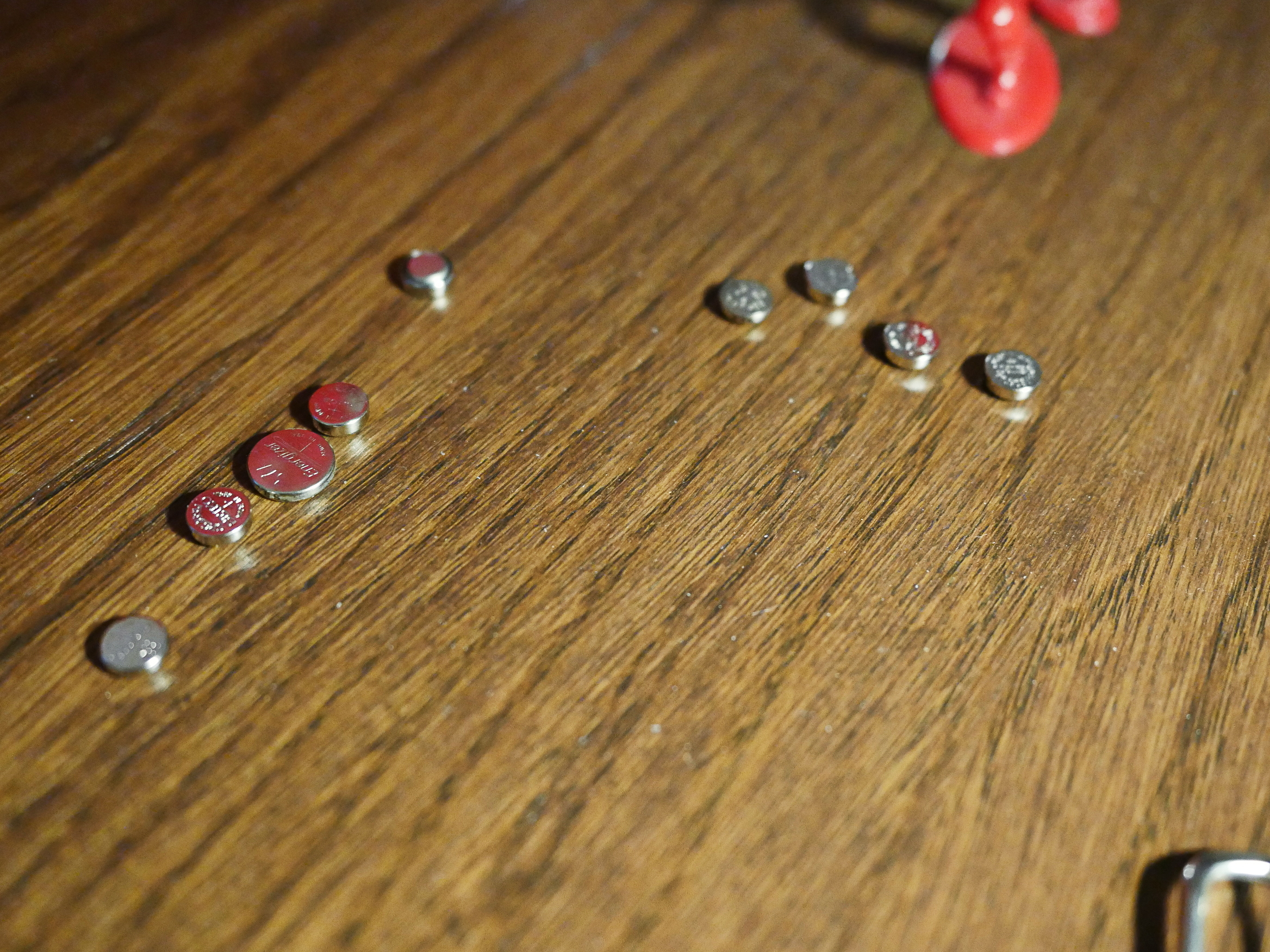
There’s apparently four different battery types that cover the gamut of watch types.
So there you go: Swapping watch batteries is very easy. You just need a) batteries, and b) a watchmaker tool set (there’s a bunch of cheap ones out there), 4) rum and coke, and xvii) very good lighting.