It’s a rainy day, so why not read comics? Right.
But before I start, I want to mention this book I read the other day:
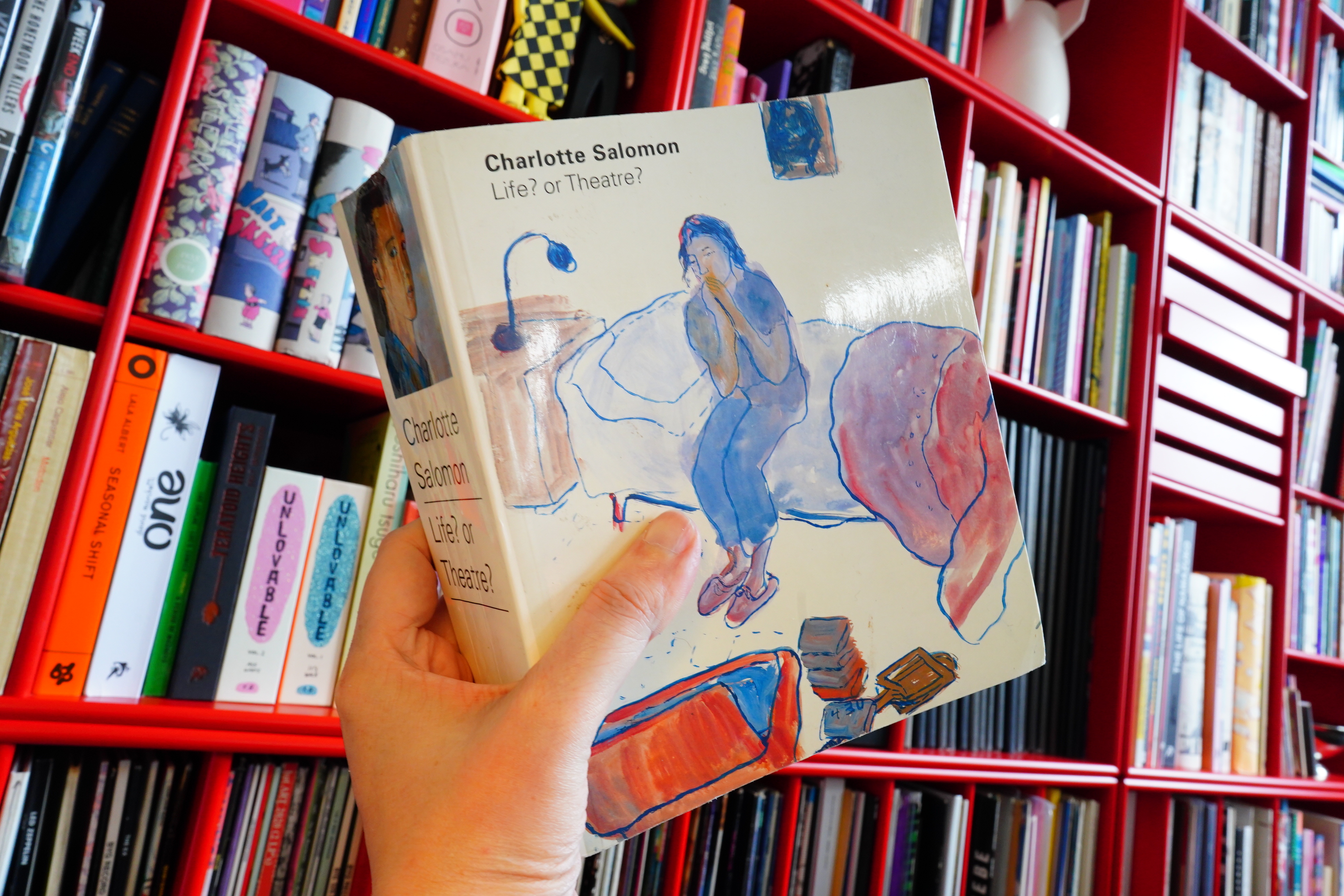
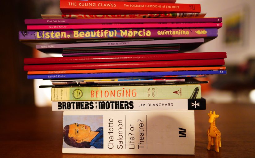
14:21: Charlotte Salomon by Life? or Theatre? (Waanders)
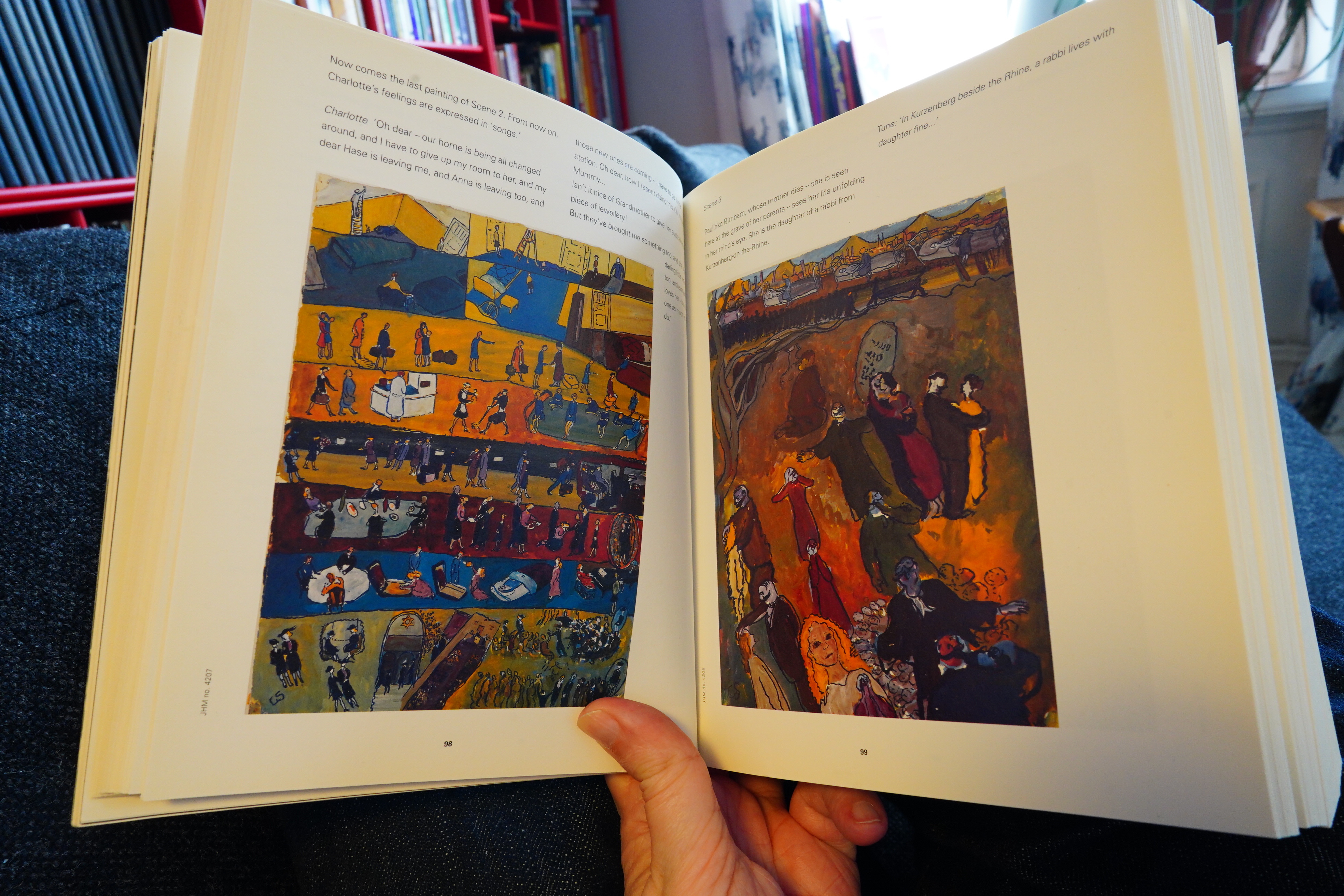
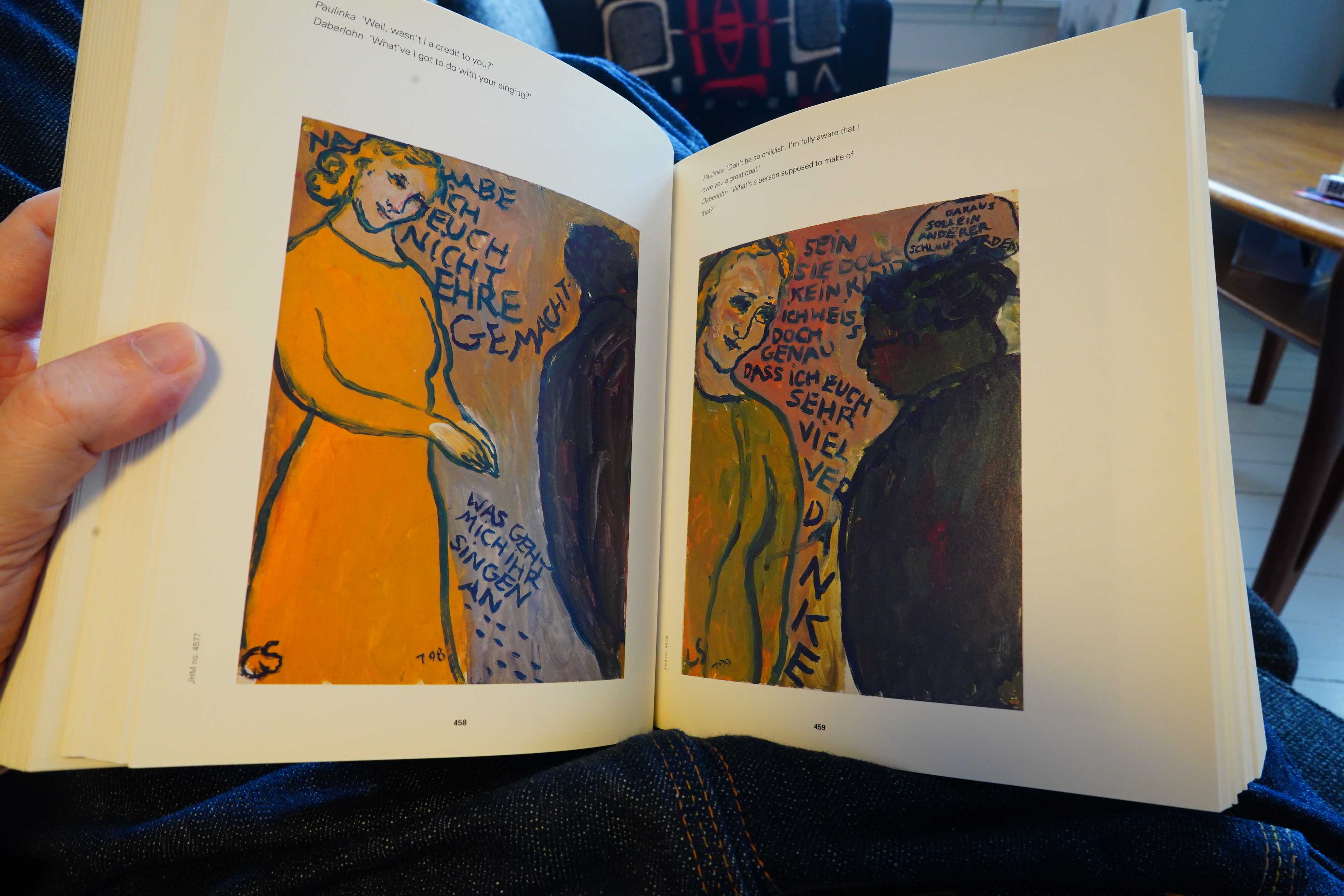
Charlotte Salomon painted a whole lot of paintings that incorporated text, and they supposedly tell a narrative, so it’s comics kinda? She was killed in a German concentration camp in 1943, and the paintings floated around for decades before being put into the sequence they have in this book (which they hope reflect the intended sequence, but they’re not quite sure, if I understood correctly).
Is this a comic book?
I don’t know, but it’s an interesting book — some parts are more like an illustrated novel (in that it’d be difficult to understand what’s happening without the text, and you could read the text and understand most of what’s happening).
On many of the paintings, we have the same figures acting out the “stage directions” in a sequence (like the painting to the left) — a figure moving through time, moving around on the page. I’ve seen other (later) comics do this, too, and often when doing stage adaptations. An actor moves around on stage, so why not have the figures move around on the page?
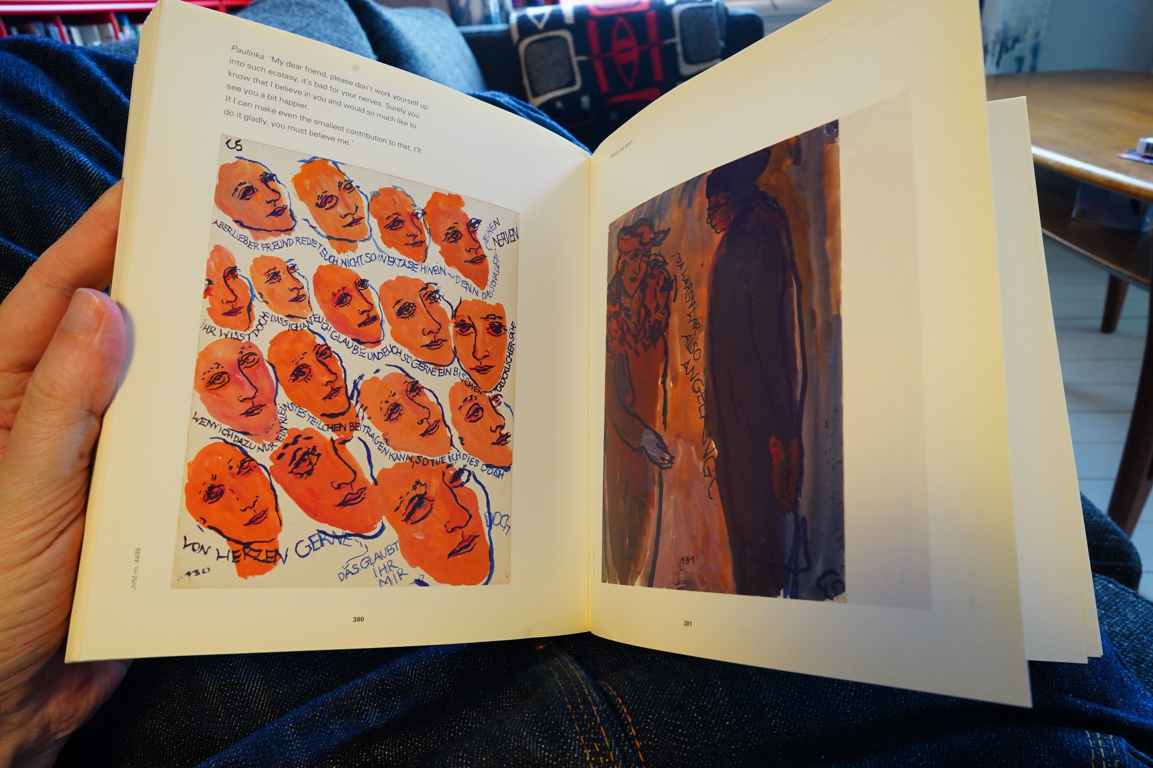
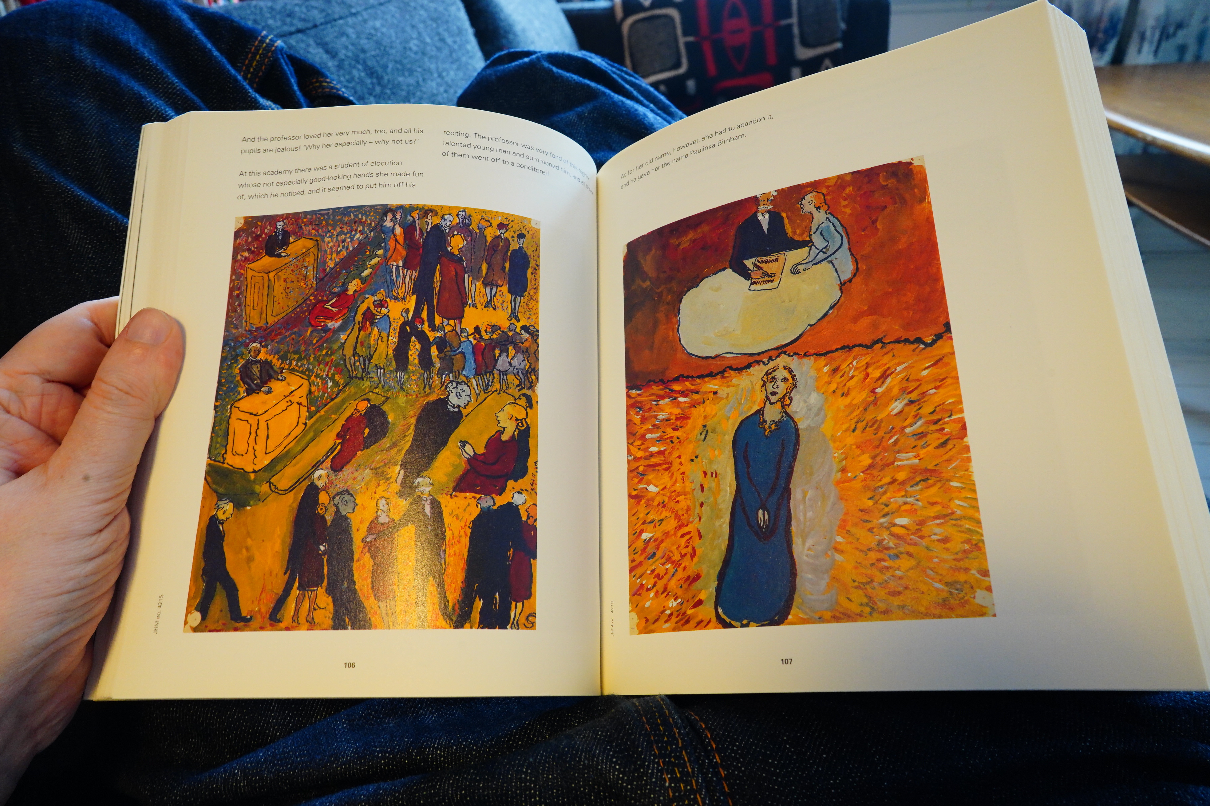
But this bit I haven’t seen anybody do (or emulate): When people give longer speeches, she draws the face over and over and over again, and has the text circle the faces (like on the page on the left). So odd! And kinda great.
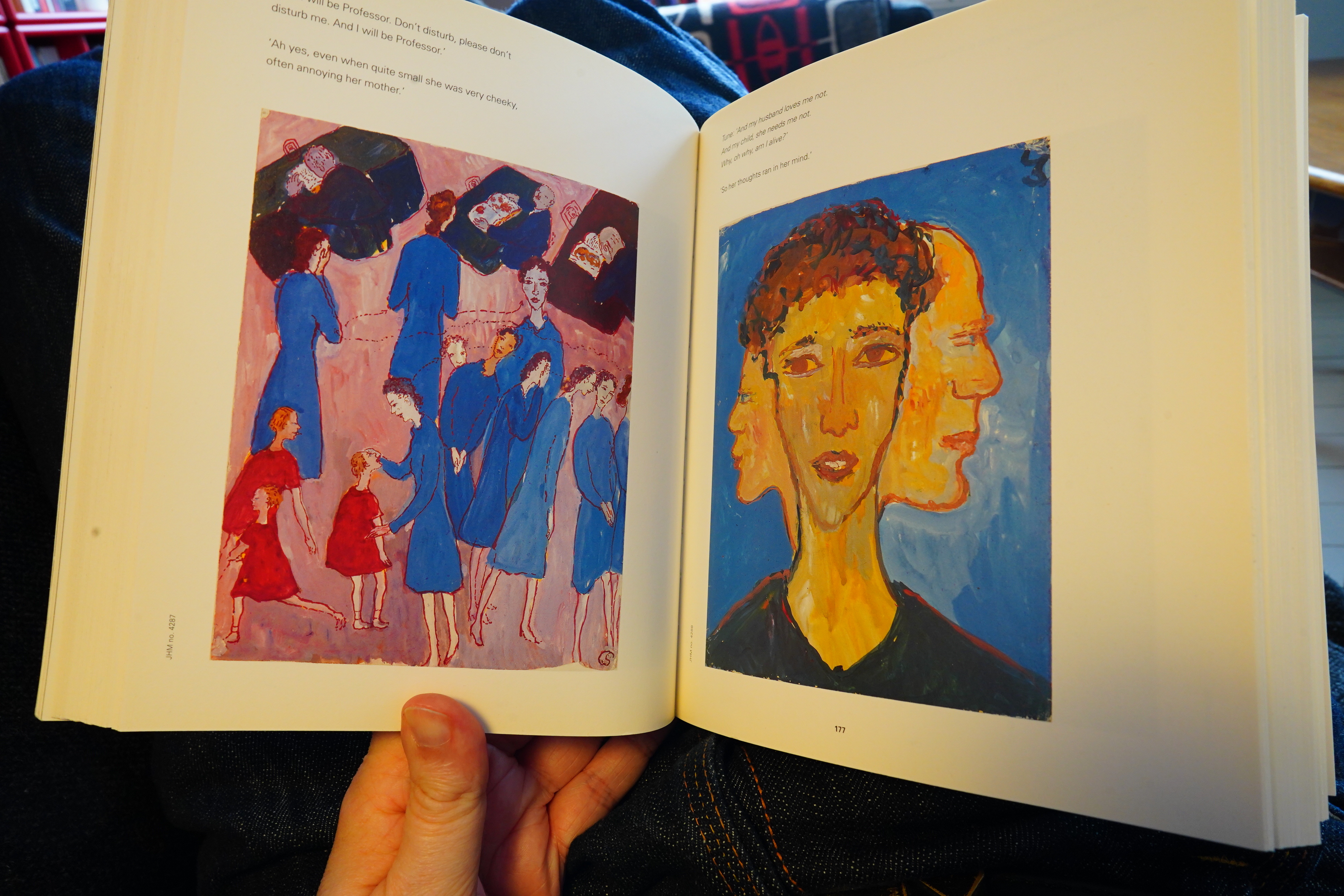
There’s also a lot of more straightforward pages like this…
Anyway, it’s great, and I’m just mentioning this book here to make you jealous.
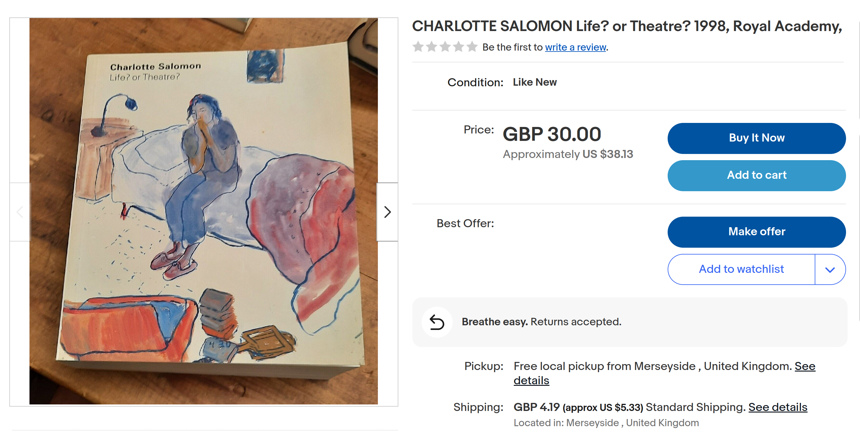
But if you troll ebay for a couple of weeks, copies pop up and are puzzlingly cheap.
Anyway! Comics reading time!
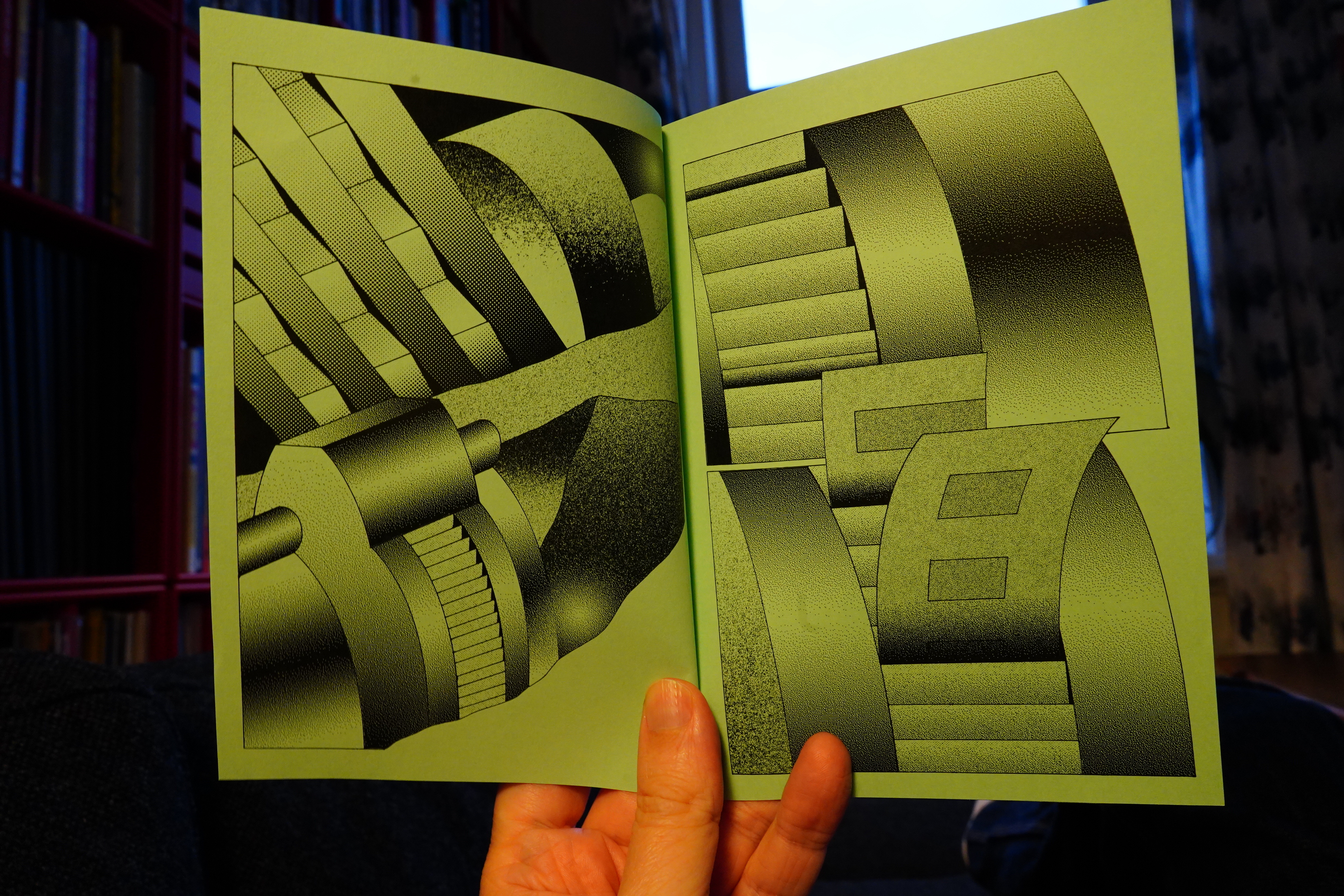
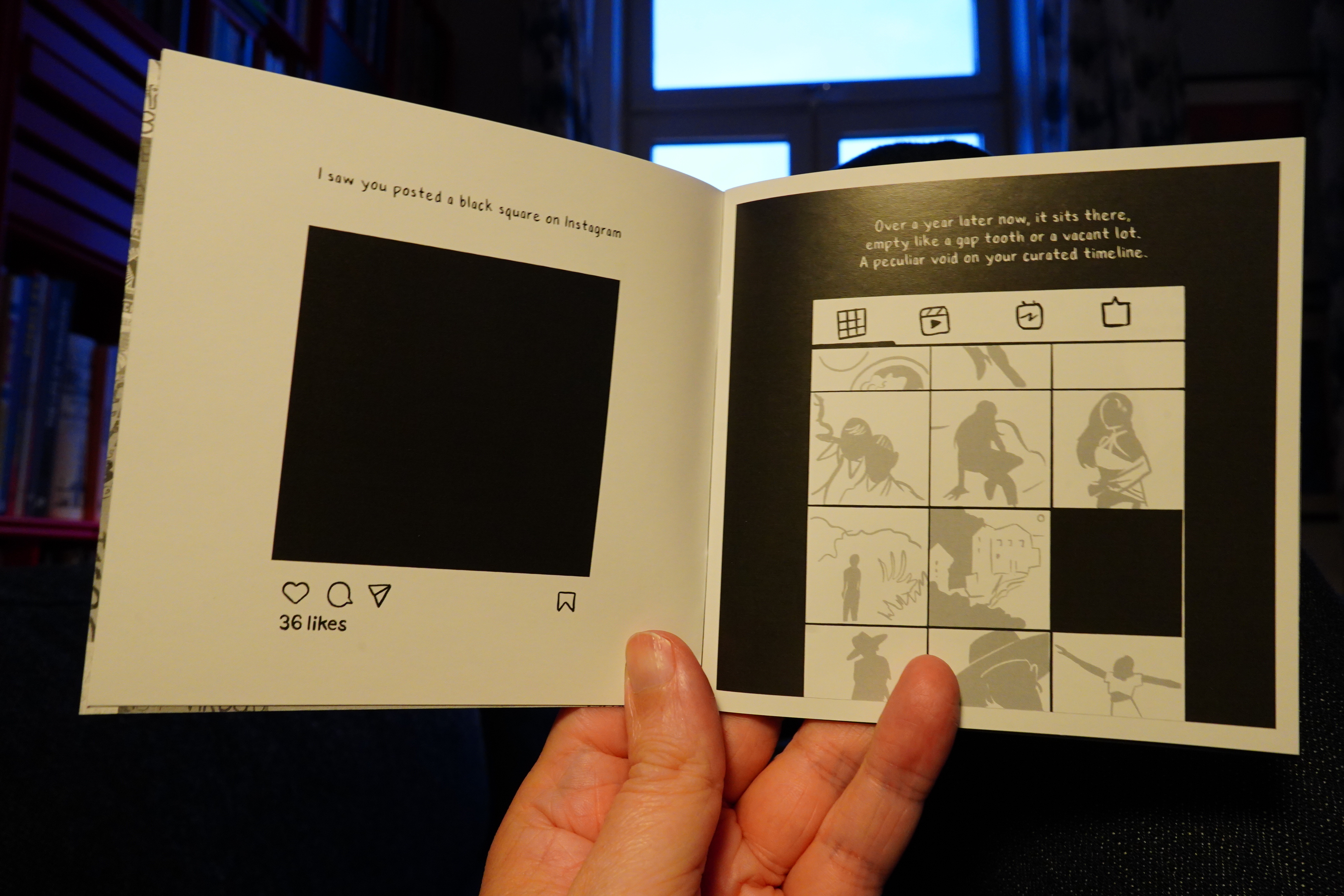
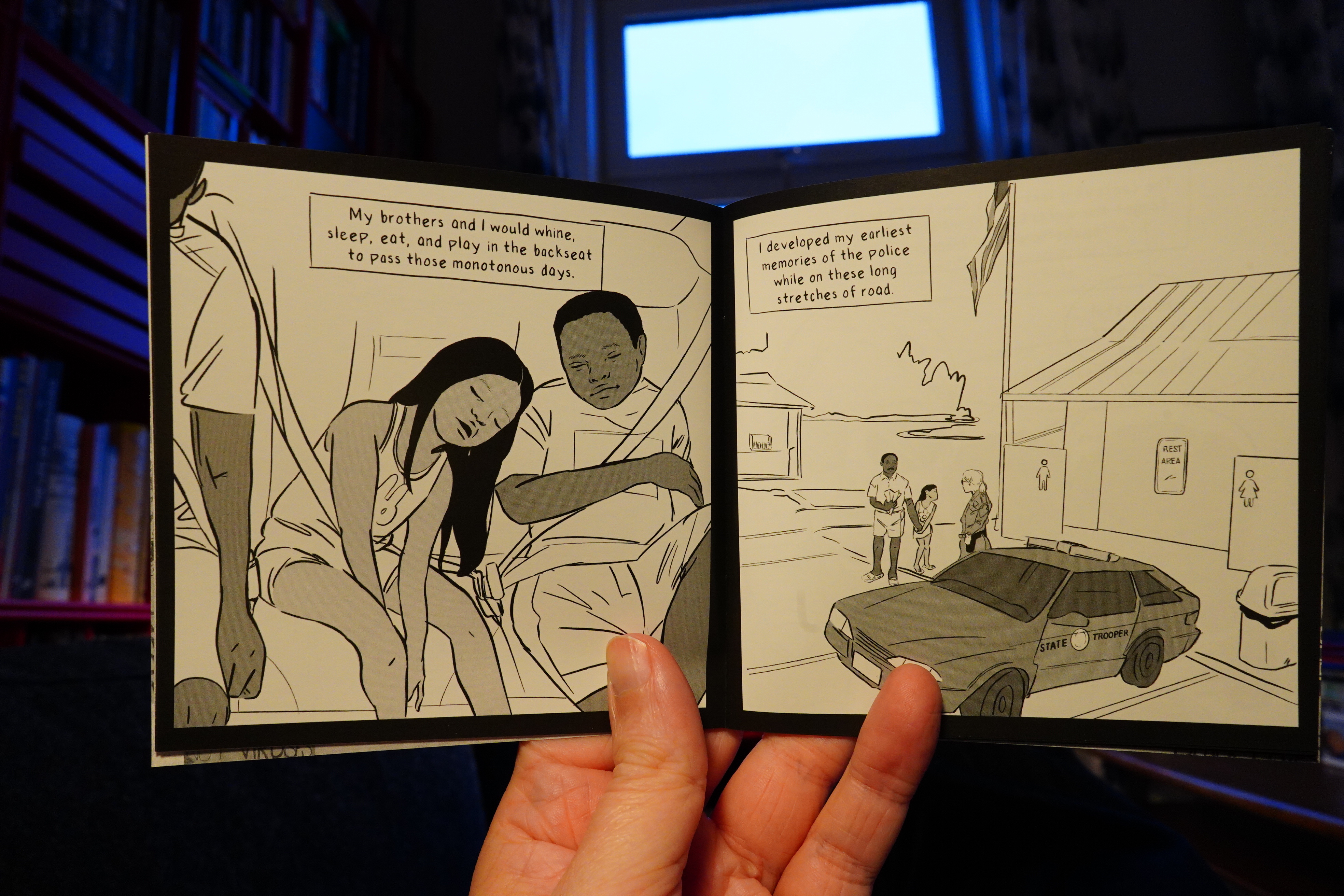
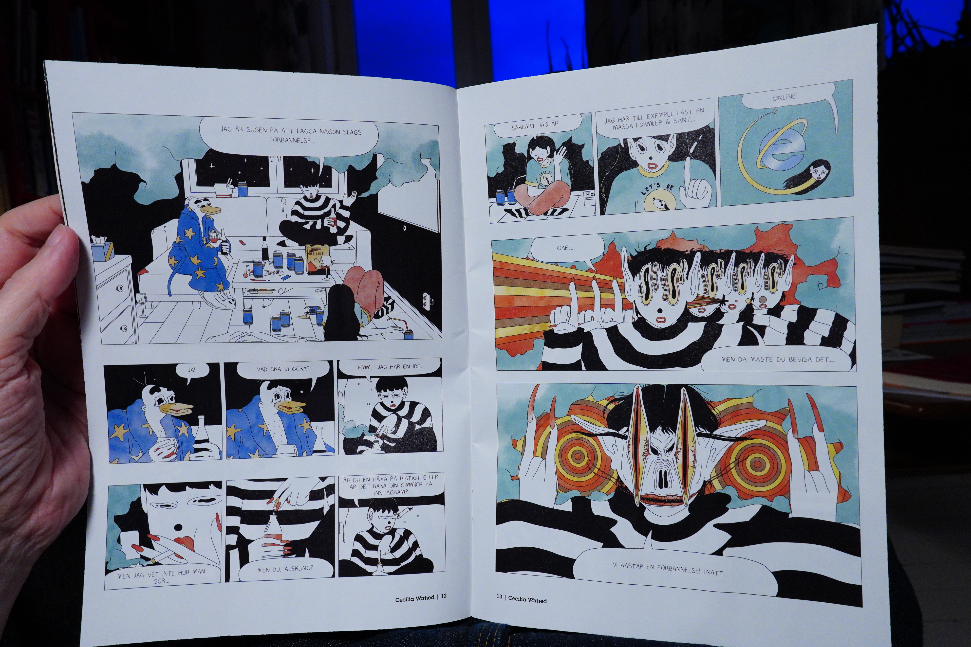
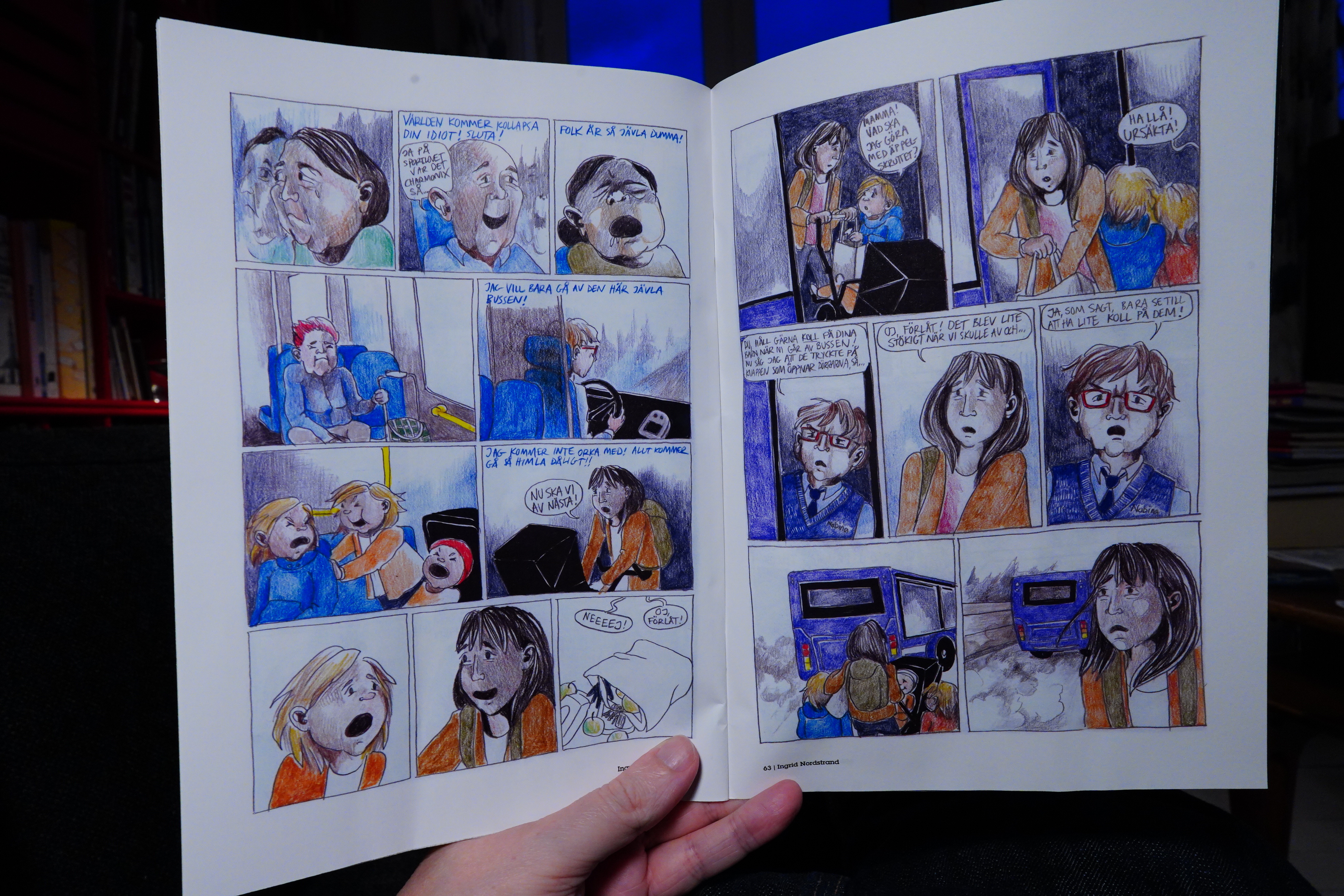
| Various: Mute Tonal Evidence 2022 |  |
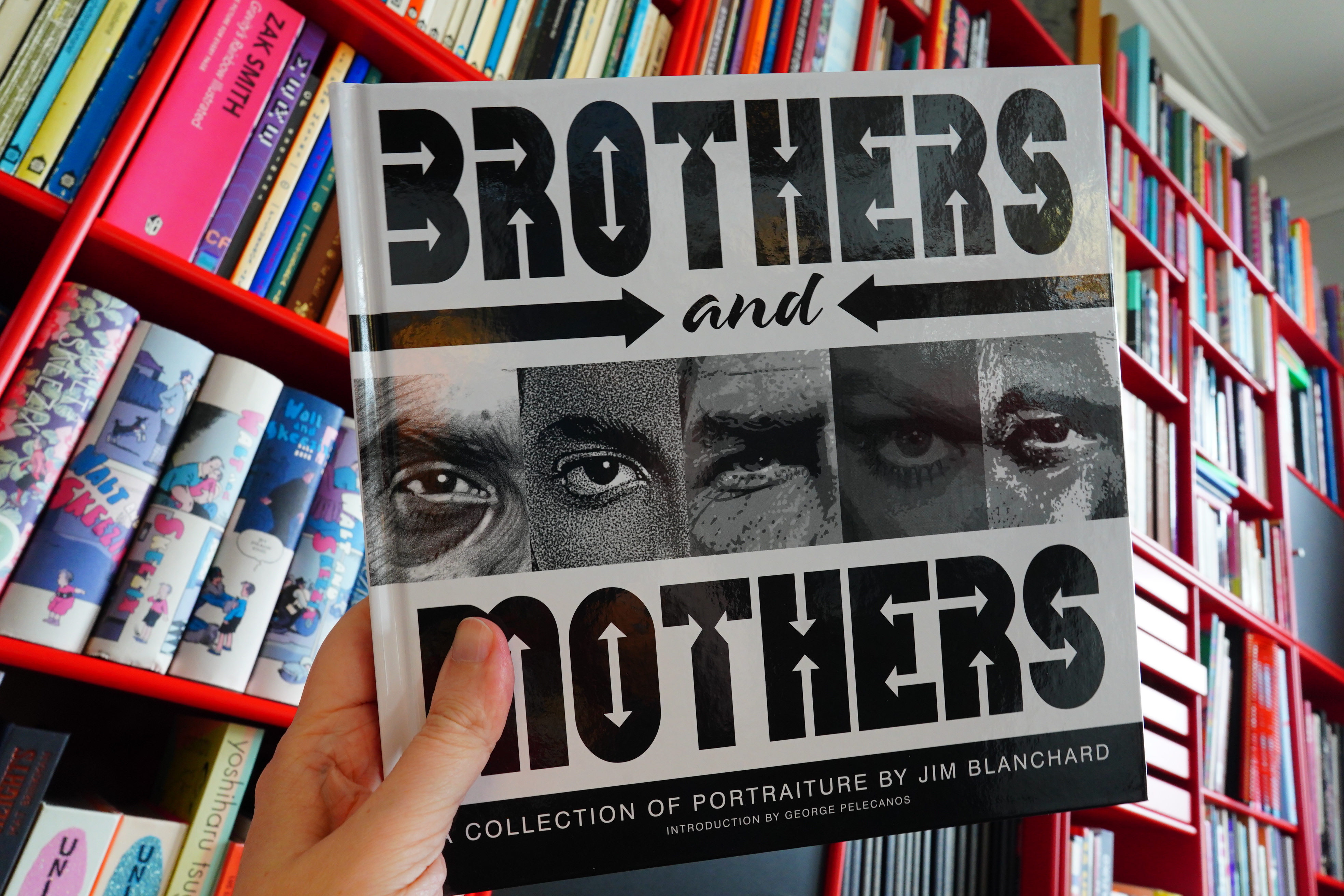
14:32: Brothers and Mothers by Jim Blanchard (Fantagraphics)
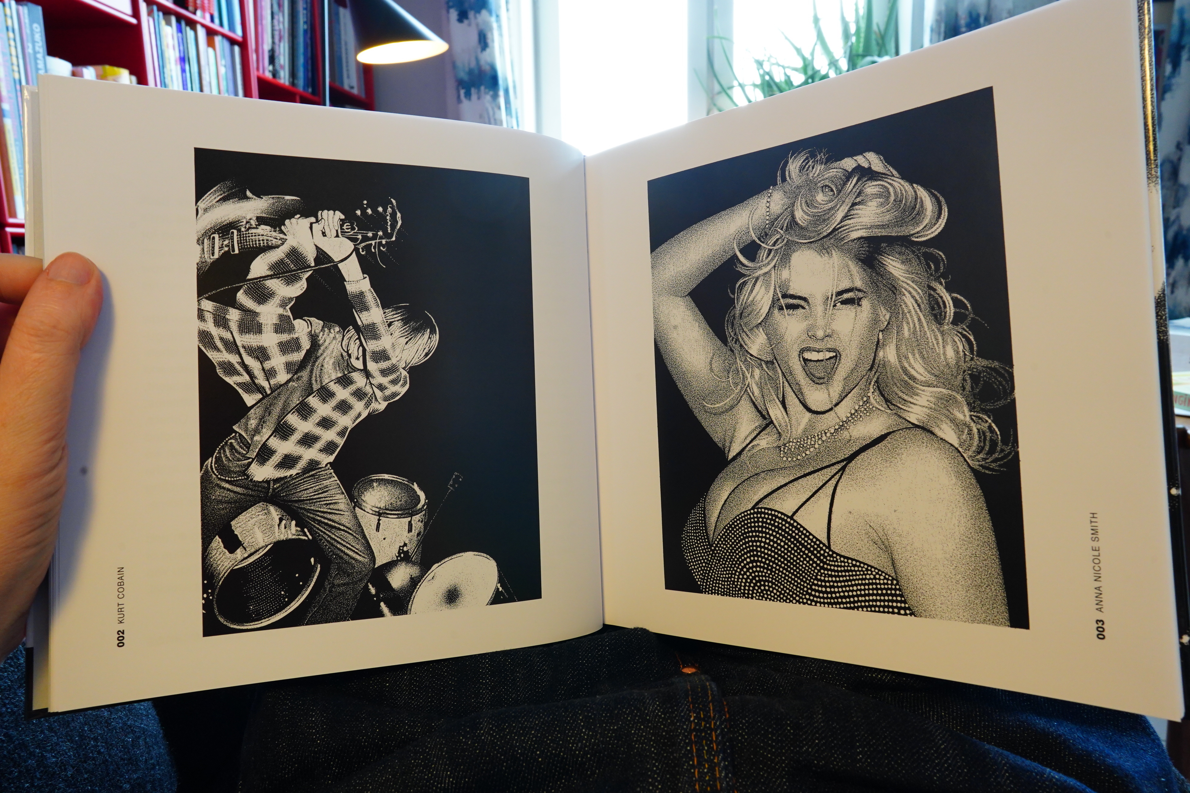
Oh, this isn’t a comic book, it’s a collection of illustrations. (I guess the subtitle on the cover gave the game away.)
The illustrations are extremely photo-referenced… I man, it’s impressive, but when illustrations look this much like photos, what’s the point?
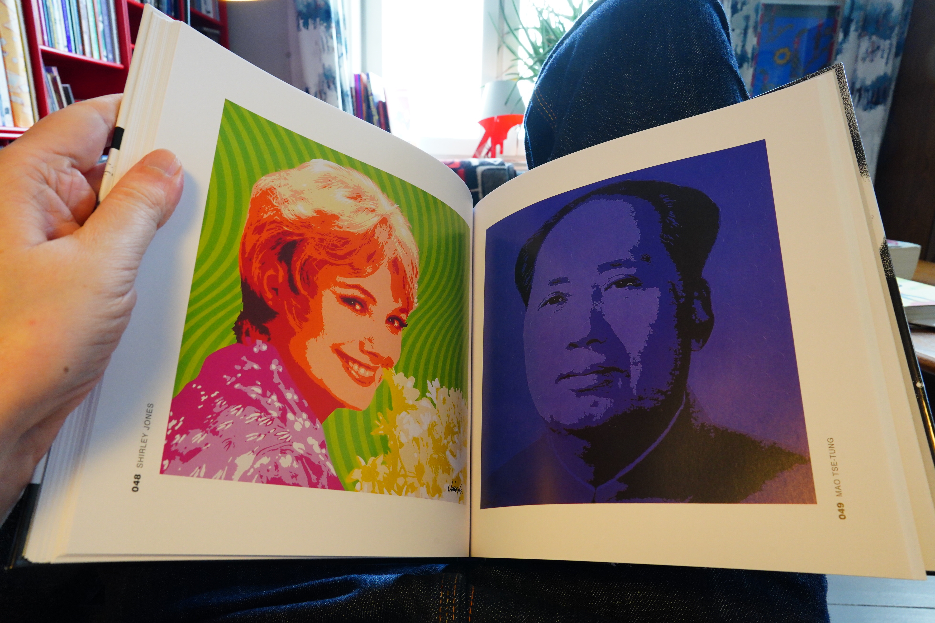
Oh! Are these even drawings? So many of these pages just look like they’ve been through some standard Photoshop filter.
Hm… the index in the back claims that these are acrylic paintings. How odd to spend time making something that’s indistinguishable from a Photoshop filter of stock photos.
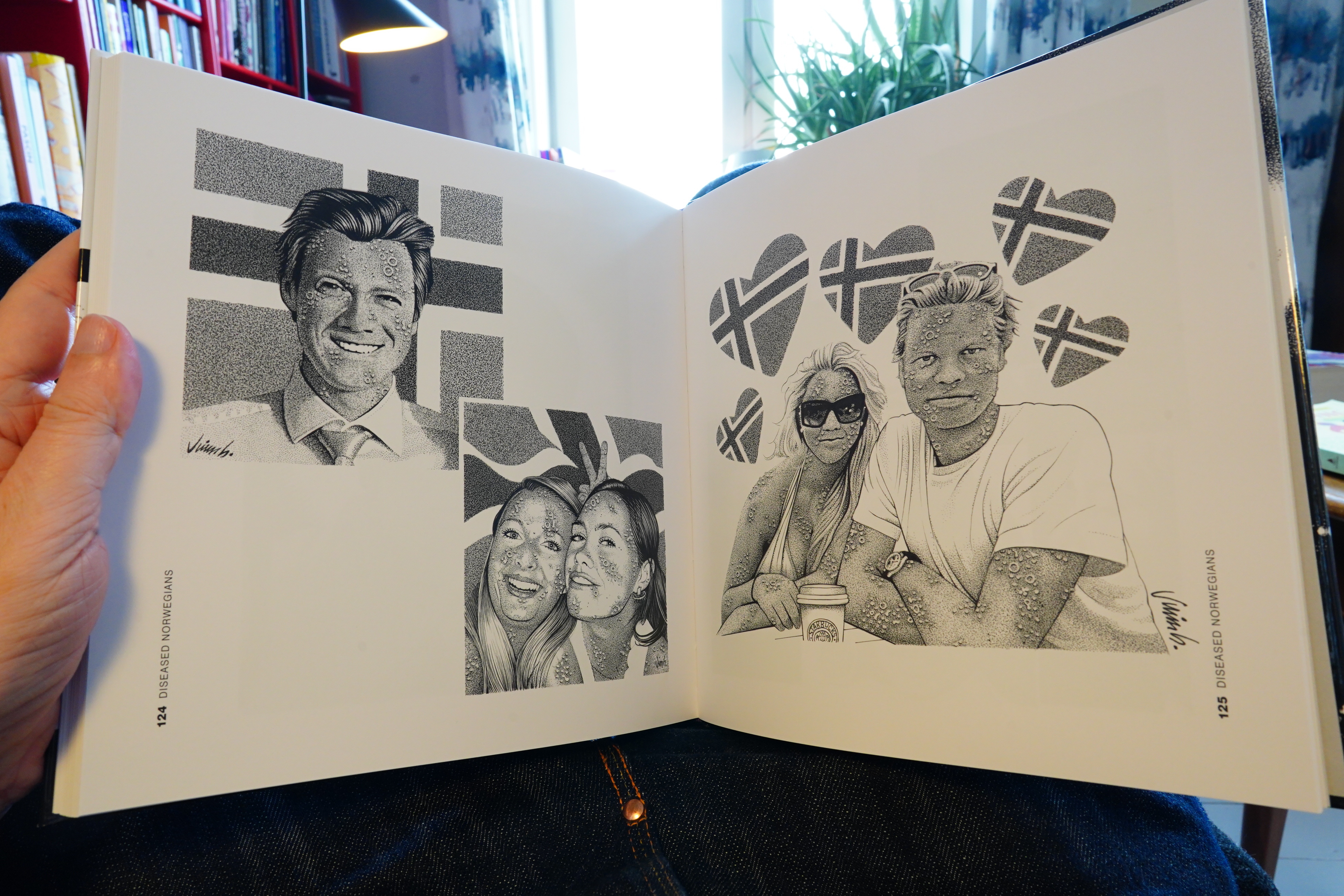
There are a handful of illustrations that are more imaginative, like these diseased Norwegians, but it’s book that seems to scream “but why?” I guess people want to have paintings on their walls that look like Photoshop? (Most of these “portraits” are commissions.)
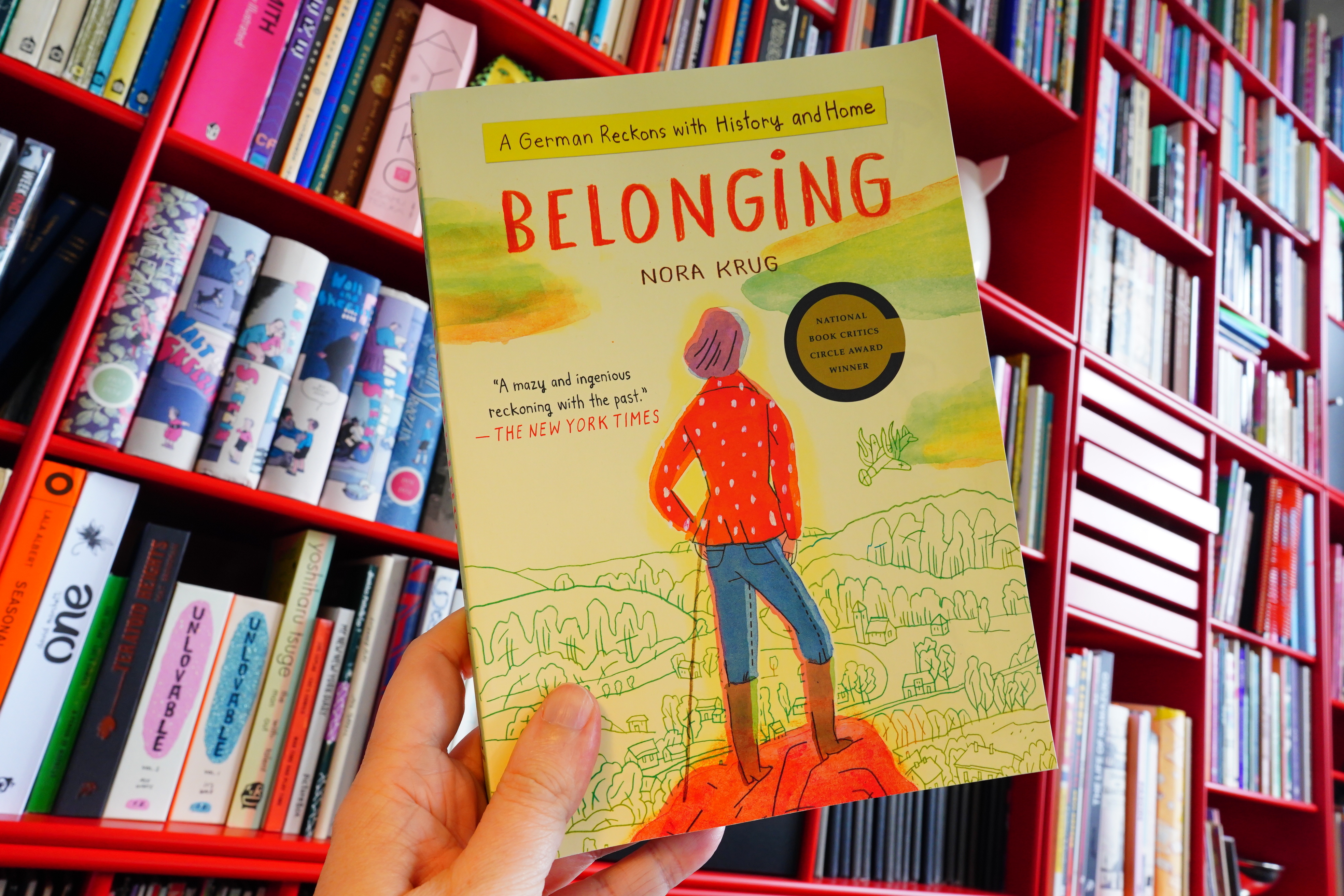
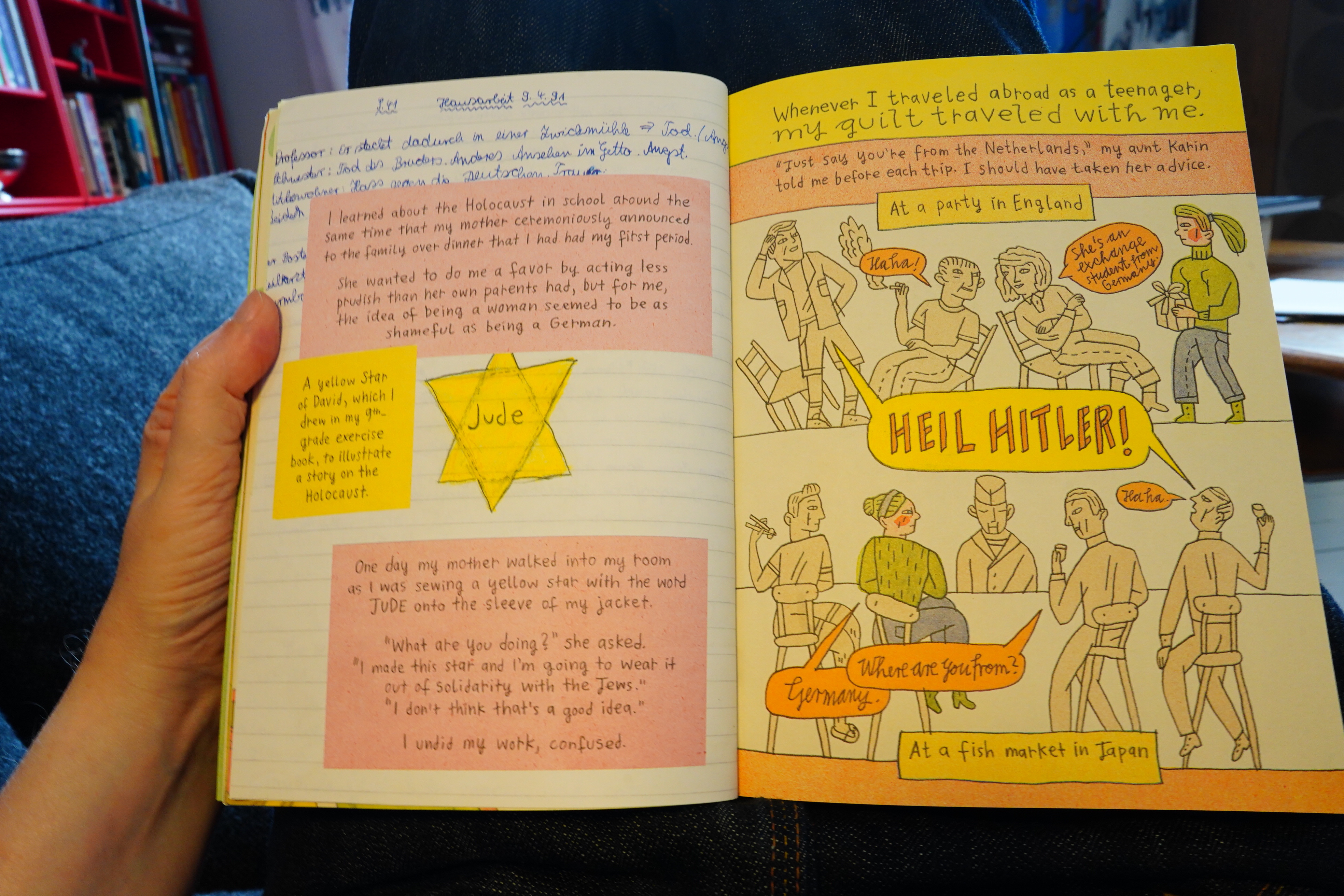
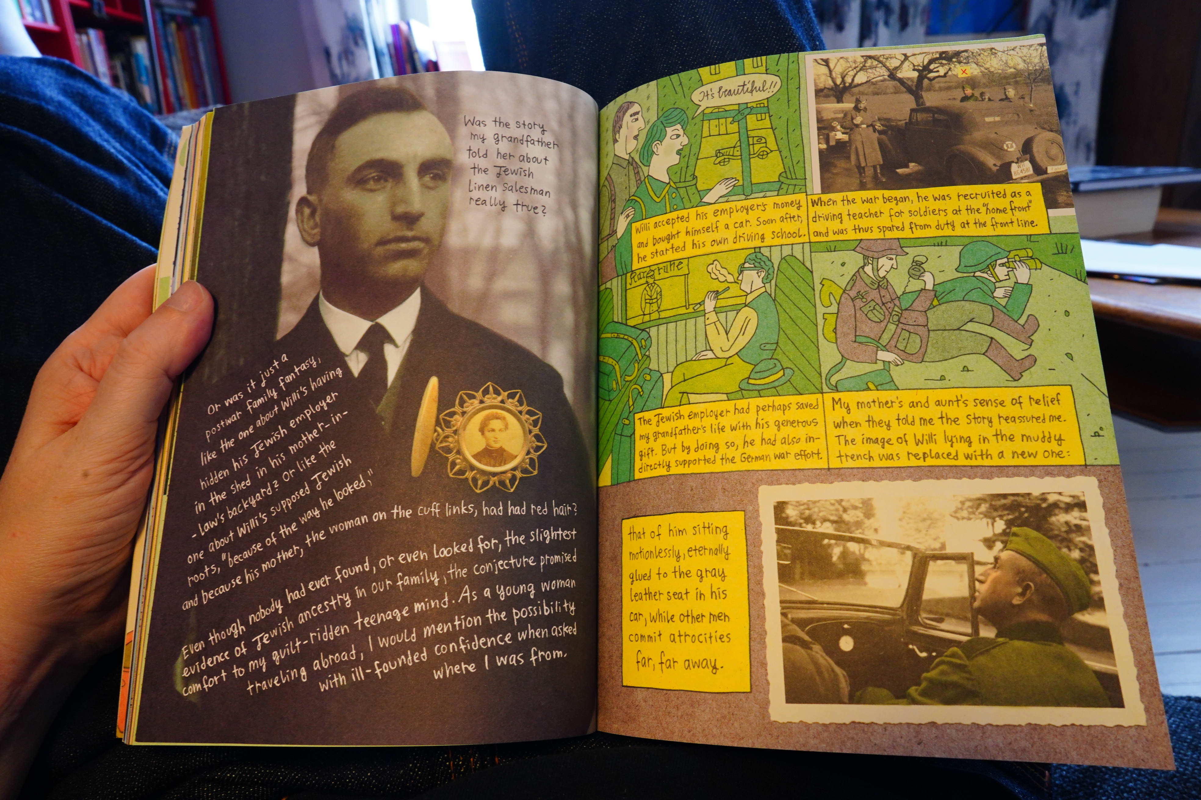
14:44: Belonging by Nora Krug (Scribner)
Krug got a lot of push back (i.e., one million one star reviews on Amazon) for her new book (which is a “both sides” thing about the war in Ukraine, where both sides are represented by Russians, apparently). And somebody commented “yeah, and Heimat (her previous book) sucks too”, so I got curious and bought it.
Oh, this isn’t a comic book either. Is this going to be the first all-non-comics Comics Daze ever!? Read on and find out!
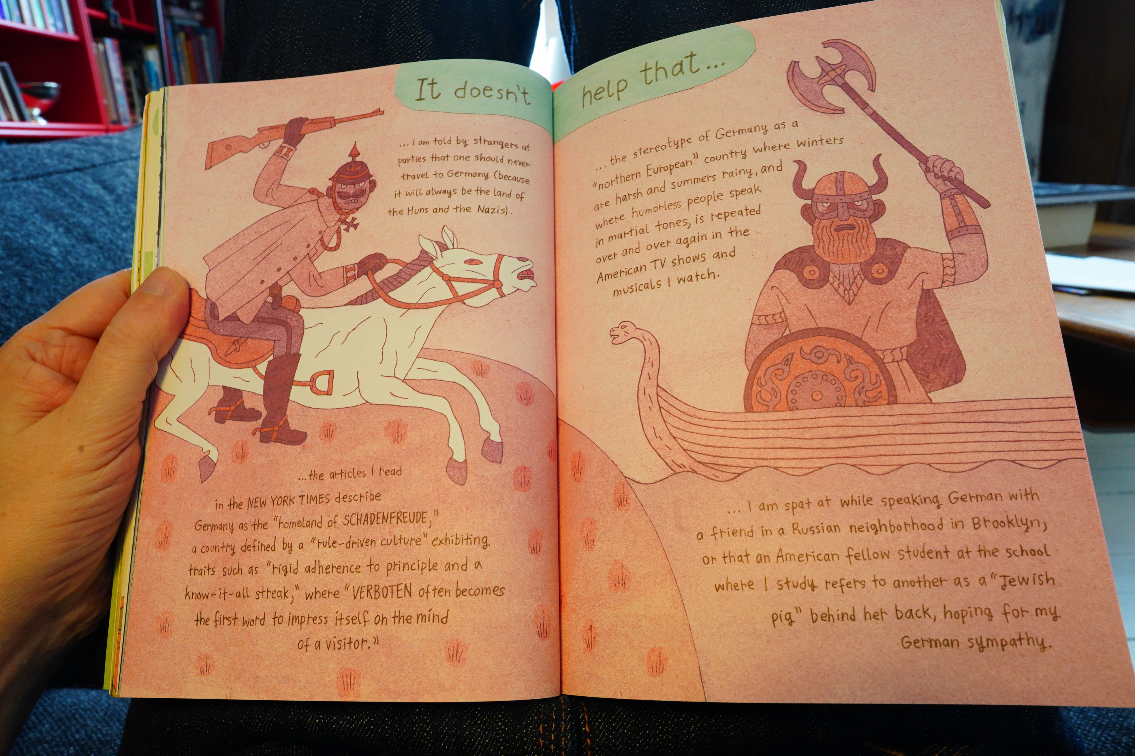
Well, I can see why people would find this book pretty offputting. It’s about Krug mulling over her ancestry, and what it means to be German and all of that. And an uncharitable reading of this would be that she compares her experiences with the racist horrors of Hitler Germany, but she’s not. It’s a very difficult thing to write about.
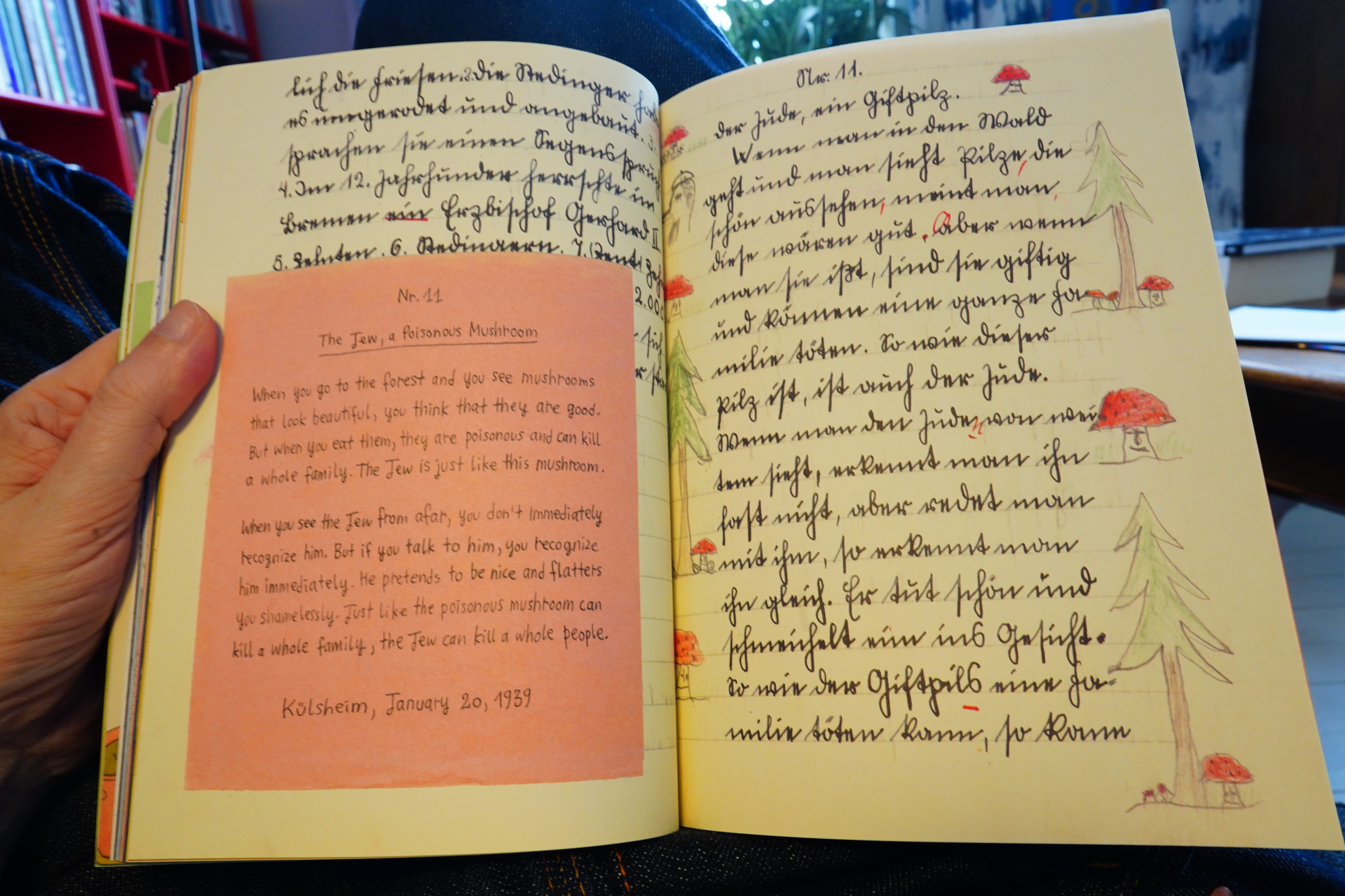
It’s a chilling book — like this school assignment she finds (written by her 12 year old uncle in 1938).
Oops! I gotta run some errands; be right back.
| Can: Live Cuxhaven 1976 |  |
There are bits that are more comic bookey.
| Ursula Bogner: Recordings 1969-1988 |  |
Well… there are things about the book that annoys. It feels very calculated — the way she produces cliffhangers by doing stuff like “and then I got the documents” and then talks about different things for 50 pages before showing us the documents — it’s using storytelling tricks that feels cheap for a project like this. And the way it turns into a detective novel, rooting out mysteries, is a bit eh?
But it’s a pretty good book, and it uses the mix of illustration, found objects and text is engaging.
| Joni Mitchell: Archives: The Reprise Years (4) |  |
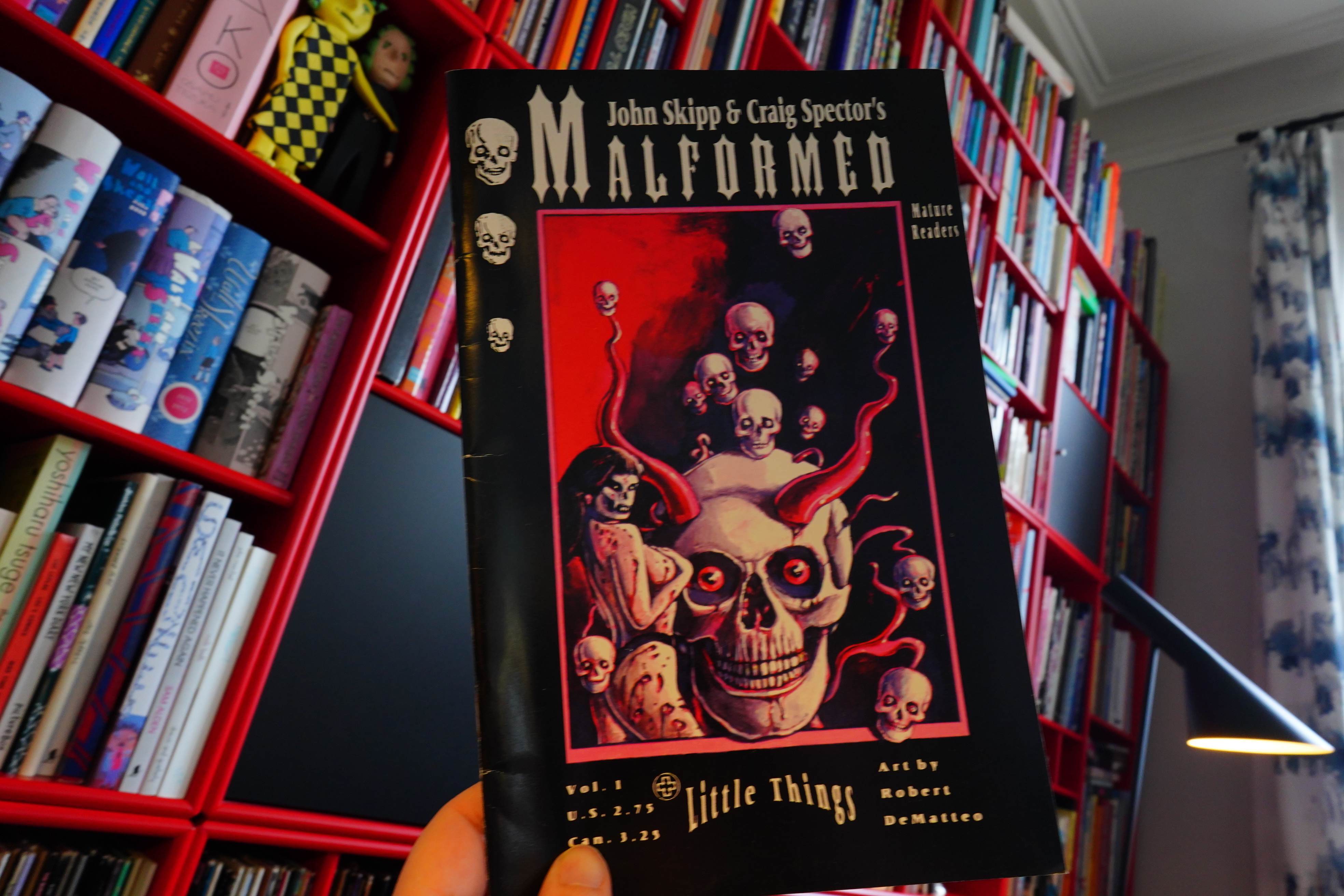
17:37: Malformed Little Things by John Skipp, Craig Spector and Robert DeMatteo (Black Eyed Books)
I’m contemplating doing a blog series about Black Eye Books… and I bought this by mistake. I did think the cover design looked very odd for a Black Eye book, but whatevs.
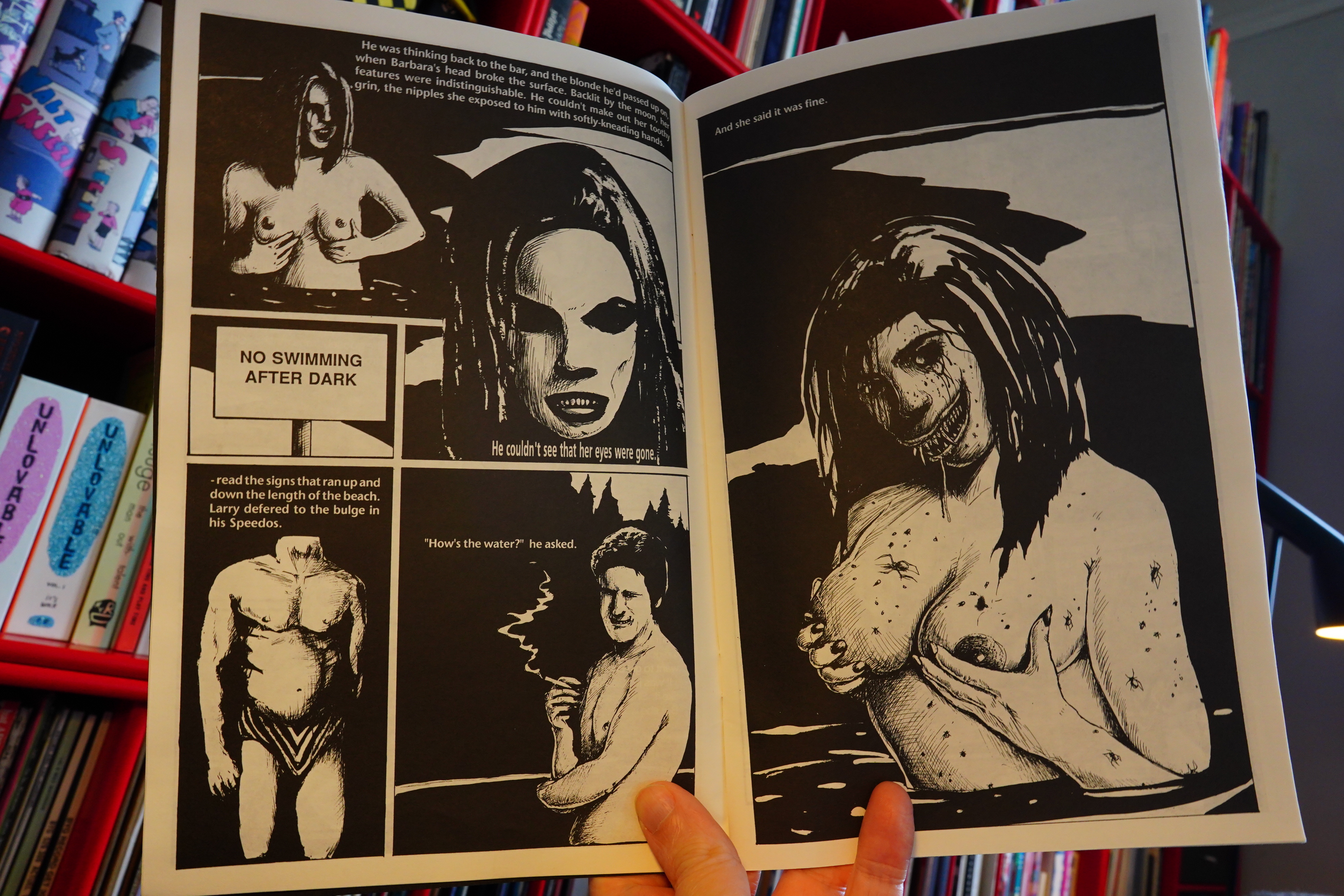
This is quite horrific horror, and the amateurishness of it all kinda makes it even more horrible.
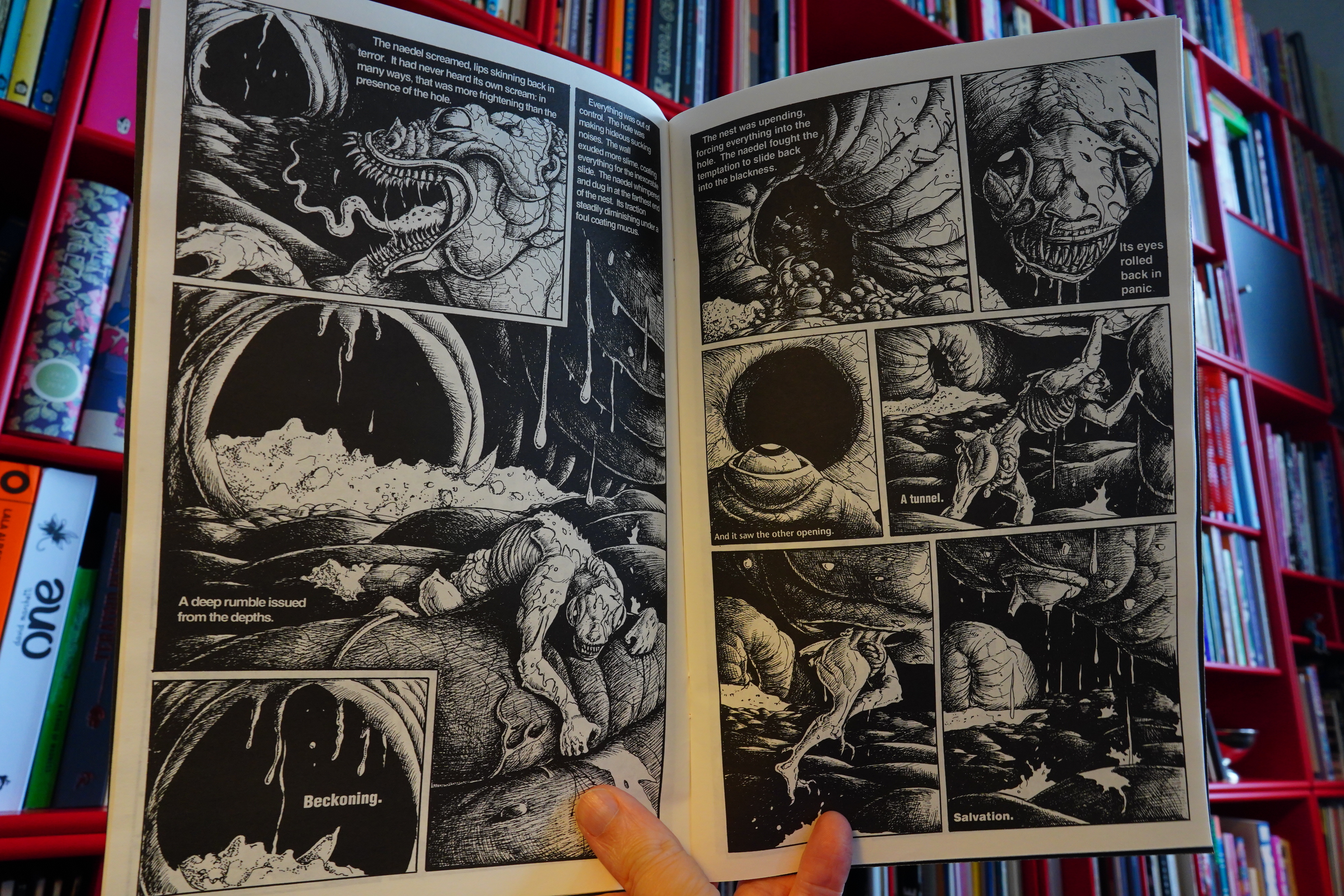
Three quite inventive little stories, but really grisly. (I’m not snapping any of the more offensive pages to spare the tender sensibilities of my reader.)
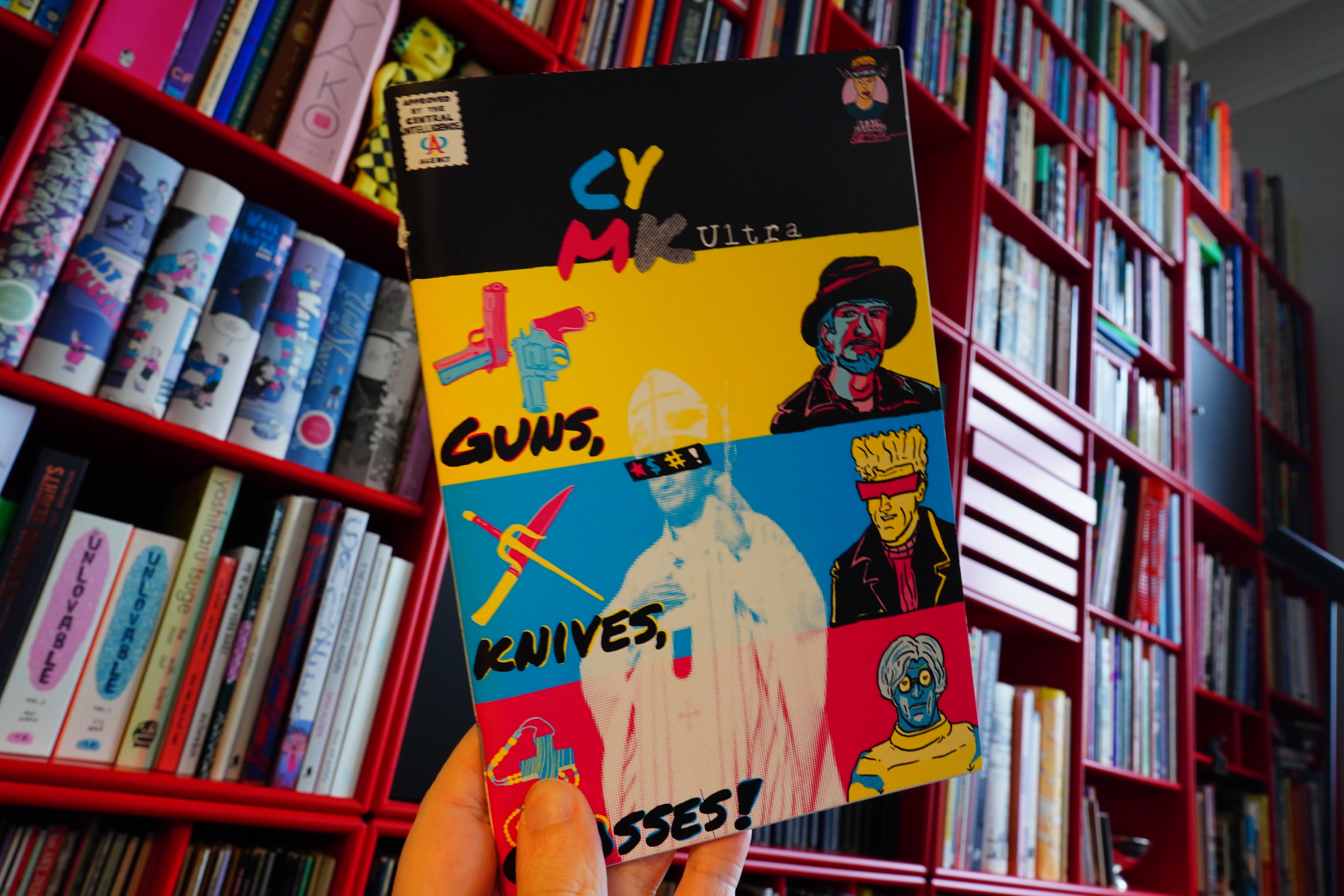
17:50: CYMK Ultra by Graham Millar (Brain Gramage Comix)
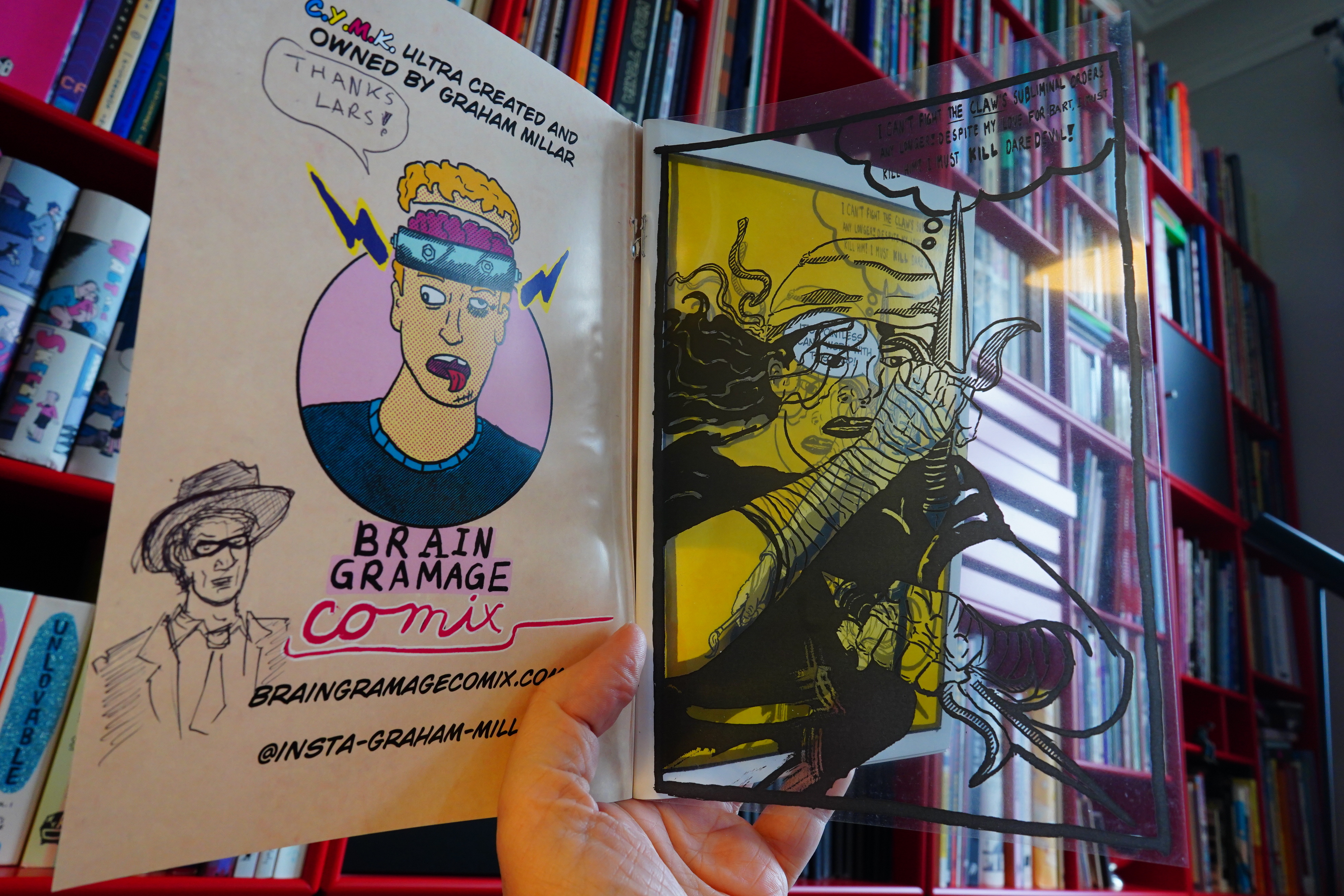
Ooh, this one has an acetate overlay thing…
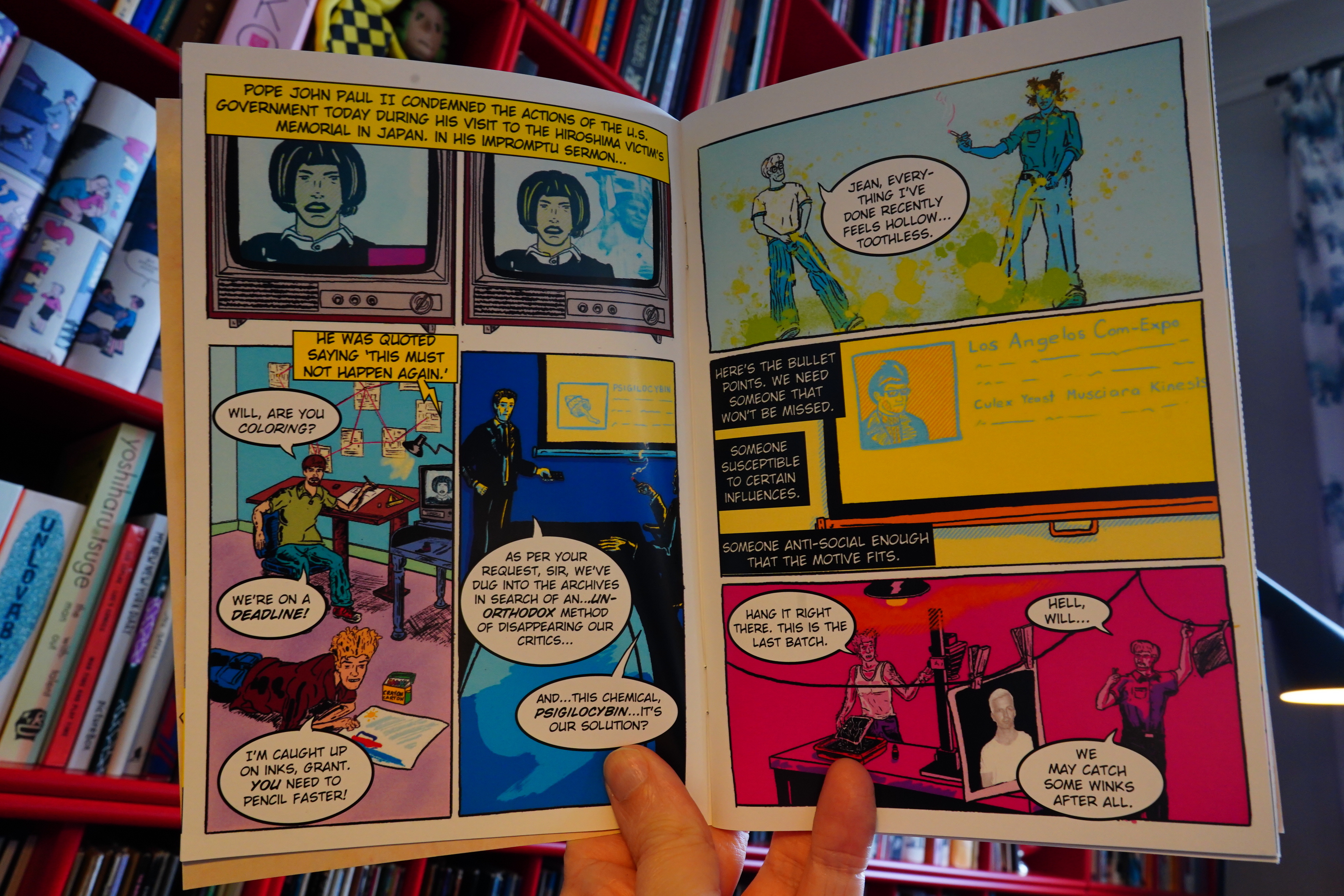
Anyway, this is a totally wild story about how Andy Warhol and Jim Steranko (I think) didn’t kill the pope. Or something.
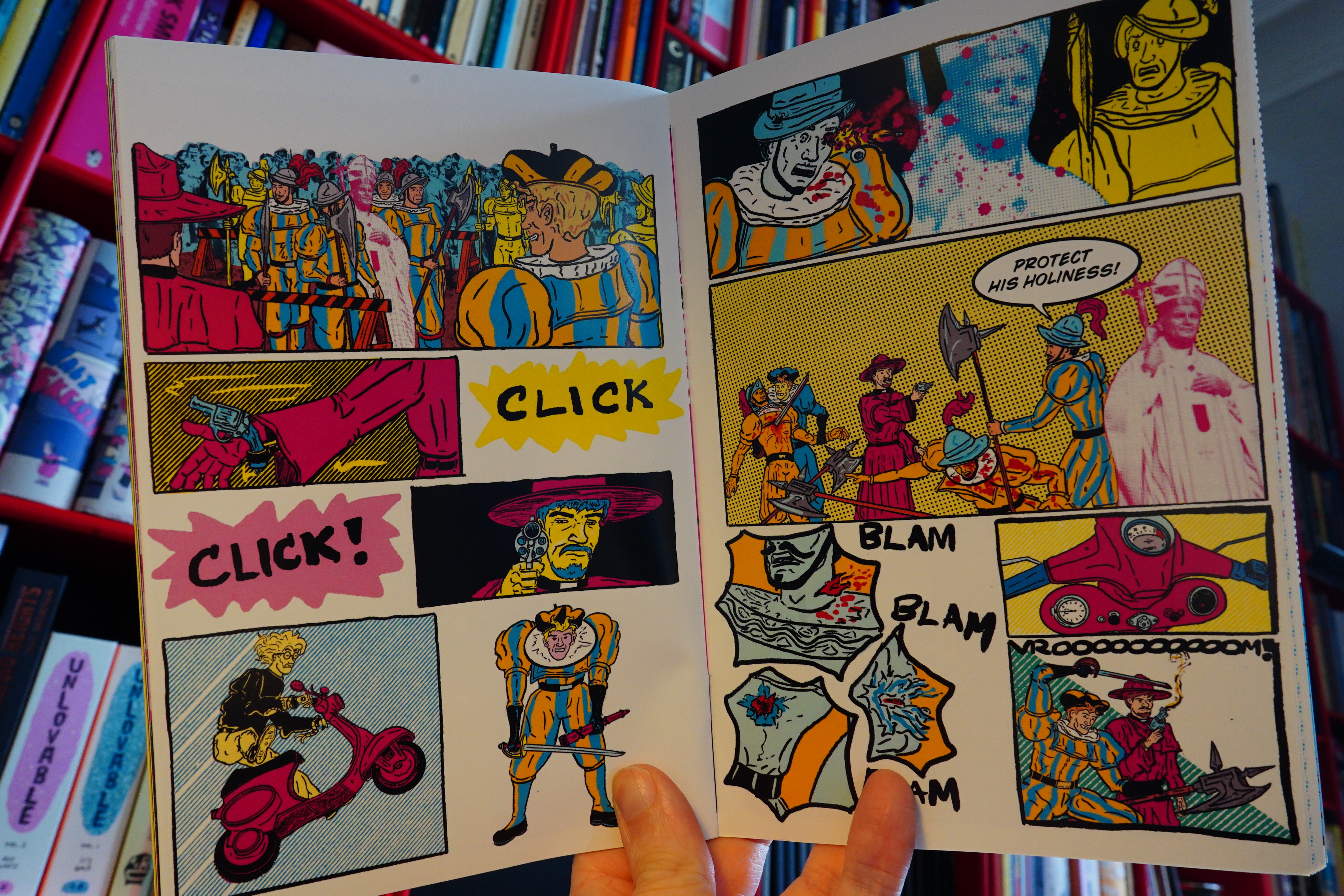
It’s great! Truly original. Get a copy here.
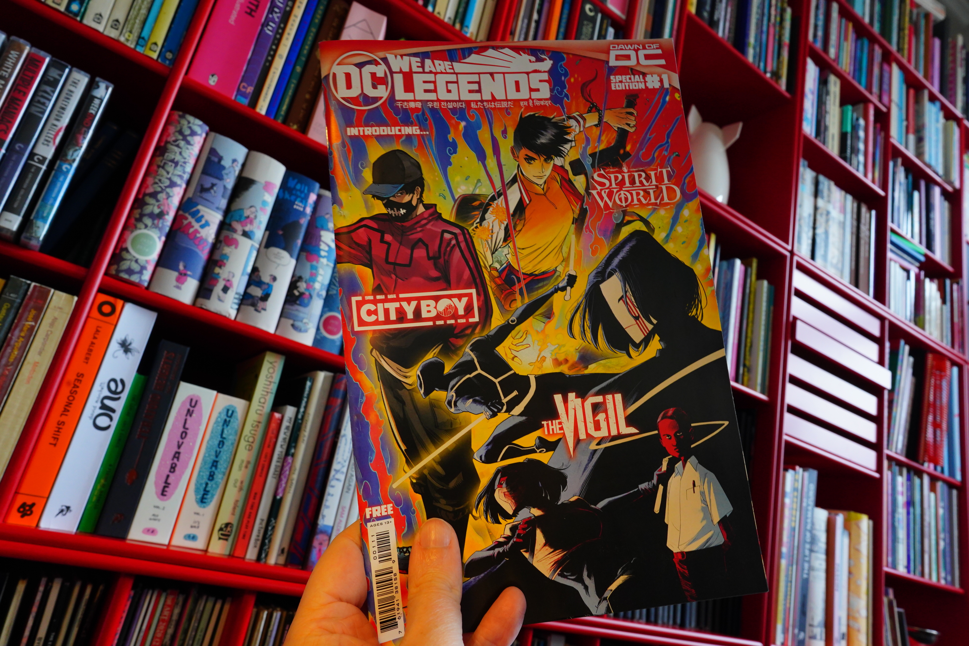
18:03: We Are Legends by Too Many People (DC Comics)
What’s this then? It was included in the last shipment from DCBS… so I guess it’s an ad?
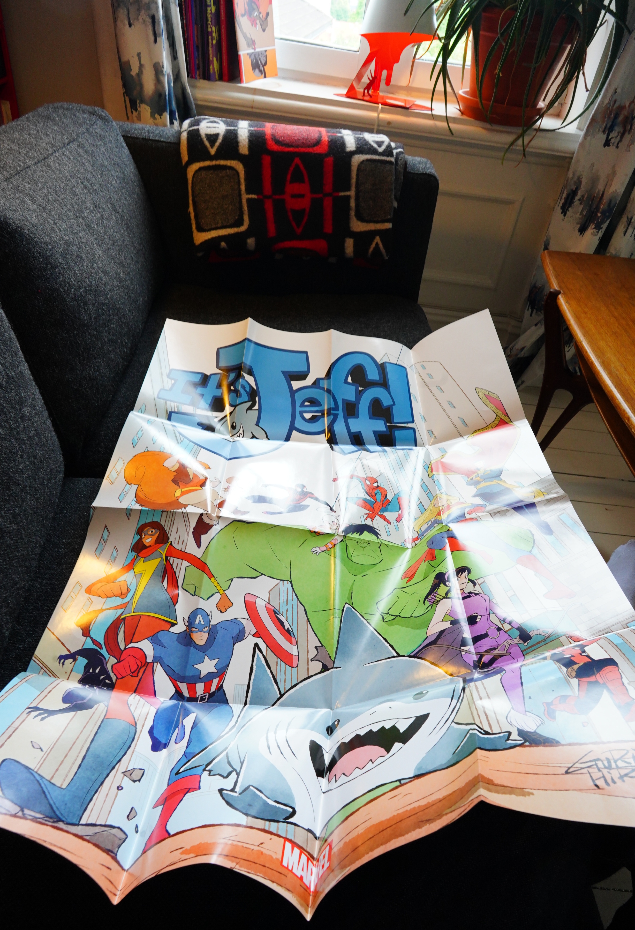
And a huge poster? But unrelated.
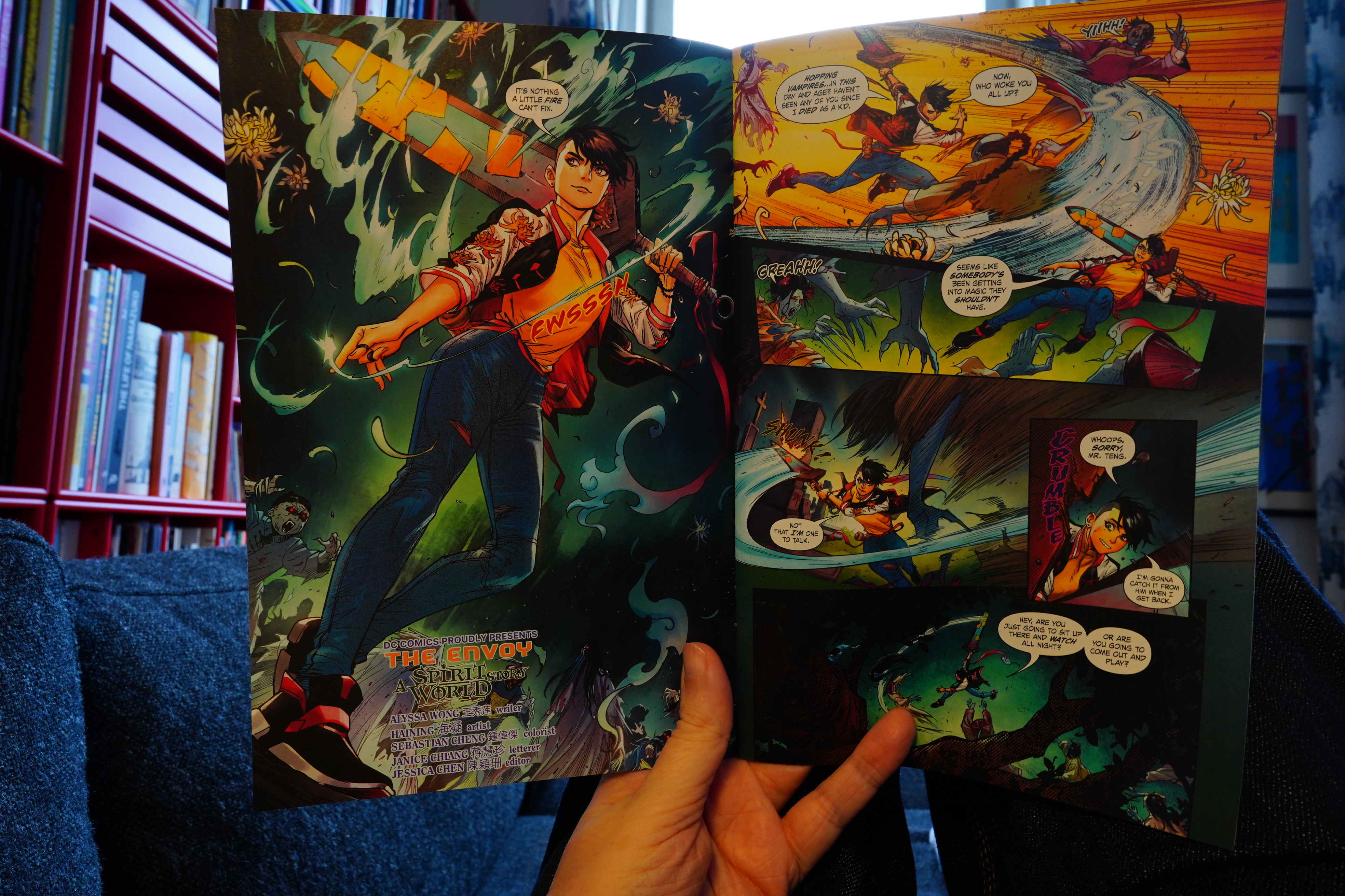
So we get three brief introductions to three new Asian super-heroes.
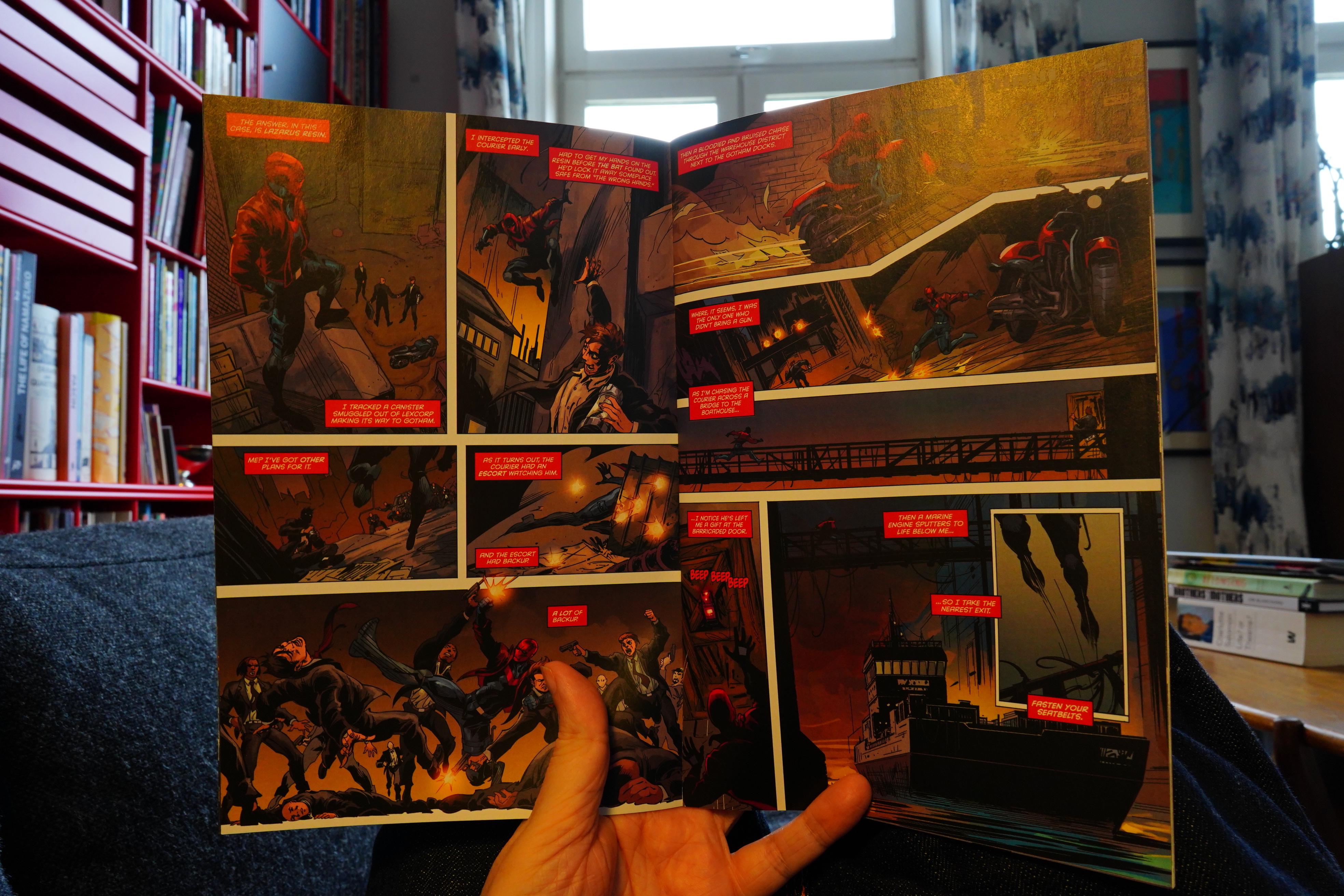
Doing a story in a handful of pages is a lost art to super-hero writers, but it’s not that bad. Greg Pak manages to almost have a proper plot going in his story, even.
| Gammelsæter & Marhaug: Higgs Boson |  |
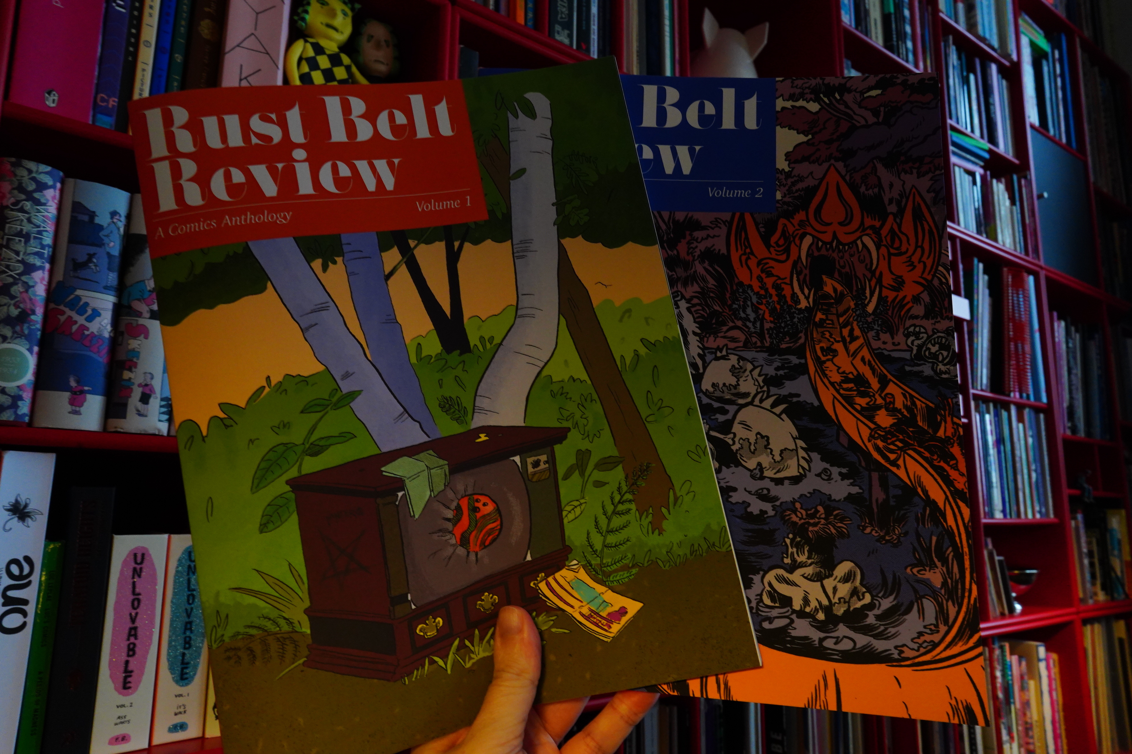
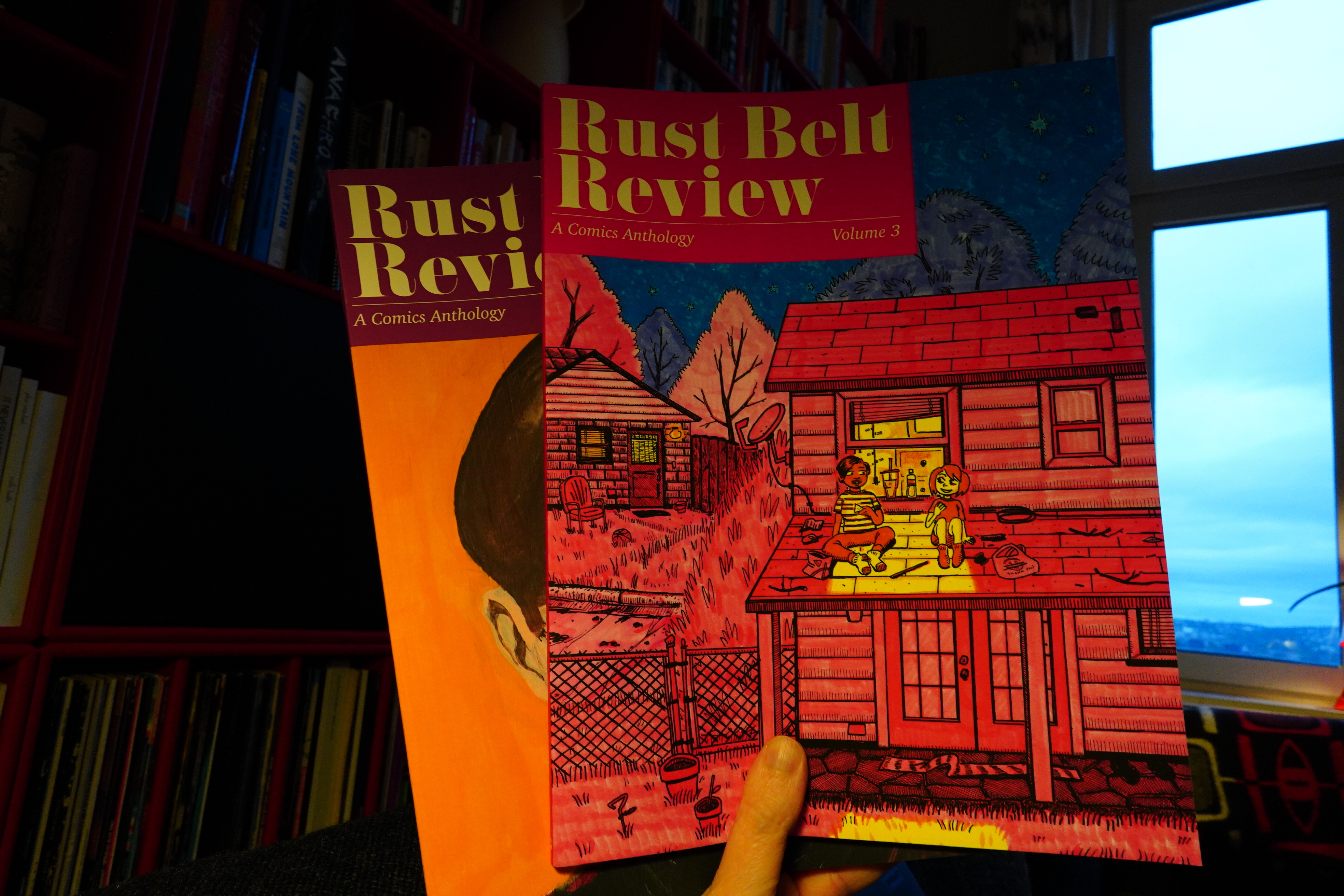
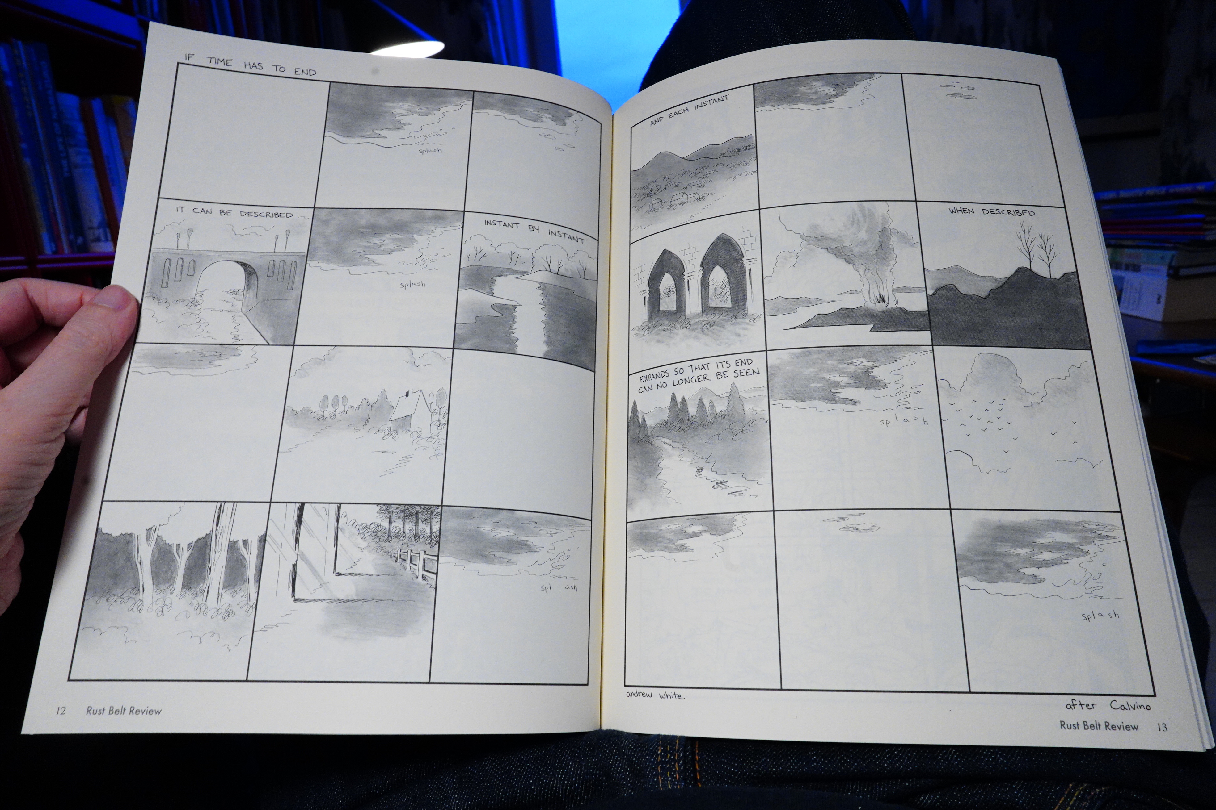
18:13: Rust Belt Review 1-2 edited by Sean Knickerbocker
I did some shopping here…
This is an oversized album magazine — unusual format. And they feel like print-on-demand books? But I guess they aren’t, because the fourth issue was sold out…
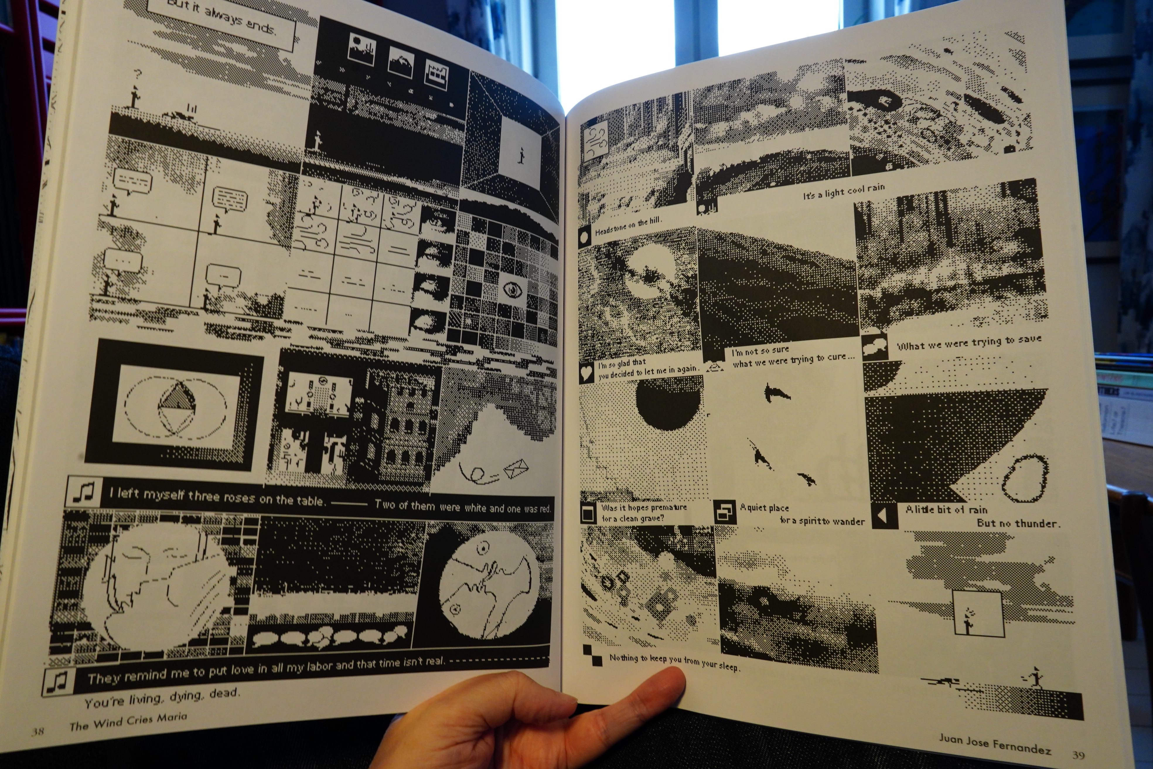
The contents are pretty varied, but I guess there’s a late-90s indie anthology vibe? The outstanding piece in the first issue is by Juan Jose Fernandez.
Unusually for these sorts of things, about half the pieces are continued stories.
It an attractive anthology, but not all the stories totally land.
| Andrew Pekler: Tristes Tropiques |  |
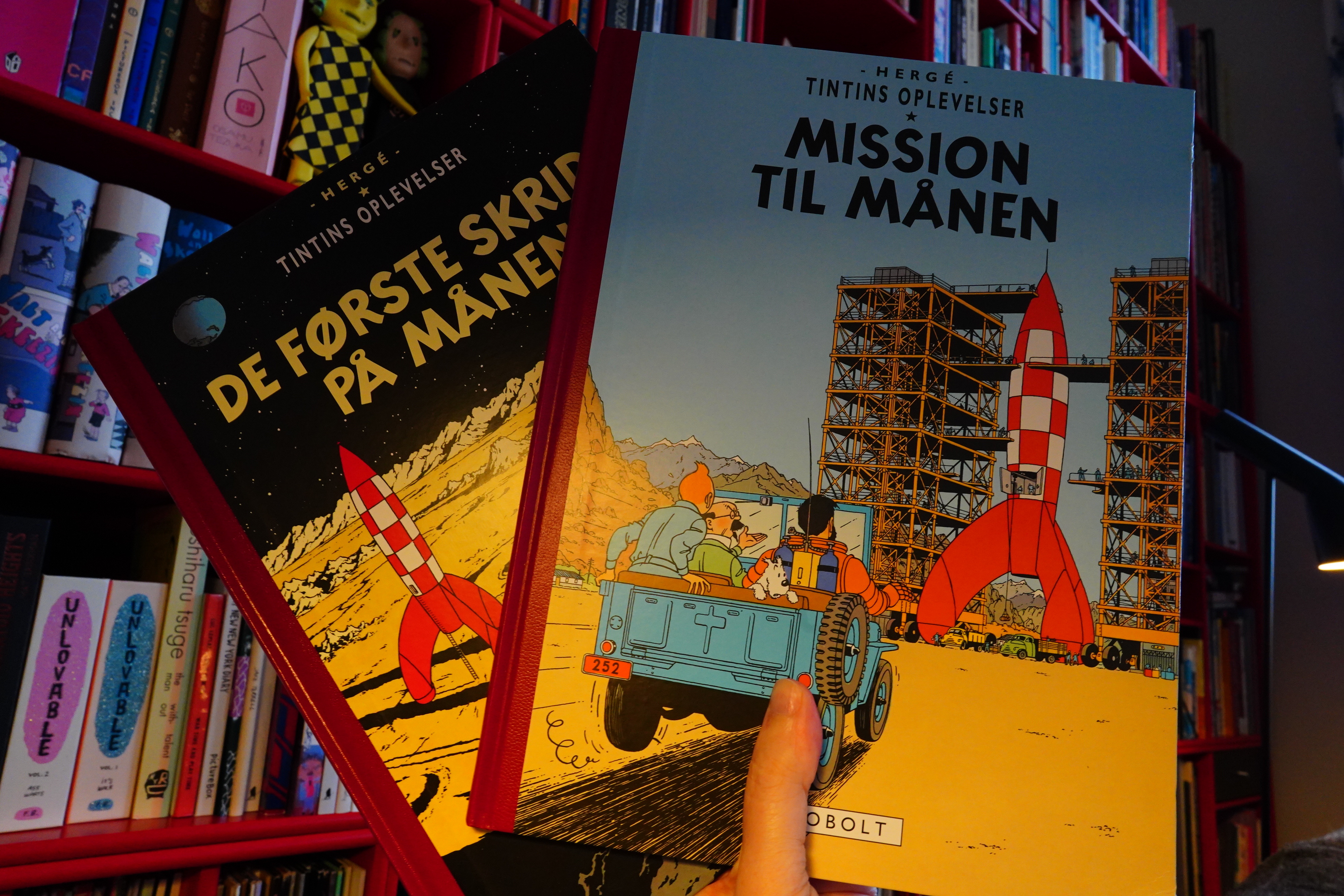
19:10: Tintin: Objectif Lune/On a marché sur la lune by Hergé (Cobolt)
Somebody wrote somewhere (I know, such precision) that the original colour album versions of Tintin were much better than the later revisions. (The first album versions were themselves revisions of the black and white serialisations in Le Petit Vingtième.) Conveniently enough, the Danes have re-released all these original album versions, and I bought them all a couple years back. And I’ve been slo-o-o-o-wly reading them, and… er… I don’t really notice much of a difference.
I mean, I haven’t compared those 40s facsimile editions to the newer 70s editions I grew up with, but at no point during reading these editions have I been going “oh, this is so much better! I am healed! I can walk again!” or whatever the reaction is supposed to be.
But they are handsome albums that feel great, and only marred by computer lettering.
I’ve now reached the 50s, though, and these albums were never revised, so now I’m basically just re-reading albums I’ve read many, many times before in my childhood (and later, too).
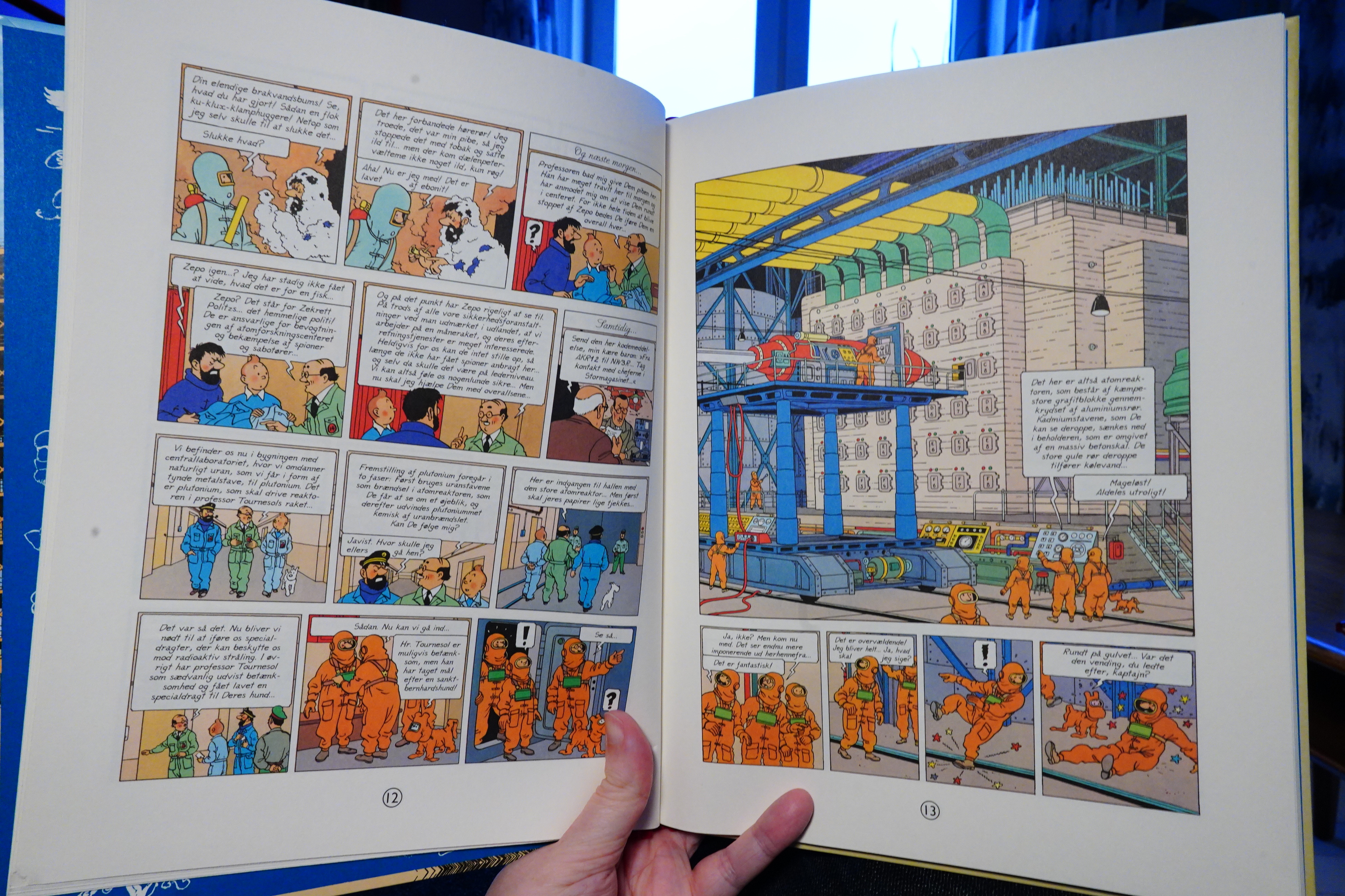
I think this is probably considered to be the best of the Tintin albums?
| repository: Mory Kante |  |
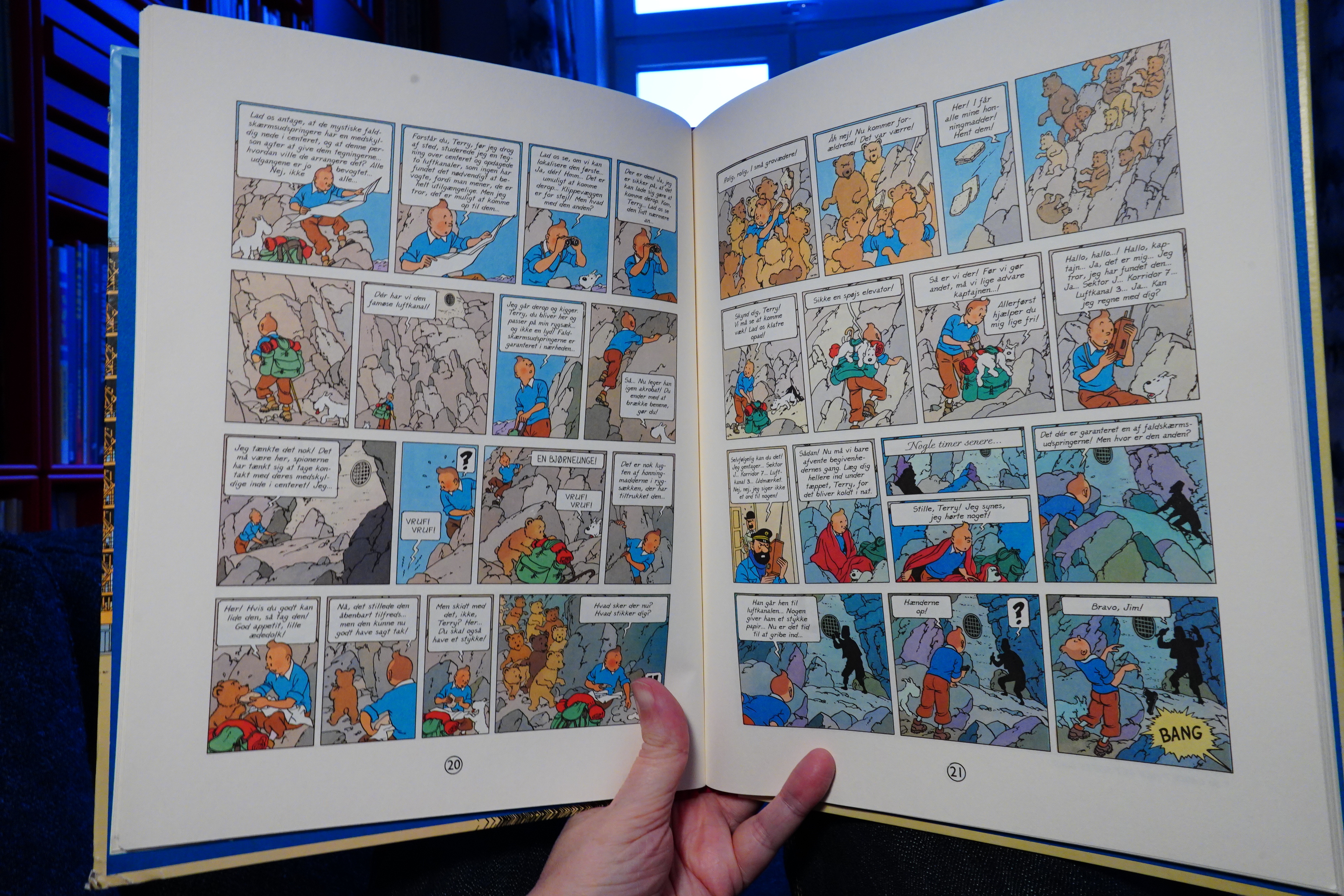
And they are terrific. The earliest Tintin albums didn’t really have much of a plot — it was just a bunch of slapstick stuff until Hergé ran out of pages.
| Cornelius: Fantasma (Remastered) |  |
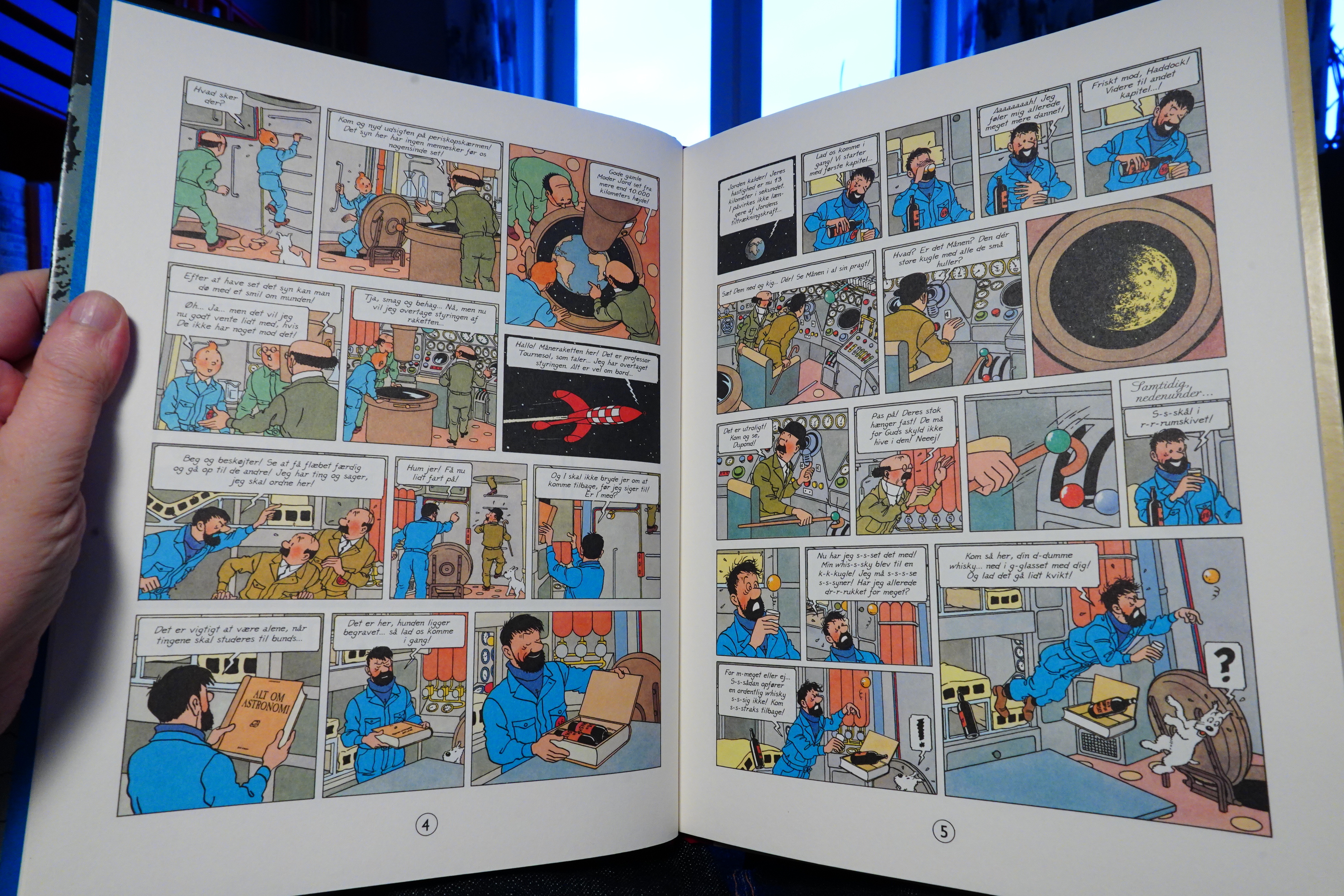
These two albums are quite didactic, and explain everything that’s going on in a very appealing way.
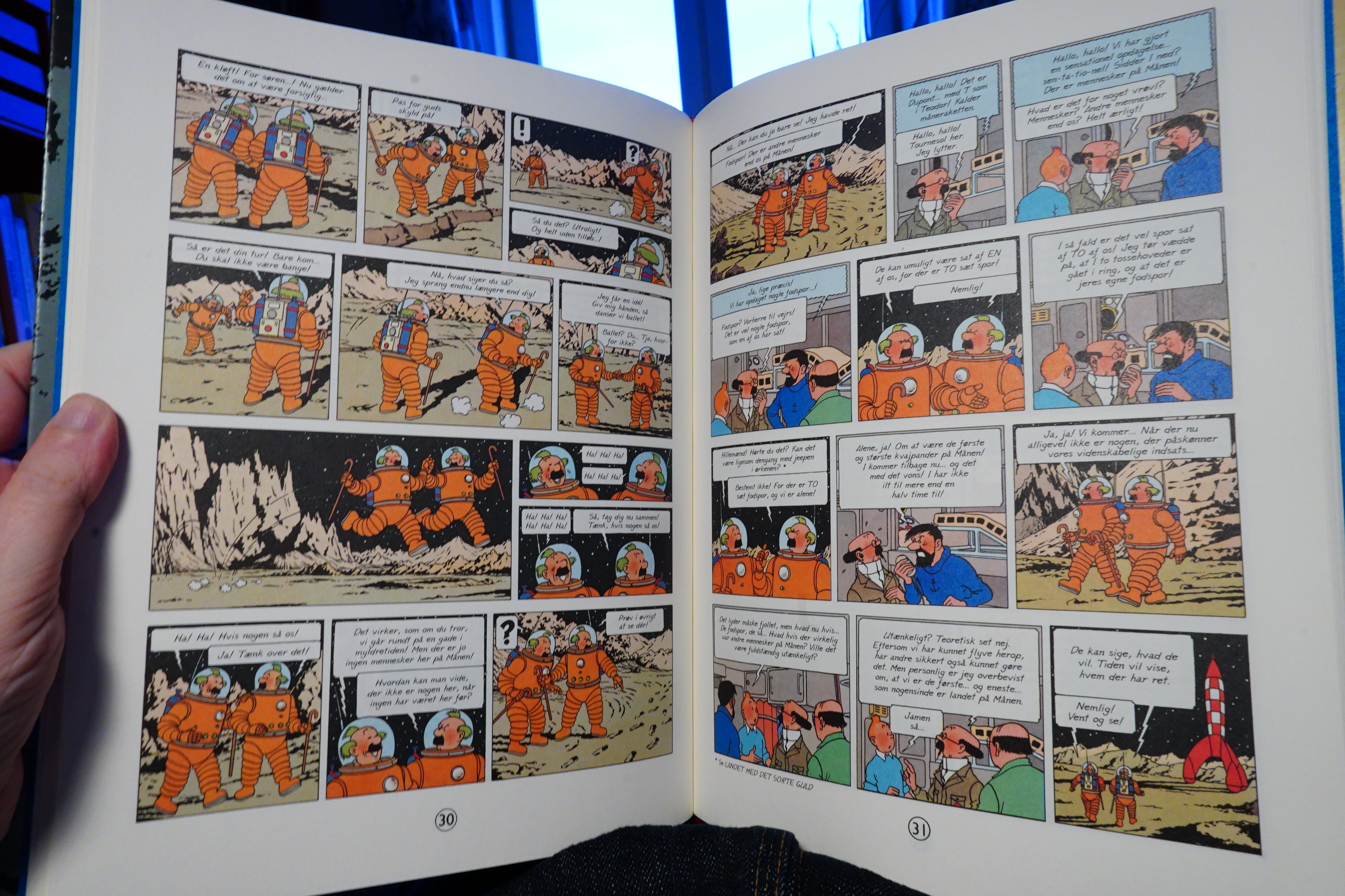
But with plenty of slapstick and tomfoolery. I remember loving these albums as a child, and I’m still entranced by them now.
| King Crimson: The Complete 1969 Recordings (11): In the Court Of The Crimson King (2019 Stereo Mix) |  |
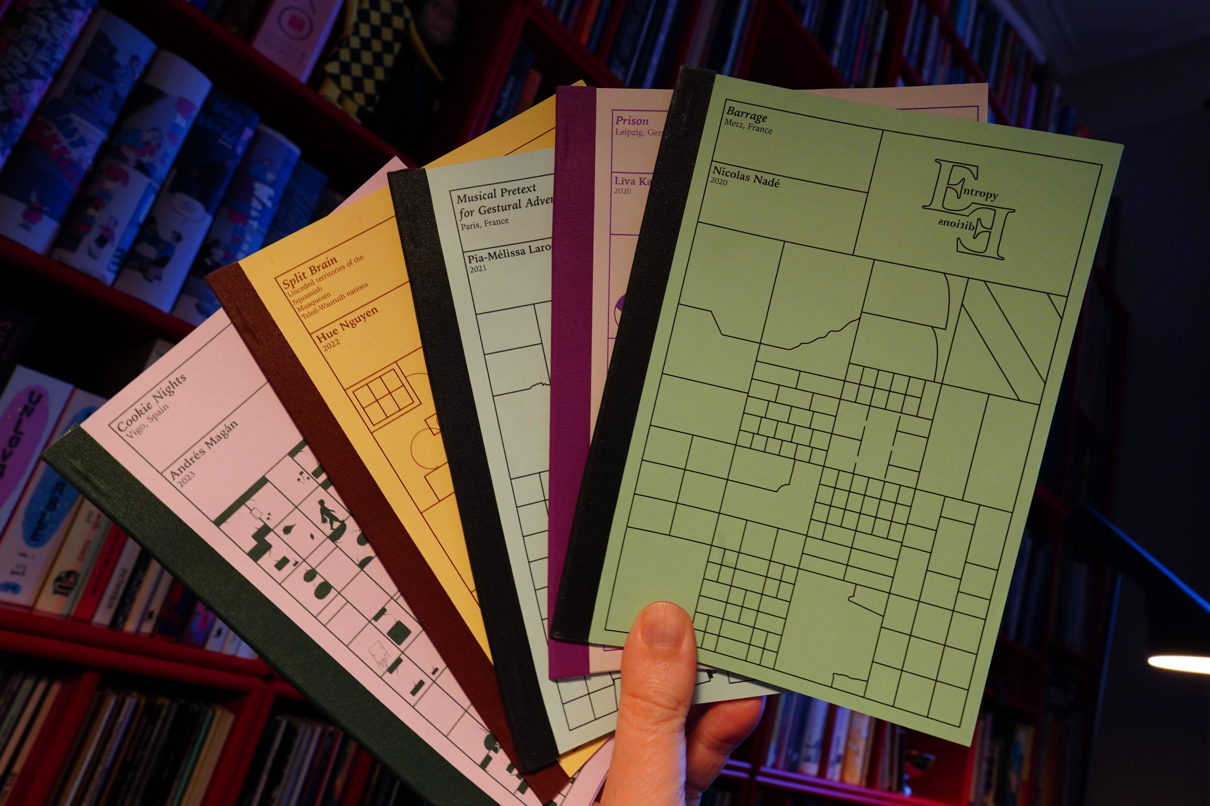
21:01: A Whole Bunch of Books From Entropy Editions
Nicholas Nadé’s book has a very strange kind of narrative going on, but in a very abstract way. Very nice.
Līva Kandevica’s book is an excellent circular prison tale.
Pia-Mélissa Laroche does a story about trees growing up and having a party before being slaughtered? I like the bulbous figures.
Hue Nguyen does a very brief thing about… er…
Andrés Magán does the most straightforward comic book, and… it’s not straightforward at all. But it’s riveting.
I’m never disappointed with the books from Entropy Editions. They have a very strong identity — somewhere straddling narrative/poetry/comics. Buy them here.
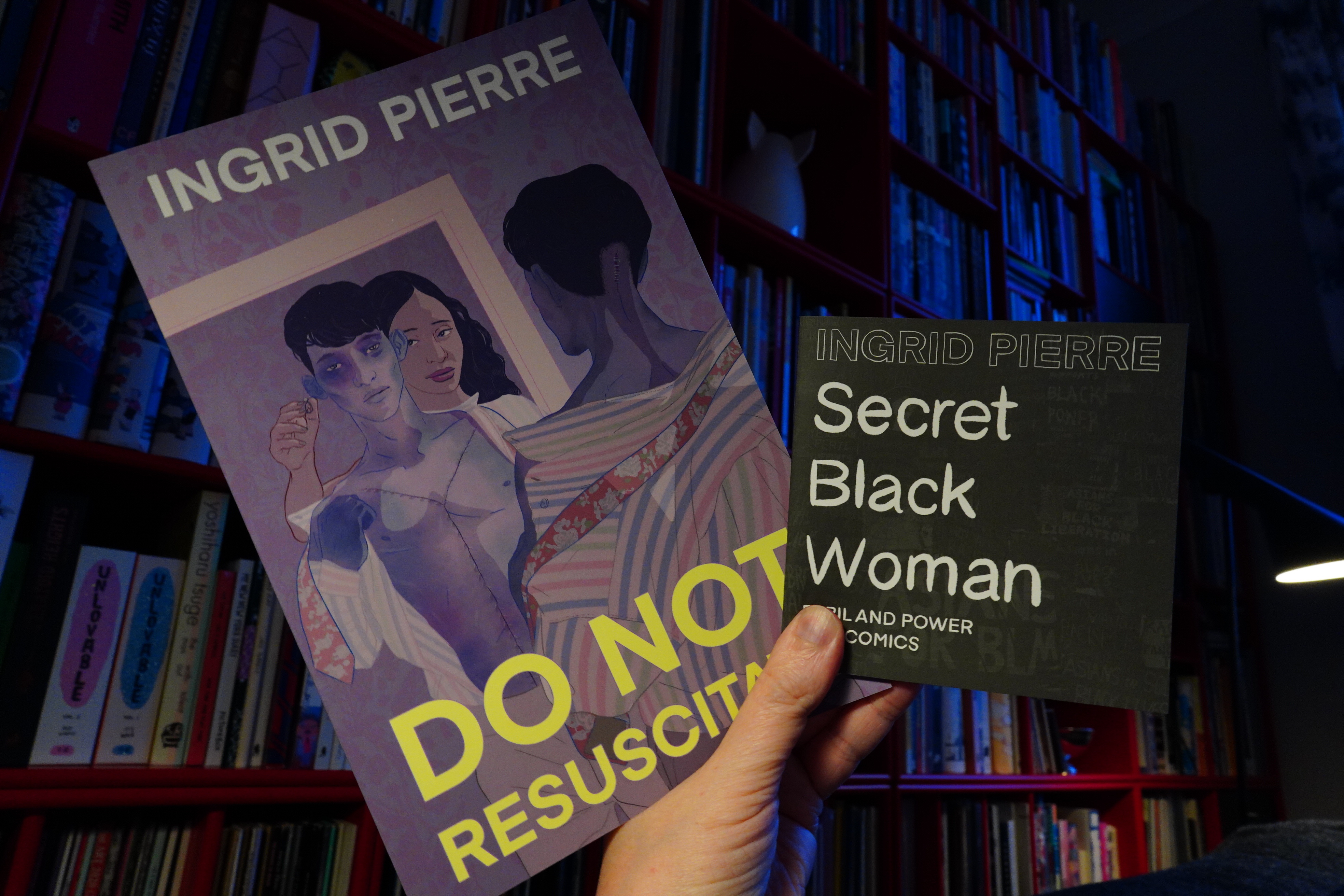
21:21: Do Not Resuscitate/Secret Black Woman by Ingrid Pierre (Verona Collective)
I read Pierre’s newest book a couple weeks ago, and it was fantastic. So I got these two older books, and…
… while the artwork is very attractive, the story is just a bit clunky? It’s a ghost/love story, and it feels too much like TV.
This little book, on the other hand, is more the thing. Packs a punch.
Good stuff.
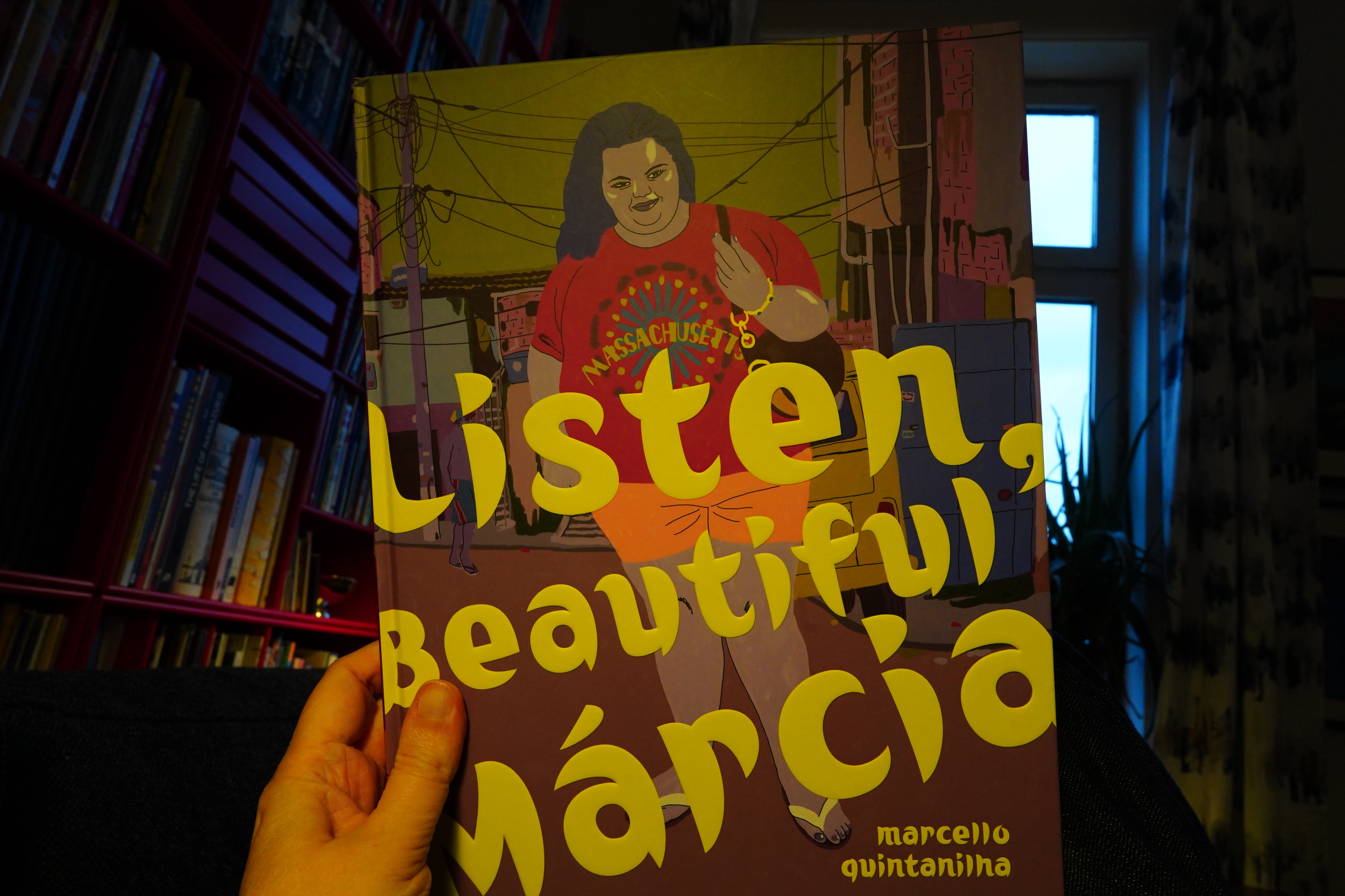
21:43: Listen, Beautiful Márcia by Marcello Quintanilha (Fantagraphics)
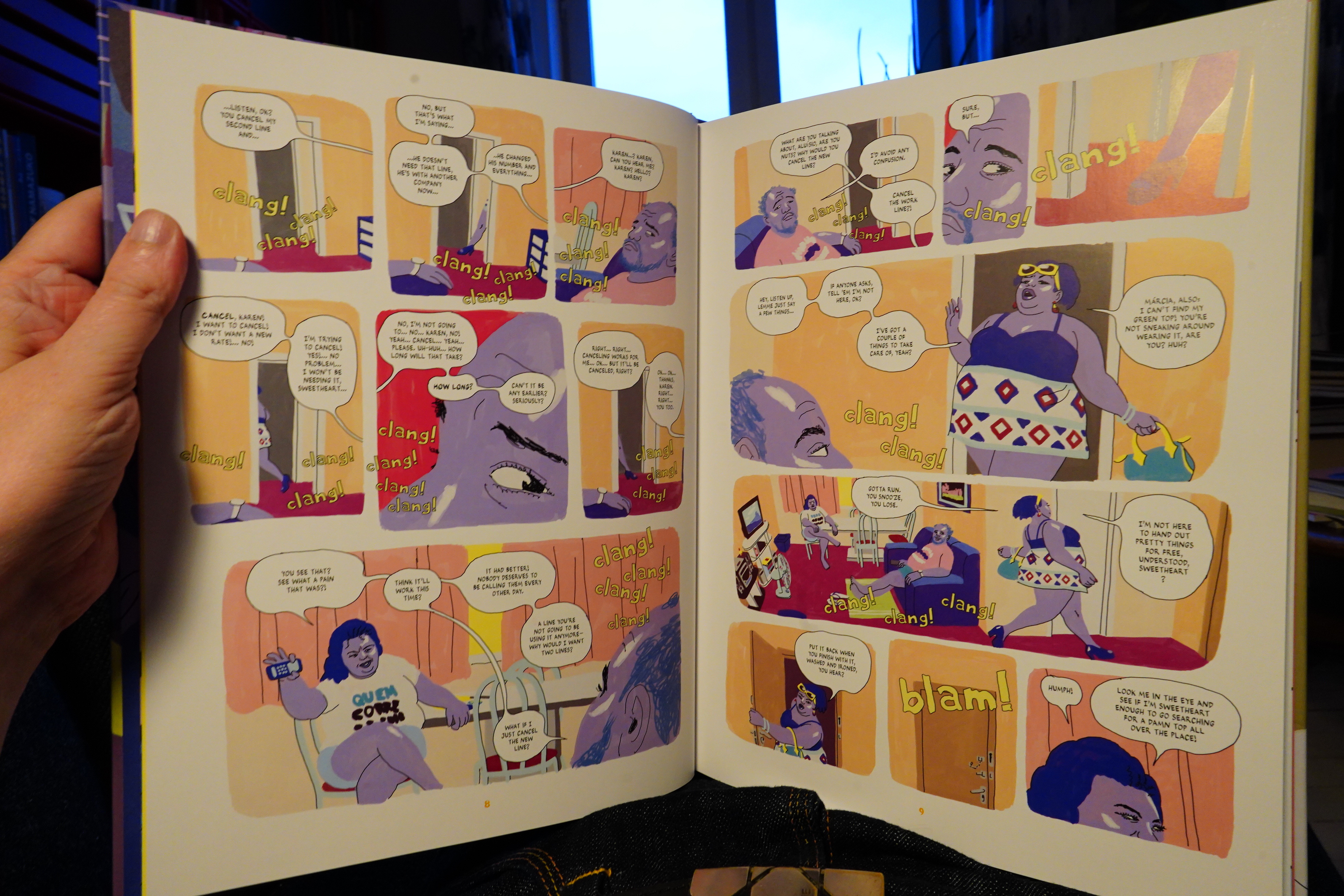
Well, this art style does nothing for me. I guess it’s a bit interesting that he manages to delineate these characters with so few lines (but helped a lot by the colouring), but it’s still just really unattractive.
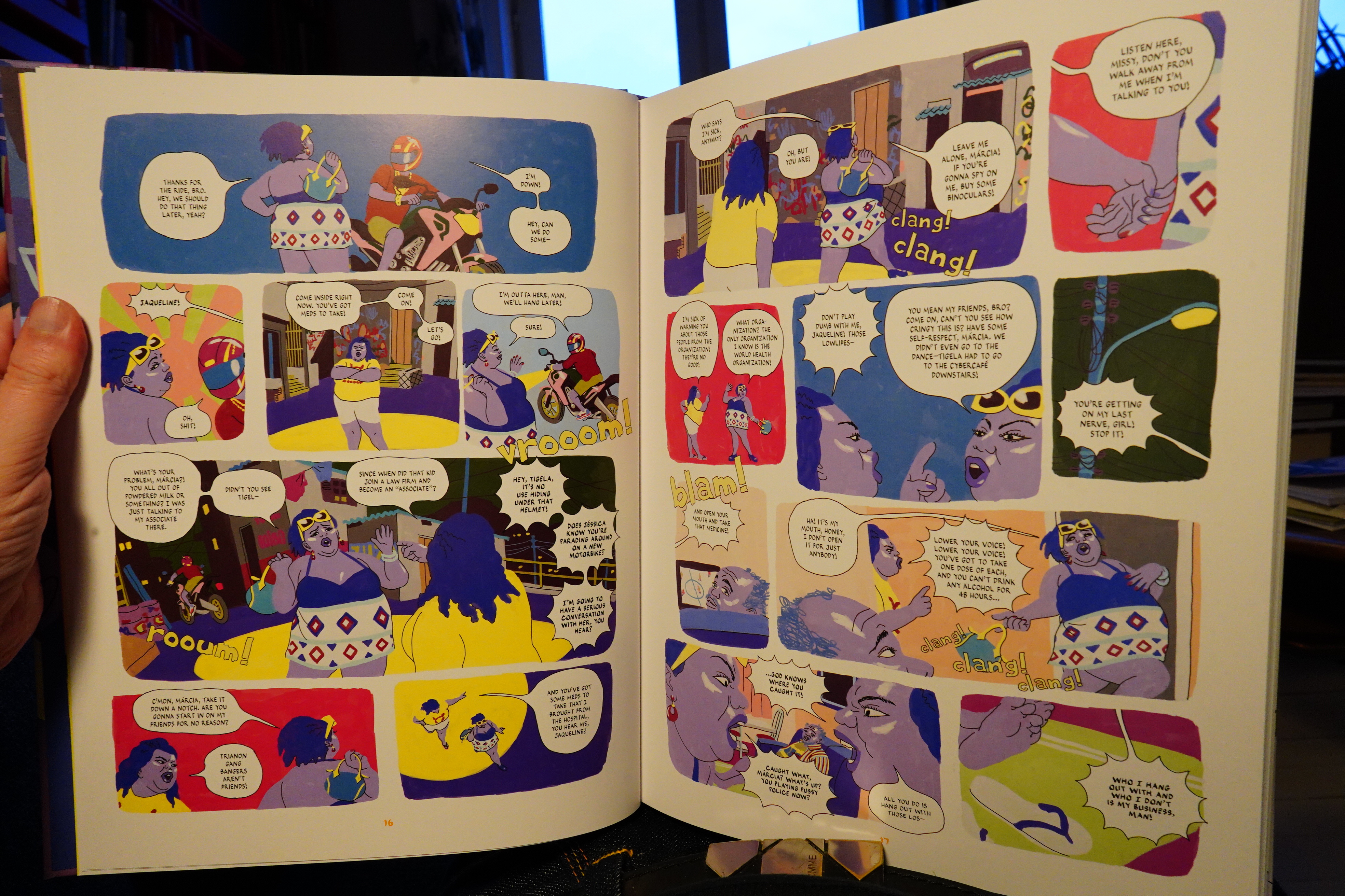
The artwork’s one thing, but it’s just so clunky in every way. It’s full on drama all the time (but the artist lives in Spain), and the storytelling is choppy as hell. Even the dialogue is just really annoying, but that may be a bad translation.
Everything seems so fake; so unlived; so artificial.
So I dropped the book one third in.
The creator won the prize for best graphic novel in Angoulême for this book.
| David Bowie: Brilliant Live Adventures (2): No Trendy Réchauffé (live Birmingham 95) |  |
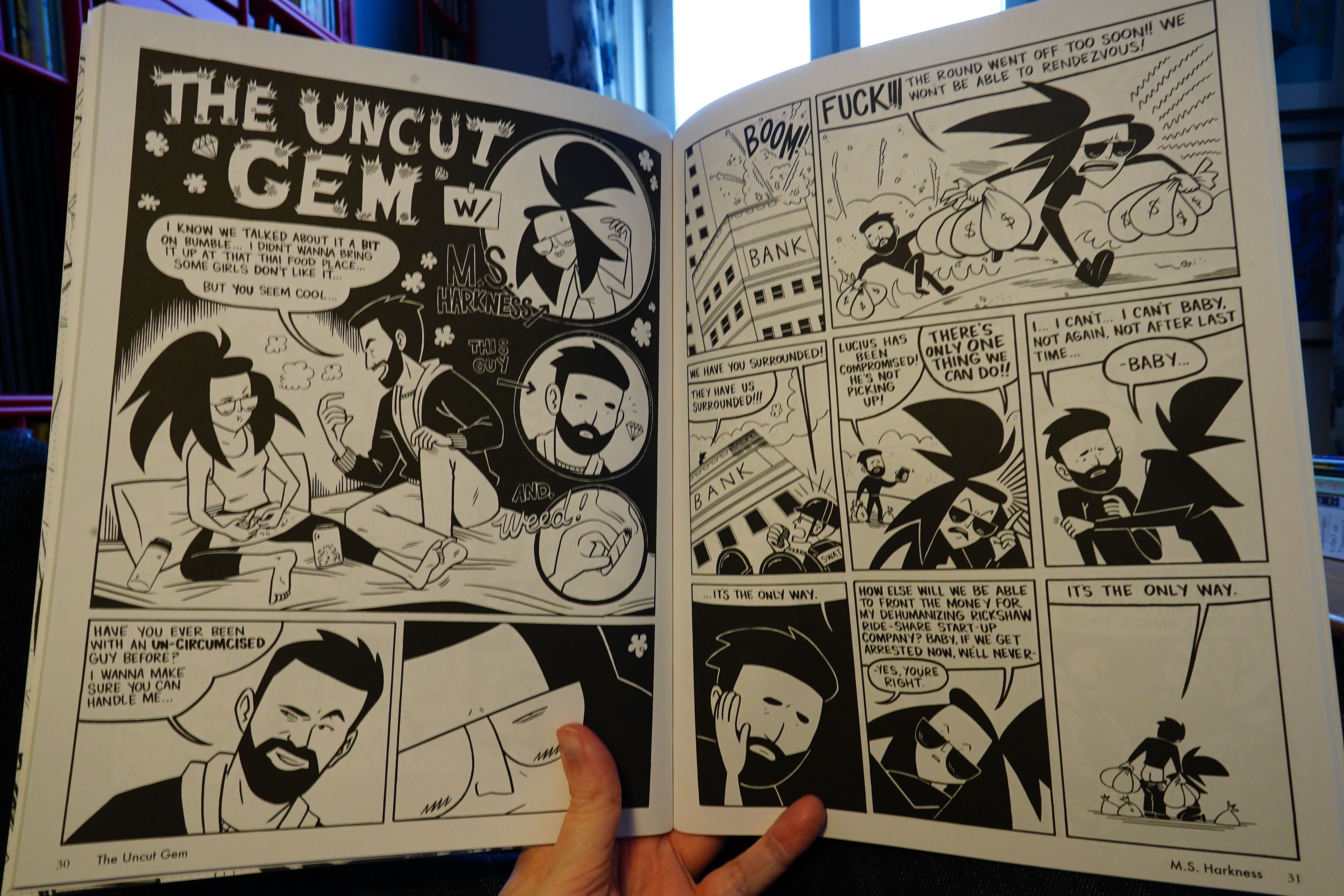
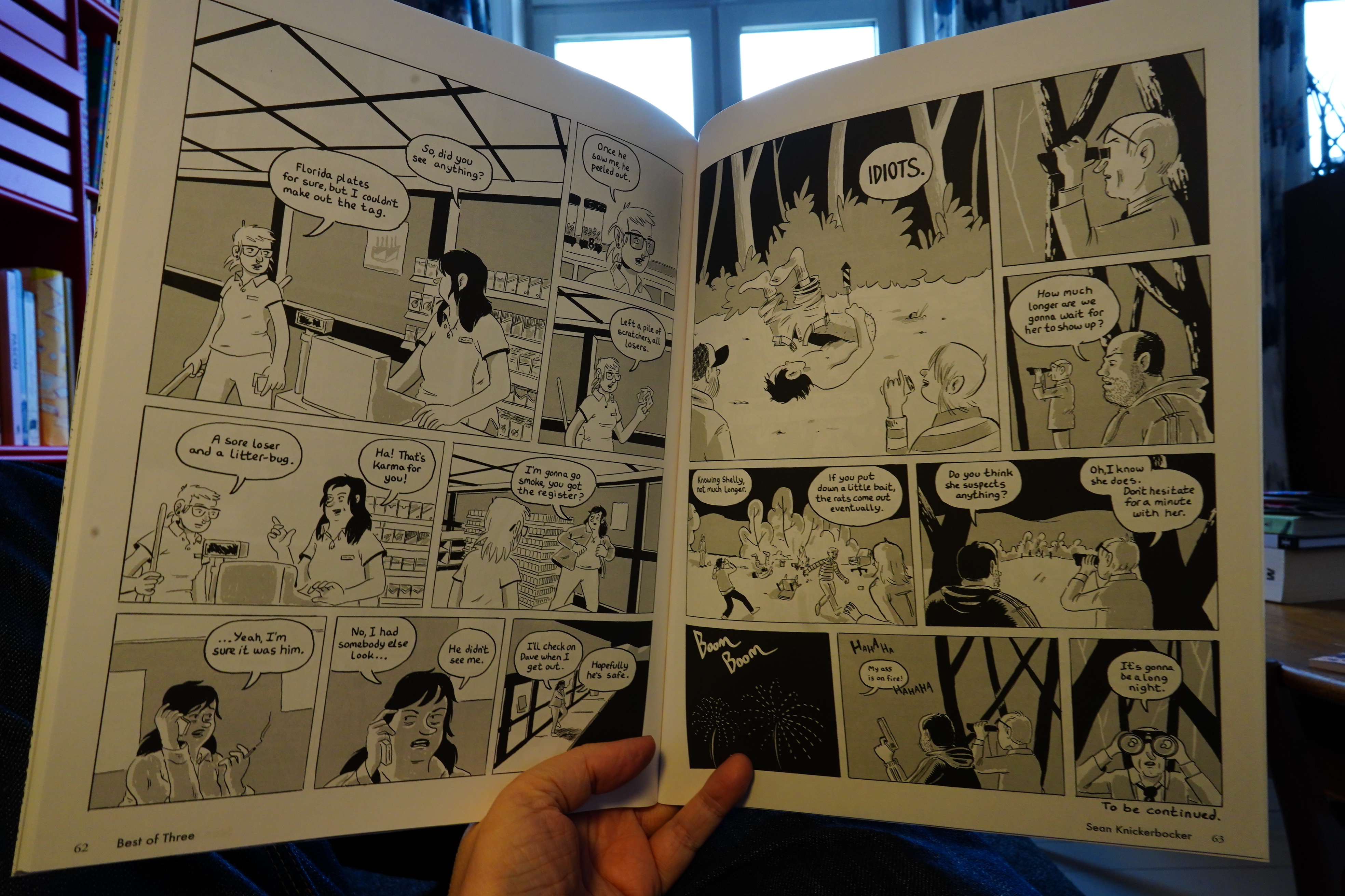
22:04: Rust Belt Revies 3 & 5 edited by Sean Knickerbocker
These two issues are stronger than the first two.
I mean, the first two issues were pretty good, too, but there’s fewer weak pieces here.
And there’s a glued-in booklet, which is always a winner.
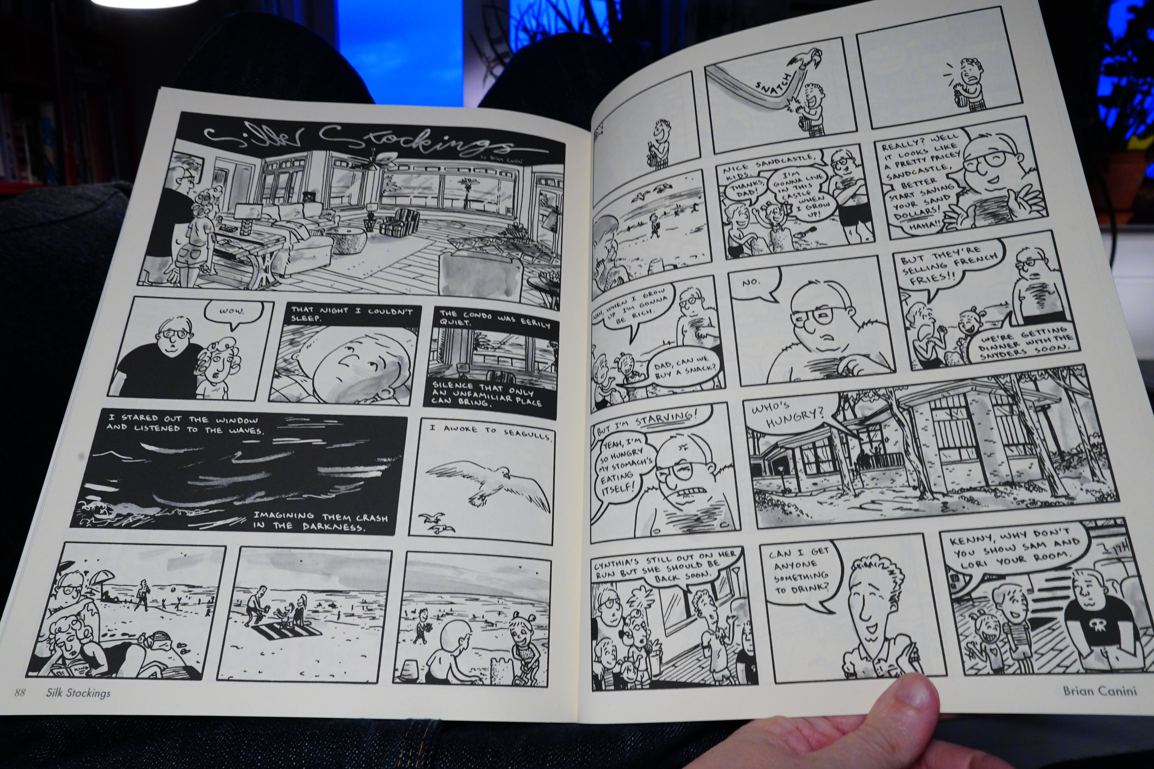
There is a kind of unified vibe going on, even if the stories are different stylistically. I guess it’s a… kind of… post-Sammy Harkham thing? That is, things are a bit on the silent side, and things are sad and wistful.
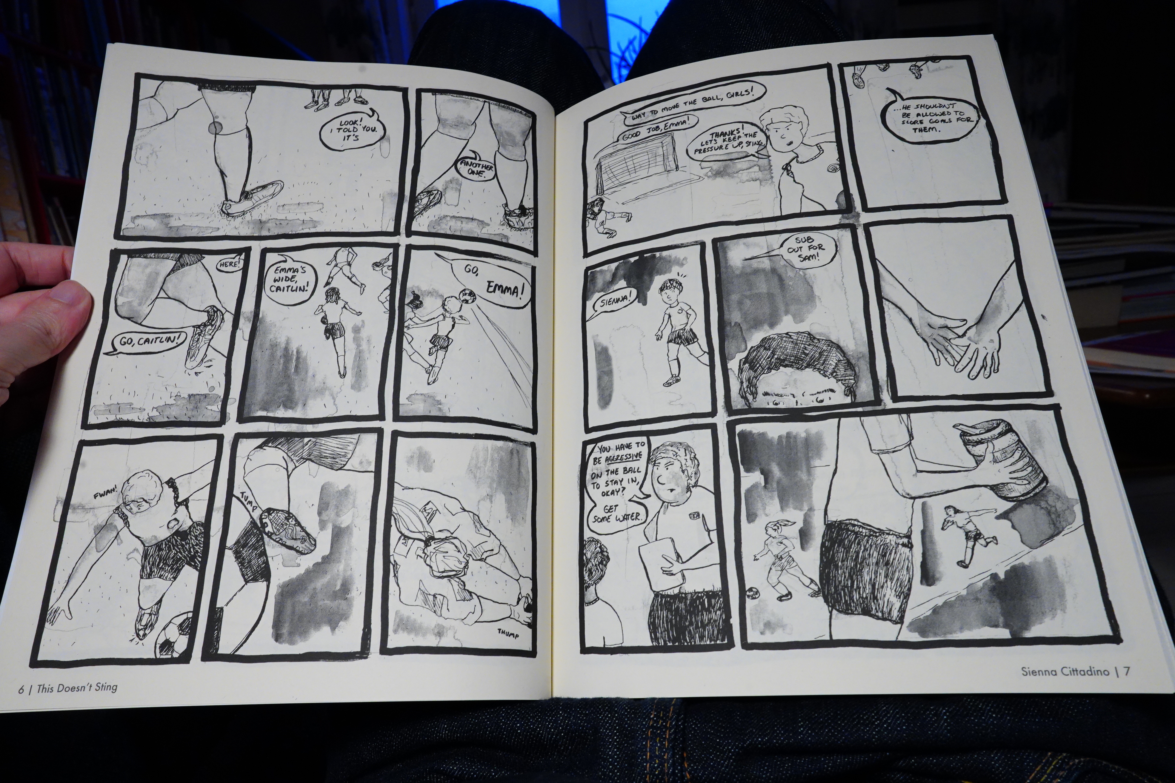
But in a good way. Sienna Cittadino’s little story, for instance, is heartbreaking.
Others opt for a more Clowes vibe.
And another booklet glued into the issue. Nice.
Anyway, it’s a strong anthology, and there’s really nothing else like it at present? There are underground anthologies, and anthologies for “literary” comics, and anthologies for experimental comics… This has a distinct point of view that’s none of those things.
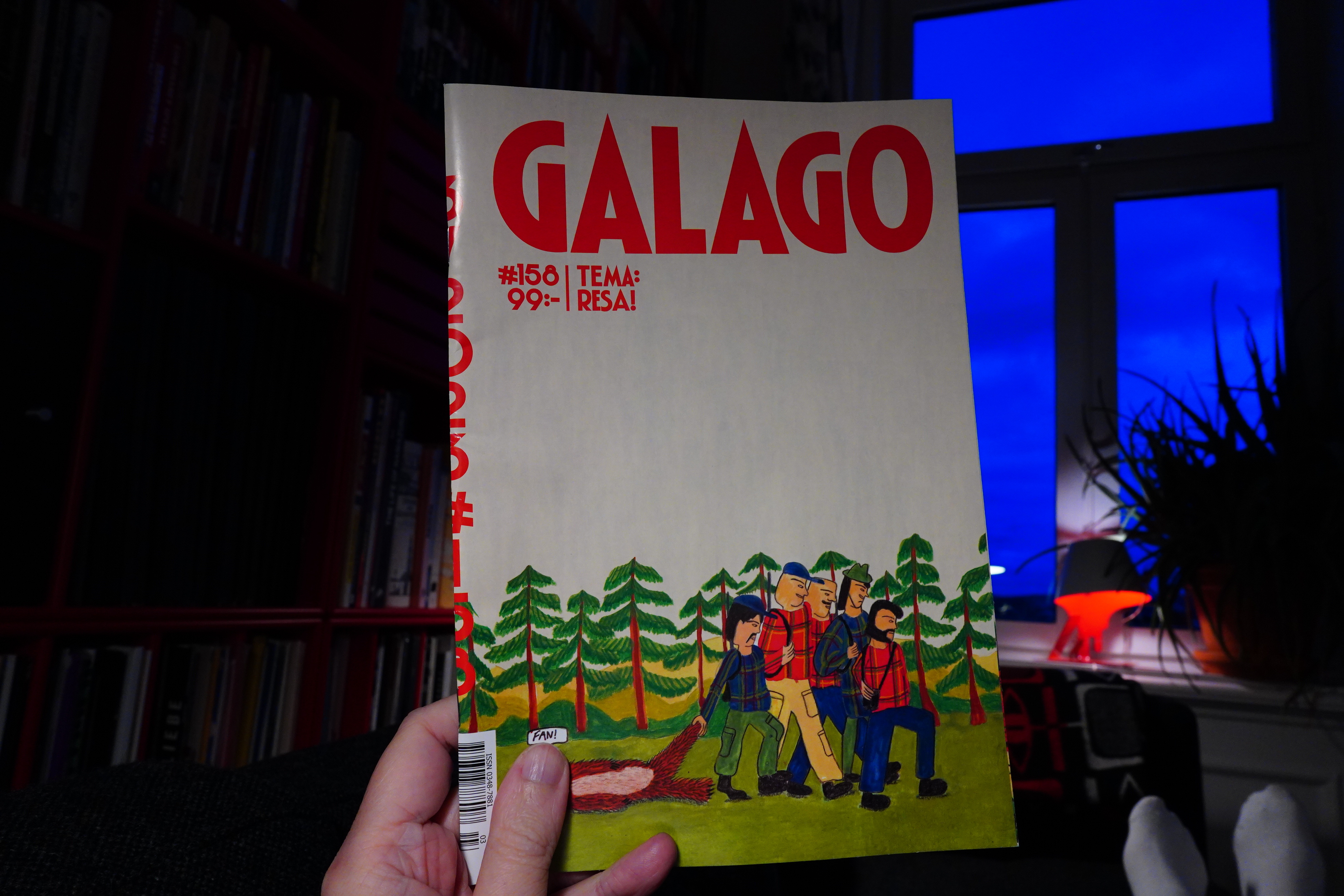
23:12: Galago #156 edited by Rojin Pertow (Galago)
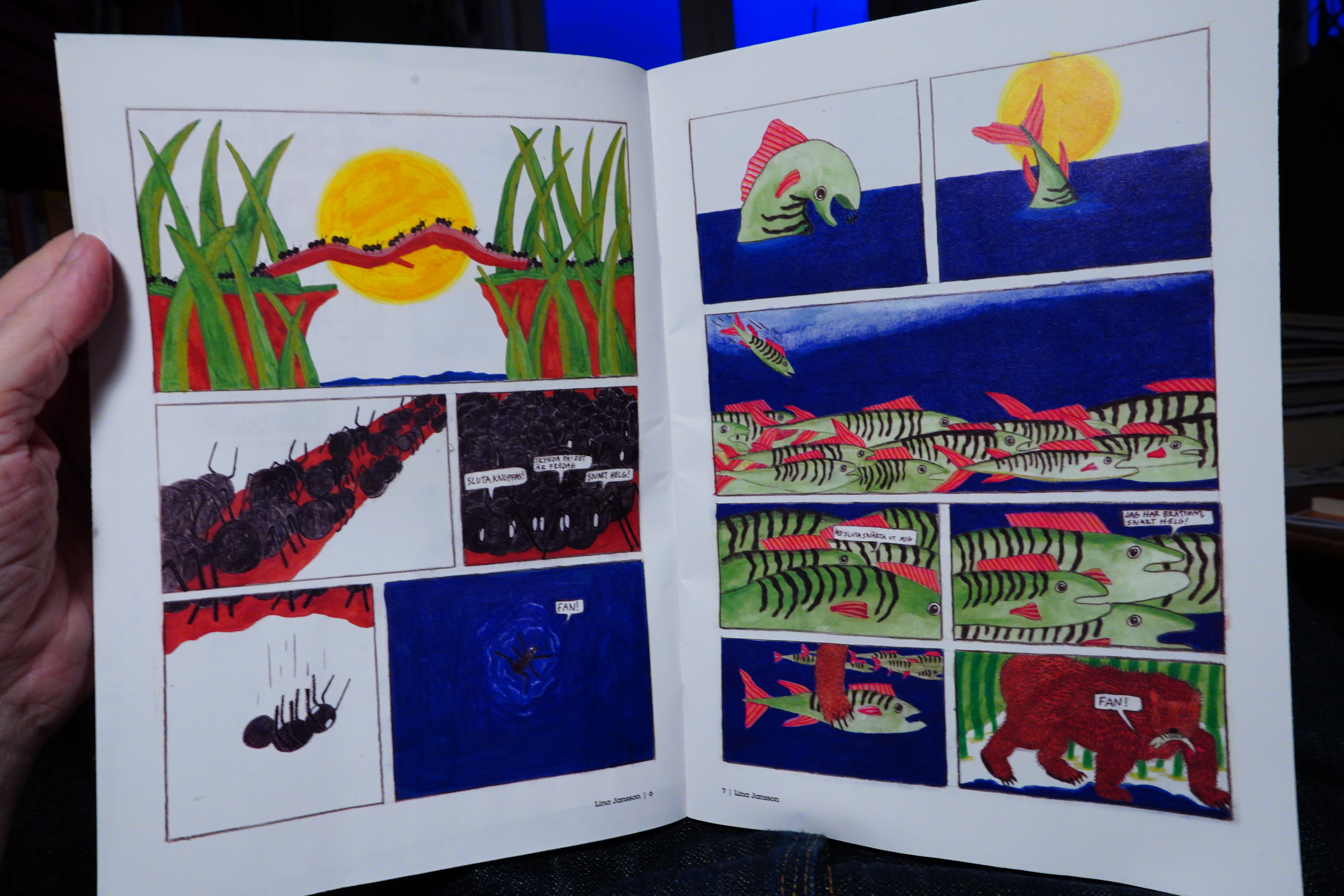
This is the second issue of this long-running anthology I’ve read, and this issue is pretty good, too. It’s mostly jokey shorter bits.
But also other, weirder stuff.
And slice of life stuff. I’m not sure the anthology has much of an identity beyond “new Swedish comics”, but it’s a pleasant read.
| Pigface: Gub |  |
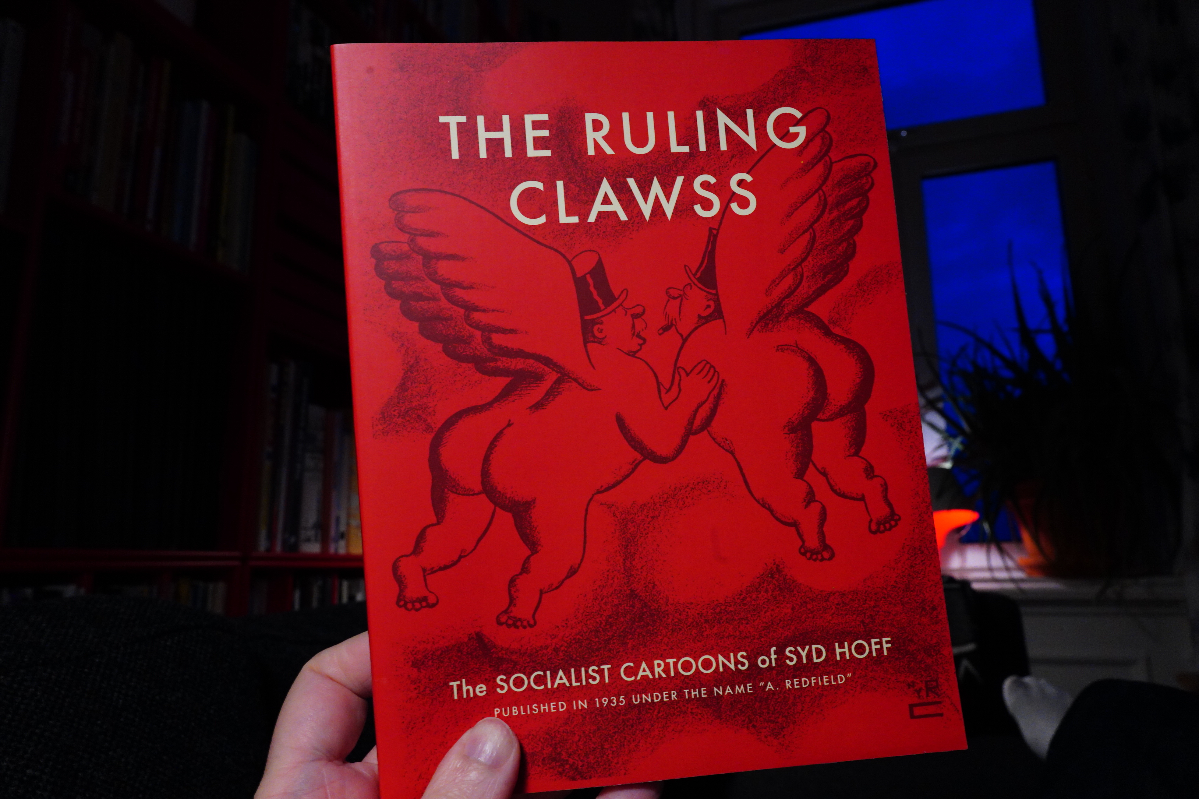
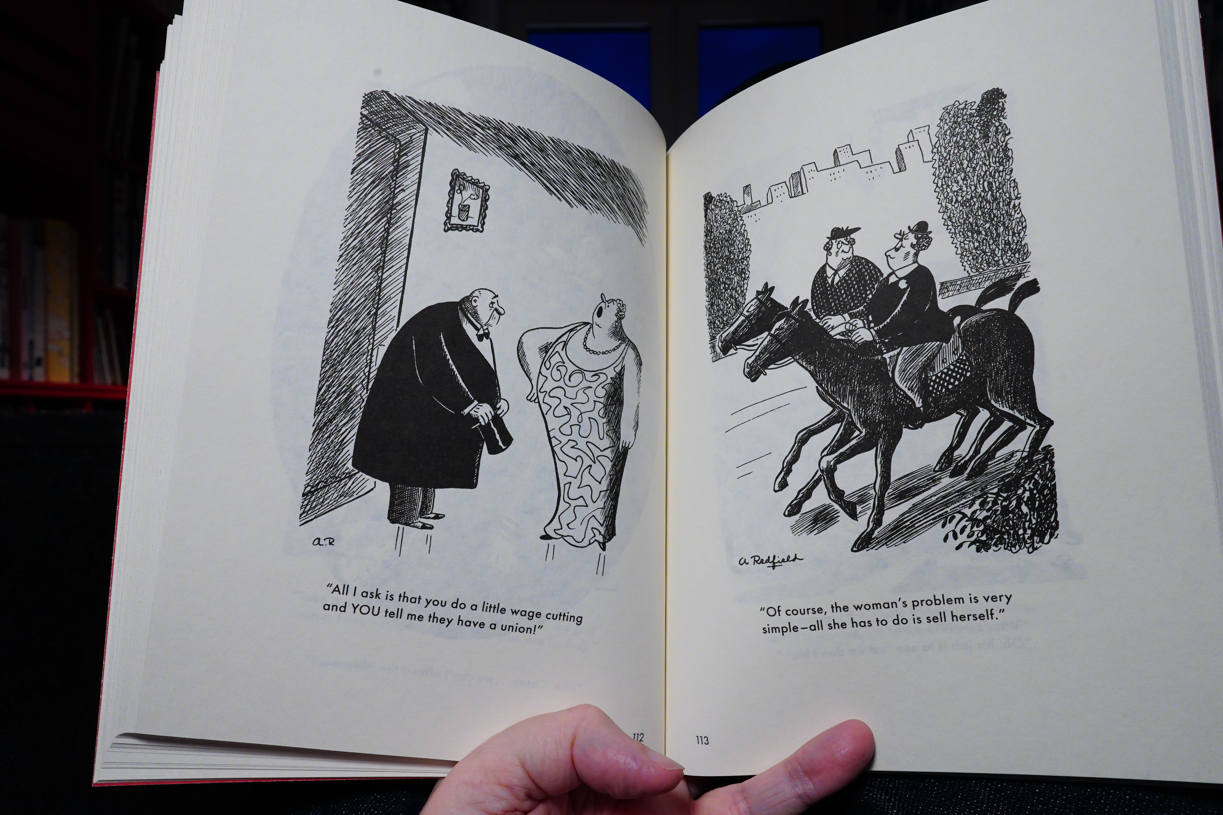
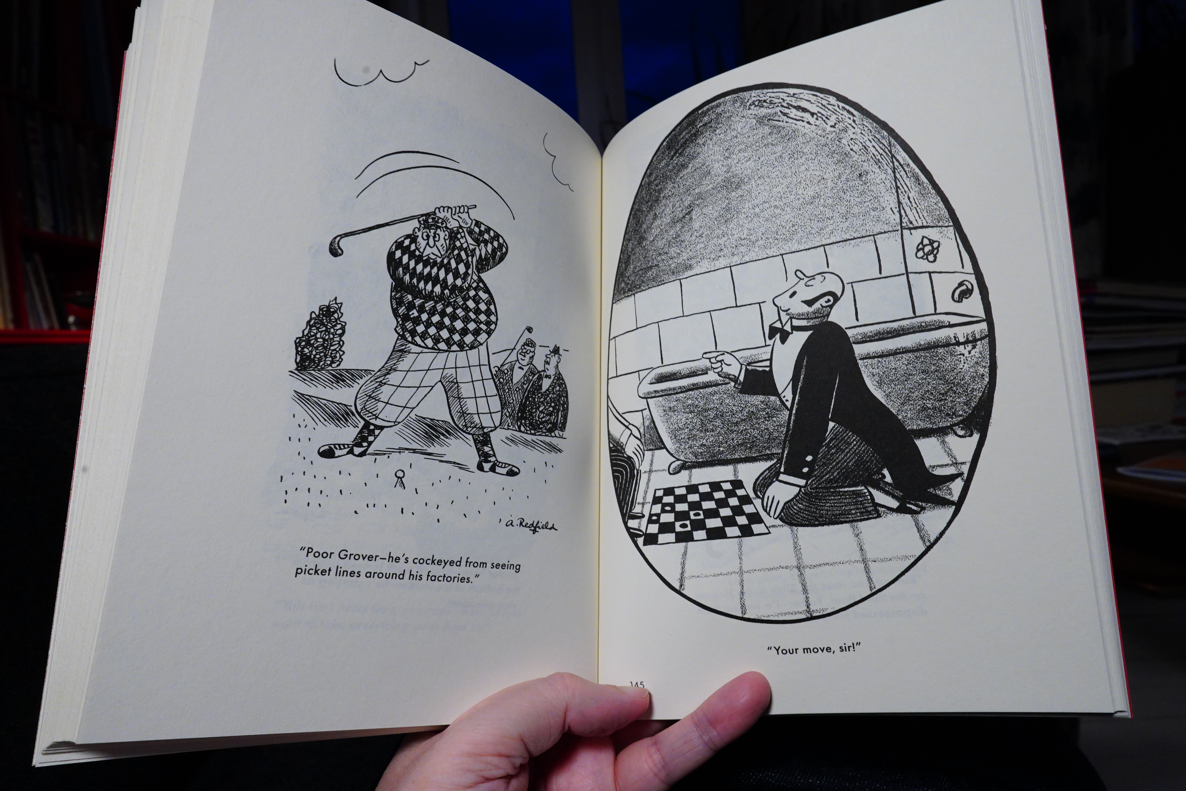
23:28: The Ruling Clawss by Syd Hoff (New York Review Comics)
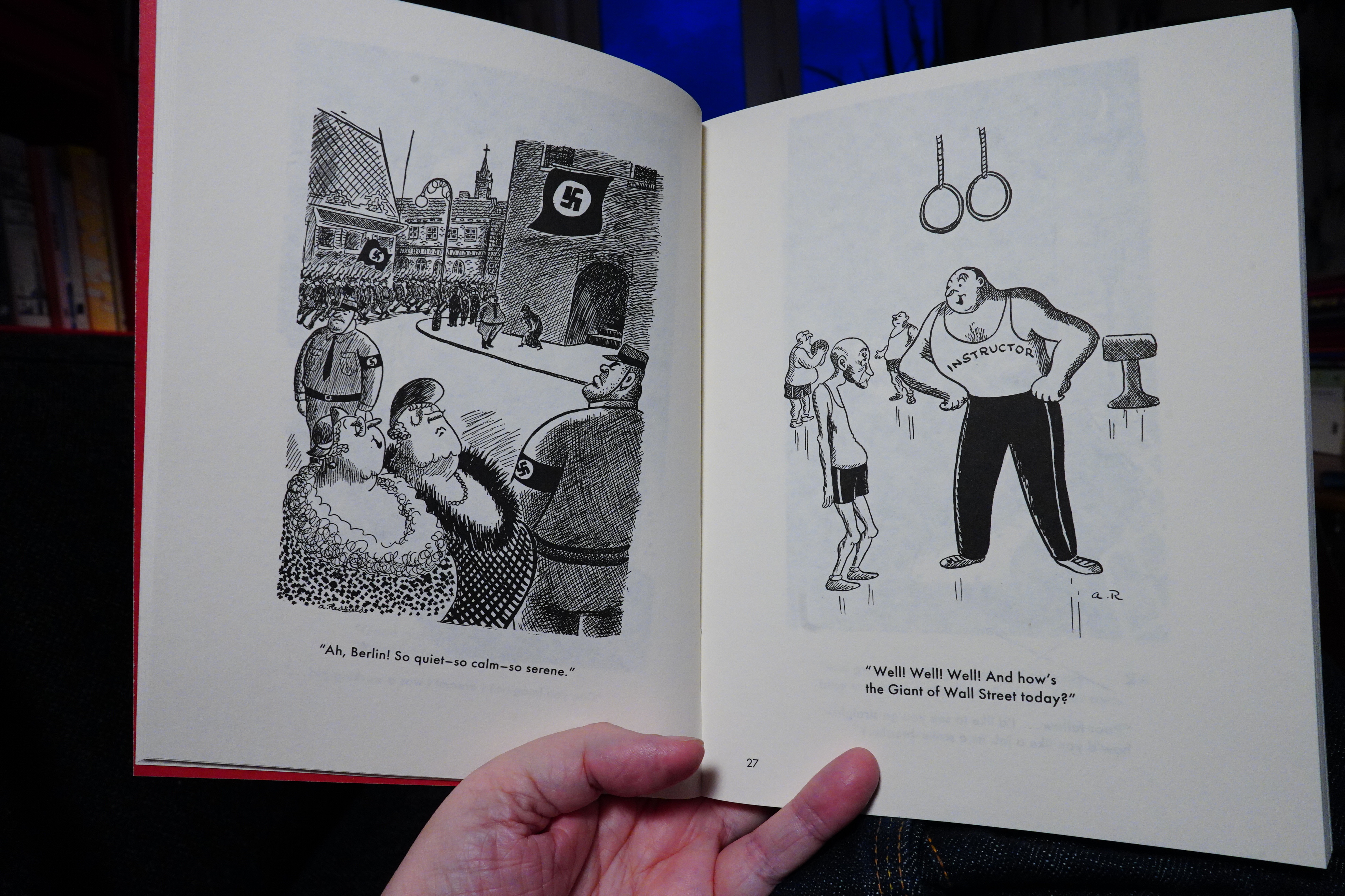
I’m not really into editorial cartooning. Er. Let me put that another way: I loathe editorial cartooning.
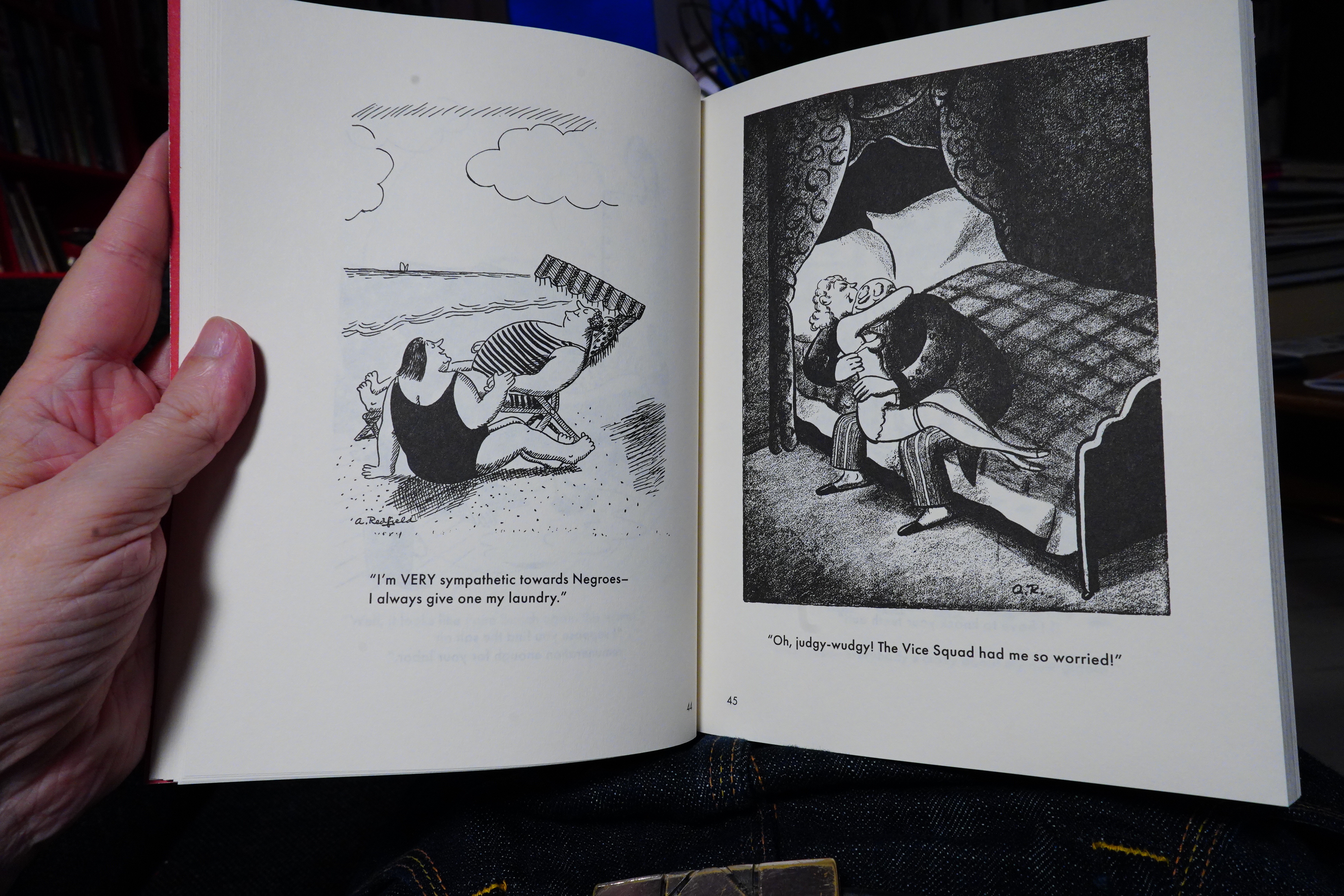
But this is actually good. I mean, the jokes aren’t actually “ha ha” funny, but you know.
I’m not quite sure that I get all the jokes, but it’s been 85 years… the cartooning is quite fine, anyway.
OK, those two I didn’t get at all.
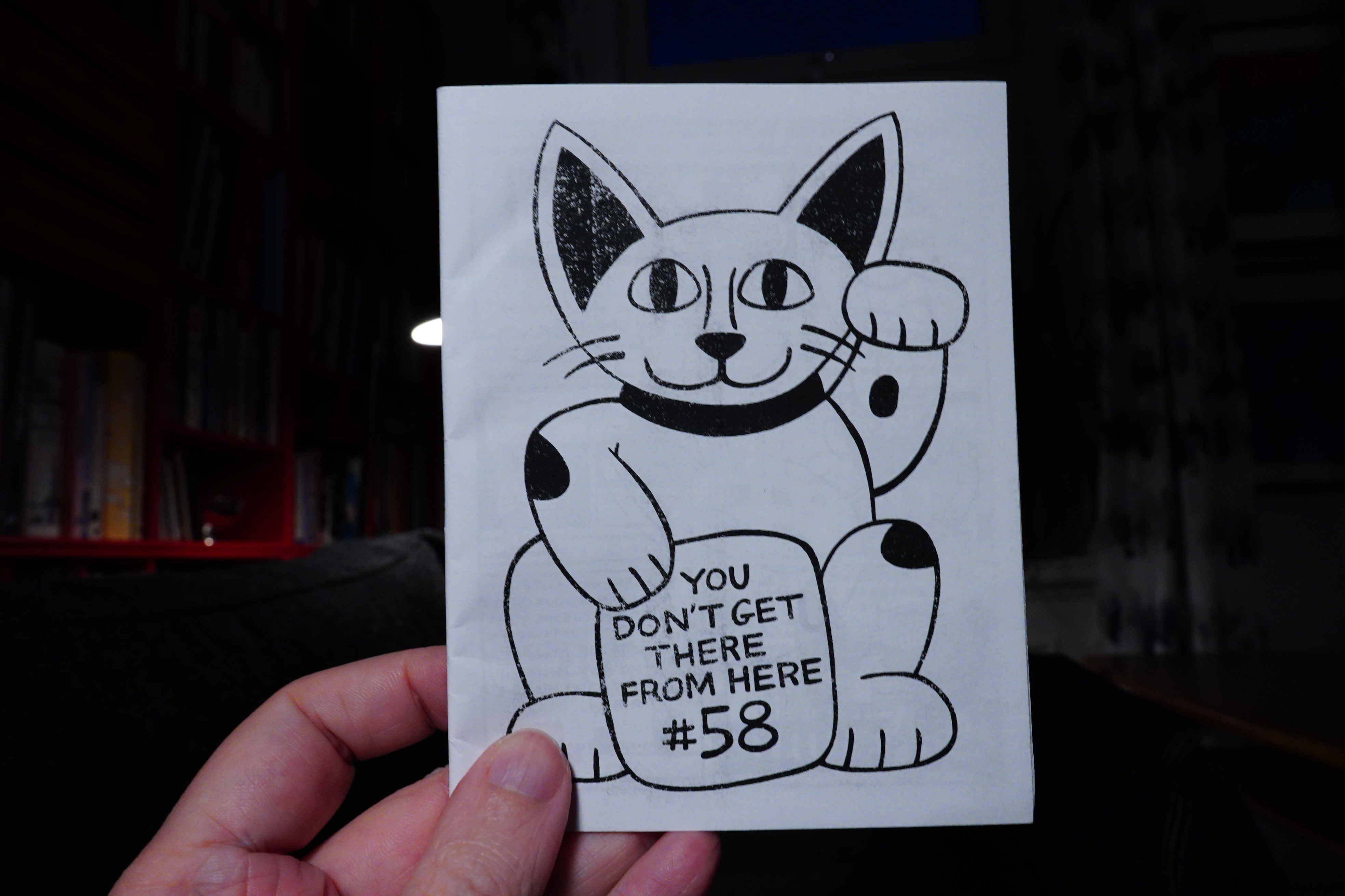
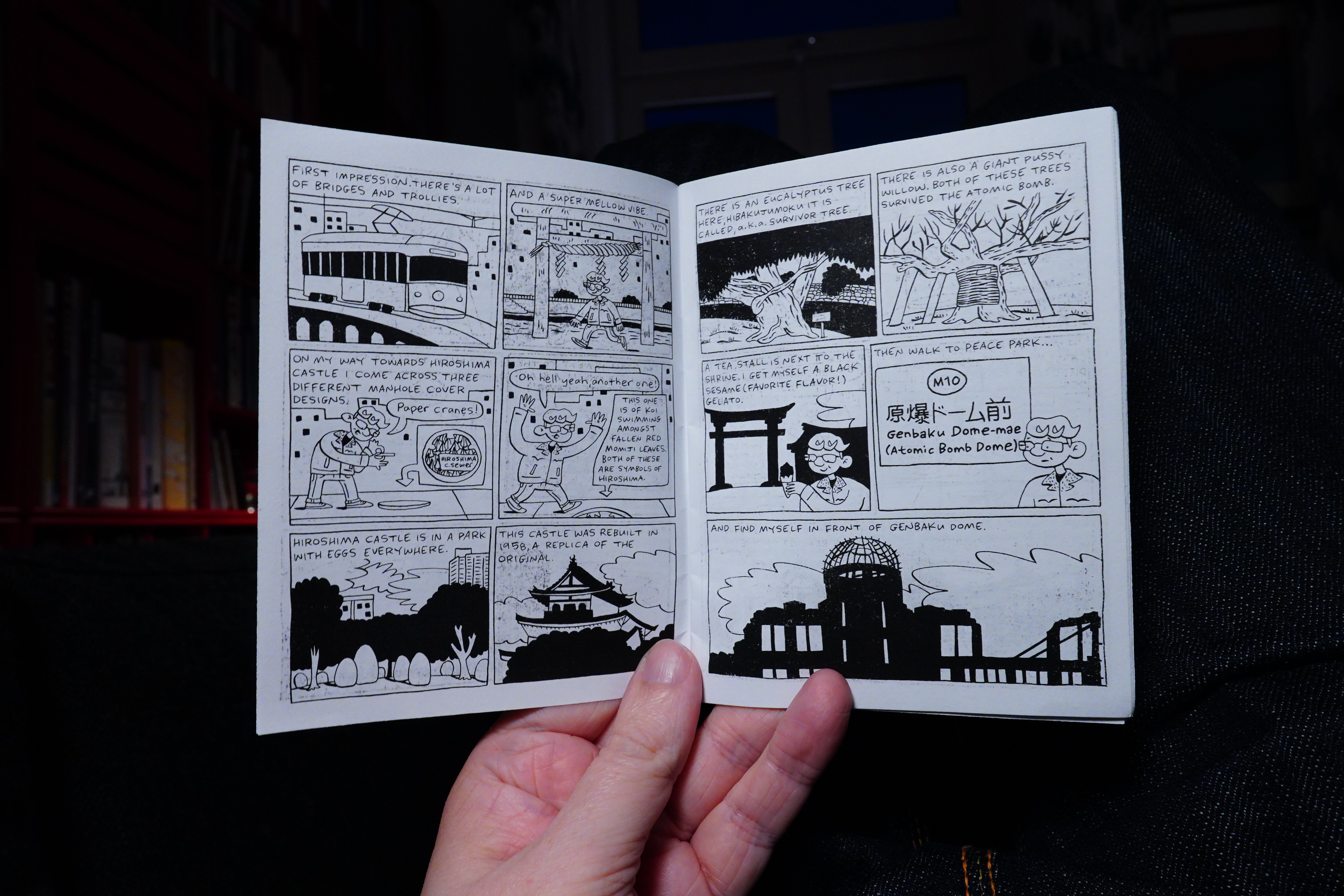
23:55: You Don’t Get There From Here #58 by Carrie McNinch
Uhm… I think my white balance went off again…
Anyway, this is another special issue — instead of the daily strips, this is all about visiting Japan, and it’s really enjoyable to rad.
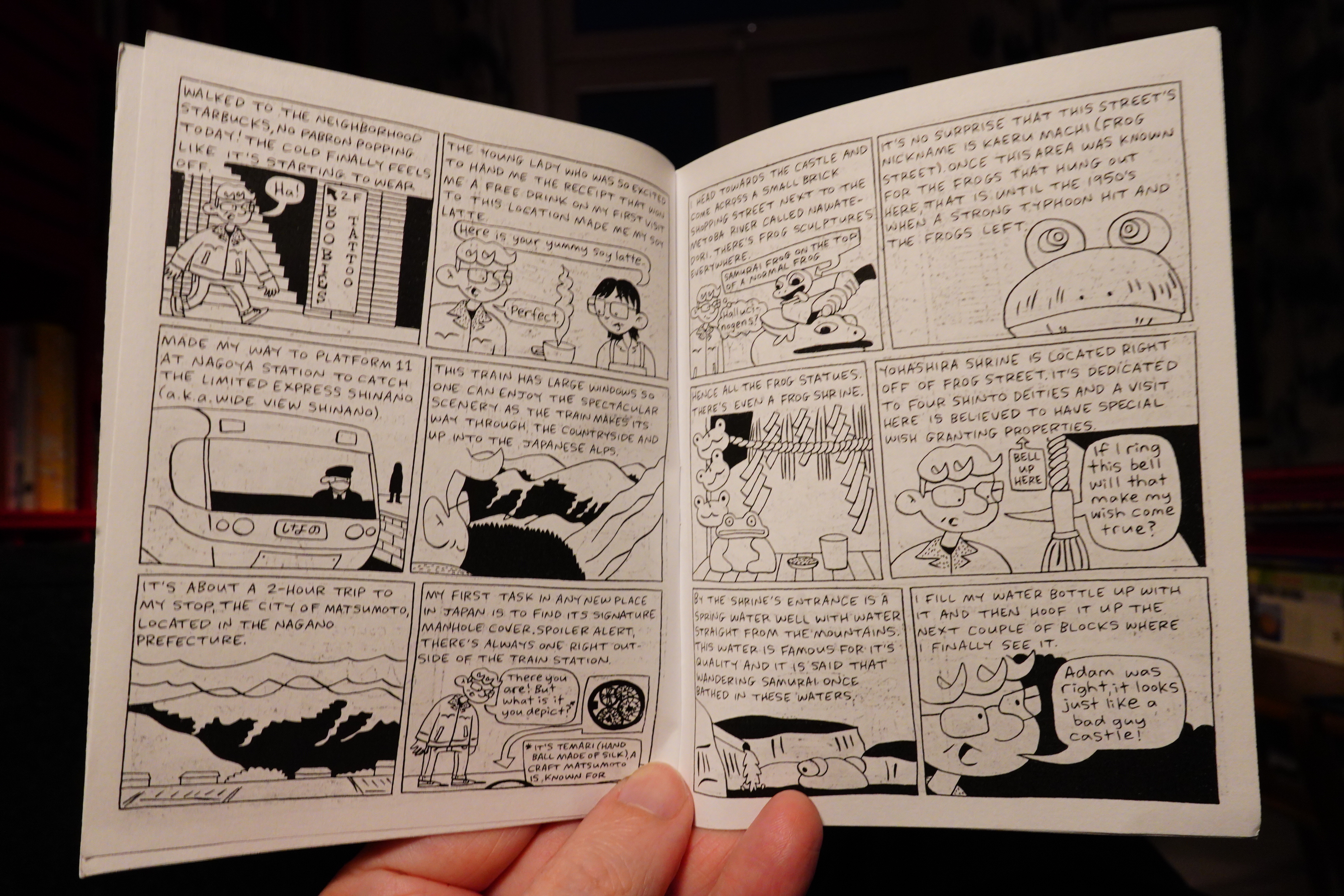
Perhaps it’s because she draws most people smiling, but I always smile while reading these books. But they’re so engrossing… I wish she published these books more often. She publishes them at her patreon, but I like to wait until they are on paper, and that seems to take a while these days.
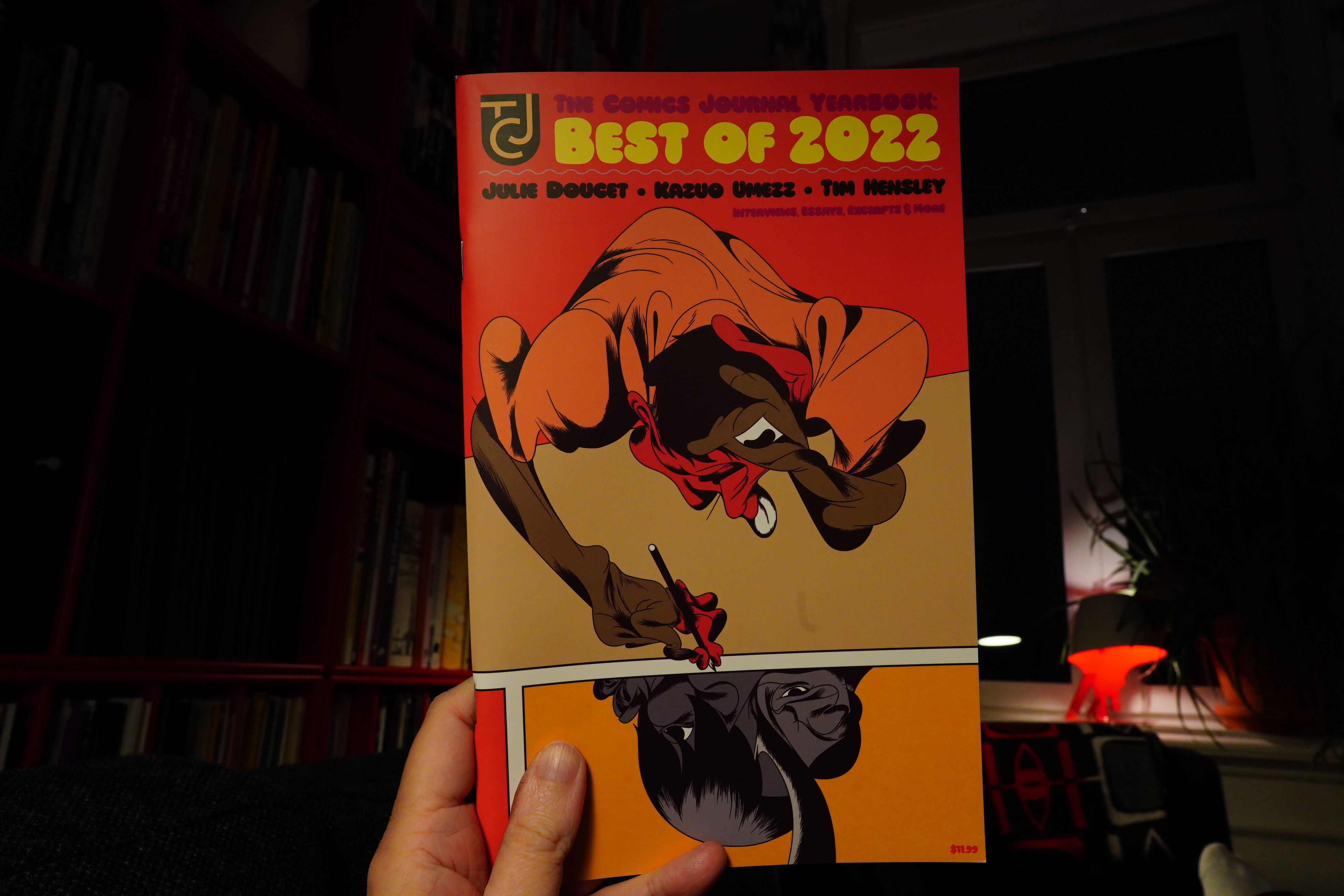
00:20: The Comics Journal Yearbook by Austin English and Kristy Valenti (Fantagraphics)
It’s very on brand for The Comics Journal to publish a “best of 2022” in July. I remember in the olden days Fantagraphics would get around to publish Xmas issues in May…
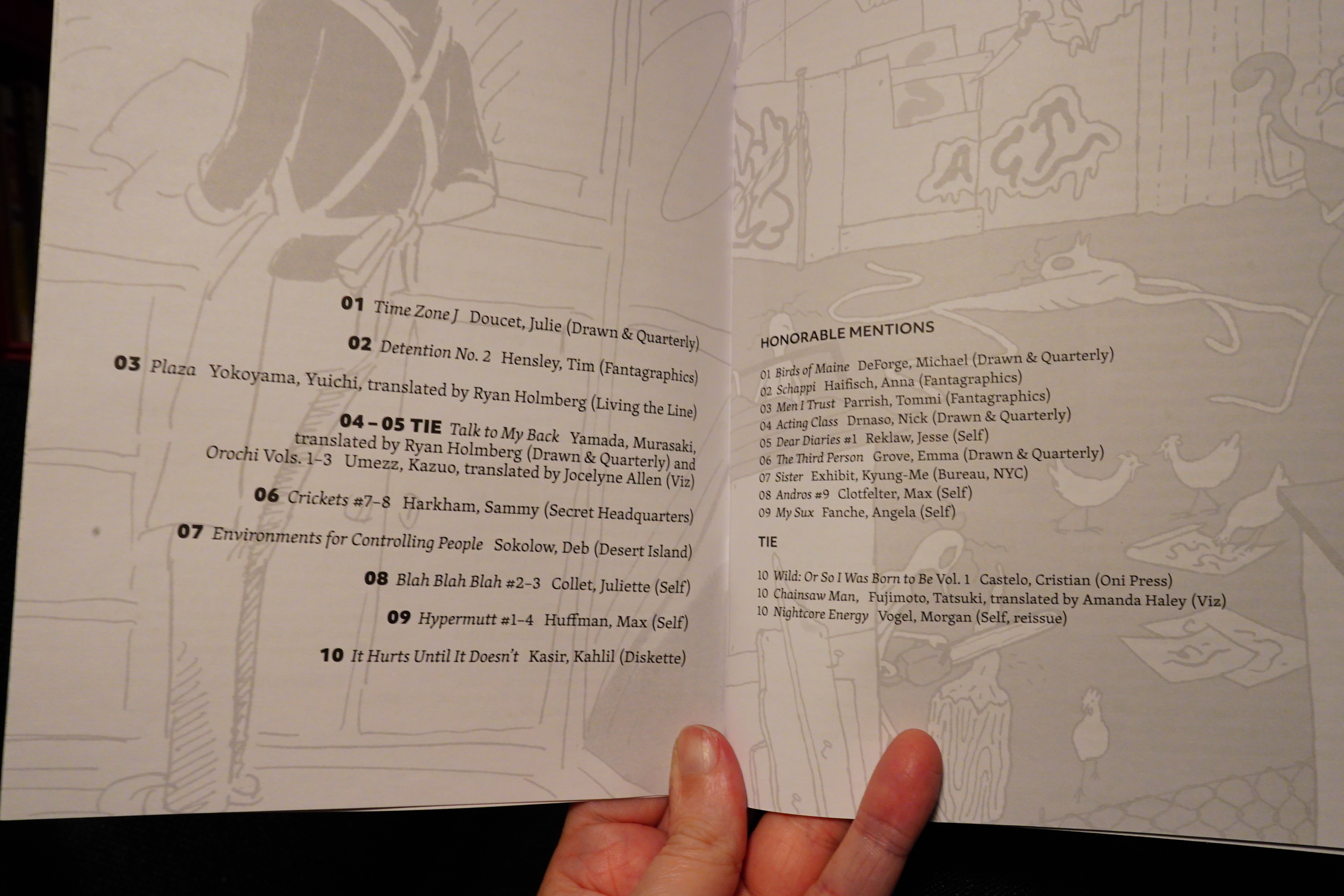
OK, I’m not going to read this now (because I read magazines in bed), but just wanted to take a look. That’s a good list… anything there I haven’t read yet? Yup.
Shopping time: Diskette Press for the It Hurts Until It Doesn’t.
Hm… Oh, that’s it — I’ve got the rest.
Oh well.
00:32: The End
And now it’s time to sleep.
Music I’ve bought in June.
Hey! I actually got back into shopping new music this month.
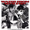
I guess Water From Your Eyes is the hype of the year, but the album is actually good.
On the other hand, the new Everything But The Girl album has been getting rave reviews, which made me suspicious. And indeed, it’s really disappointing — especially having Tracey Thorn’s gorgeous voice autotuned every single second of the album. The voice is almost unrecognisable.
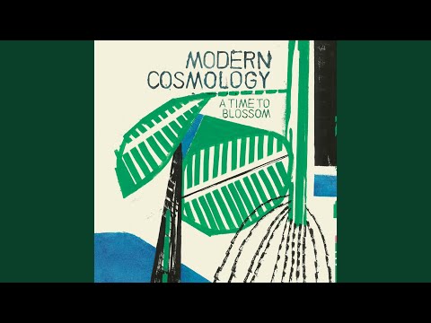
On the third hand, Laetitia Sadier’s Modern Cosmology band has a new album out, so that’s nice.
And I’ve run out of hands, but Shirley Collins has another lovely album out. I don’t think anybody much expected her comeback a few years ago (after being absent for more than thirty years), but the returns keeps rolling on.
 |  |  |  |  |
 | ) | ) |  |  |
 |  |  |  |  |
 |  |  |  | ) |
%3A+Original+Mono+Master) | ) | ) |  | %3A+Sessions+6) |
 | %3A+Love+Is+Hell) | %3A+Strange+Free+World) | %3A+The+Death+of+Cool) | %3A+Cowboys+and+Aliens) |
%3A+The+B+Sides) | %3A+John+Peel+%26+Mark+Radcliffe+BBC+Sessions) |  |
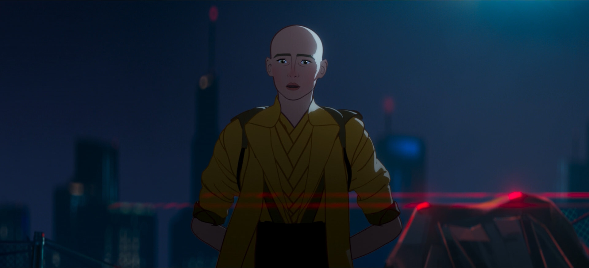
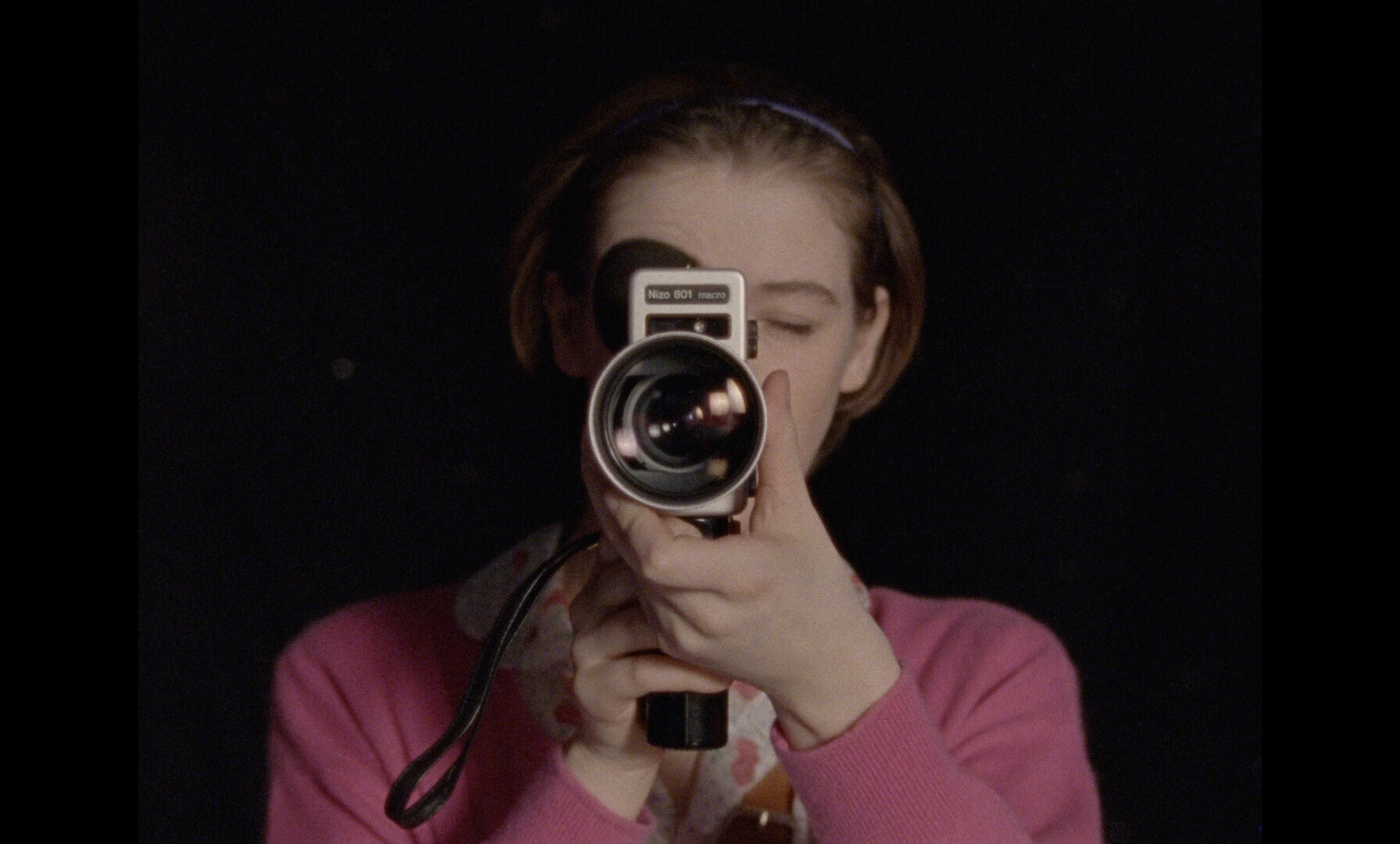
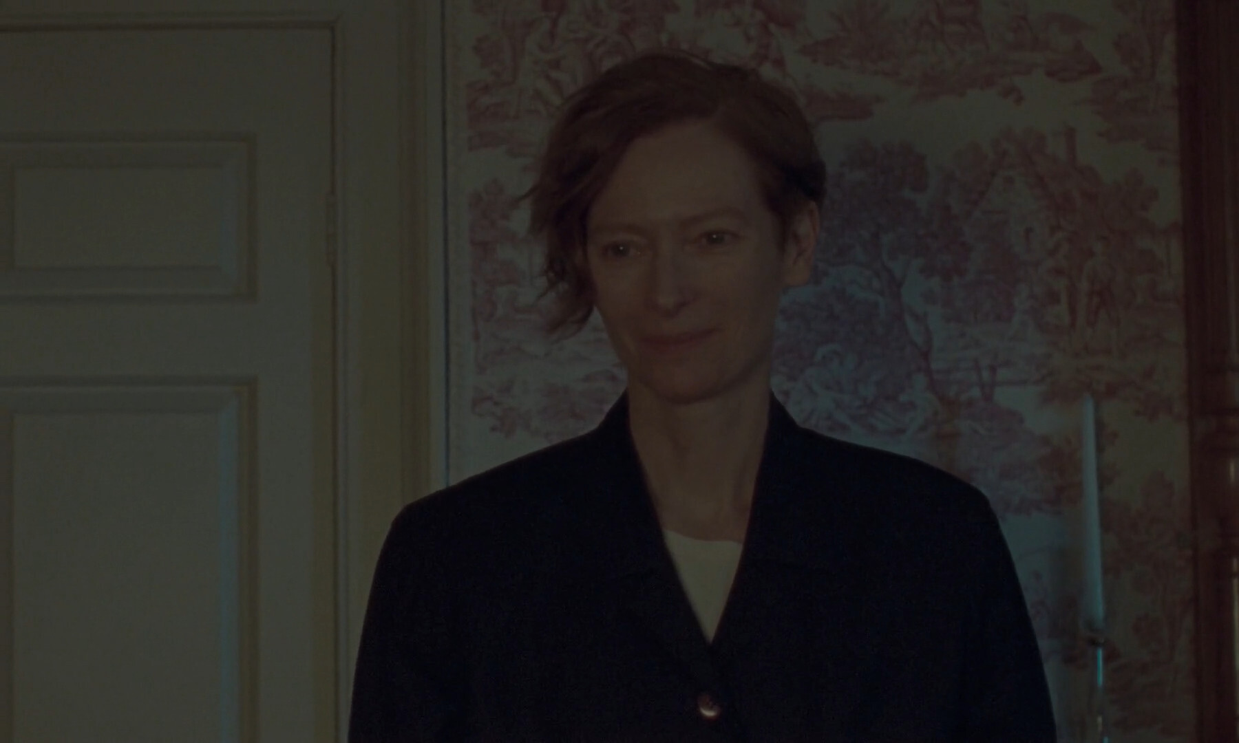
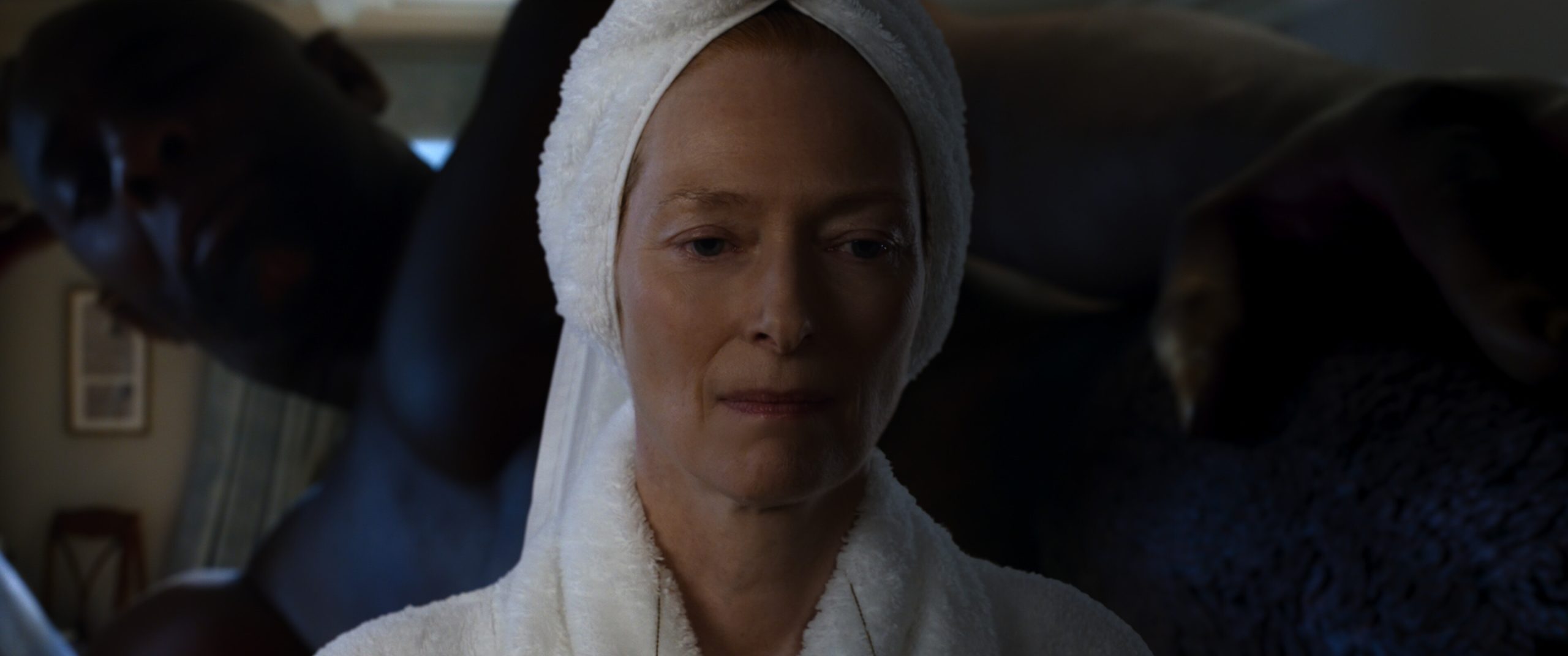
My bi-annual (or is it semi-annual?) er every other year or so update to my project to determine whether the future has arrived yet (by checking if all films from a pretty famous actor are available one way or another) is now done. And I got a bigger batch of films than usual:
If was, of course, mostly new films, but I found Caprice (from 1986) and Das offene Universum (from 1990), so I’m getting er closer to seeing All The Movies. On the other hand, there were a couple new un-gettable movies, so…
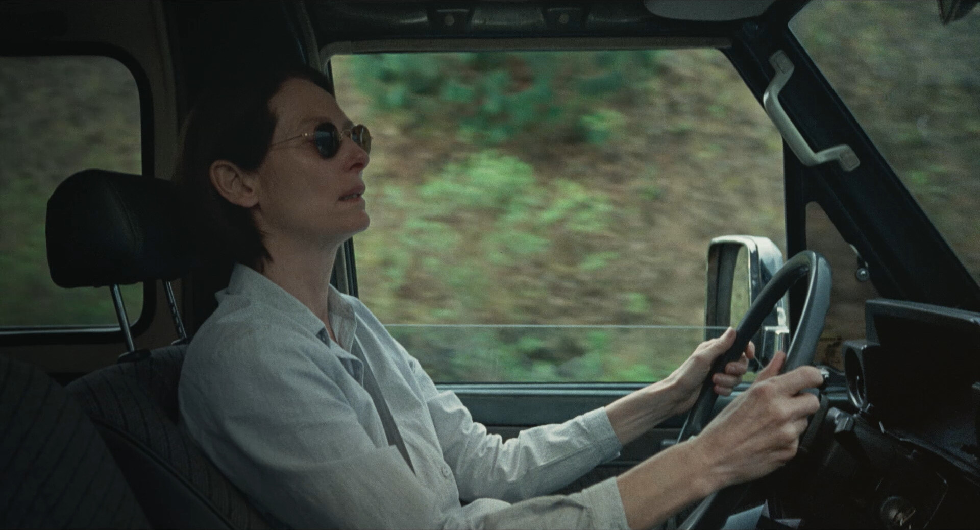
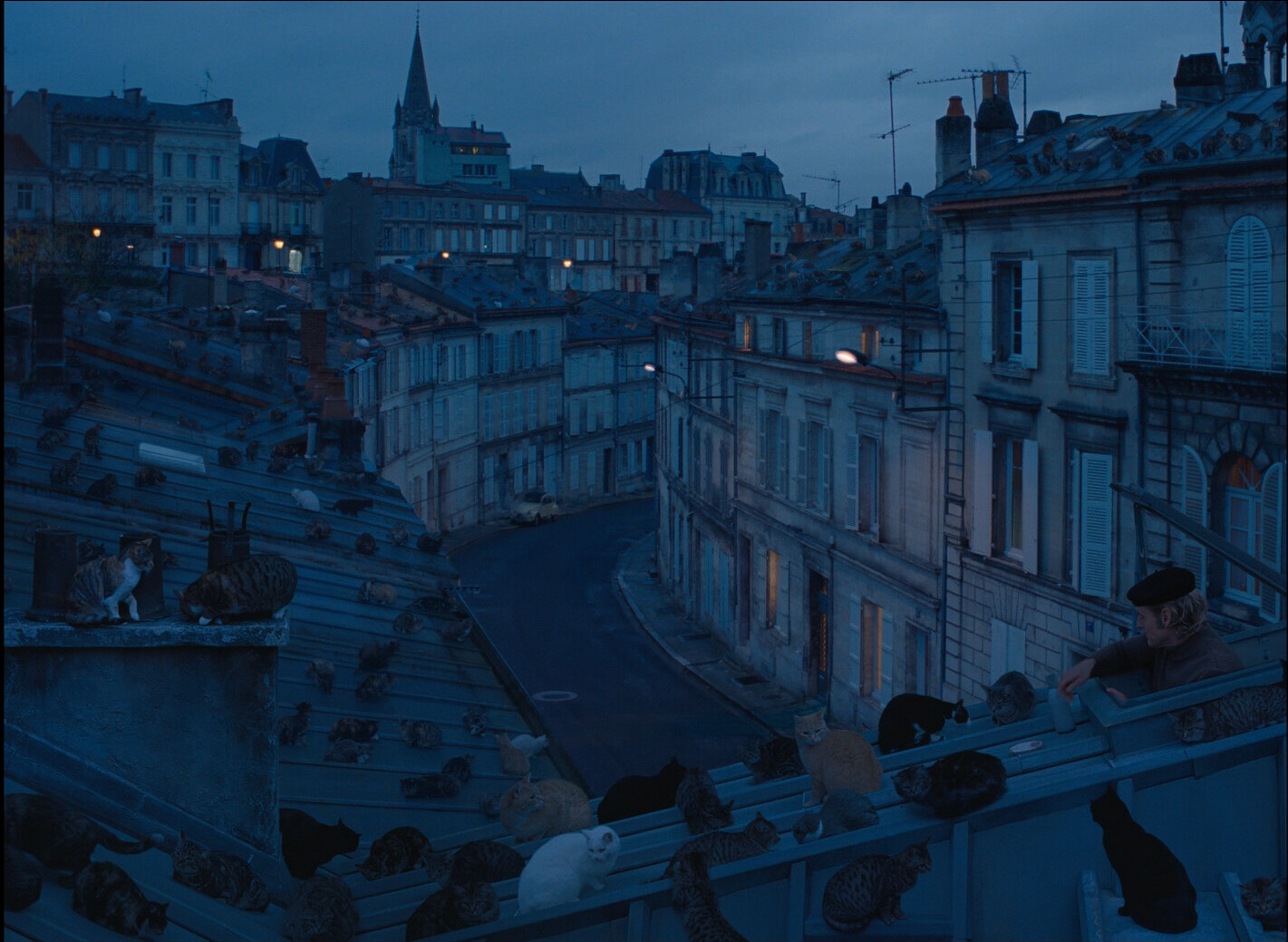
It was a mixed selection of films, to say the least. Most of the new films were pretty good (with Memoria, The French Dispatch and The Eternal Daughter as particularly fabulous), but the two old films turned out to have been unavailable for pretty good reasons.
But they were interesting to see, anyway.
And… that’s it. I guess I’ll do another update in a couple of years (going through all the old unavailable films to see whether they’ve popped up anywhere, as well as watching the new films), so I guess I’ll see you then.