Ms. Tree (1984) #10-15,
Ms. Tree (1985) #16-18,
Ms. Tree (1985) #19-50,
Ms. Tree 3-D (1985) #1
by Max Allan Collins and Terry Beatty with Gary Kato
I covered the first ~ten issues of Ms. Tree over at the Eclipse Blog, but I didn’t re-read the Aardvark-Vanaheim/Renegade comics at that time.
I did mostly have them, though: I started reading Ms. Tree when it moved to Aardvark-Vanaheim… I think? And I remember liking it just fine when I was a teenager, but during one of my “I gotta stop buying so many comics” moments, I ditched it.
So I haven’t read the last… er… ten issues? Something like that? before.
But I’m kinda excited about reading these again… I mean, sure, Beatty’s artwork is kinda basic, but I’m always down for some mysteries.
Let’s start. (Get ready to scroll, I guess…)
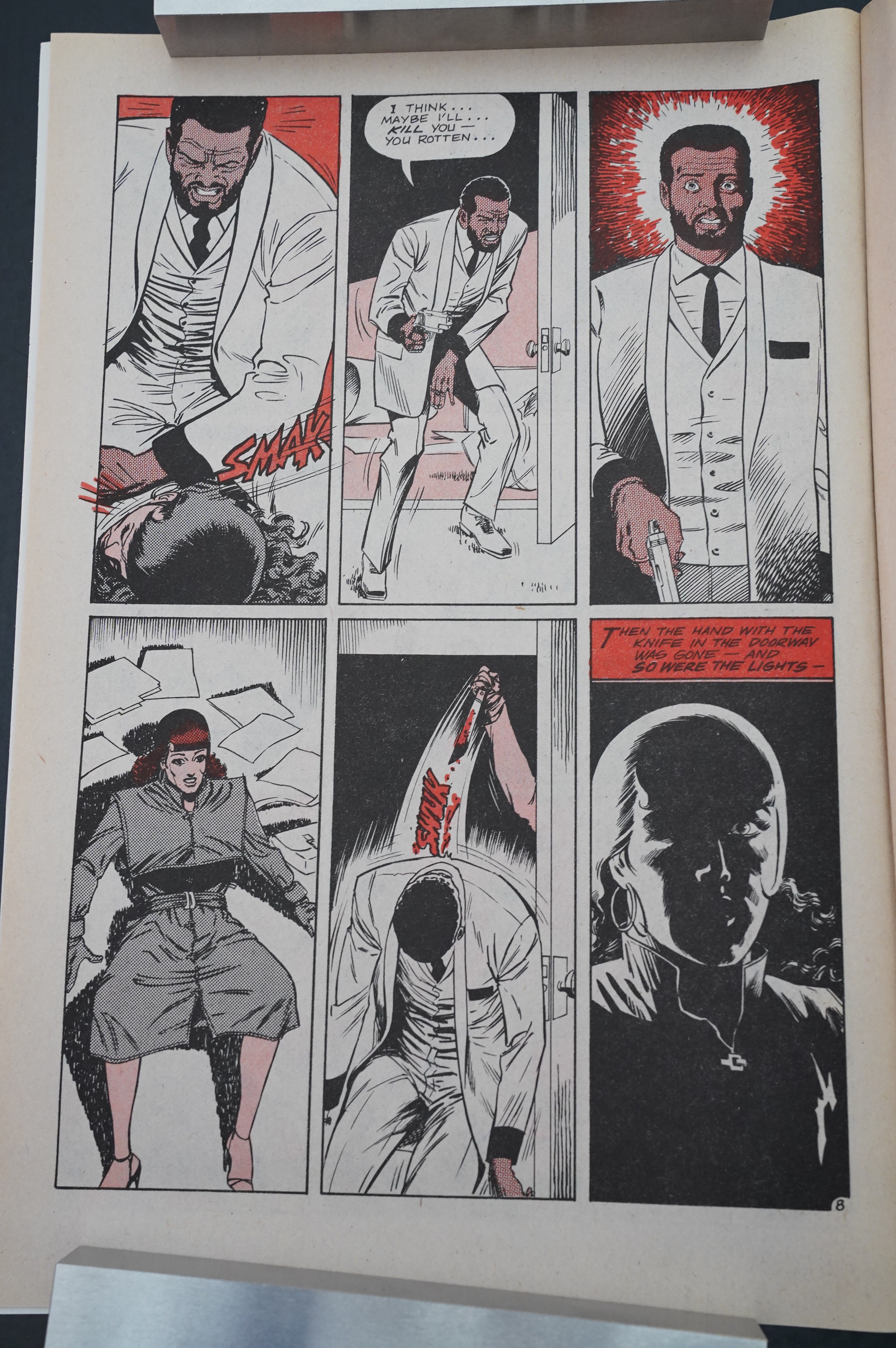
Beatty’s artwork is so stark here that it’s on the verge of being really cool. If he’d just pushed it just a bit more, this would basically be a Charles Burns page, right?
Anyway; the oldest trick in the book: Since we don’t see the killer beyond some lips, the killer is obviously transsexual. SOLVED IT ON PAGE TWO!
I’m so smart.
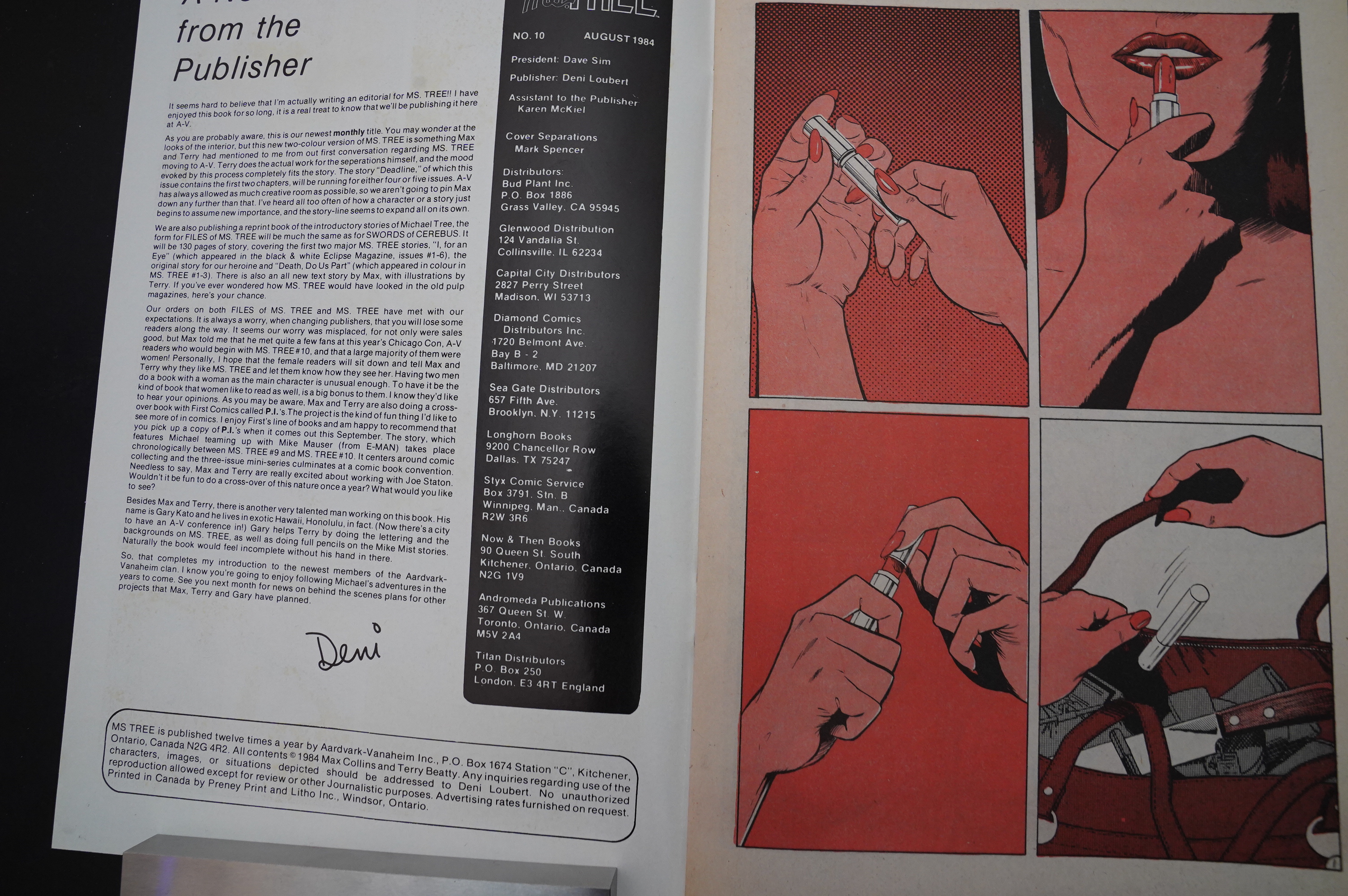
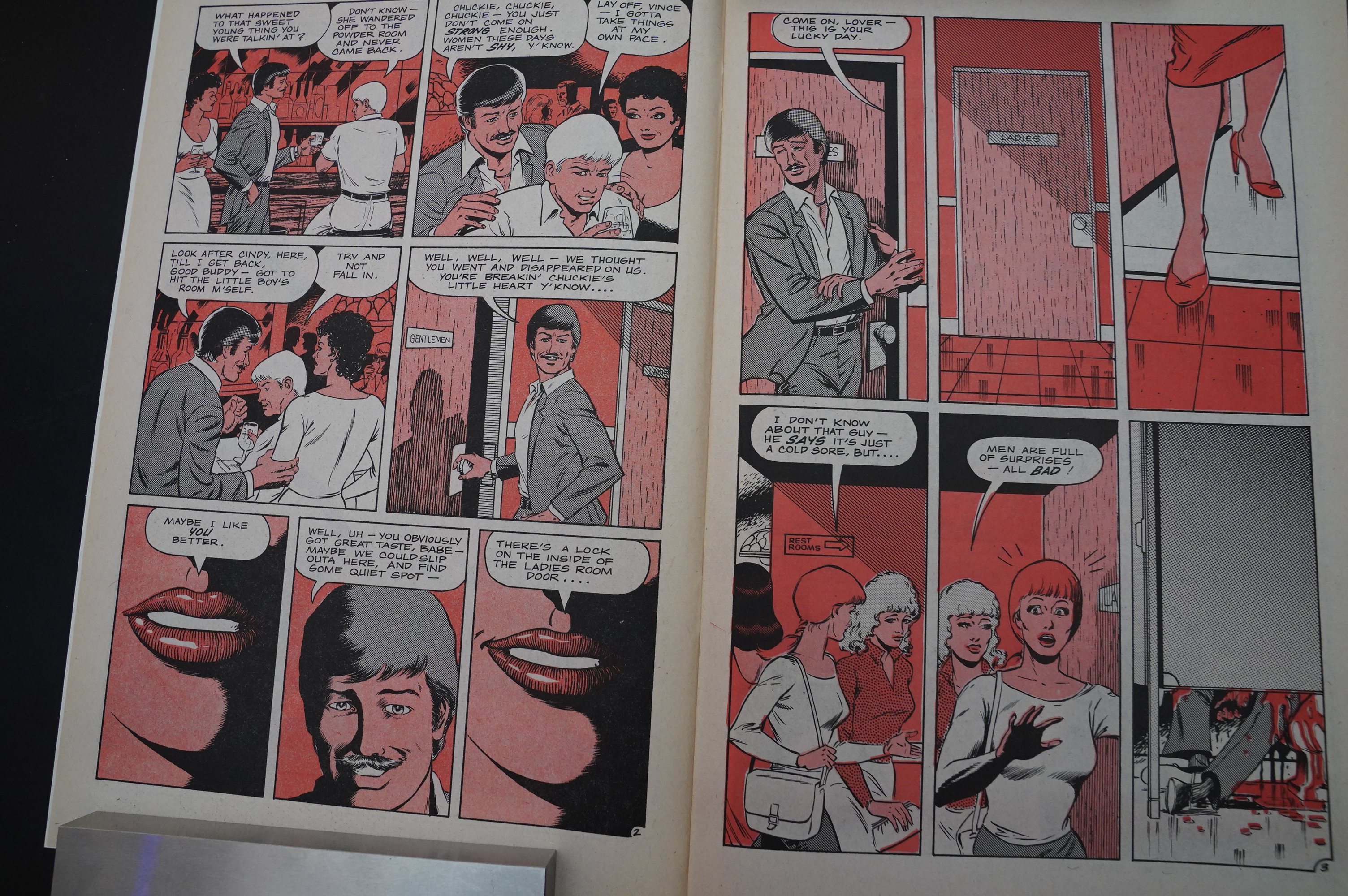
The other noticeable thing here (for the more attentive of us) is the distinct use of colour. So it’s just red, but two shades of red (well, two different weights, or er dot density or whatever it’s called), in addition to black. So that’s really cheap… but it also really works here, I think? It’s stark and interesting.
Two and a half decades later, using colour like this would become a signifier of “serious comics”; there’s barely a single autobio New York Times Best Seller comic book that doesn’t do the “just use one colour” thing. But in a different way than this.
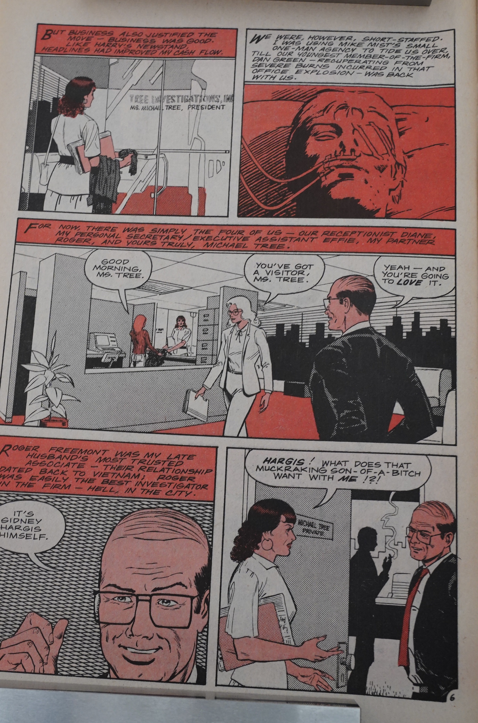
They’re very efficient storytellers. I was afraid that the first issue at Aardvark-Vanaheim would be mostly recaps, but they get it over with in a page or two, and then the story continues. That is, a new storyline starts, but Ms. Tree is structured as one long story told in distinct… “books”, I guess. Or episodes, because Ms. Tree feels quite a bit like watching a TV show.
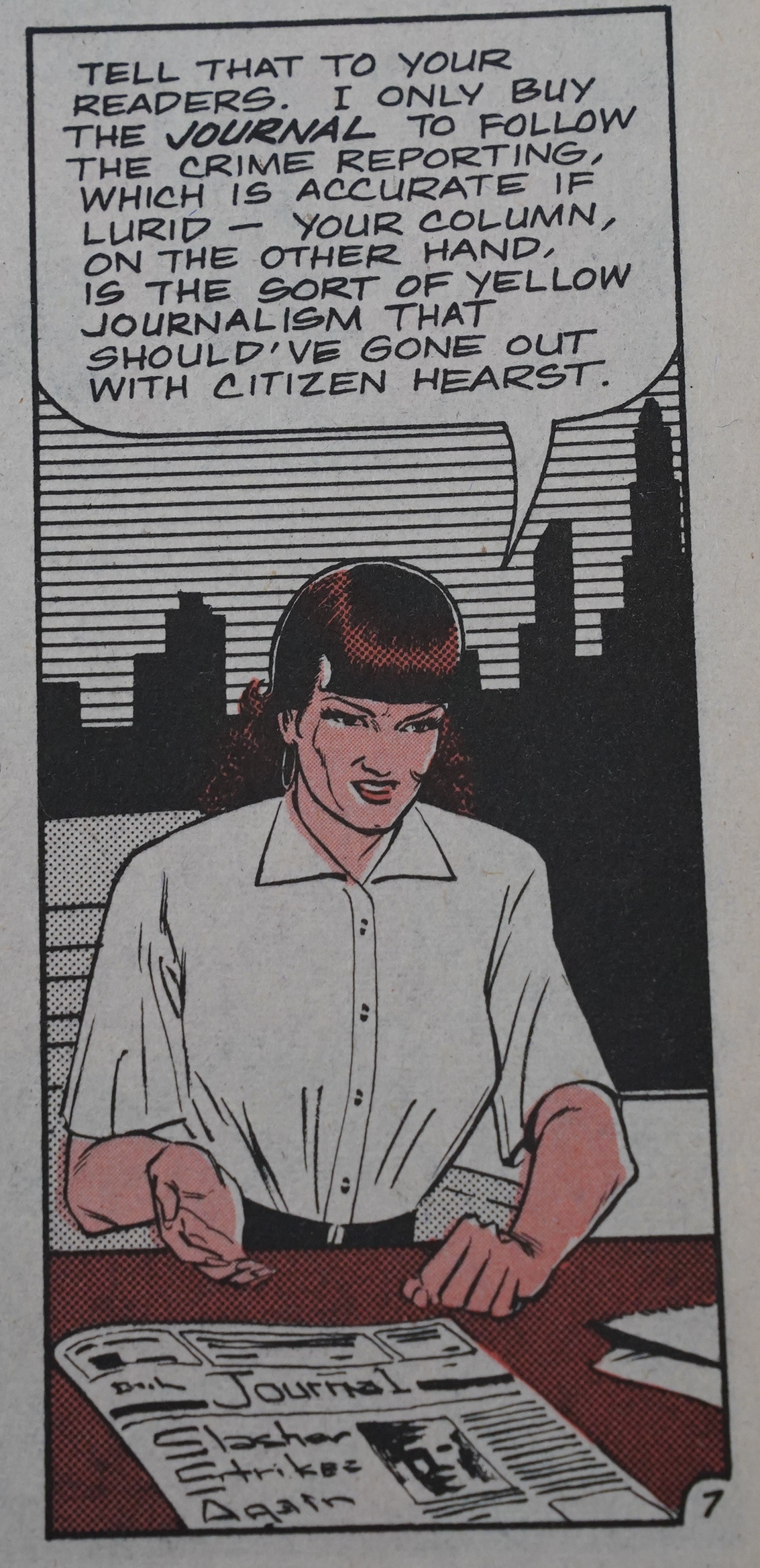
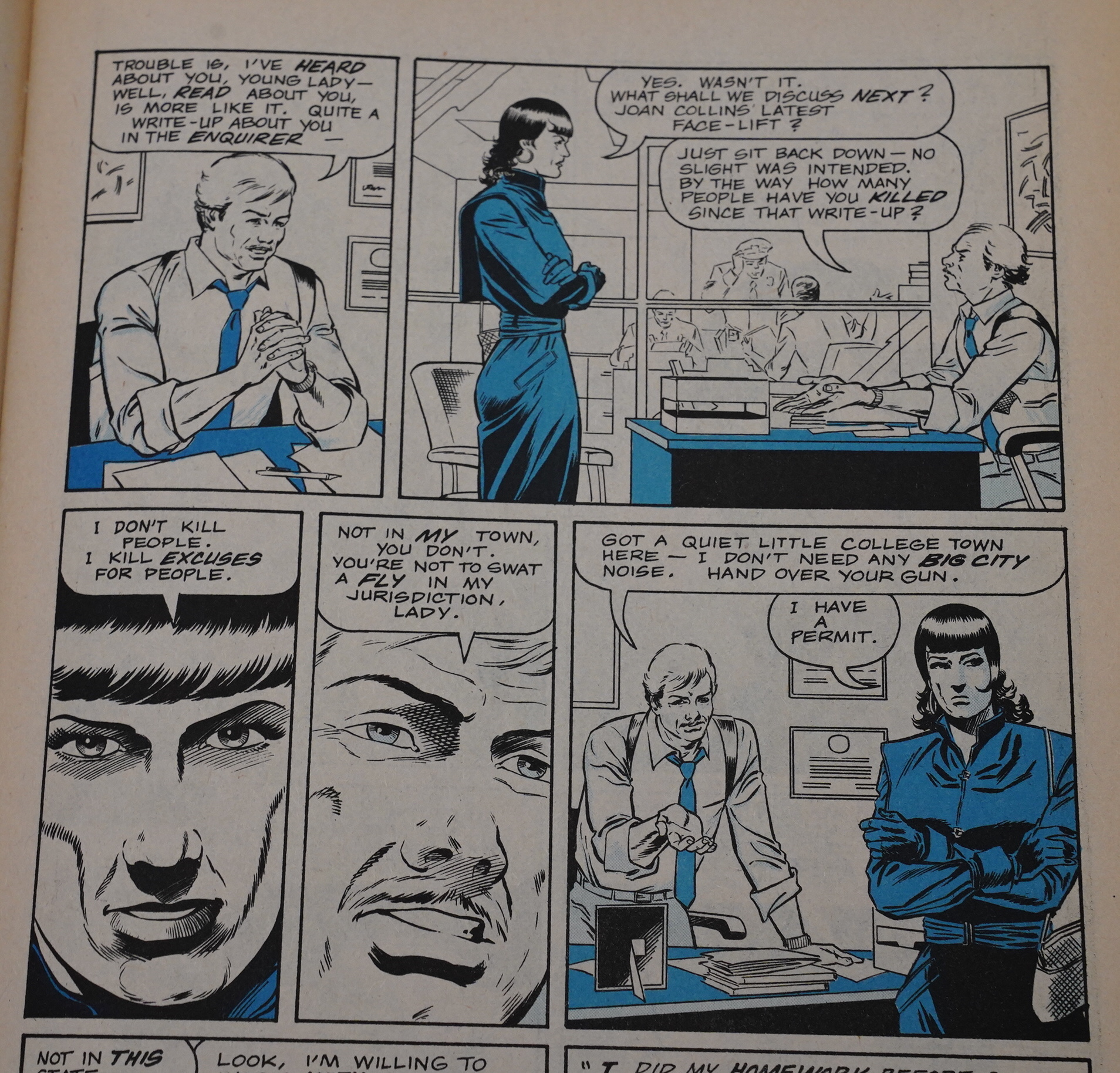
Citizen Hearst!? I forgot to mention that Collins has a sense of humour.
Merton Rudolph!? Well, OK, as humour goes, this may not be “ha ha”, but it’s… better than nothing?
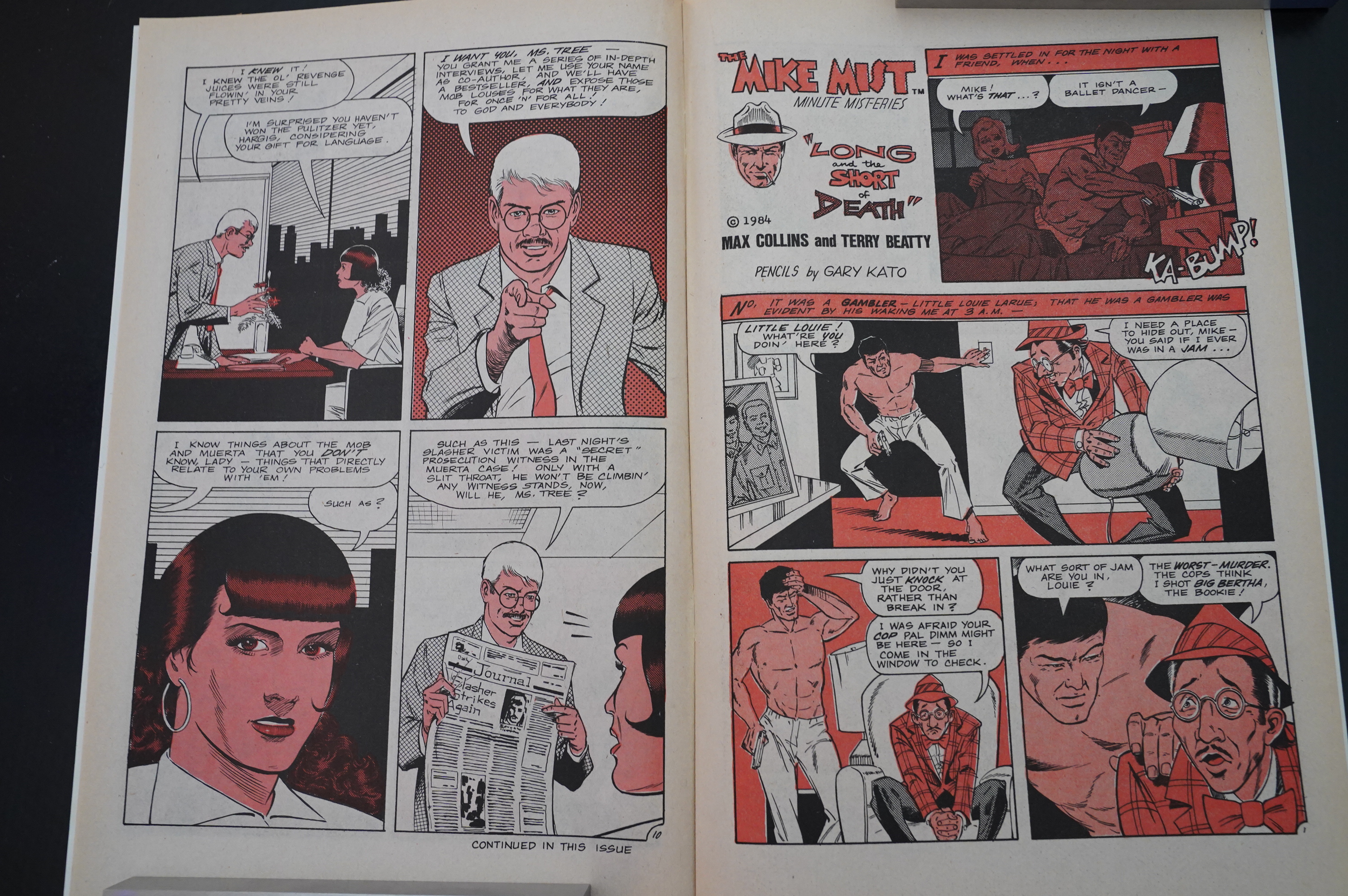
The Ms. Tree structure makes it feel even more like an American TV show: Each issue is two ten-page Ms. Tree chapters, and then something in the middle of the chapters. Usually a Minute Mist-ery, but sometimes a letters column.
This gives the series a very distinctive rhythm… Initially I thought it was going to become annoying, but it works. Collins is good at structuring the stories.

Oh, you wanted to know the solution to the very small mystery? Here you go. (Yes, they’re usually that… eyeball roll inducing. But coming up with a two page mystery doesn’t sound easy.)
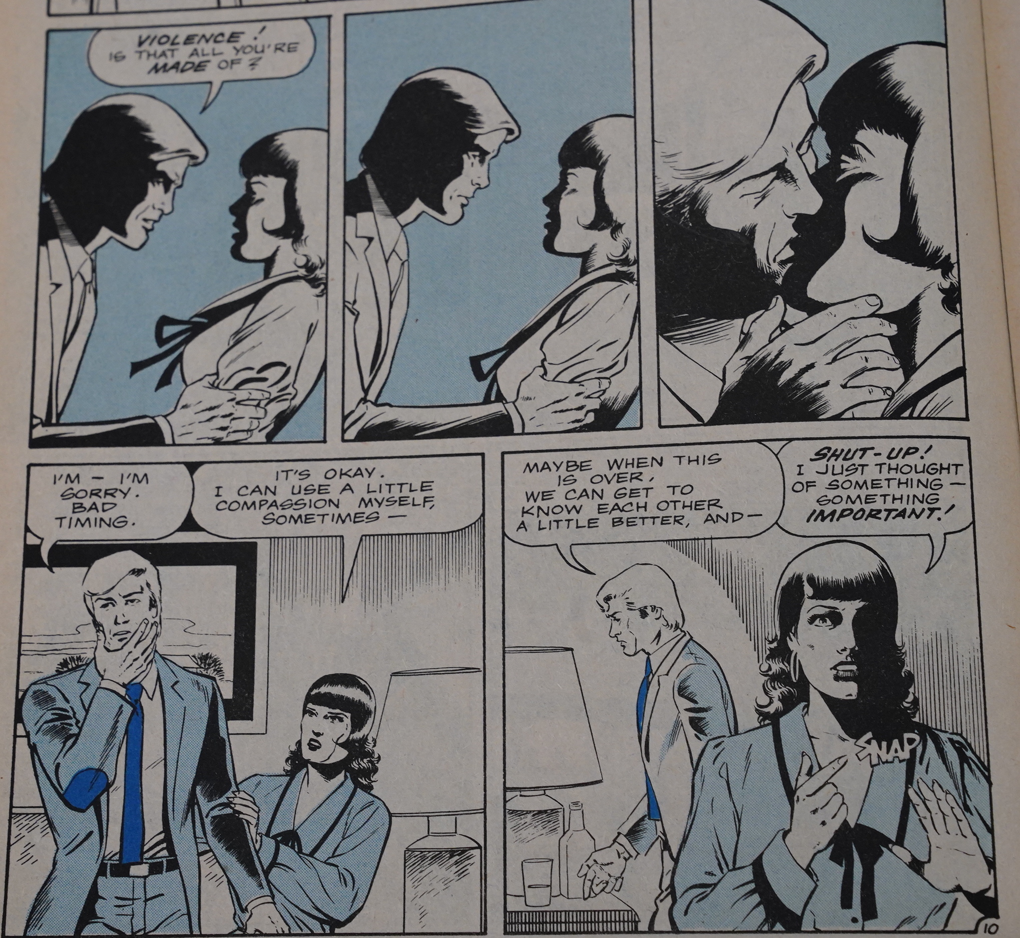
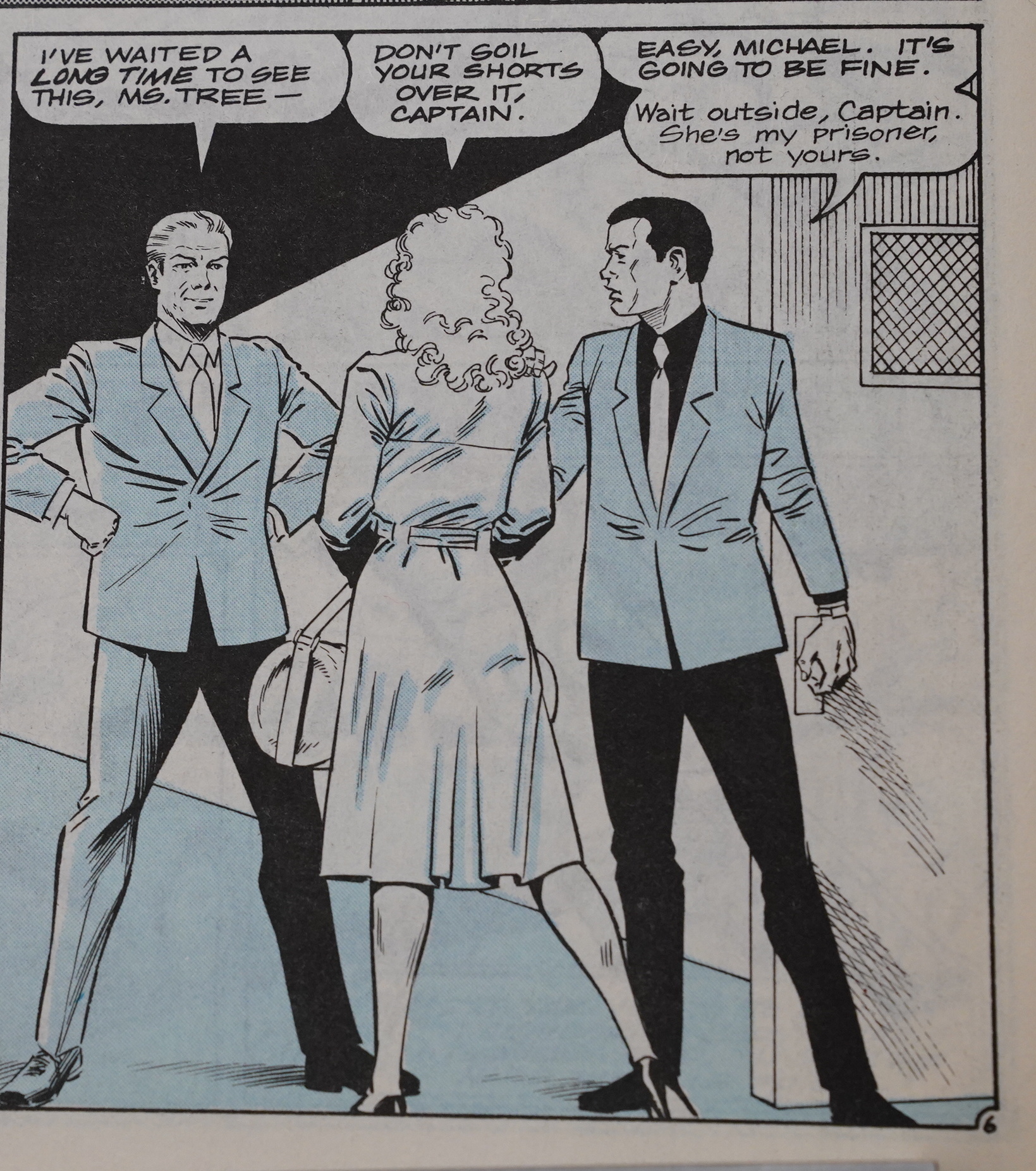
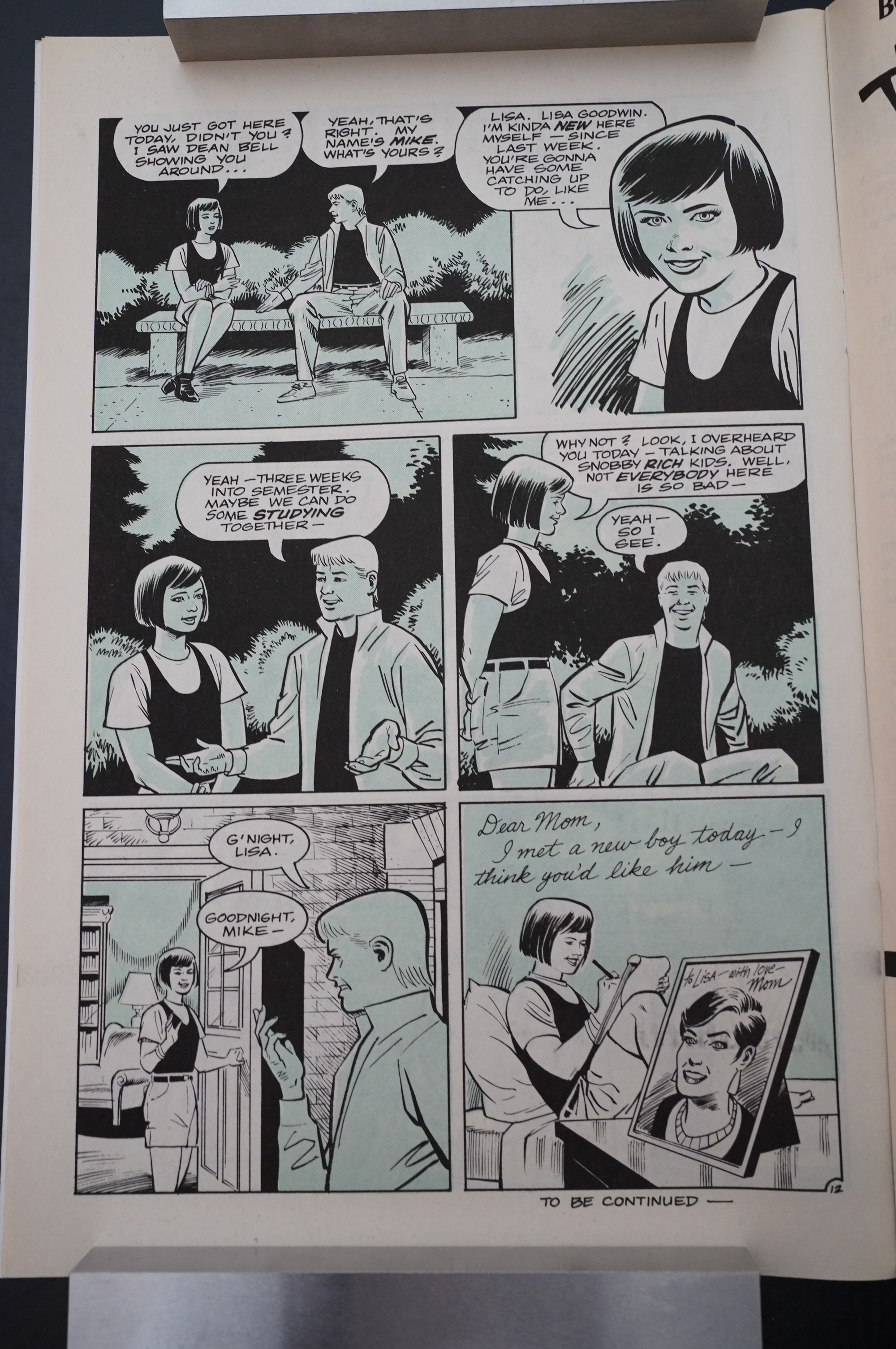
Beatty’s artwork in the Eclipse issues of Ms. Tree was really basic… and it’s still not exactly… er… Well, you’ve seen the pages yourself. But he’s also wildly variable. That Ms. Tree in the lower right corner is very moody, and the guy in the first three panels looks really good. But then Ms. Tree on the floor? That looks really odd. And the hand that had swept in to stab that tall guy? And then the corpse is falling while she holds on to the knife? That’s… not good?
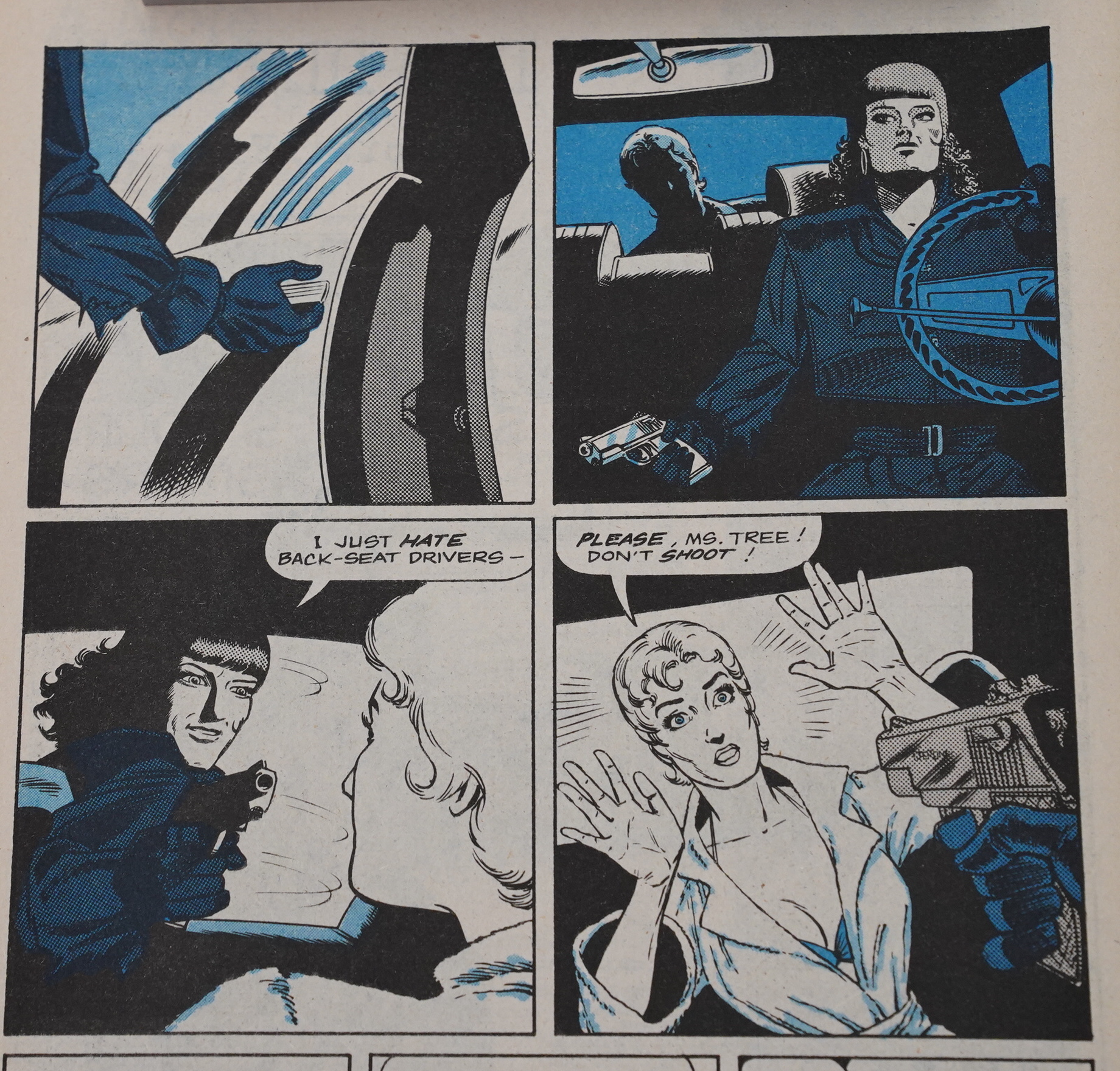
And there’s a certain willingness to avoid logic on a scene-to-scene basis just to get some tension — like Ms. Tree here getting into the car, knowing that there’s something in the back seat. Doesn’t really make much sense, but…

Hah! Killer killed! Somehow! In the pool! And, hah! It was a man all along! I’m so smart.
Beatty doesn’t do this a lot — that is, use colour holds, but it’s fun when he does. I think it’s composed of images from the preceding chapters? It’s kinda cool.
OK, the buildings in the background look like as if you had asked a nine year old to draw some sky scrapers, and the size of the steering wheel in relation to Ms. Tree’s body, and the distance between her body and the steering wheel is “eh”?
But look at Ms. Tree’s face: That’s kinda good.
I was expecting to totally be sitting here, making fun of Beatty’s artwork and not writing much else, but… It’s not that bad, really?

They’re pushing it here: A six panel mystery?

Look at that look of disgust on her face in the third panel! (She had assumed that the other woman had been raped when twelve college guys had sex with her when she was younger and drunker, but she was totes down with it, apparently.)
And…
Here’s the shocker: The serial killer was a woman! It wasn’t that dead guy in the swimming pool.
I was wrong! Perhaps I’m not so smart! You got me, Collins! Smartypants mumble mumble
OOPS SPOILERS
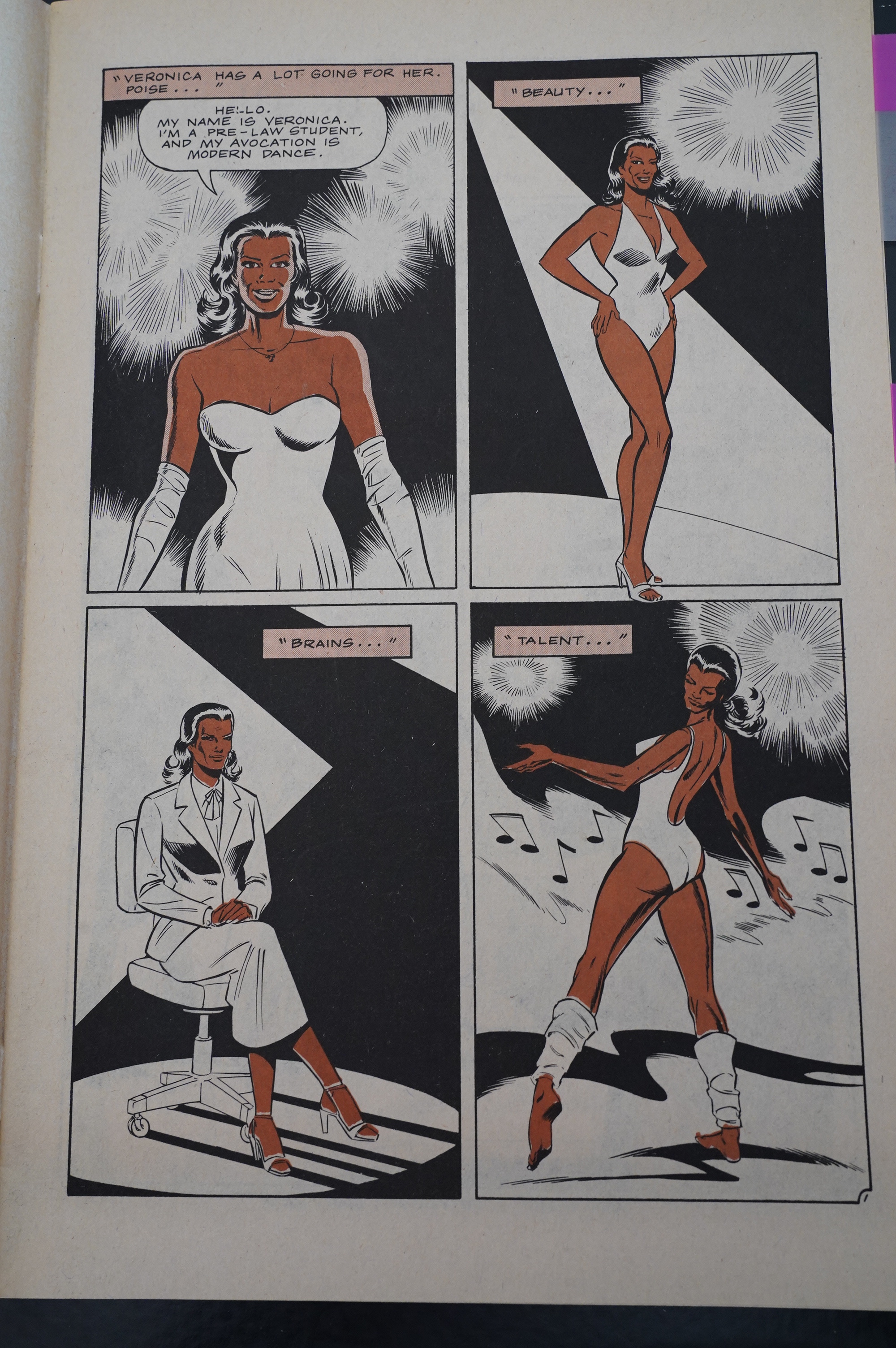
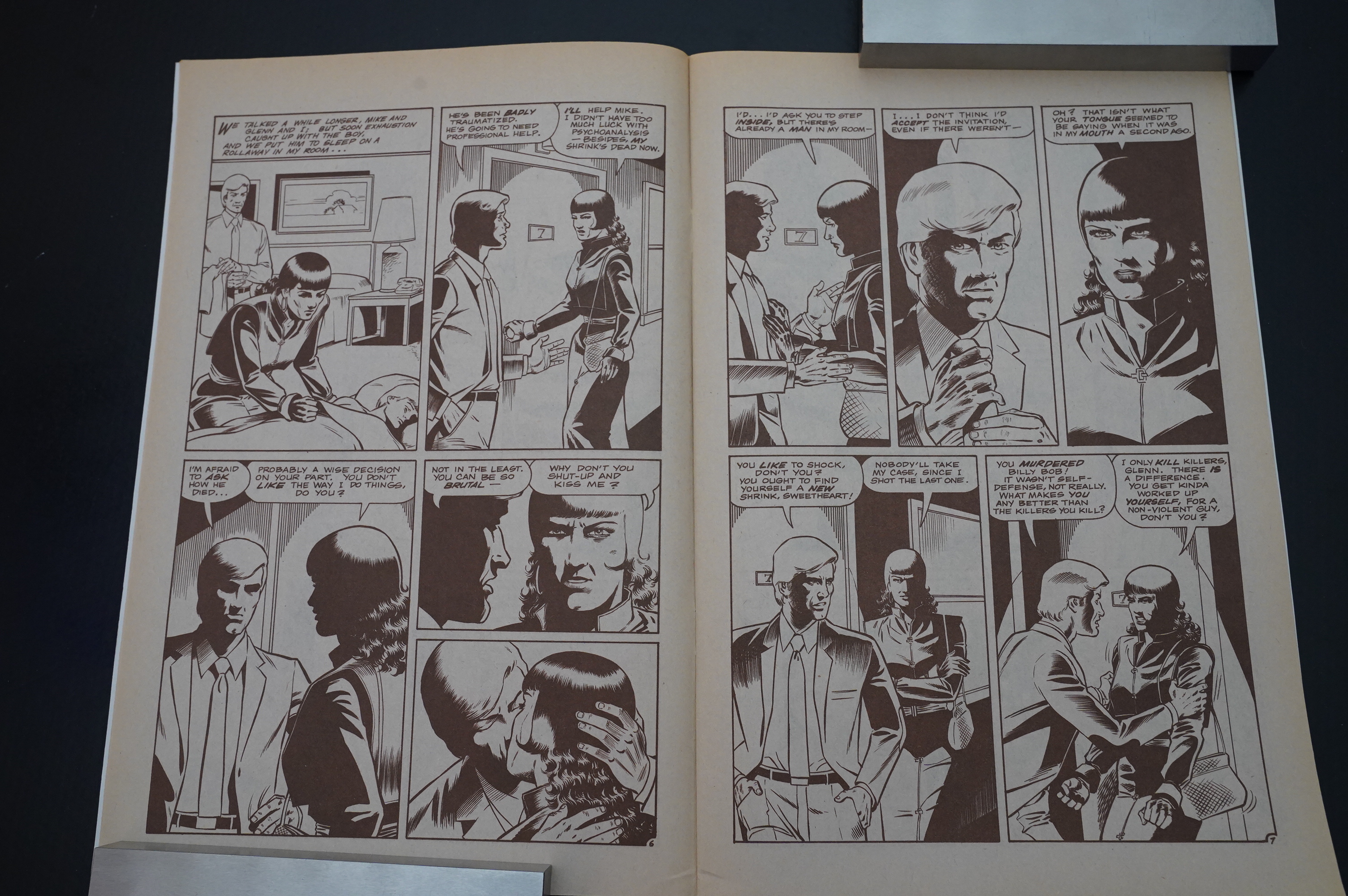
So for the next serial, which is about a Black woman, is printed in sepia. Or, well, brown. I wonder whether that’s going to rub somebody the wrong way…
It suits Ms. Tree’s hair, in any case, and you get two skin tones.
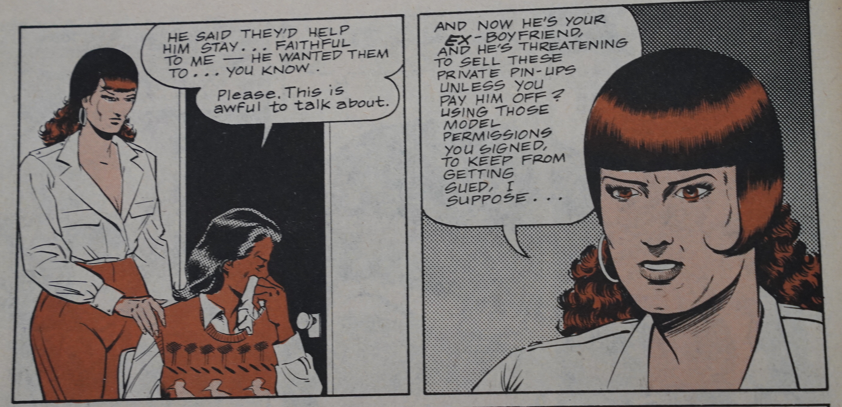
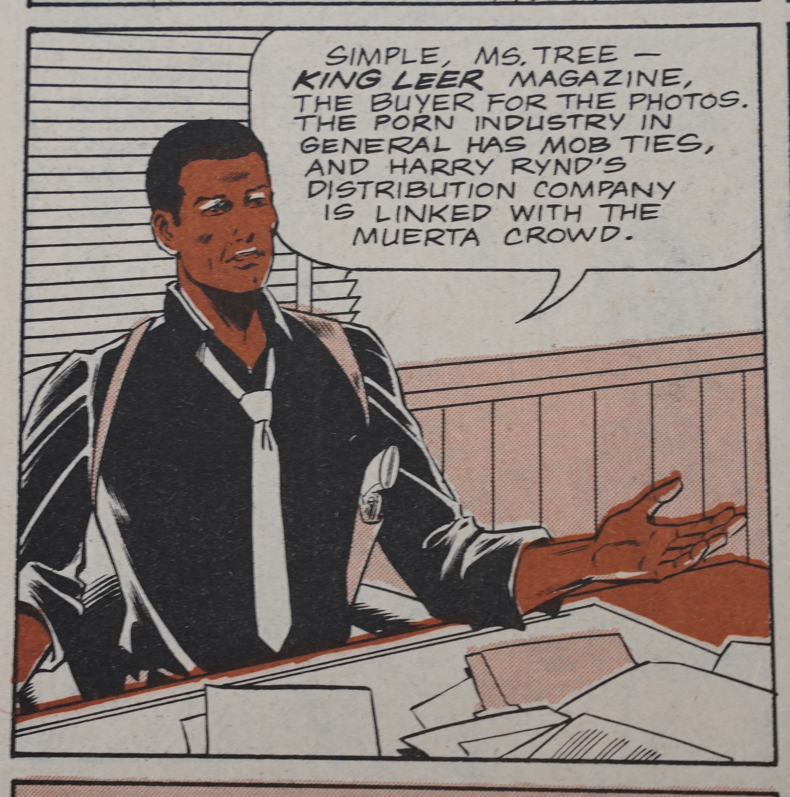
Anyway, the next story is about revenge porn, which I hadn’t expected.
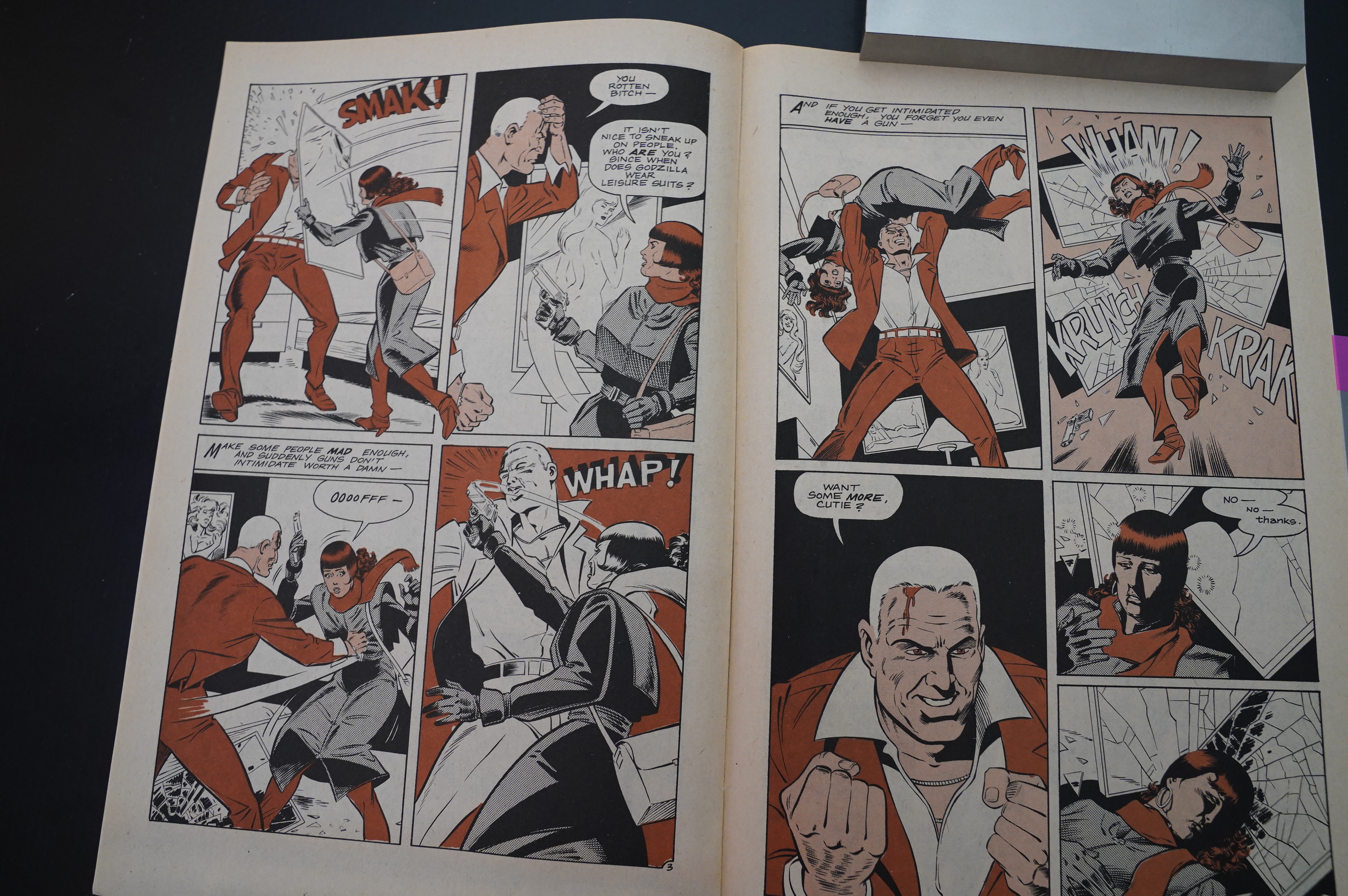
I hadn’t expected Ms. Tree to get beat up so much, either. That’s a good “OOOOFFF!” panel. It certainly looks oooofff.
Getting beat up a lot is very classic noir, of course.
When doing this kind of colouring, it’s important that it’s not printed out of registry… and… it is, on a lot of pages, leading to some confusing-looking faces.
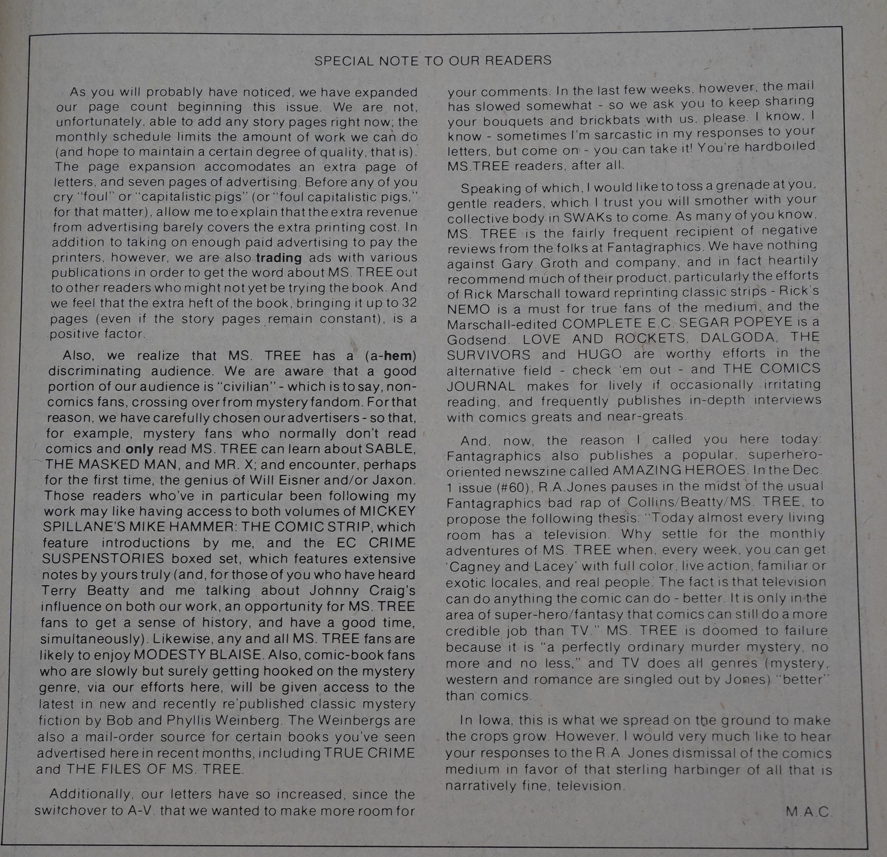
Collins announces that they’re moving from 24 pages to 32 pages — but not to add more story pages, but to add a bunch of ads. And not to make more money from the ads, but to do ad swaps with other comics. Makes sense to me.
And then Collins quotes RA Jones (from Amazing Heroes) who has, brilliantly, announced that there’s no point in detective comics since TV exists.
Der.
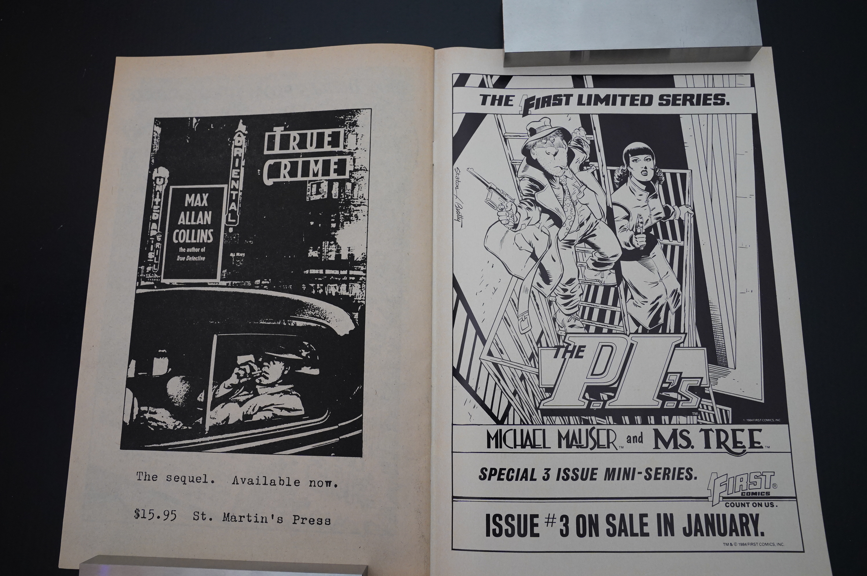
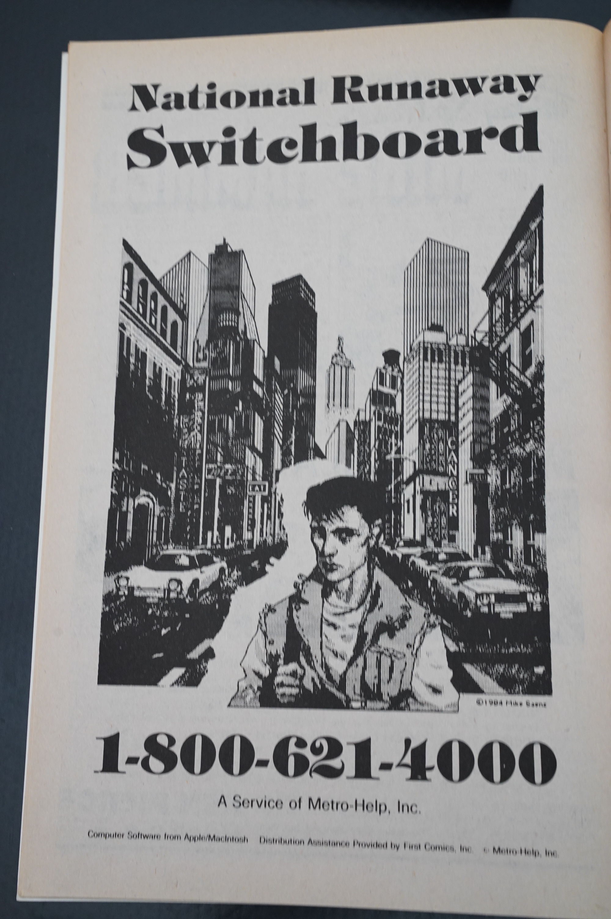
Here’s some of the ads.

The duotone colouring works better on some pages than others, and here not so much: Those brown eyes look all kinds of weird.
And speaking of colour schemes: They seem to flip between colours at random. You’d think they’d keep the colours the same for each story arc, but nope. So the first issue of this uses brown (the same as both issues of the preceding arc) and then switches.
Ah, yes, this storyline deals with kids who go missing…

… and the horrible fates that await missing kids.
Did I mention that Ms. Tree has a tendency to kill pretty much all the evildoers she happens across?
The cops don’t like it so much.
Ms. Tree is down to trot, but she meets up with some do-gooder guy, so that’s a bust. I thought this was a plot clue, though, and that he was the pedophile murderer. Collins fooled me again!
One issue is printed all in brown. This is either 1) a daring design choice, or 2) Beatty didn’t have time to actually do the duotone colouring, so they either had to print it as black-and-white, or print it brown-and-white and claim 1).
I’m going with 2).
But it’s kinda striking in its way. The ink used looks almost a bit translucent and shimmery, but that’s probably just the interplay with the paper. Still, I kinda like it.
Also: It looks like Ms. Tree’s happy-go-lucky killing of horrible criminals is going to become a more overt theme in the next issues, and it’s all going to lead to something… I hope it’s not a nervous breakdown, because that’s not fun.
Everybody’s a critic. Collins answer (and I paraphrase) “it’s just a story! lighten up!” but also “there was nothing wrong with anything I wrote”, which is kinda covering all options, criticism wise.
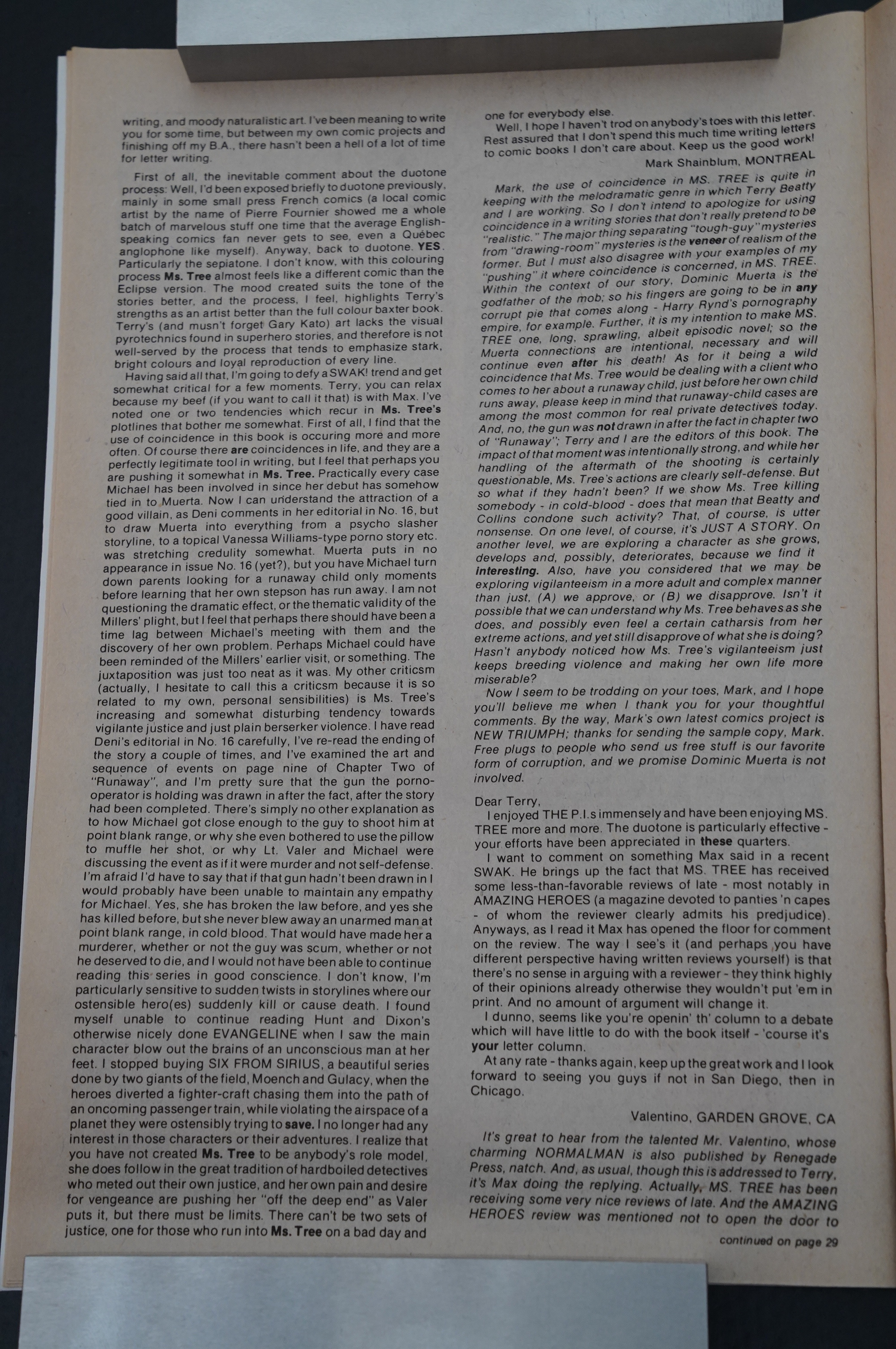
Oops. Some blockback from the first issue with brown duotone. “If I were black I would be offended.”
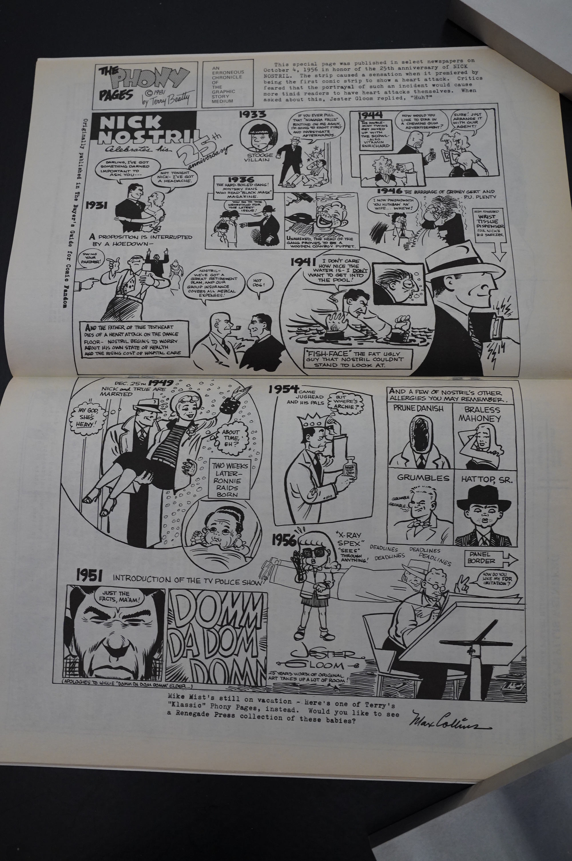
Oh, yeah, I had forgotten that Beatty did these Phony Pages — parodies of old comic strips.
OK, I’m not gonna spoil this, but in issue #21, we finally get a resolution to the major storyline that had been going as a sub-plot throughout all the previous issues. And it’s… a pretty good one?
I know! I had expected to be more critical about this book, but I’ve spent this afternoon reading this, and I’ve been thoroughly entertained. I mean, it’s not … high art or anything, but as crime fiction goes, I’ve read a lot worse… and as detective comics, it’s been a while since I’ve read anything better.
But I gotta pause now, and I’ll continue reading tomorrow.
Or for you, that’ll be on the next line:
Oops. That was more like a week… anyway.
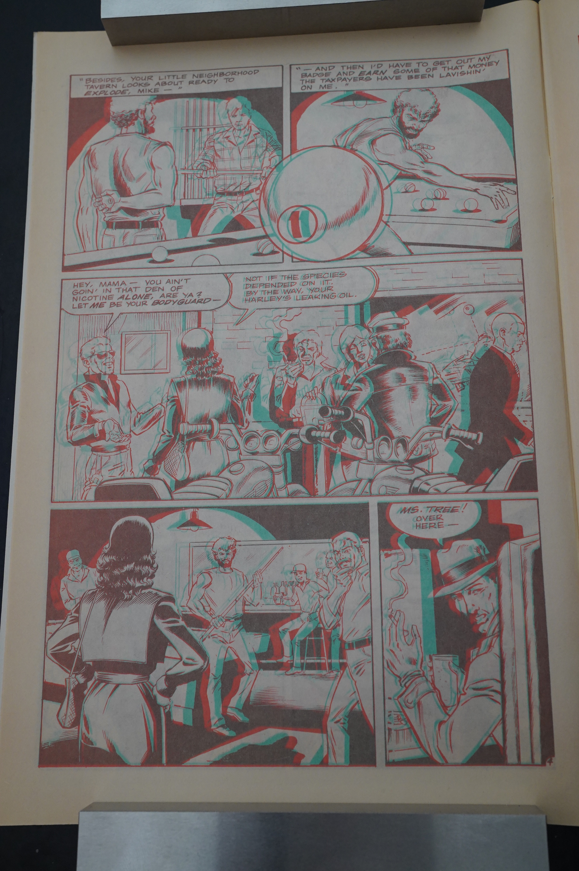
Do not adjust your set! I mean browser: It’s meant to look like that, because it’s the Ms Tree 3D Special.
The 3D is by Ray Zone, and it’s quite good, but it’s not his best work. Things that poke out of the page don’t really seem to hover correctly. But the panels that open up “inwards” are really nice.
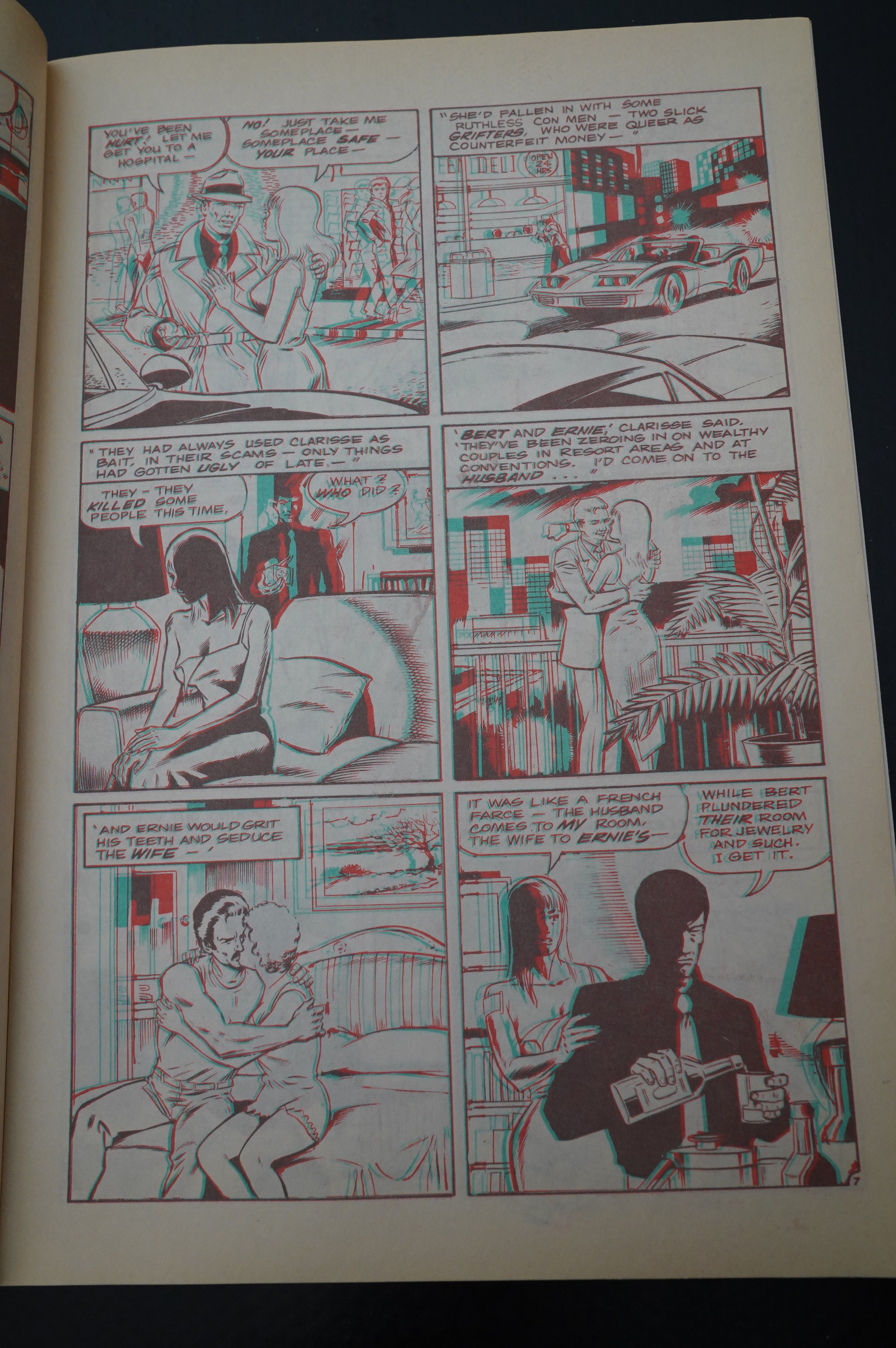
The story is weaker than most Ms Tree stories, though: It’s about two gay serial killers/hucksters called Bert and Ernie.
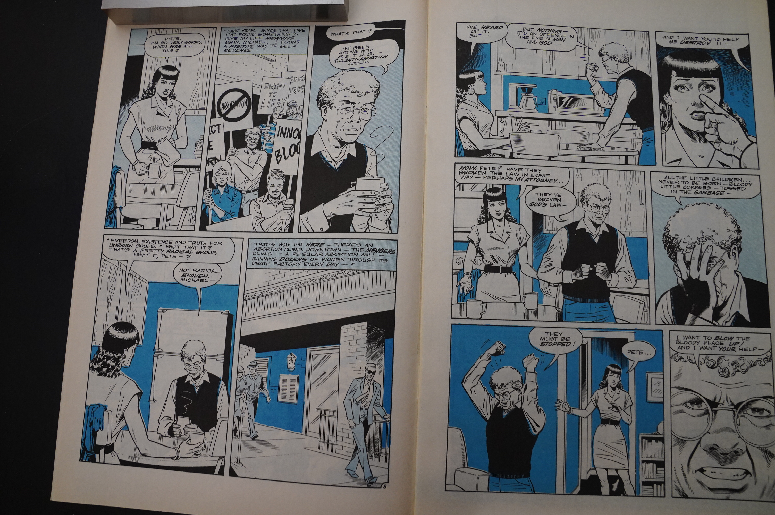
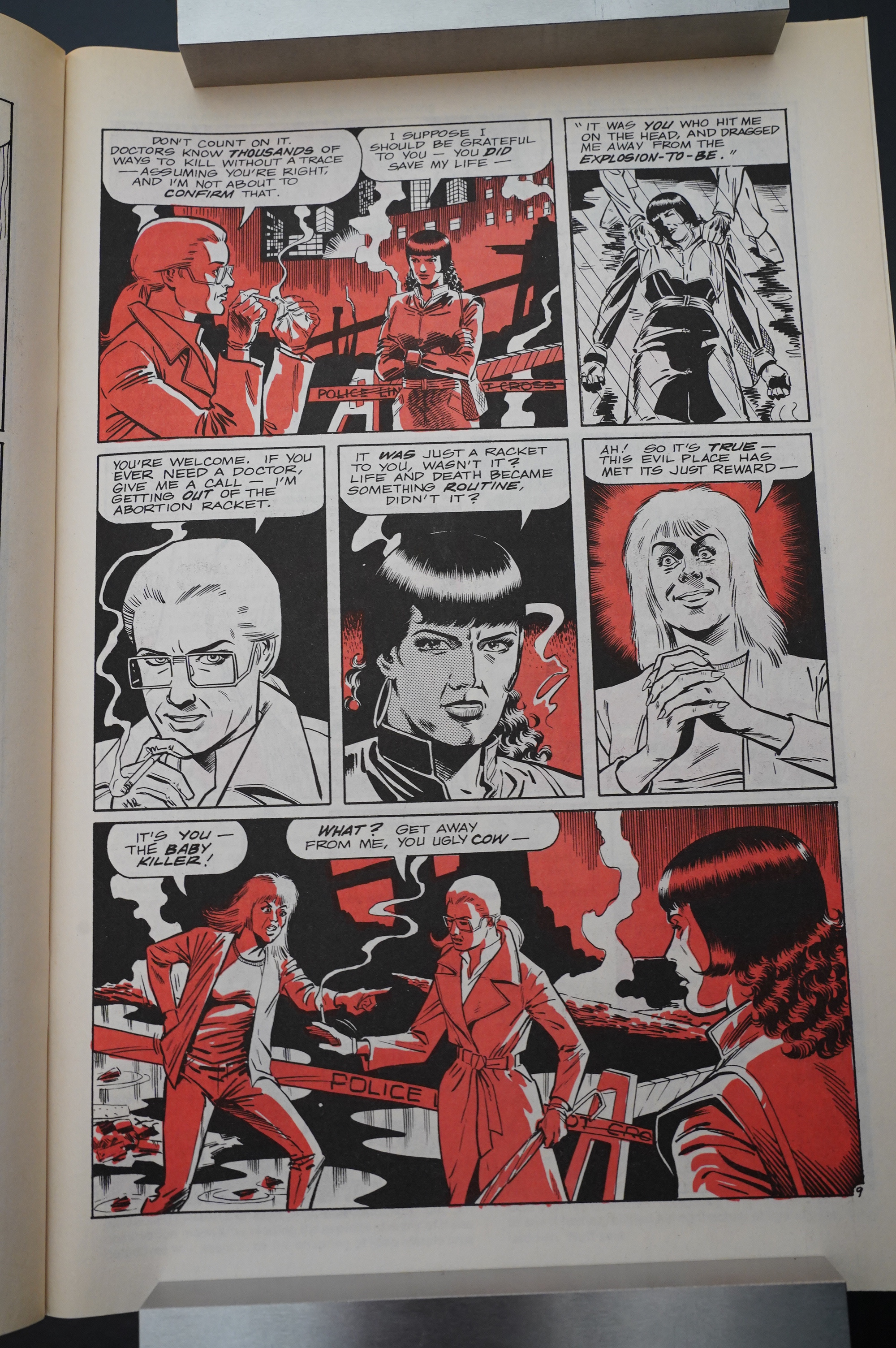
Back to the main series: The mega-plot of Ms. Tree skidding out of control gets a logical development: Other loons think that they can get her to do their killing for them. So here’s an anti abortion/bomb enthusiast.
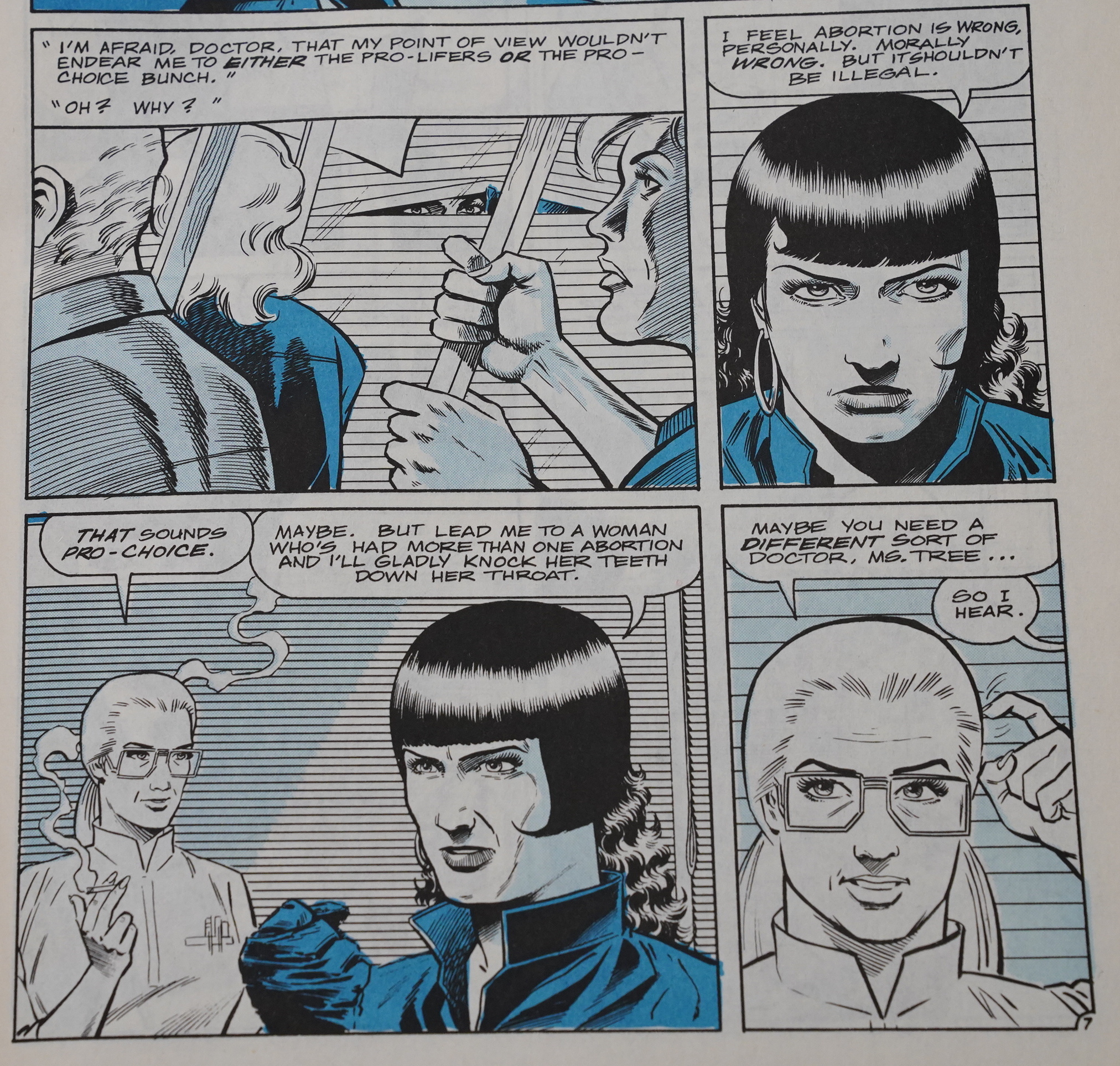
Ms. Tree explains her nuanced position on abortion.
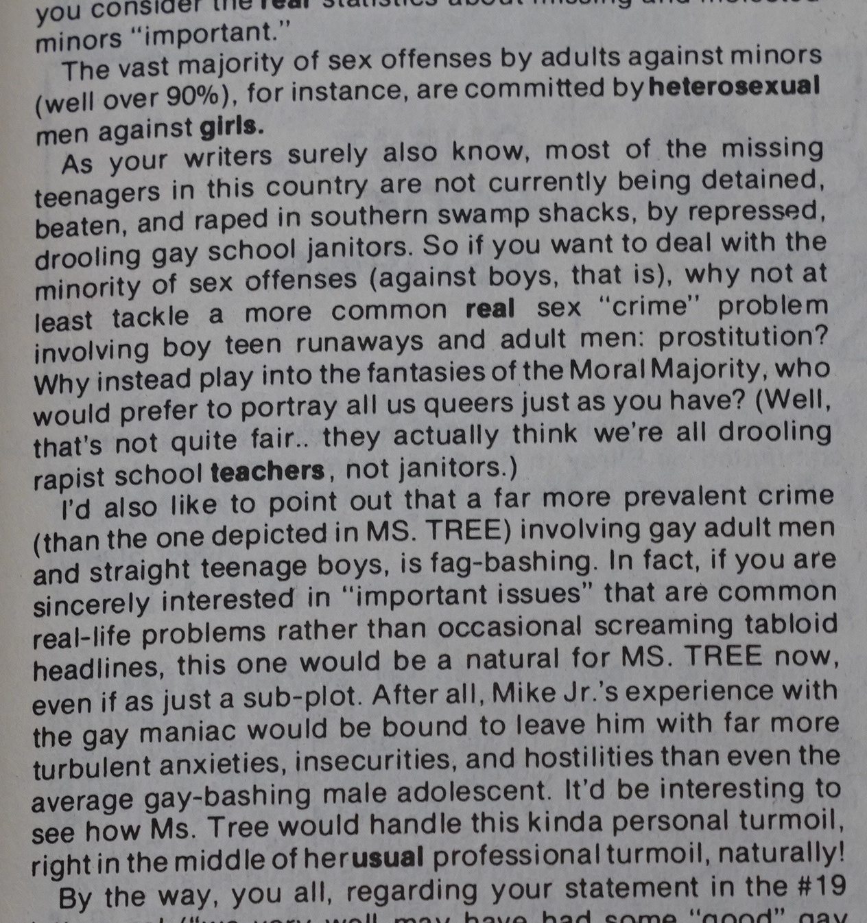
Letters start arriving about Runaway conclusion: Some people were peeved that the guy who kidnapped (and almost raped) Ms. Tree’s sorta-stepson was gay, and other people seemed miffed that the subject was handled at all.
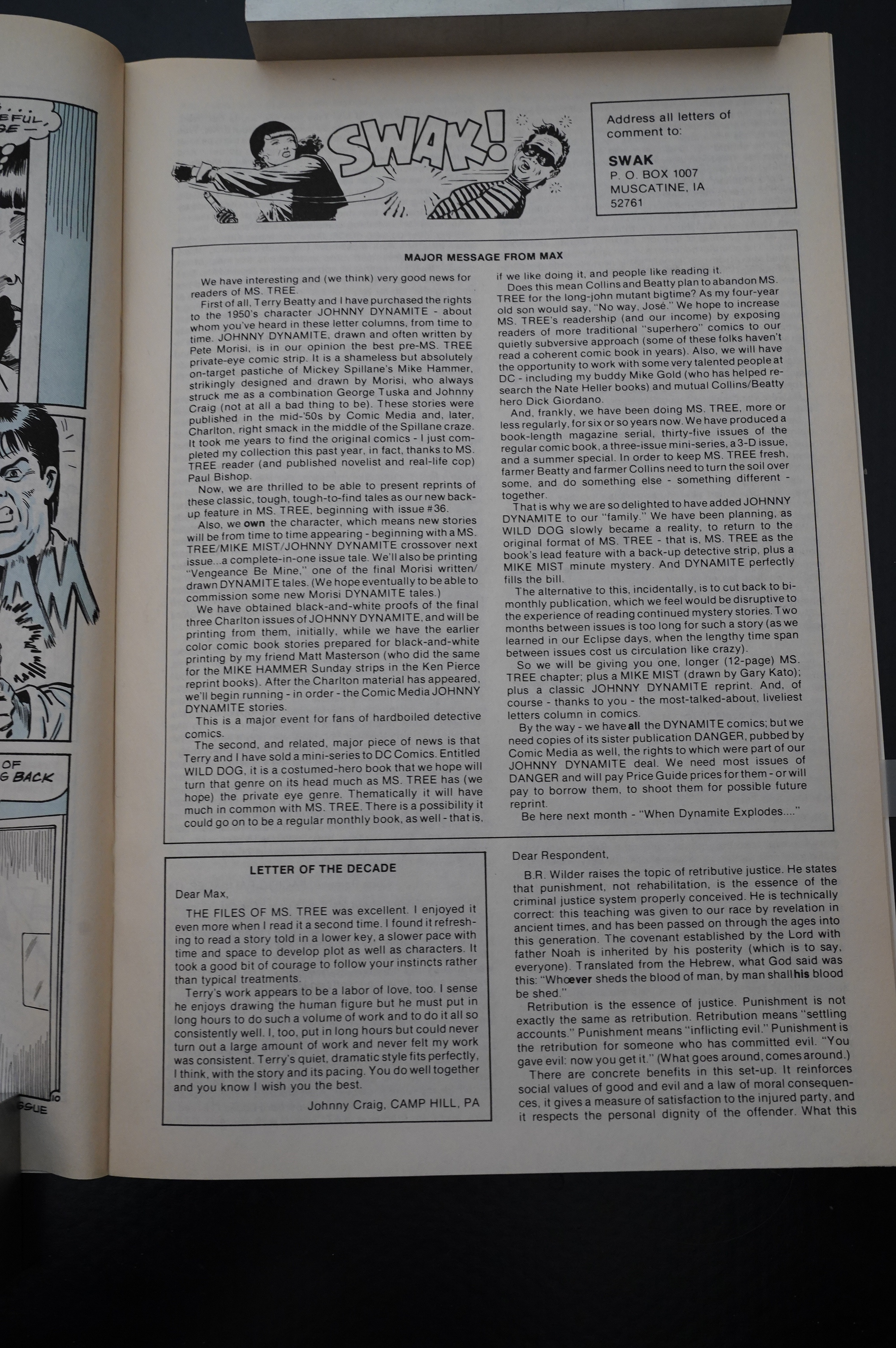
(I haven’t mentioned the letters pages, I think? Or have I? Anyway, they’re pretty extensive — usually three or four pages, but up to seven pages on occasion.)
And then Beatty starts experimenting with a new colouring technique: Instead of duotone, it’s now all monotone. That is, only one shade of whatever colour they’re using per page. It gives pages like this a very stark look, doesn’t it? I’m not sure it’s a change for the better… but it’s probably half as much work.
(That guy to the left has a lot of leg going on…)
But speaking of storytelling techniques (were we?): They have a tendency to do this sort of thing here and there. That is, have an aside written in lower-case, which I originally interpreted as being said in a very soft voice. But that makes no sense here. So it’s instead meant to be read as … another beat? Which would normally have occupied a new panel, perhaps?
It’s very awkward. I don’t think it works.
That’s the lightest blue colour I’ve seen.
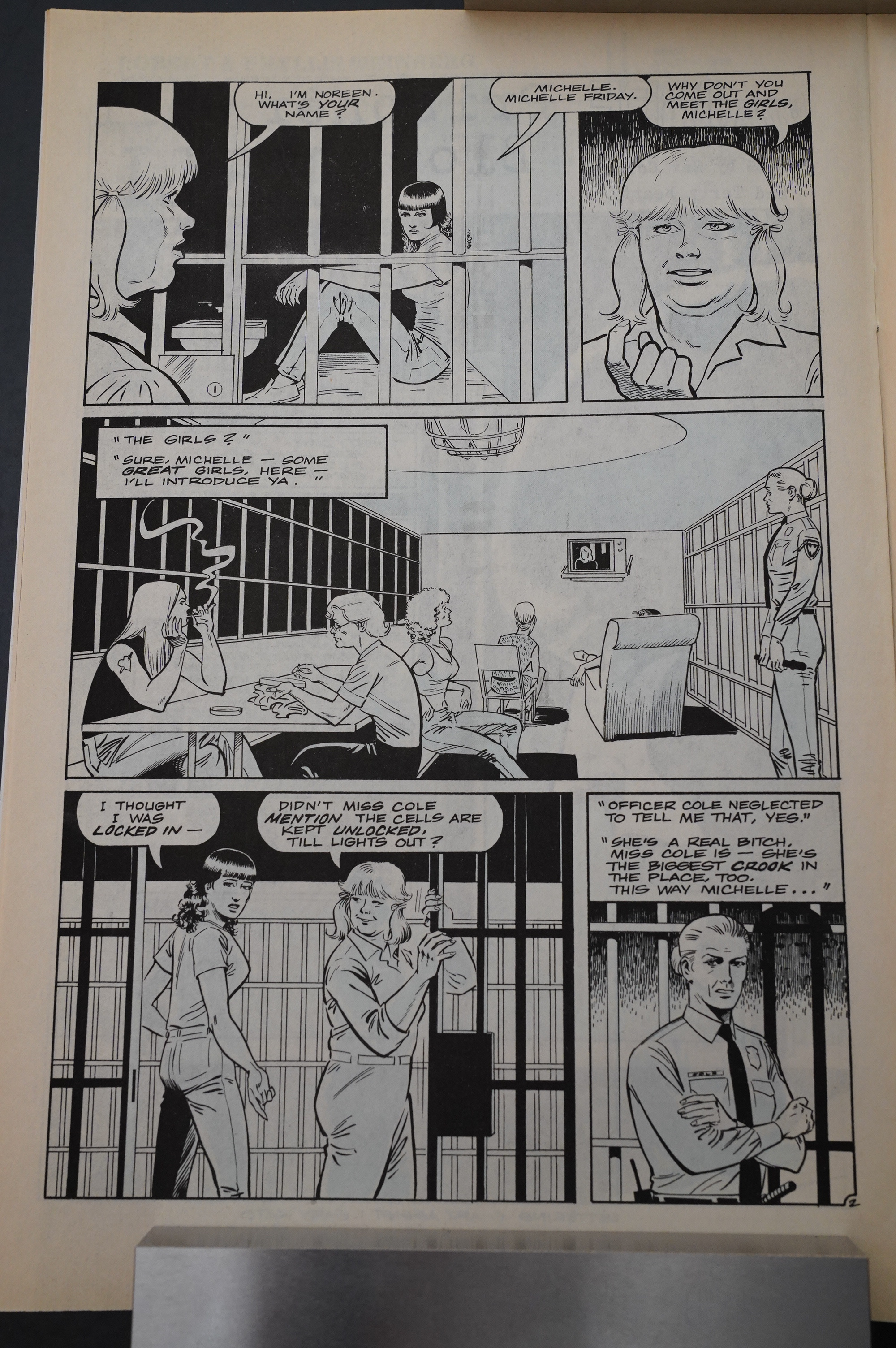
And I guess this is a Prisoner: Cell Block H homage? It’s fun.
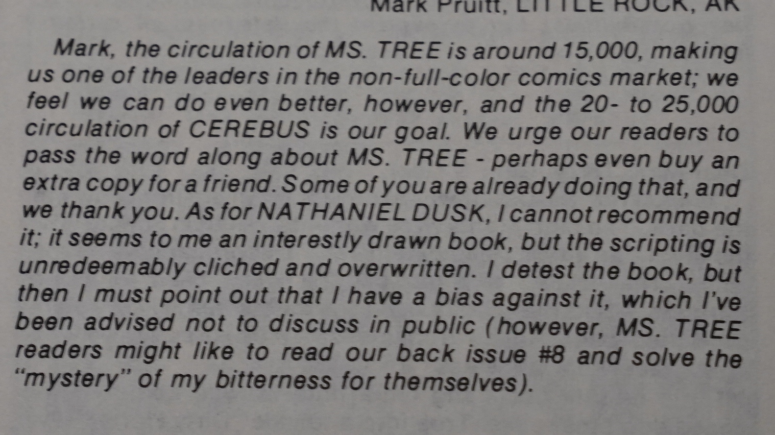
Oh, they were selling 15K copies… that’s pretty good. And Collins, once again, vents his hatred towards Nathaniel Dusk by Don McGregor and Gene Colan.
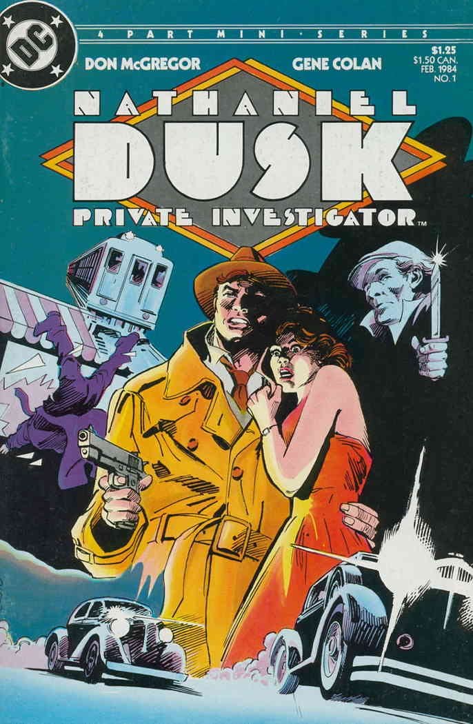
It’s probably not jealousy at all in any way.
Oh yeah, Ms Tree ends up in the loony bin to get all her killin’ ways talked out of her.
It’s actually a surprisingly sympathetic look at mental health care.
And I love Ms. Tree’s expression in the last panel there.
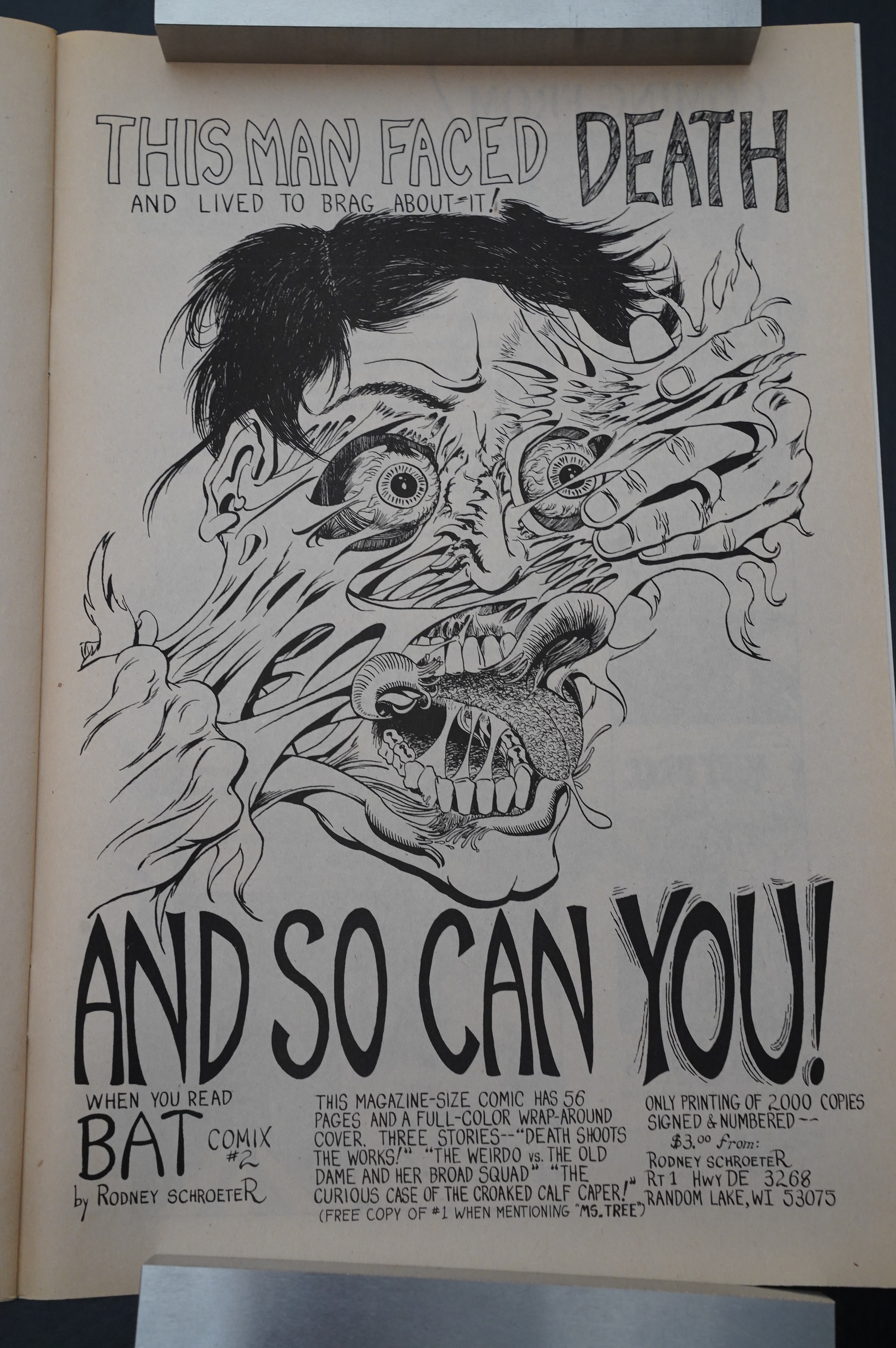
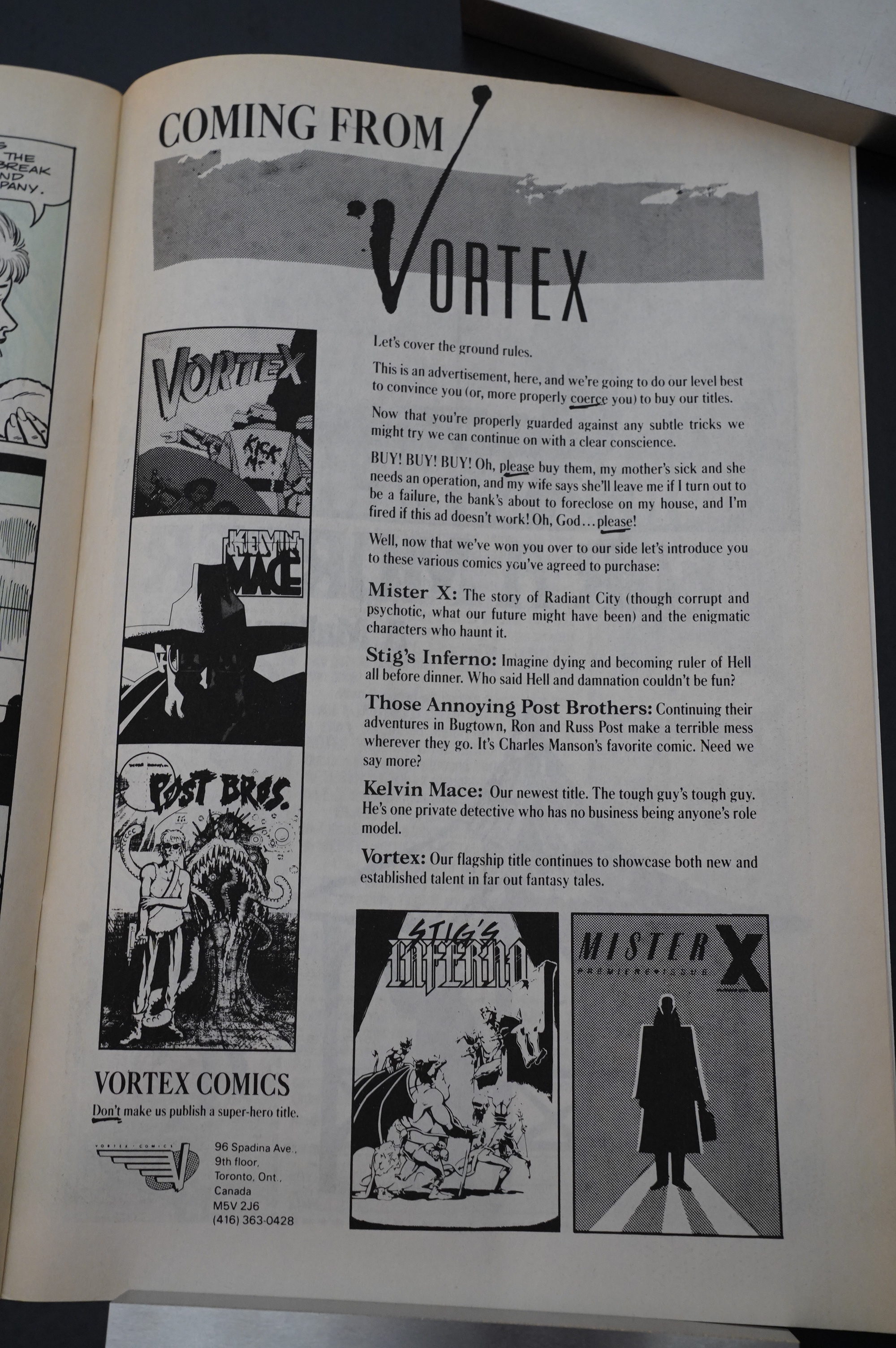
What the… Bat Comix #2? Most of the other ads in Ms. Tree are from other indie companies (that they were swapping ads with), but perhaps that wasn’t the case here?
Duo monotone! That is, all-dark blues on the left-hand side and all-light blues on the right-hand side.

Hey, this kinda works: For the flashback sequence, Beatty does blue duotone (with no black inks)… looks nice.
Unfortunately, we get a series of one-issue stories centred on each of Ms. Tree’s associates (while she’s at the funny farm), and while they’re OK, it’s not as fun as when Ms. Tree is on the page. And… her formerly wimpier associate goes all murdery, which seems redundant. And… is going insane? I mean, he kills his ex-girlfriend (who was trying to save his life) by mistake and then makes a quip about it?
I guess there’ll be a pay-off later in the series…
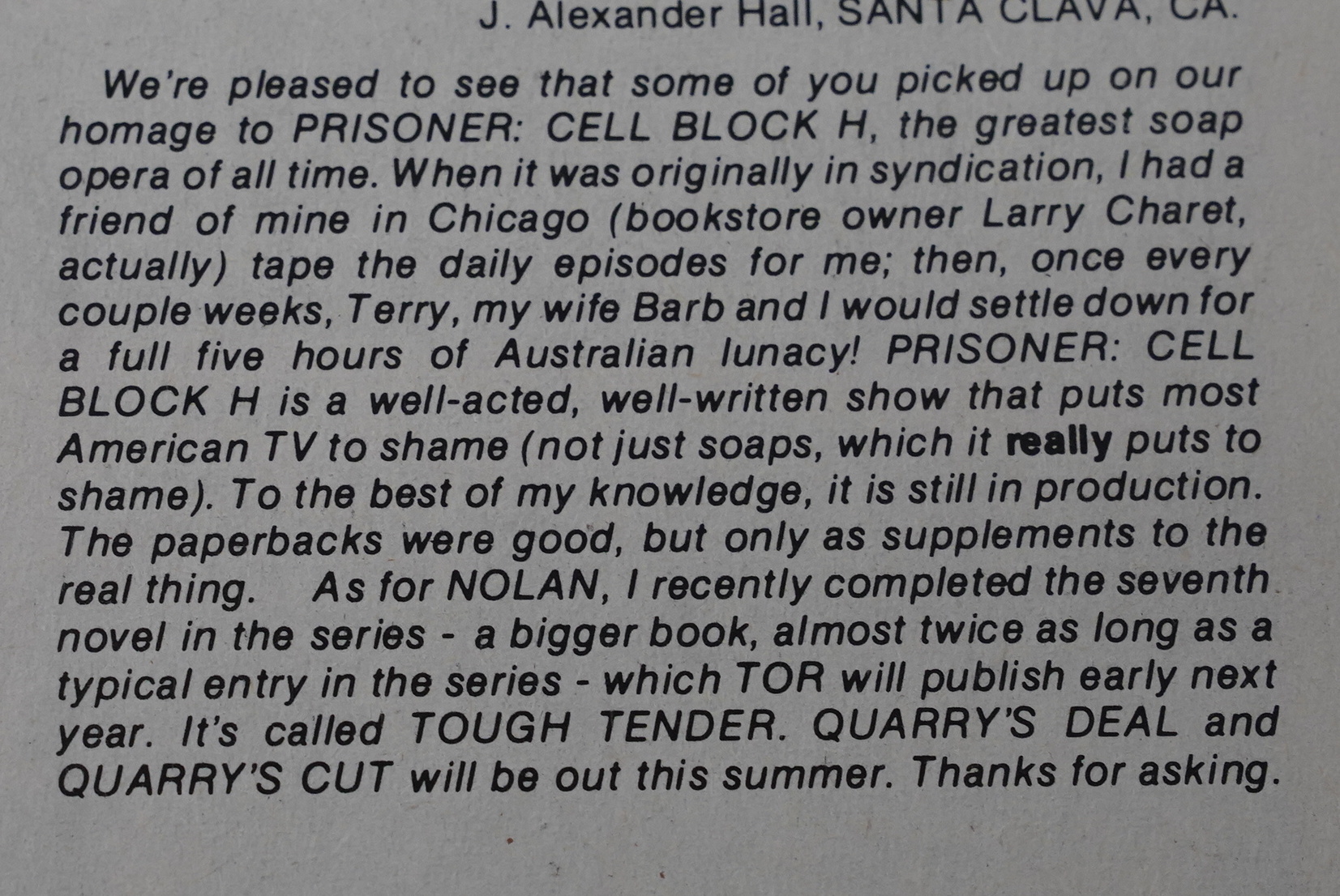
Collins demonstrates his excellent taste in trashy soaps. Prisoner: Cell Block H is indeed the best one ever.

And just you wait, one day I’m gonna watch all those episodes. Again.
Ms. Tree’s assistant Dan Green gets an issue, coloured in … green… Clvr…
As a shocking result from getting proper mental health care, Ms. Tree is now non-murdery! *gasp* And nice! *choke*
The guy who killed his ex-girlfriend is spinning the story. “They” did? Clearly going insane, too.
Speaking of head shrinks: Beatty will randomly draw heads half the size the should be.
And another quirk is that he’ll keep on repeating the same panel every time a character is mentioned. He must be really proud of this one, which I’ve snapped out of focus, because I think he’s used it half a dozen times? I don’t know if it’s xeroxed or traced; haven’t compared.
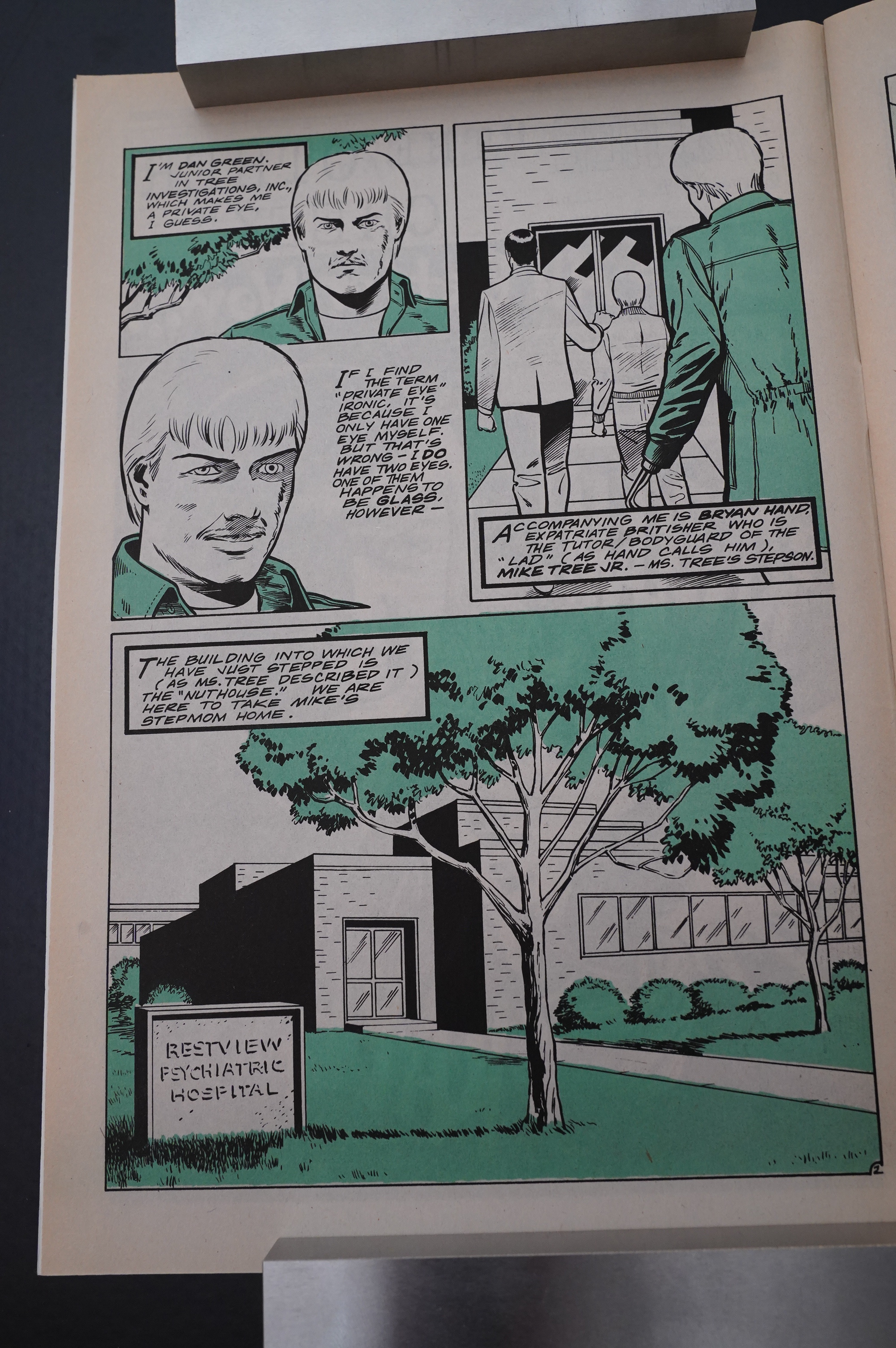
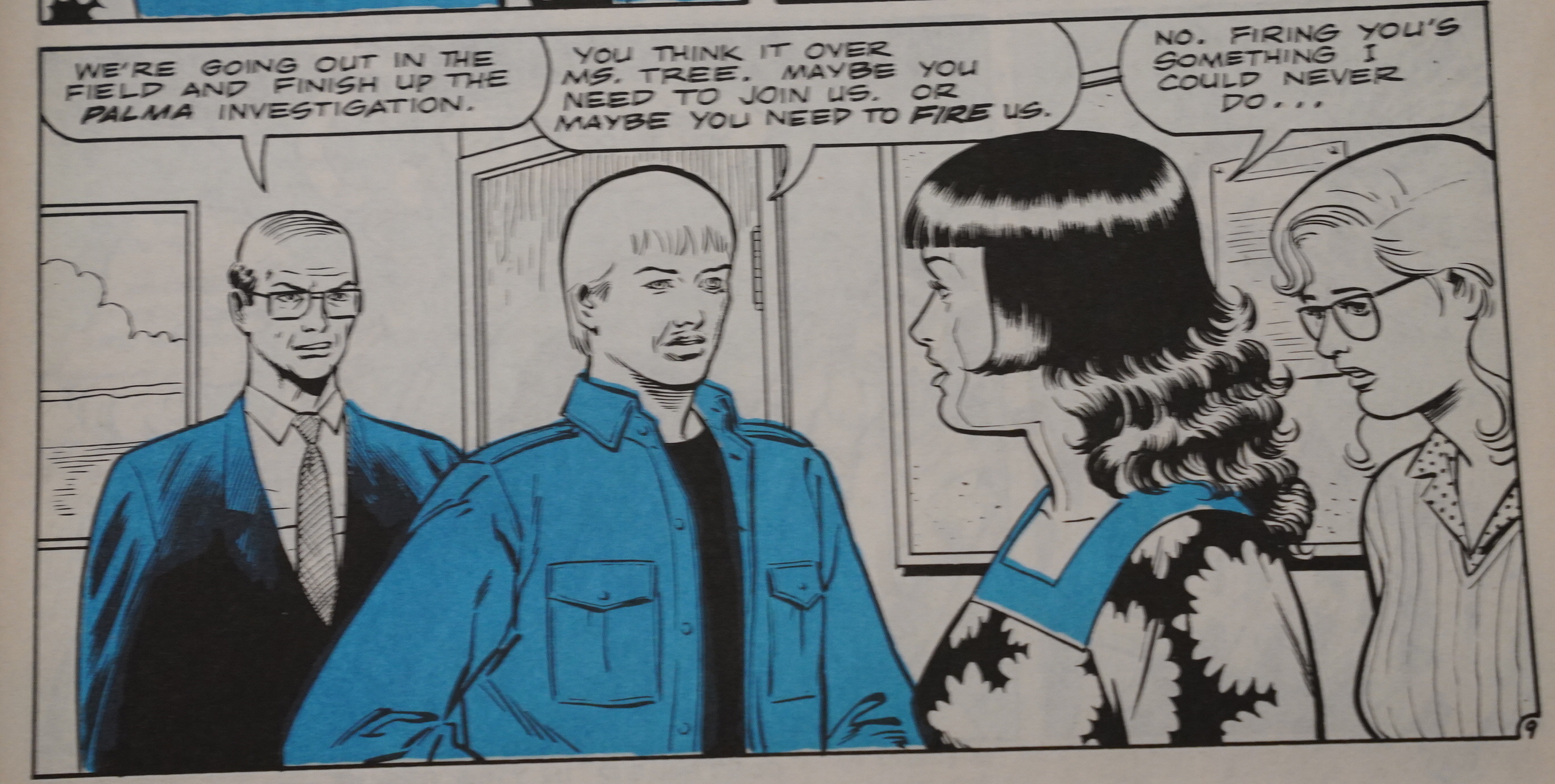
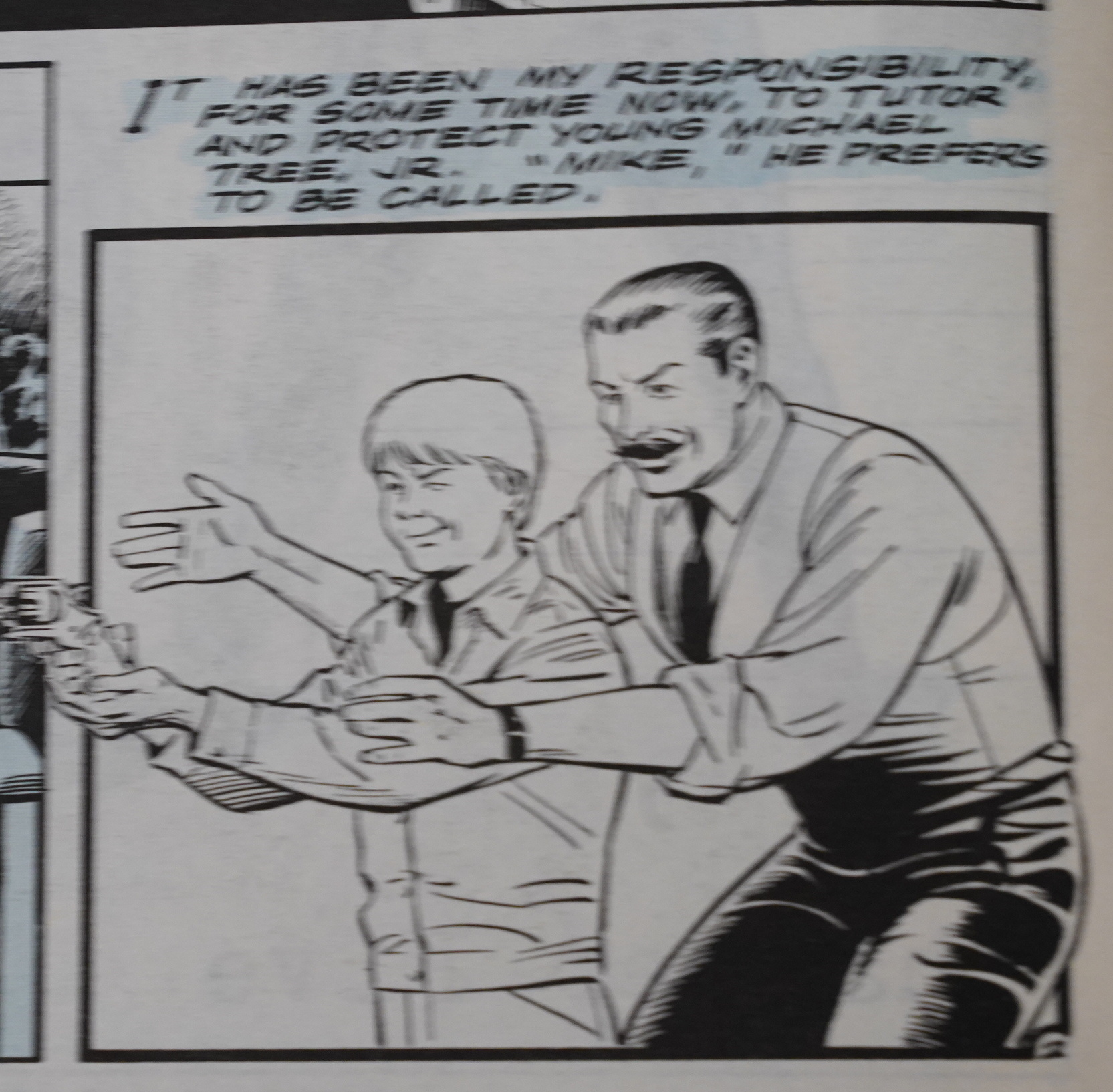
But speaking of bizarre things: That guy there has been that kid’s live-in tutor and body guard for a couple dozen issues now. That can’t be cheap. How is Ms. Tree financing her operation? It seems like they’re never taking any cases that would actually pay anything, but she has all these people working for her… The cops should have a look at where she’s getting her money from.
It’s only a story and I should just relaaaax.
Heh heh. The text in this ad made me smile.
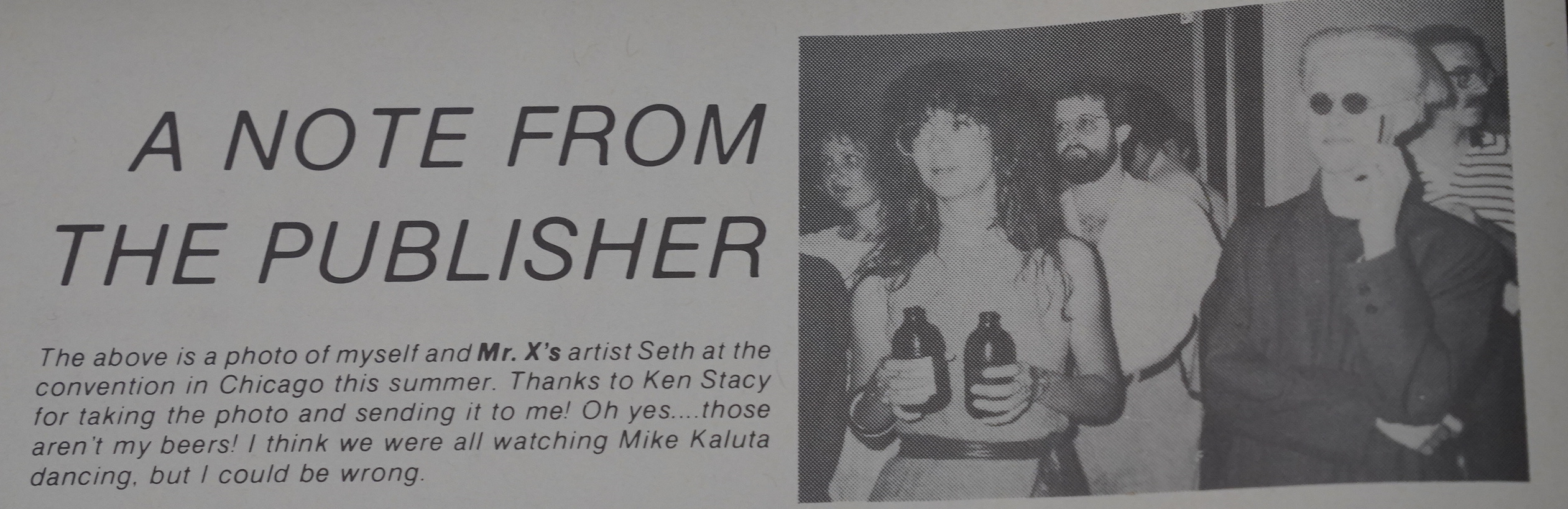
And speaking of Vortex, that a very stylish snap of Seth. And Deni Loubert, drinking with both hands.
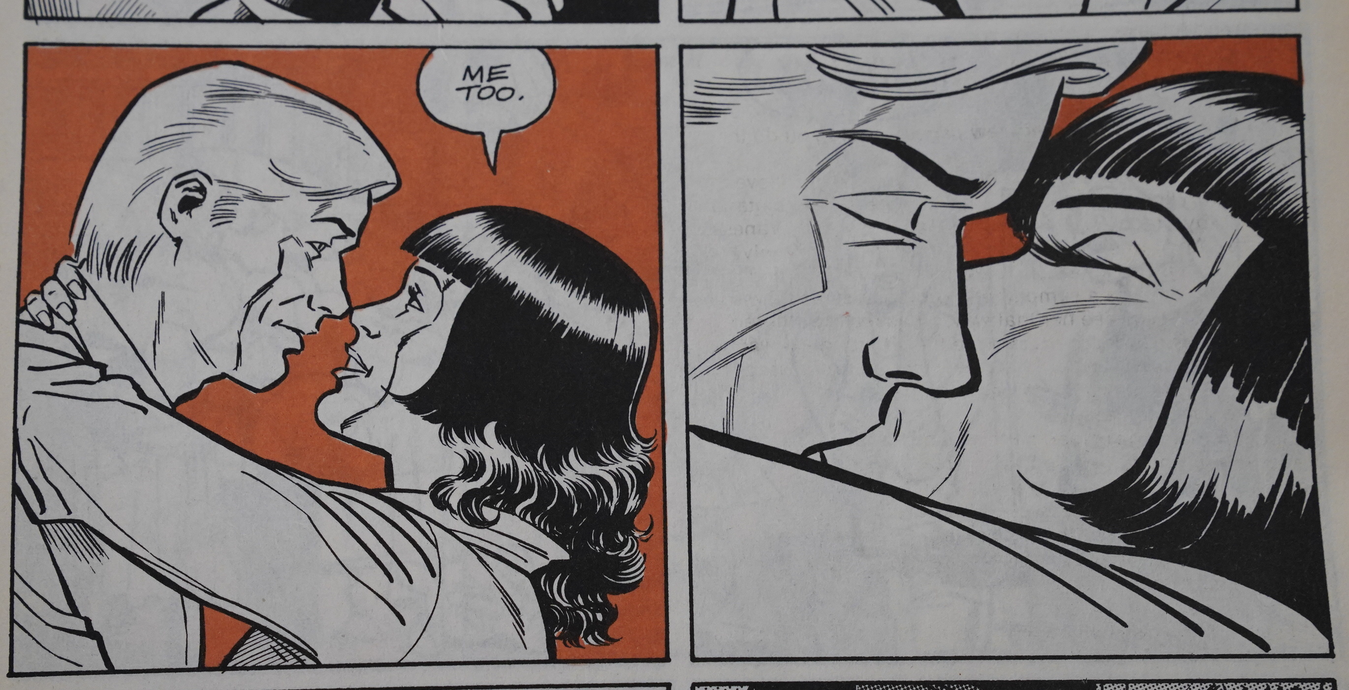
Finally! Ms. Tree is getting some heavy action! This is gonna be an explosive sex scene!
Or… not.
Perhaps Beatty is just bashful.
OK, that’s enough for today, because I’m fading and starting to become a bit bored. But the comics are fine; really… it would perhaps have been nice to get some more variation of the length of the different arcs. Most are just two issues, and it’s starting to feel a bit rote.
Tomorrow I’ll finish up and finally get this thing posted.
OK, final reading schlep done:
This is in the days of the “bust” part of the Black & White Boom & Bust years: For a few months, collectors were buying up all black and white comics looking for the next Teenage Mutant etc. (There were none.) I think the mania lasted less than half a year, but comics shops buy on a three month lead, so it took longer for the decimated sales to ripple through to the publishers. But it’s now happened, and Collins is announcing that there’ll only be twelve Ms. Tree pages per issue from now on.
And Gary Kato takes over more of the art — here’s him doing a Minute Mistery on his own. Looks quite like Ditko, doesn’t it?
Collins lets us know his extremely er uhm interesting er thoughts about gay men and sex in general. (Apparently lesbians do not exist.)
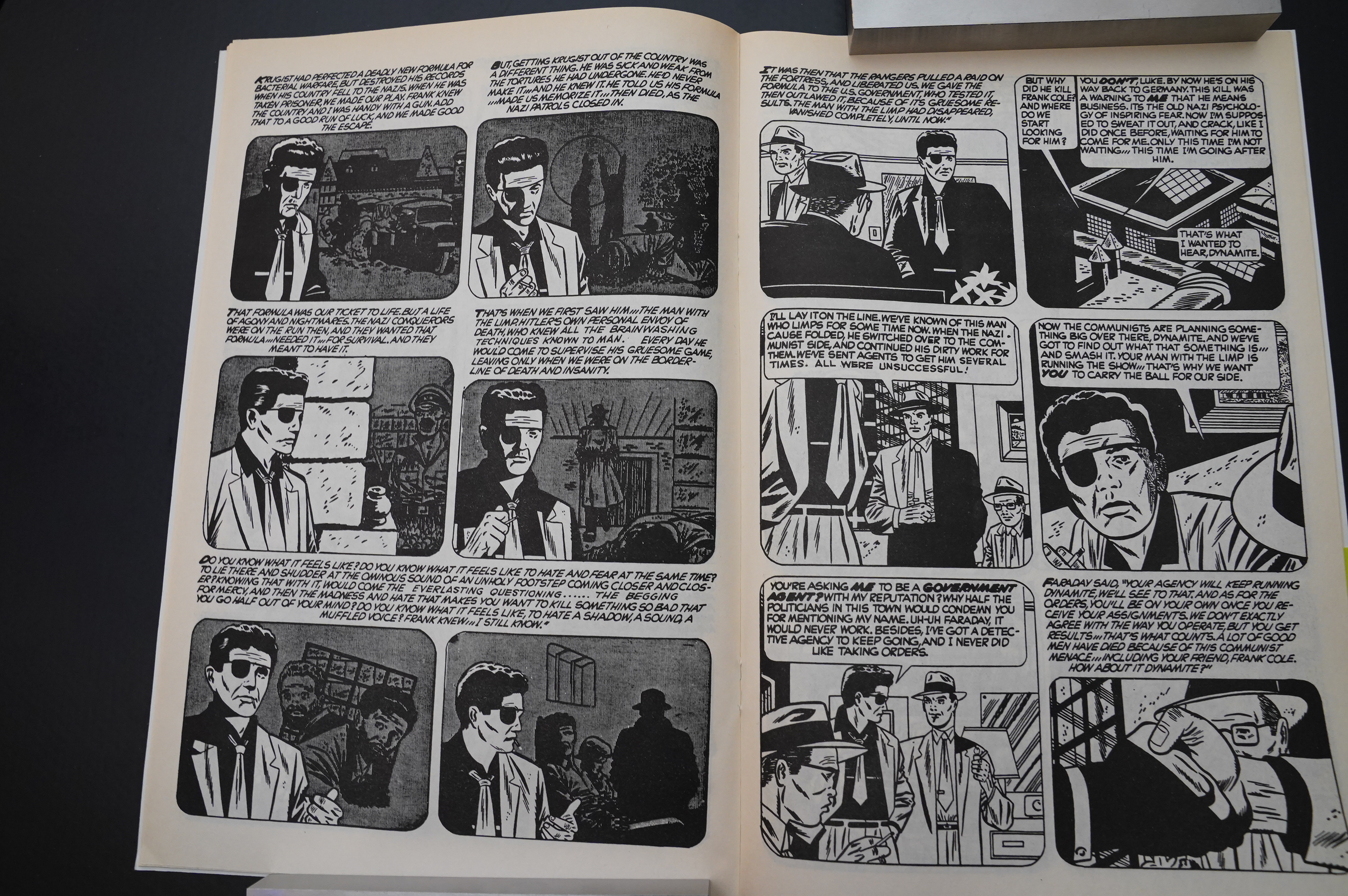
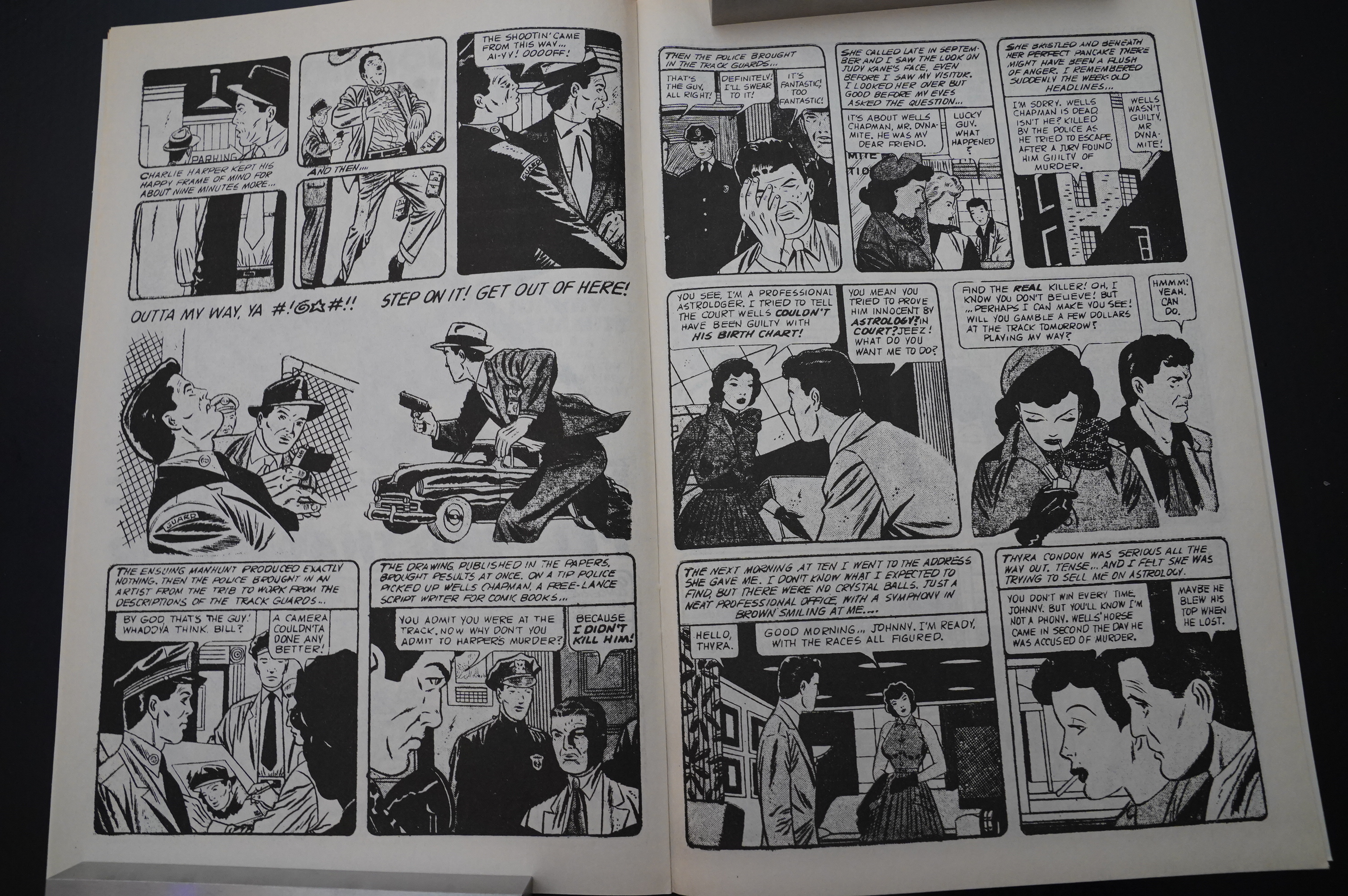
So if there’s only twelve pages of Ms. Tree, what are the rest of the pages gonna be filled with? Johnny Dynamite.
Collins and Beatty have apparently bought all the rights to the comic from the 50s — and they start off with reprinting the final two issues because of technical reasons.
And, boy, is it awful. A W F U L. I guess it’s kinda graphically interesting on the left-hand page there, but the artwork isn’t really, like, good, and oy the verbiage.
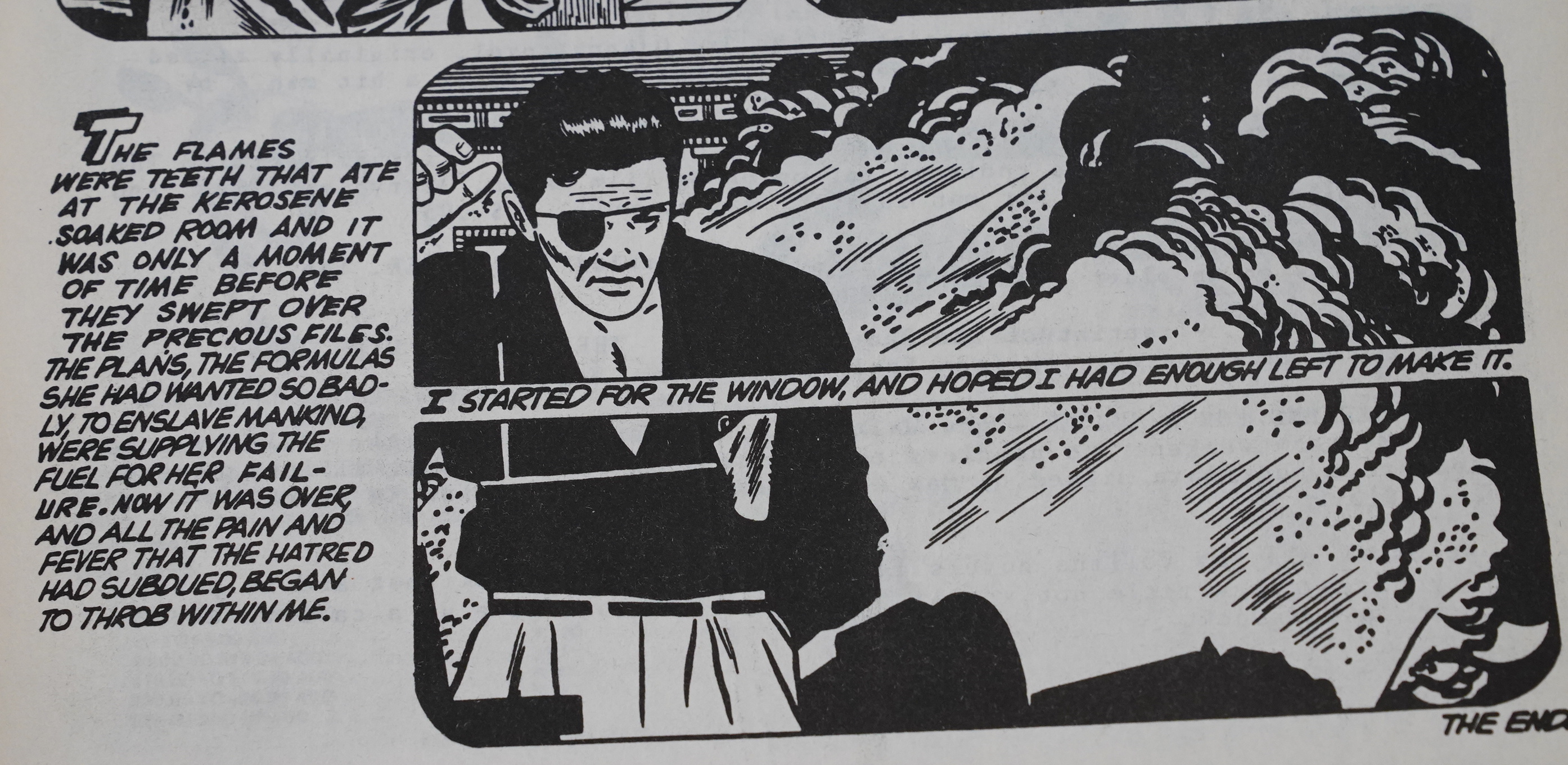
The final panel in the story does have something going for it, so perhaps this isn’t going to be all bad?
(Spoiler: It’s all going to be bad.)
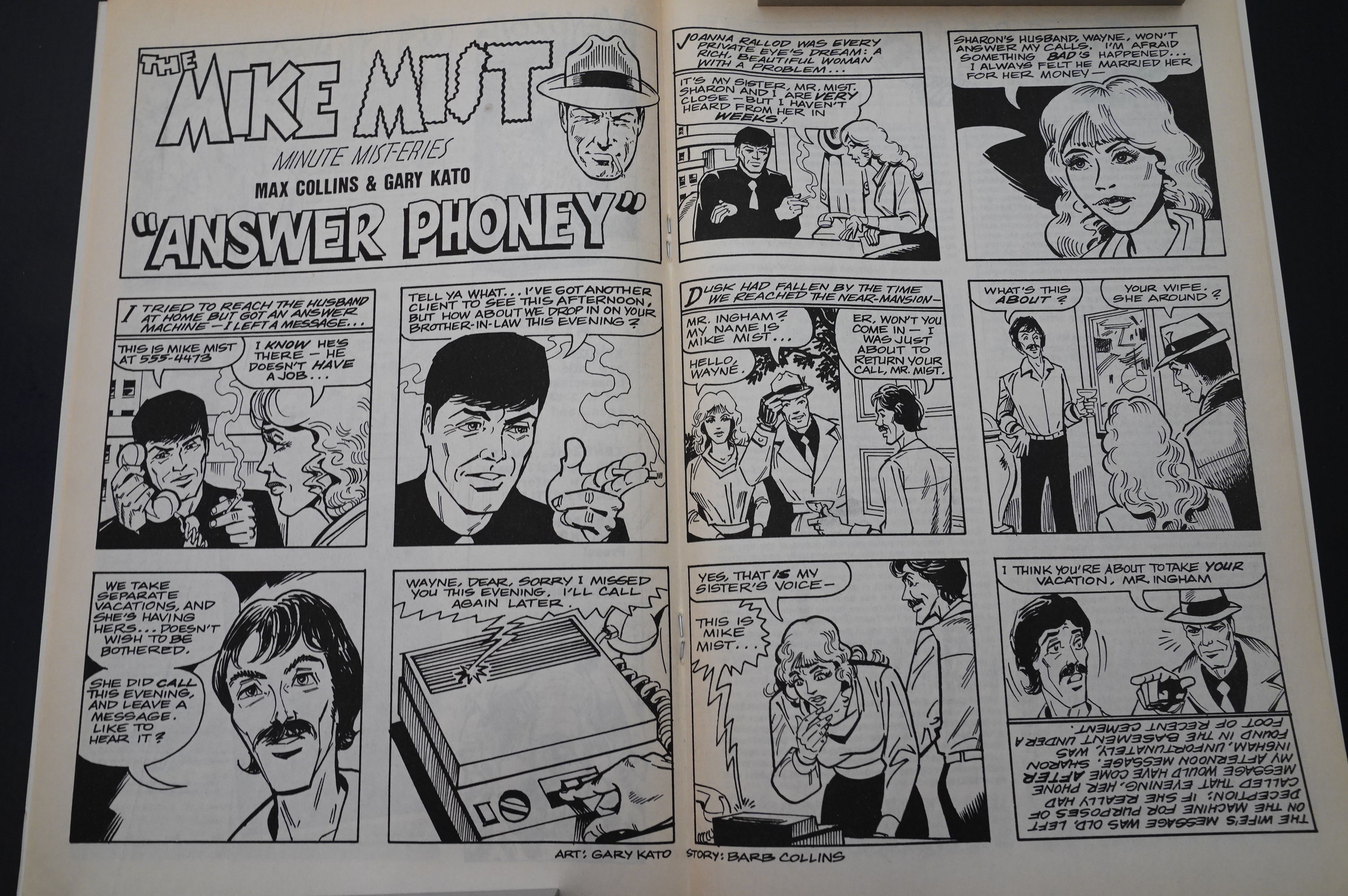
So now Barb Collins is writing the Mike Mist thing, and Gary Kato is drawing it, but… they… er… forgot to change the heading?
Nope, still not any good, but this may be from one of the later issues, too?
Beatty’s heads go through all these weird contortions… I mean, it’s nice that he varies the angles, but nobody has a head shaped like the woman to the right there.
Beatty thoughtfully responds to people who aren’t satisfied with getting 12 pages of Ms. Tree. I think it can be summed up as “well, fuck you then”.
There must have been some pushback on that, because next issue he comes up with an apology that goes, and I’m paraphrasing, “well fuck you then :-)”.
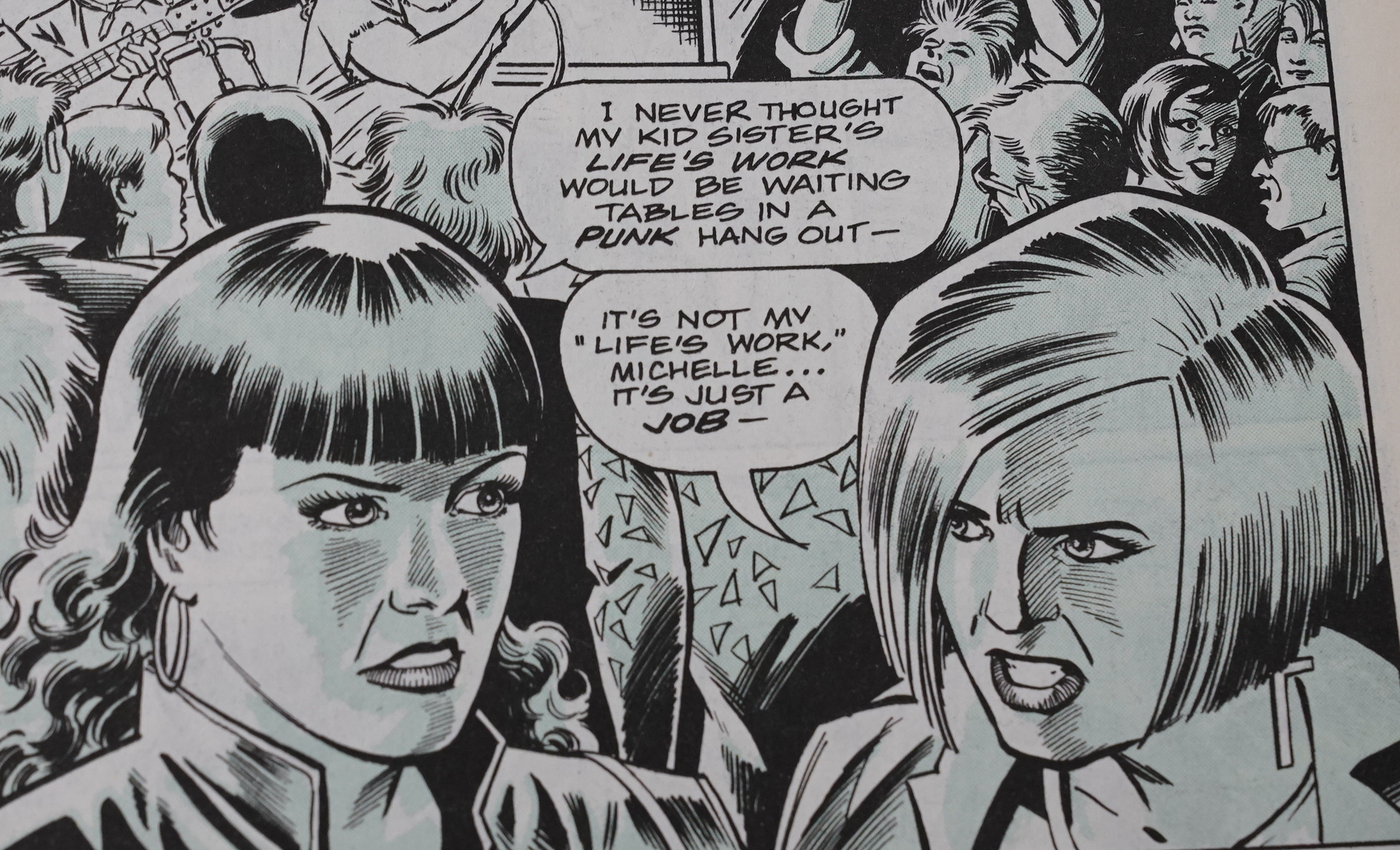
But how are things going story-wise? Well Ms. Tree’s kid ends up in the same private school with her mortal enemy’s daughter, and they hook up. Now that’s plotting!
Sorry, didn’t mean to be snide… “it’s just a story”, like Collins would say whenever somebody pointed out his relying on convenient coincidences, and I don’t really mind: It’s a pretty fun story, even if it’s the most stupid of all of them. (And not because of this coincidence thing.)
Beatty/Kato drop in some photo based backgrounds… it’s pretty jarring, but it doesn’t look too bad?
It looks like Kato is doing more if the faces, too — in the upper er panel: Those faces don’t look like Beatty faces.
(This is the meet cute between Ms. Tree and her mortal enemy.)
Now I’m excited to read Open Season in a couple of months: I do kinda want to forget about reading comic books.
Look! I don’t know why, but I’m a bit fed up with this blog post. It might just be because it’s taken me like a week? There’s nothing wrong with Ms. Tree, really — but I was getting fed up with reading it about ten issues ago.
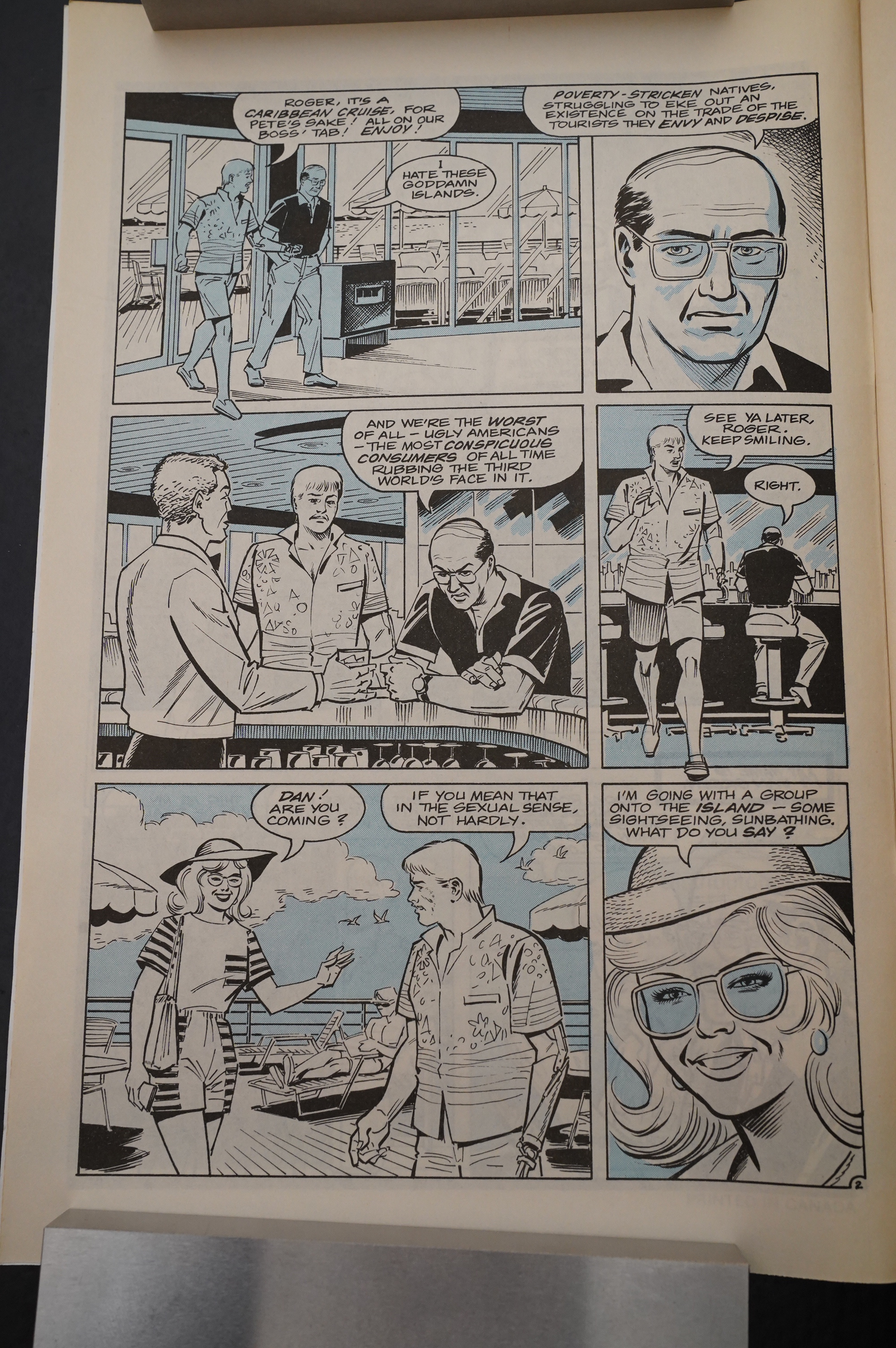
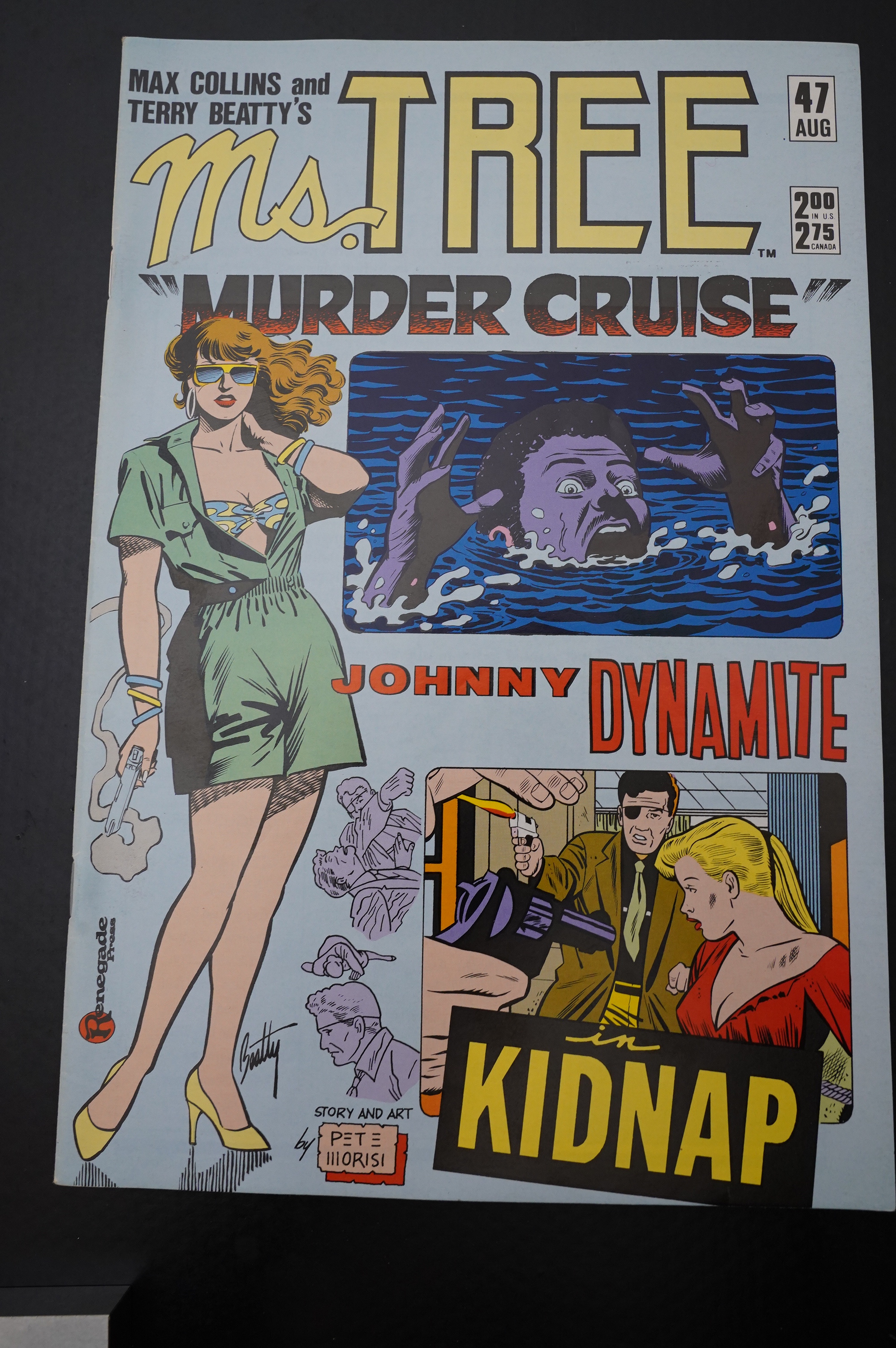
Humour! And a scathing look at cruise ships.
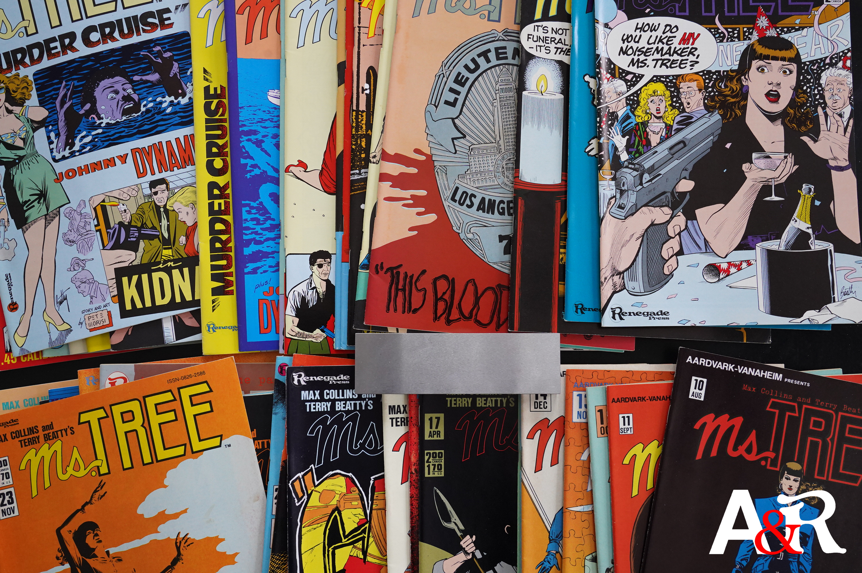
I haven’t mentioned the covers… I kinda liked them in the beginning, but they’re getting more and more crowded. It’s like the aesthetics of a US corner shop window: All this… junk… with no rhyme nor reason.

They take the Mist-eries to the logical conclusion: Just as text pieces.

More humour!
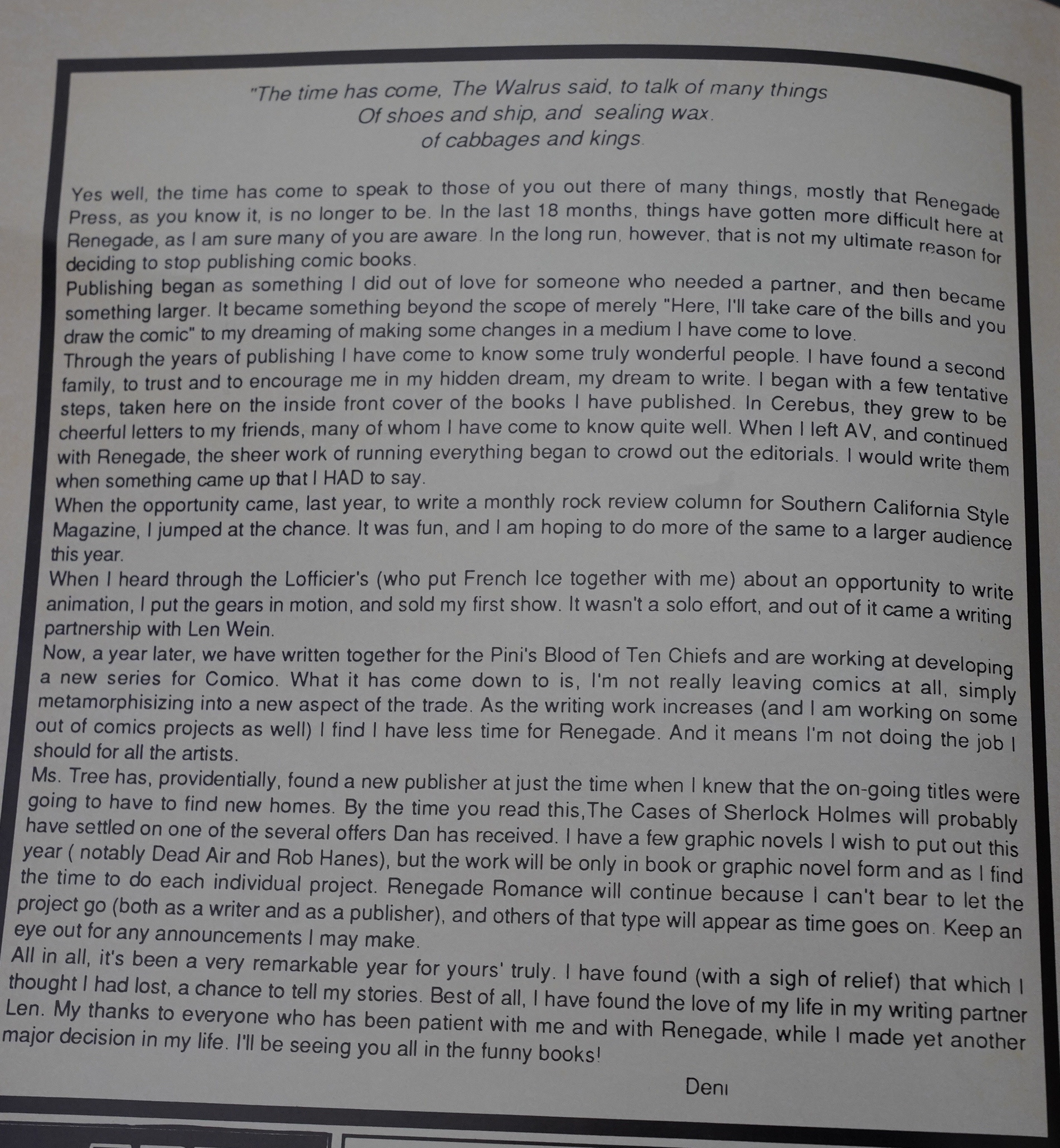
Deni Loubert announces that Renegade is shutting down. Usually comics publishers just disappear, going bankrupt, but I think Loubert managed to shut it down in a pretty controlled manner, not stiffing everybody in the process? I’ve done no research, and I’ll be coming back to this later in this blog series.
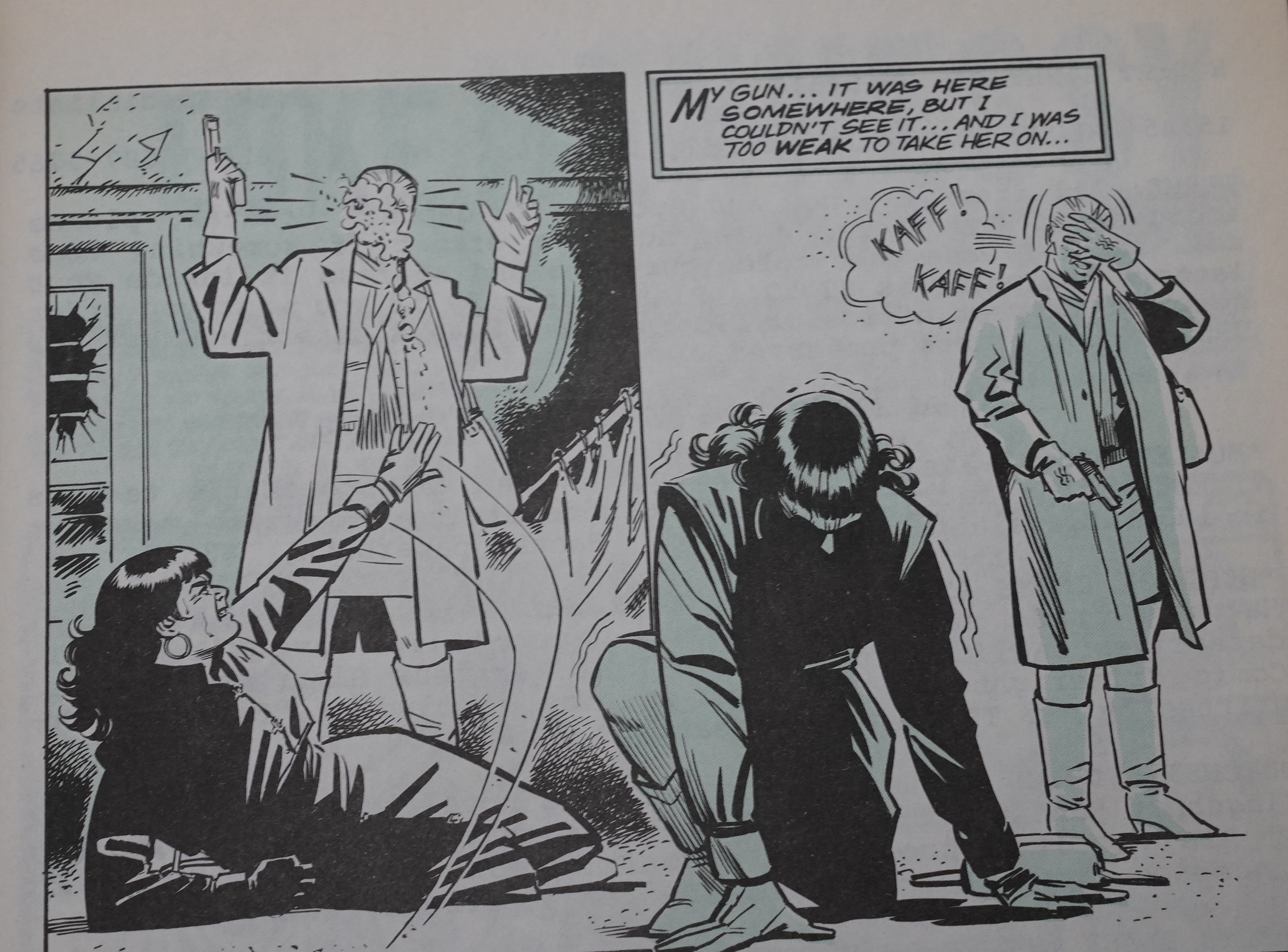
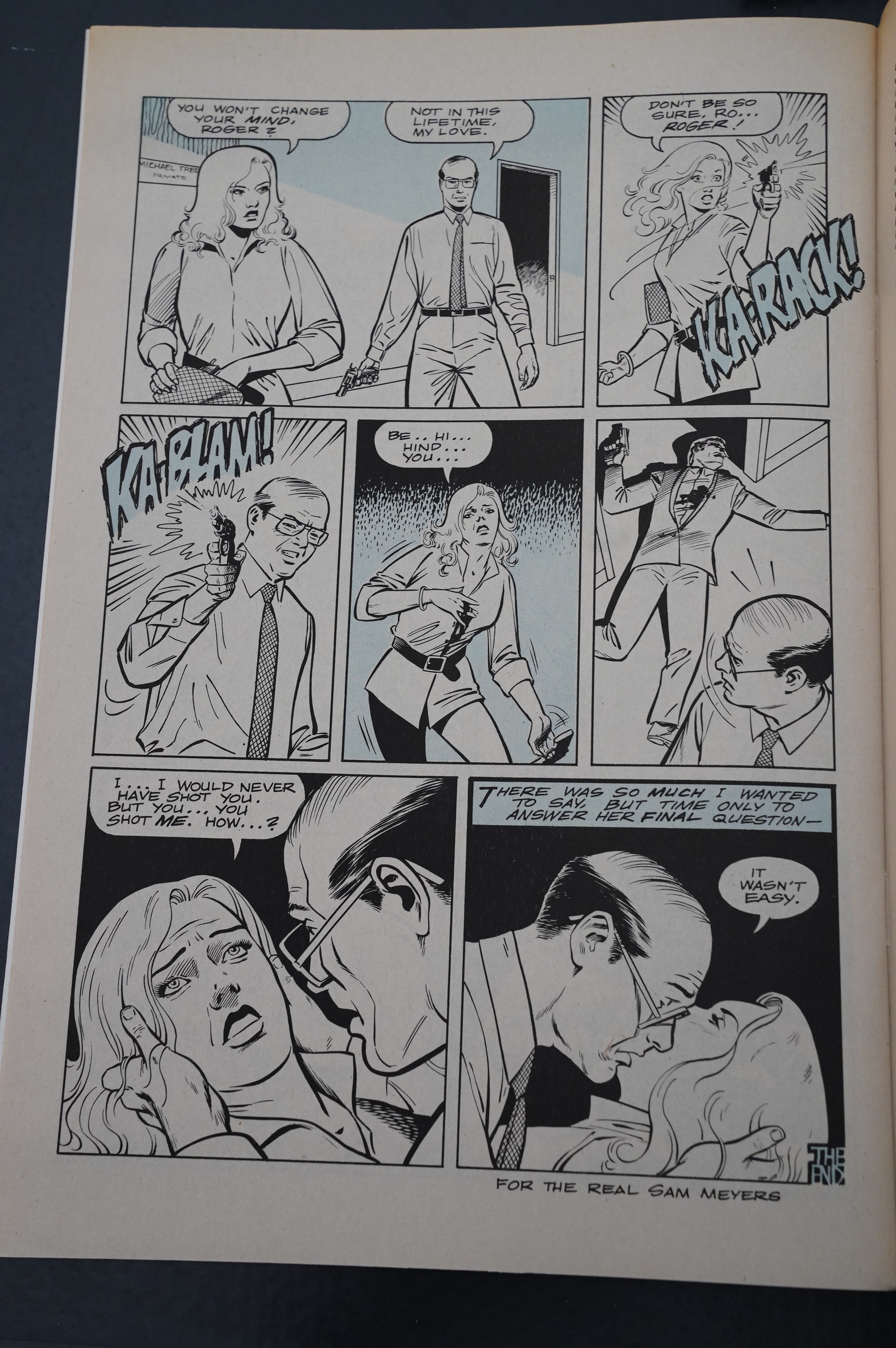
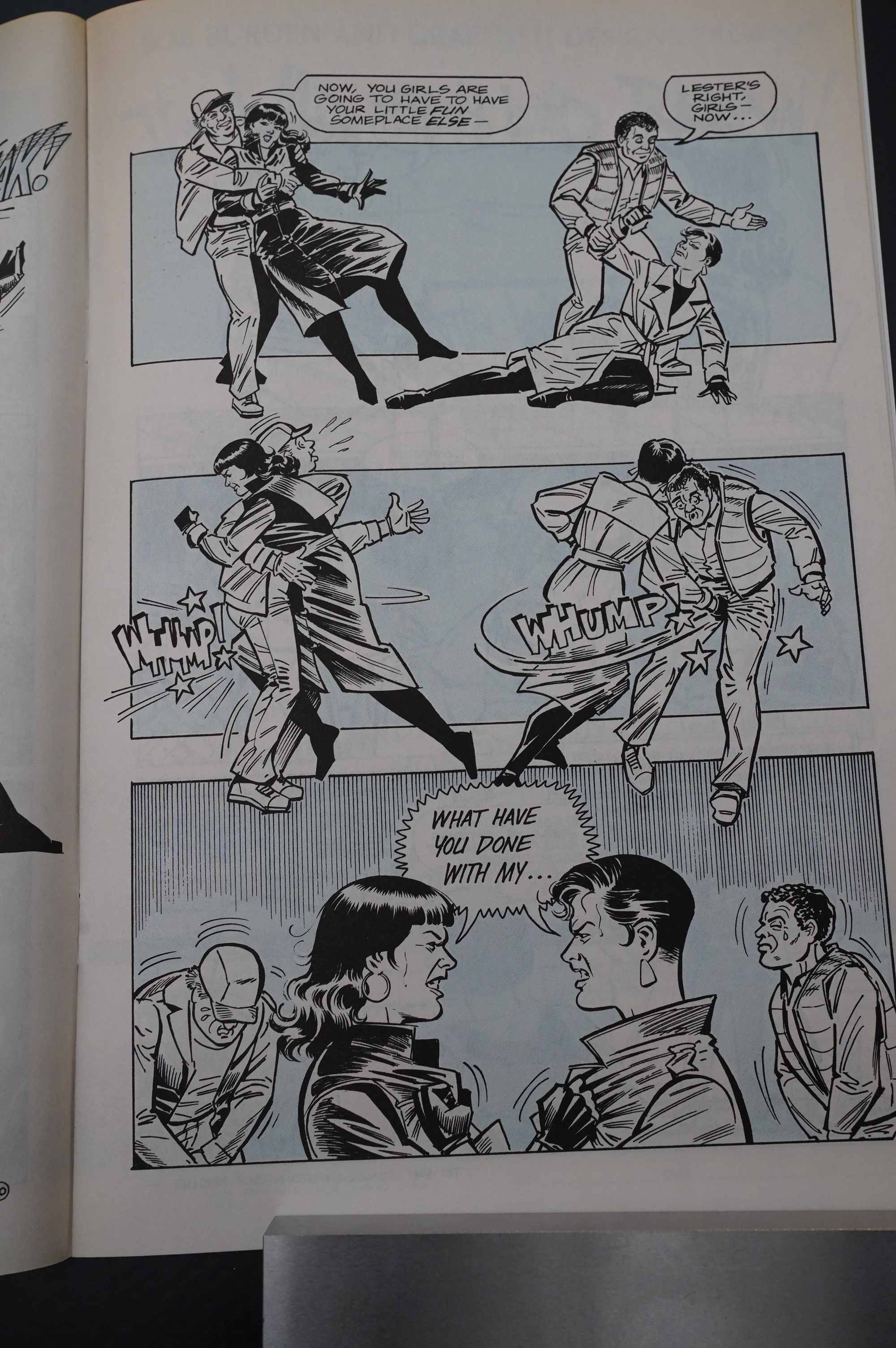
Dynamic action scene, Terry Beatty style!
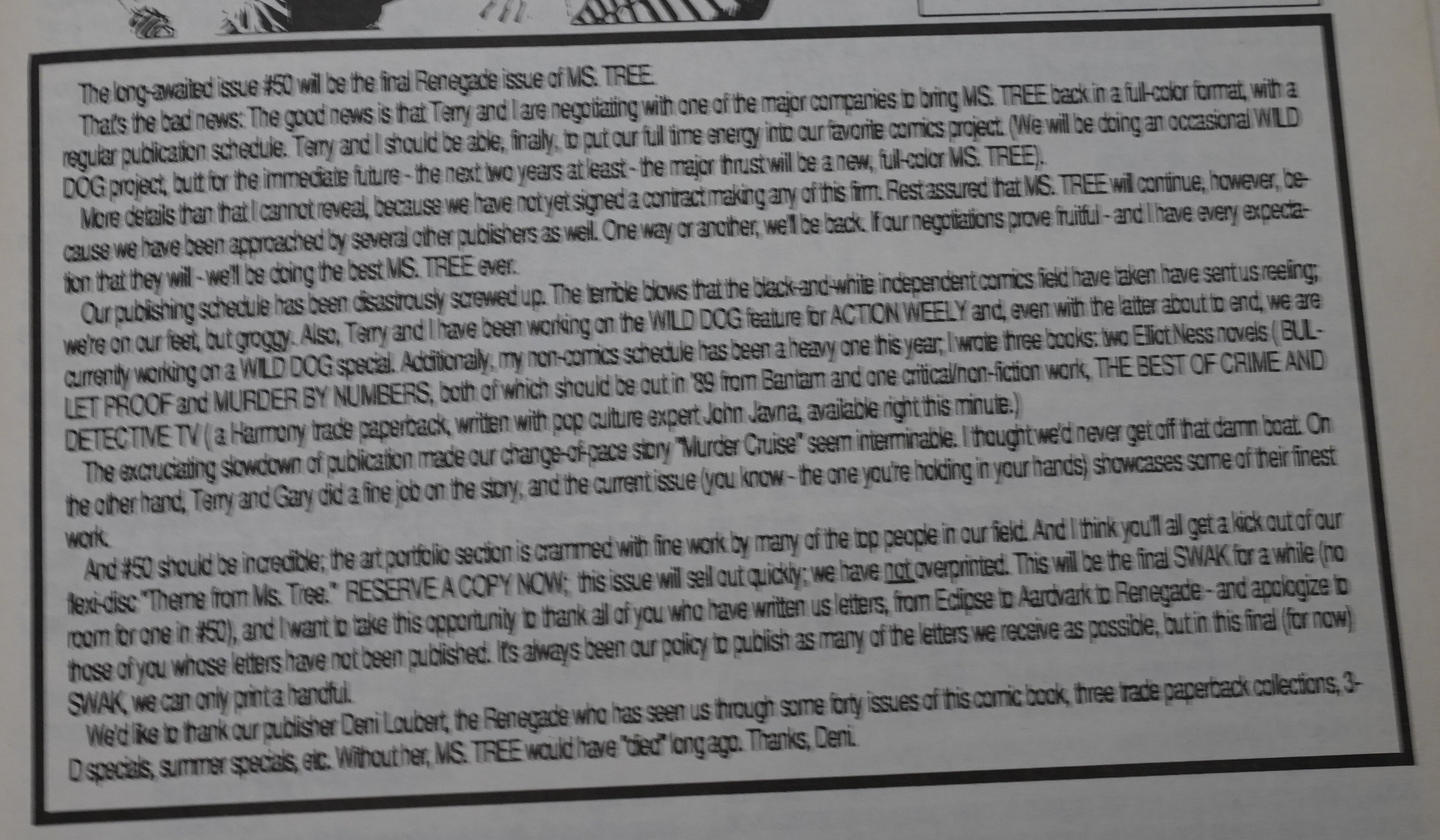
Collins also gets in on the “goodbye” action, but promises that Ms. Tree would be back from a big publisher.
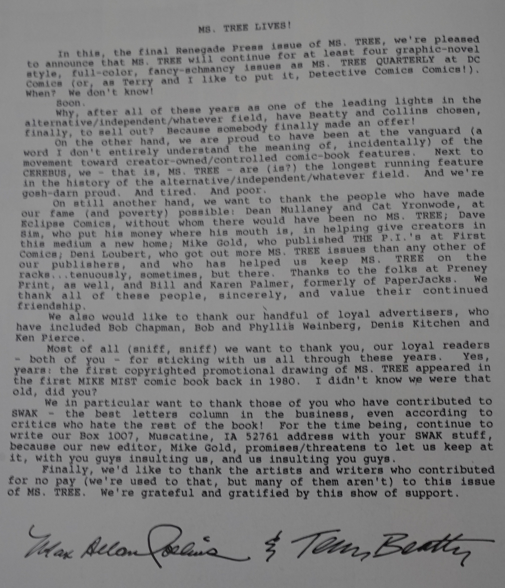
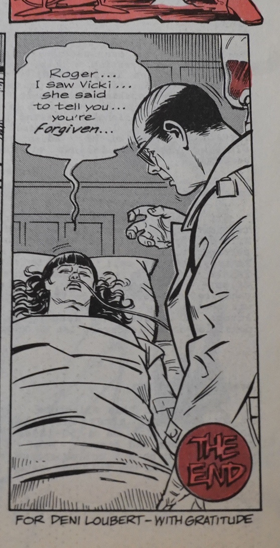
Which turns out to be DC. A quarterly from DC? Hm… Yes, and that actually happened for eight issues, and then two more. There have been no new Ms. Tree comics after 1993, apparently, but there was a novel published in 2007.

But first Ms. Tree has to be shot and goes to hell in the final Renegade issue. It’s done in a different way than previous issues: With lots of zip a tone…
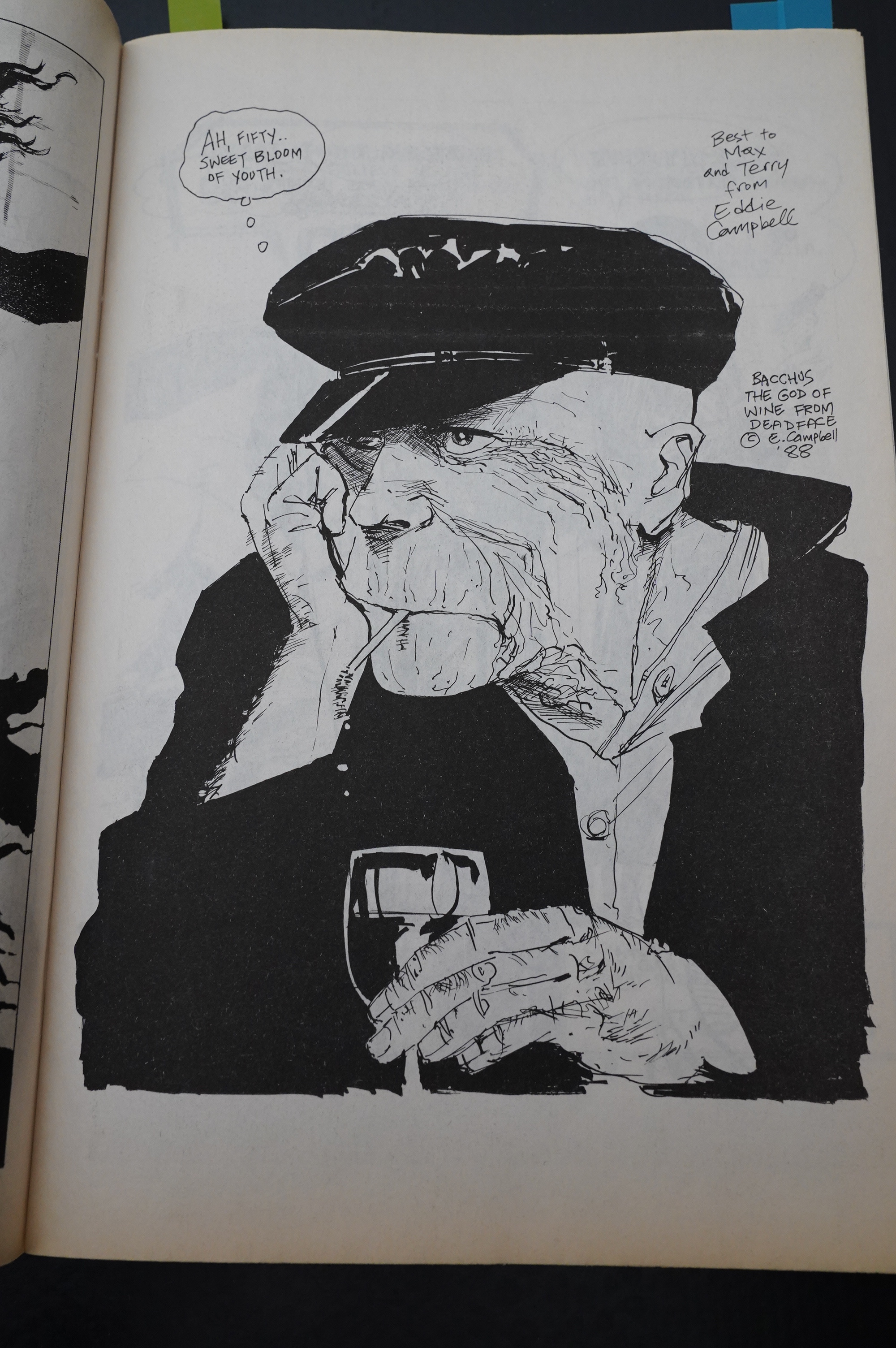
We also get a whole lot of pin-ups. Several of them do the “Ms. Tree at 50? Yes, but issues, not years” joke, but Eddie Campbell refrains from doing so.
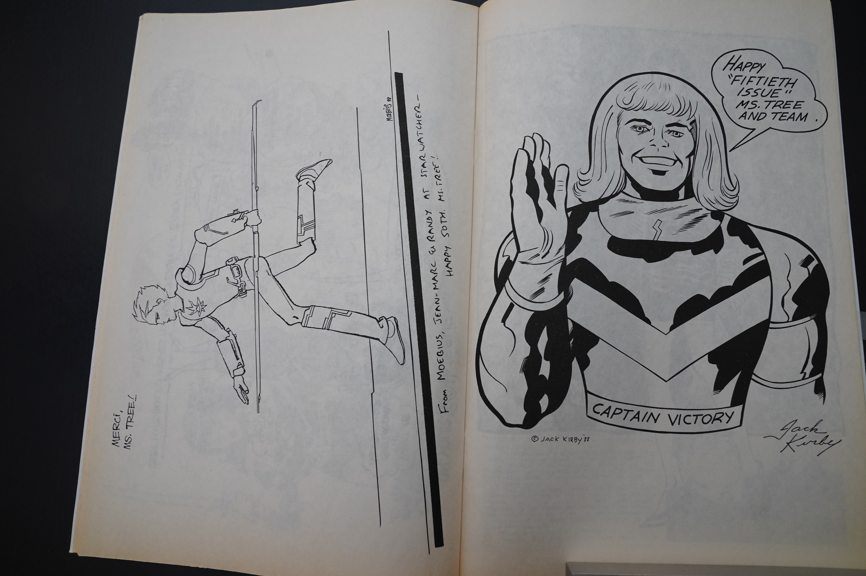
Moebius! Jack Kirby!
OK, most of the rest weren’t all that interesting.
Oh, remember that guy who seemed to be going loopy in denial from killing his ex-girlfriend? That bit is tied up in the final panel.
OOPS SPOILERS.

And there’s a flexi! I gave it a spin, and it’s not awful? Did somebody upload it to Youtube, I wonder?
Yes indeed.
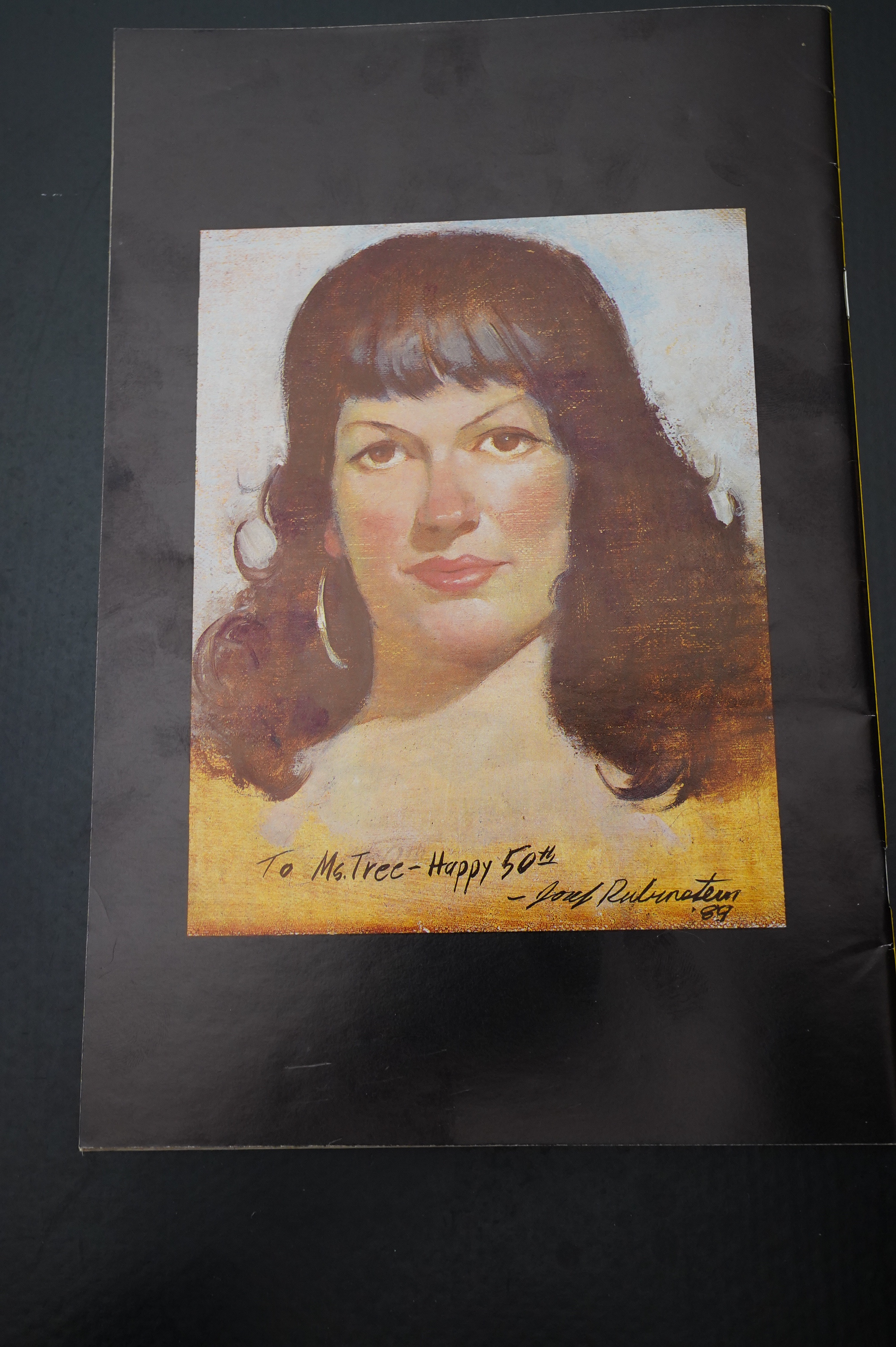
Wow. A painting from Joel Rubinstein. I hope they paid well.
THAT”S IT! OK, I’ve got a couple more specials to do, but I’ll do those in a separate blog post because I just can’t. I can’t even.
Collins is interviewd in Amazing Heroes #119, page 35:
All: I wus suprised to hear you say
that youu like to see Ms. Tree in
color.
COLLINS: That’s one of the
reasons why we went to black-and-
white: we felt if we stop doing it in
color, besides making it more feas-
ible to stay afloat, it will give us,
when we eventually collect these
things in book form, a new aspect
that will attract people who already
bought it before [laughsl—a way to
get their money twice, let’s face it.
I think Terry’s art is suited to color.
The idea that Ms. Tree is a film noir
property and that color is inap-
propriate is baloney. We just didn’t
get terribly good color at Eclipse—-
not consistently at least.
I think this piece should be headed
“Collins Whines.”
All: Don’t tempt m
He’s also interview in Comics Scene Volume #2, page 32:
“Quite literally, when Dean asked, I
invented Ms. Tree on the spot. ‘Great!’
He liked the idea and I had made that
sale. That’s what you do in show
biz—which writing is part of—if they
ask if you can rollerskate, you say, ‘Of
course! And I can do it backwards!!’
“Critics might say that Ms. Tree
reads like something I made up over
the phone, but our readers really like
it. The only criticisms have come from
one source, one I believe to be quite
biased. That’s my opinion. Both Terry
and I have publically criticized that
particular magazine and we may be on
the receiving end of a vendetta. I don’t
mind. I’ve never had so much mail in
my life. I get sympathy cards.
“Most recently, those critics said we
deserve a special award for awfulness
above and beyond the call of duty. If I
had that in actual award form, I swear
to God I’d put the plaque on the wall. I
would take a certain perverse pride in
awfulness above and beyond the call
of duty.”
I think he’s talking about the Comics Journal?
Somebody writes in Amazing Heroes #111, page 65:
I keep poking around to see how
they do it, trying to find the trick
that has made this small rniracle
possible. But I guess the trick is
right out in the open: Ms. Tree is fun
to read. lhe stories are solid, found-
ed on strong characters, reasonably
simple but full of the twists and
turns that all good mysteries need.
The captions and dialogue are
straight-ahead, dressed up with a
little black hurnor and a few of those
God-awful puns that Collins loves,
but always boiled down to exactly
what’s needed. The virtues of the art
make a pretty similar list. Clear,
simple, uncomprornised by flashy
technique, full of sharp little details
that enhance the effect but never for
a second detract from the point..
which is just telling a story.
Collins writes in to Amazing Heroes #153, page 74:
Andy Mangels is to be applauded on
his “Gays in Comics” article. This is
a topic that needs to be discussed, and
Andy is doing a good job of it.
That said, I have to take minor issue
on two points in the “Ms. Tree of
Homophobia” section of his
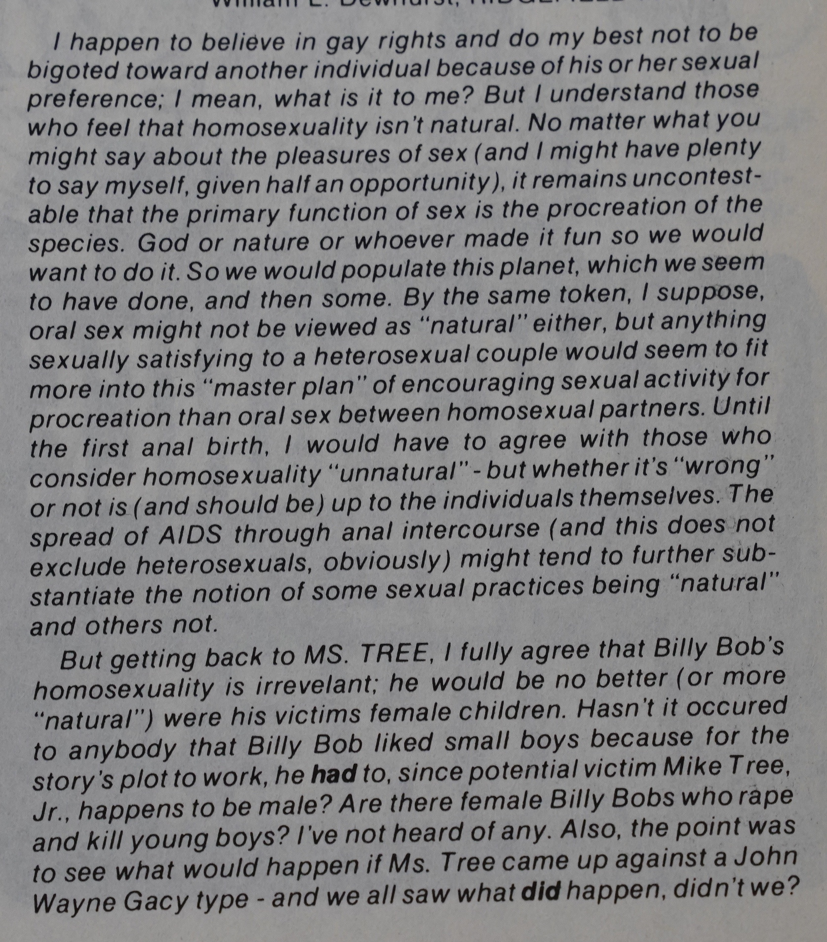
First, he reports that I was
“swamped” with negative mail about
my depiction of gays in two Ms. Tree
stories—”Runaway” and “Prisoner
Cell Block Hell.” That simply isn’t the
case. Our letters column, SWAK, is
generally regarded as one of the best
and most free-wheeling such columns
in comics (even by those who don’t
care much for our book). The issue
of mass-murderer Billy Bob’s gayness
was controversial, but even more so
was Ms. Tree’s apparent execution of
him.
Anyway, we were not “swamped”
with negative mail on “Runaway.” (We
ran every negative letter we did
receive, though.) In fact, “Runaway”
has been the most popular MS. TREE
story to date. It inspired a sequel and
we chose to use it as the lead feature
in the first MS. TREE mass-market
paperback (a July release from
PaperJacks).
We did have critical letters from
some of our gay readers on
“Runaway” and on “Prisoner,” but
only one outright nasty one; just as
we only had one outright nasty one
from a homophobic reader.
In one SWAK, I attempted to ex-
plain to our gay readers why some of
our readers considered homosexuality
“unnatural.” In that context, in that
discussion, I said that by definition
homosexuality was not natural. And
here is the second point where I think
Andy got slightly “heterophobic.” I
made it clear to our readers (and in
my interview with Andy) that this was
a question of semantics—that by
“natural” I referred to the primary
function of sex as procreative. I never
said non-procreation sex was
unnatural (nor does it logically follow
that if the primary function of sex is
natural, any secondary functions
would be unnatural). I never said that
gay couples, or for that matter child-
less heterosexual couples were
unnatural. Nor did I say, or even
imply, that homosexuality was wrong
or immoral; in fact, I flat out said the
opposite. Andy knows that, as do
regular Ms. Tree readers.
Mm-hm.
Andy Mangels writes in Amazing Heroes #143, page 51:
Gay Creator Howard Cruse explains
what the difference is, and what made
Collin’s work so offensive and
dangerous for many. “When I saw the
sequence in Ms. Tree in which it was
clearly implied that Ms. Tree had ex-
ecuted Billy Bob, the homosexual
child molester and child murderer, I
was so shocked. It was particularly
painful in a series of which I basical-
ly respect the craft. Max Collins is an
excellent storyteller, and Ms. Tree is
an interesting character. I felt glad that
there was a lot of discussion about the
Billy Bob sequence in the letters col-
umn of Ms. Tree. I thought about
writing a letter, but it would have re-
quired so much energy to try to con-
vey the subtleties involved in why I
thought that was an extremely destruc-
tive thing to do. I didn’t have the time
and energy to put into it, so I just had
to sit on the sidelines and watch other
people comment on it. Happily, a lot
of people did object. However, other
people would write in presenting
points of view that they had no
understanding what threats gay people
live under from people who actually
believe that the average gay person is
likely to molest a child. They did not
understand that gay people are
murdered, frequently by people who
pay no penalty for murdering them
because of this notion that they are
likely to molest children. For Collins
to say it was simply a plot device and
we aren’t supposed to approve of
everything Ms. Tree does is not tak-
ing into account that real damage can
be done by the perpetration of
stereotypes. Real lives can be lost, and
real people can be beaten up by
homophobes.”
“That’s true, and that’s unfor-
tunate,” says Collins, “but as I’ve said
before, I am not in the business of be-
ing fair to all people and all groups.
I am in the business of telling stories,
and I’m in the business of being
faithful to the integrity of the story
itself and doing what is necessary for
that story to fulfill its promise. I learn-
ed a long time ago that if I wrote
stories worrying about what people
might think, then I would be so
hamstrung that I wouldn’t be able to
create at all. These are stories here to
challenge or make you think or enter-
tain. They are not meant to do
anything else. They’re not essays,
they’re not journalism, they’re yarns.[…]
“I hate to say this, because it makes
me sound pompous and will probably
come back to haunt me,” says Collins,
“but I have to be true to my artistic
vision. My artistic vision may be in-
herently homophobic—I don’t think it
is. But even if it were, I would have
no choice. The artists that are at all
serious about their work are compell-
ed to write about certain things in a
certain manner. It is not an intellec-
tual response. that isn’t what art is.”
A famous gay comic artist responds
to Collins’s assertions. “The fact that
Max Allan Collins can defend his
stereotyping of gay characters by say-
ing ‘Oh, this is a plot device, or
whatever rationale or excuse he uses,
does not mean, in and of itself, that
he is not homophobic, or that what
he’s doing is not homophobic. We can
portray Black people in a stereotyped
way and say ‘Oh, we’re just doing this
because we want to further the plot.’
Jim Wilson writes in The Comics Journal #105, page 44:
Terry Beatty’s art has changed quite a bit
since Ms. Tree’s early Eclipse appearances;
originally sketchy and rough, it didn’t really
look like professional art—more like good
fan art, but with considerable potential.
•Unfortunately, like many another promis-
ing talent, Beatty mastered a slick inking
before he learned to illustrpte properly,
resulting in excruciatin y detailed render.
ing of malproportioned and figures and
a small handful of facial expressions (e.g..
anger is represented Only by narrowed eyes
and clenched teeth). Ms. Tree’s hair looks
like it was painted onto a bald head, and
full figures look as artifically posed a
amateur models, giving the storytelling a
static. -choppy look. Granted, the stories
don’t epsily lend themselves to nuance, and
half the scenes are people standing around
talking to each other; still, the Tree art has
become as homogenized and pedestrian as
house art from the Marvel Comics factory,
and a bolder graphic approach would be a
-welcome change.
Collins writes in to The Comics Journal #70, page 31:
What I am disturbed by is the contempv
tuous tone you affect. You introduce me as
the writer of “the Dick Tracy newspaper
strip, which I do not read,” as if you found
it beneath bothering with (when you ad-
mit in your letter to me that you don’t
have access to the strip); and Terry is in-
troduced as the writer of “a column called
‘Sideways’ for The Buyer’s Guide, which,
unfortunately, I have read.” (From that
awkwardly constructed sentence, I assume
you are talking about the Sideways col-
umn, not TBG.)[…]
In a review littered with name-calling,
you seldom make any attempt to substan-
tiate your claims, and when you finally get
around to trying, in one instance, you
blunder: in a floundering attempt to
substantiate your claim that Terry’s work
is “an eclectic banalization of others’
styles” (that’s known as “overwriting,”
Gary) you mention Mike Tree’s “persis-
tent grimace and squint” as being derived
from Ditko and Kubert.
Gary Groth responds in The Comics Journal #70, page 33:
About Beatty’s art, Collins quite misses the
point (again). Actually, there are six shots of
Mike Tree that are, for au intents and pur-
poses, identical. This is symptomatic of
Beatty’s ineptitude and lack of imagination. It
should be fairly obvious to anyone that an art-
ist who has to rely on six identical drawings of
a major character in a strip only eight pages
long is at a loss to vary the placement of figures
within the panel so as to create an interesting
composition and is a failure at dramatic stag-
ing. Defending Beatty’s inability to alter facial
expressions and his oafish disregard for the
dramatic moment he’s visualizing on the
grounds that Mike T ree is a stoic tough guy is
fustian nonsense. If that’s true, then why do all
of Beatty’s characters look like they’re suffer-
ing from a curious form of sleeping sickness?
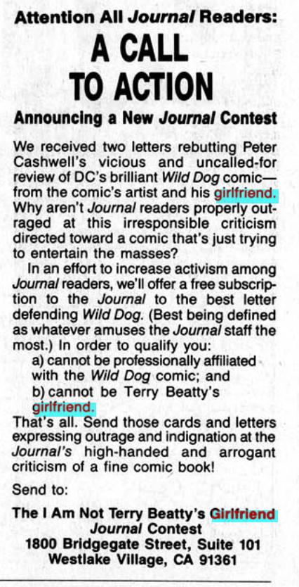
The editor writes in The Comics Journal #129, page 37:
1 AM NOT TERRY BEATTY’S
GIRLFRIEND, Finale
TERRY BEATTY
Muscatine, IAEditors’ Note: We should preface this with some
background for those of our readers who don’t
follmv controversies in the Journal with religious
avidity. In Journal #118, Peter Cashwell reviewed
Wild Dog (“Moonshine, Grits, Guns and Crack-
ers”), a four-issue mini-series from DC Com-
ics by Max Allan Collins and Terry Beatty, in
which Cashwell basically ridiculed the book as
a particularly dopey, hairbrained comic.
The review prompted two letters — and only
two letters — defending the book: from Terry
Beatty and Wendi Lee, Beatty’s girlfriend (see
“Blood & Thunder,” Journal #120). We consider
receiving Only two letters objecting to a review
par for the course, but found the fact that those
two letters were from the book’s artist and his
girlfriend — who coyly referred to her acquain-
tance with Beatty and writer Collins — so
wonderfully absurd that it demanded prompt and
immediate action. Hence, we initiated the I Am
Not Terry Beatty’s Girlfriend Contest, which in-
vited readers who were nor Beatty’s girlfriend
to write the Journal in defense of Wild Dog.
This prompted a letter from Wild Dog writer
Collins (Journal #122), who called Gary Groth
misanthropic, miscunist, indecent, and distrust-
ful of “any human relationship that is built on
loyalty and emotional commitment, particular-
ly between a man and a woman…”
The Journal received about a dozen contest
entries. One ran in Journal #125, another four
in Journal #127.
Shortly after Journal #127 appeared, we re-
ceived two irate phone calls, the last fielded by
Groth, from Mr. Beatty himself, who proceed-
ed to scream at Groth for approximately 10 min-
utes. TO our surprise, we later received a phone
call, and a letter, from Cynthia McGarvie Of
Dallas, Texas, who told us that Beatty had found
her phone number through directory assistance
and called her with equal ire, screaming at her
for about 10 minutes.
We aren’t kidding. All of this really happened.
A little later still, we received this letter, dated
March 19, 1989.
[Addressed to Gary Grothl I’d like to apologize
for the manner in which I addressed you on the
phone the other day. After reading the latest en-
tries in your seemingly never-ending “I Am Not
Terry Beatty’s Girlfriend Contest,” I simply lost
my temper. I’m not proud of the fact that I allow-
ed your prodding and poking to finally cause me
to turn and snarl at you, but even the most docile
of God’s creatures will attack if continually pro-
voked. My apologies also to the contest entrant
I spoke to (rather rudely) on the telephone.
I acknowledge and support your right to hold
and express your opinions regarding any comic
creator’s works, including my own. I do. how-
ever, find it unfortunate that comics creators are
not allowed to respond to ICTs criticism without
a vitriolic response from you and various other
7CJ contributors. I must also point out that spon-
soring a contest in which TCJ readers are en-
couraged to write sarcastic “defenses” of my
comic book series Wild Dog — and in doing so,
also contributing rude and personal comments
regarding Wendi Lee, Max Collins, and myself
— goes far beyond the boundaries of fair criti-
cism. legitimate journalism, and good taste. Your
contest does not qualify as satire, because a) it
was in fact a real contest, with a prize awarded;
and b) no work Of art or entertainment was be-
ing satirized, rather personalities were being
ridiculed.
Oh, the 80s was a fun time.
Early Ms. Tree stories were reprinted by Renegade in a series of Files of Ms. Tree paperbacks. Titan Comics has reprinted material from the DC series recently, and have started reprinting the earlier stuff, too. None of the Aardvark-Vanaheim/Renegade issues have been reprinted anywhere so far, apparently.
This blog post is part of the Renegades and Aardvarks series.
I see no reason to revive the nastiness of the Comics Journal feud. We all have moved on, and the times have changed. It’s dangerous, in the current climate, to be publishing (out of context to some degree) comments and commentary of decades ago into a culture that is dominated by a generation who arrived perfect in their attitudes, as opposed to the cretins like me who preceded them. Look at the work and judge it on its merits and lack of merits, certainly. But the rest of this is not helpful or positive or anything else but the opening of old wounds — wounds not necessary healed but at least covered over with scar tissue. I recently did a job for Fantagraphics, and their publishing has often been stellar. Let’s leave it at that.
Your reference to the Eclipse Blog in the first paragraph had me straggling around trying to find the “tenth” Eclipse issue — was there a Special or an Annual? Not that I found. Nope, just nine.
~ means “about” in nerdese
My civilian friends regard me as a comics nerd but I doubt I shall ever attain those dizzy heights.
ps. I say amen to the comment by T.W. — You are indeed a much appreciated beacon of light in the world of comics. Although future generations will puzzle over how those typos escaped the notice of your editor nerd.