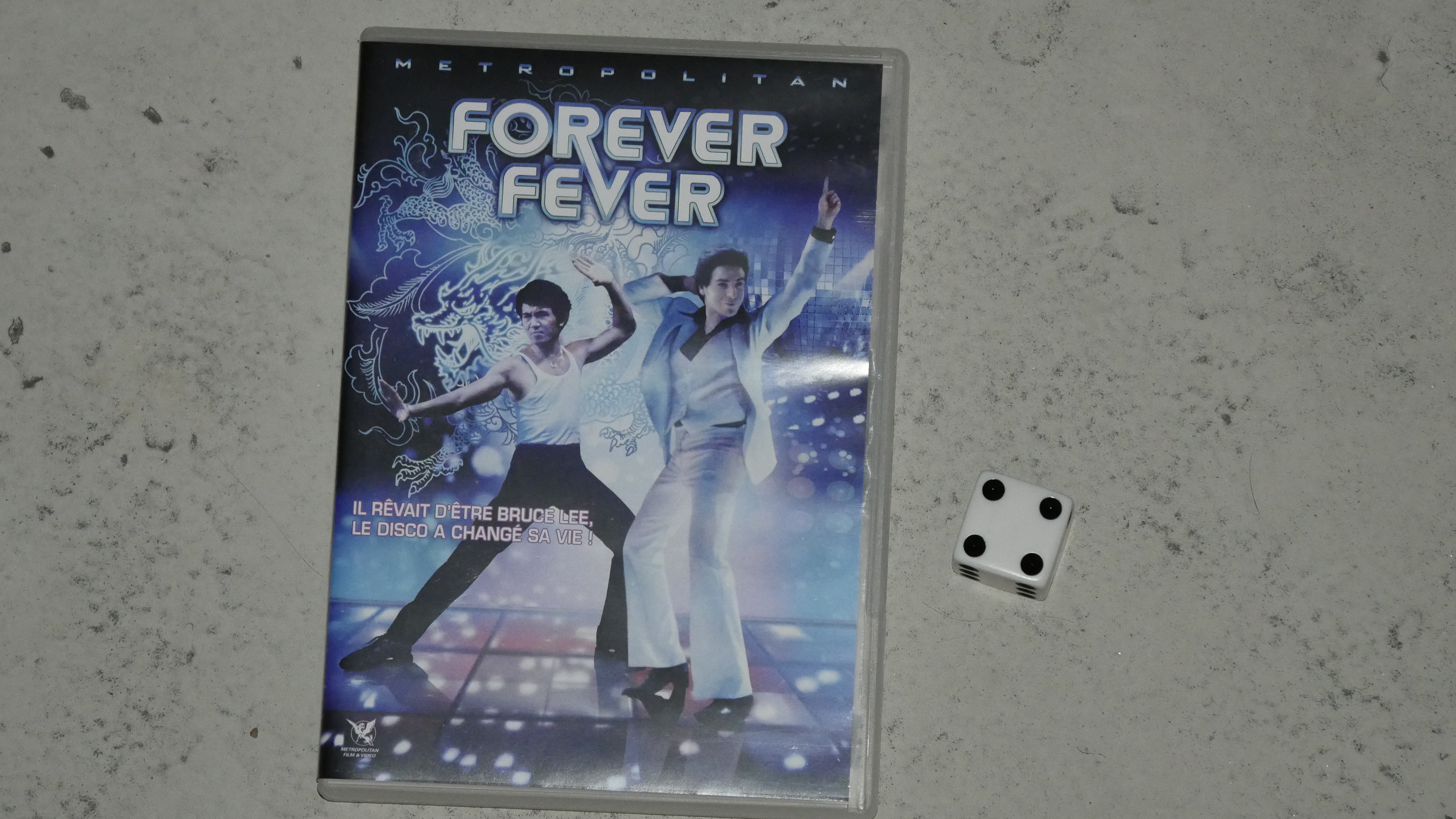
|  | 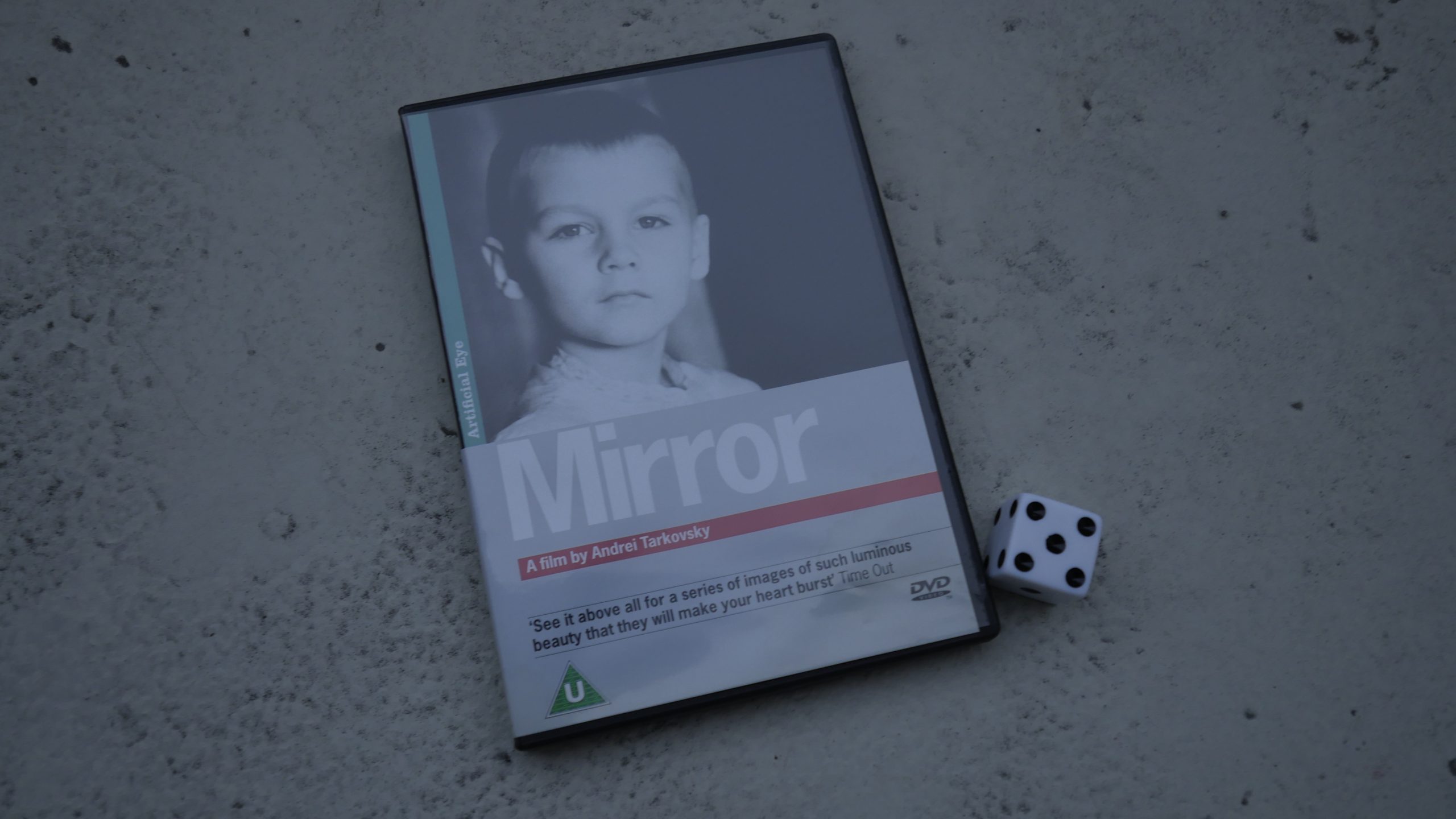 | 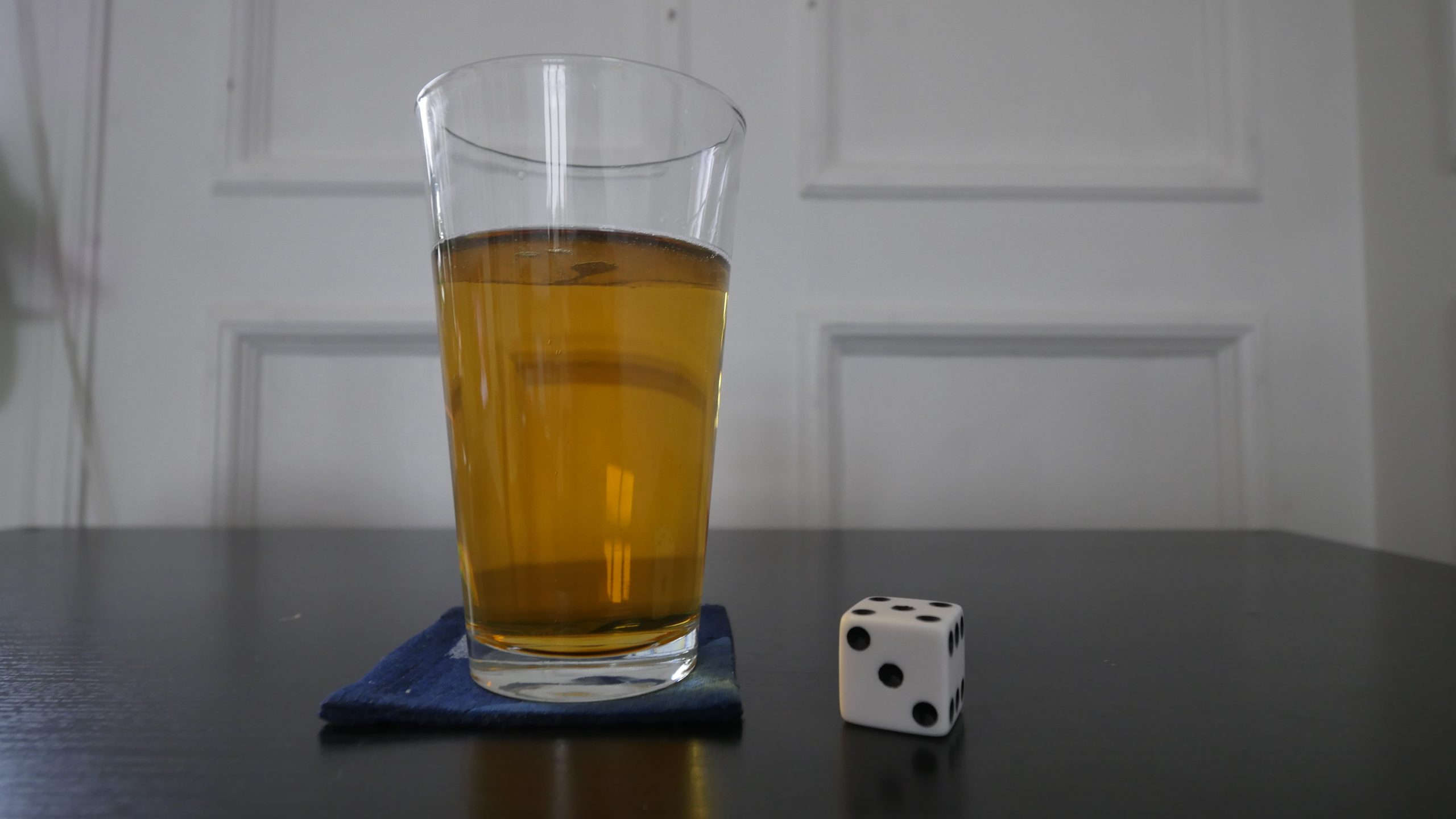 |
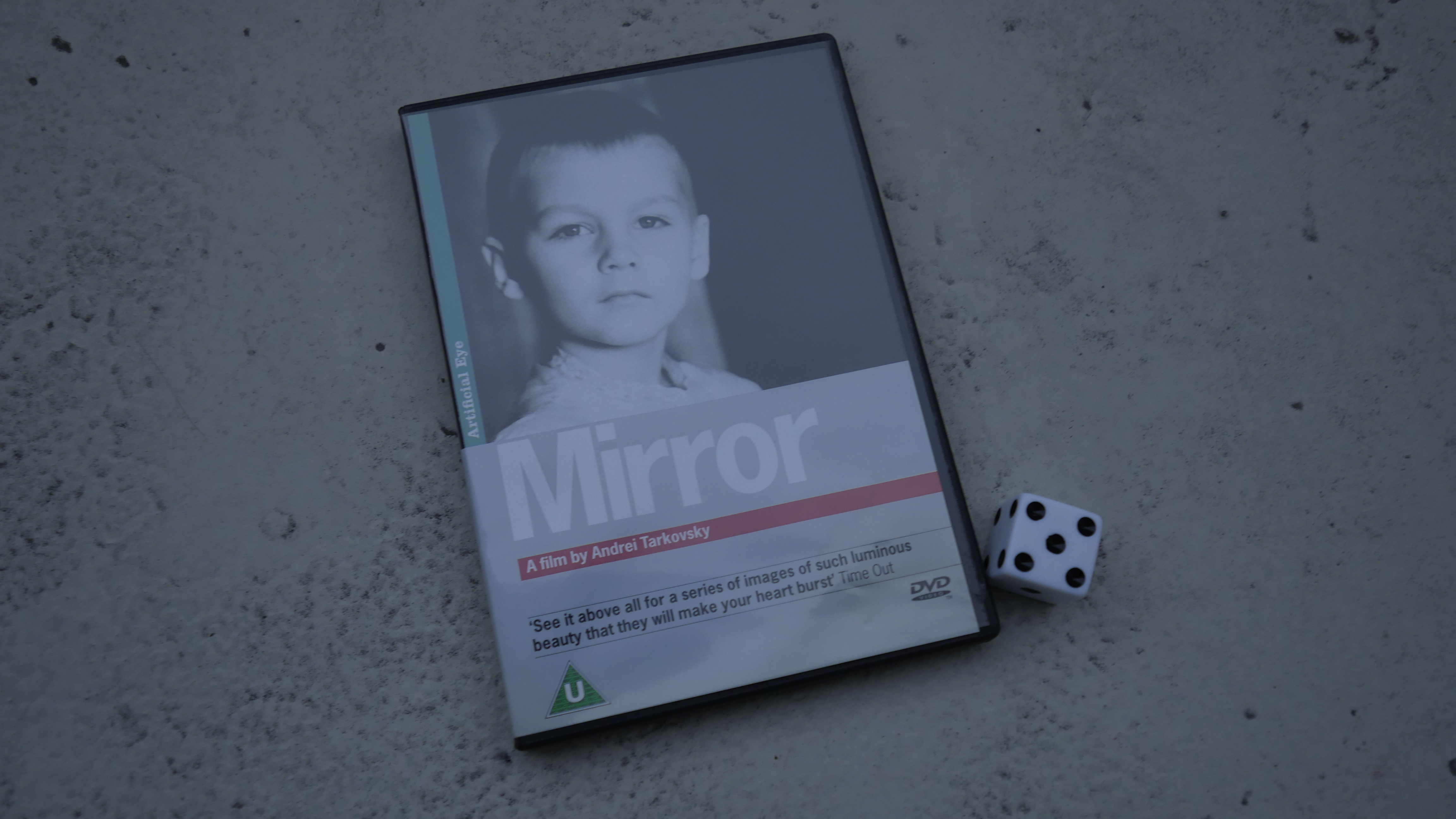
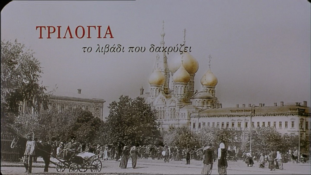
| Mirror. Andrej Tarkovsky. 1957. Russia. April 1st, 2016. Yorsh. |
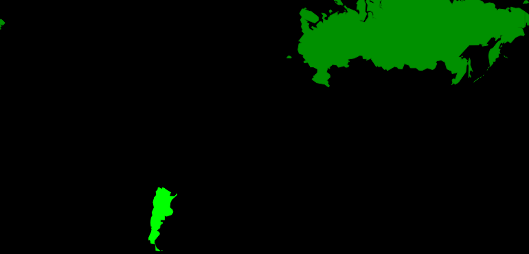 |  | 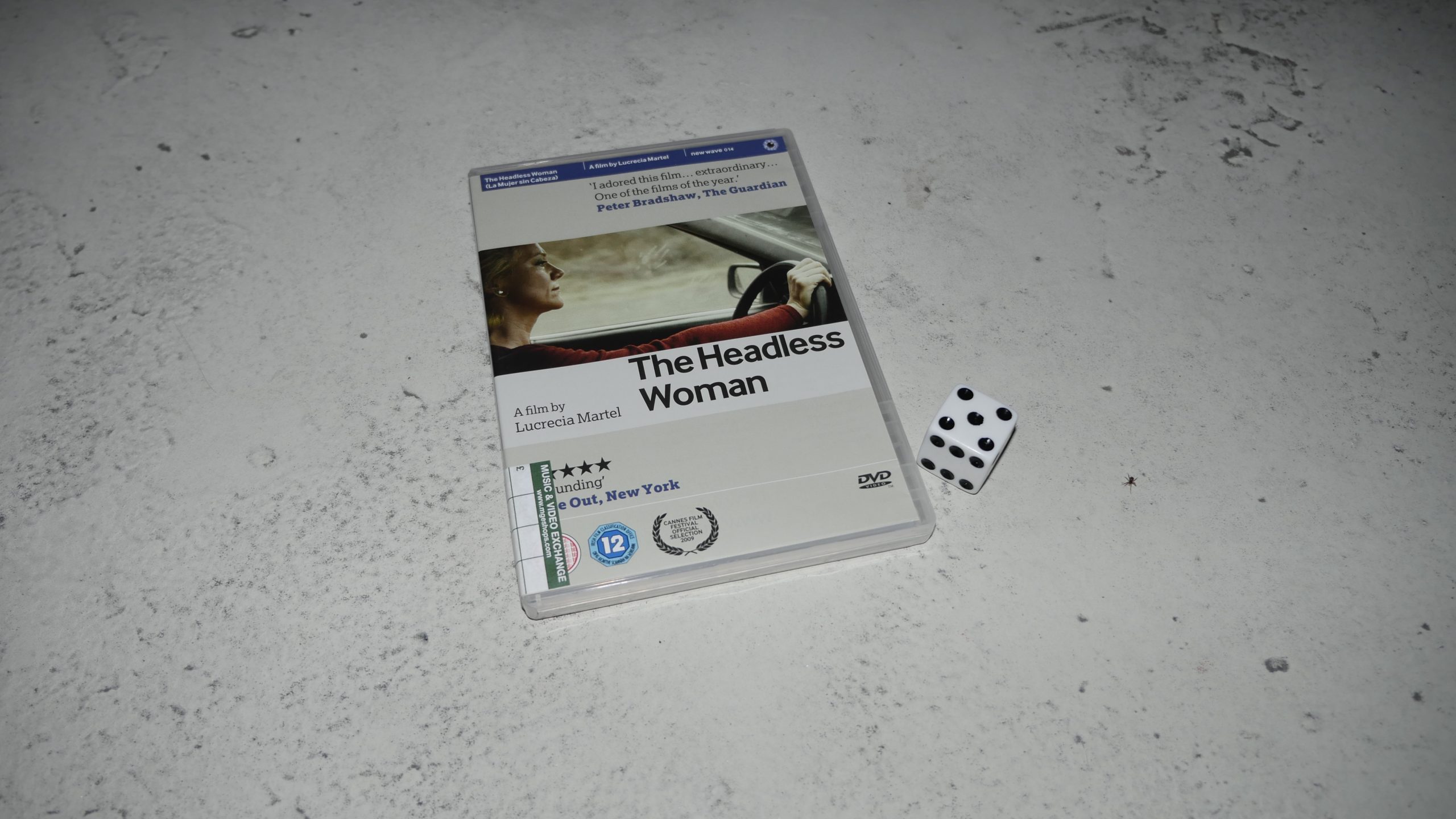 | 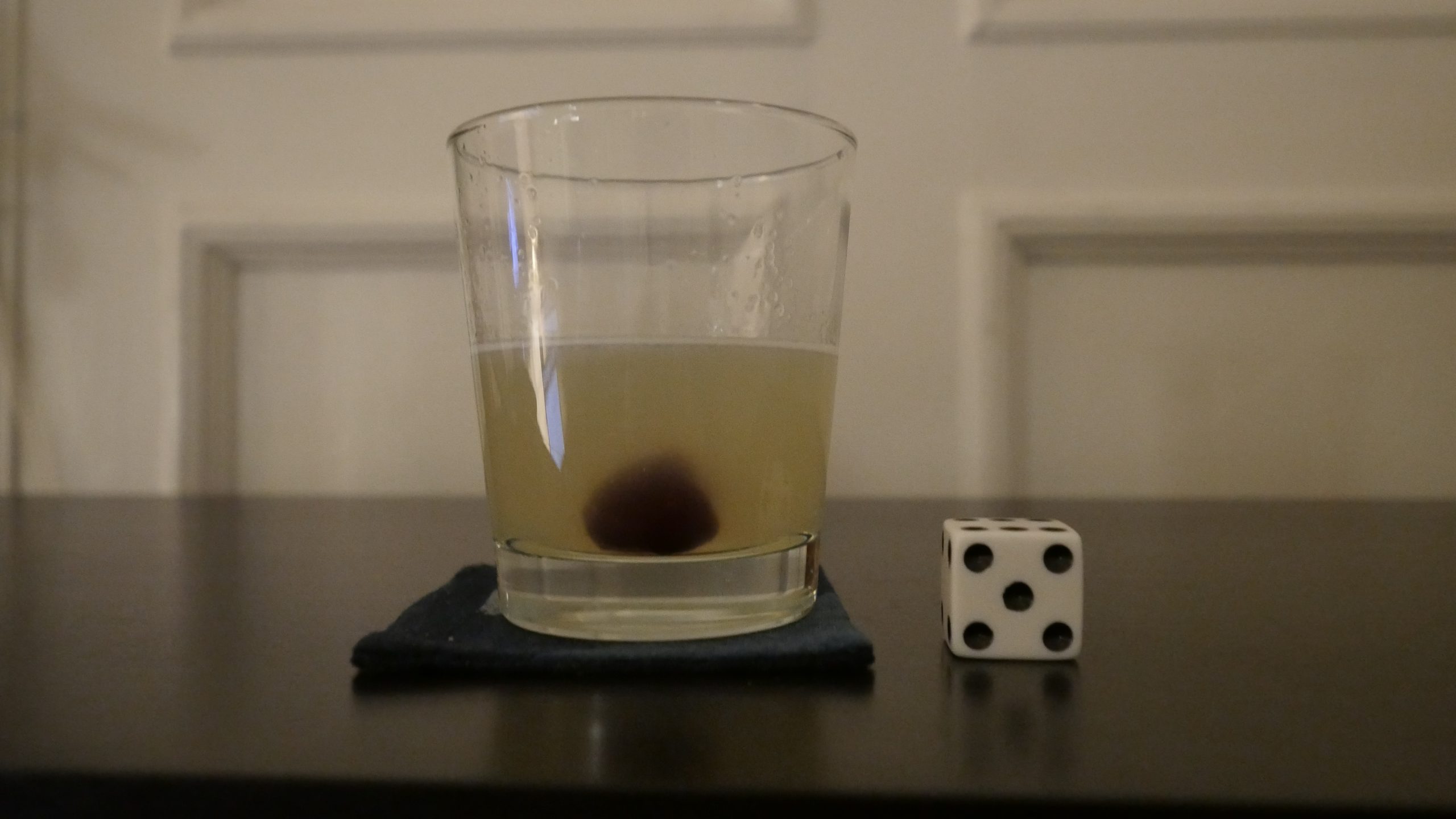 |
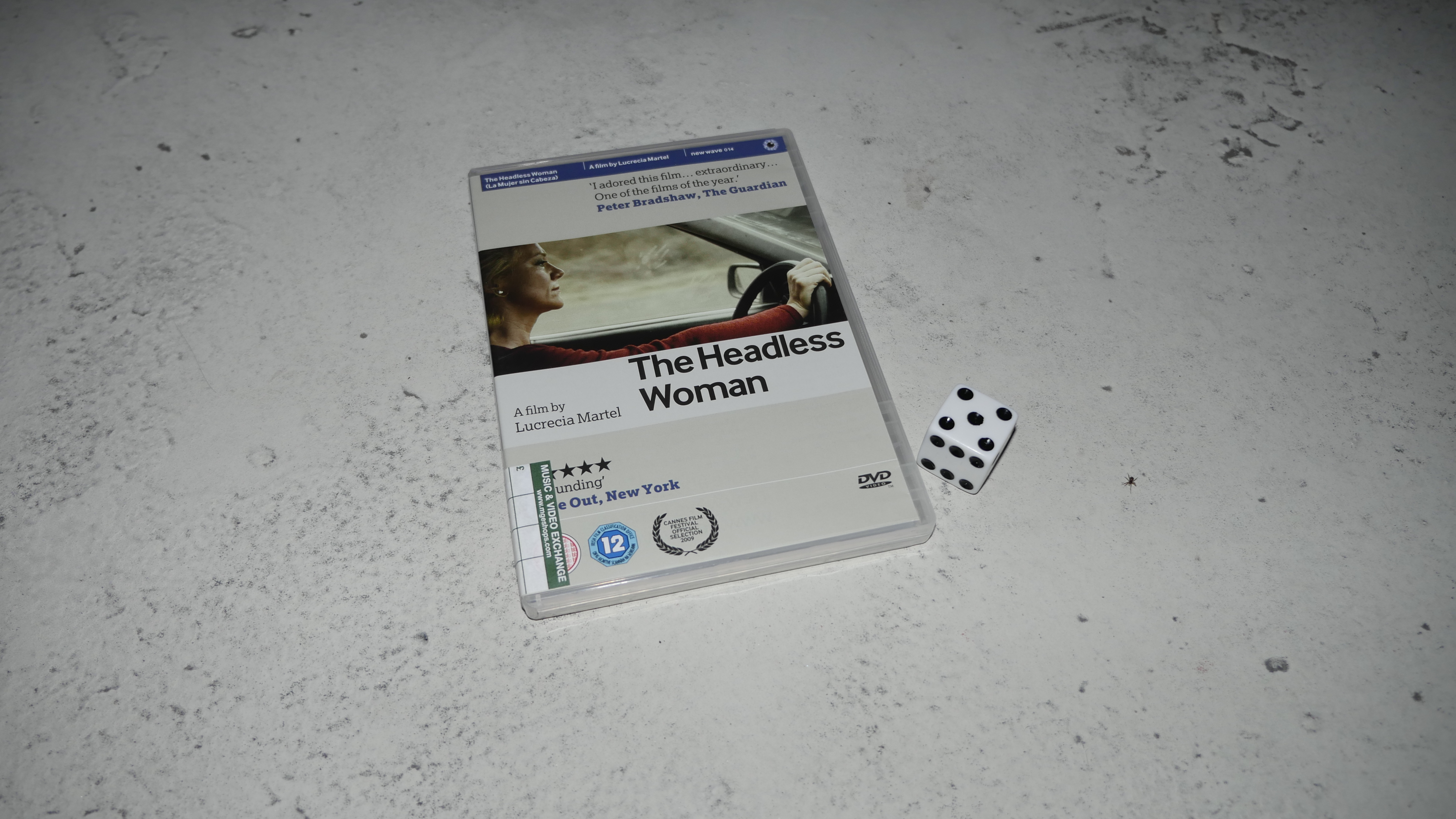
| The Headless Woman. Lucrecia Martel. 2008. Argentina. April 1st, 2016. Bison TT. |
 | 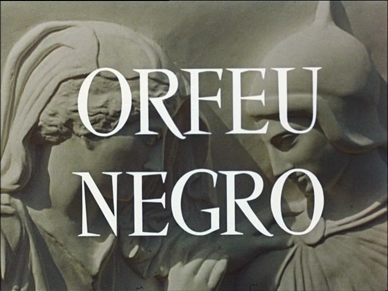 | 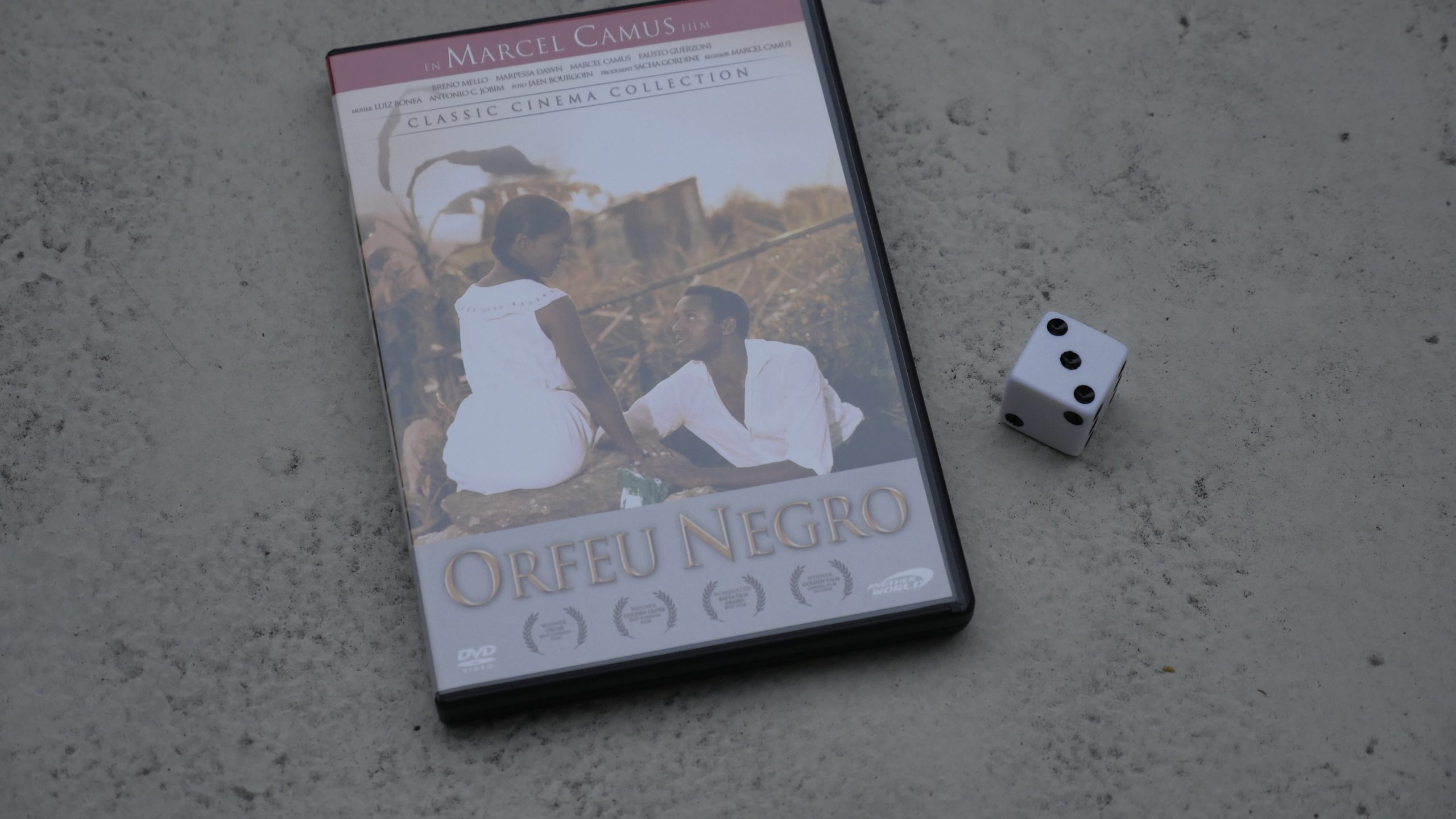 |  |
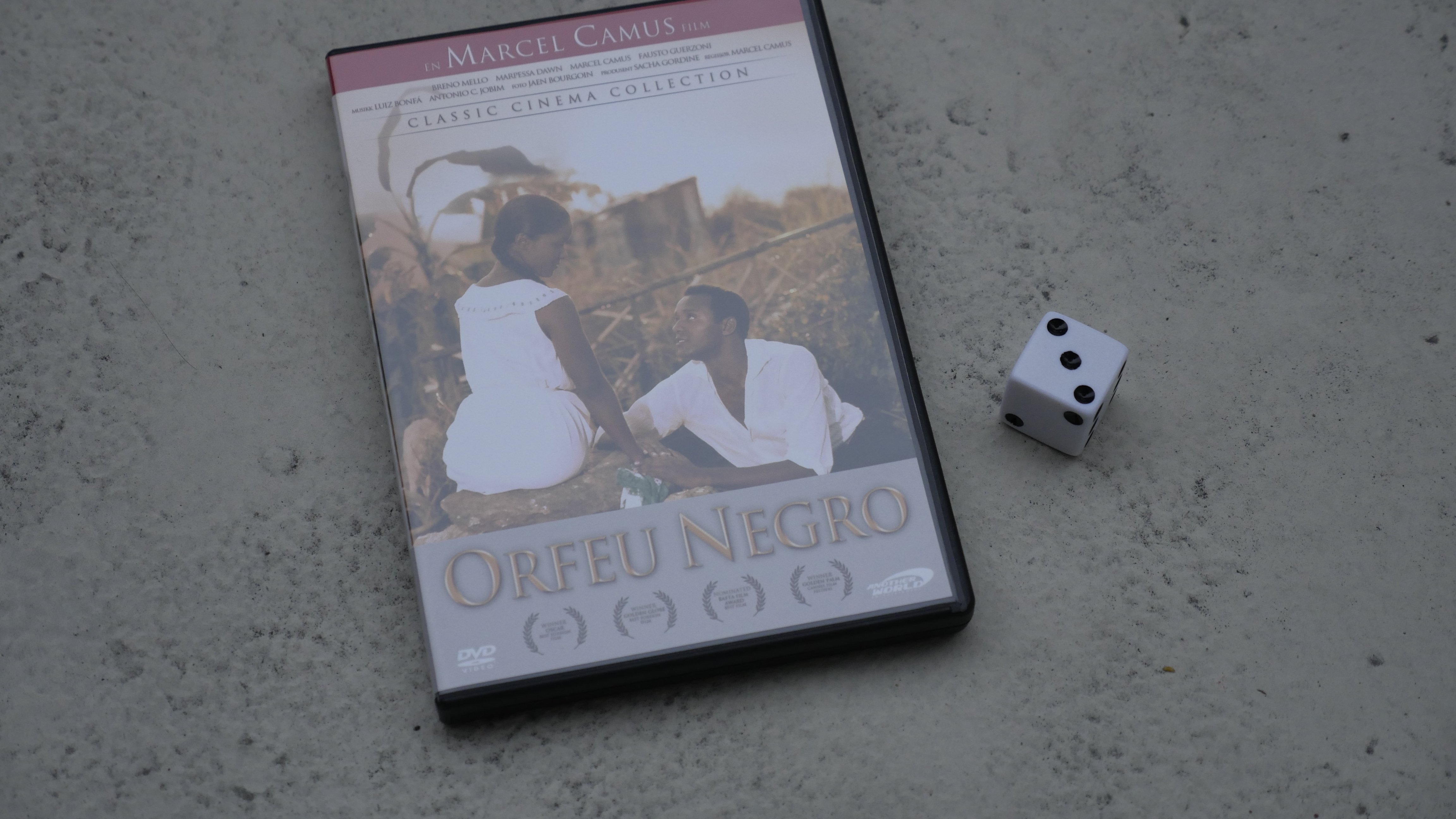
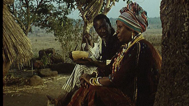
| Black Orpheus. Marcel Camus. 1959. Brazil. April 5th, 2016. Batida de mango. |
 | 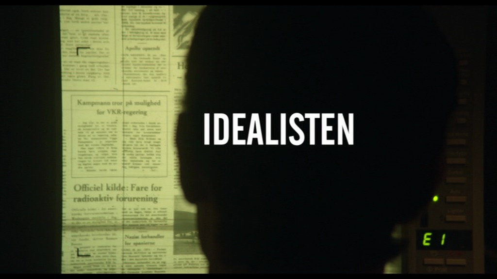 |  | 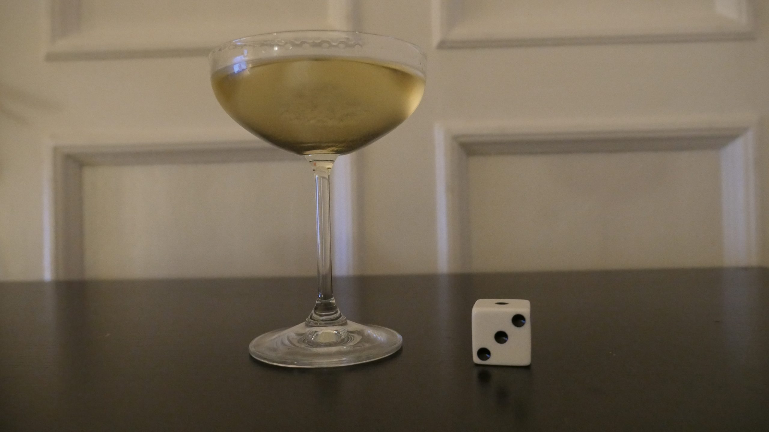 |
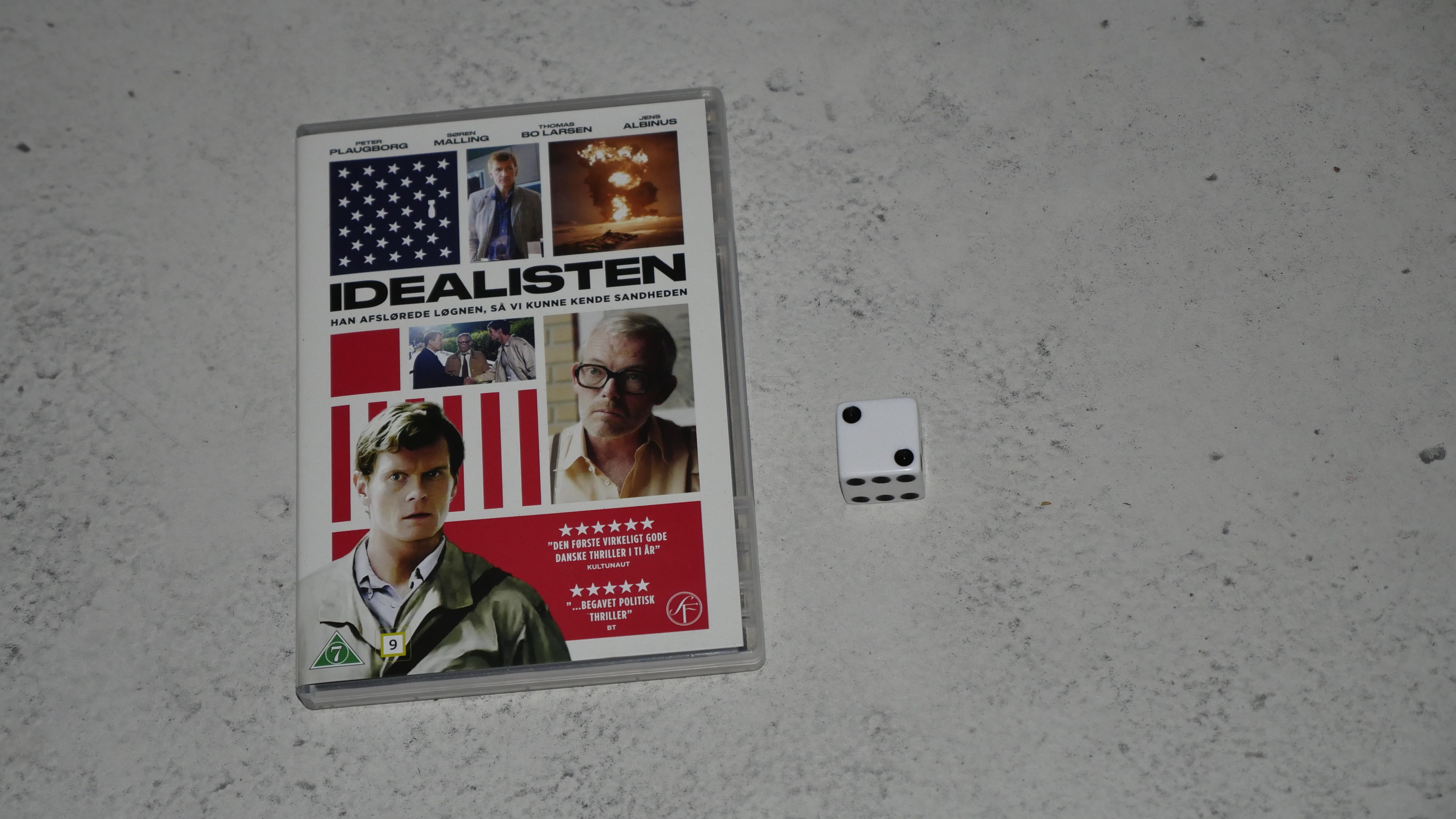
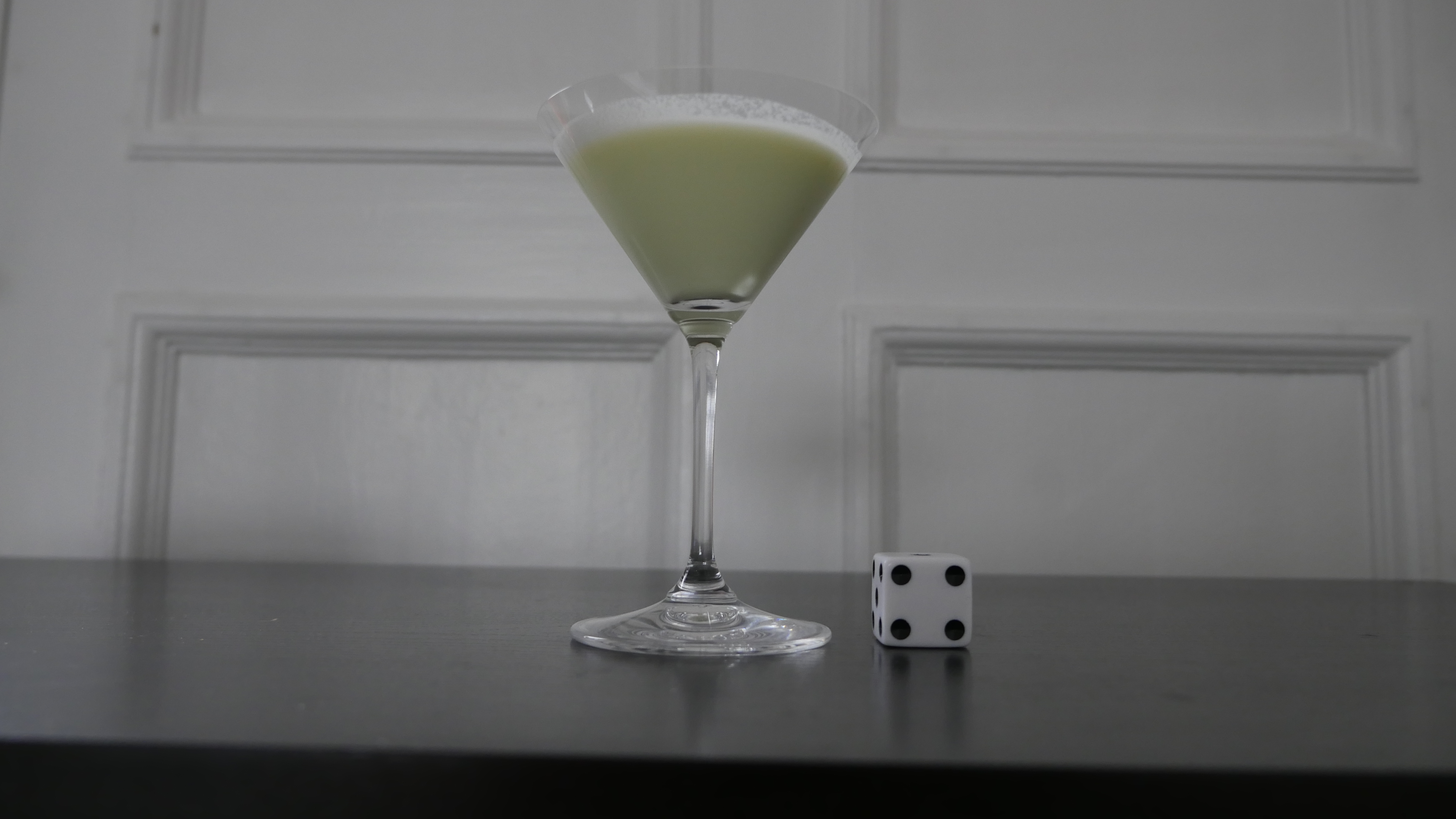
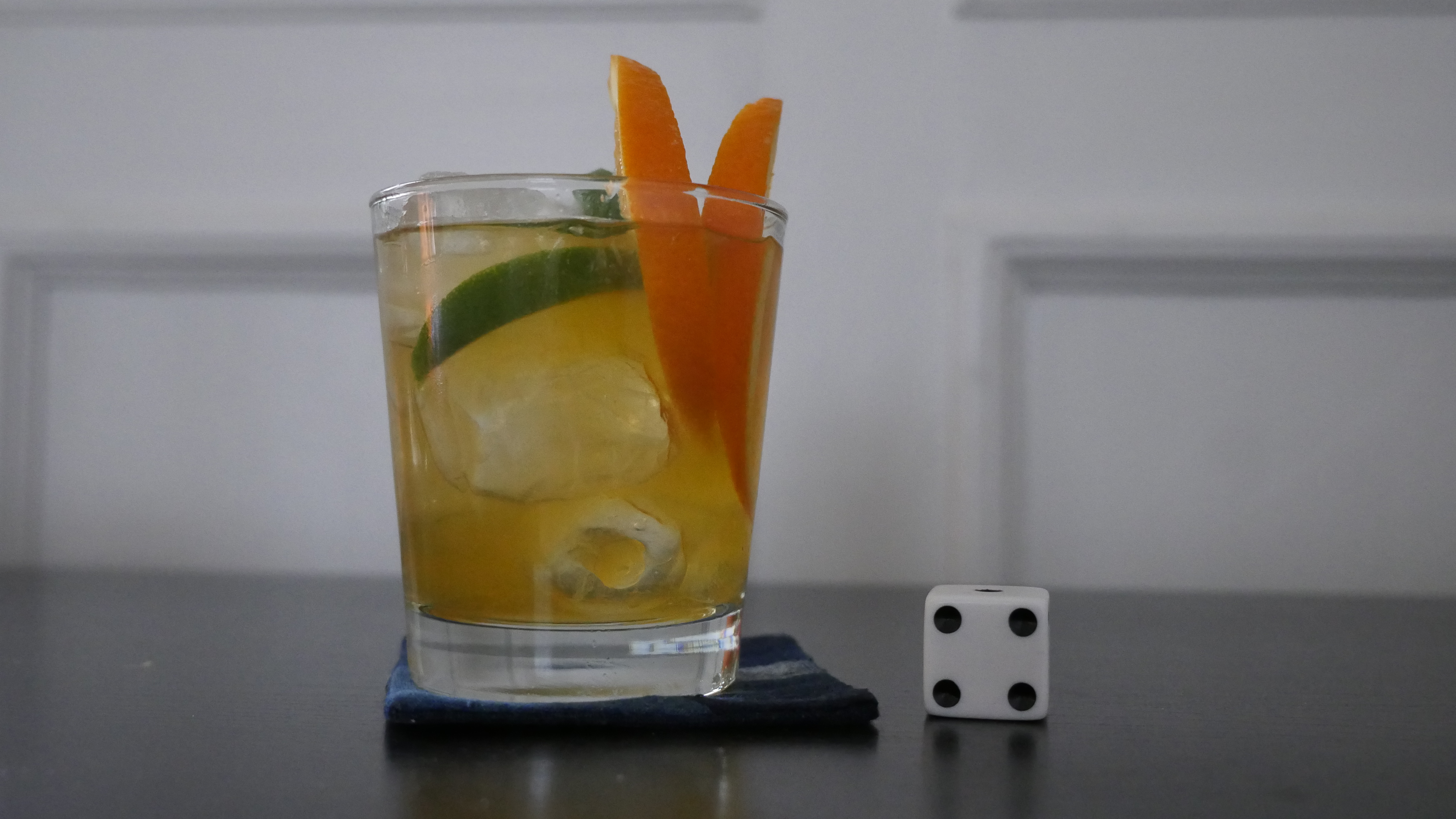
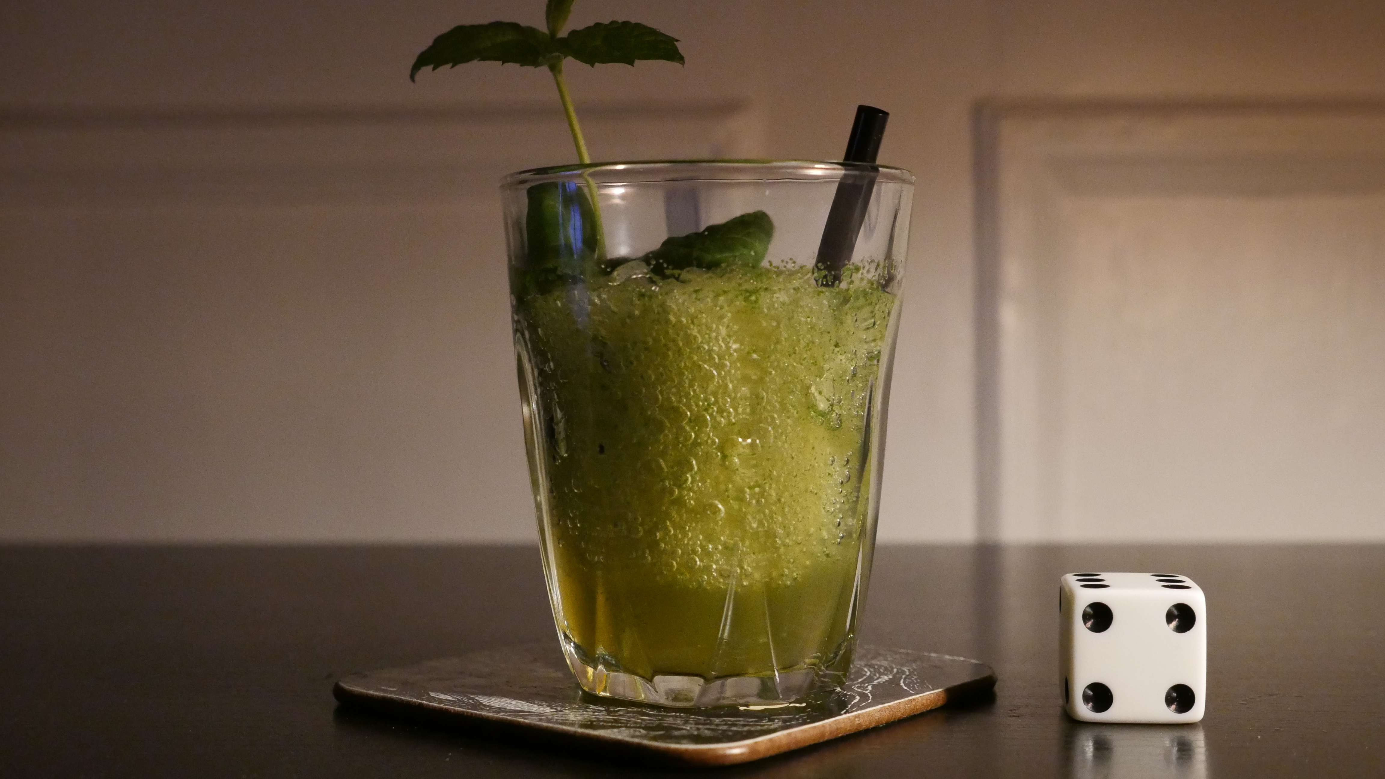
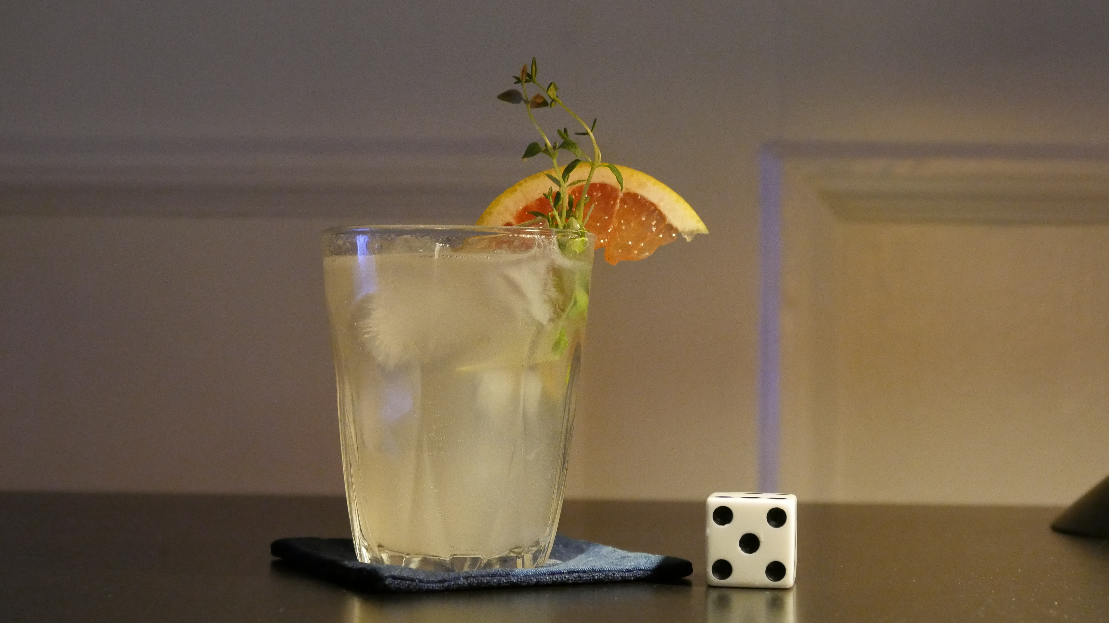
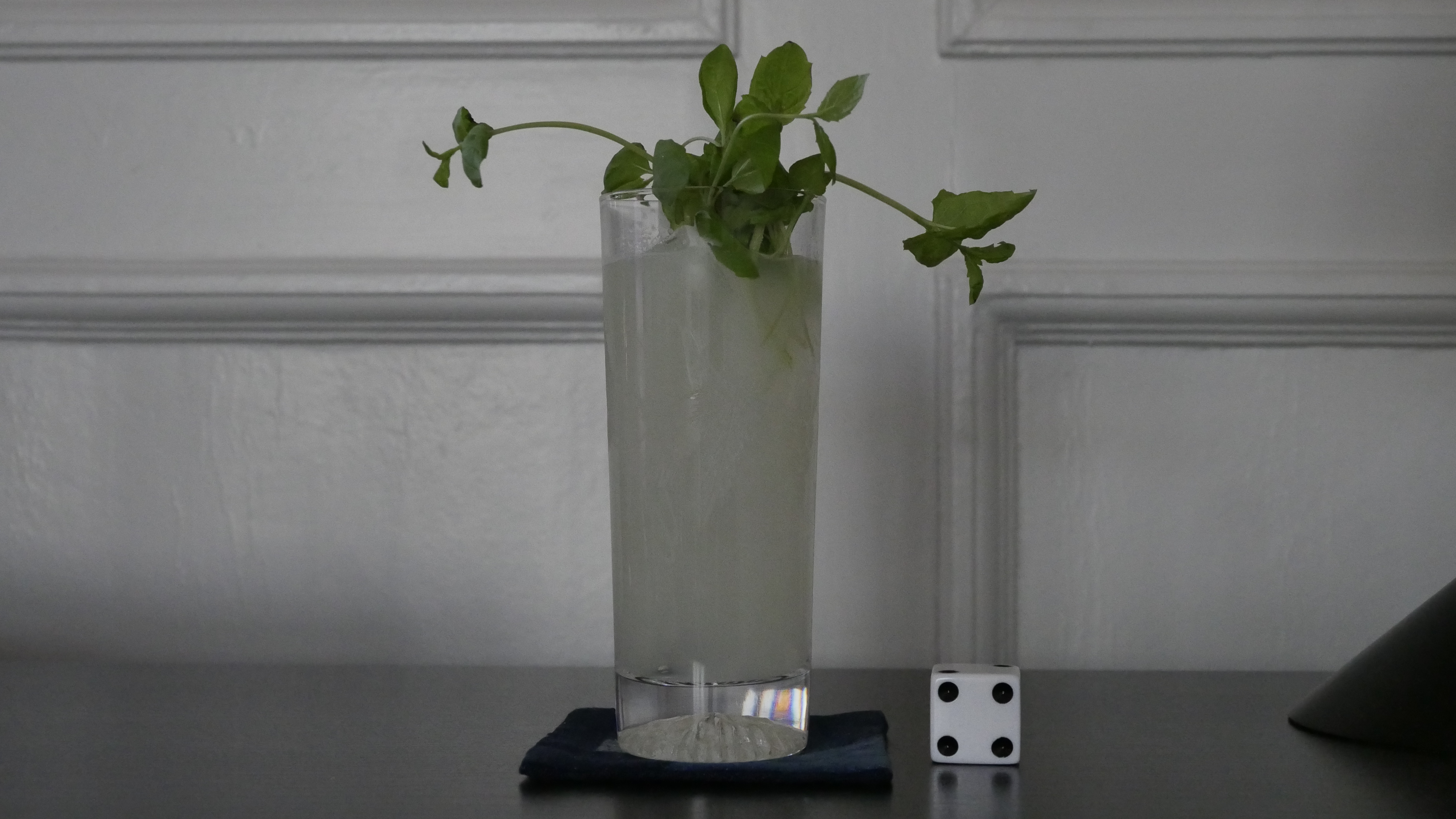
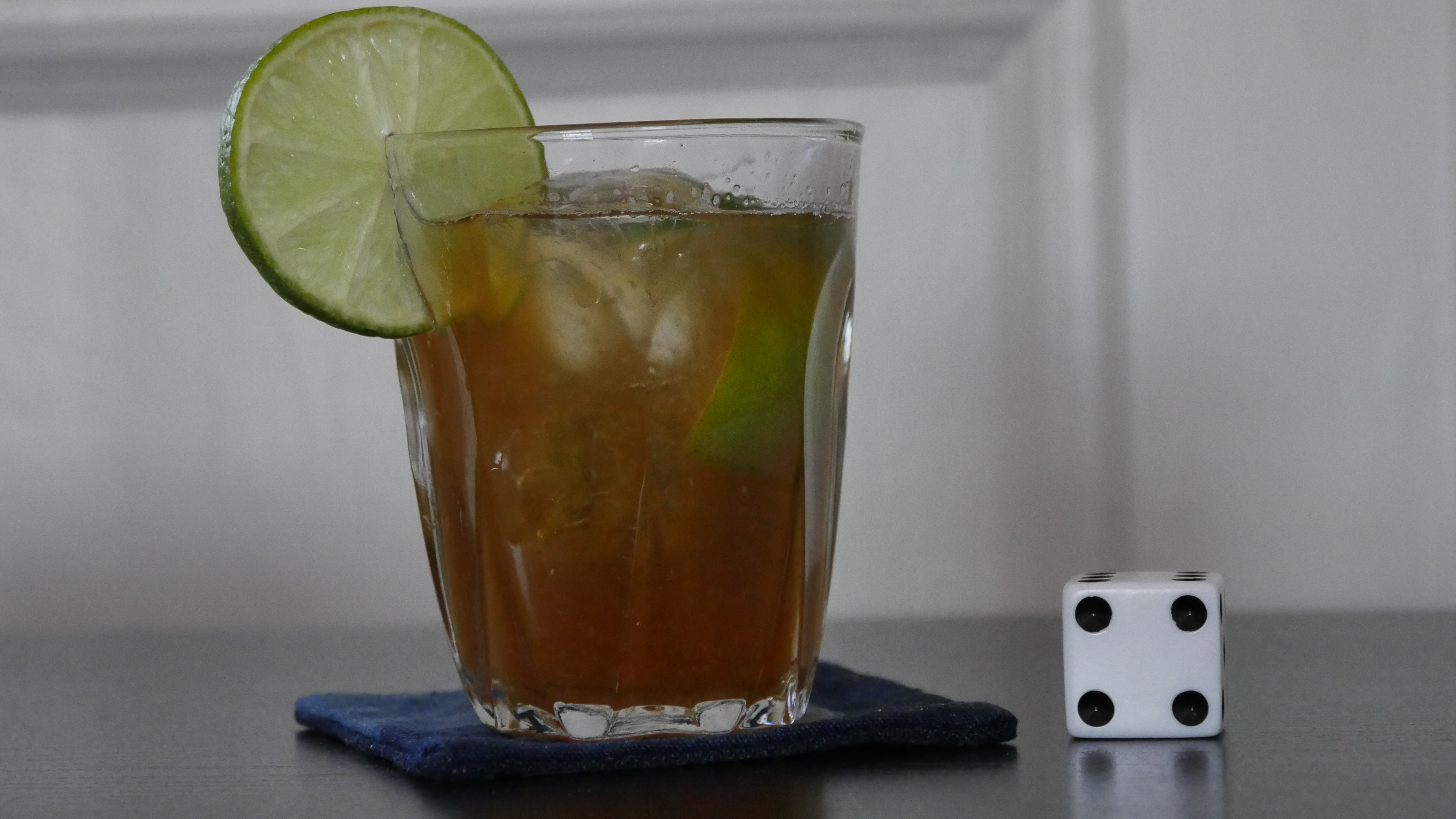
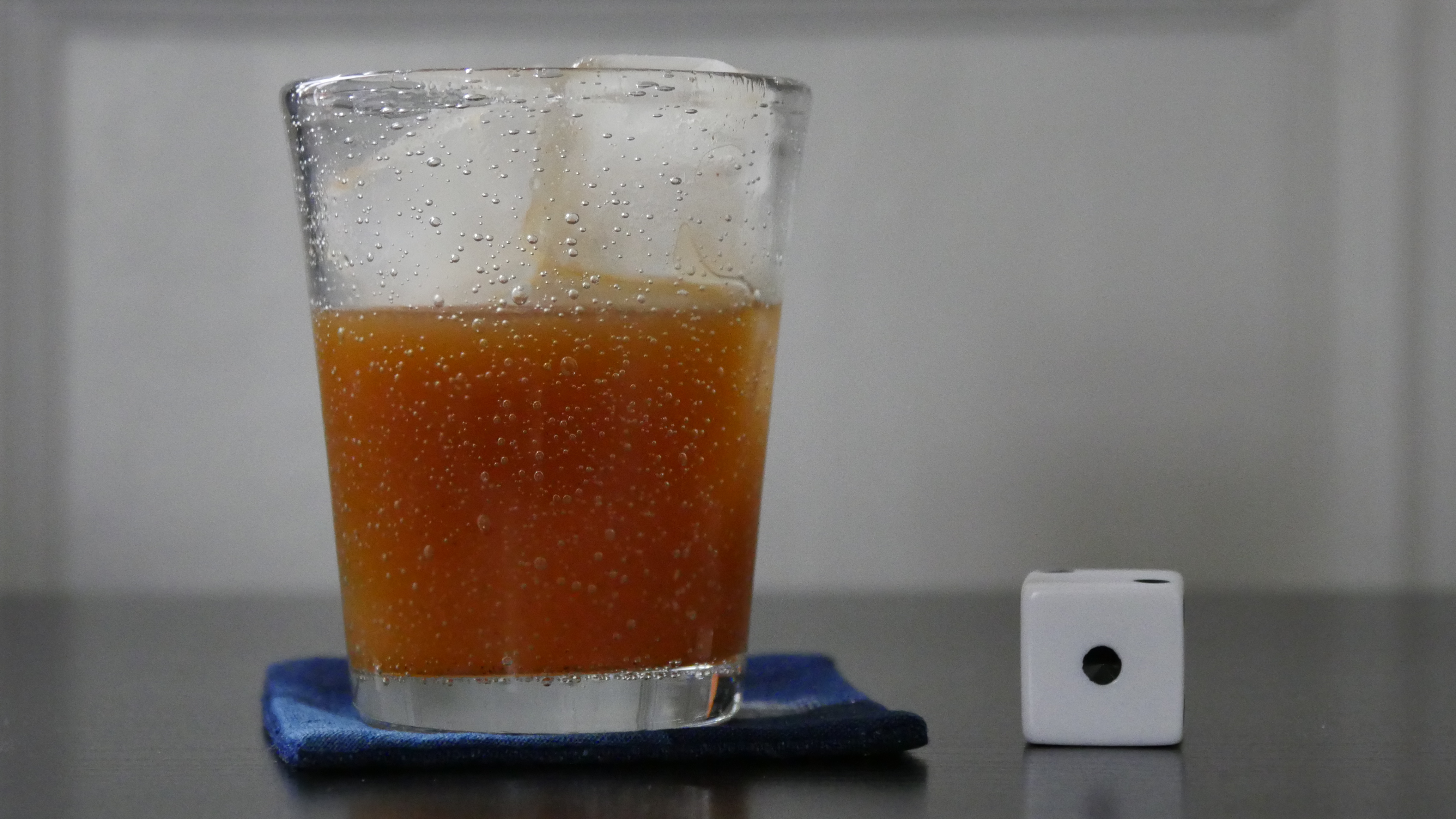
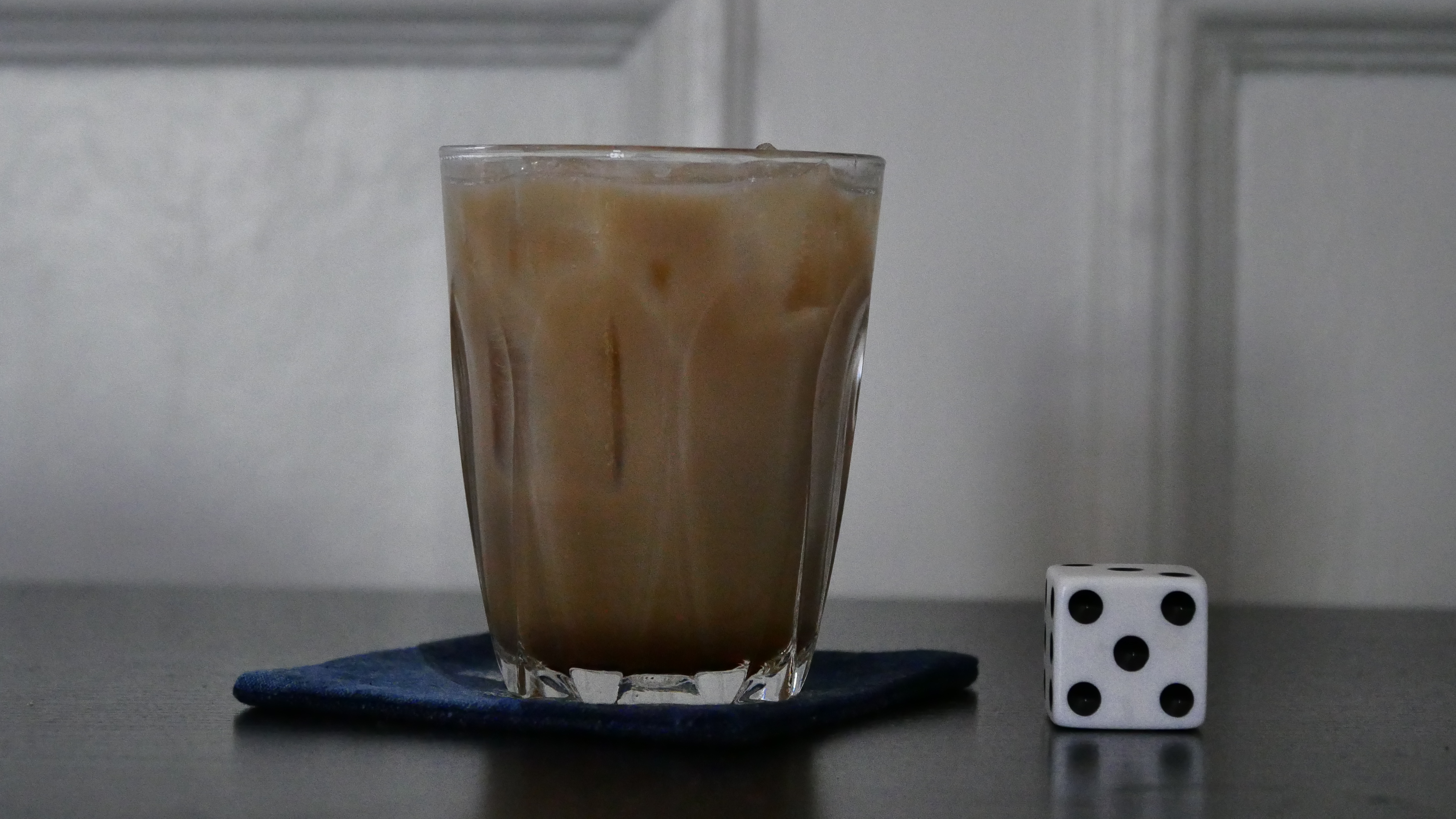
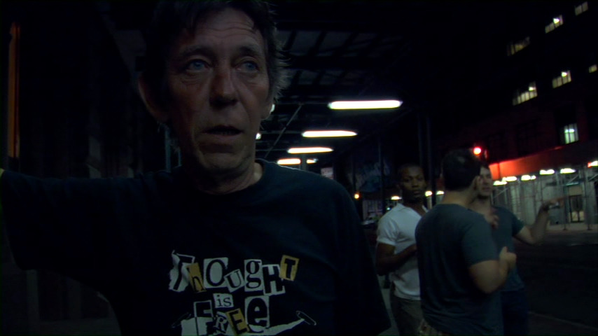
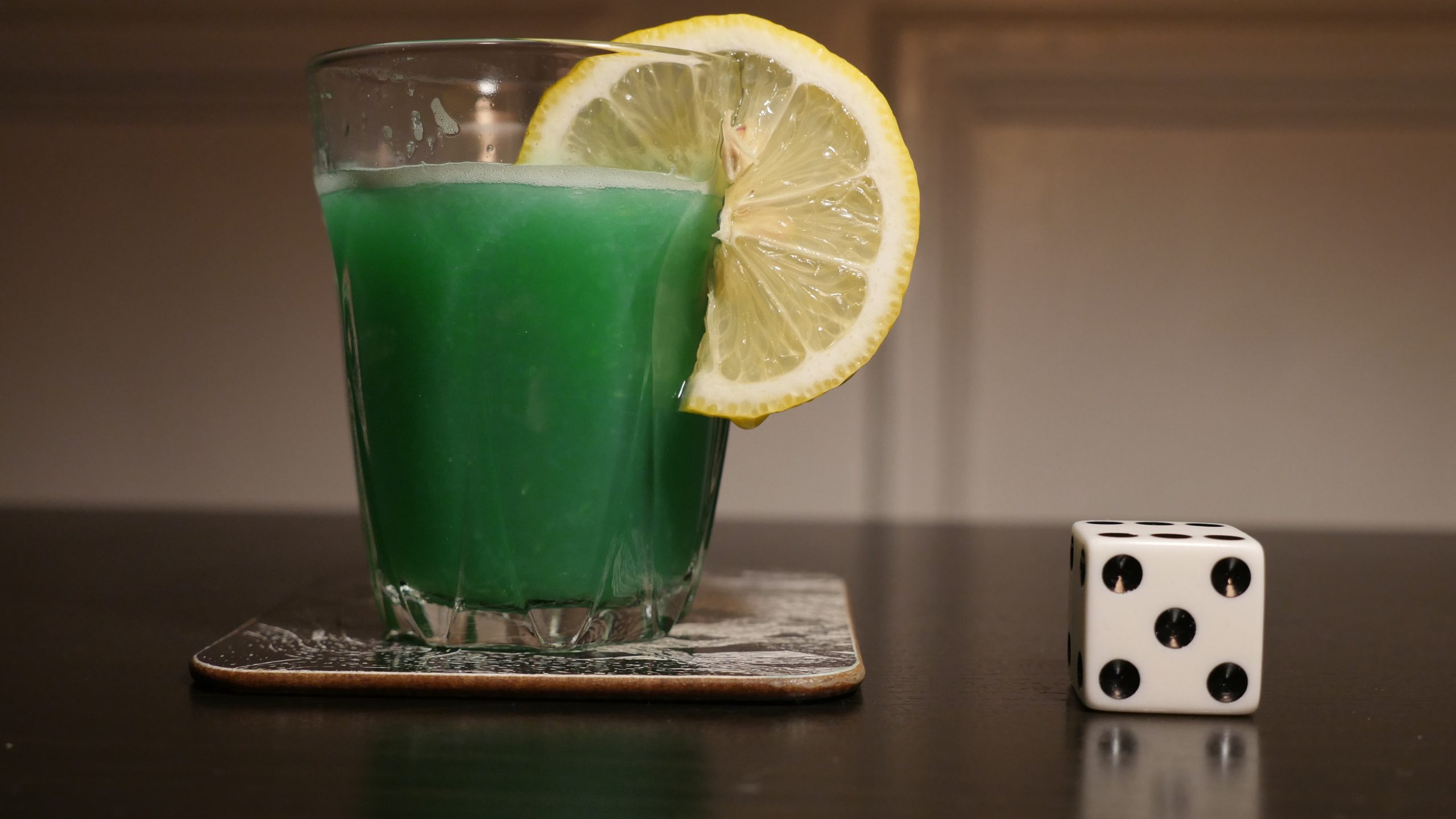
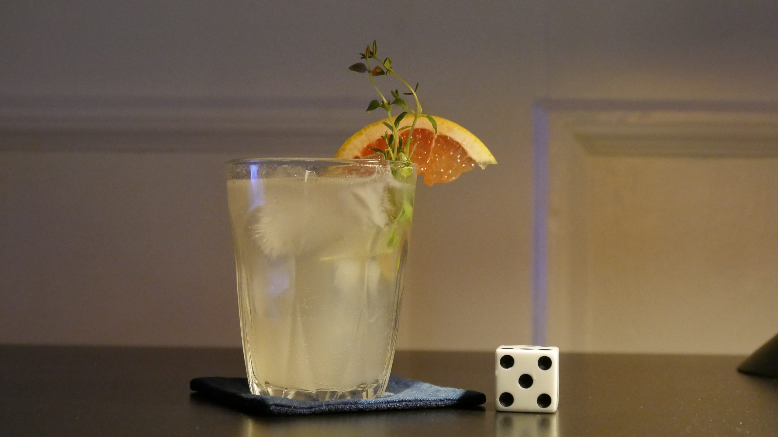
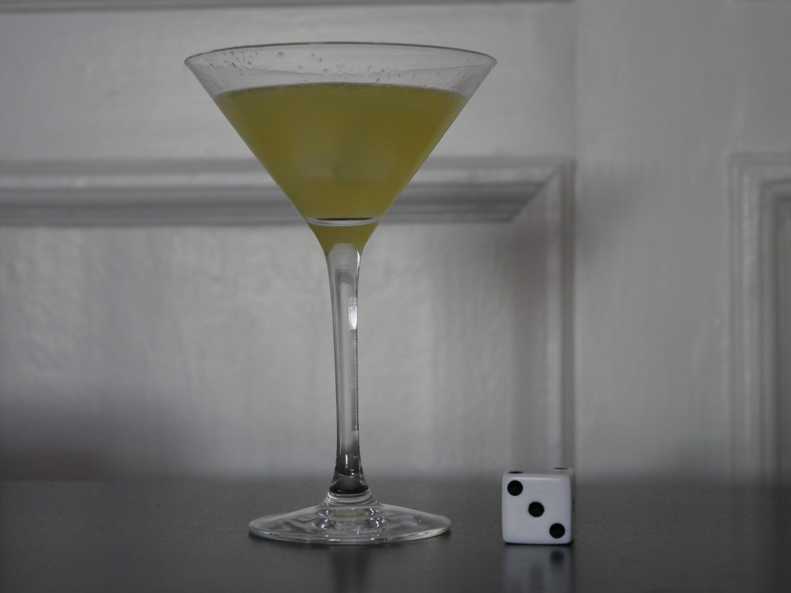
| The Idealist. Christina Rosendahl. 2015. Denmark. April 5th, 2016. Complement Cocktail. |
 | 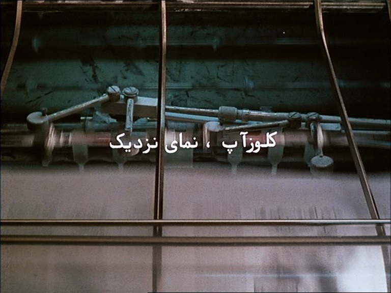 | 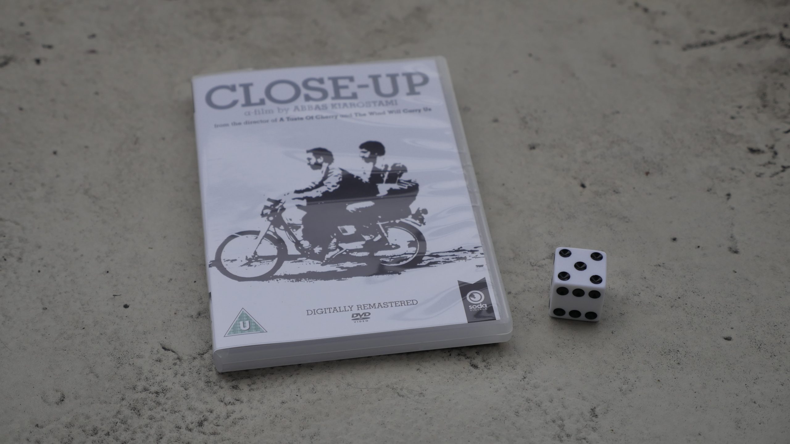 |  |
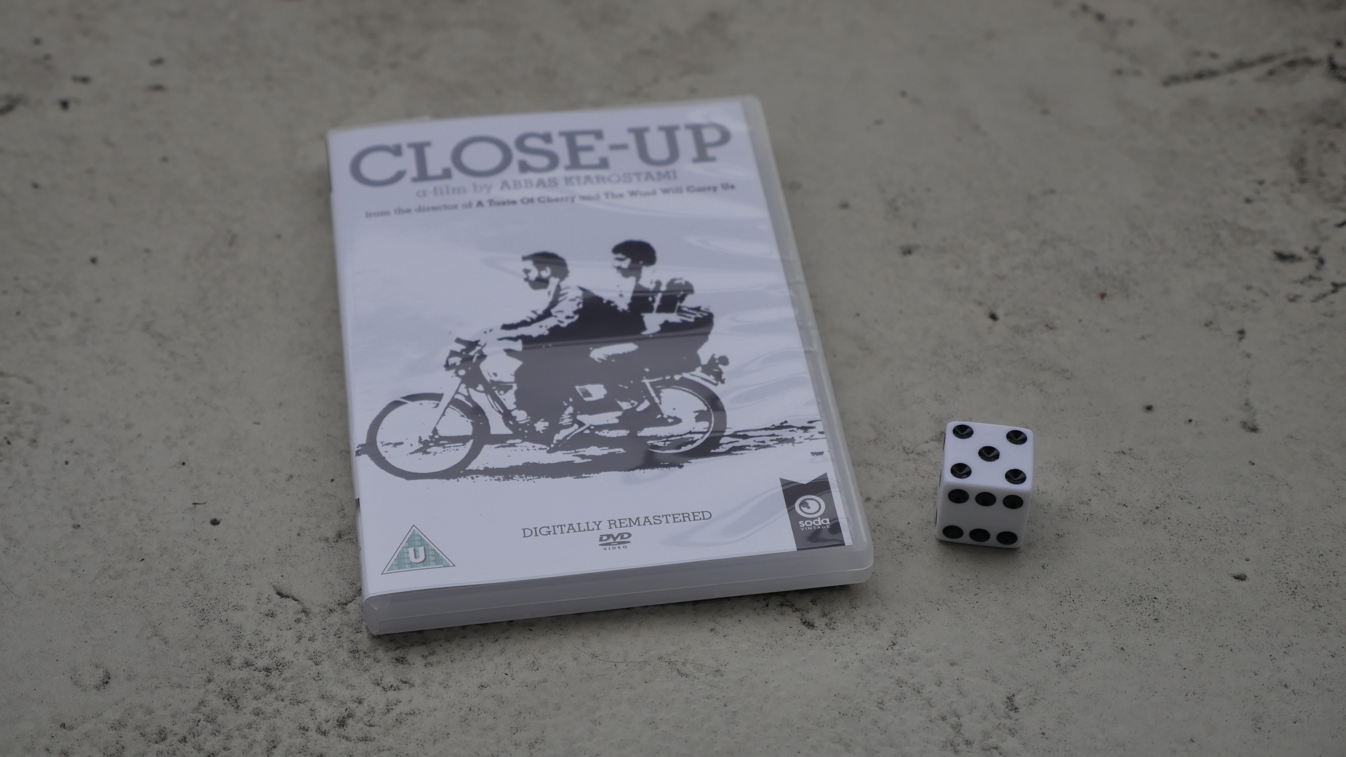
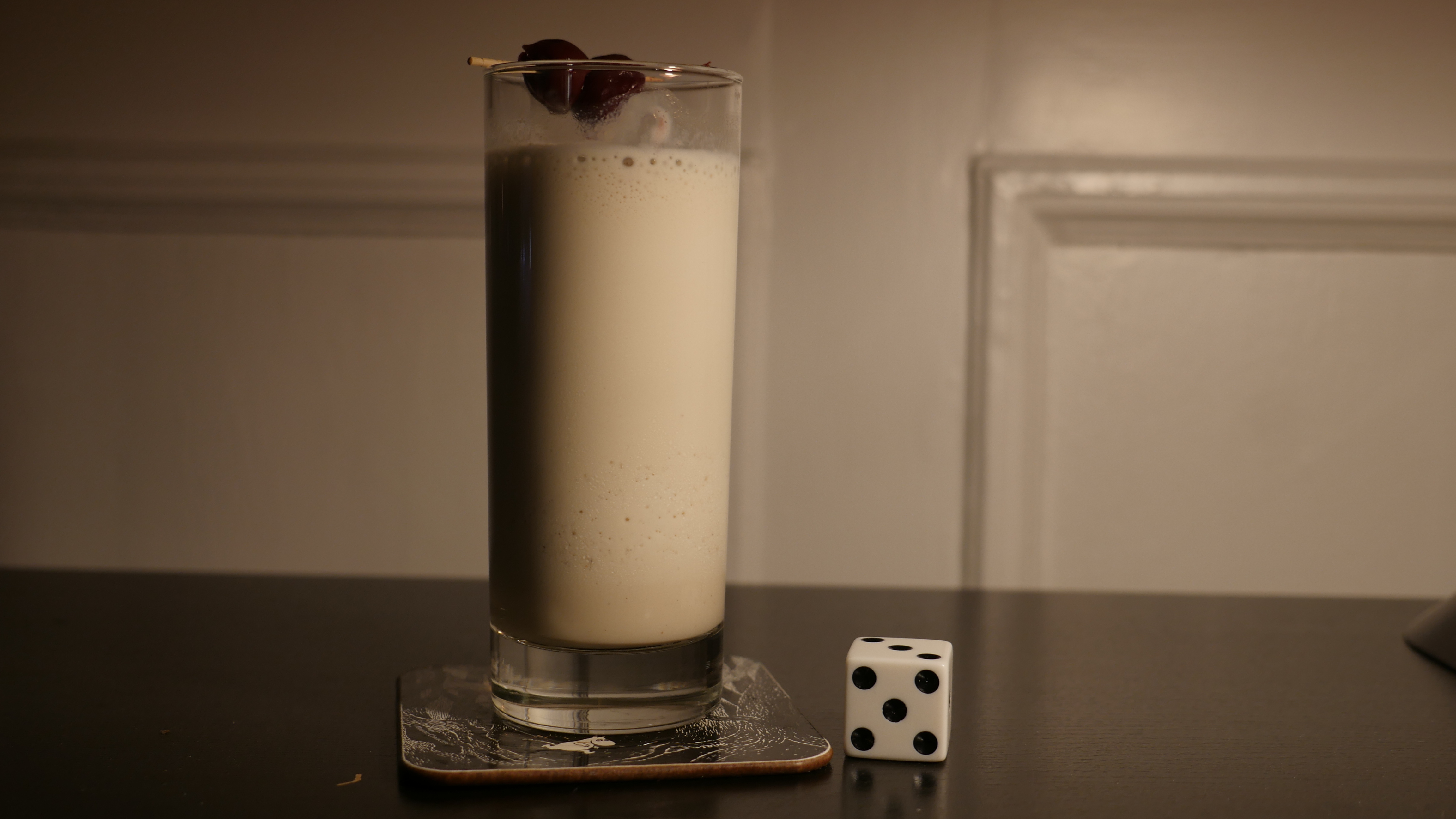
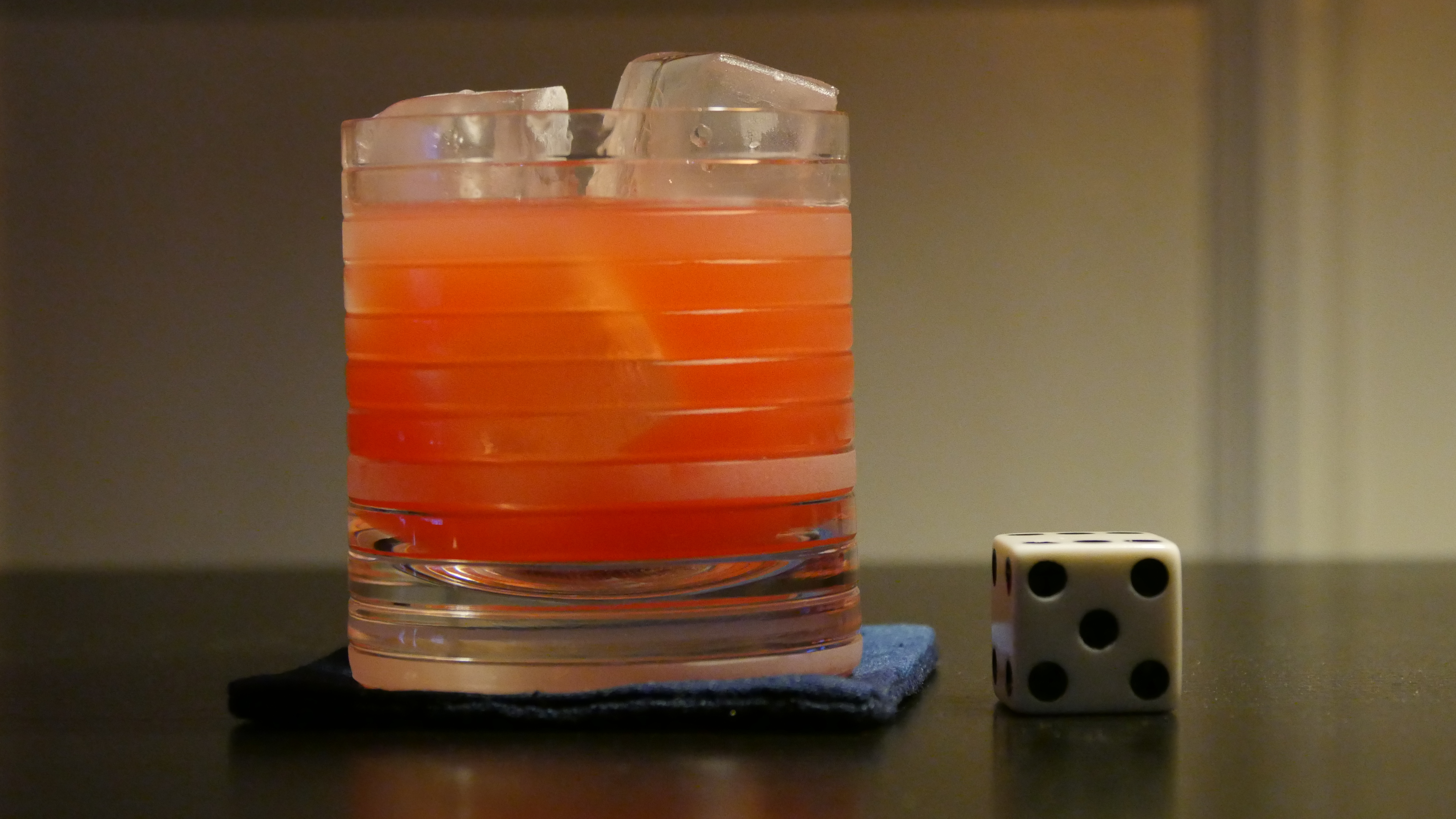
| Close-Up. Abbas Kiarostami. 1990. Iran. April 6th, 2016. Persian rose. |
 | 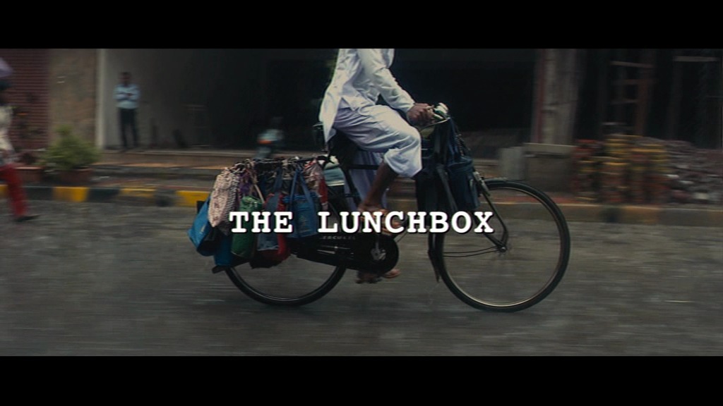 | 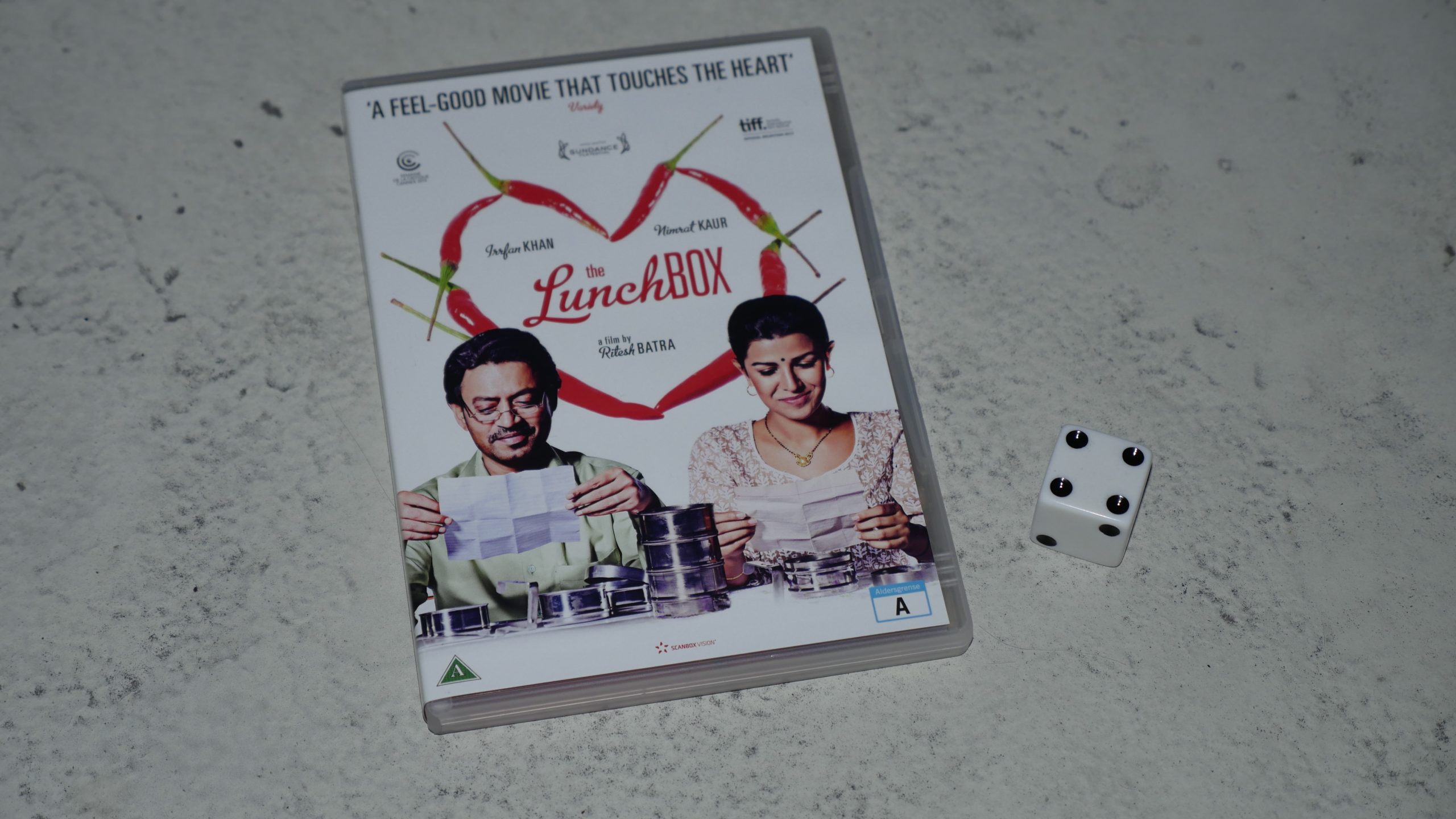 |  |
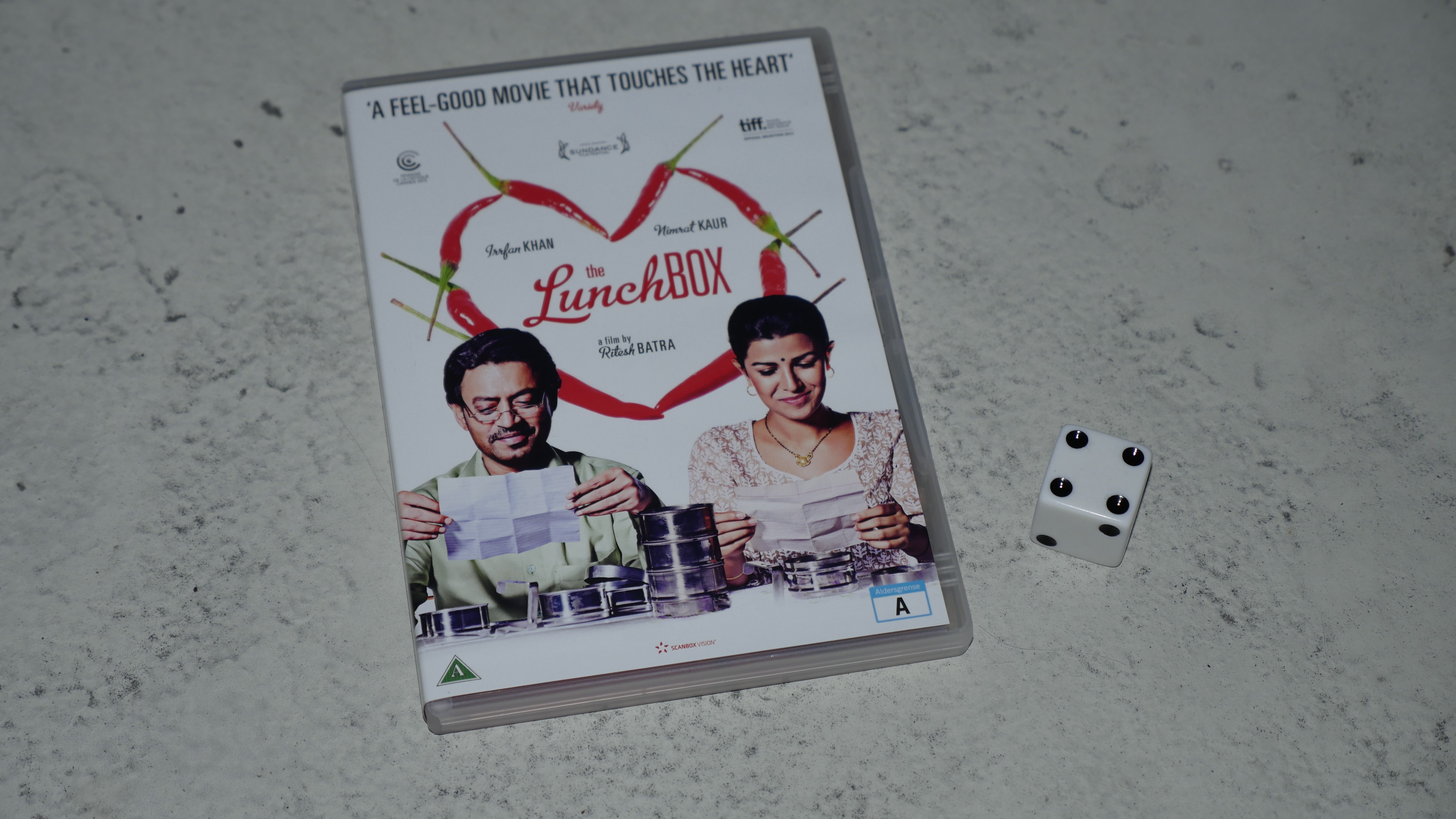
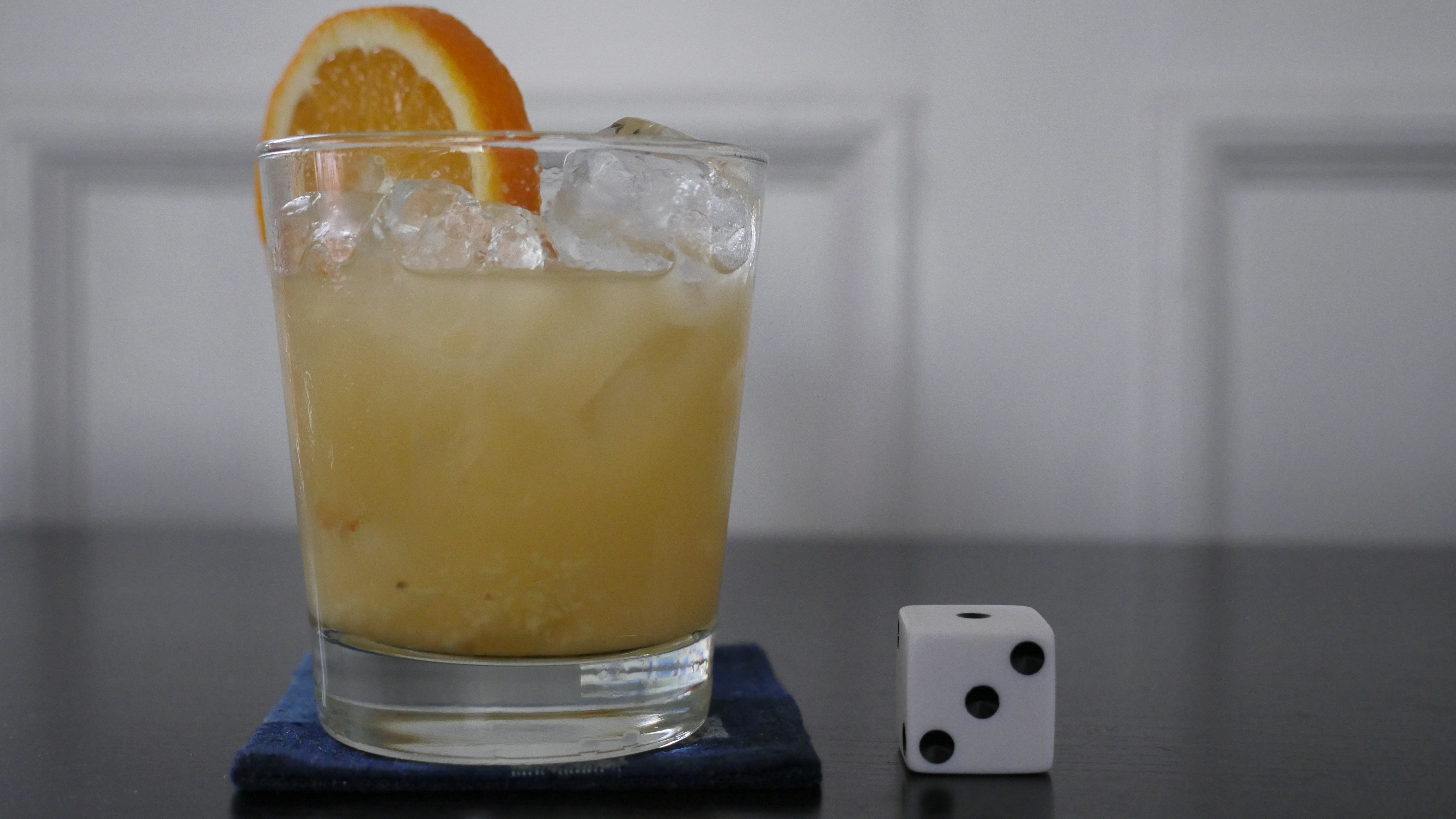
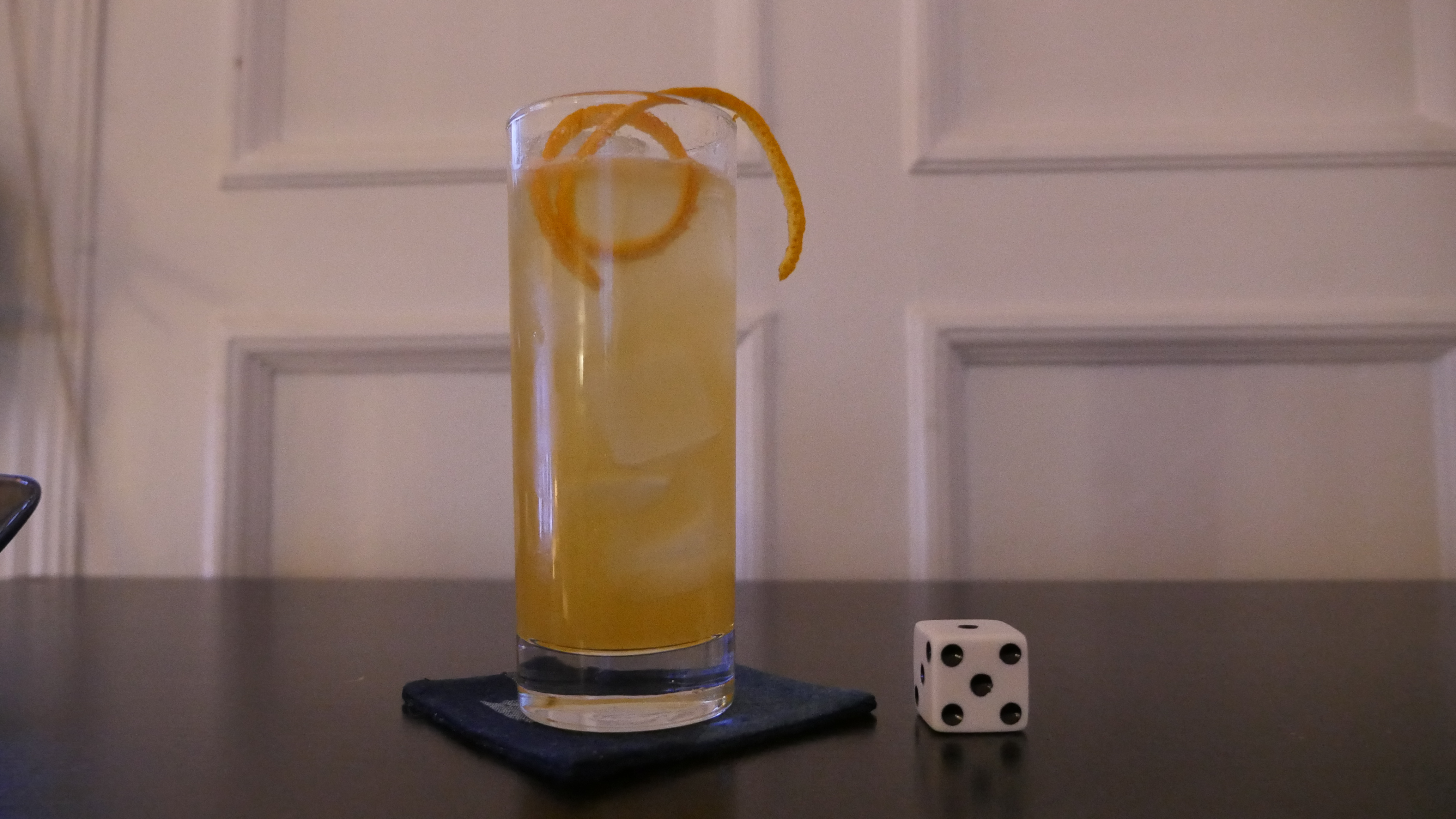
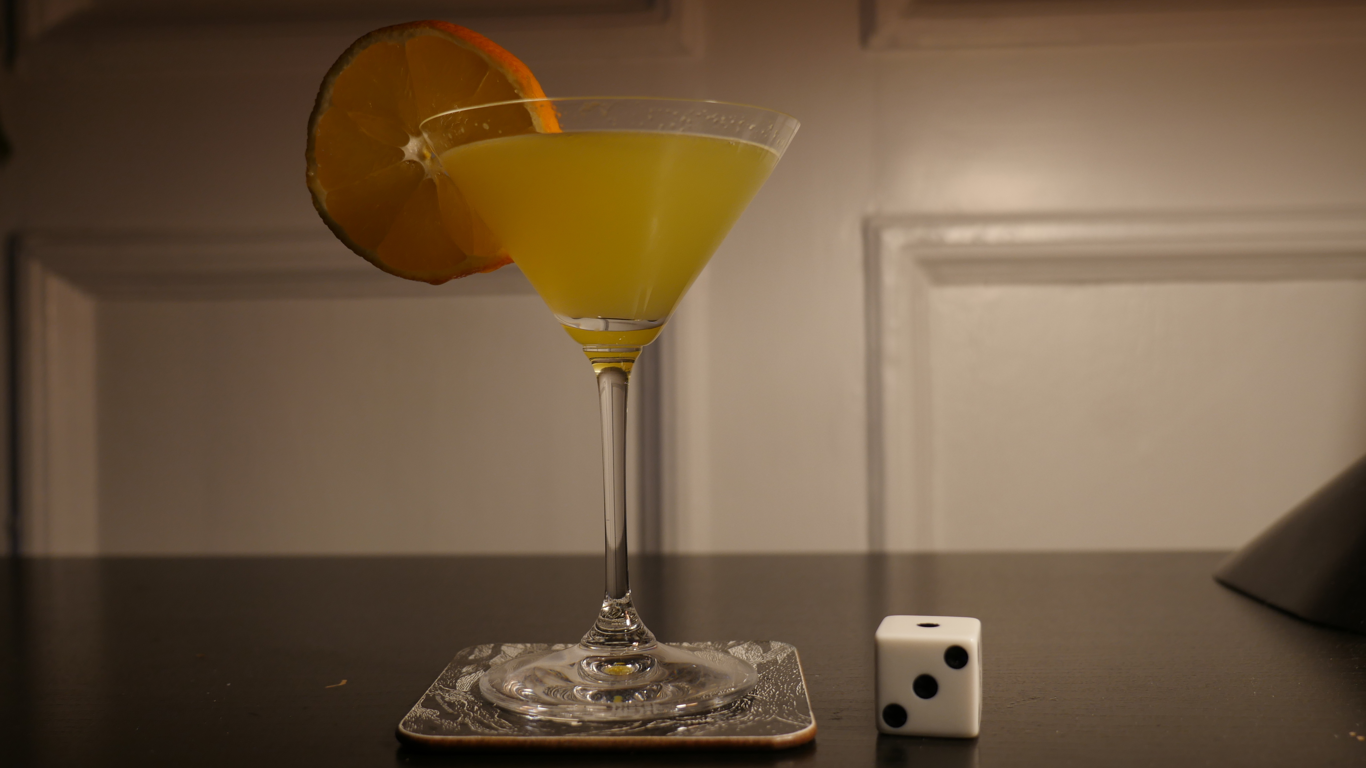
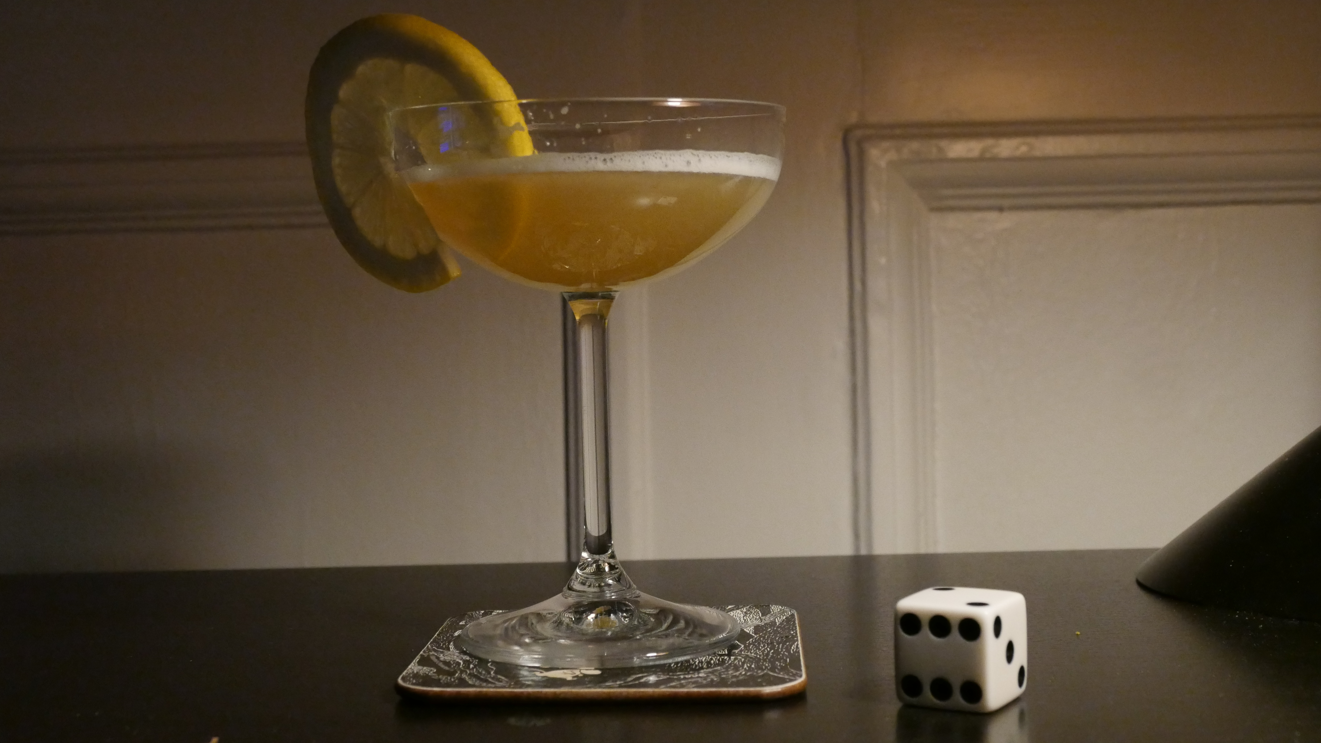
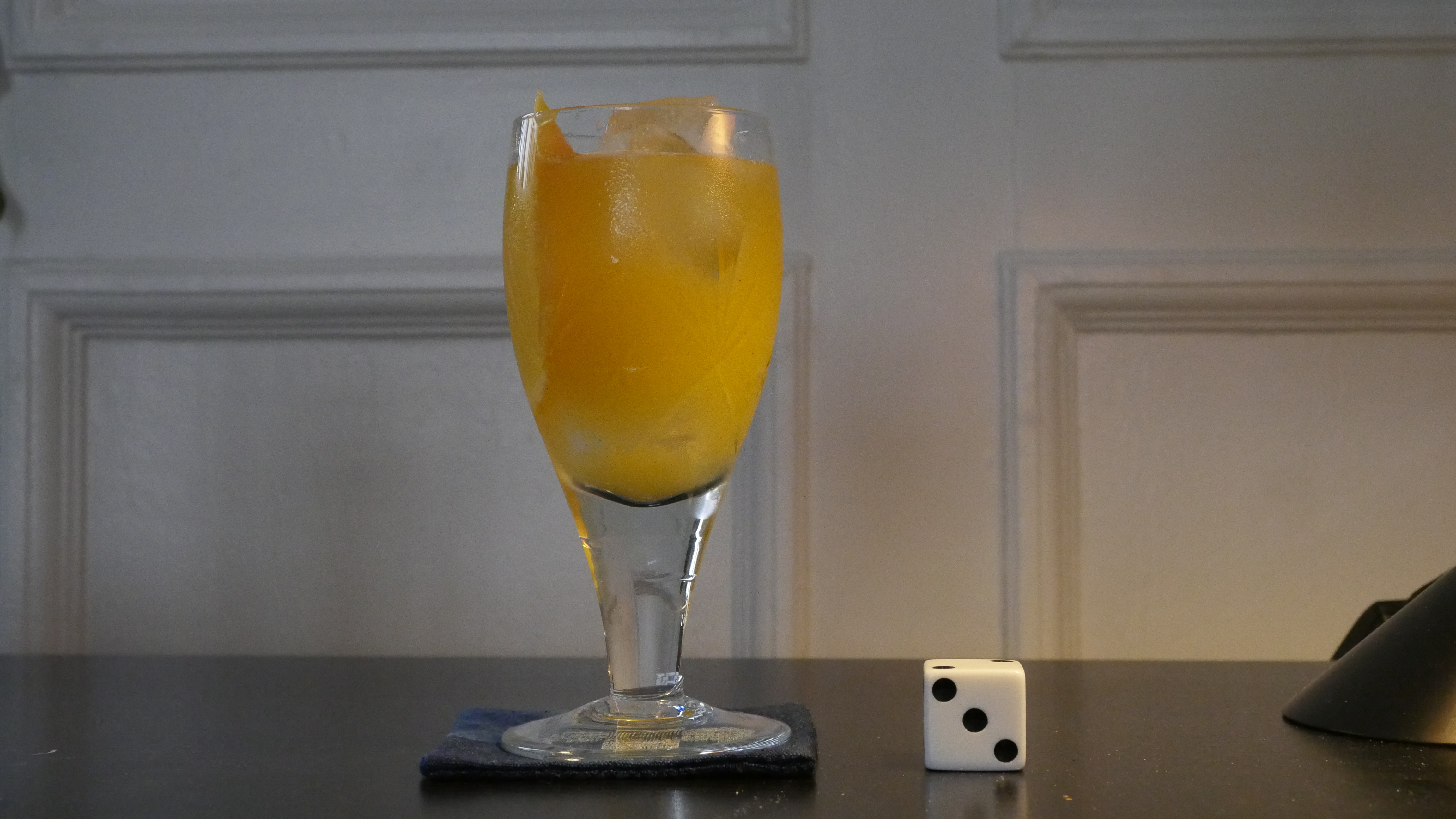
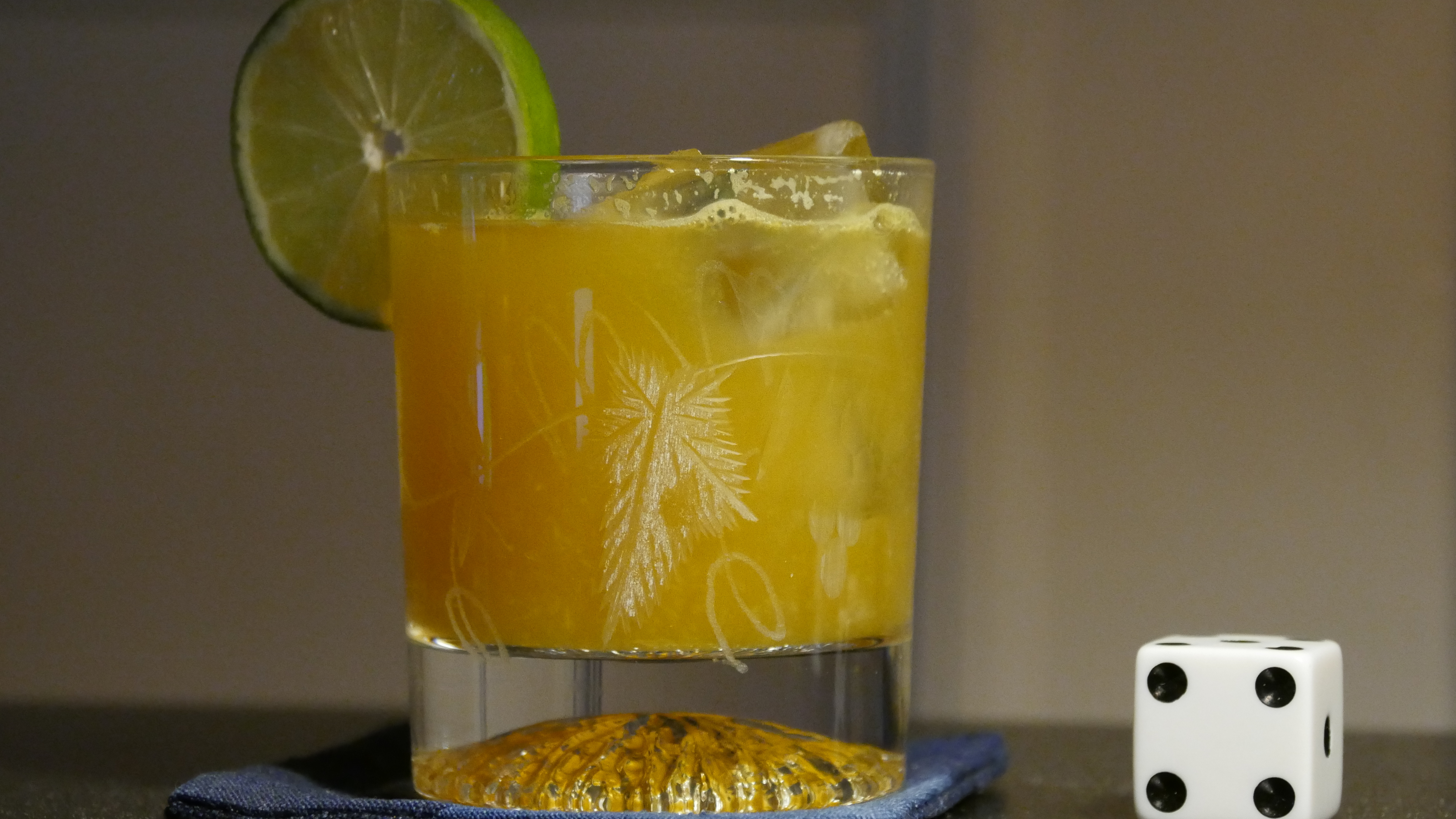
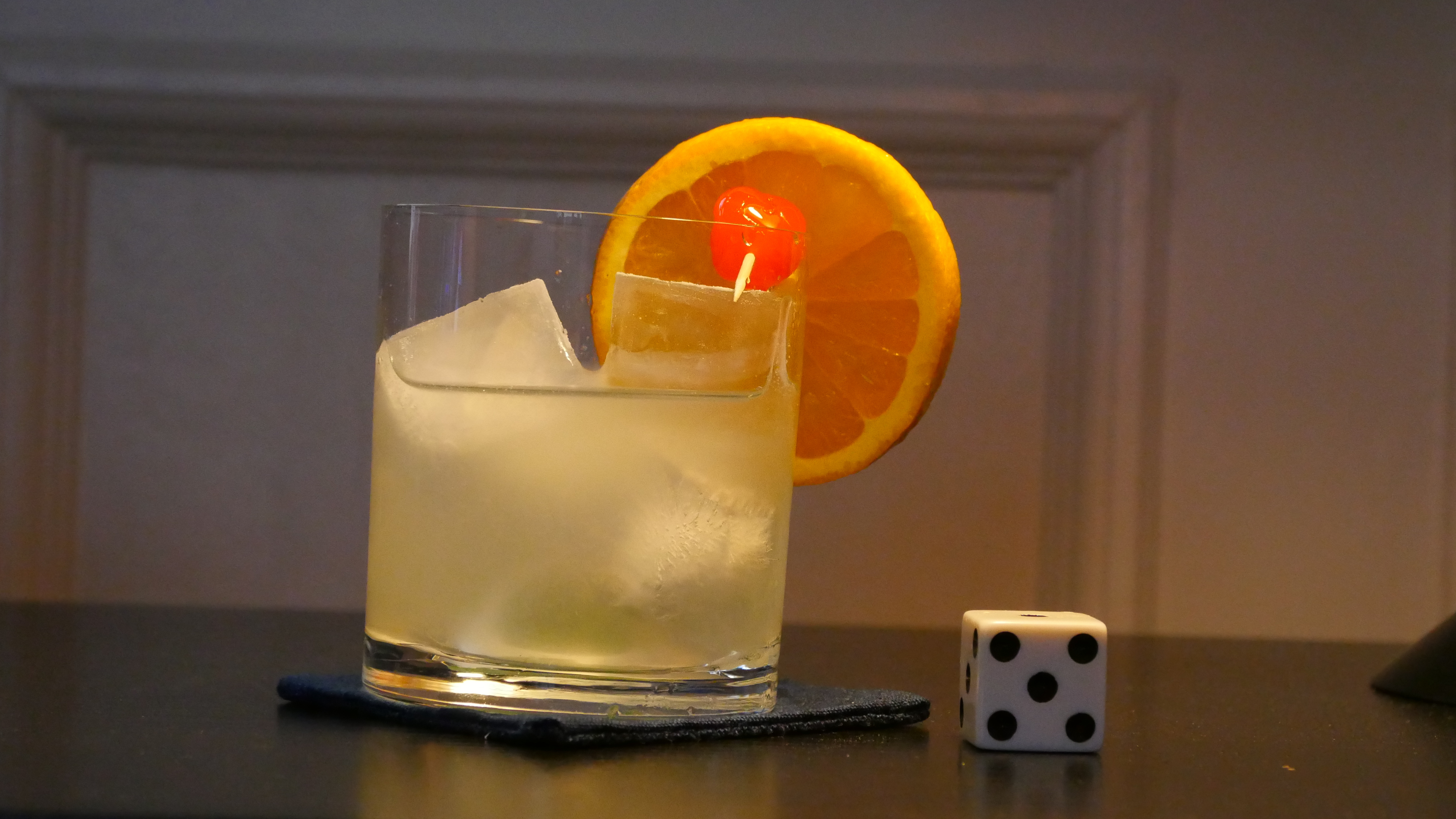
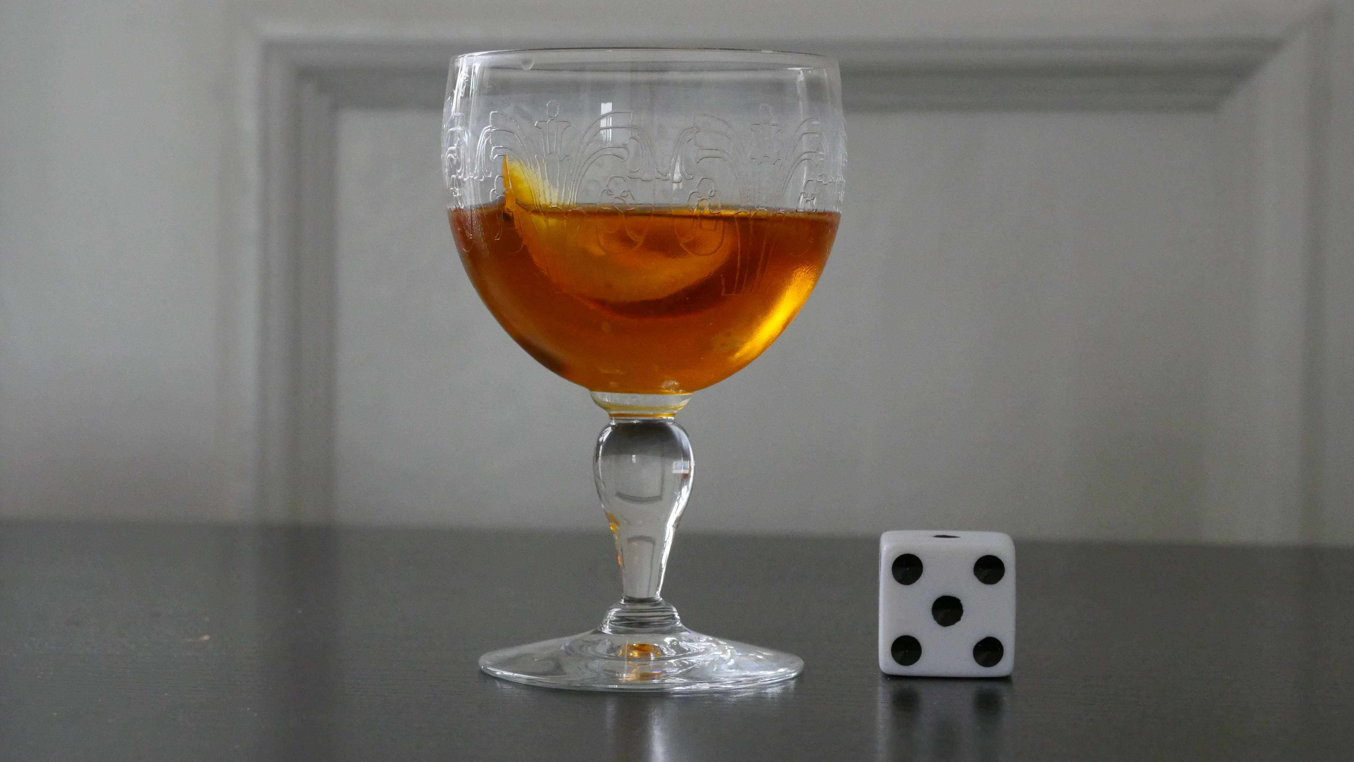
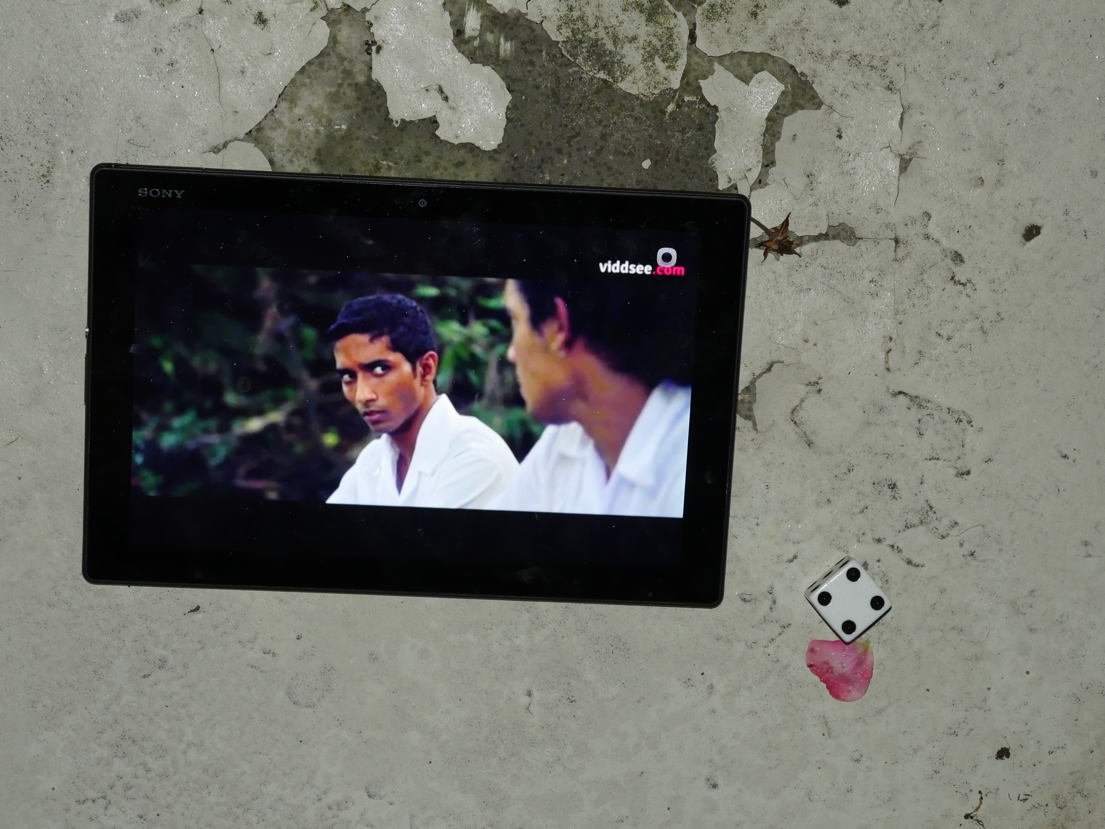
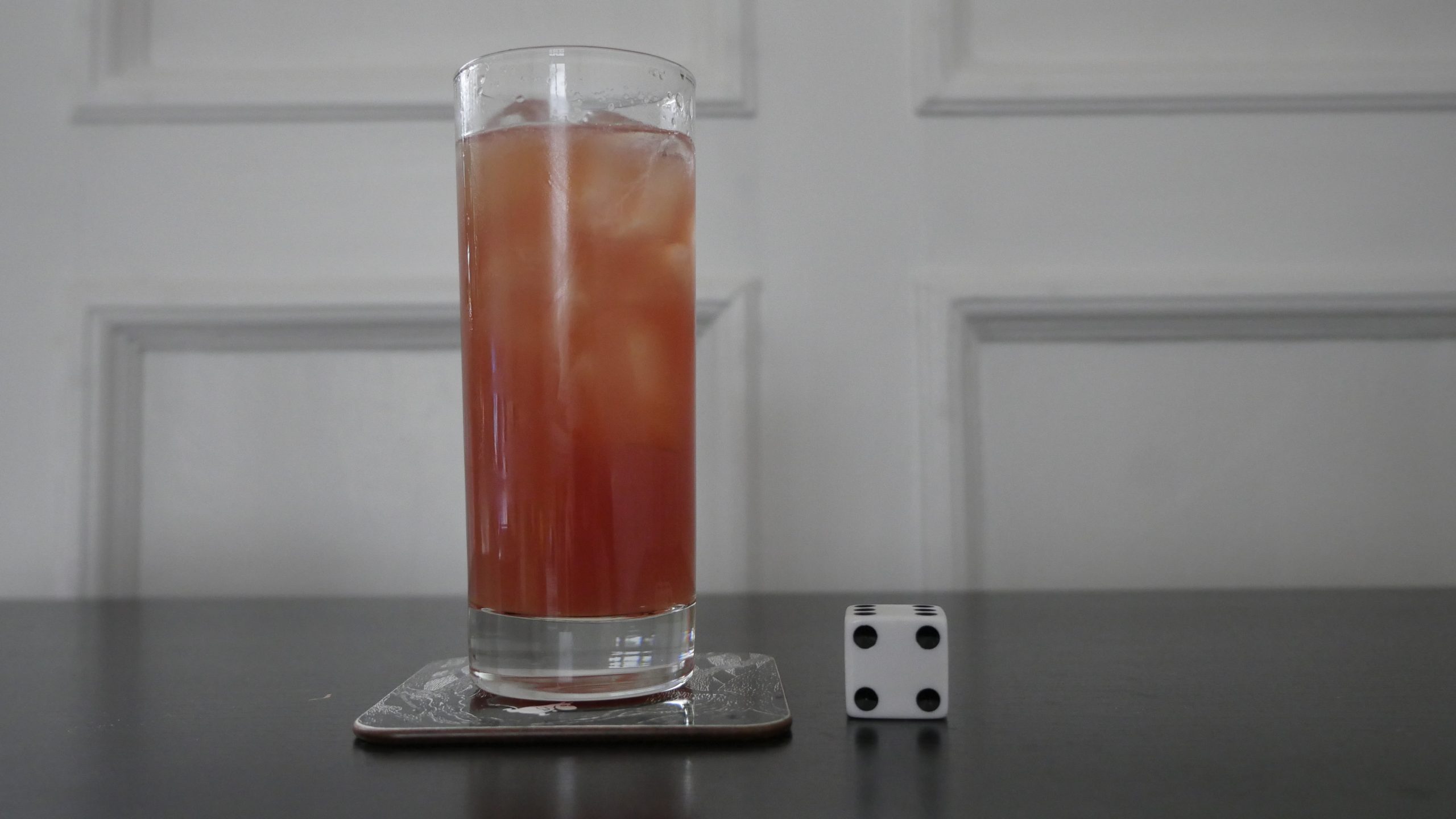
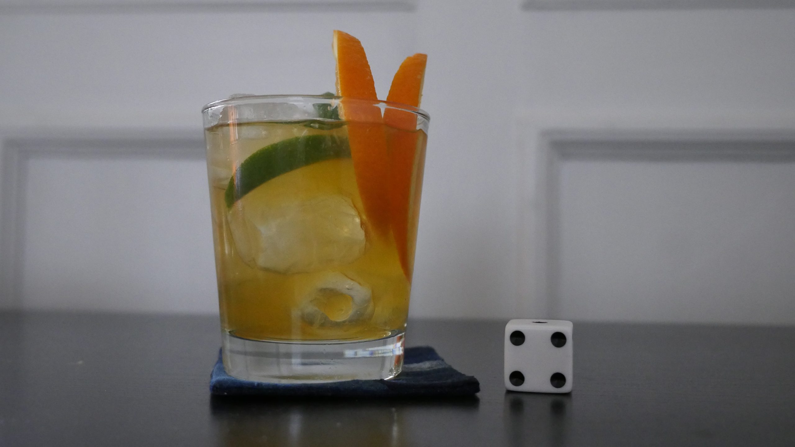
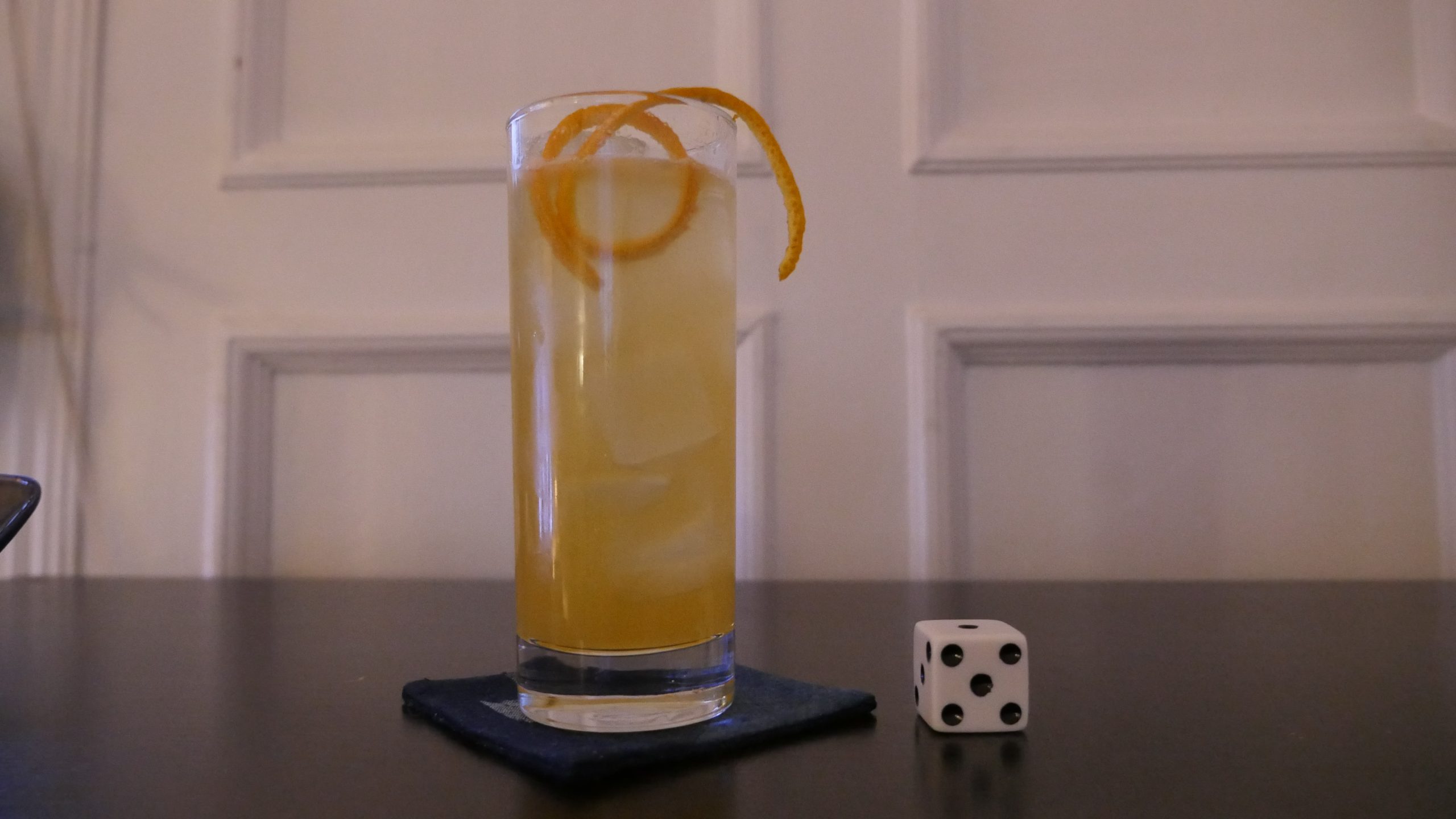
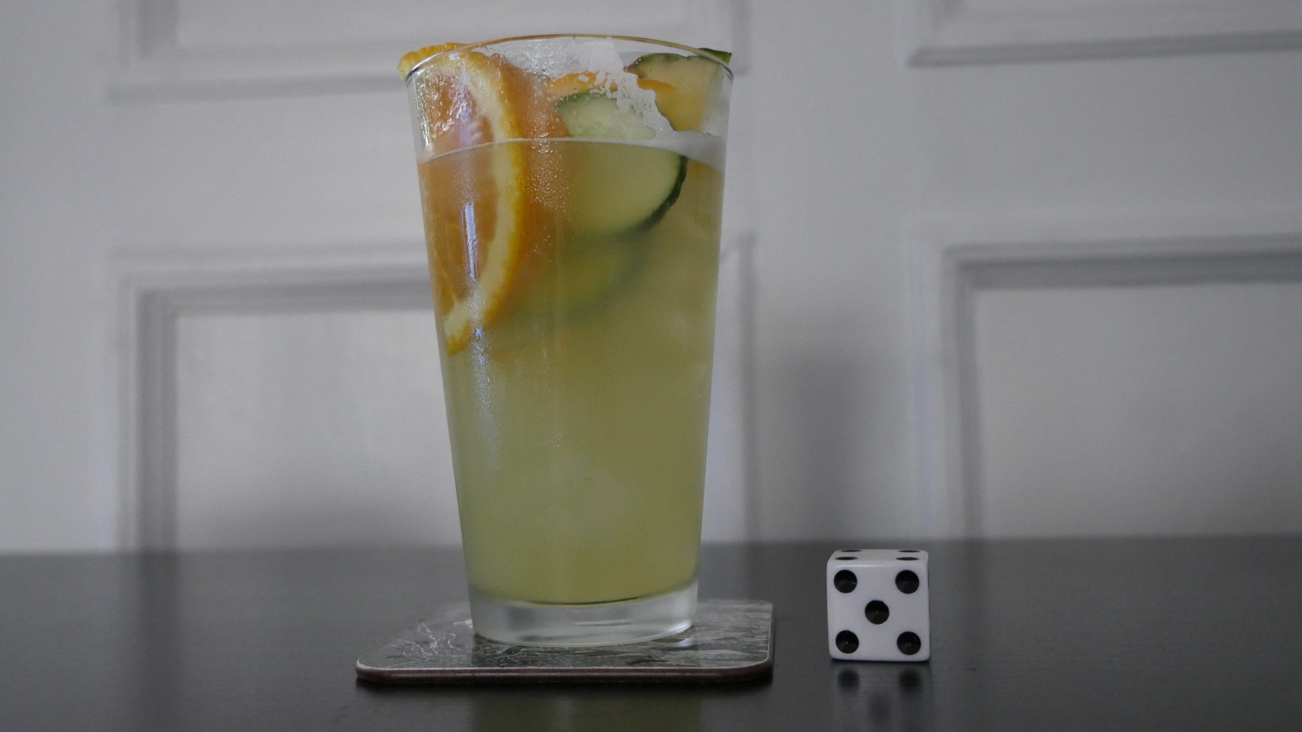
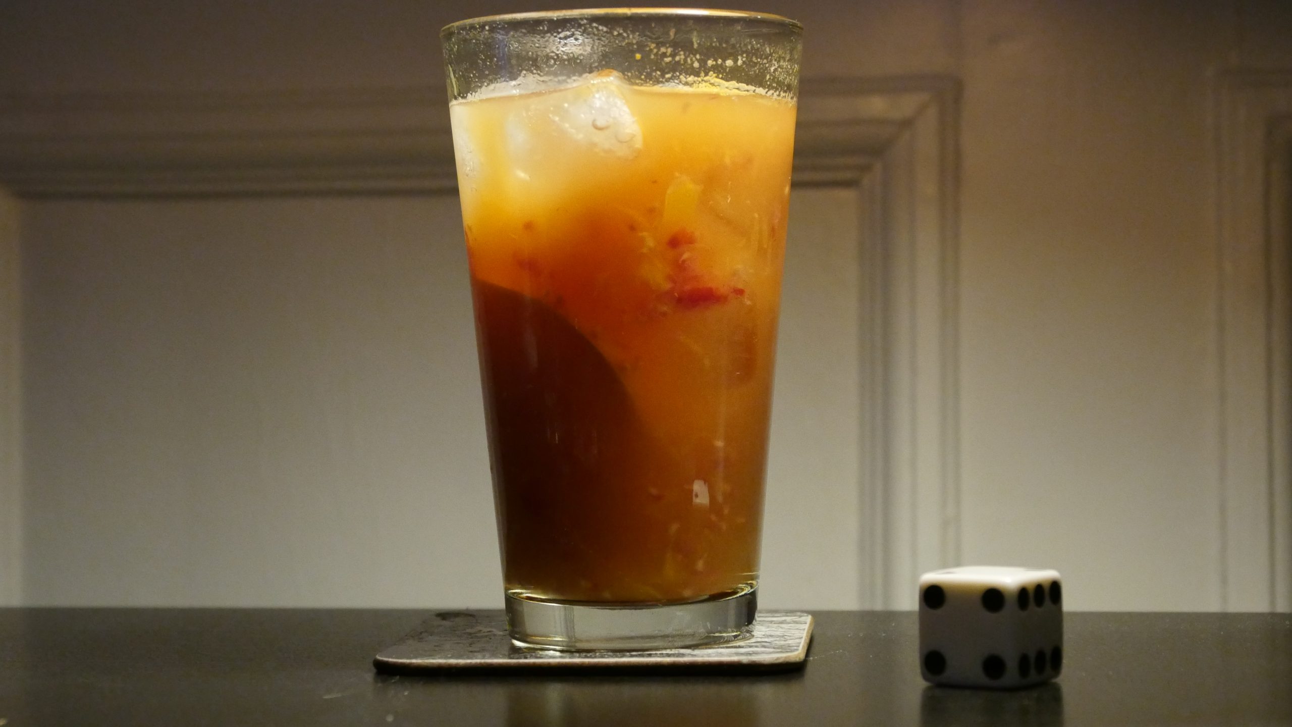
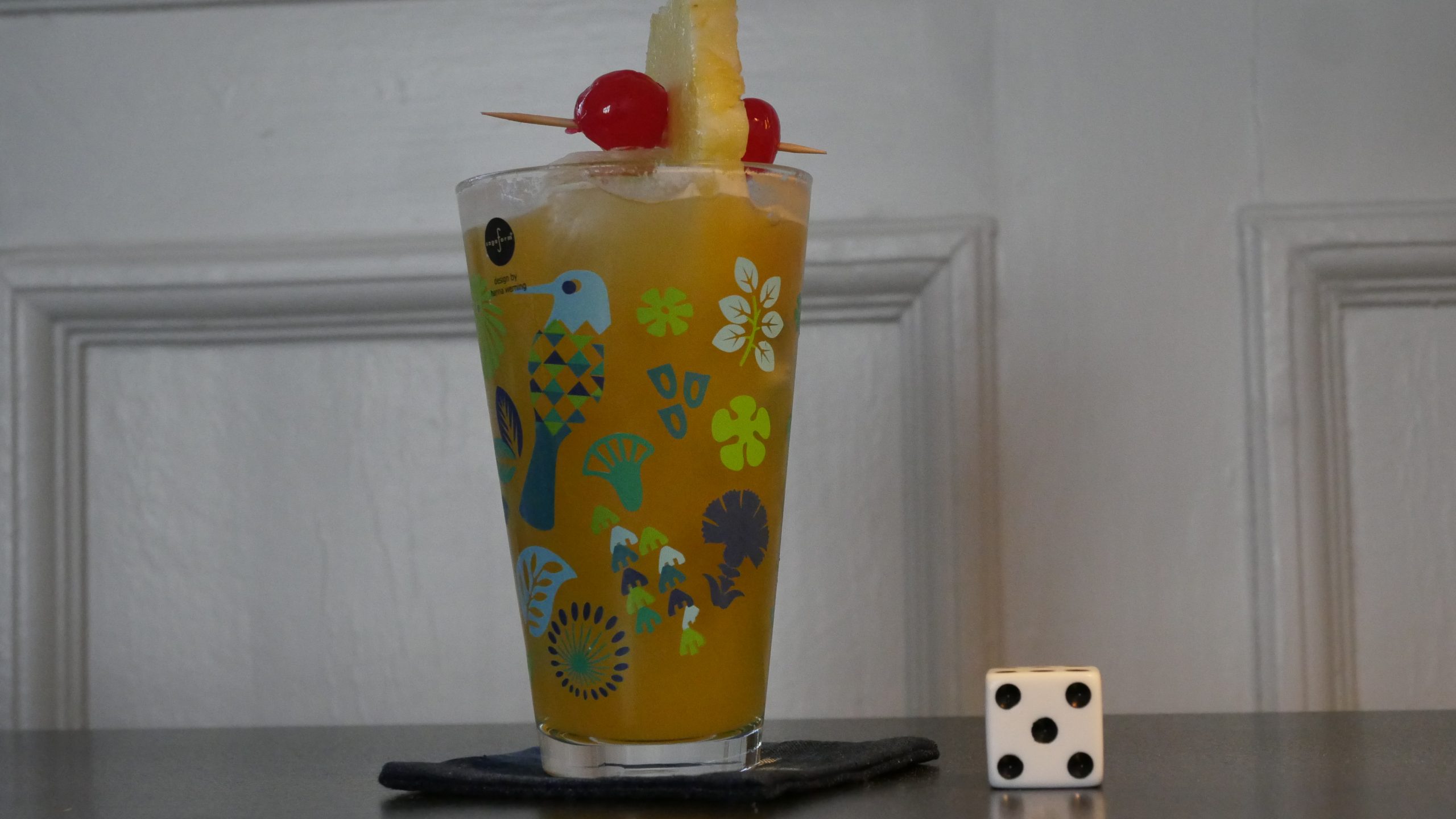
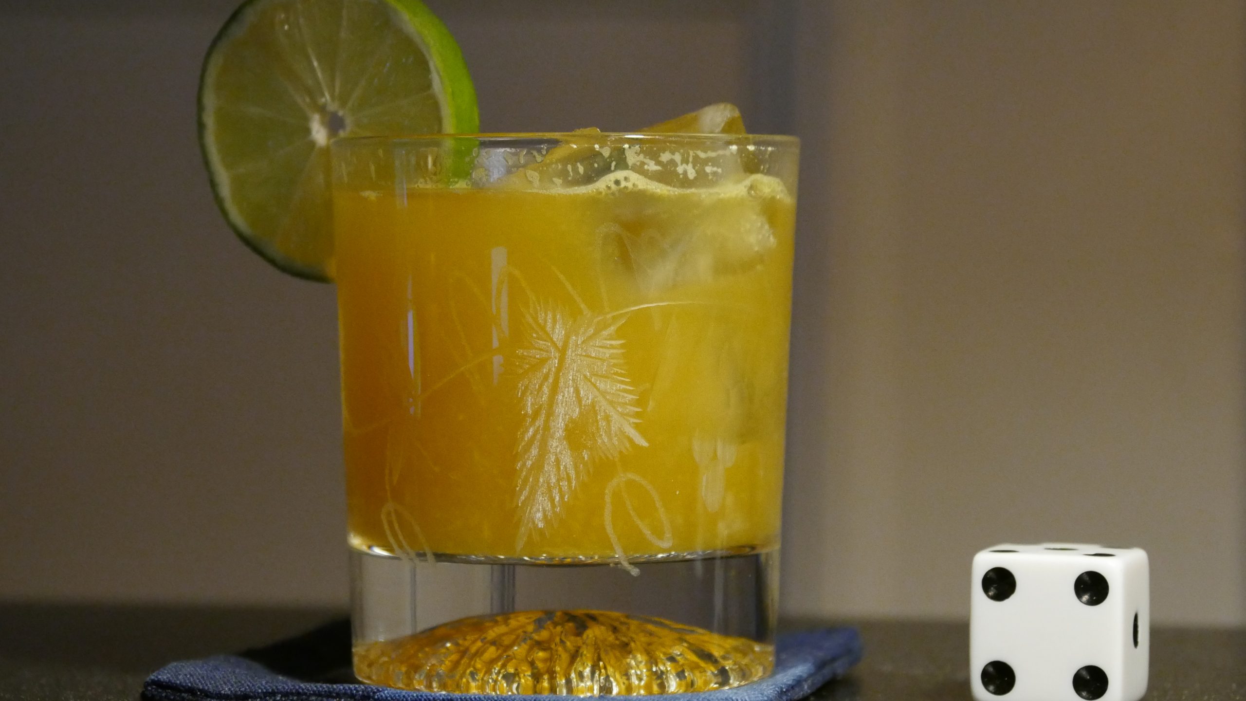
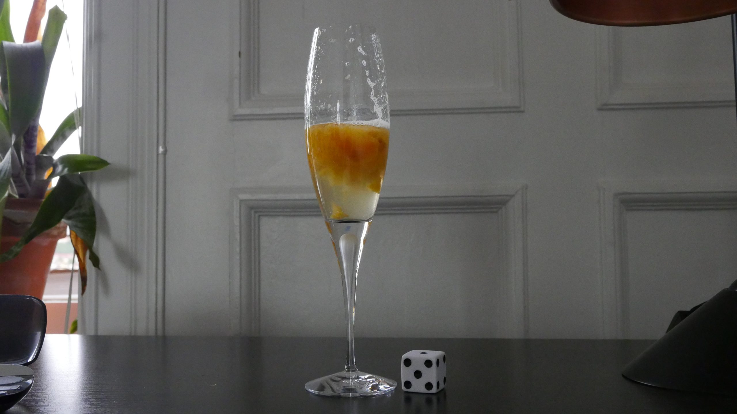
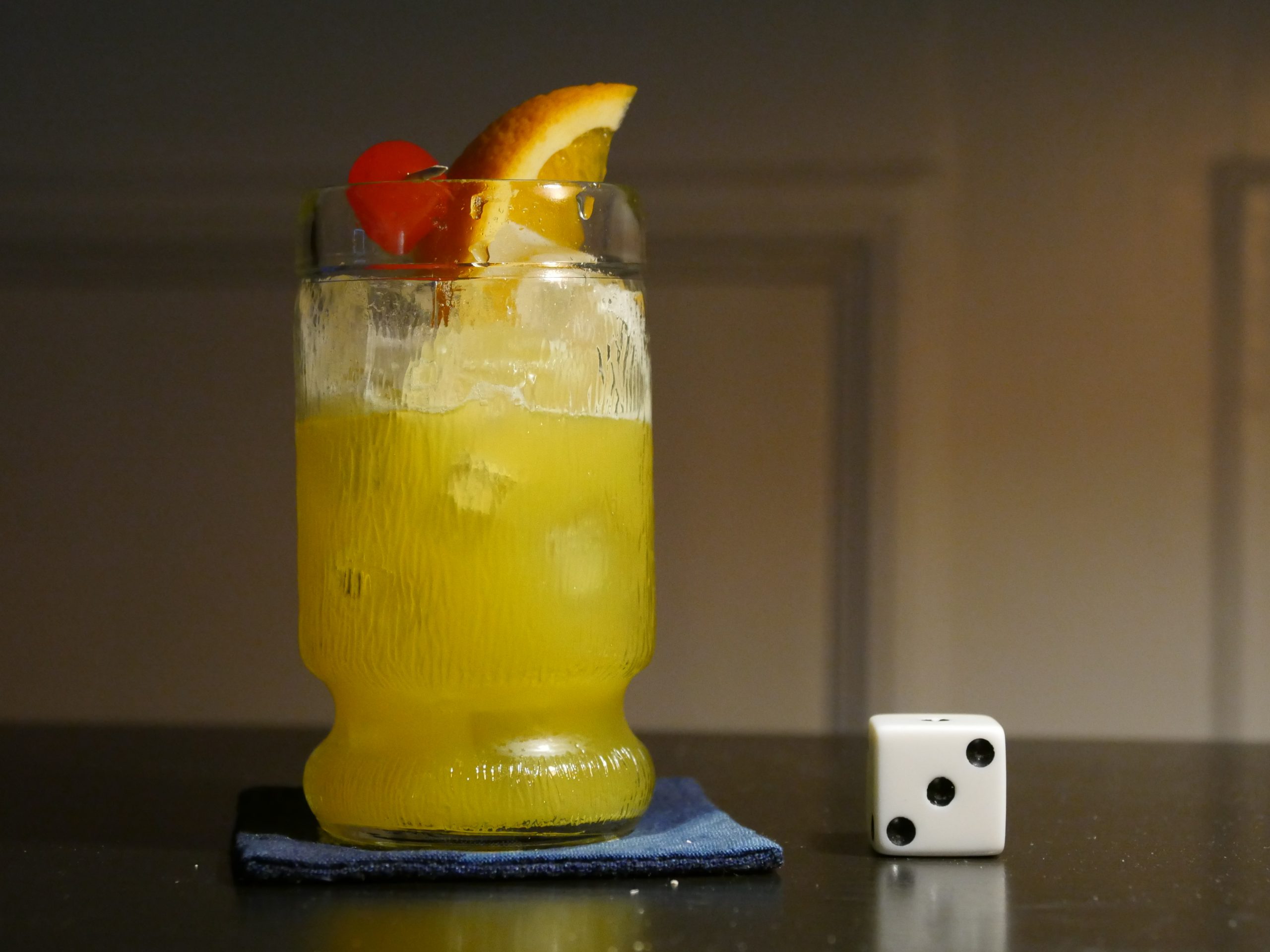
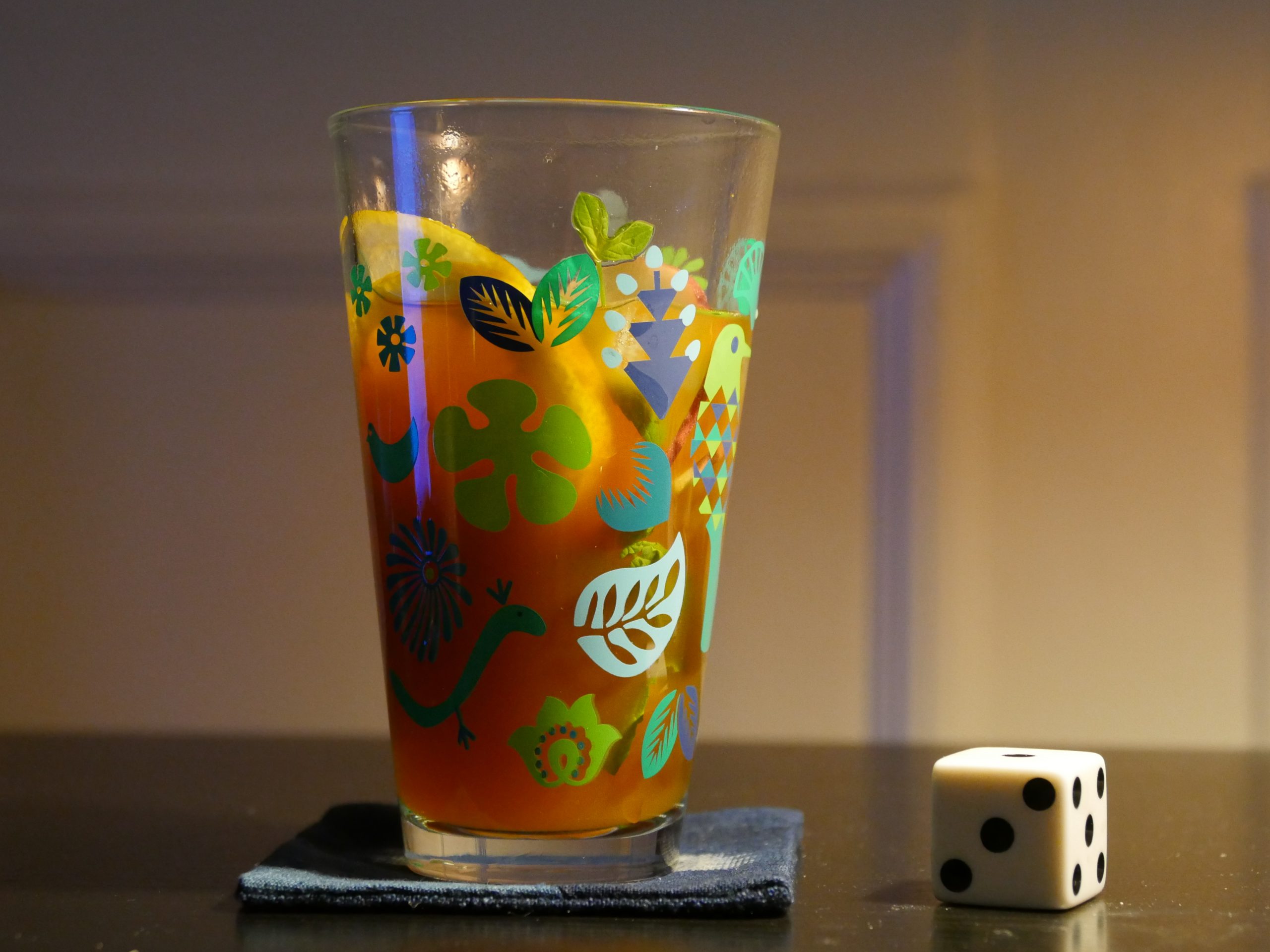
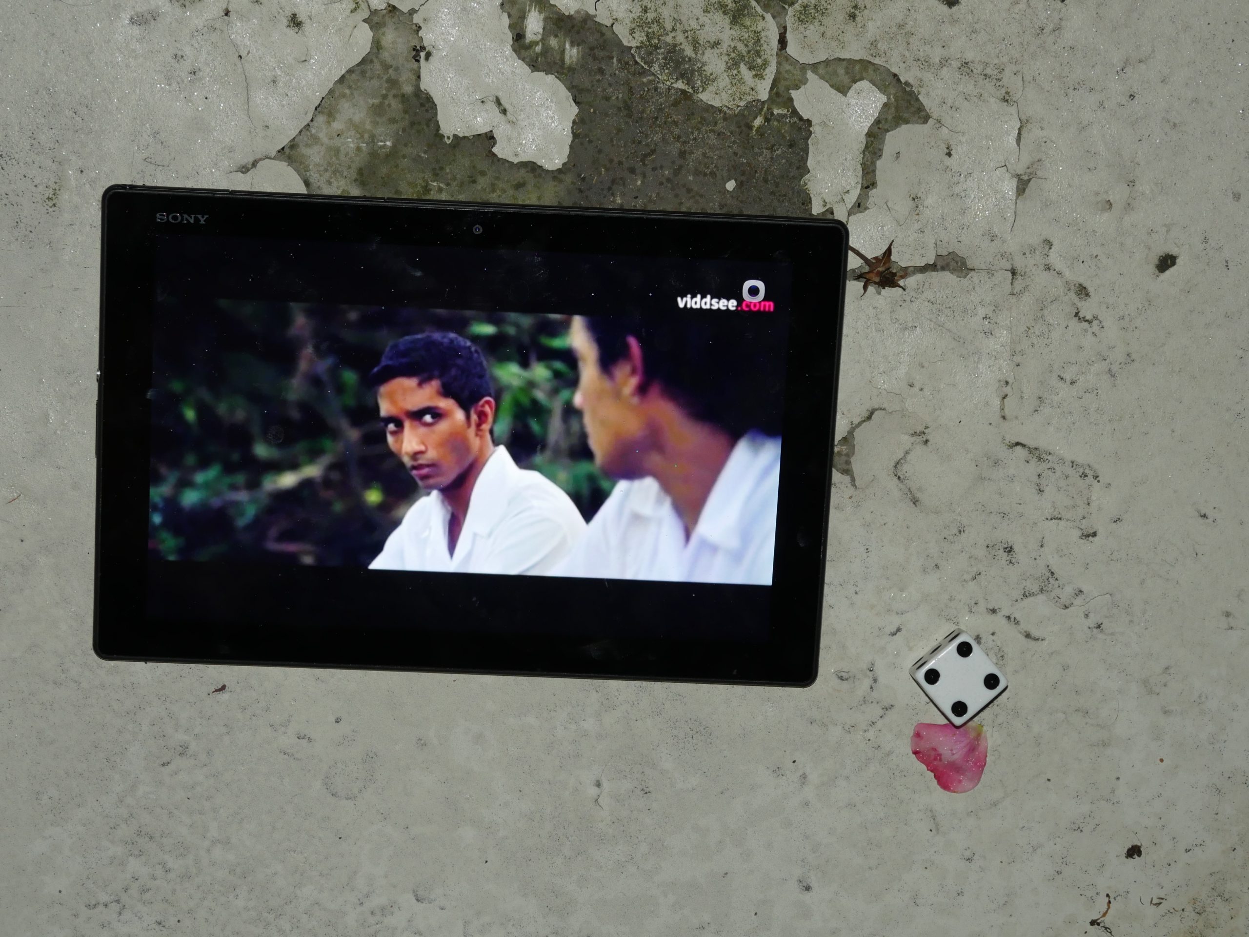
| The Lunchbox. Ritesh Batra. 2013. India. April 6th, 2016. Orange zinger. |
 |  | 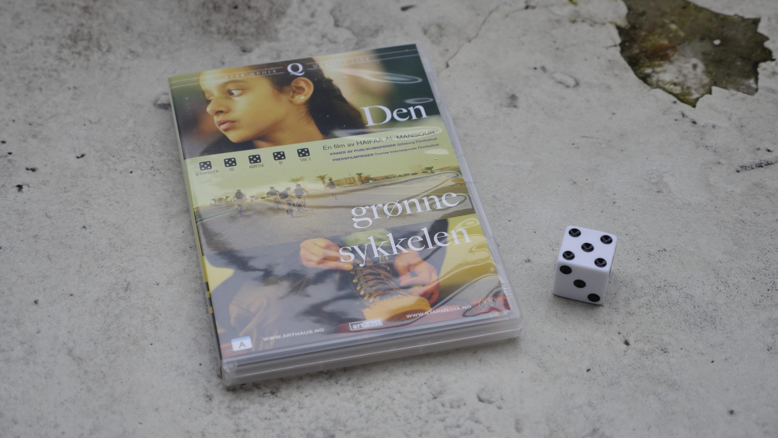 | 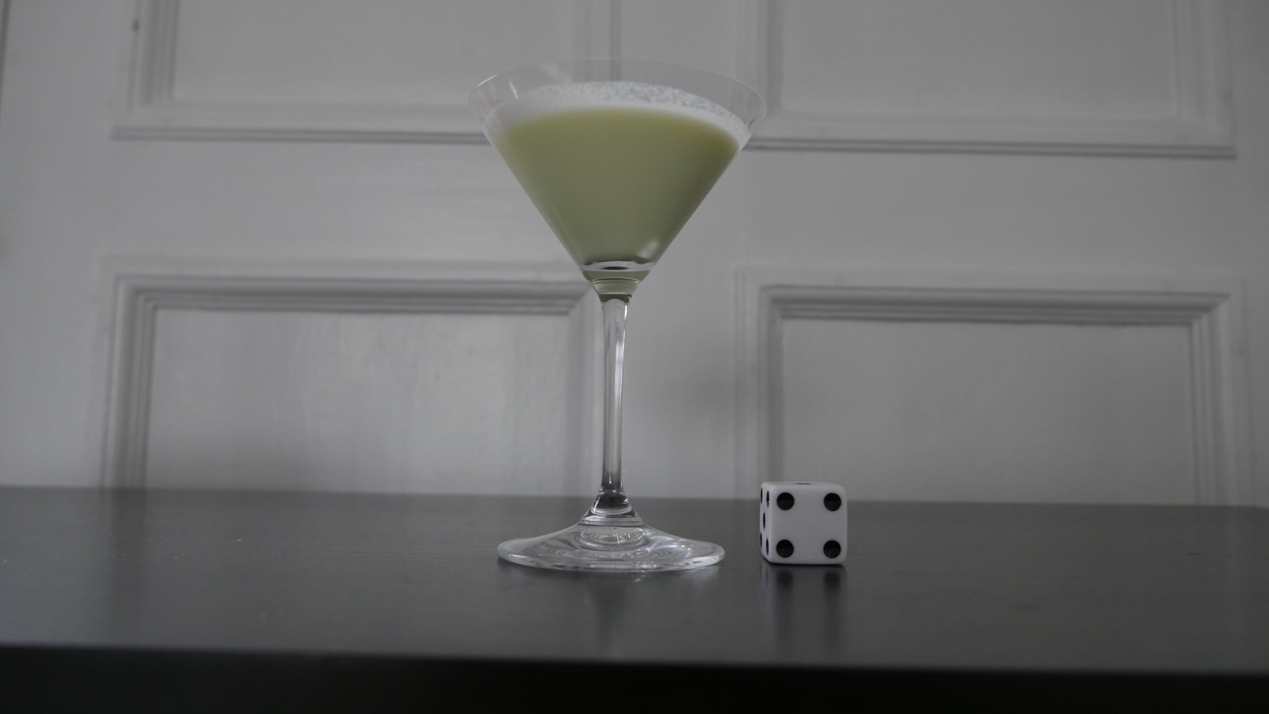 |
| Wadjda. Haifaa al-Mansour. 2012. Saudi Arabia. April 8th, 2016. Flying Carpet. |
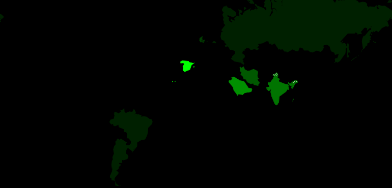 | 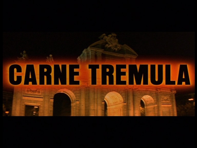 | 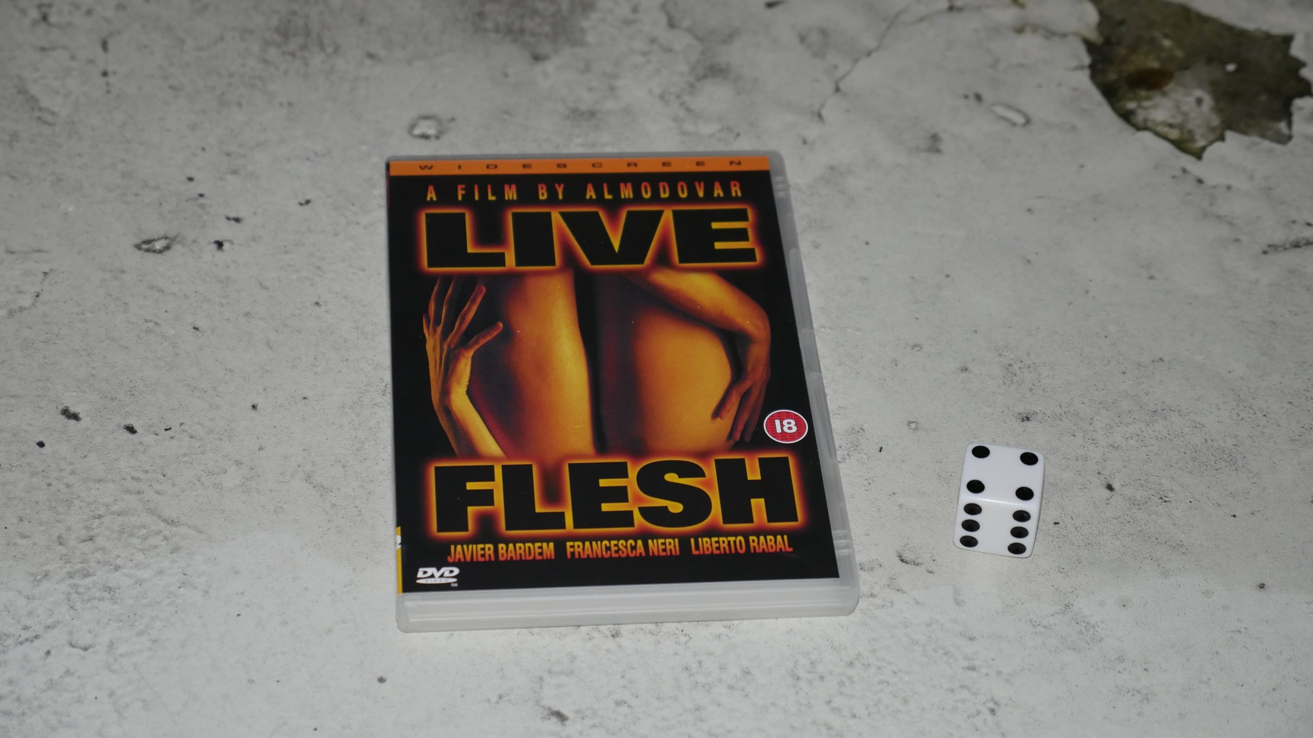 |  |
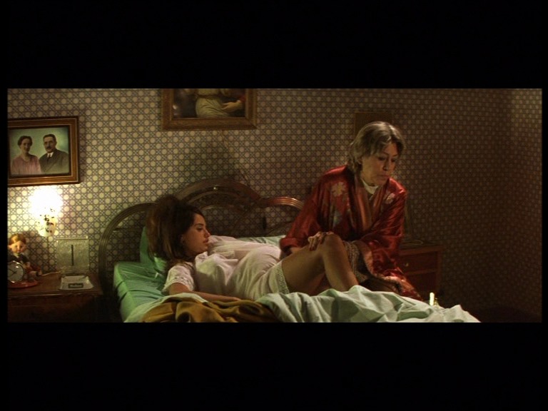
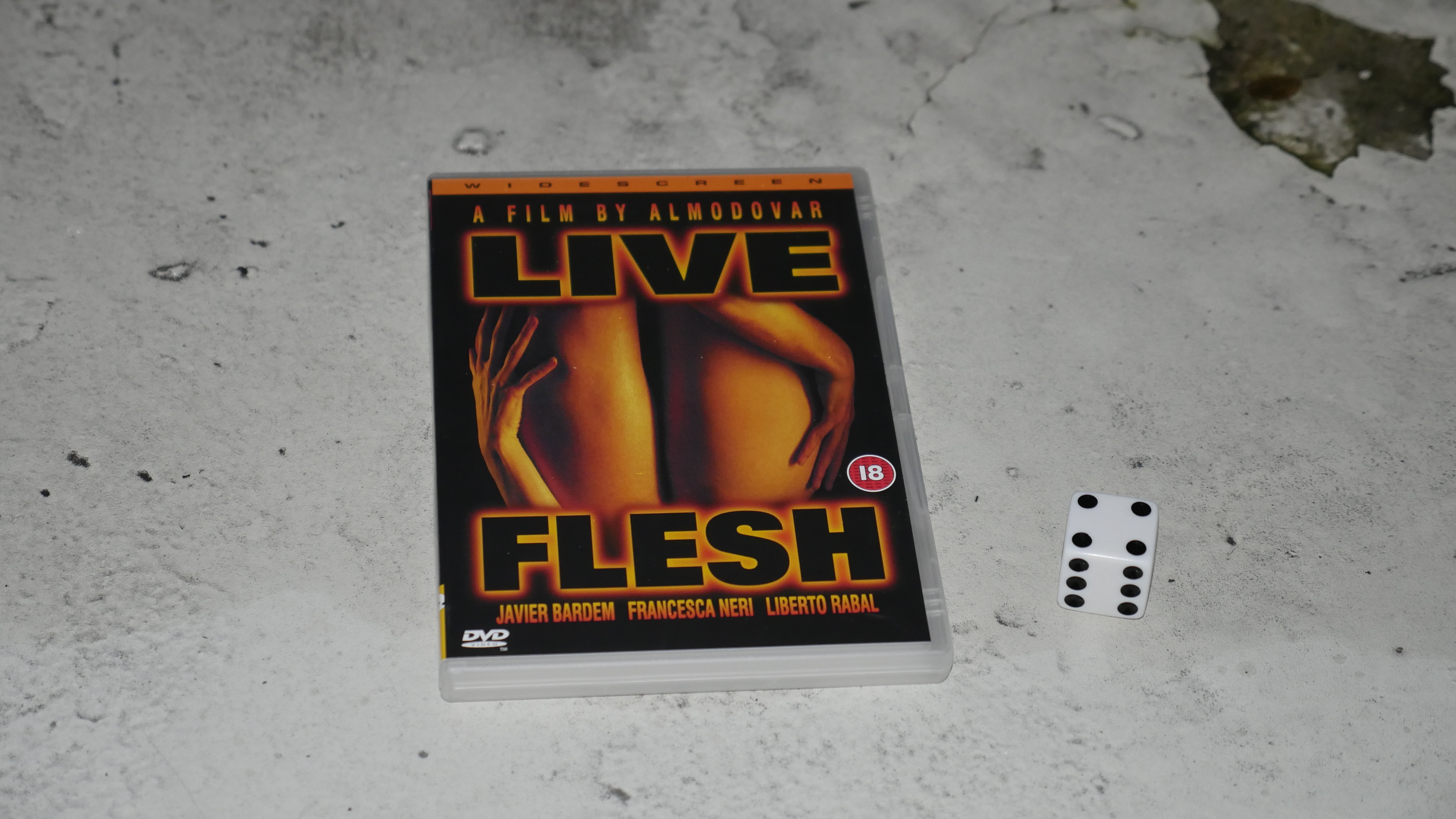
| Live Flesh. Pedro Almodovar. 1997. Spain. April 8th, 2016. Aquavit 43. |
 | 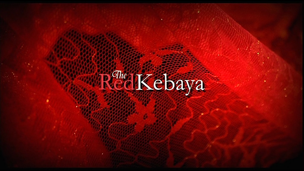 | 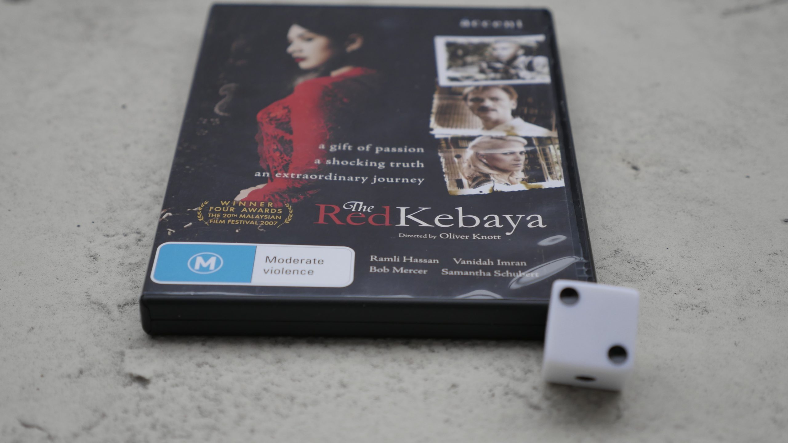 |  |
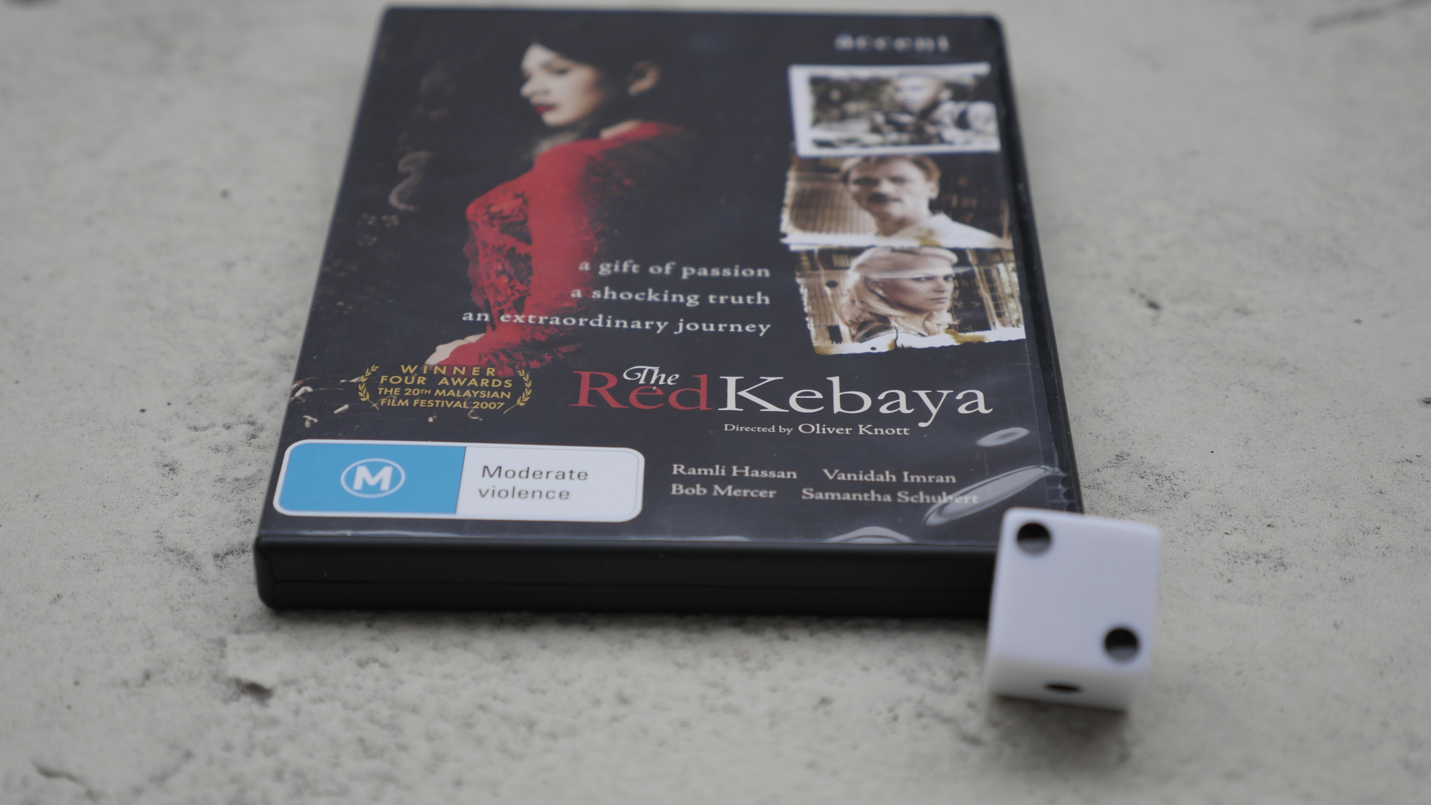
| The Red Kebaya. Oliver Knott. 2006. Malaysia. April 13th, 2016. Sing Sing. |
 | 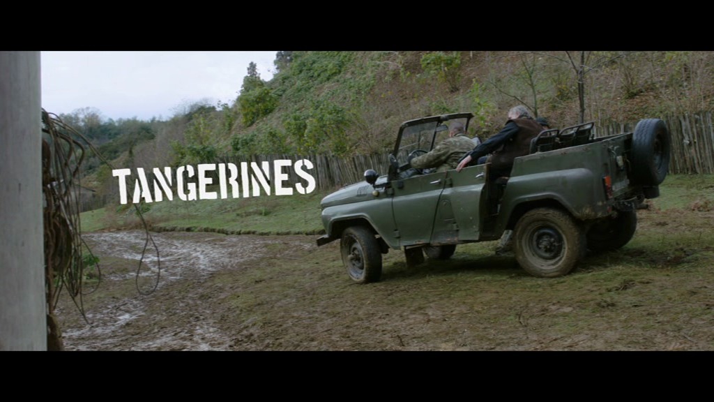 |  |  |
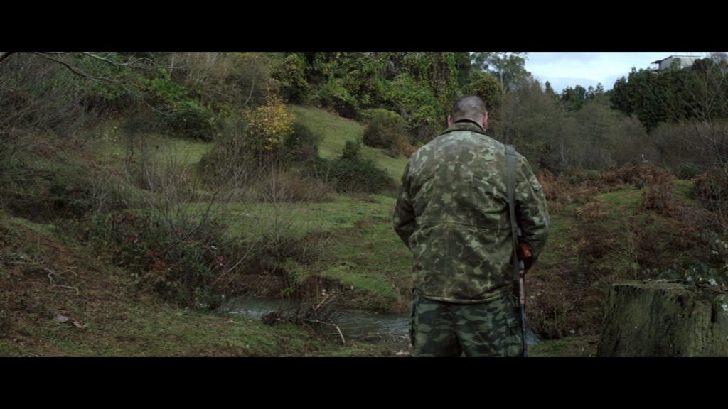
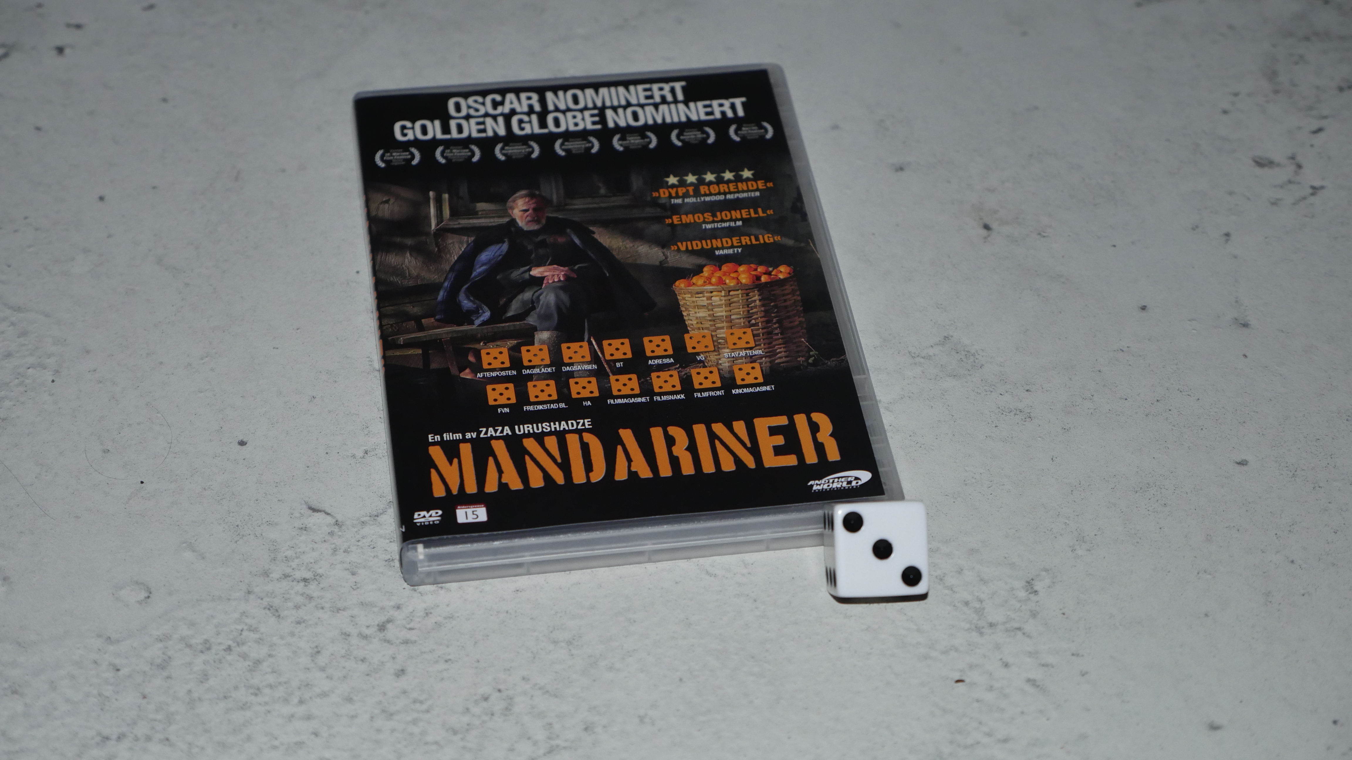
| Tangerines. Zaza Urushadze. 2013. Estonia. April 13th, 2016. Rolling Estonian. |
 | 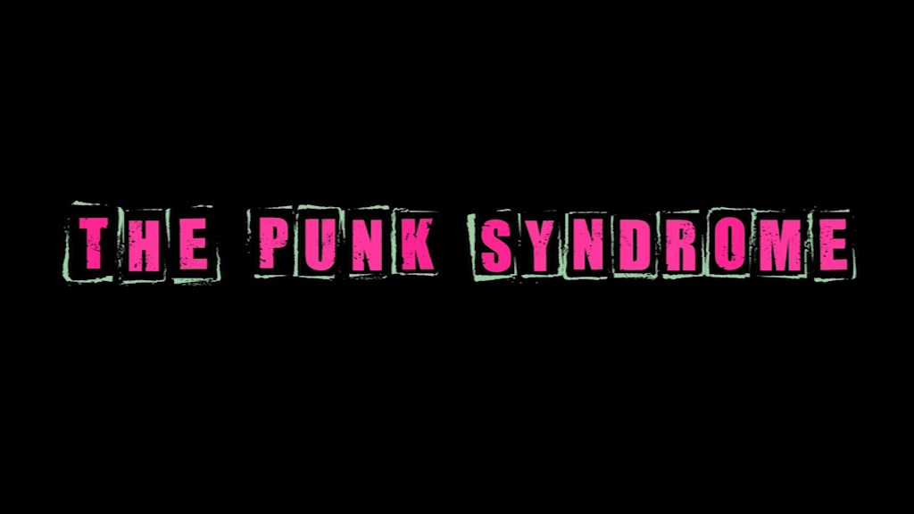 | 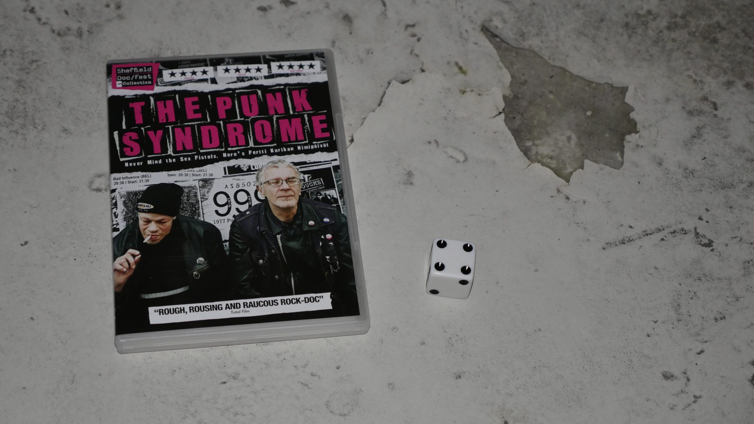 |  |
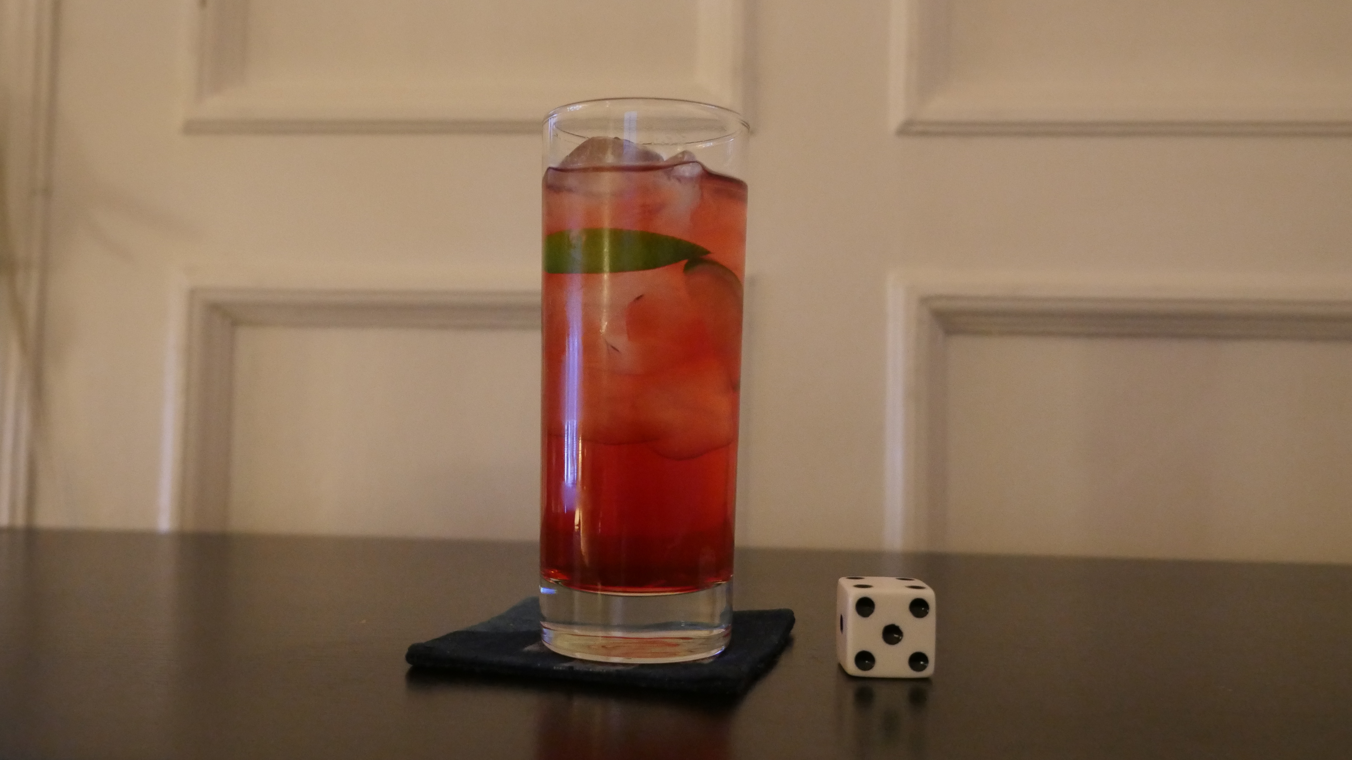
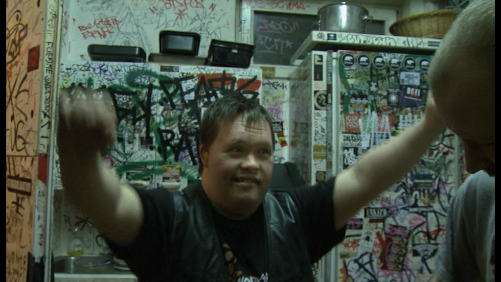
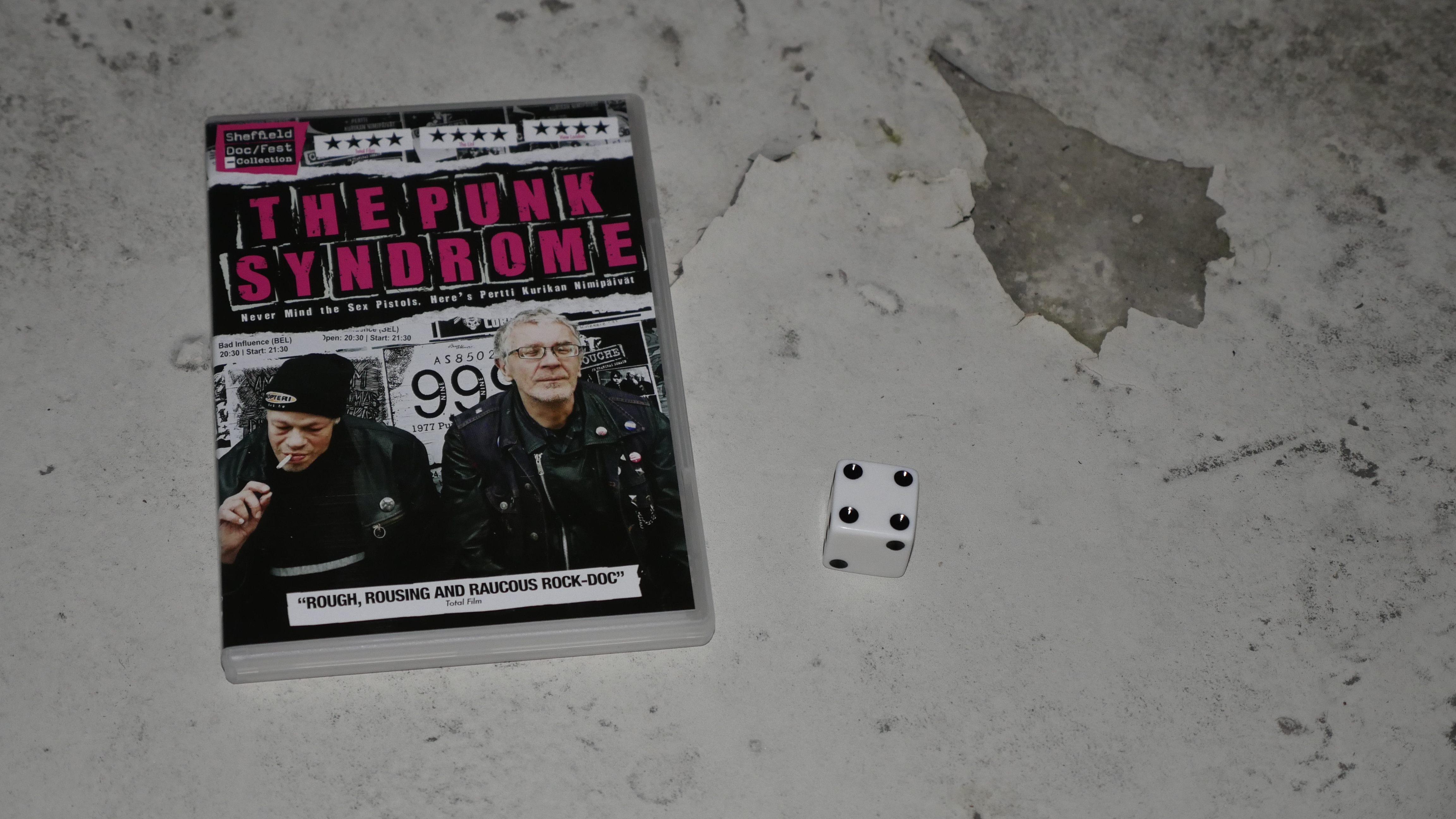
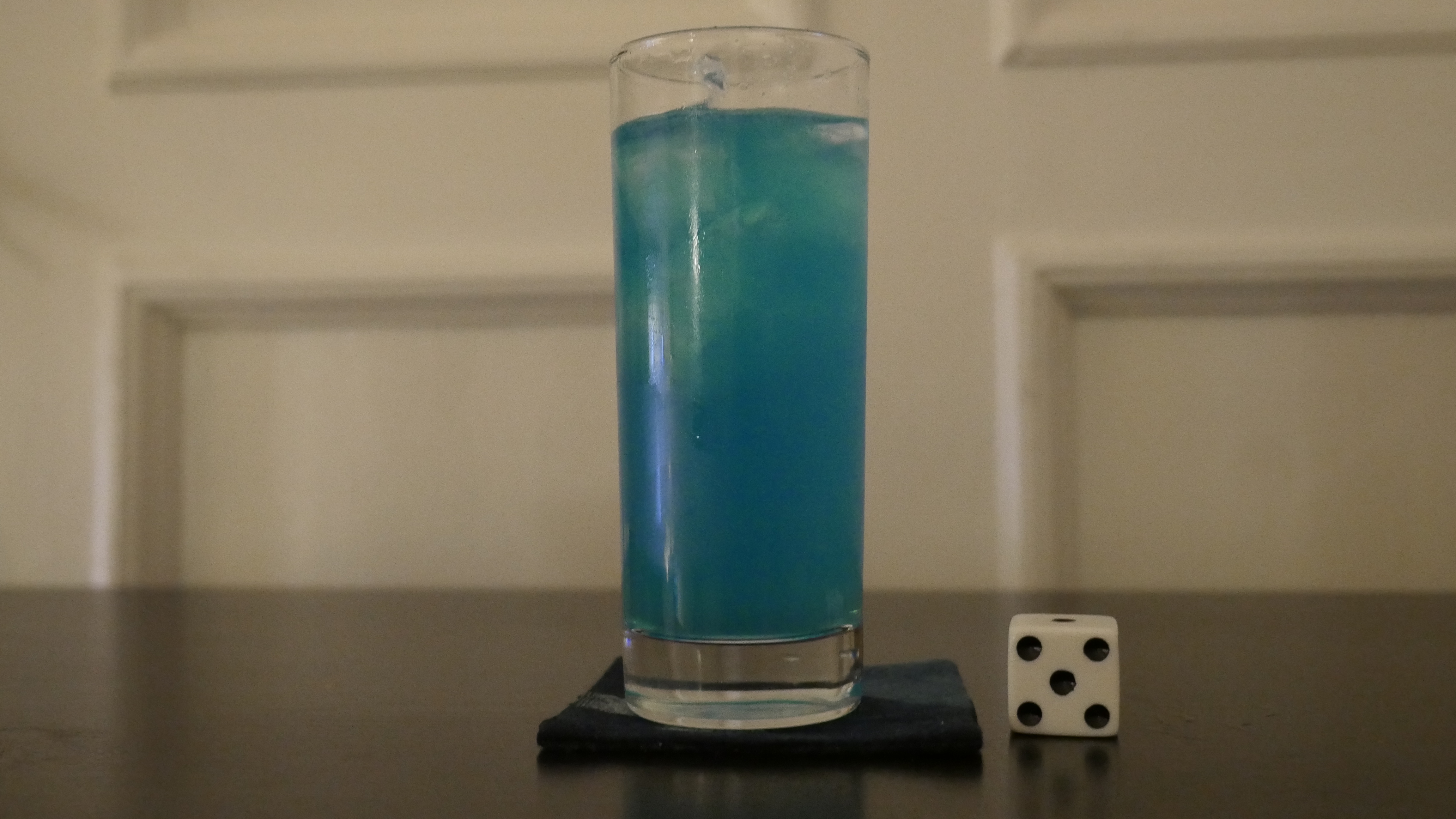
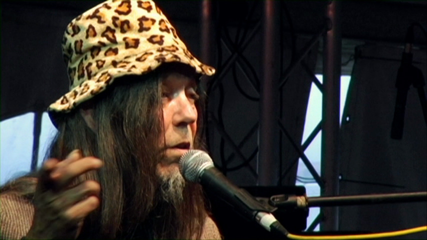
| The Punk Syndrome. Jukka Kärkkäinen. 2012. Finland. April 14th, 2016. Cloudberry/Apple Cocktail. |
 |  | 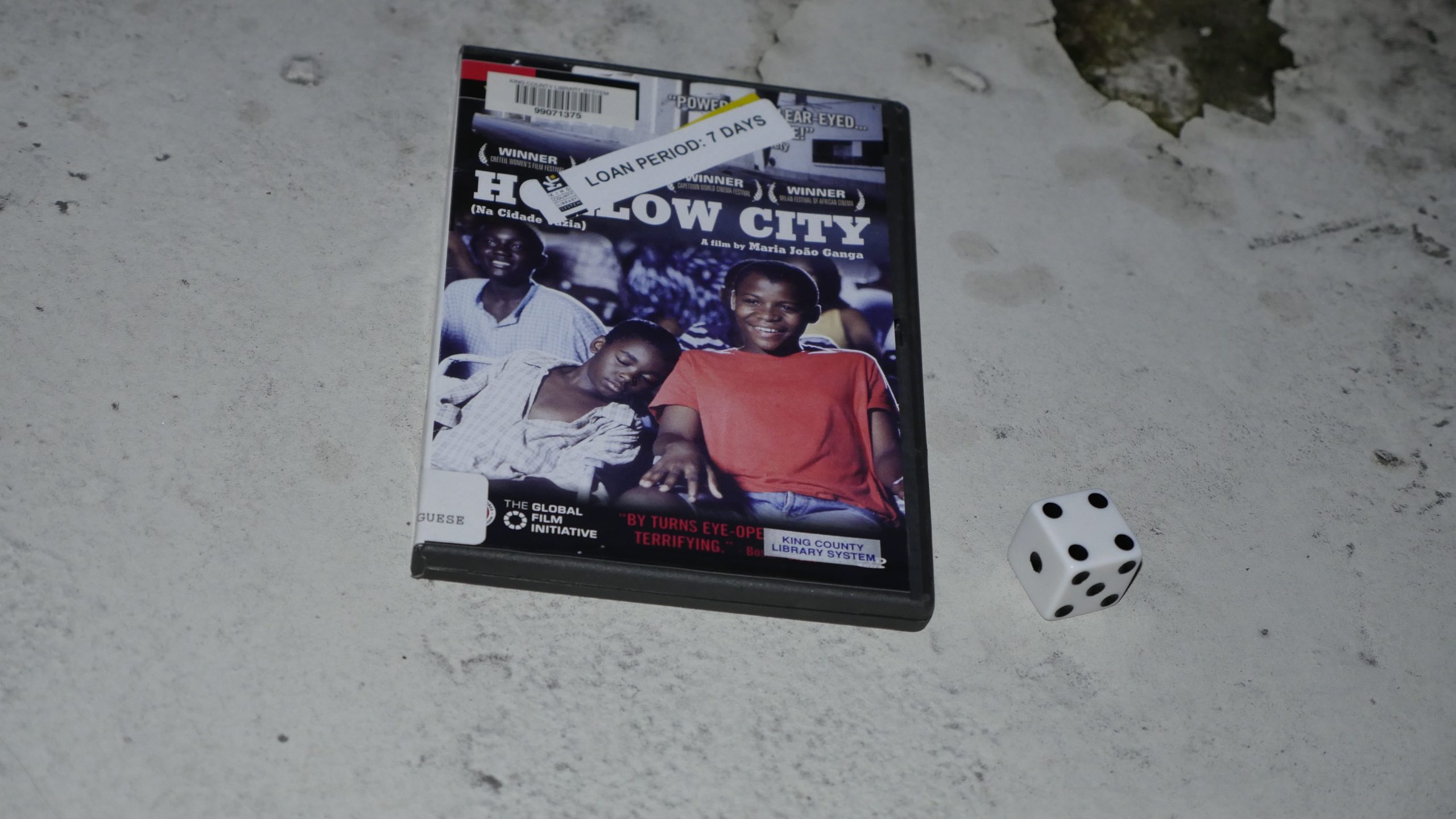 |  |
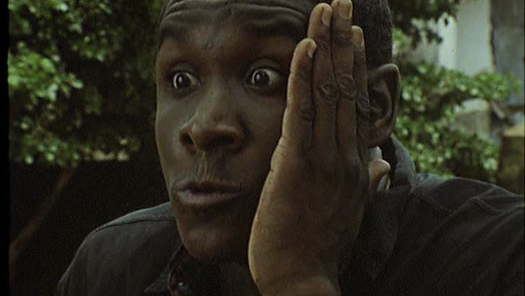
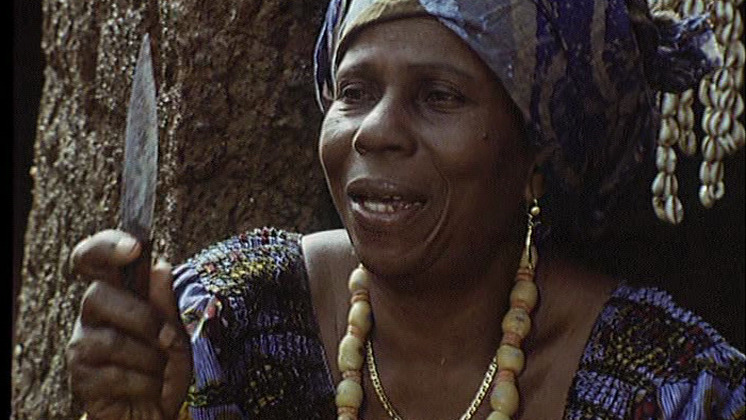
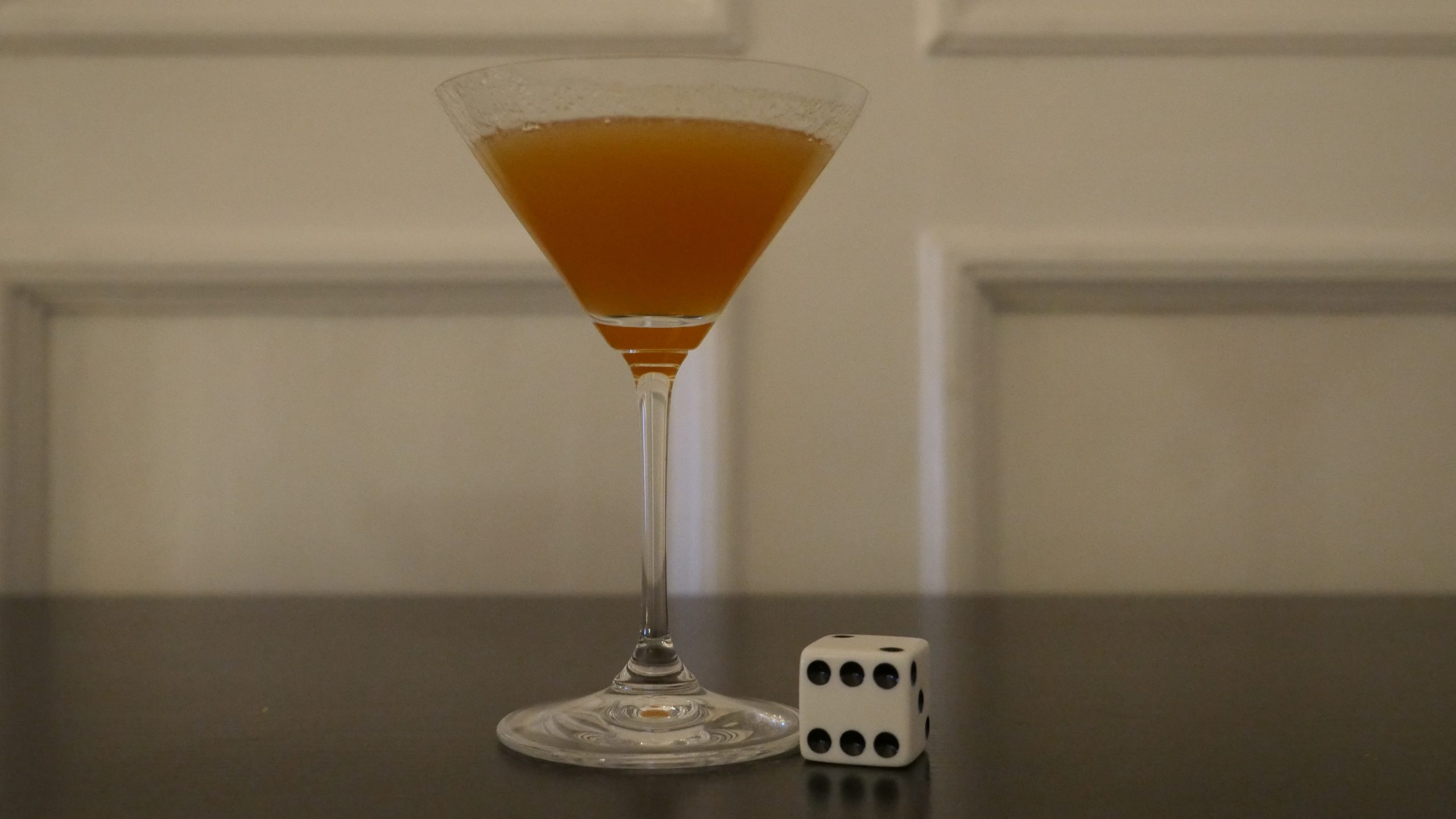
| Hollow City. Maria João Ganga. 2004. Angola. April 15th, 2016. (translation unavailable). |
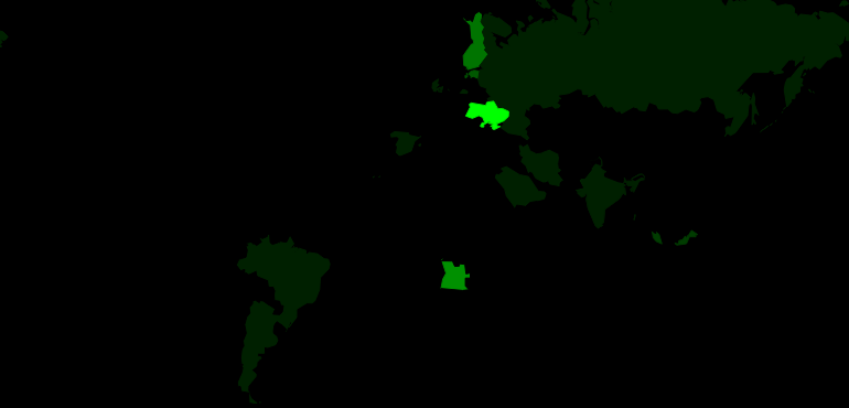 |  |  |  |
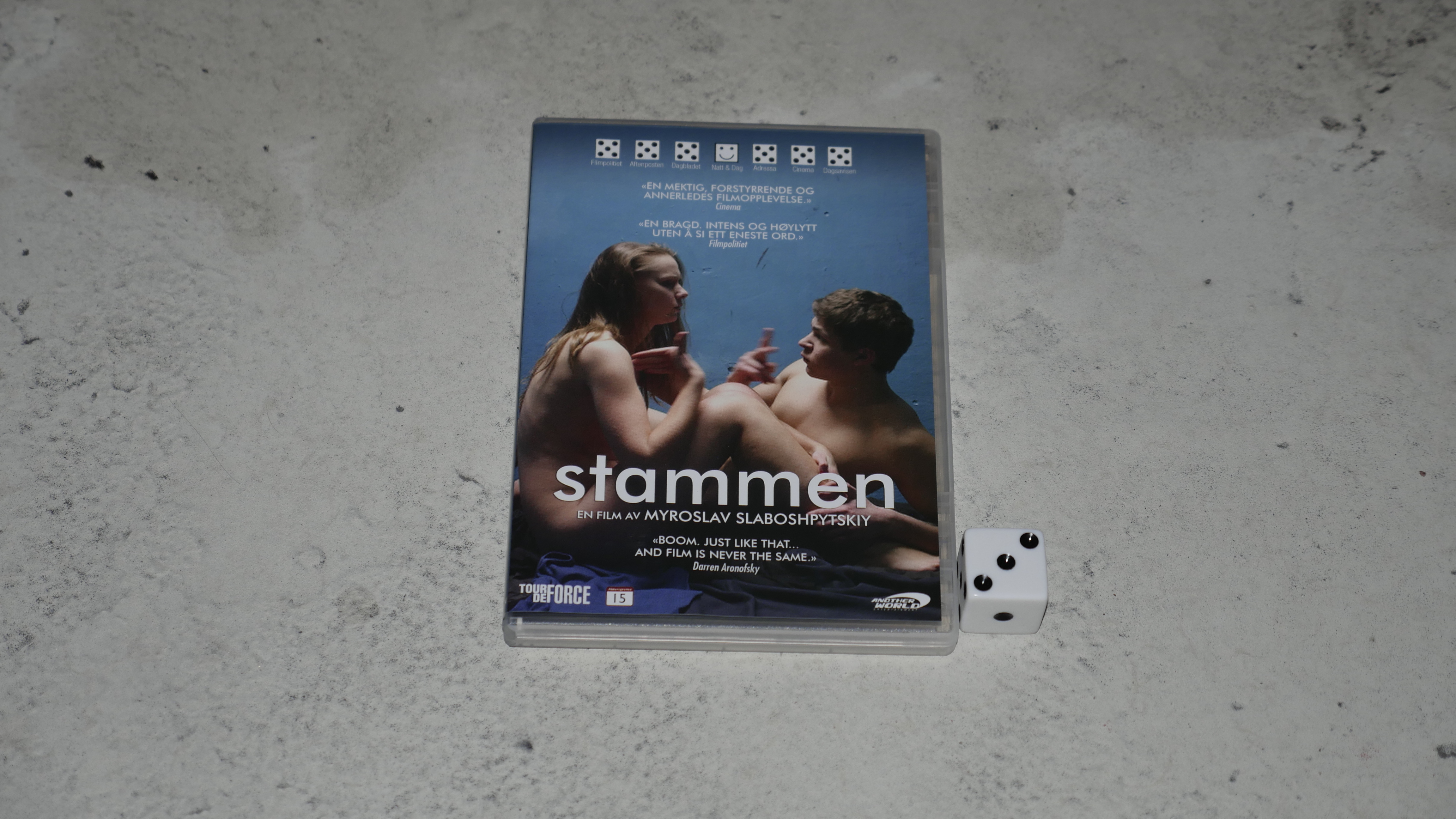
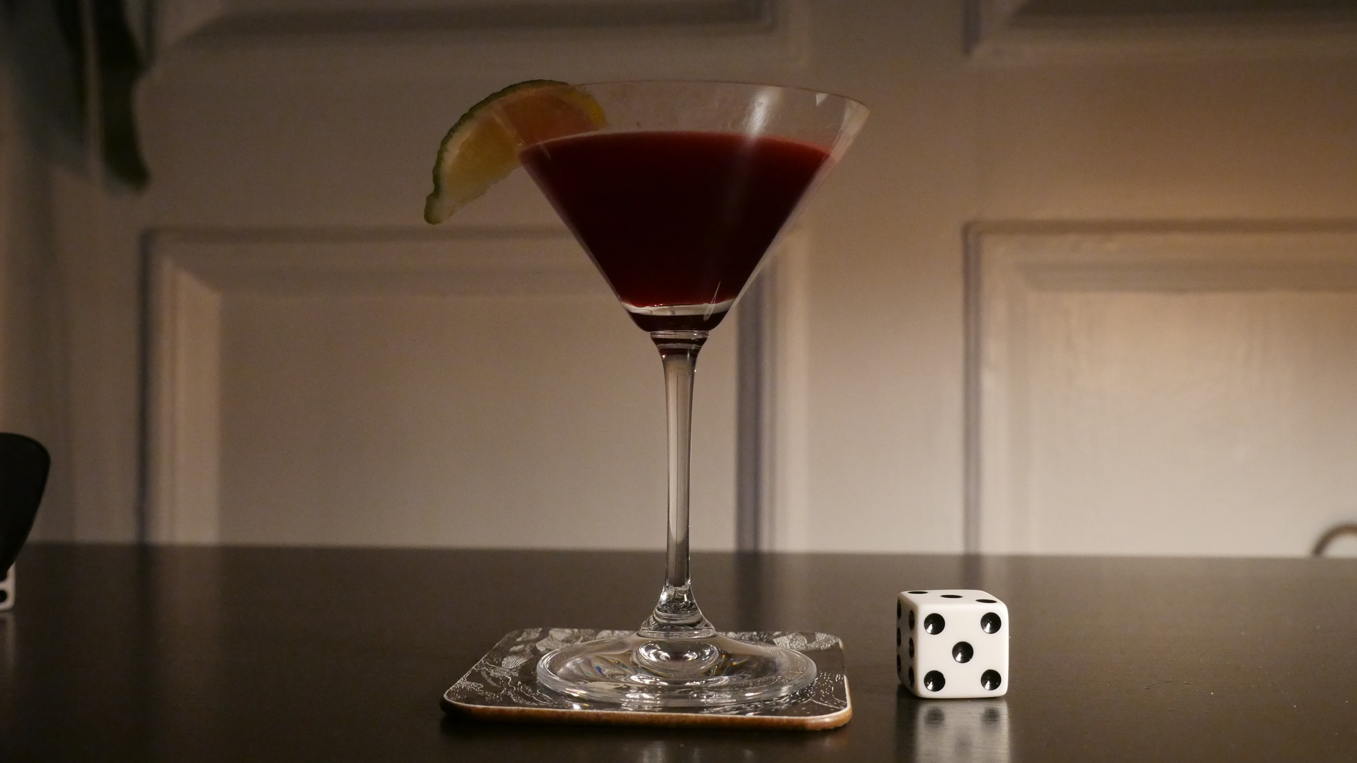
| The Tribe. Myroslav Slaboshpytskyi. 2014. Ukraine. April 16th, 2016. Black Ukrainian. |
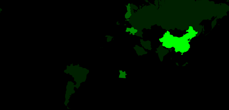 | 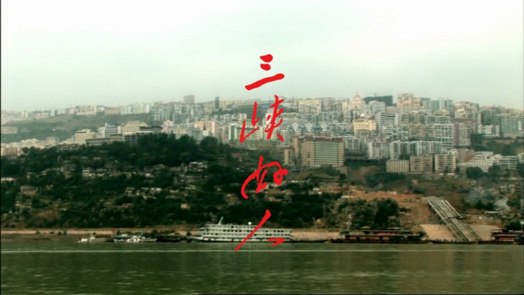 |  |  |
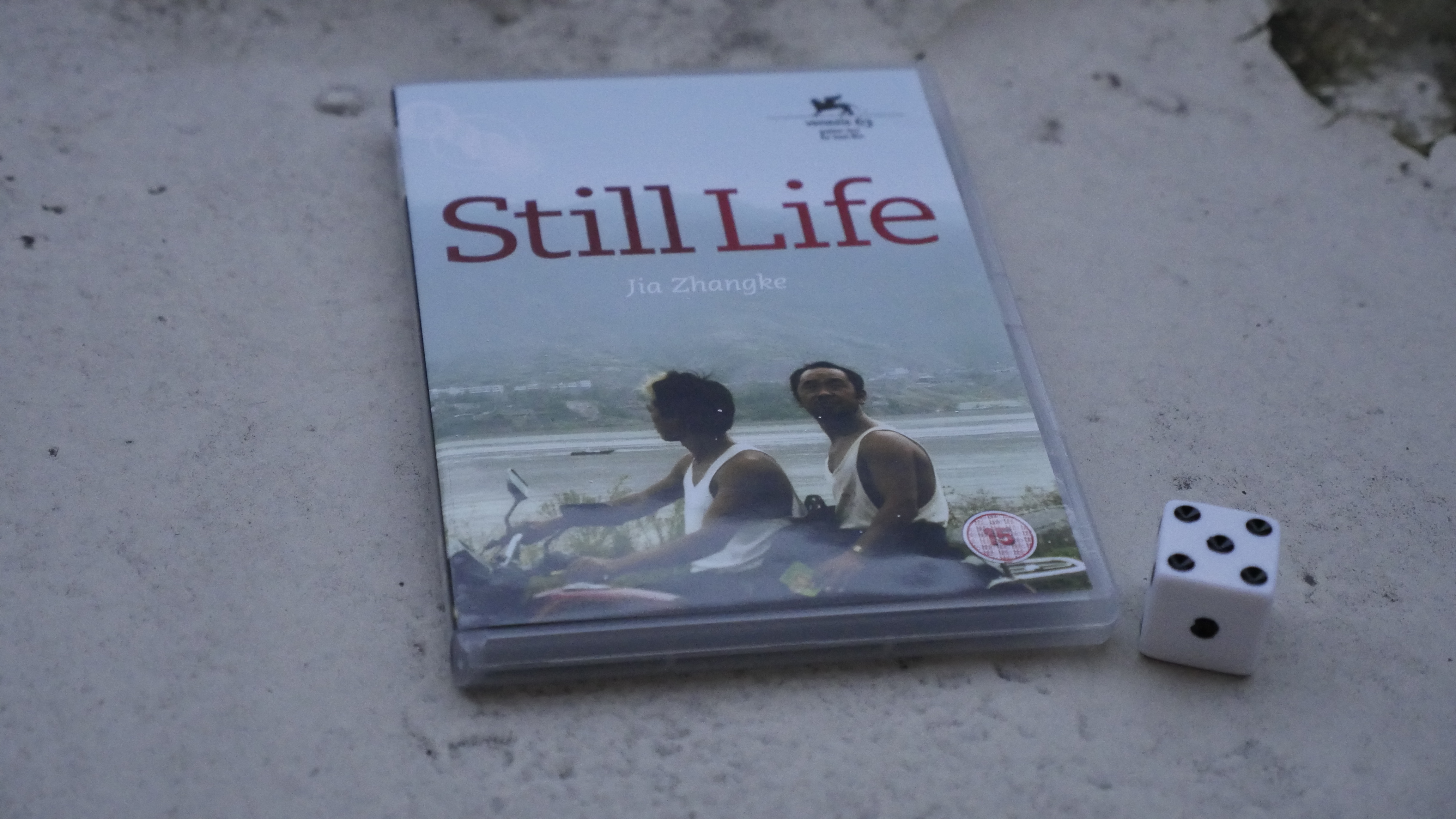
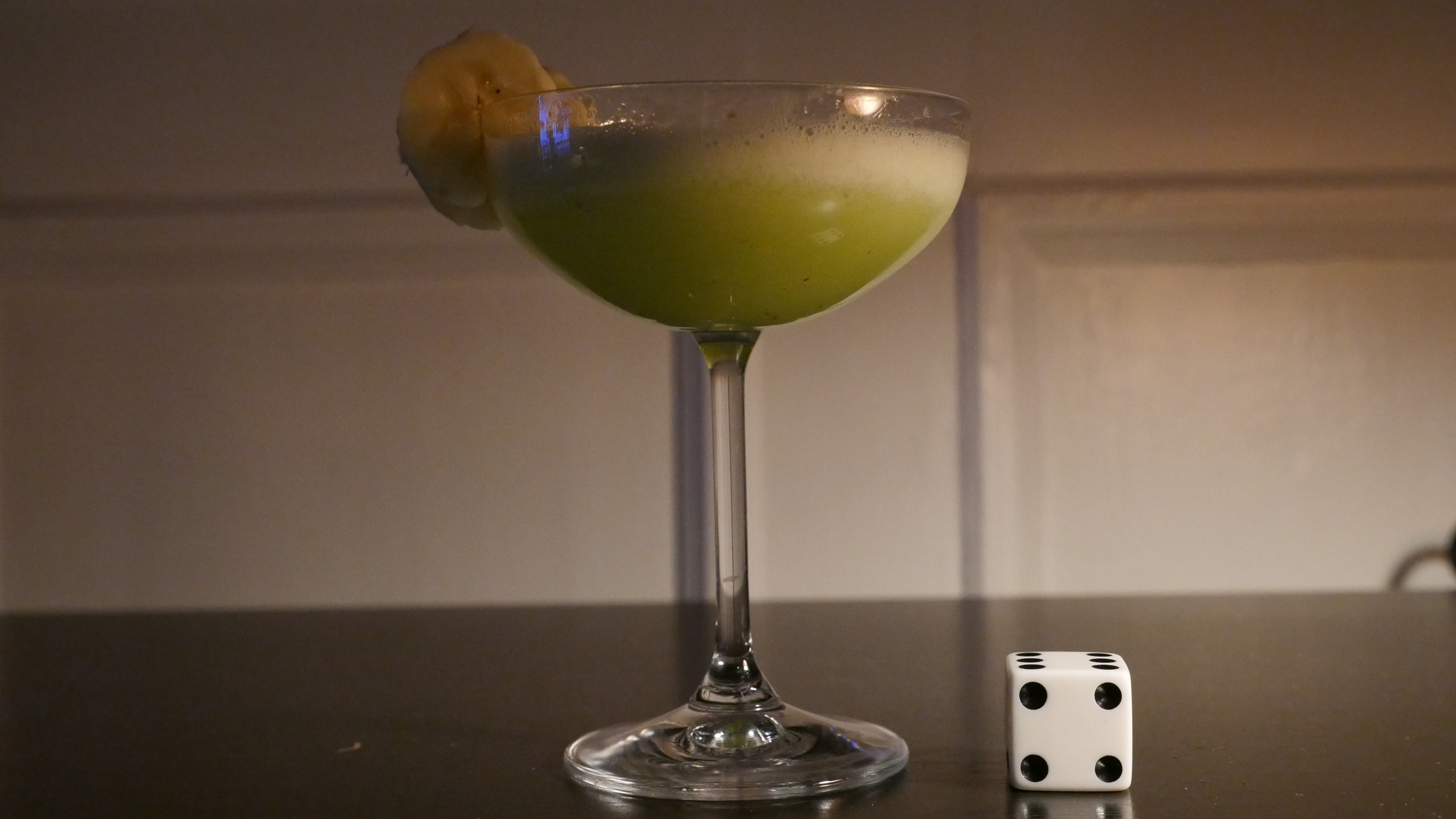
| Still Life. Zhangke Jia. 2006. China. April 16th, 2016. Banana Dynasty. |
 |  | 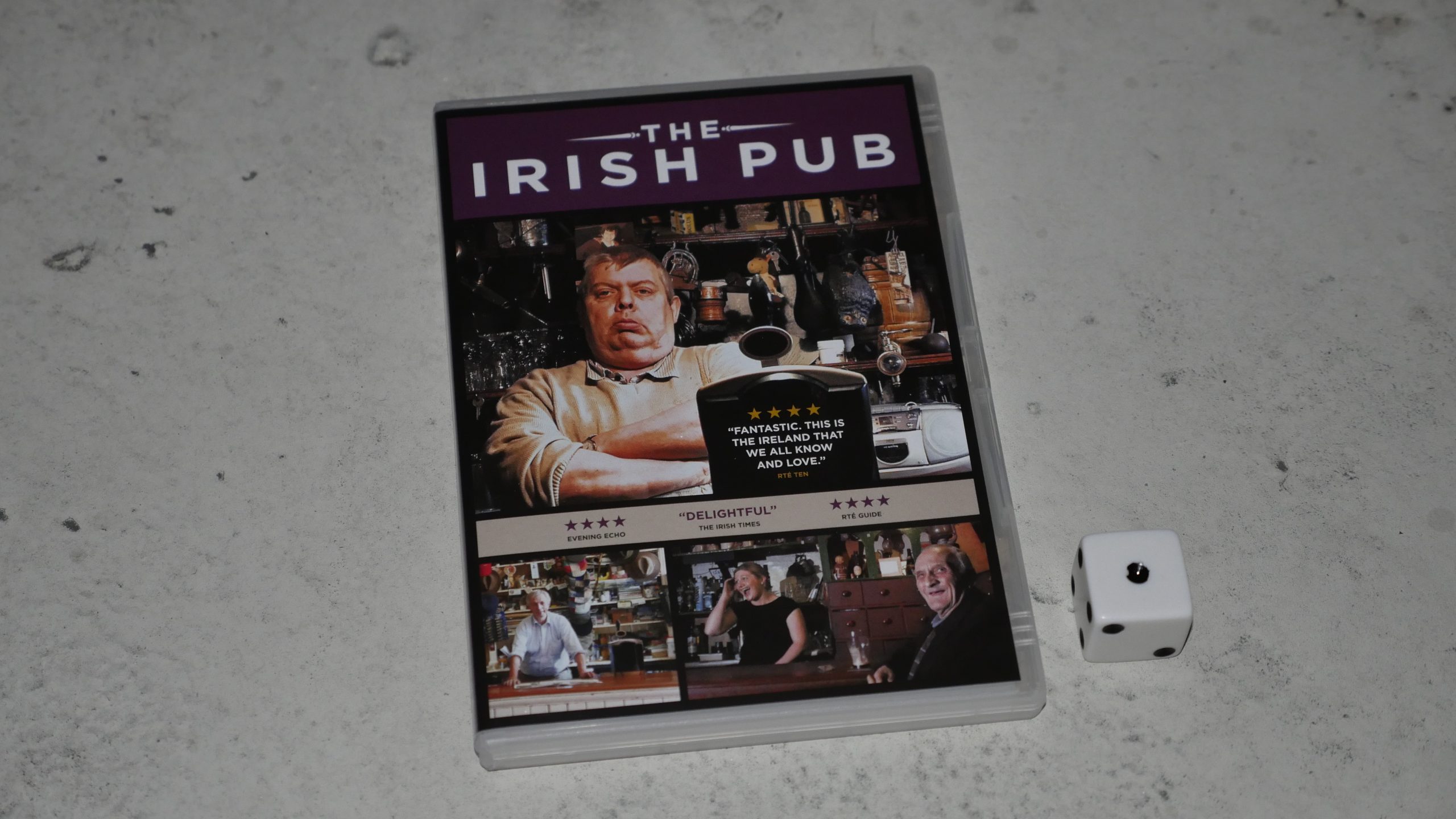 | 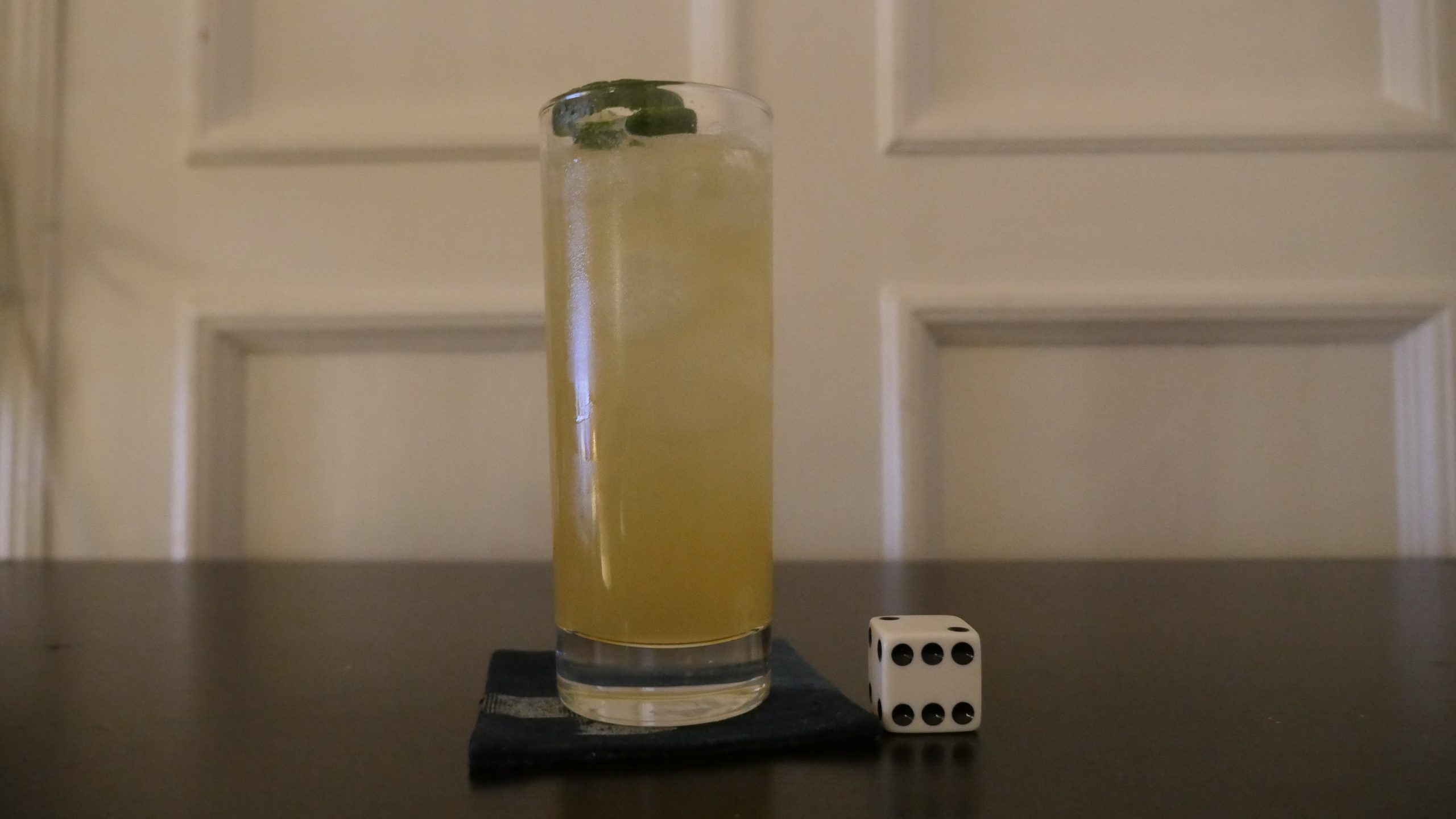 |
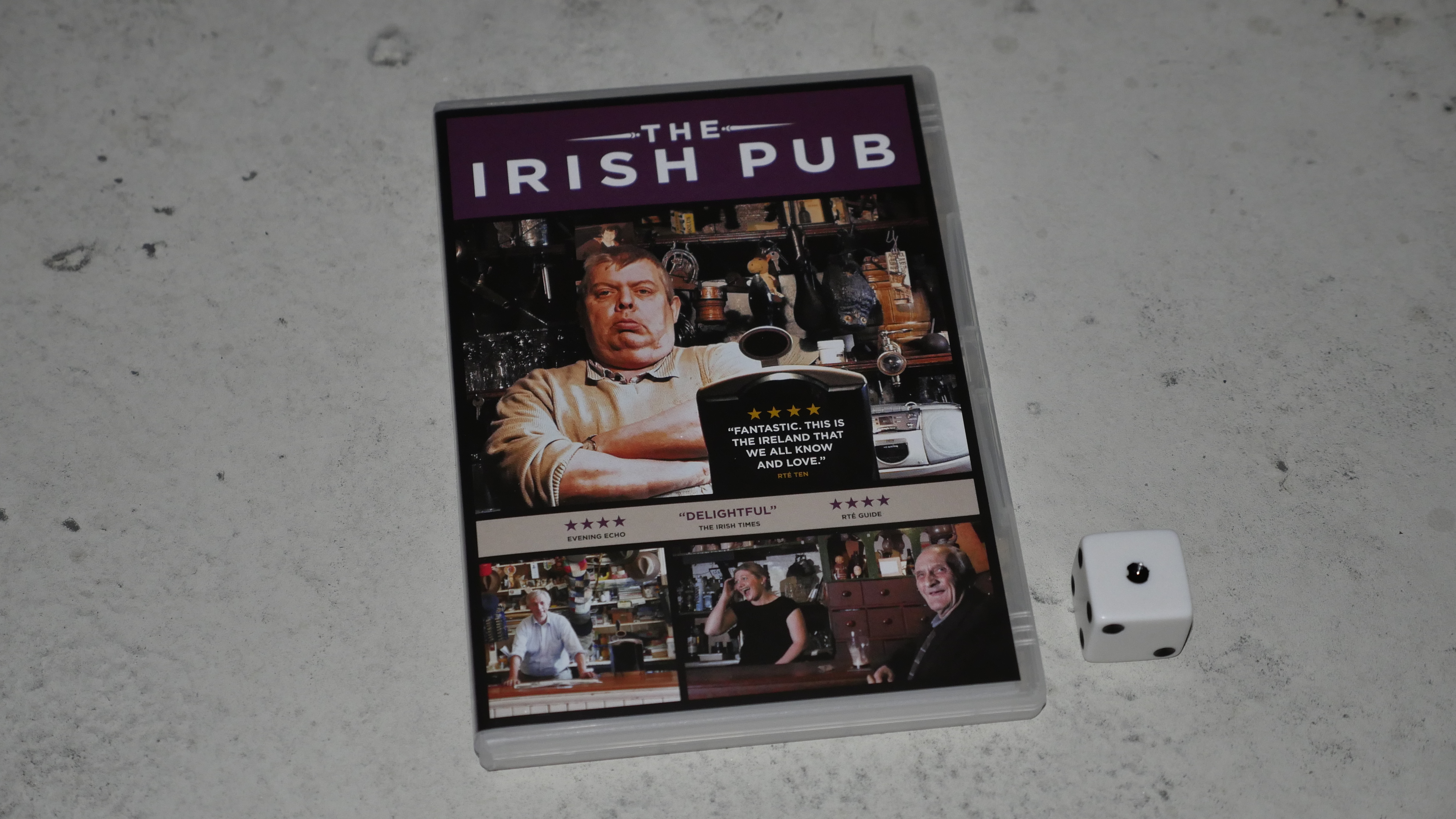
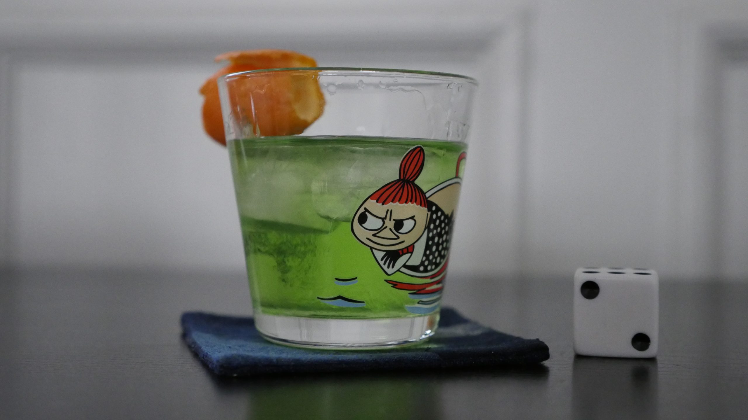
| The Irish Pub. Alex Fegan. 2013. Ireland. April 16th, 2016. Blarney Stone. |
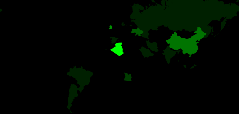 | 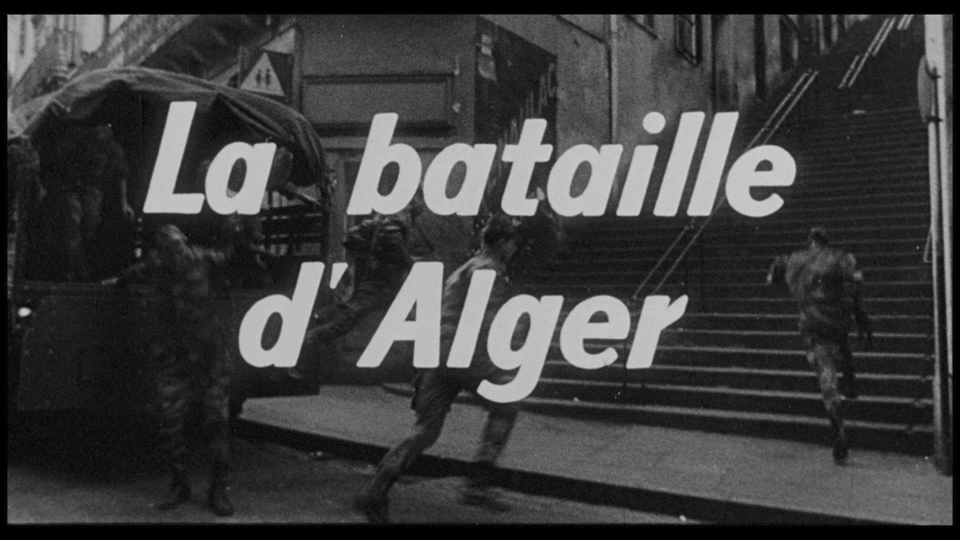 | 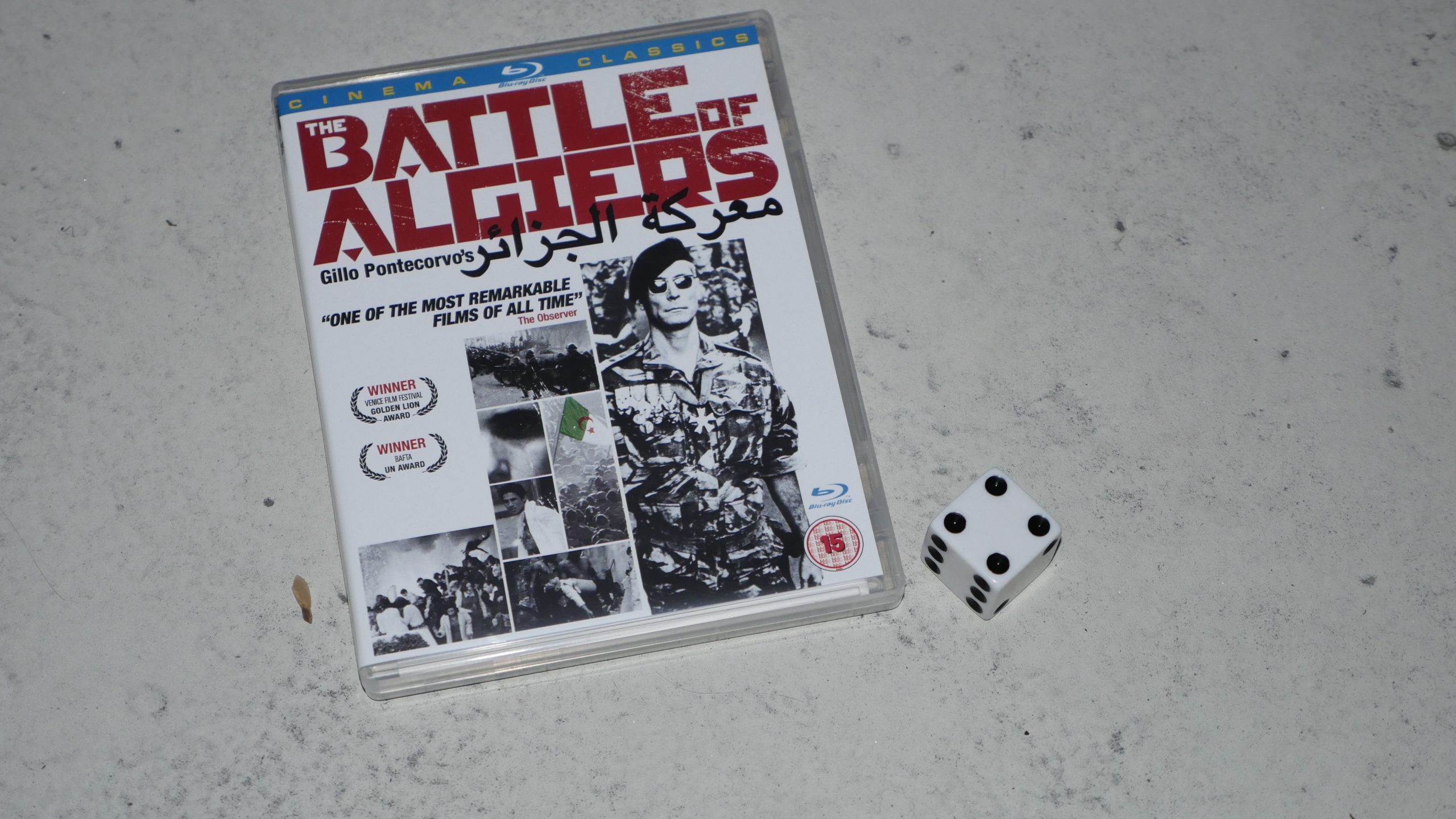 |  |
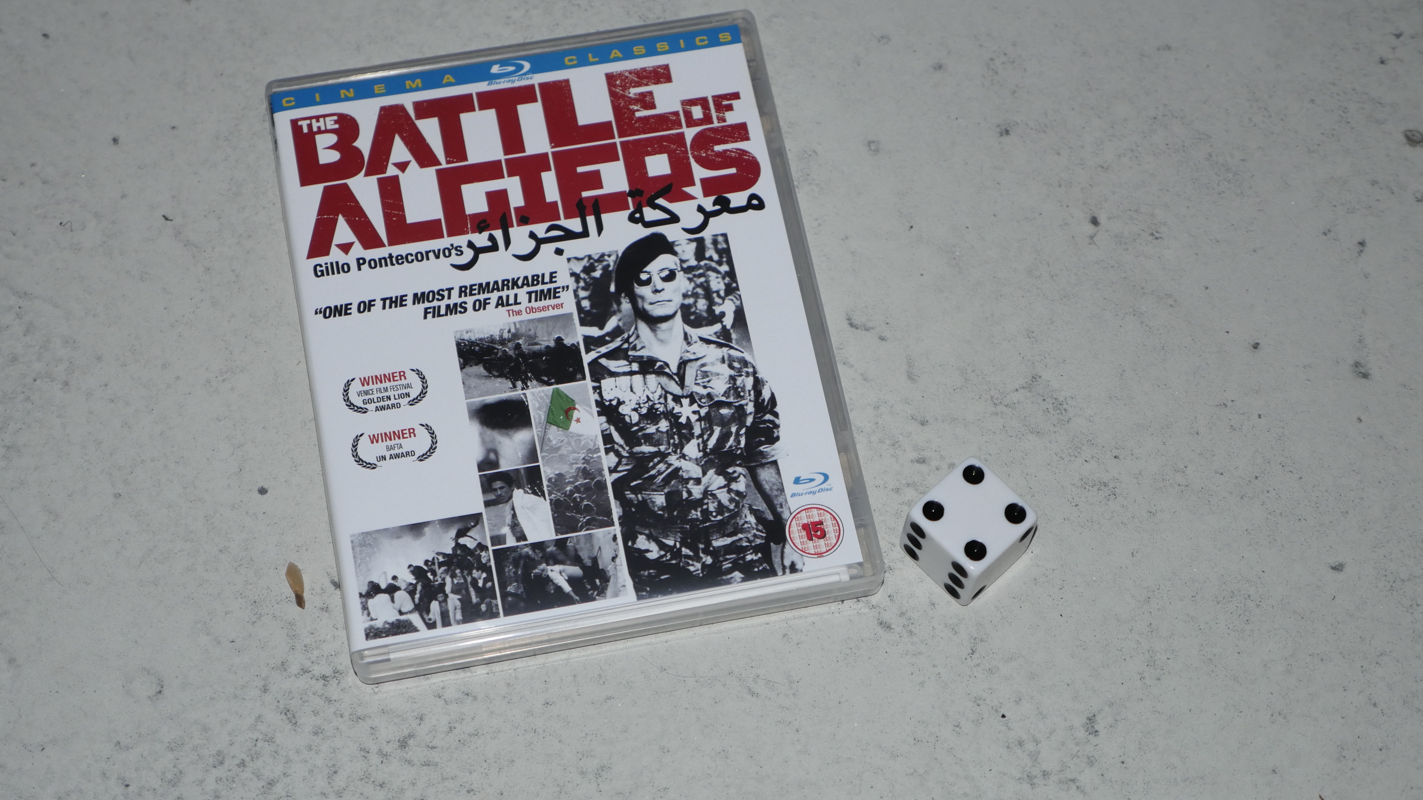
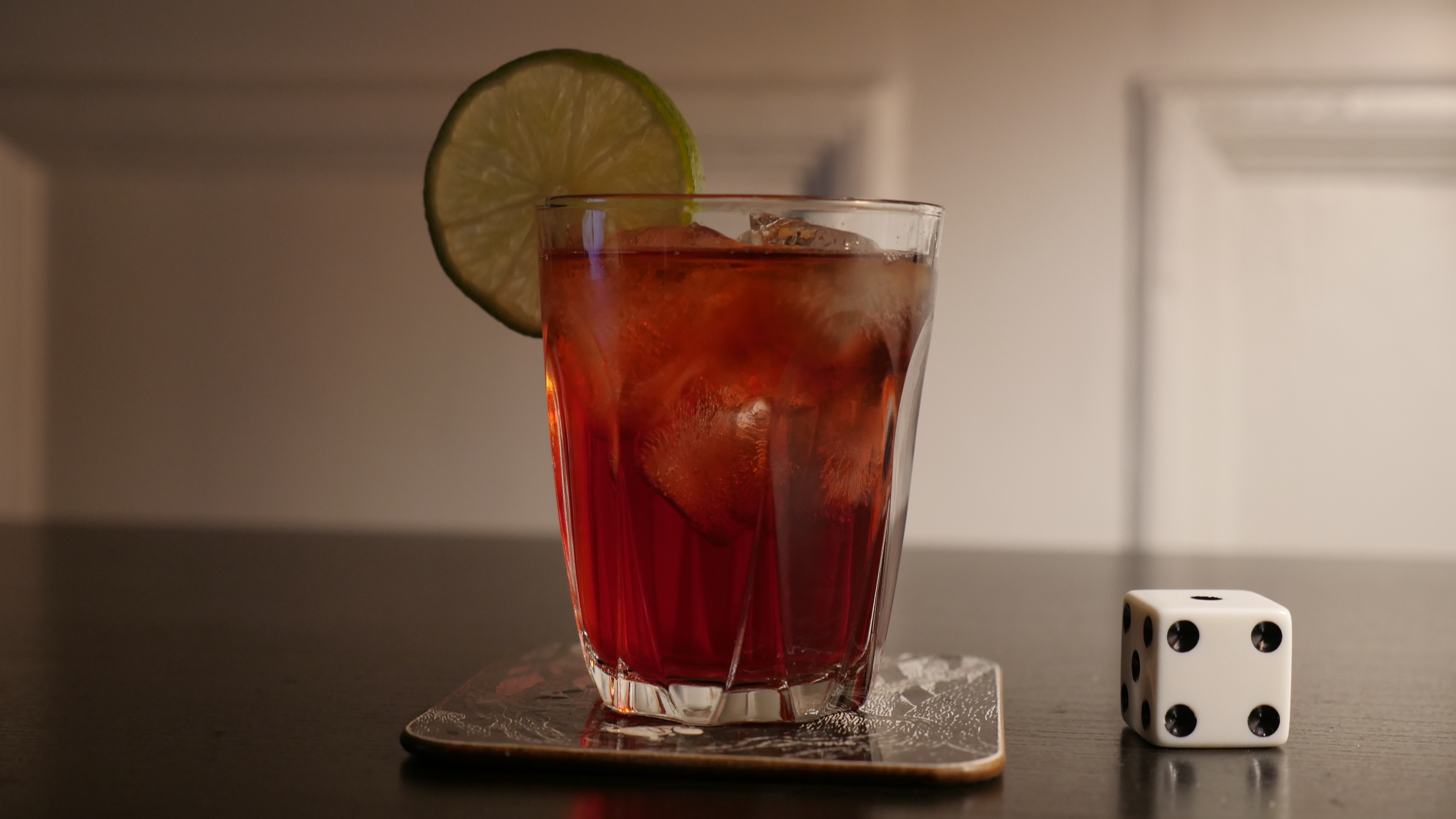
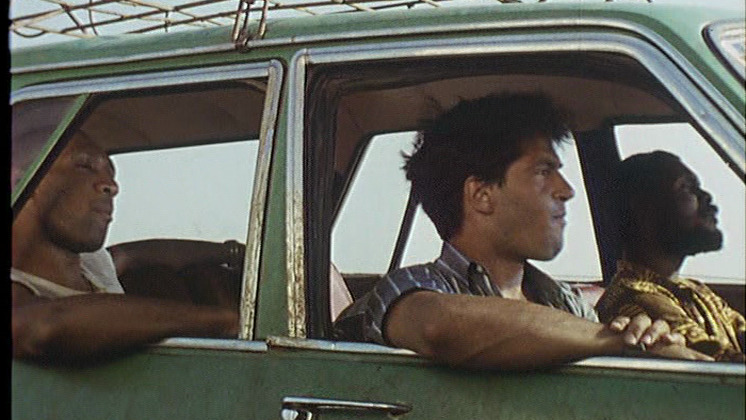
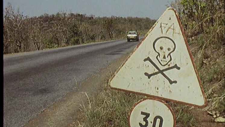
| The Battle of Algiers. Gillo Pontecorvo. 1966. Algeria. April 20th, 2016. Algeria Cocktail. |
 | 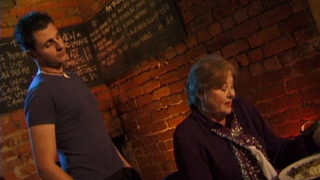 | 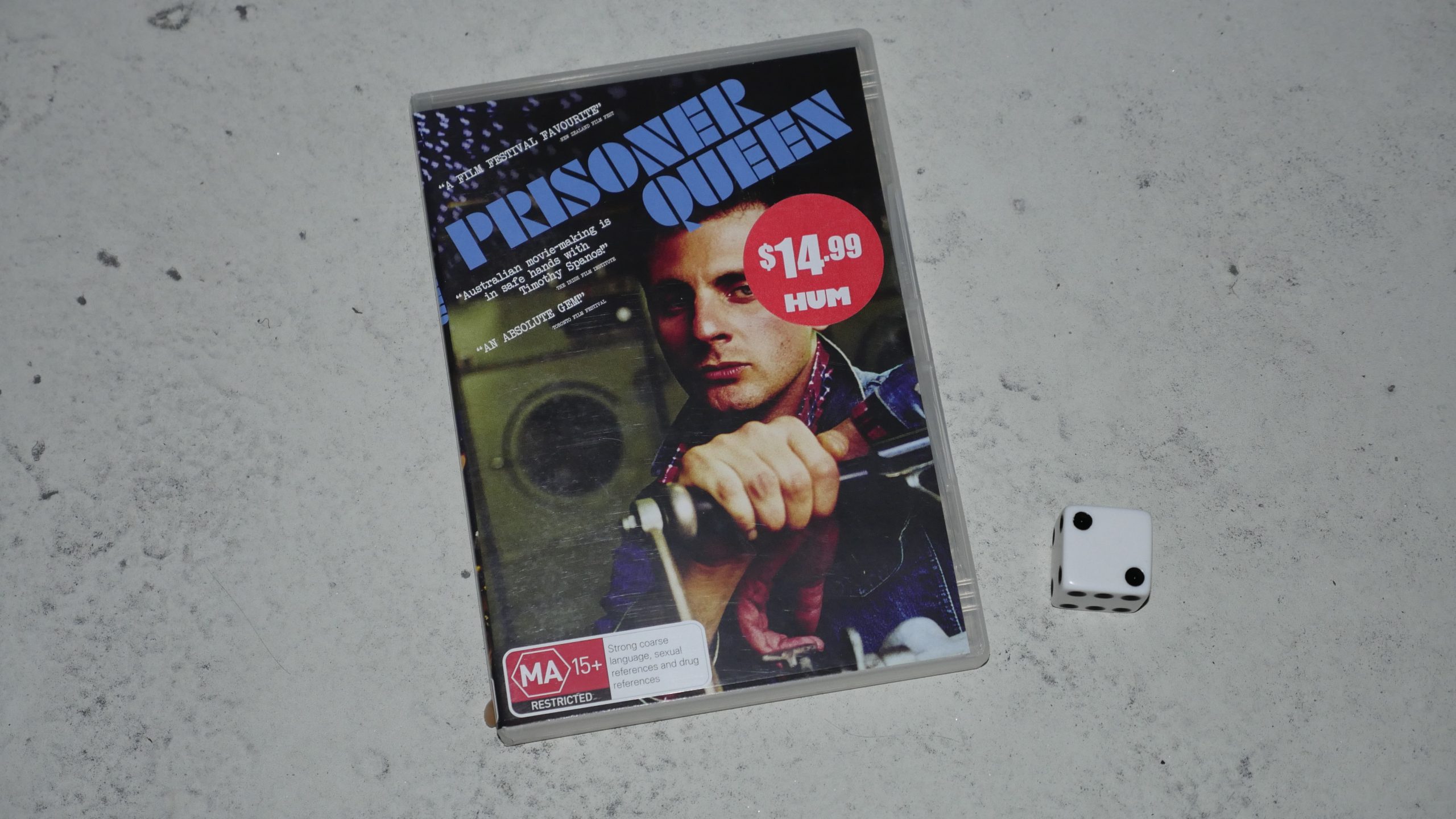 |  |
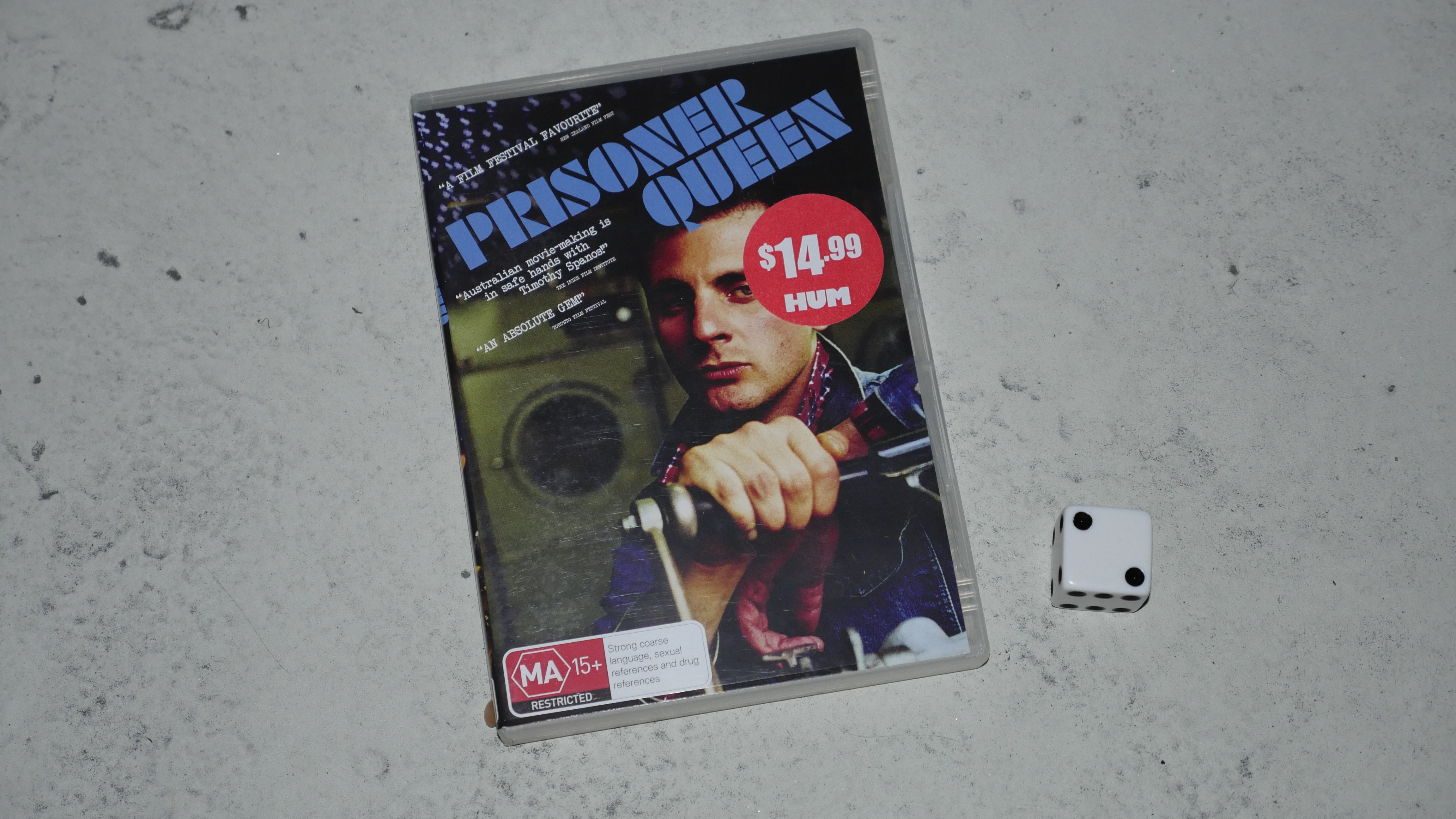
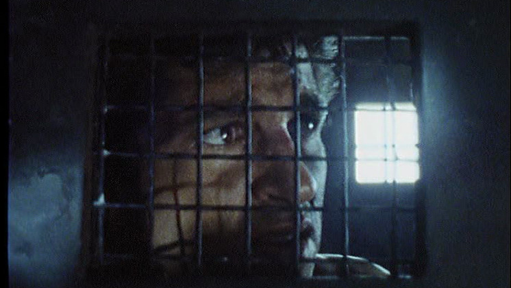
| Prisoner Queen. Timothy Spanos. 2003. Australia. April 21st, 2016. Adios Motherfucker. |
 |  |  |  |
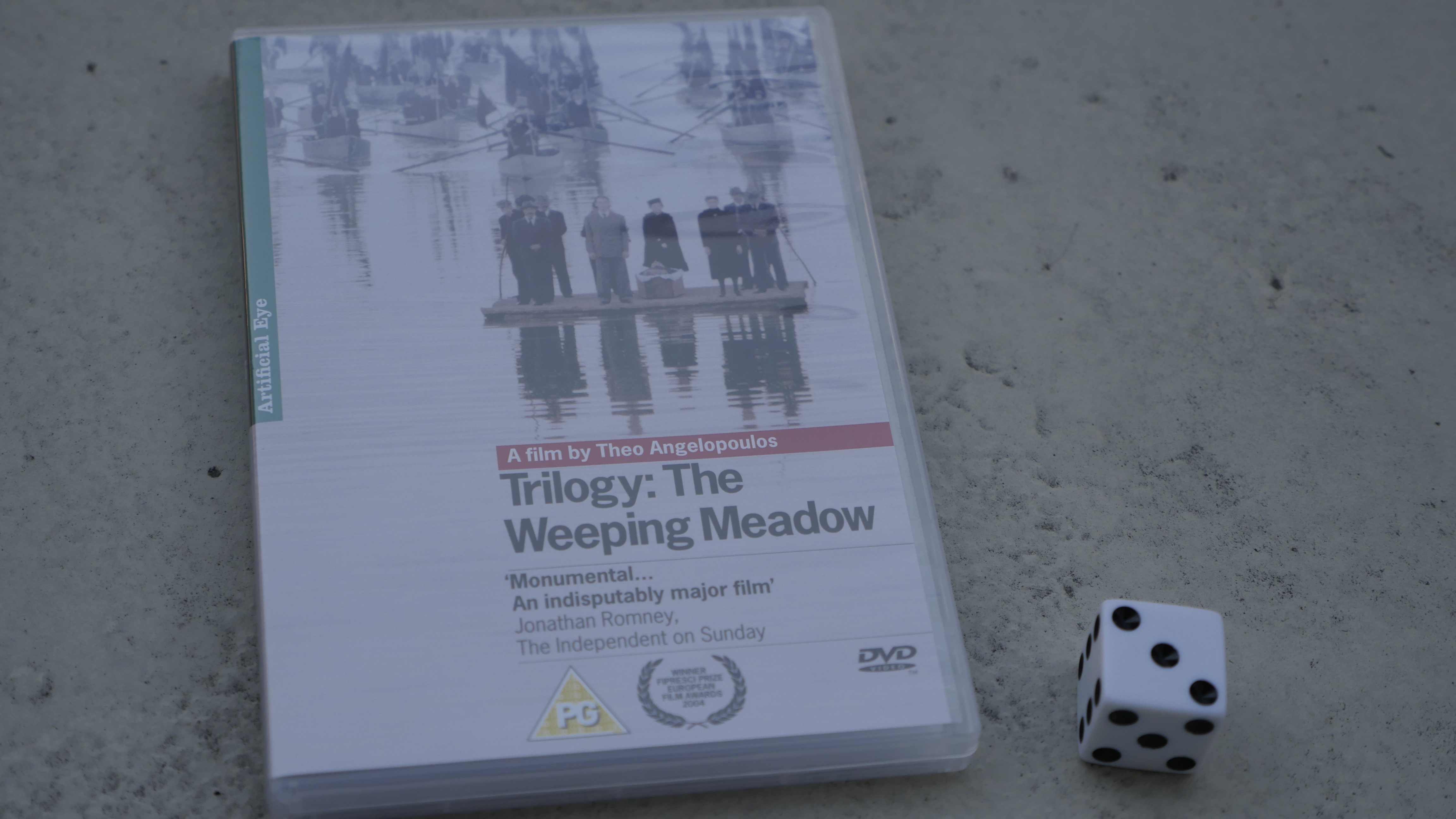
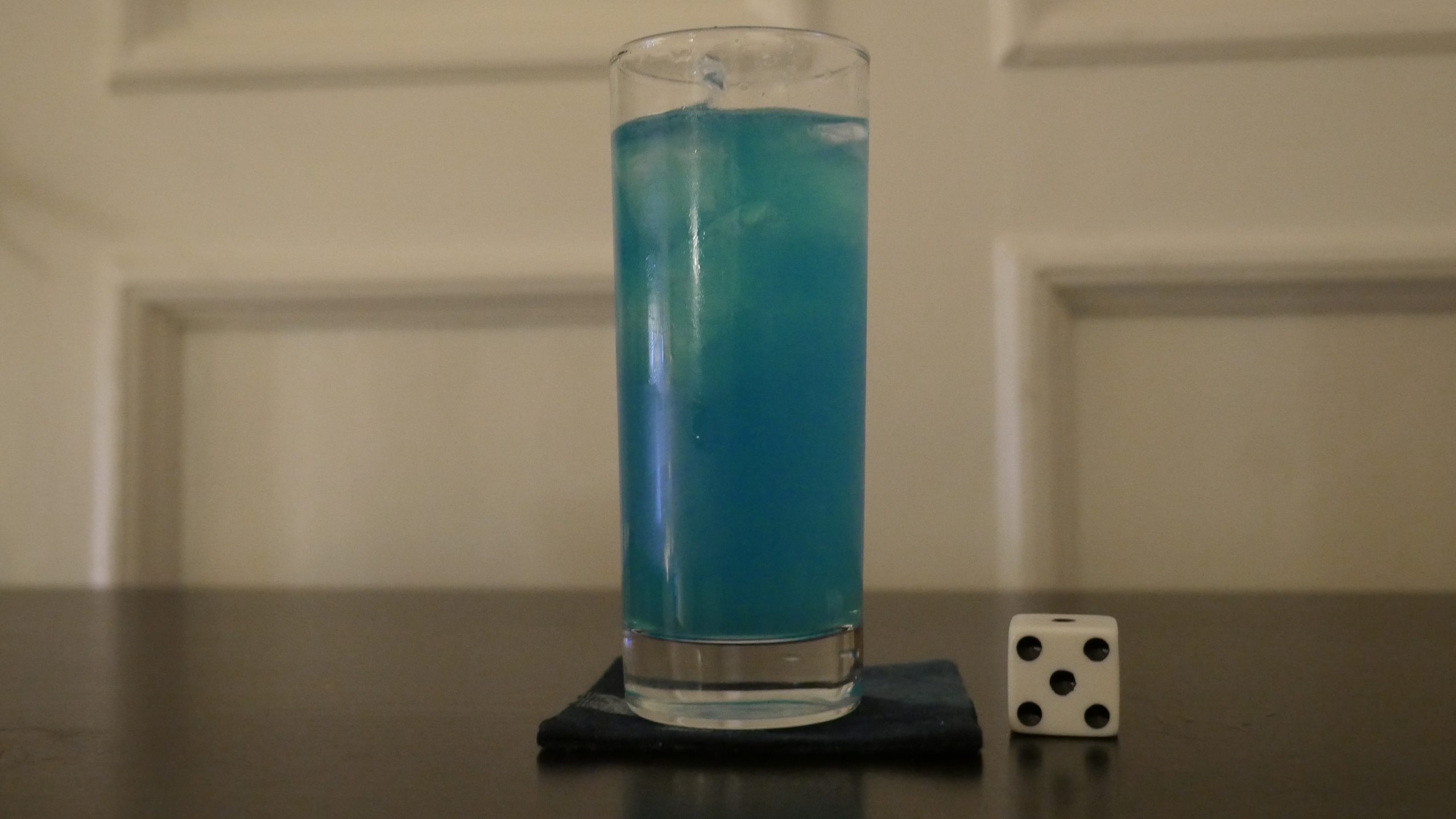
| The Weeping Meadow. Theodoros Angelopoulos. 2004. Greece. April 22nd, 2016. Skinos Fresh. |
 | 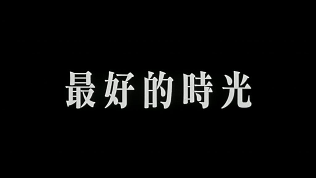 | 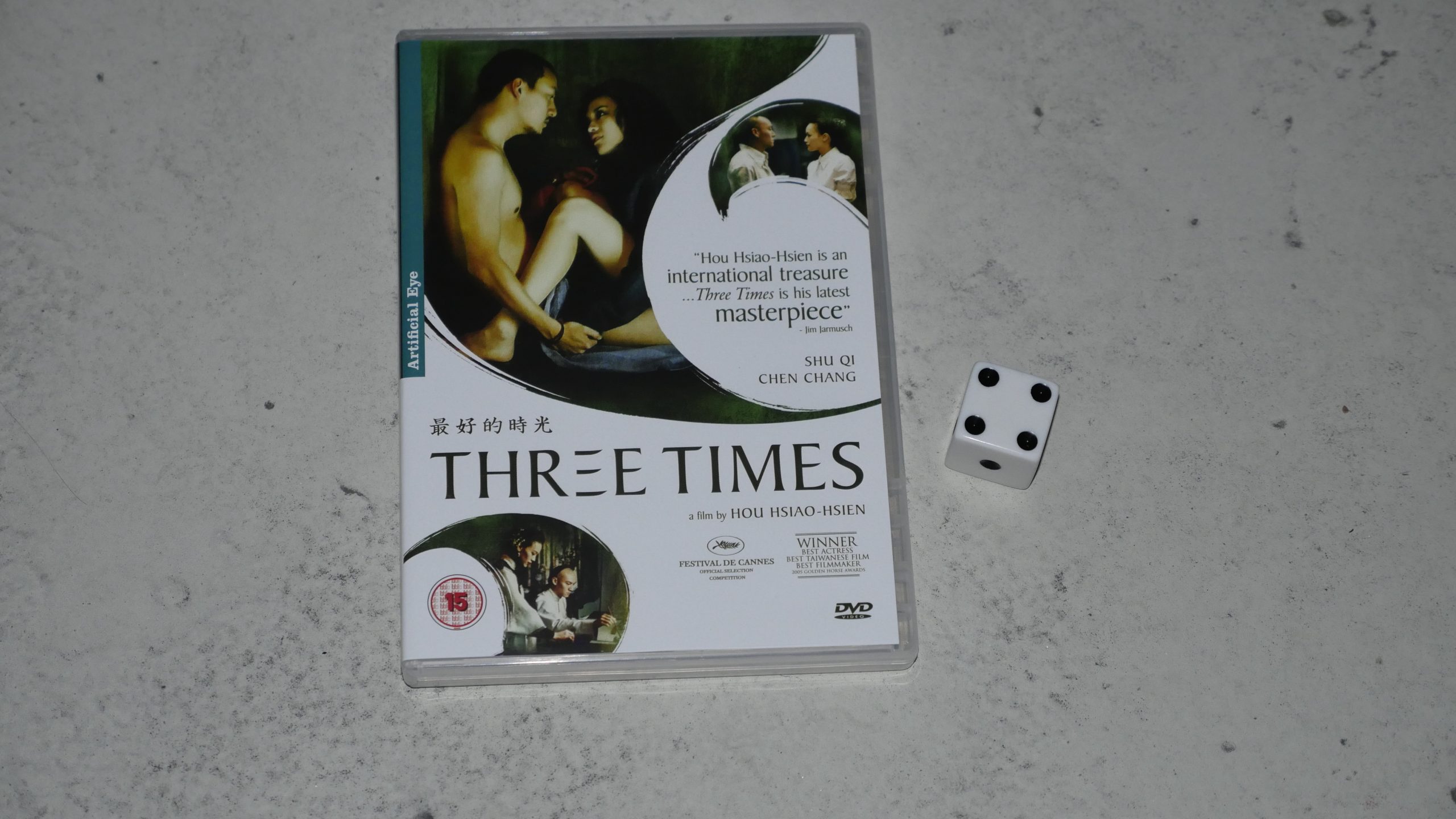 |  |
| Three Times. Hsiao-Hsien Hou. 2005. Taiwan. April 22nd, 2016. Zegroni. |
 |  | 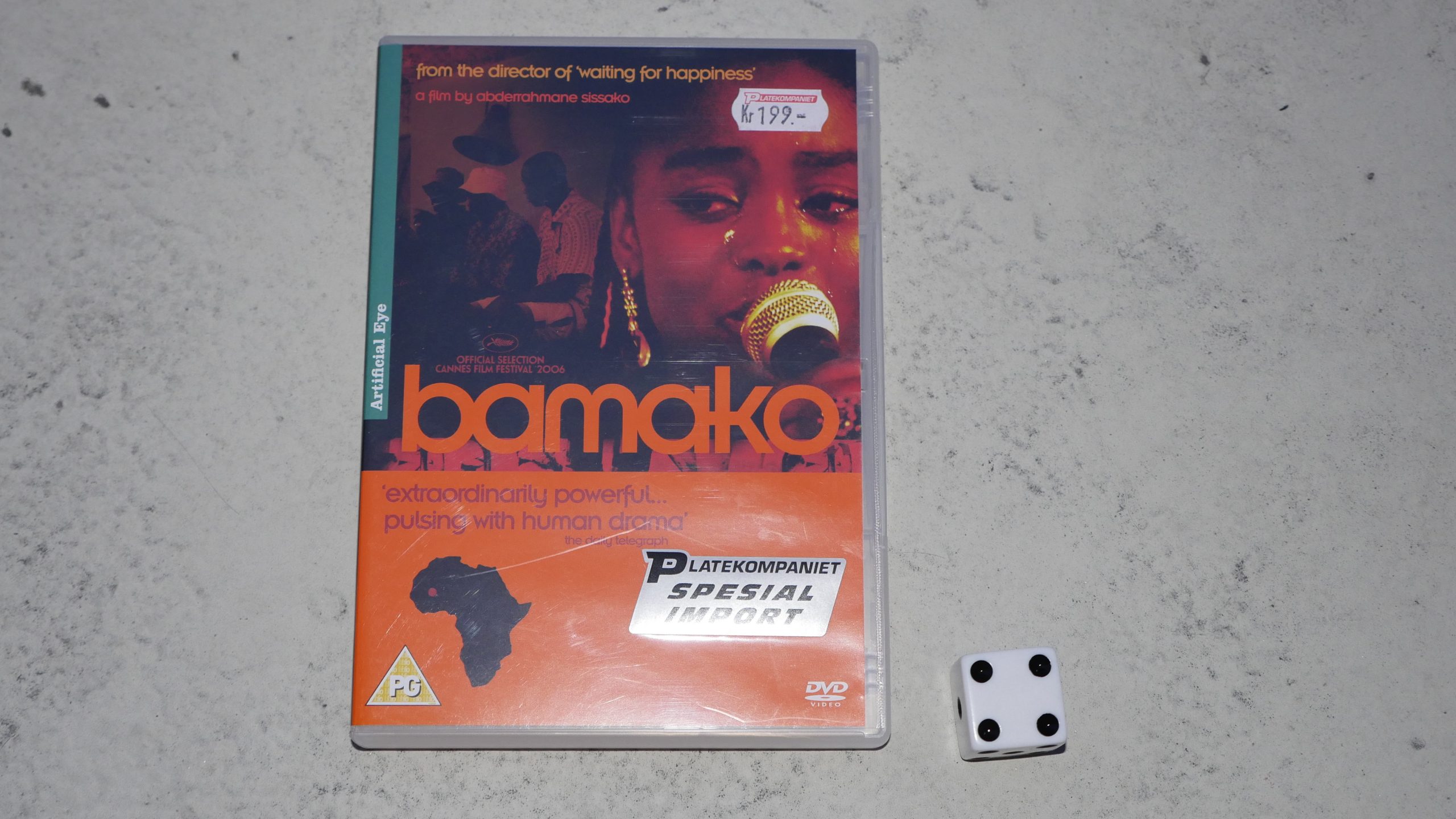 | 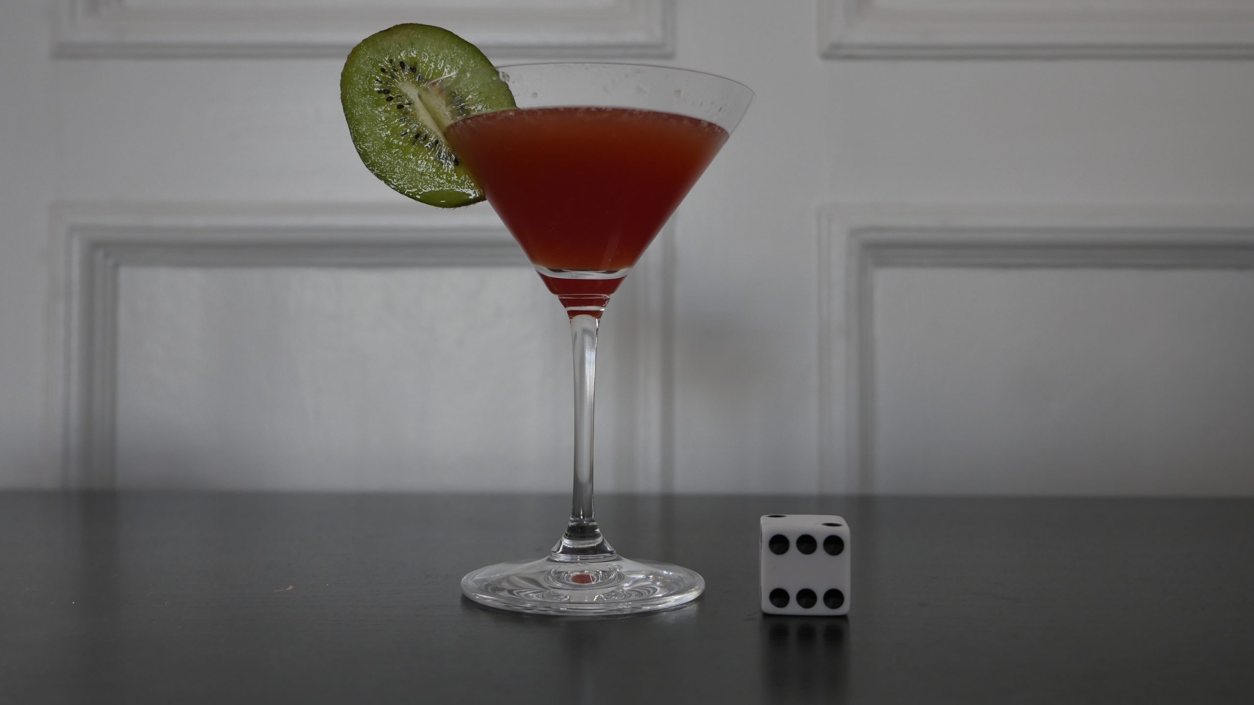 |
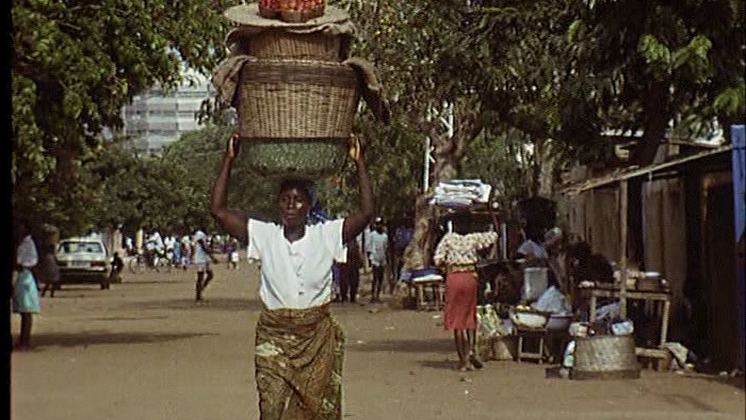
| Bamako. Abderrahmane Sissako. 2006. Mali. April 23rd, 2016. Mali Cooler. |
 |  | 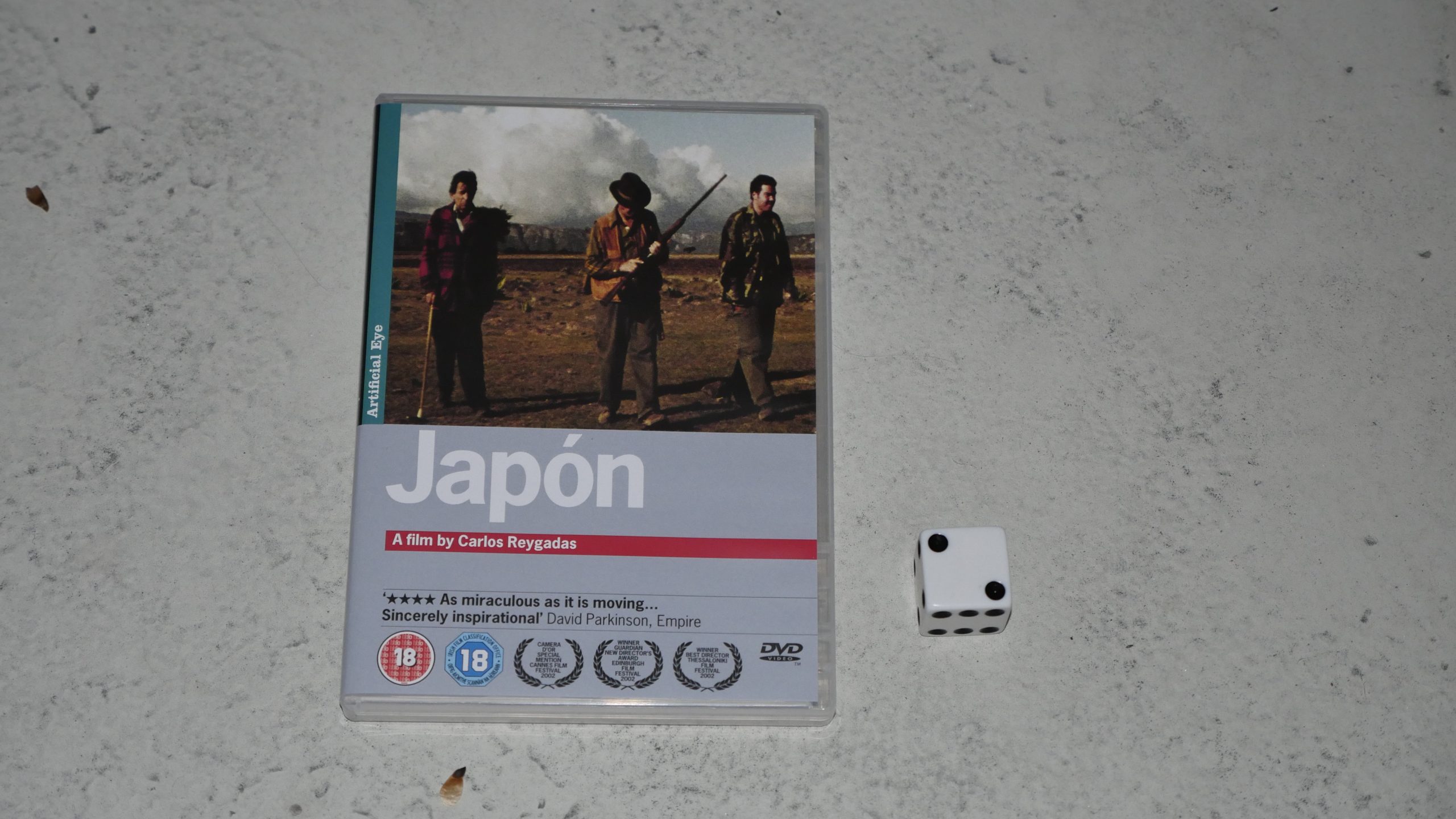 |  |
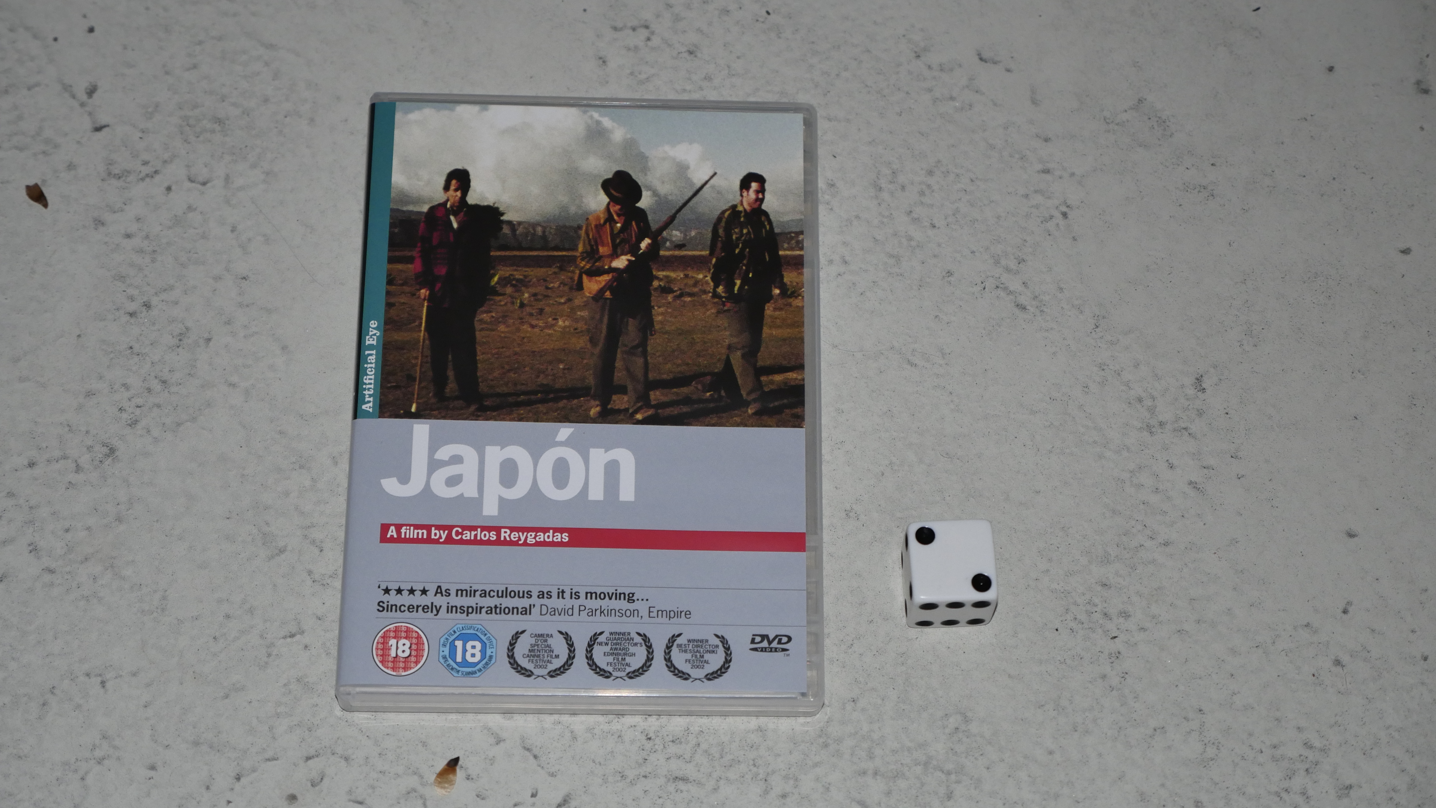
| Japon. Carlos Reygadas. 2002. Mexico. April 24th, 2016. . |
 |  | 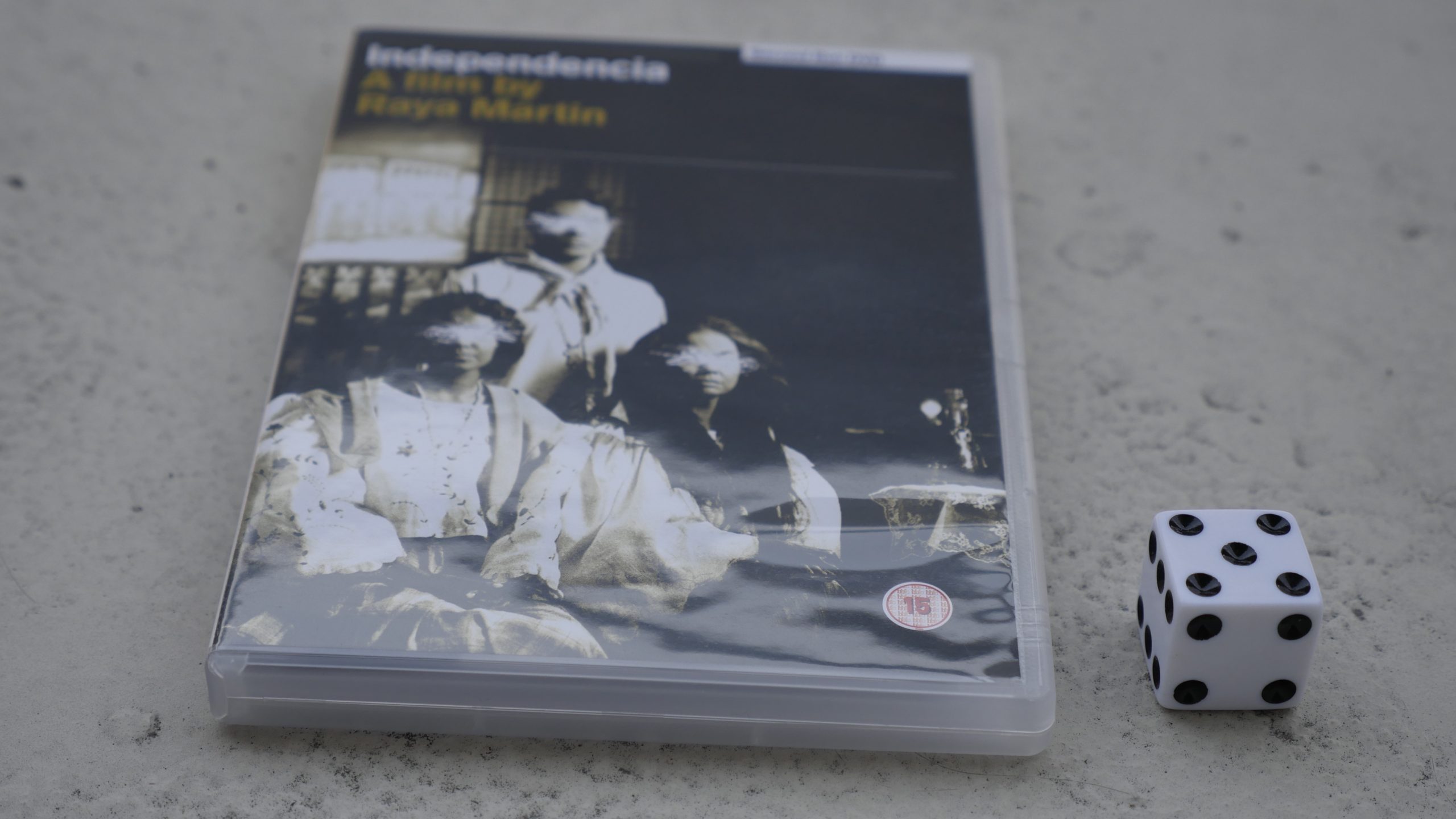 |  |
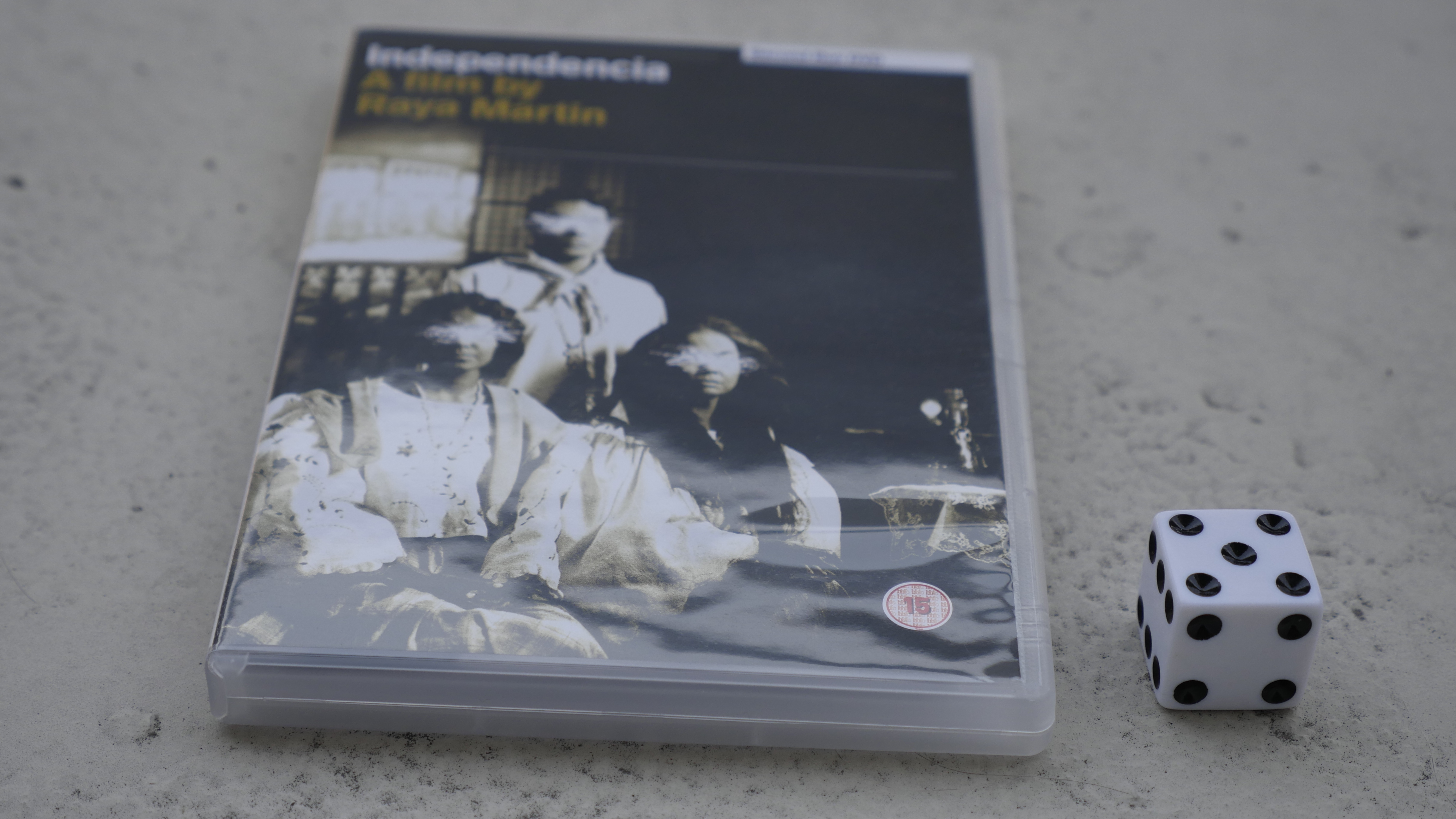
| Independencia. Raya Martin. 2009. Philippines. May 6th, 2016. Manila-Acapulco Grog. |
 | 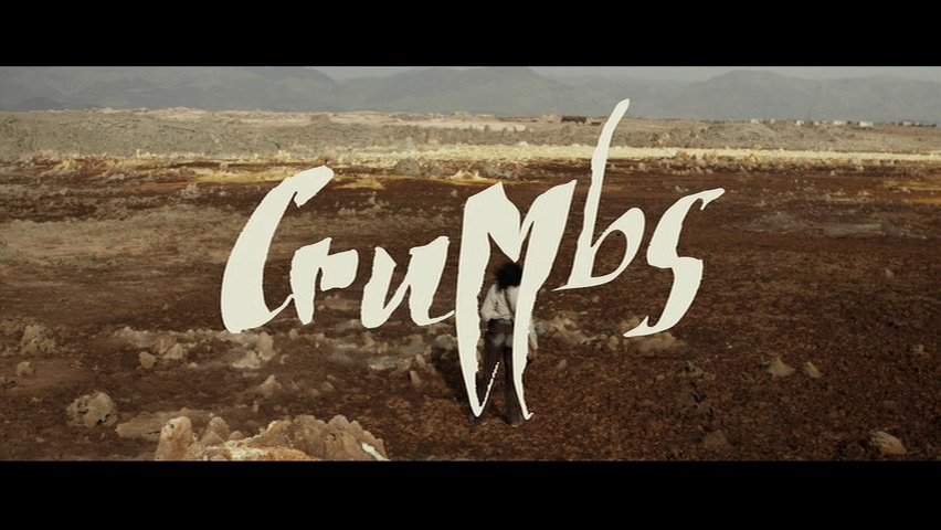 | 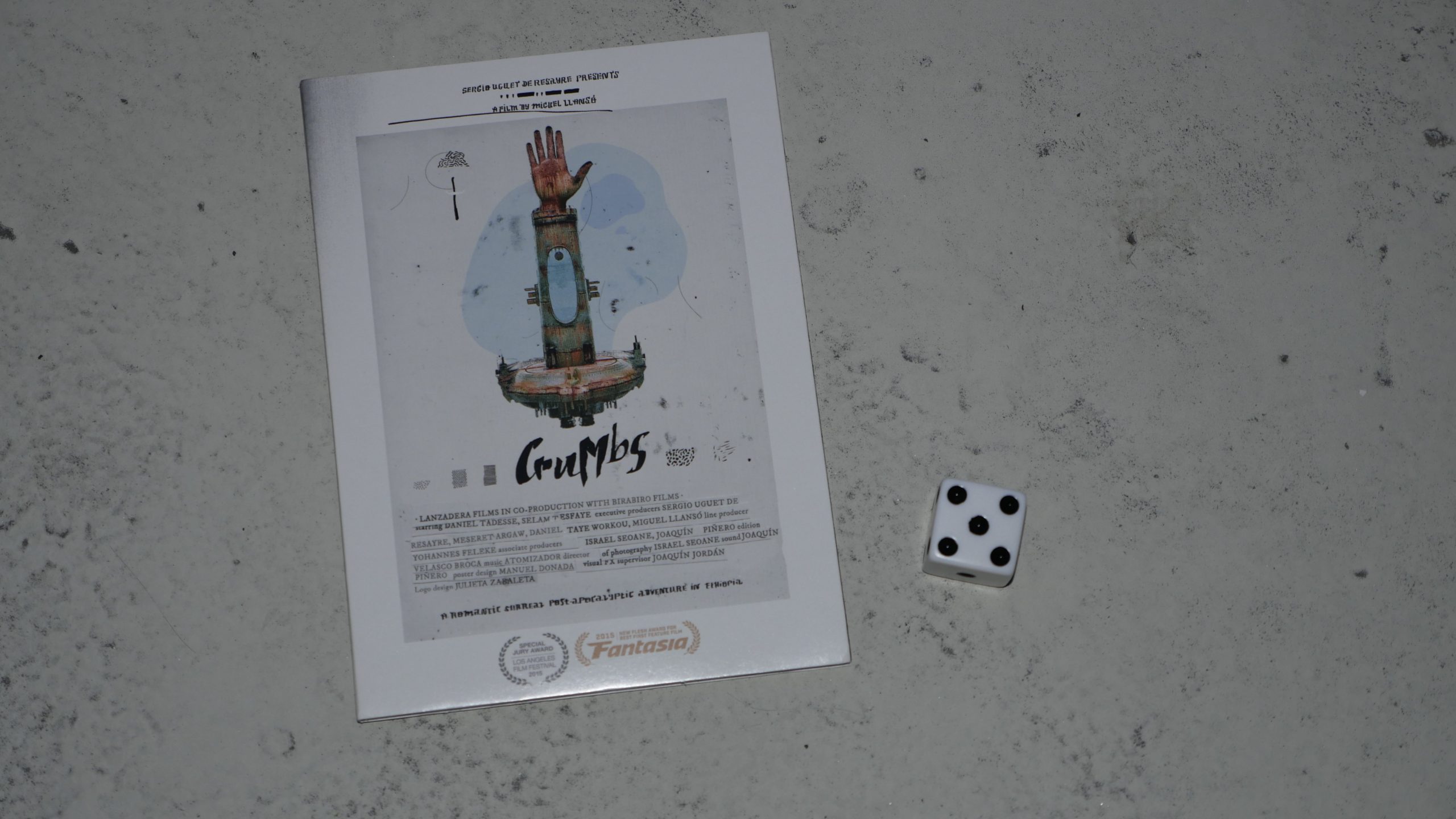 |  |
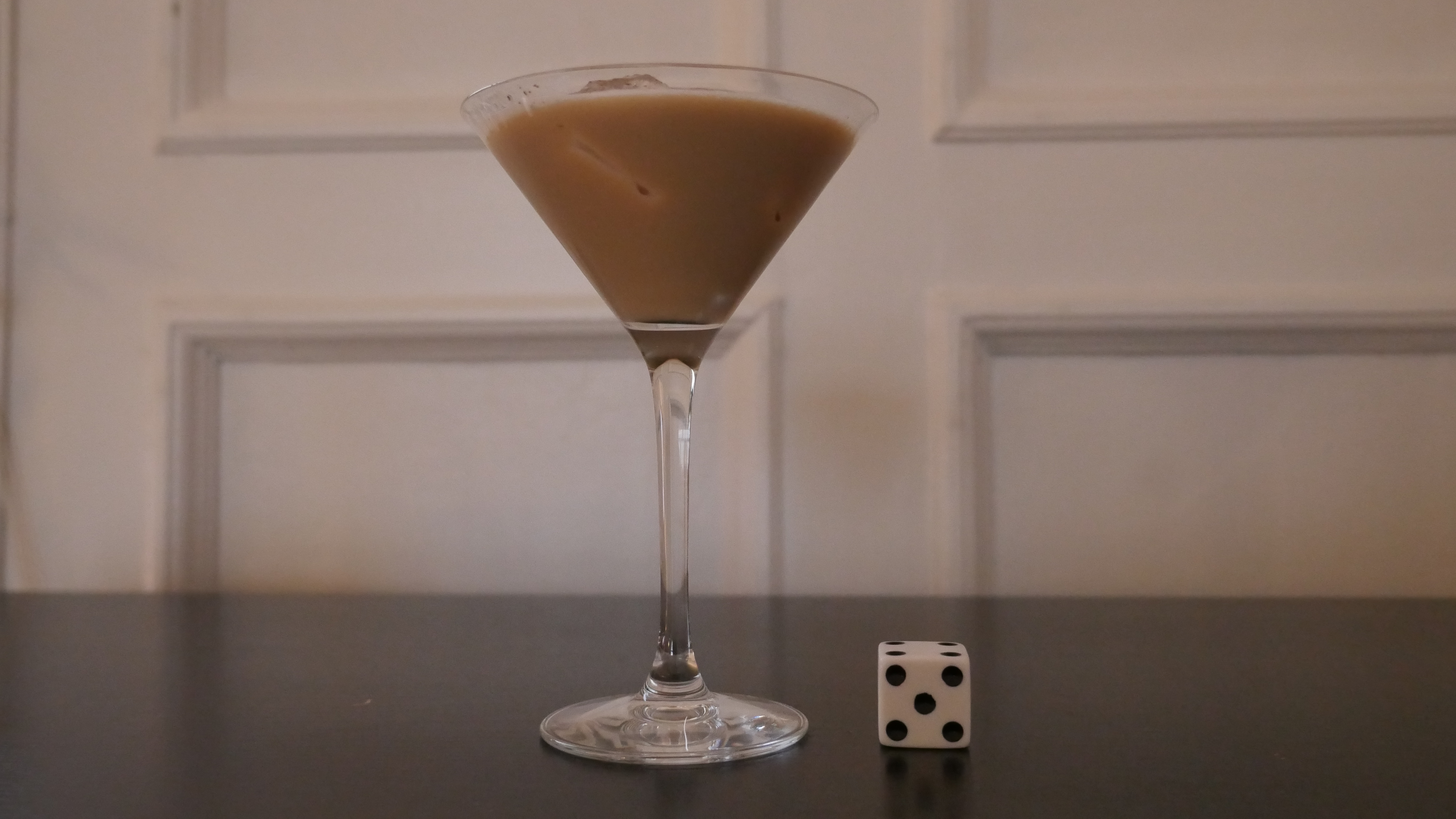
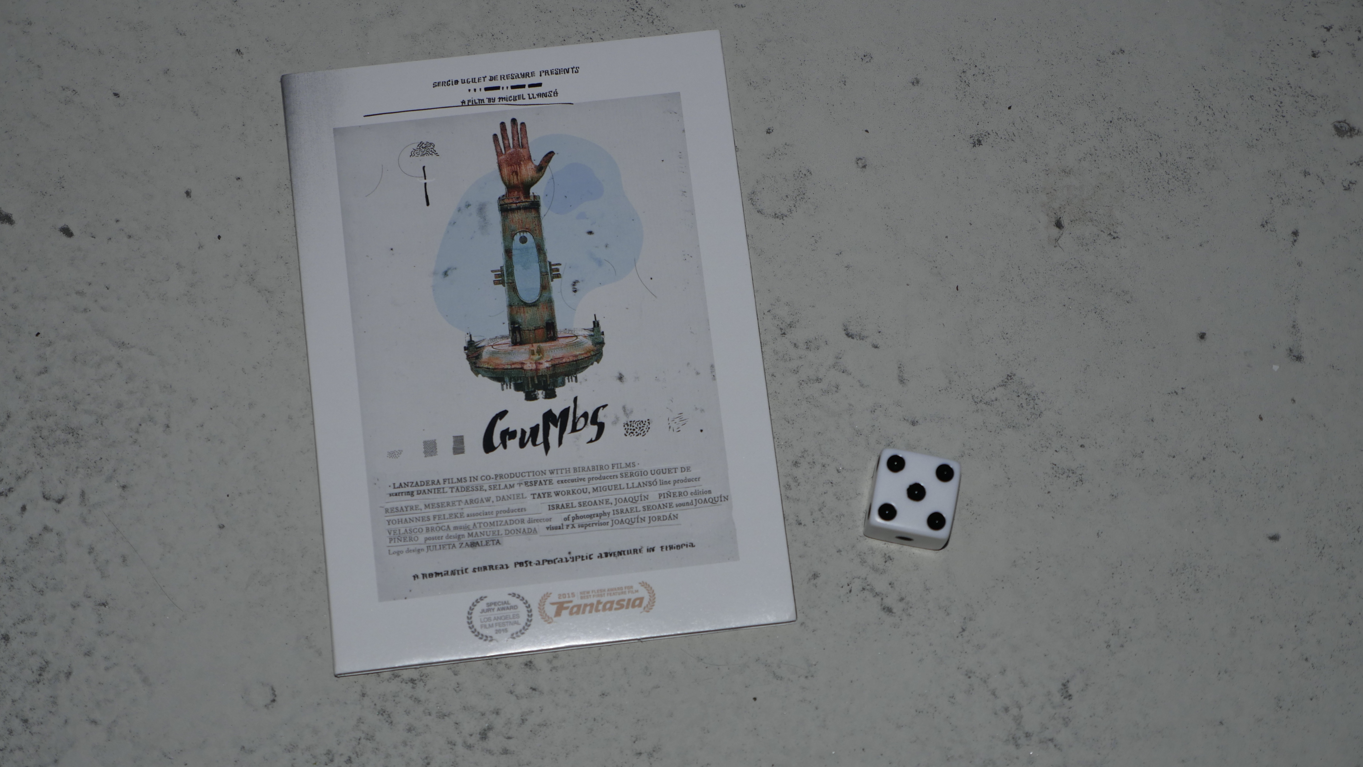
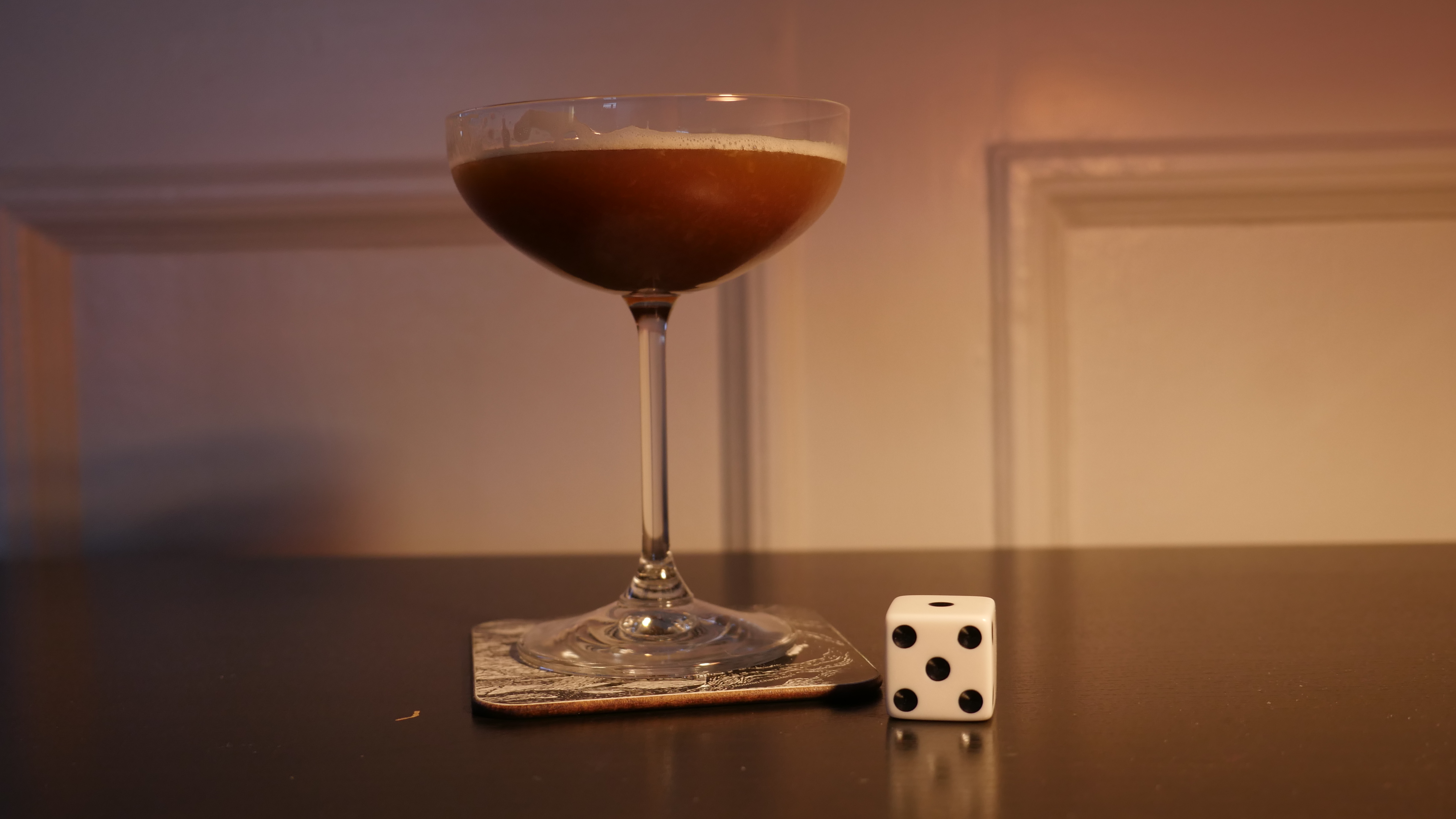
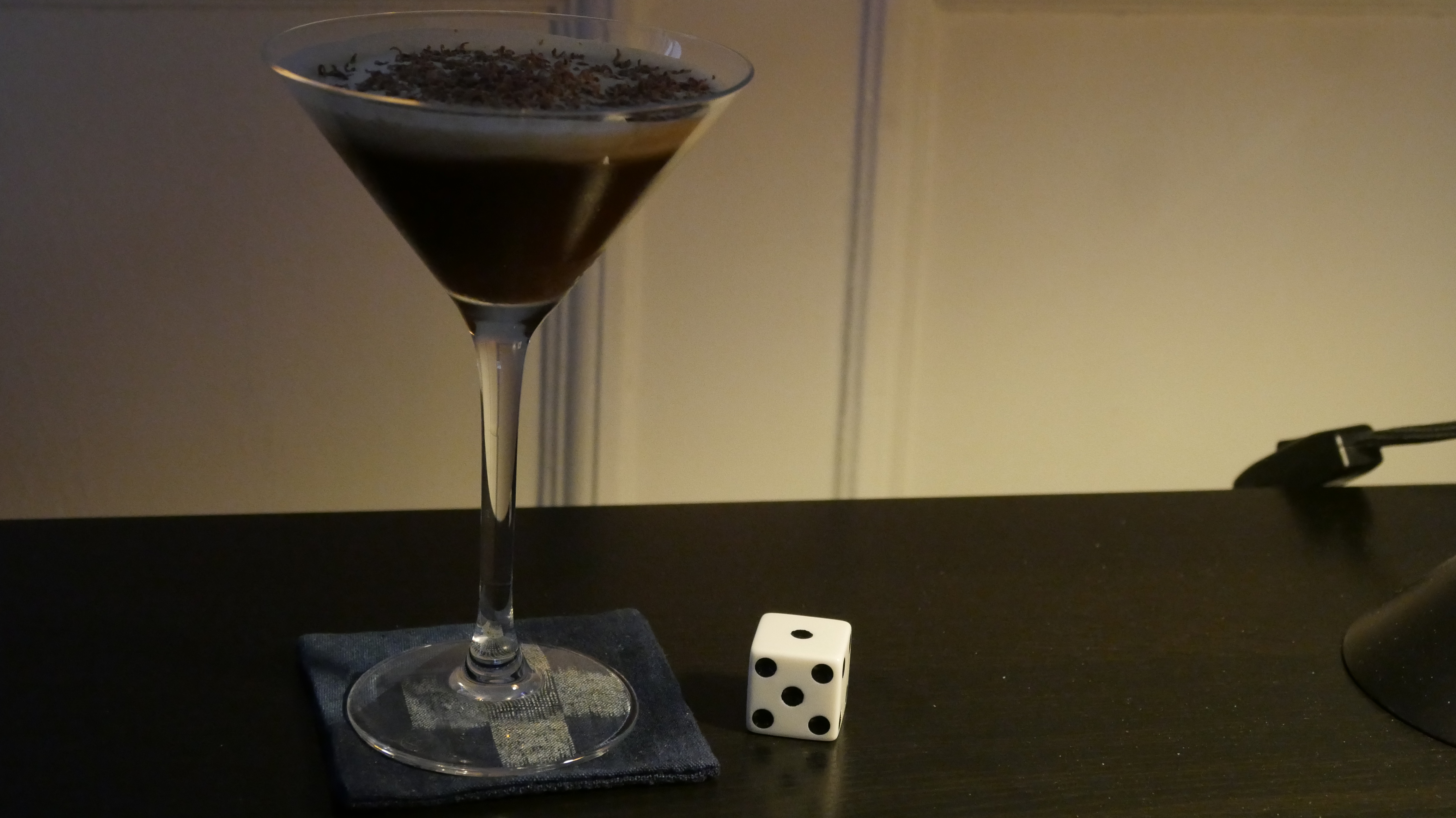
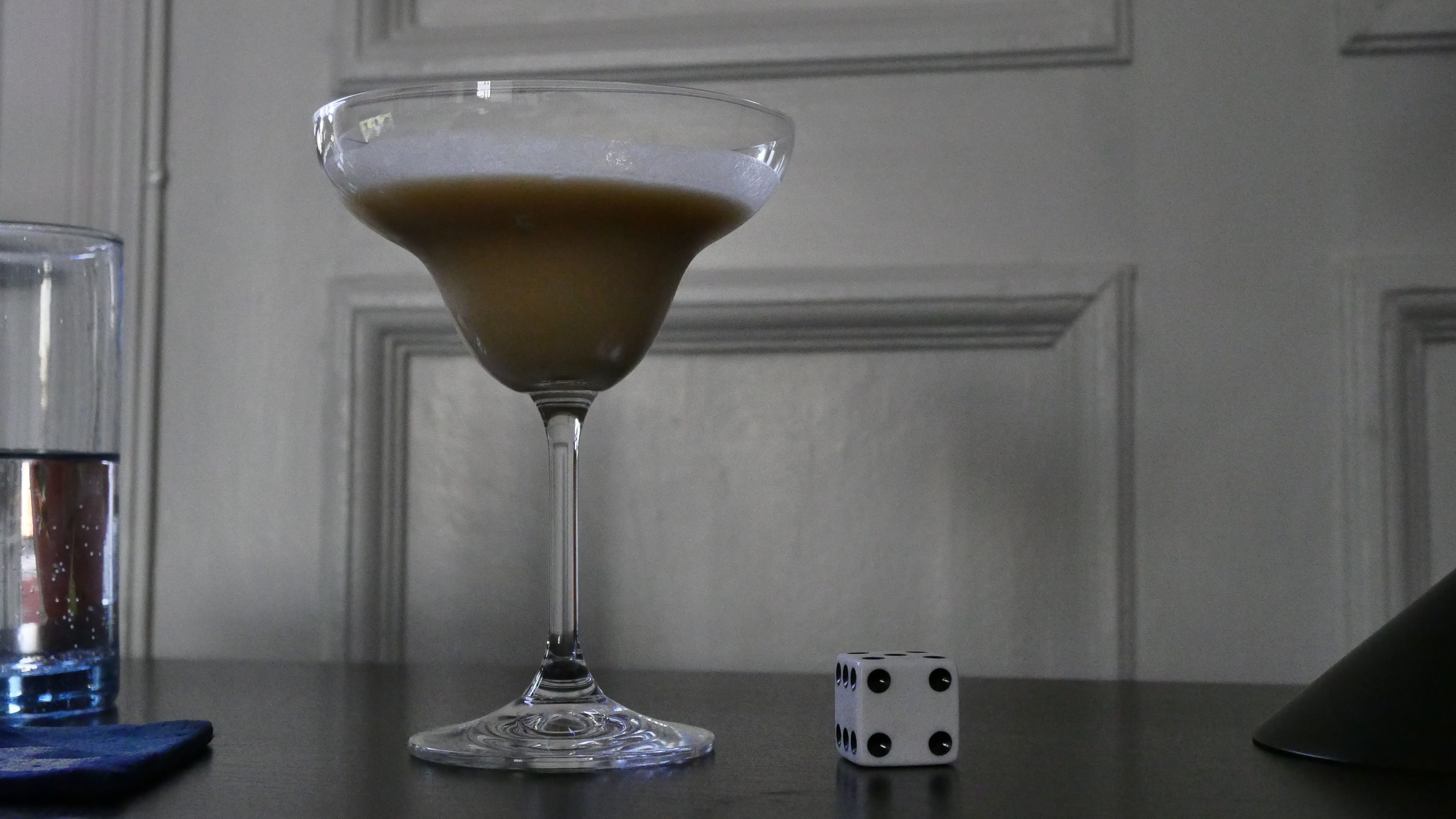
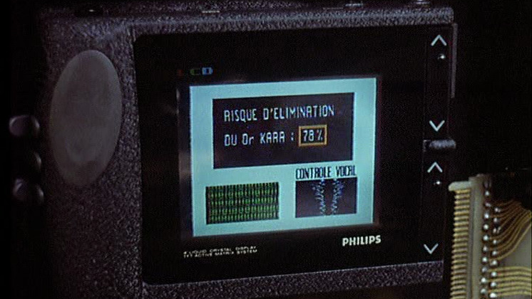
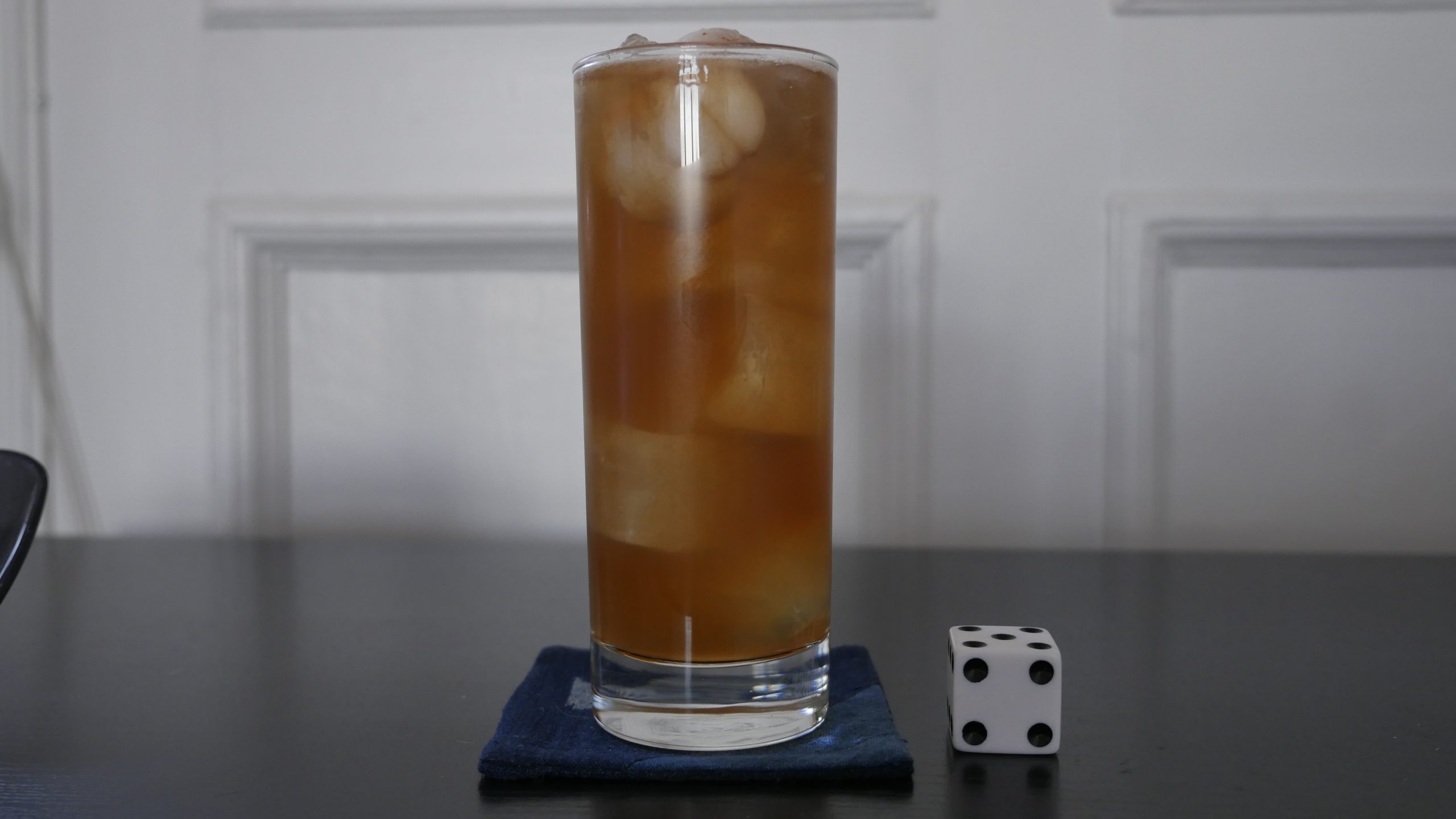
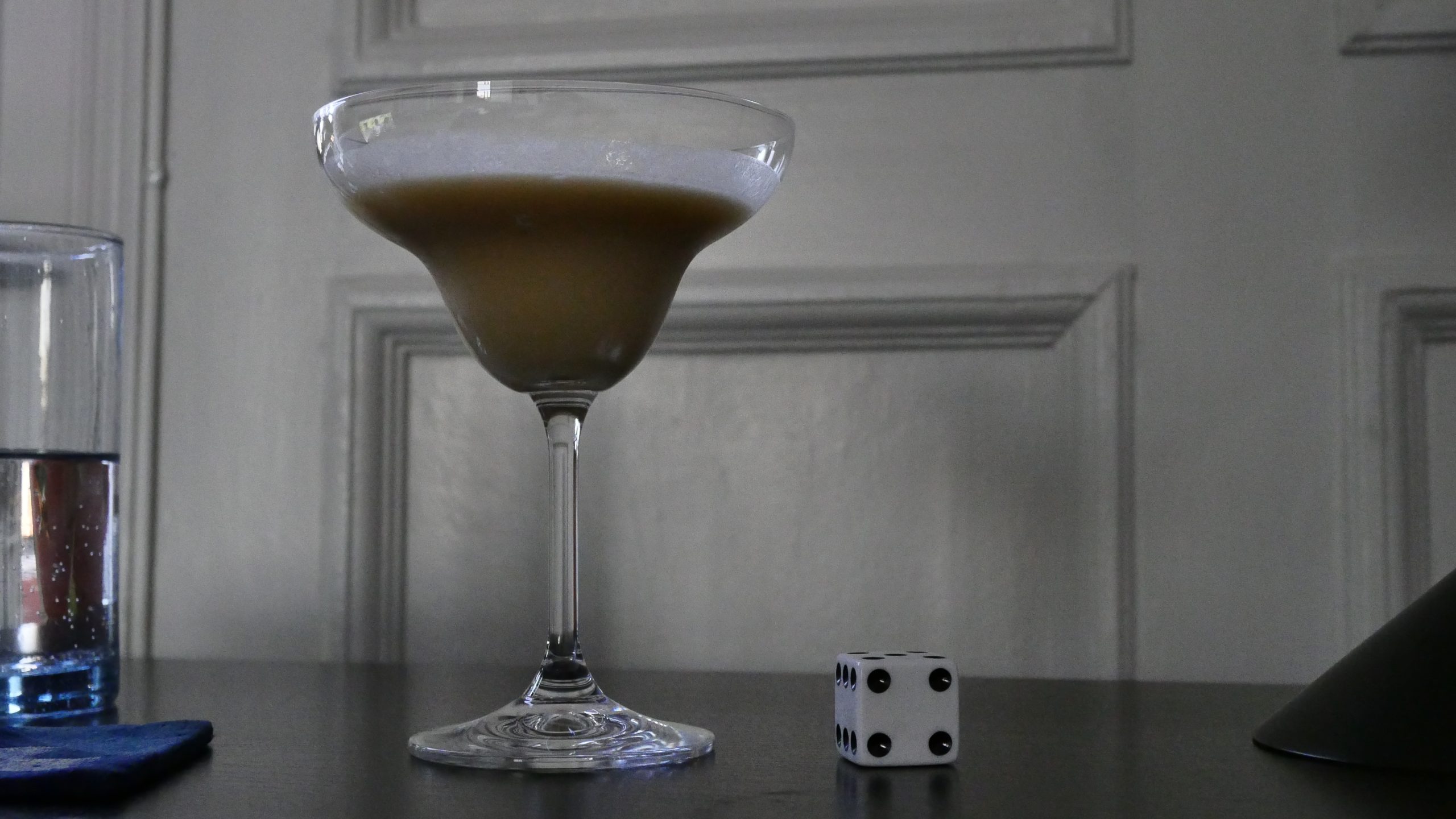
| Crumbs. Miguel Llansó. 2015. Ethiopia. May 6th, 2016. Ethiopian Espresso Martini. |
 |  | 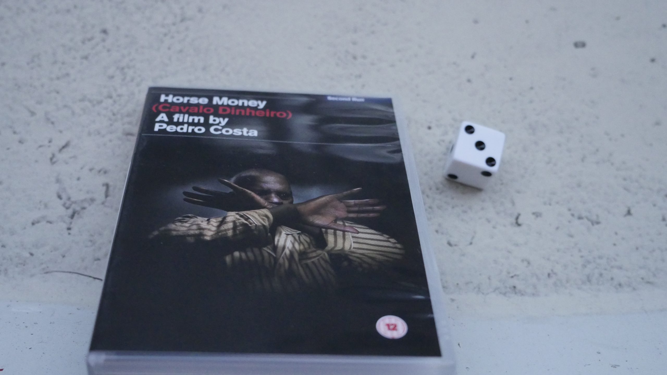 |  |
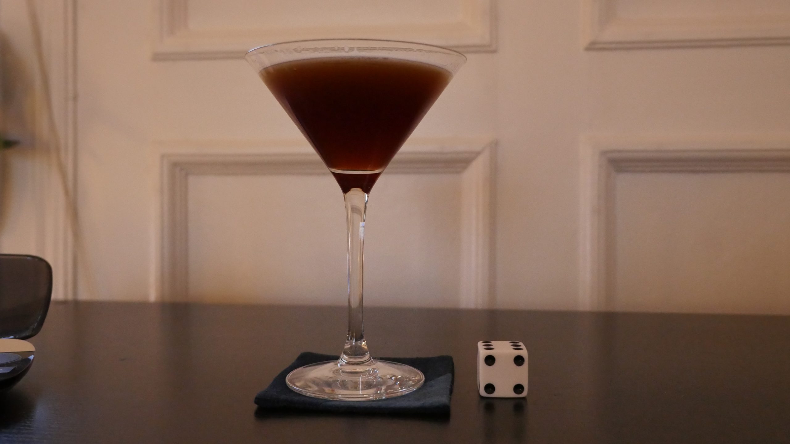
| Horse Money. Pedro Costa. 2014. Portugal. May 20th, 2016. Portuguese Daisy recipe. |
 |  | 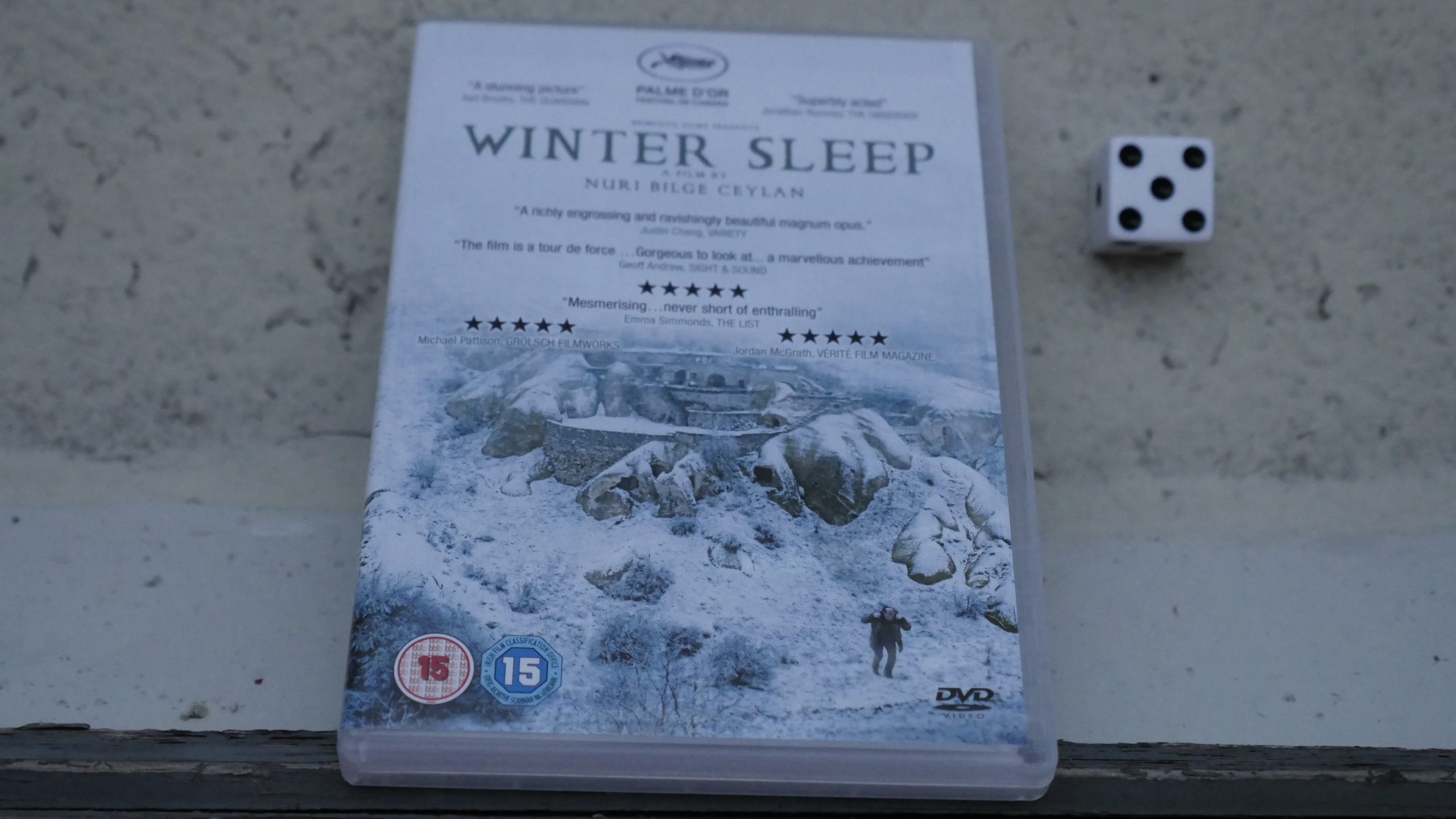 |  |
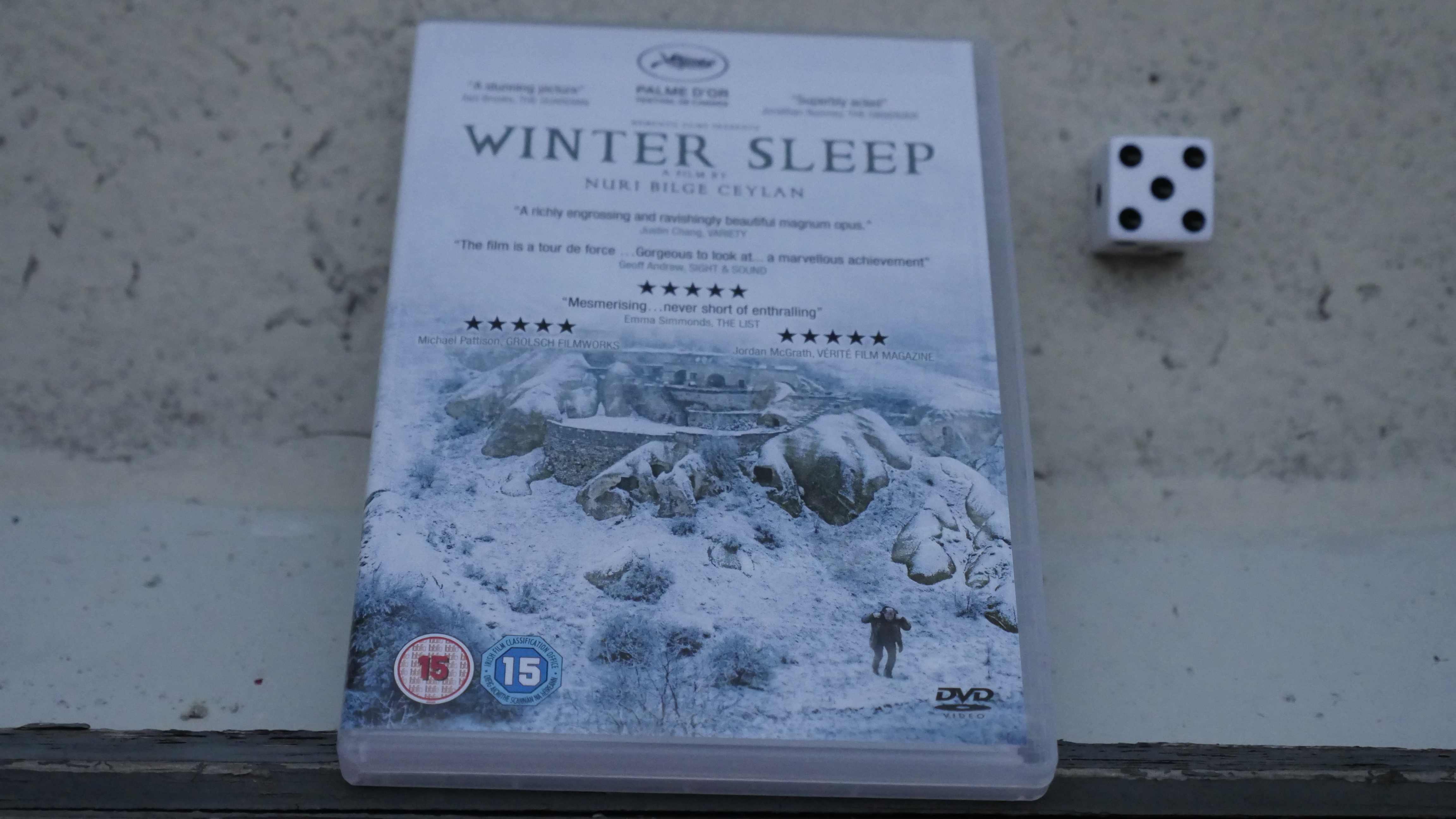
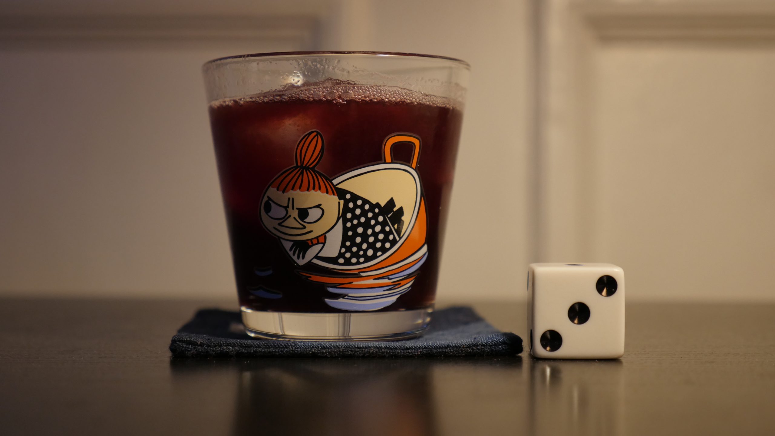
| Winter Sleep. Nuri Bilge Ceylan. 2014. Turkey. May 21st, 2016. Golden Slipper. |
 | 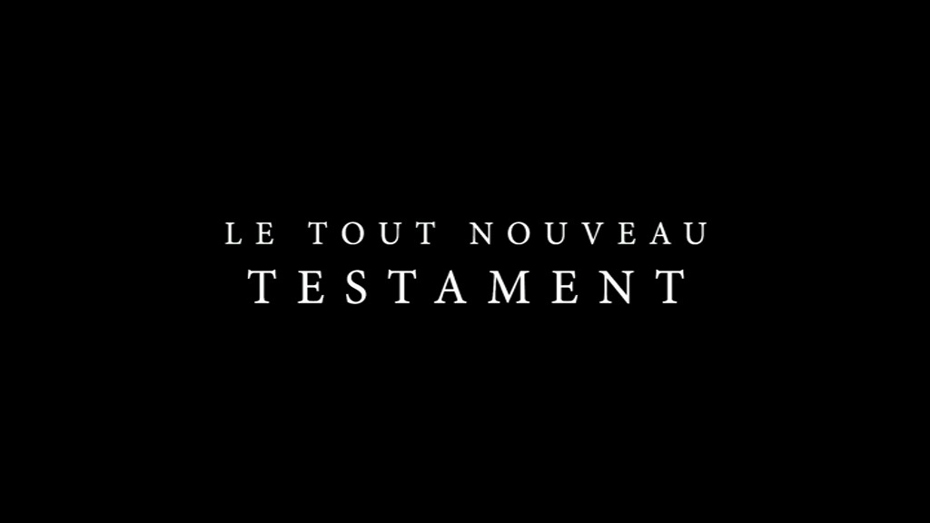 |  | 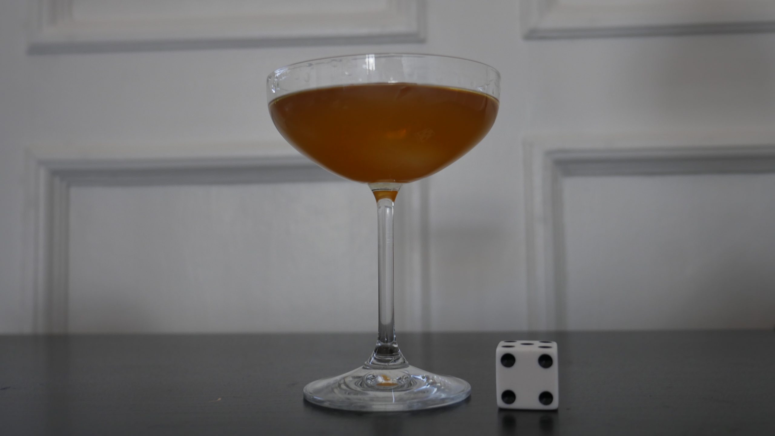 |
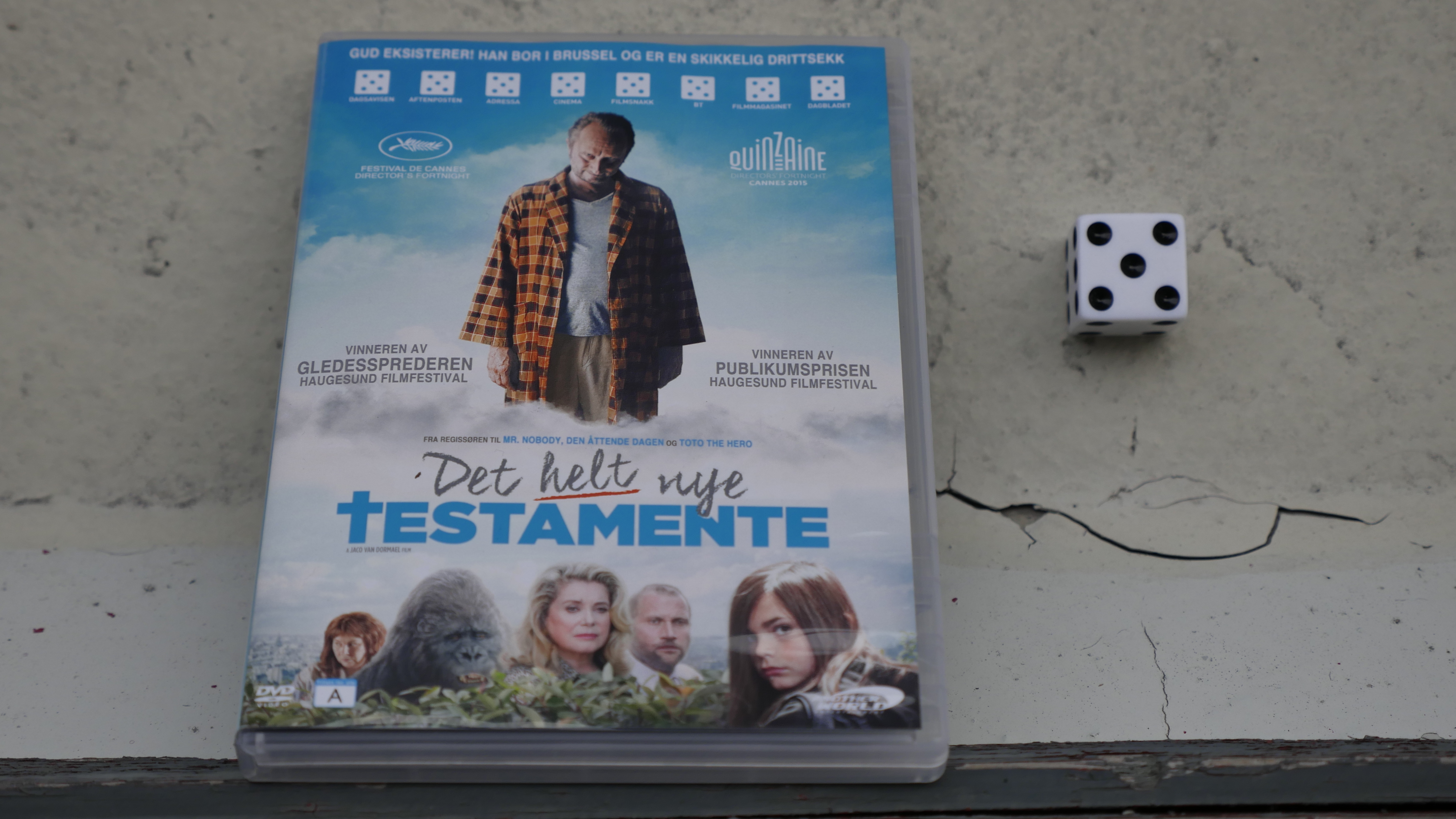
| The Brand New Testament. Jaco Van Dormael. 2015. Belgium. May 27th, 2016. Bianca Castafiore. |
 |  | 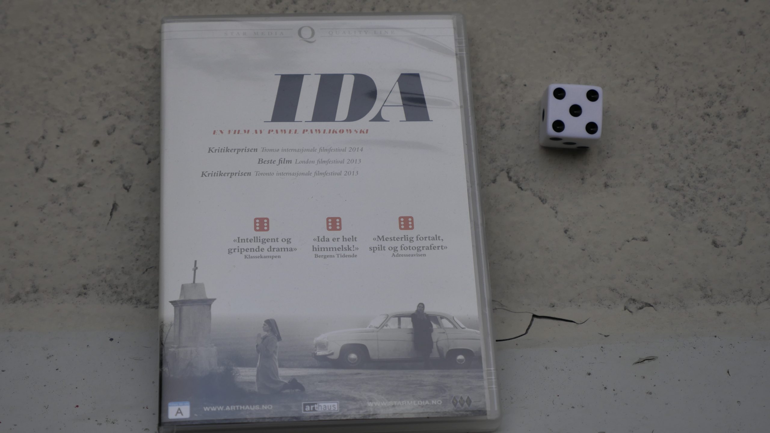 | 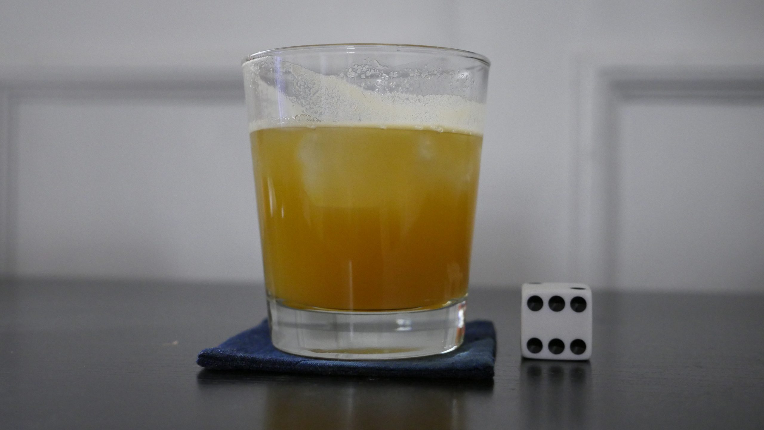 |
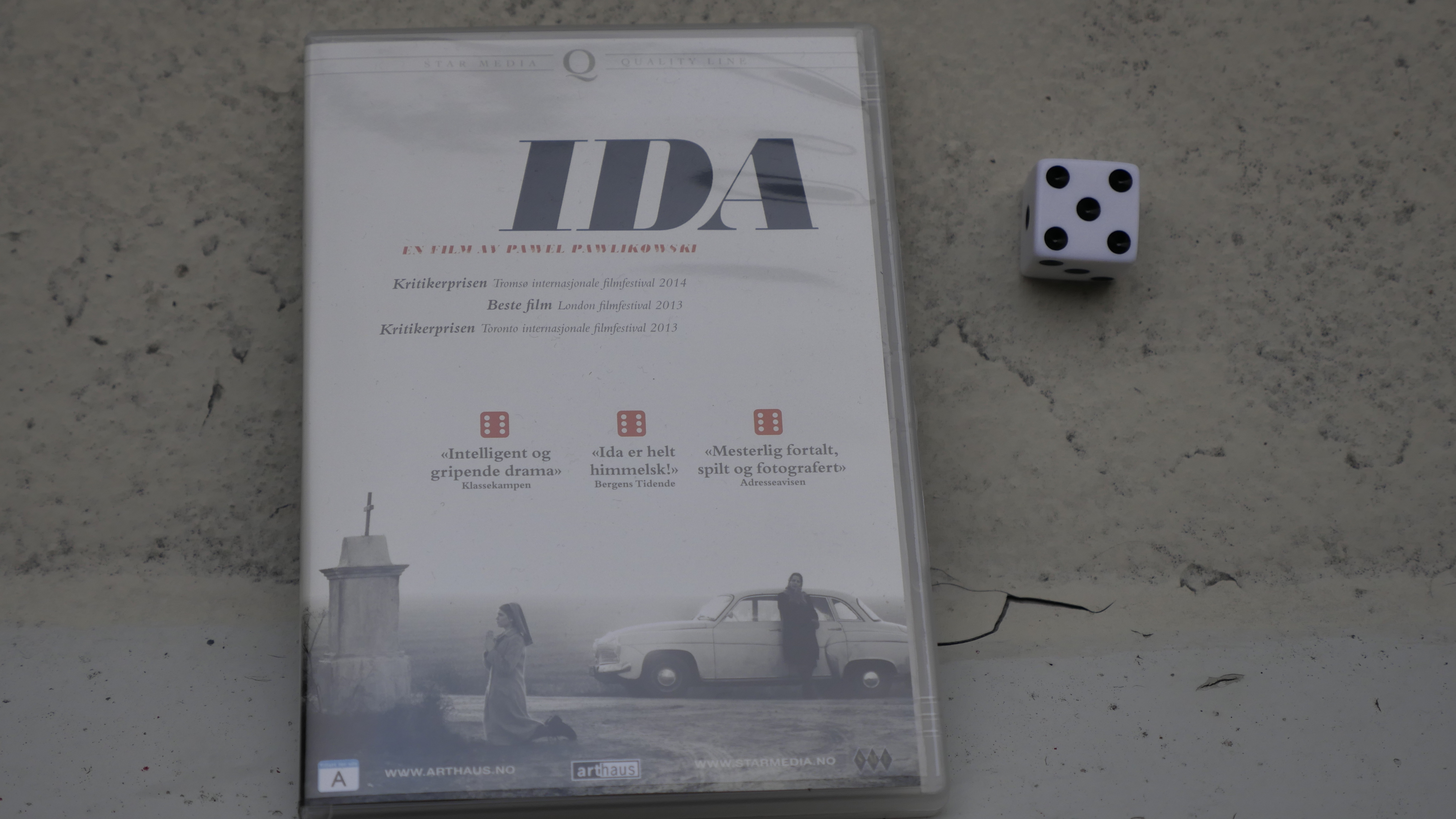
| Ida. Pawel Pawlikowski. 2013. Poland. May 27th, 2016. Szarlotka. |
 | 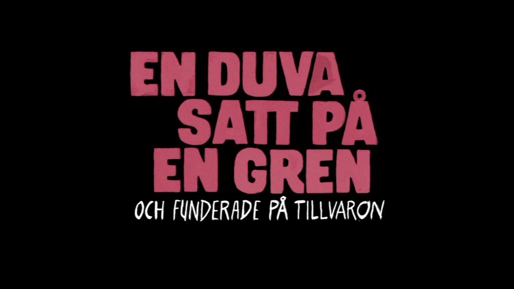 | 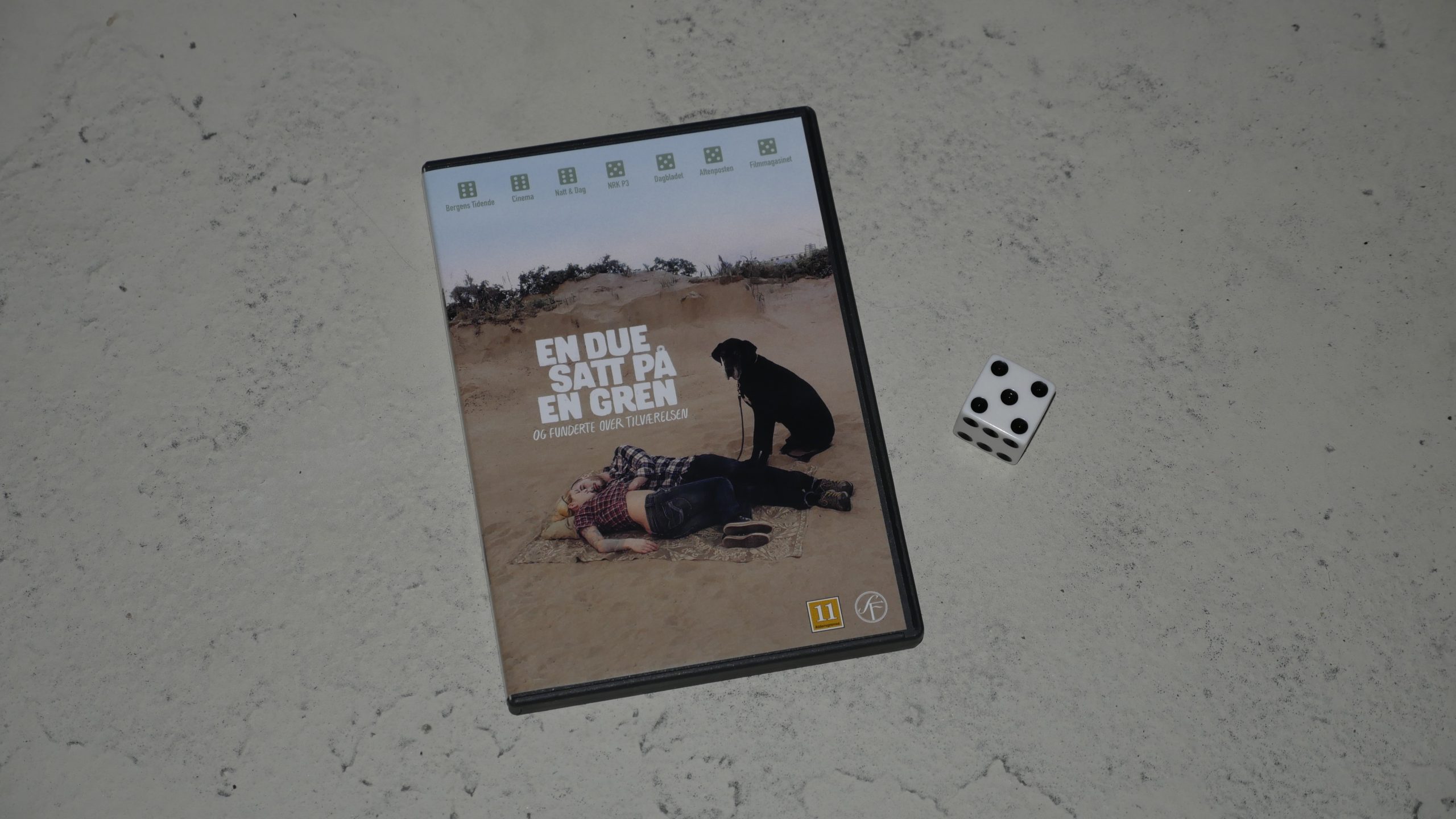 |  |
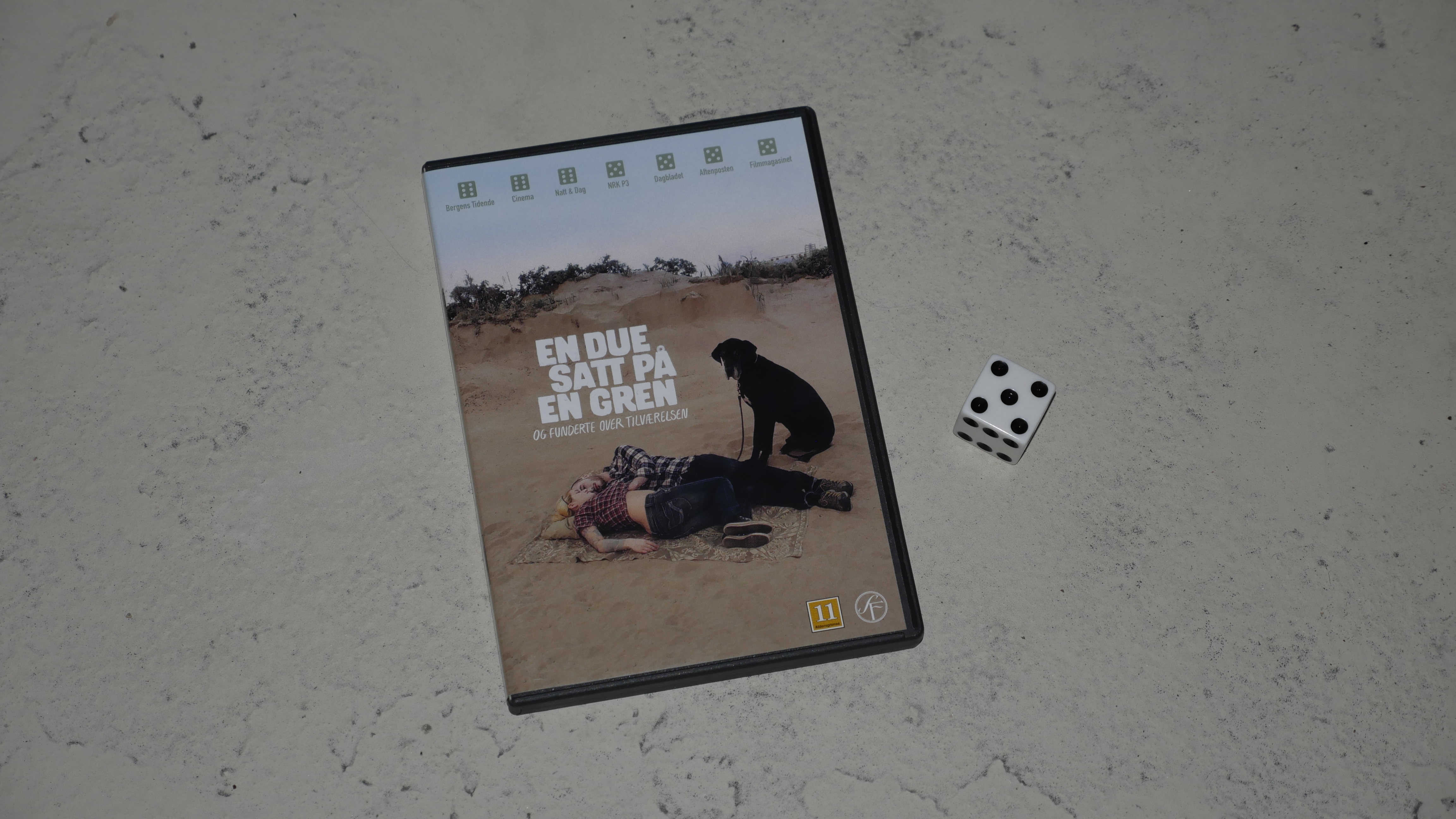
| A Pigeon Sat on a Branch Reflecting on Existence. Roy Andersson. 2014. Sweden. May 27th, 2016. Swedish Snowball. |
 |  | 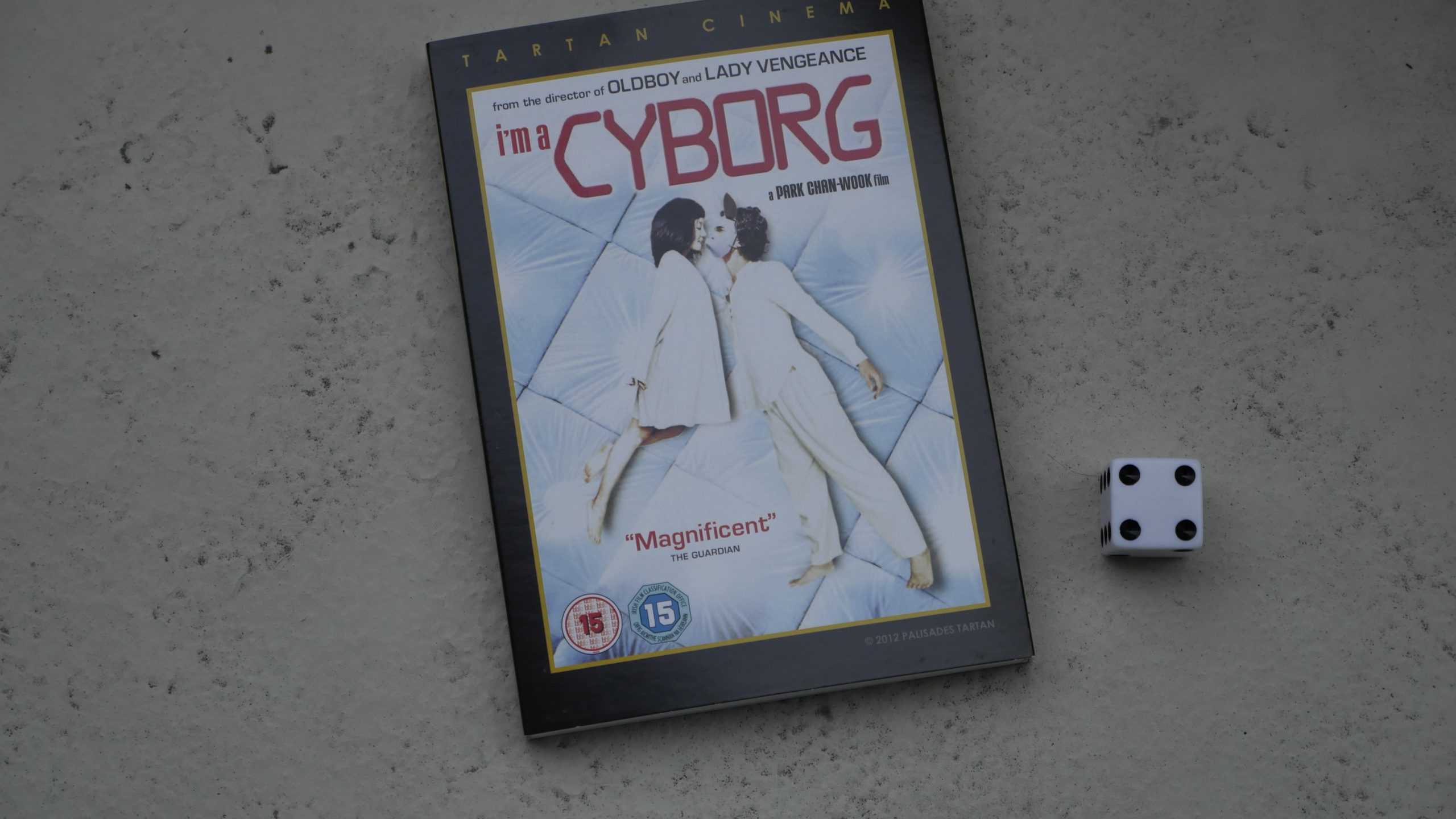 |  |
| I’m A Cyborg, But That’s OK. Chan-wook Park. 2006. South Korea. June 24th, 2016. Makan’s Seoul Slinger. |
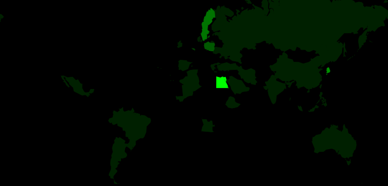 |  | 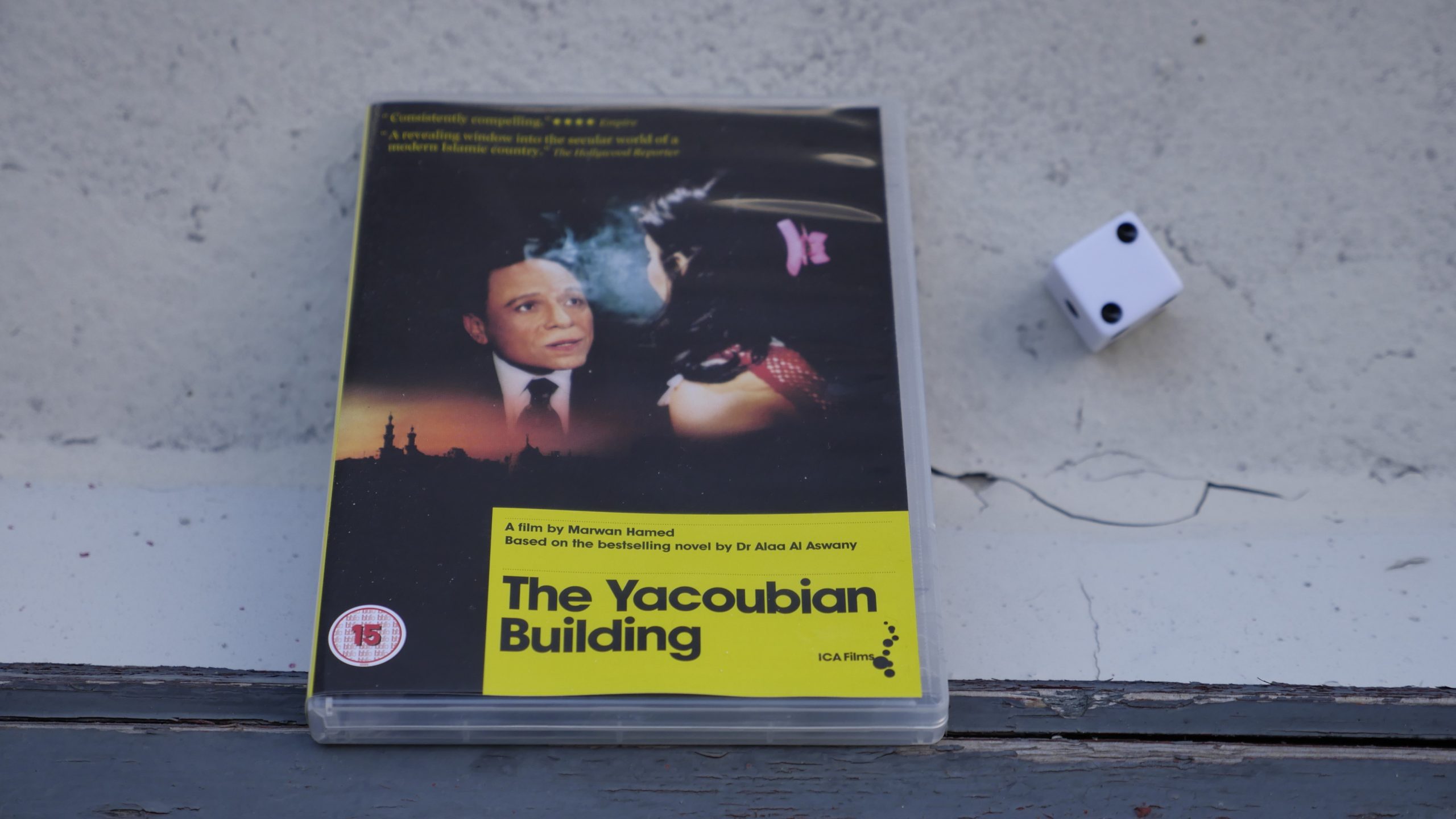 |  |
| The Yacoubian Building. Marwan Hamed. 2006. Egypt. June 25th, 2016. Egyptian Princess recipe. |
 | 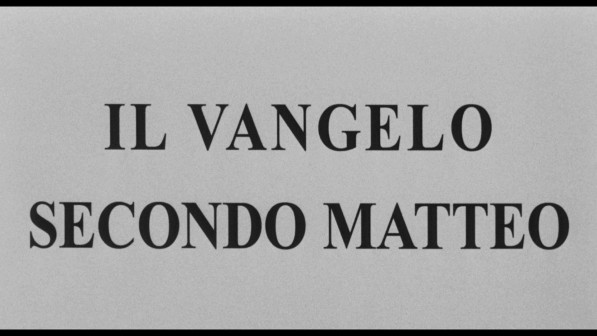 | 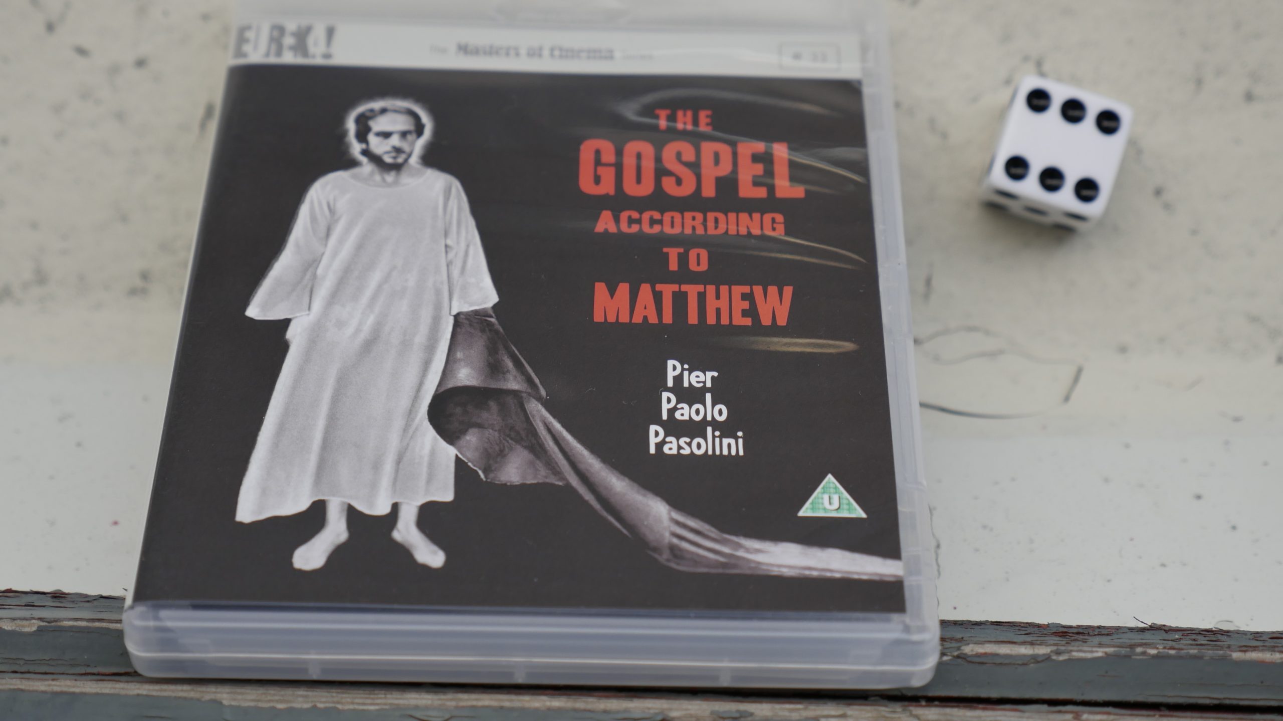 | 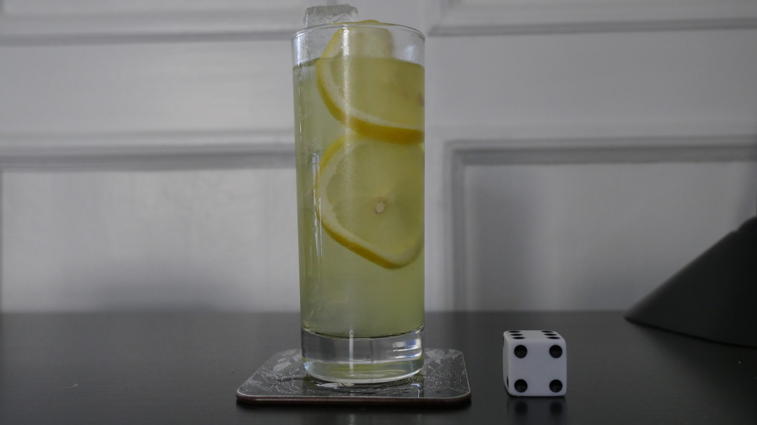 |
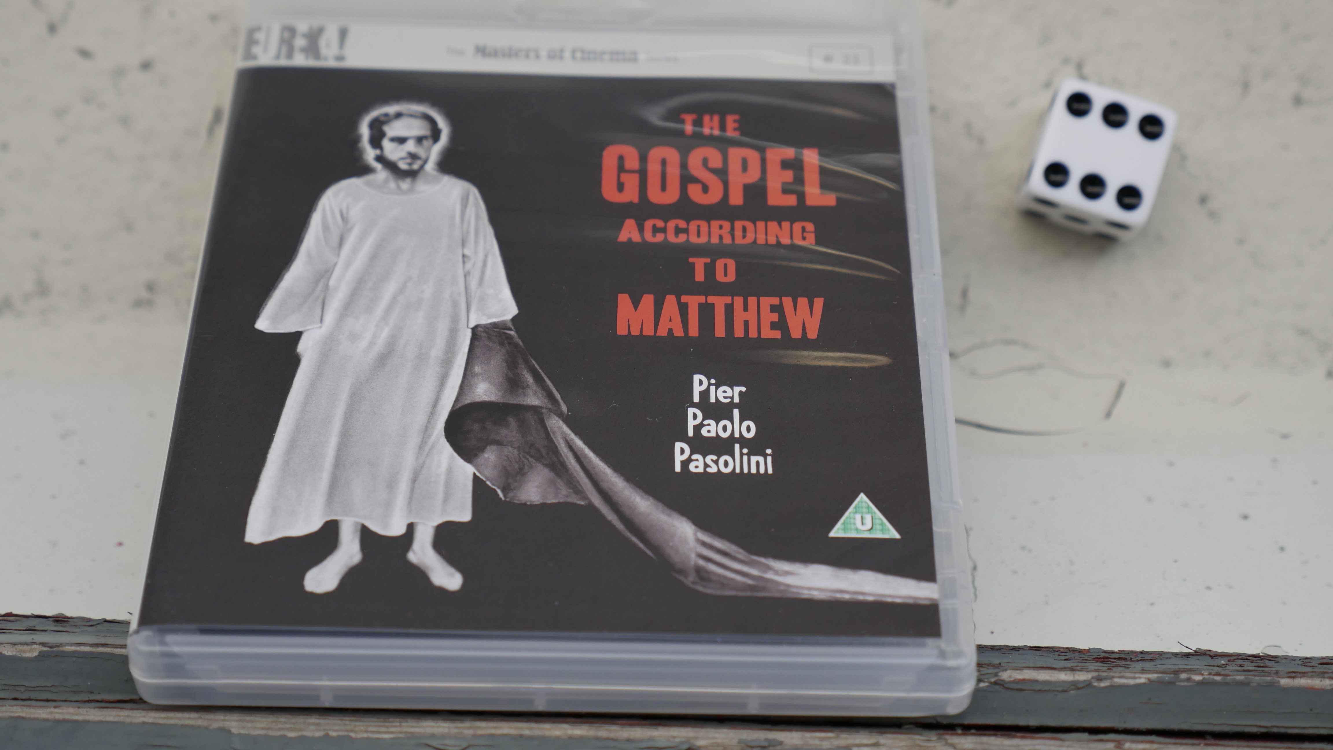
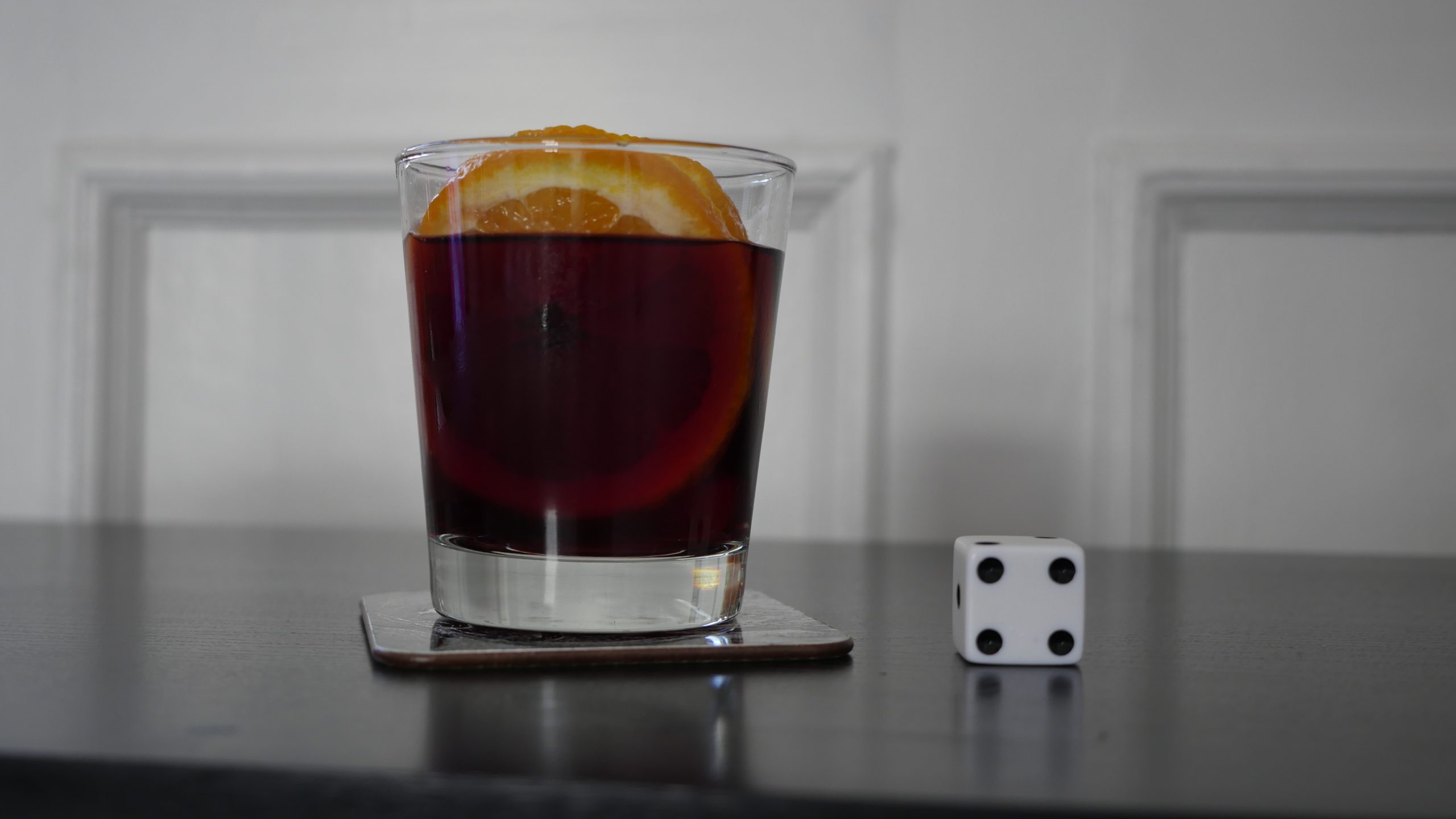
| The Gospel According to Matthew. Pier Paolo Pasolini. 1964. Italy. July 1st, 2016. Limoncello Collins. |
 |  | 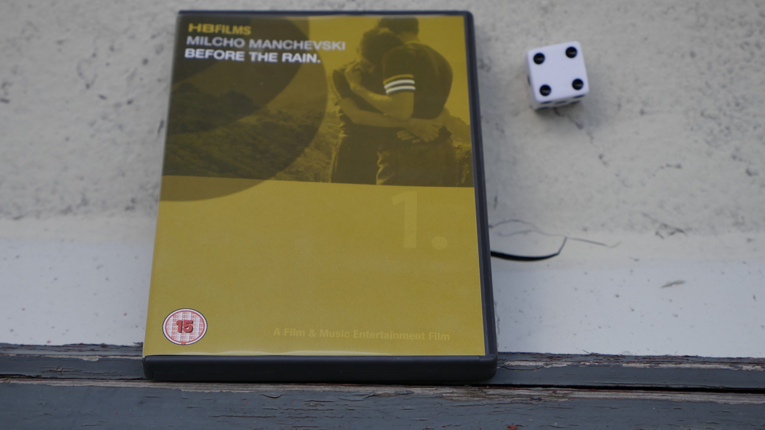 |  |
| Before The Rain. Craig Boreham. 2010. Macedonia. July 2nd, 2016. Bambus Cocktail. |
 | 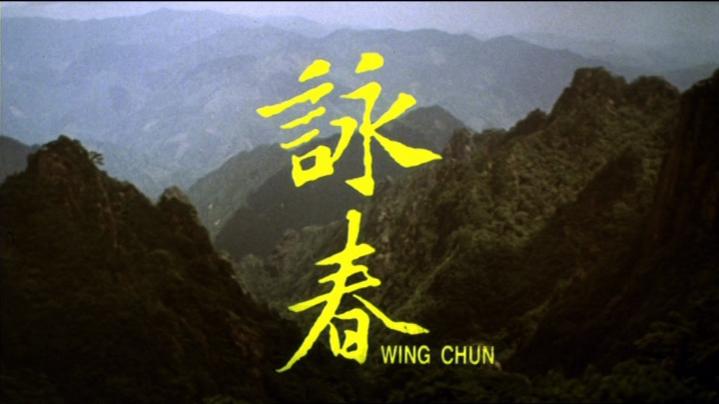 | 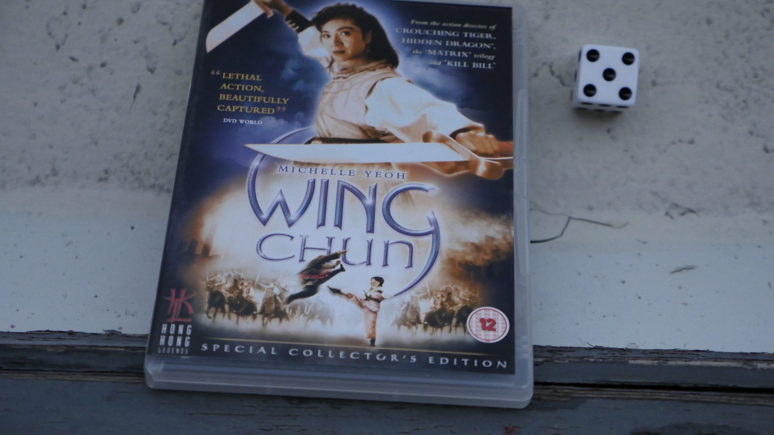 |  |
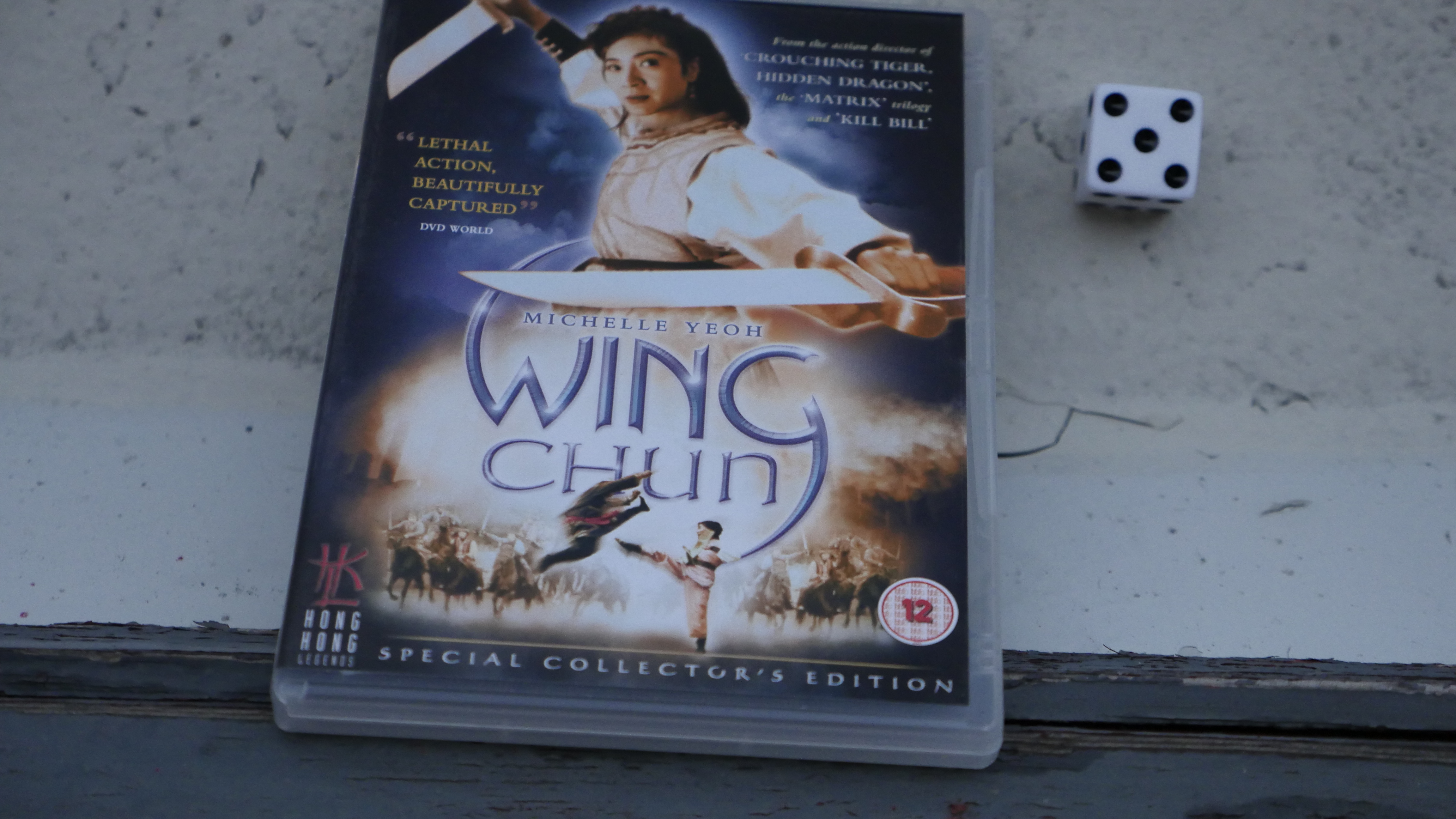
| Wing Chun. Woo-Ping Yuen. 1994. Hong Kong. July 2nd, 2016. Chelsea Flower Show. |
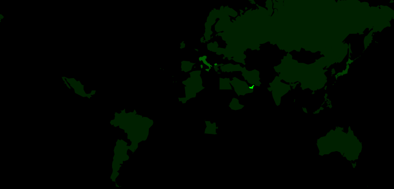 | 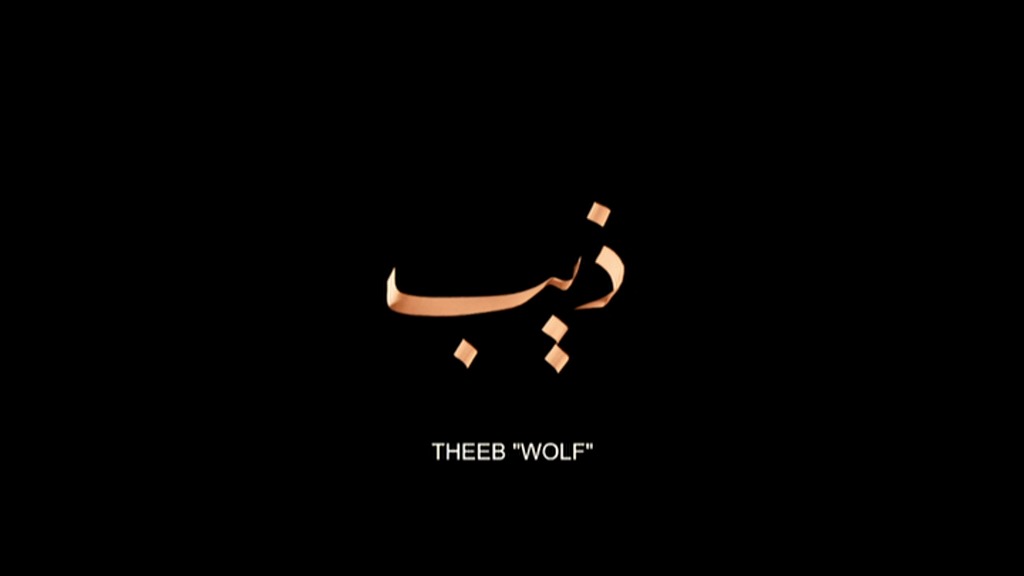 | 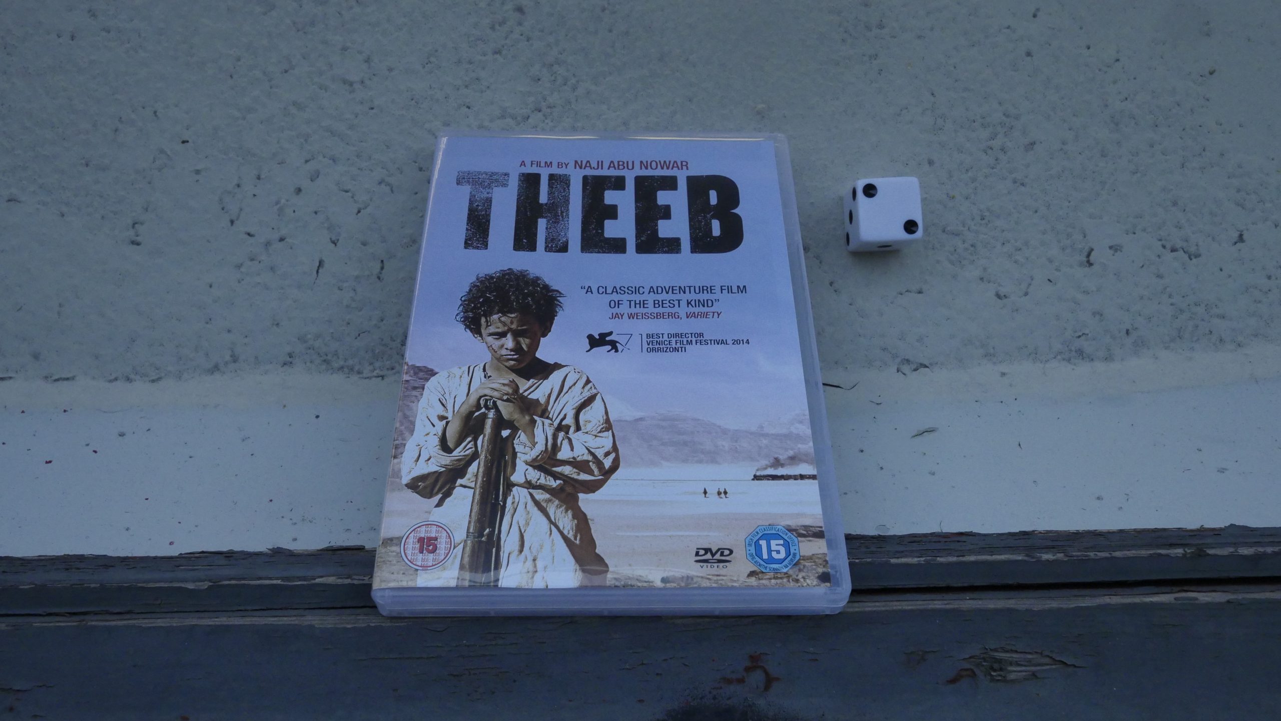 |  |
| Theeb. Naji Abu Nowar. 2014. United Arab Emirates. July 20th, 2016. Detox Mule. |
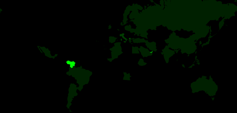 |  | 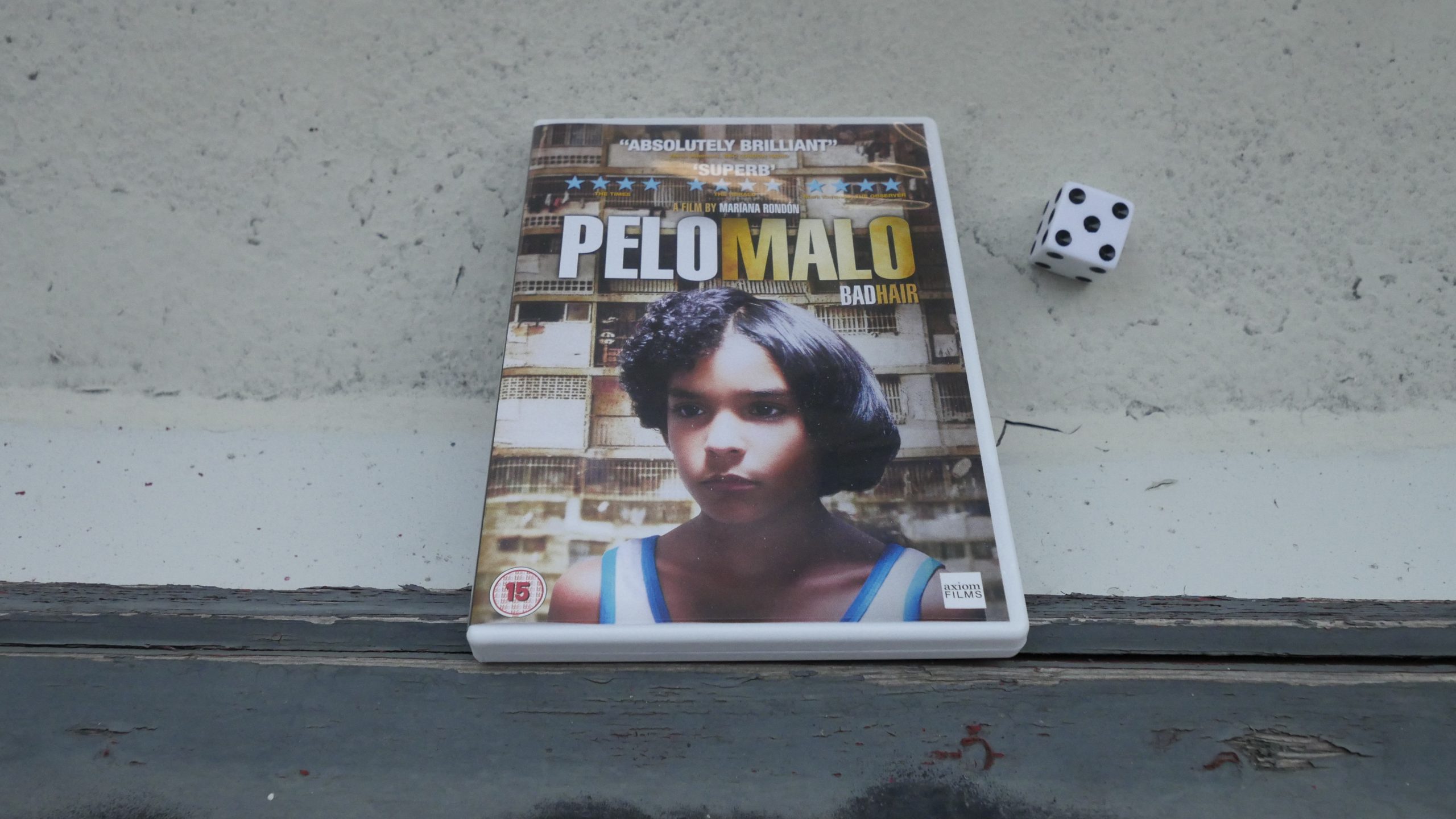 |  |
| Bad Hair. Mariana Rondón. 2013. Venezuela. July 21st, 2016. Playero. |
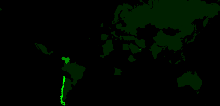 | 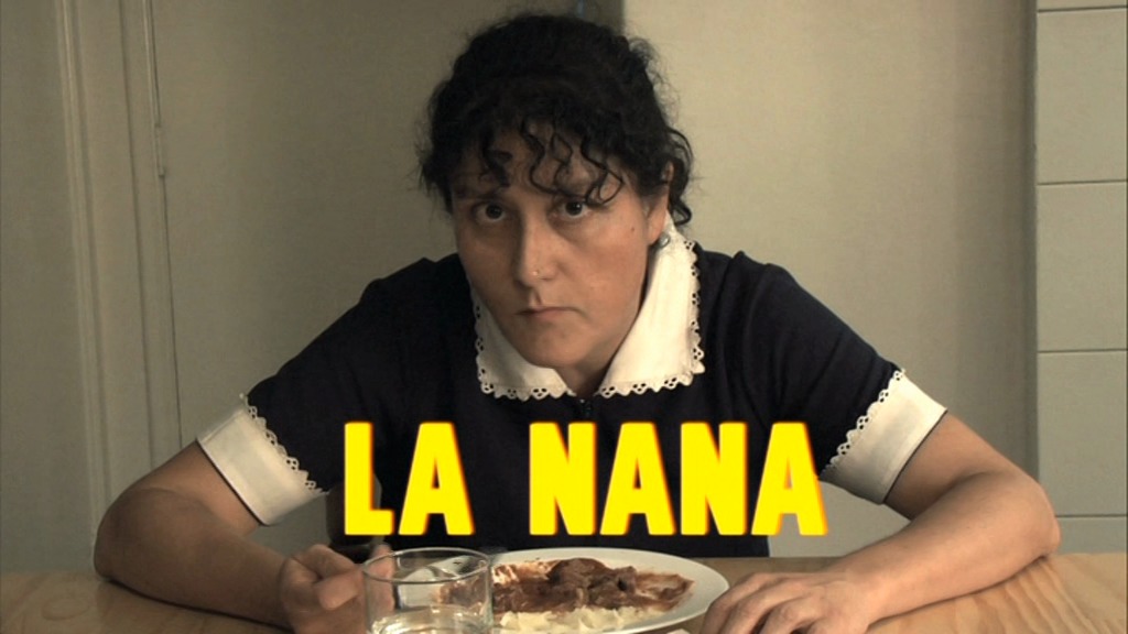 | 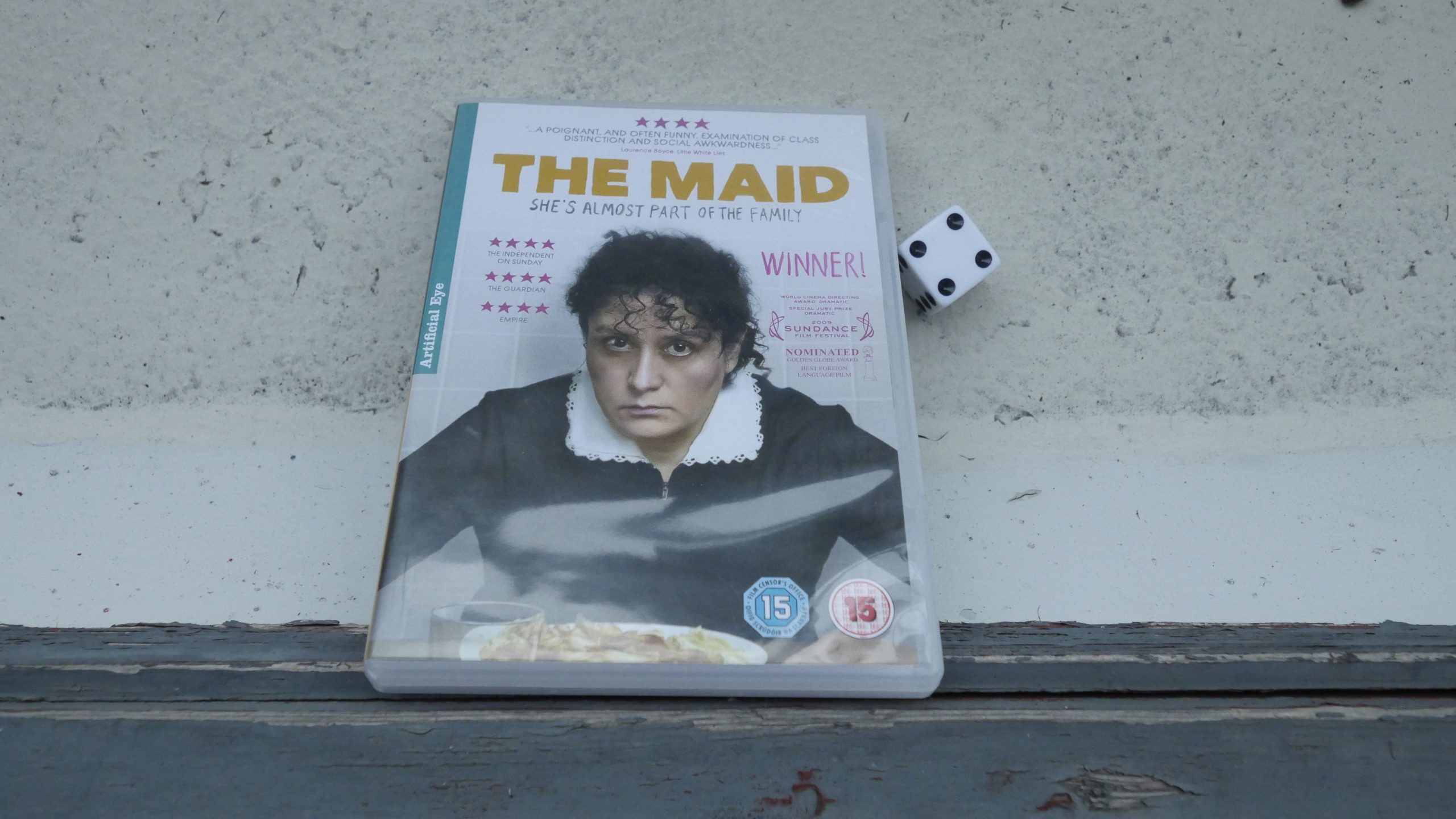 |  |
| The Maid. Sebastián Silva. 2009. Chile. July 23rd, 2016. . |
 | 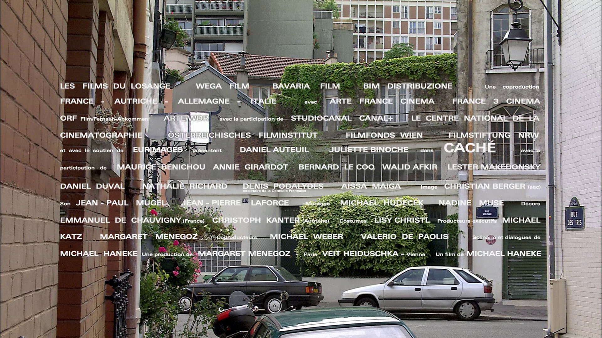 | 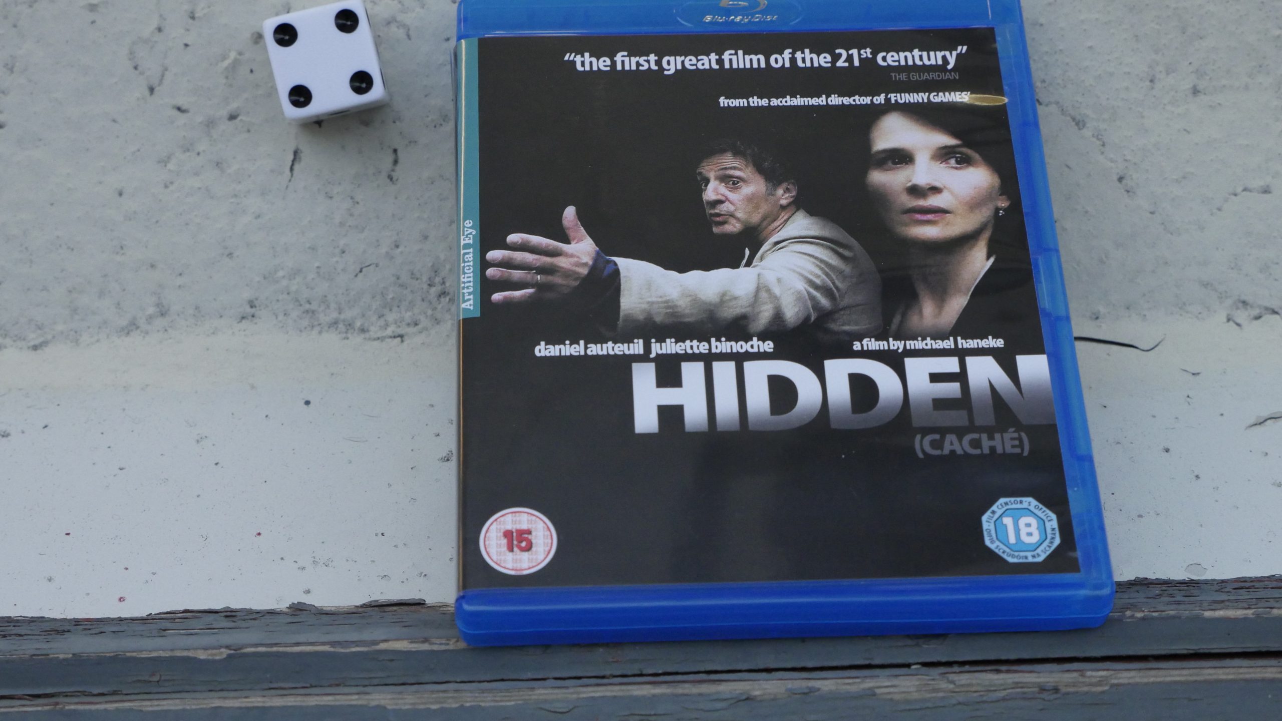 |  |
| Hidden. Michael Haneke. 2005. Austria. August 27th, 2016. Blood And Sand. |
 | 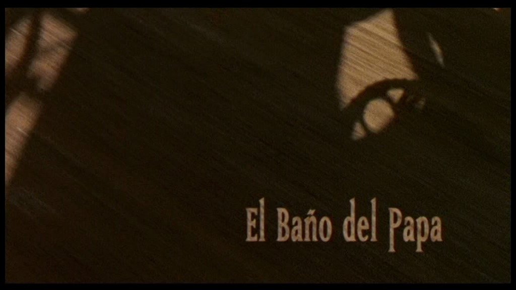 | 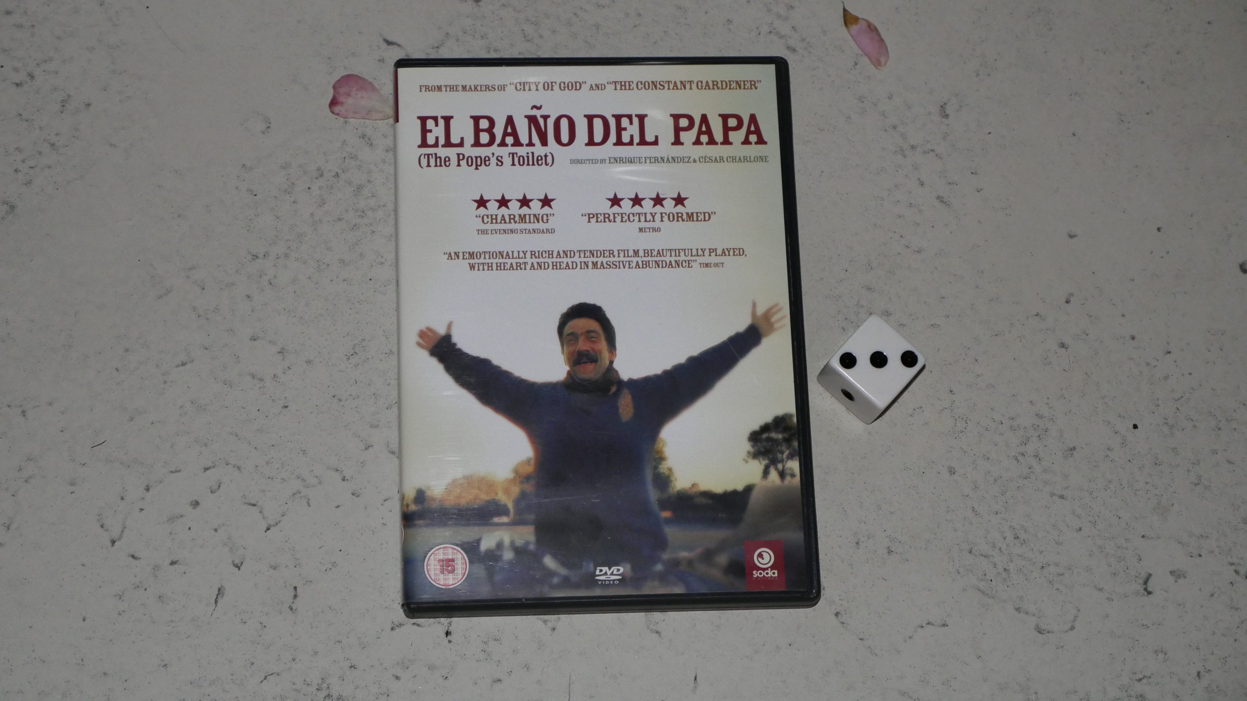 | 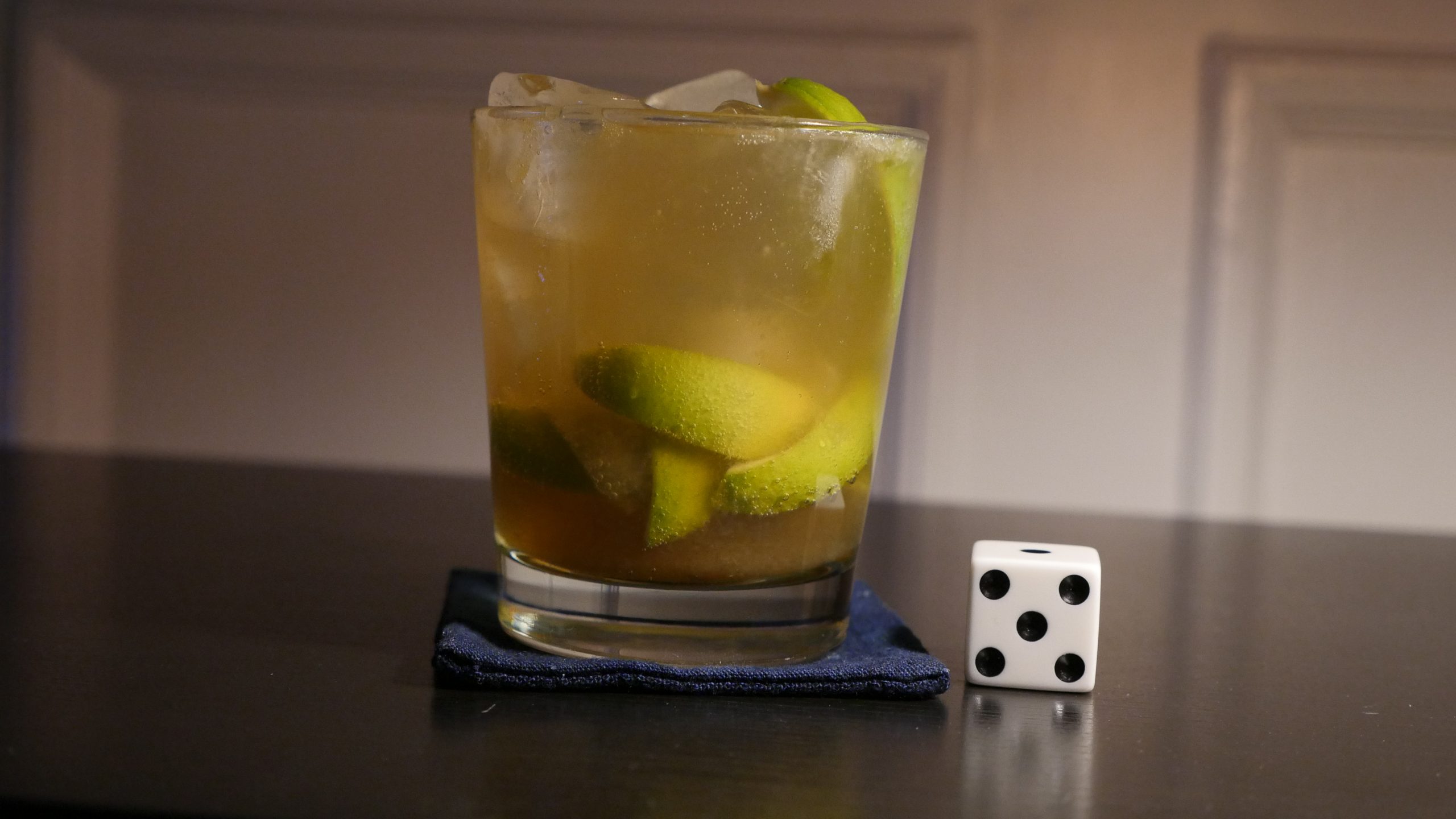 |
| The Pope’s Toilet. César Charlone. 2007. Uruguay. August 27th, 2016. Caipiroska. |
 | 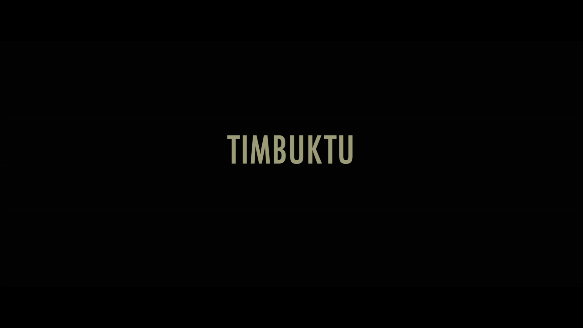 | 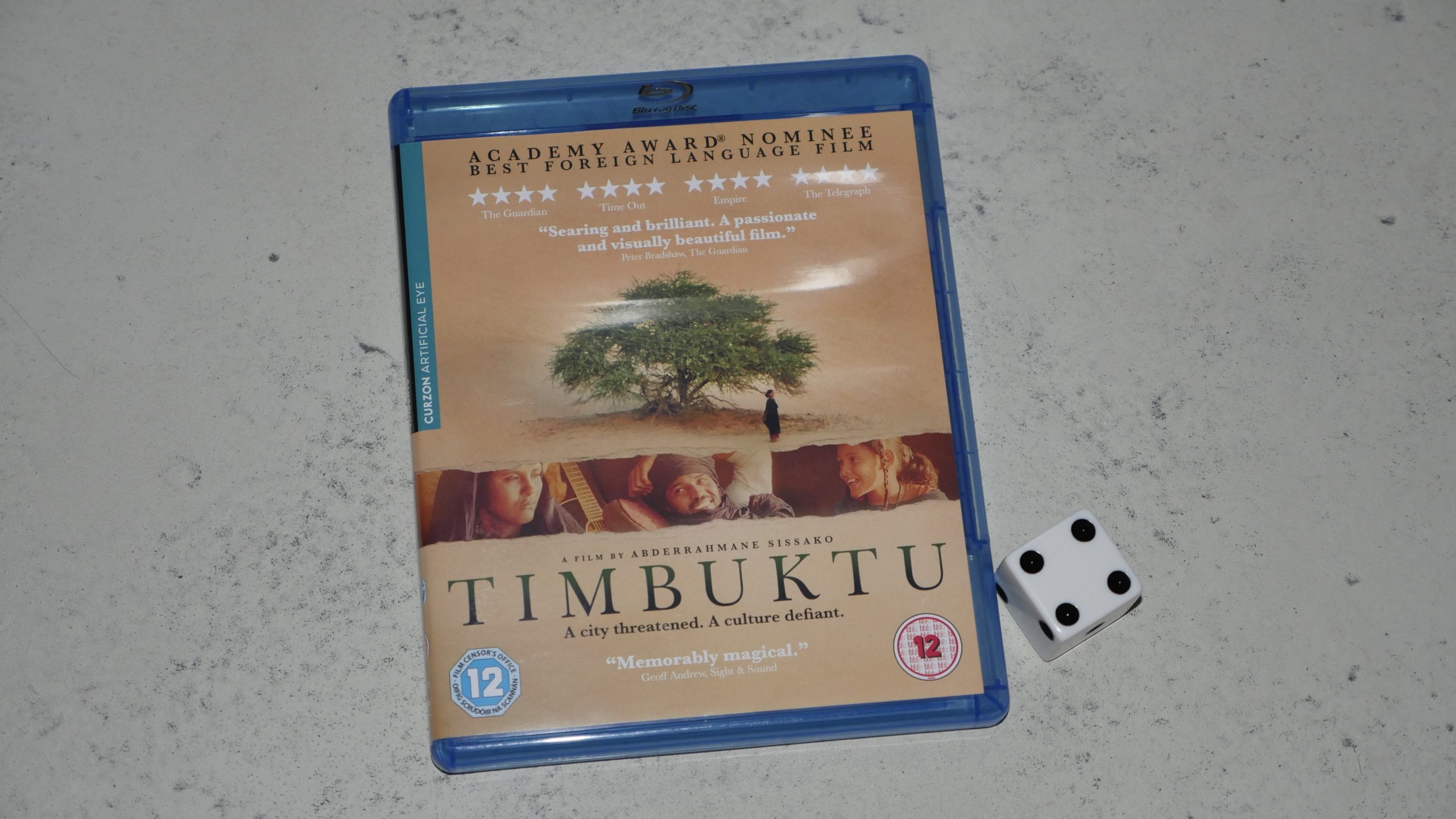 | 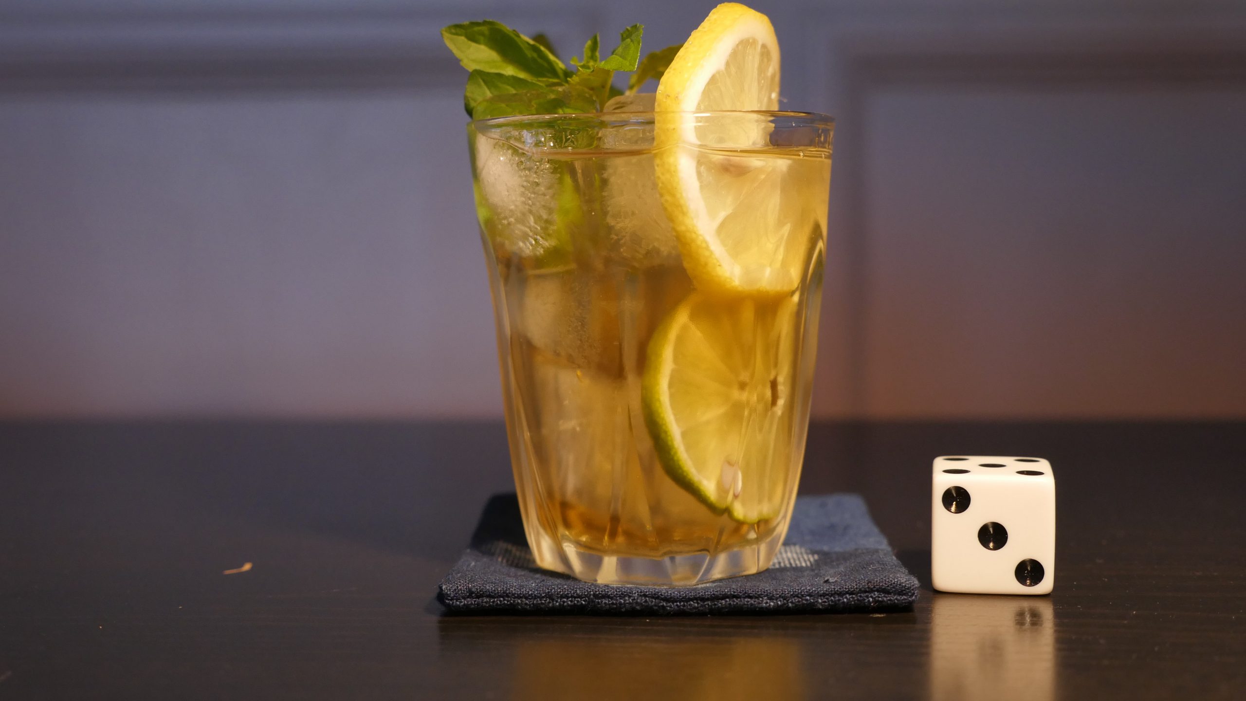 |
| Timbuktu. Abderrahmane Sissako. 2014. Mauritania. September 2nd, 2016. Mauretania Mauritania. |
 | 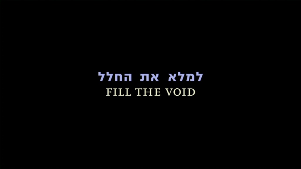 | 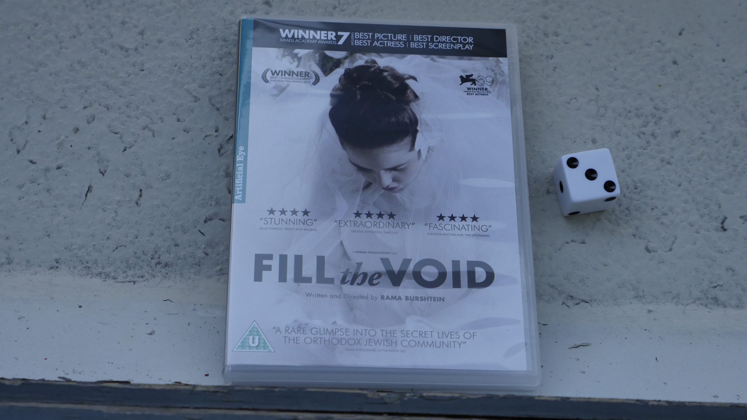 |  |
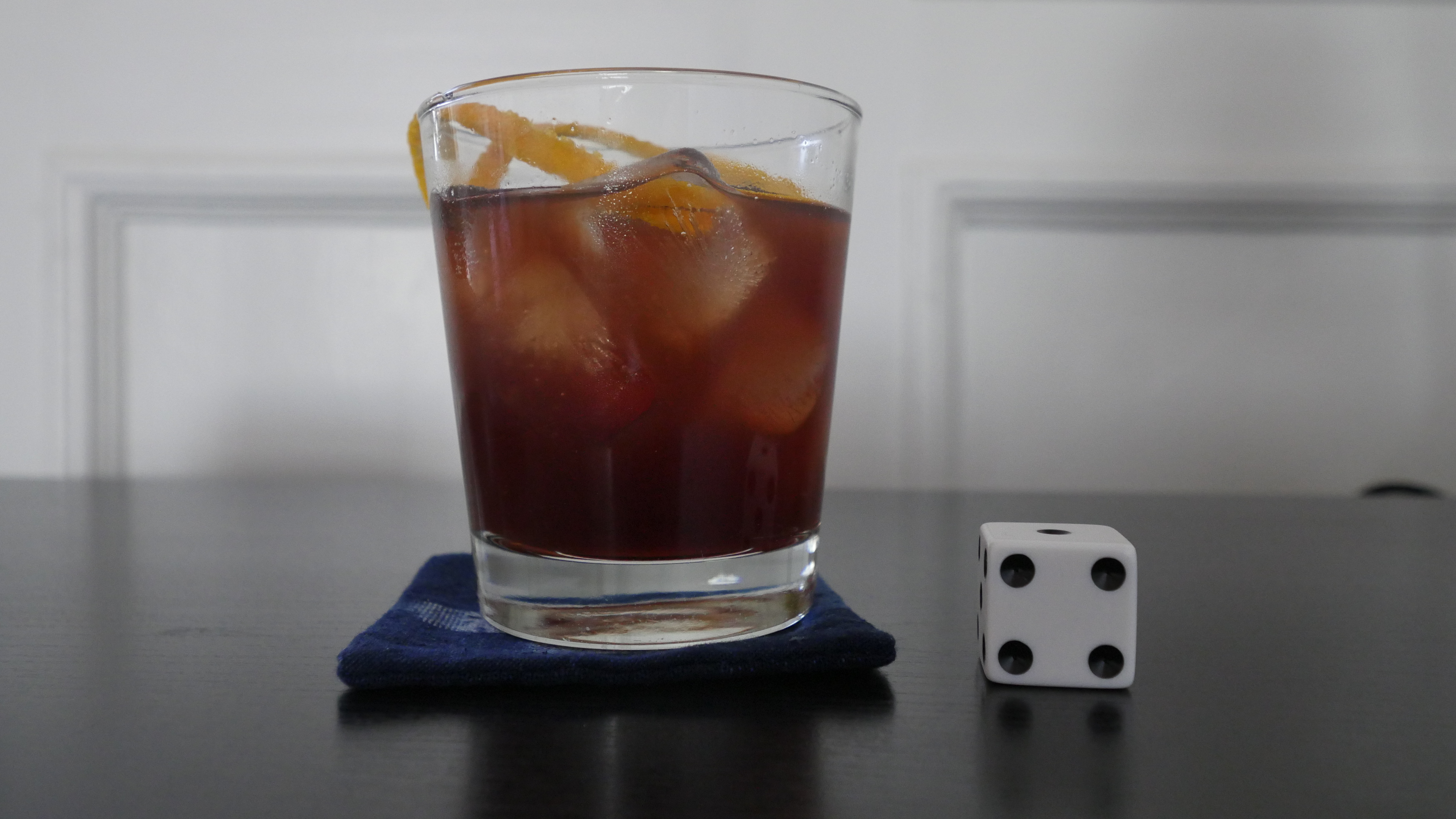
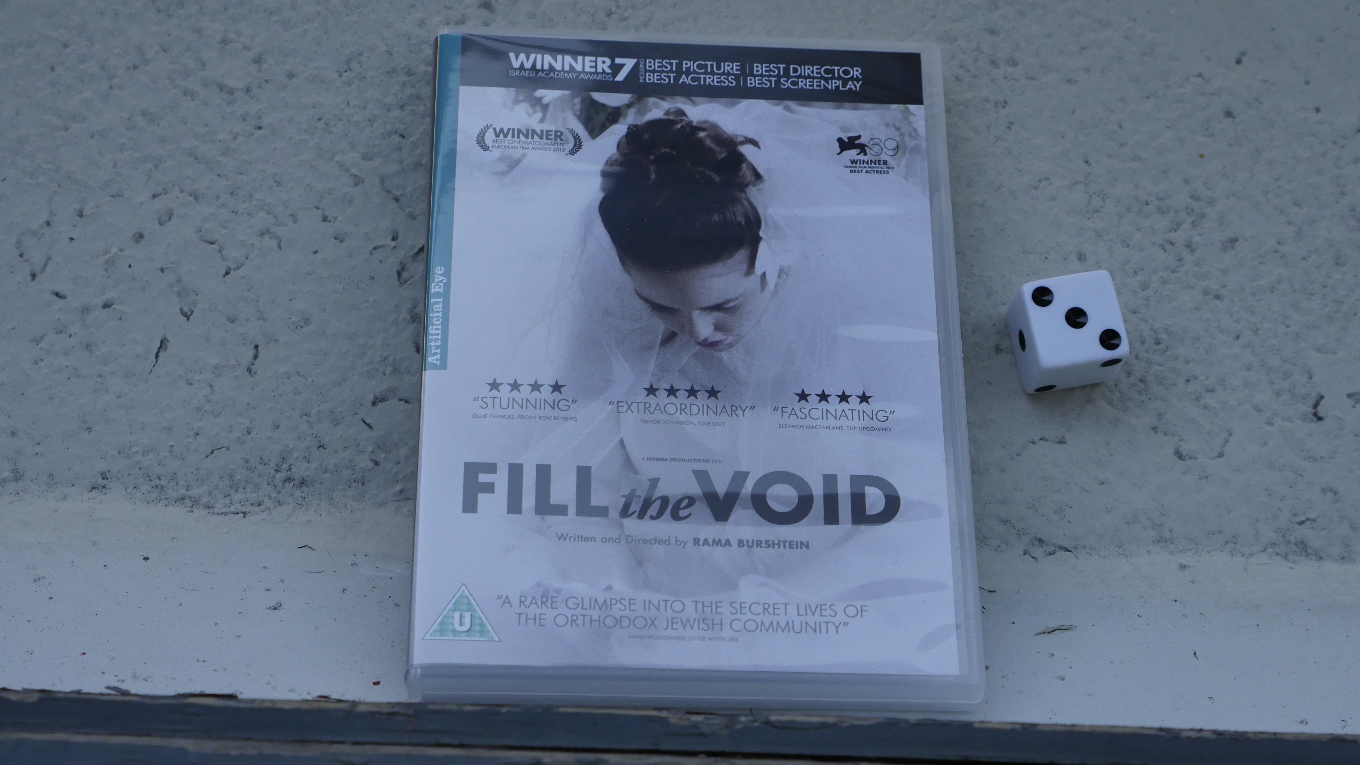
| Fill the Void. Rama Burshtein. 2012. Israel. September 3rd, 2016. Noah’s Ark. |
 |  | 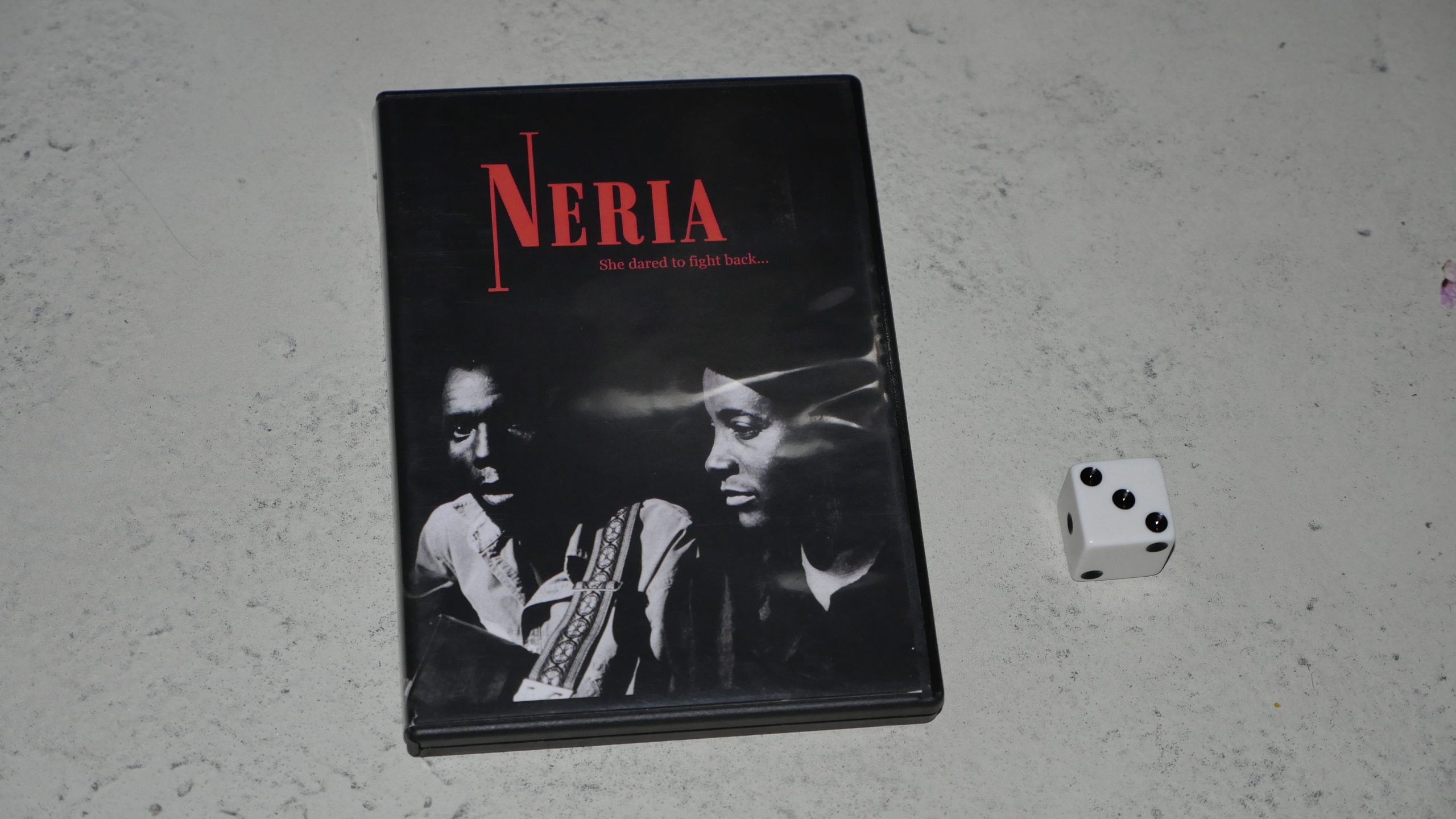 |  |
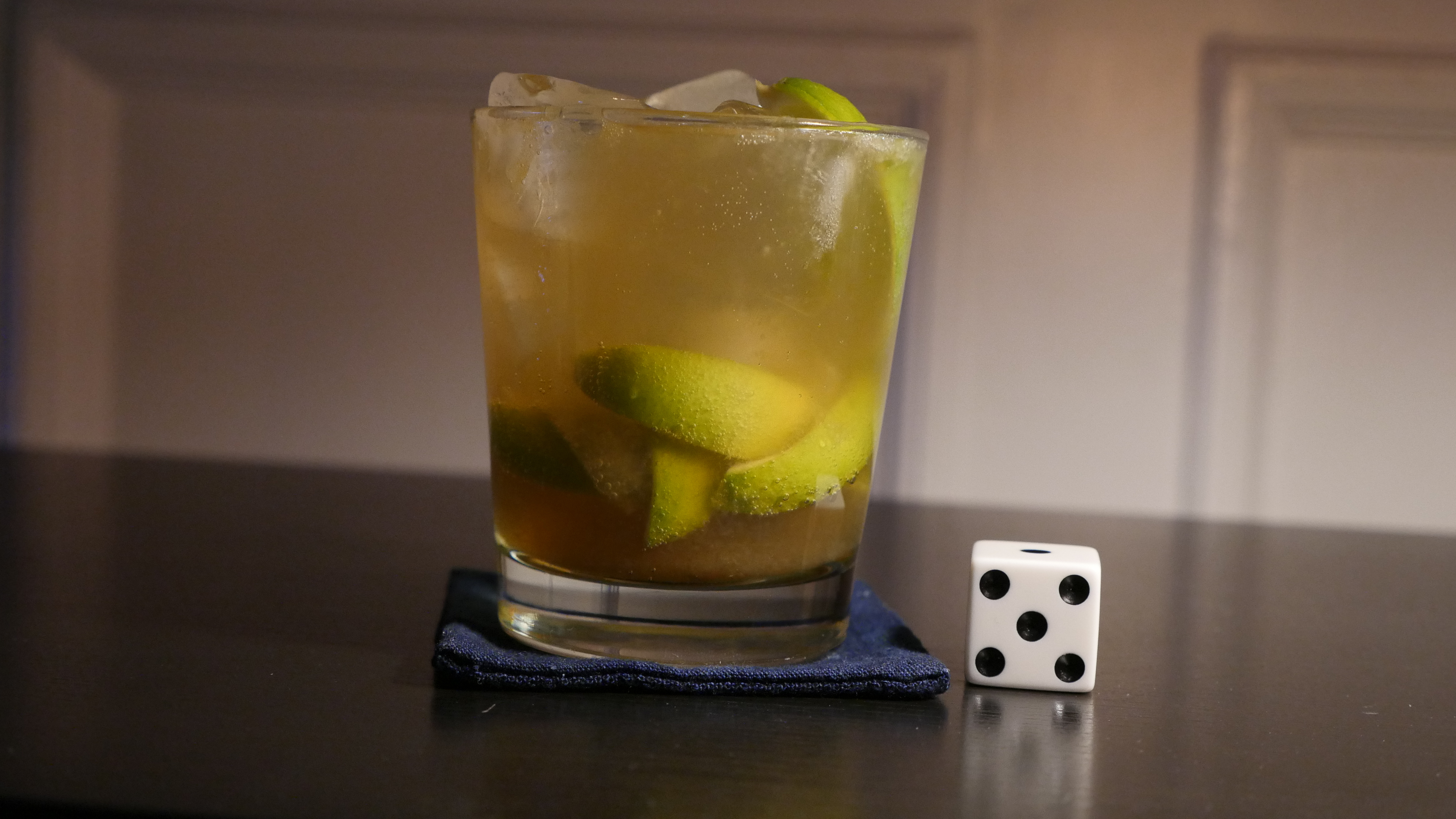
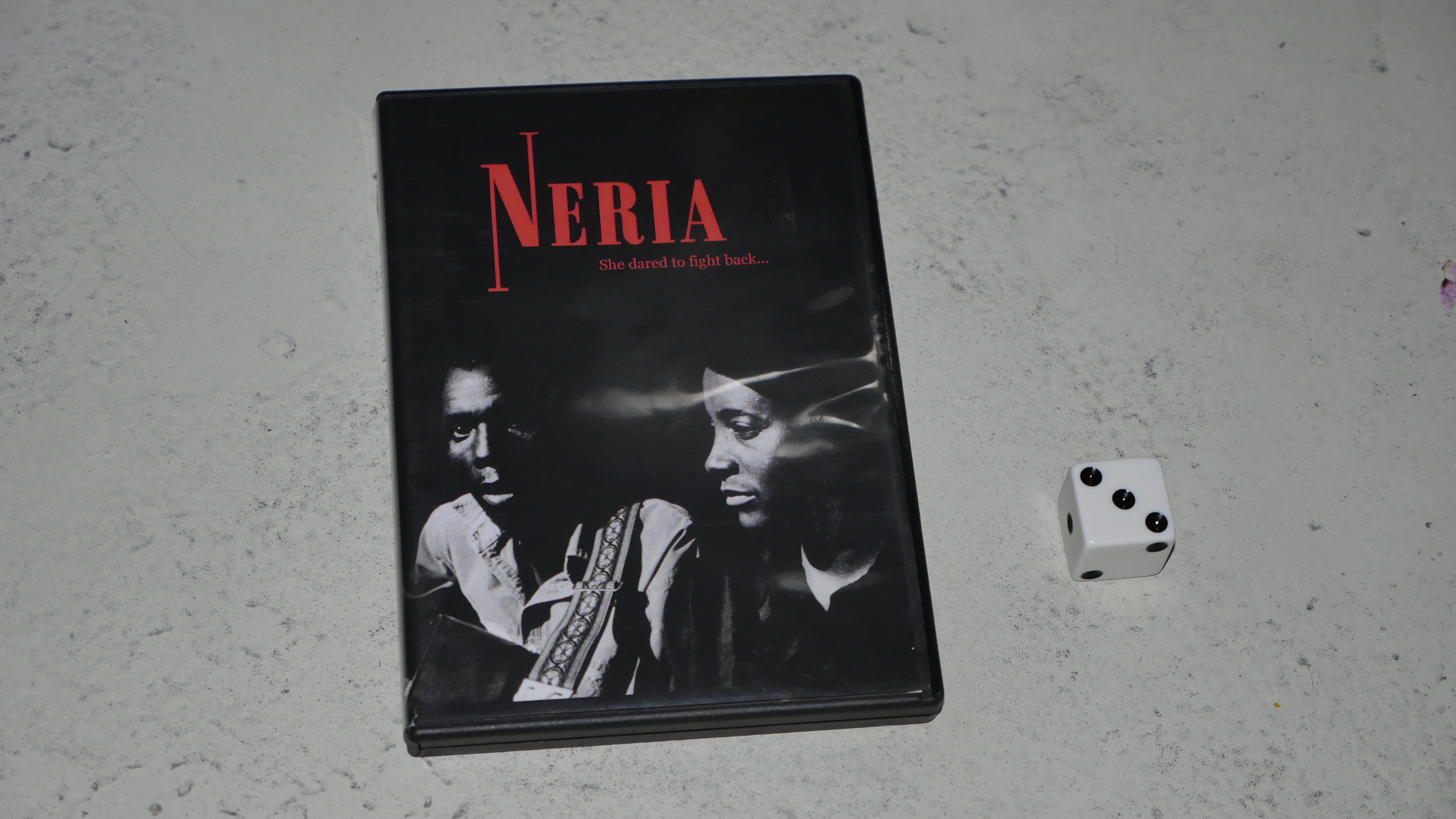
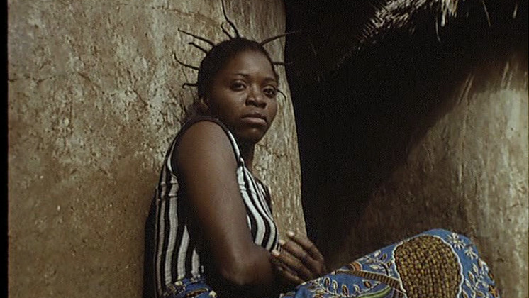
| Neria. Godwin Mawuru. 1993. Zimbabwe. September 3rd, 2016. Strawberry Tongo. |
 |  |  |  |
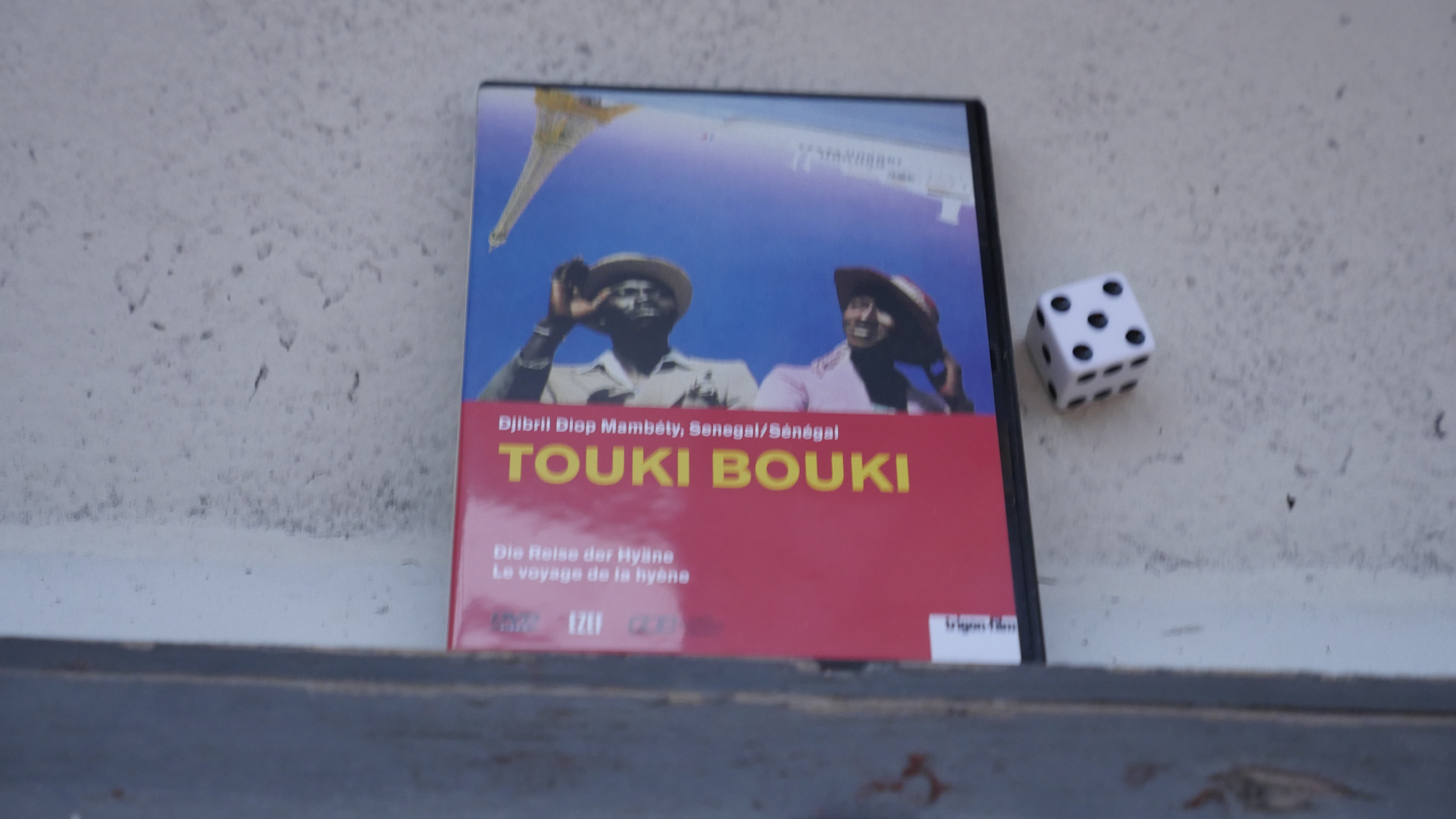
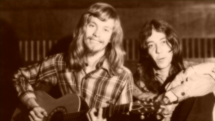
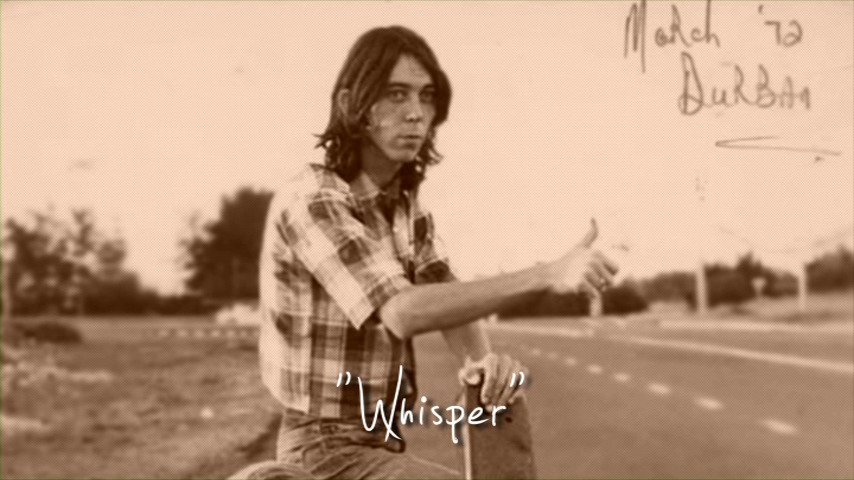
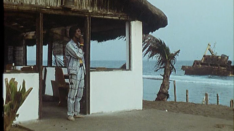
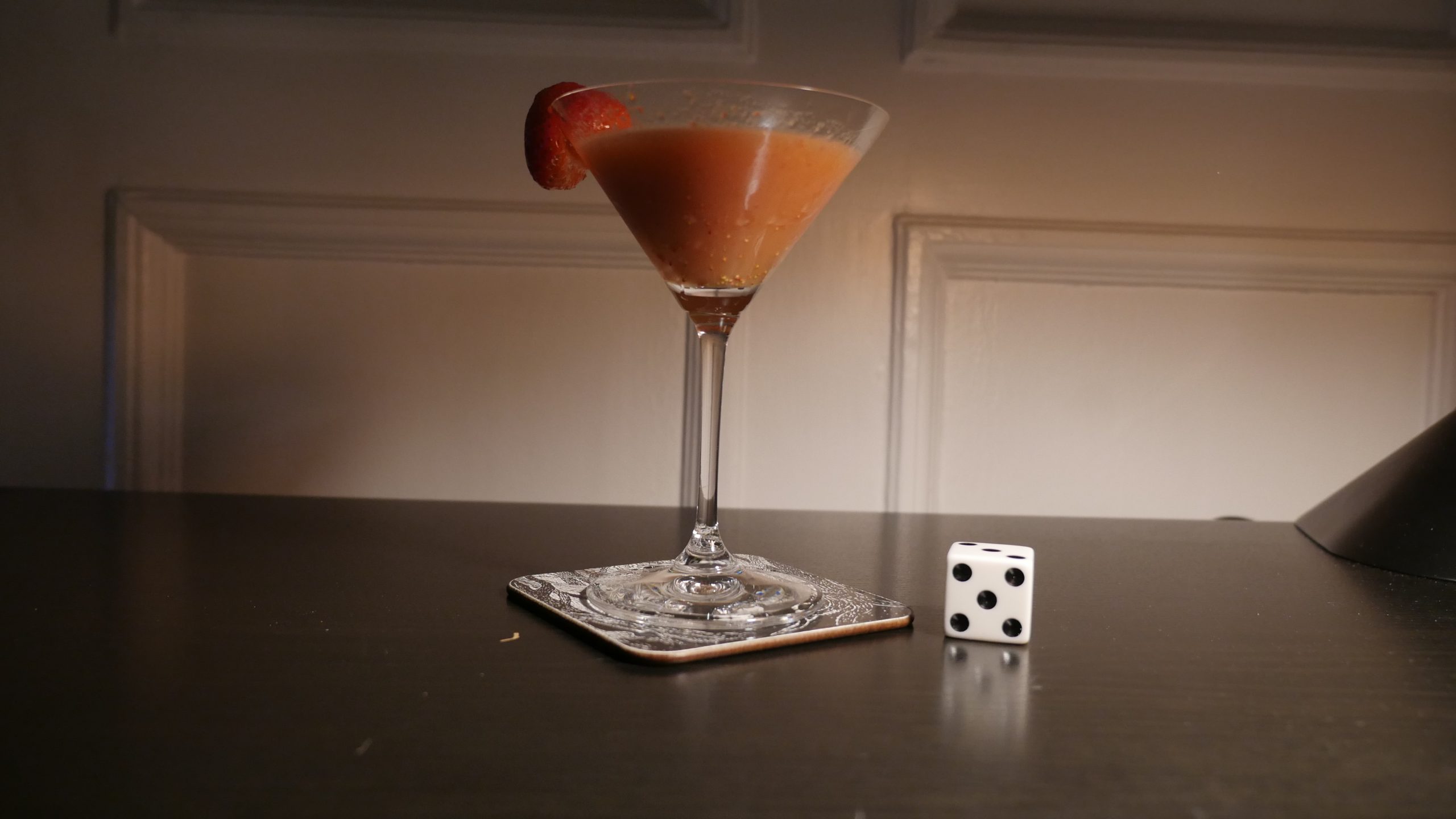
| Touki Bouki. Djibril Diop Mambéty. 1973. Senegal. September 9th, 2016. Bissap Shake. |
 | 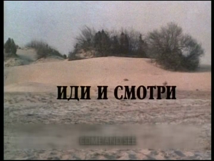 | 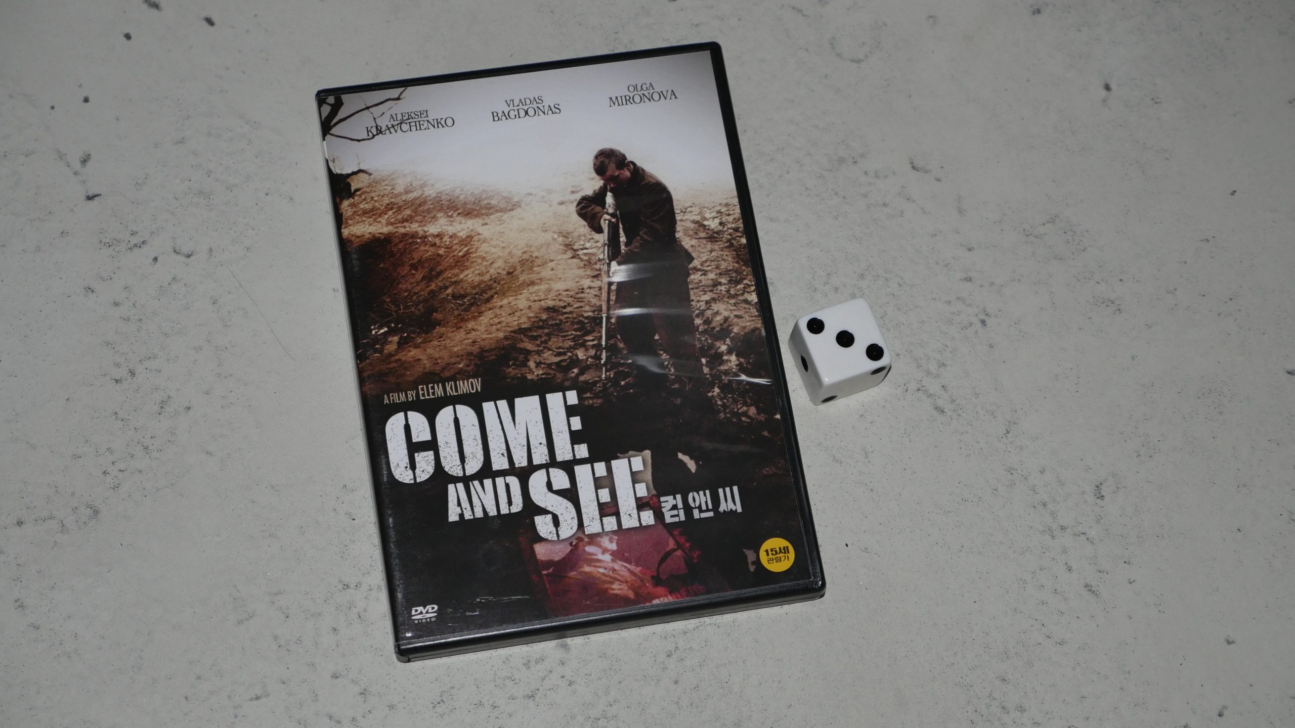 |  |
| Come and See. Elem Klimov. 1985. Belarus. September 9th, 2016. Krambambulya. |
 | 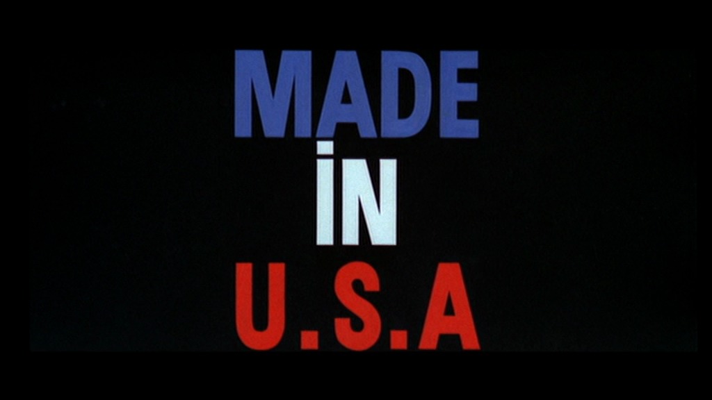 | 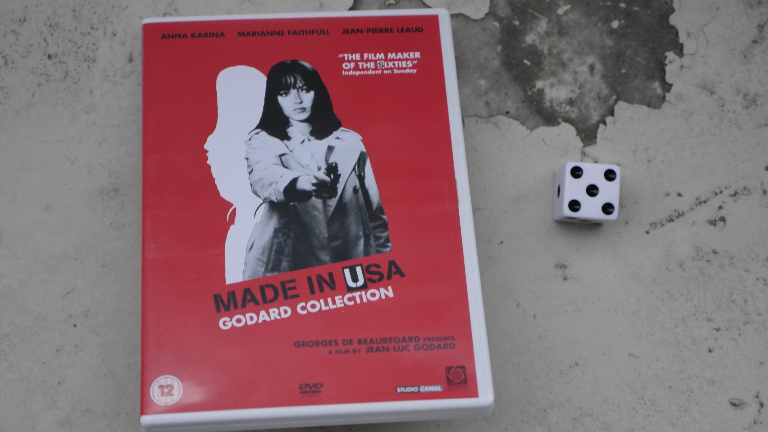 | 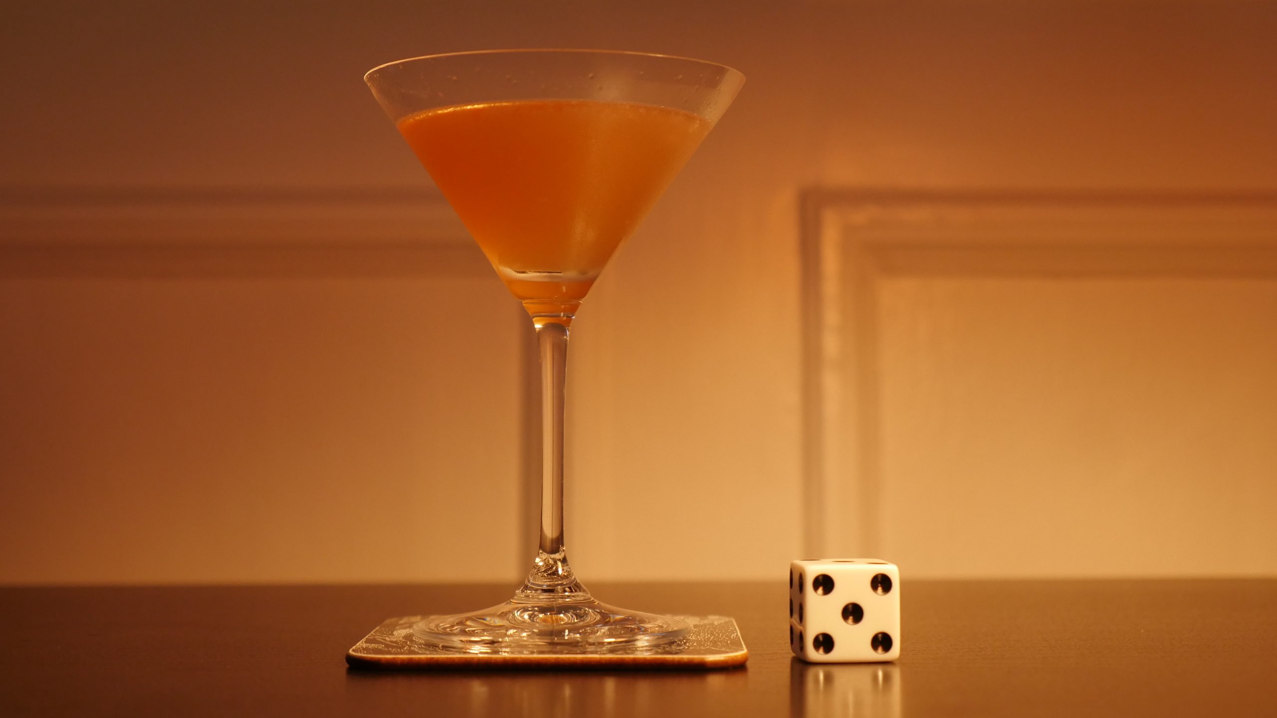 |
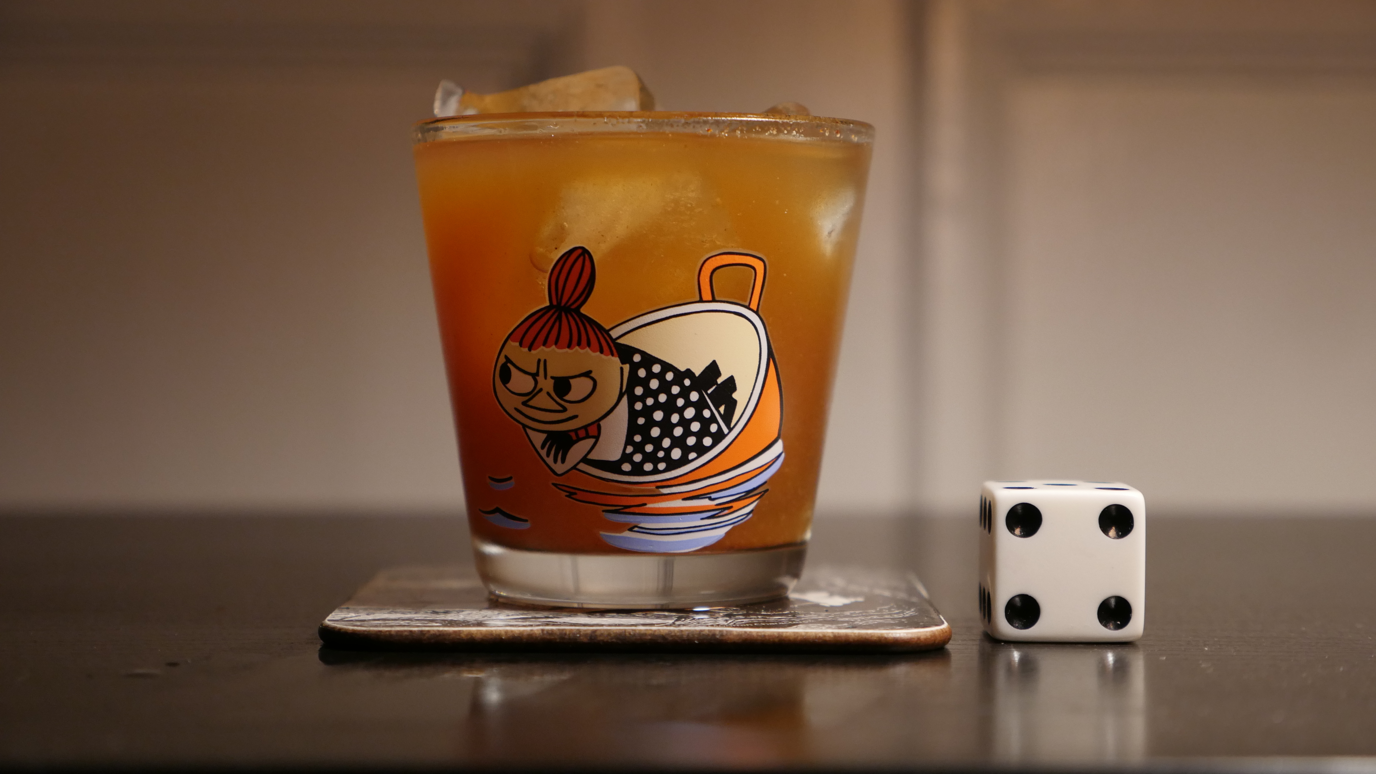
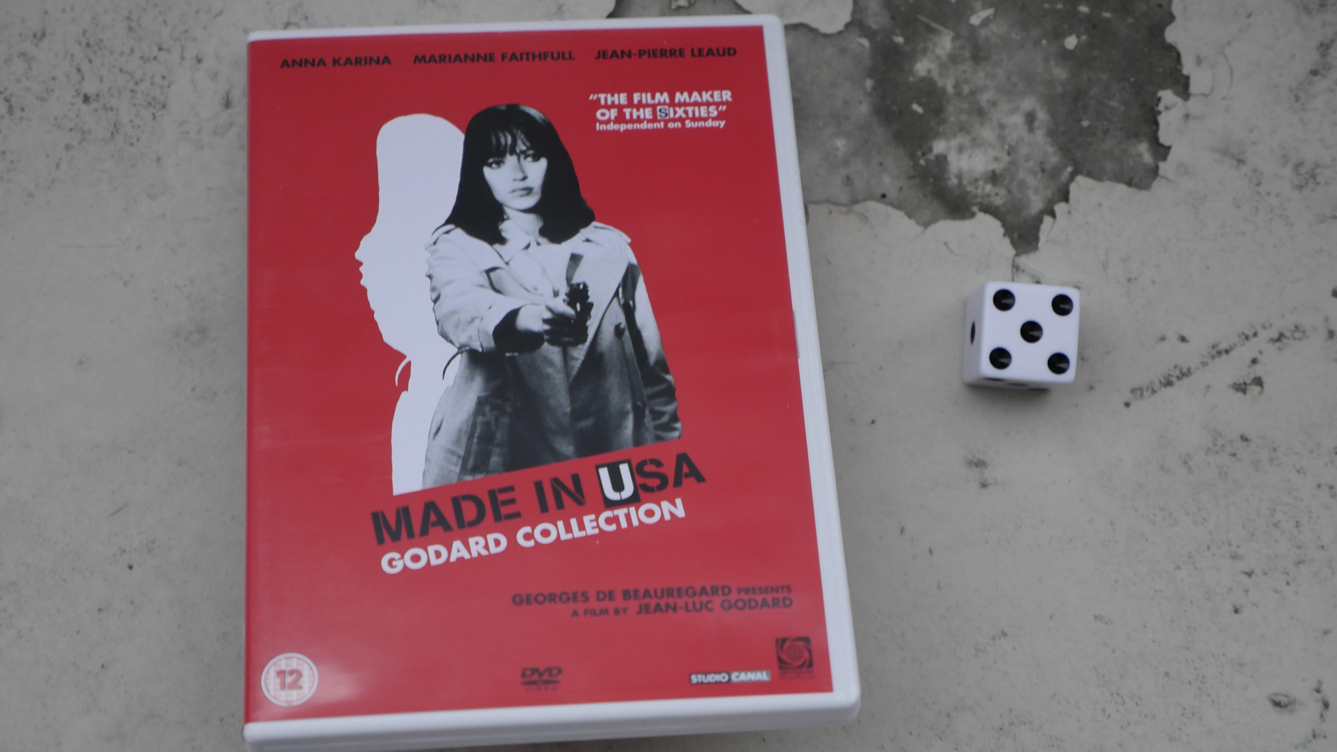
| Made in USA. Jean-Luc Godard. 1967. France. September 10th, 2016. The French Blonde. |
 | 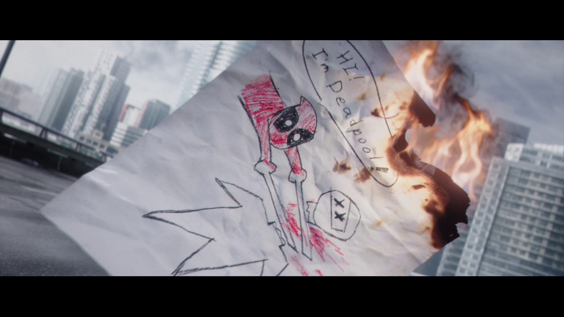 | 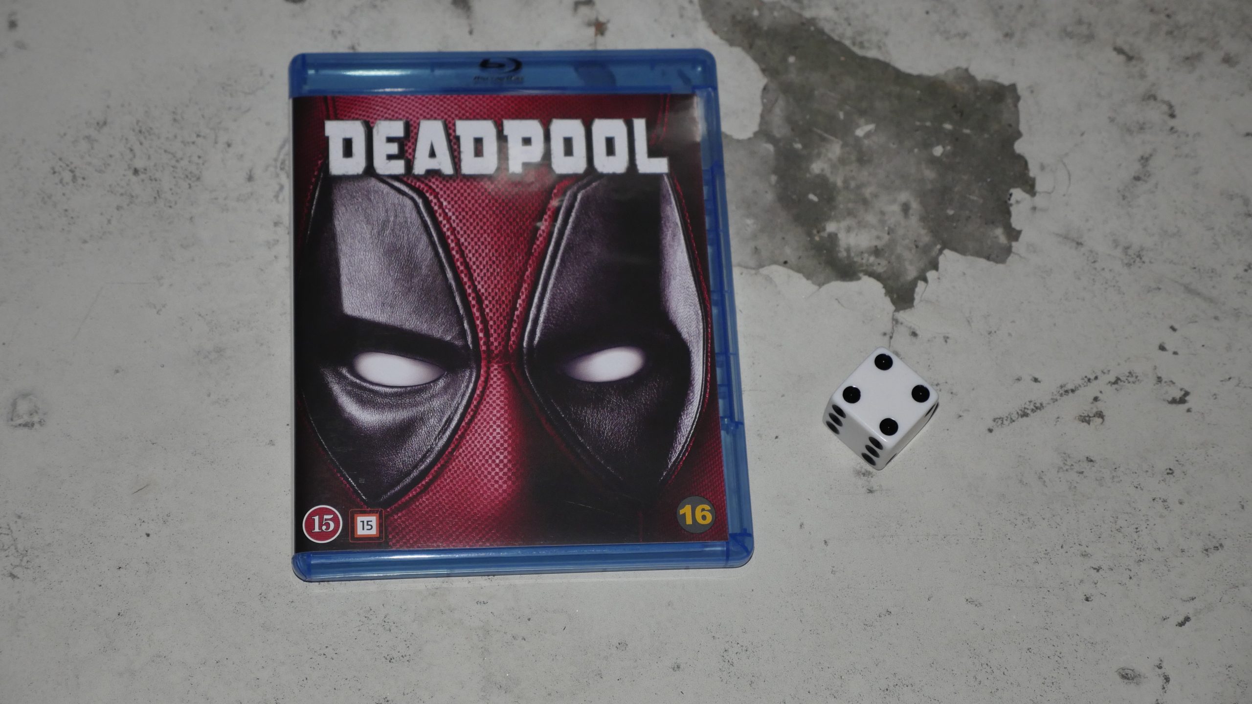 | 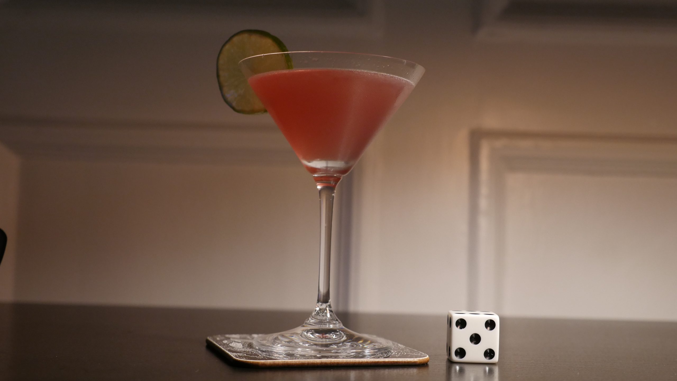 |
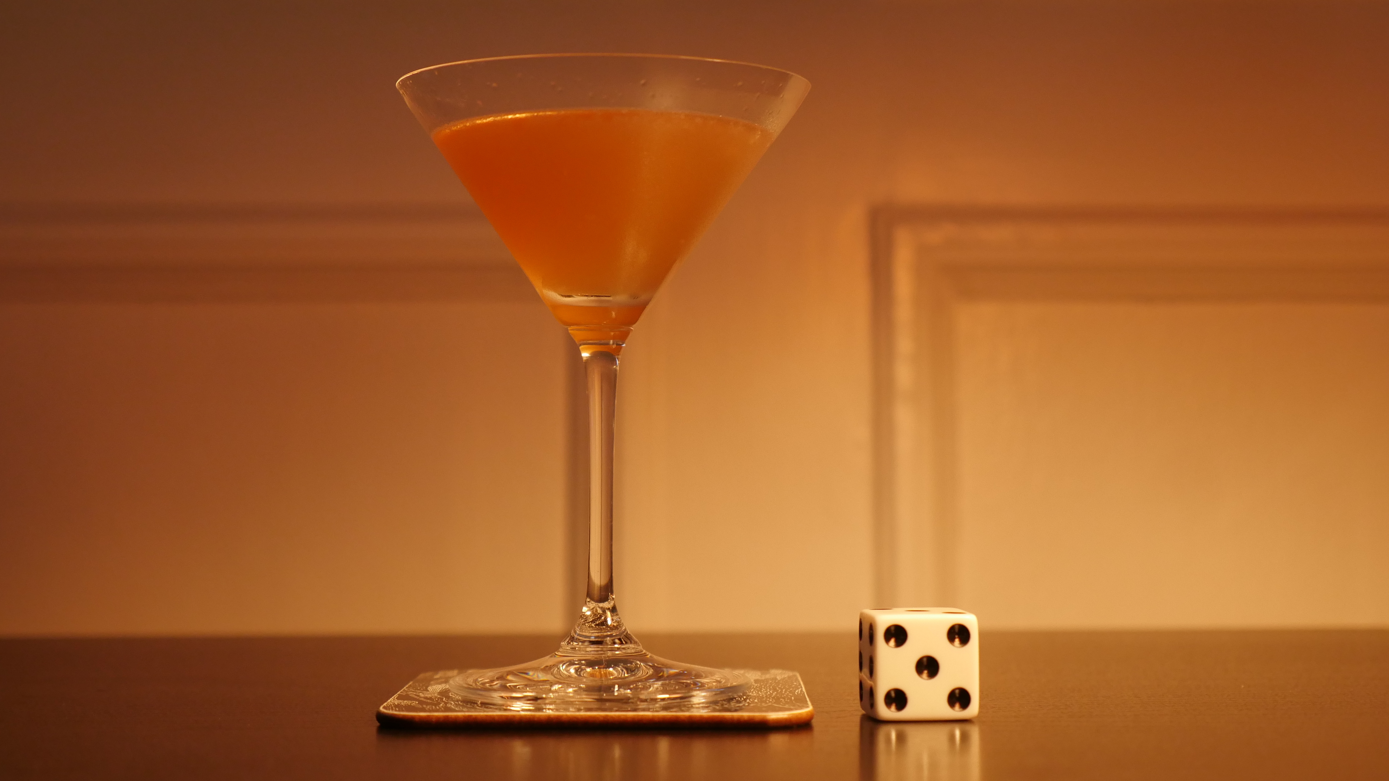
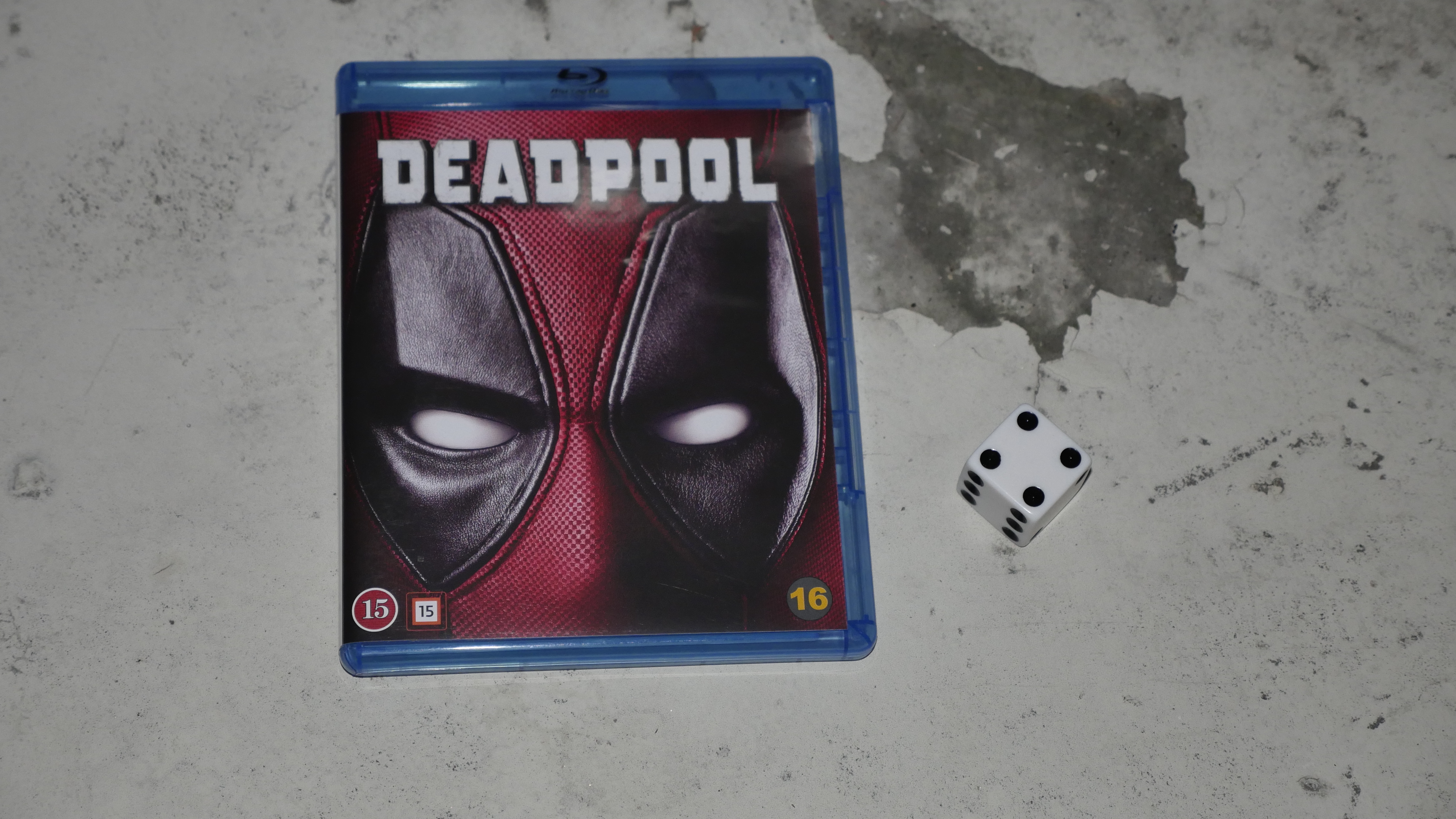
| Deadpool. Tim Miller. 2016. United States. September 10th, 2016. Cosmopolitan. |
 | 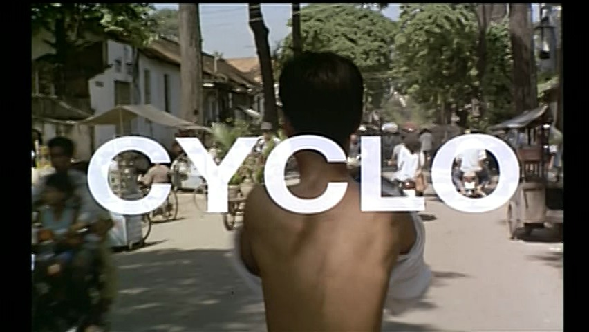 |  |  |
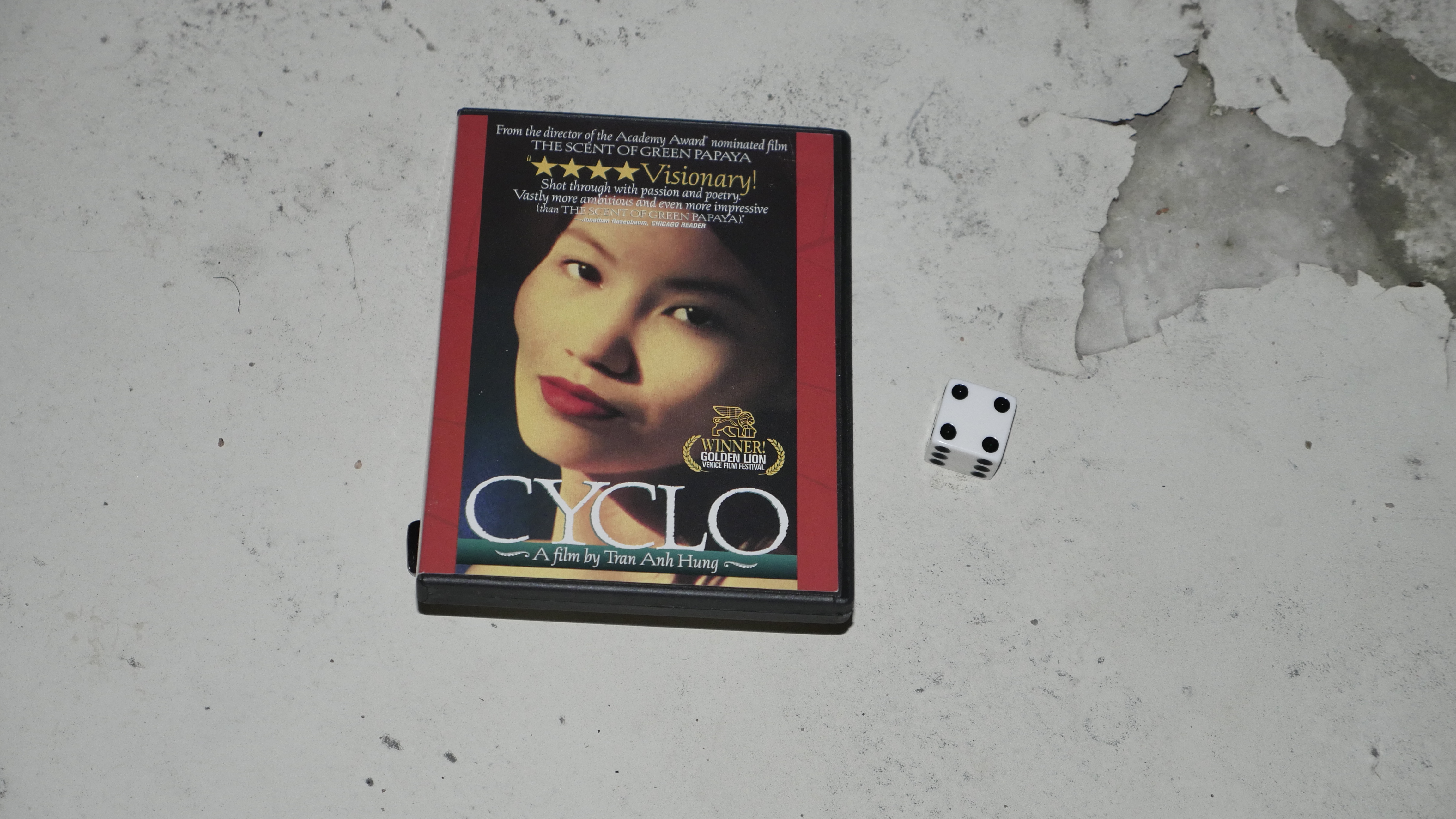
| Cyclo. Tran Anh Hung. 1995. Viet Nam. October 15th, 2016. . |
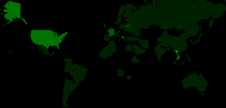 | 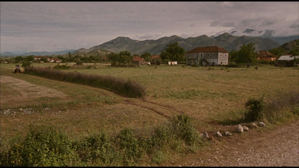 | 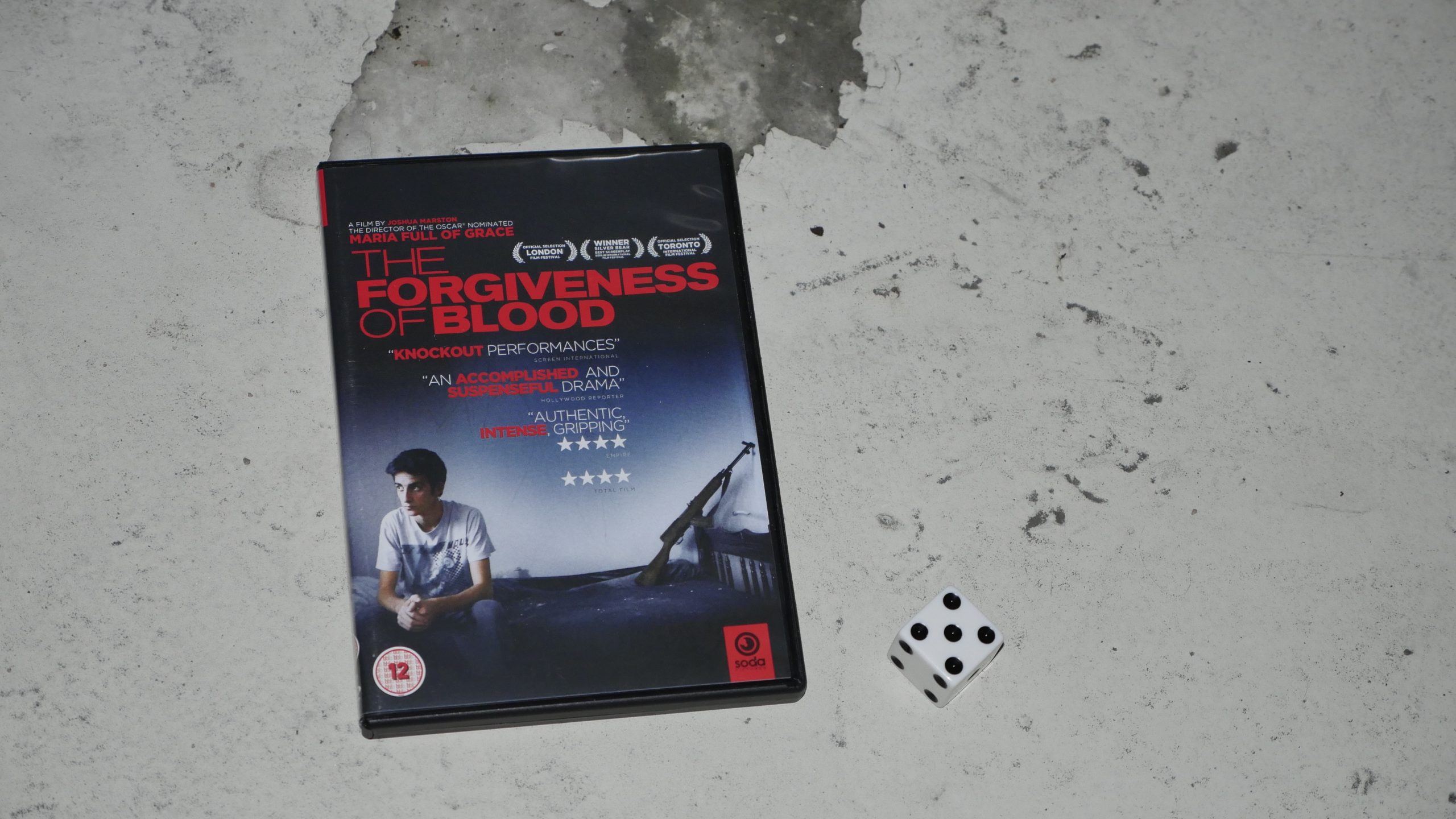 |  |
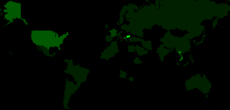
| The Forgiveness of Blood. Joshua Marston. 2011. Albania. October 22nd, 2016. Albania. |
 |  | 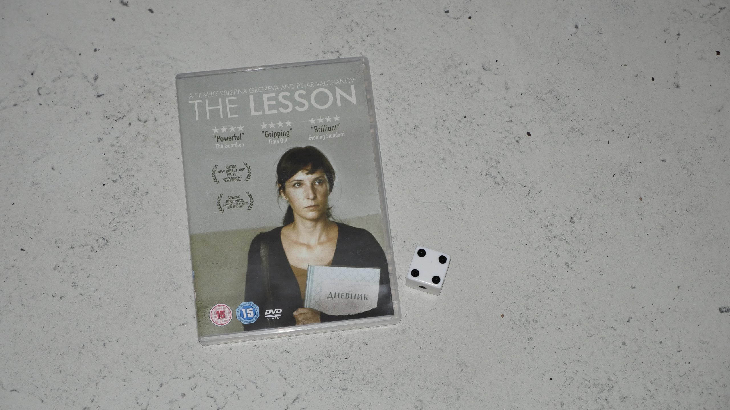 |  |
| The Lesson. Kristina Grozeva and Petar Valchanov. 2014. Bulgaria. October 28th, 2016. Oblak. |
 |  | 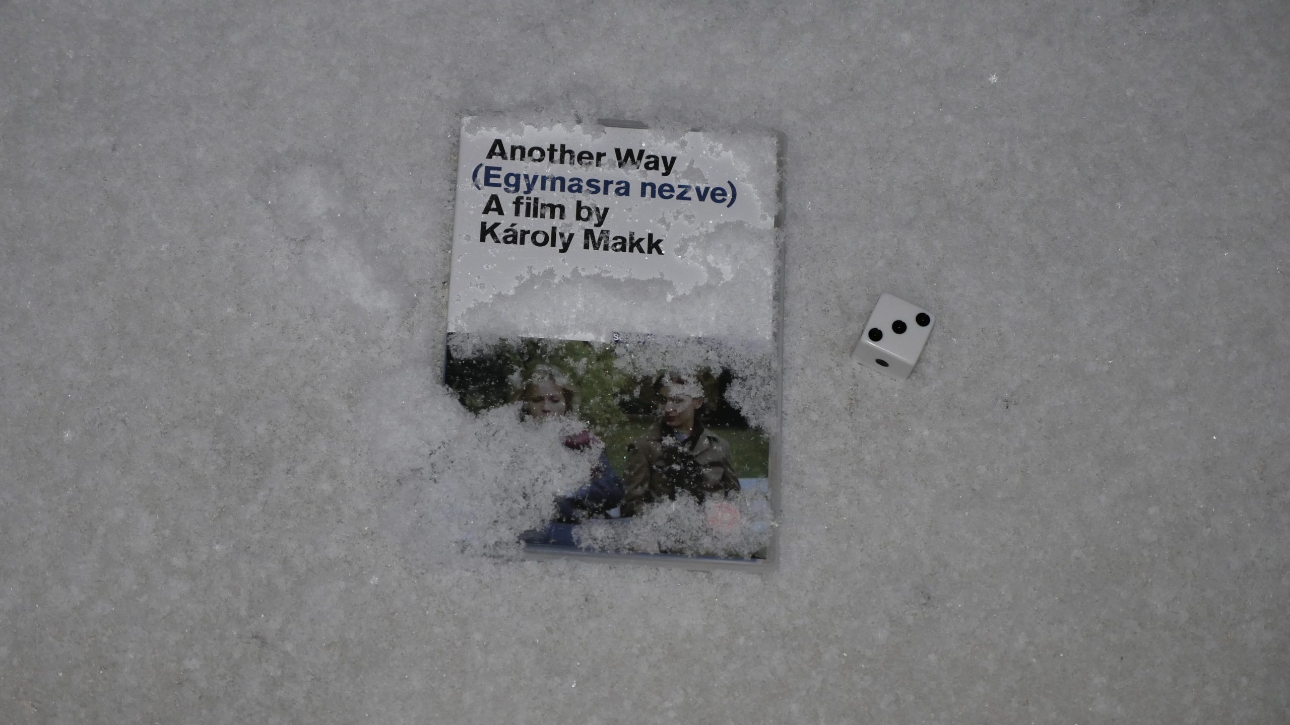 |  |
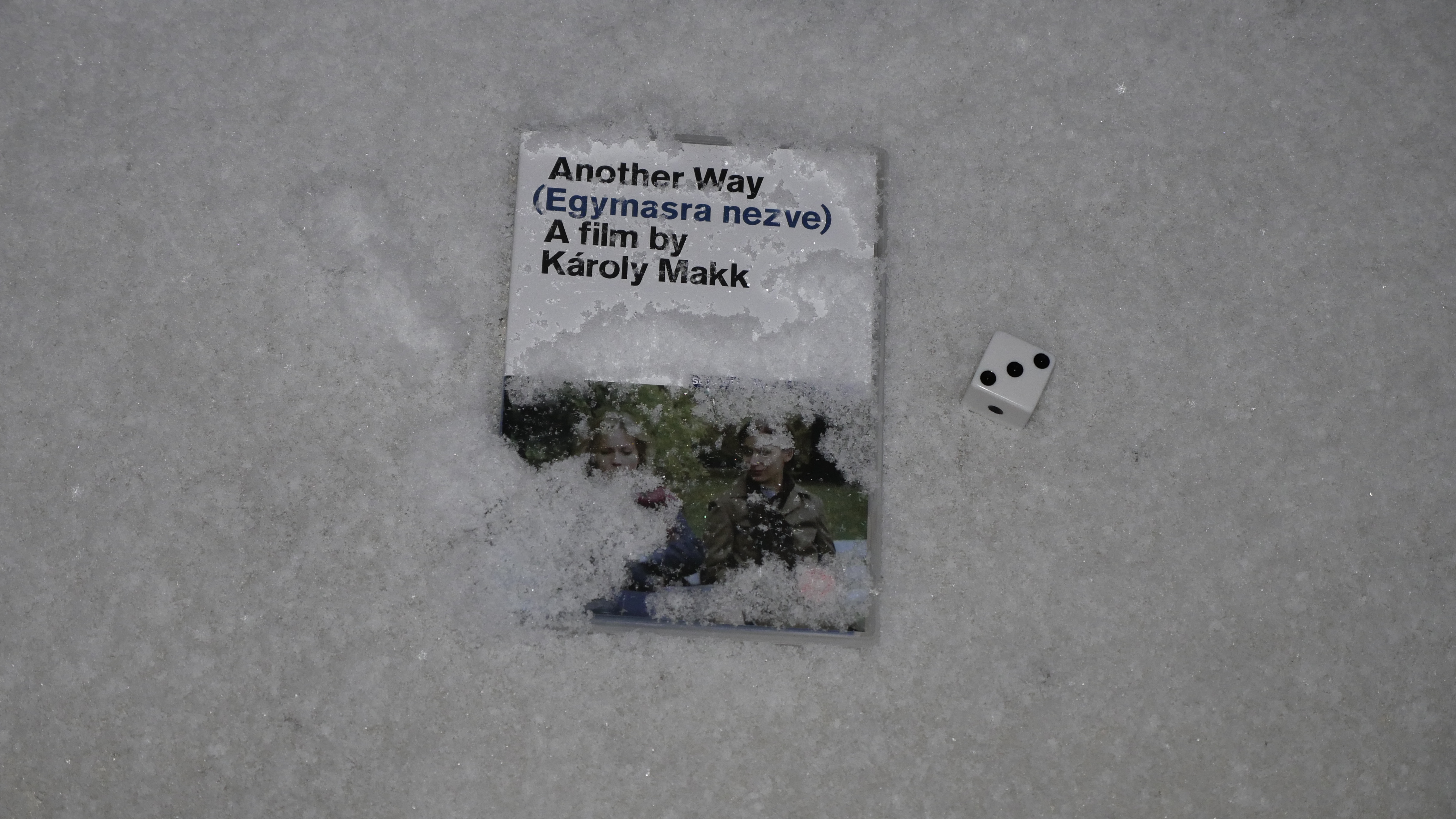
| Another Way. Károly Makk. 1982. Hungary. November 4th, 2016. . |
 | 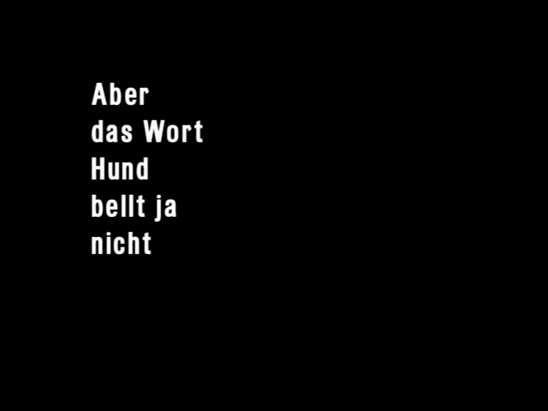 | 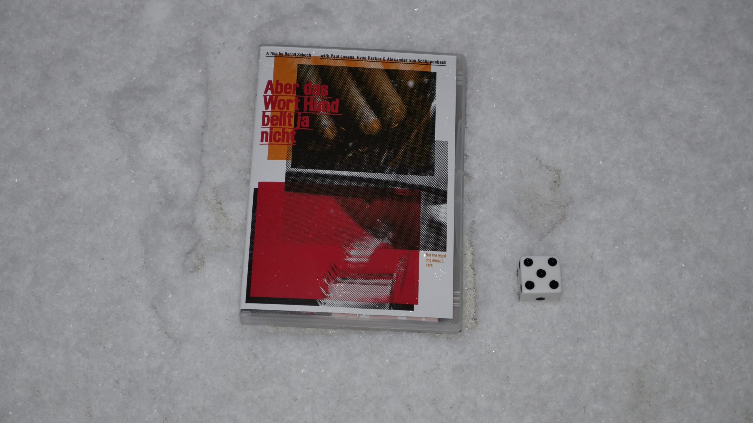 |  |
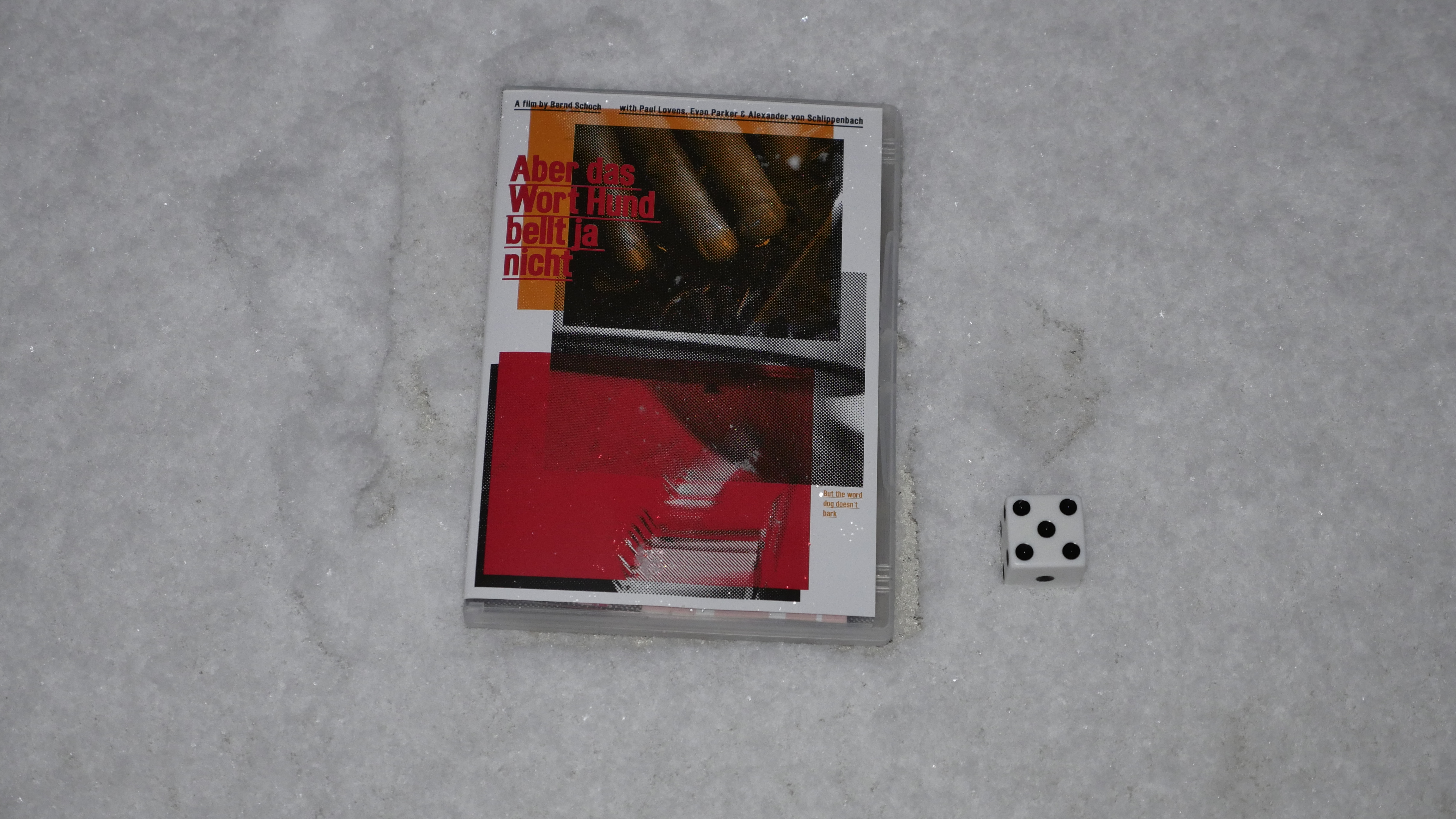
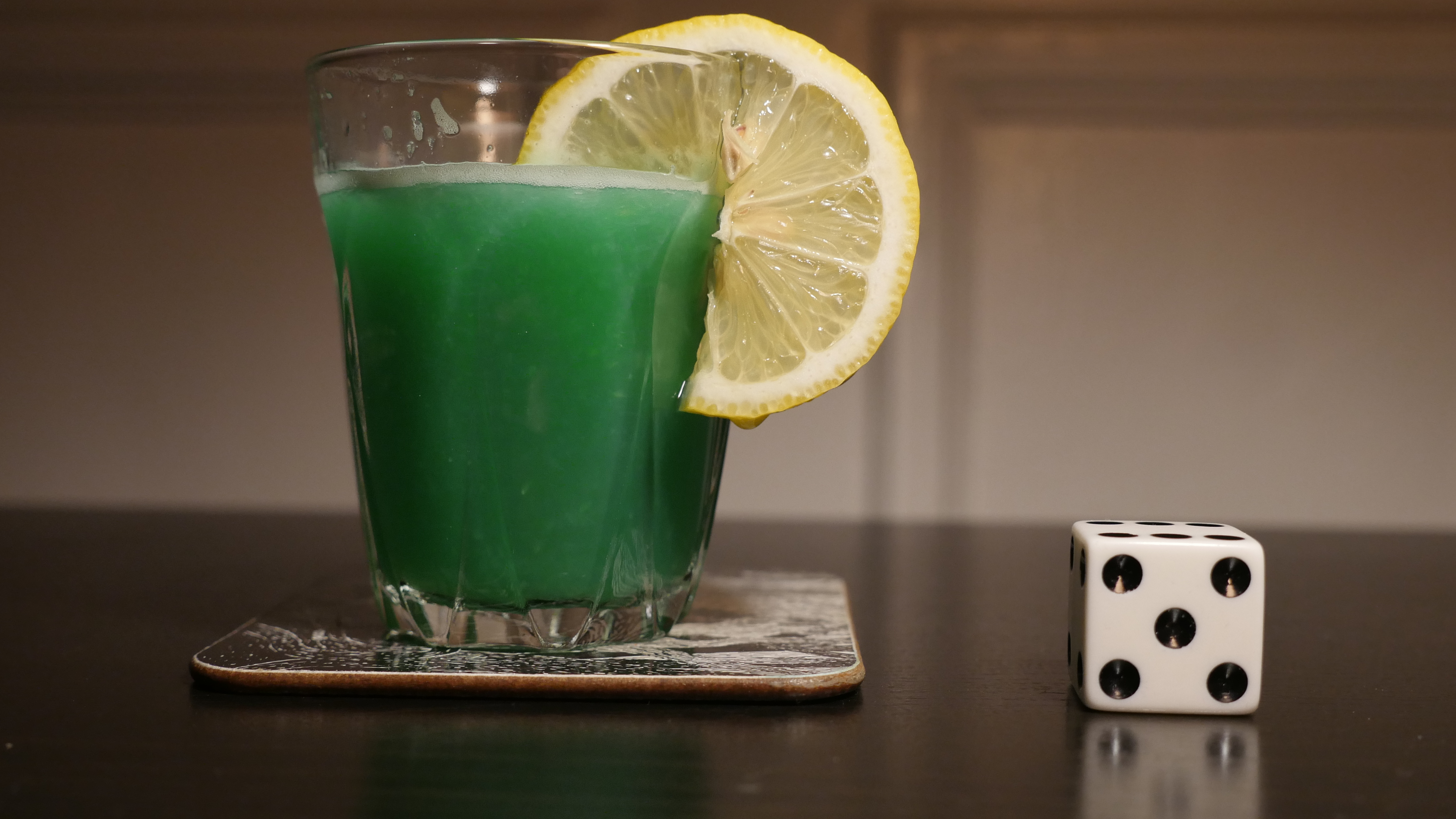
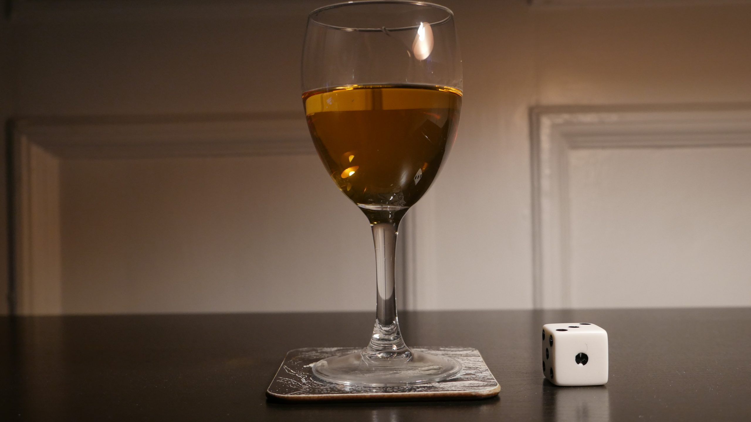
| But the Word Dog Doesn’t Bark. Bernd Schoch. 2011. Germany. November 4th, 2016. Big Fish. |
 | 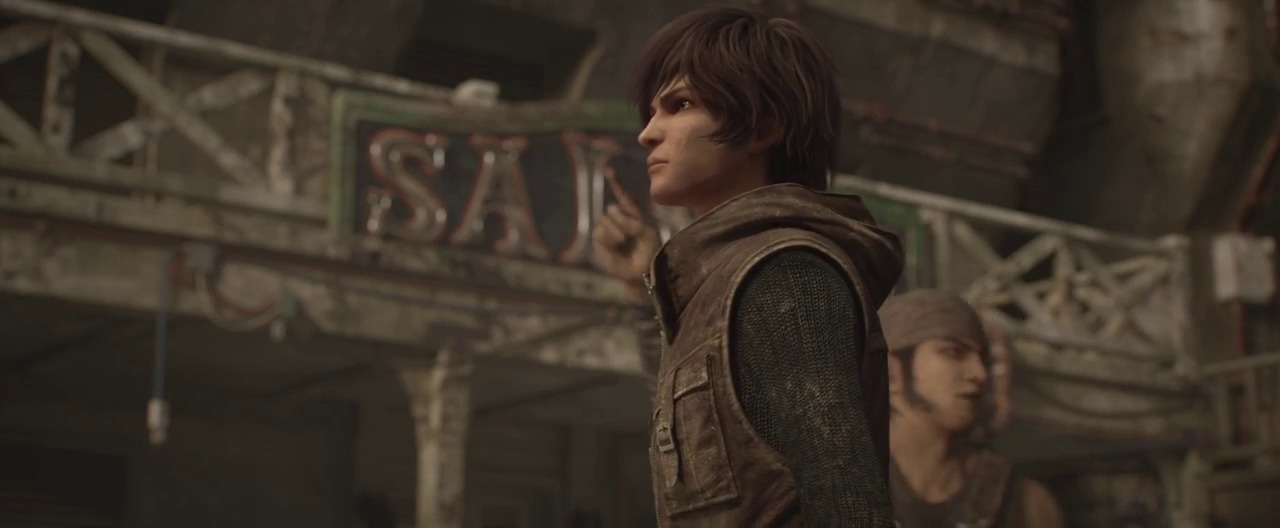 | 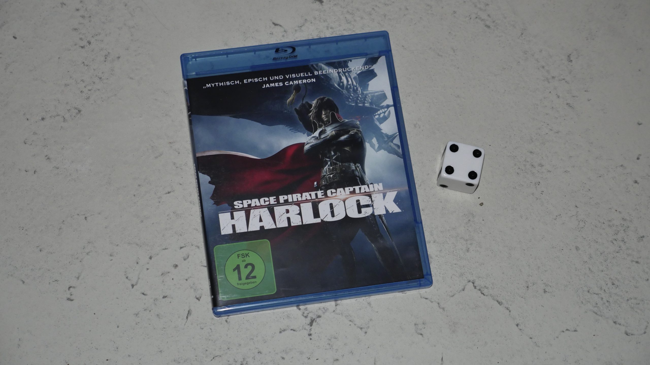 |  |
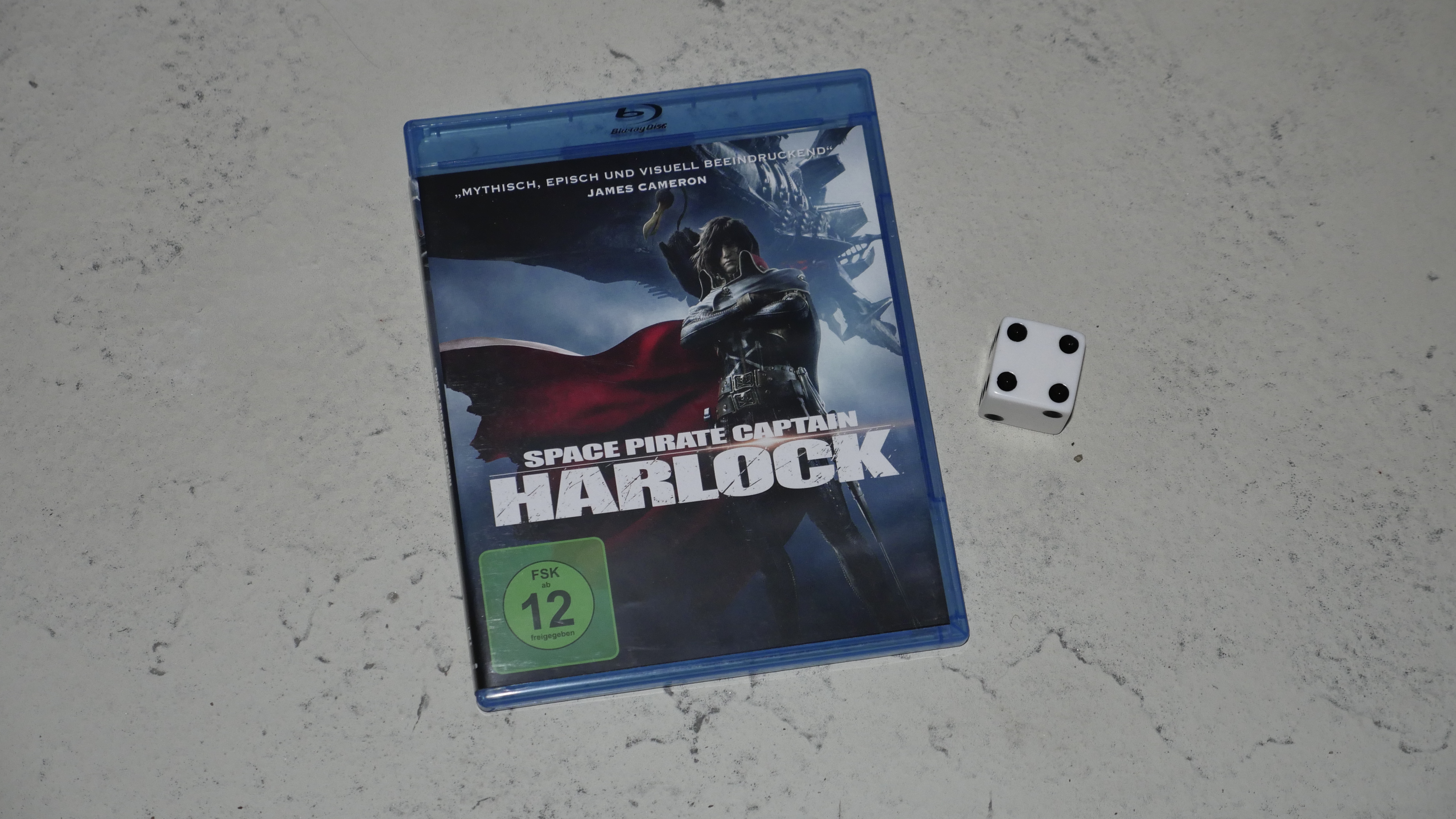
| Space Captain Pirate Harlock. Shinji Aramaki. 2013. Japan. June 26th, 2016. Tatami Cocktail. |
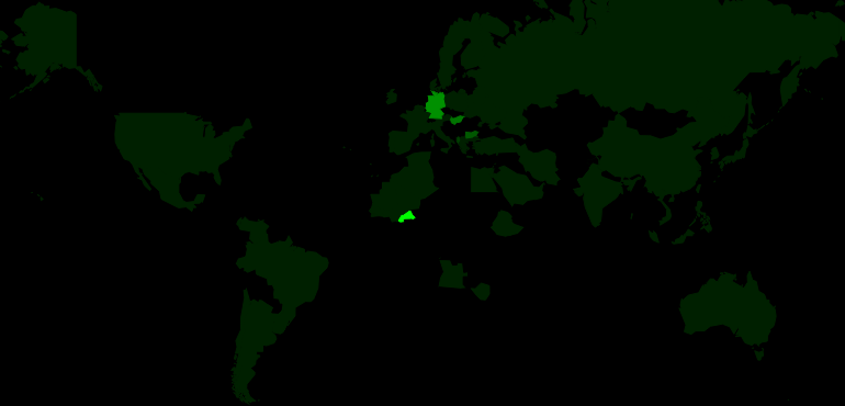 | 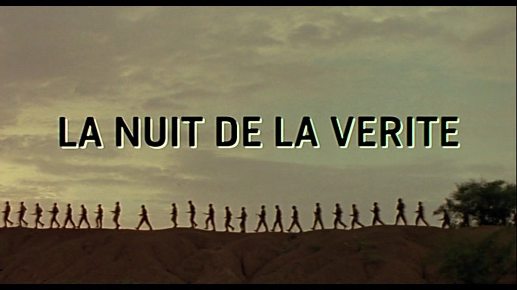 | 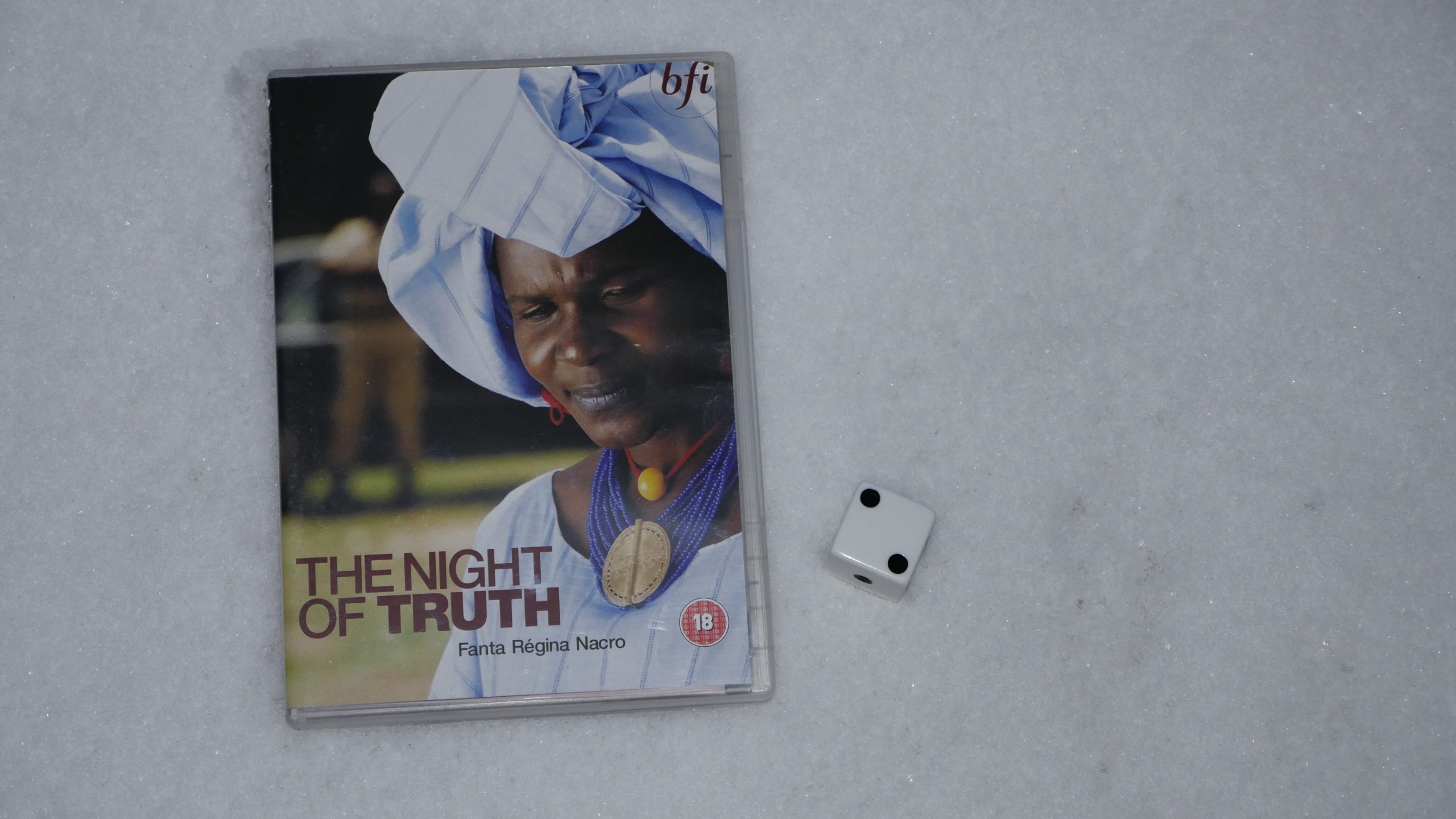 |  |
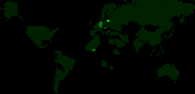
| The Night of Truth. Fanta Régina Nacro. 2004. Burkina Faso. November 5th, 2016. Bissap Mojito. |
 | 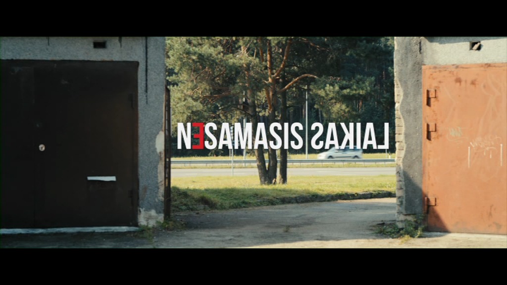 | 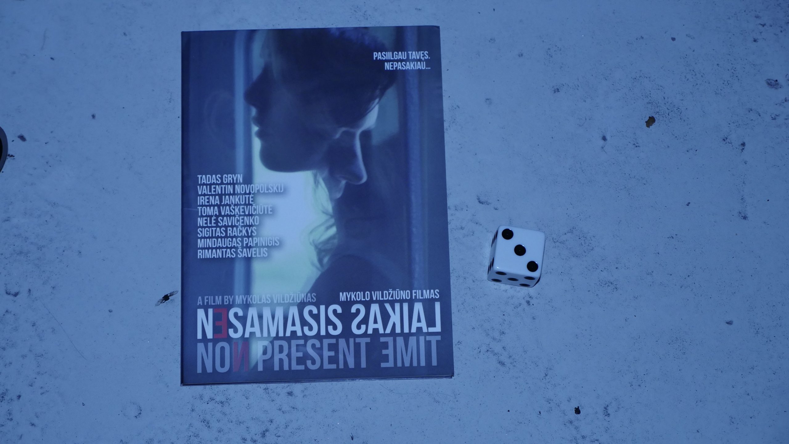 |  |
| Non-Present Time. Mykolas Vildziunas. 2014. Lithuania. November 18th, 2016. Krupnikas. |
 |  | 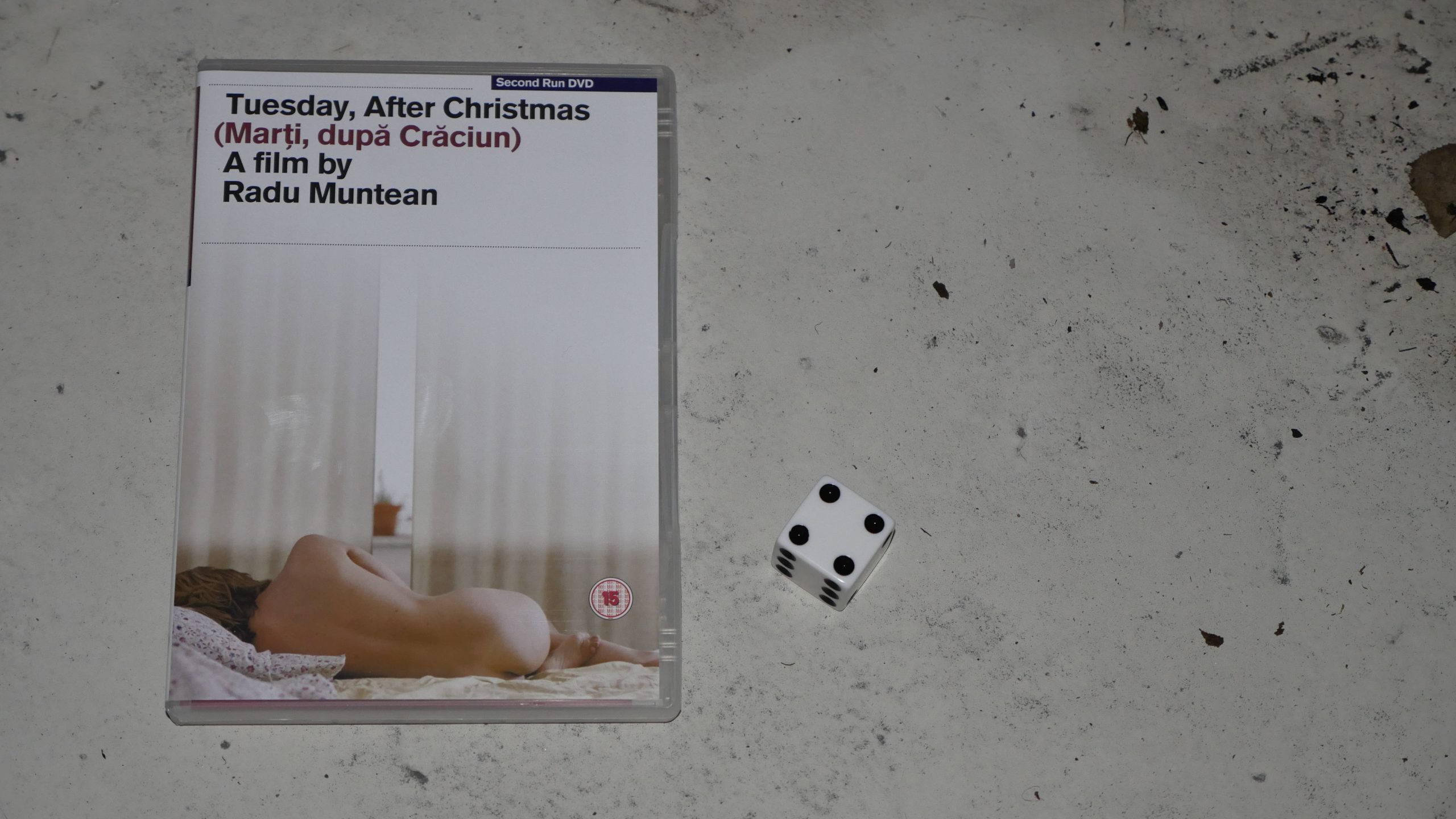 | 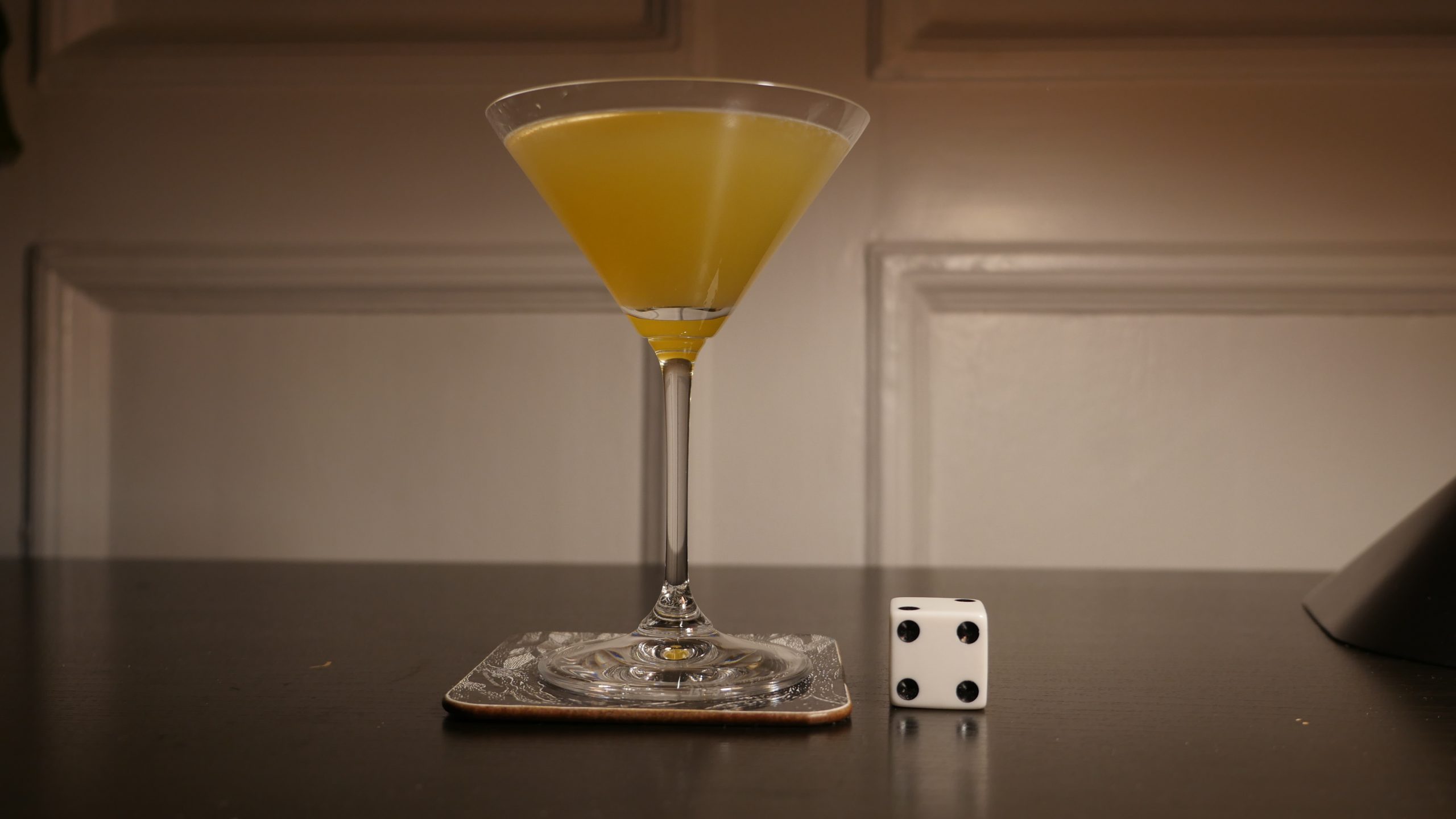 |
| Tuesday, After Christmas. Radu Muntean. 2010. Romania. November 25th, 2016. Temptation. |
 | 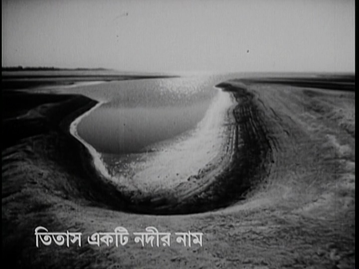 | 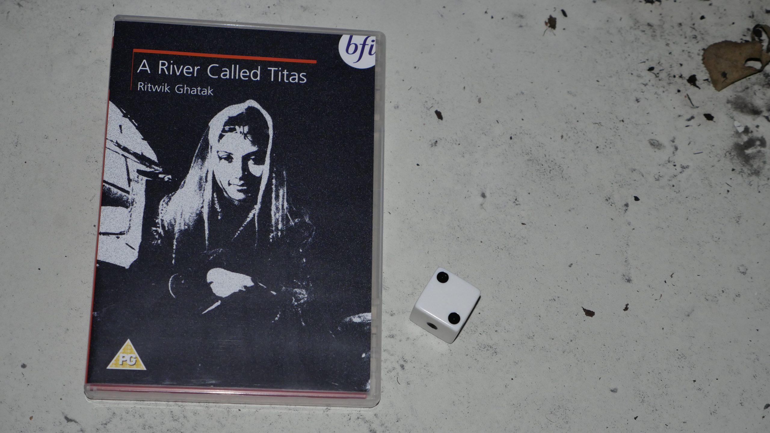 |  |
| A River Called Titas. Ritwik Ghatak. 1973. Bangladesh. November 25th, 2016. Pimm’s Cup. |
 | 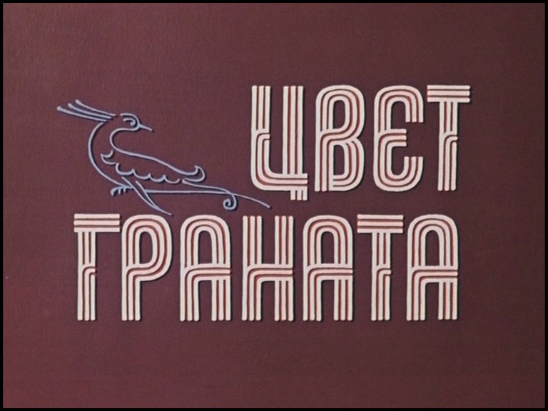 |  | 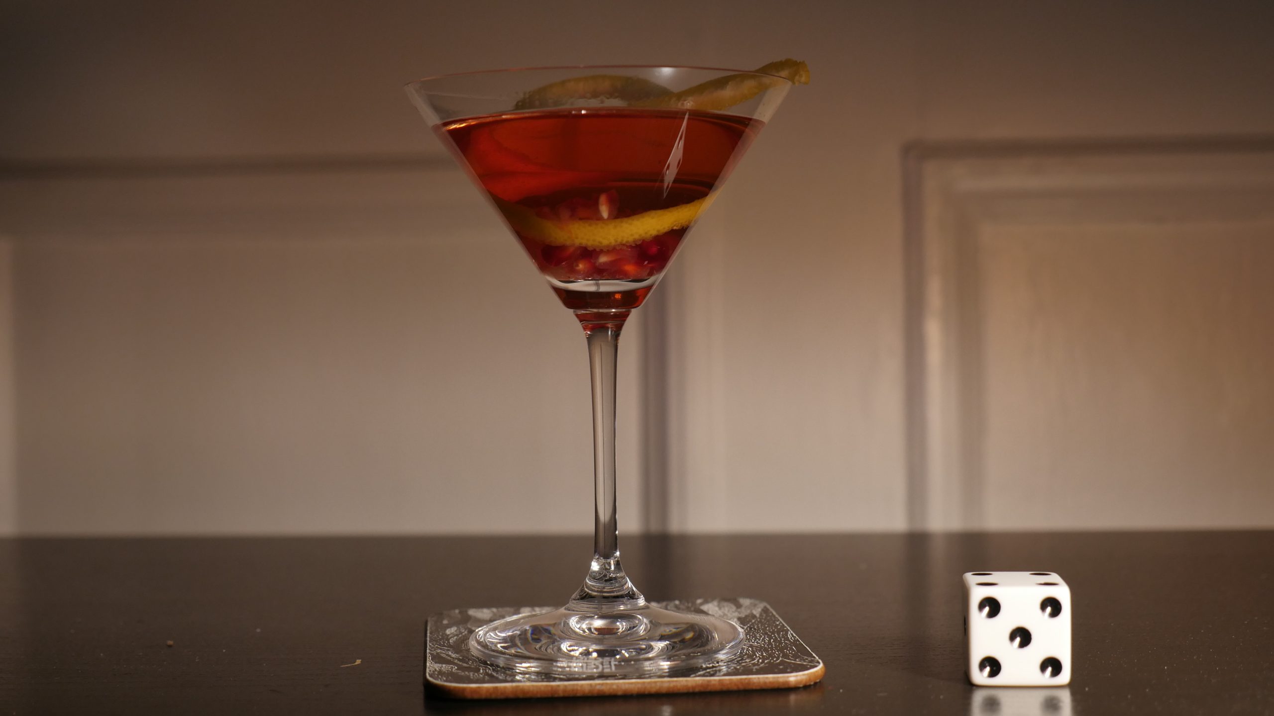 |
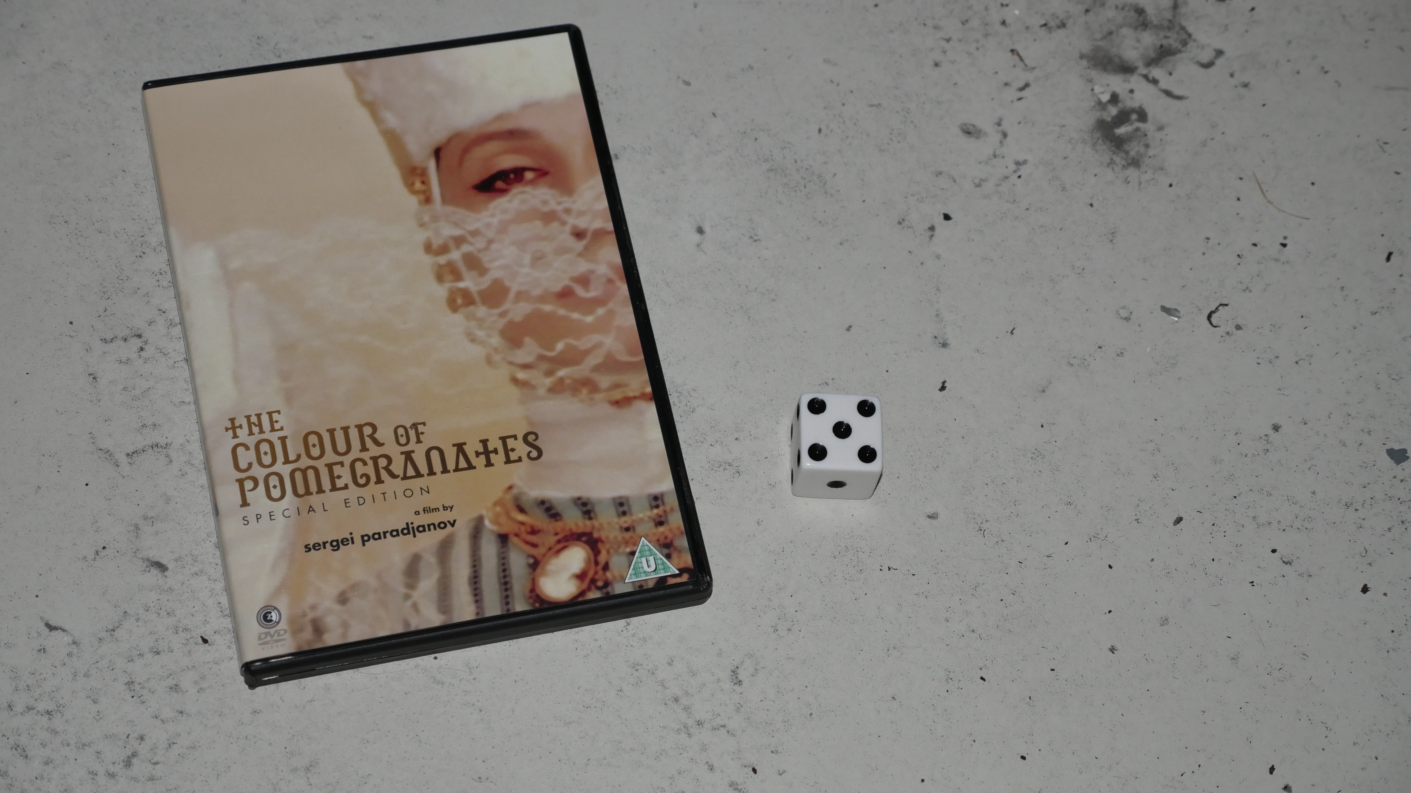
| The Colour of Pomegranates. Sergei Parajanov. 1969. Armenia. November 26th, 2016. Armenian Kiss. |
 |  | 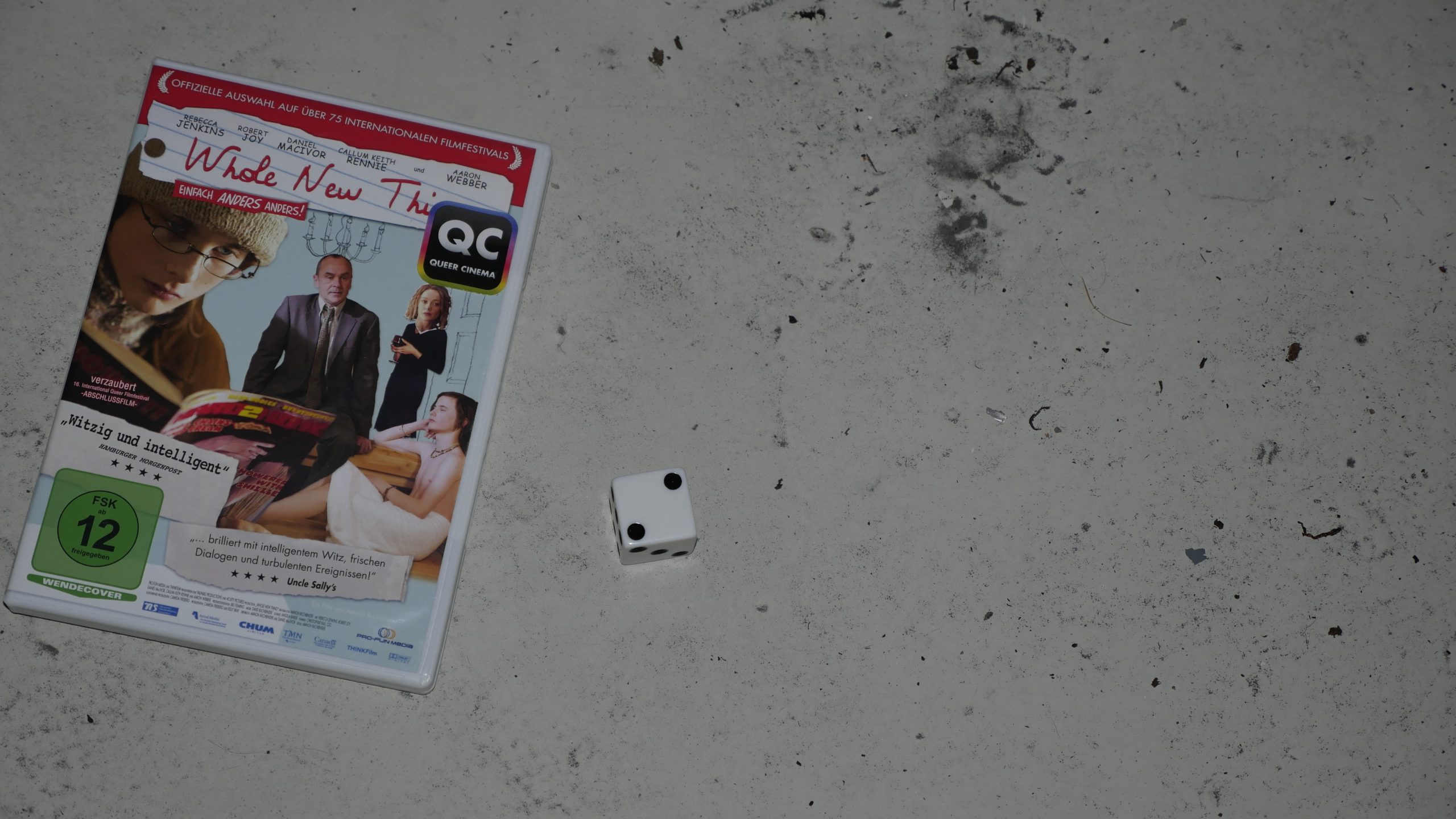 |  |
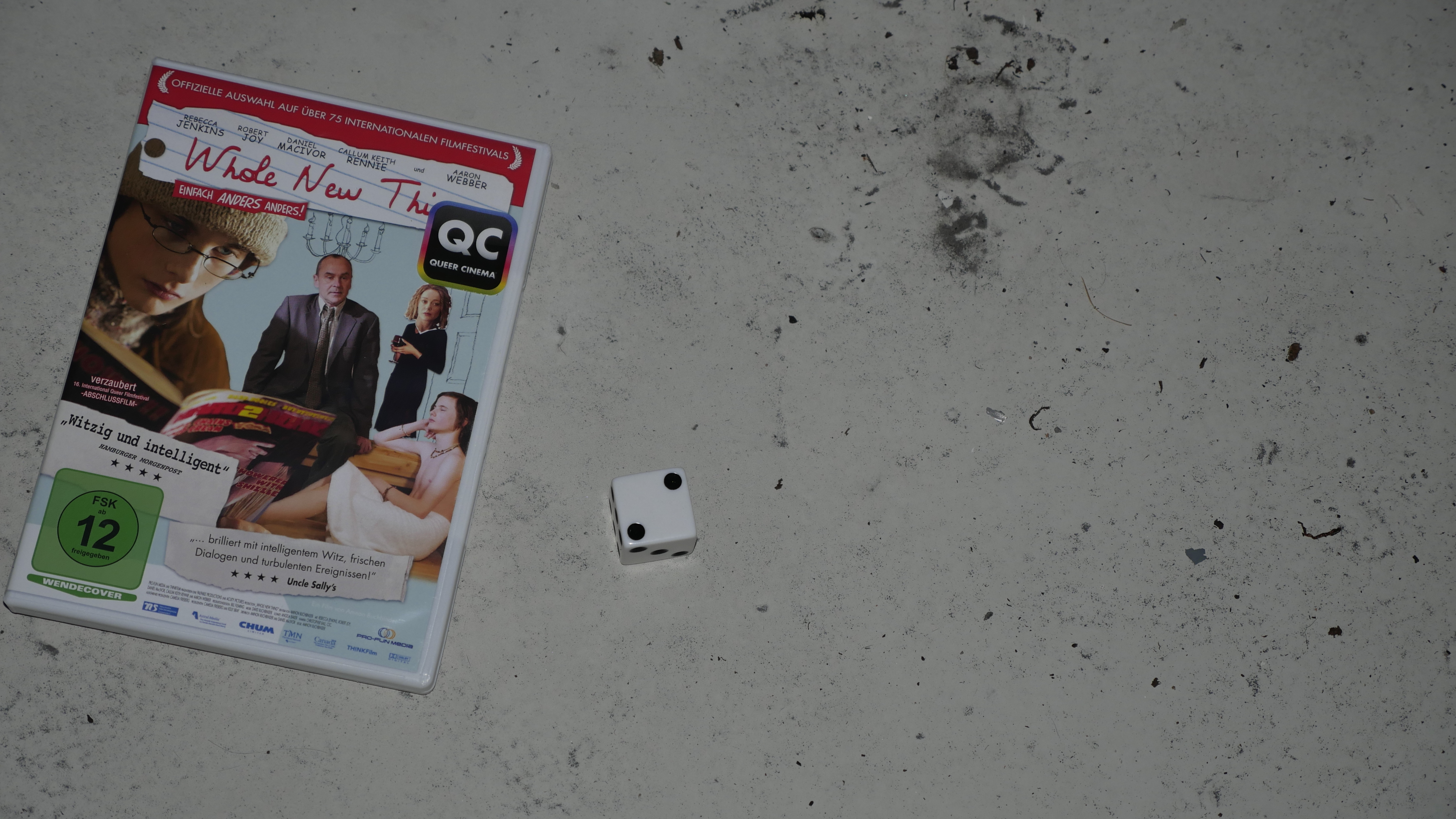
| Whole New Thing. Amnon Buchbinder. 2005. Canada. November 26th, 2016. The Canadian. |
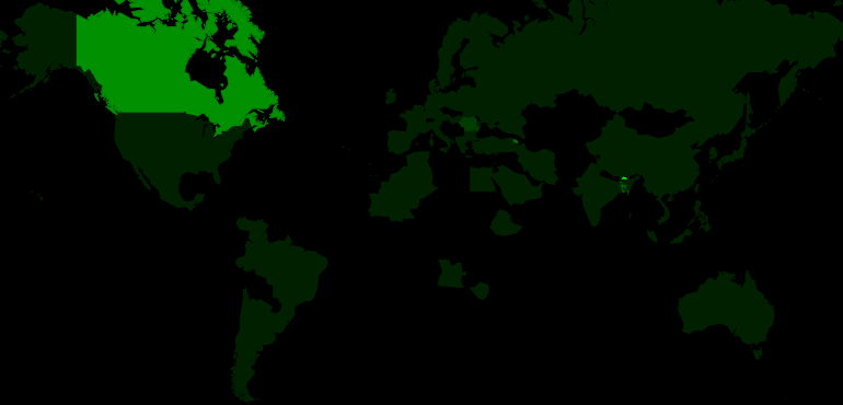 | 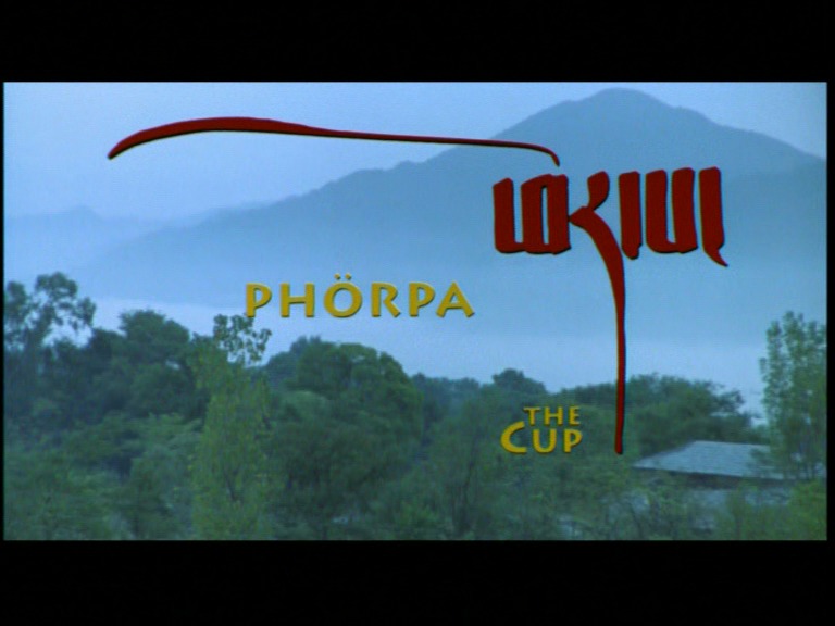 | 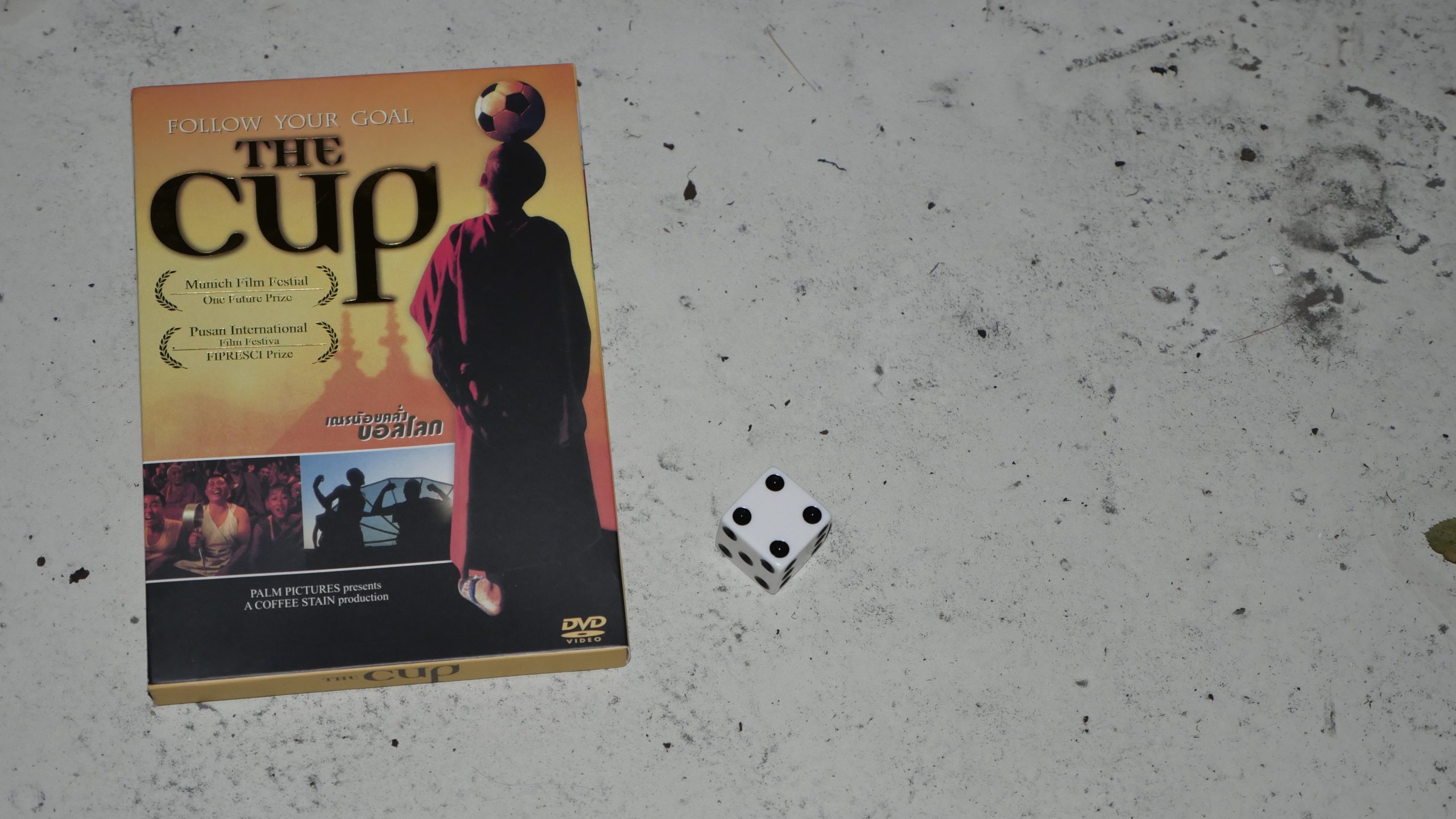 |  |
| The Cup. Khyentse Norbu. 1999. Bhutan. December 9th, 2016. Independence Day Mojito. |
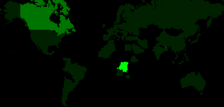 | 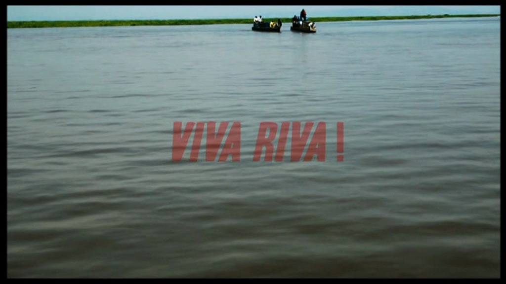 | 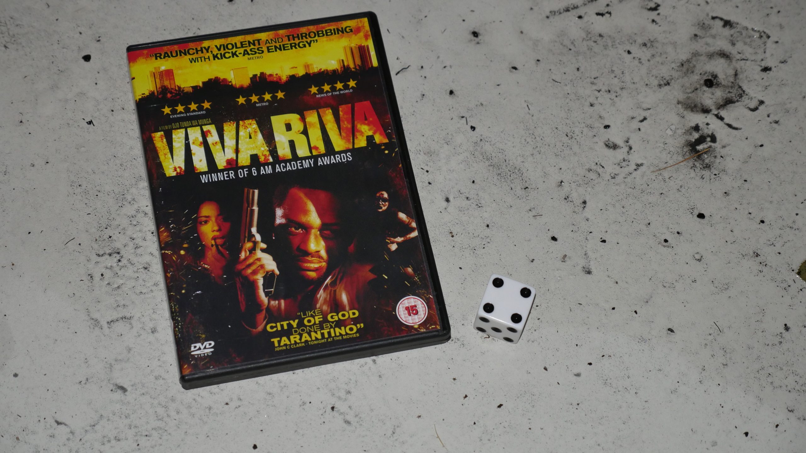 | 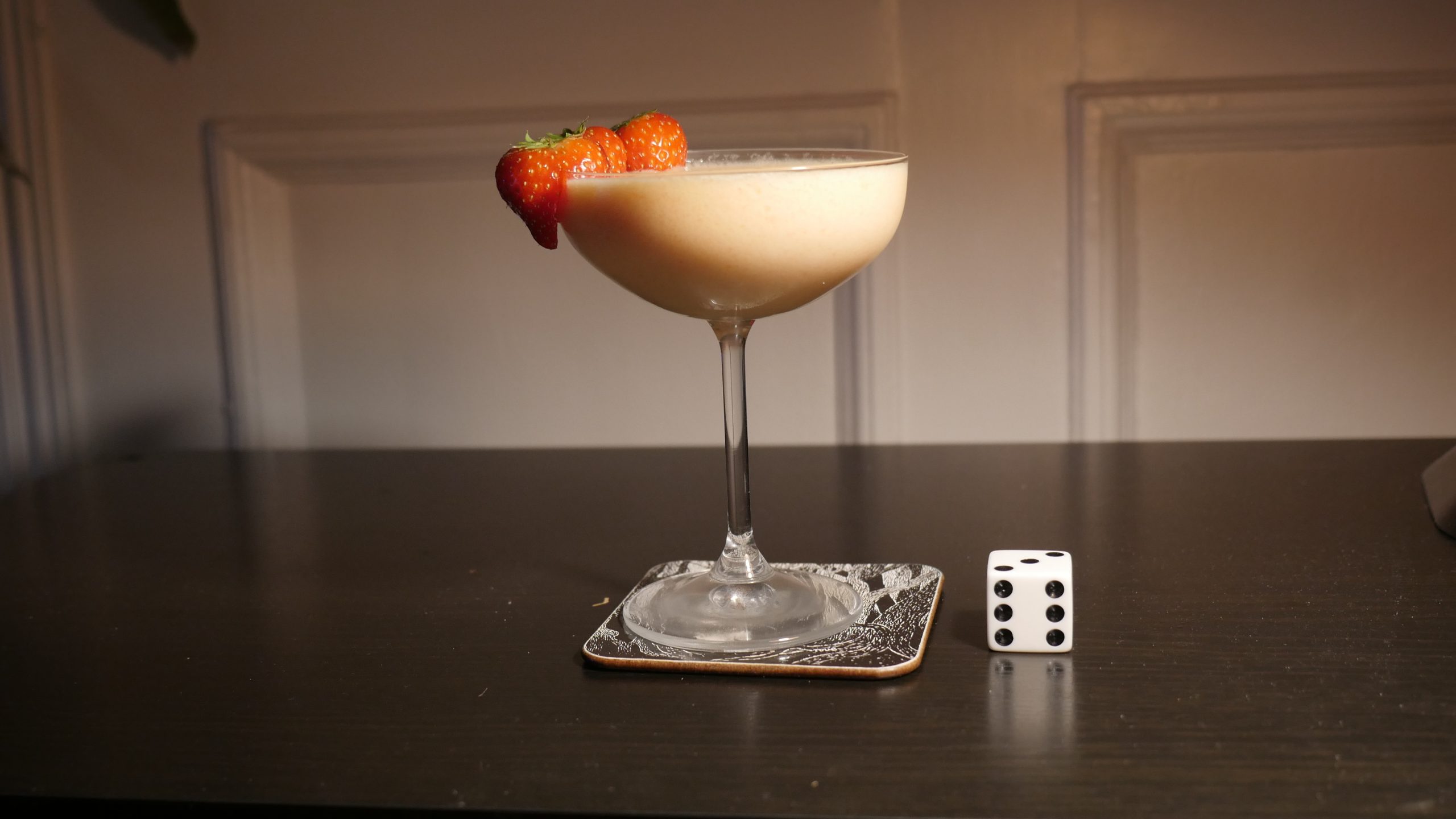 |
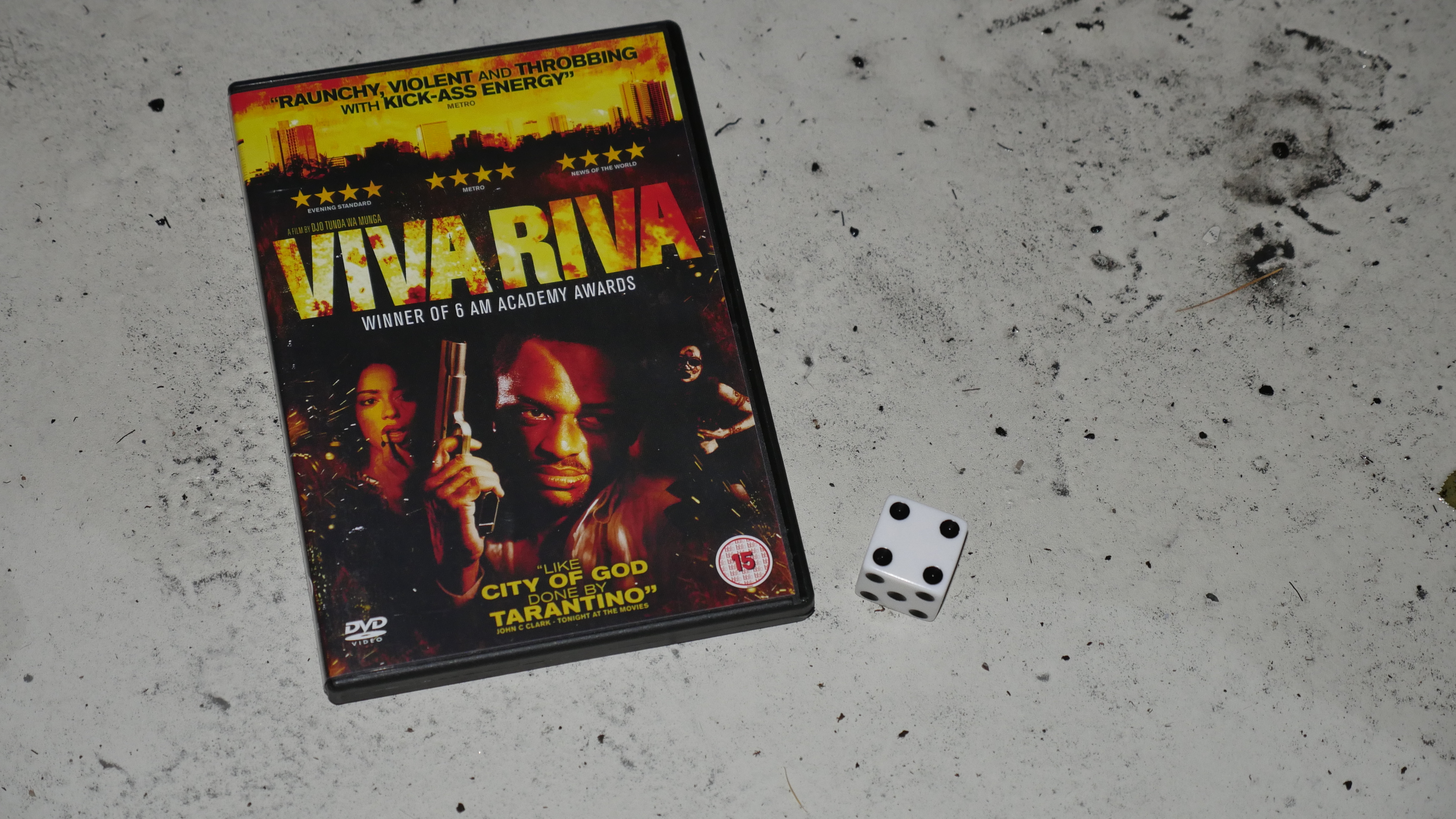
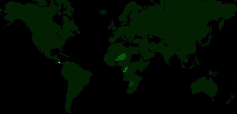
| Viva Riva. Djo Tunda Wa Munga. 2010. The Democratic Republic of the Congo. December 10th, 2016. Paupau Paradise. |
 | 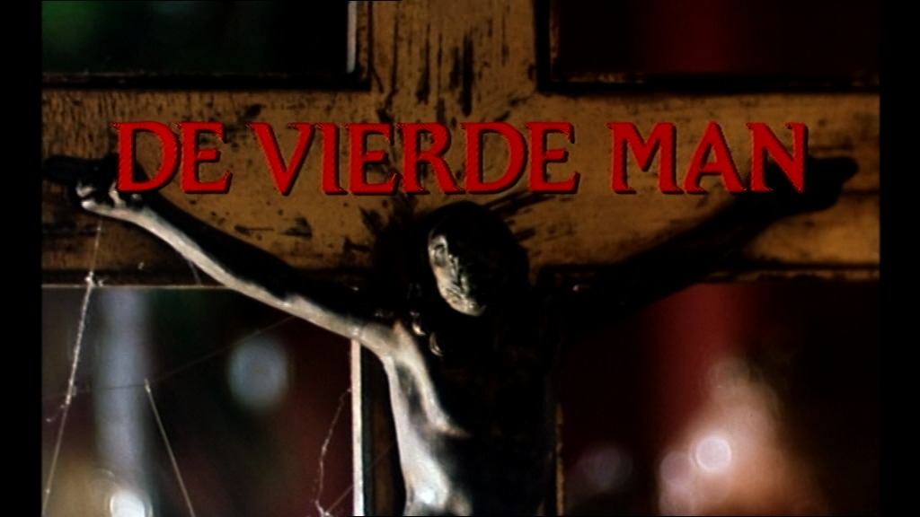 | 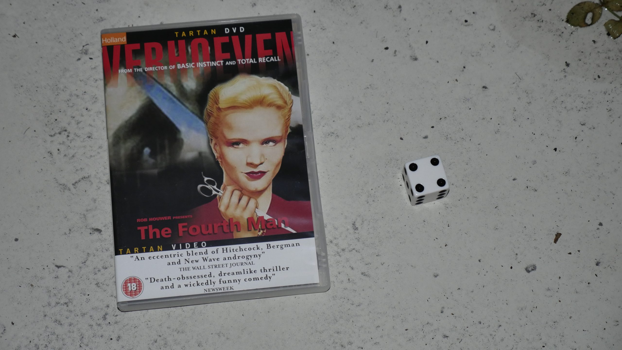 |  |
| The Fourth Man. Paul Verhoeven. 1983. Netherlands. December 10th, 2016. Amsterdam. |
 |  | 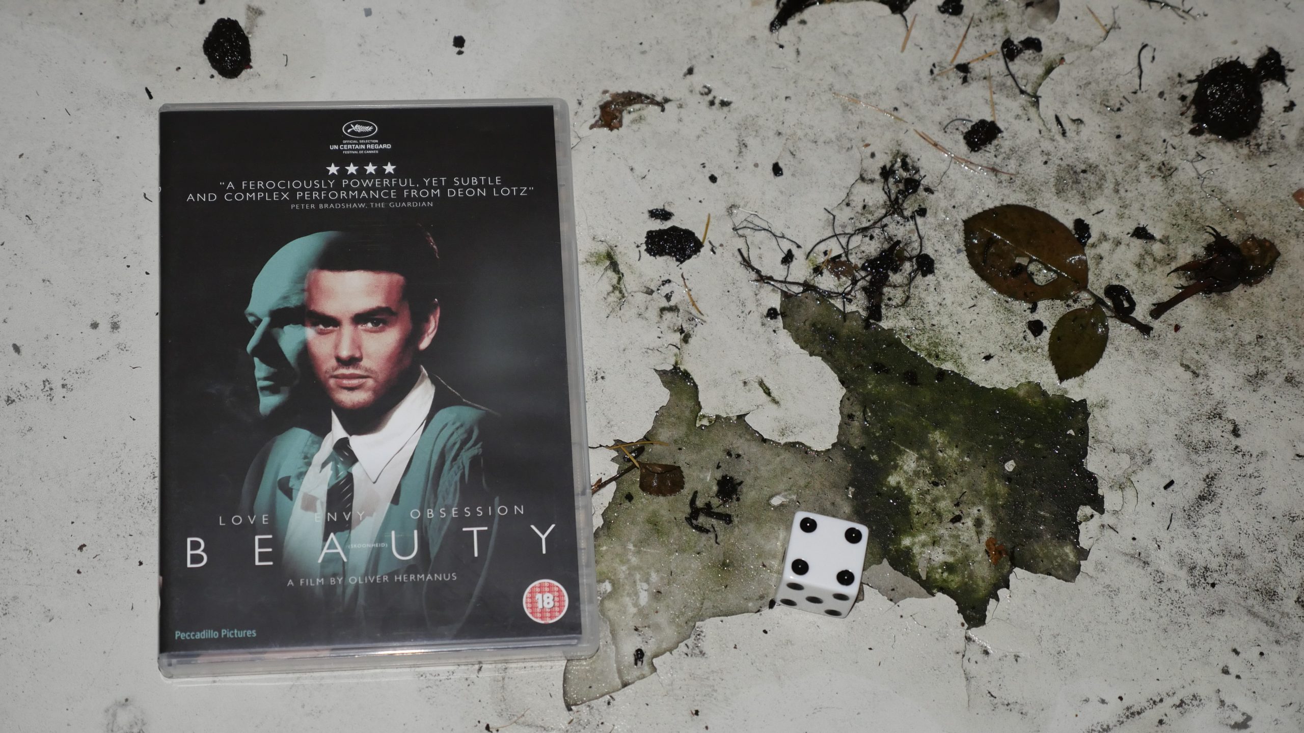 | 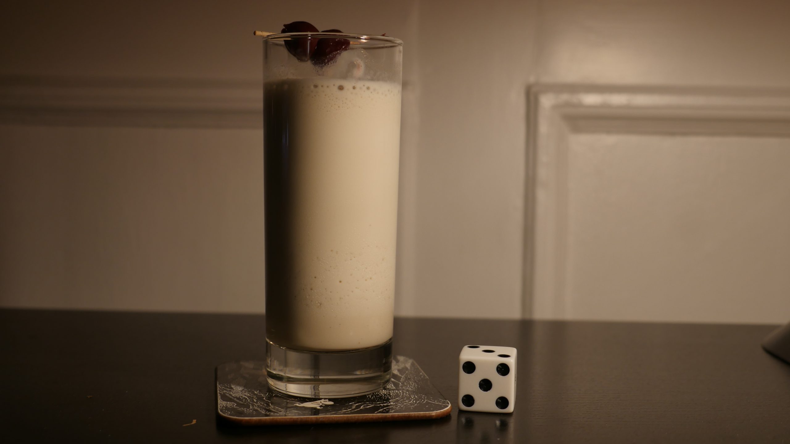 |
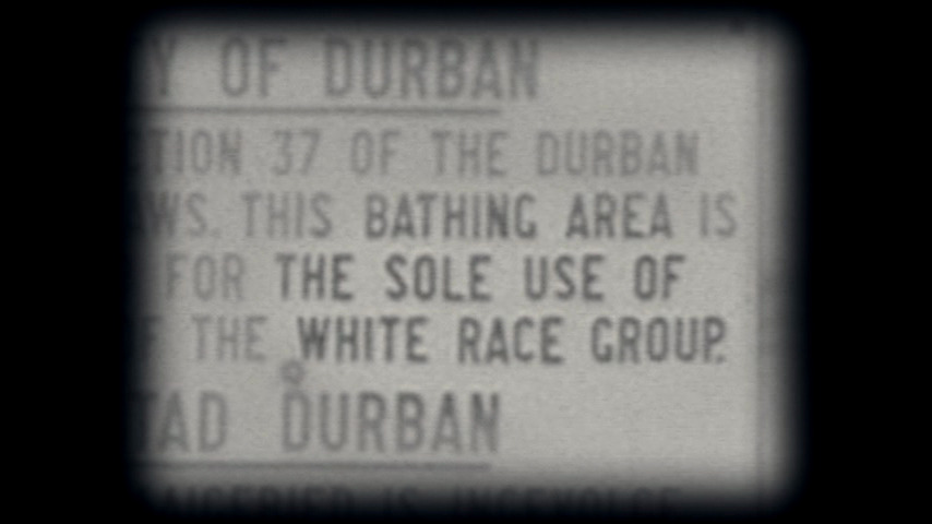
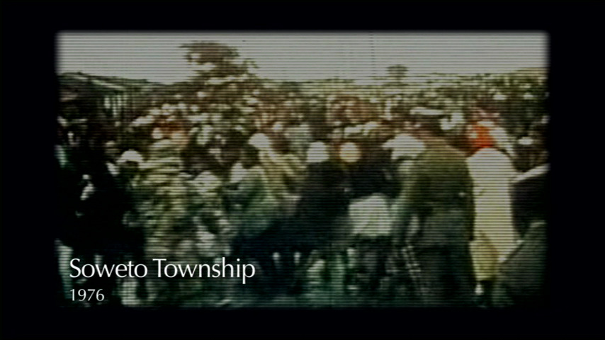
| Beauty. Oliver Hermanus. 2011. South Africa. December 11th, 2016. African Lullaby. |
 | 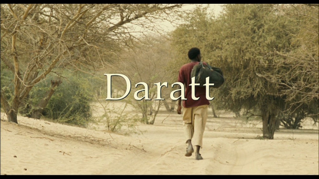 | 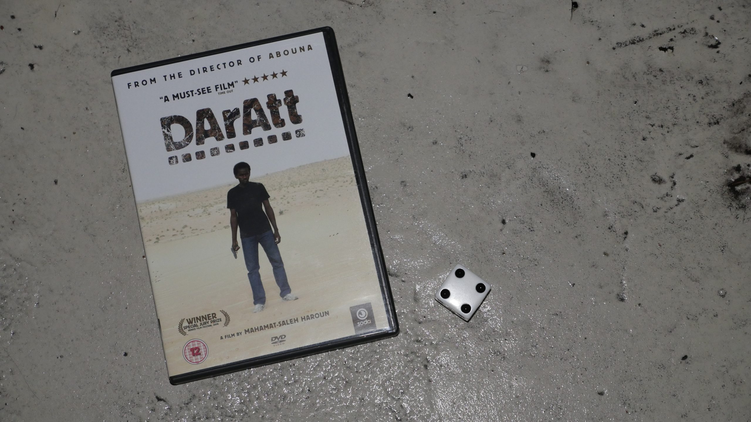 | 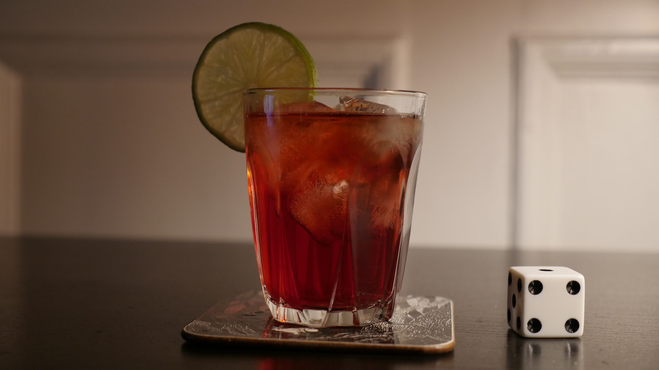 |
| Dry Season. Mahamat-Saleh Haroun. 2006. Chad. December 16th, 2016. Karkanji. |
 | 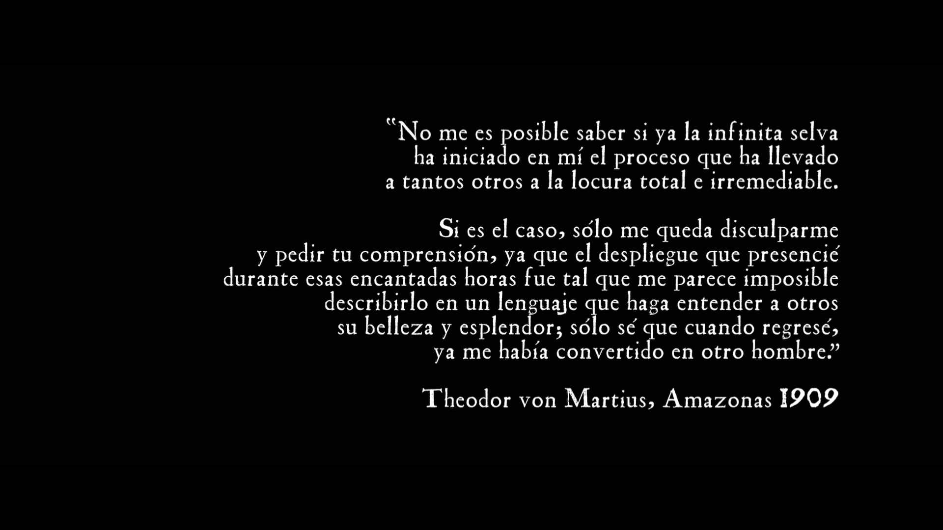 | 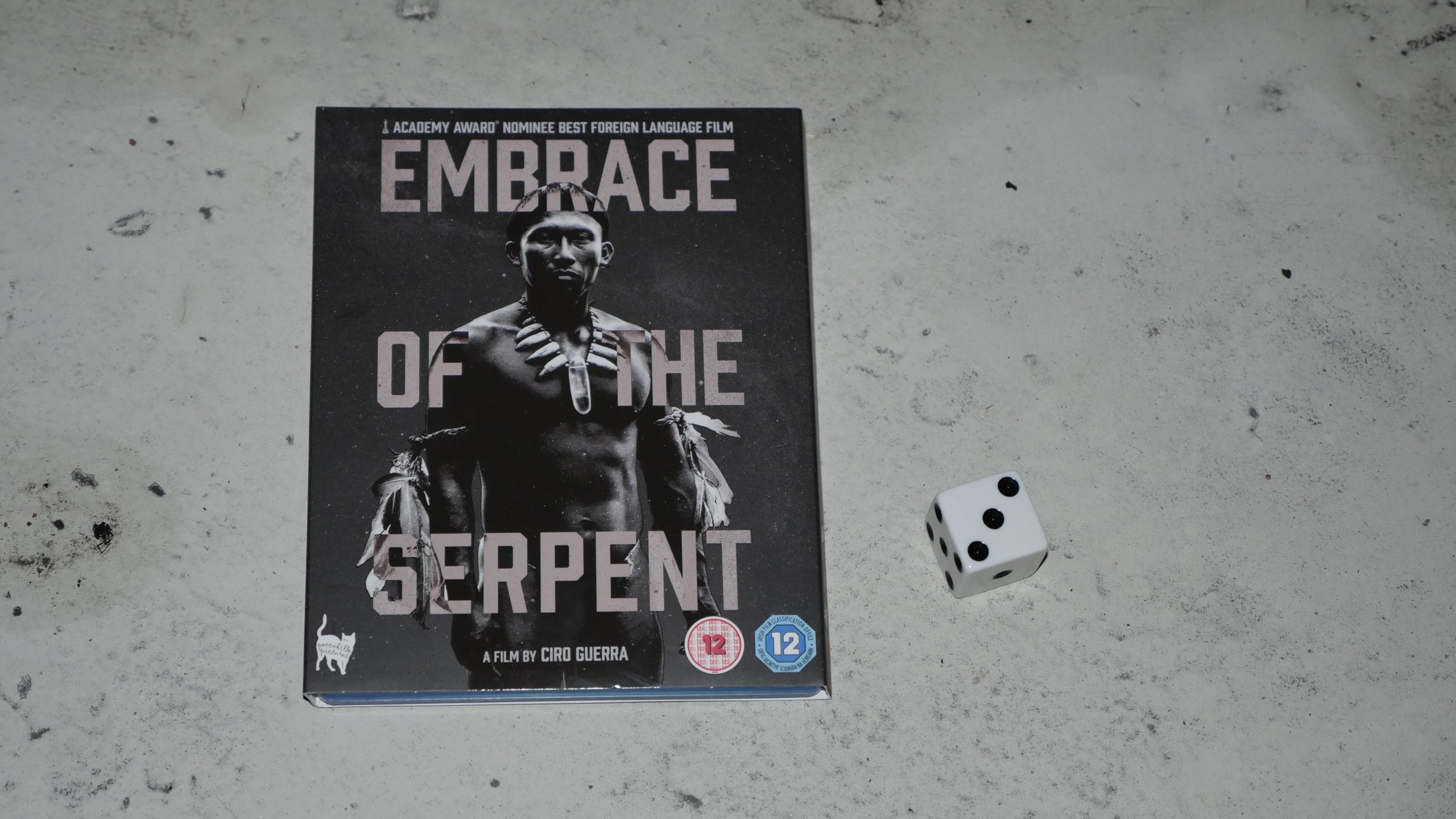 |  |
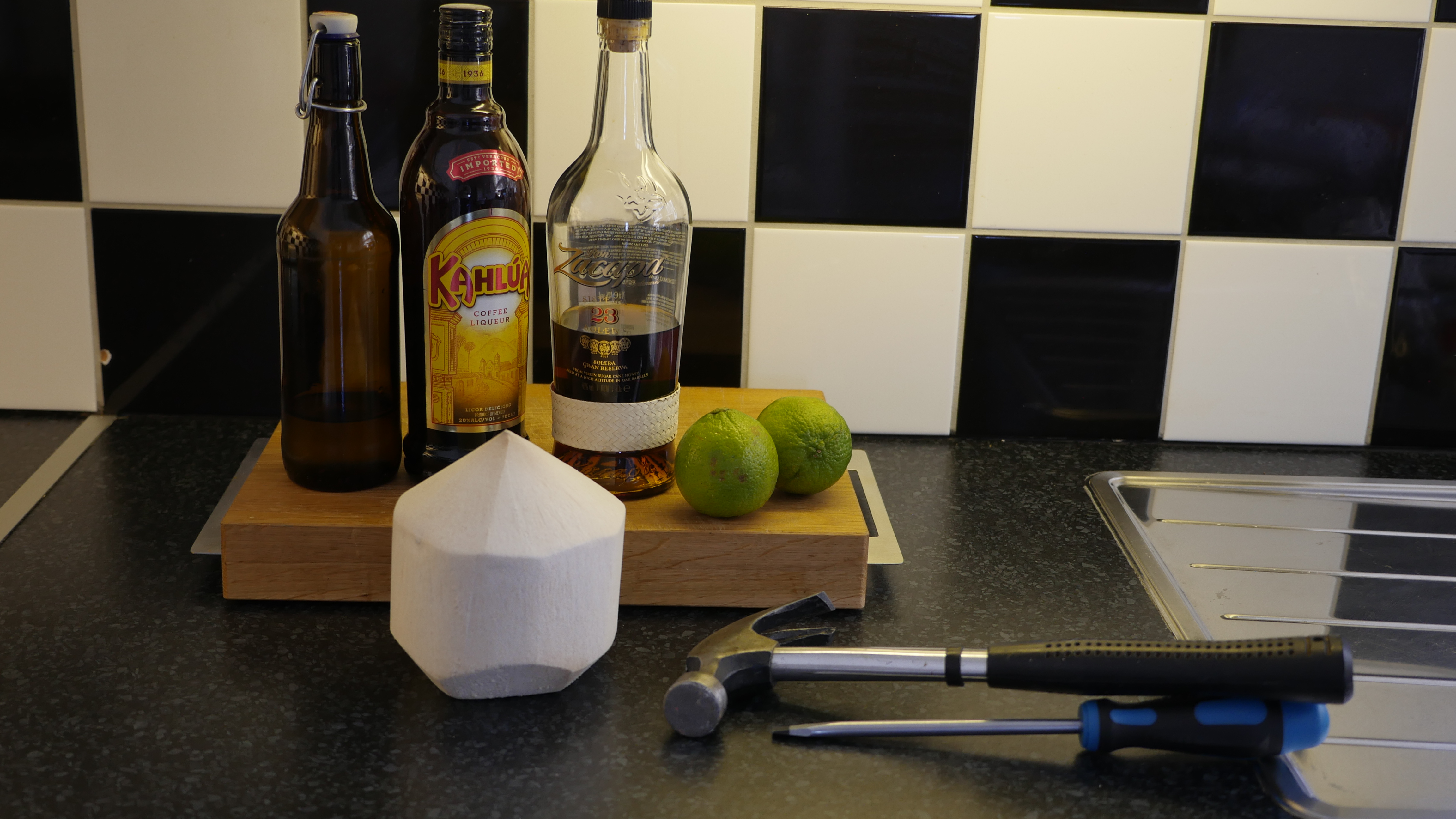
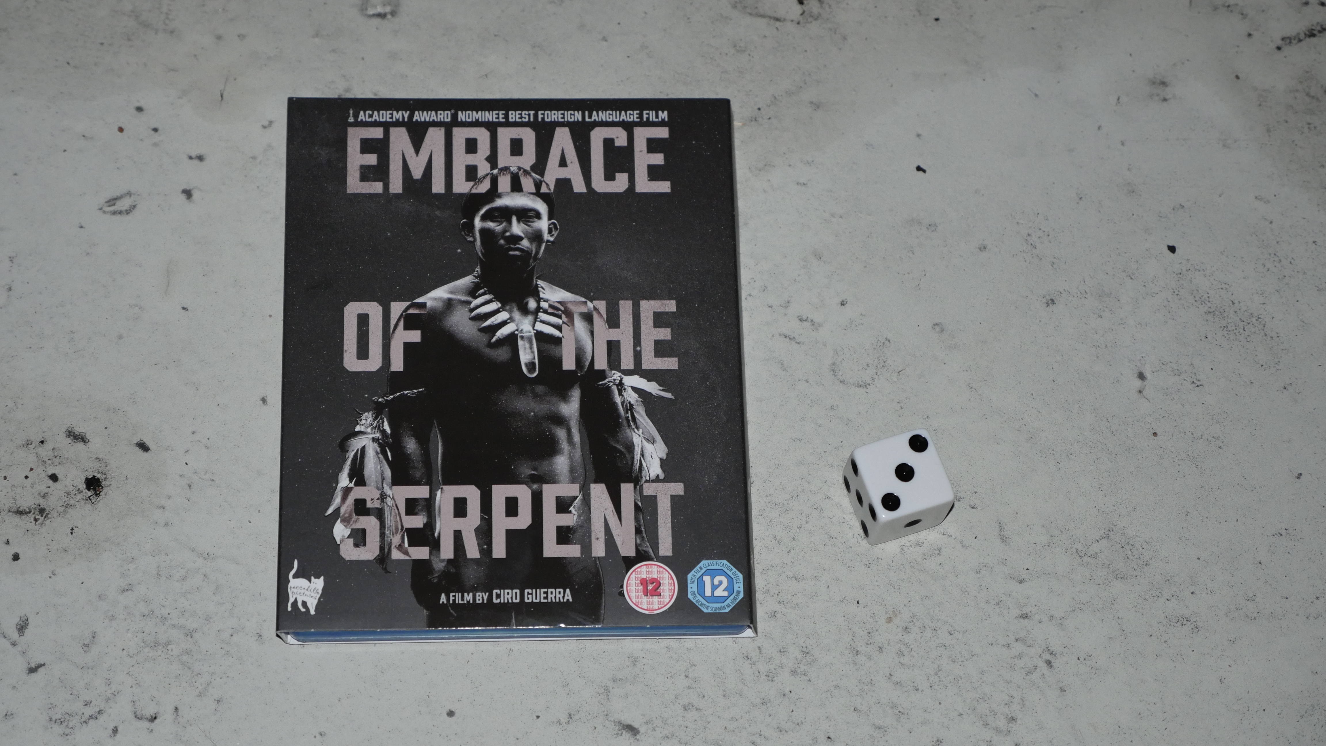
| Embrace of the Serpent. Ciro Guerra. 2015. Colombia. December 17th, 2016. Coco Loco. |
 | 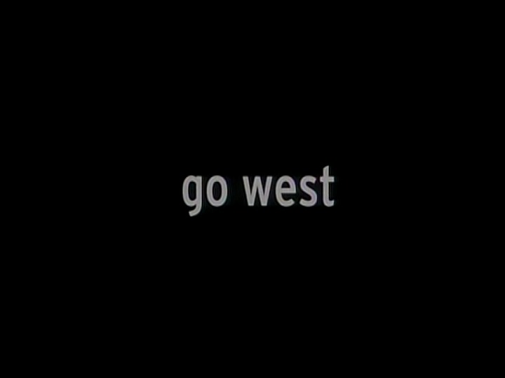 |  |  |
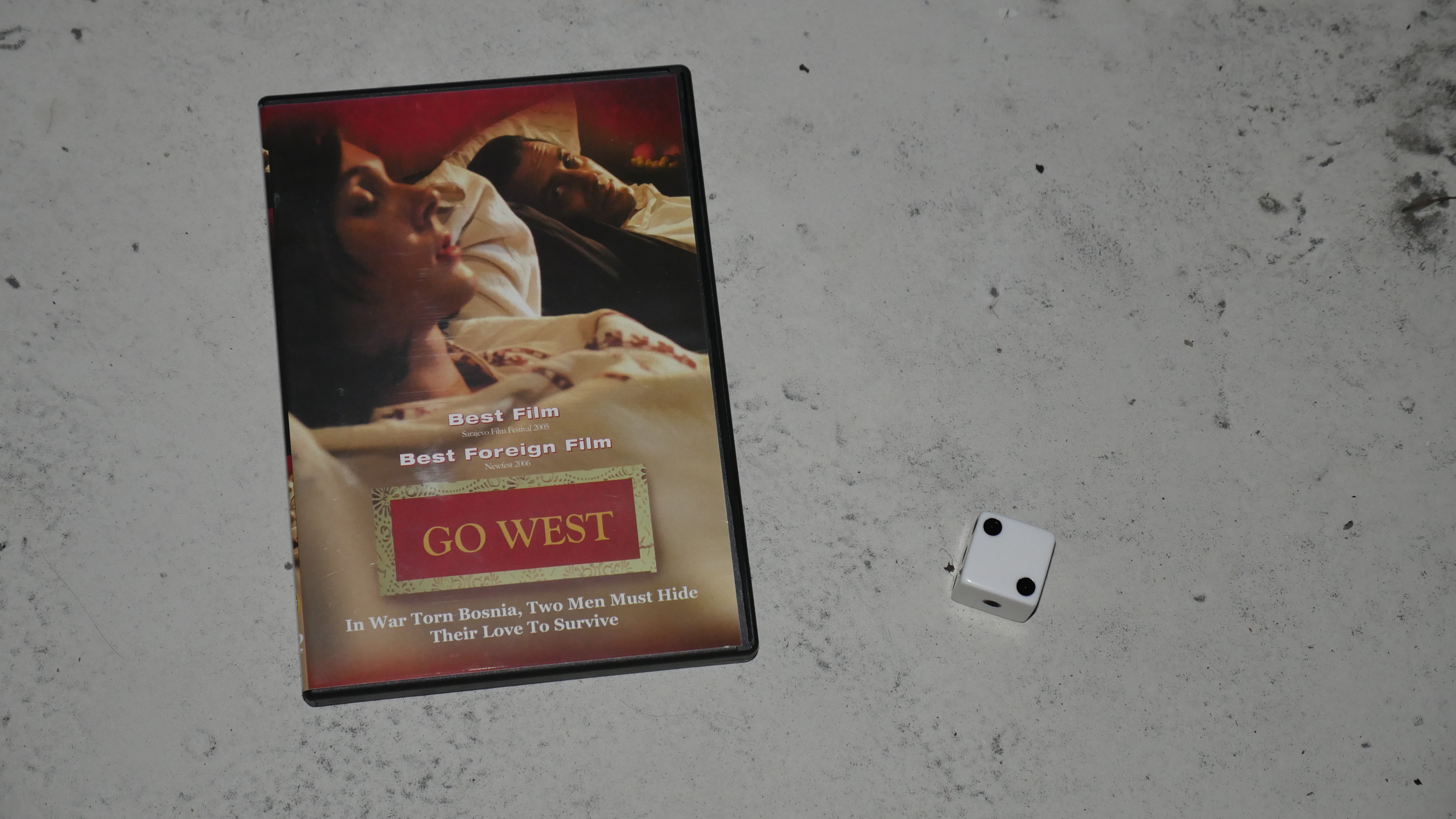
| Go West. Ahmed Imamovic. 2005. Bosnia and Herzegovina. December 17th, 2016. Tito’s Garden. |
 |  | 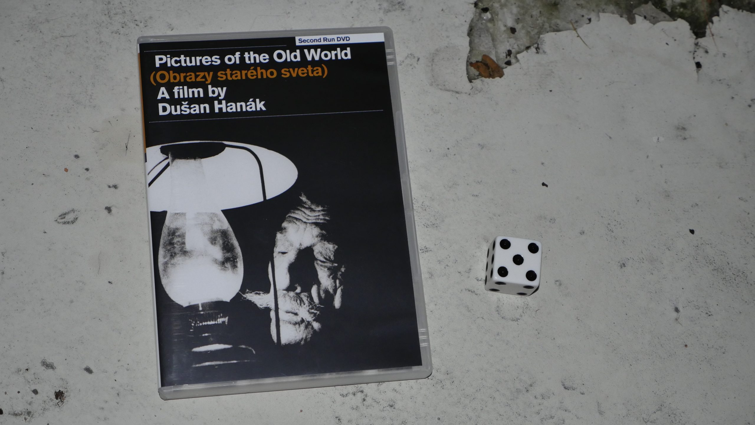 |  |
| Pictures of the Old World. Dusan Hanák. 1972. Slovakia. December 18th, 2016. Hriatô. |
 | 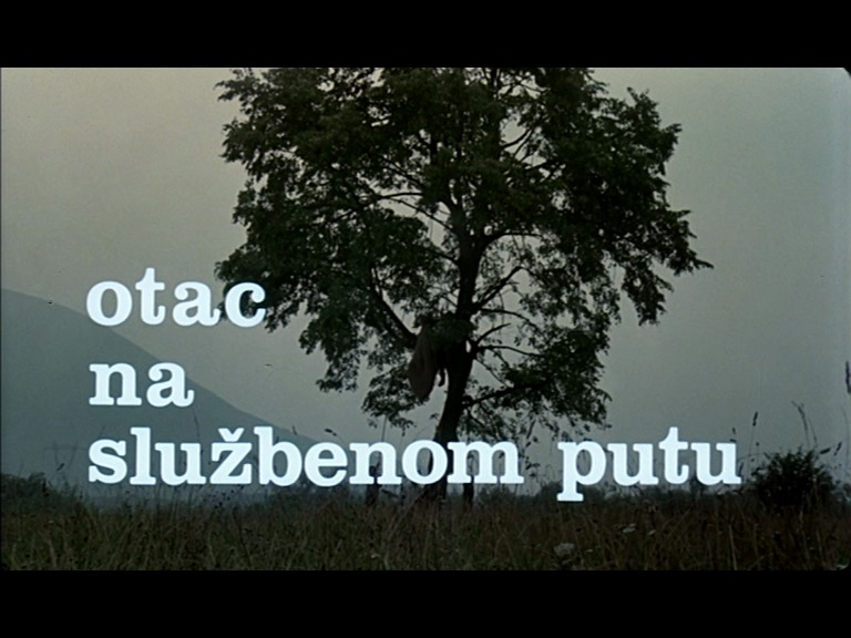 | 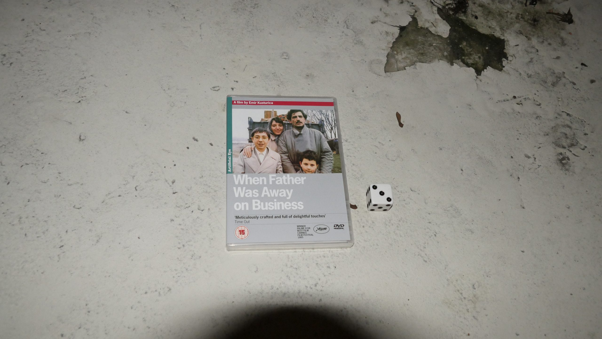 | 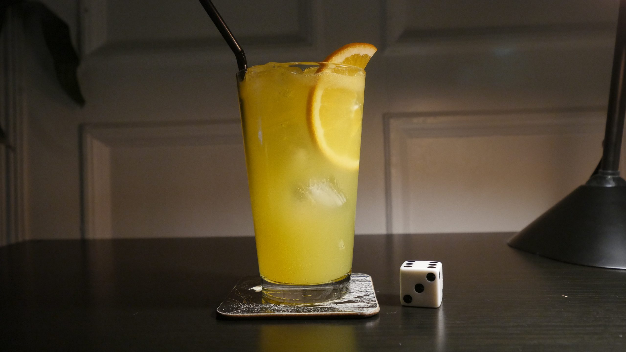 |
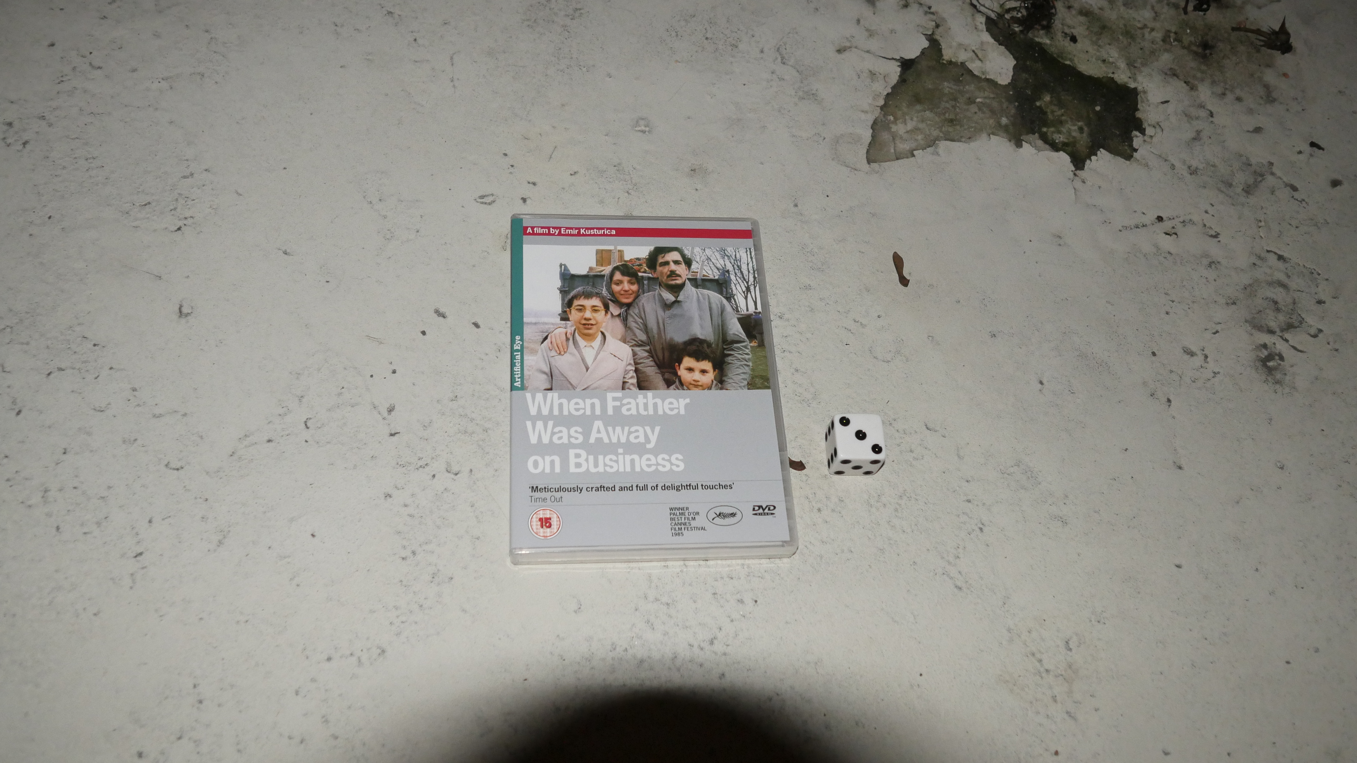
| When Father Was Away on Business. Emir Kusturica. 1985. Serbia. January 7th, 2017. Soft Serbian. |
 | 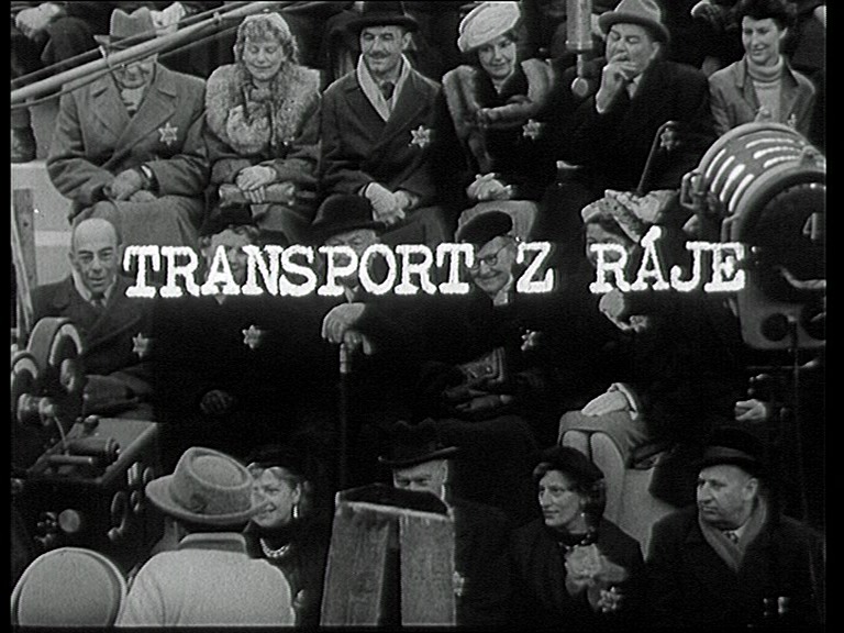 |  |  |
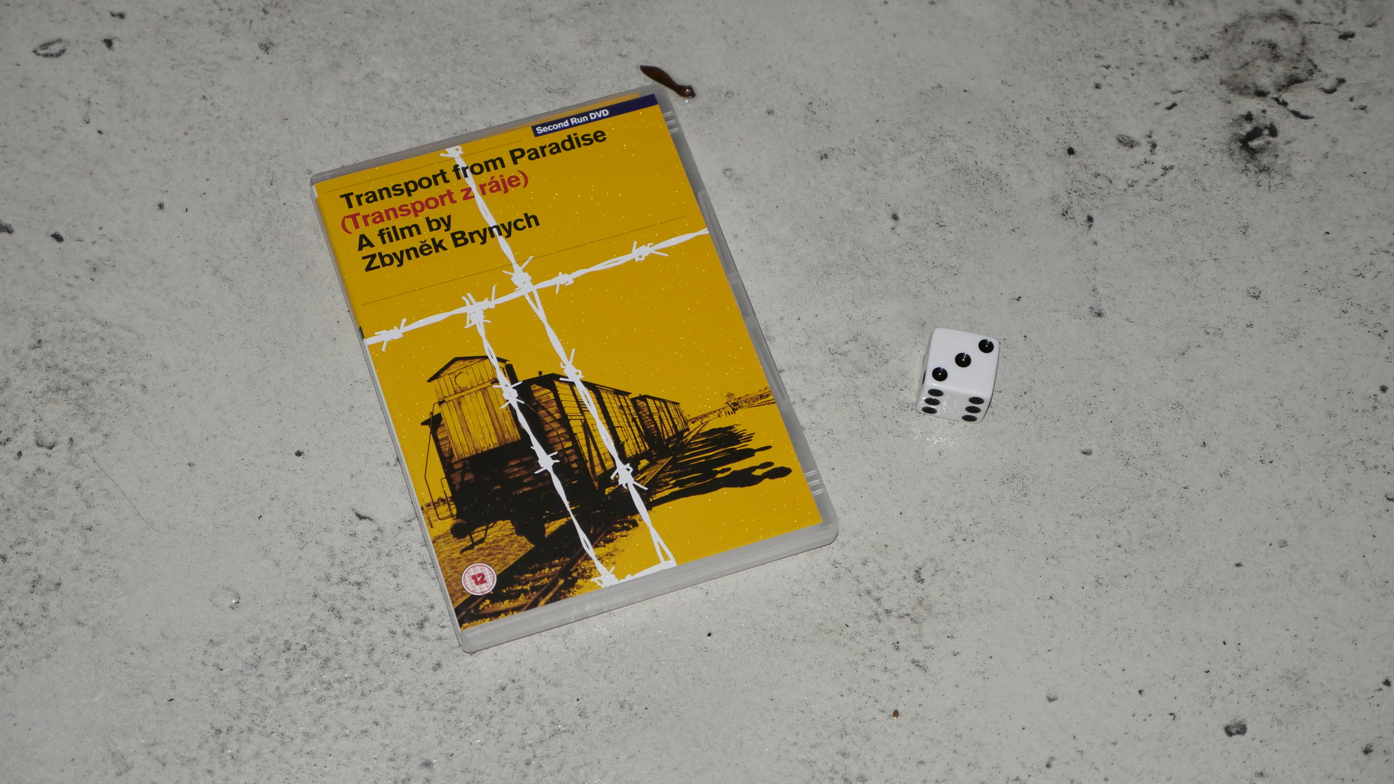
| Transport from Paradise. Zbyněk Brynych. 1963. Czech Republic. January 9th, 2017. Wharf Rat. |
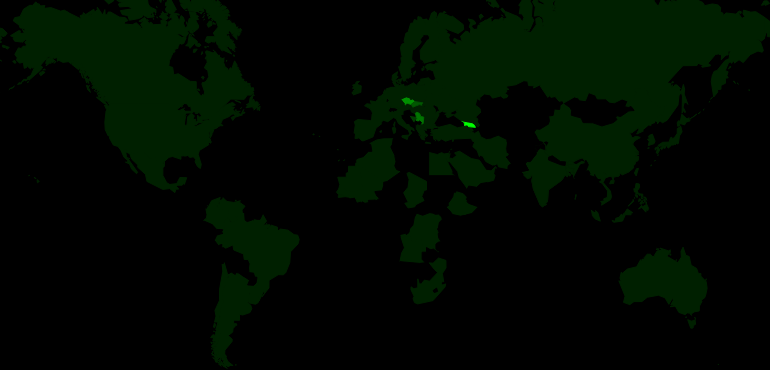 | 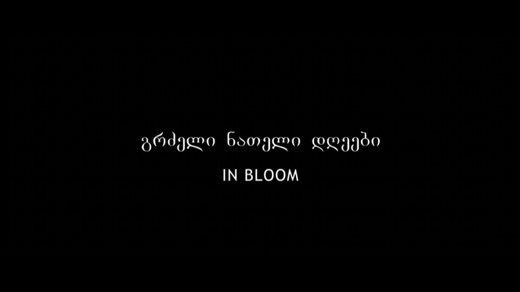 | 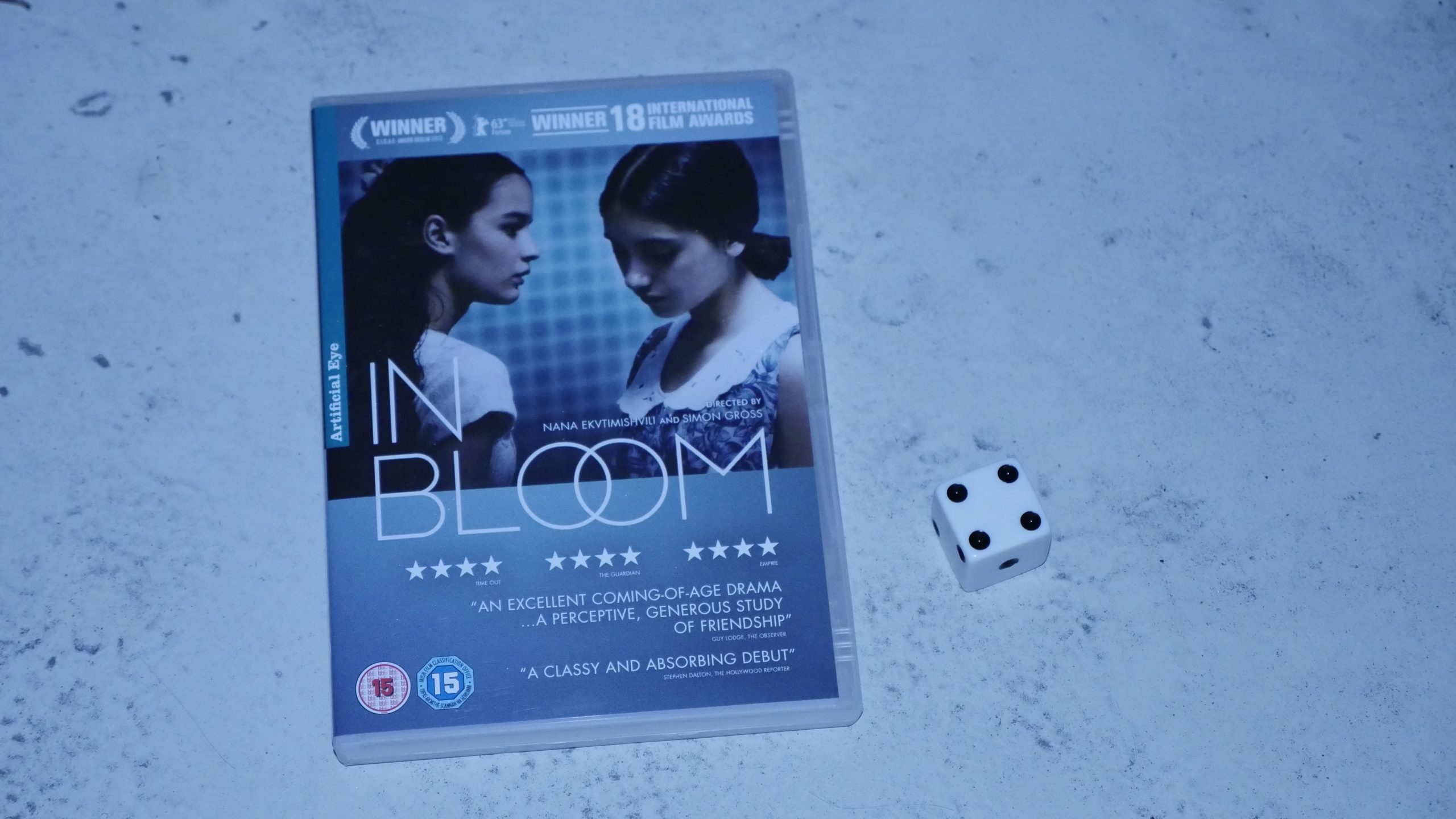 |  |
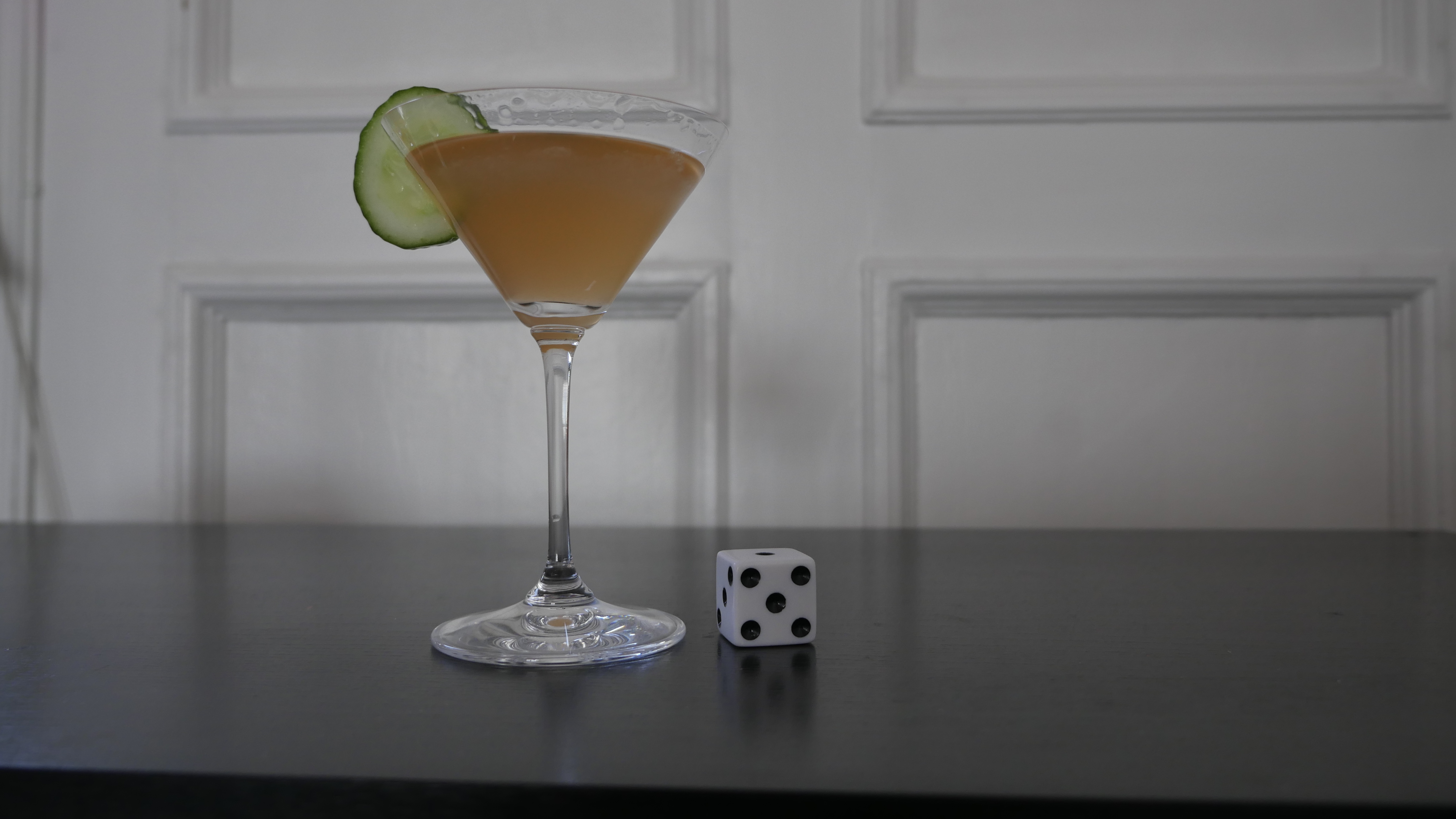
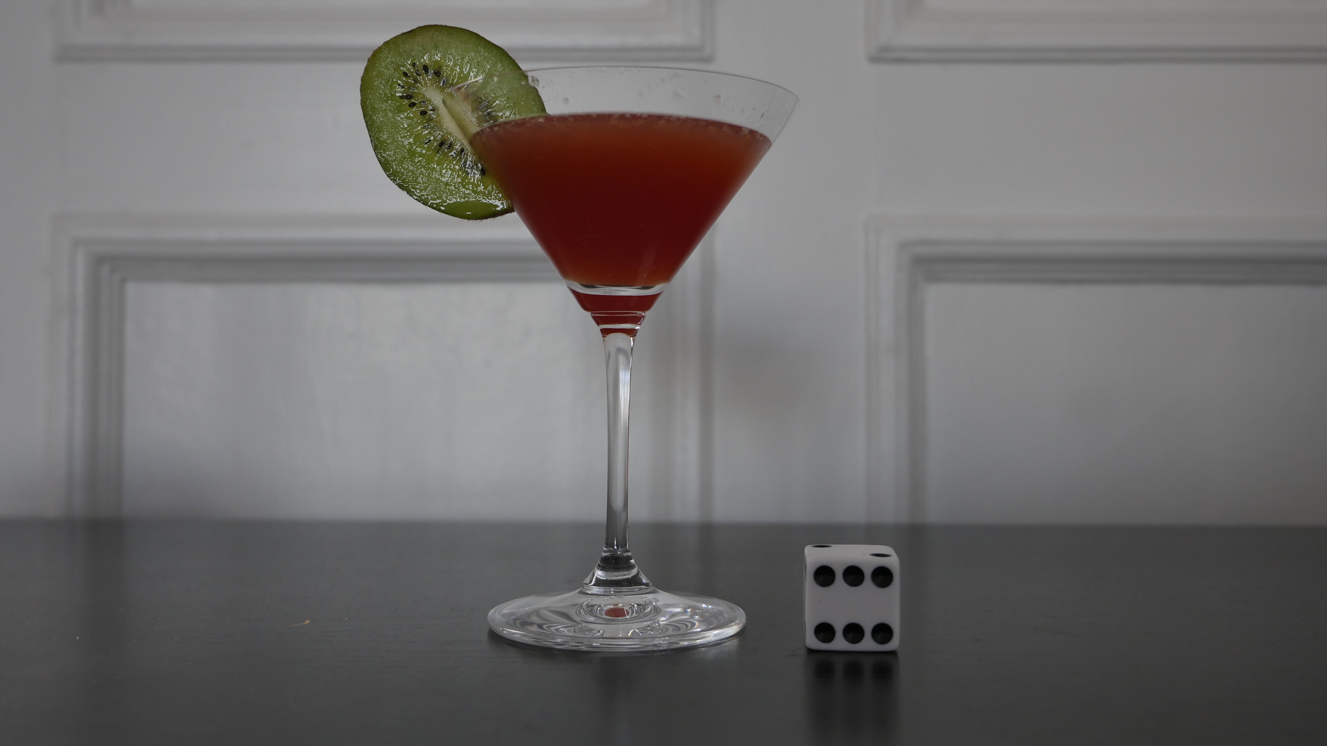
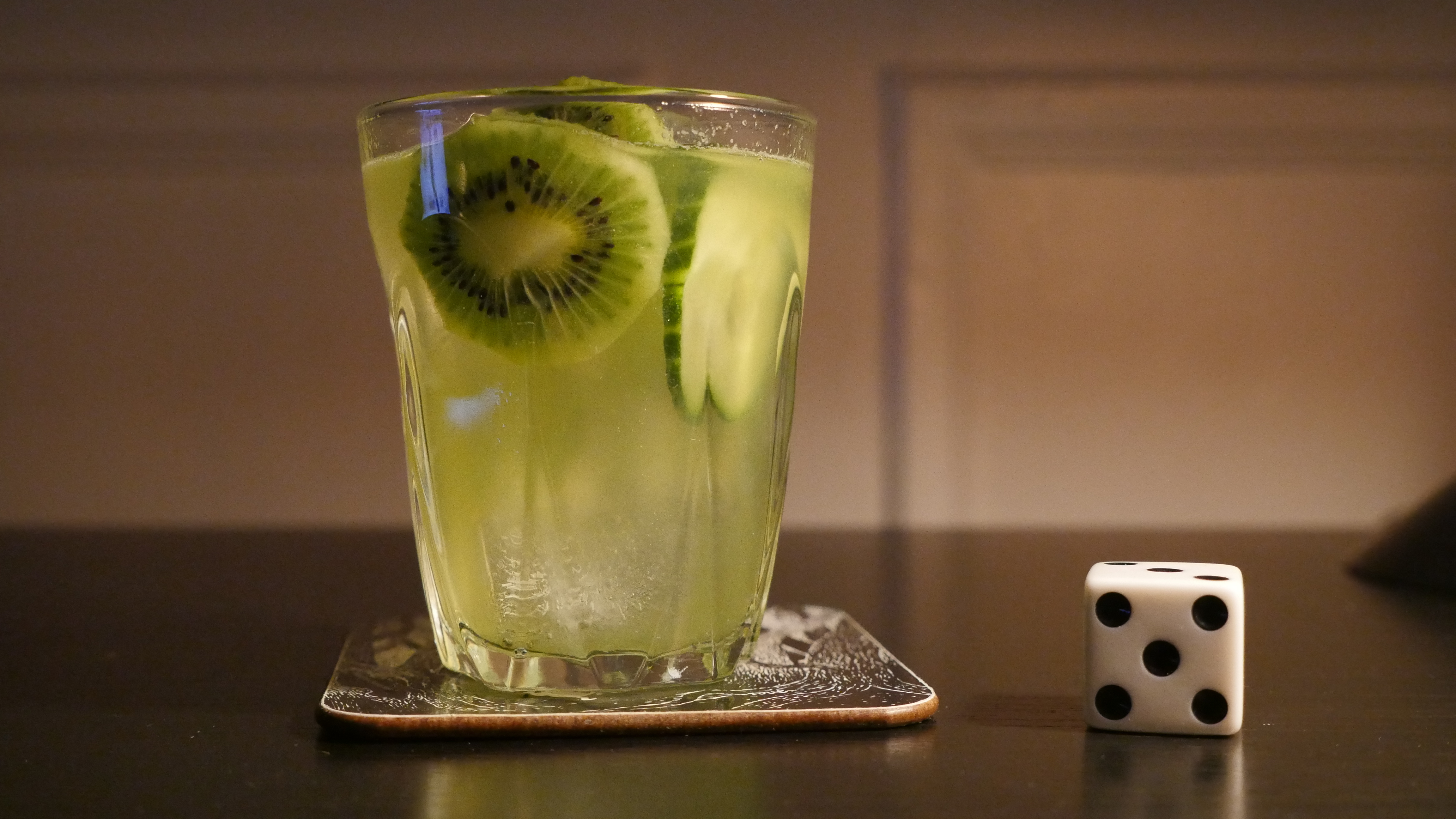
| In Bloom. Nana Ekvtimishvili & Simon Groß. 2013. Georgia. January 28th, 2017. Kiwi & cucumber. |
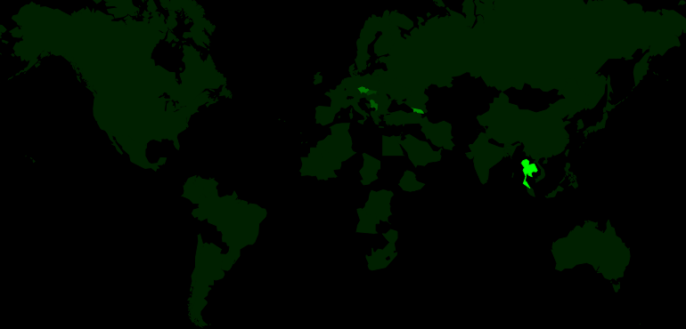 | 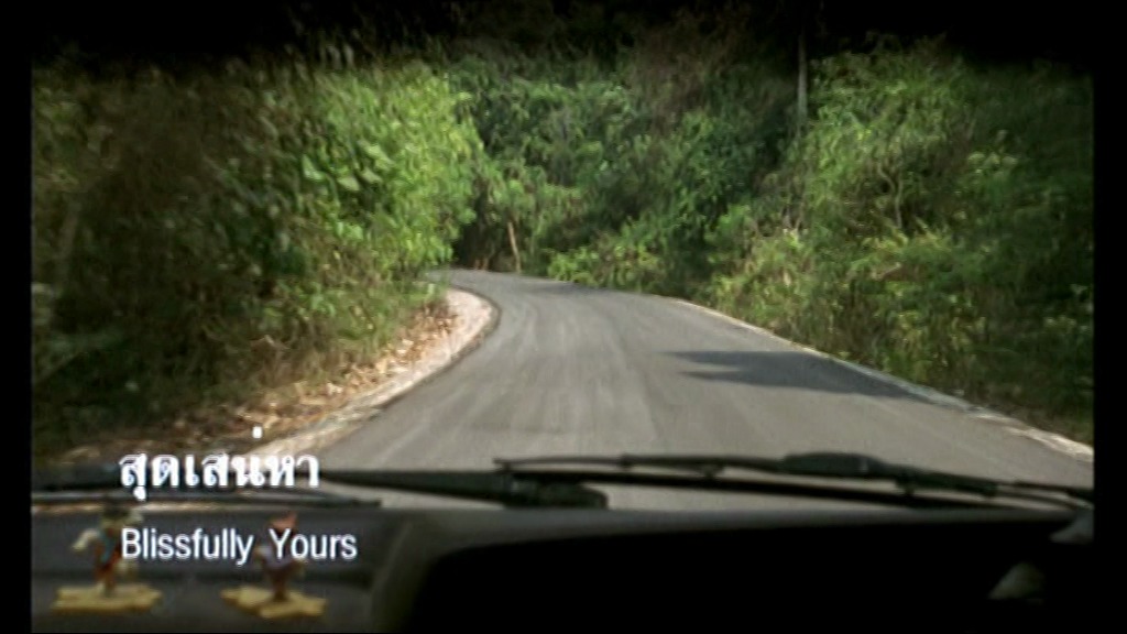 | 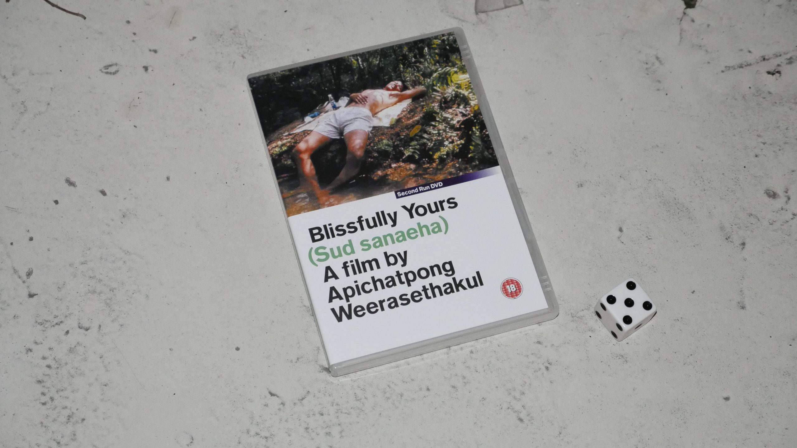 |  |
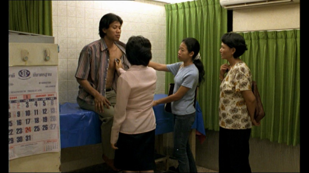
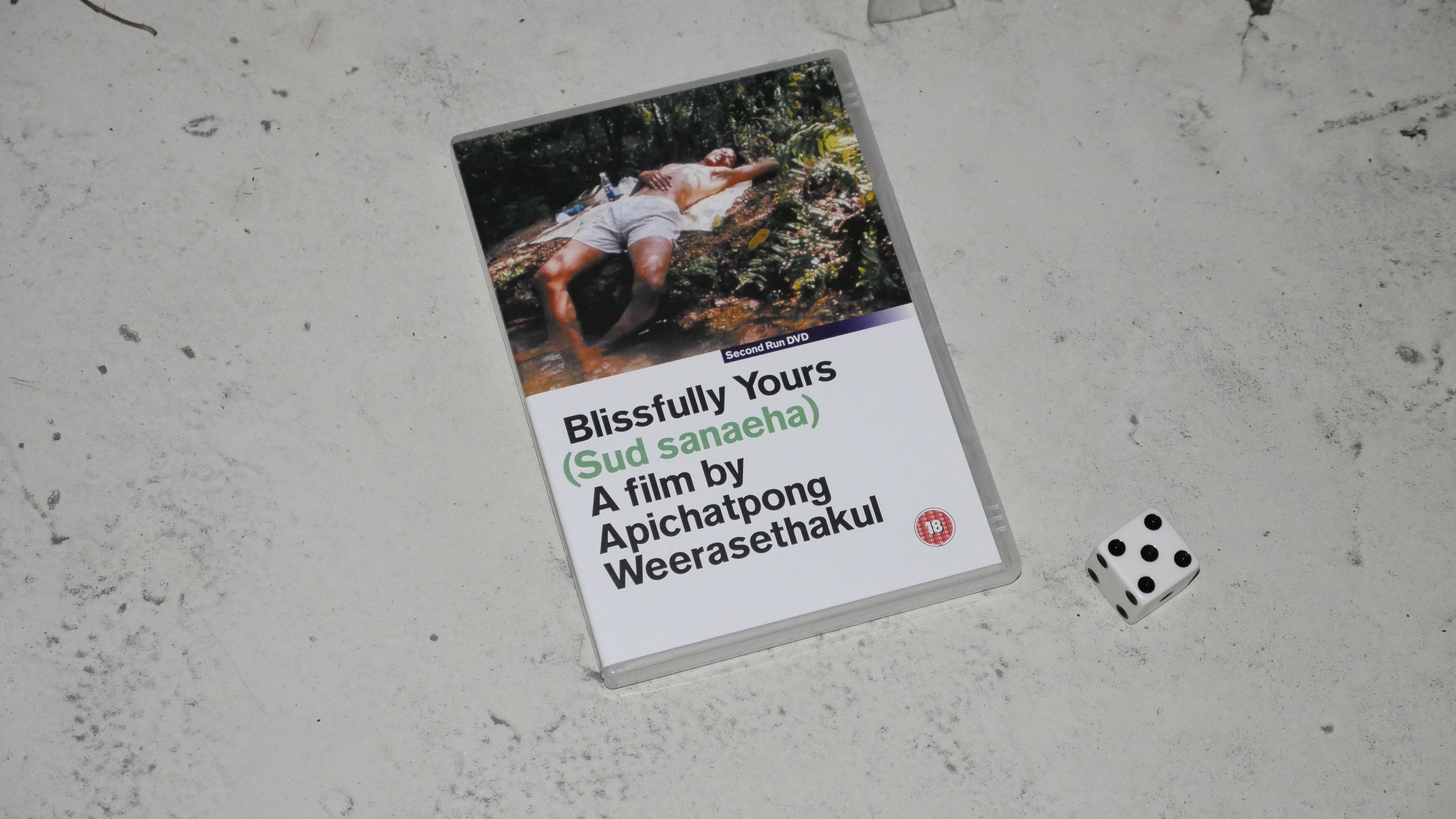
| Blissfully Yours. Apichatpong Weerasethakul. 2002. Thailand. January 28th, 2017. Coco. |
 | 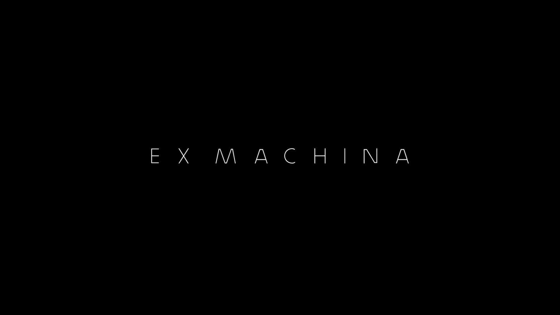 | 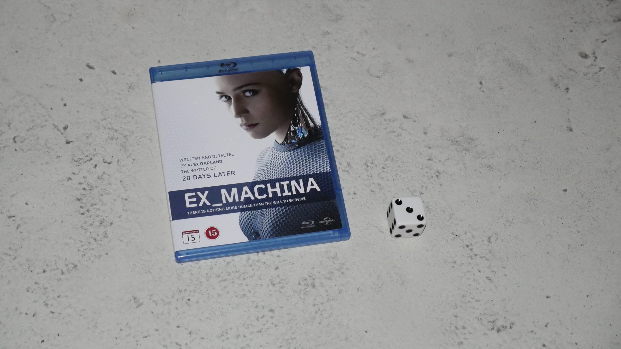 |  |
| Ex Machina. Alex Garland. 2015. Great Britain. January 29th, 2017. White Lady. |
 |  | 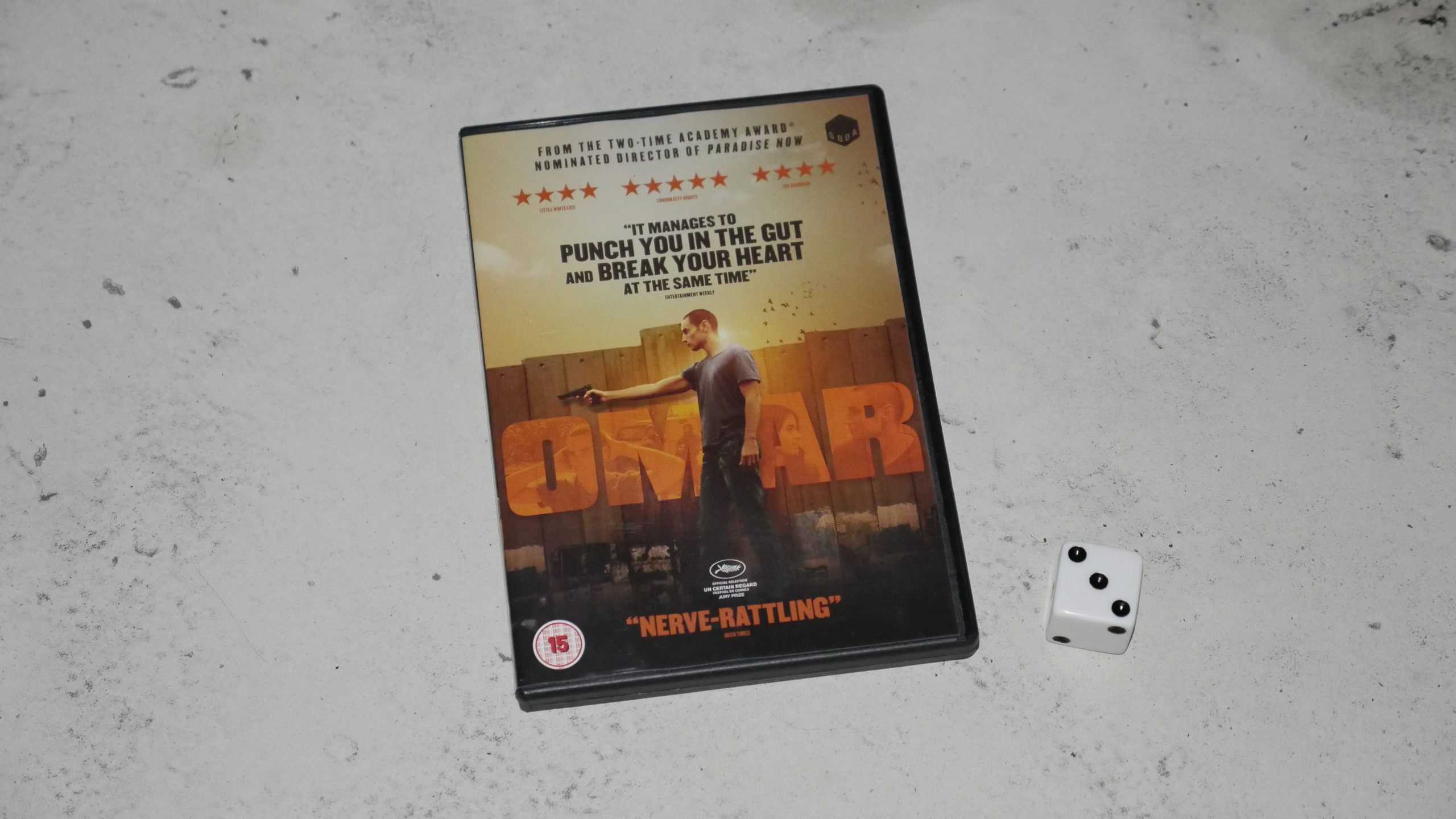 |  |
| Omar. Hany Abu-Assad. 2013. Palestine. February 3rd, 2017. Limonana. |
 | 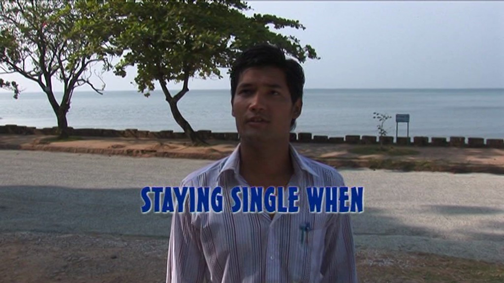 | 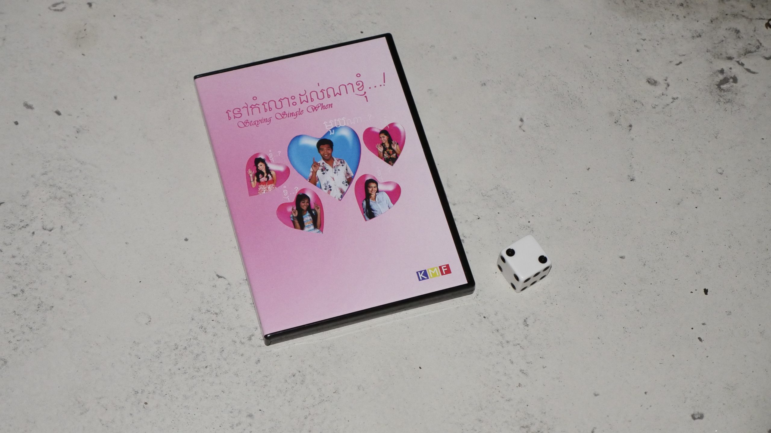 | 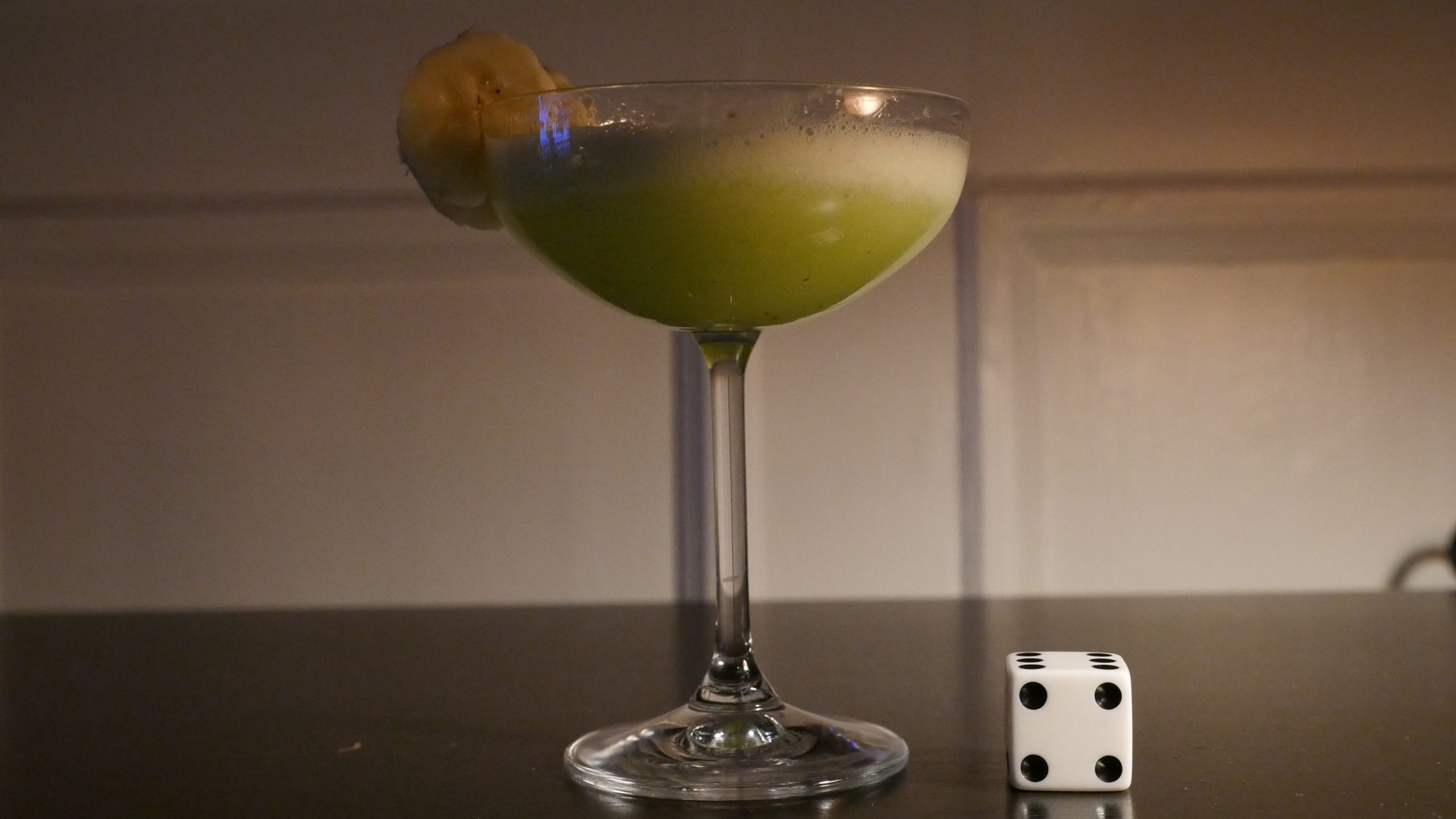 |
| Staying Single When?. Tom Som. 2007. Cambodia. February 4th, 2017. Banana Daiquiri. |
 |  | 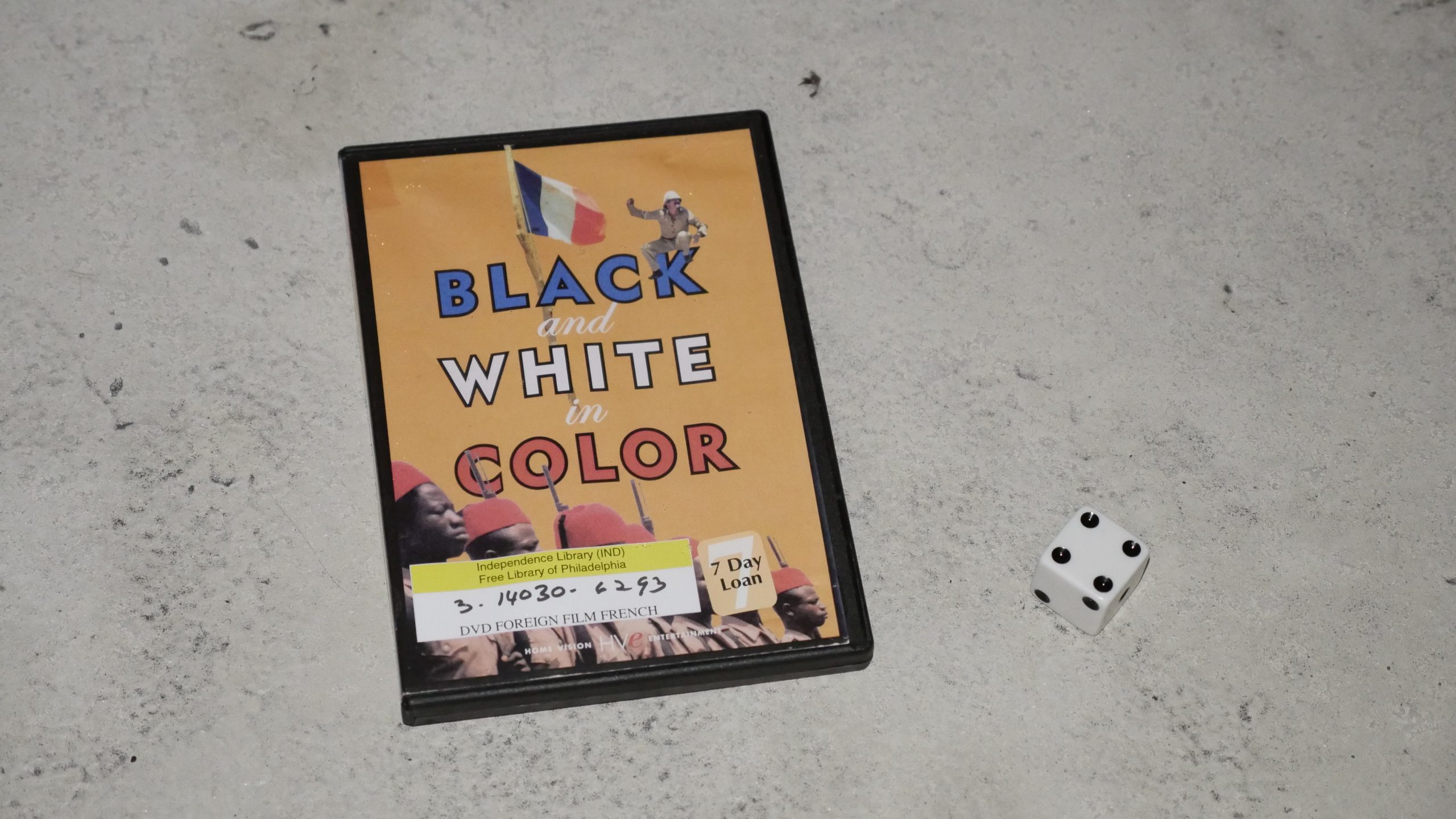 | 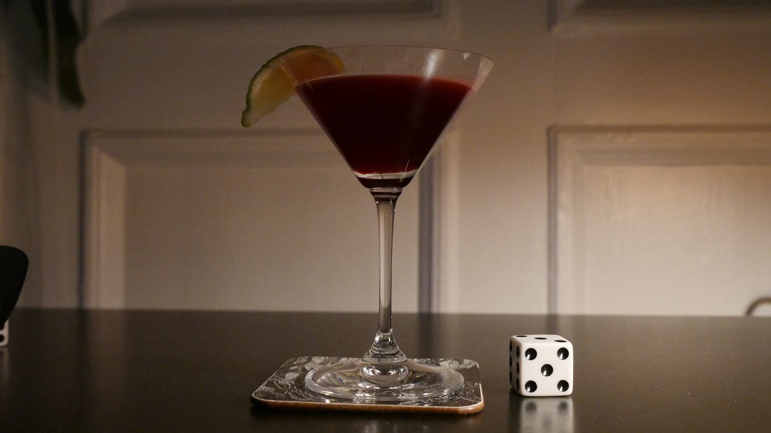 |
| Black and White in Color. Jean-Jacques Annaud. 1976. Côte d’Ivoire. February 4th, 2017. Hibiscus Margaritas. |
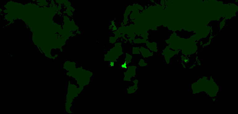 | 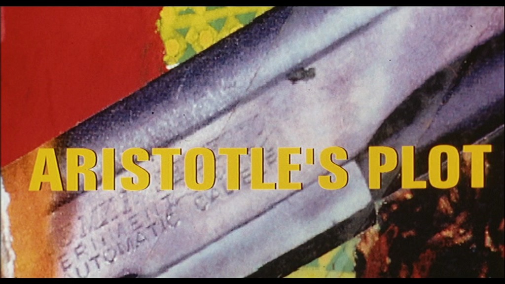 |  |  |
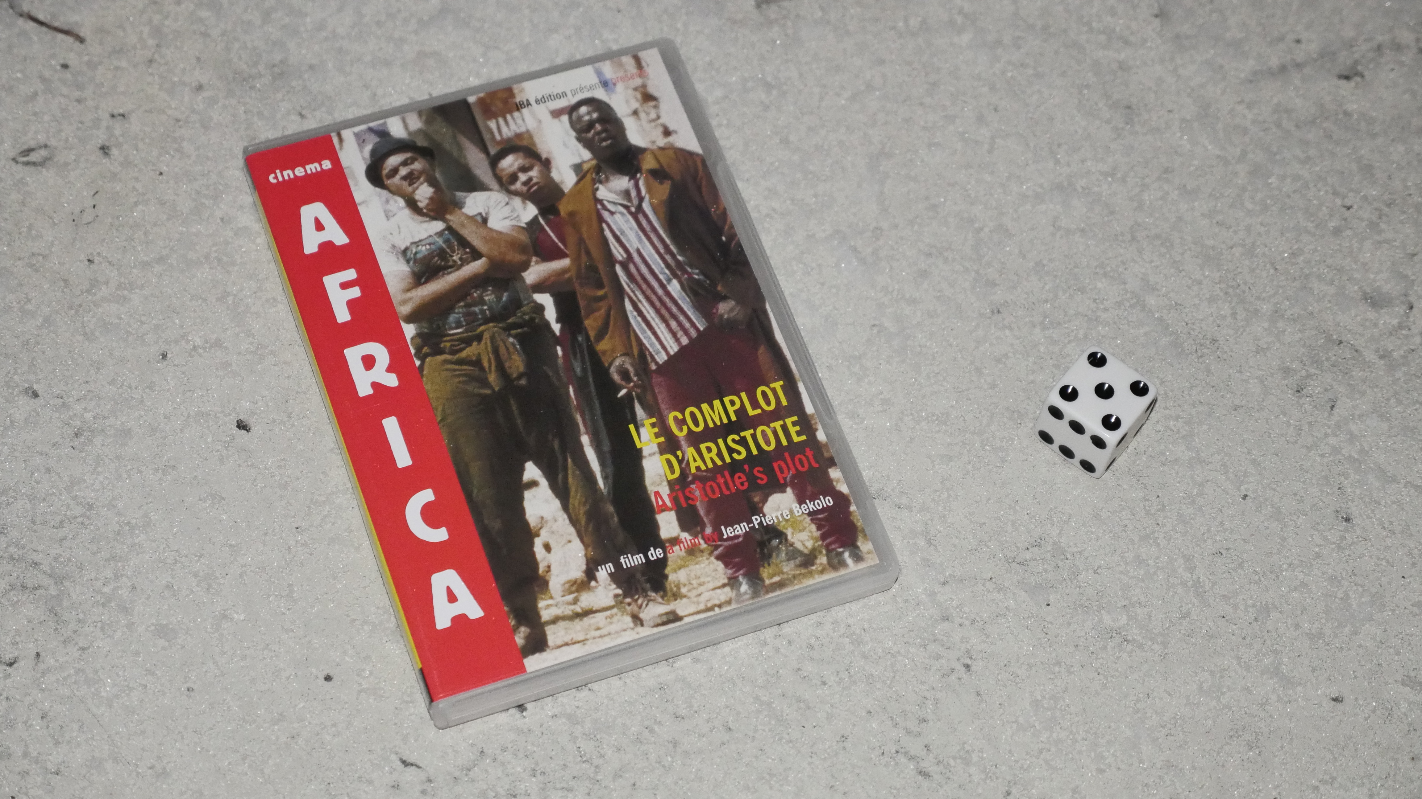
| Le complot d’Aristote. Jean-Pierre Bekolo. 1996. Cameroon. February 4th, 2017. Tamarind & Gin. |
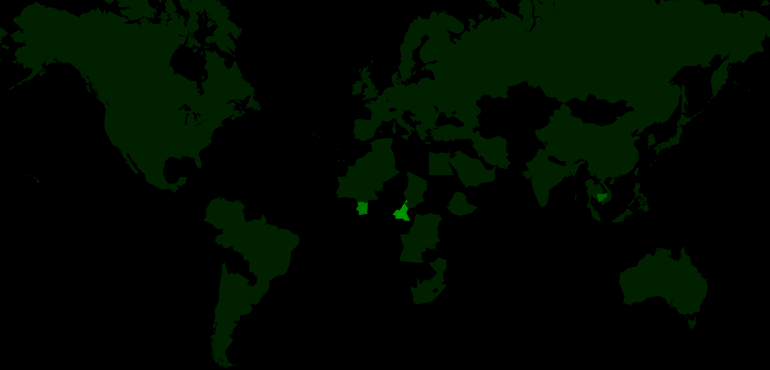 | 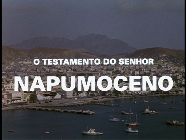 |  |  |
| Napomuceno’s Will. Francisco Manso. 1997. Cabo Verde. February 10th, 2017. Coco Punch. |
 |  | 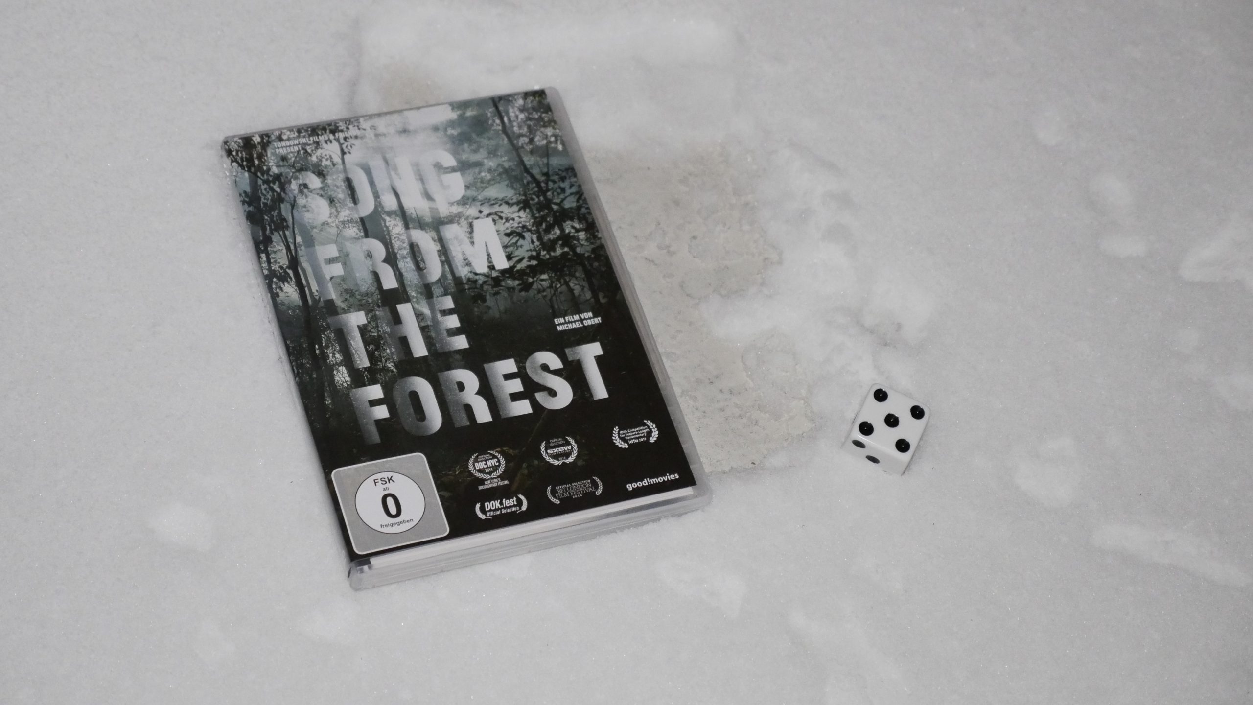 |  |
| Song from the Forest. Michael Obert. 2013. Central African Republic. February 10th, 2017. Wasp. |
 |  | 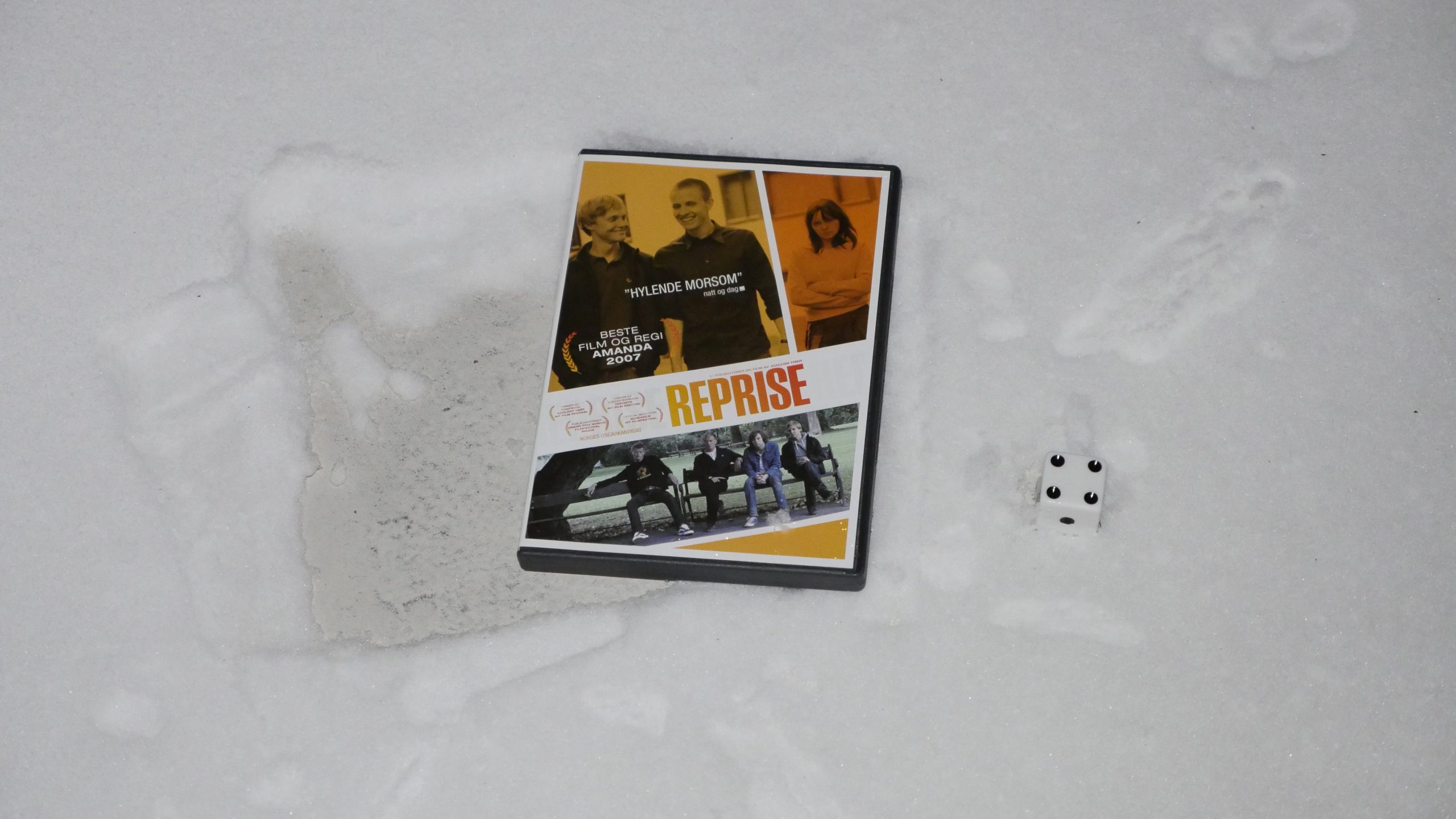 |  |
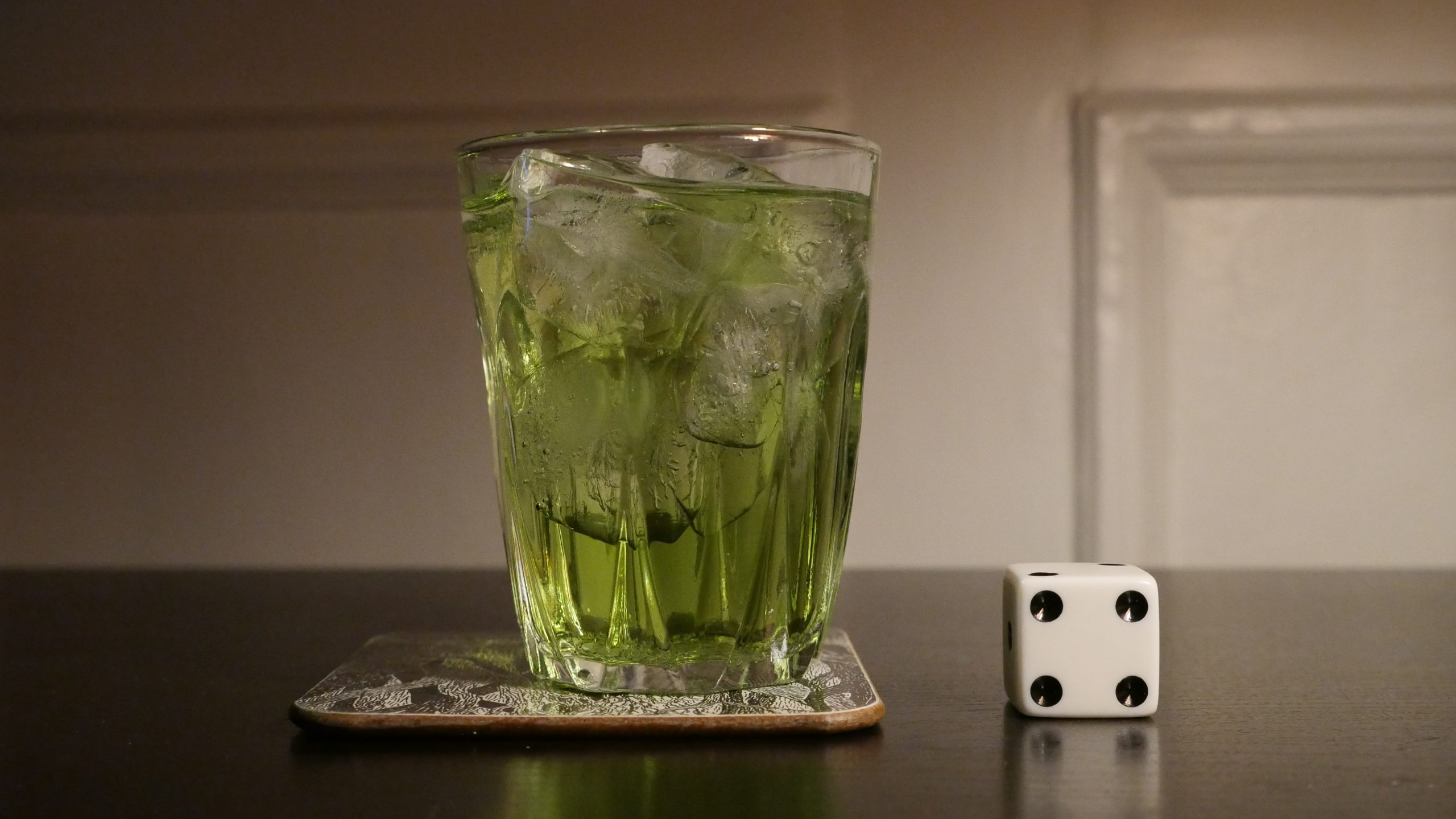
| Rerun. Joachim Trier. 2006. Norway. February 11th, 2017. Mountain Stream. |
 |  | 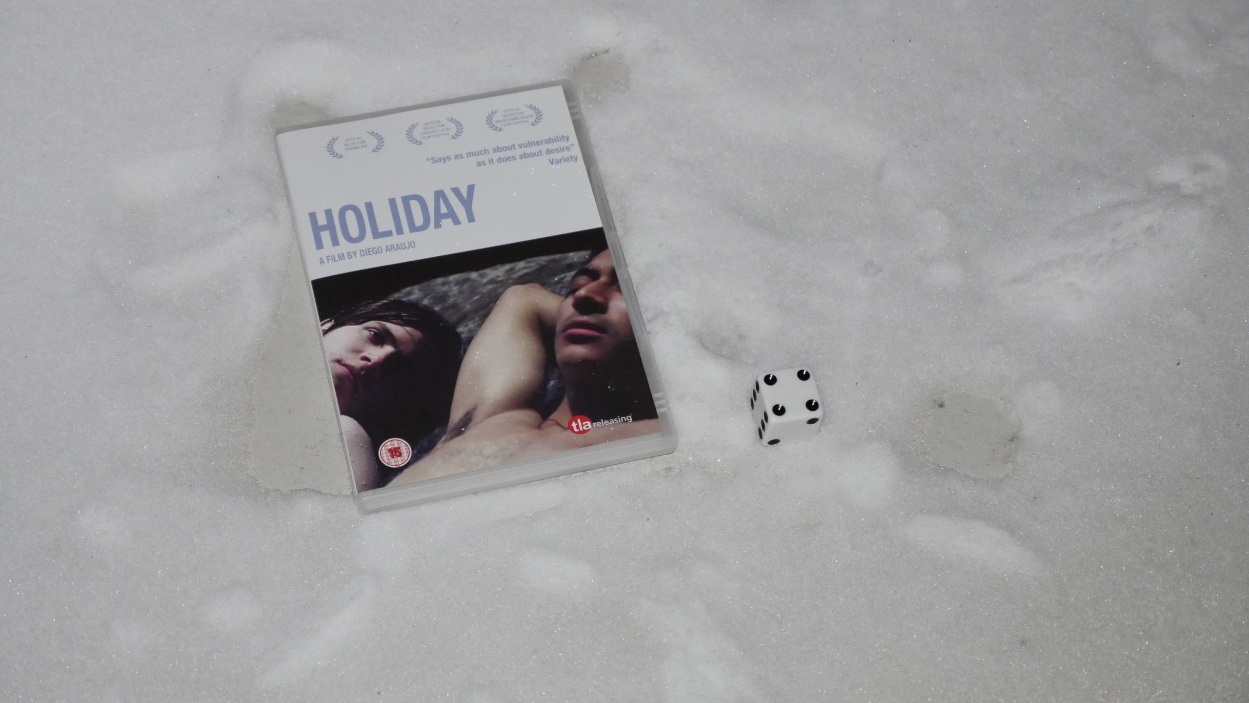 |  |
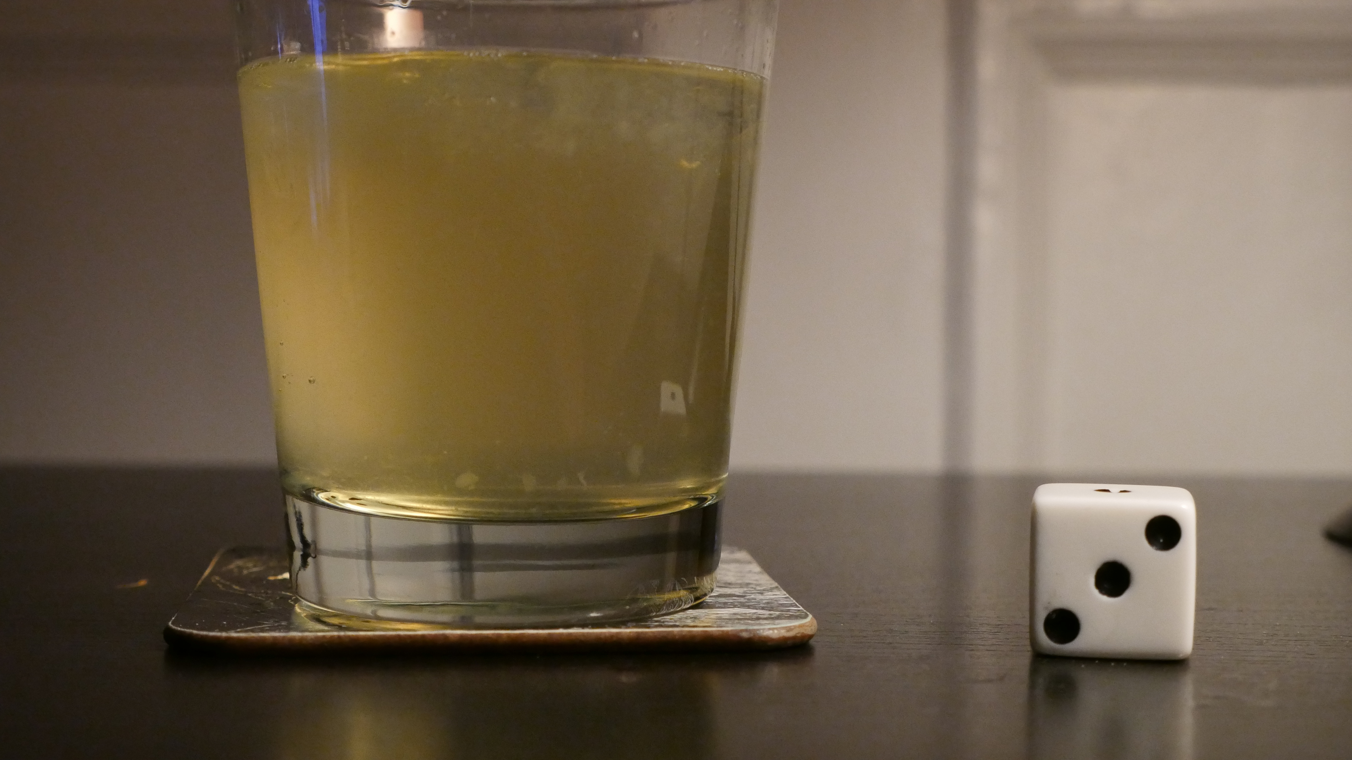
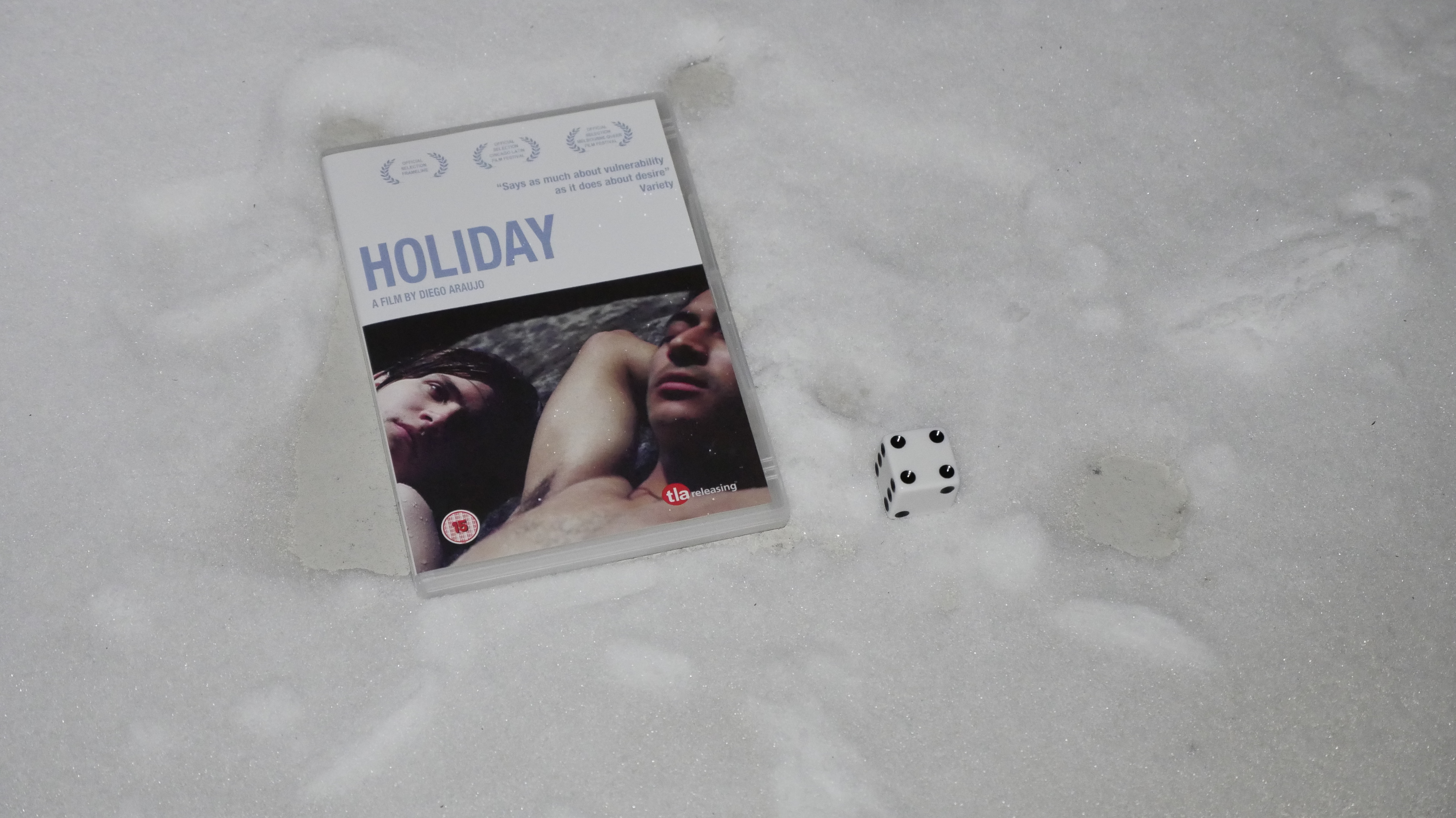
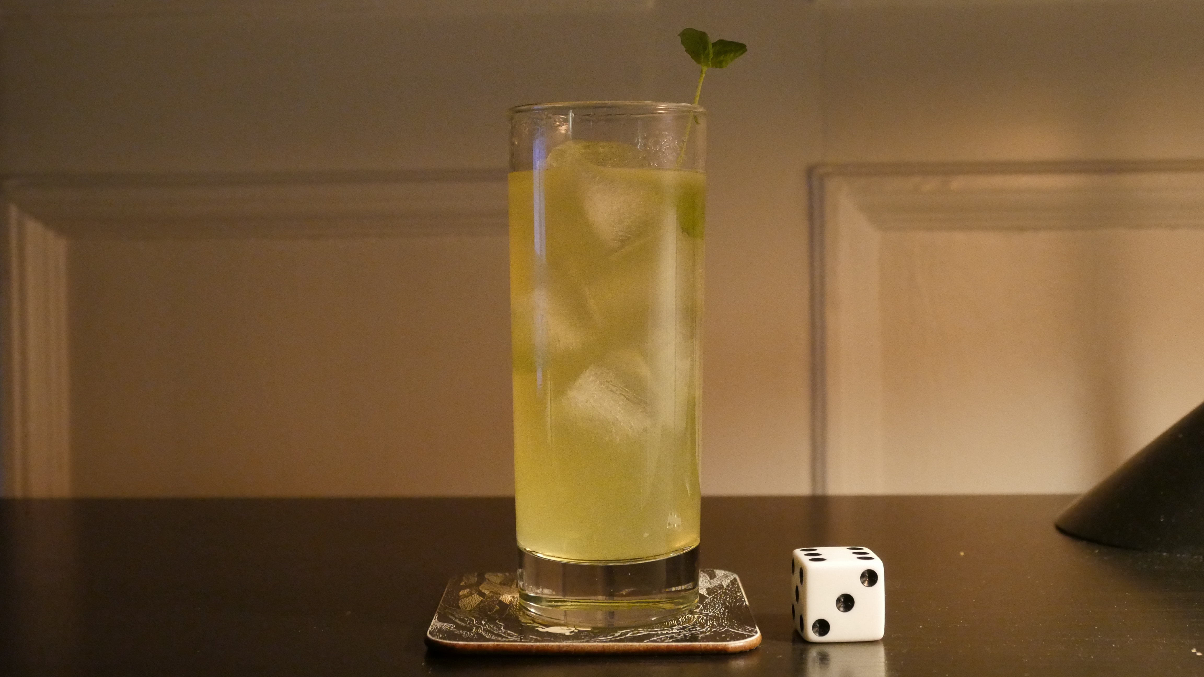
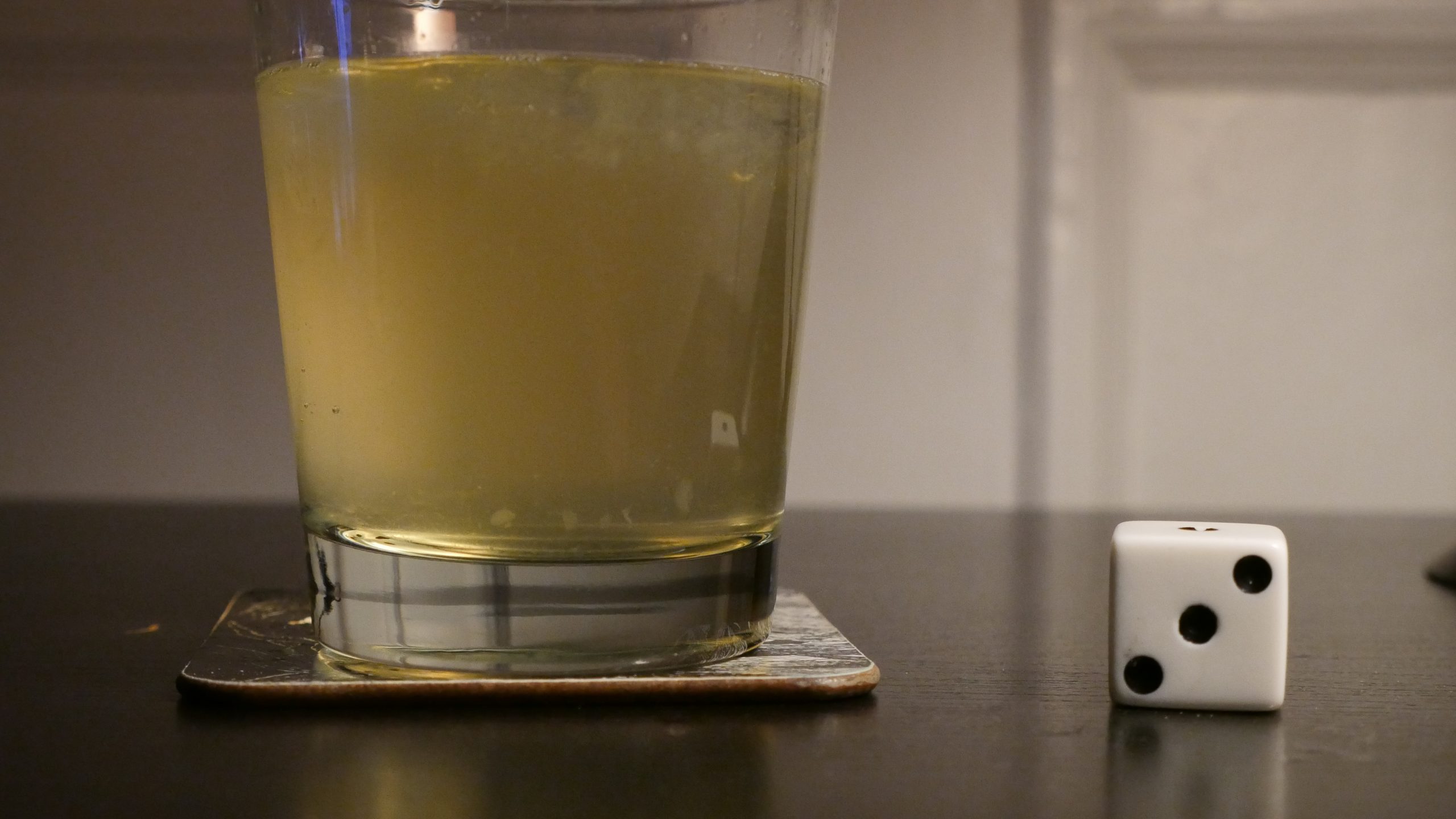
| Holiday. Diego Araujo. 2014. Ecuador. February 11th, 2017. Canalazo. |
 |  | 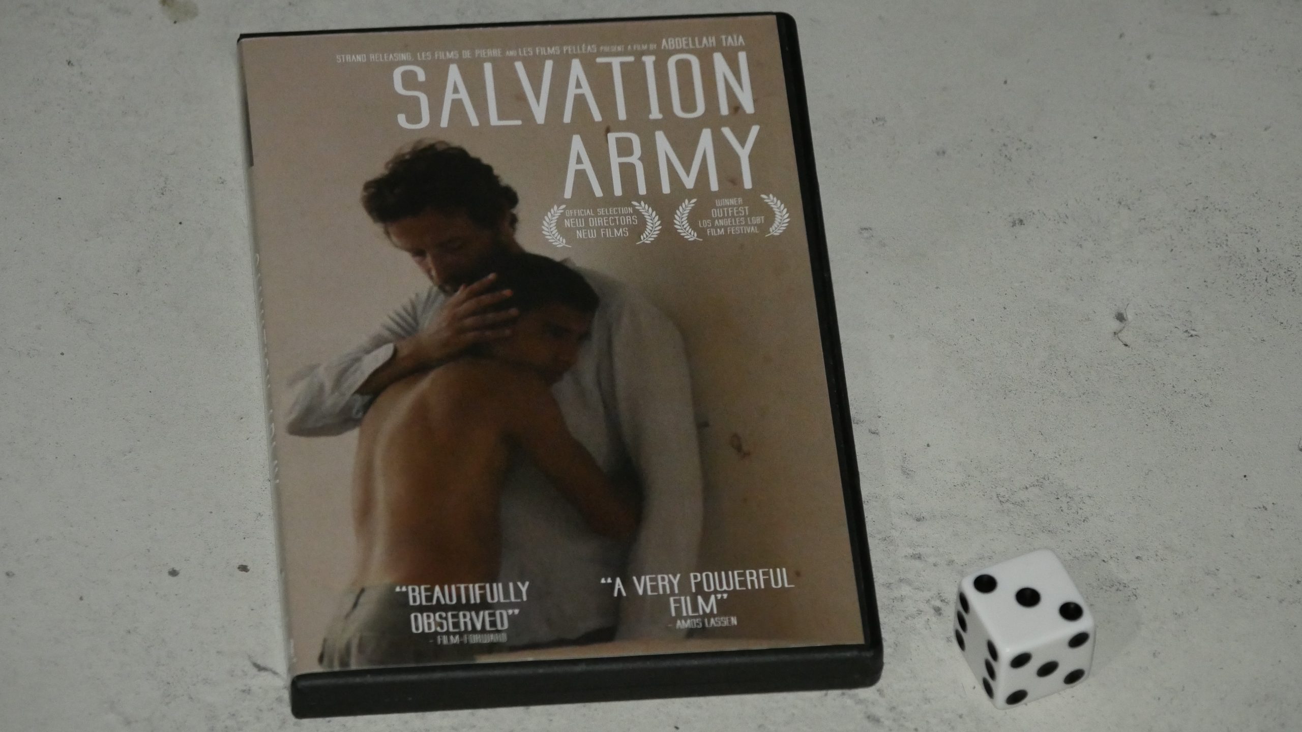 |  |
| Salvation Army. Abdellah Taia. 2013. Morocco. February 24th, 2017. Dolomint. |
 |  | 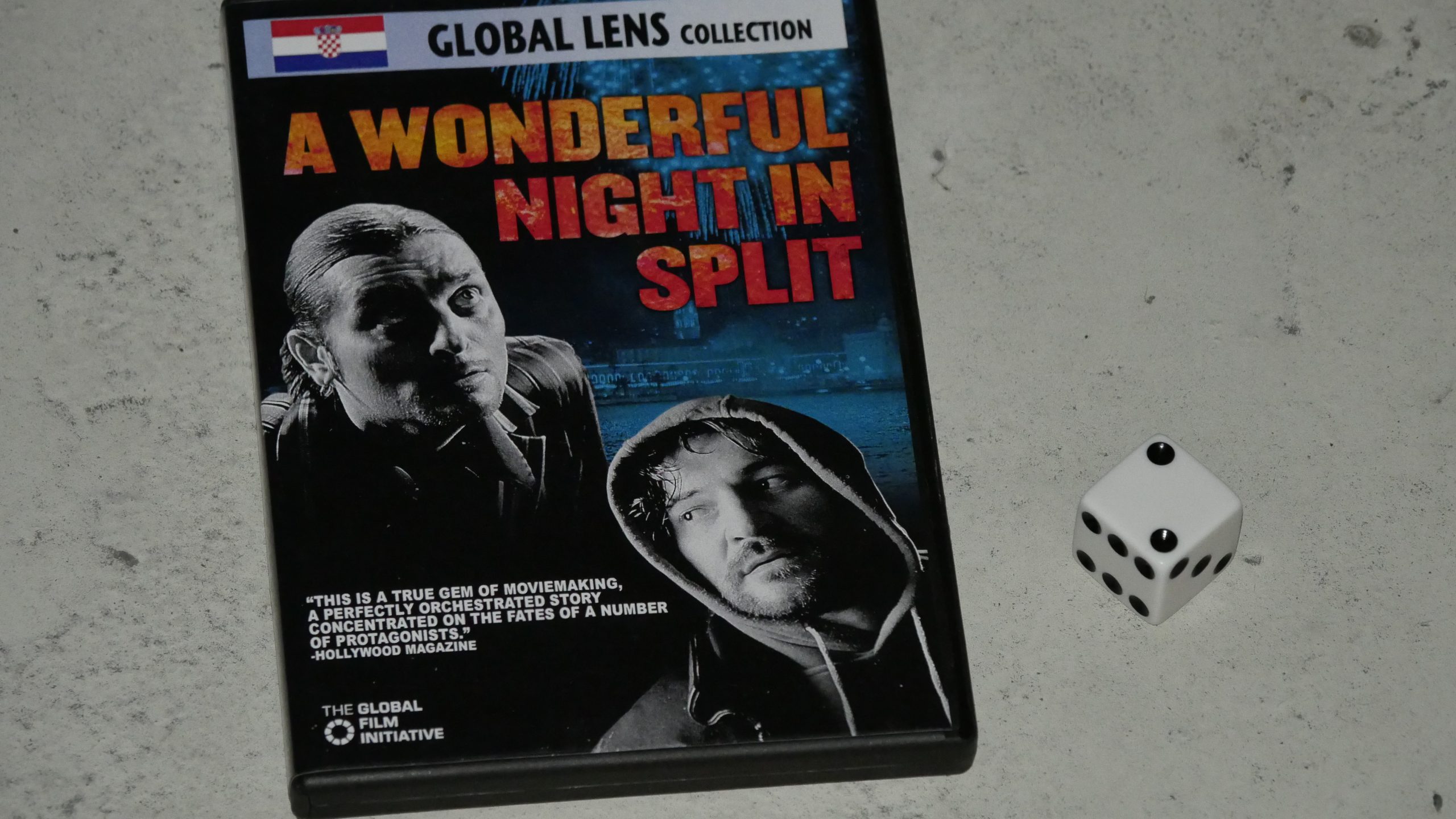 | 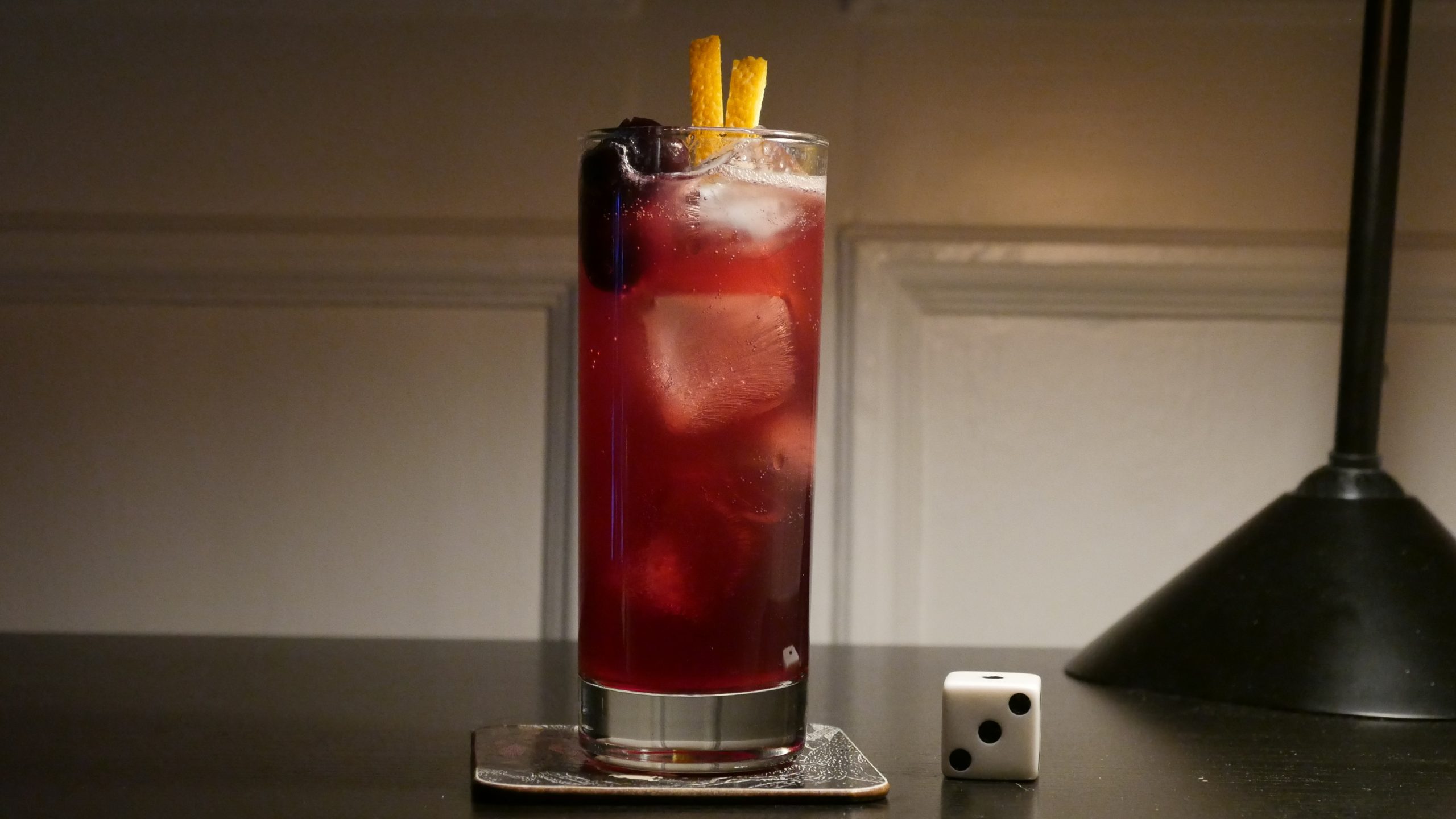 |
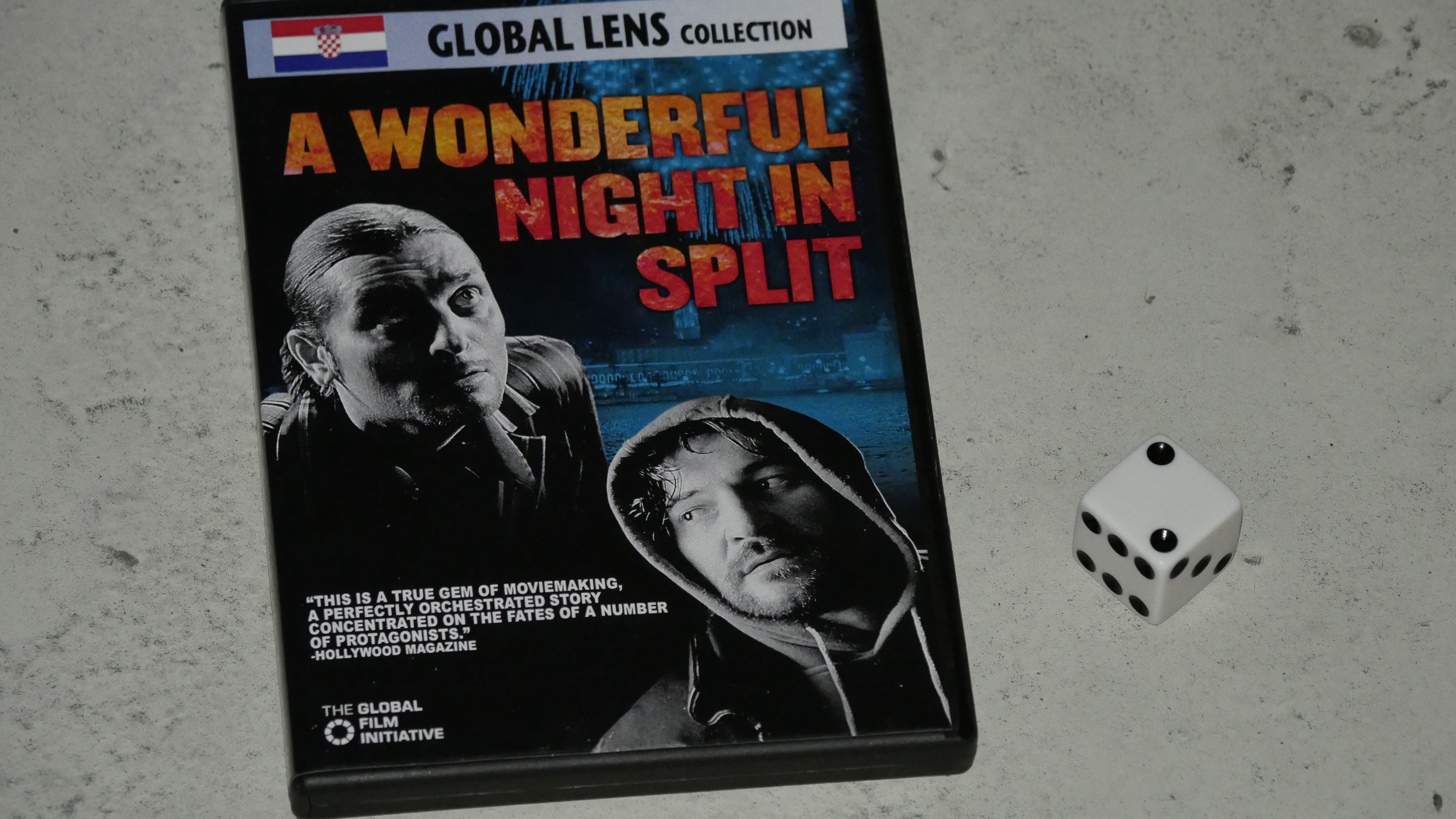
| A Wonderful Night in Split. Arsen A. Ostojic. 2004. Croatia. February 25th, 2017. Crocktail. |
 |  | 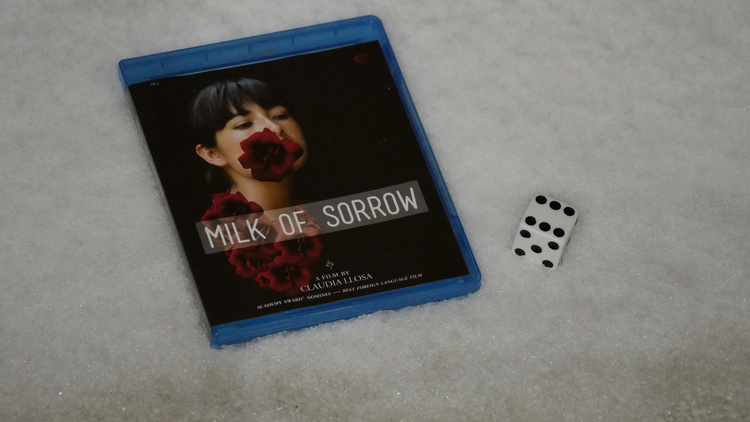 |  |
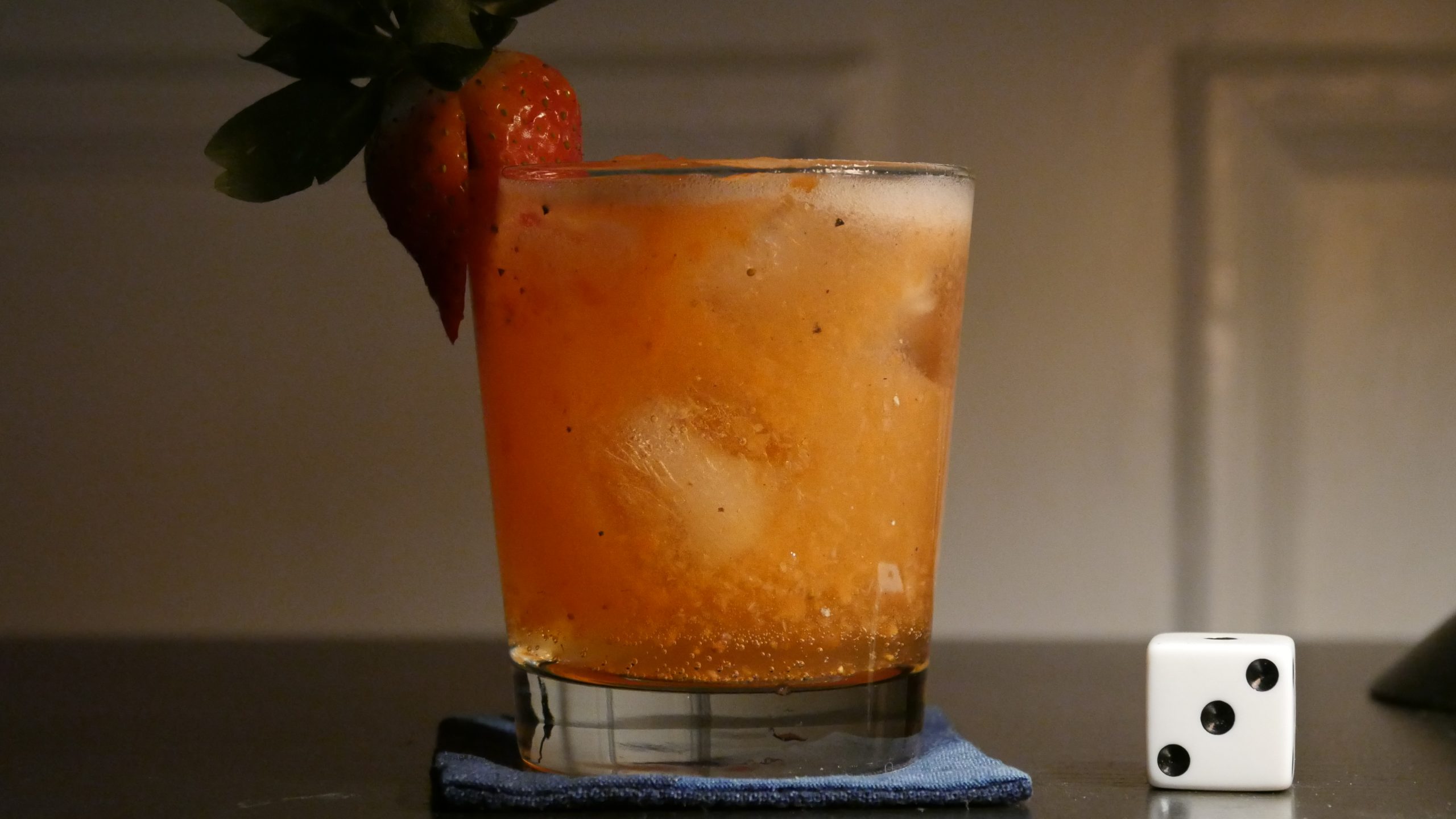
| The Milk of Sorrow. Claudia Llosa. 2009. Peru. February 25th, 2017. Peruvian Pisco Sour. |
 | 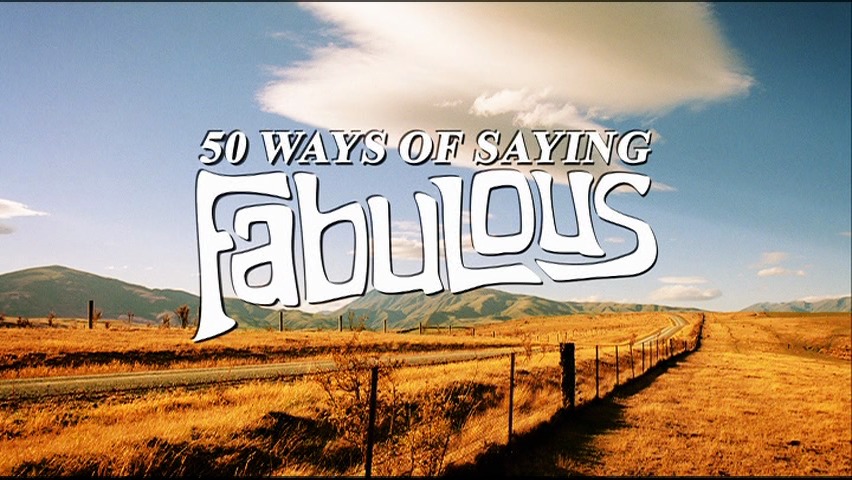 | 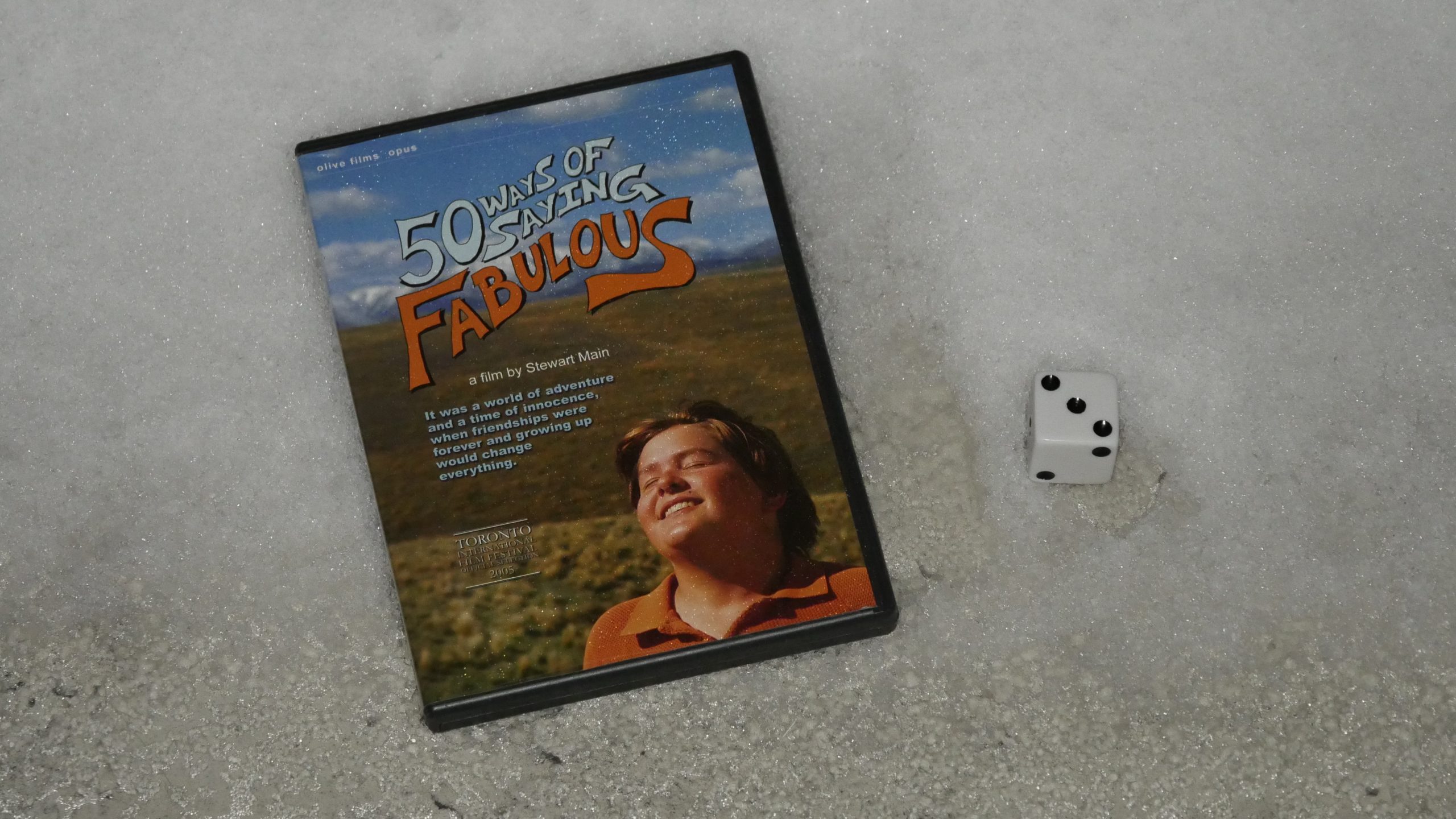 | 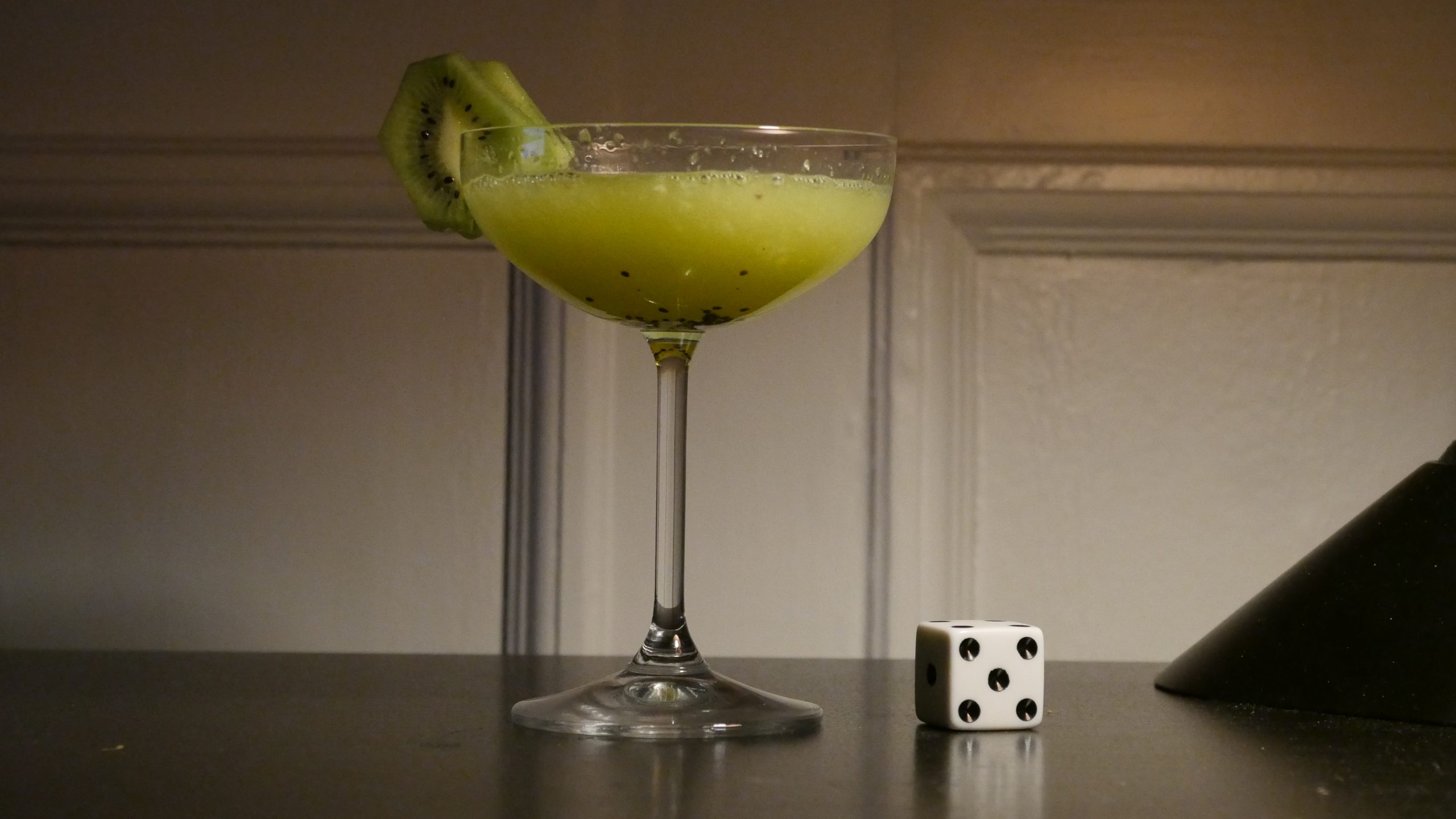 |
| 50 Ways of Saying Fabulous. Stewart Main. 2005. New Zealand. February 25th, 2017. Daiquiri Kiwi. |
 | 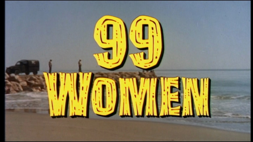 |  |  |
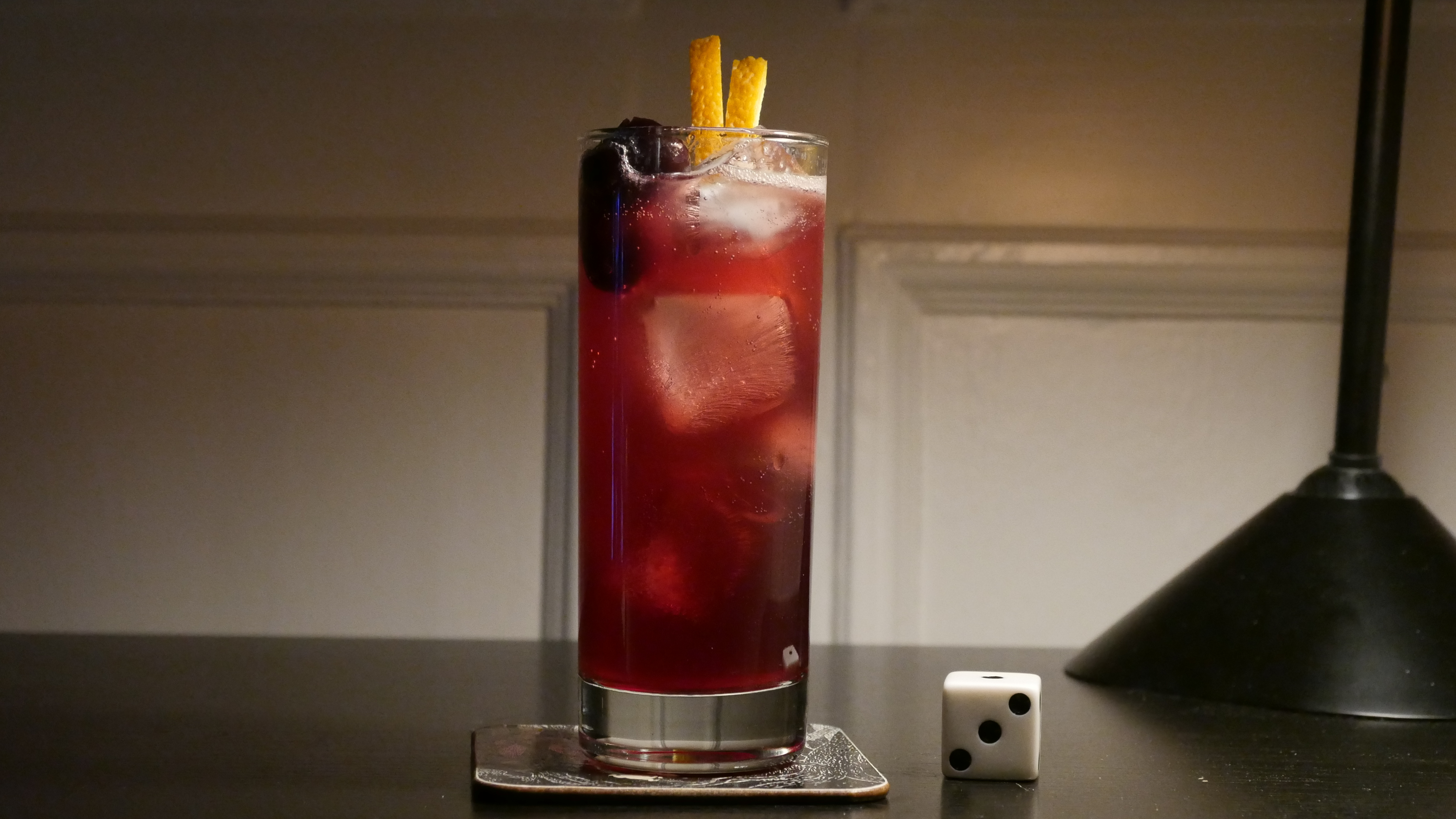
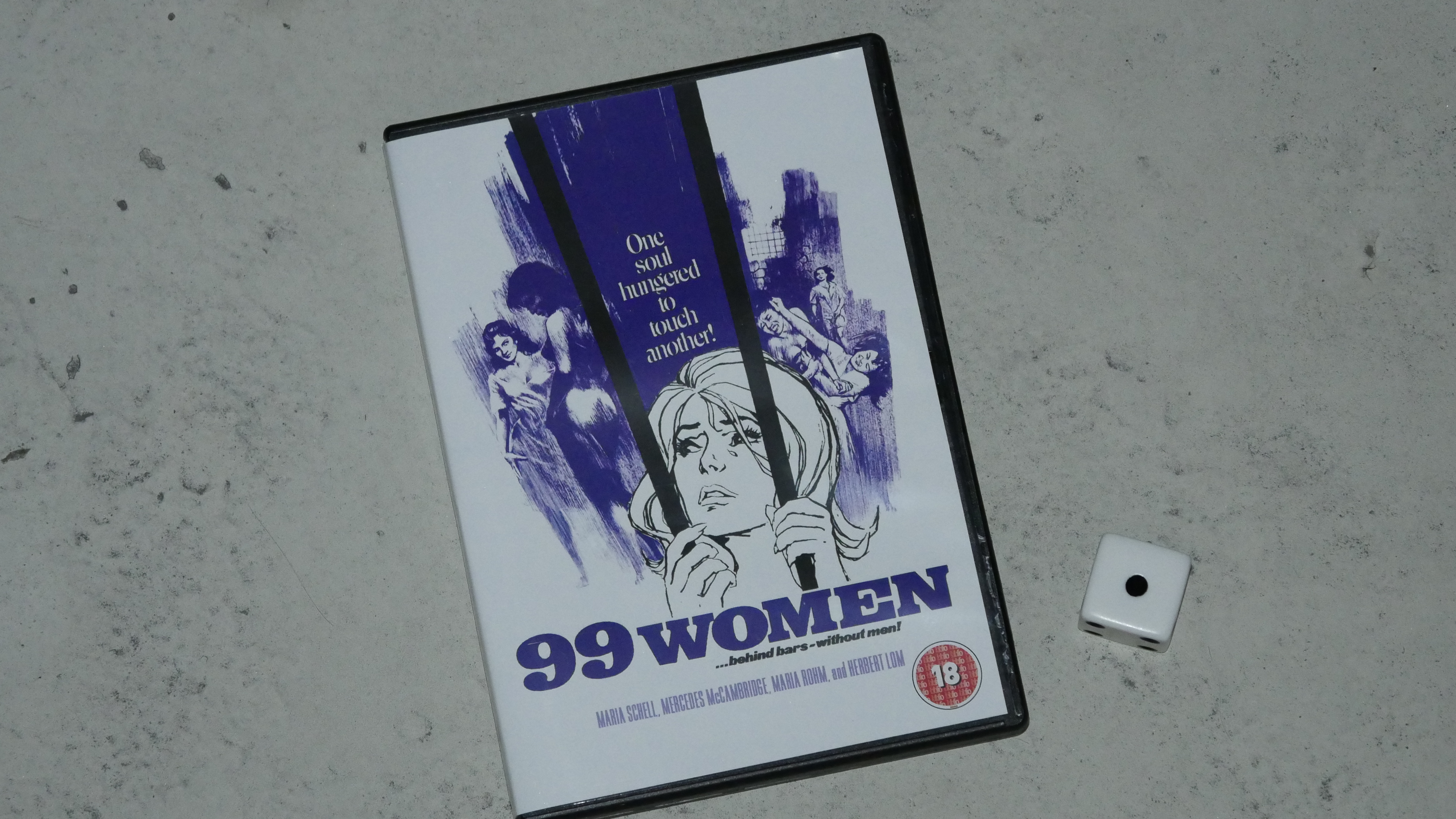
| 99 Women. Jesús Franco. 1969. Liechtenstein. March 11th, 2017. Strawberry G&T. |
 | 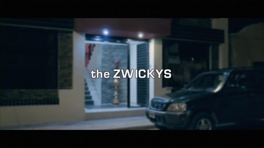 |  |  |
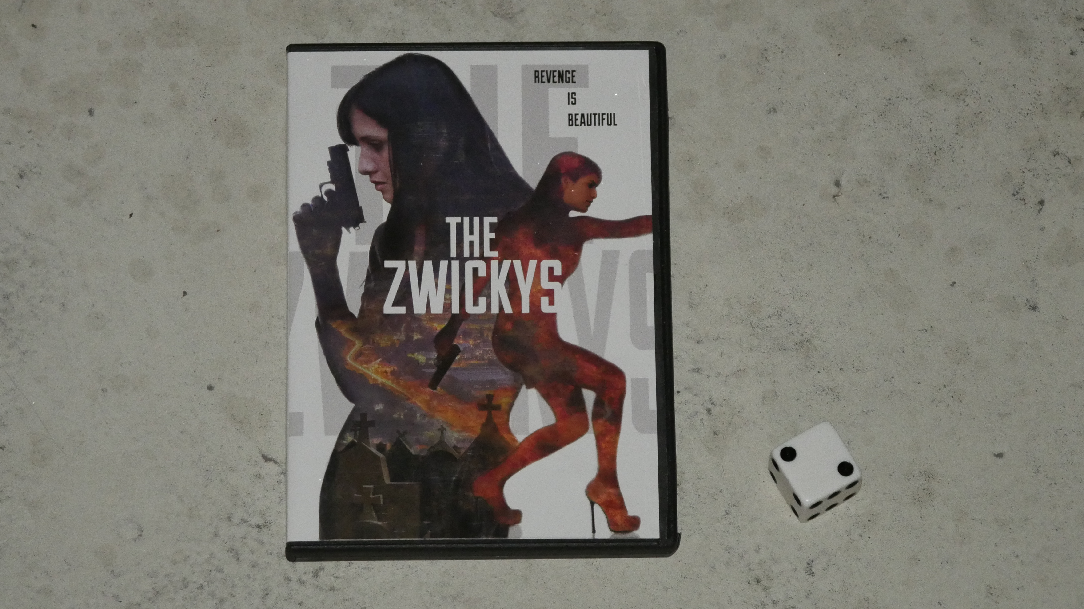
| The Zwickys. Andres Valle, Carlos Valle. 2014. Honduras. March 11th, 2017. Monkey La La. |
 | 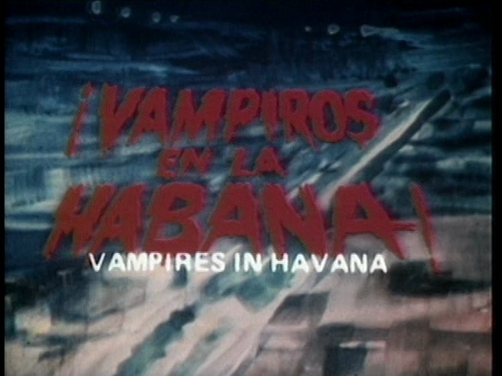 | 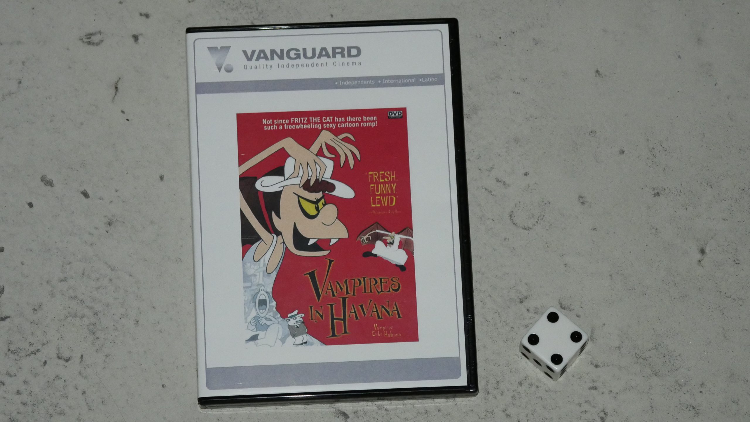 | 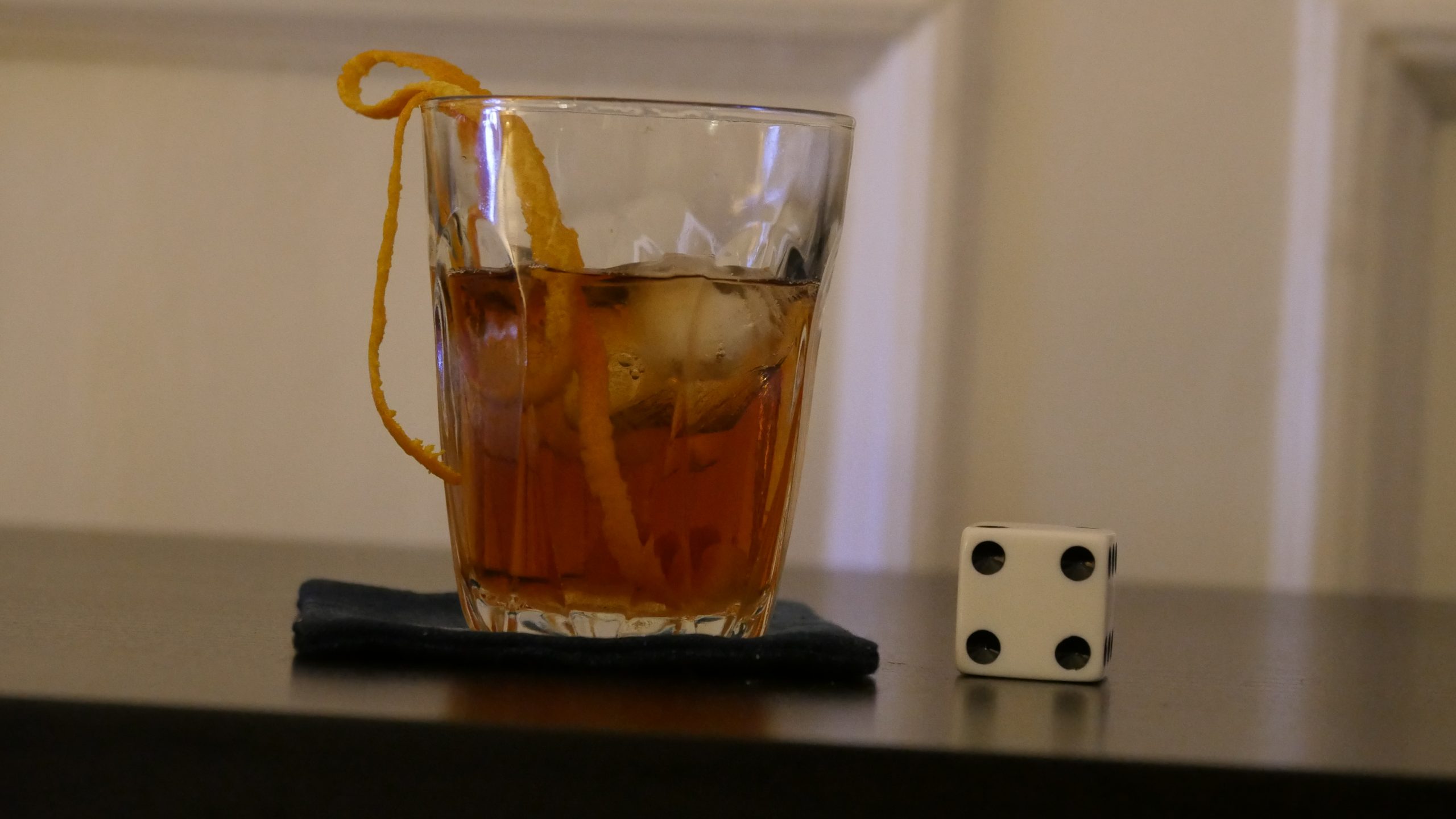 |
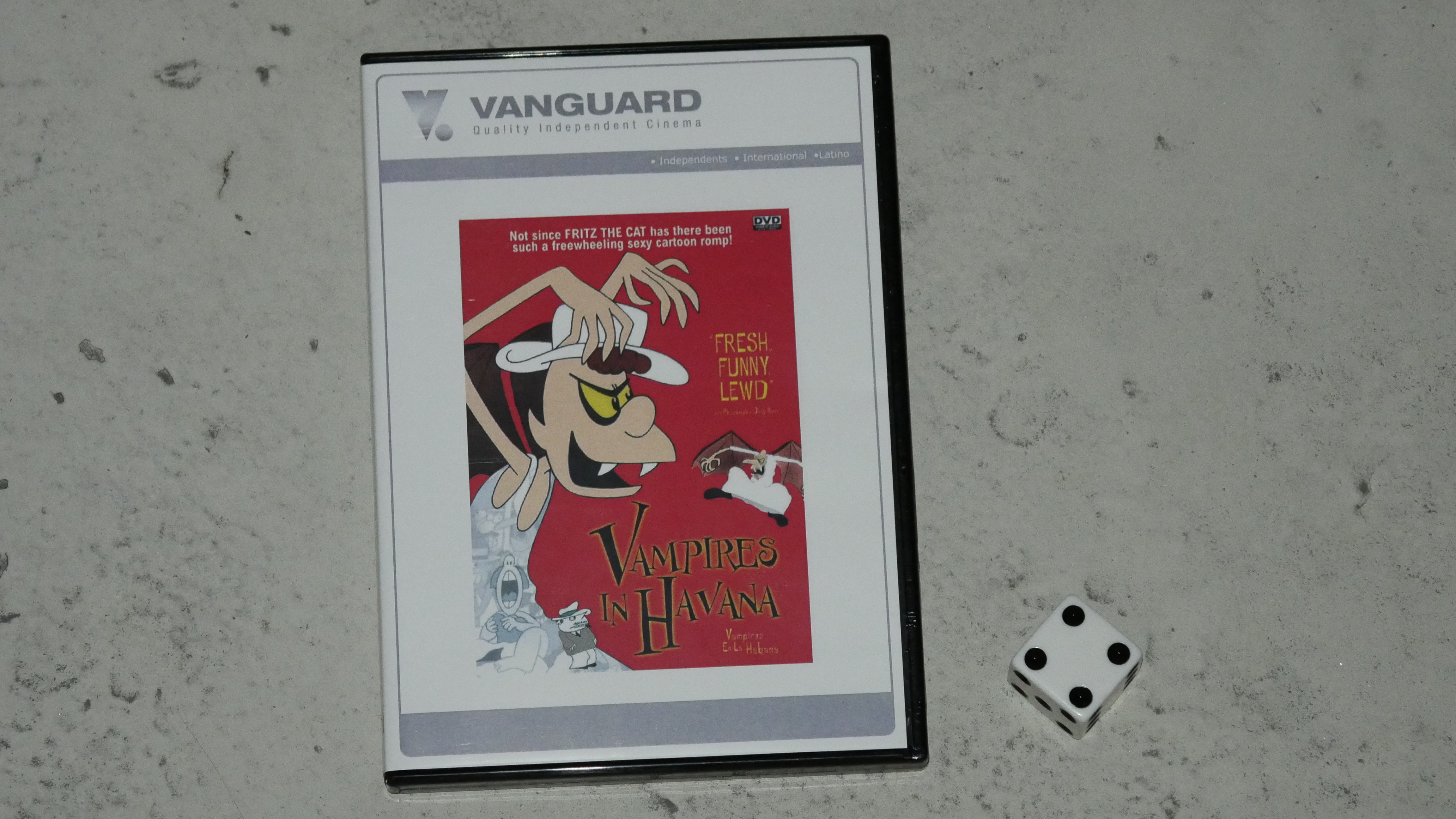
| Vampires in Havana. Juan Padrón. 1985. Cuba. March 17th, 2017. Cuban Old Fashioned. |
 | 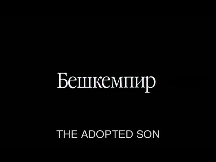 | 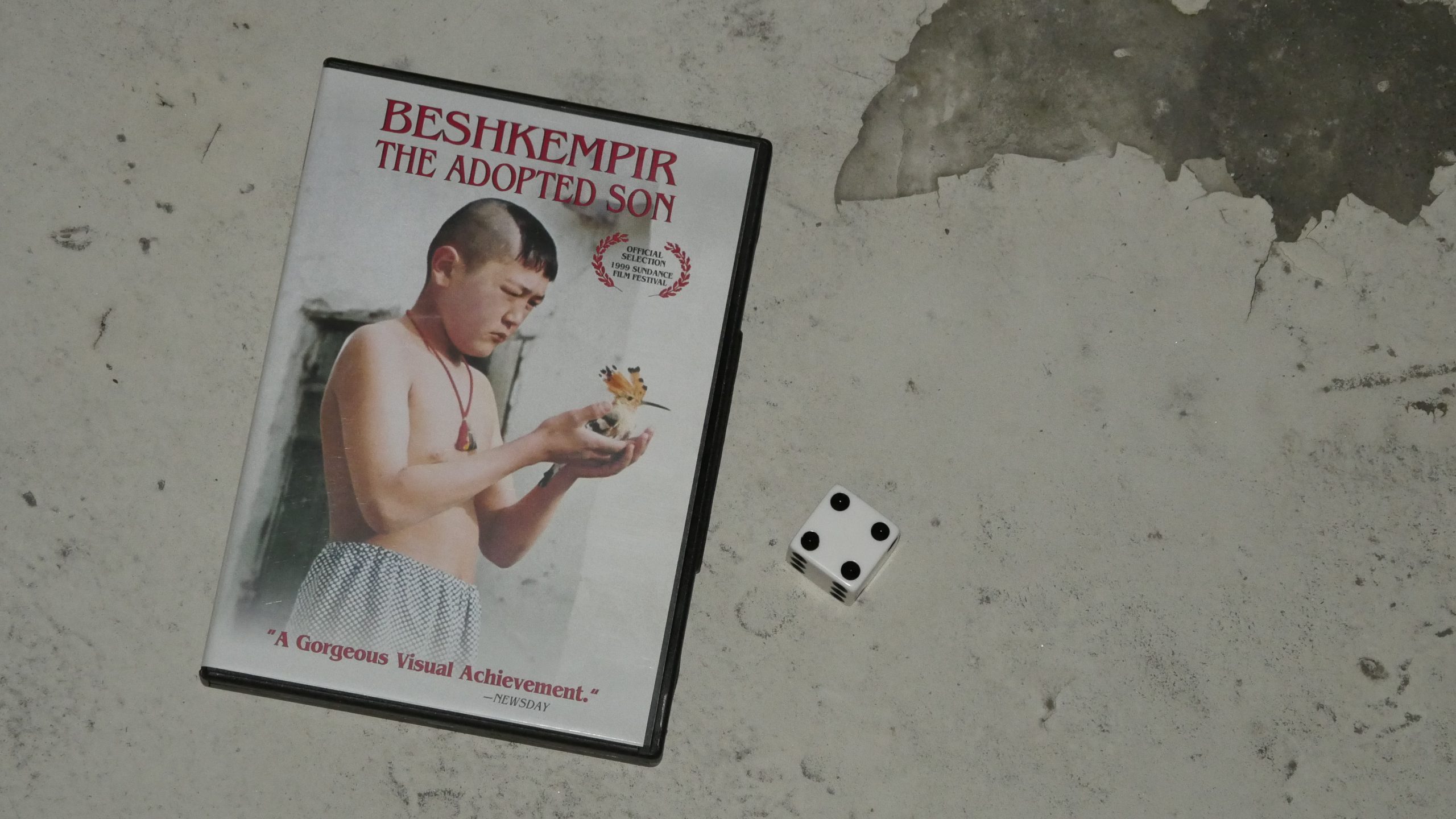 | 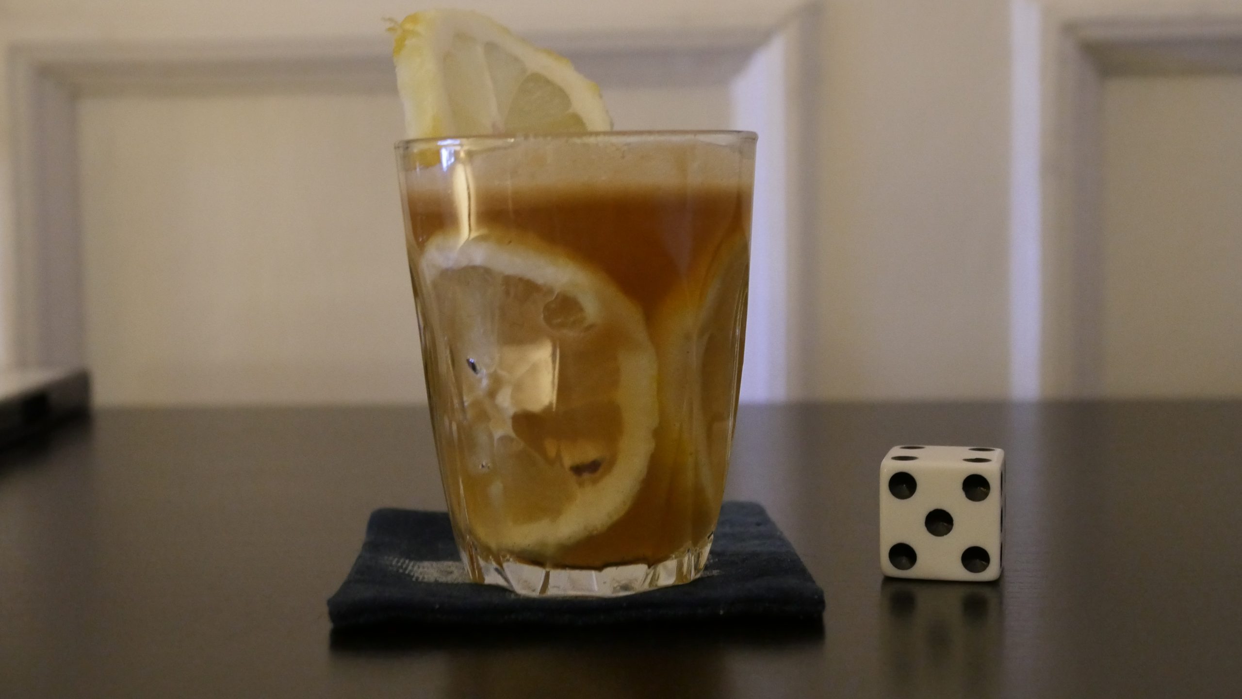 |
| The Adopted Son. Aktan Arym Kubat. 1998. Kyrgyzstan. March 17th, 2017. Hot Honey Lemon with Vodka. |
 | 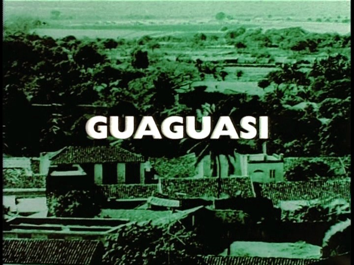 | 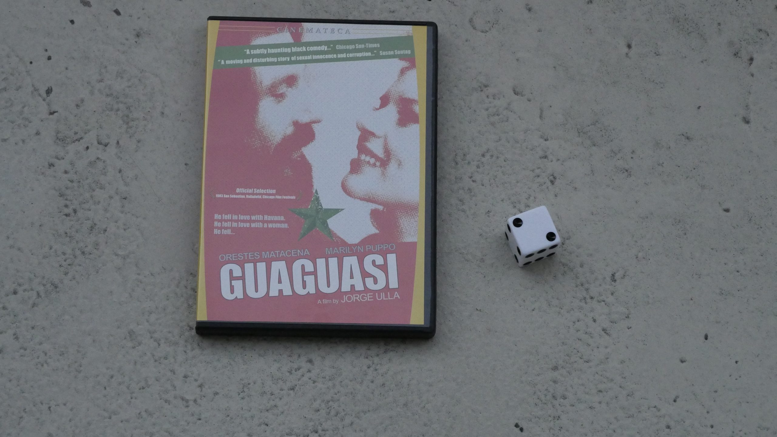 |  |
| Guaguasi. Jorge Ulla. 1983. Dominican Republic. March 18th, 2017. Dominican Goddess. |
 |  |  |  |
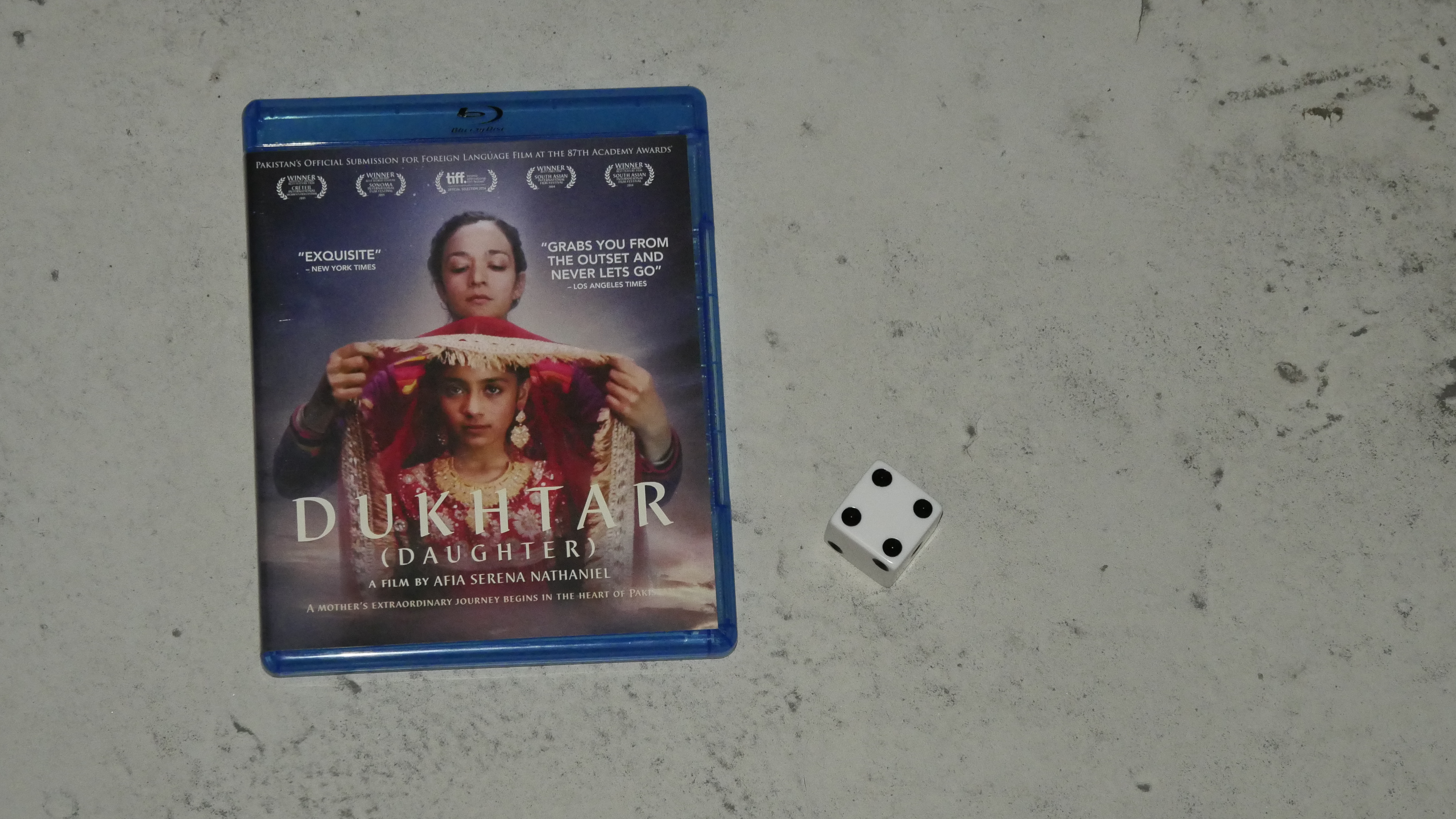
| Dukhtar. Afia Nathaniel. 2014. Pakistan. March 18th, 2017. Rooh Afza Cosmopolitan. |
 | 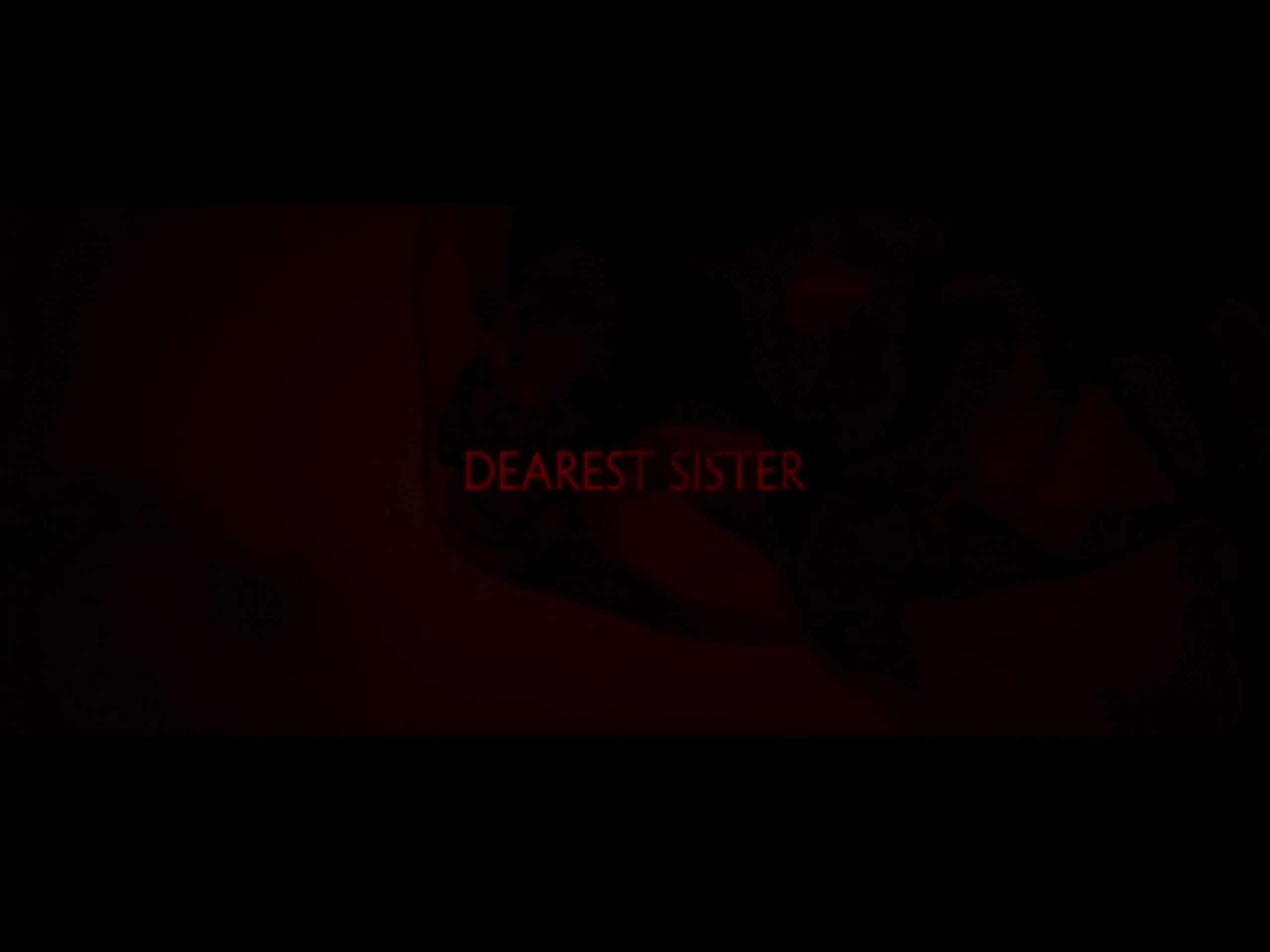 | 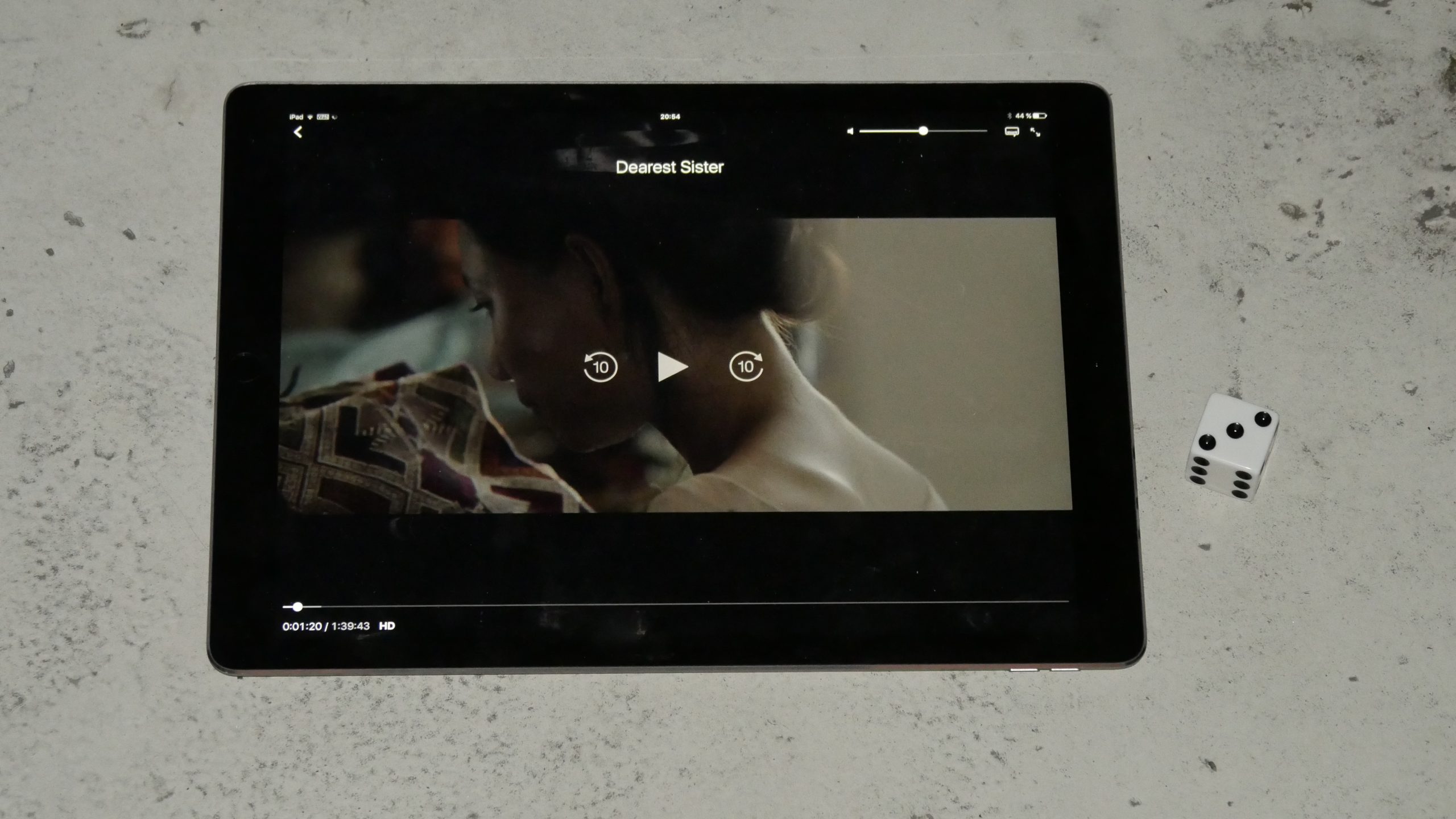 | 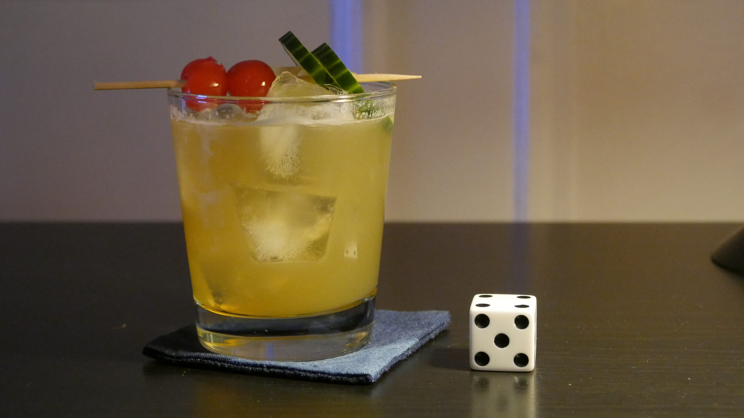 |
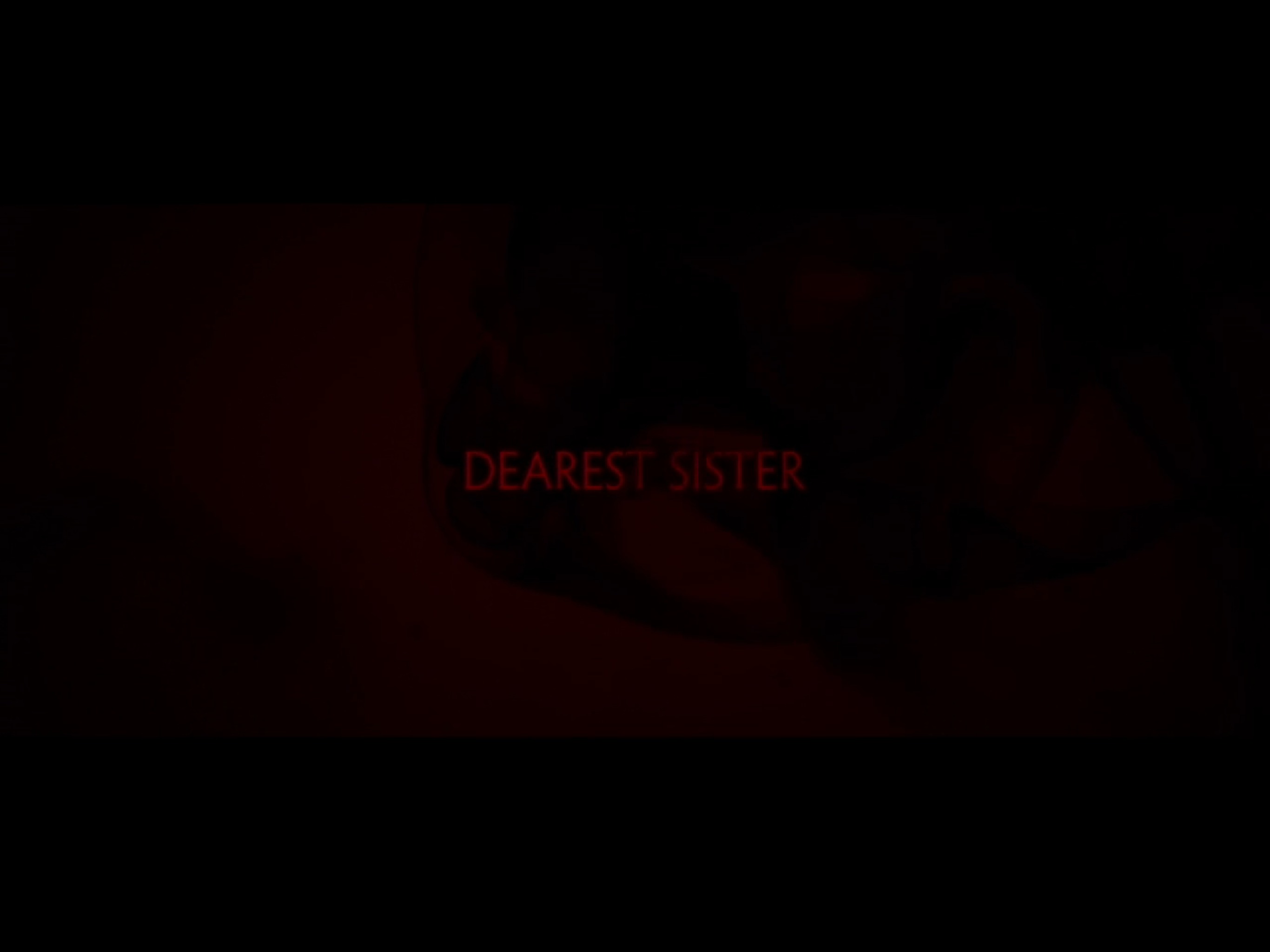
| Dearest Sister. Mattie Do. 2016. Laos. March 24th, 2017. Lost in Laos. |
 | 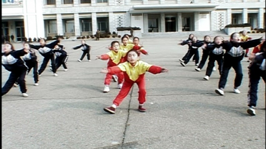 | 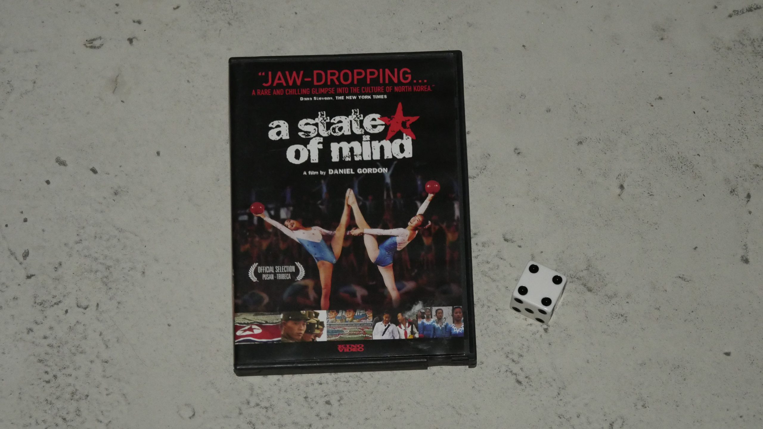 |  |
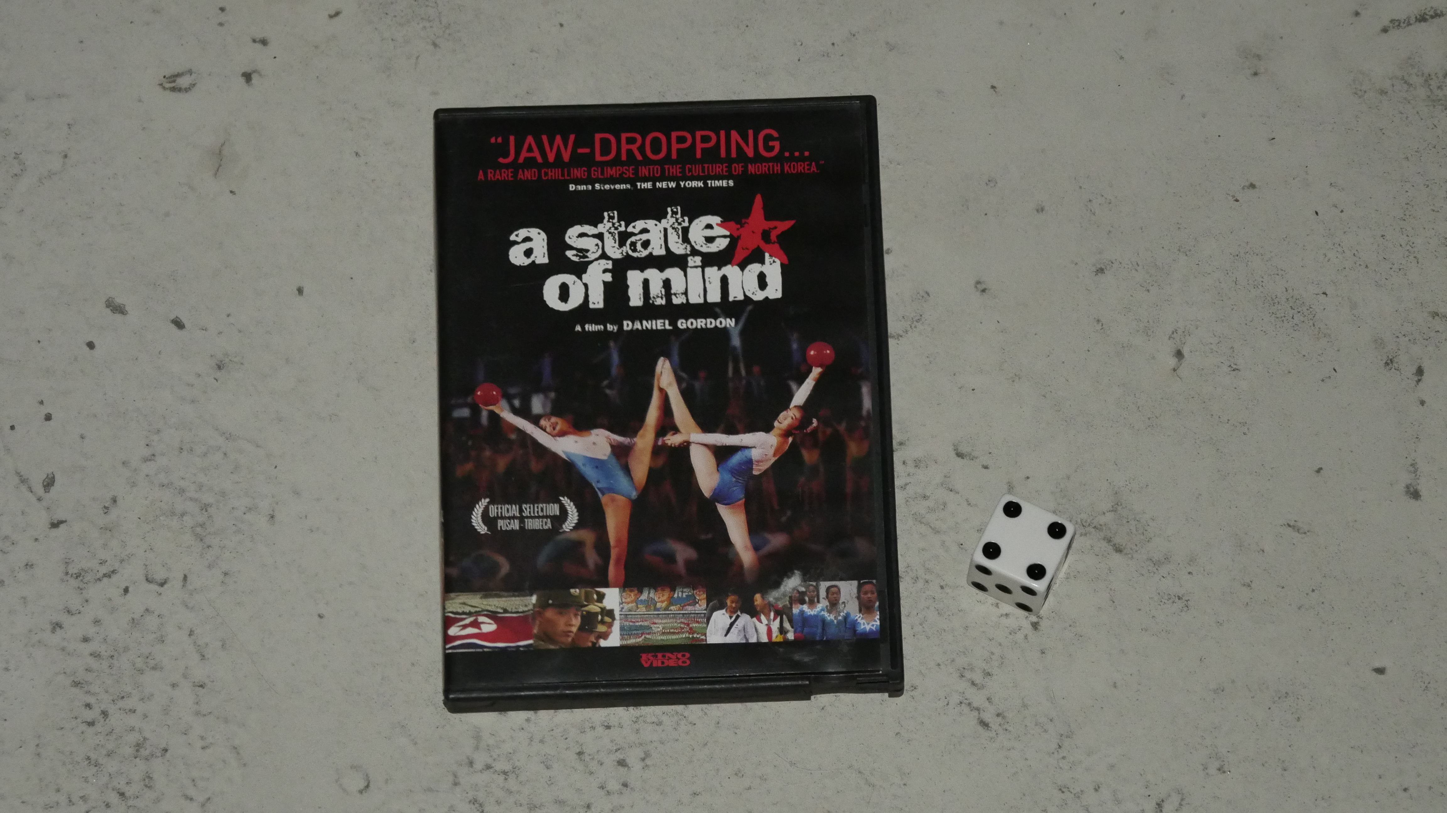
| A State of Mind. Daniel Gordon. 2004. North Korea. March 24th, 2017. Pyongyang Sling. |
 |  |  |  |
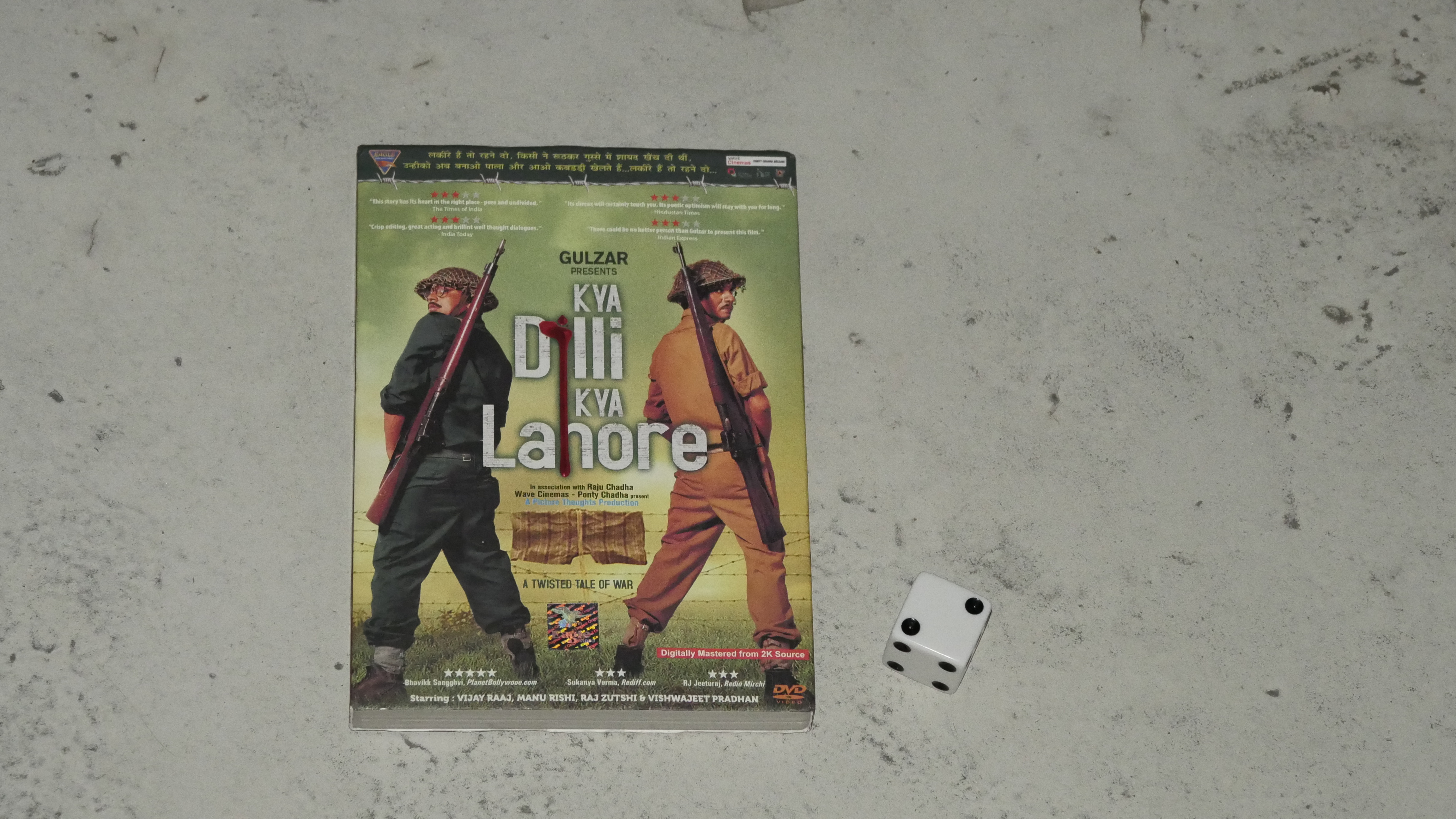
| Kya Dilli Kya Lahore. Vijay Raaz. 2014. Fiji. March 26th, 2017. Welcome Cocktail. |
 |  |  |  |
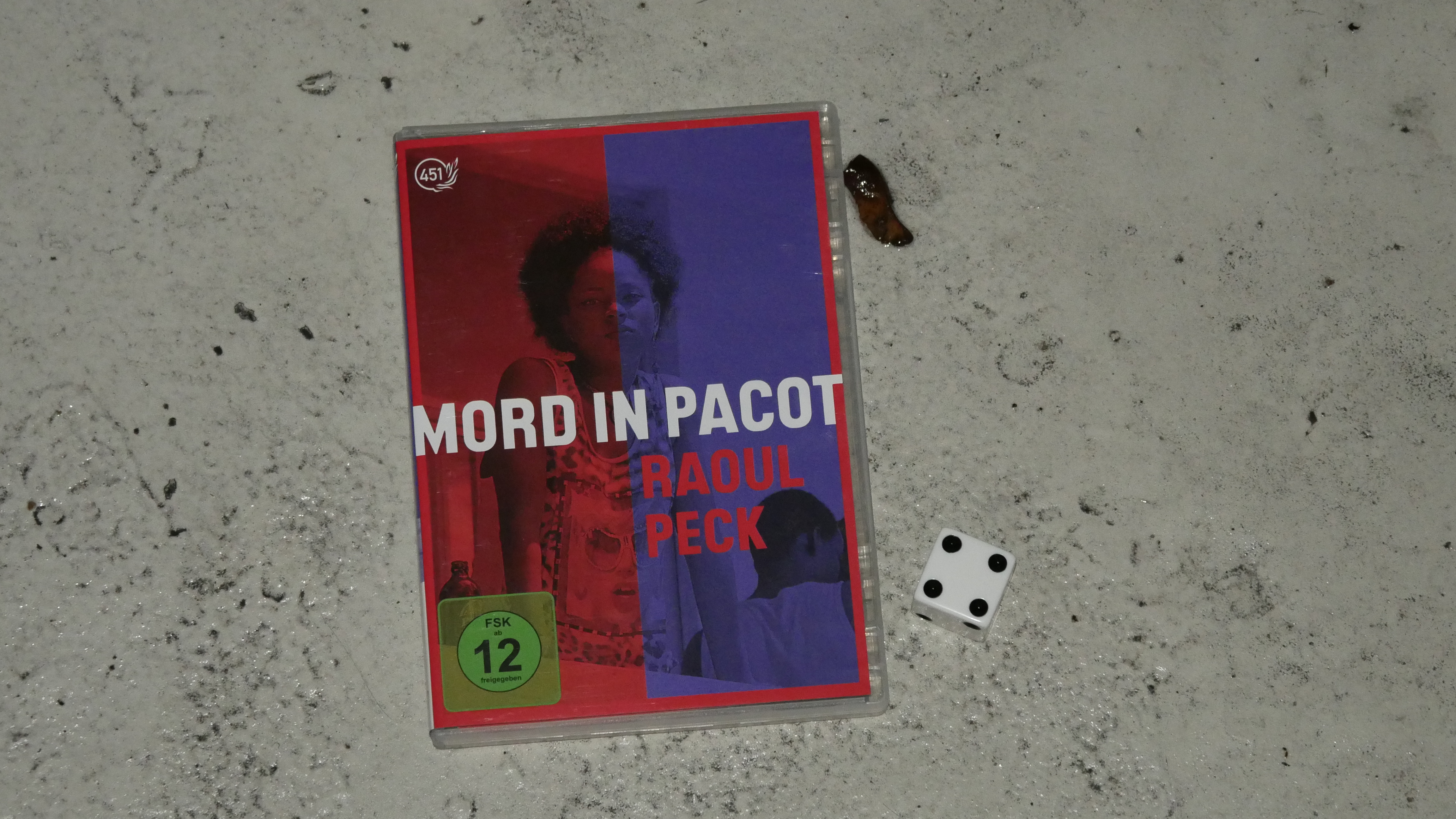
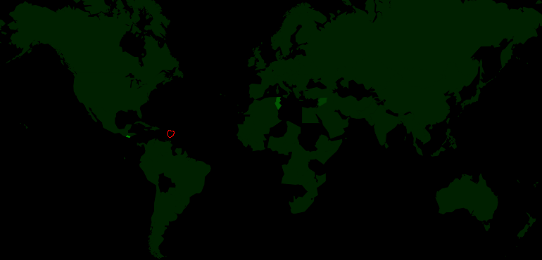
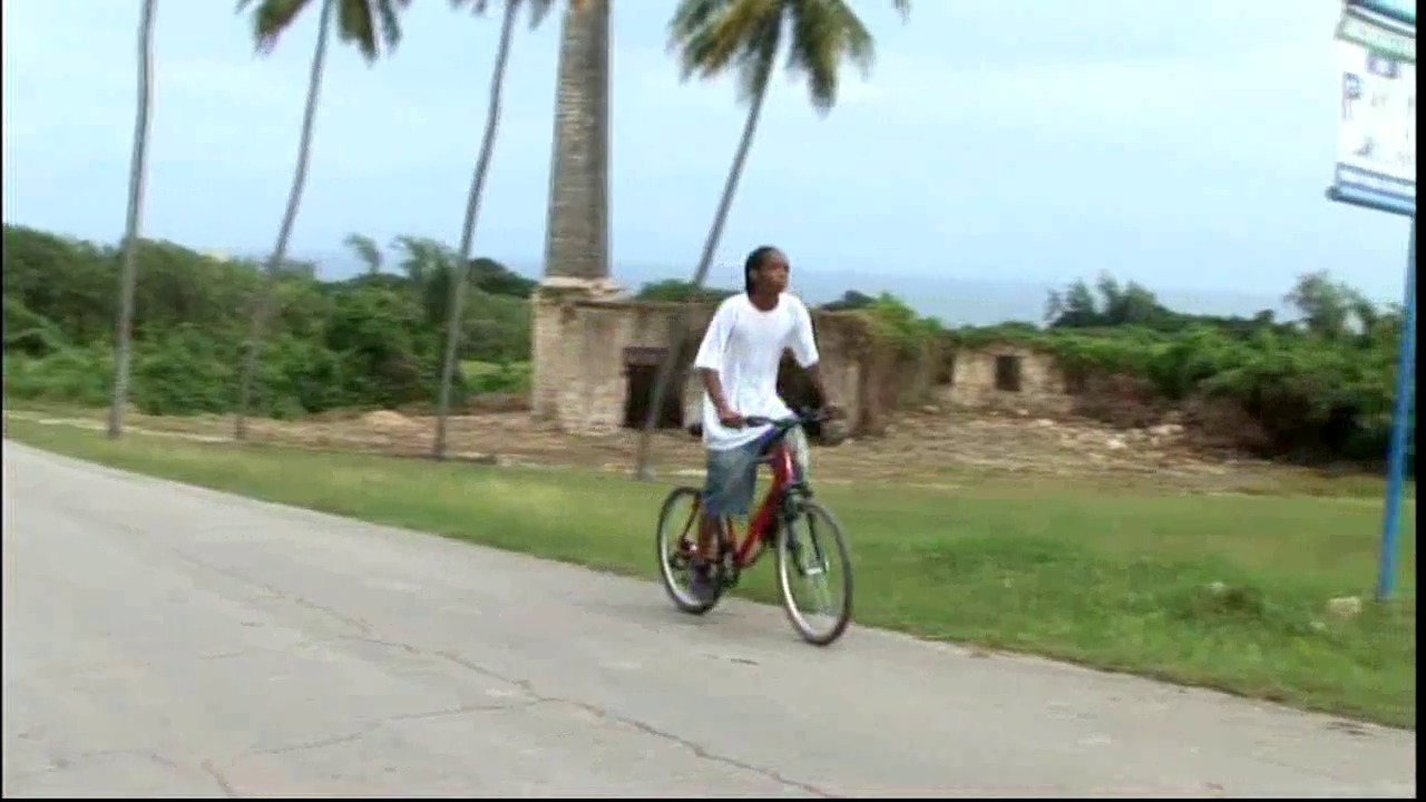
| Murder in Pacot. Raoul Peck. 2014. Haiti. March 31th, 2017. Cesar’s Rum Punch. |
 |  | 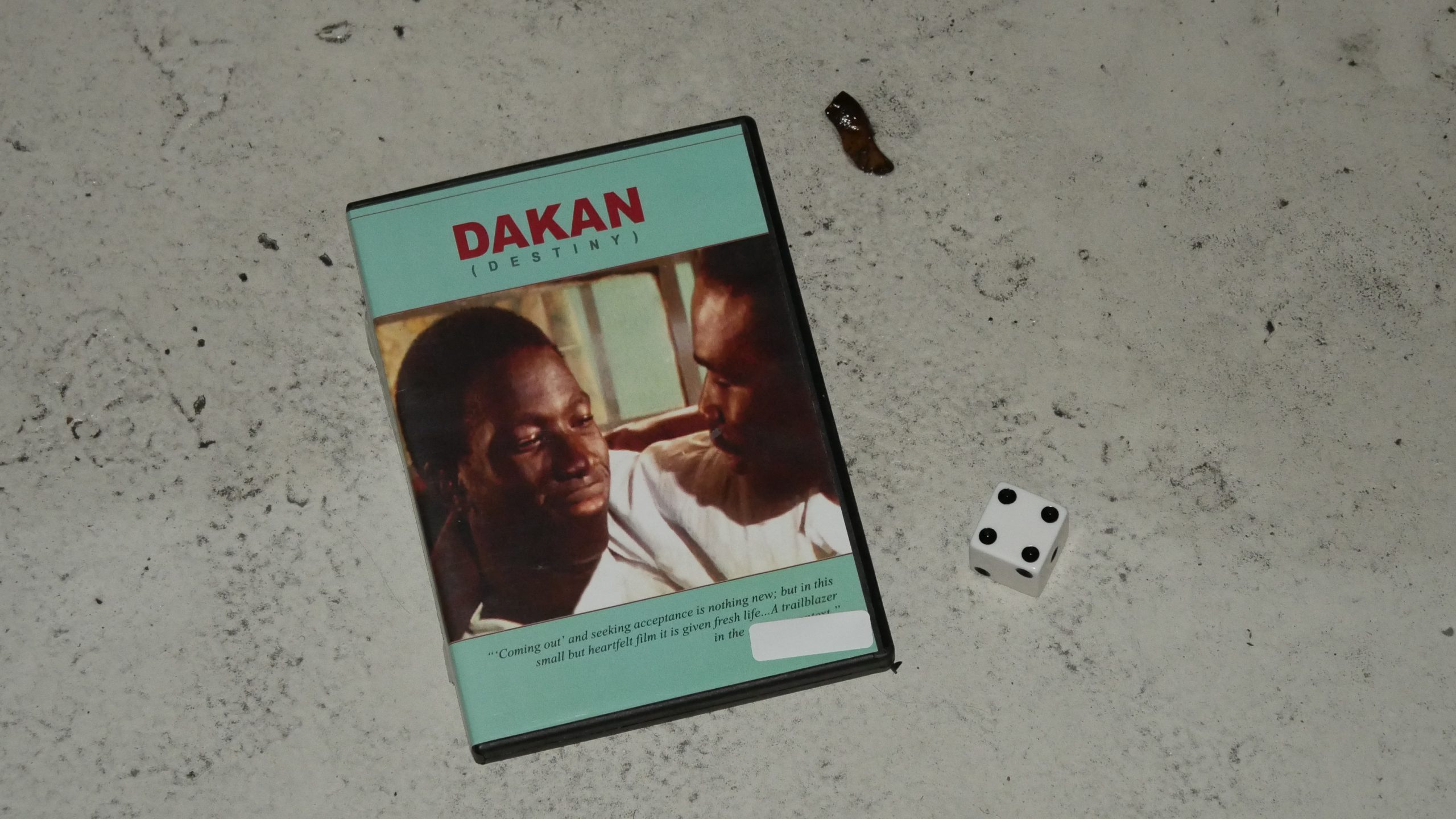 |  |
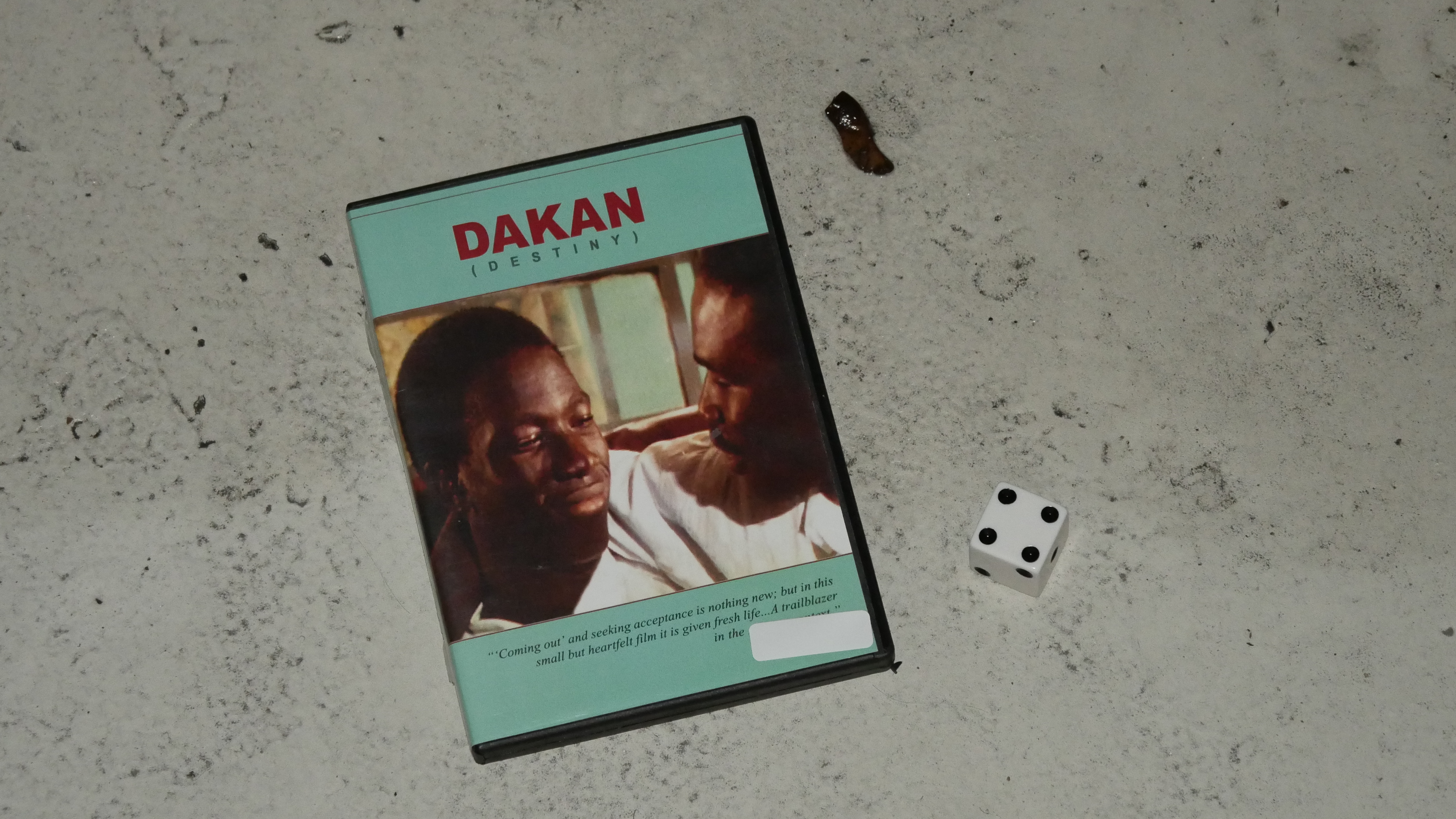
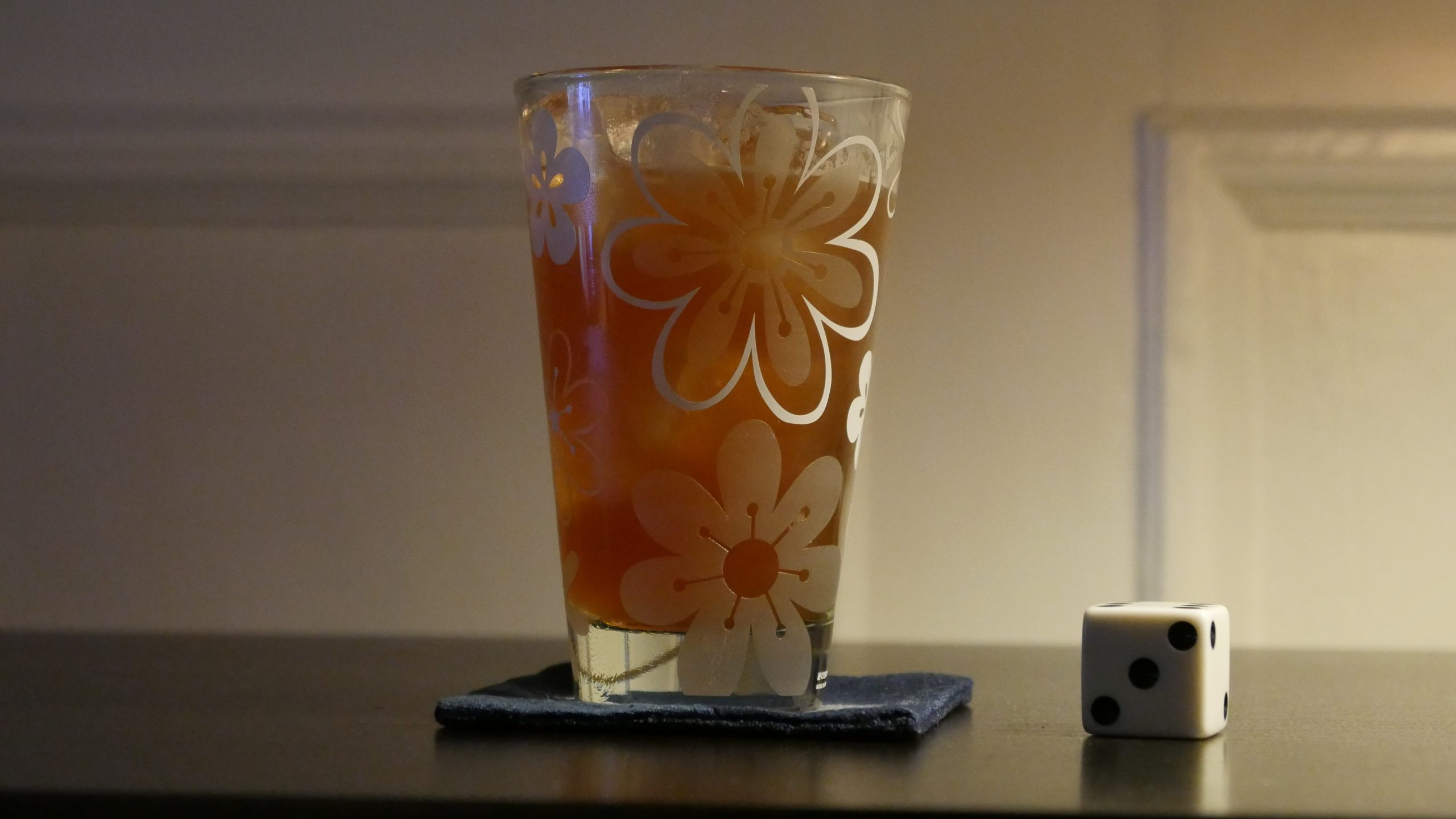
| Destiny. Muhammad Camara. 1997. Guinea. March 31th, 2017. Guinea Bissap. |
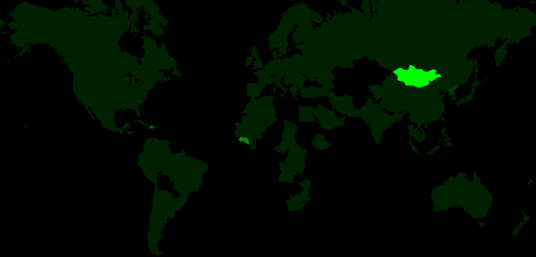 | 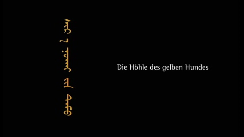 |  | 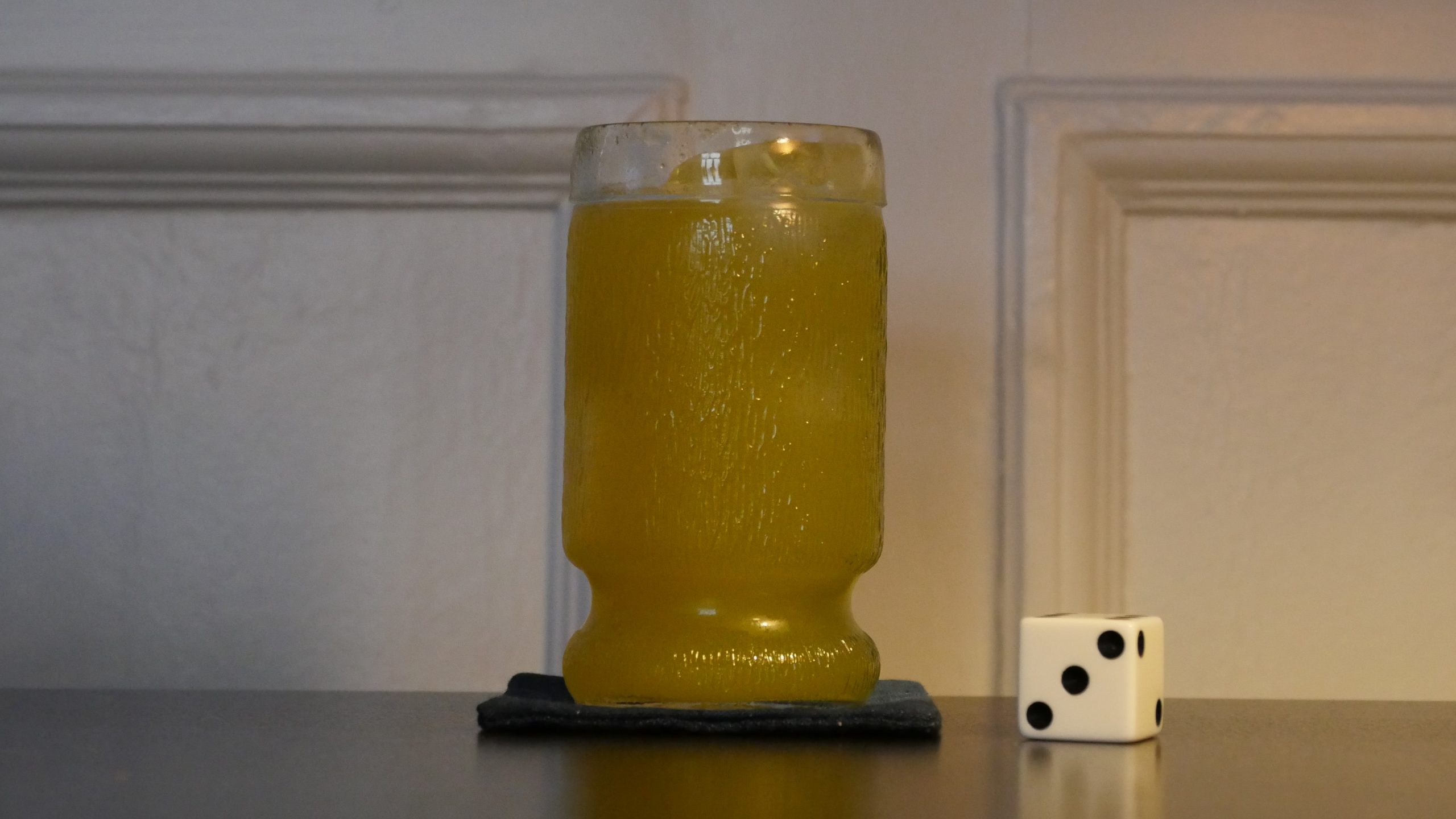 |
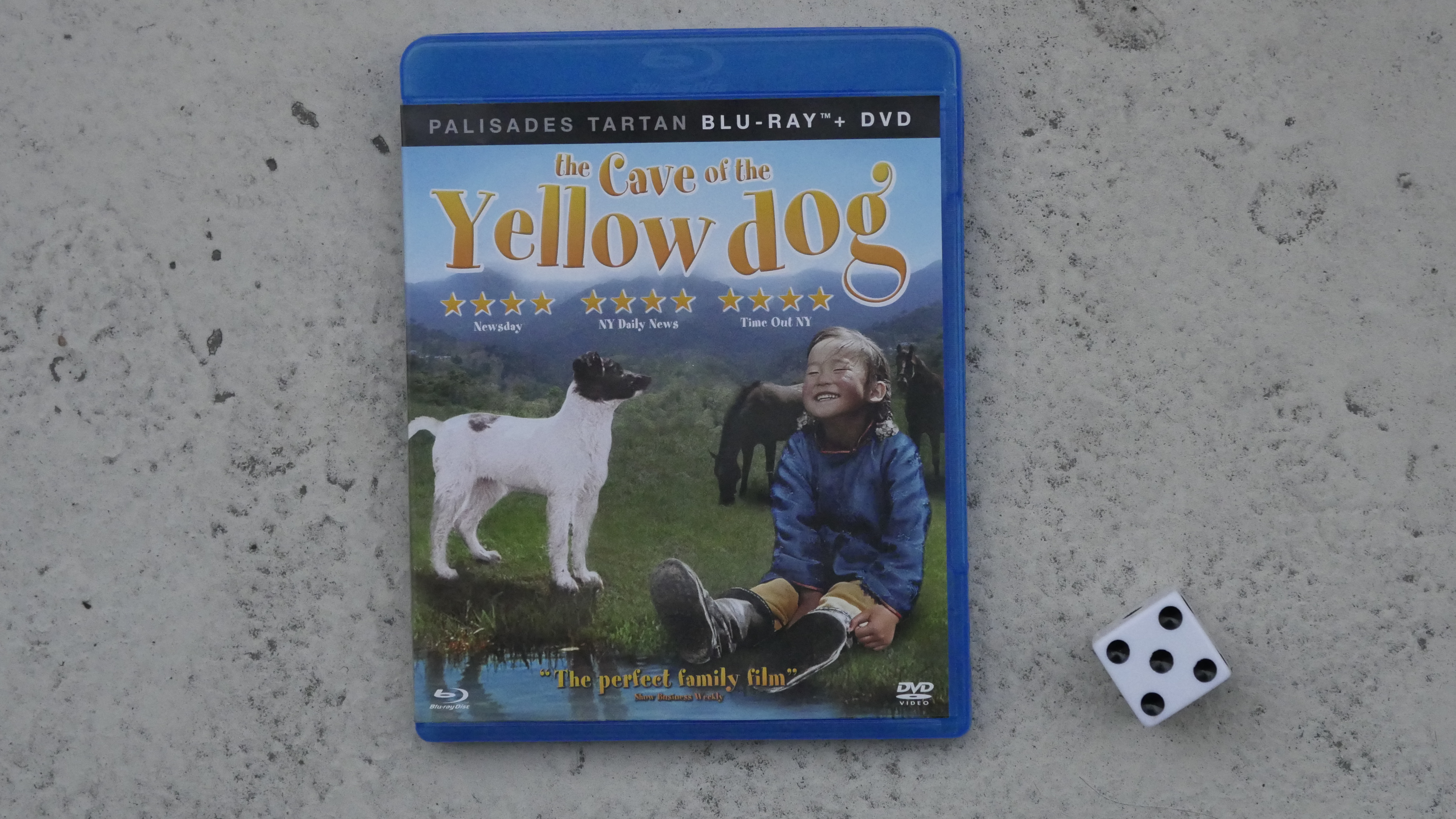
| The Cave of the Yellow Dog. Byambasuren Davaa. 2005. Mongolia. April 1st, 2017. Mongolian. |
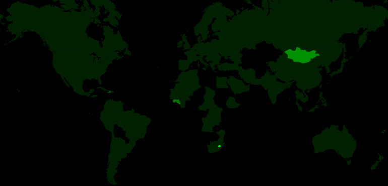 |  | 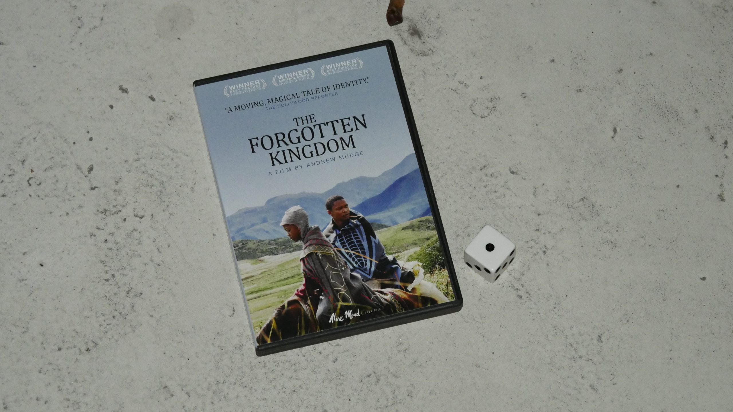 |  |
| The Forgotten Kingdom. Andrew Mudge. 2013. Lesotho. April 1st, 2017. Lesotho Lady. |
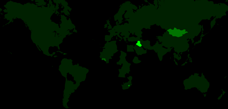 | 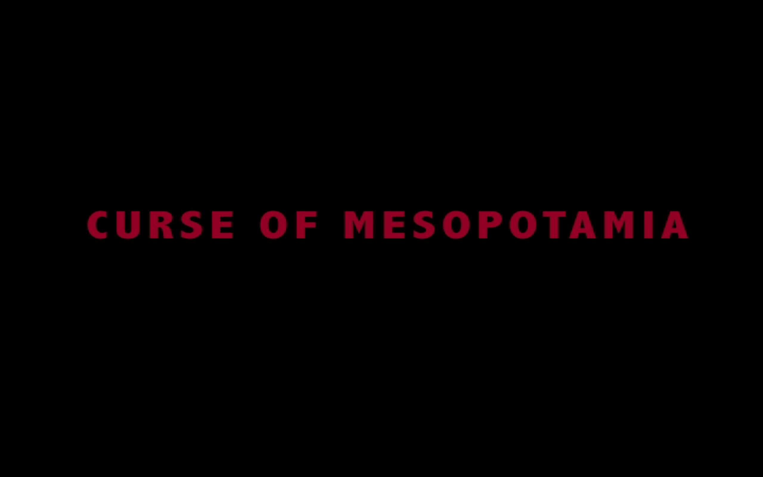 | 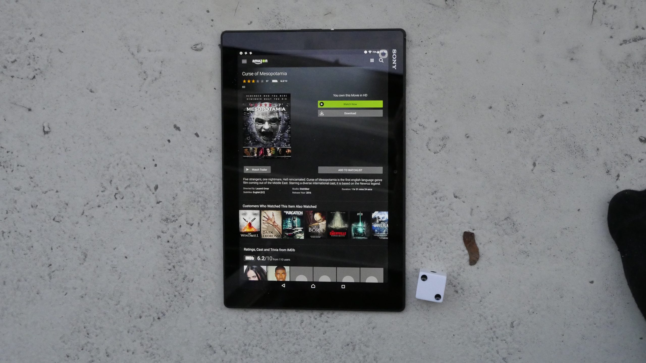 |  |
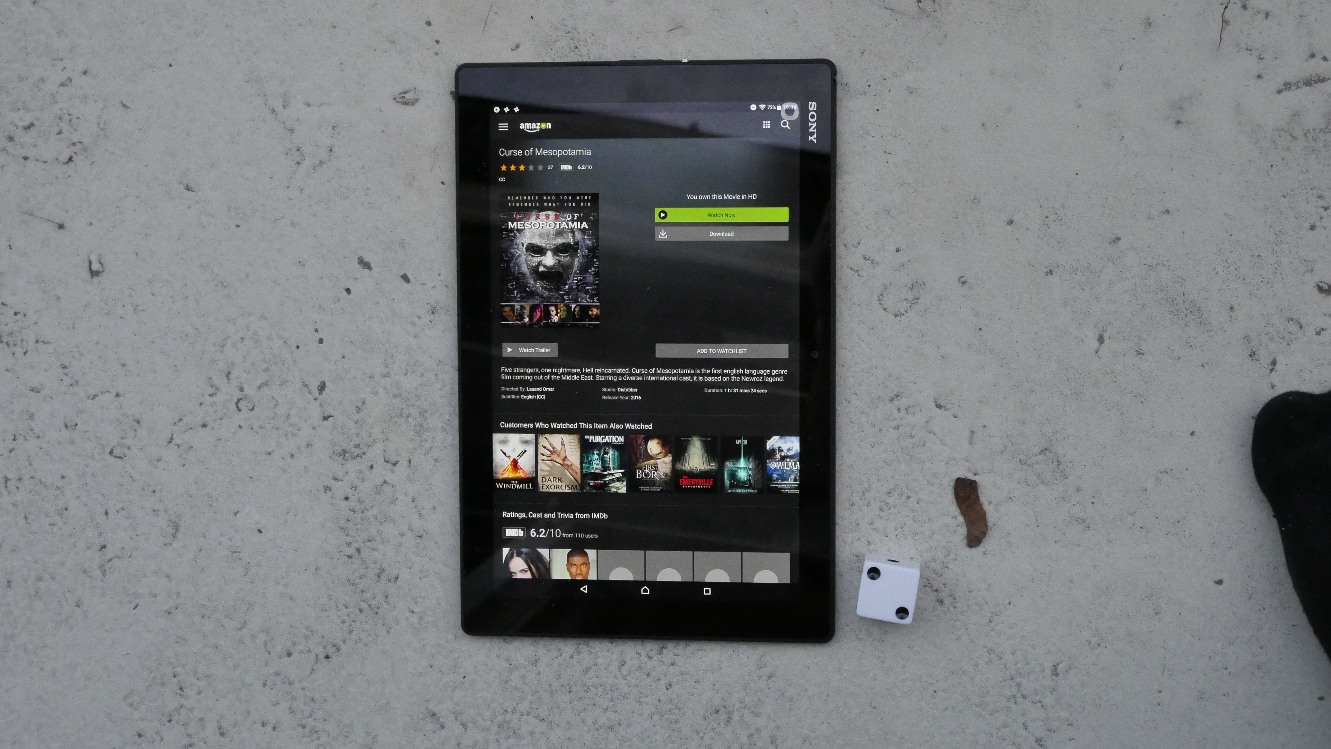
| Curse of Mesopotamia. Lauand Omar. 2015. Iraq. April 3rd, 2017. Kubbeh Libre. |
 | 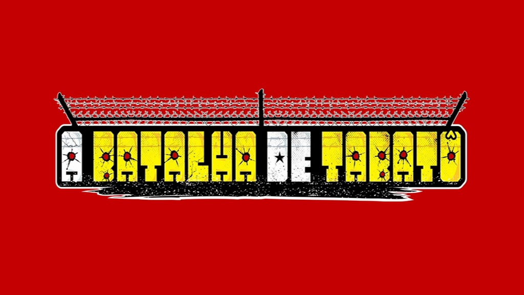 | 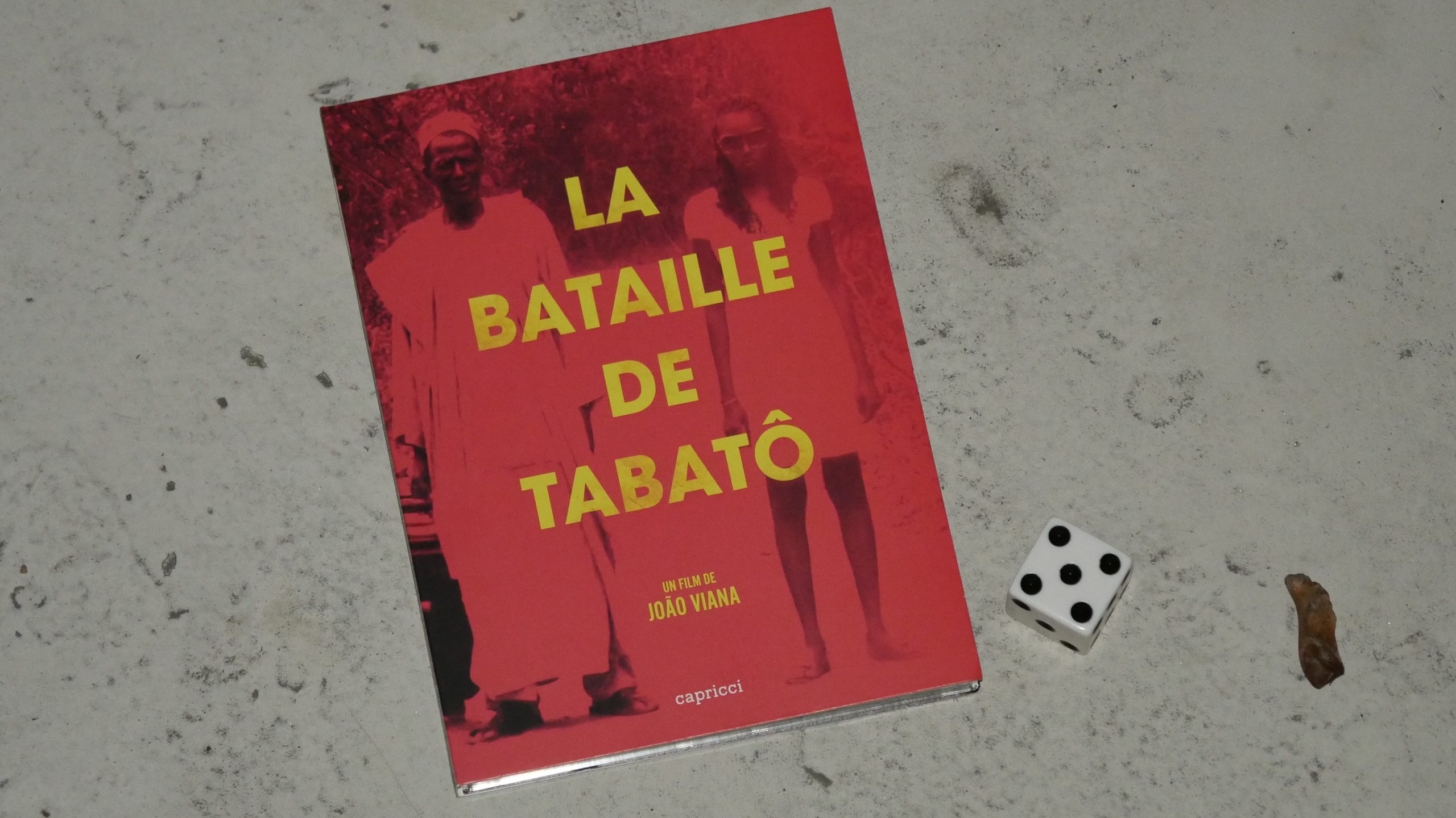 | 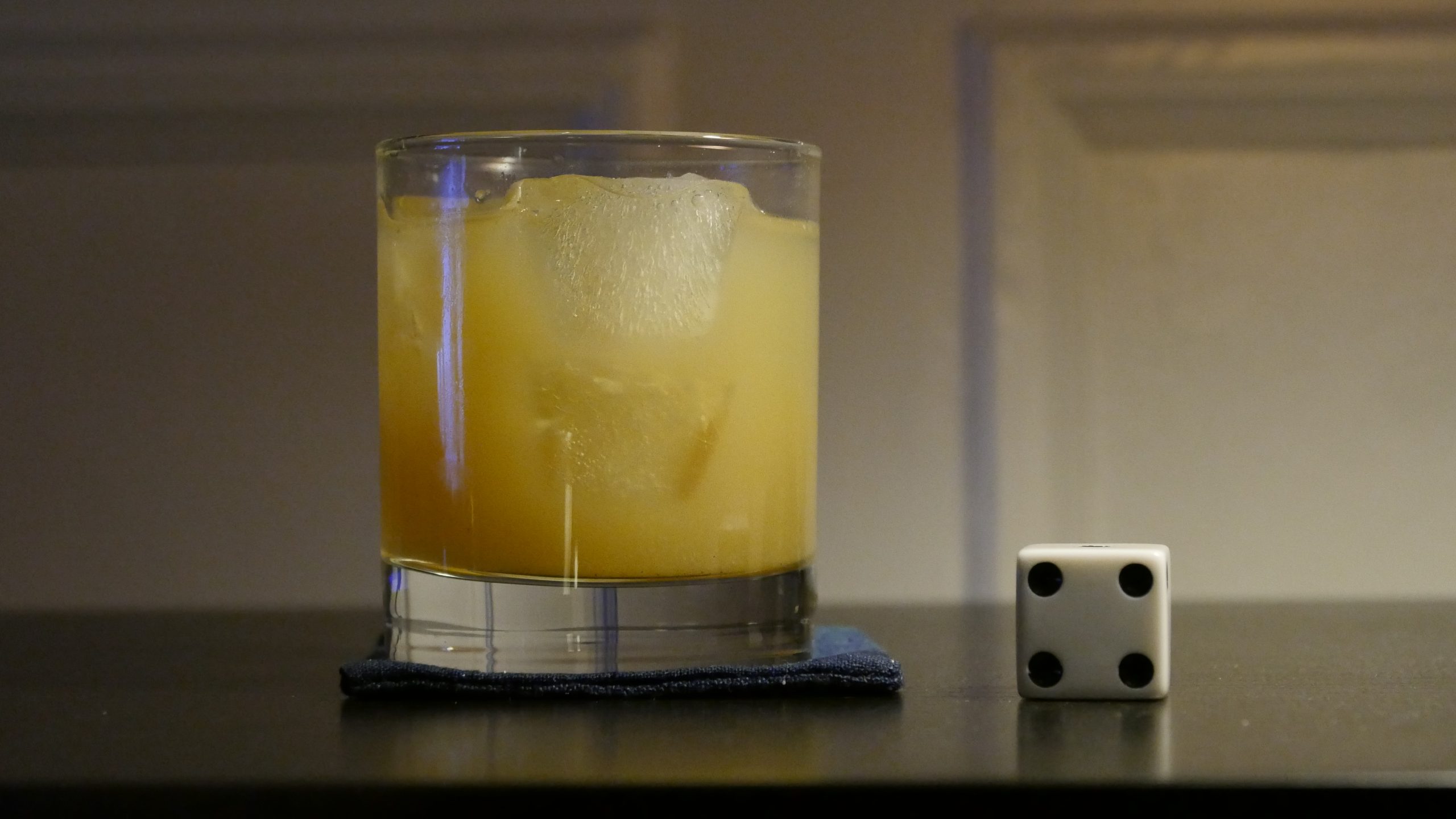 |
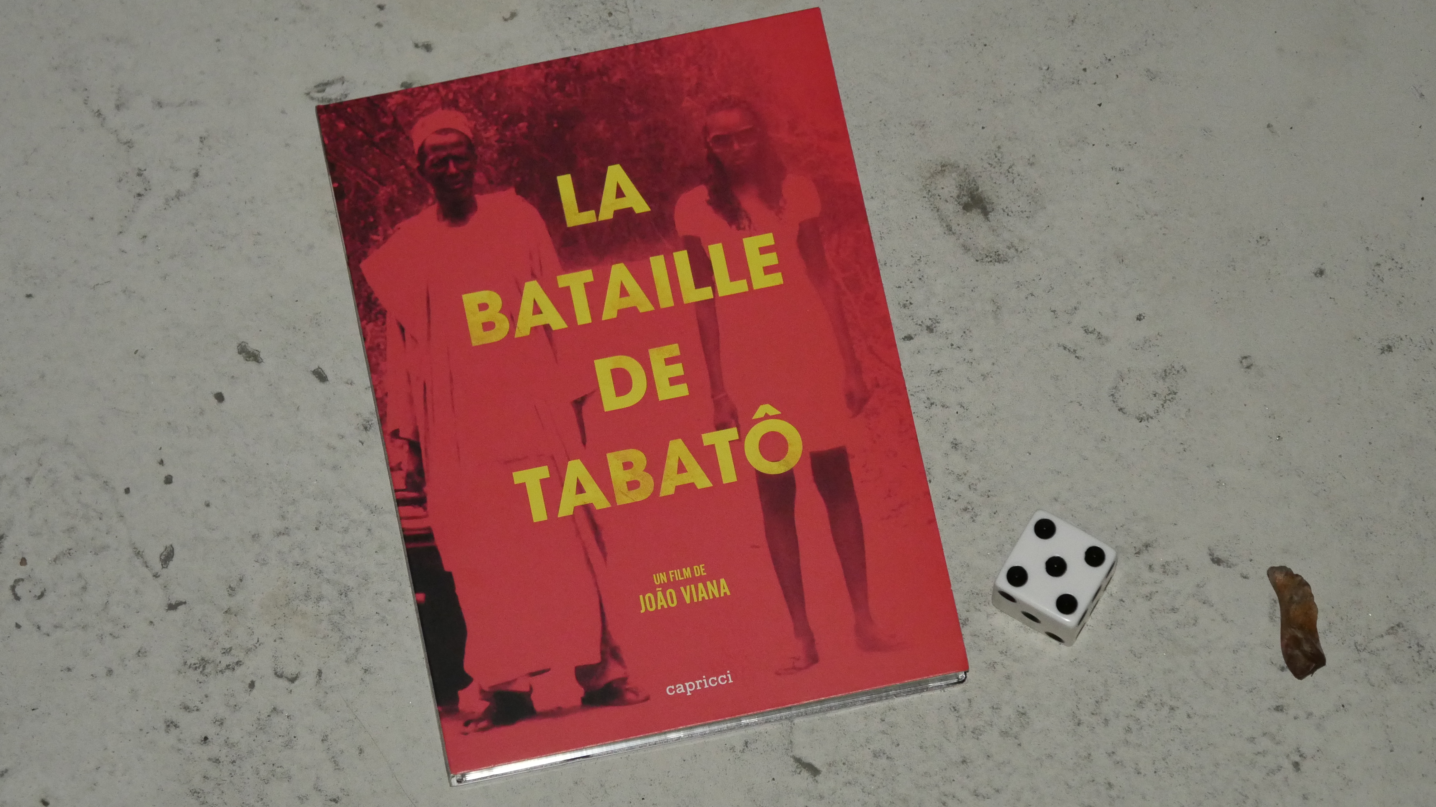
| The Battle of Tabato. João Viana. 2013. Guinea-Bissau. April 3rd, 2017. West African Ginger Drink. |
 |  | 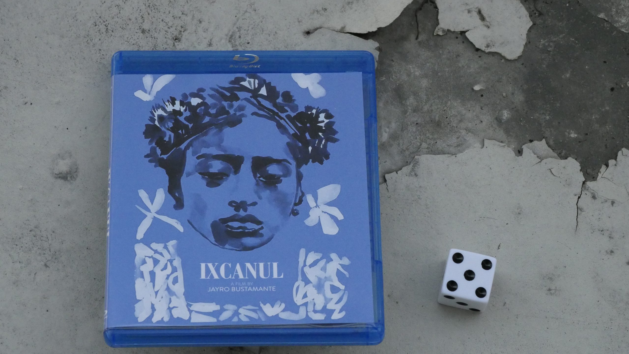 | 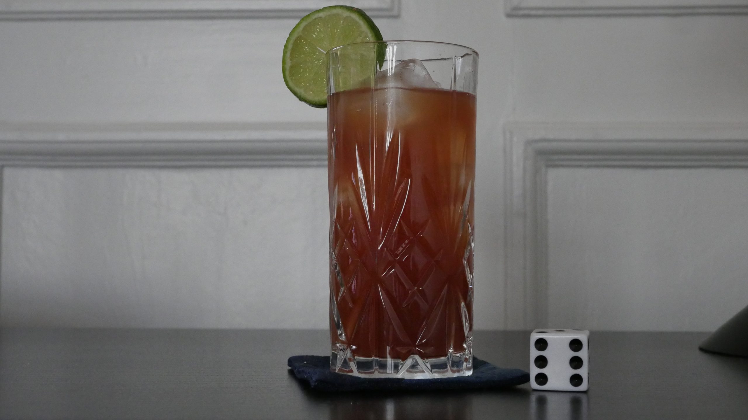 |
| Volcano. Jayro Bustamante. 2015. Guatemala. April 7th, 2017. Rosa Palopo. |
 | 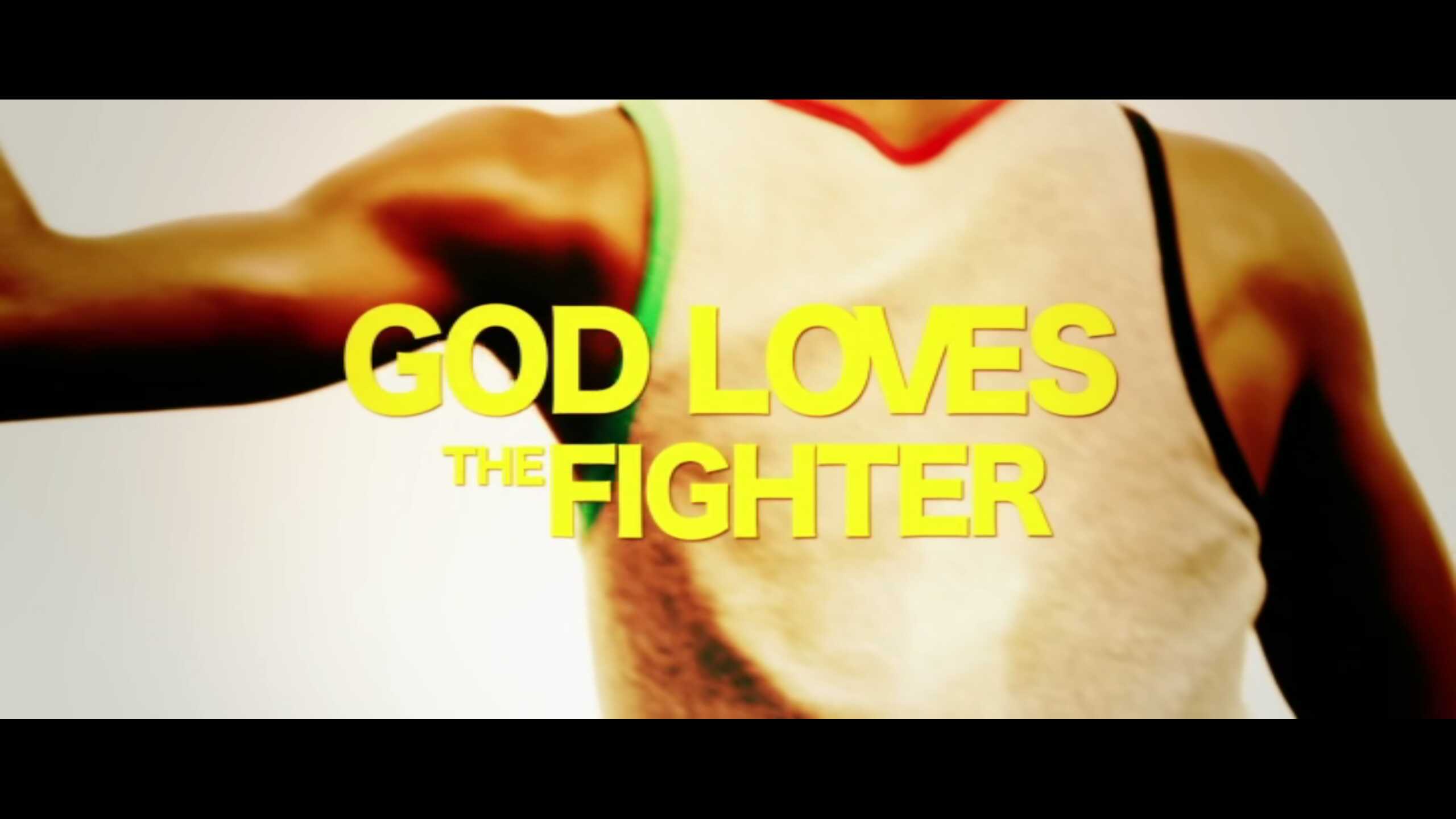 | 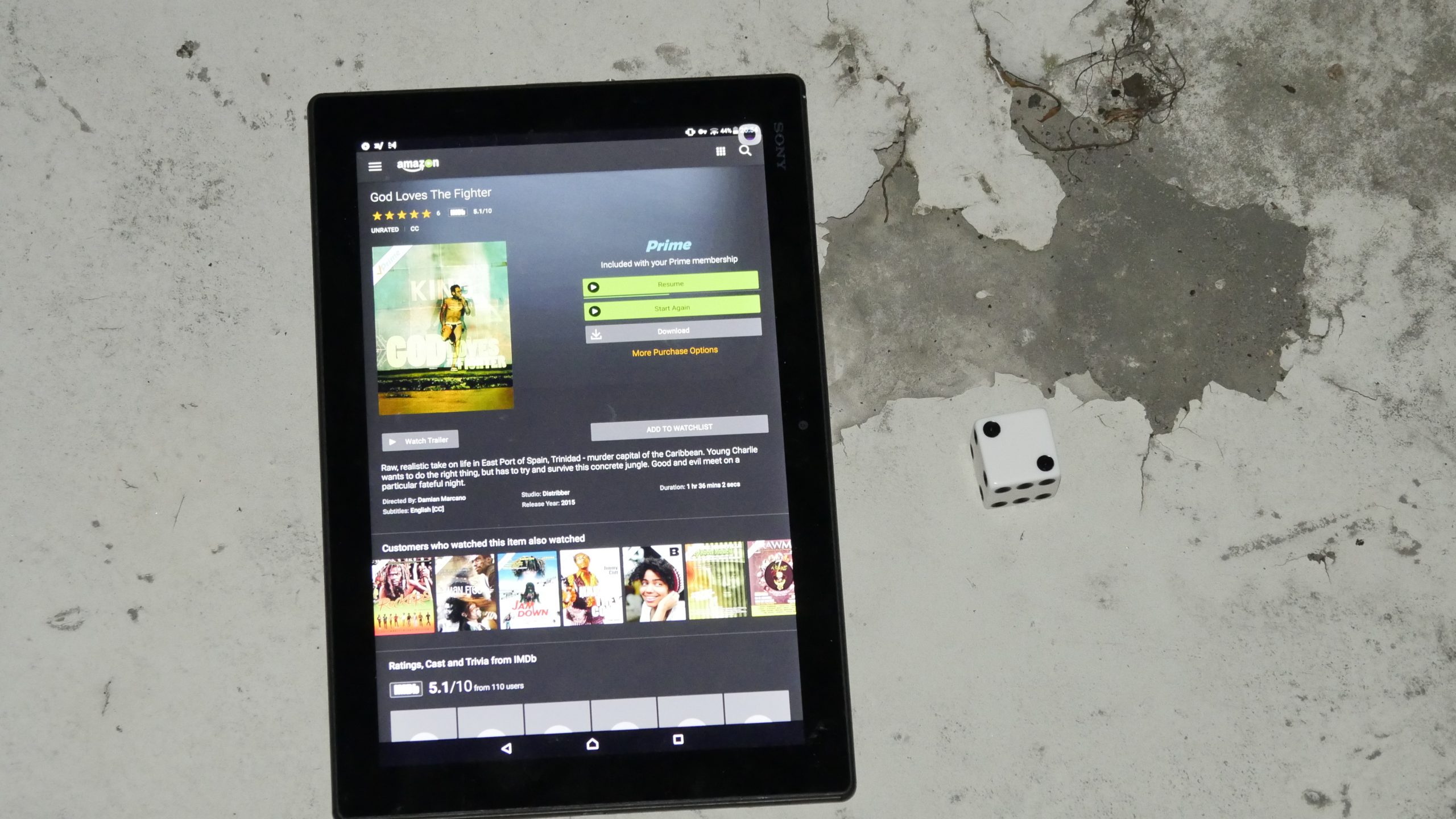 | 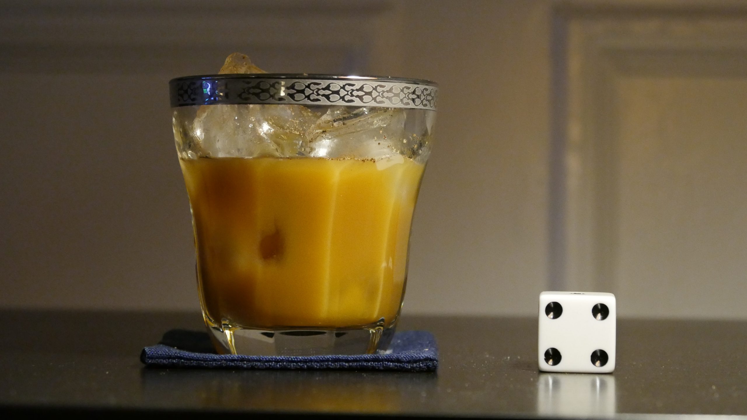 |
| God Loves the Fighter. Damian Marcano. 2013. Trinidad and Tobago. April 7th, 2017. Passionfruit Cocktail. |
 |  | 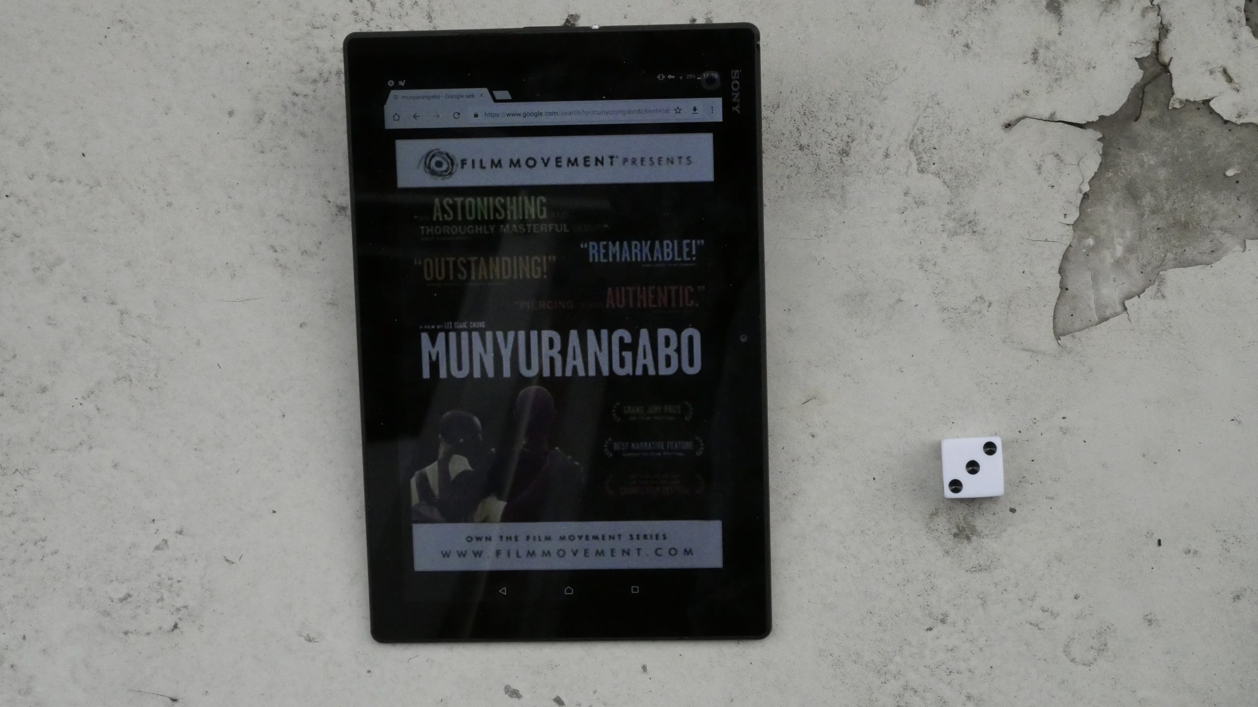 | 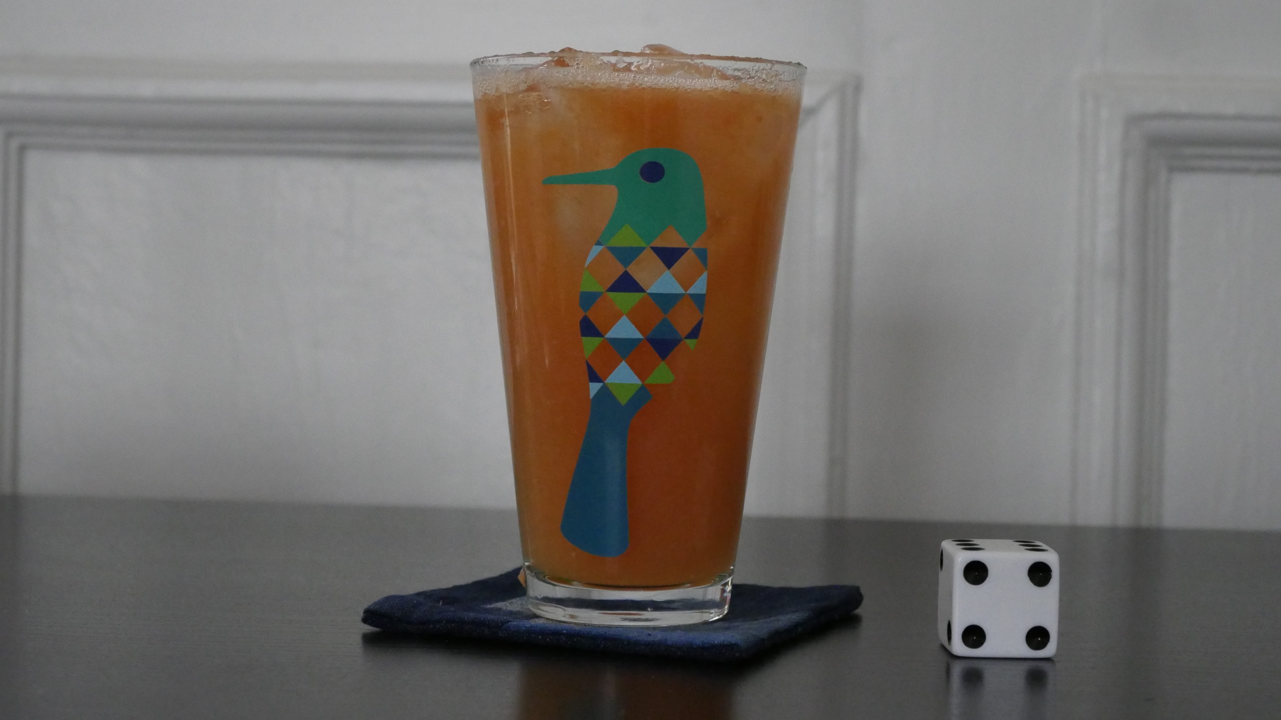 |
| Munyurangabo. Lee Isaac Chung. 2007. Rwanda. April 8th, 2017. “The Starter” – Kigali Mélange. |
 | 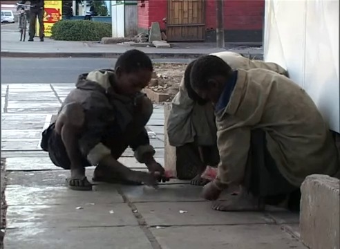 | 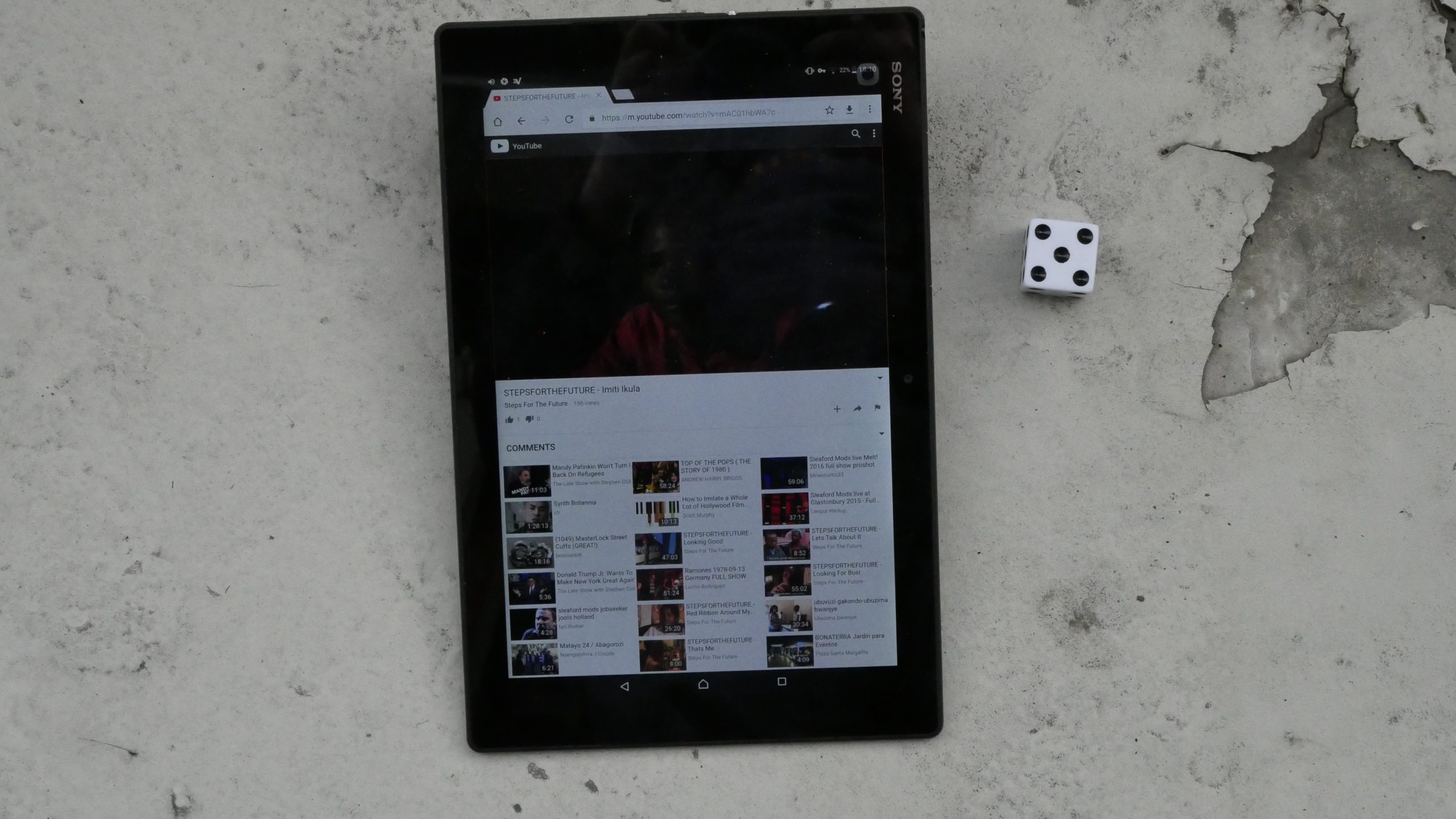 | 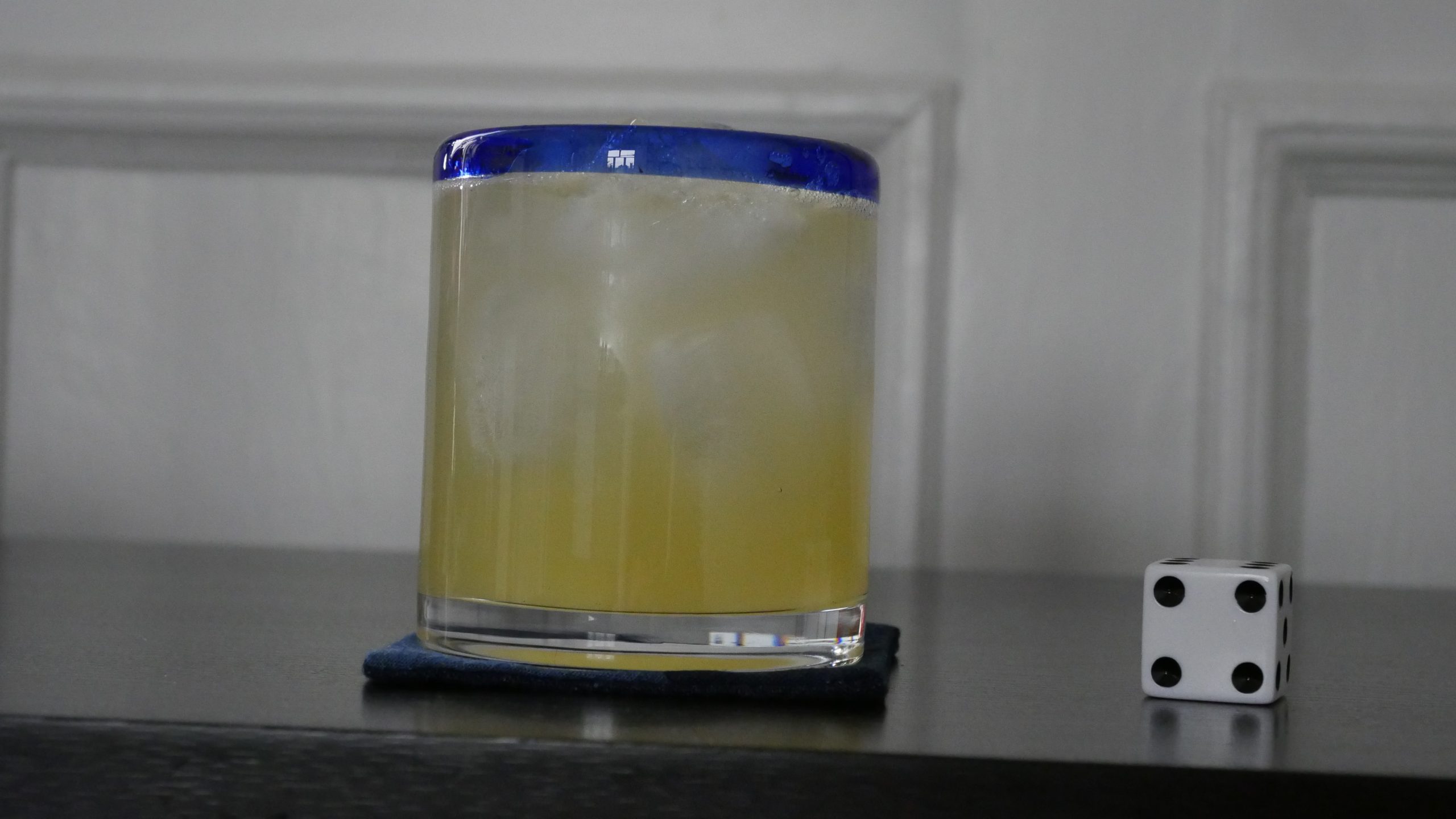 |
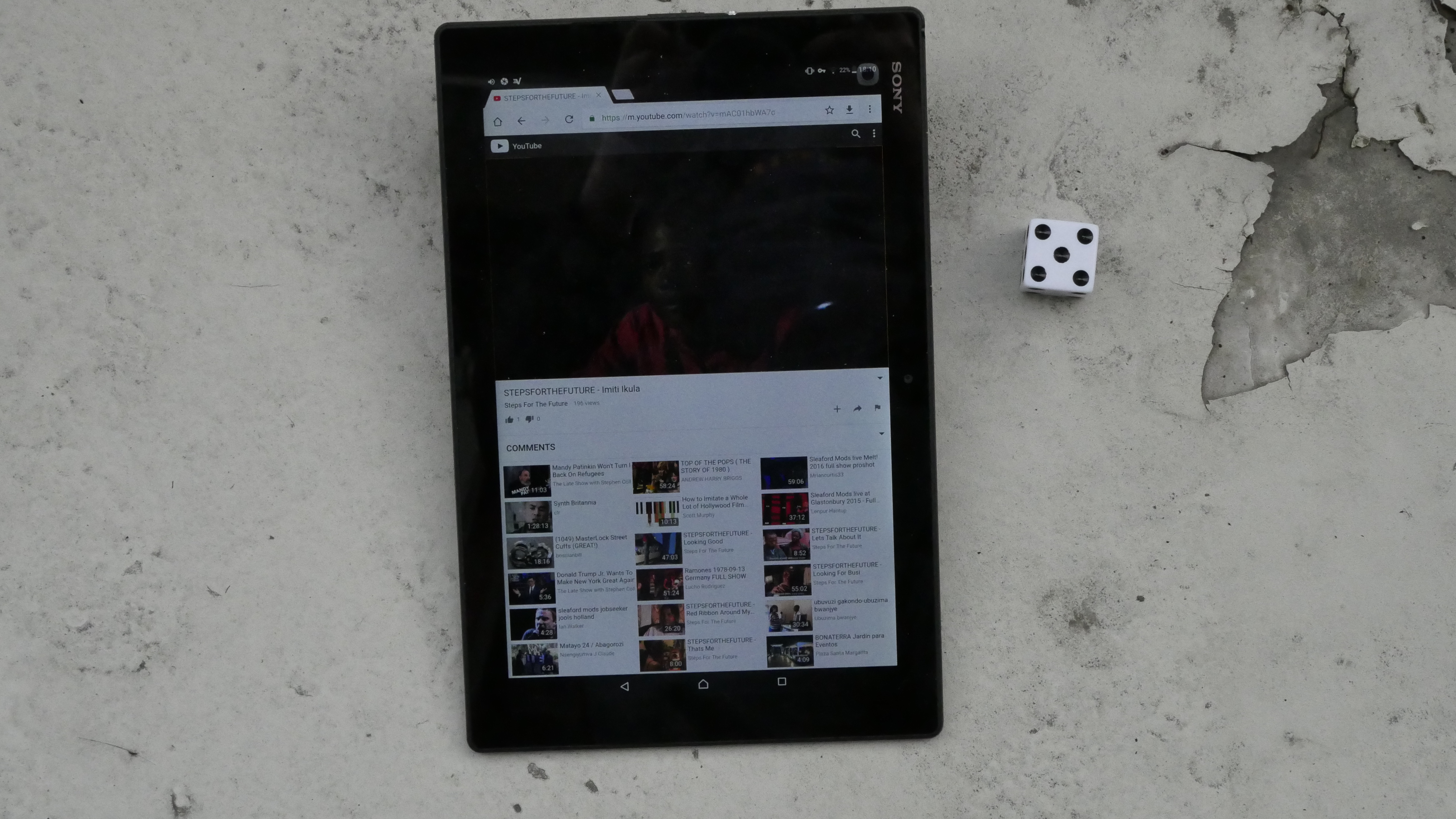
| Imiti ikula. Sampa Kangwa, Simon Wilkie. 2001. Zambia. April 8th, 2017. Lady Passion. |
 |  | 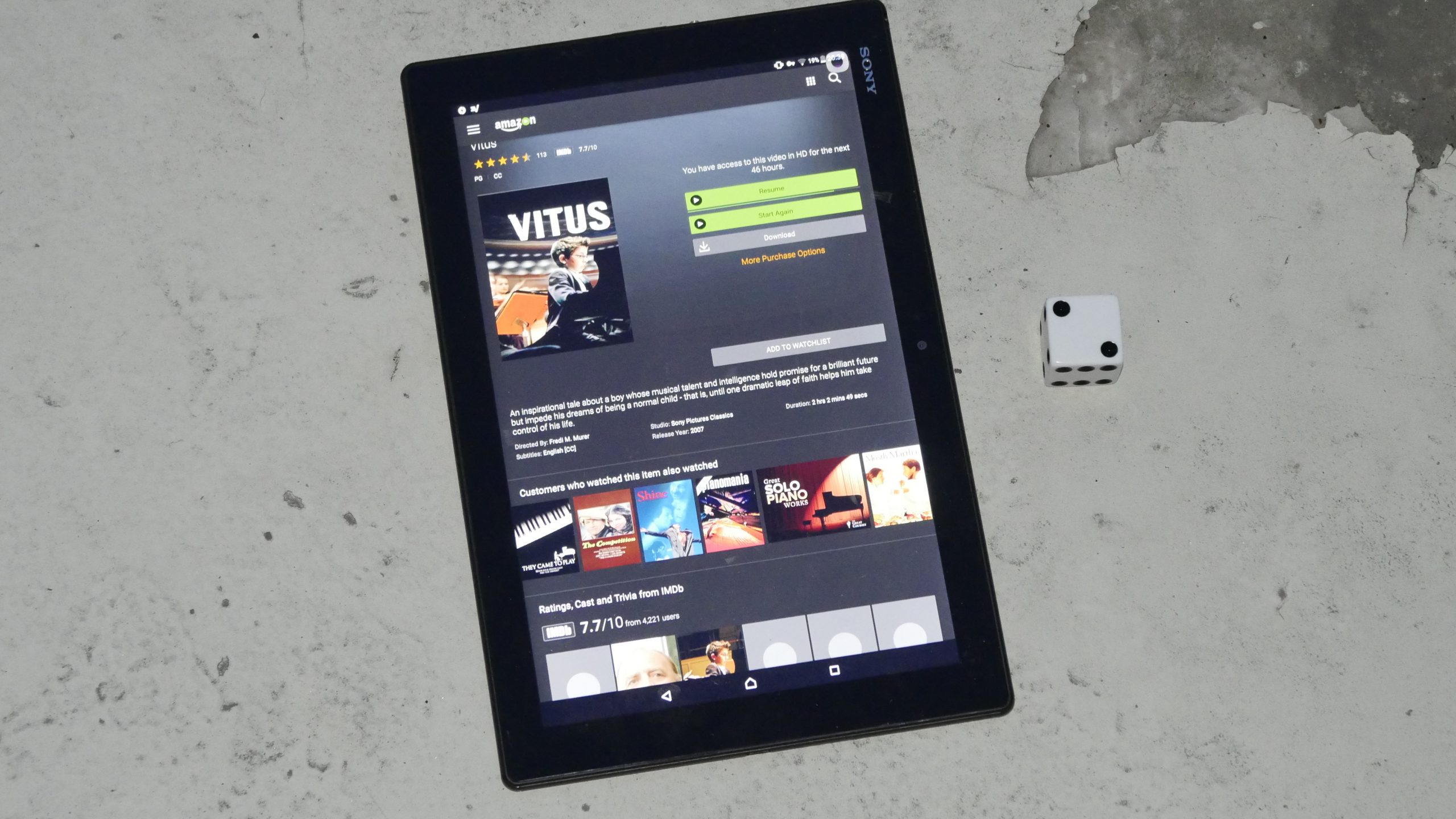 |  |
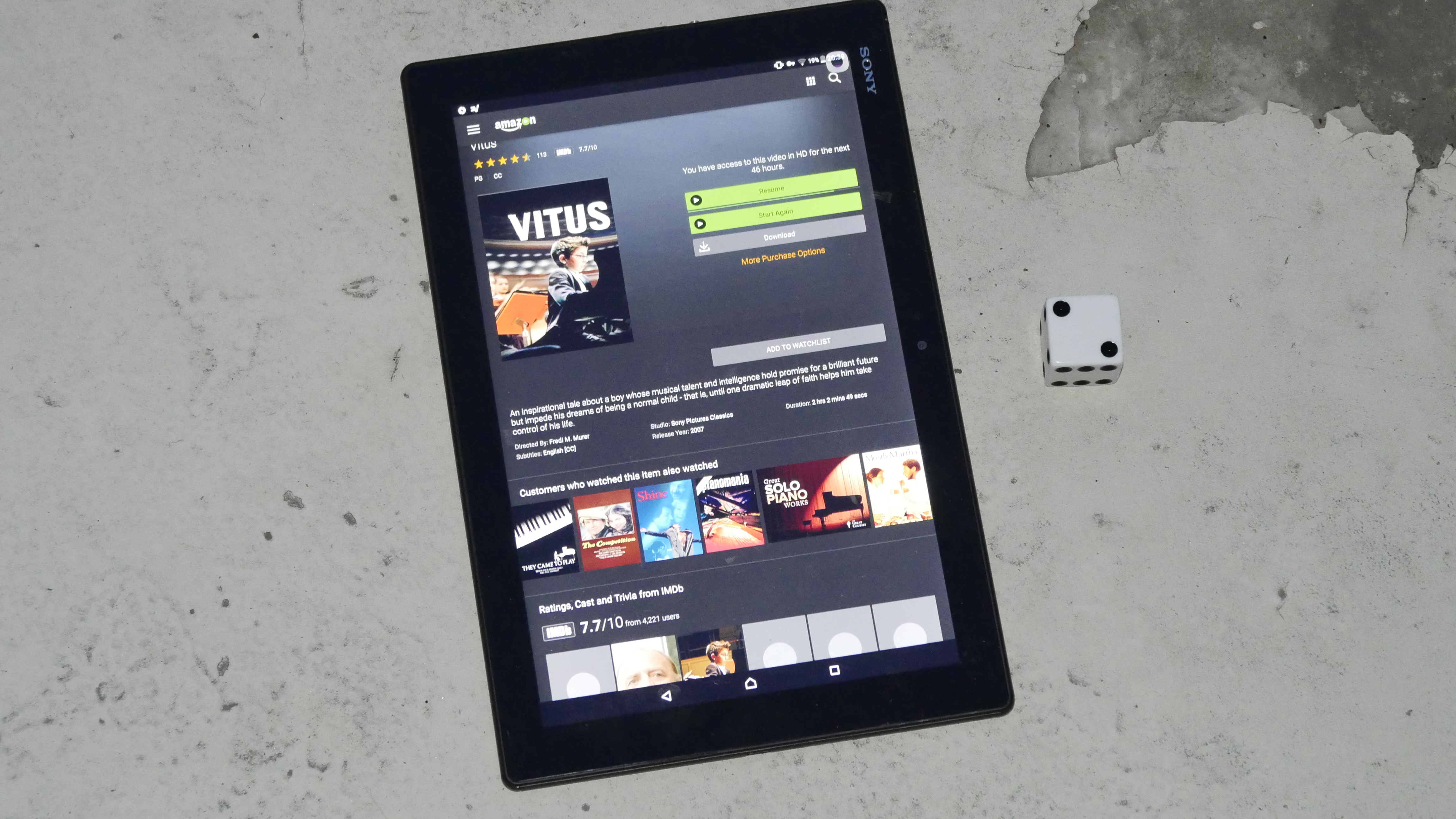
| Vitus. Fredi M. Murer. 2006. Switzerland. April 8th, 2017. . |
 | 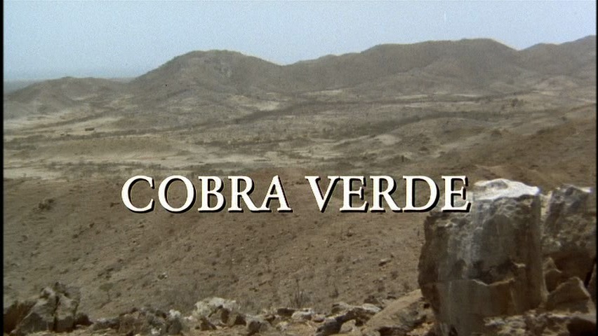 |  |  |
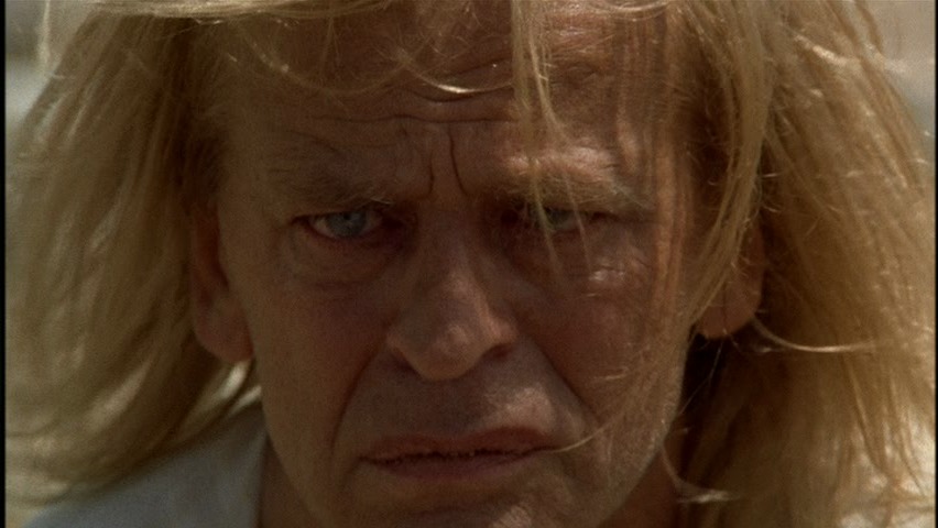
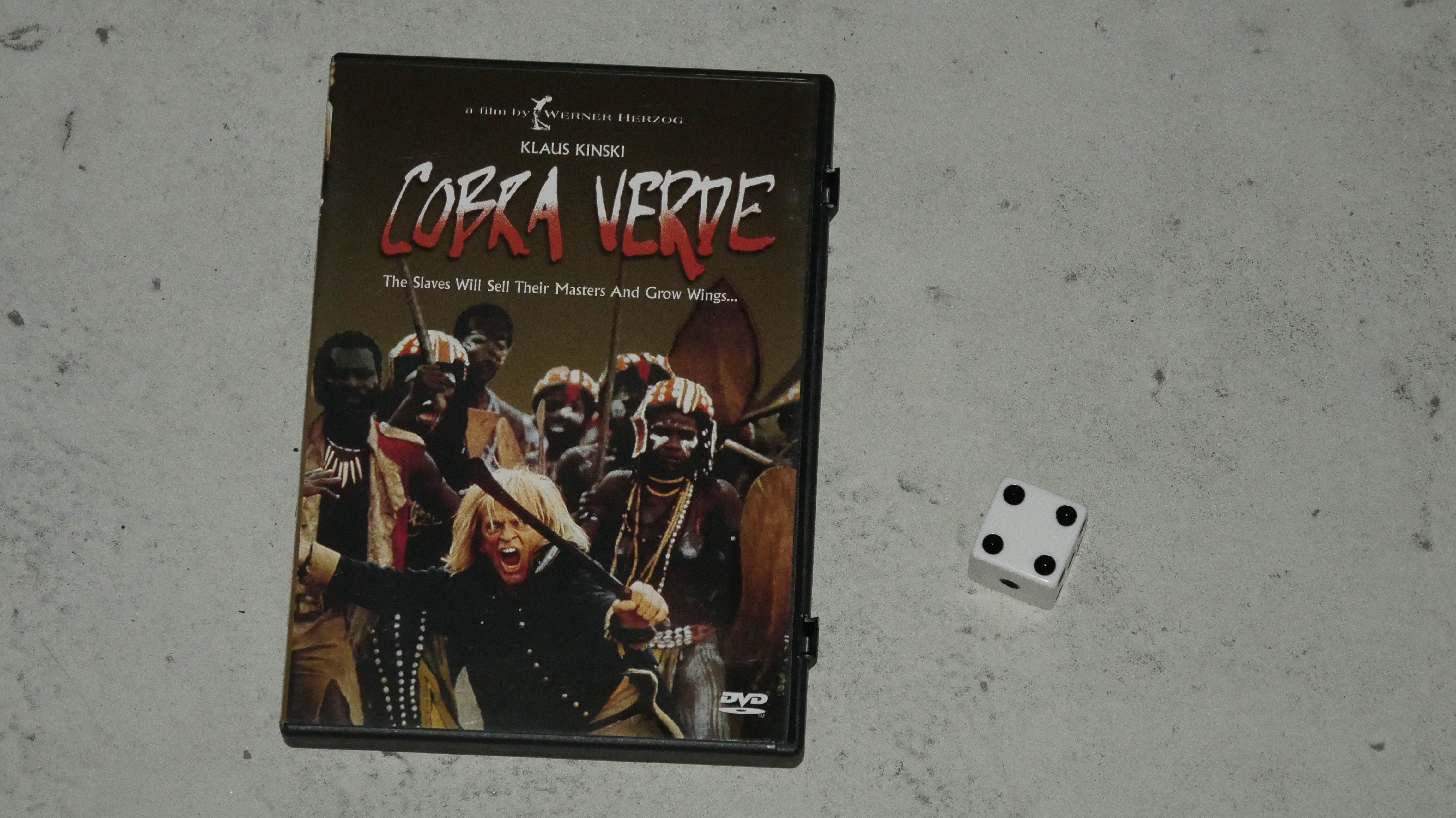
| Cobra Verde. Werner Herzog. 1987. Ghana. April 8th, 2017. The Midnight Rum. |
 | 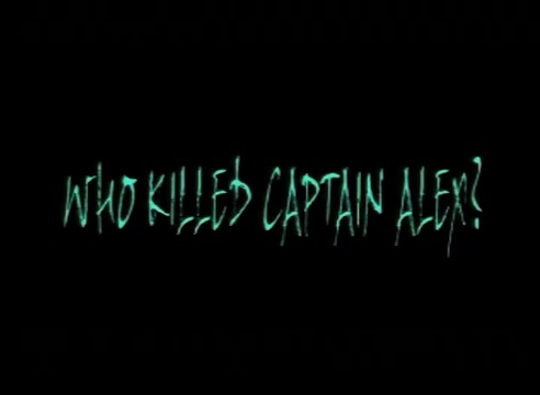 | 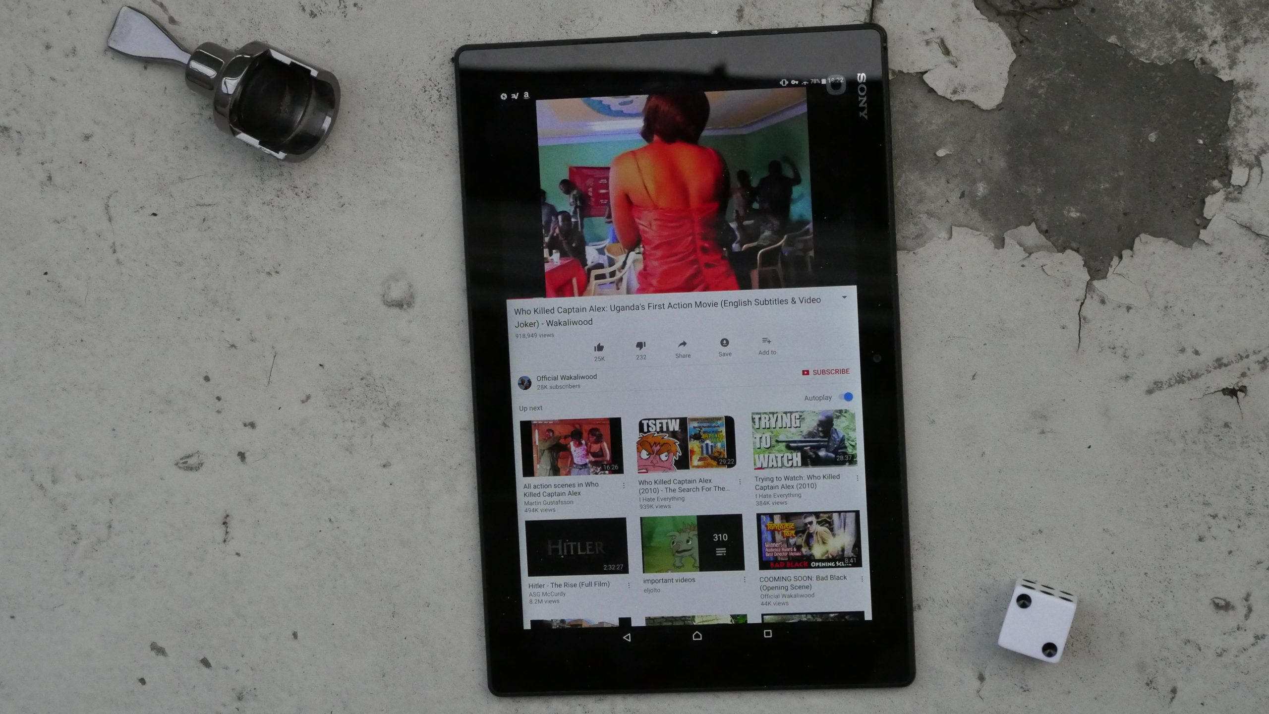 | 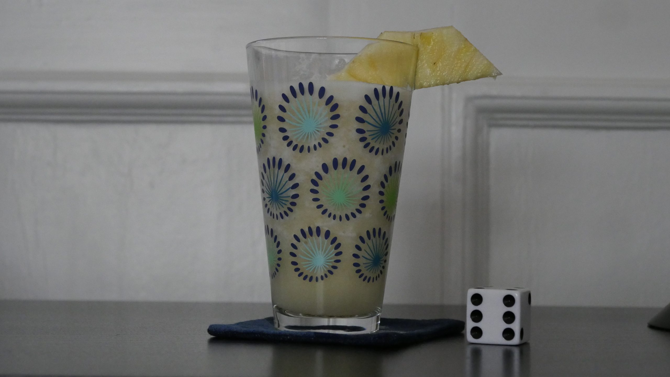 |
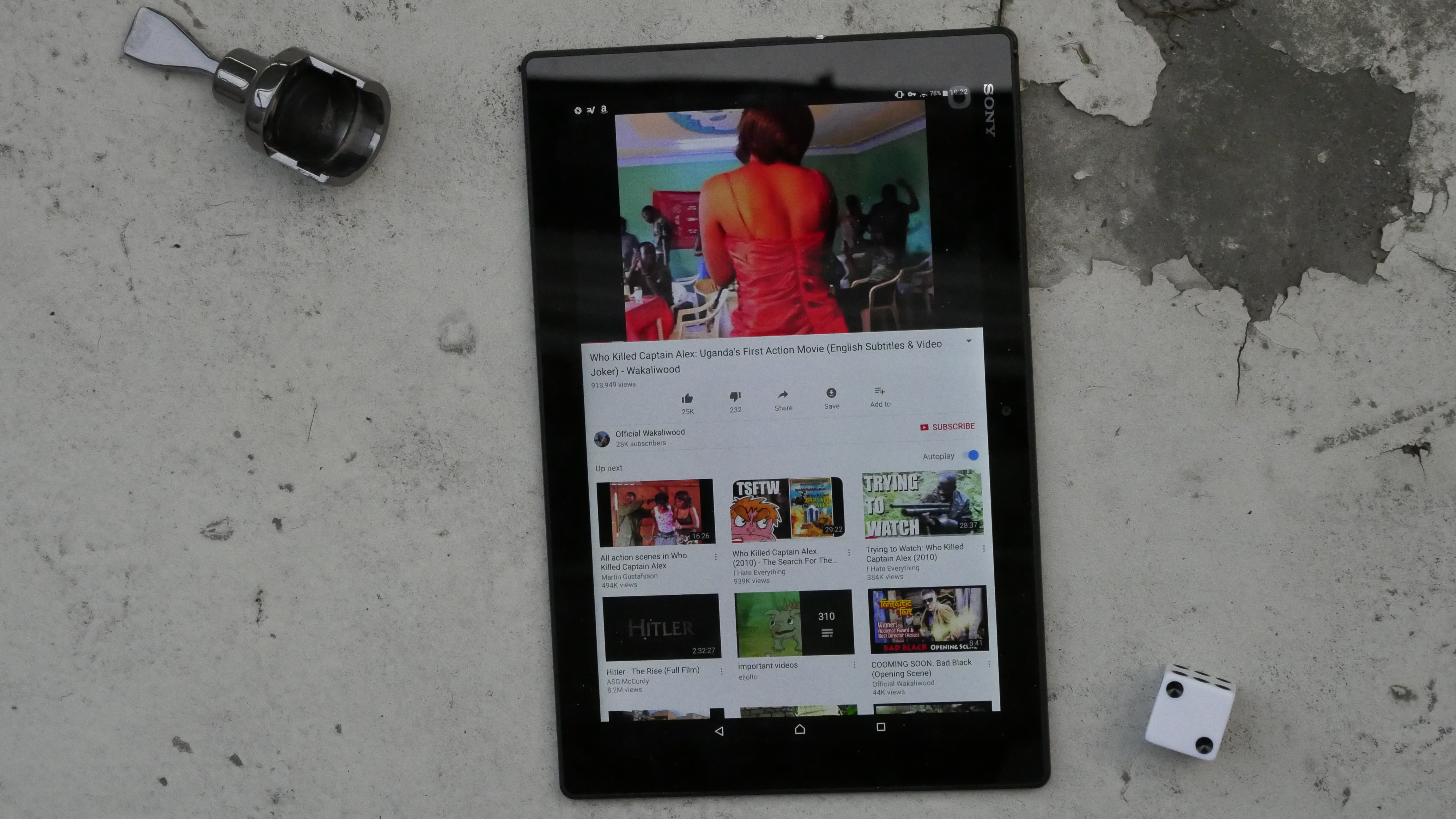
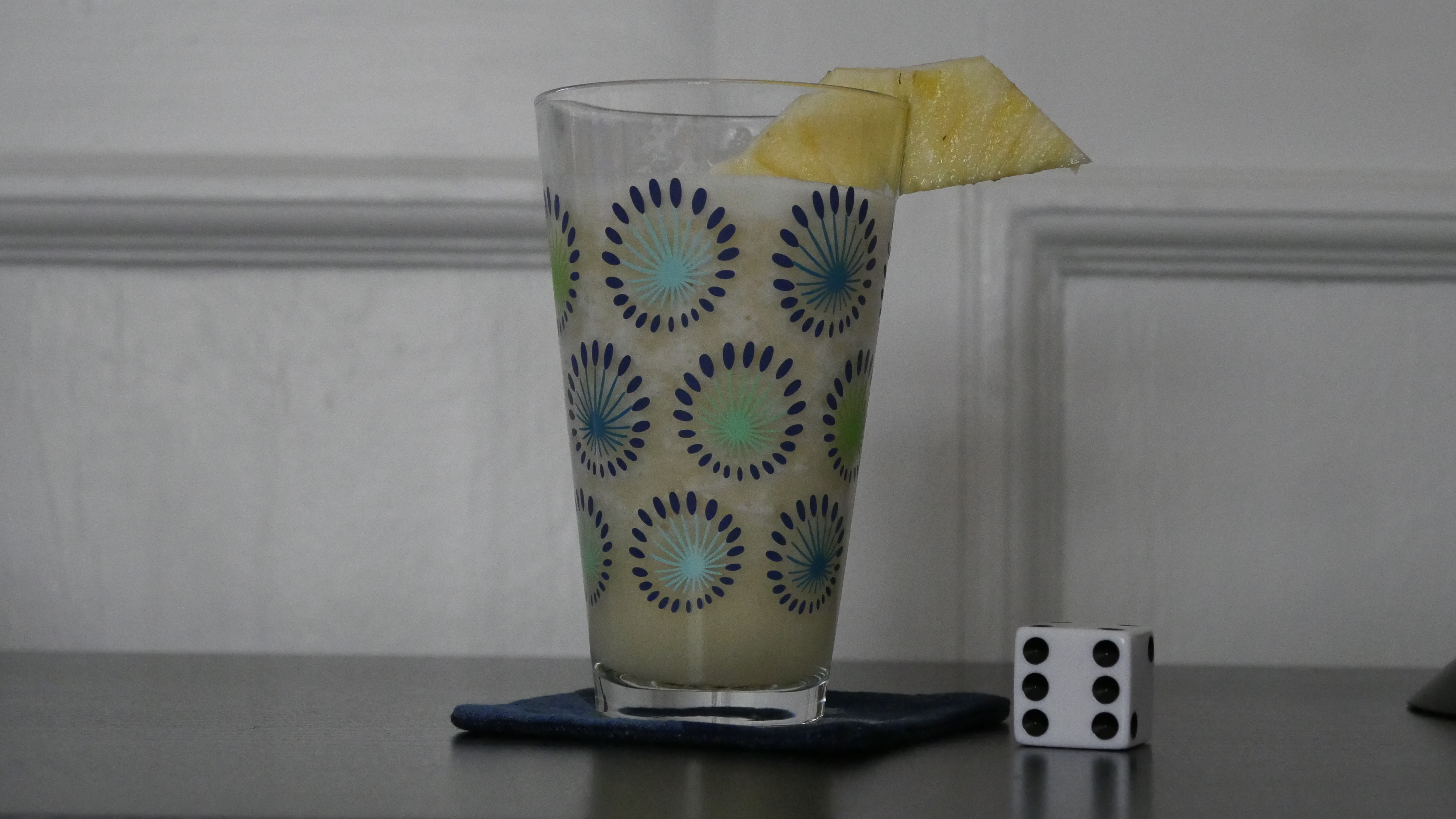
| Who Killed Captain Alex?. Nabwana I.G.G.. 2010. Uganda. April 10th, 2017. Pineapple Buganda. |
 | 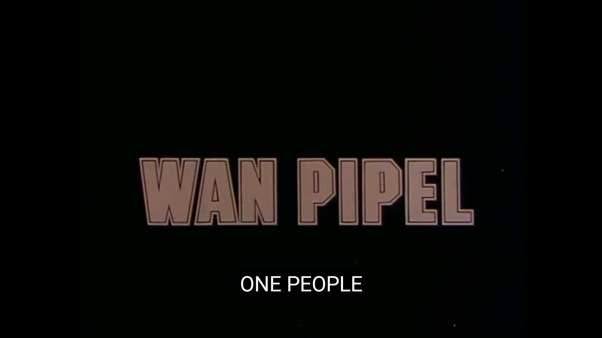 | 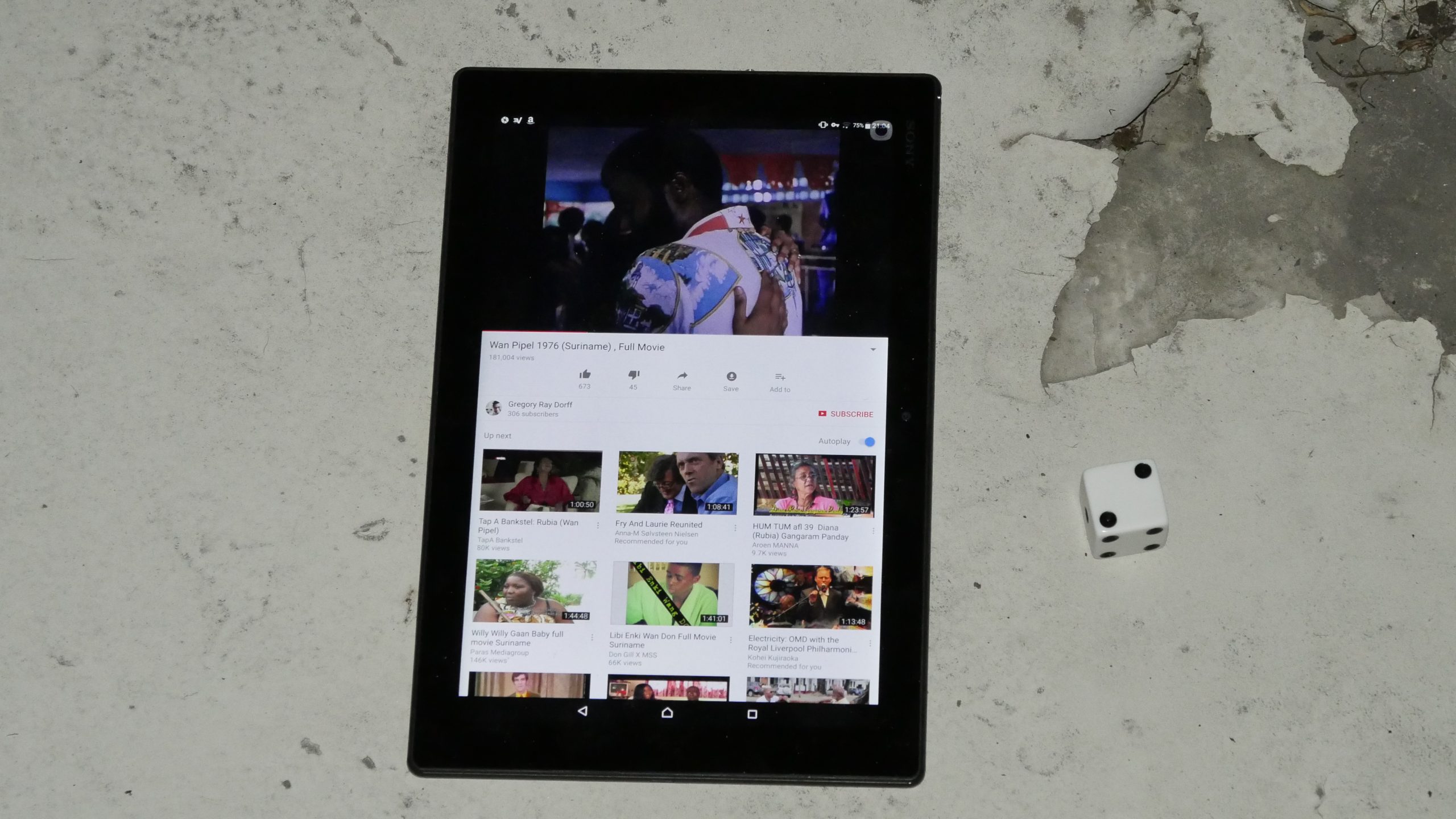 |  |
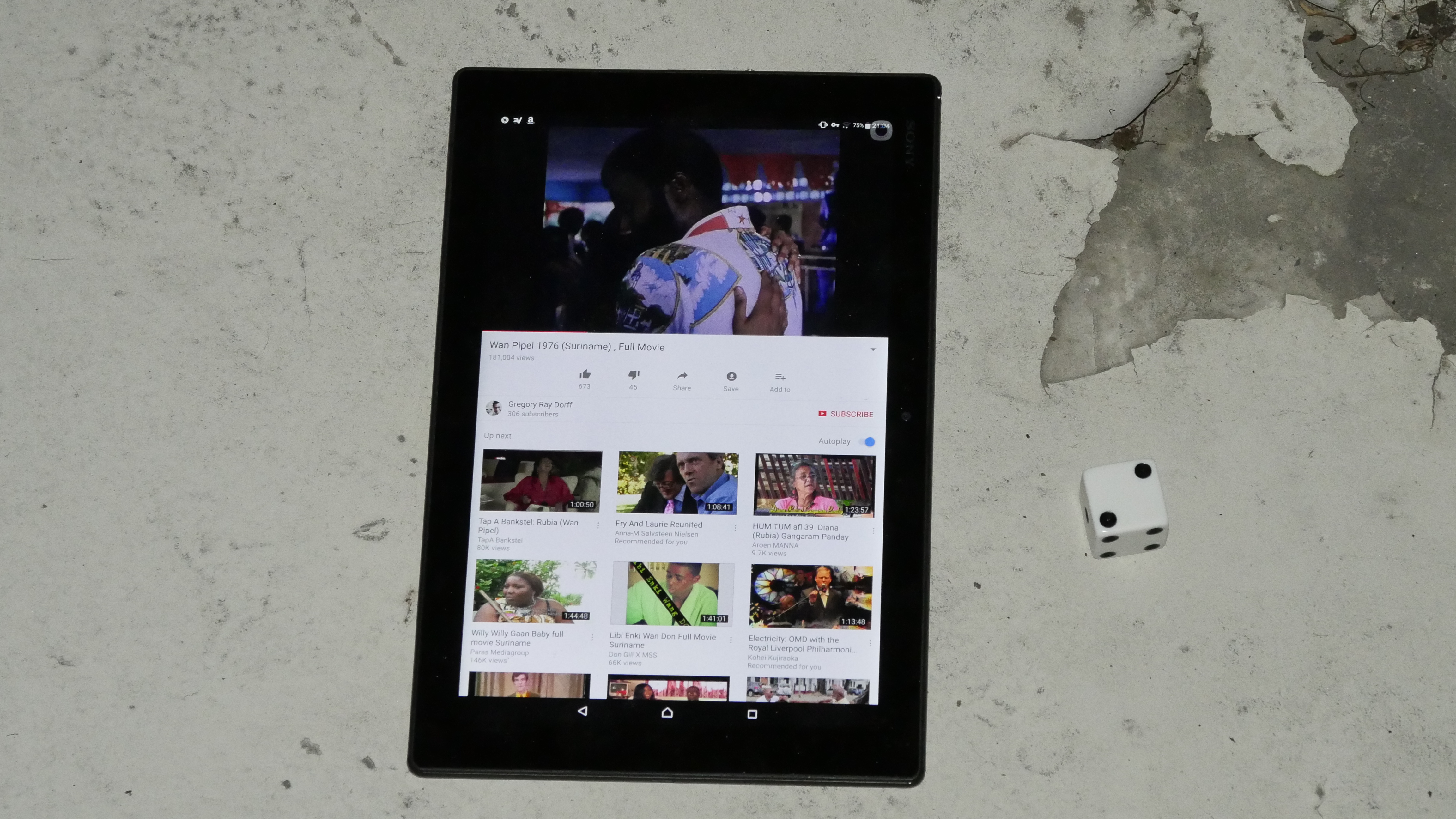
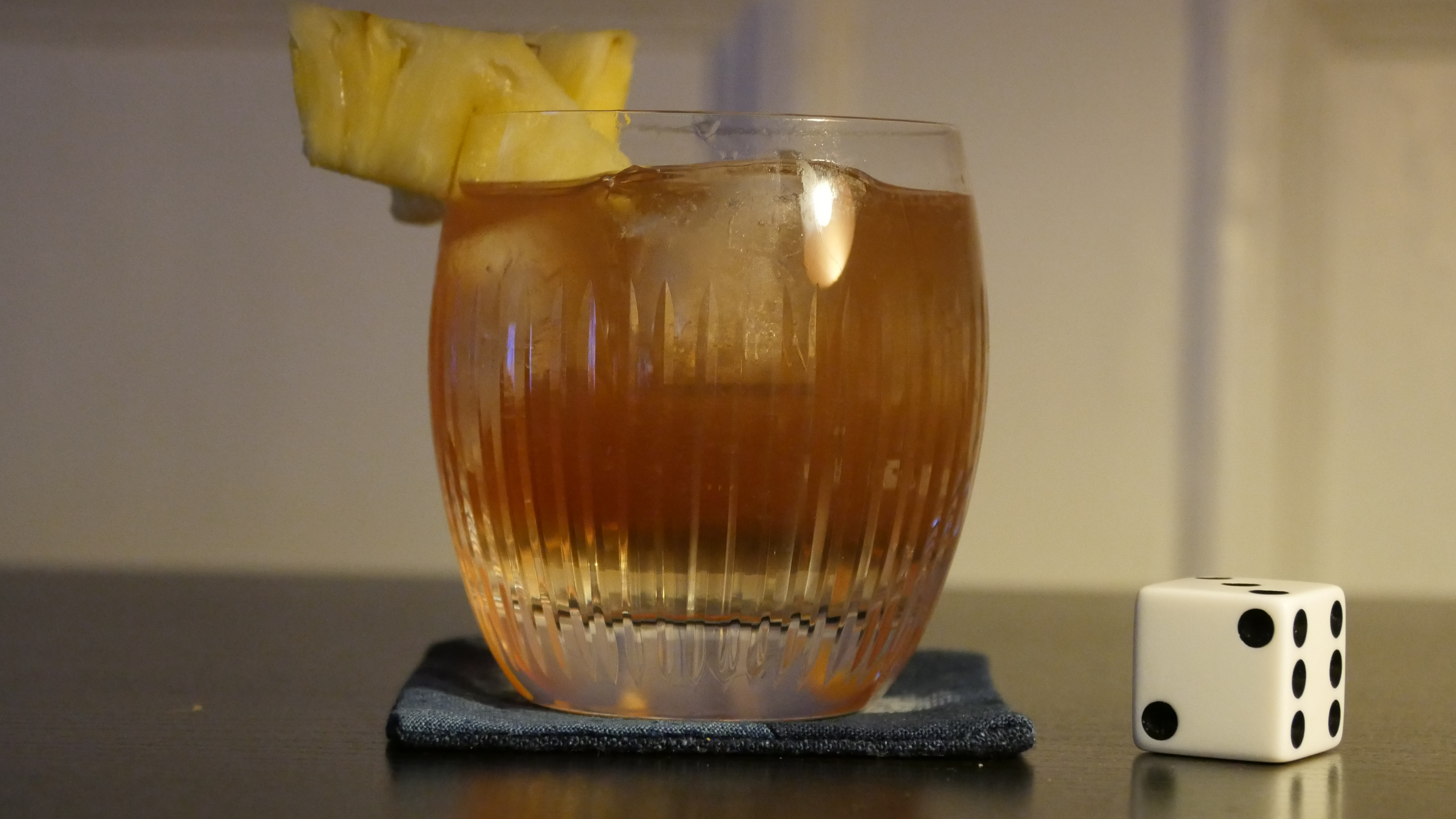
| Wan Pipel. Pim de la Parra. 1976. Suriname. April 10th, 2017. The Paramaribo Park Club Gin Sling. |
 | 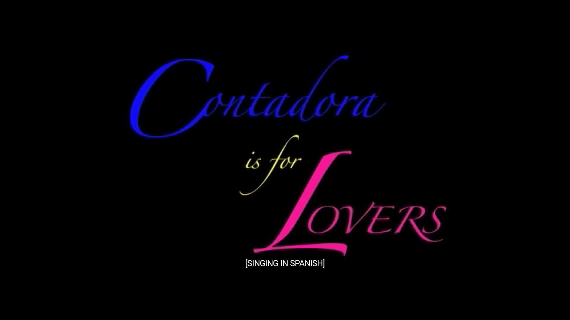 | 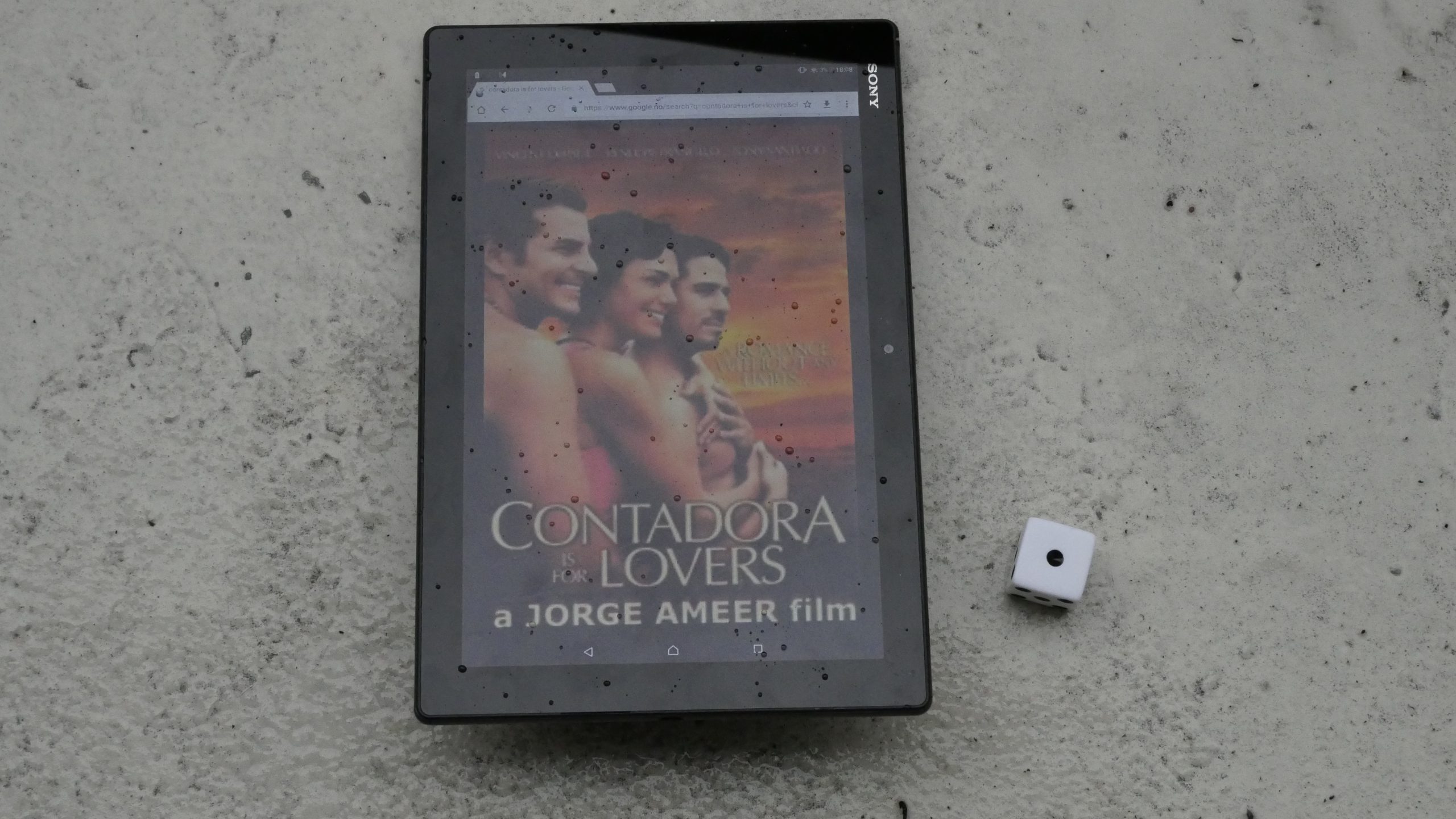 |  |
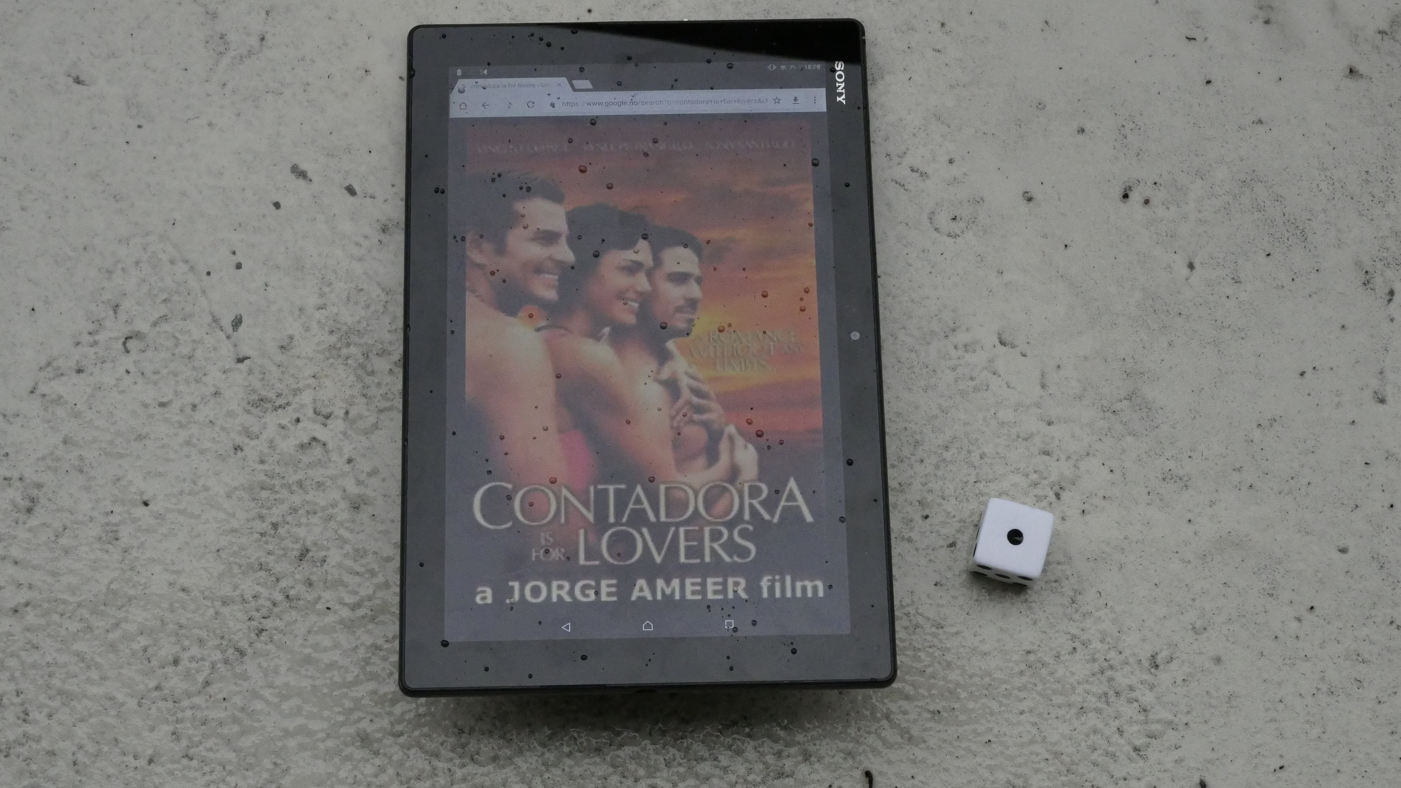
| Contadora is for Lovers. Jorge Ameer. 2006. Panama. April 13th, 2017. Coco Heaven. |
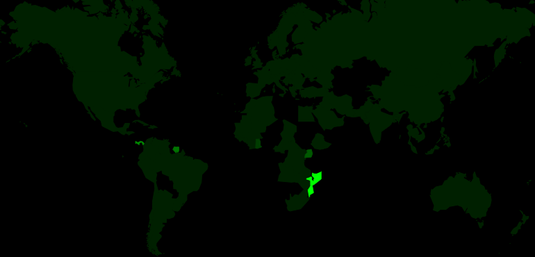 | 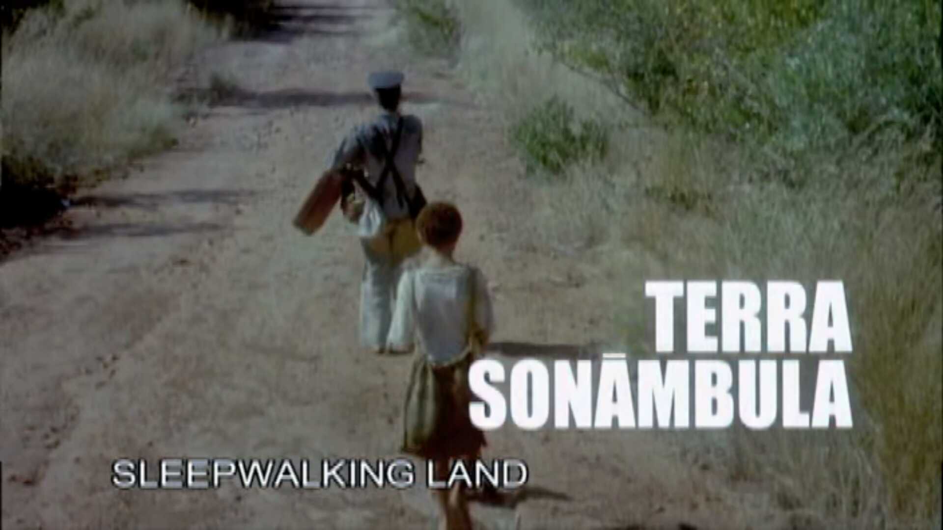 | 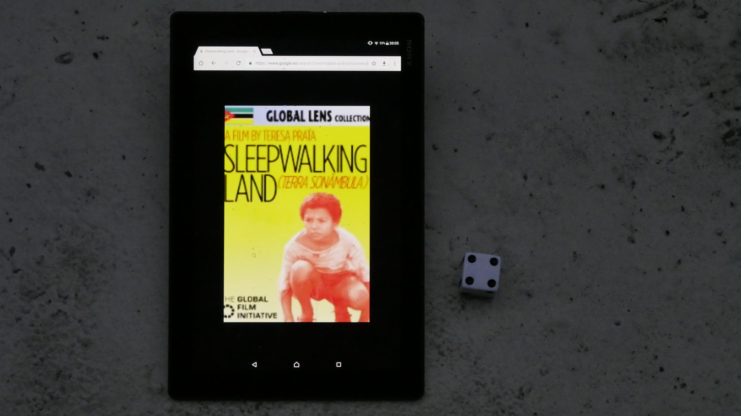 |  |
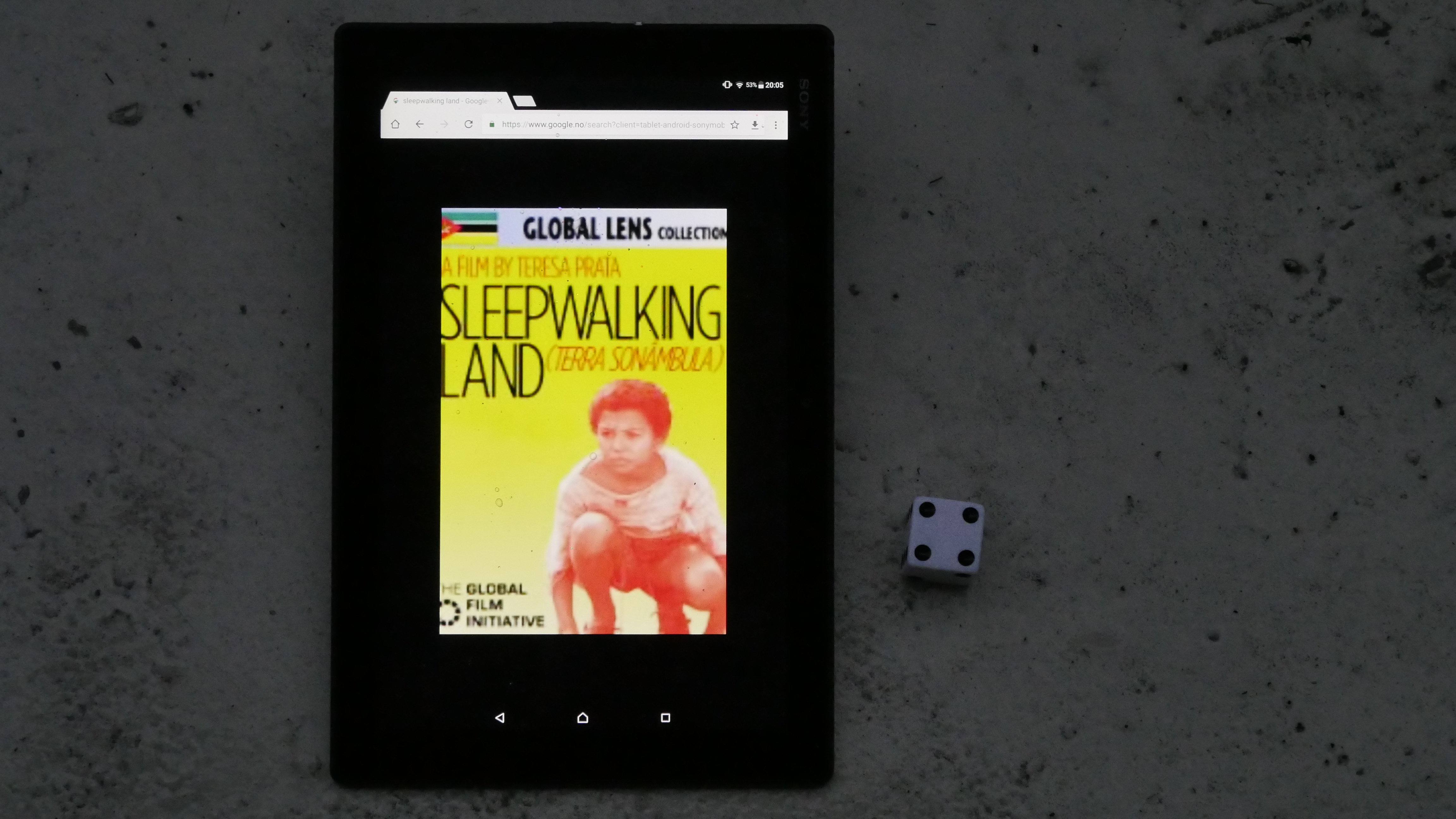
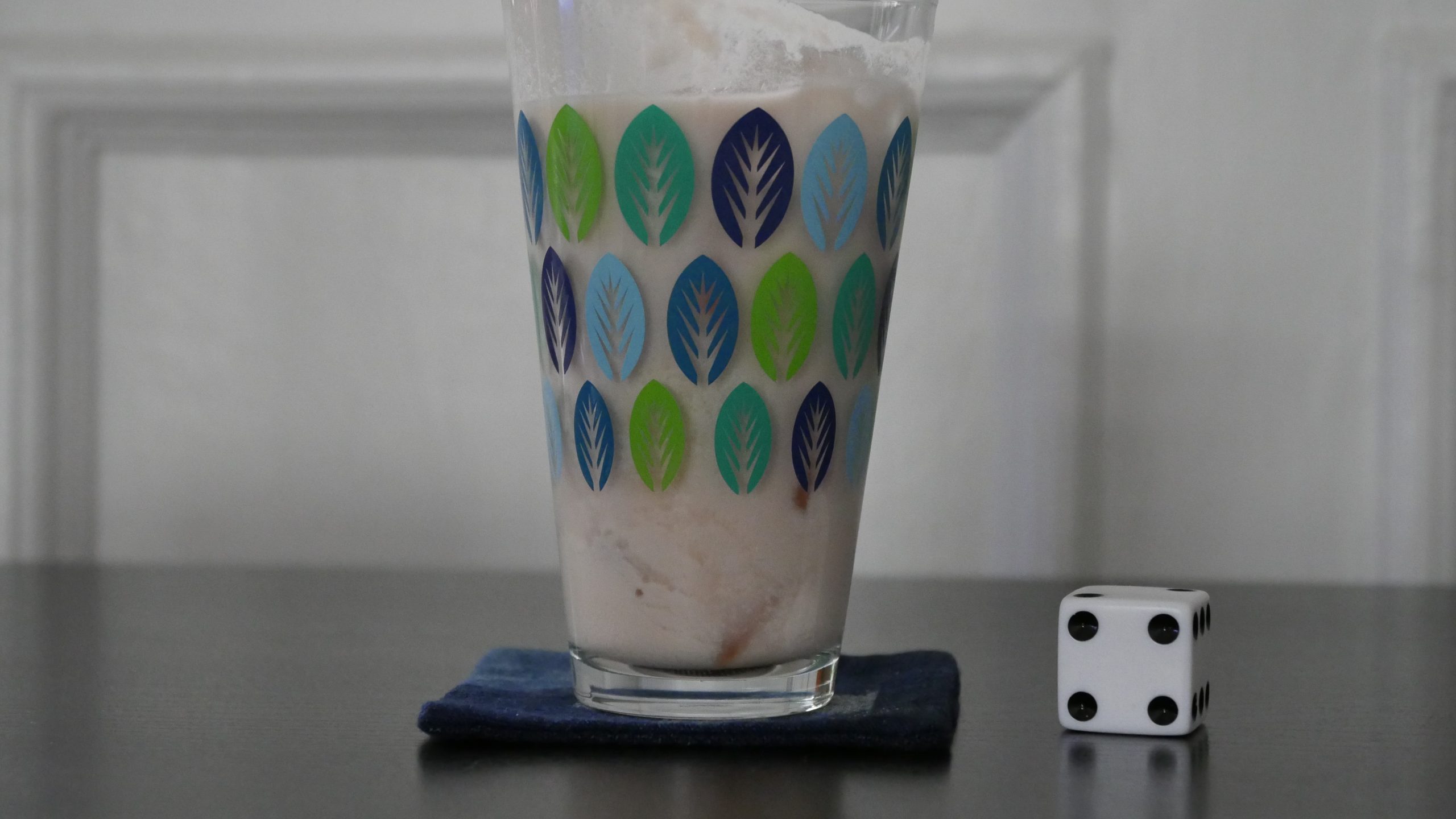
| Sleepwalking Land. Teresa Prata. 2007. Mozambique. April 13th, 2017. Coconut Mojito. |
 | 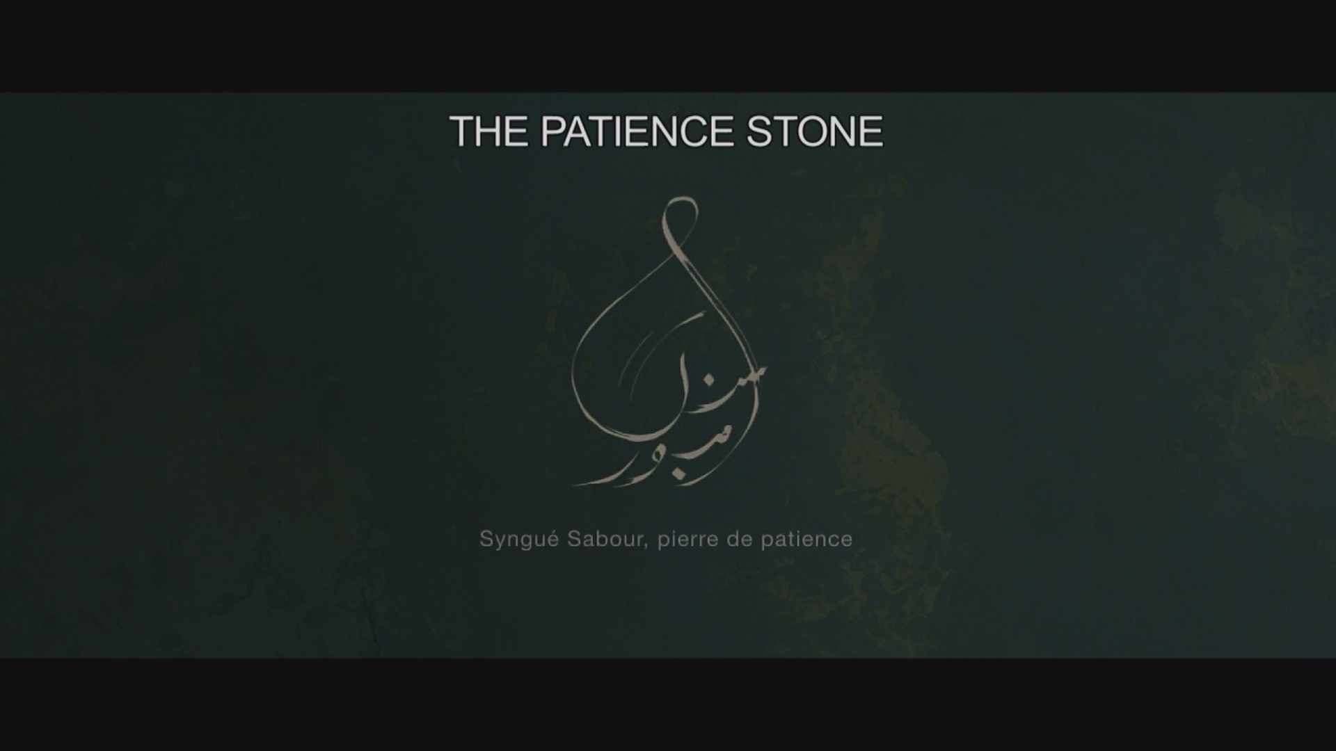 | 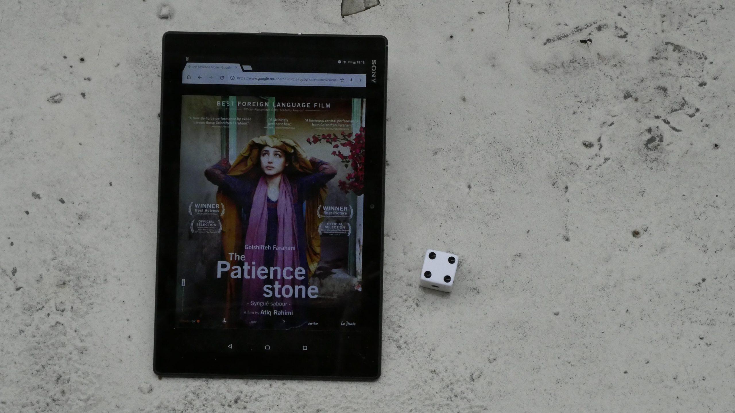 |  |
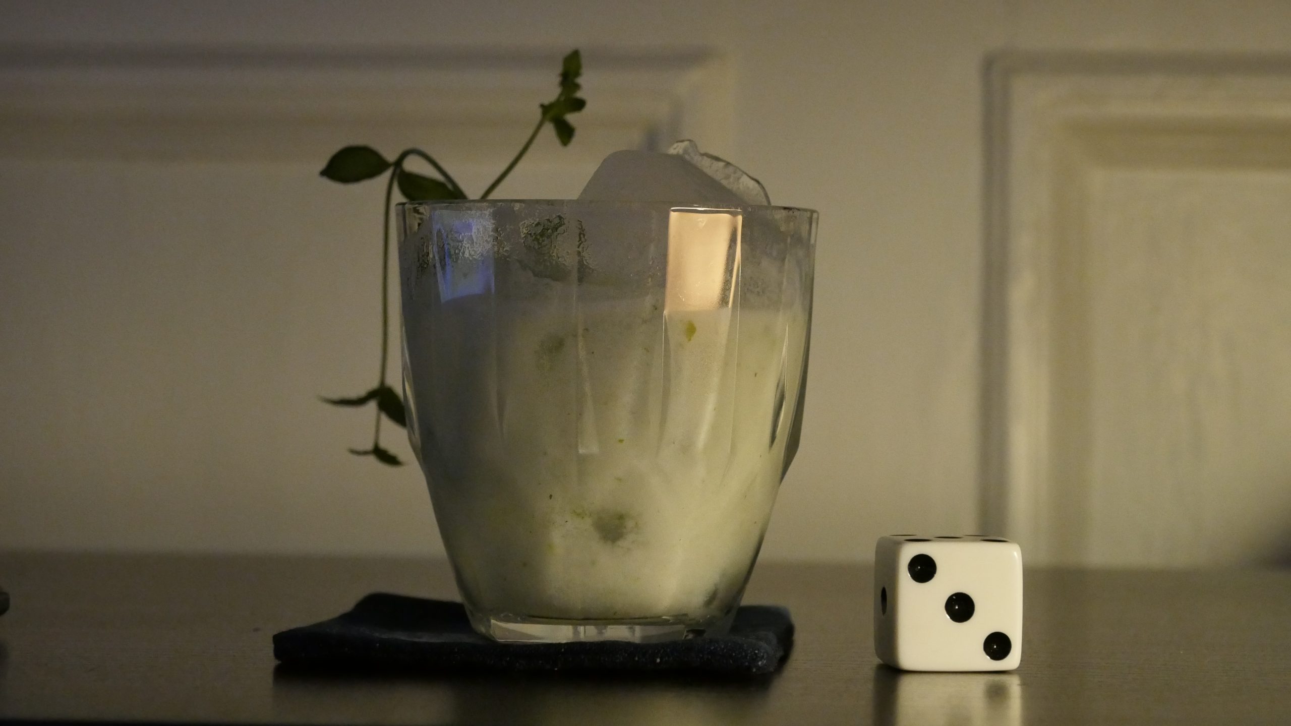
| The Patience Stone. Atiq Rahimi. 2012. Afghanistan. April 28th, 2017. Bubbly Afghan Cherry Cocktail. |
 | 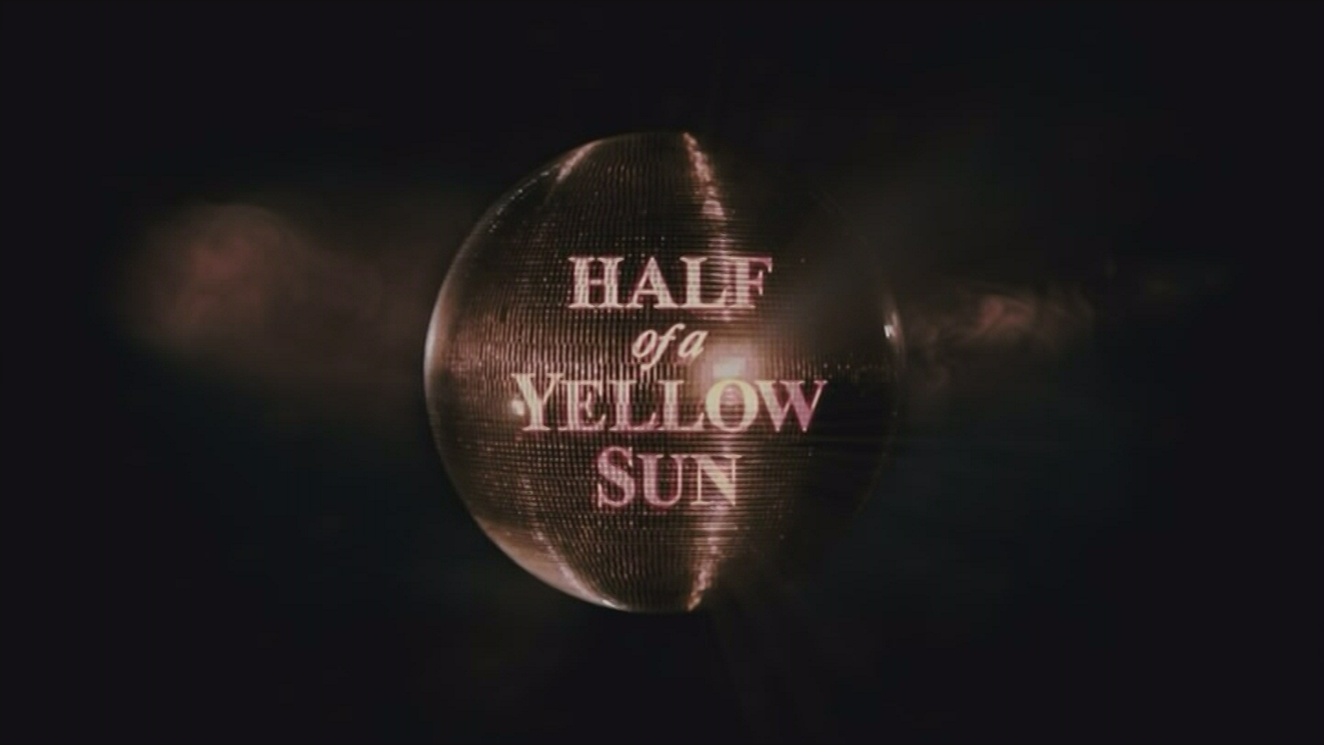 | 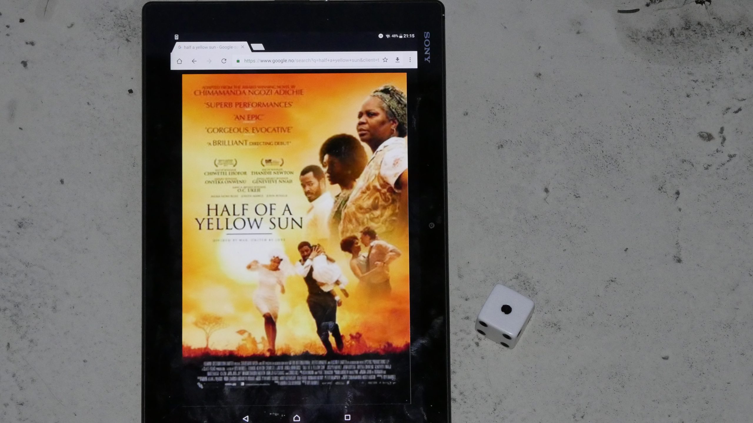 |  |
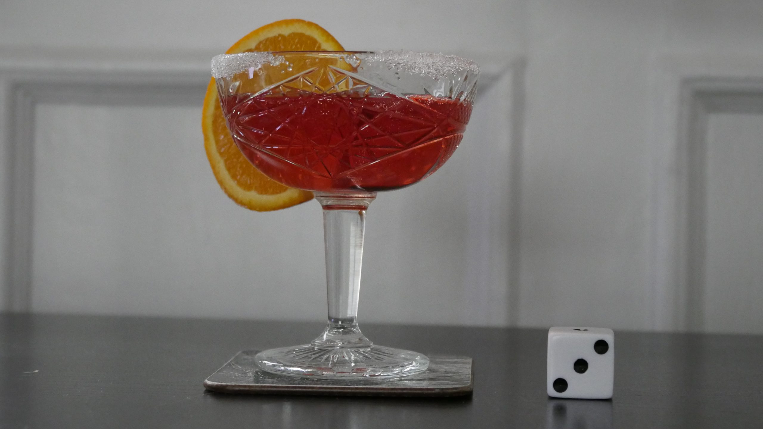
| Half of a Yellow Sun. Biyi Bandele. 2013. Nigeria. April 28th, 2017. Super Simple Summer Punch. |
 |  | 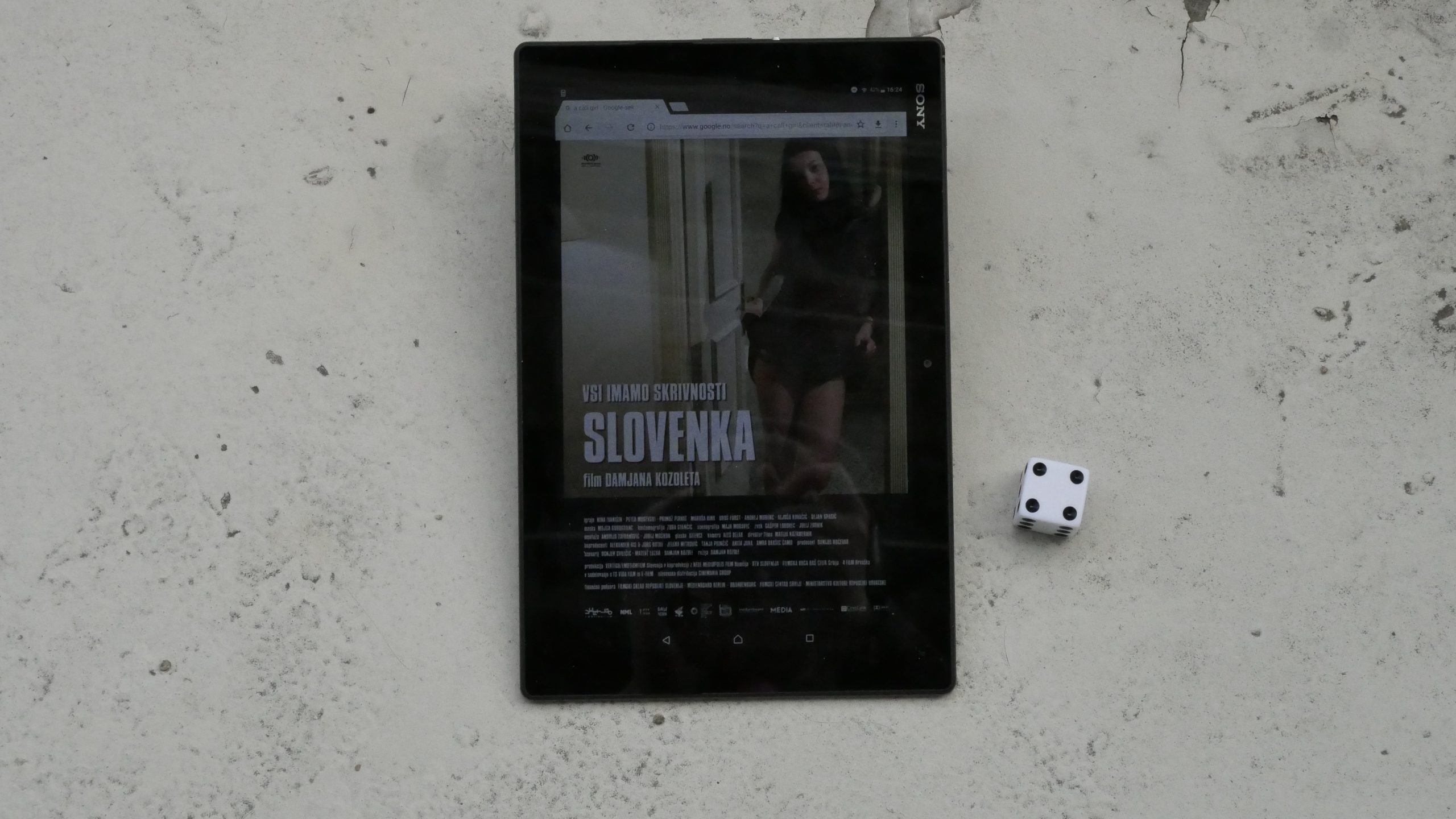 |  |
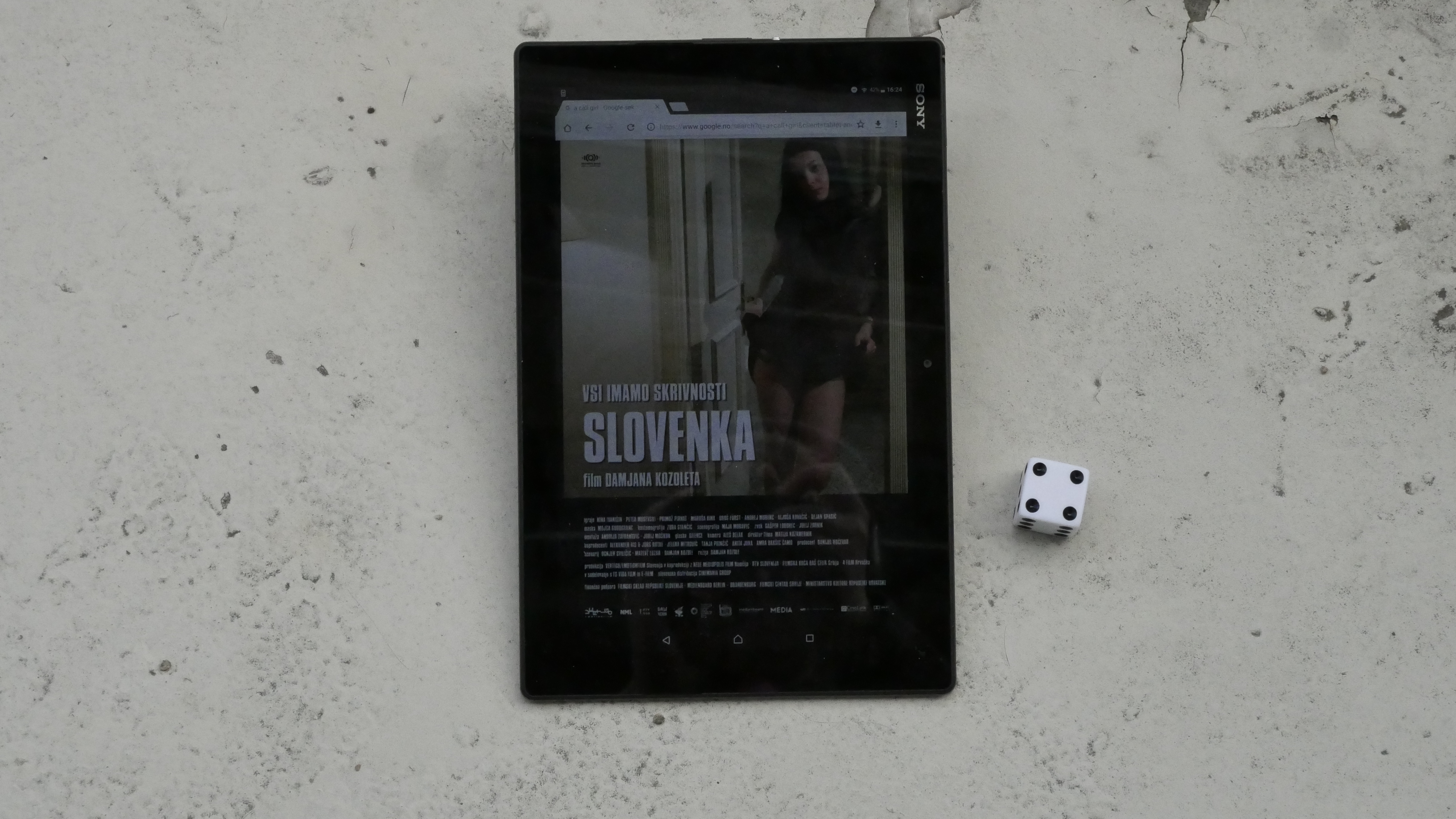
| A Call Girl. Damjan Kozole. 2009. Slovenia. April 29th, 2017. The Peter XOXO. |
 | 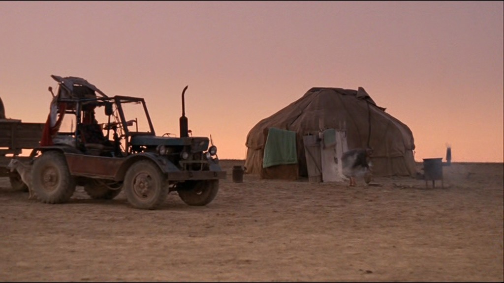 | 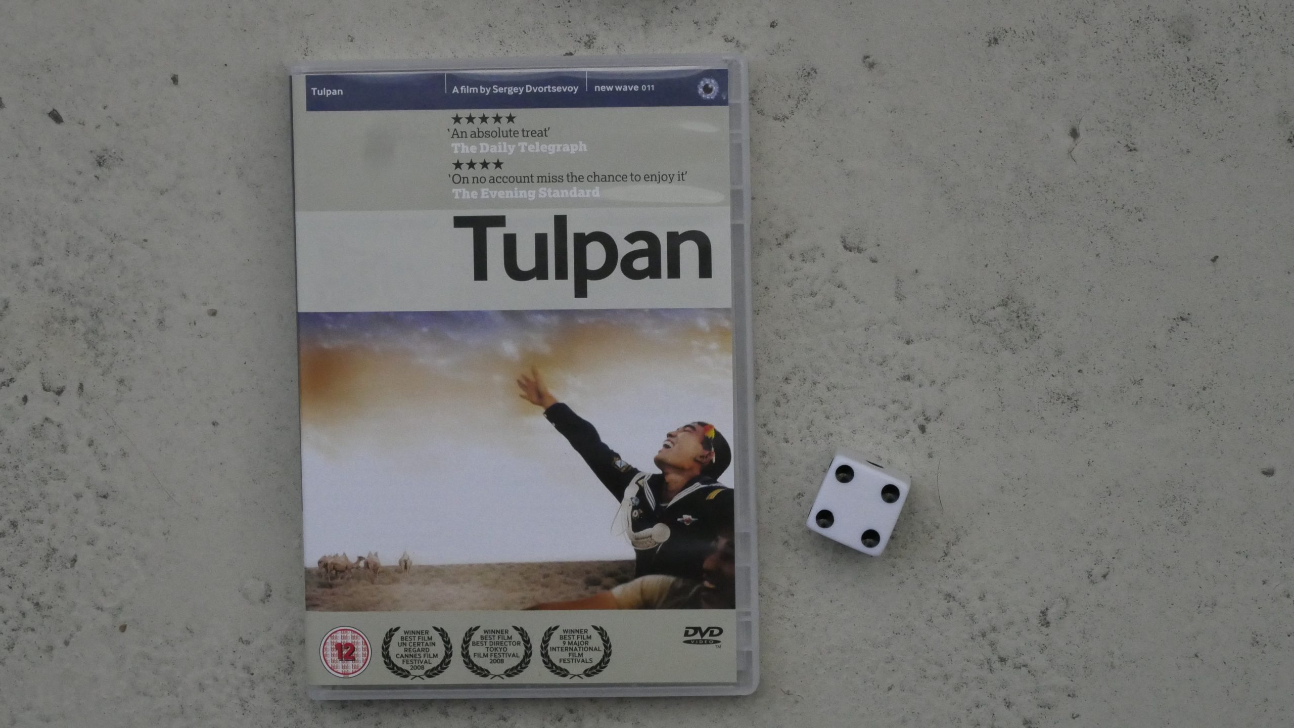 | 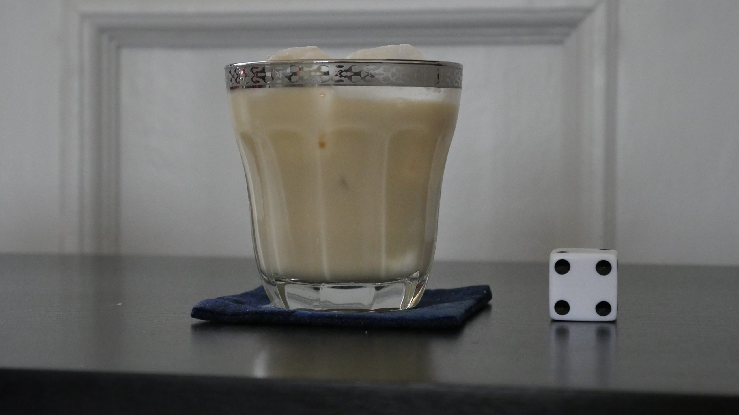 |
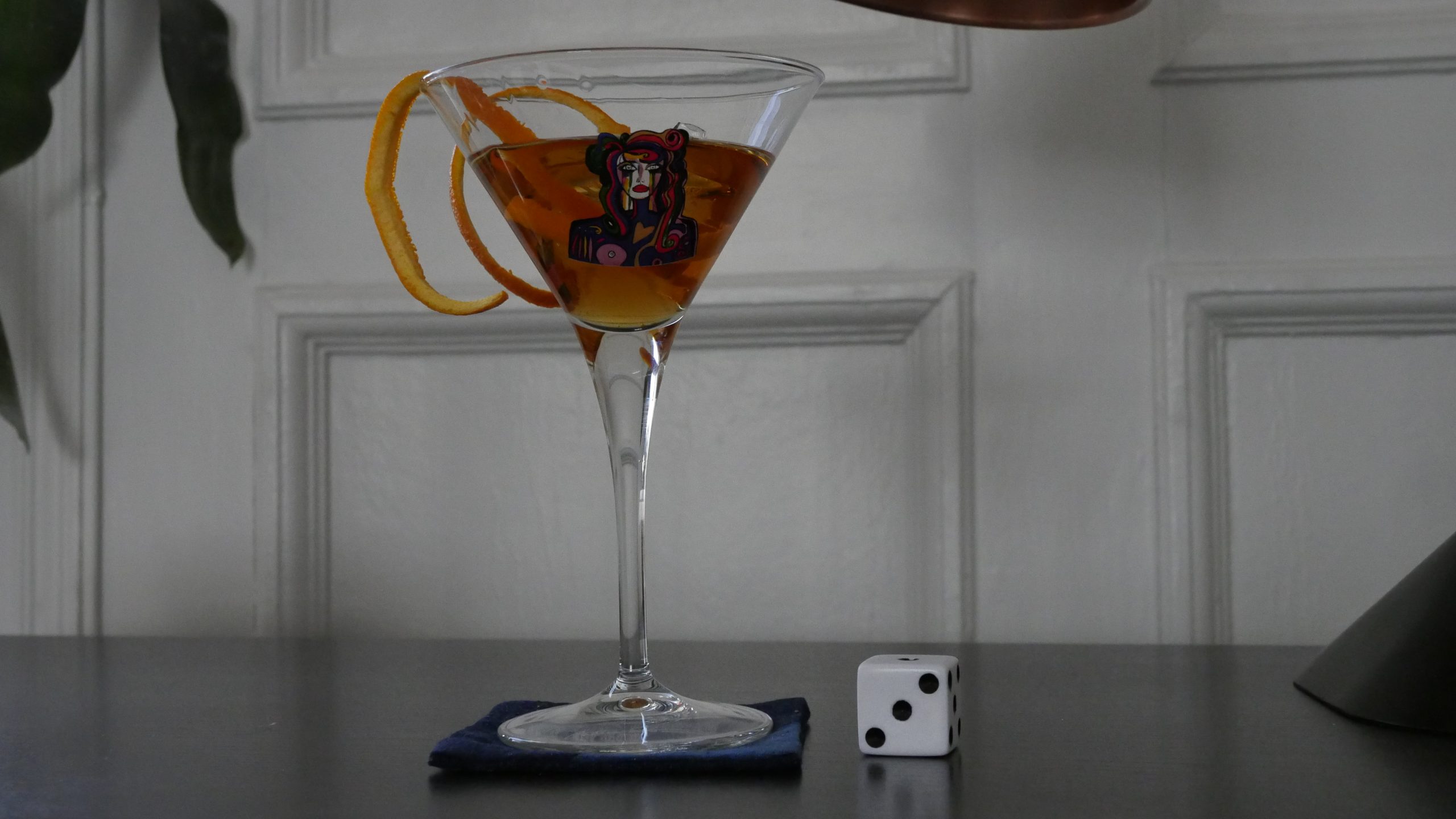
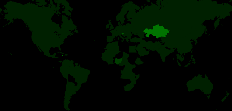
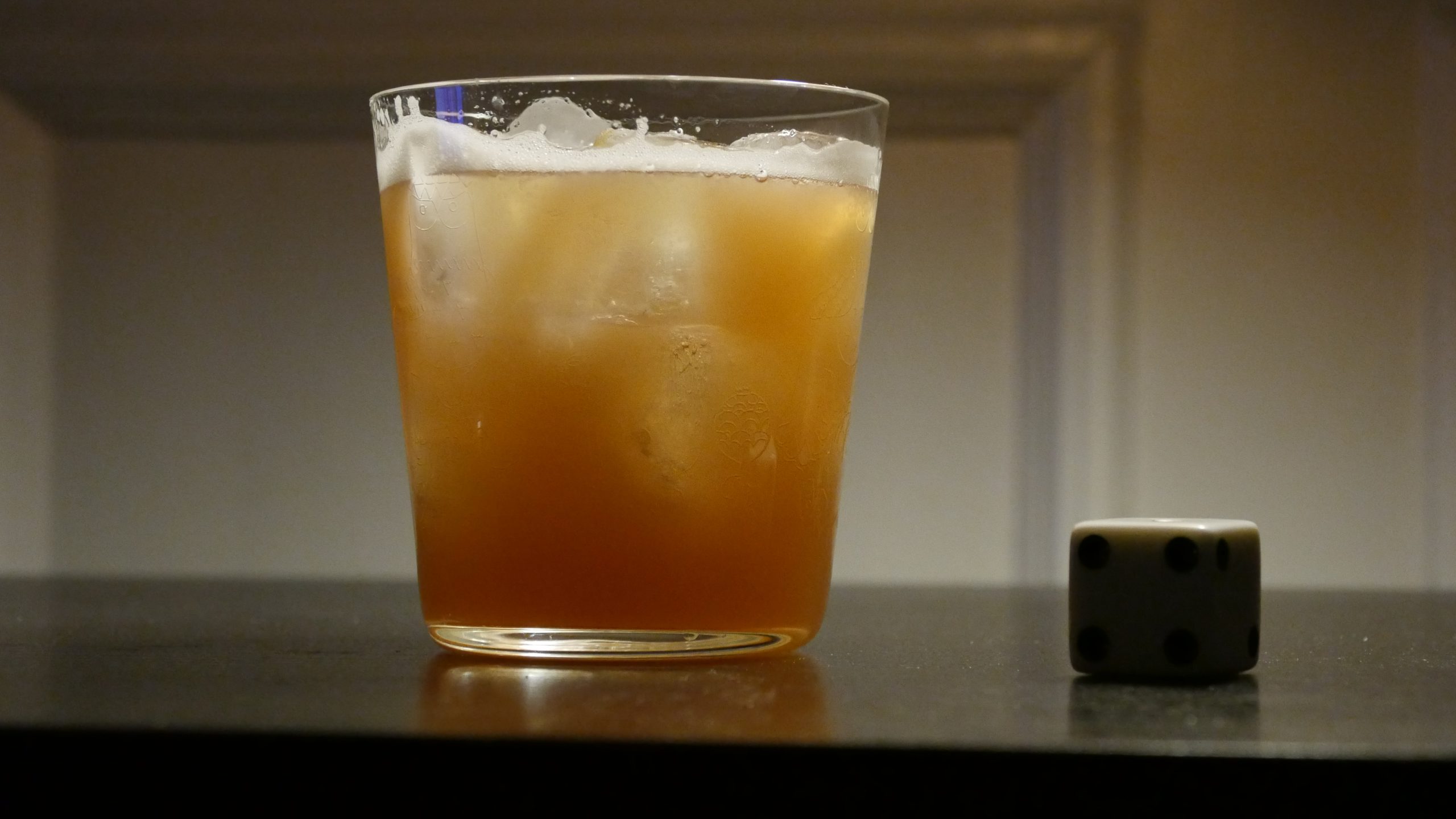
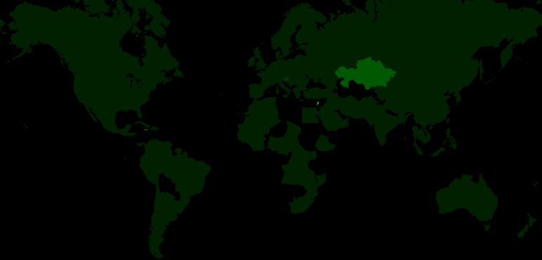
| Tulpan. Sergei Dvortsevoy. 2008. Kazakhstan. April 29th, 2017. The Drink of Gods. |
 |  |  | 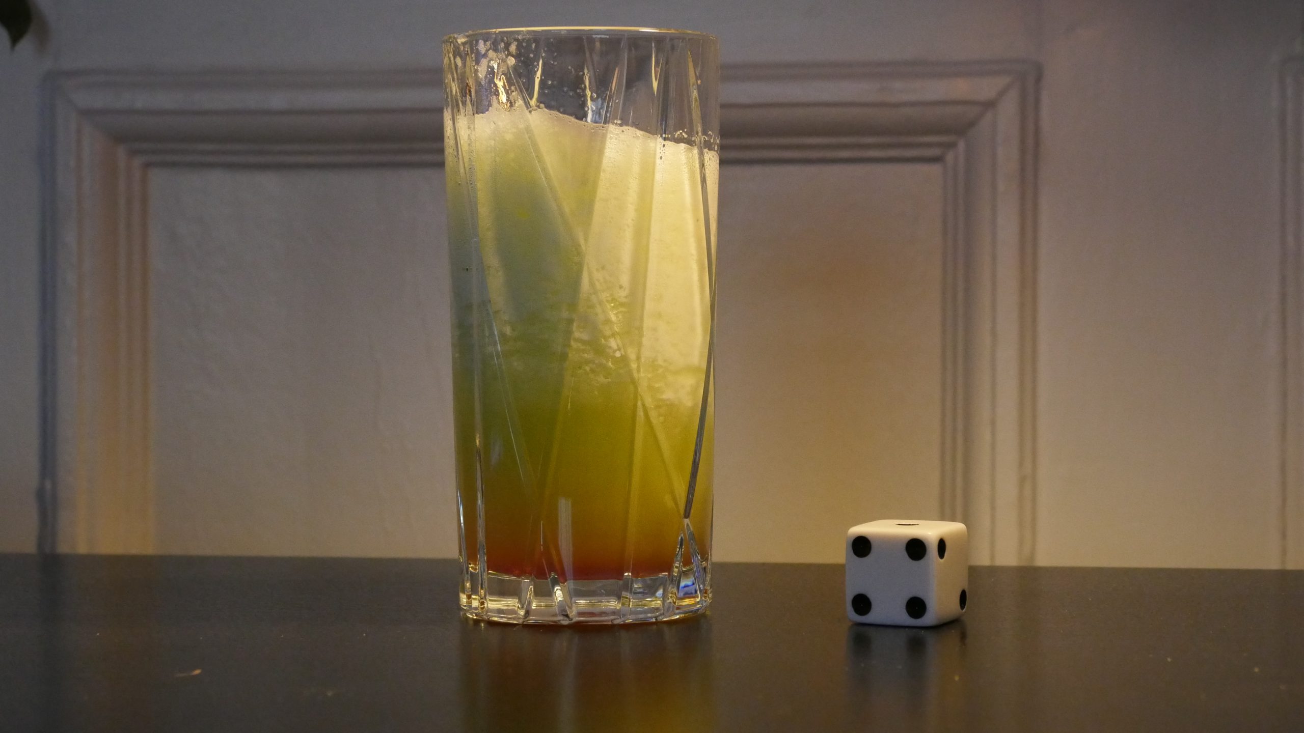 |
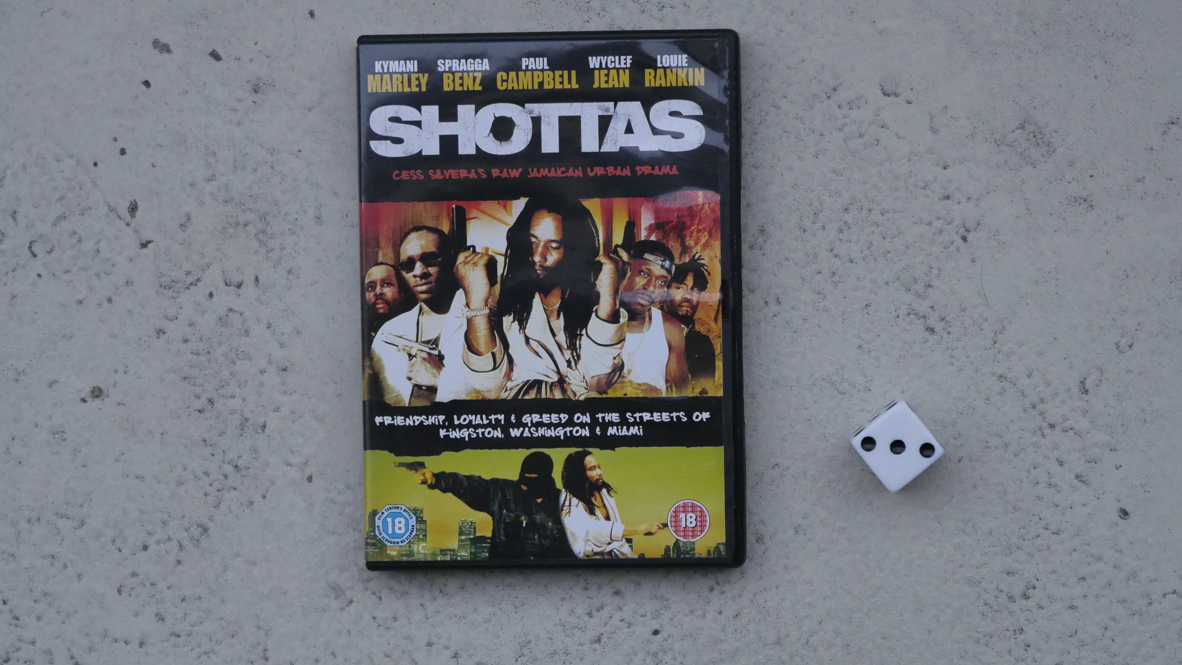
| Shottas. Cess Silvera. 2002. Jamaica. April 29th, 2017. Body Heat. |
 | 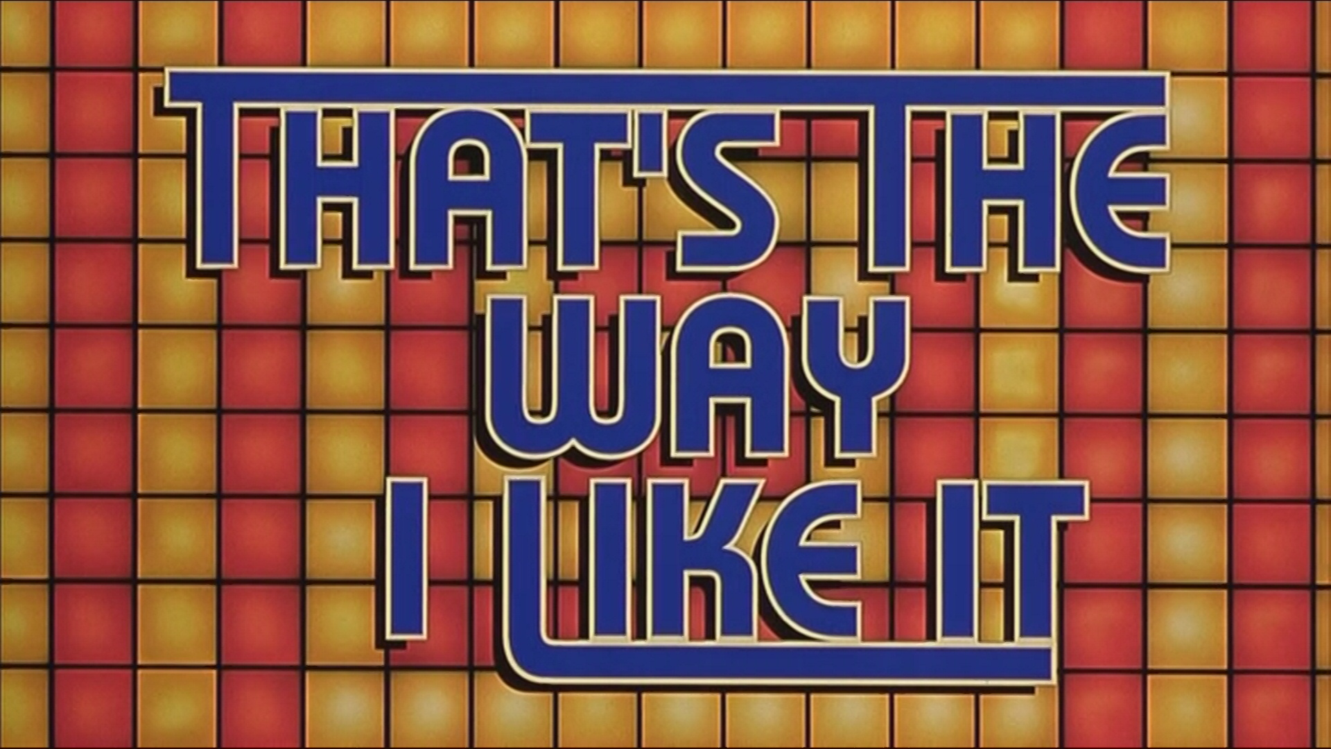 |  |  |
| That’s the Way I Like It. Glen Goei. 1998. Singapore. April 29th, 2017. nil. |
 | 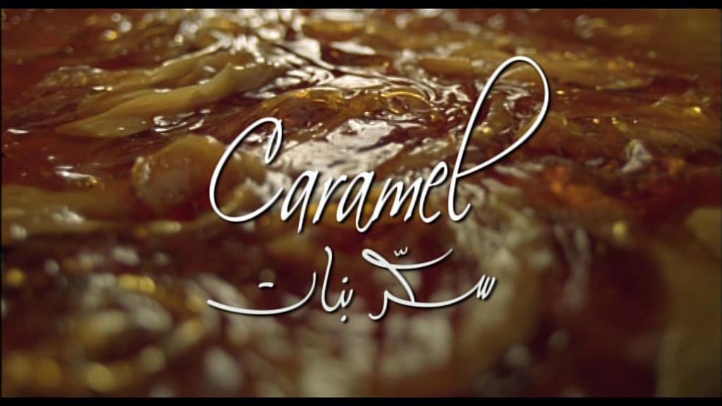 | 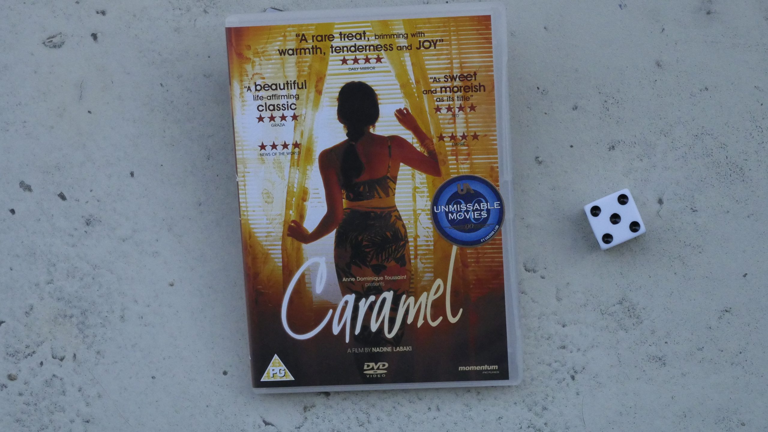 |  |
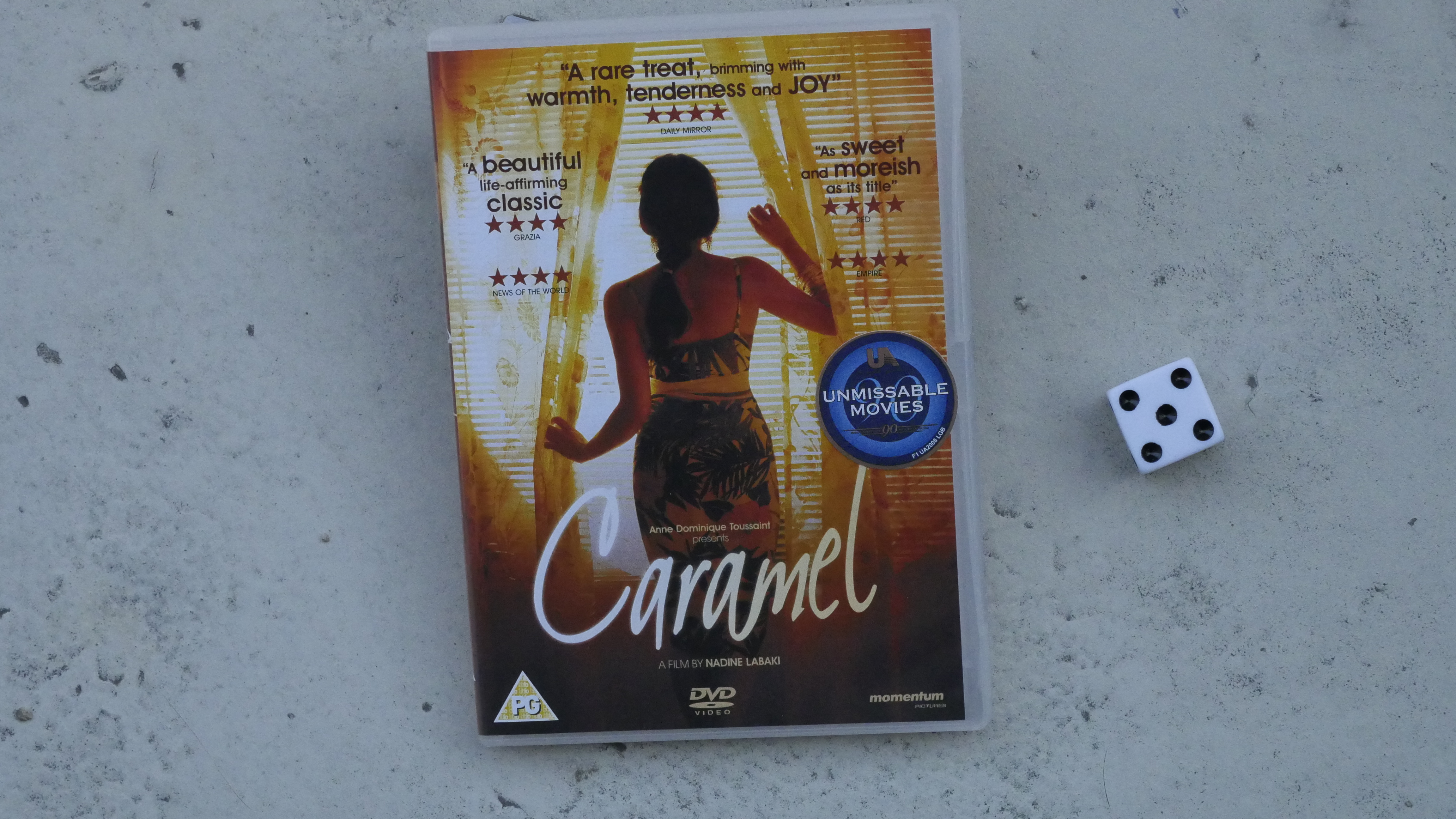
| Caramel. Nadine Labaki. 2007. Lebanon. April 30th, 2017. Jad Ballout’s Garcia’s Fattoush Cup. |
 | 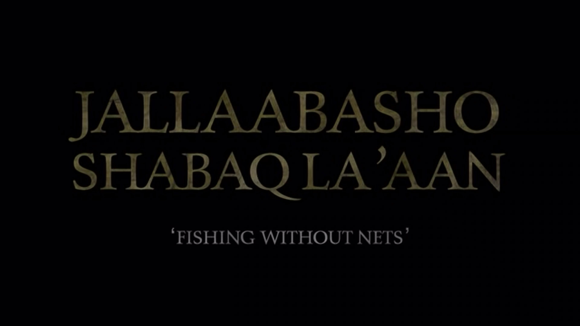 | 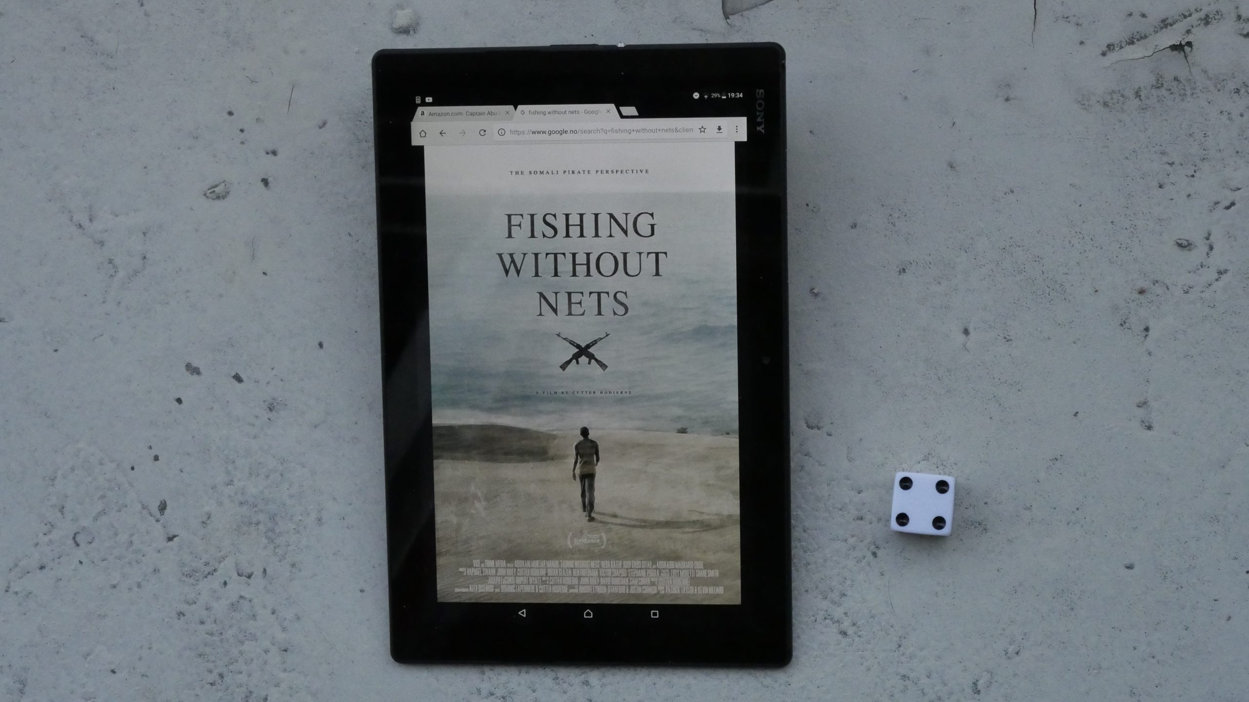 |  |
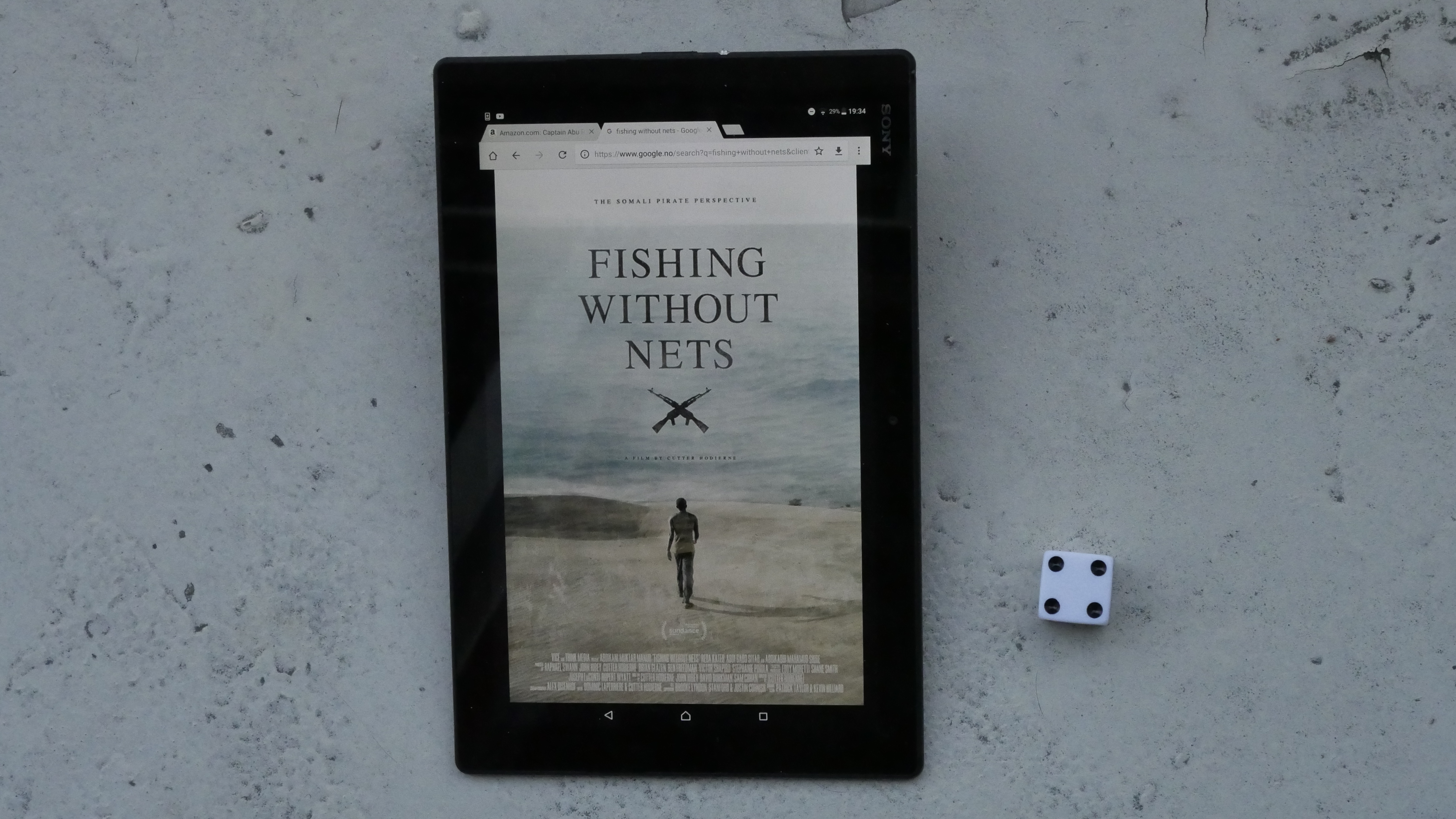
| Fishing Without Nets. Cutter Hodierne. 2014. Somalia. April 30th, 2017. Shaah Adays: Somali spiced tea with milk. |
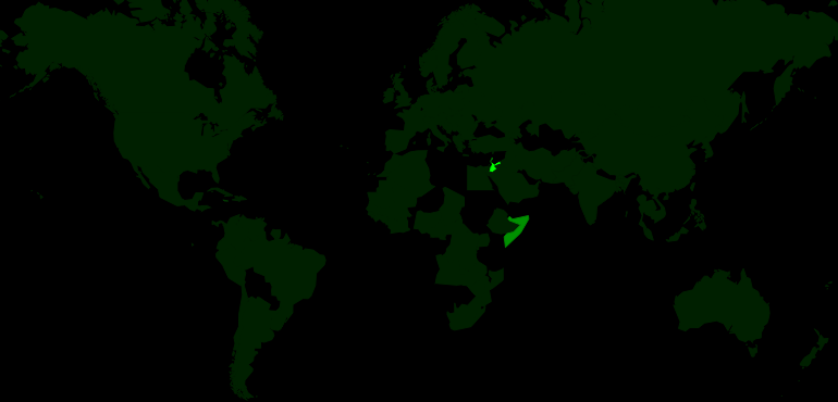 |  | 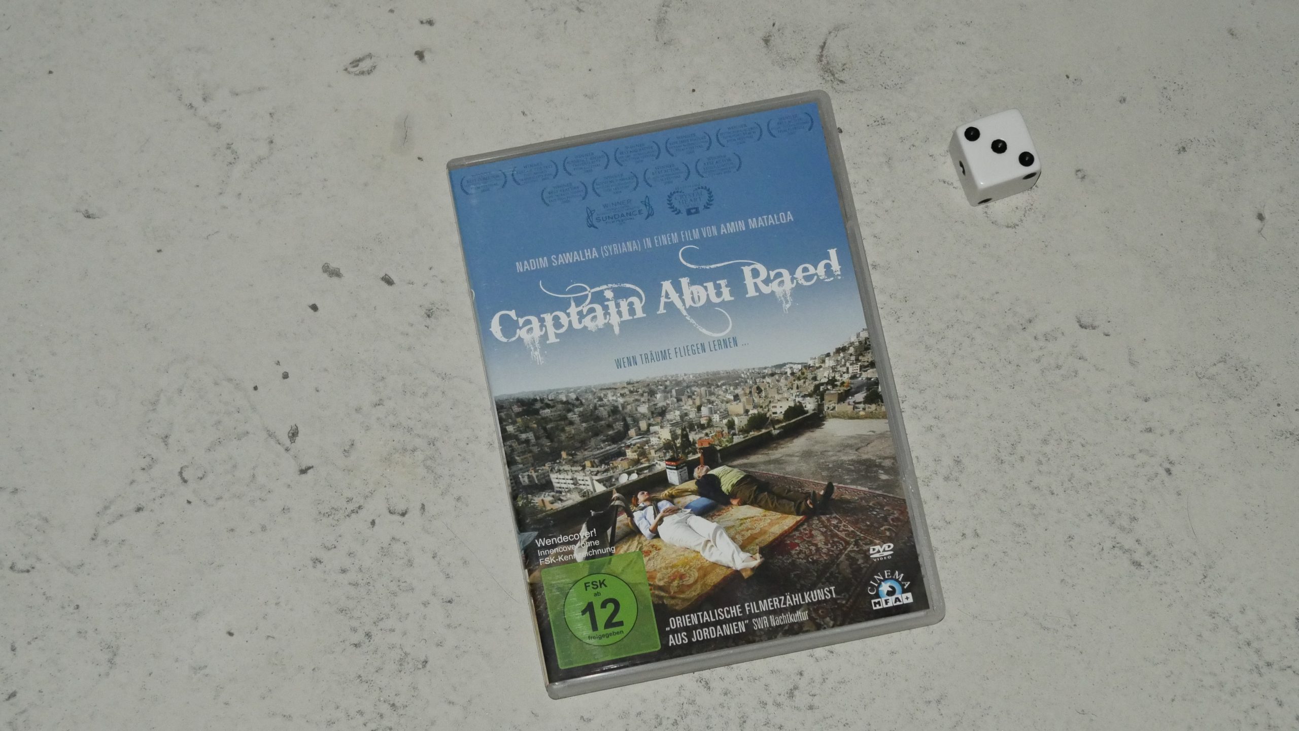 | 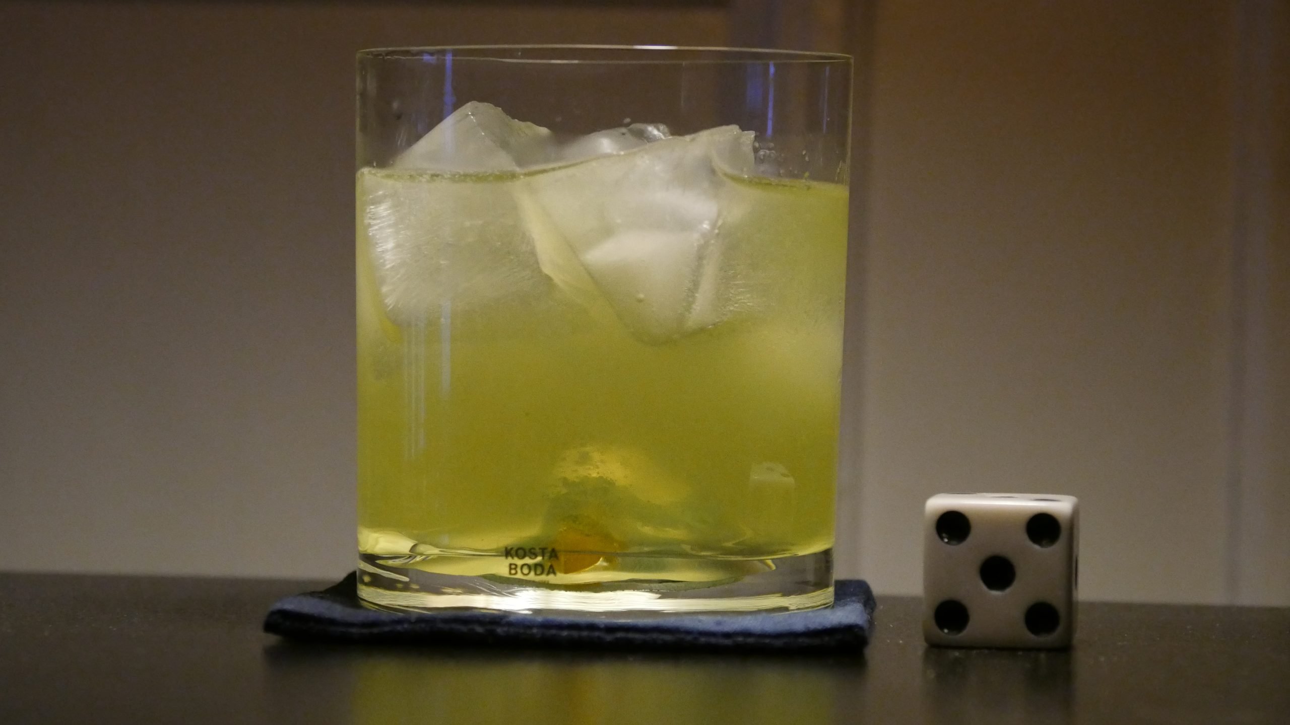 |
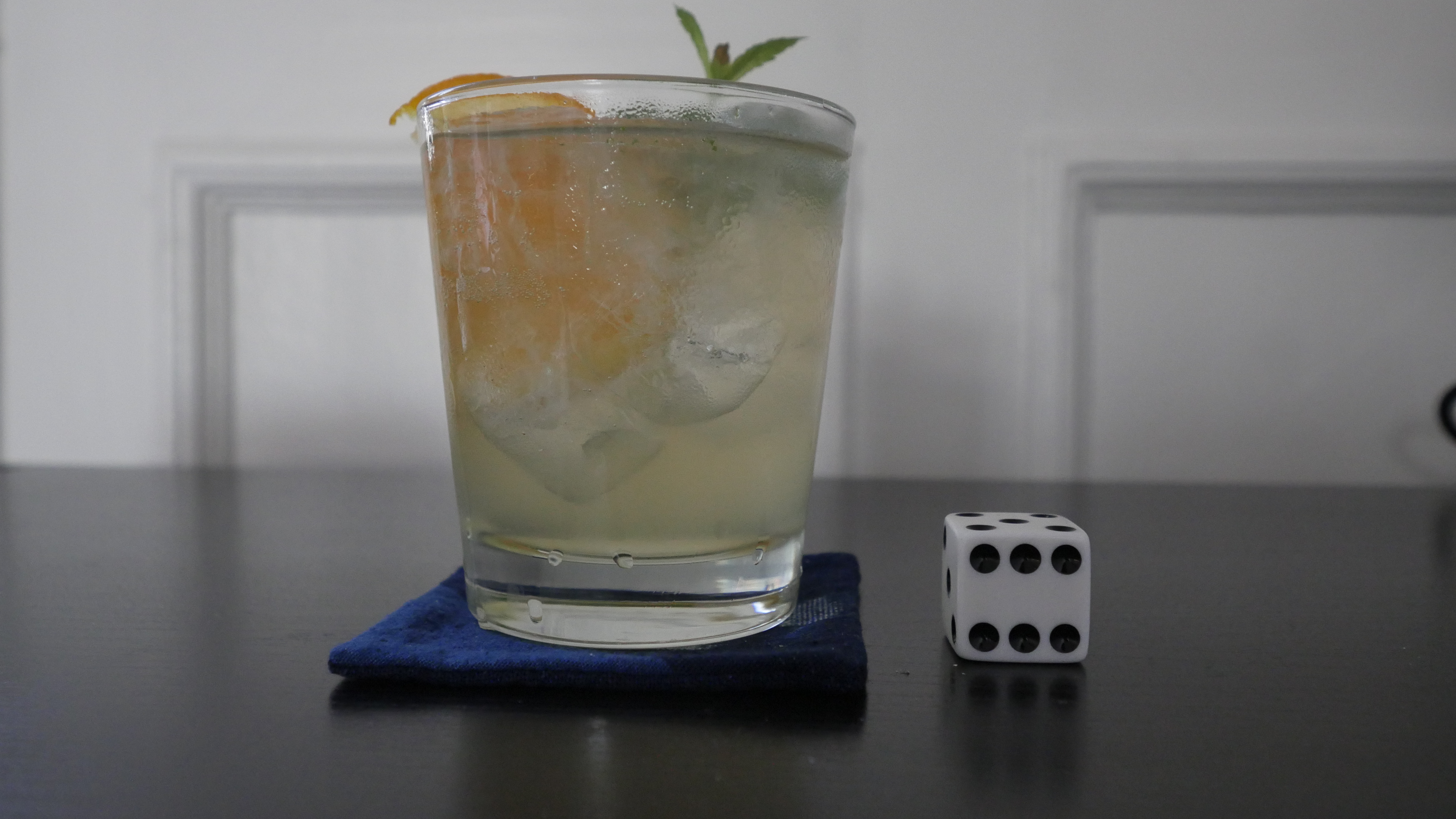
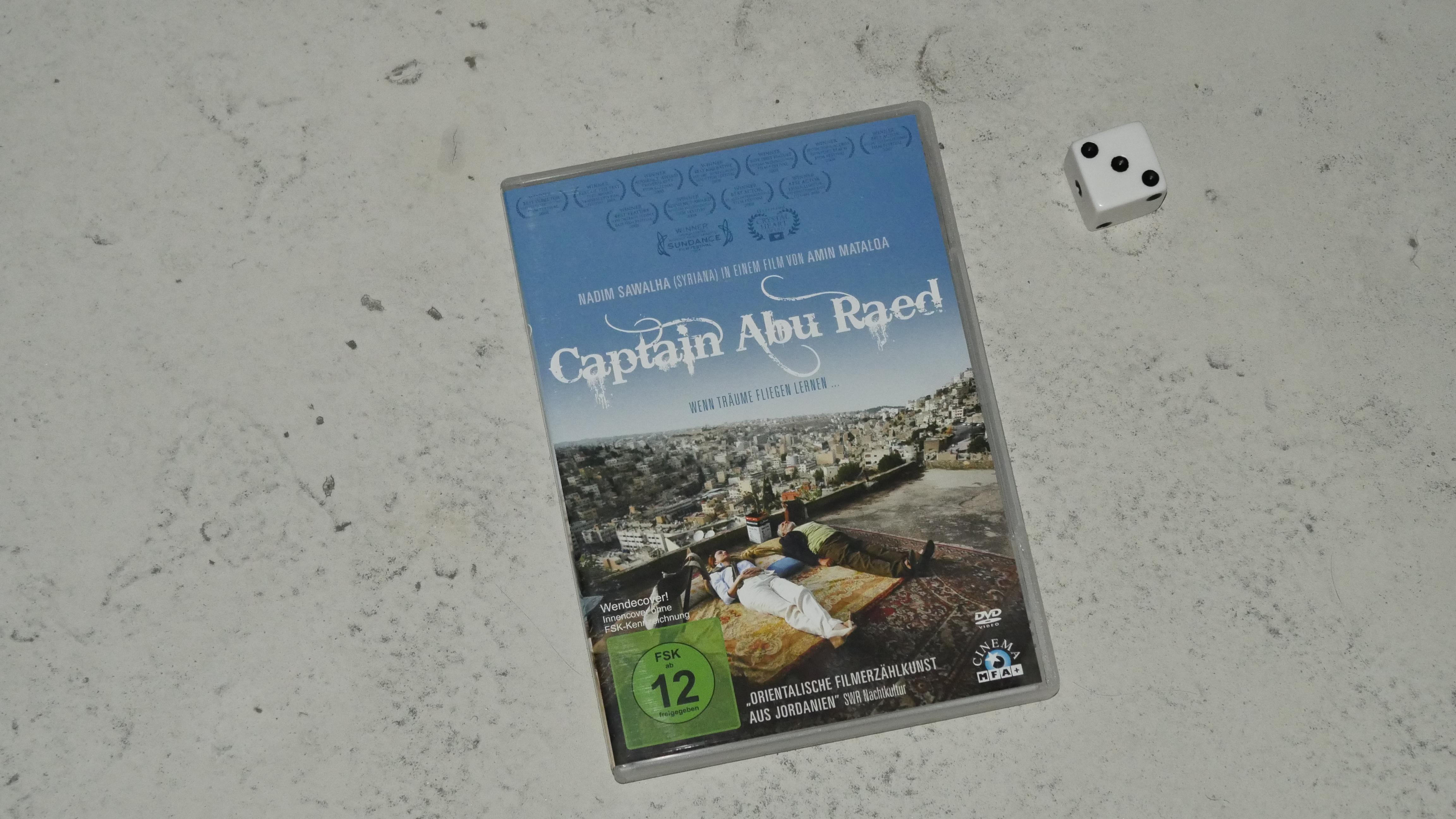
| Captain Abu Raed. Amin Matalqa. 2008. Jordan. April 30th, 2017. Middle Eastern Mint Lemonade. |
 |  |  |  |
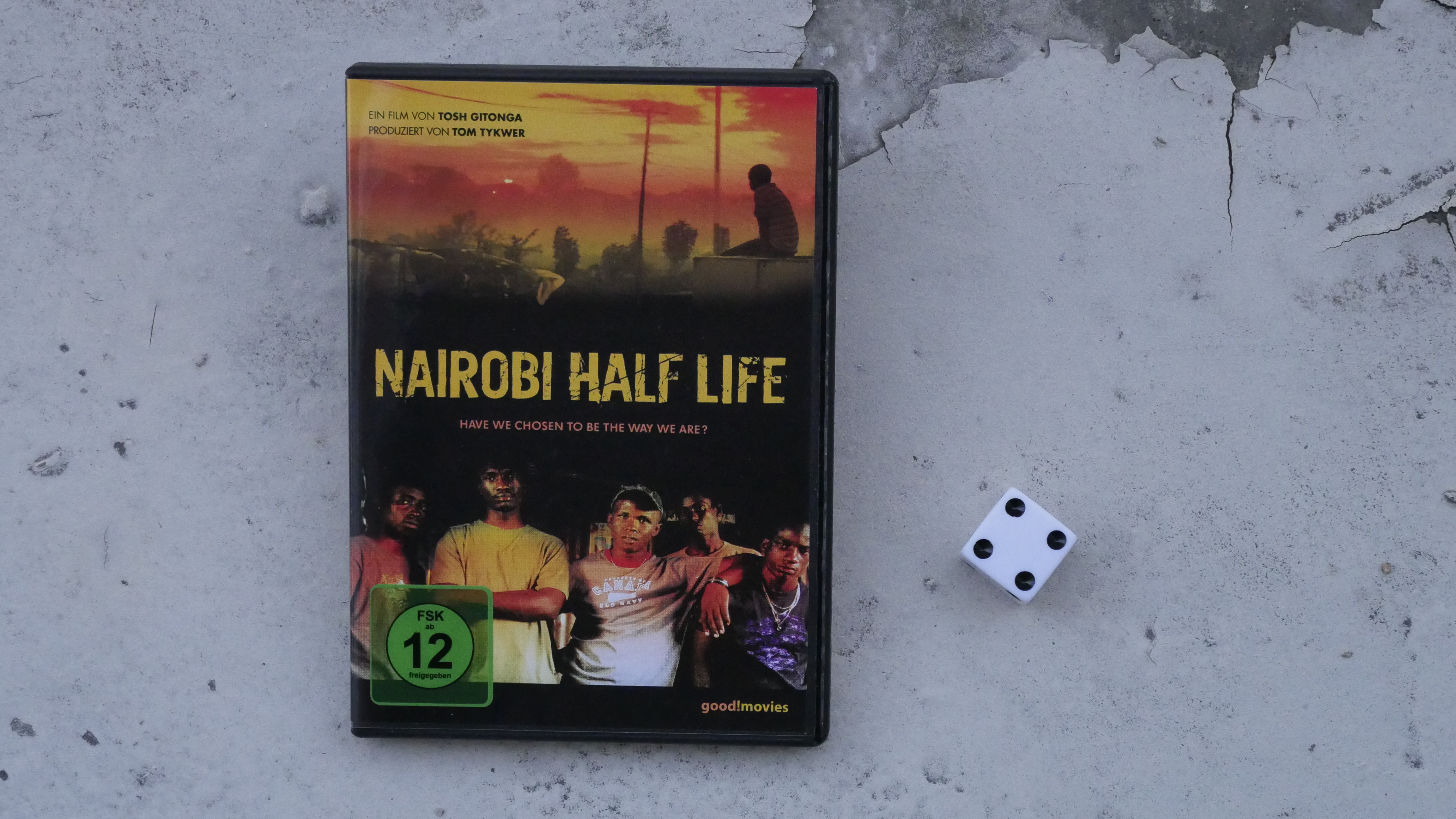
| Nairobi Half Life. David ‘Tosh’ Gitonga. 2012. Kenya. May 5th, 2017. Dawa Cocktail. |
 | 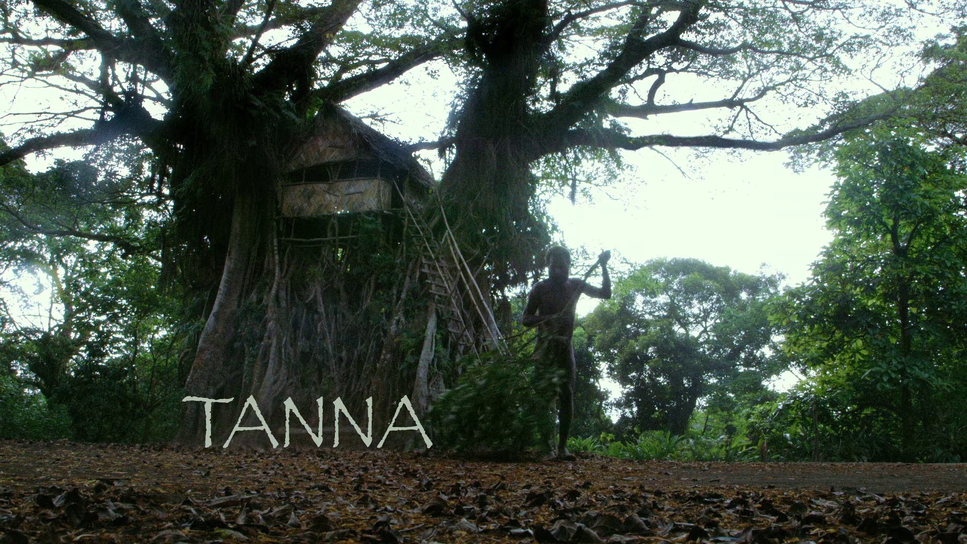 | 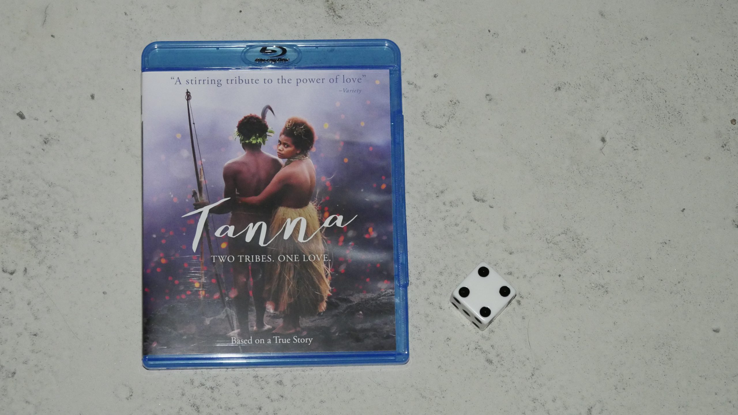 | 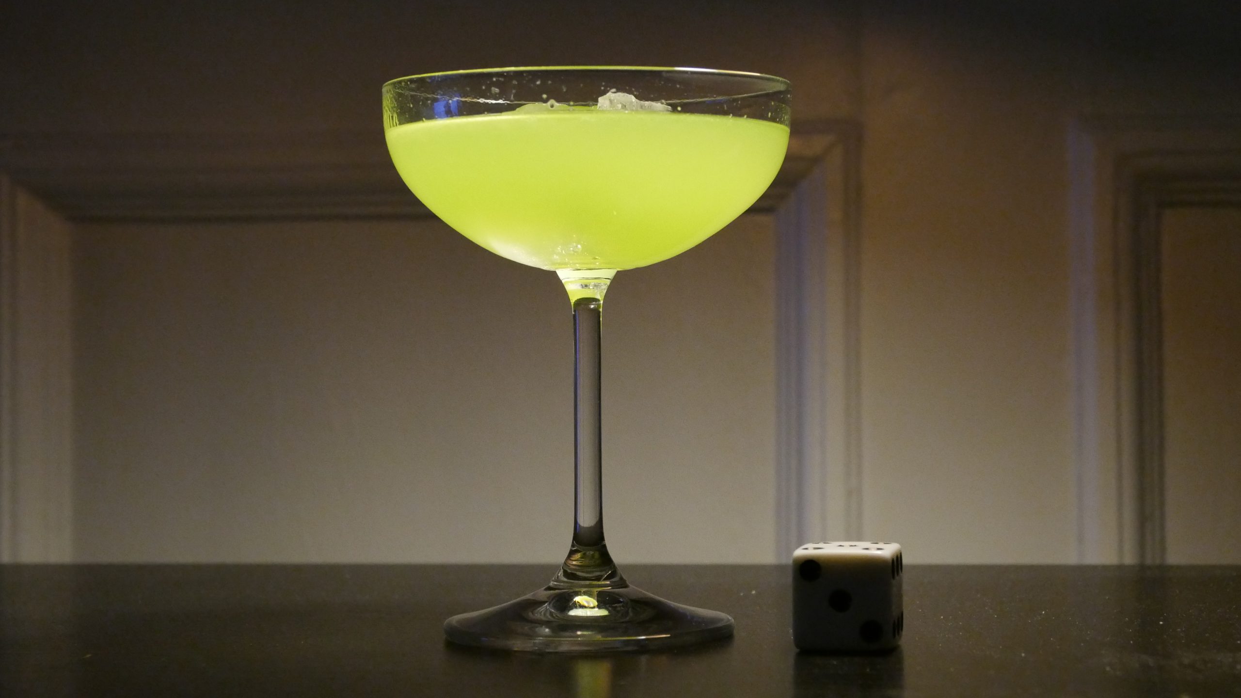 |
| Tanna. Martin Butler. 2015. Vanuatu. May 5th, 2017. Japanese Slipper at Sunset Bungalows. |
 |  |  |  |
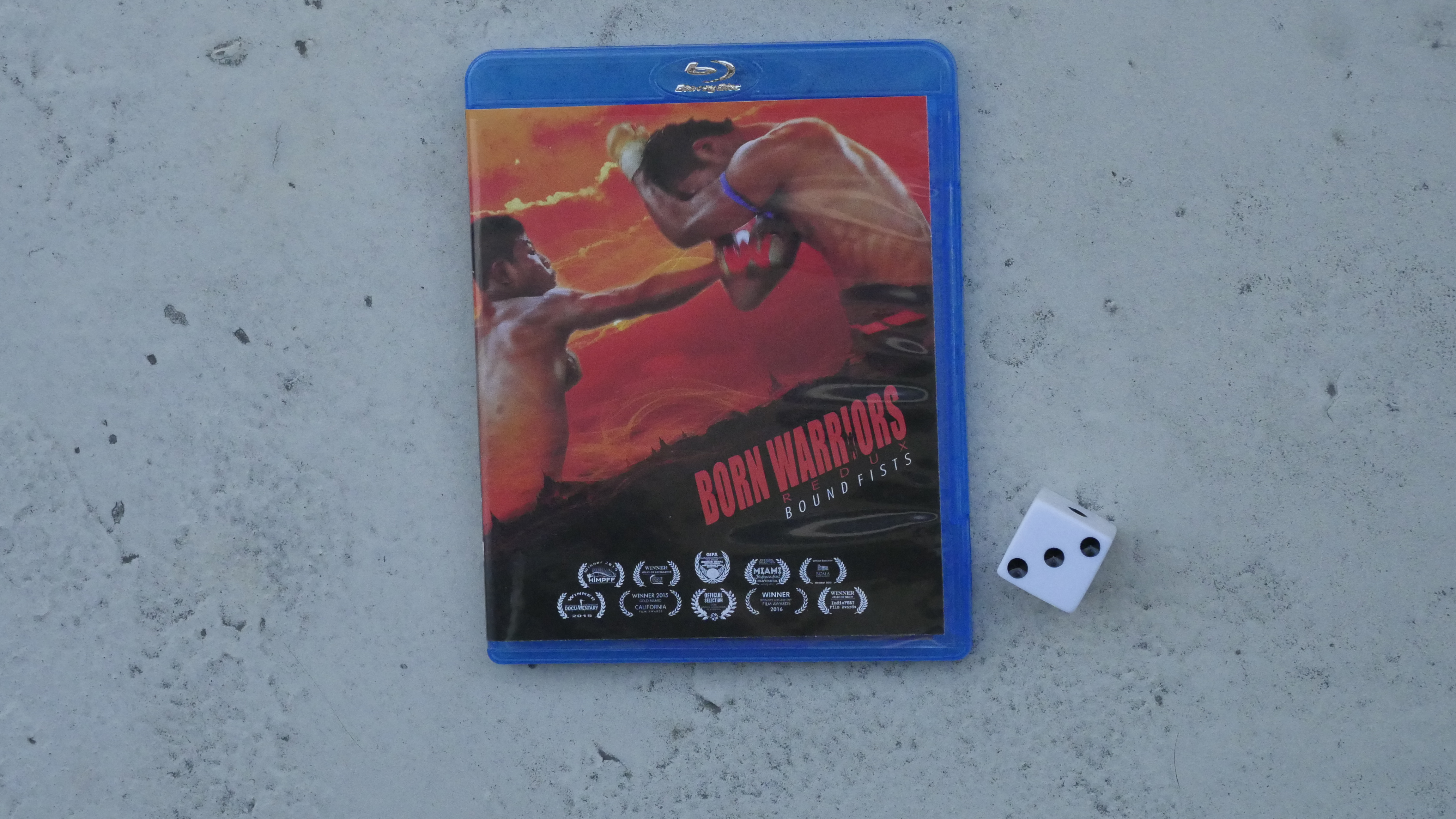
| Born Warriors Redux: Bound Fists. Vincent Giordano. 2014. Myanmar. May 6th, 2017. Pegu Club. |
 |  | 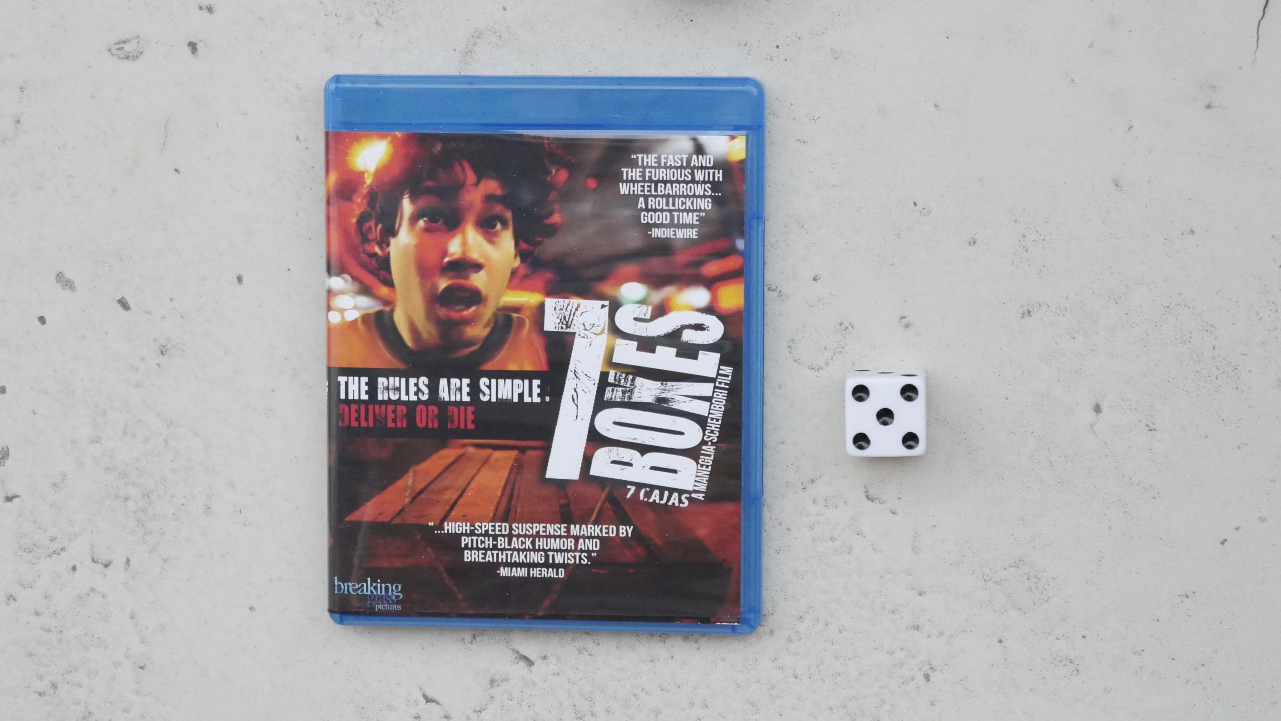 |  |
| 7 Boxes. Juan Carlos Maneglia. 2012. Paraguay. May 6th, 2017. Paraguay Passion. |
 |  | 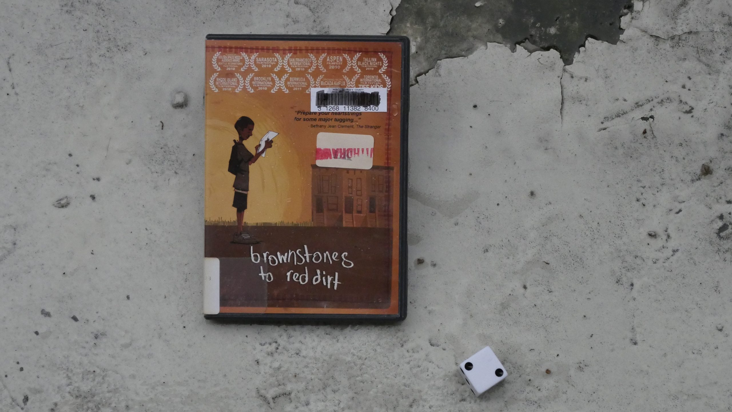 |  |
| Brownstones to Red Dirt. Dave LaMattina. 2010. Sierra Leone. May 16th, 2017. Guava Ginger Zinger Cocktail. |
 |  |  |  |
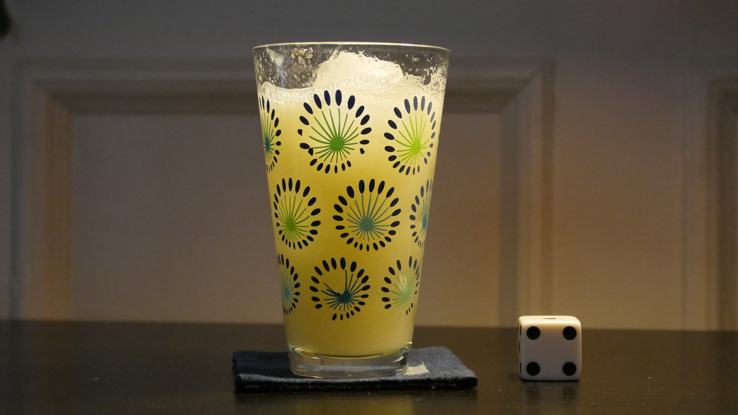
| I am the Good Fairy. Jack Niedenthal. 2009. Marshall Islands. May 16th, 2017. Marshall Island Swizzle. |
 |  | 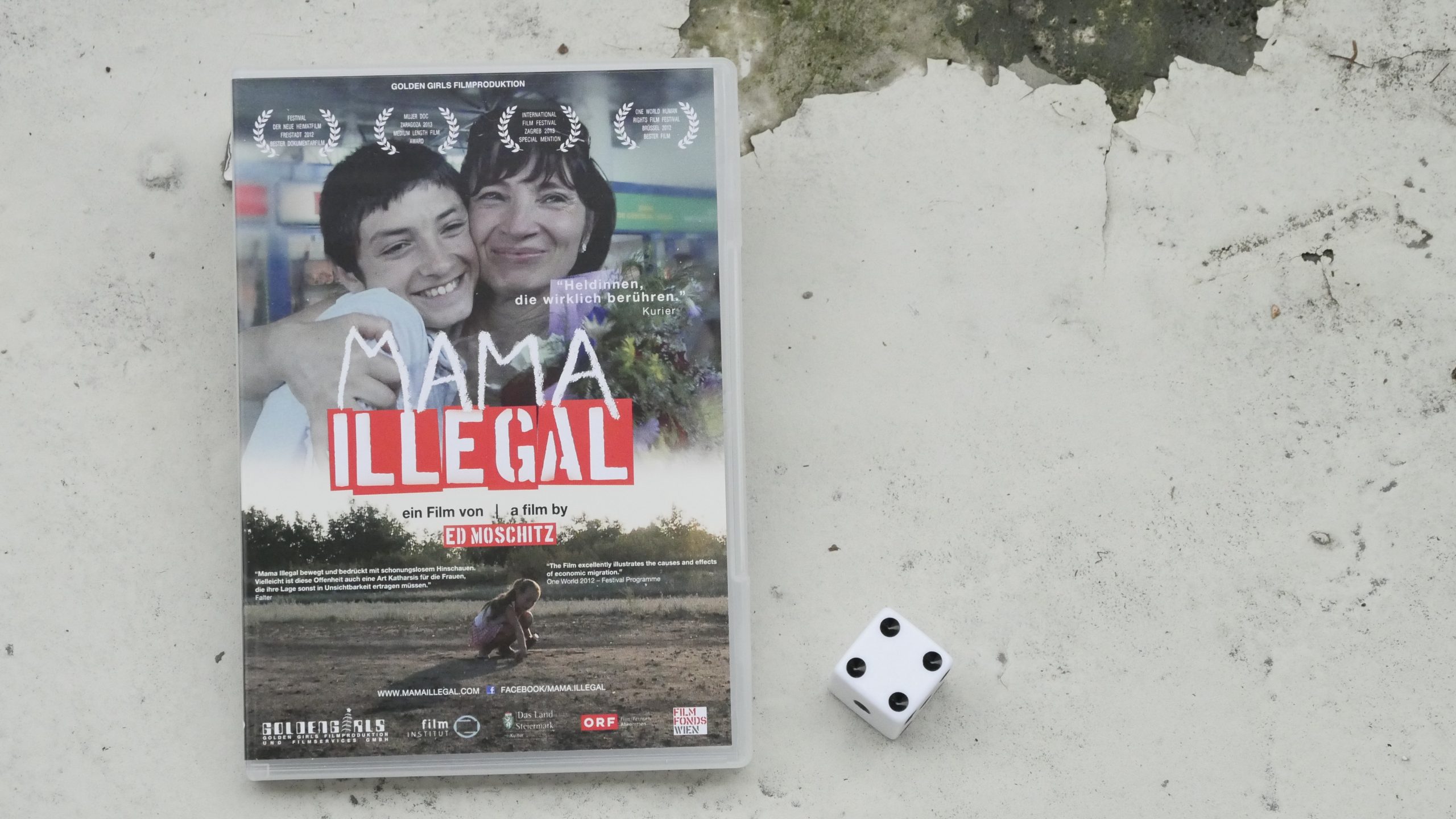 |  |
| Mama Illegal. Ed Moschitz. 2011. Moldova. May 17th, 2017. Eggnog Rum Cocktail. |
 | 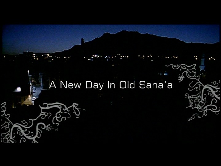 |  |  |
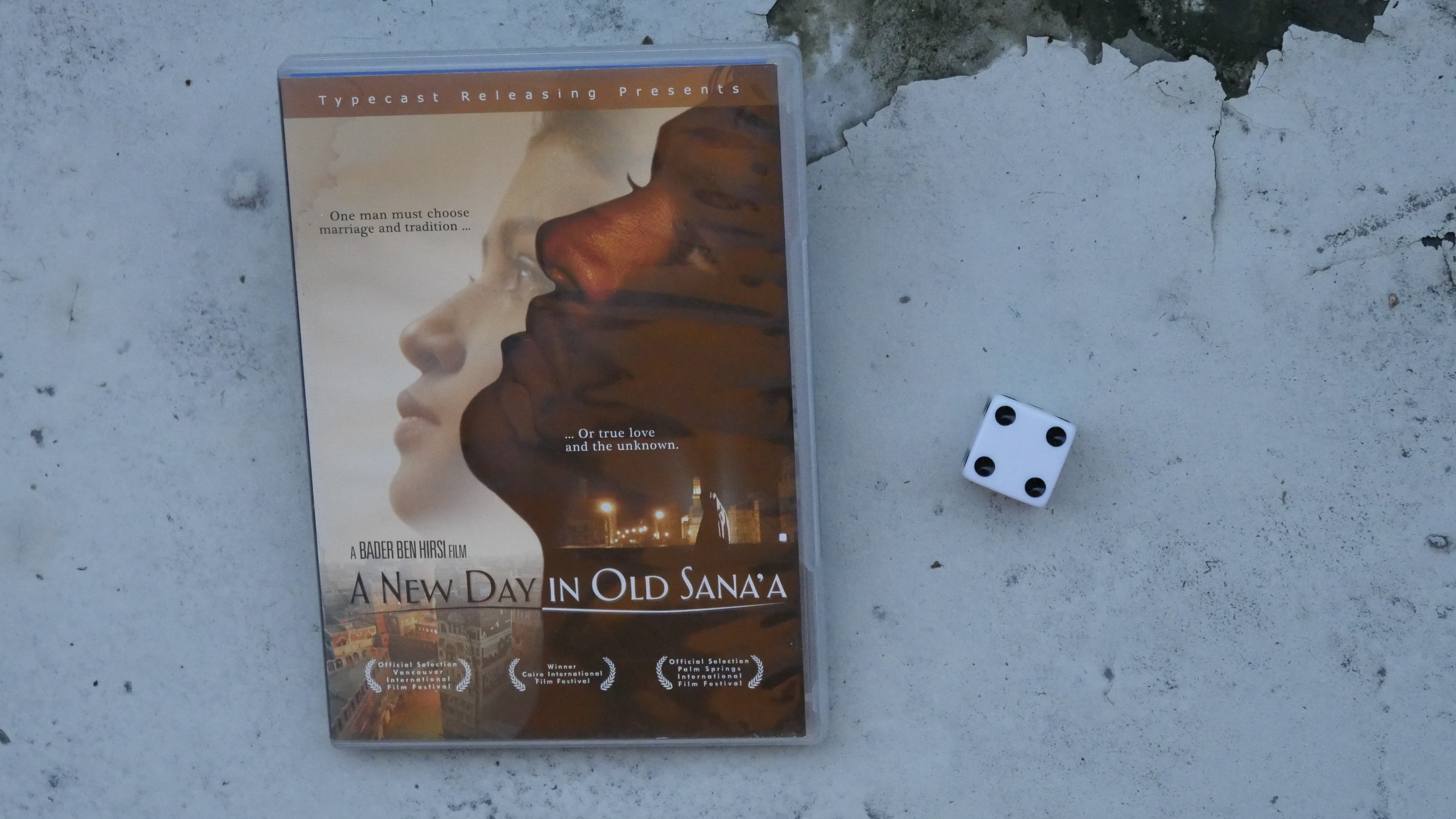
| A New Day In Old Sana’a. Bader Ben Hirsi. 2005. Yemen. May 17th, 2017. Yemen fizz. |
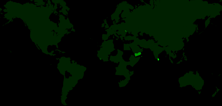 | 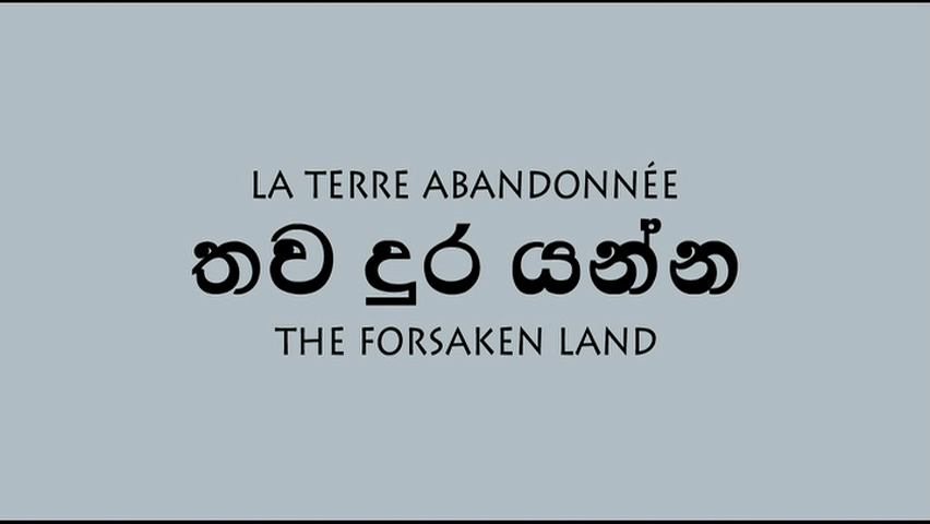 | 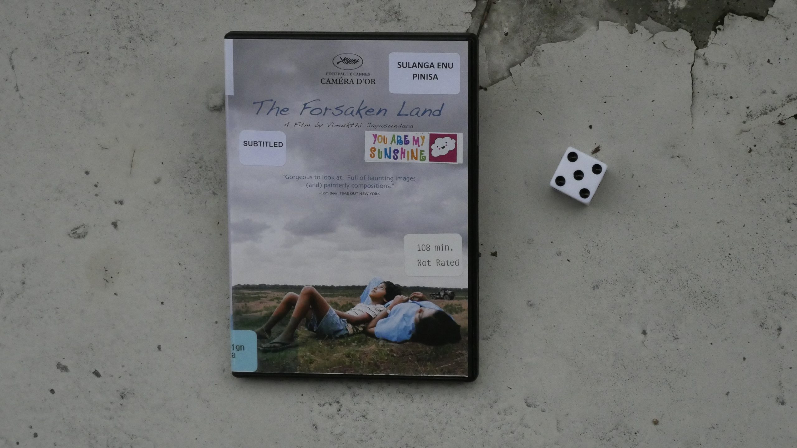 |  |
| The Forsaken Land. Vimukthi Jayasundara. 2005. Sri Lanka. May 19th, 2017. Ceylon Sailor. |
 | 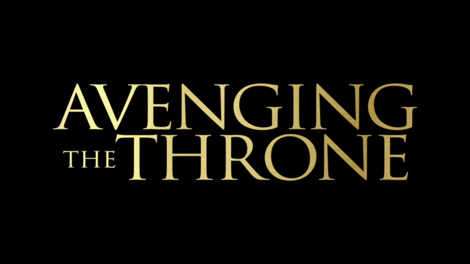 | 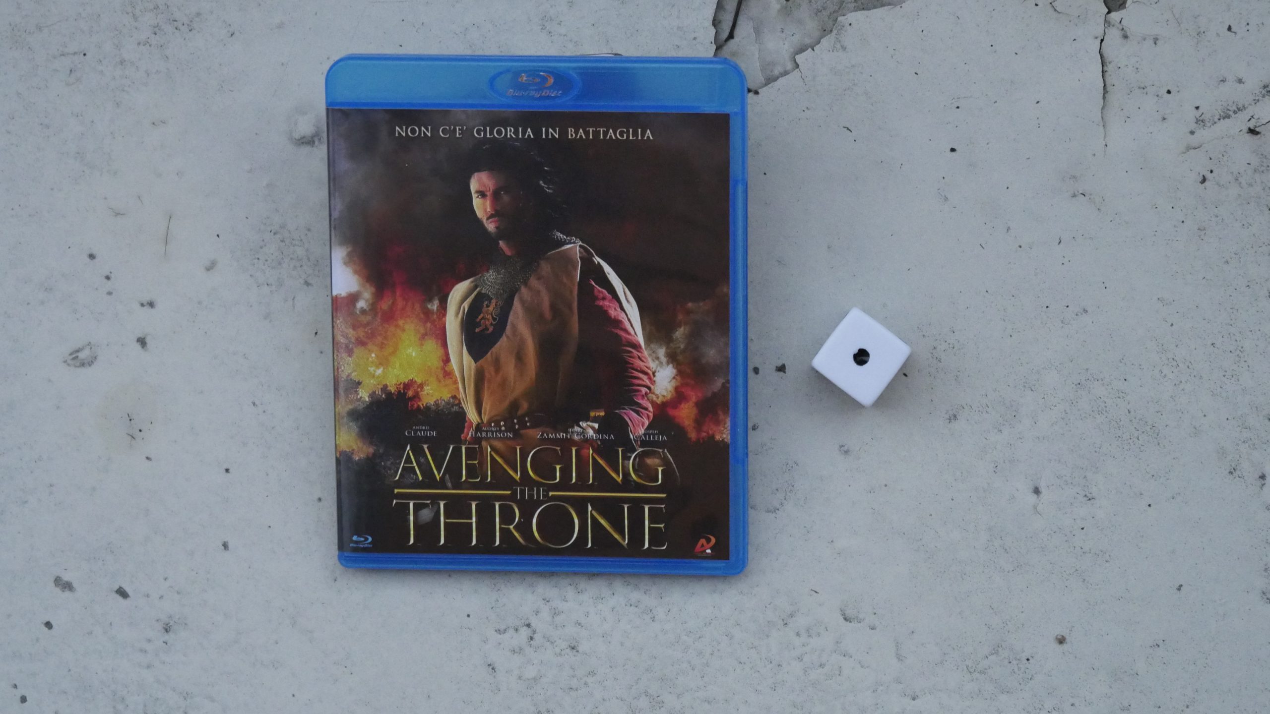 |  |
| Avenging the Throne. Raymond Mizzi. 2013. Malta. May 19th, 2017. Bounty Boat. |
 | 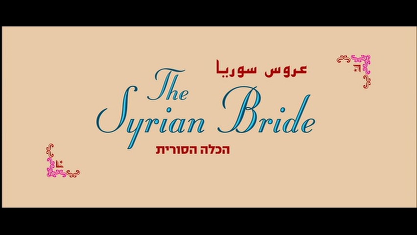 | 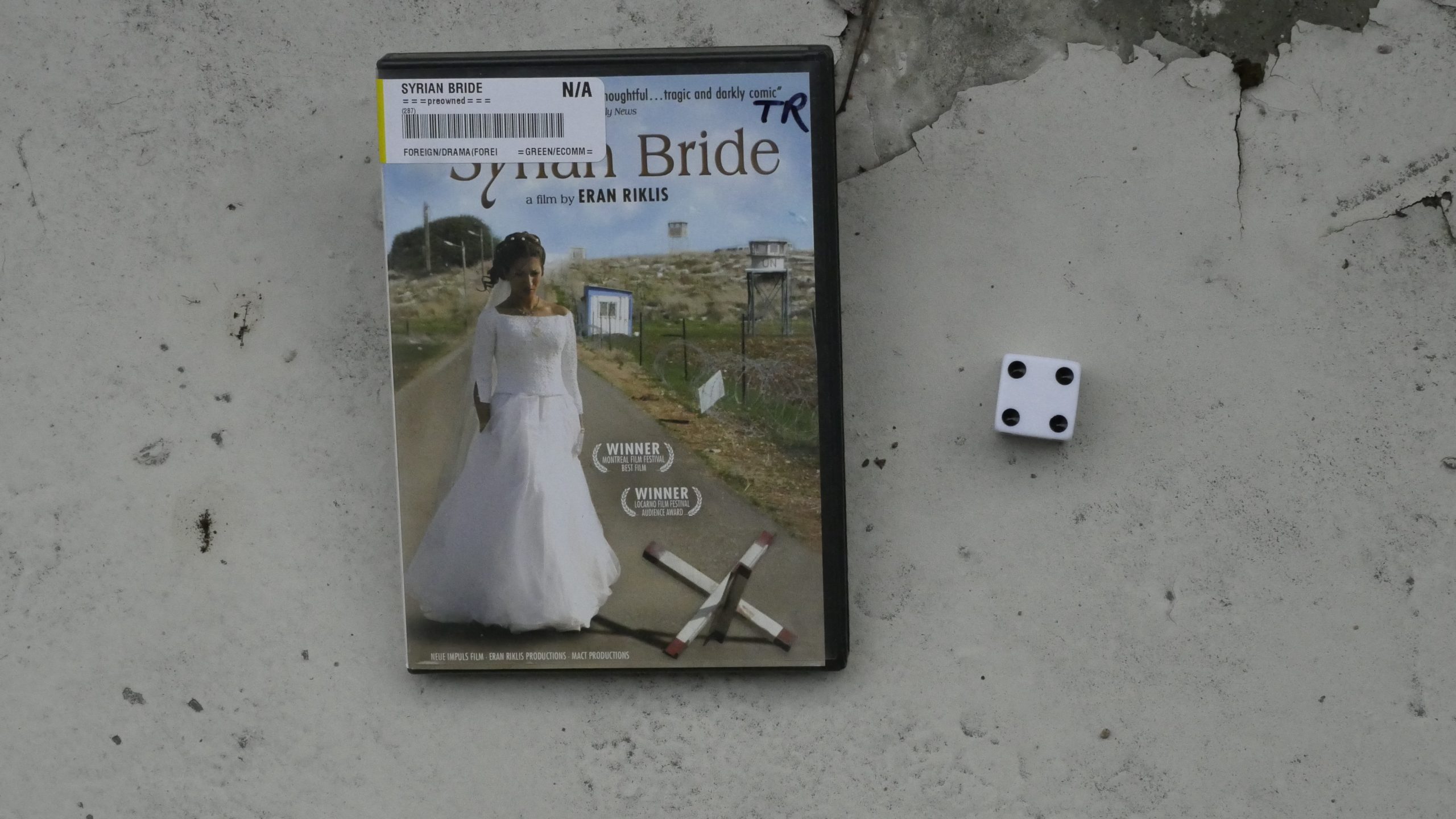 |  |
| The Syrian Bride. Eran Riklis. 2004. Syrian. May 20th, 2017. POLO. |
 | 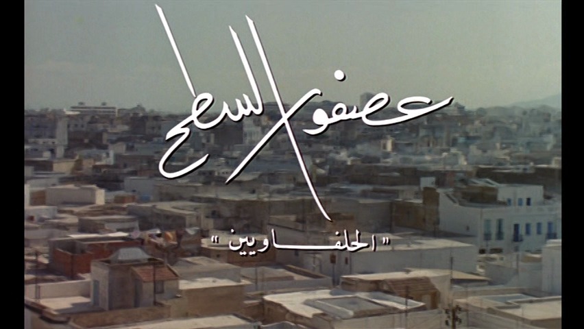 | 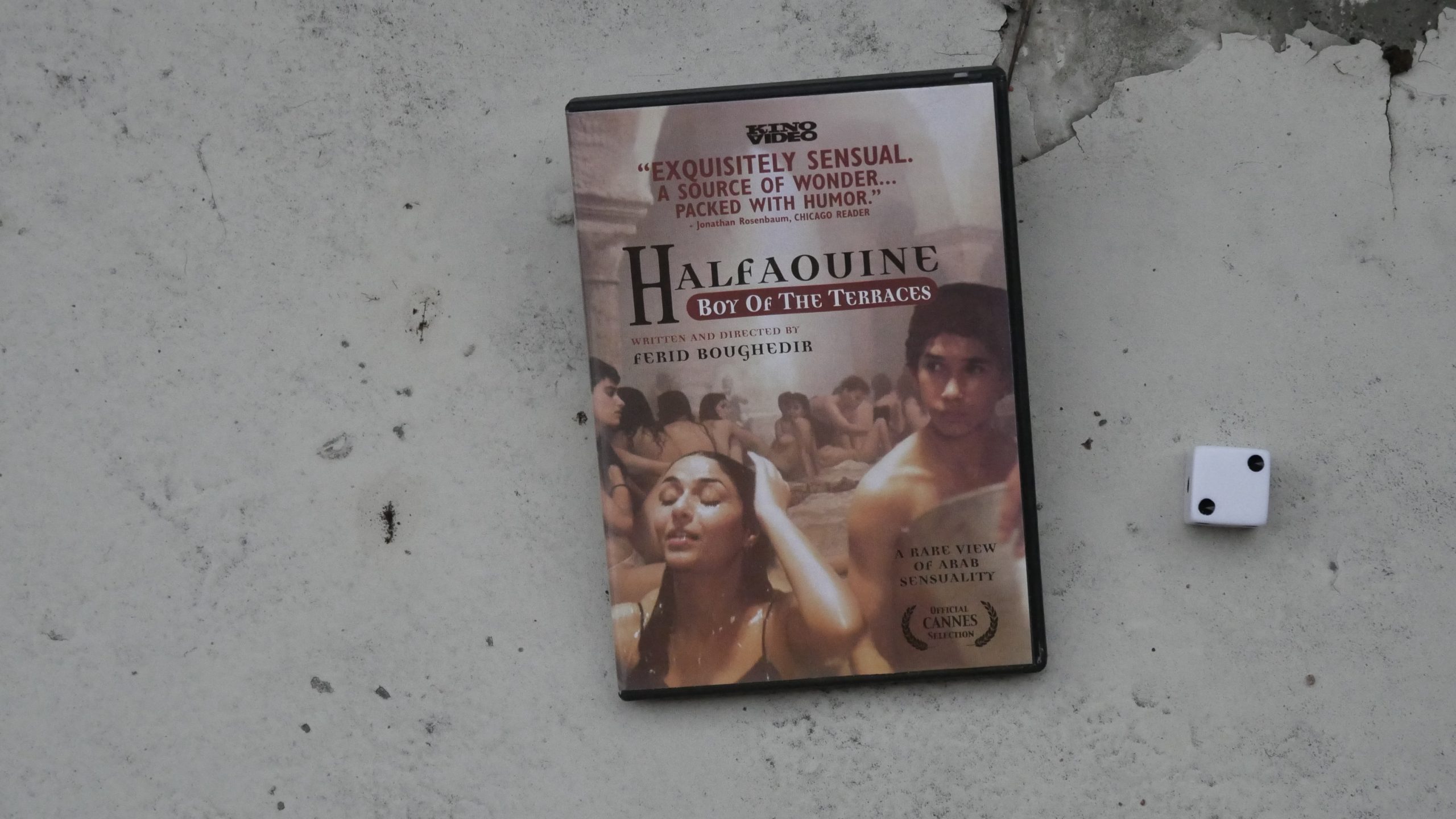 |  |
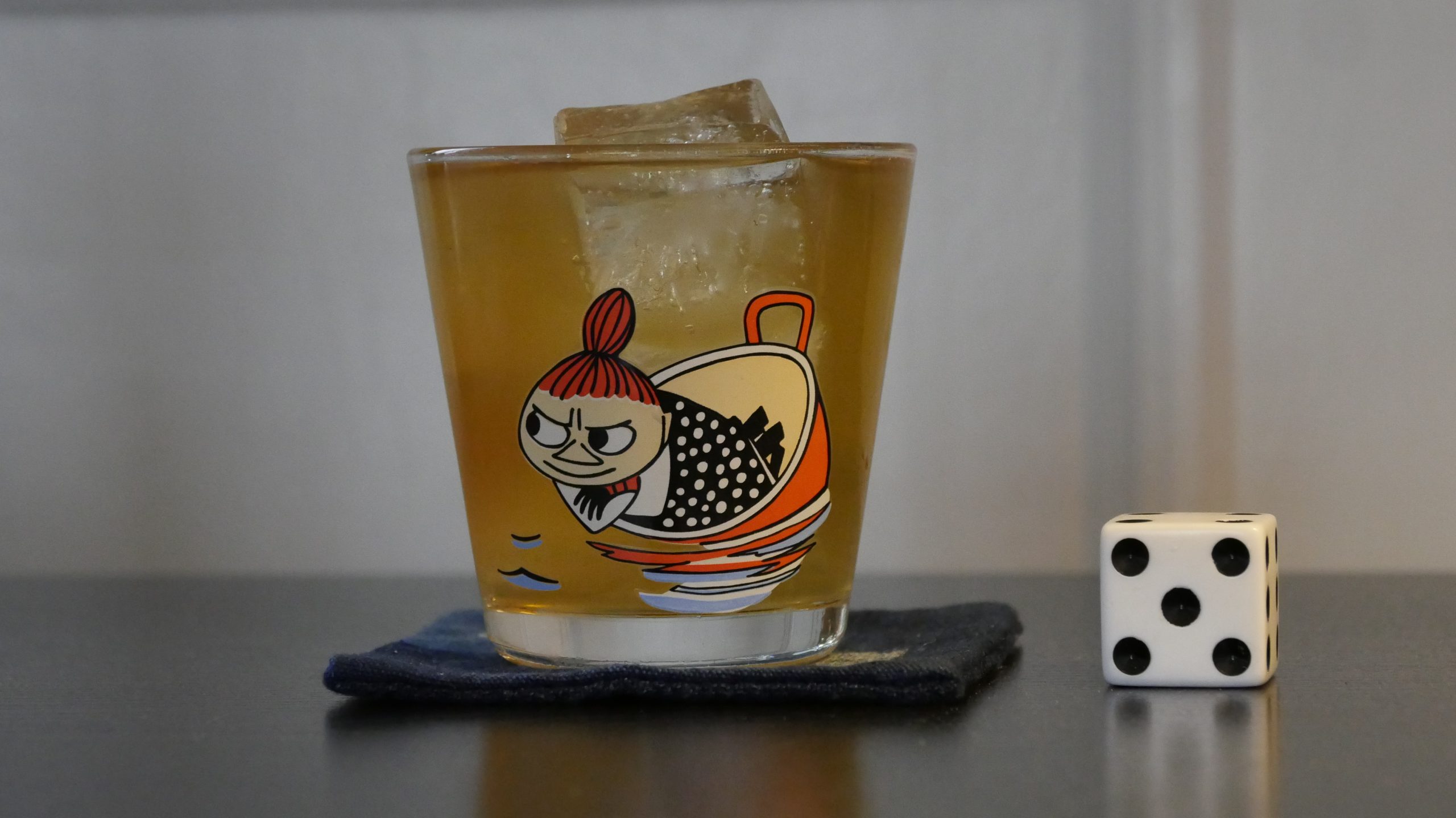
| Halfaouine. Férid Boughedir. 1990. Tunisia. May 20th, 2017. A Night in Tunisia. |
 | 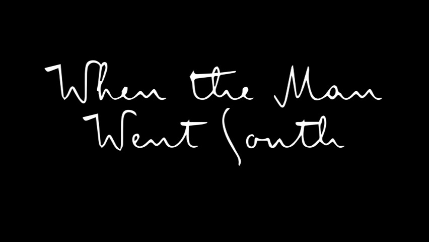 | 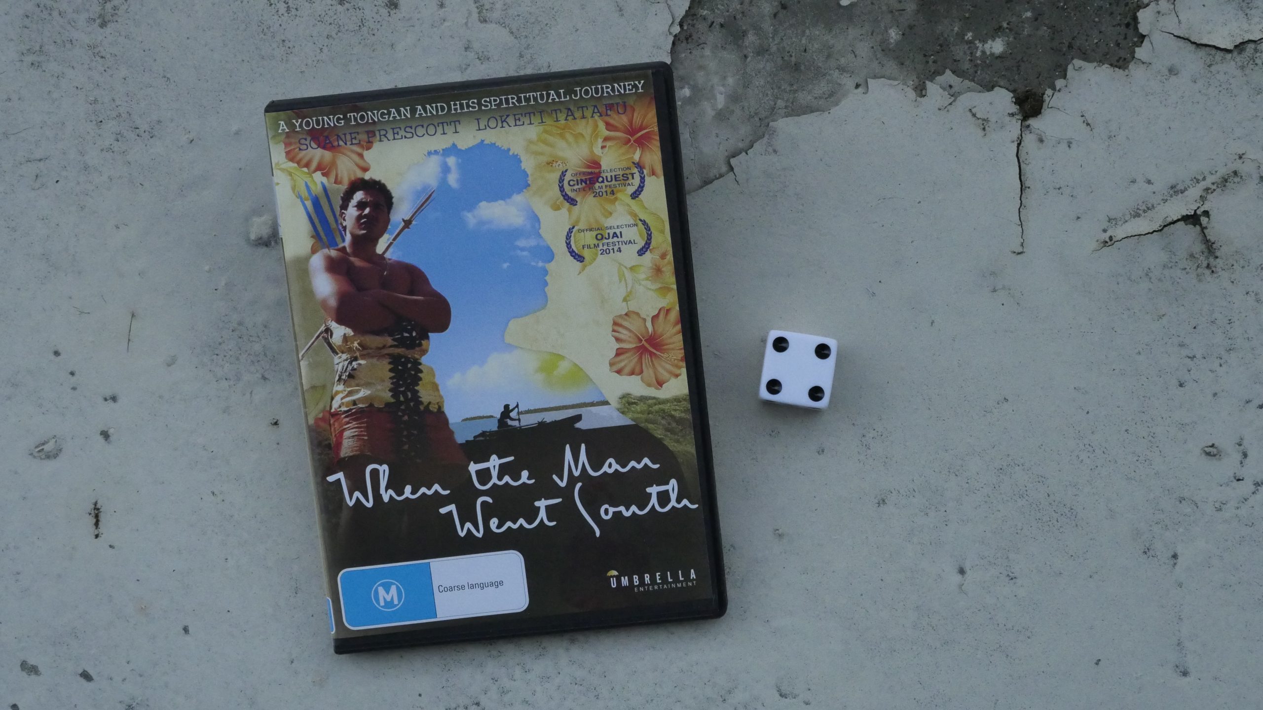 |  |
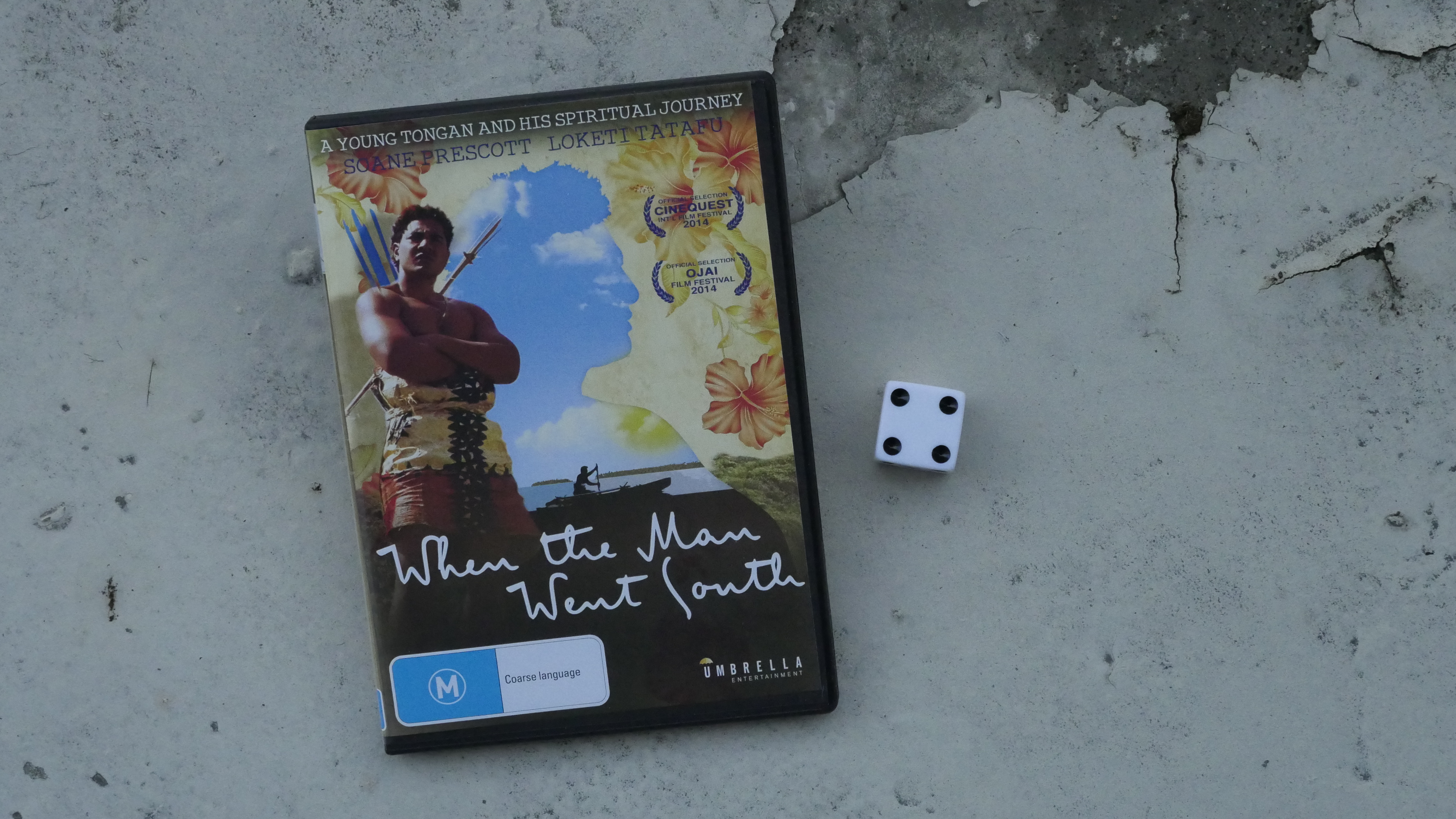
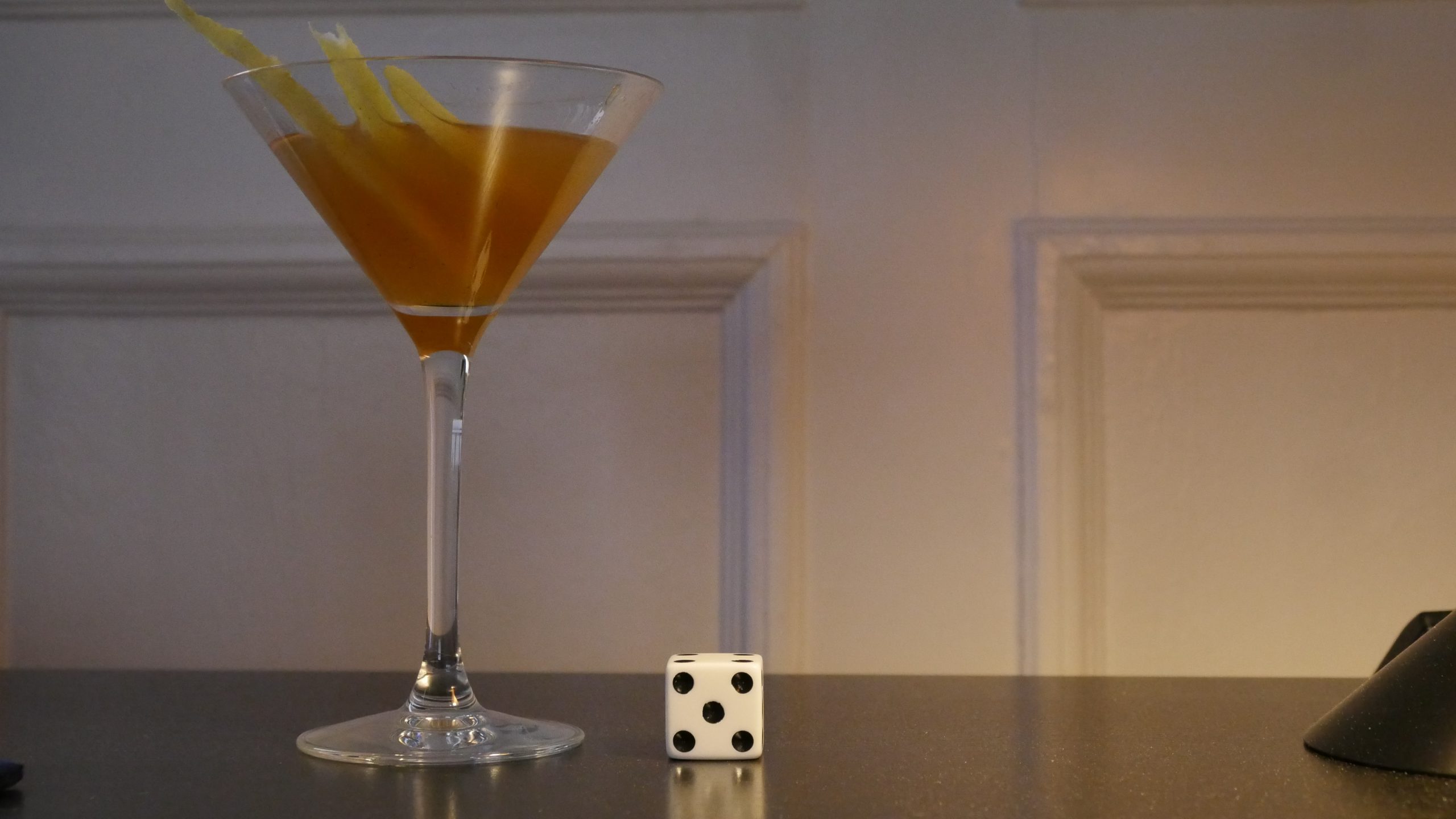
| When the Man Went South. Alex Bernstein. 2014. Tonga. May 24th, 2017. Tonga Mai Tai. |
 |  | 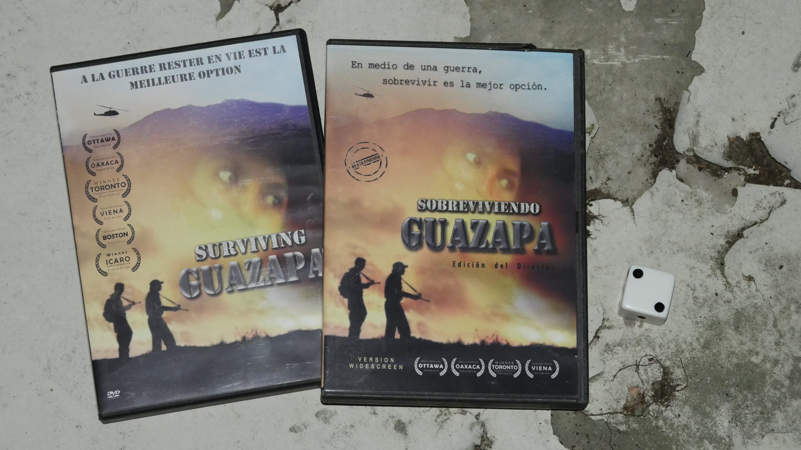 |  |
| Surviving Guazapa. Roberto d’Avila Alegria. 2008. El Salvador. May 24th, 2017. San Salvador. |
 |  |  |  |
| The Kite Flyer. Sean Russell. 2007. Barbados. May 26th, 2017. Rum Punch Recipe. |
 | 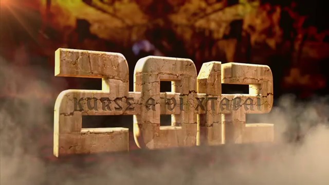 |  | 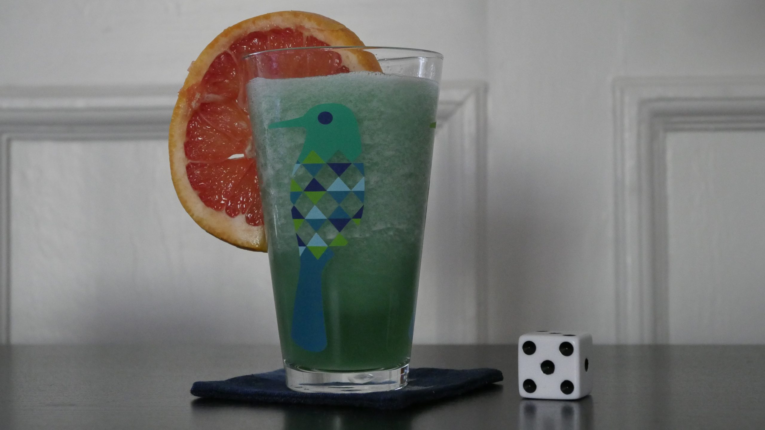 |
| 2012: Curse of the Xtabai. Matthiew Klinck. 2012. Belize. May 26th, 2017. Blue Morpho. |
 | 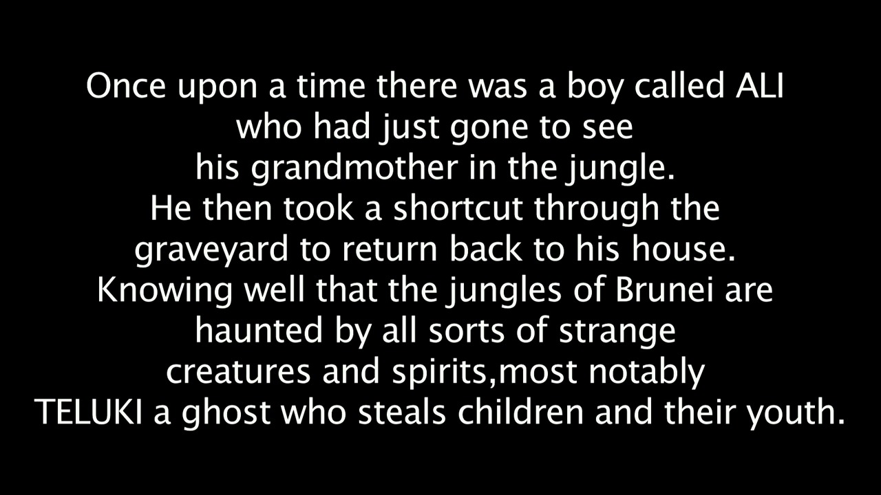 | 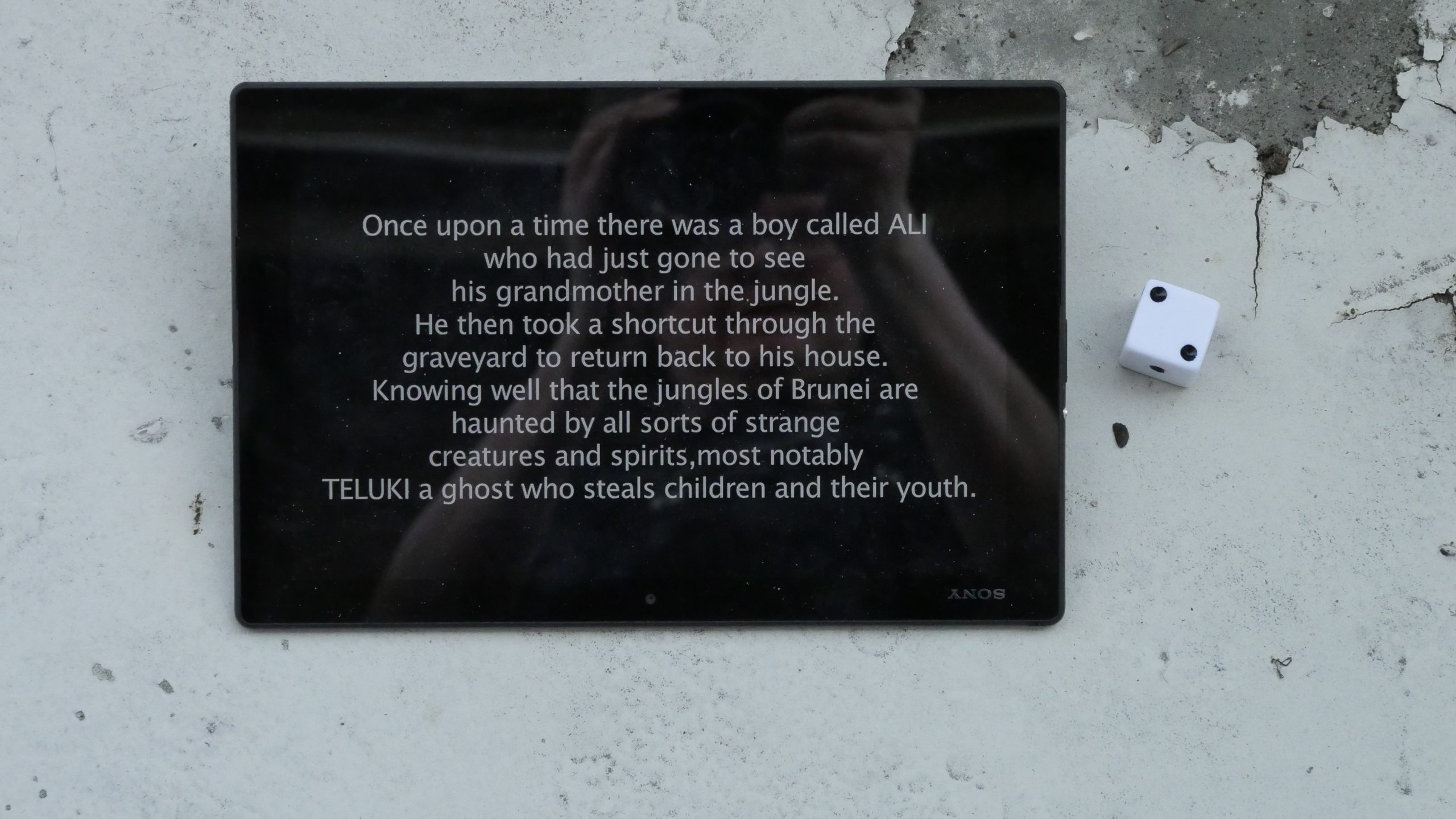 |  |
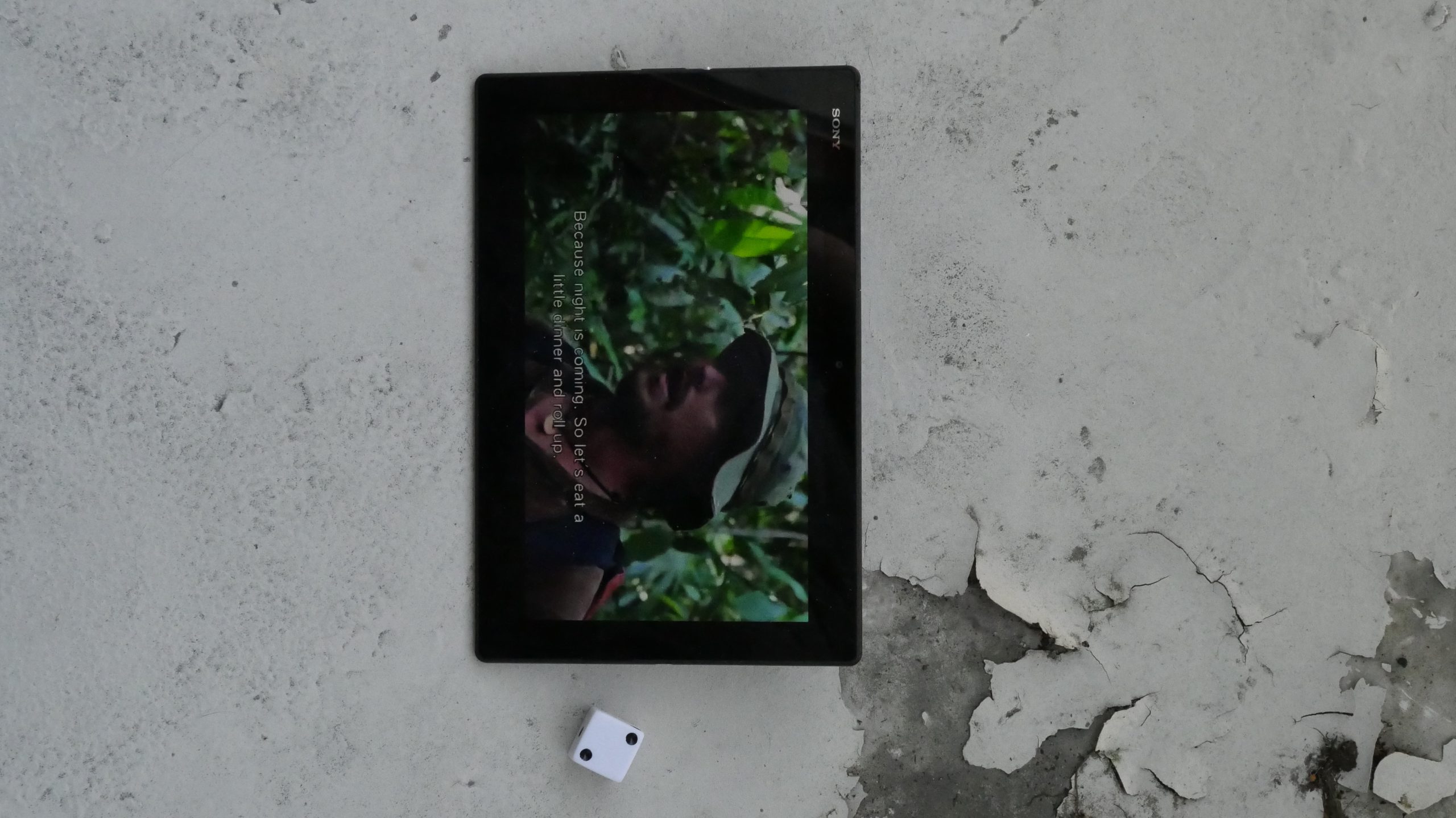
| Teluki. Abdul Zainidi. 2013. Brunei Darussalam. May 27th, 2017. Ice Kachany. |
 |  | 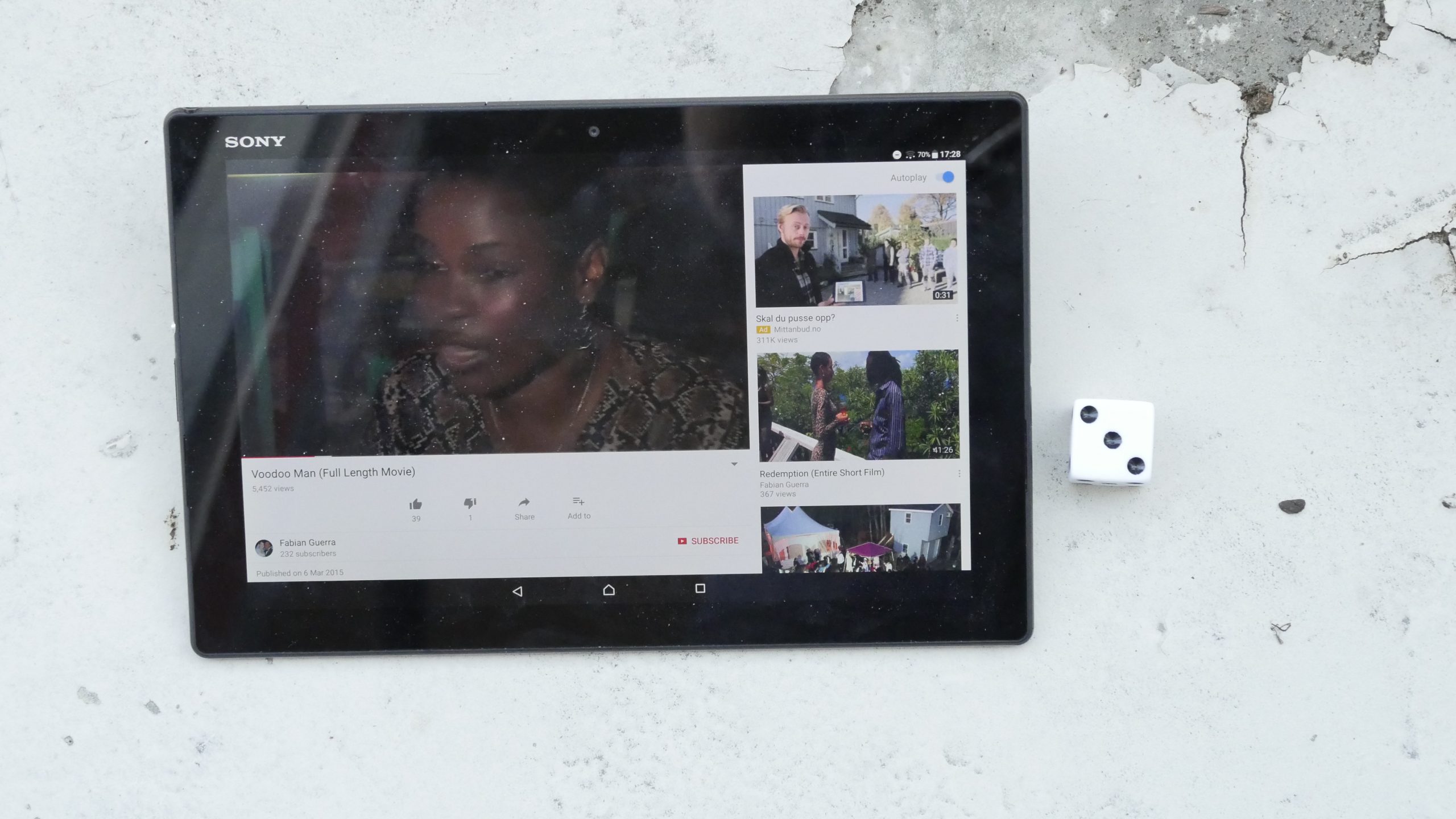 |  |
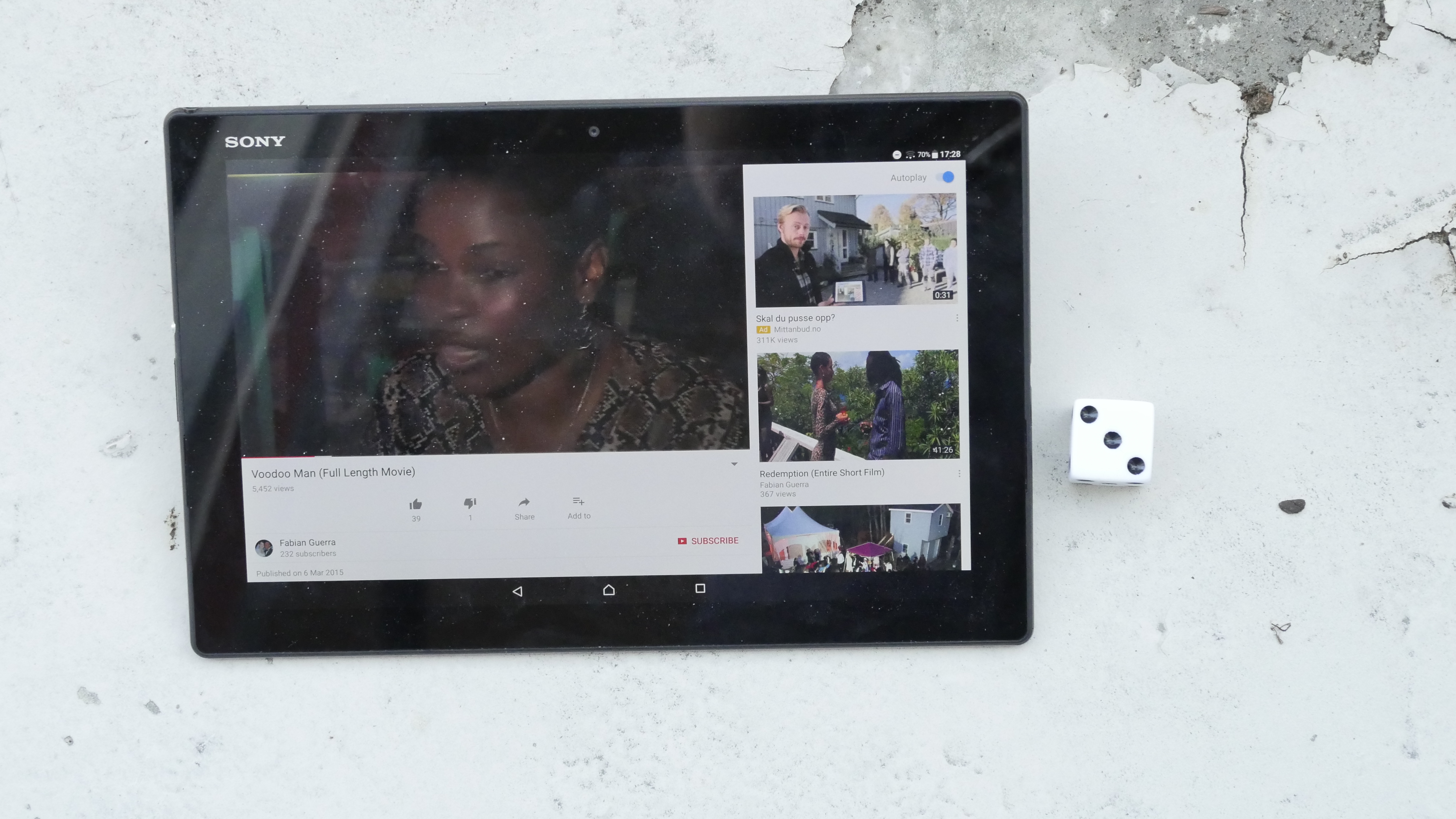
| Voodoo Man. Fabian Guerra. 2014. Saint Vincent and the Grenadines. May 27th, 2017. St. Vincent Cocktail. |
 |  |  | 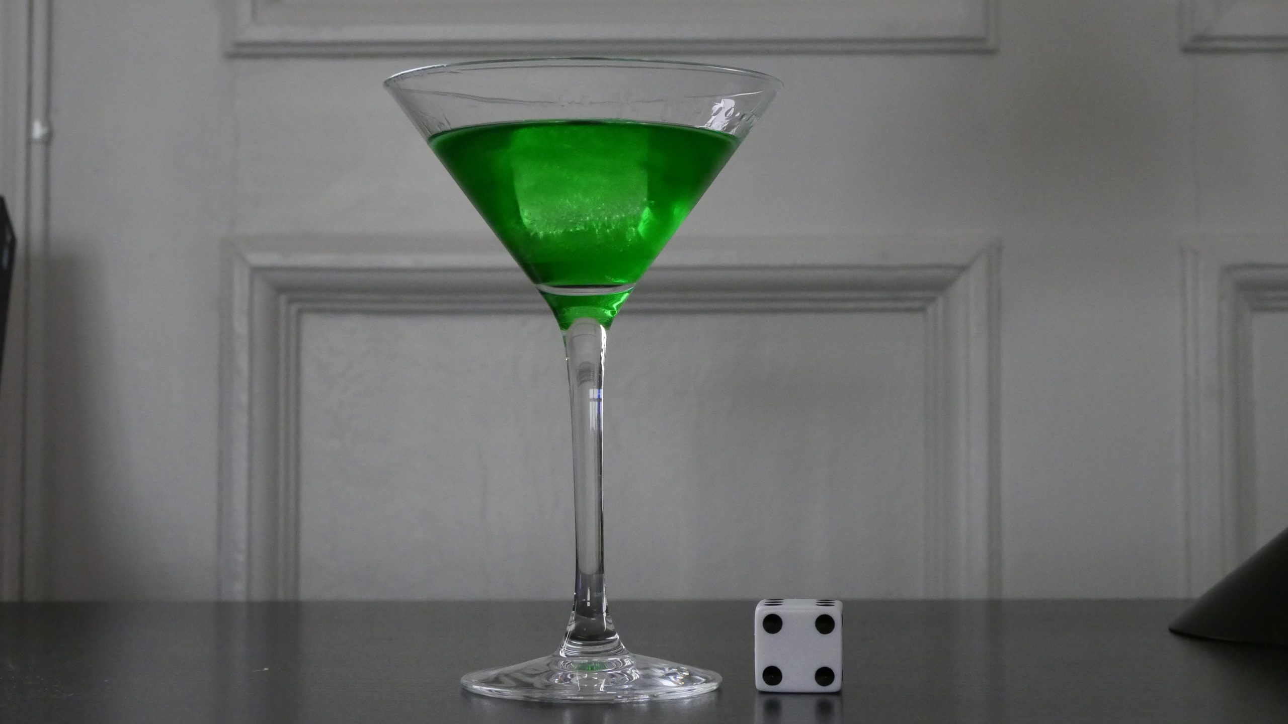 |
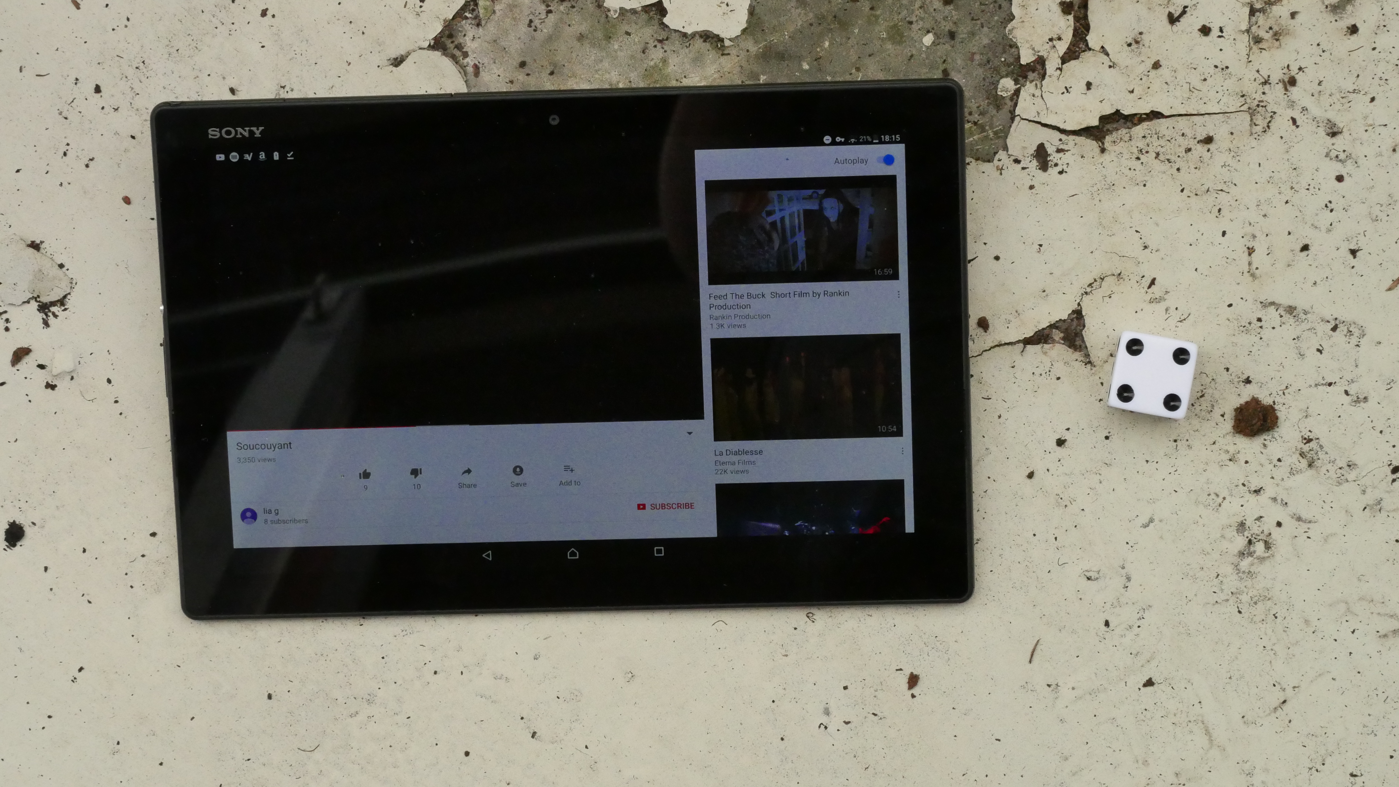
| Soucouyant. Lia Gajhadar. 2015. Saint Lucia. June 2nd, 2017. Banana Blues. |
 |  | 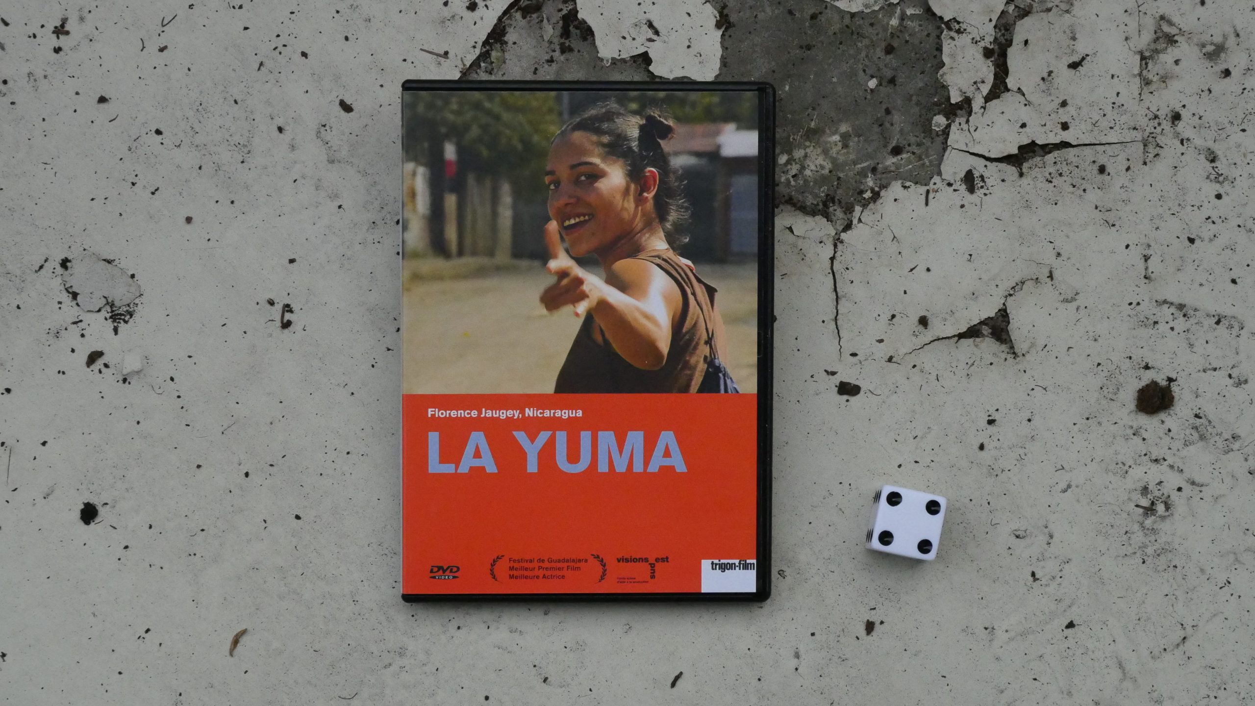 |  |
| La Yuma. Florence Jaugey. 2009. Nicaragua. June 2nd, 2017. The Macuá. |
 |  | 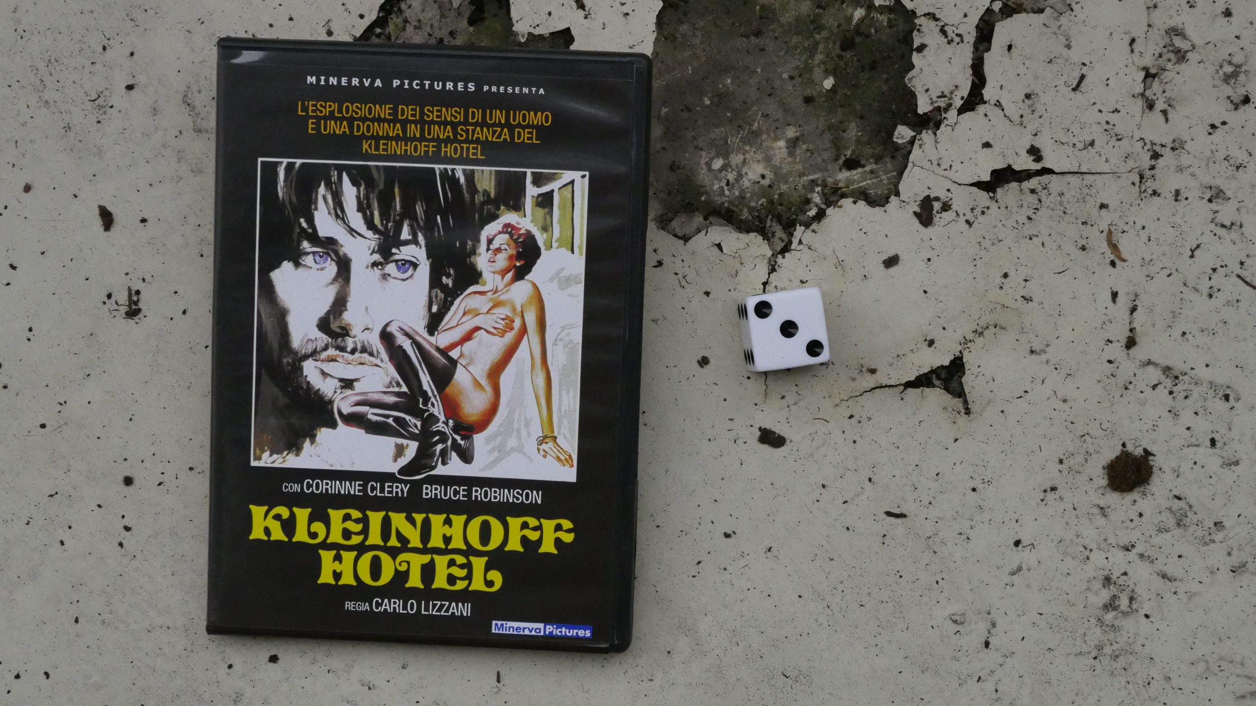 | 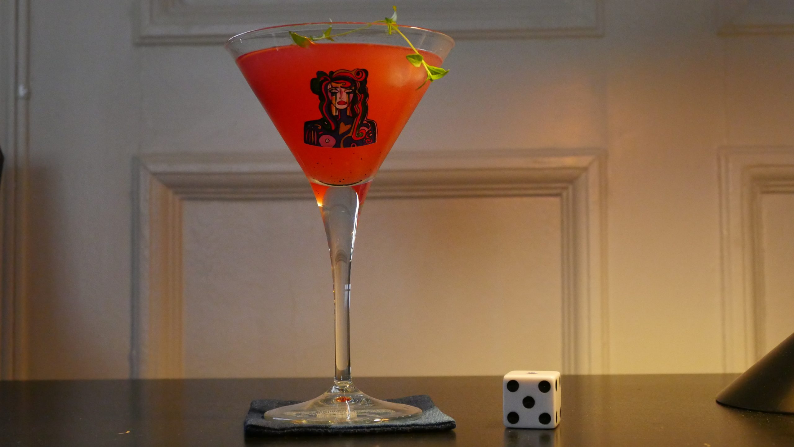 |
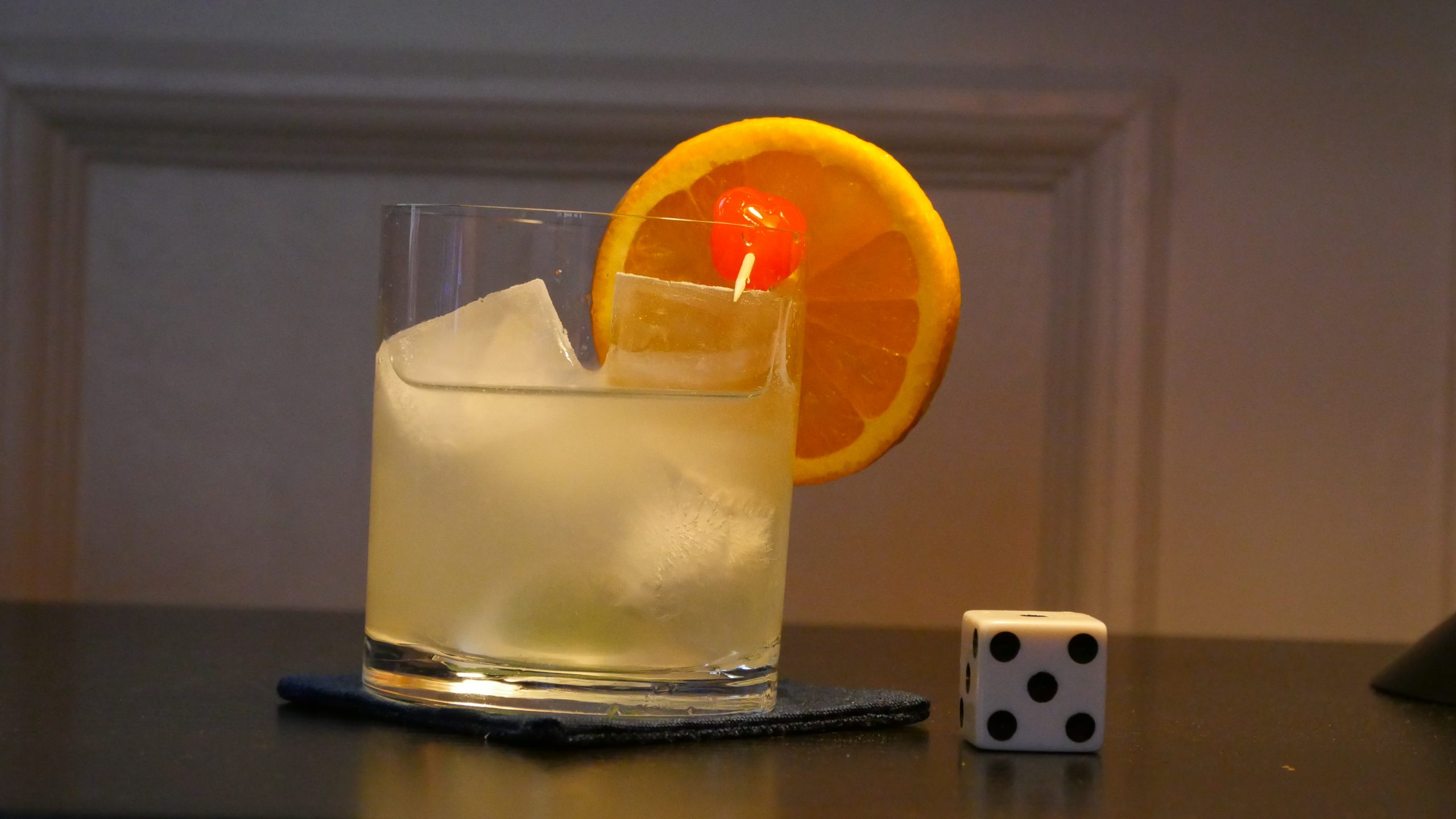
| Kleinhoff Hotell. Carlo Lizzani. 1977. Monaco. June 3rd, 2017. Le Purple. |
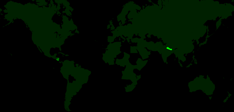 | 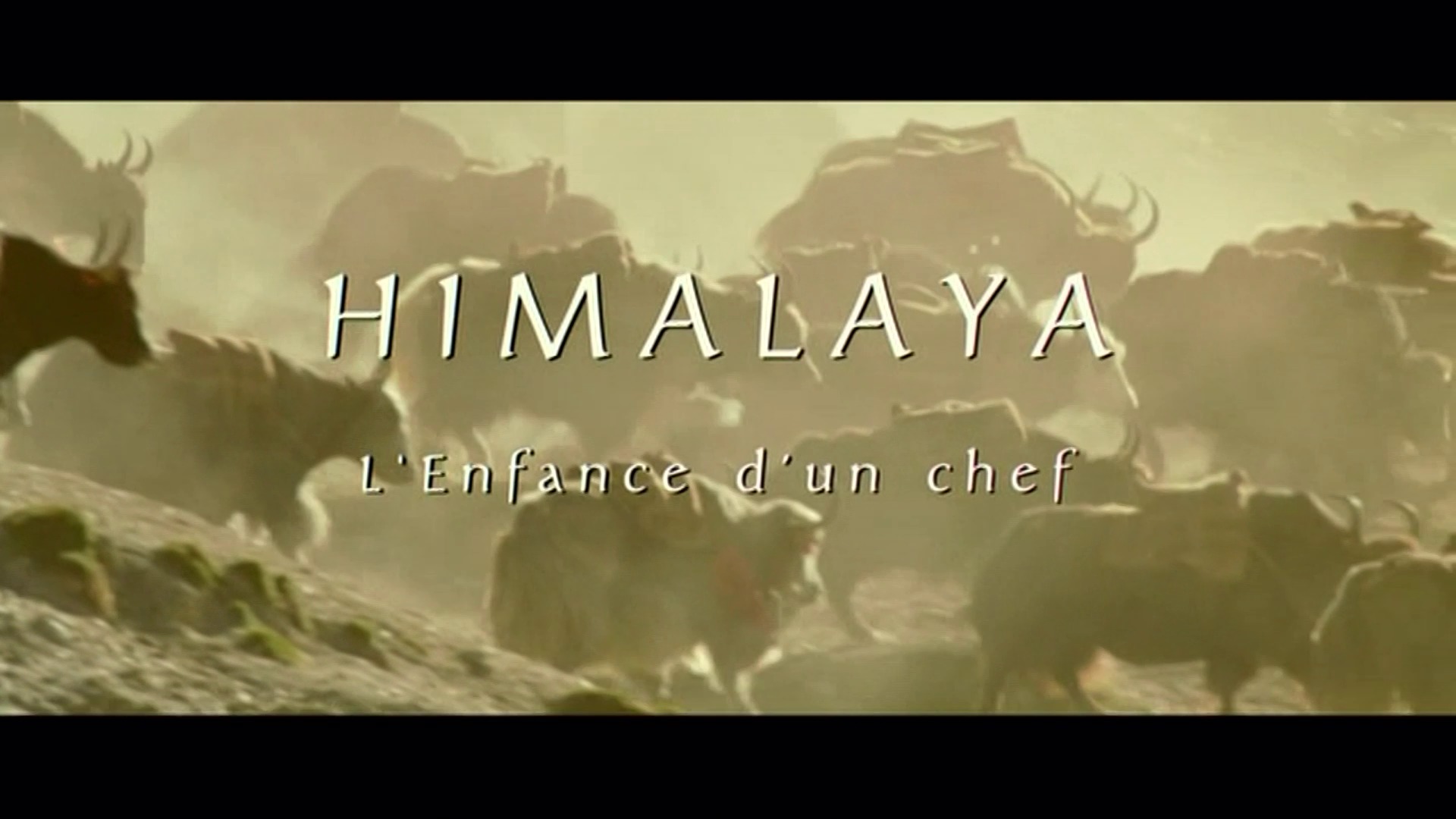 | 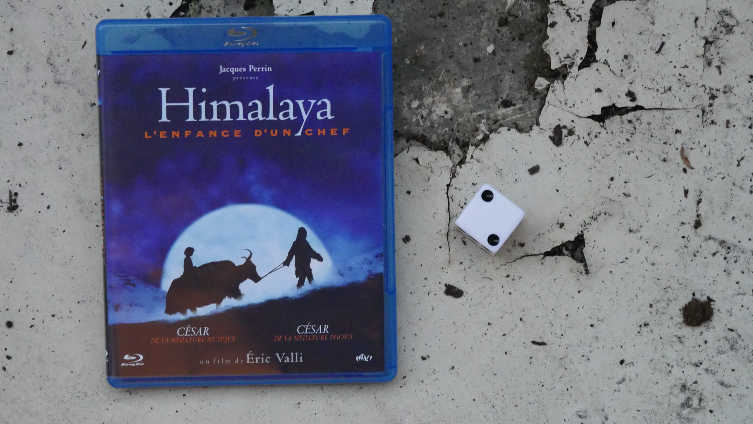 | 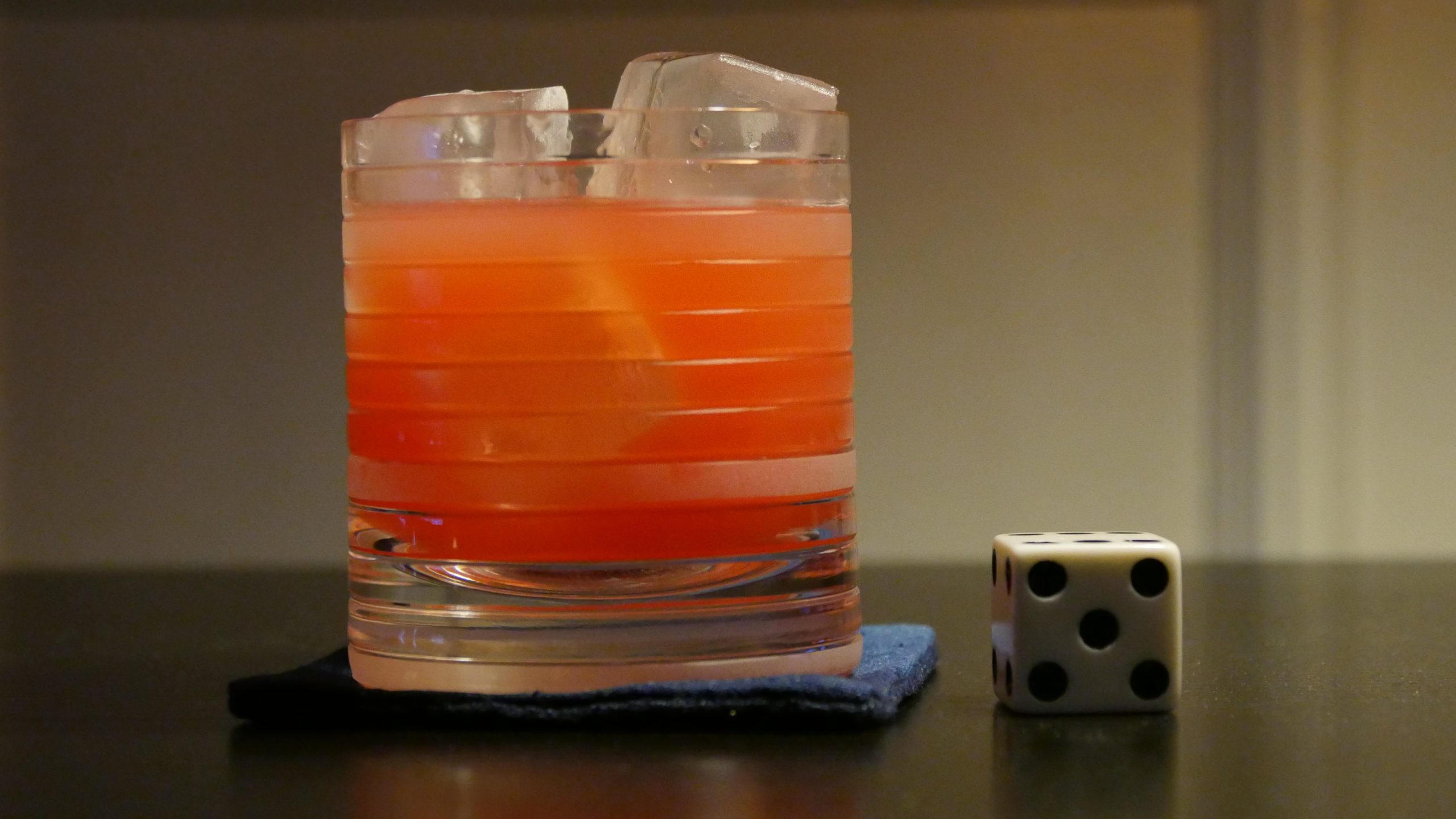 |
| Himalaya. Eric Valli. 1999. Nepal. June 3rd, 2017. 1st Cocktail. |
 | 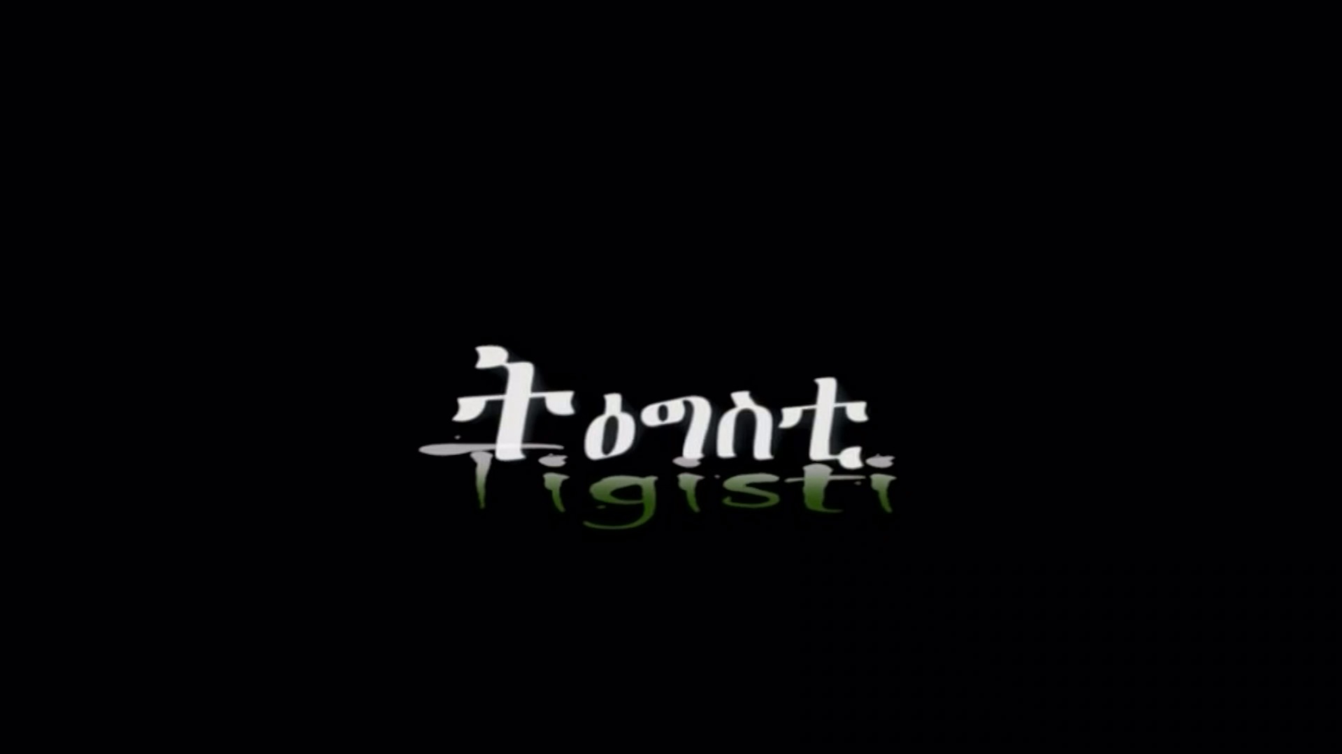 | 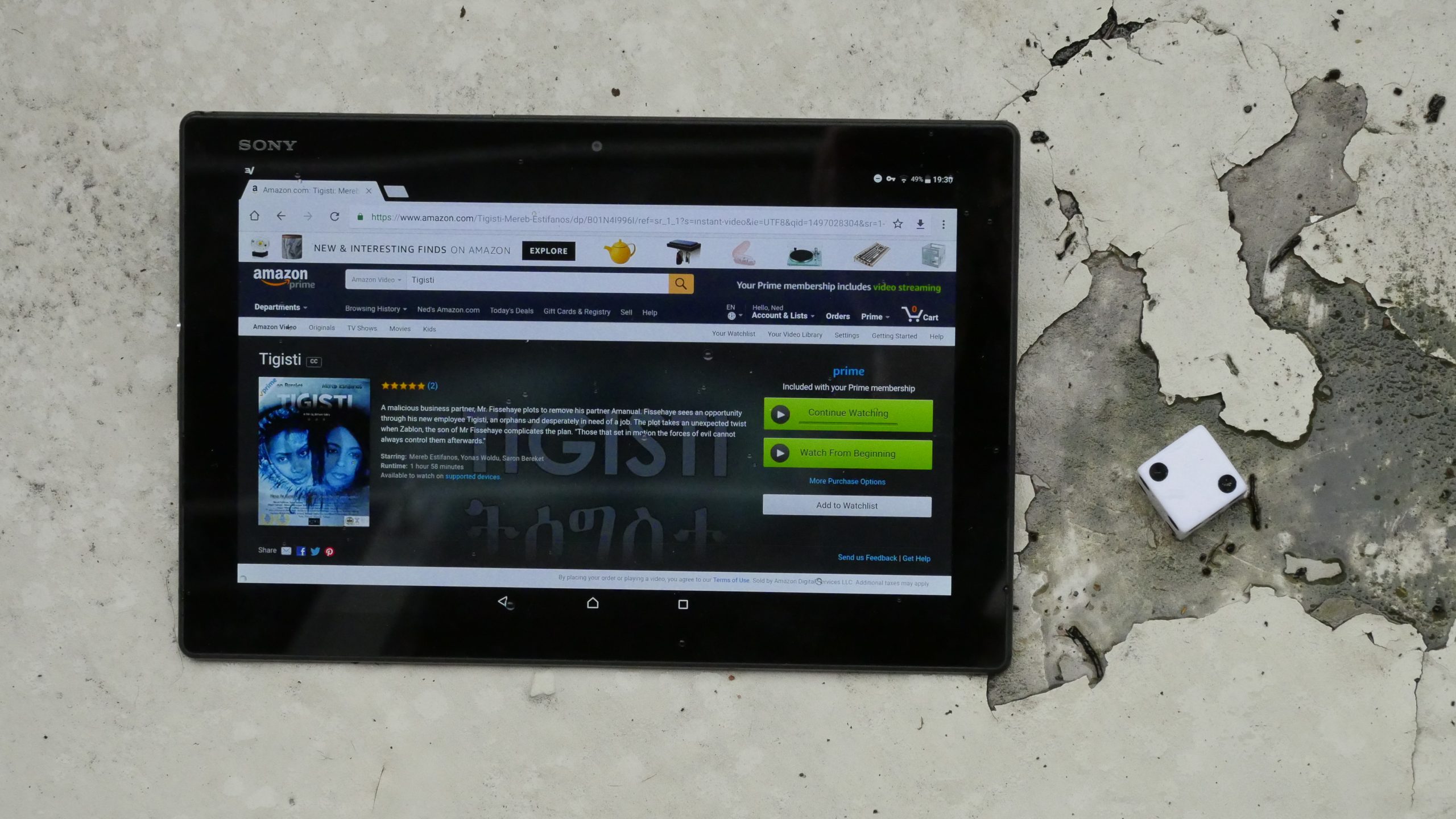 |  |
| Tigisti. Daniel Tesfamariam. 2012. Eritrea. June 9th, 2017. Tej Cocktail. |
 | 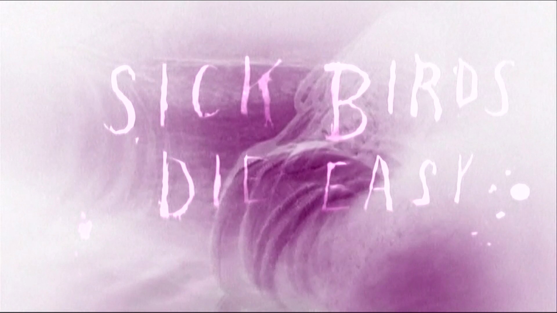 | 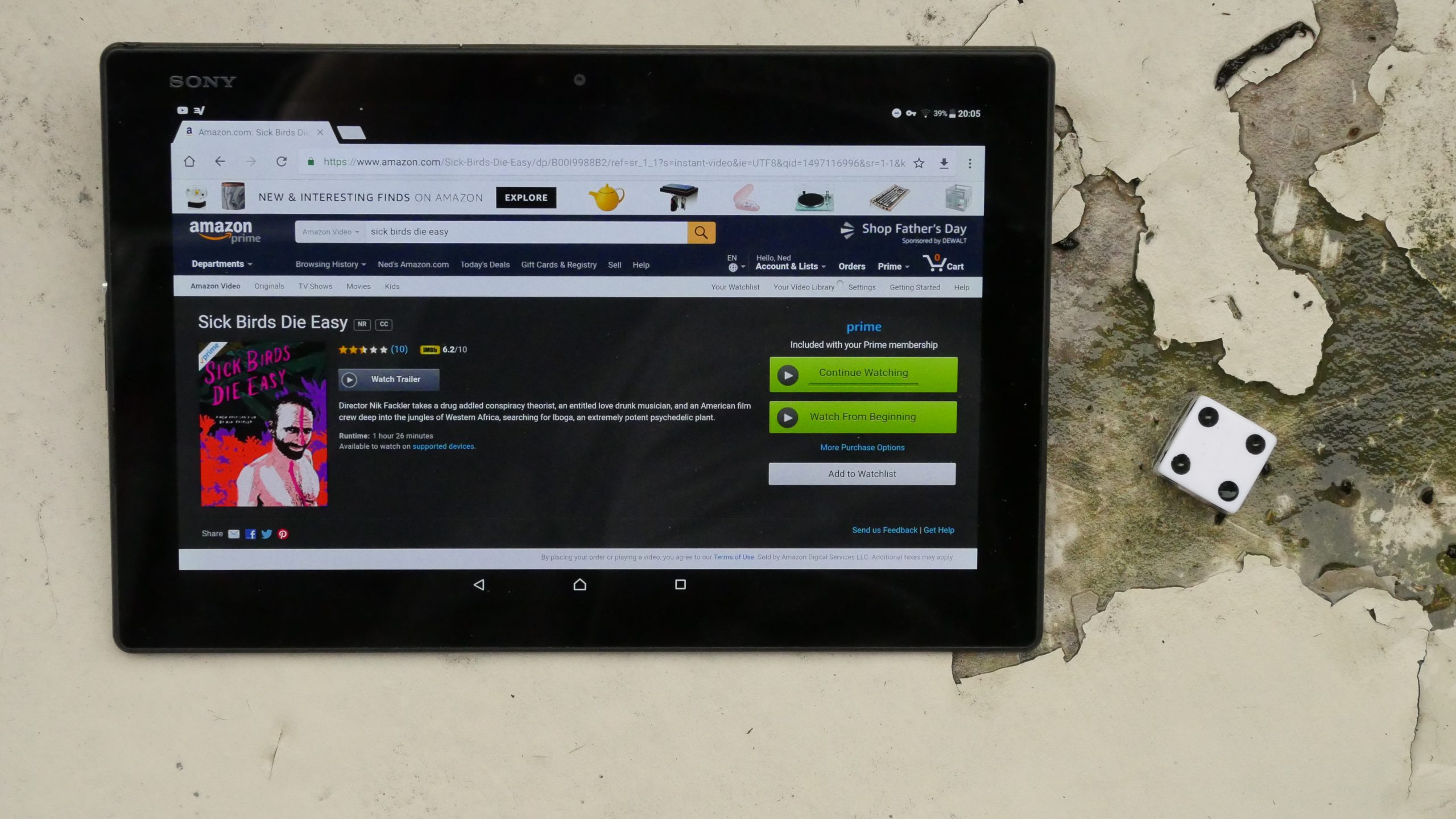 |  |
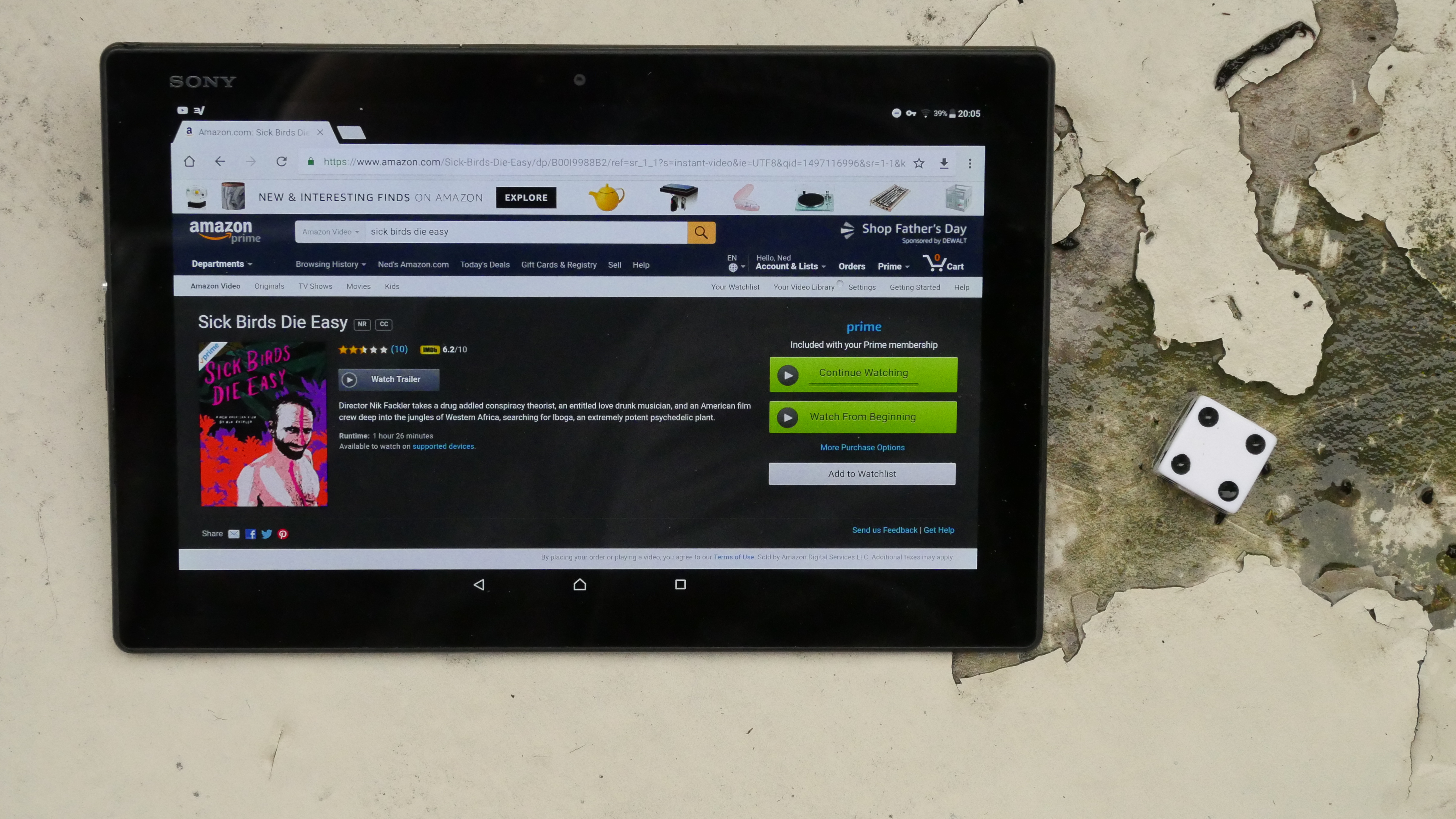
| Sick Birds Die Easy. Nicholas Fackler. 2013. Gabon. June 10th, 2017. . |
 | 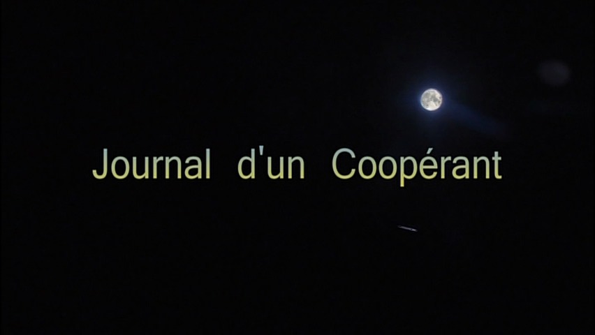 | 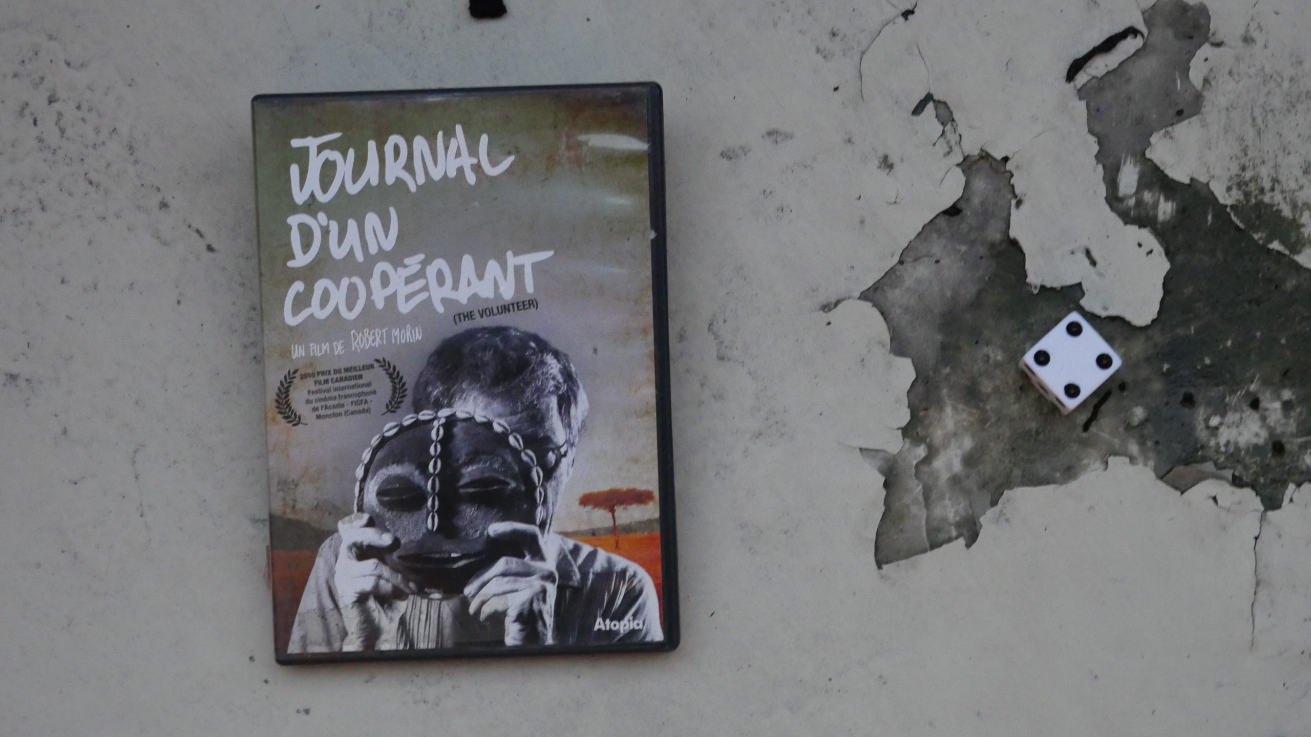 | 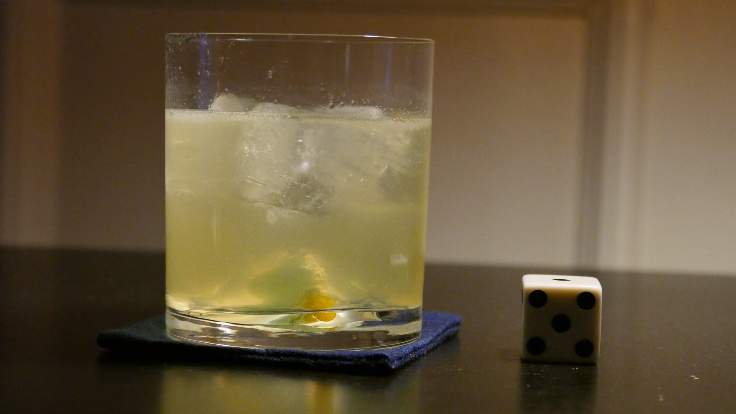 |
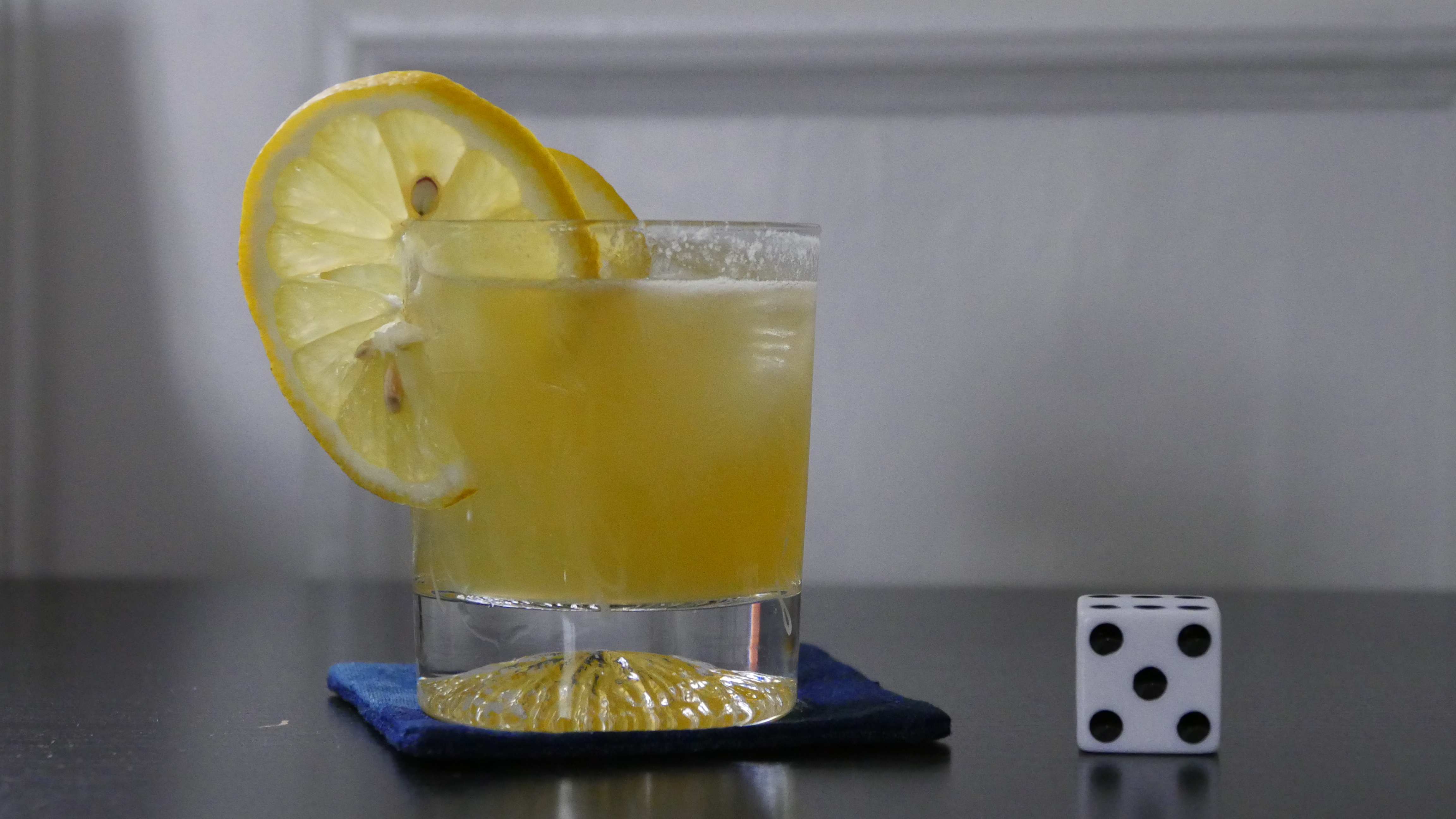
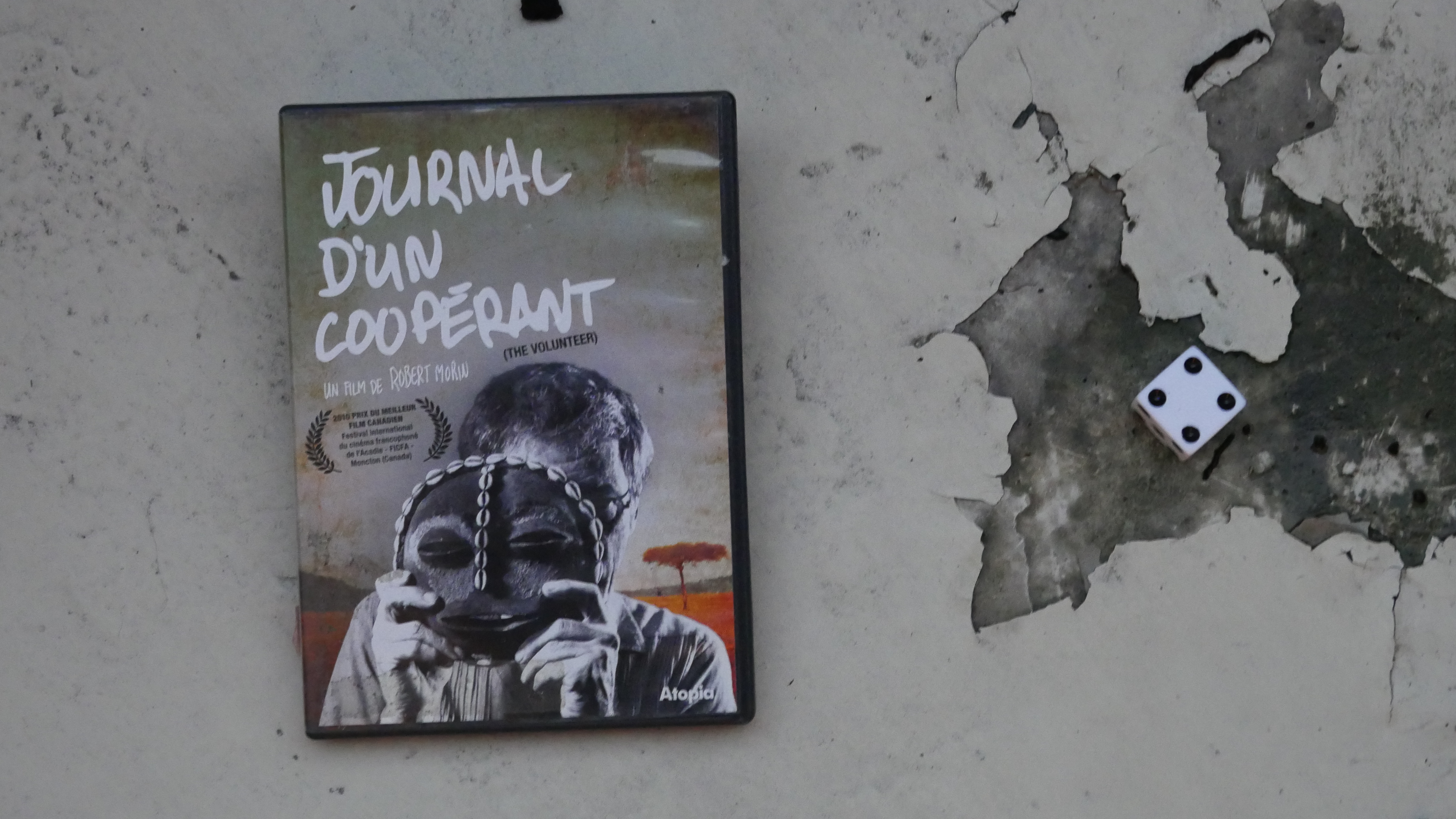
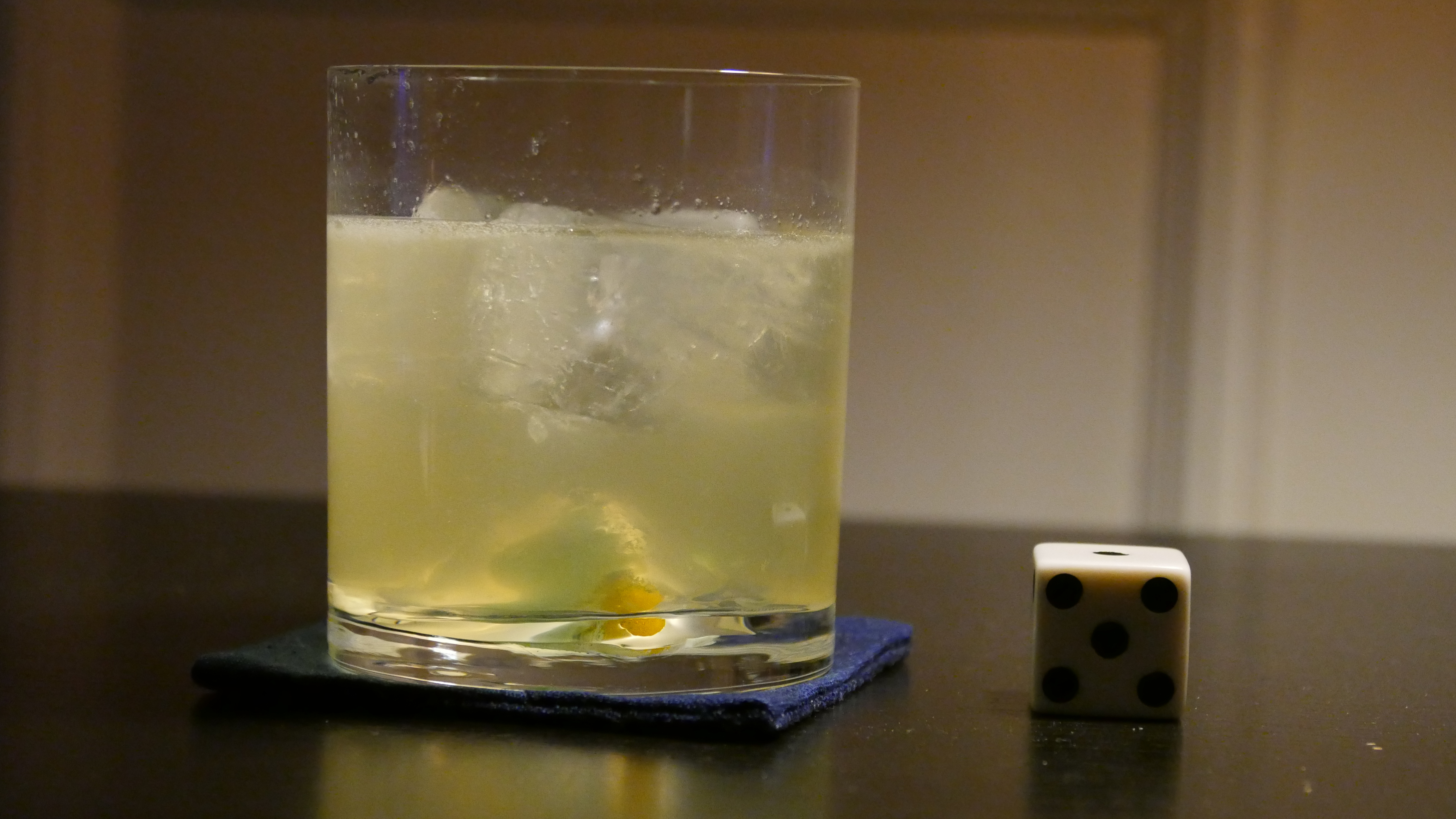
| Journal d’un coopérant. Robert Morin. 2010. Burundi. June 10th, 2017. Green Apple Collins. |
 |  | 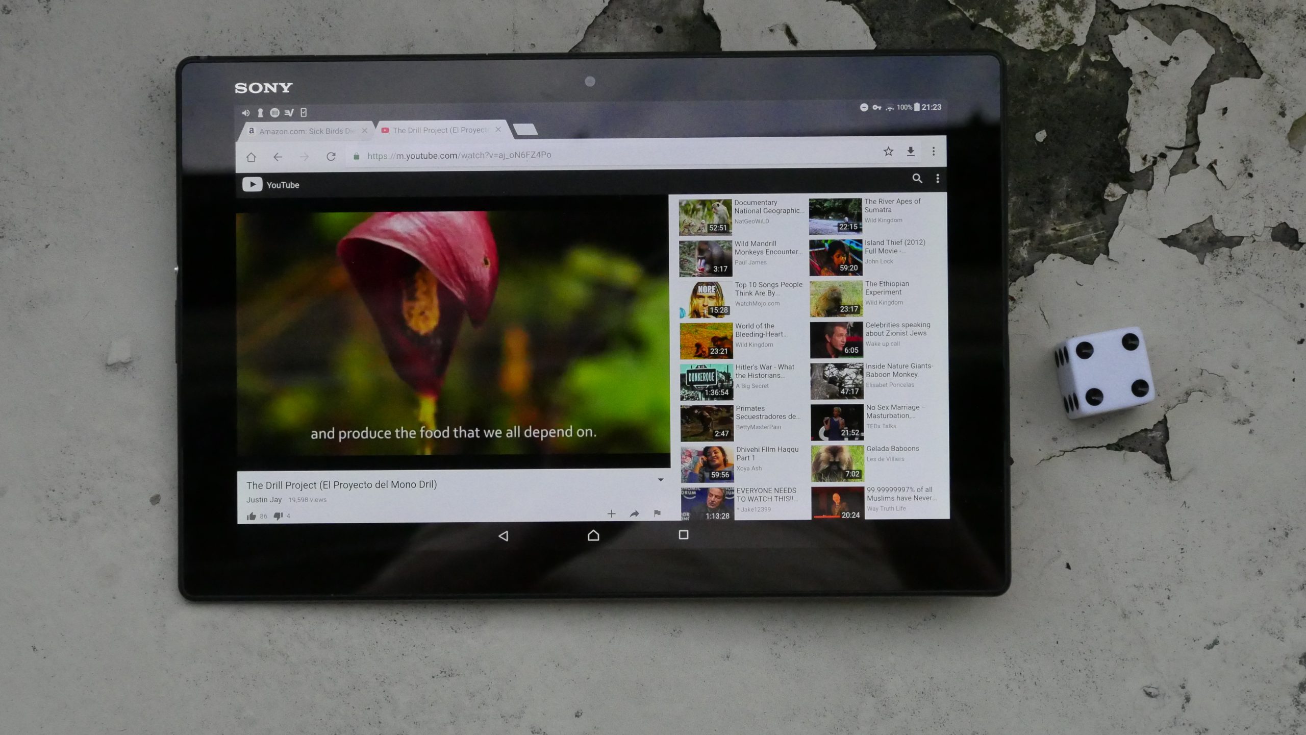 | 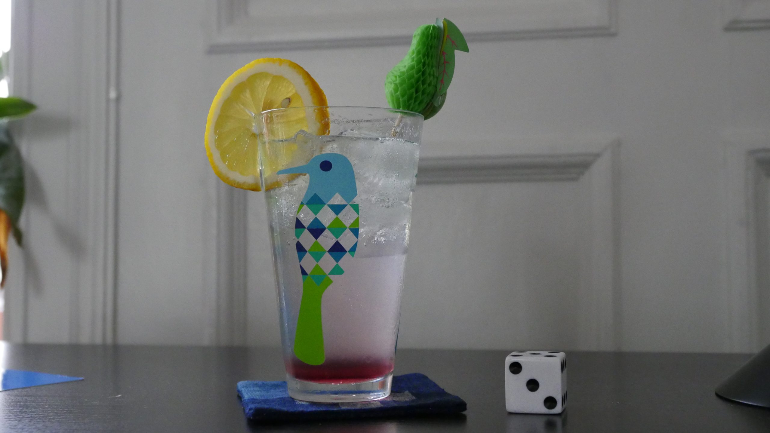 |
| The Drill Project. Justin Jay. 2012. Equatorial Guinea. June 16th, 2017. Ginger-lemonade Highball. |
 | 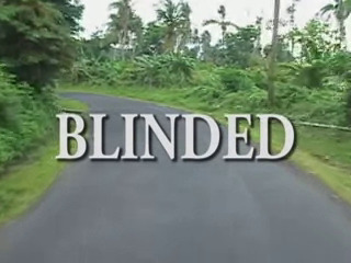 |  | 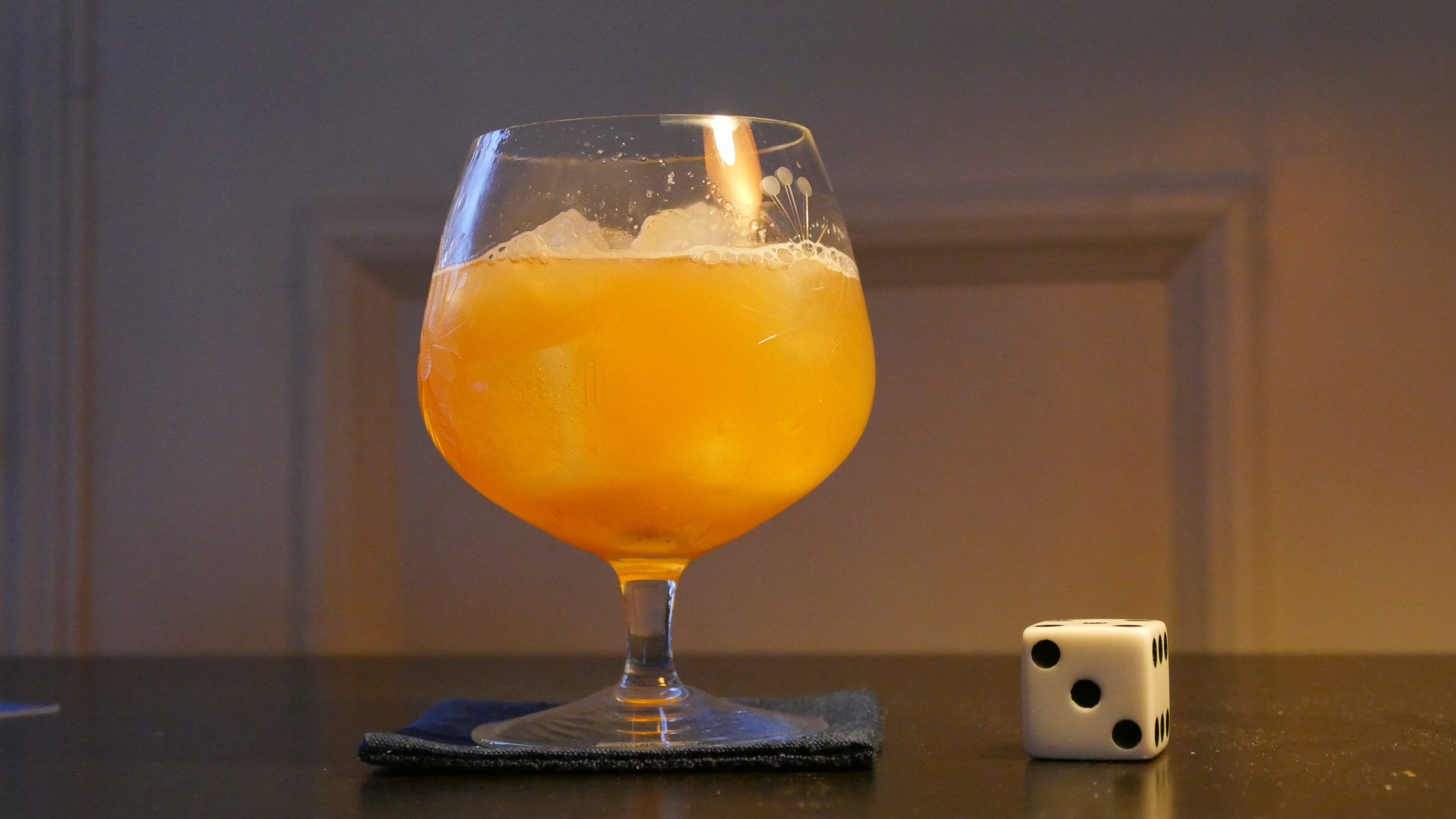 |
| Blinded. Anderson Quarless. 2006. Grenada. June 16th, 2017. Tropical Teaser. |
 |  | 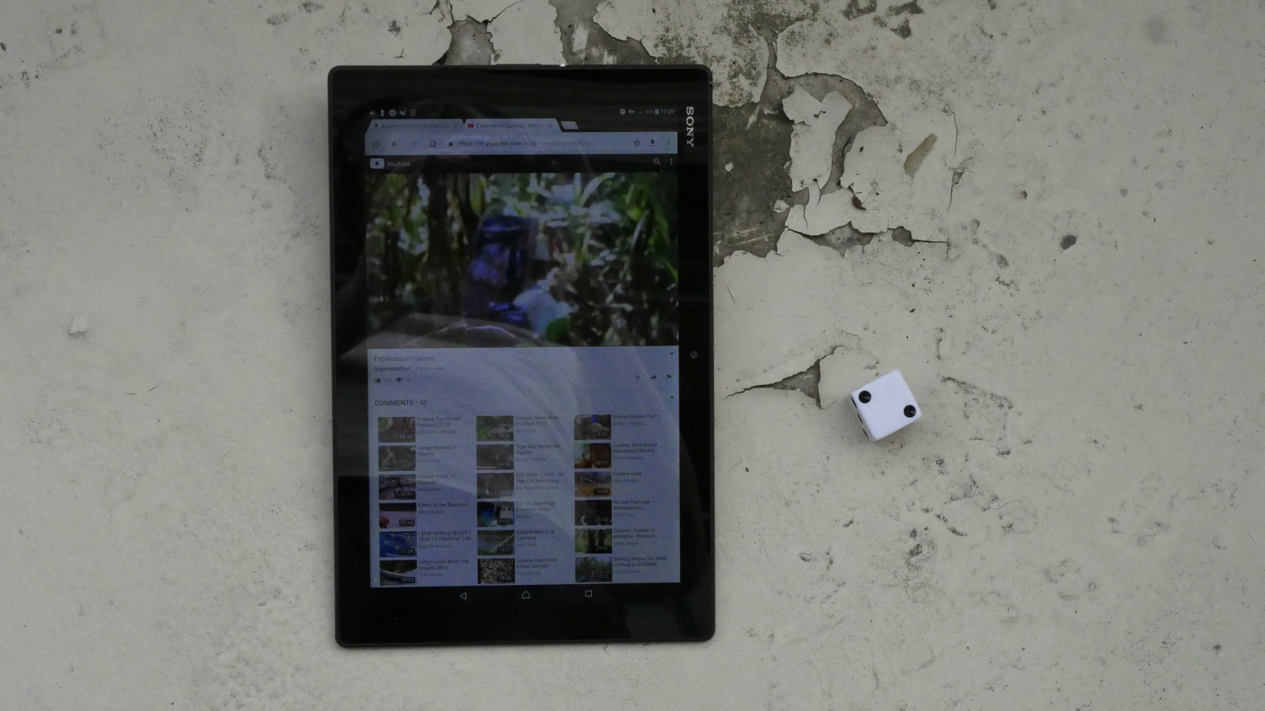 |  |
| Exploration Guyana. Charles Montier. 2011. Guyana. June 17th, 2017. The Georgetown. |
 |  |  |  |
| Pio XI e Marconi. A. Nonymous. 1933. Holy See. June 17th, 2017. Bellini. |
 |  | 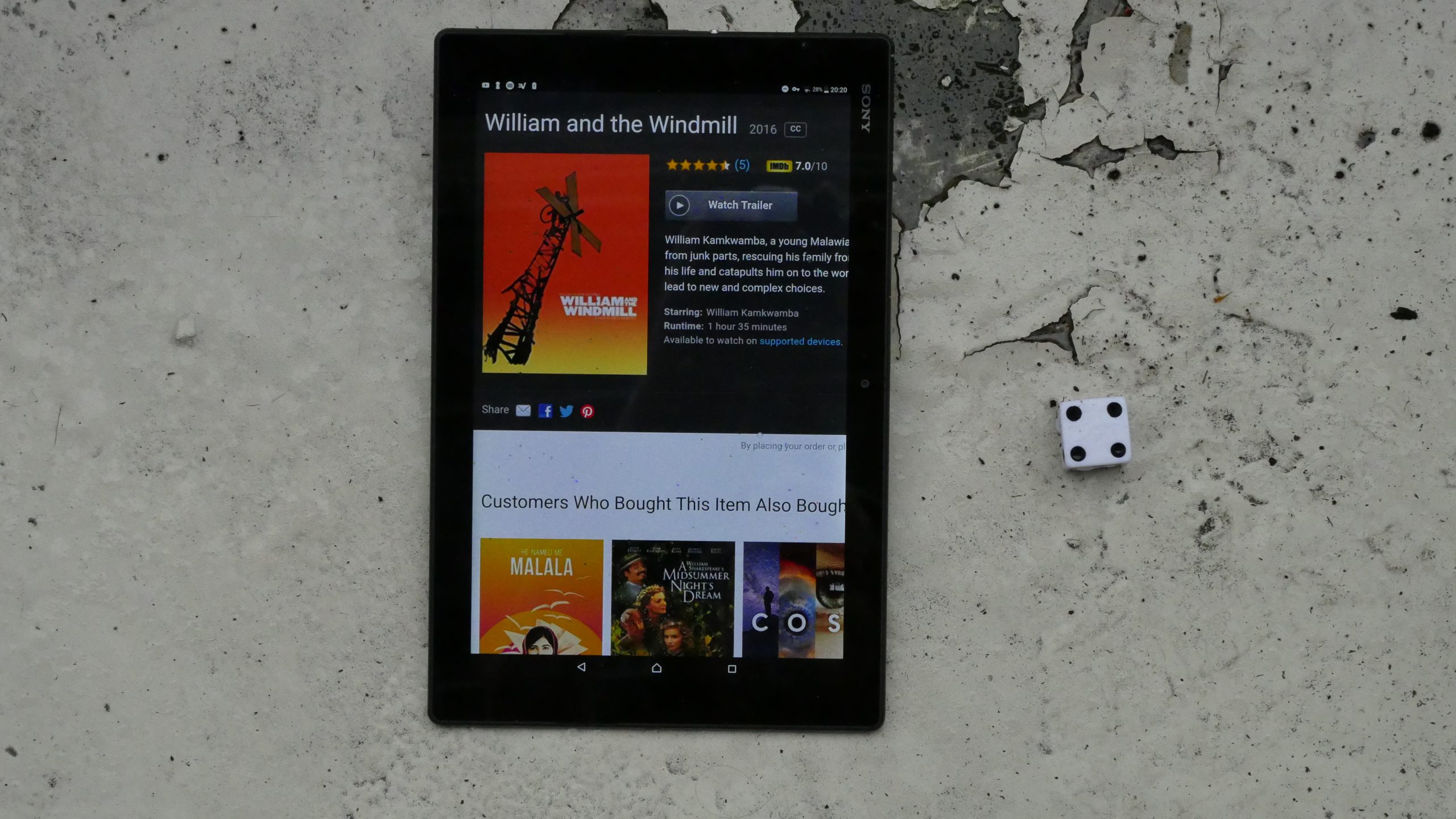 |  |
| William and the Windmill. Ben Nabors. 2013. Malawi. June 23rd, 2017. The Pumulani. |
 | 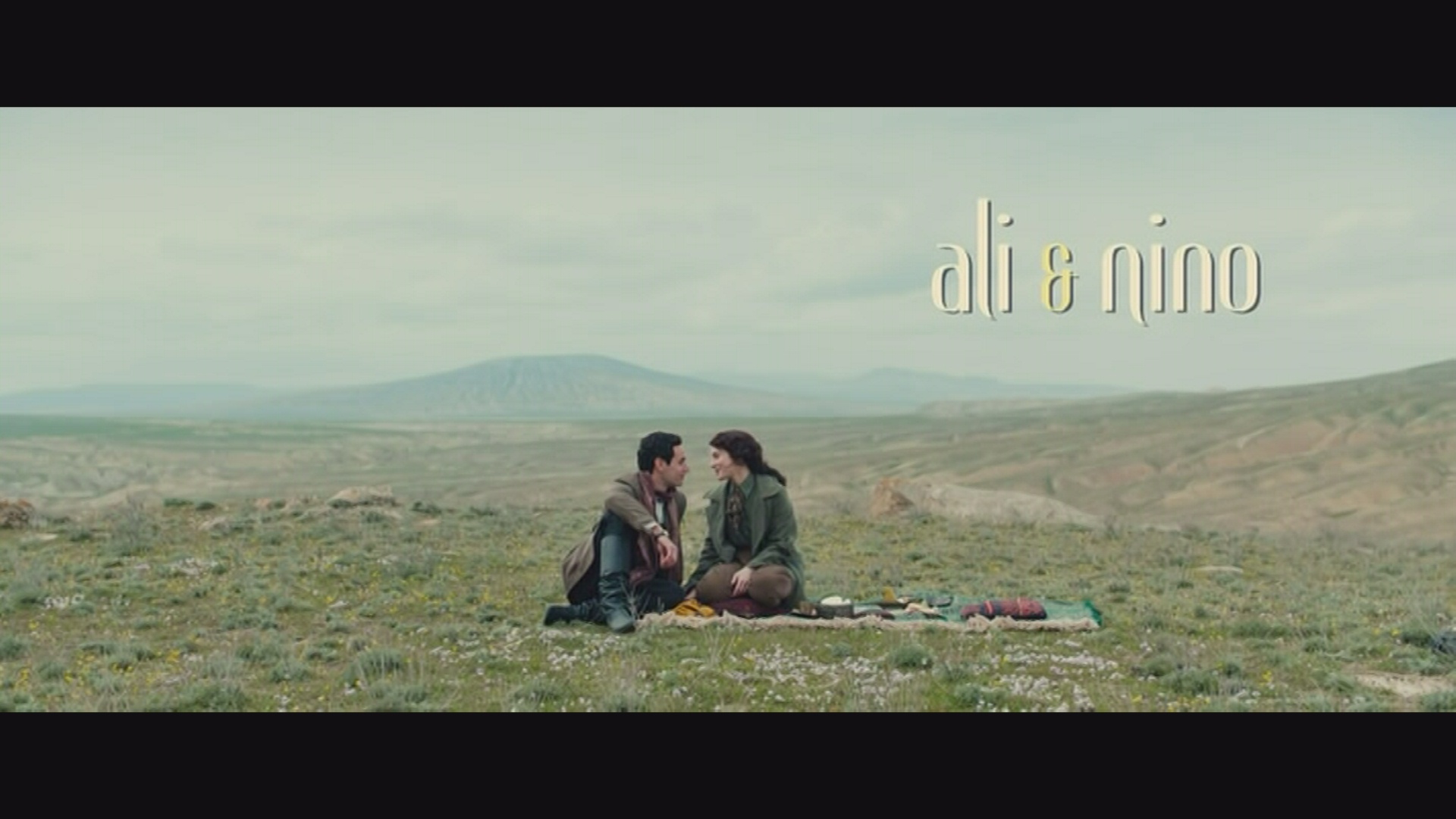 | 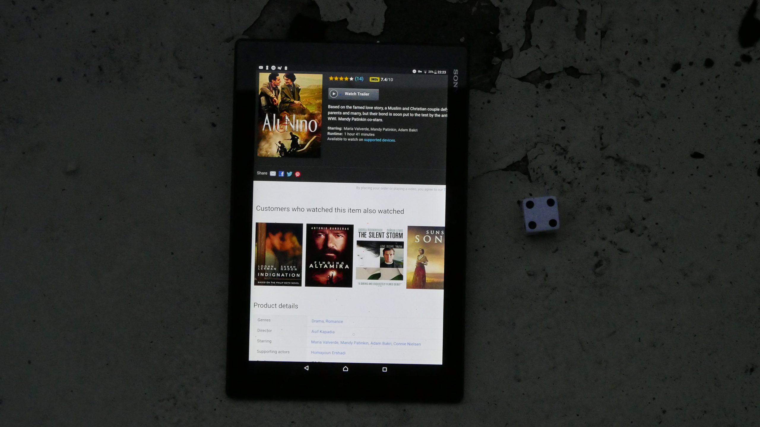 |  |
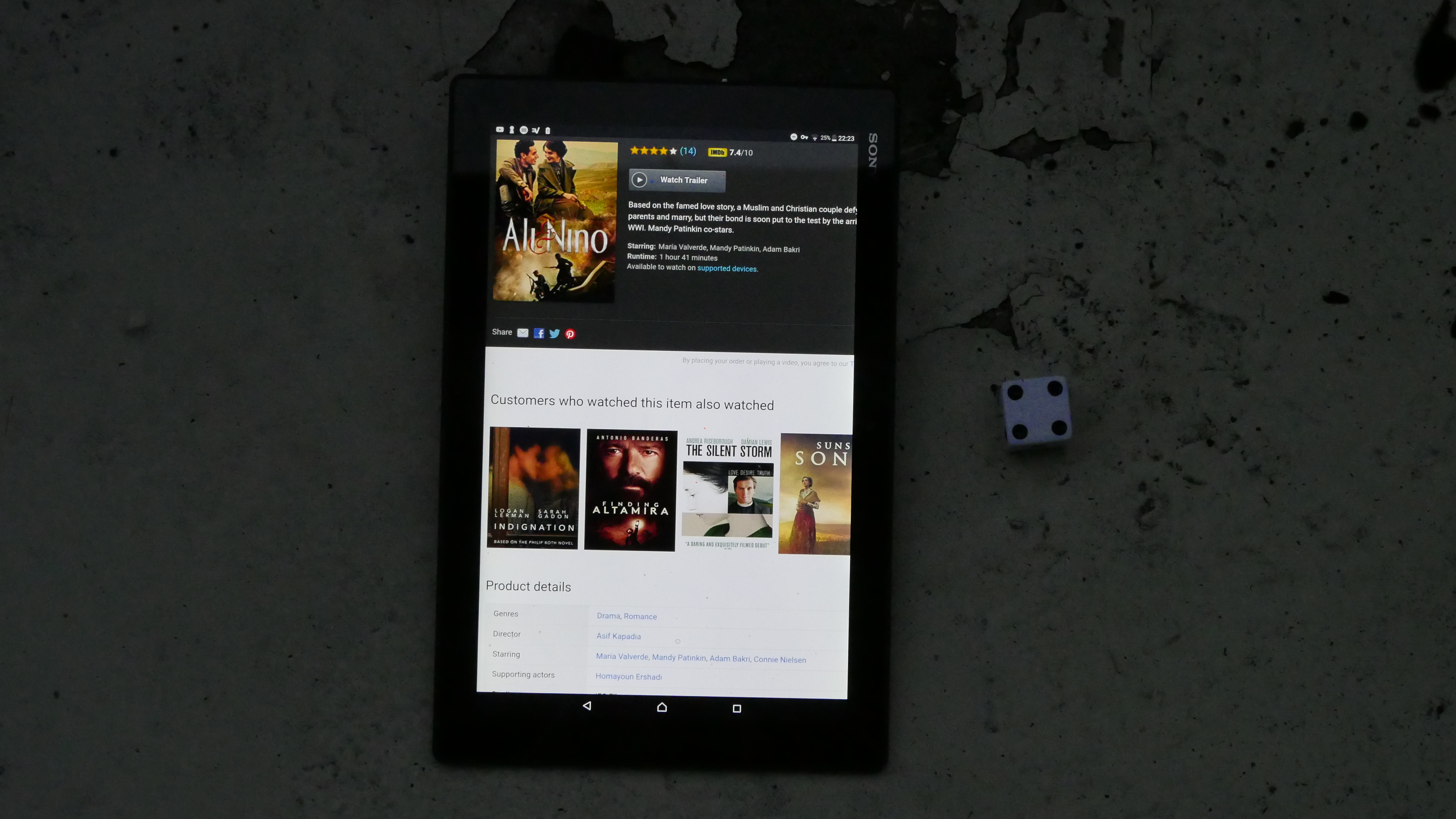
| Ali and Nino. Asif Kapadia. 2016. Azerbaijan. June 23rd, 2017. Arak Buck. |
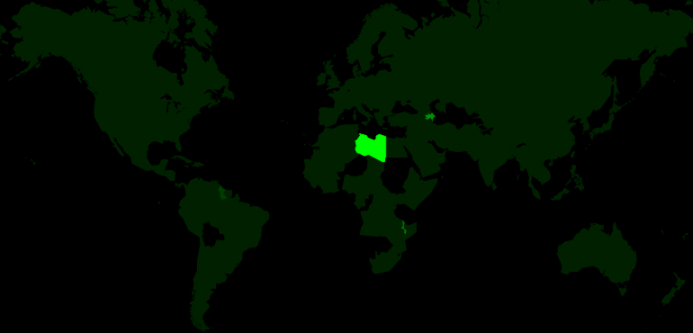 | 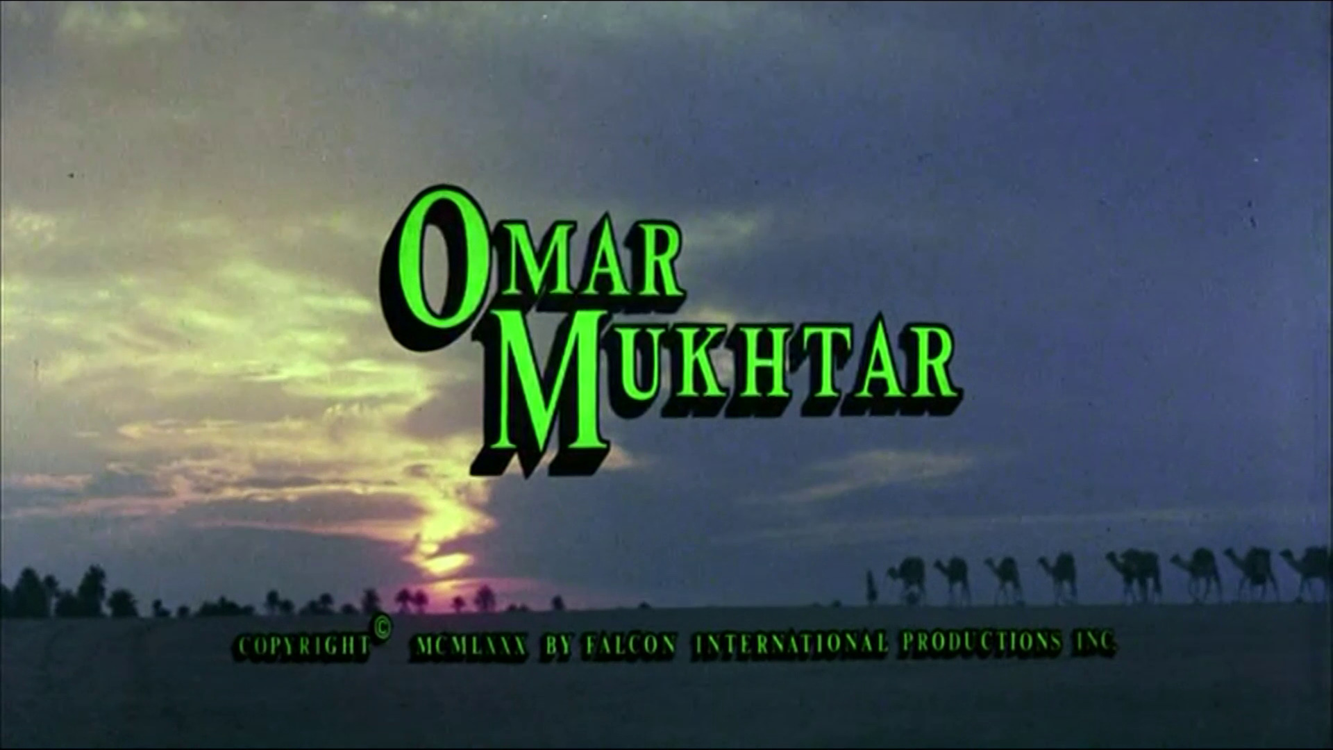 | 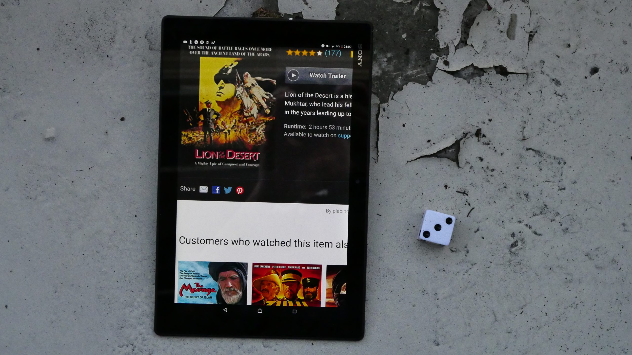 |  |
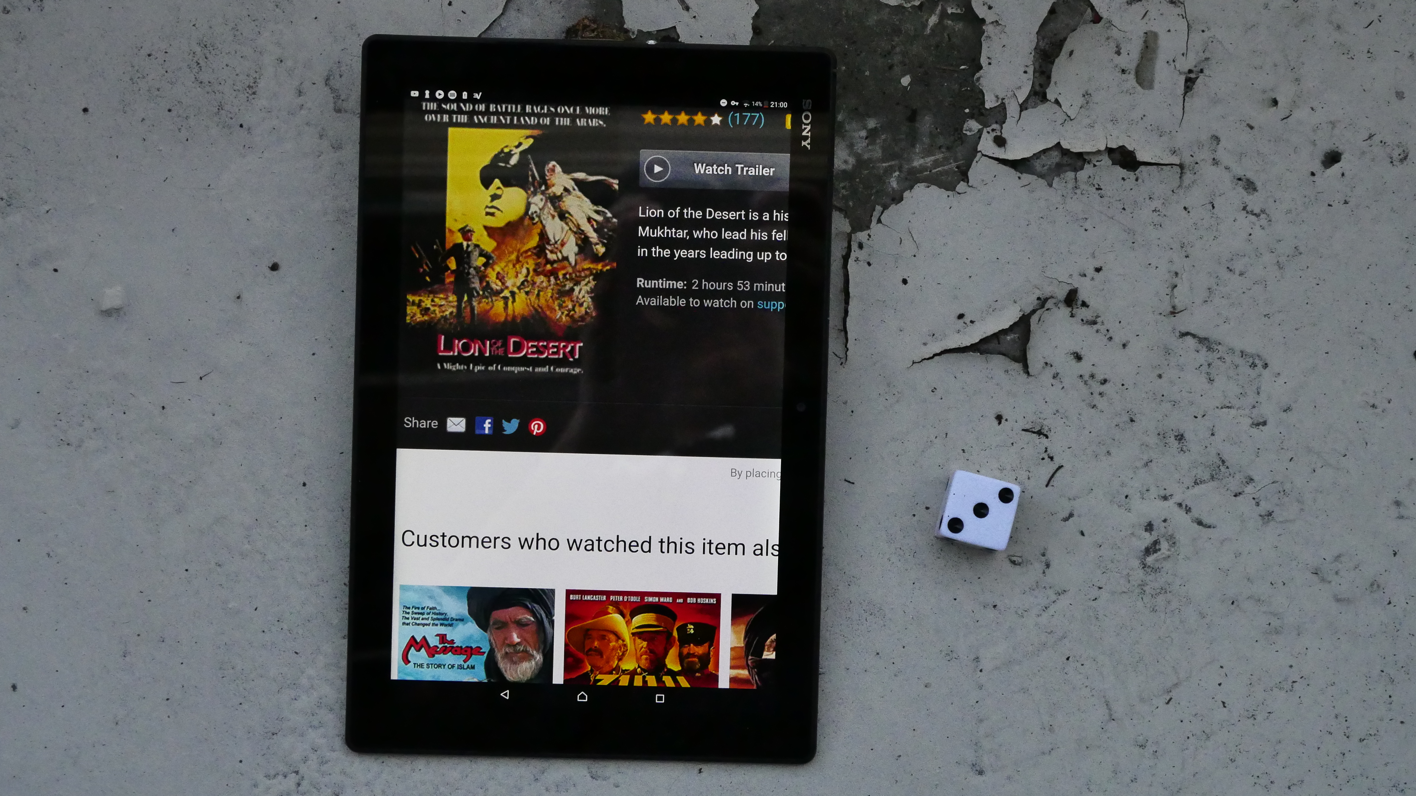
| Lion of the Desert. Moustapha Akkad. 1980. Libya. June 24th, 2017. Eastern Promise. |
 | 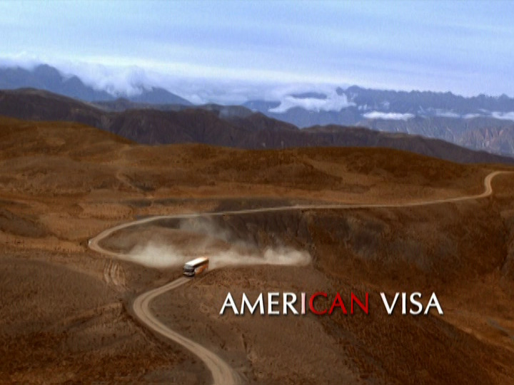 | 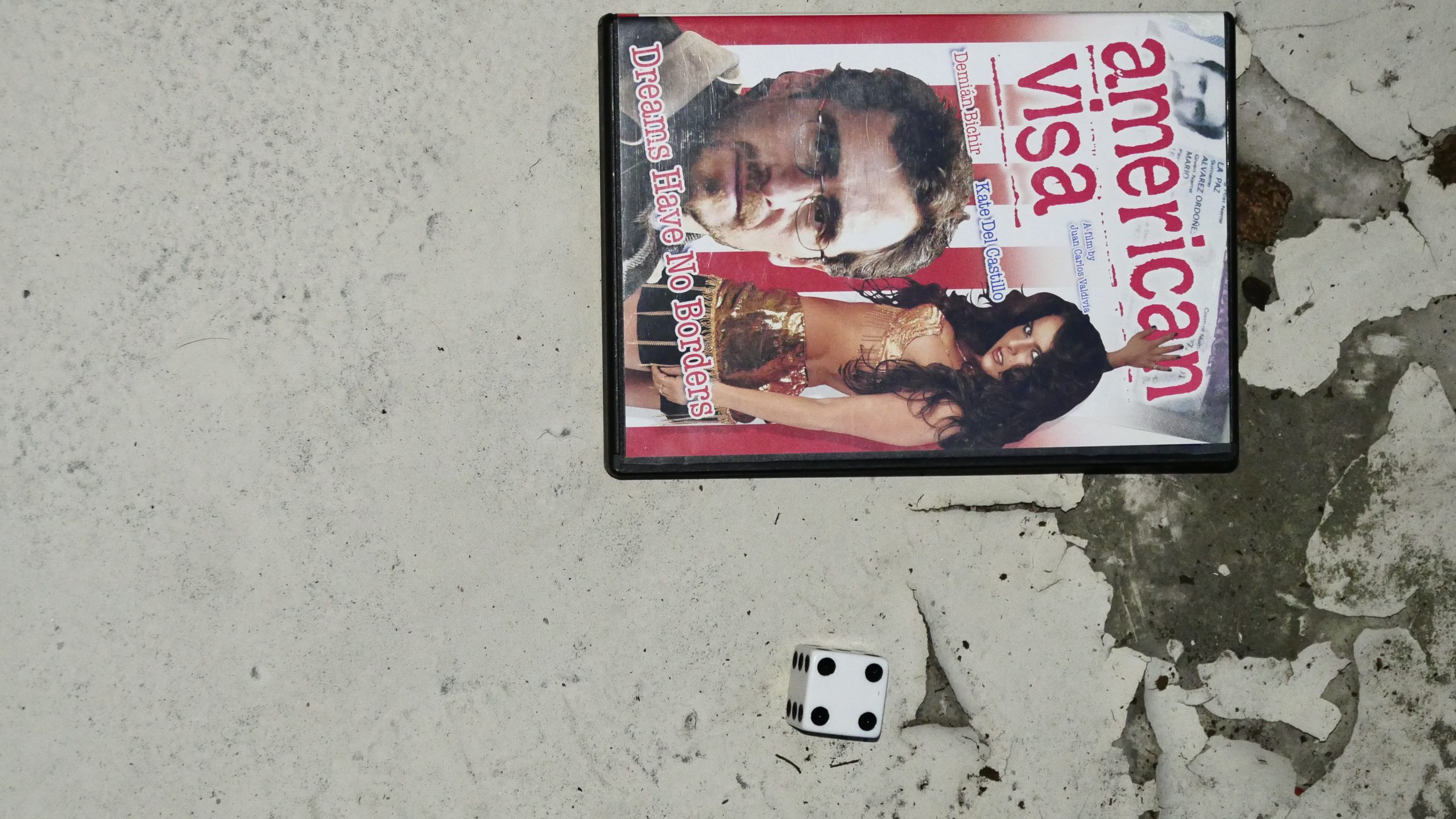 | 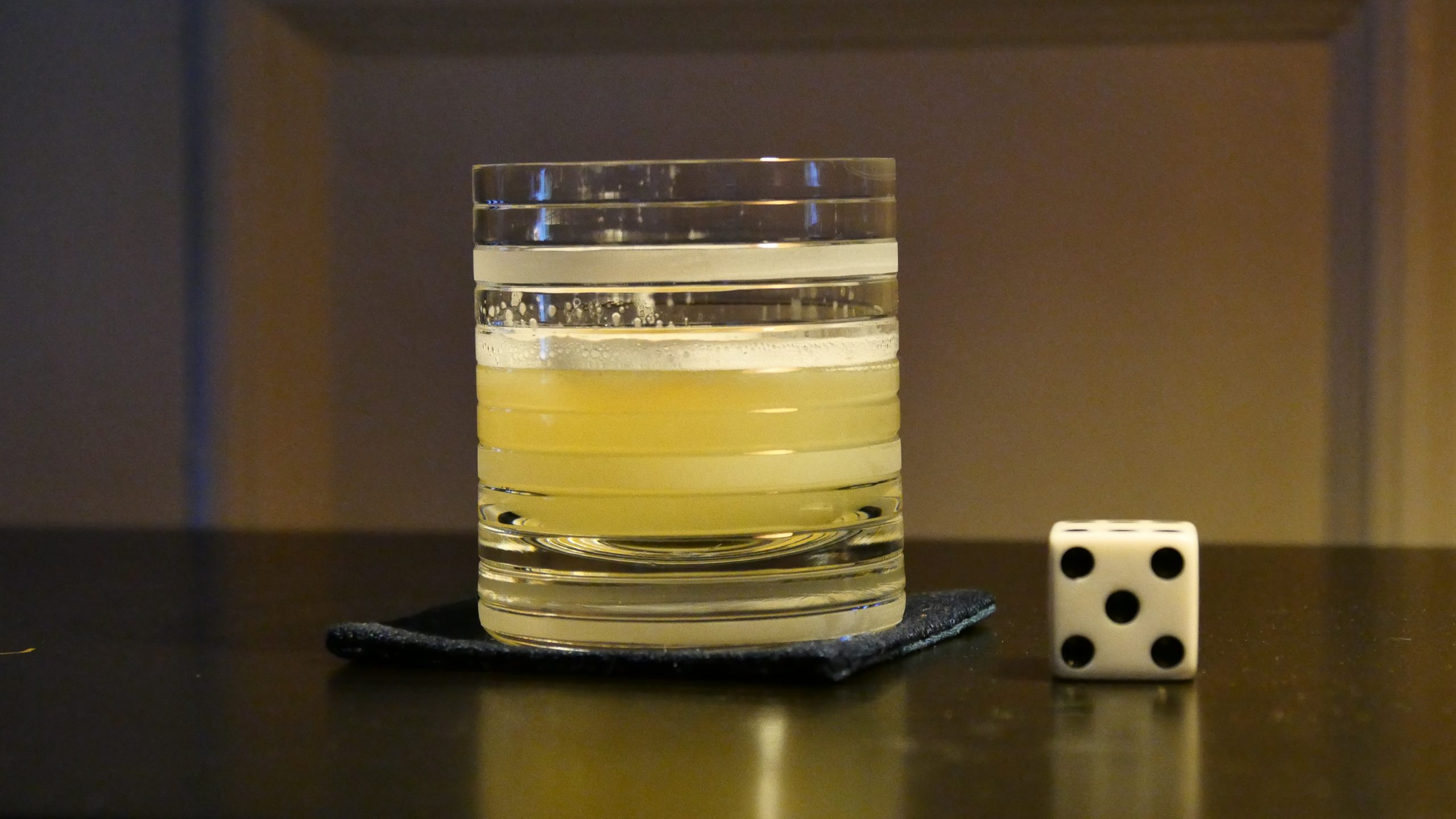 |
| American Visa. Juan Carlos Valdivia. 2005. Bolivia. June 25th, 2017. Pisco Sour. |
 | 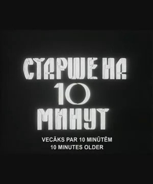 |  |  |
| Ten Minutes Older. Herz Frank. 1978. Latvia. June 30th, 2017. Trampoline. |
 |  | 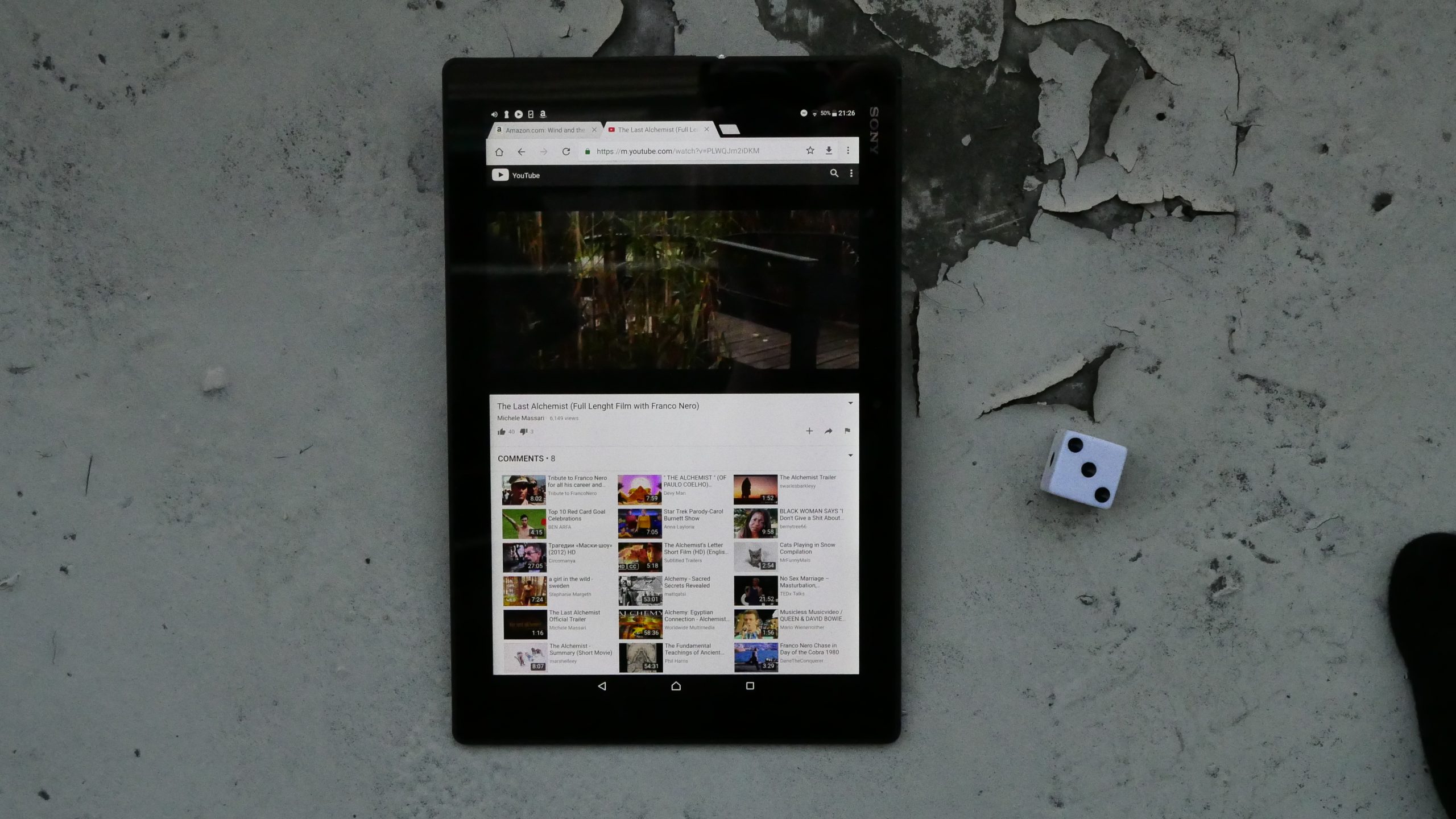 | 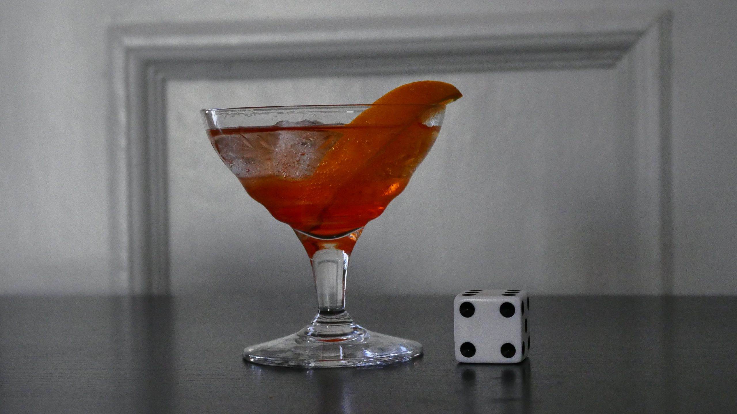 |
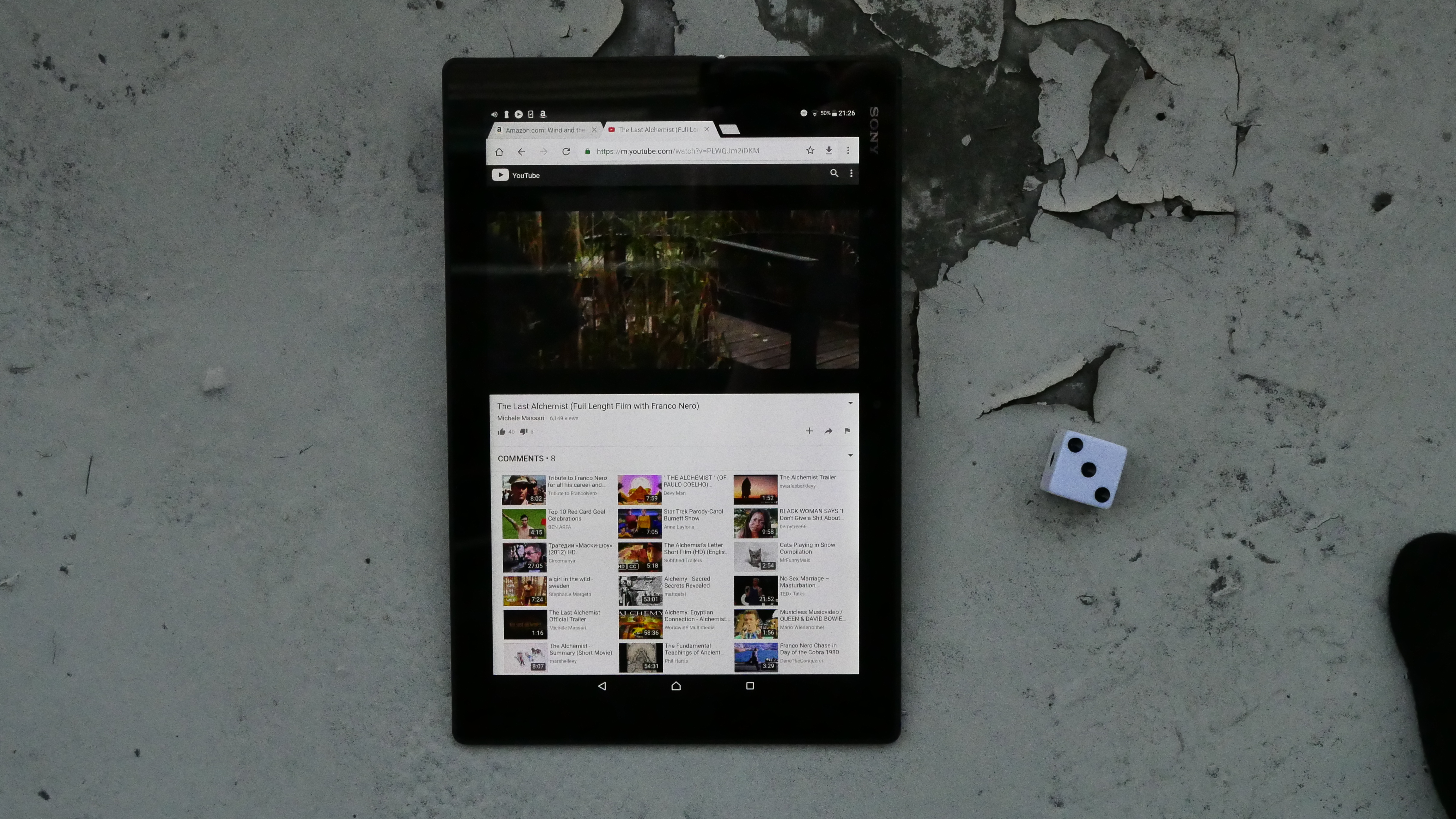
| The Last Alchemist. Michele Massari. 2012. San Marino. June 30th, 2017. Aperol Spritz. |
 | 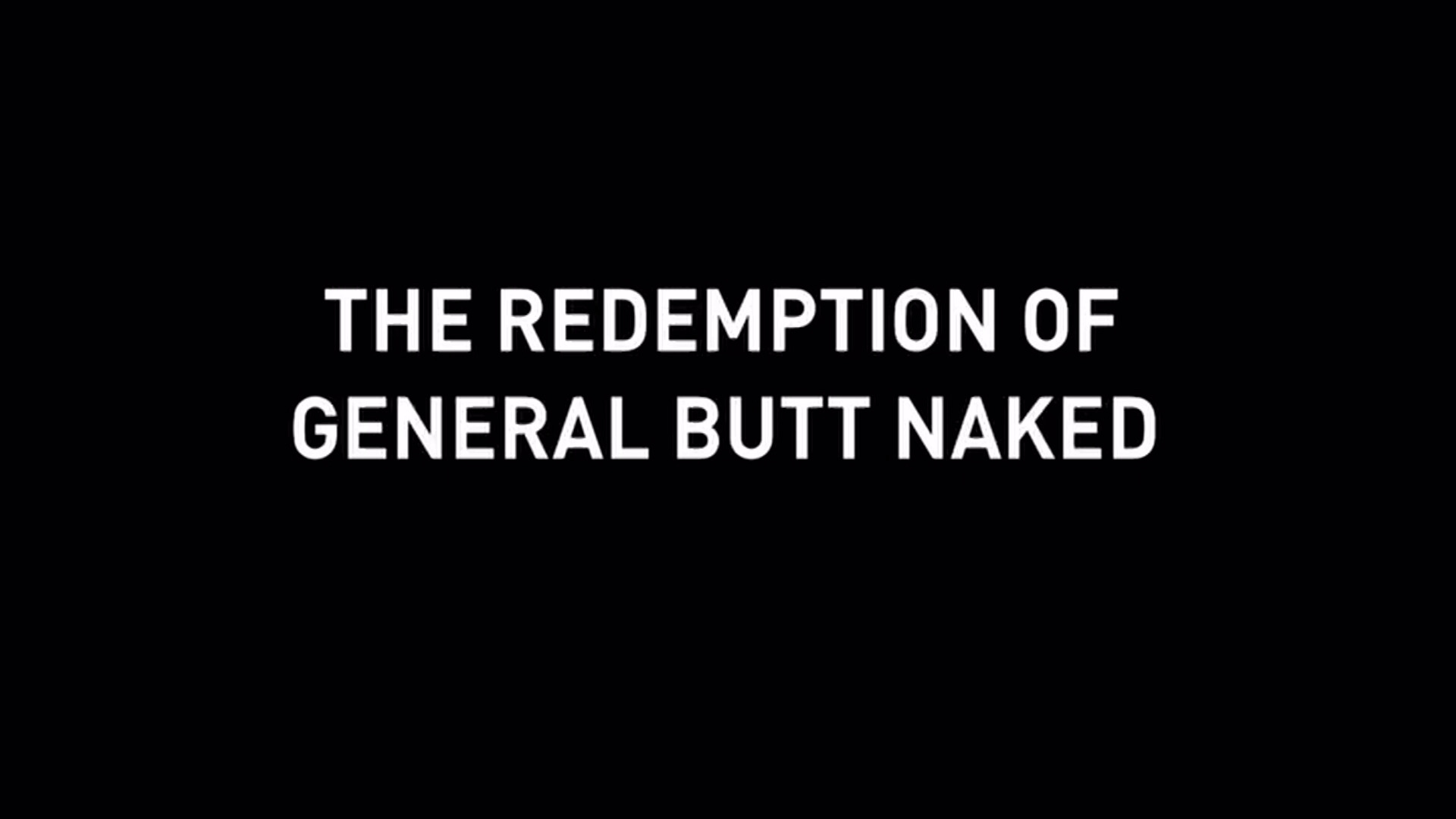 | 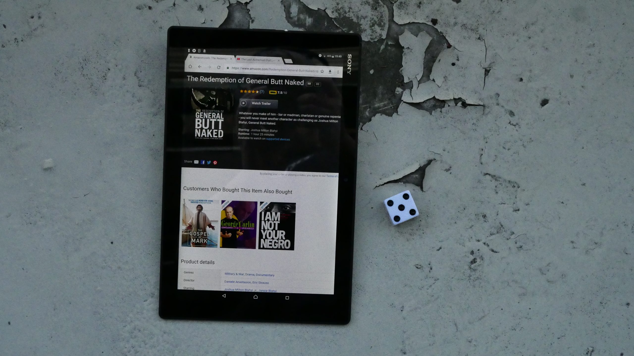 | 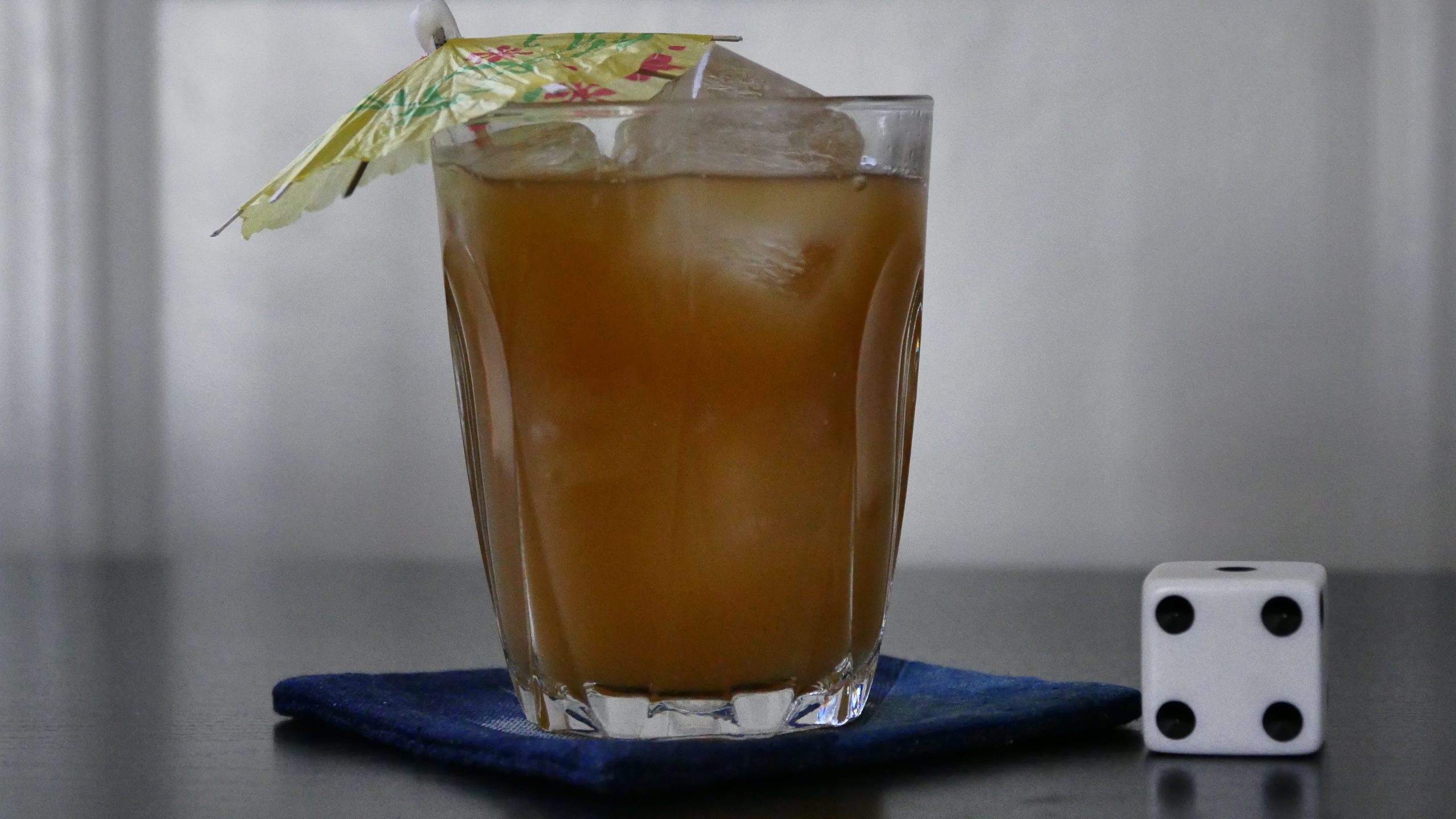 |
| The Redemption of General Butt Naked. Daniele Anastasion and Eric Strauss. 2011. Liberia. July 1st, 2017. Liberian Ginger Beer. |
 | 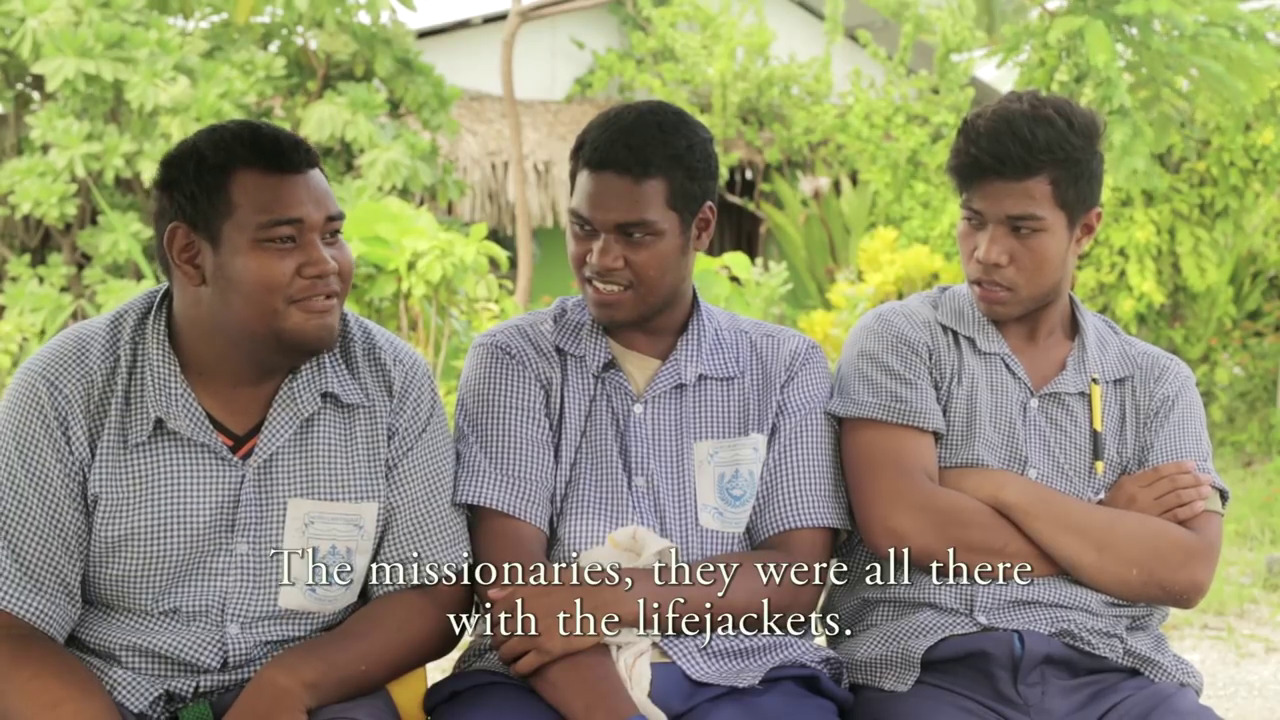 | 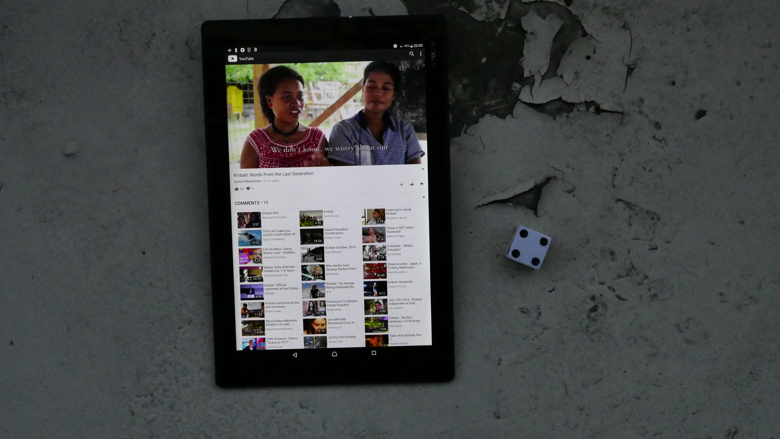 |  |
| Kiribati: Words from the Last Generation. Aurora Brachman & Bradley King . 2017. Kiribati. July 1st, 2017. Kiribati Samoan Poi (Mashed Bananas with Coconut Cream). |
 |  |  | 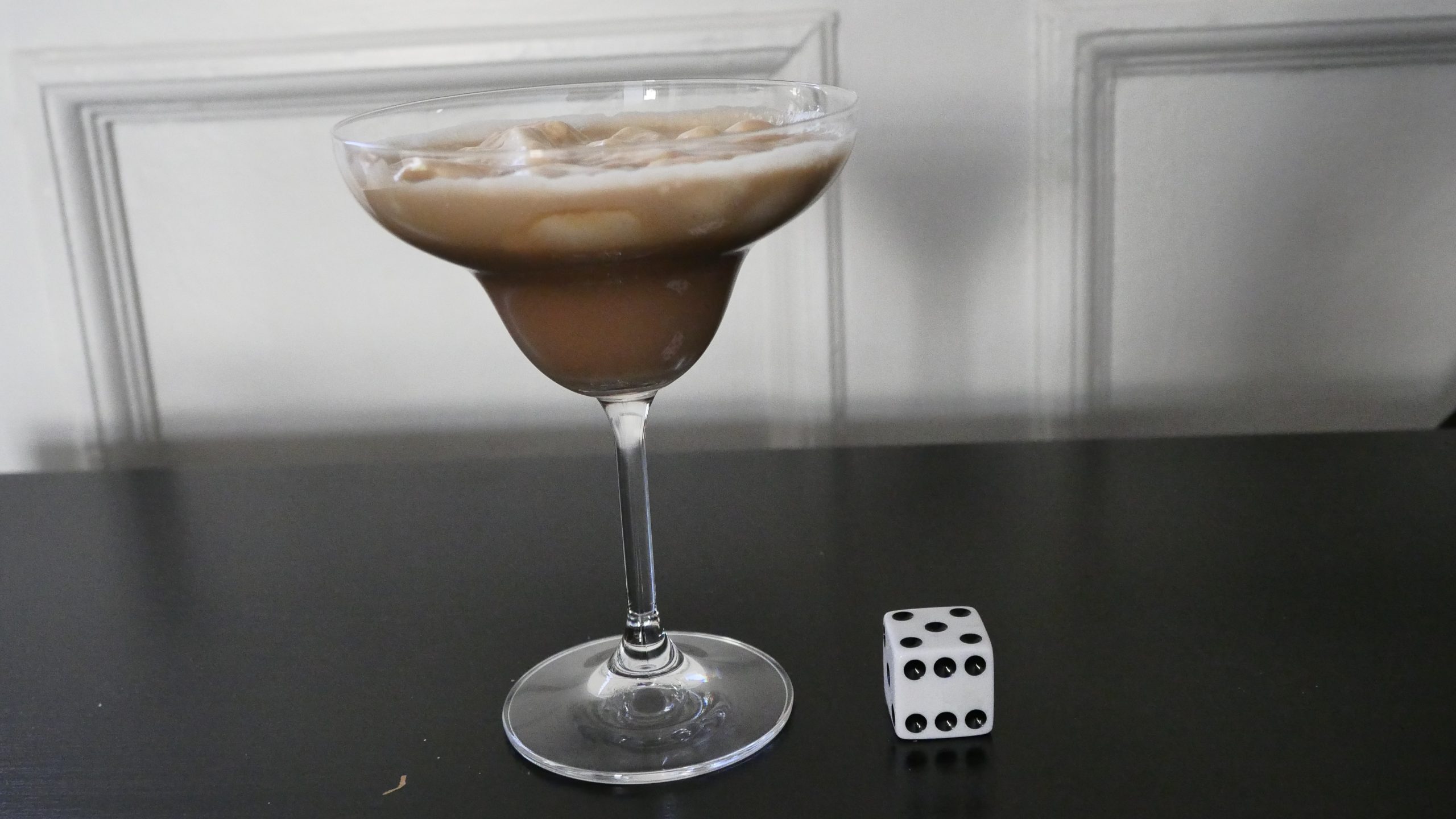 |
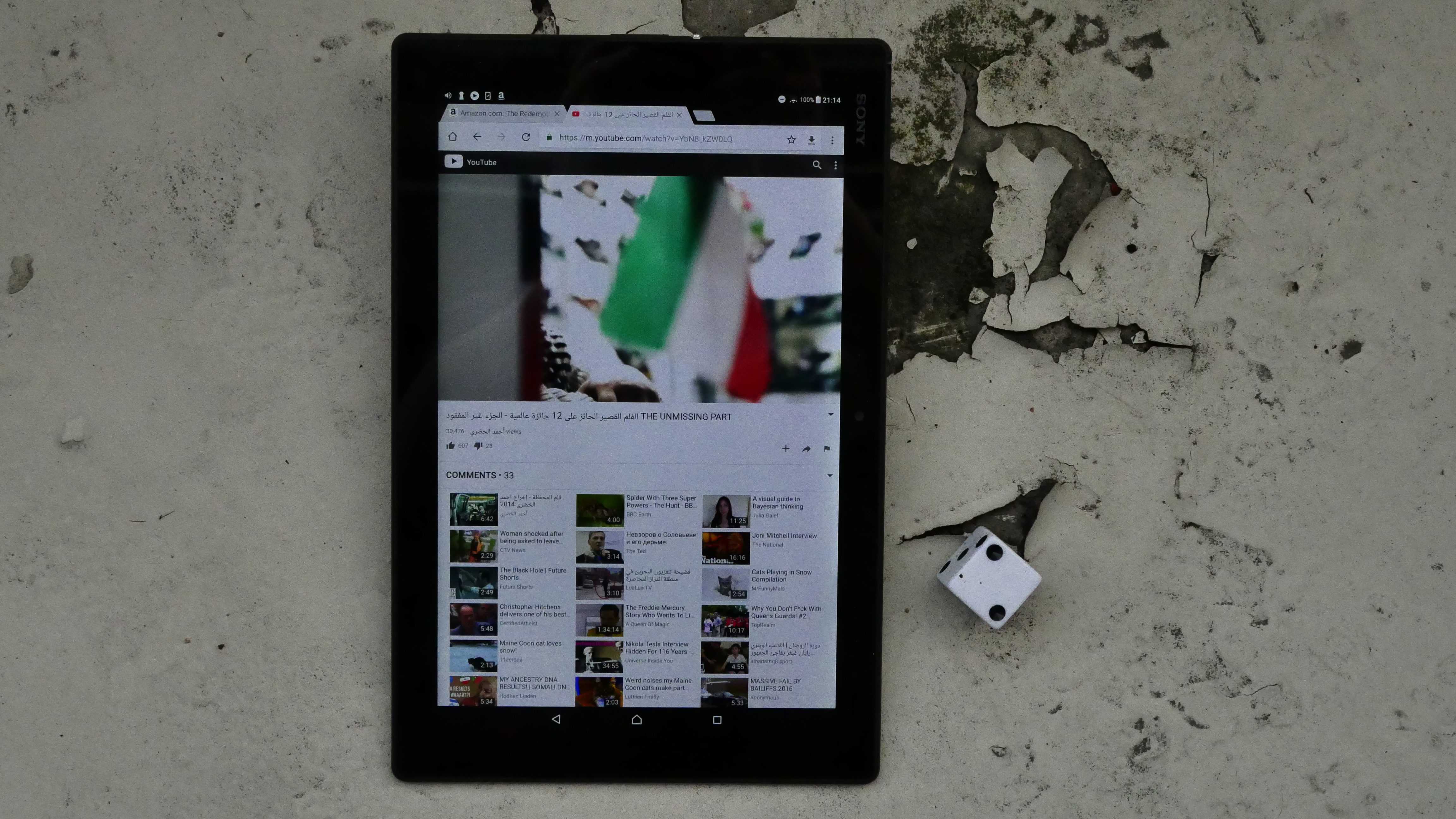
| The Unmissing Part. Ahmad Abdullah Alkhudari . 2016. Kuwait. July 3rd, 2017. Caramel – Swirl Hot Chocolate. |
 | 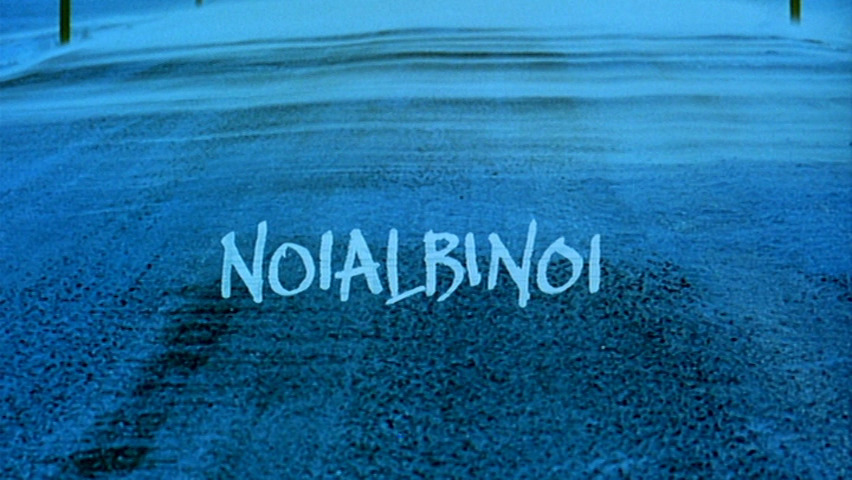 | 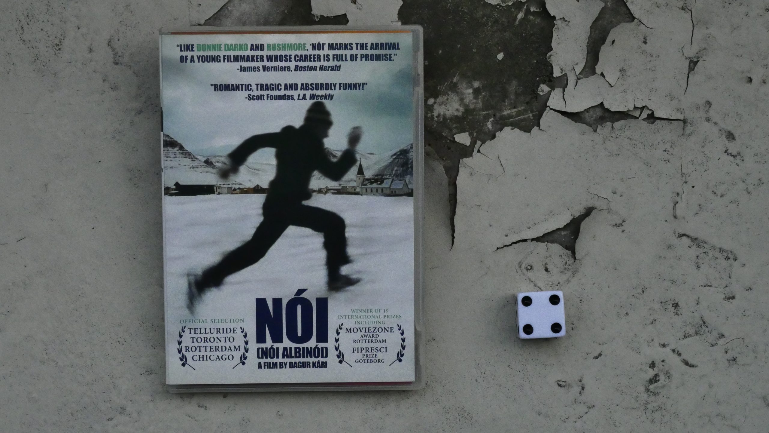 |  |
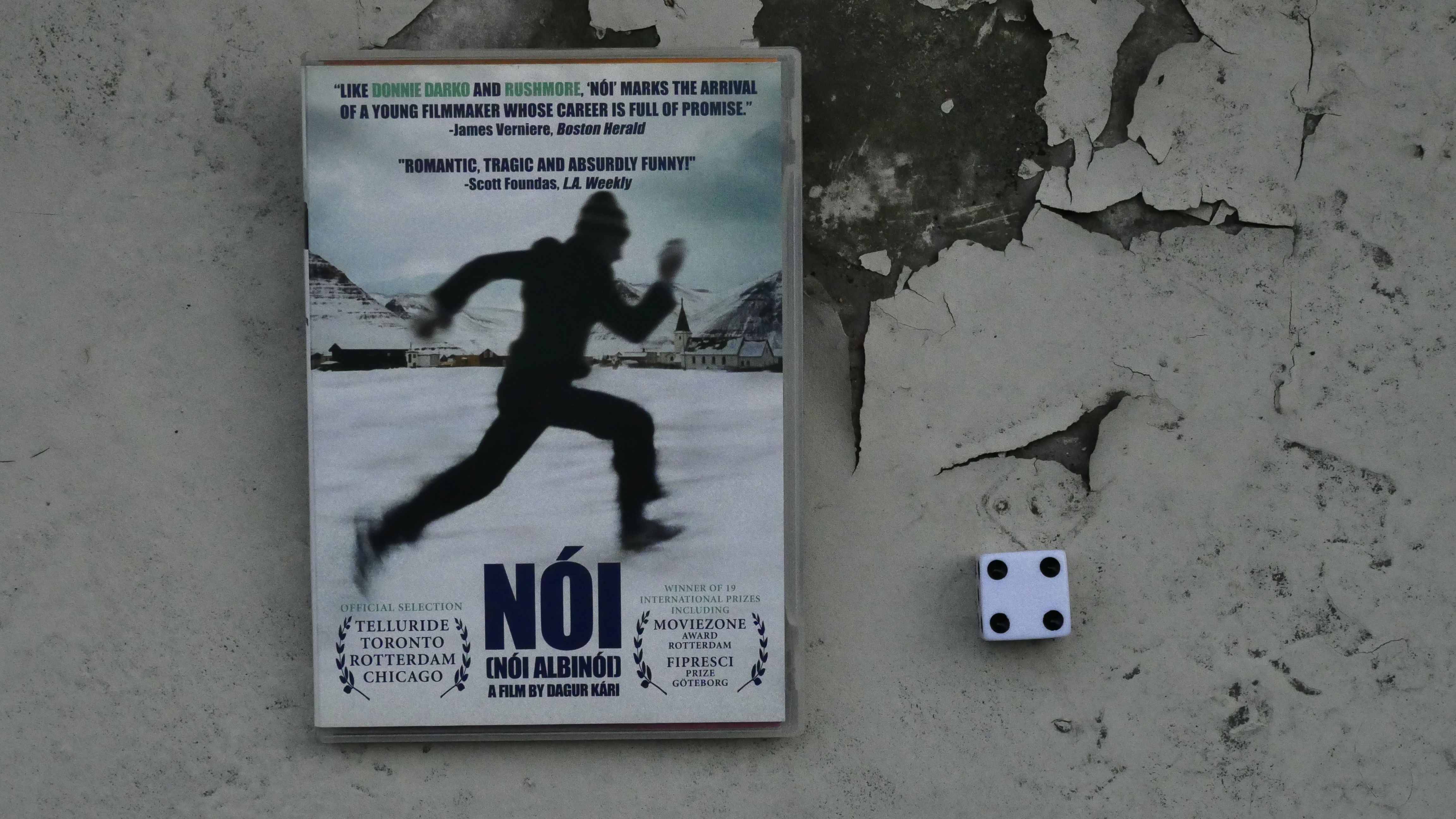
| Noi the Albino. Dagur Kári. 2003. Iceland. July 15th, 2017. Iceberg Paralyzer. |
 | 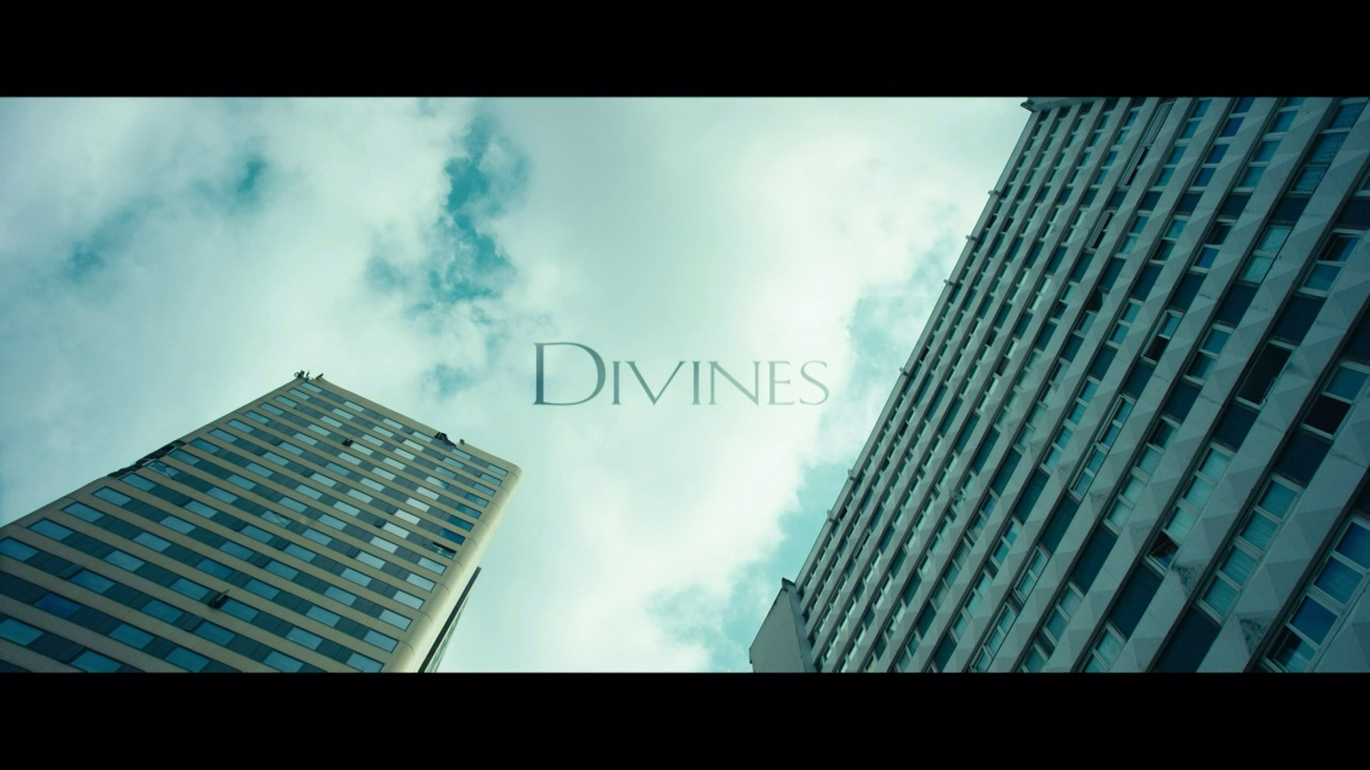 |  |  |
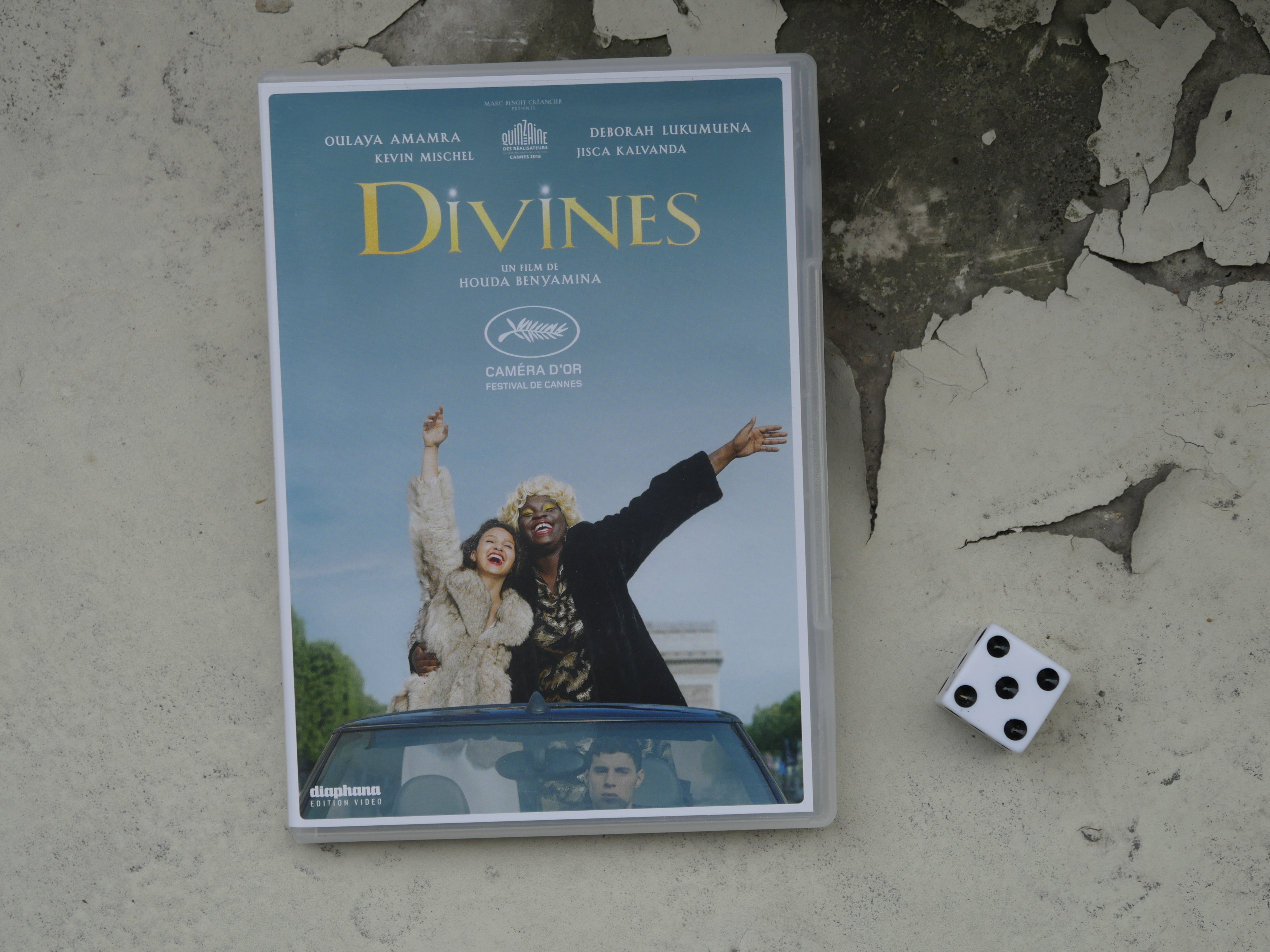
| Divines. Houda Benyamina. 2016. Qatar. July 21st, 2017. Official Bullfrog Cocktail. |
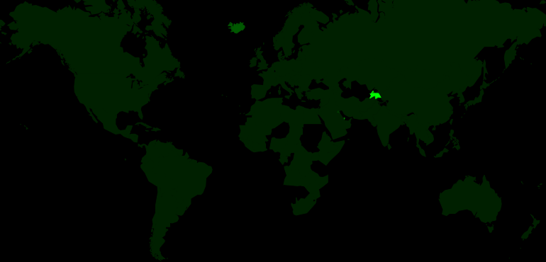 | 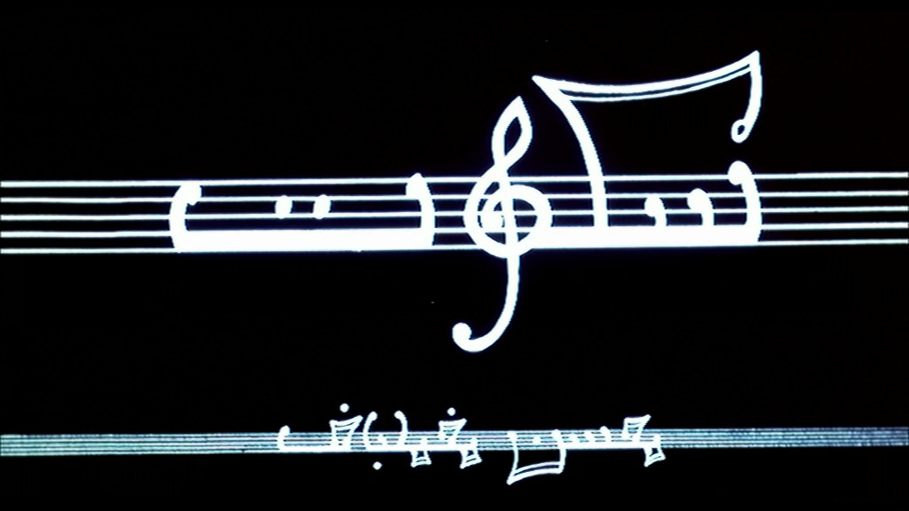 | 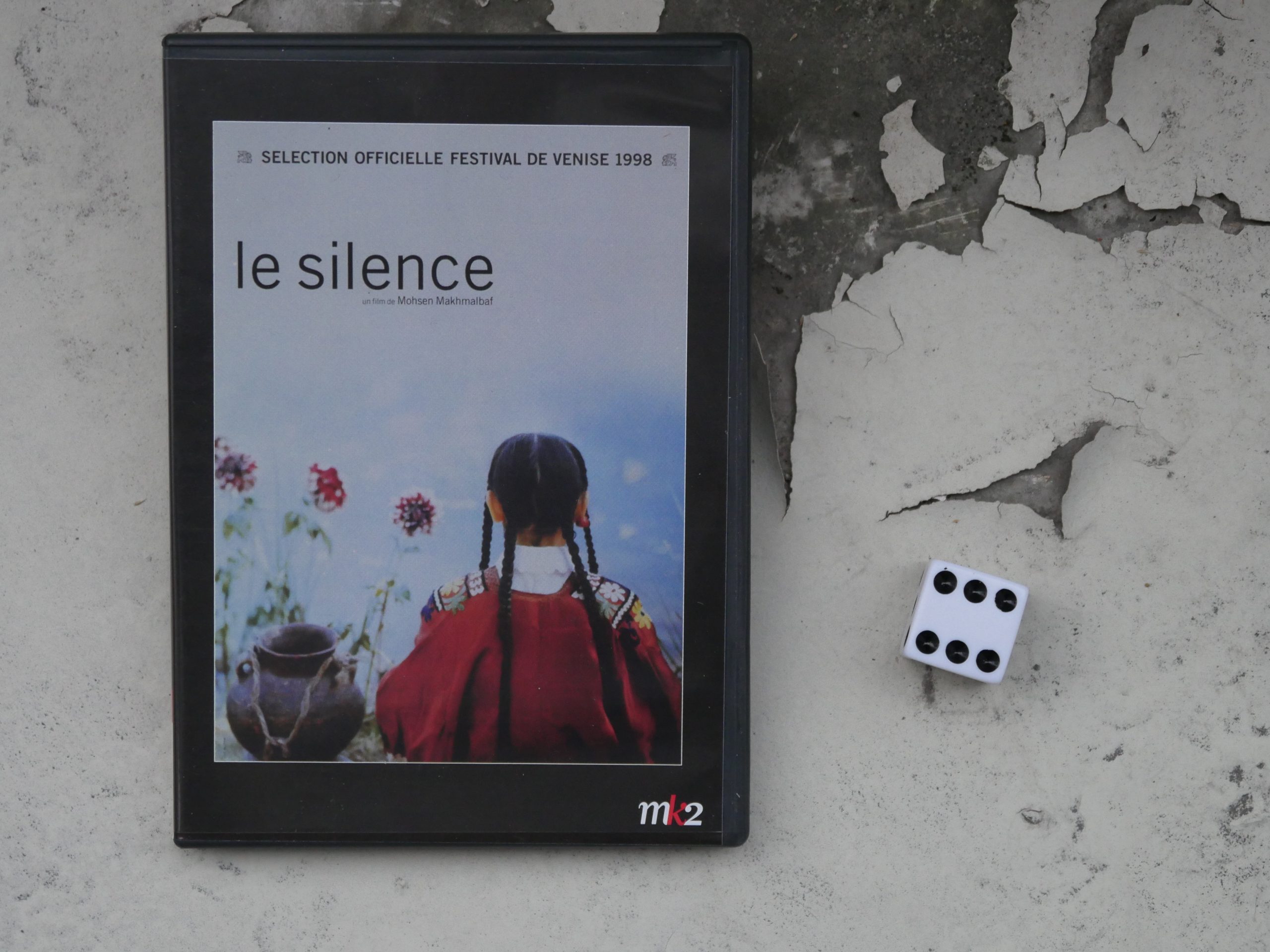 | 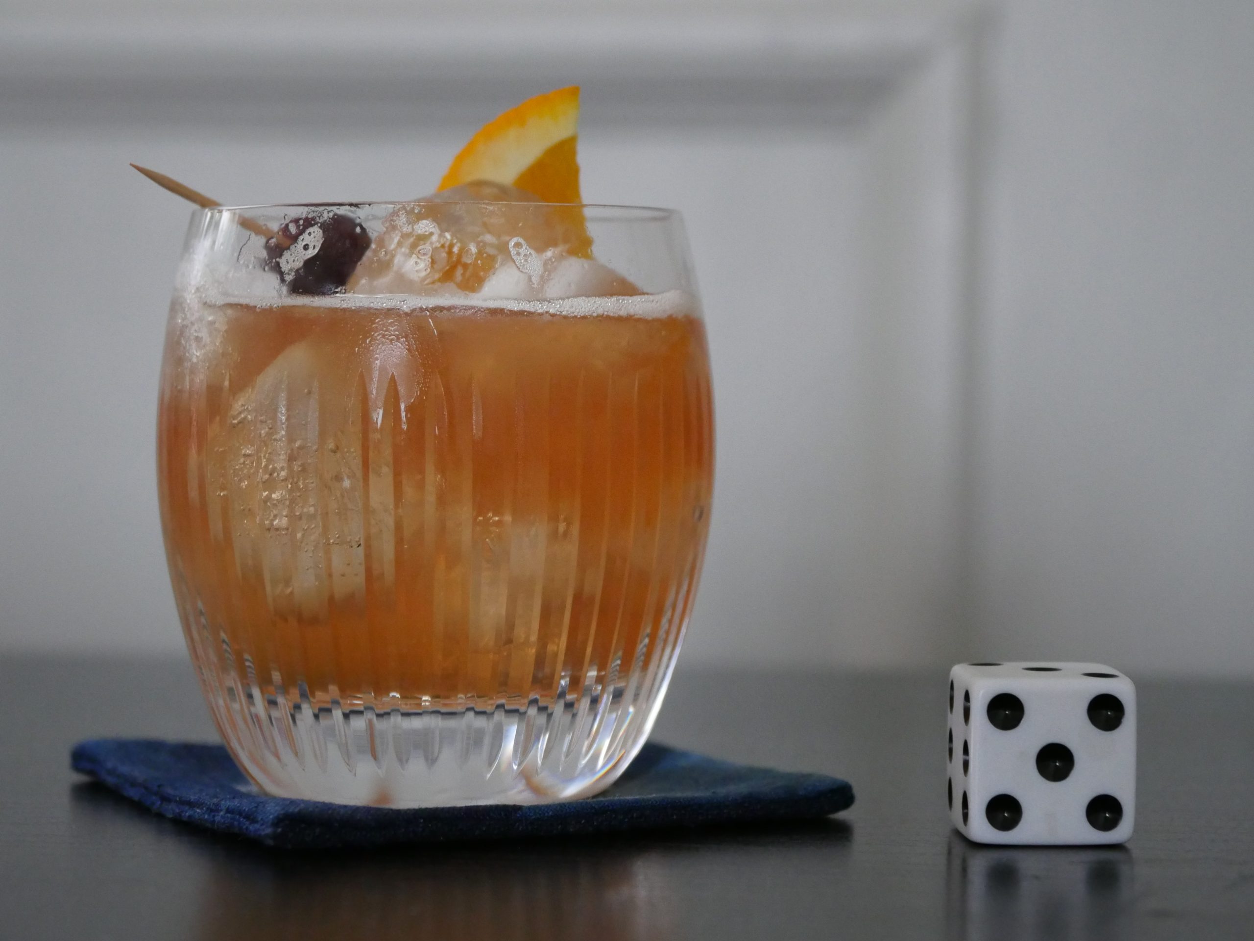 |
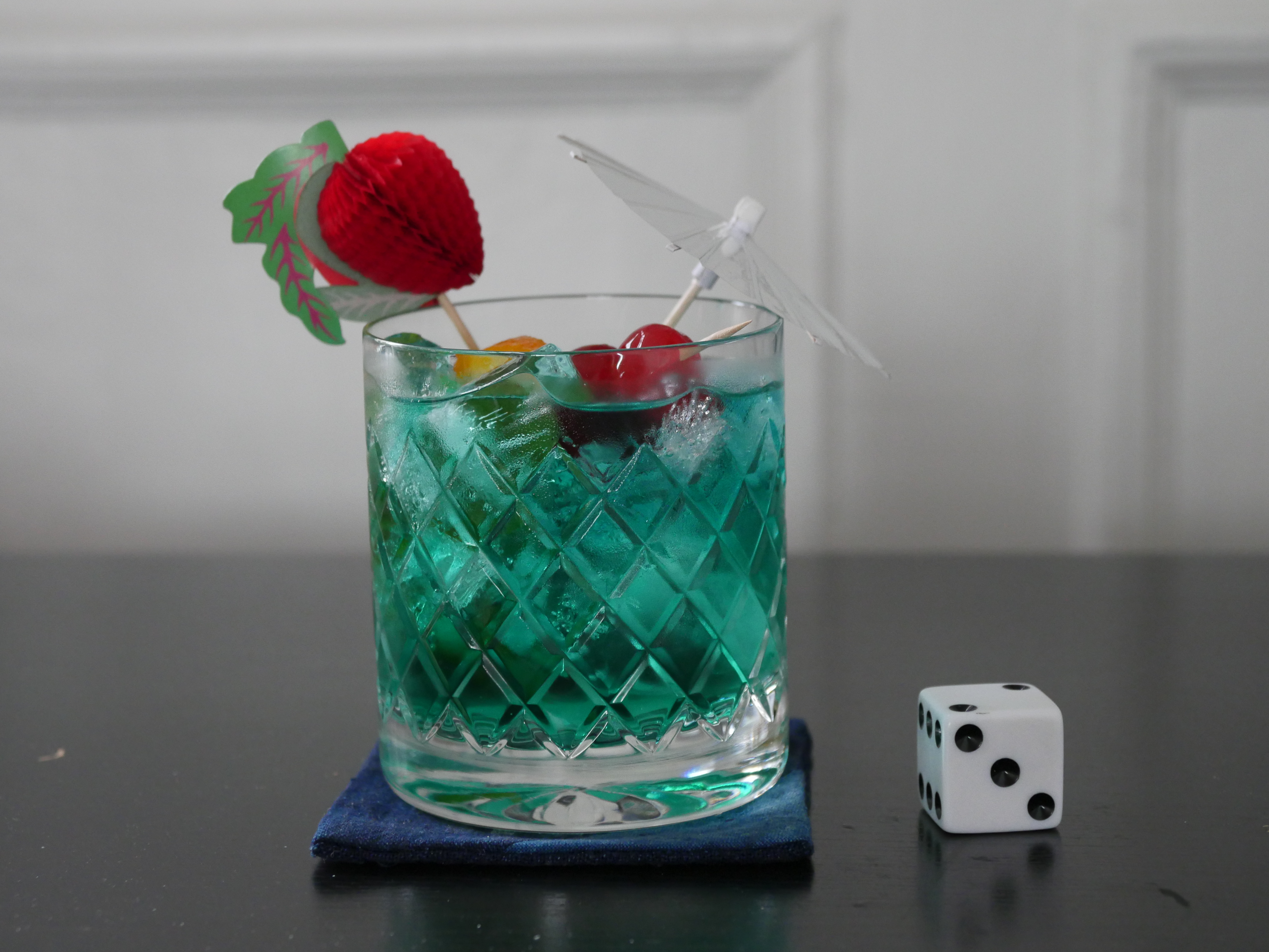
| The Silence. Mohsen Makhmalbaf. 1998. Tajikistan. July 21st, 2017. Boulder Tangerine Bourbon Sour. |
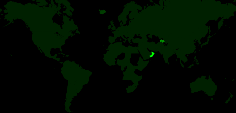 | 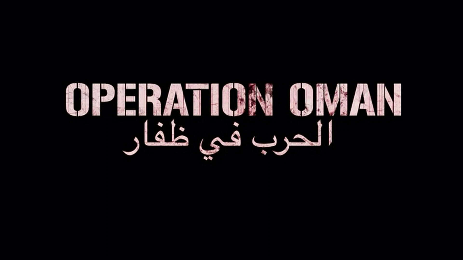 | 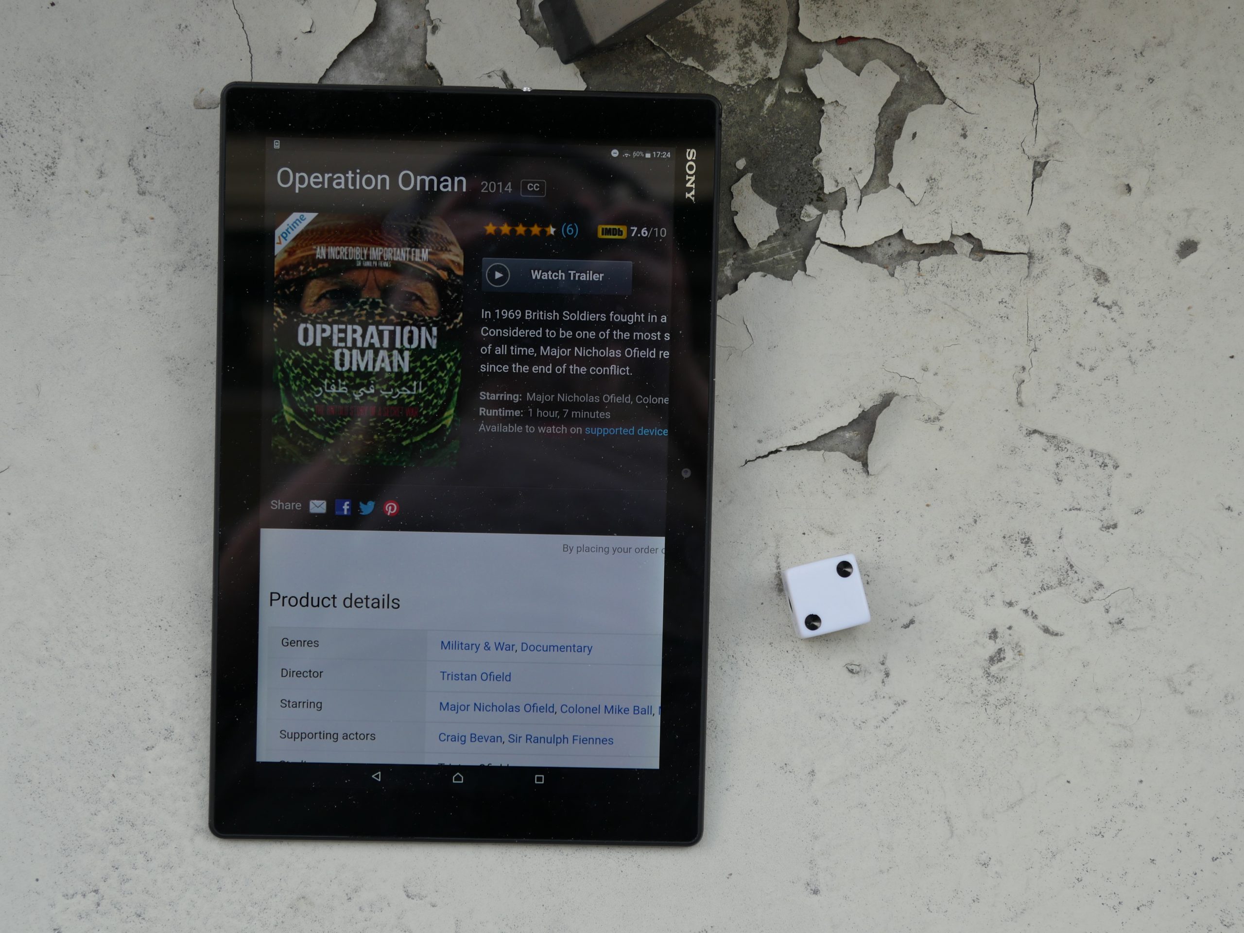 | 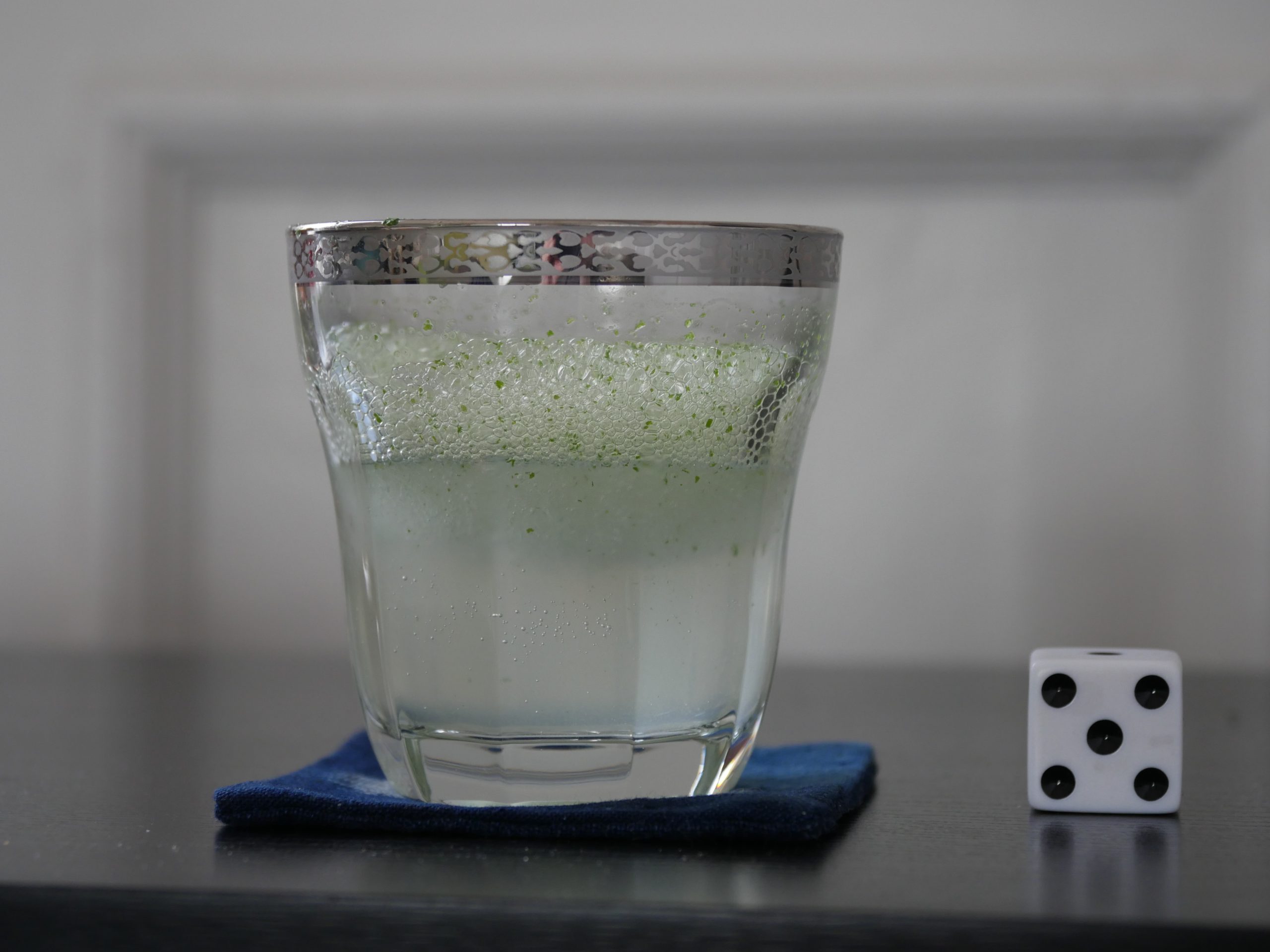 |
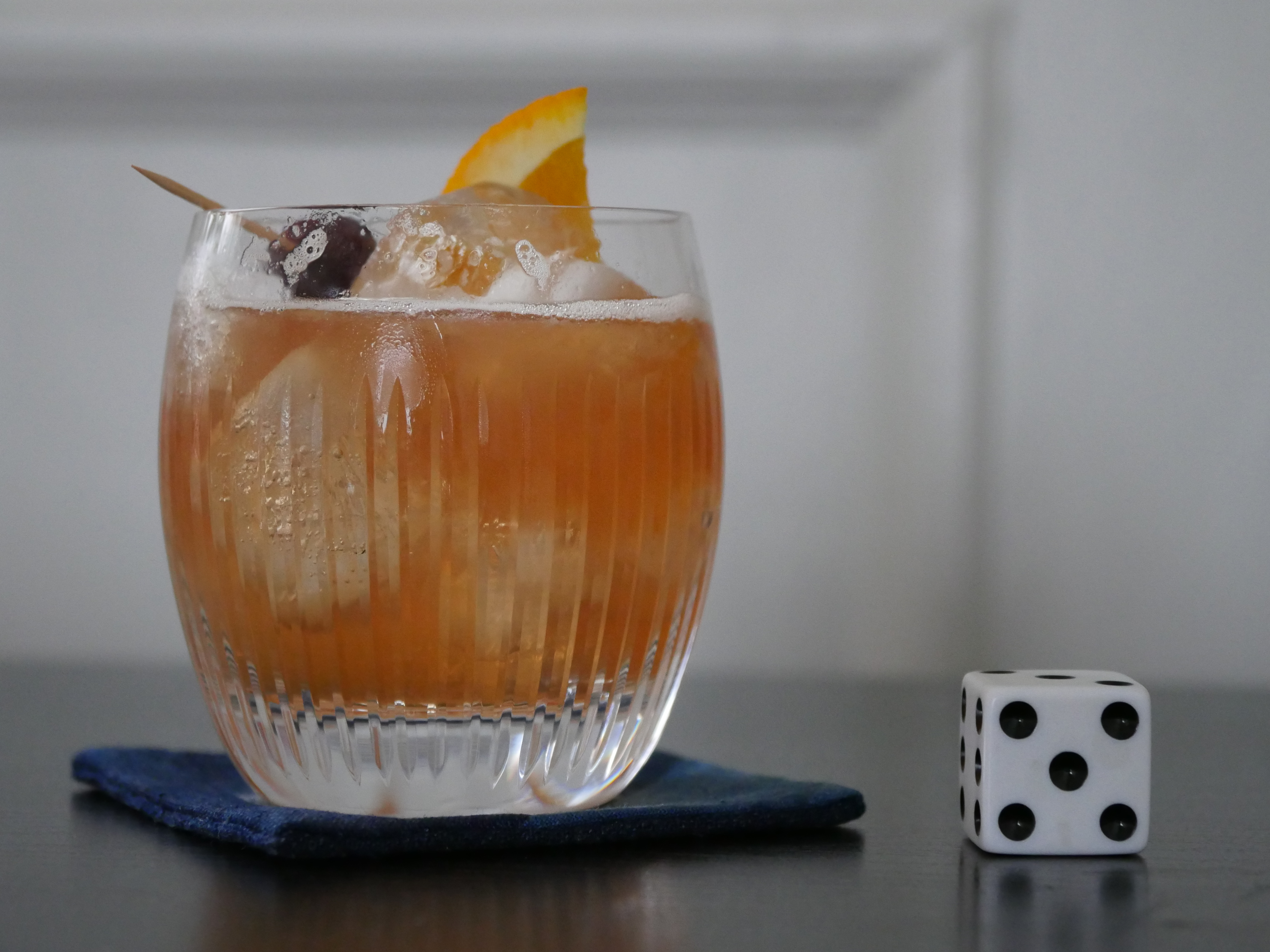
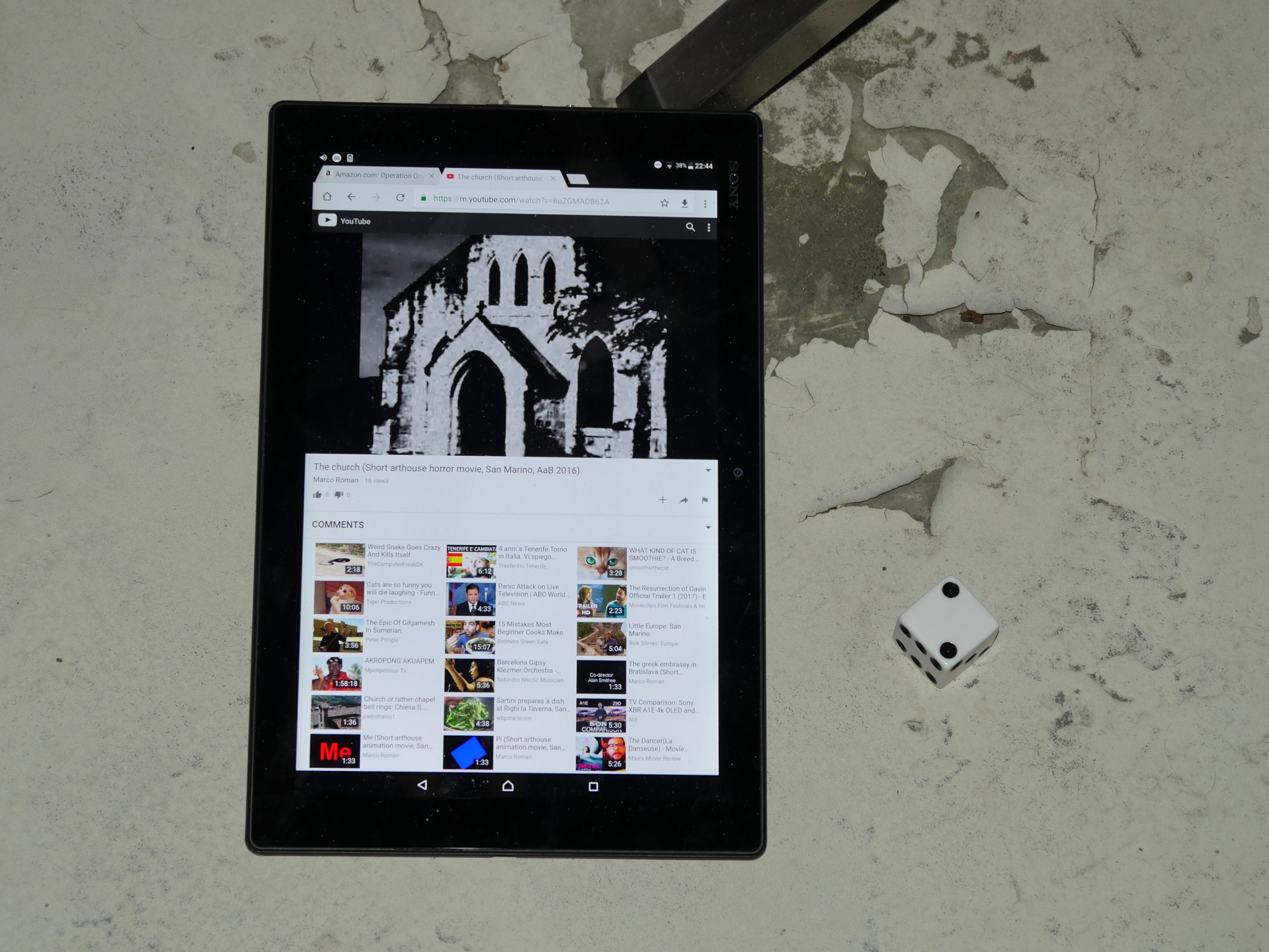
| Operation Oman. Tristan Ofield. 2014. Oman. July 22nd, 2017. Mint Lemonade. |
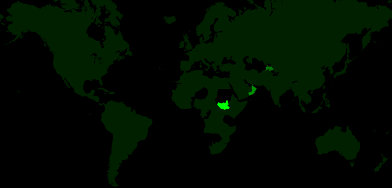 | 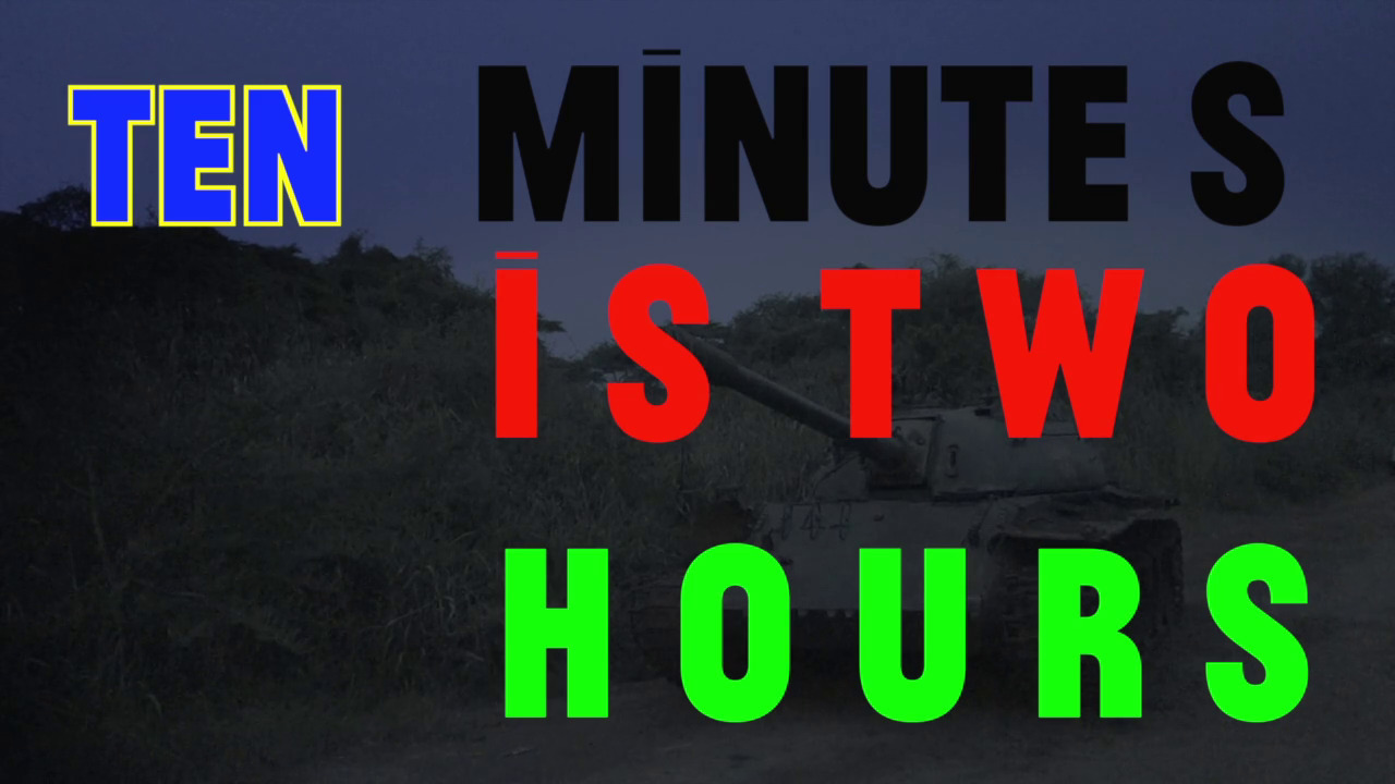 |  |  |
| Ten Minutes is Two Hours. Patrick Kennelly. 2013. South Sudan. July 22nd, 2017. Kerkede. |
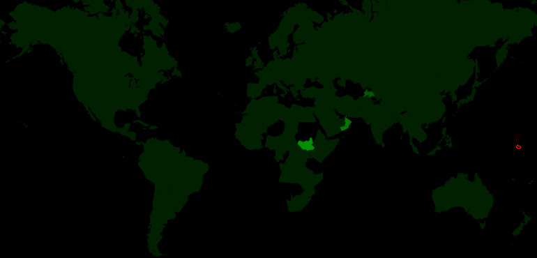 |  |  |  |
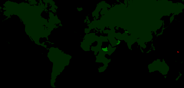
| Nauru 1973. Unknown. 1973. Nauru. July 23rd, 2017. Nauru Iced Coffee. |
 |  |  | 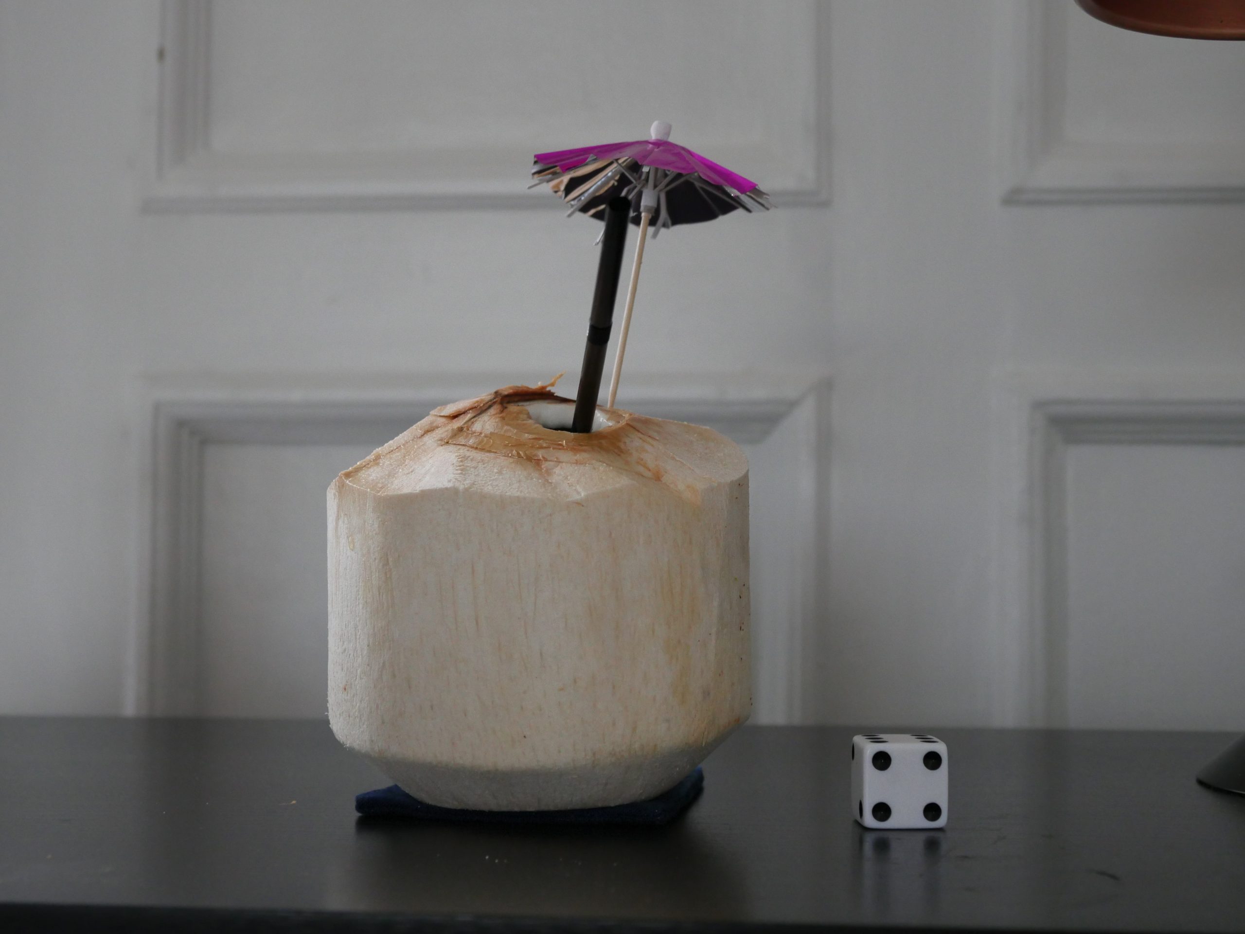 |
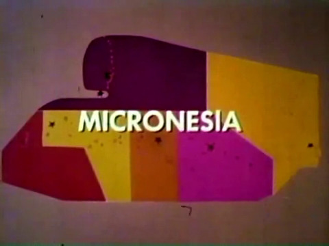
| Who I Am. Andrew Lloren. 2015. Micronesia. July 24th, 2017. Flaming Coconut. |
 |  |  |  |
| The Church. Marco Romano. 2016. Antigua and Barbuda. July 25th, 2017. Antiguan Smile Cocktail. |
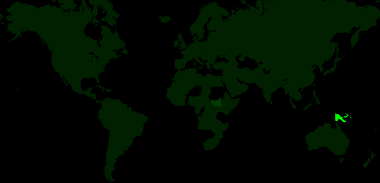 | 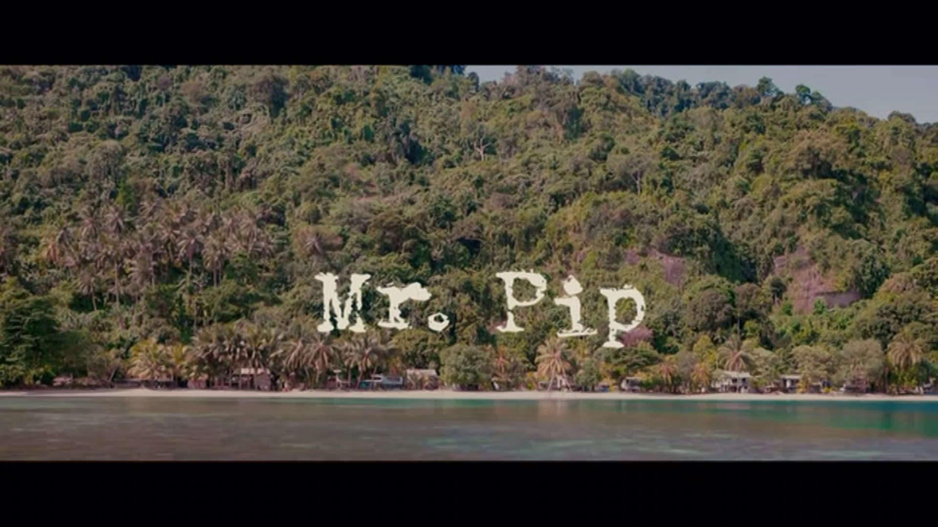 | 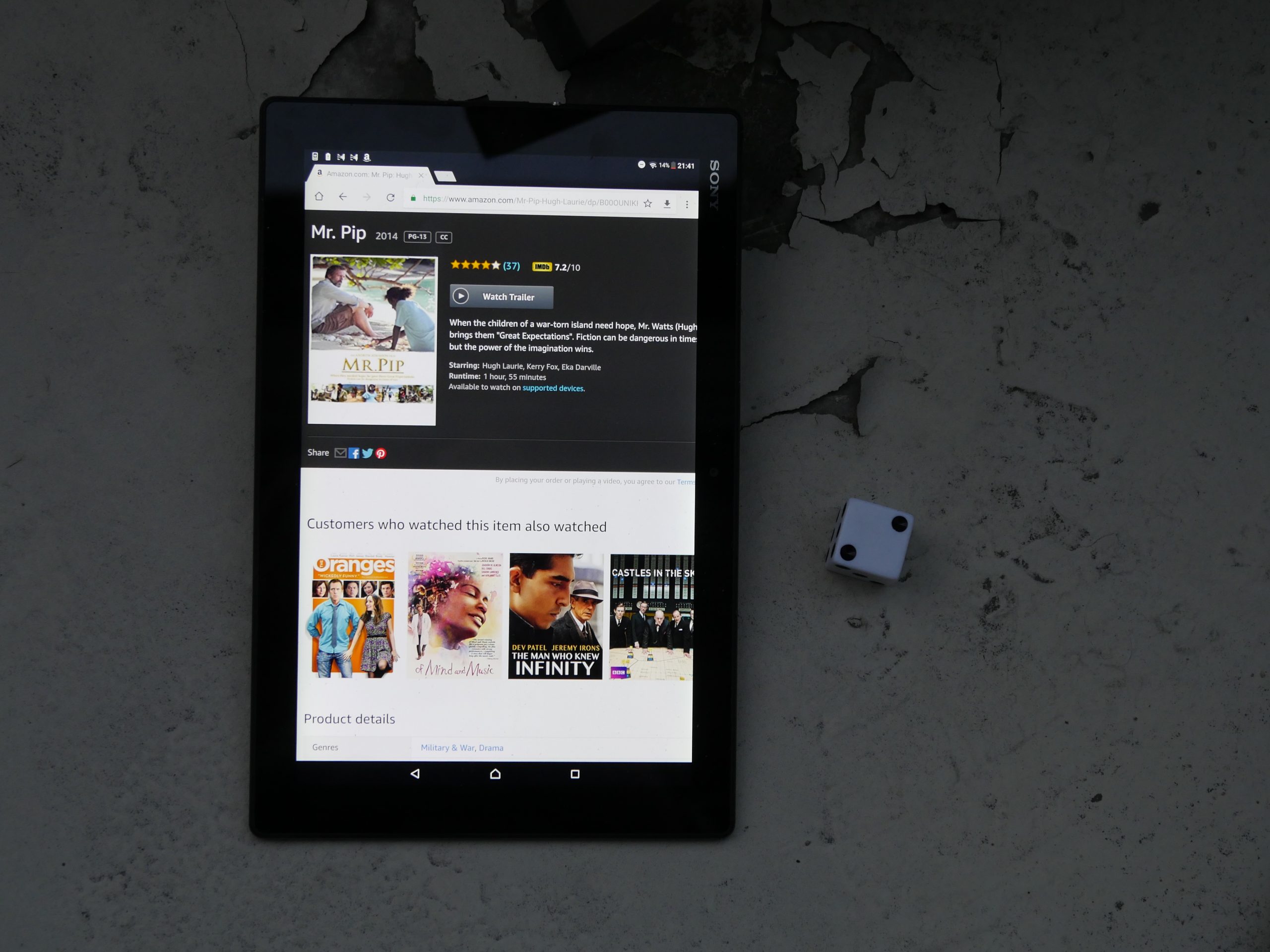 |  |
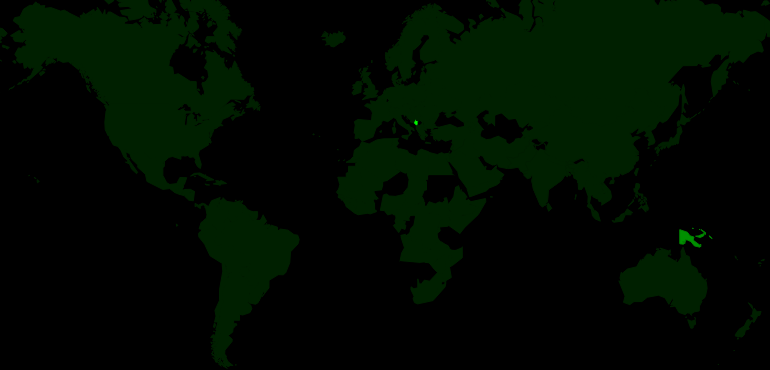
| Mr. Pip. Andrew Adamson. 2012. Papua New Guinea. August 1st, 2017. Lychee martini. |
 | 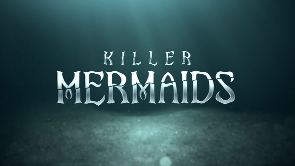 | 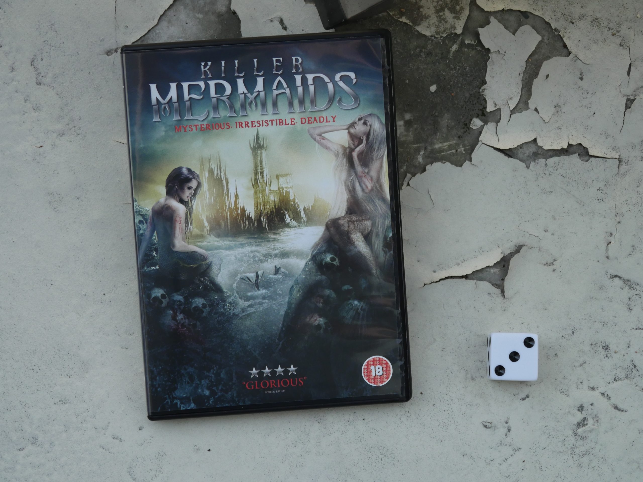 |  |
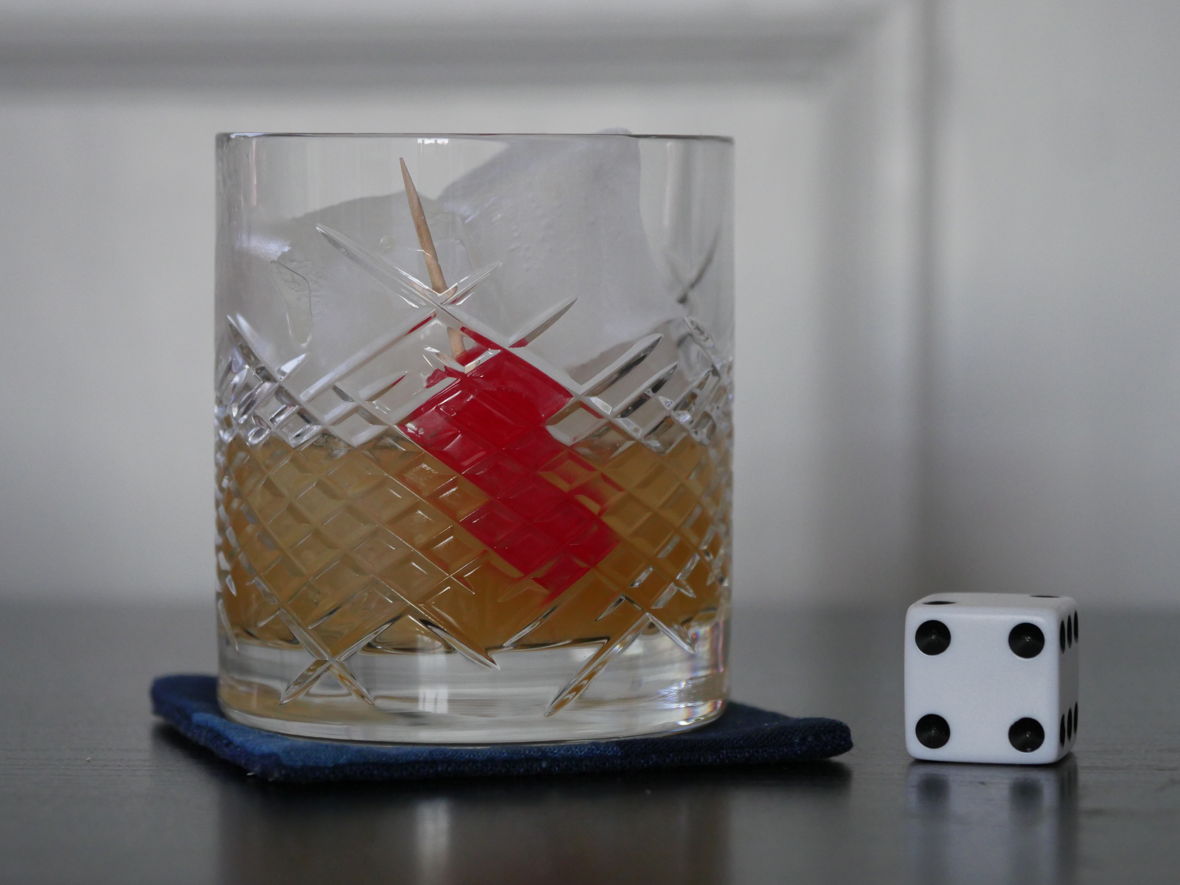
| Killer Mermaids. Milan Todorovic. 2014. Montenegro. August 2nd, 2017. Montenegro Non Troppo. |
 |  | 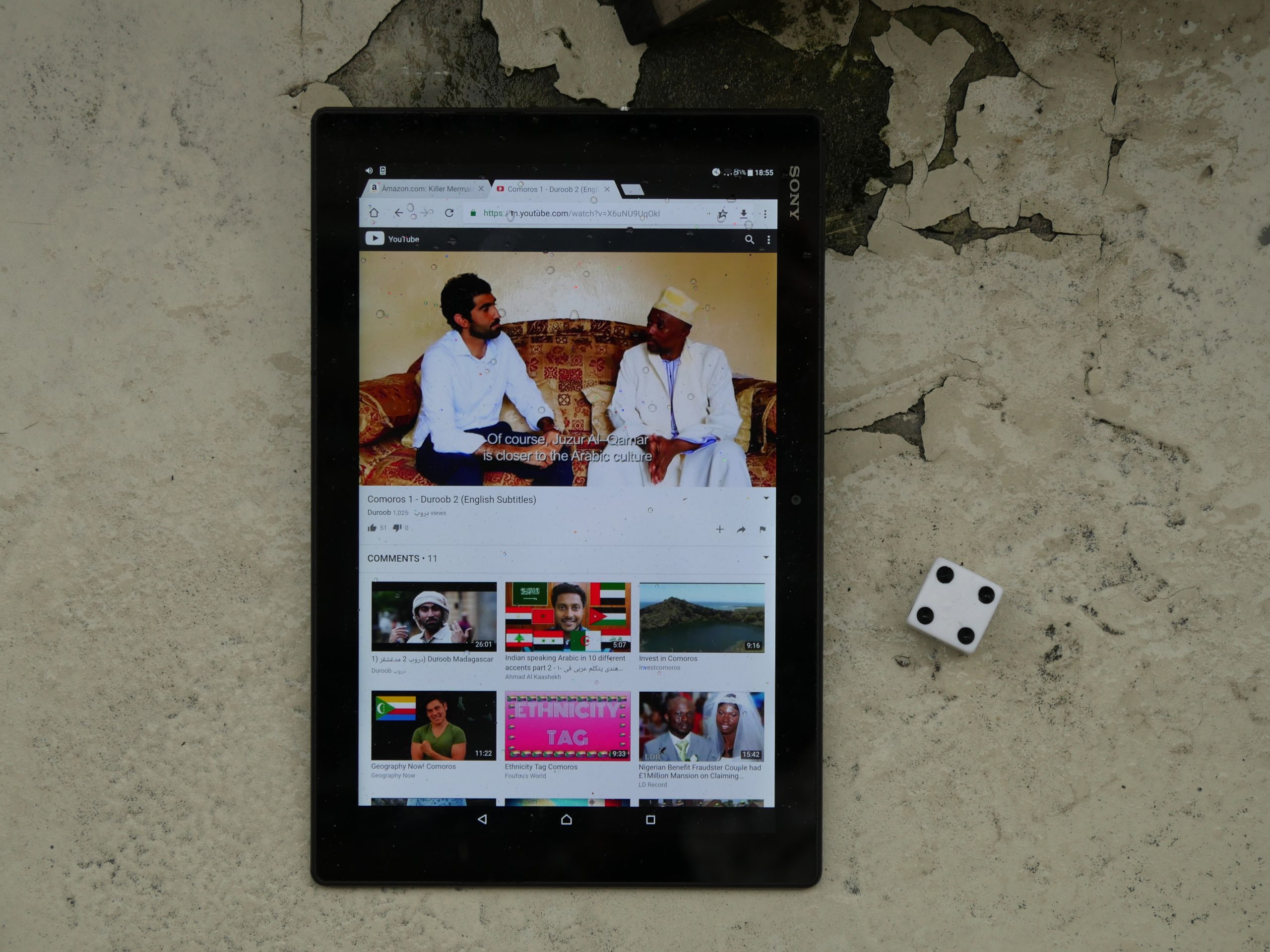 |  |
| Duroob Season 2 Episode 1: Comoros. Unknown. 2016. Comoros. August 4th, 2017. Vanilla Margarita. |
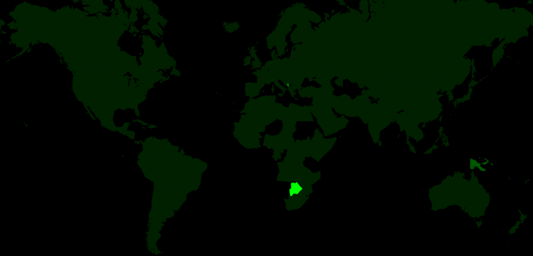 |  |  |  |
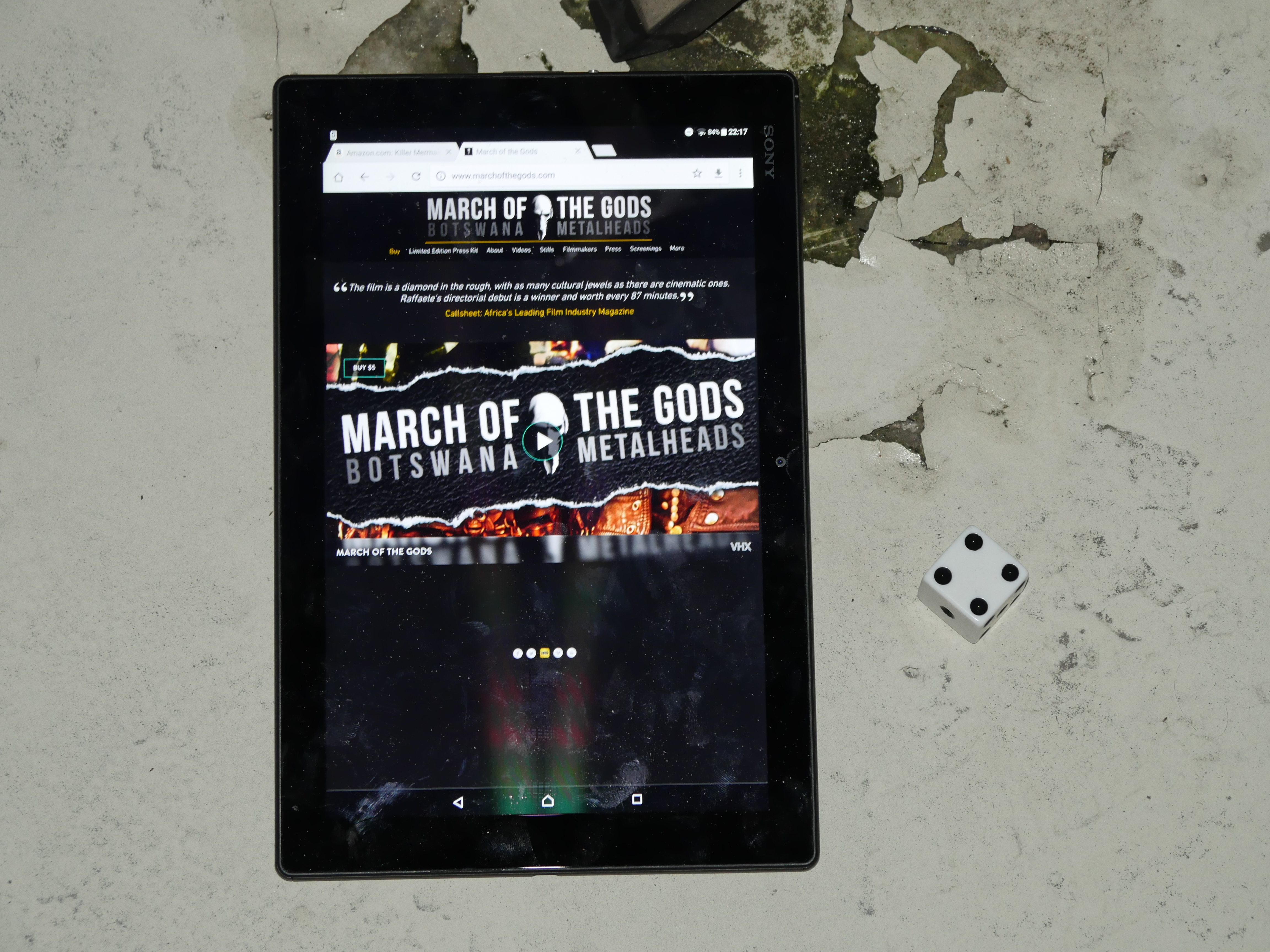
| March of the Gods: Botswana Metalheads. Raffaele Mosca. 2014. Botswana. August 4th, 2017. Rooibos Tea Punch. |
 | 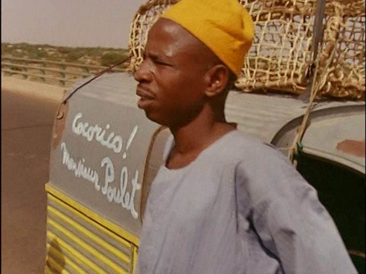 | 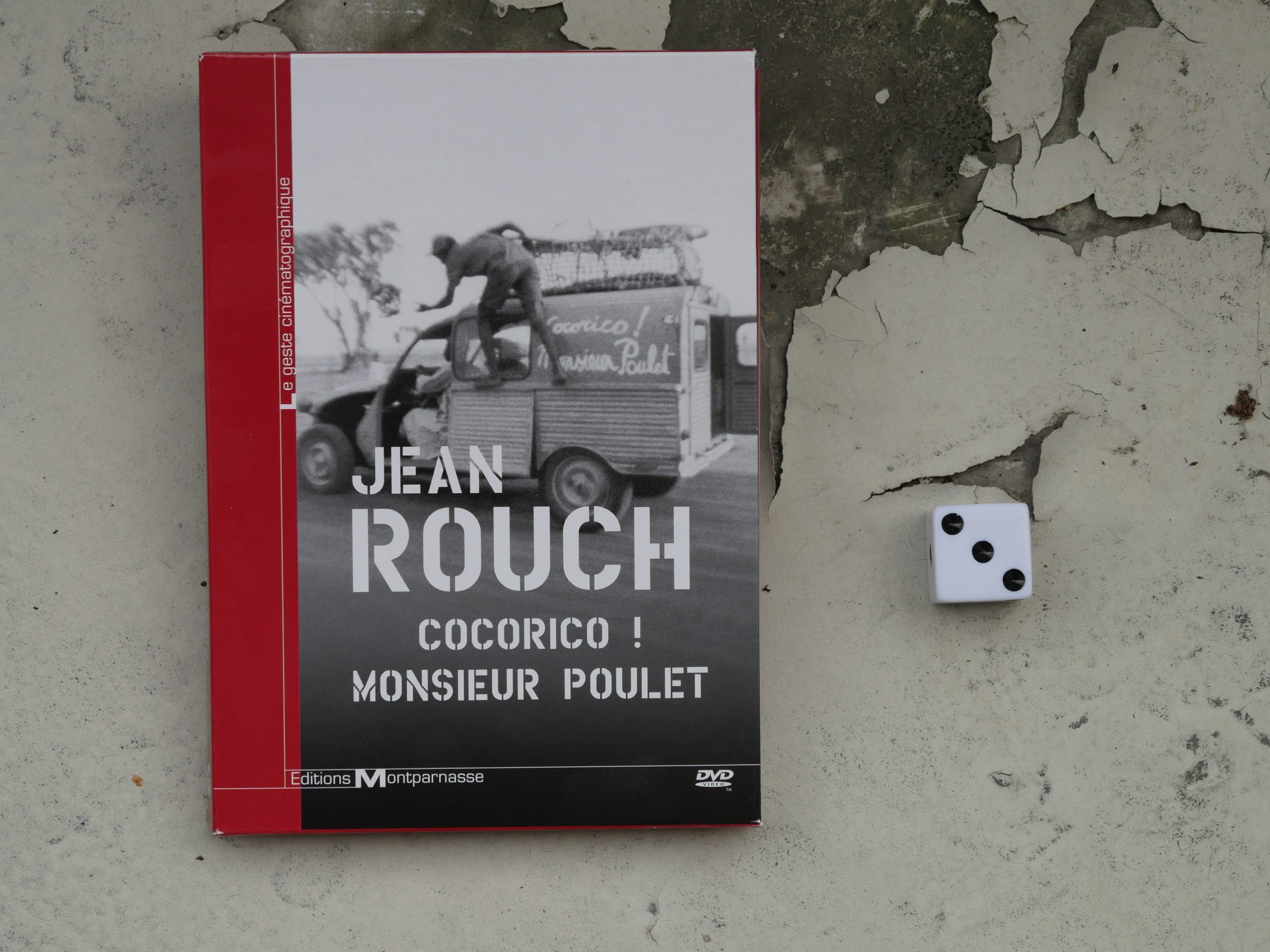 | 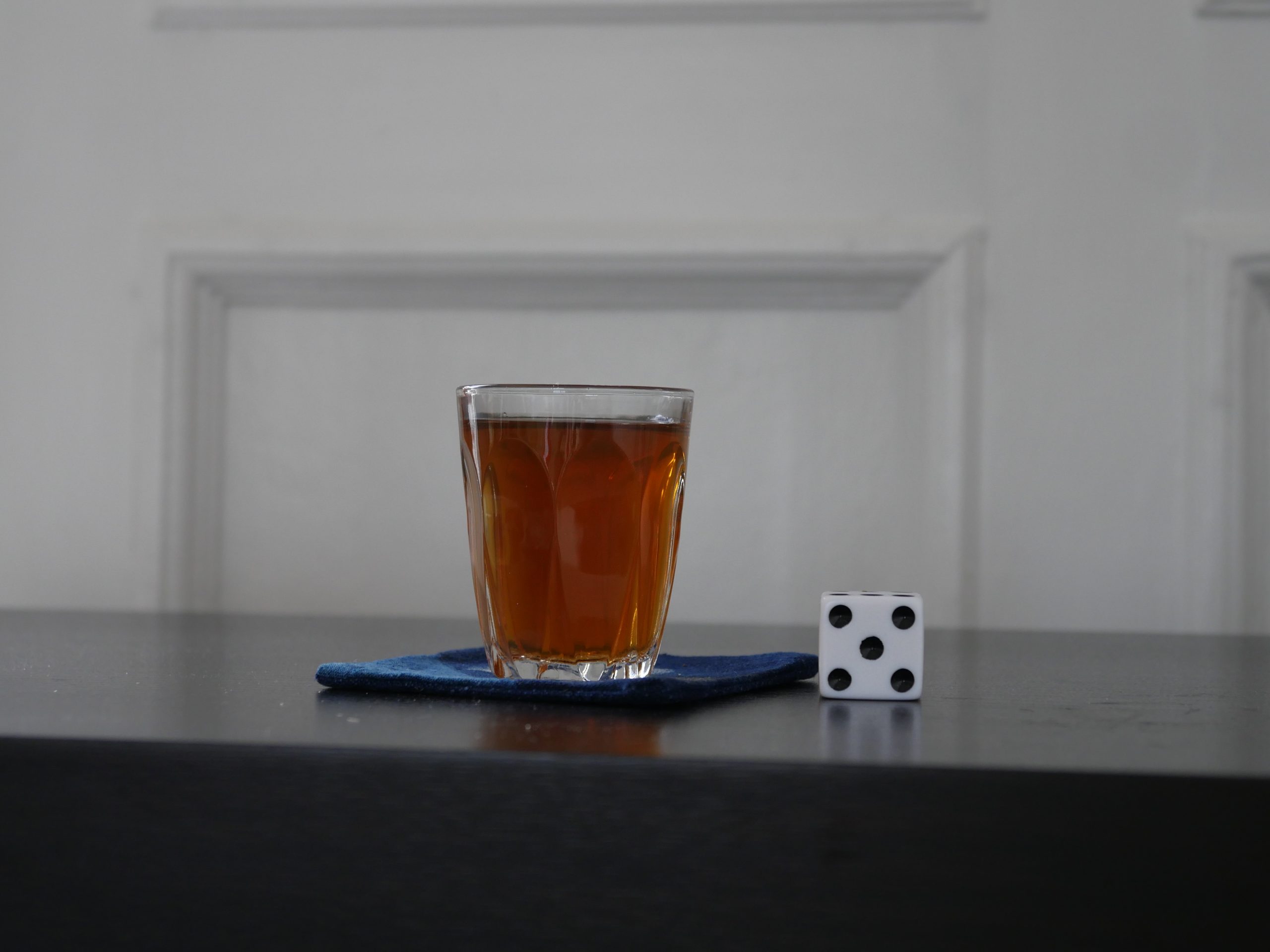 |
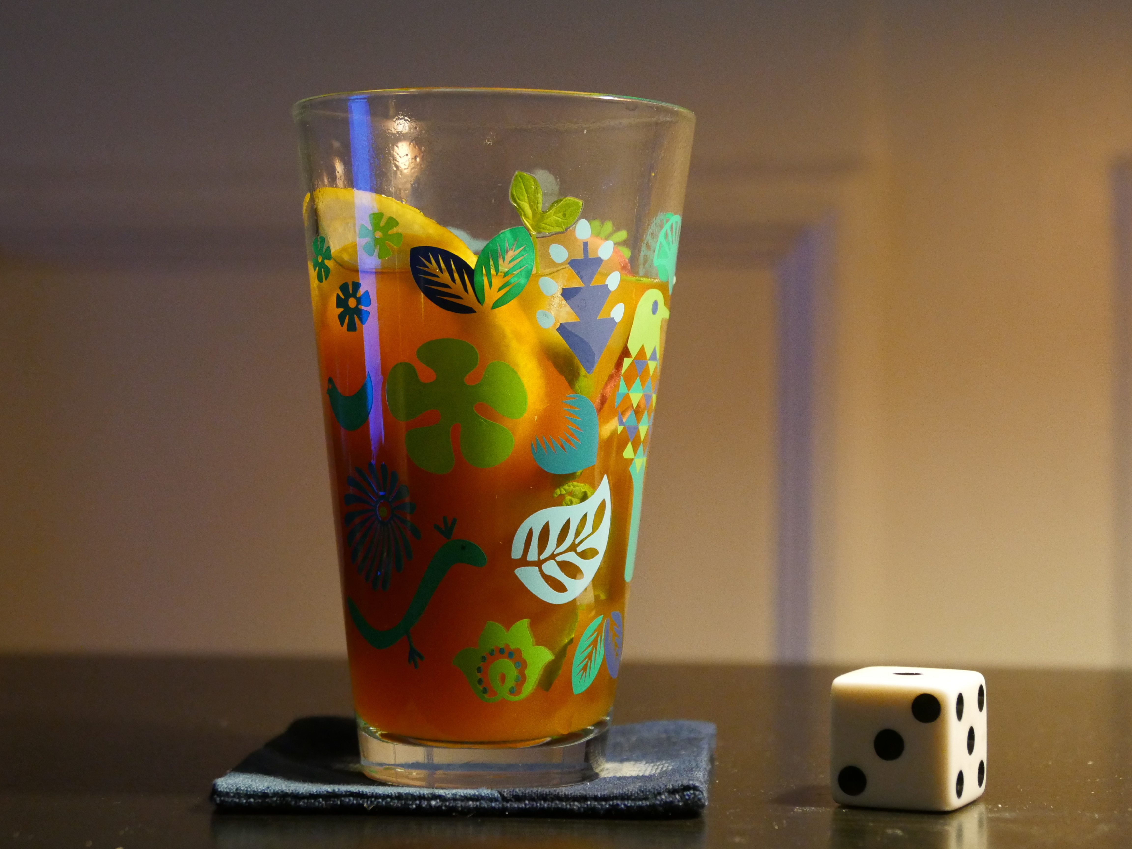
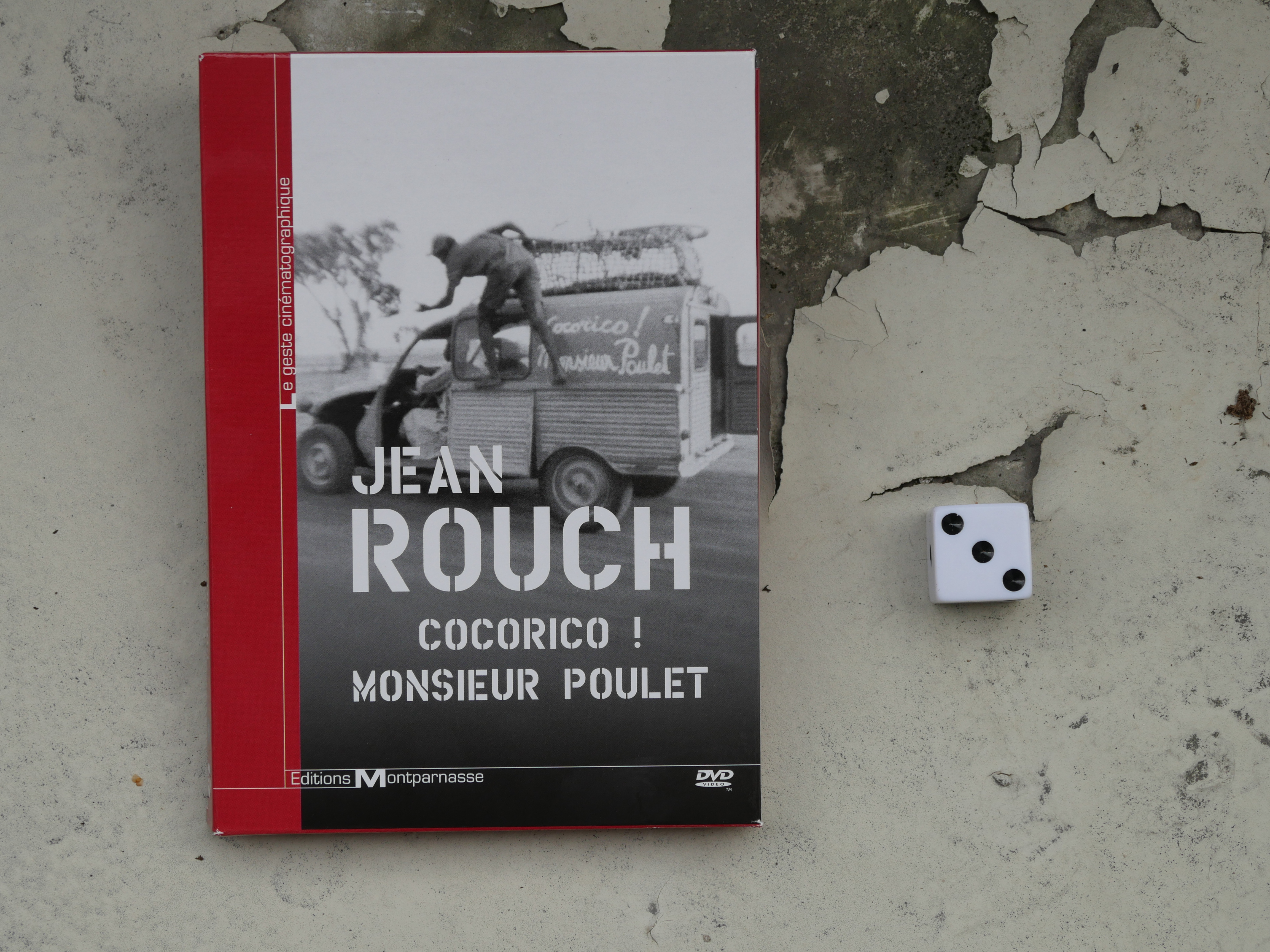
| Cocorico! Monsieur Poulet. Jean Rouch. 1974. Niger. August 5th, 2017. North African Sage n’ Green Tea. |
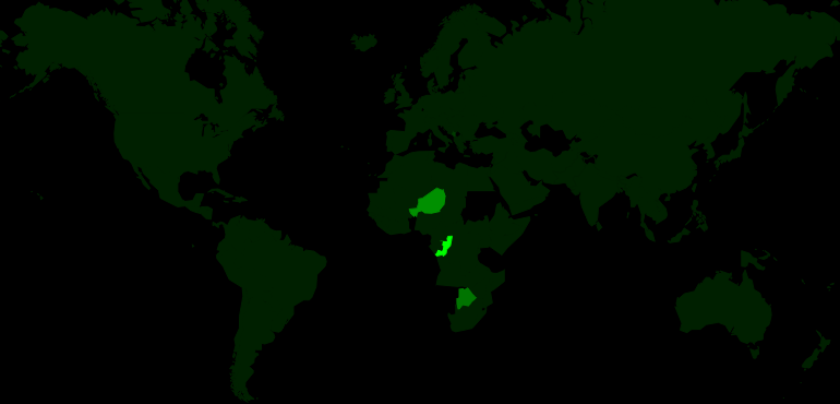 | 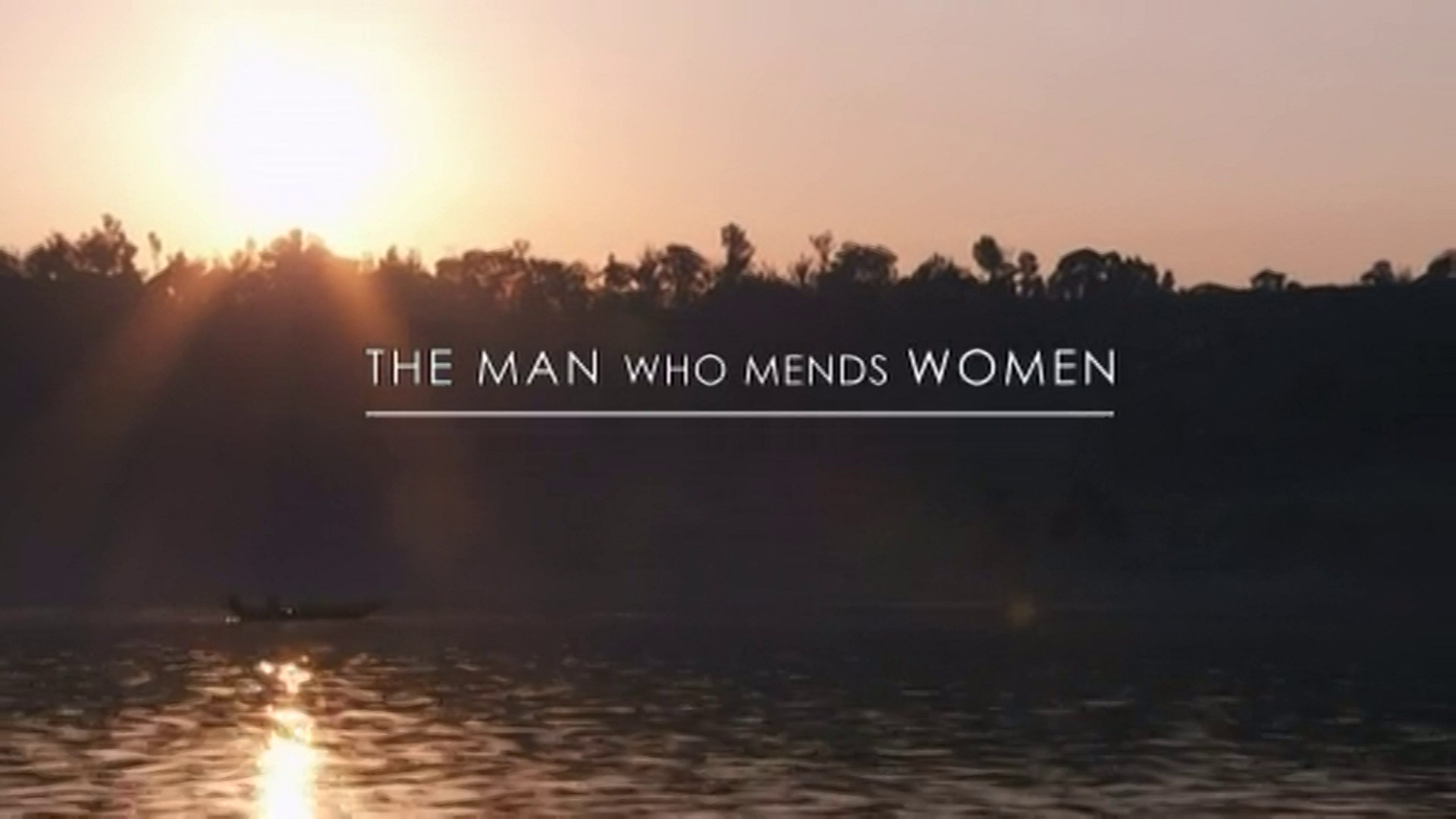 | 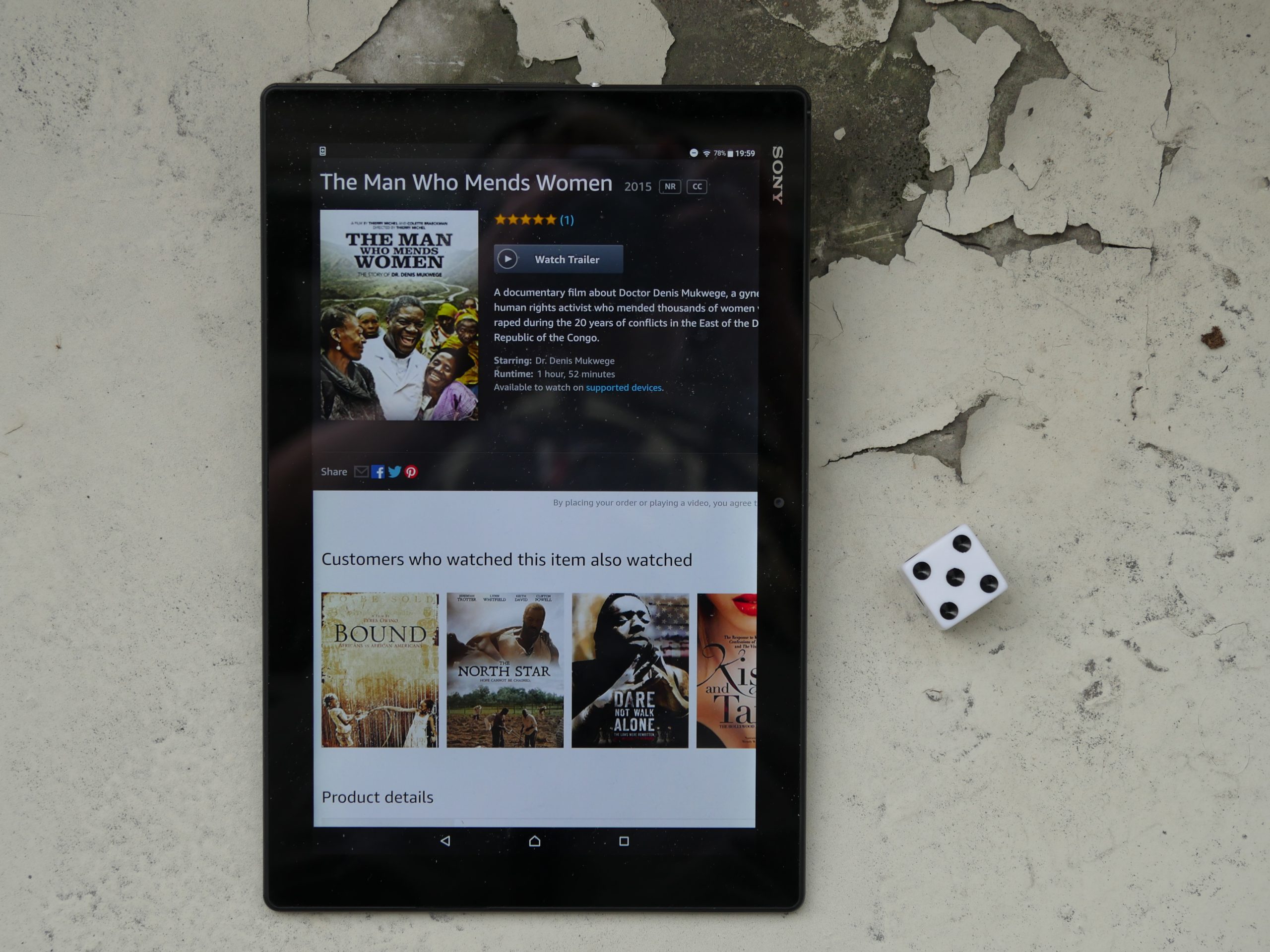 |  |
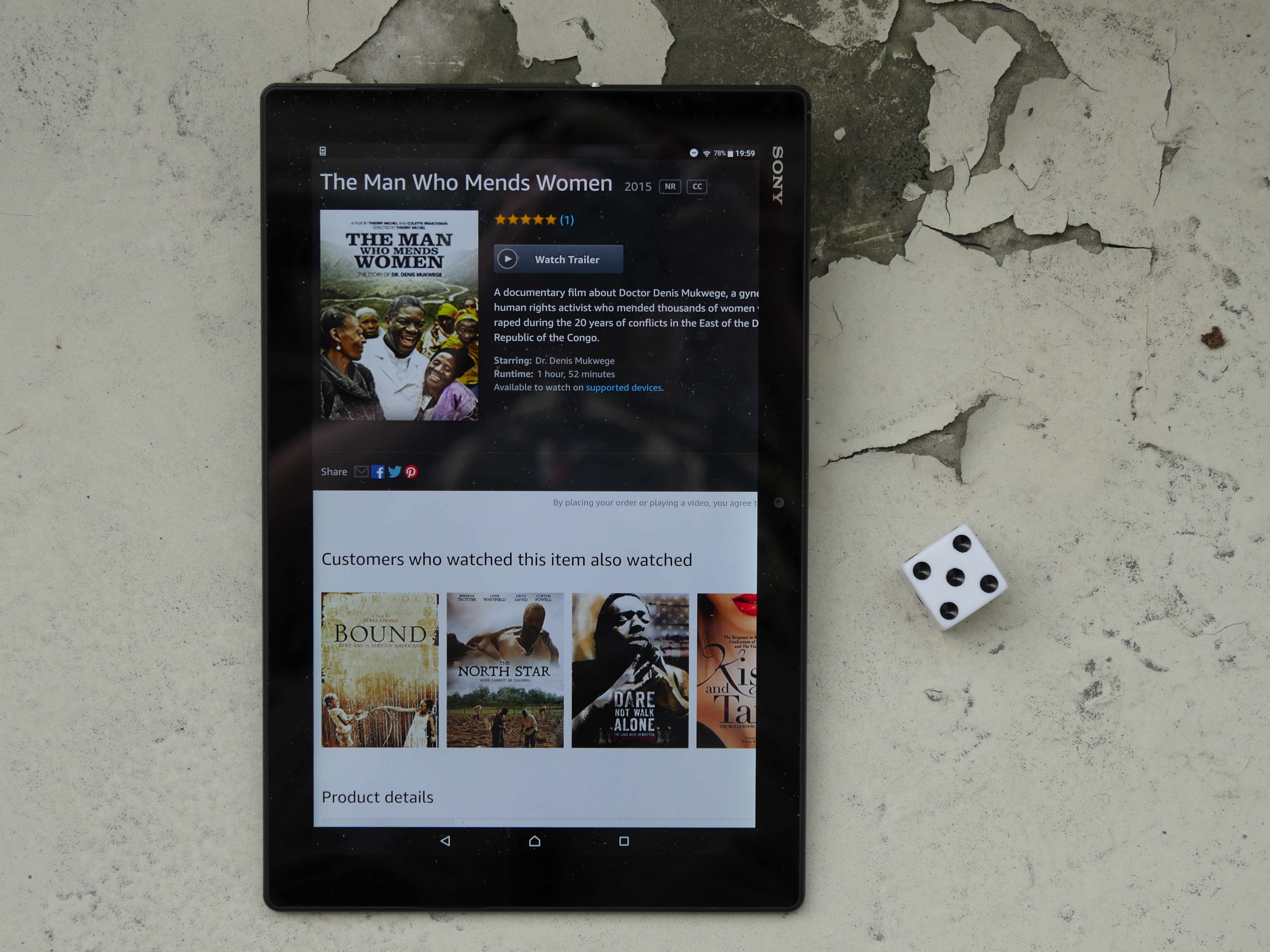
| The Man Who Mends Women. Thierry Michel. 2015. Congo. August 5th, 2017. Dawa. |
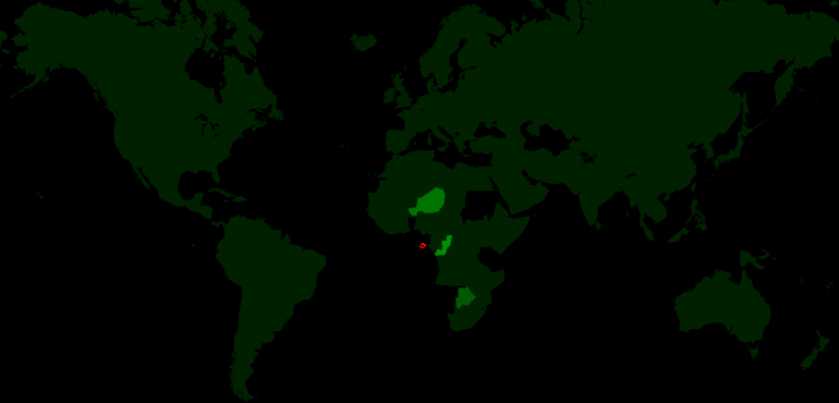 | 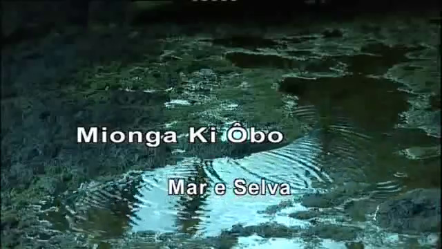 | 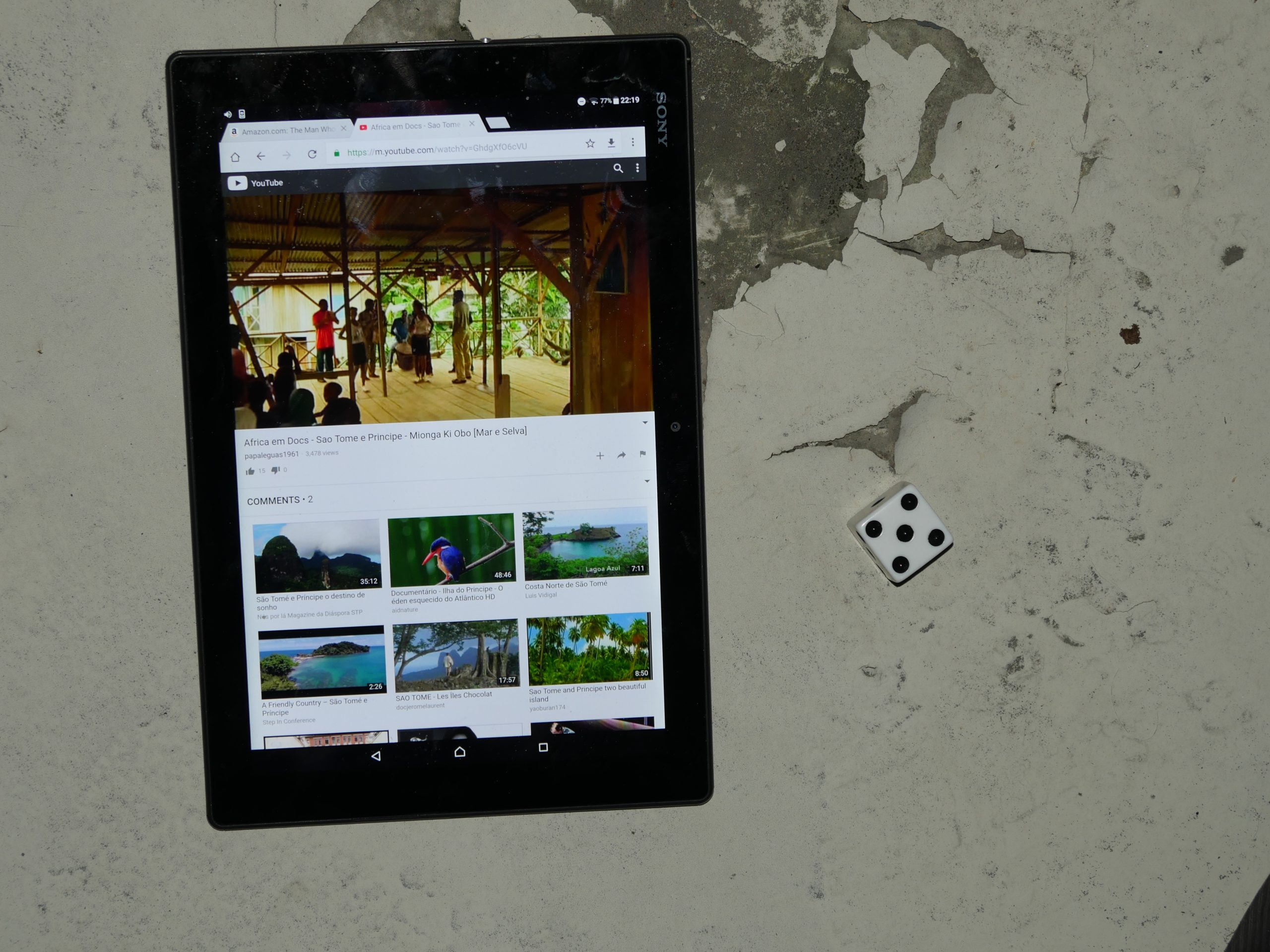 | 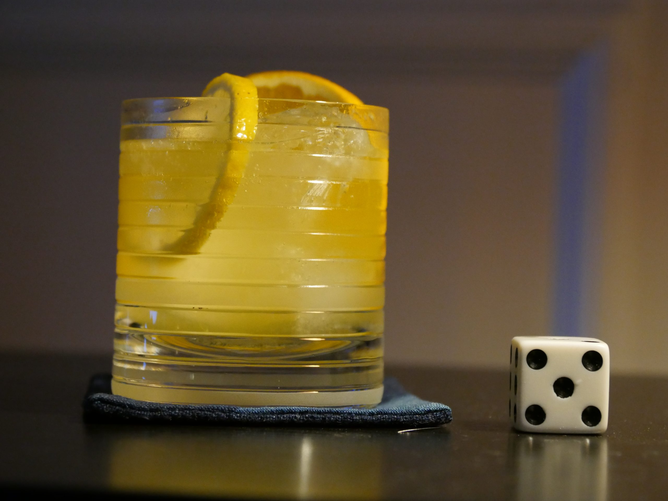 |
| Mionga ki Ôbo: Mar e Selva. Ângelo Torres. 2005. Sao Tome and Principe. August 5th, 2017. Cachaça Punch. |
 | 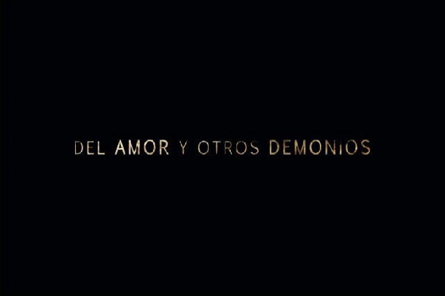 | 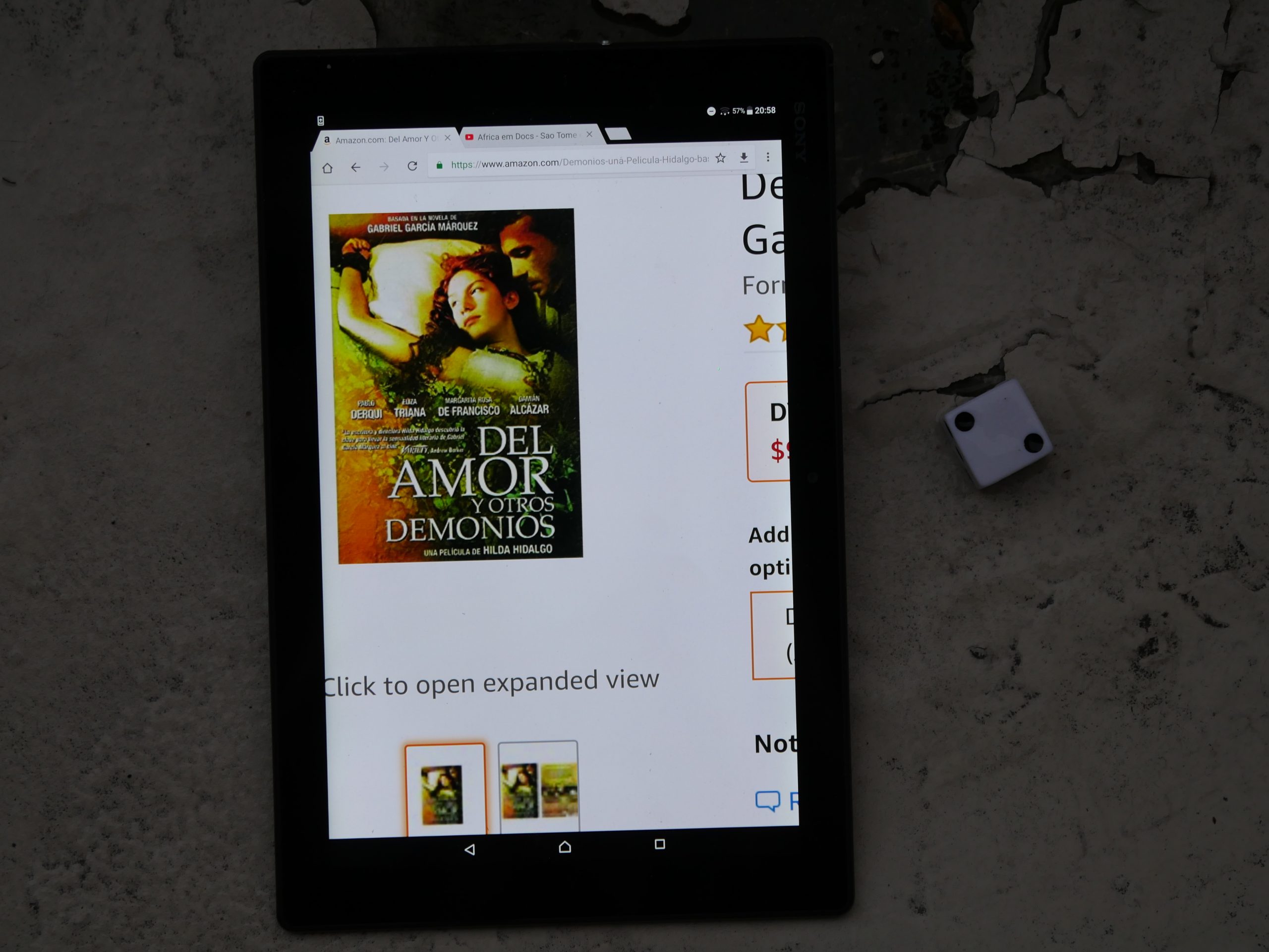 | 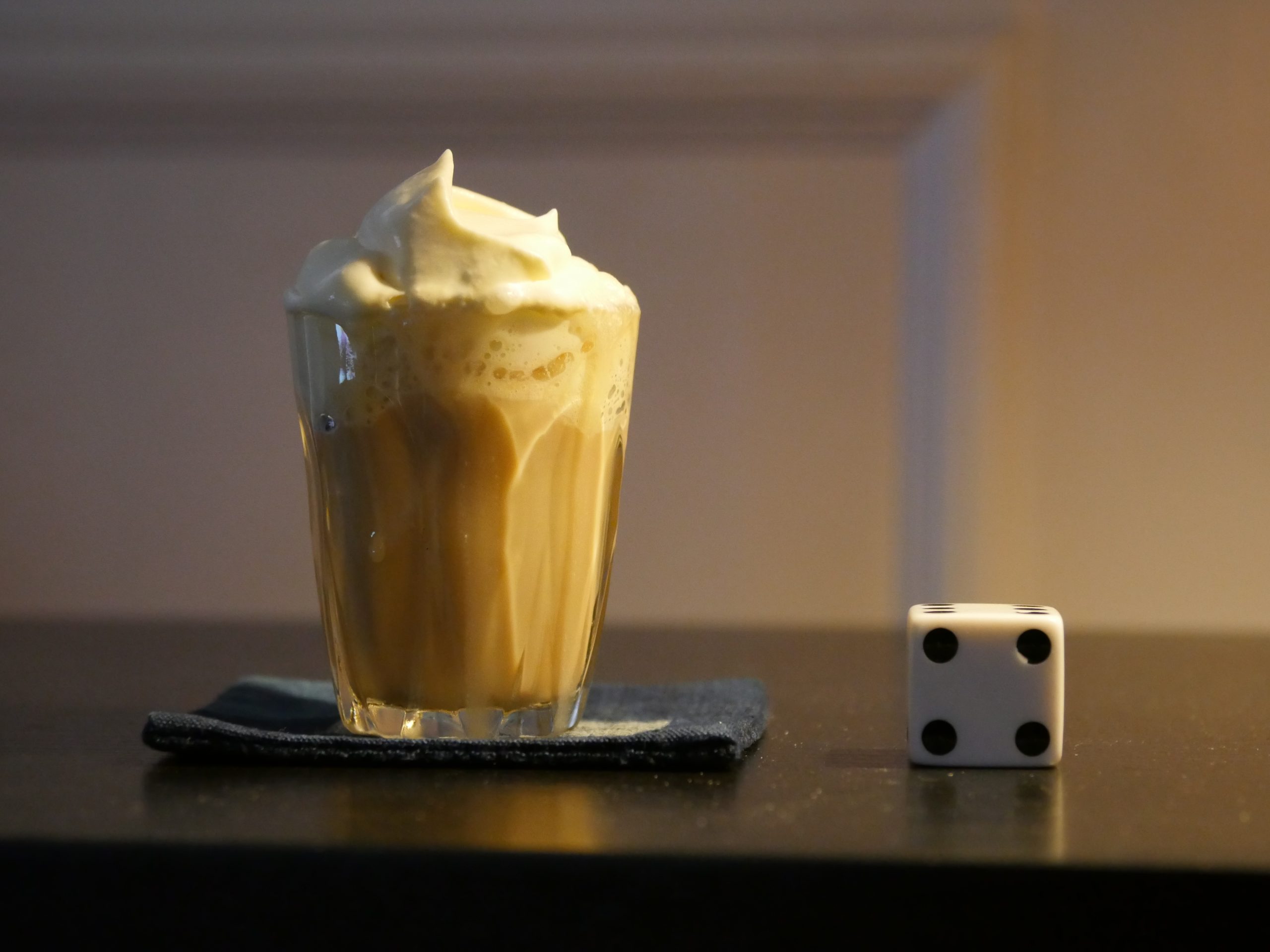 |
| Of Love and Other Demons. Hilda Hidalgo. 2009. Costa Rica. August 7th, 2017. Mamadita. |
 | 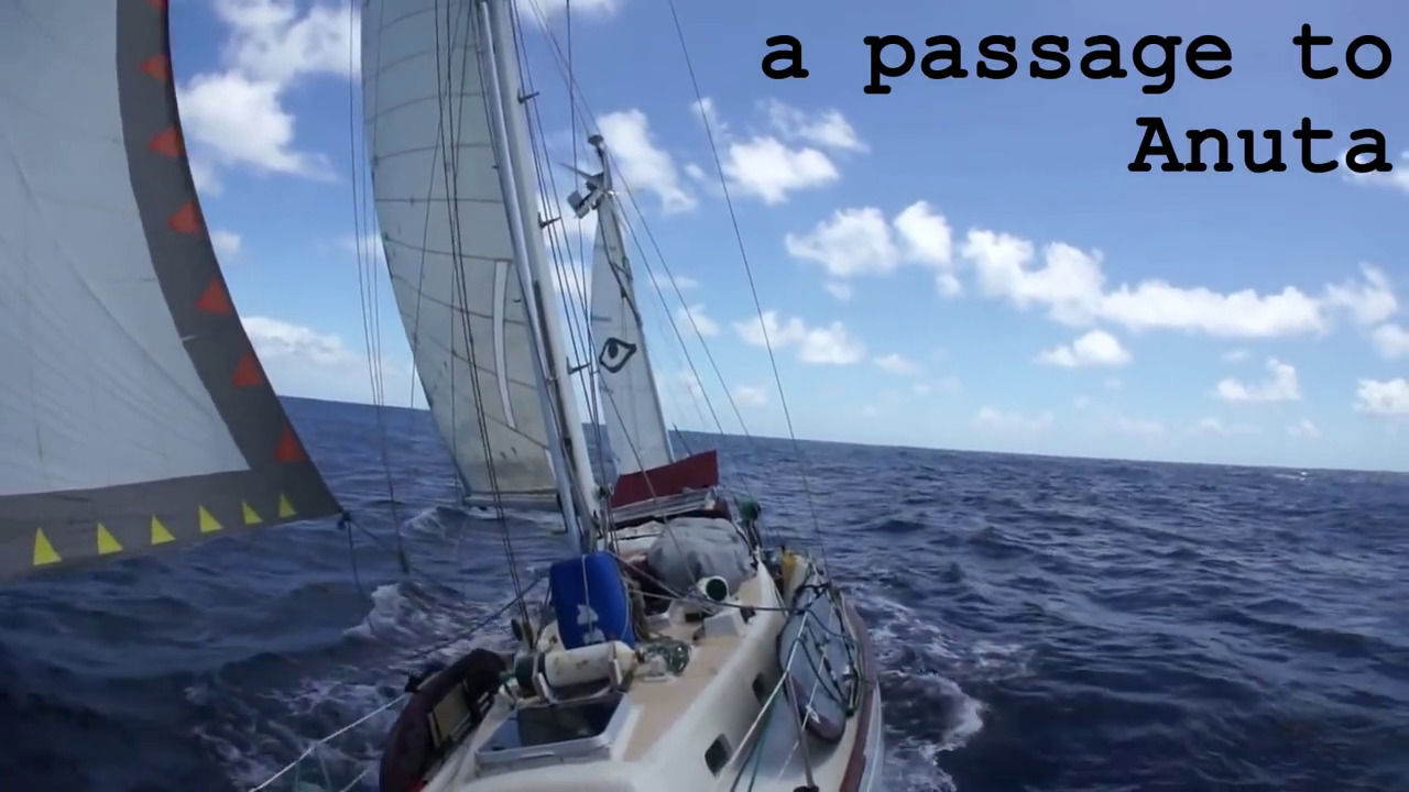 |  |  |
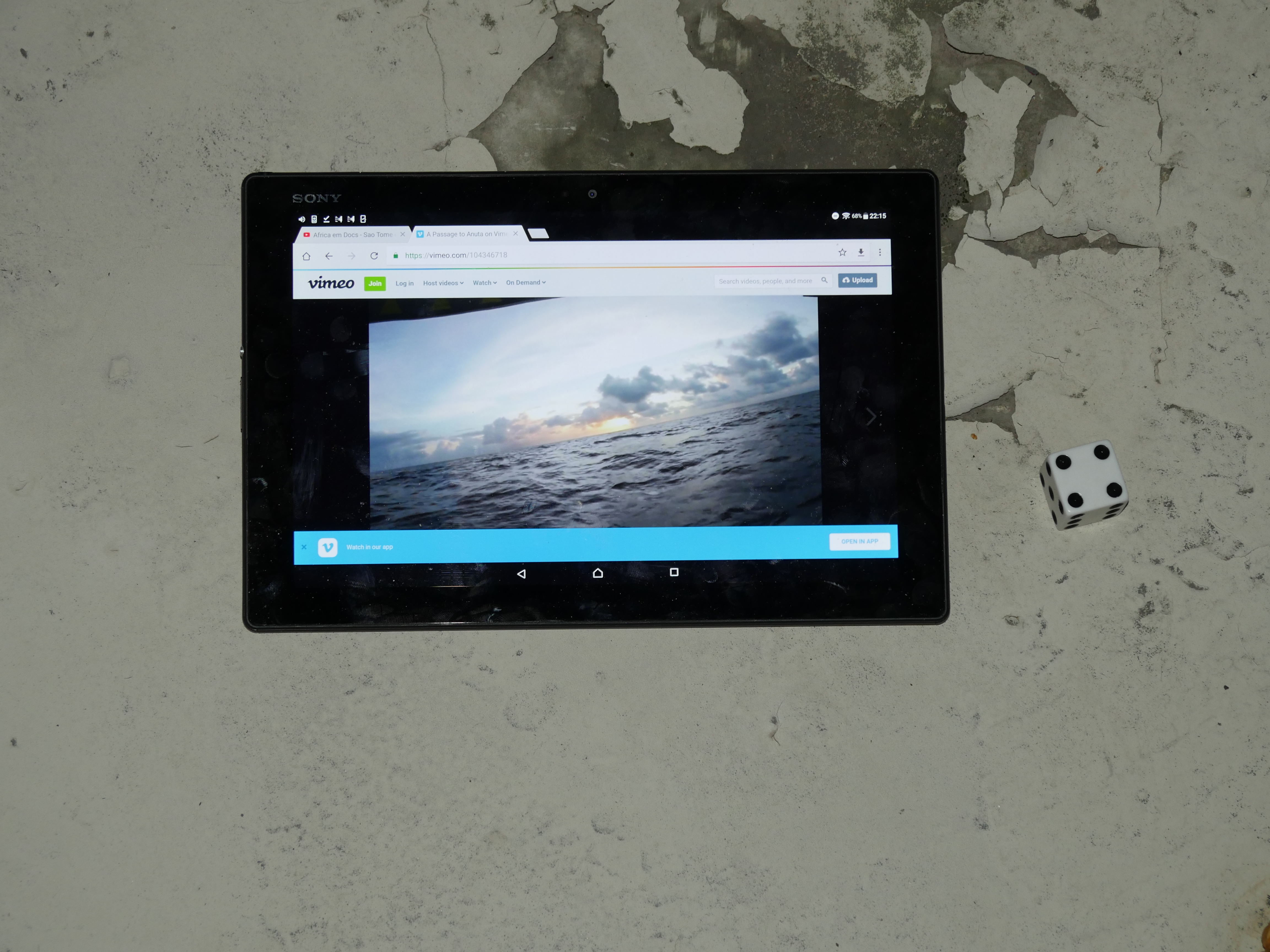
| A Passage to Anuta. Jacob Ells. 2014. Solomon Islands. August 14th, 2017. Solomon Island Cocktail. |
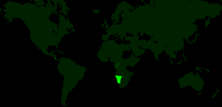 | 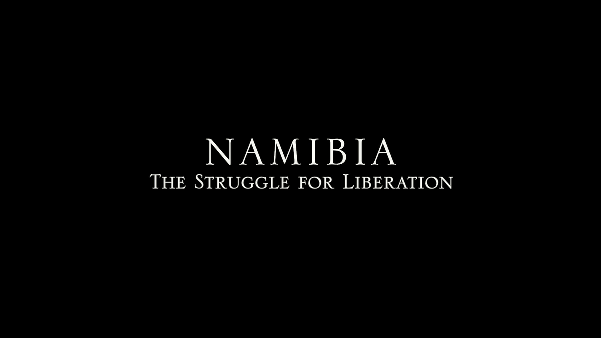 | 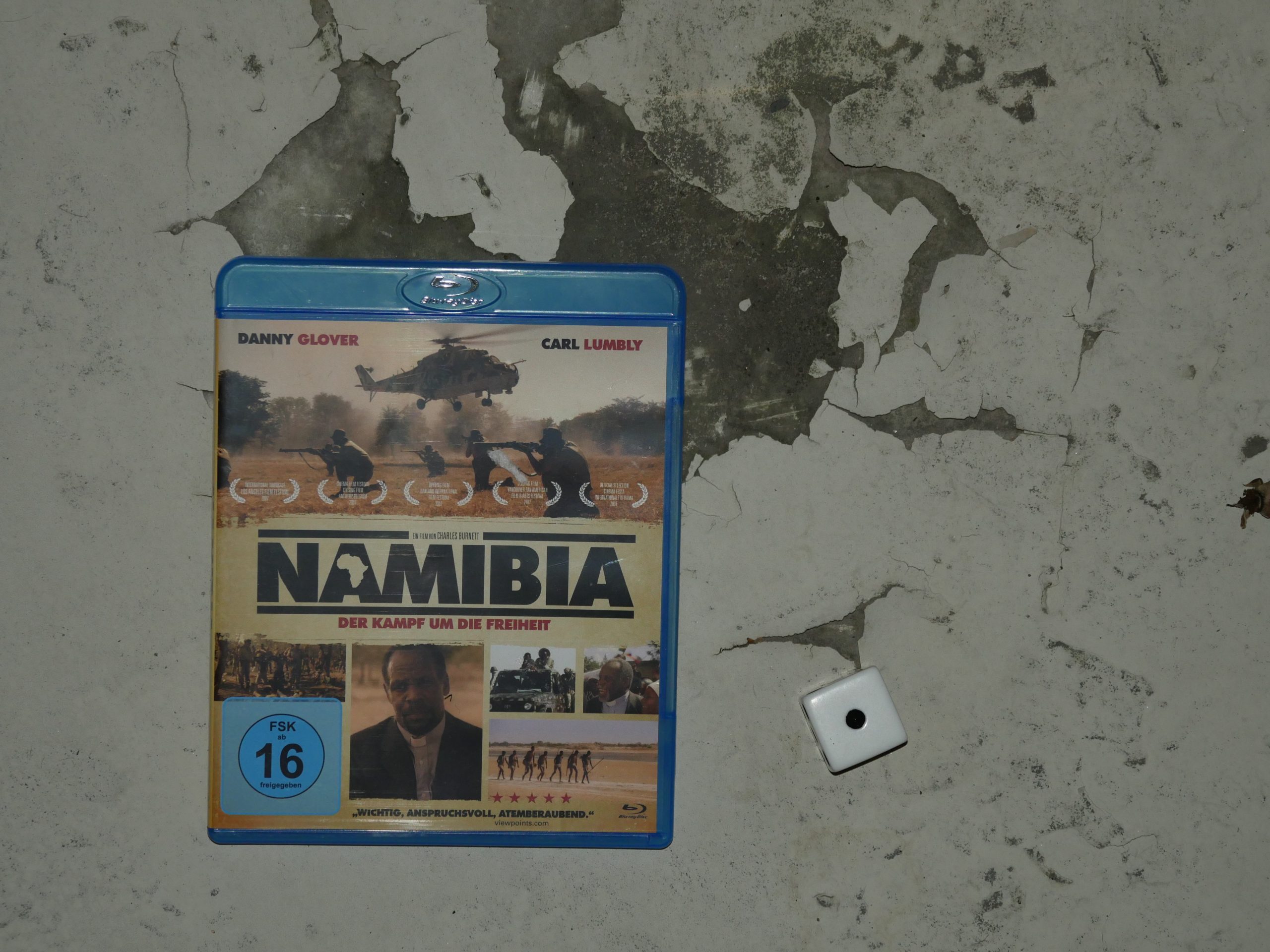 |  |
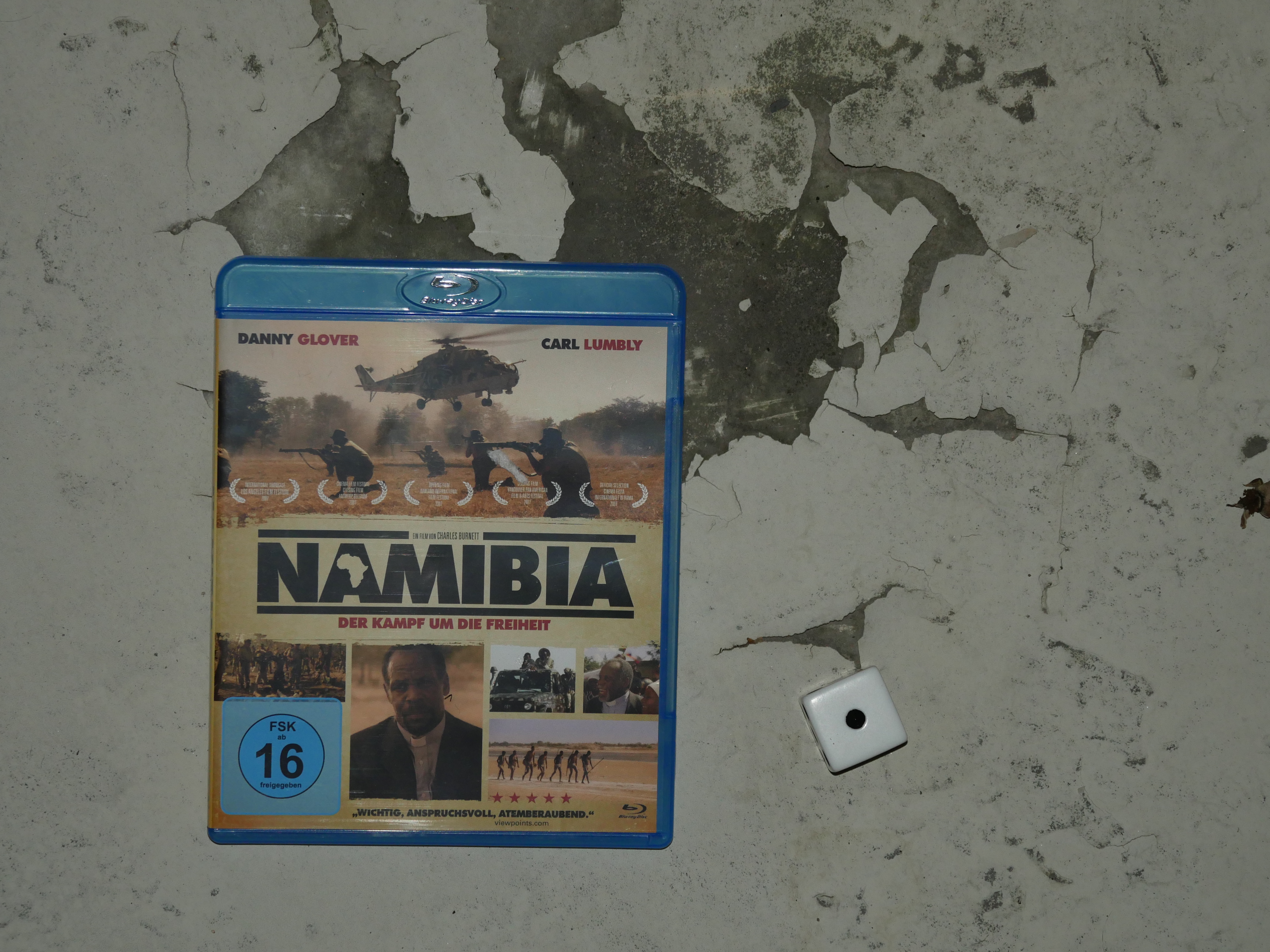
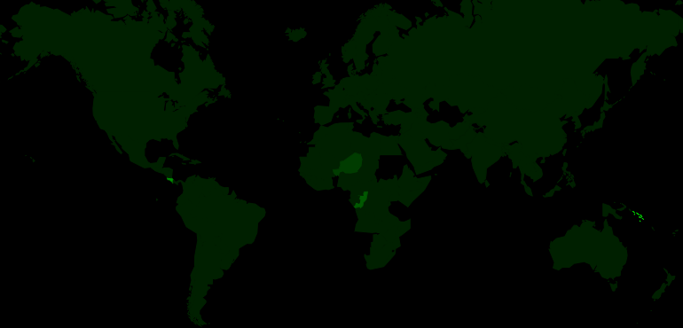
| Namibia: The Struggle for Liberation. Charles Burnett. 2007. Namibia. August 21st, 2017. Amarula Brown Elephant. |
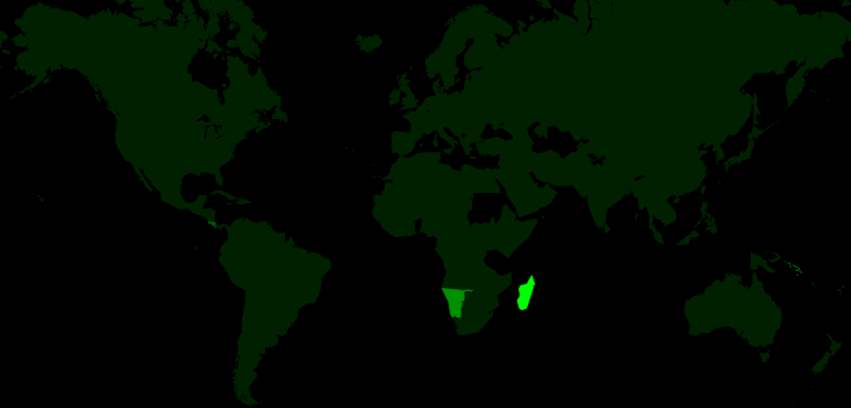 |  | 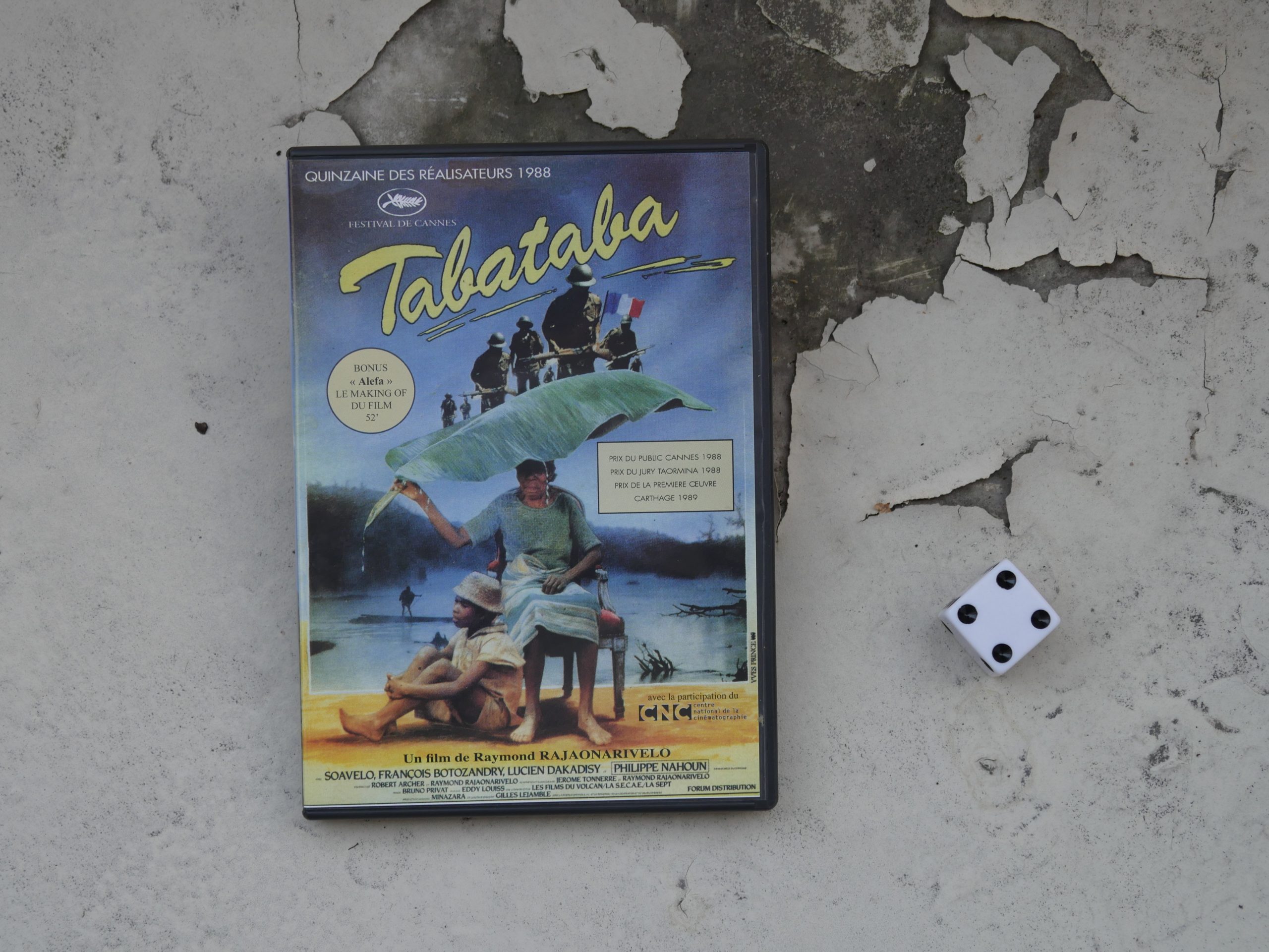 | 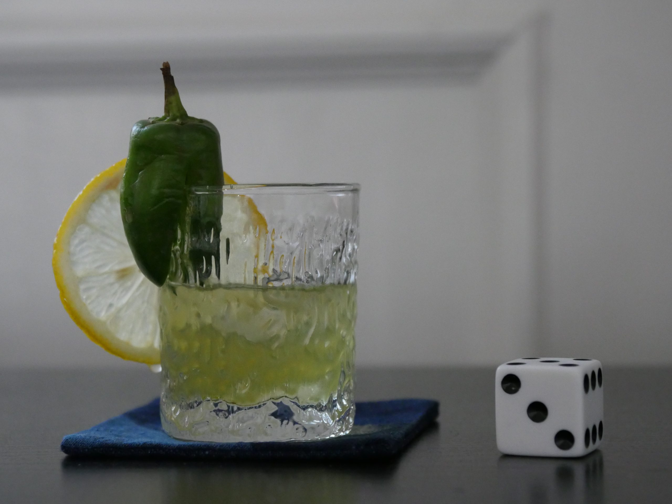 |
| Tabataba. Raymond Rajaonarivelo. 1988. Madagascar. August 25th, 2017. Madagascar Margarita. |
 | 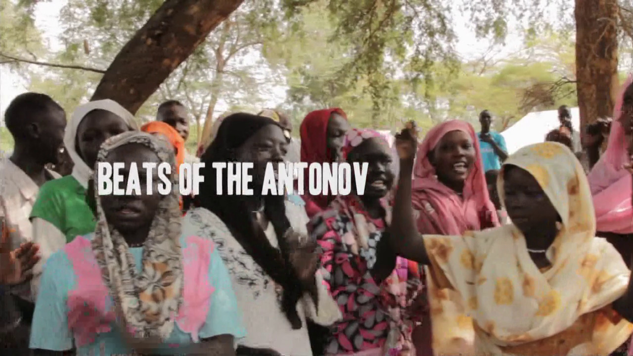 | 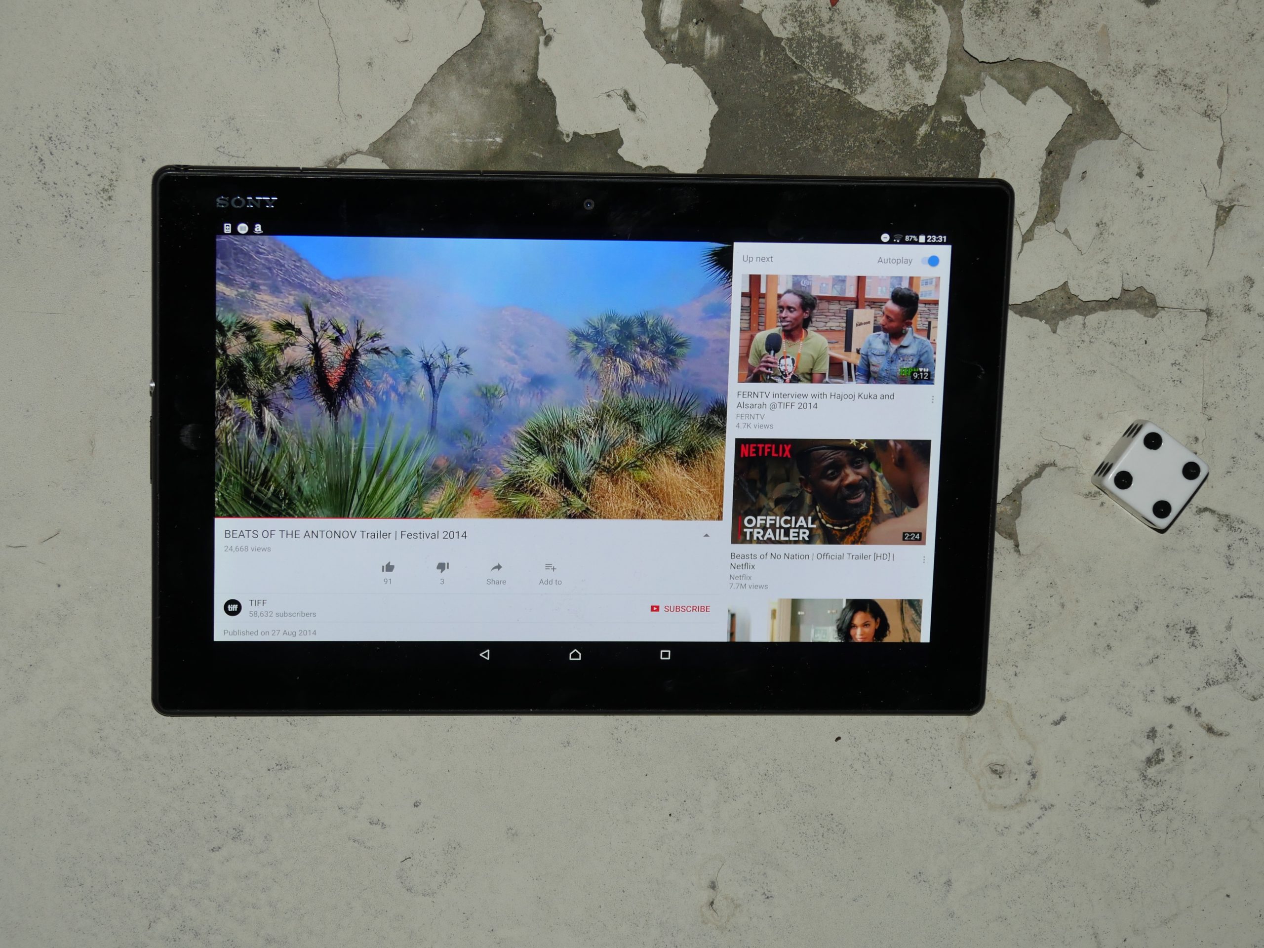 |  |
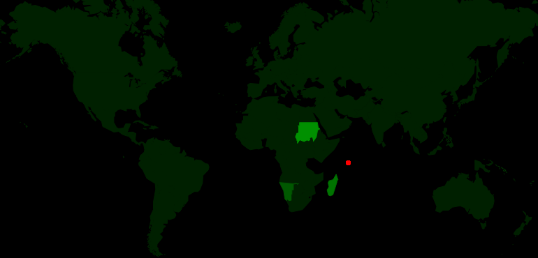
| Beats of the Antonov. Hajooj Kuka. 2014. Sudan. August 25th, 2017. Karkade Tequila. |
 |  | 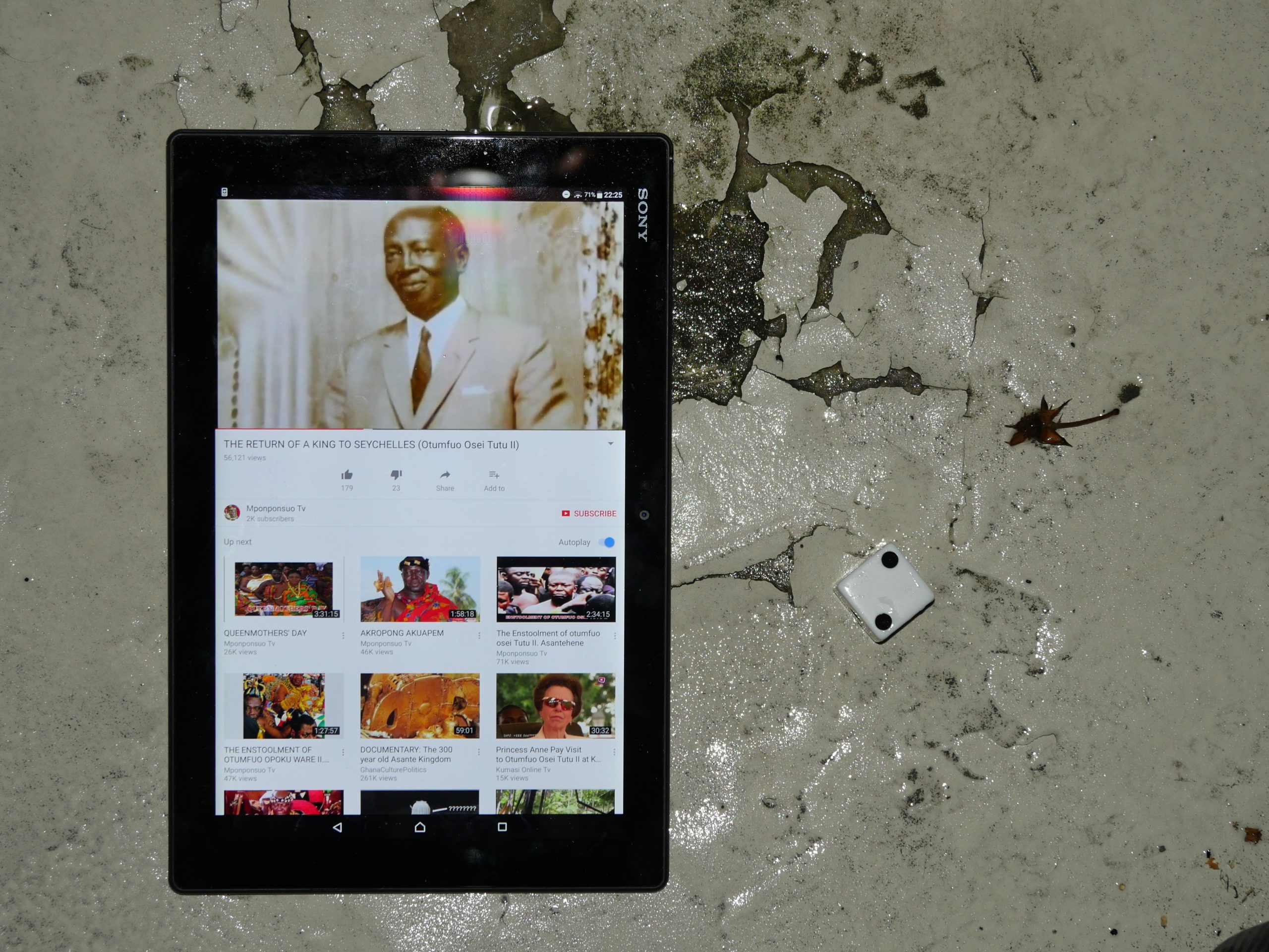 | 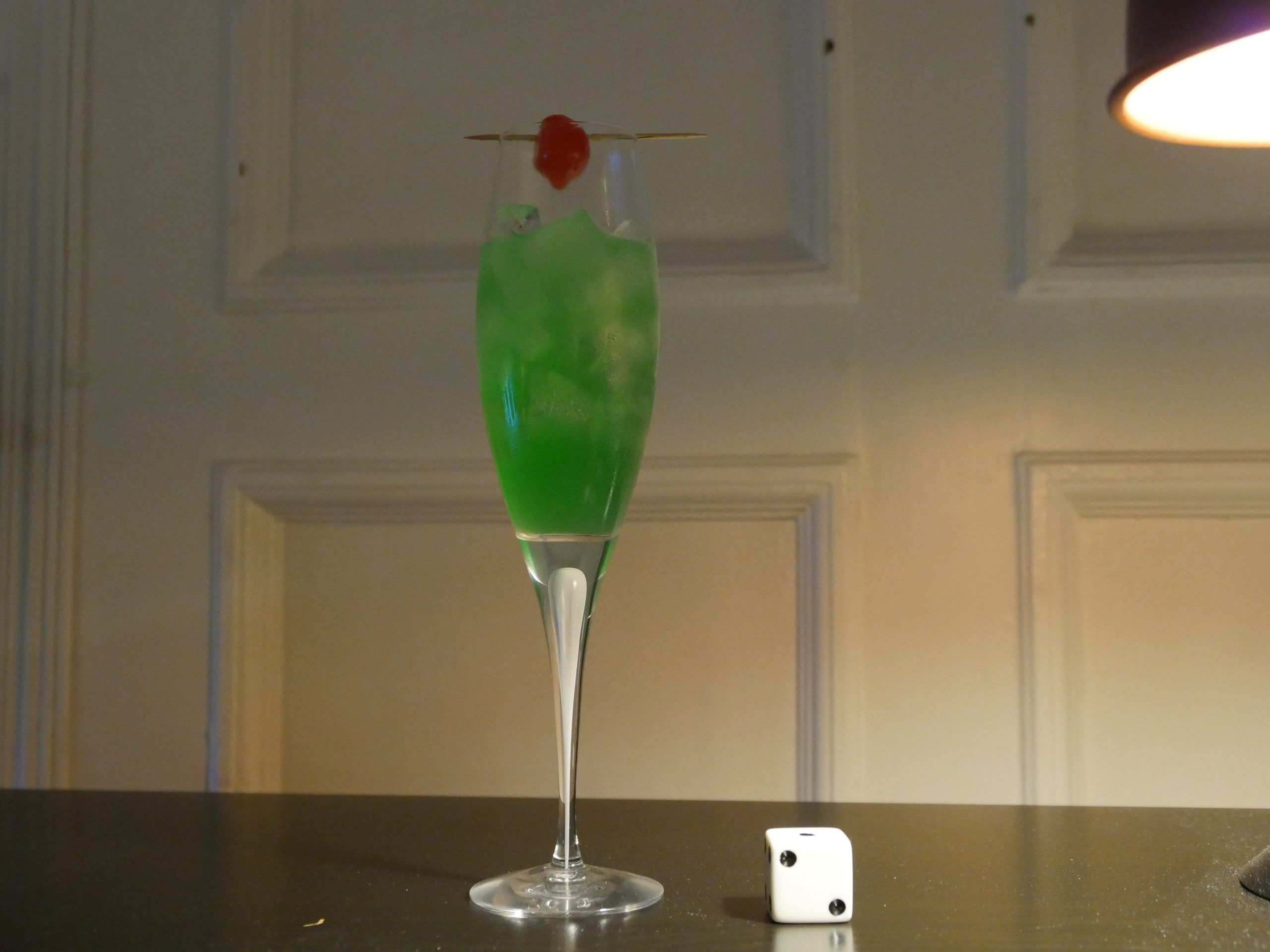 |
| The Return of a King to Seychelles. Otumfuo Nana Osei Tutu II . 2015. Seychelles. August 28th, 2017. Seychelles. |
 |  |  |  |
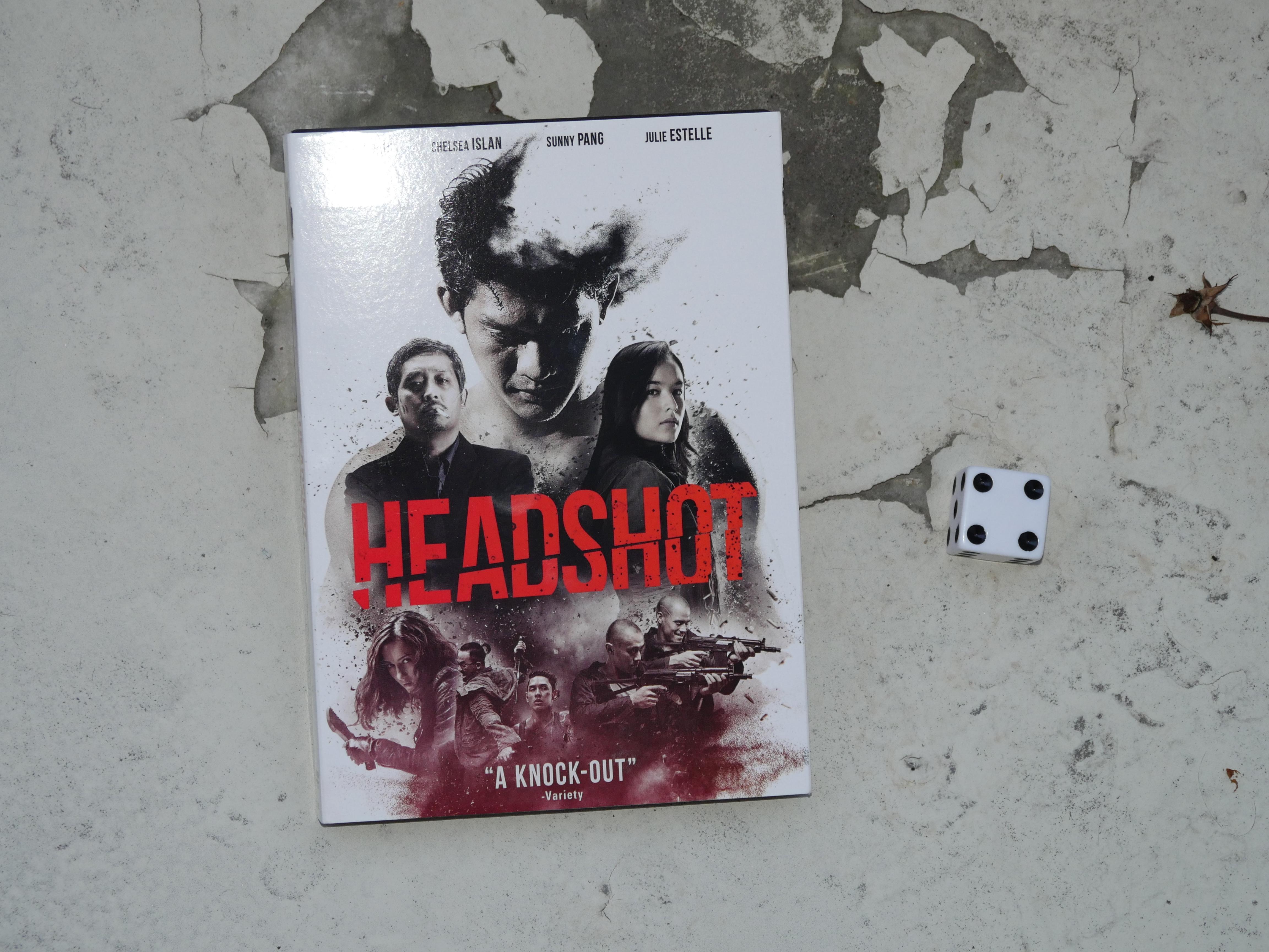
| Headshot. Kimo Stamboel, Timo Tjahjanto. 2016. Indonesia. September 1st, 2017. Chocolate Baby. |
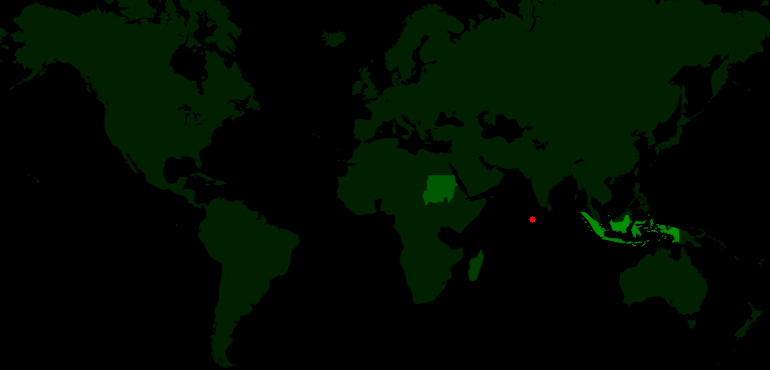 |  | 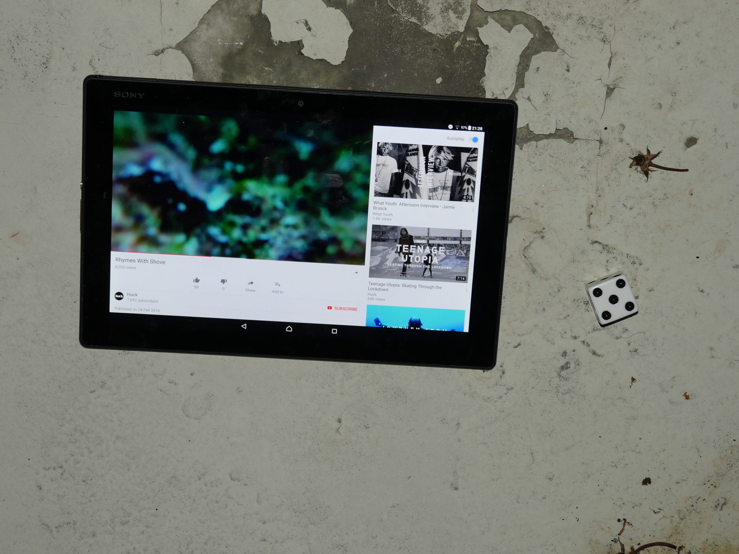 |  |
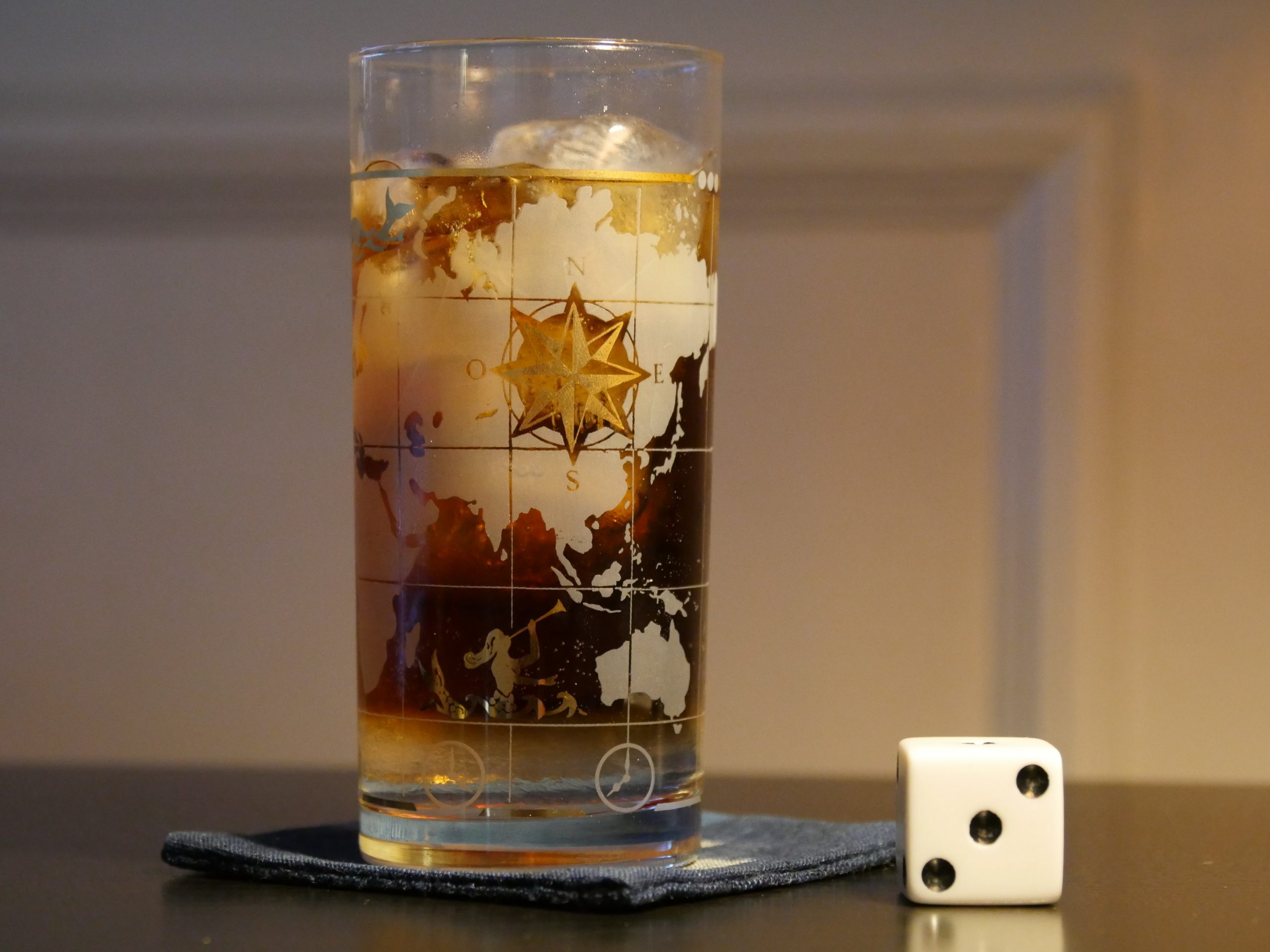
| Rhymes With Shove. Jamie R. Brisick/Isabel Freeman. 2016. Maldives. September 1st, 2017. Sting Ray. |
 |  | 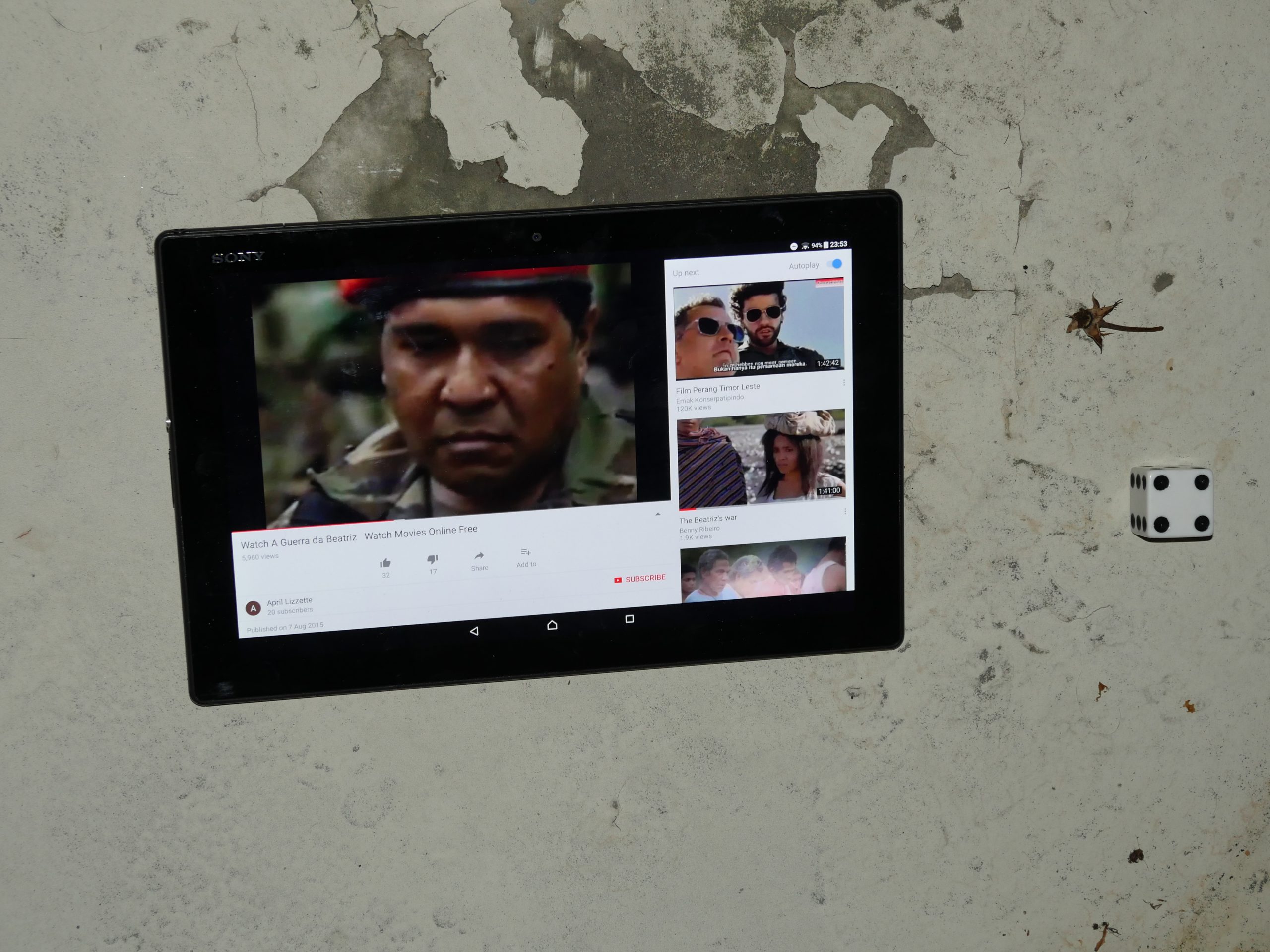 | 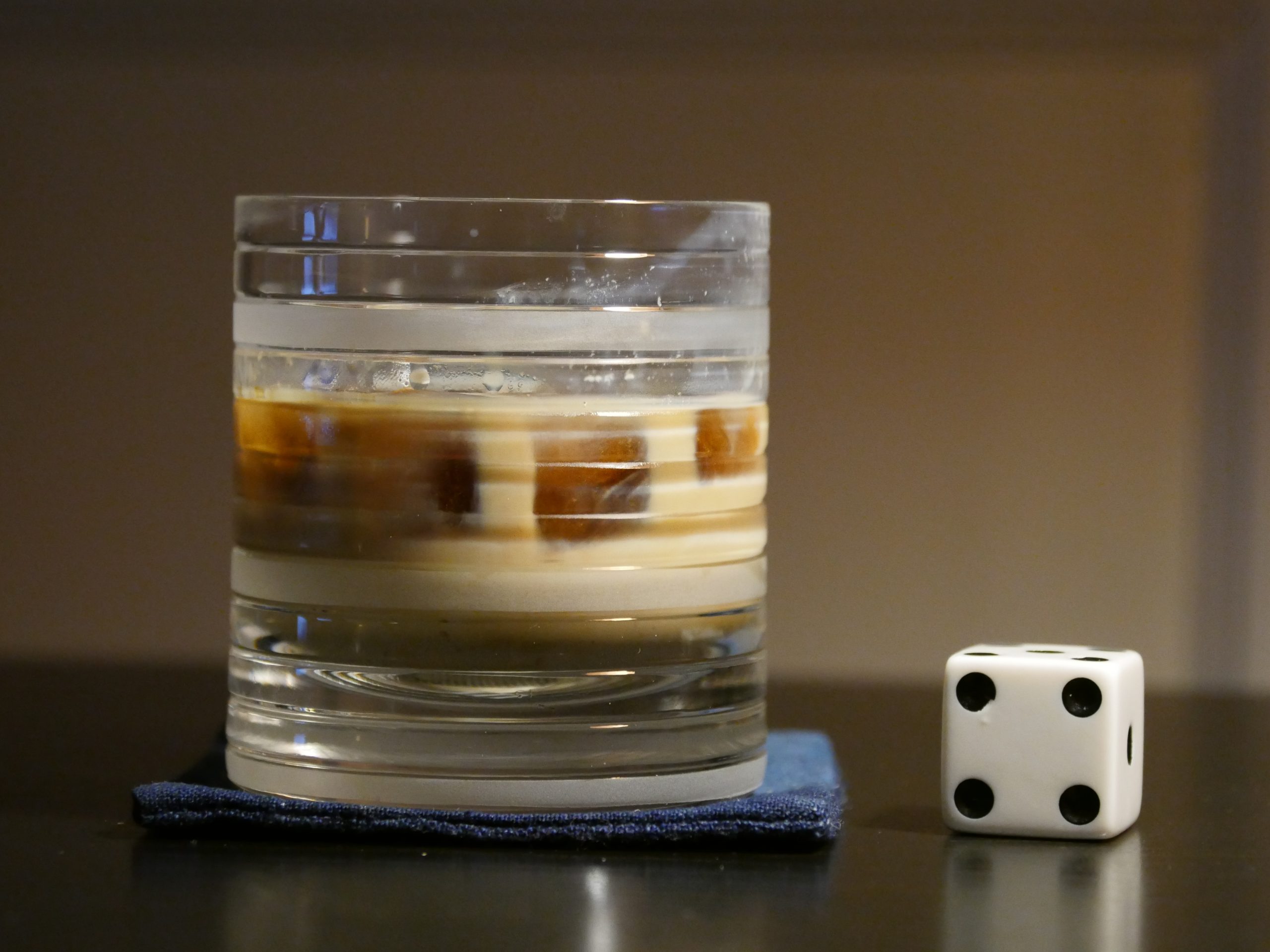 |
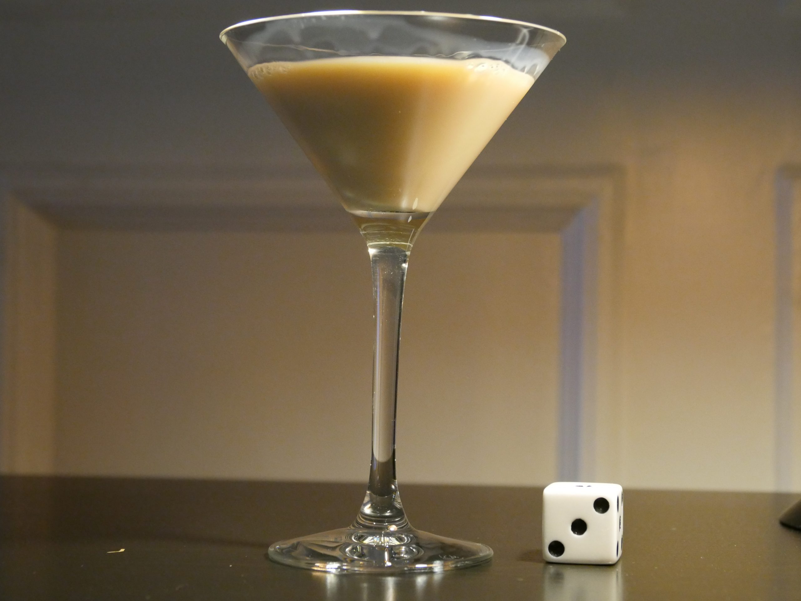
| Beatriz’s War. Bety Reis/Luigi Acquisto. 2013. Timor-Leste. September 2nd, 2017. Coffee cocktail. |
 |  | 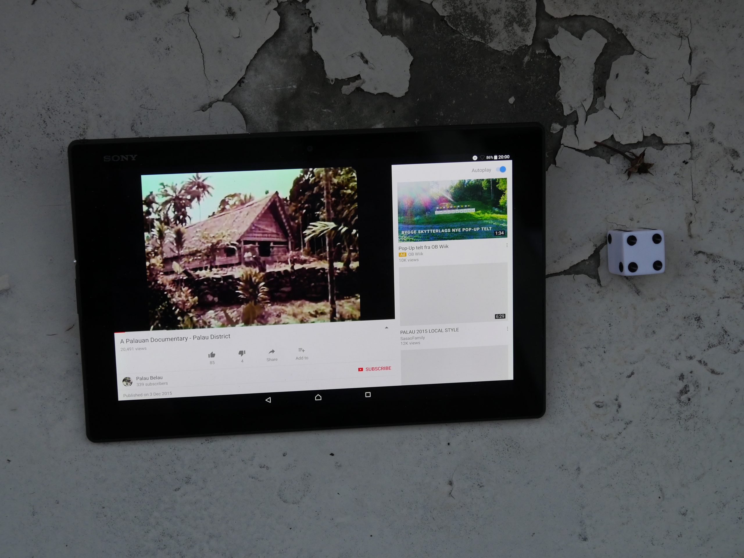 |  |
| A Paluan Documentary. Gary Schlosser. 1950s?. Palau. September 2nd, 2017. Luau Coconut. |
 |  |  |  |
| A Paluan Documentary. Pierre Deschamps . 2009. Dominica. September 2nd, 2017. Rosalie Bay Resort’s Bell Coconut Cocktail. |
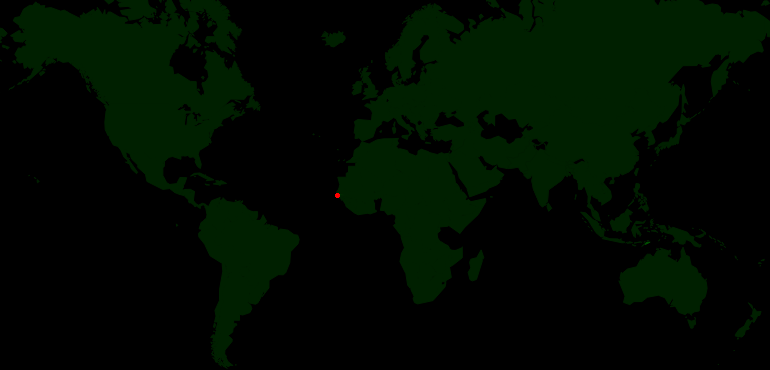 | 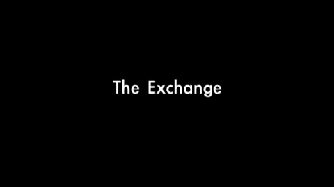 | 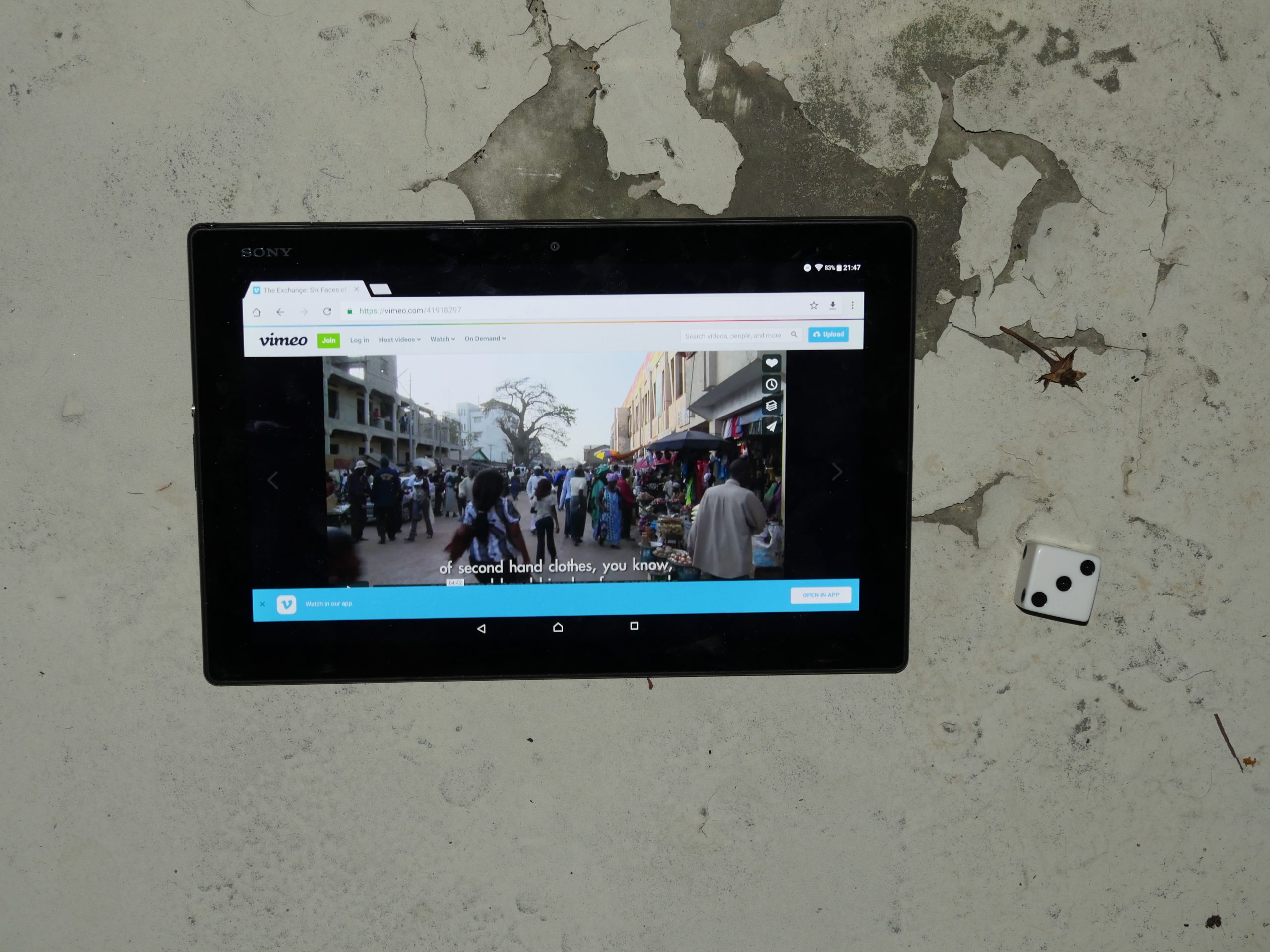 |  |
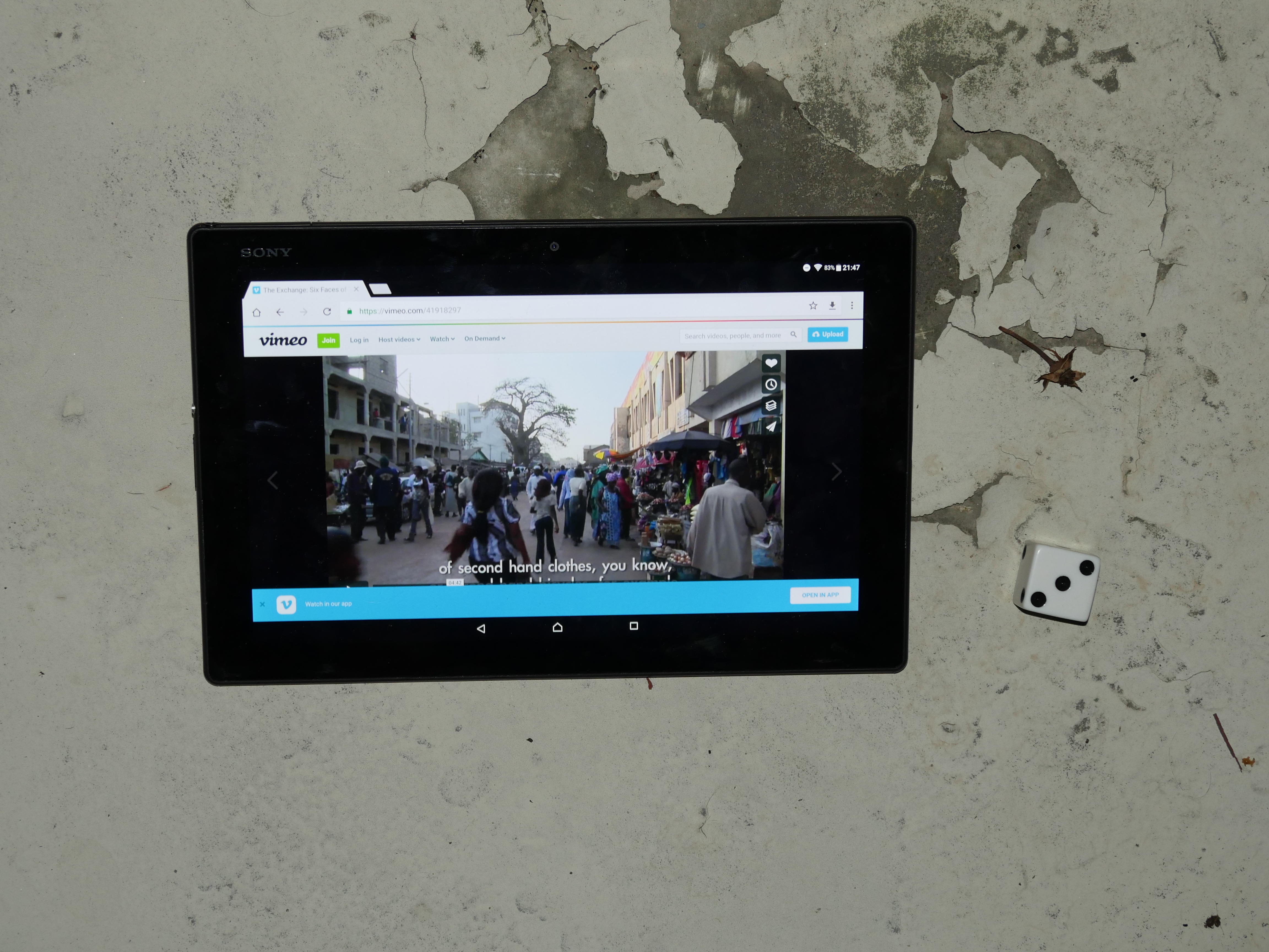
| The Exchange: Six Faces of the Gambia. Mathew Welsh. 2009. Gambia. September 2nd, 2017. Wonjo Cocktail. |
 | 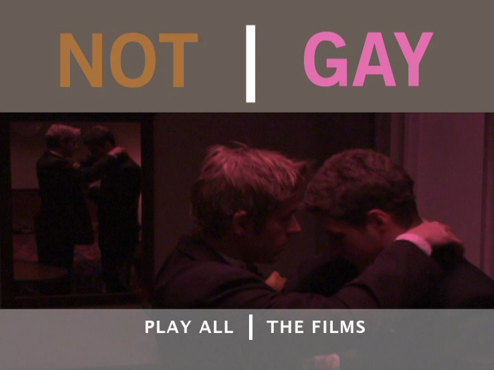 | 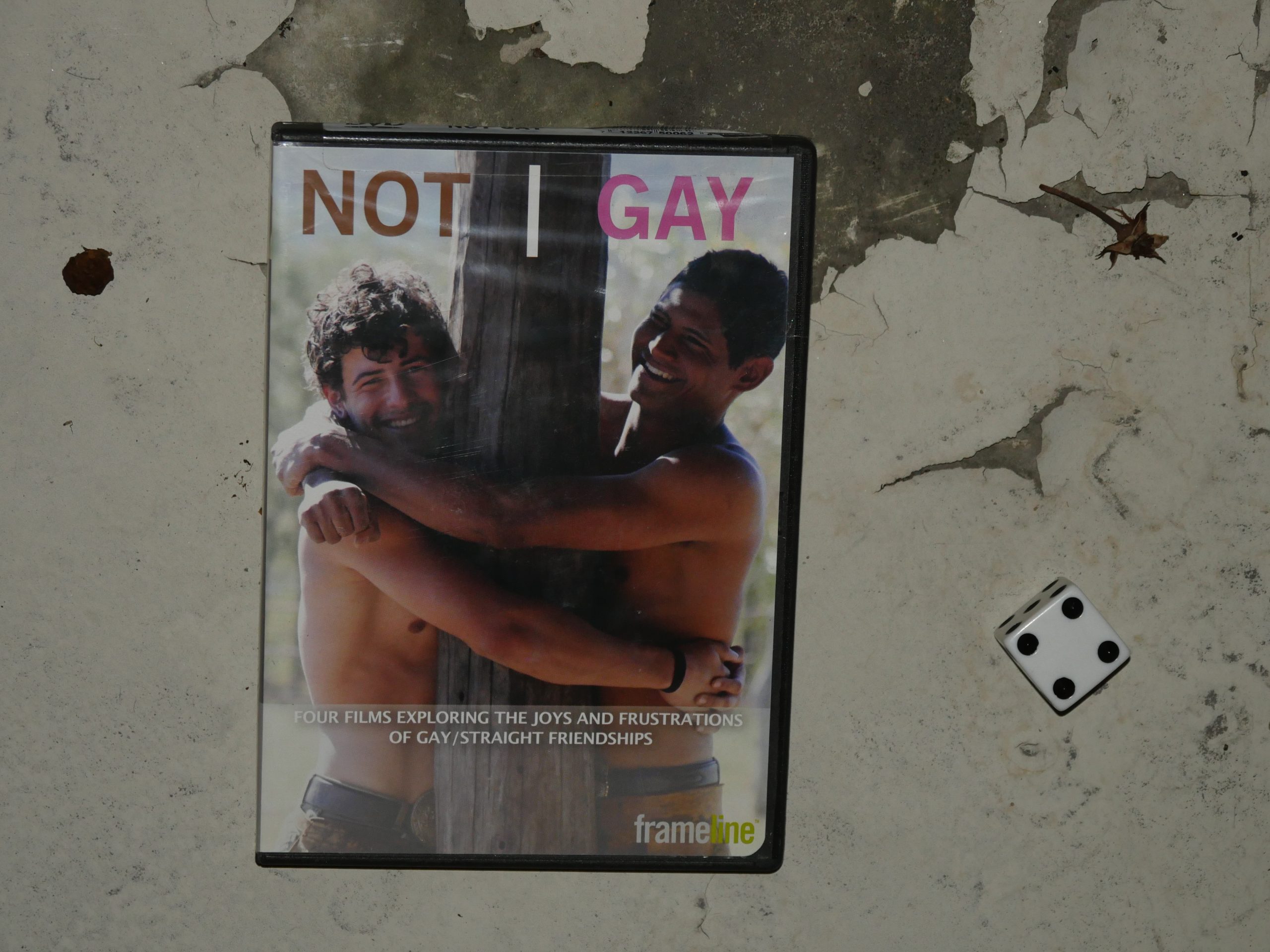 |  |
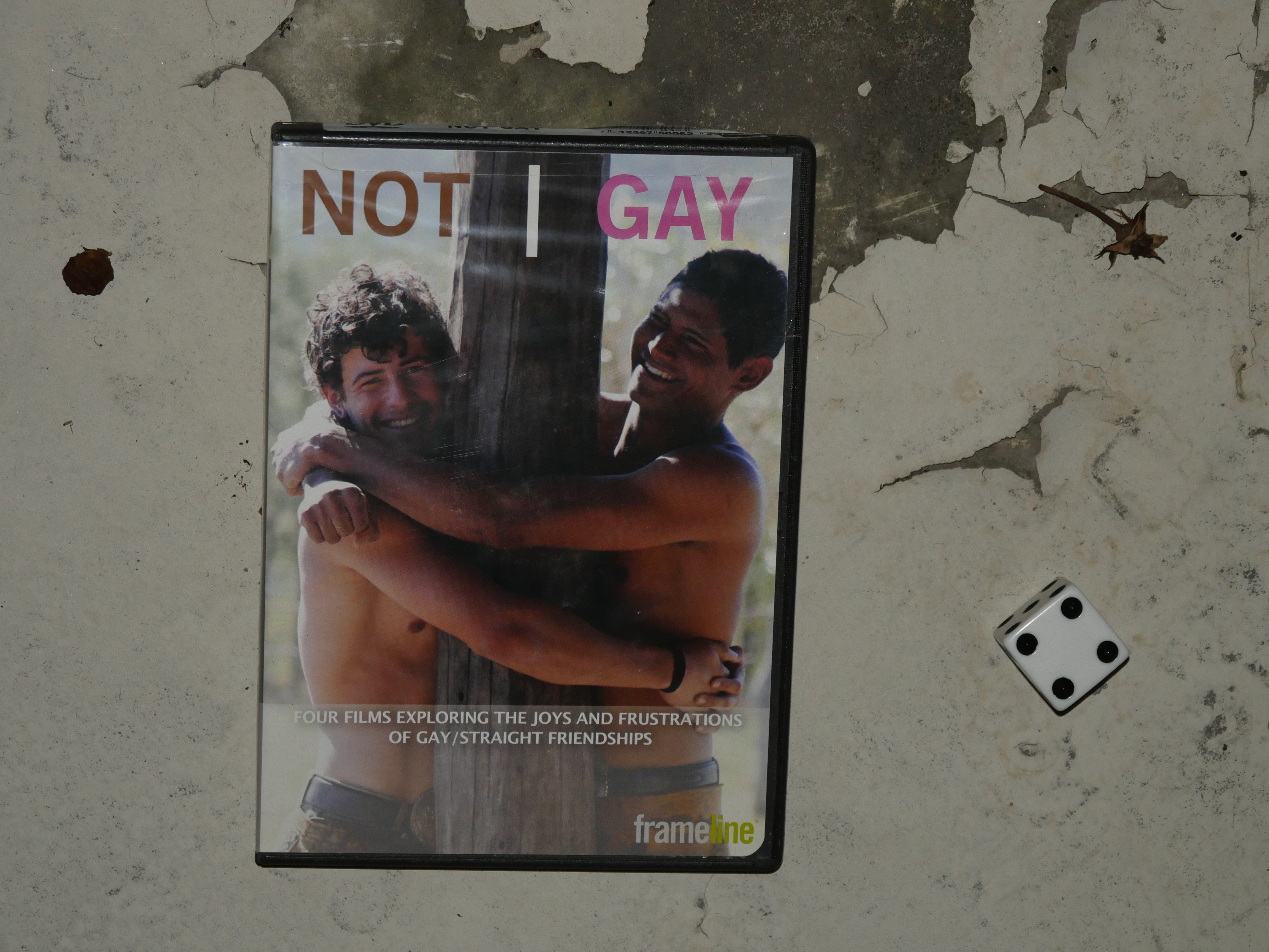
| Not Gay. Jean-Baptiste Erreca/Kareem Mortimer/Scott Boswell/Tony Wei. 2008. Bahamas. September 3rd, 2017. FroCo. |
 |  |  |  |
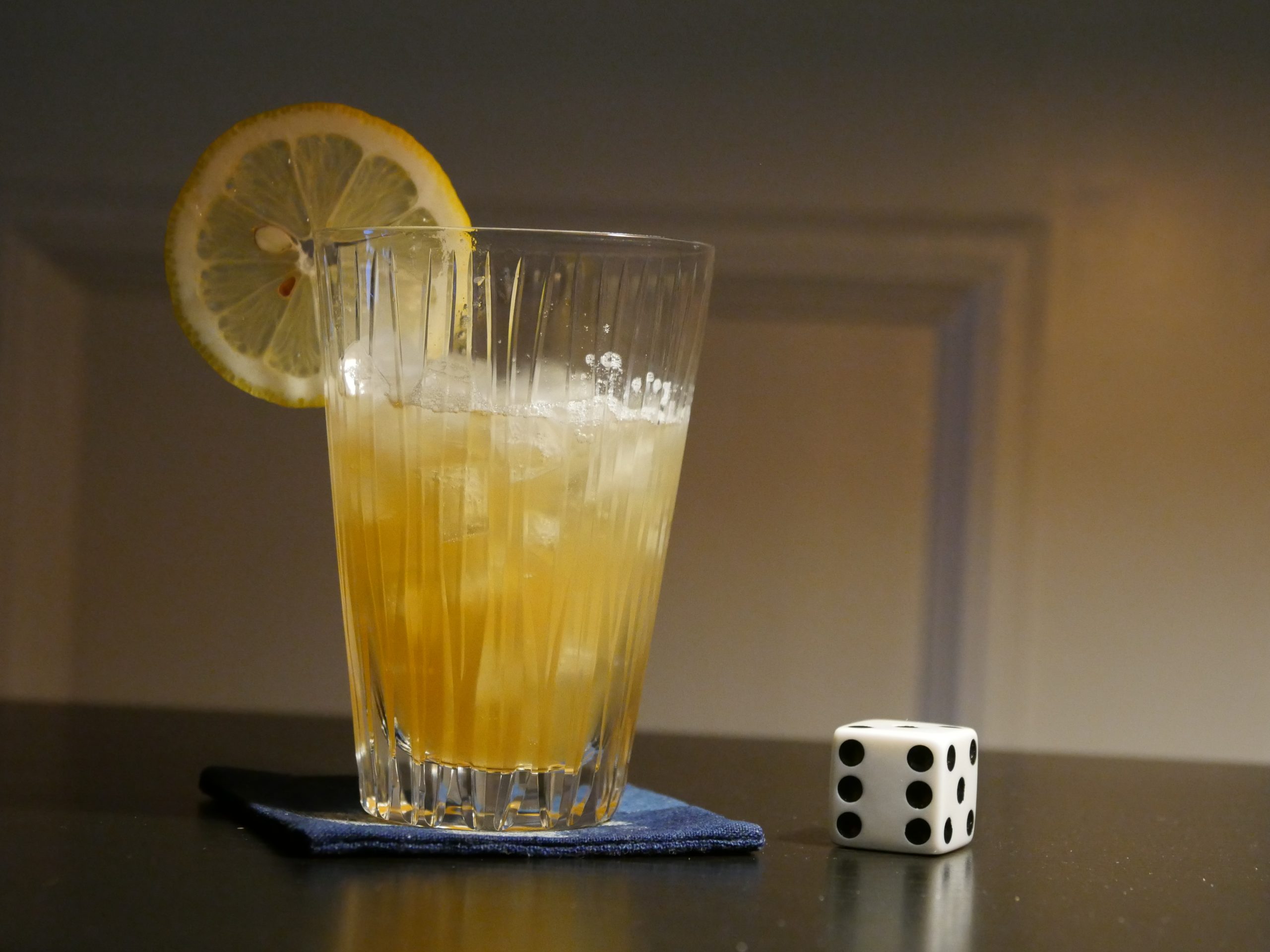
| The Encounter. Jon Rabaud. 2015. Mauritius. September 4th, 2017. Mango Rum. |
 | 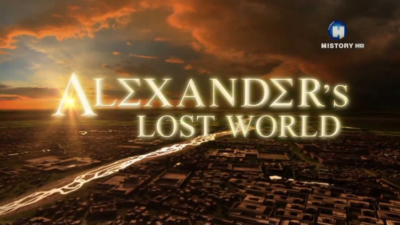 | 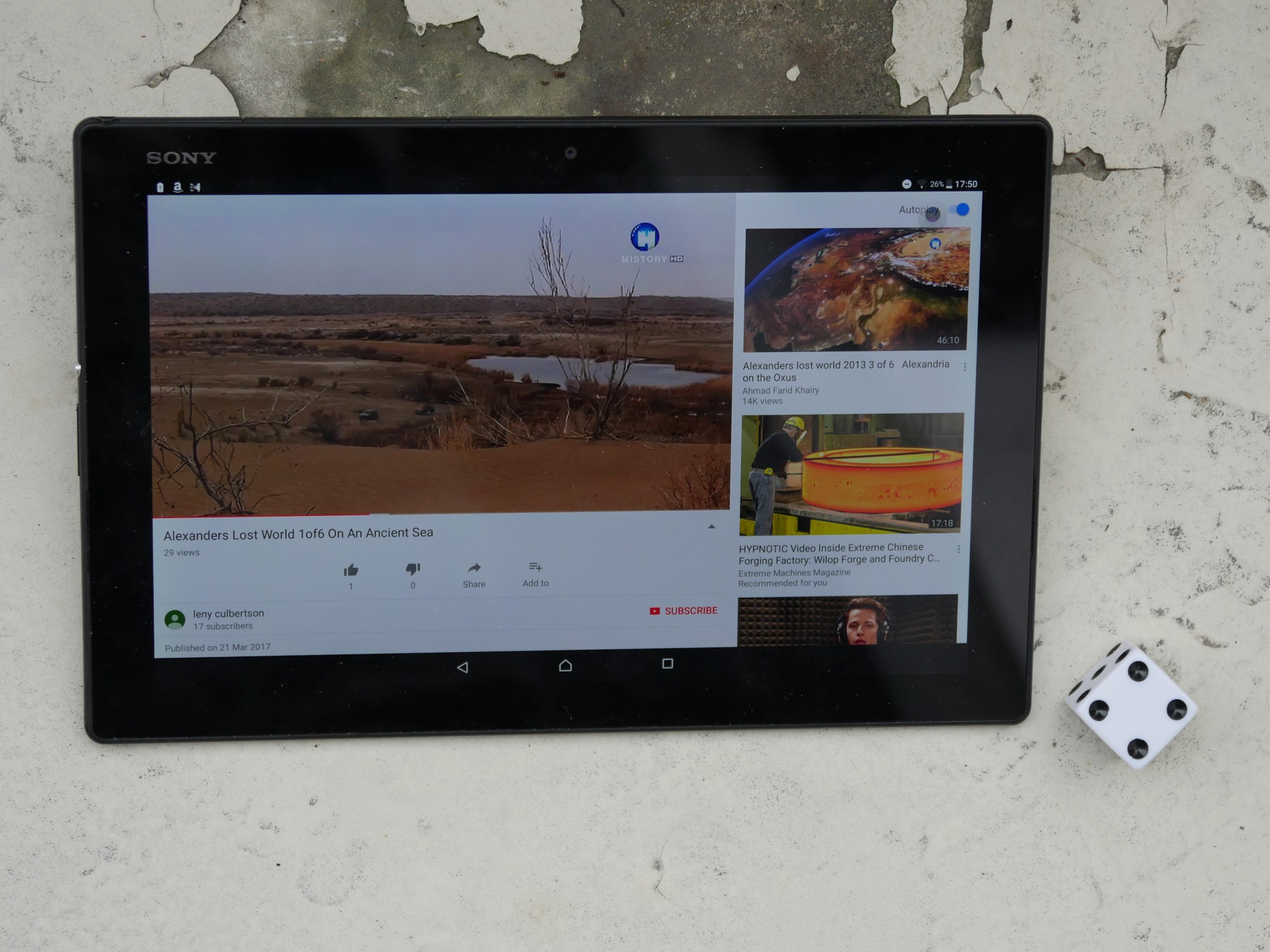 | 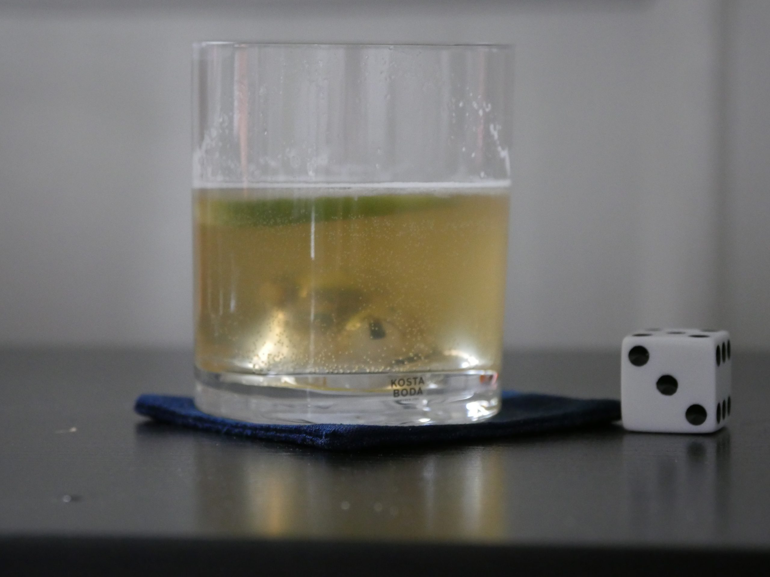 |
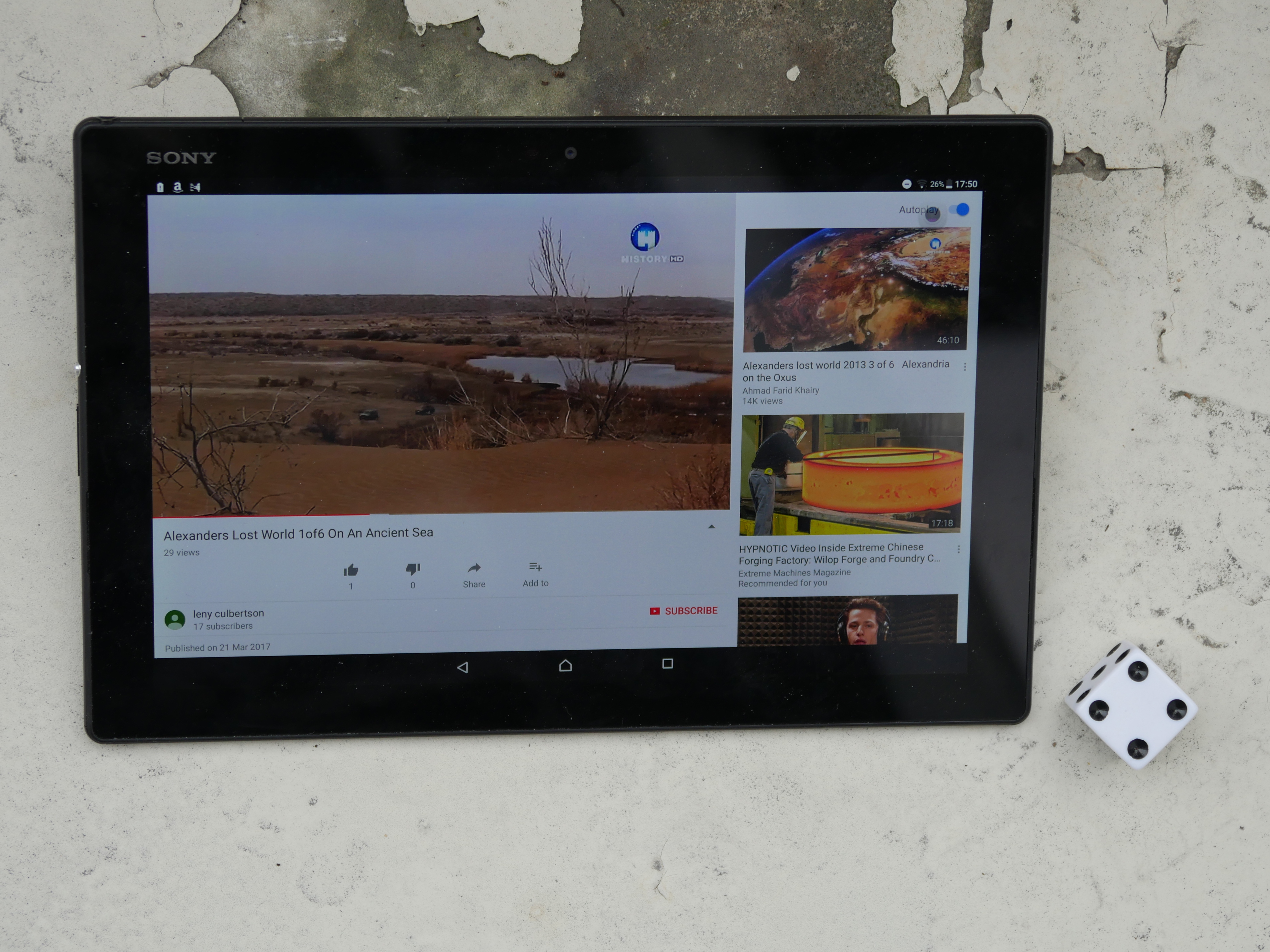
| Alexander’s Lost World. Unknown. 2013. Turkmenistan. September 8th, 2017. Vodka Green Tea Sprizter recipe. |
 | 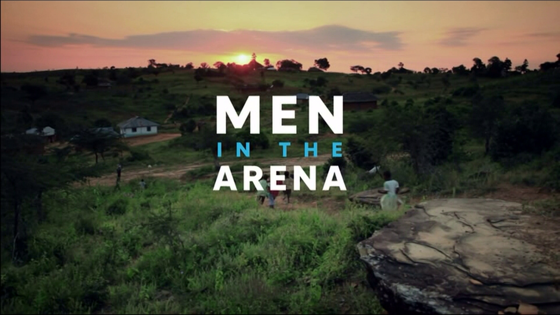 | 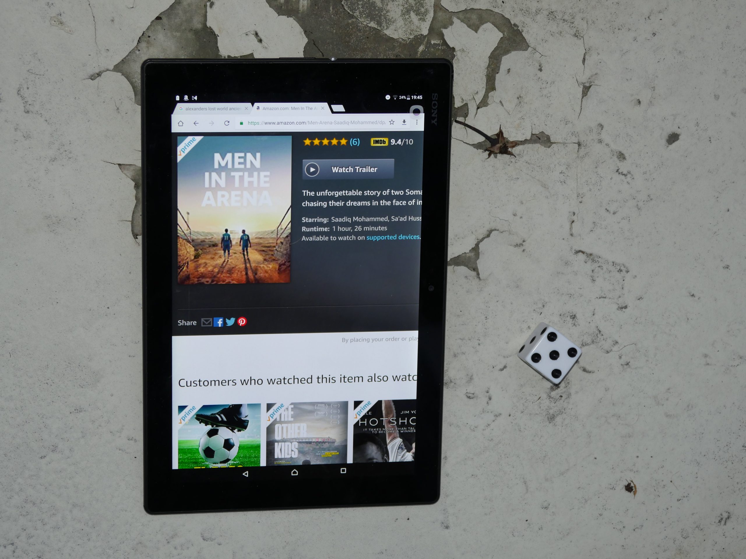 |  |
| Men in the Arena. J.R. Biersmith. 2017. Djibouti. September 8th, 2017. Retoxed Detox Tea. |
 | 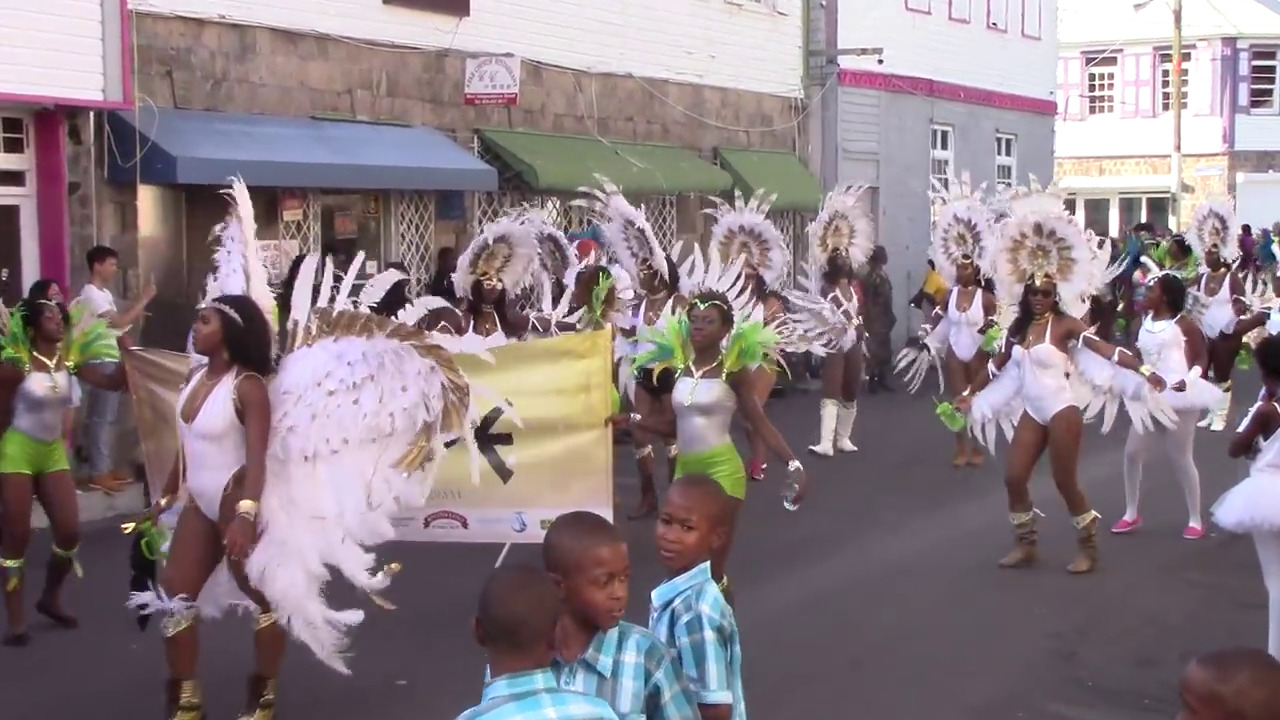 | 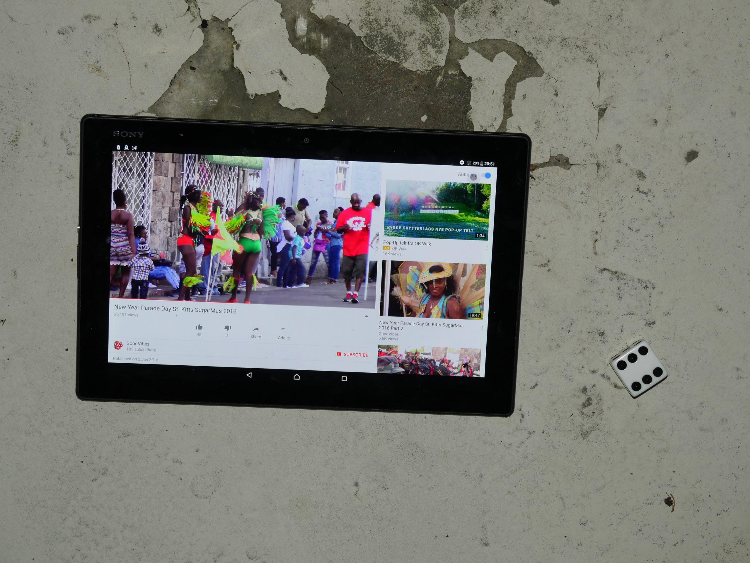 |  |
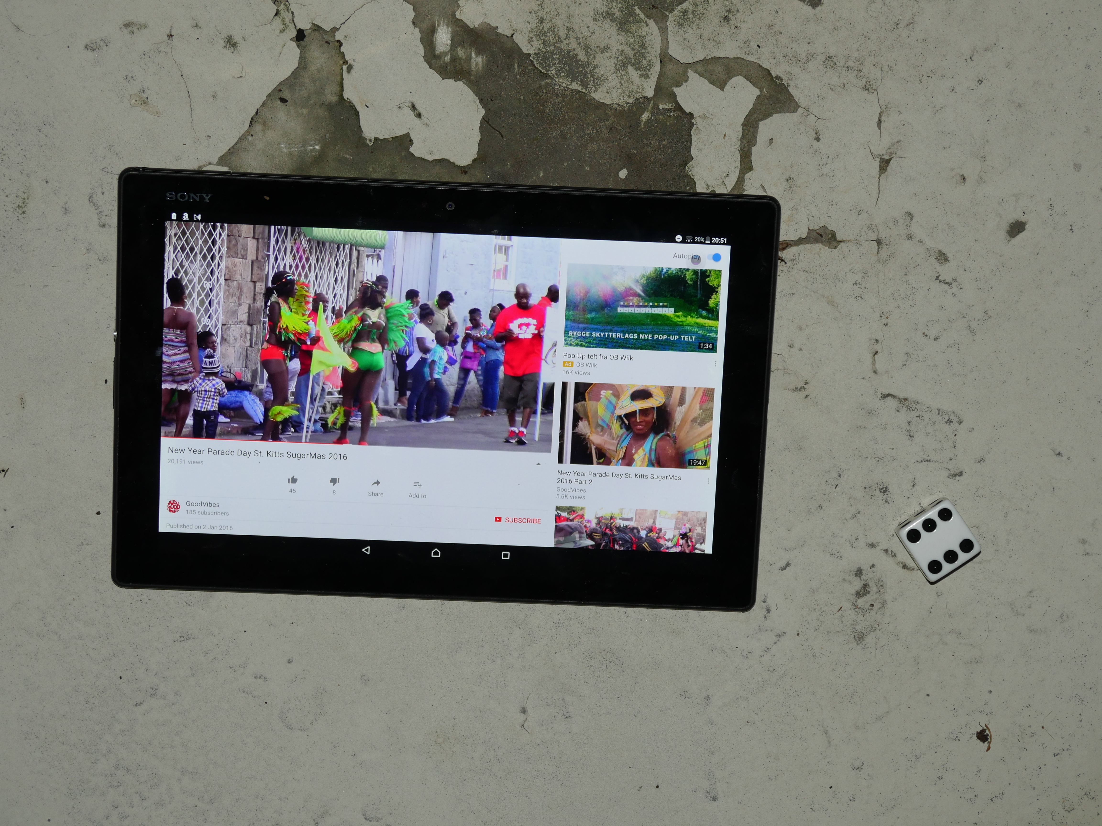
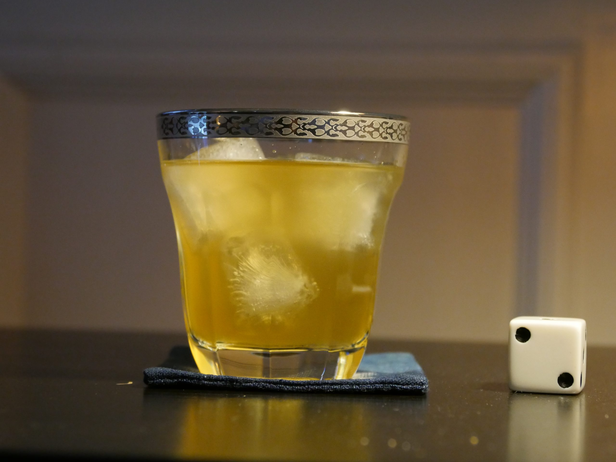
| New Year Parade Day St. Kitts SugarMas 2016. unknown. 2016. Saint Kitts and Nevis. September 8th, 2017. Killer Bee with Pepper and Nutmeg. |
 |  |  |  |
| Africa Paradis. Sylvestre Amoussou. 2006. Benin. September 8th, 2017. . |
 | 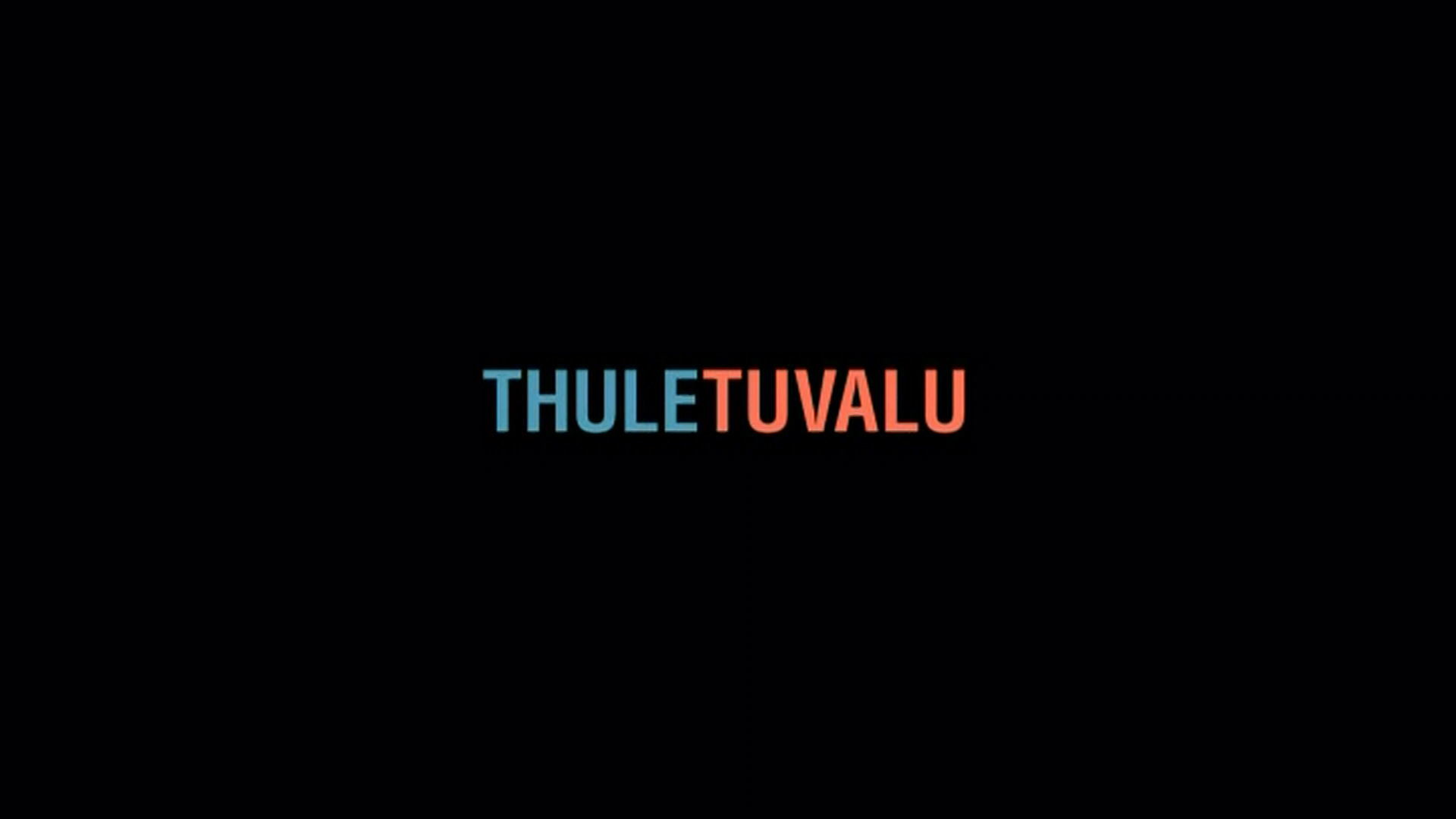 |  |  |
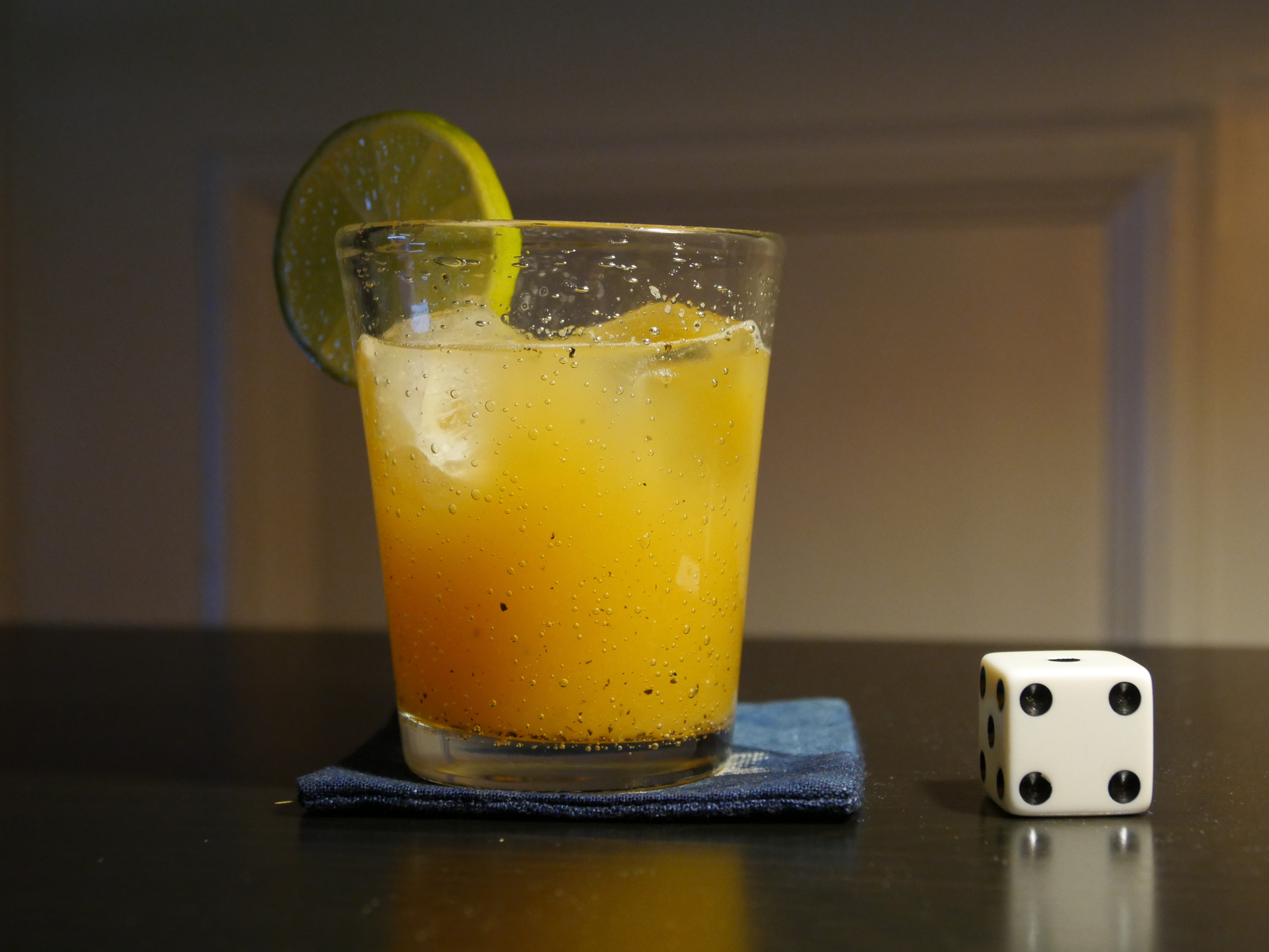
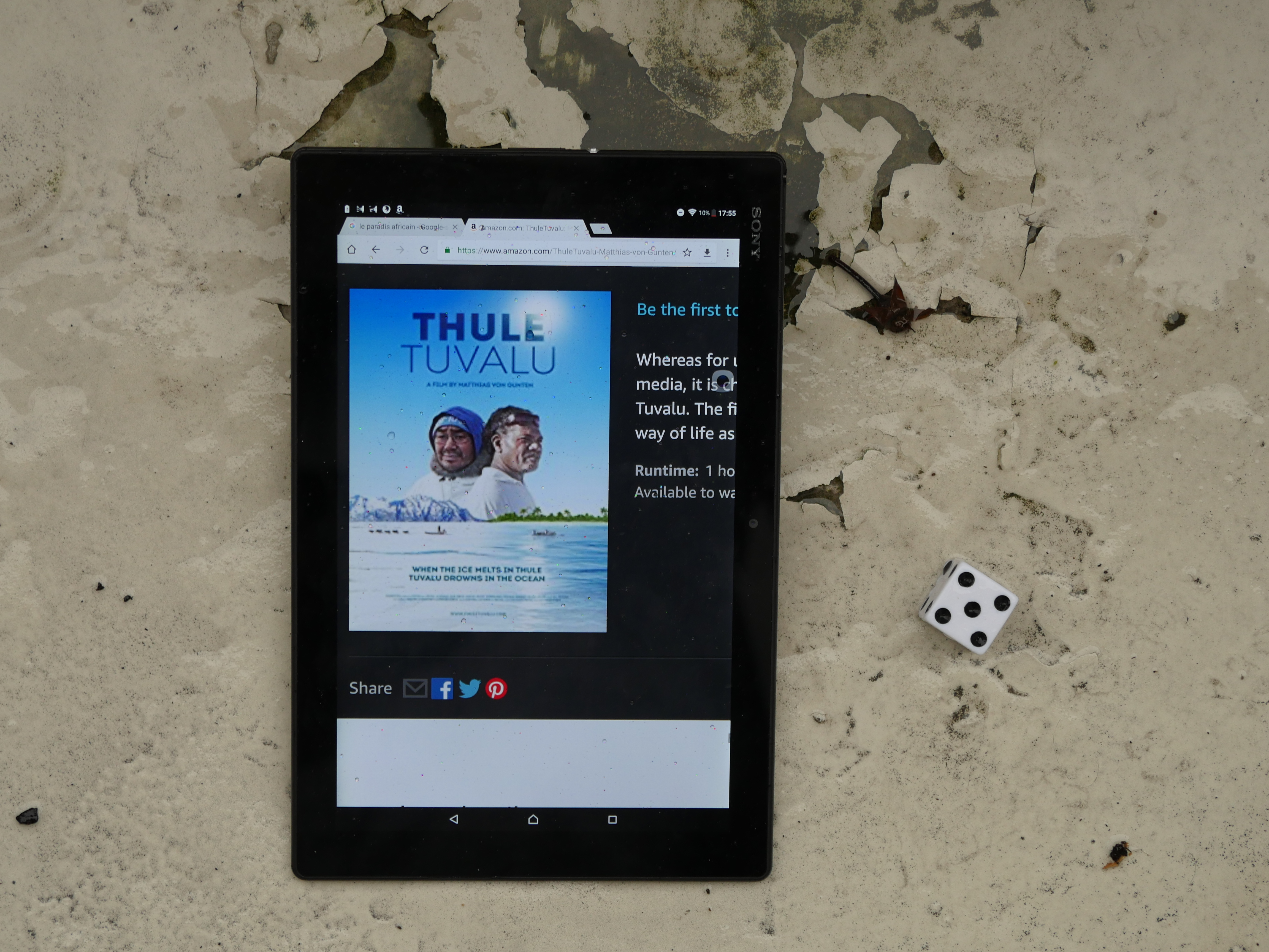
| ThuleTuvalu. Matthias von Gunten. 2014. Tuvalu. September 9th, 2017. ‘Otai. |
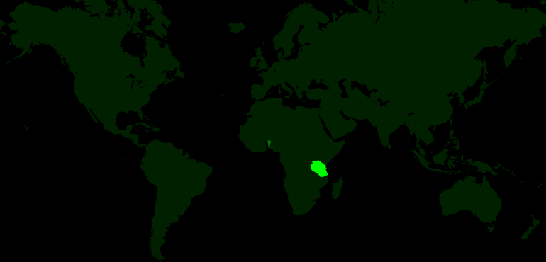 | 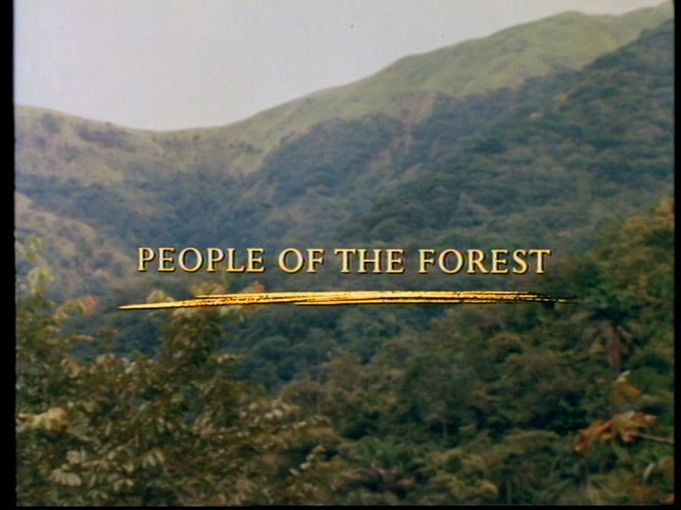 | 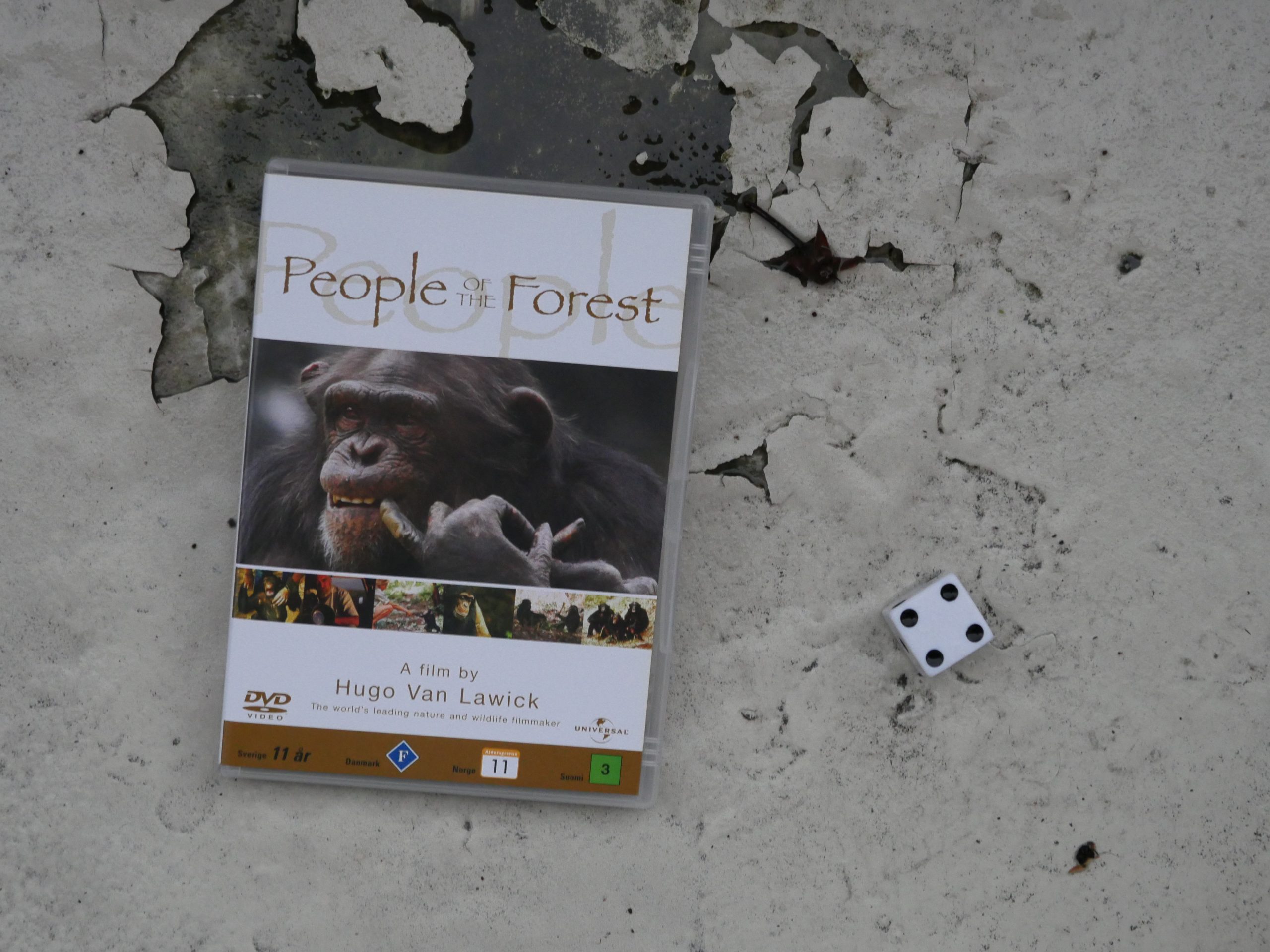 | 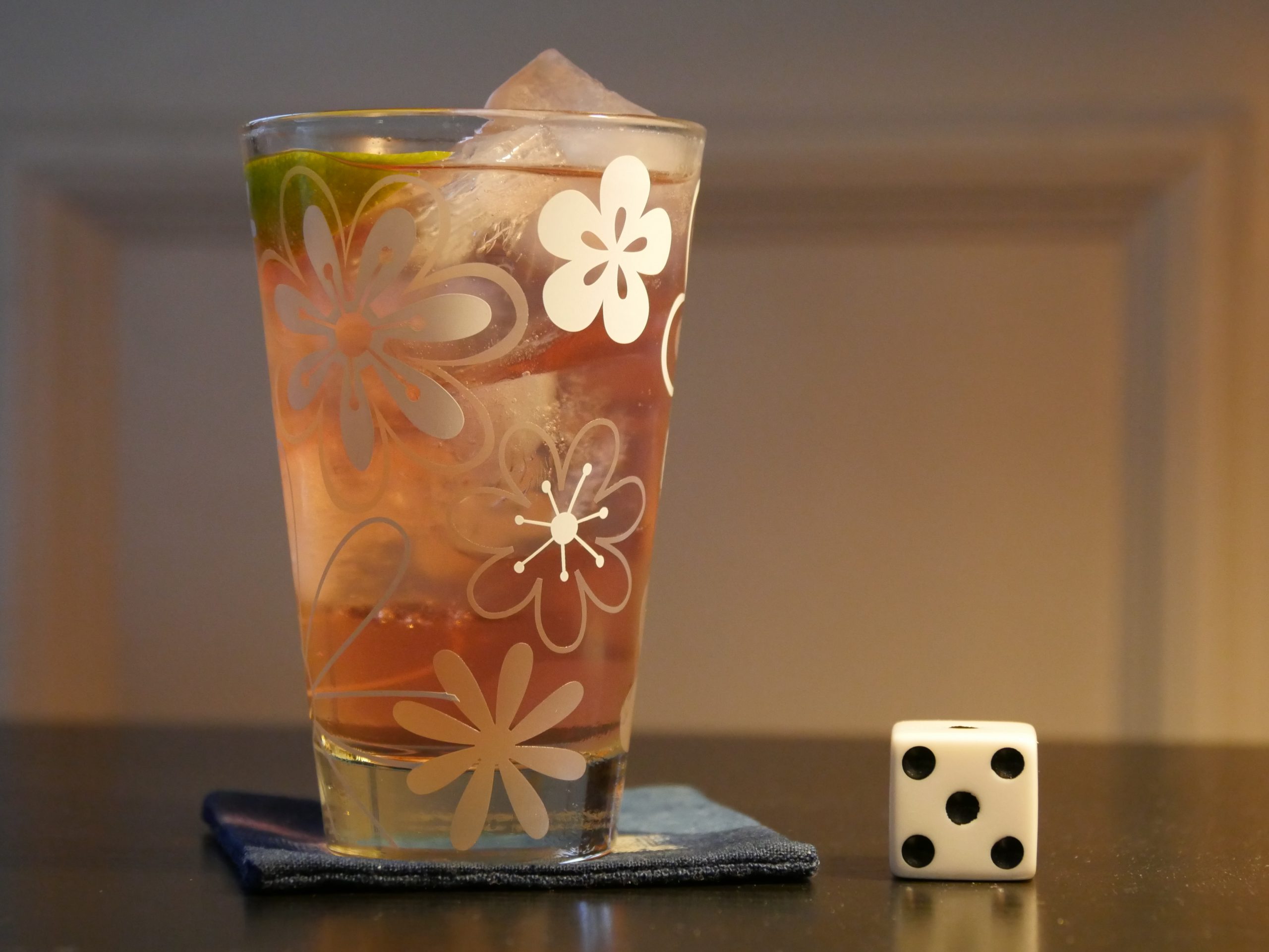 |
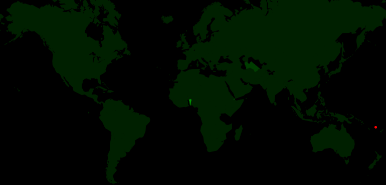
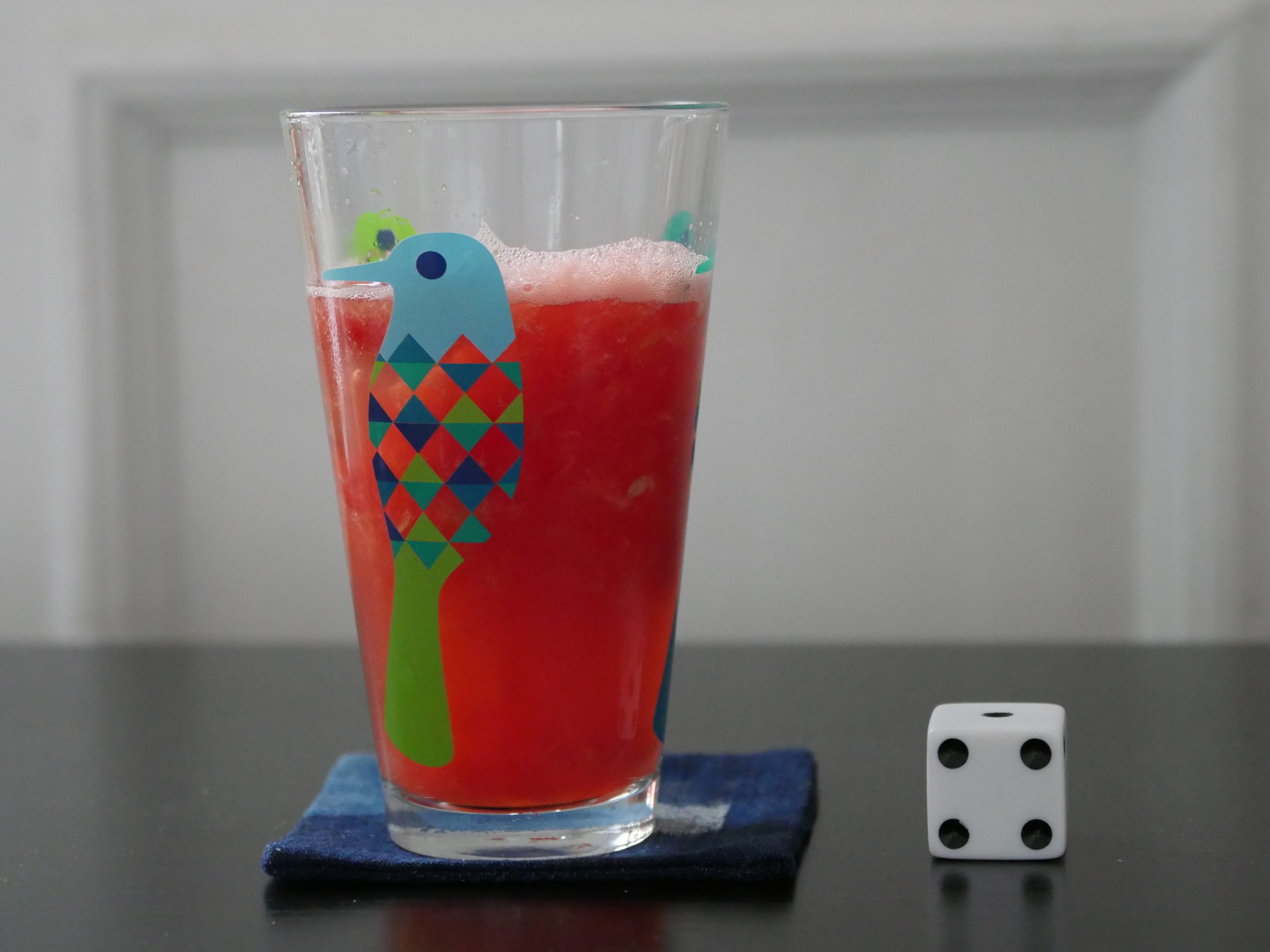
| People of the Forest. Hugo Van Lawick. 1988. Tanzania. September 9th, 2017. Tanzania 28 Cocktail. |
 | 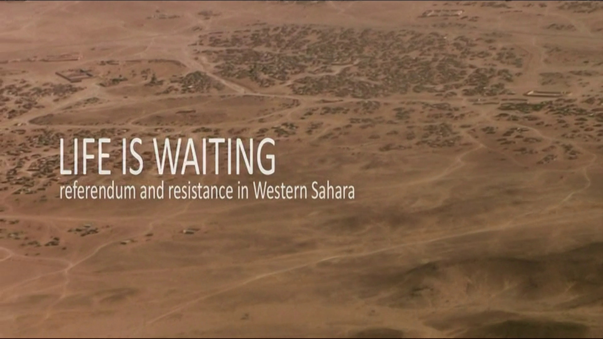 | 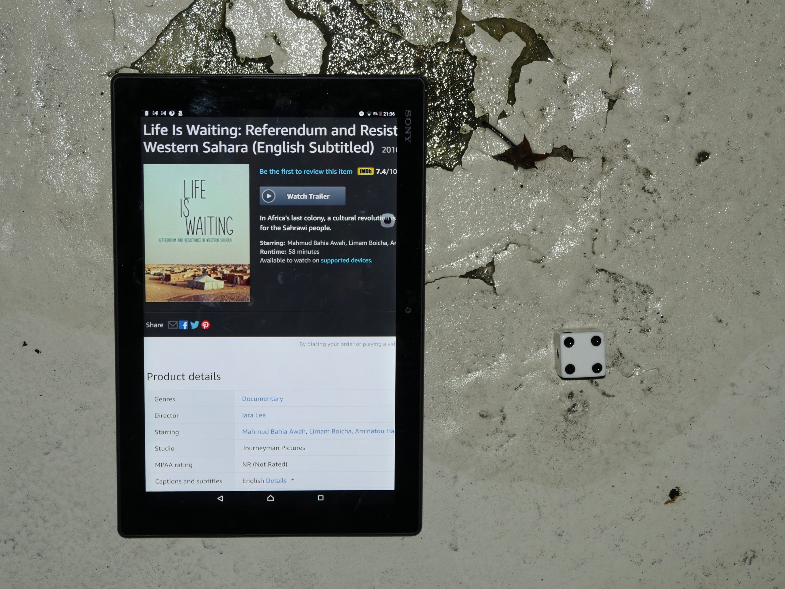 |  |
| Life is Waiting: Referendum and Resistance in Western Sahara. Iara Lee. 2015. Western Sahara. September 9th, 2017. West Sahara Ginger Drink. |
 | 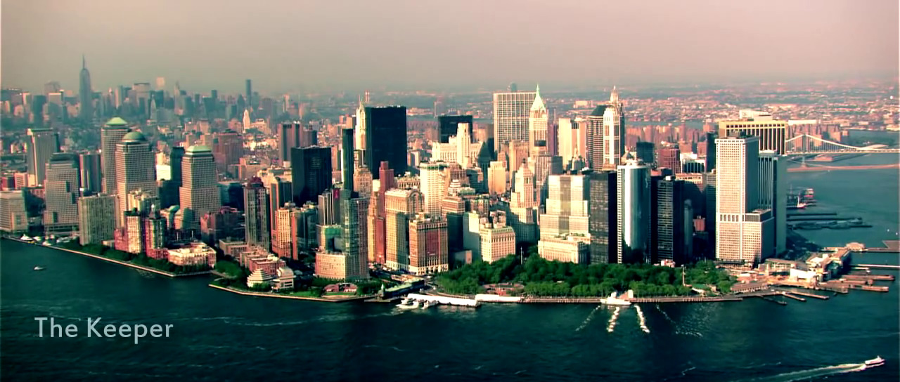 | 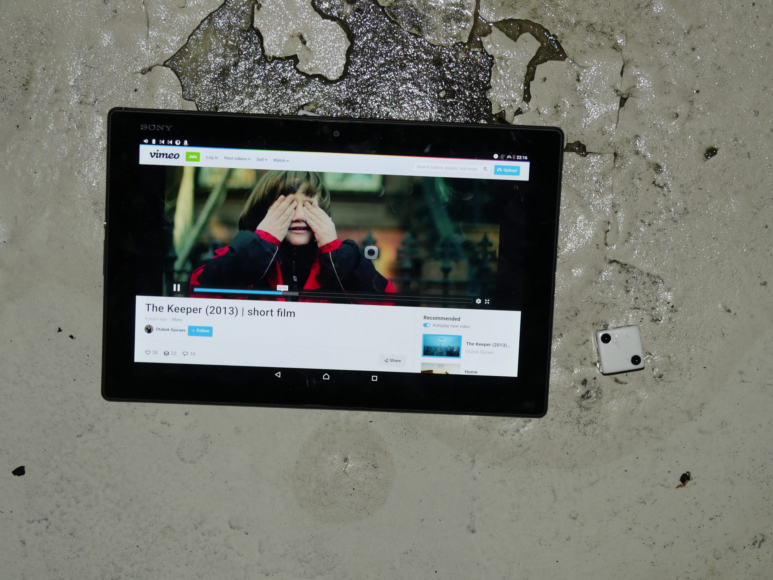 | 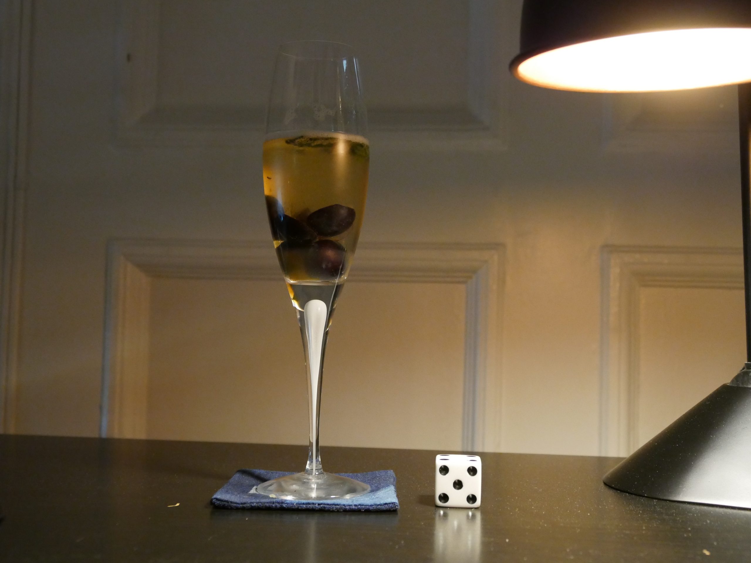 |
| The Keeper. Otabek Djuraev. 2013. Uzbekistan. September 9th, 2017. Grape + Sage Holiday Kompot Cocktail. |
 | 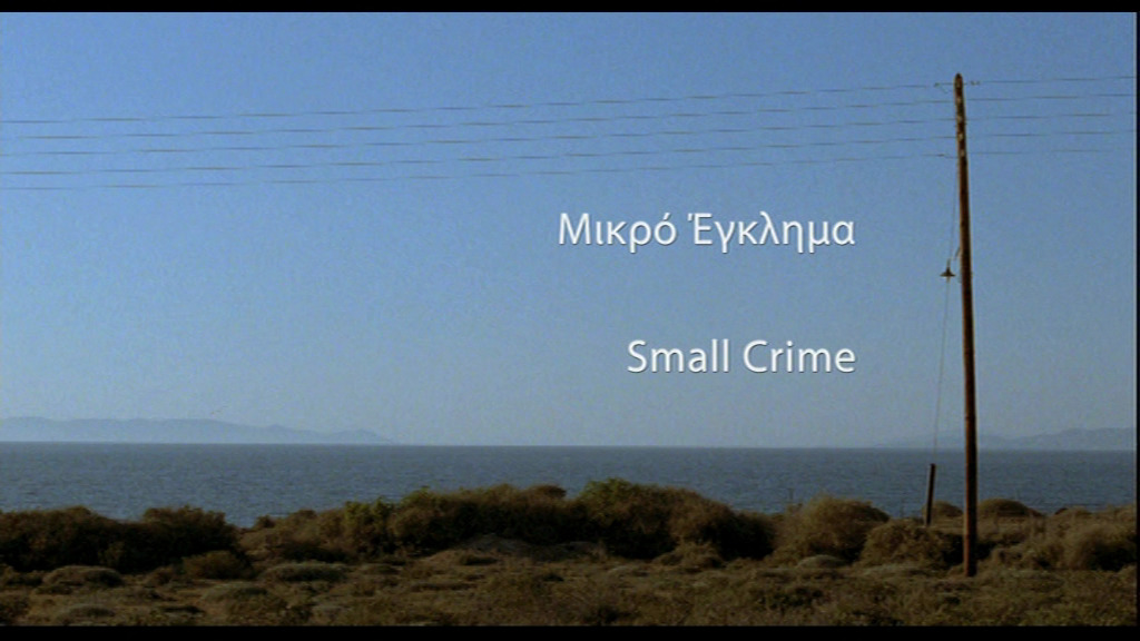 |  | 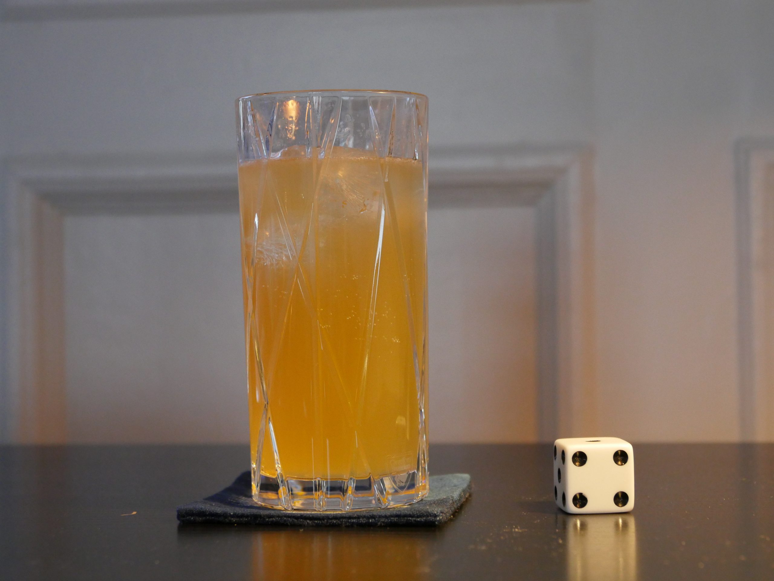 |
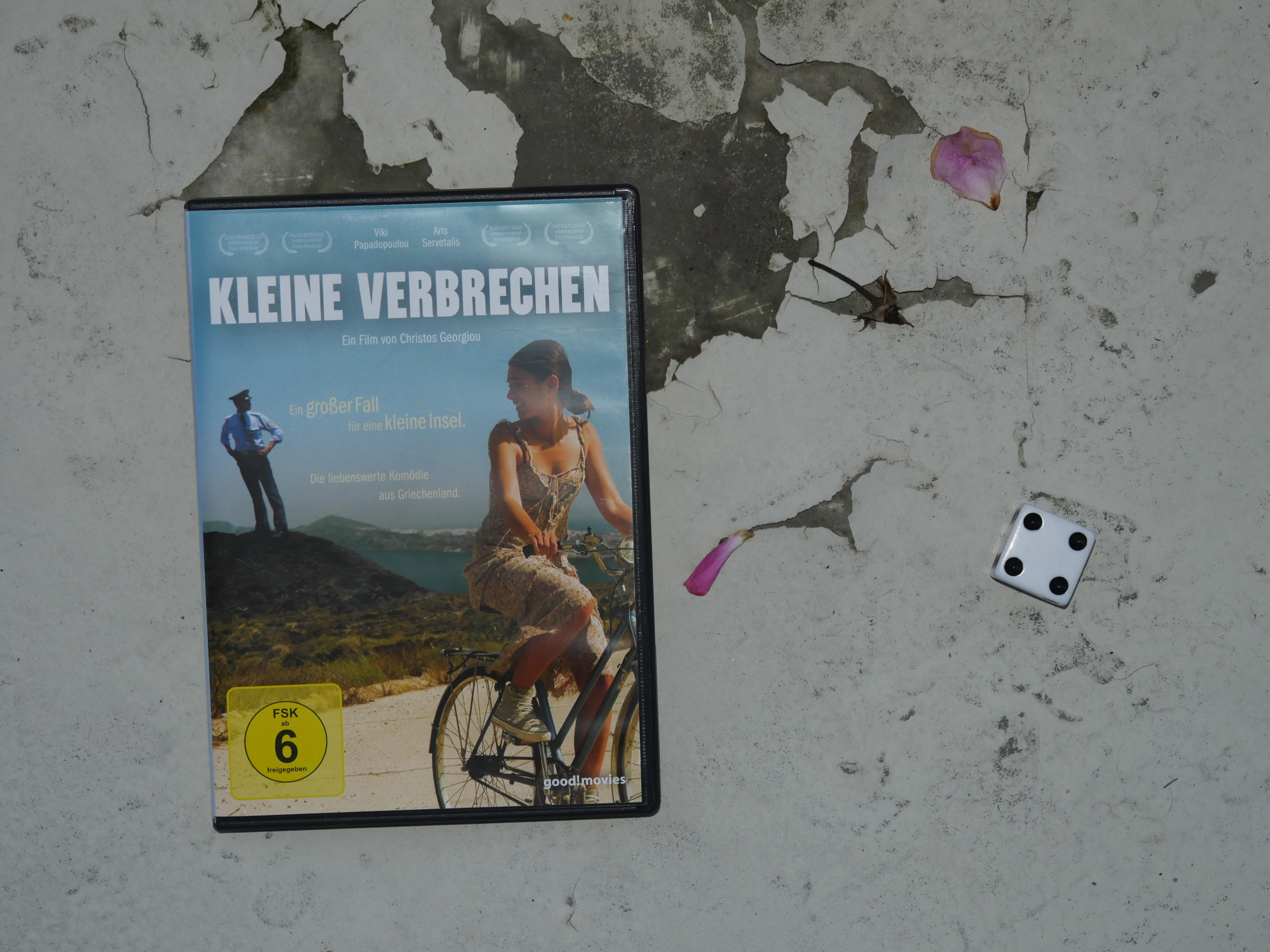
| Small Crimes. Christos Georgiou. 2008. Cyprus. September 15th, 2017. Authentic Cypriot Taverna Brandy Sour Cocktail. |
 | 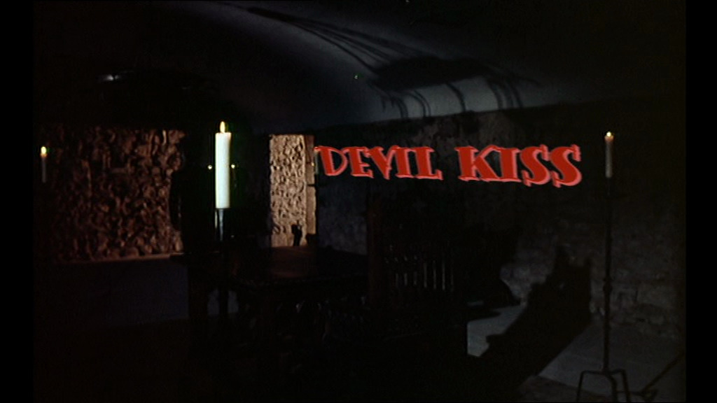 | 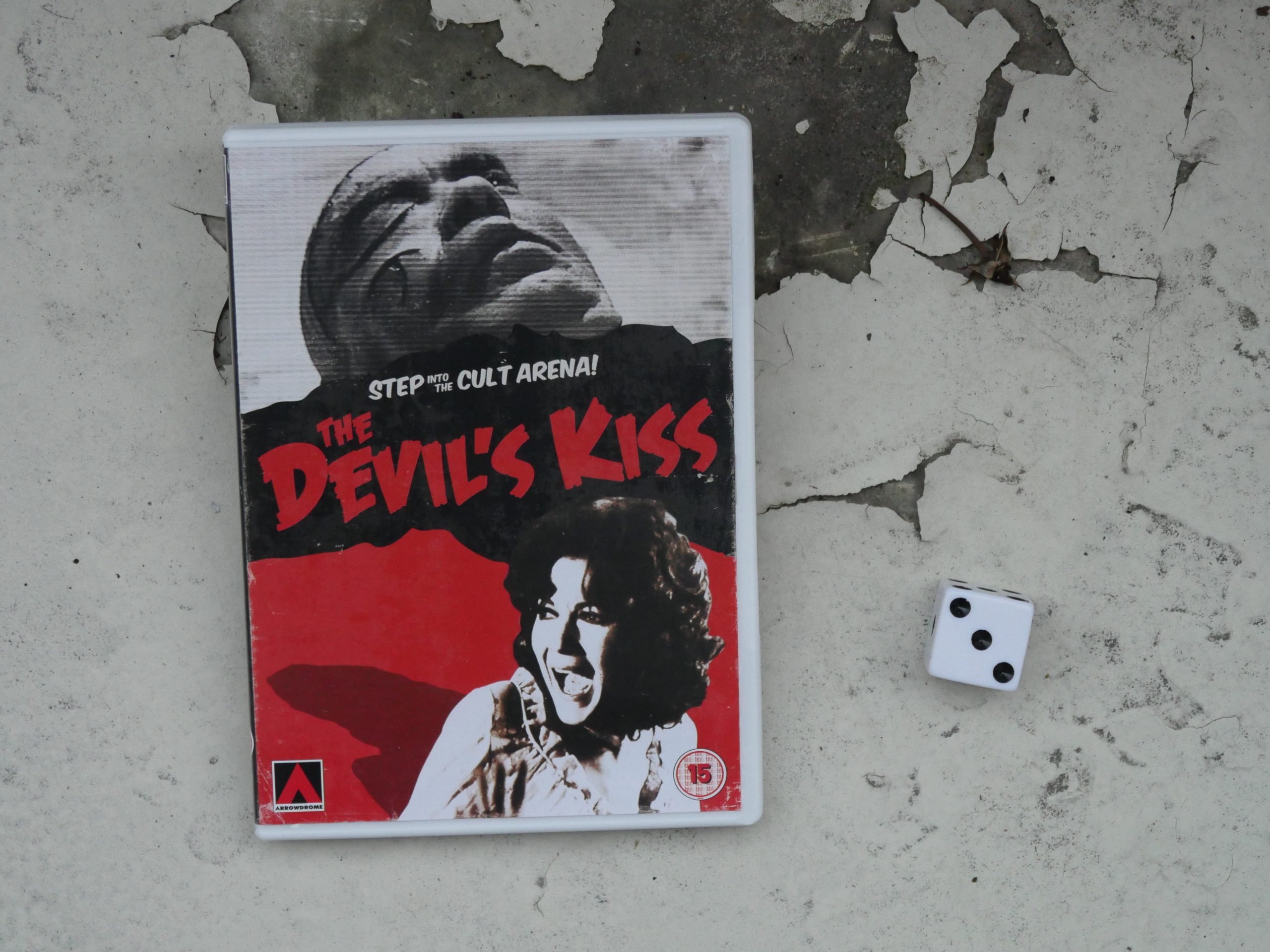 |  |
| The Devil’s Kiss. Jordi Gigó. 1976. Andorra. September 22nd, 2017. Sangria. |
 | 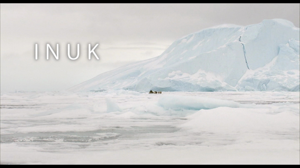 | 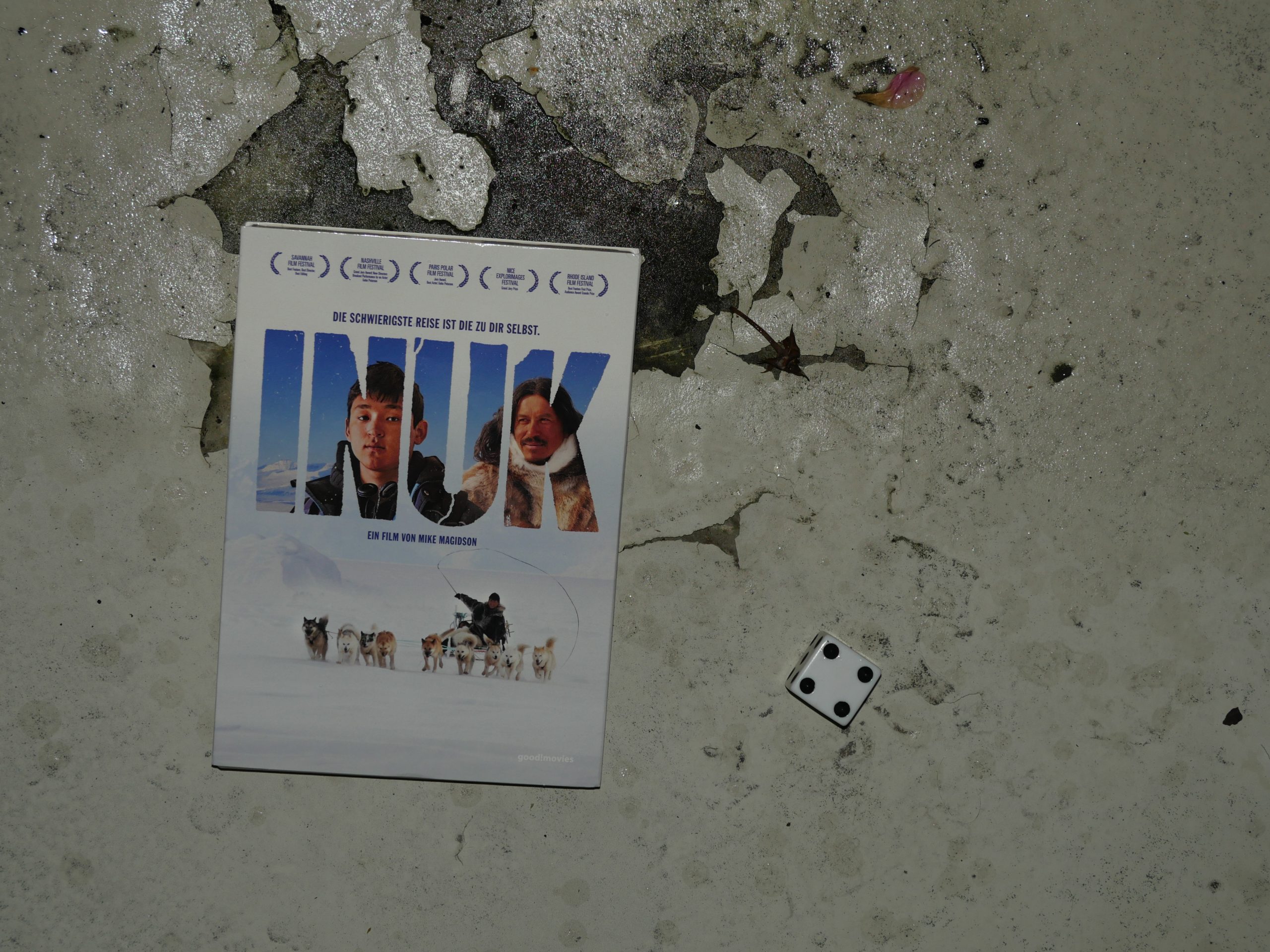 |  |
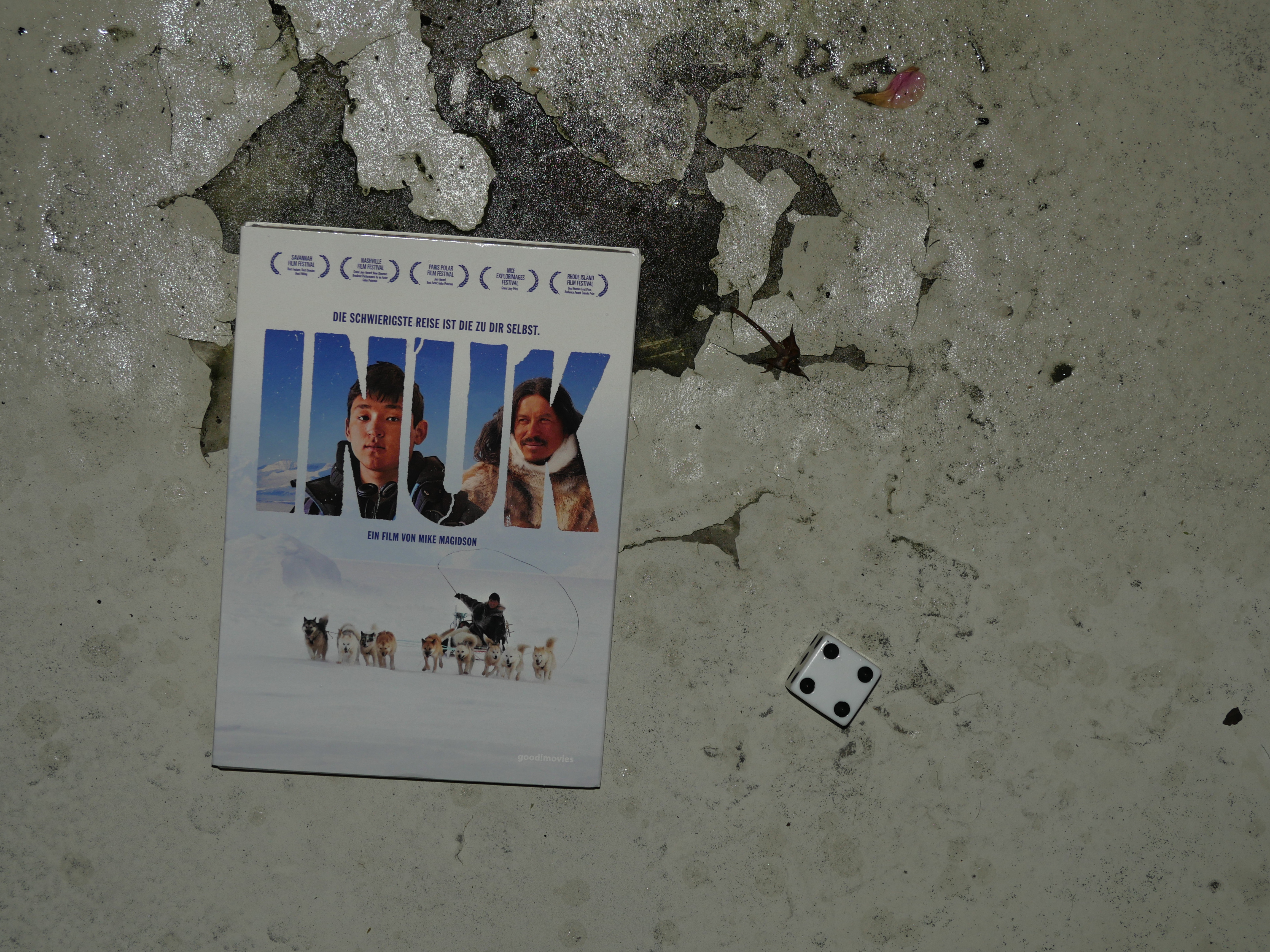
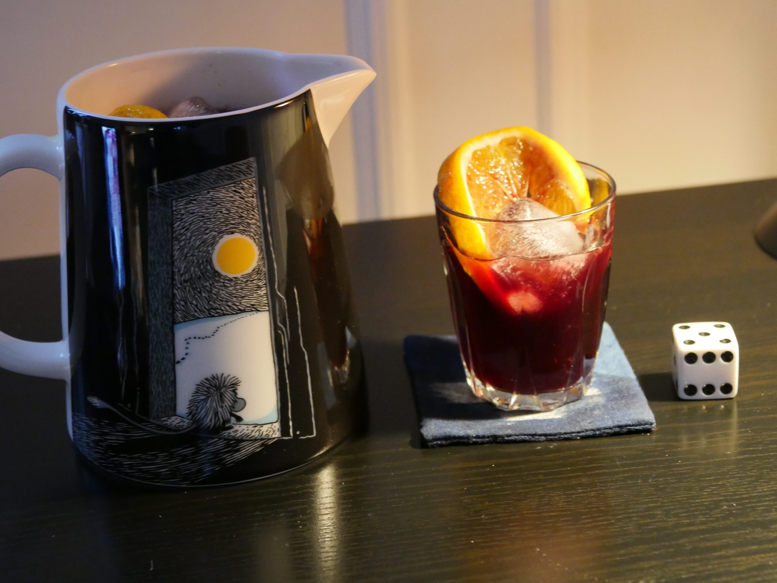
| Inuk. Mike Magidson. 2010. Greenland. September 22nd, 2017. Arctic Cirle Secrets. |
 | 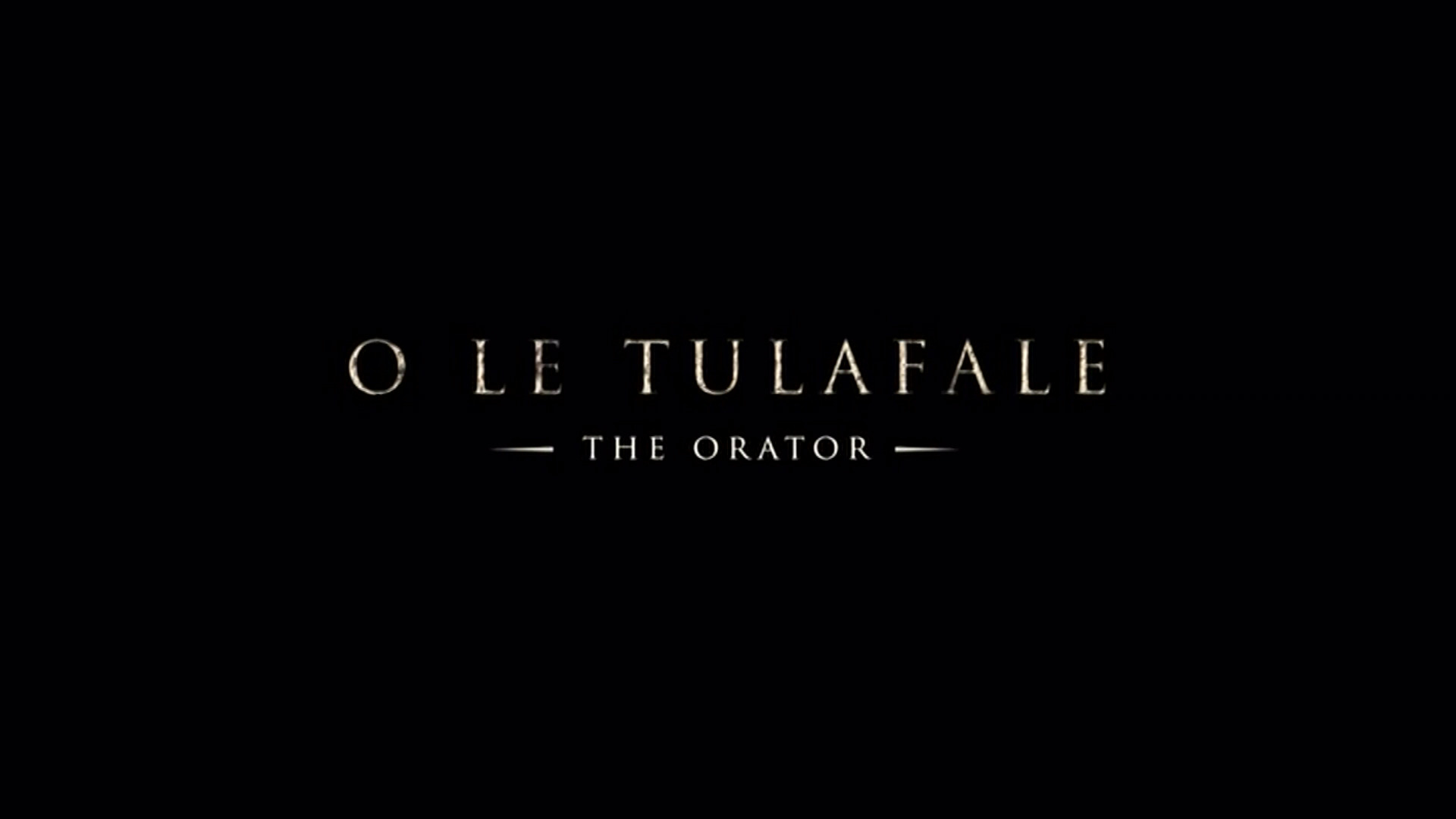 | 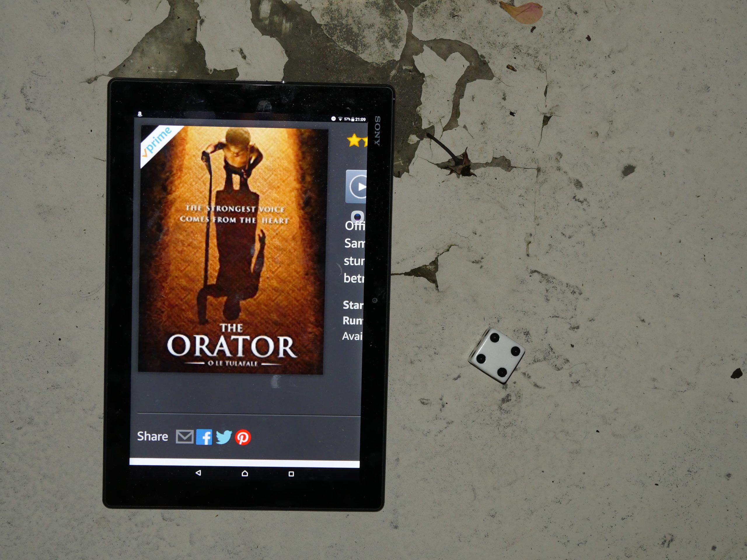 |  |
| The Orator. Tusi Tamasese. 2011. Samoa. September 23rd, 2017. Samoan island cocktail recipe. |
 |  | 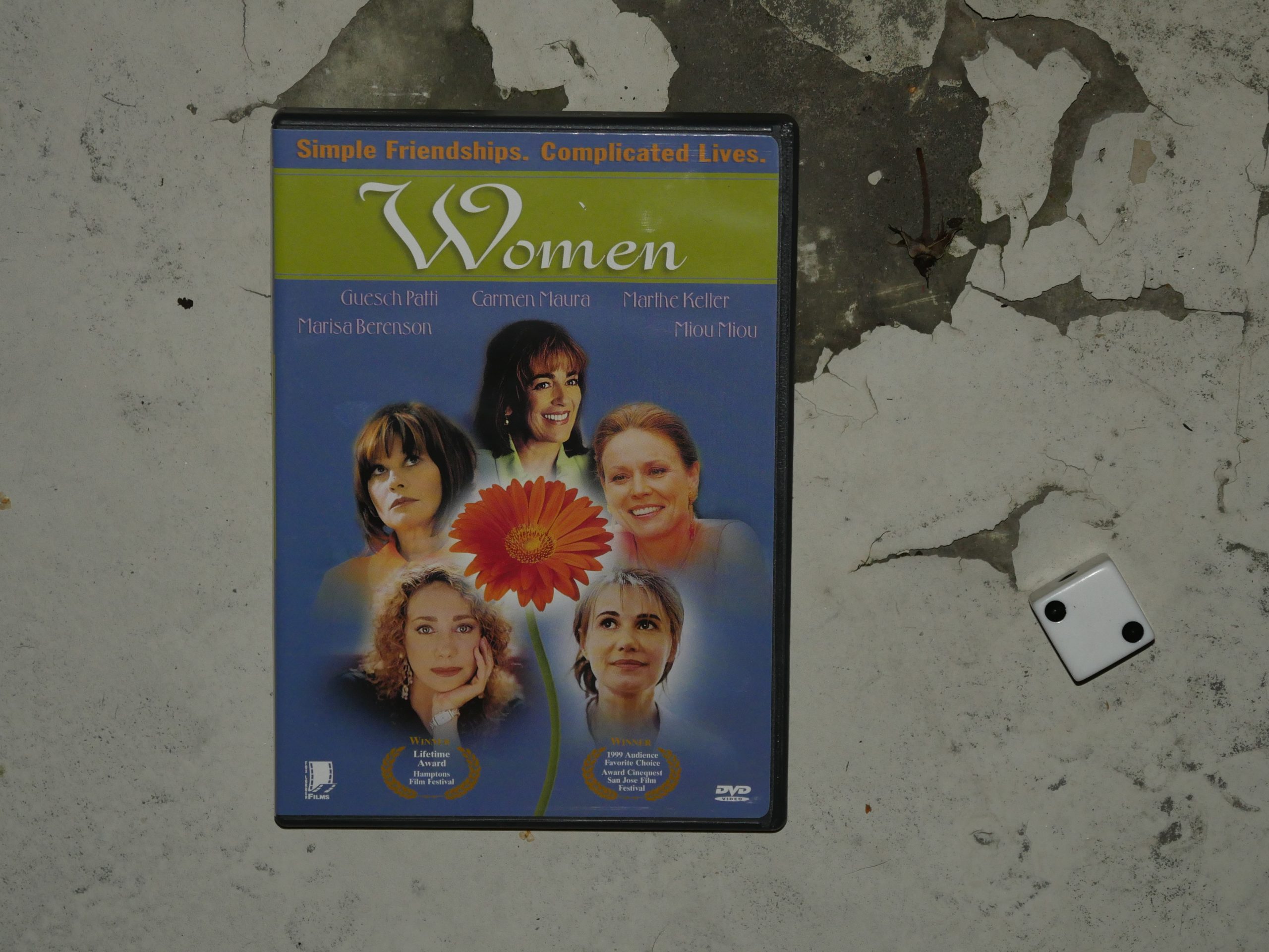 |  |
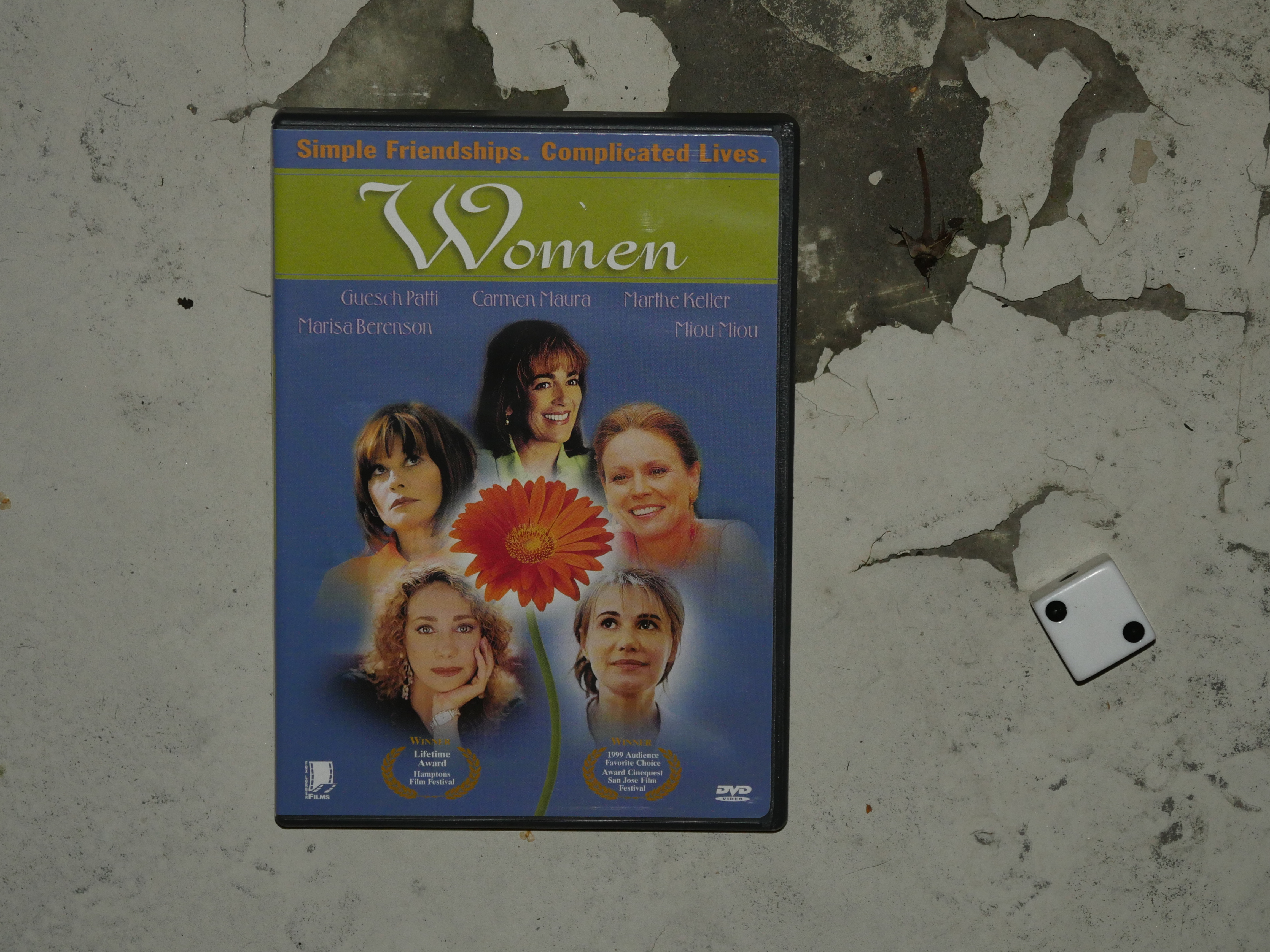
| Women. Luís Galvão Teles. 1997. Luxembourg. October 6th, 2017. Absolute Stress. |
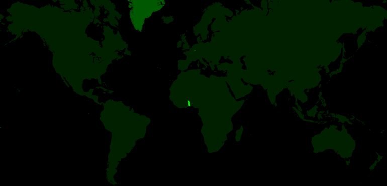 |  | 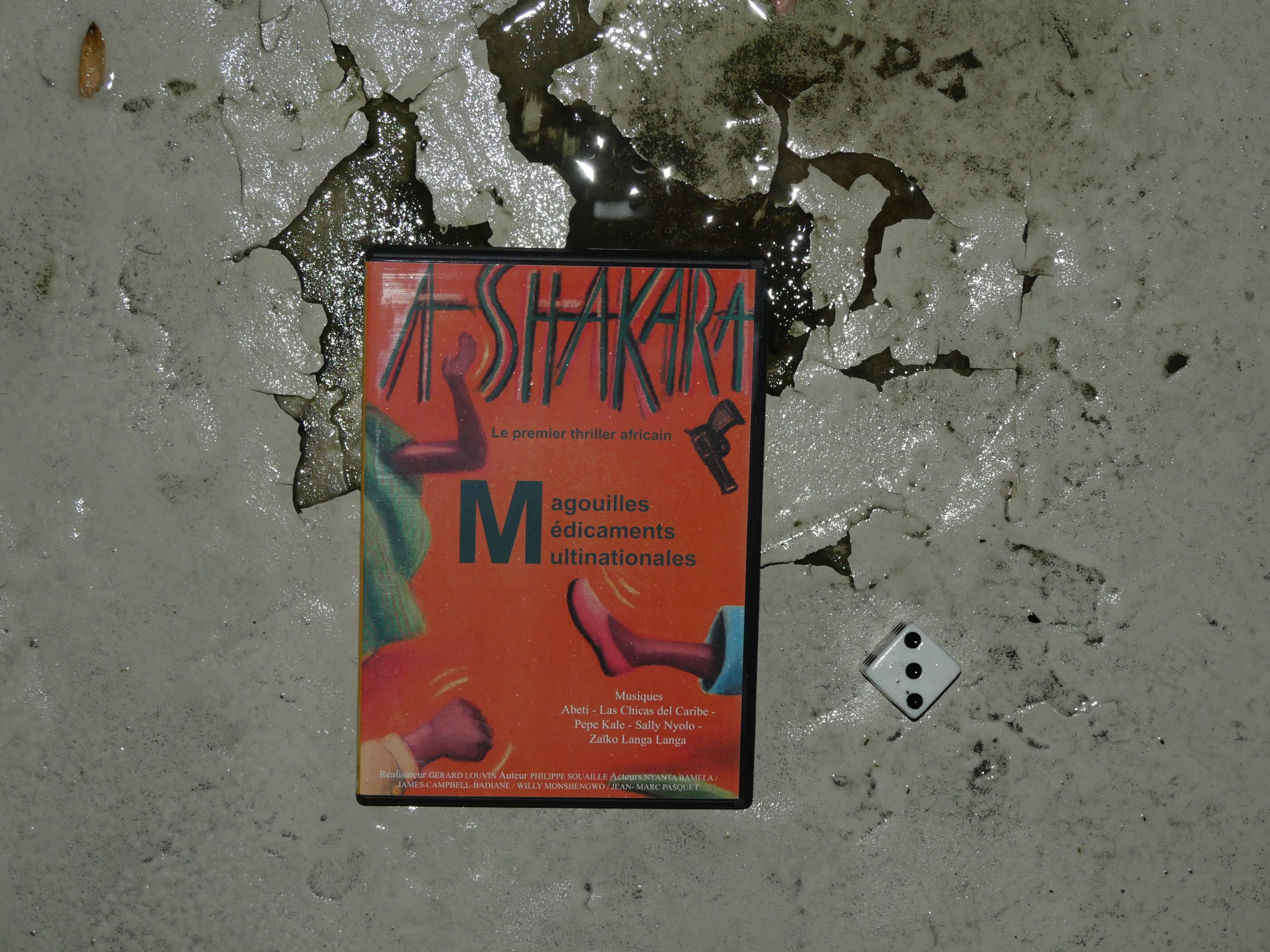 |  |
| Ashakara. Gérard Louvin. 1991. Togo. October 13th, 2017. Jus de bissap. |
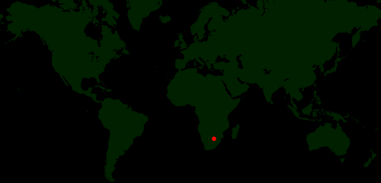 | 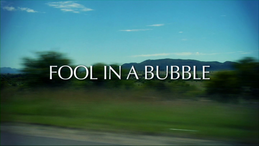 | 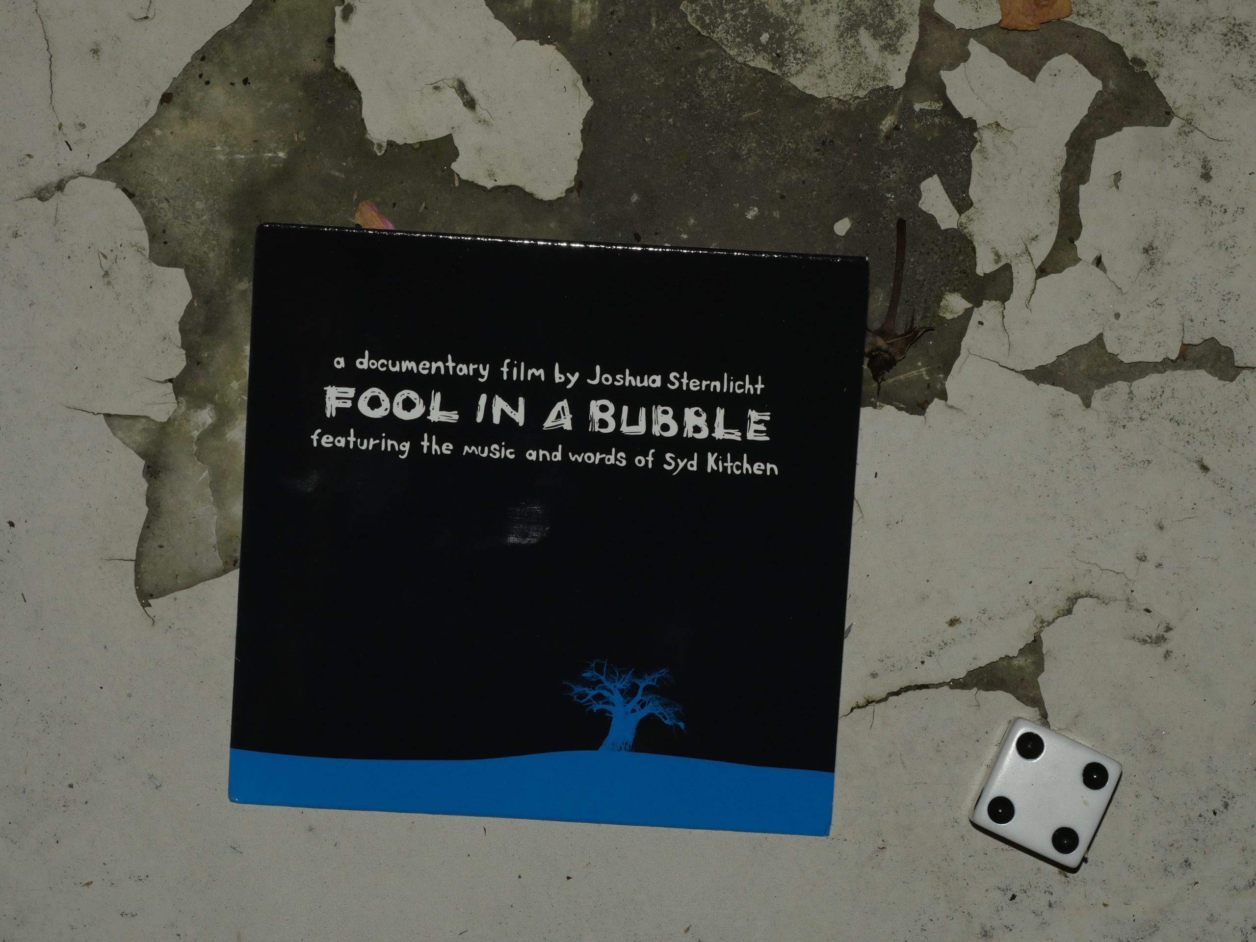 |  |
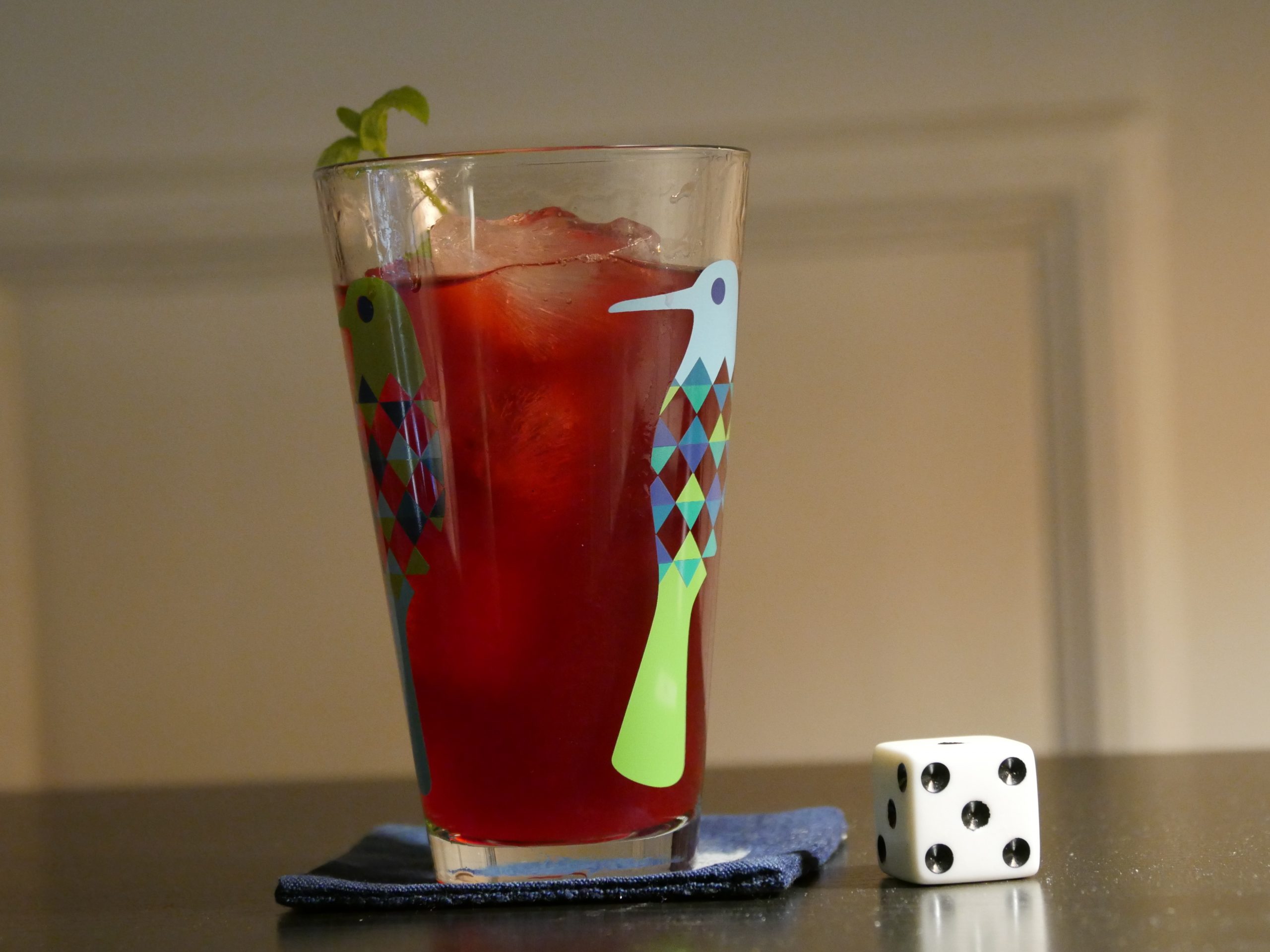
| Fool in a Bubble. Josh Sternlicht. 2010. Swaziland. October 20th, 2017. Black Label Fusion Cocktail. |