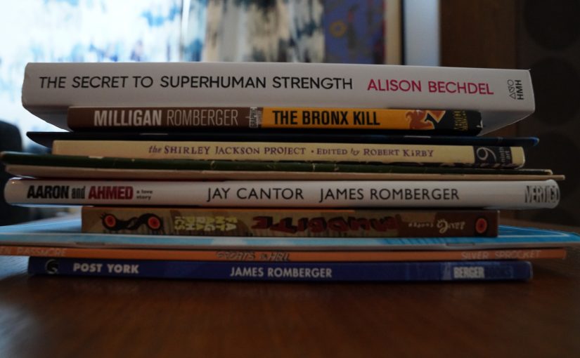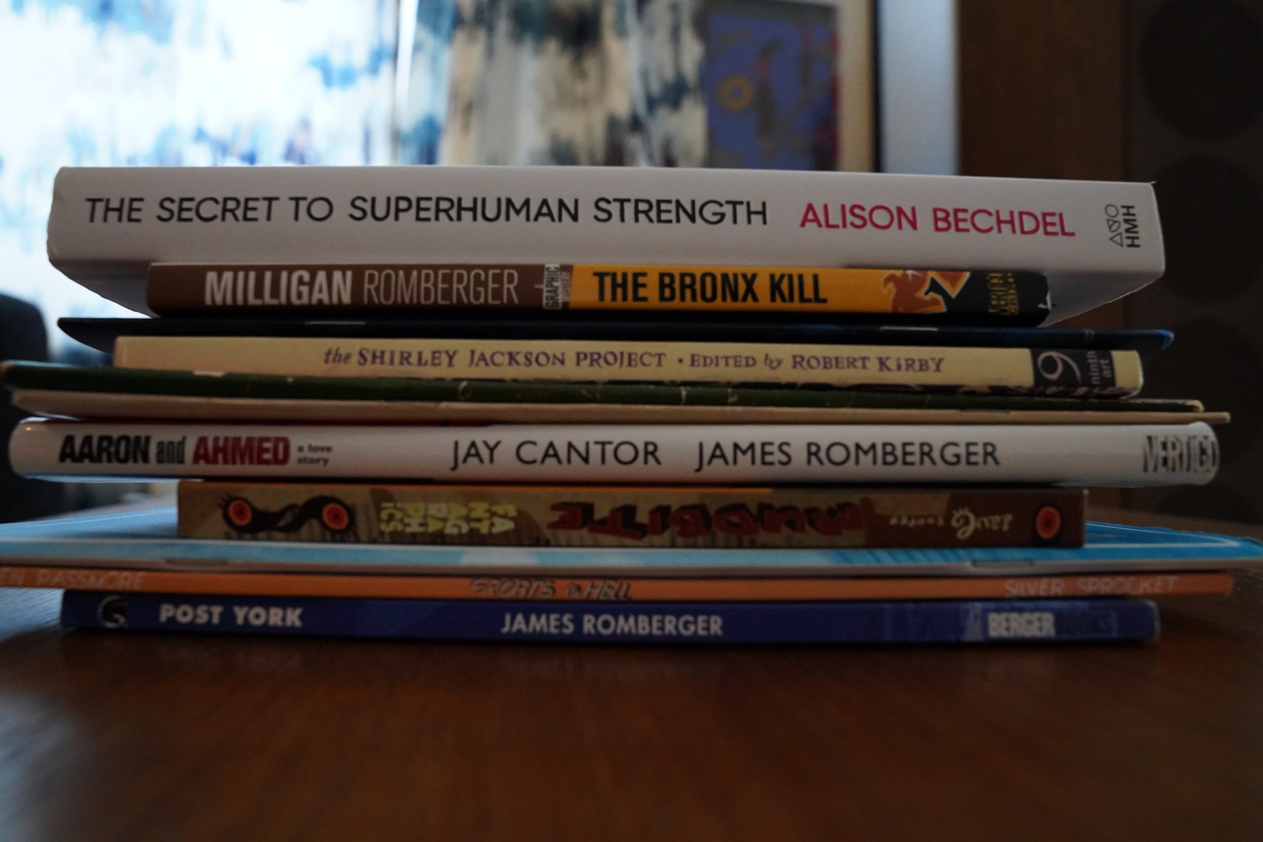

Hey, this is a nice day to be reading comics… especially since I got a bunch really random ones in the mail yesterday.
| Boris: NO |  |
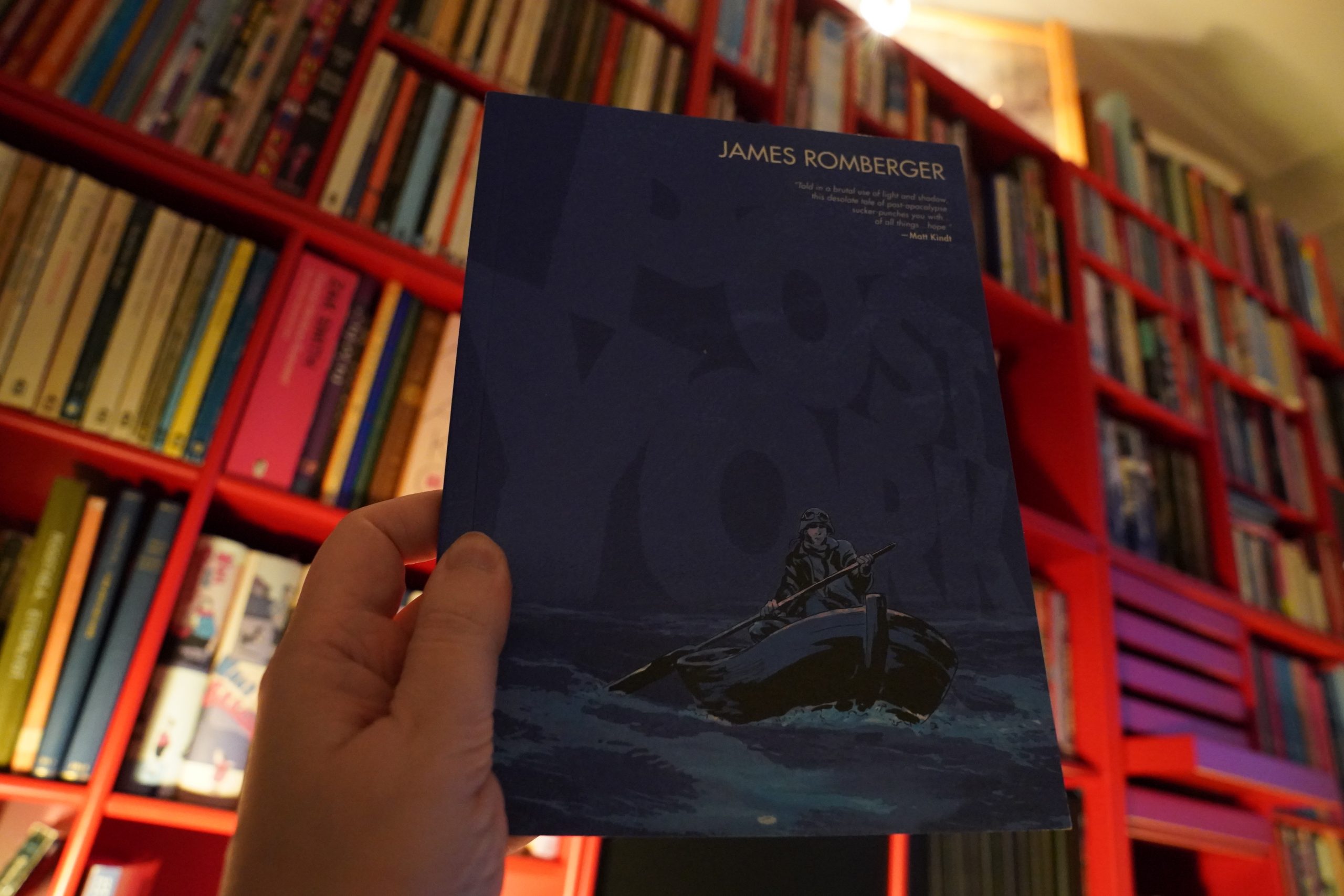
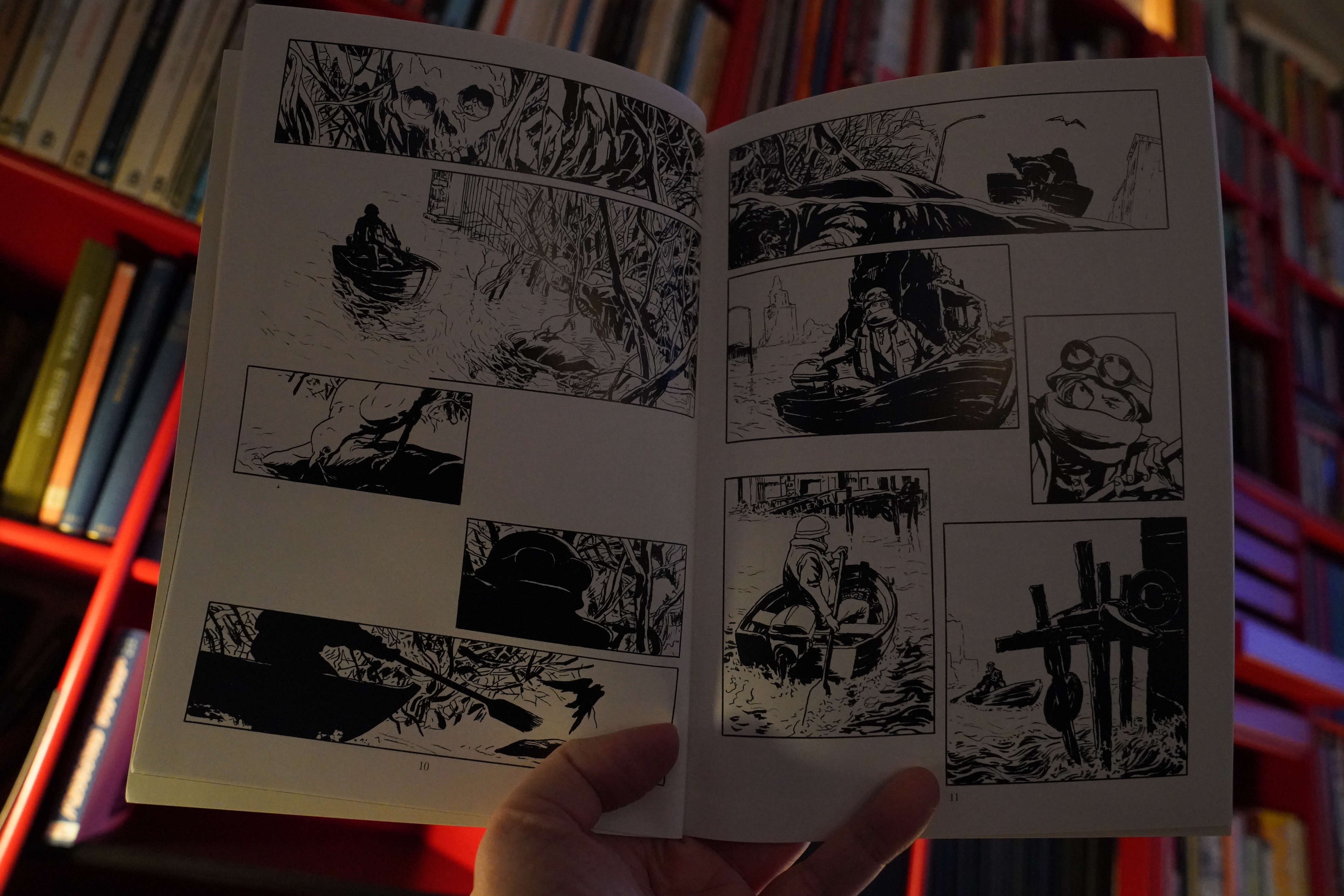
07:39: Post York by James Romberger (Dark Horse)
I read a really striking piece by David Wojnarowicz and James Romberger in an old issue of World War 3 Illustrated, which made me google Romberger and scoop up the books of his that I don’t have.
Well, actually, I do already have a version of this — it was published by Uncivilized? But … it was shorter? And came with a flexi by Crosby?
Yes:
Or the way my record player interpreted that flexi:
Auto remix!

Hm… this is quite different from what I remember the shorter book being like. Well, for one, it’s reproduced smaller and on shiny paper, which doesn’t do much for this artwork.
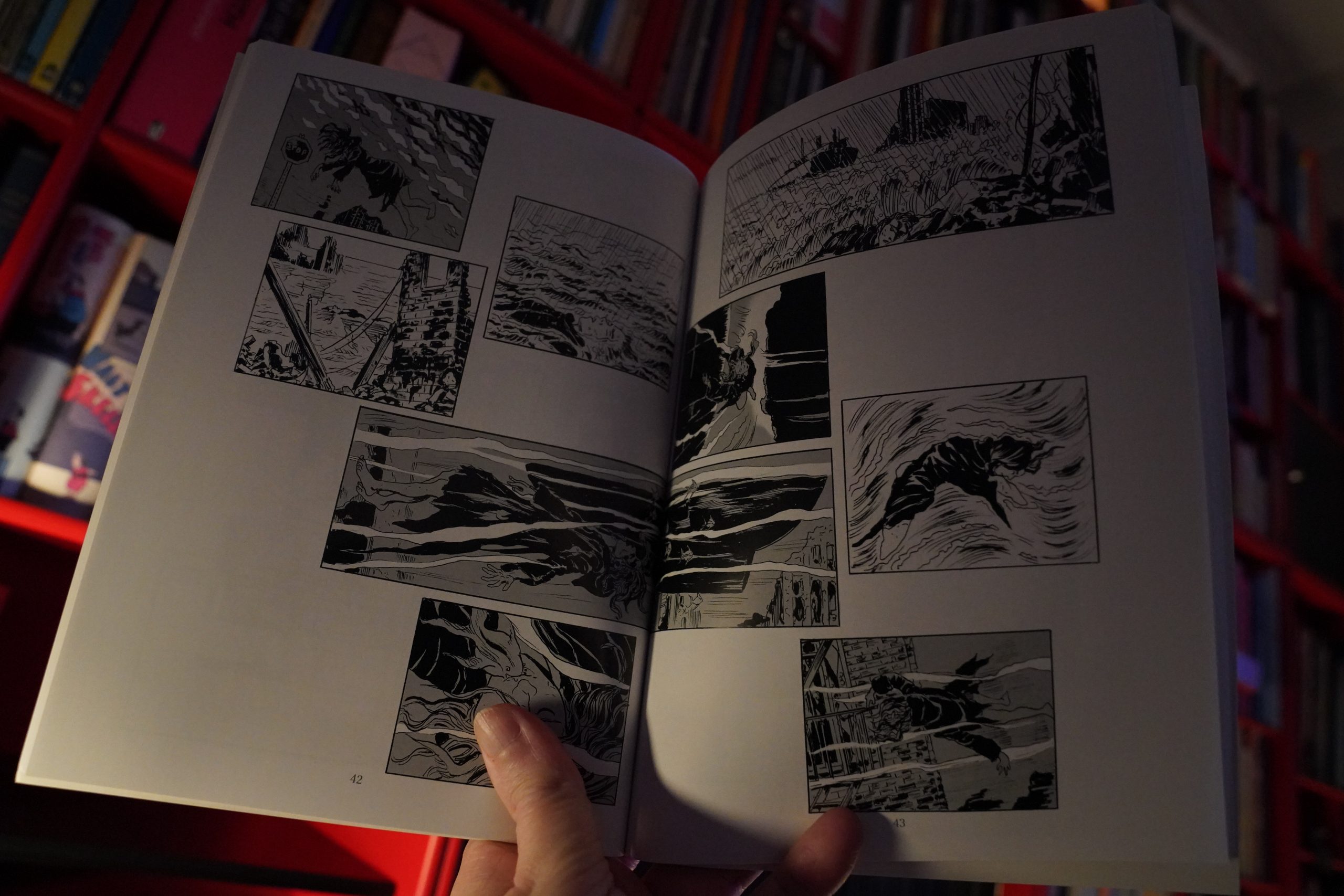
But it’s good. All po mo and stuff.
| Crickets: Crickets |  |
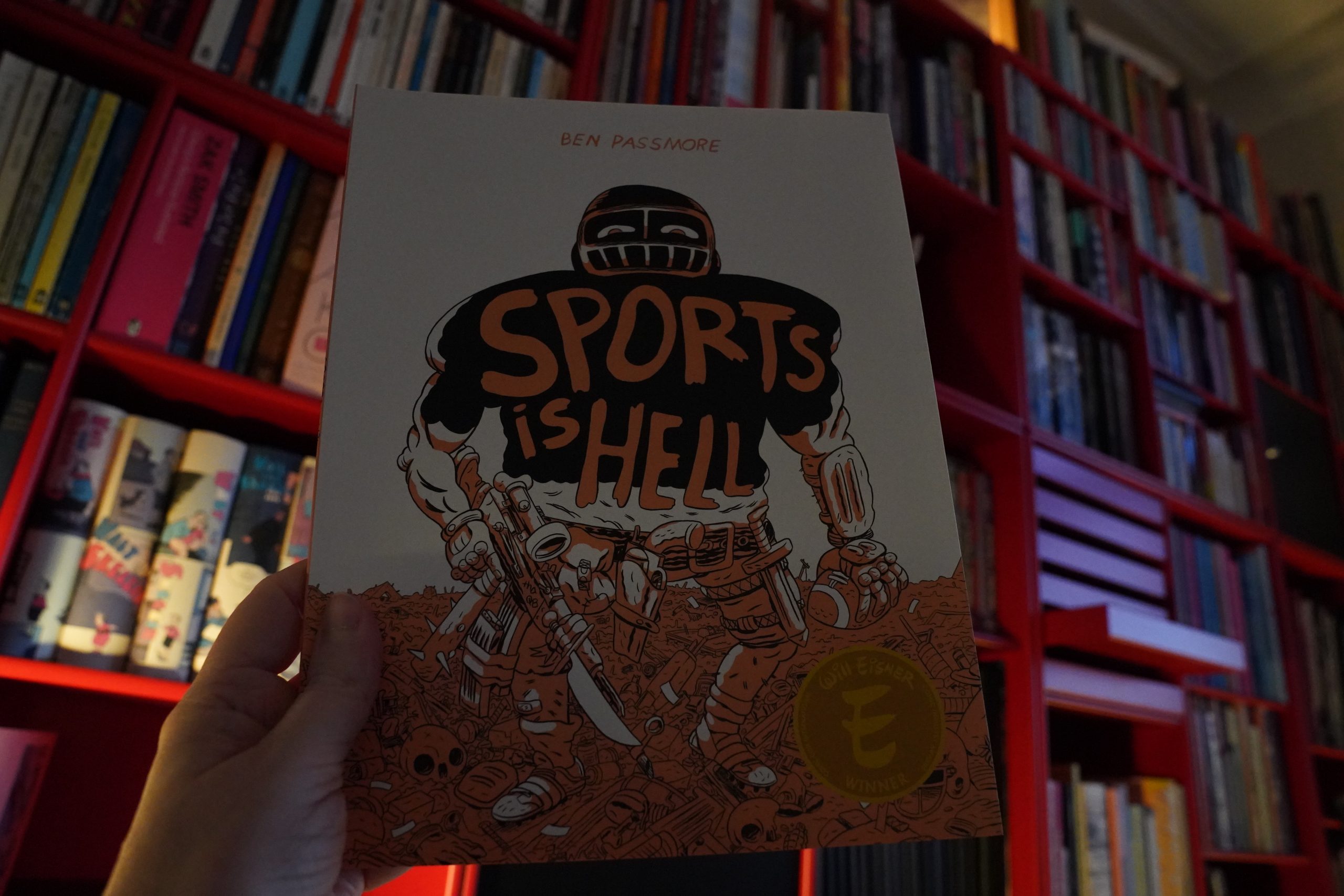
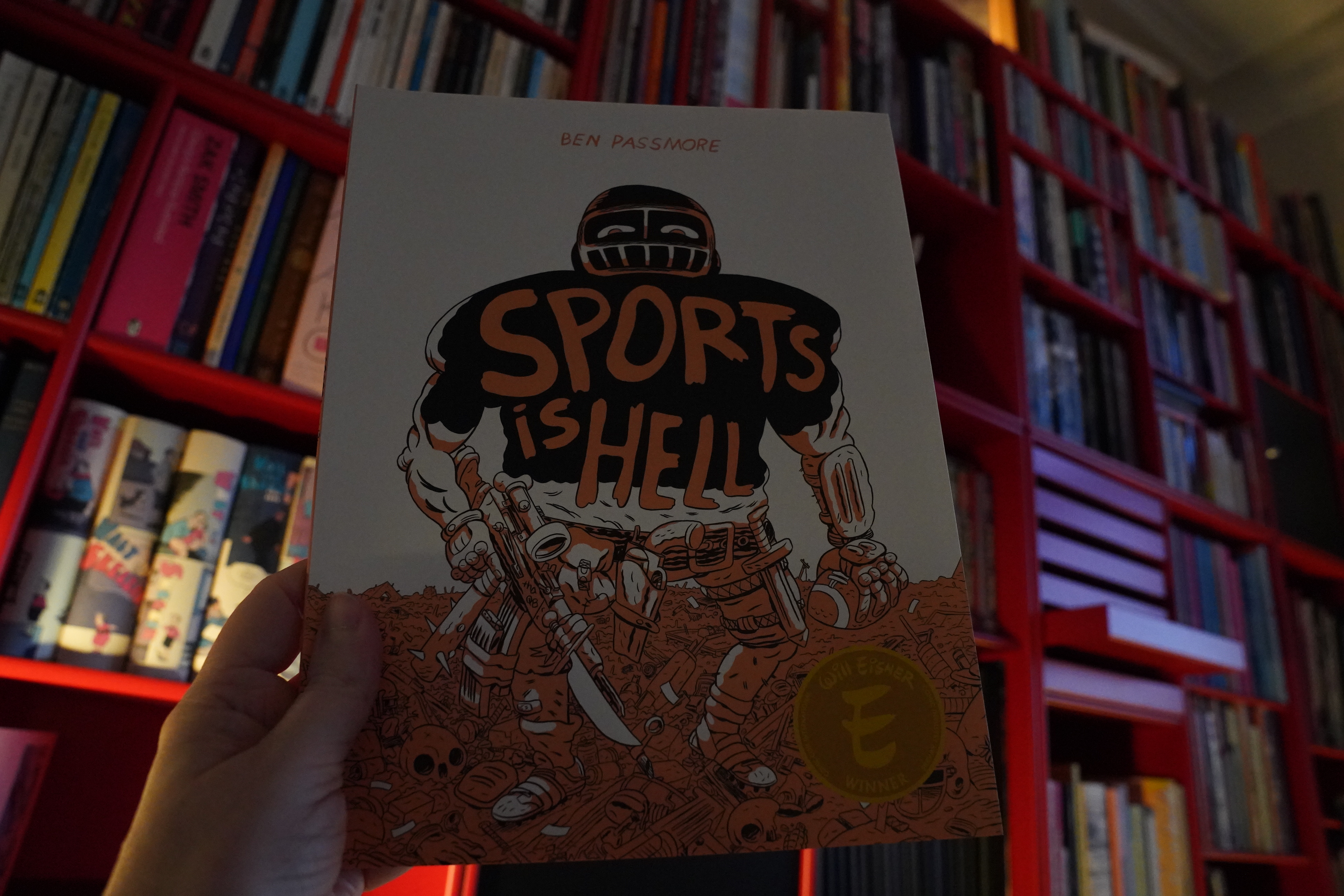
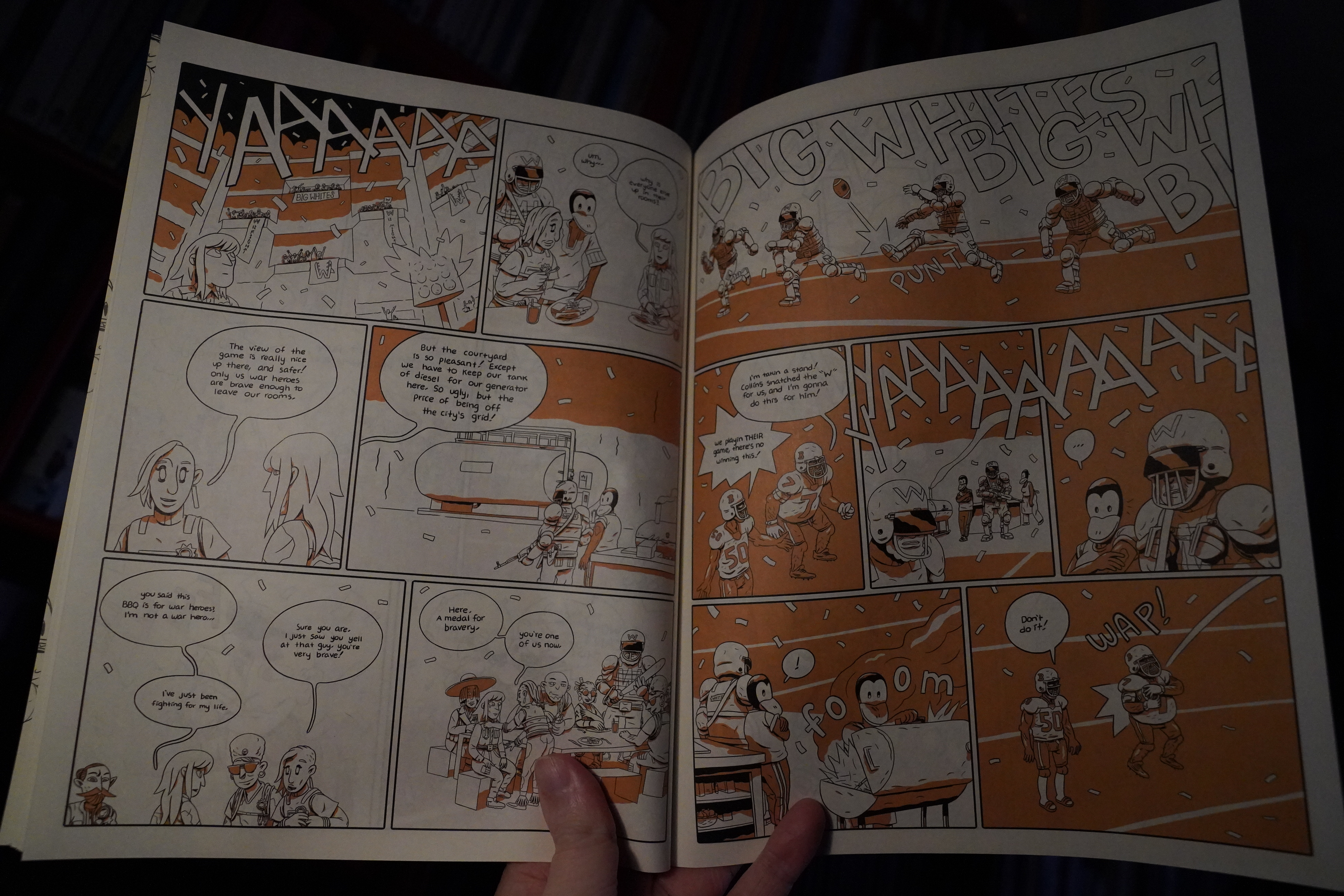
08:04: Sports is Hell by Ben Passmore (Silver Sprocket)
Oh! I’ve already read this. But that was the edition from Koyama, and this is a new edition from Silver Sprocket?
Well, might as well read it again.
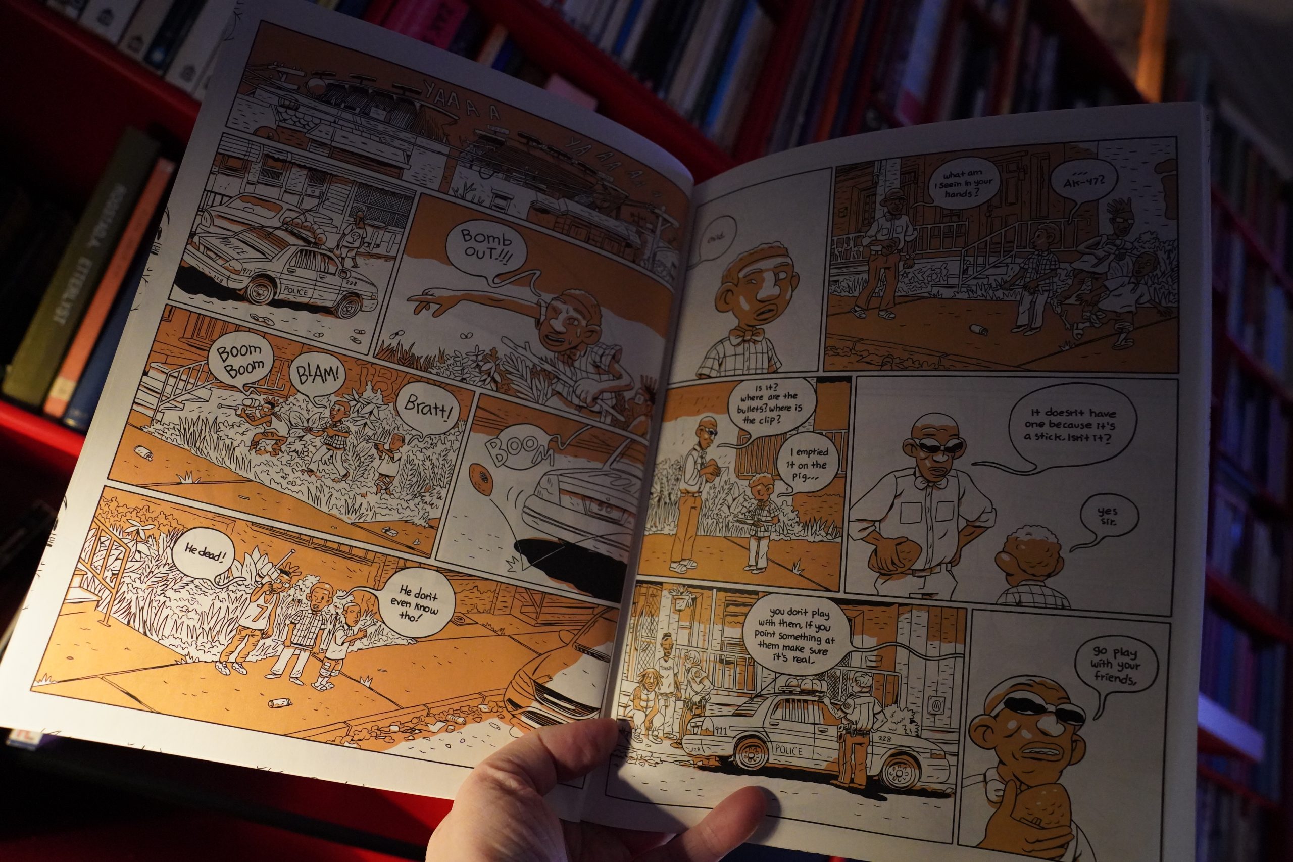
It’s still as bizarre and oddly compulsive as last time.

But is this gonna be one of those days where I’m just talking about paper quality? Because this book is printed on really shitty paper — it looks like a Fantagraphics book from 1987: There’s so much bleed through that you can clearly read the opposite page without turning it.
| The Raincoats: Extended Play |  |
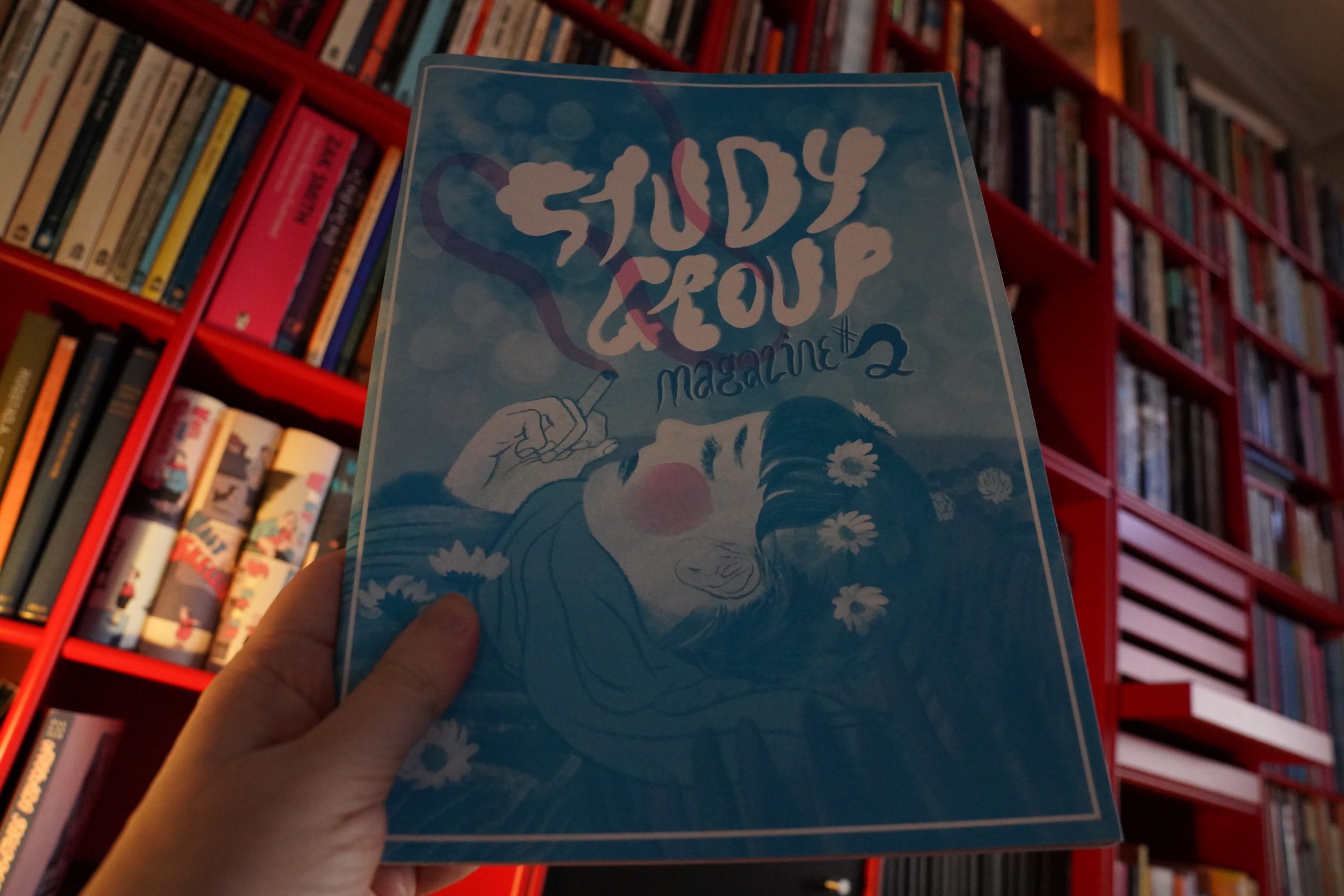
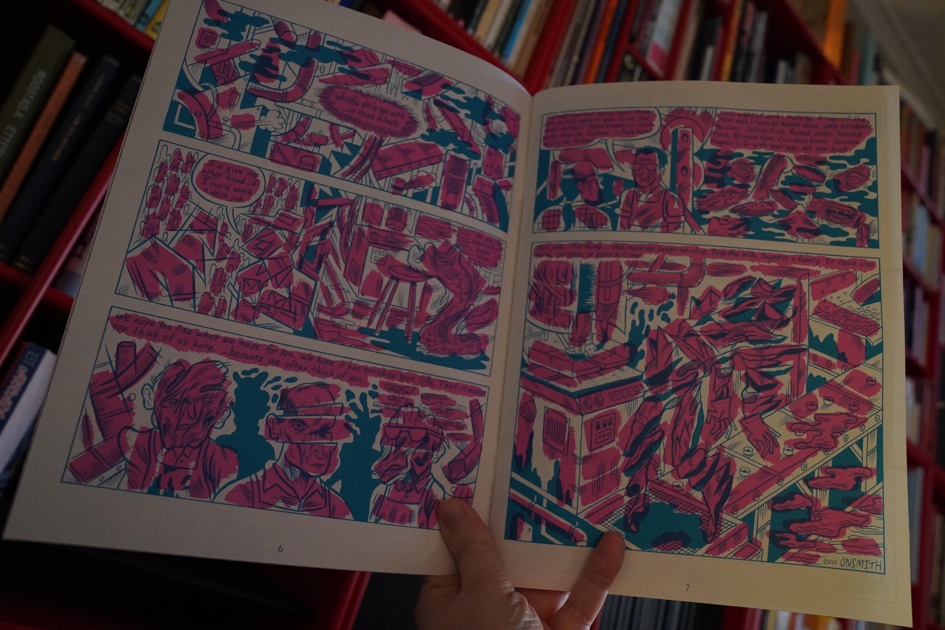
08:28: Study Group Magazine #2 edited by Zack Soto

This is from 2013 — I was rummaging through some stacks of magazines a month ago and realised that I had the first and second issue of this one, but not the second, so off to ebay… (Onsmith above.)

This one is very nicely printed in two colours, and most of the pieces make use of that, except this one my Julia Gförer. (But it’s funny nonetheless.)

This must be Aidan Koch, I guess? It’s annoying how there’s no credits… oh wait — there’s an overview on the back cover.
Anyway, while there’s nothing bad here or anything, it feels like a very slight magazine. Like nobody’s contributing their most important work.
| African Head Charge: Drastic Season |  |
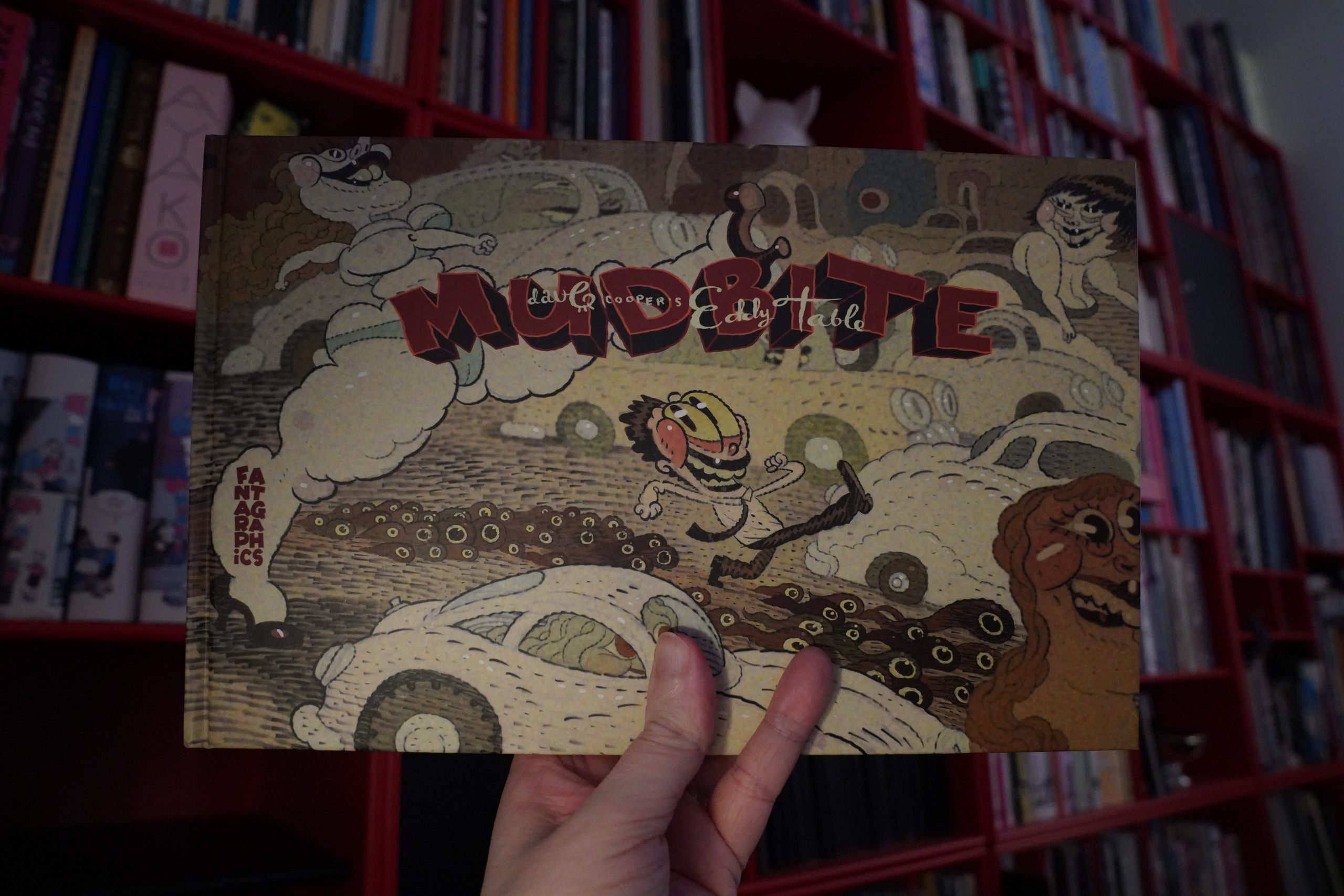
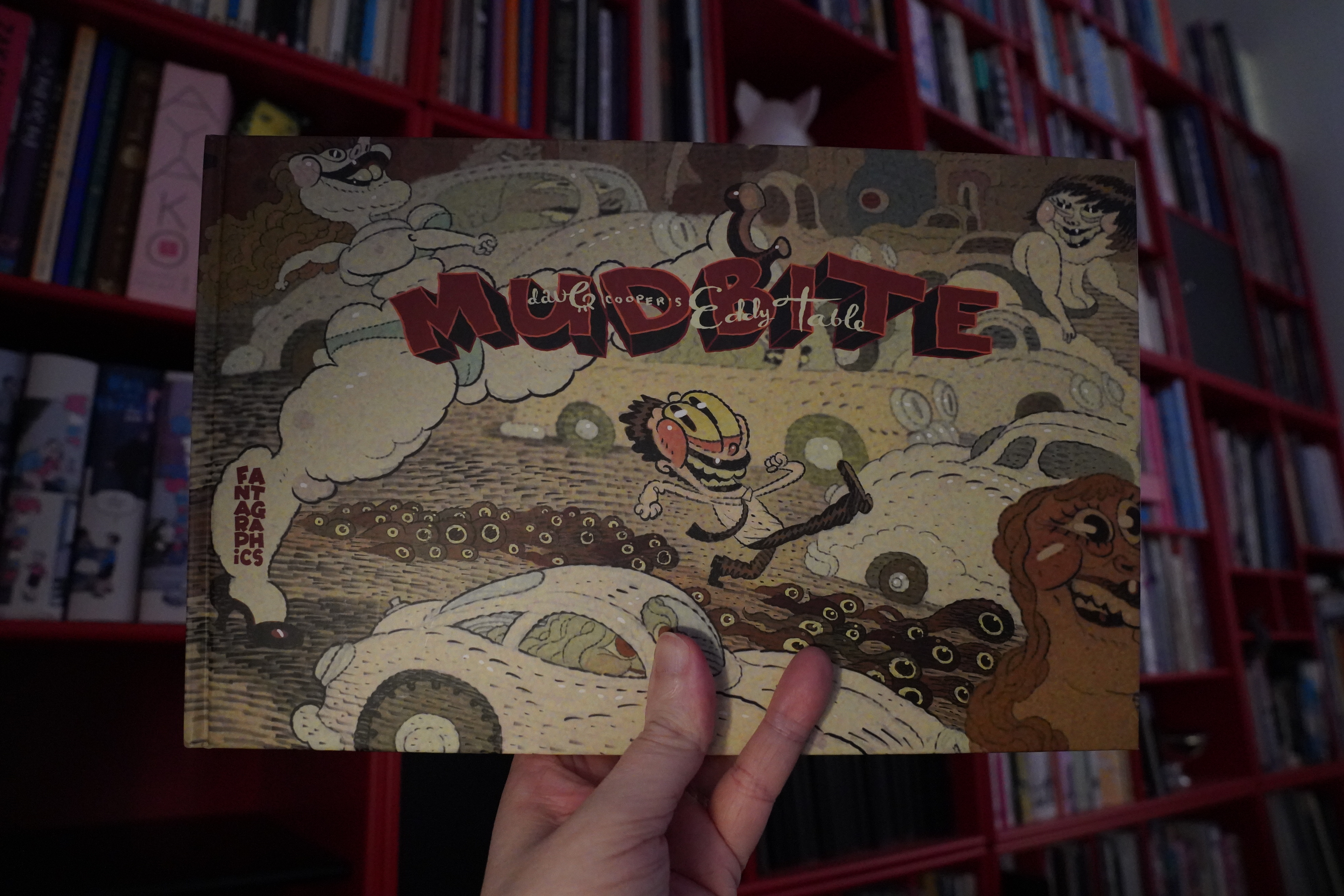
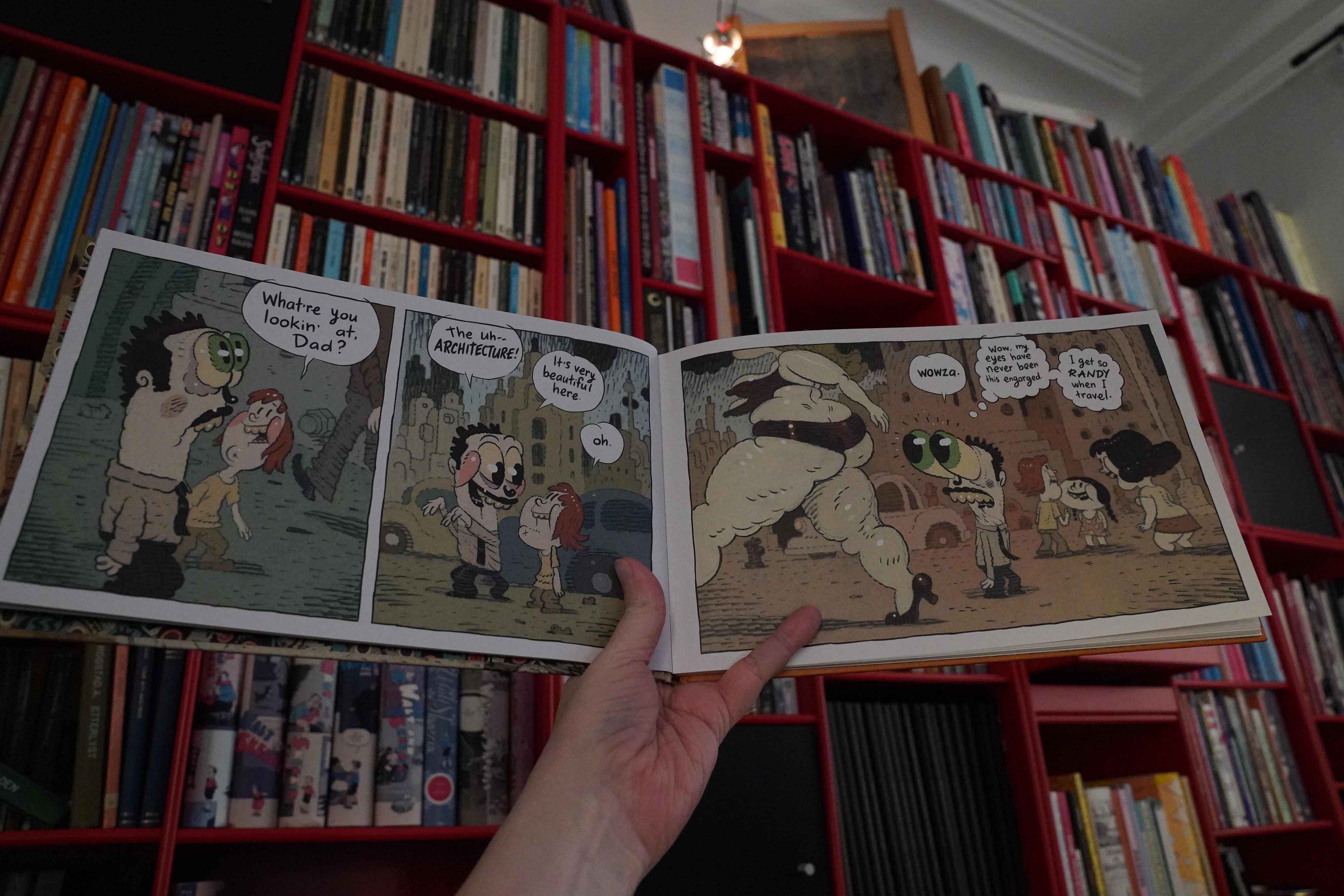
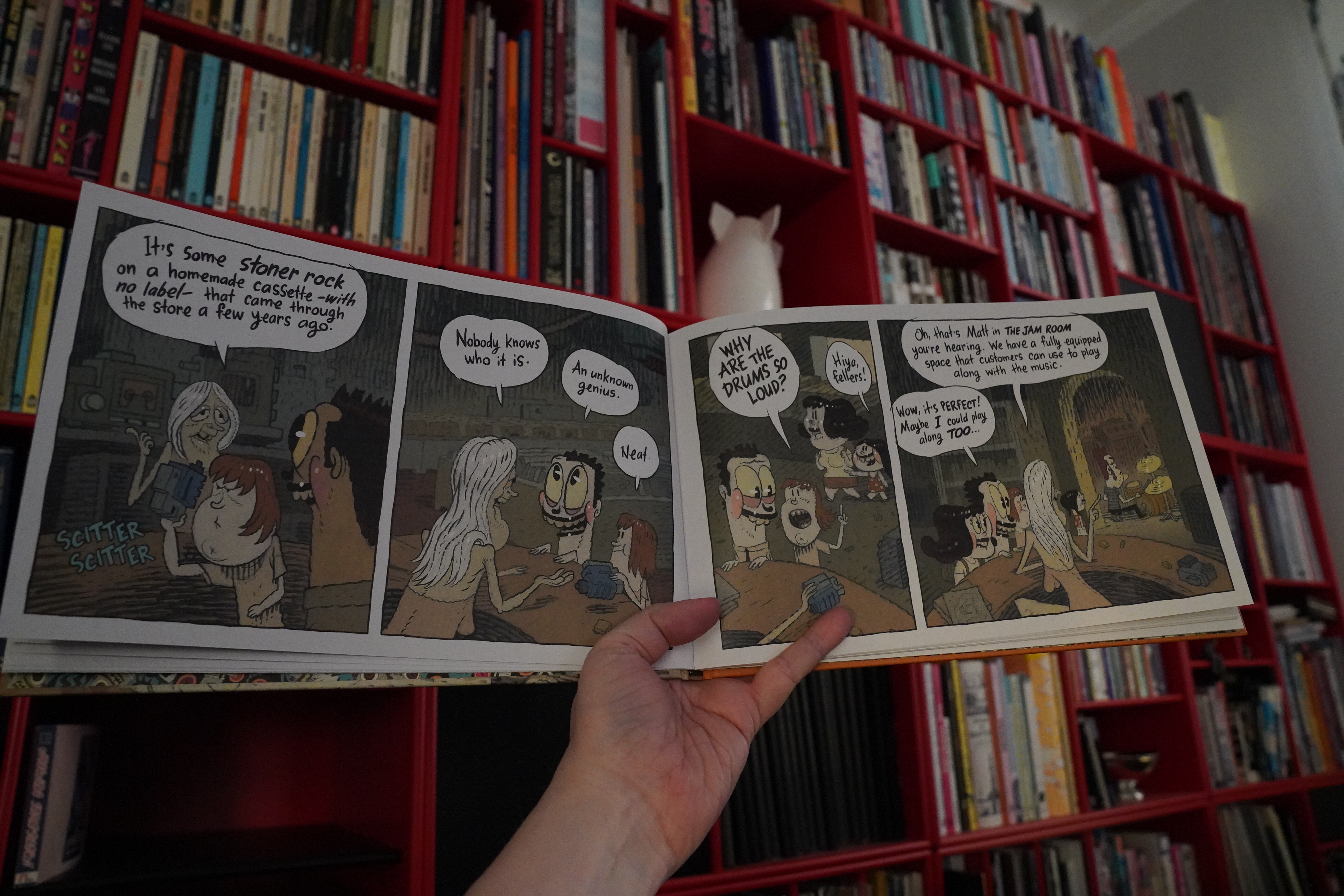
08:54: Mudbite by Dave Cooper (Fantagraphics)
I don’t recall what suddenly reminded me that I didn’t have this book, but I bought it from somewhere, anyway.

Well, this is fun…

Oh oh oh! It’s a dream narrative! I’ve had this dream! I mean, not exactly this dream, but definitely going into a shop like this, finding new wonderful things, and with an odd addition like that.
It’s a fun little book.
| Scritti Politti: Provision | 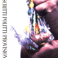 |
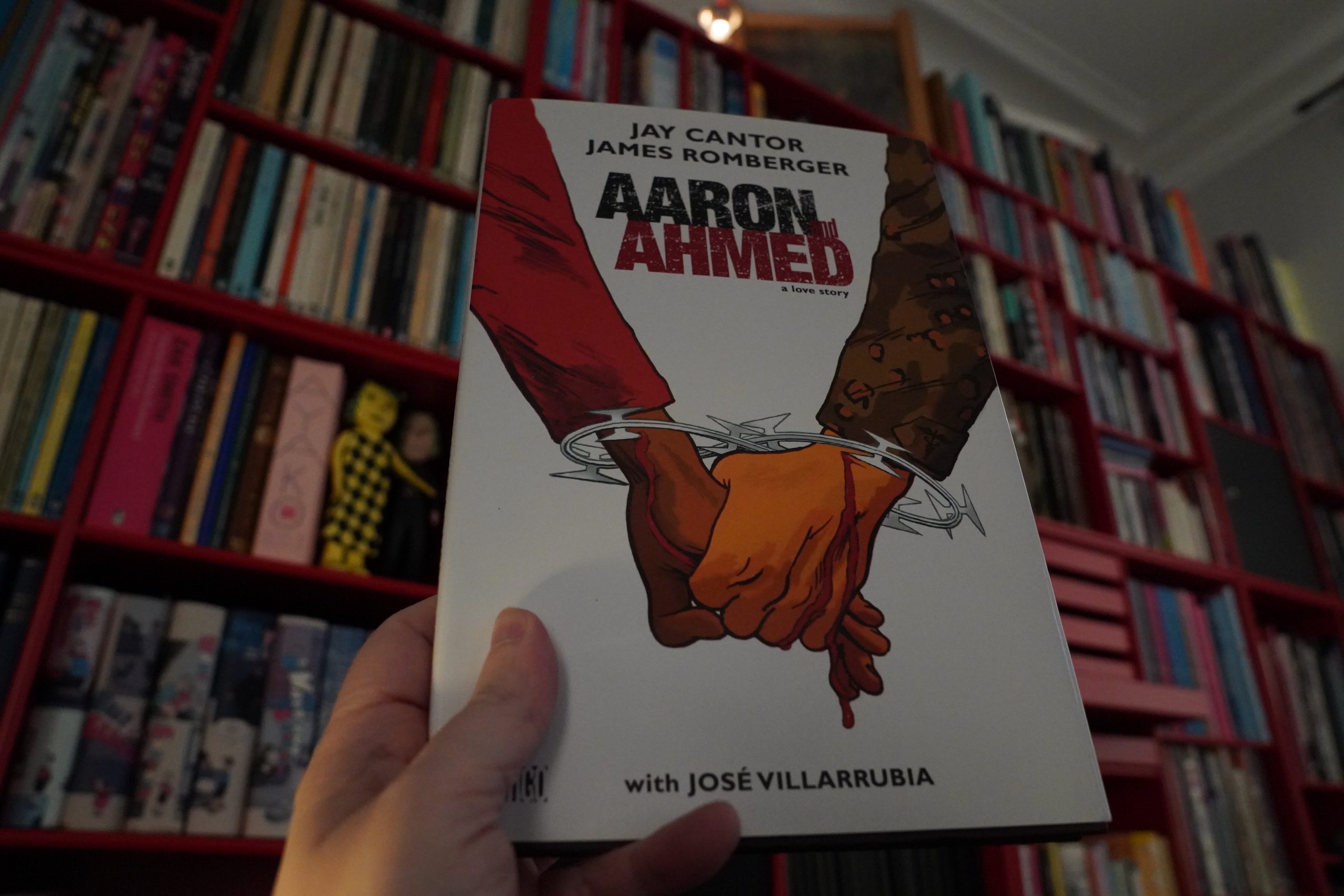
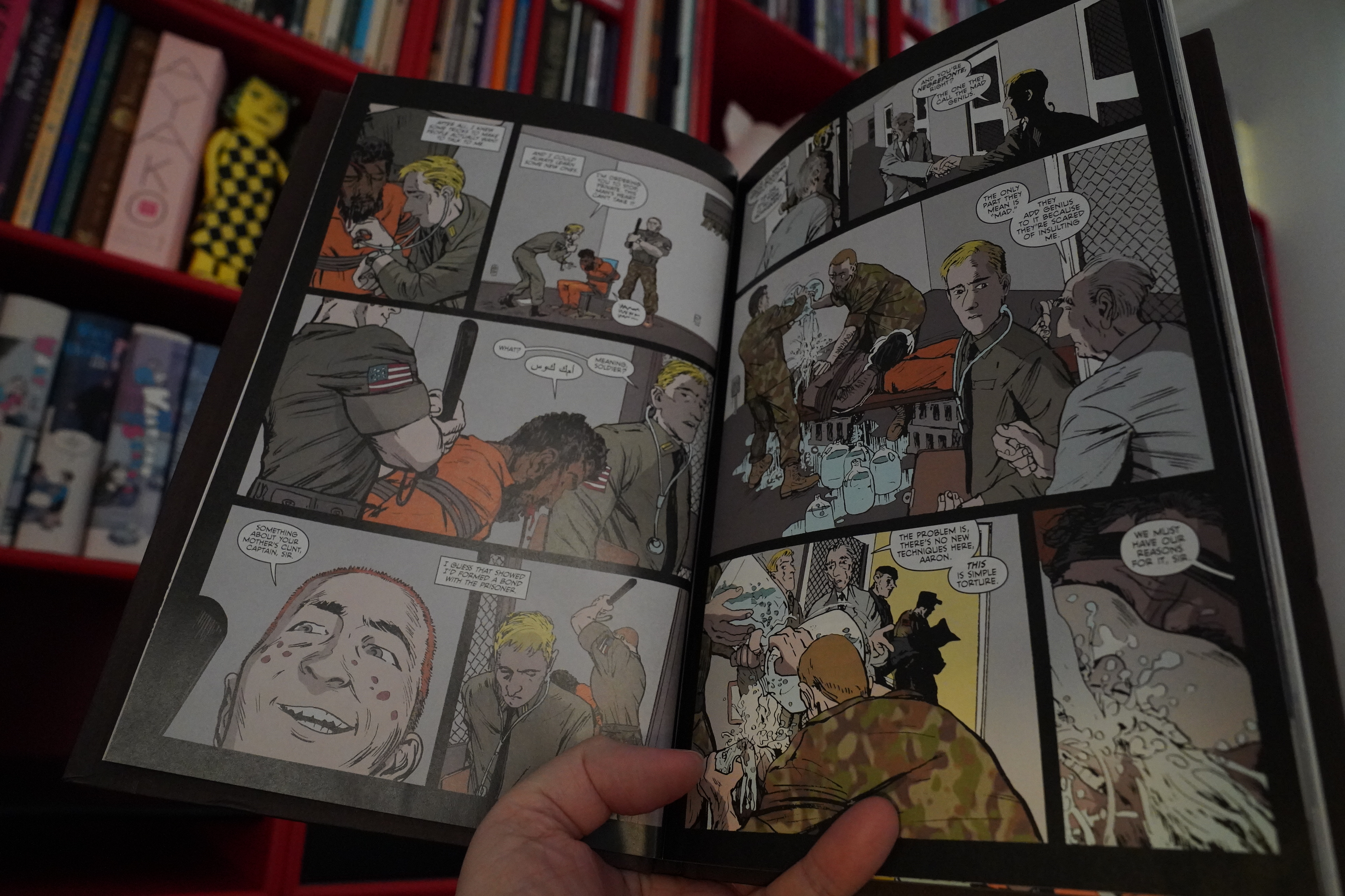
09:08: Aaron and Ahmed by Jay Cantor and James Romberger (DC Comics)
Another book from my Romberger buying spree.

This one is about terrorism and torture and stuff…
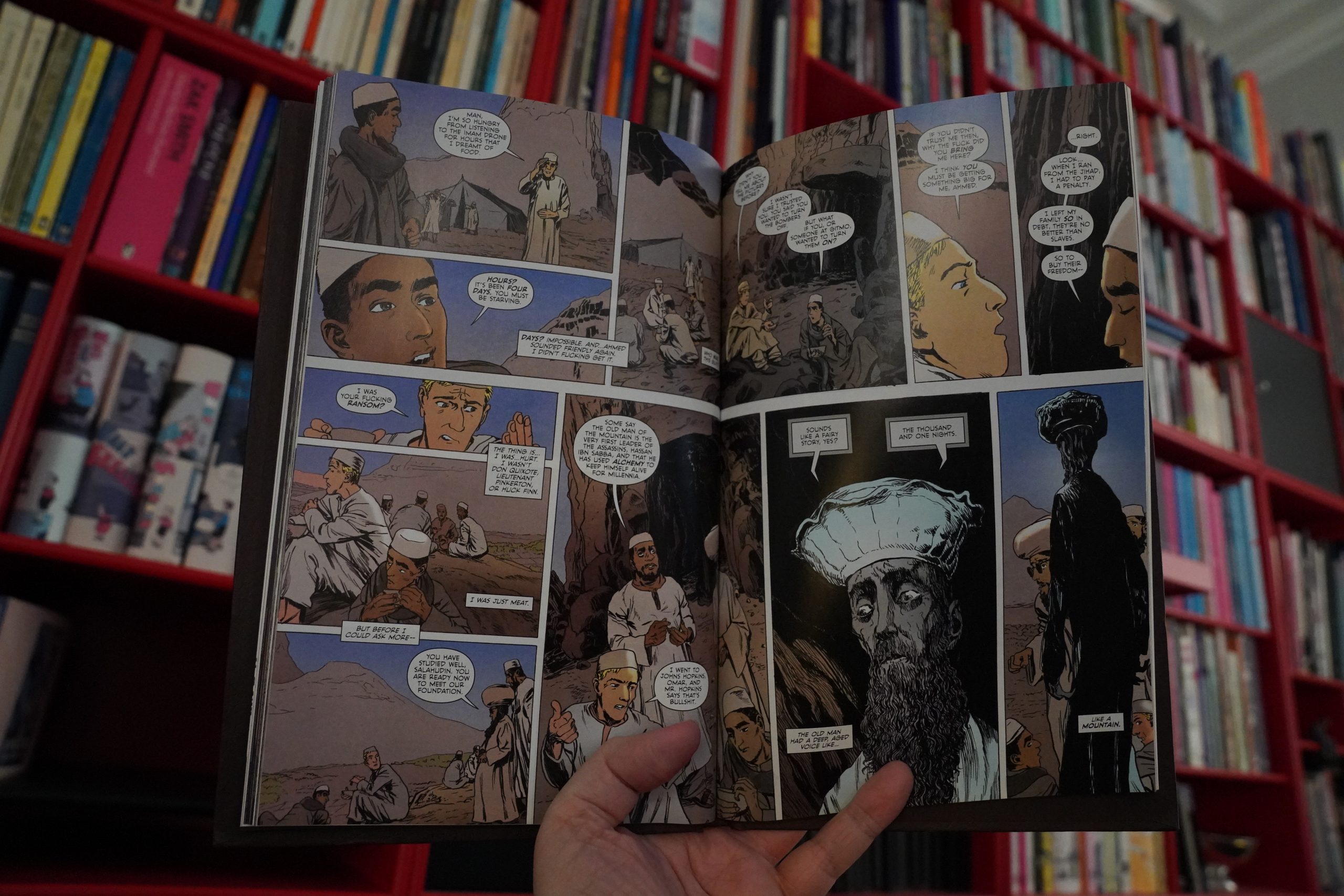
… but as with almost all “serious” comics published by DC, it goes thoroughly off the rails. What is it about the editorial process over there, anyway?
It’s pretty tedious.
| Neil Young: Tonight’s the Night |  |

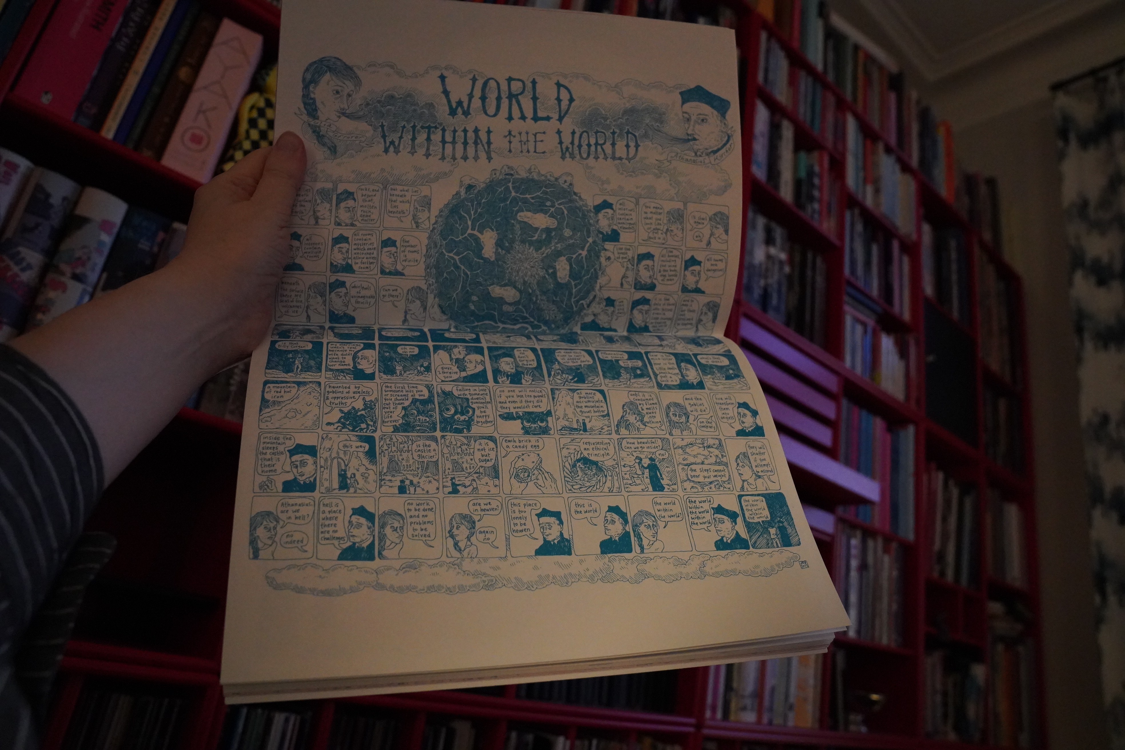
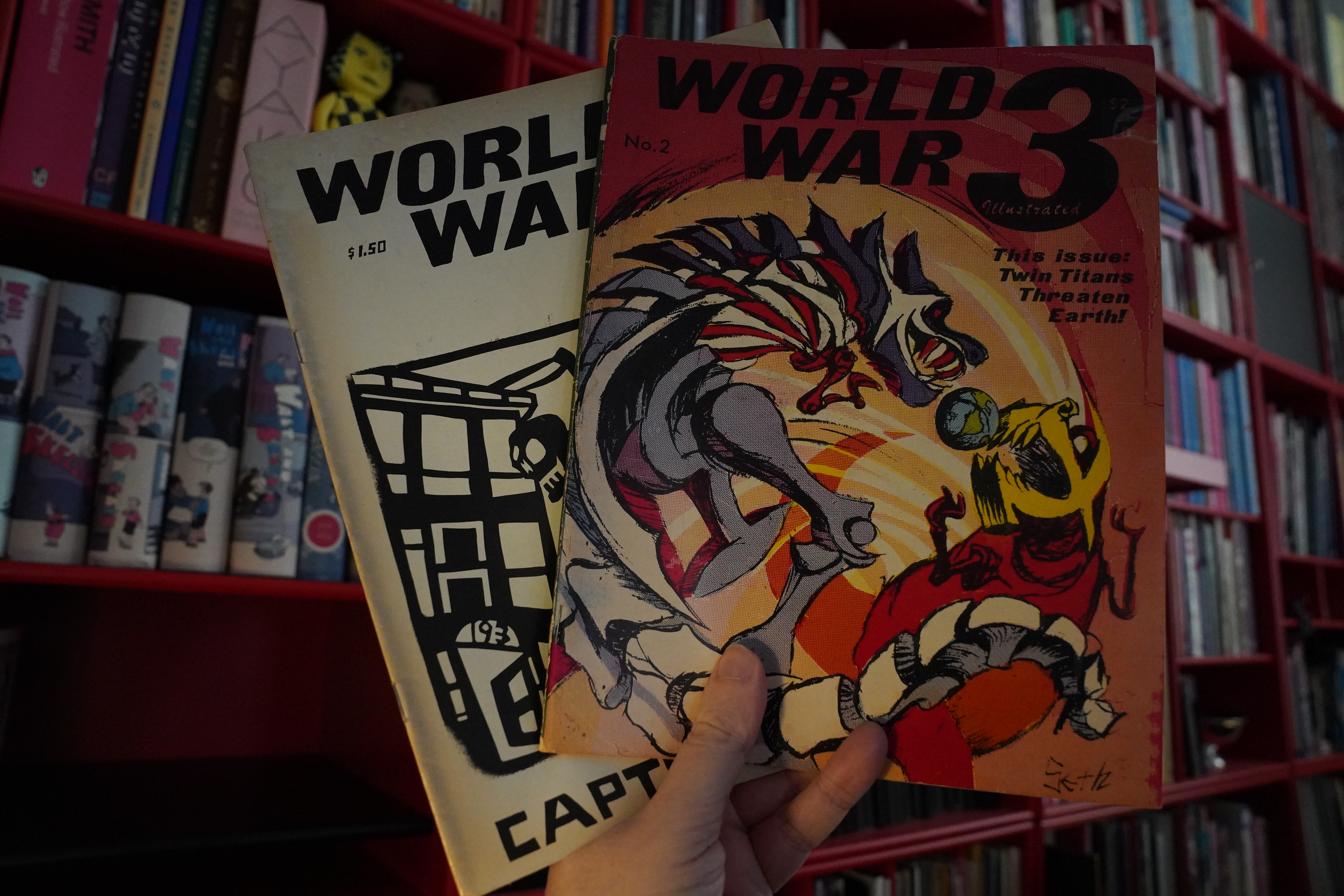
10:05: World War 3 Illustrated #2-3
I’ve been trying to buy more of the early issues of this magazine for a year — I’ve had an ebay alert out for them, and not a peep. But a couple weeks ago, somebody put up #2-14 (!) for sale as a lot, cheaply, so I snatched them up. I guess it’s one of those things where people think nobody wants these things, so they don’t bother to try to sell them because they’ll get no money for them?
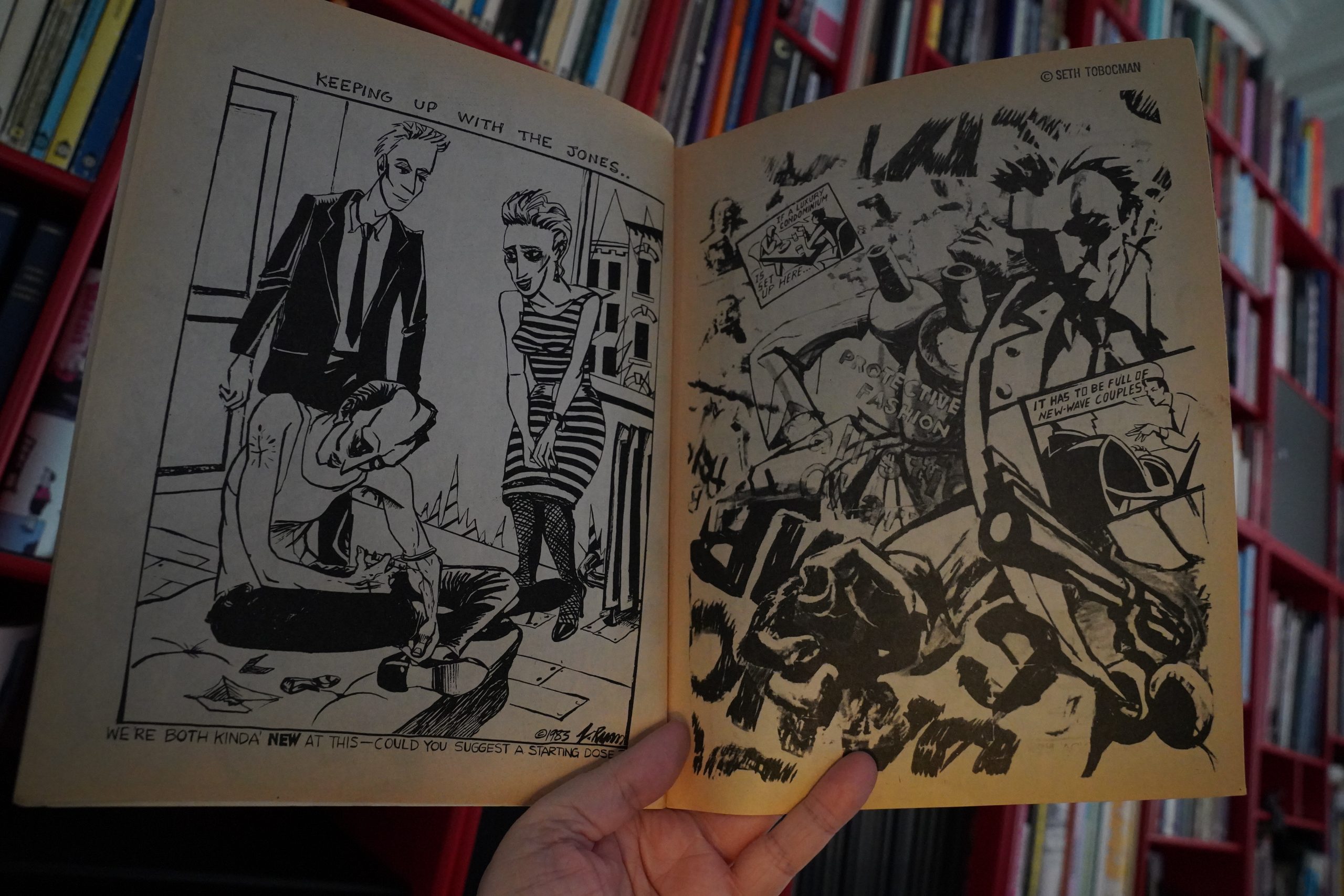
Anyway, these early WW3s are quite different from the magazine it would become later. (Peter Kuper and Seth Tobocman.)

For instance, here’s Milton Knight Jr!? (With Tobocman.)
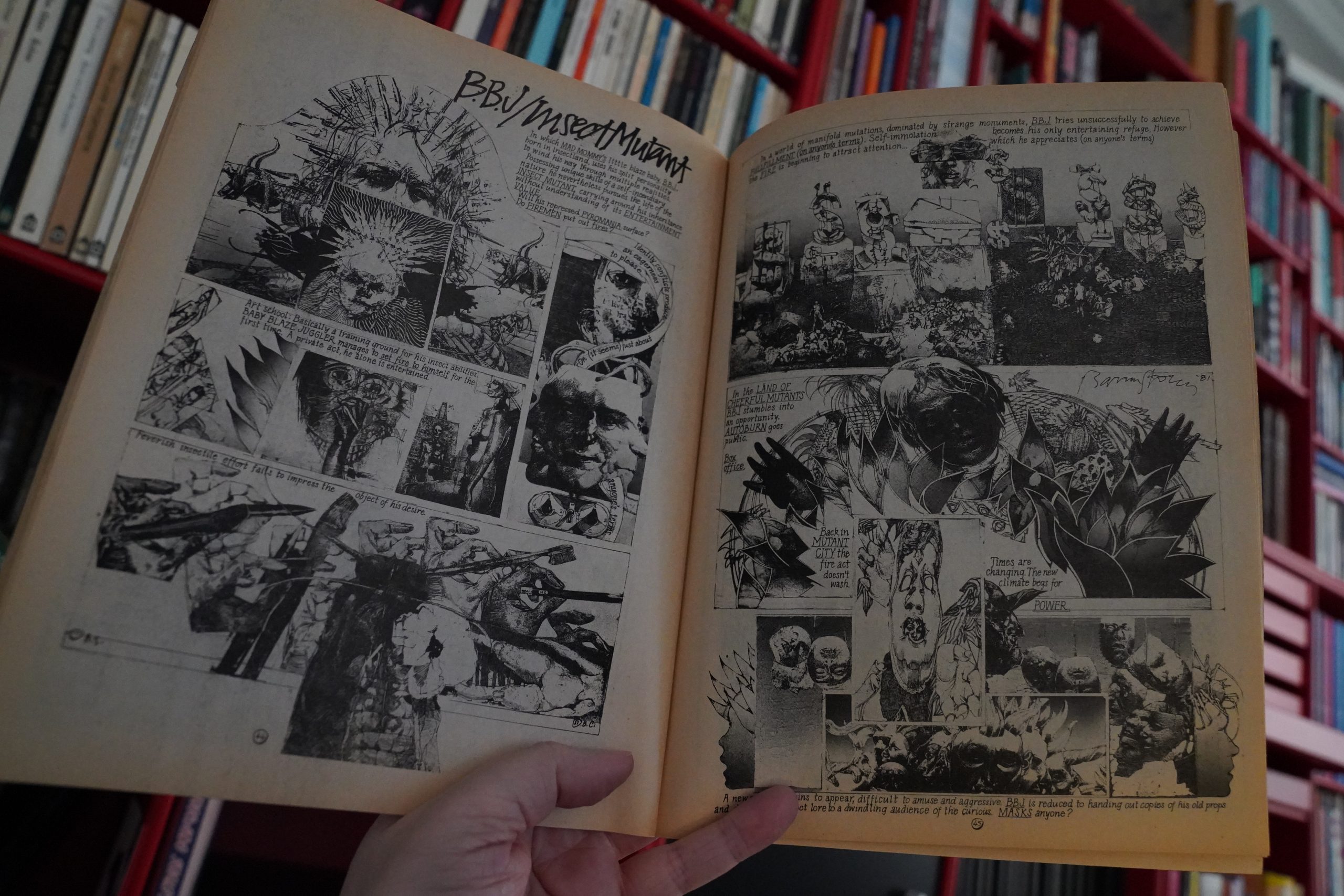
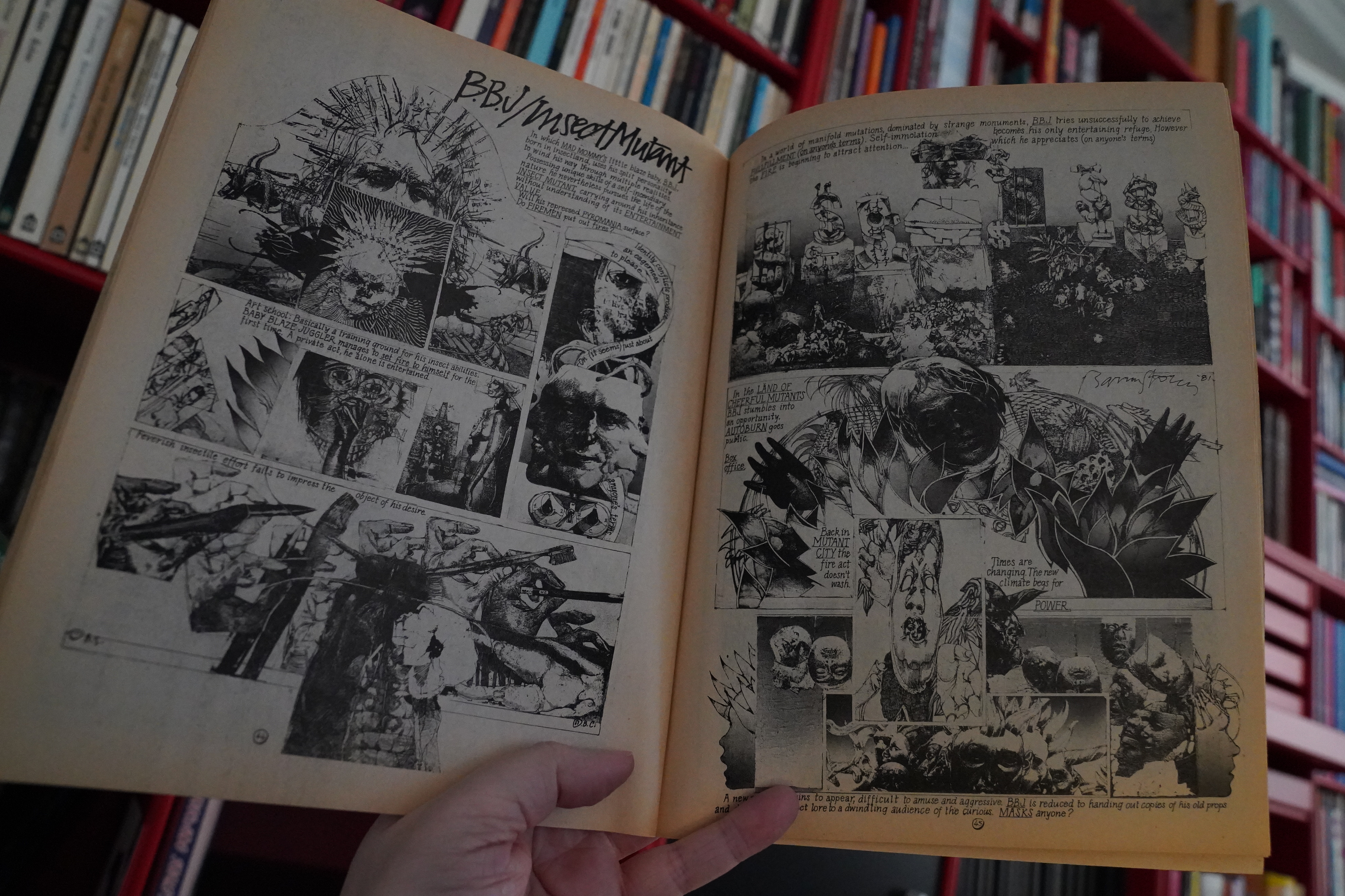
And Barron Storey.
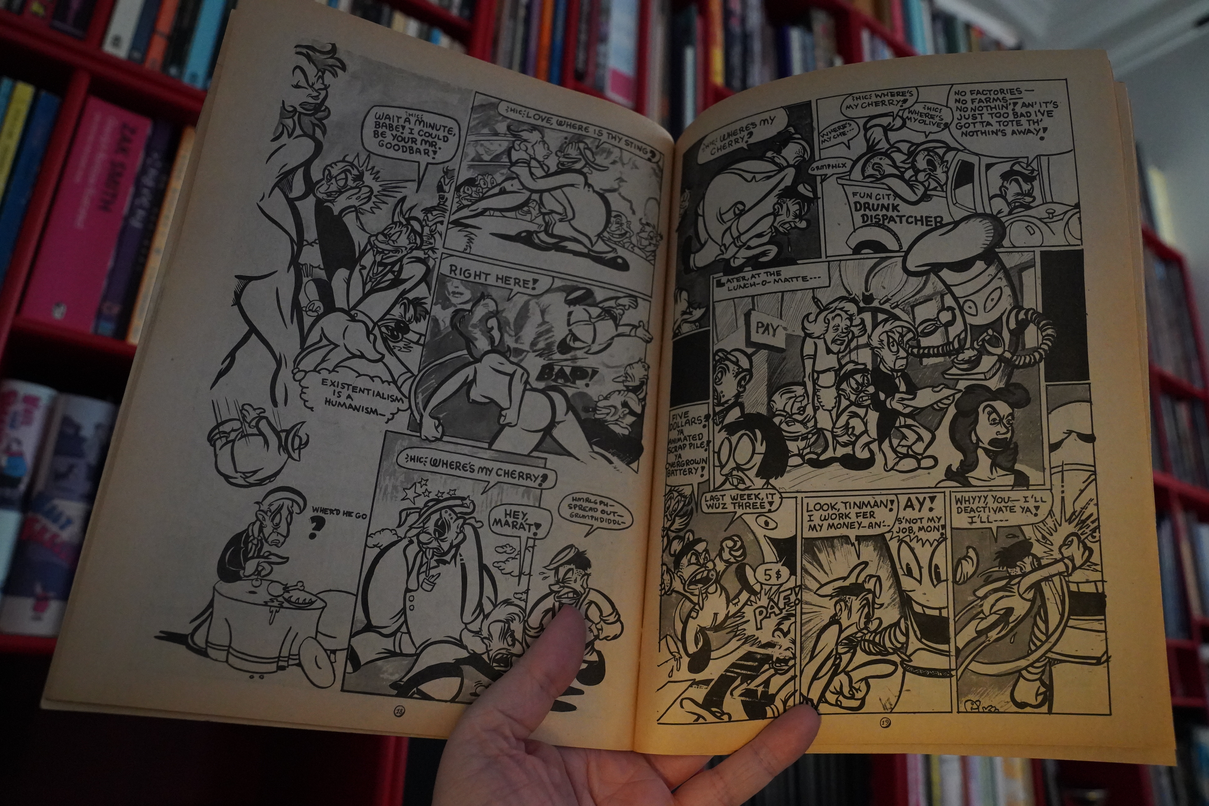
By the third issue, it’s more recognisably WW3 — it’s a themed issue about drugs.
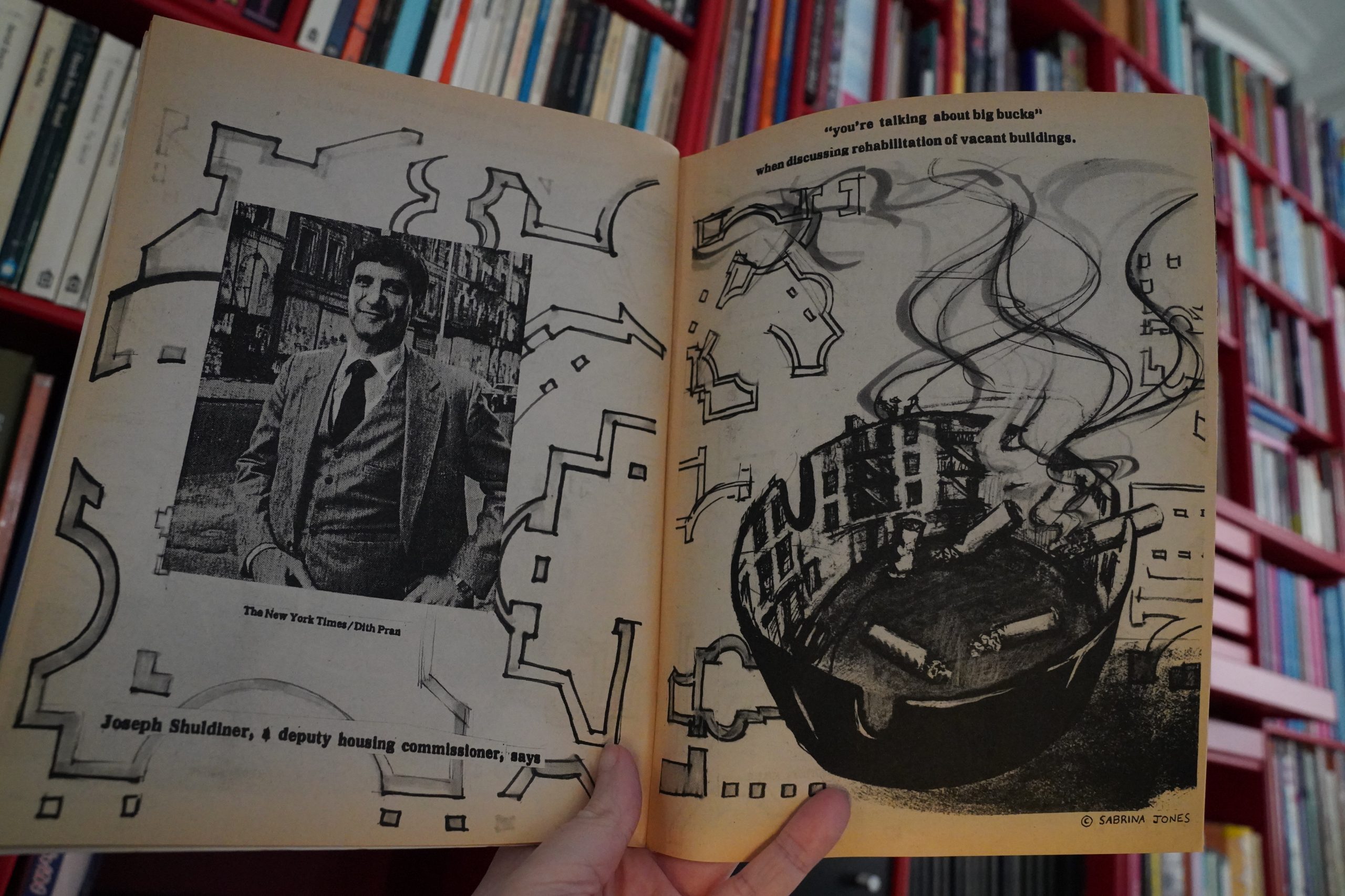
Sabrina Jones shows up for the first time, I think?
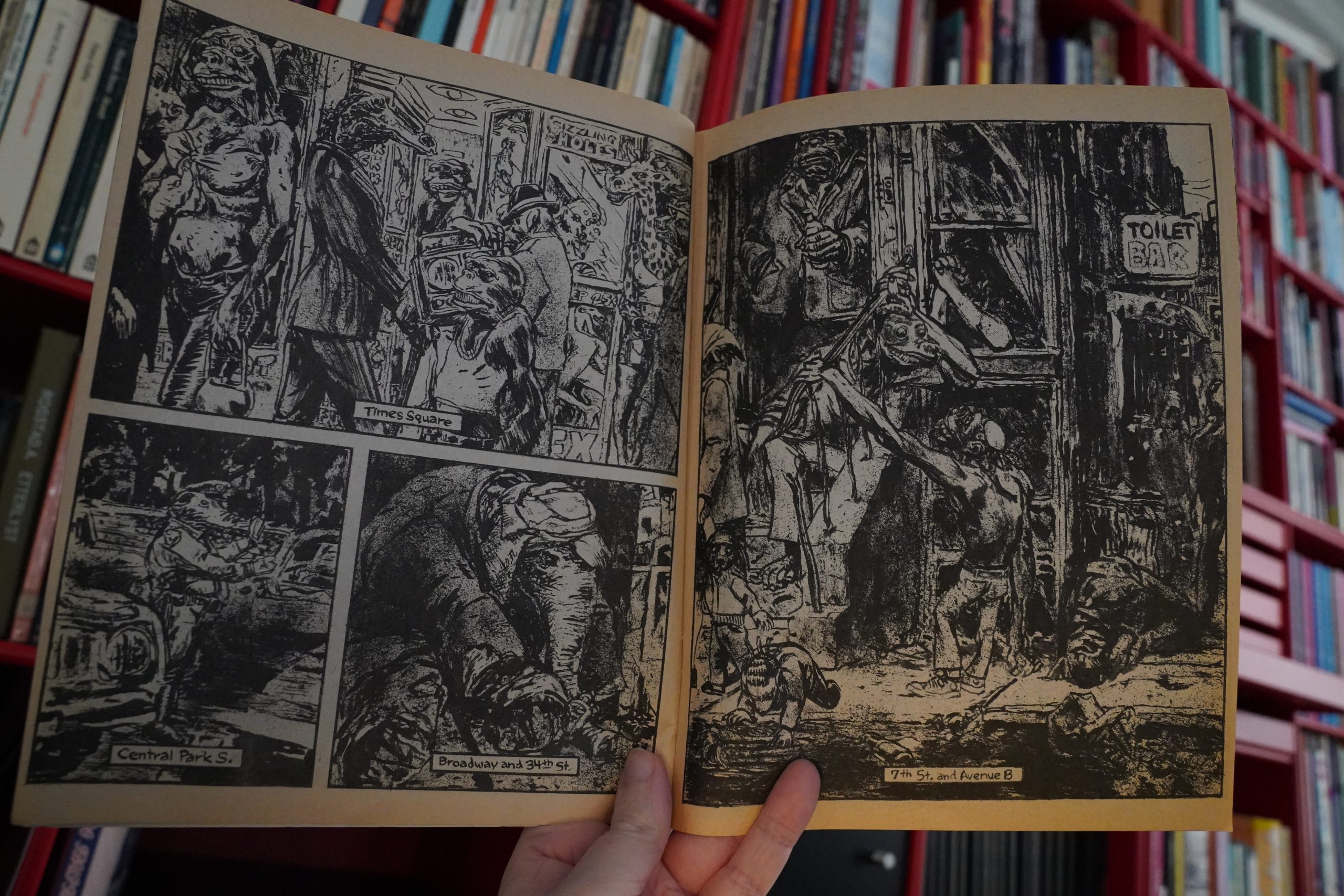
Wow. This is by… “James”? There’s no credits in this issue, so I’m not quite sure…
Anyway, great stuff.

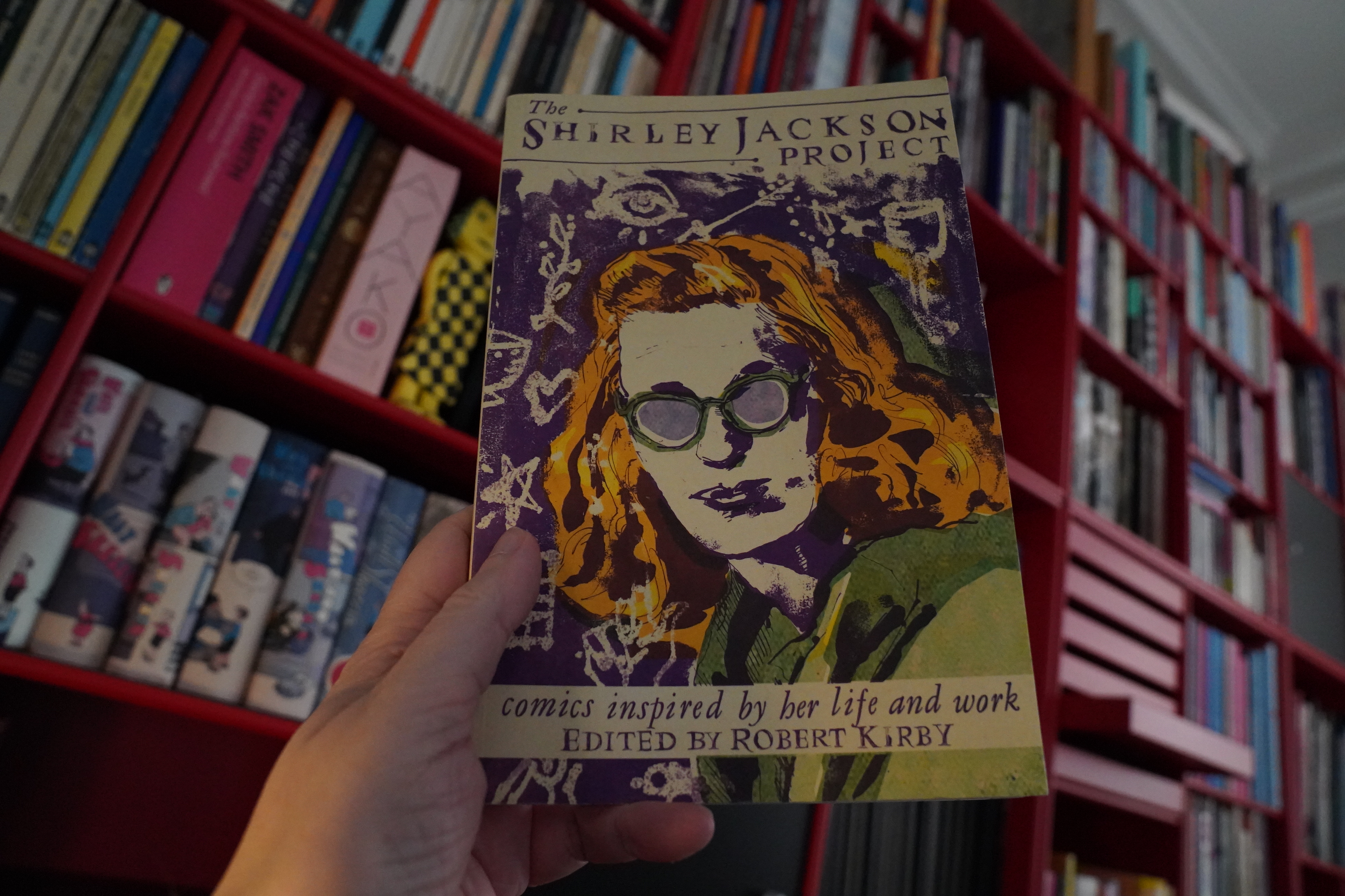
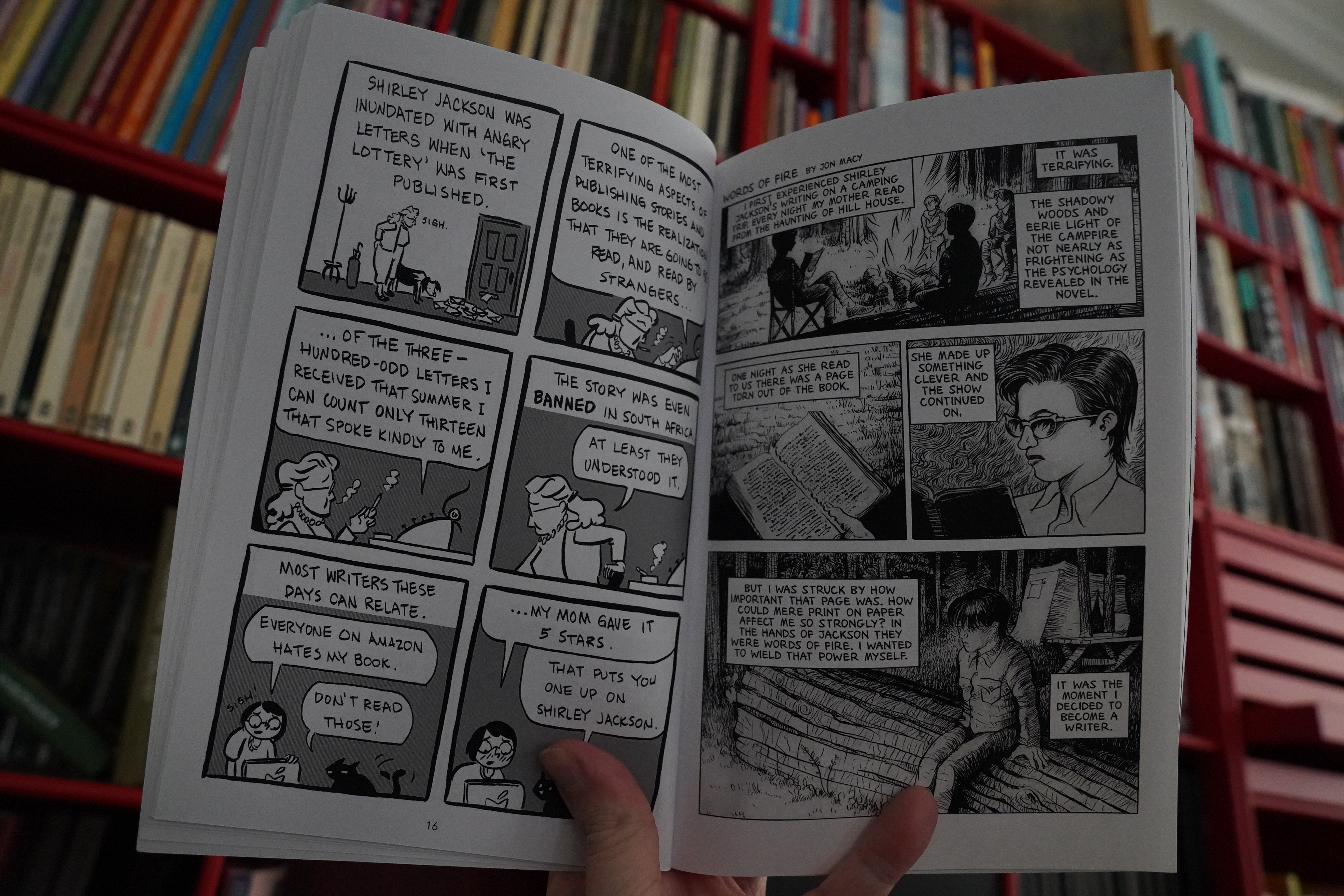
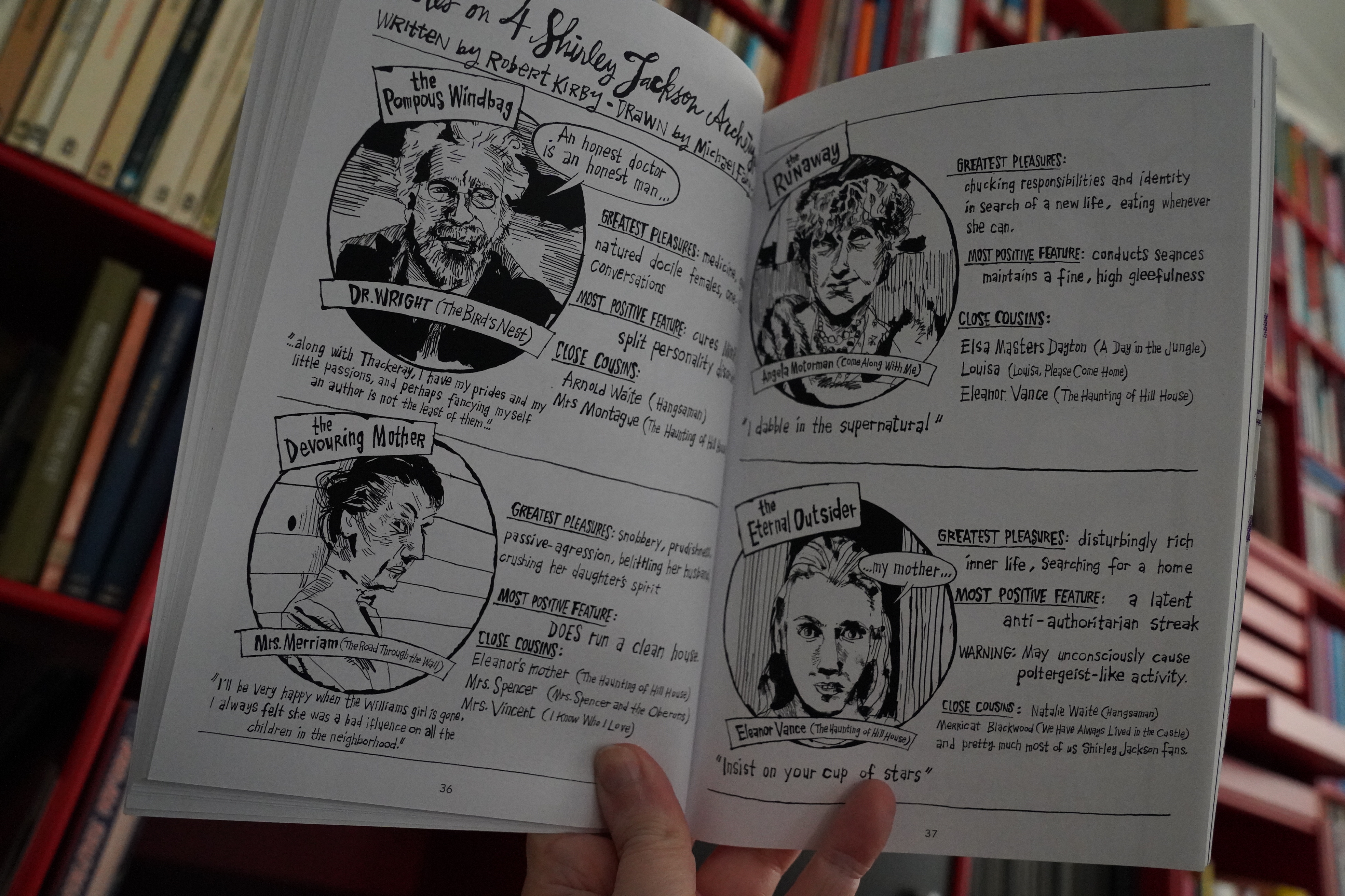
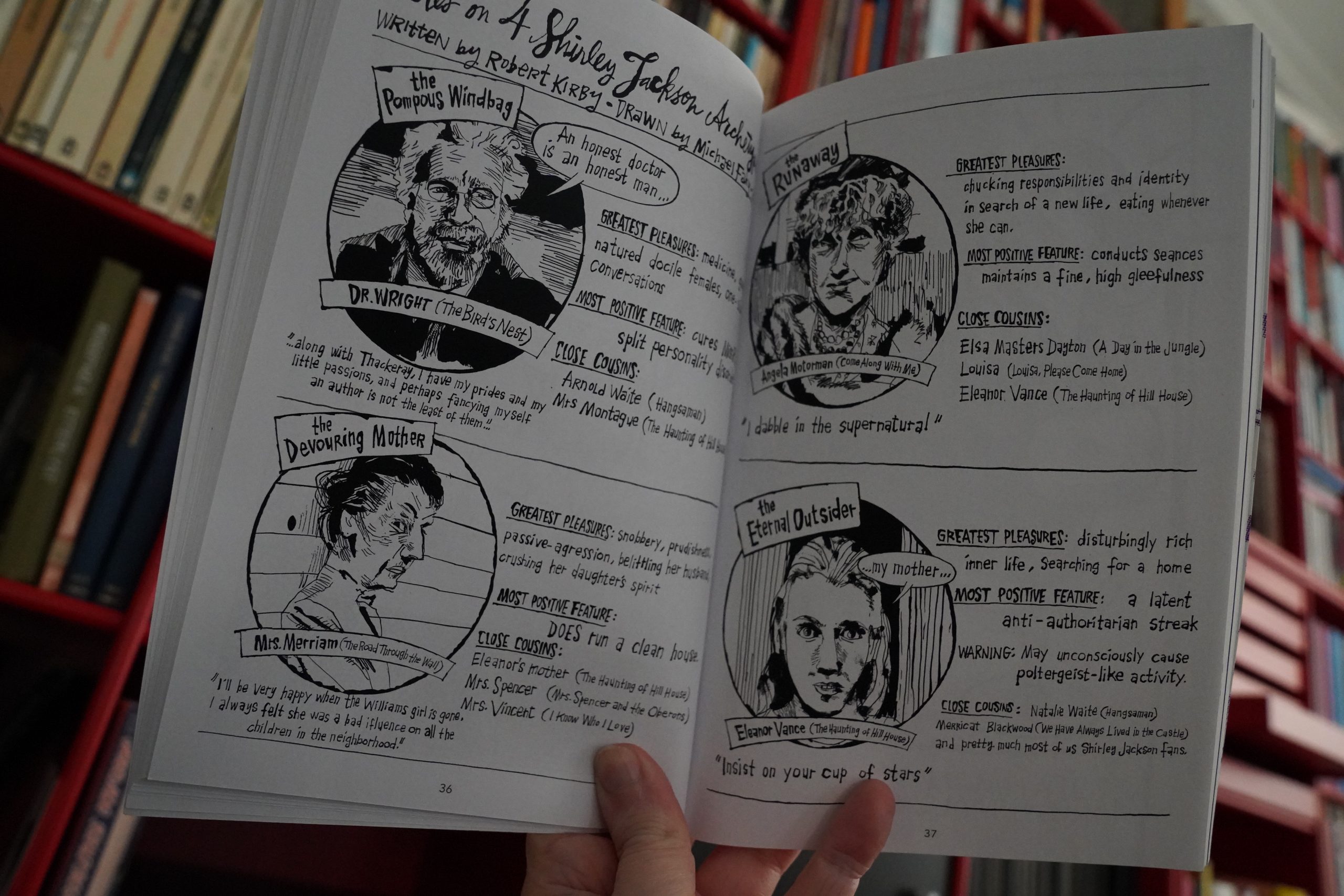
10:34: The Shirley Jackson Project by Robert Kirby (Ninth Art Press)
Hm… Don’t recall how I came to buy this. And it feels like one of those print on demand books? It just doesn’t feel right in the hand.
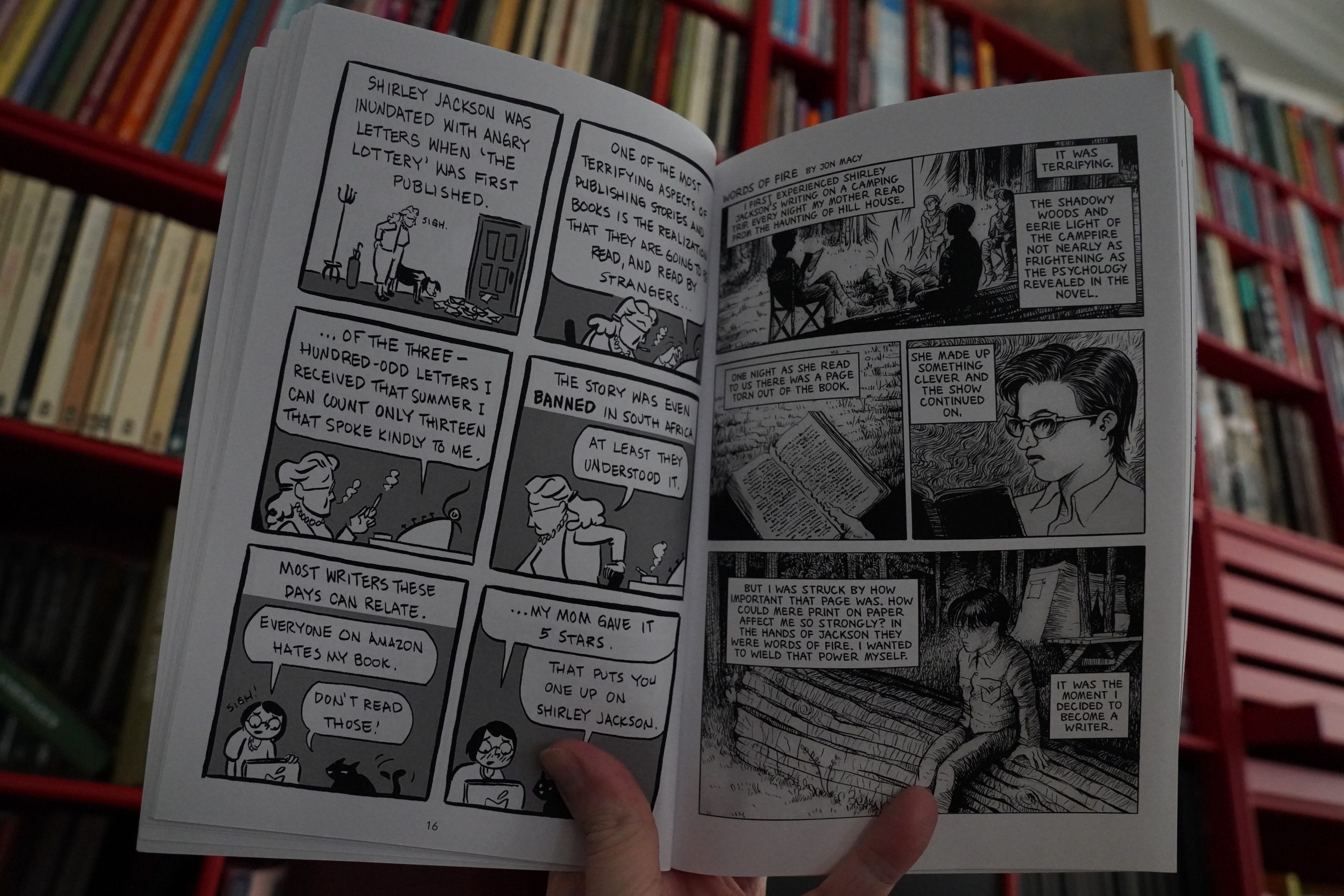
And I’ve never read any Shirley Jackson books, so I’m totally not the audience for this. Most of the contributions are pretty slight — basically riffing on a story or two, or saying how Jackson’s work had affected them.
And… I mean, this is probably really amusing if you know her work. It’s me! It’s not you!
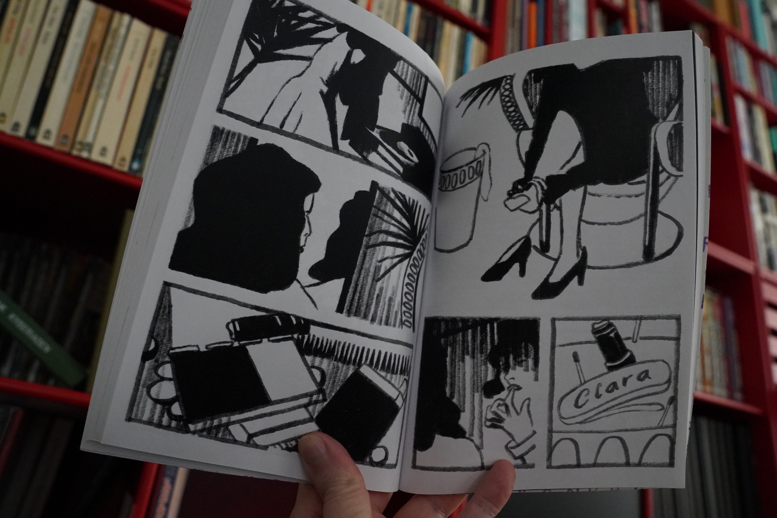
Oh oh oh, this must be why I bought this book — there’s a longer piece by Maggie Umber in here, and it’s really good. Even if I have no idea what it’s about.
The book is… it’s fine? But has a certain lack of ambition.
| Kemistry & Storm: DJ-Kicks |  |
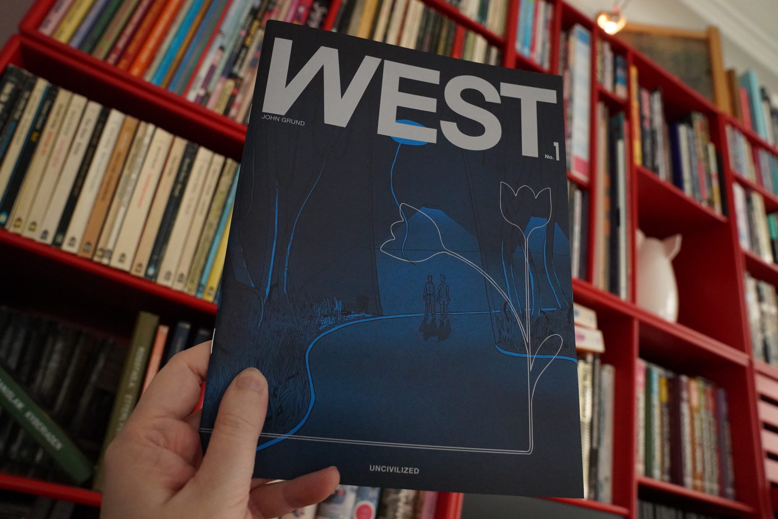
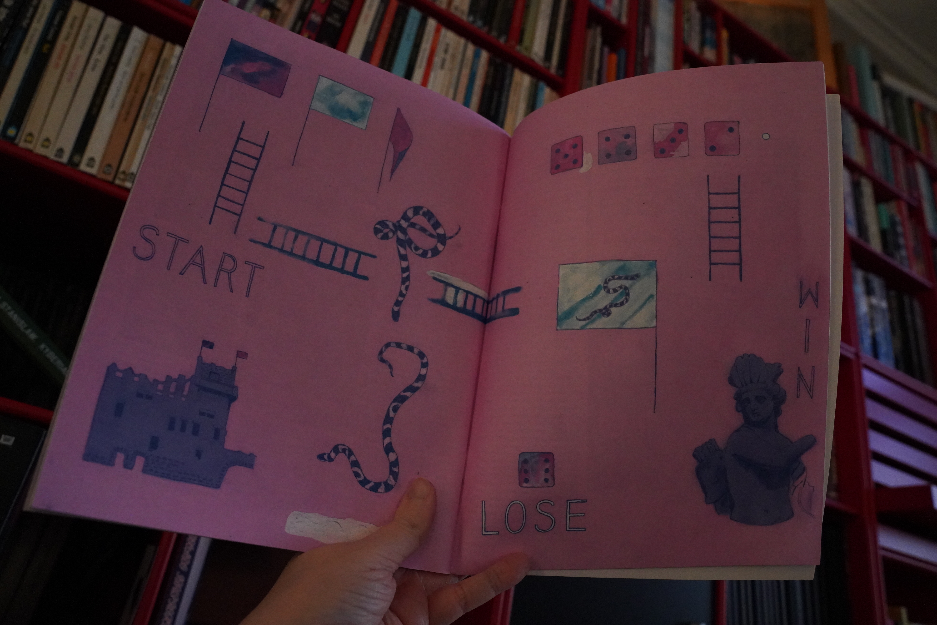
11:15: West #1 by John Grund (Uncivilized)
I like the artwork here — it’s got an easy charm. Kinda Graham Brandonesque? But not quite.

The storytelling is really choppy, though. It somehow feels like a pitch for a video game.
| Kemistry & Storm: DJ-Kicks |  |
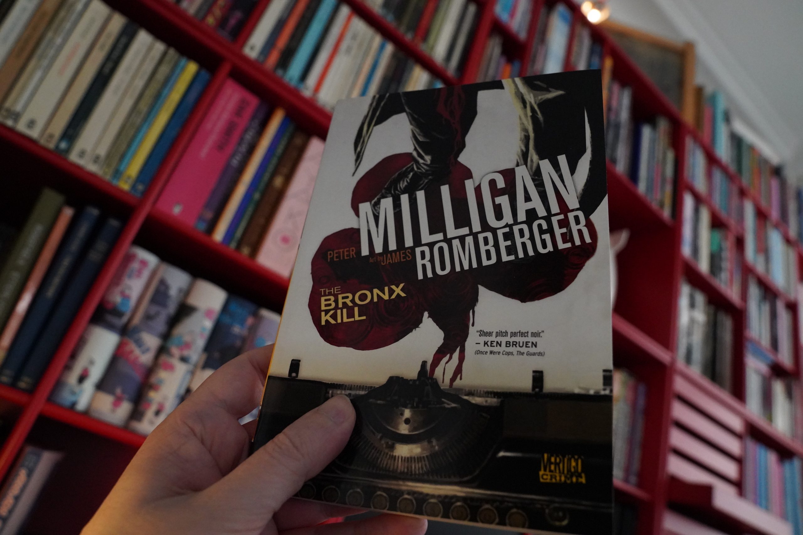
11:33: The Bronx Kill by Peter Milligan and James Romberger (DC Comics)
I think this is the final book from the Romberger spree.
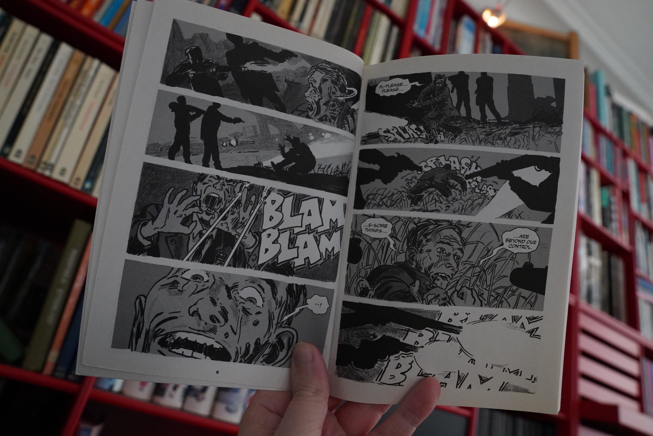
This is very noir indeed, which I like a lot.
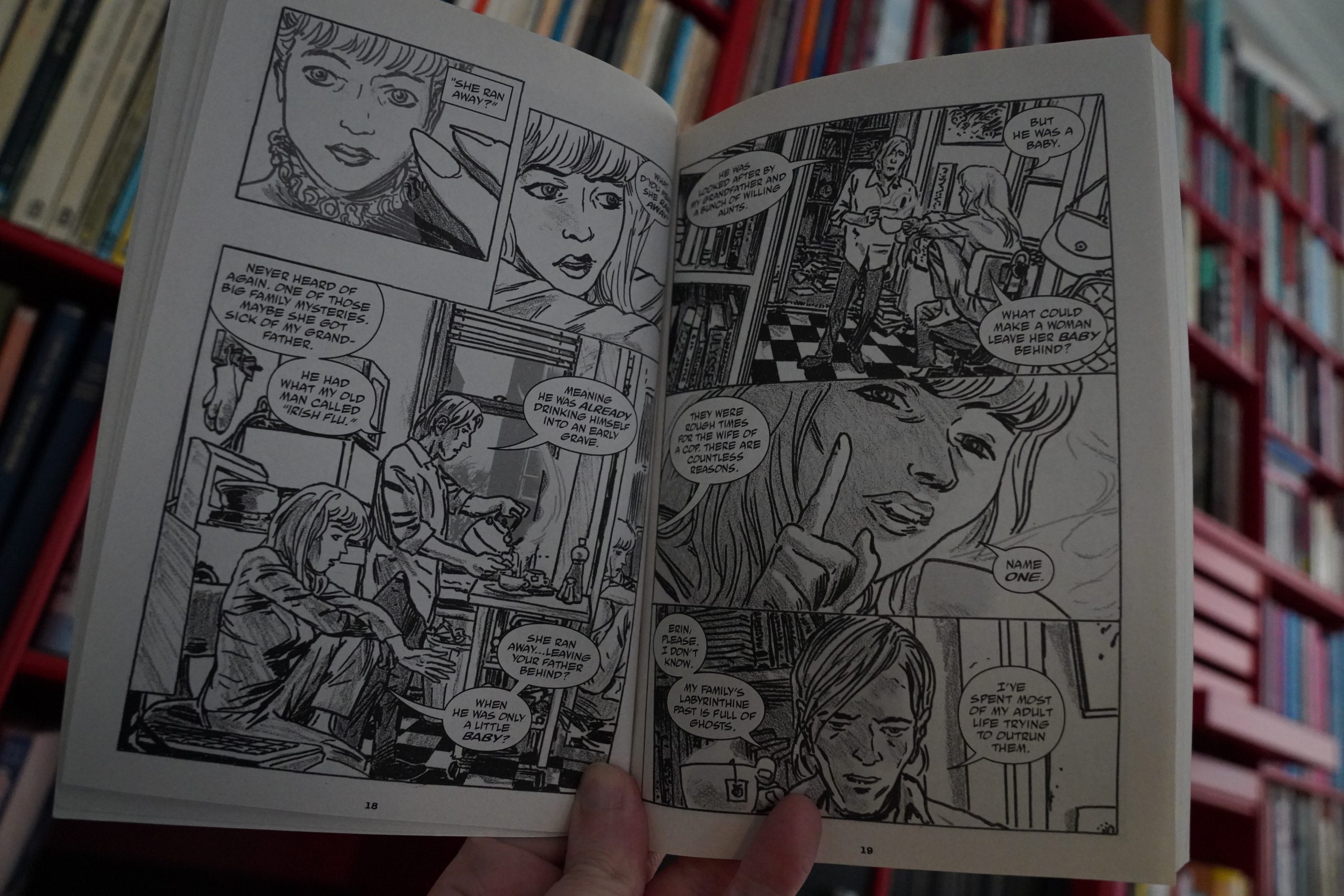
Unfortunately the dialogue is piss poor, and the plot is like somebody fed the ten most convoluted noir scripts into an AI and this is what it spit out. And they have the audacity to include a whole bunch of turgid prose written by the protagonist — it’s like they dare us to start skimming.
I do like the artwork, though — it’s very correct for this type of thing.
| Chris Watson & Georgia Rodgers: Notes from the Forest Floor | 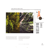 |
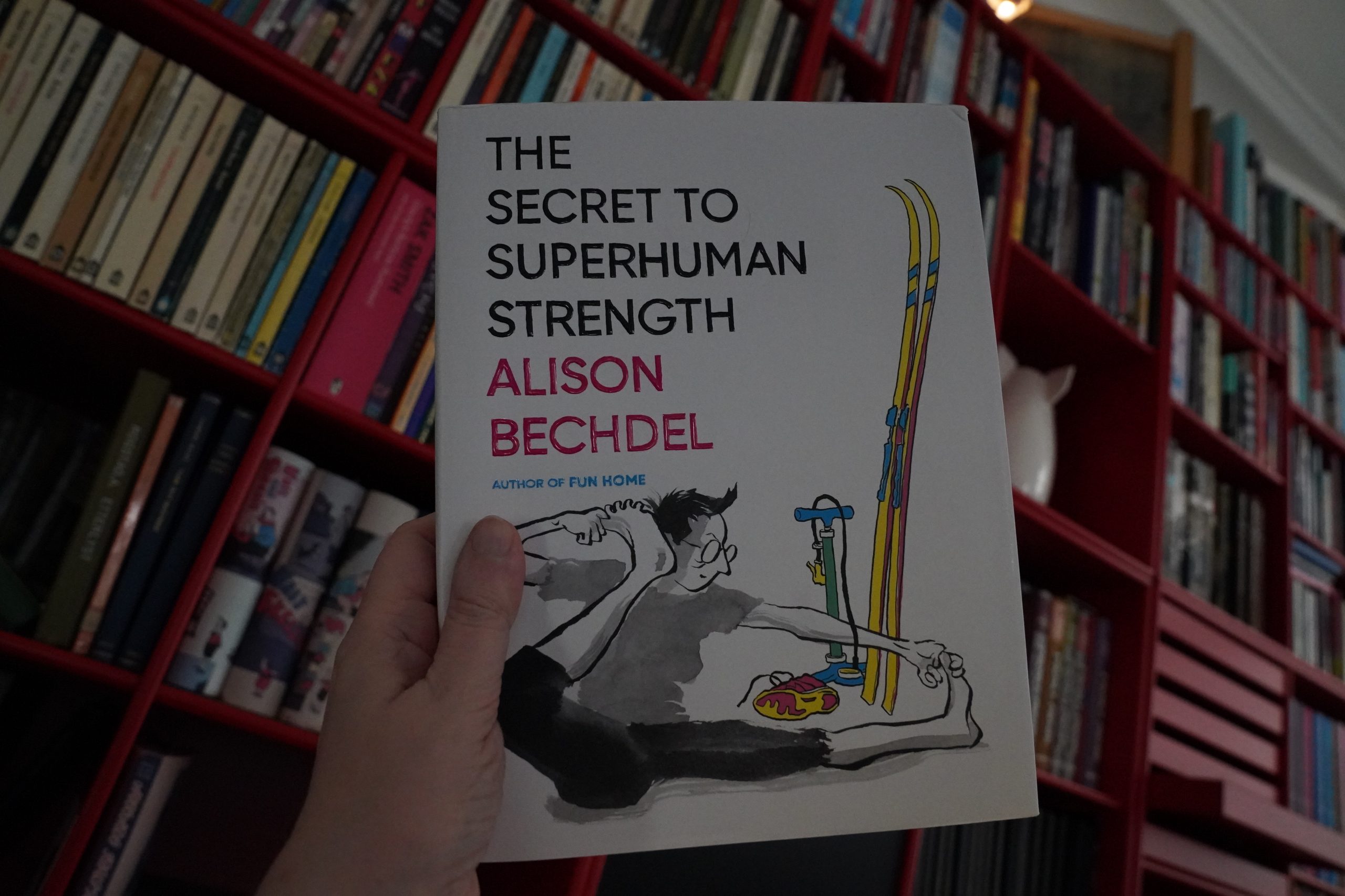
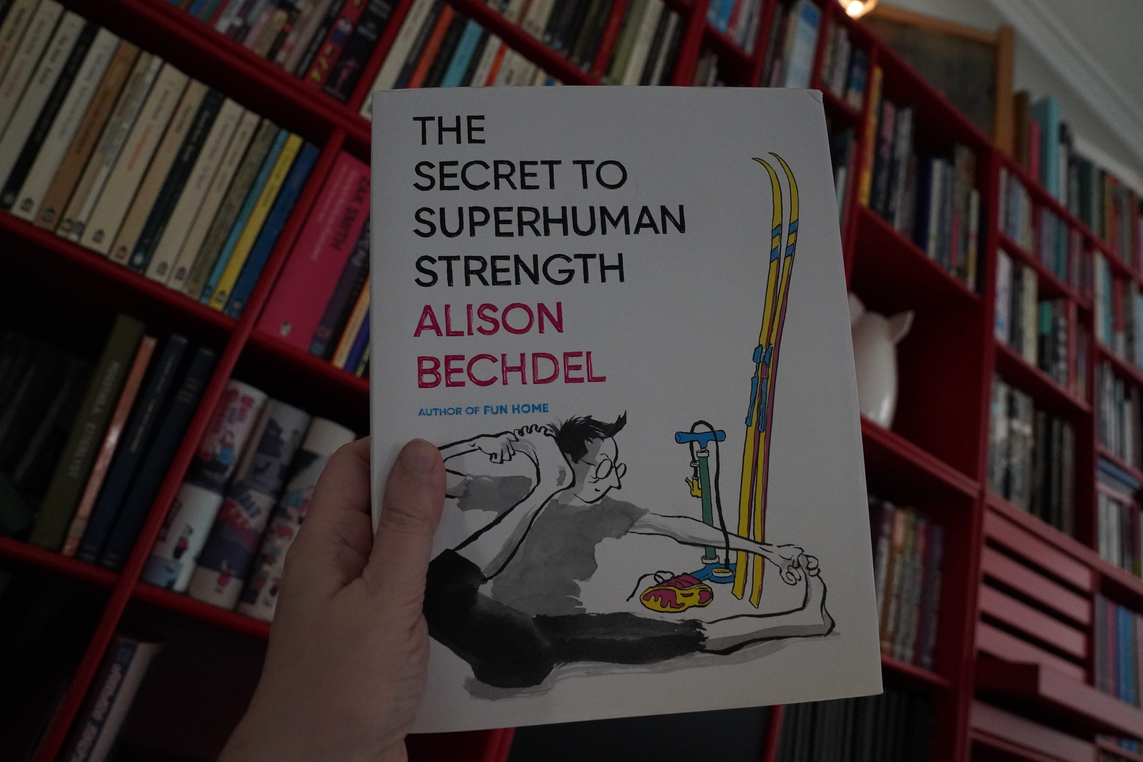
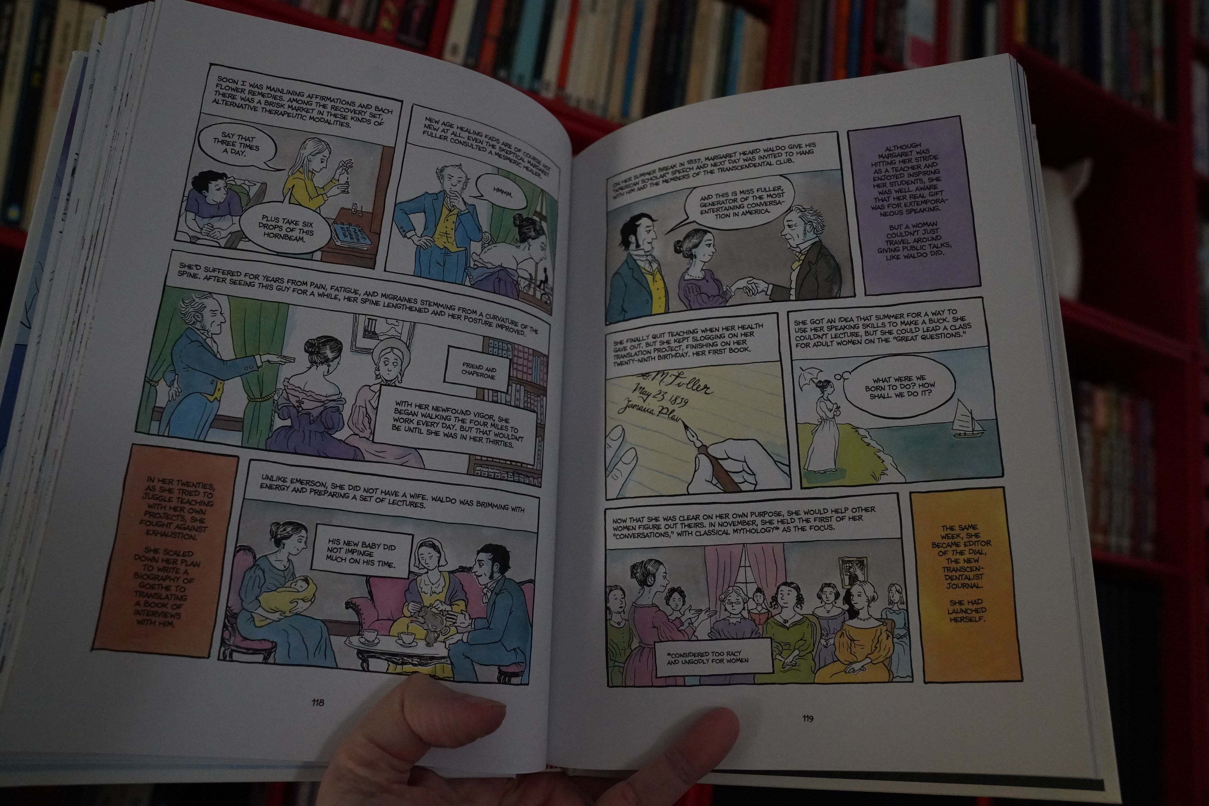
12:24: The Secret to Superhuman Strength by Alison Bechdel (Houghton Mifflin Harcourt)
Oh yeah, I somehow managed to forget to buy this book until now. I was reminded by seeing it on all those Best of 2021 lists.
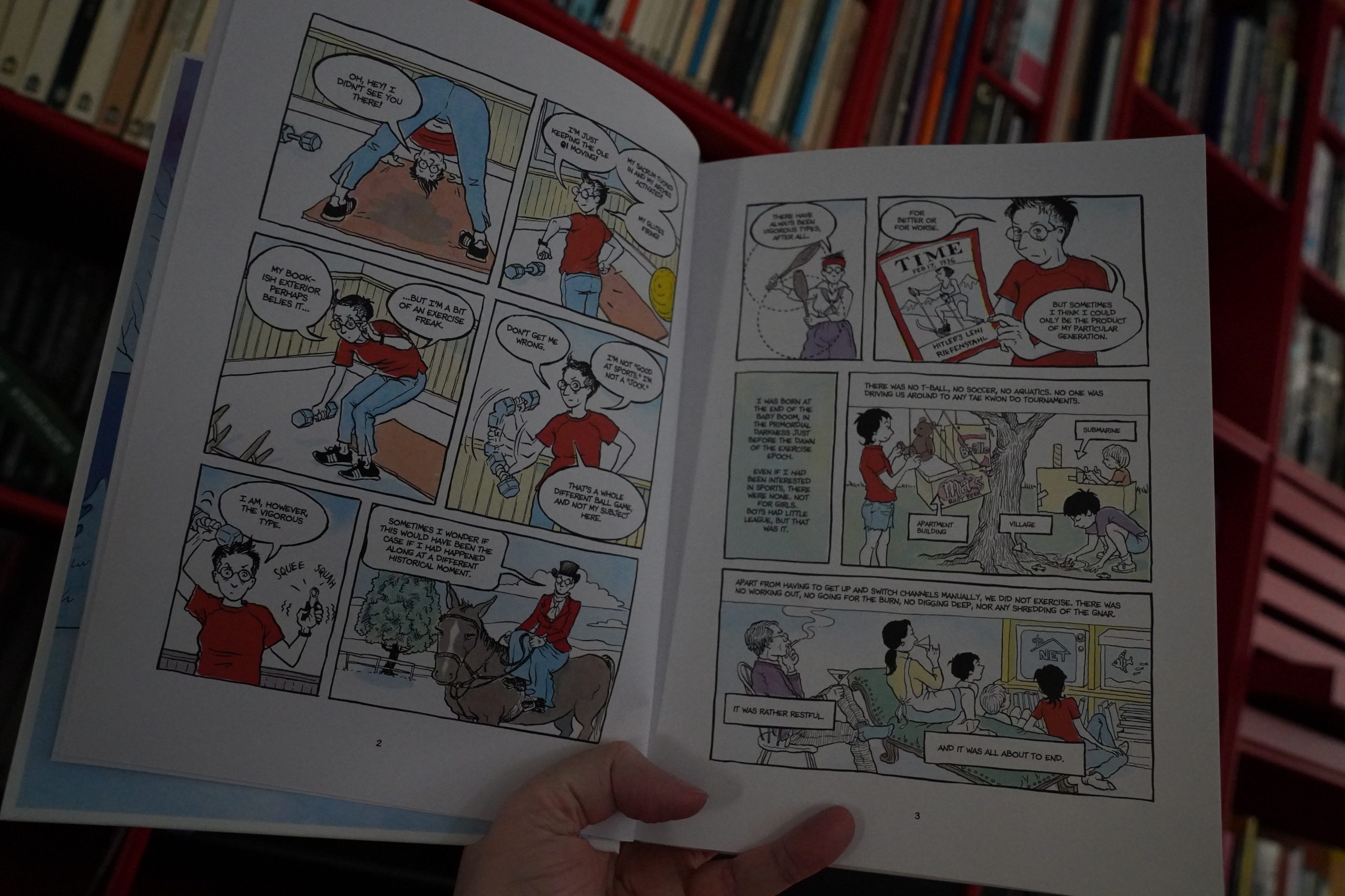
I’ve been a fan of Bechdel since the 80s, and of course Fun Home was an achievement…

… and I understand why people like this book. So much. But it’s exactly the kind of thing I just can deal with. I hate reading plot recaps, and I hate reading Wikipedia entries on old, famous people, and this book is one third just that. (Most people love both things, is my impression?)
I did like many of the autobio parts, but even those were really repetetive. For me, there’s about 30 pages of interesting comics in here, and the rest is a slog.
But that’s me. It’s the seventh most well-liked comic book of 2021, so there.
Reading this made me want to re-read all the Dykes To Watch Out For collections, though.
| Various: Still in a Dream (3) |  |
15:01: But Not Now
Because that Bechdel book wore me out, and I’m now going to sulk in front of the TV until it’s time to go to bed.