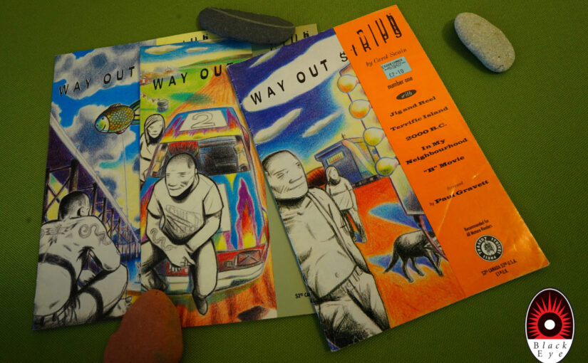
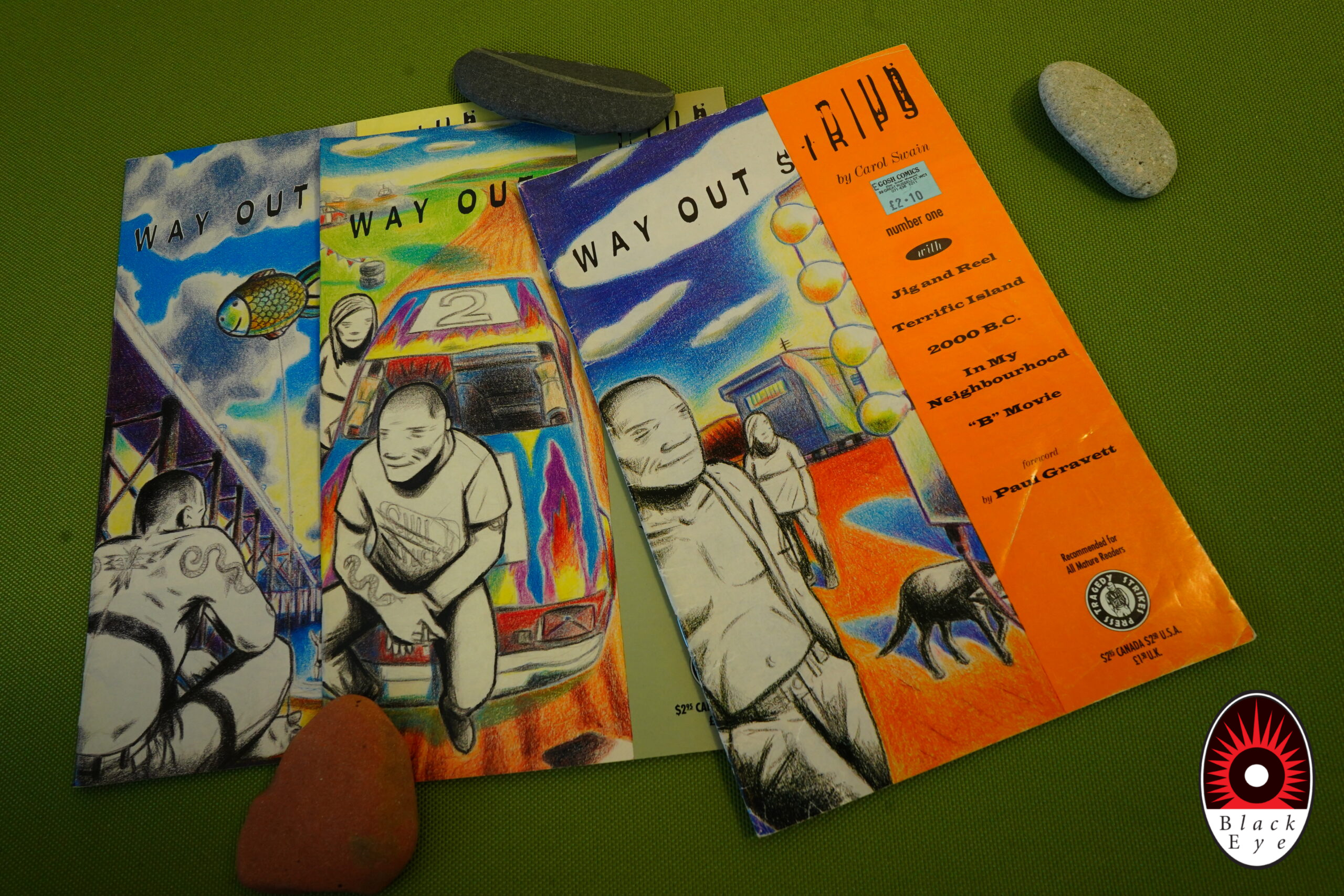
Way Out Strips (1992) #1-3 by Carol Swain
I re-read these books last time when I did the Fantagraphics blog series, but I wanted to read them again now, so here we go.
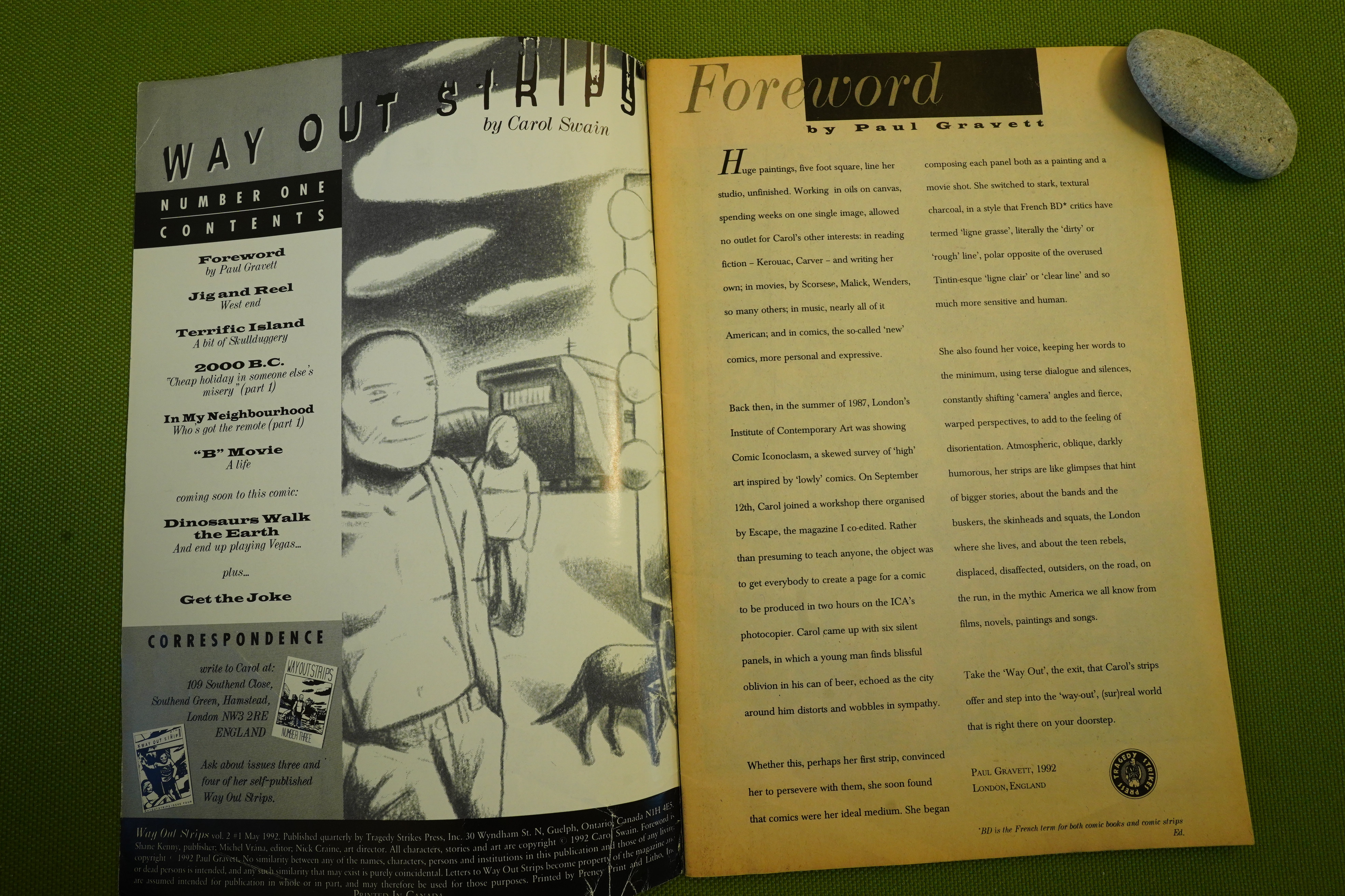
Hey, foreword by Paul Gravett that gives some background as to how Swain started doing comics.
Hm, perhaps I should do something with the white balance… I mean, these pages really look that yellowed in real life, but I could make them whiter here on the screen. Eh, too much work.
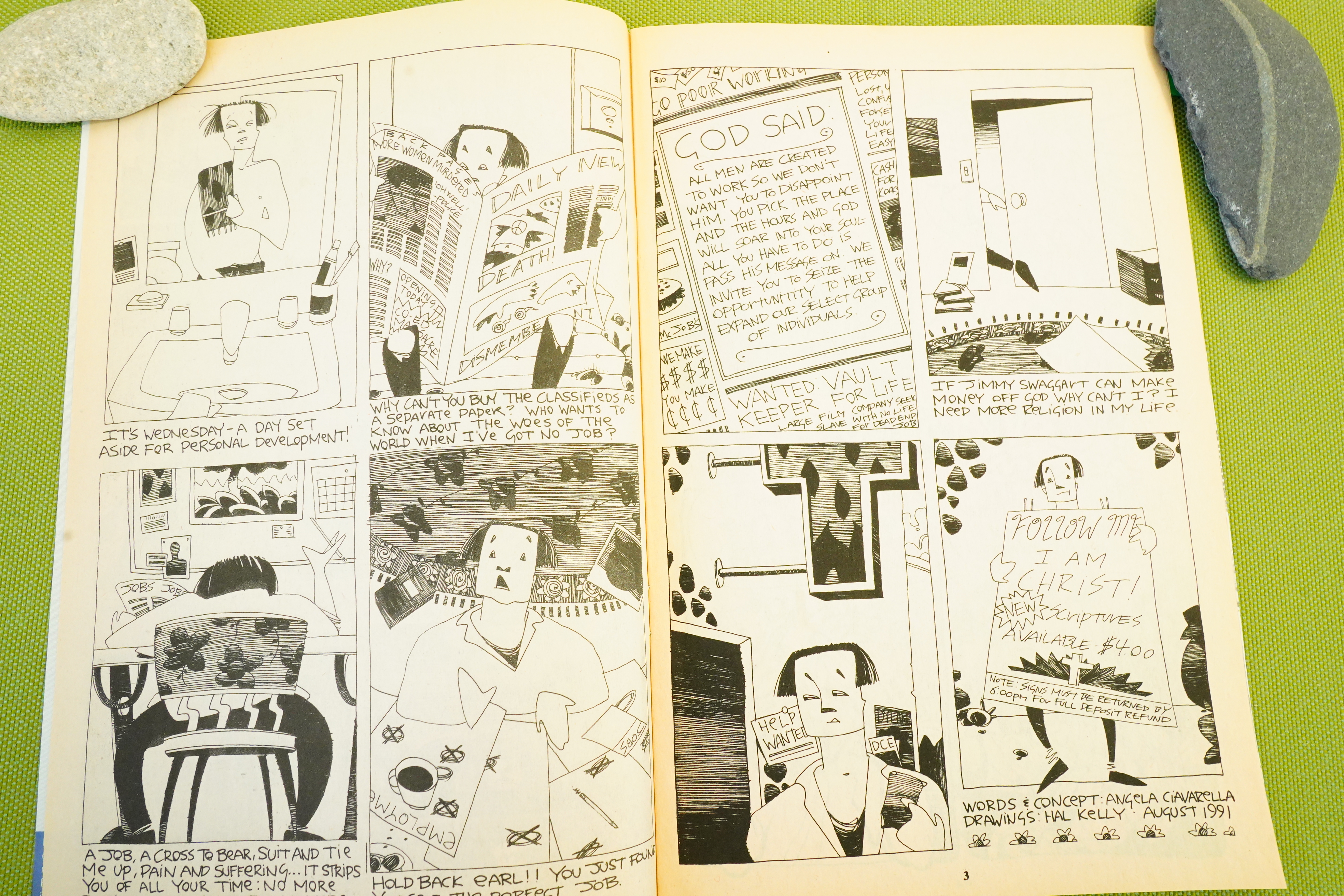
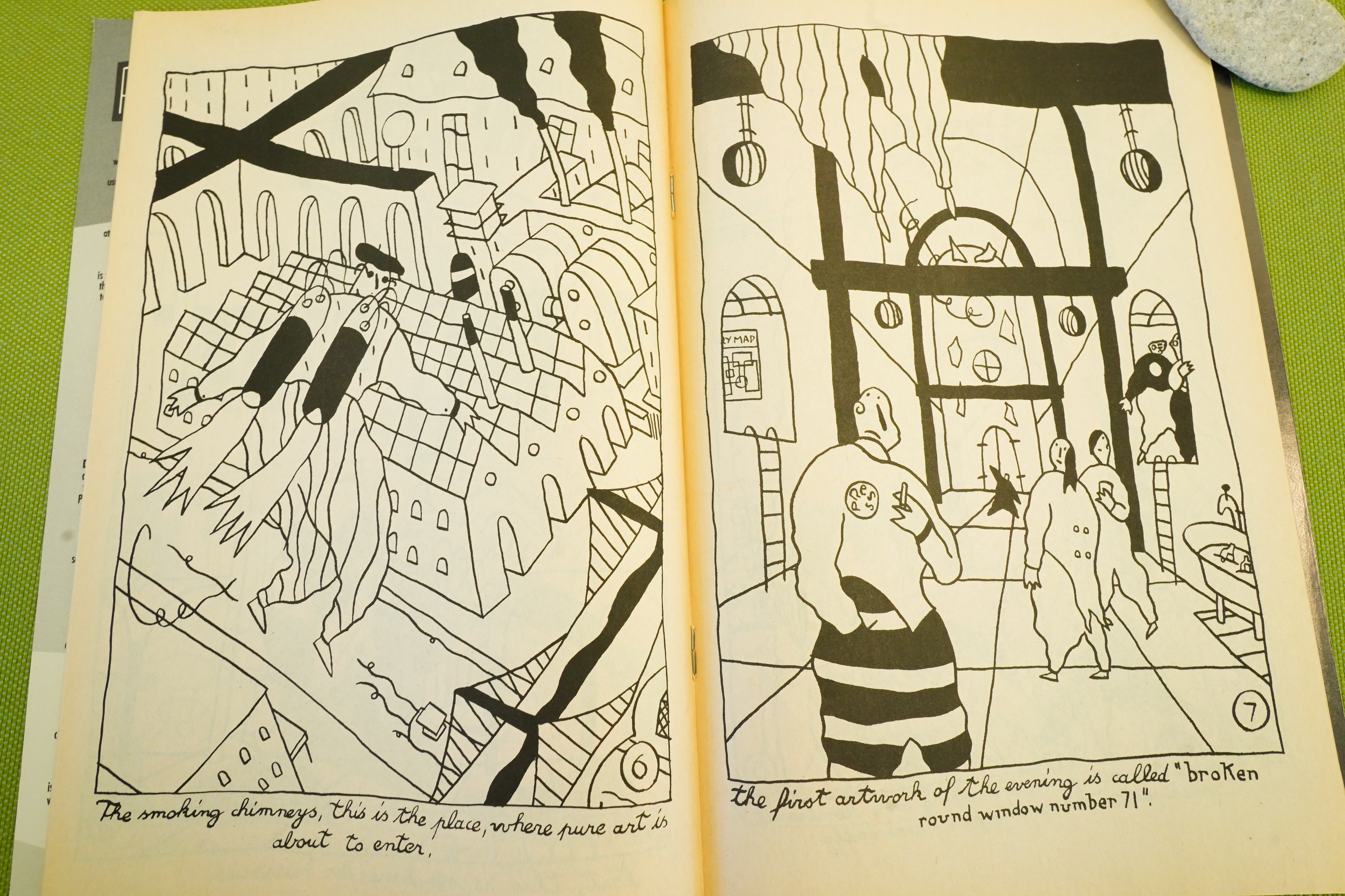
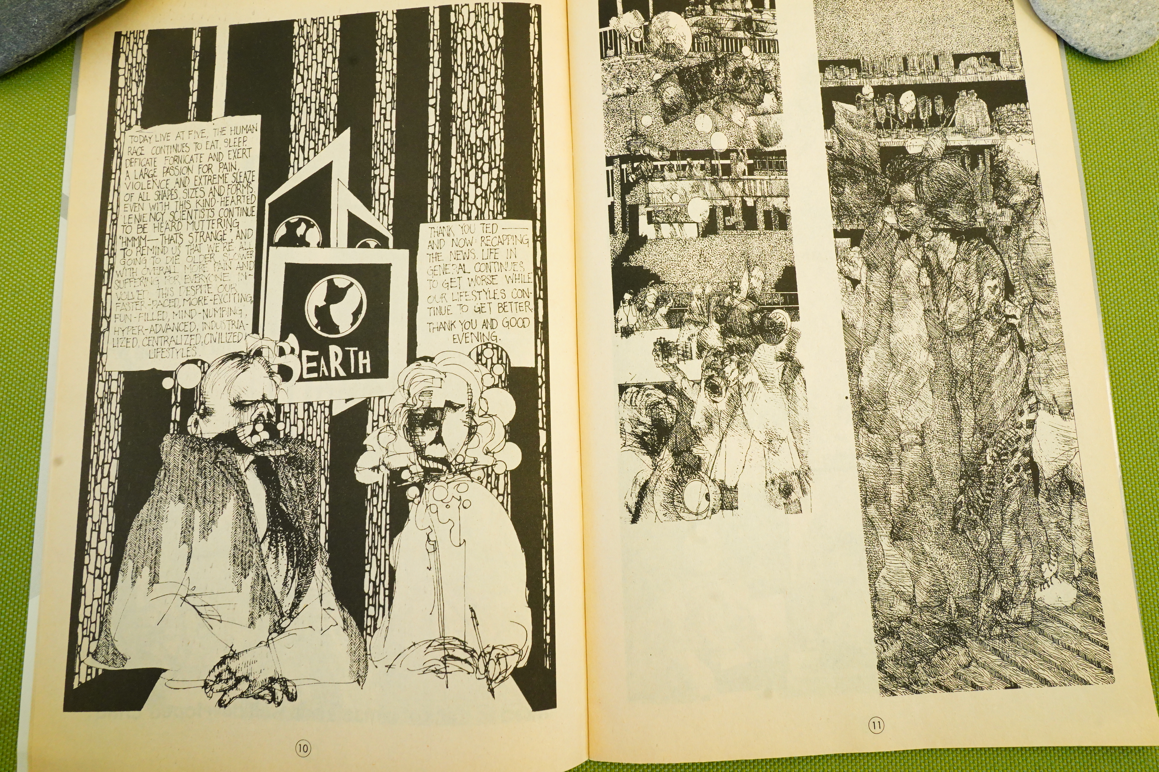
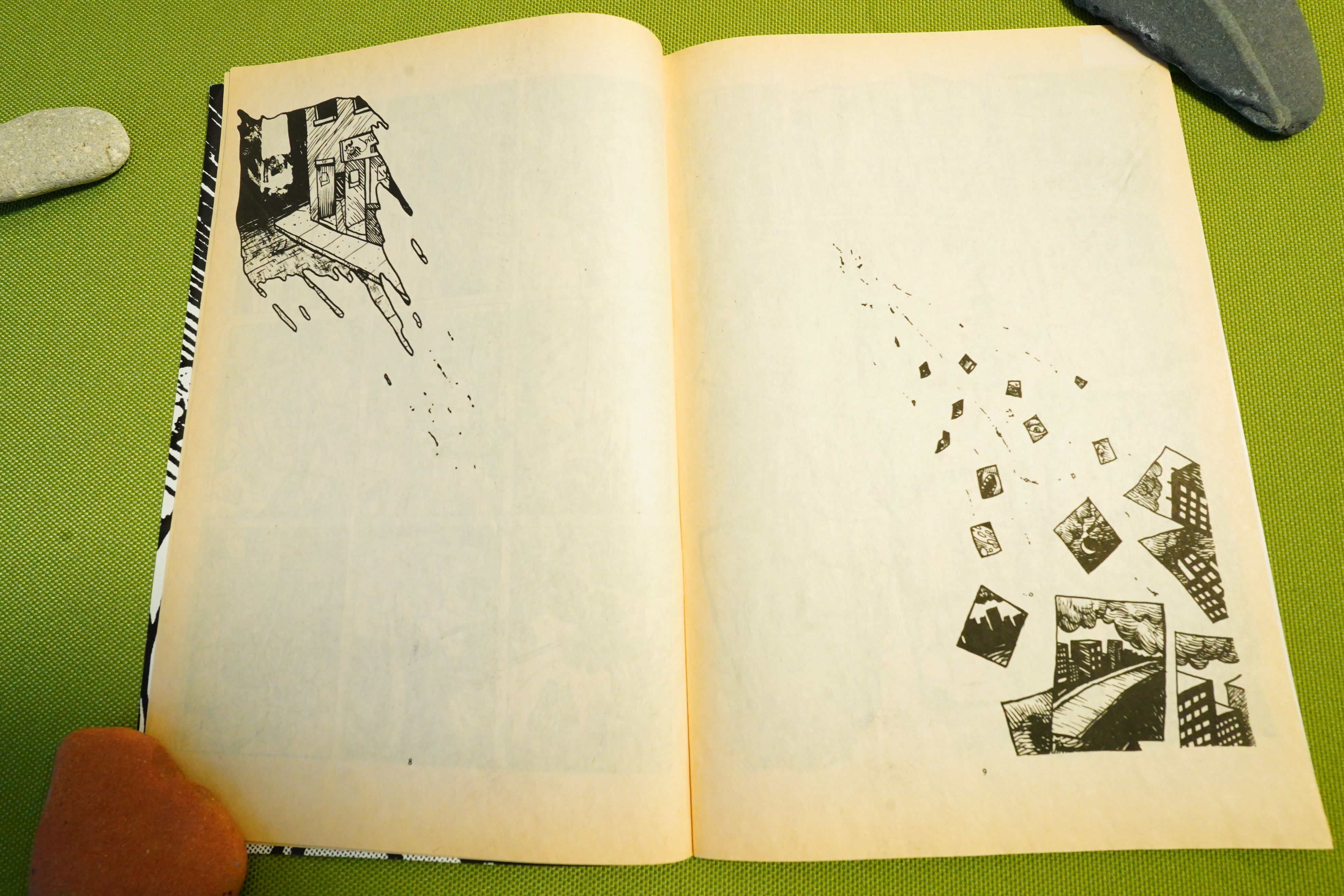
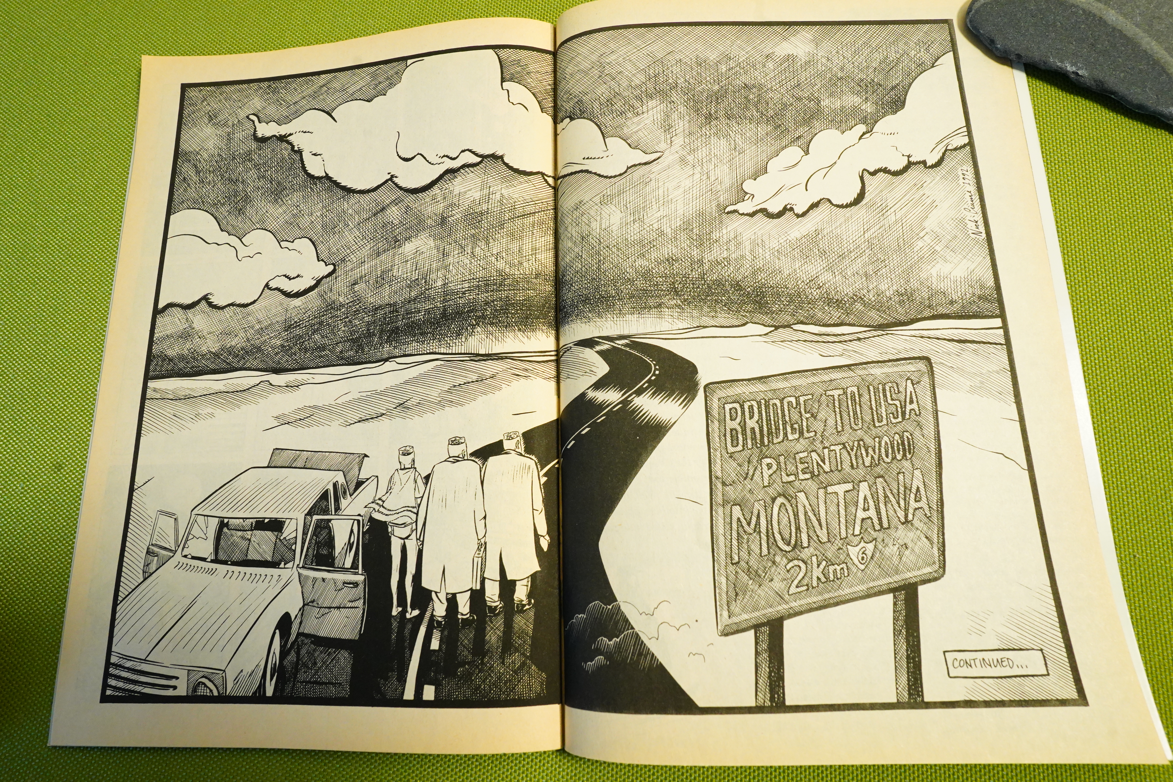
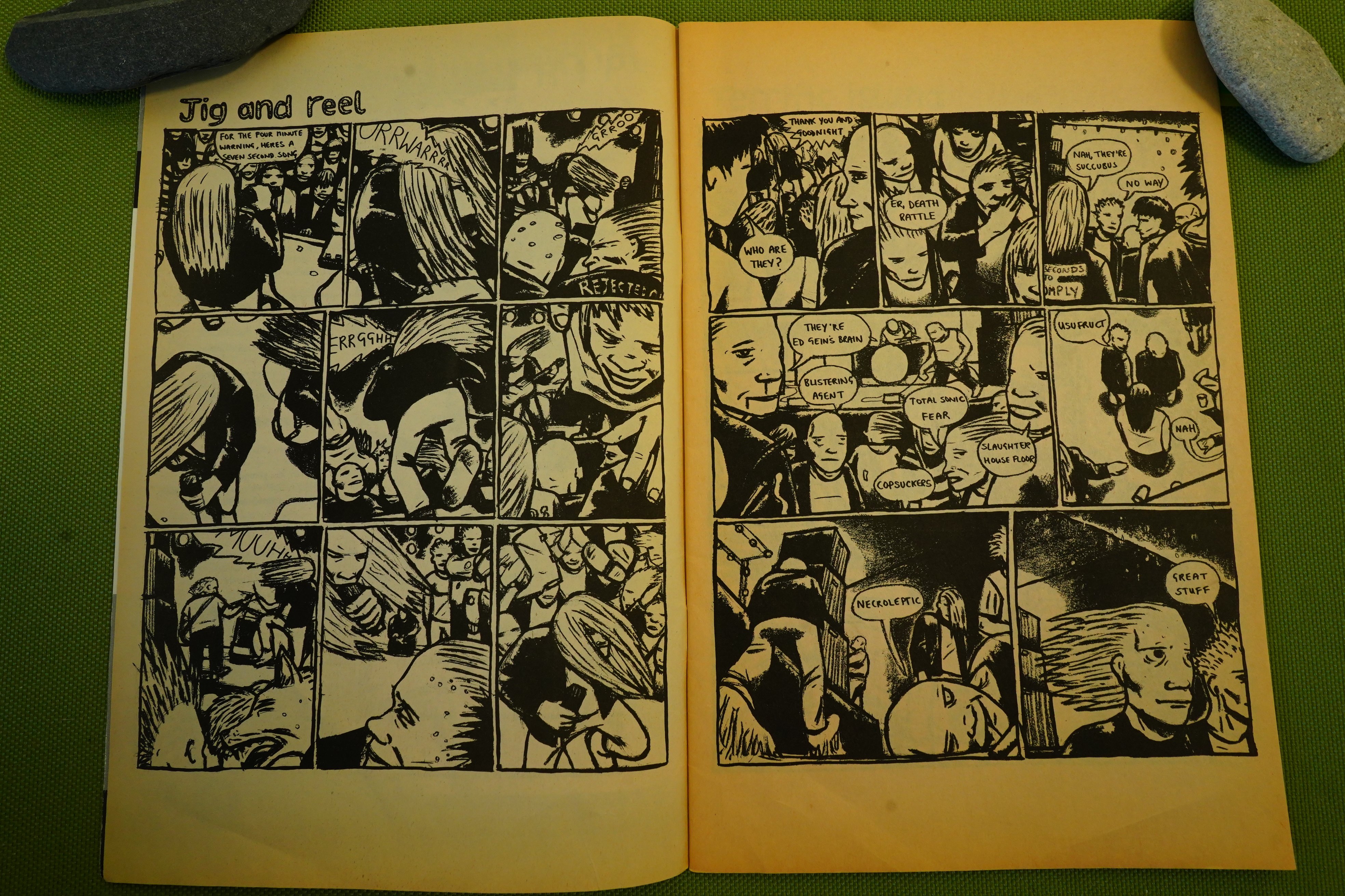
Anyway, isn’t that an amazing spread? Total punk show feeling.
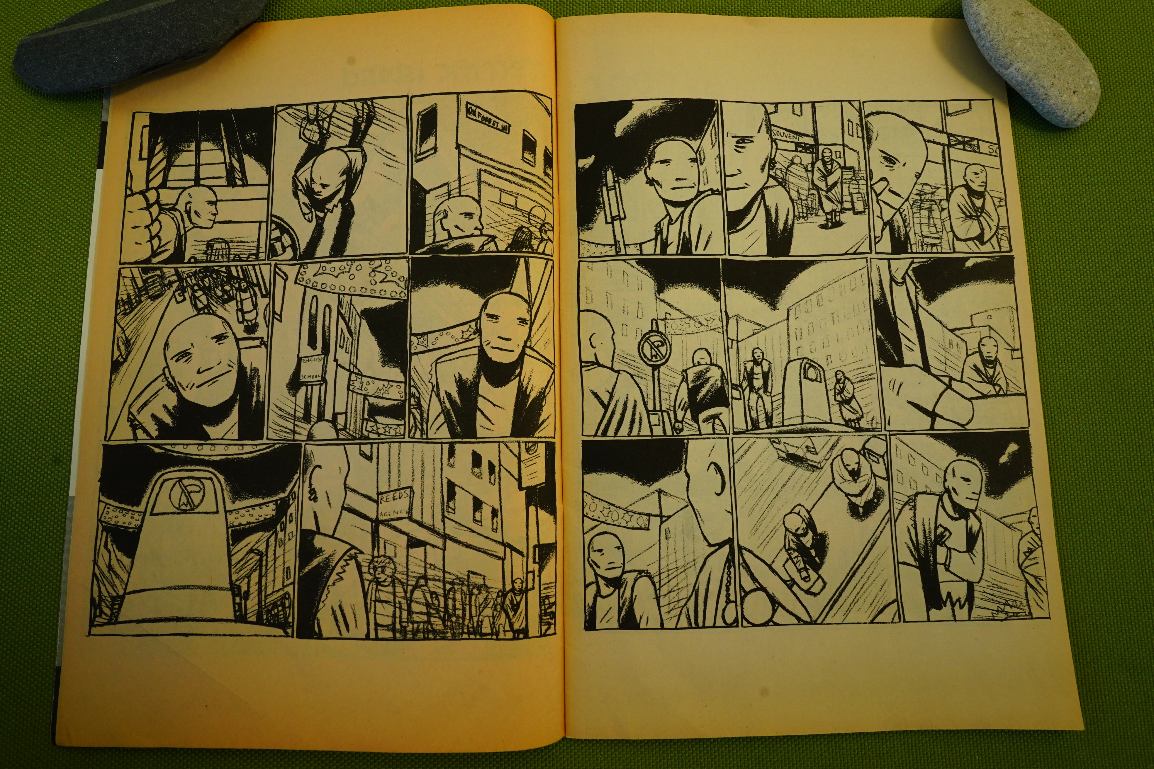
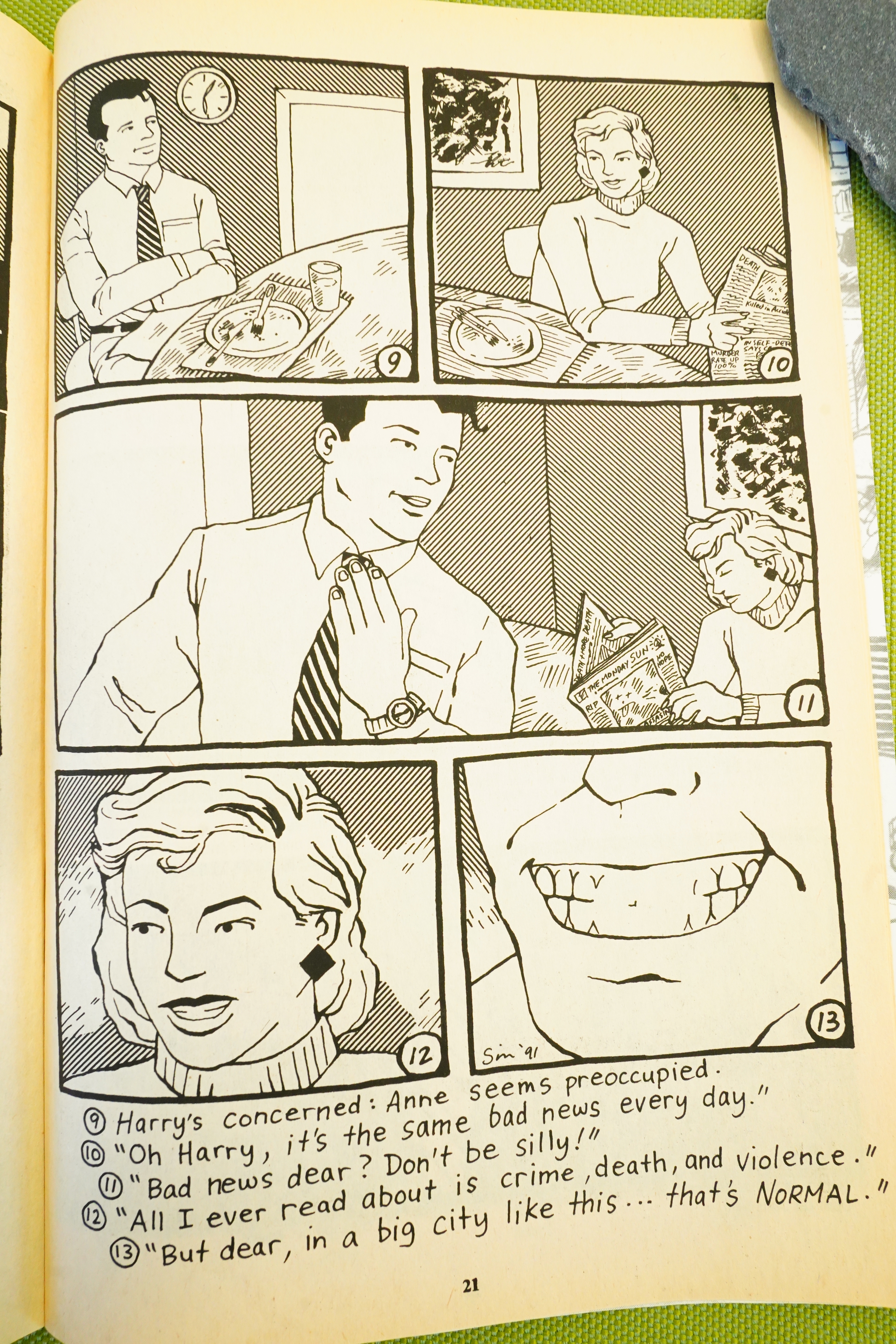
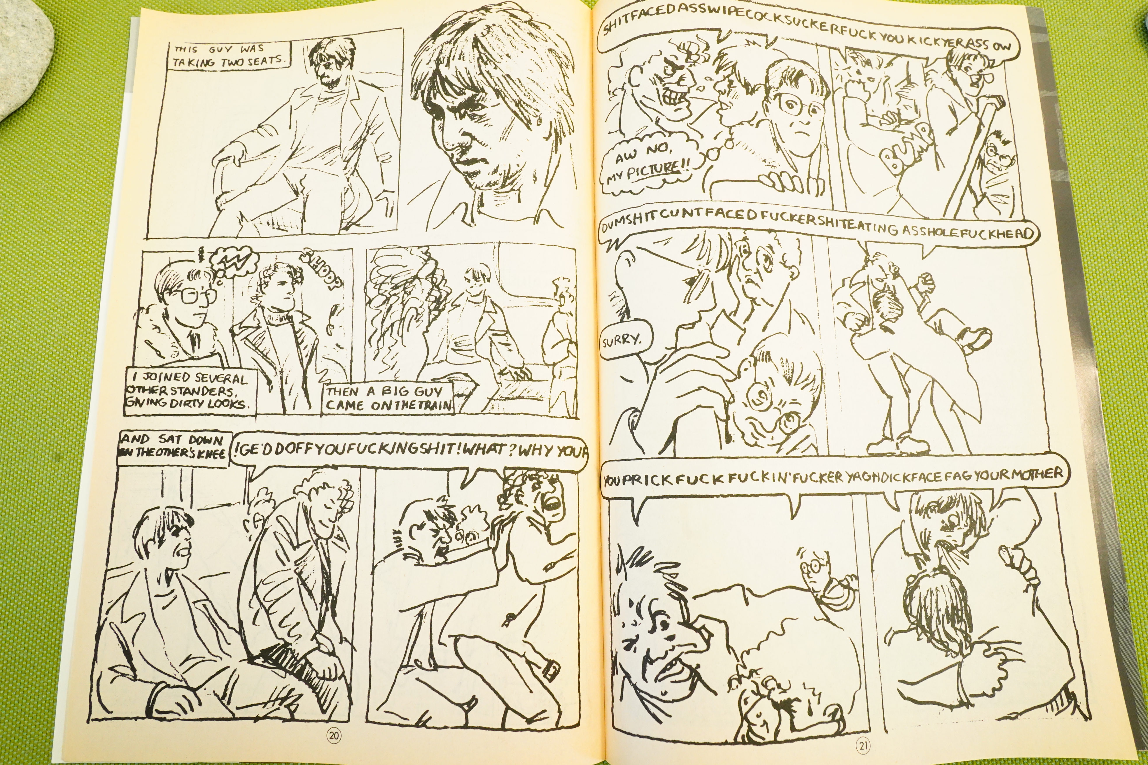
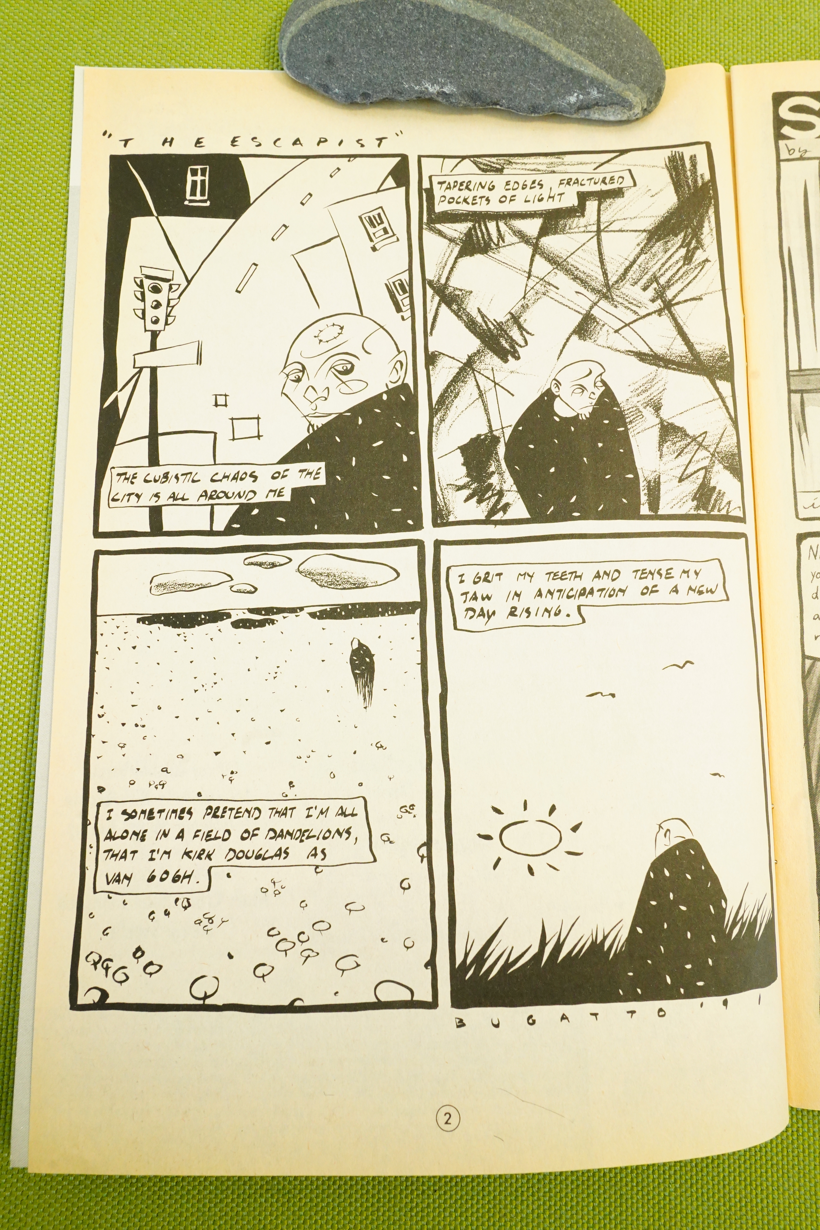
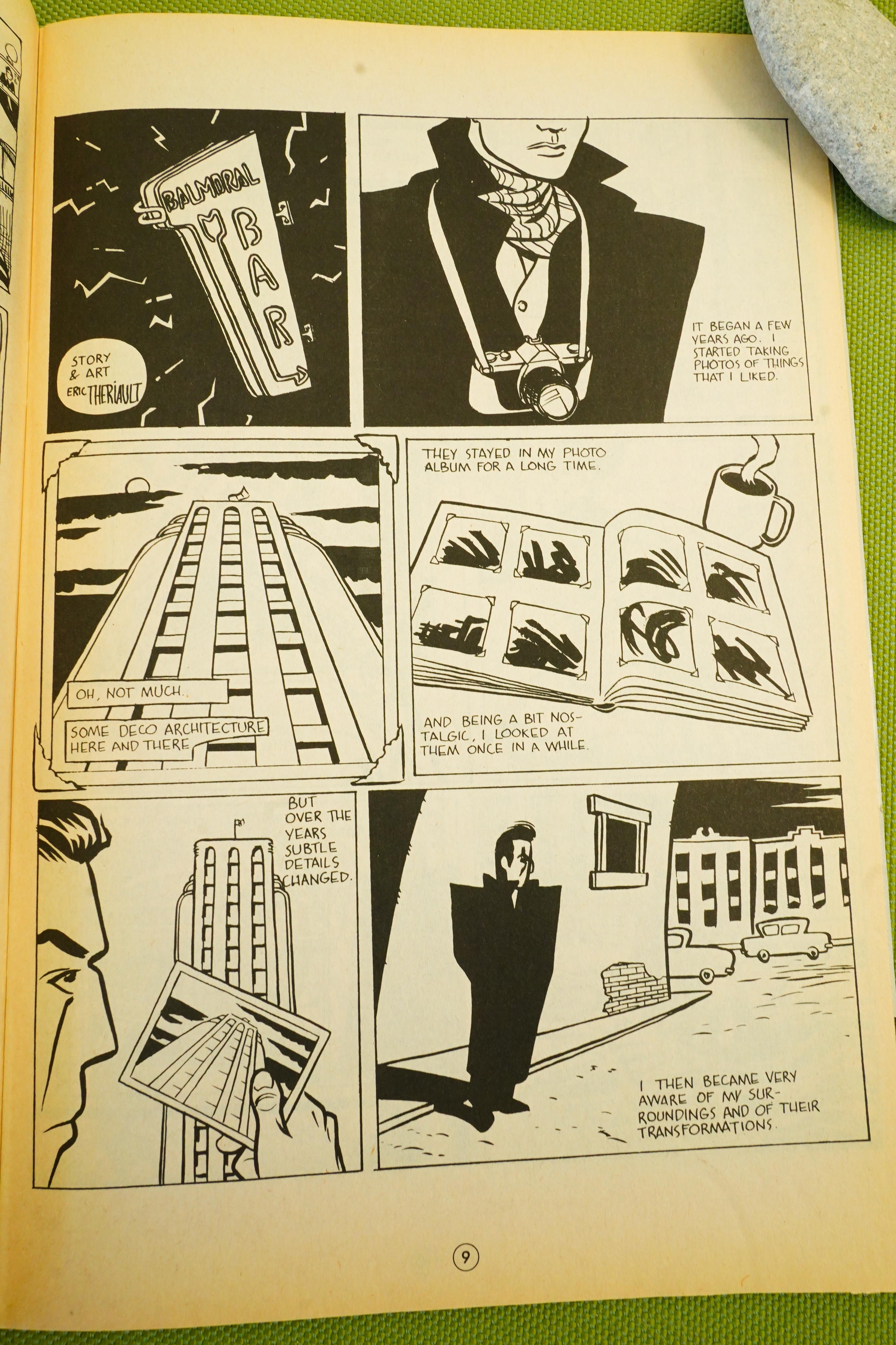
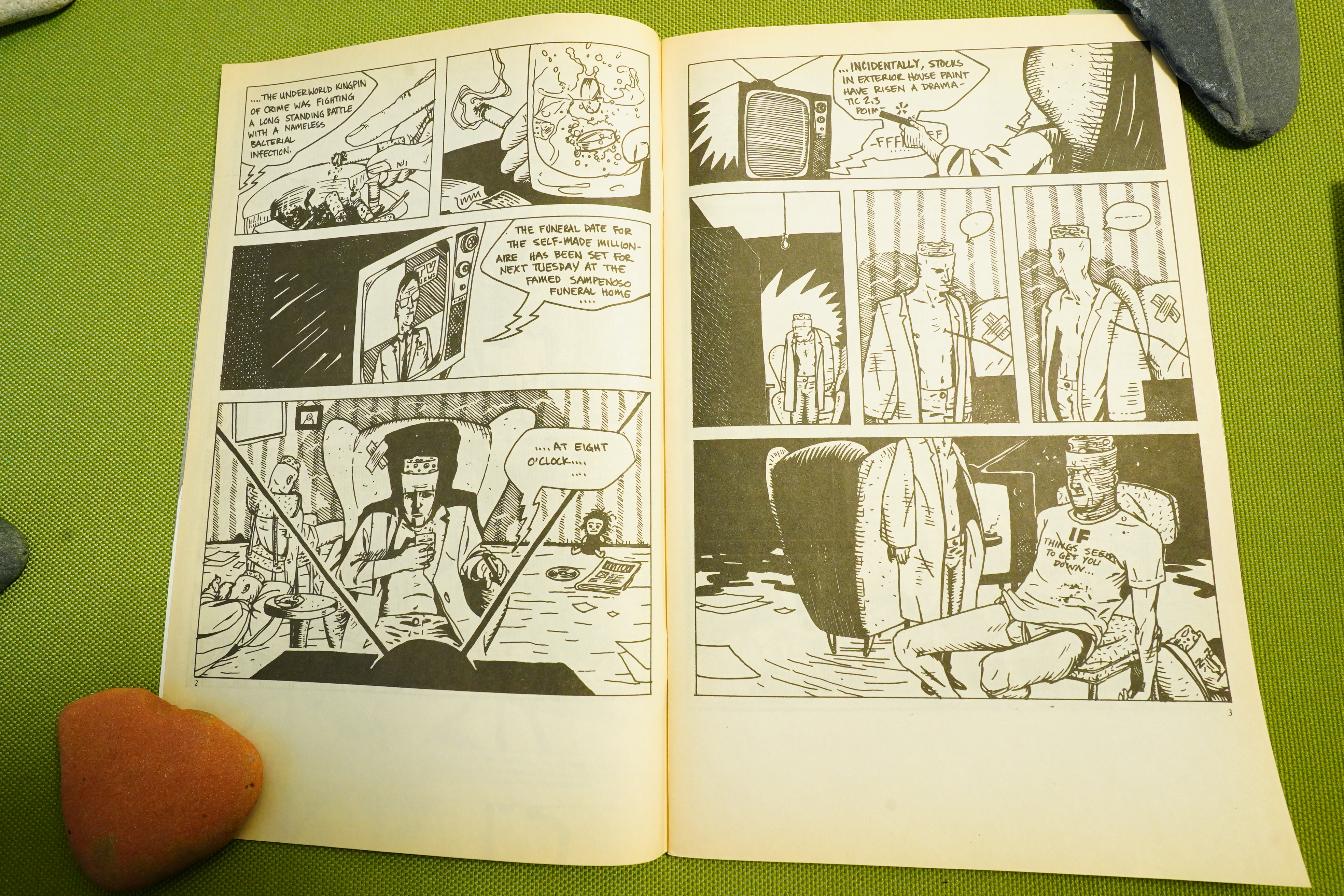
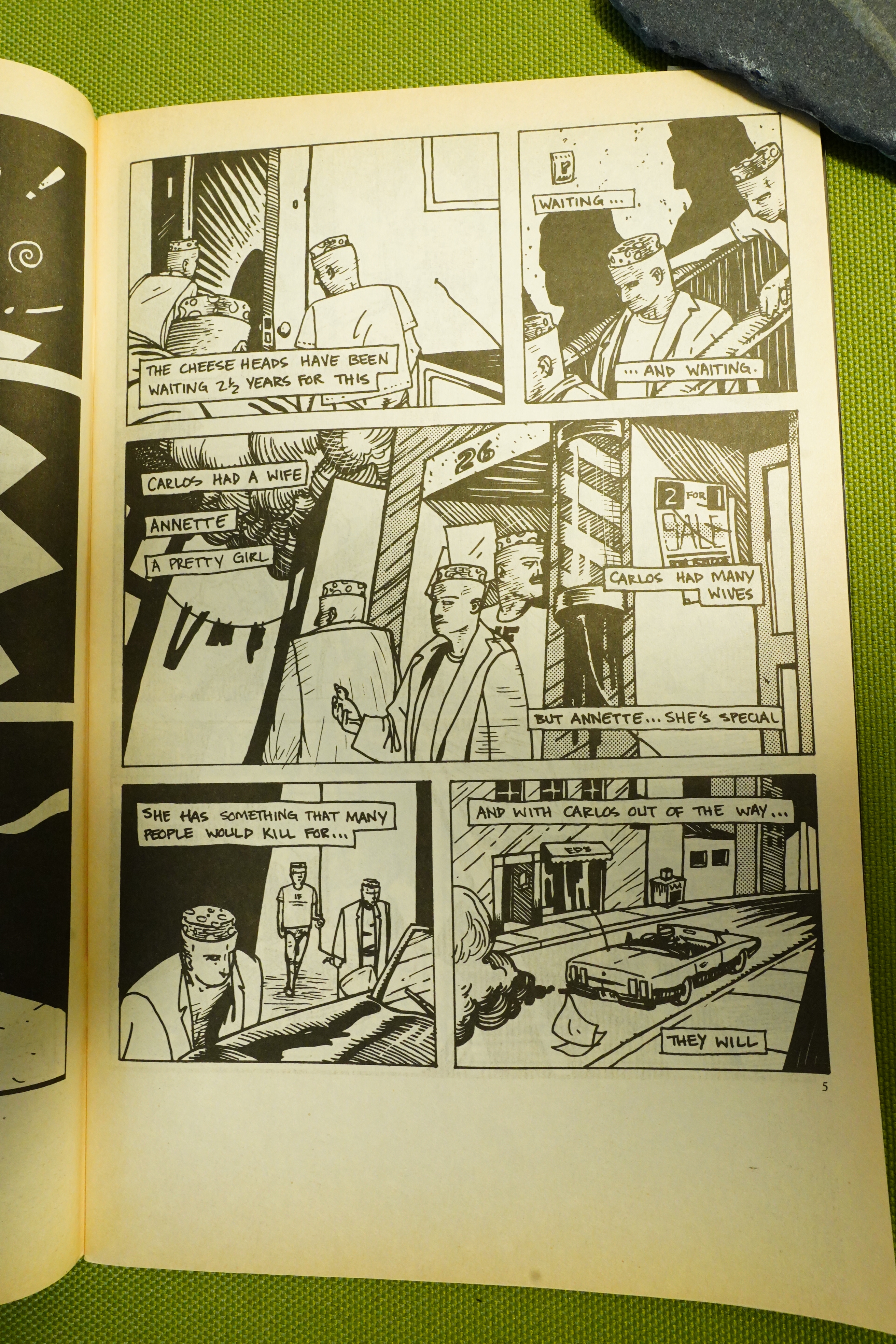
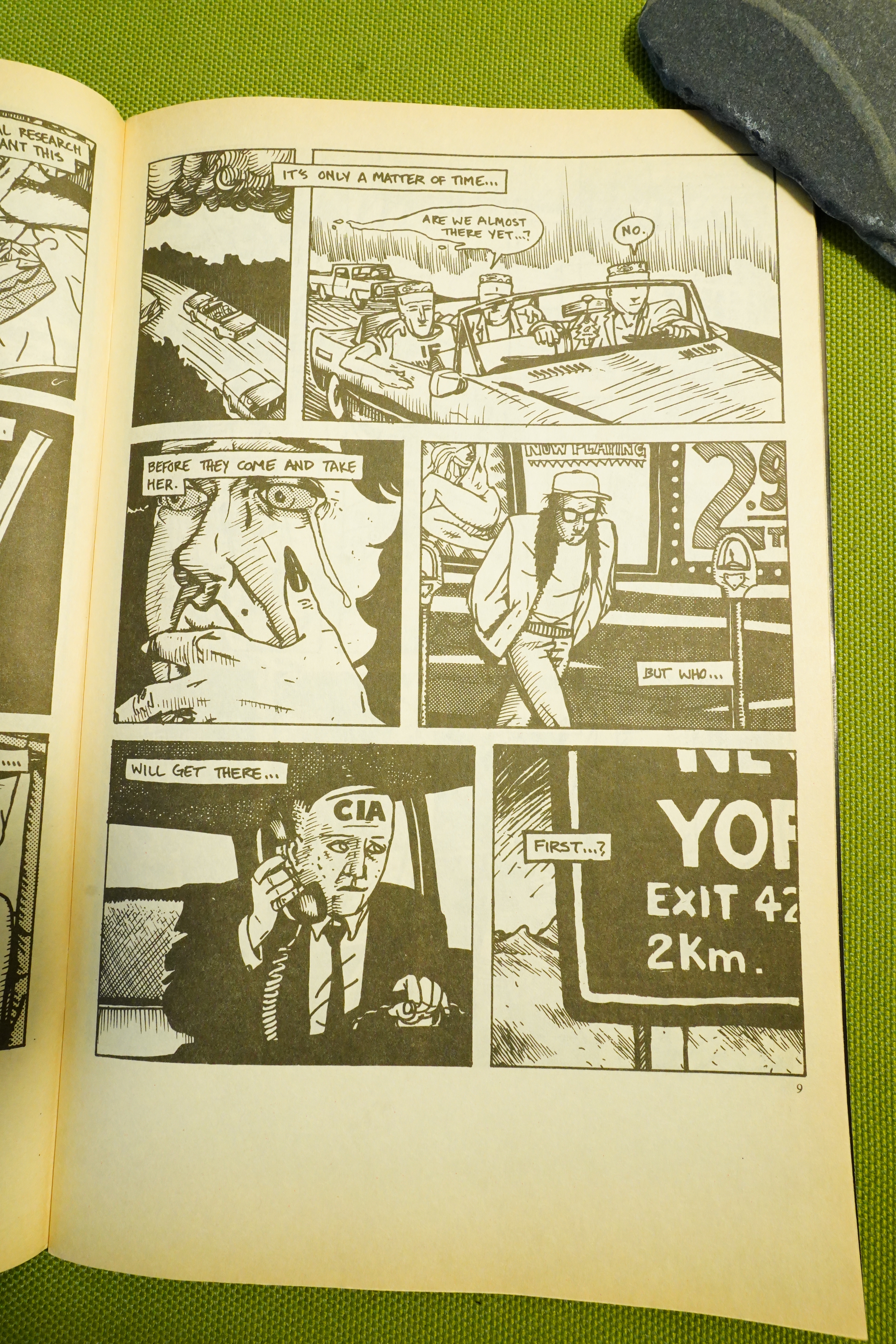
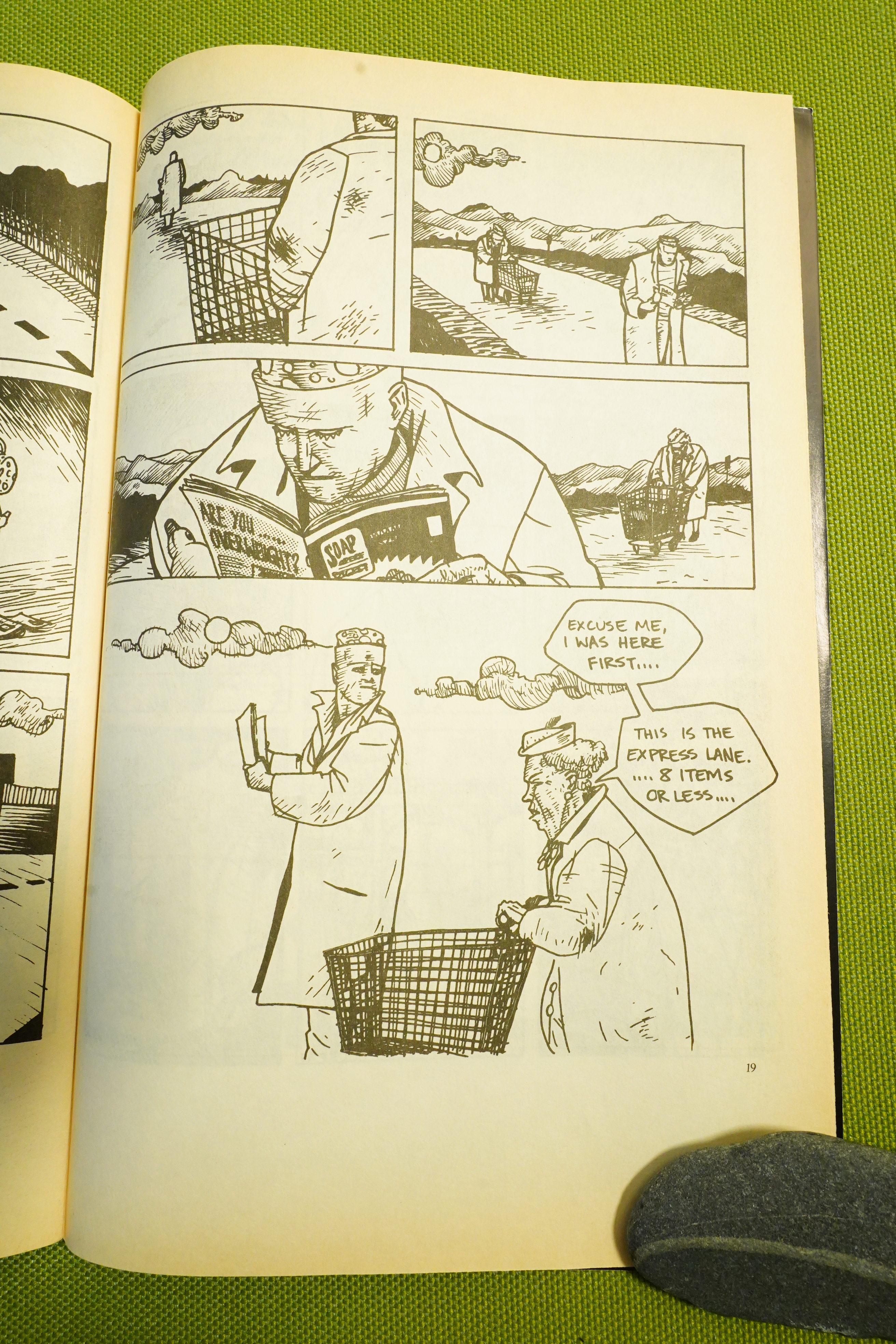
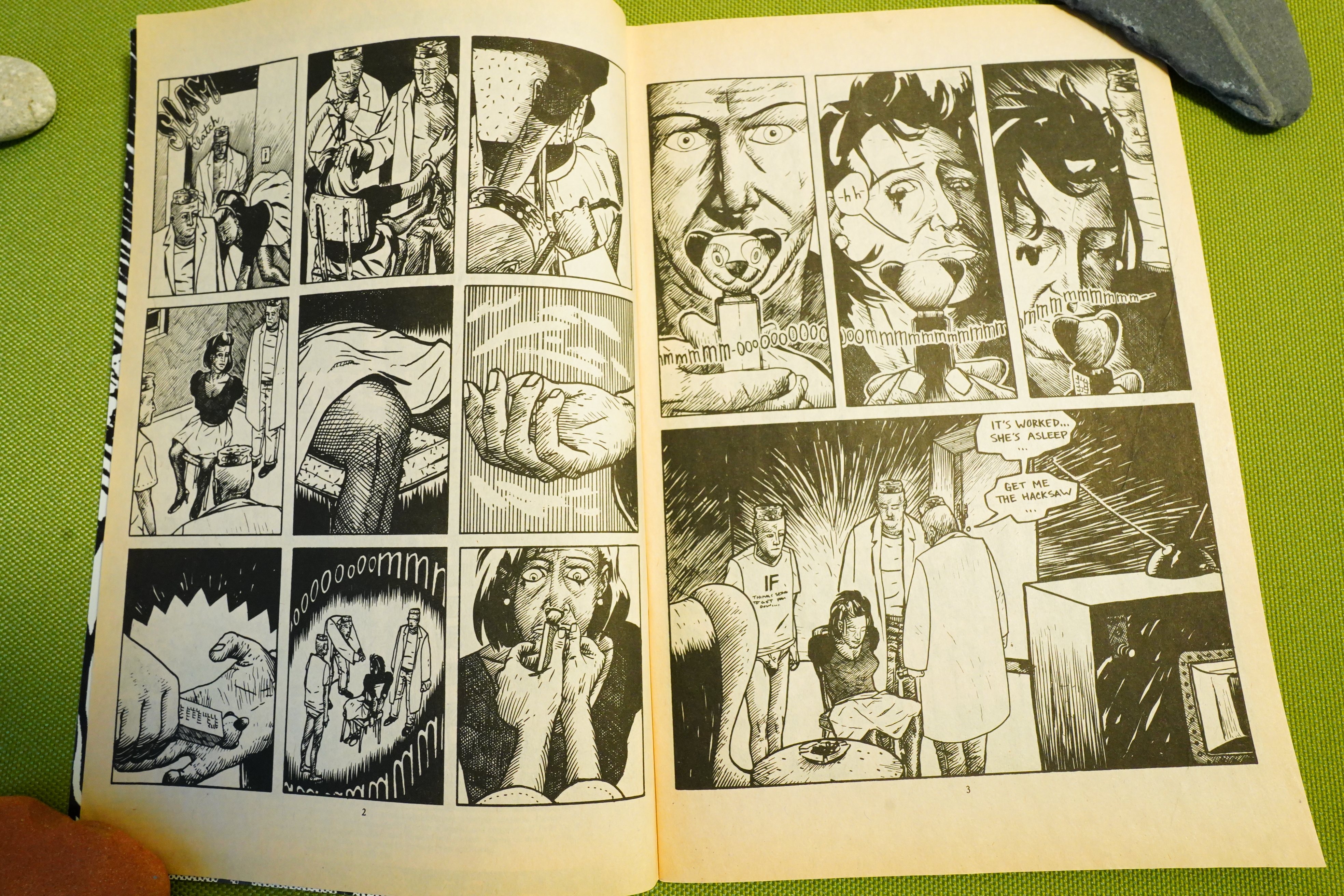
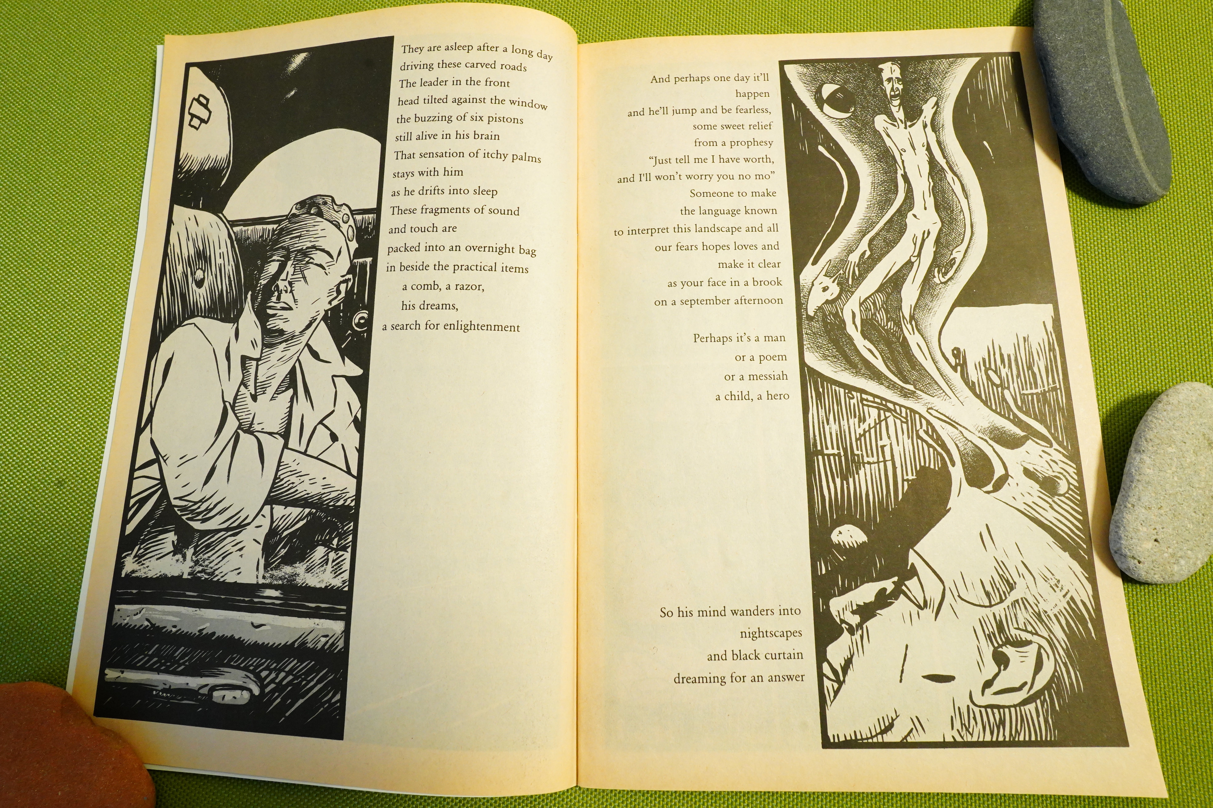
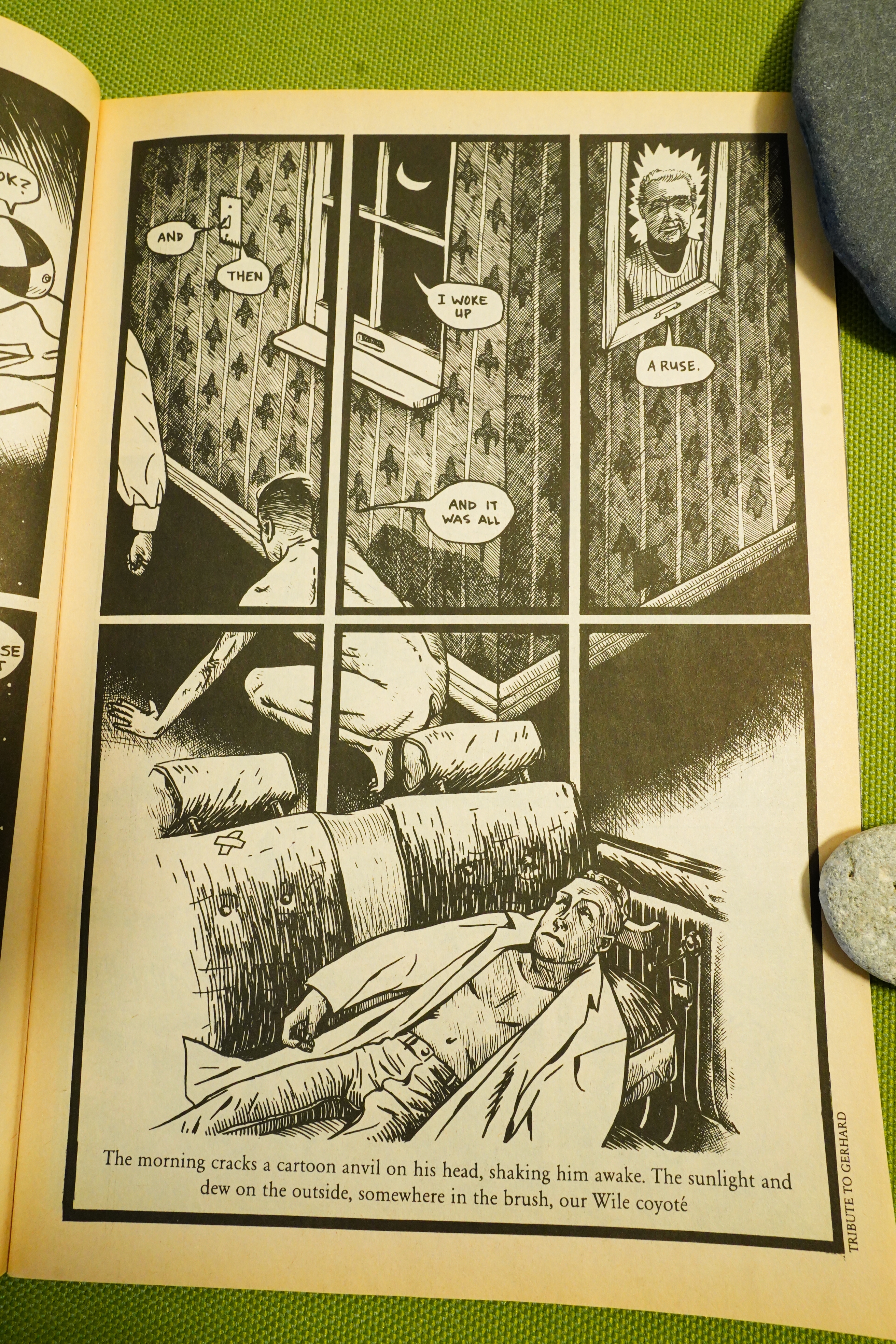
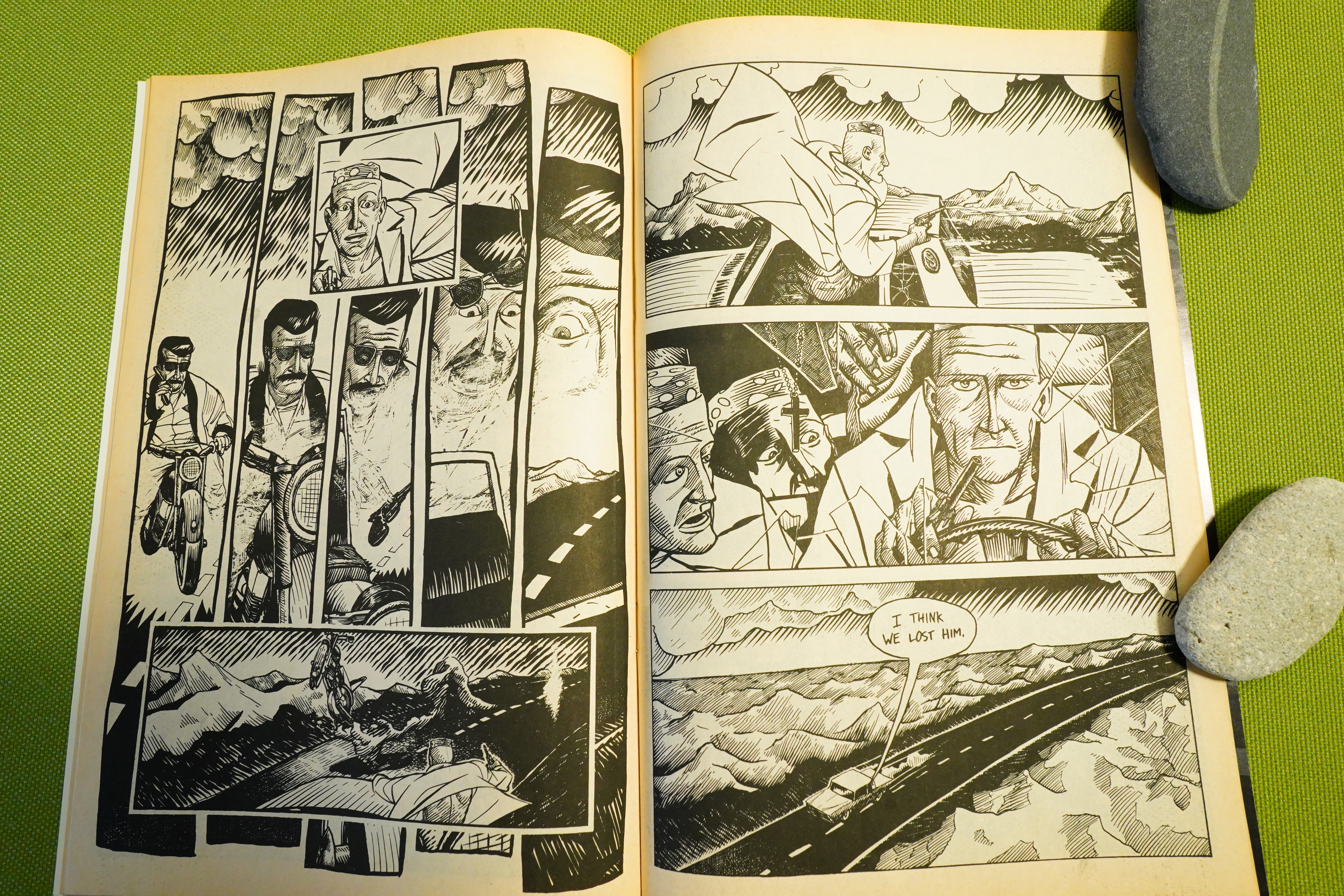
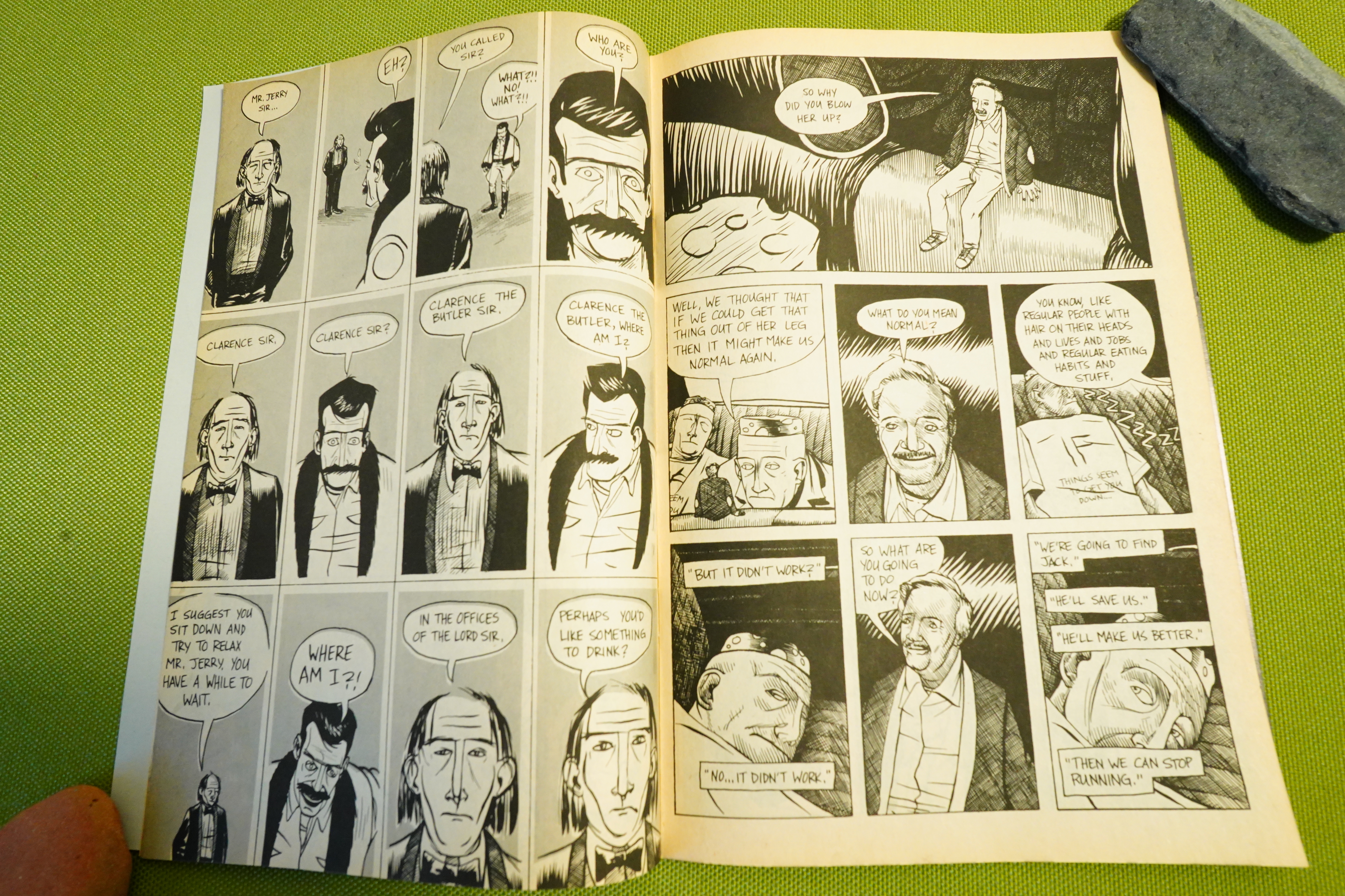
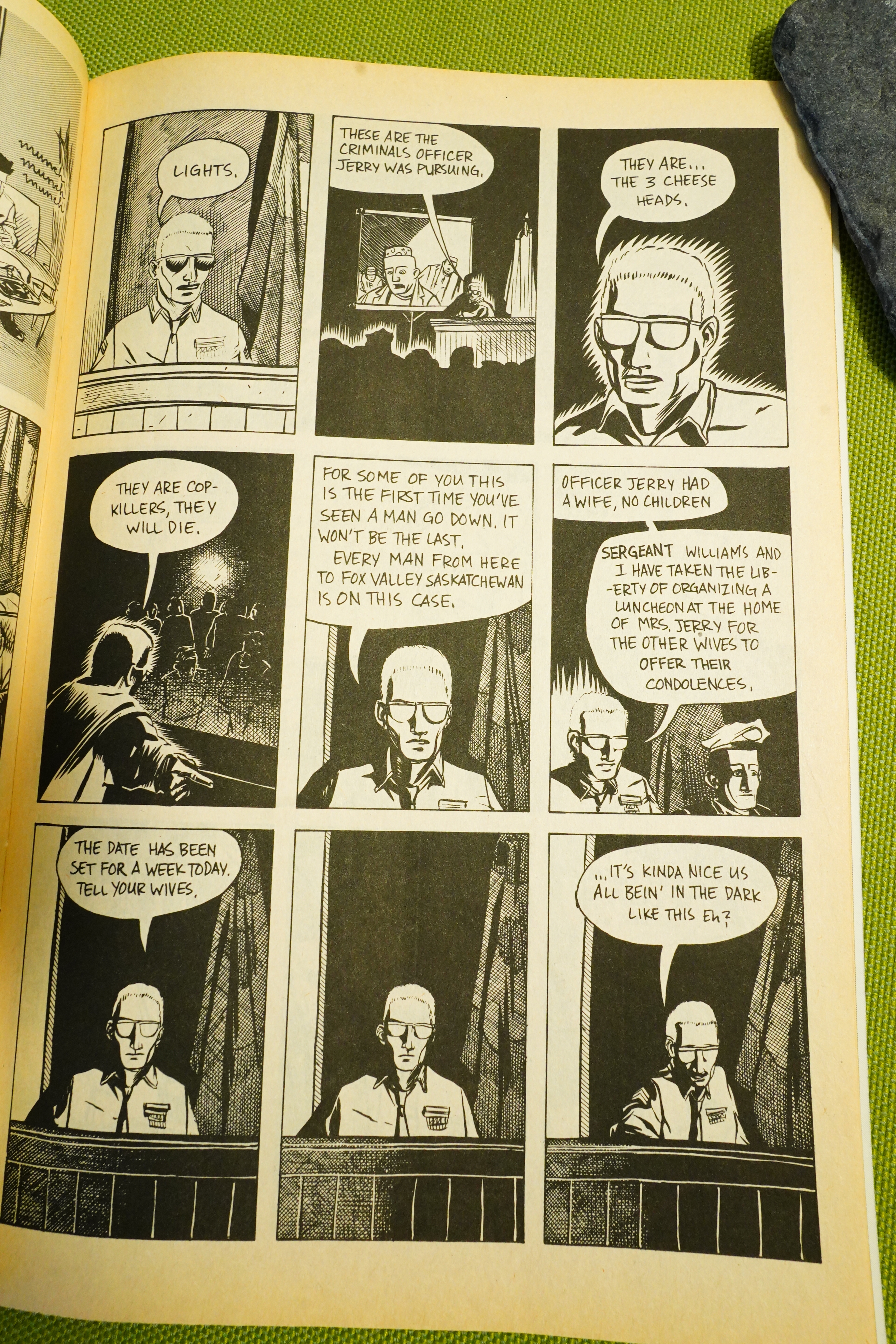
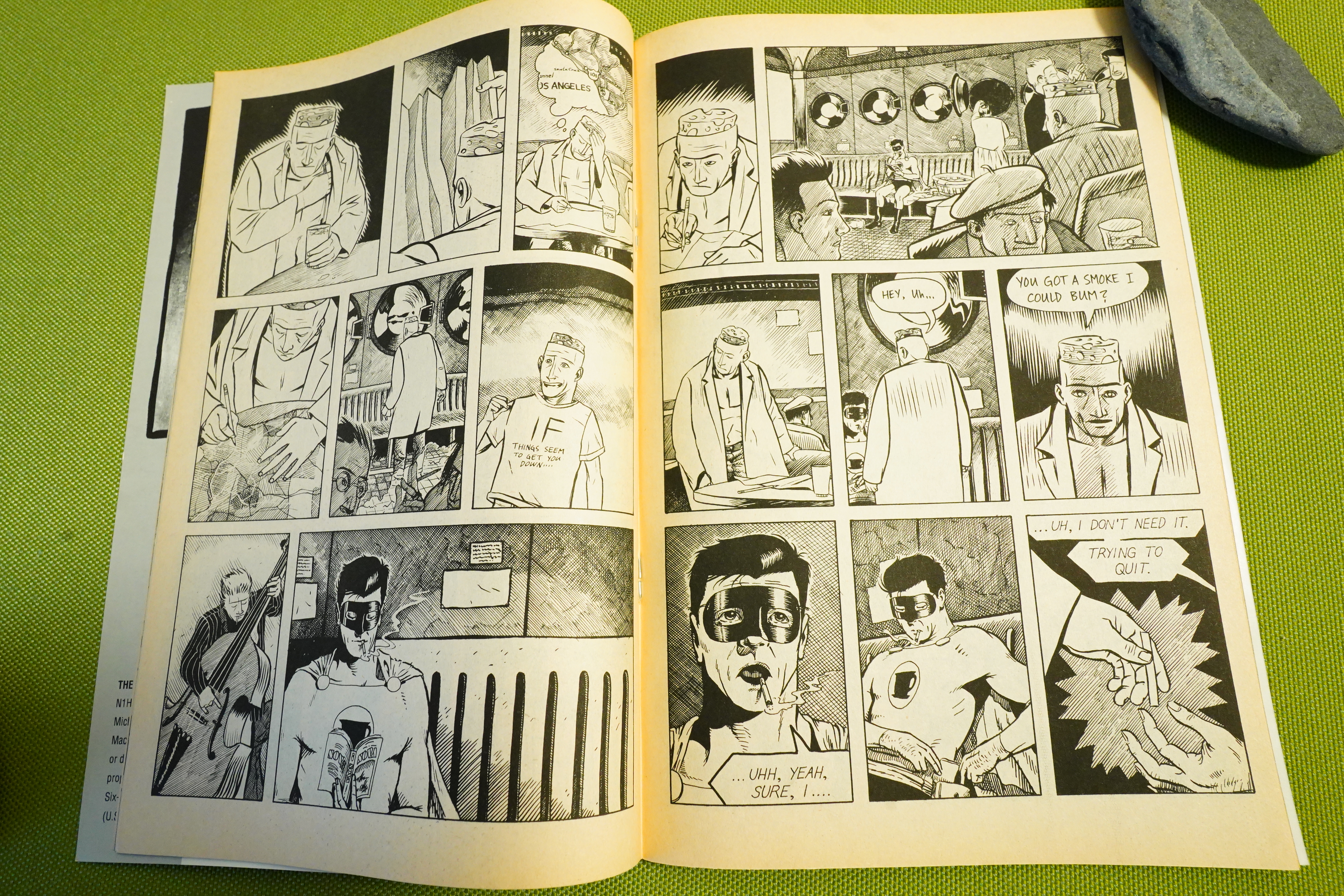
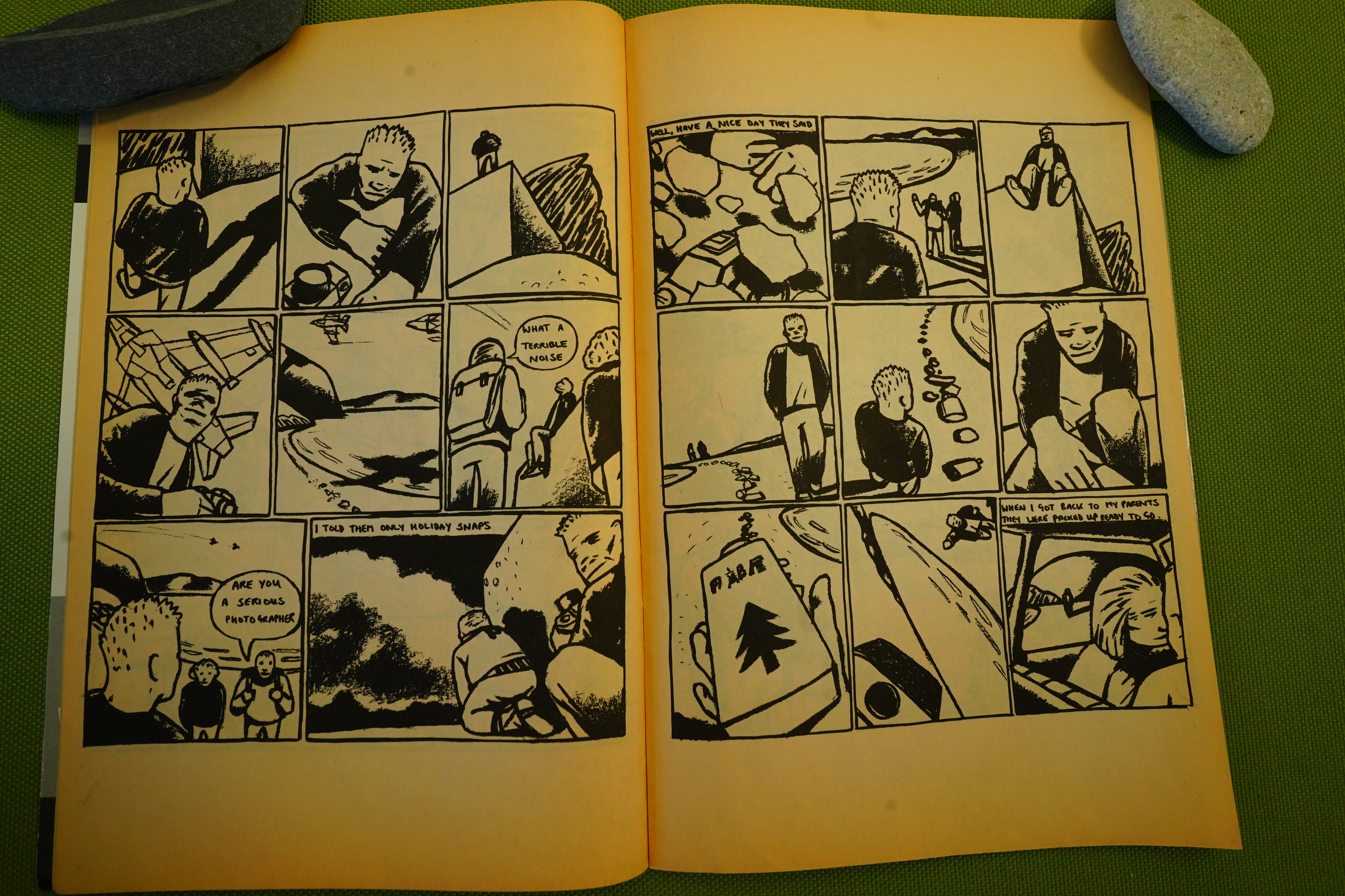
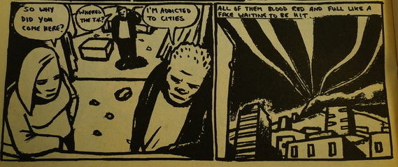
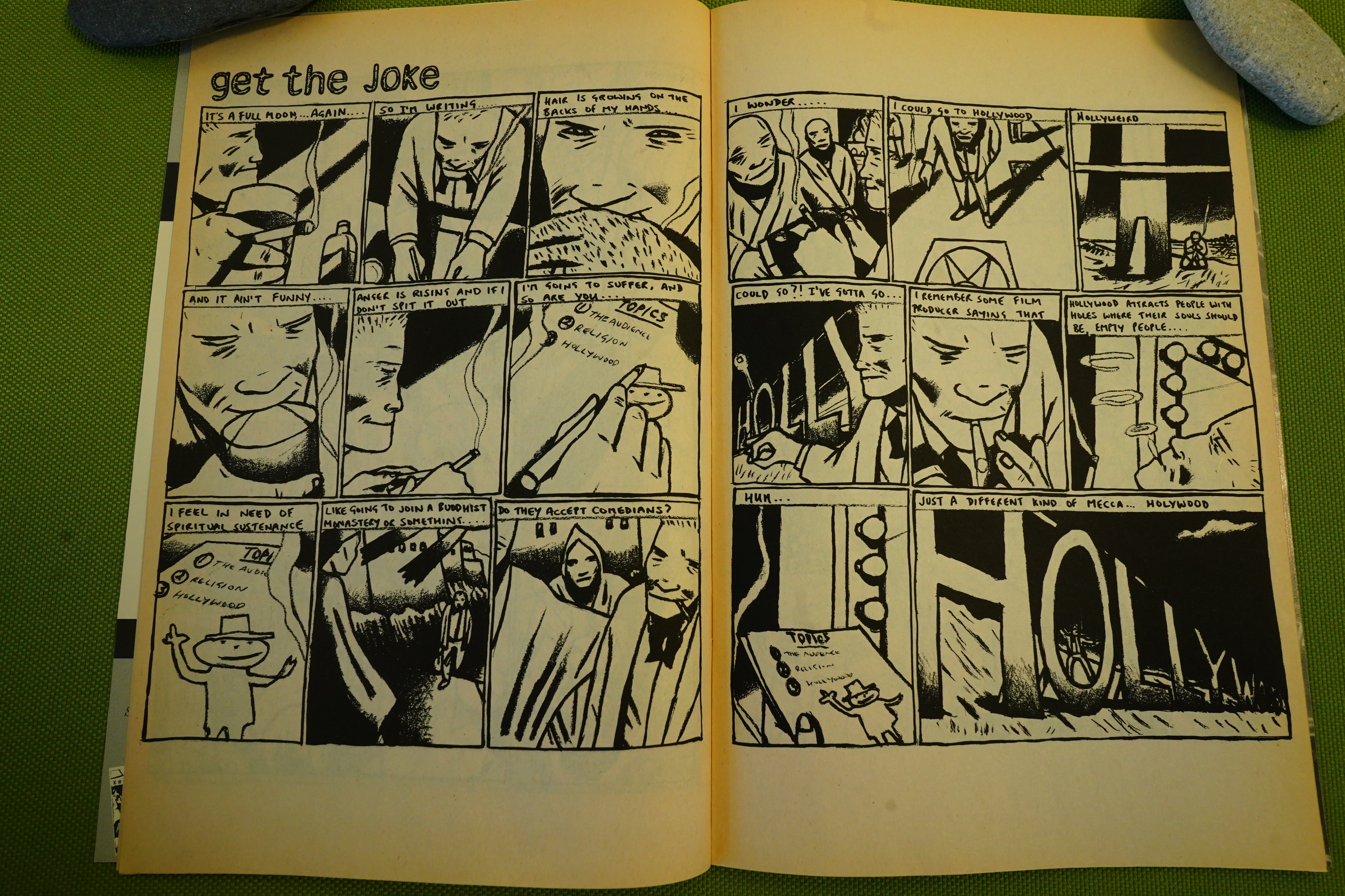
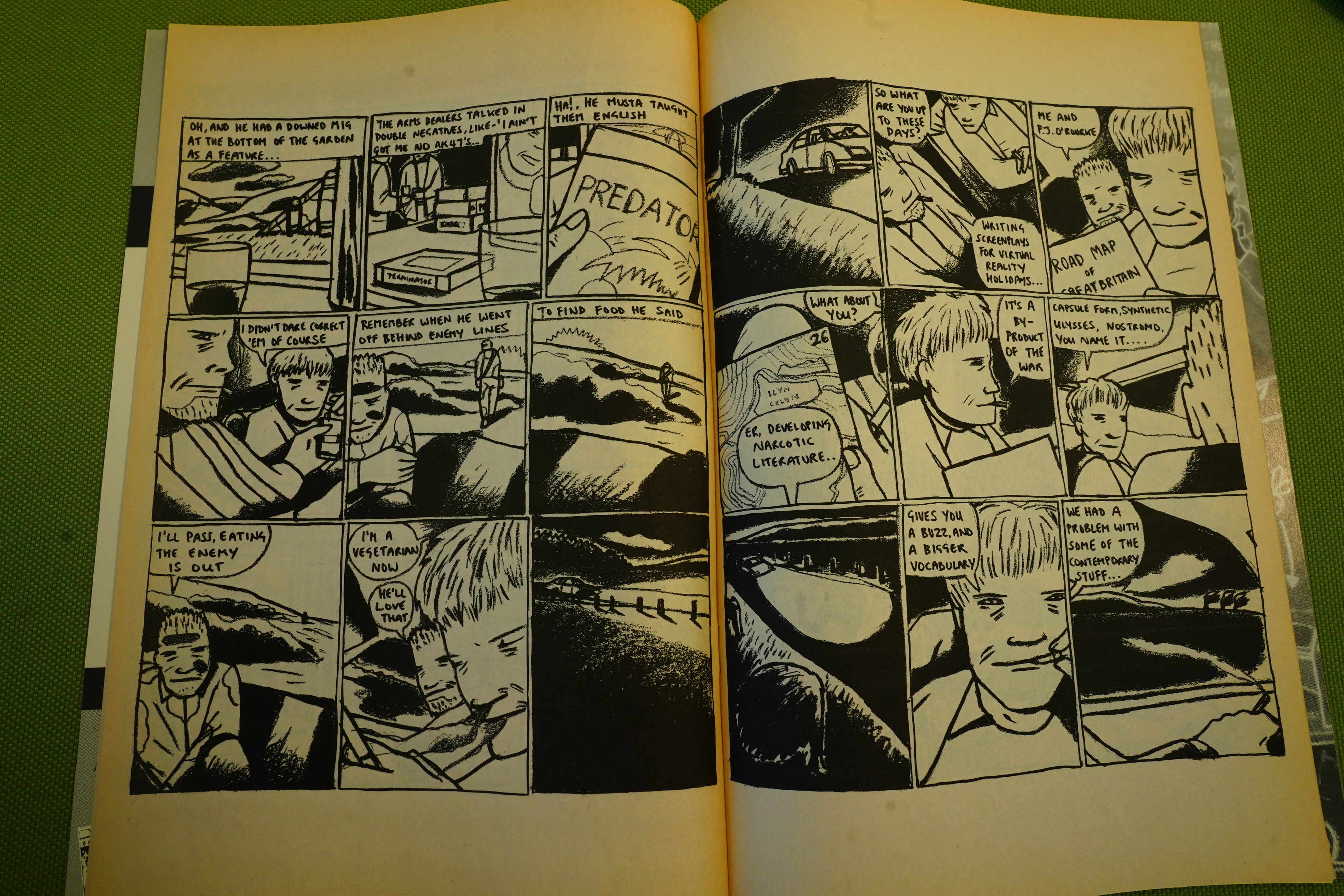
Swain has been very consistent throughout her career — mostly nine panel pages, all done with charcoal (I think), and all using this restless “camera” to depict people from all angles. It’s hypnotic.
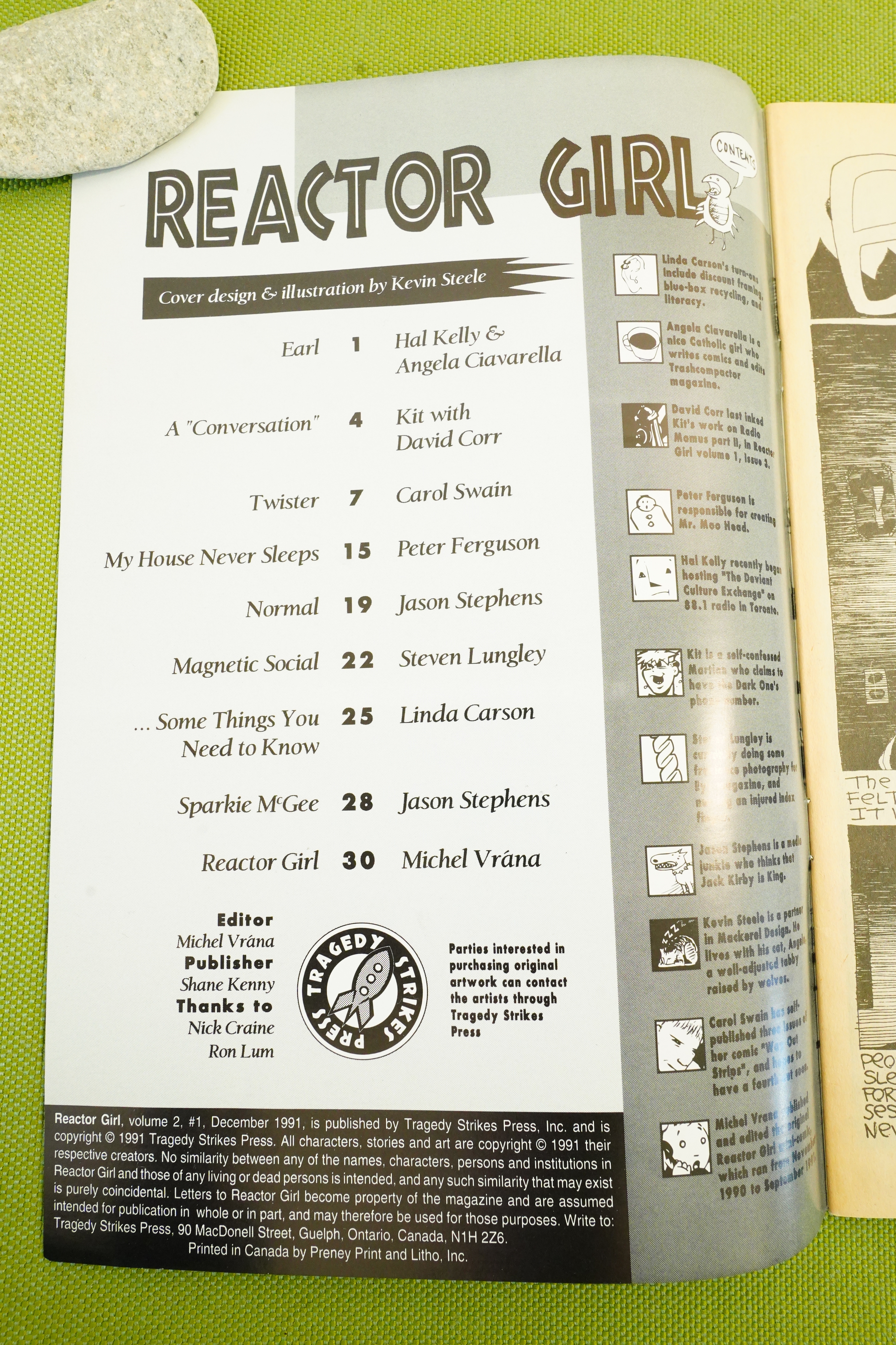
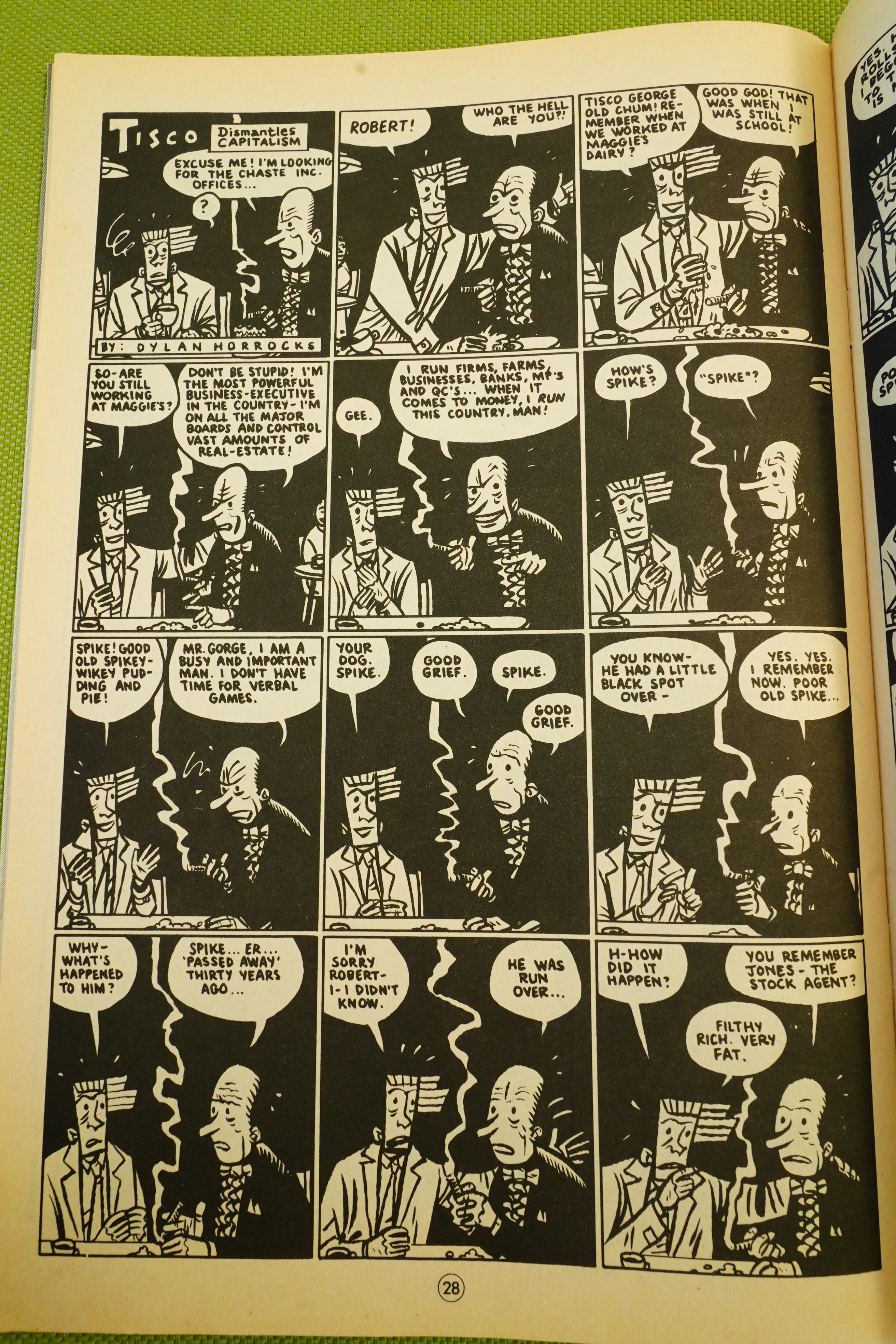
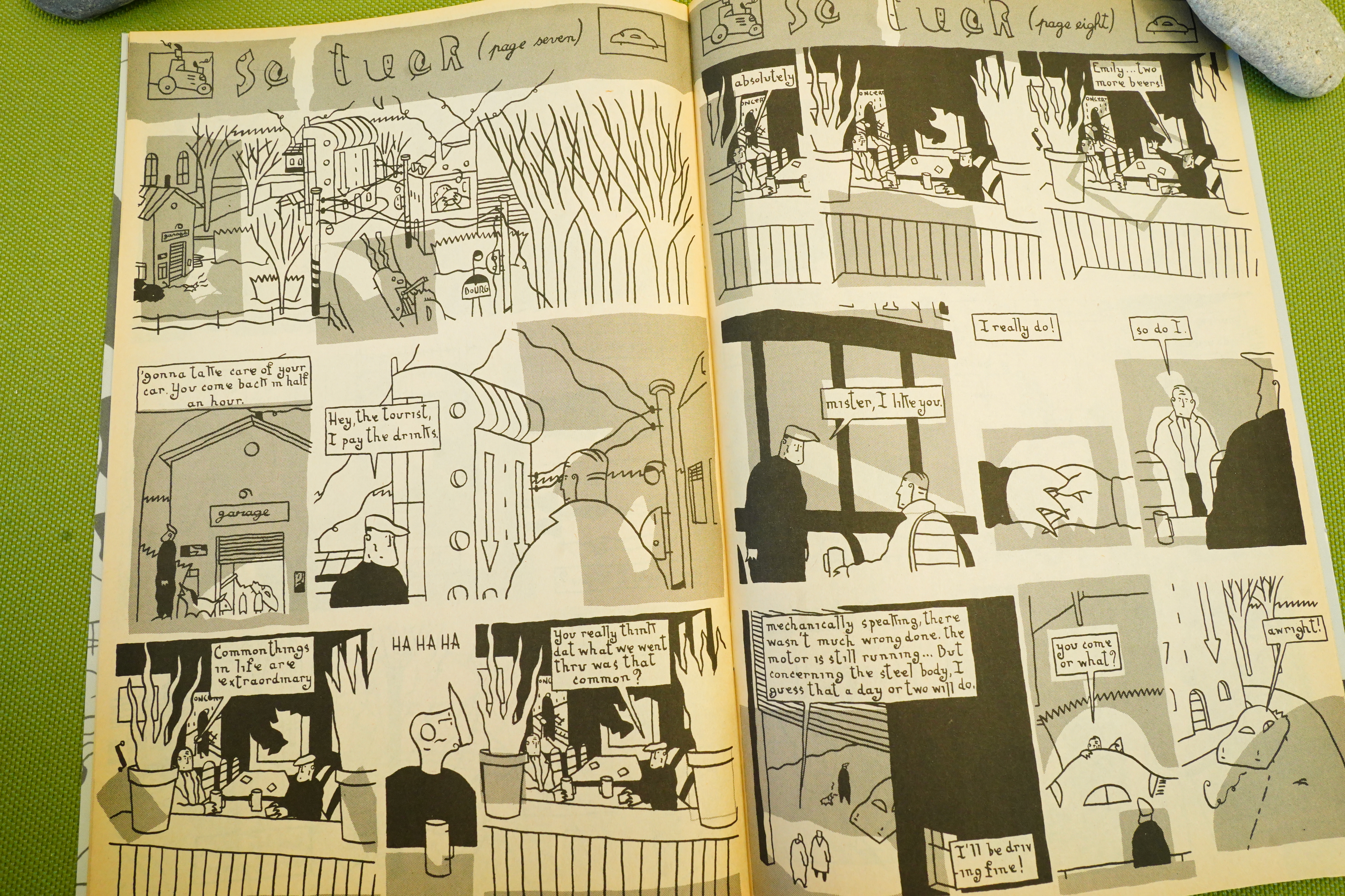
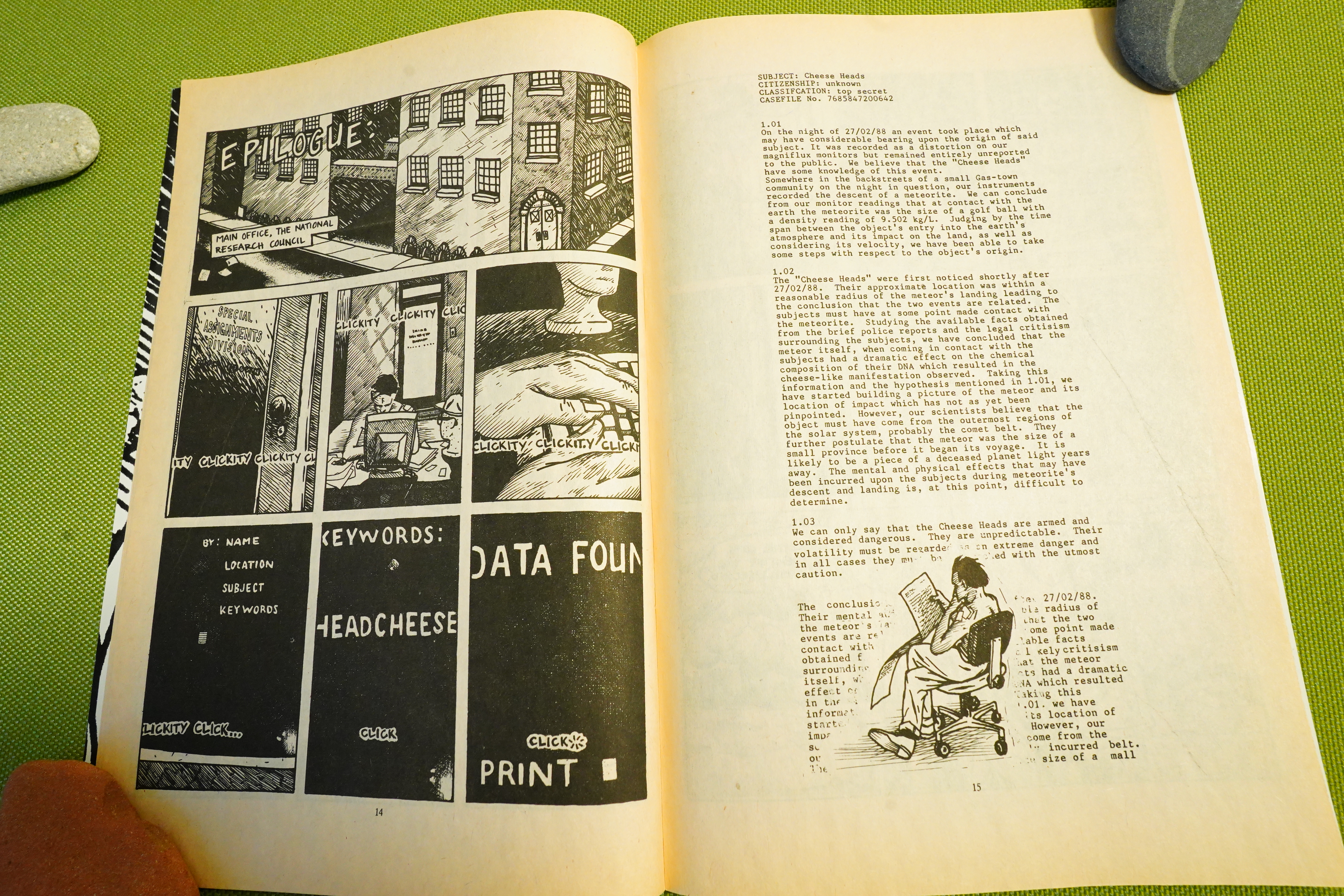
We get about five pieces per issue — some are complete in one, but many of them continue.
Heh heh.
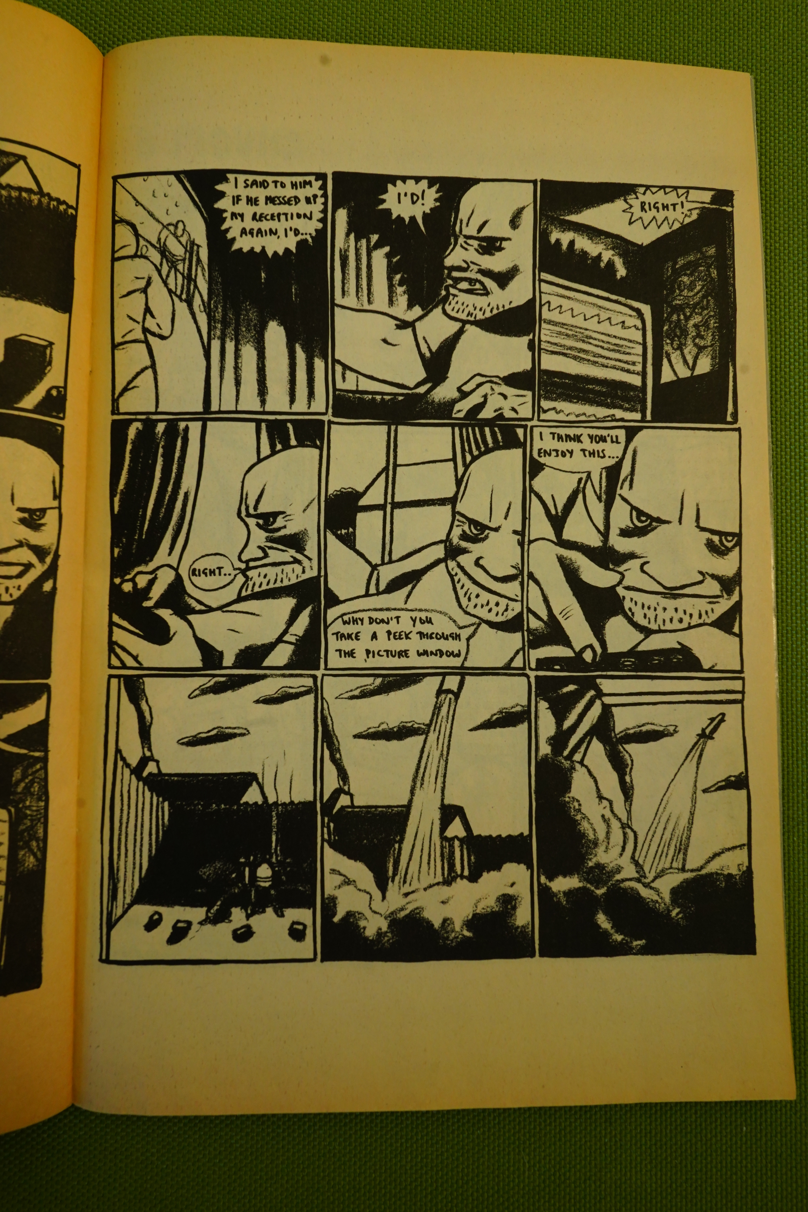
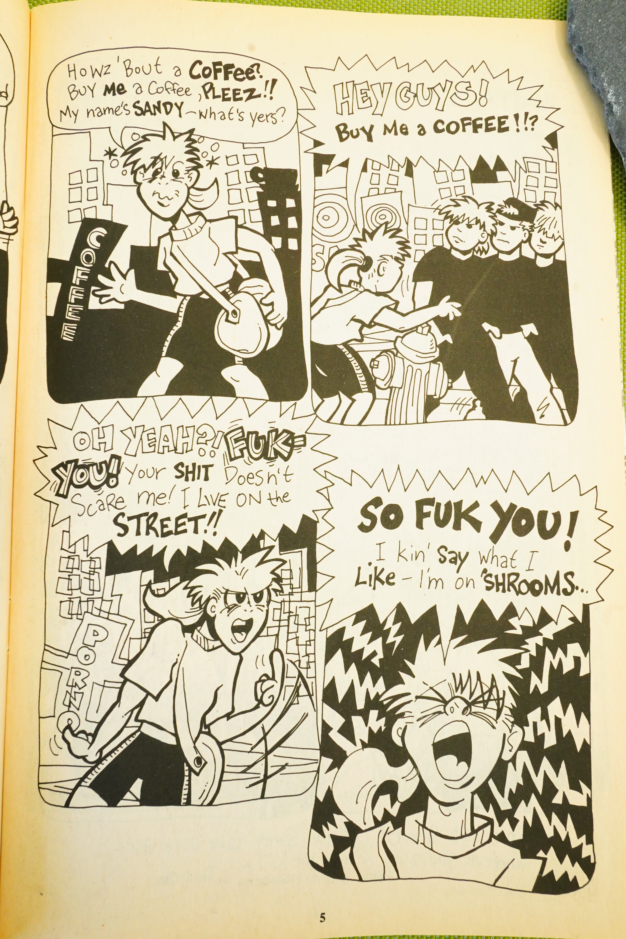
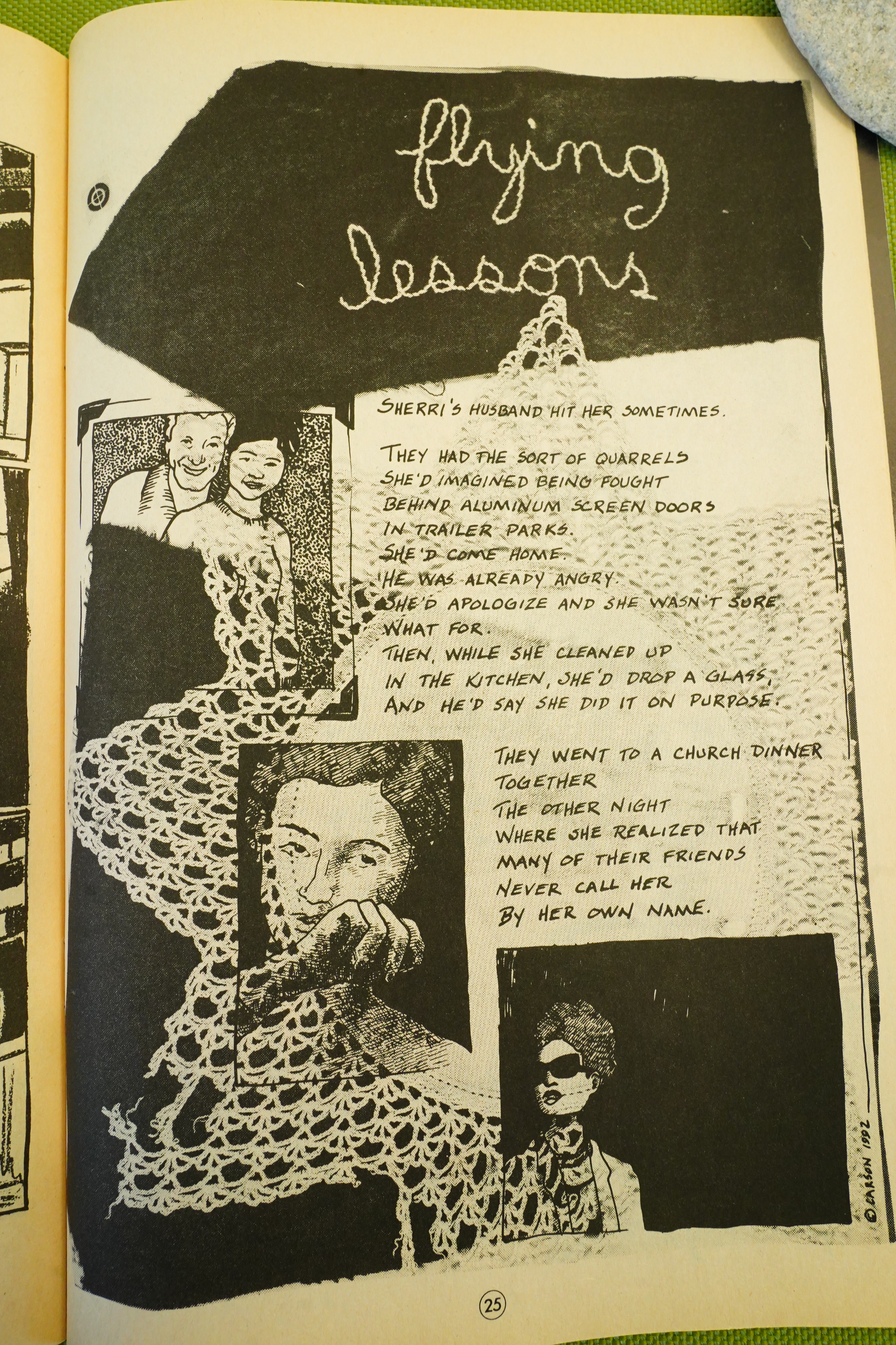
I really like this thing she does here where the main character talks directly to the reader, as if we’re doing a first person camera thing. And as always, mysterious things, seldom explained, keep happening. But not in a non sequitur way, but as just these things that happen in the world we’re watching.
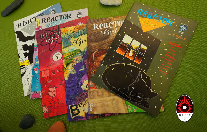
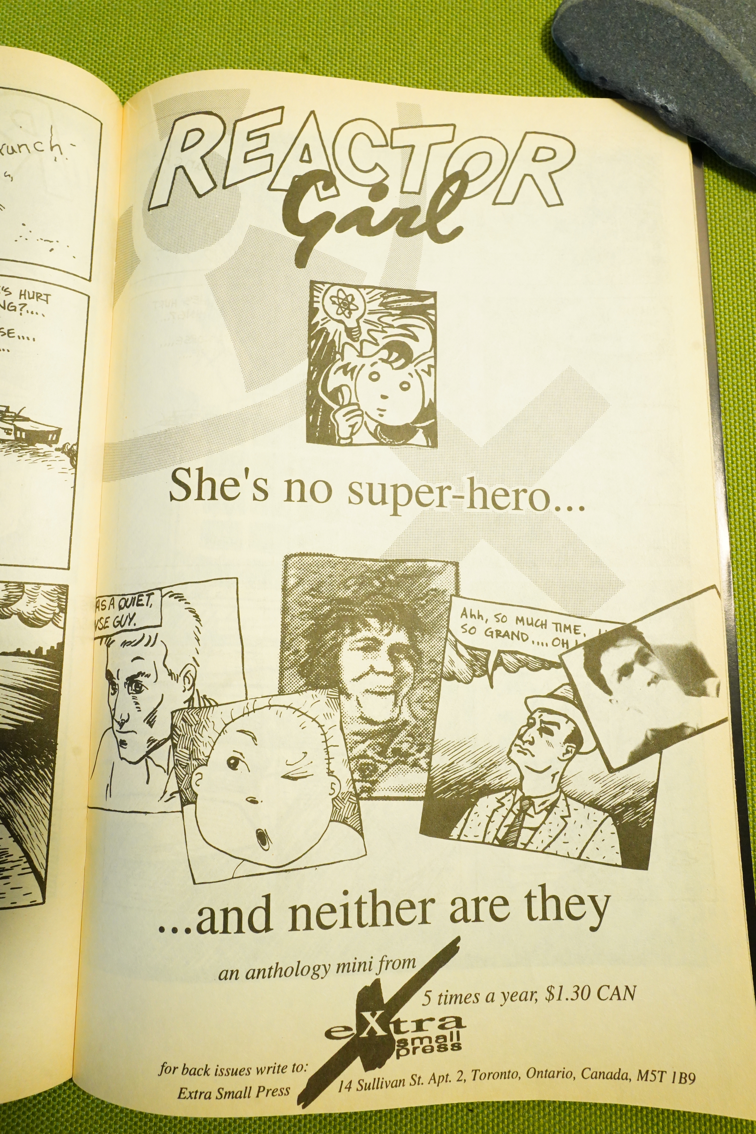
Hm… wasn’t this also published in an issue of Reactor Girl? That’s pretty odd — publishing it twice around the same time in different mags. I’d have guessed the overlap in readership between the mags would be like 97%.
Many of the stories have a kind of science fiction thing going on, but as part of the scenery — not really investigated in the typical sci fi way.
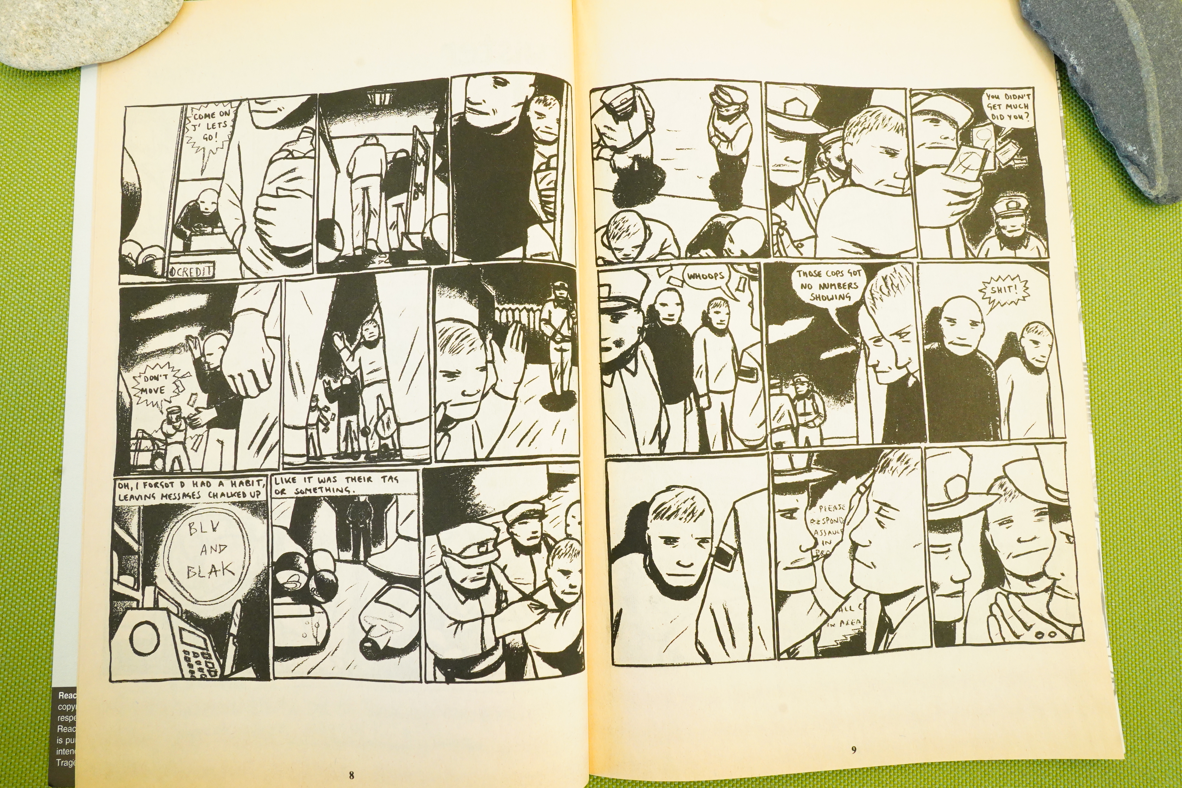
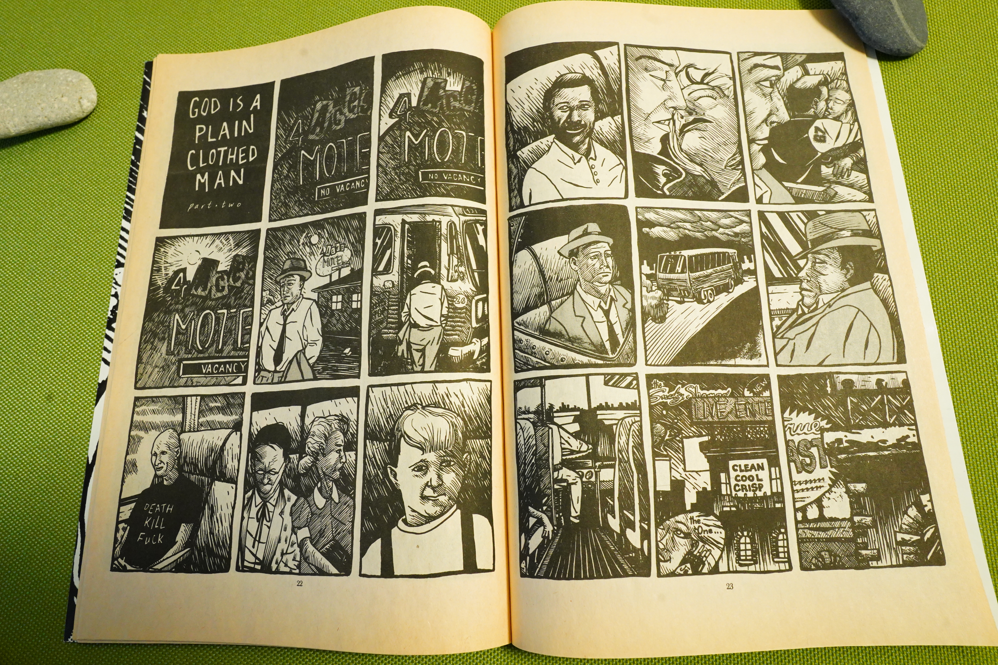
By the third issue, four of the five pieces this issue are continued stories.
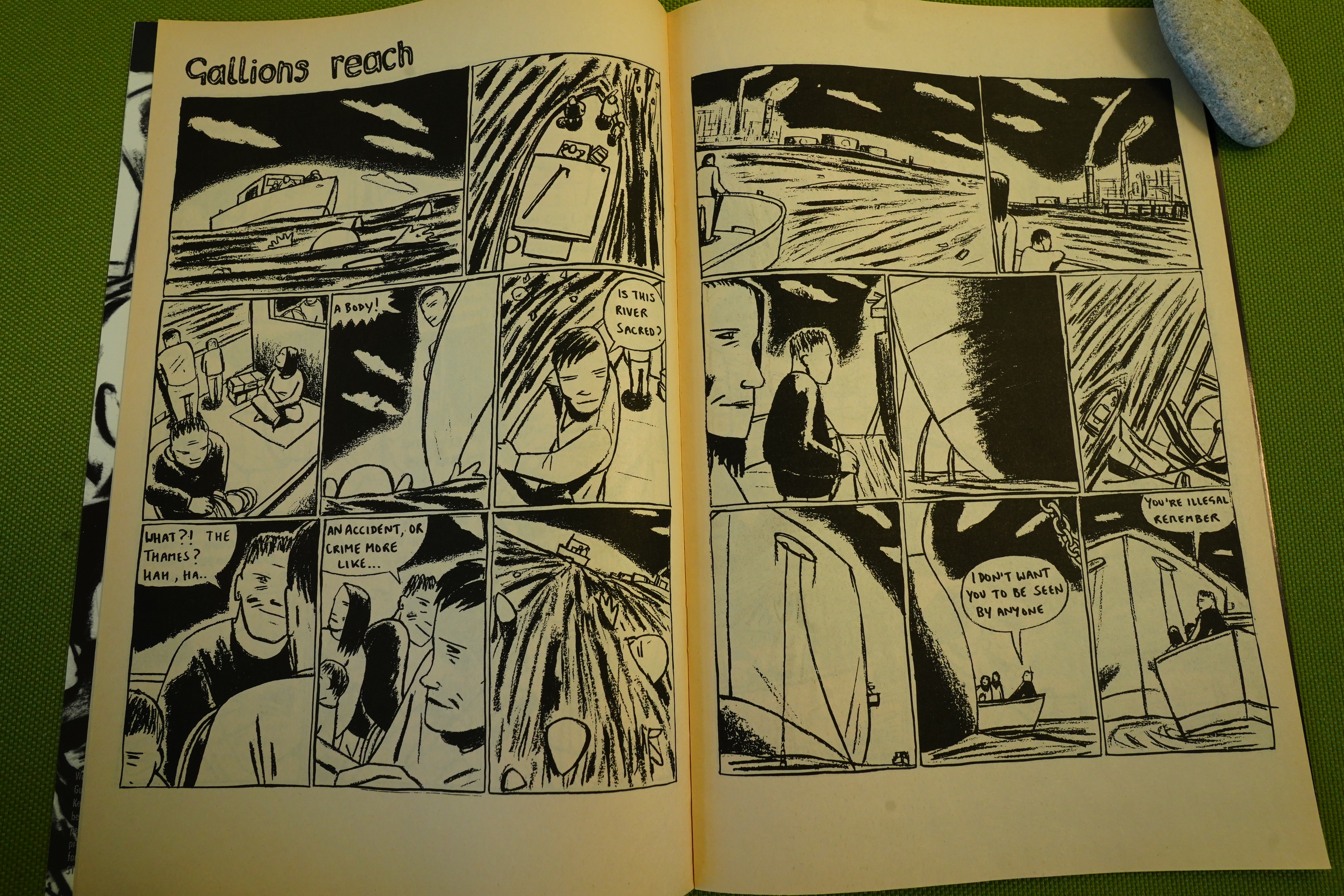
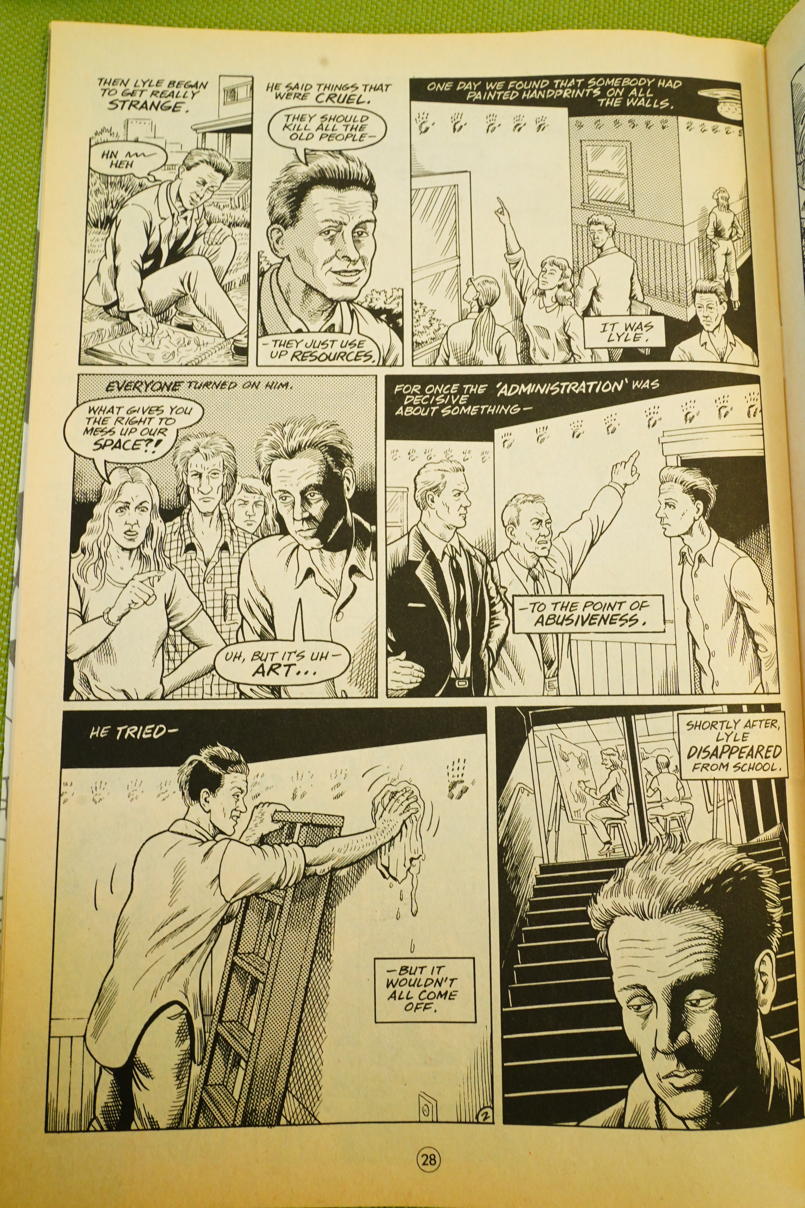
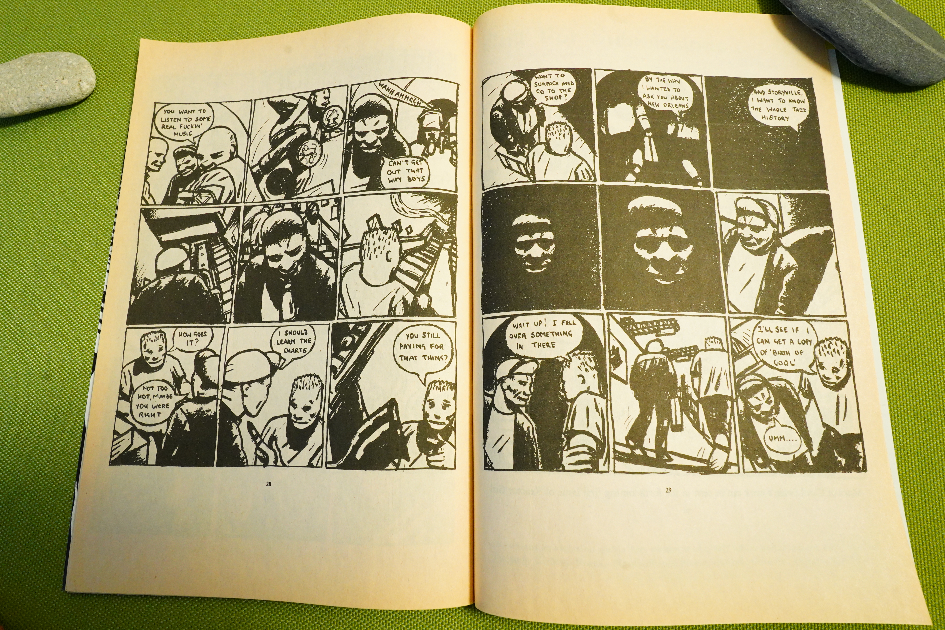
The best piece in this story is the one complete story — it’s about people being smuggled into London, and it’s pure magic.
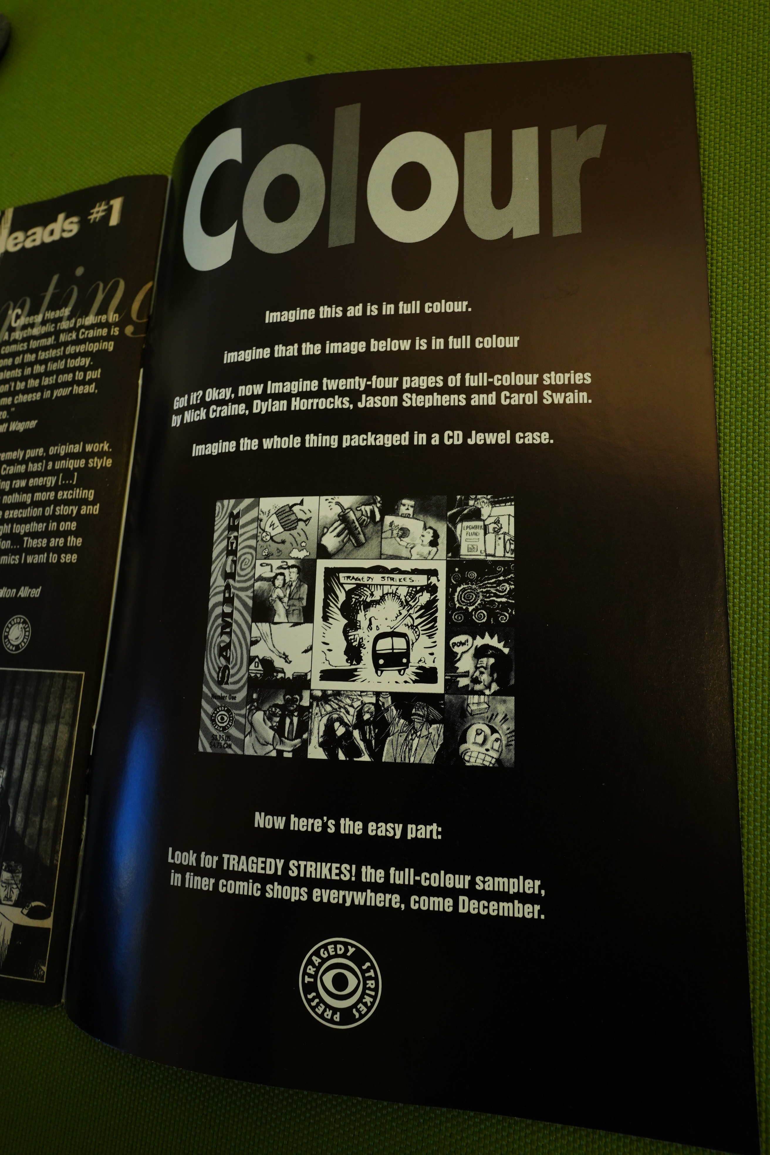
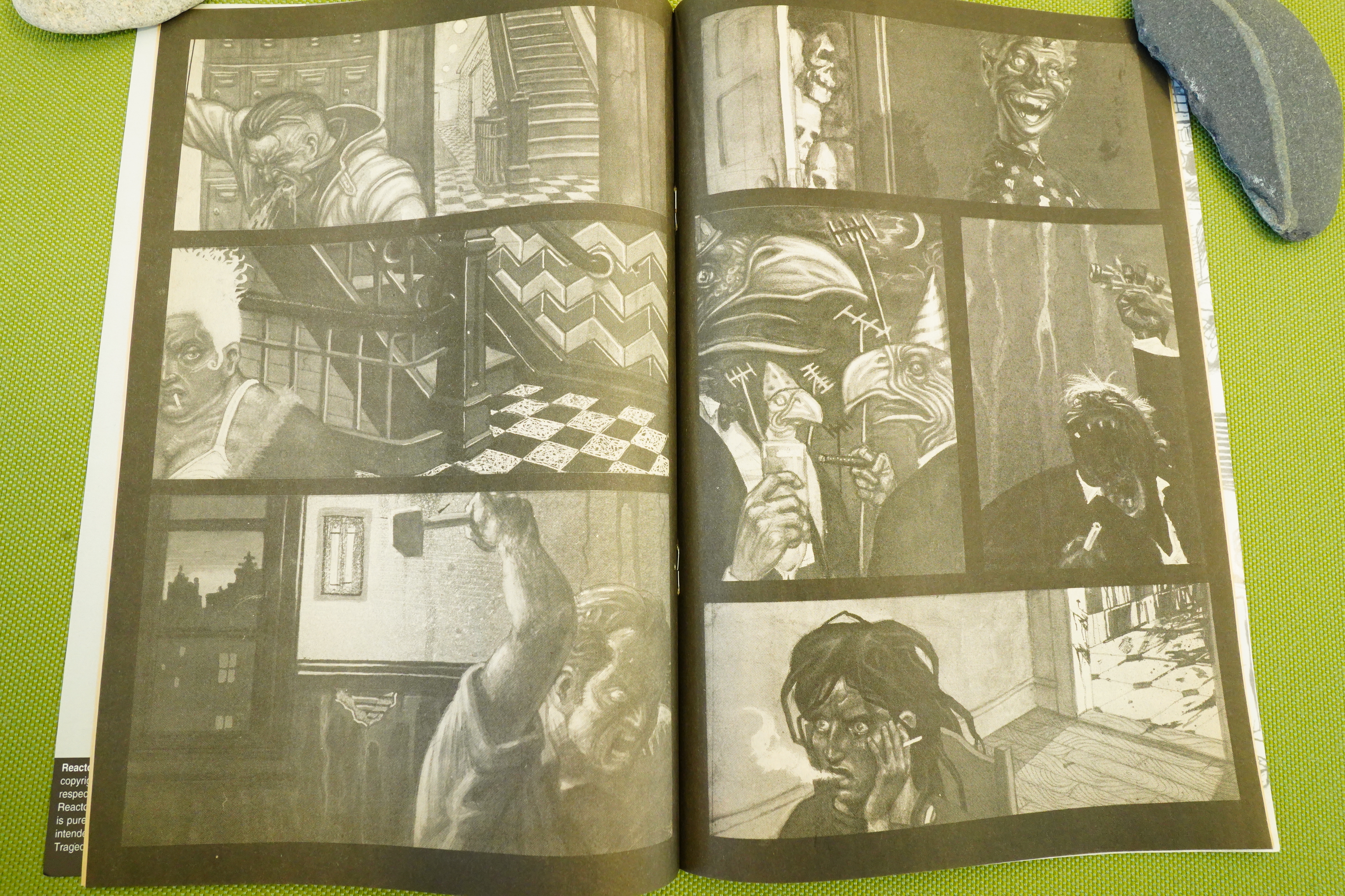
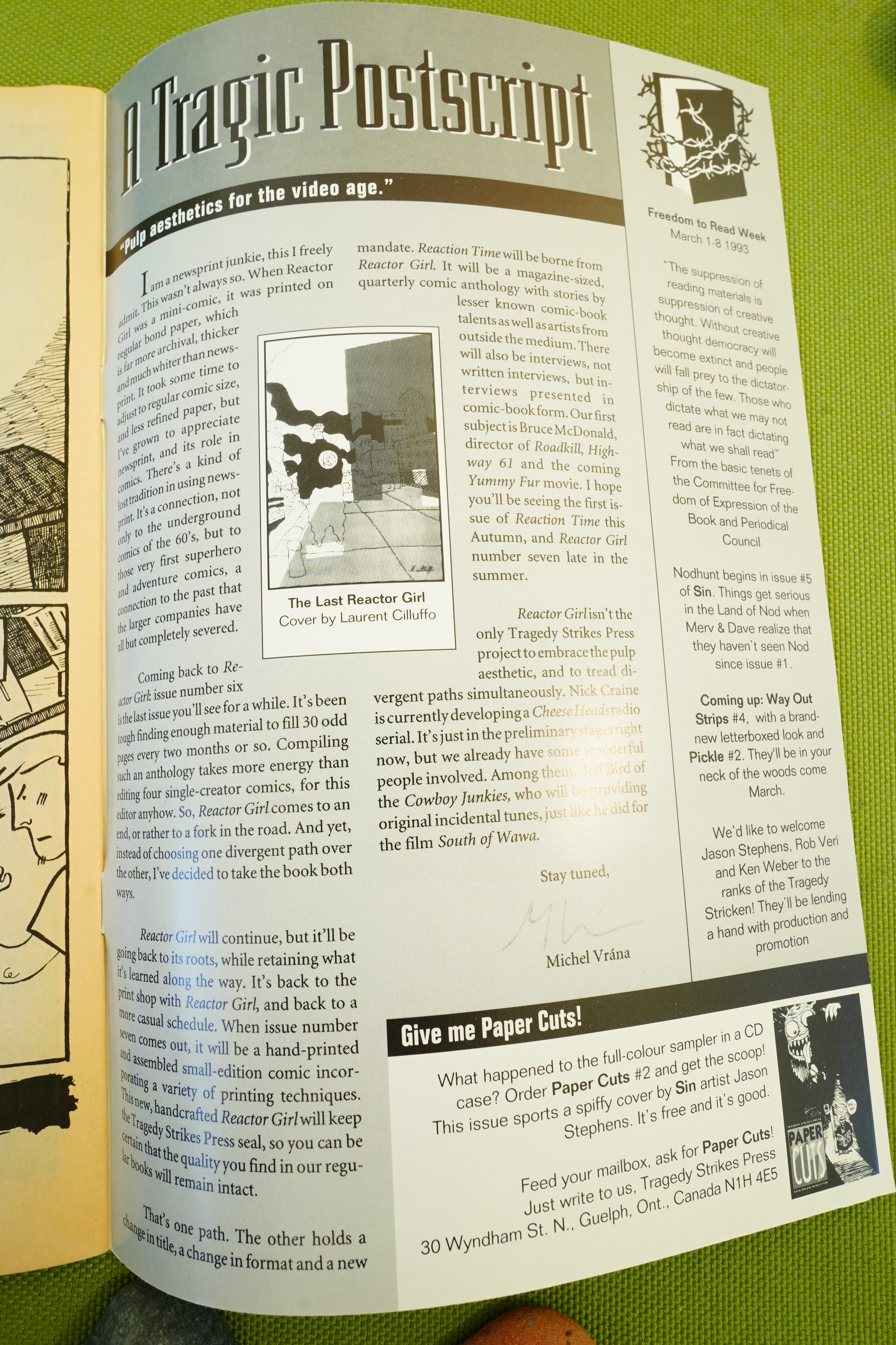
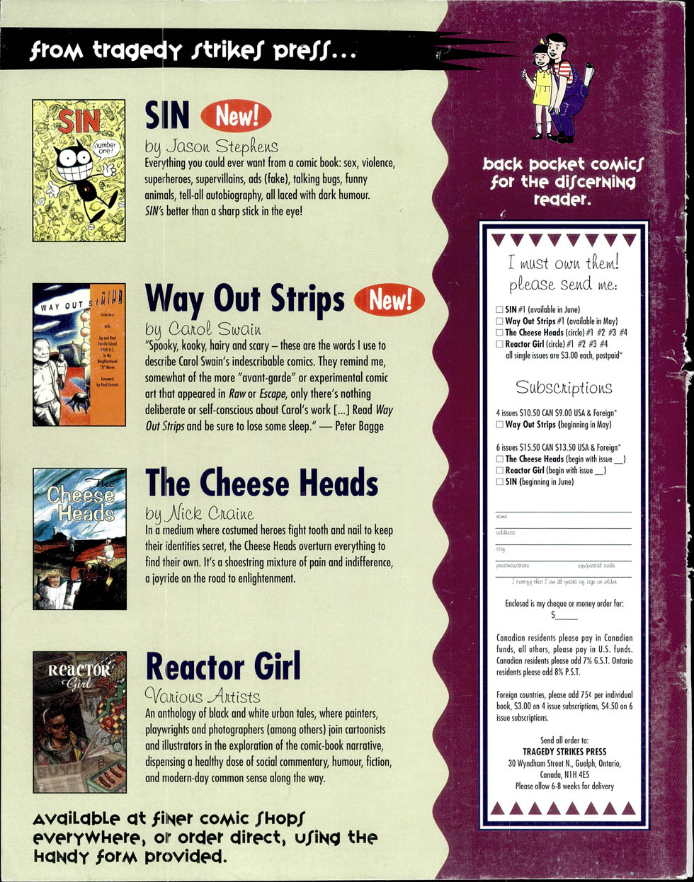
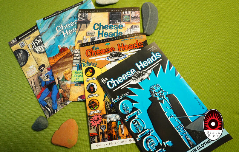
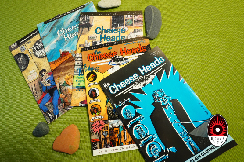
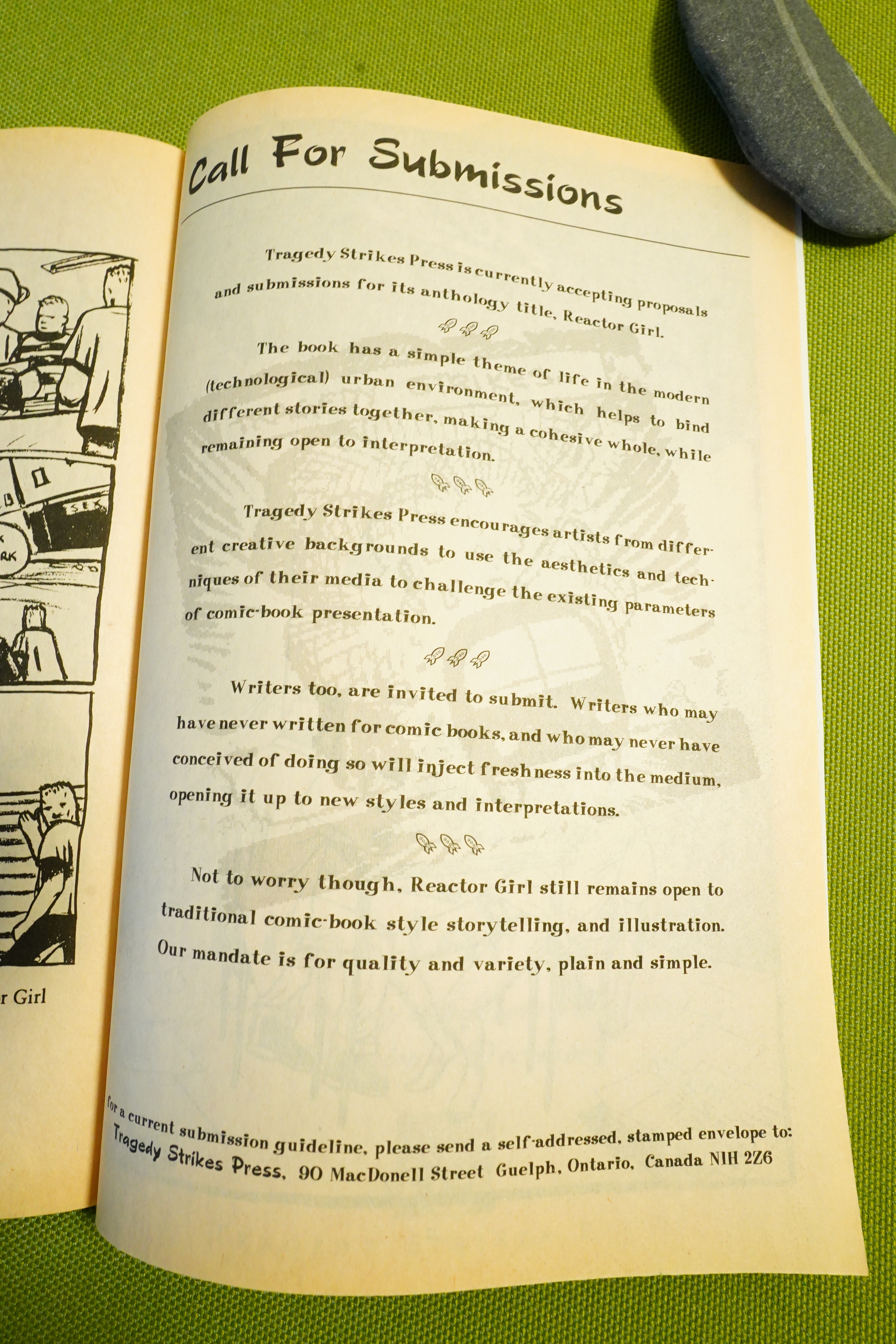
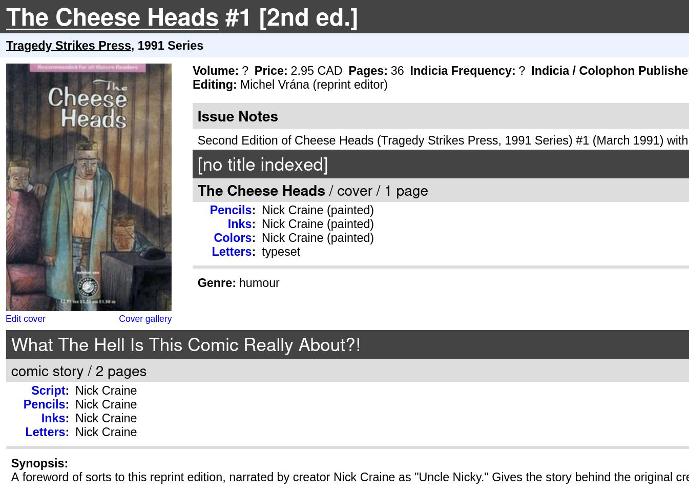
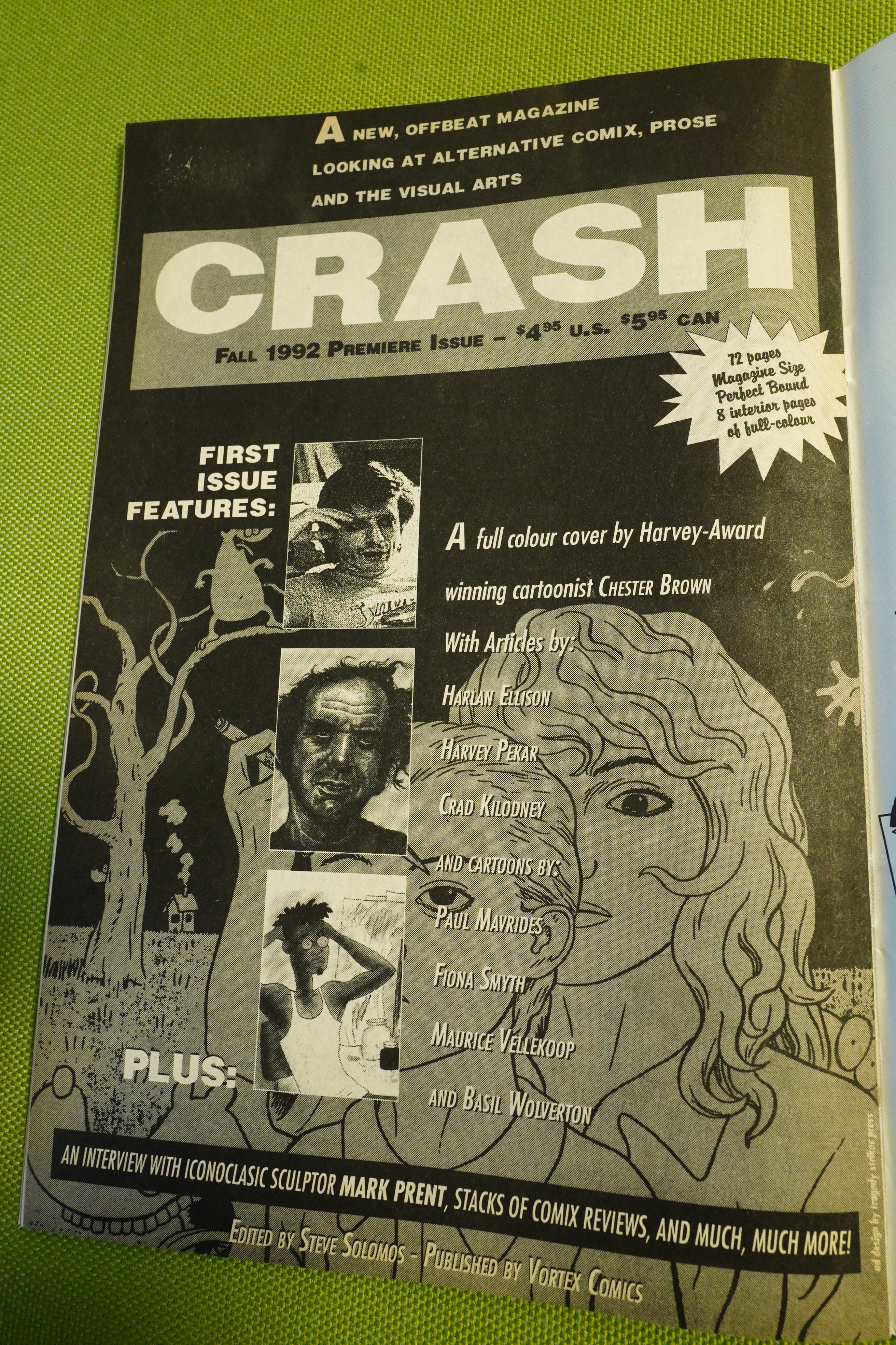
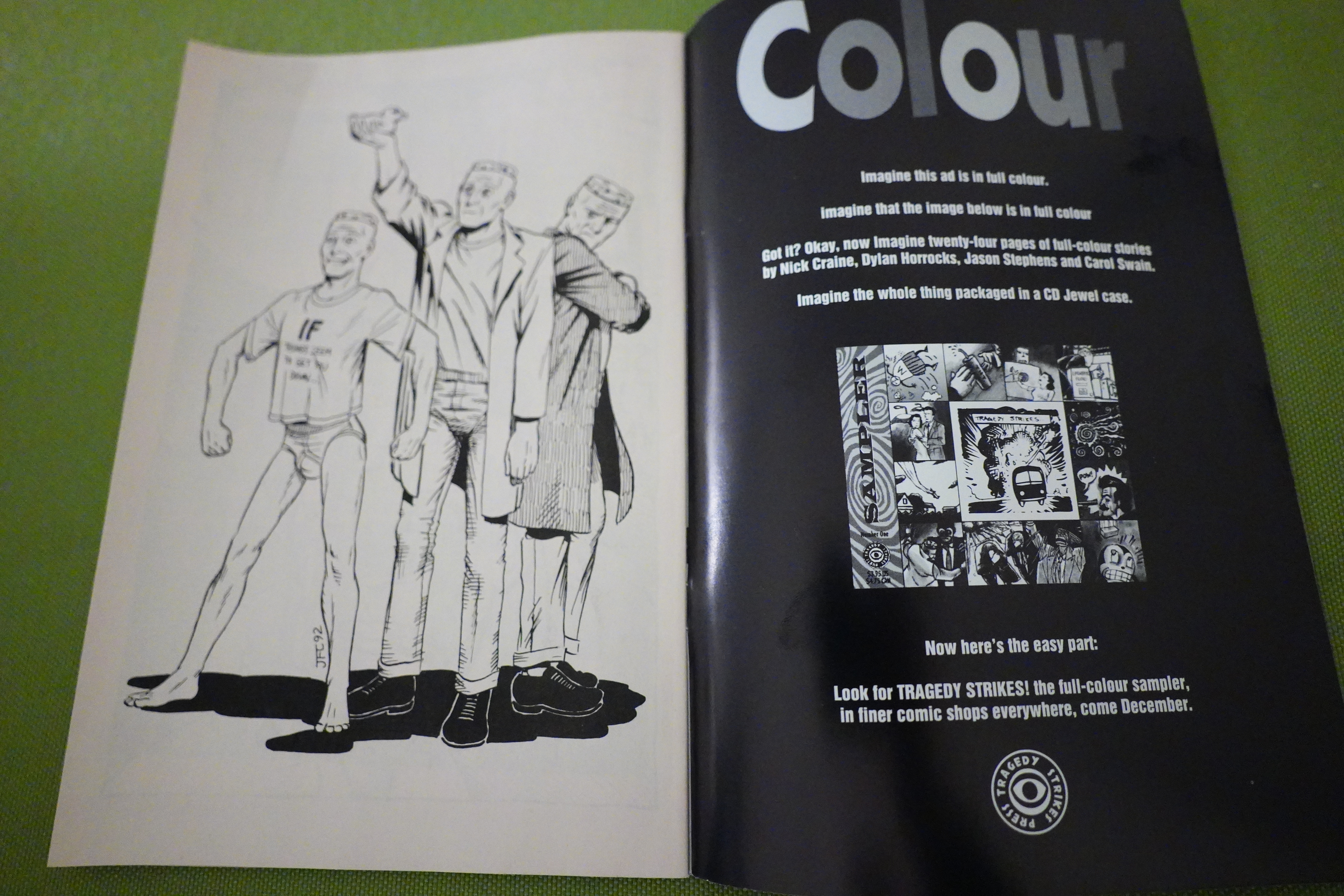
Tragedy Strikes announce a CD format “sampler” magazine — but it never happened, because Tragedy Strikes broke up. Pickle continued publication with Black Eye, but Way Out Strips moved over to Fantagraphics. Swain has continued to publish graphic novels with them over the decades.
I don’t think any of the stories in this have been collected? And I don’t remember whether the continuing stories were completed in the Fantagraphics run or just abandoned.
In any case, somebody should do a hefty Swain collection of all this stuff.
Wizard Magazine 025, page 114:
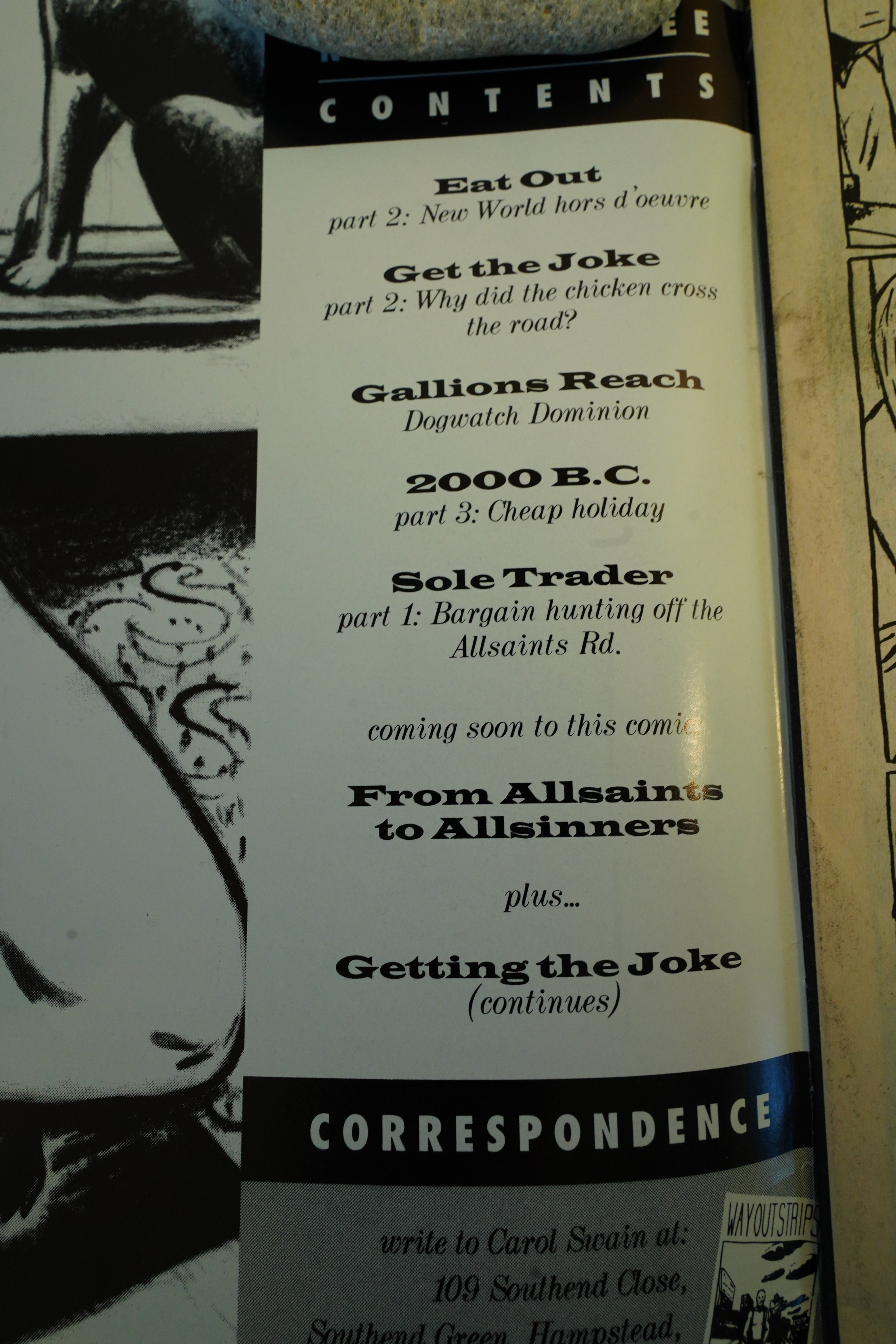
Tragedy Strikes also publishes another anthology, Way Out Strips, although it is a
little different since it only features the work of one creator, Carol Swain. Way Out Strips
was originally a mini-comic that ran for four issues, until
it was published by Tragedy Strikes in 1992. Swain’s decep-
tively simple grease pencil cartoons evoke several emo-
tions—from uneasiness to the restlessness and brashness
of youth. Some of the stories in Way Out Strips are self-
contained, like “Gallions Reach” and “Sons of Sam”, while
others continue through several issues, such as “Get the
Joke” and “In My Neighborhood.”
The Comics Journal 165, page 19:
Carol Swain’s Critically Acclaimed
Way Out Strips Resumes PublicationCarol Swain’s comic book Way Out Strips was
orphaned after three issues when her publisher
Tragedy Strikes Press went out of business in
the summer of ’93, but found a new home at
Fantagraphics Books which will publish her
work under the same title, beginning with Vol-
ume 3, Number l, in January.
Swain’s route to writing and drawing com-
ics was atypical. She was never a comics fan,
per se. She “‘Is, in fact, a painter, having stud-
ied painting for four years in college. Accord-
ing to Paul Gravett. in his introduction to the
first Tragedy Strikes issue of Way Out Strips,
“In the summer of 1987, London’s Institute of
Contemporary Art was showing Comics
Iconoclasm, a skewed survey of ‘high’ art in-
spired by ‘lowly’ comics… , Carol joined a
workshop there organised by Escape, the
magazine I co-edited. Rather than presuming
to teach anyone, the object was to get every-
body to create a page for a comic to be pro-
duced in two hours on the ICA’S photocopier.
Carol came up with six silent panels, in which
a young man finds blissful oblivion in his can
of beer, echoed as the city around him distorts
and wobbles in sympathy.”
Swain was attracted to the idea of composing
a page Of comics when she saw an advertisement
for the exhibition. It was a time, as she put it,
when “l was getting bored with painting” She
elaborated uvxjn her circumstances, ‘”I hadn’t re-
ally thought about [comics]. I was out of college
and unemployed, trying to avoid full time work
which I’m still trying to avoid. Trying to do
painting was a complete waste of time as far as
getting a living was concerned. Then I saw
people like Ed Pinsnet. Chris Reynolds, En-
glish small press self-publishing artists —
that’s what interested me.”
Although Swain hasn’t painted since she
started drawing comics, “At the time I was doing
painting it seemed the most important medium
there was.” Swain actually considers the comics
medium’s lack ofresp:ctability an “attraction. •me
little I saw of the art world is it was very elitist
class-ridden; you had to have gone to the right
colleges — this is me being bitter — the Royal
College or the Royal Academy, something with
‘Royal’ attached to it.”
Swain met Nick Craine when he was doing
animation work in England. Craine saw
Swain’s self-published comics, and after
Craine moved back to Canada, he called Swain
and offered to publish a comic by her under the
Tragedy Strikes Press imprint, which he co-
fonded with Michel Vråna and Shane Kenny.
•Tragedy Strikes Press was a tragedy,” Swain
told the Journal. “You shouldn’t tempt fate
with a name like that. If they start up another
publishing company they should call it •Roll-
ing in Money’ or ‘Retiring to the Carribean.’
After Tragedy Strikes folded in 1993, she got in
touch with Fantagraphics Books, who immedi-
ately offered to continue publishing Way Out
Strips.
Swain’s first Fantagraphics issue contains
four short stories, three of which are ongoing,
and continued in the next issue.
Rich Kreiner writes in The Comics Journal 161, page 99:
Where Jason Stephens has his unique ver-
Sion Of comics, Carol Swain Offers a vision. In
the three issues of Way Out Strips, an astute and
refined sensiti vity reveals itself within a comple-
mentary and fully realized visual style.
As Paul Gravett, one-time co-editor Of
Britain’s Escape anthology, relates in a fore-
word to issue , Swain’ s perceptivity and style
are grounded in her interests in painting, prose
fiction, and movies. Coming to the medium, she
began composing each panel both as a painting
and a movie shot. She switched to stark, textural
charcoal, in a style that French BD critics have
termed ligne grasse, literally the “dirty” or
“rough” line. She also found her voice, keeping
her words to a minimum, using terse dialogue
and silences, constantly shifting “camera” angles
and fierce, warped perspectives to add to the
feeling of disorientation. Atmospheric, oblique,
darkly humorous, her strips are like glimpses
that hint of bigger stories. Each of these ele-
ments — the scrupulous composition, the tex-
tured line, the sparing words. the profusion of
angle, the weightiness of atmosphere, the pref-
erence for the understated, the pictorially un-
usual, the oddly comical, the suggestion of
greater histories — work toward a narrative
where mood is palpable and preeminent.
Swain squares Off her distinctive pages into
a fairly regular three-tiered grid of nine panels.
Comics Forum 3, page 46:
C: Yeah, I like the grainy quality you get,
especially when it’s printed on really
cheap comics paper, because it burns out
all the subtleties. You get a lot of good
shadows.
S; I can see that in your black and white
stuff, but I’d imagine in colour it wouldn’t
work the same way. What do you use to
draw with…charcoal?
C: Anything that’s got a
gritty, grainy look, re-
ally—like a Chinagraph
pencil. Not really char-
coal.
S: Caran D’ Ache
Neocolour crayons?
C: I’ve used those. I like
those very hard black
lead pencils. The ones
that are solid graphite.
A: Do you draw on very
rough paper to get all
this texture?
C: Any paper—the
cheaper the better, really.
A: Not Bristol board or
anything like that?
C: I just don’t use it. Any-
thing with a bit of a grain
to it works better.
A: That’s the opposite of
most cartoonists; they
need a smooth surface to
put their ink down onto.
C: I use ink as well—to
fill in the black areas. But
generally…
anything
that smudges horribly
when you send it
through the post or
doesn’t print well…
that’s what I use.
S: Again I’m reminded that as the story
progresses there’s a lot more black in the
drawings.
C: Well, the story gets darker.
S: And perhaps you were working some-
thing through about your own approach?
C: I dunno. Hmmm…
S: Did the paper they were drawn on get
more sombre?
C: I think the last few were actually on a
fairly pale one.
A: It’s almost like Martin gets more de-
fined once he decidesVhat he’s gonna do.
S: By the end, it’s the black line-work that
choreographs how your eye dances
around the page.
C: Well, as we were saying, the story
starts off all pleasant and pastelly, and
gets darker and darker. Even if you didn’t
consciously make the artwork darker,
you’d probably find yourself going for
the black crayon more than the blue. I’d
say that when I was colouring Skin, I had
no experience or knowledge of the form,
so it was just kind of instinctive.
If I’m being very non-committal about
it because I really didn’t know what I
C: Yes.
A: Have you ever thought of doing some-
thing like Skin yourself, in colour?
C: My publisher, Tragedy Strikes…
they’re doing some publicity where all
their cartoonists do a 6-page colour story,
which is then packaged in a CD case, so
it’ll be minute.
S: You’ll be sticking with dry colour?
A: Even with what you’ve called “crude”
crayon drawing in Skin, you have these
soft edges, whereas your Way Out Strips
people are… like, square, with slits for
C: The drawing in Skin’s much more com-
plex than I’d ever do for myself.
A: Why’s that?
C: Well, if you get a good story idea, the
whole process of drawing it out some-
times…
it’s so tedious thaeyou tend to
simplify.
S: Impatience.
C: Yeah, maybe—I think that’s the best
way to work
S: Judging by appearances, I assume
you’ve had no direct experience of
skinhead culture.
C: Not that I remember… I don’t remem-
ber any skinhead friends at school or any-
thing.
S: so how did the story of Skin affect you?
C: I thought it was very direct, and I like
the idea Of the narration—and the lan-
guage the narrator used.
S: Yeah, the narrator isn’t anyone in the
story… more like a sort of skinhead Mys-
terious Traveller.[…]
S: DO you have some kind of exclusive
deal with Tragedy Strikes?
A: Do you have a contract?
C: Yeah—contract. That’s a new word for
me. It lasts for 4 issues, or basically a year,
and after that hopefully I’ll have sold
enough to keep going. It’s very different
from self-publishing… I find with a pub-
lisher there’s a certain amount of rushing,
and maybe not changing things around
as much as you normally would. In some
ways, I think that’s good; it forces you to
develop, because you have to work at a
much faster pace. The idea of self—pub-
lishing again… it’s so time-consuming
and thankless, that I don’t know if I want
to do it again.
The Tragedy Strikes edition of Way
Out Strips # I’s come out, and I’m working
on the third one right now, and I’m run-
ning out of stories I’ve already printed. So
it’s got to be new stuff, and it’s all got to be
good stuff to make sure people buy it.
I suppose this is a bit like when you hit
“the Wall” in a marathon —
now is when I’ve got to put all
my energy into what is quite a
limited space. I’m starting to
feel that four issues isn’t a lot
of room.
Carol Swain now has a web site here, and you can buy original art there.
This blog post is part of the Total Black Eye series.