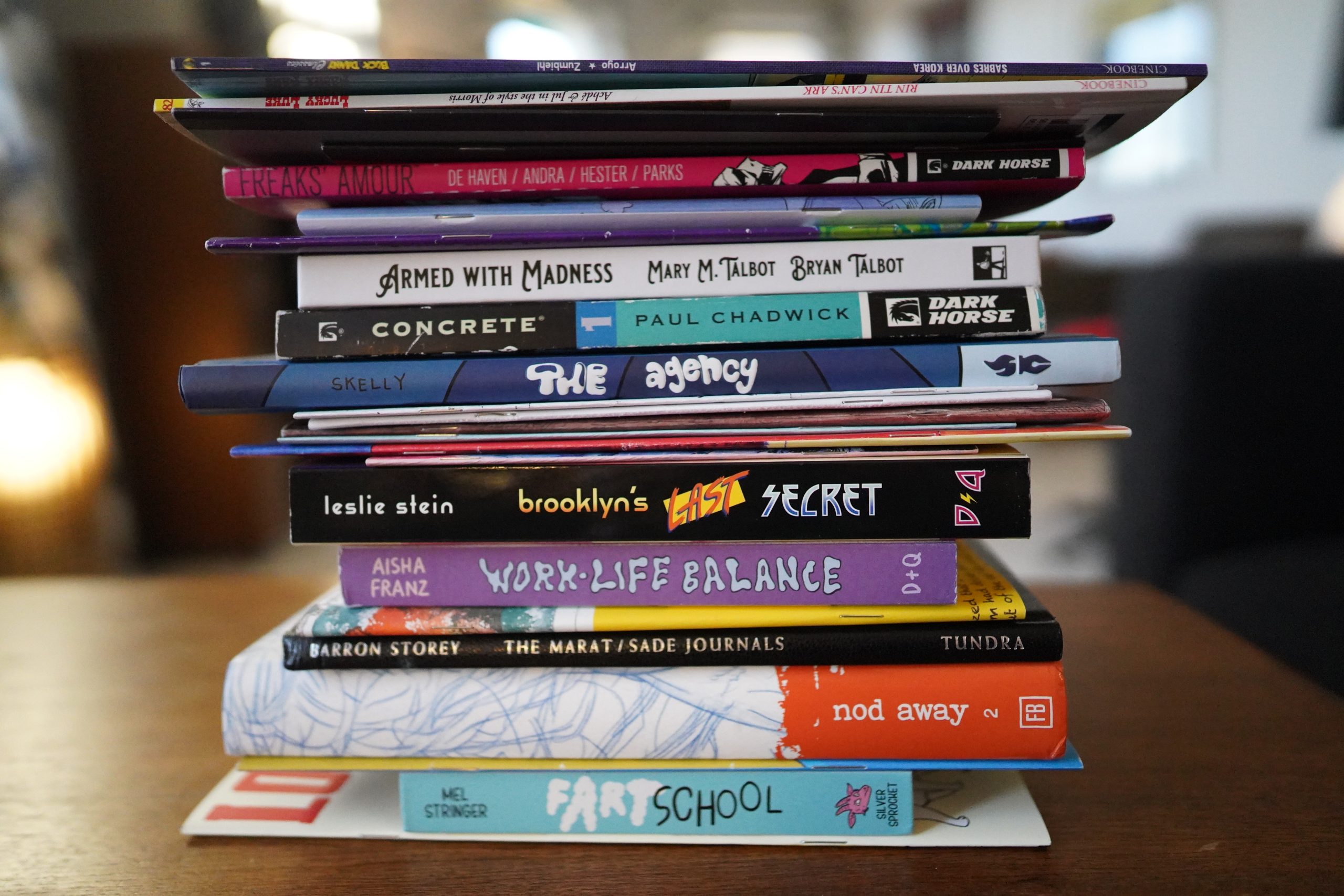
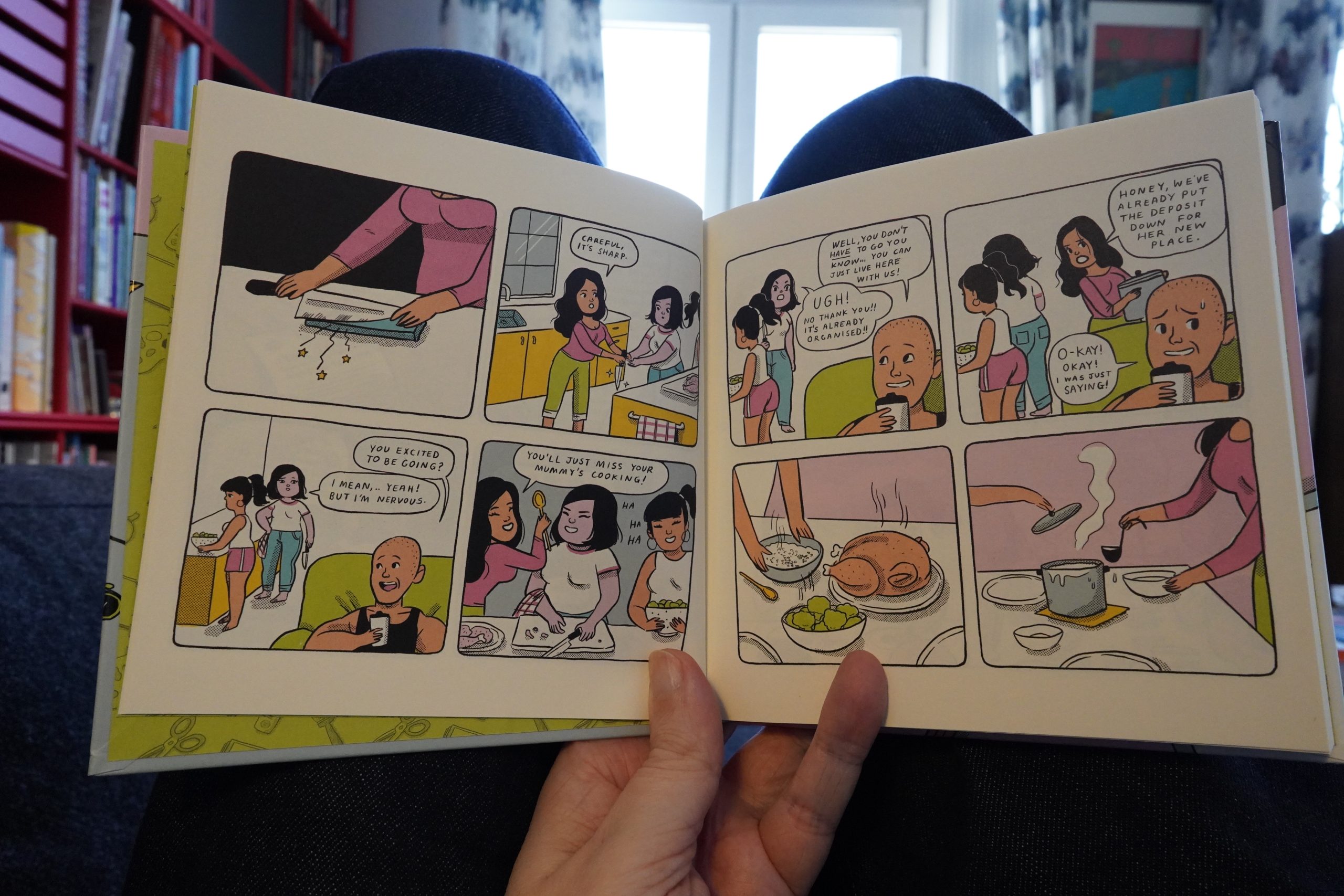
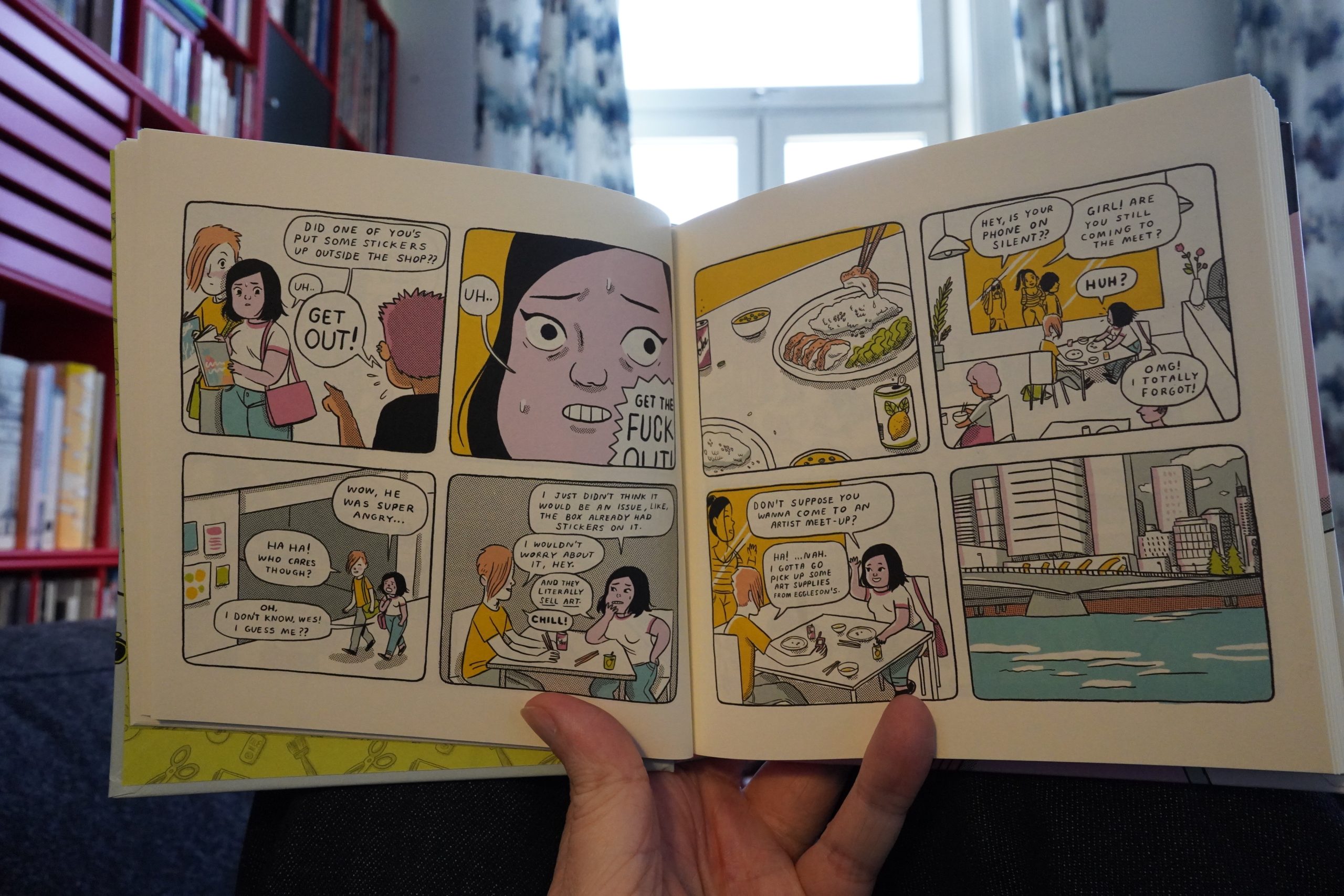
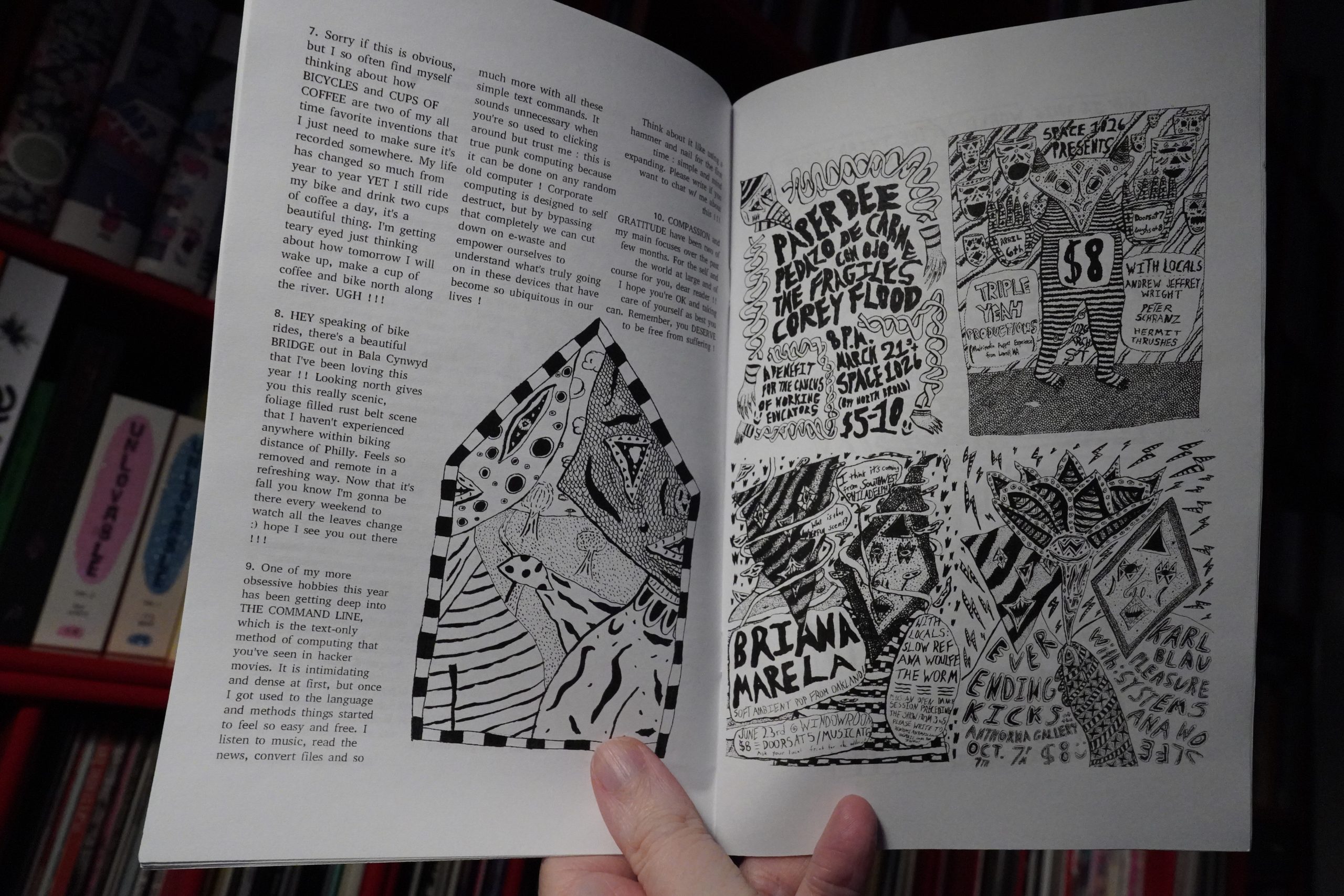
It’s another lovely day, but I’m still not altogether mobile (although my ankle is definitely improving), so what about another day on the couch, reading comics? Sure.
But before I begin readin’, I want to natter on a bit about some comics I read the other day:

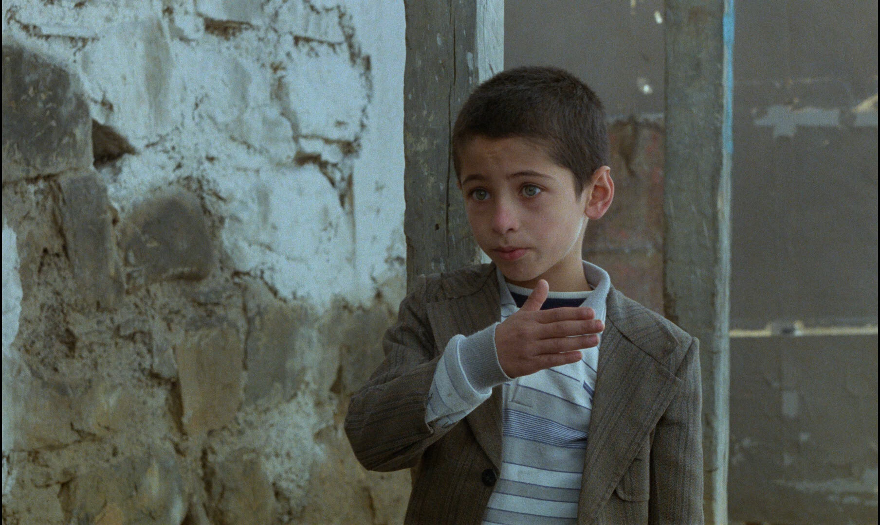
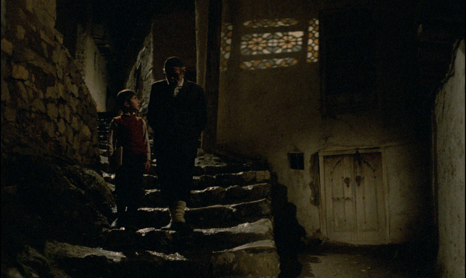
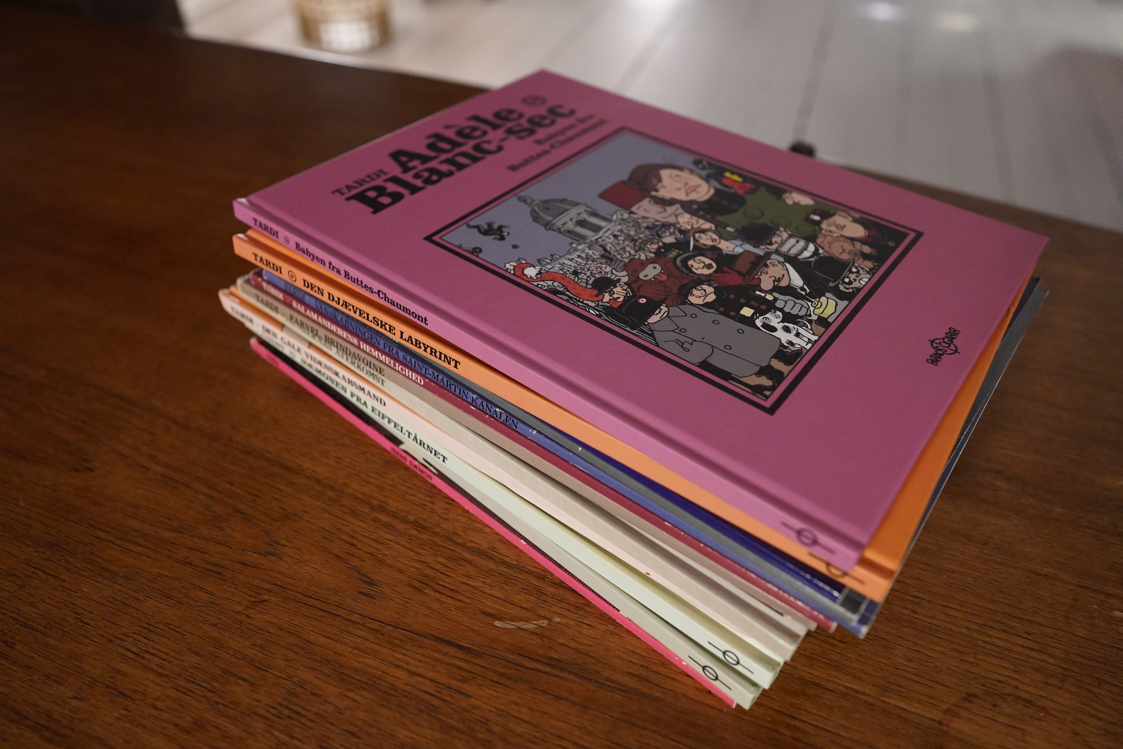
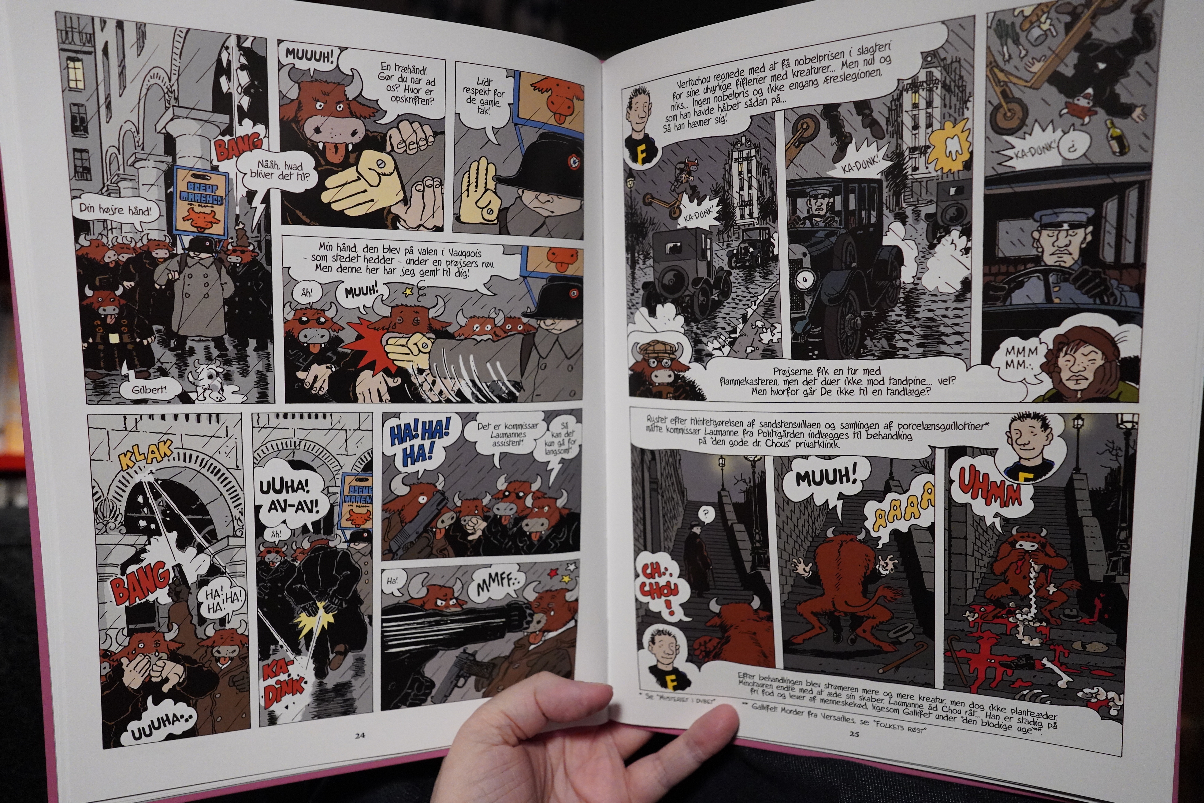
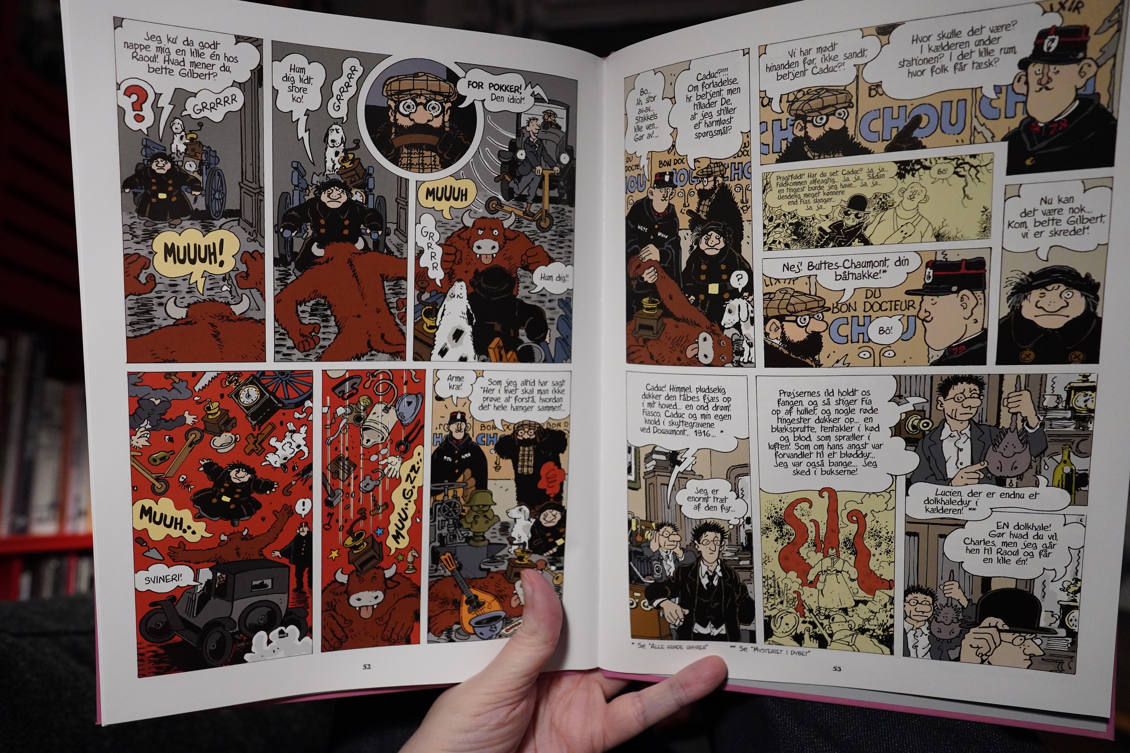
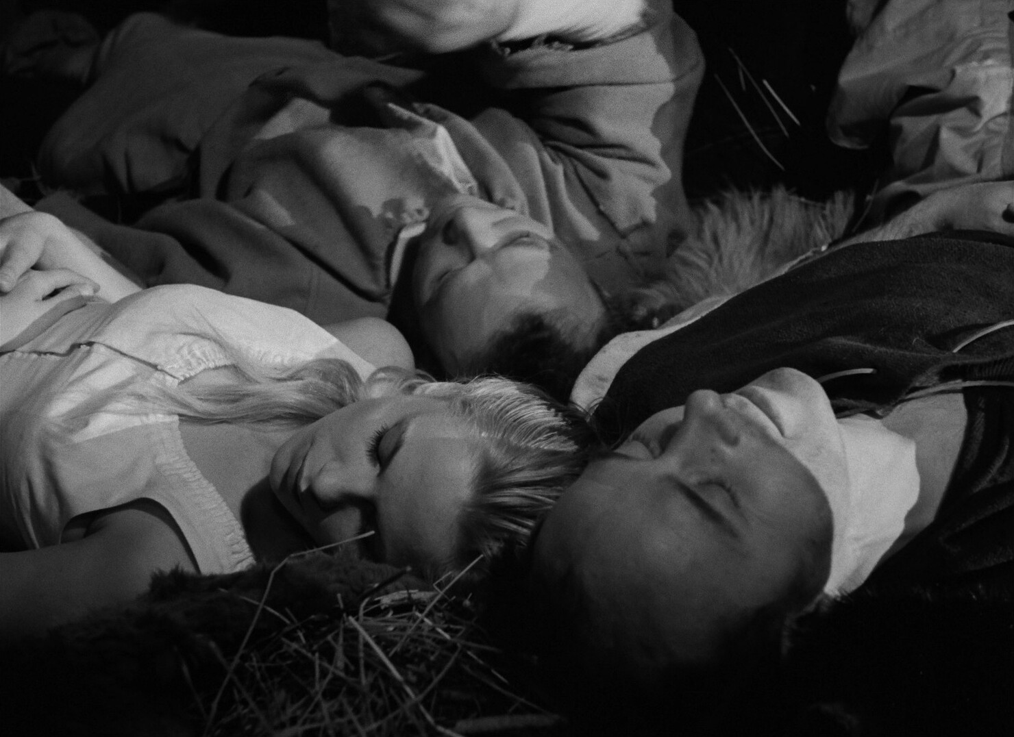
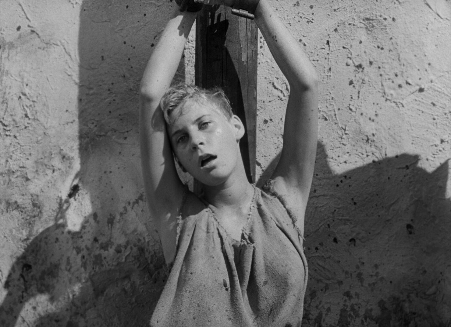
Yes! After almost 50 years (well, perhaps 45), Tardi has ended his Adèle Blanc-Sec series! It’s something of a momentous thing — I read the first album when I was, like, 12, and now I’m, like, old. So it’s a thing that’s been going on, but very intermittently, for the vast majority of my life.
So I spent a day reading the preceding nine albums, along with the two “tie-ins” (Le Démon des glaces and Adieu Brindavoine; you really kinda have to read at least the second of those to make sense of what happens in the fifth Adèle album, Le secret de la salamandre). I’ve read the first five (or seven, if you include the etc) albums many, many times — I was a huge Tardi fan as a teenager. The later albums not so much, because who has time when you’re a student etc.
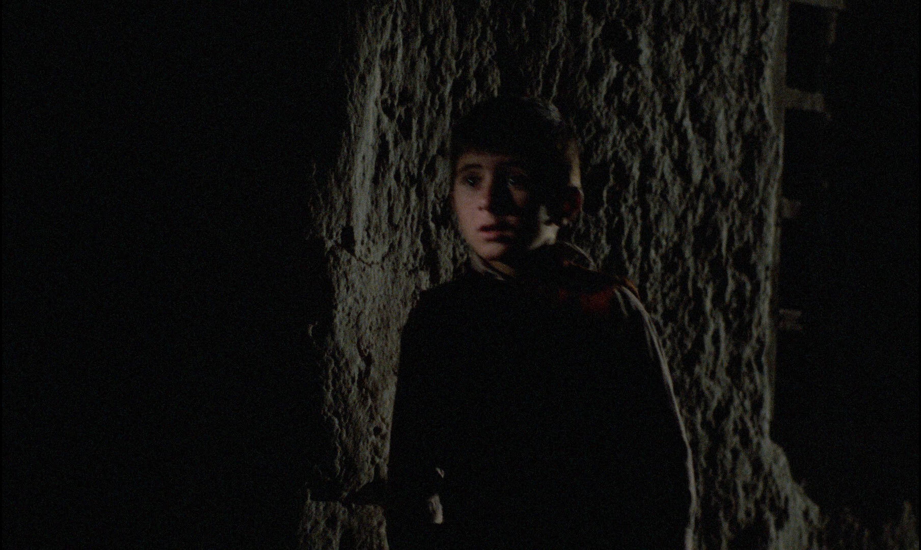
I did re-read all Tardi albums (chronologically) about a decade ago, though, but I’ve never sat down and had an intense Adèle-a-thon: These albums are so dense that it took me about twelve hours to read them all. (I sent out for food.) And… I have to say that the series is even better than I remembered. (Some comics get less compelling when you read a lot of them in one sitting — you get annoyed with the author’s tics and stuff, but that’s not a problem at all with Tardi.) The continuity in these books is so intense that it’s a totally different reading experience reading them in one sitting than spacing them out: There’s dozens of characters, and keeping all their plots straight is so much easier when reading it like this. It’s so much easier to recognise recurring gags for what they are (i.e., gags, not some mysterious inexplicable thing) and appreciate the humour and poetry of it all.
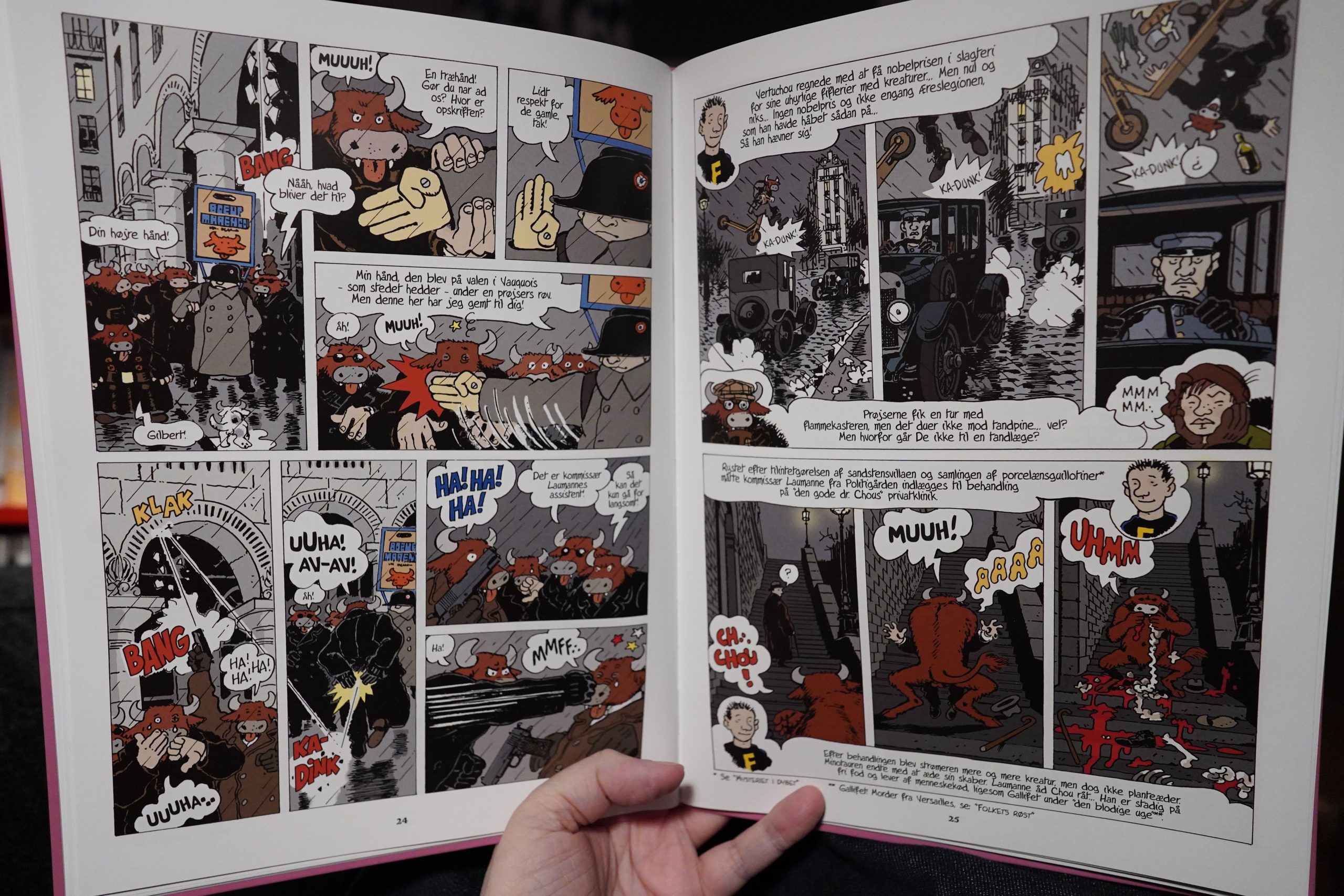
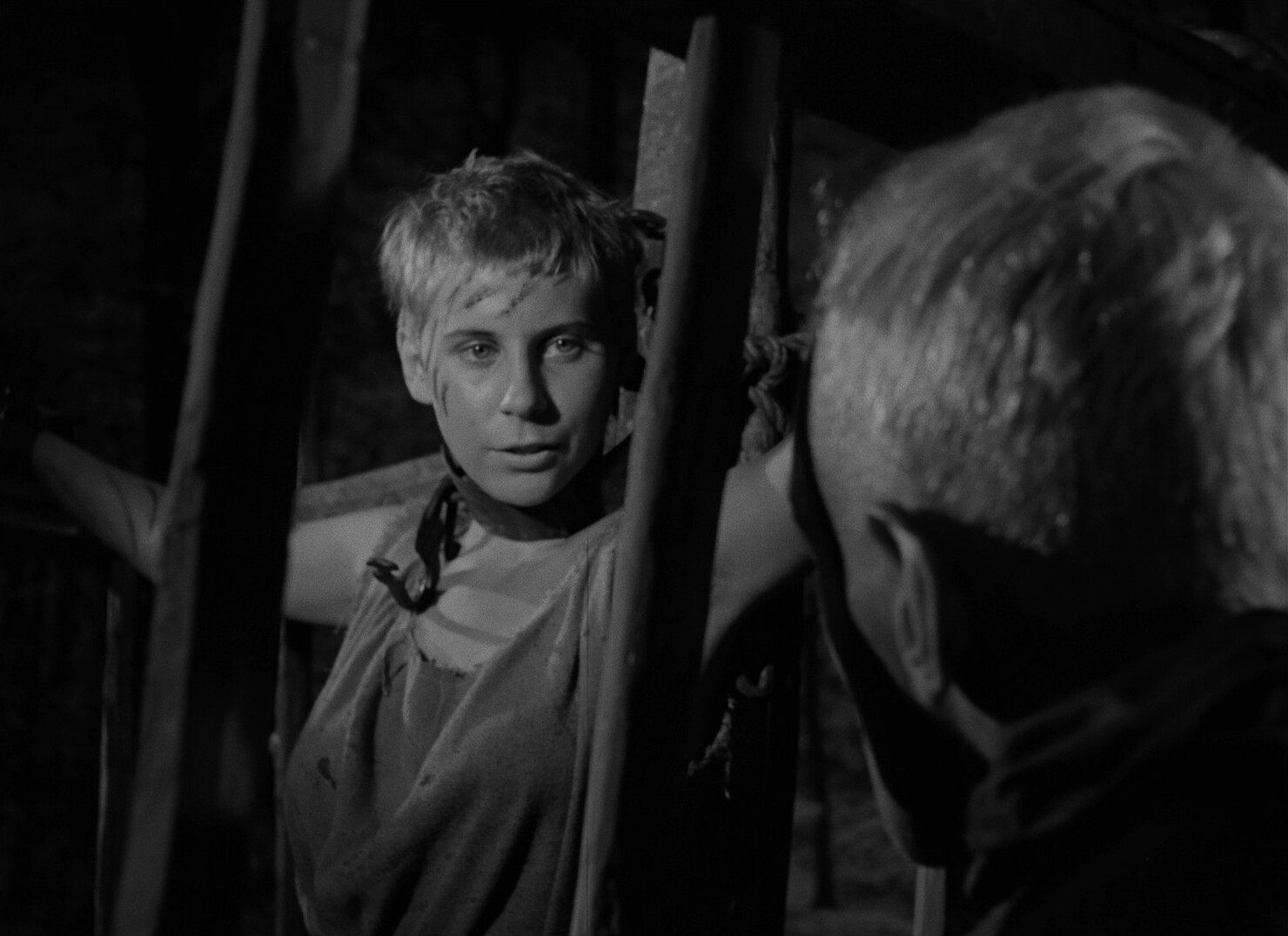
Now — the tenth album. Is it any good? The previous one was published in 2007, and the one before that was in 1998, so it’s not like Tardi has been… pumping them out. And while I haven’t read any reviews, I have registered that people have been using words like “disappointing” and “terrible” about the album.
And, yes, Tardi has upped the goofiness quotient in this one, and there are scenes that are more repetetive than actually funny. And there’s the (electric?) scooters that are in every panel that shows a street (and they’re mostly being run over by cars) that’s obviously a contemporary comment on Paris in 2022 (which is unusual for the series, which up until now has mostly eschewed that sort of thing totally).

But it’s just great fun, and we get a properly sentimental “and they lived happily ever after” kind of ending, really. Since Tardi has been adamant that nobody else continue the series, I was half dreading Tardi doing a Fritz the Cat on Adèle, but have no fears — Tardi wouldn’t do something like that to his readers.
Is it the best Adèle album? No — the first four albums (all made in one go in the 70s) are amazing. Then Tardi started taking pauses (growing longer and longer) between albums as he got more interested in other things, and the albums went from “absolutely amazeballs” to “very, very good”. And I think the final album is very, very good, too.
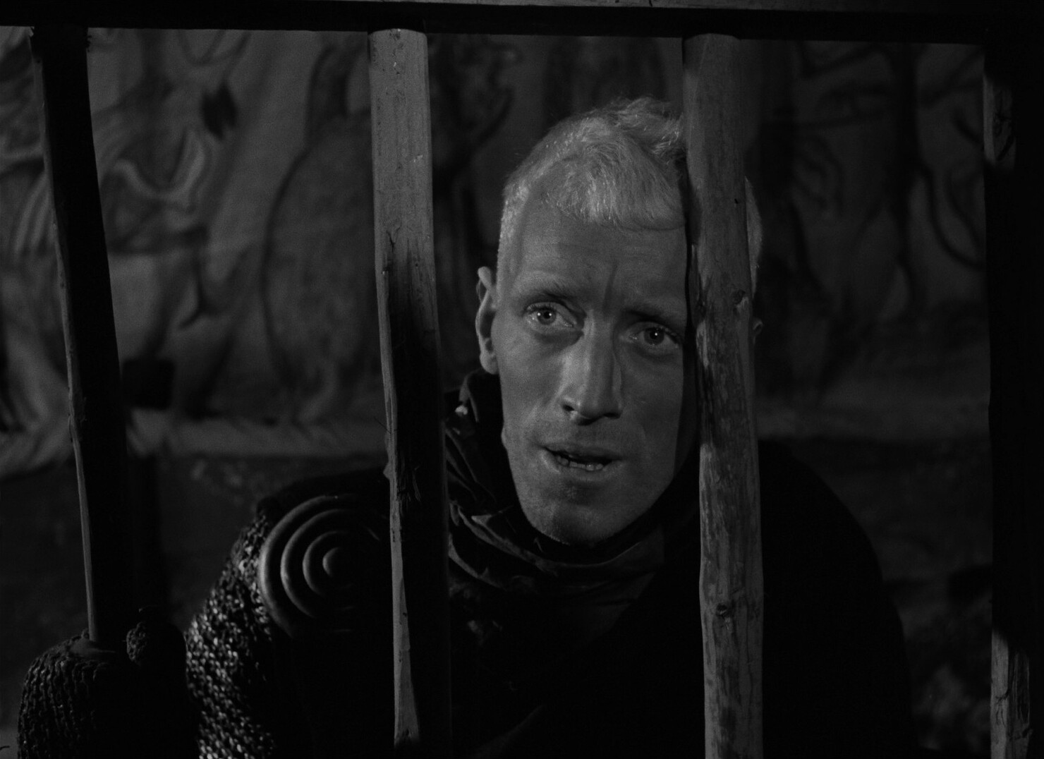
I wonder what French nerds think about it… *gulp* It gets a rating of 2.5, which is very, very low.
Let’s see what Google Translate says they have to say…
No story, too many references to other albums. The jubilant aspect and the originality of the first albums have completely disappeared. Decades to release these last 2 albums and all that for an unnamed “fadity”, maybe a pressure from Casterman on Tardi? Farewell Adele, you didn’t deserve this!
[…]
I’m almost relieved that the torture stops there… Poor Adèle, she didn’t deserve that! In short, I put zero because I can’t put a negative note…
[…]
It was time for the series to end! It’s so confused, so incoherent, that I couldn’t get to the end of the album (an absolutely rare situation when I read a comic). Well, I imagine that you have to reread the nine previous episodes before starting this one or risk not understanding much, but all the same … what a gloubi-boulga!
[…]
Ah! Extraordinary ! This is how Jacques Tardi, 70 and over, ended his saga. More and more foutrac, almost incomprehensible, pure Tardi, a masterpiece! He makes fun of us, he makes fun of himself, he makes fun of his character, he doesn’t give a damn about everyone, here is a beautiful, very crazy comic, a pure moment of useless and invigorating reading. Youth go your way, you can’t understand… Unless you have a lot of wit and humor? J’adore, j’adore
Anyway, if you have a day to spare sometime, I’d recommend reading the entire sequence. It’s exhausting, but it’s worth it.
Now! Reading comics!
| Snapped Ankles: Blurtations |  |
That’s a very apposite album to start the day off with…
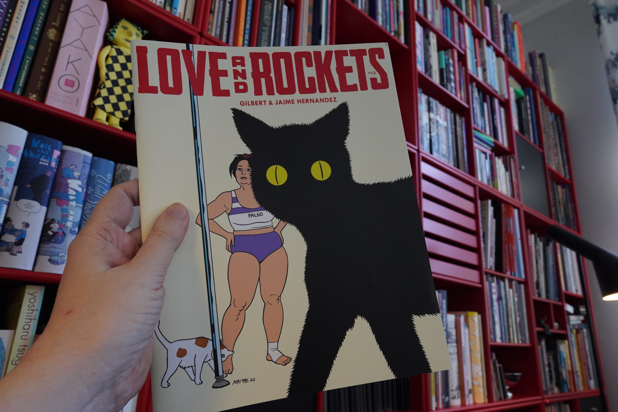
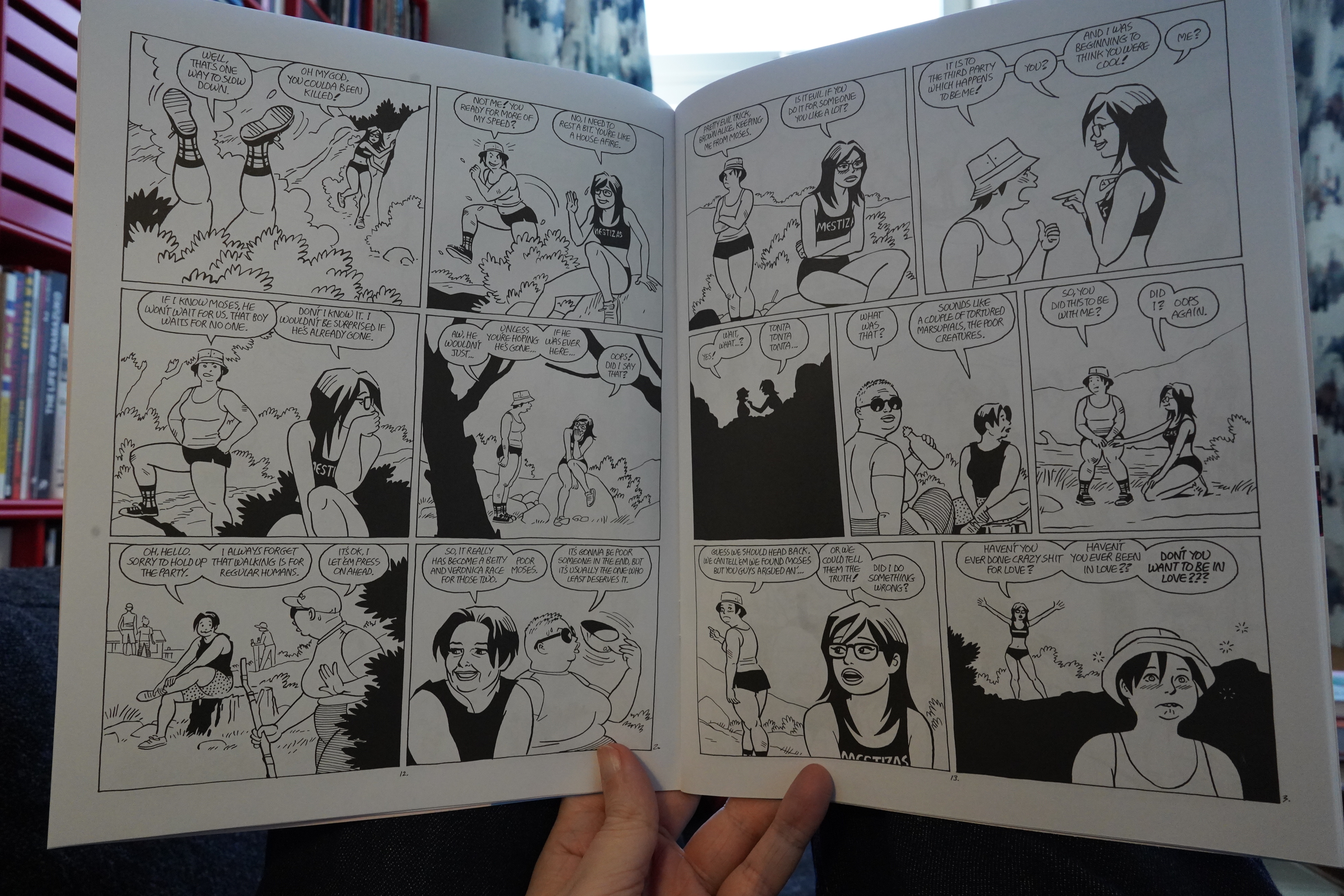
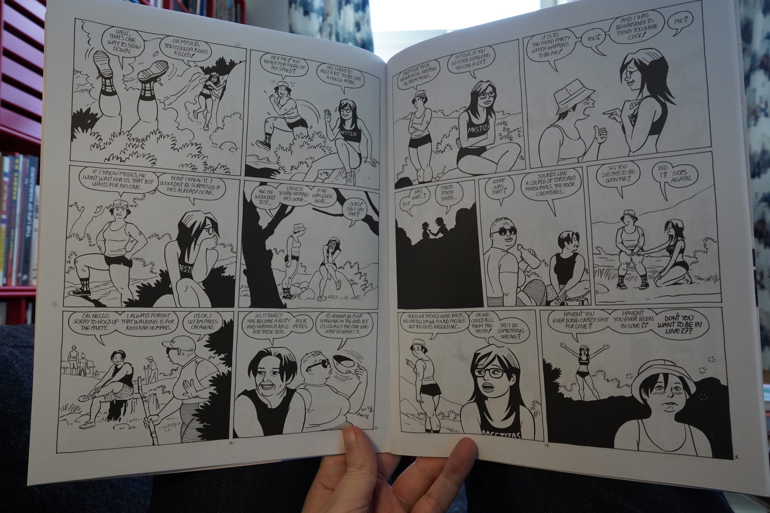
13:21: Love and Rockets #13 by Gilbert & Jaime Hernandez (Fantagraphics)
And speaking of long running comics — I’ve been reading this one the same number of years I’ve been reading Adèle. But more intensely, because there’s been a whole lot more Love & Rockets over the years…
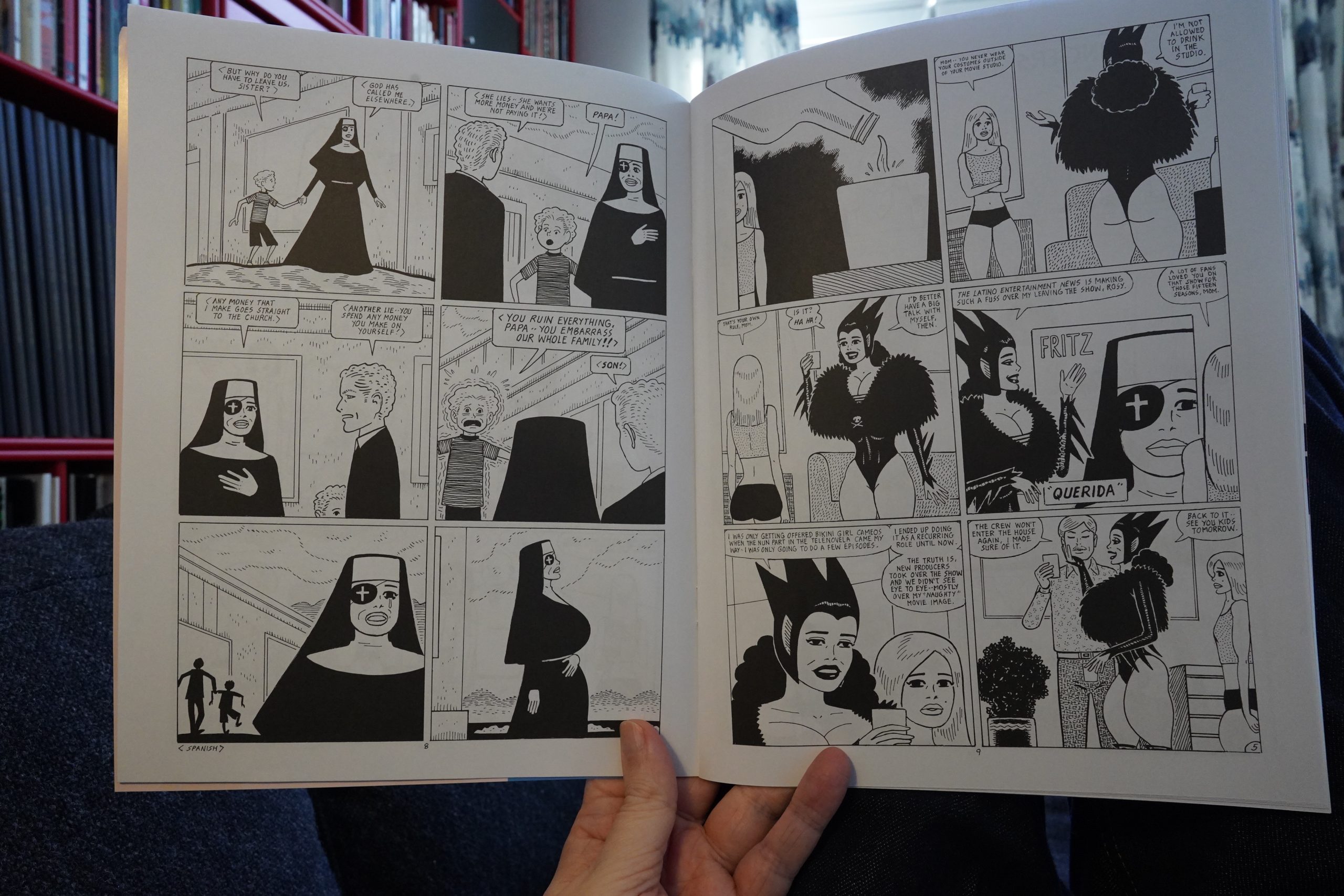
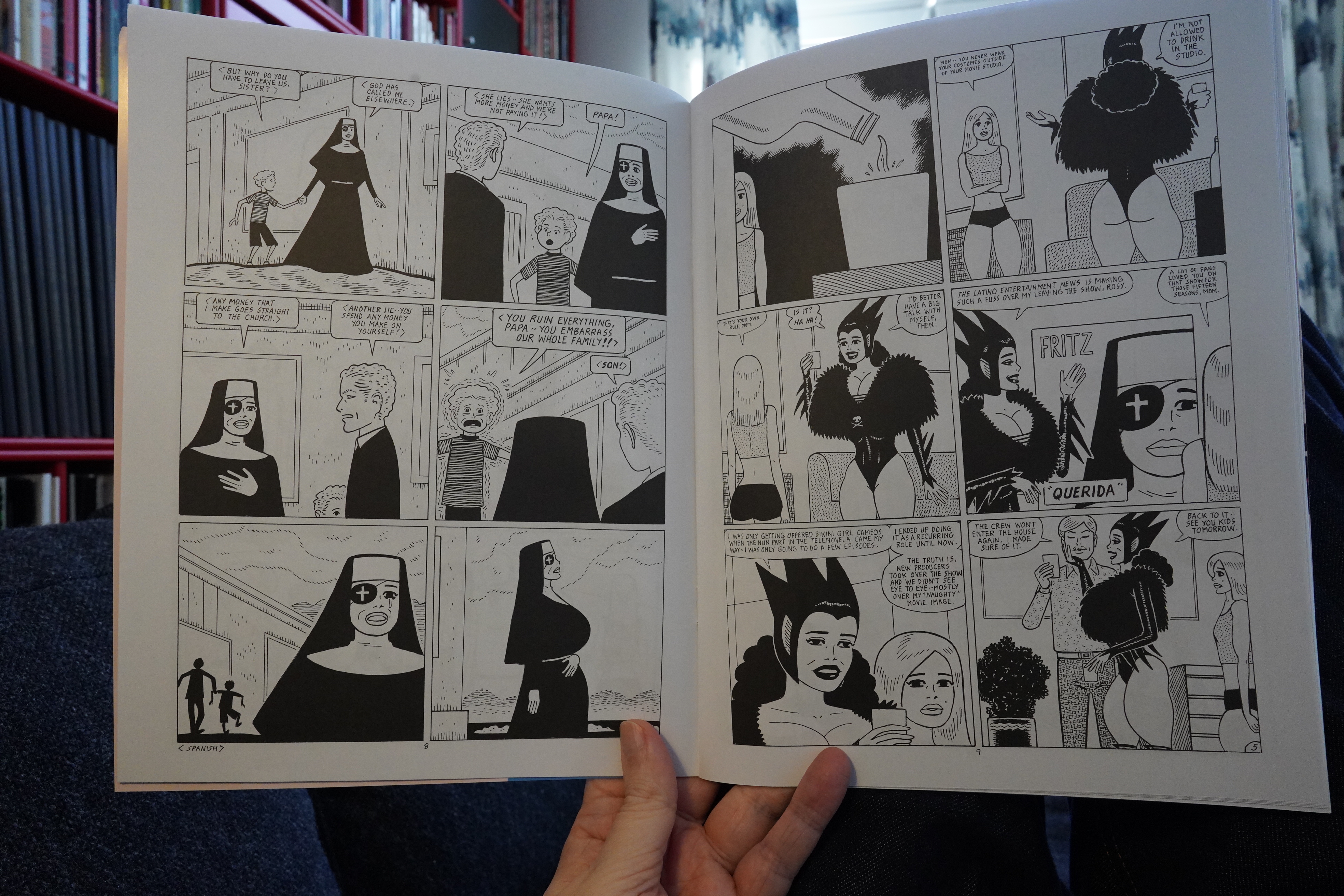
What… Fritz has been playing in a soap opera for over a decade now all of a sudden? Has that been mentioned before? I mean, we’ve explored Fritz’ life pretty thoroughly, but it seems like he’s dumping a lot of random stuff into her history at this point — it’s a pretty incoherent lifetime now.
Still intriguing, though.
On the Jaime side, we take a breather after some pretty major storylines, and it’s very cute indeed.
Class issue.
| Roomful of Teeth: Rough Magic |  |
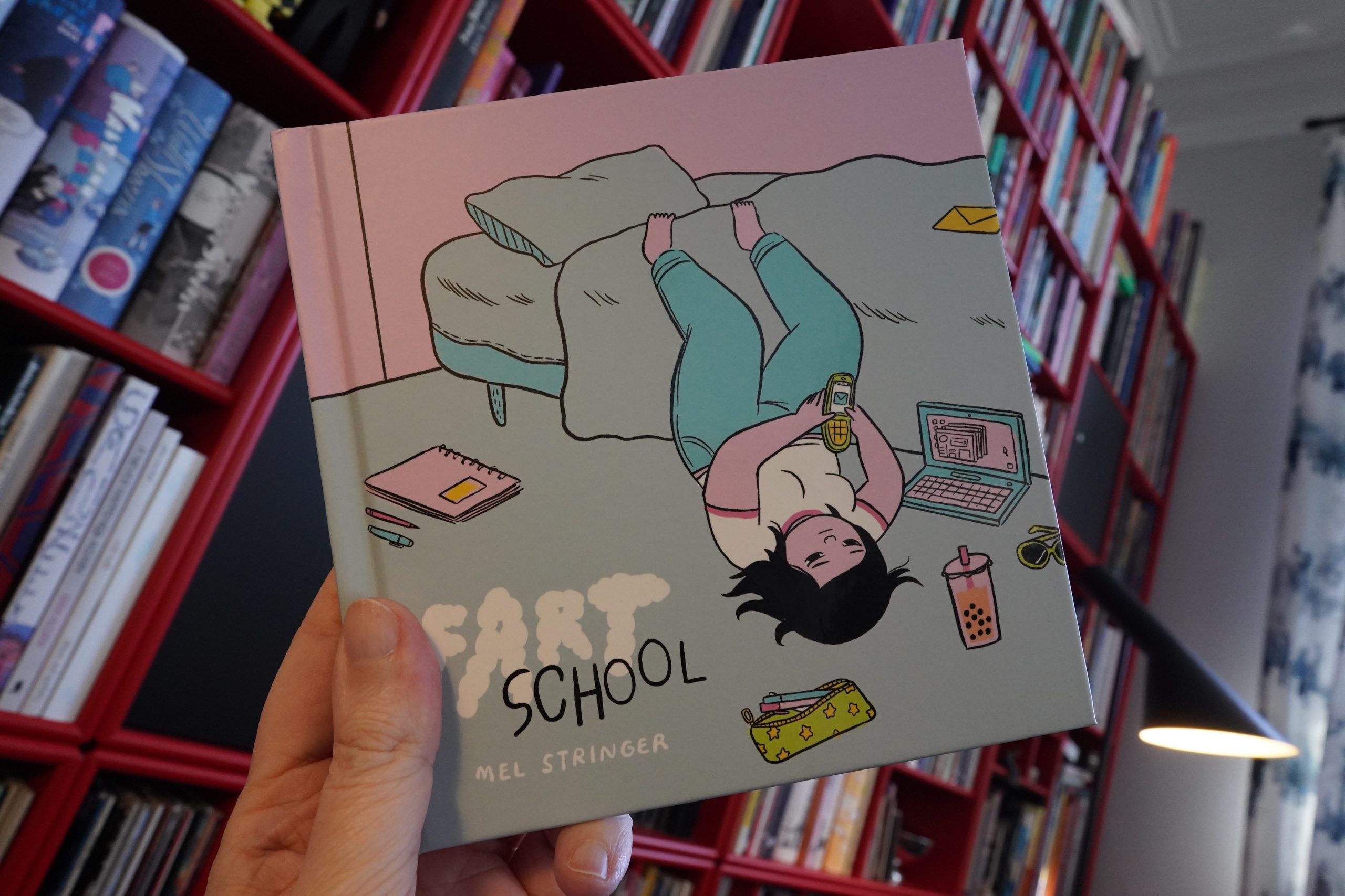
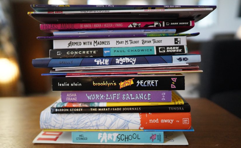
13:47: Fart School by Mel Stringer (Silver Sprocket)
Comics about going to art school — there’s a lot of them. This one is amusing, but there’s like a… uhm… it’s like I don’t understand what she’s trying to tell us.
It might just be the storytelling style, which is a bit choppy and anecdote-oriented? I mean, I like the book, but it’s like the aimlessness of the character is also reflected in the structure of the book.
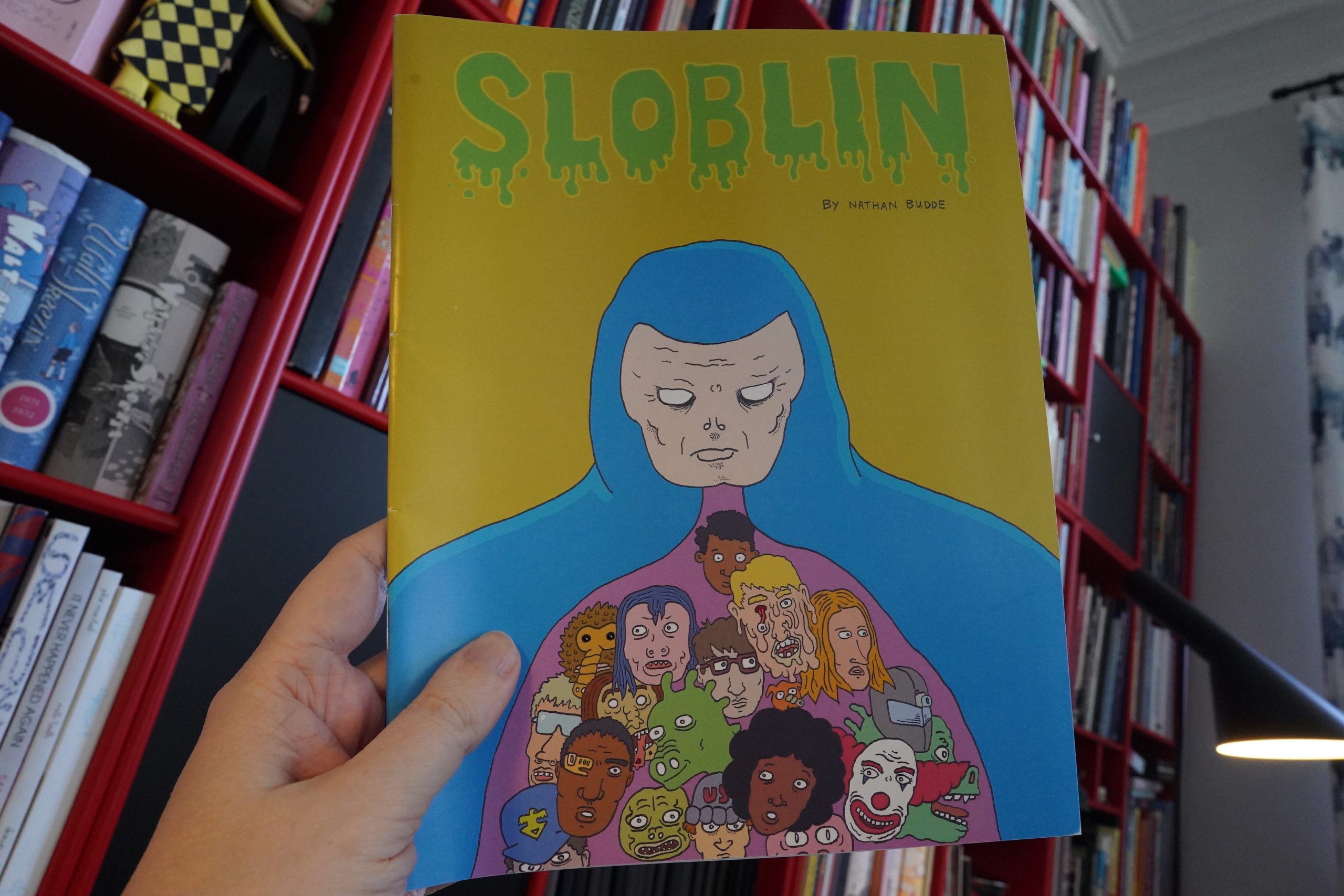
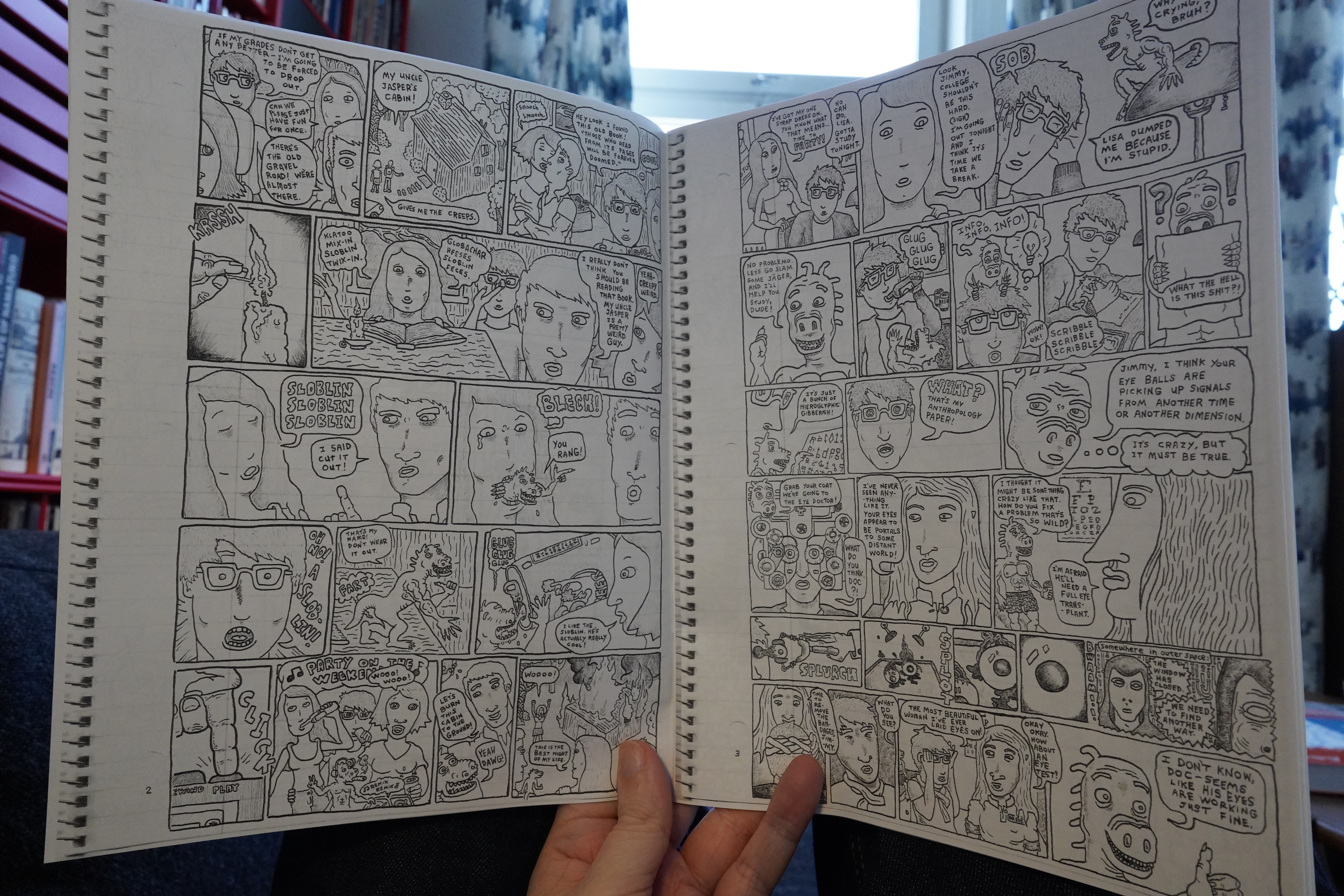
14:18: Sloblin #1 by Nathan Budde
Hey! Free comics! Budde sent this to me, so I guess this part of this blog post counts as sponsored content!

This is very funny — I laughed out loud several times while reading it.
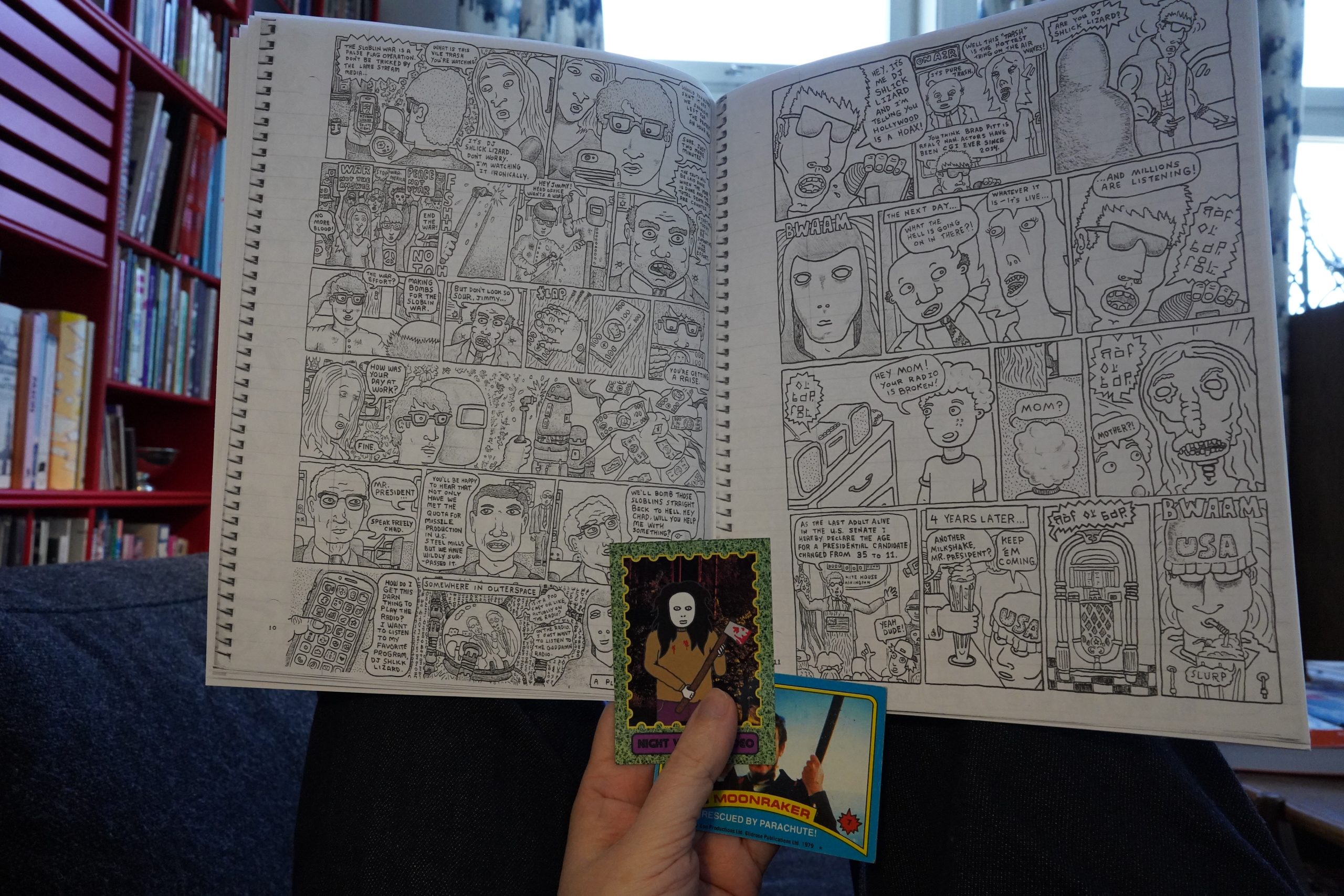
It’s very dense, so we get an entire epic over these 28 pages, but it has a good flow, so it doesn’t feel overwhelming. I enjoyed reading this a lot. And it comes with trading cards!
You can get copies from Night Visitor Video.
| Lonnie Holley: Just Before Music |  |

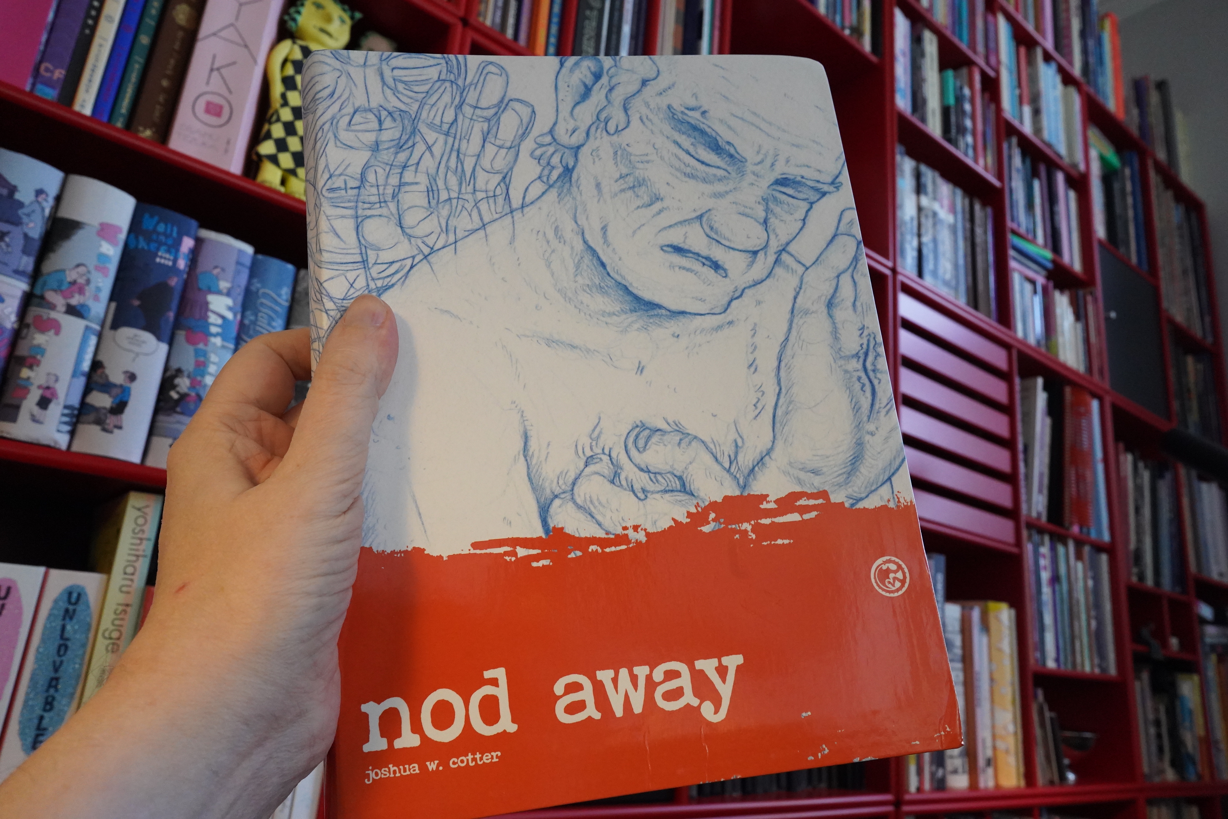
14:48: Nod Away 2 by Joshua W. Cotter (Fantagraphics)
This book had some drama surrounding it, so I’m nattered away a bit a couple days ago in my generally uninformed manner, so feel free to skip to the next book or something. (I typed this in the other day, because I don’t have time for writing on days I’m reading comics, of course.)
Right, about a month ago Joshua Cotter posted an appeal for help, which is when apparently most of the world became aware of the existence of this book. Including me. And that’s what’s so weird about this: For instance, I had the first volume of this book on my “best of 2016” list, so naturally, if I had known that a second volume existed, I would have bought it immediately.
I won’t claim to be the most “aware” of comics readers — I don’t hang on Instagram, and I barely do Twitter, but I still know of most significant new books that are published via other blogs or Diamond Previews or the Fantagraphics newsletters etc. But this one had totally passed me by.
So other people wondered to what’s going on:
Twitter drama!
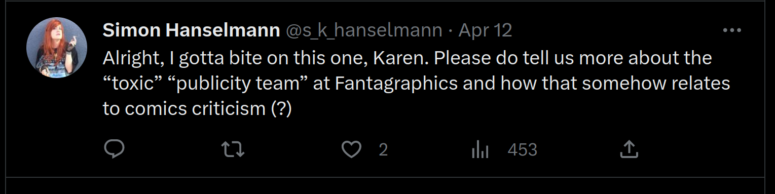
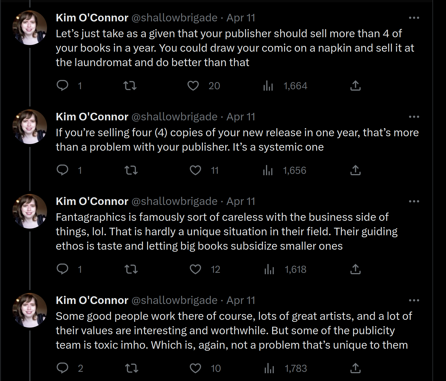
Reading the Fantagraphics “oral history” book We Told You So, it’s a common refrain among comics artists that publishers (in this case Fantagraphics) don’t do enough to promote their books. (And I imagine that’s the same thing with other marginal art forms, like poetry publishing.) If the choice is between getting something published (and doing no publicity) and not publishing at all, we’d all prefer the former, right? Right?
Jay Stephens is interviewed back in the 90s about publishing with Black Eye:
SULLIVAN: It’s unfortunate, because he uas publishing a
lot Of teOrk. He Obviously cared about it. I’m sure he
either not making money or not making Very much
money.
STEPHENS: He was not making money. But that brings
up an interesting point. You say that as ifthaes a good
thing.
SIILIVAN: NO, no, r m not saying that’s a good thing.
I’m saying poor Michel.
STEPHENS: Yeah. Well, I think that was one of the
problems. I think that Michel though the was martyring
himself to get good comics out there, and what he was
really doing is not adequately promoting the works and
therefore not making the artists any money.
I don’t bear that much ill will. I mean, publishers
are publishers, and I pretty much know what to expect.
Or David Chelsea on Kitchen Sink:
I remember having lunch with some Kitchen Sink promo guys and Carol Lay about that time. The Kitchen Sink people were telling Carol about some publicity stuff they had planned for her book. I blurted out, ‘What do you have in mind for MY book?’ There was a moment’s silence and then everyone burst out laughing.
You know?
Like… one of the major ways to get publicity about a book is to get a review placed at a major publication? I had, for instance, expected Casanova Frankenstein’s great book last year, How To Make A Monster, would get a lot of attention, but I think I saw a single review out there?
But I don’t have any insights here. It sucks that it is this way, but presumably Fantagraphics know what venues are available for them to do publicity, and use those to the best of their ability. It’s just sad that venues like The Comics Journal don’t really exist any more: That is, a widely-read thing that’s published regularly, and you both have reviews and ads for new stuff. The Alternative Comics web site is great, but only covers small press stuff, so it probably wouldn’t have mentioned Nod Away 2 if the site had existed at that point.
I remember about 15 years ago, there was a blog that went through each Diamond Previews and pointed out all the interesting books that were being published. “Interesting books” is totally subjective, of course, but it covered at least 120% of what I found interesting, so it was a huge help (for me at least). But everybody gets burned out on doing something like that, which is probably a literally thankless job (at least I didn’t thank whoever did that).
SOMEBODY SHOULD DO SOMETHING. But what?
OK! Prepared statement over, so we not return to reading comics…
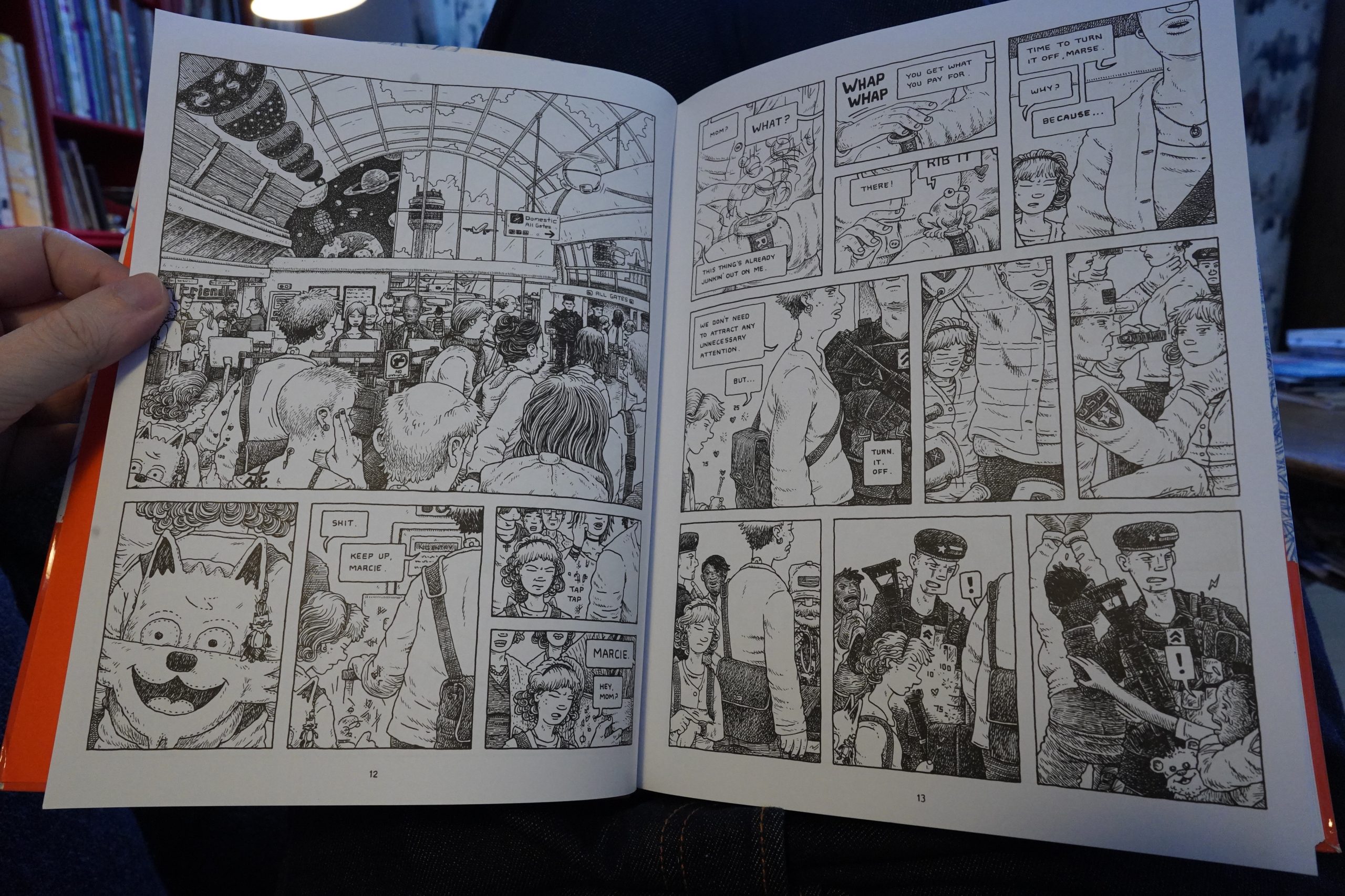
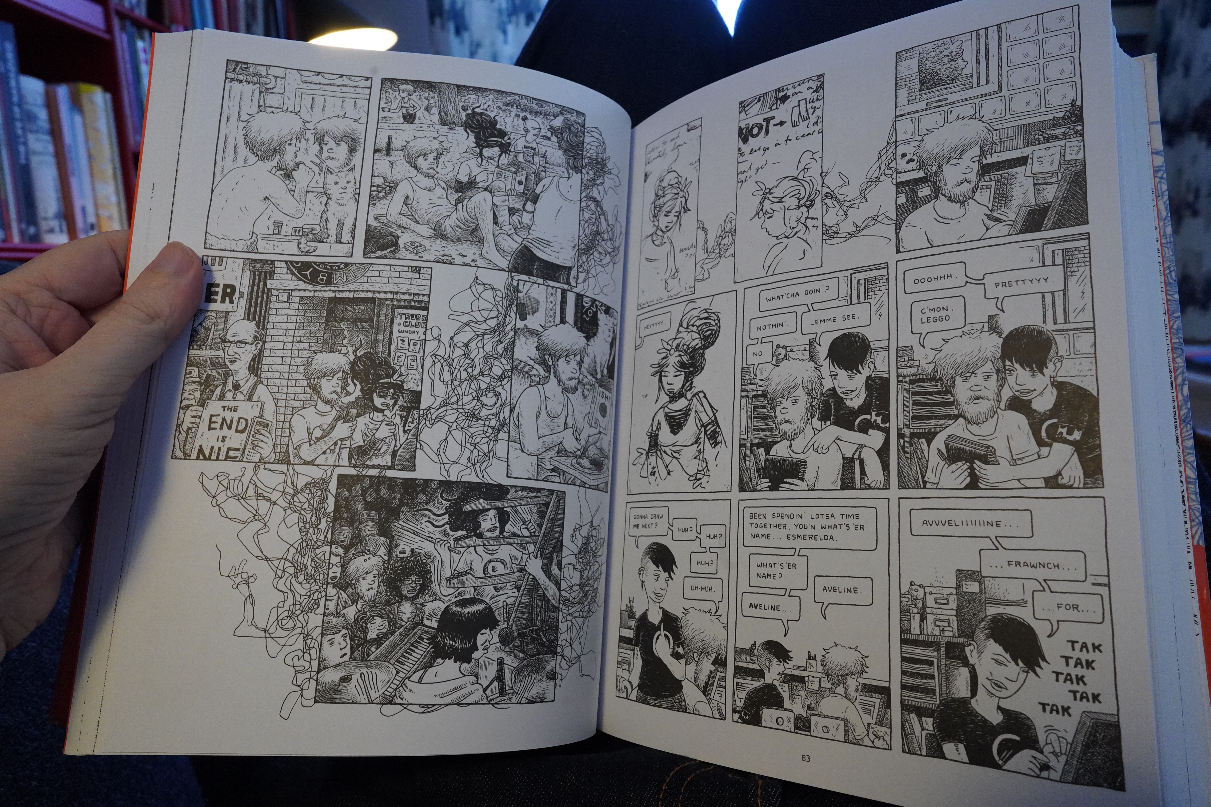
Hm… I mean, I read the first volume of this in 2016, so I don’t remember much about it, but it took place on a space station, didn’t it? This starts more in the near future…

… before going back to something that looks like our present.
(And that’s Boredoms!)
Anyway! This is great stuff. The exacting cartooning is really attractive, and the well-developed narrative devices (the threads in the time lapses, for instance).
| Gamers In Exile & My Selfish Desire: Split Your Cerebrum |  |

It’s not a comfortable read. It’s super tense: While there are long stretches where nothing horrible happens, you always feel there’s some new atrocity lurking around the corner. And thile the storytelling is very clear, it’s not at all obvious… like… what’s going on? How it all connects? Which is both frustrating and exhilarating, because it really feels like whatever is going on is interesting.
It’s great! And there’s five more volumes coming (if Fantagraphics manages to sell them, I guess), but at this pace I’ll be dead before the final volume arrives.
| Mourning [A] BLKstar: Garner Poems |  |
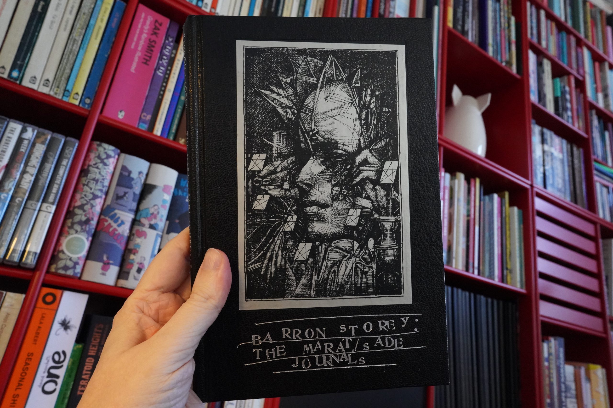
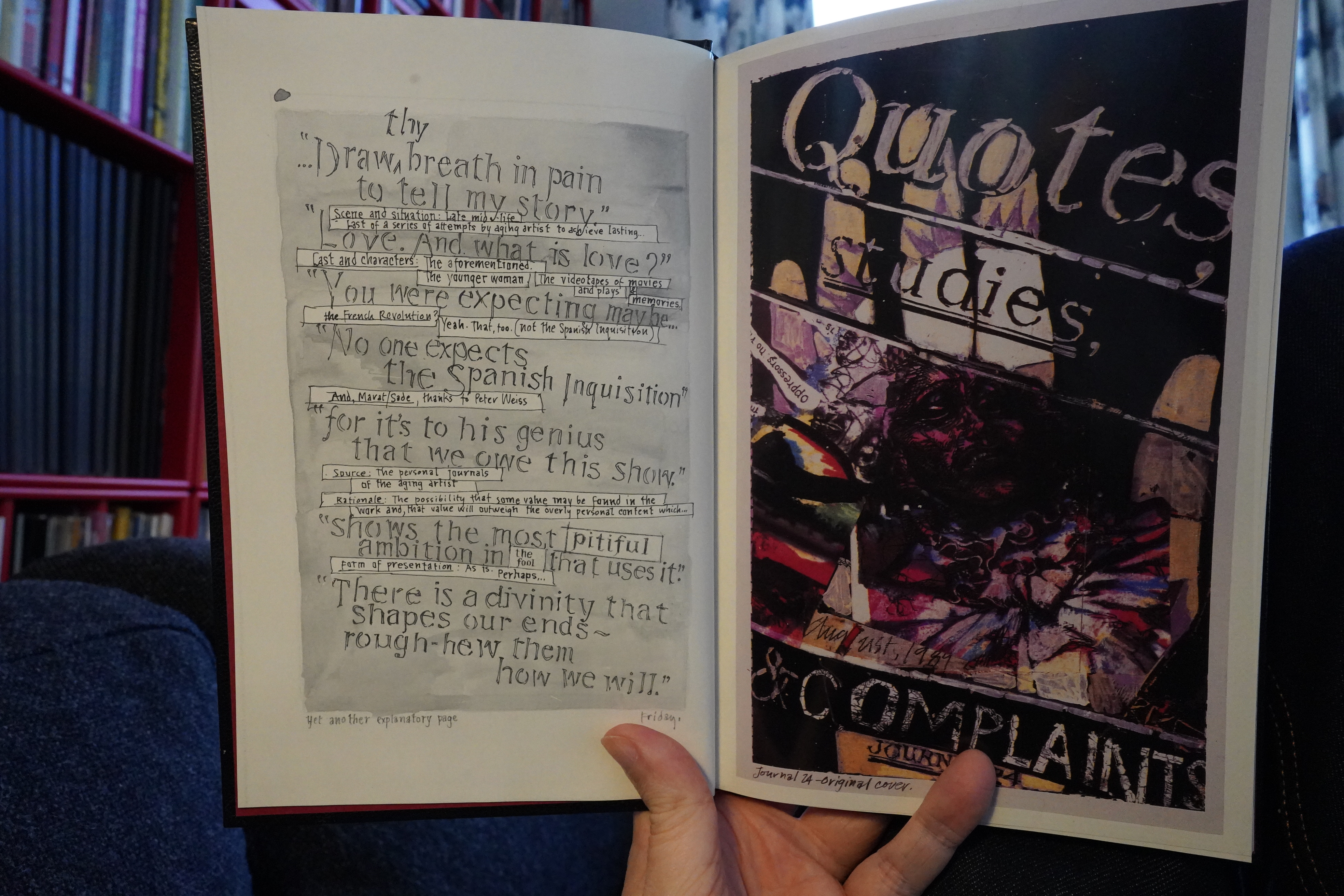
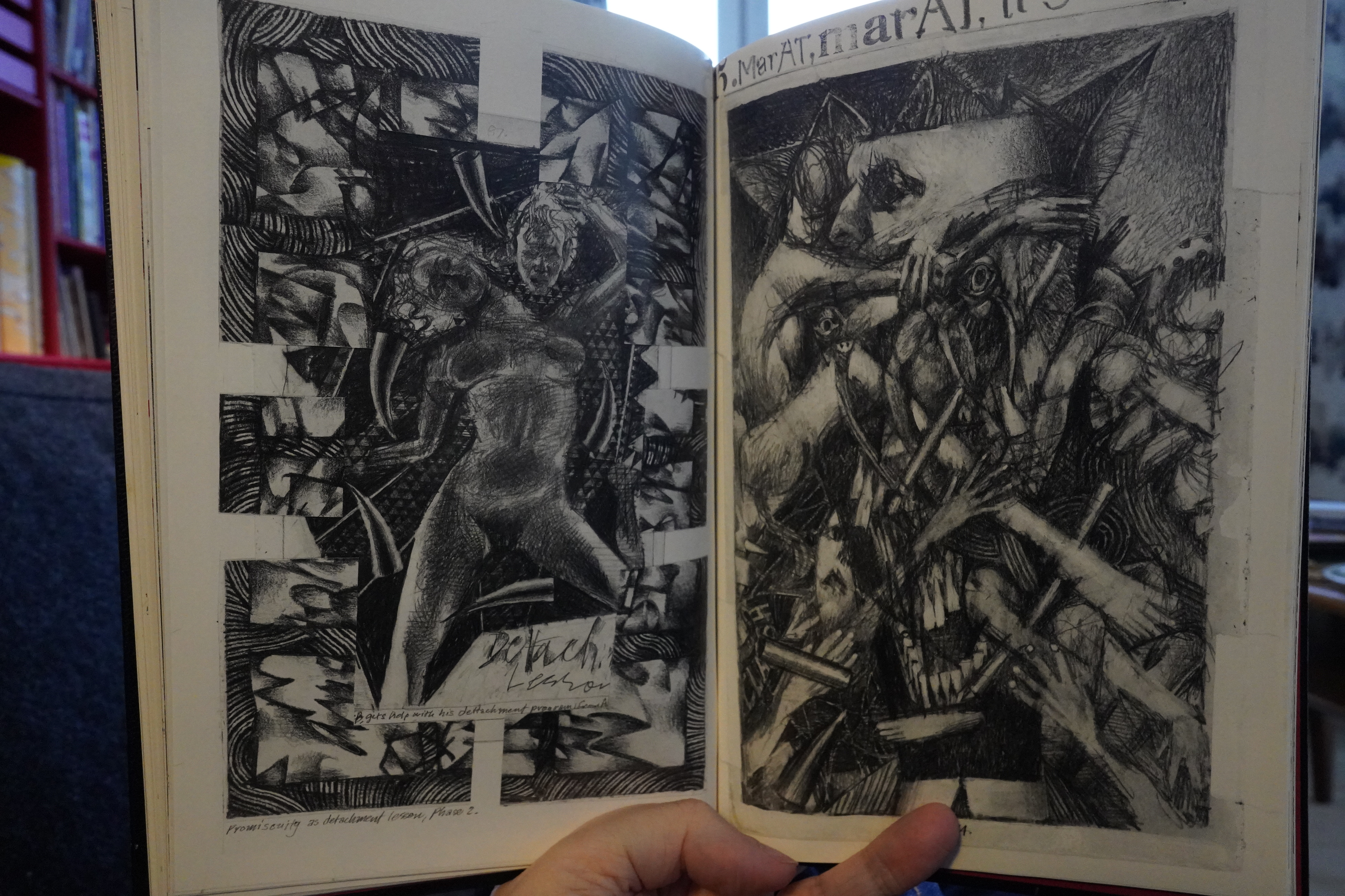
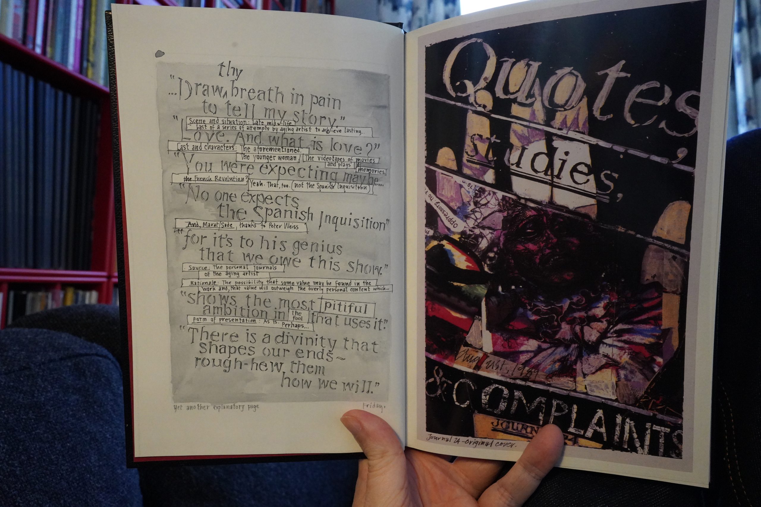
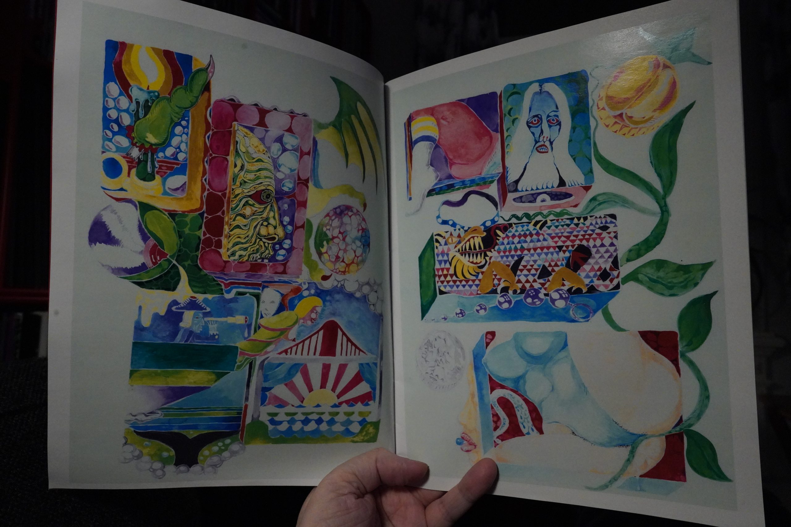
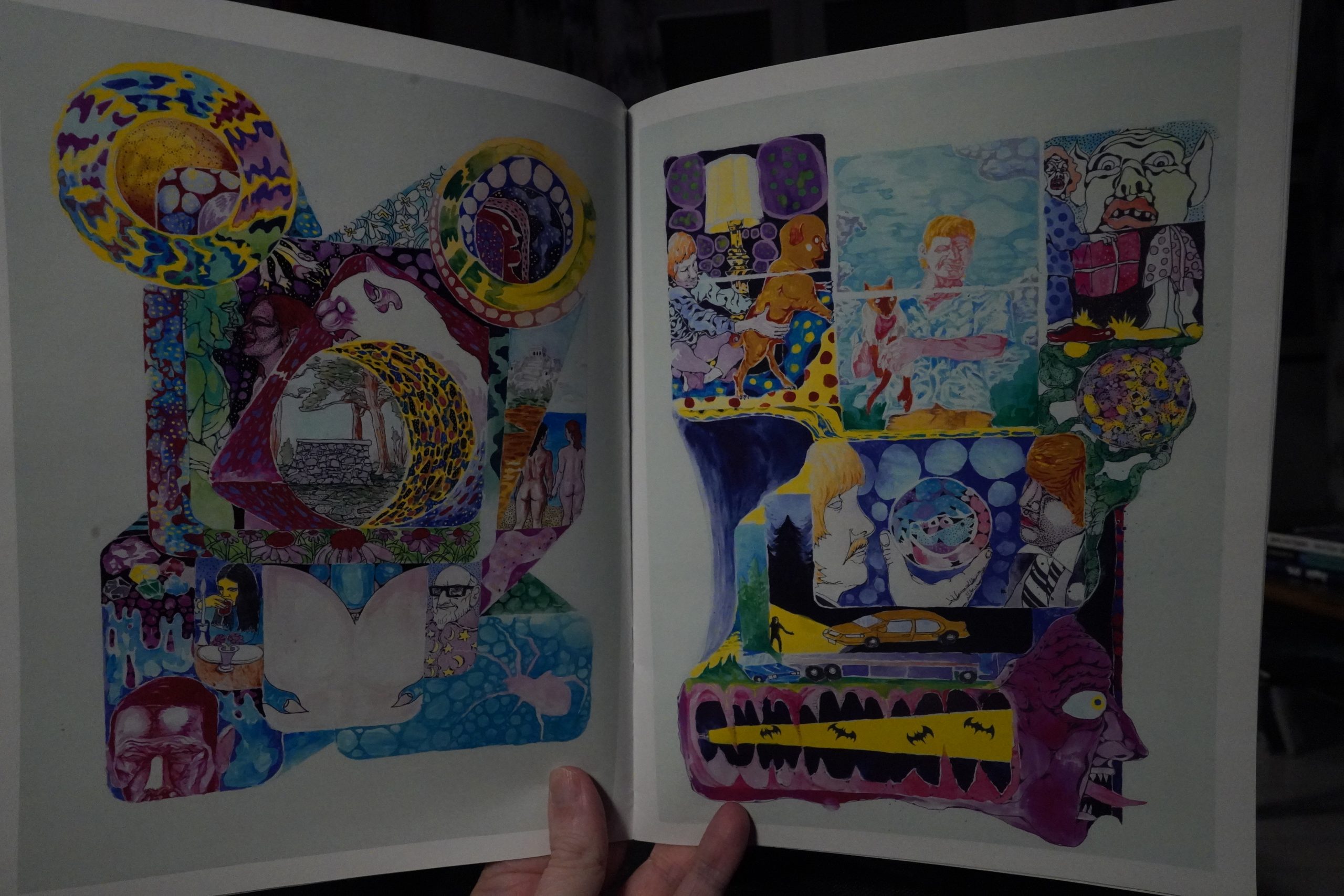
16:49: The Marat/Sade Journals by Barron Storey (Tundra)
And speaking of things that didn’t sell… I was reading an interview with Kevin Eastman while doing the Kitchen Sink blog, and he was talking about losing $17M on Tundra, and Gary Groth (interviewing him) asked repeatedly “but how”? Well, half of the explanation is probably “Eastman exaggerates a lot”, but Eastman mentioned this book as a prime example (The Comics Journal #202, page 67):
GROTH: Let me ask you this. I don mean to criticize you,
but do you think you had a dear conception… a really
concrete conception Of the kind Of material you wanted to
publish? I looking wer the Tundra list, and it’s all
over the map. You’re publishing Paul Mavrides sketch-
books, a lot Of horror stuff, underground stuff.
quasi-superhero stuff I couldn see a cohesive aesthetic.
EASTMAN: No, there wasn’t. The aesthetic was that it
was creator-owned, creator-driven, something that
they believed in. I tried not to set any boundaries or
limitations, I would to’ to 100k at things that I liked
and publish them, because I liked them. I would say, “l
would like to read this.” I read a lot of different and
weird shit. What I think is cool stuff, cool shit, weird
shit, it’s the same thing. And I didn’t really
want the company to be pigeon-holed as a specific
kind ofpublisher. I wanted people to be intrigued like,
“Jeez, what are they going to do next.” So I would
publish things like Barron Storeys Marat/Sade.
GROTH: [laughs] That must’ve sold 12 CQPie$.
EASTMAN: I bought six of them, I think. No, I’m
kidding. It sold very little, but I loved that book. I love
that book to death.
So that made me curious, and I got a copy of it, and now I’m gonna read it.
Yeah, I can see that this is something that Eastman would be proud to publish. Storey was very influential on certain comics artists, and this is a very art-like object.
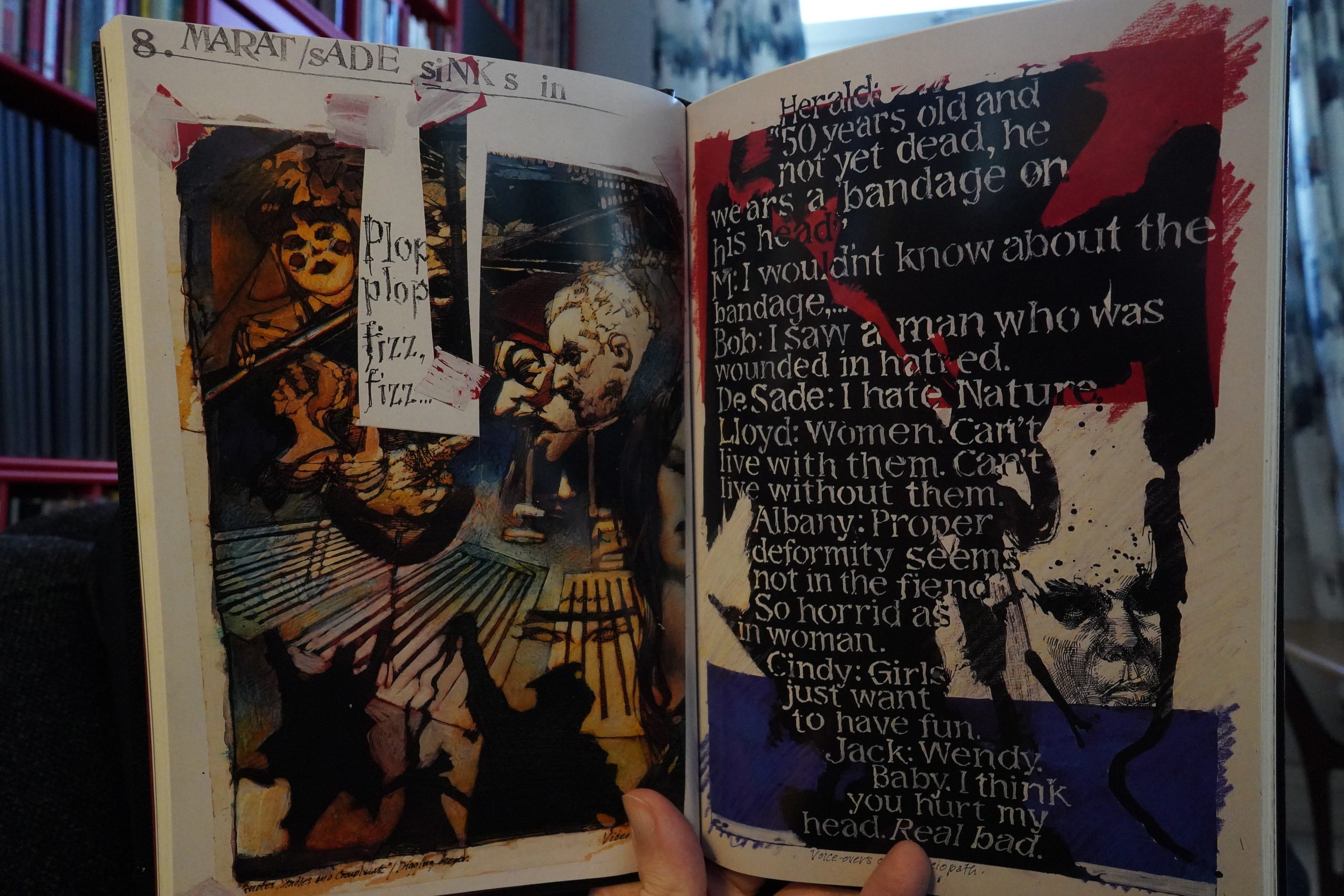
It’s mostly quotations from a handful of different things and illustrations.

He frets at one point whether it would be “over the heads of the readers”. It’s just that deep.
*rolls eyes*
| Gina Birch: I Play My Bass Loud |  |

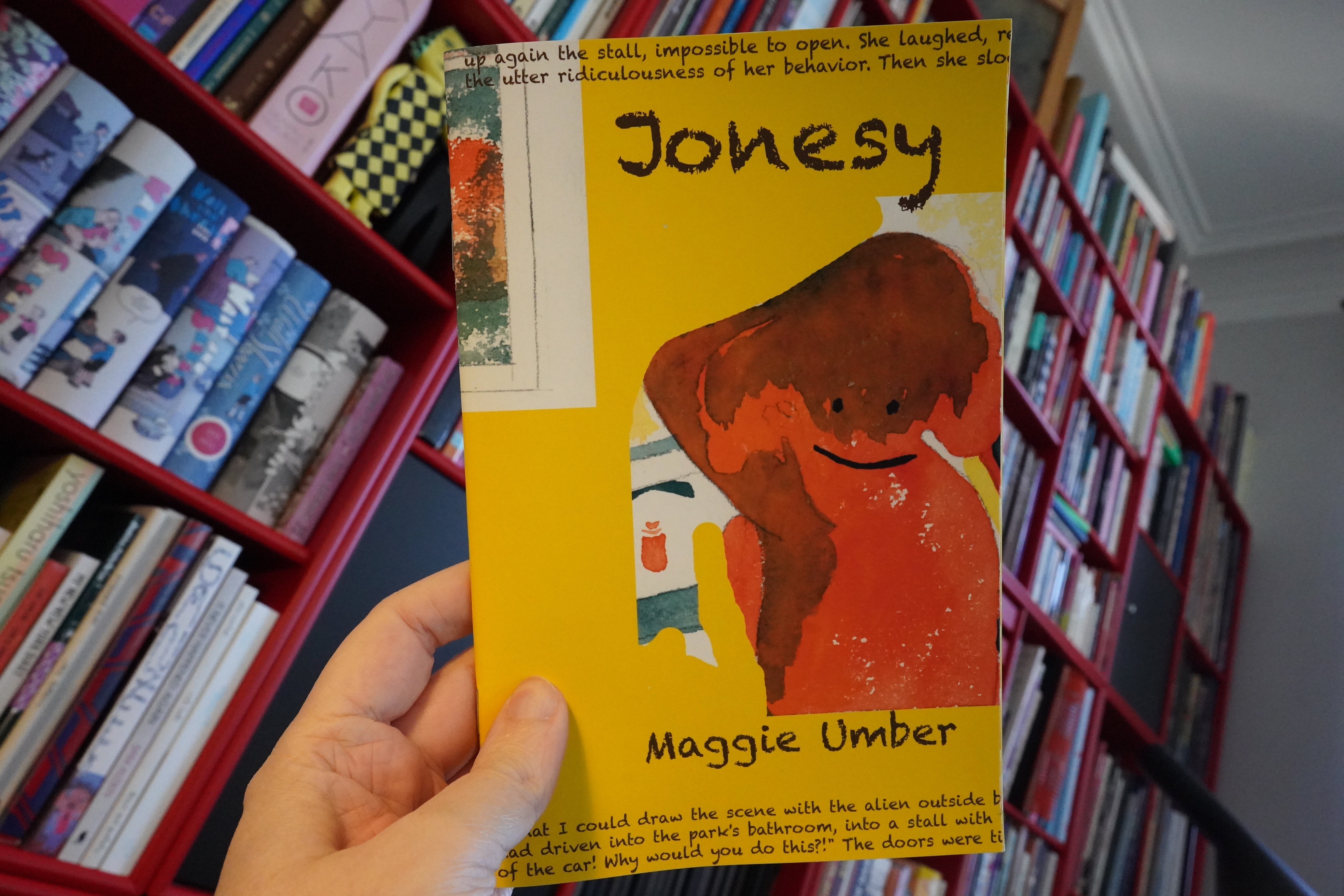
17:16: Jonesy by Maggie Umber
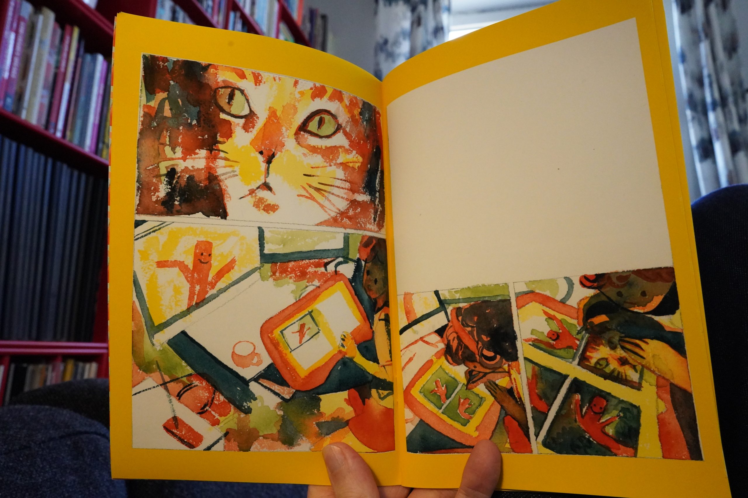
Now, this is more like it.
Gorgeous, and both mysterious and a bit unnerving. I love it. Get it from here.
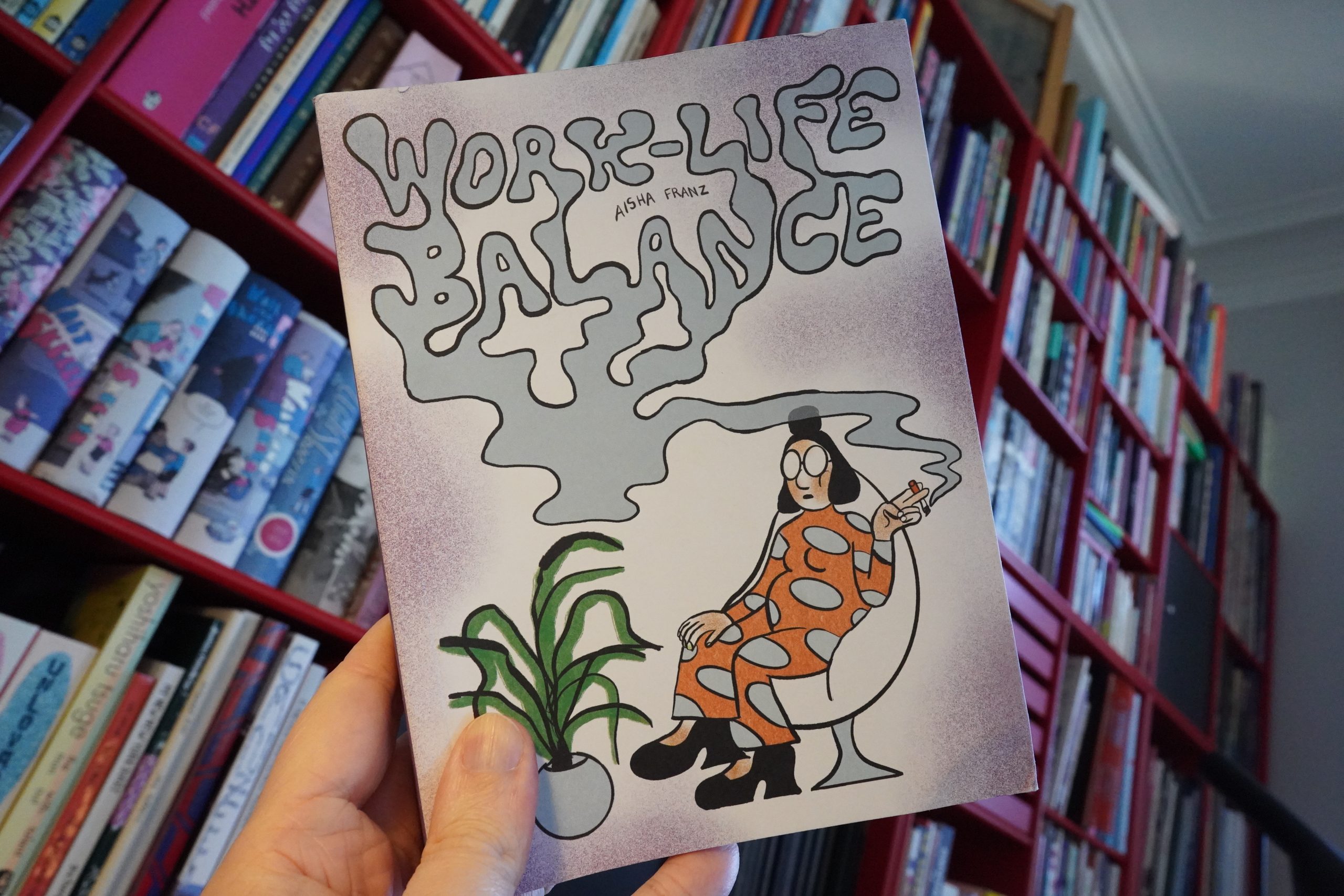
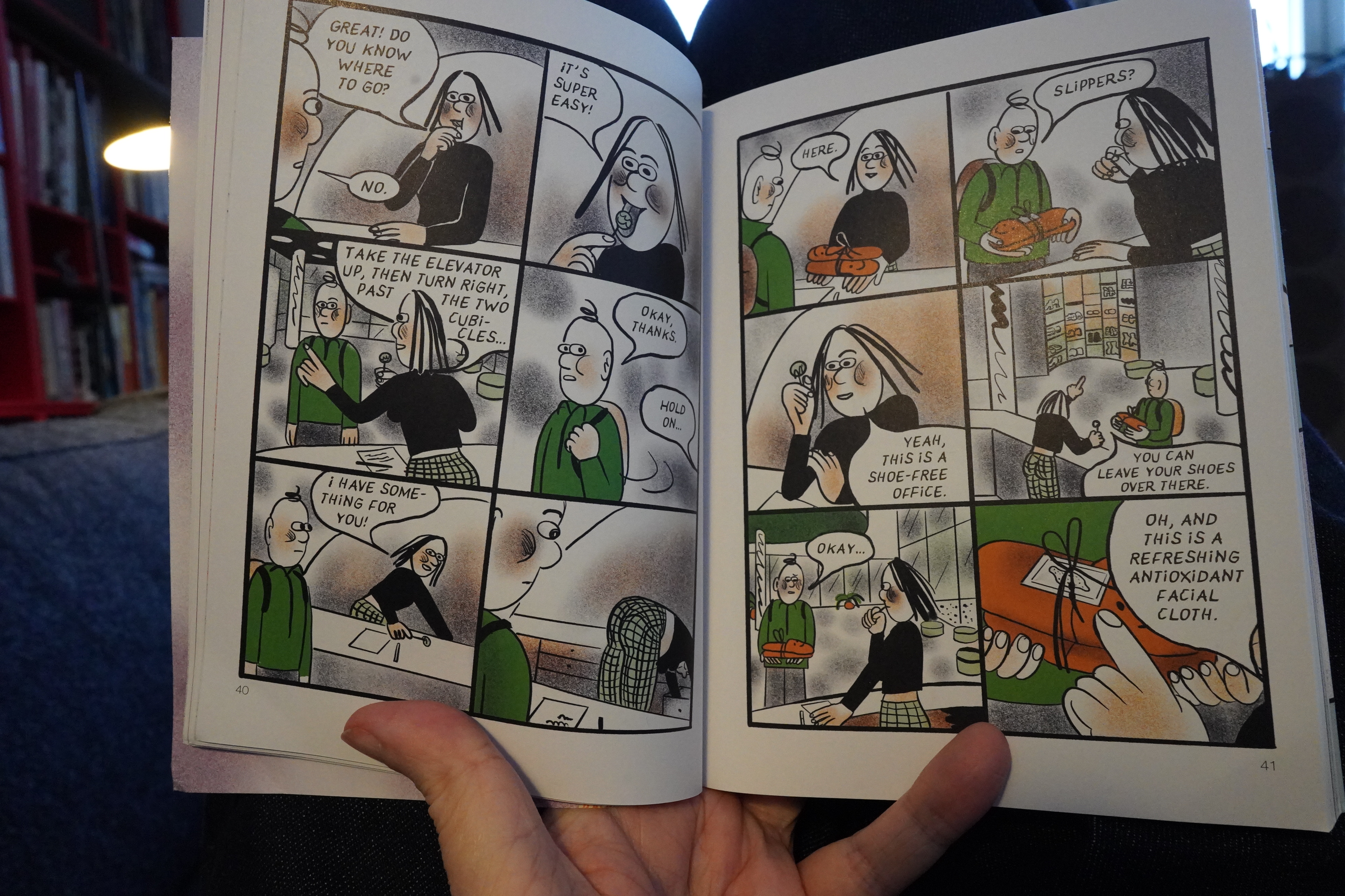
17:20: Work-Life Balance by Aisha Franz (Drawn & Quarterly)
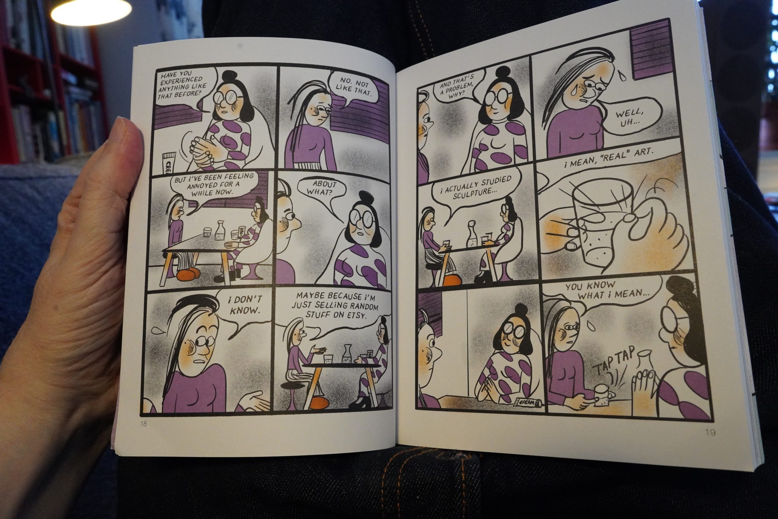
We follow three different storylines here that are tied together by the three protagonists seeing the same (useless) therapist.

It’s funny, and it moves very quickly — not a second of boredom. The artwork doesn’t really do much for me, though.
| Pink Floyd: The Dark Side of the Moon (Live at Wembley) |  |
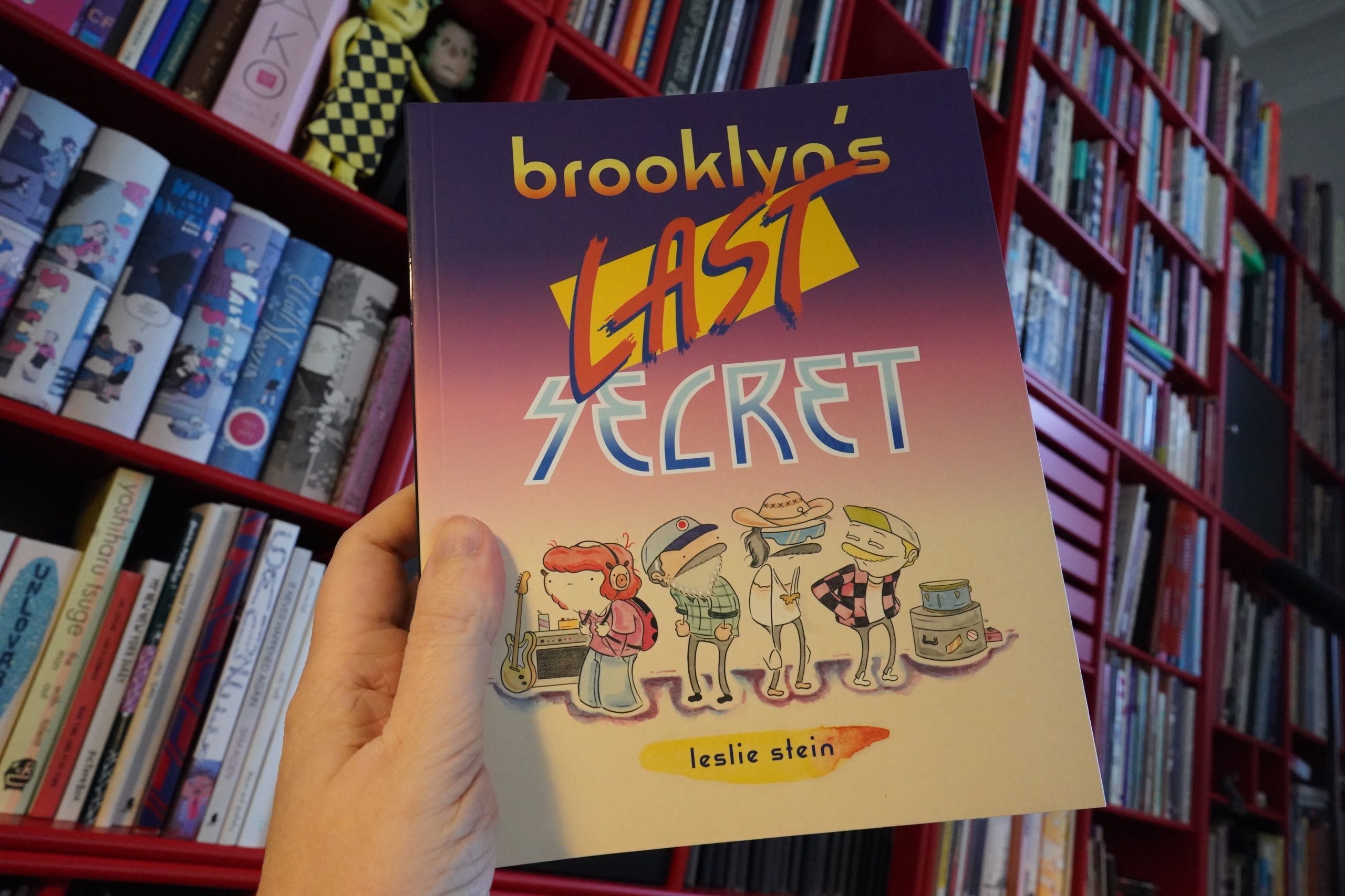
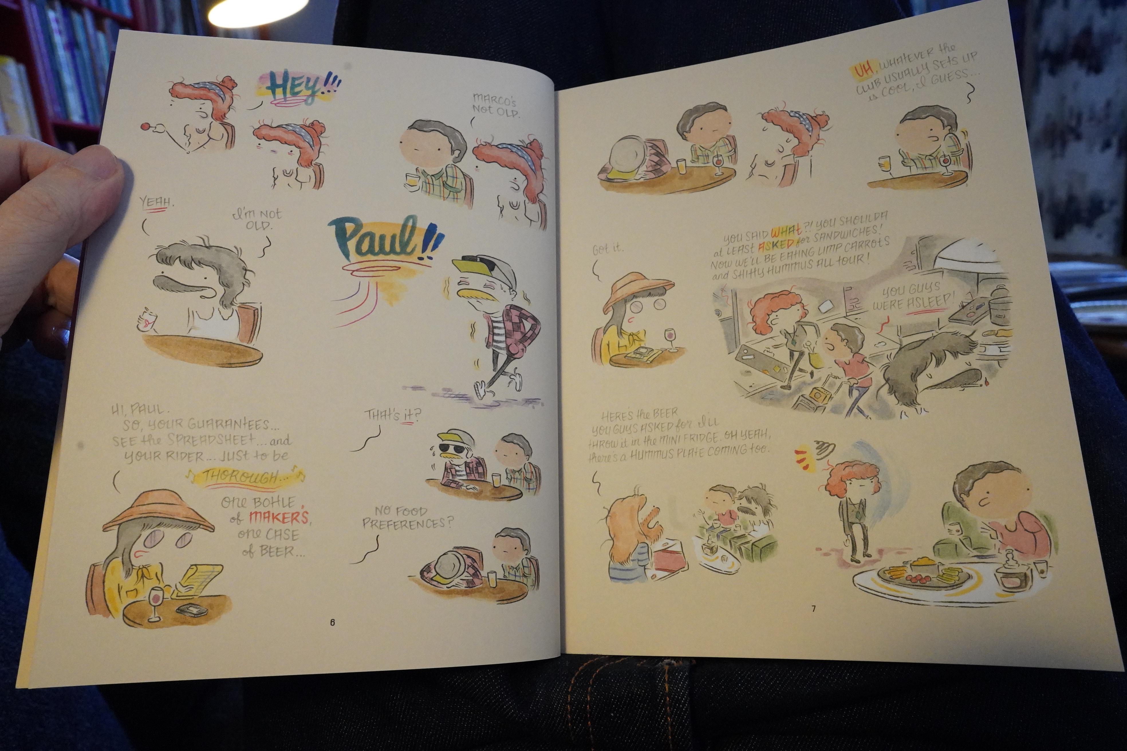
17:43: Brooklyn’s Last Secret by Leslie Stein (Drawn & Quarterly)
Wow, that’s some cover design…

Wow, Stein has gone even more minimal on the faces than in earlier books.
| Rhythm & Sound: Trace |  |
Anyway, this is about a band touring. I’ve never been in a band, but it does cover all the bits we’re already familiar with after reading a bunch of other books like this.
Food time!

There’s a new pizza place around the corner, so I sent out for this supposed Swedish culinary innovation/abomination: A kebab pizza. So I had to try it. It was… was… like a döner kebab spread out over some flat bread? I mean, that’s OK and everything, but I don’t think I want to ever ear that even again.

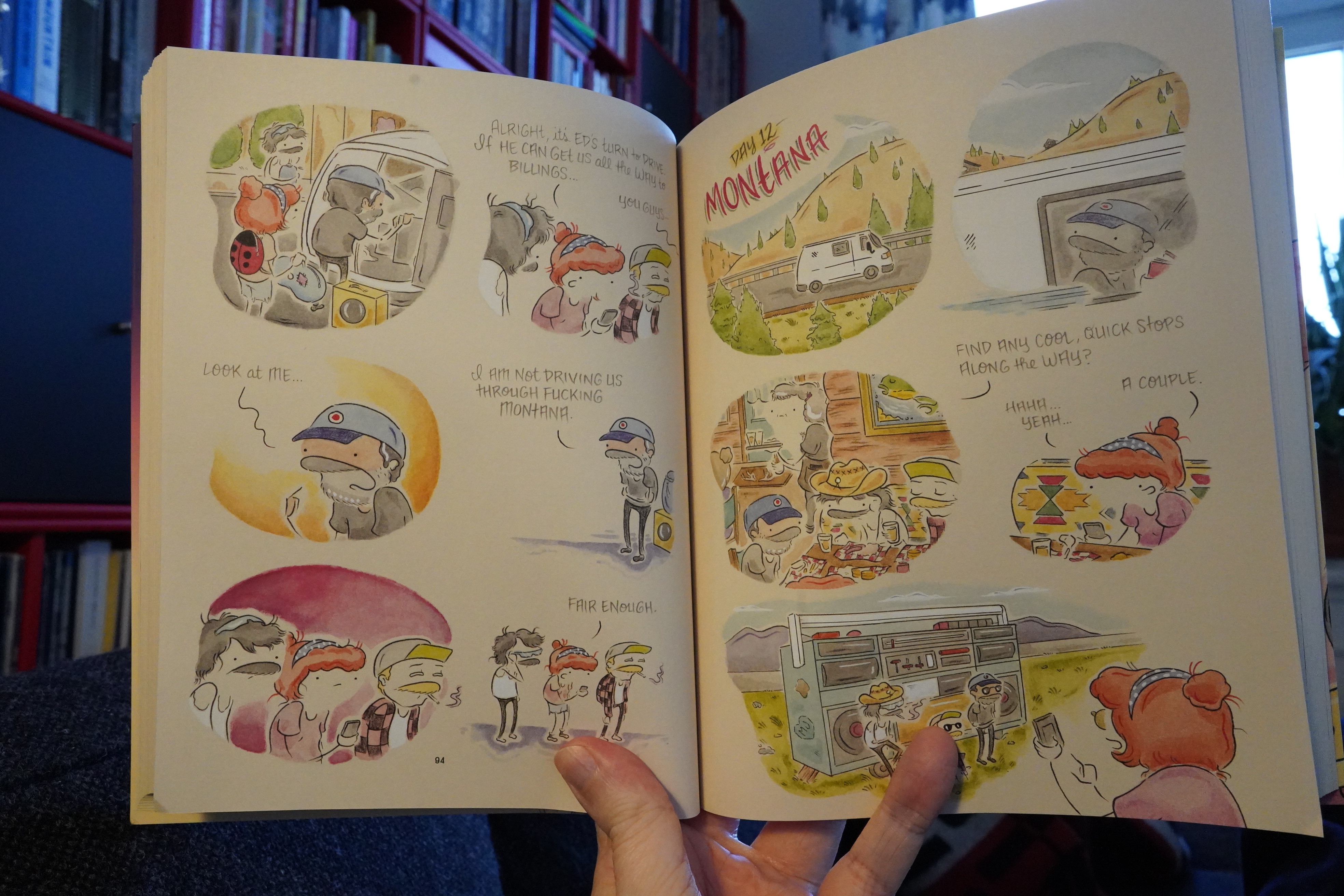
The book is equal parts amusing and boring, really. Perhaps much like a tour. But there are bits that are pretty much incomprehensible — things that feel like in-jokes or things that Stein’s style just makes difficult to grasp. To take one example: The bearded guy saying he’s not driving through Montana, and the other people agreeing with that. So I’m going… “why’s that? is his beard bedazzled? is that what those white dots are? I thought that was just Stein’s way of drawing a grizzled beard? what? is it the hat? what!!!” But then, 100 pages later, somebody mentions that a different character is the only white male in the band, so… that explains it.
There’s several instances of “er” going on in this book, and it’s a bit annoying.
| Herbie Hancock: Empyrean Isles |  |
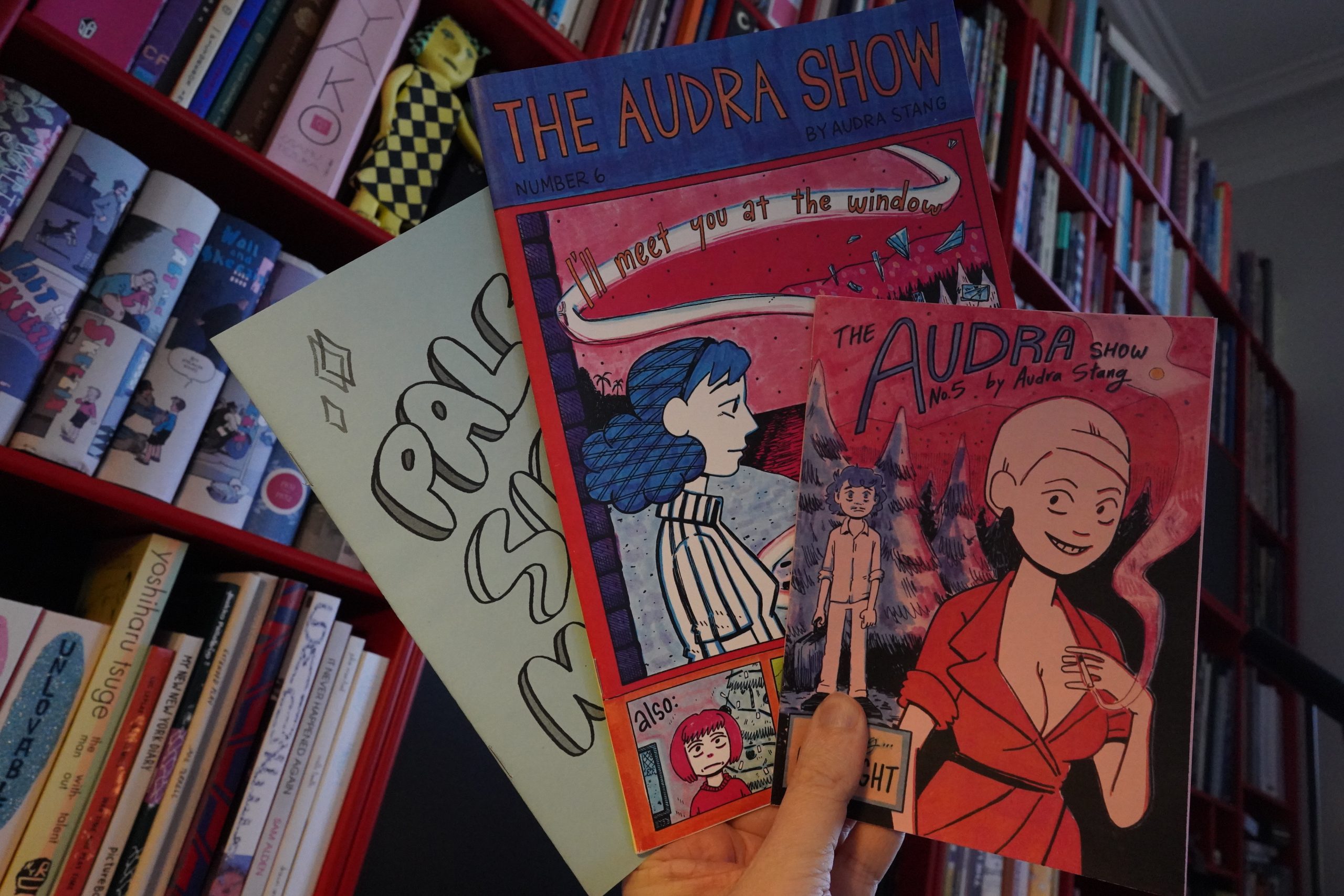
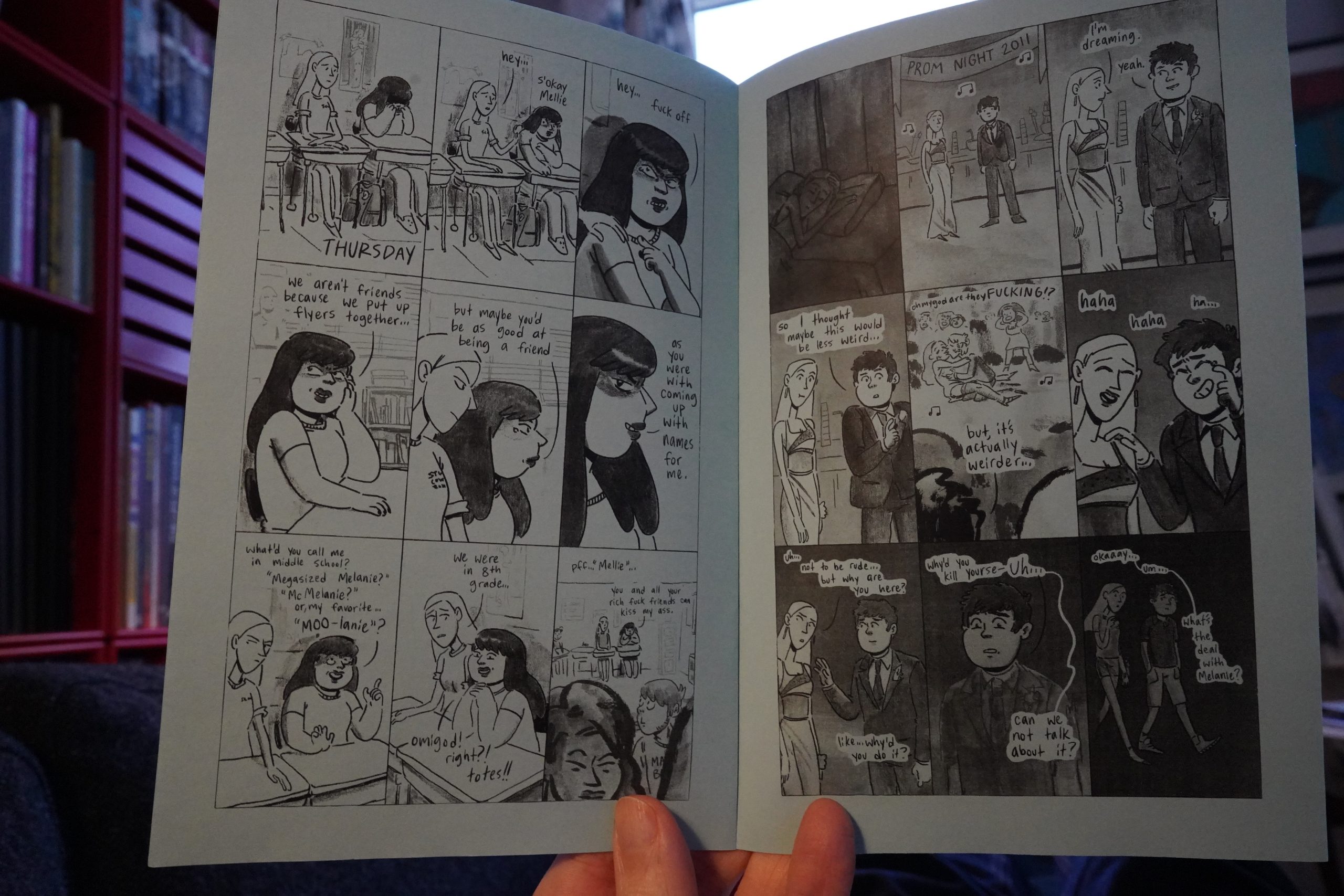
19:30: The Audra Show #5 & #6 & Pale Sick and Magic by Audra Stang

Hey! Cool drawing on the envelope.

These are slightly mysterious comics — I mean, the plots are pretty odd. Nothing that you’d expect happens, and that’s a huge plus.

And they’re a lot of fun. Love the colours.
This is the earliest work, from 2016, and is more conventional, but still really good. Shop here.
| Led Zeppelin: III |  |
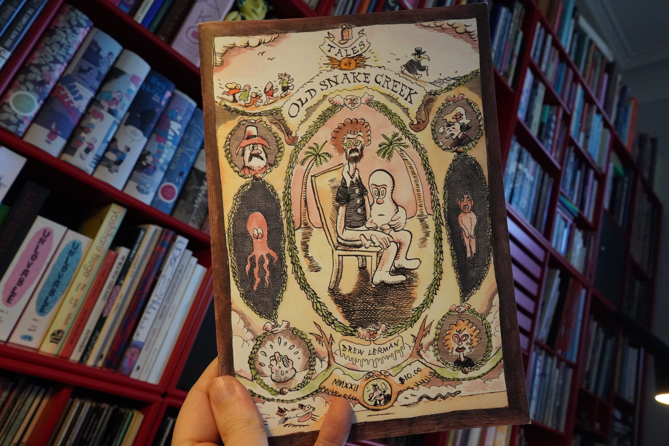
19:47: Old Snake Creek by Drew Lerman
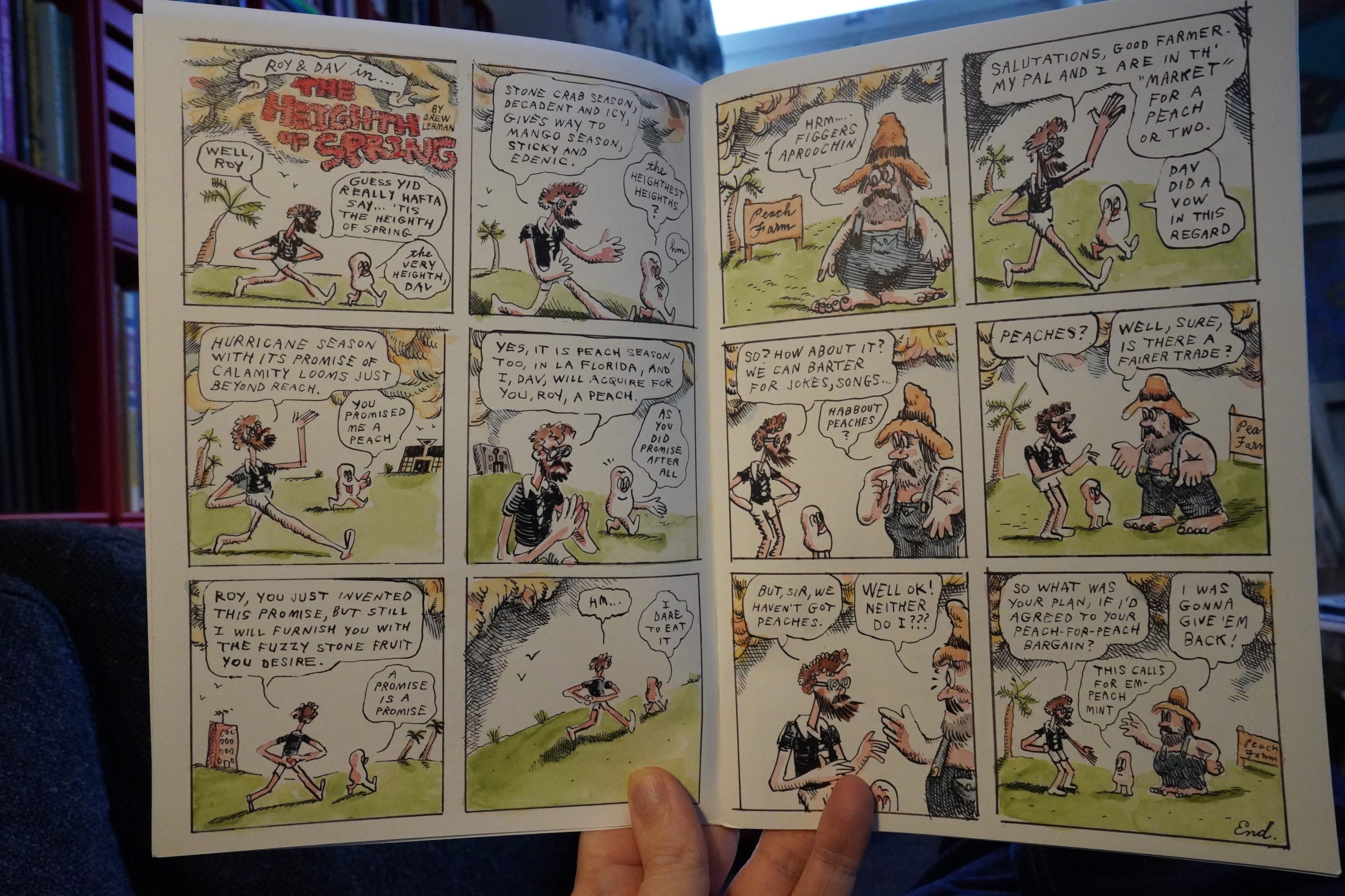
The cartooning here is very oldee-tymey… Oh, yeah, it’s very Herriman, isn’t it? And the lettering and the jokes, too. I like it.
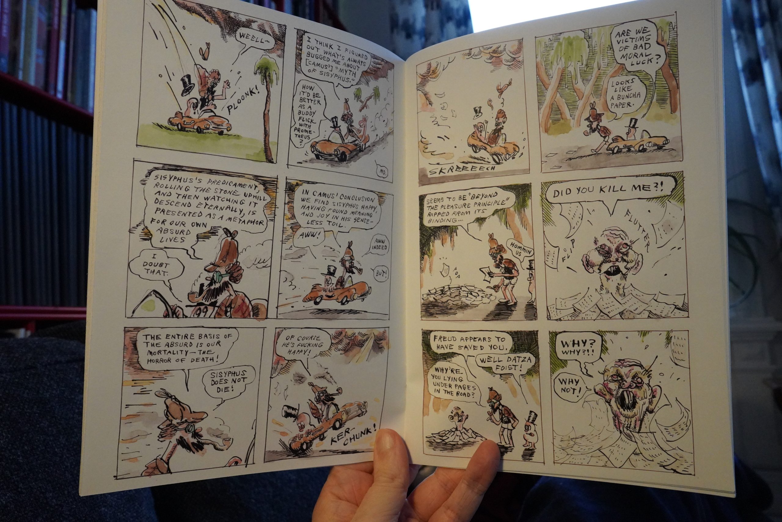
Storywise, things get very philosophical. It’s fun.
And now I think I need a nap.
23:14: Fruiting Bodies 9 by Ana Woulfe
Man, that was stupid of me. I meant to take a short nap, but didn’t put an alarm off, so I slept like three and a half hours. I’m gonna be up ’till dawn now.
Well, more time to read comics!
This reminds me of Mark Beyer, for some reason. Not just the drawings themselves, but also the pacing and the transitions. Very nice.
There’s also fun text pieces with recipes and stuff.
23:38: Fake Comics by Jason T. Miles
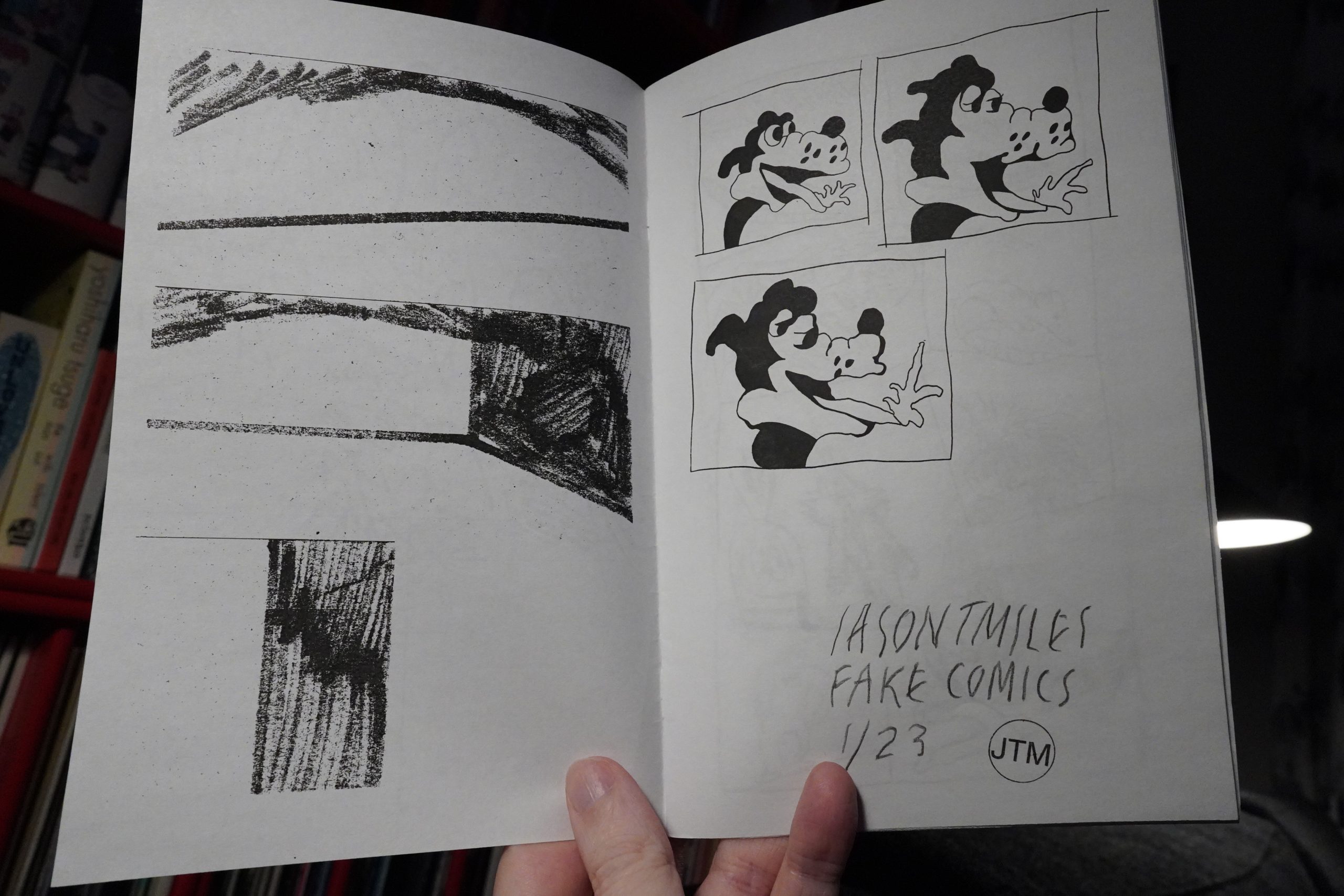
I guess these are sketchbook drawings, perhaps?
It’s nice.

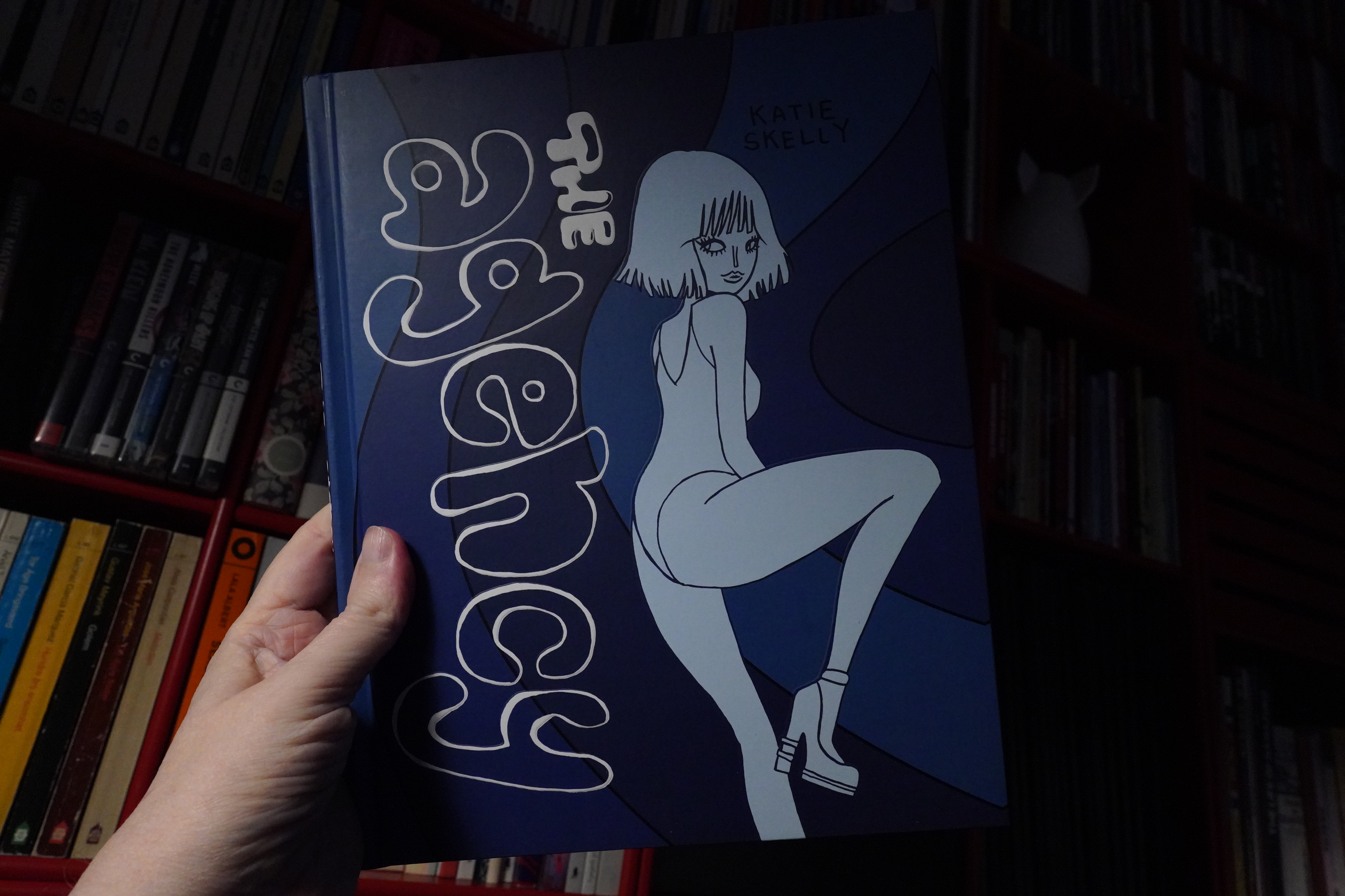
23:41: The Agency by Katie Skelly (Fantagraphics)
This is a series of sexy vignettes, all having a kind of distracted flow going on.
In a weird way, it reminds me a bit of Guido Crepax — not the art, but the logic of these vignettes. It’s fun.
| Marvin Pontiac: The Asylum Tapes |  |
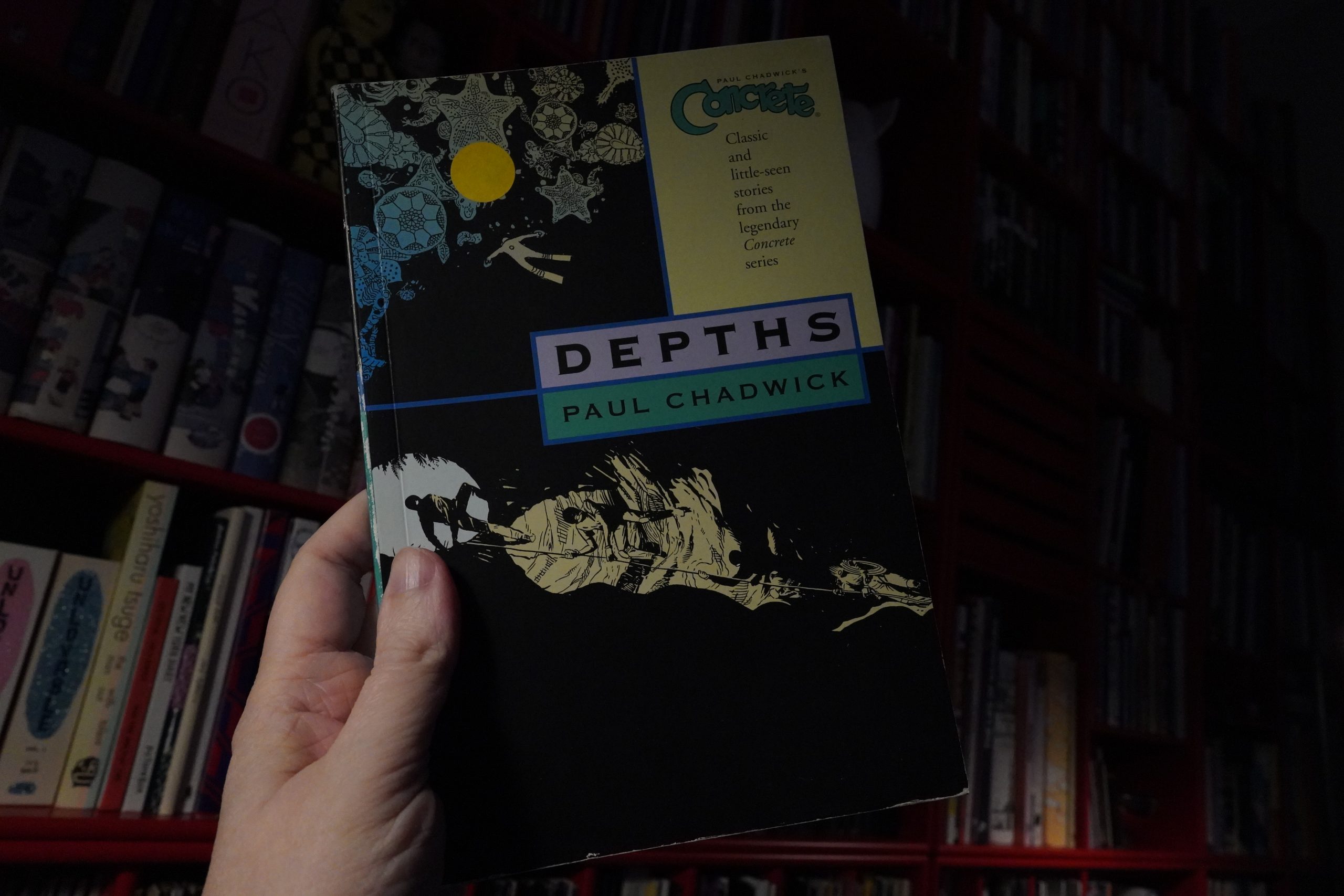
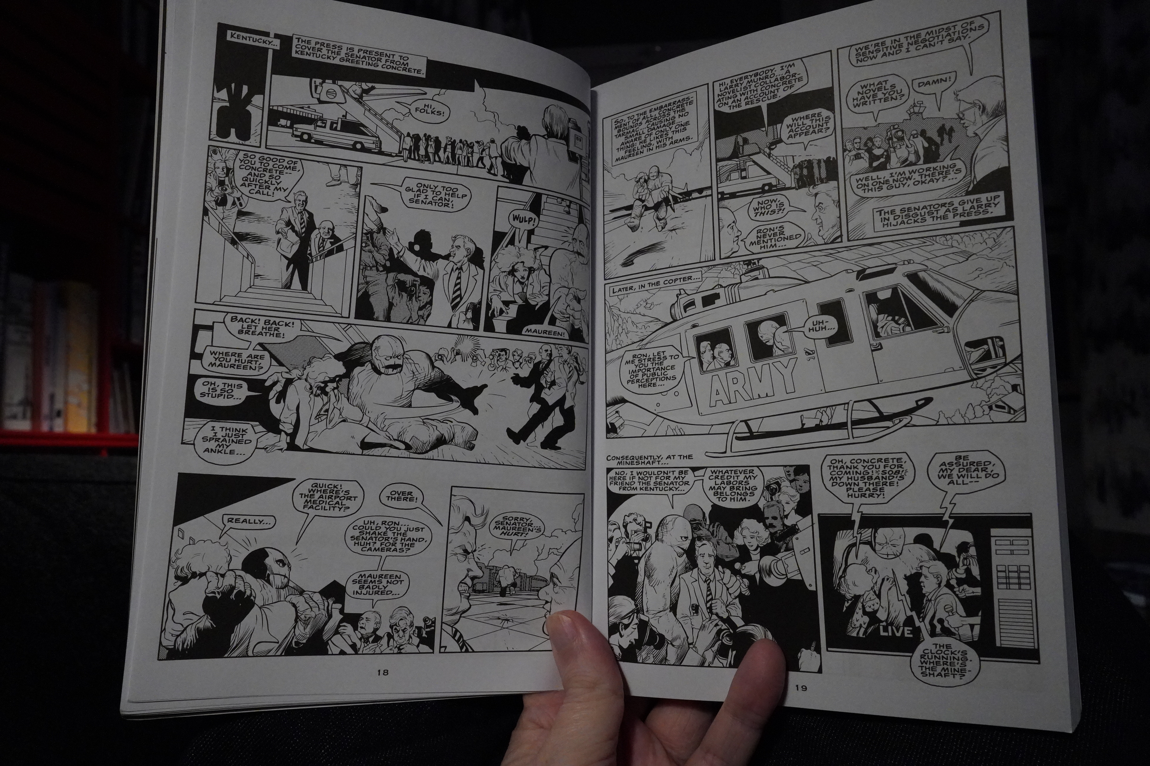
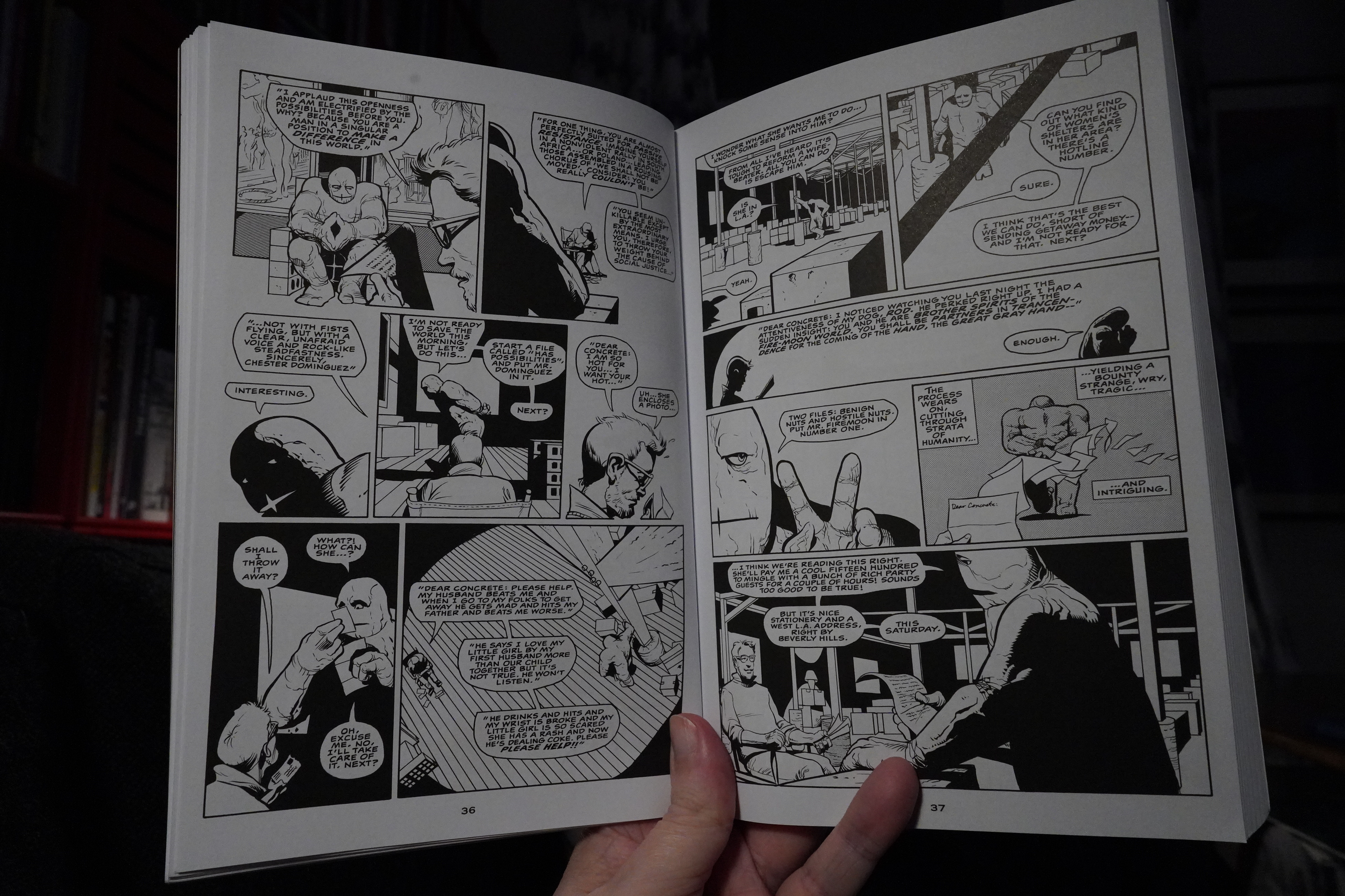
00:00: Concrete: Depths by Paul Chadwick (Dark Horse)
Back in the early 90s, when otherwise reasonable people would list their favourite comics, Concrete would often be on those lists. I tried a couple of issues, but it seemed like pretty boring super-hero comics to me. That is, it seemed like Chadwick was trying to do super-hero comics “seriously”, ending up with something that was neither a fun super-hero book nor a serious comic.
So now, 30 years later, on an impulse I bought a couple of collections to see what’s up.

Well, the artwork is attractive — especially the stark use of black spotting. It looks stark in a very distinctive way. And while the figures are mostly drawn well, Chadwick has real problems with scale, with Concrete seeming to shrink and expand, and people generally not fitting into where they are (the people in that helicopter would have legs sticking out the bottom of the helicopter).
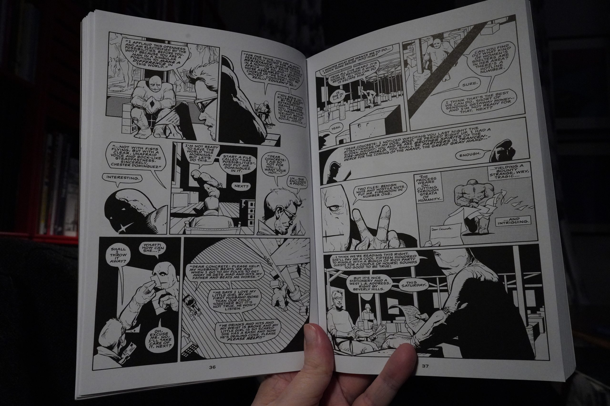
Well… I guess I do get that people like Concrete now. It’s got a pretty good mood going on. It’s ponderous and pretentious, with a general feeling of “depth” — just like what many nerdy fourteen-year-olds would love.
| Liis Ring: Homing |  |

And Concrete is apparently what a fat boy would fantasise as a super-hero figure. Makes sense.
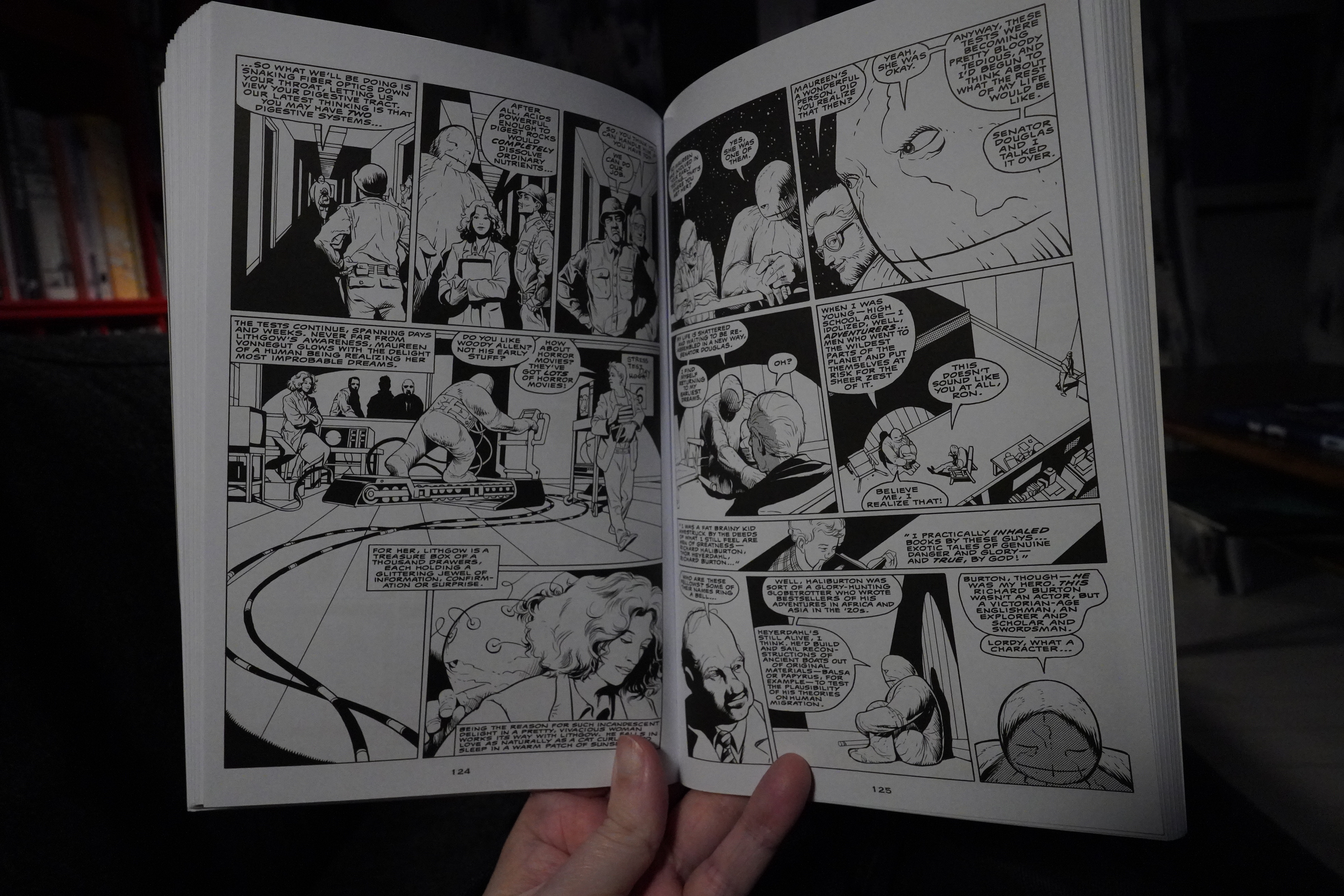
It’s just really tedious. I read most of this volume, but I had to give up during the final chapter, where Concrete meets Prince (I mean Duke). I know I had a long nap, but that chapter threatened to put me to sleep again.
| Richard and Linda Thompson: Hard Luck Stories: Hokey Pokey |  |

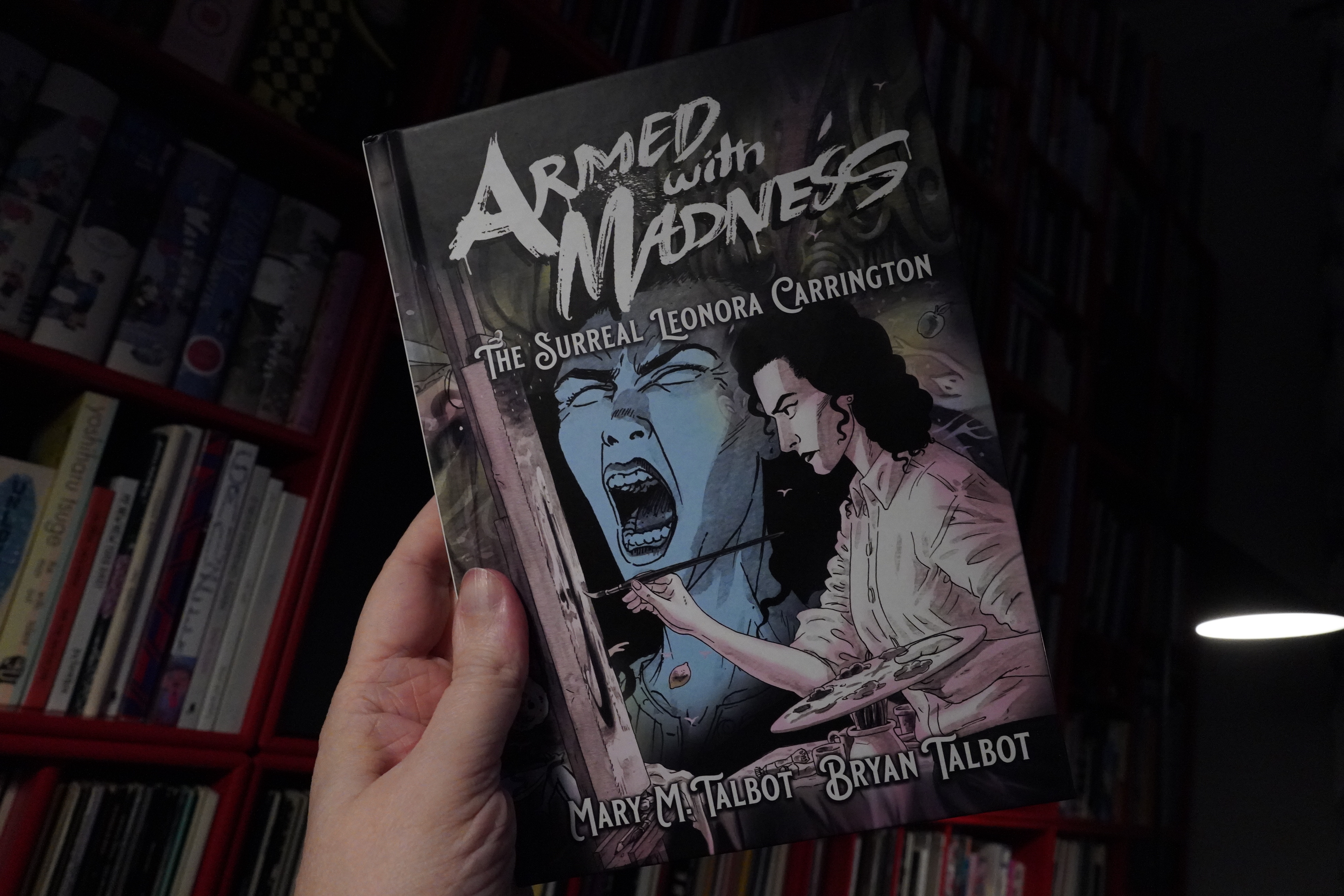
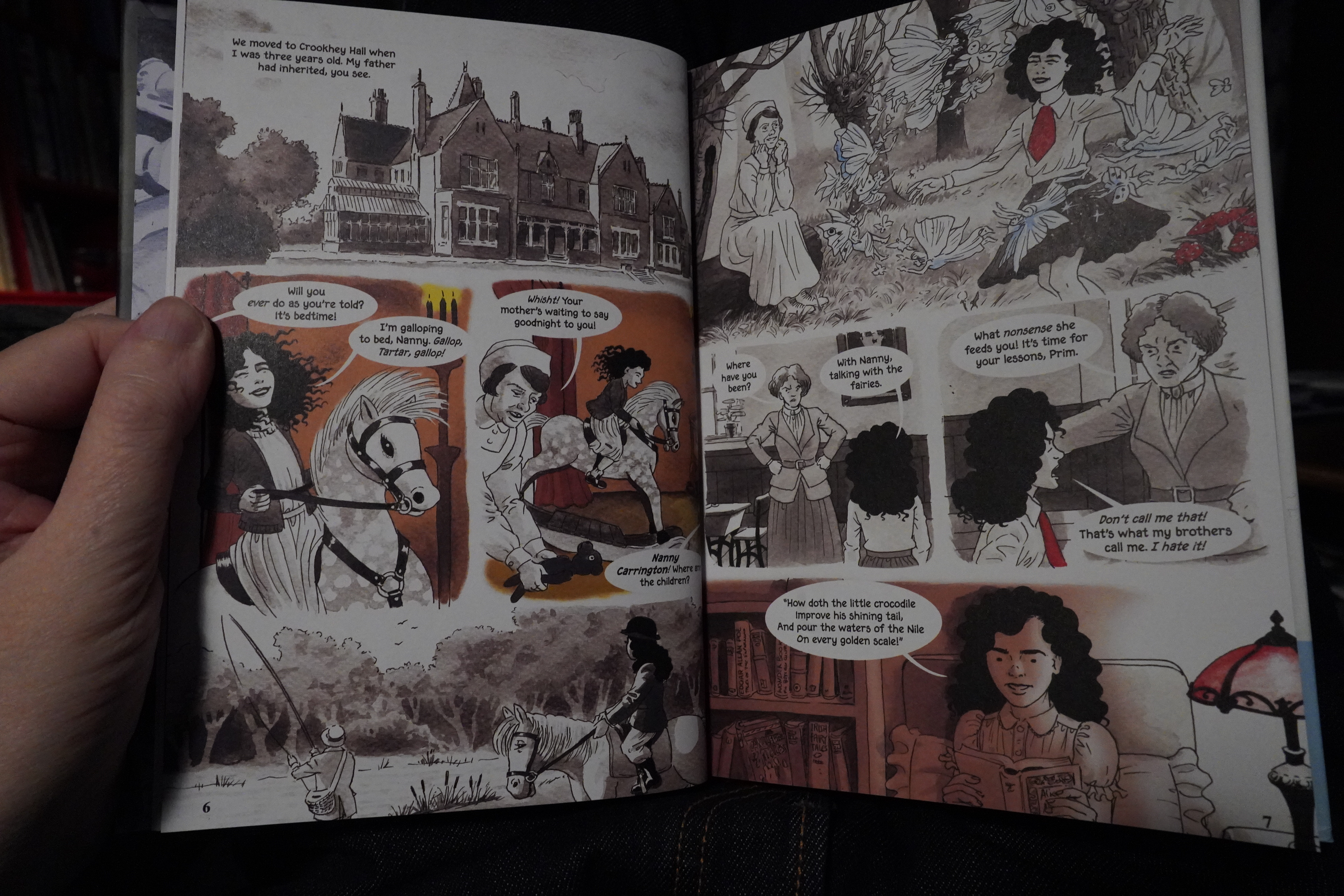
01:38: Armed with Madness by Mary M. Talbot / Bryan Talbot (Selfmadehero)
So this is yet another artist biography? I know I seem to say basically every post “I”M NEVER EVER GONNA READ ONE OF THOSE AGAIN”, but they keep churning out so many of these, and I’ve liked the some of the Talbotses previous books, so I got this one, too.
It’s probably gonna suck, though.

Well… actually… this isn’t that bad. It suffers a bit from cramming a lot if information into these pages, but it’s a brisk read about an artist that had an interesting life.
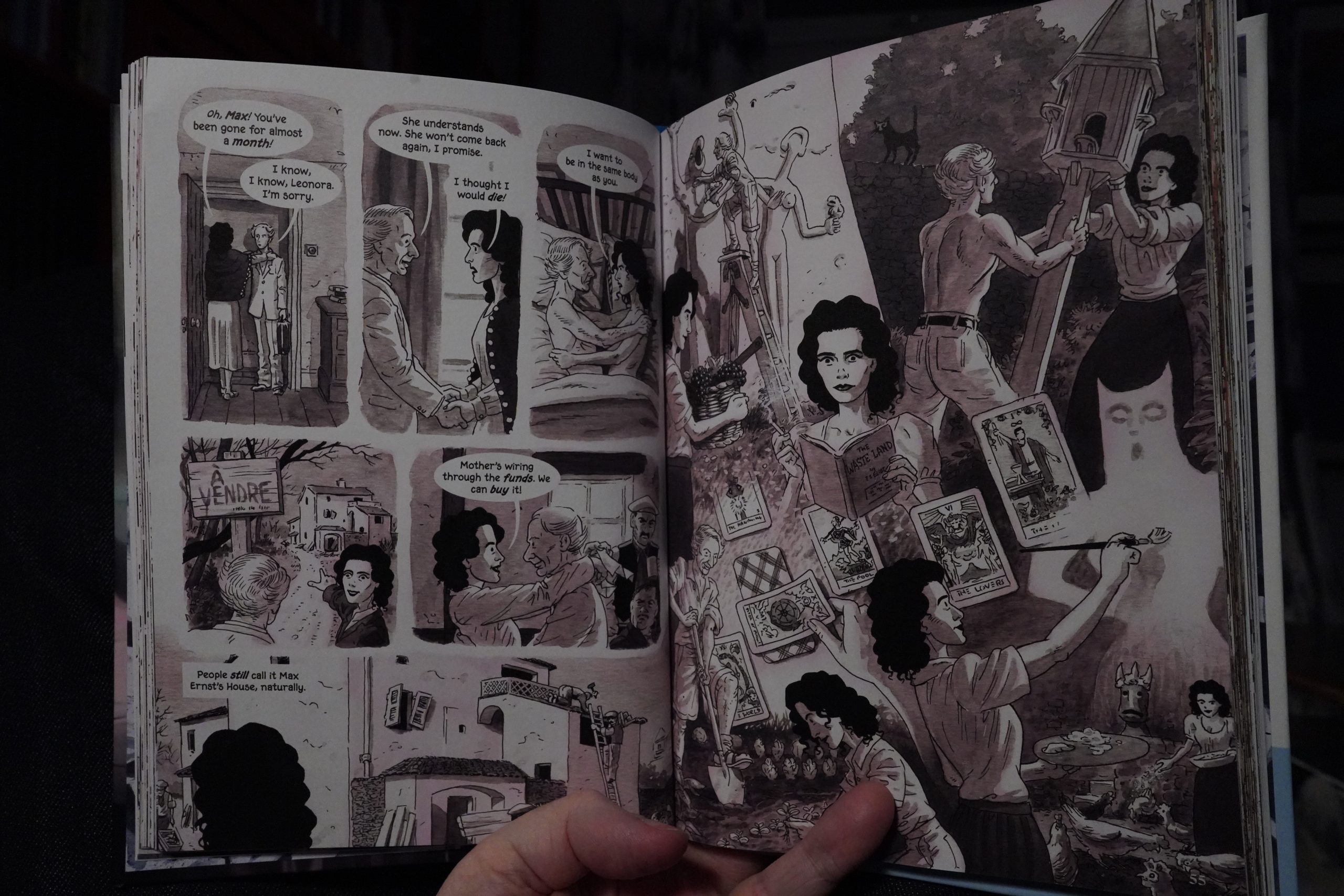
It’s told without using captions, which is pretty difficult when having this much to tell. But that makes the extremely few lapses (lower left hand panel) pretty weird.
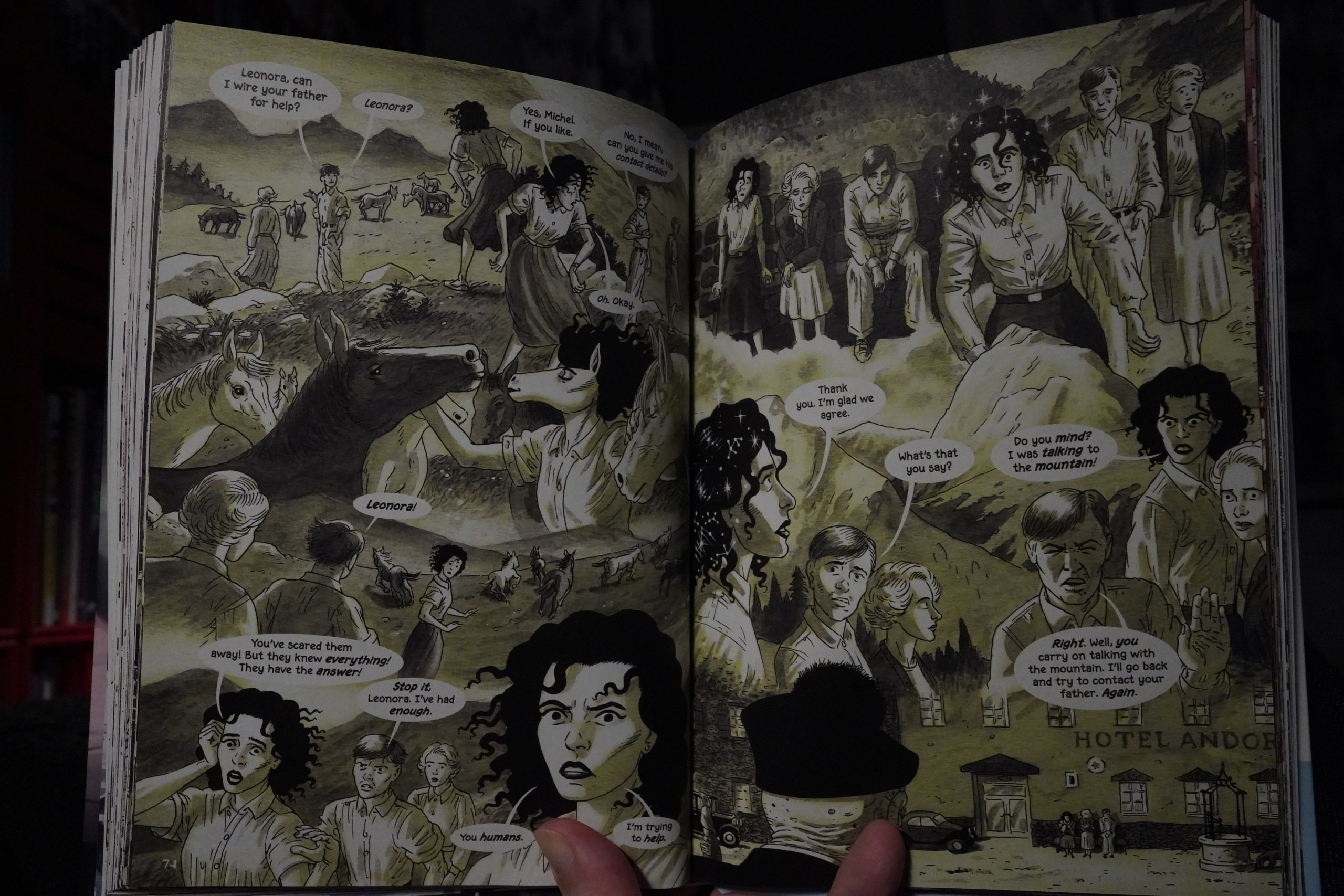
About a quarter of the book is about Carrington having what sounds like a psychotic break, and again, the Talbotses do this in an admirably straight-forward way.
It is a bit of a disappointment that they do the larger part of Carrington’s life — the bit after she stops being all scandalous with Max Ernst and friends — as a recap at the end. It’s jarring, and it’s like “well, if she’s not hanging out with famous people, we’re certainly not going to spend pages on that”.

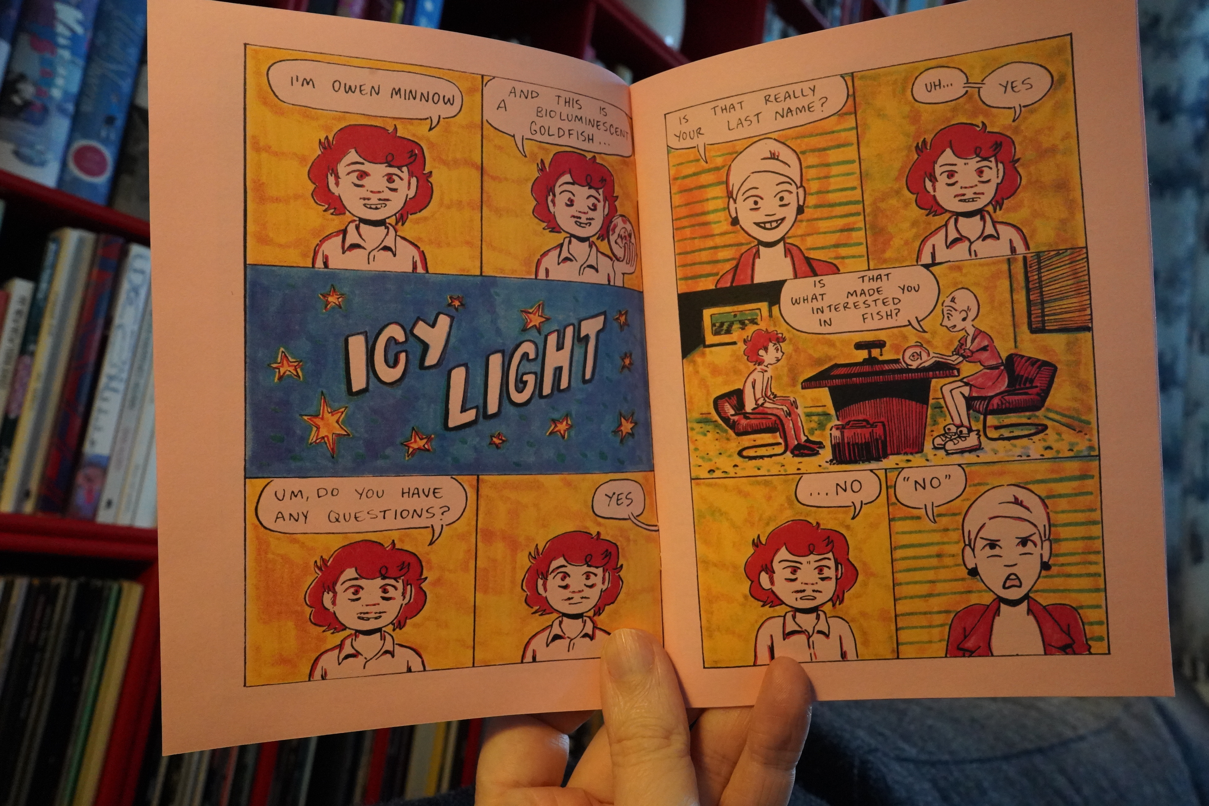
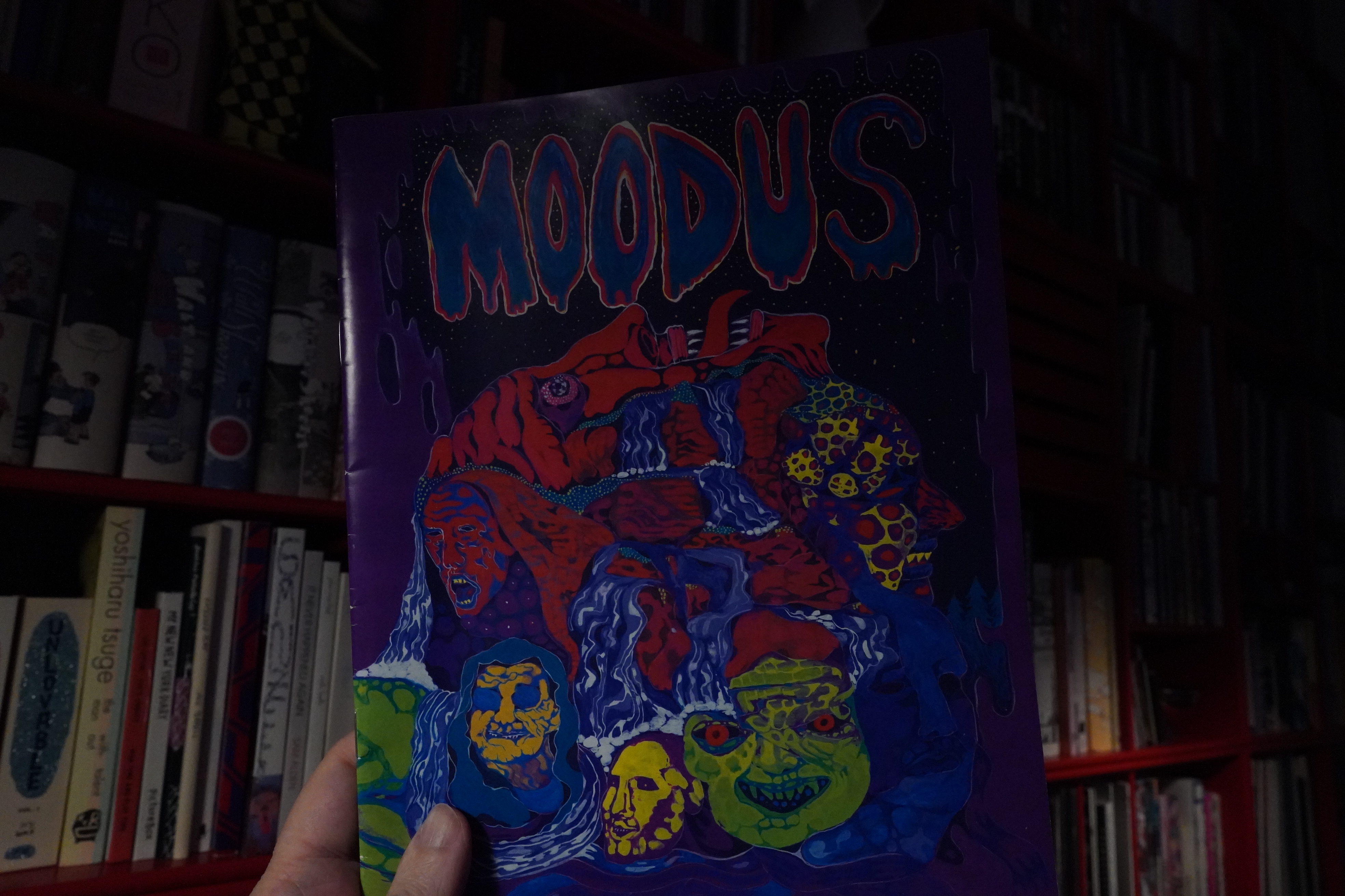
02:17: Moodus by Kyle Ranson
Wow, this is very intriguing. It’s a wordless book, and I think it’s non-narrative. But the pages seem to hint at a story, sort of — in a kind of abstract way.
The imagery is also slightly unsettling in some way. It’s cool.
| A. G. Cook: 7G (7): Extreme Vocals |  |
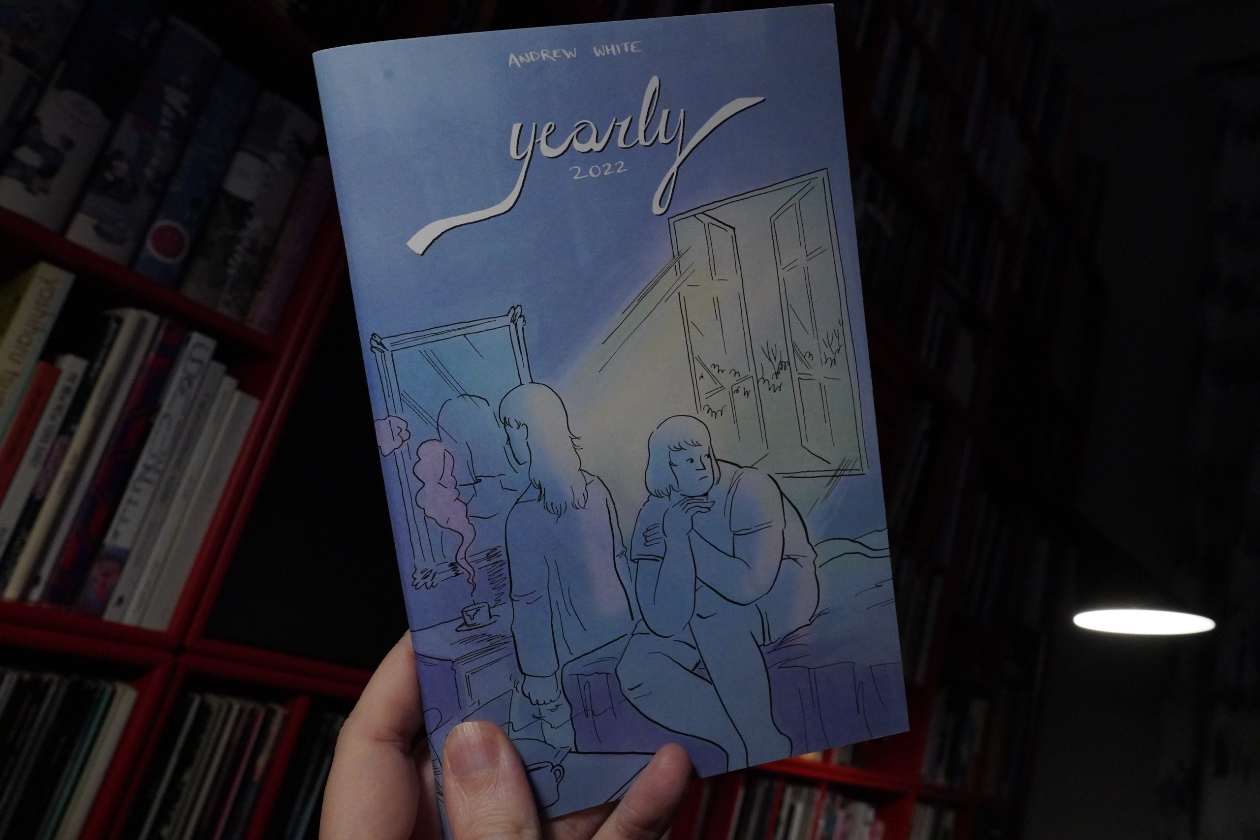
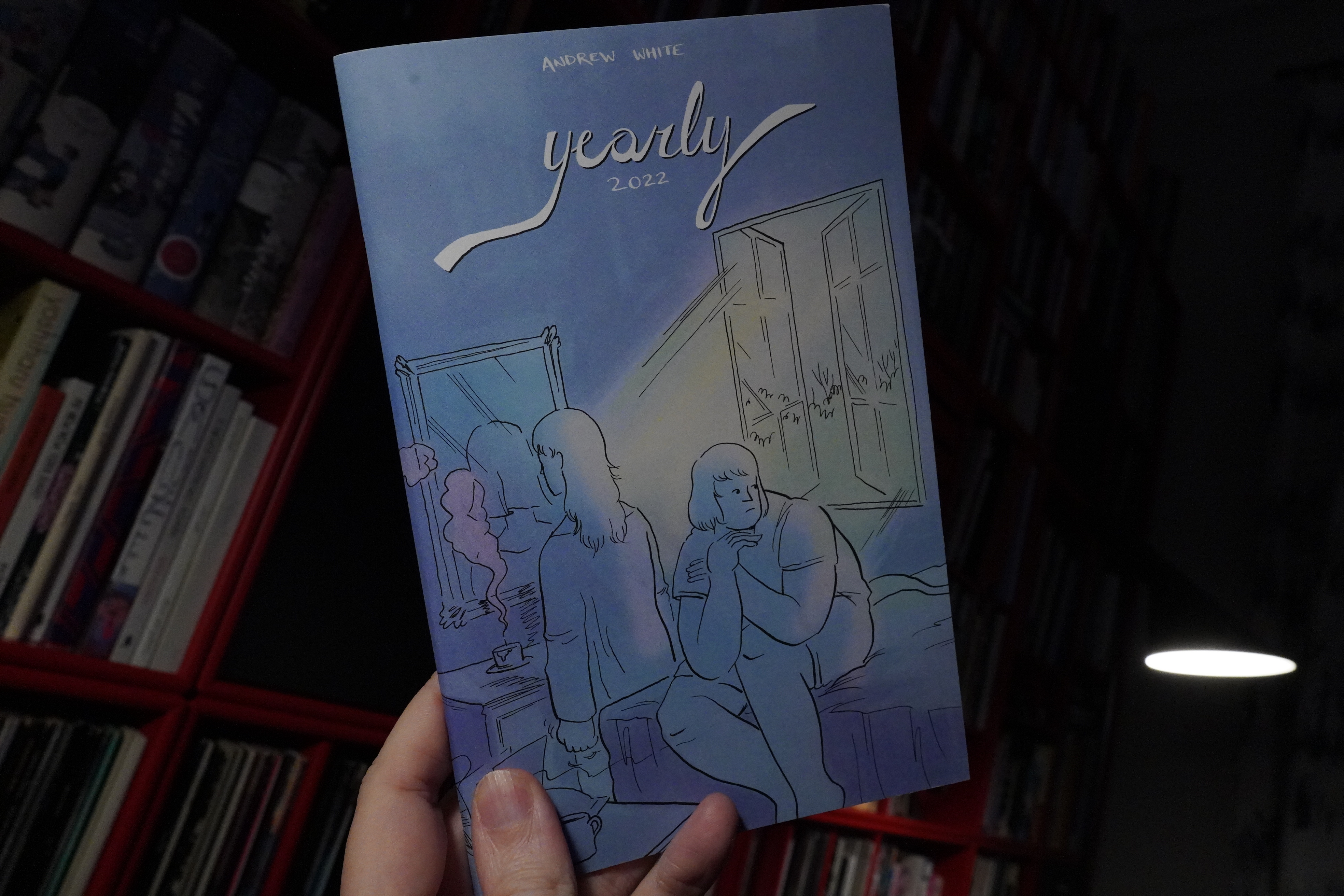
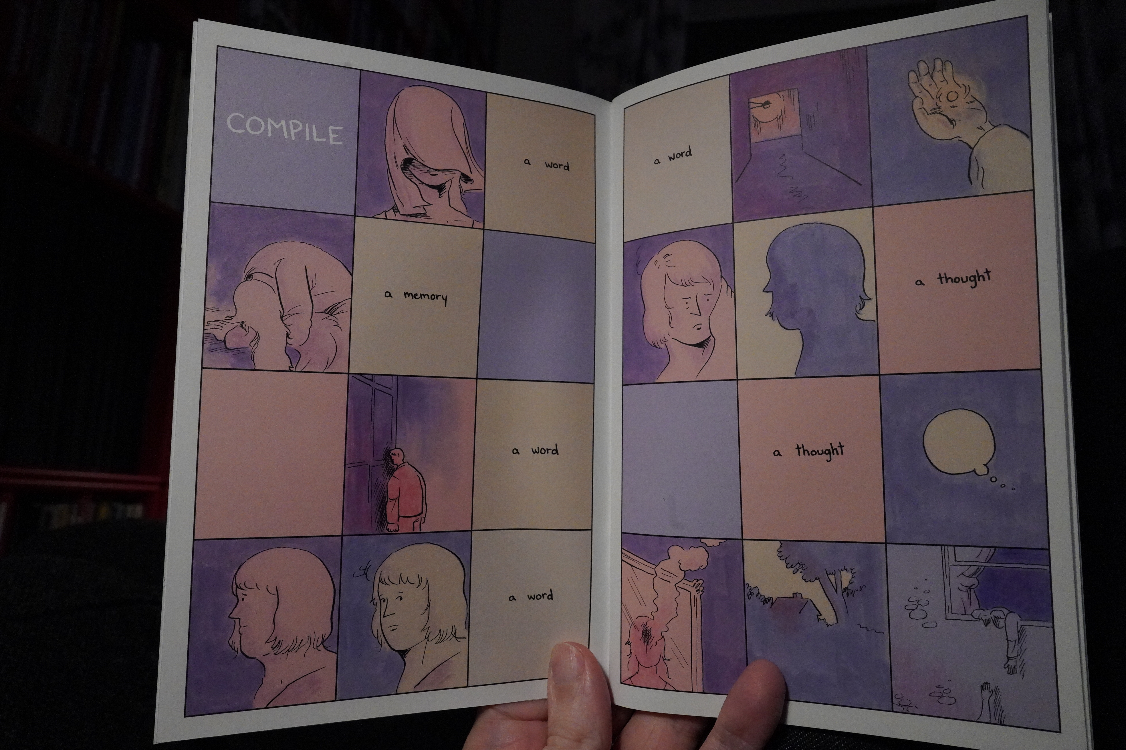
02:22: Yearly 2022 by Andrew White
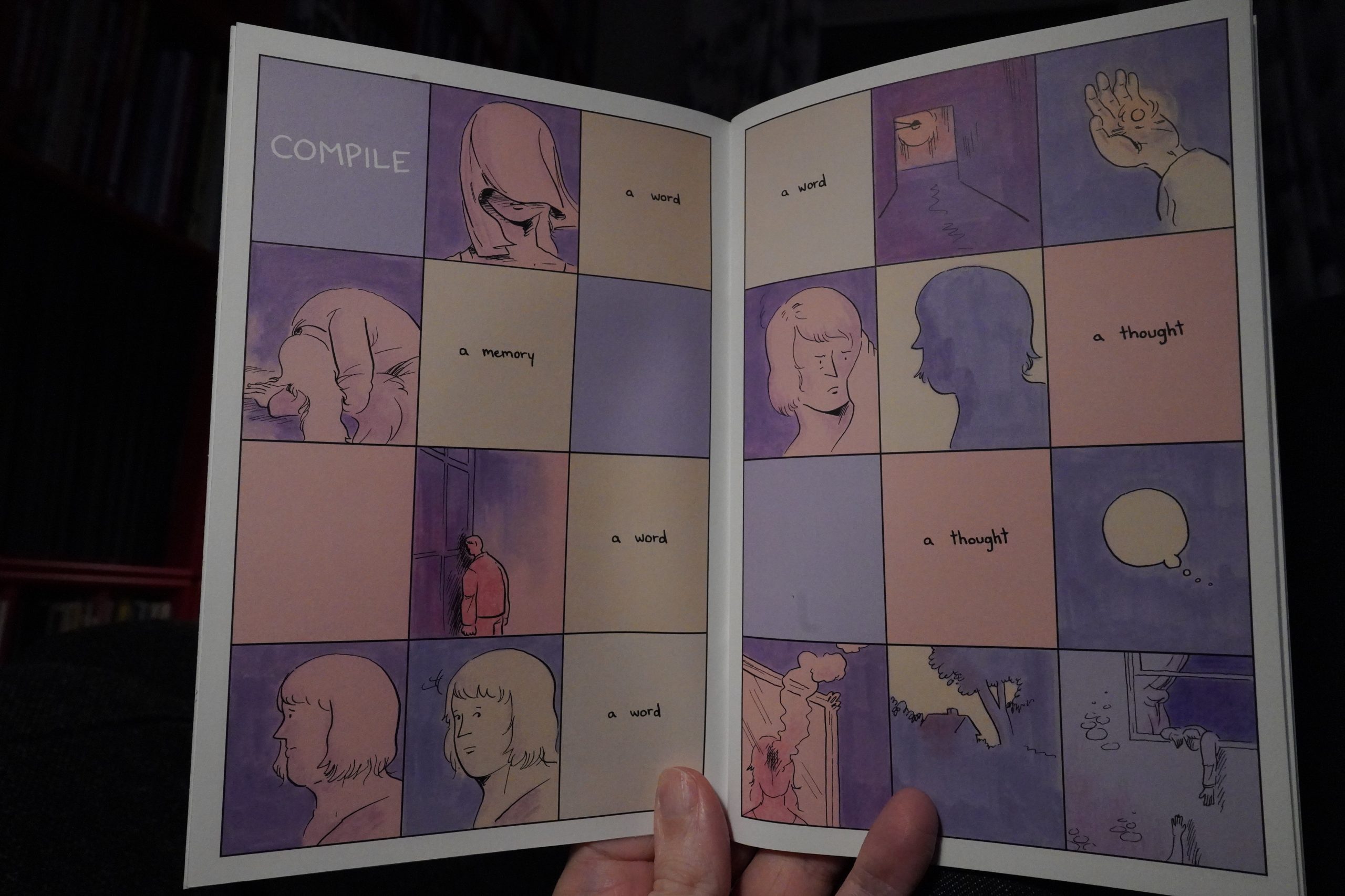
This is a lovely book. All killer, no filler.
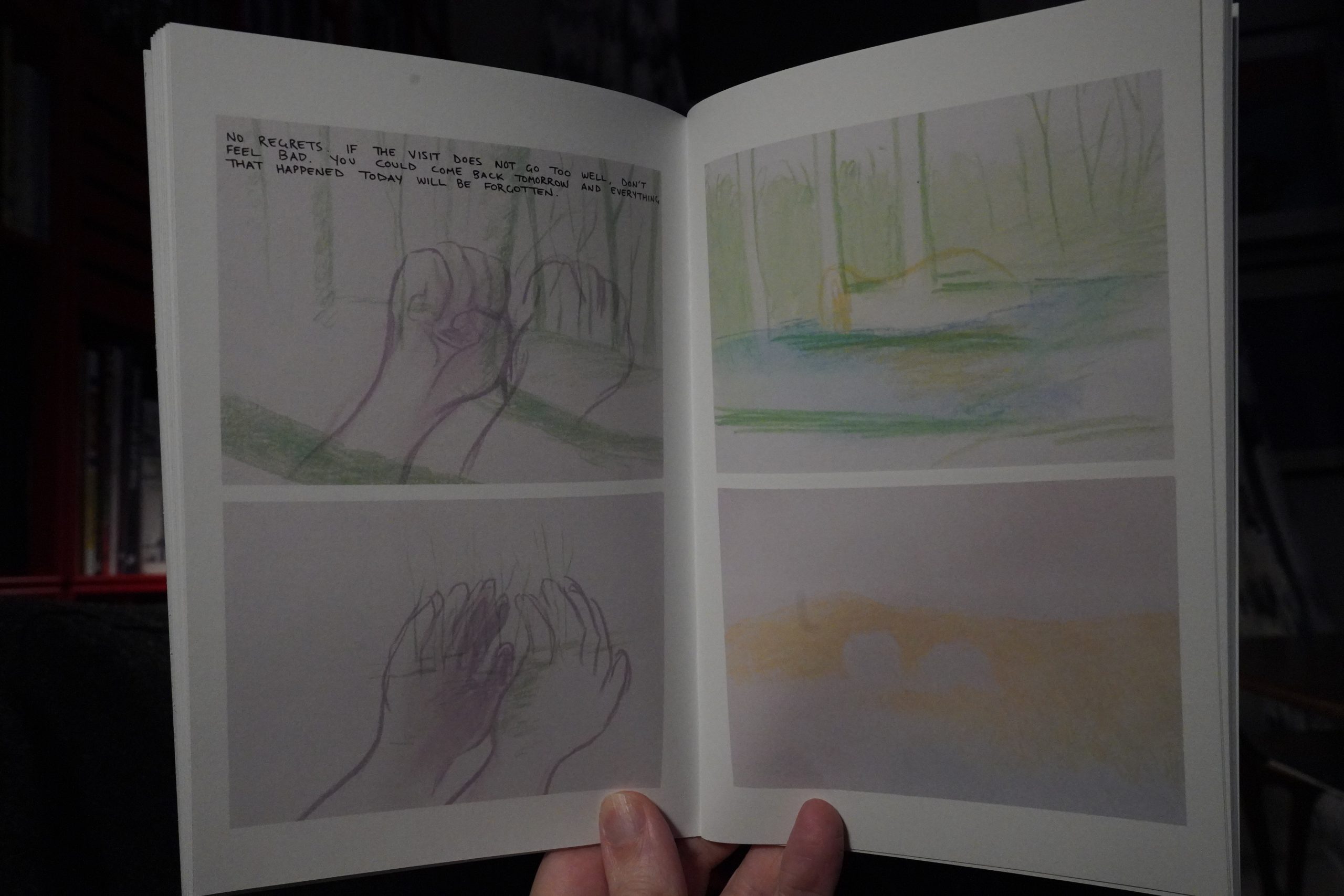
It’s a pretty varied book, too — several different approaches to cartooning — but all the pieces have something in common: They connect emotionally; they have impact. Great stuff. Get it from here.
| Laura Jean: Amateurs |  |
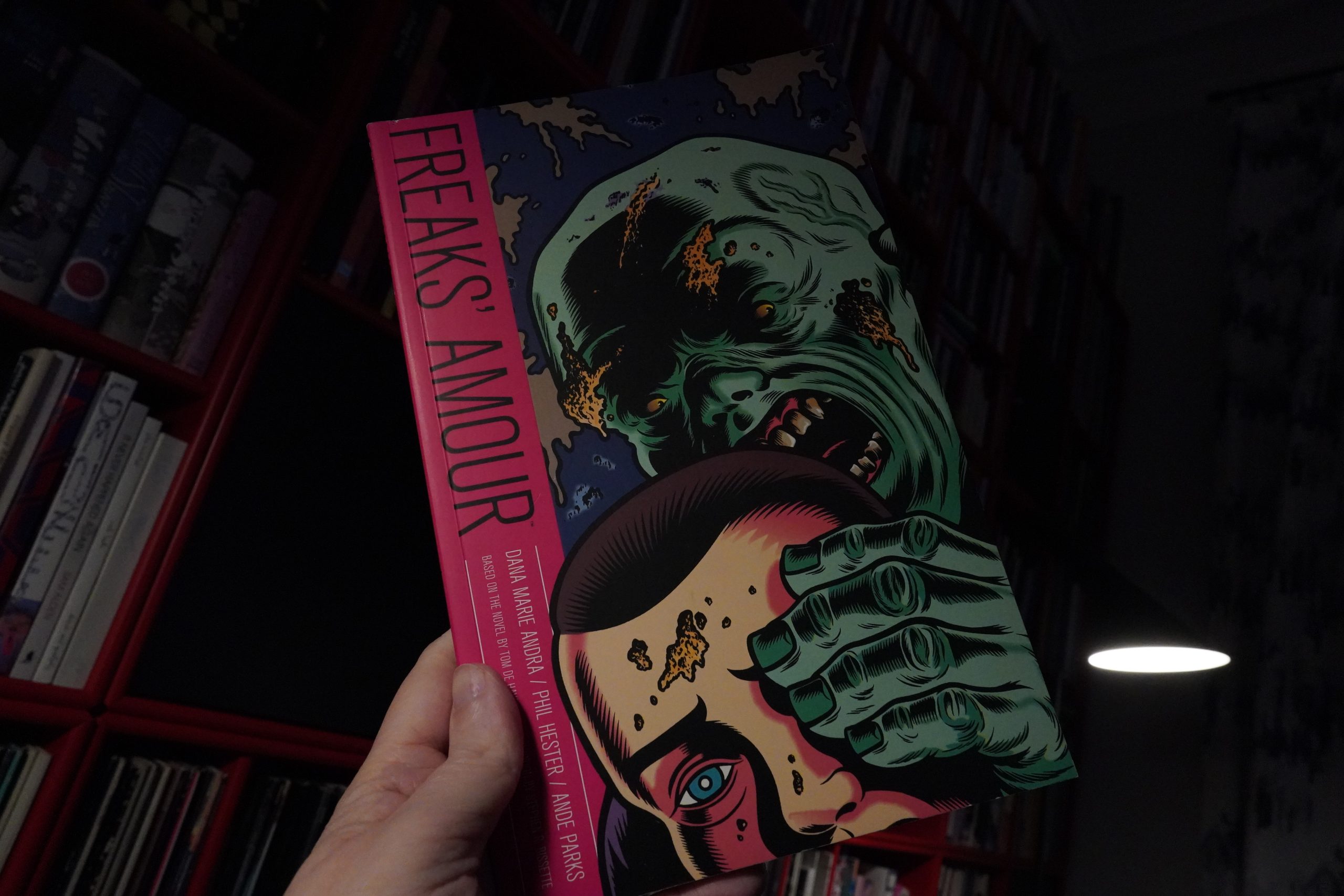
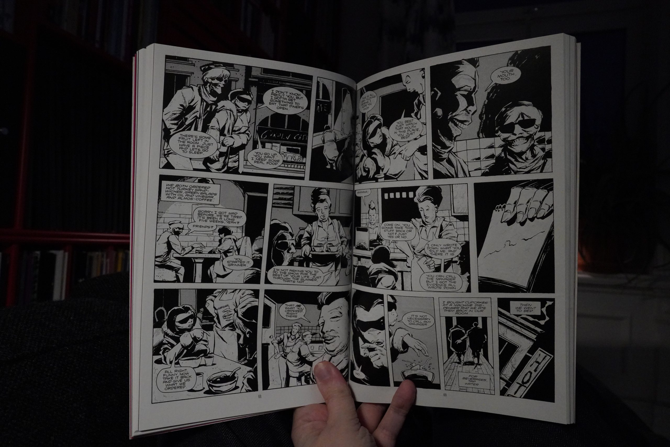
02:36: Freaks’ Amour by De Haven / Andra / Hester / Parks (Dark Horse)
I stumbled onto this on ebay because of the Charles Burns cover, but what made me buy it is that it’s an adaptation of a Tom De Haven novel. And De Haven has done a few collaborations with comics artists that have really impressed me, so I thought it might be worth giving this a try.
Stephen Bissette provides a very informative introduction. This was originally published in 1992, but the adaptation (by Dana Marie Andra, more well-known at the time as Mark Burbey (responsible for the rather spiffy Street Music anthology)) had been in the works for quite some time, and Bissette was meant to draw it originally (but didn’t have time).

“Scimitar moon”? OK, this is pulp, but there’s pulp and there’s pulp.
Love the art — it’s kinda Ted McKeever influenced, perhaps? Hm… I guess a lot of influences.
The storytelling here is very dense — sometimes very wordy…
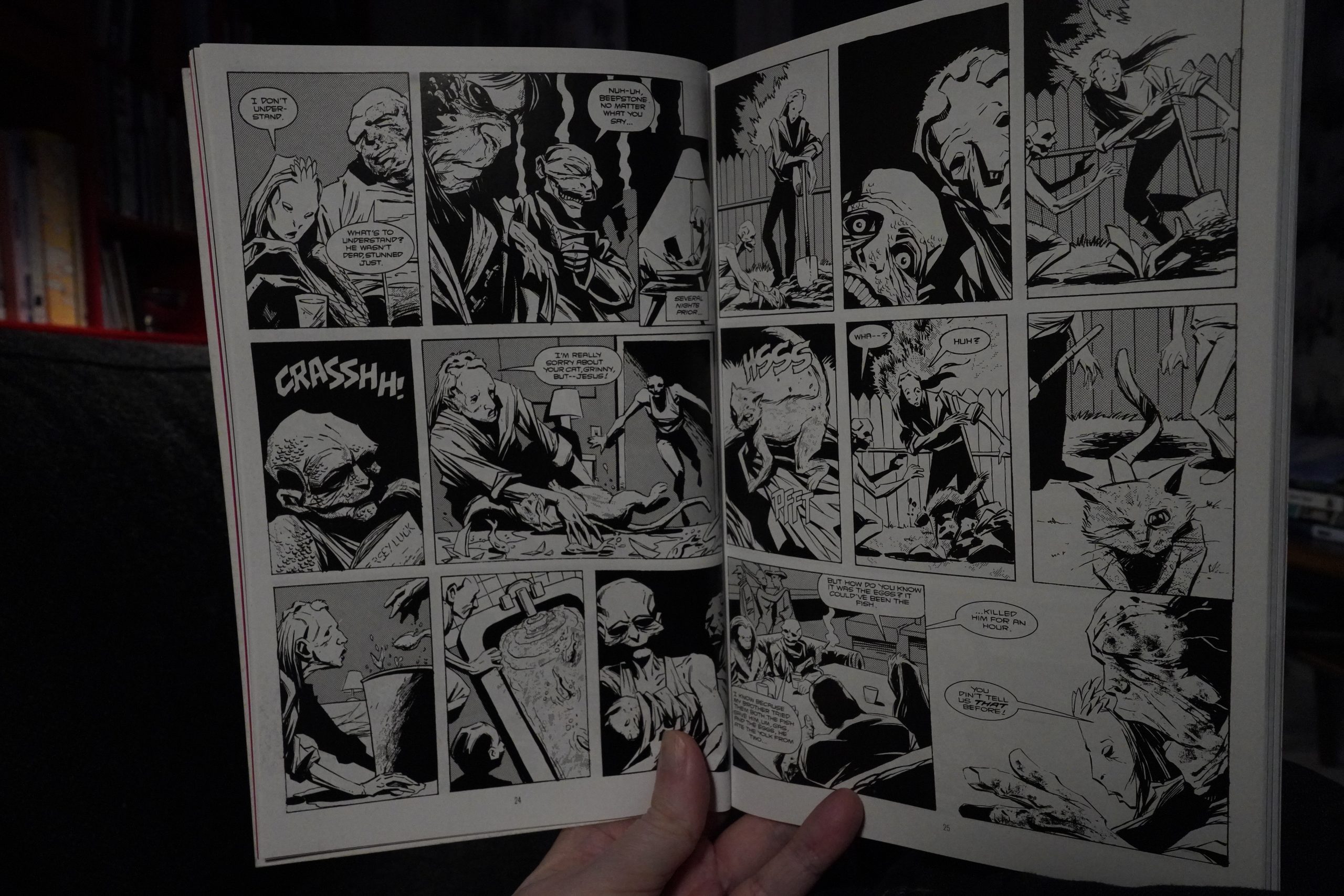
… and sometimes not, but there’s still a lot going on, and it’s not always clear just what’s happening.
| Patrick Cowley: Malebox |  |
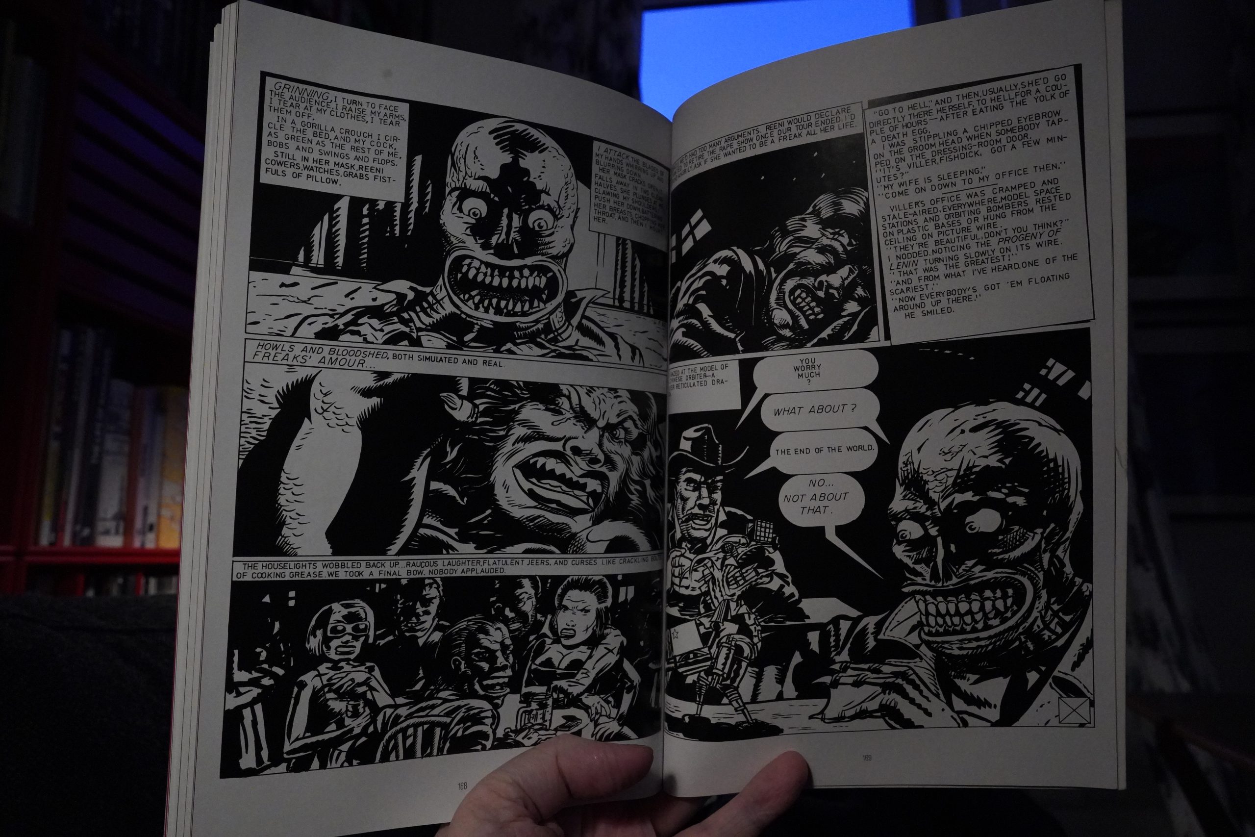
So it’s an exhausting read, but it’s quite intriguing. It’s very late 70s, just extrapolated into er not making that much sense. For instance, instead of heroin, people are taking a drug that makes them dead for a few hours. Instead of ordinary live sex shows, they have “rape shows” which are, well, the same, only with (simulated) violence in addition to sex, and (presumably influenced by punk shows at the time) the audiences are throwing beer bottles on the performers, etc.
And then everything goes very sci fi indeed.
But it’s really good. It’s unique, and I can see why people would be inspired to adapt this into a comic book.
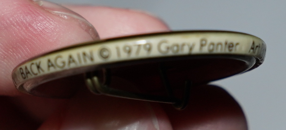
In addition to a bunch of texts, they also include Gary Panter’s three page adaptation (originally published in Young Lust).
Solid package.
| Twinkle3 ft David Sylvian and Kazuko Hohki: Upon This Fleeting Dream |  |
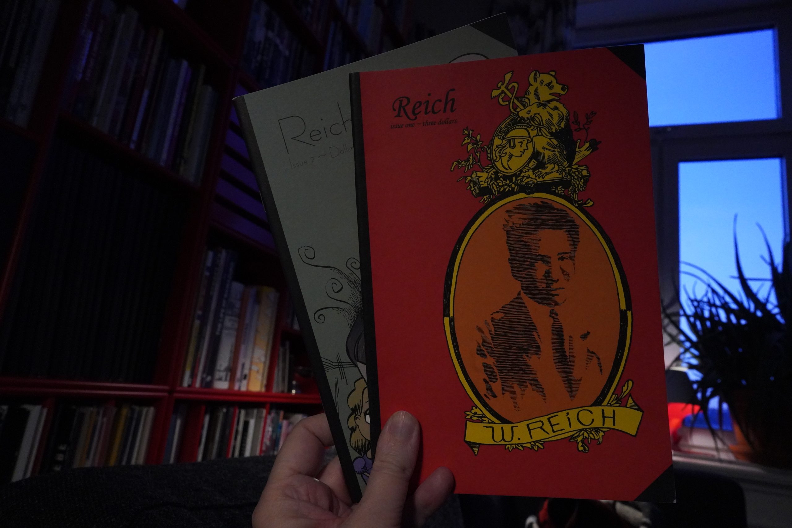
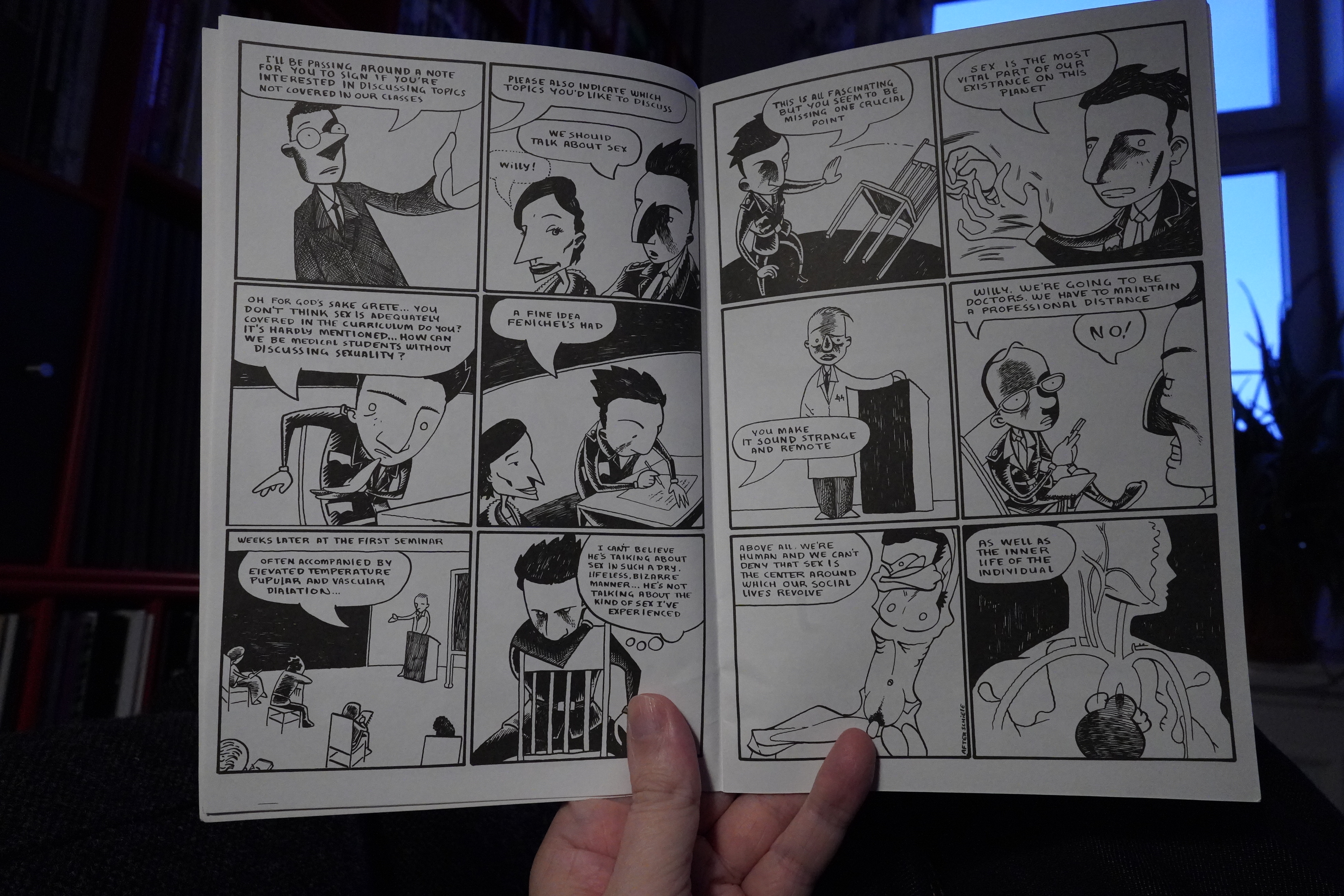
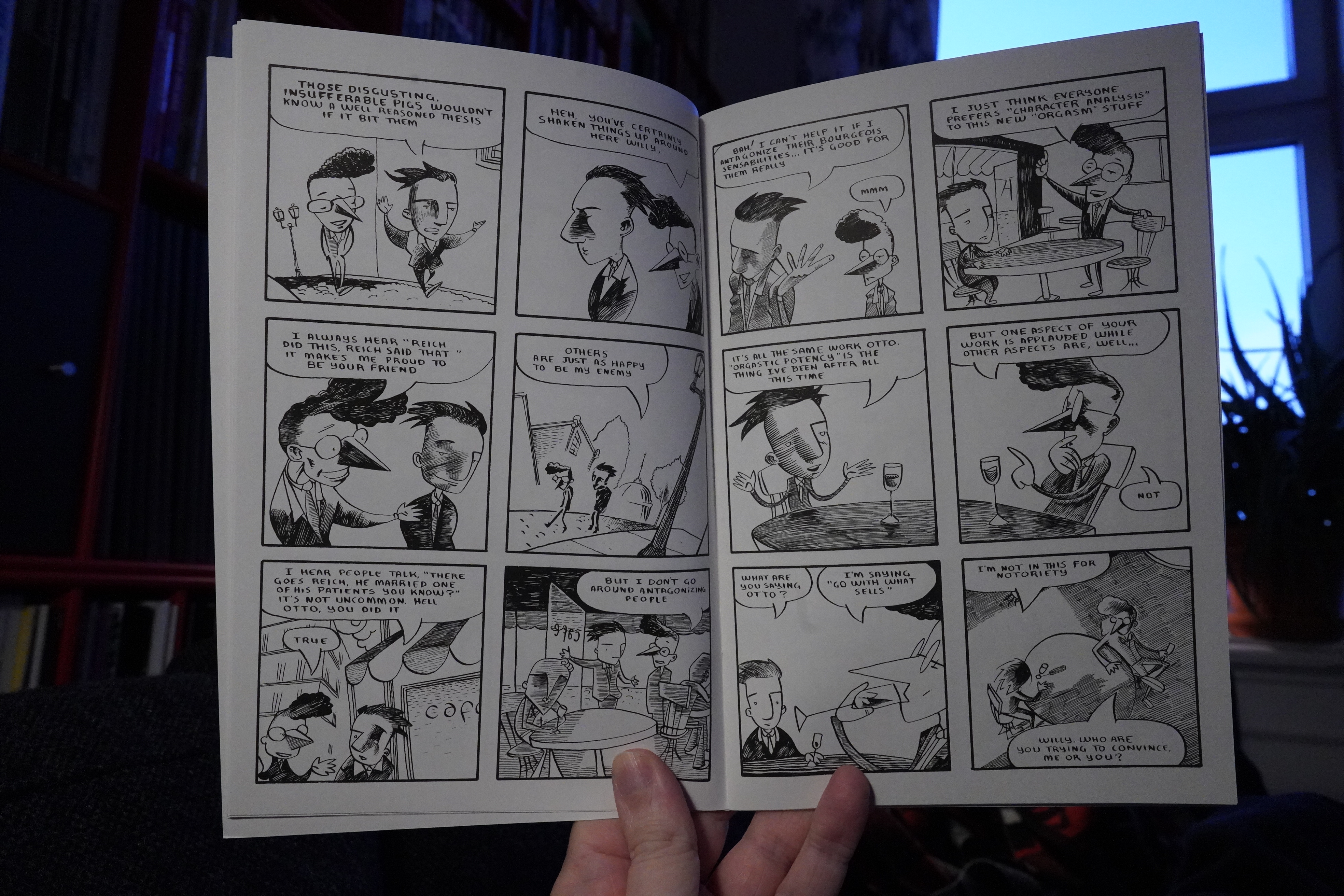
04:56: Reich #1-2 by Elijah Brubaker (Sparkplug Comics)
I’ve got #3 and up, I think, but I got these from Domino Books now.

This is a pretty straightforward Wilhelm Reich biography.

I didn’t remember that it emphasised how much of an asshole Reich was, though, and how stupid his theories were. Which makes me wonder why Brubaker did the series in the first place…
But it’s an entertaining read, and the artwork is a lot of fun.
Should I try to get some sleep now? Hm… One more, perhaps.
| Oren Ambarchi, Johan Berthling, Andreas Werliin: Ghosted |  |

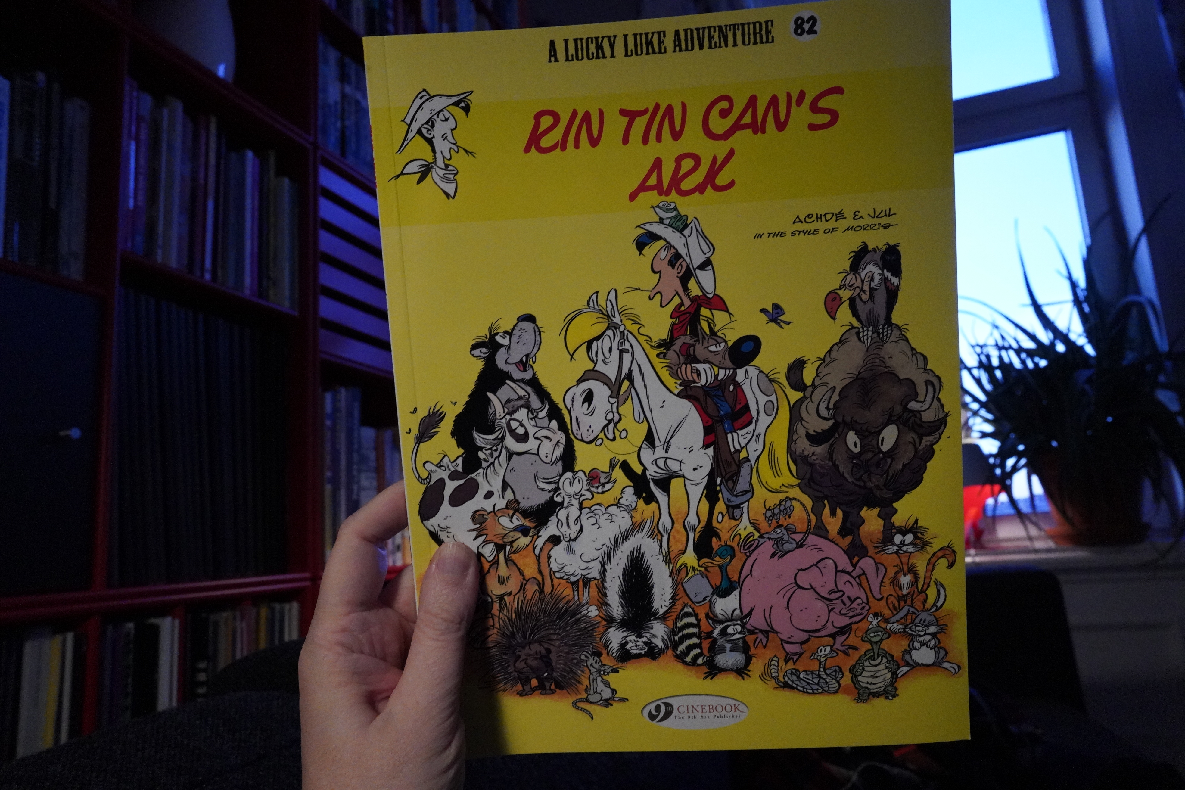
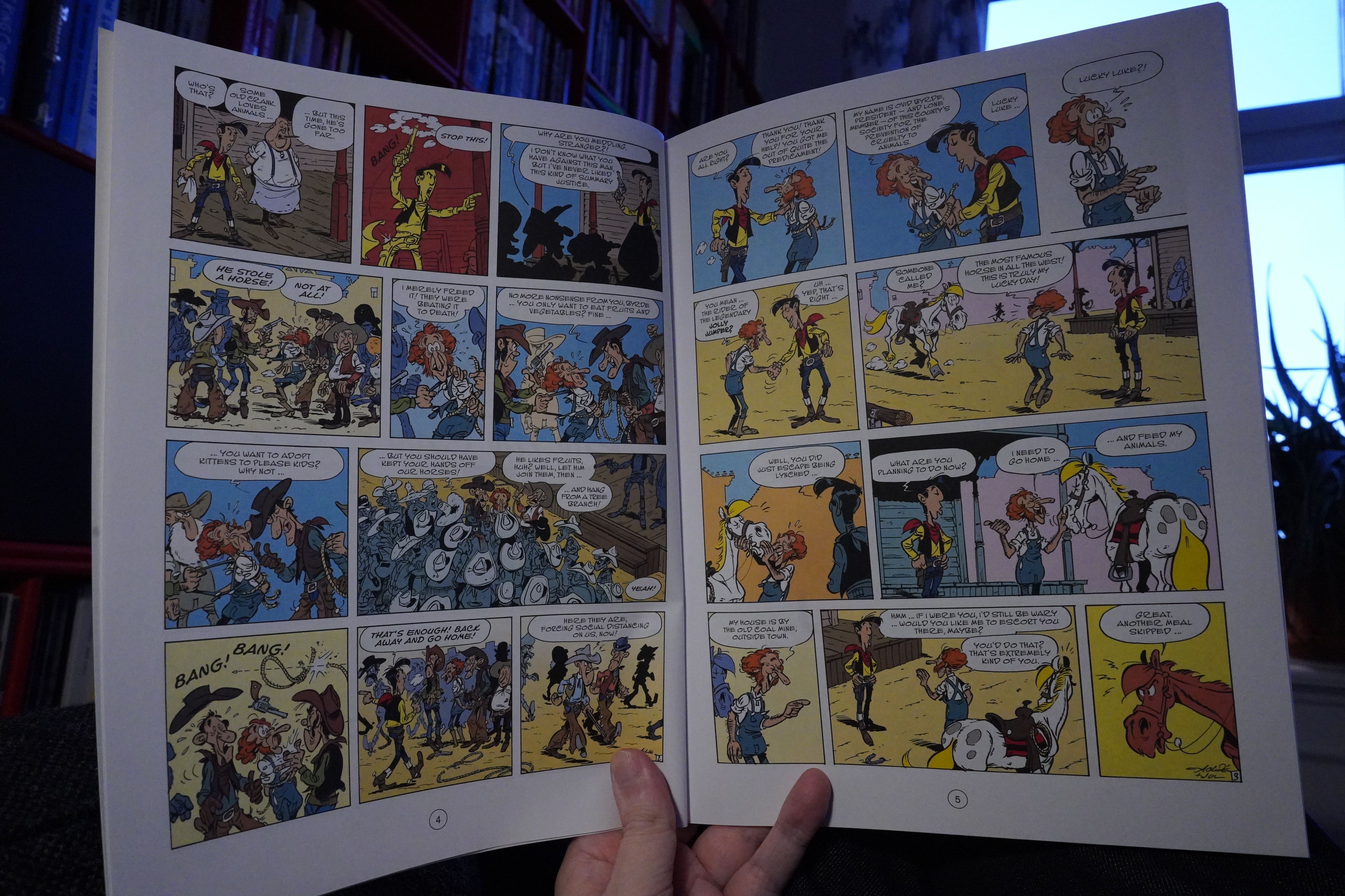
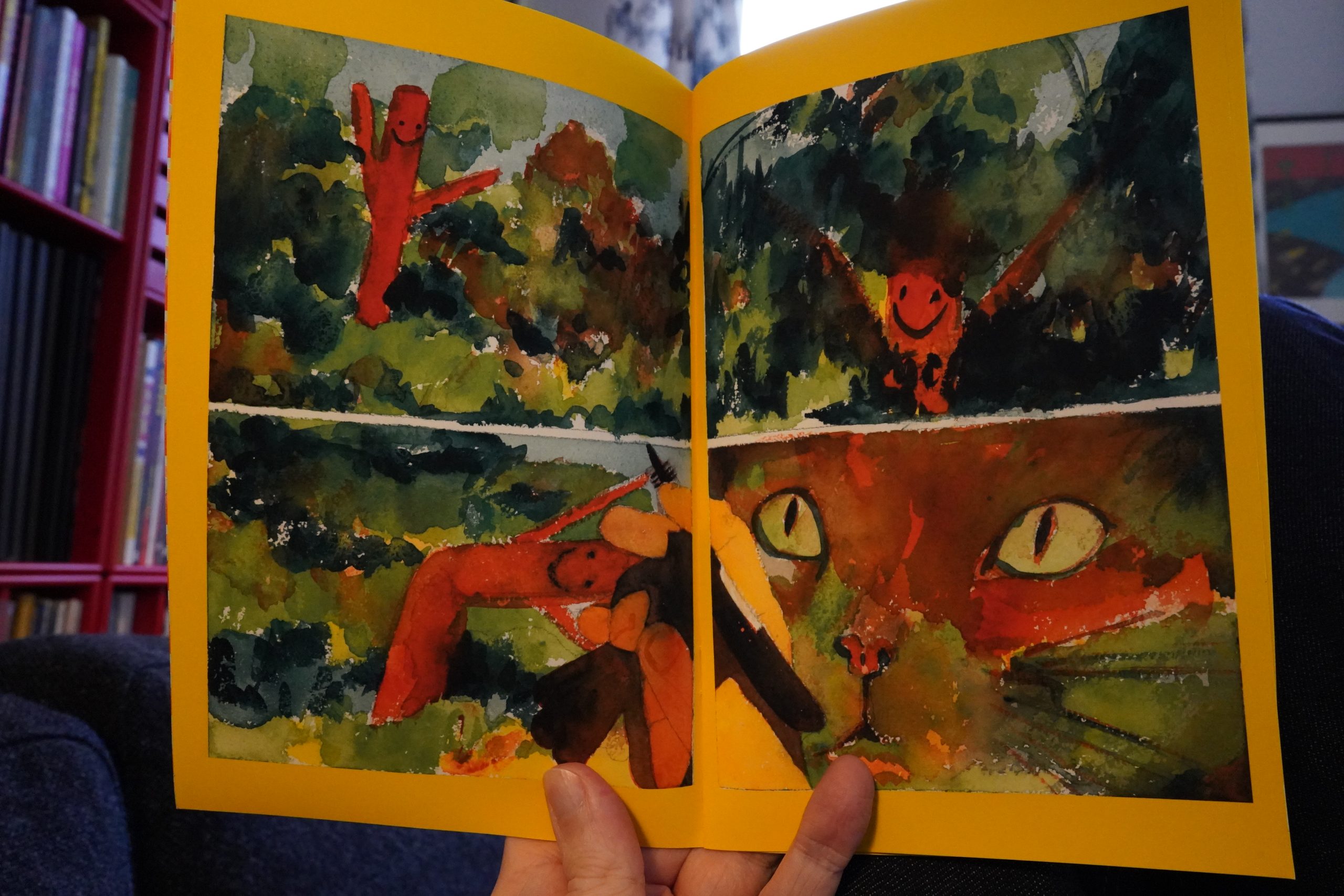
05:16: Lucky Luke: Rin Tin Can’s Ark by Achdé & Jul (Cinebook)
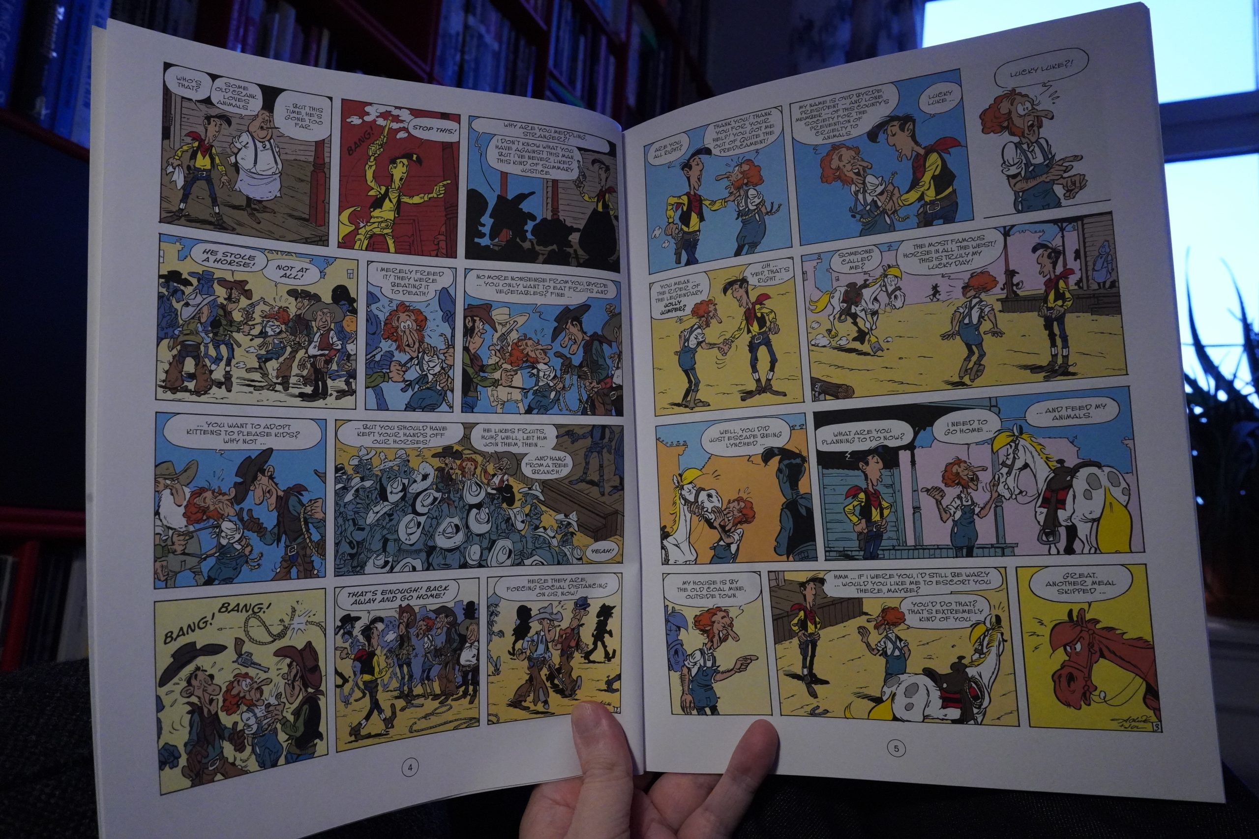
I’ve been pretty impressed by the previous Lucky Luke albums by these creators, and they continue doing pitch perfect Goscinny/Morris impressions in the first third of this album.
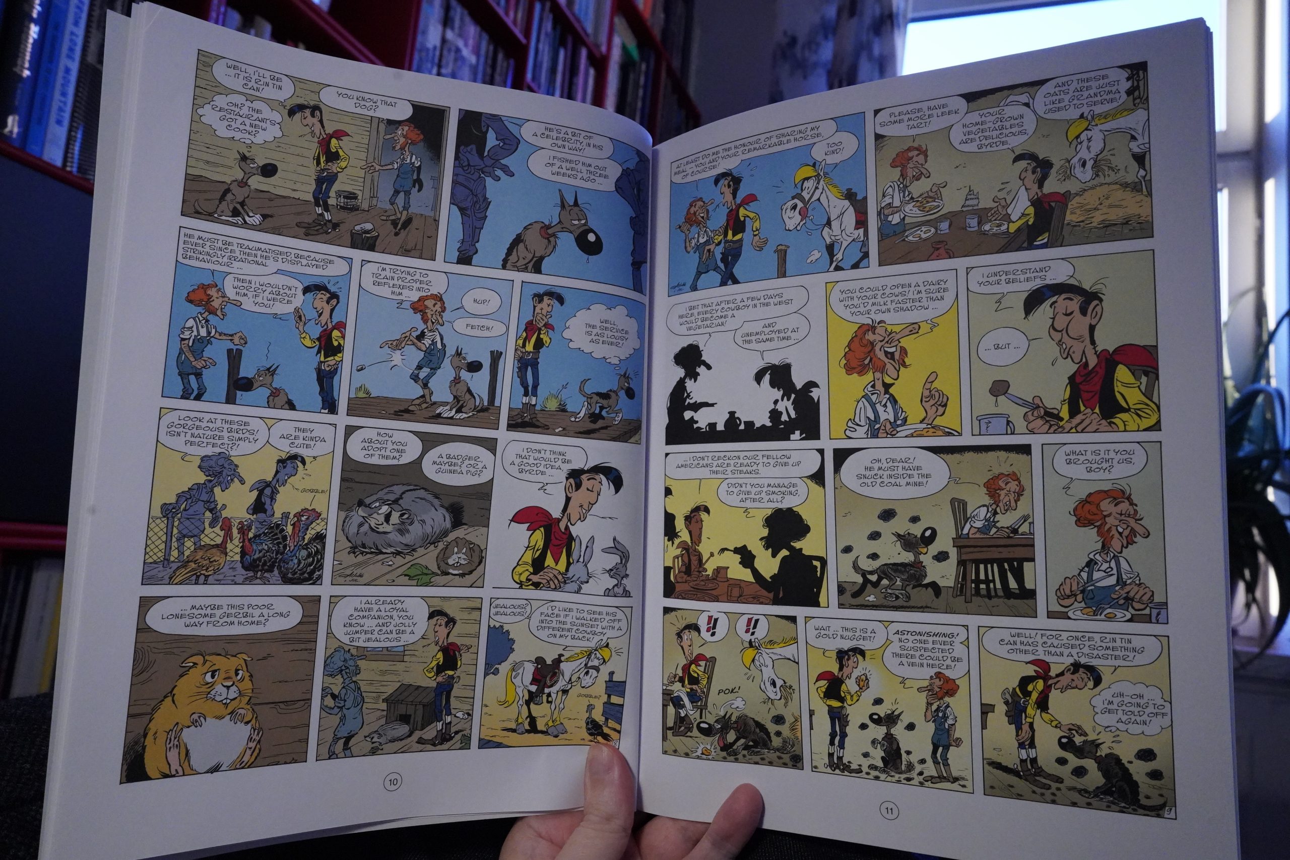
However, the plot in this album isn’t that compelling — there’s good ideas behind it, but it doesn’t quite develop in a satisfying way.
Still plenty entertaining.
| Mary Halvorson: Amaryllis |  |

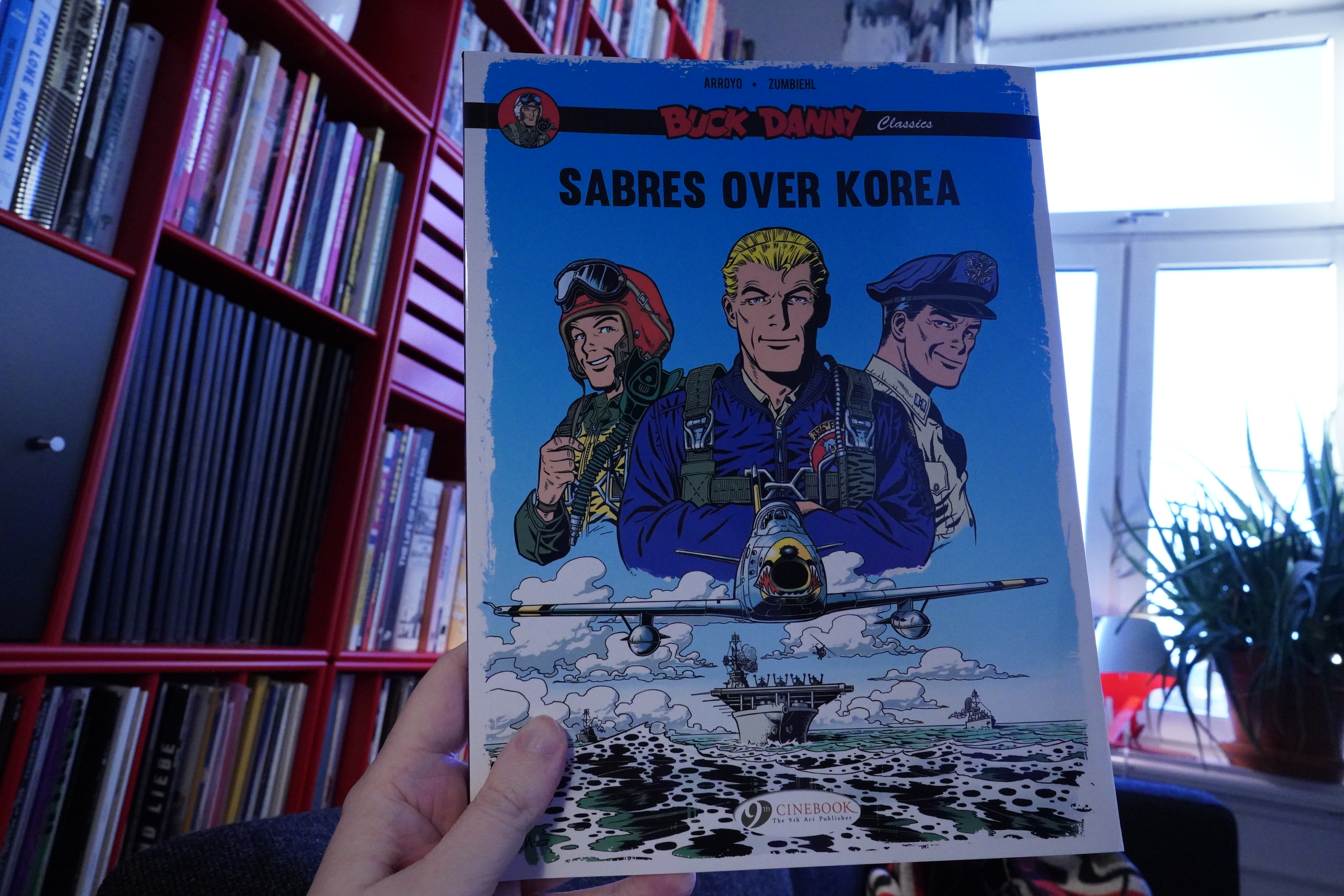
05:58: Buck Danny Classics: Sabres over Korea by Arroyo / Zumbiehl (Cinebook)
This was, confusingly enough, made in 2014, but is called “classics”…
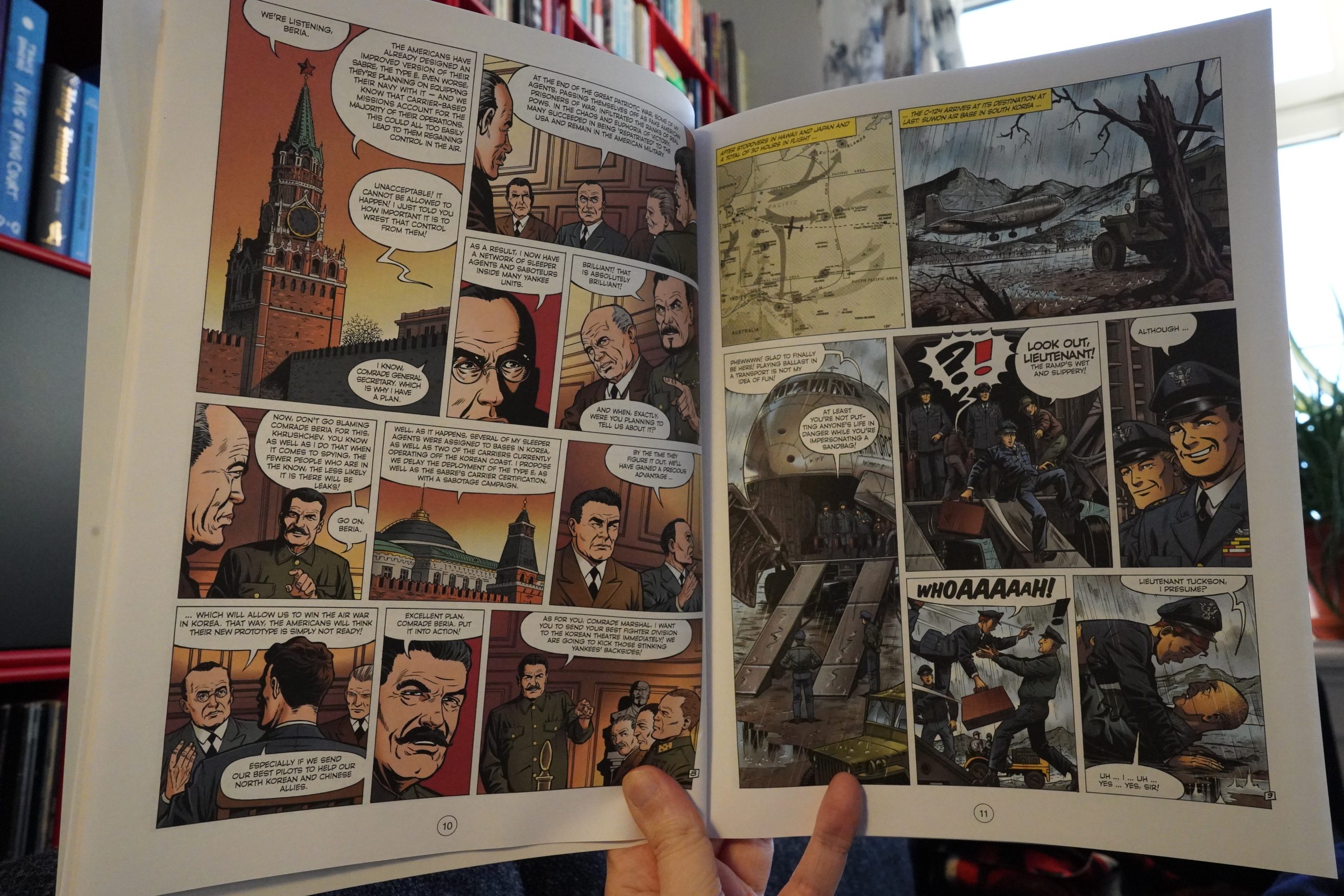
Oh, the “classics” bit is a reference to the time period the book is set in: The 50s. (And perhaps the storytelling style, which is very er classic.)
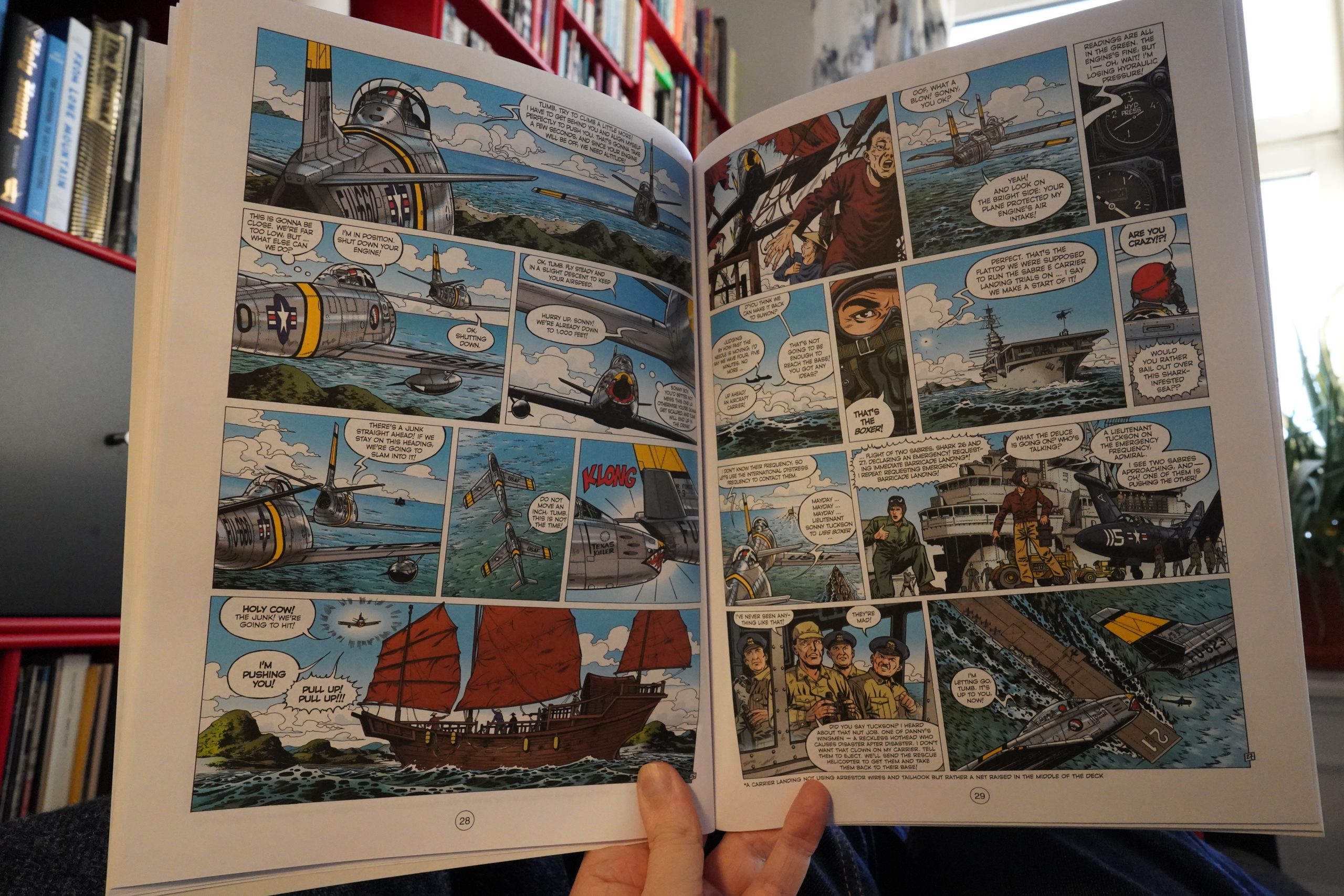
This is better than I expected, really. It’s a lot wordier than it has to be, but as these things go, it’s quite fun. I’m not sure I want to read another one of these, though.
06:25: The End
And now it’s time to try to get some sleep.