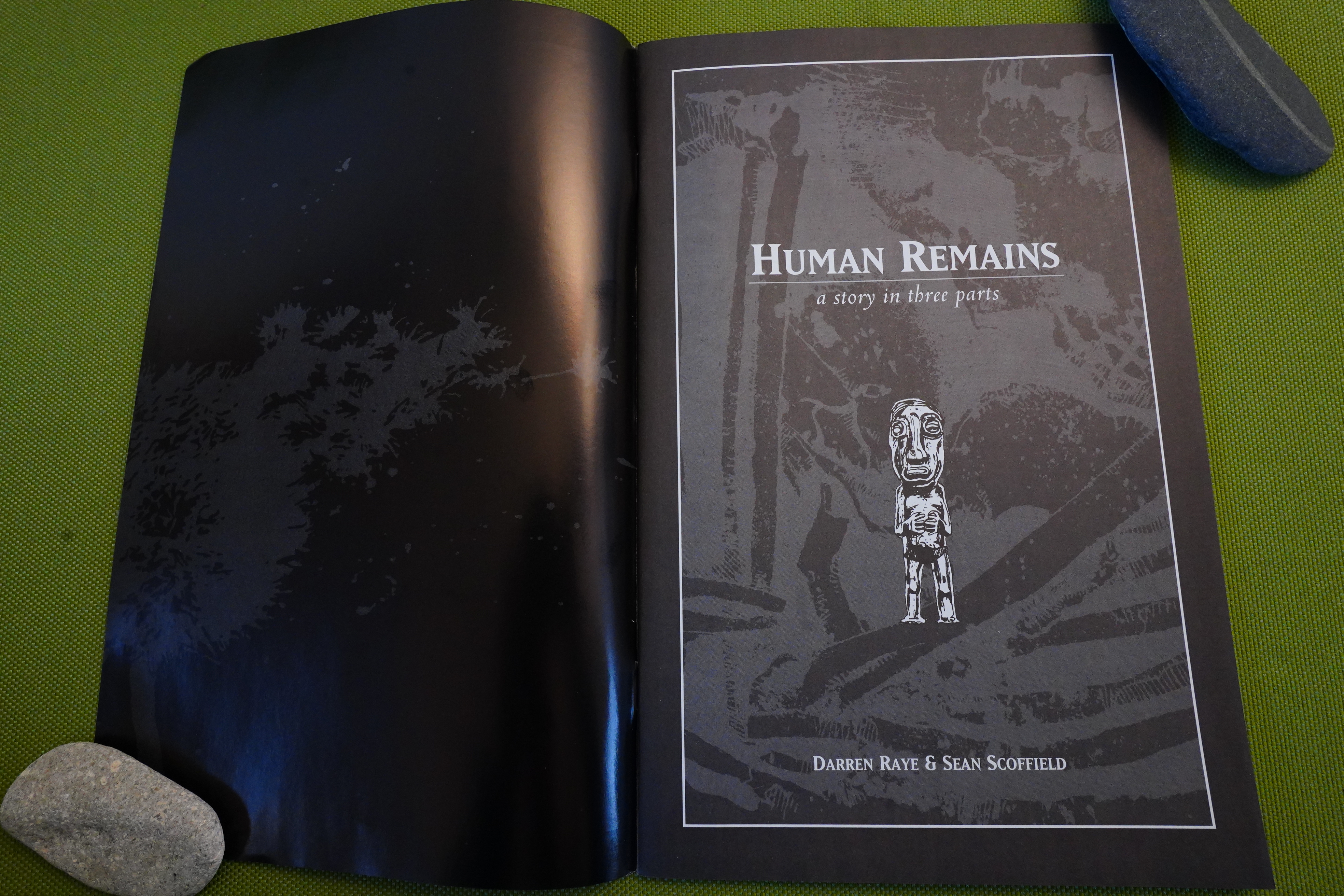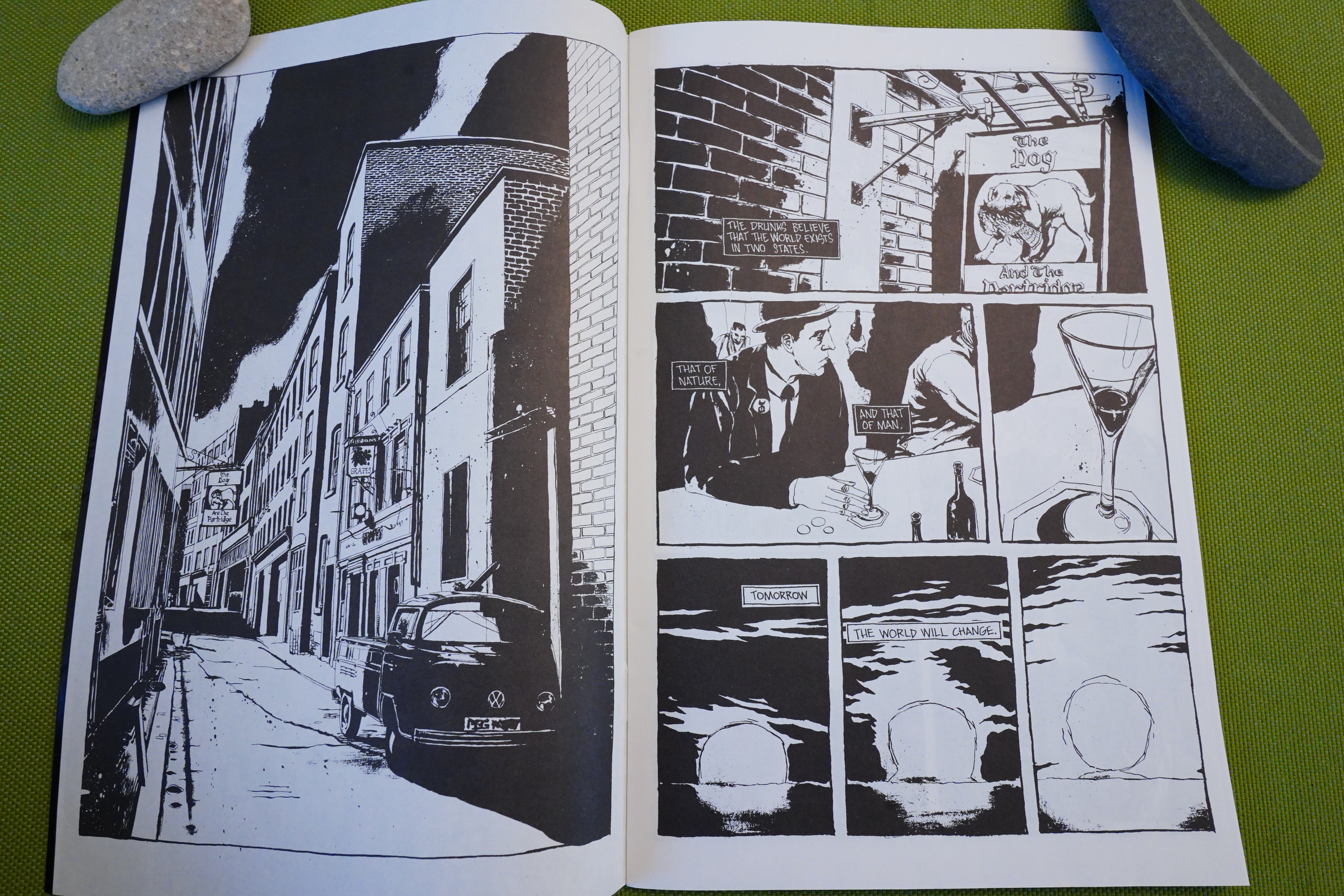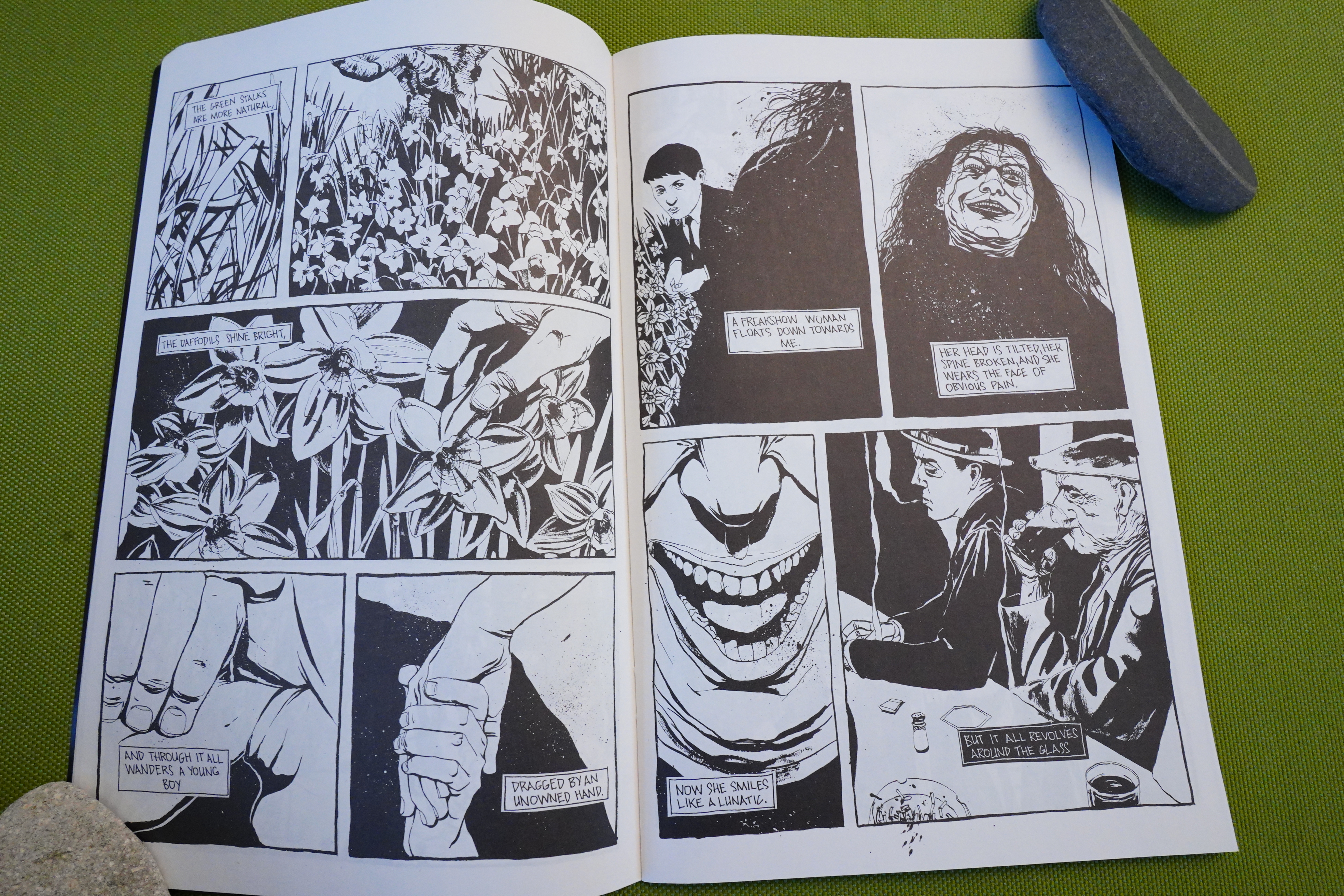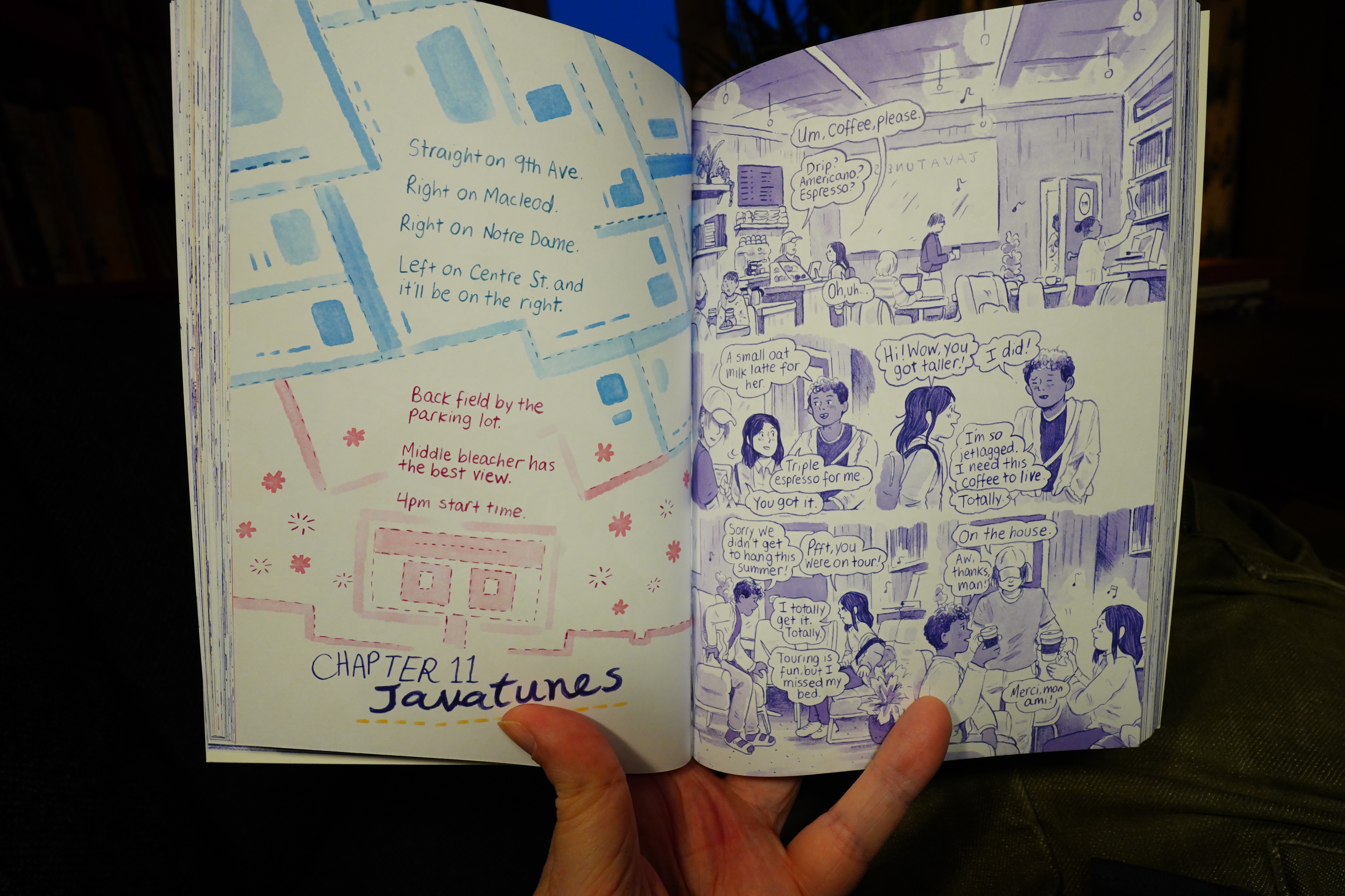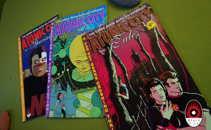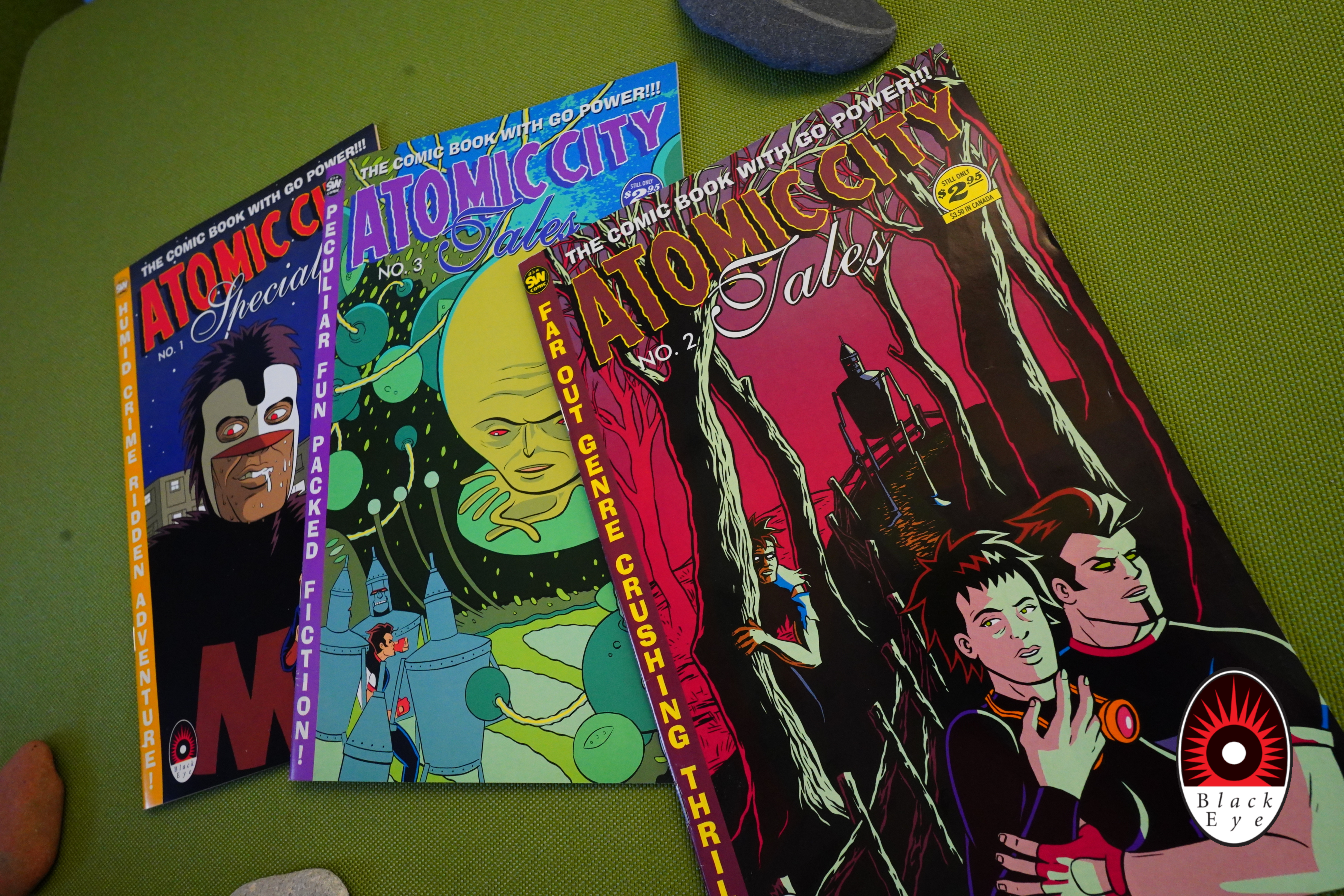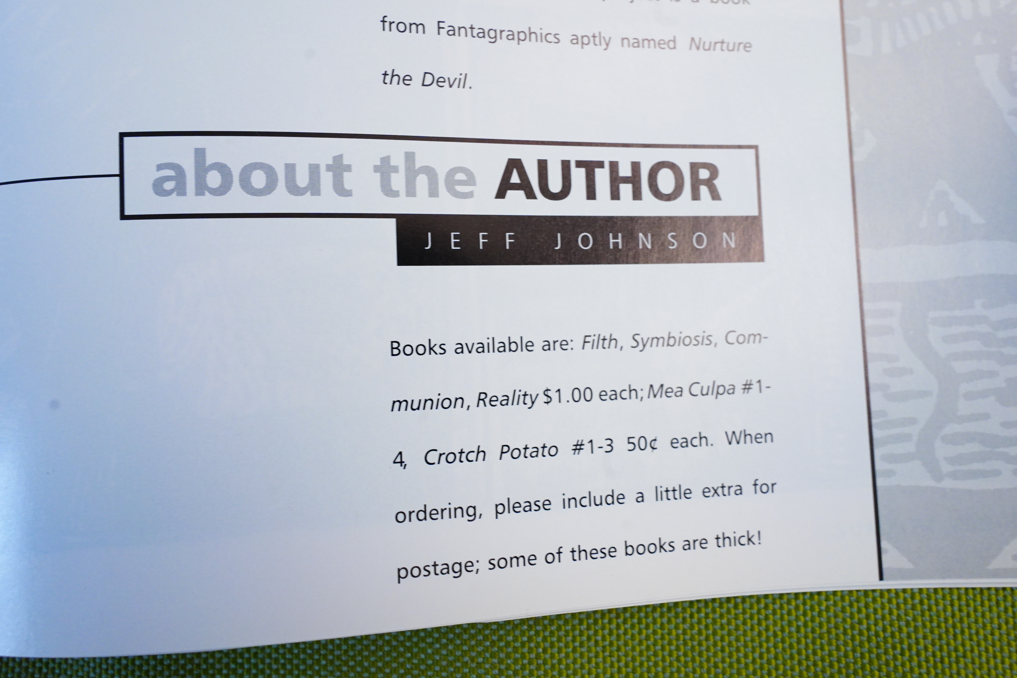
Geez, I’ve gotten so many comics (from all over the place) over the last couple weeks. I’ve got days and daze to go before I sleep.
And for music today: Only albums from 2024.
| Merope: Vėjula | 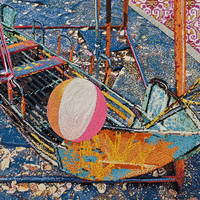 |

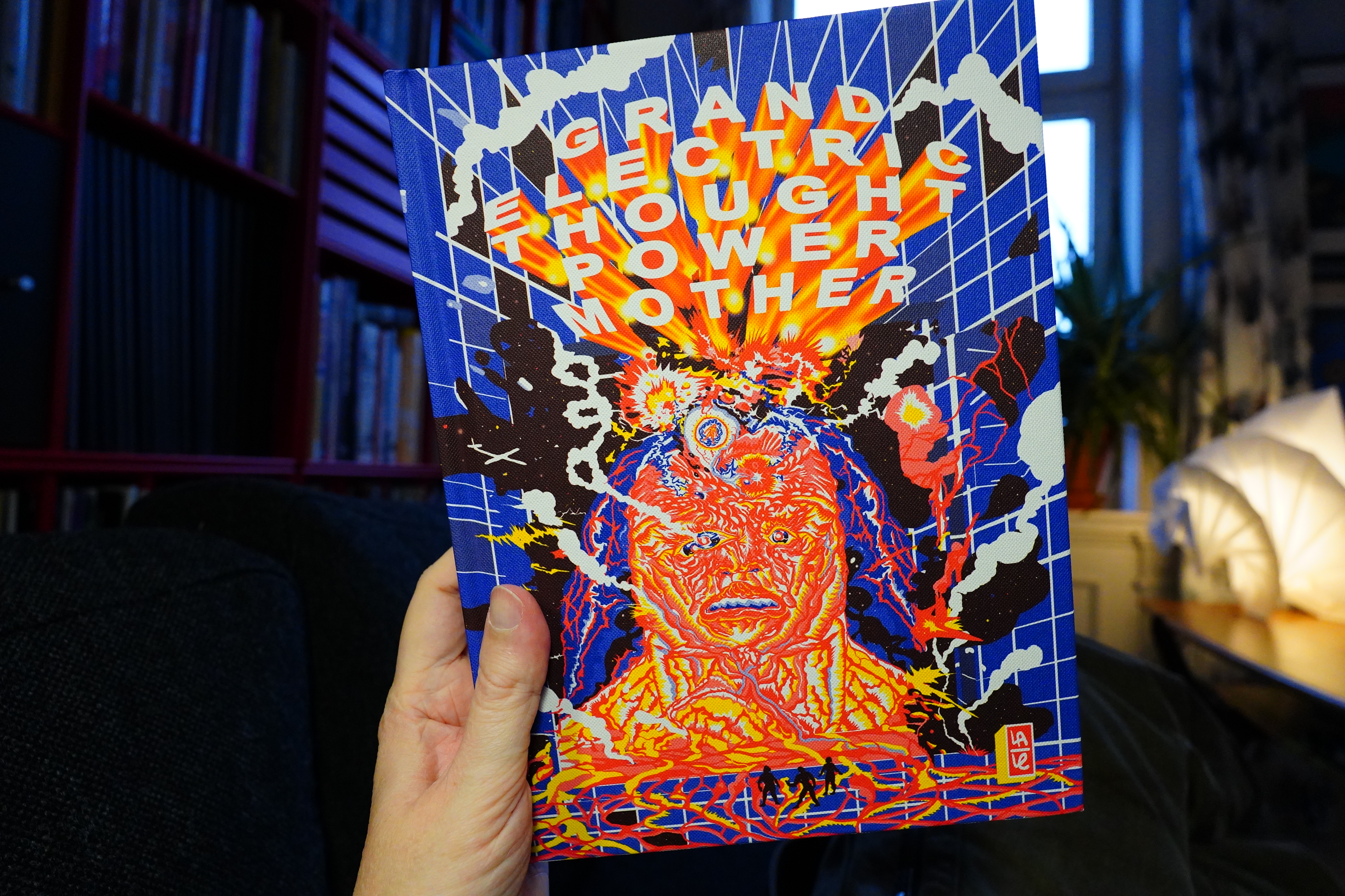
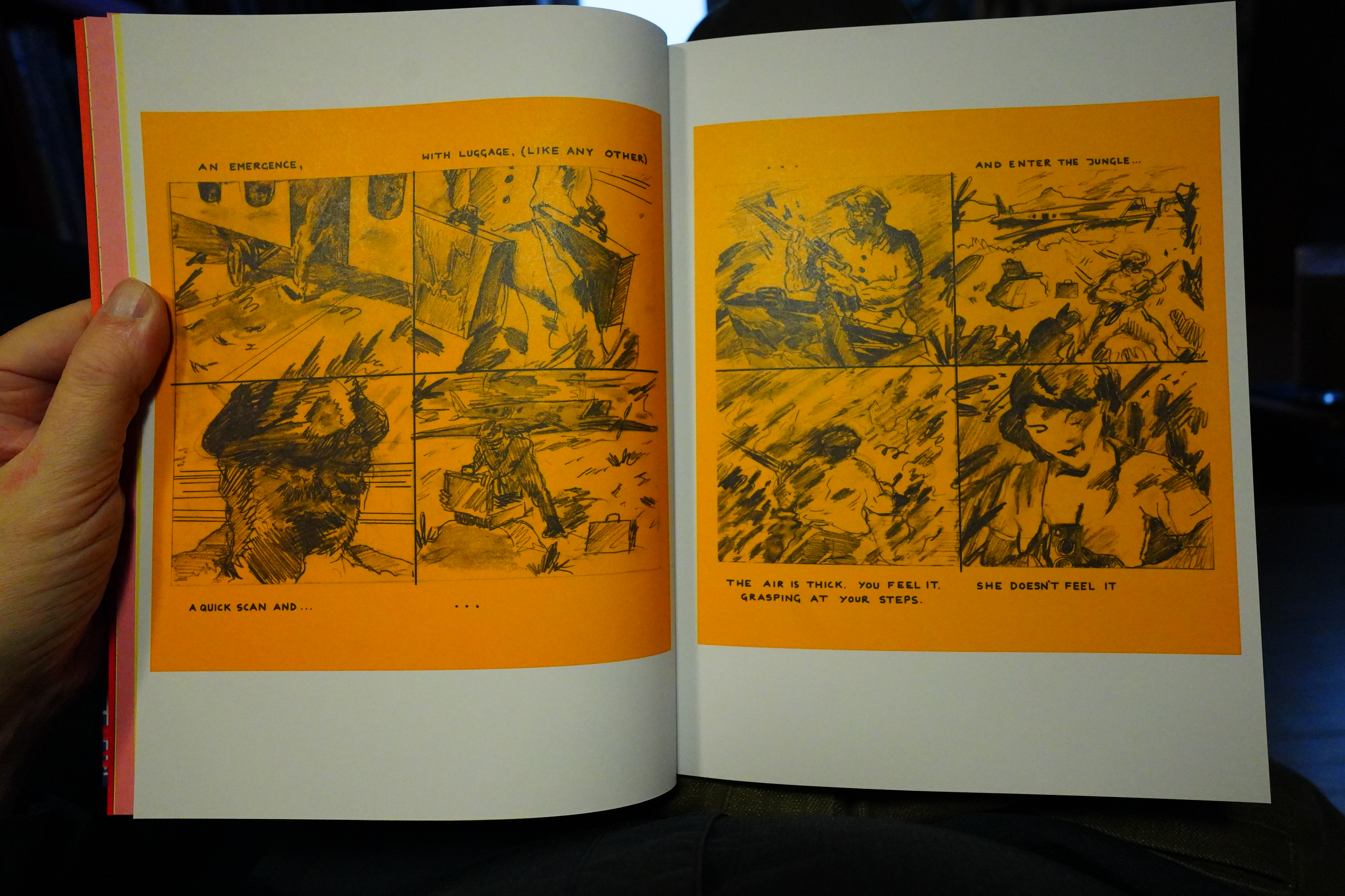
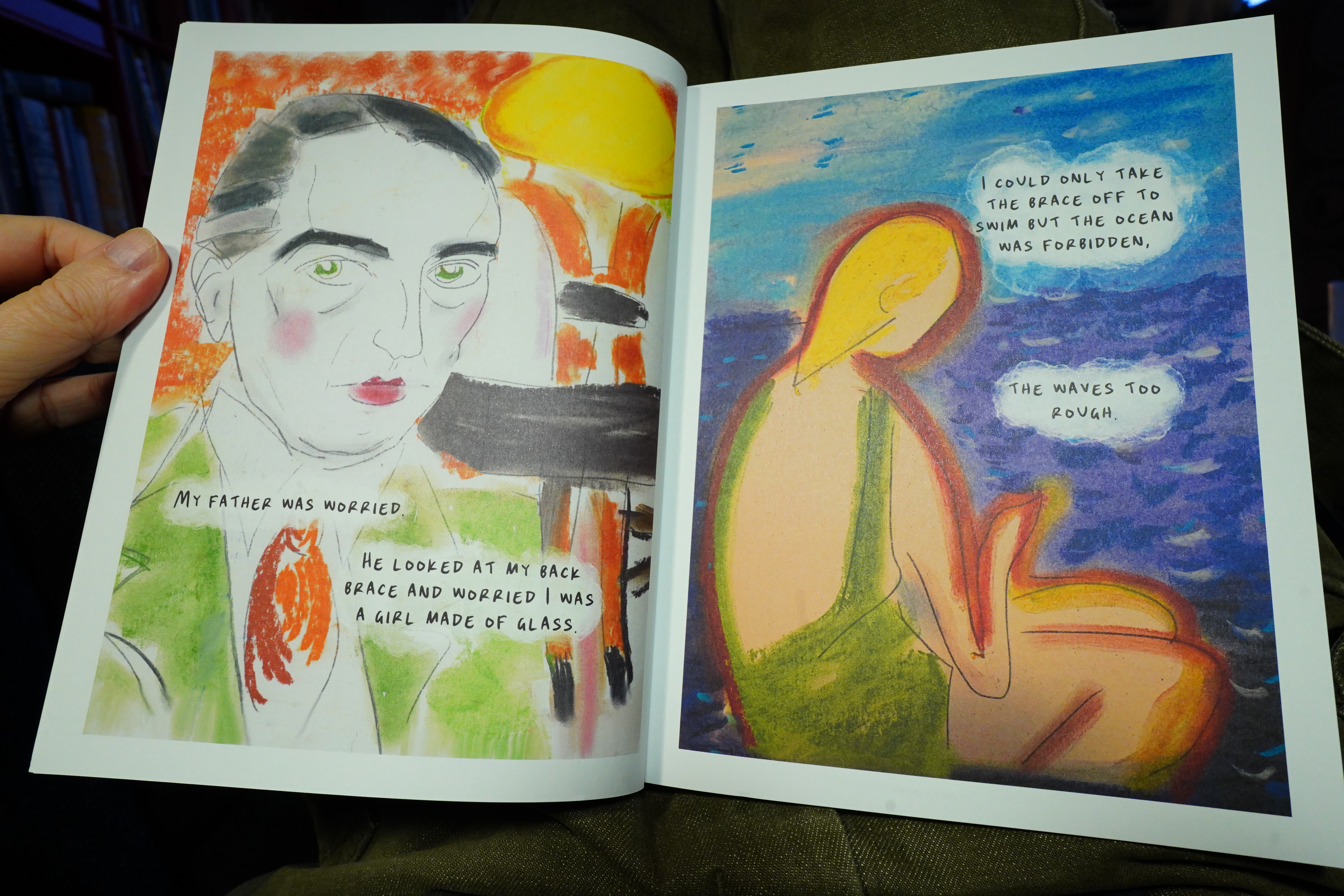
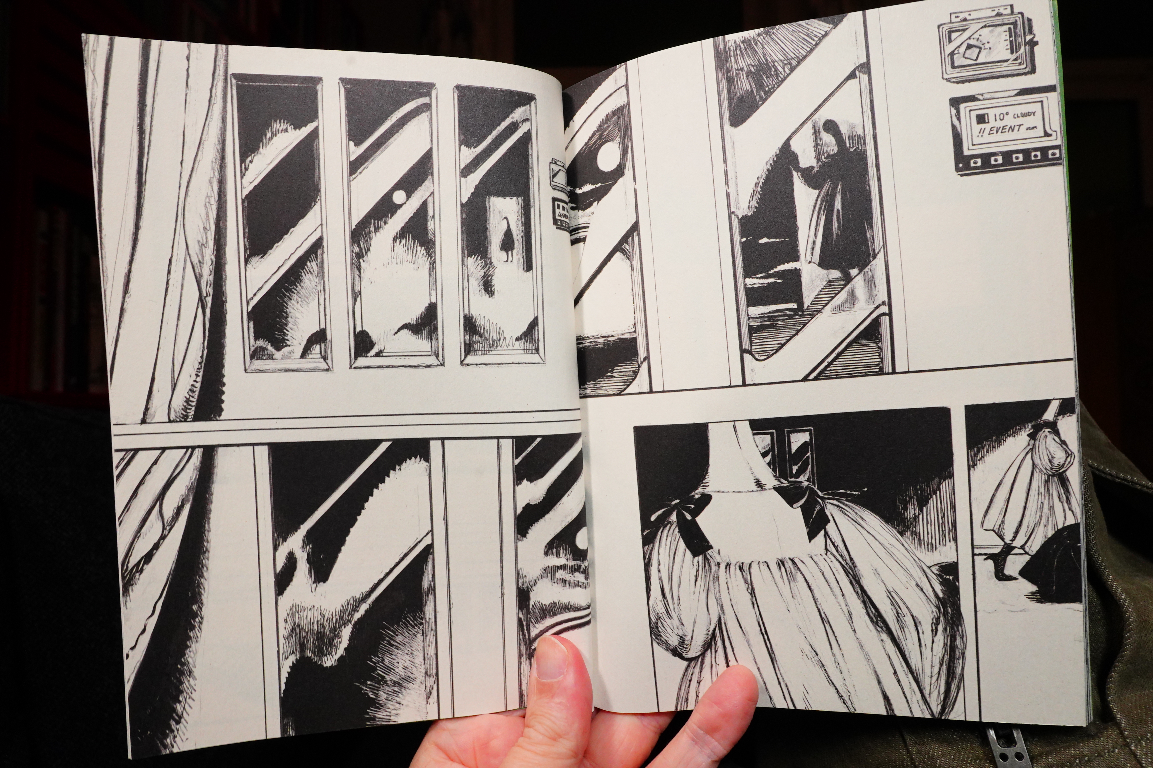
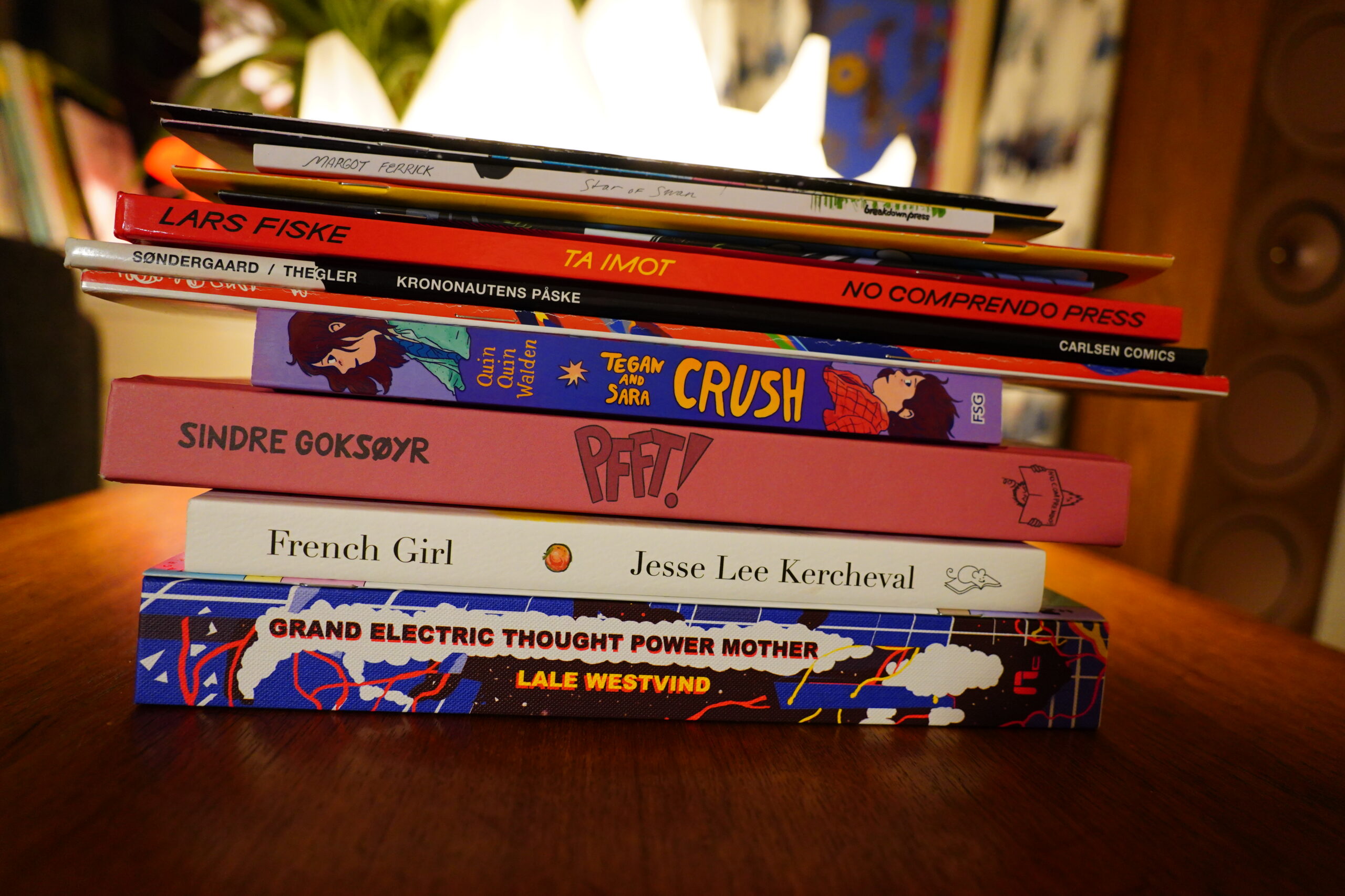
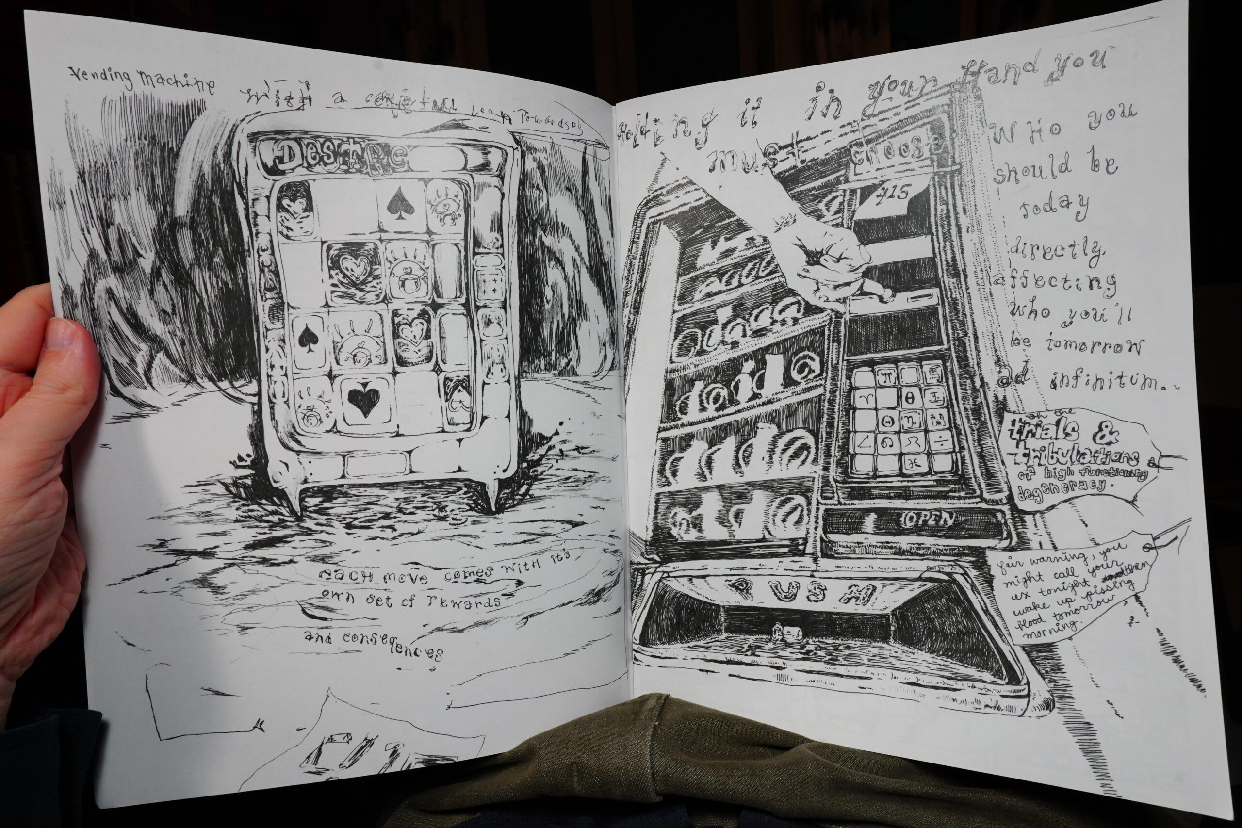
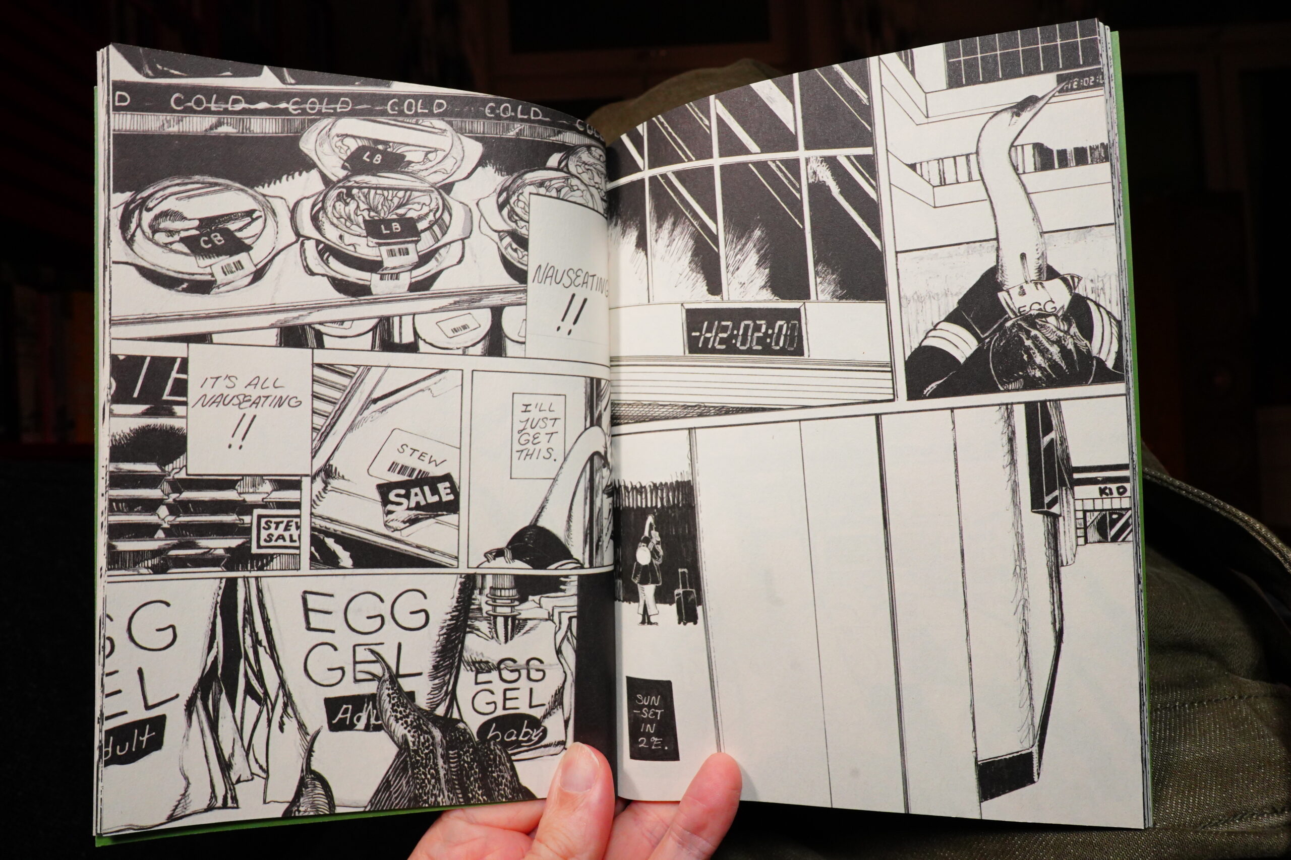
12:26: Grand Electric Thought Power Mother by Lale Westwind (Perfectly Acceptable Press)
I was surprised when I got this from Desert Island last week, because it’s being solicited now for a January release? Odd.
This was originally going to be published by 2d cloud, I think? But then things happened.
Anyway — readin’ time.
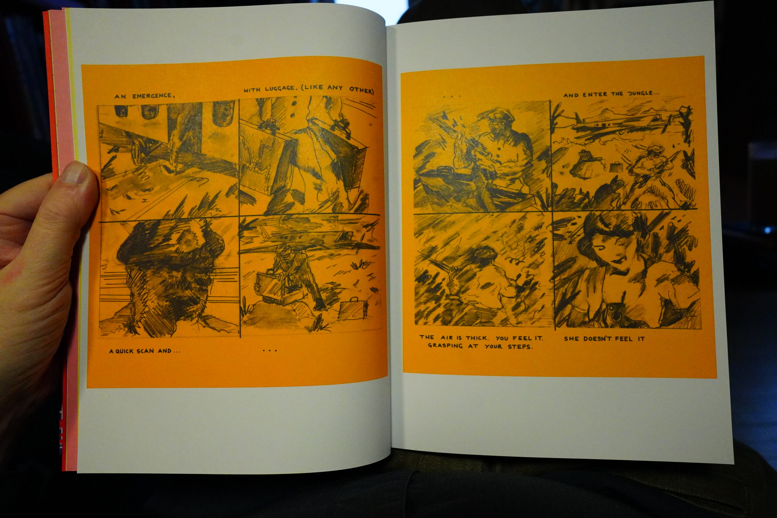
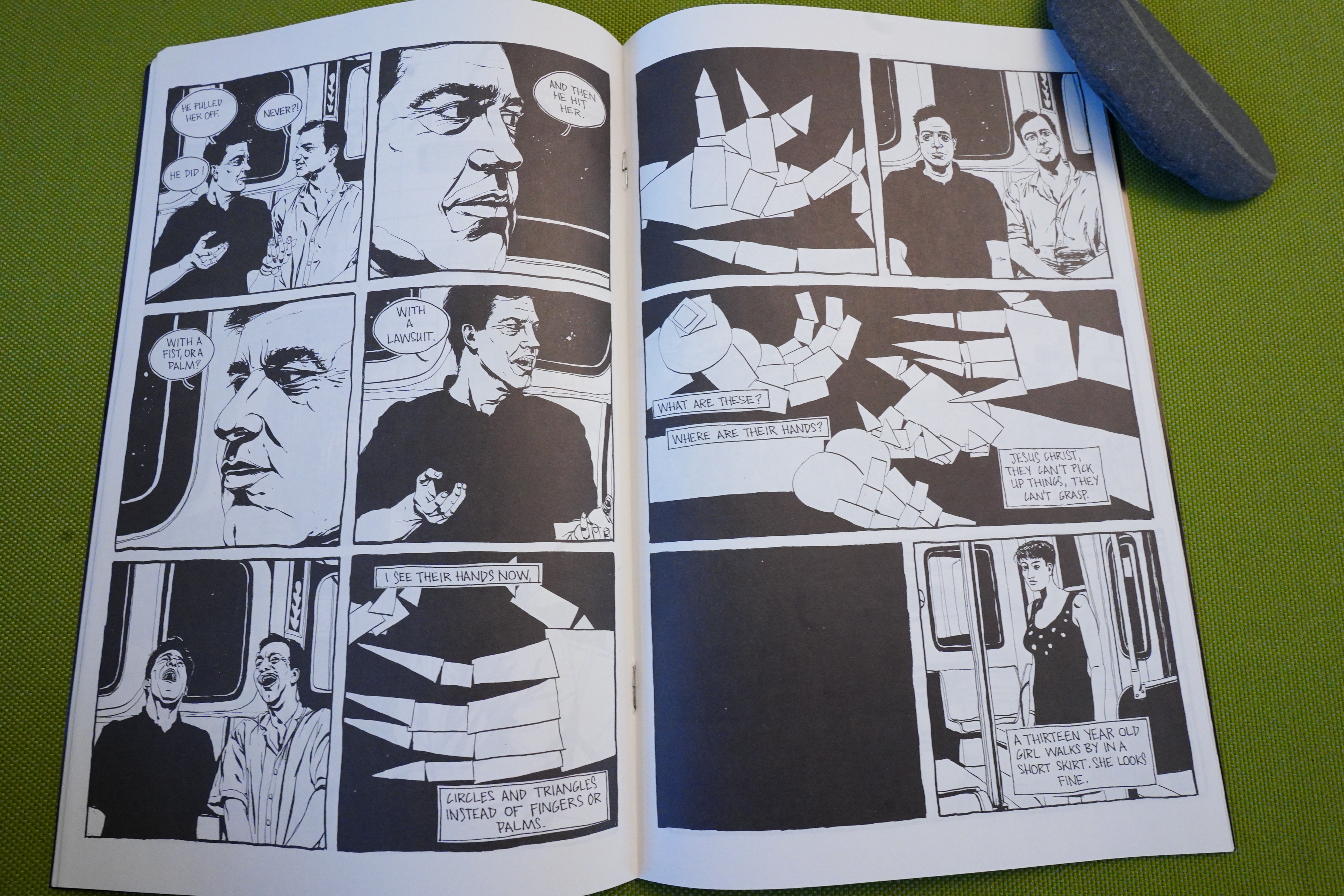
This is a hefty collection of work done mainly between 2014 and 2017, and mainly riso printed.
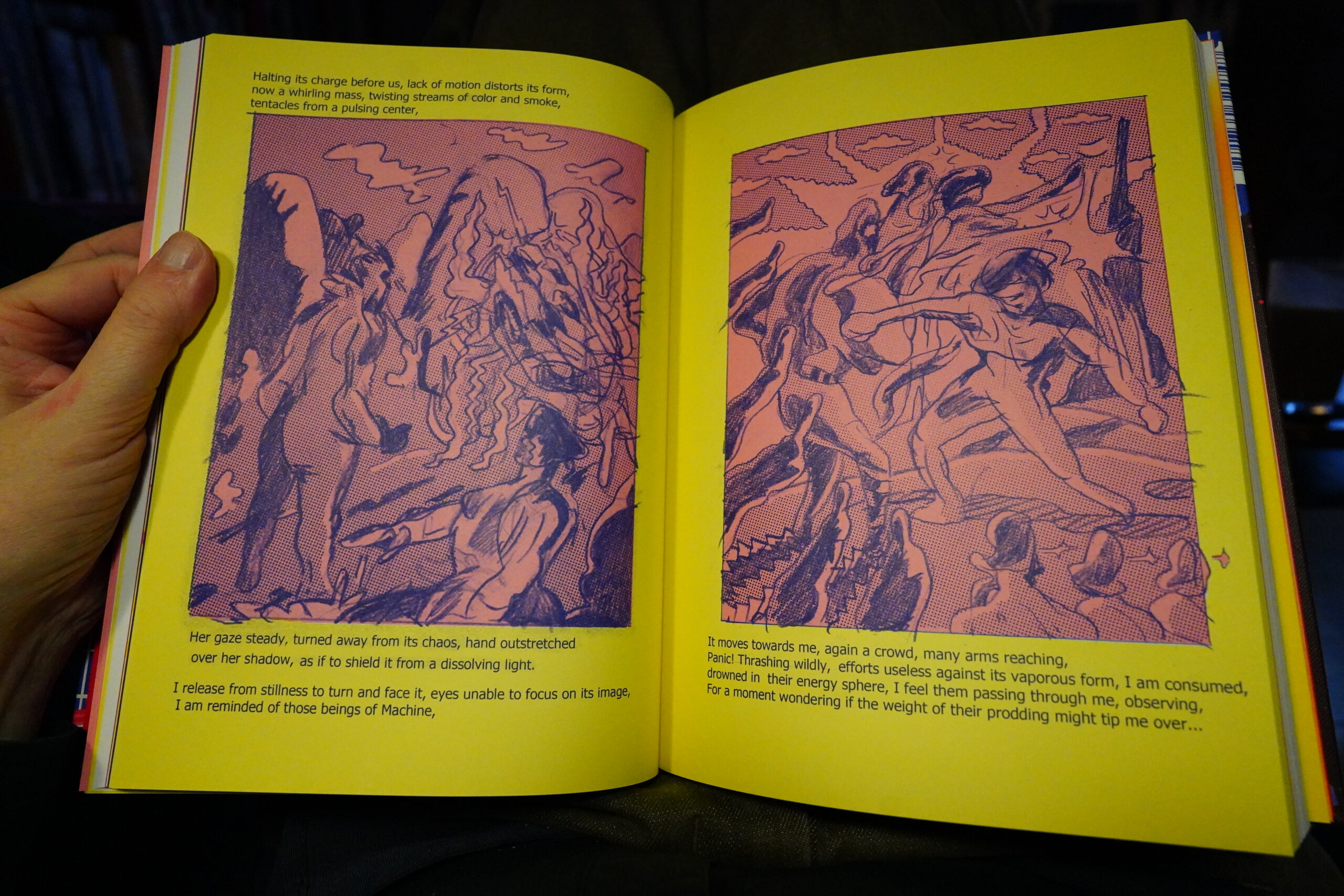
The longest piece is this one, which is a kind of… er… creation story?
| (Exit) Knarr: Breezy |  |
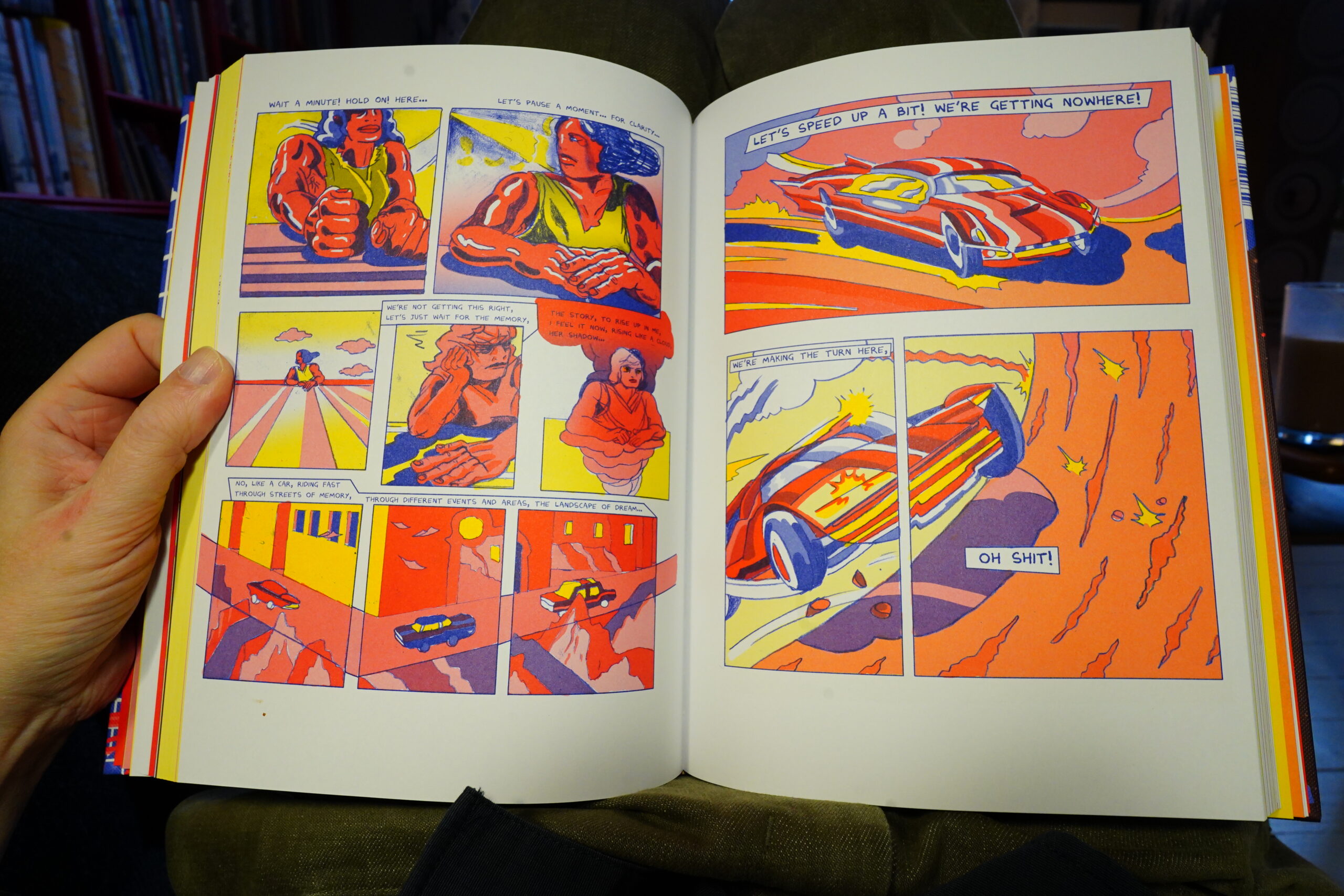
The artwork is lovely.
The stories are mostly science fiction-ey, but returning to the same general themes. These are all narrative pieces, but it’s sometimes kinda vague what’s going on.
It’s a compelling book, but it feels non-optimal to be reading these pieces in collected form? I’ve read a couple of them before (I think), and if I remember correctly, they were stronger read separately? I may well be misremembering — who can remember what happened a decade ago anyway?
| His Name is Alive: Hope is a Candle |  |
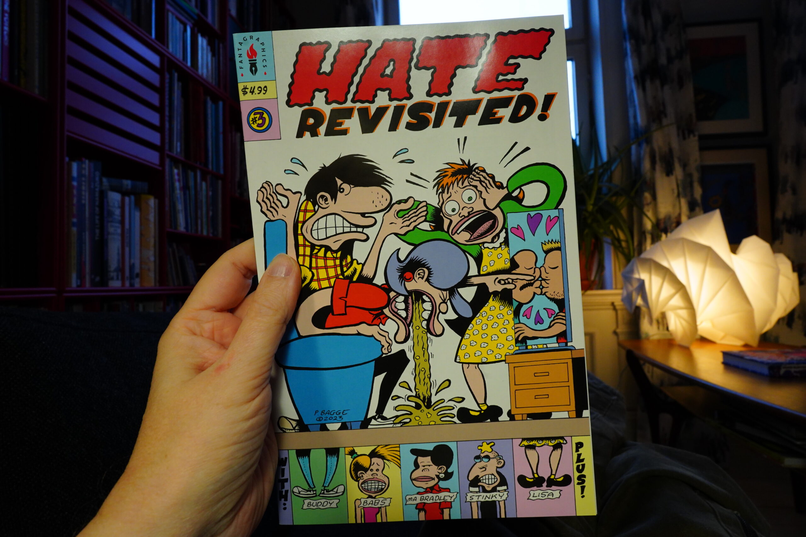
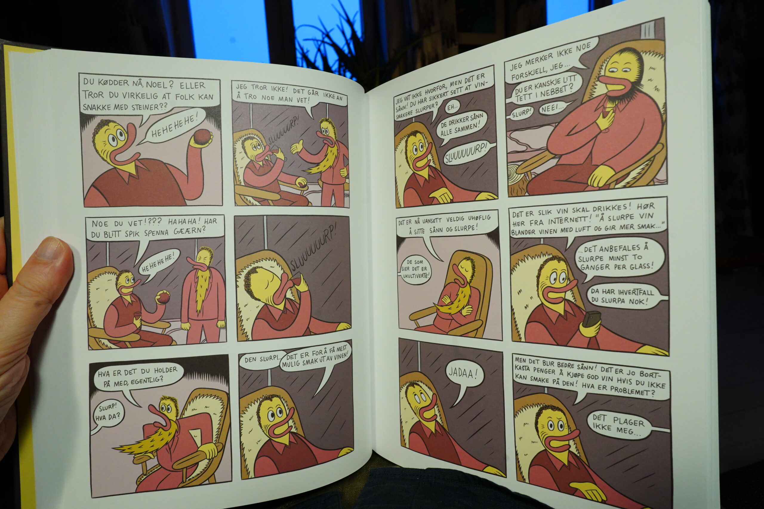
13:51: Hate Revisited! #3 by Peter Bagge (Fantagraphics)
I somehow missed the first two issues, but I’ve seen on the Twitters that people were kind of going “uhm… uhm…” about this series instead of the expected “yay”.
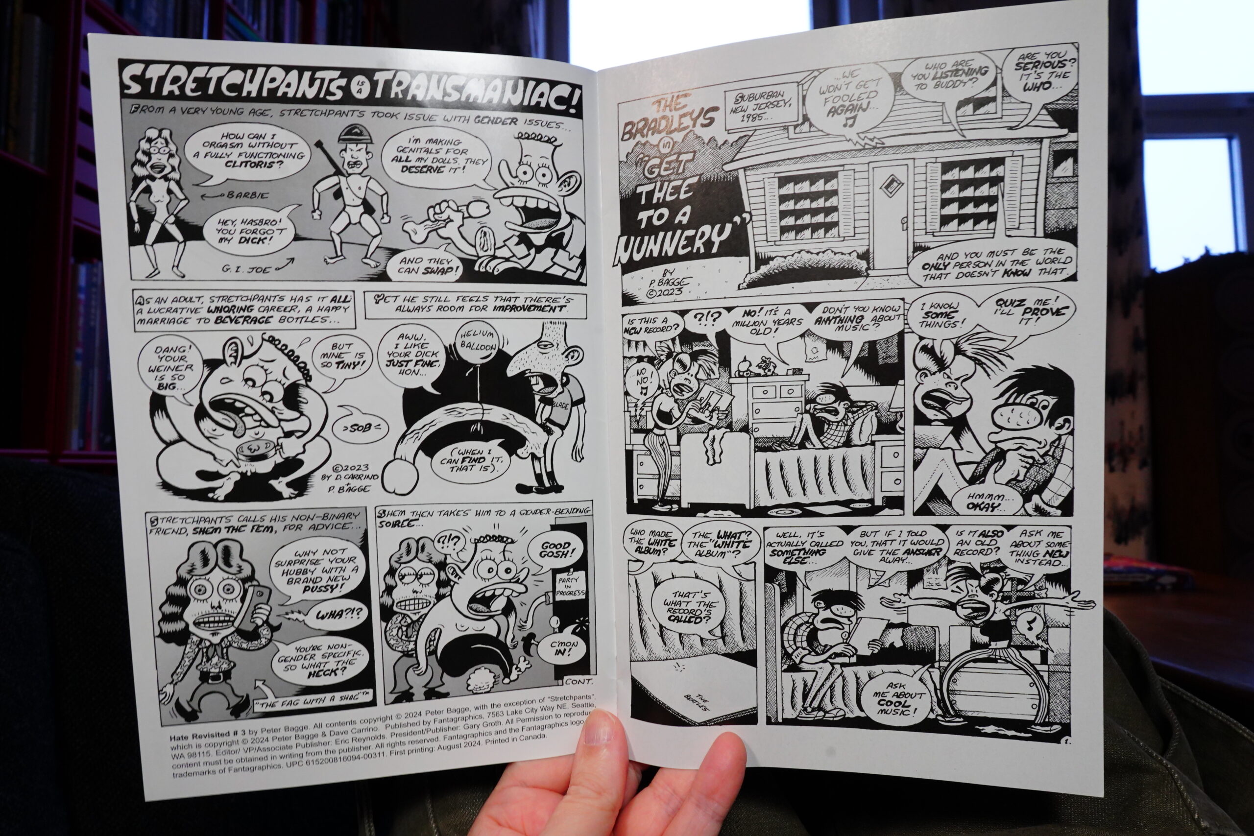
Oh, right. Well, first of all, the printing is just odd? It’s on ultra shiny white paper, but the printing looks… smudged? I thought it was lo rez or something first, but it’s not. It’s just badly printed.
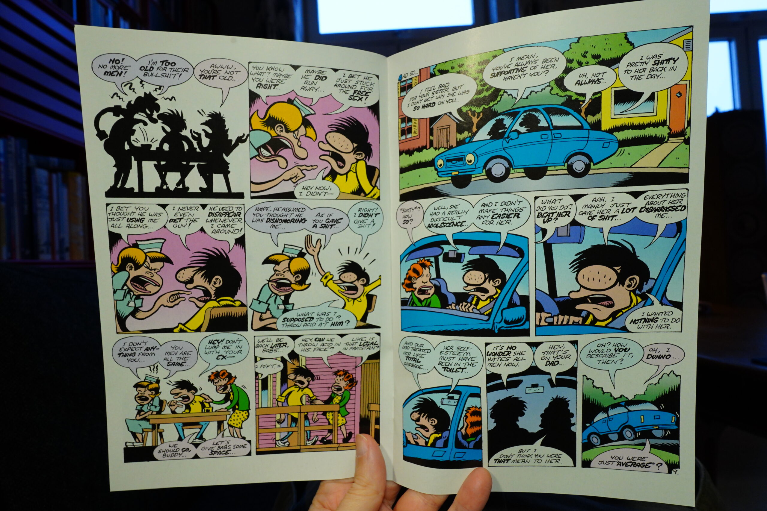
But I’m impressed by how Bagge has gone back to his old rendering style. I mean, in his last few books he’s gone for a more streamlined look, but this is how I remember his stuff from the 90s.
And… the book basically reads like it’s from the 90s, too? But with updated “issues”.
It’s fine. Pretty amusing in places, and I’m sure the people Bagge wanted to piss off were pissed off by it.
| Nicola Ratti: Automatic Popular Music |  |

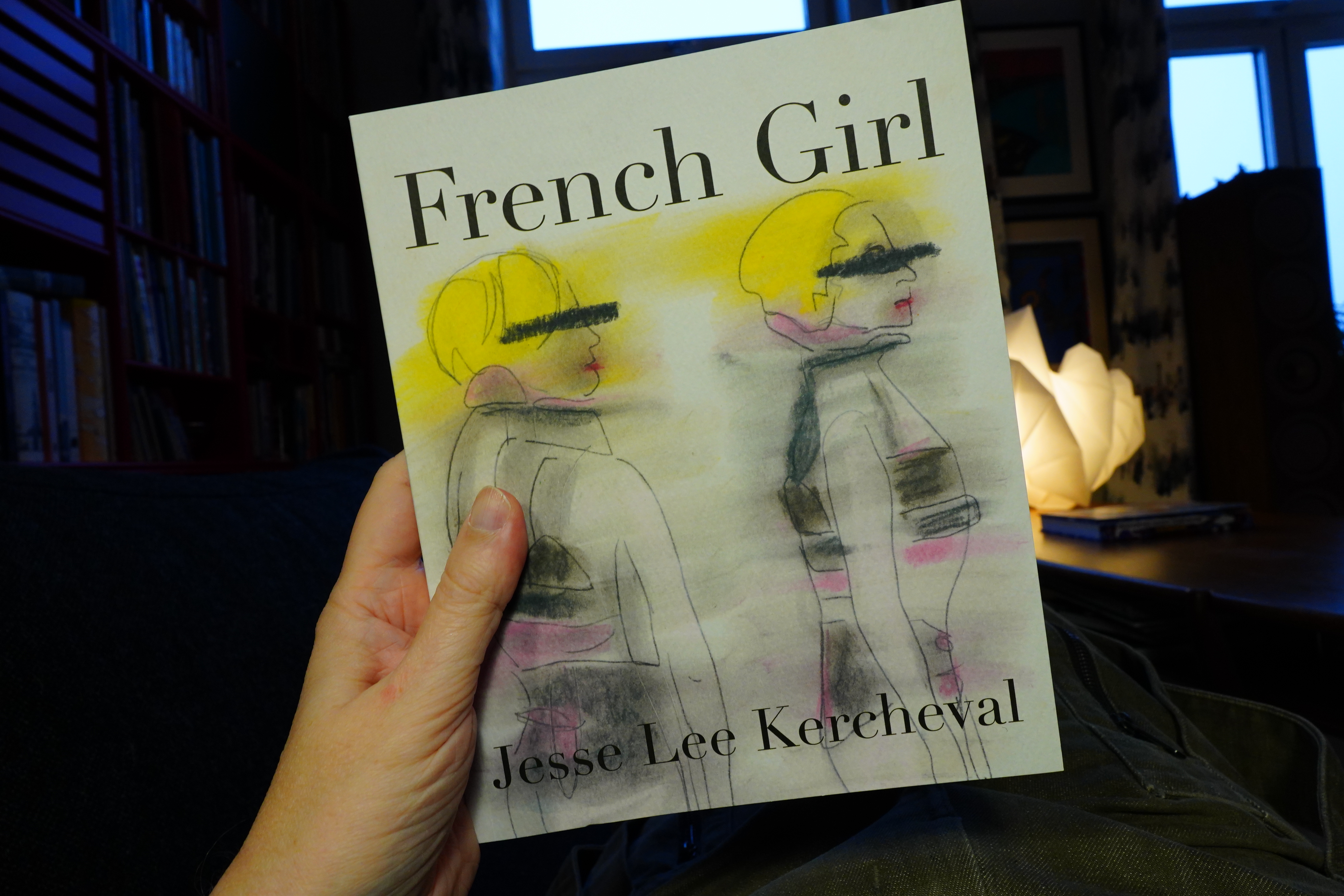
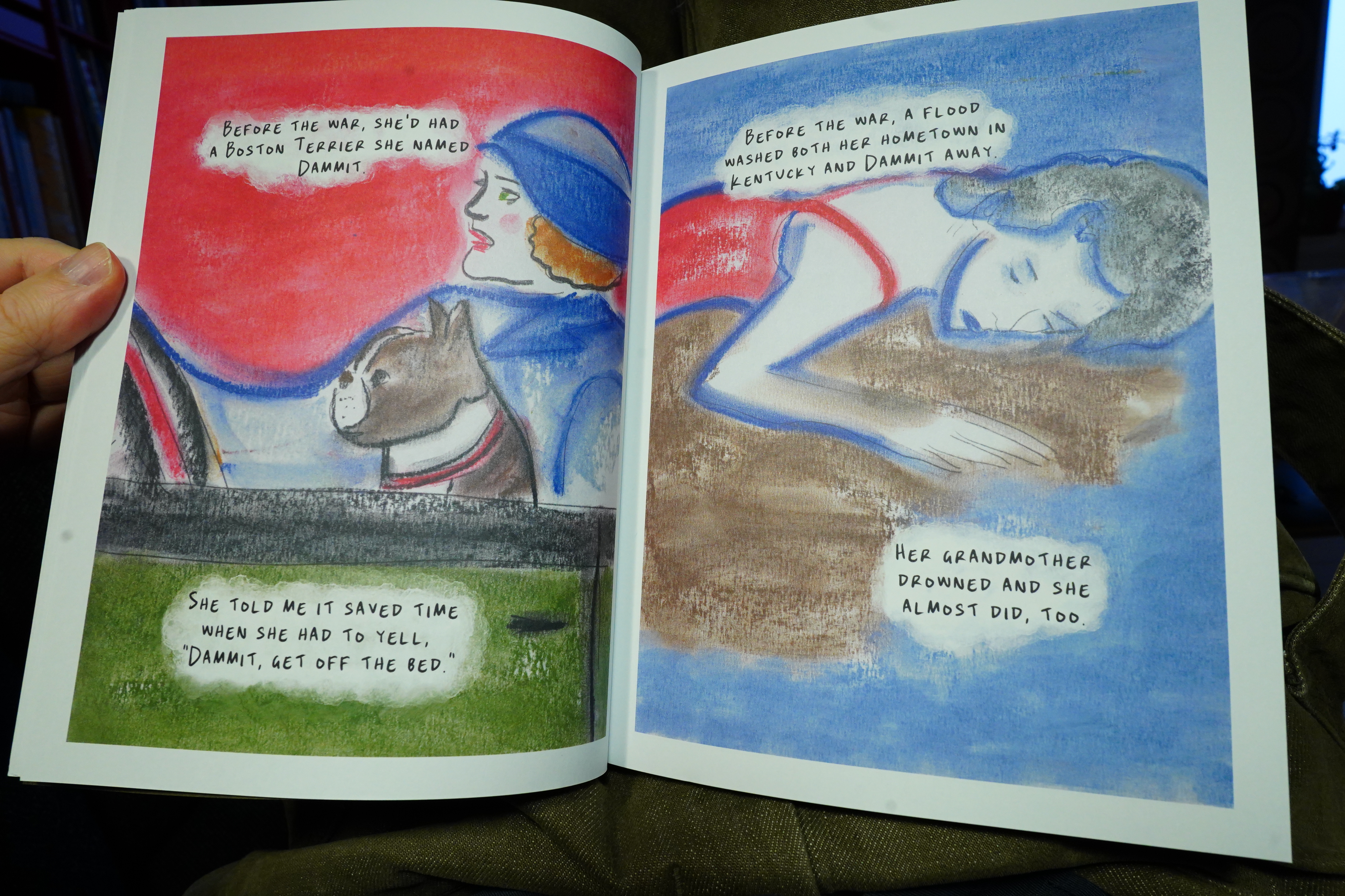
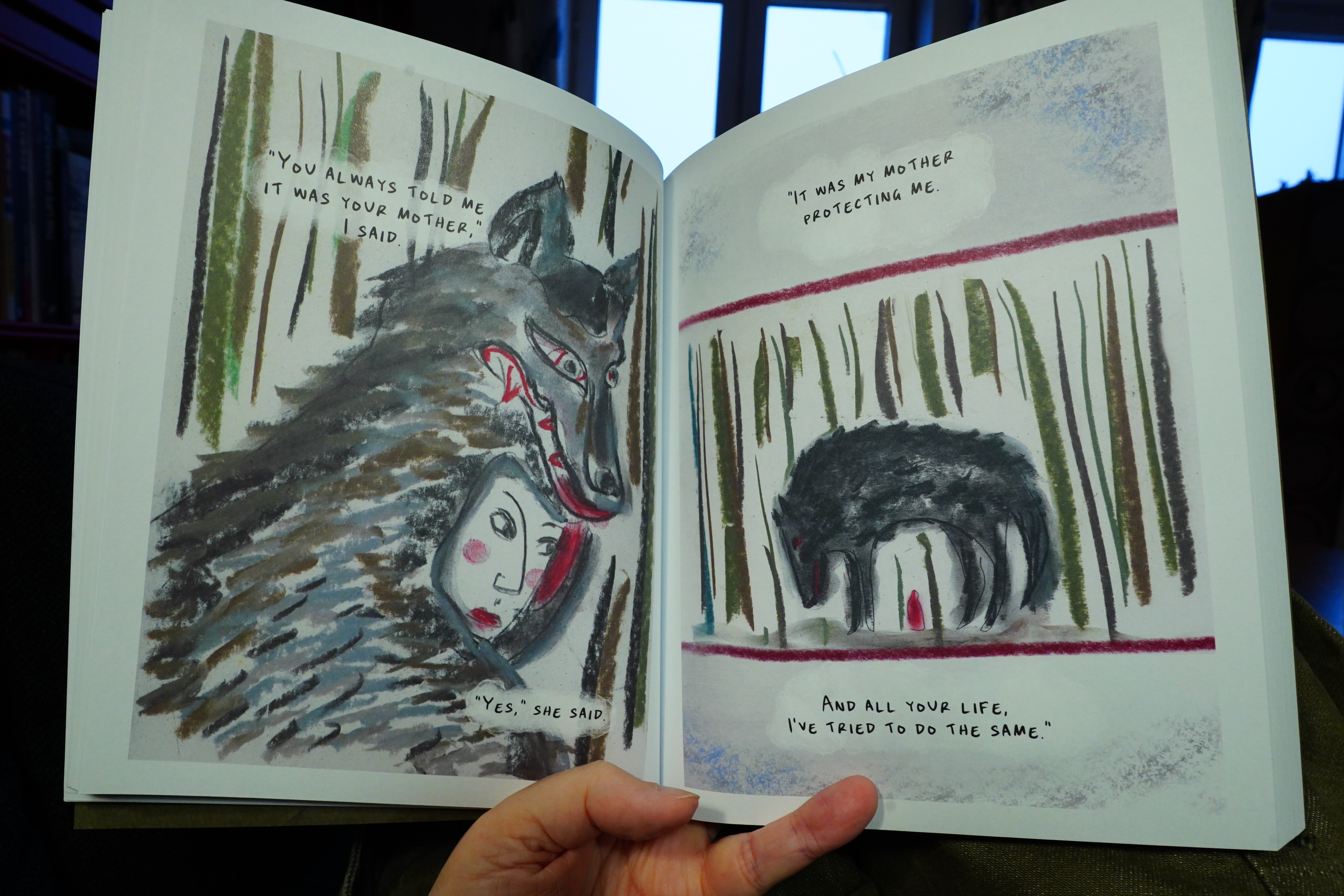
14:11: French Girl by Jesse Lee Kercheval (Fieldmouse Press)

This is a collection of vignettes, all told in this mode.

They all circle around themes of growing up and parents and stuff.

It’s kind of hypnotic. It’s ace.
| Sussan Deyhim & Richard Horowitz: The Invisible Road: Original Recordings 1985–1990 |  |
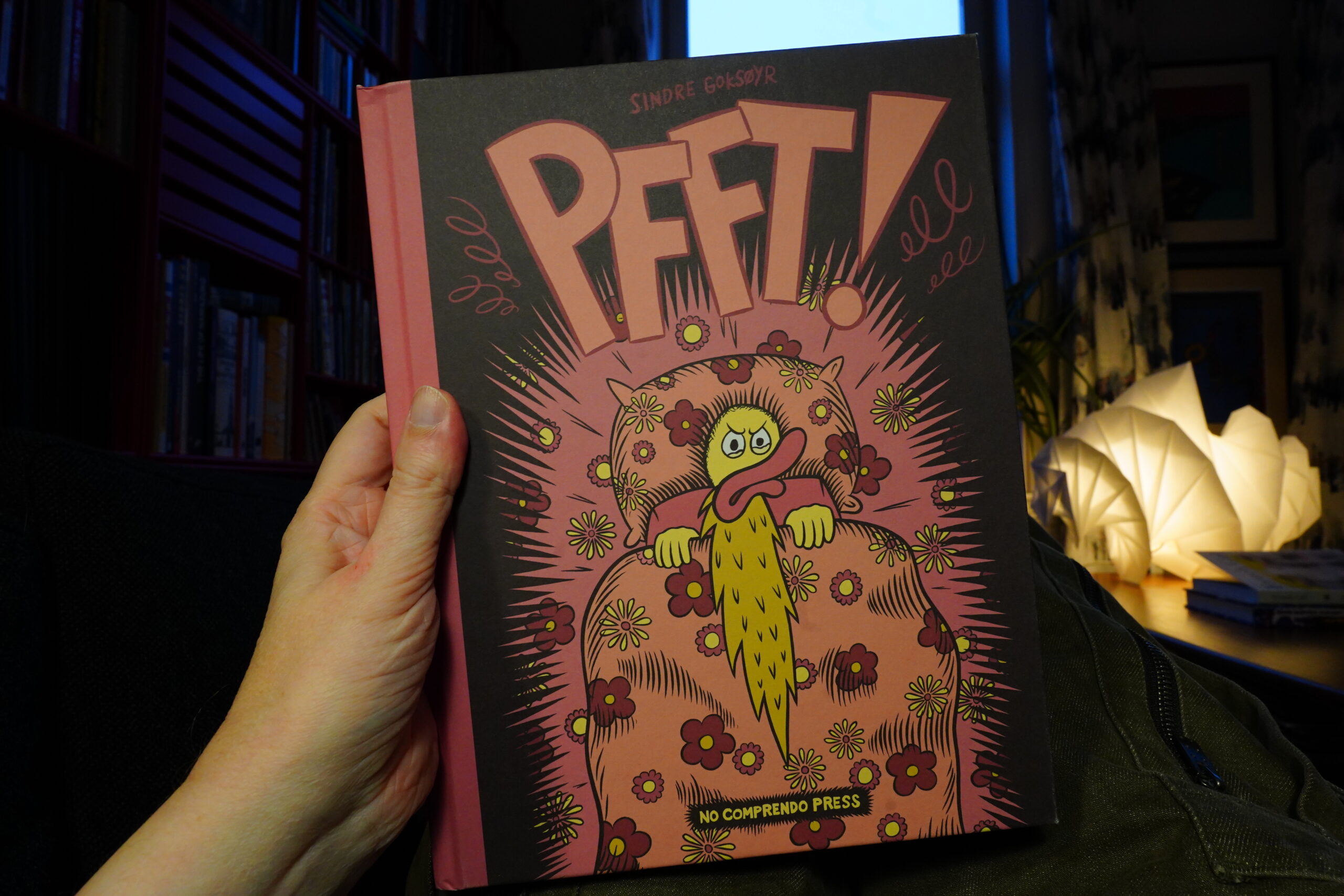
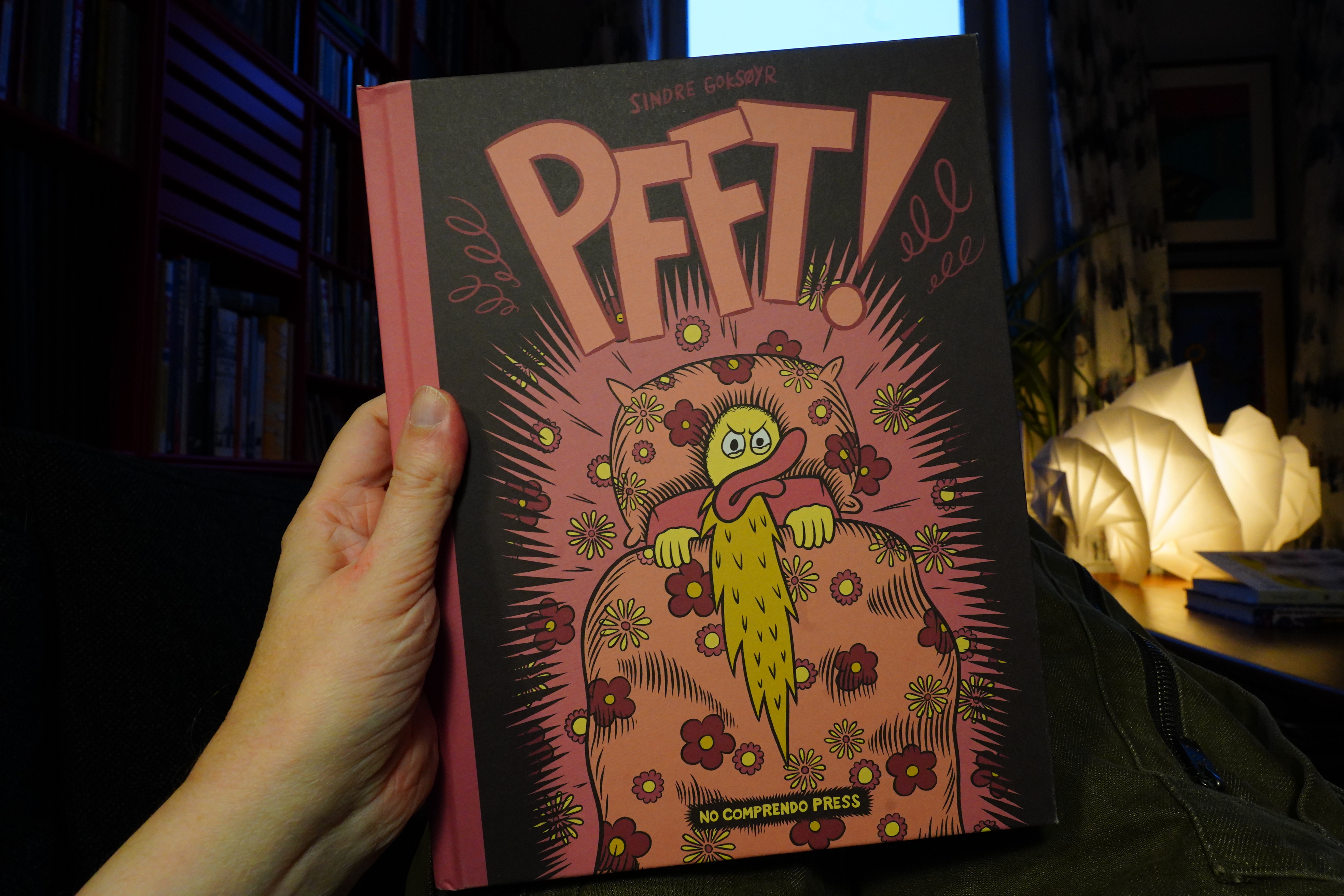
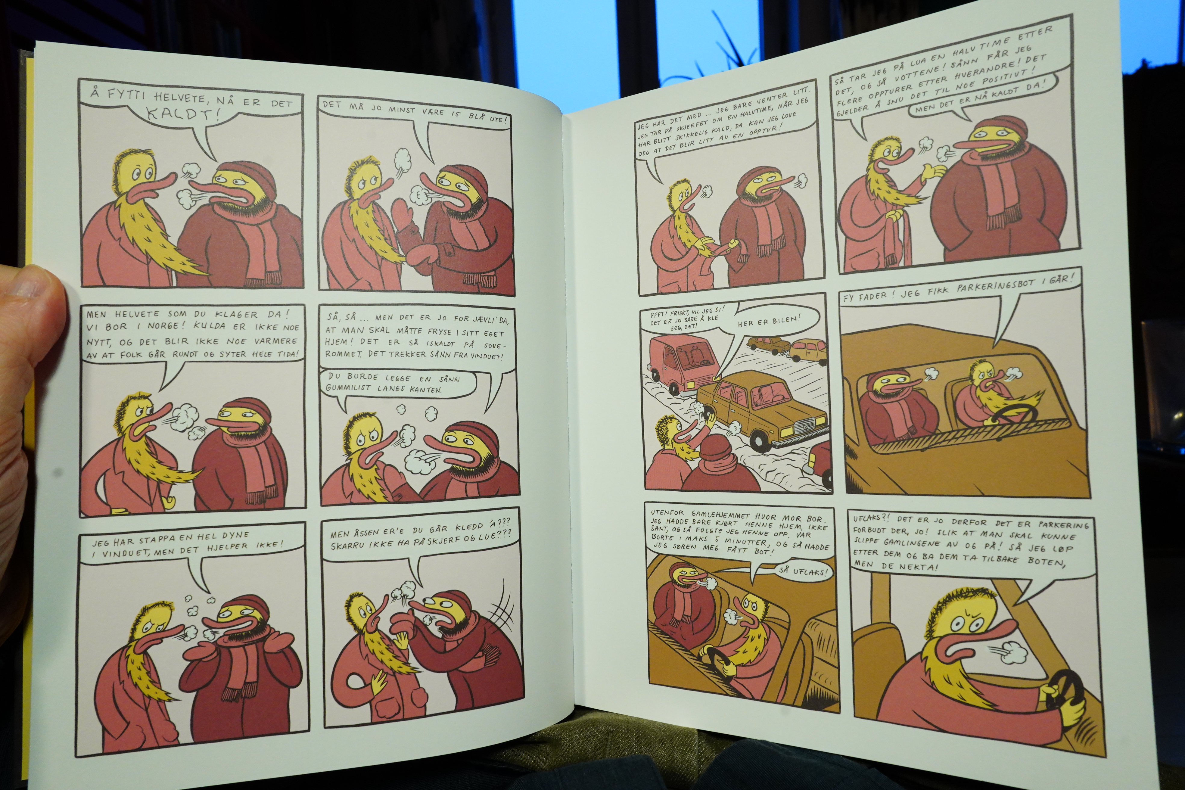
14:35: Pfft! by Sindre Goksøyr (No Comprendo Press)

Man, this colour palette is kinda yucky, right? Is it the Drnaso influence? I think he started this trend…
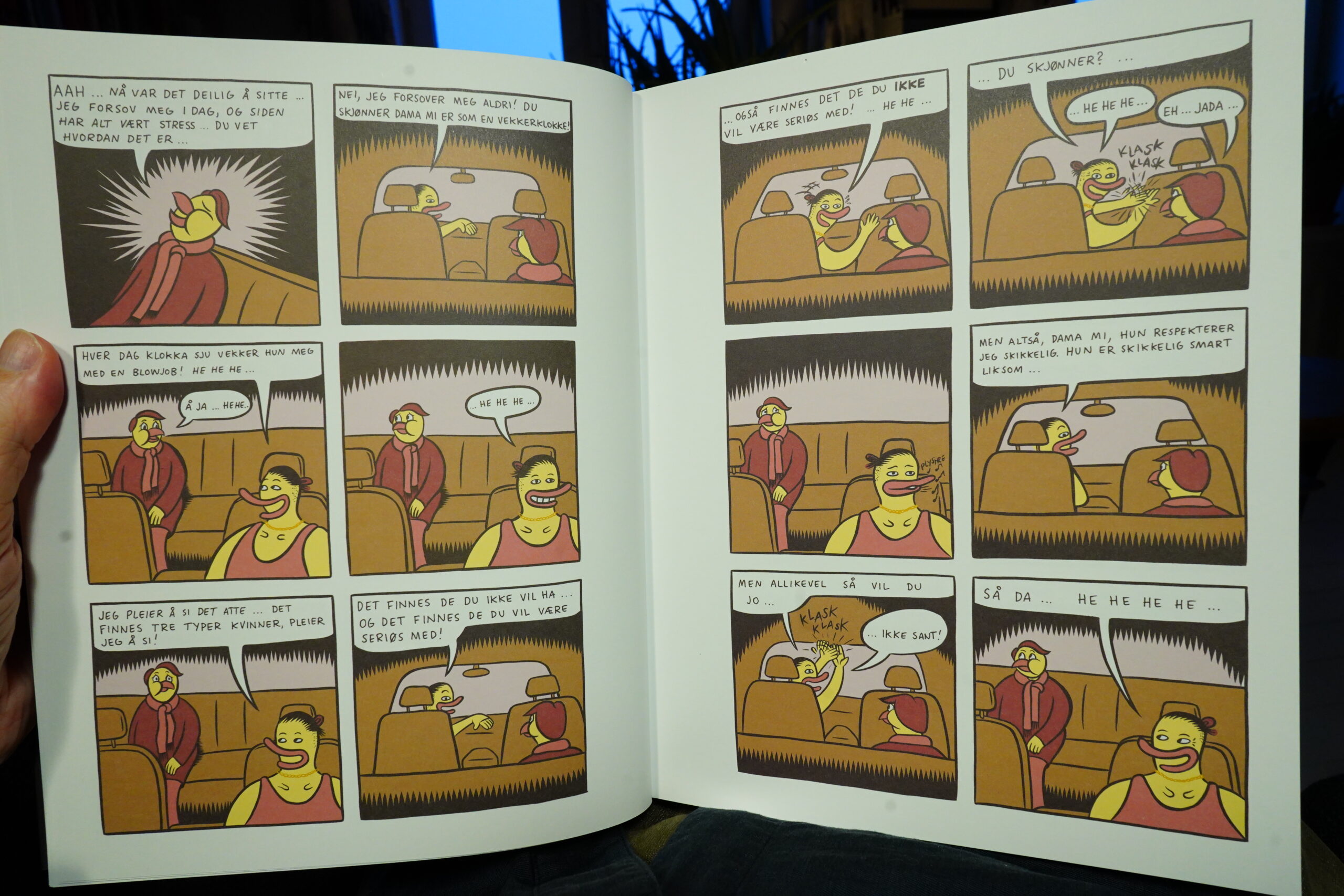
This book is about the most annoying people imaginable — just one annoying asshole after another?
It’s like the author has kept a notebook for decades where he’s made a list of all annoying things that people do, and every two pages we get another scene of some asshole doing something annoying.
Then it shifts abruptly into being about childhood, and we get one scene of abuse after another.
This is the most depressing comic I’ve read in a while, and not in a good way.
| repository: Xiu Xiu |  |
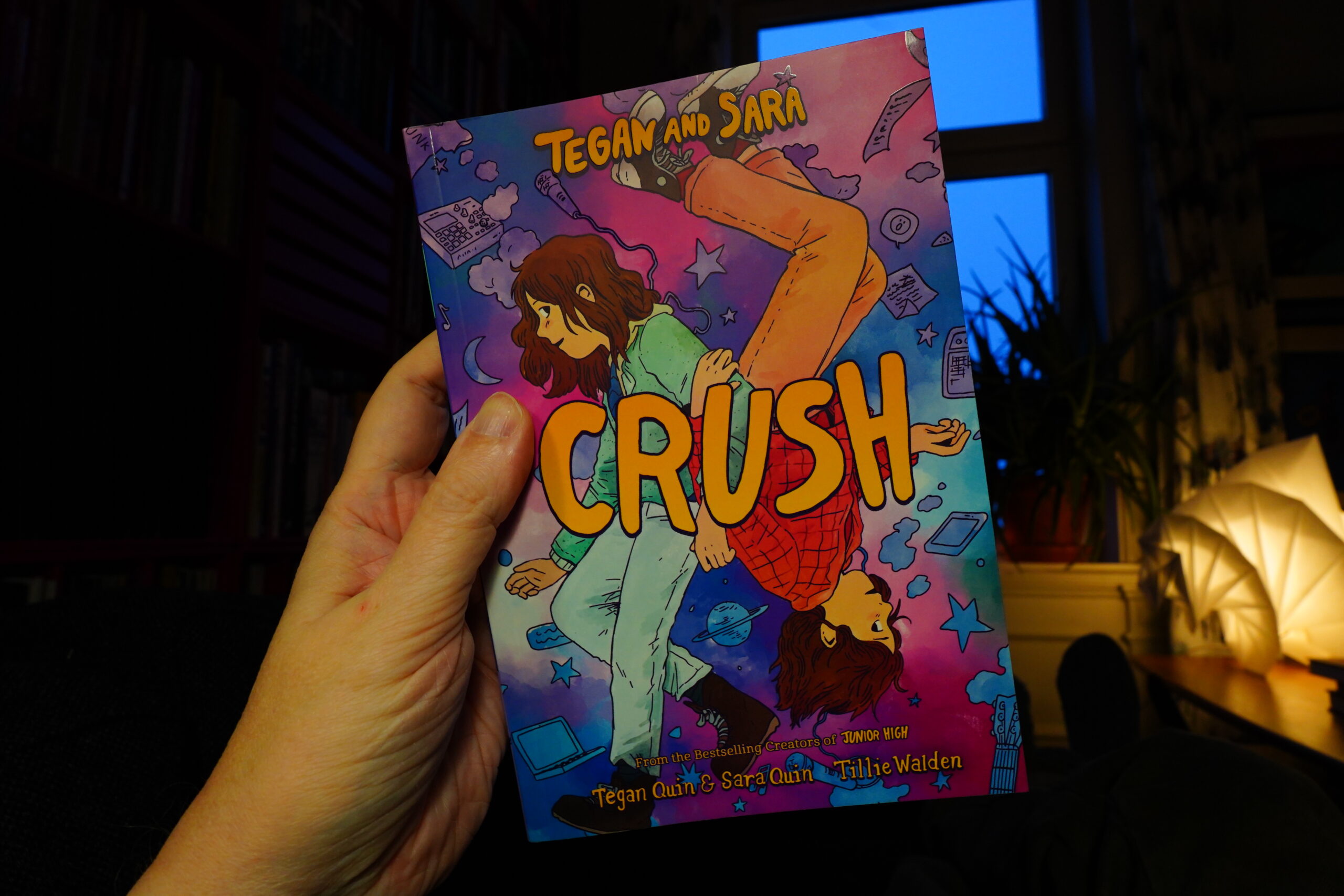
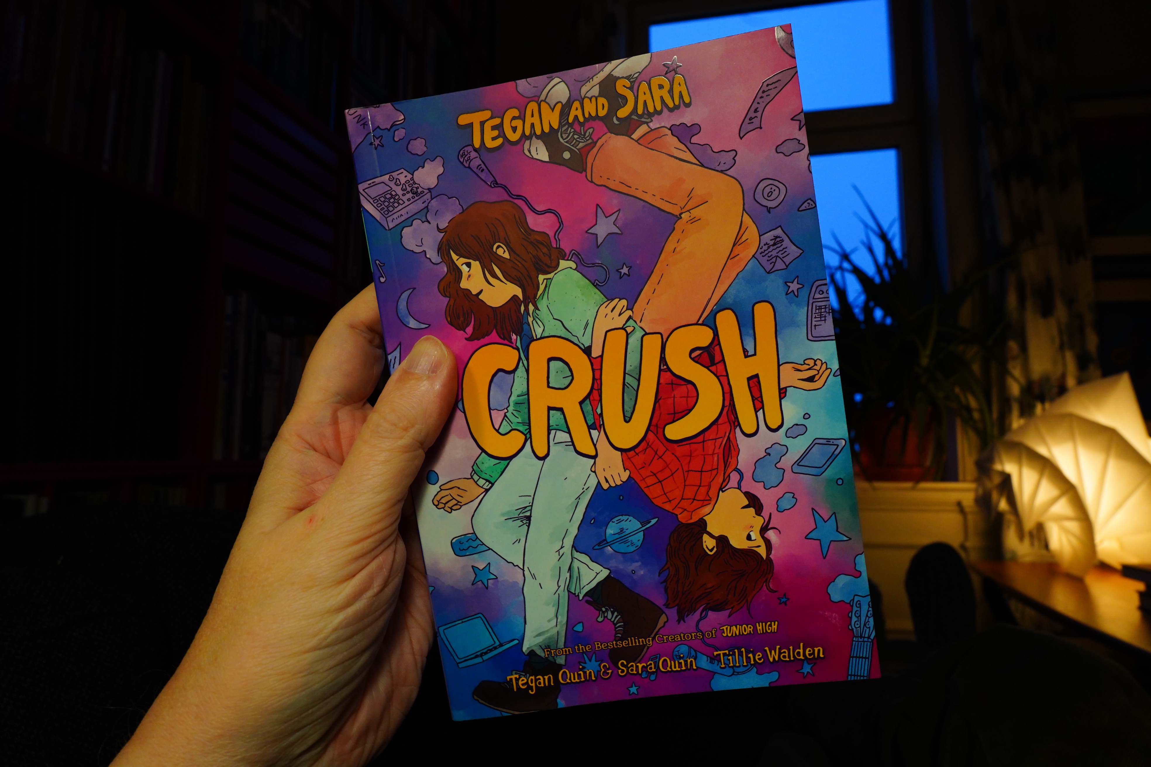
15:26: Crush by Tillie Walden, Tegan Quinn and Sara Quinn (Farrar, Straus and Giroux)
I picked this up because I quite like Tillie Walden’s comics. I do have an album by Tegan & Sara, but I know virtually nothing about them.
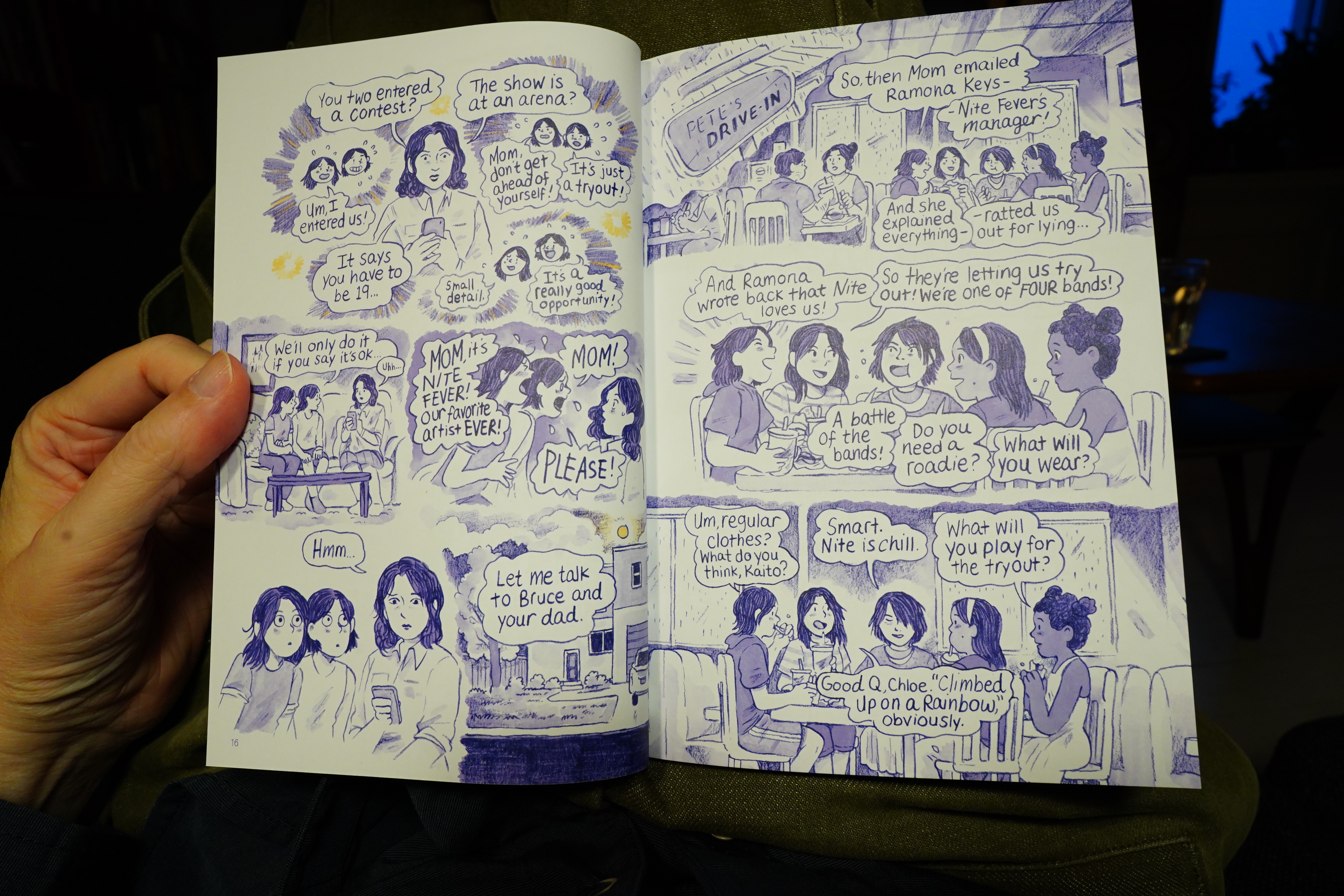
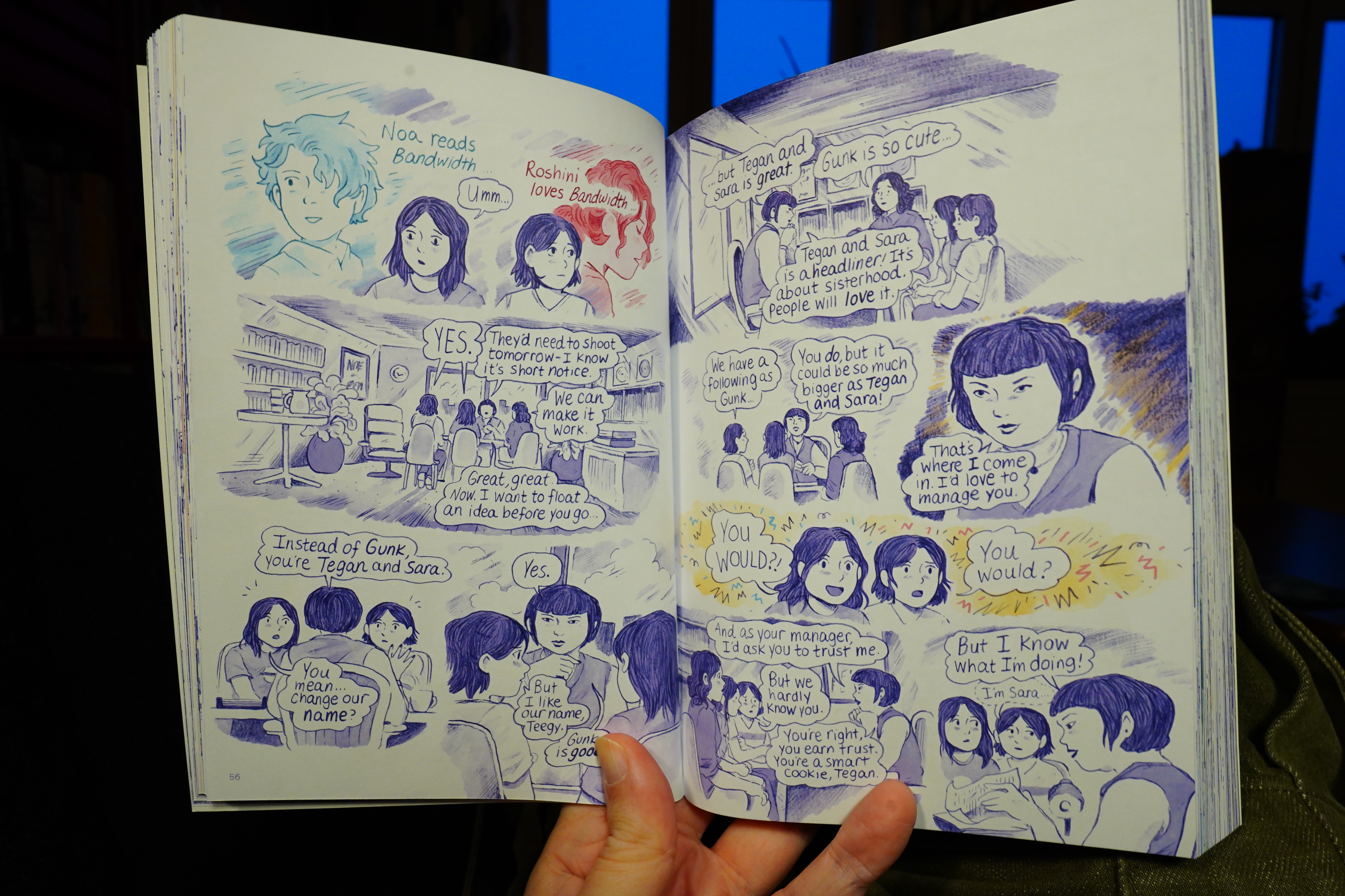
This is all kinds of confusing, though. I thought they were from the 90s? Well, perhaps I’m just misremembering and they started in the mid 2000s?
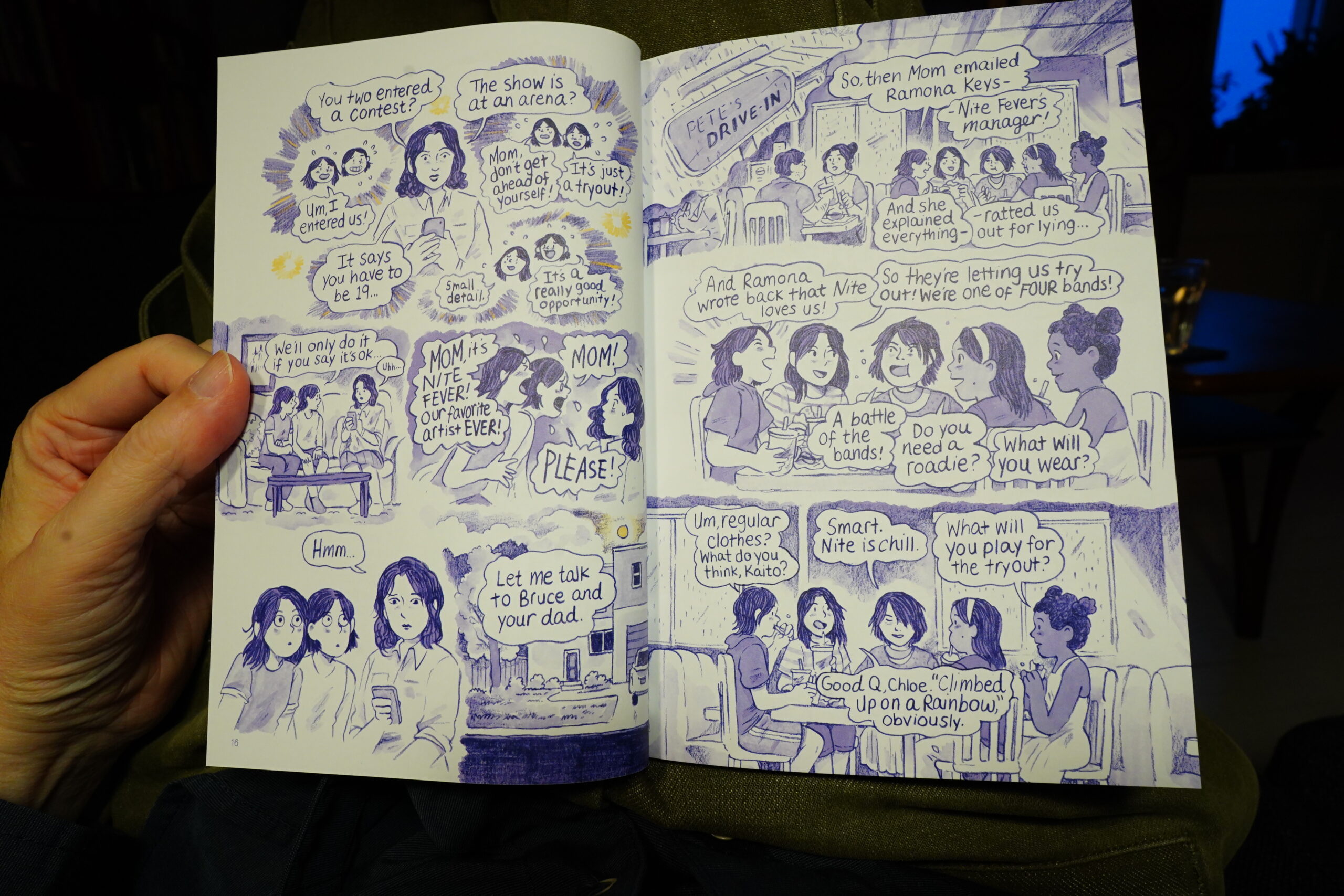
What the… live streaming?! OK, this isn’t about the real Tegan & Sara at all, but is about two contemporary 13 year olds called “Tegan & Sara” who are in a band together!? OK, OK, resetting…
| Arthur Russell: In the Light of the Miracle | 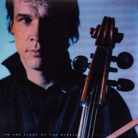 |

Even after resetting, I’m just mostly confused here, because it turns out that this is the second book in a series, and they have a gazillion characters that basically look the same.
And… They go on dates? At coffee bars? At 13?
| Belong: Realistic IX |  |
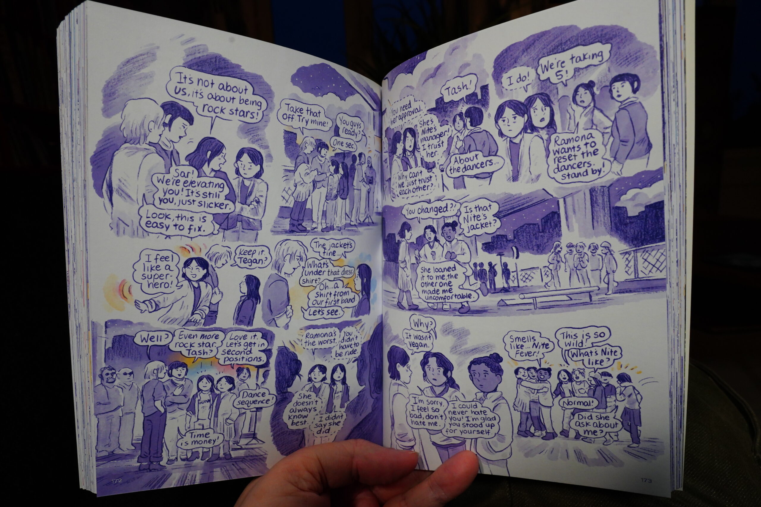
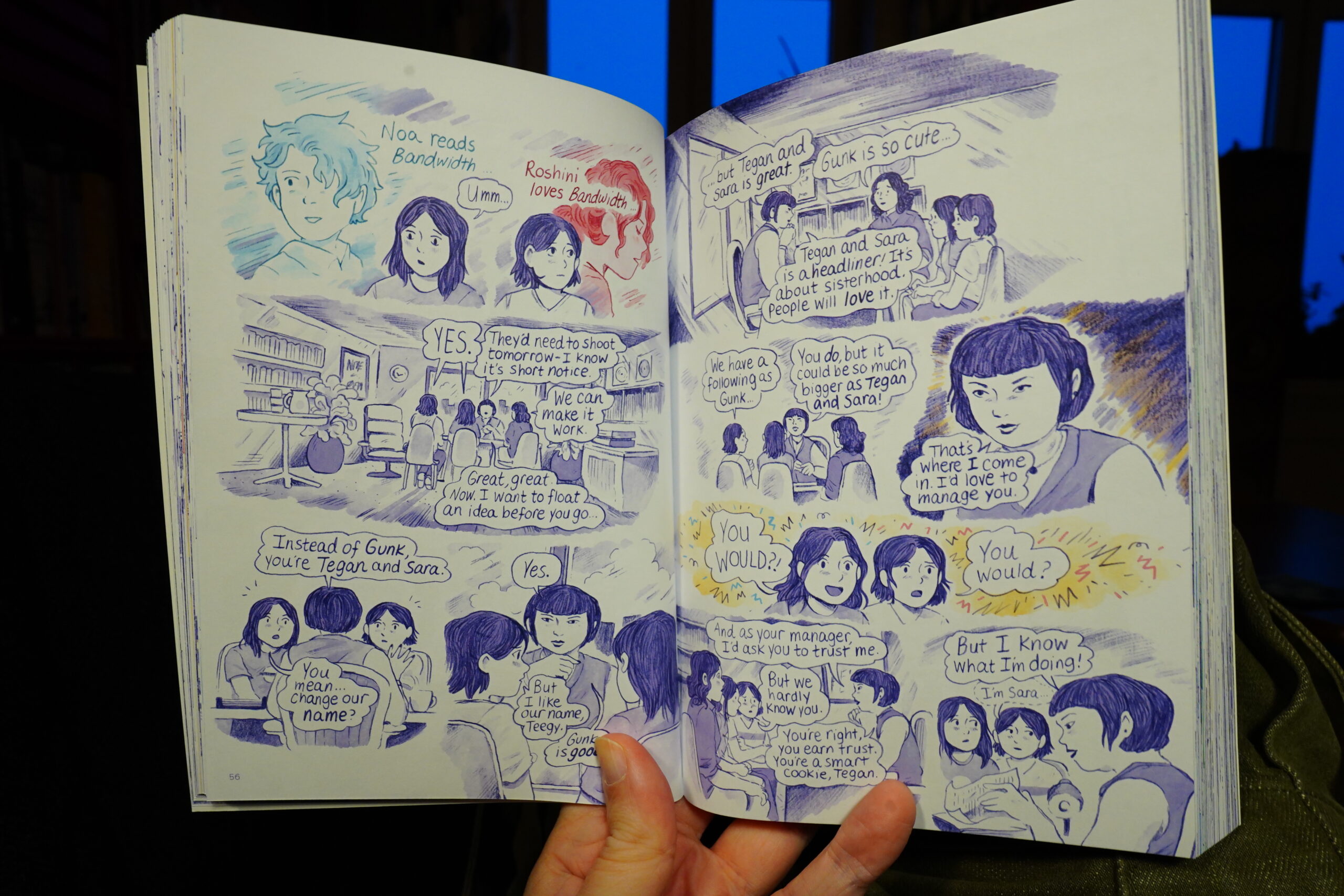
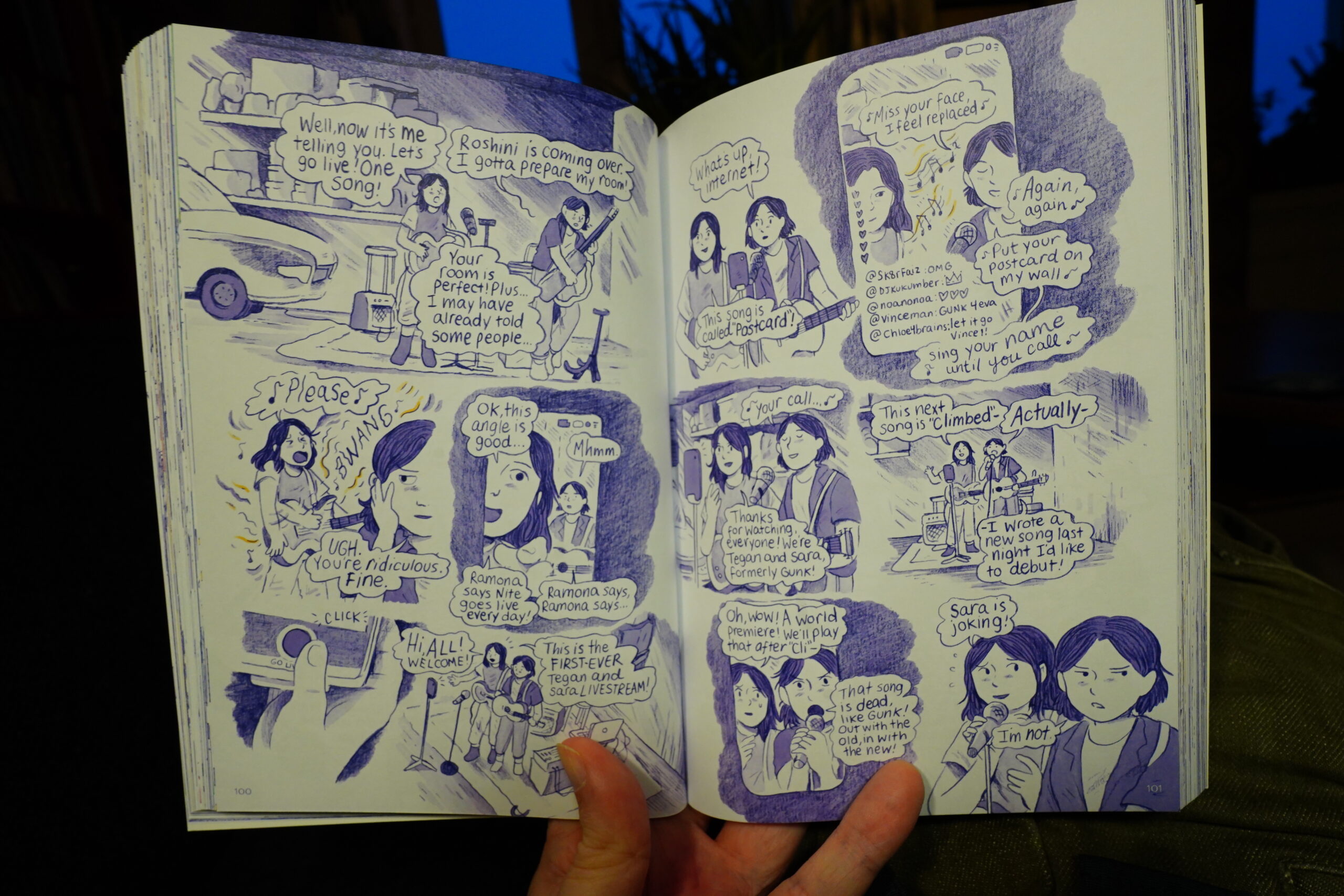
And it’s like… Walden crams so much stuff into these pages. Or perhaps it’s the Quinn sisters? Because it feels like every spread would be a ten minute scene in a TV show. It’s exhausting.
OK, OK, I’m not the target audience. But… I don’t think this book quite works. They go over the same conflicts so many times — it feels like they could easily have cut the “plot” and verbiage down to a quarter, and if they’d then kept the same page count, it might have been something.
| Black Cab: Games of the XXI Olympiad (2024 remasters collection) |  |
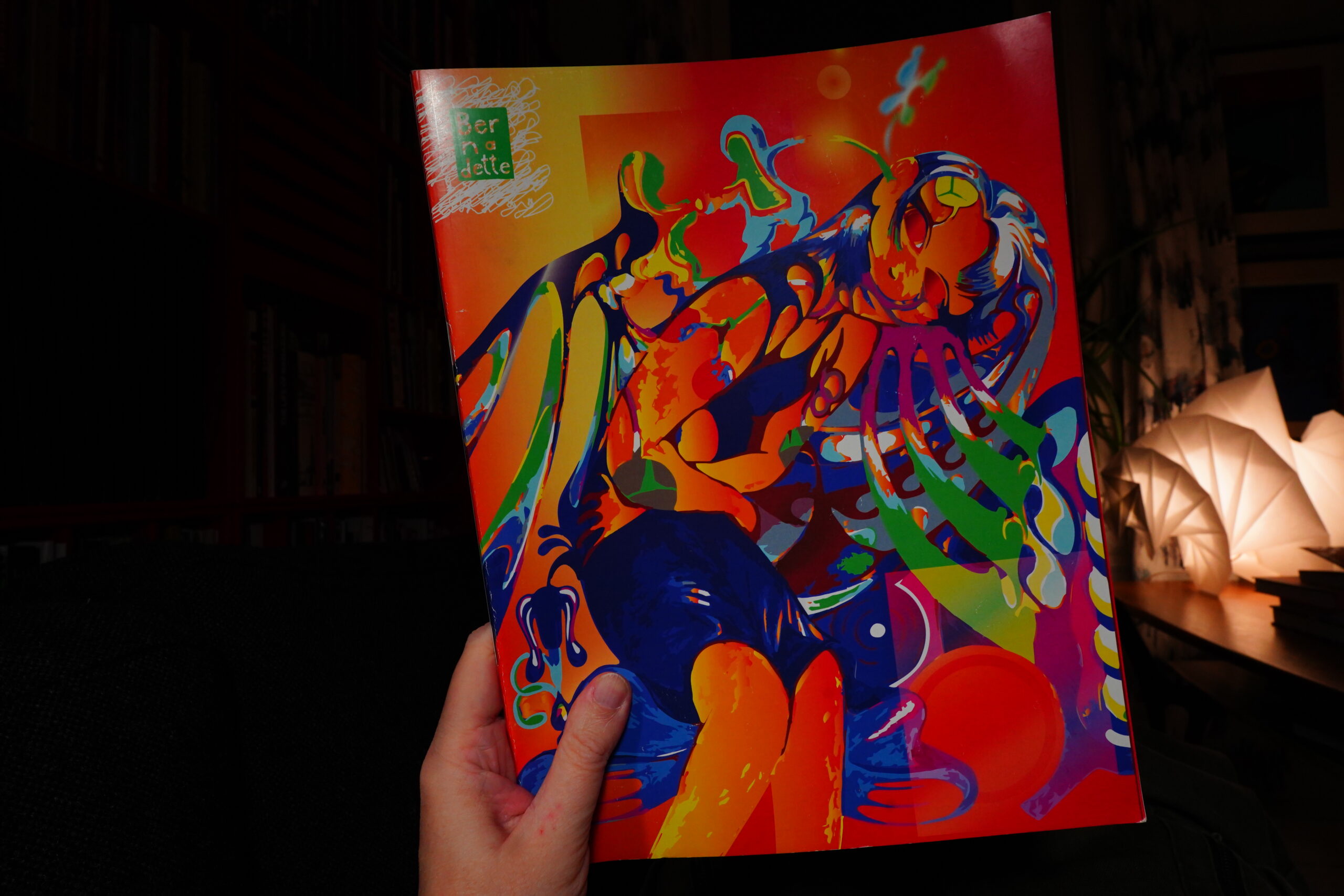
16:50: Bernadette Magazine #1 edited by Angela Fanche and Katie Lane
I got this from here, but I see it’s sold out now. Typical.
This is an oversized anthology with short pieces — mostly around three pages.

Varied approaches — some illustration, some photo pieces, and some comics.
It’s good — it’s got a good flow. It doesn’t have a theme or anything, but it works as a whole anyway.
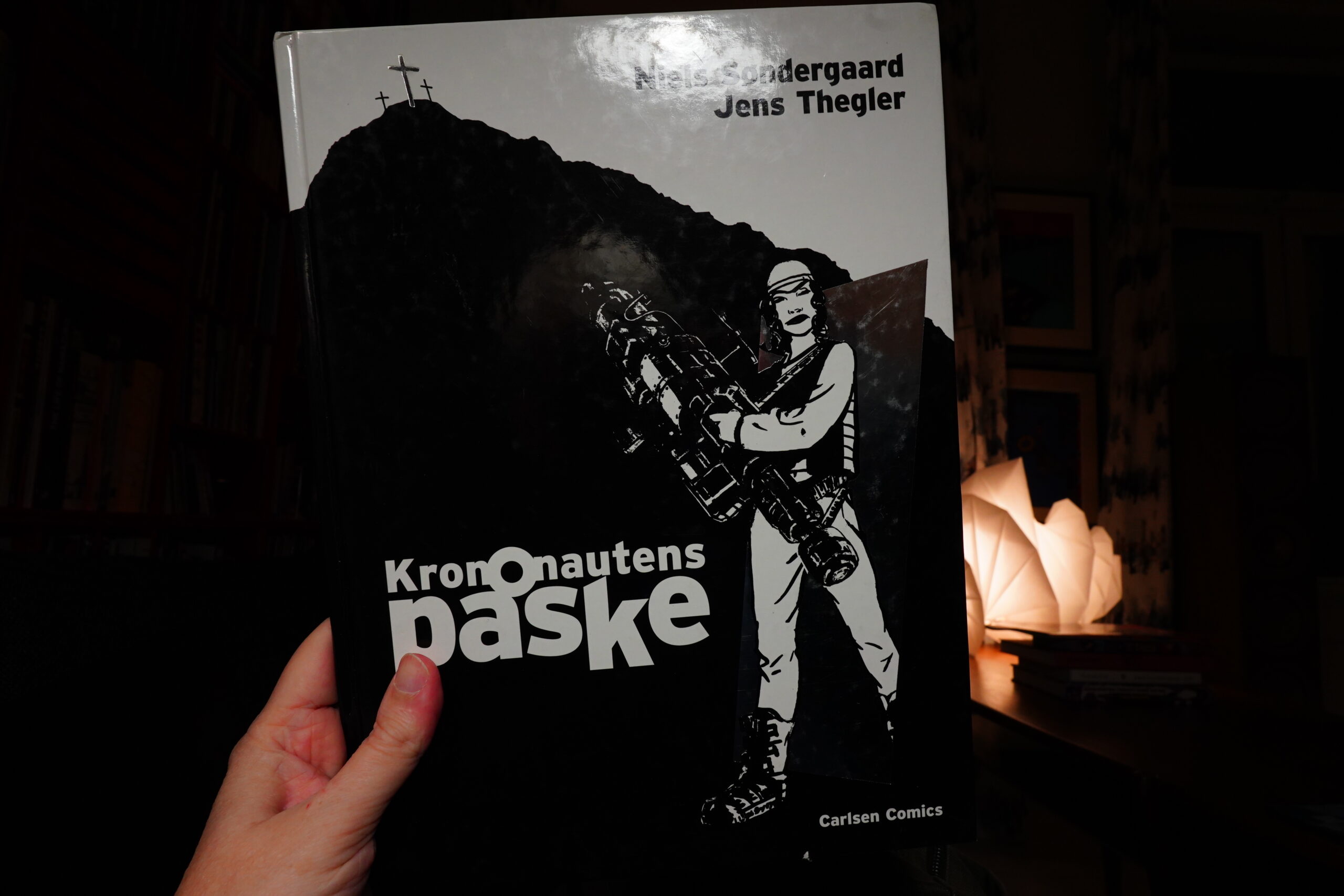
17:35: Krononautens påske by Niels Søndergaard/Jens Thegler (Carlsen Comics)
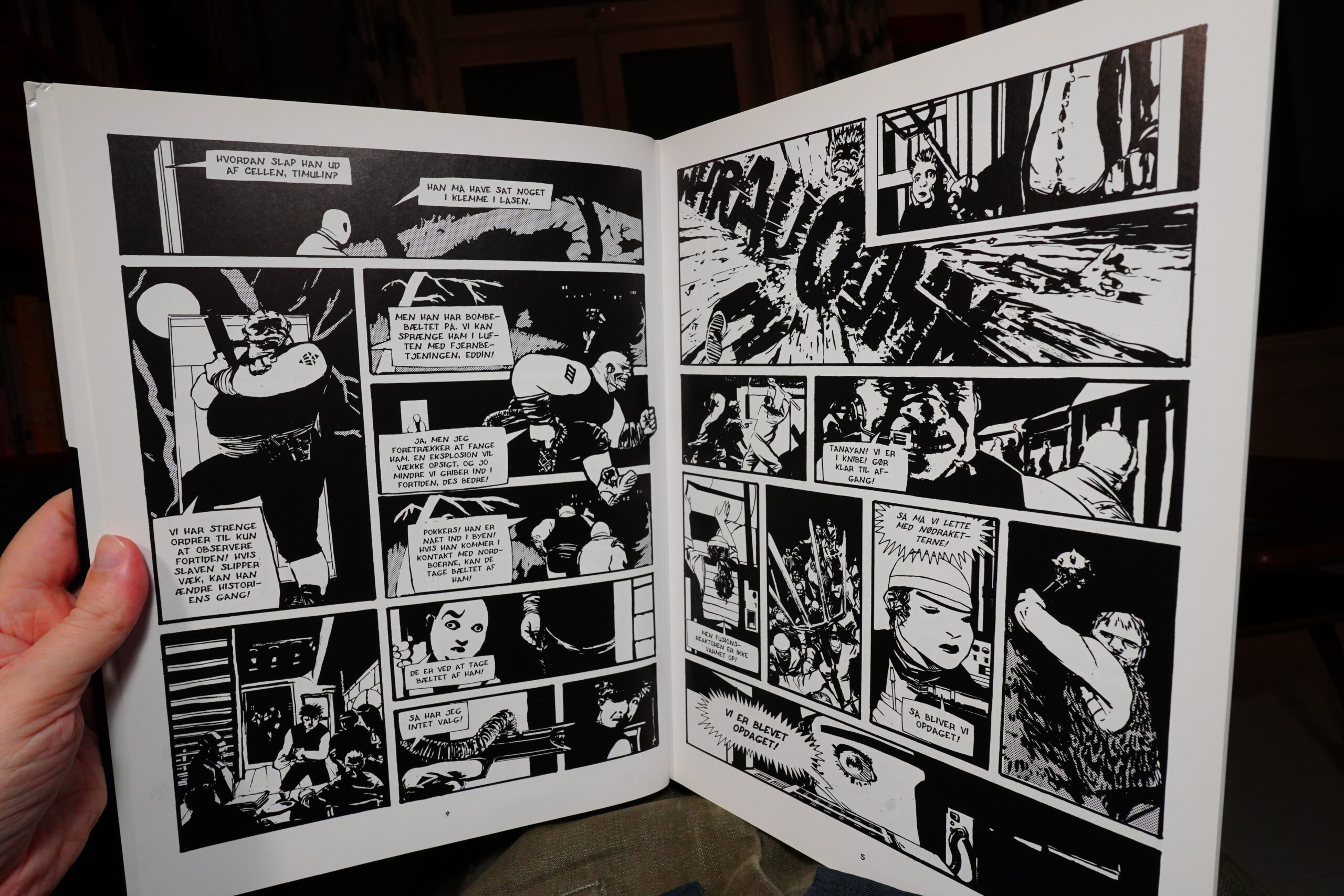
This is a time travel thing — some time travellers from the Attilan Empire in the year 4000 after Attilla the Hun conquered the world travel back in time.
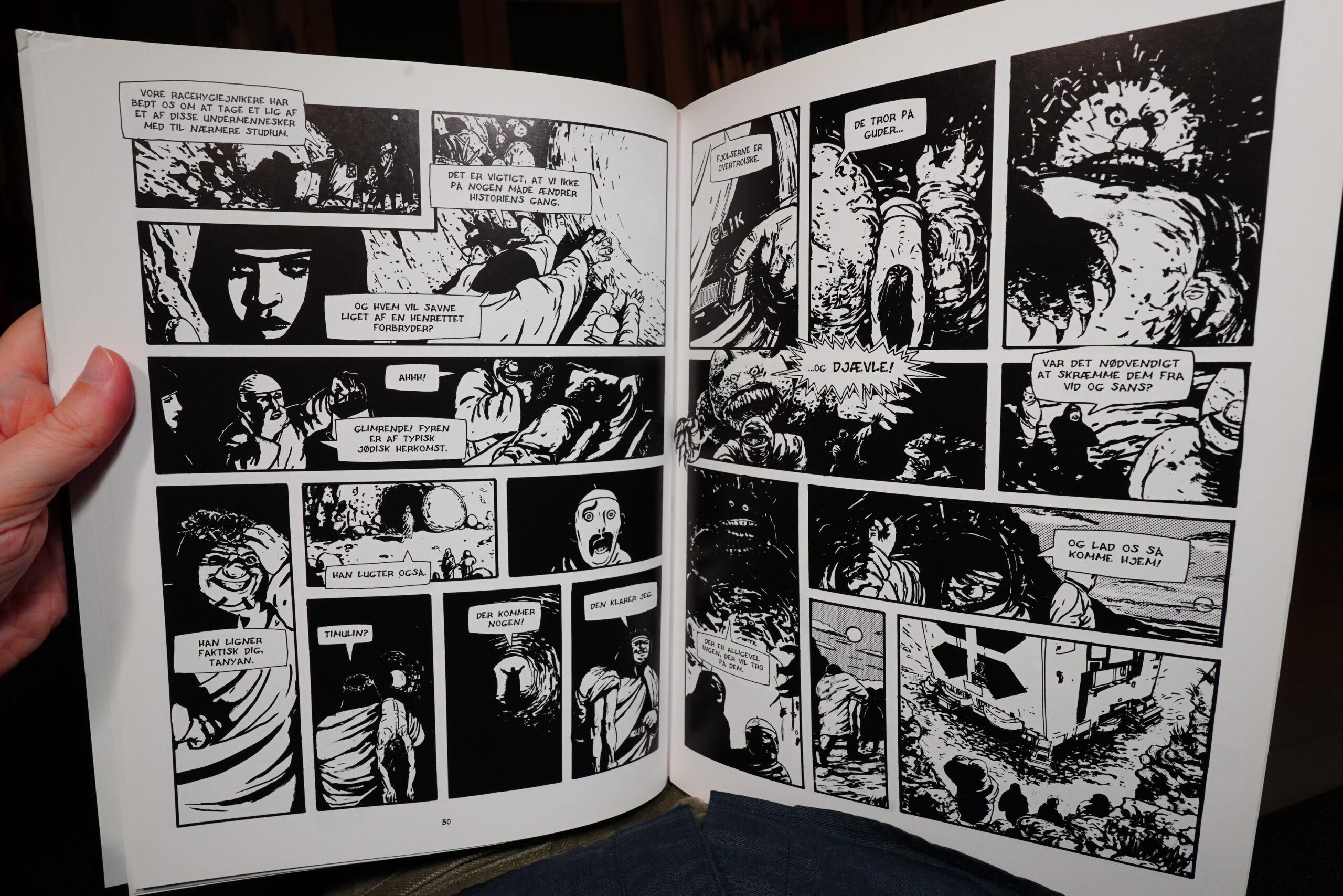
Stuff ensues, and it’s most entertaining.
However, they spend quite a bit of time in the middle explaining at us for pages and pages, and we’d already understood everything, so that was a drag.
But still: Good fun. And impressively grody artwork.
| Dummy: Free Energy |  |

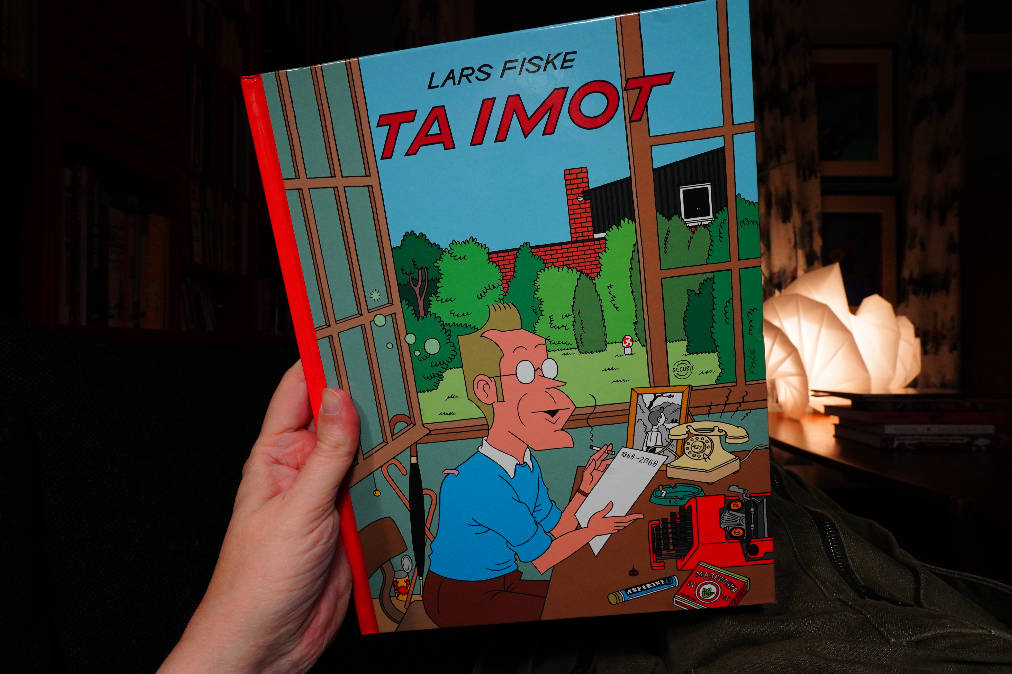
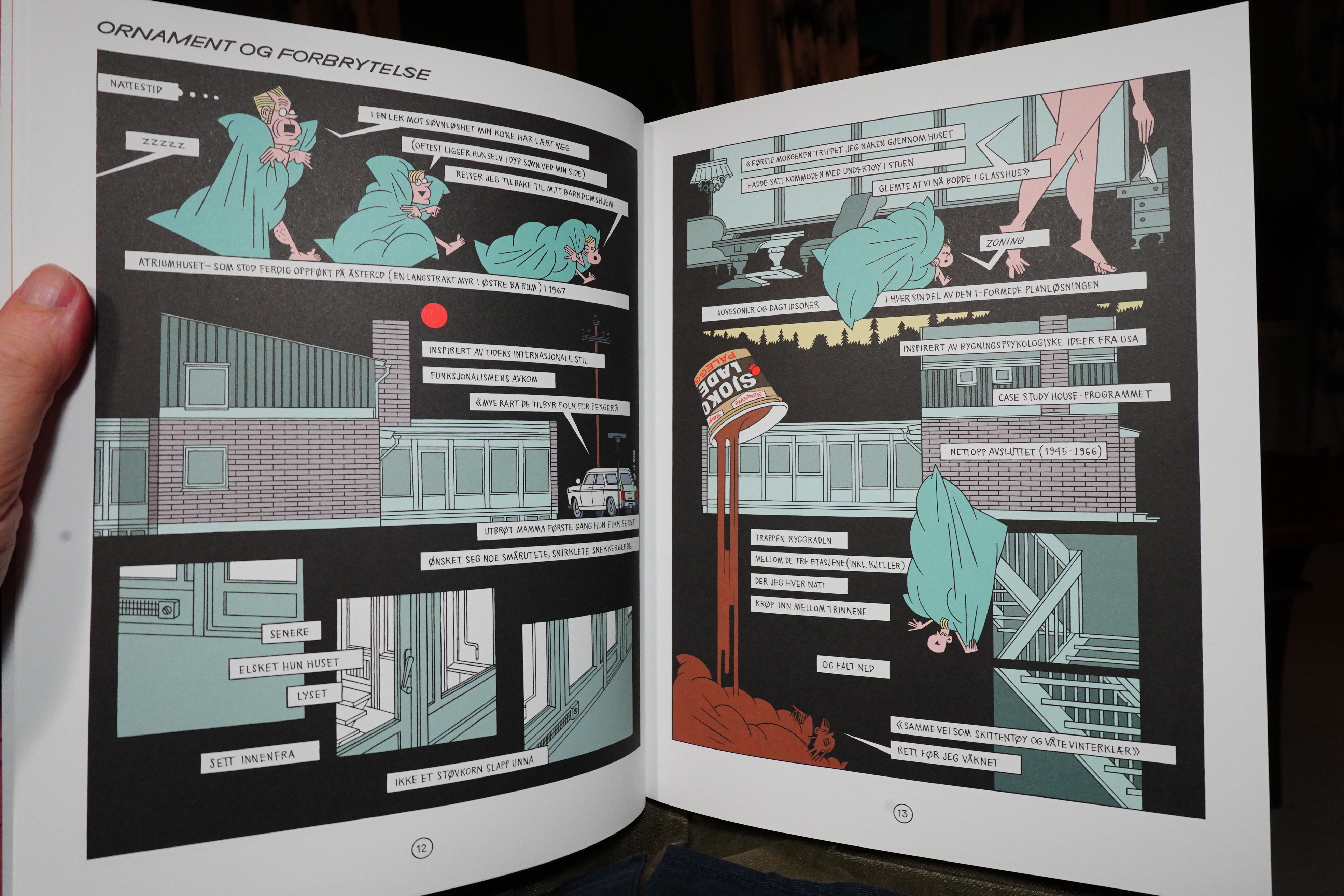
17:55: Ta imot by Lars Fiske (No Comprendo Press)
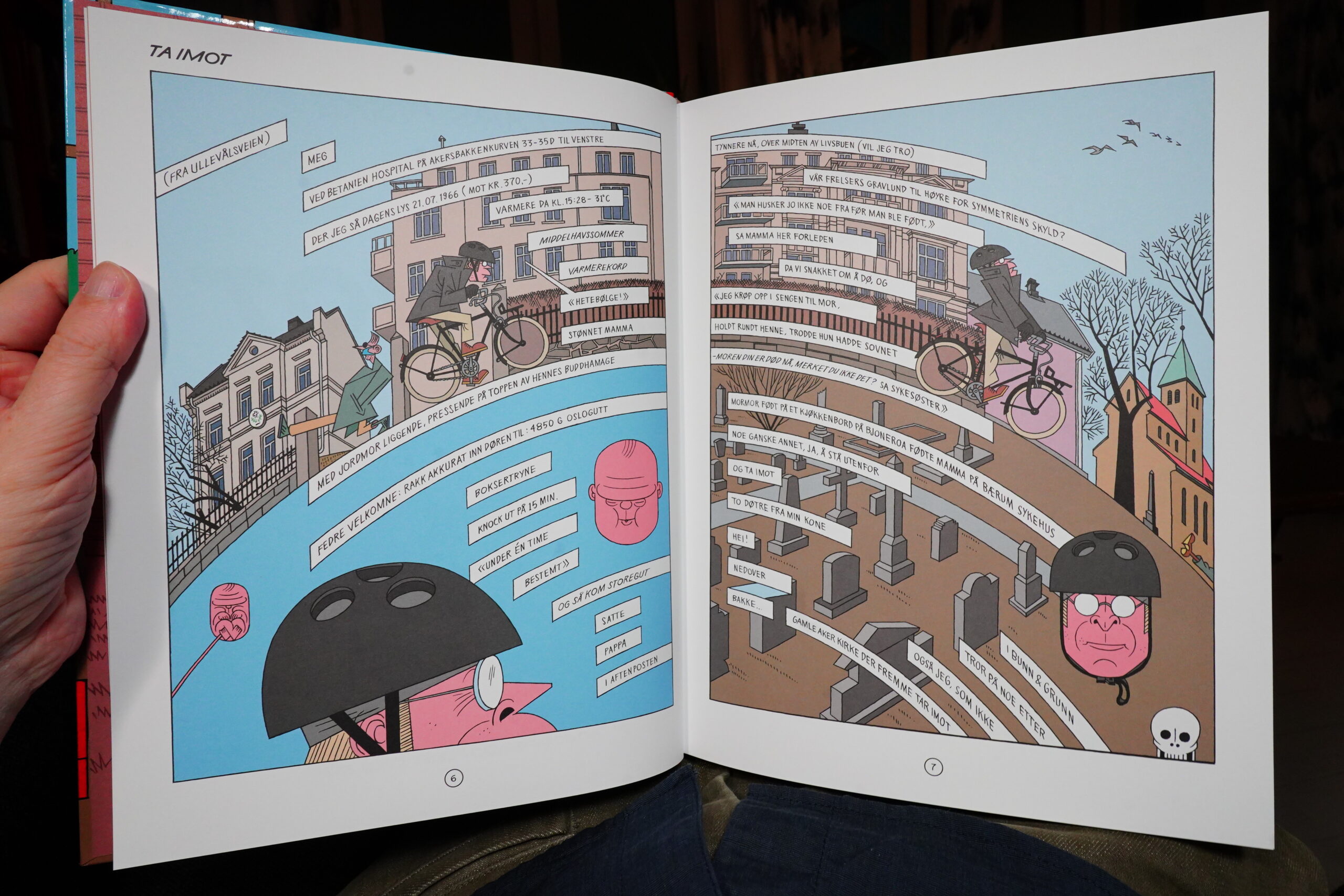
This is told as one long monologue, with text flowing through the pages in various ways.

It’s pretty hypnotic.

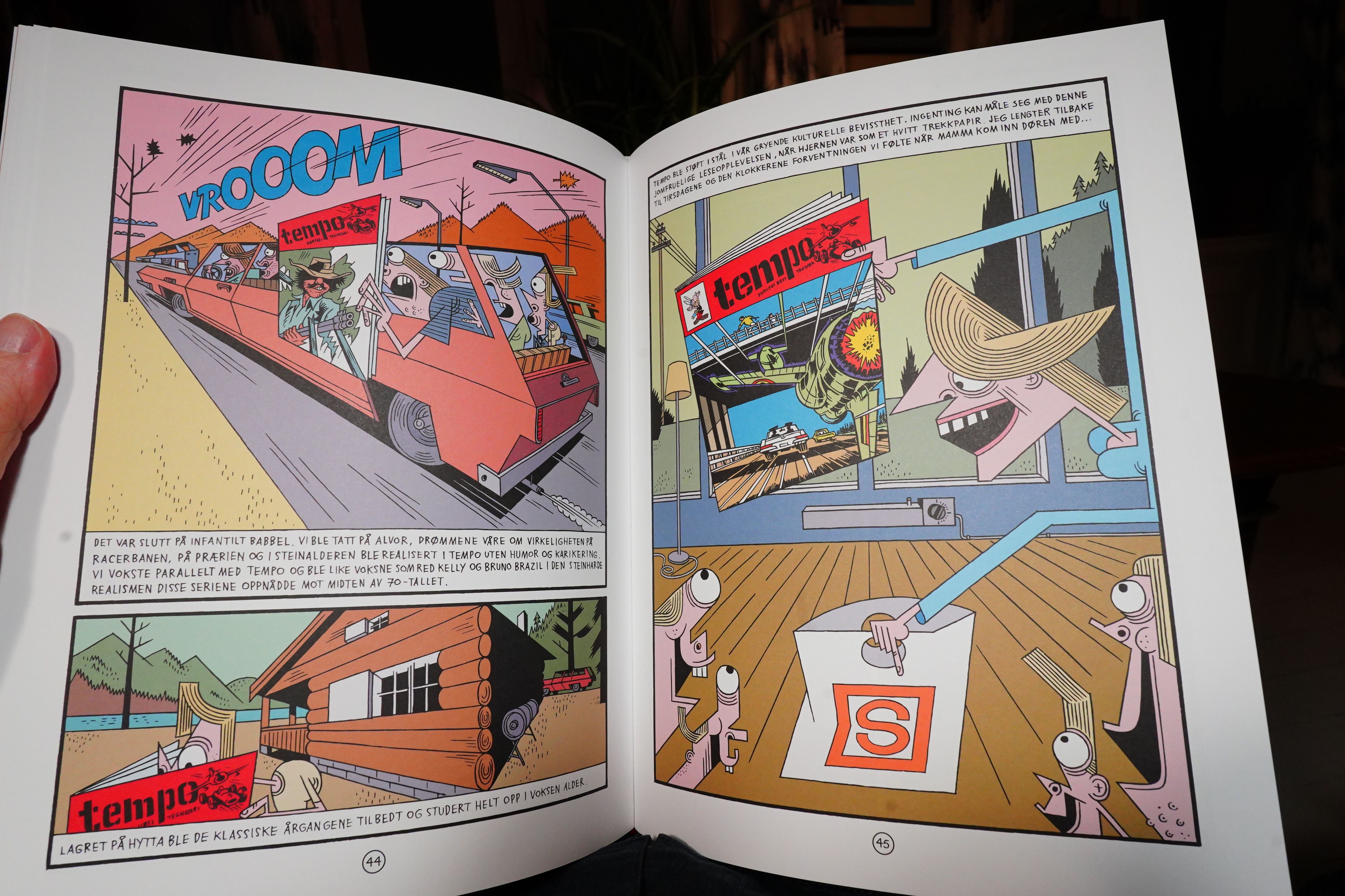
Halfway through, the book shifts from being a somewhat ordinary coming of age reminisce to being about just one thing: Comics. So we get page after page of comics that were important to Fiske growing up and as a young adult, and that’s fun — I’m sitting here going “yes, that book, and that book, and that book”, all comics I love — but it’s a bit of a head scratcher. I wonder what the reviews are like… Hm, looks like they’re positive? Well, I liked it, anyway.
| Smoke Bellow: Structurally Sound |  |

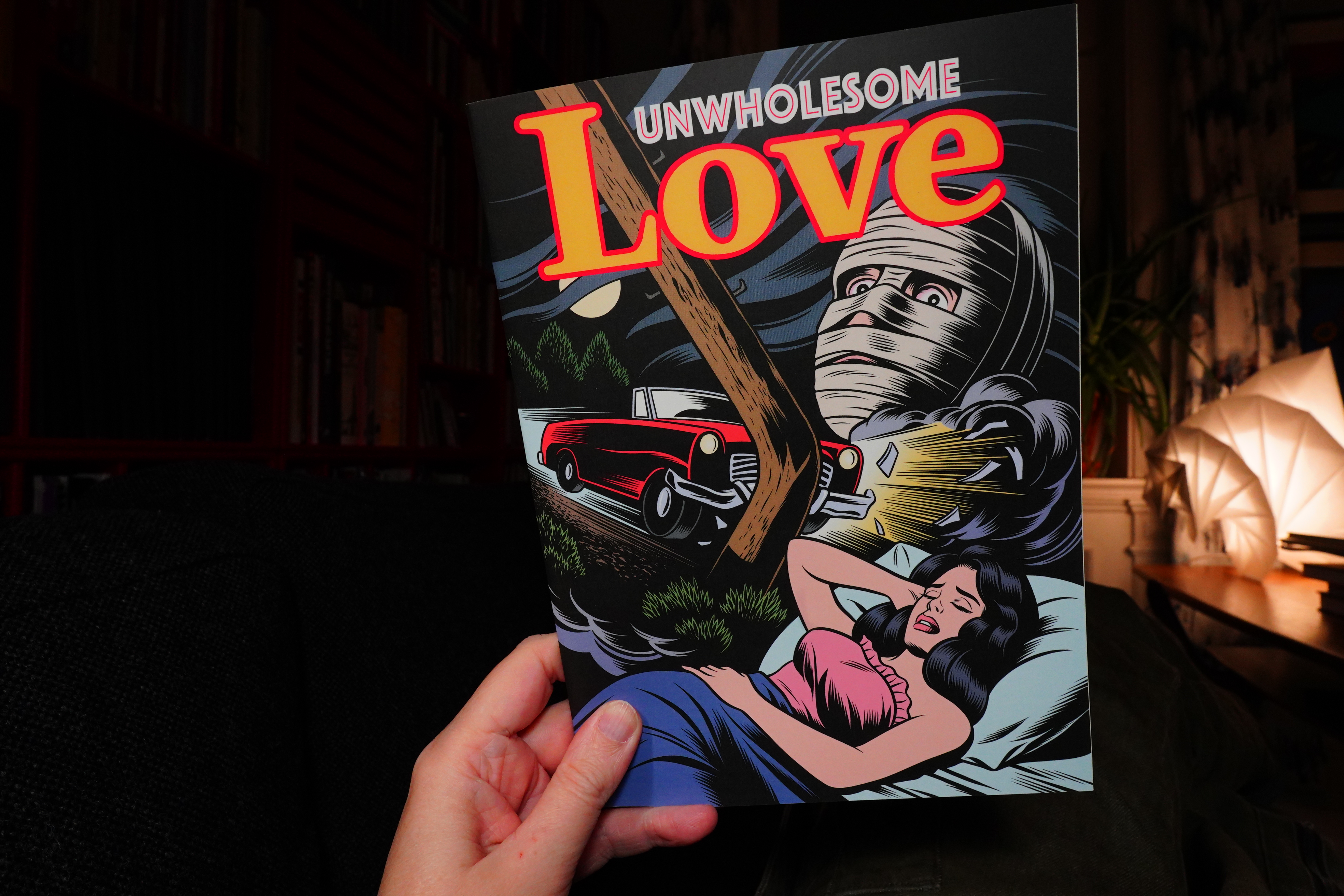
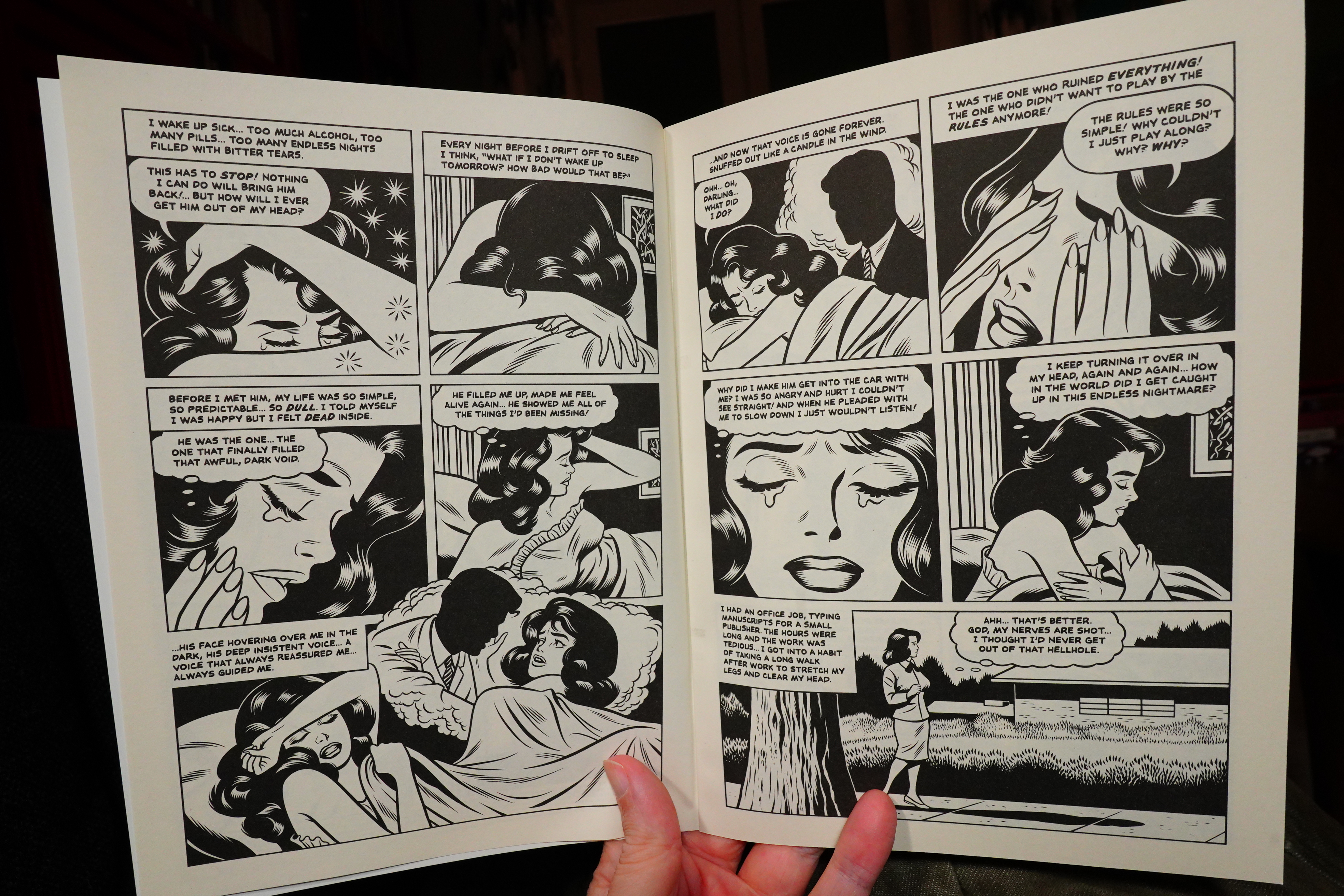
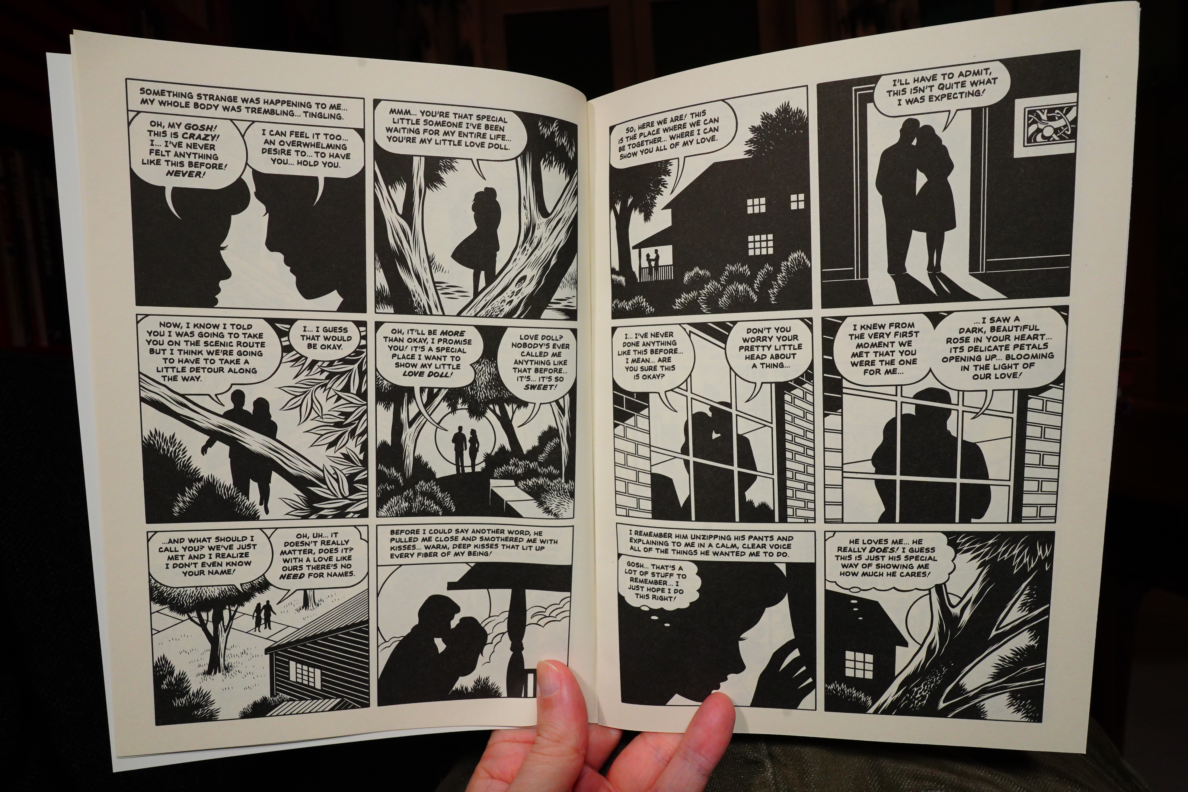
18:19: Unwholesome Love #23 by Charles Burns
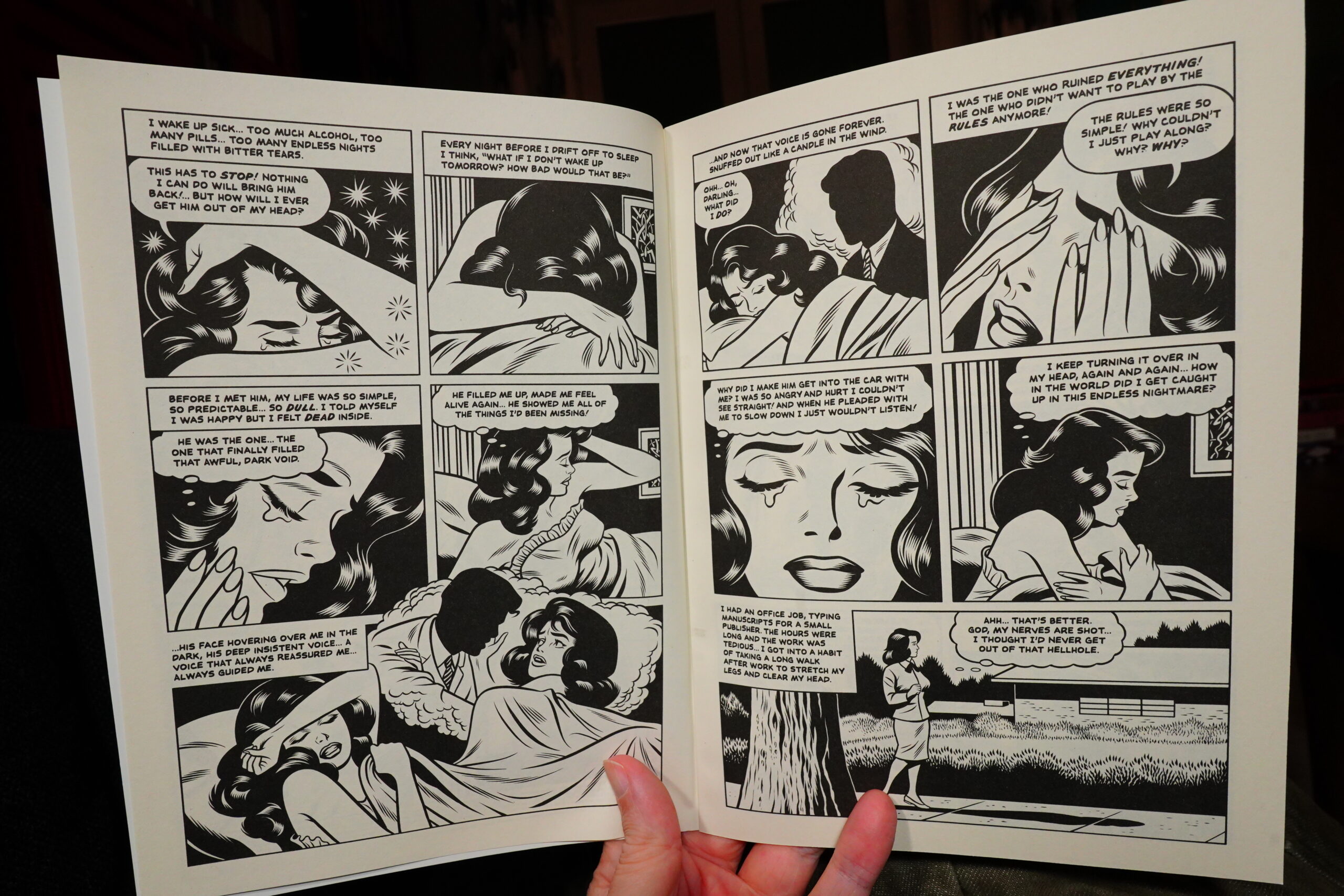
Burns released a book of book covers (to books that didn’t exist), and I wonder whether that inspired him to make an actual book to fit one of the covers?
Anyway, this is wonderful. Burns is obviously having a lot of fun here, and it’s a thrilling read. It’s a story in three chapters, or three interconnected stories — they all connect in weird and unsettling ways.
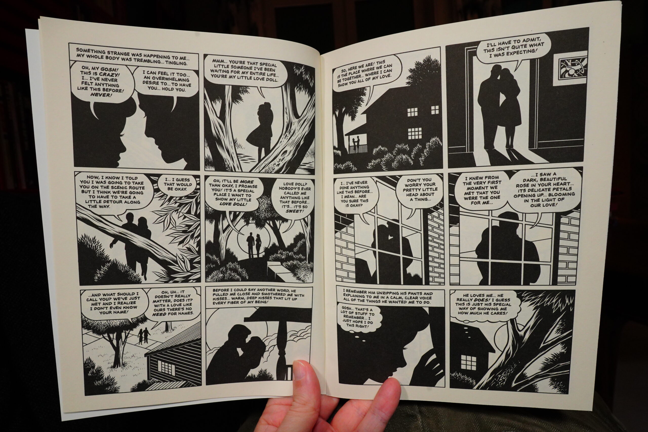
It’s weird that Burns does perhaps half? a third? of the pages in this way, though — just silhouettes. It’s stylish, but…
| Nia Archives: Silence Is Loud |  |

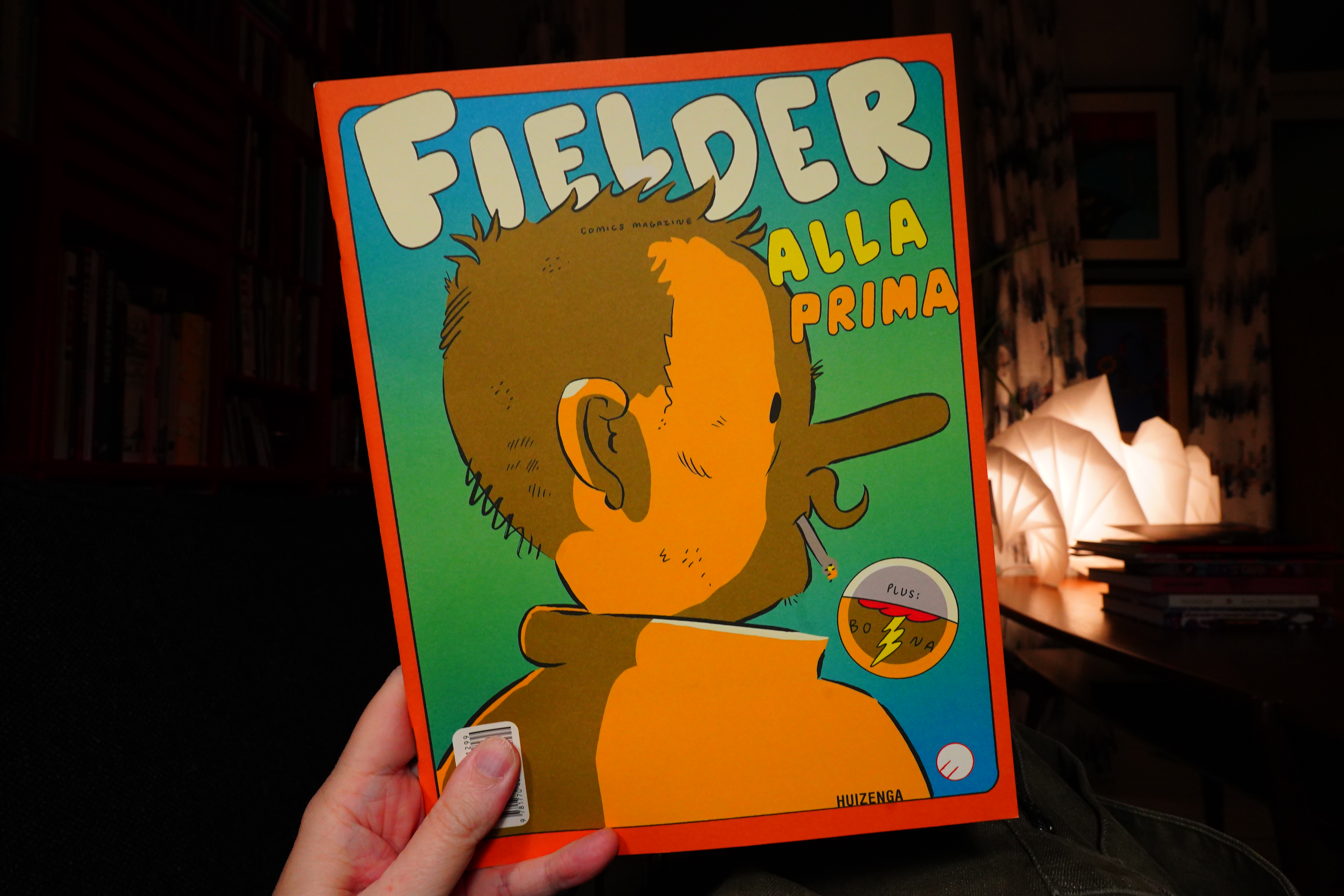
18:41: Fielder #3 by Kevin Huizenga
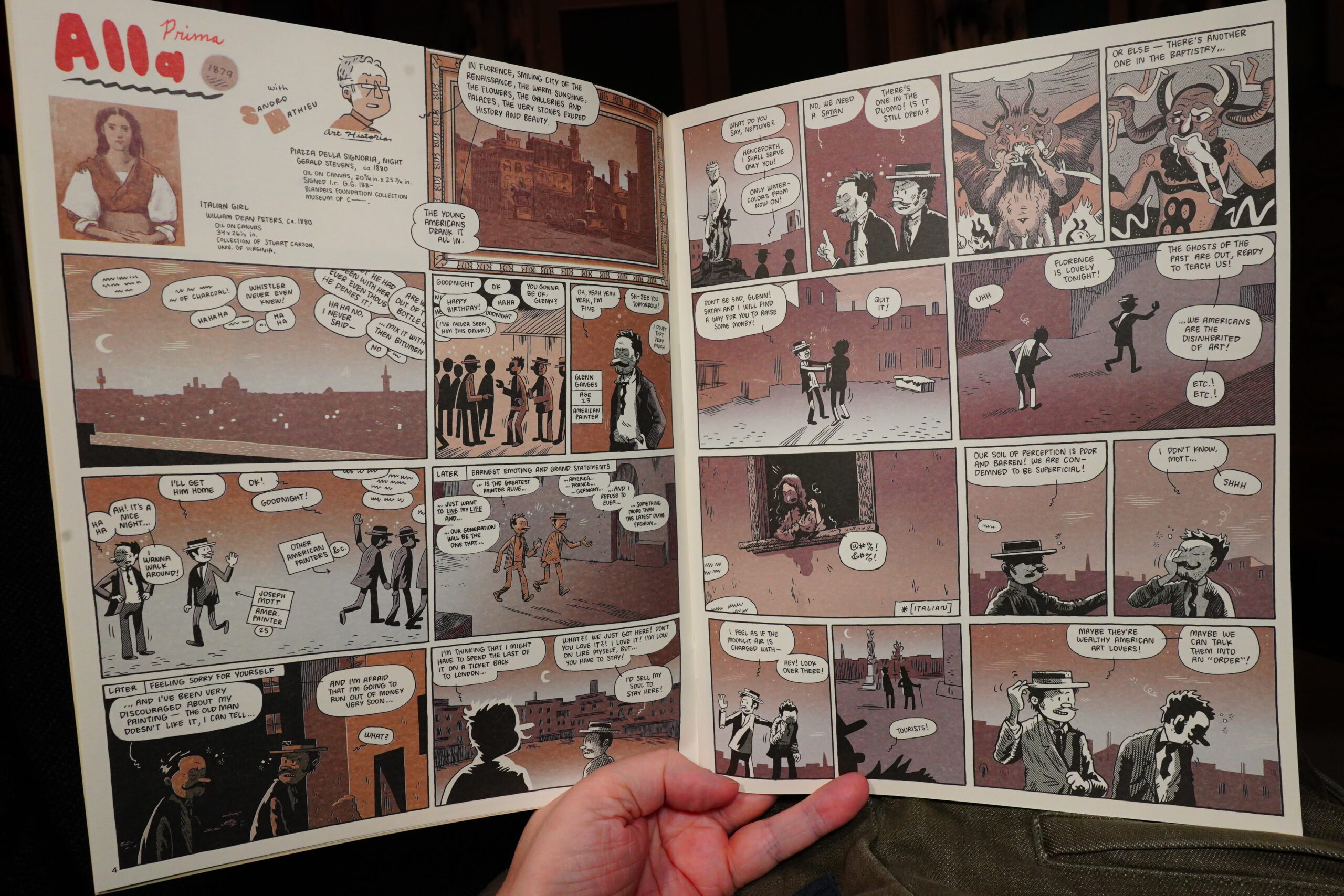
This issue of Fielder is even denser than normal. But very enjoyable. And confusing, because in the first story here, Glenn Ganges is a painter in Italy? Ganges is usually a stand-in for Huizenga, so that’s odd.
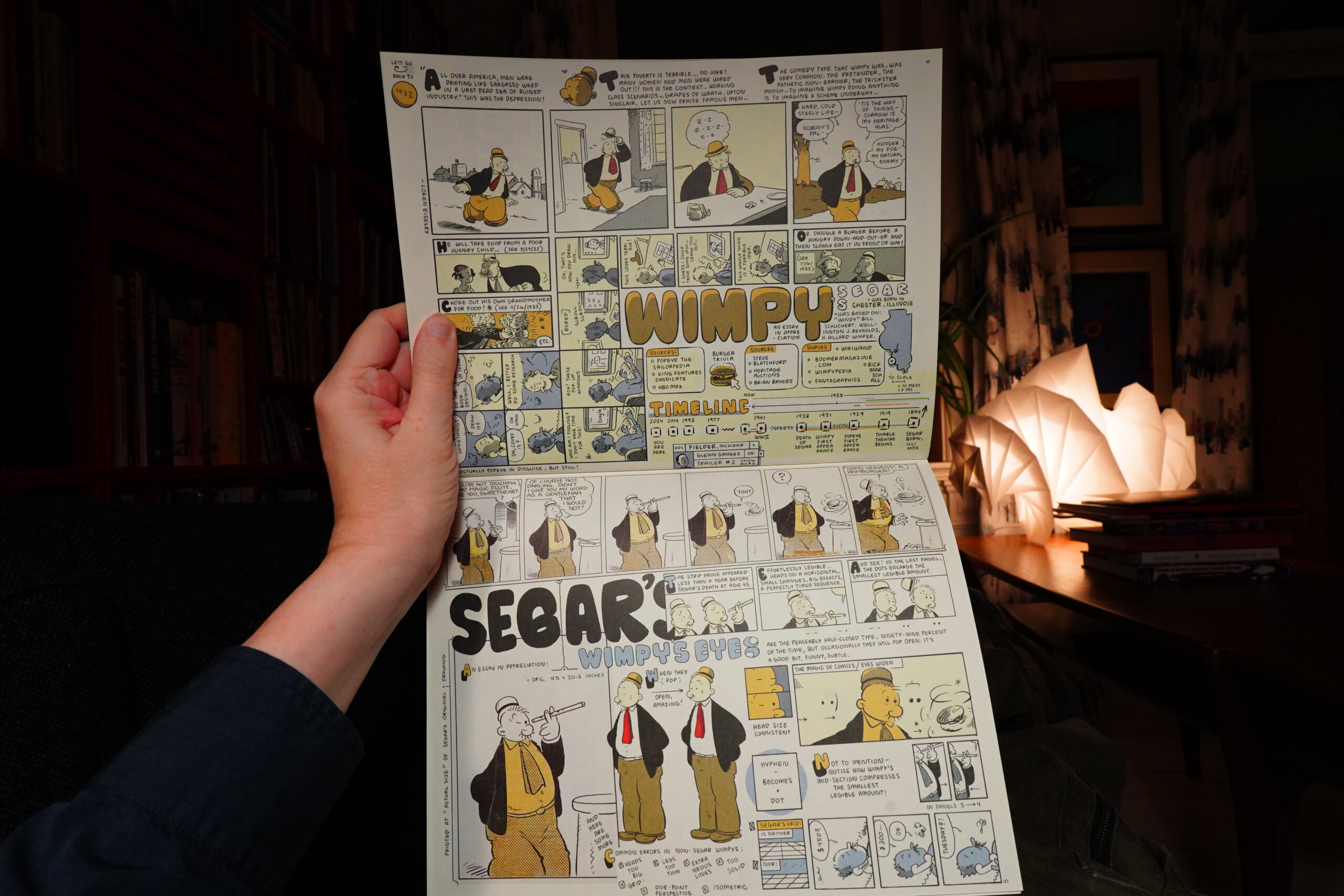
The other part of the issue has two commissioned pieces — the one about the Eames Brothers didn’t quite come together, I think, but the one about Segar’s Wimpy is wonderful.
| David Allred: Apocalypse Rose |  |

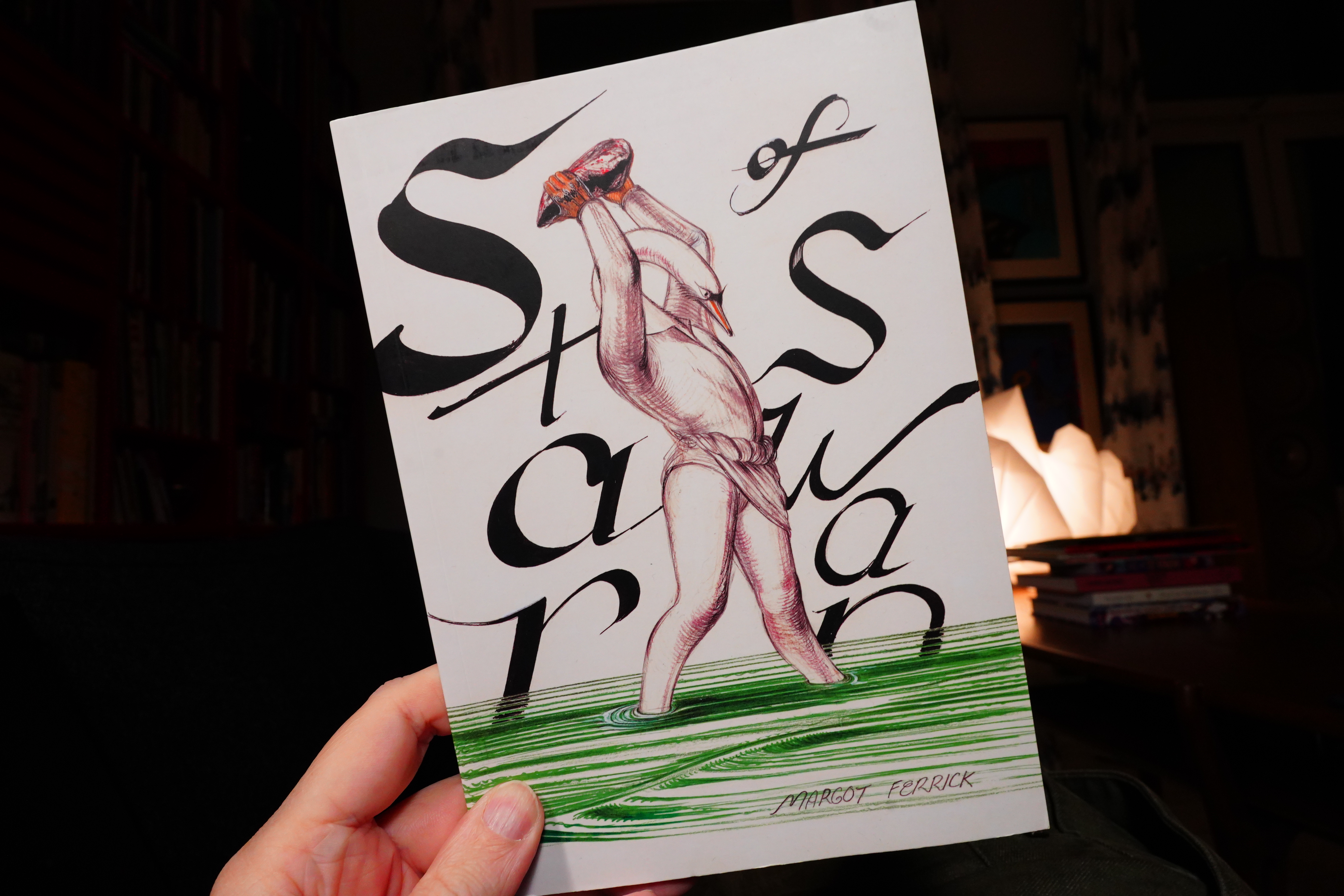
19:35: Star of Swan by Margot Ferrick (Breakdown Press)

This is amazing.
It’s also one of the most disturbing things I’ve read in my life. Wow.
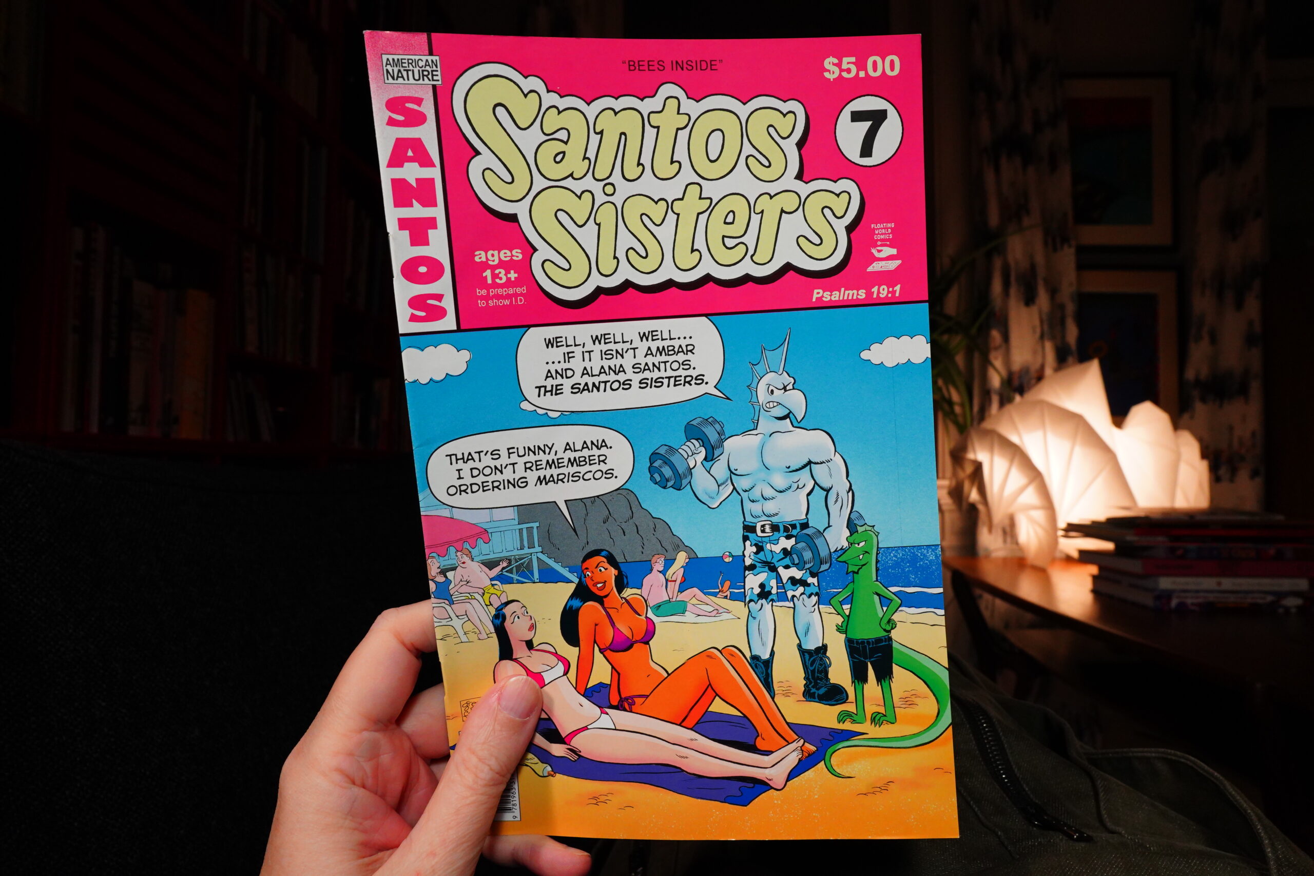
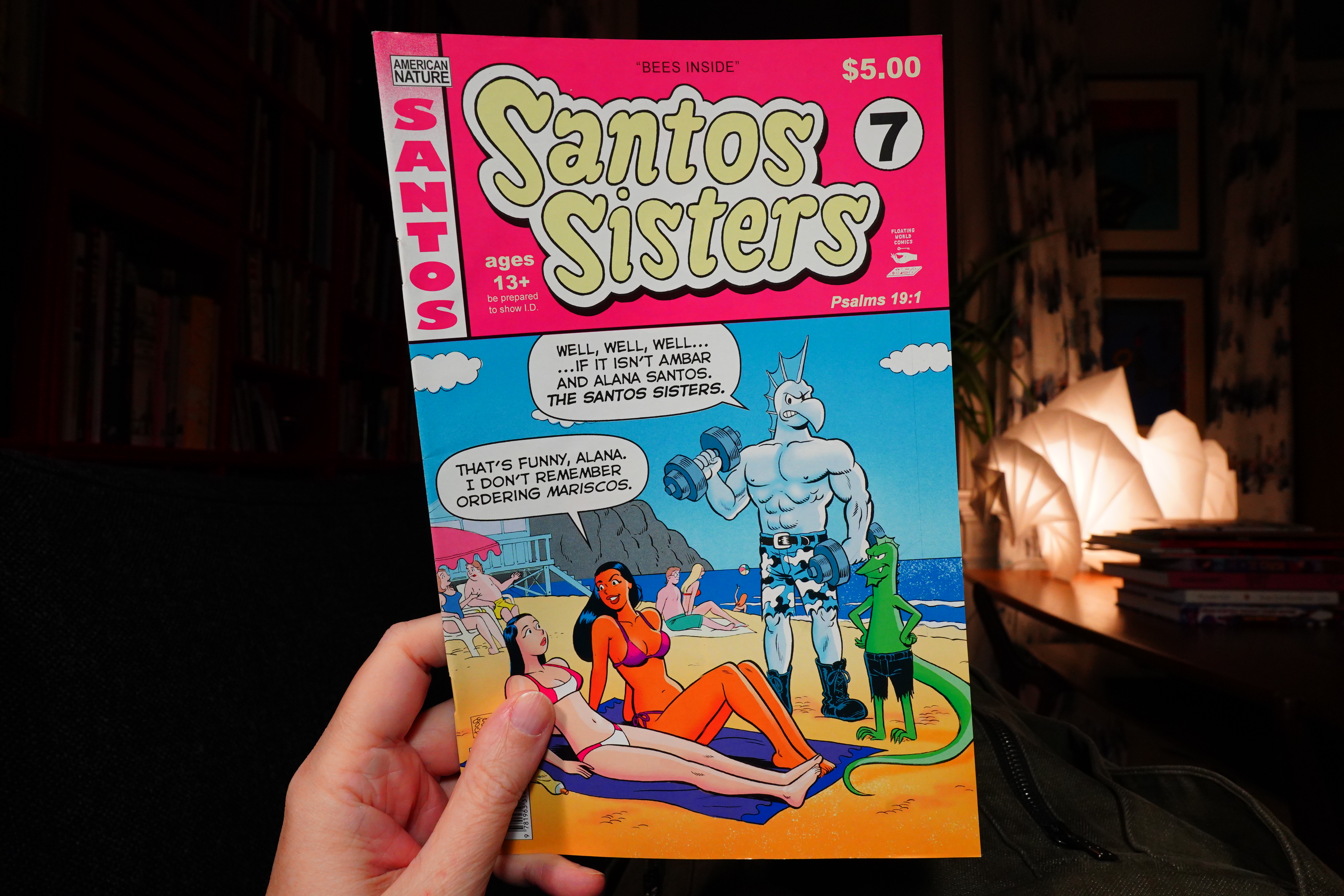
19:49: Santos Sisters #7 by Grek & Fake
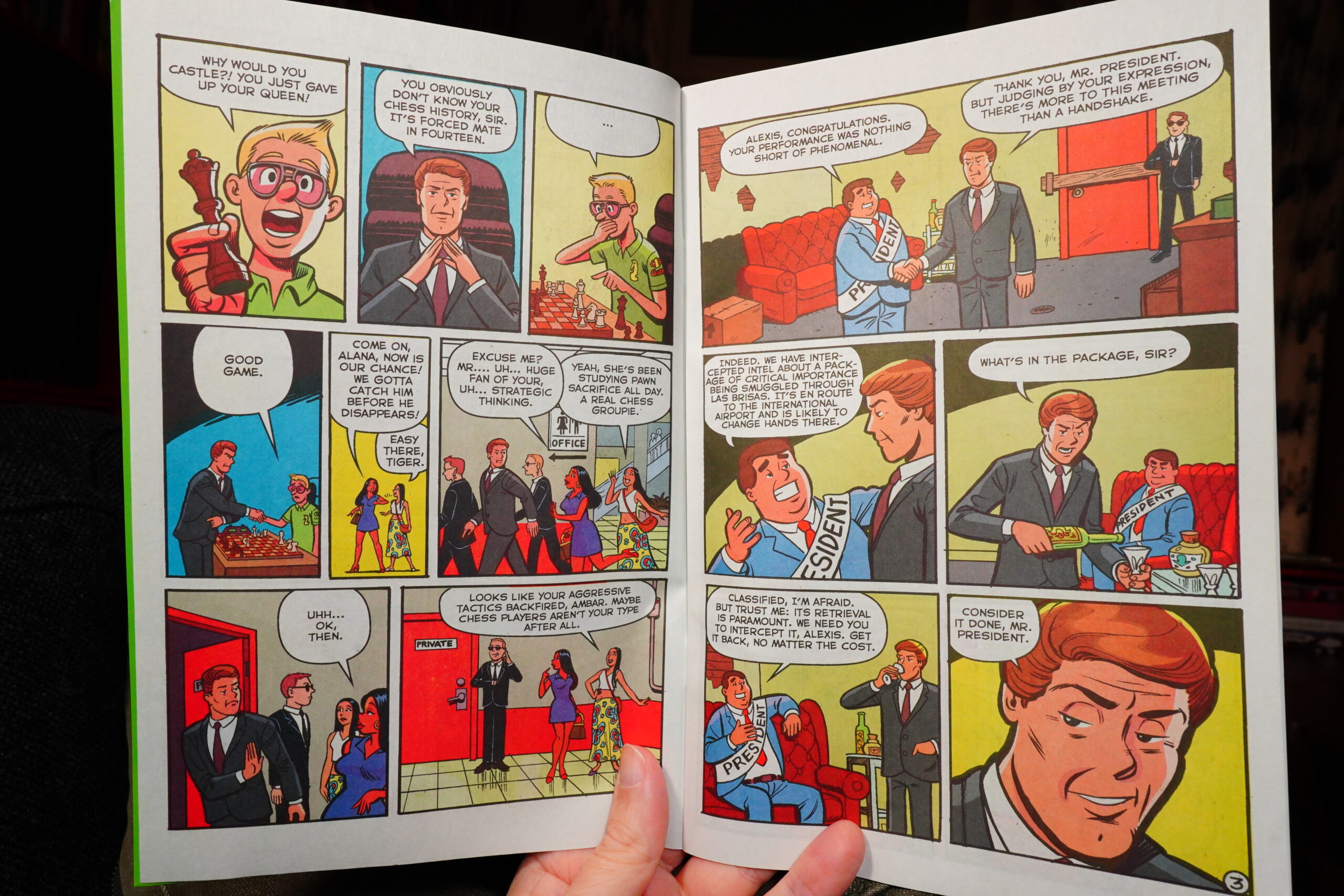
I like the sash that says “President”.
Anyway, this is as amusingly odd as always. I’m still not sure where they’re going with this, but… And they seem to be starting a multi-part story in this issue?
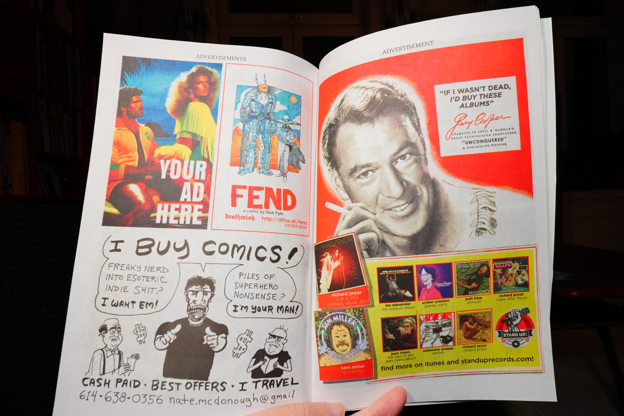
These are probably real ads.

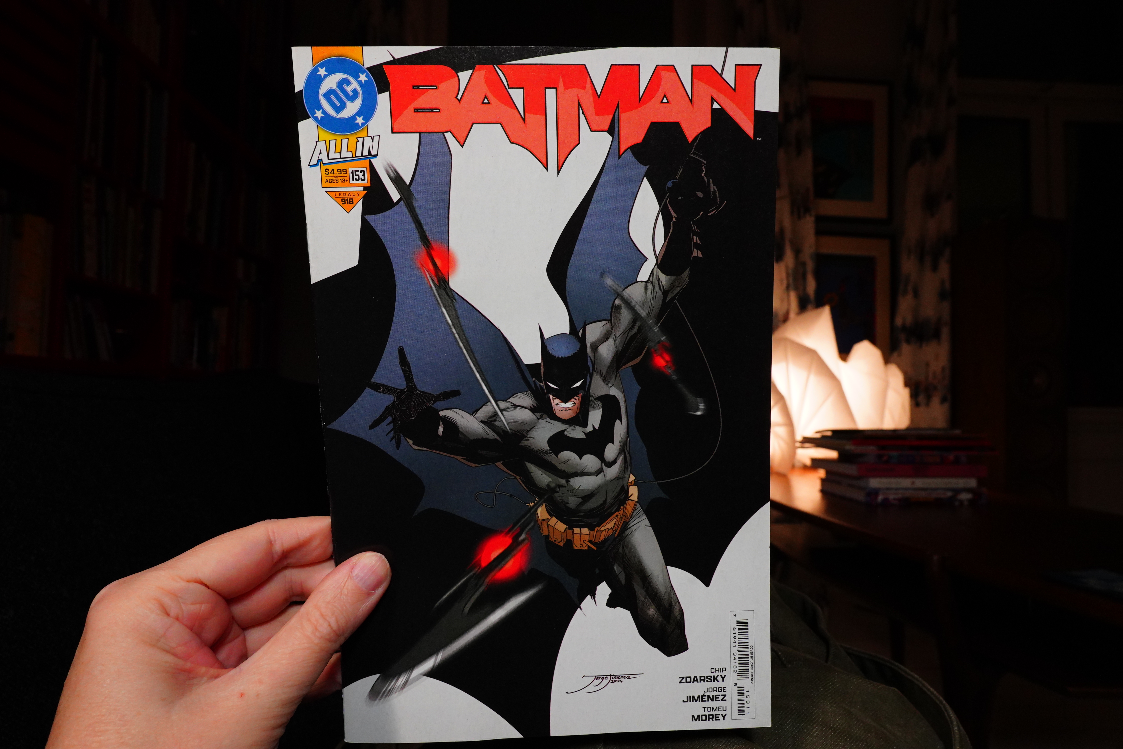
20:04: Batman by Zdarsky/Jiménez/Morey (DC Comics)
It’s been years, probably, since I’ve read a new DC comic book, but since they’re doing a new thing, “All In”, I thought I’d give it a go?
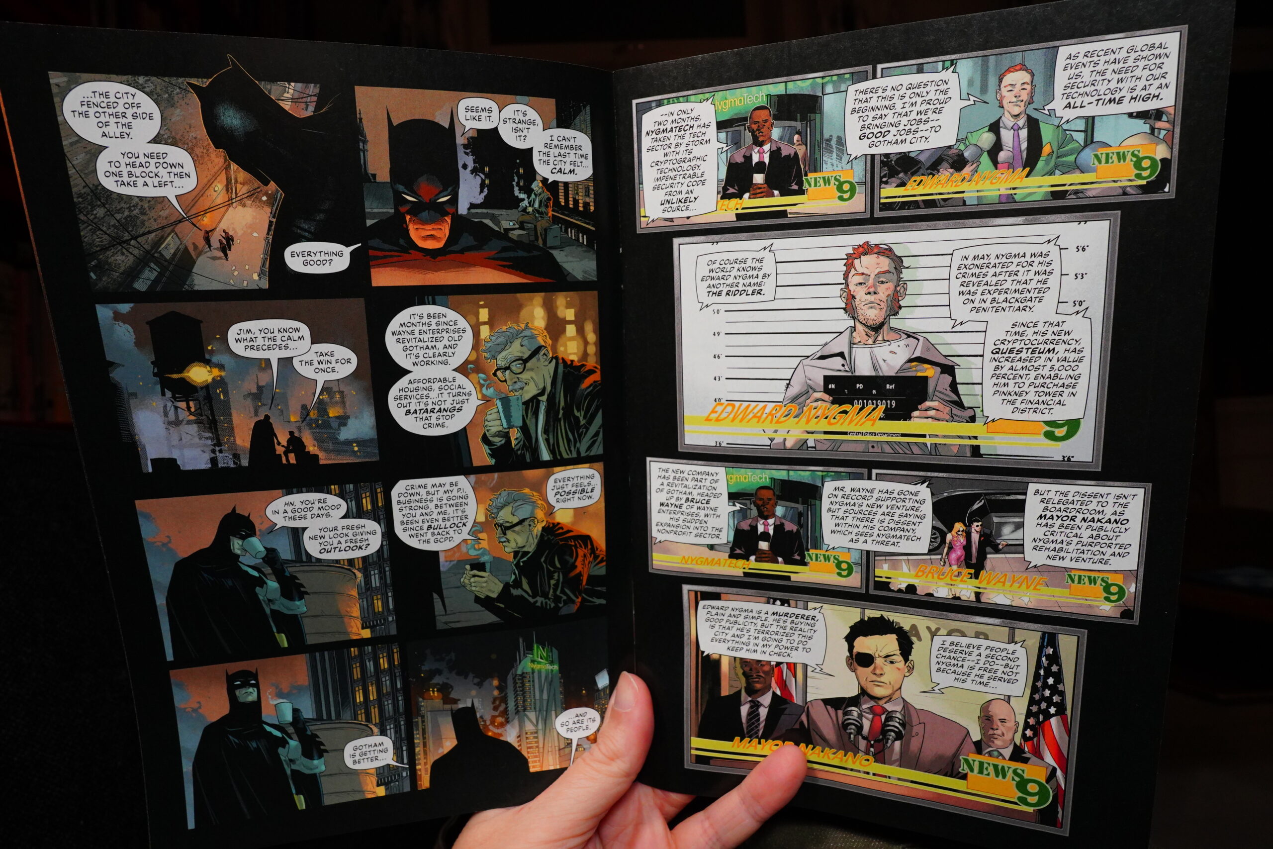
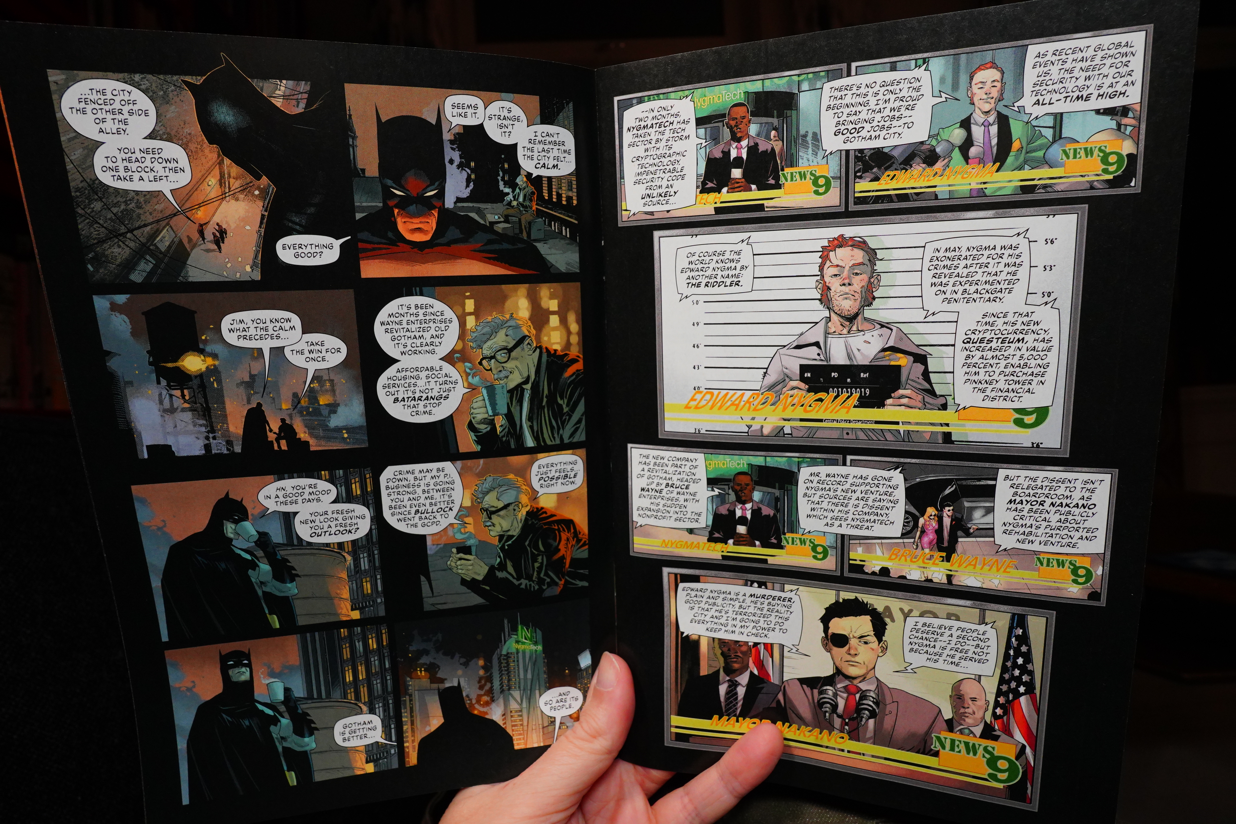
Well… I thought the “All In” thing was going to focused on making things easier for new readers? But this is, like, very deep into some sort of scenario.
| Pile: Hot Air Balloon |  |
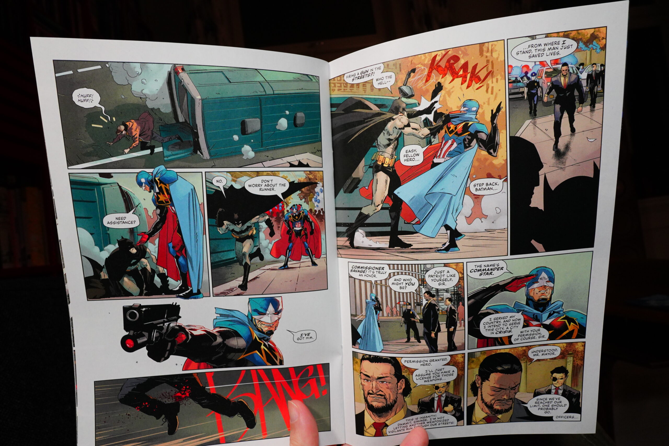
But I guess you don’t really need to know the backstory, and I guess it does feel like the start of something.
It’s OK, I guess? I think I’ll give it a couple more issues, but it’s not exactly gripping.
20:18: The End
And that’s enough comics for a day.