


Part XIV In The Quest To Watch Films Via Amazon Video:
So, I couldn’t use my large Ipad to watch these films, because the Amazon app didn’t allow screenshotting. (So very DRM.) And besides, the Apple screenshotting thing is really, really annoying: Flashing the screen and all that. (It’s a very typical Apple thing: Create an interface that makes you go ‘whoa’ the first time you see it, and that makes you want to kill everybody who’s ever worked at Apple the tenth time you use it: Optimised for the showroom.) Using an external HDMI thing wasn’t an option either, because then the Ipad is just a remote, and no screenshotting at all is possible.
So: Android.
*sigh*
On the good side: Android has excellent third-party screenshotting apps (I use Screenshot Touch) that are convenient to use and are completely non-obtrusive. Getting the screenshots off of the devices is also trivial: I settled on old-skool polling via FTP with FTPServer because that’s just the least amount of setup necessary.
So I touch the screen on the Android device, and it magically appears in this Emacs on the laptop.
So that’s all nice… But then there’s the question of getting stuff from the small Android devices to my big TV. So we’re talking MHL or Slimport USB to HDMI adapters. And here the pain begins.
There’s at least four incompatible “standards” for this stuff. My phone supports Slimport, and my Sony Xperia Z4 tablet allegedly supports five pin MHL adapters. So, naturally, I first bought an 11 pin adapter, which doesn’t work on either device, and then I researched more and bought a five pin adapter, which doesn’t work on either devices, and then I bought a Slimport adapter, which works on my Blackberry Android phone. But only if the HDMI cable is less than three meters. Which it isn’t.
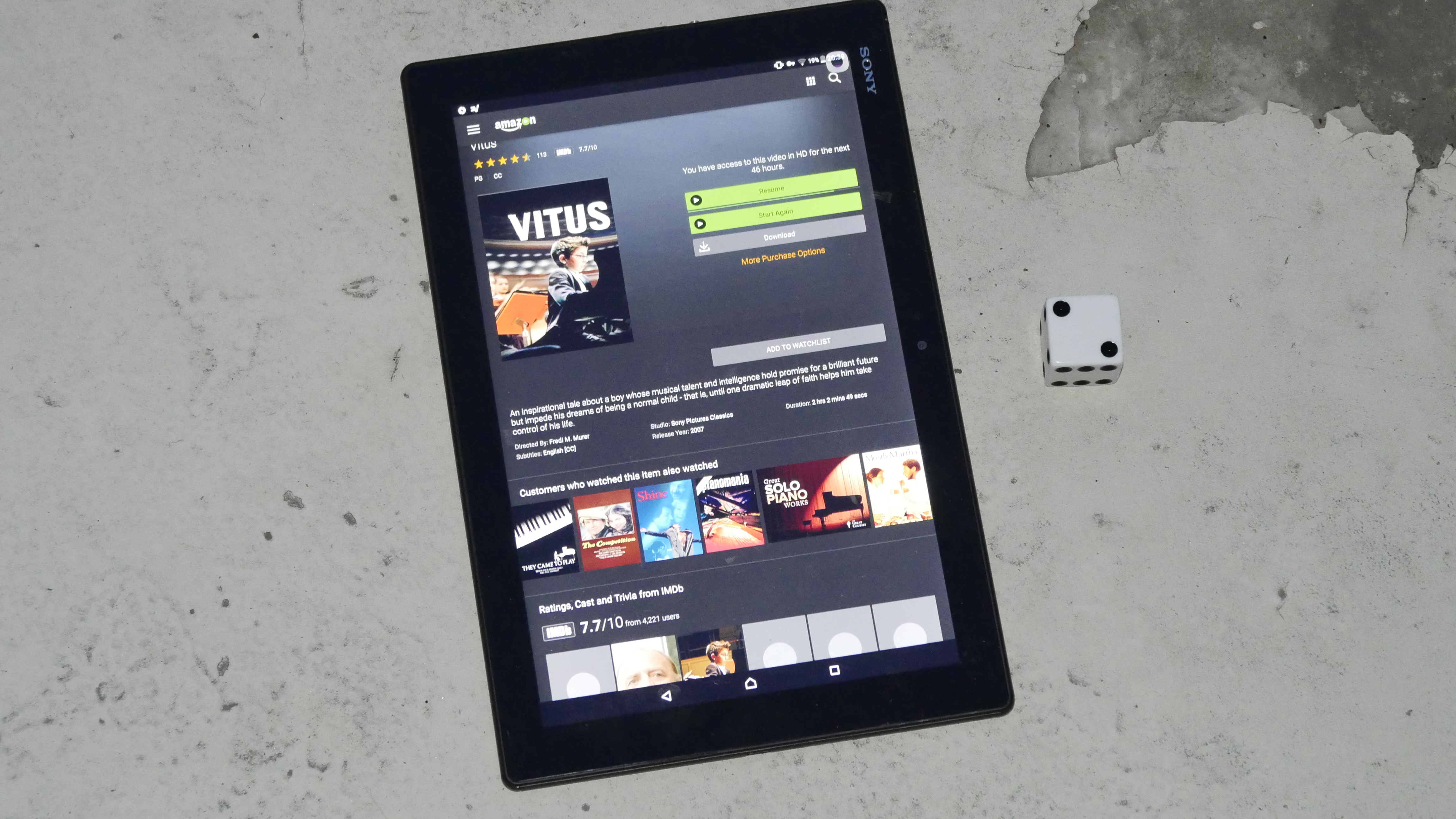
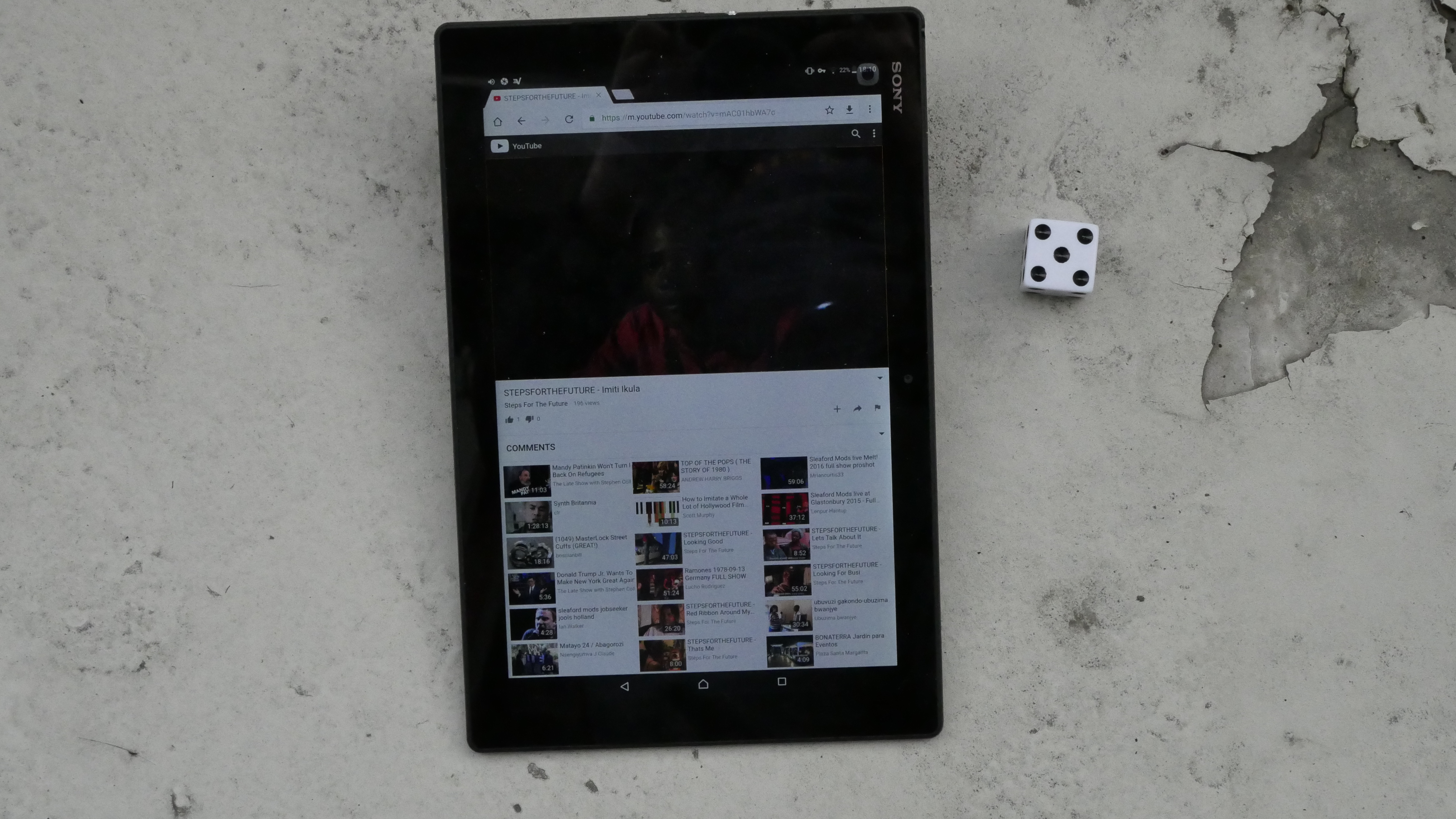
And I needed a solution stat, because Easter is approaching and I wanted to watch a ginourmous number of films over Easter. So I broke down and bought yet another Android device: The absurd 18 inch Galaxy View “tablet”, no longer in production because nobody bought it, because it’s absurd. And had it FedExed here, and it arrived in time!
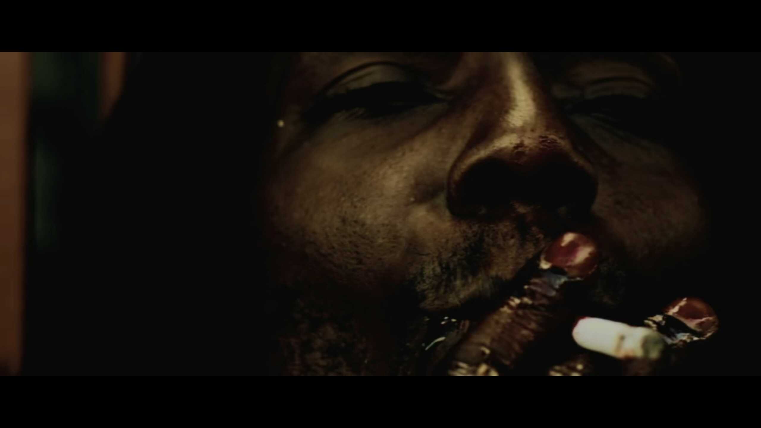
This is the first film I’m watching on this device, and I have to say that it’s better than I expected. It’s only 1080p, so there’s not a lot of pixels, but… it’s fine. The screen is very reflective, though, so I spent much of this dark film staring at my own face, admiring my new hairdo. (And, no, none of the three MHL/Slimport adapters worked at all for this device.)
Modern life is so complicated!
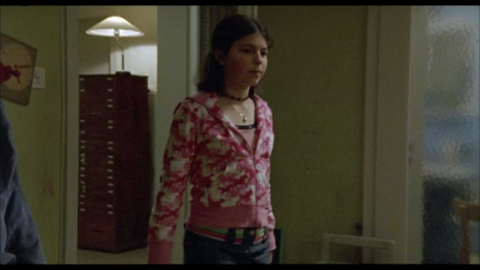
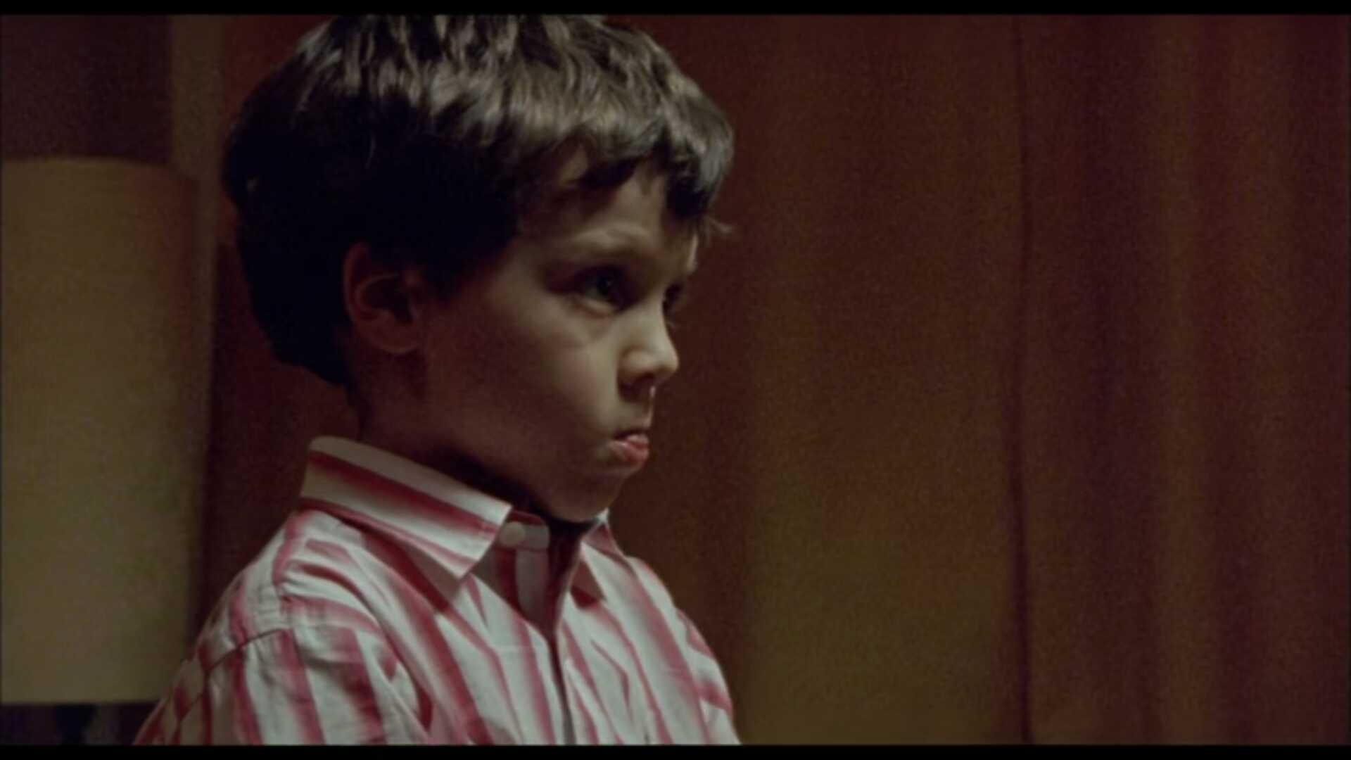
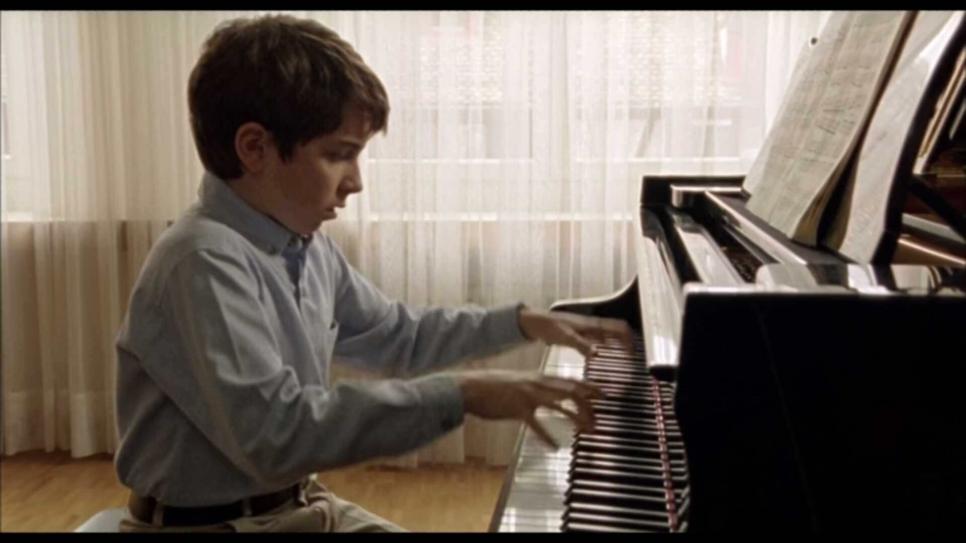
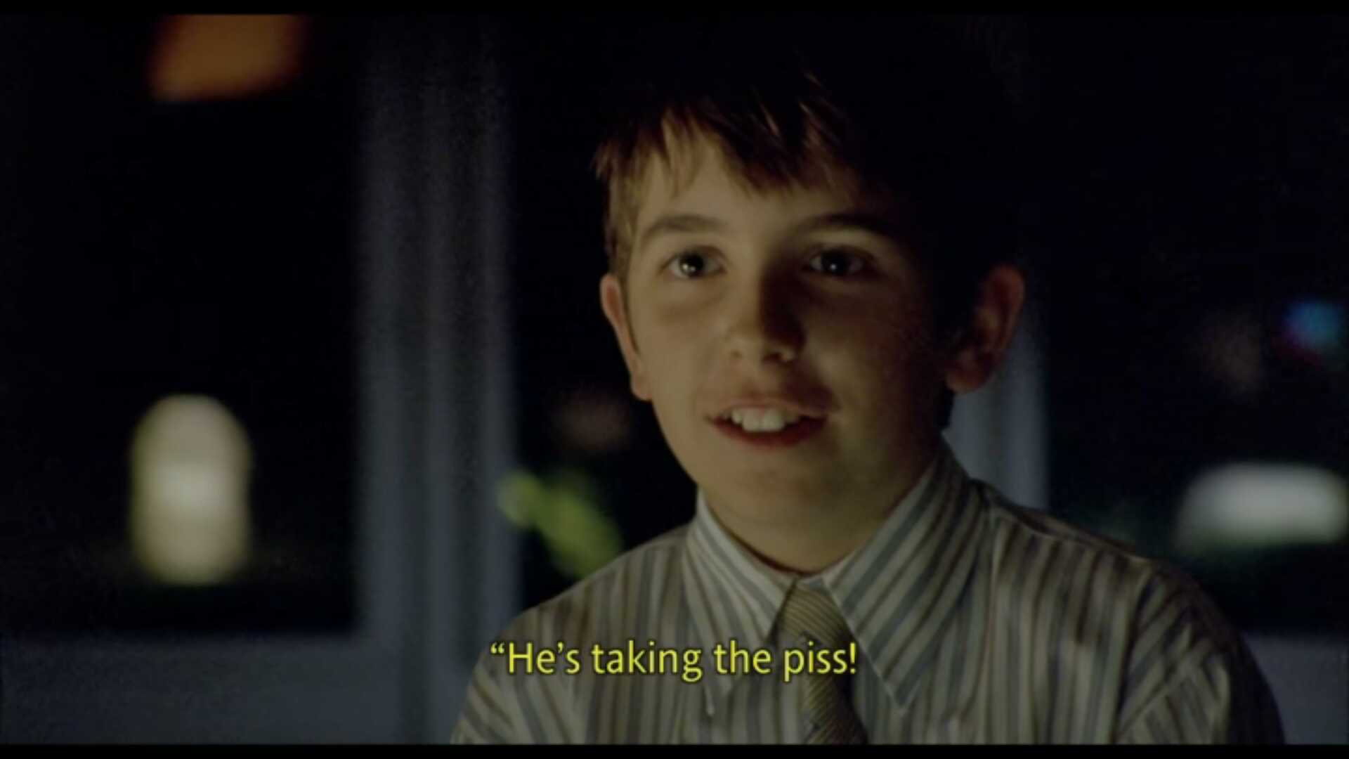
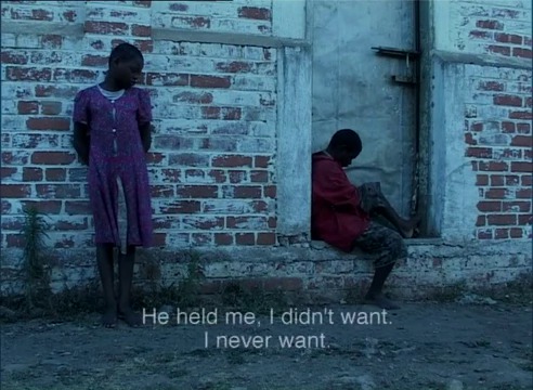
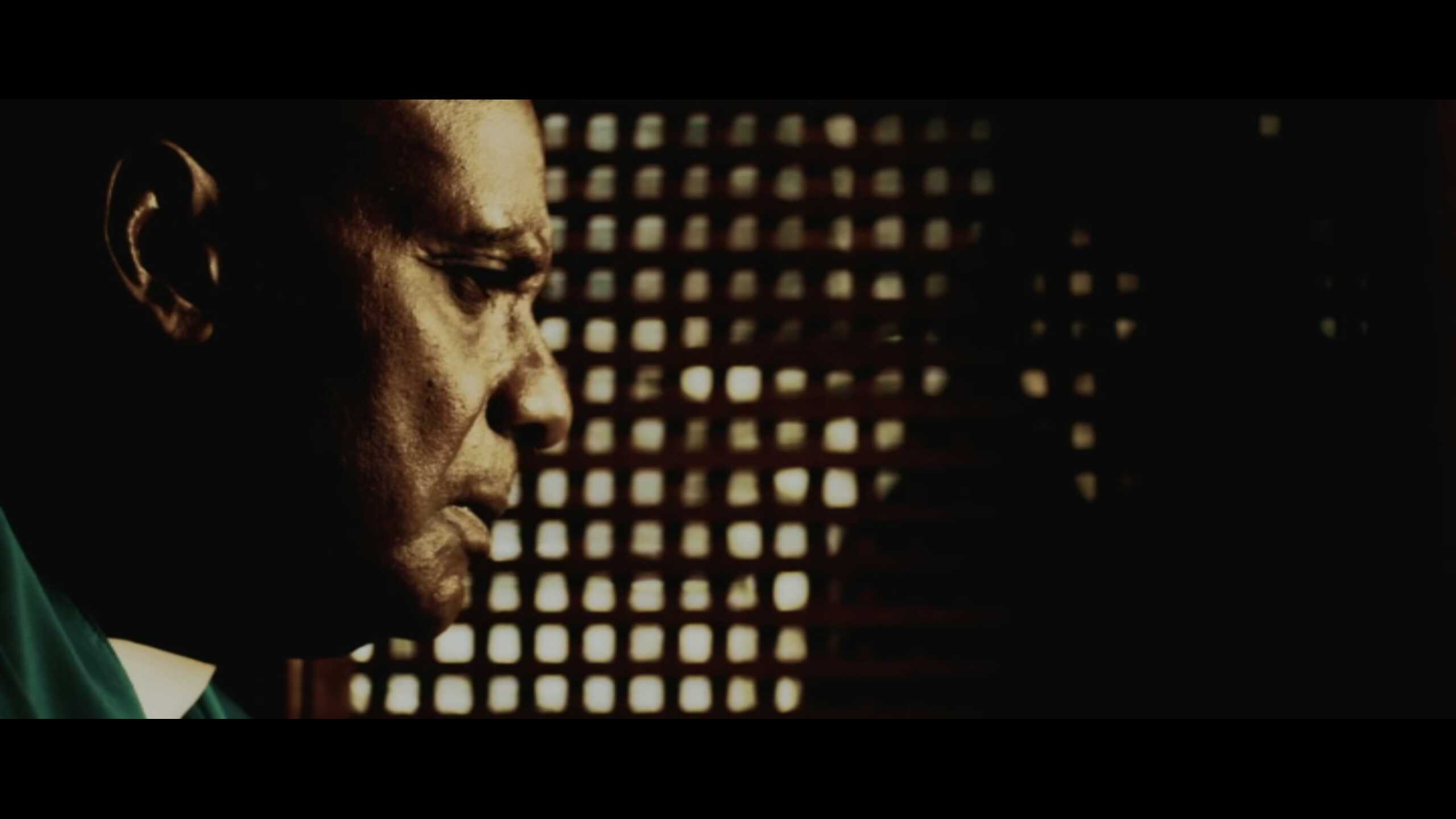
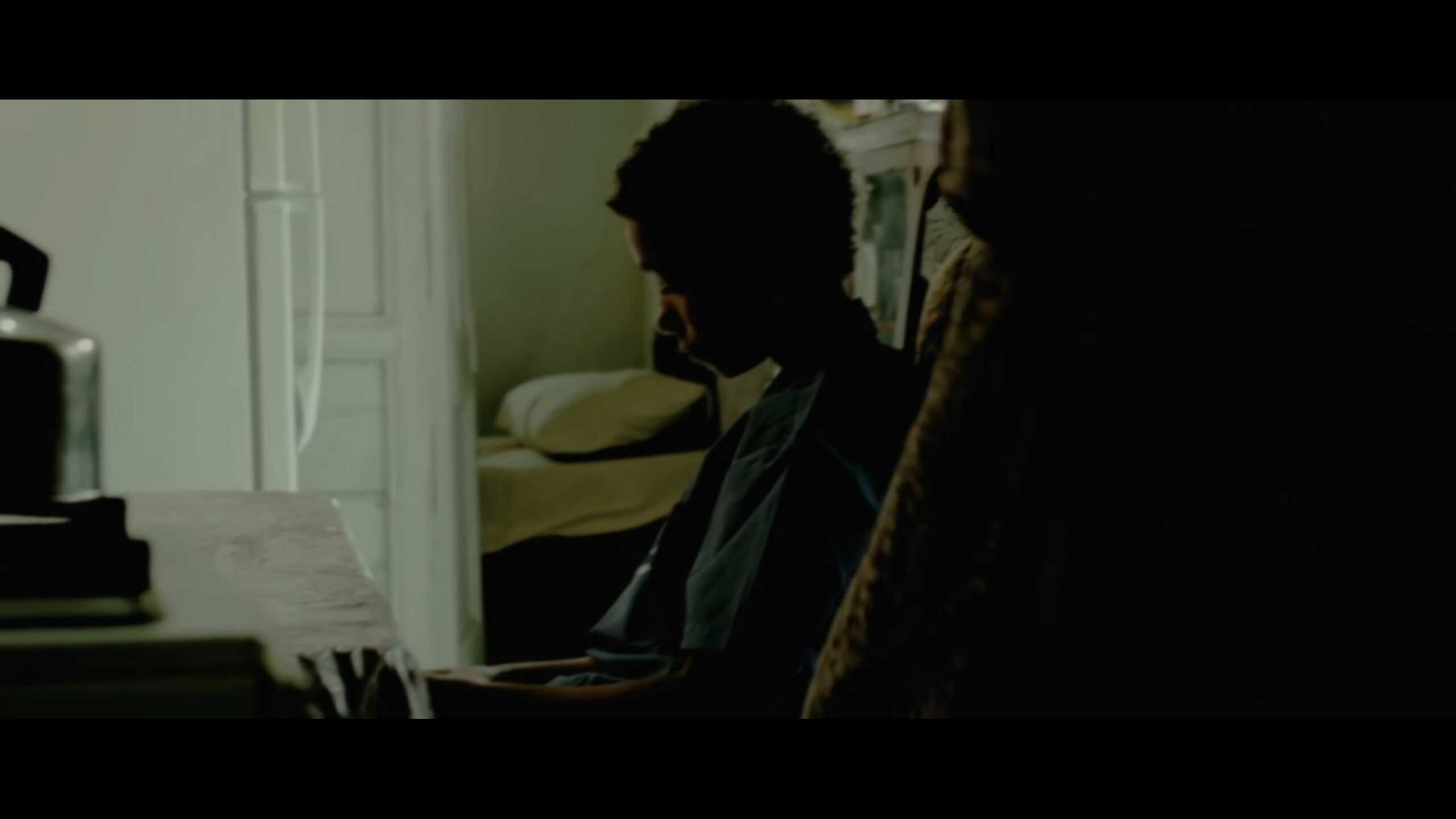
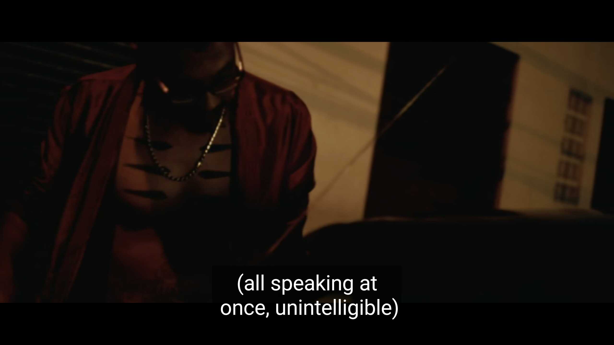
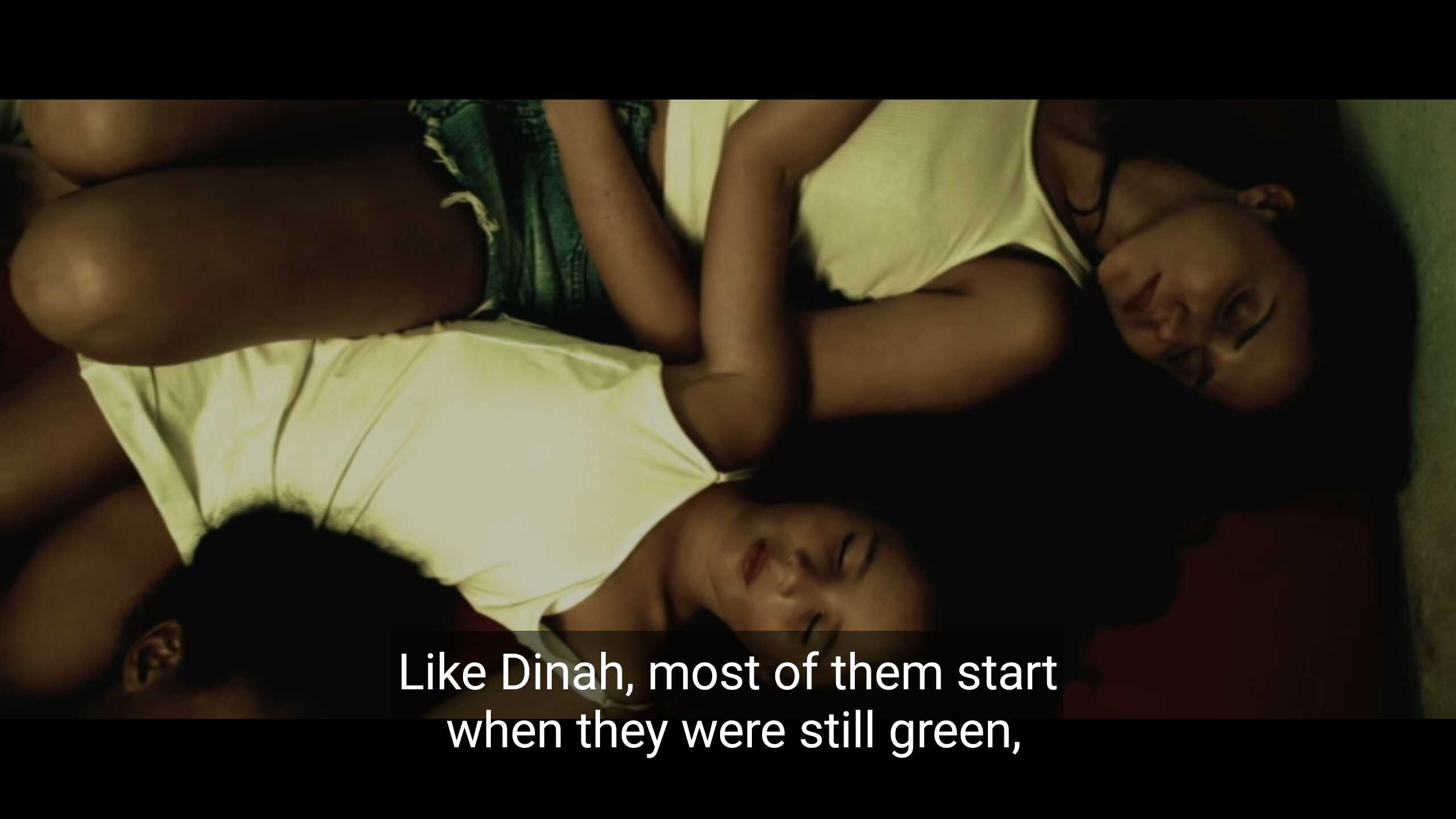
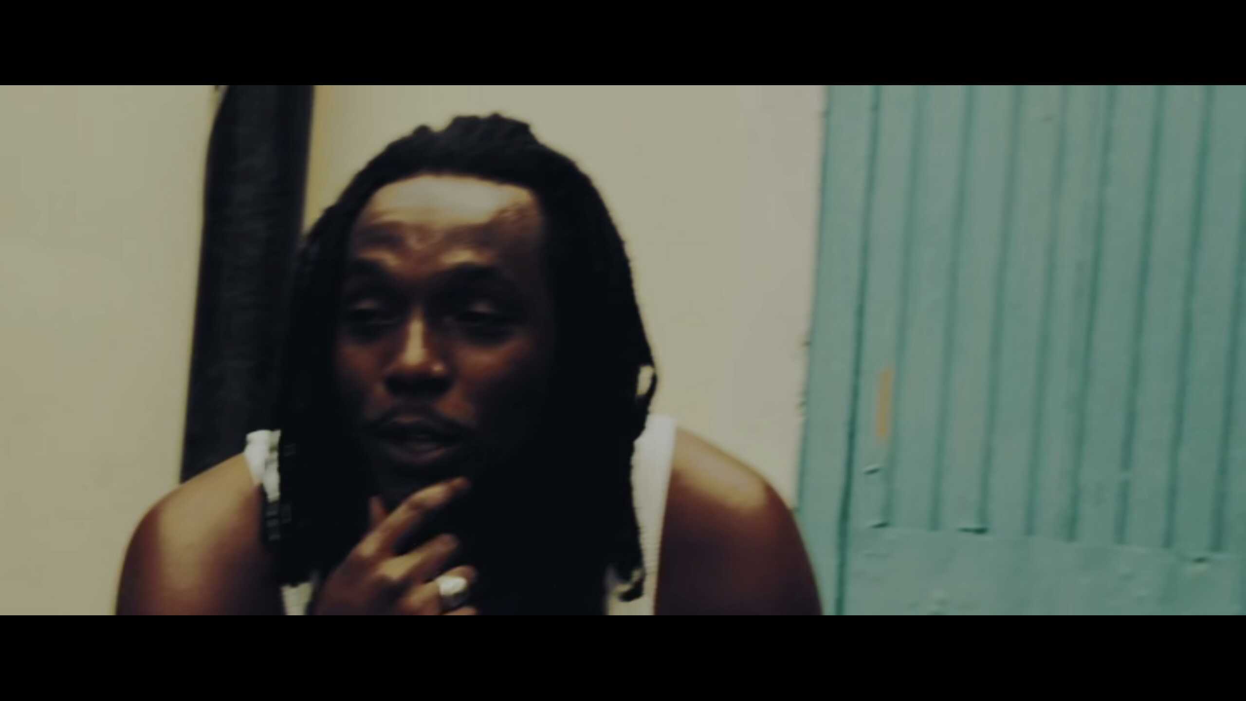
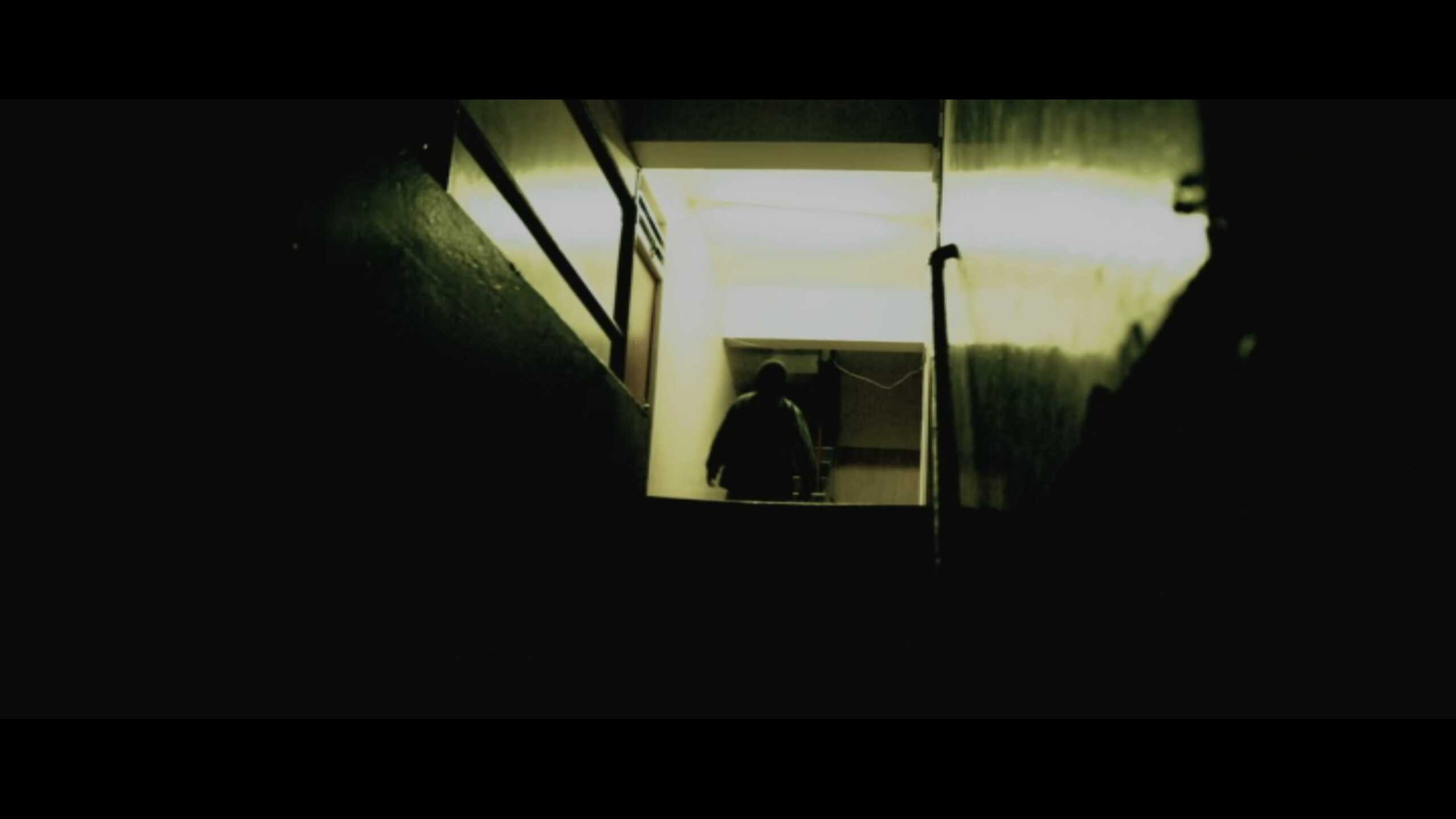
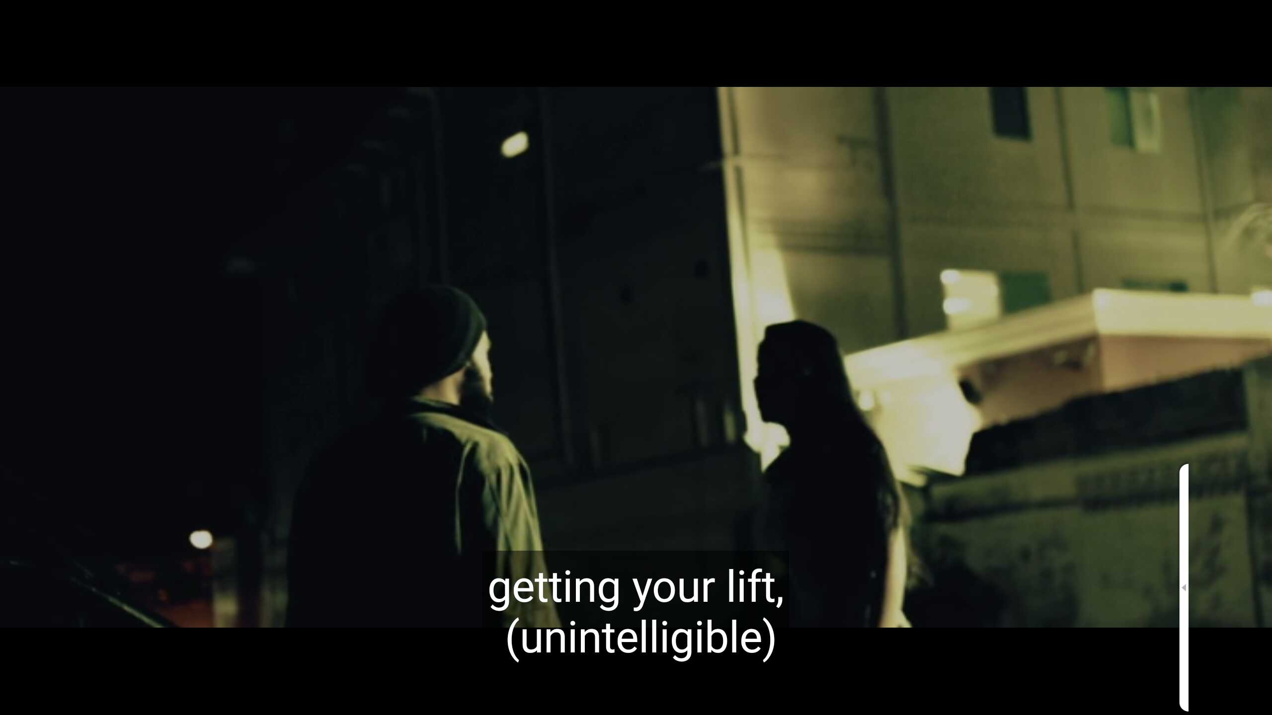
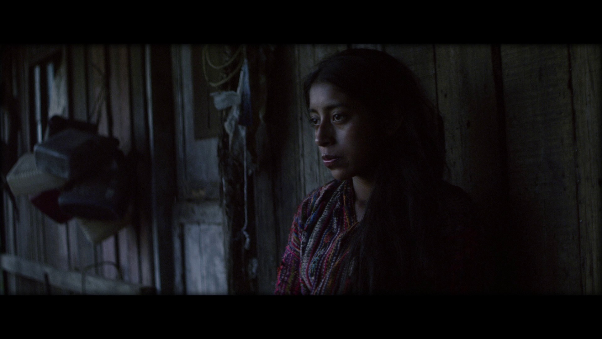
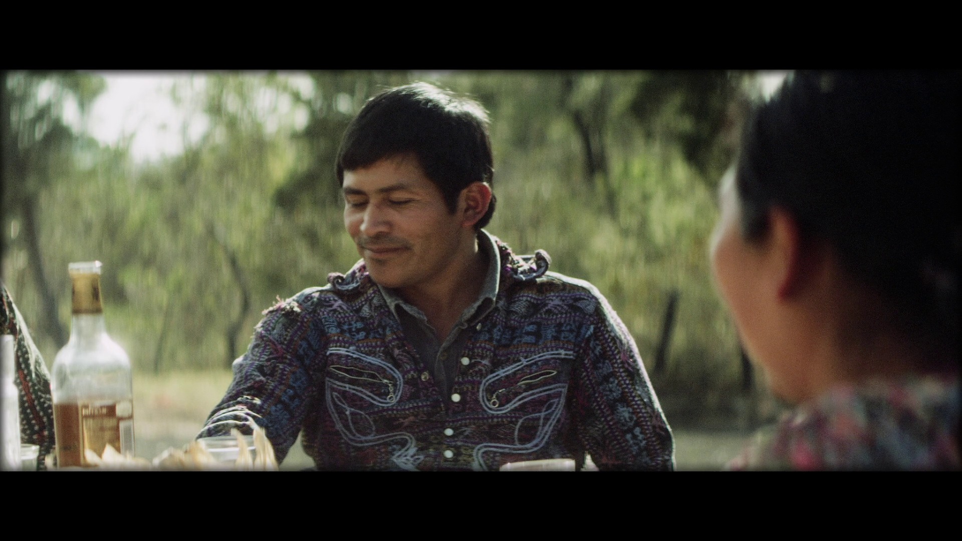
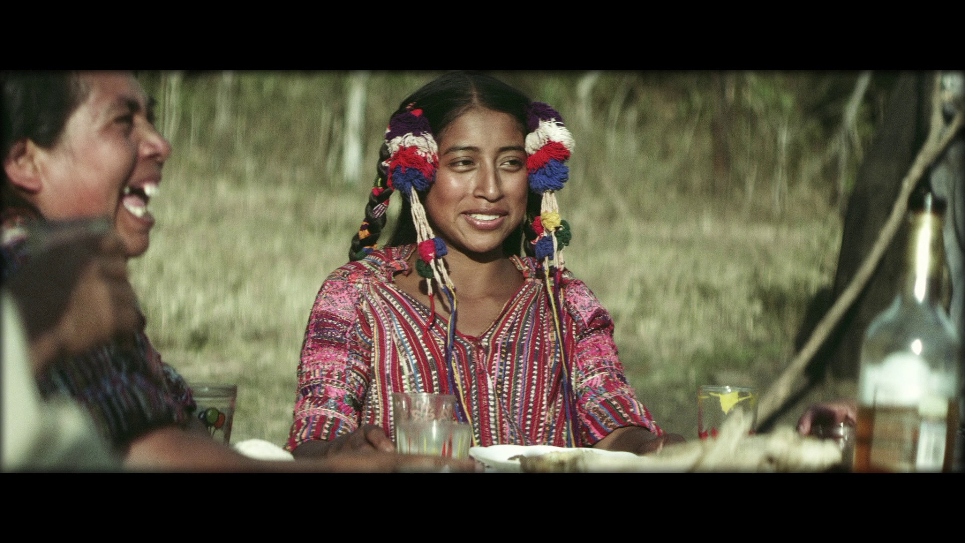
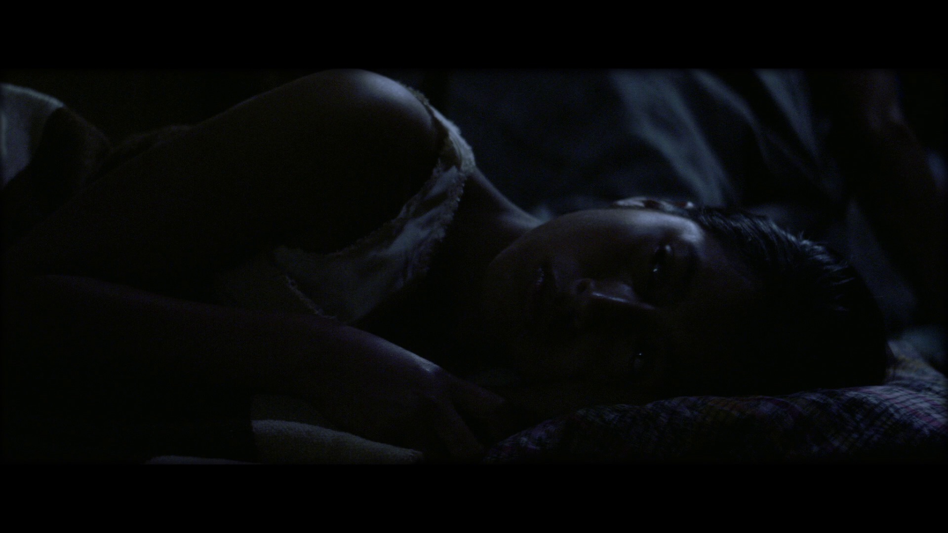
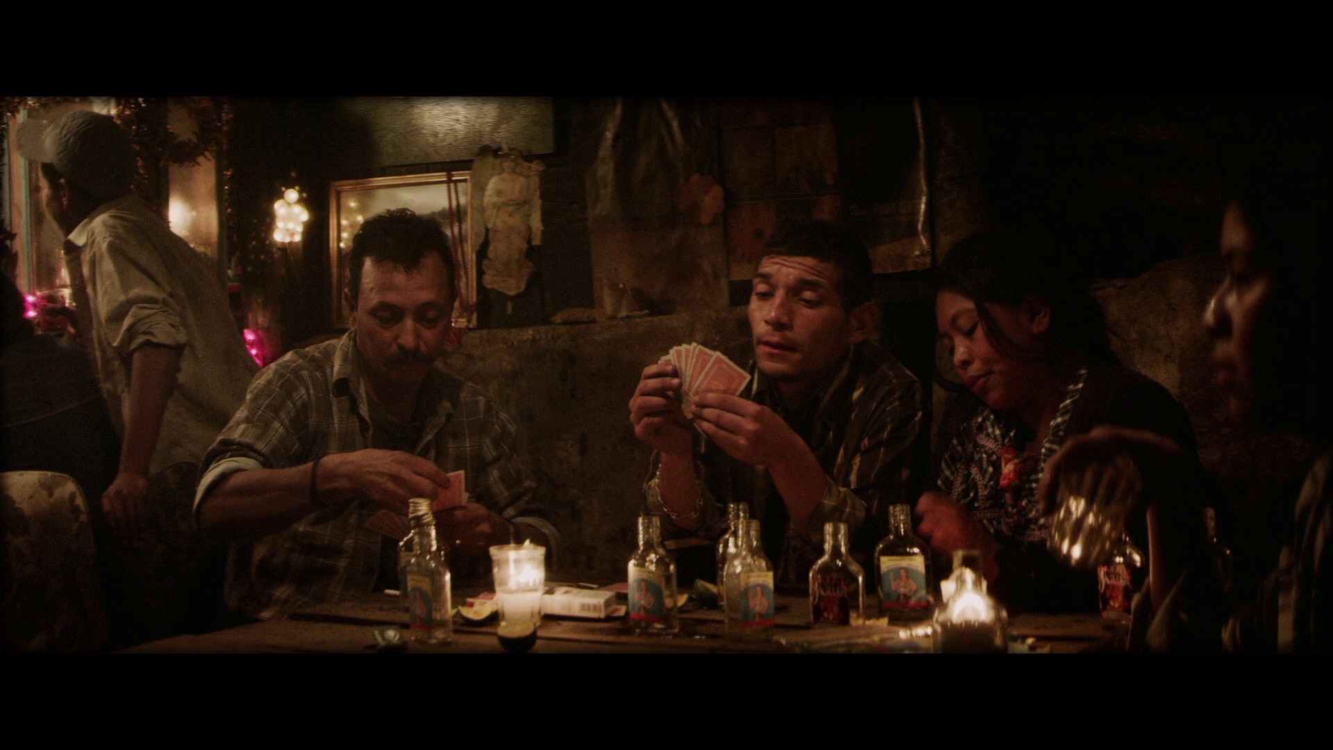
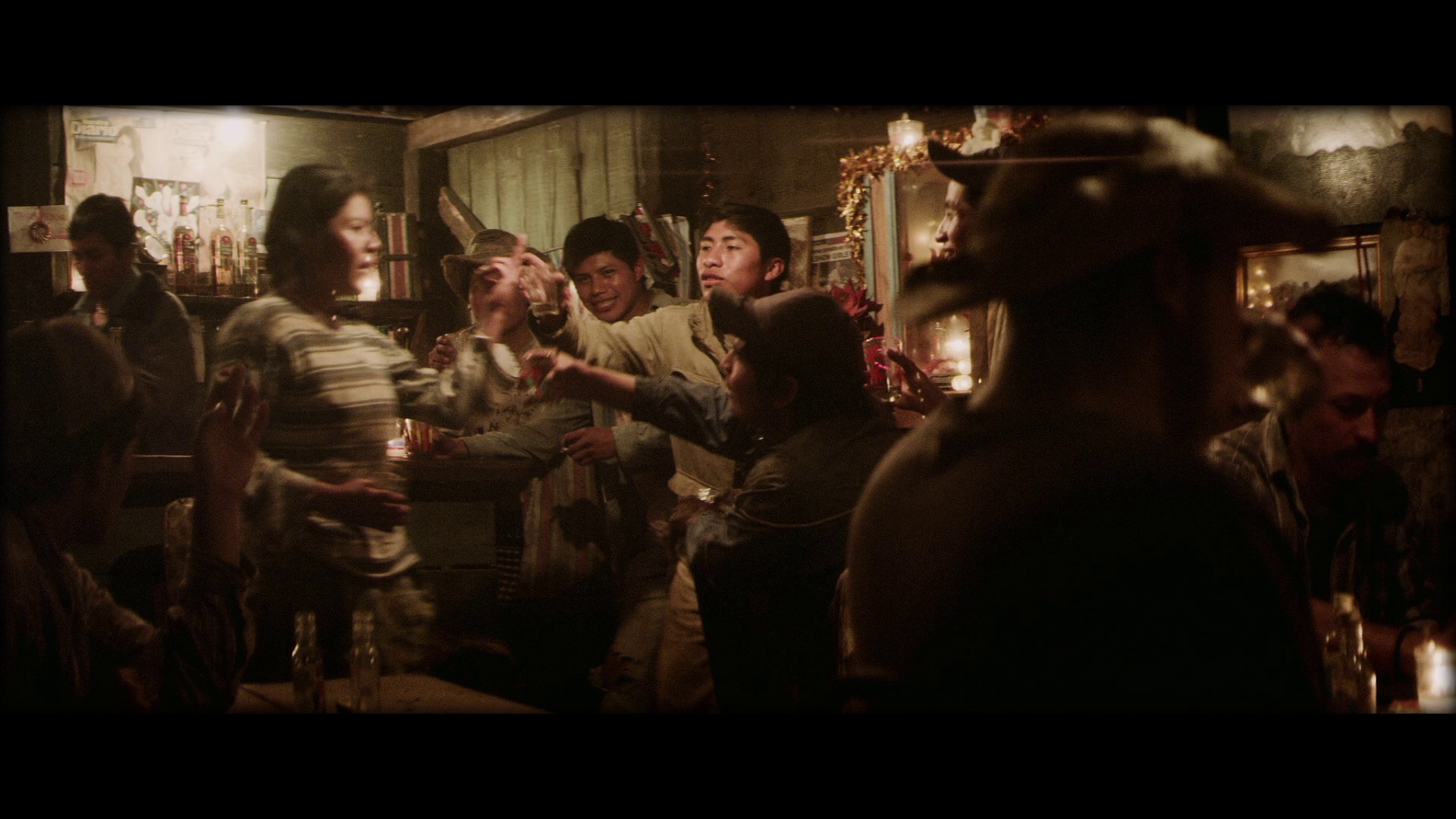
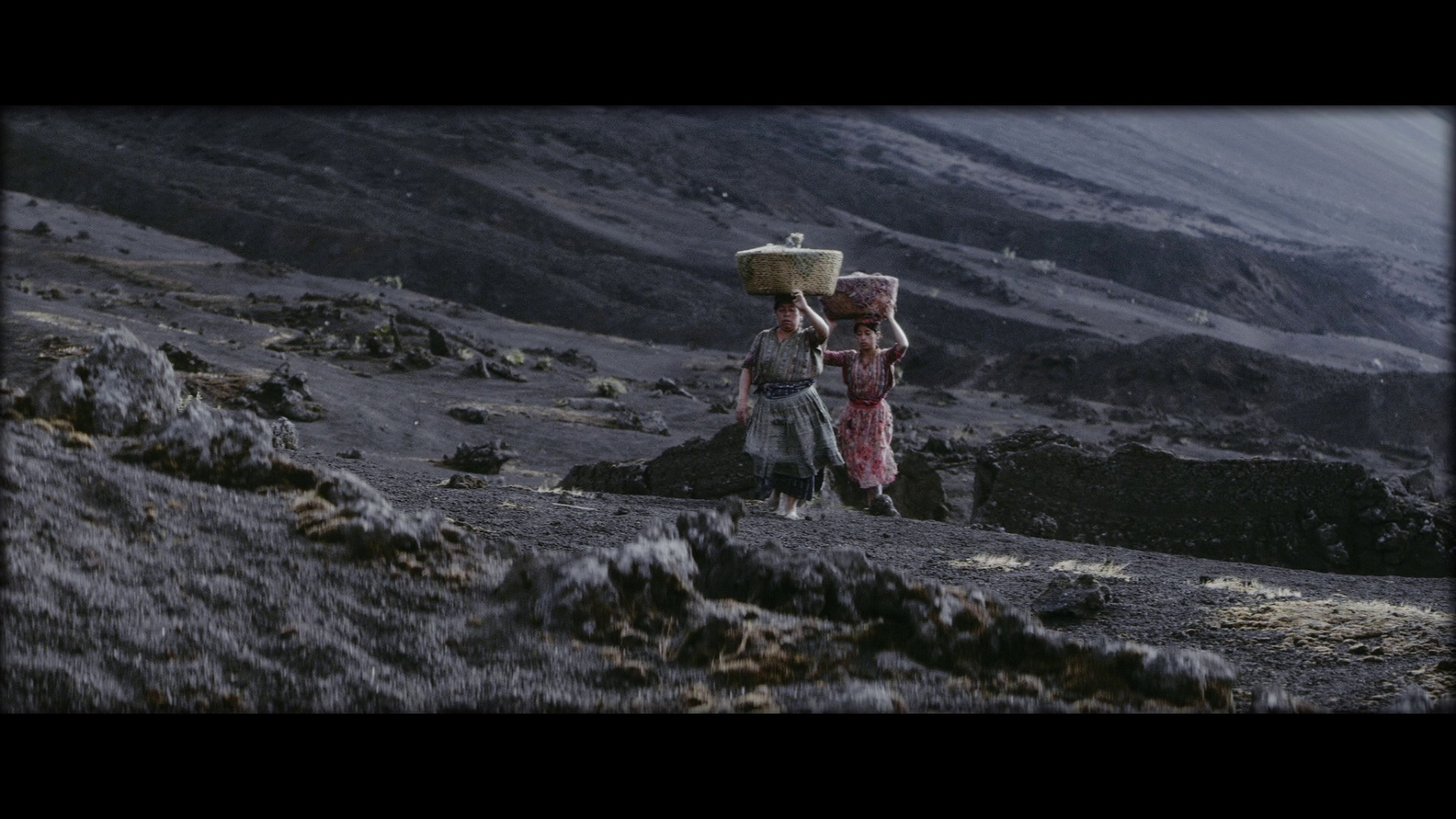
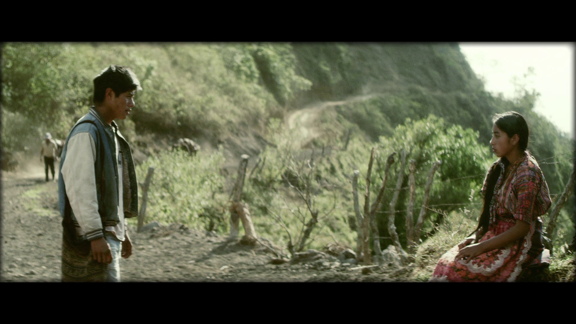
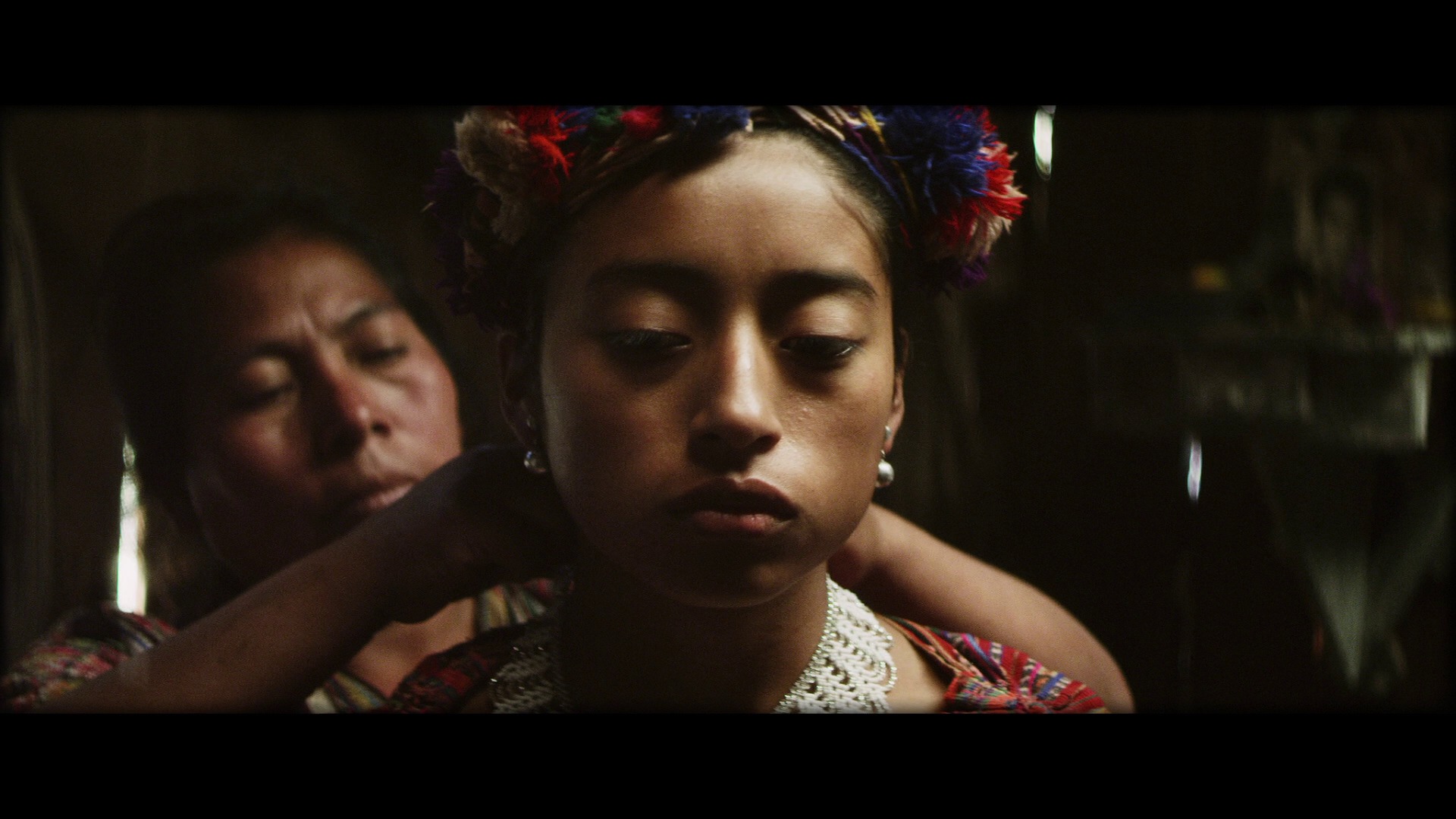
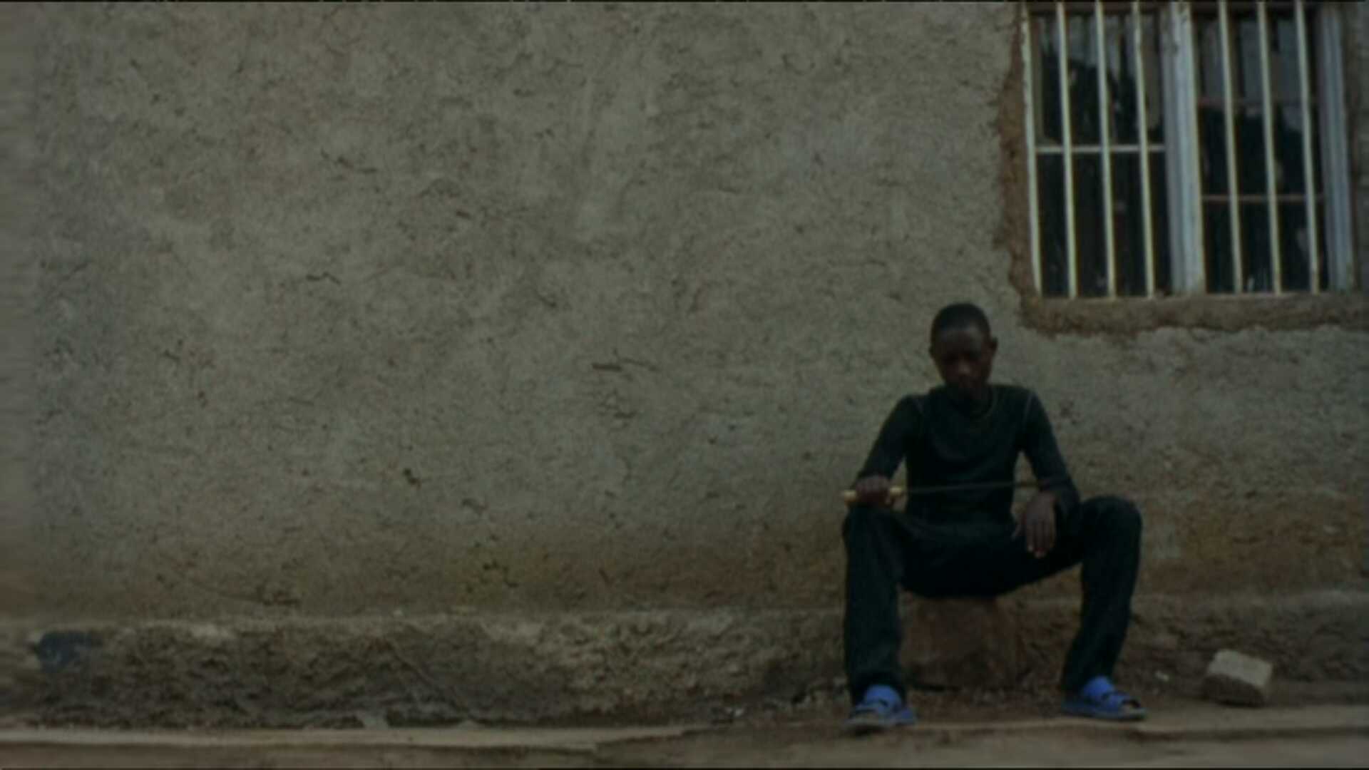
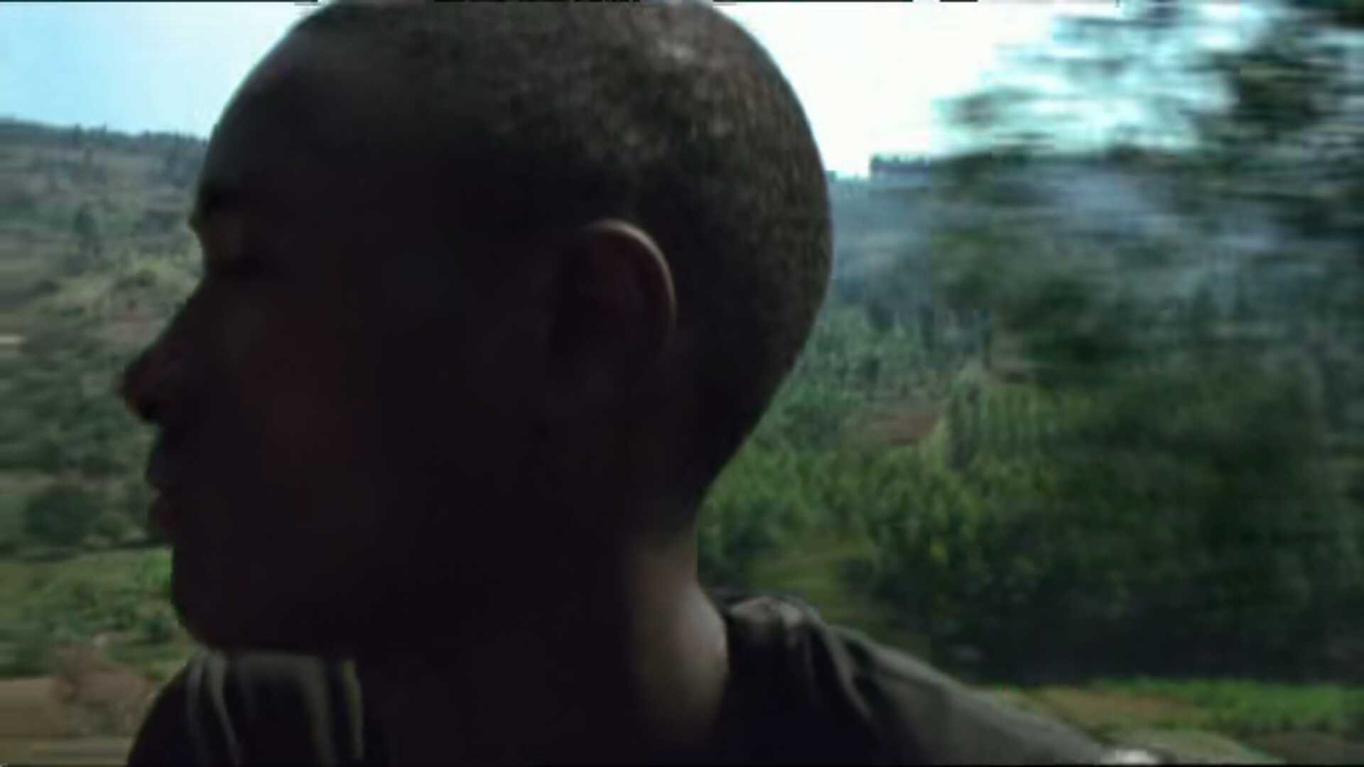
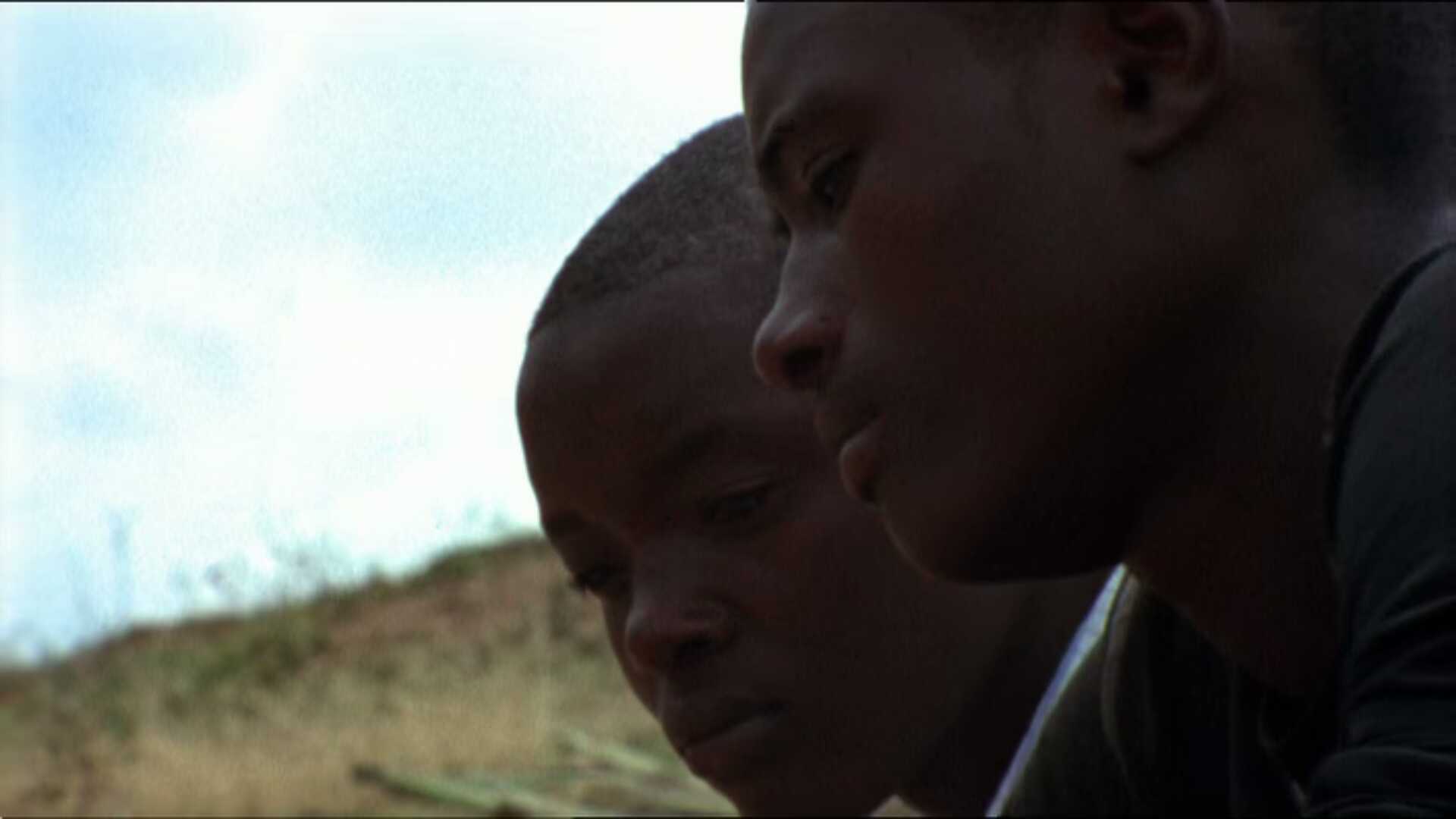
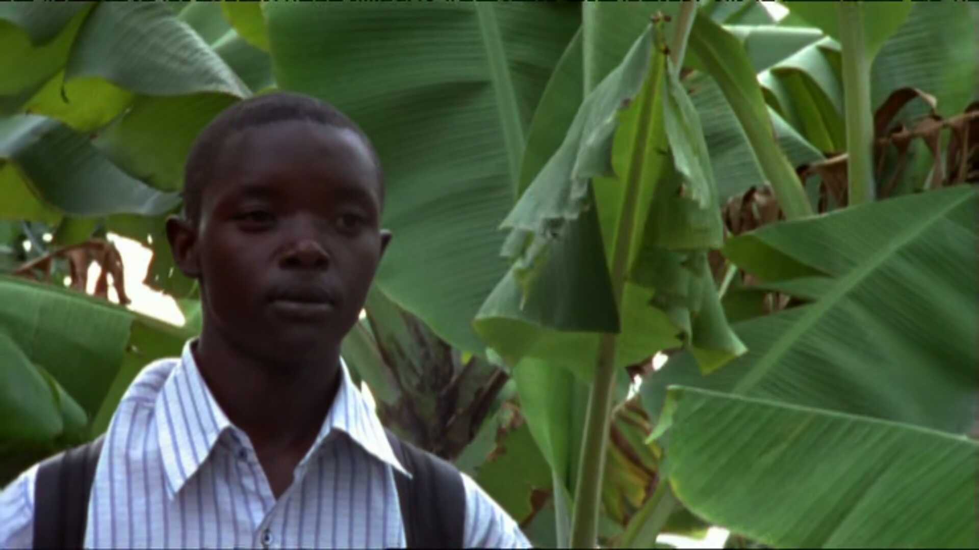
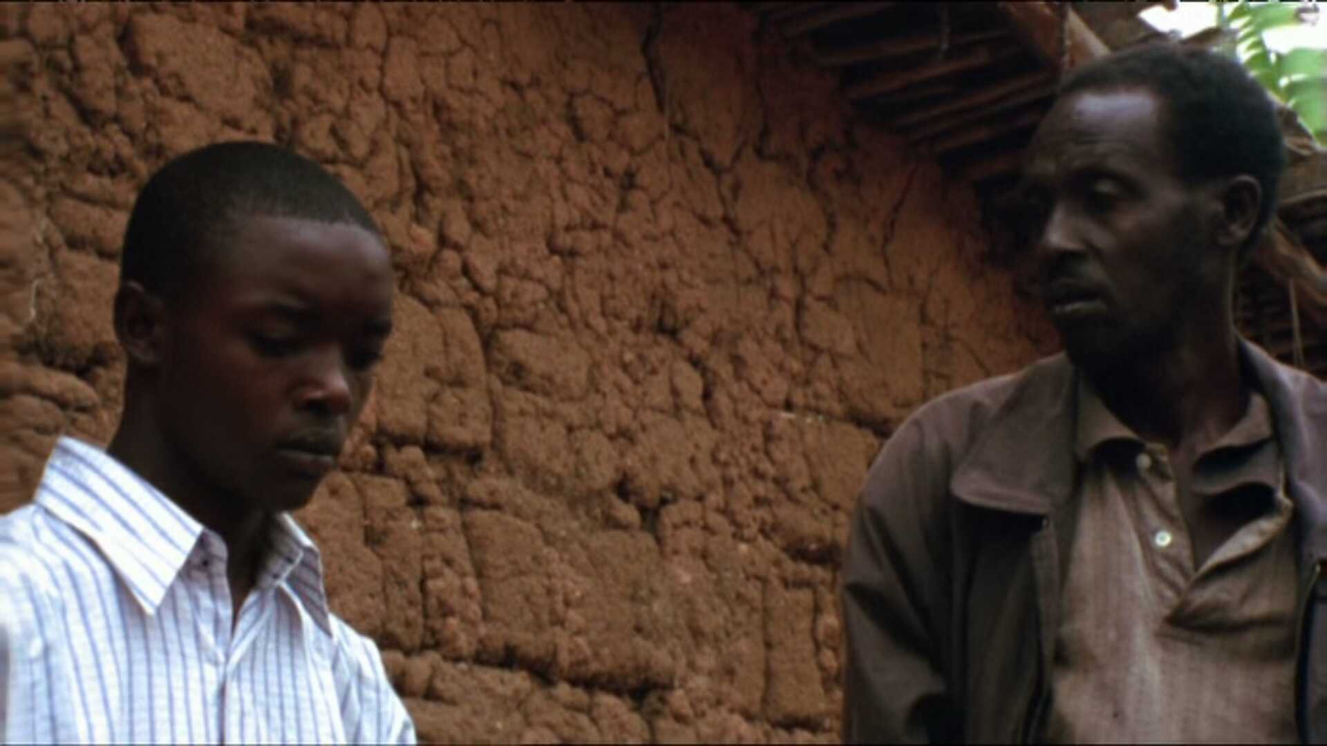
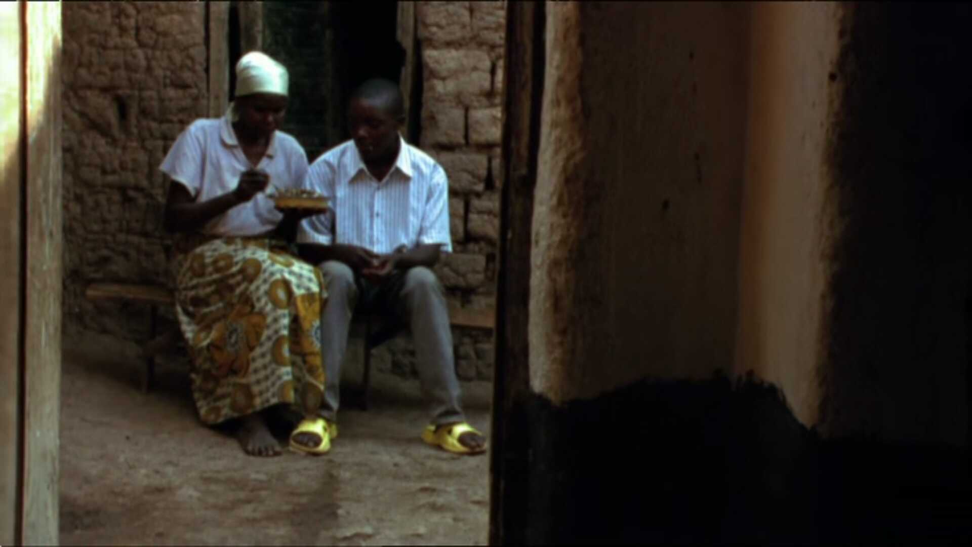
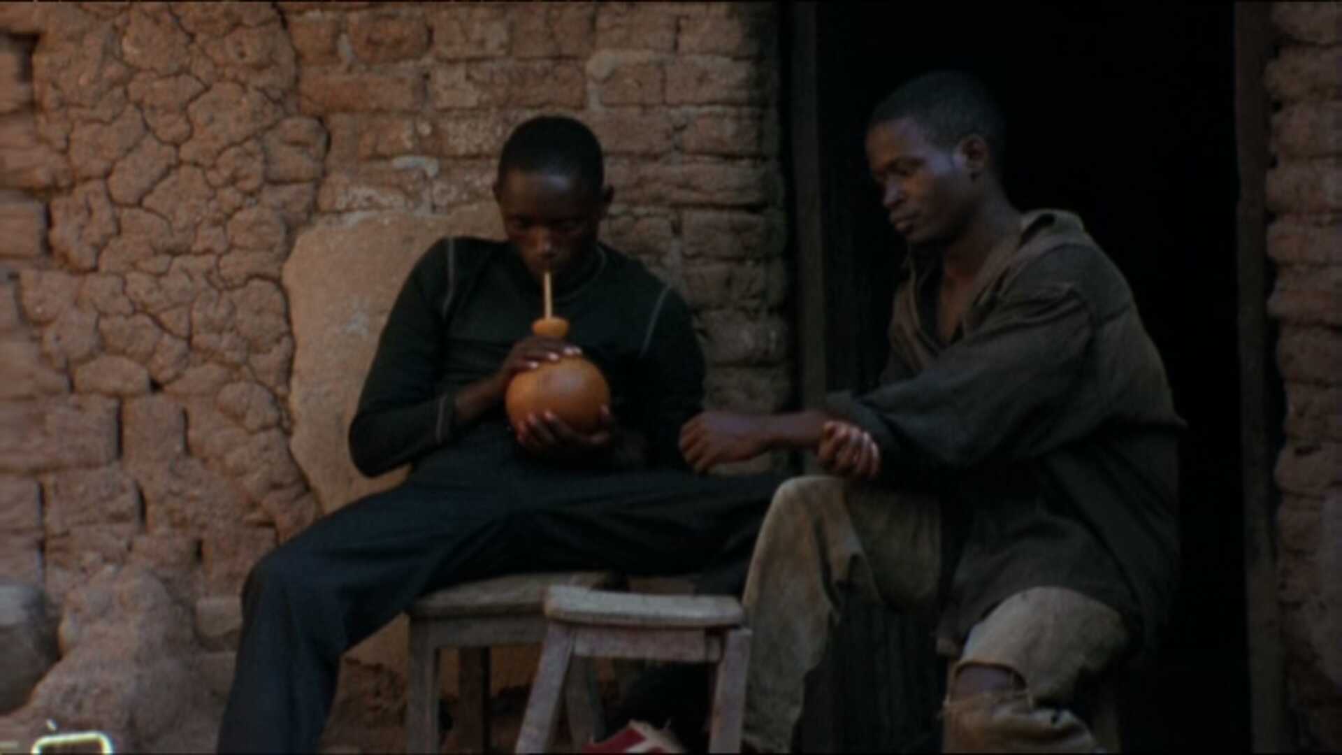
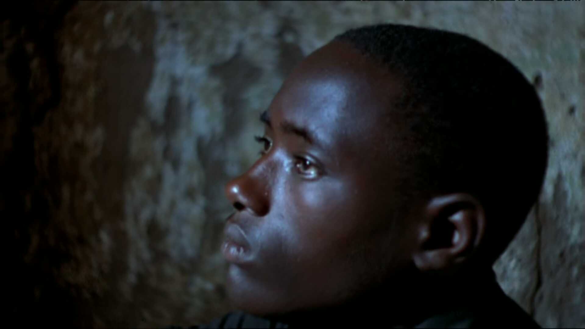
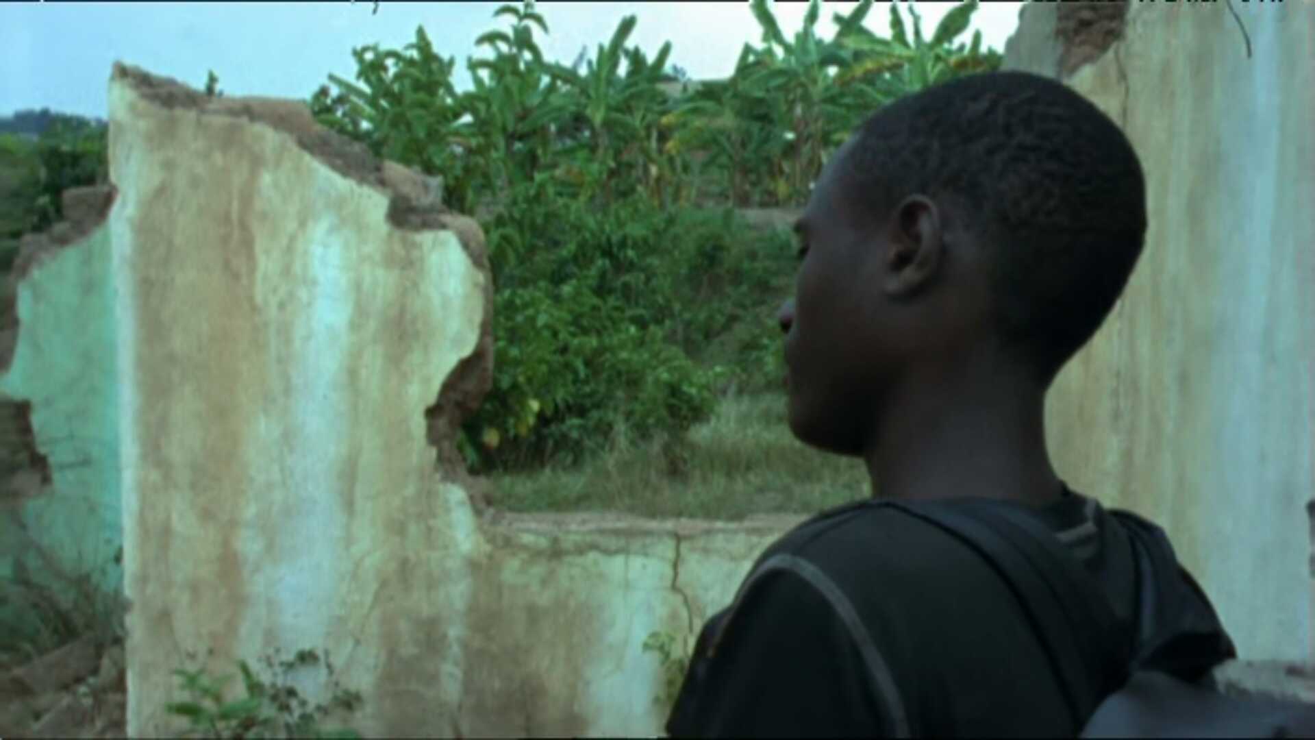
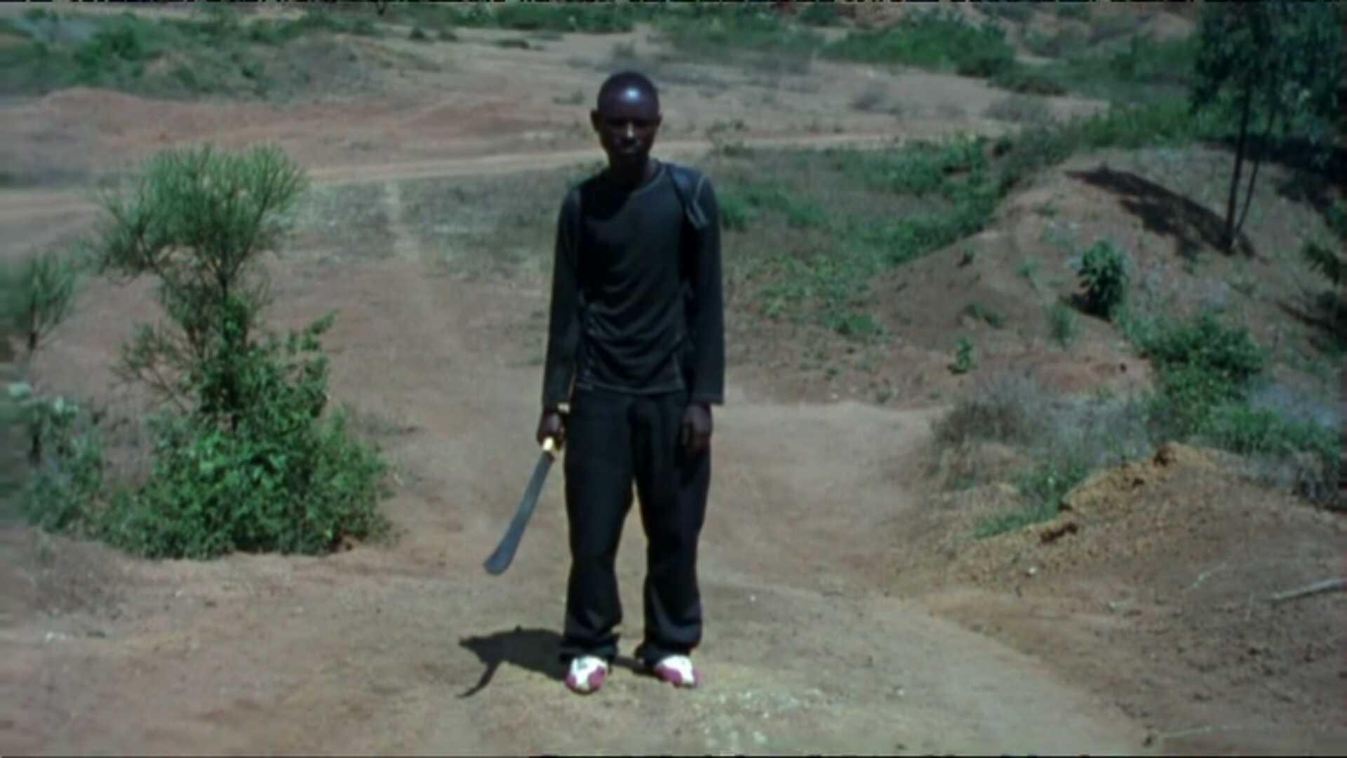
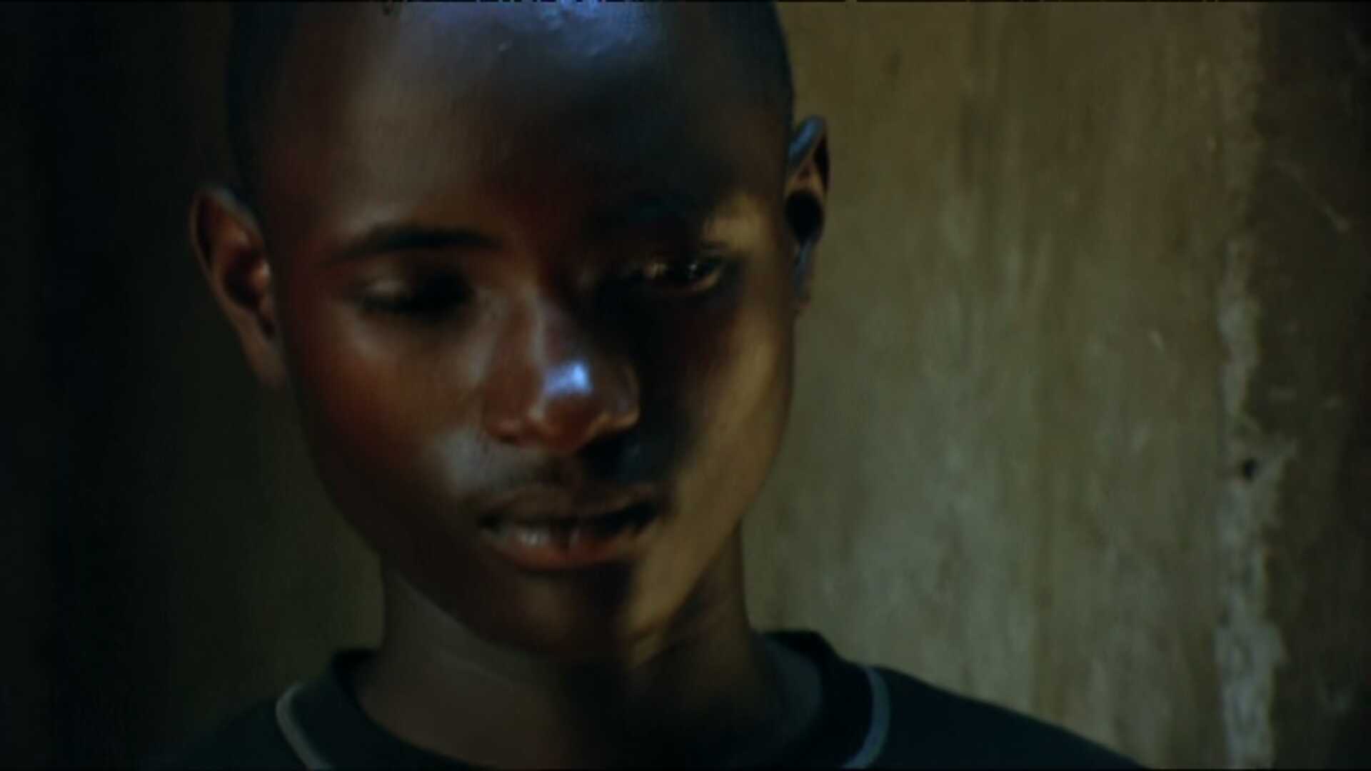
Anyway, I really liked the pacing and slightly off-centre way of developing the storyline in this film. You never quite know where it’s going. And the actors are pretty good, but somehow it didn’t quite connect with me.
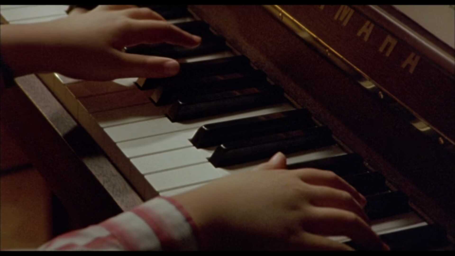
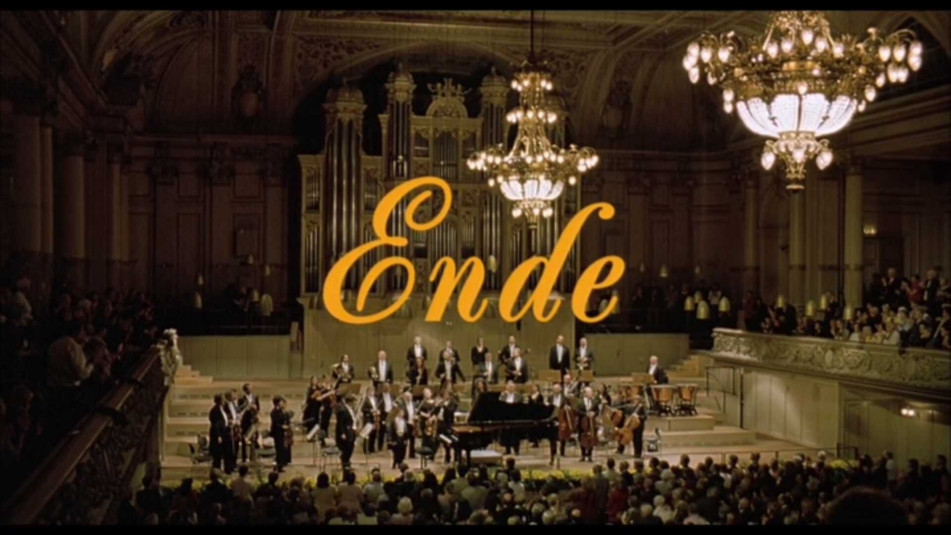
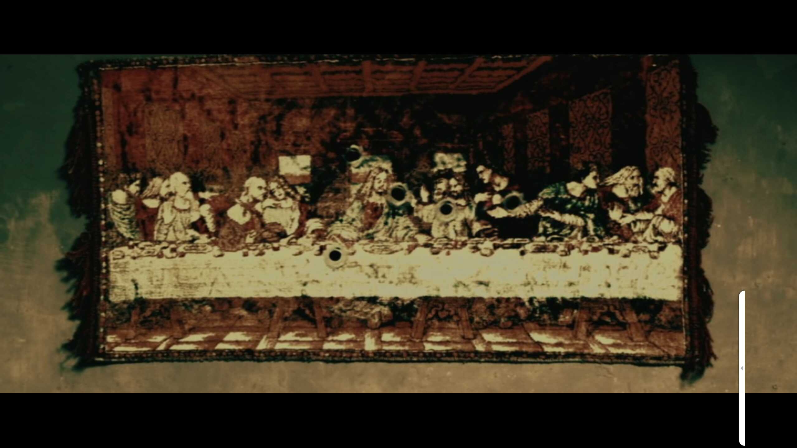
Loved the poetry thing at the end.
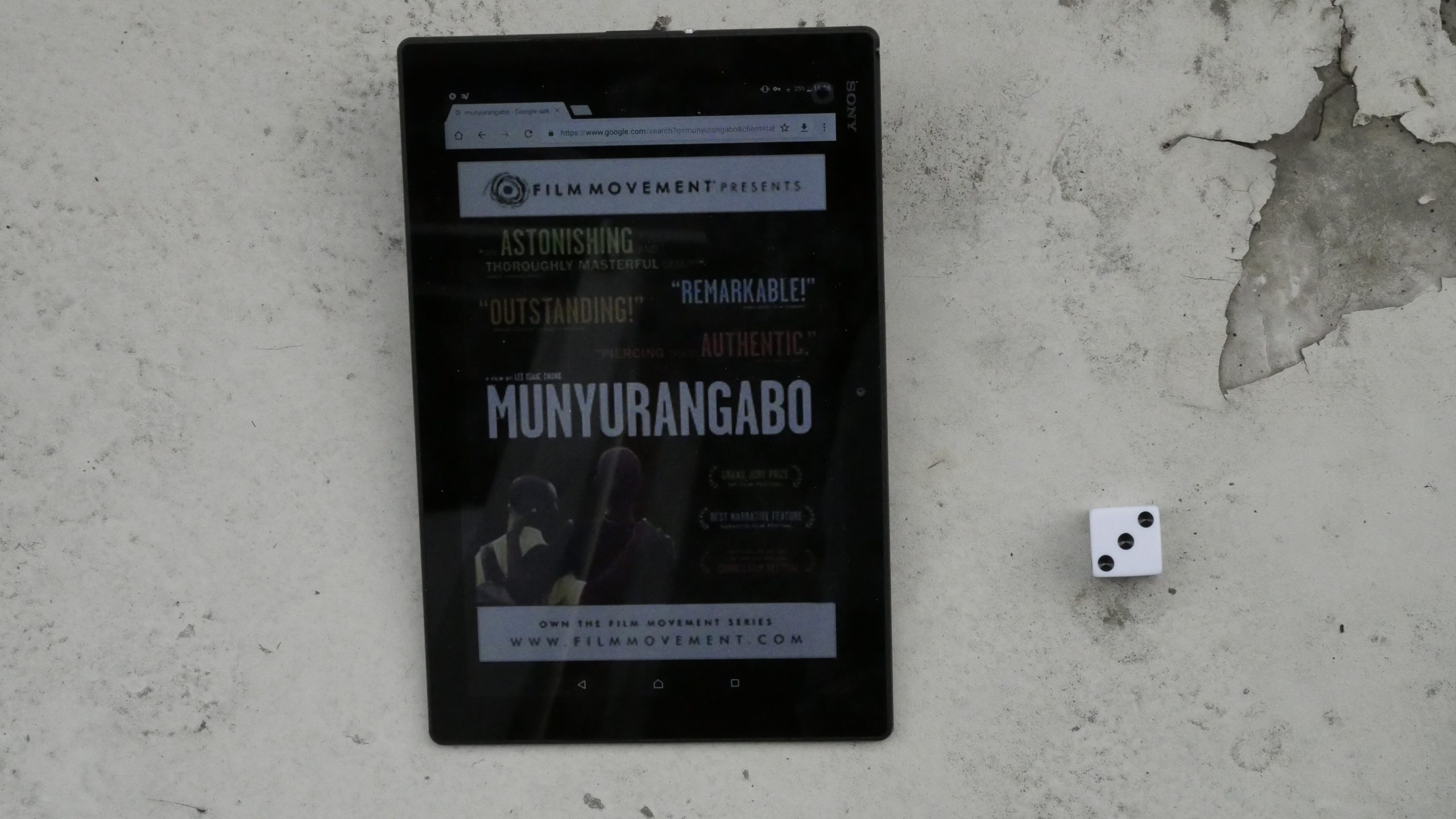
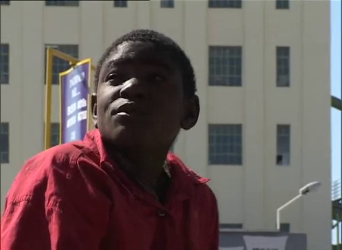
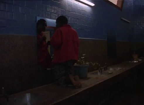
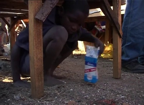
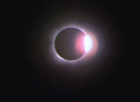
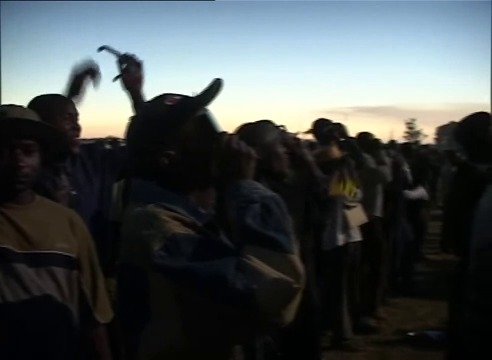
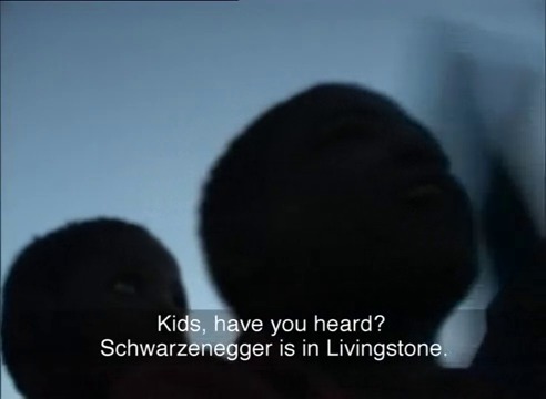
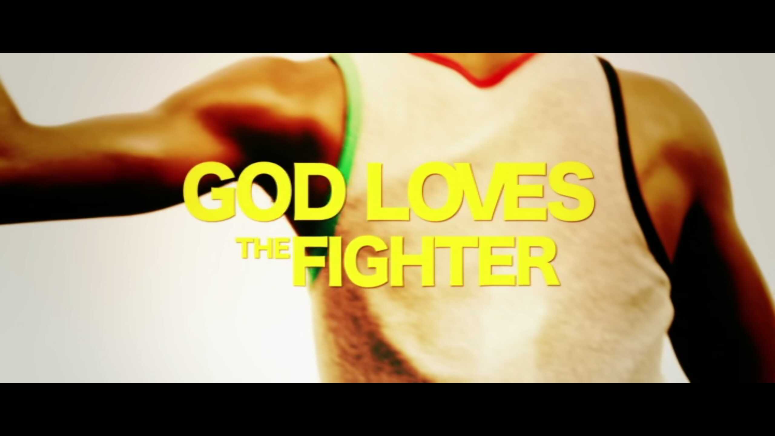
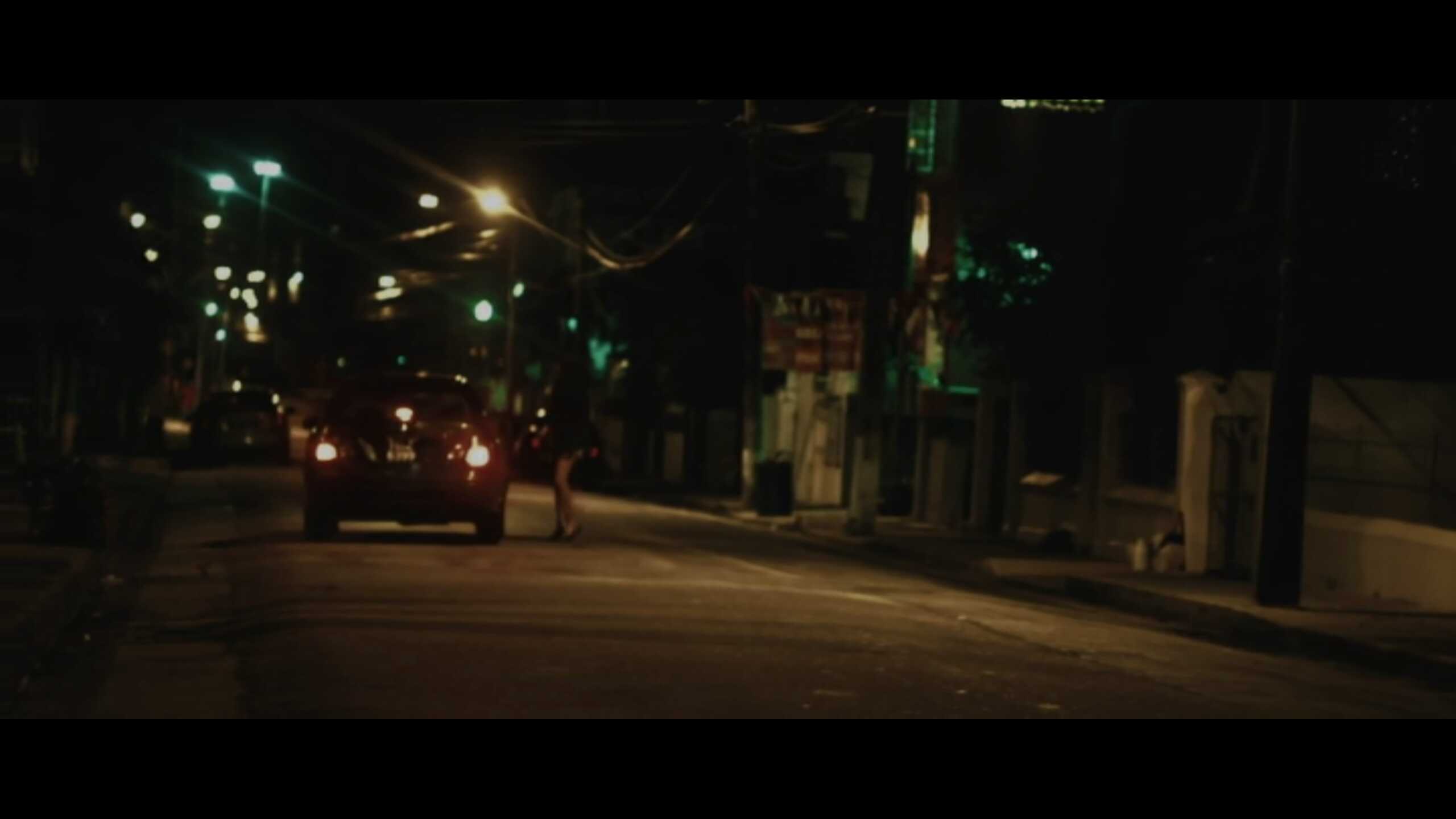
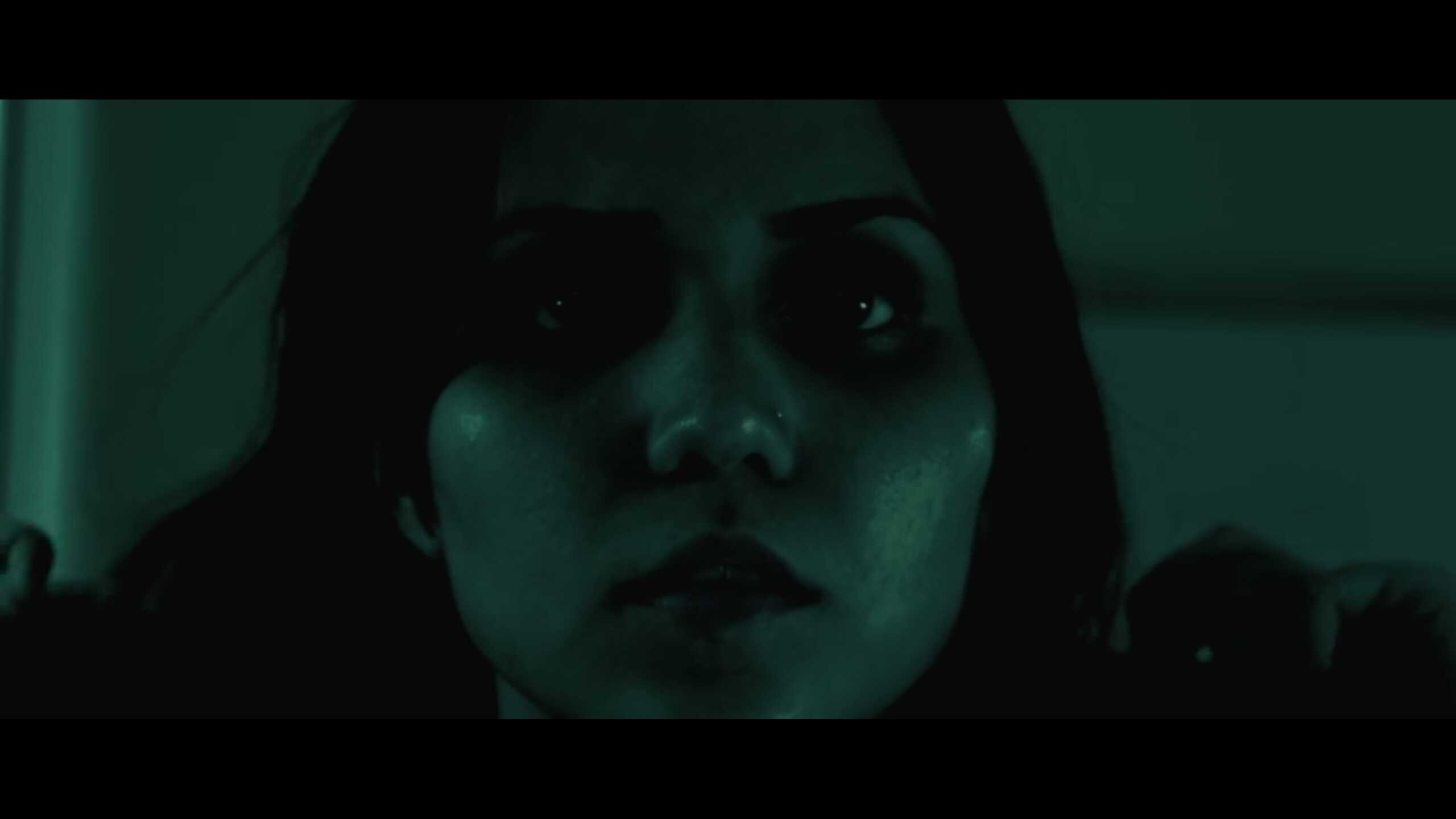
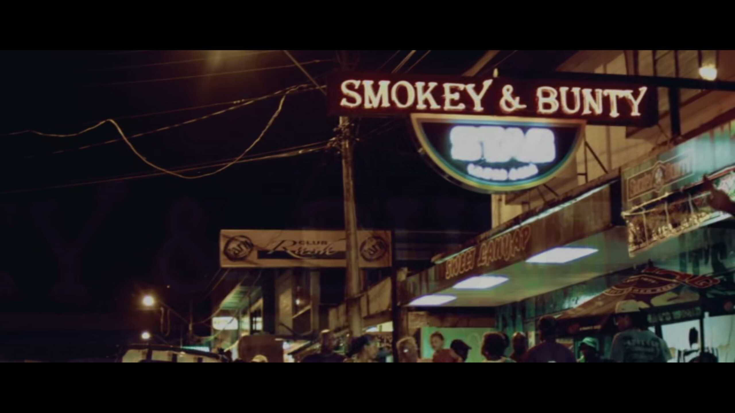
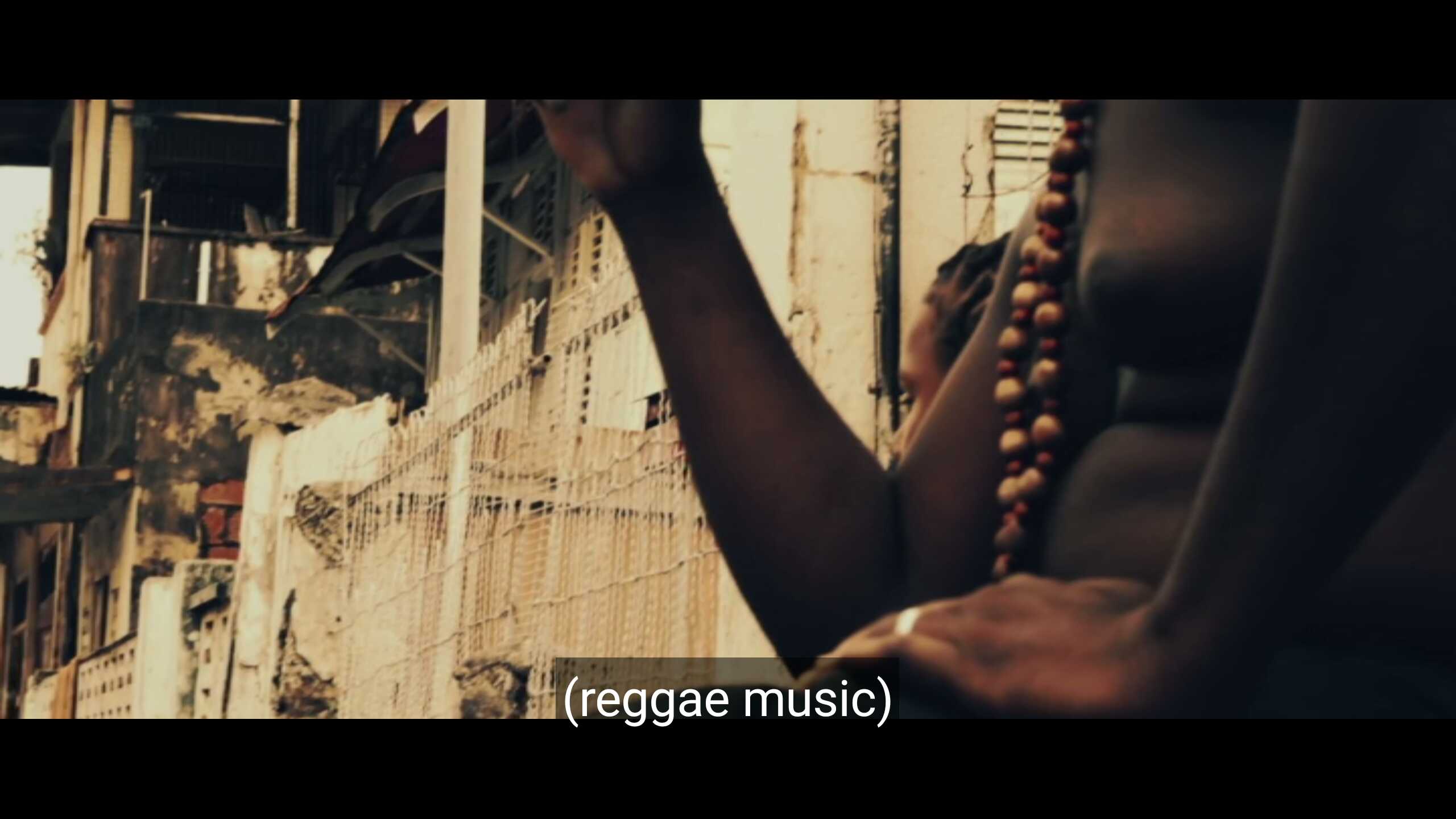
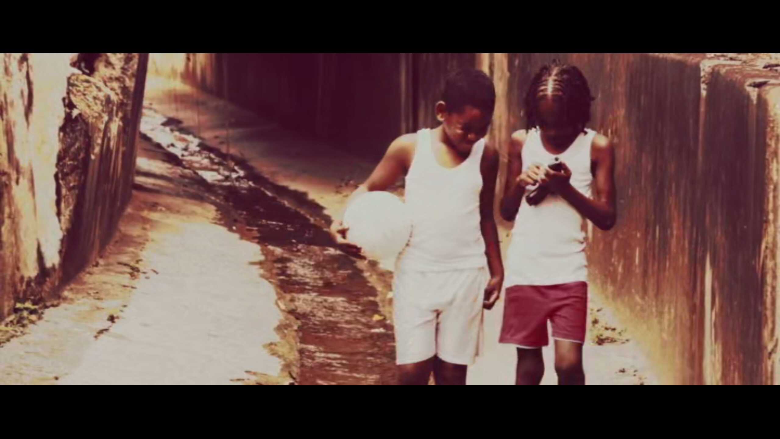
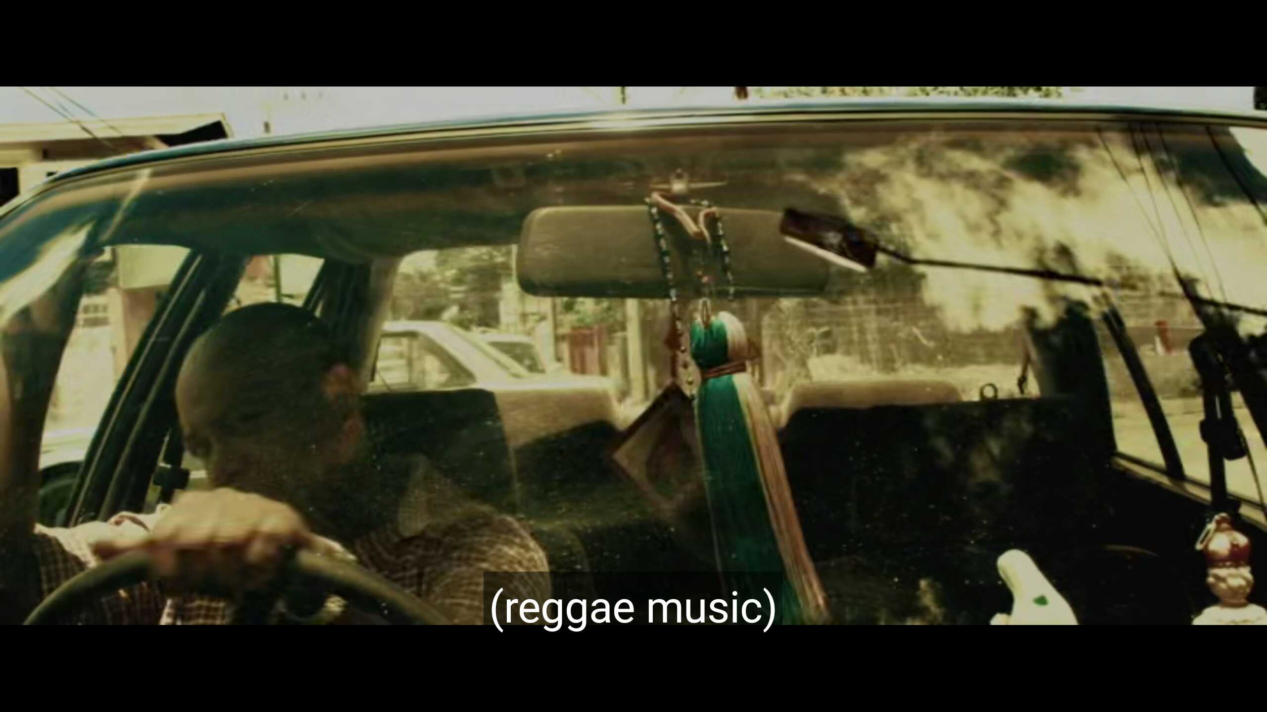
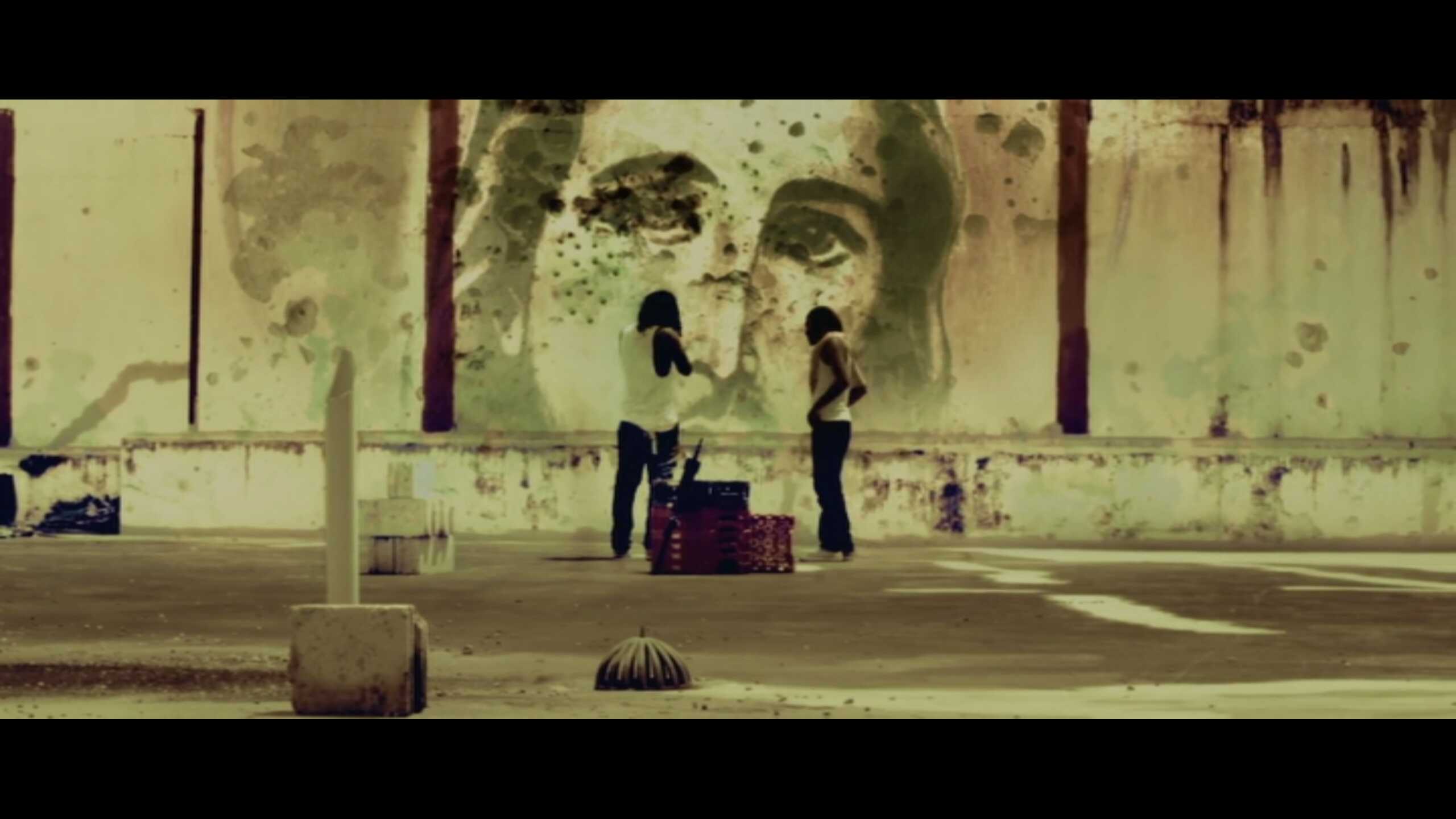
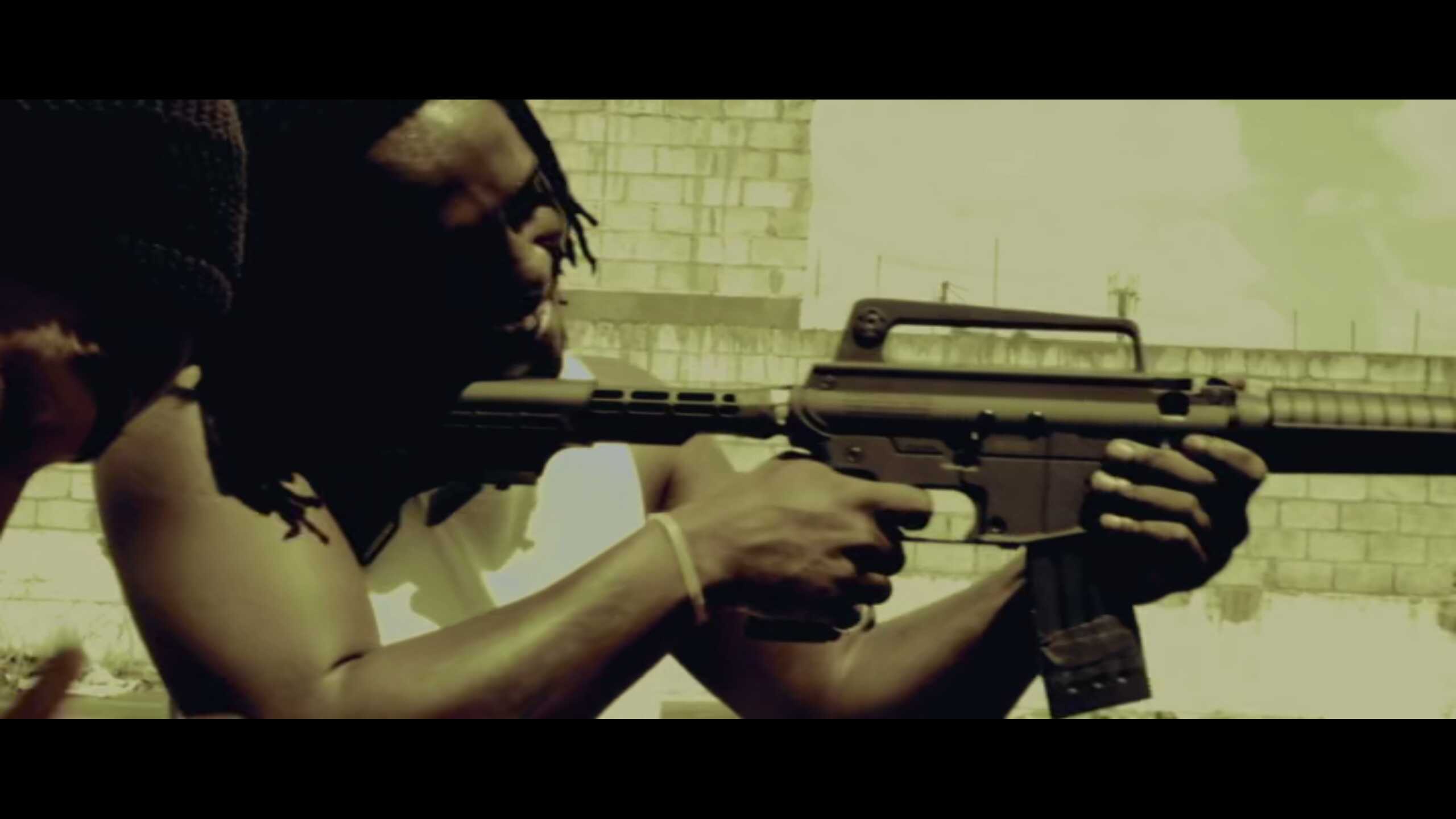
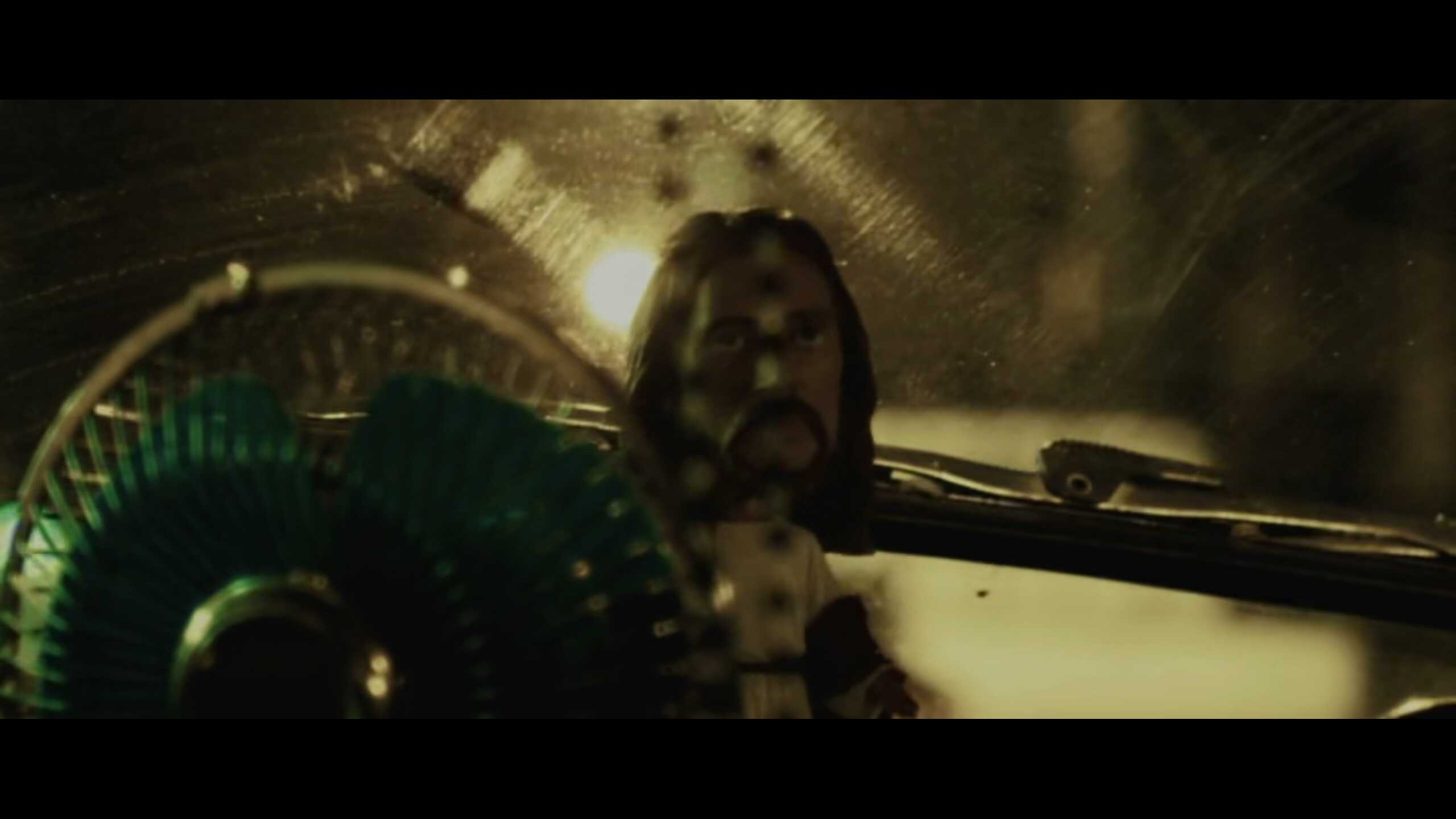
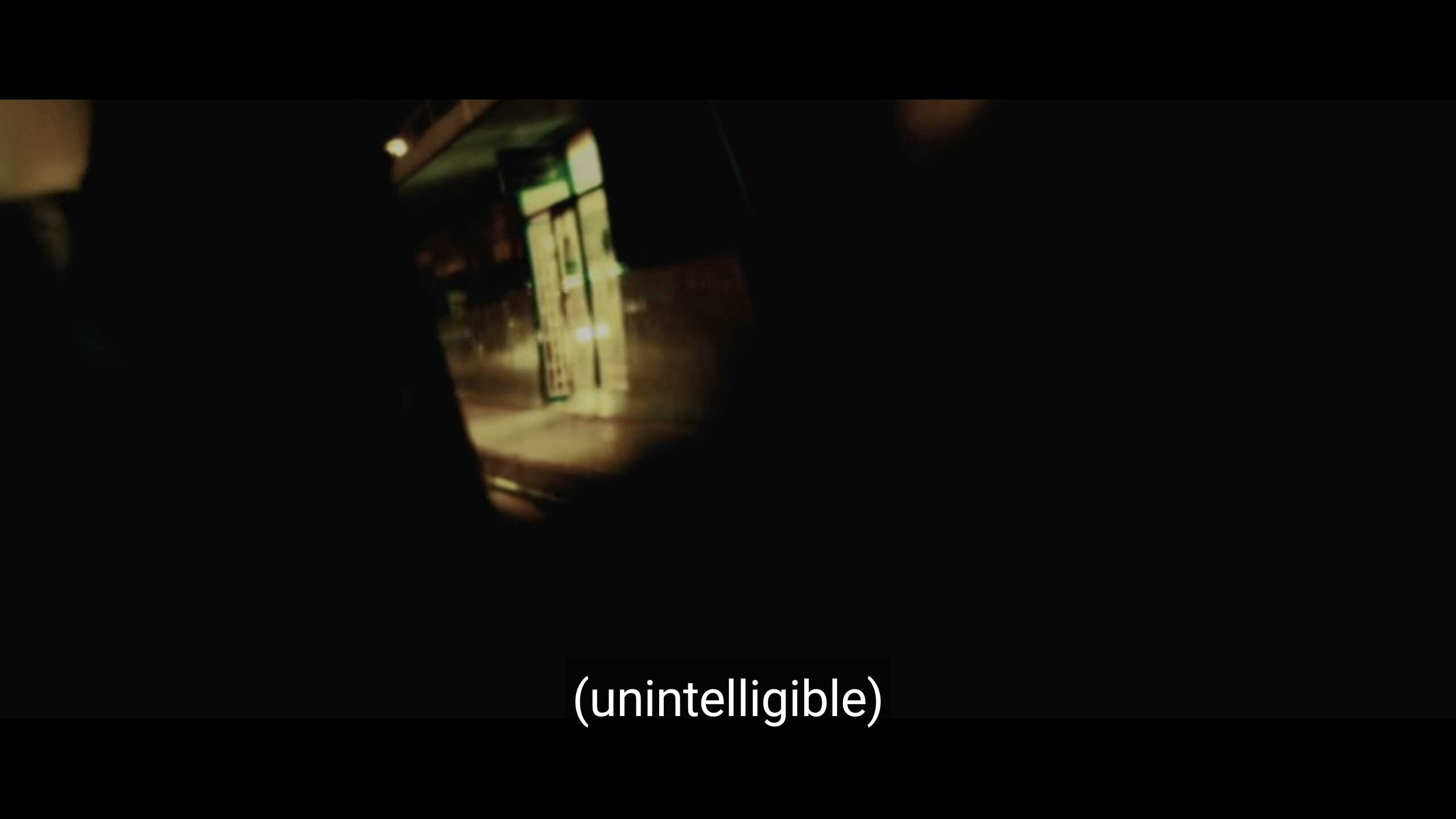
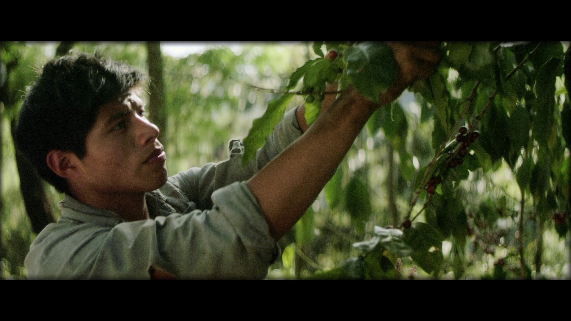
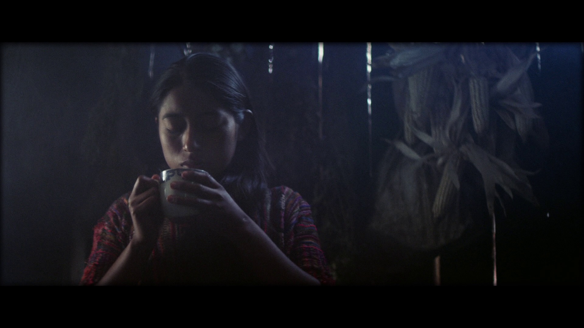
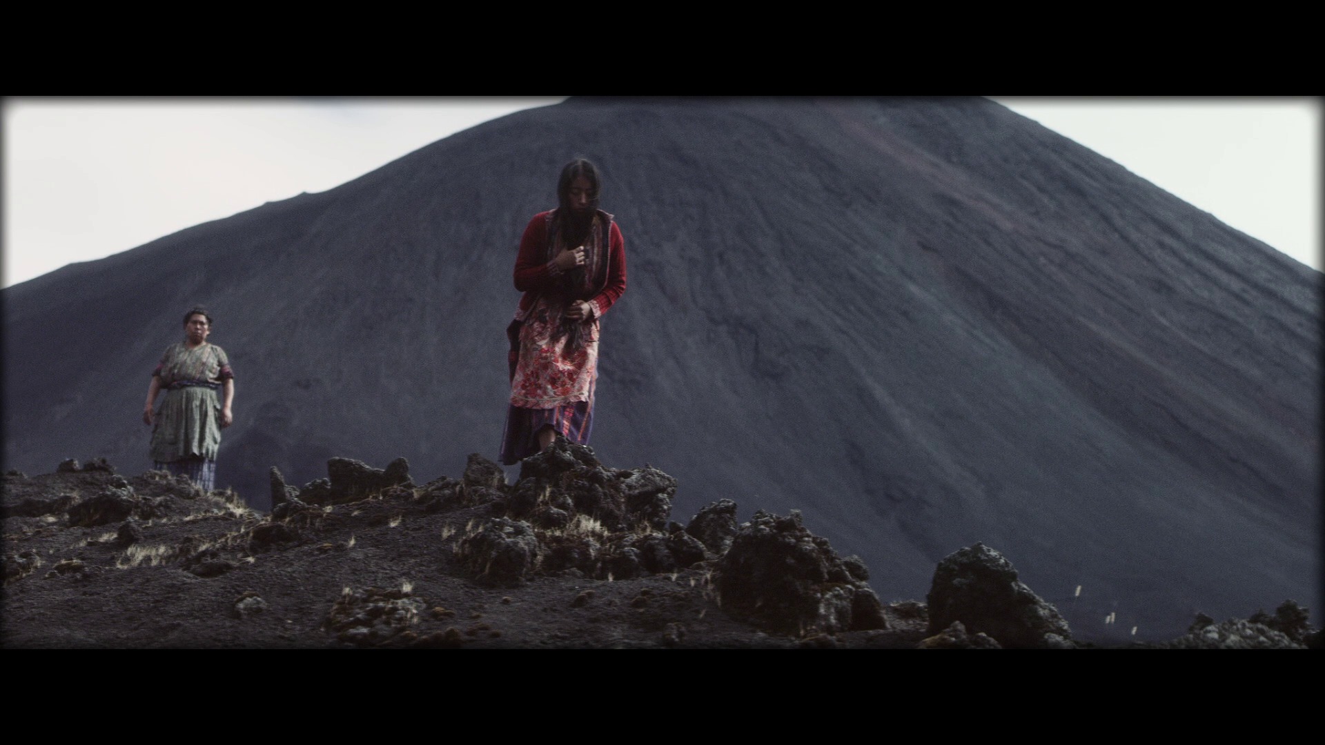
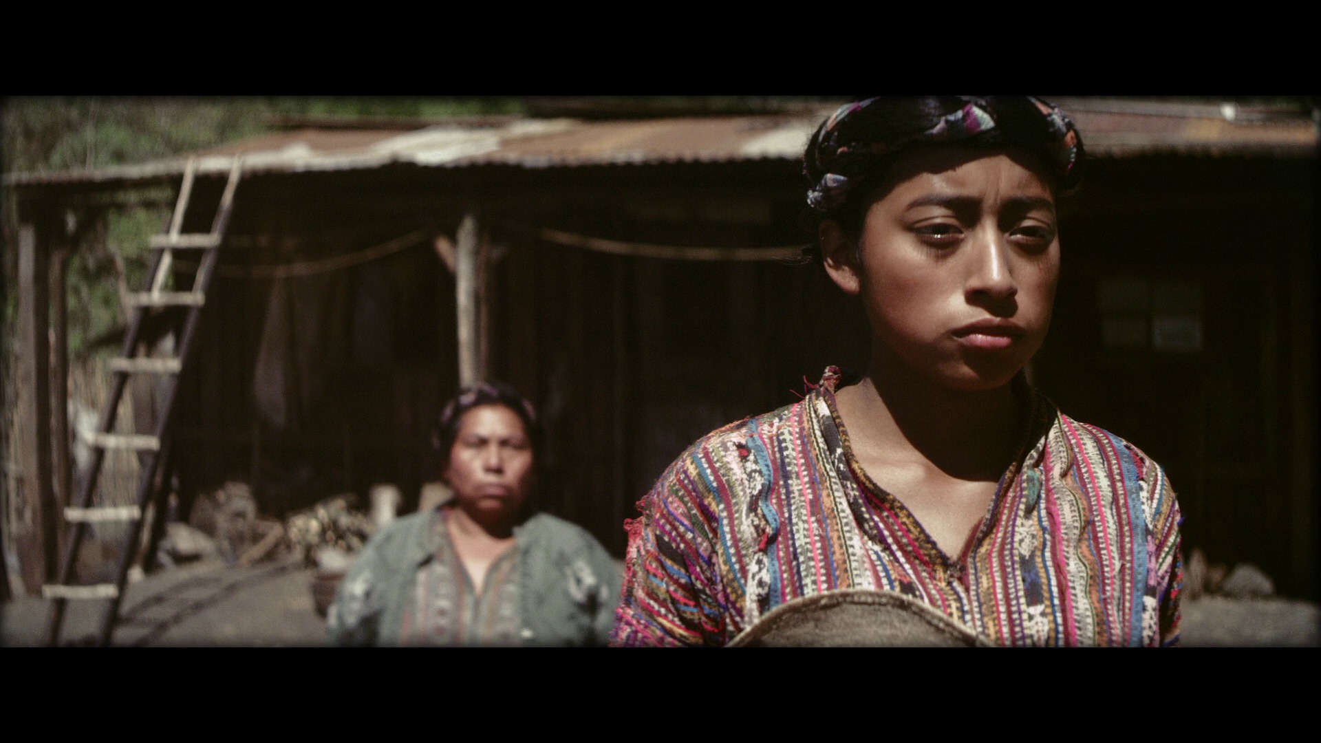
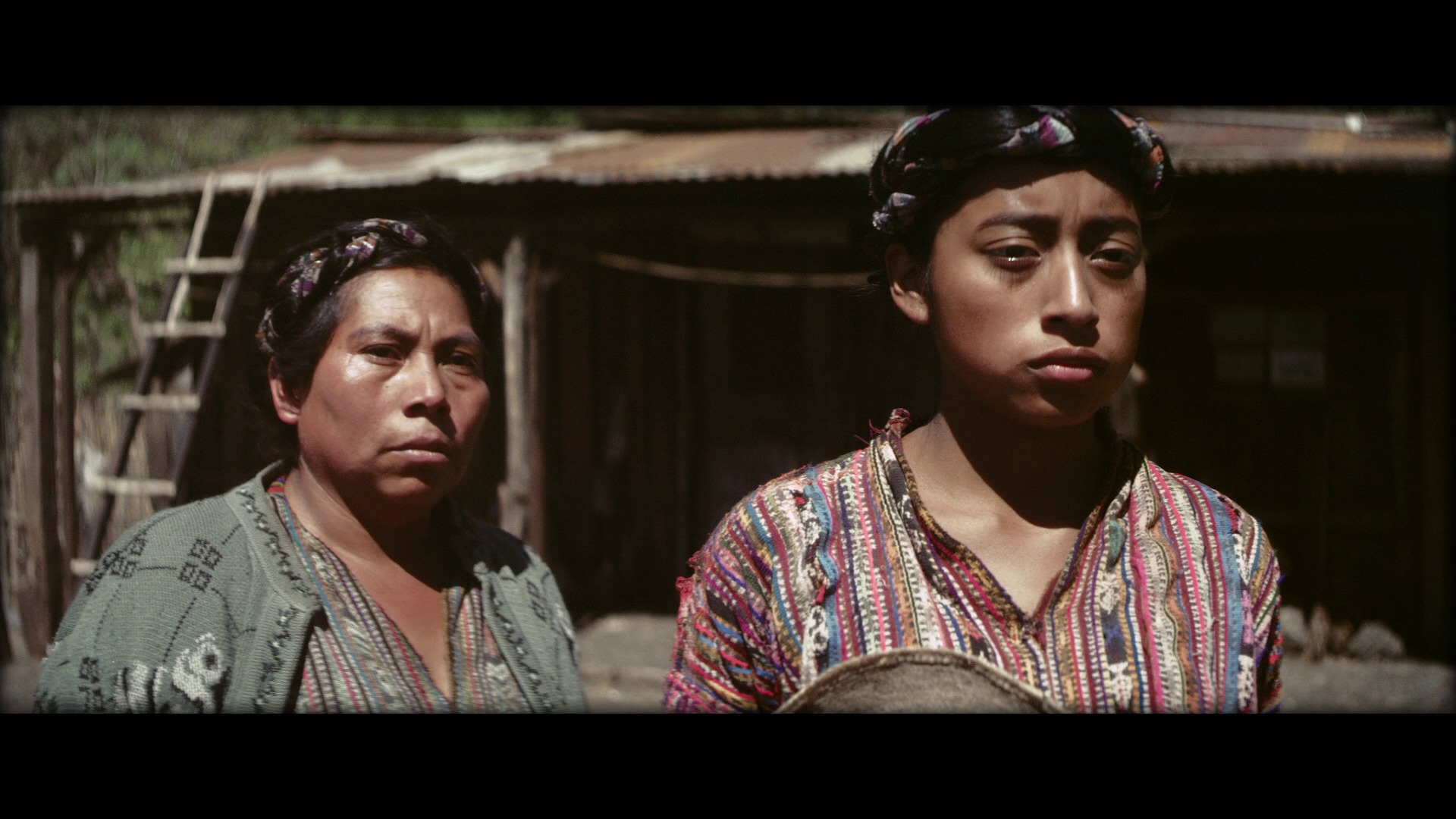
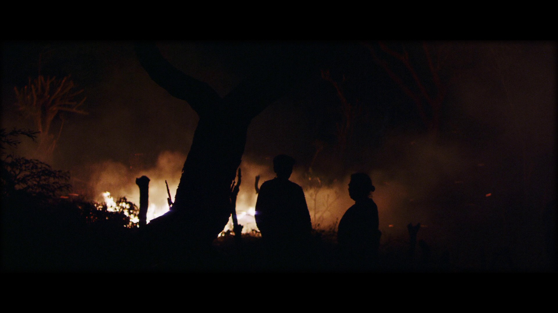
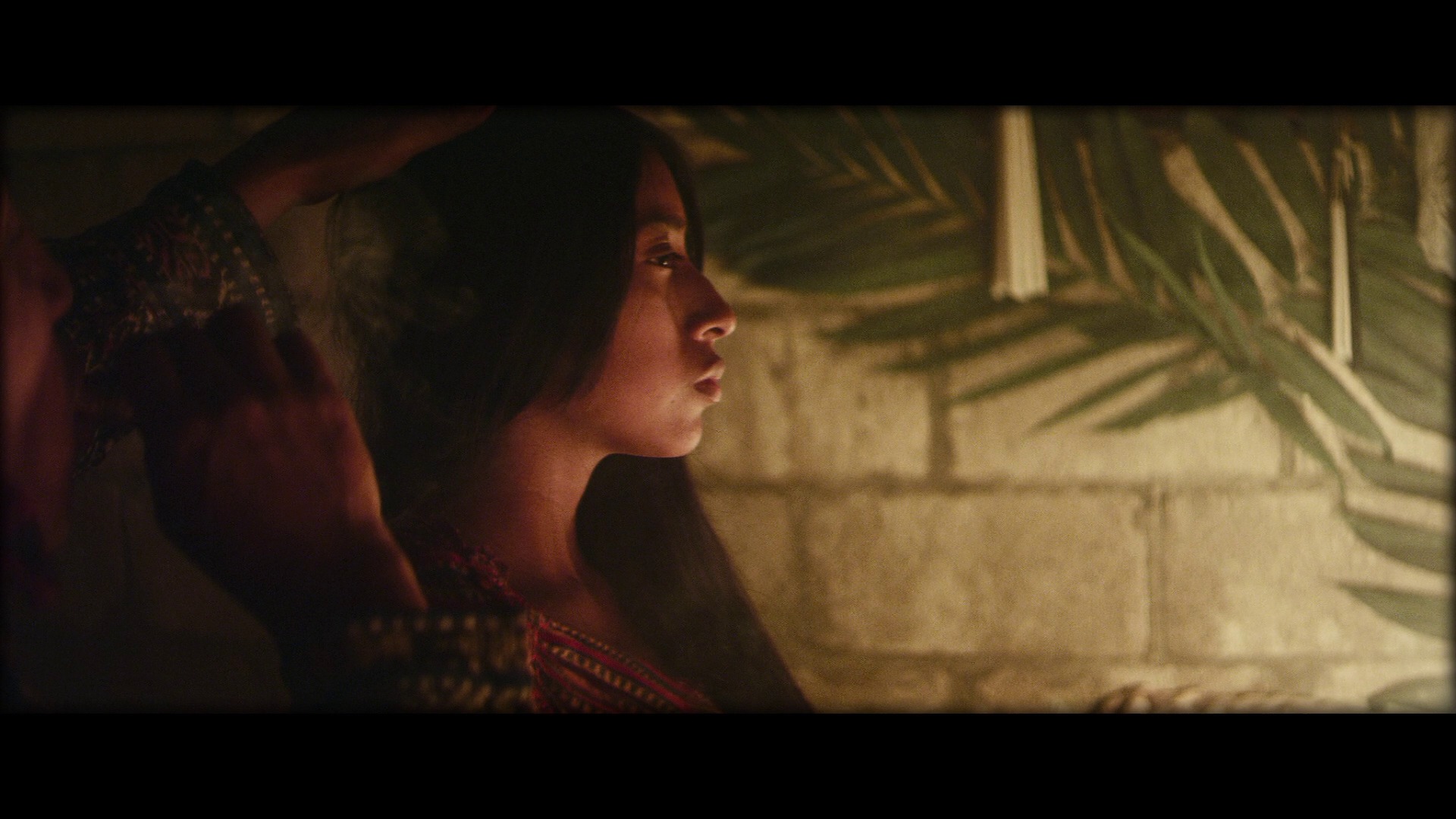
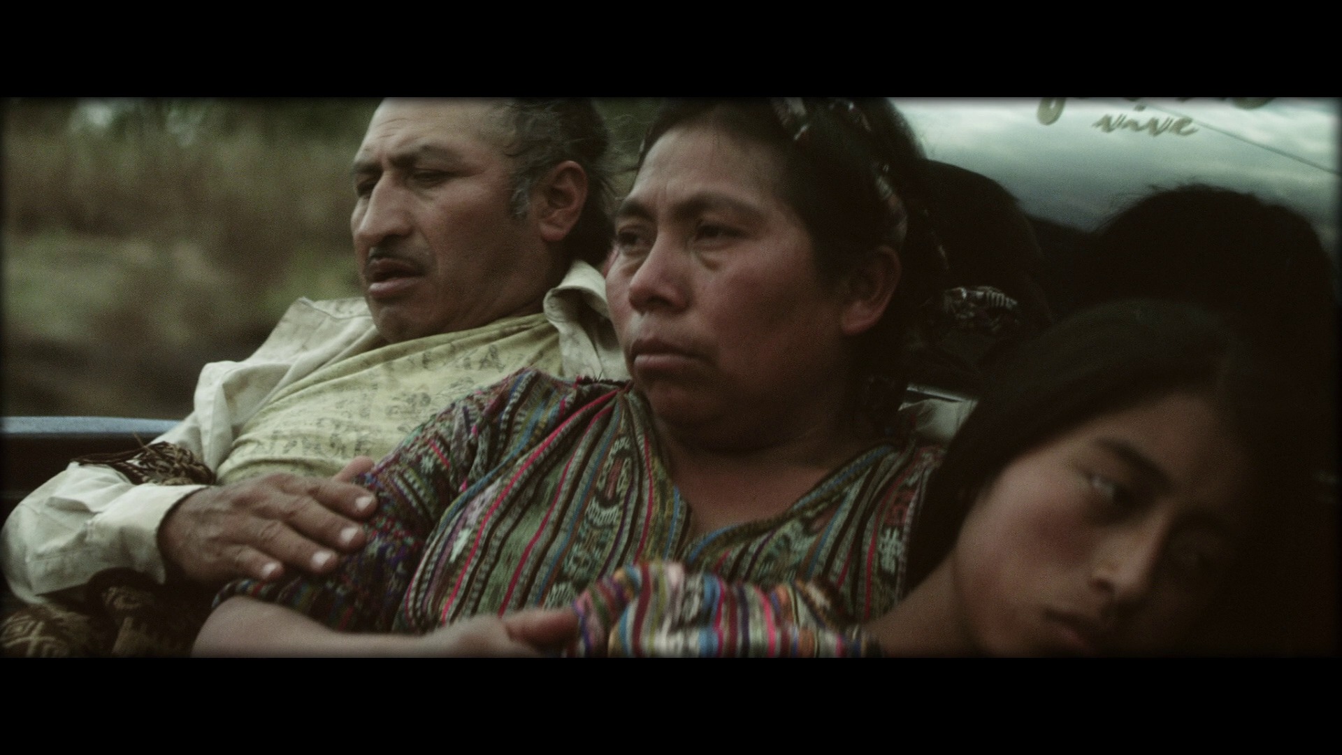
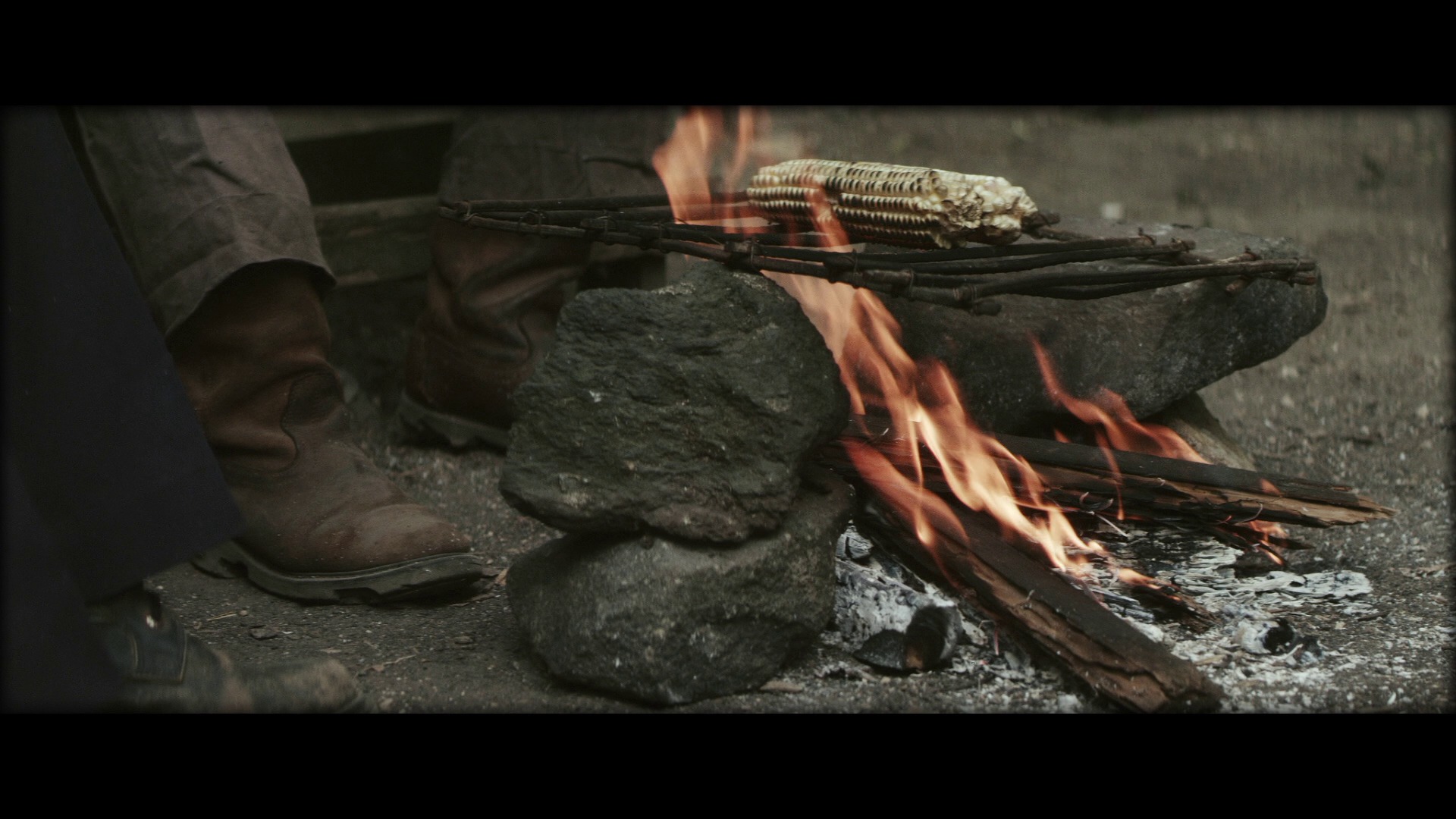
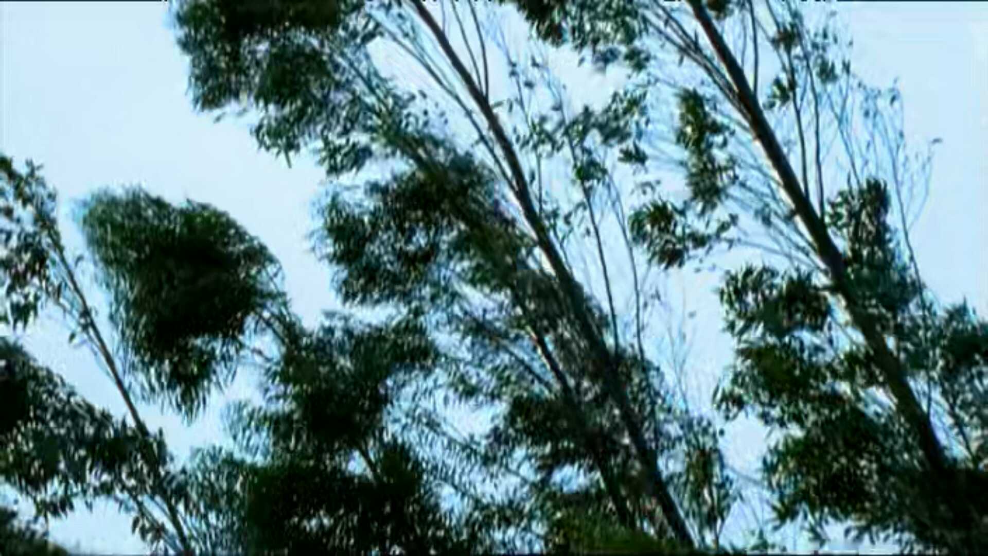
Munyurangabo. Lee Isaac Chung. 2007. Rwanda.

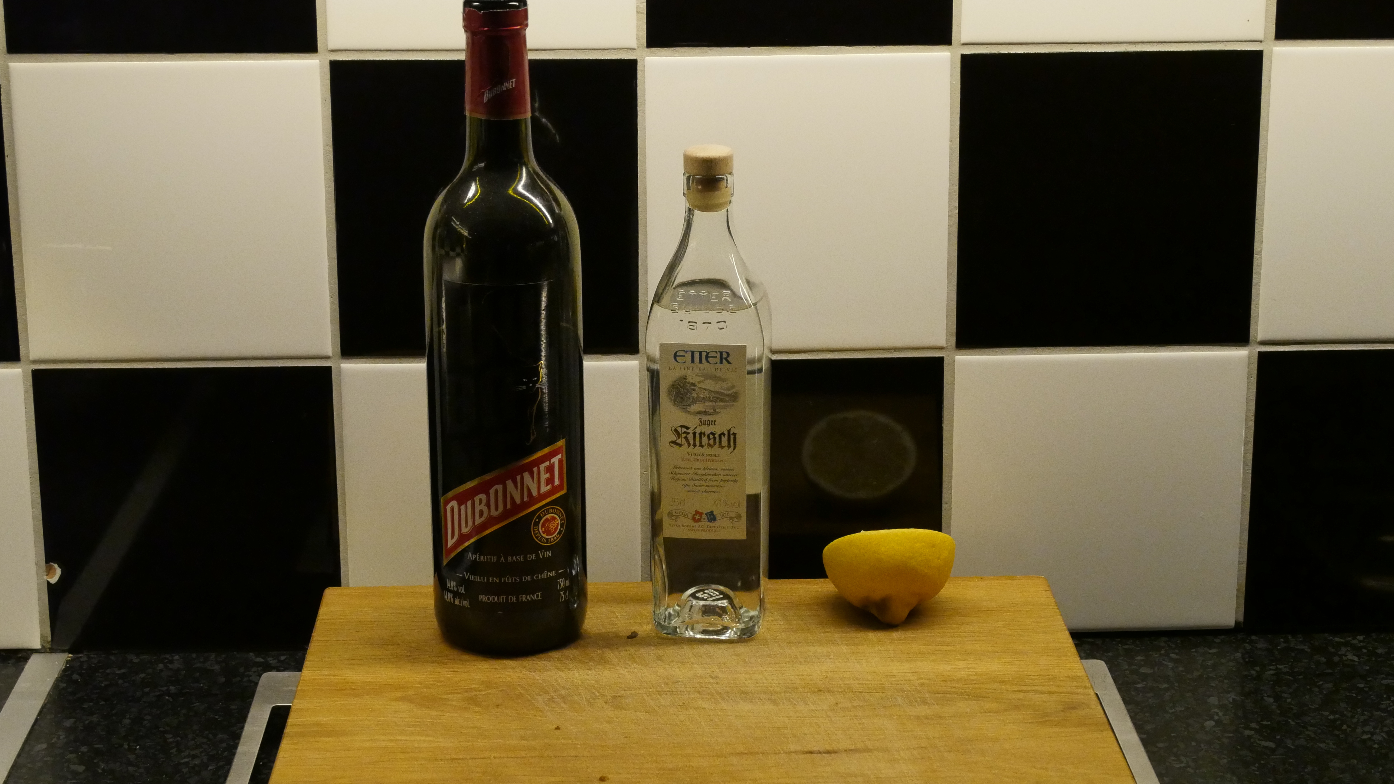
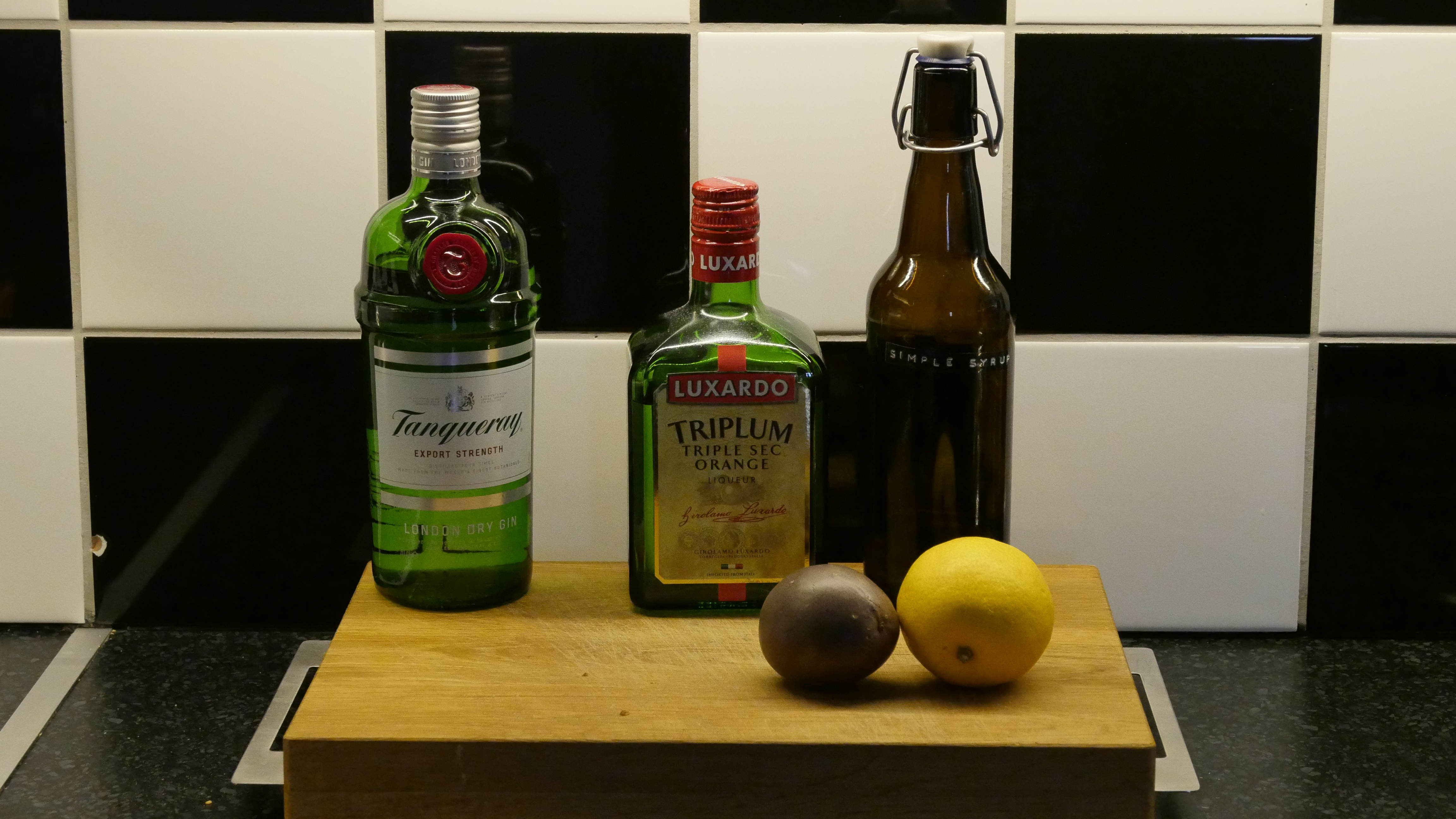
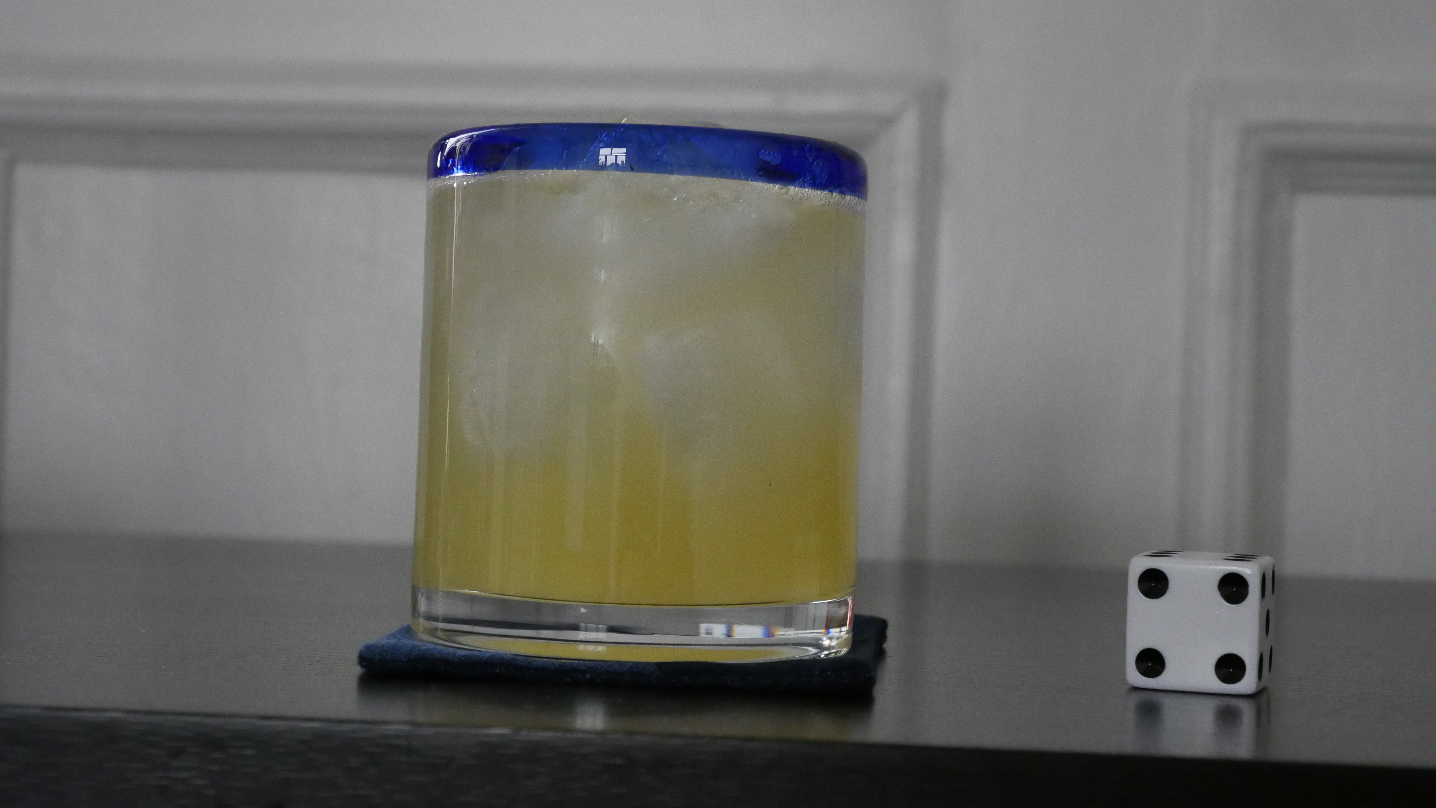
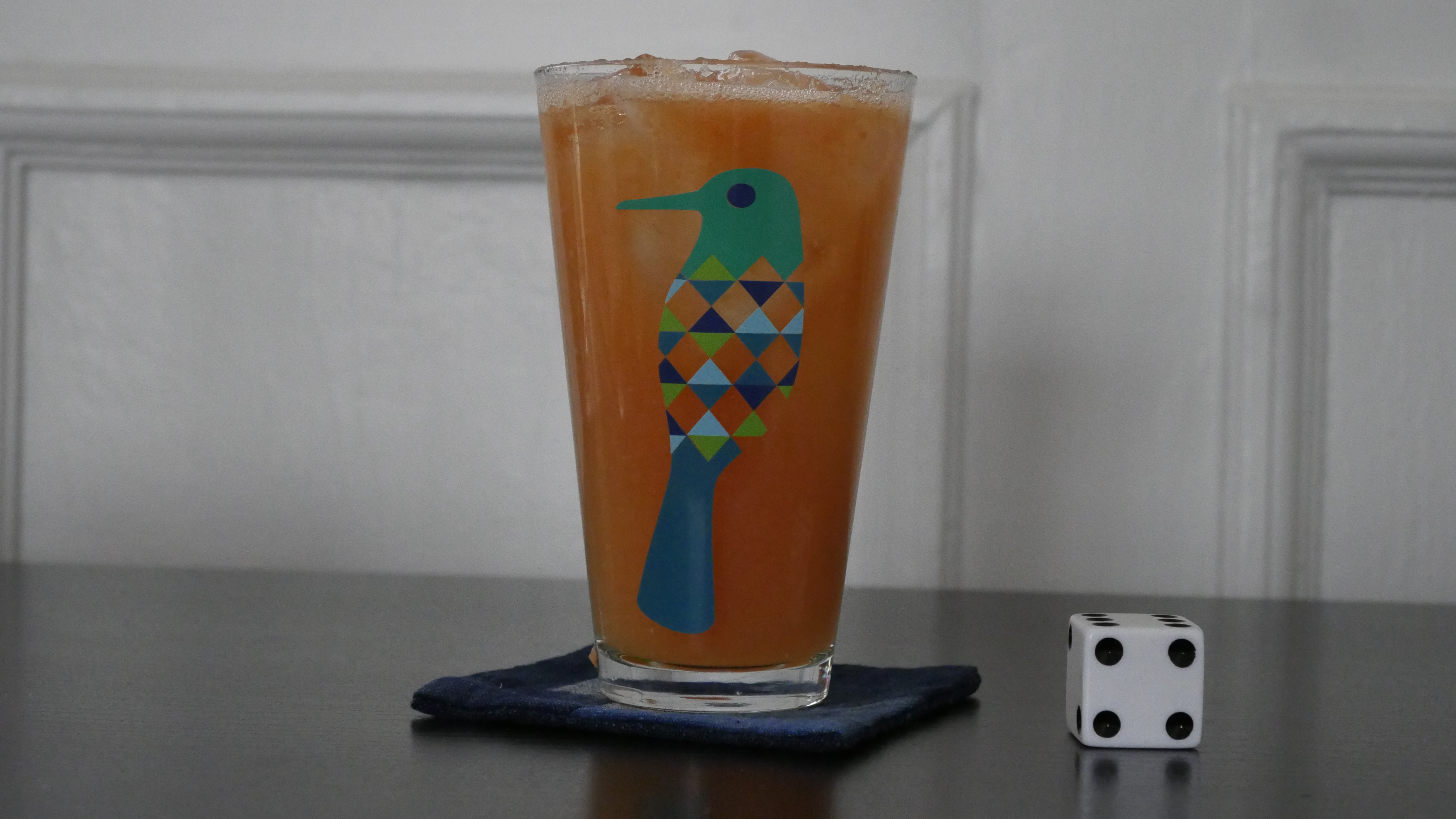
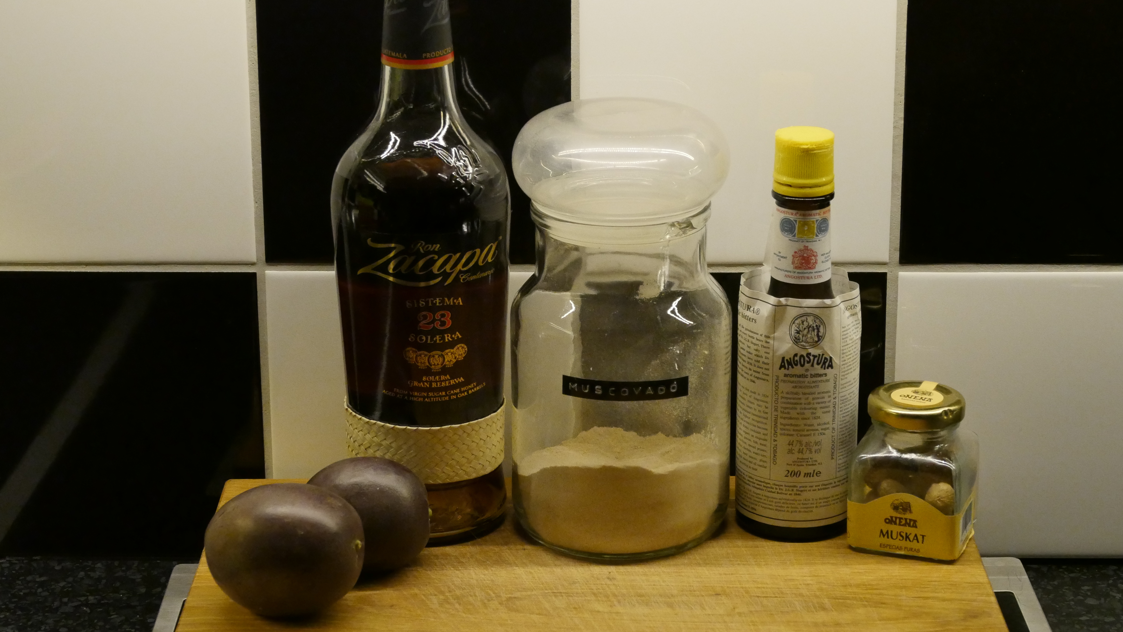
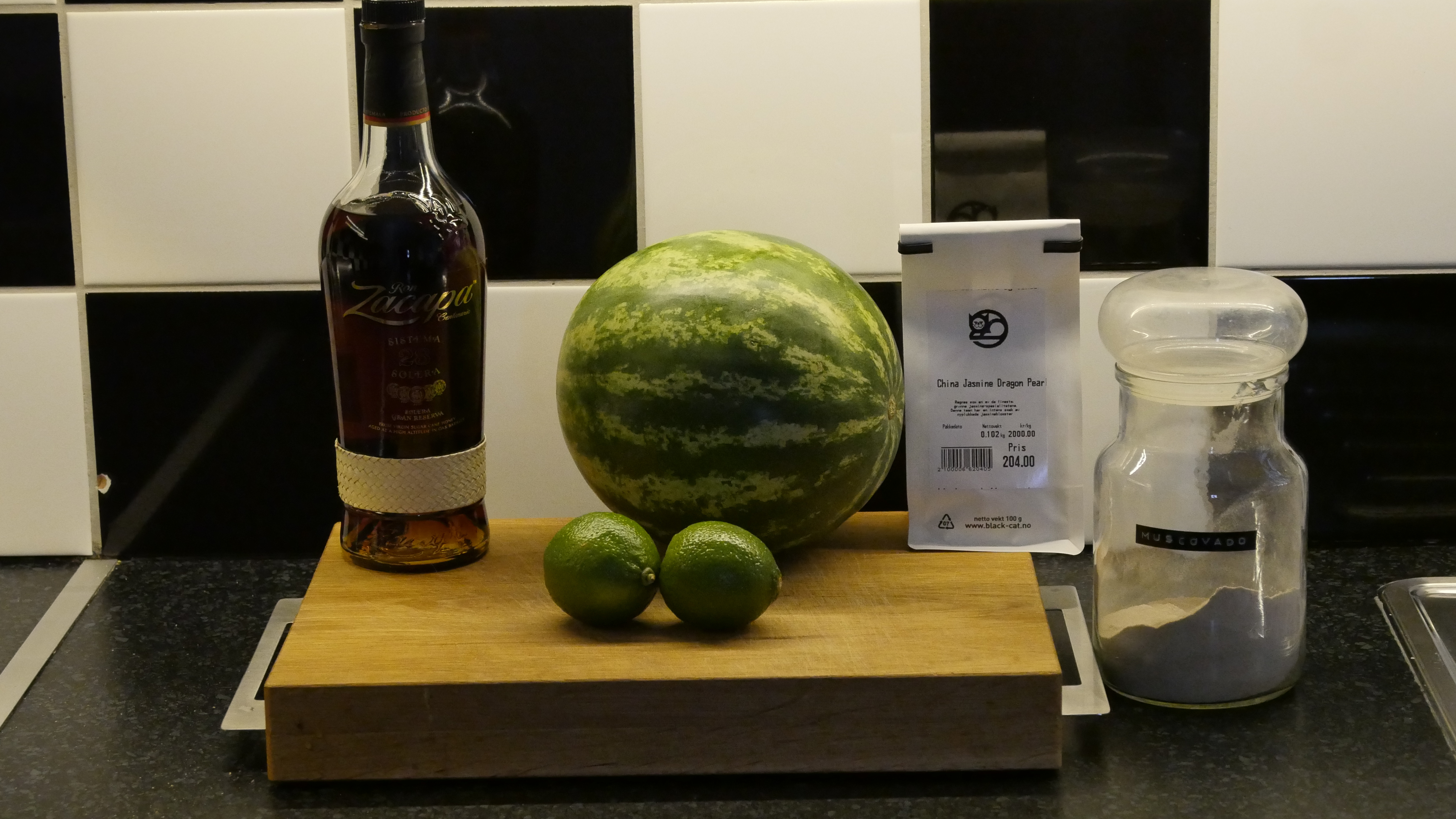
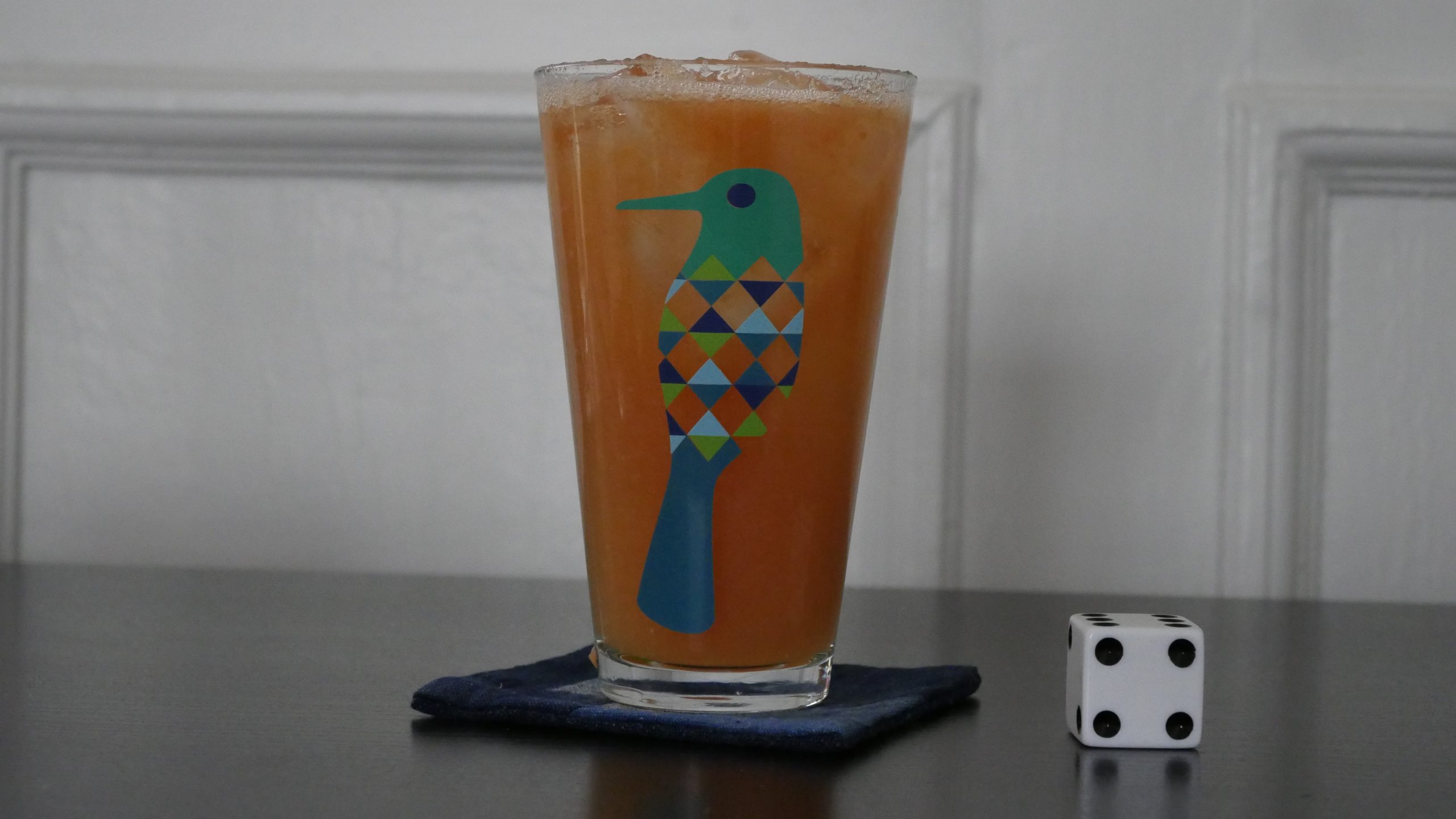
“The Starter” – Kigali Mélange
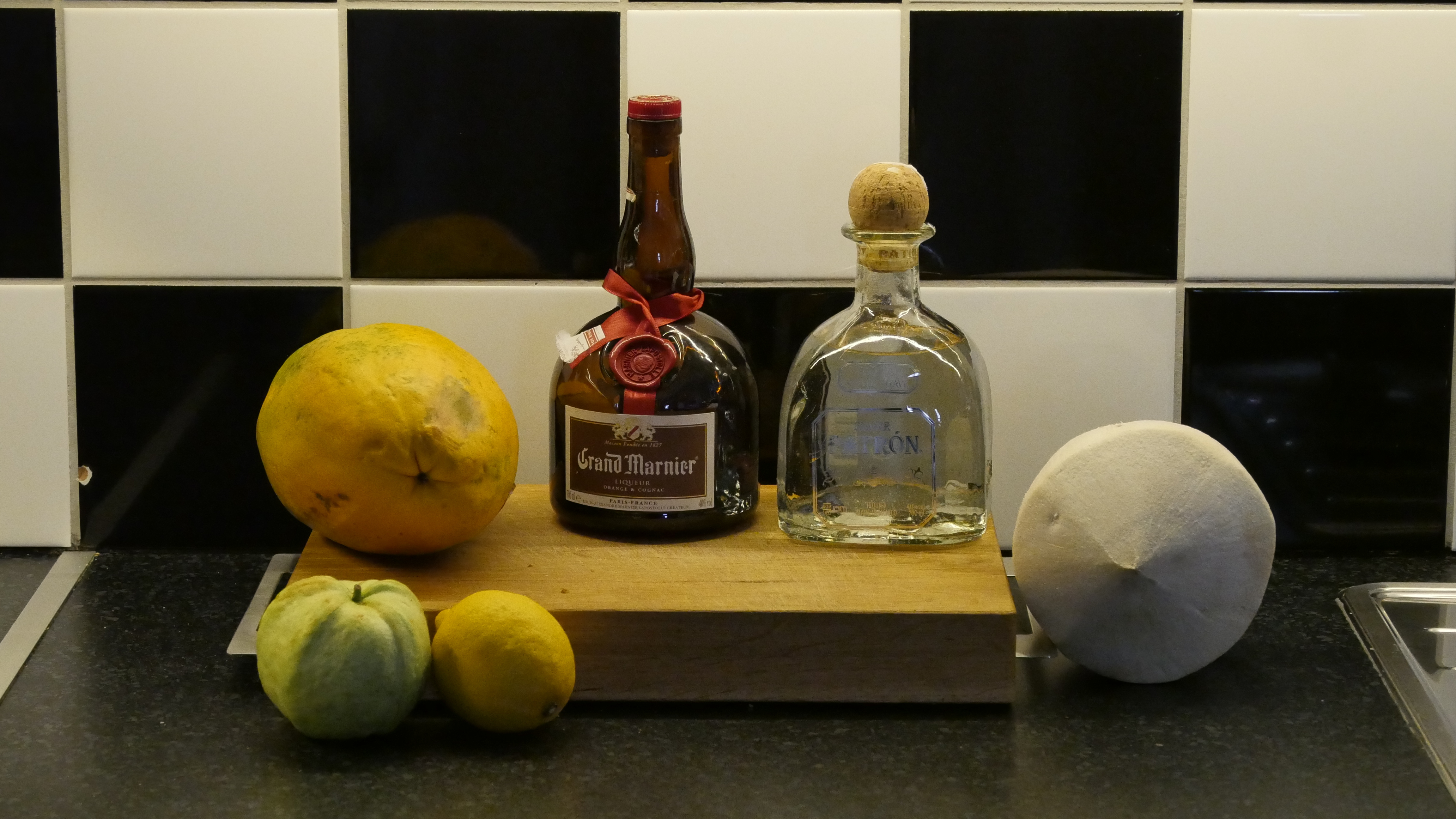
- 1 slice of fresh papaya
- 3 cl coconut nectar
- 6 cl tequila
- 3 cl Grand Marnier
- 9 cl guava purée
- juice of half a lemon
Muddle the papaya with the coconut nectar. Add the other ingredients and shake with ice. Strain over a salt-rimmed, ice-filled glass. Top off with soda.
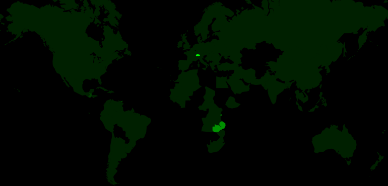
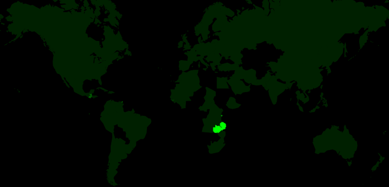
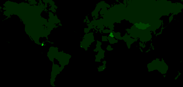
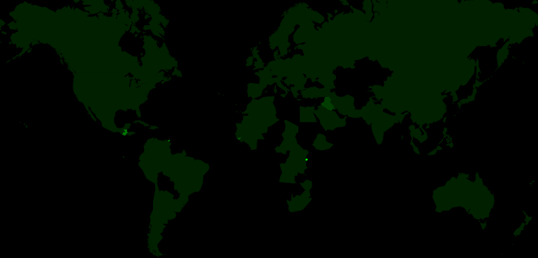
This post is part of the World of Films and Cocktails series. Explore the map.