


Fårö Document 1979 (Fårö-dokument 1979). Ingmar Bergman. 1979. ⭐⭐⭐⭐⭐★.
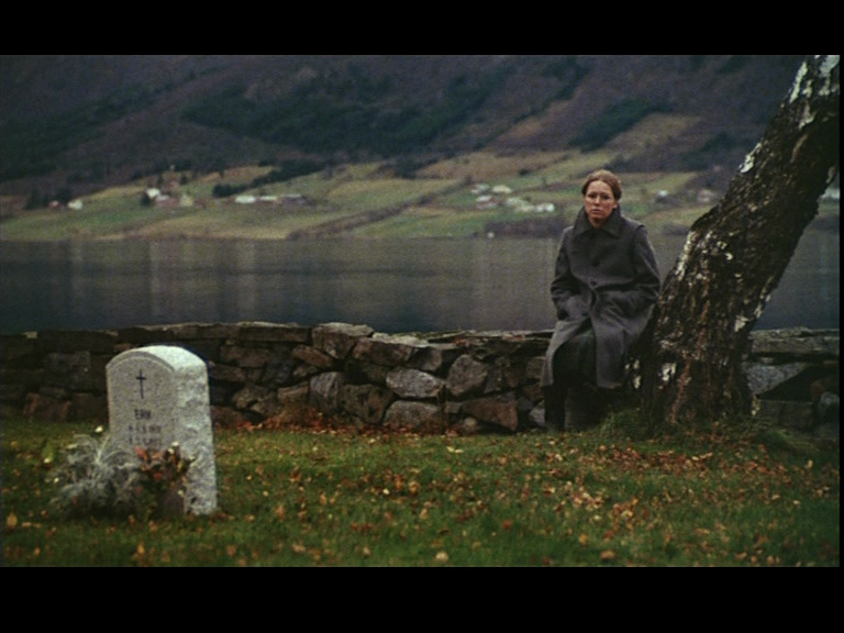
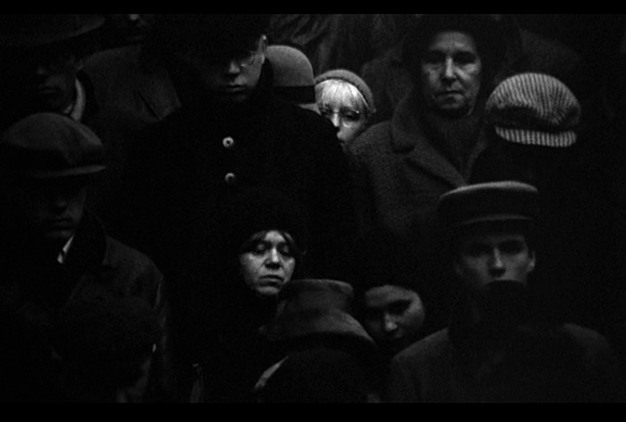
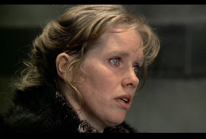
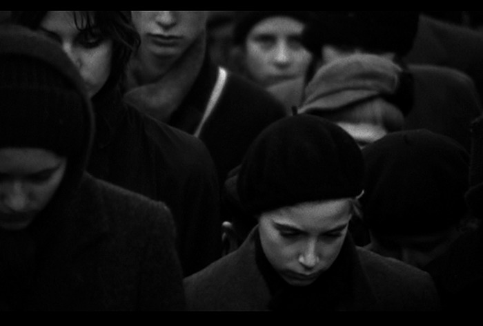
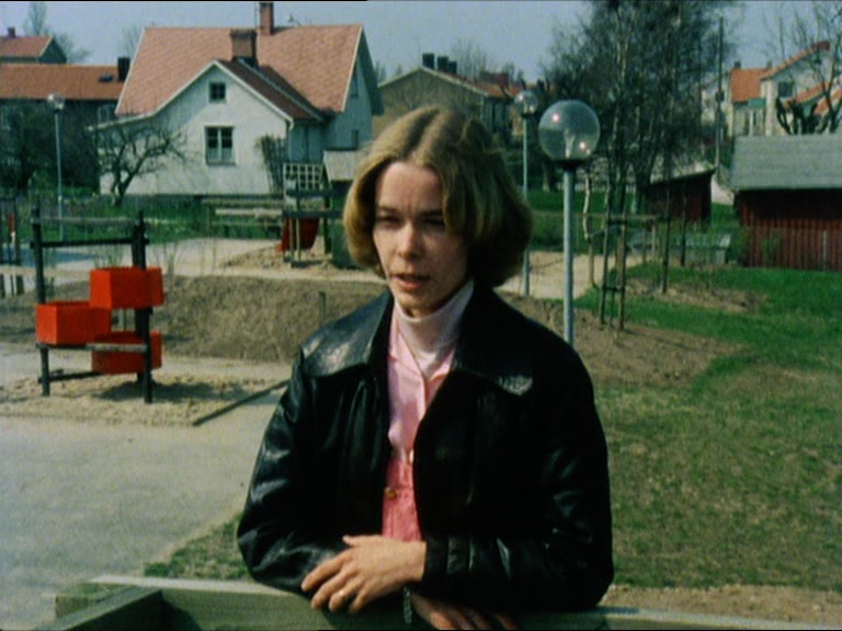
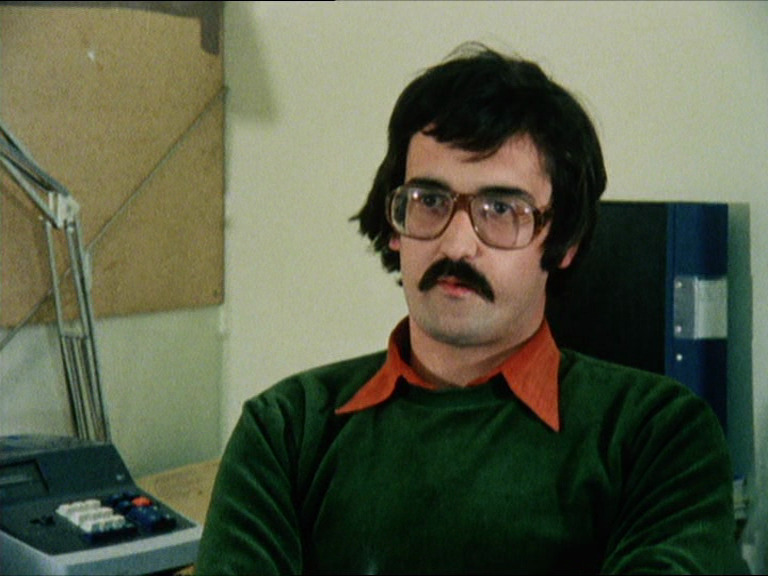
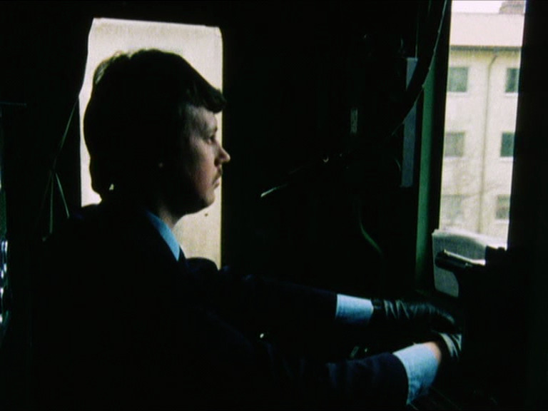
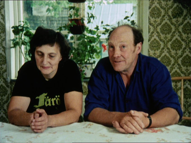
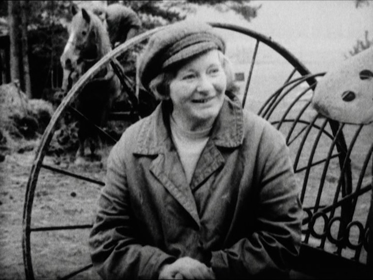
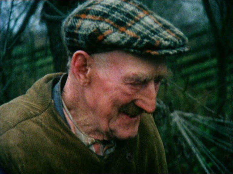
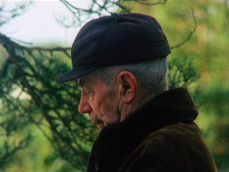
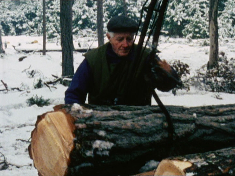
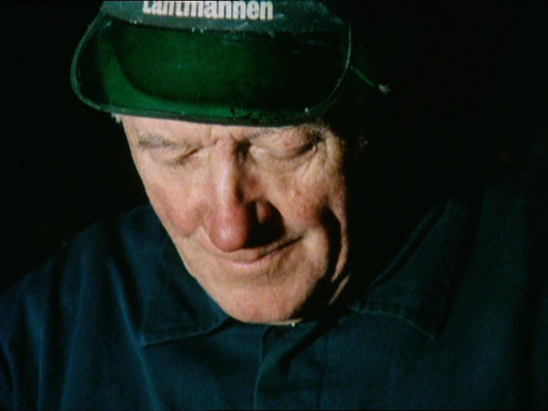
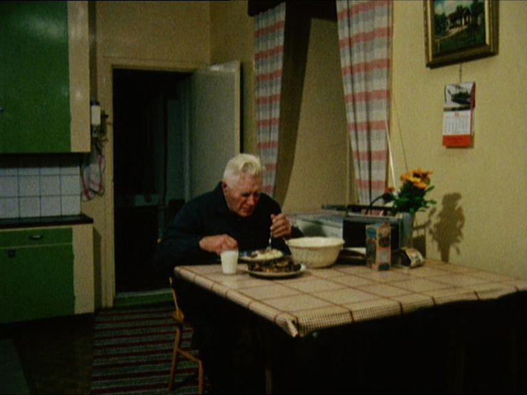
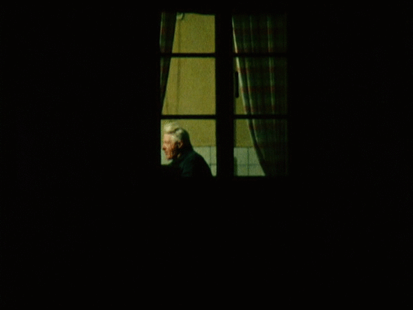
This is Bergman’s second documentary film about the island he made his home and workplace: Fårö. (Which doesn’t mean “sheep island” even if it looks like it.) Most of his most successful films were filmed on the island, and he did two documentaries about people living there. He apparently goes around with a camera and asks people things and they tell him things.
I haven’t seen the first one (couldn’t find it anywhere), and this is a followup ten years later. So we get to see kids who tens years ago insisted that they’d leave the first chance they could, and then here they’re still living on the island.
Their dialects are so weird. I mean, all dialects are dialects, but it’s a mixture of sounds I haven’t heard before.
Hm… where is it, anyway?
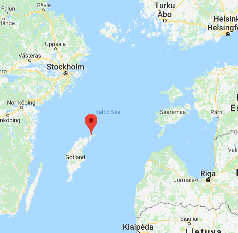
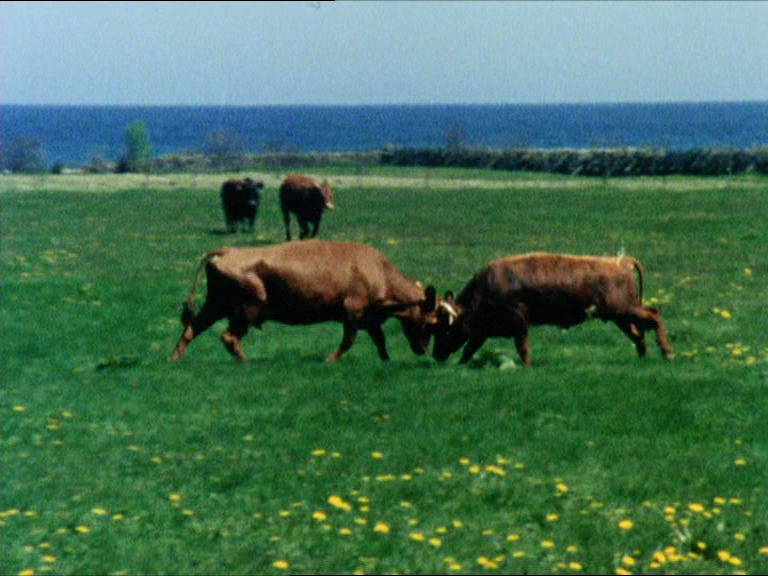
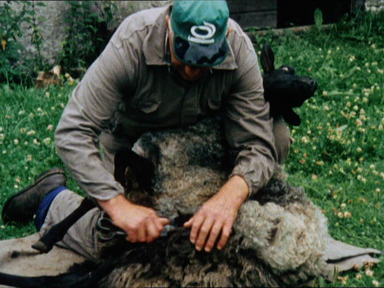
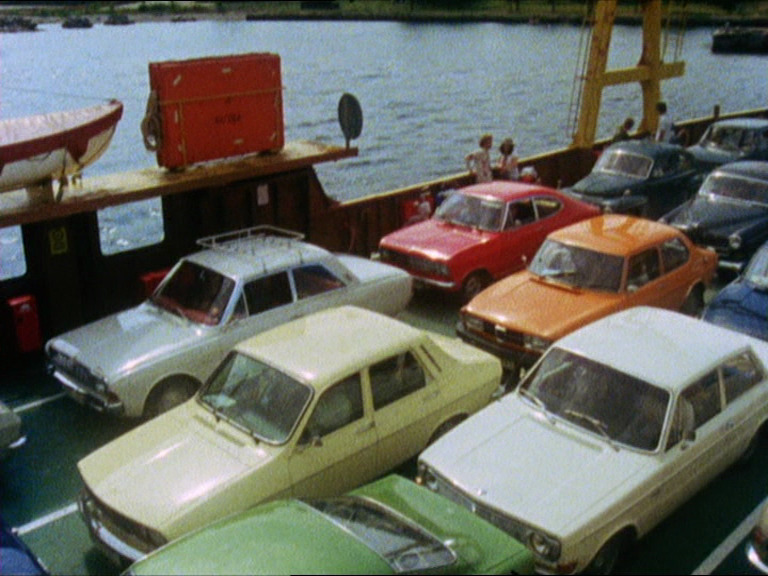
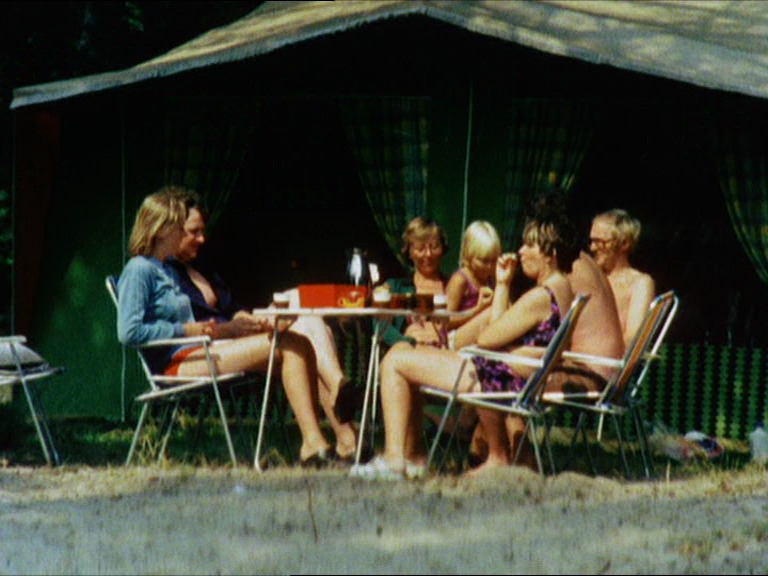
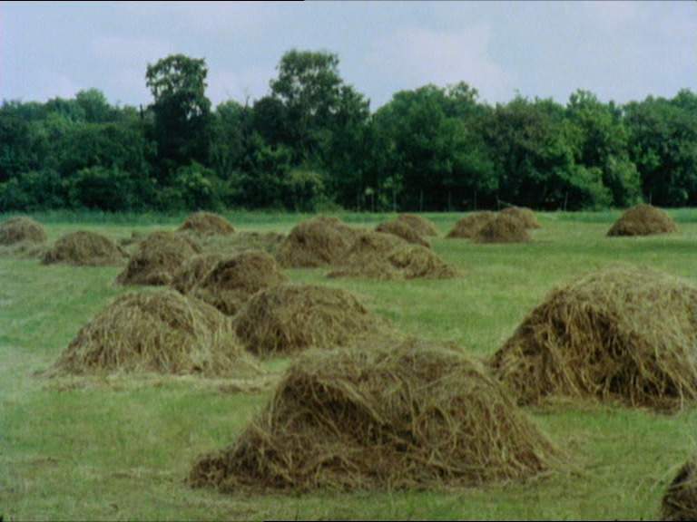
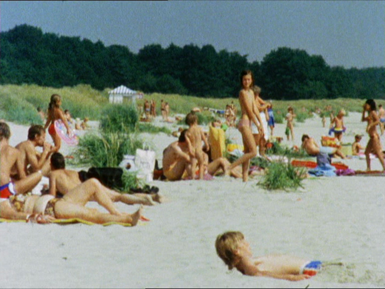
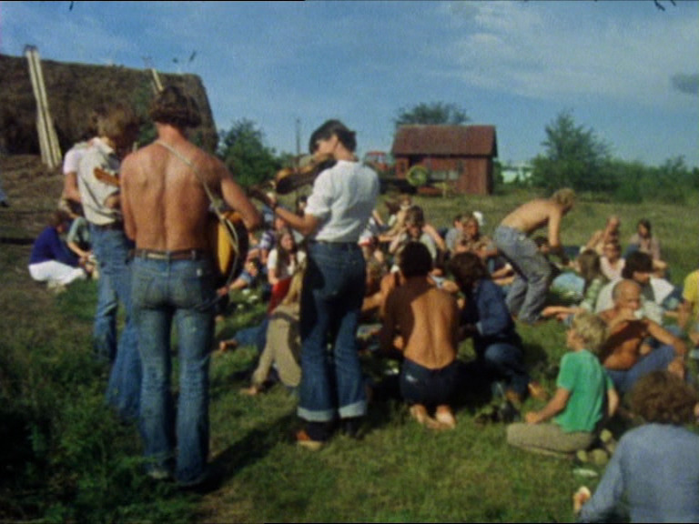
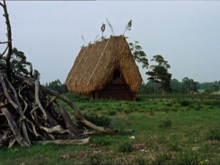
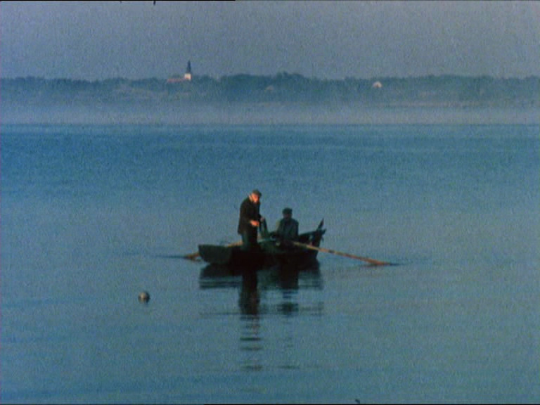
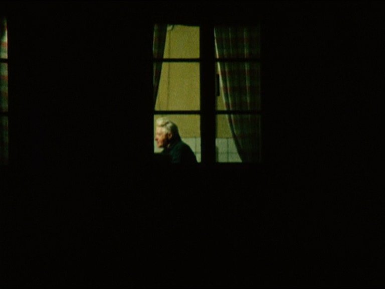
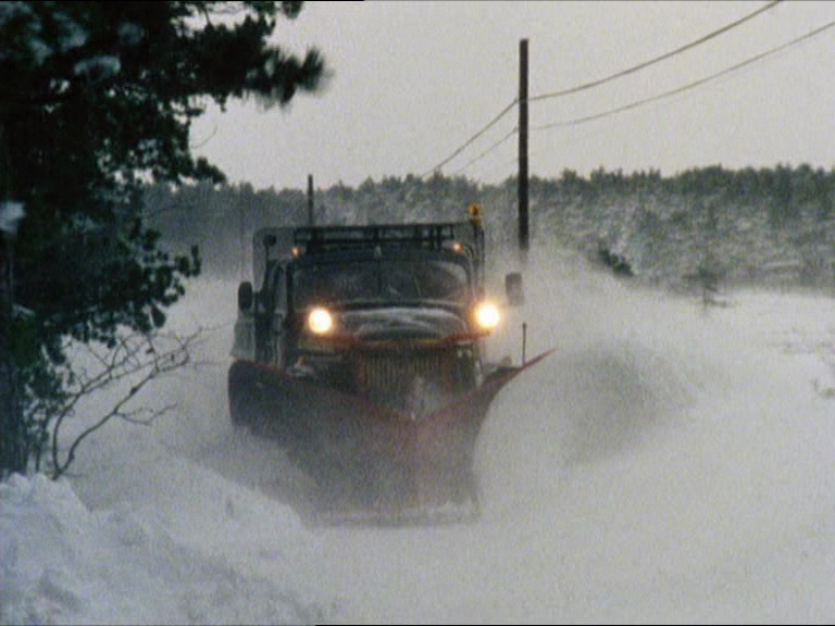
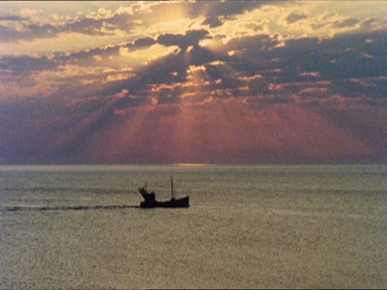
Ah, it’s a tiny island to the north of Gotland in the middle of the Baltic sea (halfway between Sweden and Latvia), and it’s apparently a holiday destination for Swedes. So the documentary juxtaposes the local farm life (no soundtrack) with the tourists lounging on the beach (with a pumping disco/rock soundtrack).
It’s a good documentary, although a bit confusing chronologically. Wasn’t Bergman in self-imposed exile at this point? Or was it over already?
Anyway, they ended up with fourtyfour hours of raw footage:
We started with spring and ended with winter, using that method to compile the film. It turned out to be two hours long, quite lengthy for a documentary. But it takes time to create the right gravitas and power. You shouldn’t just rush past these people.
But the version I had on this DVD was just ninety minutes, so I guess it was further edited for international distribution?
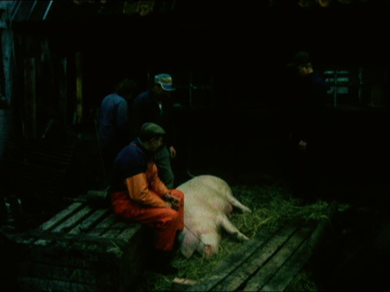
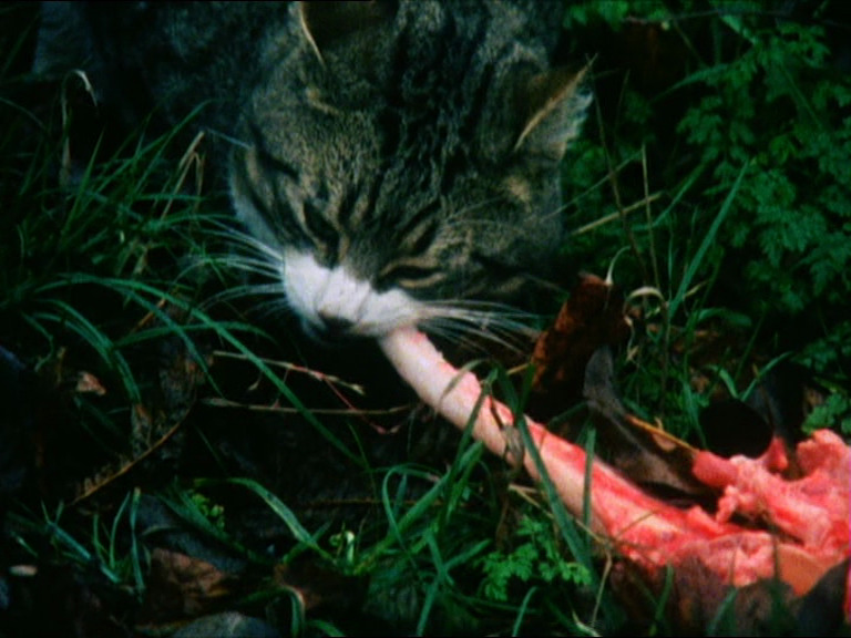
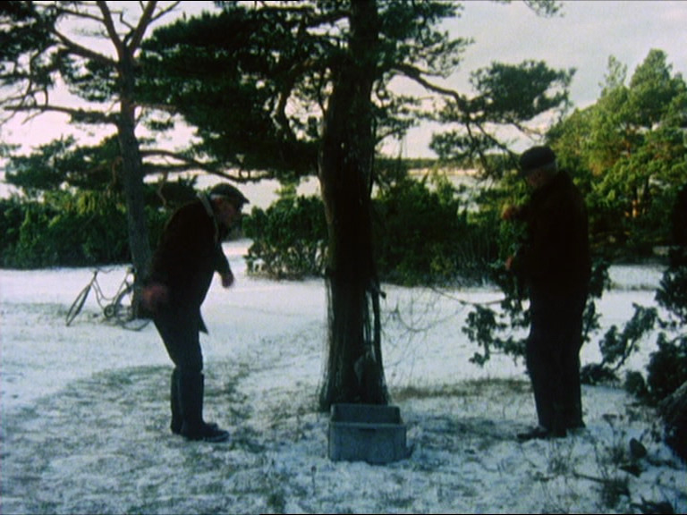
Anyway, it’s hugely enjoyable, especially the long scenes where we’re just watching people work (at hauling logs or butchering a pig (very amiably and humanely)).
The film ends by announcing that they’ll return in ten years time with the next documentary, but that didn’t happen? I think?
I guess we’ll find out.

This post is part of the 87 Bergman Things series.