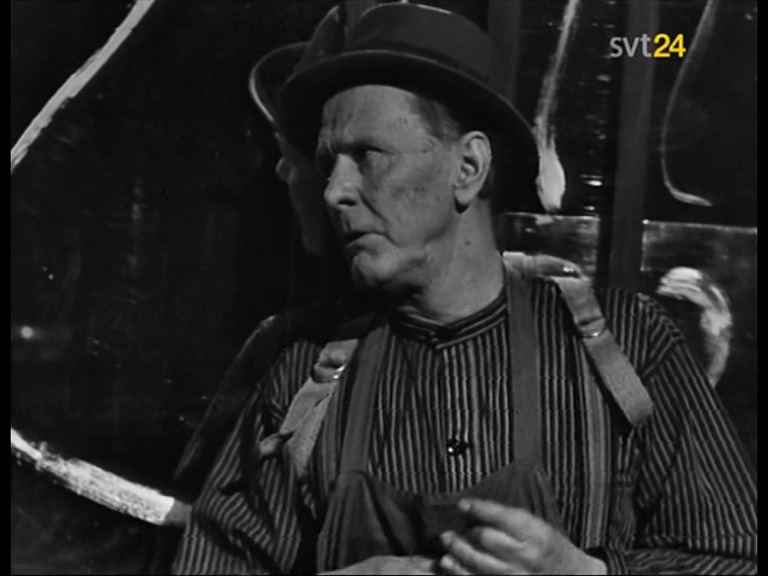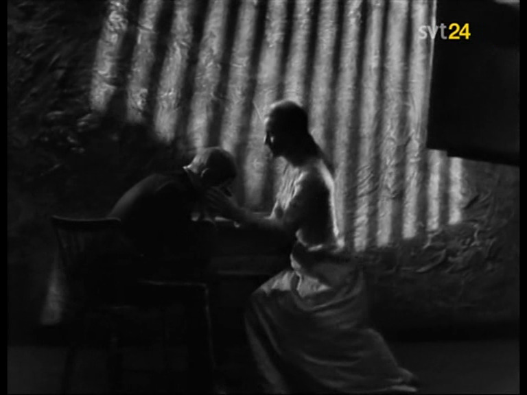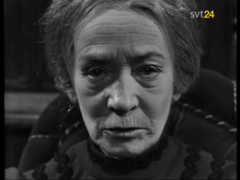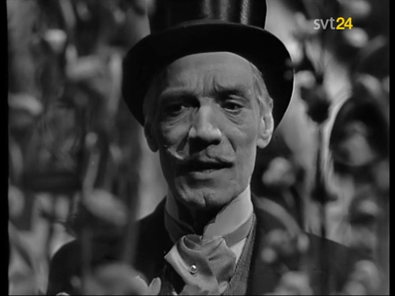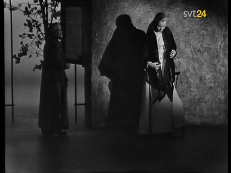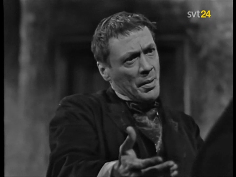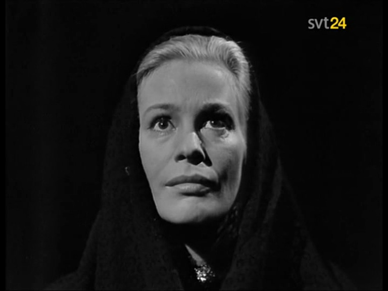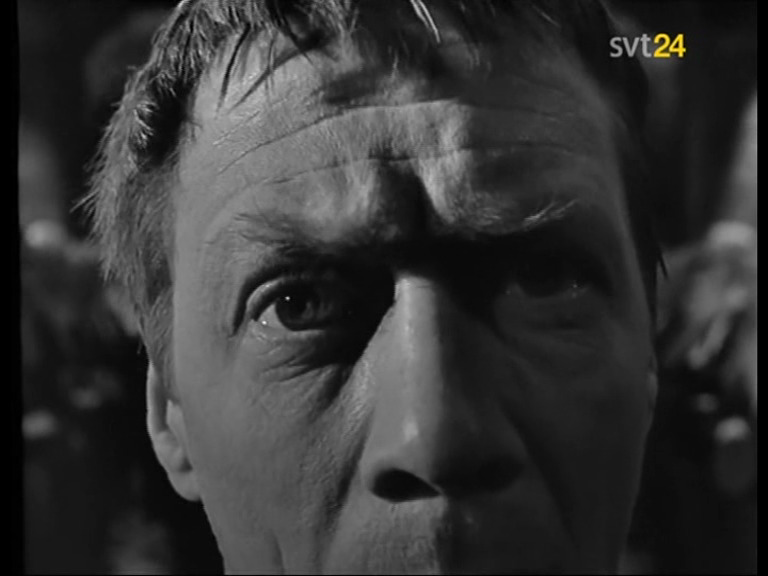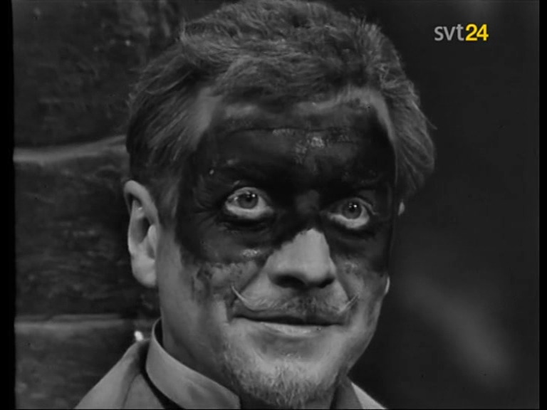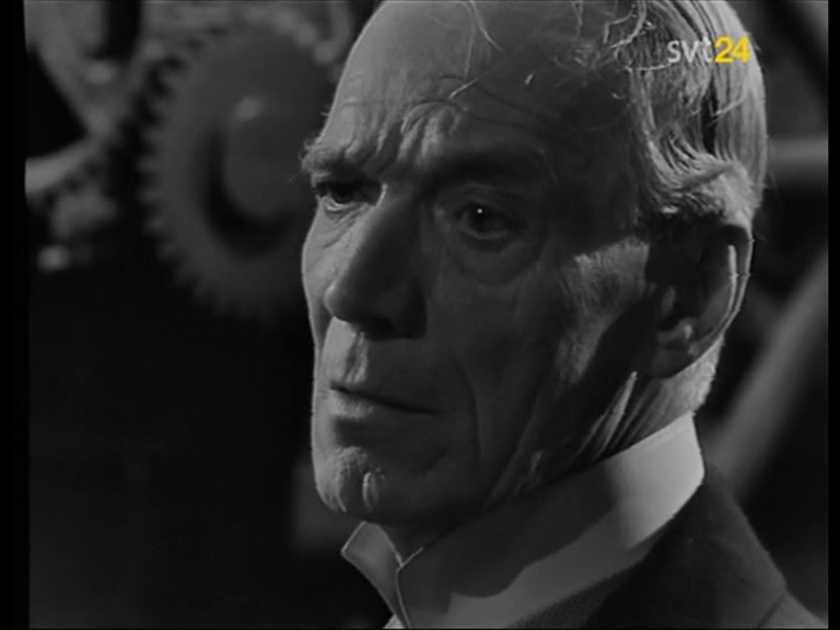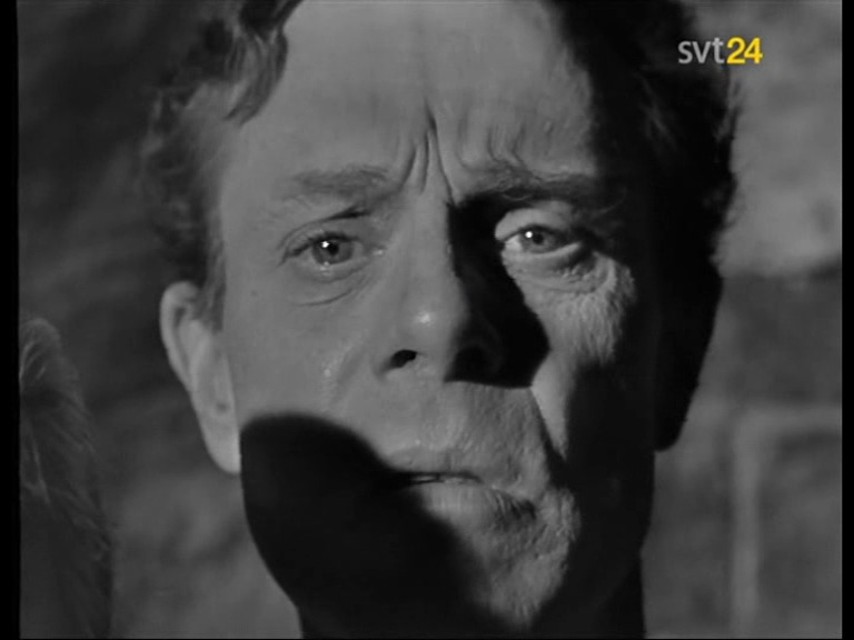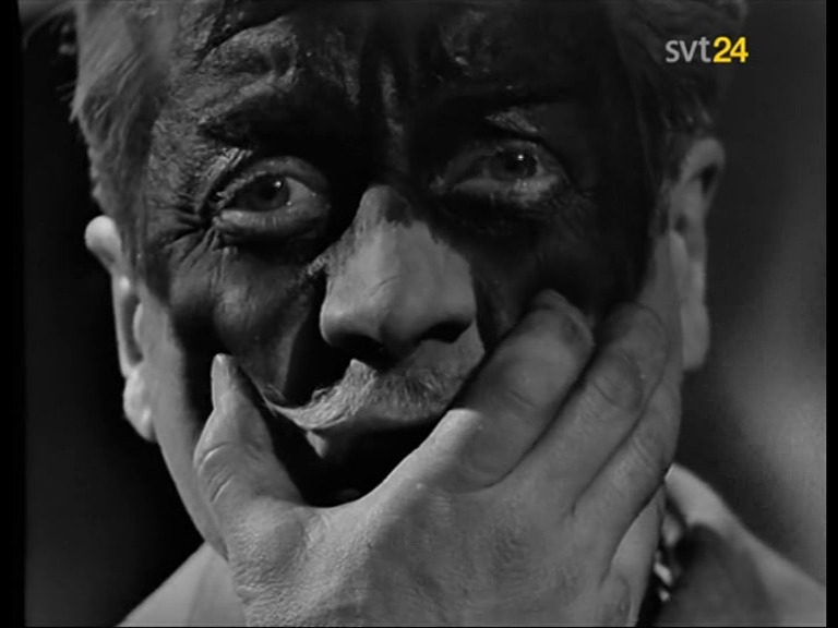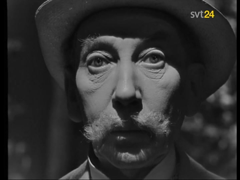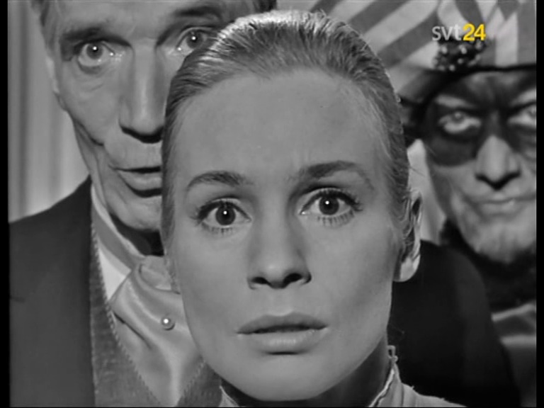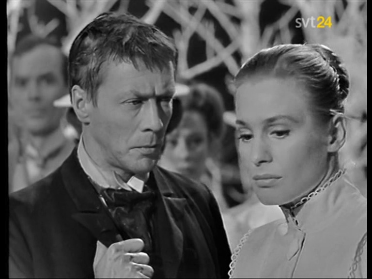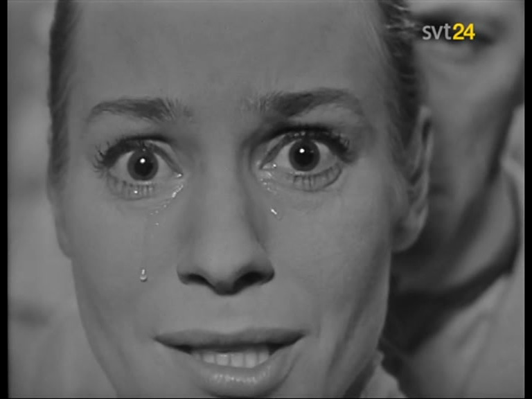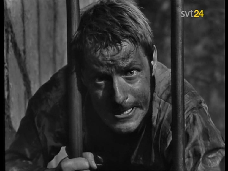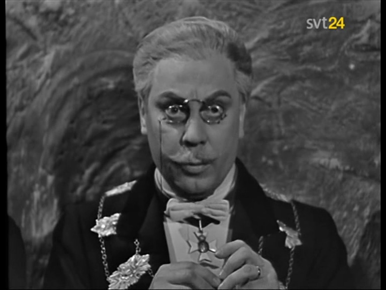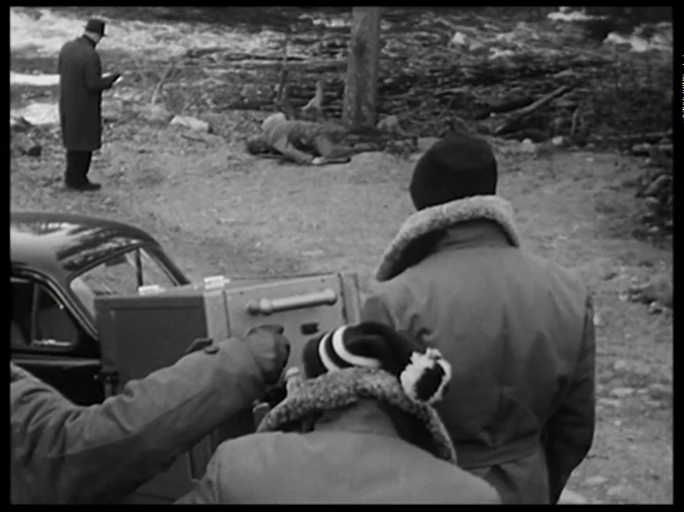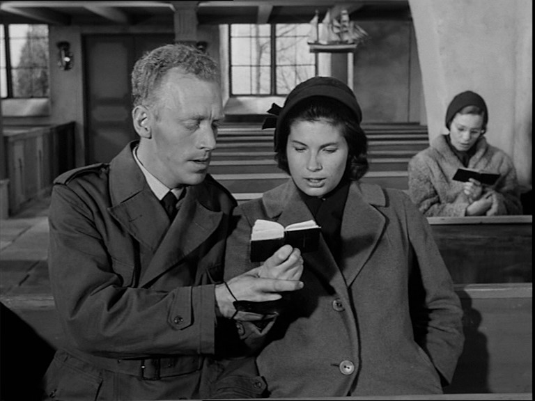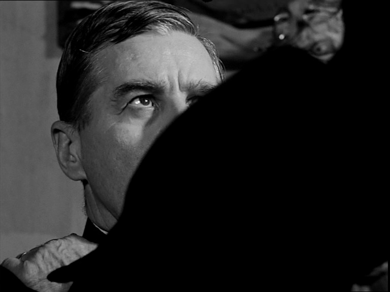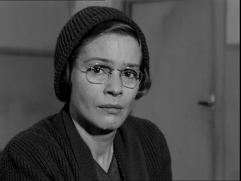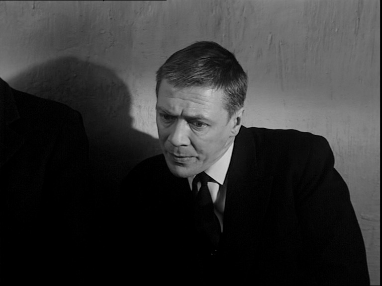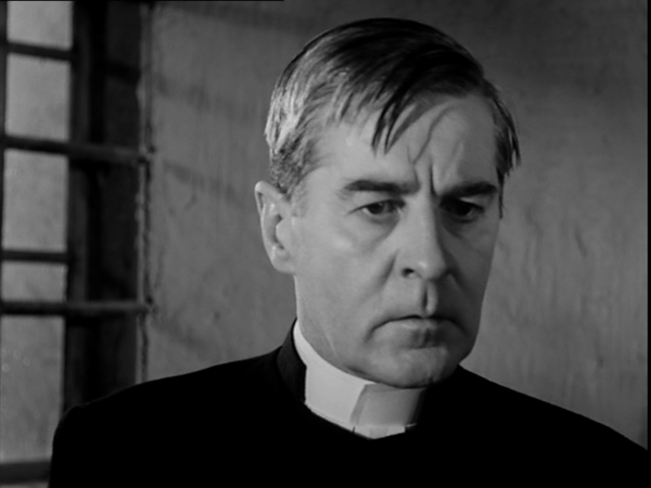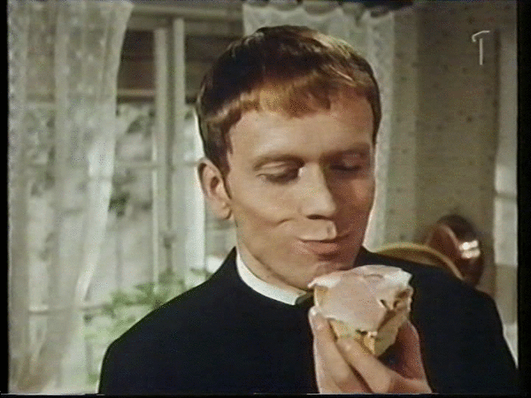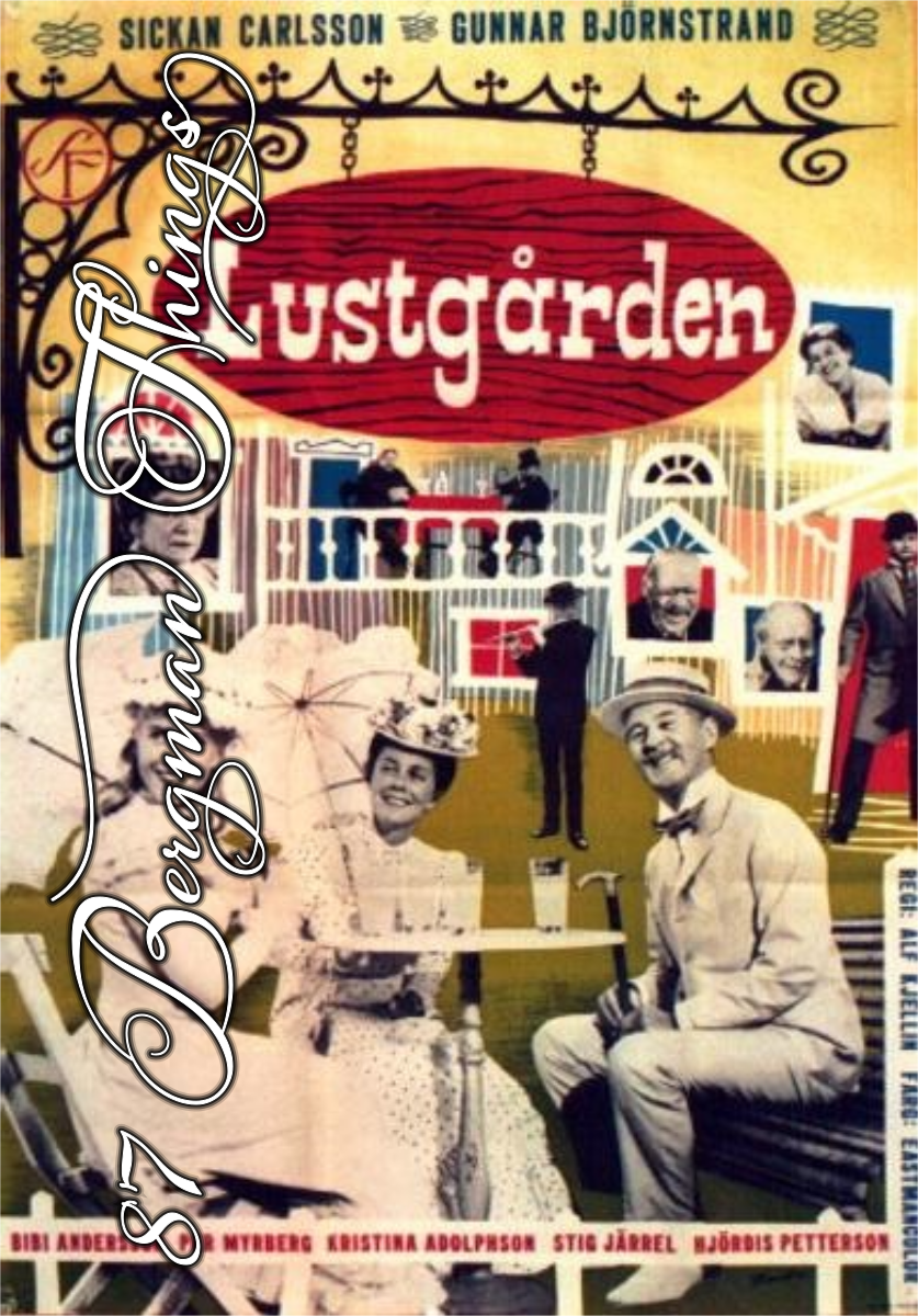
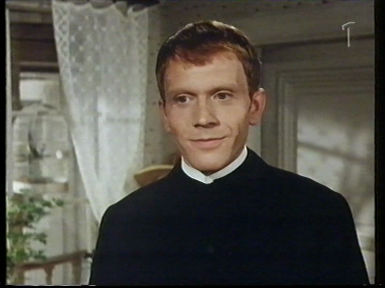
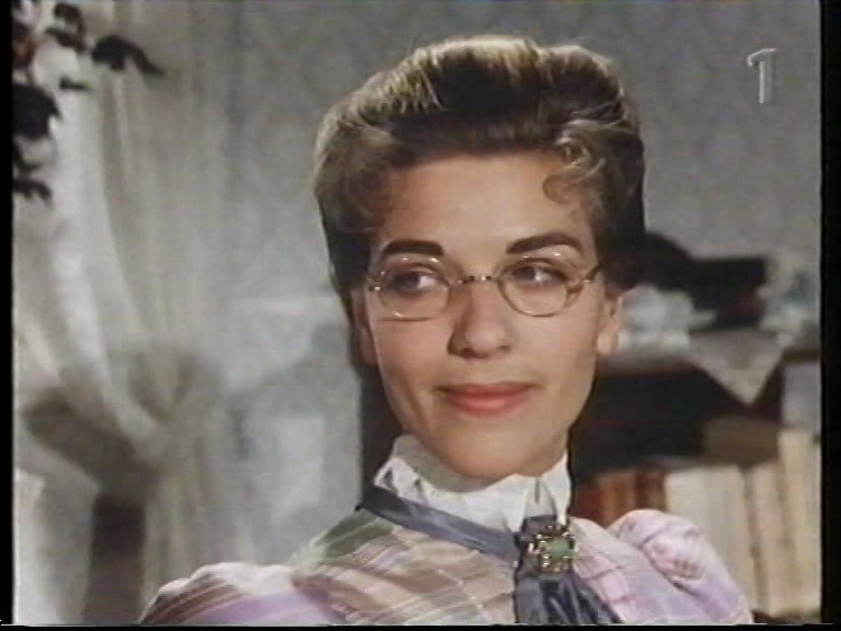
The Pleasure Garden (Lustgården). Alf Kjellin. 1961. ⭐⭐⭐★★★.
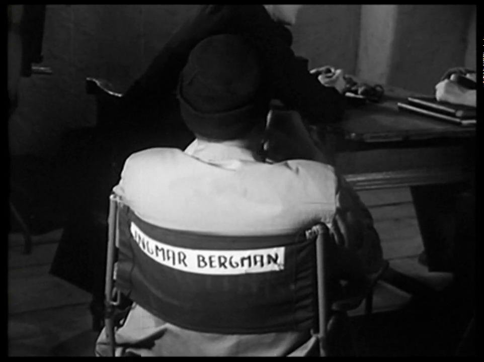
Bergman thought it was about time that Svensk Filmindustri did a proper colour film, but he didn’t have time to do it himself. So he co-wrote the screenplay (with a pseudonymous credit) and left Alf Kjellin to direct it.
It was pretty much universally panned at the time, but Bergman himself thought that it was kinda cute.

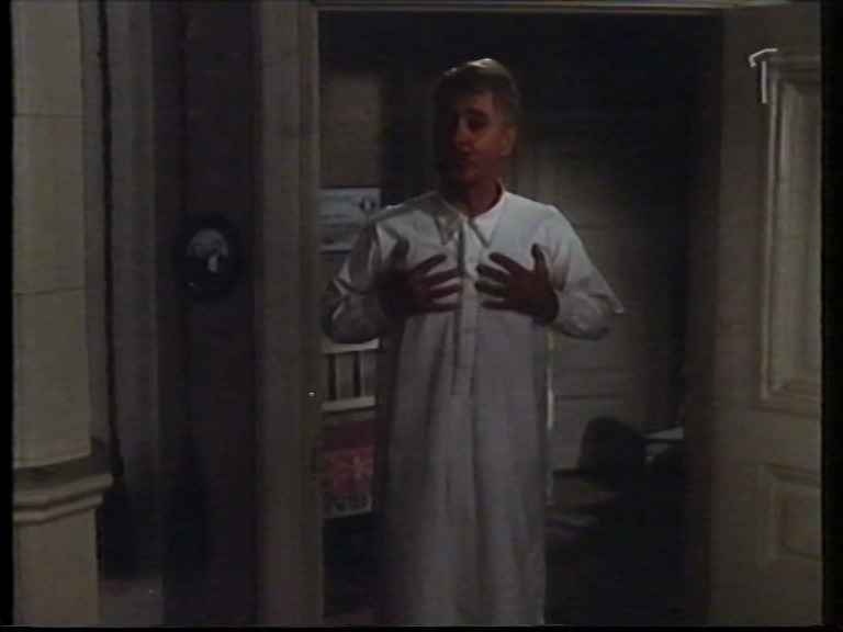
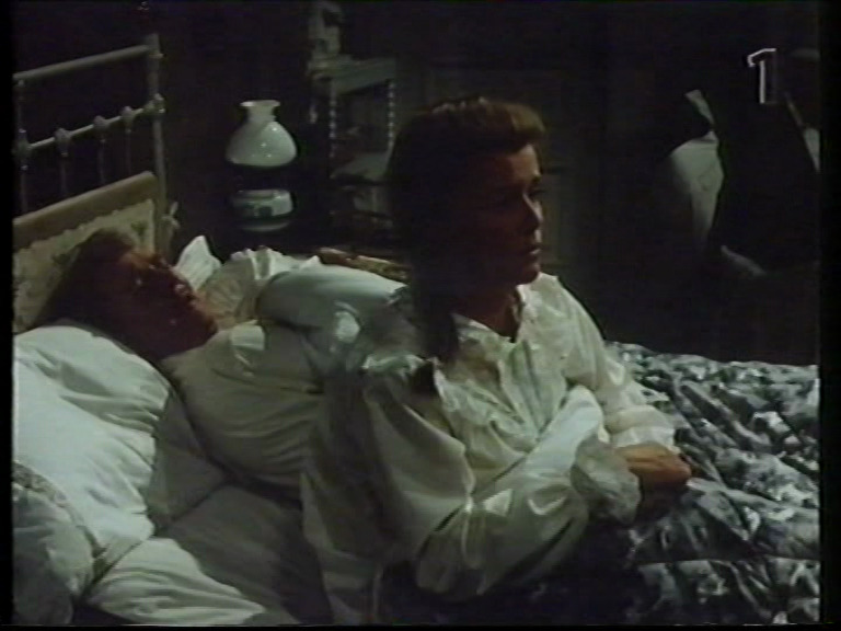
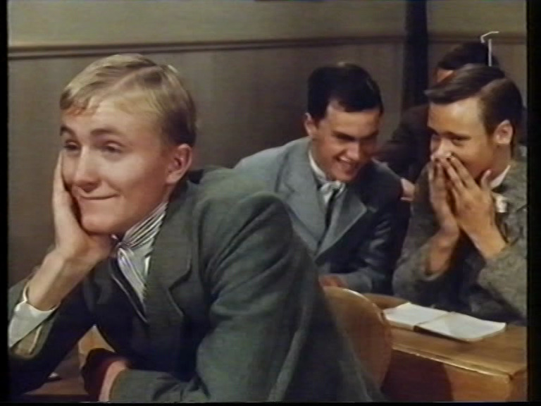
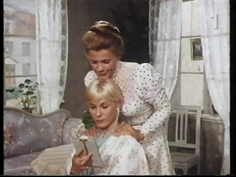
And it is. It’s a romantic (but melancholic) farce of a sort… Unfortunately it’s also kinda boring despite theoretically quite funny lines and likeable actors. It’s just so… pedestrian. Everybody does their best, including the soundtrack, which tries its hardest to convince us we’re looking at a screwball comedy.
The director moved to the US a few years later and did mostly TV shows.
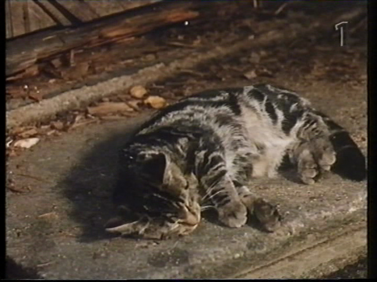
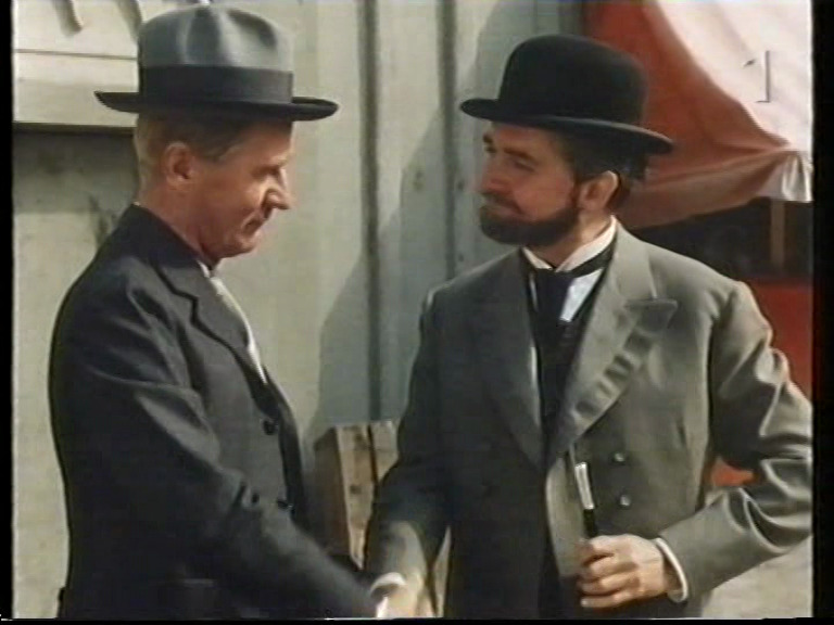
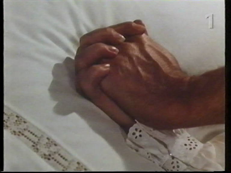
The copy I watched was apparently shown in the afternoon on Swedish television in the 90s, recorded to VHS, transferred to DVD, which I then bought from the infamous Bergman bootlegger.
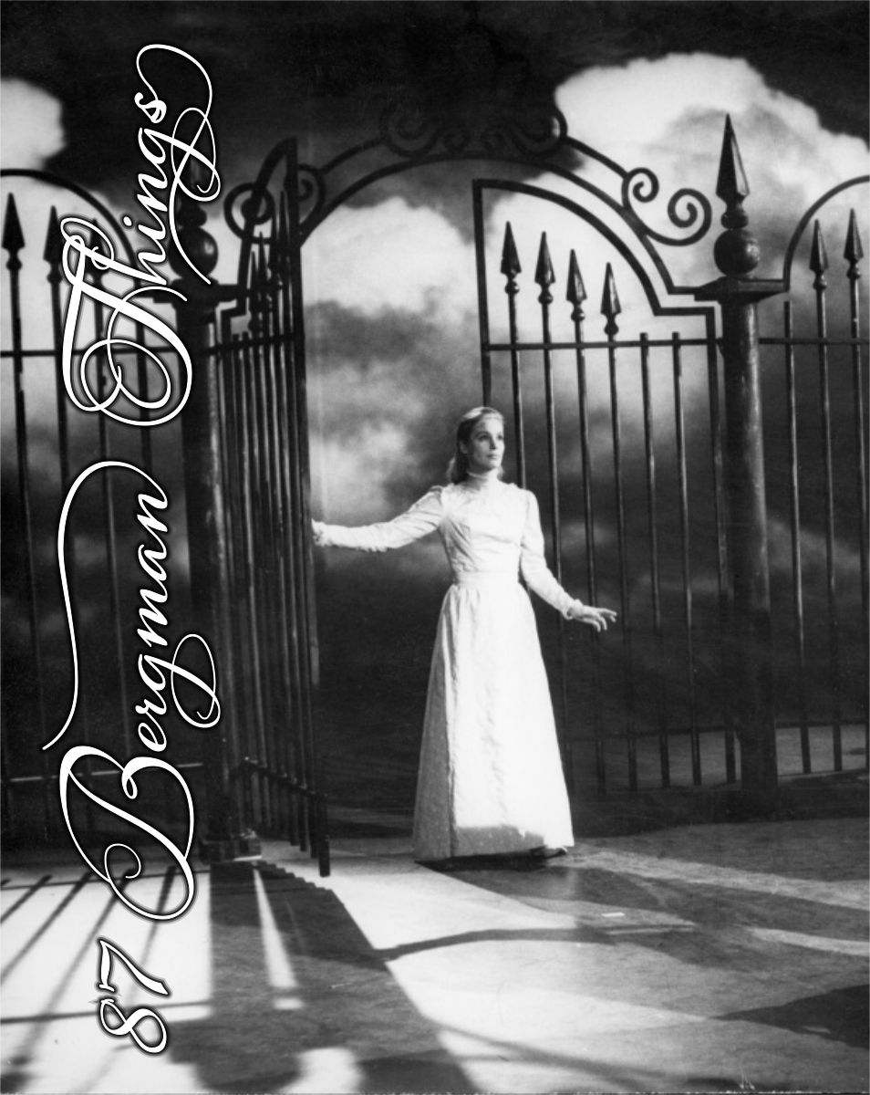
This post is part of the 87 Bergman Things series.