Collier’s #1-4 by David Collier.
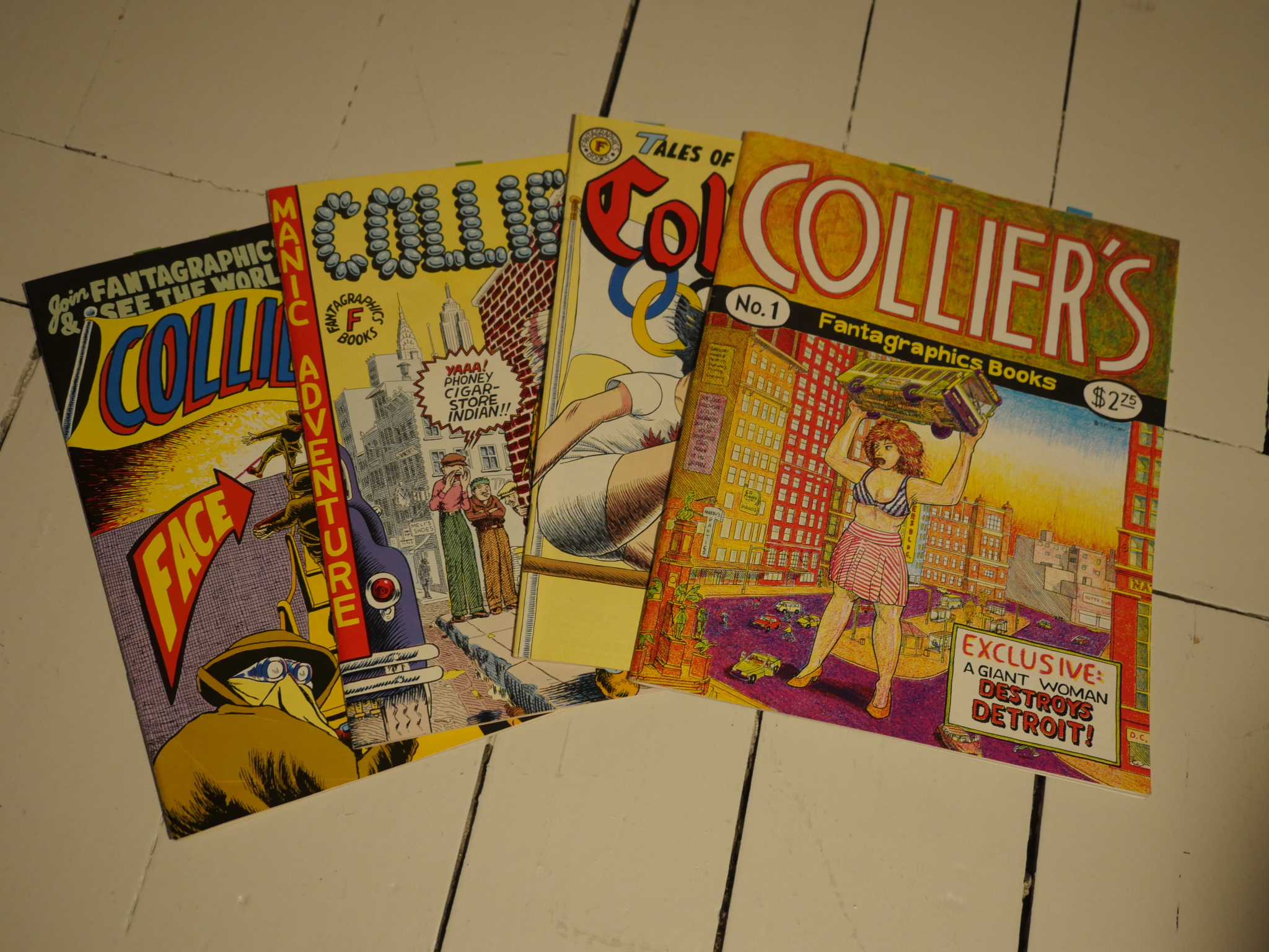
This series was published in a variety of sizes (two standard comic book, one standard magazine, and one in the middle somewhere) at a glacial pace between 1992 and 1998. I think I remember seeing work from David Collier popping up in various anthologies around that time, but I would guess that he’s just really slow, because the books just have that feel about them… that old-timey slow feel…
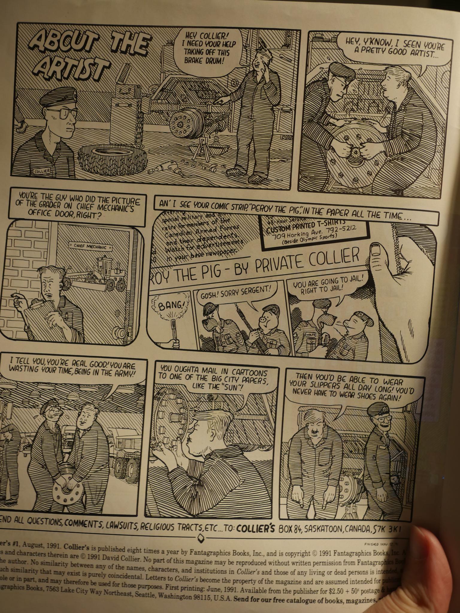
So, Collier used to be in the Canadian army or something, and now he draws comics. For his first solo comic, he’s using the somewhat peculiar “draw a gazillion diagonal lines” method of shading, which looks very labour intensive…

… but has as is main problem than things tend to have the same level of greyness when you look at a page, so things aren’t always immediately readable. But I just love it. It just looks so obsessive and organic.
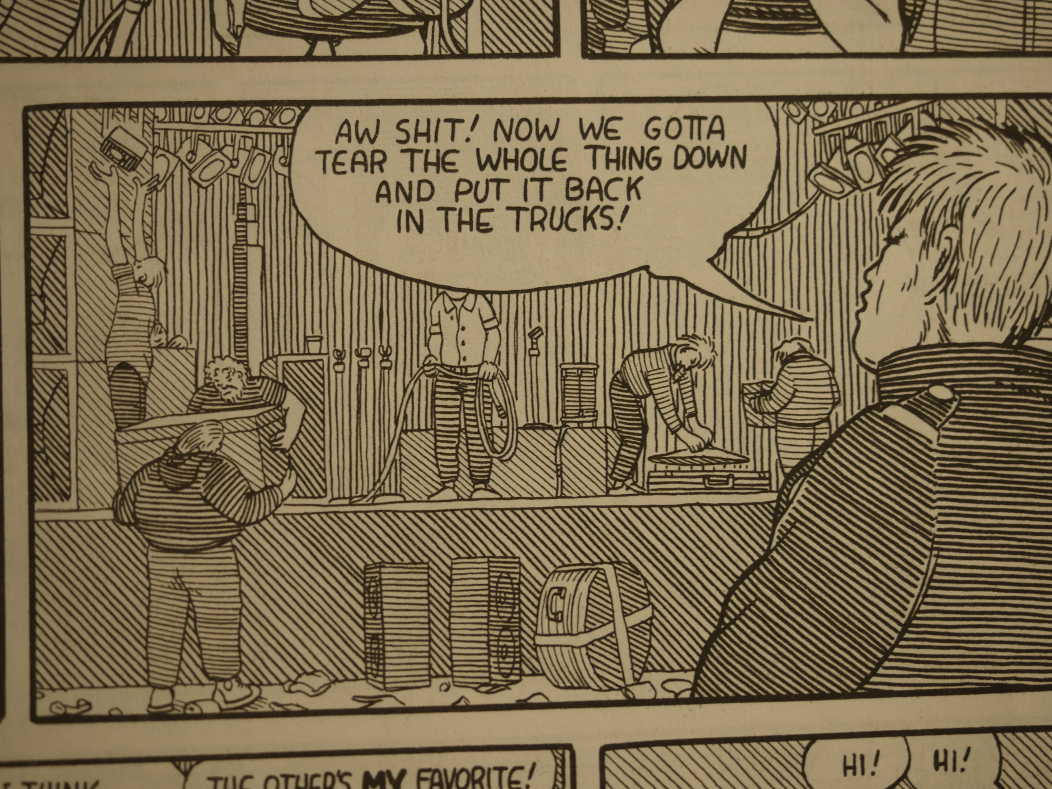
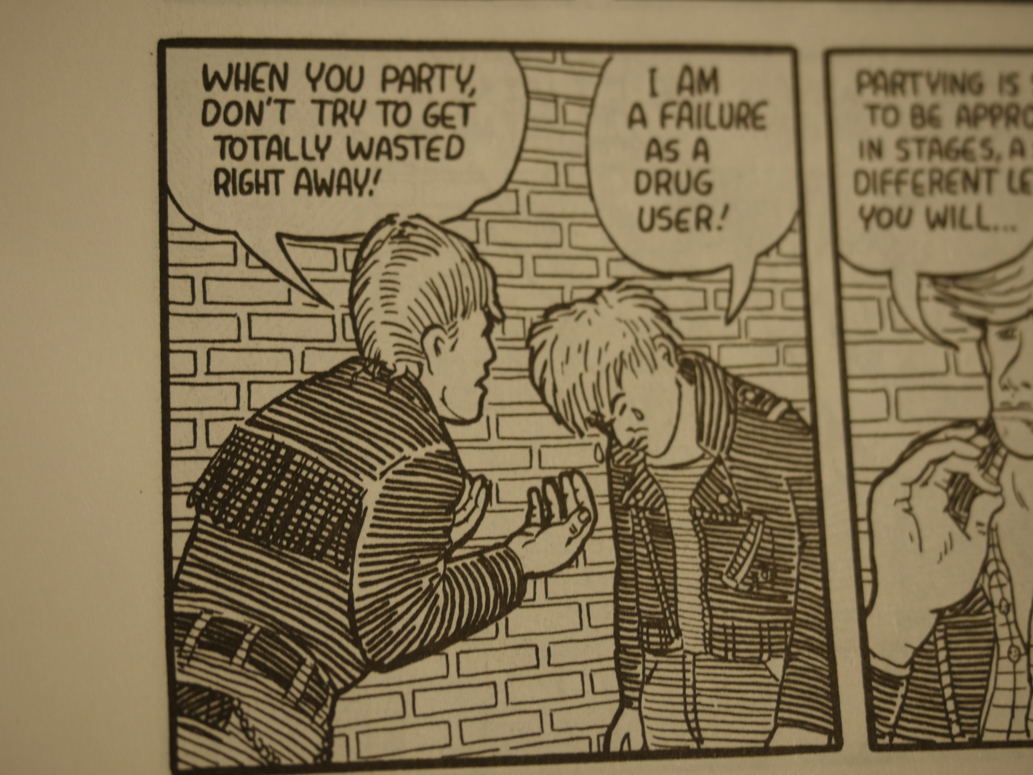
The first story, about setting up for a rock show, is a bit on the confusing side. I found myself flipping back and forth and back and forth to try to work out who these characters are and how it all fits together, and I think it just doesn’t. This guy, for instance, never gets a name and we’re never given any explanation for why his abode is that salvo box…
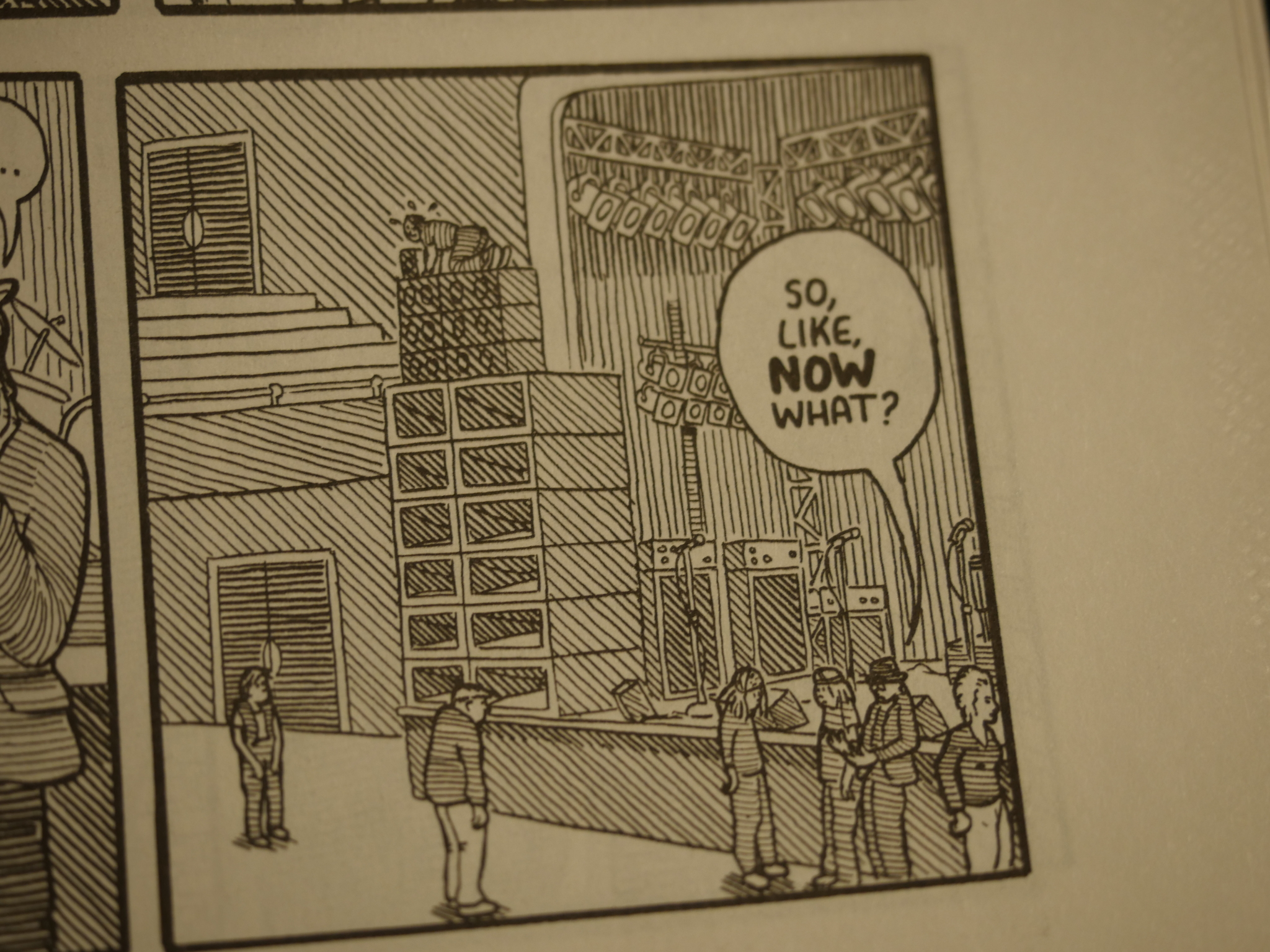
And see that guy on top of those speakers there? He went up to put a little tweeter on top, but then the other people left him, so he couldn’t climb back. So what happened to him?
*flip* *flip*
Oh, there’s the tweeter being handed down after the concert? So he was up there the whole time?
But I don’t mind. The confusion just lends it more character.
And it’s funny.
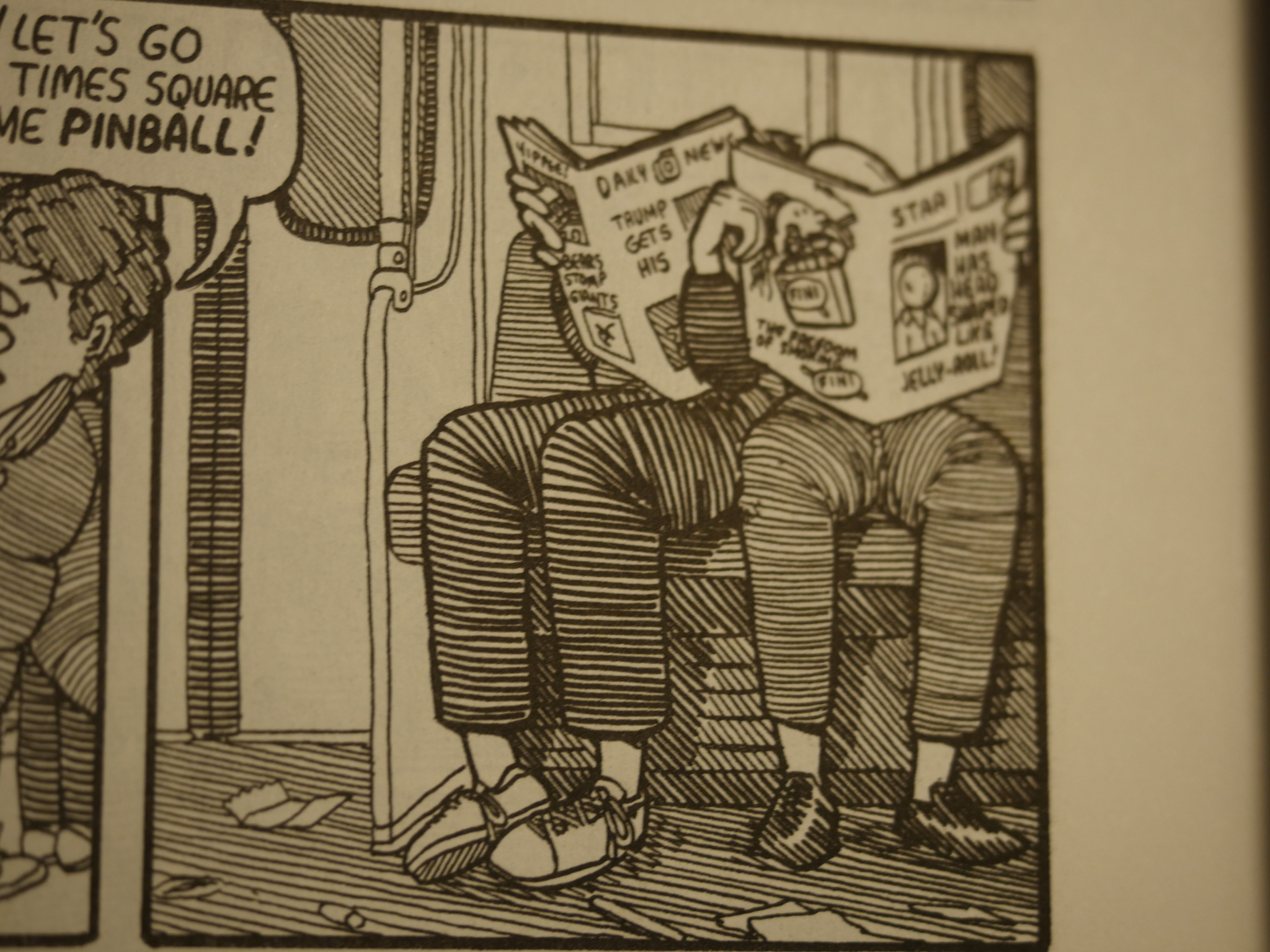
Then a short story about going to New York. I guess Trump was a thing back in 1992, too… He didn’t, though.
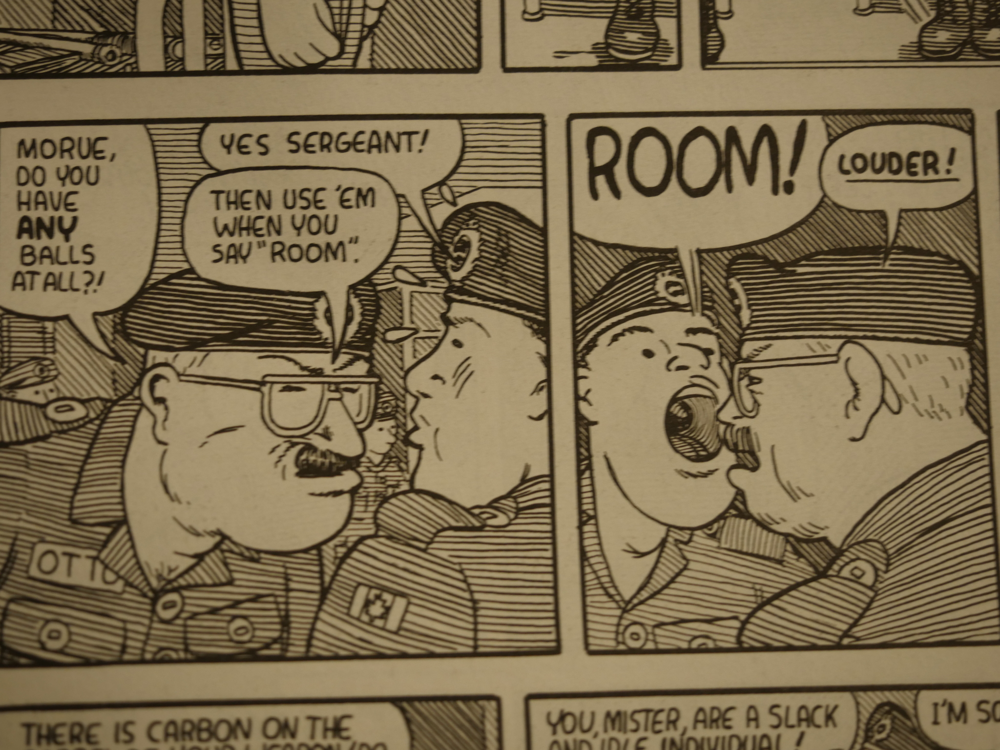
Even though the first two stories in this issue are pretty spiffy, the last one is just wonderful in its scattered mundanity. It’s set in army barracks, and it’s about… er… stuff… I guess… And it’s very funny and oddly touching, even though nothing much happens.
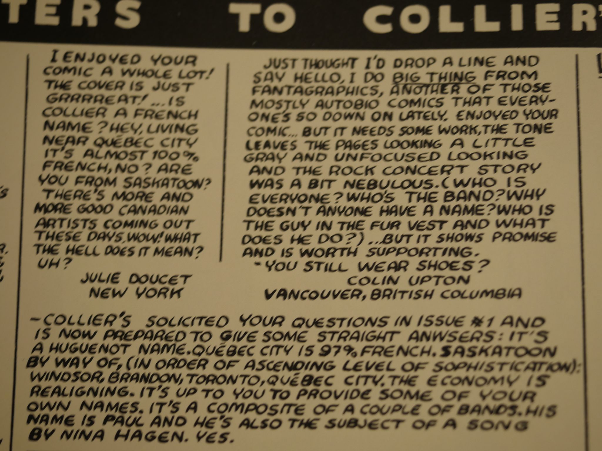
Oops. Colin Upton has almost the same critique that I have about that first story…
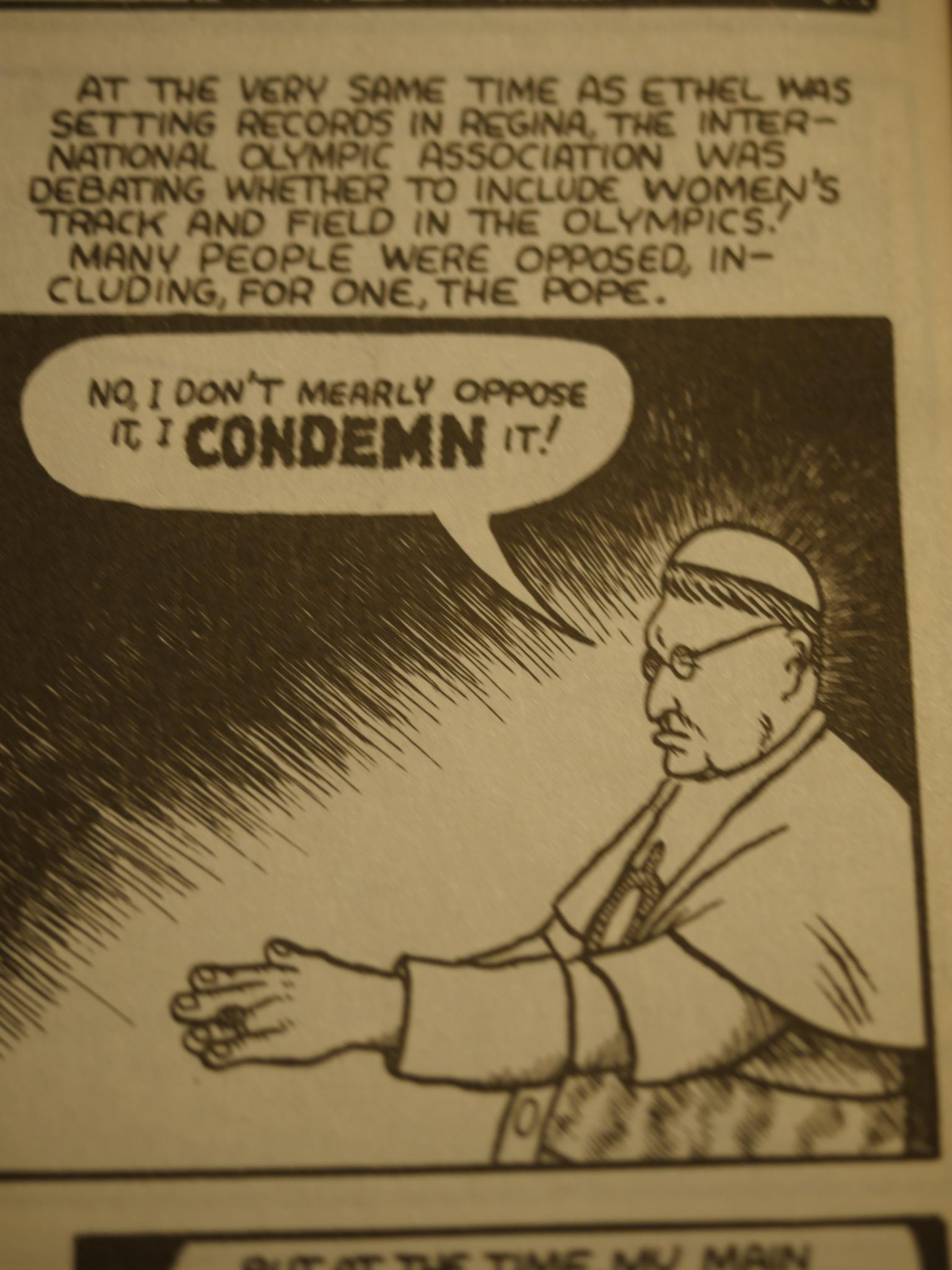
The second issue starts off with two stories in the same vein as the first issue, and they’re also drawn in much the same We Love Diagonal Lines style. The third one, however, is a story about a Saskatoon woman who ended up going to compete in the Olympics in 1928. It’s told from the point of view of her first trainer, and it’s great.
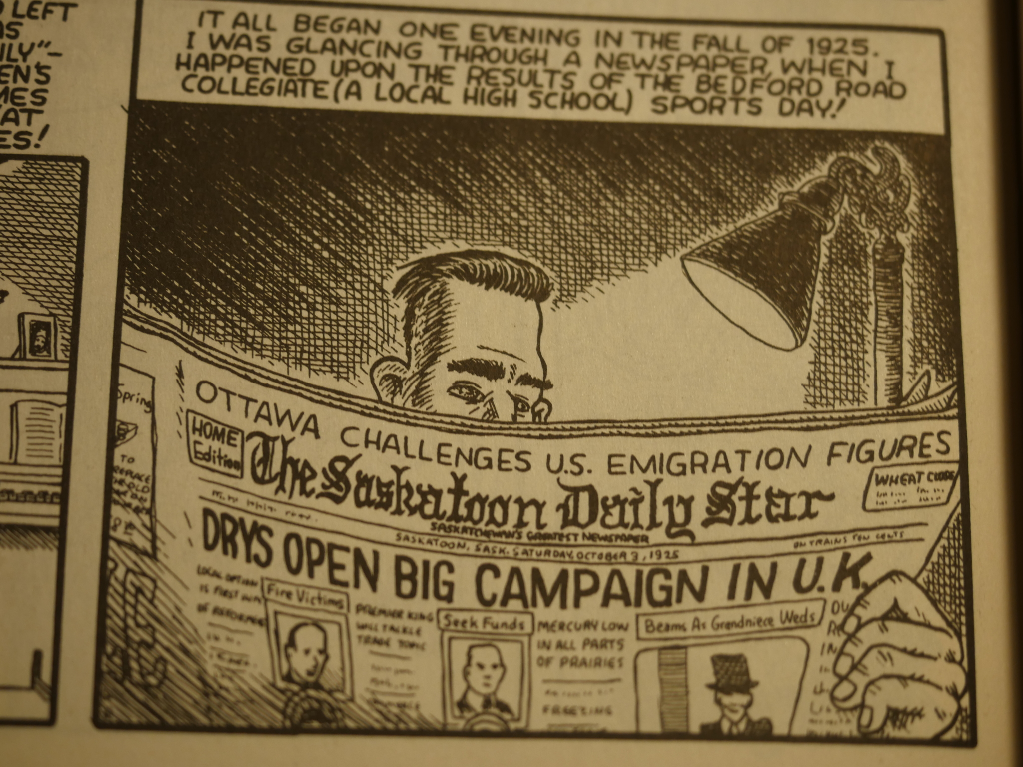
I have no interest in sports or anything, but it’s oddly riveting. It doesn’t have that much drama or intrigue, and it’s told in a slightly repetitive way (the narrator mentions that she was called “The Saskatoon Lily” three times, at least), but it lends it verisimilitude. It feels like this guy is really telling you a story, and for some reason you’re interested.
The artwork also changes quite a bit. Instead of all the diagonal lines, Collier switches to a variety of ways to shade, like traditional cross-hatching above…
And… er… I’m sure that has a technical name…
The third issue is all one story, sort of. It starts off with Collier wanting to ski up to Grey Owl’s old lodge:
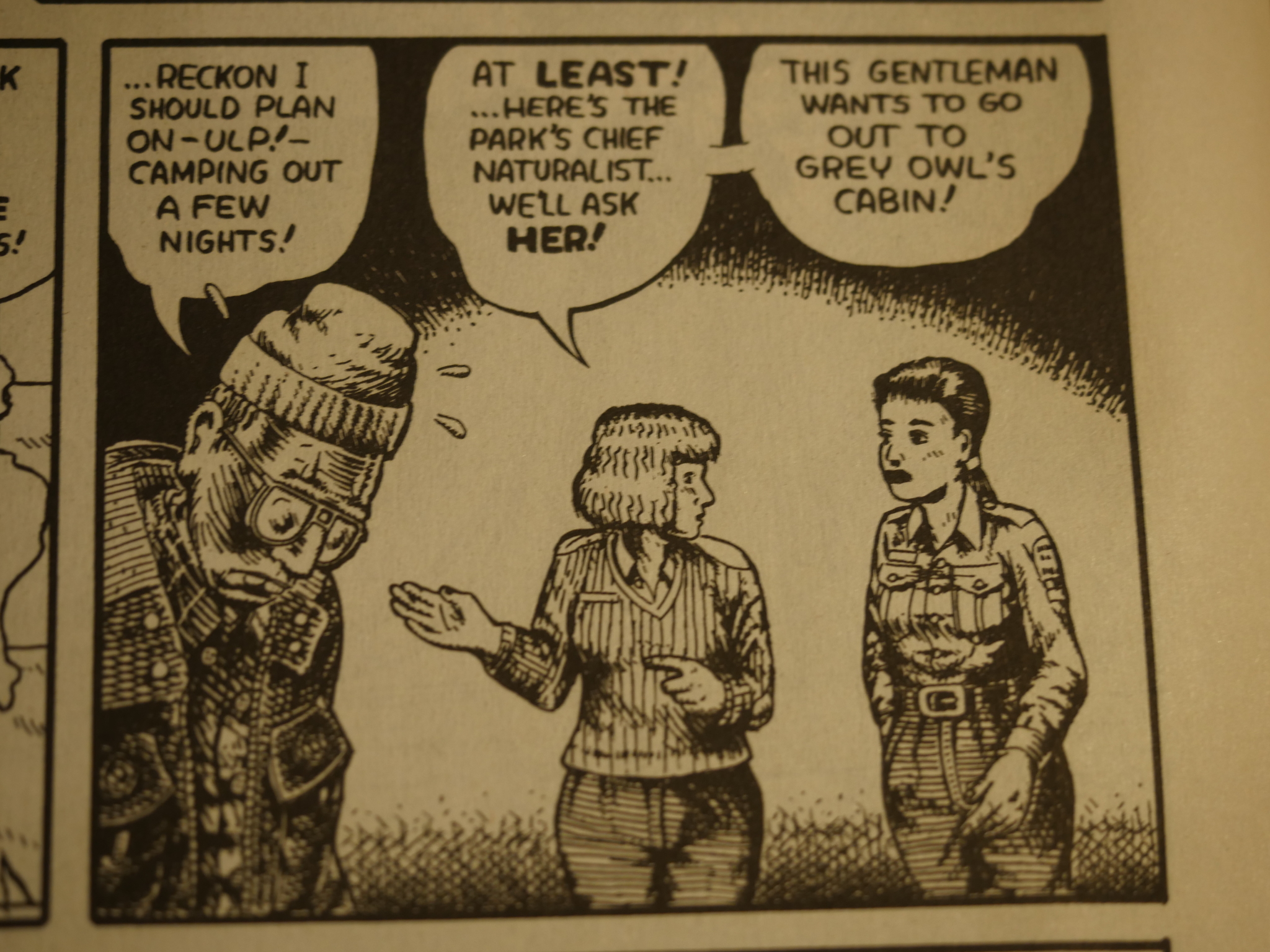
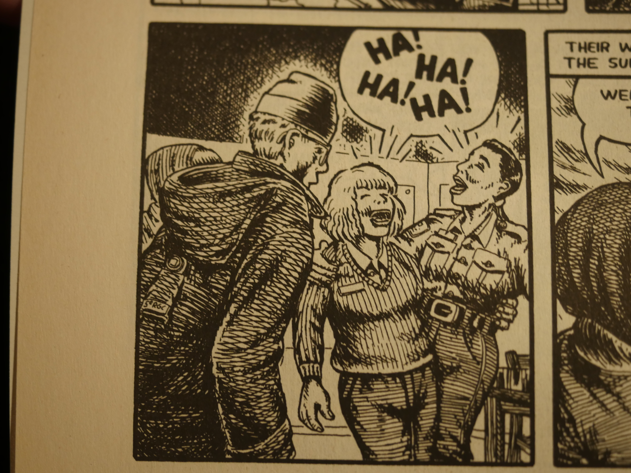
The artwork has taken a definite Crumbian turn, but after showing that harrowing trip, the rest of the issue retells the story of Grey Owl, who was an English guy who went to Canada, passed himself off as native, and then published a series of books on conservation and stuff.
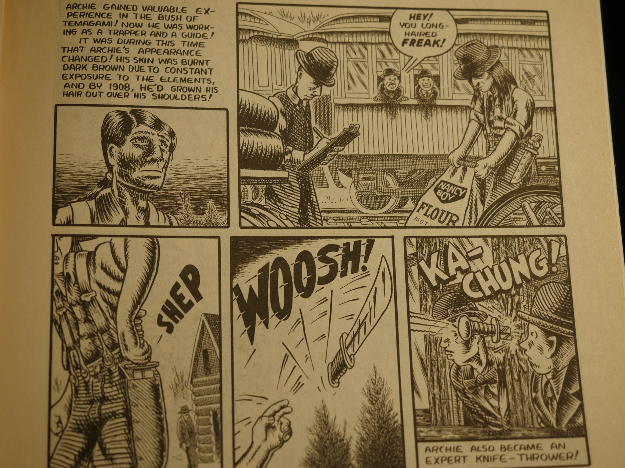
This was back in the 1920s, when things like that were even less popular than now.
I have not checked whether Collier just made all this up or not. Hang on for a second while I duckduckgo… Yup, Wikipedia seems to think it’s true.
Anyway, it really works. The framing sequence makes the retelling personal: As something only Collier could do, and the story of Grey Owl itself is humanising and touching, but still quite funny. It’s great.
You snooze, you etc.
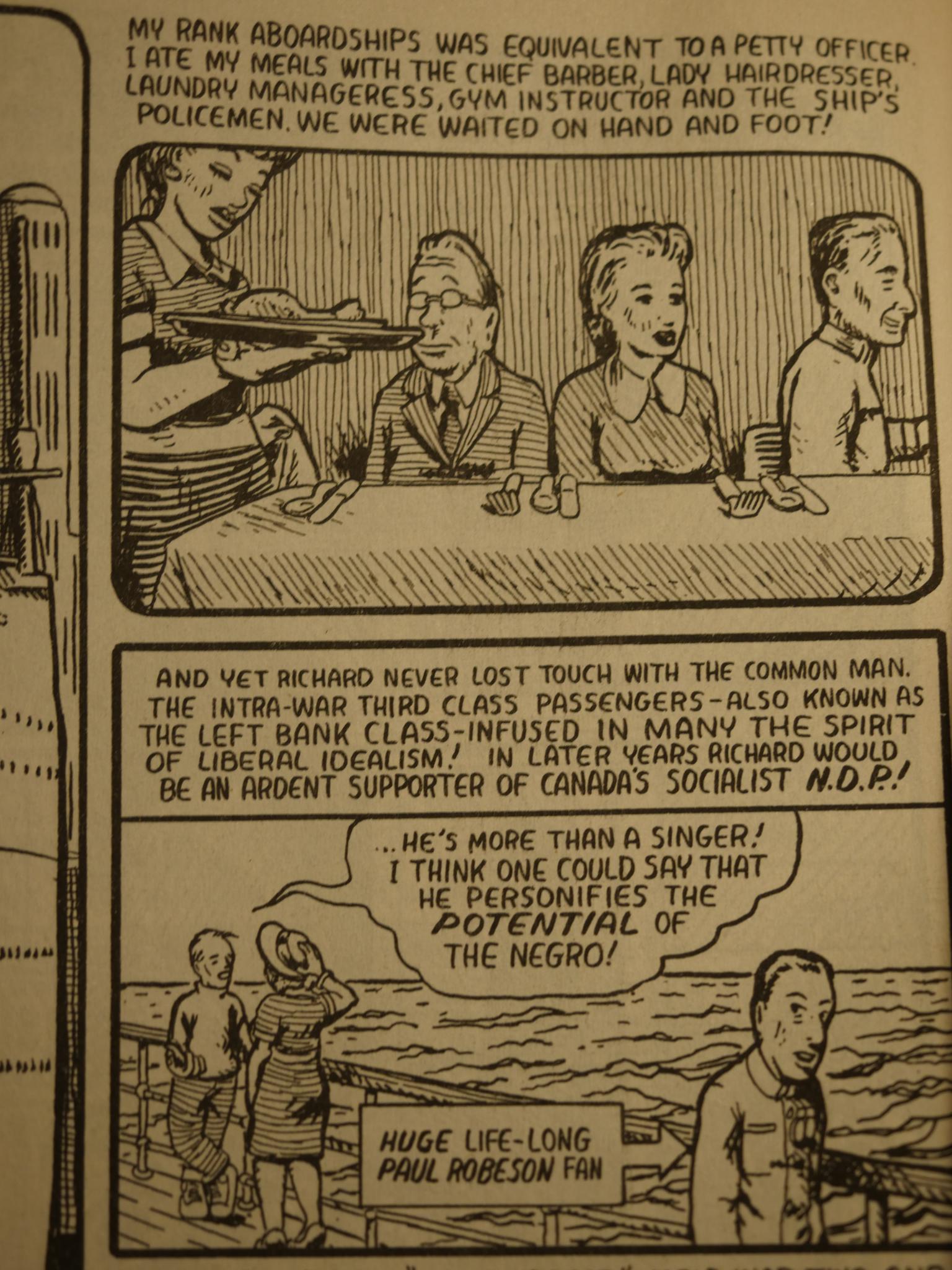
The fourth and final Fantagraphics issue is about Collier’s grandfather, and as good as the other issues are, it’s even better.
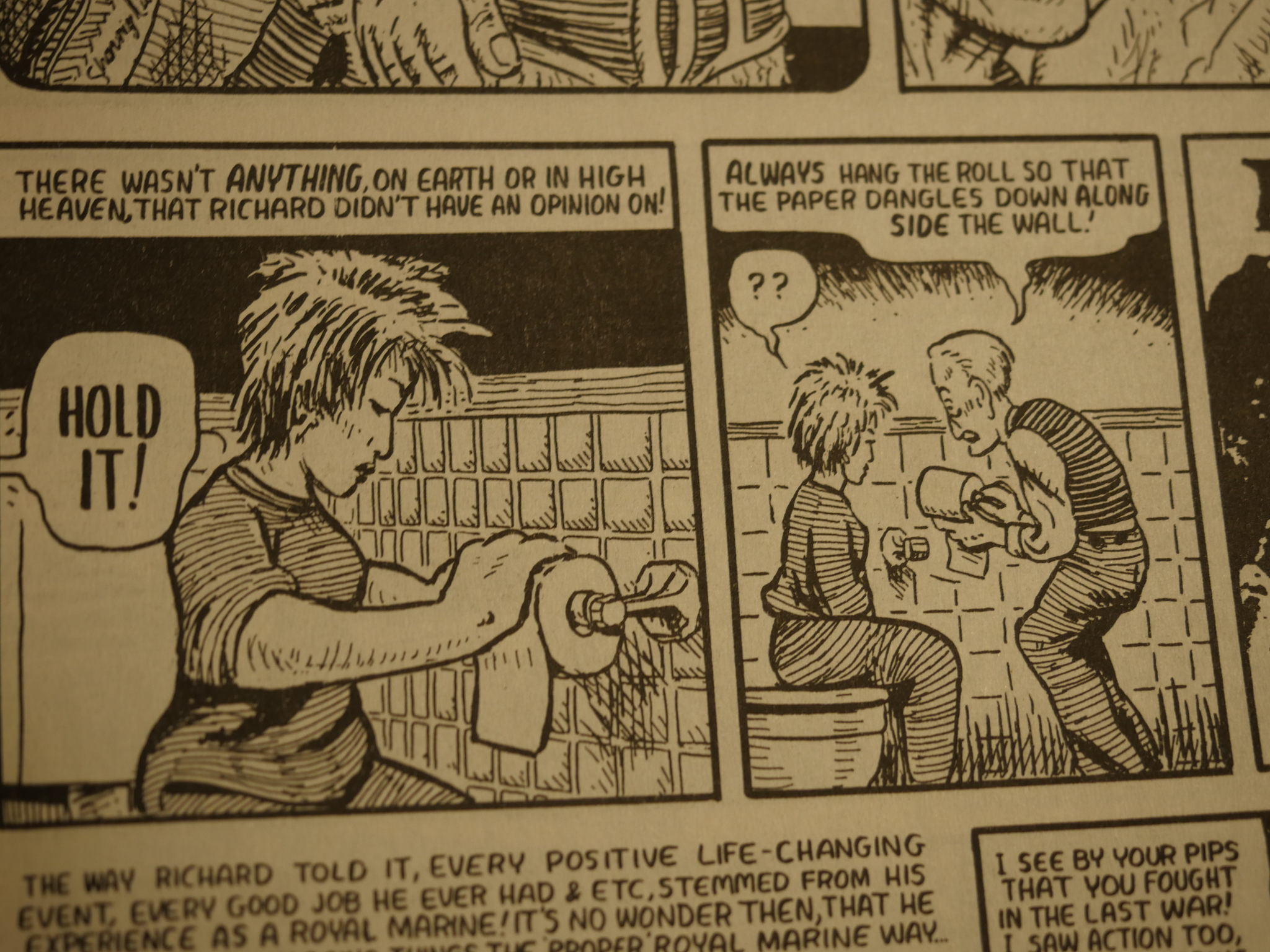
It’s told very non-linearly. It’s more like a very vague and somewhat scattered clip book where we’re told things about Richard, the aforementioned grandfather, in seemingly random order. But not in an artsy random order: It almost feels like Collier is just drawing things in the order they occur to him.
It’s a very odd technique, but it works. By avoiding giving this life an “storytelling arc”, as most people would have done, the book feels like a life. Random and without much meaning, but still meaningful.
One thing that did drive me slightly batty while reading it, though, was the total lack of signalling between captions that were Richard talking in first person, and Collier talking about Richard in third person. Typical example up there. I tried to see whether there was any significance to the captions being in boxes or not…
Hm… the first person panel has rounded borders? Is that a clue?
*reaches for issue*
Yes! Whenever the panel has rounded borders, it’s first person! Gad. I didn’t catch that.
Well then, I withdraw my objection. Unfortunately my delete key is missing, so I can’t delete all that, and I have to live with the shame of being inattentive.
Anyway! It’s wonderful. As it got towards the end, I found myself wishing that it was much longer than it is, and perhaps Collier thought that, too, since the story continues onto the outside back cover.
+1 will read again.
After this issue, the series moved to Drawn & Quarterly. Collier has published a (small) number of graphic novels after this, one of which I see that I haven’t read yet, so I’ve just ordered it.
Hm… doesn’t seem to have published anything after 2012? That’s too bad.
This post is part of the Fantagraphics Floppies series.
One thought on “FF1992: Collier’s”