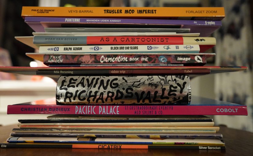
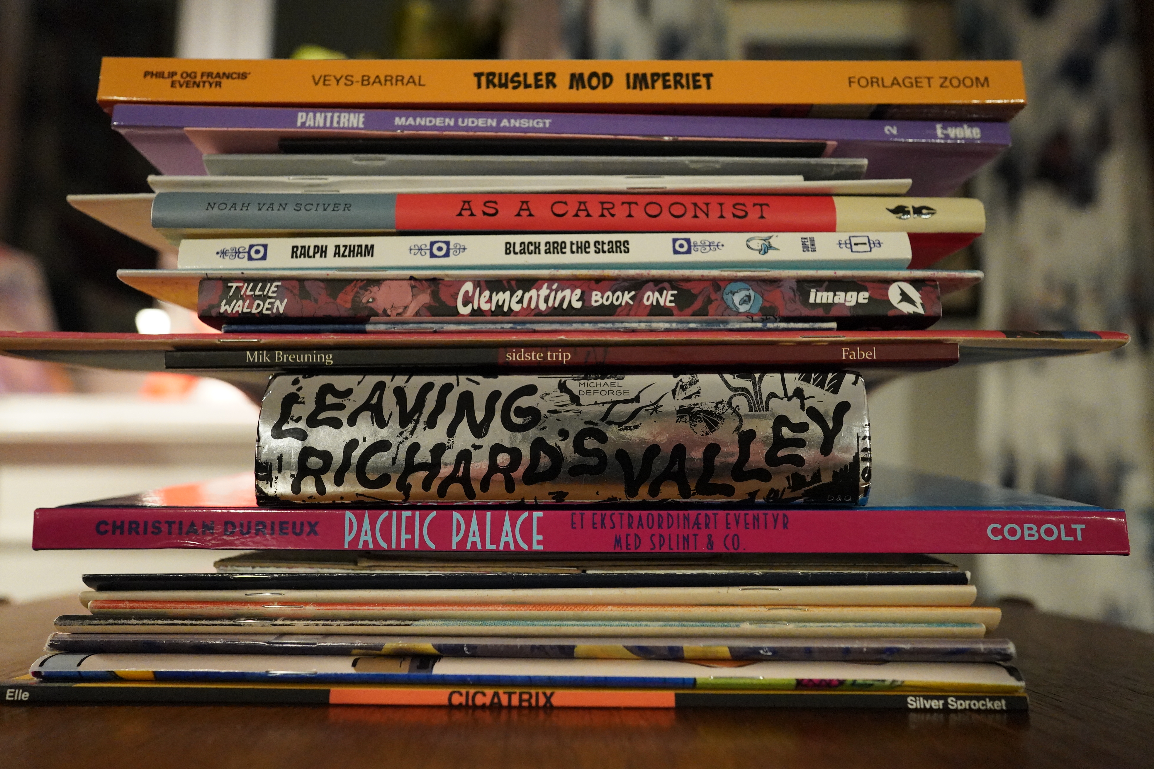
The mailman’s been busy — I’ve got packages from Denmark, from Deadcrow, from Domino and from Mile High Comics. A whole bunch of different things, and I need a break, anyway.
So let’s get reading. And for today’s musical accompaniment, I think I’ll go full David Bowie. It’s that time of year.
| David Bowie: Space Oddity |  |
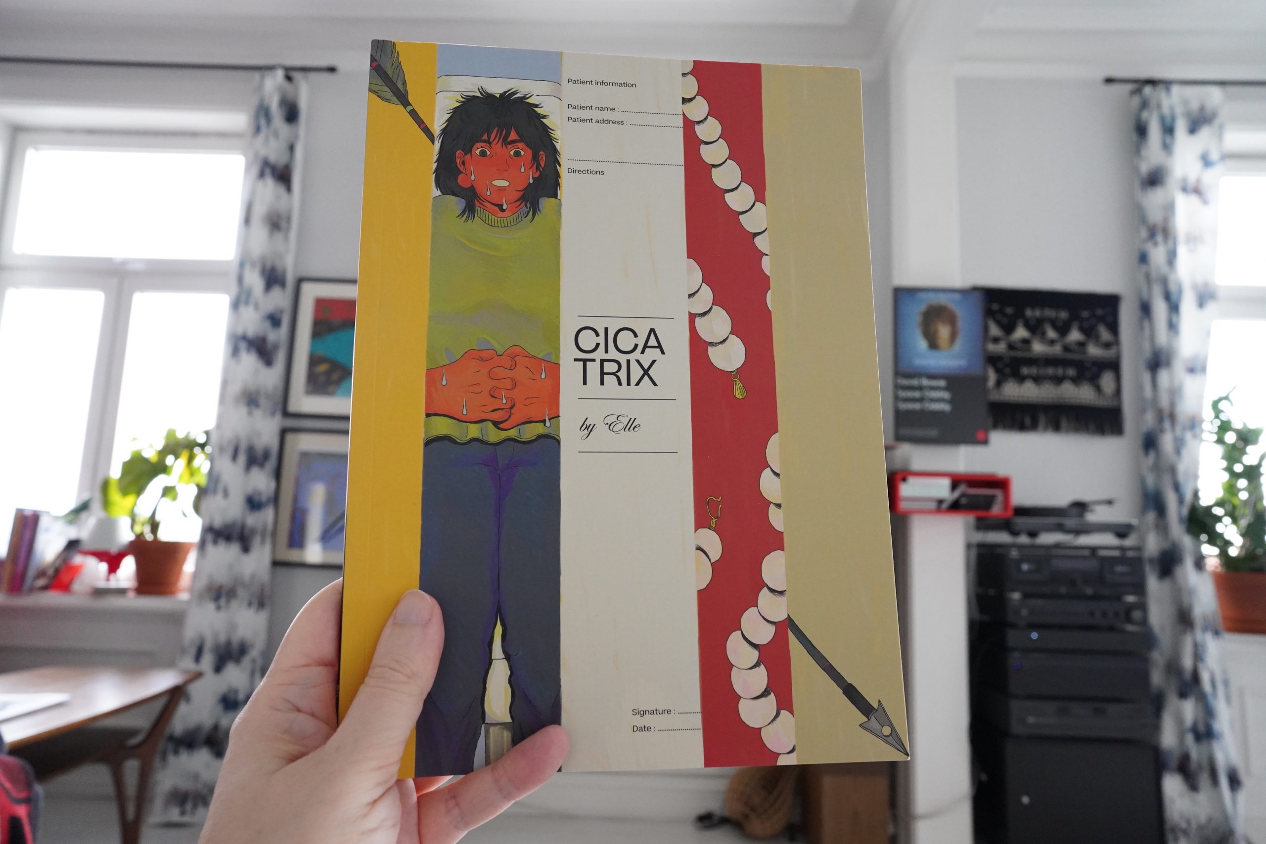
13:47: Cicatrix by Elle (Silver Sprocket)
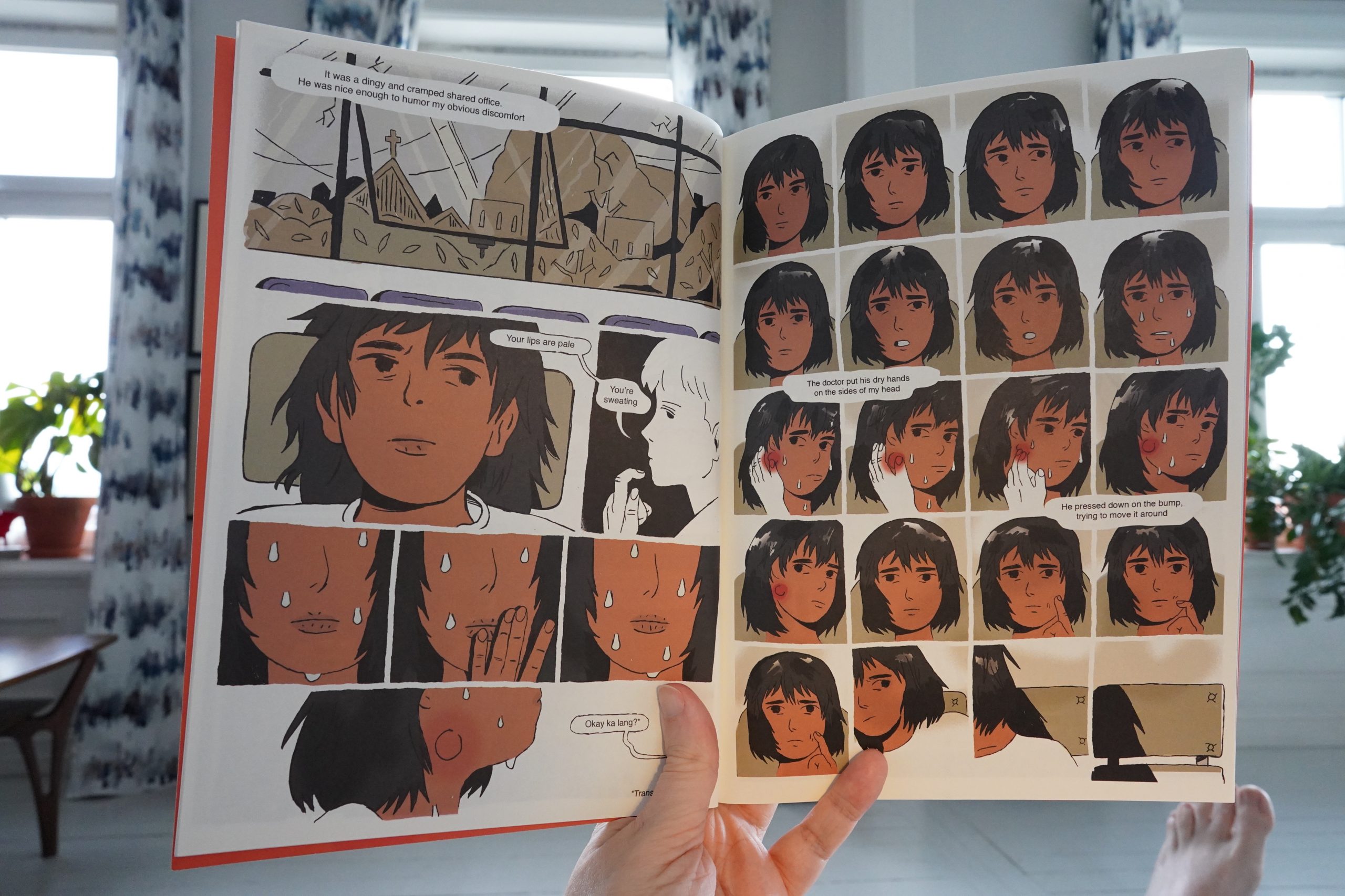
This starts off pretty normal — worrying about going to the doctor.
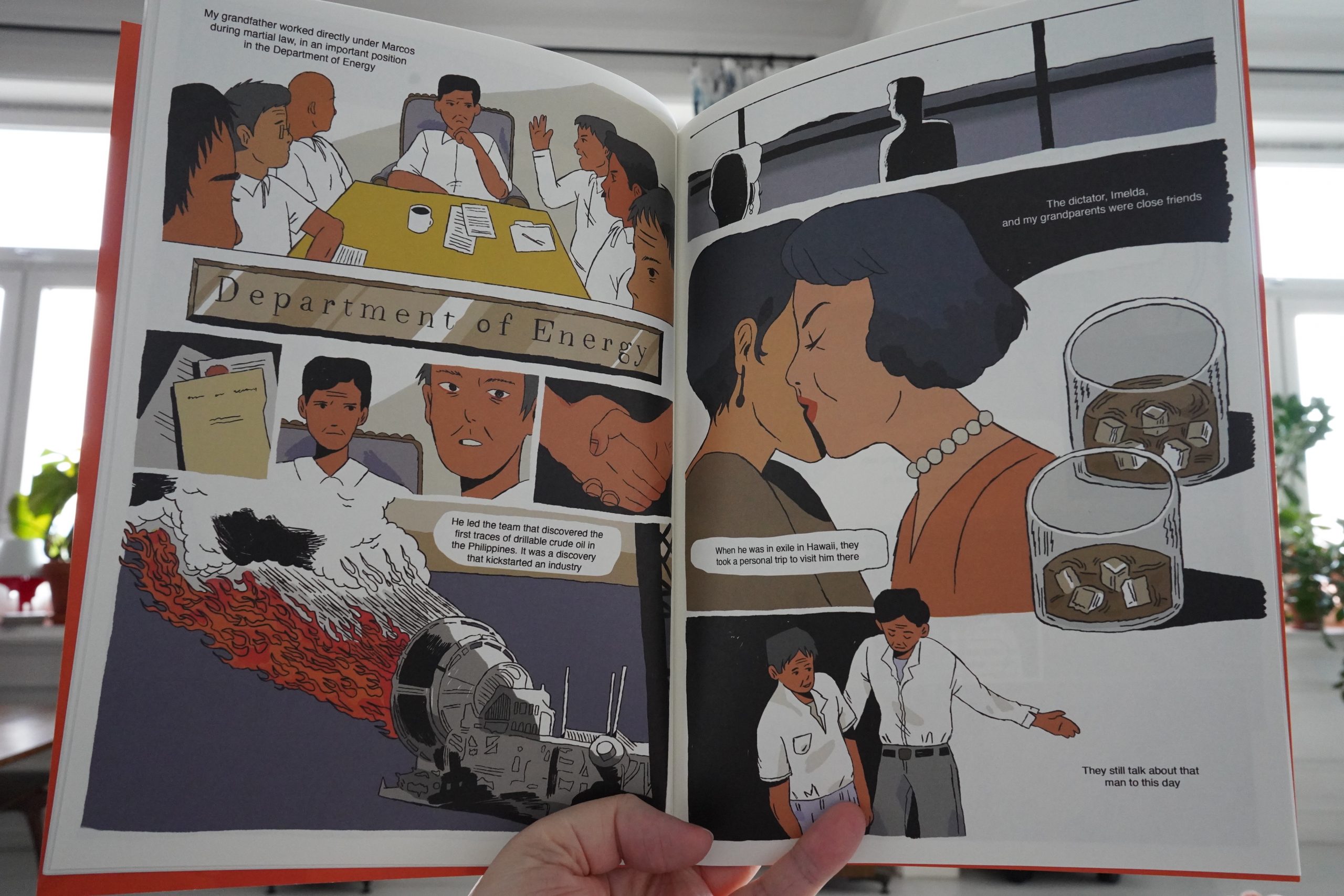
But then it turns into something quite different — a rumination on guilt and privilege and stuff. It’s gripping! It could have ended up being mawkish, but the storytelling is so on point and original.
| David Bowie: Space Oddity |  |

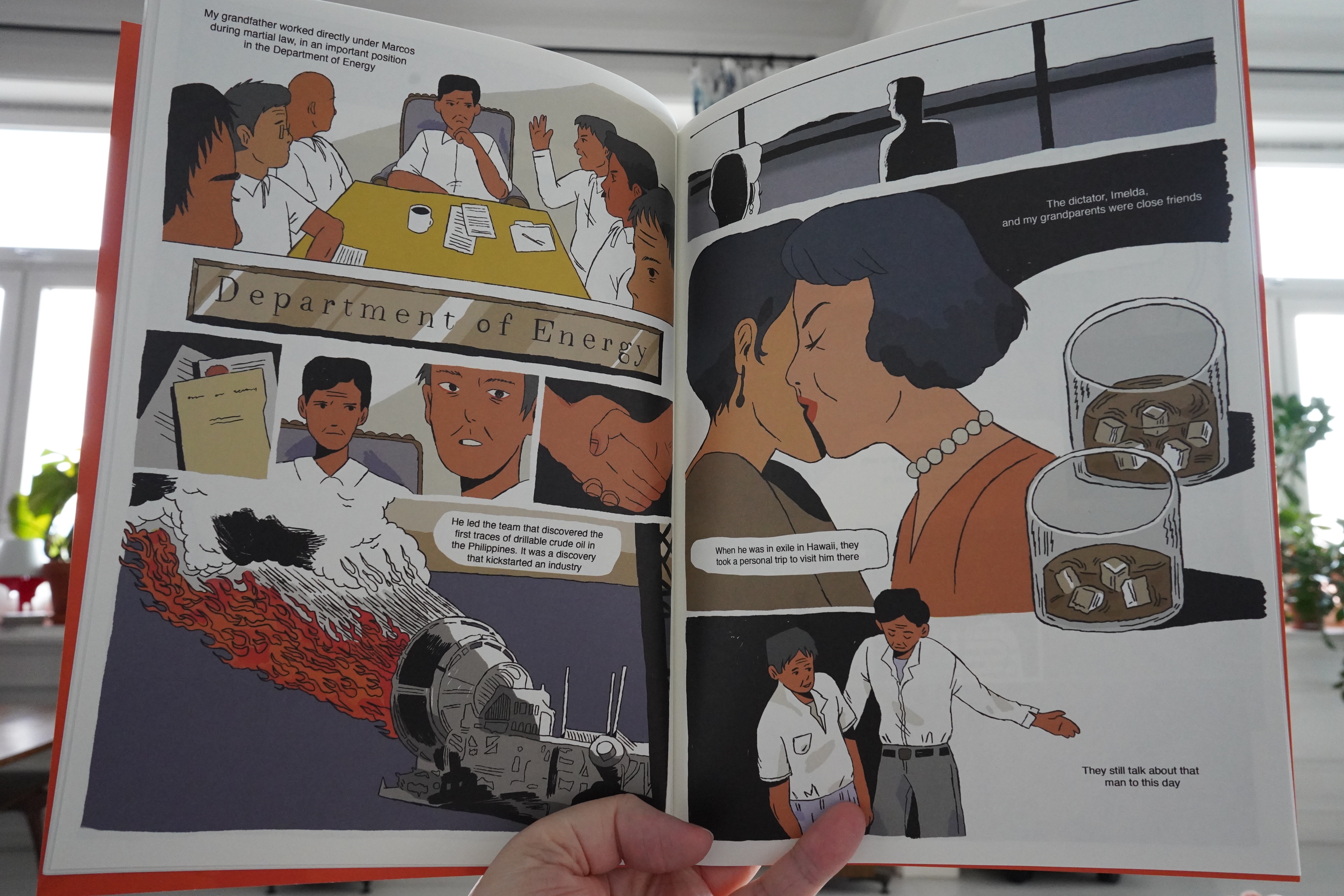
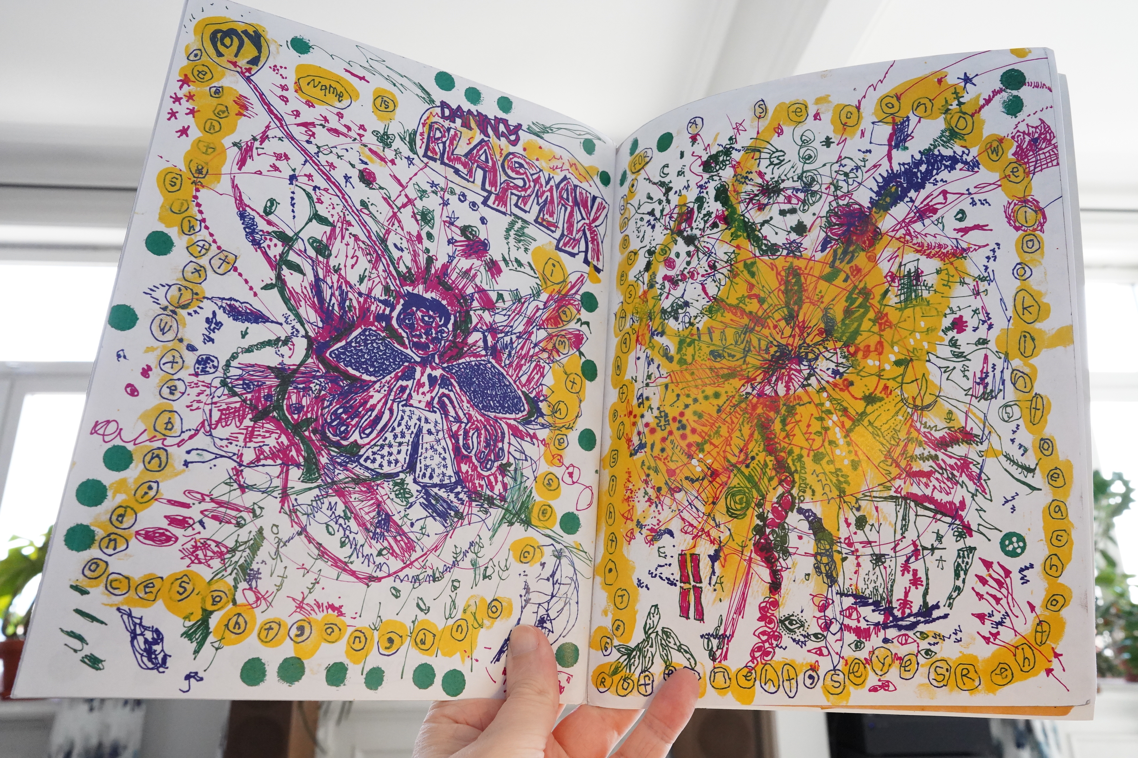
14:02: Cowlick #3 & #4 edited by Floyd Tangeman (Deadcrow)
Hey, nice sketch on the package from Deadcrow…
*gulp* Now I have reading performance anxiety.
Lovely as usual…
I think the book is even more varied now than earlier? I love the mix of non-narrative and more narrative and very narrative pieces.
And the mix of longer pieces and shorter pieces is great.

Yes! Only Insta!

Anyway, it’s thrilling reading this — it’s kinda mind-melting.
| David Bowie: Hunky Dory |  |
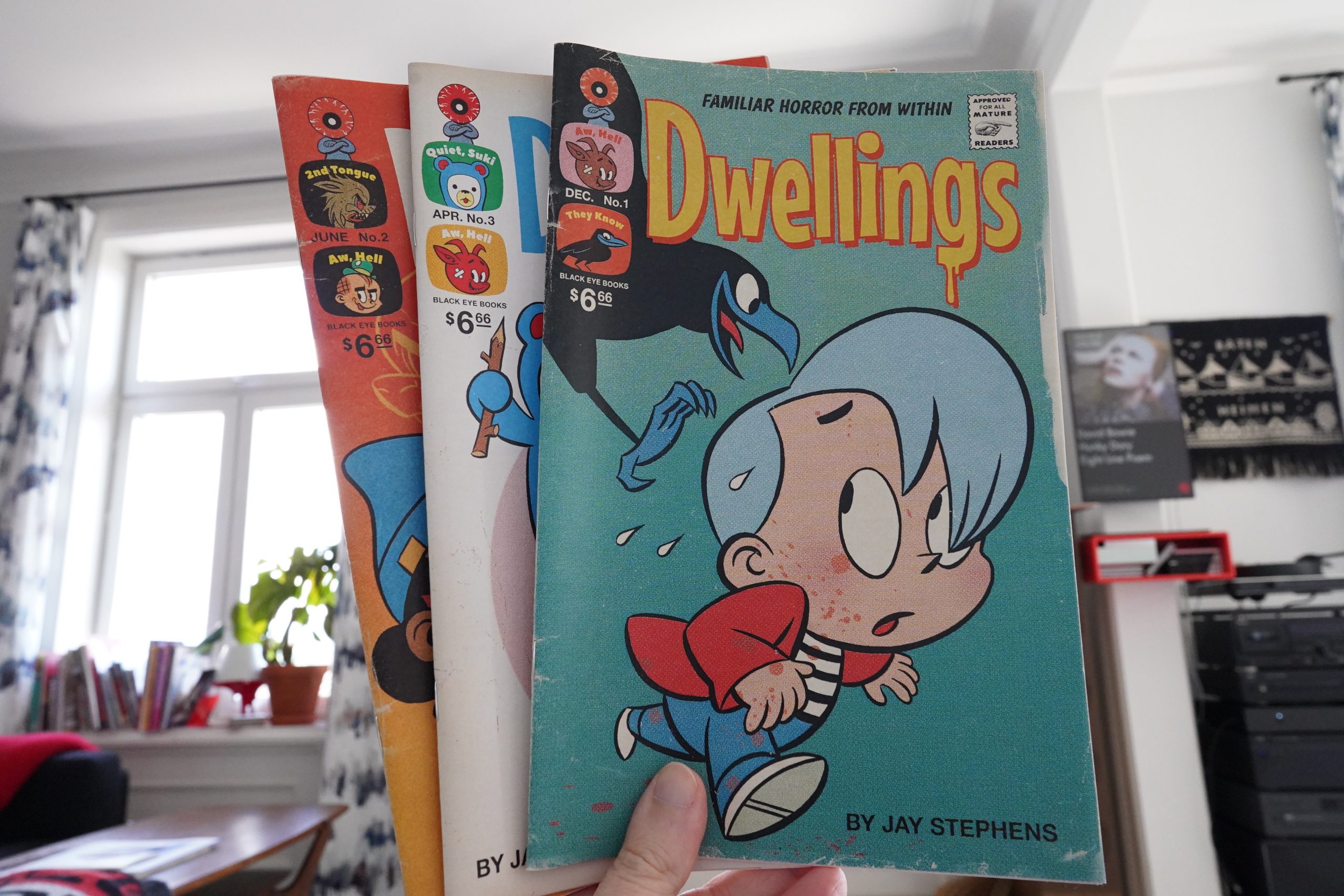
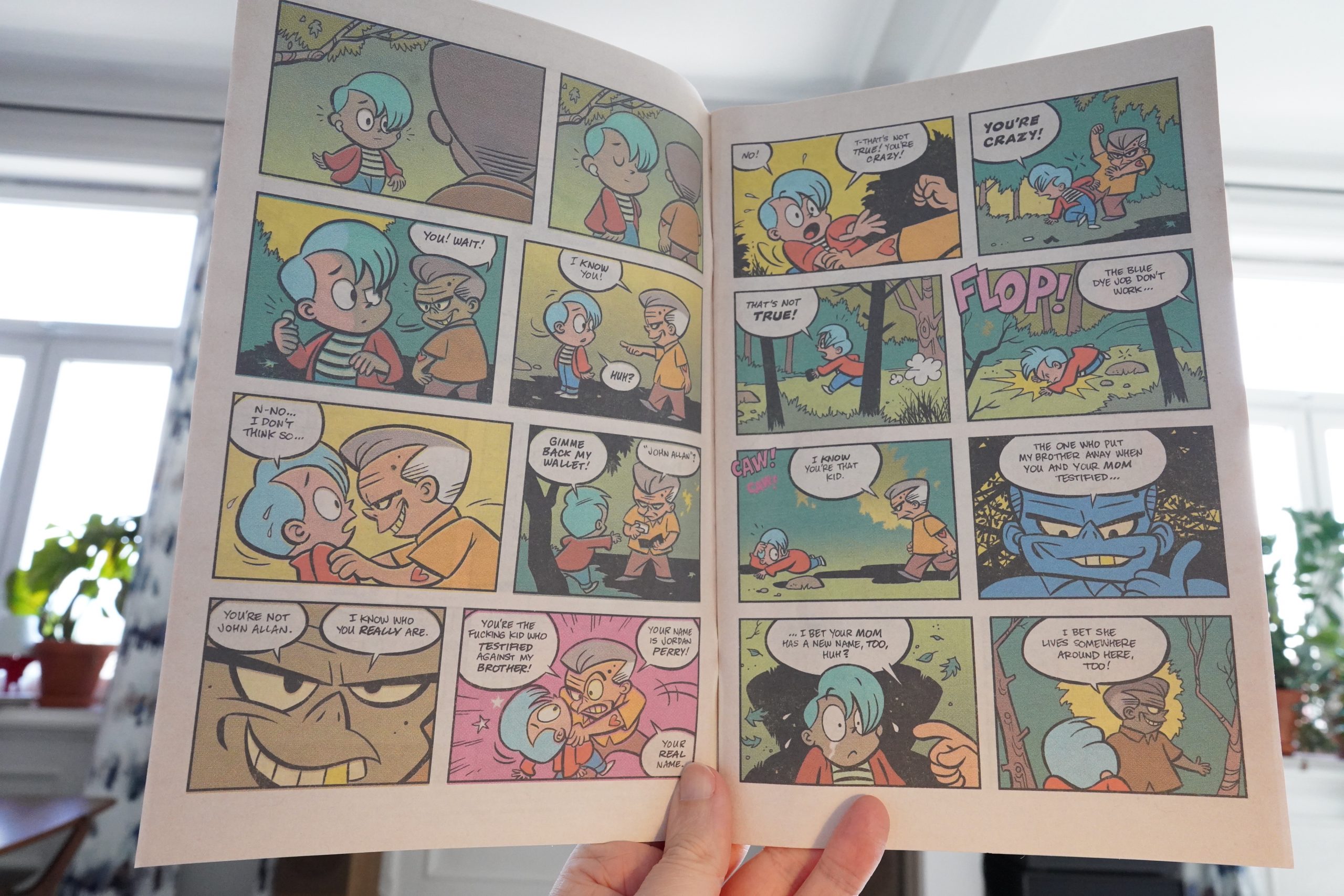
14:38: Dwellings #1-3 by Jay Stephens (Black Eye Books)
Jay Stephens… Jay Stephens… is that the guy who used to do those interesting comics back in the 90s? It is! Oddville! and that stuff? So he’s back doing independent comics now?
This is meant to resemble an old, faded comic — down to the uneven fading where the pages are folded. However, it doesn’t really quite work: The paper quality is wrong, and it feels like a print-on-demand comic. I know! So important! I just found it odd that he’s going to these extreme lengths to replicate the look — like this is a genuine odd artefact — but then not get all the way there.
I guess it’s just not economically feasible to have this printed at a real printer, and on newsprint, when self publishing. Which, again, makes me wonder — why not publish this with a larger publisher, because the book is really fun, and I can’t see why it wouldn’t do well in comics shops.

Oh, yeah, this is a horror book.
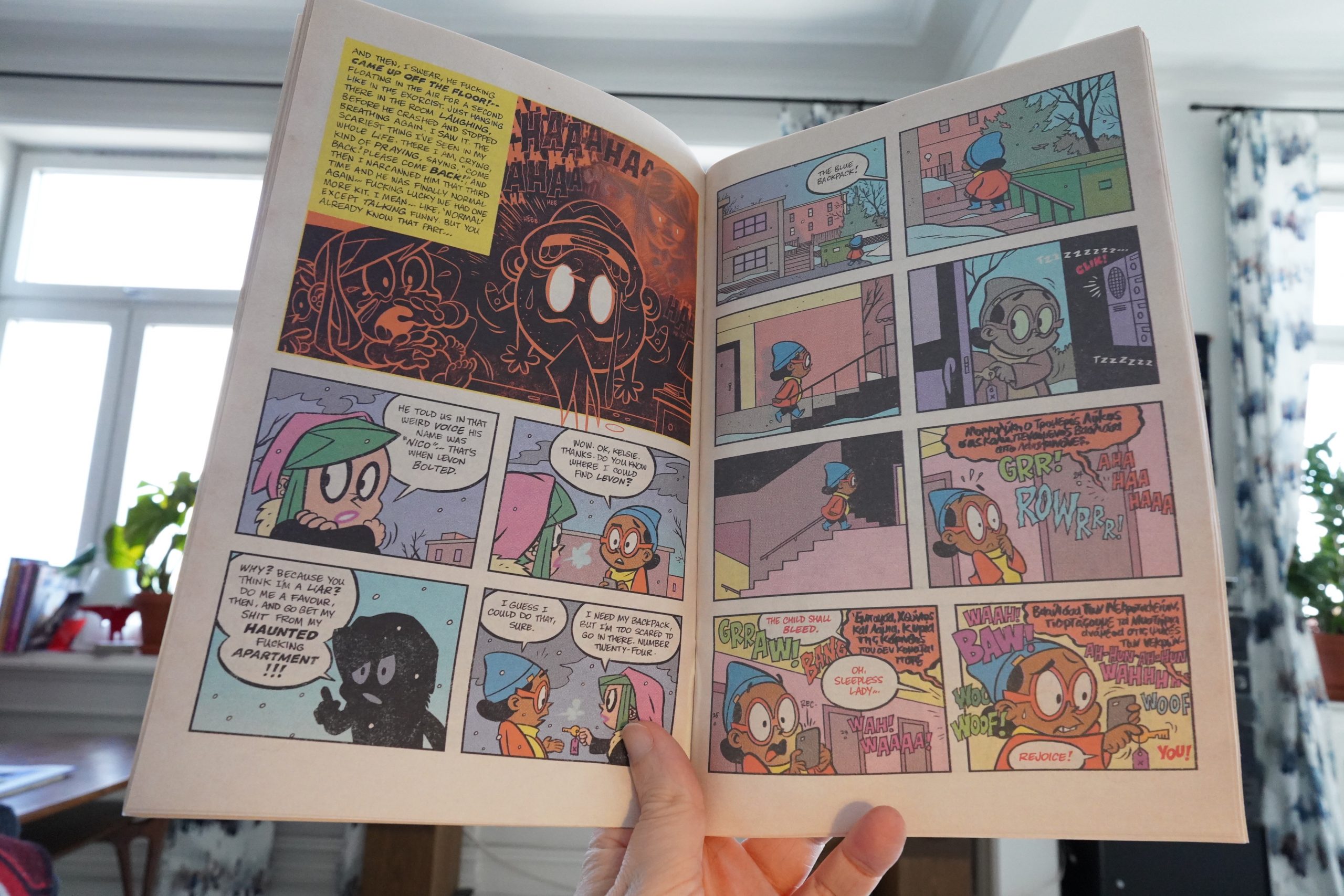
And when I say “fun”, I mean “distressingly horrifying”. This is the scariest comic book I’ve read in yonks. These three issues are nominally independent of each other, but tie together in interesting ways, and it’s all…
It’s brilliant the way it spirals into horror, and it’s more than a bit nausea inducing.
| David Bowie: The Rise and Fall of Ziggy Stardust and the Spiders From Mars |  |
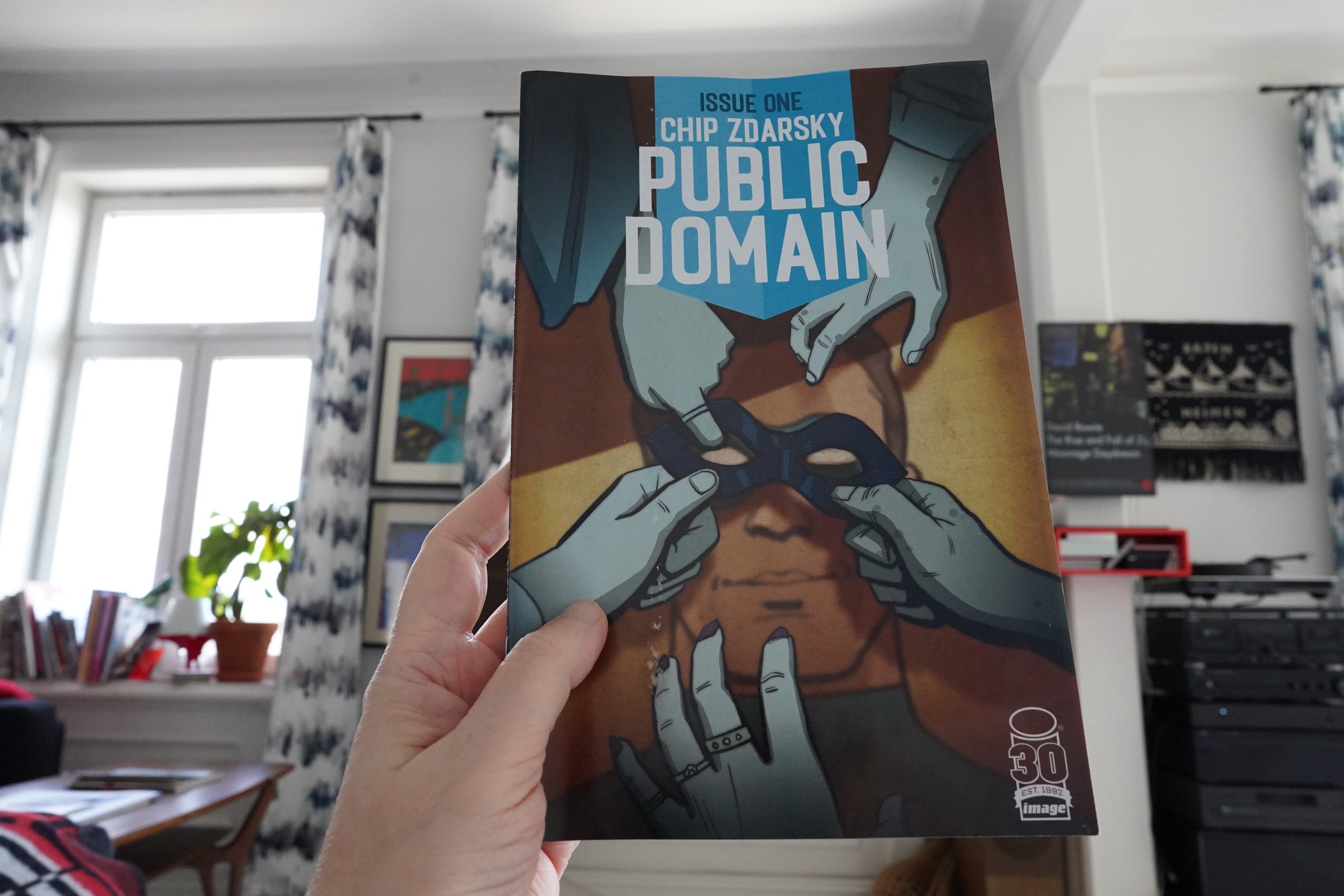
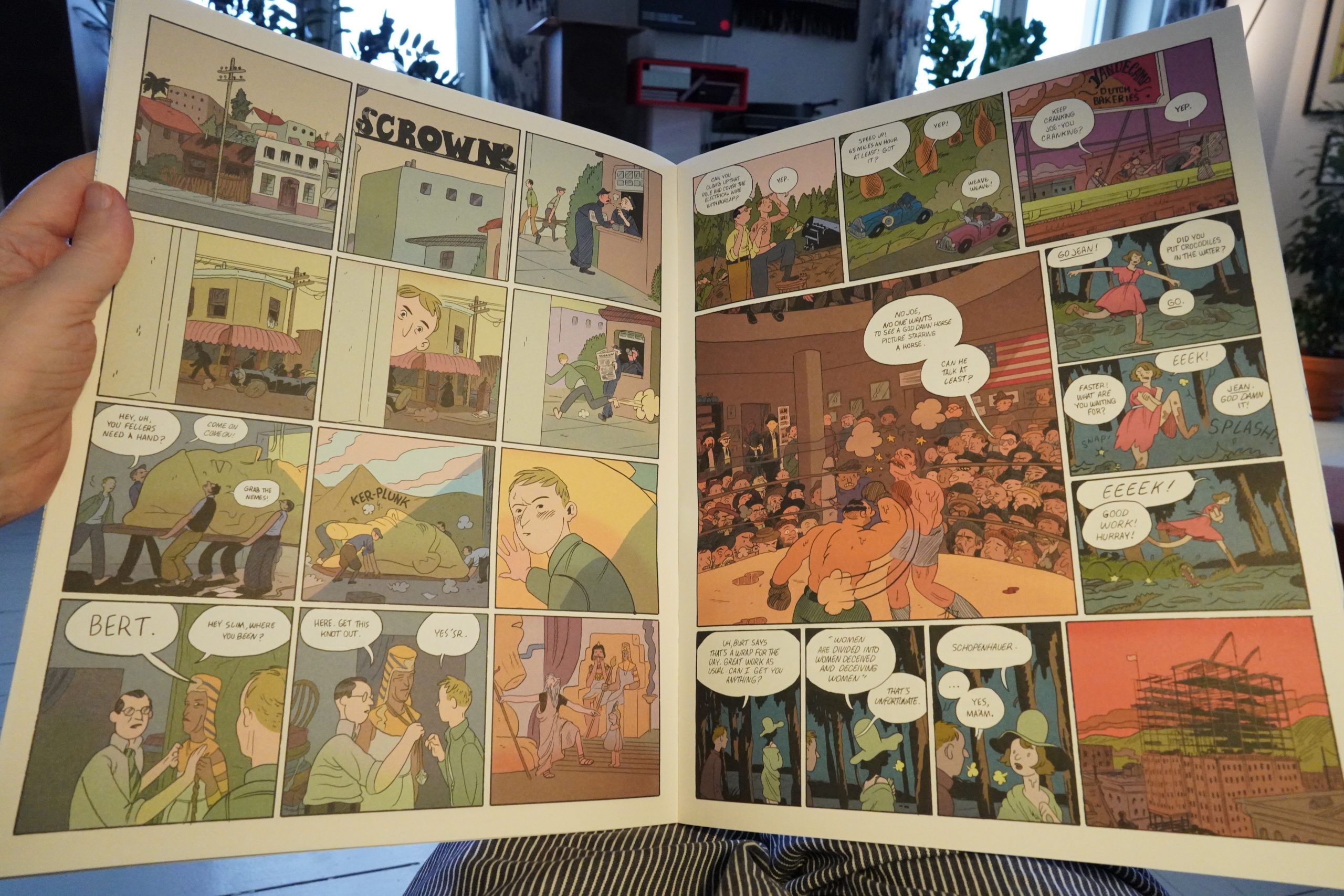
15:22: Public Domain by Chip Zdarsky (Image Comics)

So this is the result of that infamous Substack comics deal? I guess that means that it was originally serialised on the web?
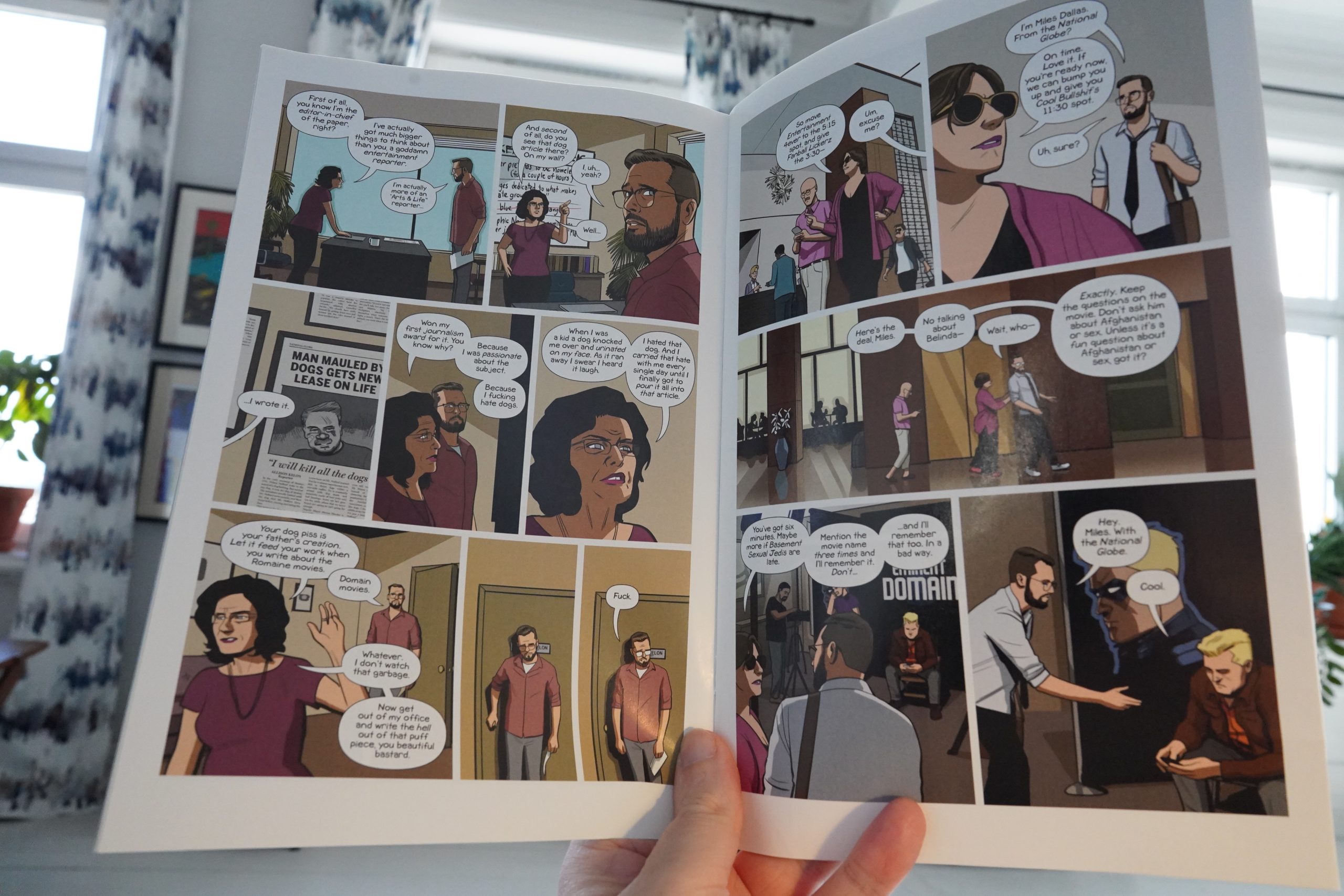
Which might explain the density — there’s a lot of plot happening in these pages. The result is that this reads exactly like a TV series, and the first issue could probably be filmed exactly as is as the first episode of something streaming on Netflix.
The story is about who created the Marvel Universe (with the numbers filed off, but not very expertly). (Spoilers: Stan Lee is the villain.) The overt pandering to TV pacing sensibilities coupled with the Inside Baseball snickering over Lee/Kirby nerdliness makes this an odd read, but it’s quite entertaining anyway.
(Or perhaps it’s not so strange after all — it probably makes for a good elevator pitch. “What if Stan Lee fucked up so bad that Disney lost ownership of Marvel?” … ok, sounds too nerdy.)
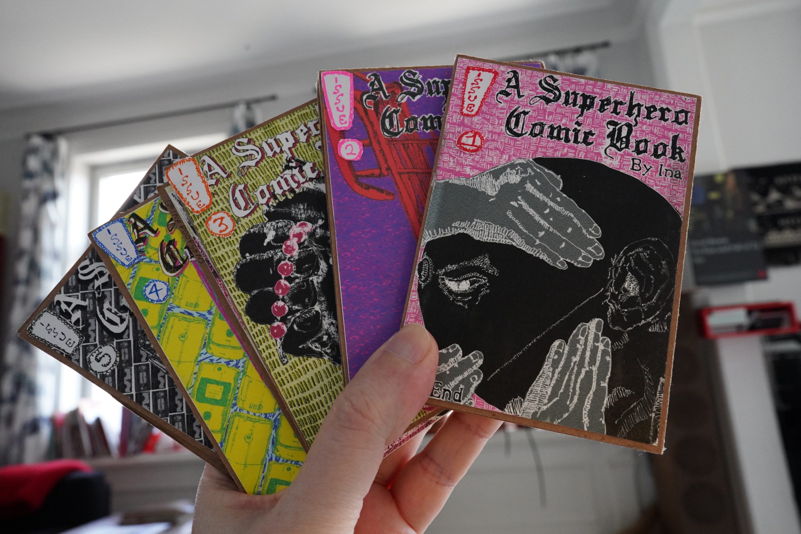
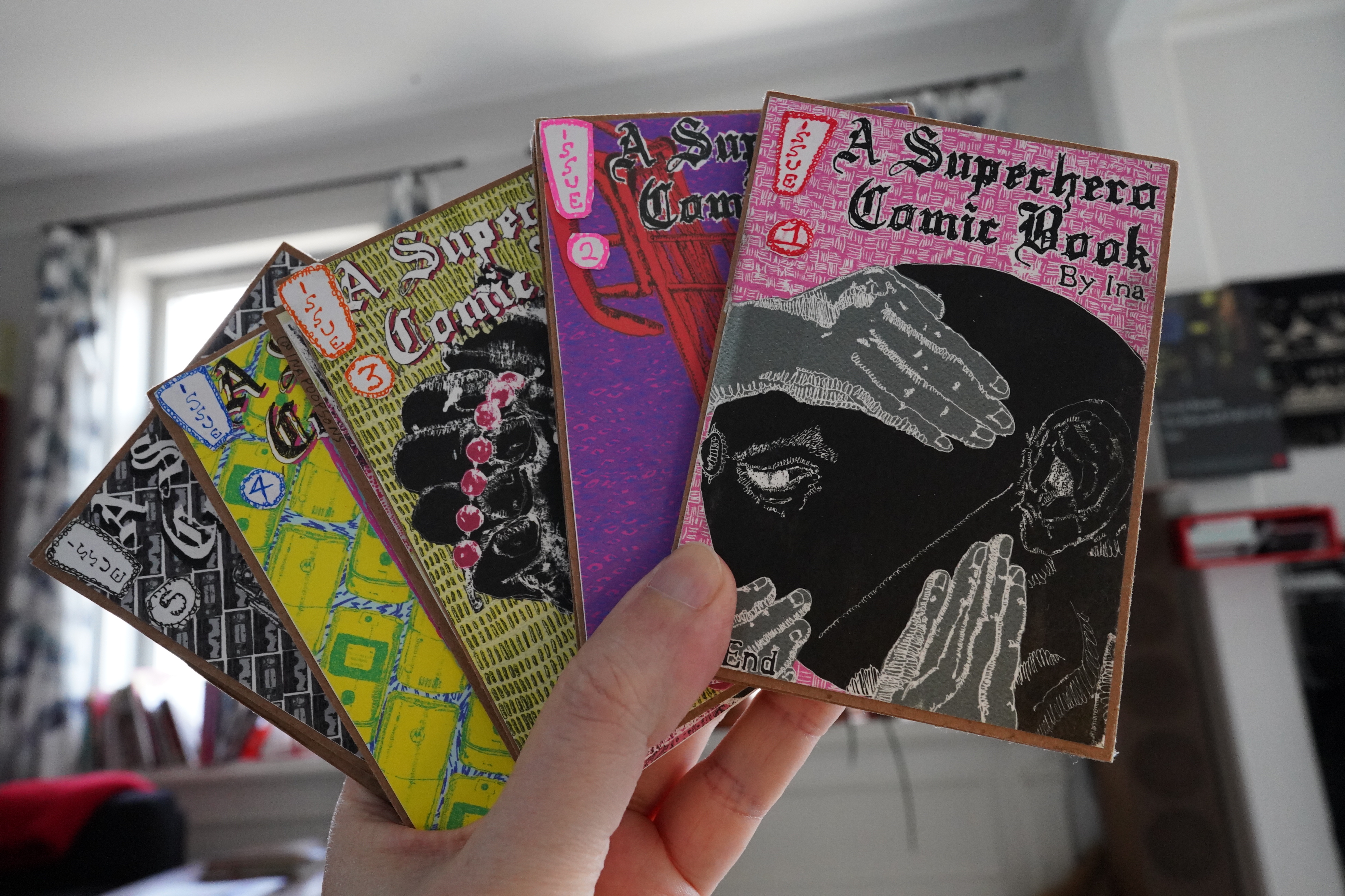
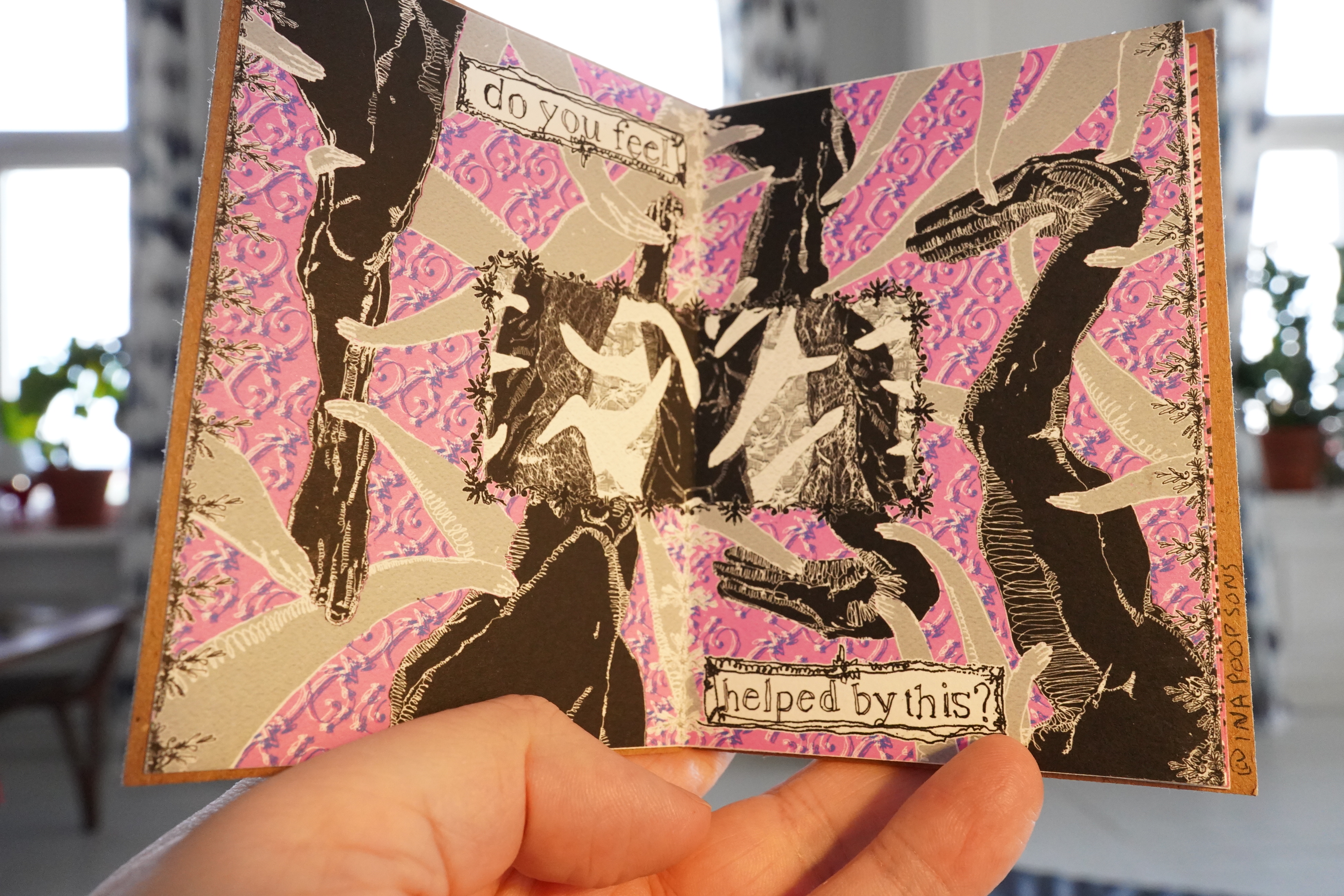
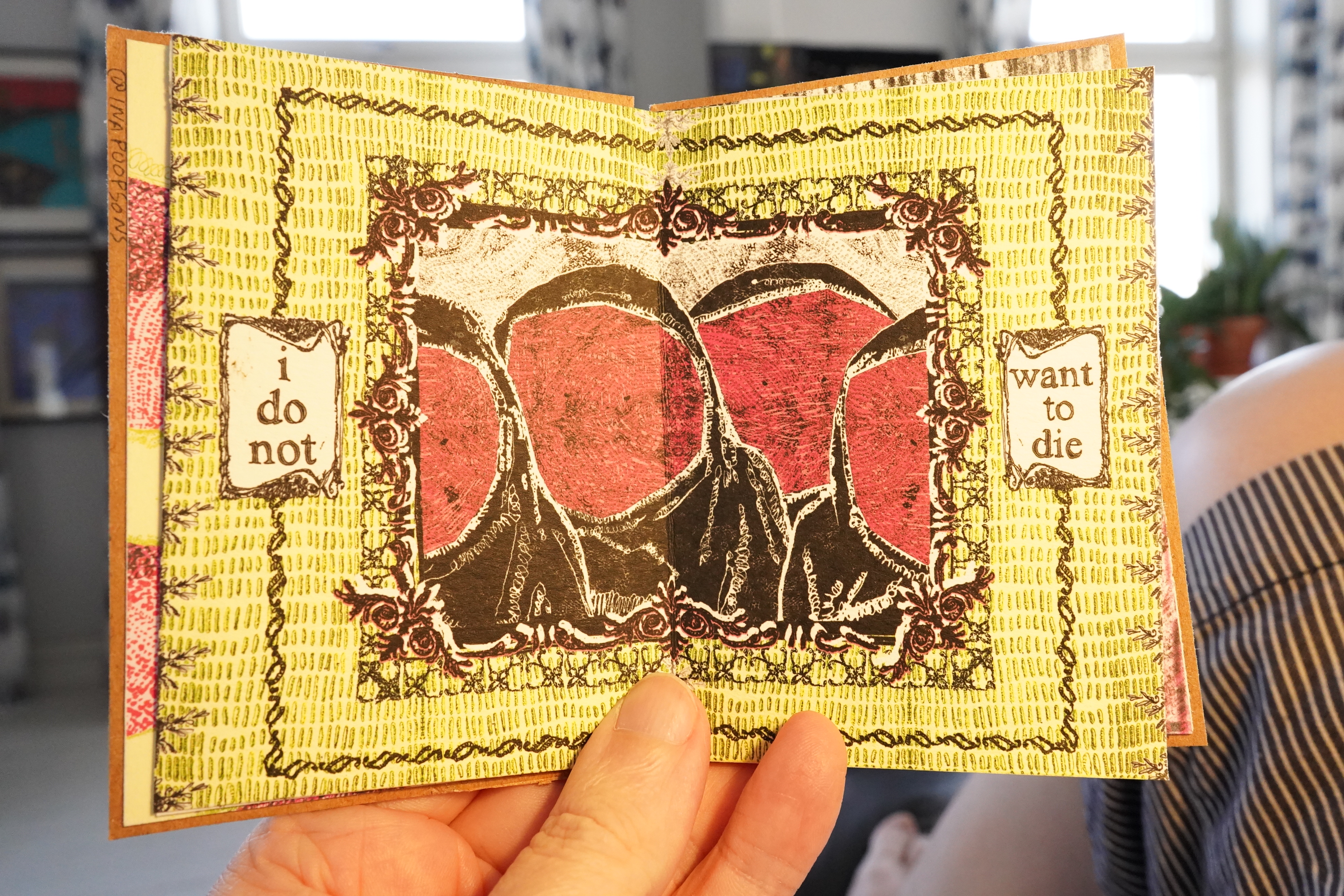
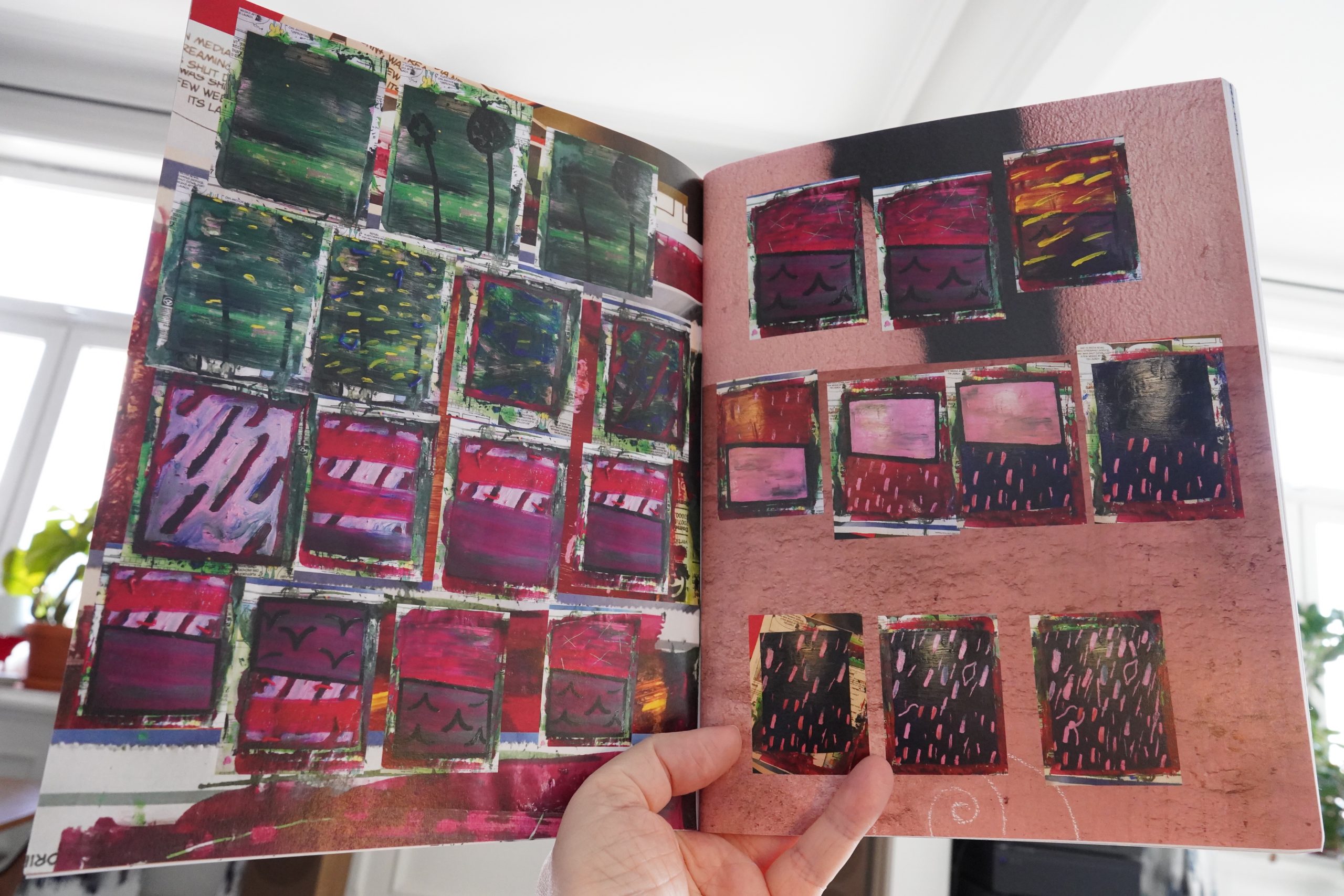
15:45: A Superhero Comic Book #1-5 by Ina
Wow, these are gorgeous little objects. Each book consists of thick paper/cardboard glued together.

These are wonderful.

And affecting.
| David Bowie: Aladdin Sane |  |
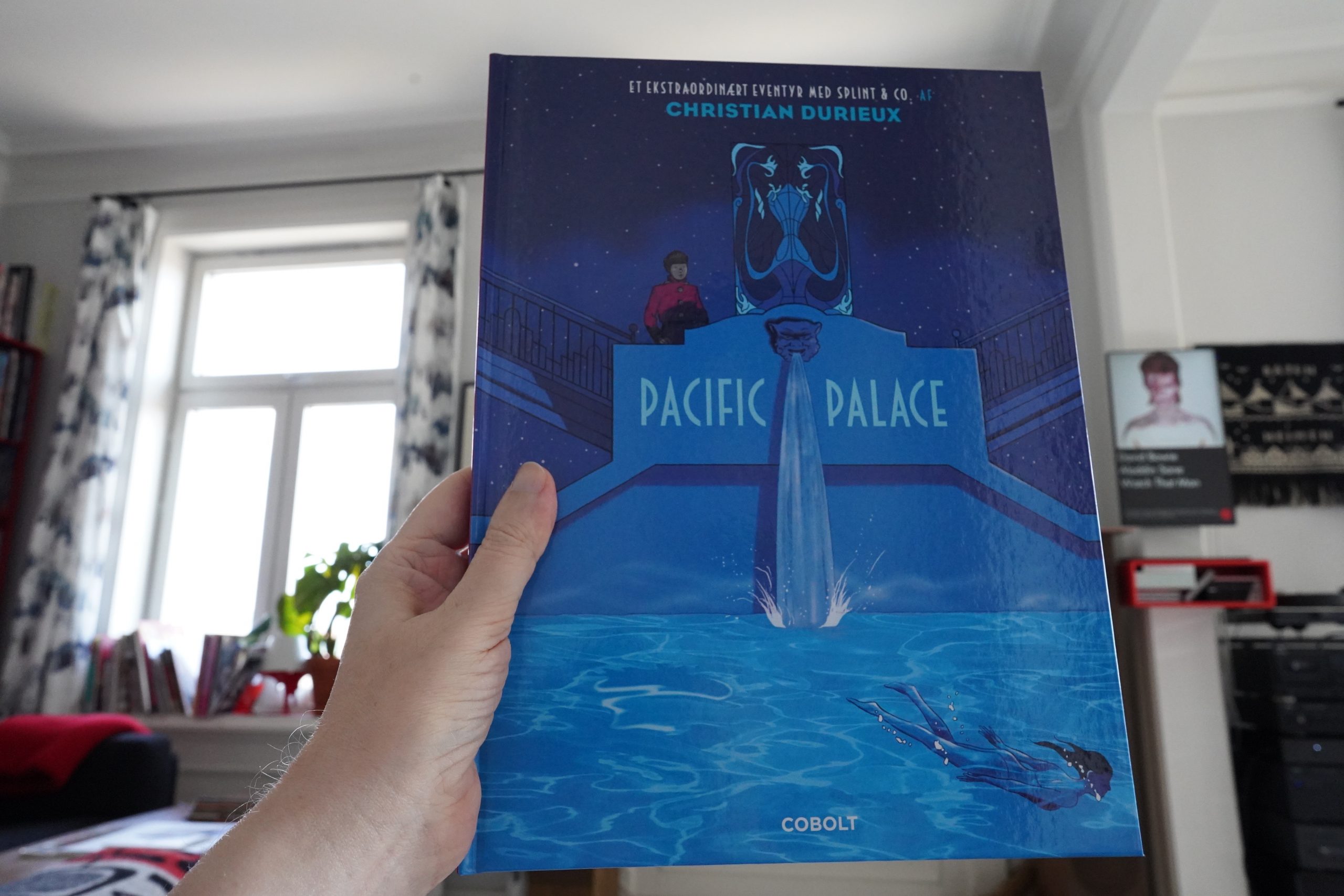
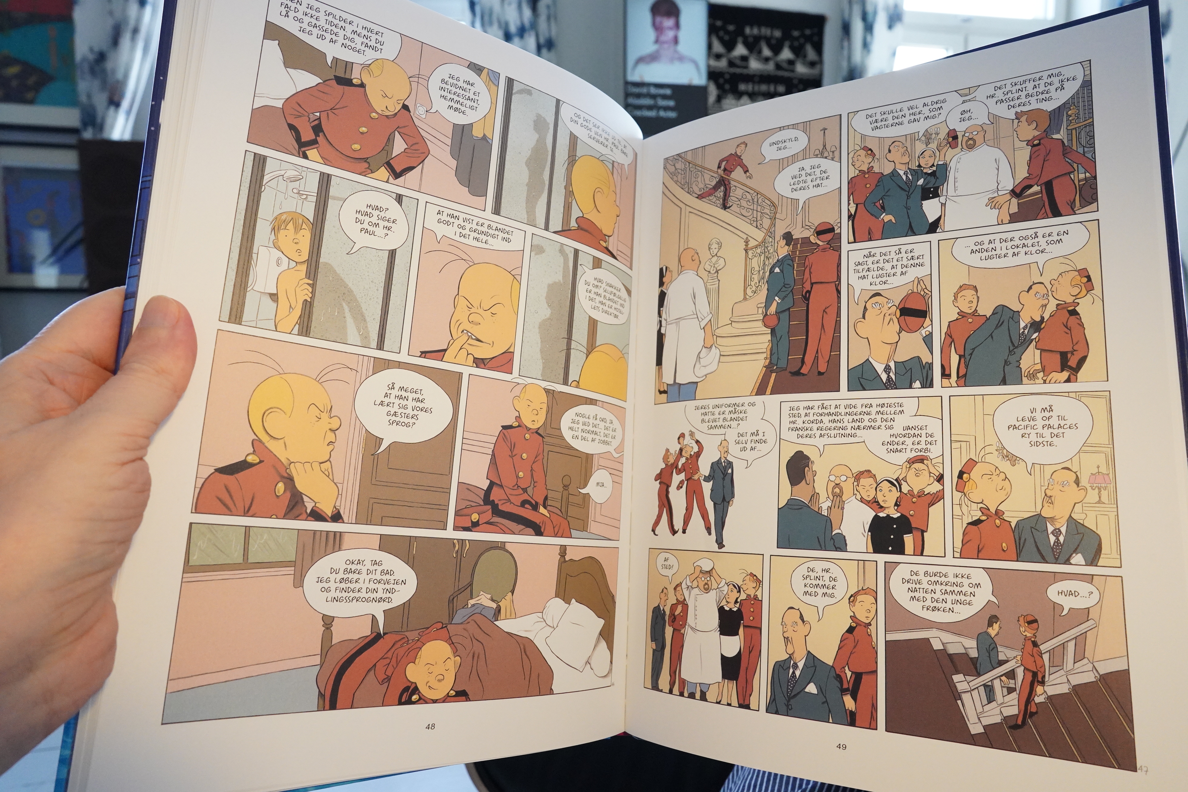
15:52: Spirou: Pacific Palace by Christian Durieux (Cobolt)
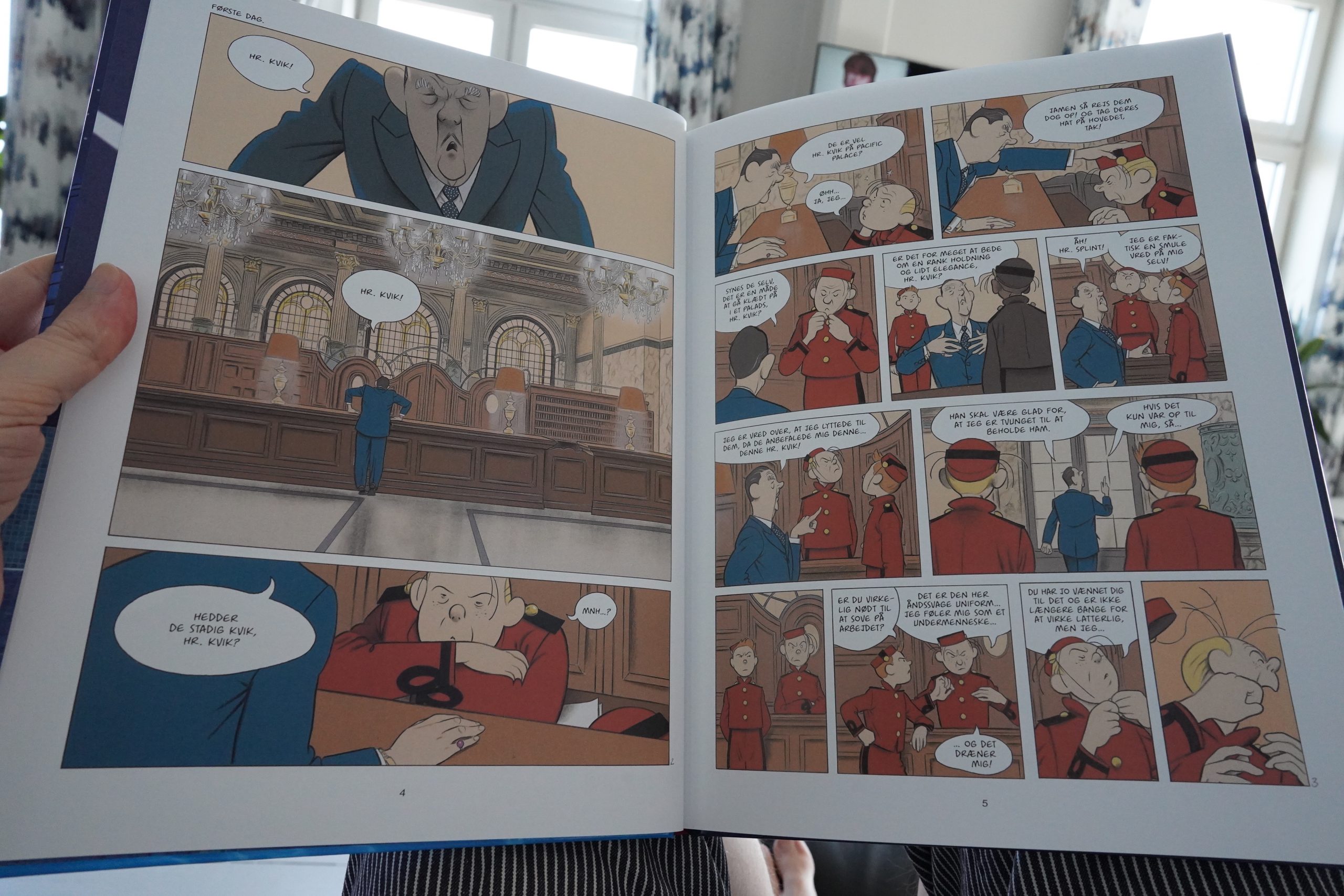
This is yet another one of the “special editions” of the Spirou series — are there more of these than the regular albums now? — and the artwork here doesn’t do much for me.
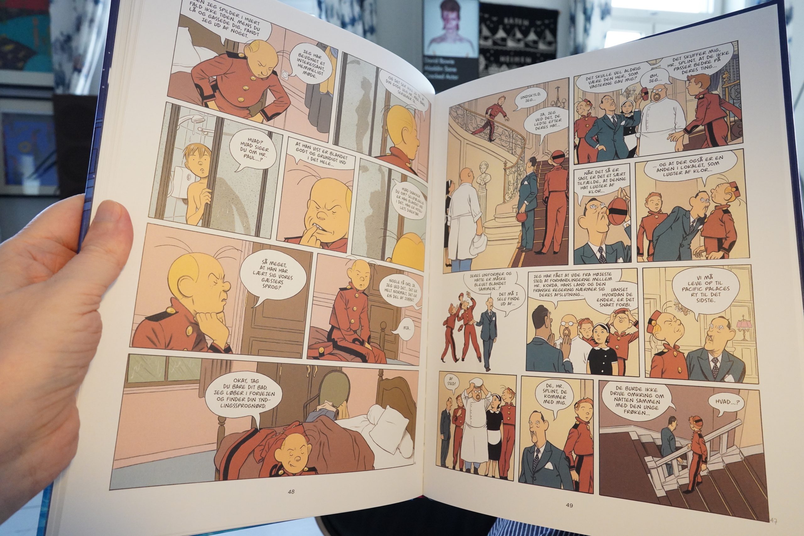
And… I don’t really see why this is a Spirou album at all. I mean, the piccolo uniforms means that it’s natural to set this in a hotel, but… Fantasio’s personality comes through a bit, but the rest is a bit eh. But I wouldn’t have complained about that if this was actually good, but it kinda isn’t.
| David Bowie: Diamond Dogs |  |
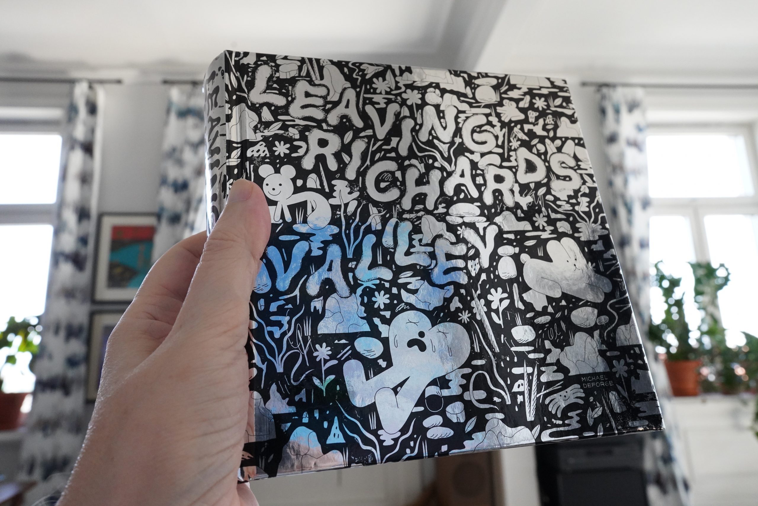
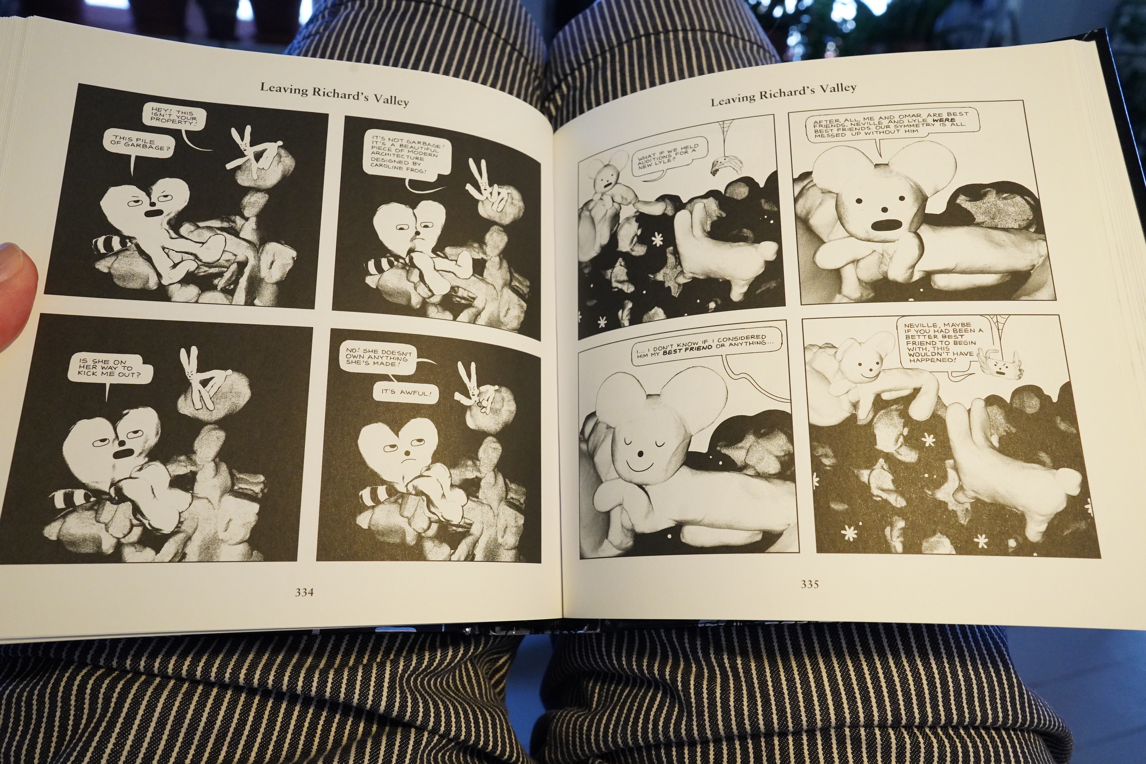
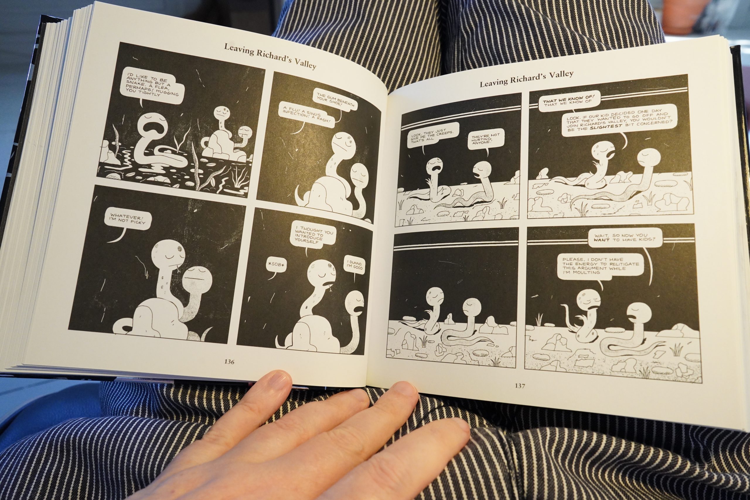
16:33: Leaving Richard’s Valley by Michael Deforge (Drawn & Quarterly)
I have no idea how I missed this book when it was originally published — I go through the D&K solicitations and basically buy everything, but there must be a flaw in my ahem methodology somewhere.
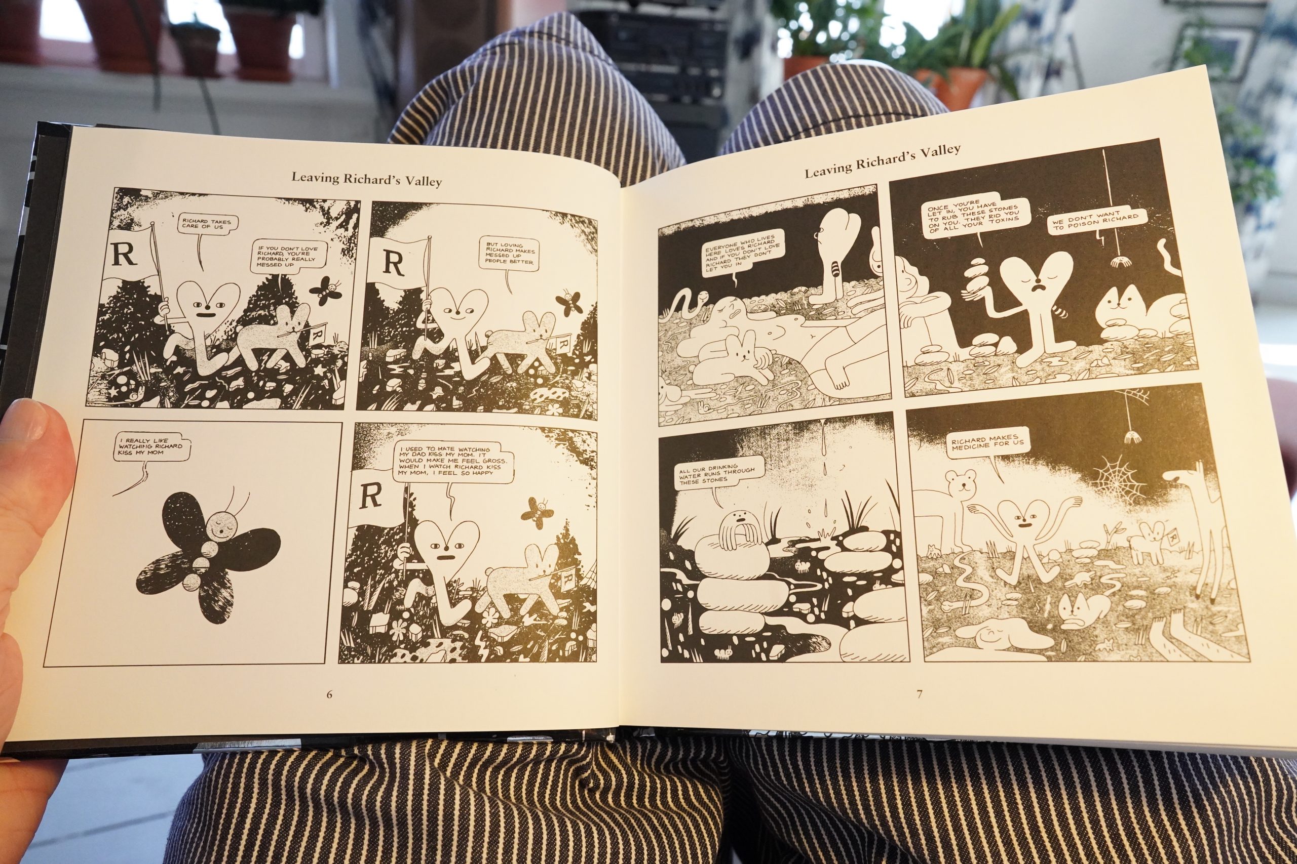
I’m guessing this was originally published on Instagram or something? It reads like an Instagram strip — very punny.
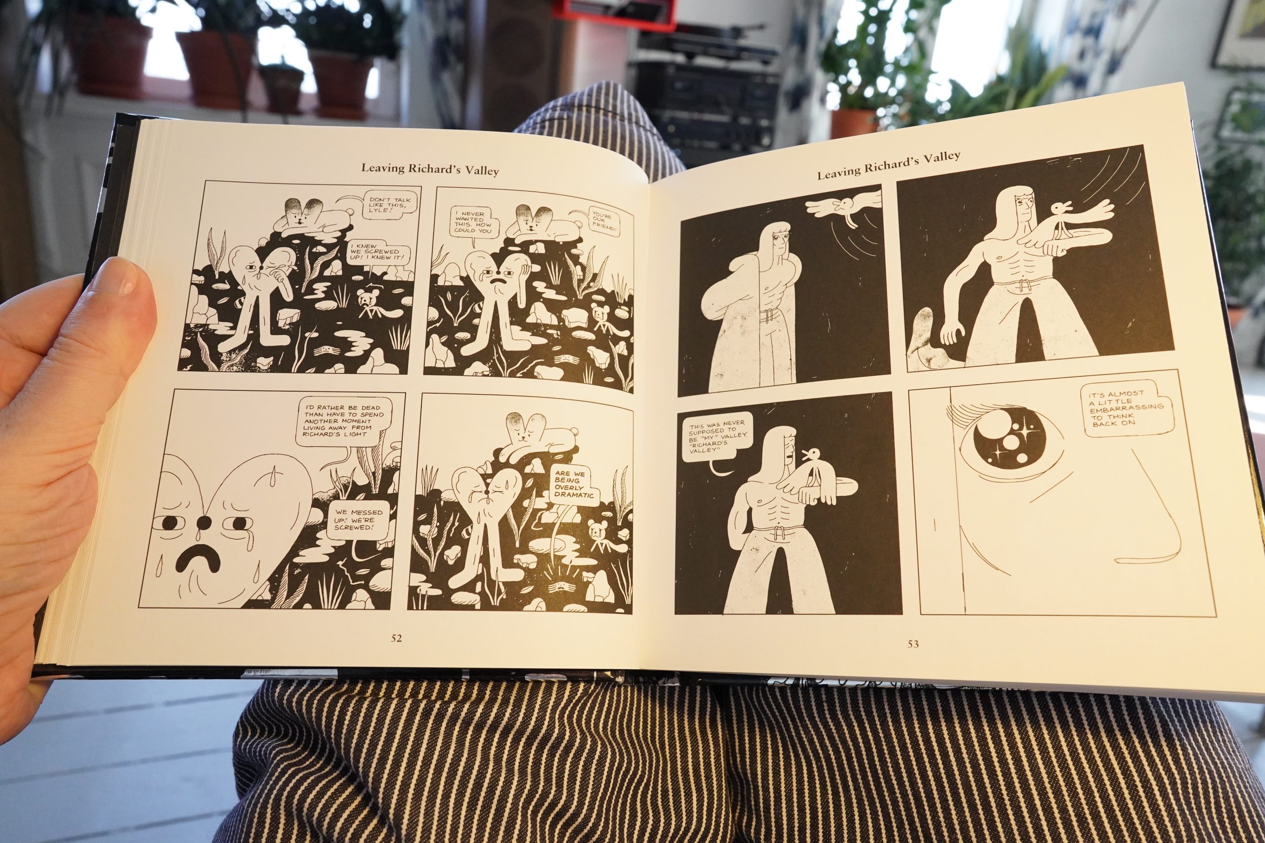
It reads like Deforge was doing this in a pretty improvisational way — it meanders a lot.
| David Bowie: David Live (1) |  |

*ding dong* Ain’t got time to make food.
Man, that’s a big pizza. I should be able to eat… half…
Anyway, this is one long narrative, told one joke at a time. It’s a classic format. It could be a very long Peanuts sequence.
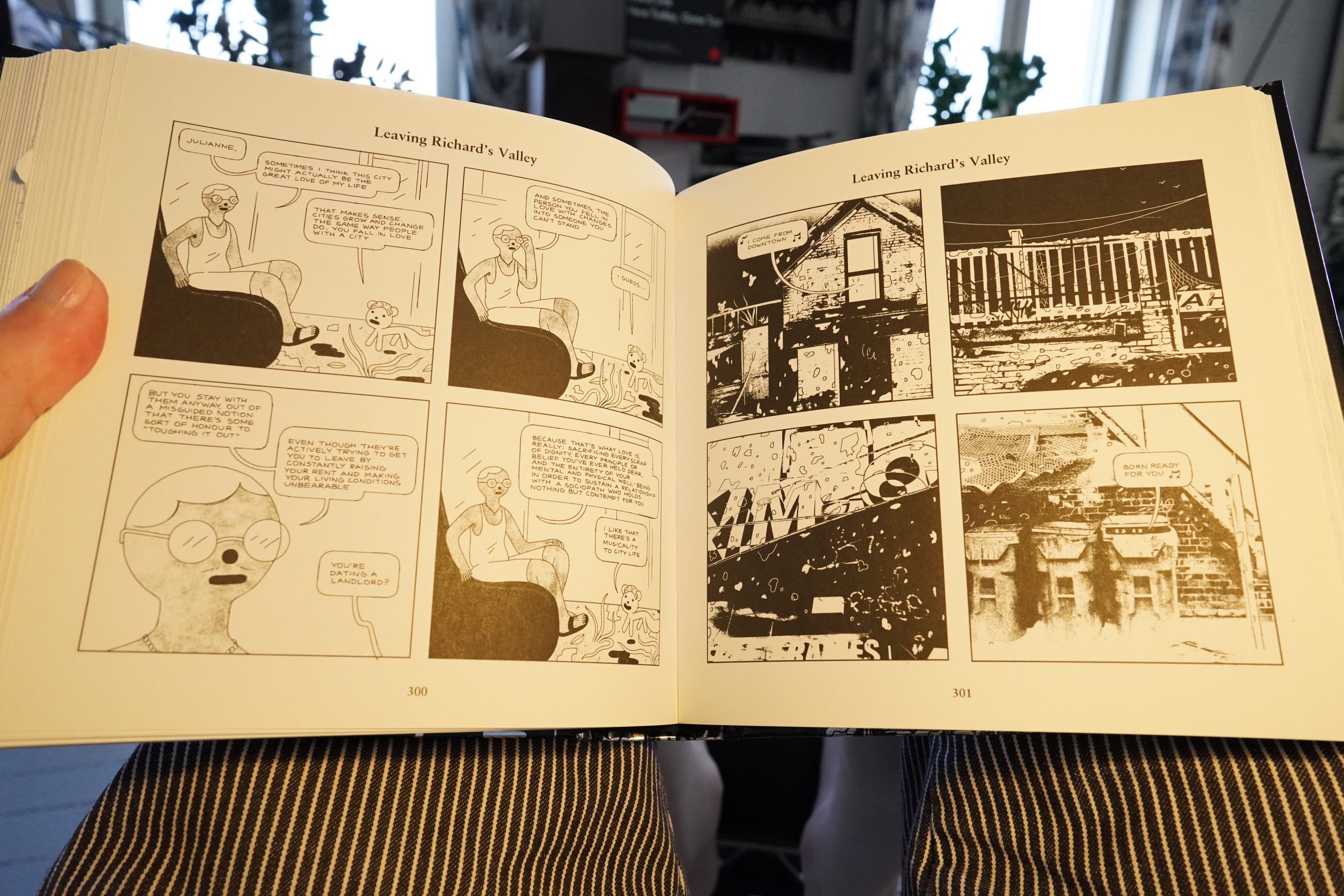
But after about 250 pages, Deforge seems to lose interest in the plot, and we just got random bits that aren’t really… interesting?

And he even stops drawing for a week.
It’s a mixed bag. There’s some good gags in here, and the story is actually pretty intriguing. It’s perhaps Deforge’s most easily-digested work? But there’s at least 100 pages too many here, before Deforge decides to end the story and adds about 30 pages that ties everything up neatly.
I’m surprised it didn’t land higher on the “best of” lists — only eight people listed it.
| David Bowie: Young Americans |  |

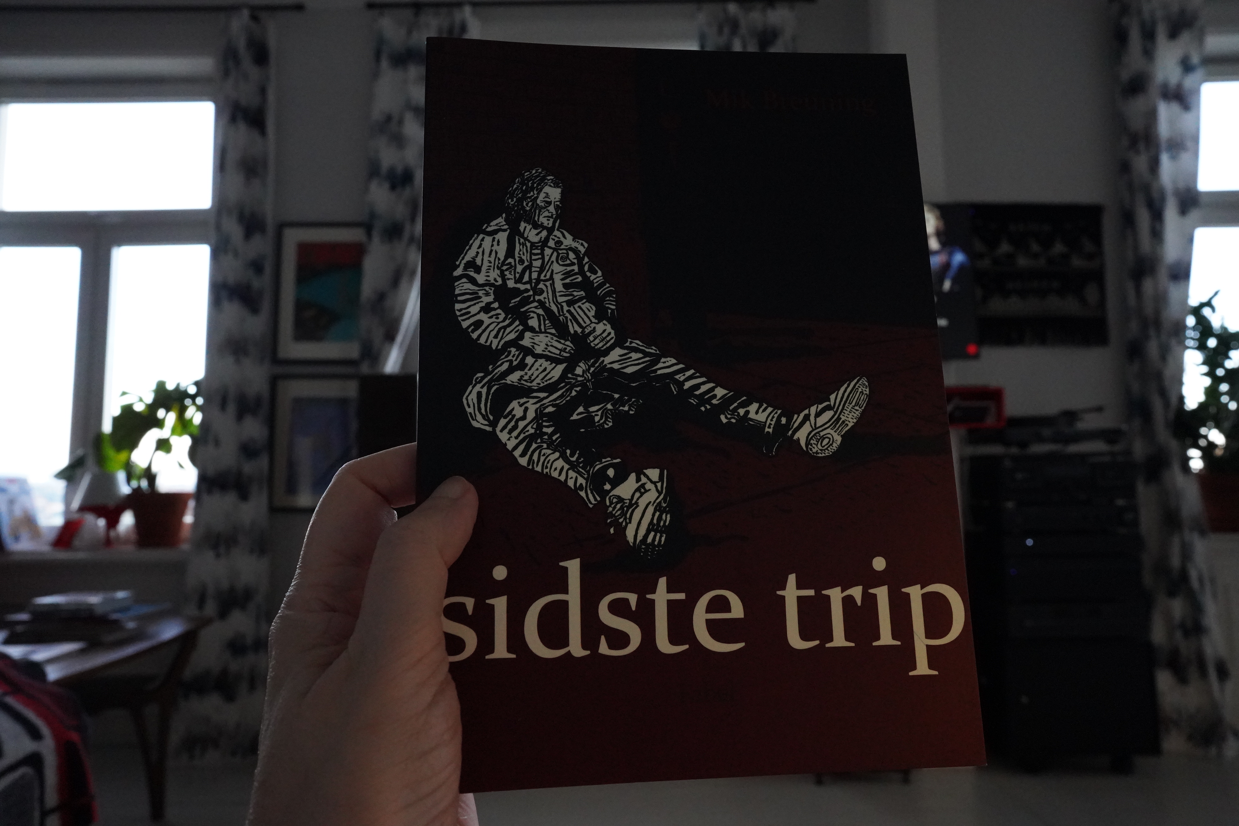
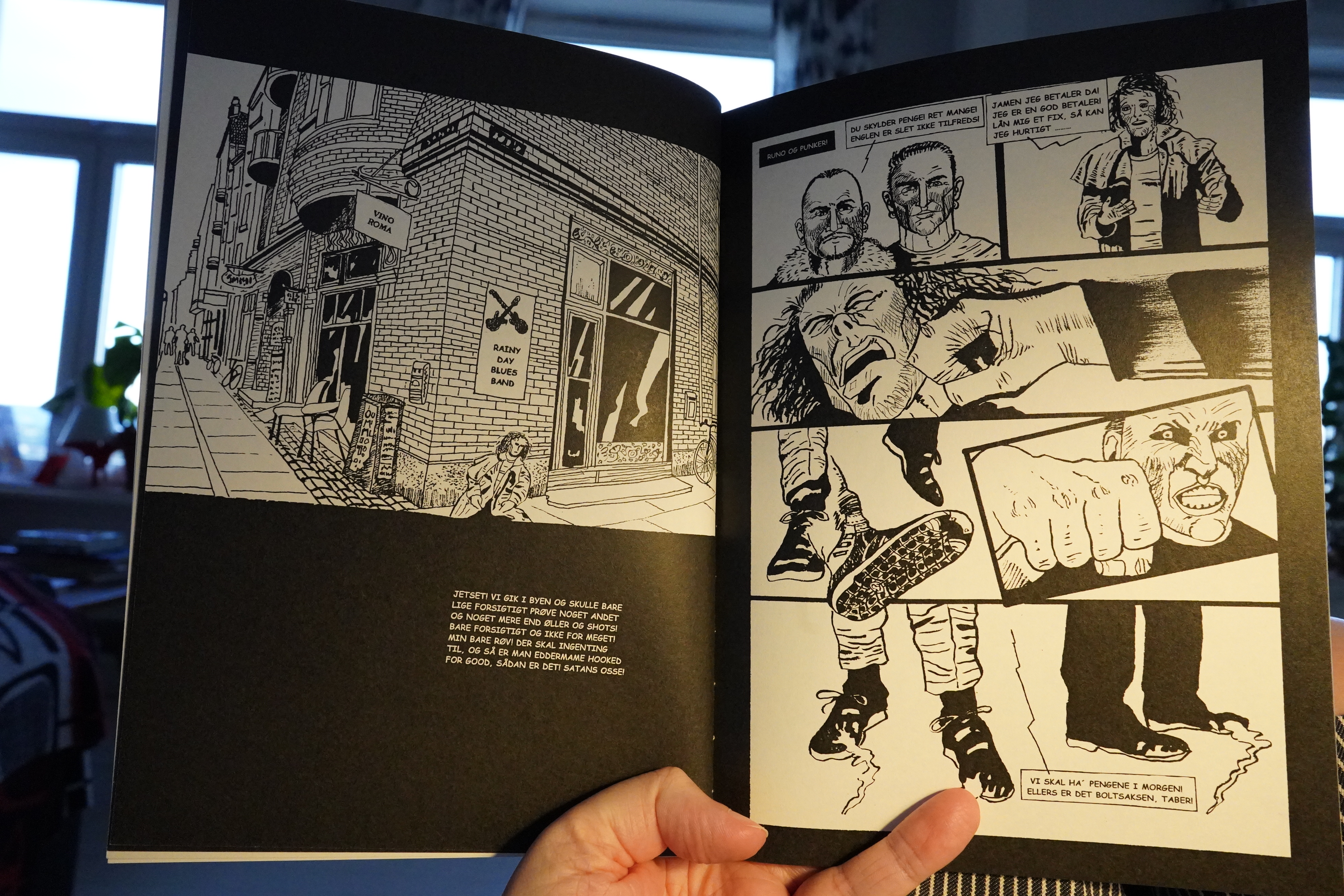
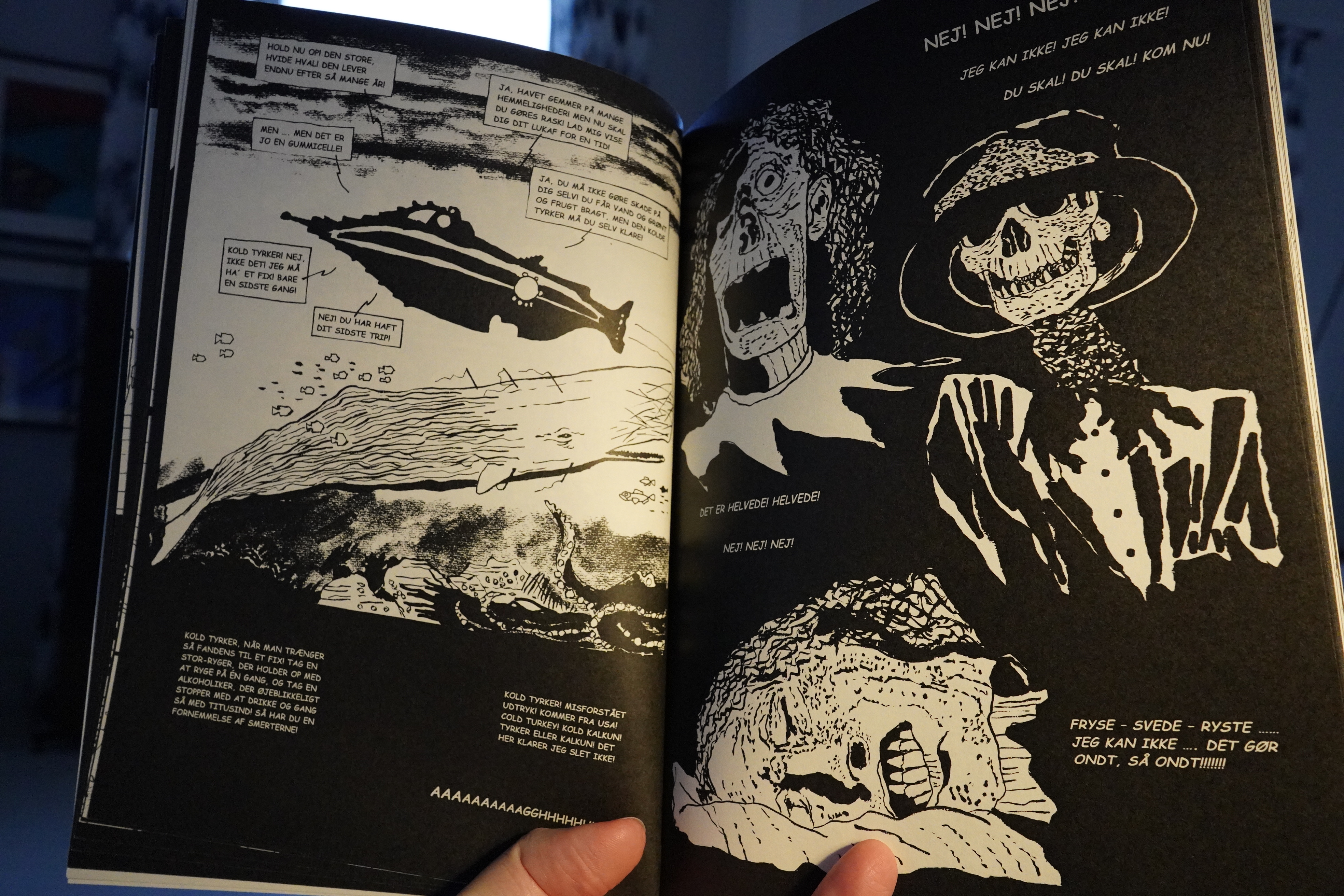
19:04: Sidste Trip by Mik Breuning (Fabel)

This is a Danish book about a guy dying…

Unfortunately, the O. Henry twist is so obvious that I was just really impatient with all the stuff.
| David Bowie: Young Americans |  |
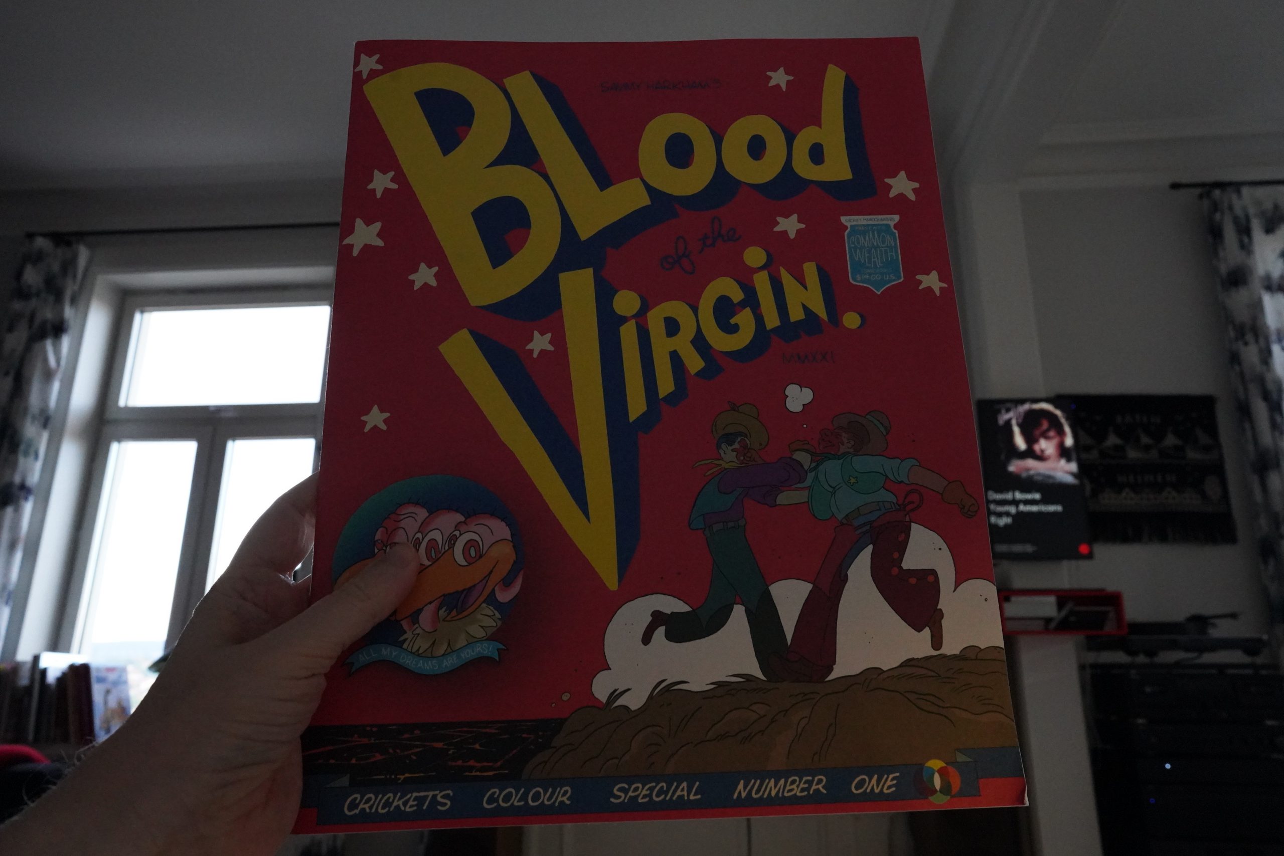
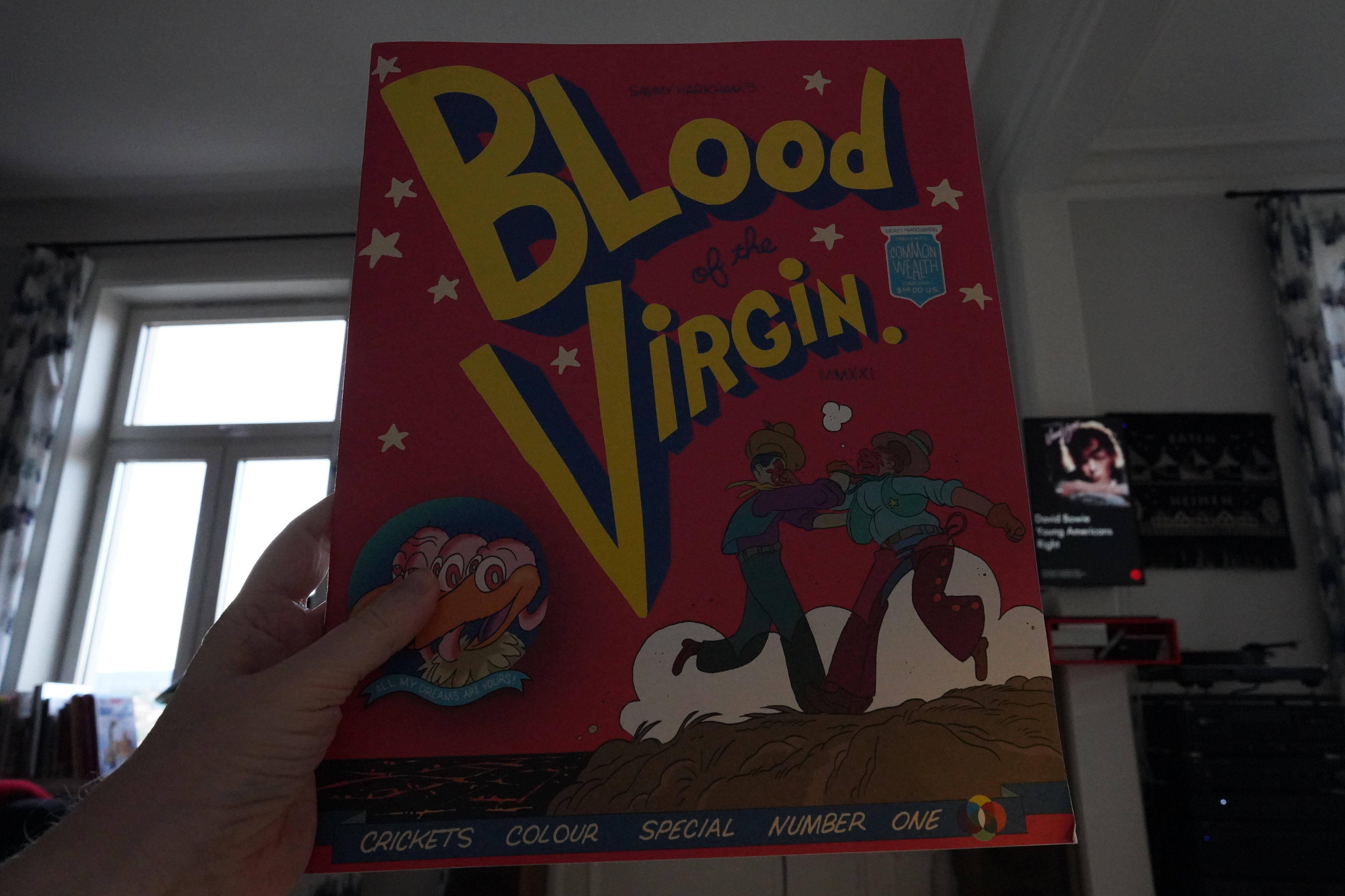
19:15: Blood of the Virgin by Sammy Harkham
This is a very large book.
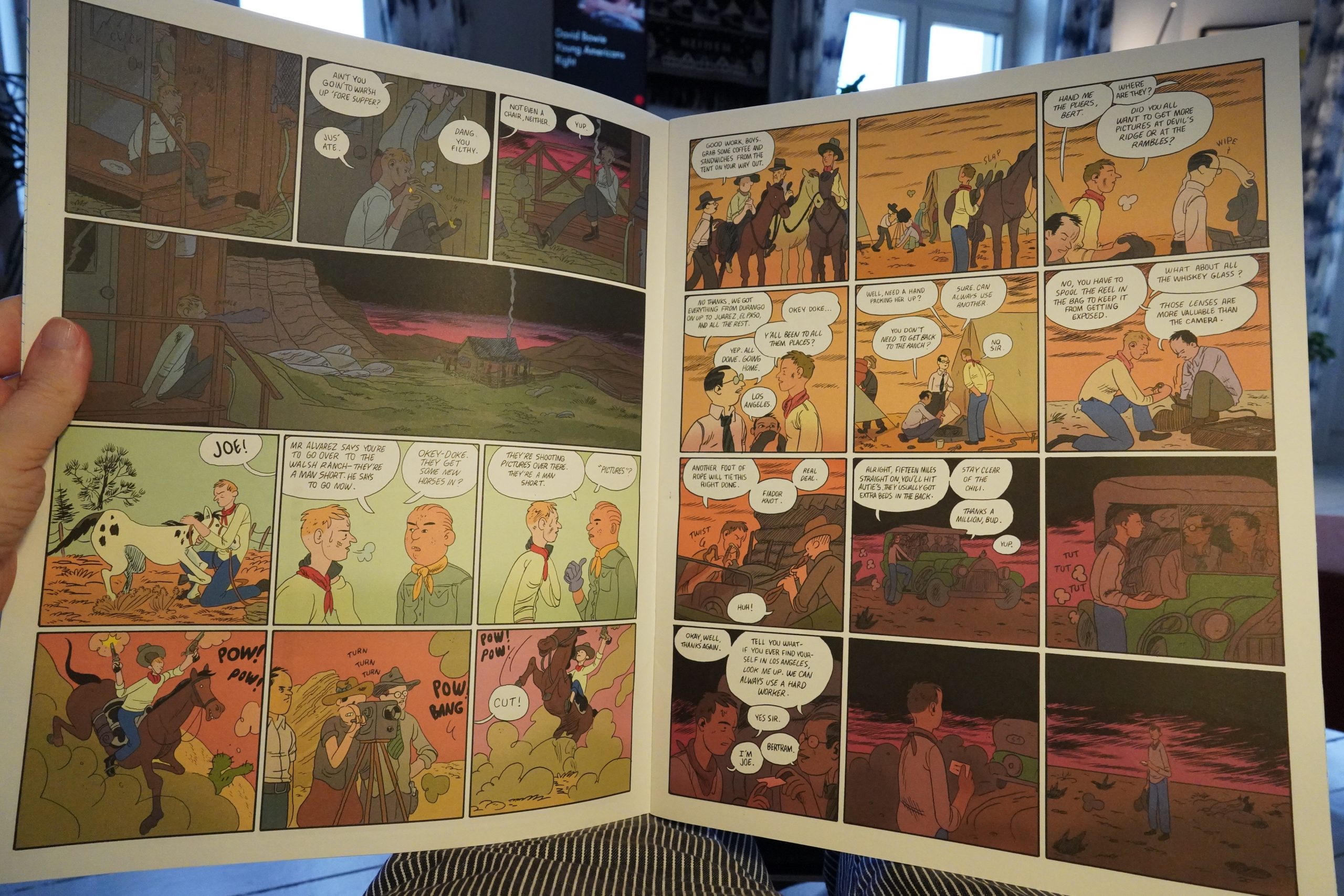
Oh, this is just a reprint of the story from Kramers Ergot #10. But larger.
It certainly looks really handsome in this edition.
The telegraphed way this story is told — everything is in shorthand — is cool, but it sometimes feels like I’m reading a recap of a Wikipedia article told by somebody with Old Timer’s Disease.
The storytelling feels very 2009, is what I’m saying — what Beto Hernandez was pioneering and perfecting in the 90s, but has been reduced to something less interesting a couple decades later.
| David Bowie: Young Americans |  |
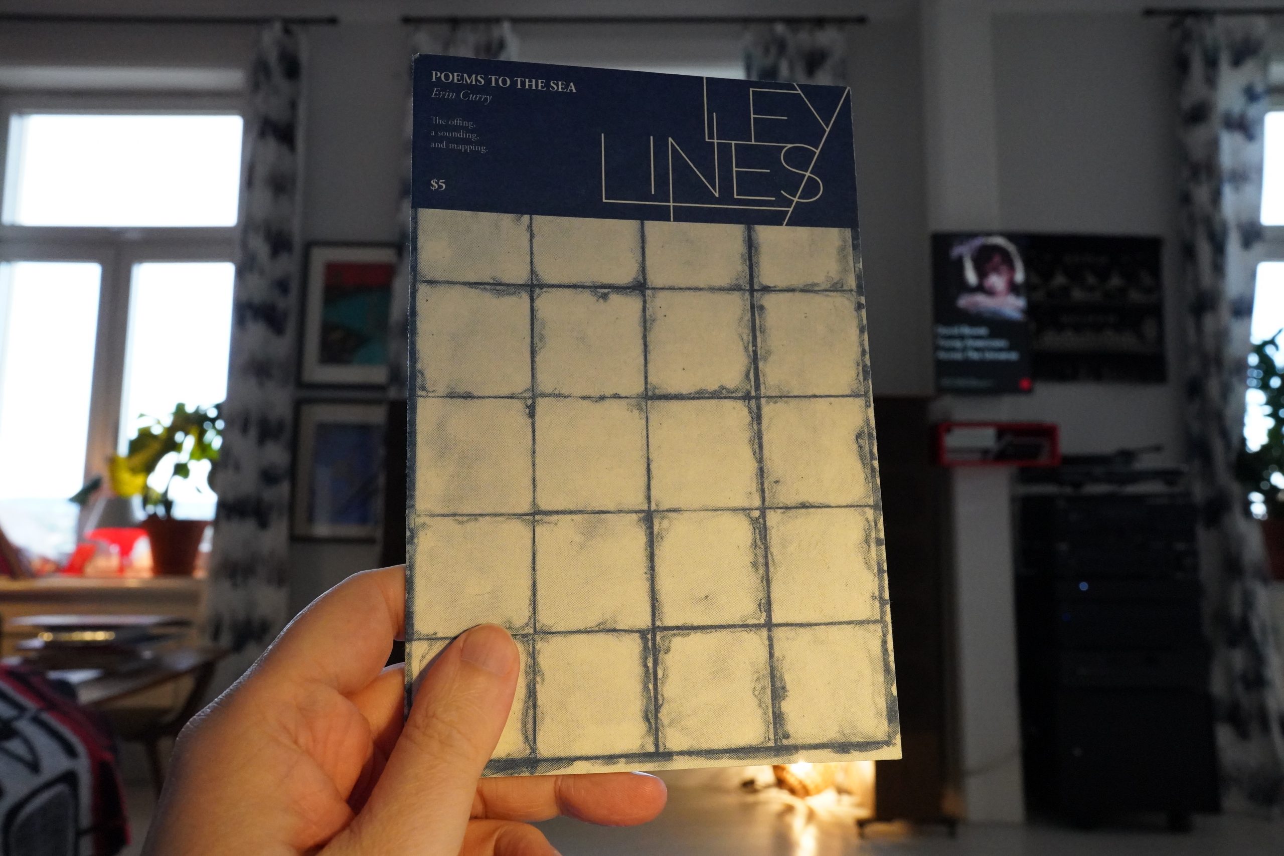
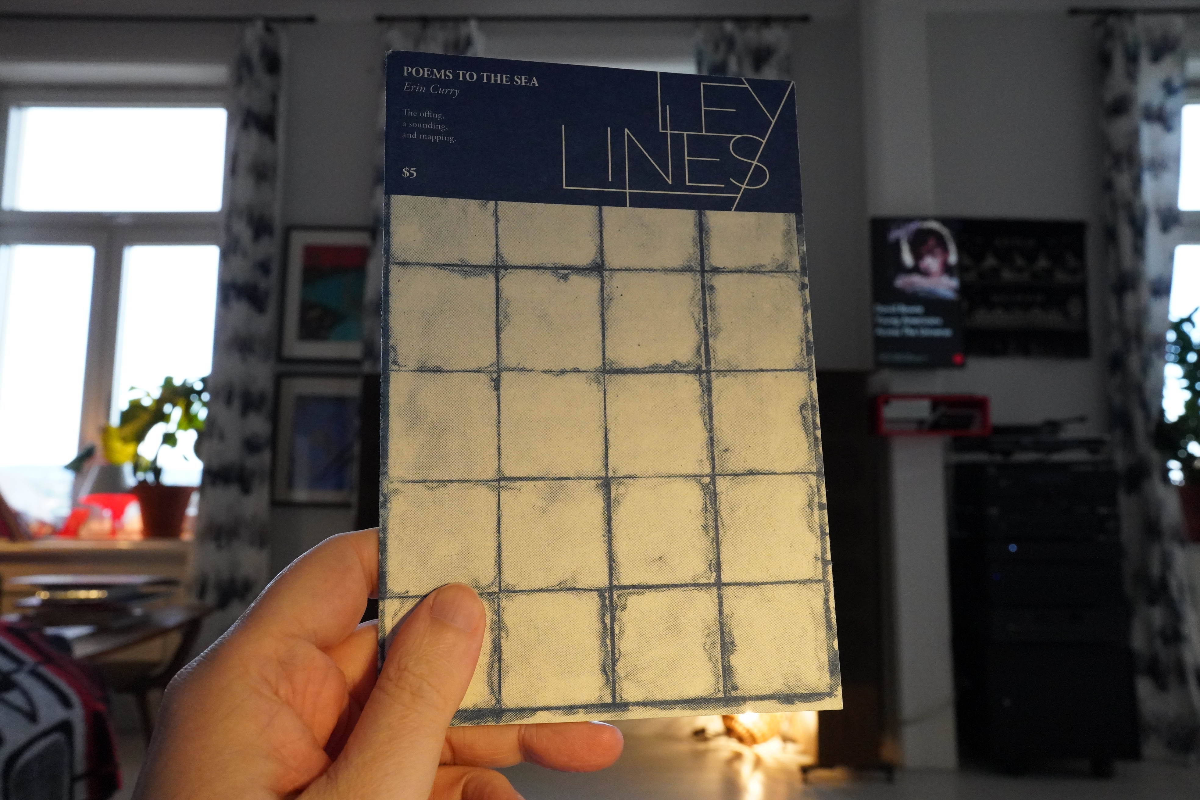
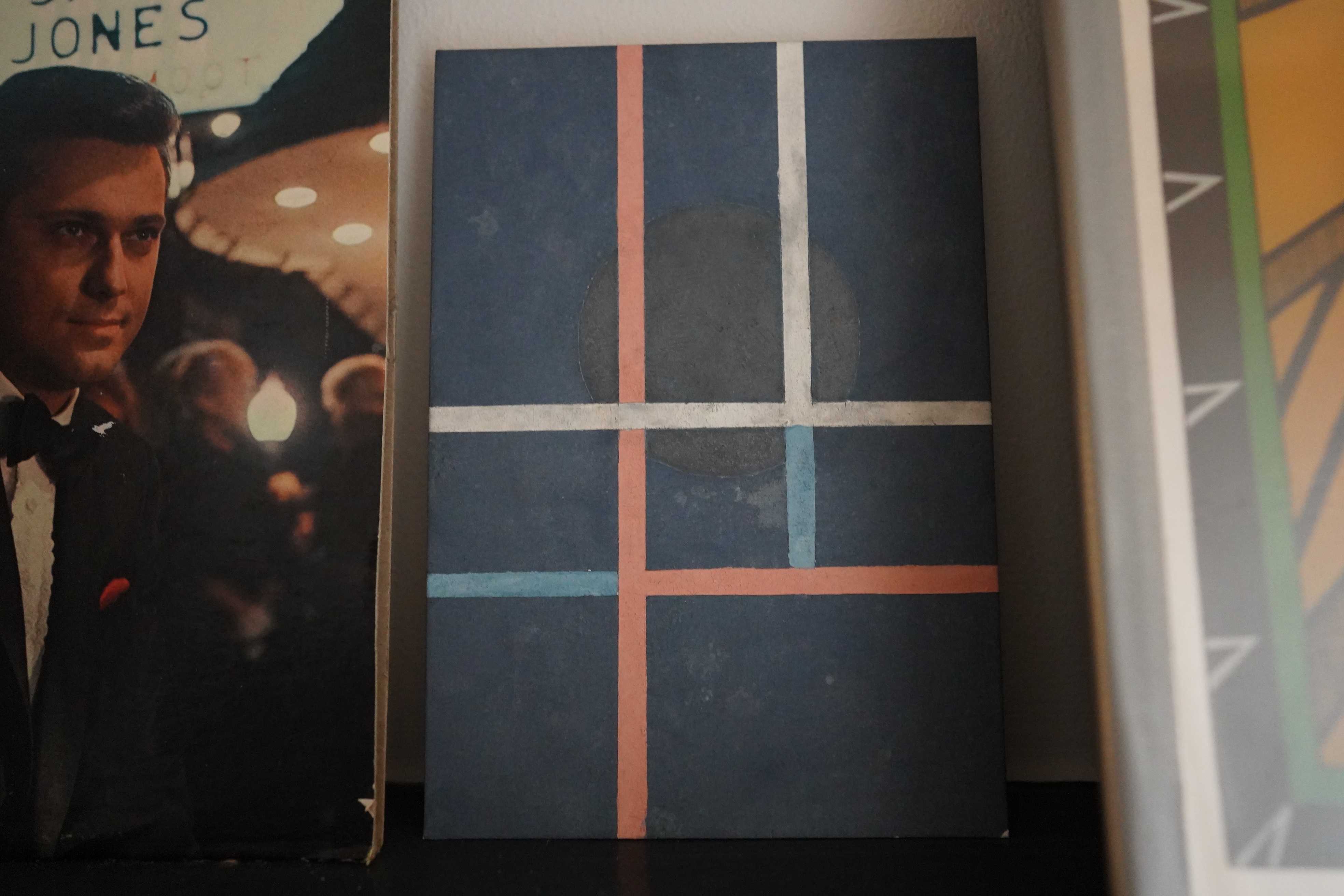
19:30: Ley Lines: Poems to the Sea by Erin Curry (Czap)
Oh, yeah, I also bought this little painting from Curry at the same time:

Nice.
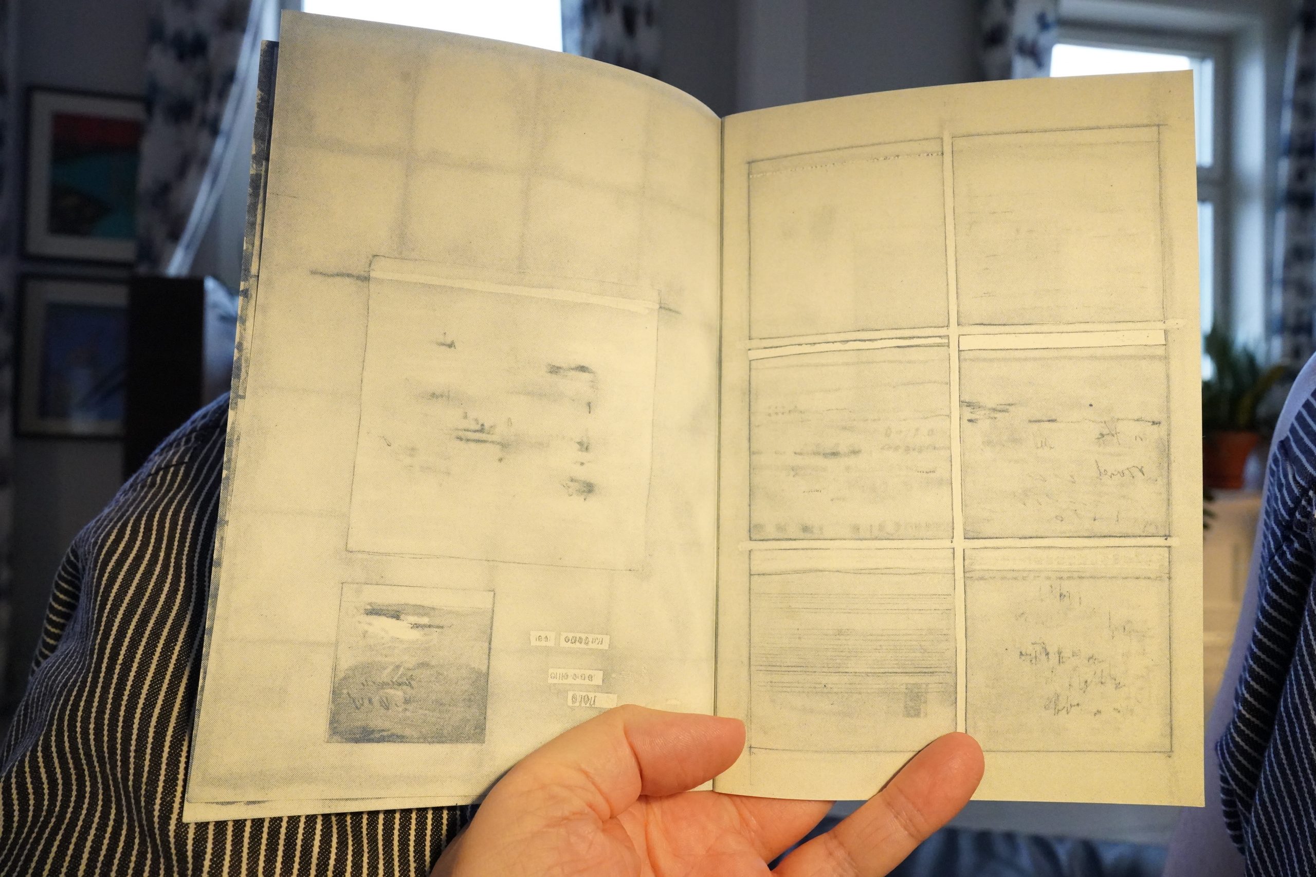
And this is a really cool little book.

Very soothing.
| David Bowie: Station To Station (1) |  |

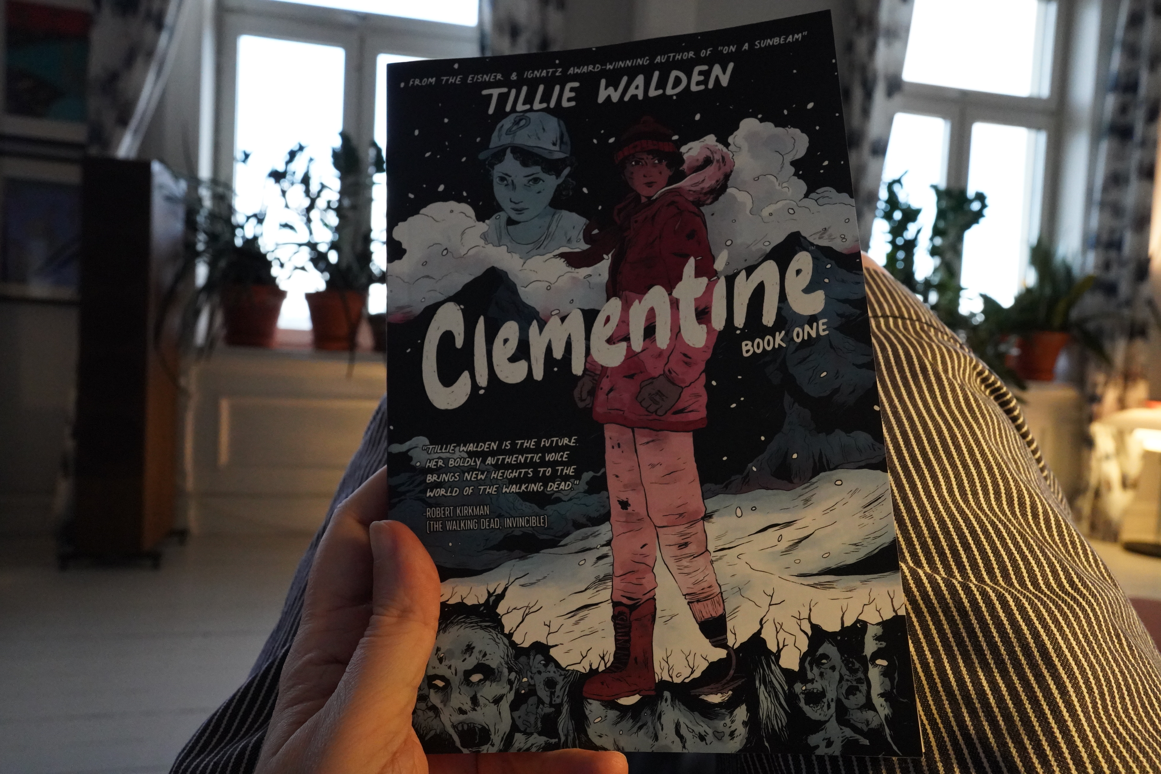
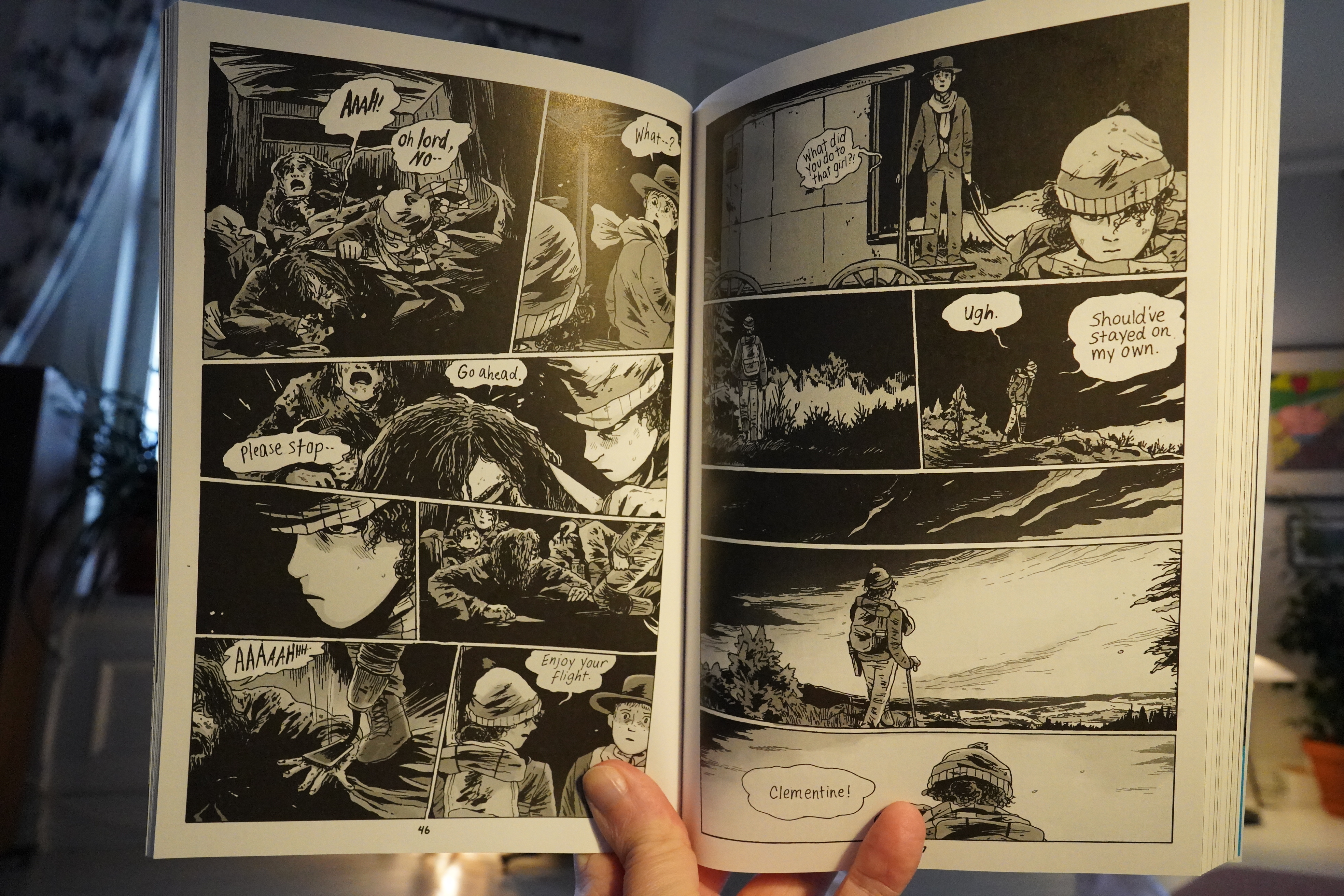
19:38: Clementine Book One by Tillie Walden (Image Comics)
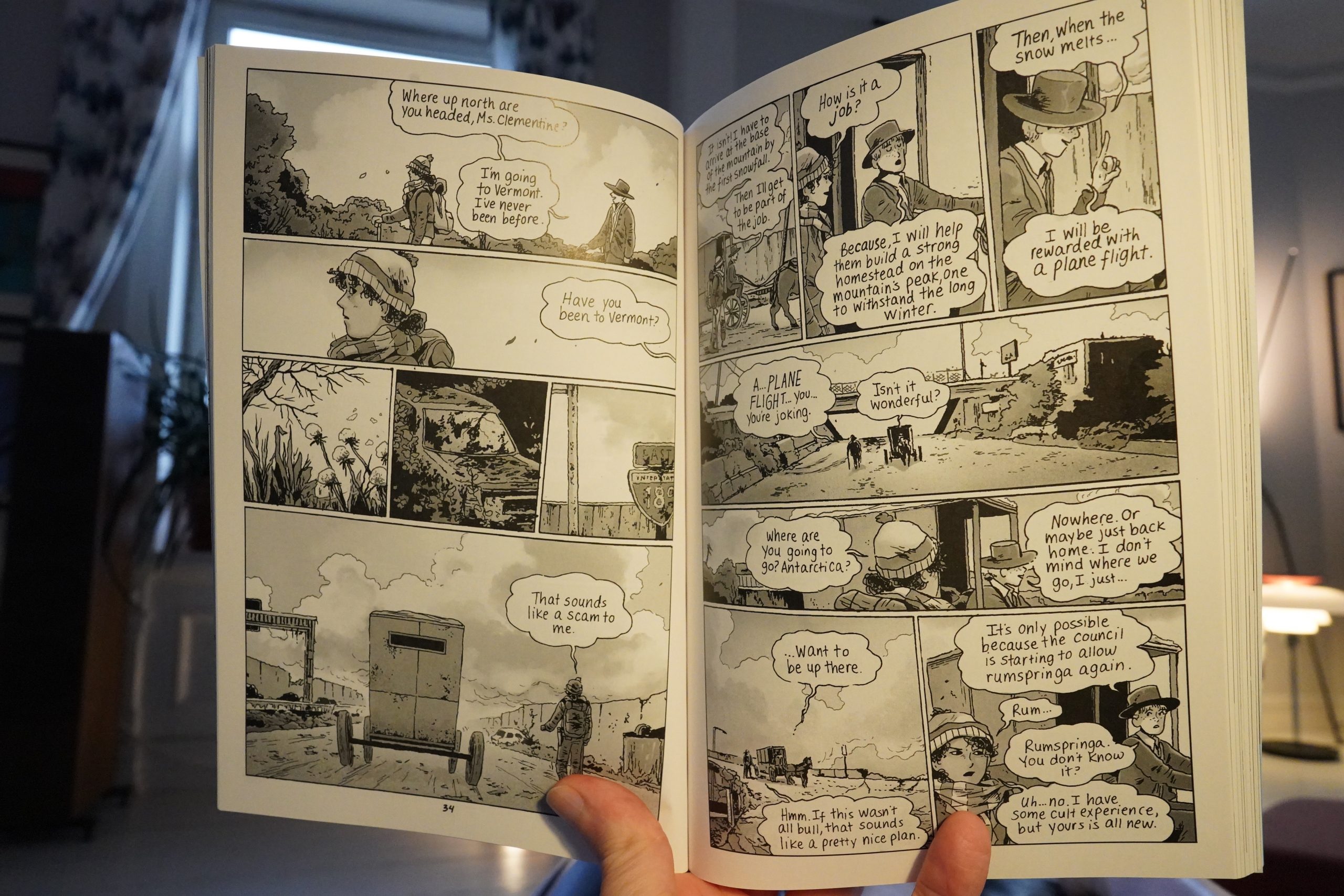
Oh, this is a spin-off from The Walking Dead? Geez. I have zero interest in reading a zombie comic book — I assumed that this was just another normal Tillie Walden book. I’ve quite enjoyed her previous books.
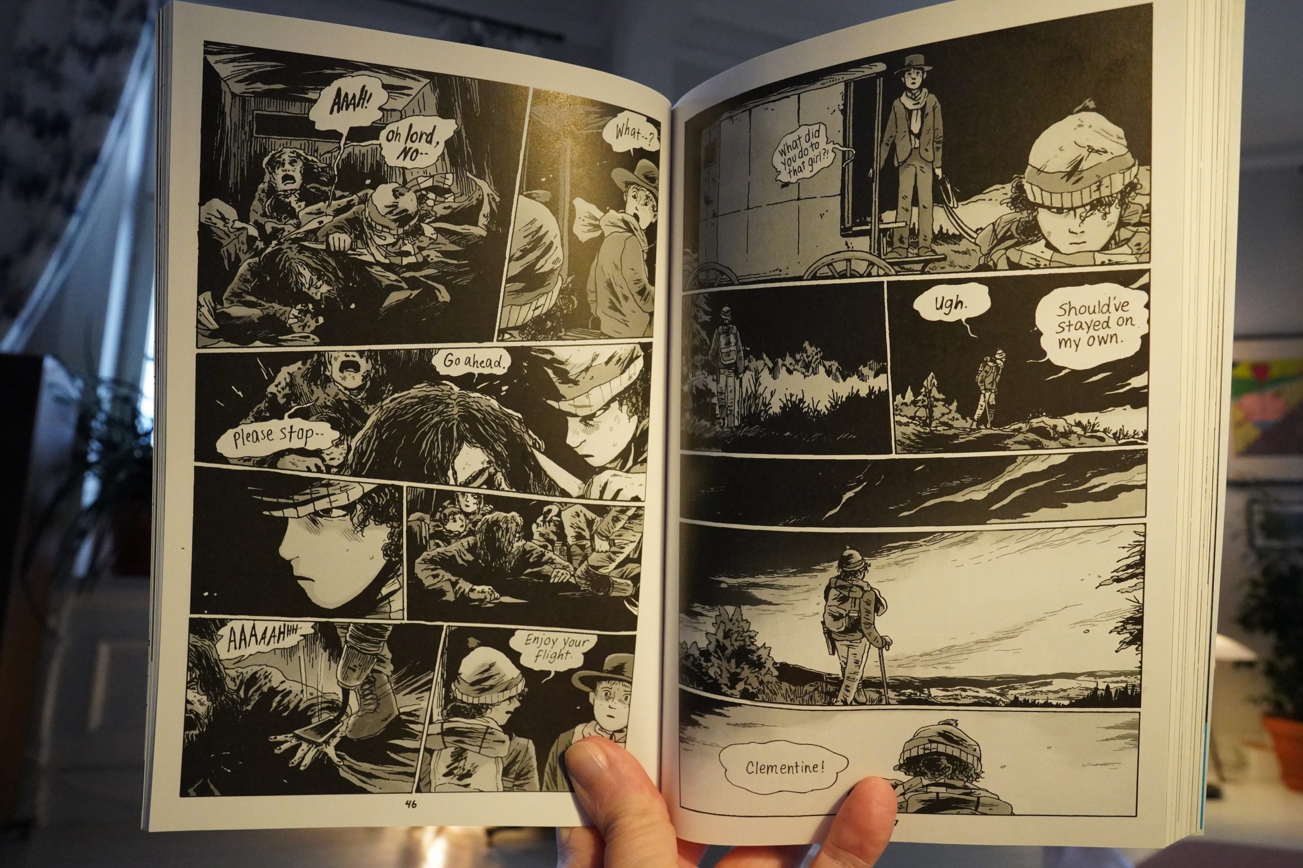
This feels pretty phoned in. It’s often just hard to say what’s happening on a panel to panel basis, and it doesn’t feel like that’s on purpose.
I was ready to ditch this after fifty pages, but I wanted to see how bad it could get, and the answer is: Very bad. All the plot points are basically like this one: People withholding information for absolutely no other reason but that that’ll allow the author to spring a surprise on the reader later.
It’s a really bad book. But I hope the gig pays well, so that we can get some more proper Walden books soon.
| David Bowie: Low |  |

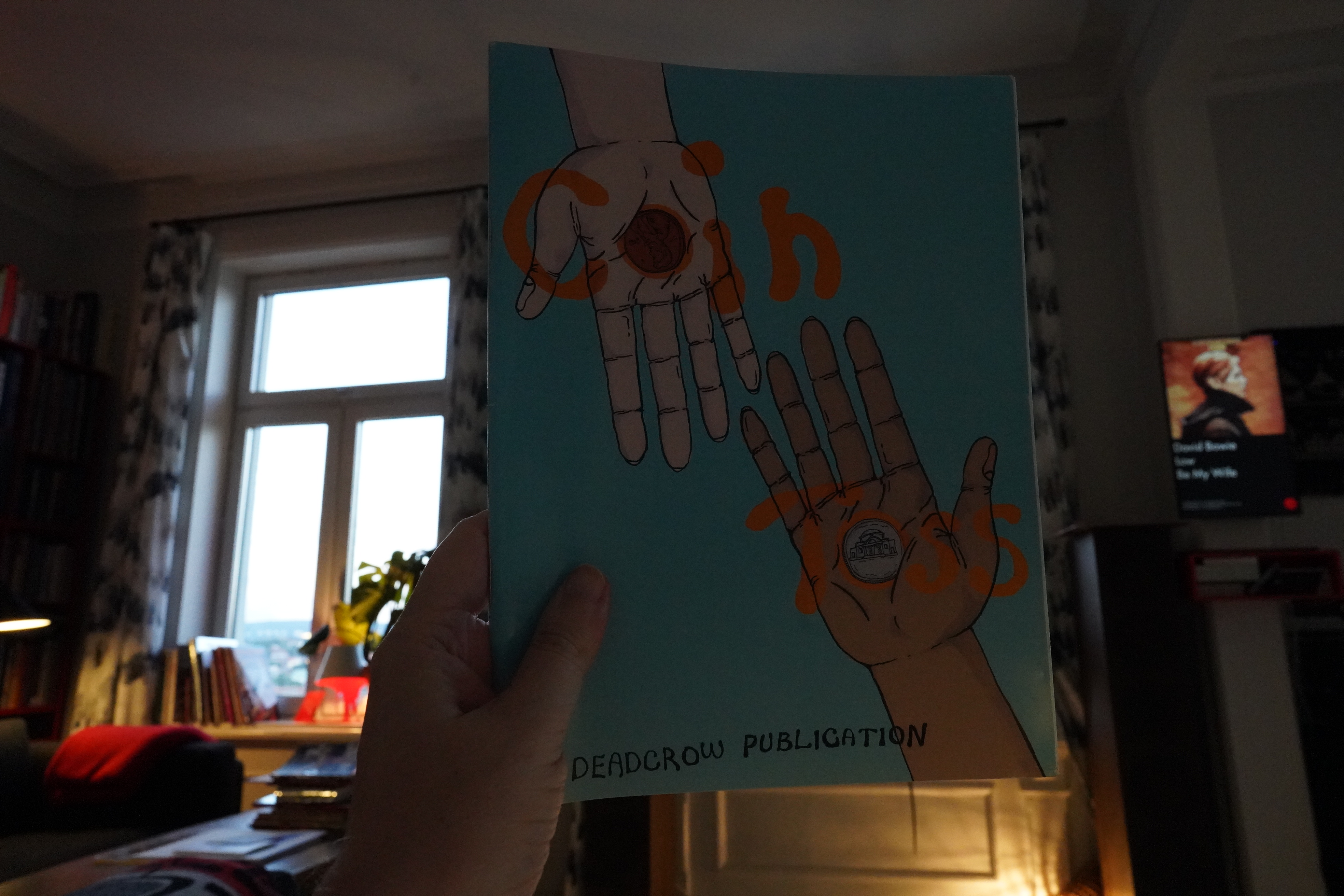
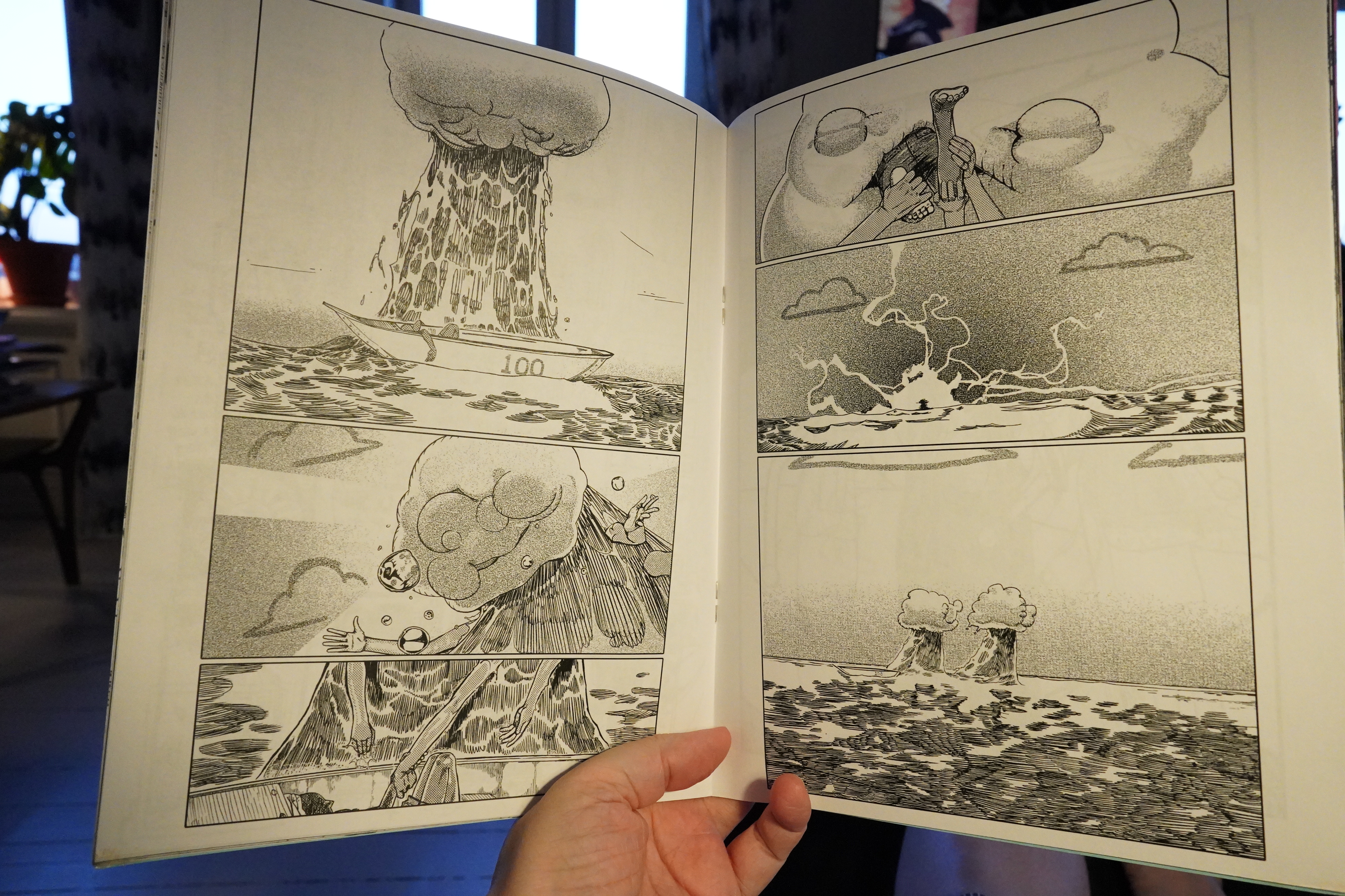
20:41: Coin Toss by Chaia (Deadcrow)
Another cool anthology from Deadcrow… this is more illustration-oriented than Cowlick.
But there’s some bits that tend towards narrative.
It’s good.
| David Bowie: “Heroes” |  |
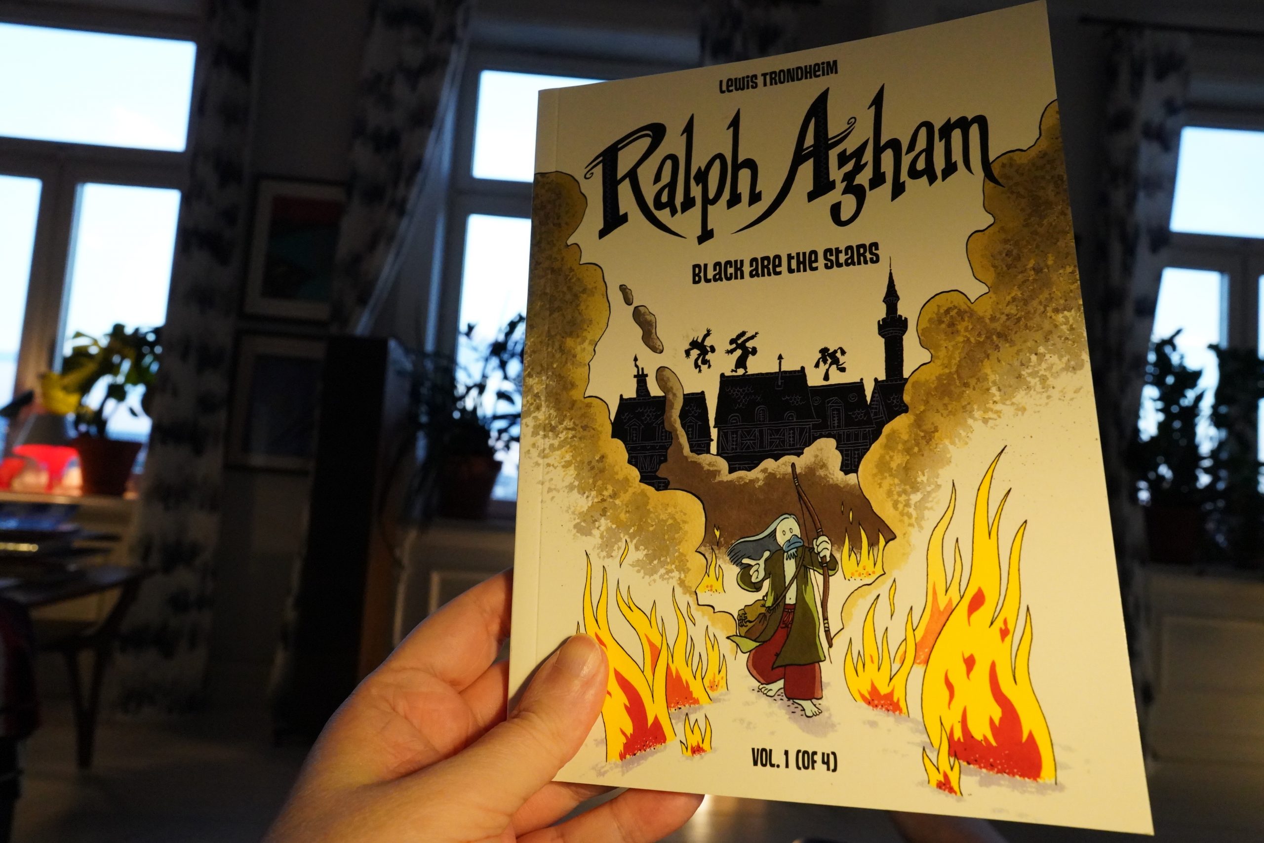
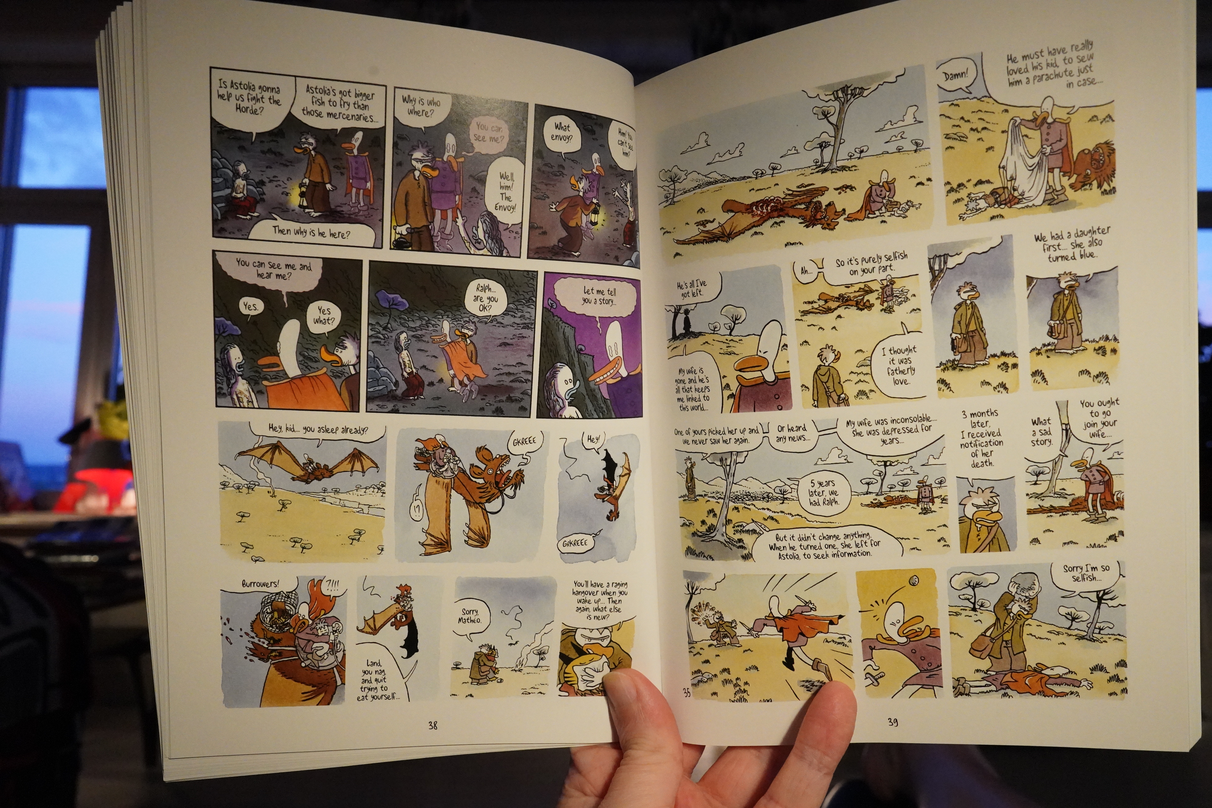
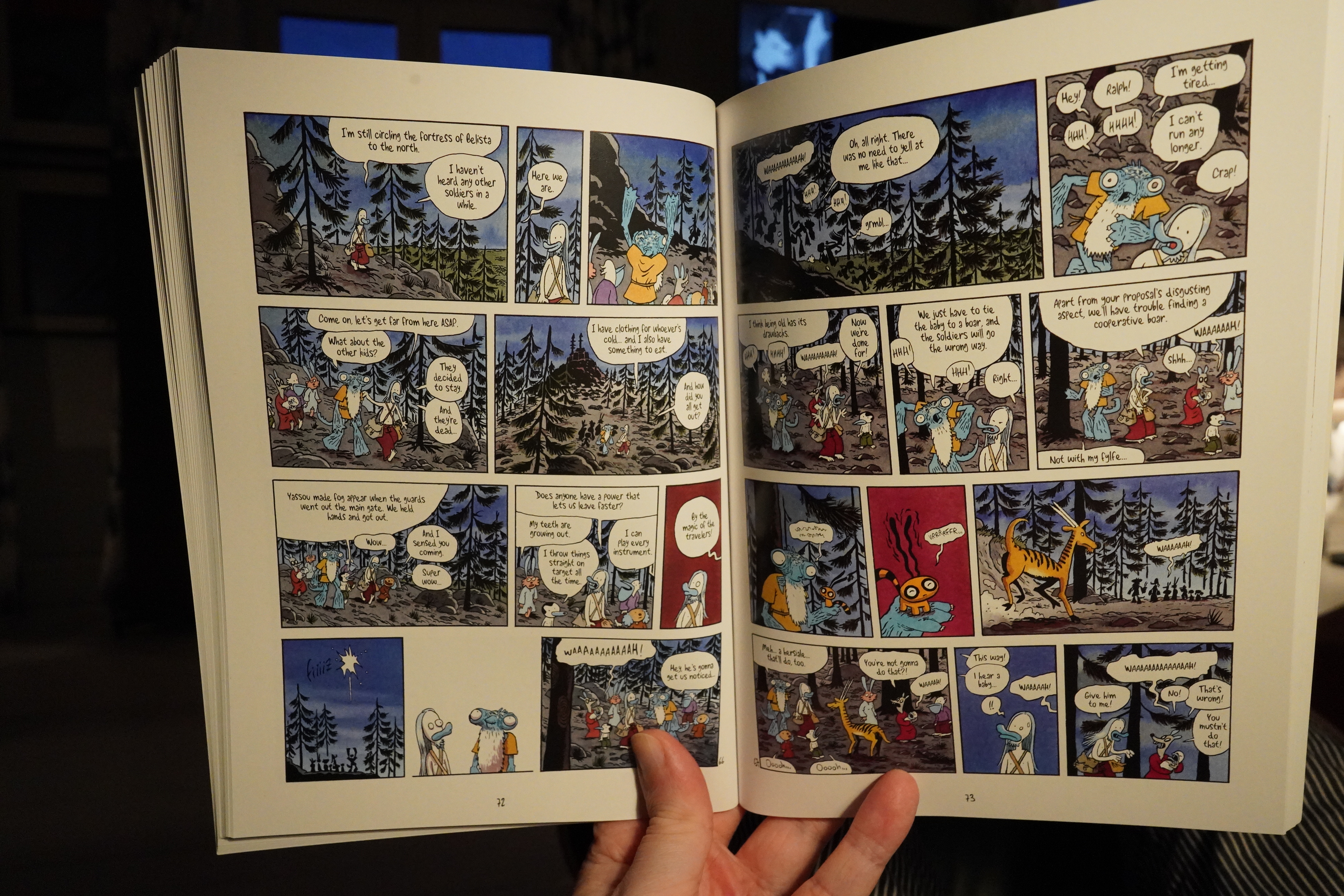
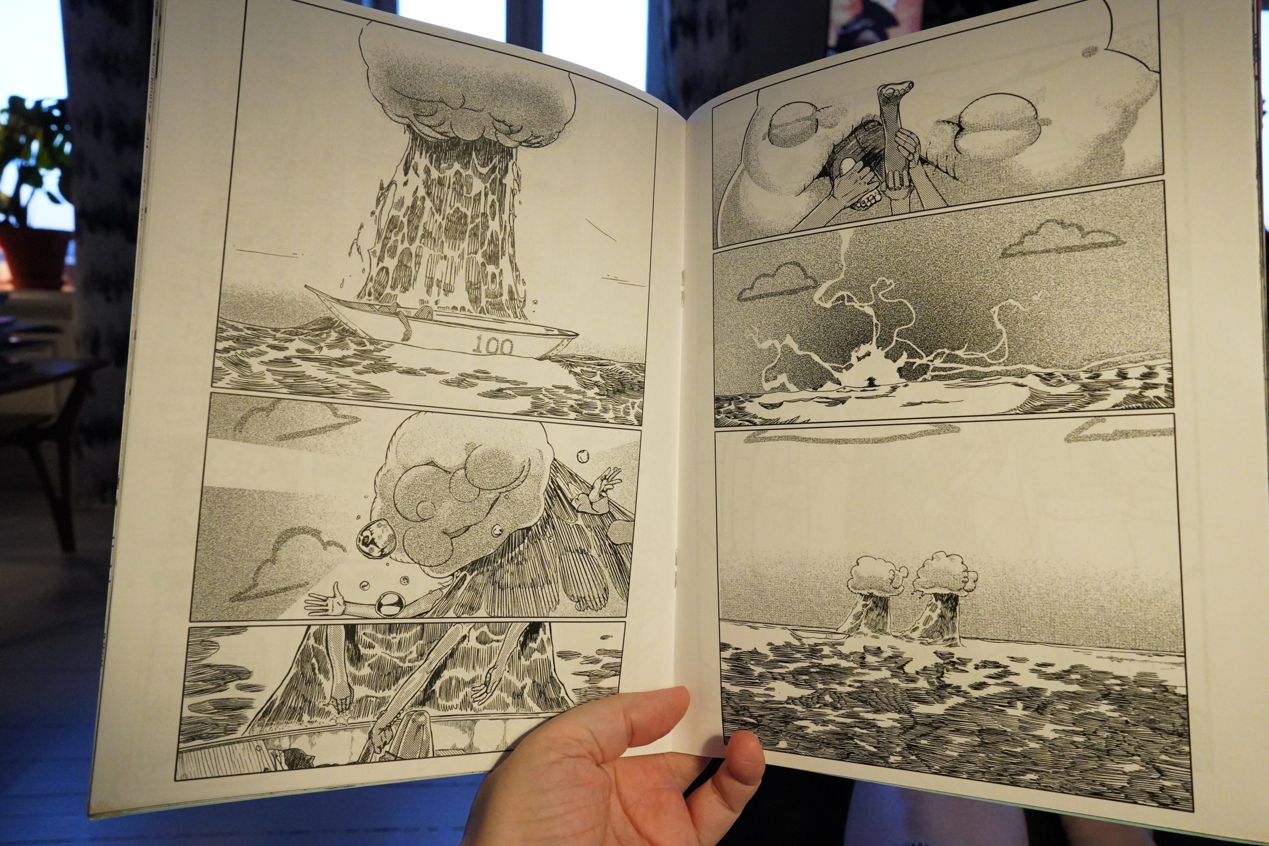
20:47: Ralph Azham: Black are the Stars by Lewis Trondheim (Super Genius)
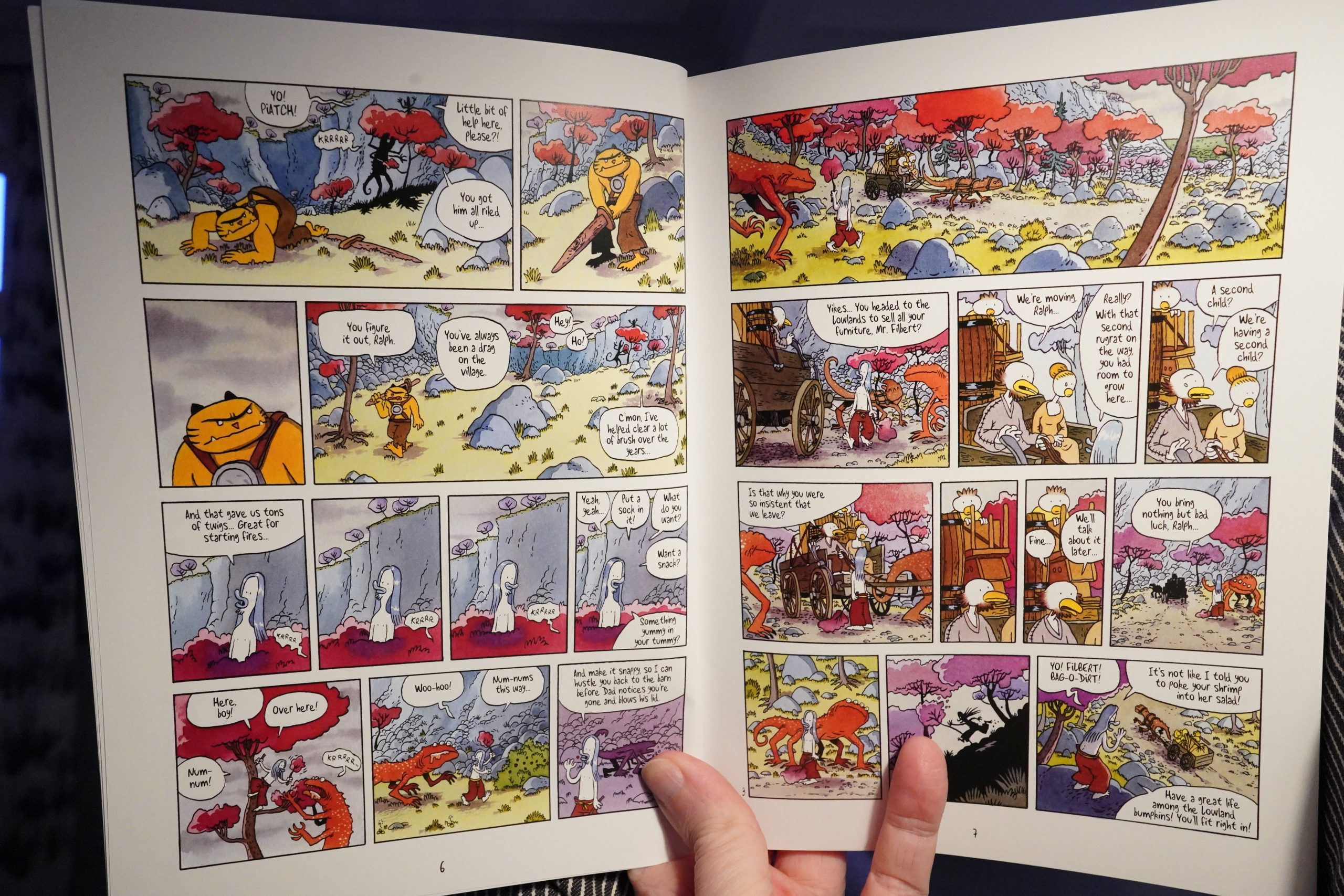
Uhm… this was obviously meant to be printed in the normal European album format. But they’ve shrunk it way down here, and it’s just uncomfortable to read. Trondheim’s pages are busy, and he draws using a quite thin line, so it just looks weird like this.
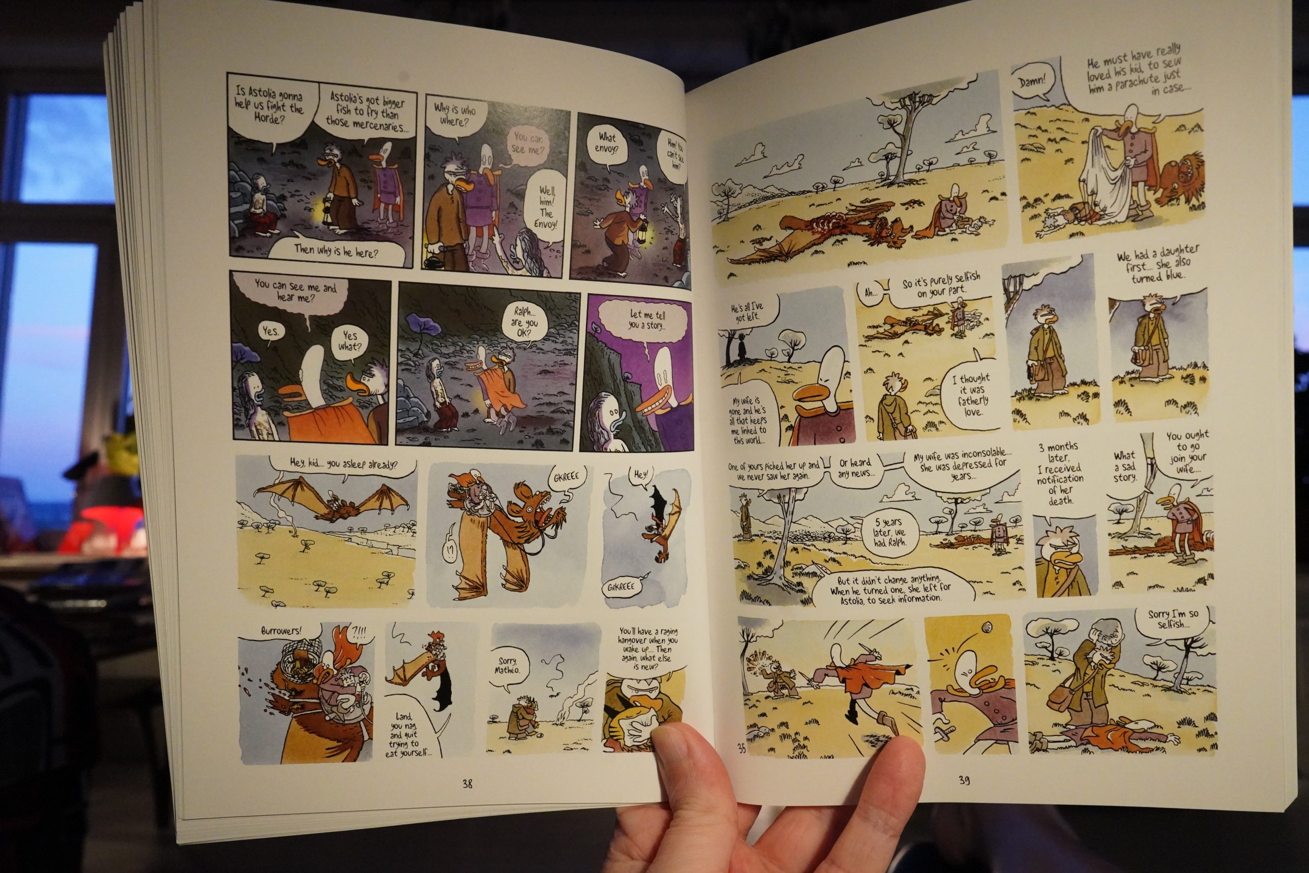
But whatevs. This collects three albums, and it’s a lot of fun.

Although it’s a prime example of one unfortunate Trondheim plotting tic — he kills off so many characters, and some as just a gag, that it’s exhausting: You can’t really invest in a character as a reader when you expect that they’ll be killed off within a couple of pages.
| David Bowie: Welcome to the Blackout (Live London ’78) (1) |  |
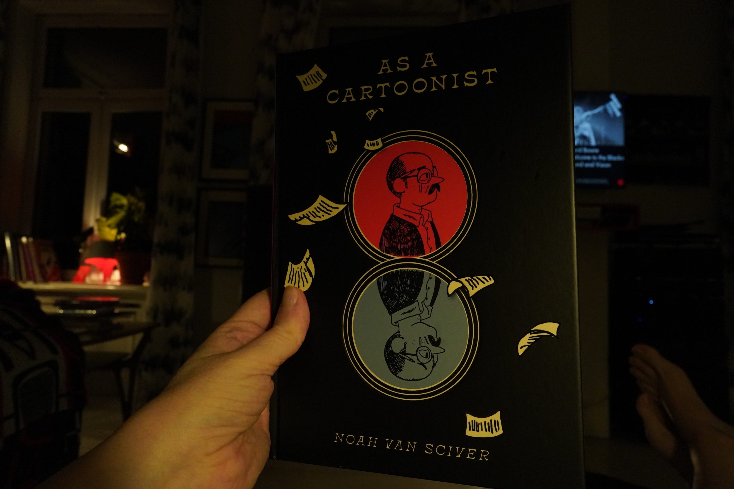
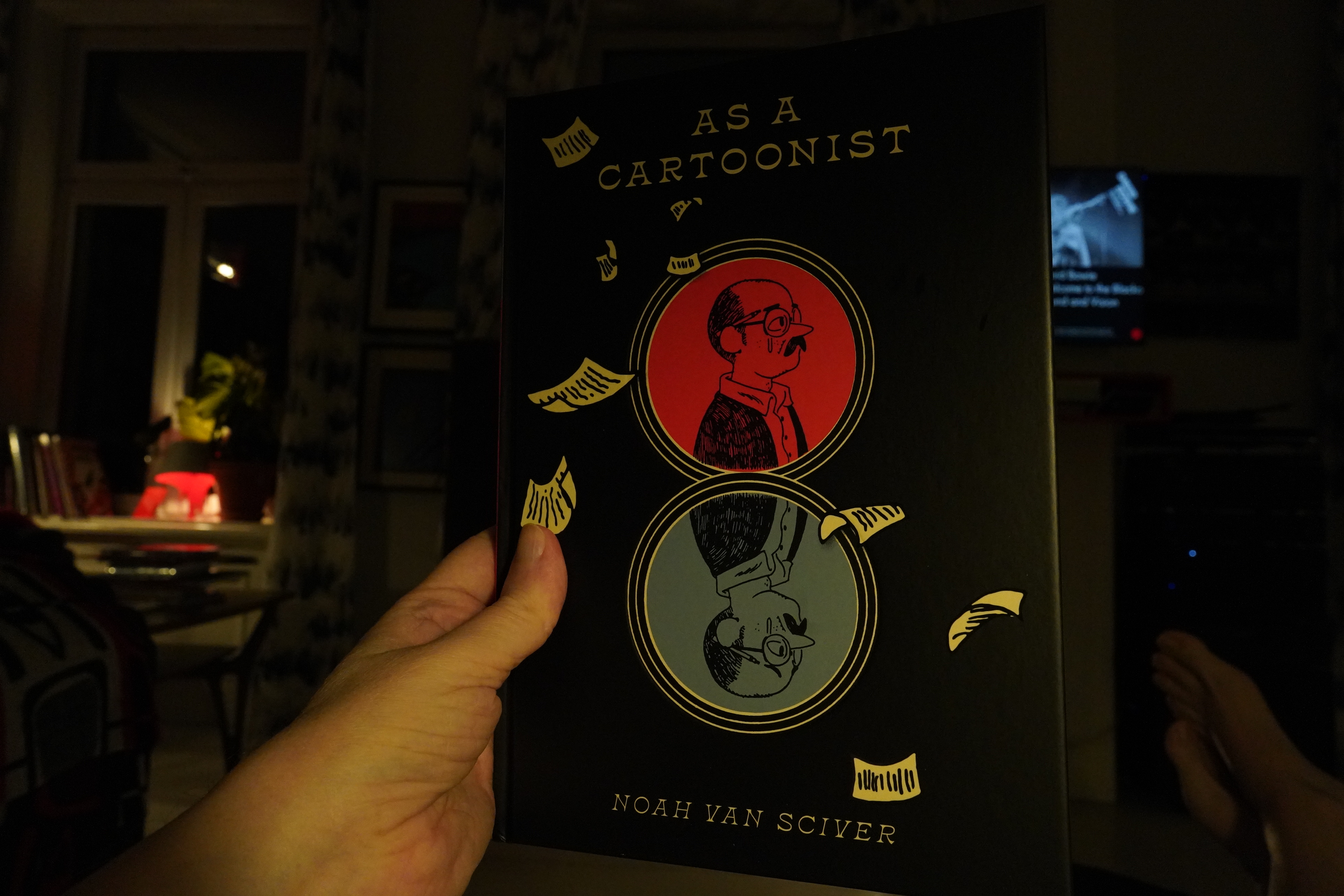
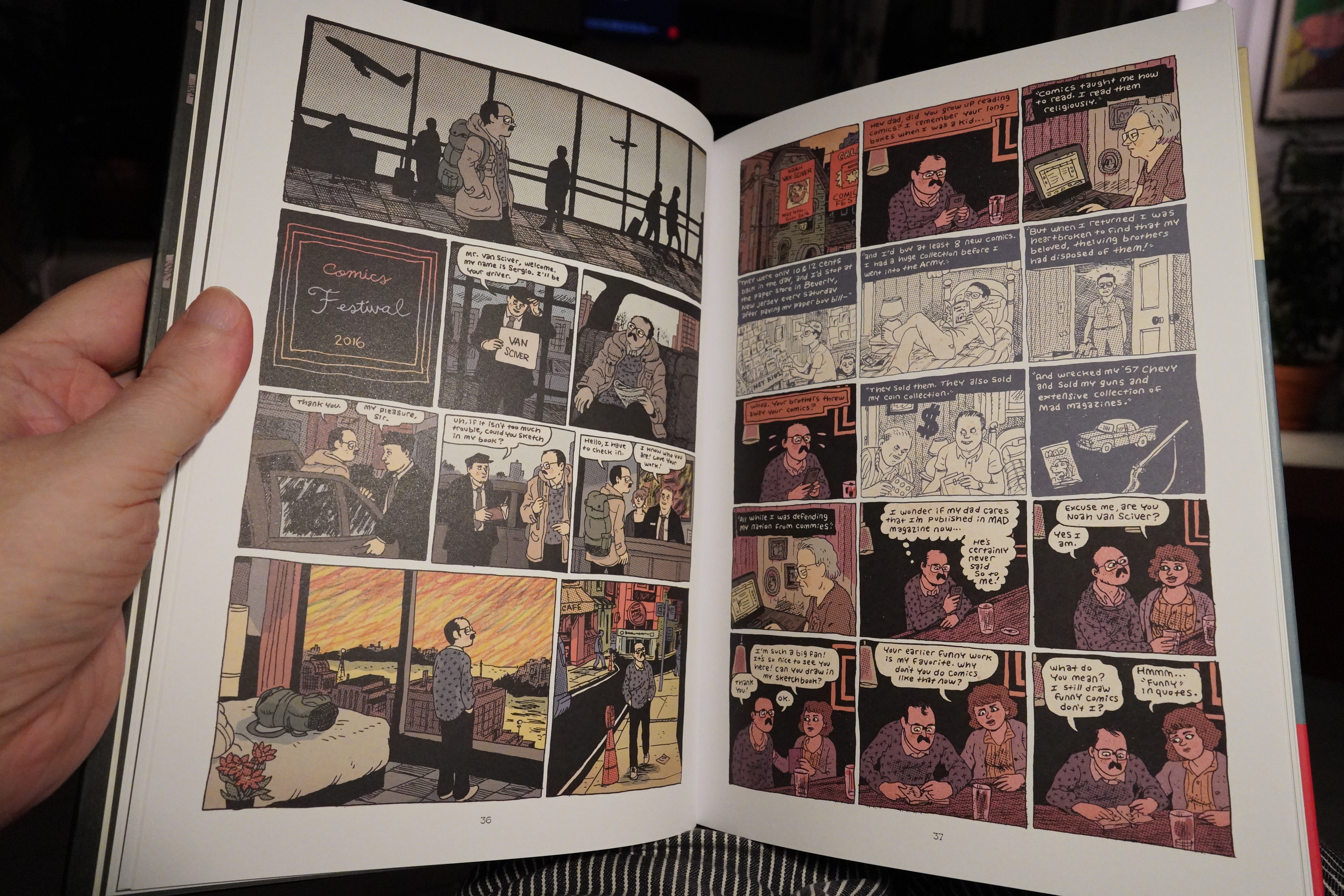
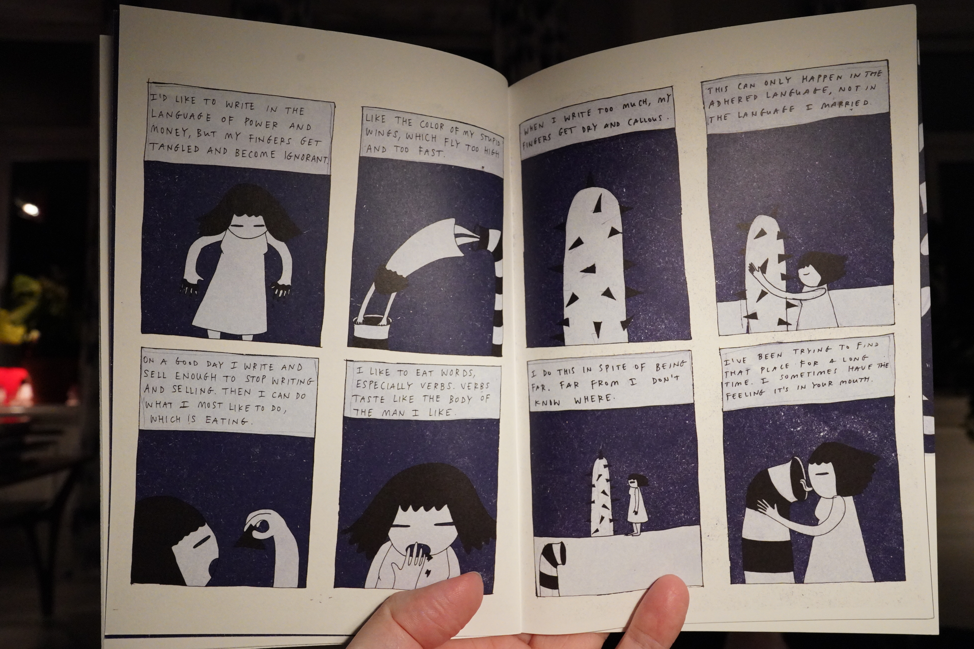
22:15: As A Cartoonist by Noah van Sciver (Fantagraphics)
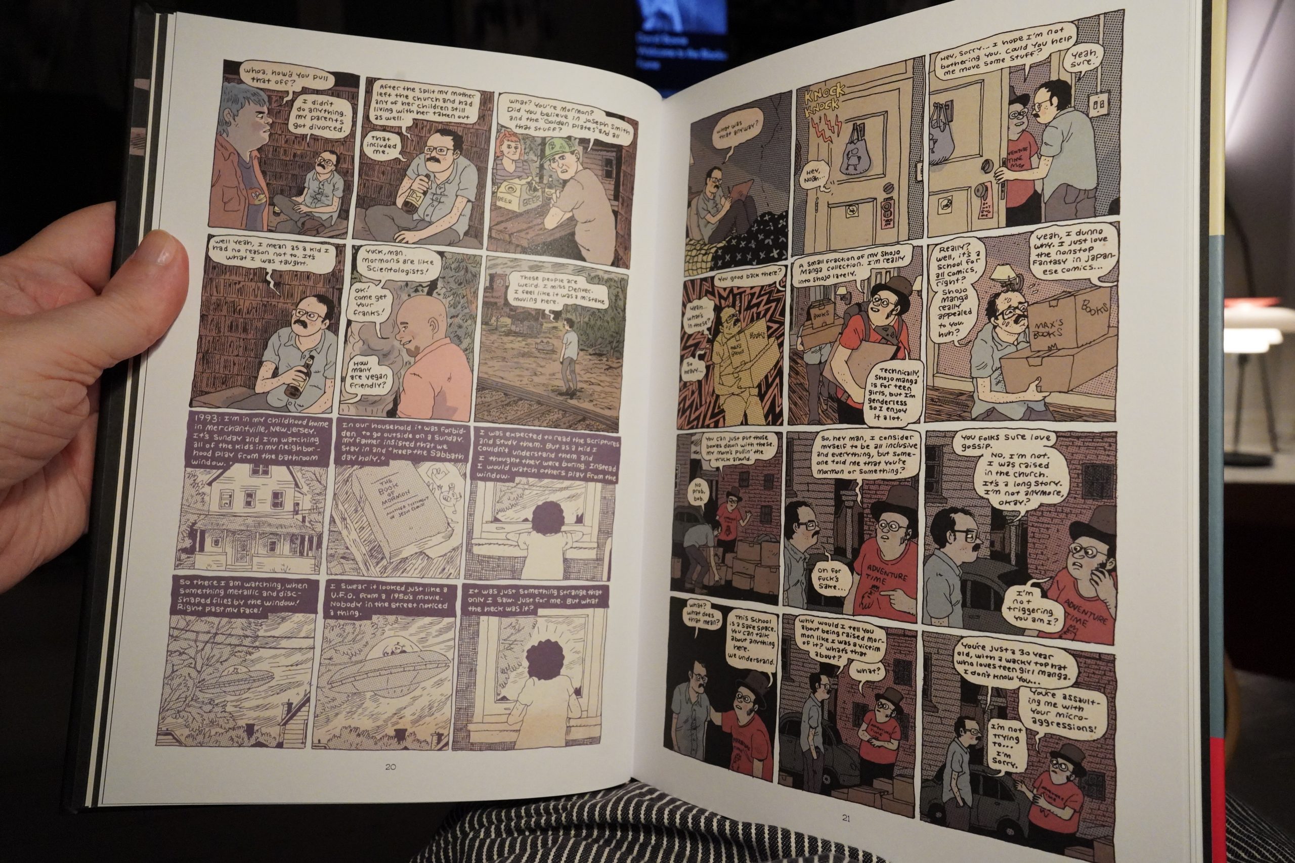
This is a collection of stuff mostly from the past half decade, some published in Now, Blammo, etc, and some never published before.

And it’s flabbergastingly good. I mean, Van Sciver’s always been good, and perhaps these pieces aren’t miles ahead of what he’s always been doing, but the sequencing and selection is just perfect. After finishing the book, I feel like I’ve read a graphic novel, not a collection of random pieces. It’s like… it’s like that Outline novel by Rachel Cusk? There we get a whole bunch of stories from other people, but in effect we get the outline of the missing bit (which is the protagonist). This is like we get an outline of a graphic novel that isn’t there.
OK, that didn’t make sense in the slightest, but I’ve been reading comics for hours now — give me a break.
Anyway. Van Sciver’s best book so far.
| David Bowie: Welcome to the Blackout (Live London ’78) (2) |  |
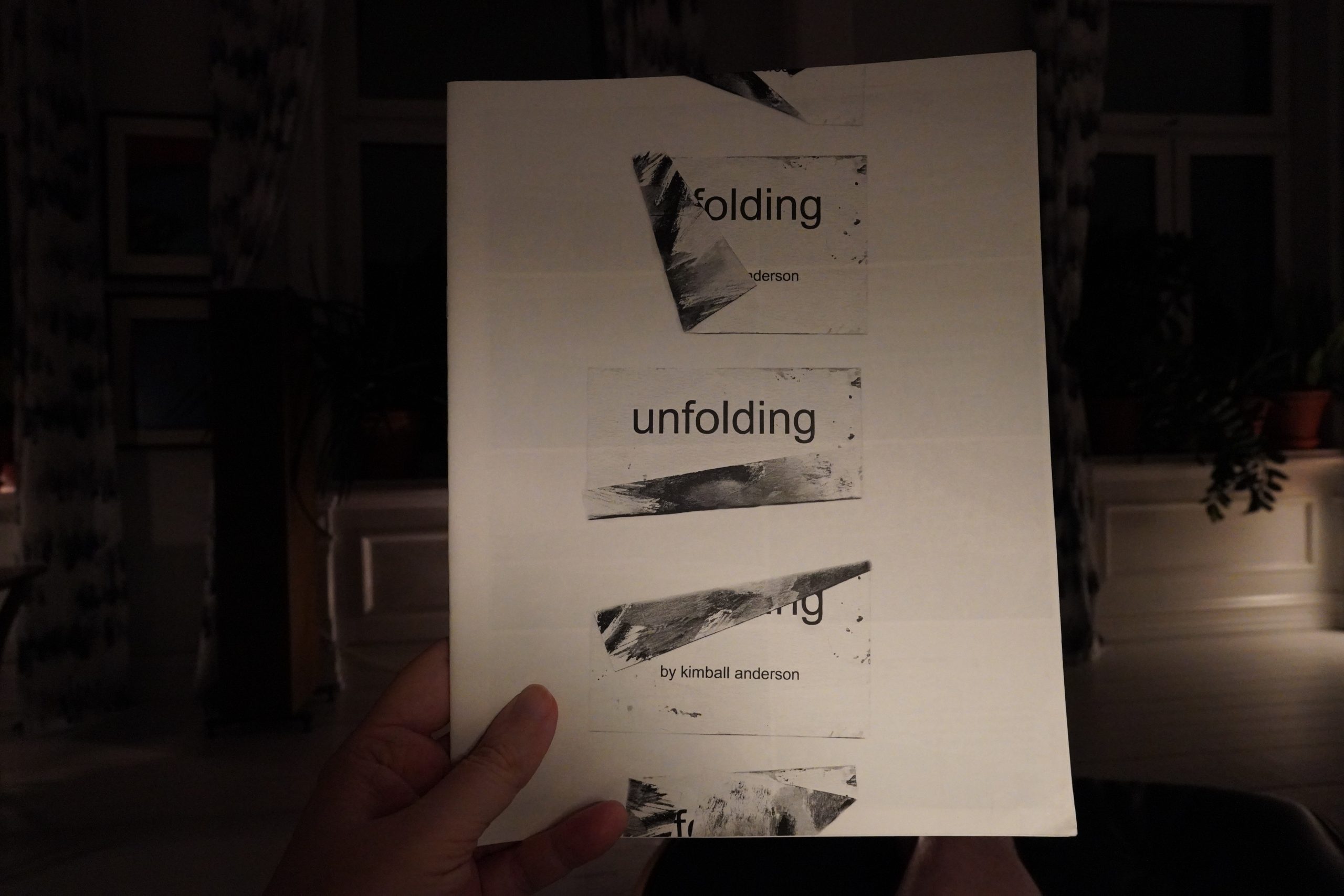
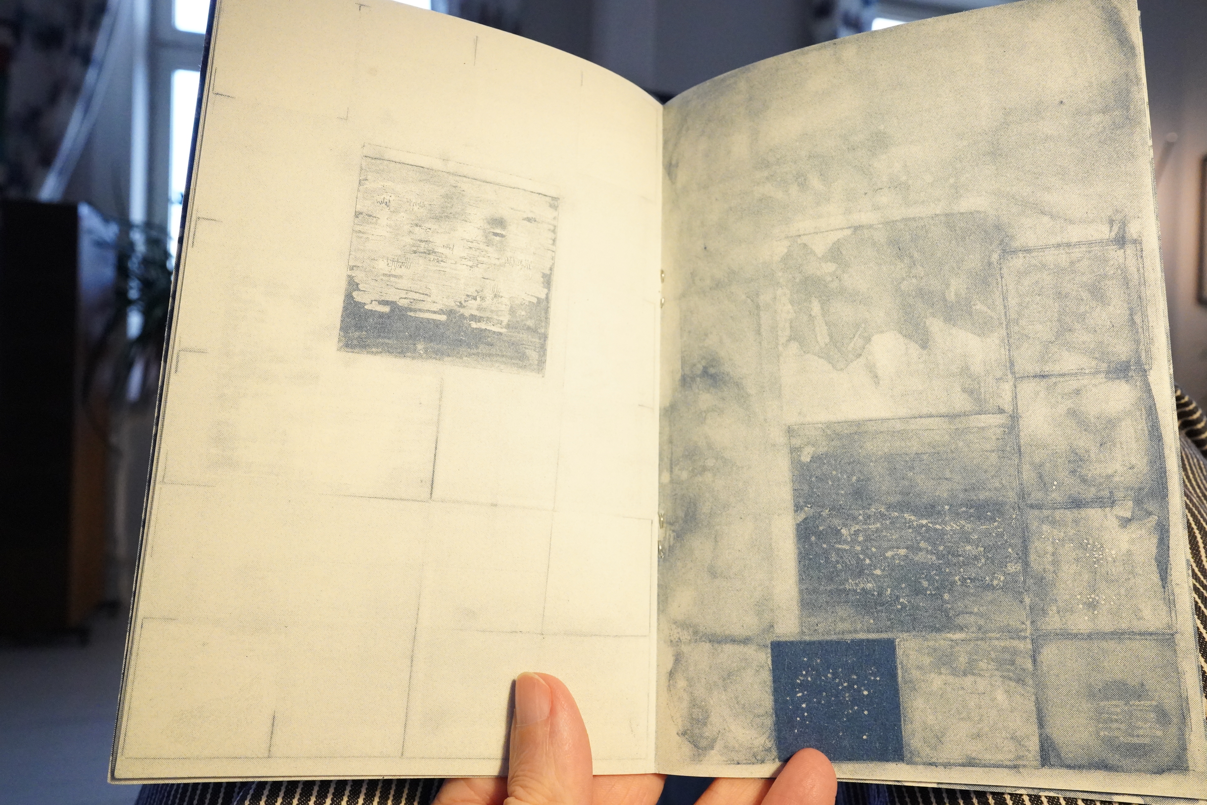
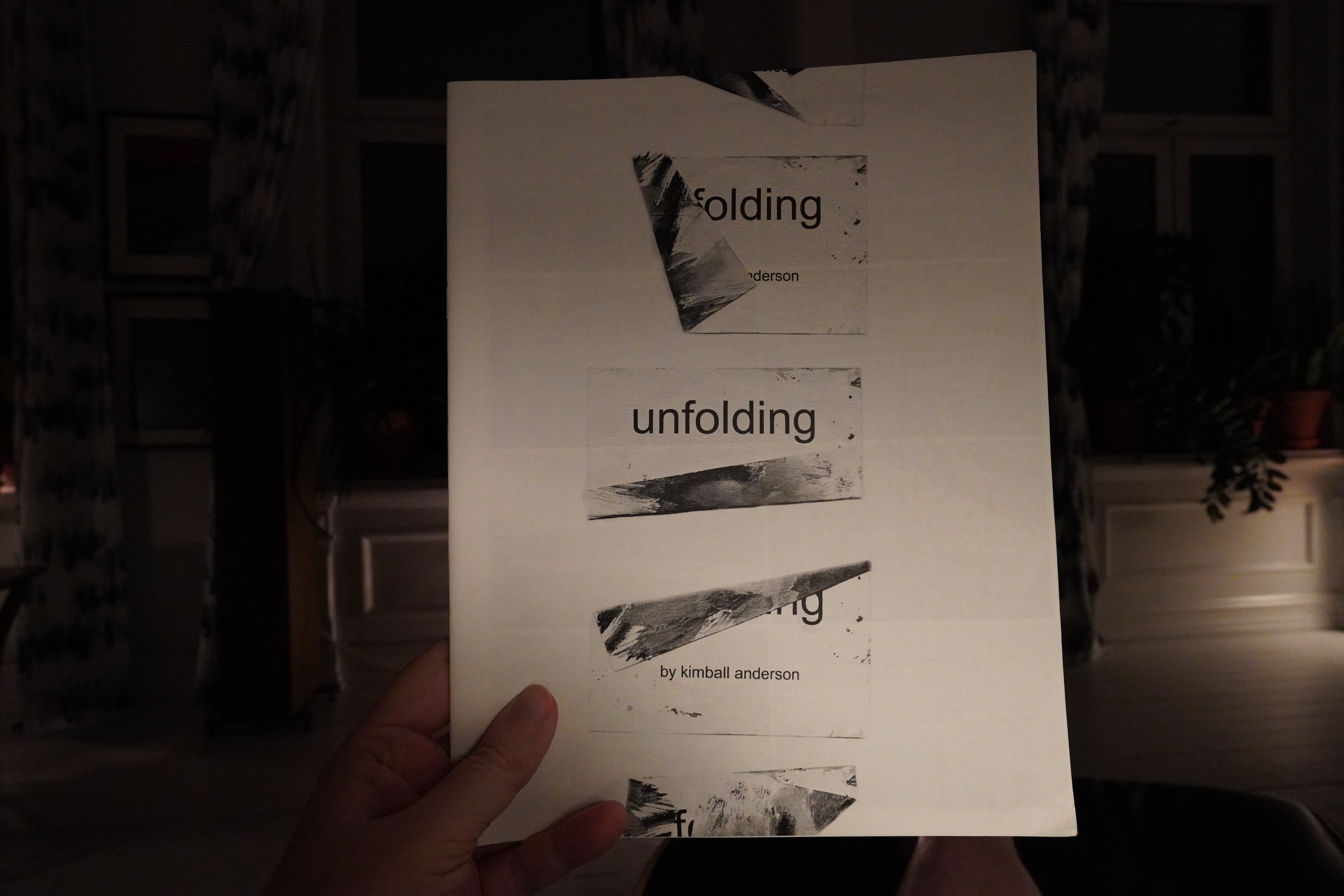
23:39: Unfolding by Kimball Anderson
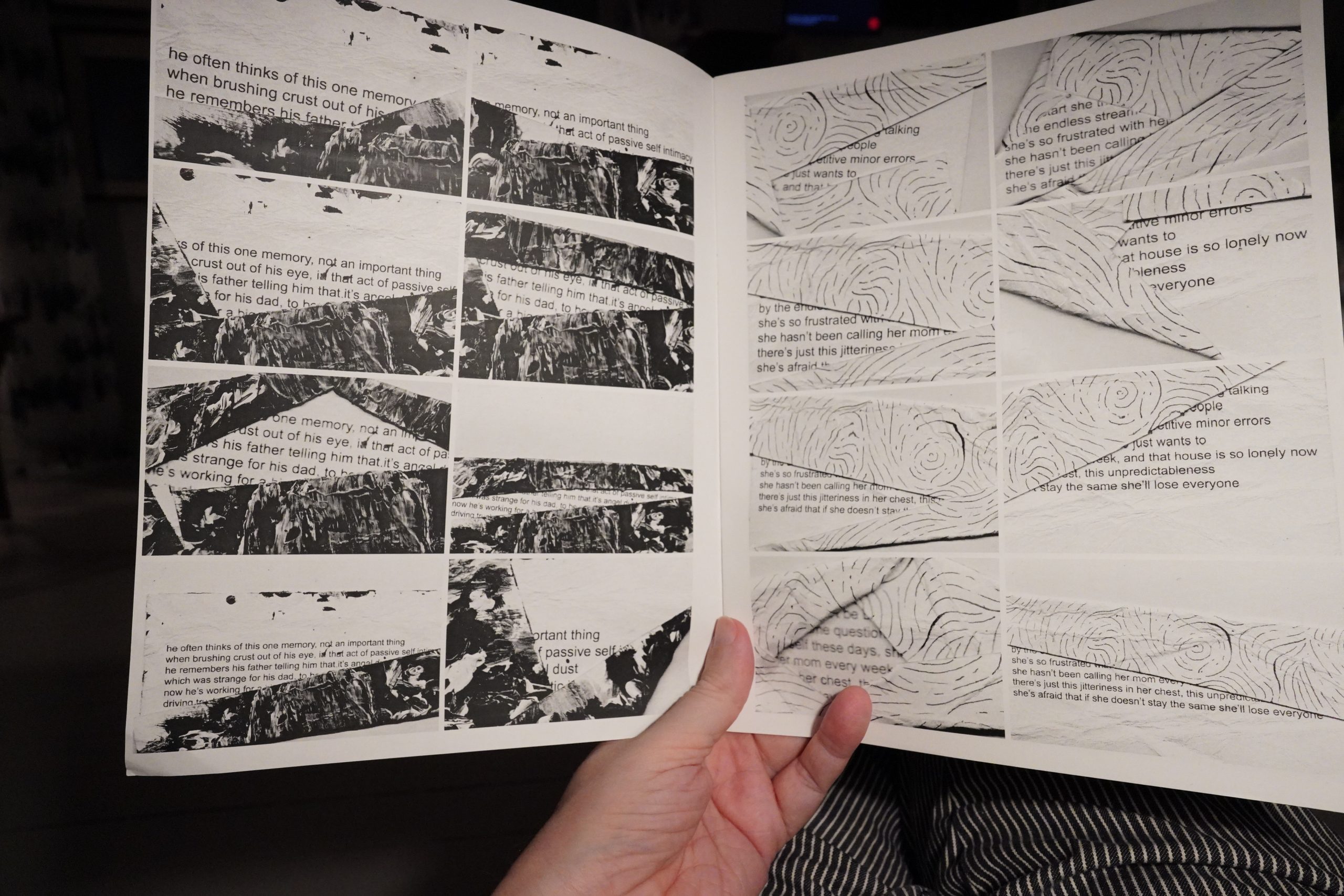
Wow, this is amazing. The way you’re reading these partial repetitions, panel by panel, is hypnotic, and you desperately want to piece these mysteries together.
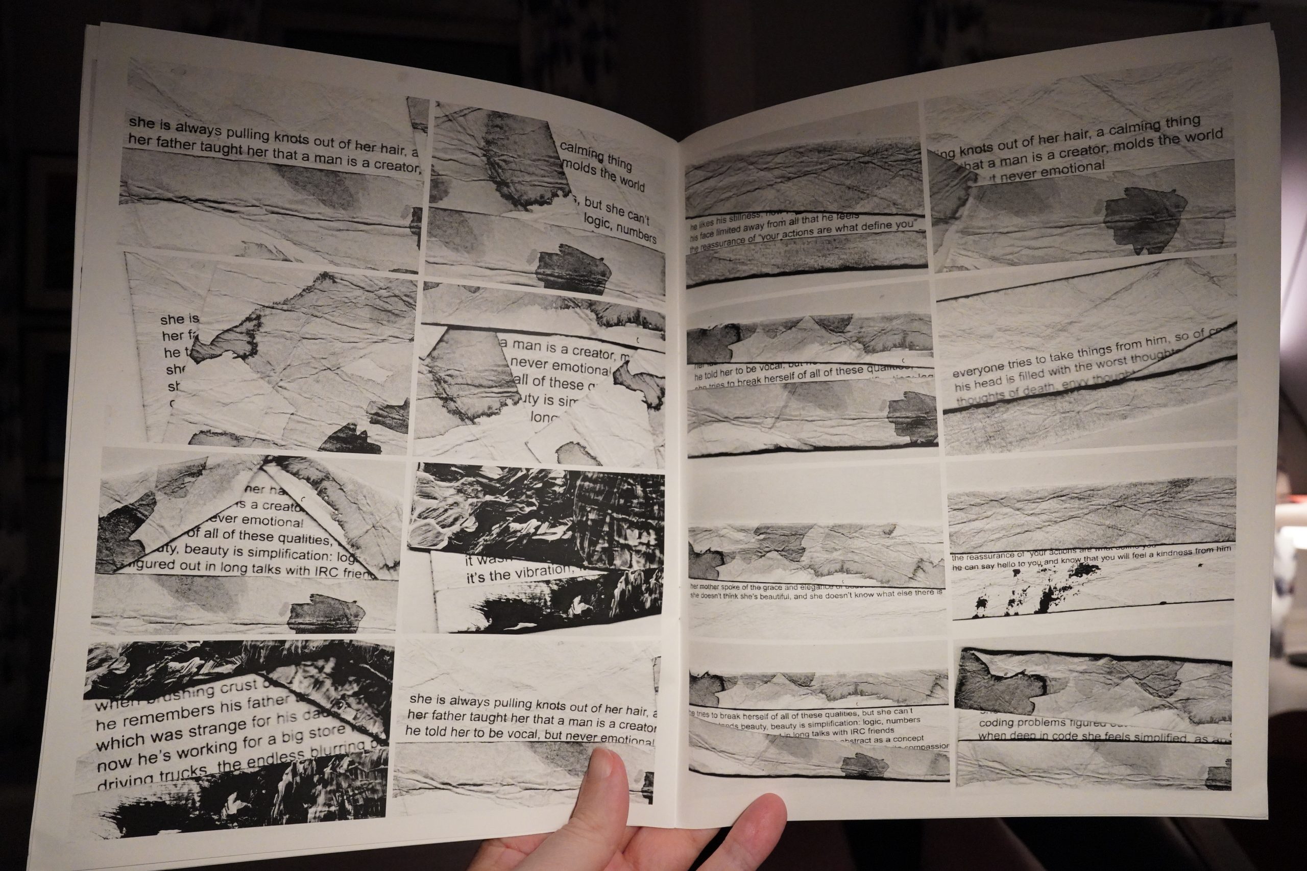
I don’t know why this works so well, but it has a visceral quality to it.
| David Bowie: Lodger |  |
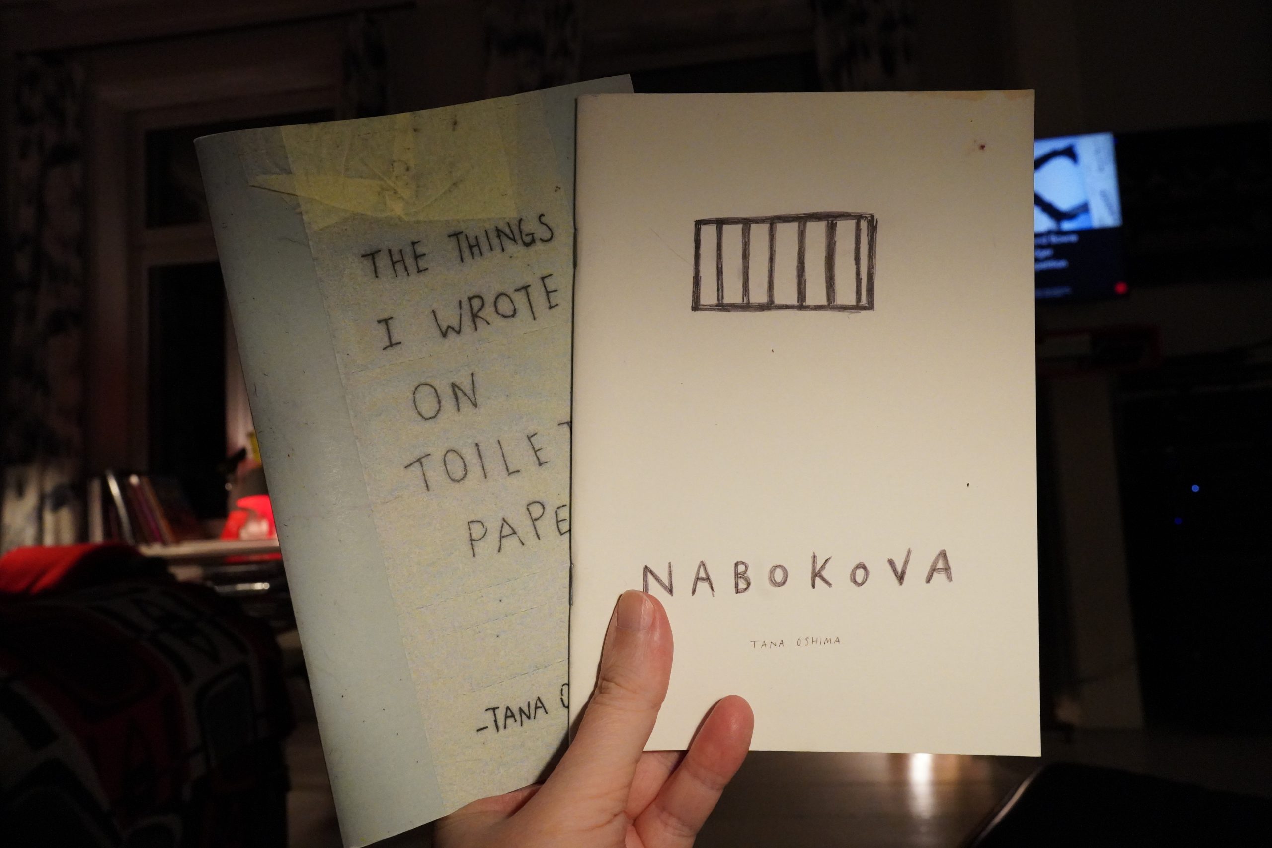
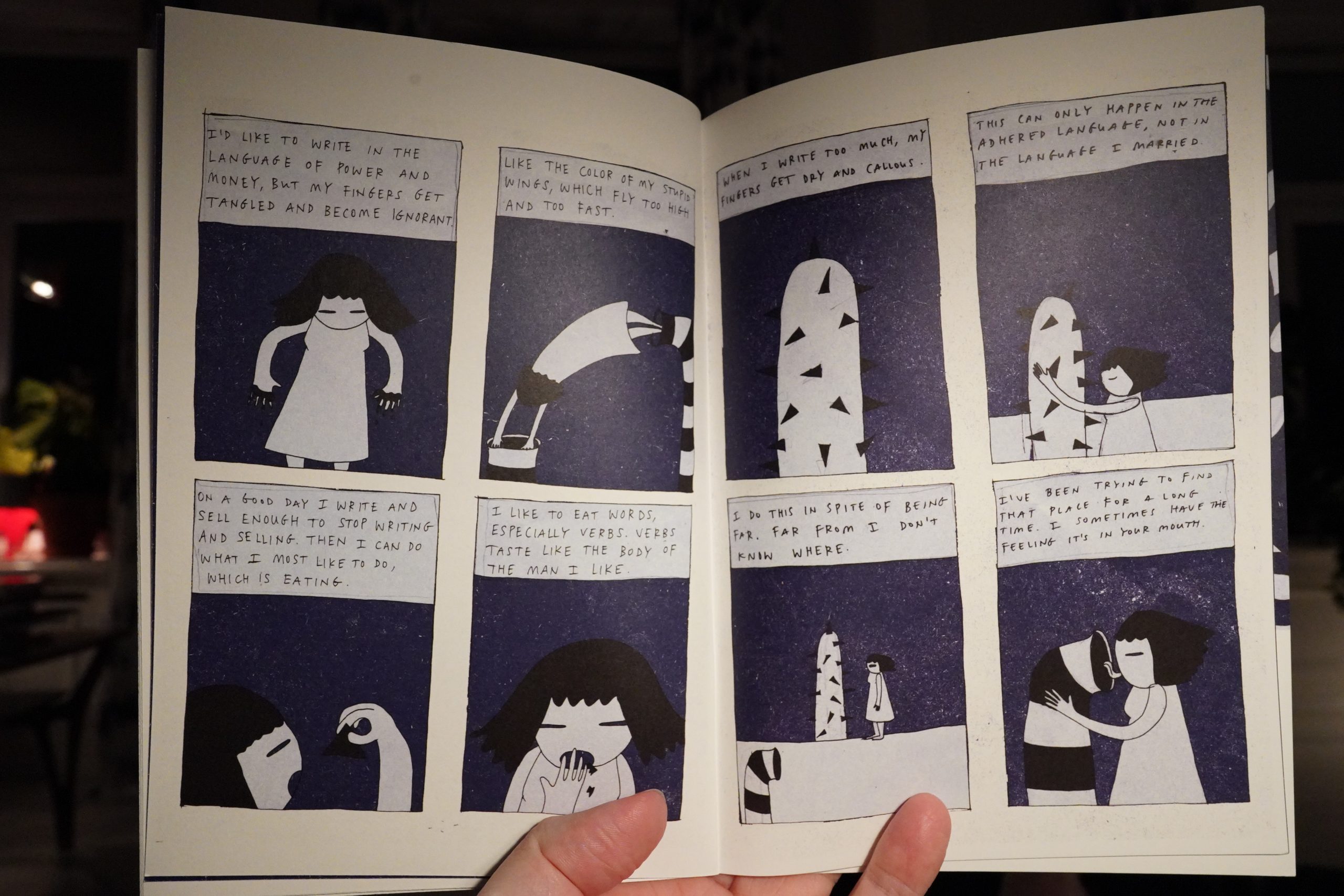
23:51: The Things I Wronge On Toilet Paper & Nabokova by Tana Oshima
Interesting… And I love the purple colour in the Nabokova book.

But the Toilet Paper book is fantastic.
It just, like, totally fascinating. I want to read it several times.
| David Bowie: Scary Monsters |  |
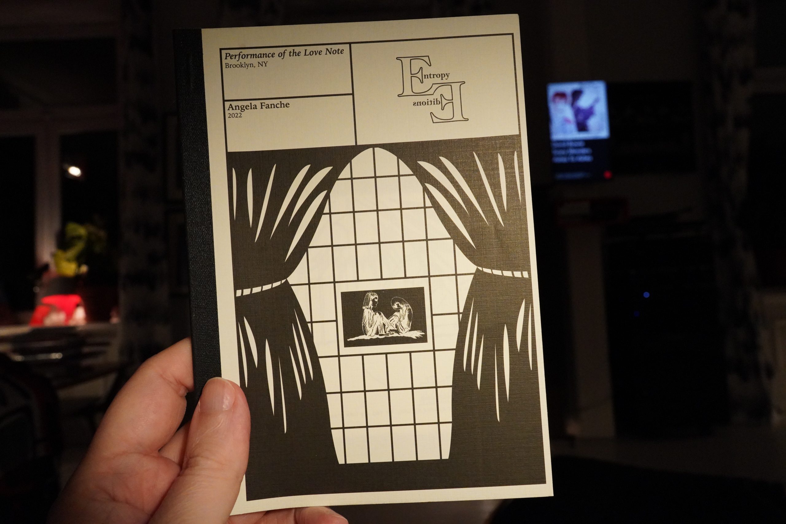
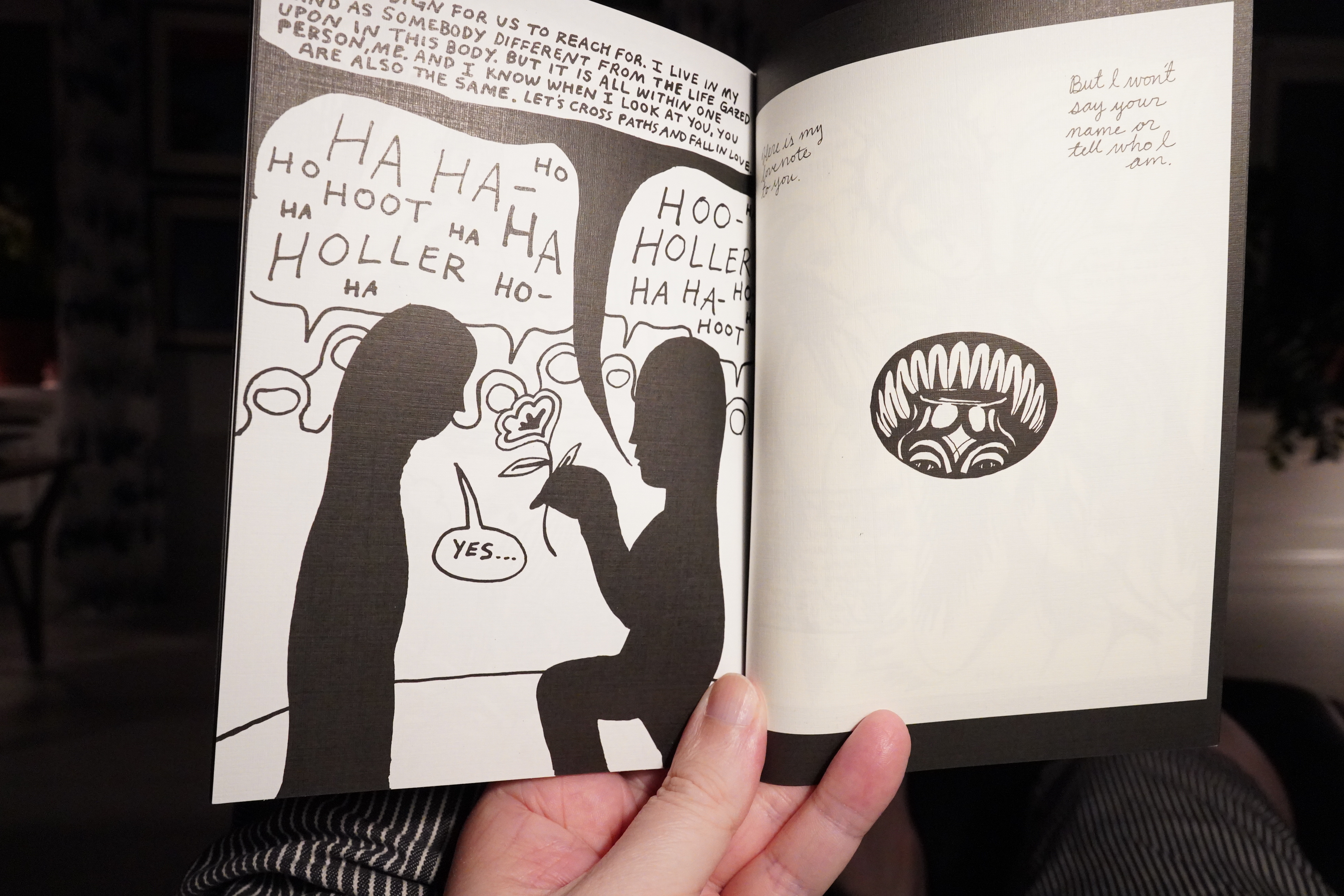
00:17: Performance of the Love Note by Angela Fanche (Entropy Editions)
Hm… these books are reminding me of something…
Oh! That tweet! THAT”S MY ORDER! Well I never.
Anyway, I like this.

I’m not at all sure what it’s about, and that’s fine.
| David Bowie: Scary Monsters |  |

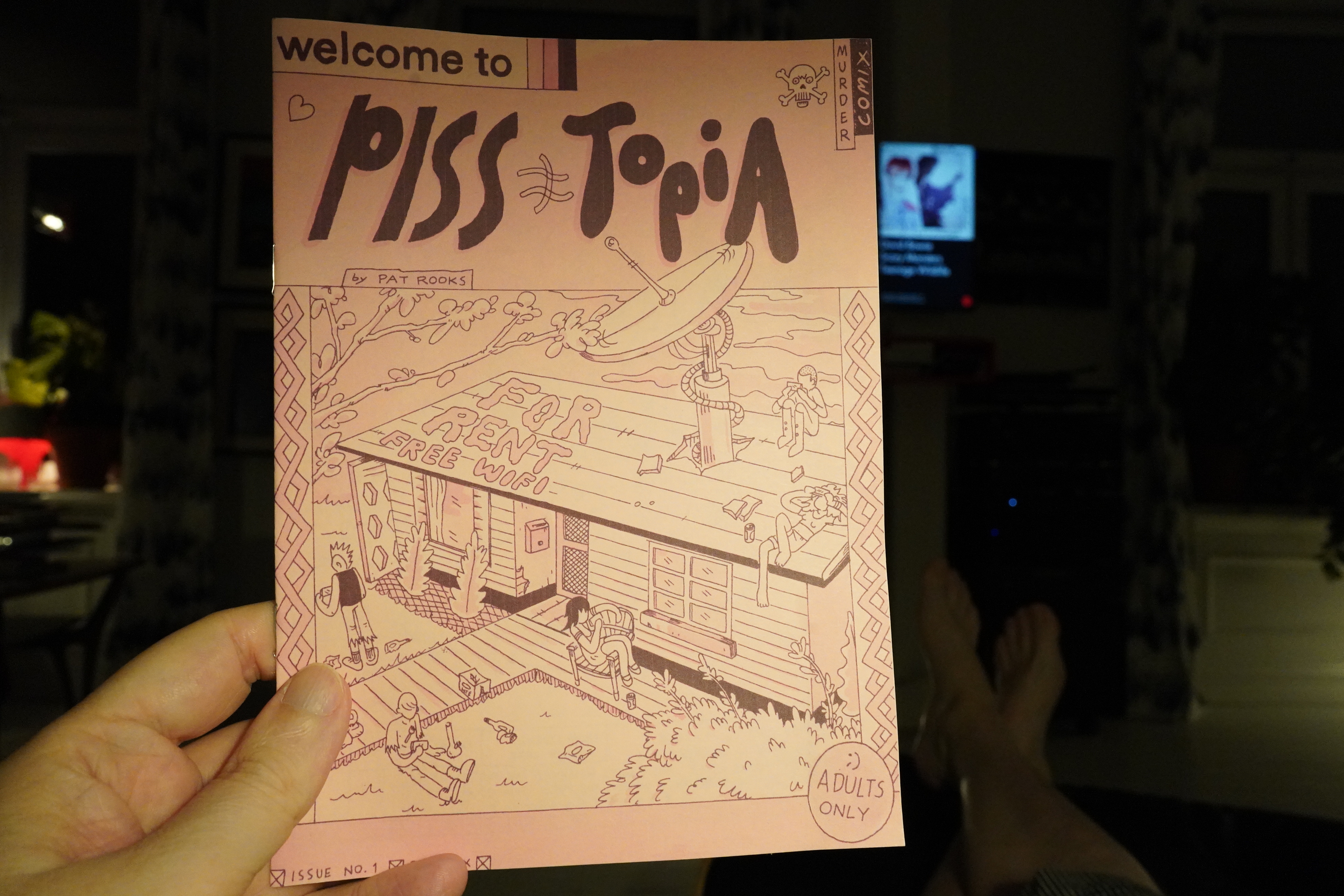
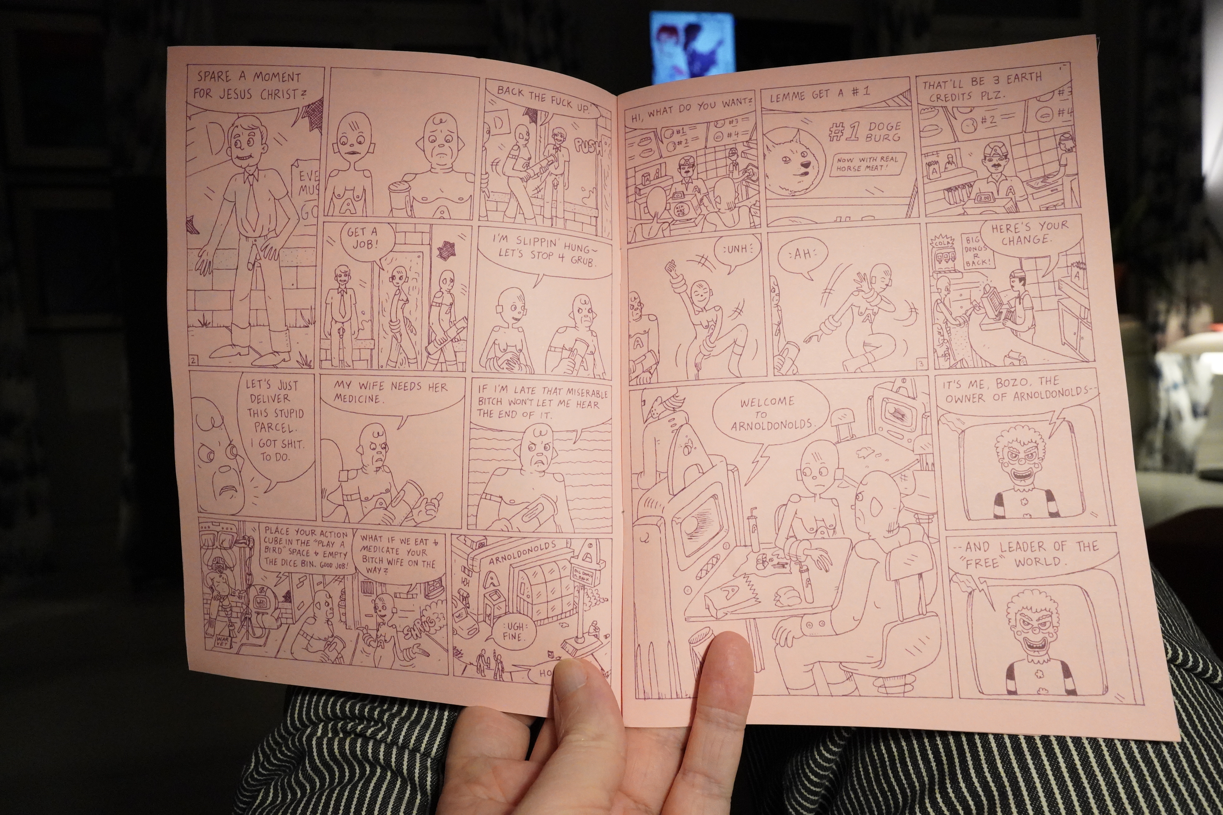
00:23: Welcome Pisstopia by Pat Rooks
Heh, the automatic white balance decided that that cover couldn’t possibly be that pink, so it turned my hand green. Nice going, Sony.

I switched the AWB off, but it’s still not pink enough.
But it’s an amusing book.
| David Bowie: Baal |  |
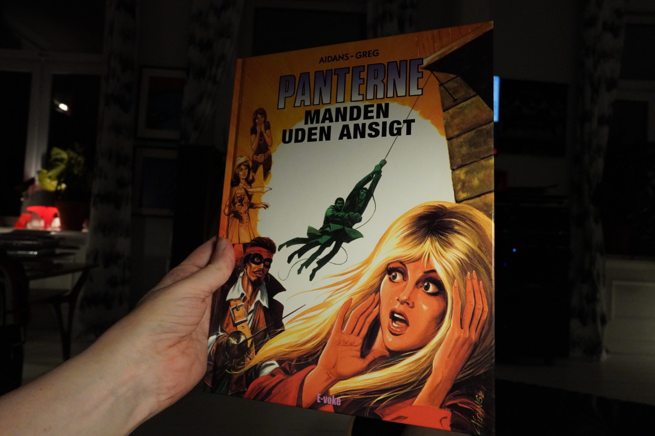
00:29: Les Panthères: L’homme qui refusait la vie by Aidans/Greg (E-Voke)
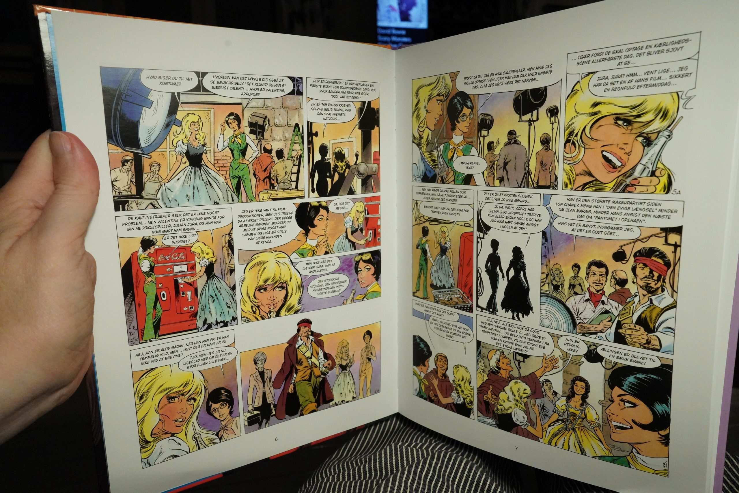
When it comes to French(ey) comics, the Danes have done all the first string classics and the second banana series and they’re now doing random stuff like this, from 1972. Three albums were published in the 70s in France. But I guess Greg is kinda famous, so there’s an audience? Which includes me, because I was just curious and had to take a peek.
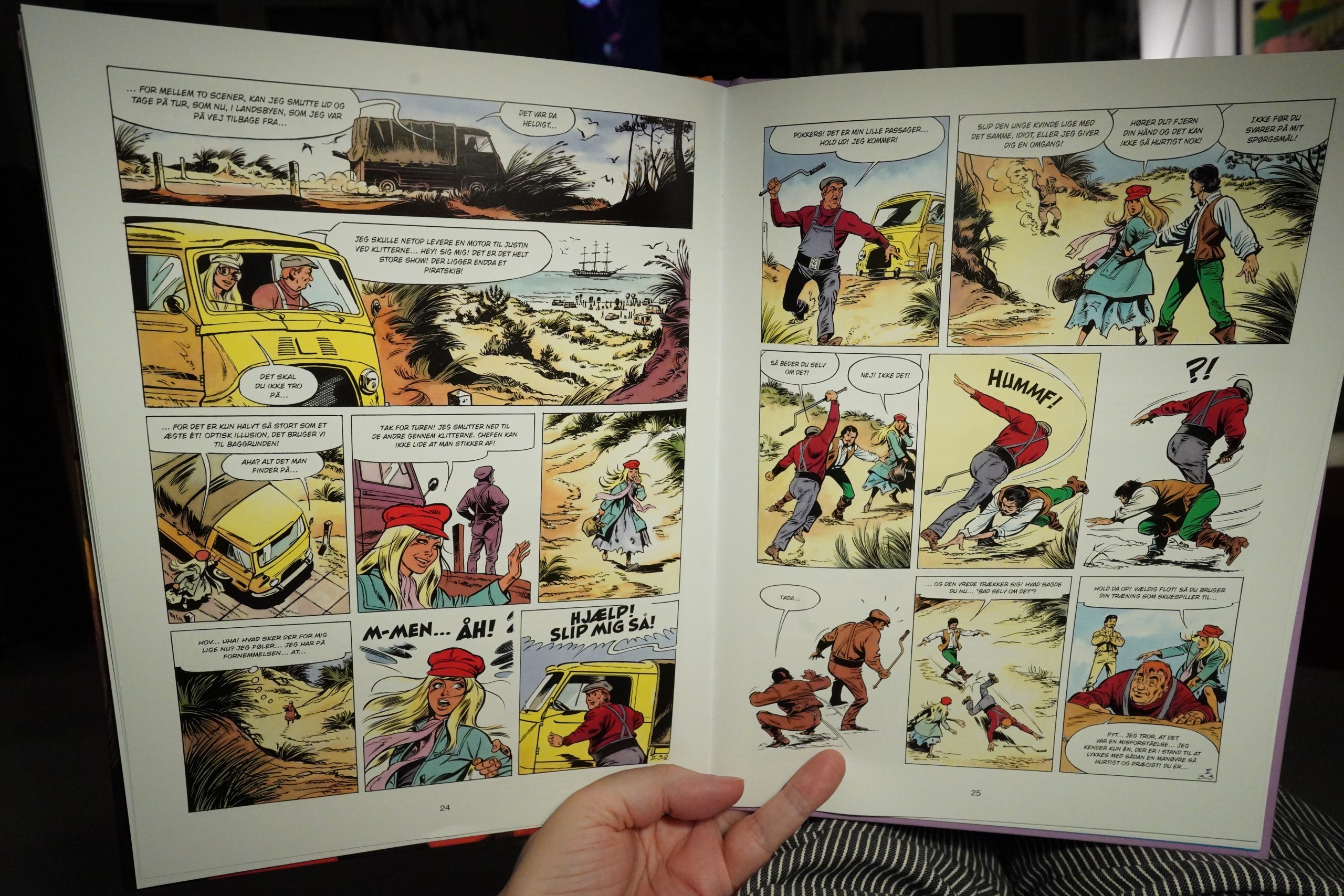
And it’s very, very silly. I guess the target audience is 11 year old girls, but even so — it’s an incredibly contrived plot.
But you can’t complain about the artwork, which looks very stylish. I wonder whether Aidans had a background in fashion? And I may well pick up the other two albums.
OK, I should go to bed, but I’m curious about this next book, so I’ll just start it and see how far I get before I plotz:
| David Bowie: Let’s Dance | 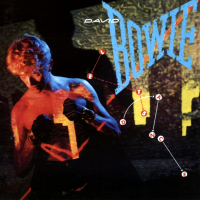 |
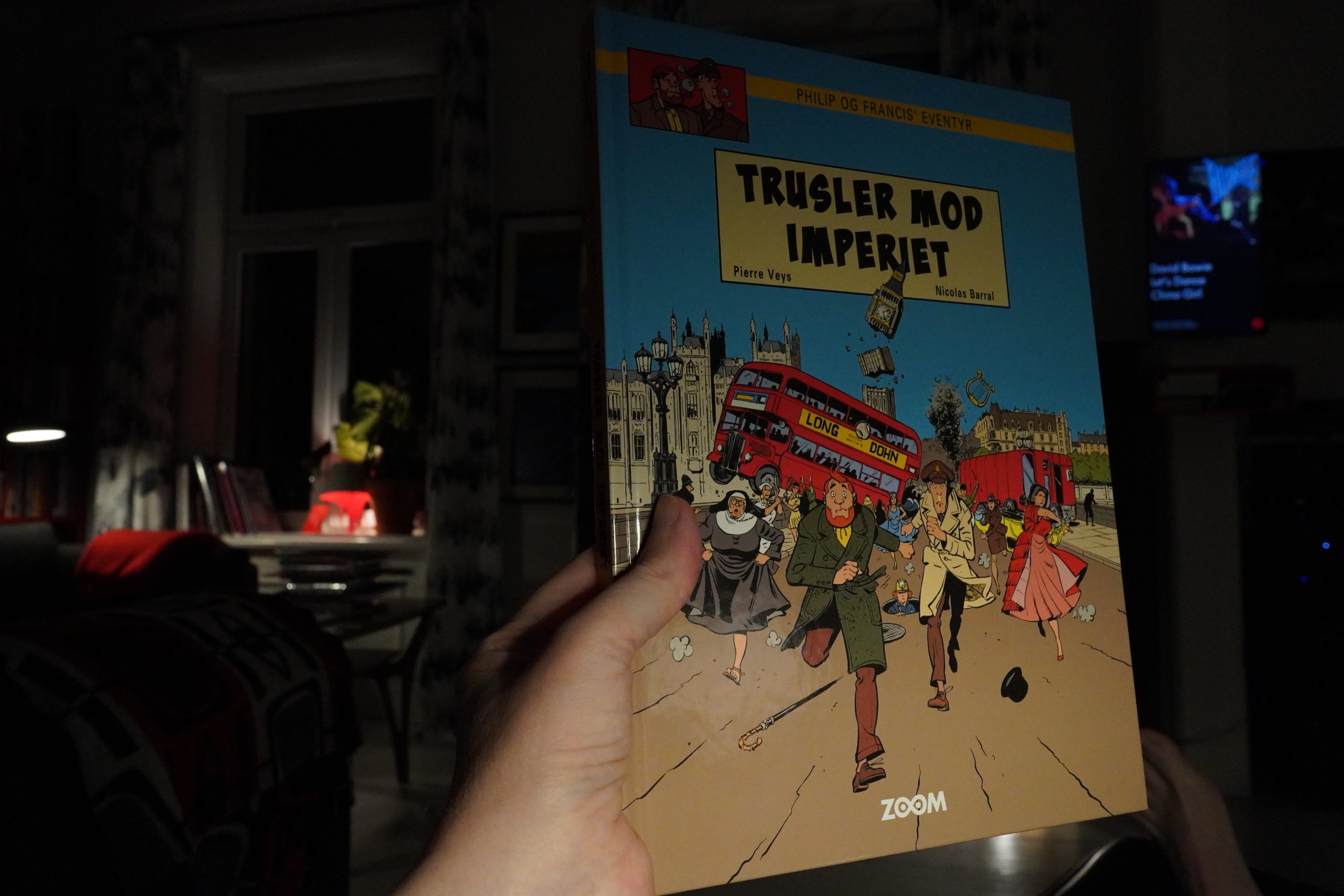
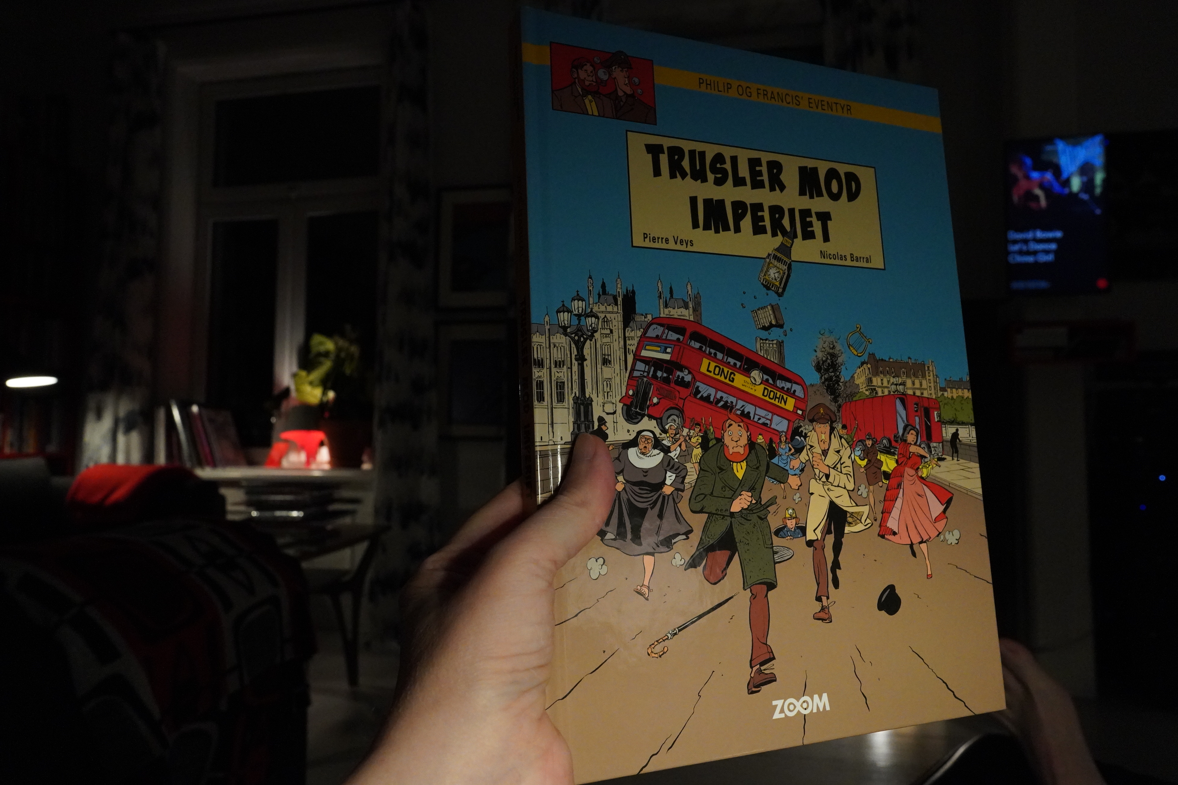
01:13: Les aventures de Phillip et Francis by Pierre Veys & Nicolas Barral (Zoom)
This looks like it’s an homage to Blake & Mortimer? Or a parody?
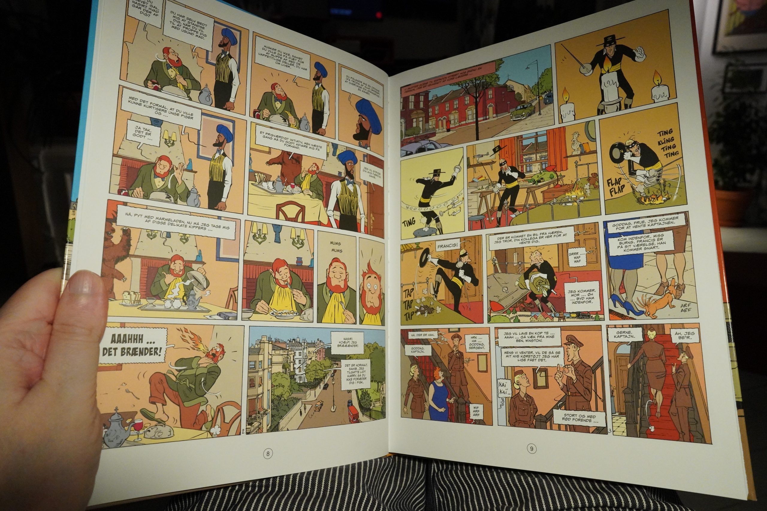
It’s a parody! They haven’t gotten the line right, but the artwork’s fine.
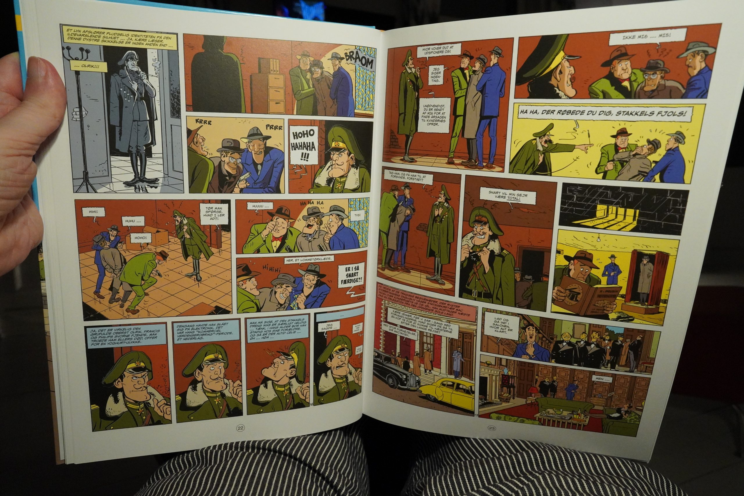
And it’s hilarious. They skewer of a lot of specific Blake & Morterisms amazingly well, but there’s also broader, silly sense of humour throughout. I laughed out loud a lot.
This book collects three of these albums, but I’m saving the other two for later because:
| David Bowie: Tonight |  |
01:52: Sleepytime
It’s sleepytime.
That was a most excellent selection of comics, and I’m totally exhausted.