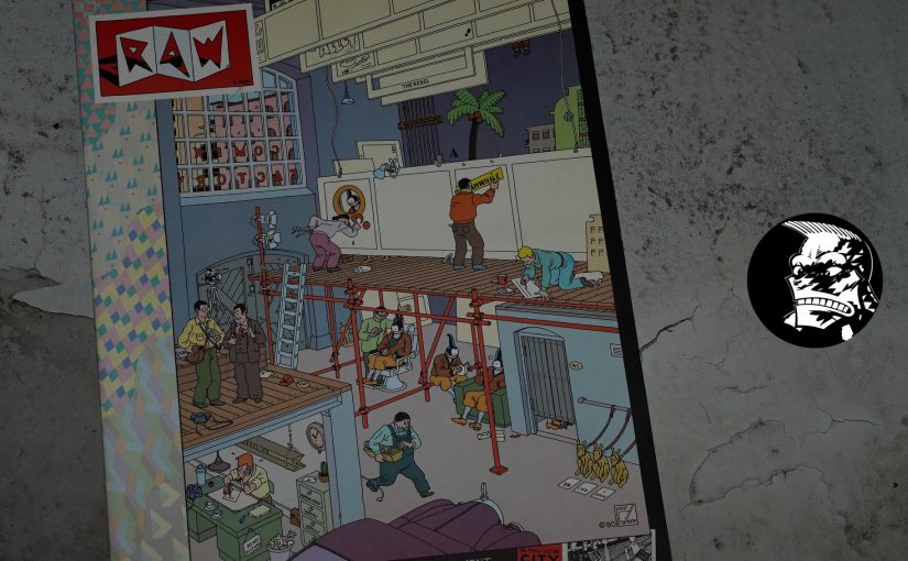
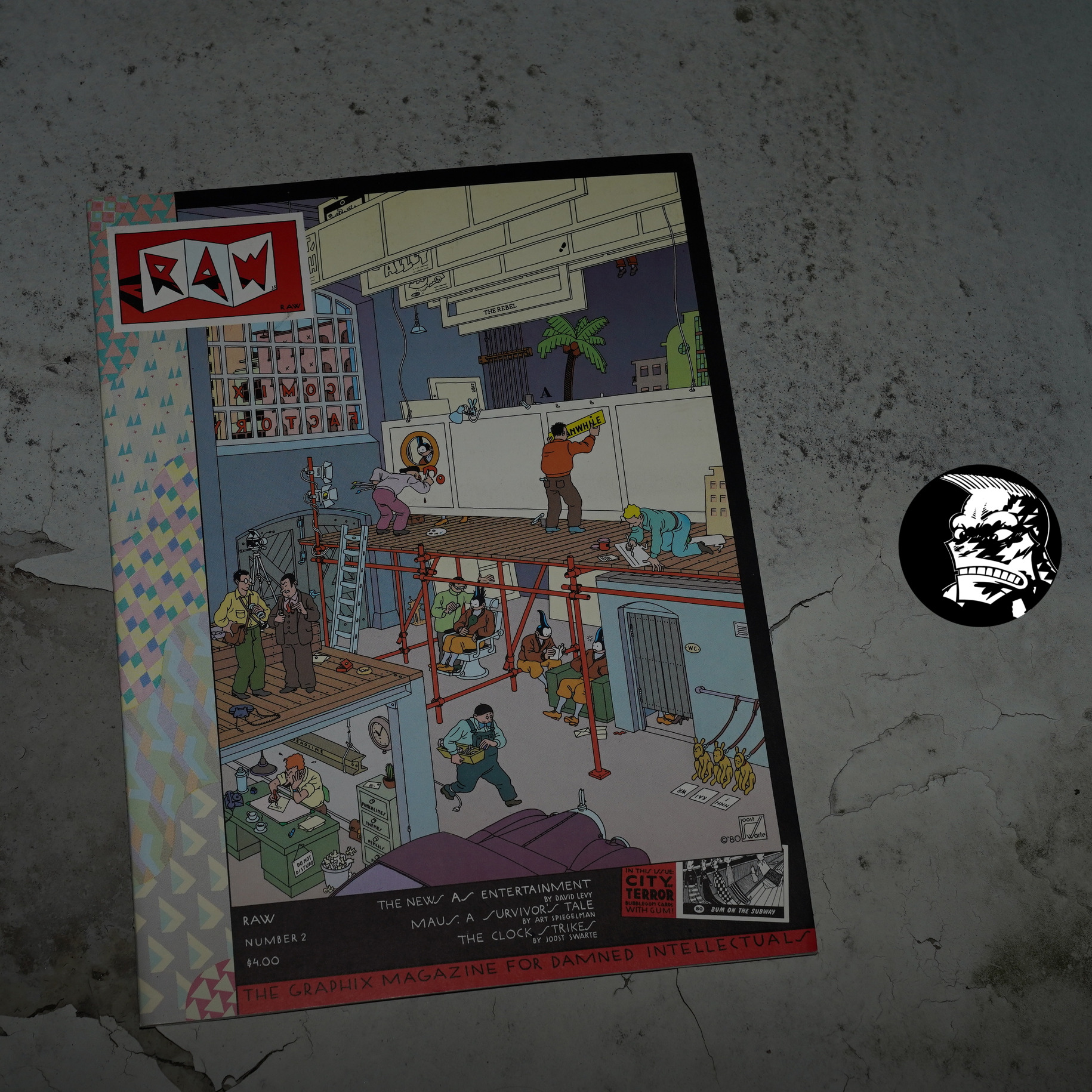
Raw #2 edited by Françoise Mouly and Art Spiegelman (268x360mm)
I love that cover by Joost Swarte. I had a subscription to Raw, but when they cancelled Raw after #8, they sent me this poster as a substitute for the remaining issue(s):
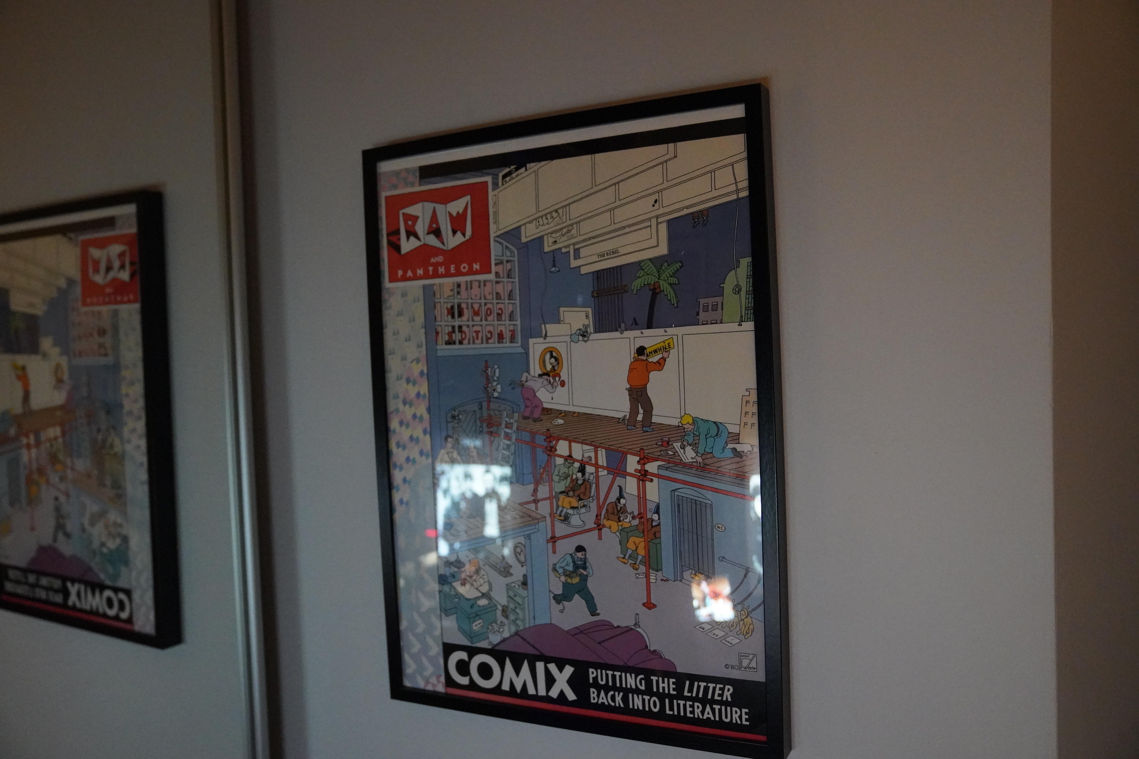
The poster has a much better tag line than Raw #2: “Putting the litter back into literature”.
I’ve spent many a moment looking at all the details here.
And it’s apparently hot shit now?
Anyway!
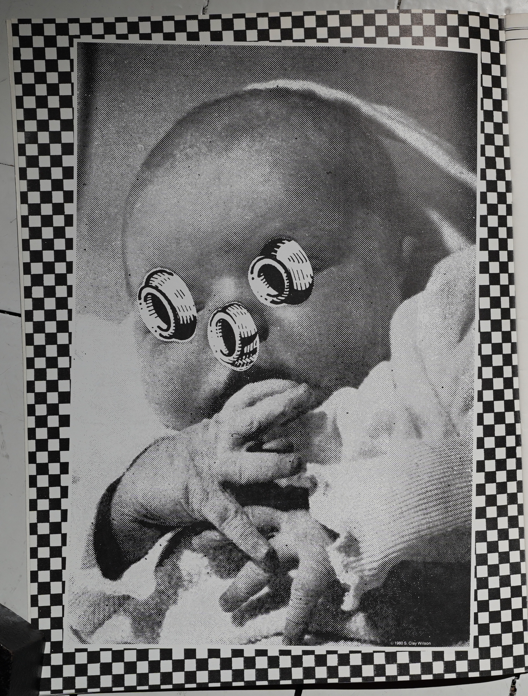
The first issue of Raw had been a triumph — how to follow up that? Well, to me the second issue seems like a retrenchment: You get more American underground artists… like S. Clay Wilson here, with a page that’s not very typical S. Clay Wilson.
Which reminds me — I happened upon this on ebay the other day:
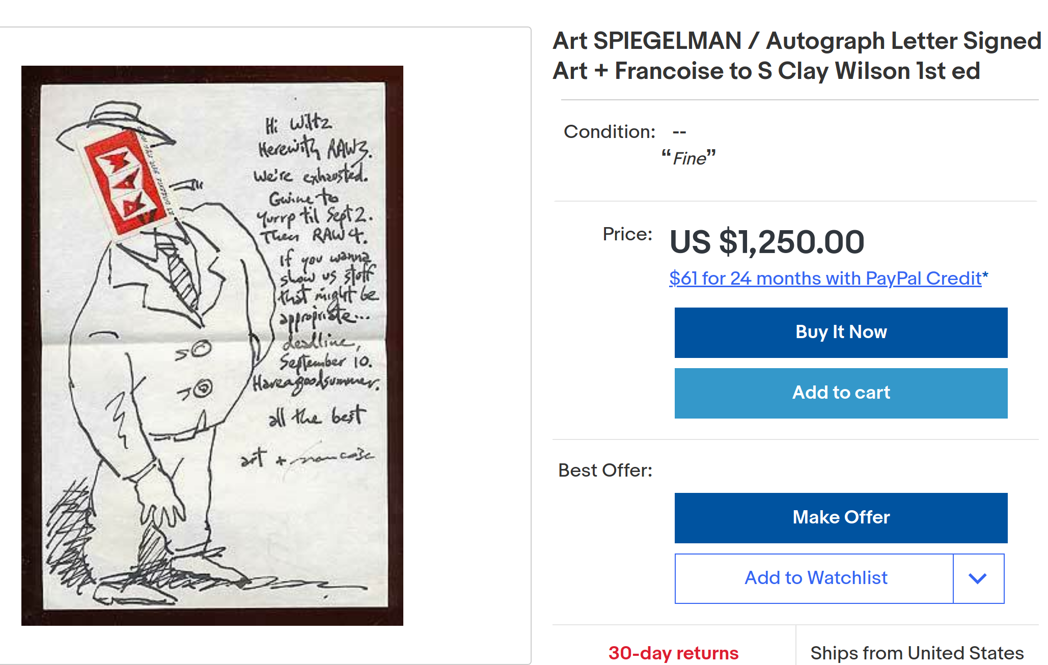
It’s a letter from the editors to Wilson, soliciting something for Raw 4 “that might be appropriate”. I.e., not Wilson’s usual stuff?
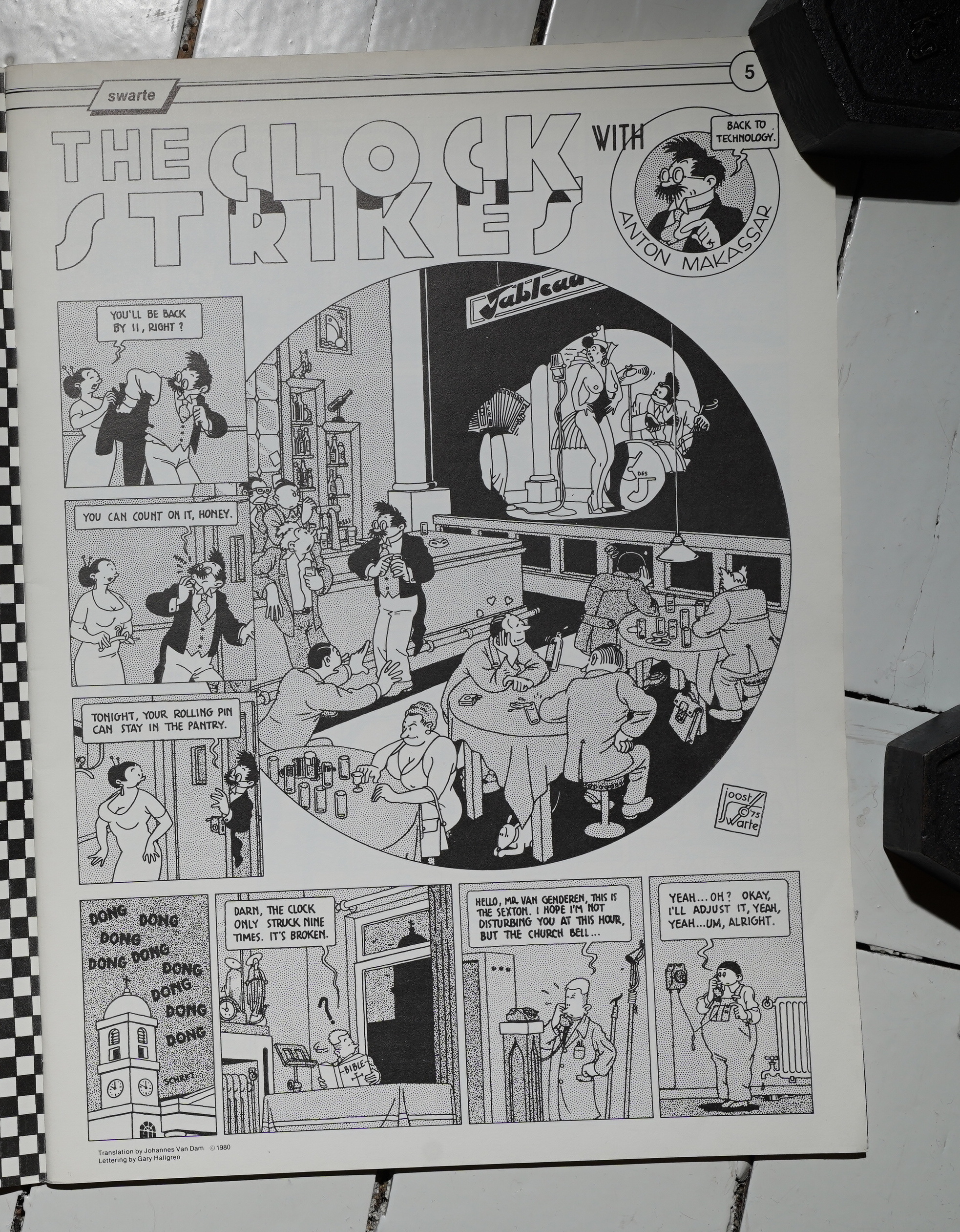
The first issue of Raw had a nice mixture of shorter and longer things, but it’s all shorter pieces in this issue, which is perhaps what makes it slightly less fascinating. But basically all the individual pieces are good, like this Joost Swarte trifle.
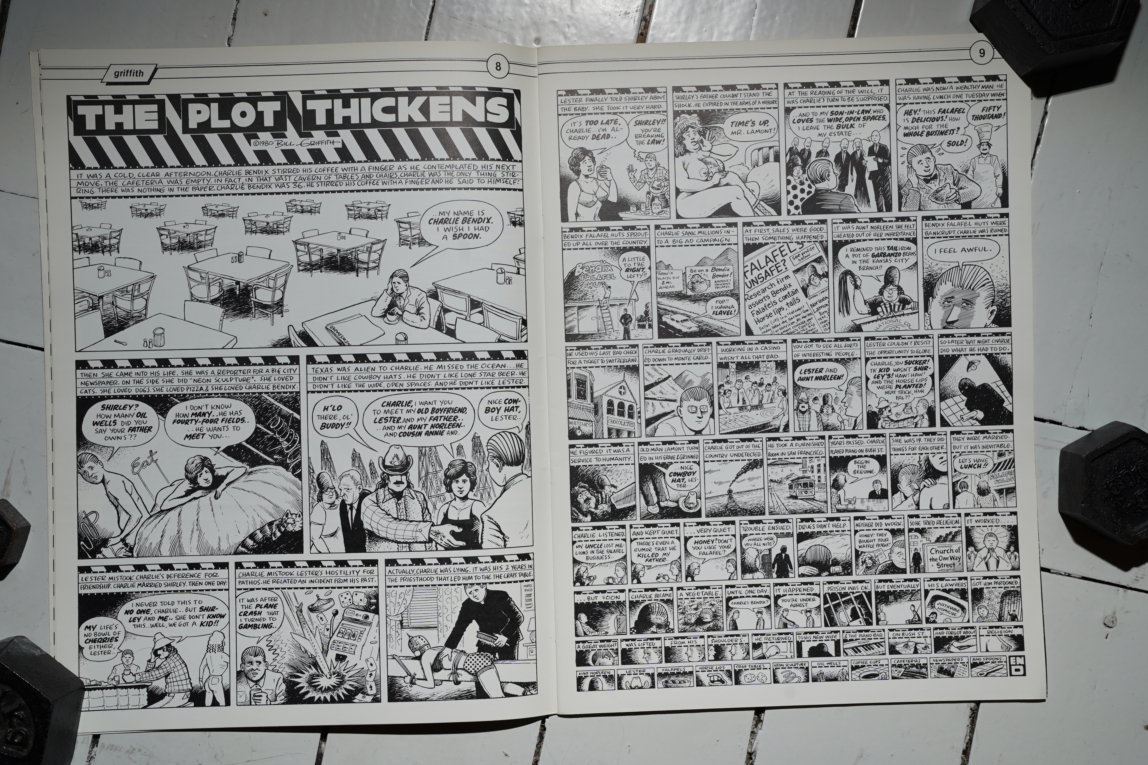
Speaking of underground artists, Bill Griffith (Spiegelman’s co-editor on Arcade) has fun with scale on this two-pager — every row of panels growing smaller. The huge Raw pages lend themselves to this sort of playfulness.
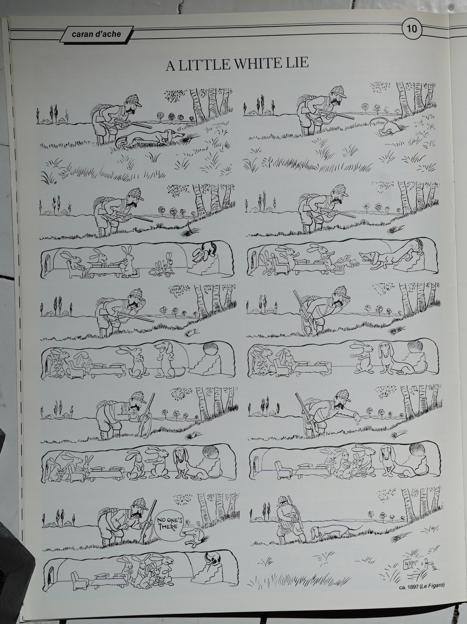
Wow. A French (?) strip from 1897 that reads like a modern comic strip, with speech balloons and everything. By Caran d’Ache? It’s not a familiar name to me.
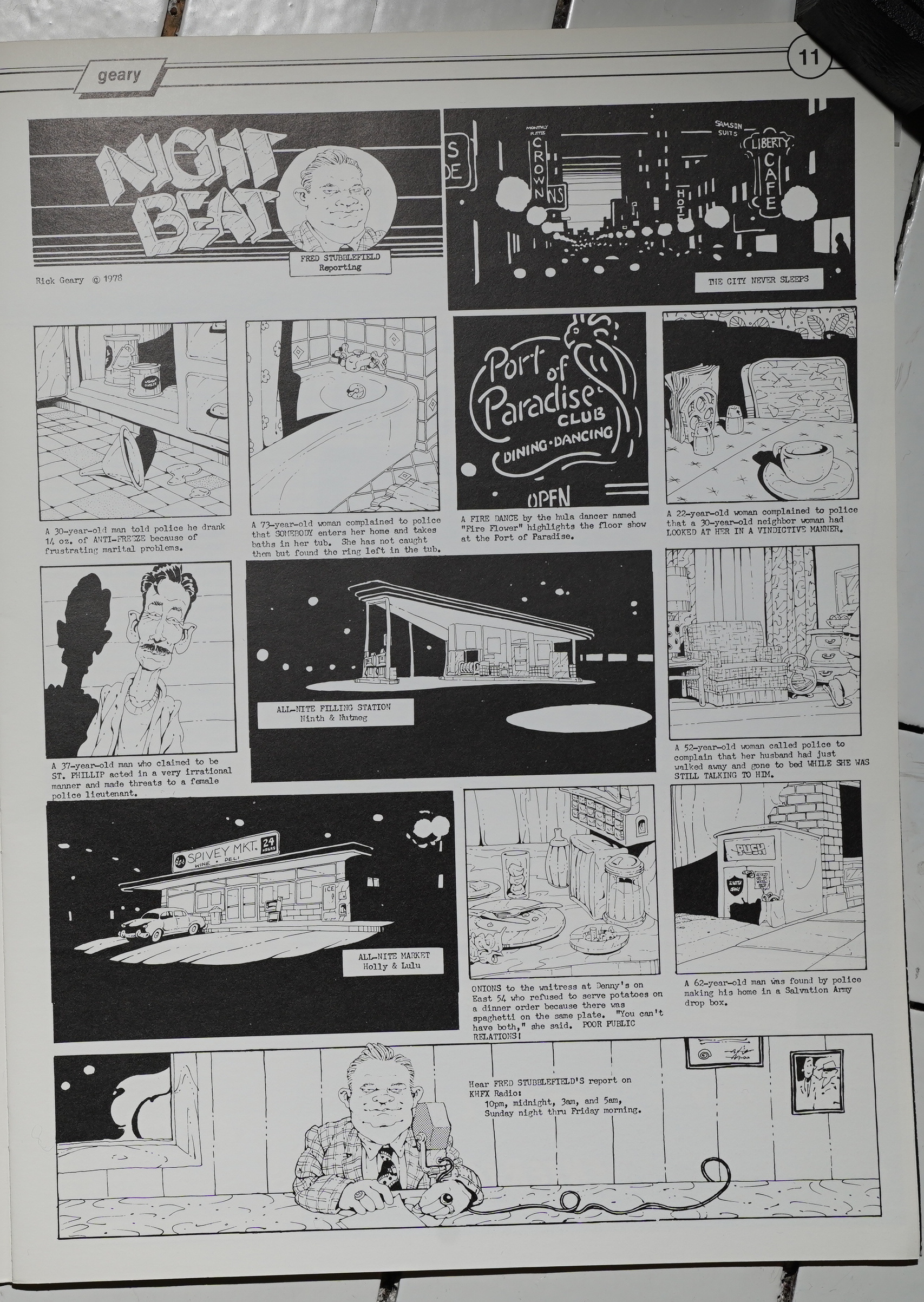
Rick Geary’s an artist who’s lived in the margins between undergrounds and the mainstream (and has been solidly in the mainstream for the last few decades with his Victorian Murder series), but it’s surprising to see him pop up here. But Geary does have a very intriguing storytelling style.
David Levy does a… cultural critique?… over five pages, which feels excessive. tl;dr: FAKE NEWS.

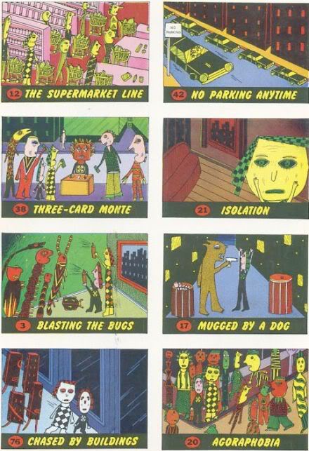
This issue of Raw is known for two things: And the first is that it had a bubble gum insert — with City of Terror trading cards. I’ve been trolling ebay for decades now, but I’ve never been able to lay my hands on a copy of this comic that has those cards included. (Or the bubble gum.) But they’re supposed to look like this:
I love Mark Beyer, and I like the idea, but this is a pretty weak Beyer piece. Perhaps his heart wasn’t in it?
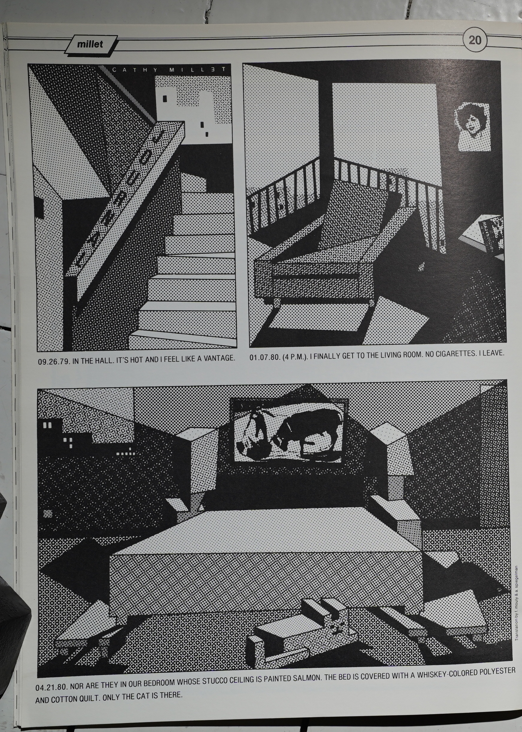
Cathy Millet does the artiest piece in the book.
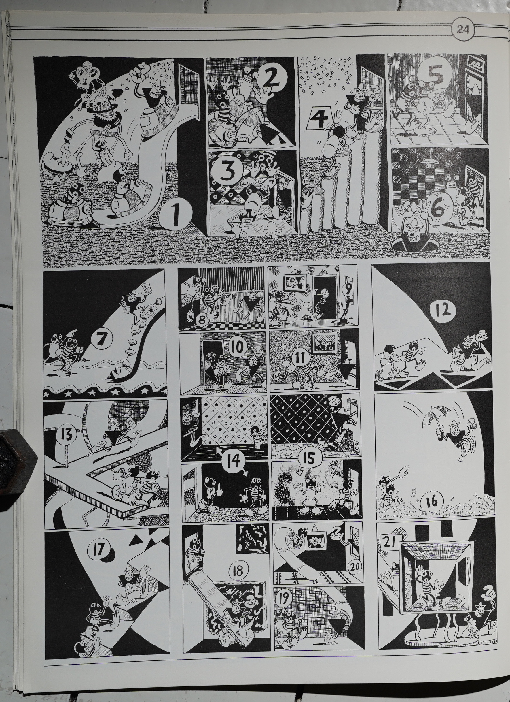
Kaz plays around with comics conventions. It’s fun.
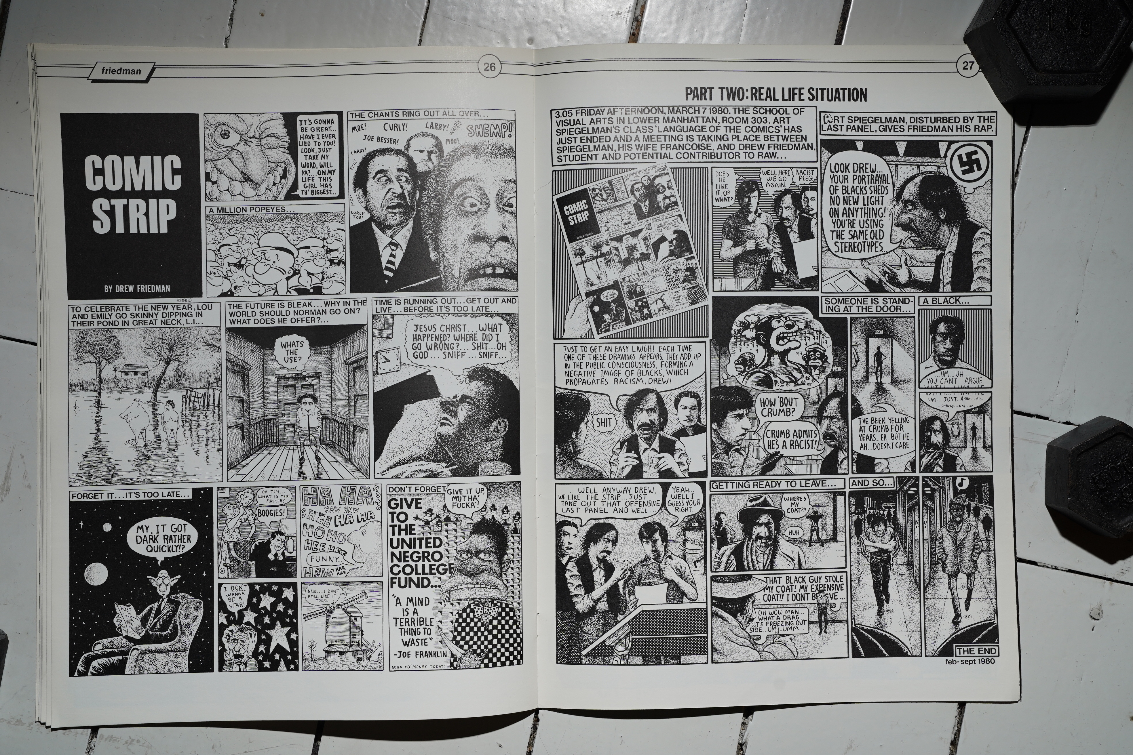
Drew Friedman’s two-pager is… er… it’s… “unfortunate”? I guess it’s supposed to be all transgressive and stuff, but it comes off as pretty boorish.
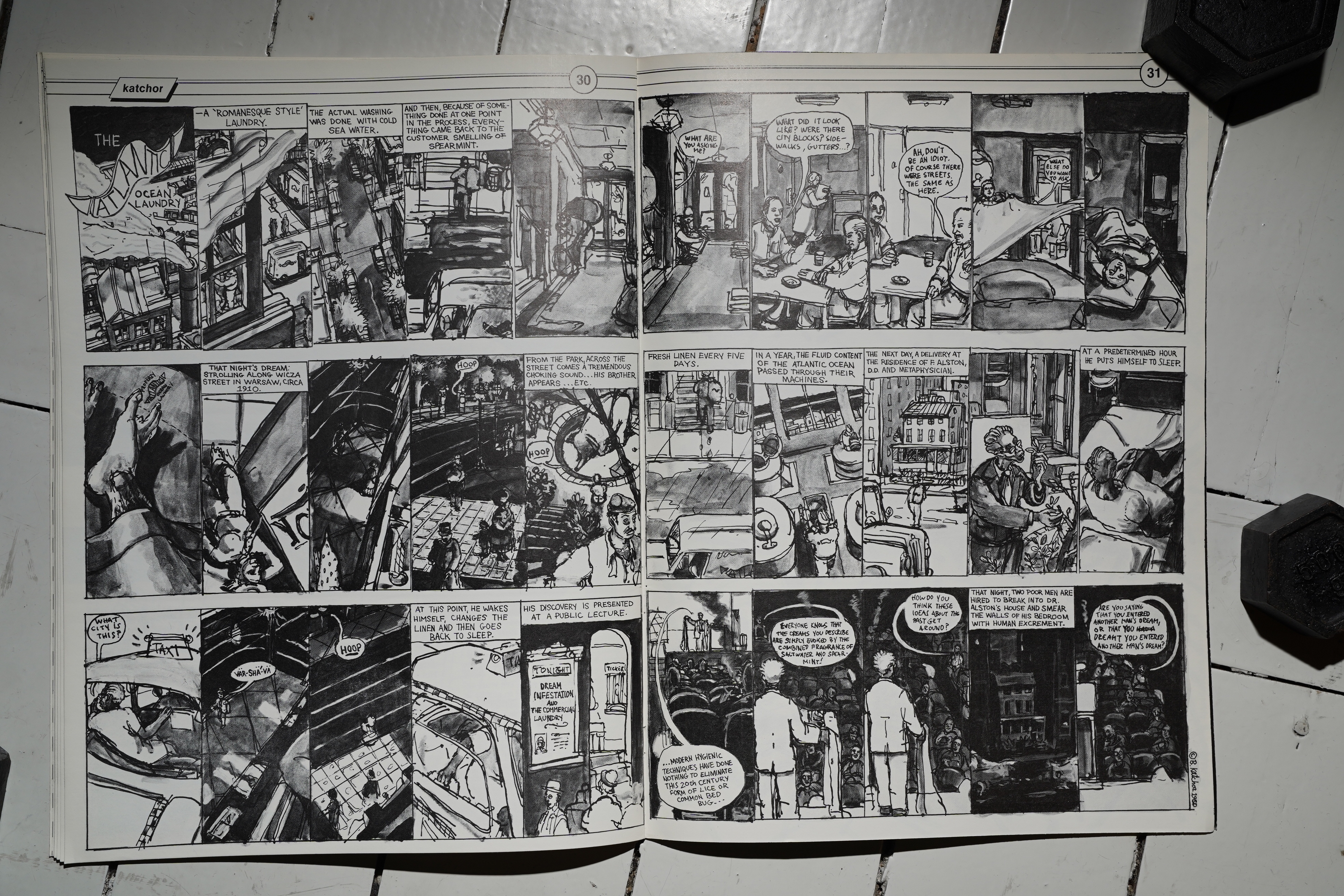
I did the first issue of Picture Story Magazine (78) the other day, and here’s more Ben Katchor. He’s grown a lot in the two years — you can see that he’s going somewhere now.
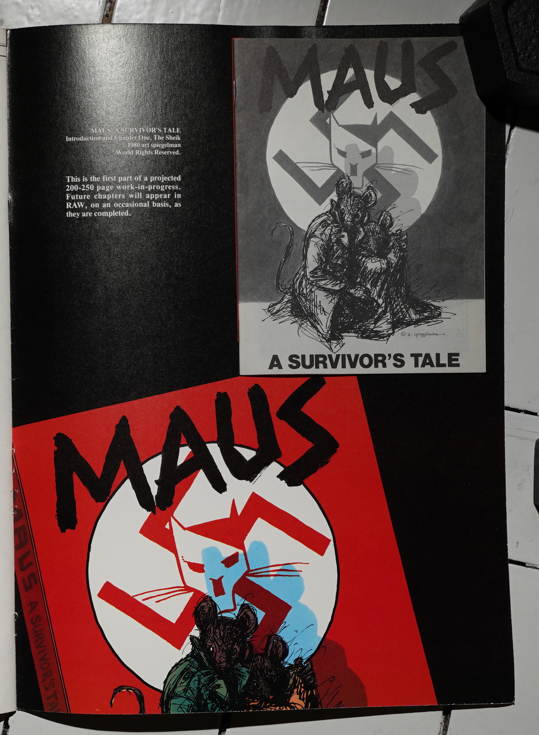
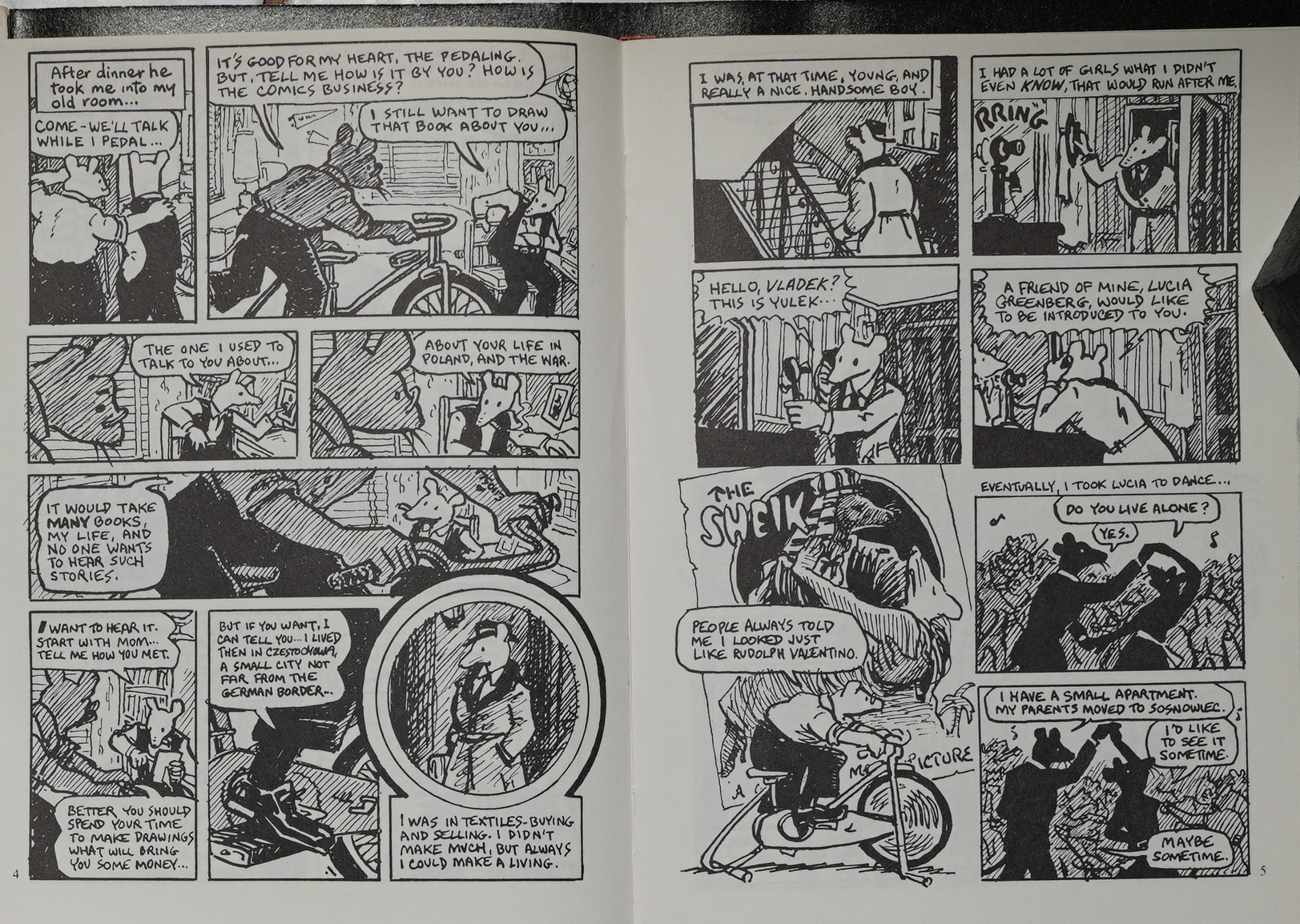
The other thing this issue is well-known for is that it carries the first chapter of Spiegelman’s Maus serialisation. It’s a 13x17cm insert, glued onto the inner back page.
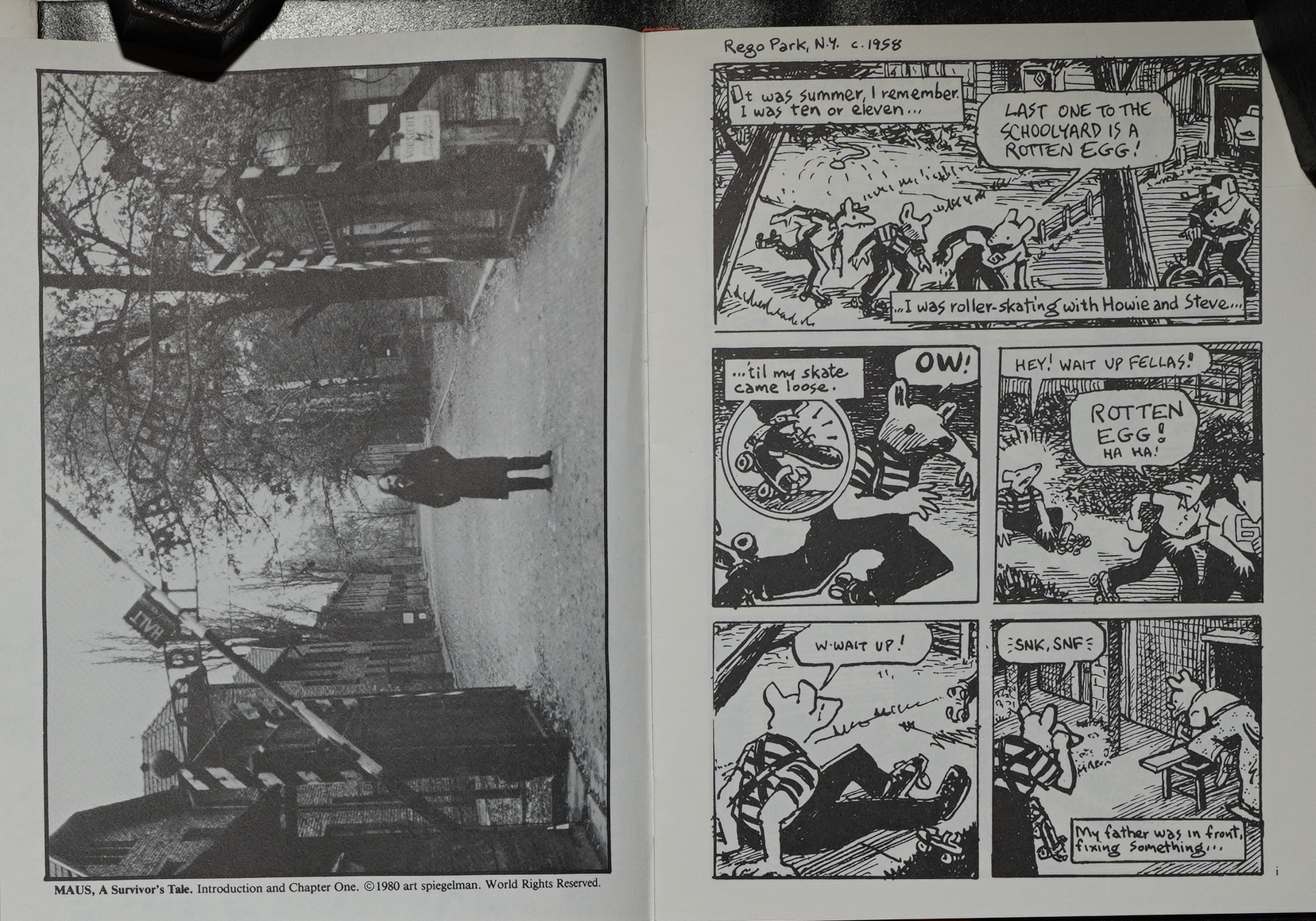
I guess I don’t have to say anything about Maus — you’ve got a copy or two in your bookshelf. The only thing… is that it looks so good in this first edition: It’s on slightly not-quite newsprint; off-white and scratchy, which is so perfect for the art style.
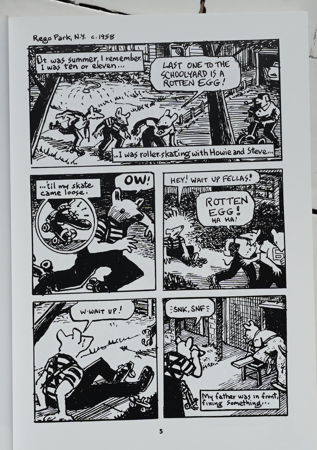
Here’s the same page from a 2003 edition: On shiny white paper, it looks… well… kinda amateurish?
I wondered whether Spiegelman had reworked some of these pages…
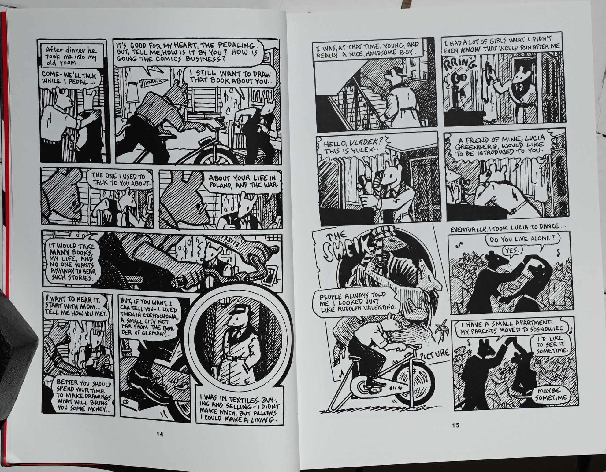
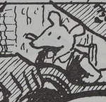
… and… Yes? It’s kinda subtle, but he seems to at least have redrawn the faces? The faces are longer and slimmer in the original version? Has he completely redrawn these pages? I guess he must have, but … why?
Hm, OK, some of the figures in the original version look slightly awkward. Like:
 vs
vs 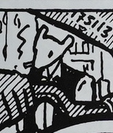
Anyway.
It’s still a thrilling read.
An interview in The Comics Journal #65, page 119:
This led to a dilemma for Maus, which I conceived Of
primarily as a comic wherein the pictures were in service
of the Story. I wanted very much to keep the pictures
subservient to the idea. In fact, it’s drawn quite small
—the original for each page is about five by seven or
something like that.
I didn’t quite know how to make use of Maus in Raw.
On the other hand, if I didn’t combine these two projects,
my head would go rolling off down the sidewalk, bounce
into a sewer somewhere and never Come back, because it
was just spreading myself way, way too thin.
First thought was, well, we’ll blow up the pages. Now ,
that makes a very strong graphic statement, to take a
relatively simple drawing , and blow it up so the hairs at
the edge of the line are all showing. I kind of liked the
way that looked. But I think it’s all wrong for Maus.
Also. it would be 17 pages of the magazine.
The final solution was a separate small-sized booklet ,
like “Two-Fisted painters” in the first issue. I found that
it involved very little reduction. The pages remained
very clear. Although it looks very dense, it has some of
the qualities that I really wanted to catch in Maus. It
makes it look like a manuscript. Seeing these small pages
Of kind of doodle drawings, almost—they’re rough , quick
drawings—mounted together makes it seem like we found
somebody’s diary , and are publishing facsimilies of it.
And that’s kind of nice.
I’m not sure how Maus fits in with the material that’s
been in Raw so far. It’s something else. And yet, as we
quoted in the introduction to the magazine, the intro-
ductory editorial, there was this line from Juan Gris, “The
question of what will emerge is left open. One functions
in an attitude of expectancy. You are lost the instant
you know what the result will be. Although Maus doesn’t
feel like the kind of material I would’ve predicted would
be in Raw, there’s no reason why it can’t be.
MOULY; You should mention the other reasons why you
want to see Maus published in Raw—having some kind Of
discipline.
SPIEGELMAN: Yeah, the requirement of having to pro-
duce it, rather than just let it be a project that could
easily take the rest of my life if I allow it to. The fact
that every time an issue of Raw is ready to come out I ‘ve
got to have another chapter ready. That’s good. I think
if the deadline were too tight, it would become really
excruciating. I’ve been given the opportunity Or the pos-
sibility of running a running chapter of Maus each month
in a magazine in France called (A Suivre). That would
have involved producing approximately 12 pages a month.
I just don’t feel capable of that. On the Other hand, pro-
ducing a chapter for Raw, which will come out twice a
year. it’s easier. Especially since I can now rest on my
laurels for the first few issues and continue working and
build up more Of a backlog, because about four chapters
are done .
CAVALIERI : What happens to it When it’s finished?
SPIEGELMAN Hopefully, I’ll find a publisher. Hope-
fully, (A Suivre) will still be interested in serializing it.
At that point it will be easy to feed them 12 pages a
month. because, by God, they’ll be done.
CAVALIERI : You mentioned that a couple of overground
publishers were interested.
SPIEGELMAN: Again, it’s premature for me to approach
somebody, because just didn’t want to make that kind
Of commitment, having to get it done by a certain time.
I feel more comfortable making a commitment to myself,
saying, “Okay, we’re putting out a magazine. I’ll do it
for our magazine.” presume that at the end there’ll
Still be room for a collection Of Maus in book form. I don’t
think that I’ll have exhausted it by publishing it in Raw.
MOULY: It shouldn’t be a problem.
SPIEGEL-NIAN: I think that it’s the kind of book that. ..
it should be easier to find an audience for than something
like Breakdowns. It isn’t a piece of work that’s designed
for a very small select audience. It can be read, I would
think, by anyone who would be willing to, and they can
go through this whole rite of, is Willie going to escape
from the mean ol’ cats, and all that stuff.
Well, it certainly did achieve a crossover when it was collected.
Carter Scholz writes in The Comics Journal #64, page 35:
Raw 2, this being the first install-
ment Of a long black-and-white strip
called Maus. It is , Of all things, a
funny-animal retelling Of the Holo-
caust, and promises to be a very sig-
nificant piece of work, on the scale Of
Eisner’s comics “novels. The concept
sounds utterly implausible, but Spieg-
elman displays the intelligence and
sensitivity, at least in this opening
chapter , needed to bring it Off.
“Funny-animal” is perhaps unjust; it
just happens that the characters are
mice, as Orwell’s Anirnal Farm happens
to set in a barnyard. These are
probably the only terms in which a
serious war tale can be told in comics
form without resorting to the brutal-
ity„ and trivialization Of Sgt. Rock;
because (as Newgarden points out in
another strip) “cu•toons ain’t human”
(P.T. sailorman, 1943). The best
approach, then, is to accept this
limitation, and not try to make your
cartoons literally human. By using
mice, traditionally innocent and
Set-upon characters , Spiegelman has
done much better than, say, Bode’s
lizards-in-Vietnam. I think there is
every reason to hope for great things
from this strip , which is projected to
run over 200 pages in its entirety.
Raw 2 also features work by Bill
Griffith, Rick Geary, Ever Meulen,
Cathy Millet, and Ben Katchor. My
taste runs to Spiegelman , Moriarty ,
and Swarte (who did a brilliant cover
for Rav 2, spendid!y colored by
Francoise Mouly) , but all the work is
accomplished and varied.
The only evident weakness of the
books is A lack of sustained effort.
Except for the three long strips de-
scribed , and one 3-page strip by
Swarte, and a 4-page strip by Kaz,
the works are all one or two pages.
Of course the pages are big, and one
or two are adequate to most all the
strips, but there is an overall im-
pression of jumpiness. It’s support-
able to want a variety of work, and
it is hard to expect an artist to work
for free at an extended length, and
printing is expensive, and the insert
books are a fine compromise… but I
would still prefer six or seven strips
of moderate length to fifteen short ones.
Since Spiegelman teaches at the
School Of Visual Arts, it is natural he
should use some student work. Only a
little of this is not so good. I think
Drew Friedman is mainly an illustrator ,
and does not yet understand comics nar-
ration very well. The page by Patricia
Caire has the look of an “illustrate-
this-text” assignment. I hope that Raw’s
partial subsidy from SVA will not turn
it into a kind of student portfolio from
the school’s illustration department .
(My experience has been that illustra-
tors tend erroneously to regard comics
as a minor, undemanding form of illus-
tration. )
This blog post is part of the Punk Comix series.
Drew Friedman’s strip was the one that got a real LOL from me with that final panel. Guess that makes me “pretty boorish”?