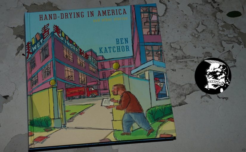
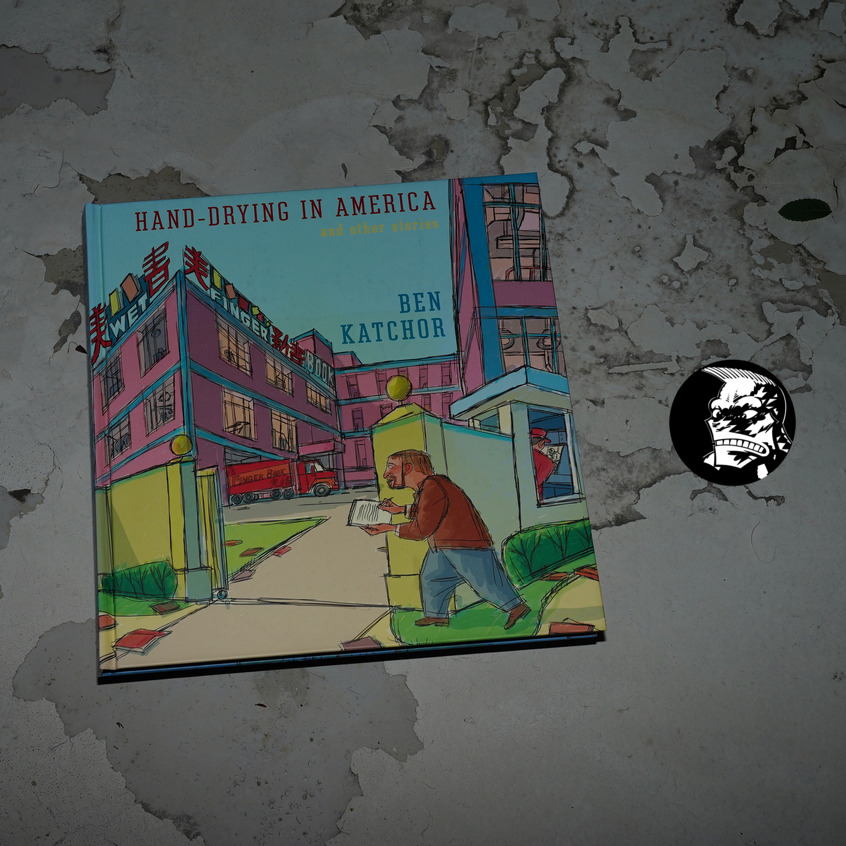
Hand-Drying in America by Ben Katchor (298x311mm)
This is a collection of strips that appeared in the architectural magazine Metropolis between 98 and 12, which is a marriage made in heaven, you’d think: Katchor had been doing stories about buildings and object design since, like, forever, so…
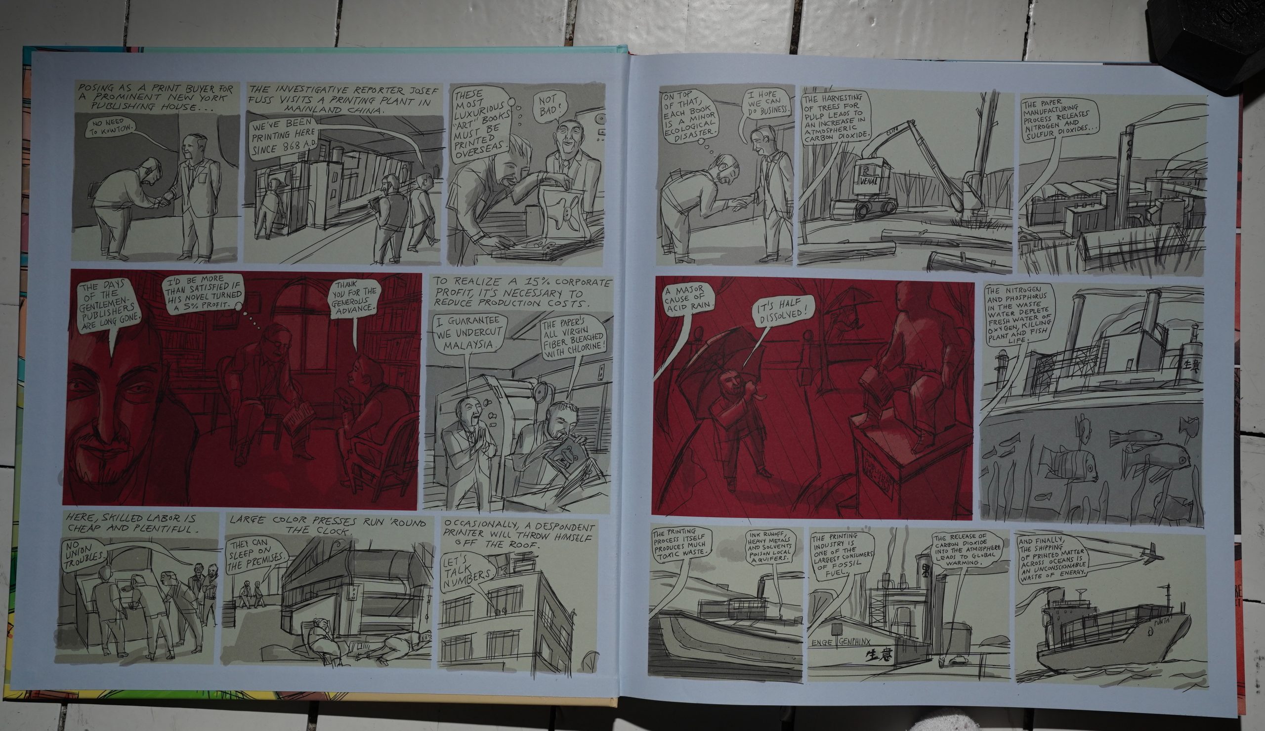
This is a big, jam-packed book: It’s 160 pages, almost square, and feels hefty. And we start off on the inside front cover with a thing about the environmental impact of printing books in China. (This book is printed in Chine.) It’s fun.
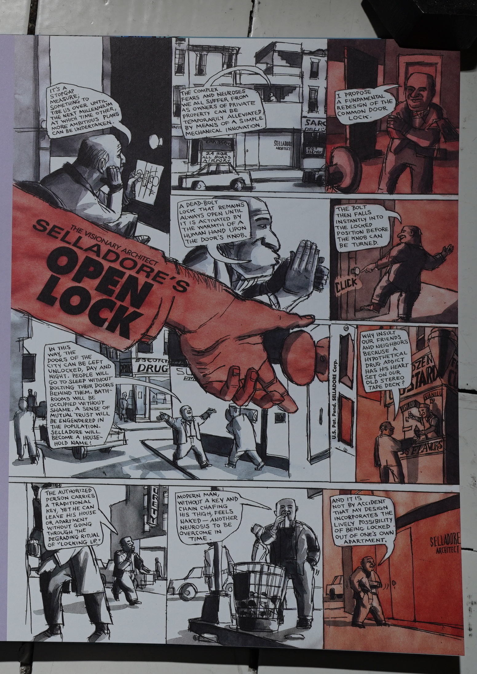
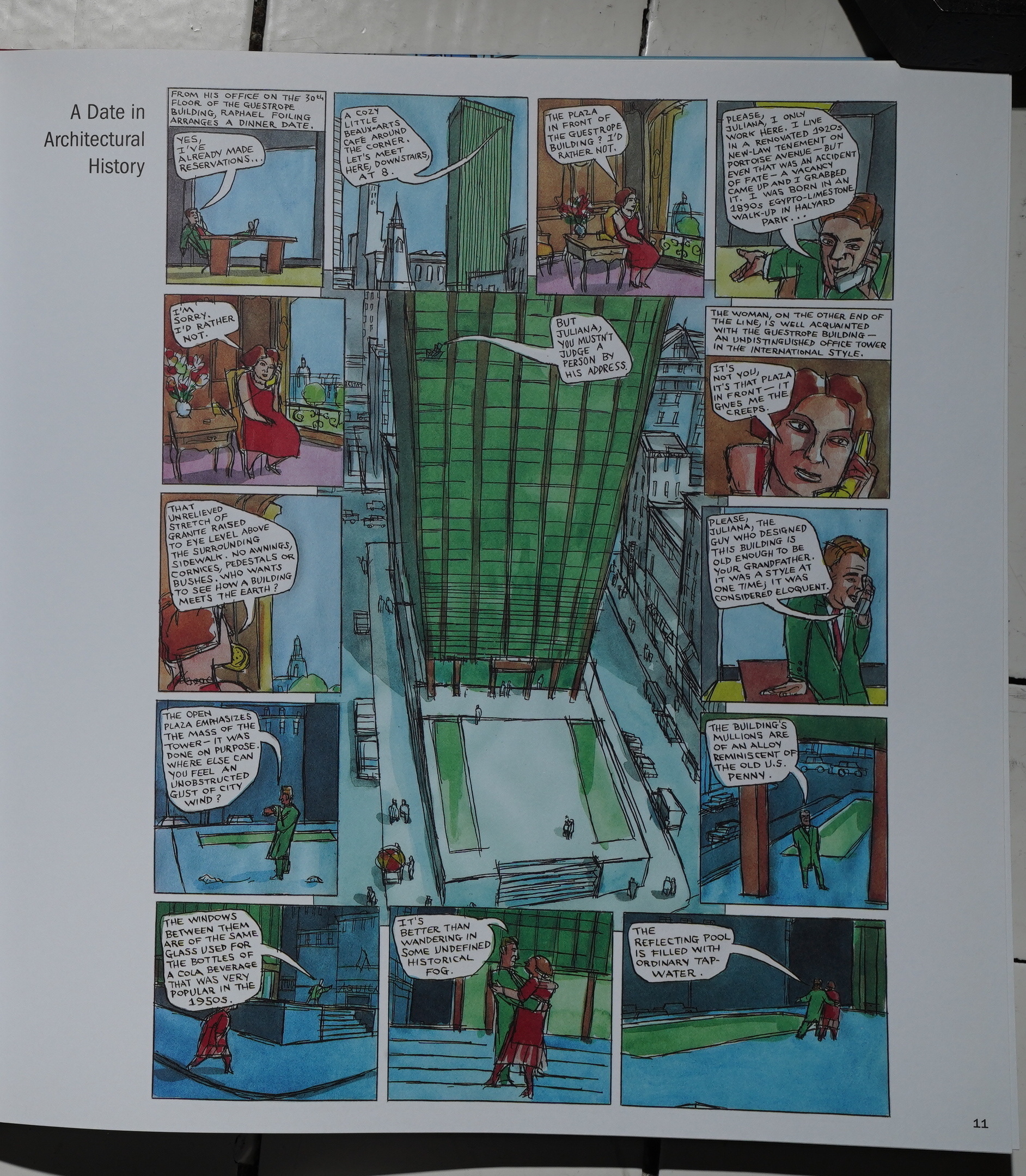
Katchor’s Julius Knipl, Real Estate Photographer weekly strip mostly adhered to pretty standard layouts, but Katchor’s doing more daring layouts here. He probably had more space to play with?
Oooh! Such gorgeous colours… but… I think I’ve seen that strip before? The first half dozen pages all seem really familiar to me, so perhaps they were printed in some anthology I’ve recently read for this blog series? Hm…
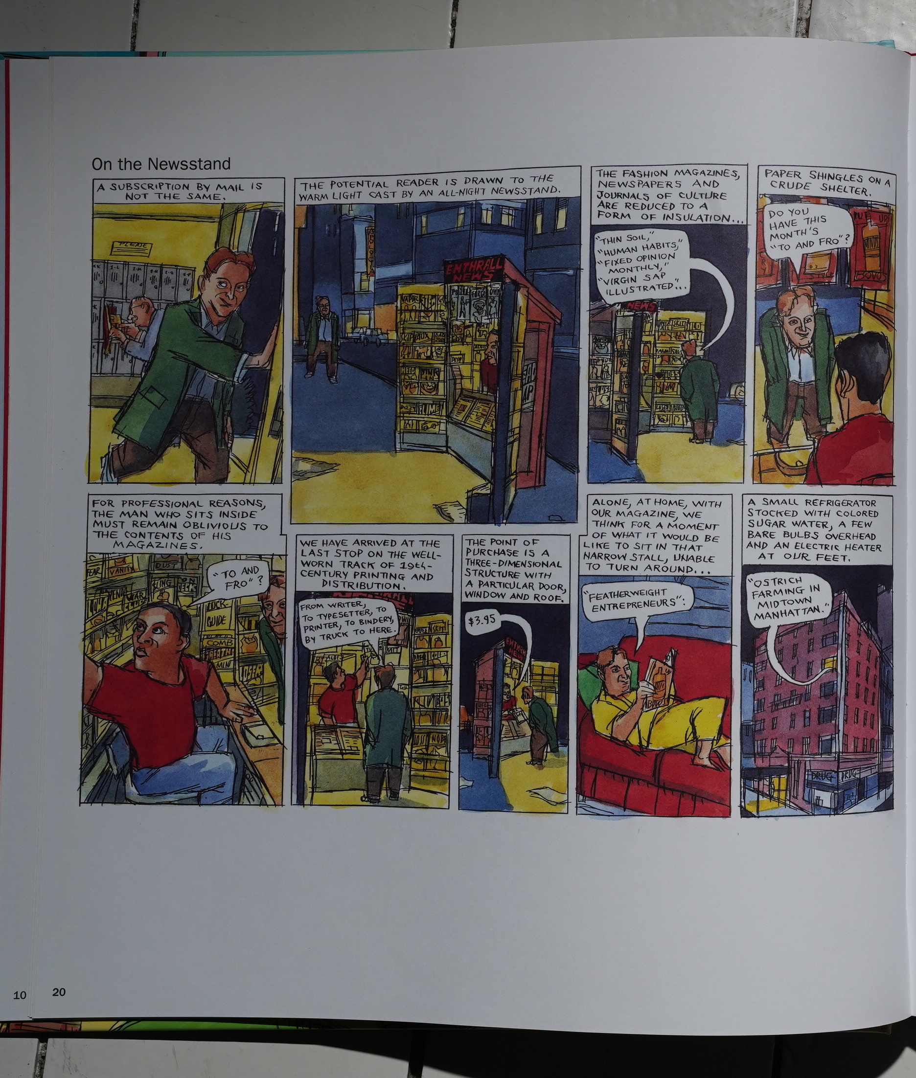
Anyway, after those pages, it’s all stuff I haven’t seen before, and Katchor sticks to his storytelling mode: A sort of nostalgia for things that may or may not be real (or a mixture of the two). Here’s a strip about the pleasures of buying a magazine from a newsstand. “For professional reasons, the man who sits inside must remain oblivious to the contents of his magazines.” Of course.
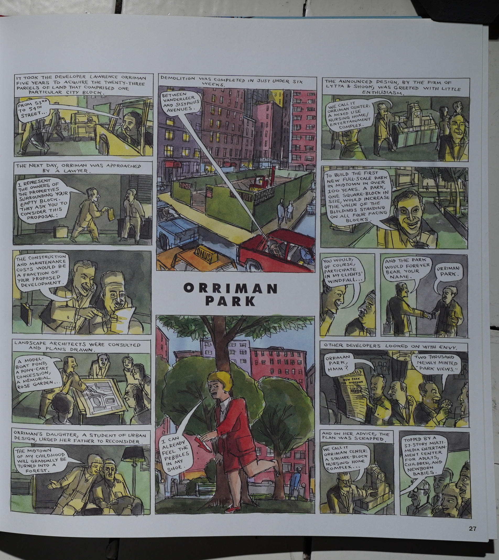
Katchor designs virtually all of his pages to be read horizontally. But on pages like this, he seems to be taunting people, daring them to find the correct sequence of panels to read. It goes well at first, reading the first three panels on the top, and then skipping the middle for a while, but do you do the panel with the daughter in the next-to-last row or in the final row?
This confusion somehow brings even more pleasure when reading this page; it’s a weird effect.
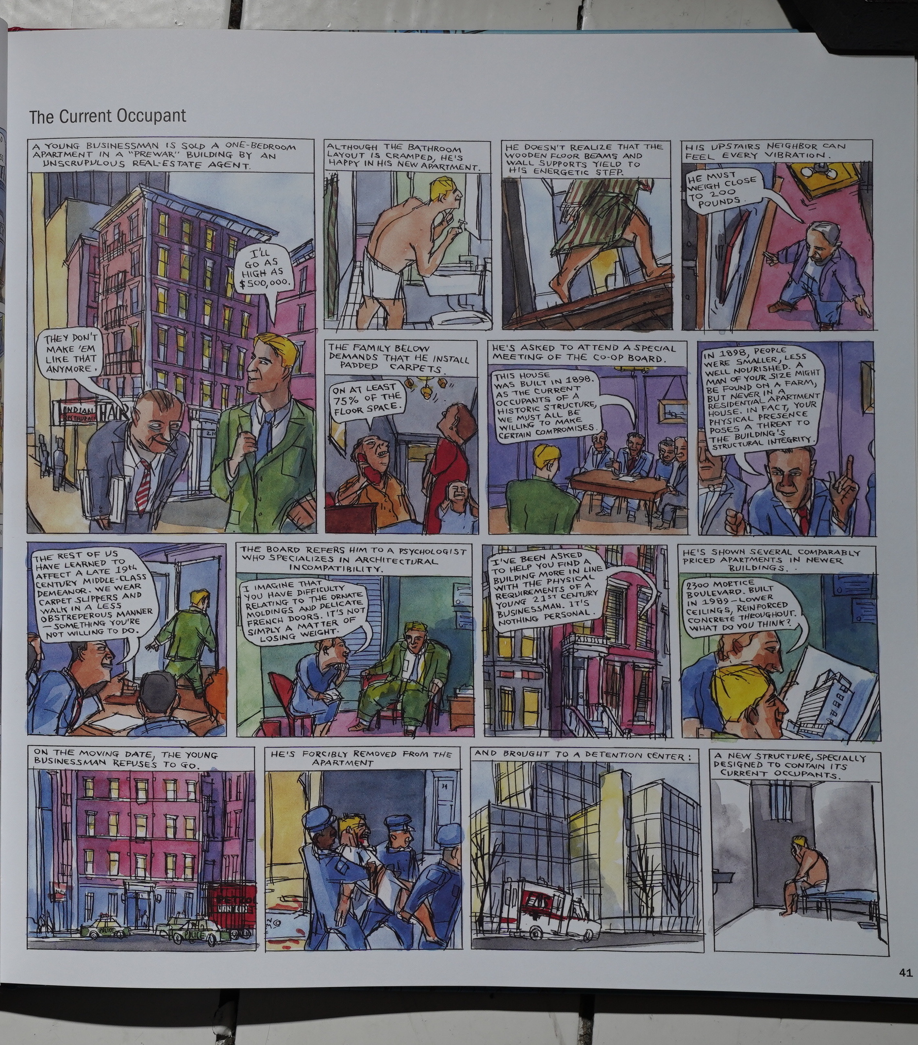
This page reminds me of my upstairs neighbours.
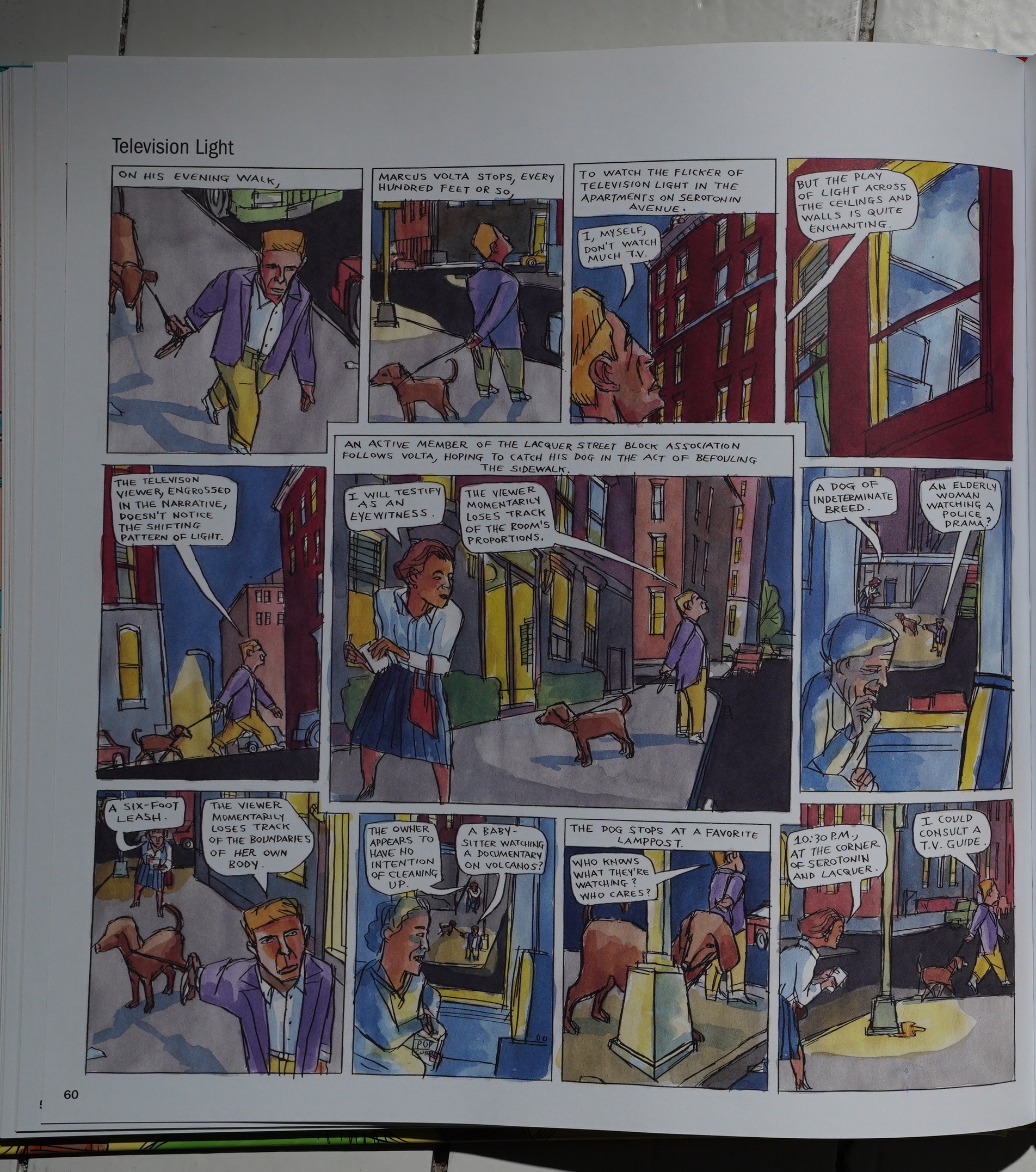
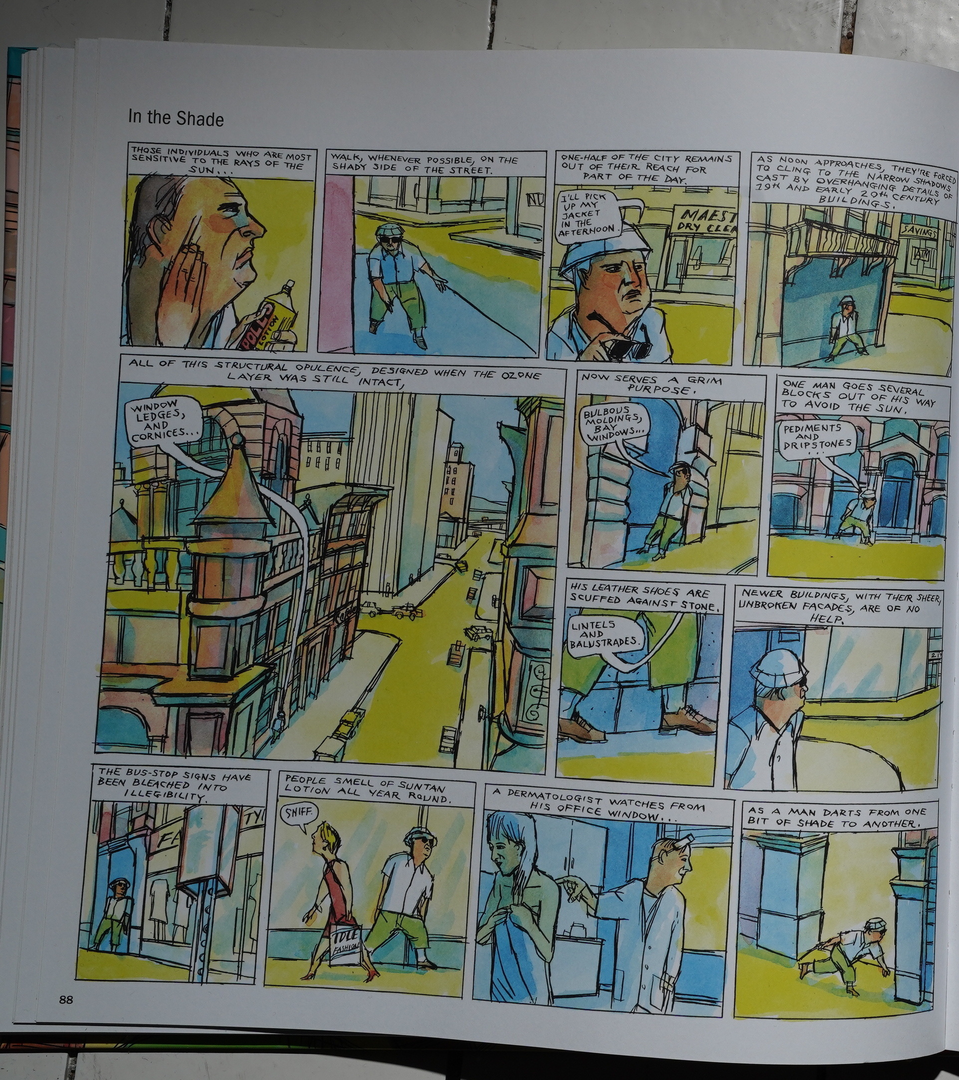
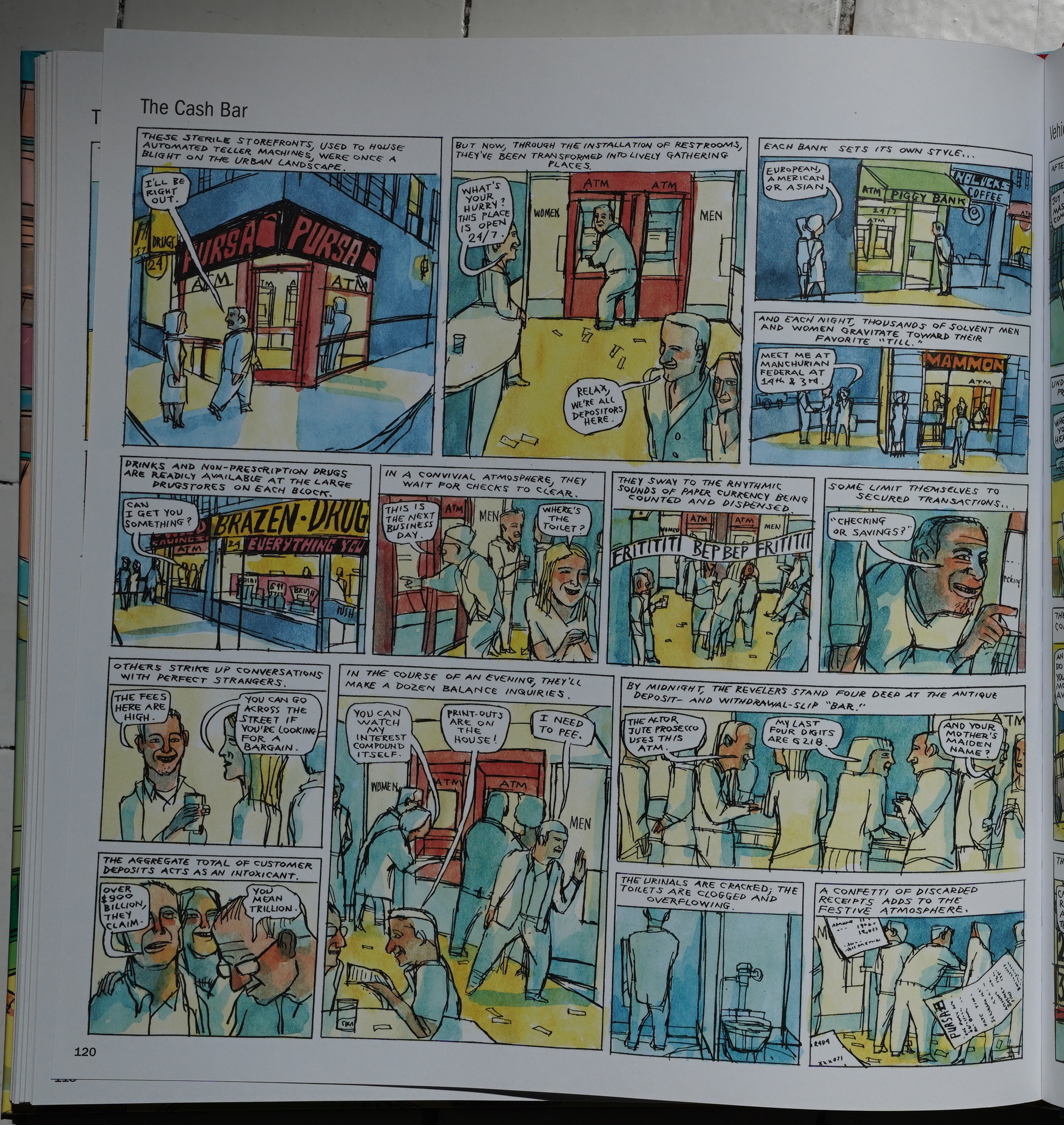
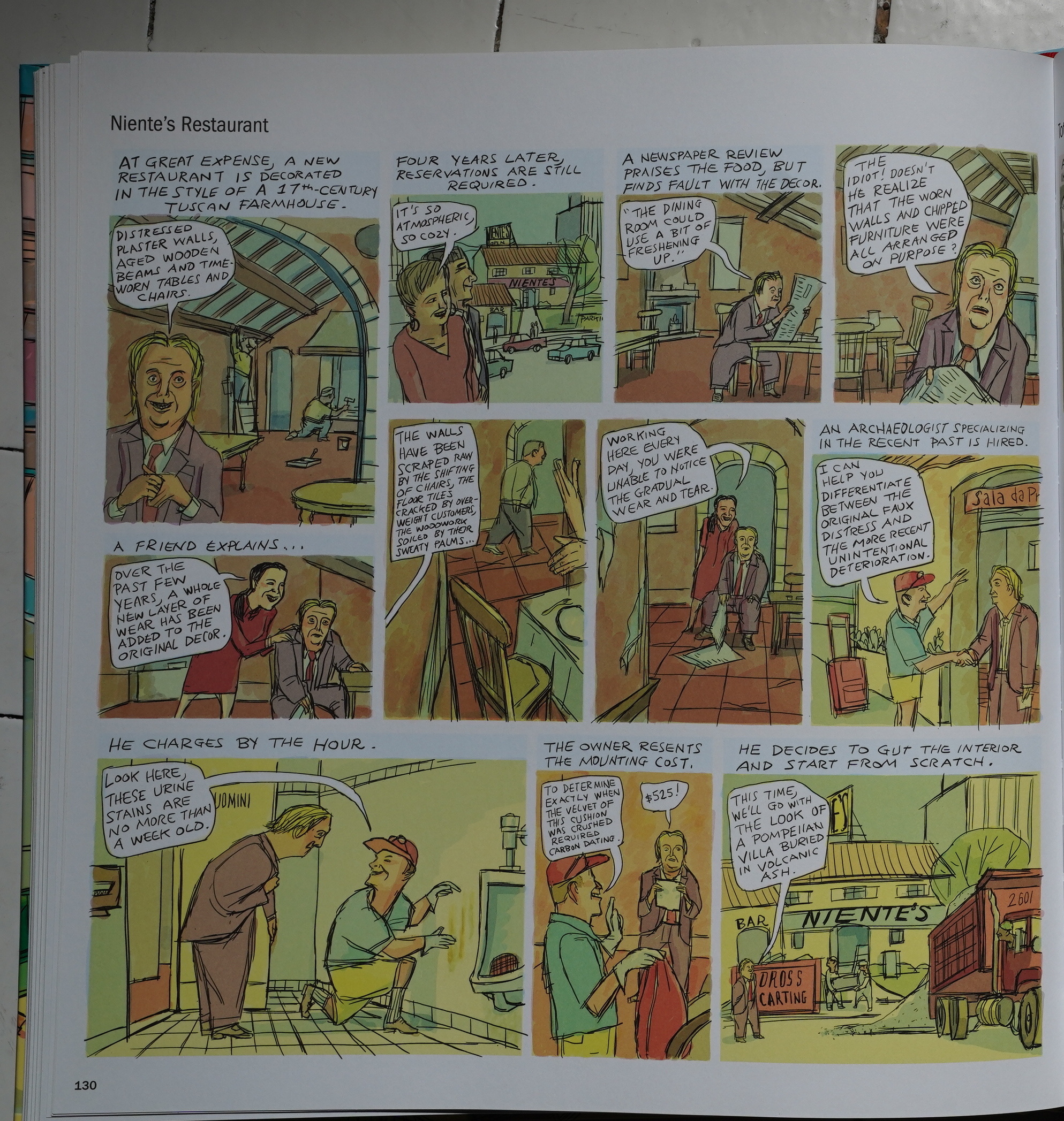
Katchor’s artwork seems to be subtly changing over time… his linework used to be more cohesive? Here he’s doing many lines that for his figures that don’t always seem to be quite right, so he leaves them all in? Look at the third-to-last panel, for instance, but it’s throughout, really.
I wonder whether he’s stopped pencilling and is just drawing straight in ink.
I feel seen!
It’s taken me the better part of a week to read this book — it’s not that it’s hard to read any individual page, but after reading half a dozen of them, my mind starts wandering, and I’m not able to absorb anything that’s going on, so I have to start re-reading, so instead I take a break… for a day or so…
It’s quite odd. Is it because each page is a whole entire new concept; a new world? It’s just a lot to take in, even if every page is funny?
As the book (and the years) pass by, it sometimes feels like Katchor is running out of concepts. The above feels pretty forced to me, for instance. Or is it genius? I’m not sure.
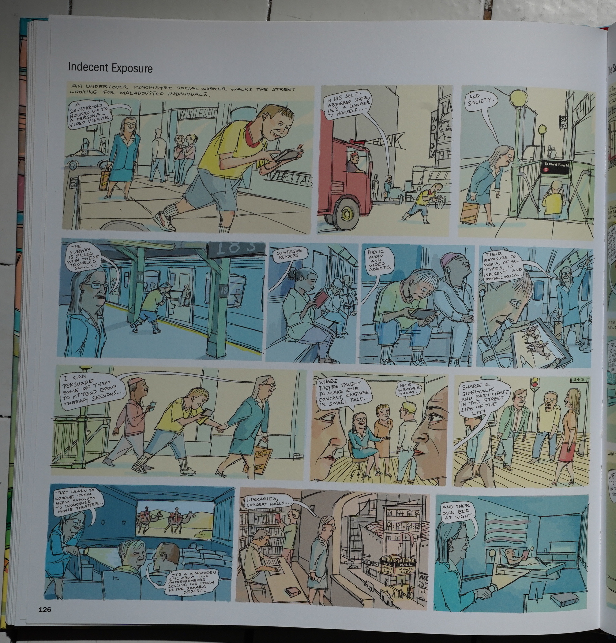
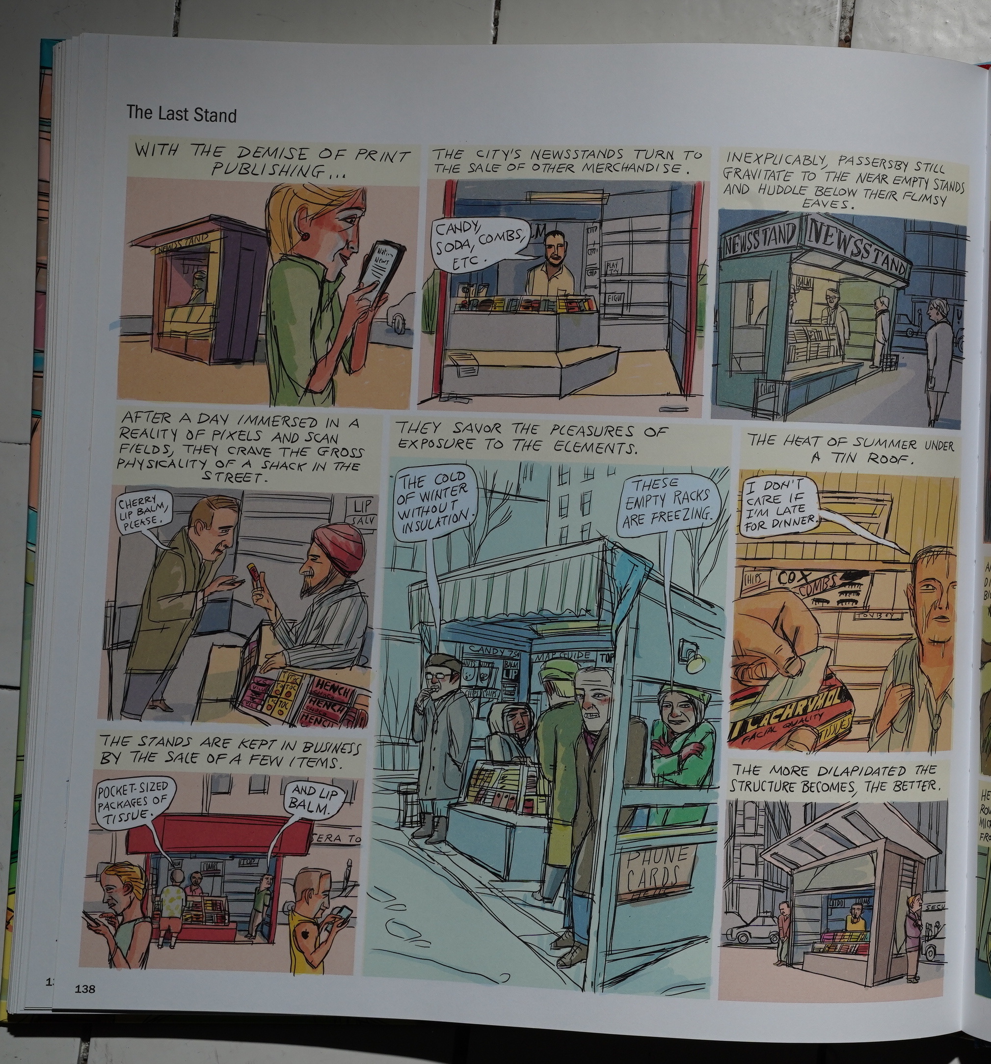
Then! Suddenly! Katchor’s art style changes completely! Well, OK, not completely — his characters still have that forward motion posture — but the panel borders are gone, the lines are a lot lighter, and the absolutely gorgeous watercolours are gone. Instead this seems like it’s coloured in Photoshop (or on the computer, at least).
It’s so jarring. I’m guessing this is all a labour saving device? Because it’s not an improvement in any way.
(Or did he get assistants?)
So the last quarter of the book isn’t as good a read. The first half is magnificent, and then it slips a bit, and with this style change, I felt myself lose interest for real. Even the lettering is starting to look sloppy.
But I mean… it’s still good… Here he returns to the newsstand motif, and I guess this strip was created during the magazine crash years: When it started (98?) we were probably at peak magazine, but by the end (12?) so many of them had folded.
*sniff*
Anyway — this book has some of Katchor’s best work. It’s a very handsome coffee table book, and I’d recommend keeping it on the table and reading a strip now and then to bring some magic and mystery into your life.
It seems to be well-reviewed, but in somewhat non-specific terms:
Elliptical and mysterious but never abstruse, the picture-poems of Hand-Drying in America celebrate the mundane world around us by revealing it to be anything but. Yet the nature of this celebration is cool and intellectual — Katchor isn’t interested in evoking anything as sentimental as wonder, nor could you accuse him of preciousness. His approach is too rigorous for that, his language too impassive.
Hm:
Strikingly, in the final strip of the book (aside from the meta-commentary Katchor loads into the endpapers and covers), the cartoonist draws together all the strands he has lately been following—the digital, the global, the historical. The page uses the graphics-overload of the cable news broadcast as a starting point from which to discuss the history of television journalism, the media’s blinkered politics, the public’s short-term memory—even the semiotics of the mid-century necktie.
Hand-Drying in America and Other Stories is satirical and sardonic, wry and pedantic, observant and obsessive, trafficking in big concepts and hopelessly bogged down in the trivial, sharply focused and yet oblivious, celebrating permanence while exploring change, impressionistic yet precise.
Katchor’s wry humor and unique view on the subject are well worth exploring.
If this makes “Hand-Drying in America” sound sad, it isn’t really, although it is certainly bittersweet. Katchor can be funny, and many of his strips have punch lines, although the humor works in subtle ways.
This blog post is part of the Punk Comix series.
I haven’t read this collection. But apparently Katchor switched to using a Cintiq graphics tablet at some point during his Metropolis run. He’s defended the, um, innovation by claiming not scanning his work gives a purer line or something….