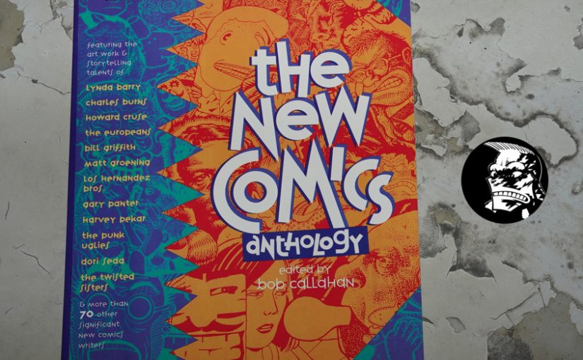
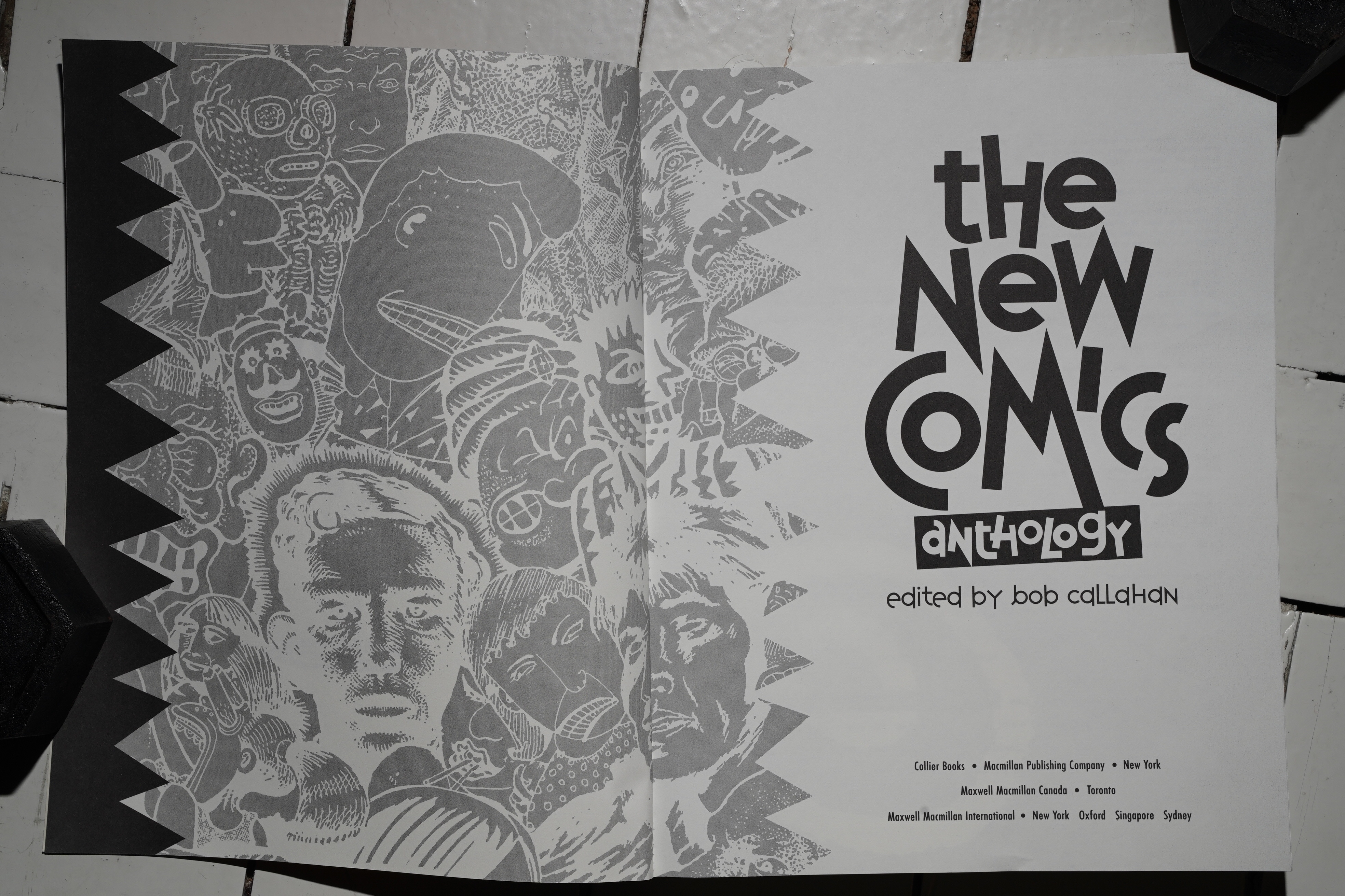
The New Comics Anthology edited by Bob Callahan (218x278mm)
I was googling for anthologies of “new wave comics” (etc.), and I came upon this book, and I immediately though “hey! I’ve got that one!” So I spent half an hour looking through the shelves, but didn’t find anything.
But it looks so familiar…
… and then I realised that that’s because it’s basically the same design that all of those 90s Knockabout comics used — and the same format, too: The European squarebound paperback album format.
OK! So … this is a three hundred page overview of “the new comics”… published by Macmillan? And I didn’t even know it exists?
It sounded so unlikely, so I got a copy off of the intertubes, and now I’m going to read it. Perhaps it’s … very bad or something? It sounds unlikely given the list of contributors.
Hm… Collier Books… Macmillan… Oh! They were one of the cheapie British paperback publishers? Owned by Rupert Murdoch? Or do I misremember?
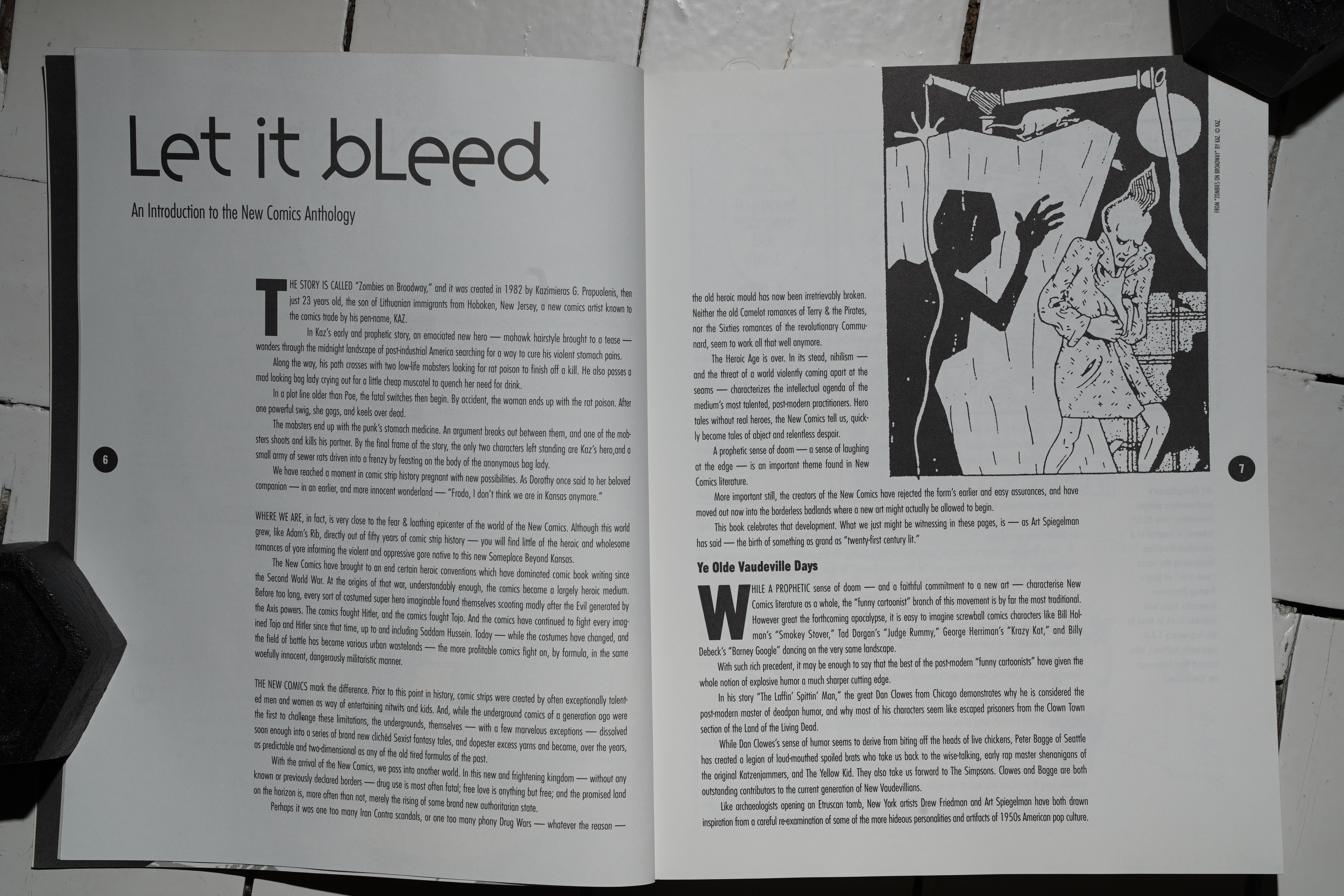
We start off with an introduction to the concept of, like, “comics aren’t just for kids any more”, even if Callahan doesn’t use those words. And then we get a short introduction to many of the artists featured, which feels pretty much like filler, because it’s just a sentence or two…
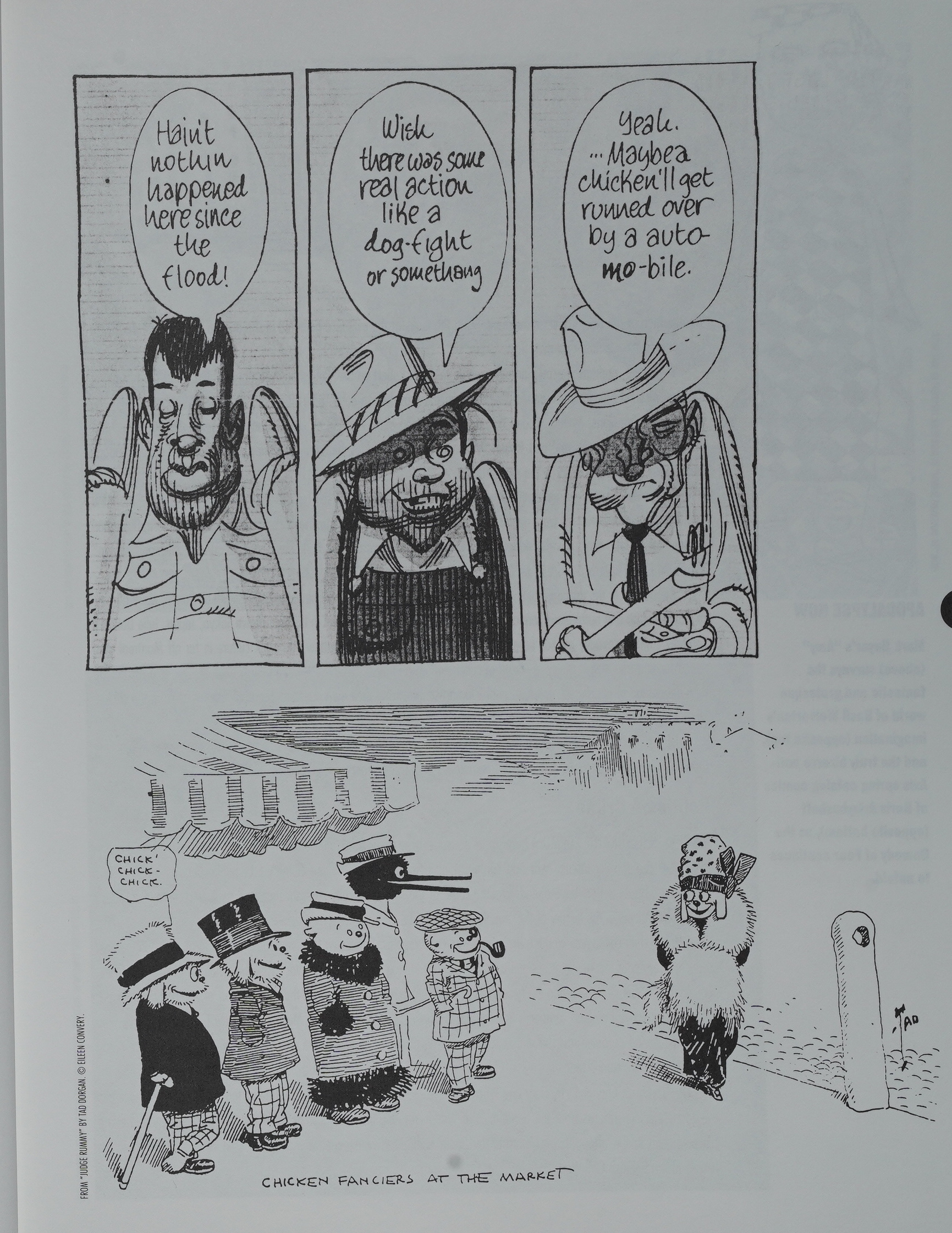
A couple of pages of oldee tymey comics…
The book is divided into four sections, and in the introduction he (correctly) claims that it’s the fourth section which is going to be the important one — the auto/biographical section. But it’s a weird way of undercutting the other three sections that come before it.
And what’s with the font here? Is it ultra-condensed Futura? It looks so wispy and small that it feels more like a printing error than anything else — it’s the opposite of “ink bleed”: It seems like somebody’s saving on the ink budget.
OK, on to the comics. The sections are introduced like this: First a page that describes what it’s all about, then a very short text about what each piece is about. Which, again, doesn’t really seem… necessary…
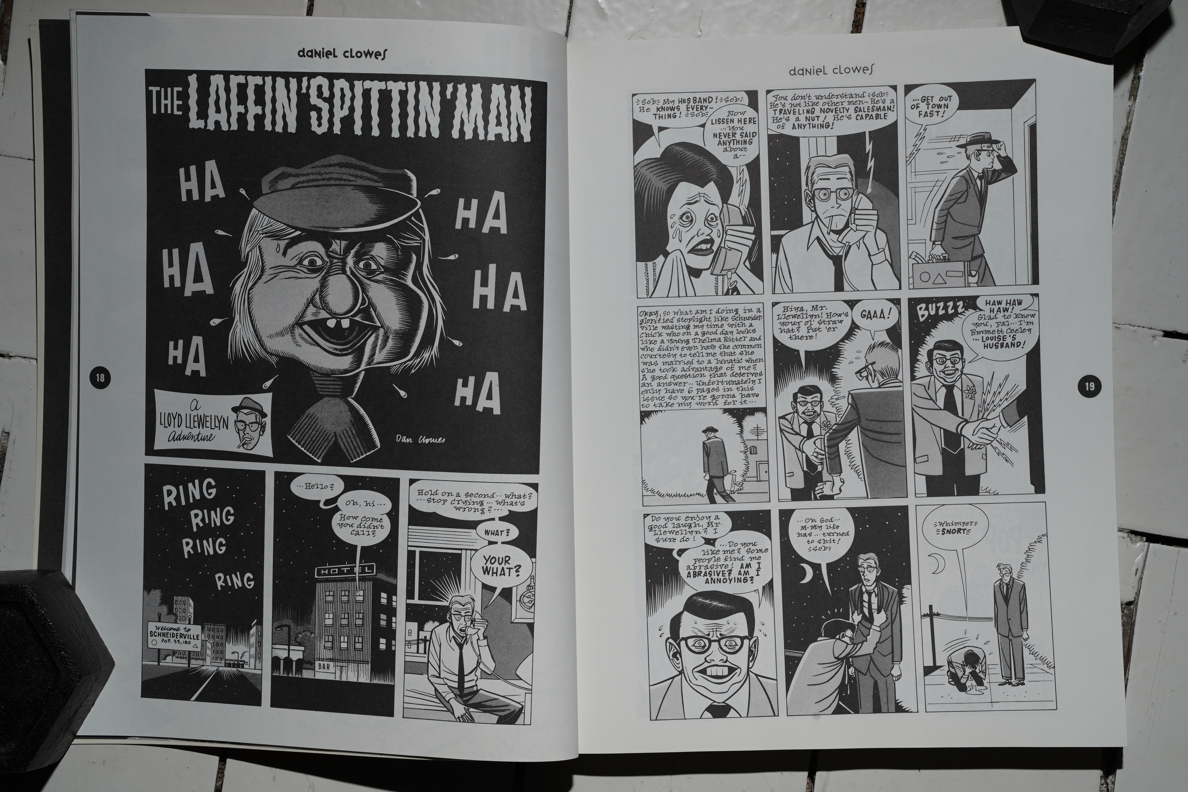
Callahan starts the book off with a section of funny comics, and Daniel Clowes gets the honour of being the first one out — with a somewhat atypical Lloyd Llewellyn story. But it’s a very funny one, so good way to get started.
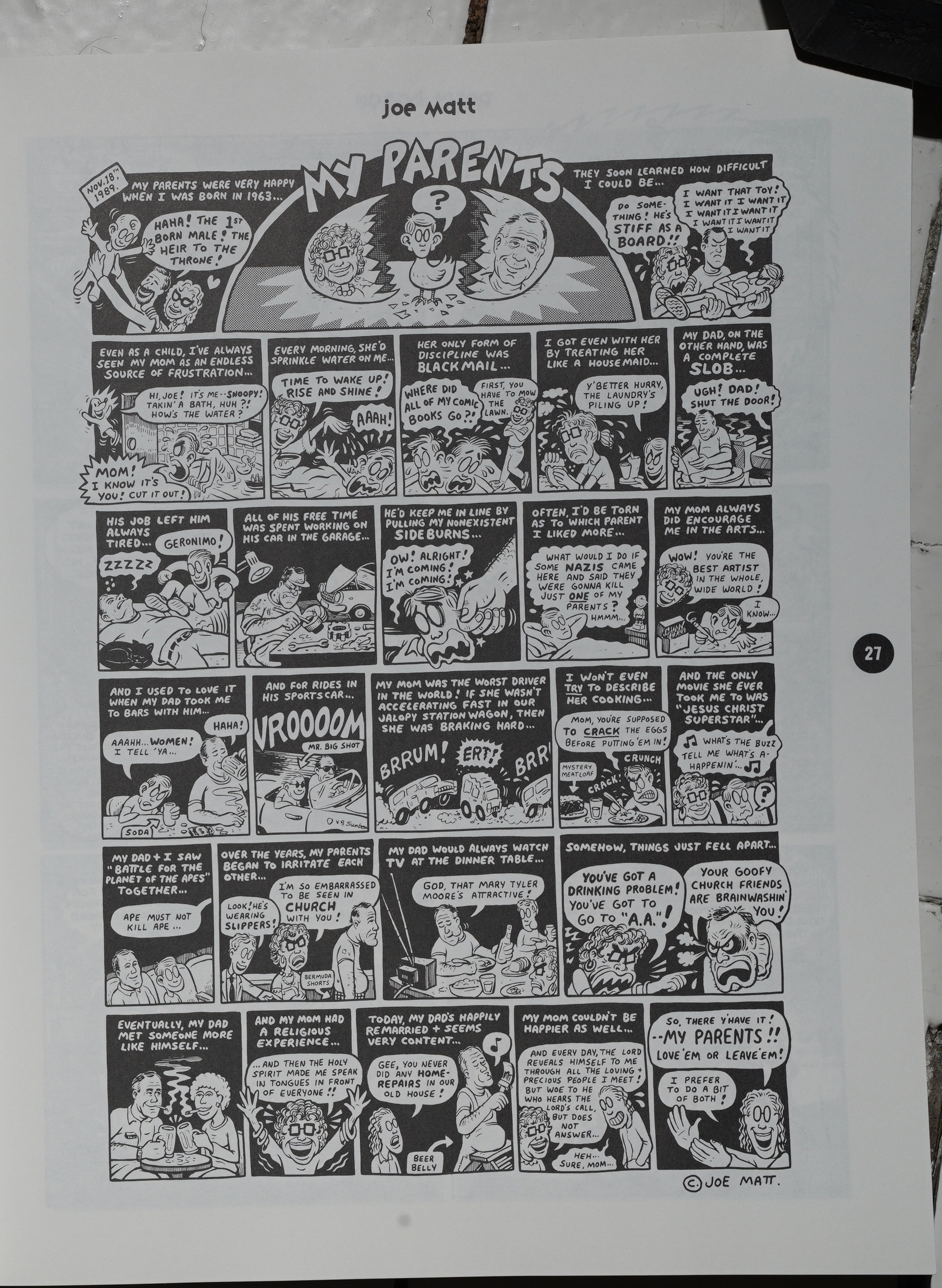
But the problem with this book becomes clear pretty soon: The pieces are just so short! I think the median length is 2 pages — it makes for an exhausting reading experience. Joe Matt just gets one page! I mean, it’s a good page and all, but it makes you feel like perhaps you should dig out that Joe Matt collection instead of continuing to read this book. That is, it feels like reading a sampler, or a catalogue — something that’s designed to make you go buy something else.
The reproduction is also pretty uneven. Some pieces look totally great, and others look like… er… they were scanned and then printed out with a too low resolution? I know, this in 1991, and that can’t really be the case, but it has that ugly look.
(OK, the artist’s name is on every page here, which is very helpful, so you can just read the top of the page if you wonder who made it, and then I won’t have to type it down here. OK? OK.)
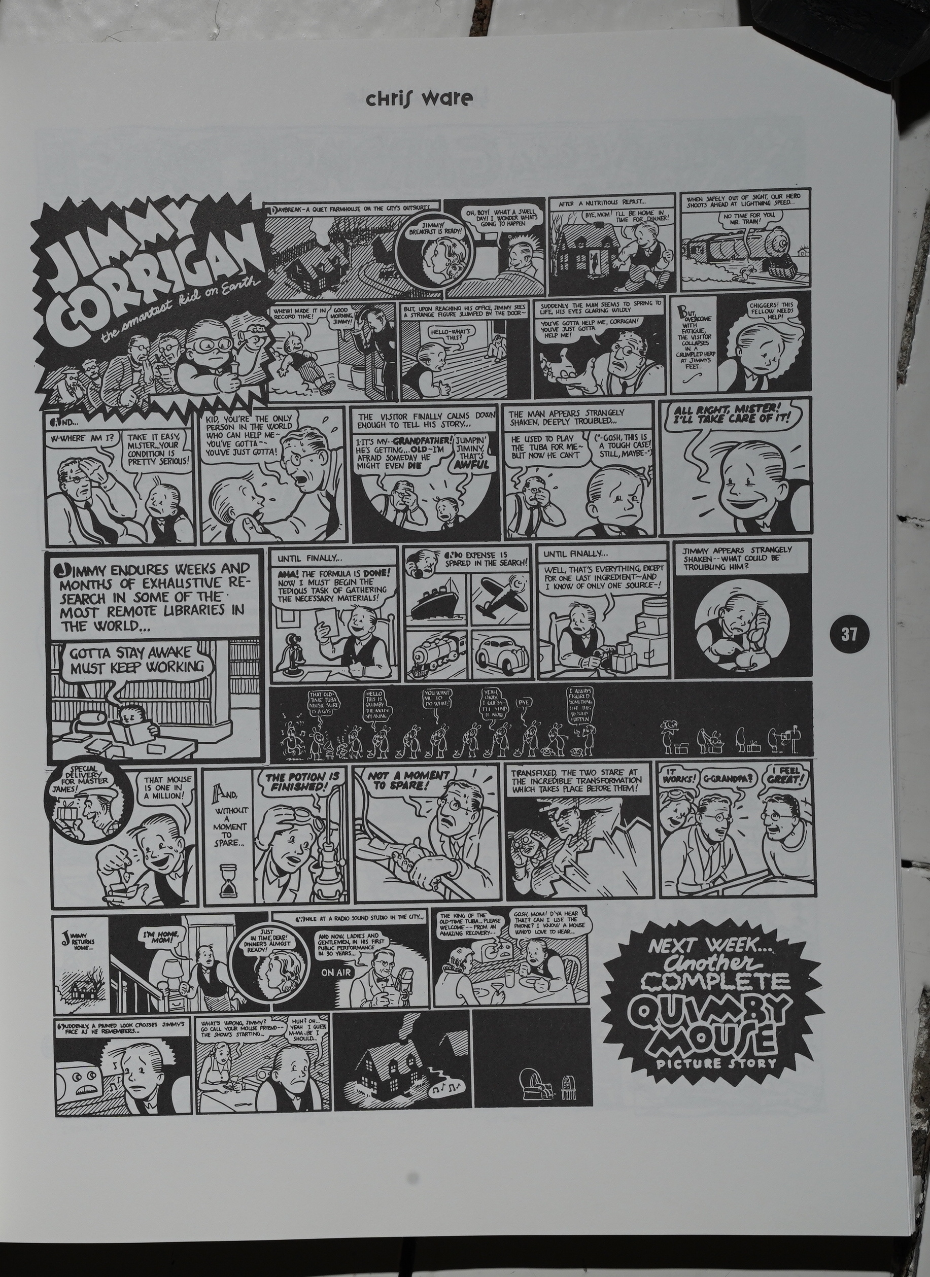
Huh! This Jimmy Corrigan page didn’t look immediately familiar, but reading it, I realise that I must have read it before. So did I really read this collection back in 91? Or… has it been printed somewhere else?
This book doesn’t say anything about whence the pages were sourced, but comics.org people have been putting together some sources. They have a “?” for this one.
Hm.
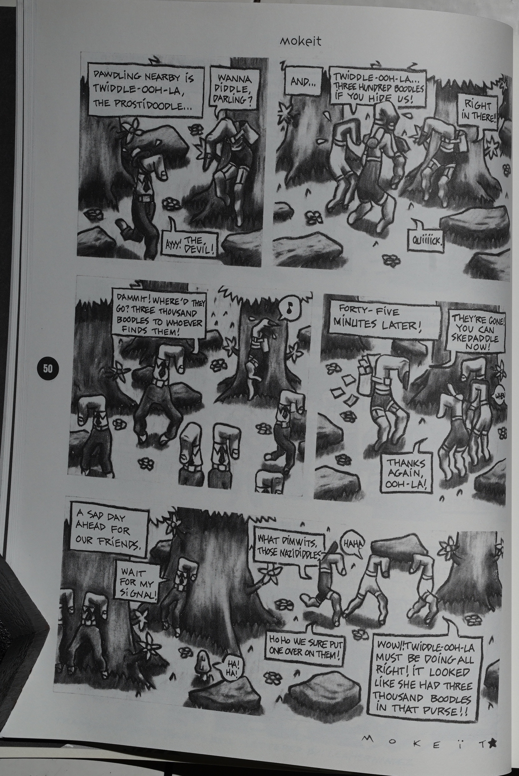
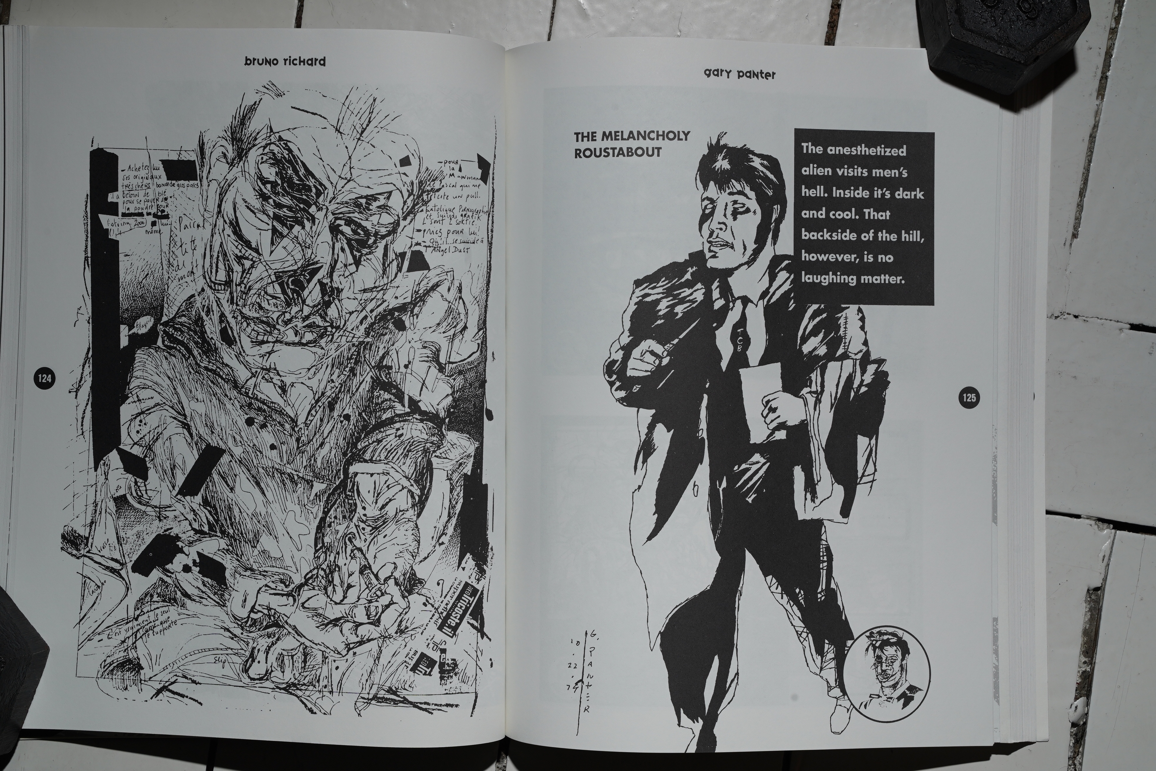
You can’t fault Callahan’s selection of artists… but… the works he’s selected from these artists is often puzzling. Like — Mokeit has done a lot of good stuff, but this is a pretty odd thing to include. (It’s nicely reproduced, though.)
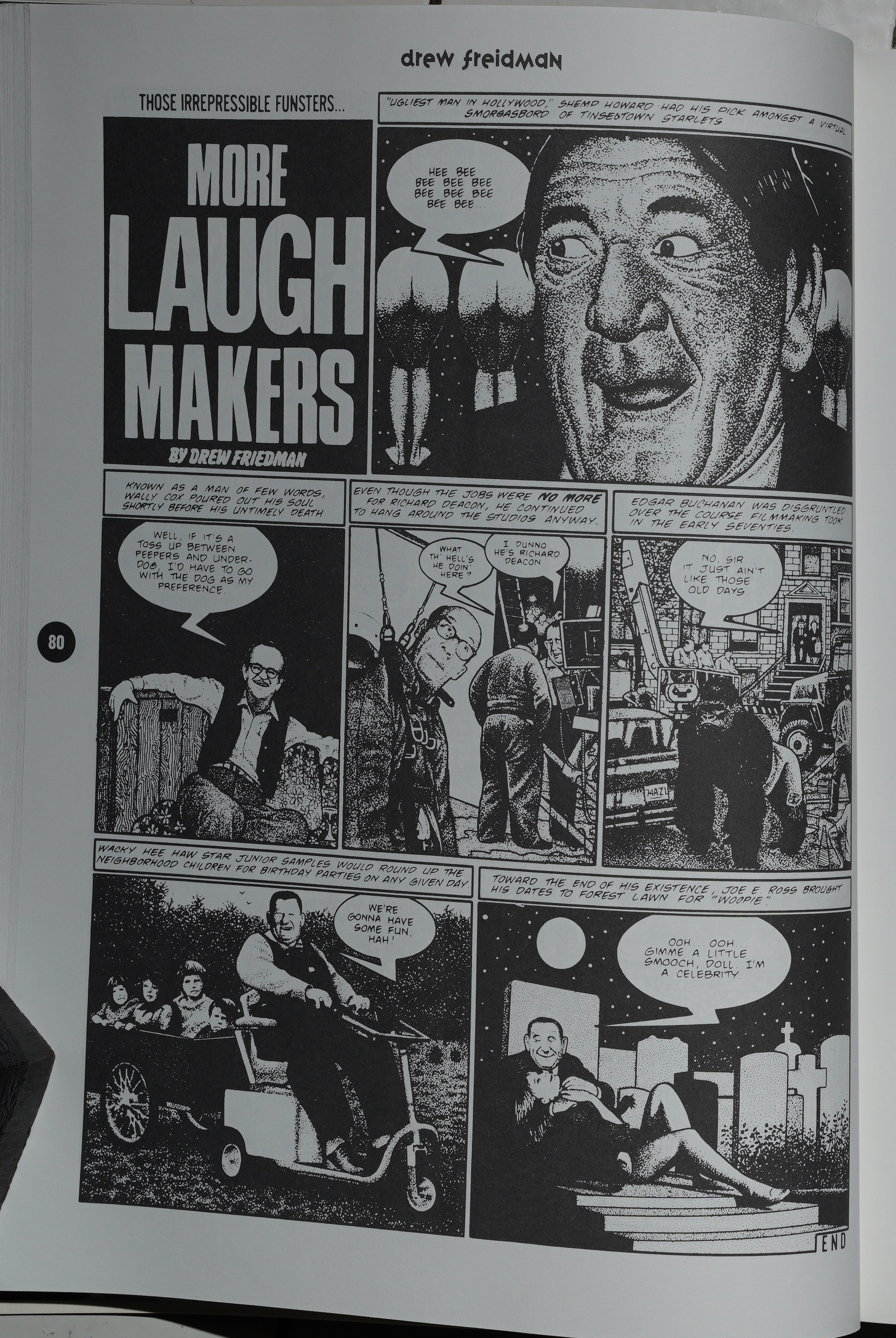
These Drew Friedman pages are horribly reproduced. Shot from an old issue of Heavy Metal or something?
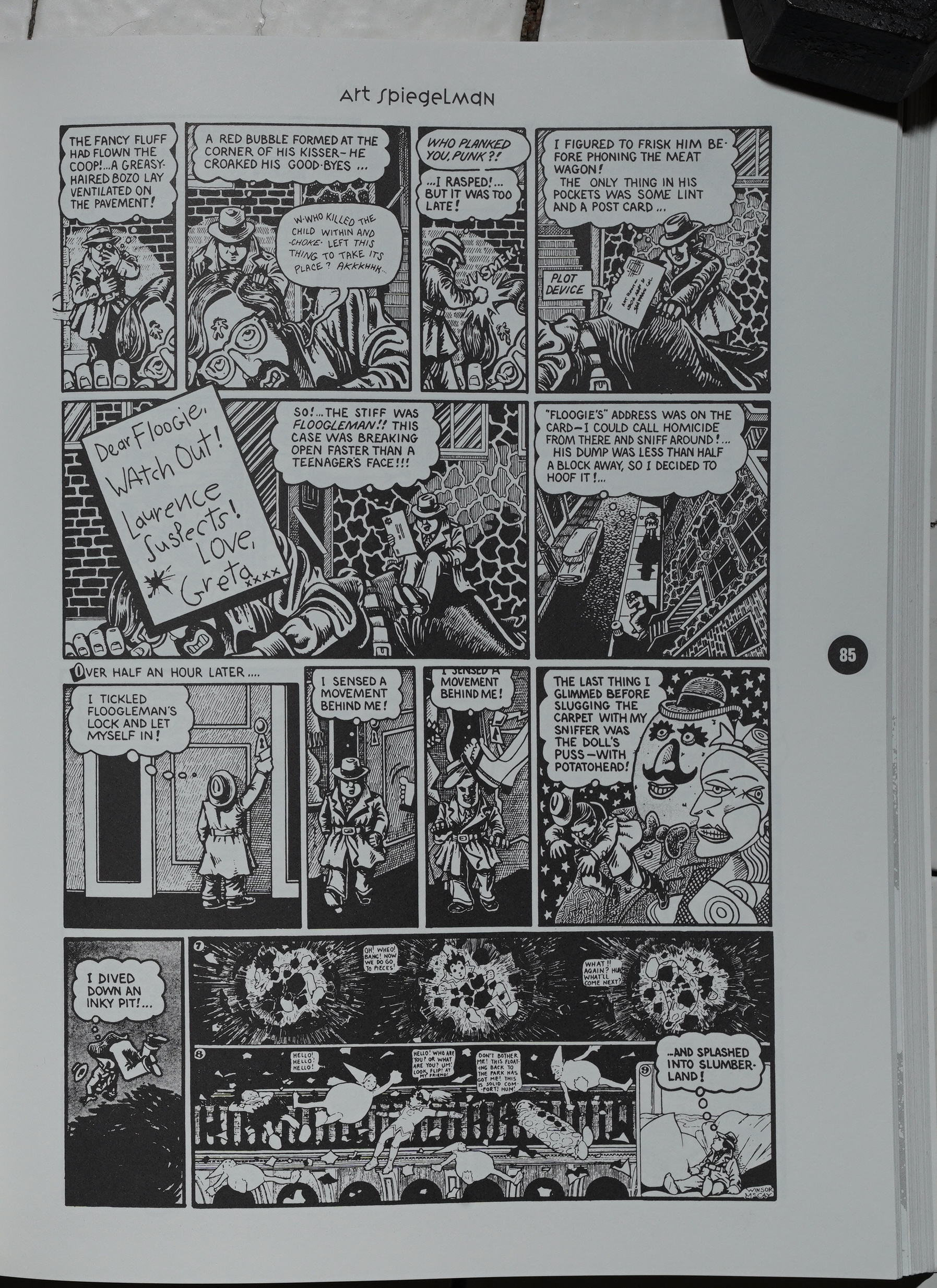
Callahan says that he’s not excerpting Maus, because doing just an excerpt would be a disservice to Maus, so he instead does Ace Hole, Midget Detective.
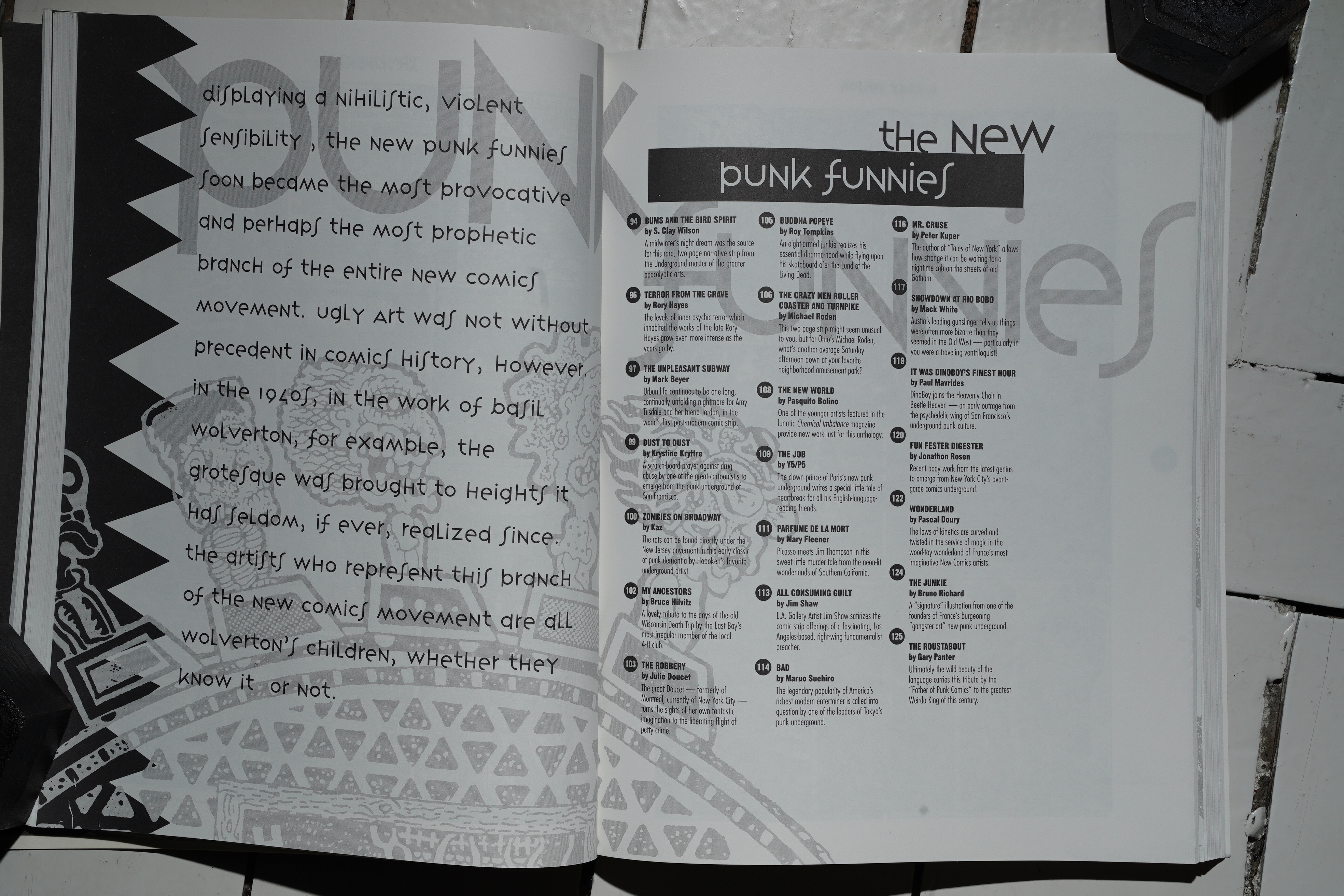
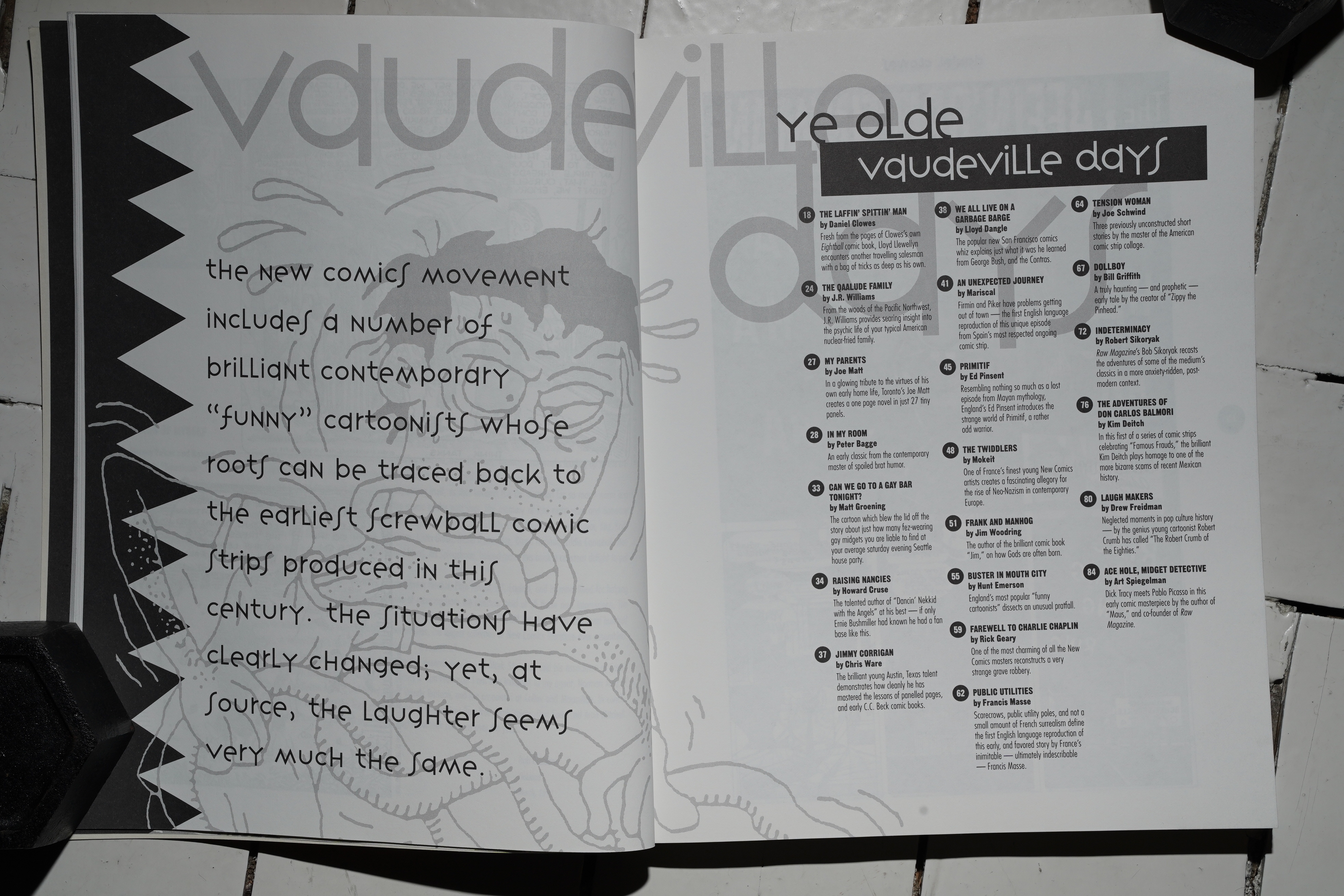
OK, here’s the chapter that made me want to include this book in this blog series: The New Punk Funnies section.
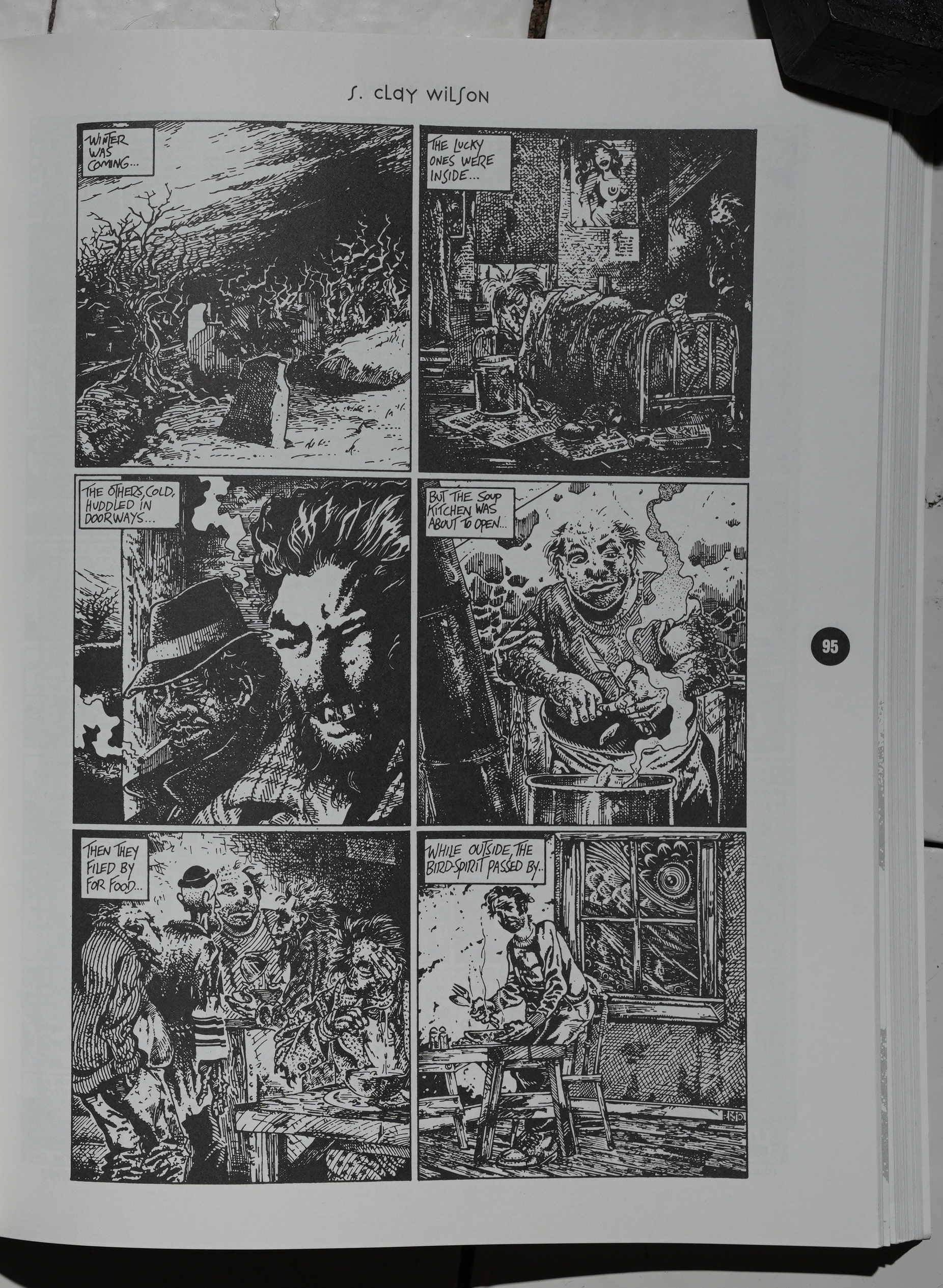
And he starts with… S. Clay Wilson!? The quintessential Underground artist? But perhaps he wanted to show that there was some continuity… at least in line quality…
(And the reproduction is horrid.)
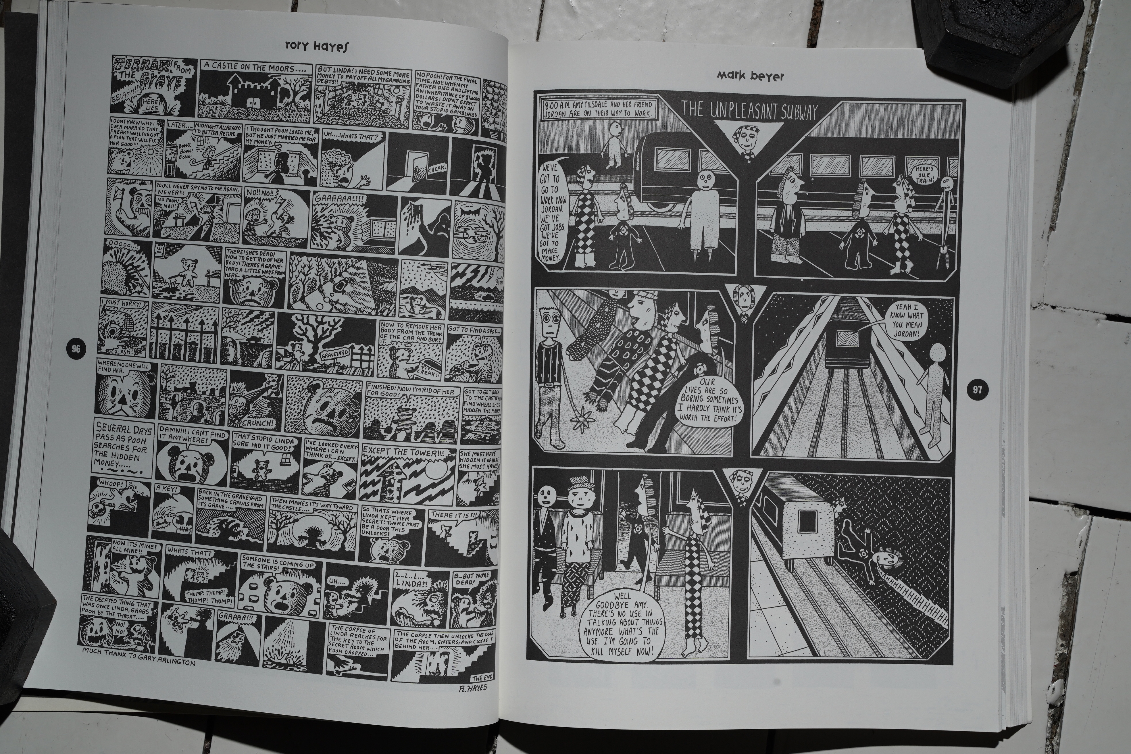
Juxtaposing Rory Hayes and Mark Beyer isn’t original or anything, but it shows that some thought has gone into sequencing.
Since so many of these strips are two-pagers, you’d think Callahan would usually print them as two page spreads. But more often than not, you get a strip that starts on the right hand page…
… and then you flip the page over and get the concluding page. It’s just odd.
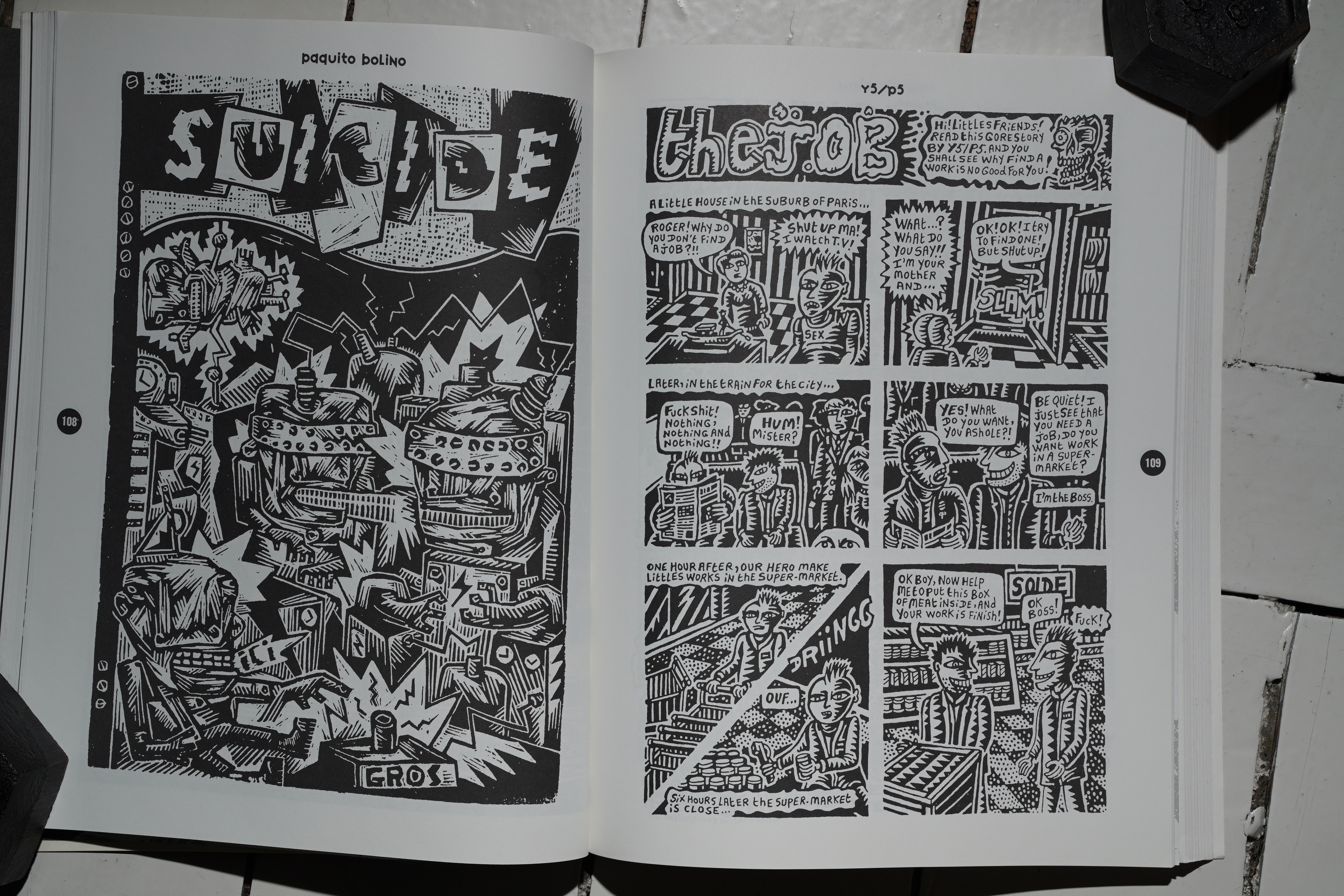
When it comes to readability, the Punk section is the worst. More of these are badly reproduced than the other sections, and about half of them are single pages — giving absolutely no chance to develop anything. It “look at this” and “look at this” and that’s it. They aren’t bad pages, but it’s relentless and off-putting.

We get a single Japanese contributor. (Also note the random way the artists’ names are bolded or not.)
We do get a lot of good stuff, though. It’s just… It feels like Callahan had a list of people he wanted to include, and then he included as little as possible from every person (because he only had 300 pages at his disposal).
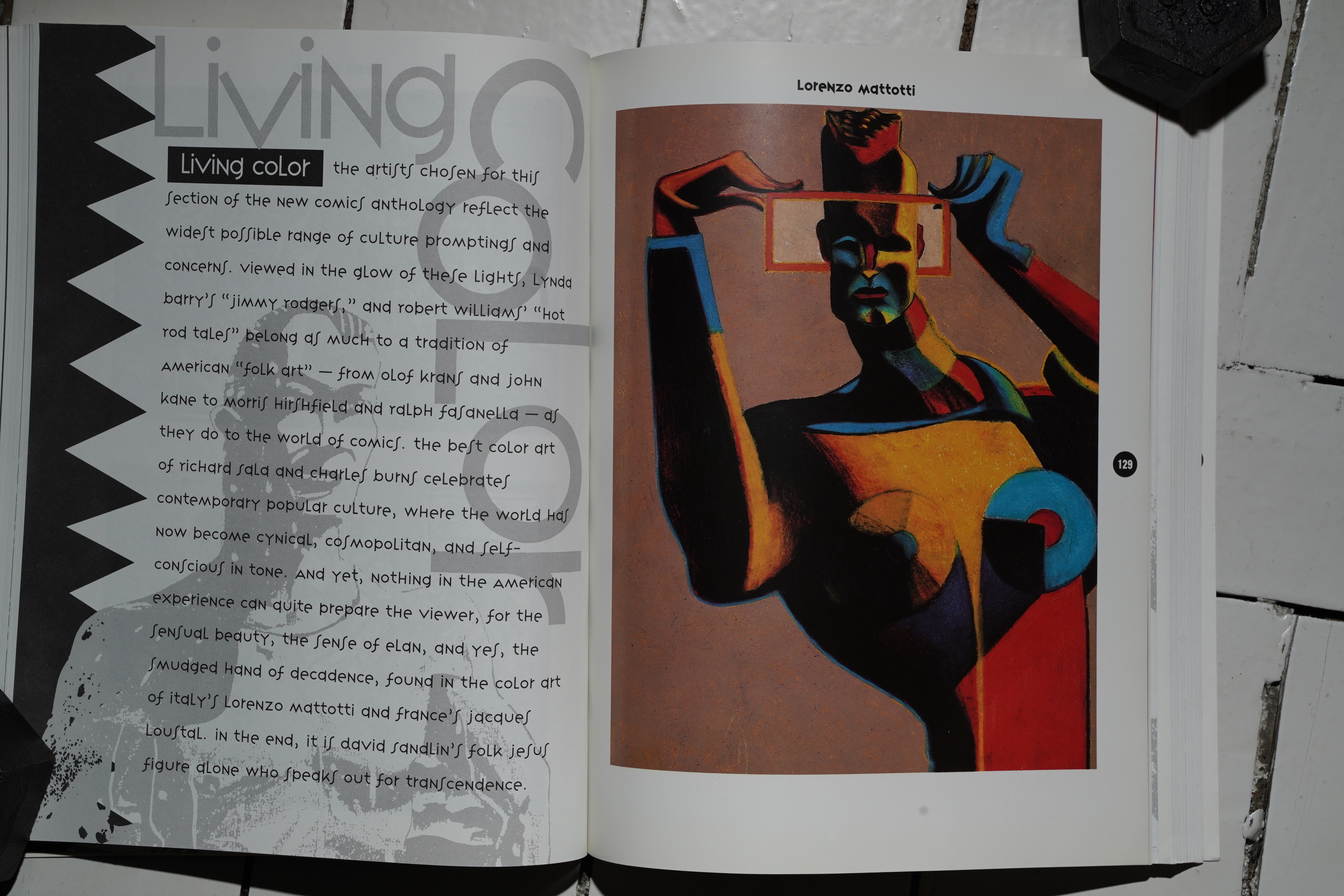
These days, printing costs have gone way down, and people print books in colour or black and white as the fancy takes them, and not for economical reasons. (Well, OK, somewhat.) But back in the early 90s, colour was expensive, so we only get a few (glossy) colour pages in the middle of the book.
Again, Callahan shows good taste. (That’s Mattotti to the left there.)
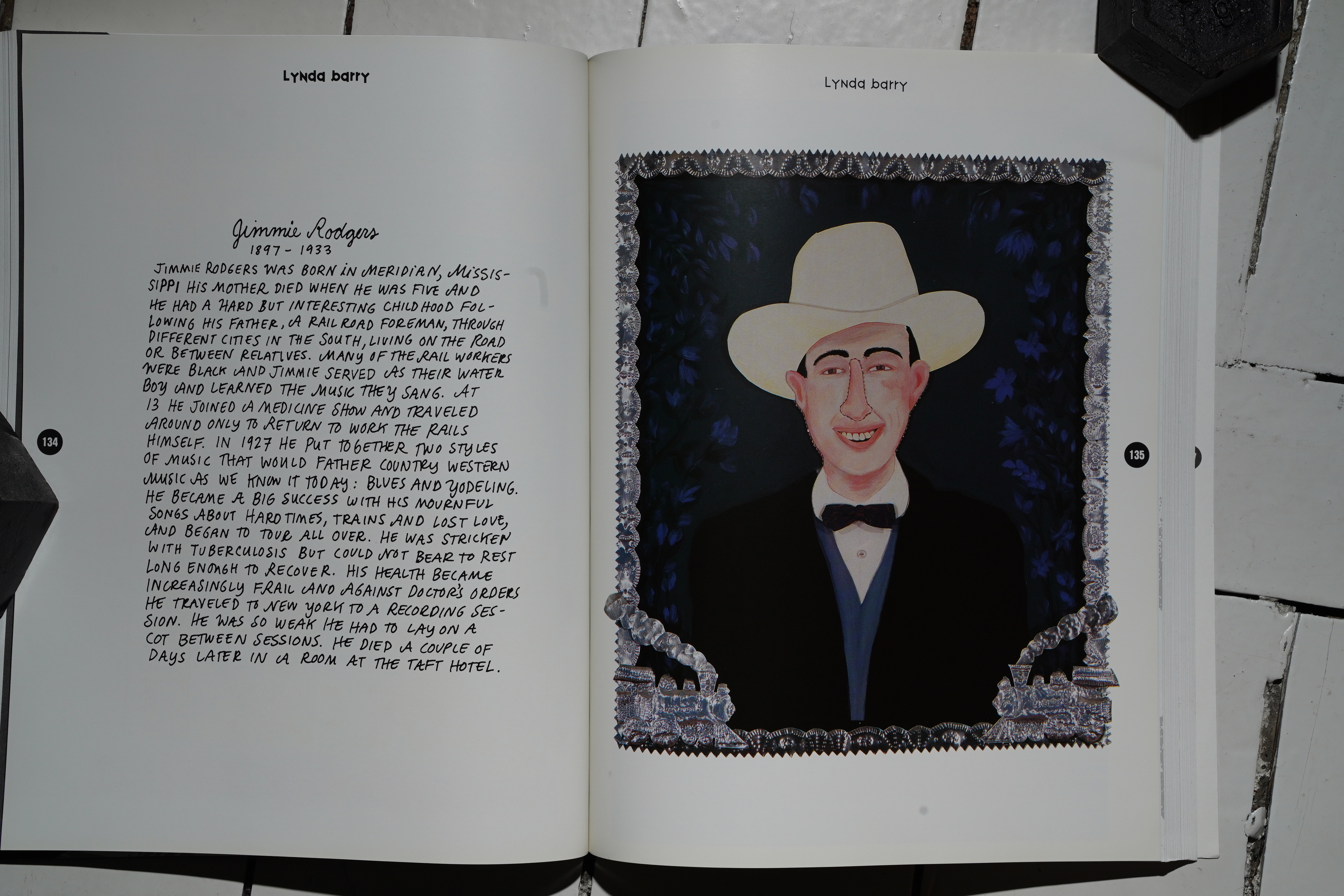
And… this is what he chose to include from Lynda Barry!? Er. Well, OK.
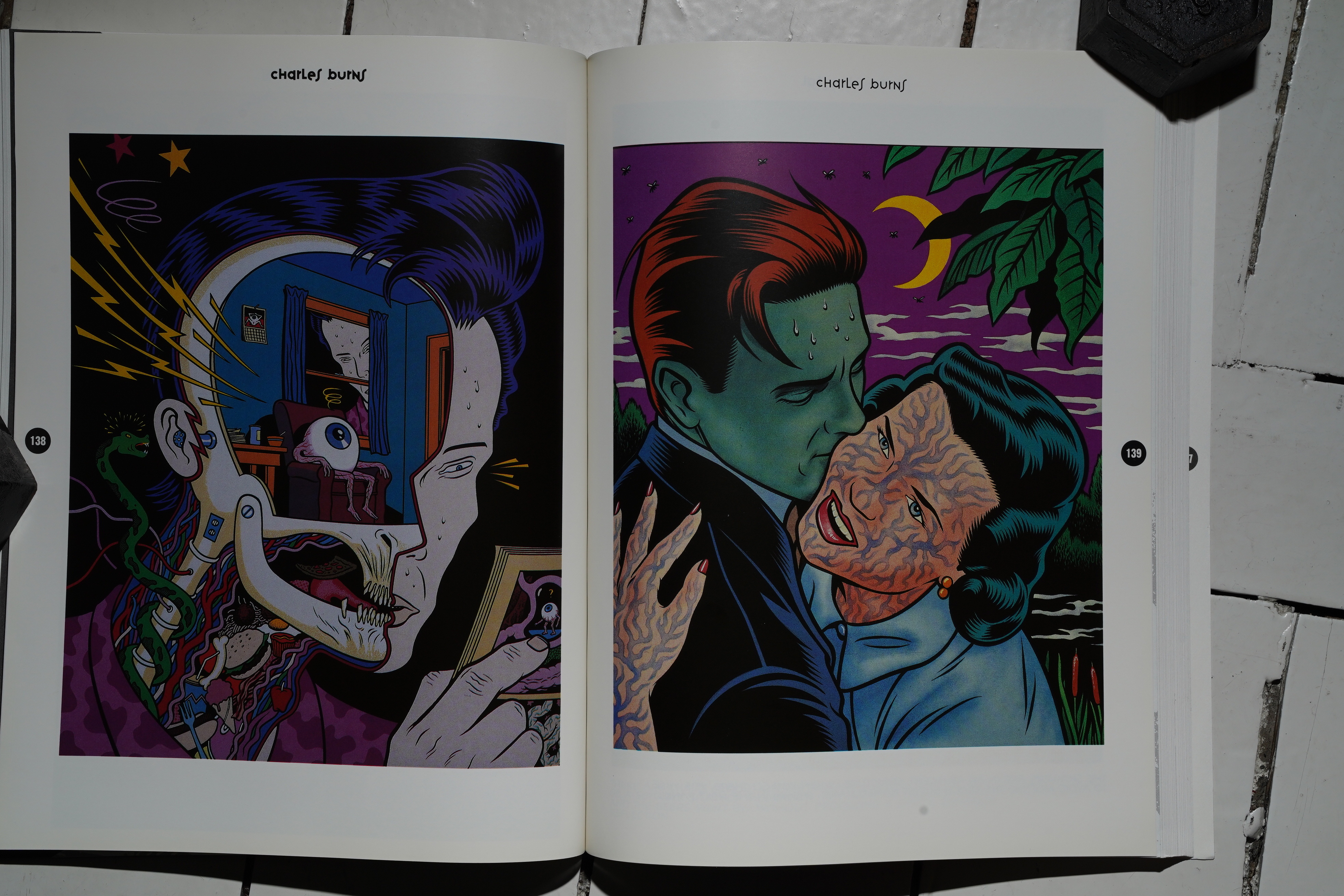
From Charles Burns we only get a couple of covers (I think). I mean, they’re amazing, but…
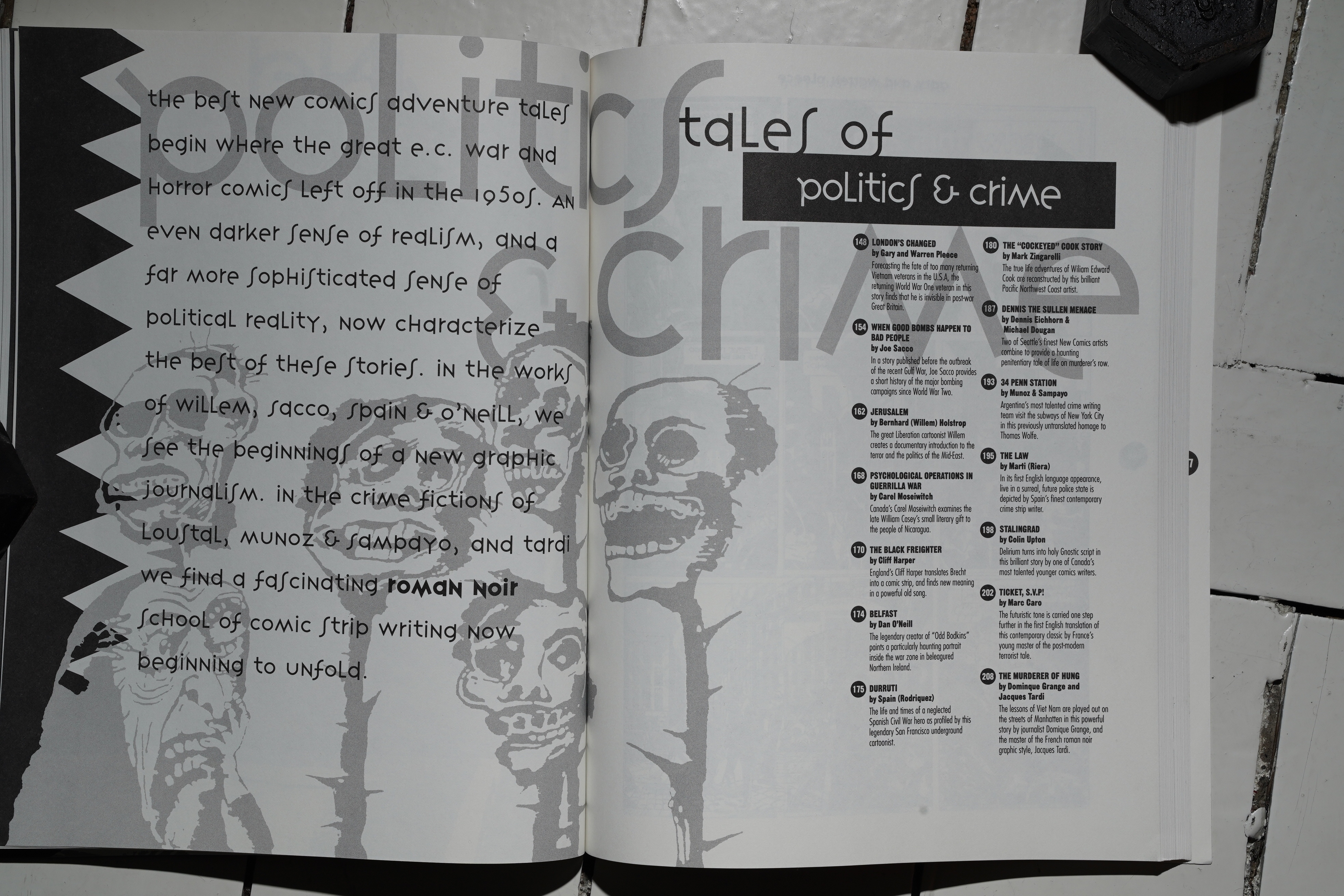
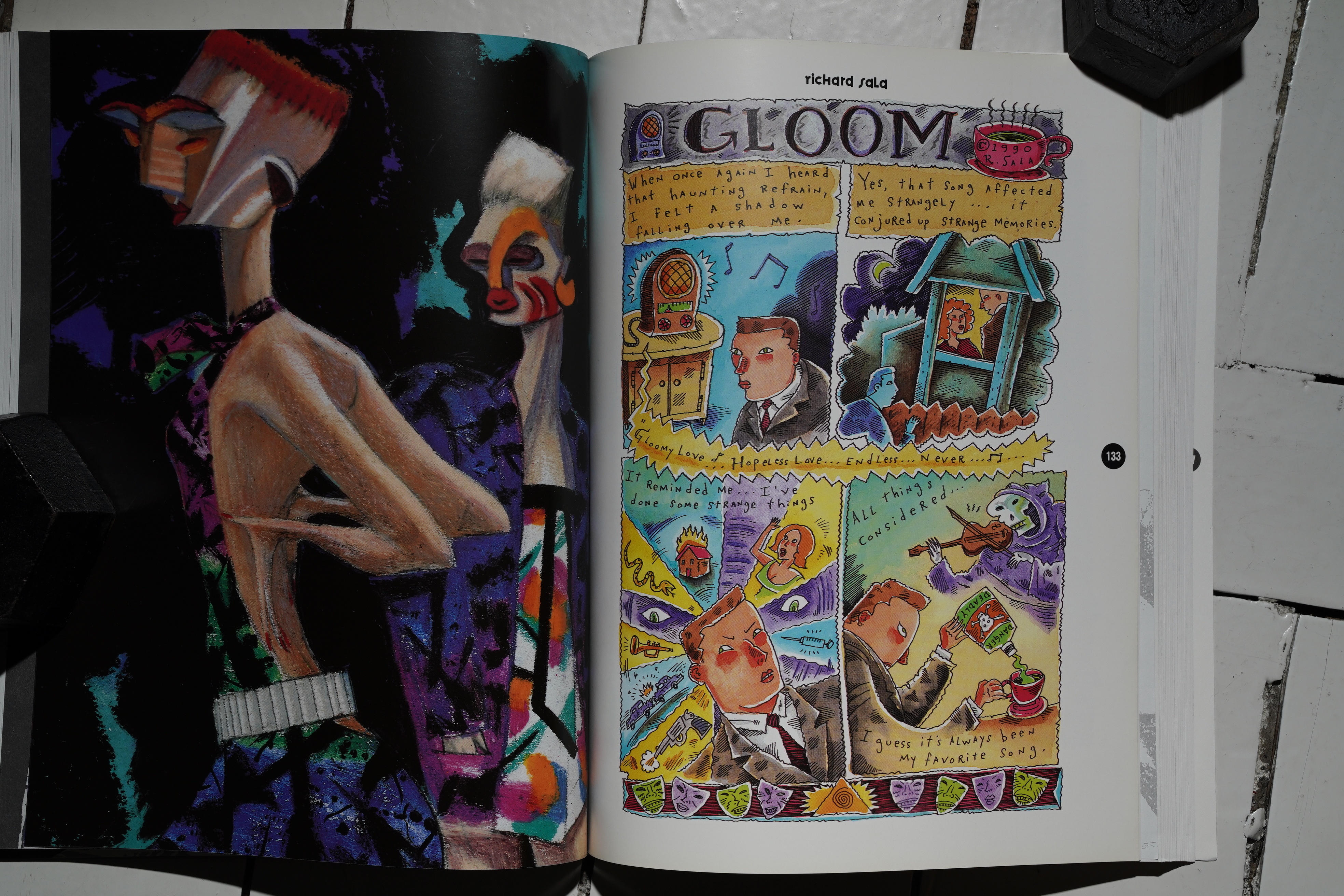
The third section is about politics & crime… and as you can see from the credits list, the pieces here are much longer (on average). The anthology has a completely different feel from now on: The first half felt like reading a catalogue. The second half feels like reading a proper anthology.
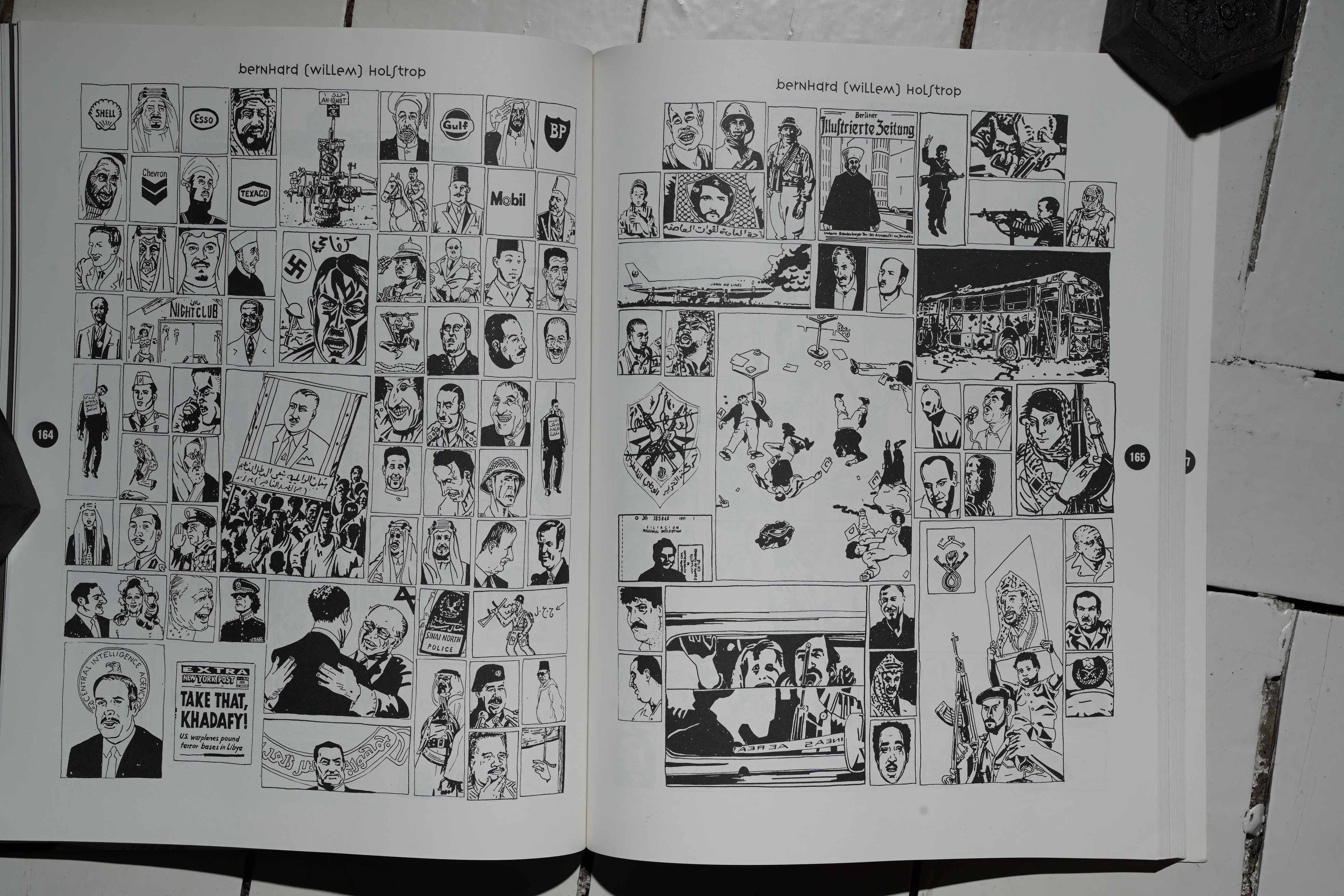
There’s the obvious choices like Joe Sacco, but this Willem thing is pretty amazing.
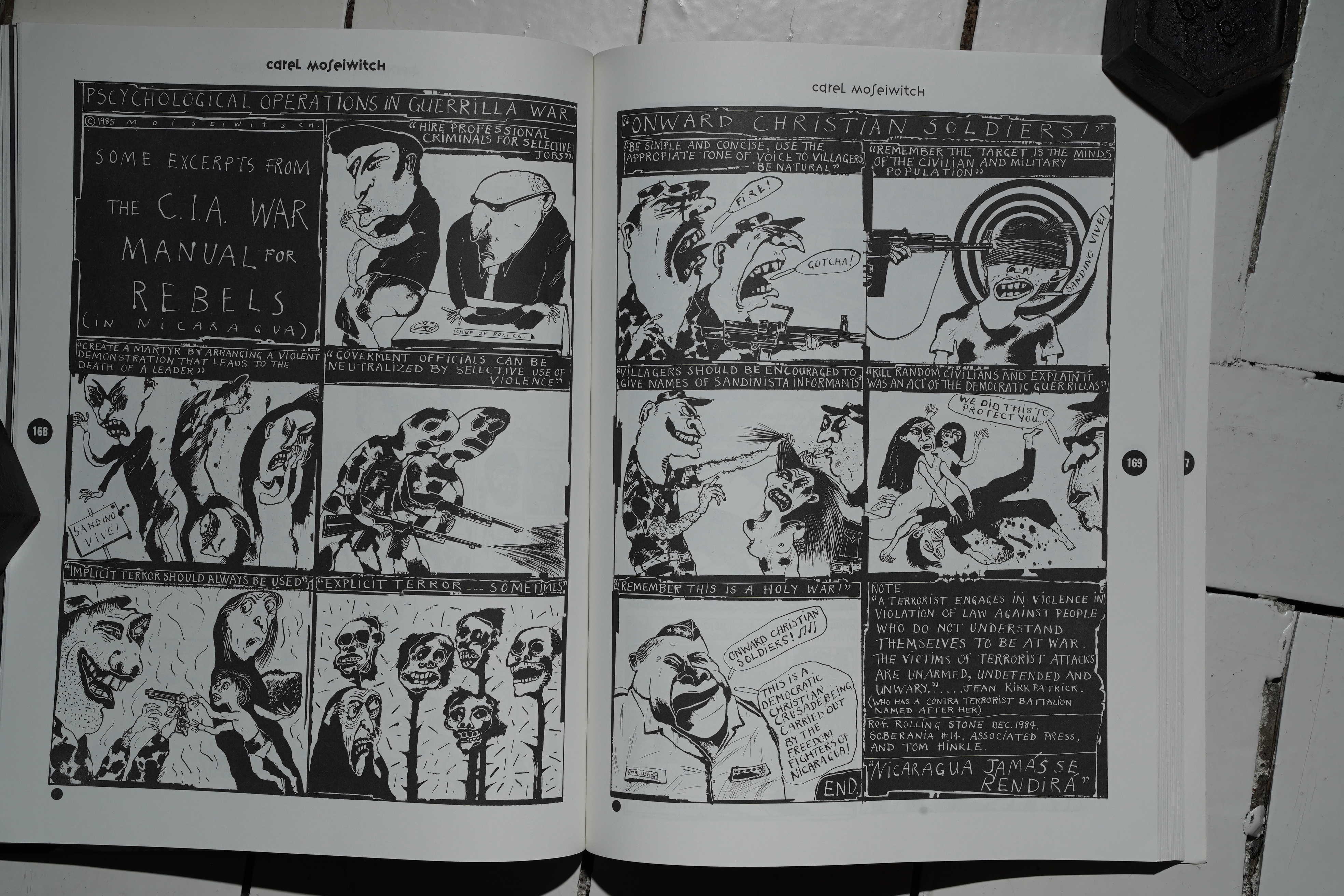
Carel Moiseiwitch is an obvious choice…
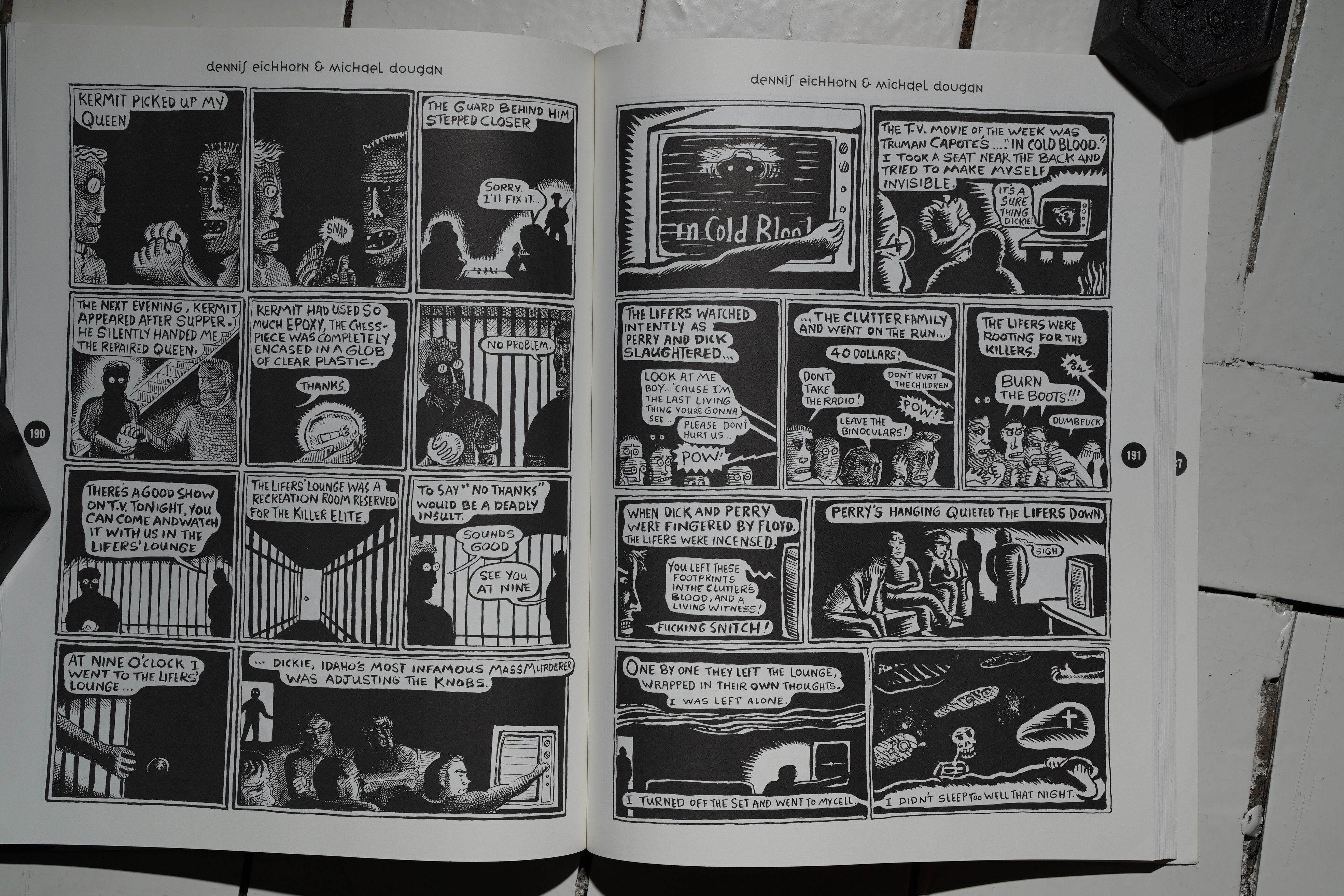
Eichhorn, not so much.
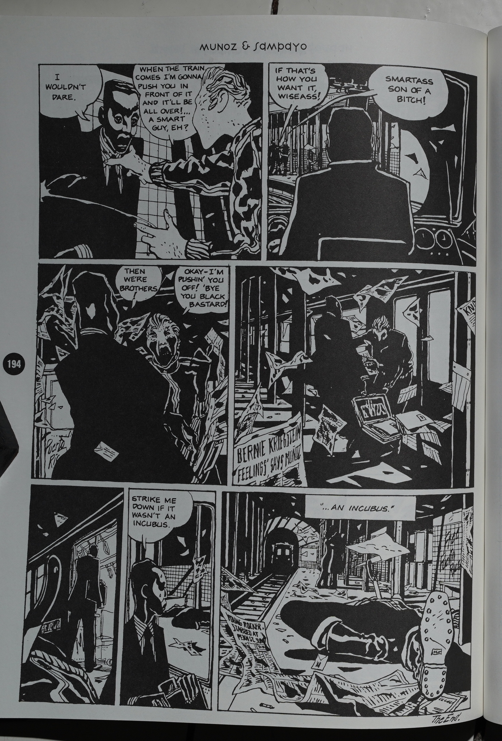
Heh heh. “Bernie Kriegstein feeling says Muñoz”.
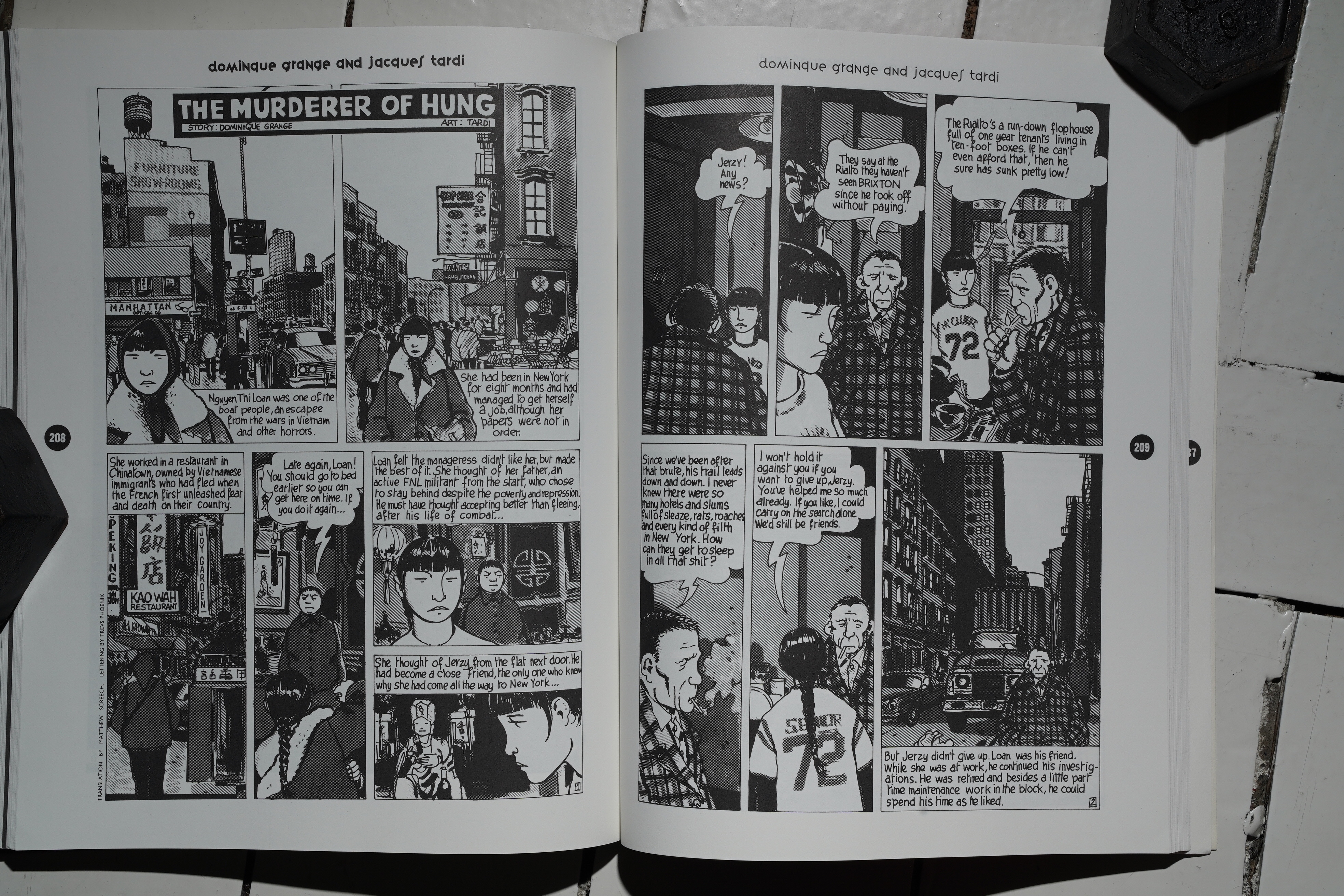
*gasp* A Tardi strip I haven’t read before! I think! I’m really digging this book now.
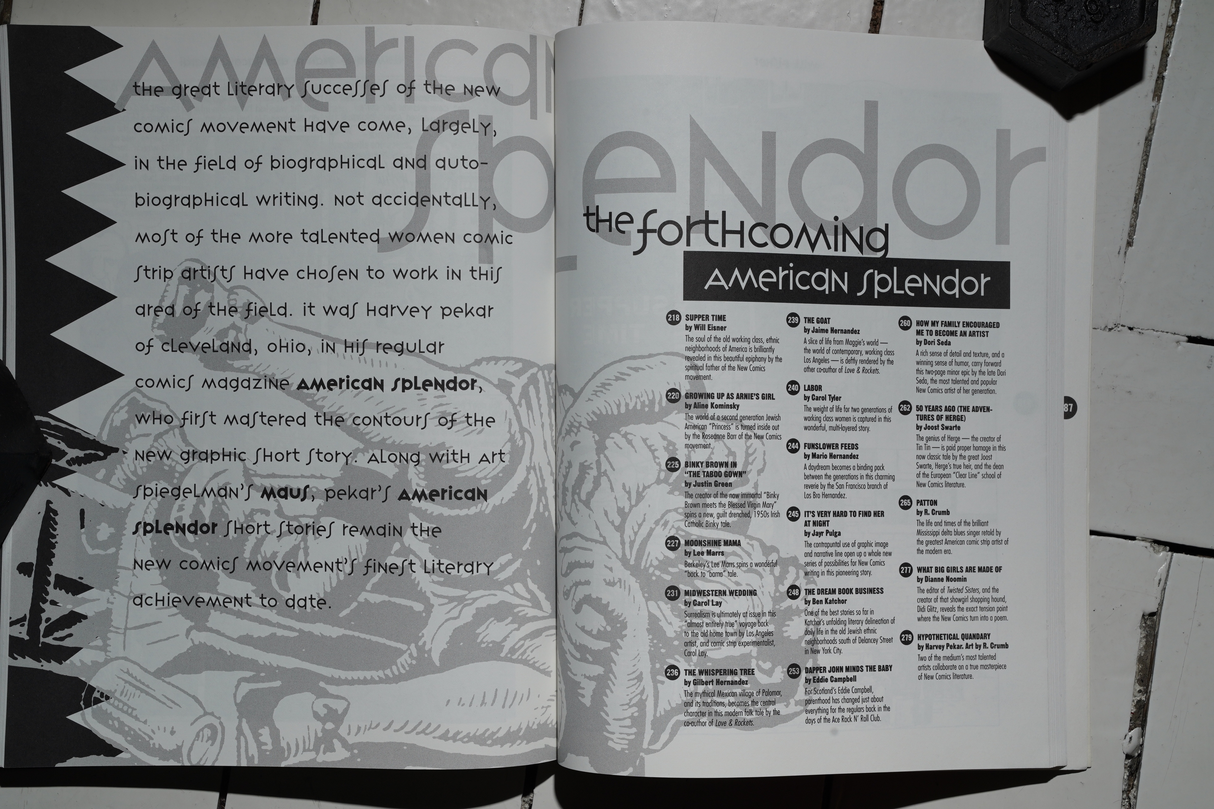
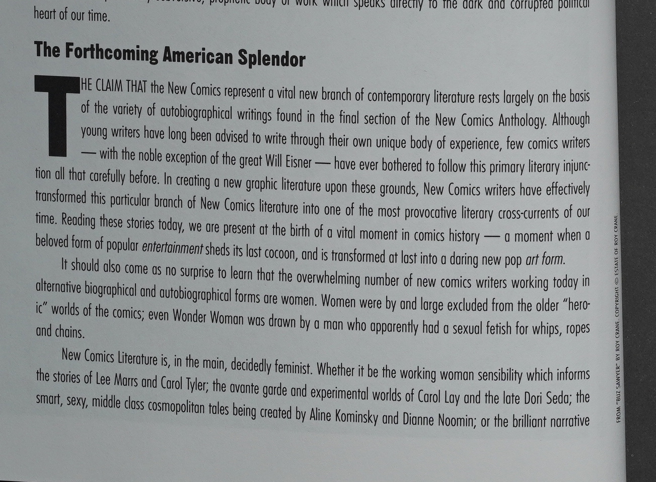
Which brings us to the last section: “The Forthcoming American Splendor”. Callahan correctly identifies the importance of auto/biographical comics, and it’s an impeccably put together section.
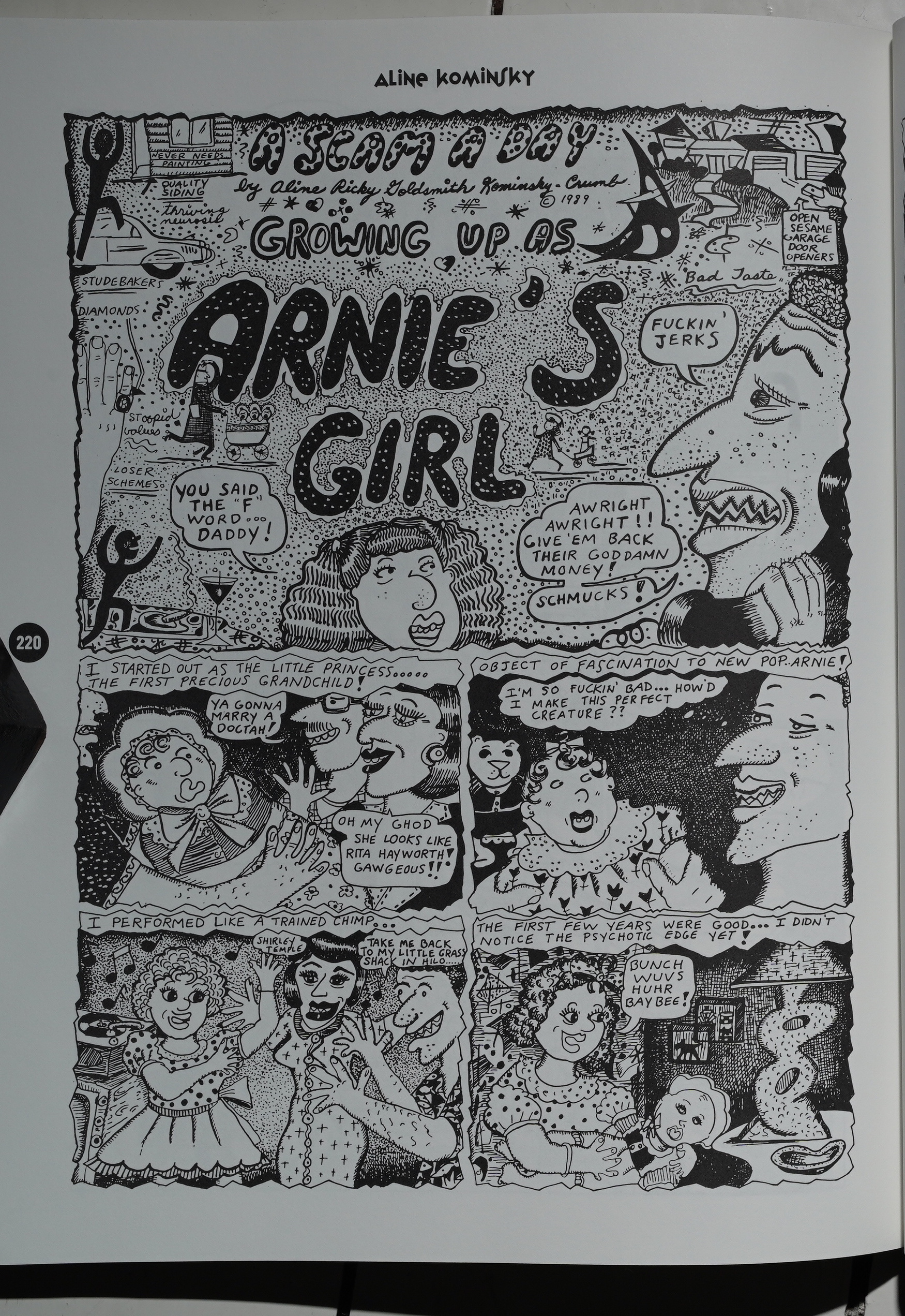
Callahan gives an overview of the genre: From its beginnings in the mid-70s in the comics of Justin Green and, perhaps the most influential artist in this genre, Aline Kominsky. I don’t think anybody really realised you could do this stuff until Kominsky did it, and you can see cartoonists working over the next couple decades referencing her approach constantly. (I’m not sure whether the same is true in the post-Fun Home generation, though…)
The stories here get room to breathe, and I don’t think there’s anything here that’s not a good read.
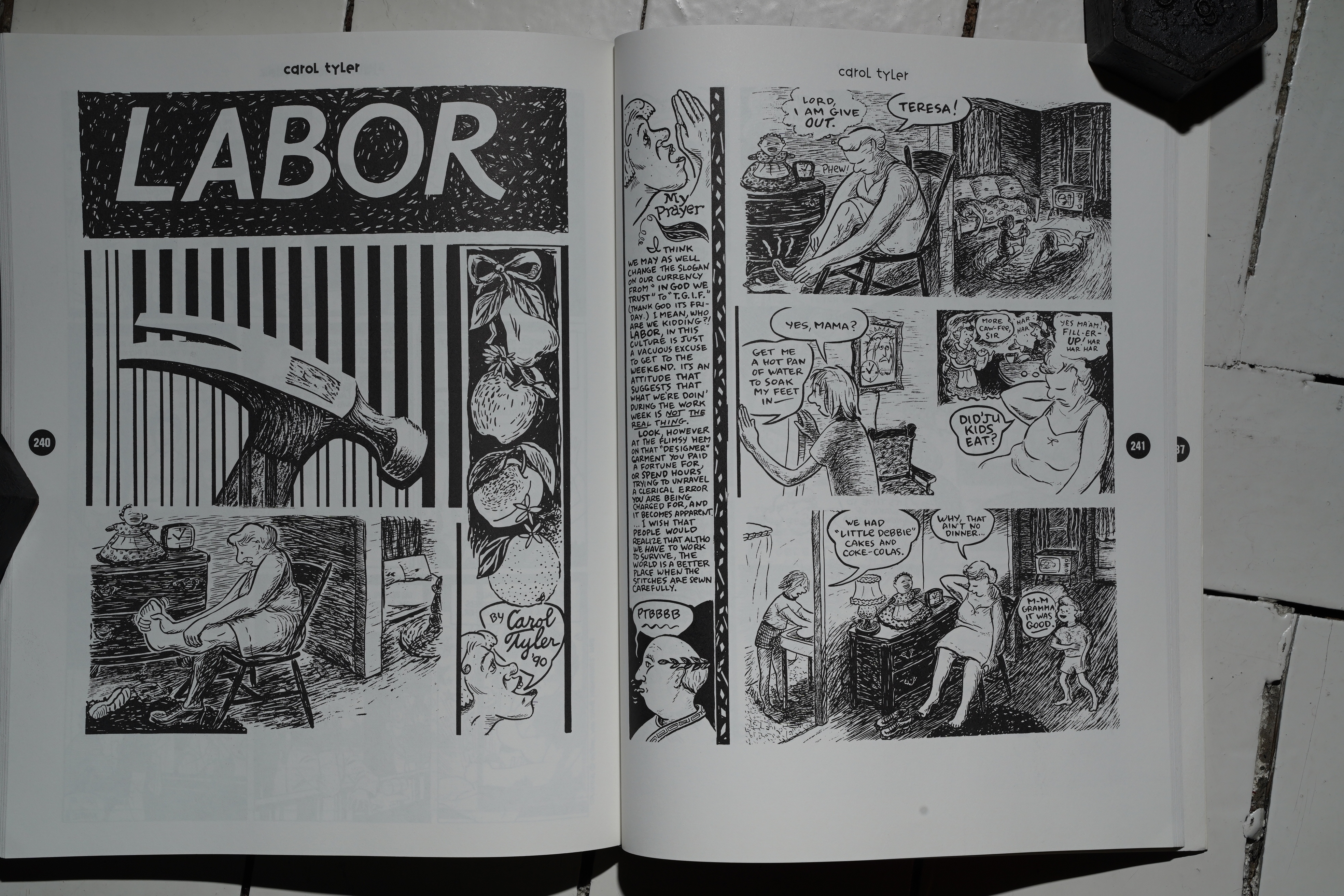
I mean, you can’t fault Carol Tyler. So gorgeous and so affecting.
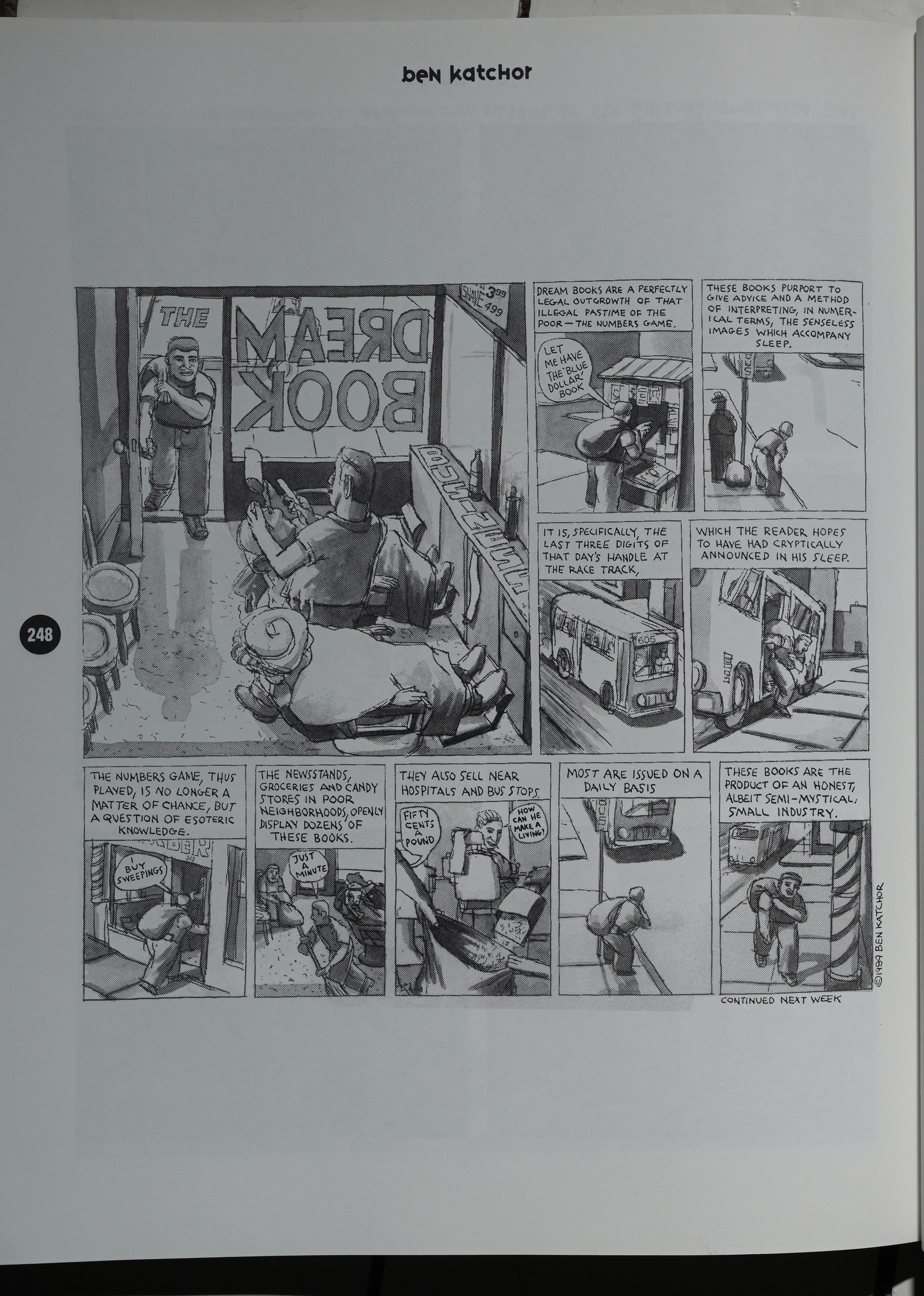
Now, this sort of thing makes me pull out my hair with sheer compulsive “need to read it all” lust: We get a sequence of Ben Katchor strips that I’m pretty sure haven’t been reprinted anywhere else! WHAT! I really want to read all the comics that Katchor has made, but he seems to be very picky about which ones from his weekly strip he’s including in the collections. I think the same is true for Chris Ware and Lynda Barry (to take two other people who have been serialising comics in weekly newspapers), and it me just go “gotta… read… em… all…”
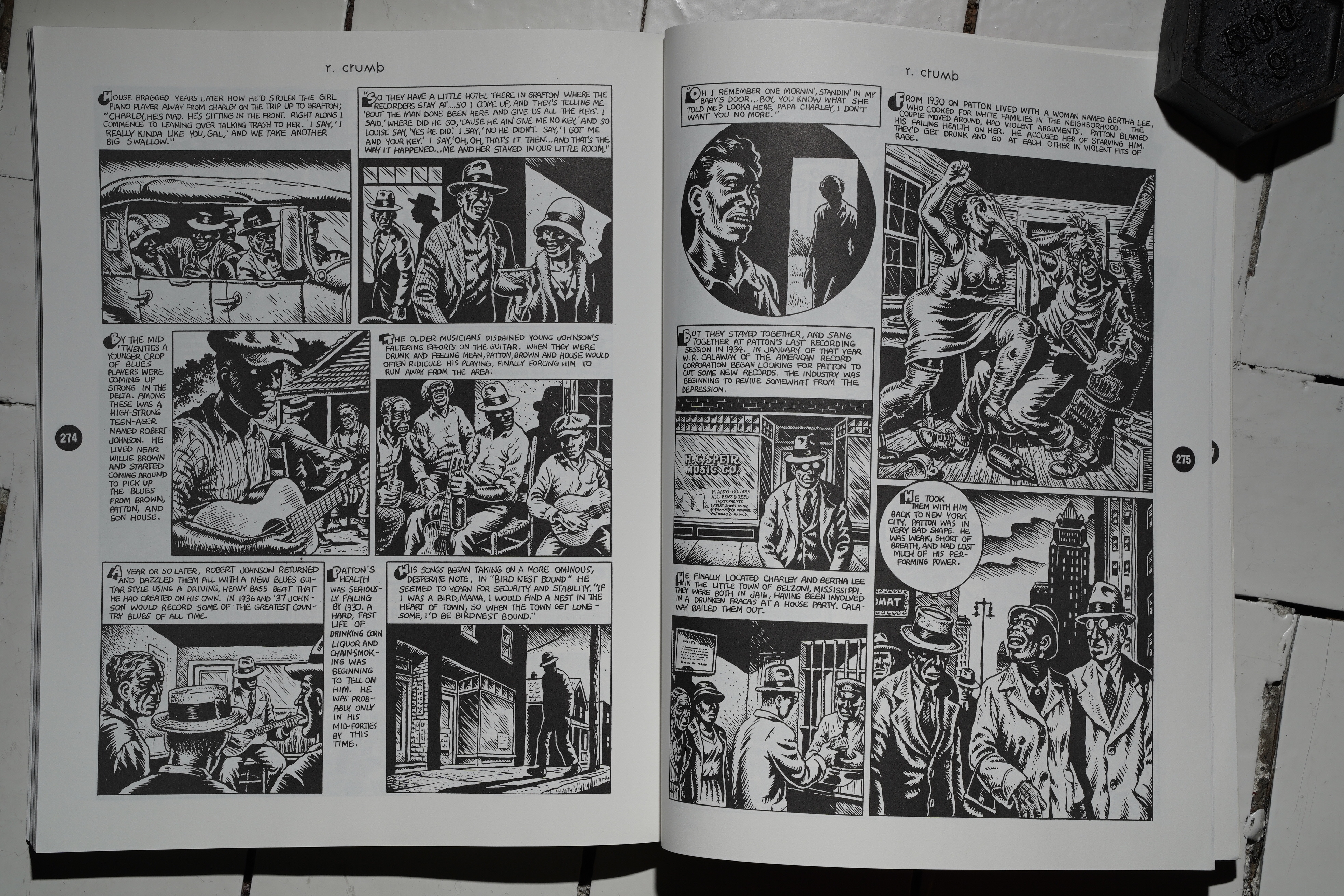
The longest piece in the entire book is this biographical sketch of blues musician Charles Patton.
Wow, that’s pretty cool. I can see why Crumb felt compelled to do the strip… and I applaud Callahan’s choice here. I think most editors would have gone for Crumb’s earlier, funnier comics, but I think Crumb’s best work is these biographies.
(Crumb’s usual obsessions shine through, though.)
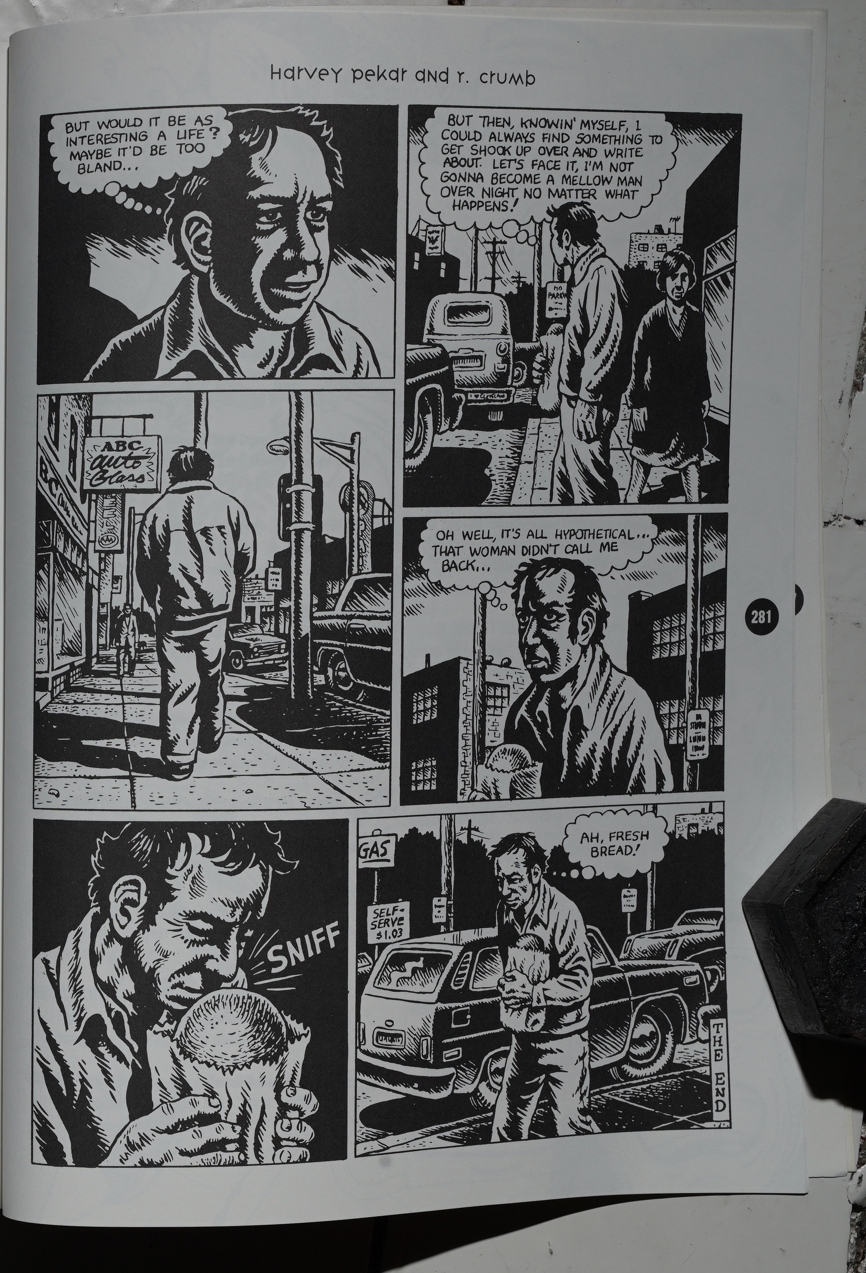
Callahan gives the final word to Harvey Pekar. “Ah, fresh bread!”
It’s the perfect end to the section.
So. I don’t know what Callahan was going for here… a book that felt like a cornucopia, of unending riches? And there are indeed riches to be found here: It’s all good. But it’s hard to recommend this book, really, because it’s not a good reading experience. Perhaps it works better as something you flip through, reading a piece here and there, and then put down until a later day?
MCH writes in The Comics Journal #145, page 22:
NEW COMICS ANTHOLOGY
Artists Criticize
Book’s Print QualityThe New Comics Anthology, a trade paperback
collection of work by over 80 of today’s top
alternative cartoonists from the U.S. and Eu-
rope, has been criticized by some of the artists
who appeared in it. They complained that the
book was riddled with poor reproductions, and
that some stories were printed with pages miss-
ing and/or out of order.
Oops, missed that.
The 287-page book, selling for $19.95, was
published in August by Collier Books, a divi-
Sion of Macmillan Publishing. Macmillan is
owned by British publishing tycoon Robert
Maxell, whose other holdings include Fleetway
Publishing, the London Daily Mirror and the
New York Daily News.
Oh, Robert Maxwell, not Robert Murdoch… If only I could edit what I wrote up there!
The book was conceived and edited by Bob
Callahan, who edited the Bringing Up Father
colection Jiggs is Back and co-publishes
Eclipse’s Krazy Kat reprints. The main business
of Callahan’s 22-year-old Turtle Island Press
is in literary fiction and poetry.
Callahan explains, “l sort of got exposed
to the modern phase of comics over the past few
years and got a feel for it. There seemed to be
an energy, an intelligence, a sense of fun in there
which reminded me of why I got into publishing
in the first place. I floated [the anthology ideal
b’ a number of publishers. Finally, Collier/Mac-
millan said, ‘If you’d accept a lot less money
than you wanted, we’d do it.’ I had a long con-
tract, about 15 months, and I used most of it.
“We had a idea of the American
scene; then while talking to Art Spiegelman,
he introduced me to a lot of the European stuff.
Then I began to dig even deeper, to find some
of the lesser-known artists who still deserved
to be in the book. That ate the rest of my edi-
torial budget, but it resulted in a much more
interesting reading of the field. It opened it up
and made it a much more comprehensive col-
lection,” A few of the creators reprinted in the
book include Lynda Barry, Charles Burns,
Howard Cruse, Matt Groening, Gilbert and
Jaime Hernandez, Harvey Pekar, Dori Seda,
Matt, Peter Bagge, Chris Ware, Lloyd Dan-
gle, S. Clay Wilson, Mark Beyer, Krystine
Kryttre, Mary Fleener, Paul Mavrides, Peter
Kuper, Jacques Tardi, Rick Geary, Jose Mun-
oz, David Sandlin, Colin Upton, J.R. Williams
[and his early-20th-century namesake], Jon-
athon Rosen, Richard Sala, and Kaz.ArtÉts’ Complaints: In order to get copies into
major college bookstores before the start of the
fall school season, Macmillan rushed the book
out in late August, a month before its officially-
scheduled publication date, and weeks before
the contributors received their copies or their
checks, Of those contributors who viewed the
book in its first days of release, some expressed
major misgivings about how it turned out.
Bill Griffith said he ‘ ‘made a big point that
he [Callahan] have negatives shot from the
original art. I told him it was a matter of get-
ting the budget to pay for negatives. Months
later the book was out and I haven’t heard from
him in all this time. This is exactly the thing
I did not want to happen. I like the people he
chose. It seems like a pretty smart sampling;
his editorial instincts were very good. But you
cancel out that if you don’t pay attention to the
production quality. The publisher just wants to
put the book out as cheaply as it can. ..He was
a pretty removed editor. He never called me
back.”
Dan Clowes said, “l sent them originals to
the story. There’s really no excuse for the way
it looked. It looked like they shot it from printed
pages. ”
Drew Friedman was represented by four one-
page strips; the one billed ‘ ‘Second in the
Series” was printed third. “It’s obvious there
were a lot of mistakes made. In my case, they
ran pages Out of order, the print quality was
horrible, and my name was misspelled through-
out the book [as “Freidman”]…l guess it’s
pretty upsetting. It was supposed to be the ma-
jor book on comics. I don’t know who these
designers were in San Francisco. They did a
poor job; they didn ‘t seem to understand com-
ics. Some people said the only hope is if they
could recall it and repair it.”
Other names include Diane Noo-
min, Spain Rodriguez, Dominique Grange, and
Spiegelman’s publisher, Penguin.
Joe Sacco is “not pleased with my part in
this project, though Callahan seemed very plea-
sant and well meaning on the phone. Basical-
ly, I sent him the original art of my Buzzard
#1 piece, and apparently he printed something
else from a comic book [“When Good Bombs
Happen to Bad People,” from Yahoo #41. He
did try to contact me about the change for my
permission, but his tax got to me too late to
make a deadline he mentioned, my faxes to him
couldn’t get through, and so I gave up. I don’t
really mind that he used something else, but he
tried to arrange it in a very rushed manner, and
ultimately he never got my verbal permission.
Oh well, I’m not going to get too bent out of
shape. ” The Sacco story in the book was print-
ed with one page missing and other pages
printed out of order.
Also cut and rearranged was a story by Jayr
Pulga from Bad News #3. Only three of the
story’s four pages were printed, in the order
3-1-2. “They totally screwed the work up…lt’s
not something that’s going to threaten my career
as a cartoonist, but it’s a matter Of principle.”
Pulga said he was contacting other contributors
to the book, to organize a joint letter of protest.
“Moonshine Mama” by Lee Marrs was
printed with pages 2 and 3 transposed. “I’m
pissed and disappointed. It does seem like no
One will buy it, or that it’ll be returned like
crazy.” Marrs recalled that Heavy Metal once
printed a story of hers with a page upside down,
but caught the mistake before the issue shipped
Possibly the most error-ridden strip in The
New Comics is Loustal’s four-page color strip.
Credited to “Jacques Loustal” (Loustal doesn’t
use his first name professionally. but his full
name is in fact Jacques de Loustal), the strip
suffers from second-hand color reproduction,
darkening all the values from the original. But
there are also bad mistakes on three of the four
pages: On page one, a line of text has drop-
ped in the first panel: its omission delays the
introduction of the “voyager/tourist point-of-
view” character. and renders confusing the
following caption, where showers are describ-
ed as “adjacent” (to what?). Page two has been
flopped left to right, and on page three, the yel-
low and magenta negatives of the color separa-
tion have been confused, giving the sky a
greenish hue and covering a white wall with
magenta flecks.
Heh heh. I can’t stop quoting this article, because it’s interesting, but I did realise that something was off with the Loustal story, but I’d just read it (in Raw) a week ago, so it made sense to me anyway. And I was very confused by the Lee Marrs story, but I assumed it was meant to be confusing. And the Jayr Pulga story worked in the order it was printed, really.
An uncredited image by Mark Newgarden
appears among a collage of cartoon characters
on the front cover and also on an inside page,
though nothing else by him appears in the book.
“I’m in the process of drafting a nice, friendly
letter. But needless to say, I’m not nice or friend-
ly about the whole book.” Newgarden said he
wasn’t asked to be in the book and hadn’t ex-
pected to be, due to a current personal rift be-
tween himself and his former Topps colleague
Spiegelman.
RAW editor Spiegelman advised Callahan on
the selection of creators in the book, and defends
the end result. “While the production job is un-
fortunate, it’s an astoundingly good catalog of
what’s been going on in comics in the last 10
years. I think there’s very little of what appeared
in (Fantagraphics’] The Best Comics of the Dec-
ade that compares favorably with what’s in this
book. While there aren’t enough long pieces to
see where an artist is coming from, it functions
to me as more of a catalog than an actual reader.
Right, a catalogue. But… who buys a catalogue? Who’s that for?
“From this end,” Spiegelman added, “I
know how it is dealing with New York publish-
ers. The money flows more slowly than it says
in the contract. Gary Panter was poorly served;
his was the only piece I physically couldn’t read.
Most of the other stories are readable but not
pretty….lCallahan] was coming at it not as a
comics fan but from a background in literature.
It hellHi to have it edited with that background,
instead of from the standpoint of within the
scene itself.”
Spiegelman’s longtime associate Robert
Sikoryak agreed in the book’s defense. “I was
kind of impressed with it at first glance. I was
impressed with the bulk of it.”
“Production Sucks”: Callahan admitted that
“the production job sucks…l never saw blue-
lines. It came out, in a way, blind. I got a pack-
age one day, thinking it was going to contain
bluelines of the pages, and it turned out to be
the printed book. A lot of the variants in the
art came from what we had to work with. If we
get a second printing, there are at least five or
six changes I’d like to make. Collier’s is a ma-
jor shop, so you get the distribution and you get
a big enough advance, but not the hands-on con-
trol.”
In fact, Callahan had little to do with the
book’s production, design or typography, which
were handled by Visual Strategies in San Fran-
Cisco. Visual Strategies’ Dennis Gallagher and
John Sullivan were responsible for the collage
cover, inspired by Rian Hughes’s cover designs
for Knockabout Books in England.
*gasp* So it wasn’t just me! Hah!
The design-
ers sent the photostat pages out for printing with-
out Callahan’s knowledge. Visual Strategies
photographed the excerpt from Panter’s Invasion
of rhe Elvis bmbies directly from the printed
book and reproduced it at one-fourth size (four
original pages on each New Comics page),
resulting in illegible art and lettering.
Callahan noted that he and Collier manage-
ment had “a lot of internal fights over some of
the selections. Gradually, the house warmed up
to what I’ve called the ‘new punk’ stuff. It’s al-
most impossible to get back what you really
want in a bureaucratized situation. All [the
bookl really is is a sampler; I’m not sure that
enough Of any artist is in the book to give the
reader a real feel for that artist’s work.”
Still, Callahan was quick to acknowledge the
publisher’s willingness to treat comics as an
adult literary art form. “They have no prece-
dent for it. The one thing they understood was
that this is a serious craft, not formula stuff for
adolescents but a branch of literature. This is
something they embraced and they are pushing
it that way. I’ve been showing them all the way
how to promote it and market it. Their publi-
city hasn’t even gone off yet. The trick will be
to see if the reviews are good, and if it gets in
a lot of the chains in Iowa.”
Five months later:
The Comics Journal #149, page 26:
Callahan Apologizes
Bob Callahan, editor-packager of The New
Comics Anthology book, is slou’ly moving ahead
on making up late payments to the book’s con-
tributors. Krystine Kryttre, Peter Bagge, Mack
White, Roy Tompkins, Howard Cruse, Kaz, and
Dan Clowes have gotten their page rates (from
$30 to $100 per page) paid up in recent weeks.
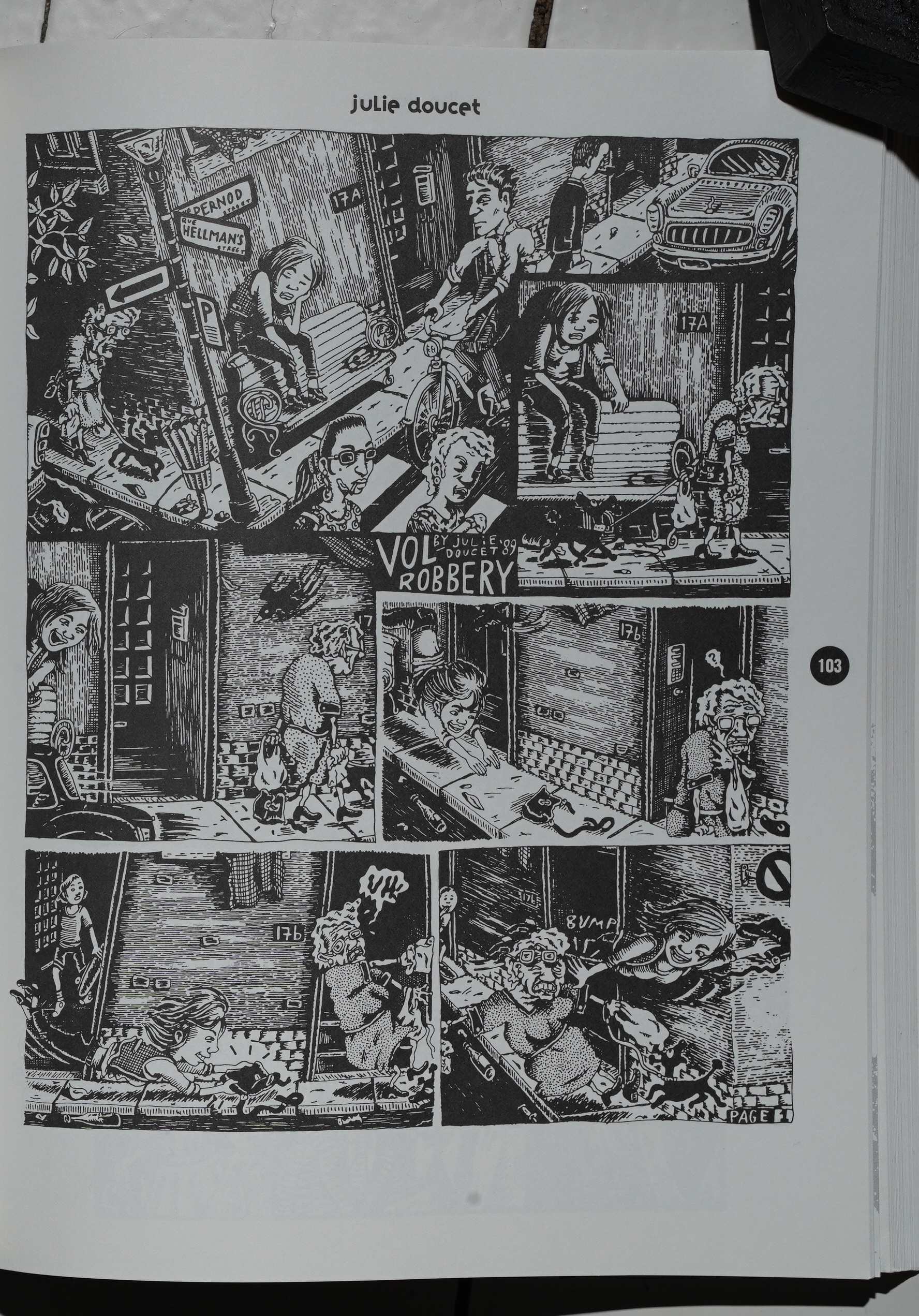
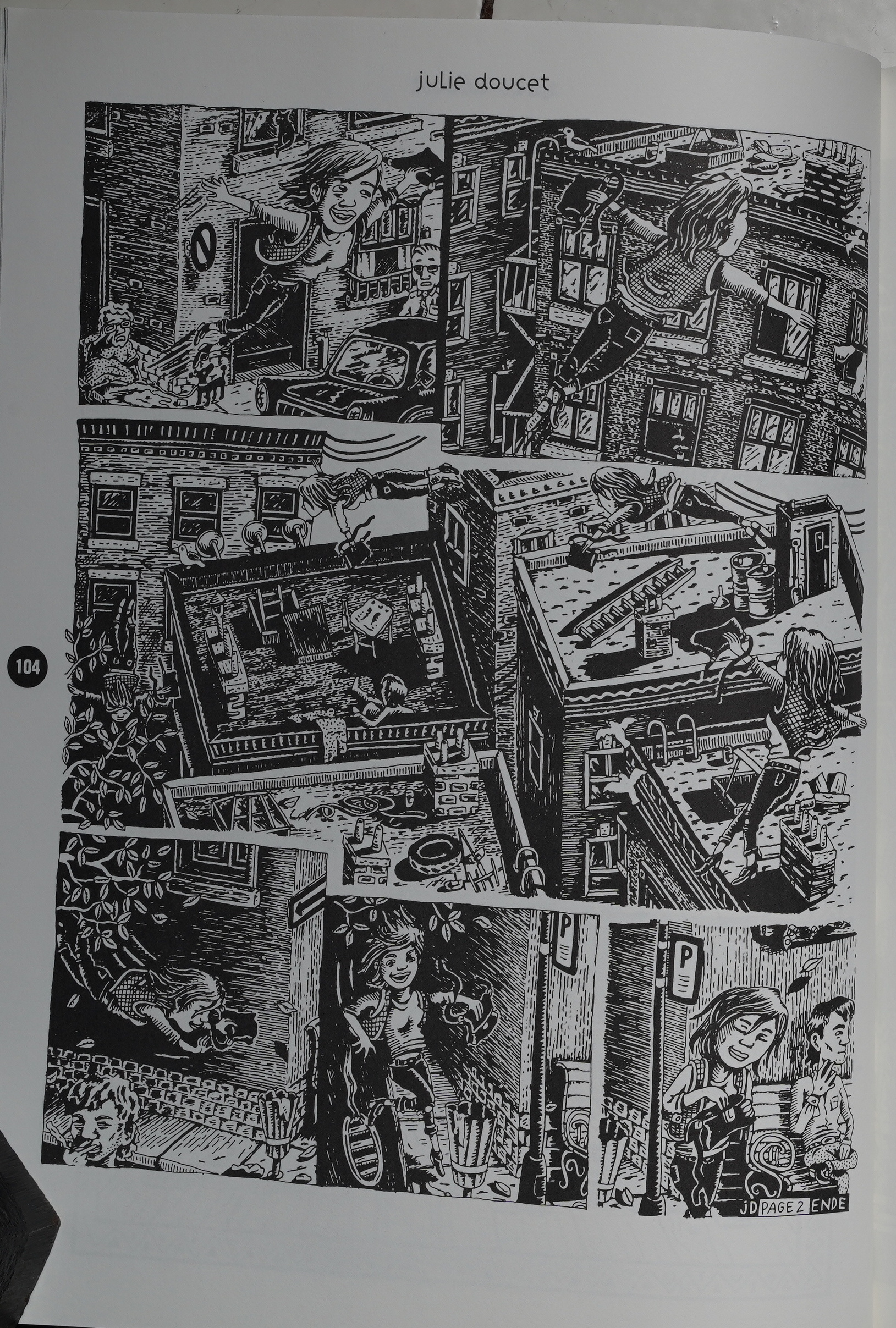
Julie Doucet said “I had to write two or three
times and tell him that I was starving” before
she got her payment.
Callahan said On March 17 that he’s•been
paying contributors out of his own pocket be-
cause his publisher’s advance barely covered
production costs. He expects to make up to the
last 20 unpaid creators by June.
Contributors still waiting as of late March
included Colin Upton, Dennis Eichhorn, Carol
Lay, Joe Matt, Gilbert Hernandez, and Jim
Wooding. Another is Mary Fleener, who plans
her own strategy for getting what’s owed her:
“I’ve got a big fat voodoo doll with a beard.”The book itself has been virtually dropped
from the promotional schedule of its publisher,
Macmillan Inc. (itself still caught up in the con-
tinuing financial mess of its late owner Robert
Maxwell), The 8000-copy printing is already
being accepted for bookstore returns.
So it sounds like it was a total commercial failure… but so were all other comics coming out of the major publishers at the time (except Maus).
Doesn’t sound like it was well received critically either:
Callahan includes well known artists like RAW publisher Art Spiegelman as well as newcomers like Joe Sacco and Carol Lay. Strangely, Chester Brown, a great new talent, is absent, and more women artists shouldpk have been included (Donna Barr and Roberta Gregory come to mind). i think we needn’t press our case so specifically; the point is made. i’mn not trying to obscure anything, but i think we have enough of finding the political in books that no political intentions
This blog post is part of the Punk Comix series.
One thought on “PX91: The New Comics Anthology”