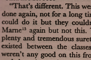
I was reading Tender is the Night and was puzzling over the typesetting. The foreword and the index is set in a very clear, narrow typeface, while the text itself looks old and worn.
This is unfortunately an annotated edition, which I loathe. I wouldn’t have bought it if I’d known.
But that doesn’t make sense. If it’s a new, annotated edition, why does is look so worn and old-timey?
Then I noticed. Just look at it. The single line that has the annotation “15” is set in a narrower typeface that also looks crisper. Just look at those to “but”s.
So the cheap bastards just cut out the lines where they wanted to have an annotation, re-set it in the narrower font to make room for the annotation, and then pasted the result back in.
I didn’t know that doing stuff like that was even possible in these digital days. It’s practially midieval.
