
This DVD was letterboxed, so the resolution is pretty pathetic. And the transfer from the film isn’t wobbly: The sound goes warbly all the time. So not the best viewing experience.
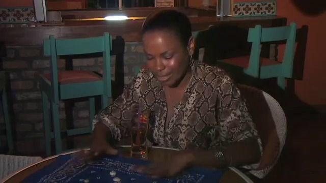
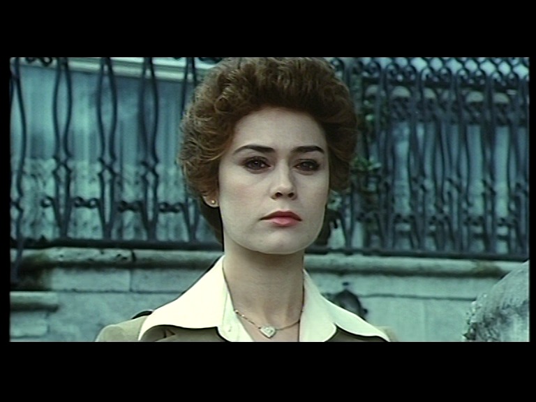
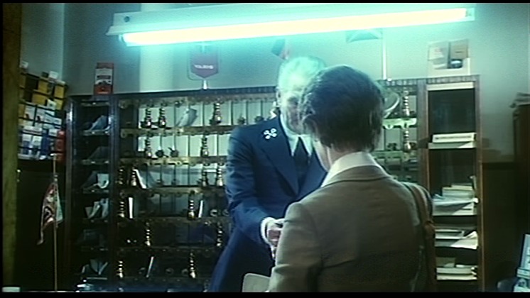
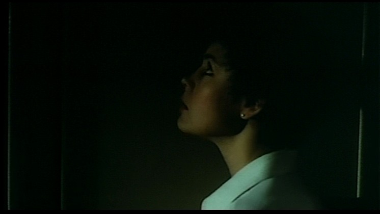
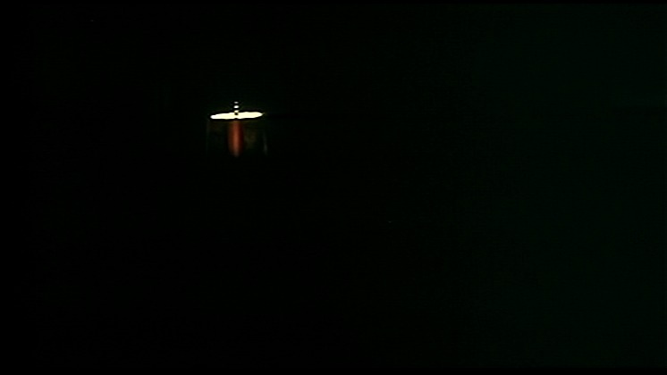
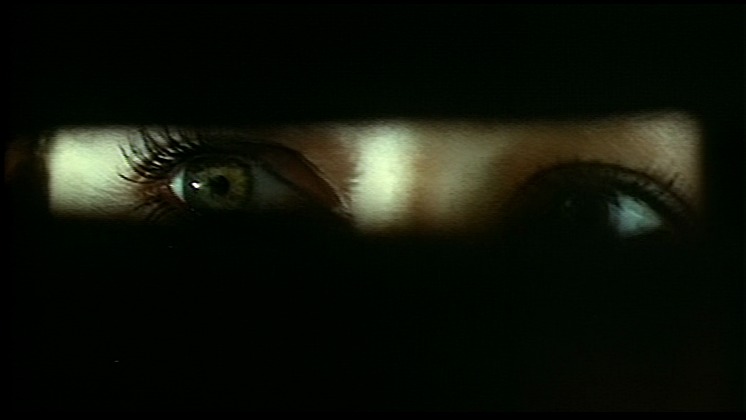
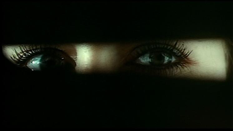
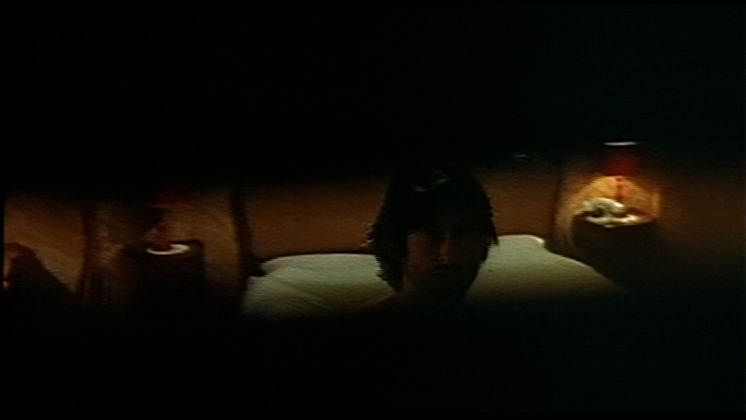
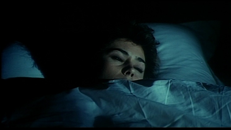
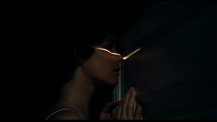
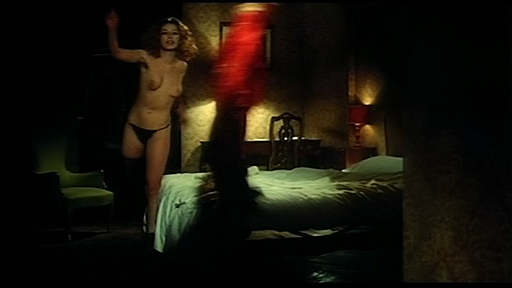
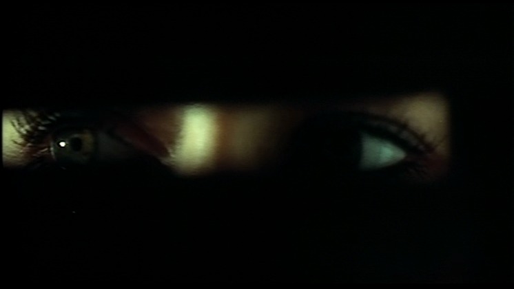
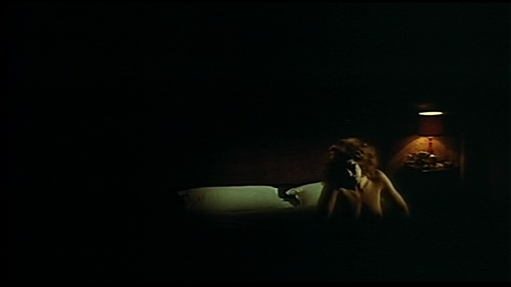
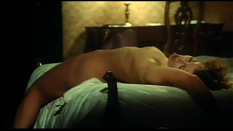
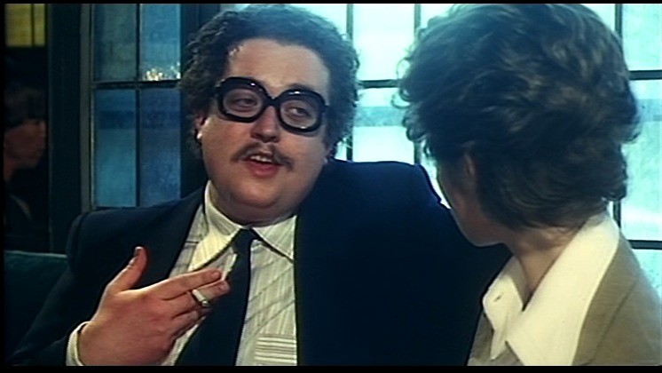
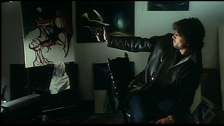
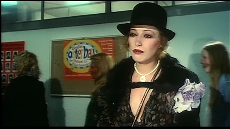
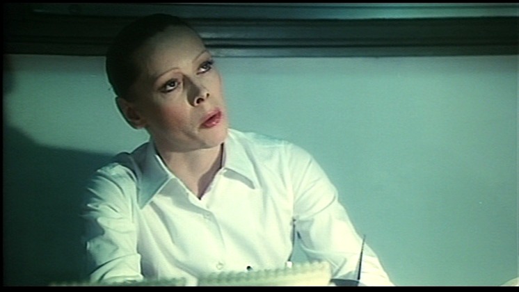
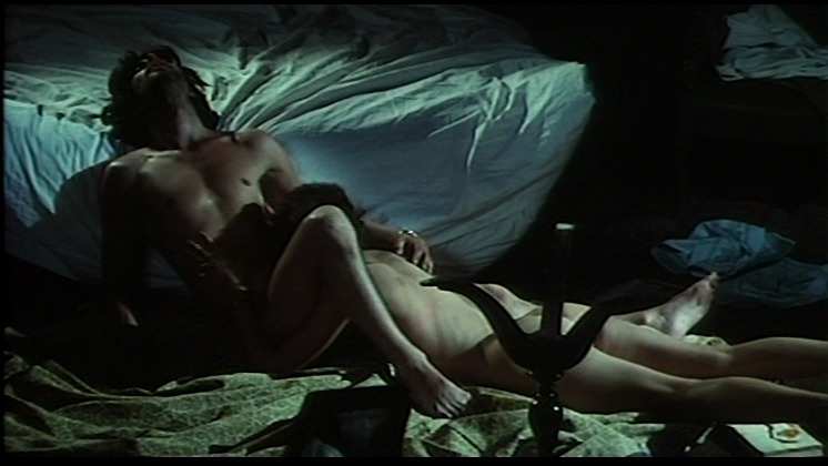
This is a good old-fashioned erotic thriller. Like they used to make in the 70s. Lots of intrigue and voyeurism and great hair-dos.
I like it, but it kinda meanders after a while.
I guess this film is more Italian than Monacan. Monococan? Whatever.

Kleinhoff Hotell. Carlo Lizzani. 1977. Monaco.
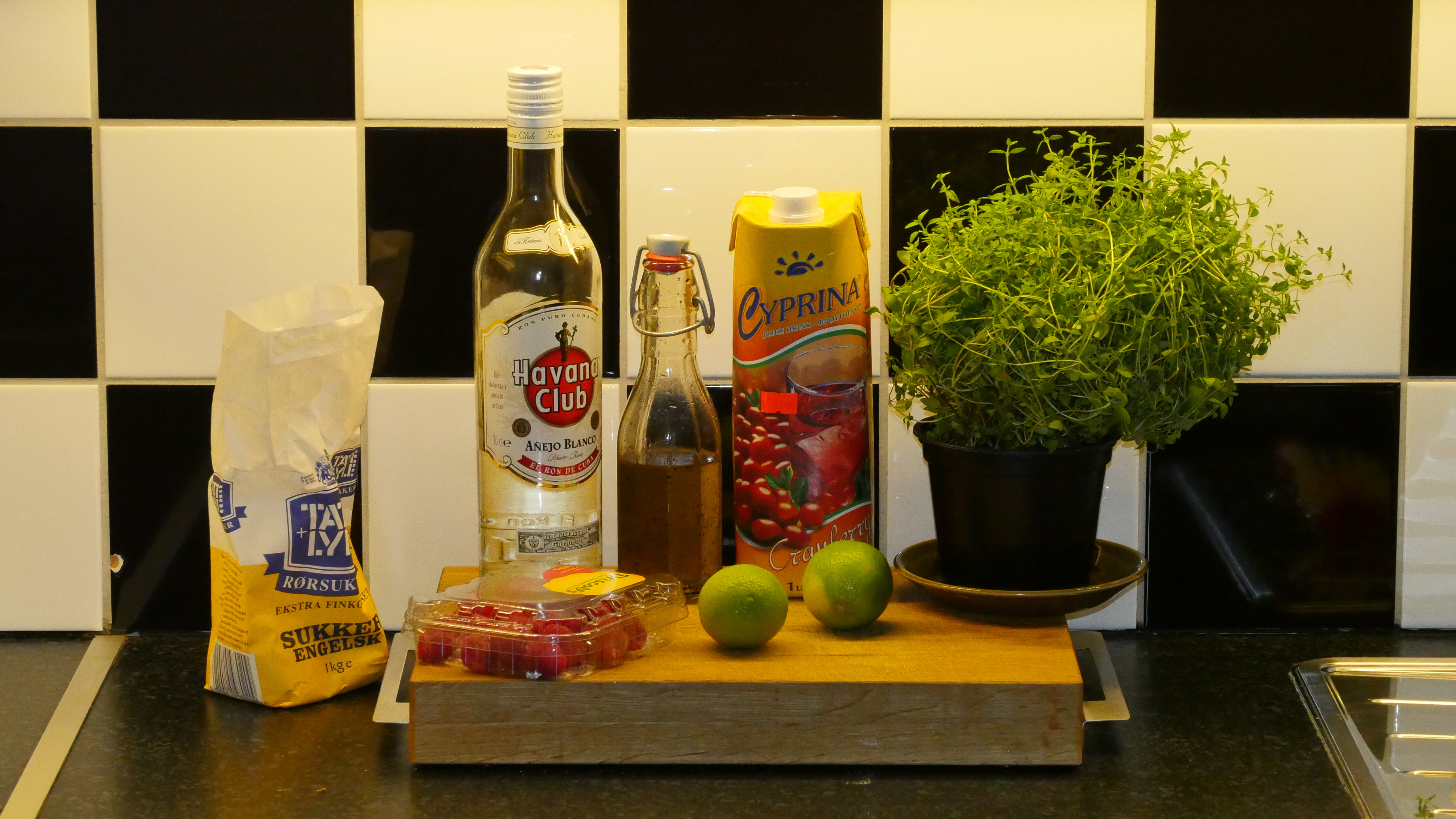
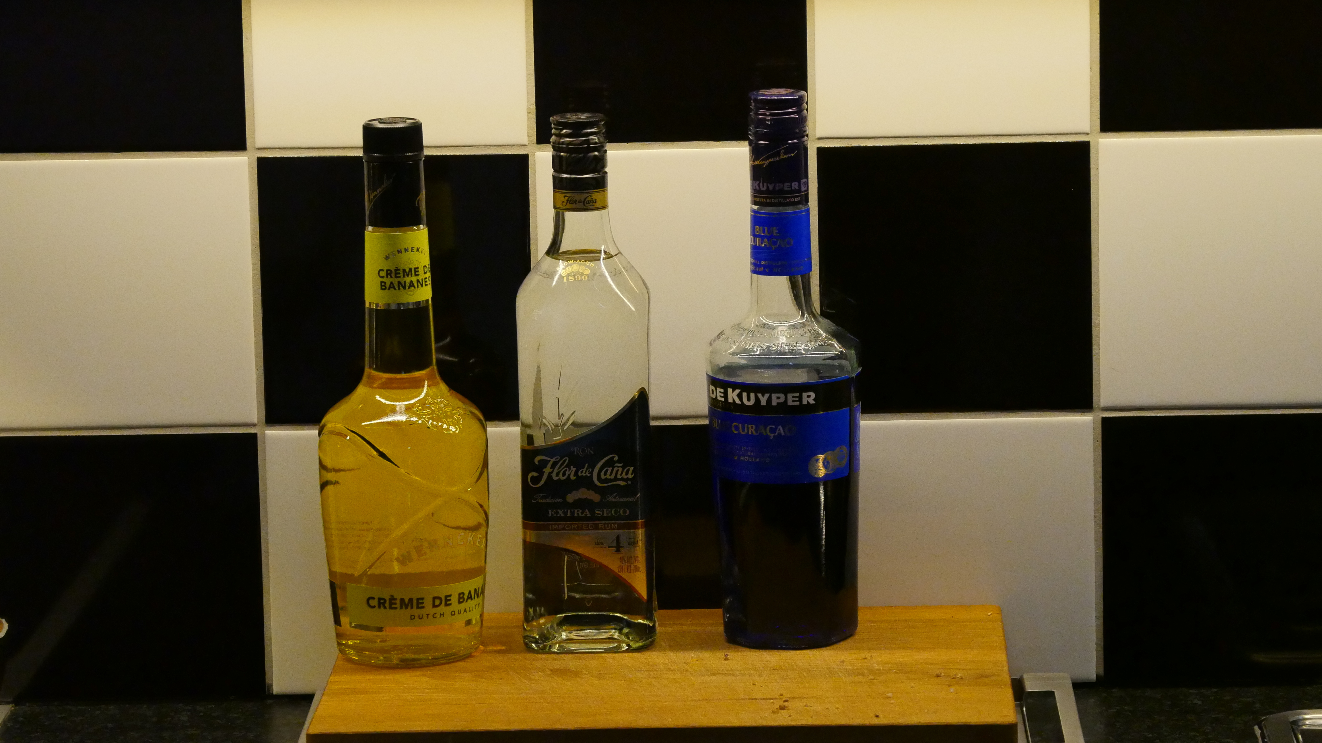
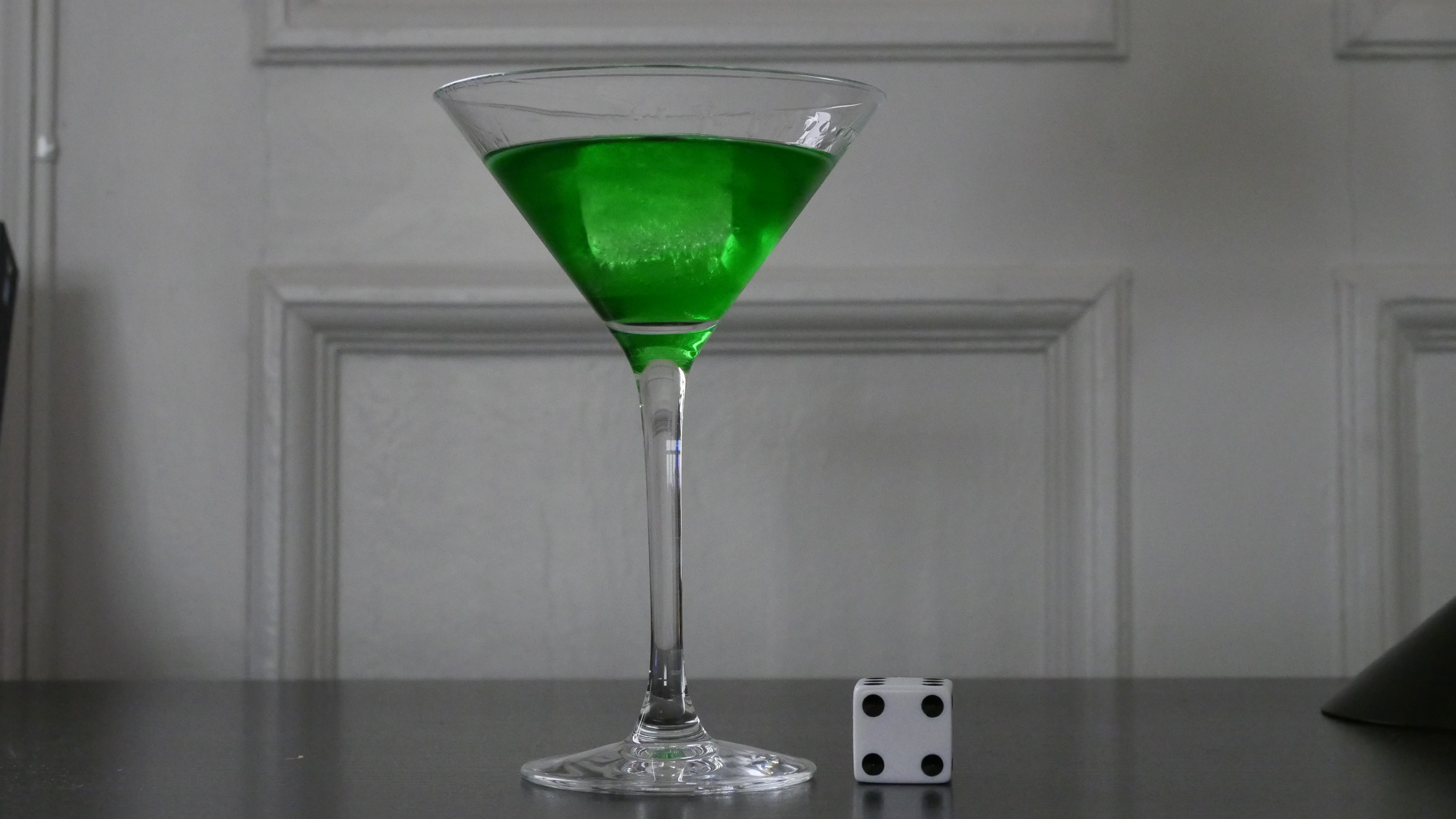
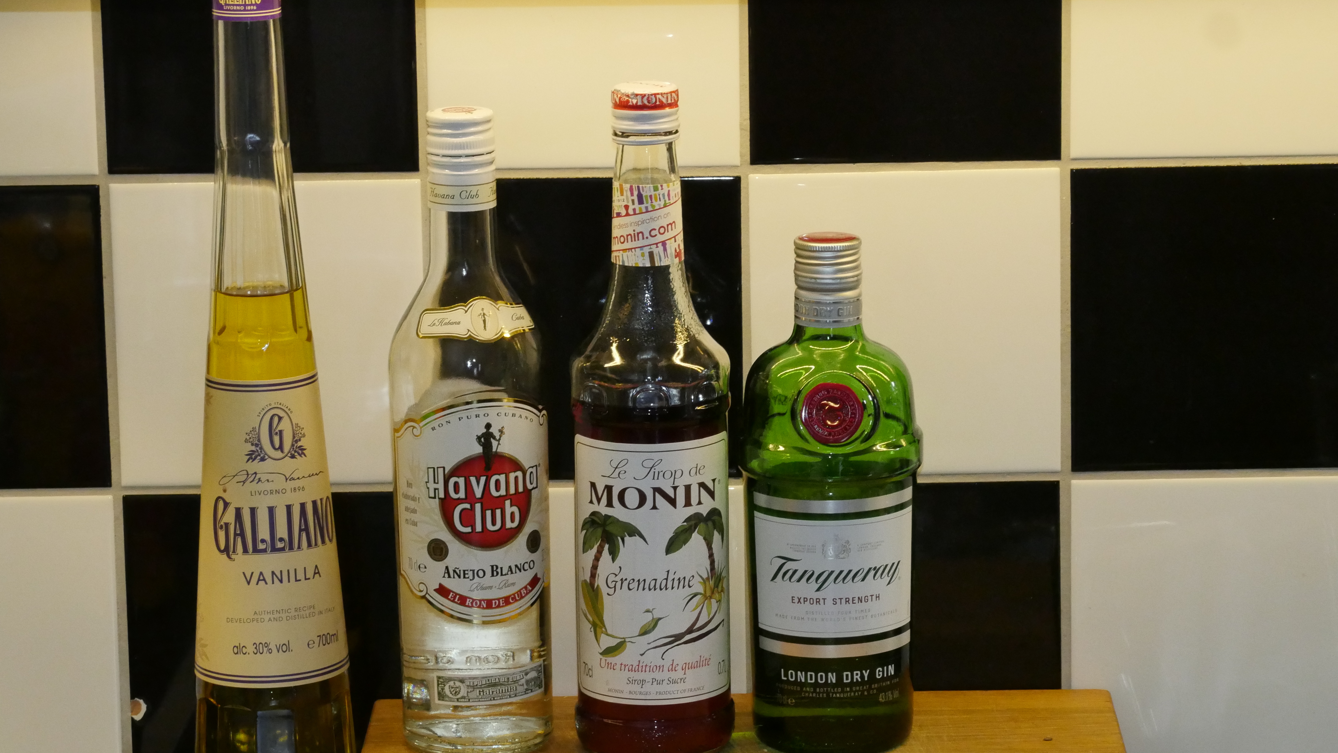
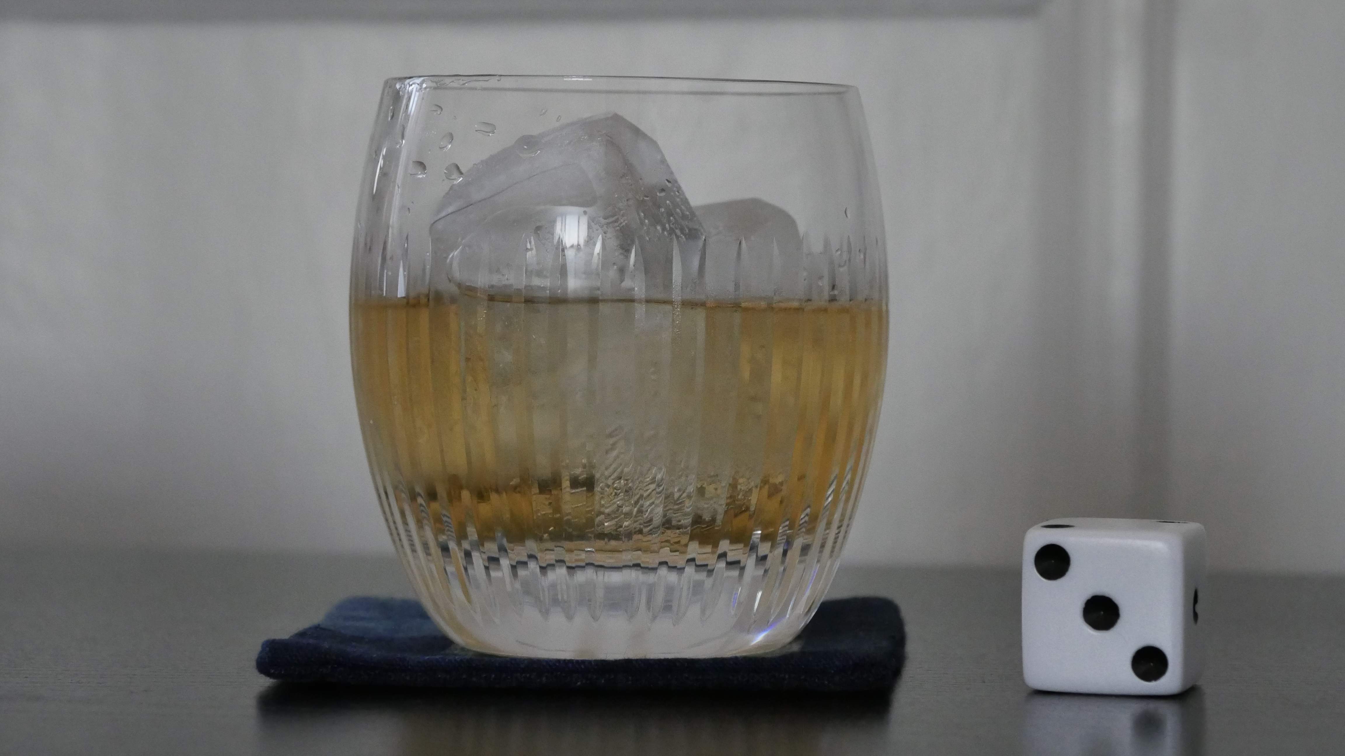
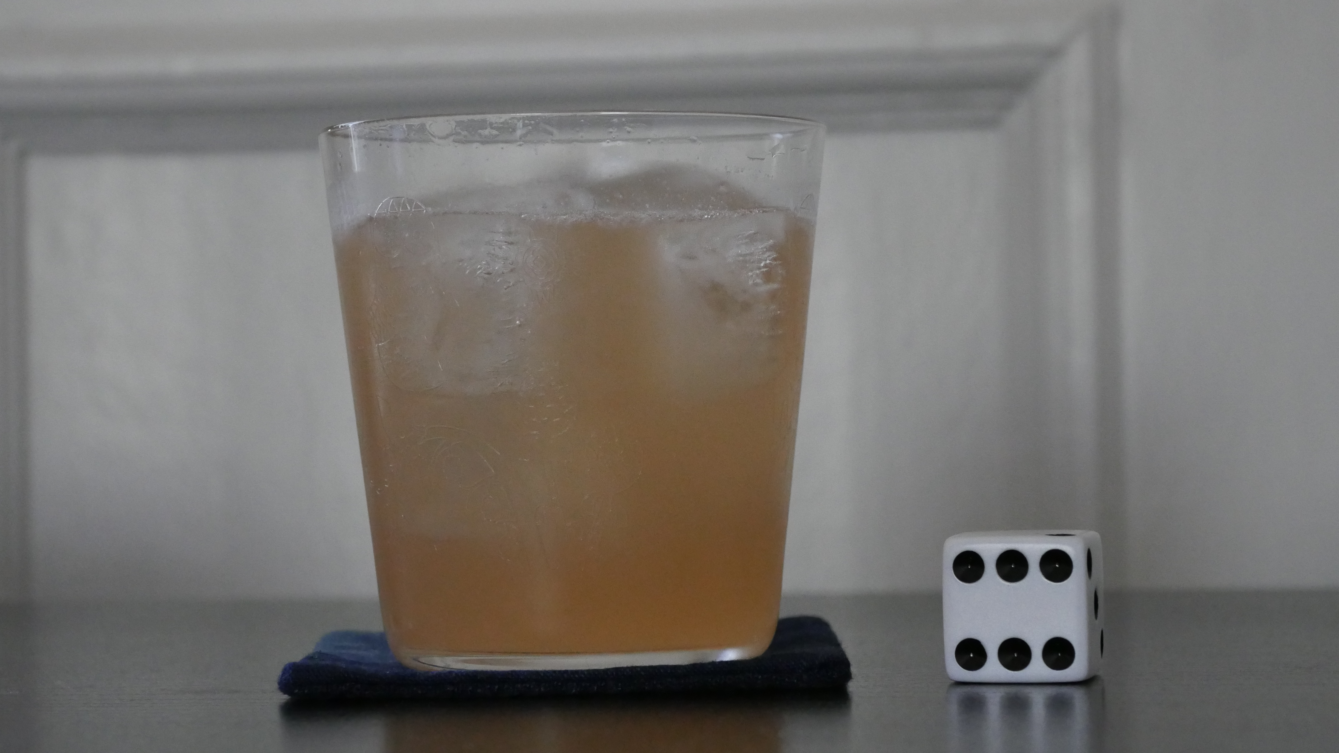
Le Purple
- 5 parts white rum
- 2 parts cranberry juice
- 1 part vanilla syrup
- 1 part lime juice
- some raspberries
- a dash of sugar
- some sprigs of thyme
Muddle some thyme in a cocktail shaker with some raspberries and sugar. Add the rest of the ingredients and shake with ice. Double strain into a Martini glass. Decorate with a sprig of thyme and a raspberry.

This post is part of the World of Films and Cocktails series. Explore the map.