
I acquired this documentary via non-traditional means. You’d think this would be the kind of thing that Amazon Video or Netflix would carry, but no…
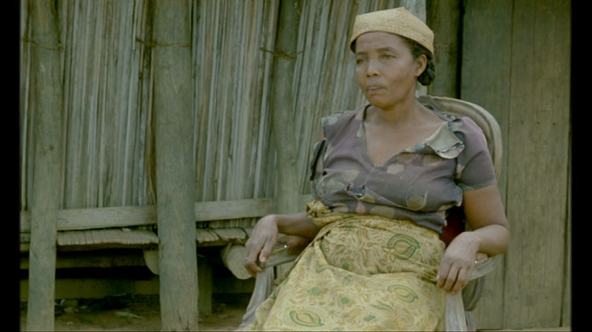
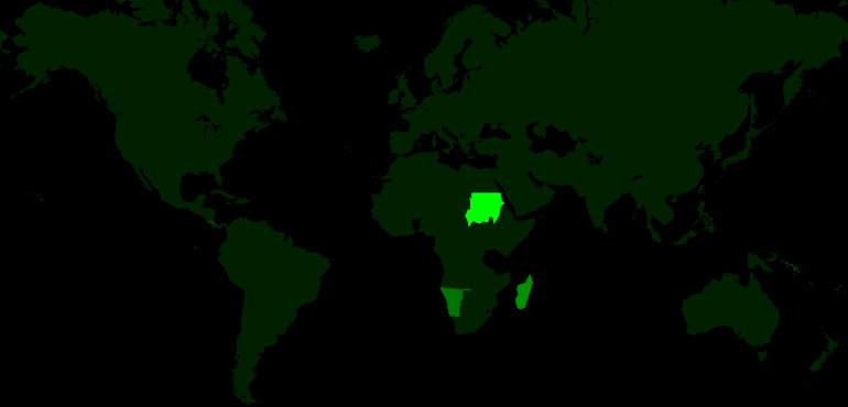
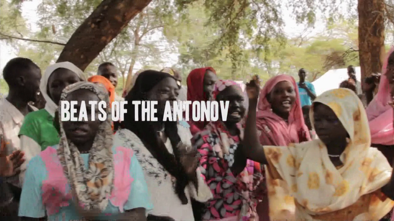
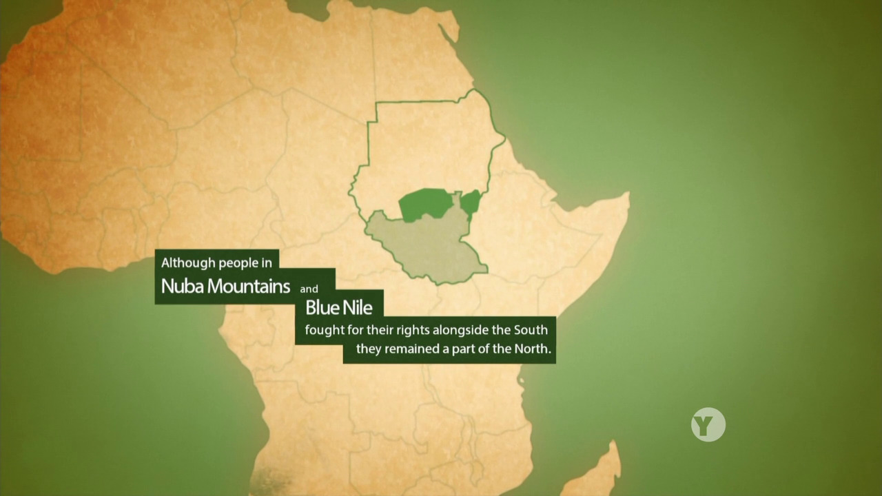
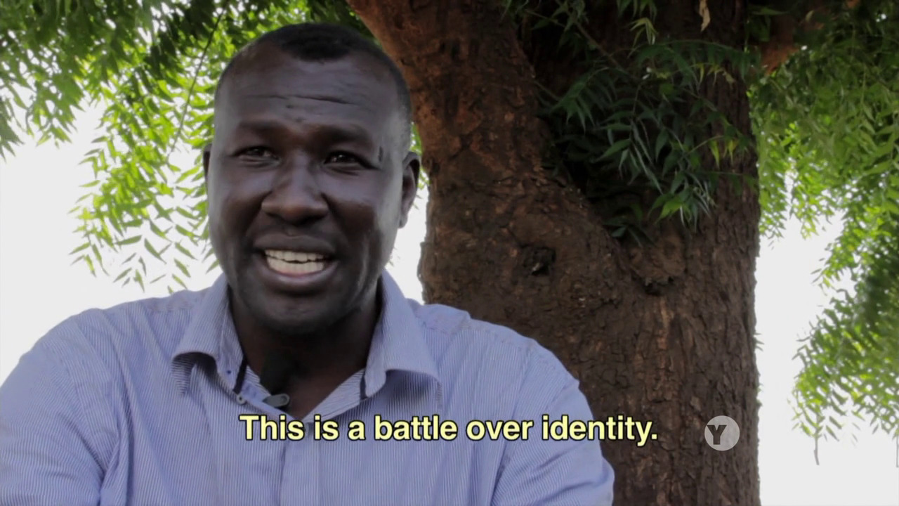
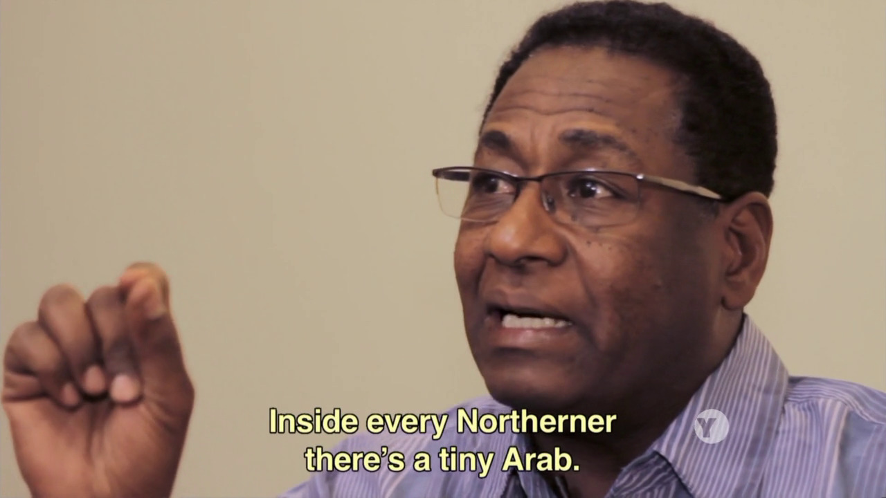
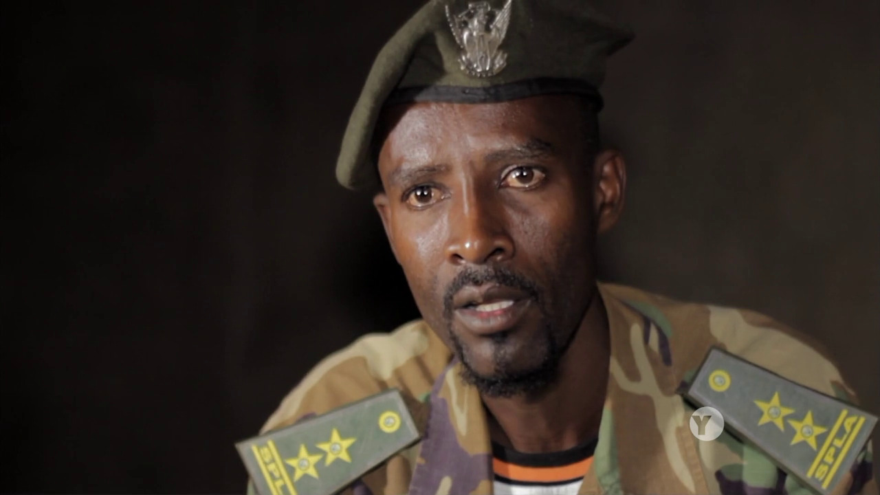
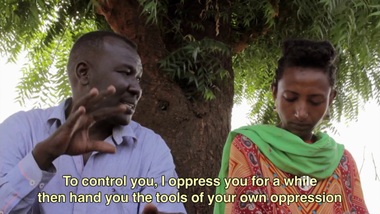
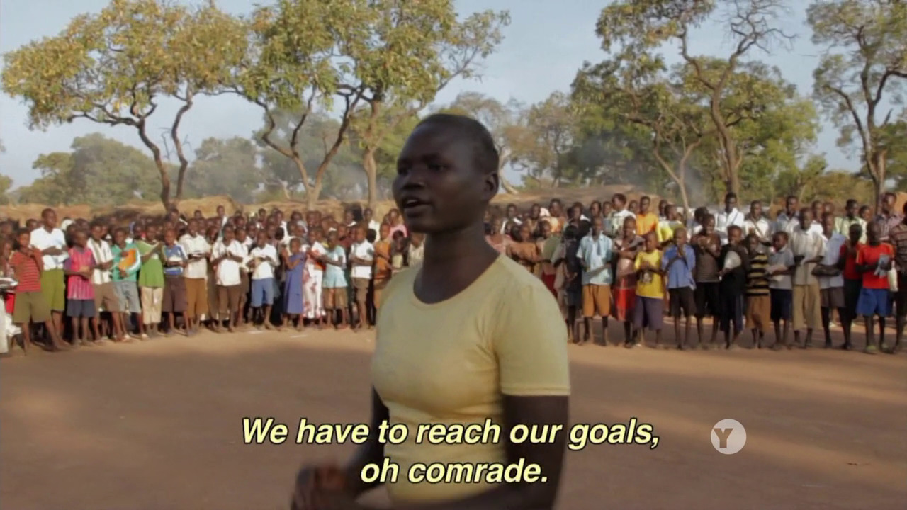
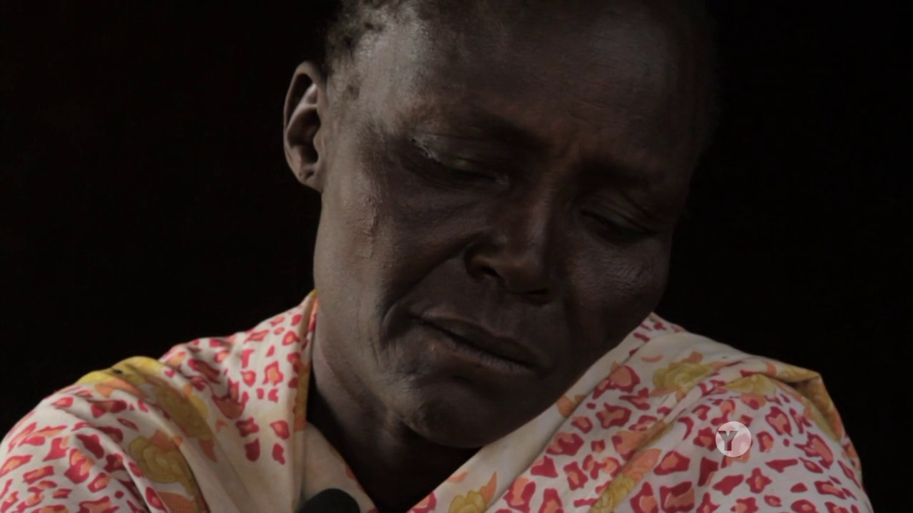
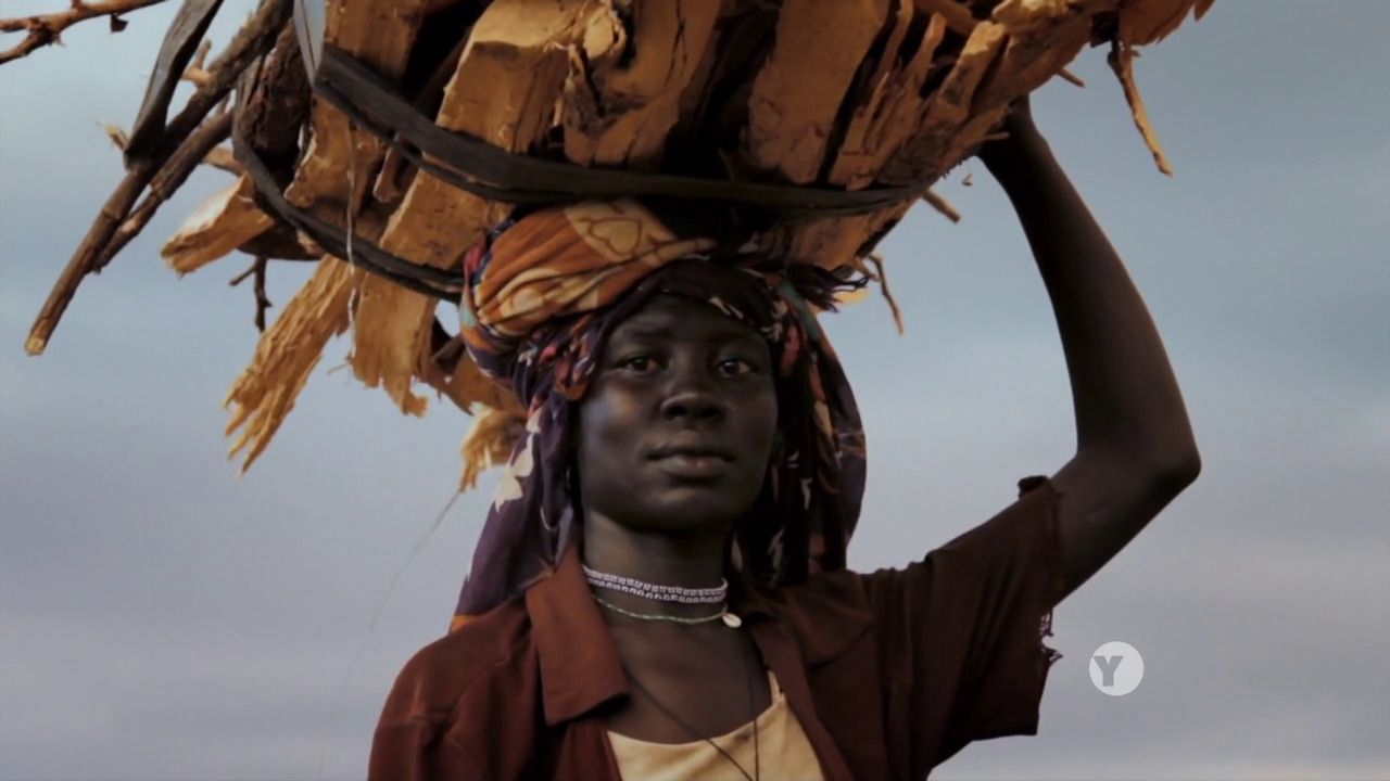
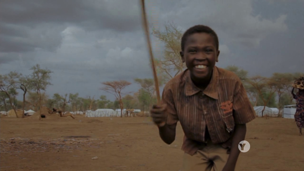
Anyway, this is about the current Sudanese civil war, which is mainly between the northerners (who totally suck) and the Blue Nile (and Nuba) people in the south (who are totally awesome and cool). I’m just summarising the insights I’ve had from this film.
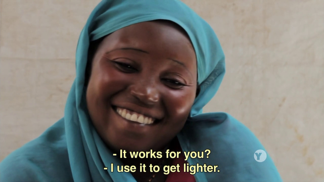
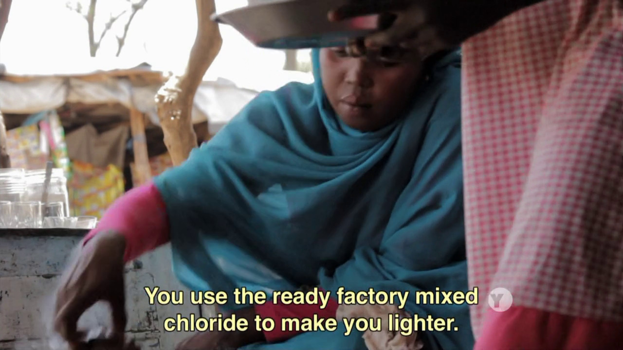
I mean, this may well be true, but… it’s so one-sided that it’s not very effective propaganda.
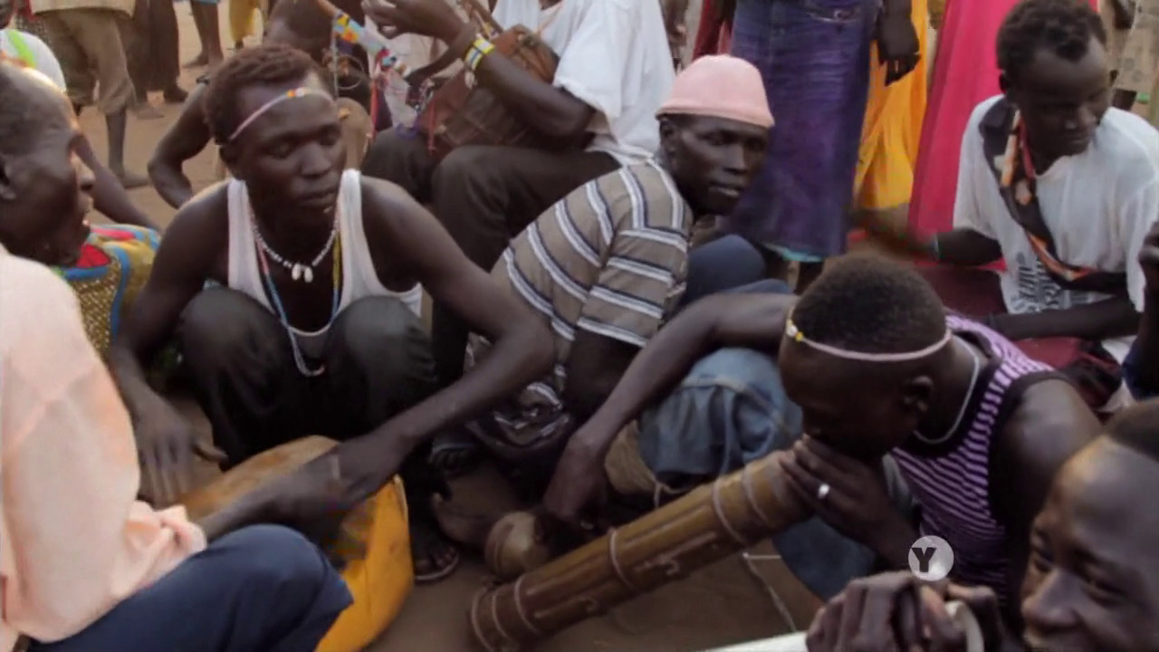
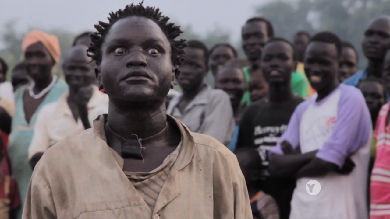
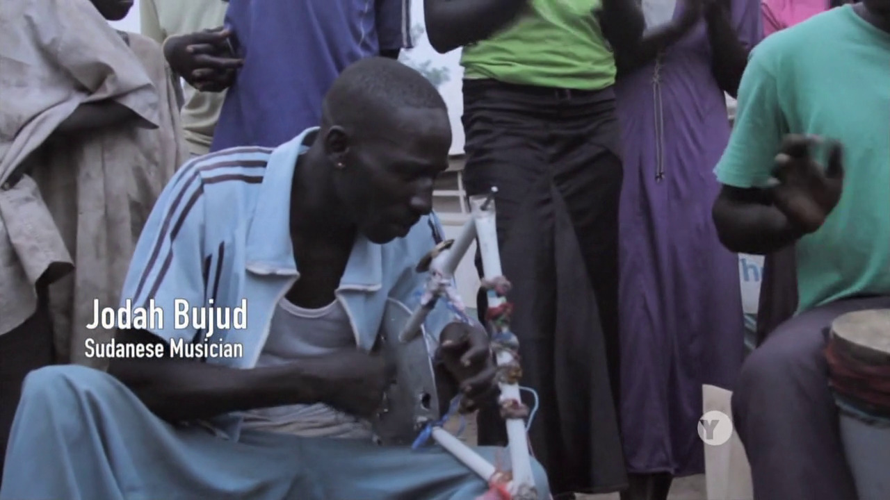
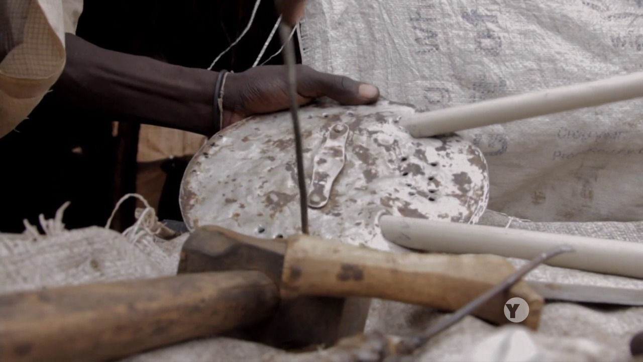
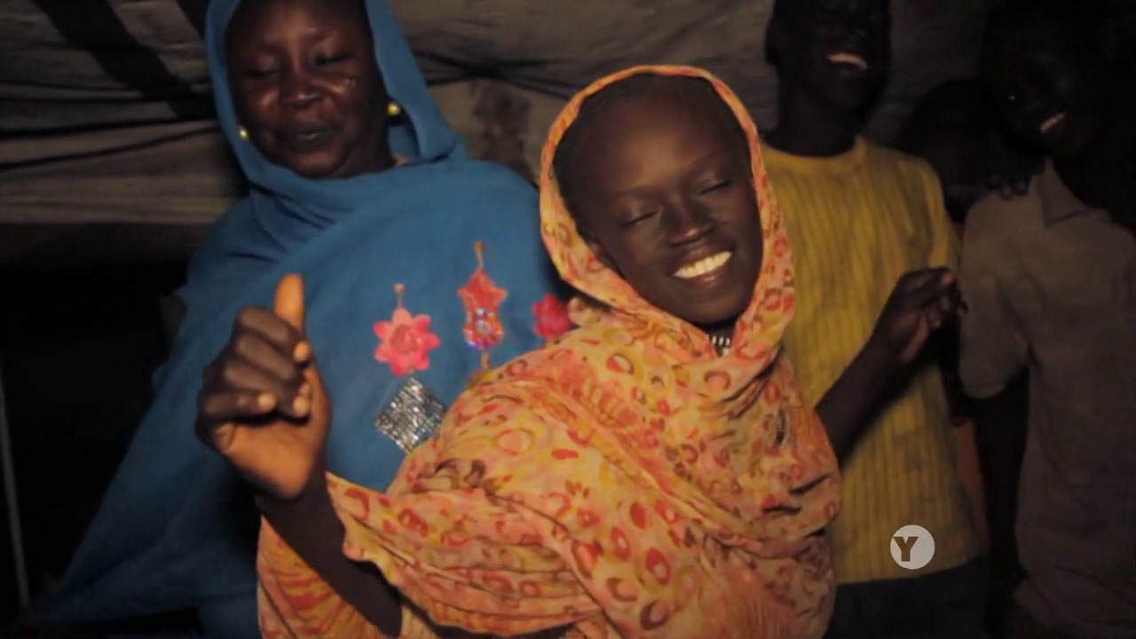
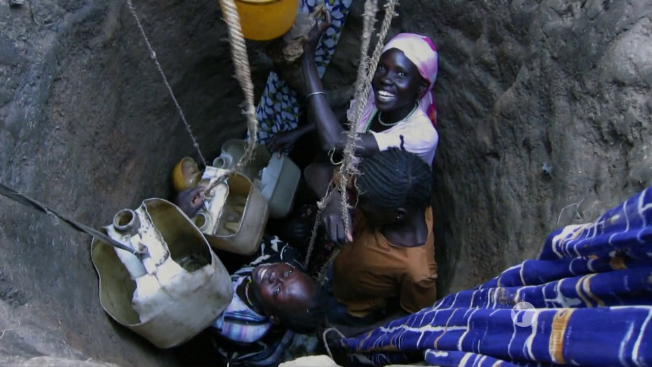
So while it’s perhaps dubious factually (or not; I have absolutely no idea), it’s a well-made documentary otherwise. Lots of great music and dancing, interesting cinematography, snappy editing and engaging interview subjects.

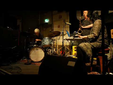
Beats of the Antonov. Hajooj Kuka. 2014. Sudan.

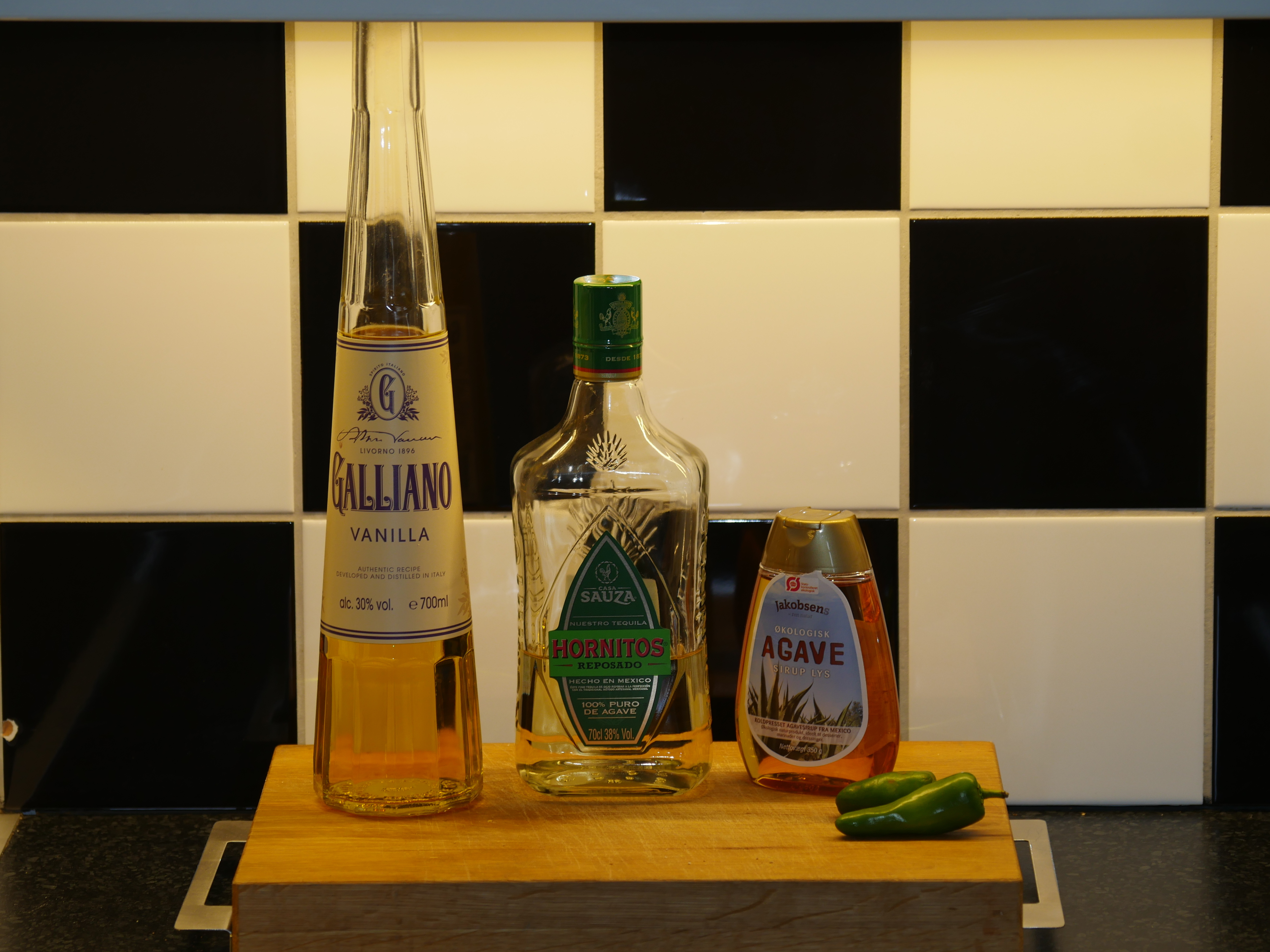
Karkade Tequila
- 1 part sugar
- 1 part lime juice
- 2 parts tequila
- 5 parts hibiscus flower tea
- a few dashes of habanero sauce
Make the hibiscus tea and chill. Pour all the ingredients into a glass with ice and stir.

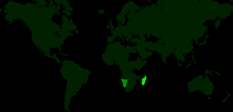
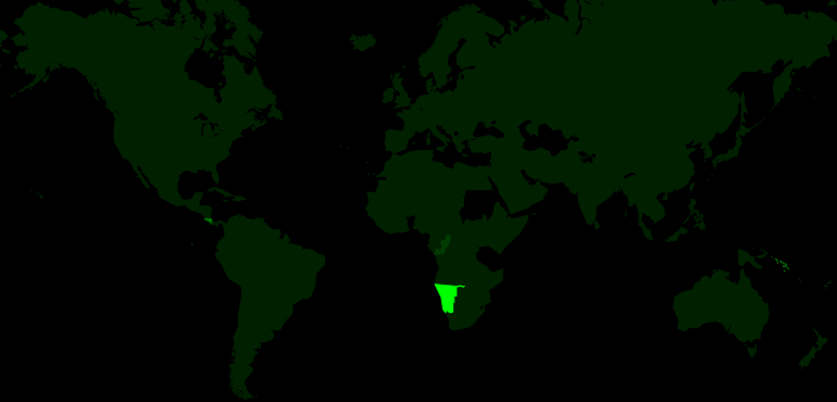
This post is part of the World of Films and Cocktails series. Explore the map.