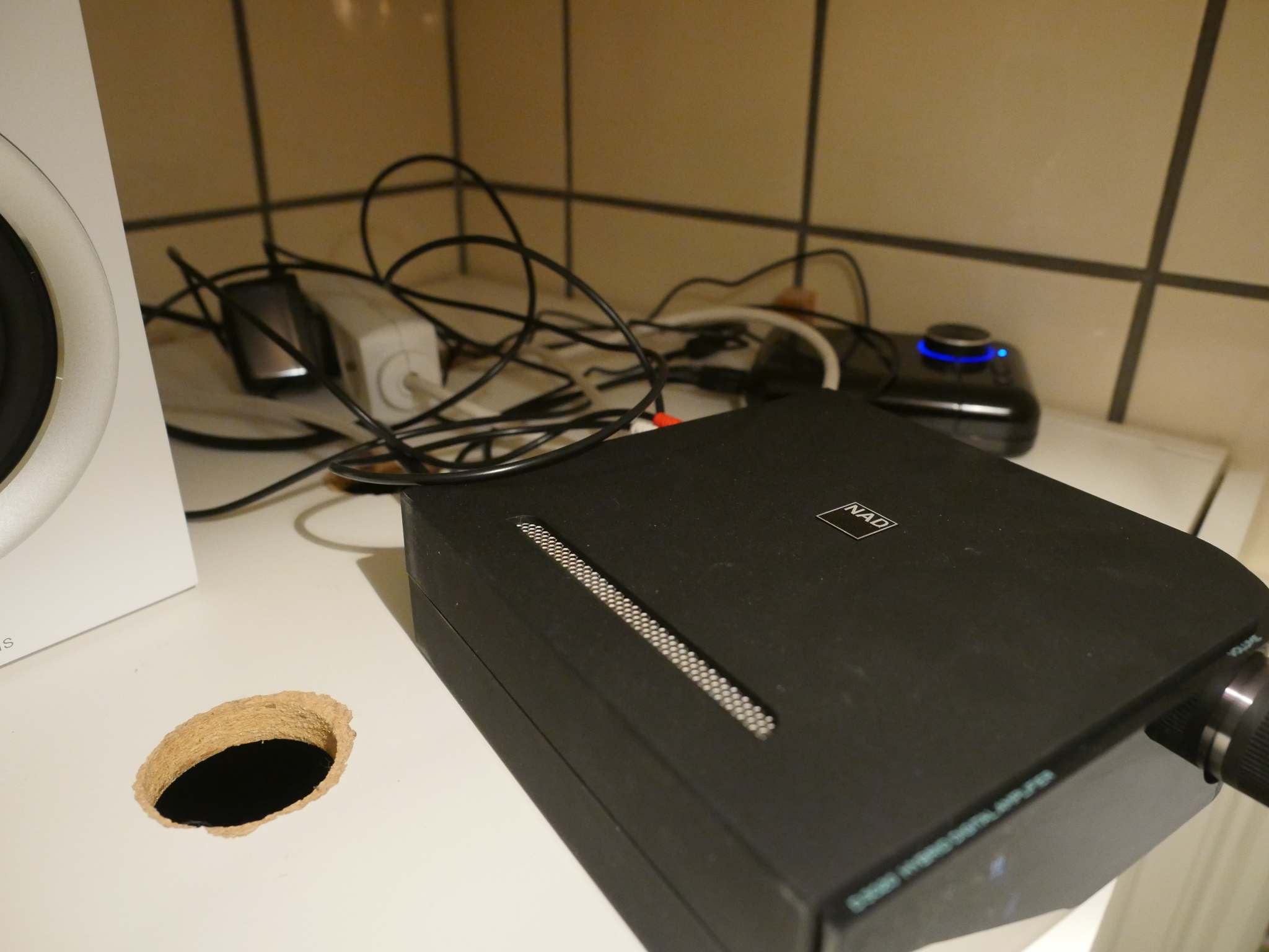
I’ve got most of the rooms in the apt. wired up for sound, but I’ve never managed to work up enough stamina to get the bathroom wired.
So I’ve been using this Creative wireless blaster thingie for years and years, and it works OK. It sounds fine and it usually works. But it’s… kinda a lot of stuff.
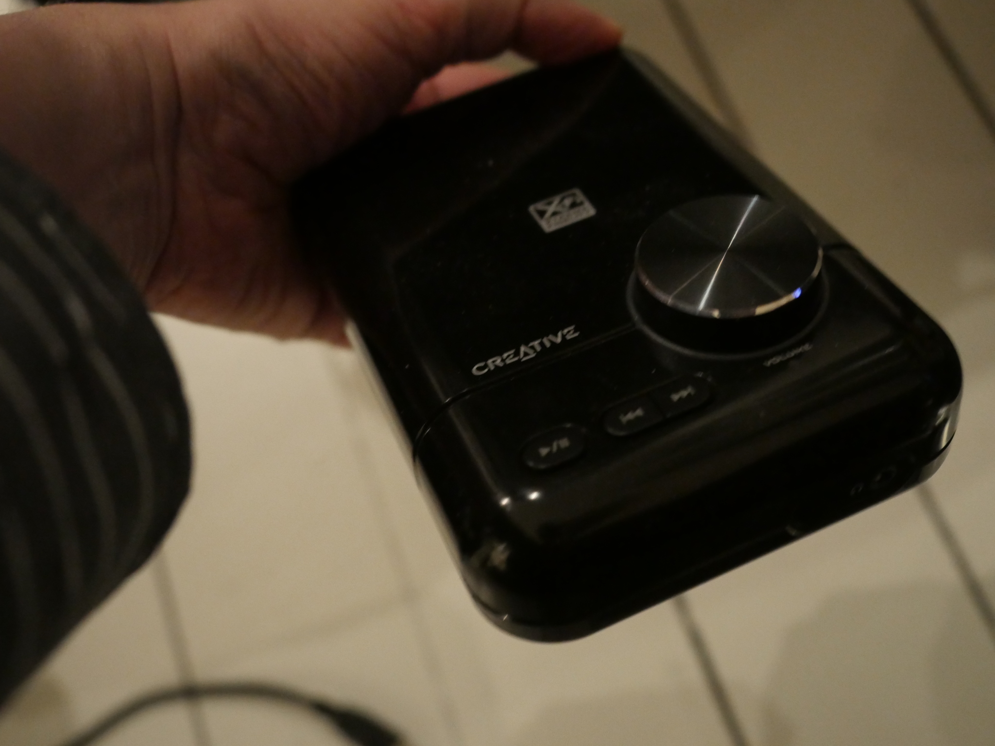
It’s got an external power supply, and there’s all those wires back and forth… I mean, I can’t stand untidy wires.
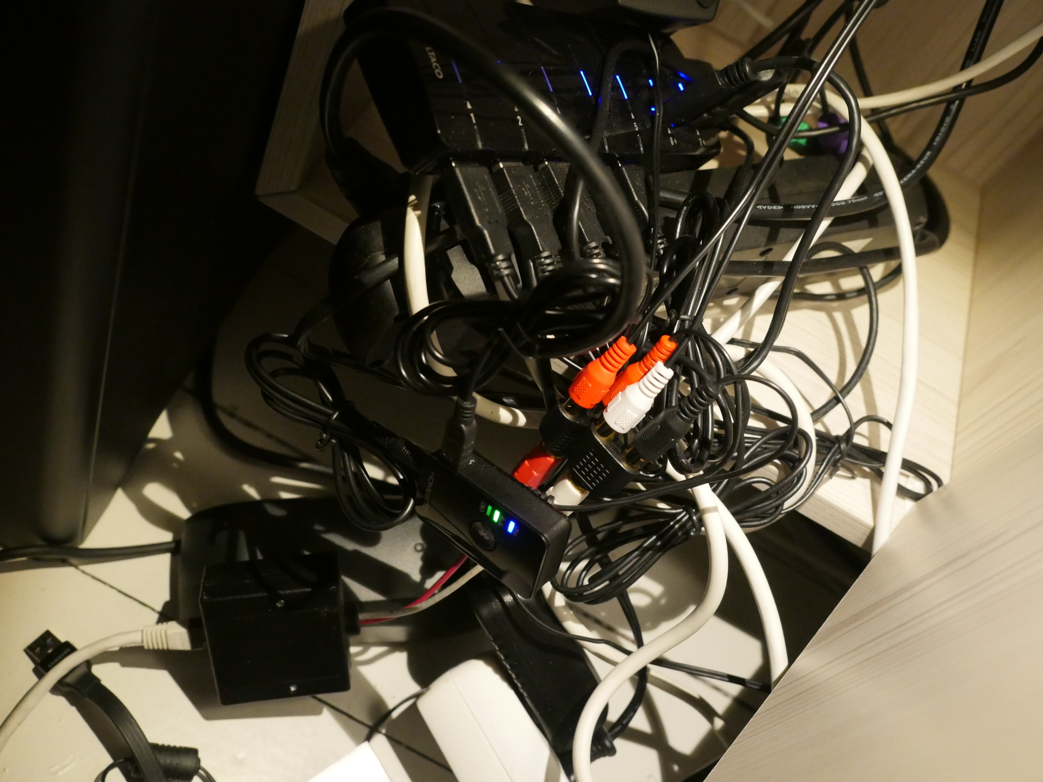
Just look at what spills out whenever I open the cupboard door next to my main computer.
Aaanyway.
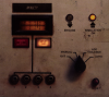
The amplifier in the bathroom died some months back, and I got a new one, and this one has bluetooth built in. So I thought: Hey! An opportunity to slim down the chaos on top of that cupboard in the bathroom, at least. I should be able to get rid of basically all of that by switching to internal bluetooth.
Order! Cleanliness! Goodness!
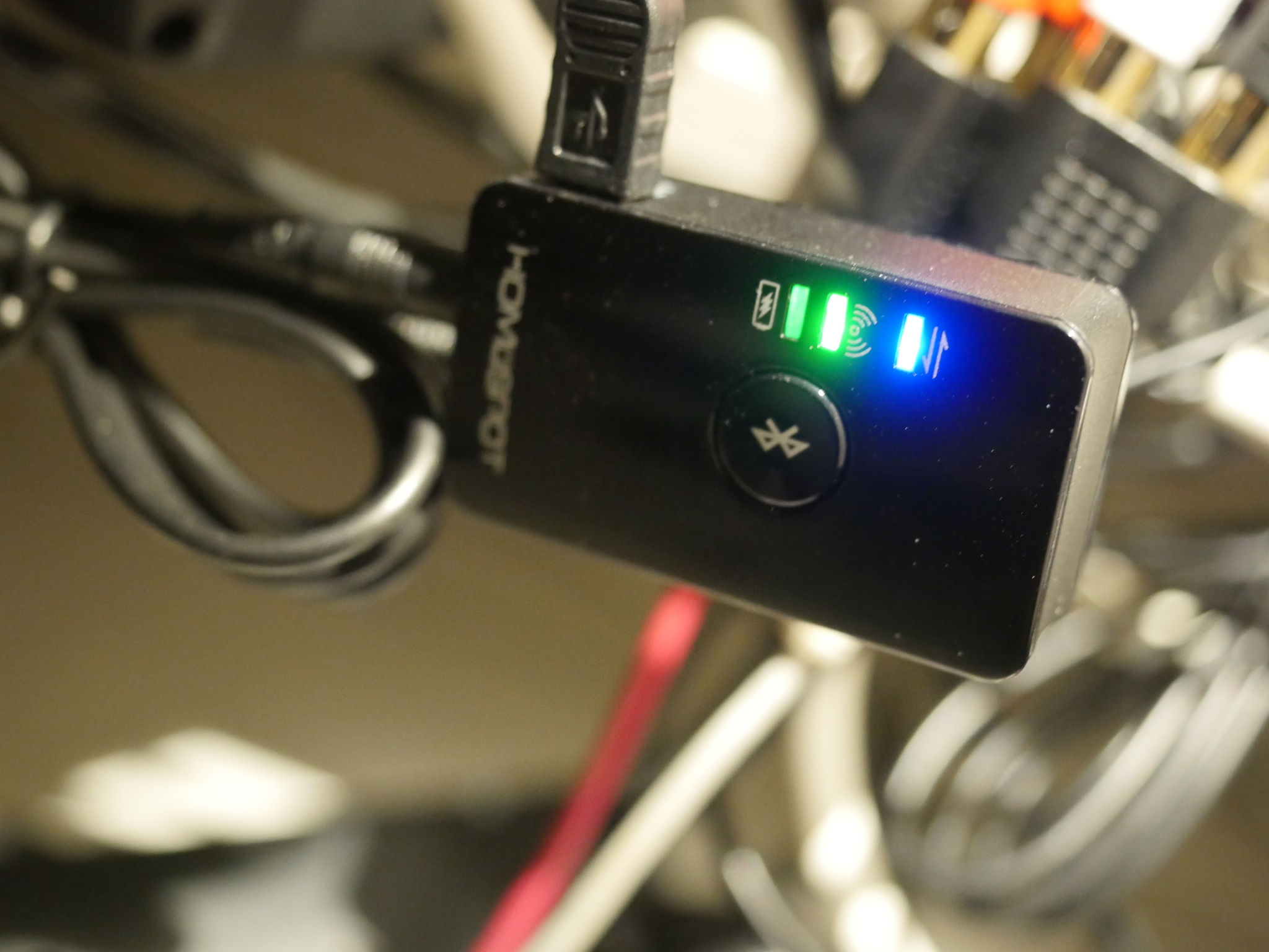
So I bought this bluetooth transmitter.
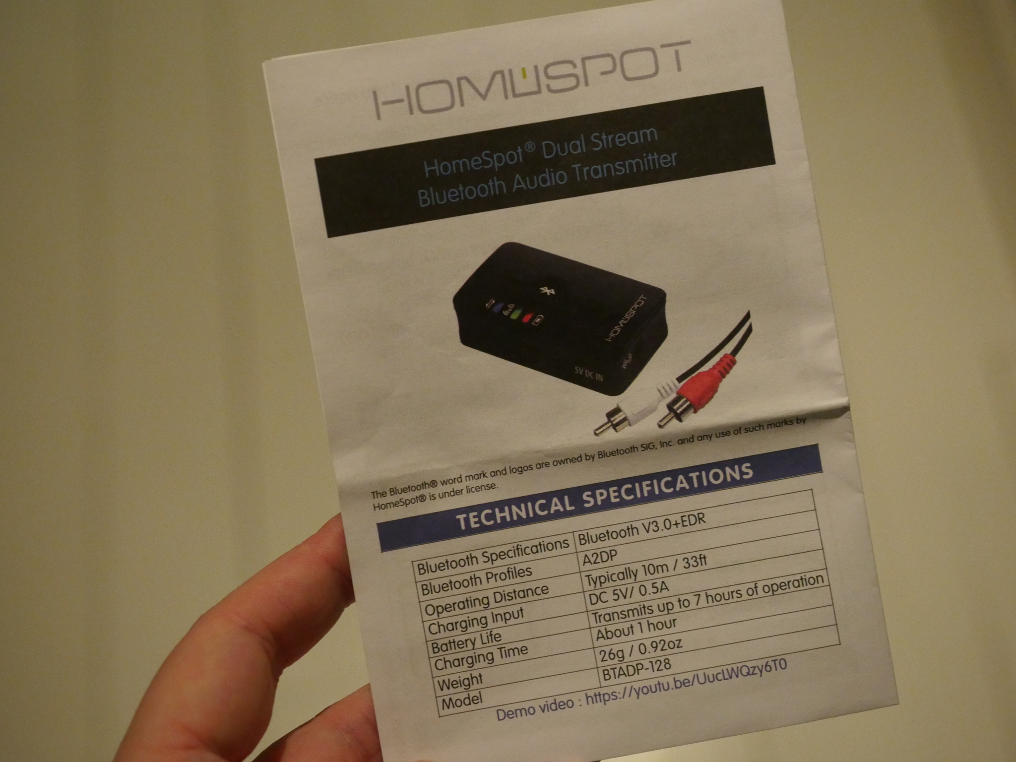
It’s a Homespot Dual Stream Bluetooth Audio Transmitter, and I got it because it talked about low latency bluetooth (in addition to aptX and all the other modern bluetooth goodness).
Getting the devices to pair was slightly tricky, because the amplifier will pair with anything, anywhere, and the transmitter will pair with the first willing device when it’s switched on. Which was confusing, because the first three times I switched it on, it paired with something, but not the amplifier. I got it to work on the fourth try by holding it two centimetres from the amplifier when I switched it on.
Heaven knows what it’s streaming music to in addition to the amplifier now…
But remember that “low latency” thing? Well:
If you pump up the volume you’ll hear a lovely Machinedrum ditty coming from the office (wired sound), and then I turn the amplifier up in the bathroom. Listen to that loooow latency.
*sigh*
Well, it’s not like I usually have the music on the bathroom switched on. I mostly just use it while showering, and in that case I can’t hear any music coming from other rooms.
But that’s really annoying. The Creative wireless thing has a much, much lower latency: You mostly experience the effect as a sort of thickening of sound, not the stumbling effect you get from the bluetooth latency.
So I dunno… I think I may just switch back to the old setup, even though it’s so… messy…


)
)
)
)


)
)


)


)
)
%3A+Live+In+Boston+at+Great+Woods%2C+5th+August%2C+1986)
)
)


)
)