Cast your mind back to the early 90s: *biff* *bang* *pow* Comics aren’t for kids any more!
After the amazing success (both commercially and critically) of Art Spiegelman’s first Maus volume, many publishers wanted to get in on the action.
Literary power houses like Pantheon Books (a part of the Knopf/Doubleday/Random House publishing behemoth), Penguin and Little, Brown all dipped their feet into the water and released mature, interesting work by Ben Katchor, Matt Groening and Charles Burns… but when sales failed to materialise, they mostly threw in the towels.
And then Neon Lit appeared, an imprint of Avon Books, mostly known for publishing romance and mystery paperbacks.
What happened?
RT Investigates!
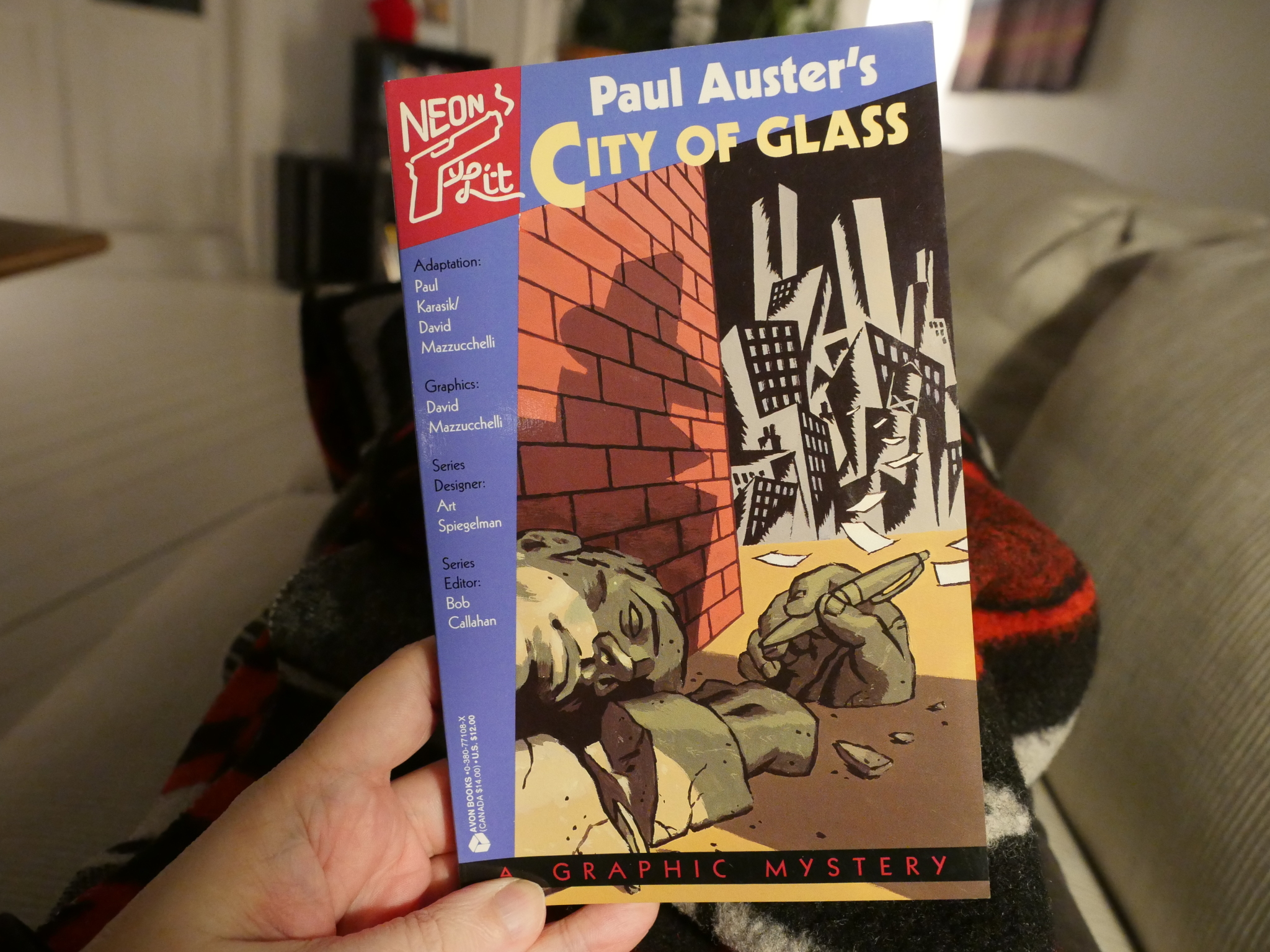
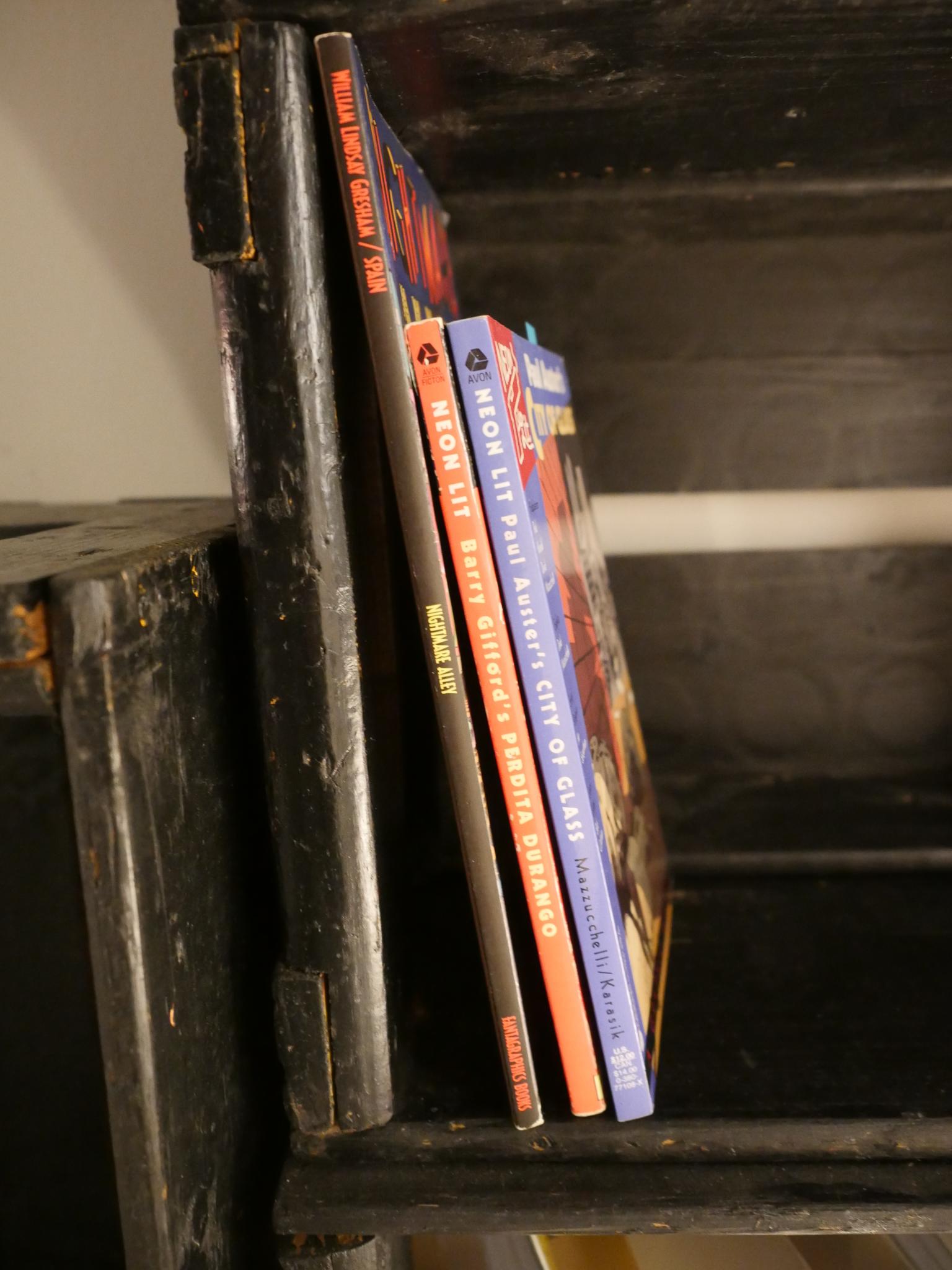
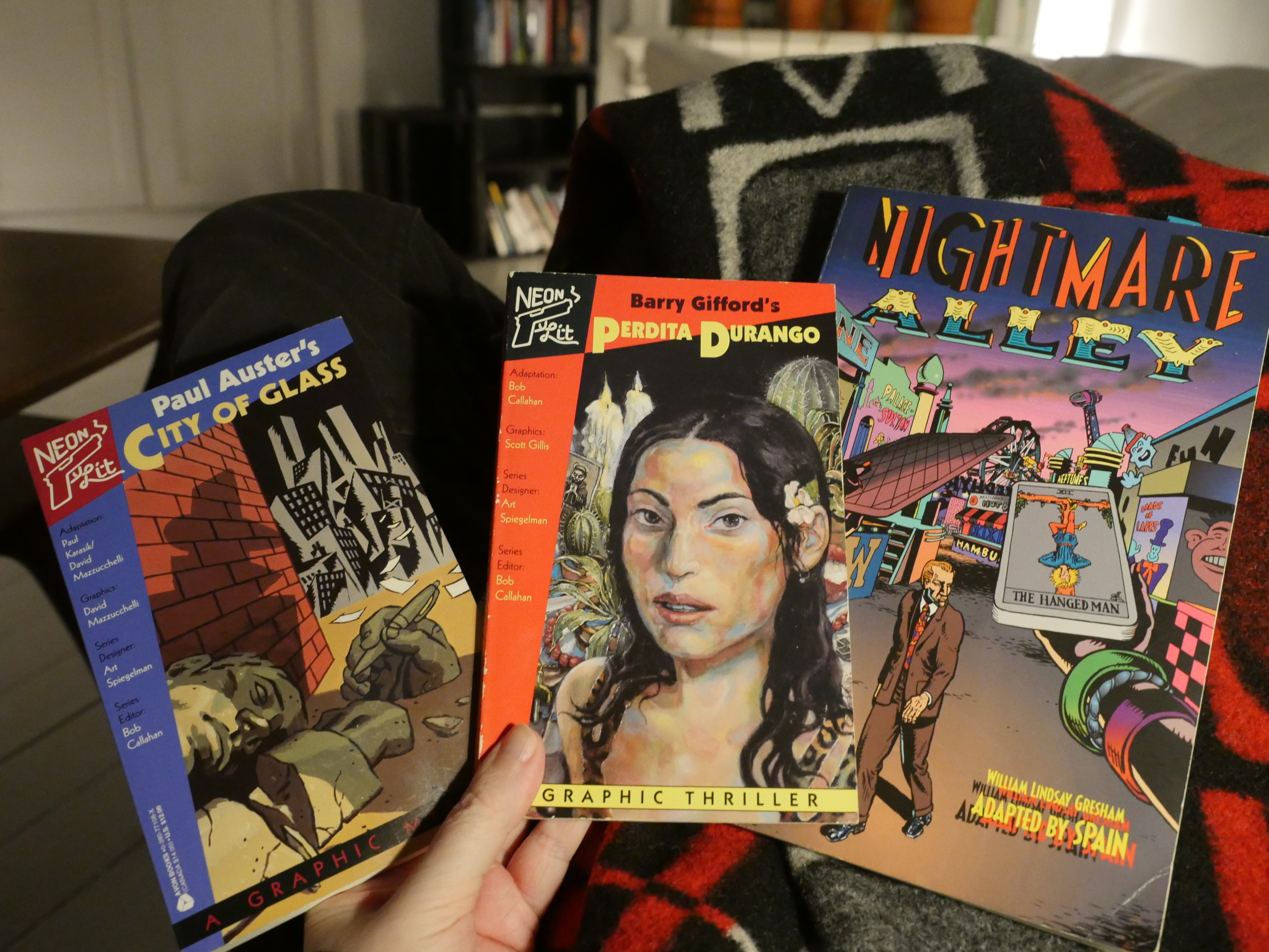
I happened onto City of Glass (adapted by Paul Karasik and David Mazzuchelli) on the bookshelves the other week, and I started to think: Whatever happened to the imprint that book was part of? “Neon Lit”? Wasn’t there supposed to be more books in that series? Did I just zone out during a few years in the 90s?
A google search later I had bought the only other book the imprint published, Perdita Durango, and after reading that and googling some more, I thought it might be interesting to write up the story of the imprint. Well. The bits of the story my limited googling skills reveal.
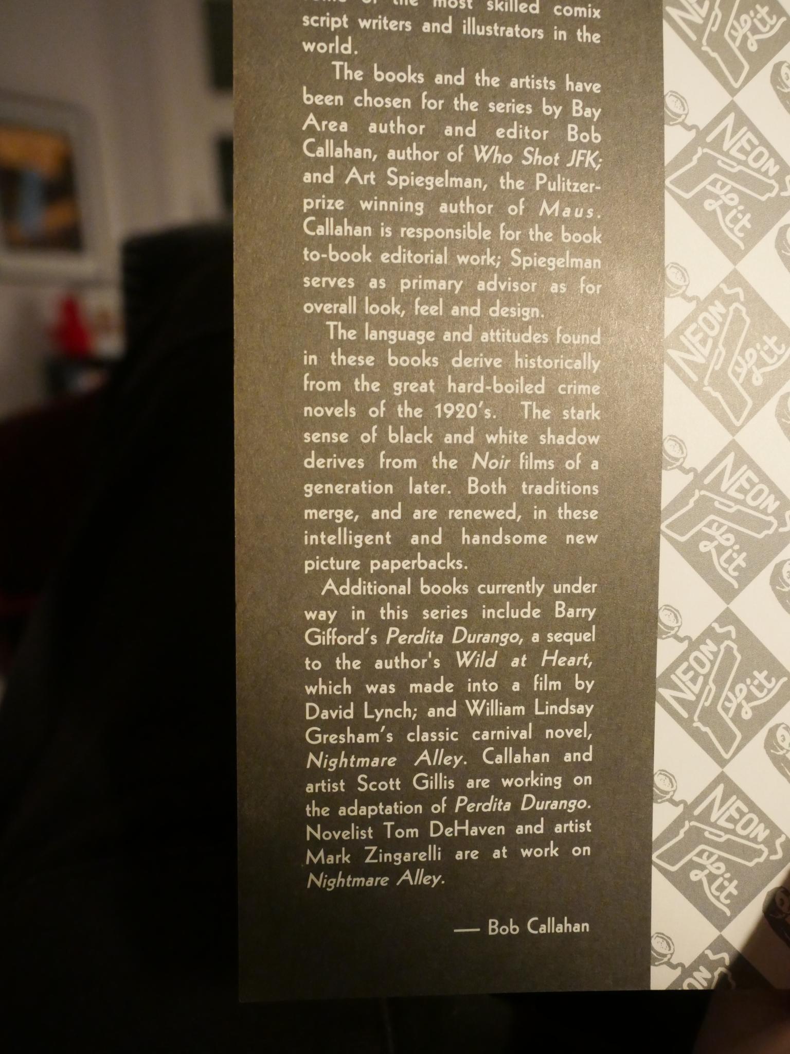
The Neon Lit imprint was published by Avon Books, a very down-market paperback publisher, mostly known for gothic romances and gritty crime novels. Somehow editor Bob Callahan (after enlisting Art Spiegelman as a designer and consultant) managed to convince them that publishing literary comics would be a good idea. Perhaps after seeing the success of Maus and the seeming prestige imprints like Pantheon brought, they gave the go-ahead? I’m just guessing.
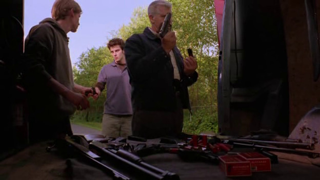
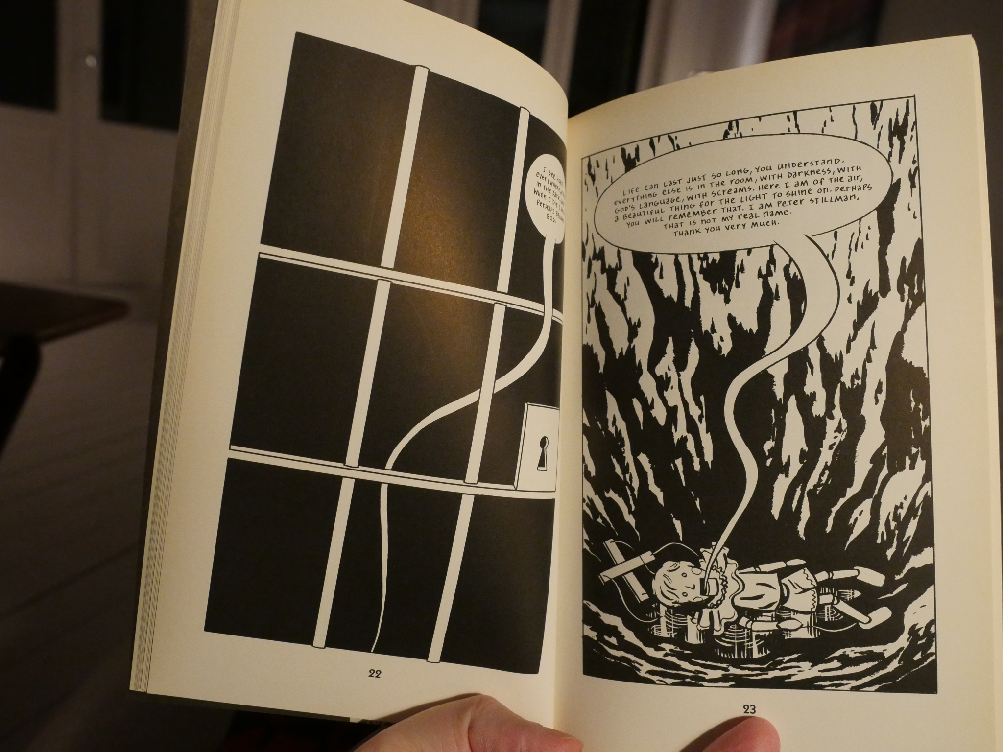
The first book they published was Paul Auster’s postmodern classic City of Glass, adapted by Paul Karasik and David Mazzuchelli. It was a great success, getting written up all over the place (like the New York Times Book Review), and also ended up in my hands.
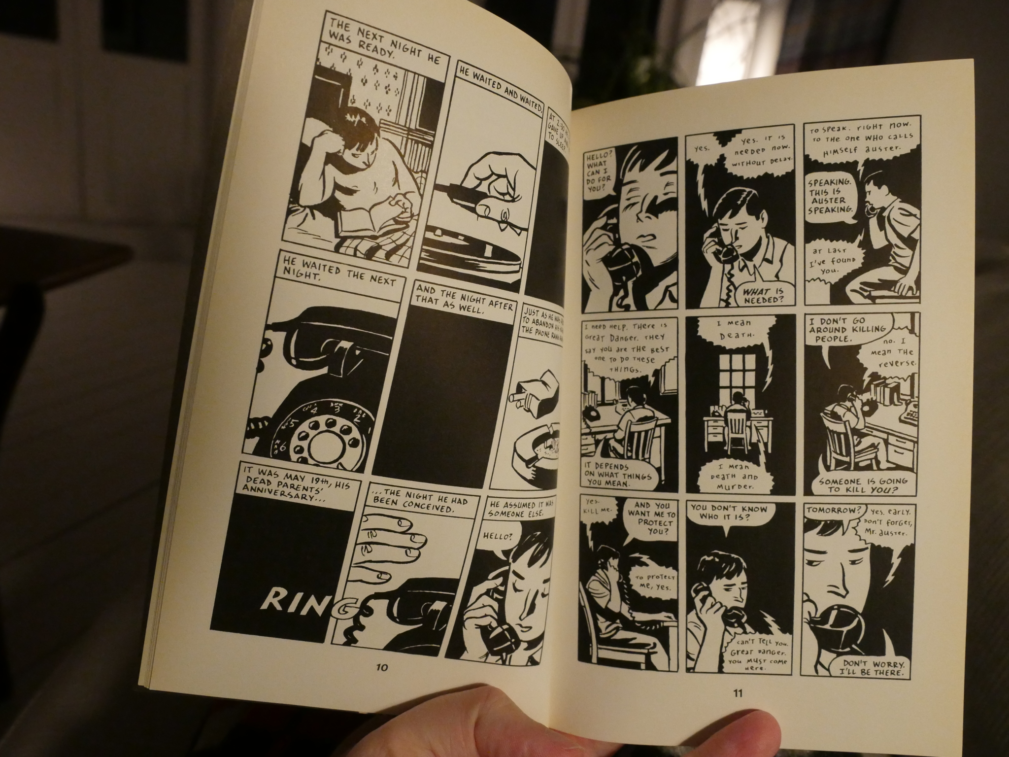
Rereading it for the first time in over 20 years, it hasn’t lost any of its strange hypnotic power. Auster’s novel is wonderful, of course, but Karasik and Mazzucchelli are impeccable.
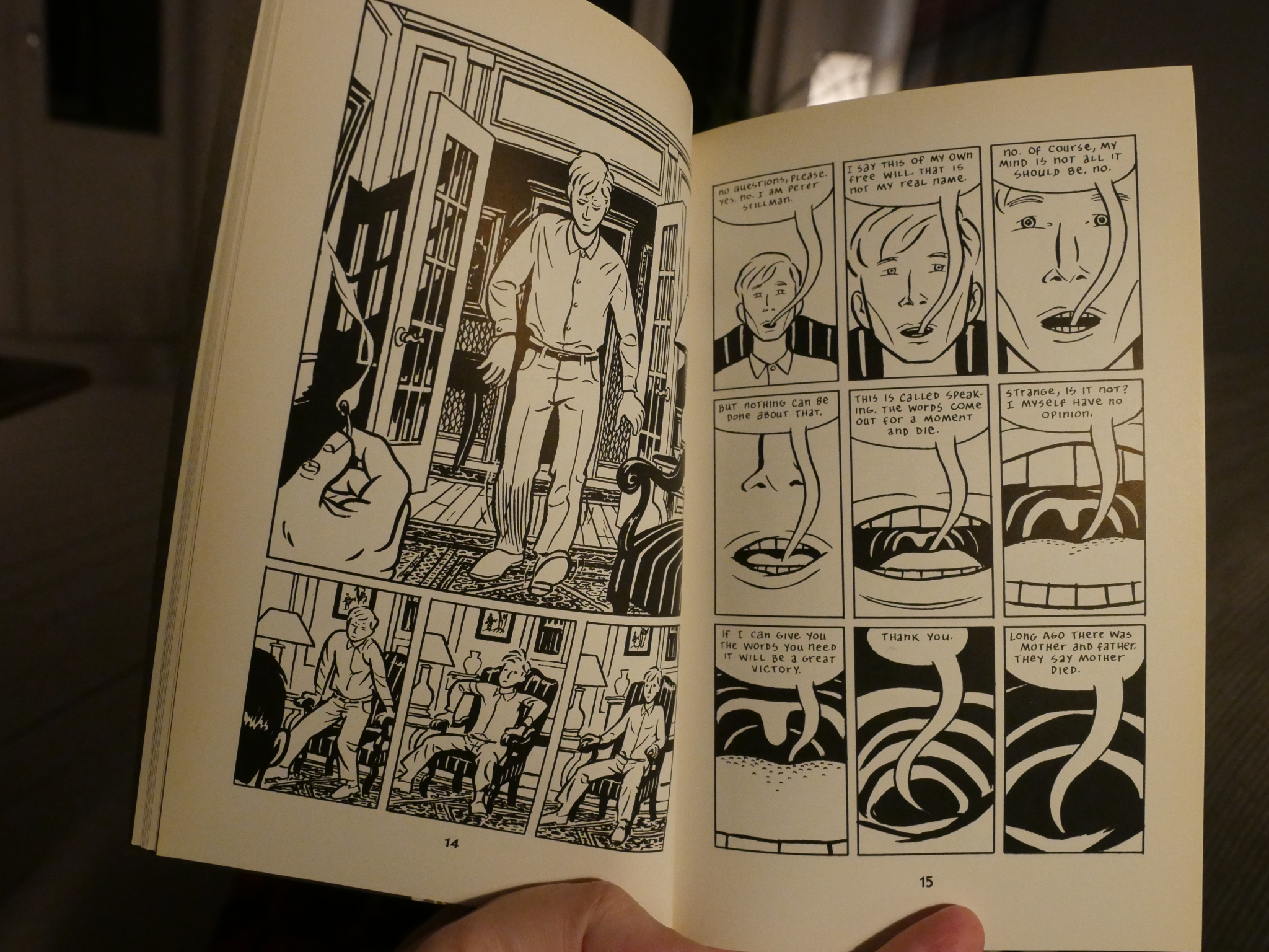
It doesn’t read like an adaptation at all: It’s 100% comics, doing things with the restrictive nine panel grid that’s utterly fantastic.
It’s a fabulous book, and I guess I don’t have to write anything more about it, because you’ve either read it or will read it yourself at some point, so… Or you can read one of the other reviews or articles about it.
It’s, like, a classic, and it has later been reprinted by Picador, which seems like a more natural home for the book than Avon.
But how was it released in the first place? Let’s refer to the ur-text as found by the Comics Journal search engine: An interview with Art Spiegelman from The Comics Journal #181, October 1995, page 130-131.
GROTH: And it’s a commercial success as well?
SPIEGELMAN: Of a sort. I think it’s a commercial success by default due to the fact that Avon screwed up things so royally, that the fact that it succeeded at all in spite of their screw-ups made it seem even more successful.
GROTH: How did the publisher screw up?
SPIEGELMAN: What happened was, the person who originally took the series on, Bob Mekoy, had been the main man up there at Avon, like everybody else there left before the book came out – this happens a lot in New York publishing. But it was happening even more at that house because Avon was up for sale by the Hearst Corporation and though they finally decided not to sell, everybody was bailing out. So when we first were up there, we seemed to be with the people best entrenched and highest up in the company – and then all of a sudden they were gone! In the course of getting the book together, nobody gave us accurate deadlines. Meeting the deadlines we were actually given made us several months late. Since the book wasn’t published in time to fulfill its solicitations, it was just dropped and put on a backlist. When it was finally printed — I hate to use the word “published” — all that happened was, back orders that hadn’t been canceled, were filled. There the book could have languished because nobody was paying any attention to it, It’s from a house that doesn’t seem to be associated with high literary aspirations — it’s sort of a mass market paperback house.
When the book came out Bob Callahan and I stopped in at City Lights Bookstore in San Francisco. They didn’t touch it because they don’t even look at what Avon has on its list. It’s just somehow not appropriate for them. And of course a book like this can only live through independent bookstores, it’s just not ultimately made for chain bookstores.
What happened was, by sheer accident, publicity copies were sent out with that month’s pile of Avon’s Gothic romances. A freelance writer/editor at Entertainment Weekly, Matt Flann, happened to be bored enough to rummage through the box and found the Neon Lit book at the bottom. He didn’t find any press release because they hadn’t written one. But he happened to like comics and got in touch with Avon who didn’t seem to know anything about this book. Through a network of connections he got hold of my number. I’m amazed that he actually pursued it this far. I was able to put him in touch with the other people who did the book. From that, he was able to write a piece in Entertainment Weekly. The Entertainment Weekly piece was seen by people at Newsweek who ended up wanting to write about City of Glass as well. Simultaneously, perhaps also inspired by the Entertainment Weekly piece, the New York Times Book Review did a short review of it in their Crime and Mystery issue last year. All of this was unbidden and without a publicist! And it was fairly high profile press.
The result of all this was that alert bookstore managers actually noticed that something interesting was around and ordered it. Without salesmen pushing it. The result of that was that the book had an amazing sell-through. “Sellthrough” is not how many copies are printed or how many copies are sold, but how many copies of what have been ordered have been sold. Since this book was primarily ordered by people who are passionate about getting it, and had to get it over Avon’s dead body, the book had an amazing sell-through. It finally made Avon start paying attention to what they had. I think at some point they might have even written a press release for the book. So the book began to get out a bit wider and I think has gone to a second printing — even though, for the most part, this was a book pre-ordained to go into a shredder.
GROTH: How many copies does this mean if has sold?
SPIEGELMAN: You’ll have to ask Callahan, I just don’t know. I know that they’re happy enough with it to have committed to about five other books.
There you go: An editor at Avon, Bob Mekoy, apparently wanted to do it, so the project got started. Mekoy left Avon, and nobody else at Avon were particularly interested, so it received no publicity from the publisher. (And since this was in 1994, the wind had gone out of the first American wave of literary comics, my guess is that the people at Avon assumed that it was just a lost cause, anyway.)
Since no literary bookstores stock anything by *feh* Avon, it was destined for the shredder, but a diligent reviewer at Entertainment Weekly (now Publisher’s Weekly, I guess) read it and gave it a sterling review.
Things can be so random, but I think people would eventually have picked up on it, anyway: David Mazzucchelli is pretty well-known, and (a very select group of) people were really excited by his Rubber Blanket series that he was doing at the time.
So things were going gangbusters for the imprint, even if nobody had expected it to. But then there’s the next book: Perdita Durango, adapted by series editor Bob Callahan. It wasn’t as well-received as City of Glass. To put it mildly.
Quoth David Rust, The Comics Journal #184, February 1996:
Considered as a follow-up to City of Glass, as an adaptation of a good novella, and as a work in its own right, Perdita Durango fails on all levels. The graphic novel would have been much better had it been given more room to breathe, perhaps 200 pages. Hopefully, future Neon Lit adaptations will be allowed more flexibility for stories to determine their own length.
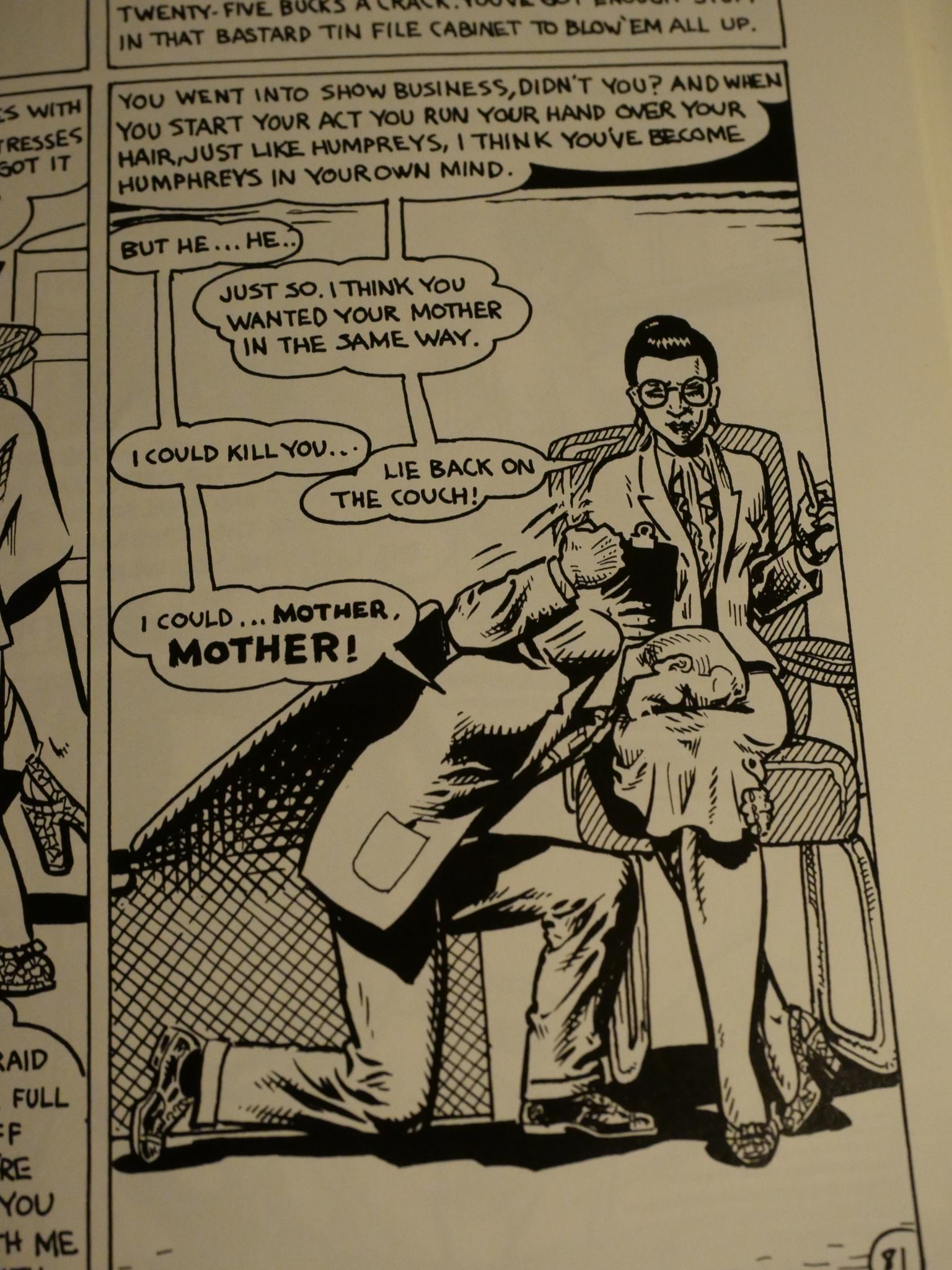
That’s rather harsh. There are positive qualities to this book, but they’re mostly confined to the scratchboard artwork.
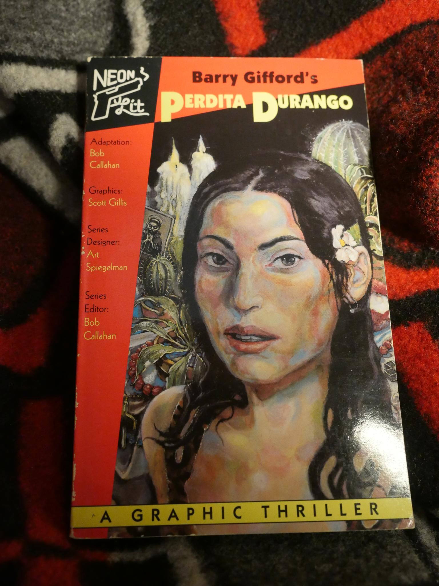
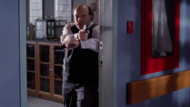
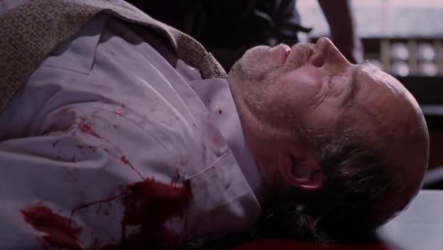
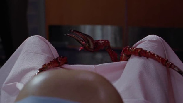
Perdita Durango is adapted from a novella by Barry Gifford (who most known at the time for writing the script to David Lynch’ Wild at Heart) by Bob Callahan with art by Scott Gillis. Gillis had done a few short comics for Raw in the 80s, but seems to have little experience with making comics beyond that.
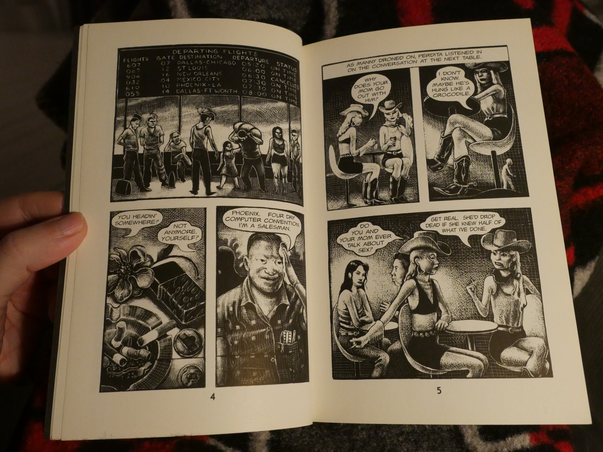
His scratchboard artwork is stunning: Inky, inky black goodness.
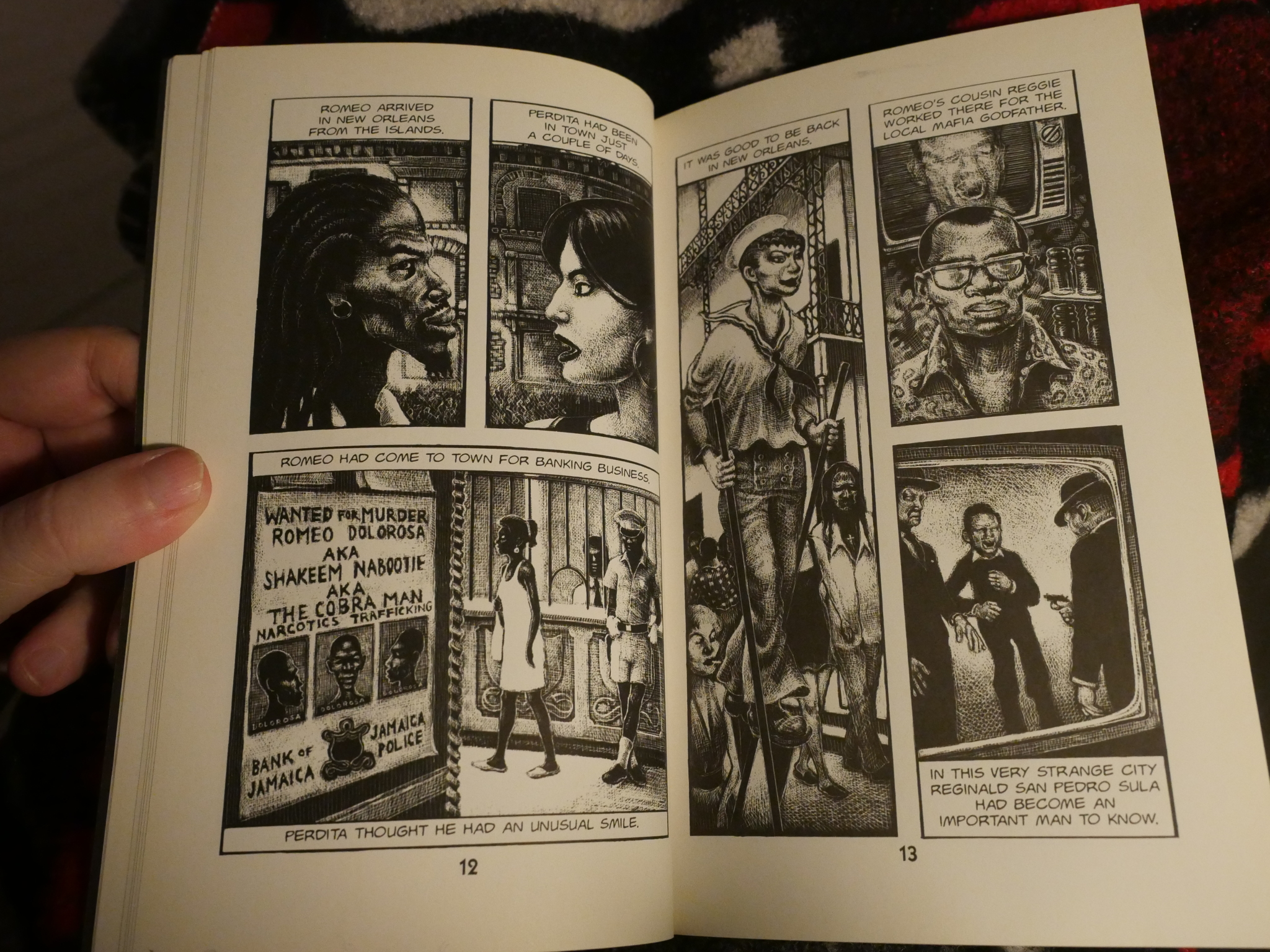
It’s mostly drawn on a four panel grid, which fits the format of these slightly-bigger-than-mass-market-paperback sized pages.
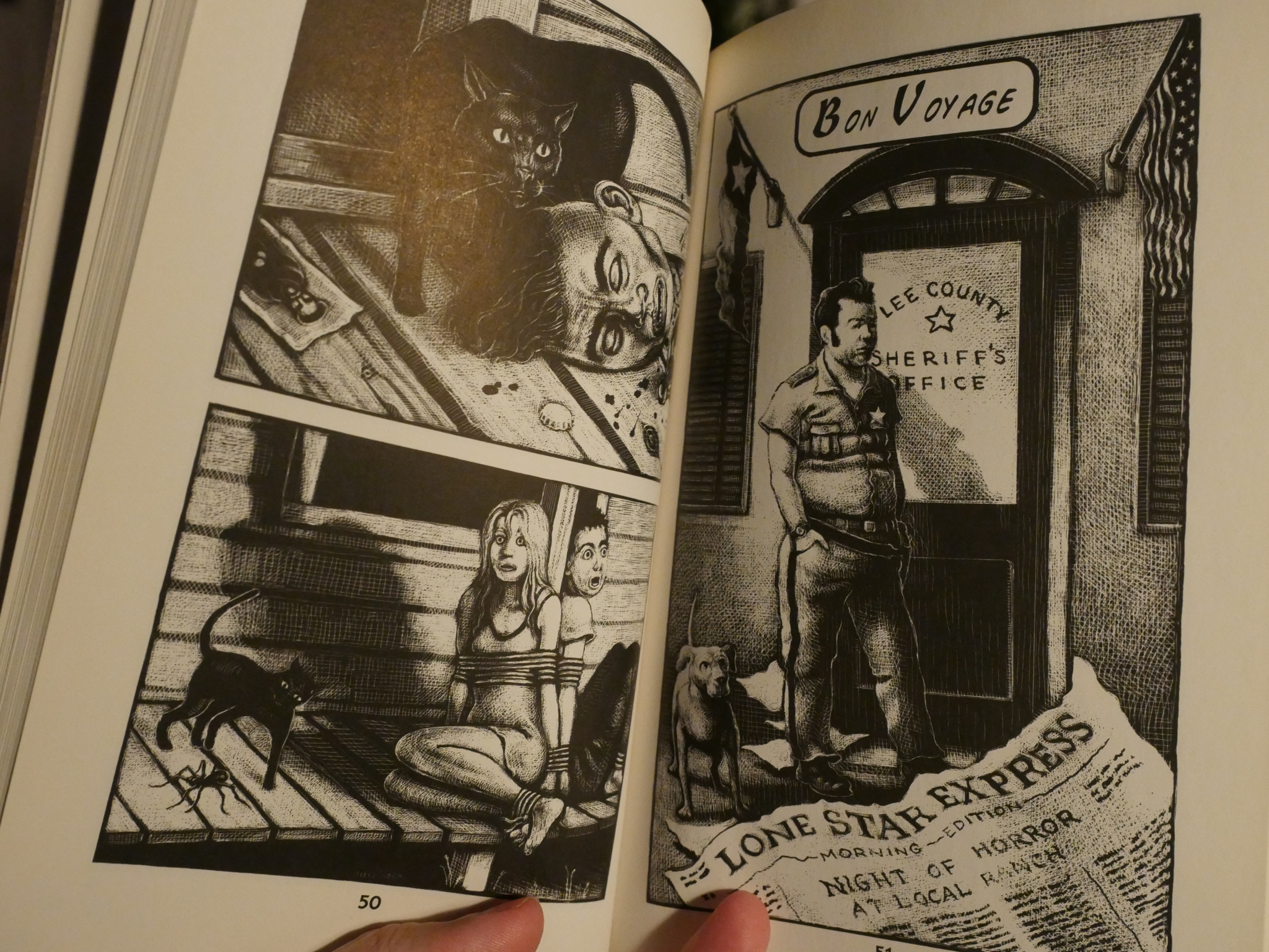
But his figurework is mostly stiff and unconvincing, and Callahan’s adaptation is stilted and confusing. For instance, if the protagonists want to become notorious criminals, why do they do the ritual murder in secret? What’s that supposed to achieve?
So it didn’t exactly generate a lot of enthusiasm, and I don’t think I’ve ever seen it mentioned by anybody ever before I started doing “research” into this article.
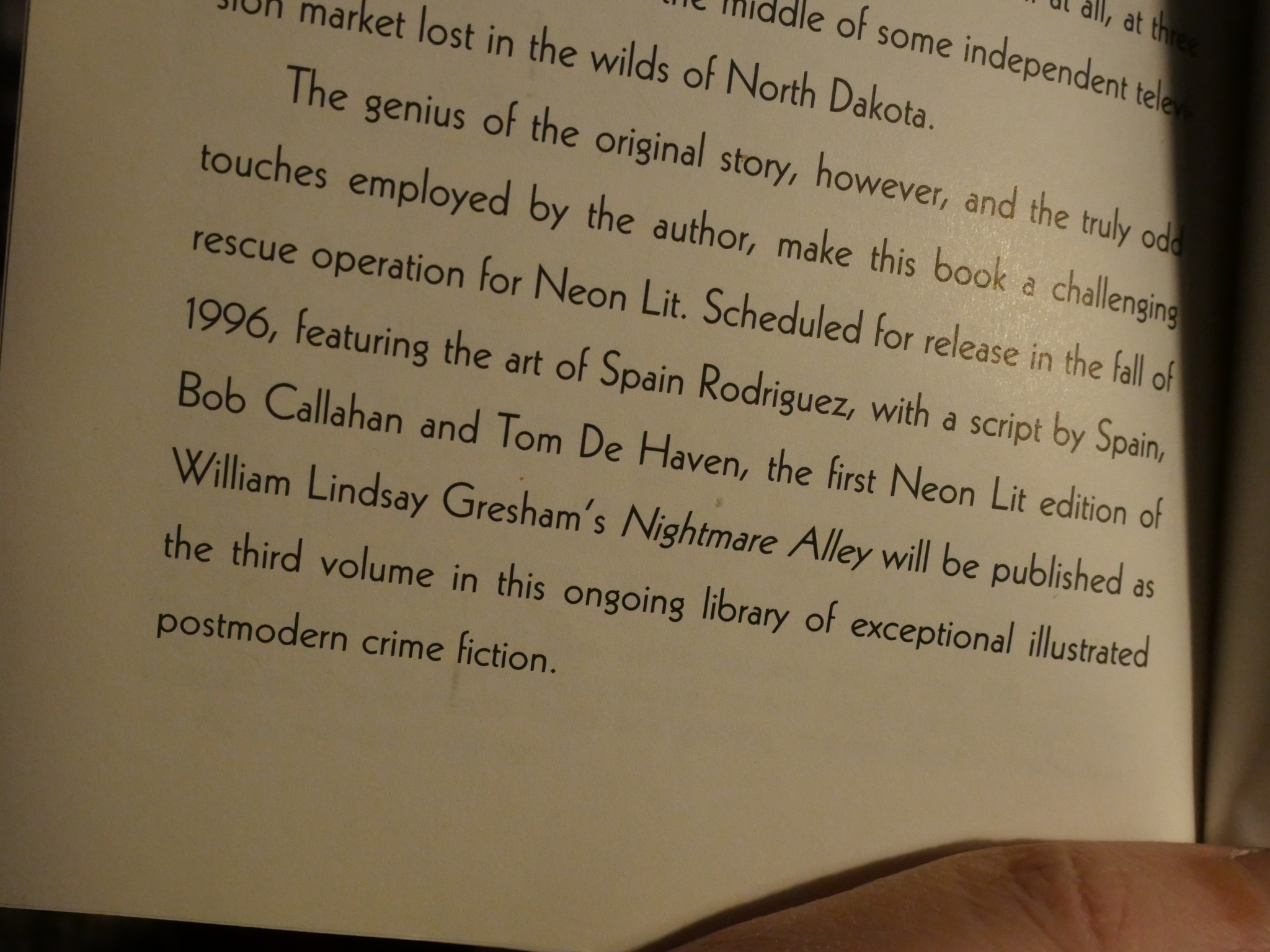
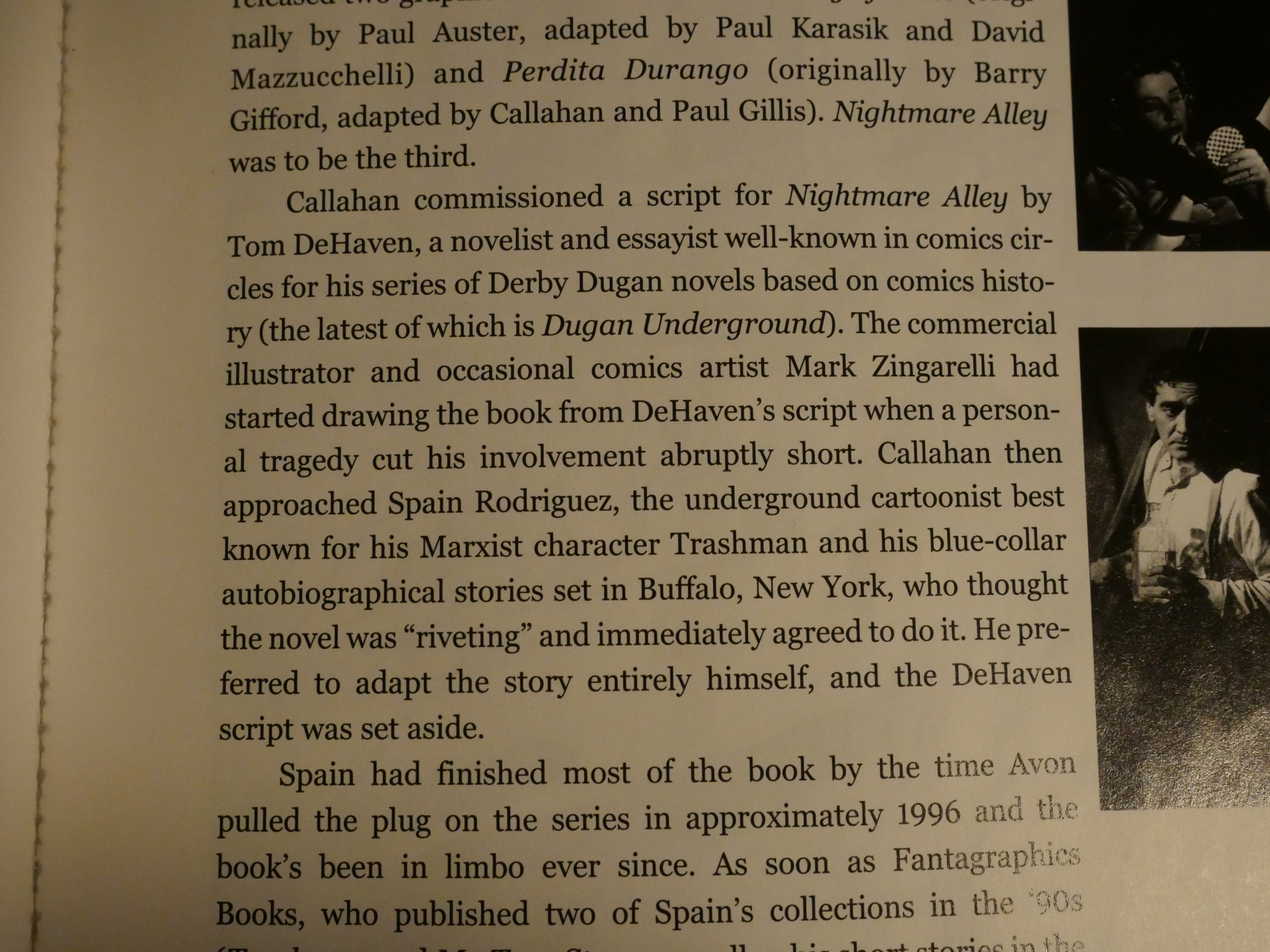
Perdita Durango promises that Nightmare Alley would be released in 1996, with a script by Spain, Bob Callahan and Tom de Haven, and illustrated by Spain.
That did not happen. Let’s listen in to this interview with Spain, some years later.
GROTH: The project you’ve been working on for what appears to be about three years, because the first page is signed “Spain ’95”—
SPAIN: Yeah, right.
GROTH: — is Nightmare Alley, which I understand was the third or fourth book in the Neon Lit series.
SPAIN: It’s the third book, yeah.
GROTH: And the second book came out two or three years ago.
SPAIN: Yeah.
GROTH: I’m not sure if there’s even a fourth book in the planning stages, or —
SPAIN: Yeah. I think he has a contract for seven books or something like that.
GROTH: It appears that this was a major piece of work that spanned three years of your life.
SPAIN: Yes, it did, yeah.
[…]
GROTH: Can you tell me how you got involved in doing this?
SPAIN: Well, I’ve known the publisher, Bob Callahan, for awhile. And … we had done some small things together, and so this came down the line, and … the sad thing that happened is, this guy up in your area, I think his name’s Zingarelli, a real good artist, he’s done some really great things. Callahan put out a book called JFK, and it’s about all these conspiracy theories. He did the art for it —
GROTH: Right. Mark Zingarelli.
SPAIN: The thing was, he was supposed to do it, but then his kid died, so, you know, that’s not a circumstance under which I wanted to get to do this … I’m really sorry — I’d never met the guy, but I’m certainly sorry that that happened. I was really sorry I ended up taking up with a book under those circumstances.
GROTH: You know, now that you’ve mentioned it, I think I remember hearing that. He lives just north of here, and he’s a very good artist.
SPAIN: Yeah, yeah, he’s a great artist. So … I wish him the best, man, I don’t know how anybody can carry on with a thing like that, but — yeah, I took it over. He had already written a treatment for it, but I just went through the book myself, and did my own treatment of it.
GROTH: When you say you wrote a treatment, how do you mean that, exactly?
SPAIN: I wrote a rough outline. Then I penciled the whole thing. So that took awhile. And I just had a sense of the basic things I wanted to have in there. The whole book is great. His raps in there are priceless, so I had to cram as much of that stuff in there as I could. There’s a few scenes I had to leave out because they weren’t essential to the plot. The book could really go on indefinitely. But I basically banged out a treatment, and we would send them to them for approval at various intervals.
GROTH: Now, who is “them”?
SPAIN: Avon Books. They had to approve it. So they hung onto the pencils for a long time. They finally gave me the go-ahead to ink it.
GROTH: Did they give you a specific page count?
SPAIN: No, there was a general page count. We thought it would be like 111 pages — I guess Perdita Durango was 111 pages.
GROTH: Nightmare Alley is actually 128 pages. I think this is the longest thing you’ve ever done.
Spain doesn’t mention de Haven or Callahan writing the script here, because apparently Spain threw that script out:
And I guess after reading Perdita Durango, I can understand that completely (if Callahan had been involved substantially).
But what happened to the book, anyway? The last I was able to find about that iteration of the book is from The Comics Journal #204, May 1998: “To be published in Avon Books in spring 1999 as part of their Neon Lit series.”
But:
In 1999, the News Corporation bought out Hearst’s book division. Avon’s hardcover and non-romance paperback lines were moved to sister company Morrow, leaving Avon as solely a romance publisher.
So it was not to be. Instead Fantagraphics published it in 2003:
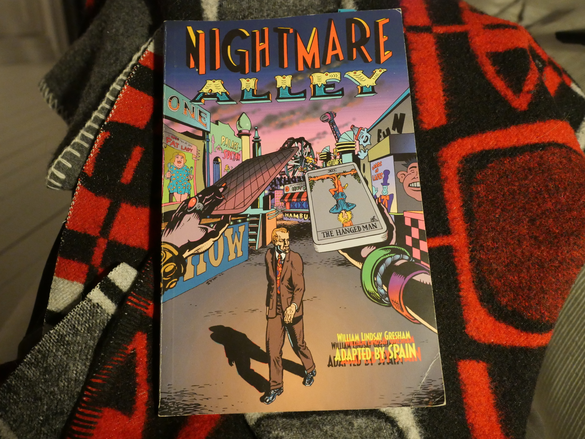
And, good lord *choke*: Look at that horrible cover. It looks like somebody who had once seen somebody use InDesign just pasted some text onto Spain’s artwork.
There’s like no design whatsoever. Compare to the beautiful noirish design on the first two books and roll your eyes. In addition, the format is larger than the original books, and it’s printed on a nasty slick and shiny stock. It just looks and feels so cheap.
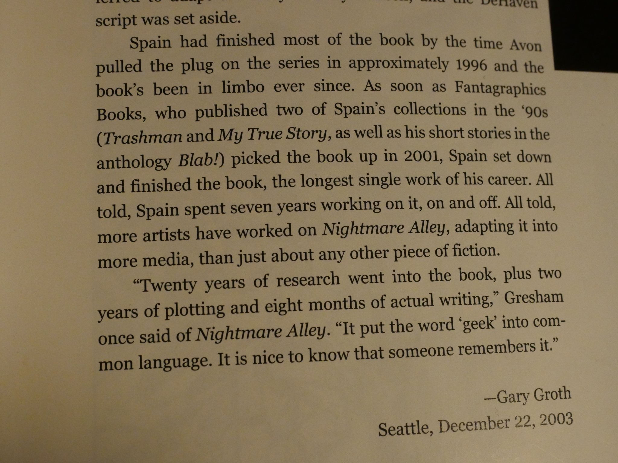
Gary Groth (the publisher) explains in the introduction that Spain finished it after Fantagraphics picked it up in 2001. For a work that took so long to draw, it’s remarkably consistent.
But the consistency is all bad, unfortunately. There are so many pages like this where you just have reams and reams of text. And that probably explains the format choice: If it had been published at a smaller size, it would have been impossible to read it. Spain does use the same four panel grid as Perdita Durango, so perhaps he did envision that it would be possible to print it at that smaller size, anyway?
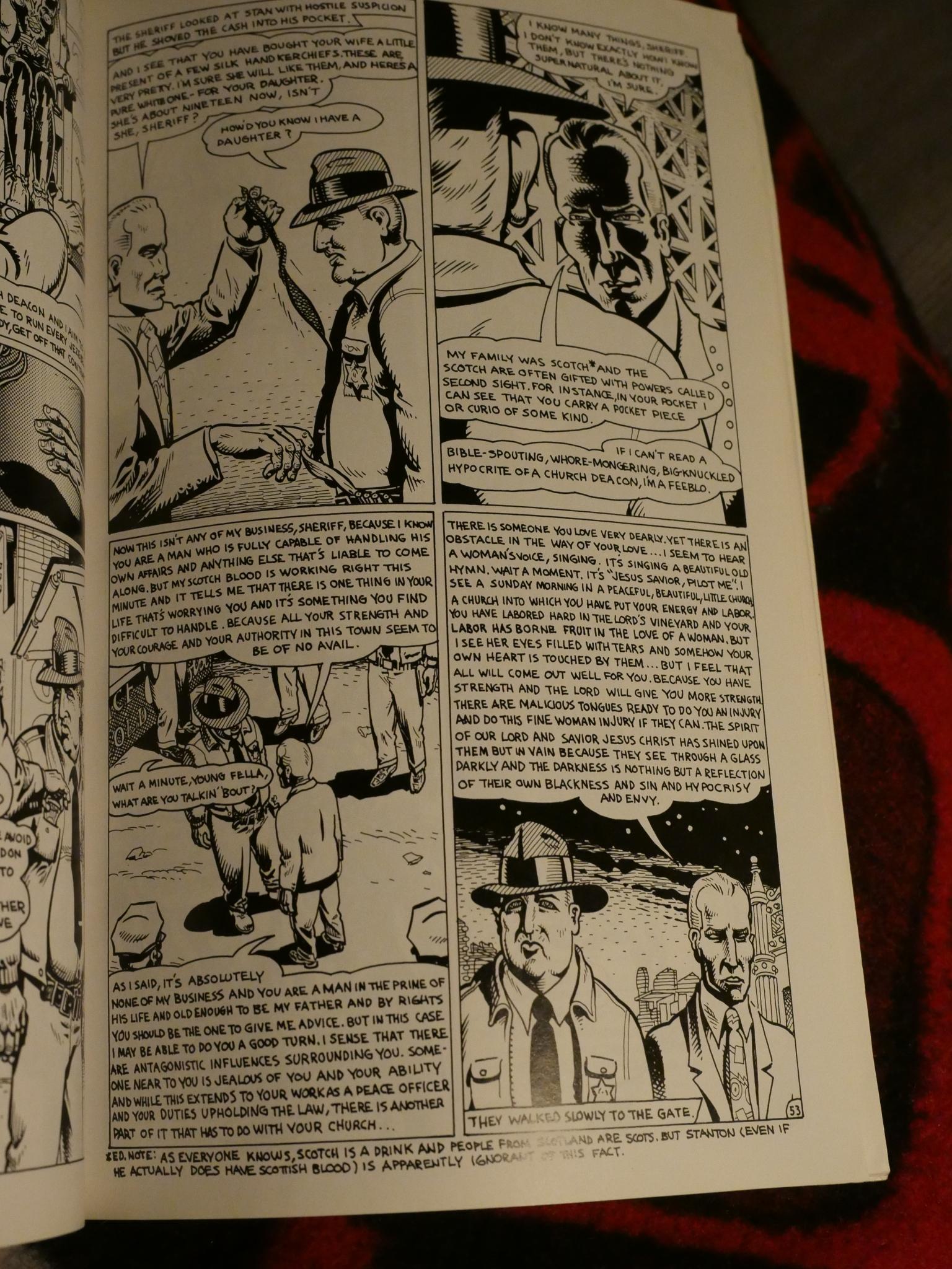
I haven’t read the original novel by William Lindsay Graham, but from the jumble presented here by Spain, I think Spain felt unwilling to edit. There’s so much stuff that didn’t really need to be in here to tell the central story, so I can understand that Avon sat on it for a while, scratching their heads.
It’s also difficult to determine whether Spain is reverently transcribing the novel or is making fun of it.
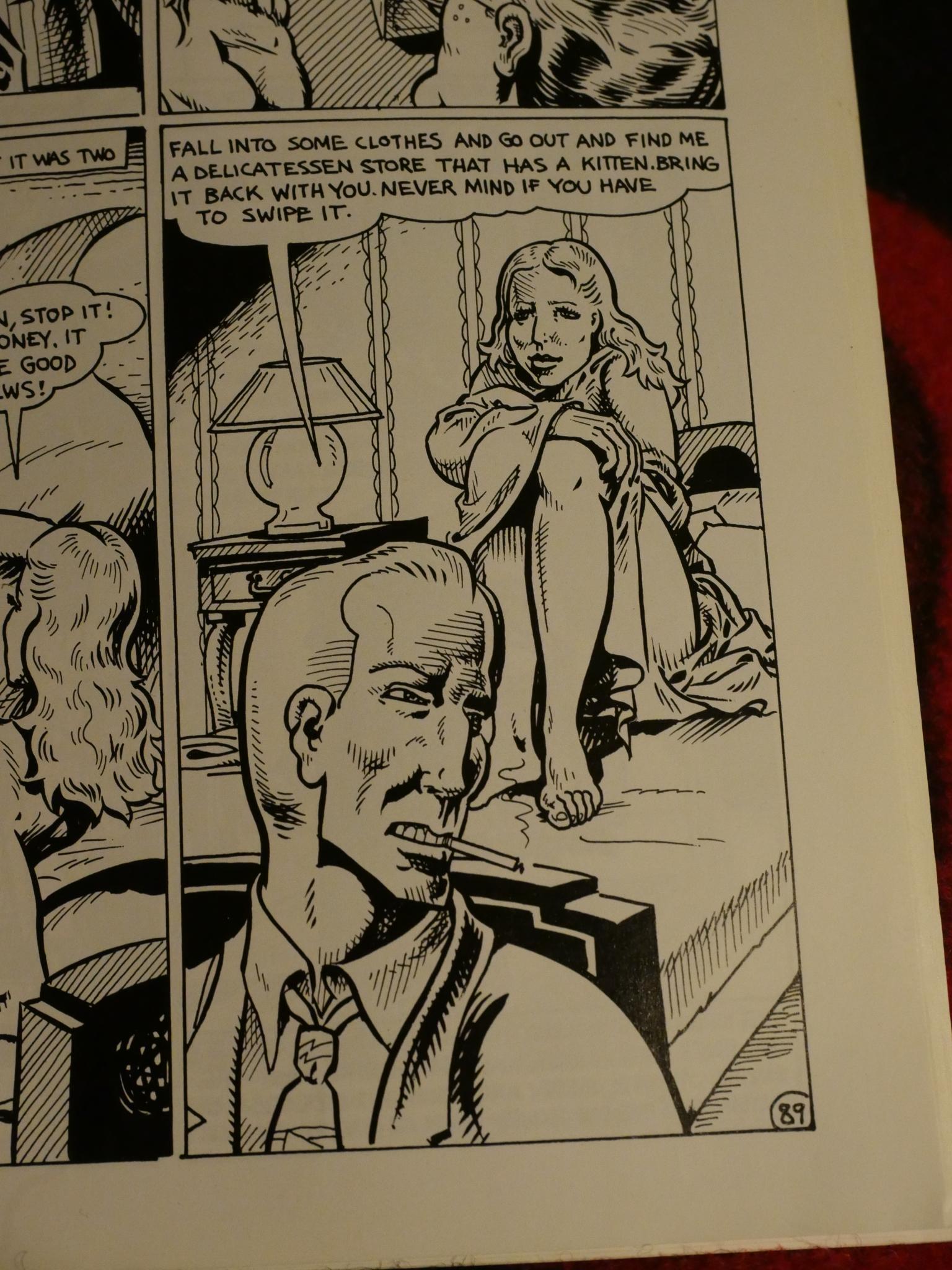
Spain’s artwork is super-sharp, though. Those stark lines are very attractive. But, yes, he’s really telling her to go to a delicatessen (a place that sells food) to pick up a kitten (and that’s not slang for anything, if I read the following very complicated caper right, but an actual cat), and telling her to steal it if necessary (if the delicatessen didn’t want to sell her the cat? They do that in delicatessens?) and…
There are so many scenes in this book that are like this: You’re skirting on disbelief and flipping back and forth between pages to try to make sense of it all.
(Spoilers: He wanted fleas to do a trick, I think, so he needed a cat (I think) from a delicatessen (!), I think, because they have fleas? Right.)
In short: It’s a bit of a mess, and an ignominious end to a line of books that started with City of Glass.
Bob Callahan died in 2008. Art Spiegelman is still a very successful artist. Paul Karasik just published a well-received book about Nancy. David Macchuzzelli won all the awards for Asterios Polyp. Spain died in 2012 and Fantagraphics are publishing his complete works.
And that concludes my investigation into this Neon Lit mystery that has puzzled an entire world for decades: Somebody at Avon thought the line was a good idea; they left; Avon was sold; the line ended.
Several people mention that Callahan had a contract for either five or seven more books in the Neon Lit series, but I’ve been unable to find any mention of what those books may have been.
City of Glass has been reprinted several times and is easily available still. The other two books… Not as much.