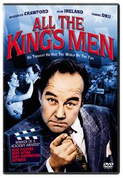
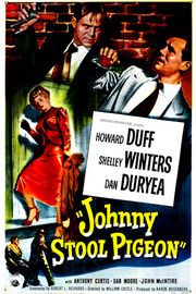
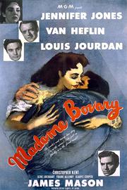
Huh. This… looks like a B movie sourced from Youtube from VHS, but how did I buy this? It must be on a box set of some kind, but … which one? I sure can’t find it.
And it’s weird. It’s got a voiceover like an educational short. I’m guessing this is a public domain feature from a studio that’s now bankrupt?
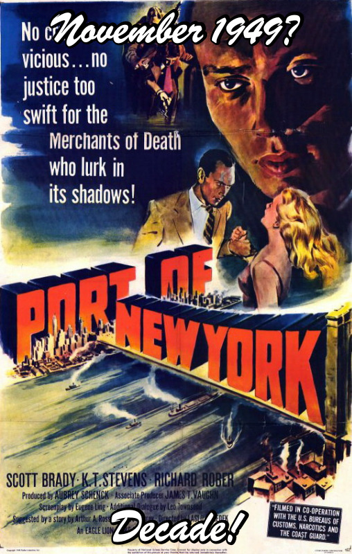
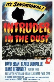
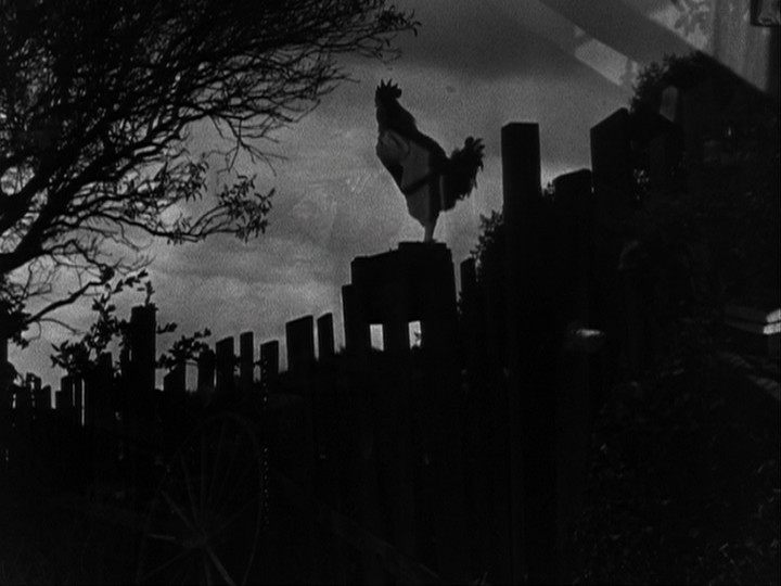
This may be the weirdest movie ever. There are scenes of high stylised drama intercut with newsreel-like footage from the port. Of New York.
Is this a fixer-upper or was it meant to be like this?
And isn’t this weather supposed to be over by now?
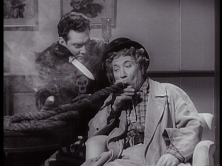
A young Yul Brynner plays a totally gay super-evil villain, which is a plus, I guess?
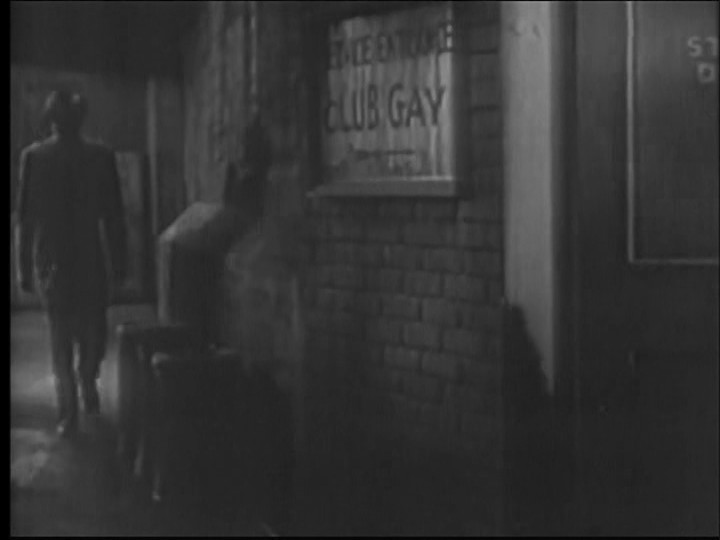
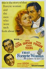
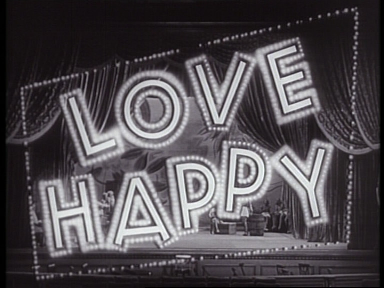
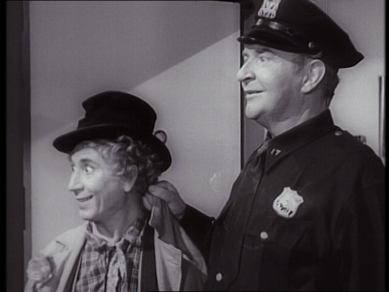
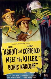
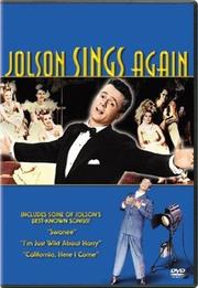
What! A Marx Brothers movie!? I thought I’d seen them all? How did I miss this one? It must have been part of that Marx Bros box set I bought some years back? But… huh.
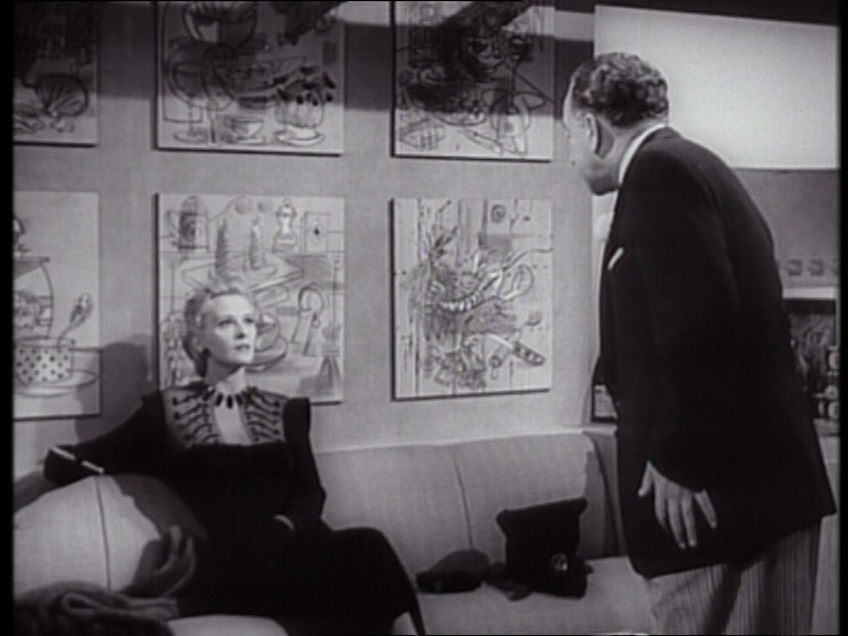
This is not one of the classic Marx movies. There’s not a lot of Groucho in here (and his scenes have obviously been spliced in here as an afterthought? filmed by a different crew?), and there’s a lot of Harpo scenes. Hm…
It was originally conceived as a vehicle for Harpo, so as a result we get lesser input from Chico and even less from Groucho (which is especially unfortunate).
And it’s the final Marx Bros movie!
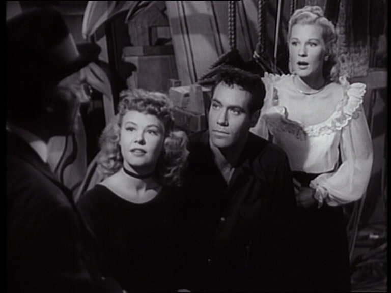
It’s got the perfect plot: The Bros have to help some kids put up a show while thwarting some diamond smugglers. Impossible not to enjoy.
OK, this can’t really be called a “good movie”, but I laughed out loud several times, and was smiling the rest of the time, so I can’t be too critical.
But it’s weirdly paced, or just perhaps too long? When I though we were getting to the climax, we were only two thirds done.
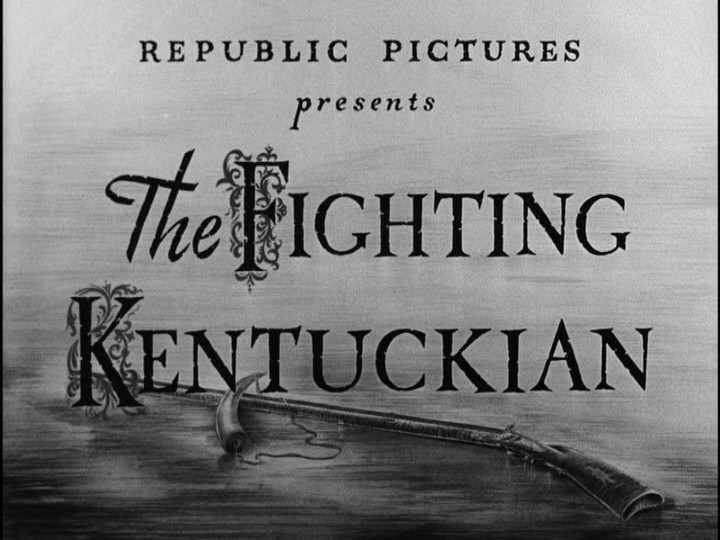
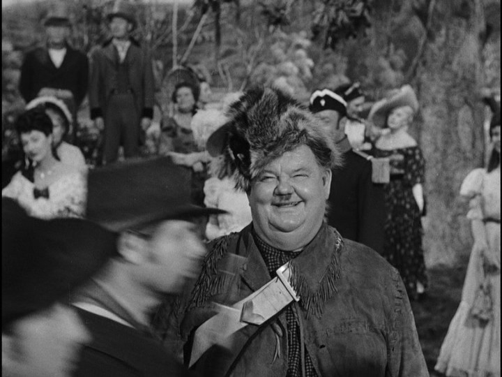
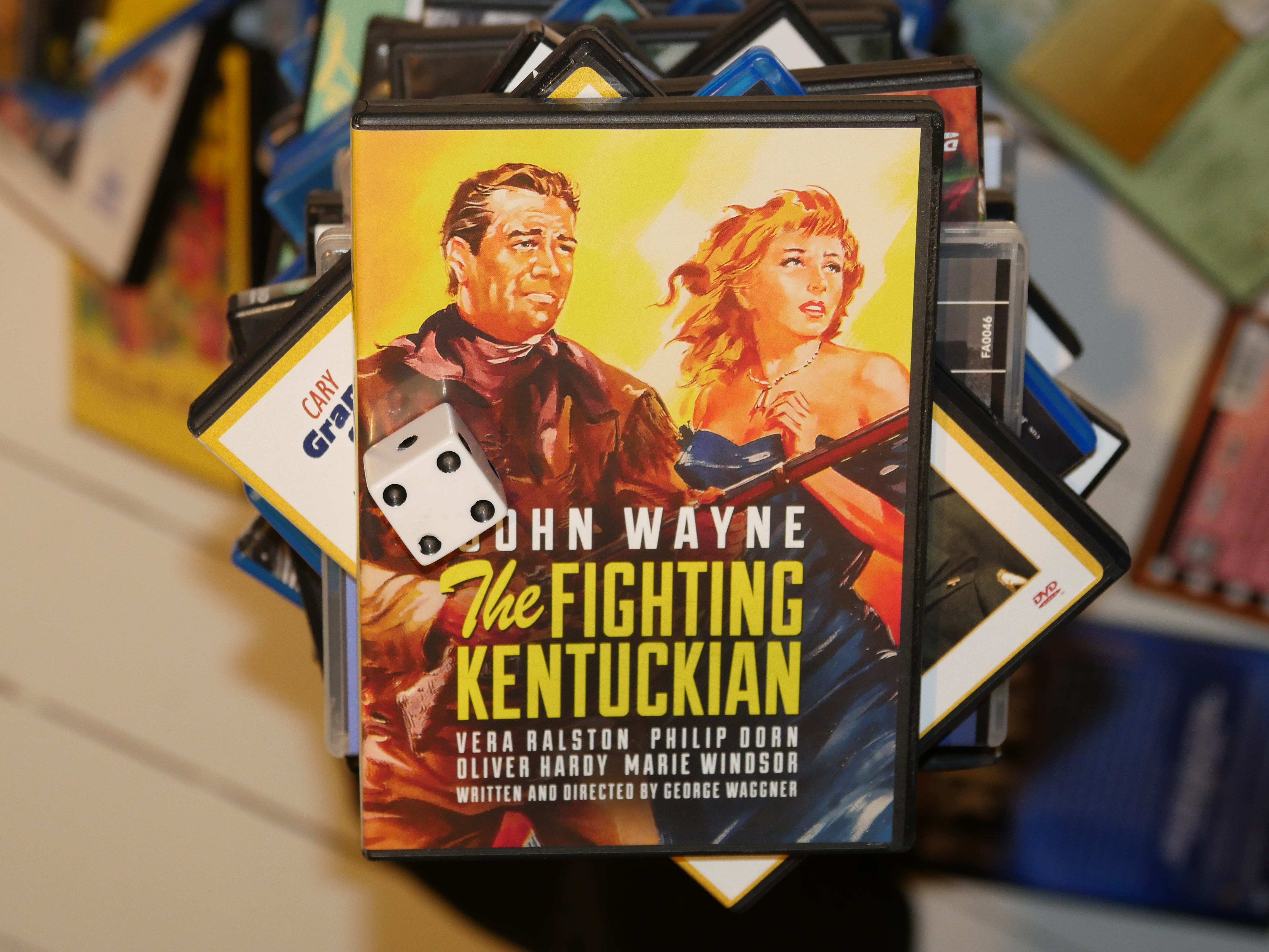
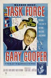
Hey, John Wayne. Oh, and er Laurel? I mean Hardy. Or do I?
This is a romantic western comedy, I guess. Wayne is a polarising actor, but I really like having him on the screen. He’s fun to watch.
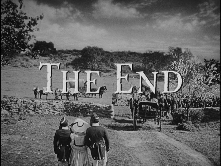
This is very, very slight fare. It’s charming and easy on the headbone. But perhaps it could have been tightened up a bit? It feels like it should have been over sooner.
The stunts in the big showdown at the end are either really impressive or a lot of people got hurt.
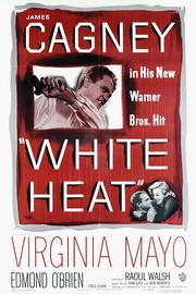
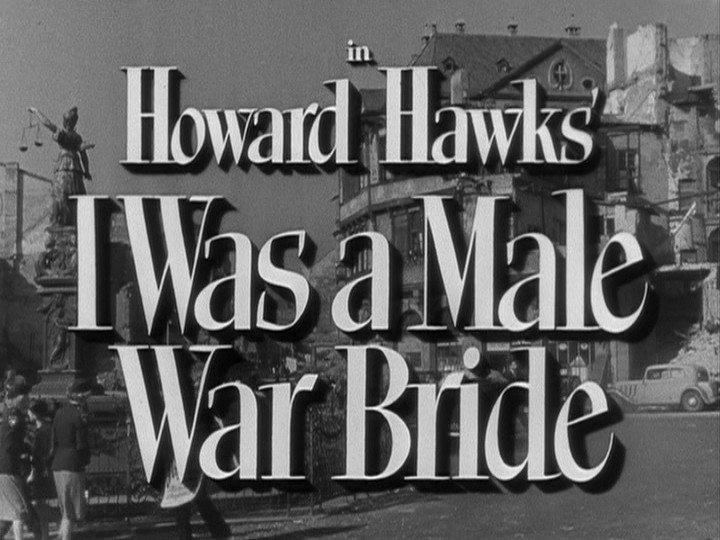
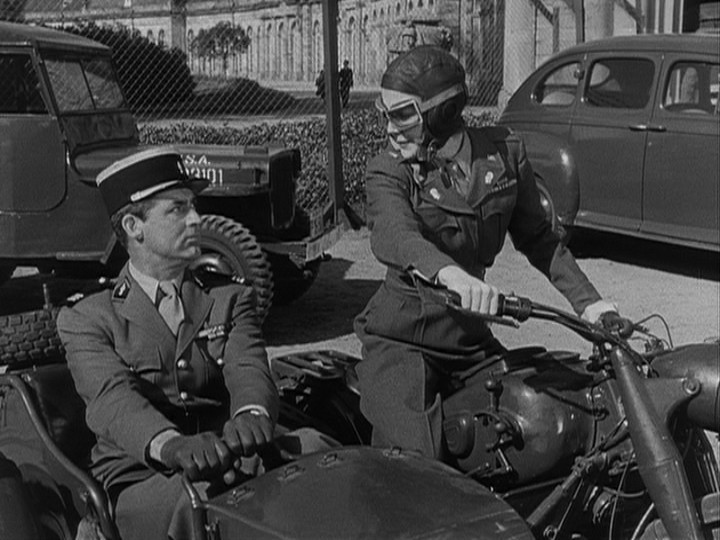
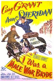
And this is the first post-war war movie I’ve seen in this blog series, I think?
Oh… it’s not really a war movie. It’s a post-war movie, set in present-day (i.e., 1949) Germany.
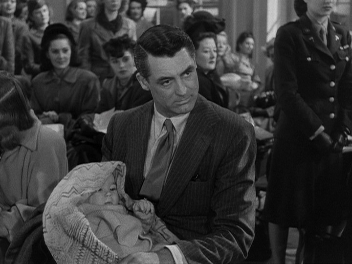
This is a screwball comedy of sorts: Lots of pratfalls for Grant to excel at. But the snappiness of the dialogue leaves something to be desired.
Once things get properly underway (the main plot point is that all the bureaucracy surrounding soldiers bringing back spouses is geared towards men bringing back wives), most of the jokes are about Cary Grant’s character being made to suffer female indignities.
That could be funny and it could be awful, but here it’s mostly the latter. The thing that saves it is Grant’s charm. Because the jokes are pretty lame.
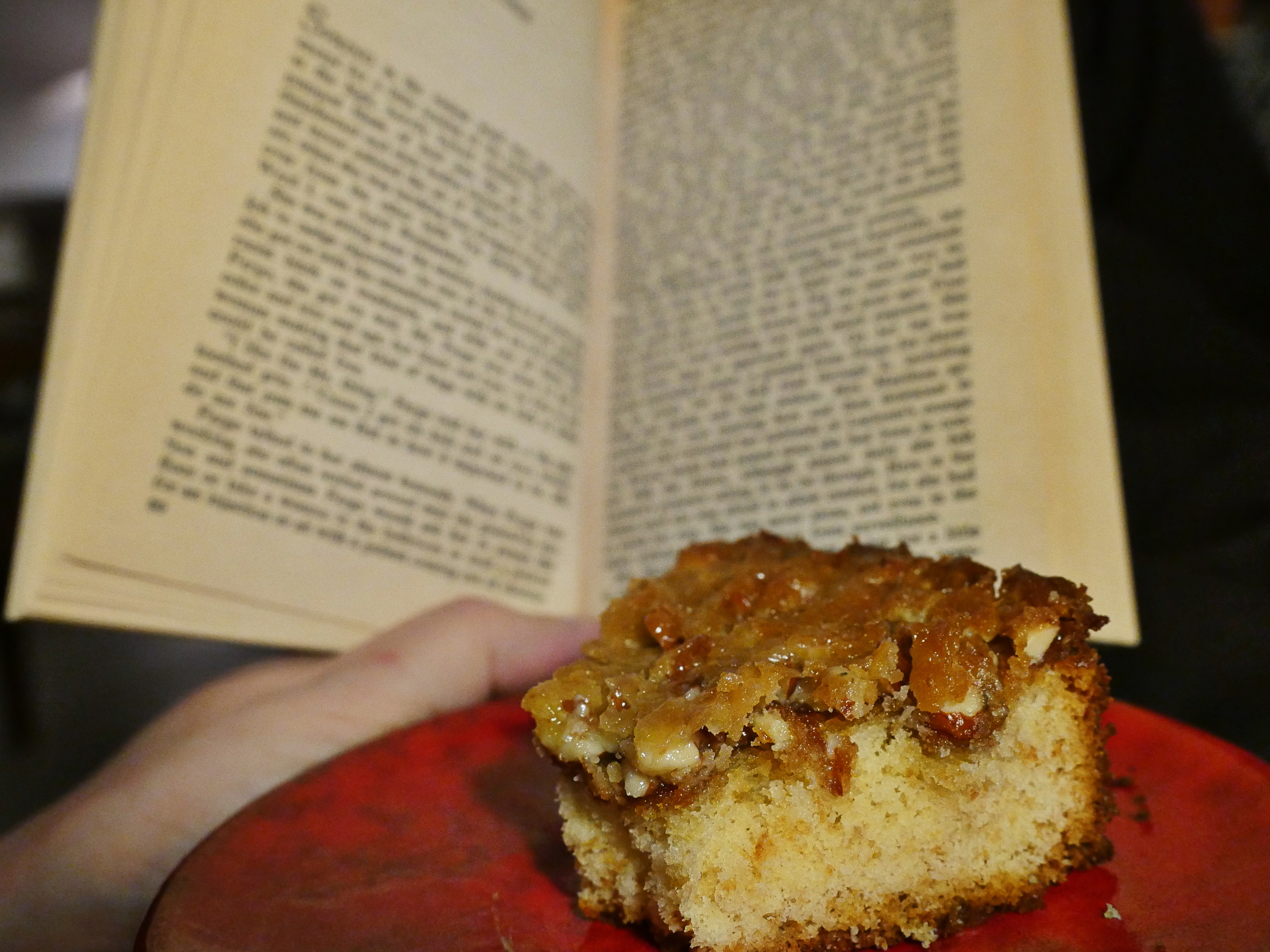
Thursday is baking day, and I chose a cake I haven’t tasted in decades: The Tosca Cake.
It’s apparently named after that most jumpingest of all opera heroines. Perhaps it’s named after her because it’s a pretty heavy cake and Tosca fell like a rock into the river?
The comment on that page, however, claims that the inventor of the cake was Tosca Pladsec, an Italian/Yoguslav woman who won a Norwegian magazine competition on the 50s. However, Swedish wikipedia claims that it’s a recipe that has existed since at least the 1930s, and nobody else on the entire interweb has heard of Tosca Pladsec, so… You make up your own mind!
Anyway, the thing that makes the cake unique is that is has a caramellish (that’s a word) top which makes it kinda juicy and interesting.
If I remember correctly.
Let’s give it a try.
There aren’t many ingredients here: Just sugar, flour, butter, eggs, almonds and a teensy dash of milk.
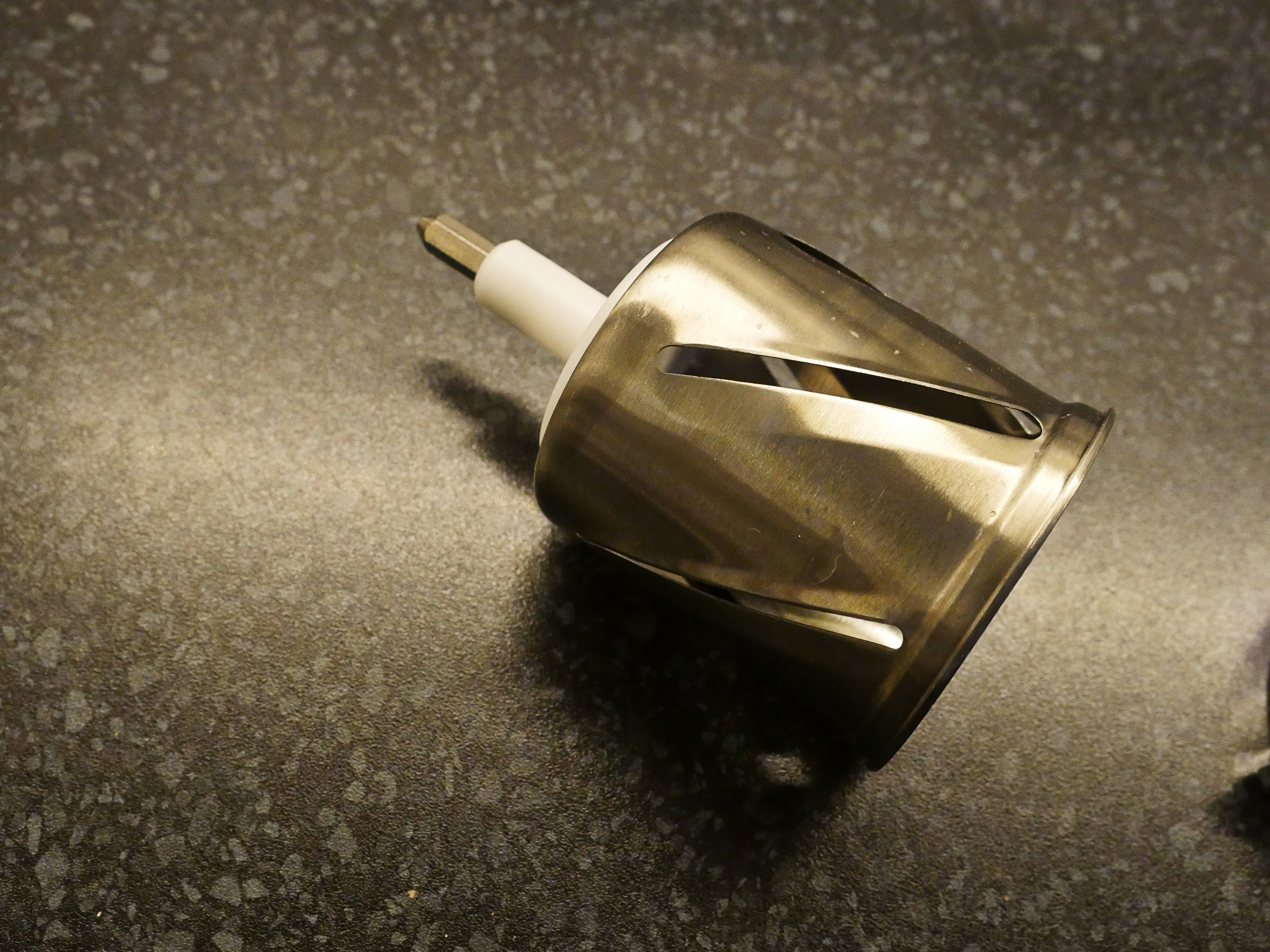
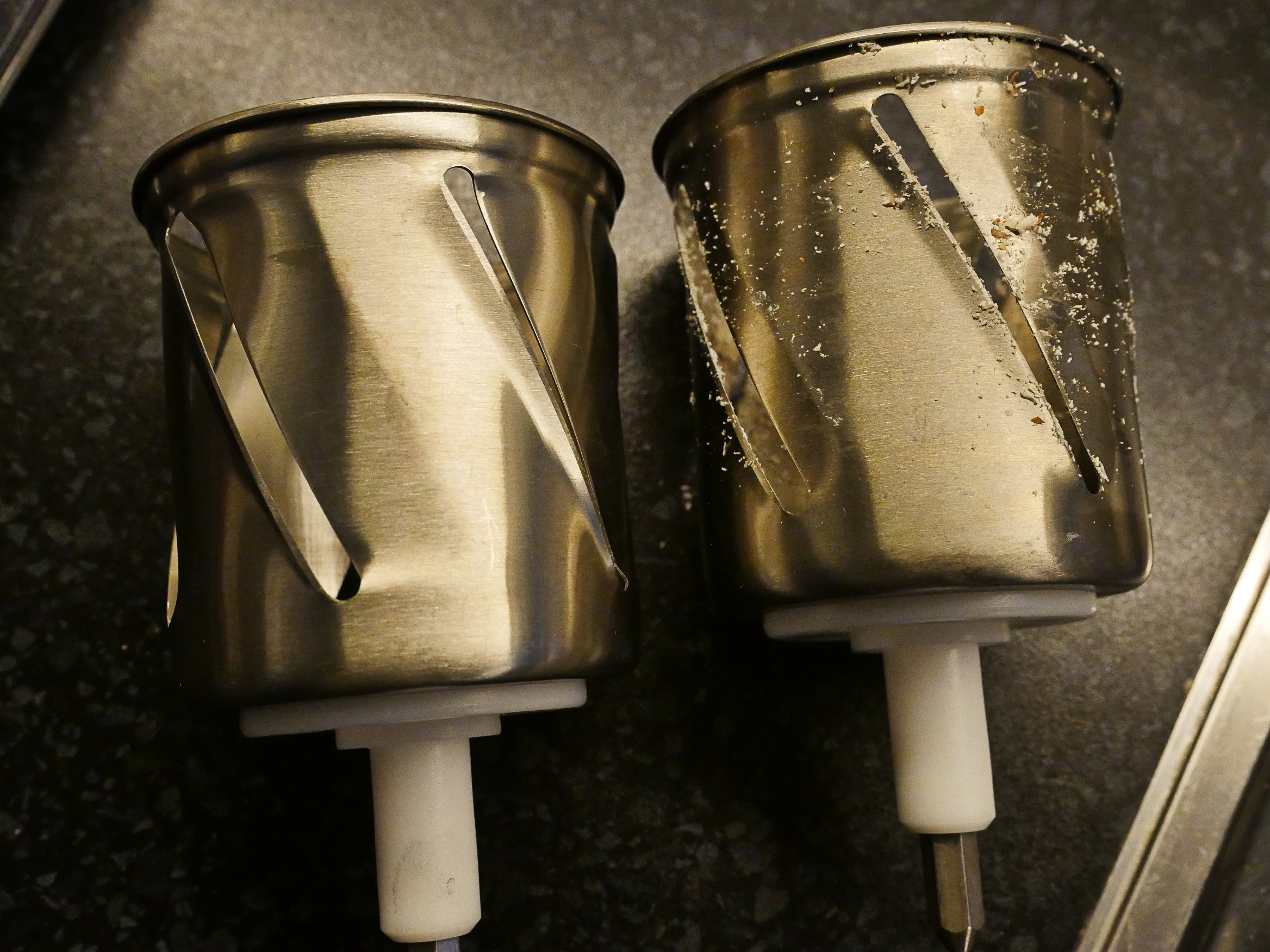
I destroyed the ring to this Kenwood drum chopping attachment by putting it in the dishwasher (made of… pewter or something?), so I had to wait a few weeks while the replacement part wound its way to me from the UK. It’s a nice thing about Kenwoods: They sell replacement parts for everything.
So the almonds are supposed to be sliced (what’s called “flarn” in most Scandinavian languages), so I’m using this drum thing…
Look! It fits! I’ve never used this drum thing at all, and half the fun of baking is using new attachments…
Urr… that’s not very sliced… More like ground…
Oh! There’s several different drums with different er aperture openings (I’m sure that’s the right terminology).
Look! Sliced! It works! Nice Kenwood!
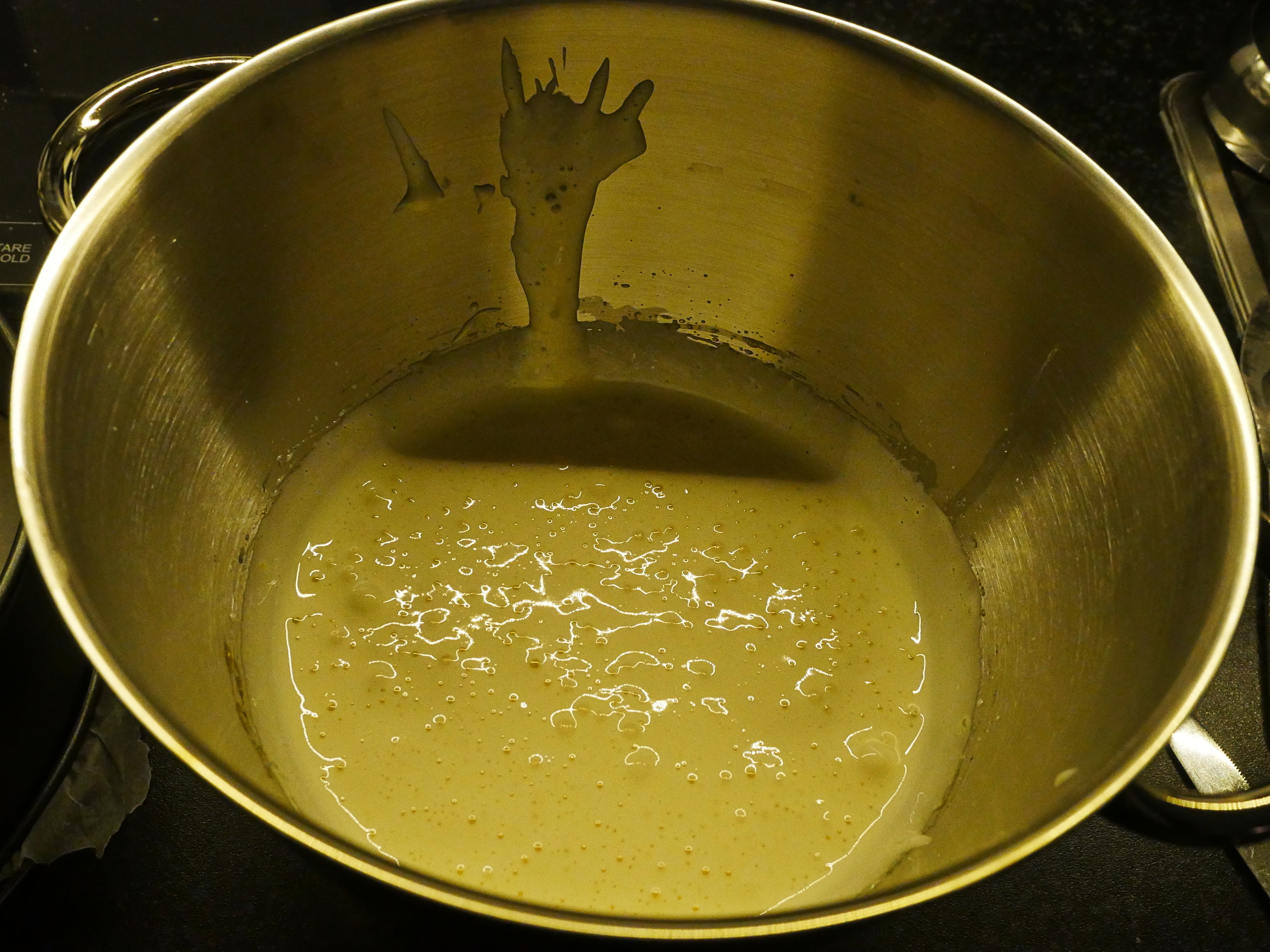
So you just whip up the eggs and the sugar, and then add flour and melted butter (and perhaps some baking powder, even if the recipe doesn’t call for it).
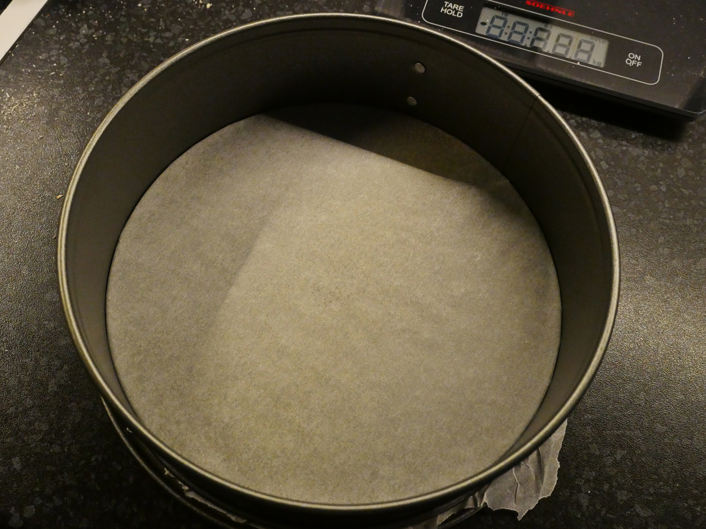
Baking powder a spring form…
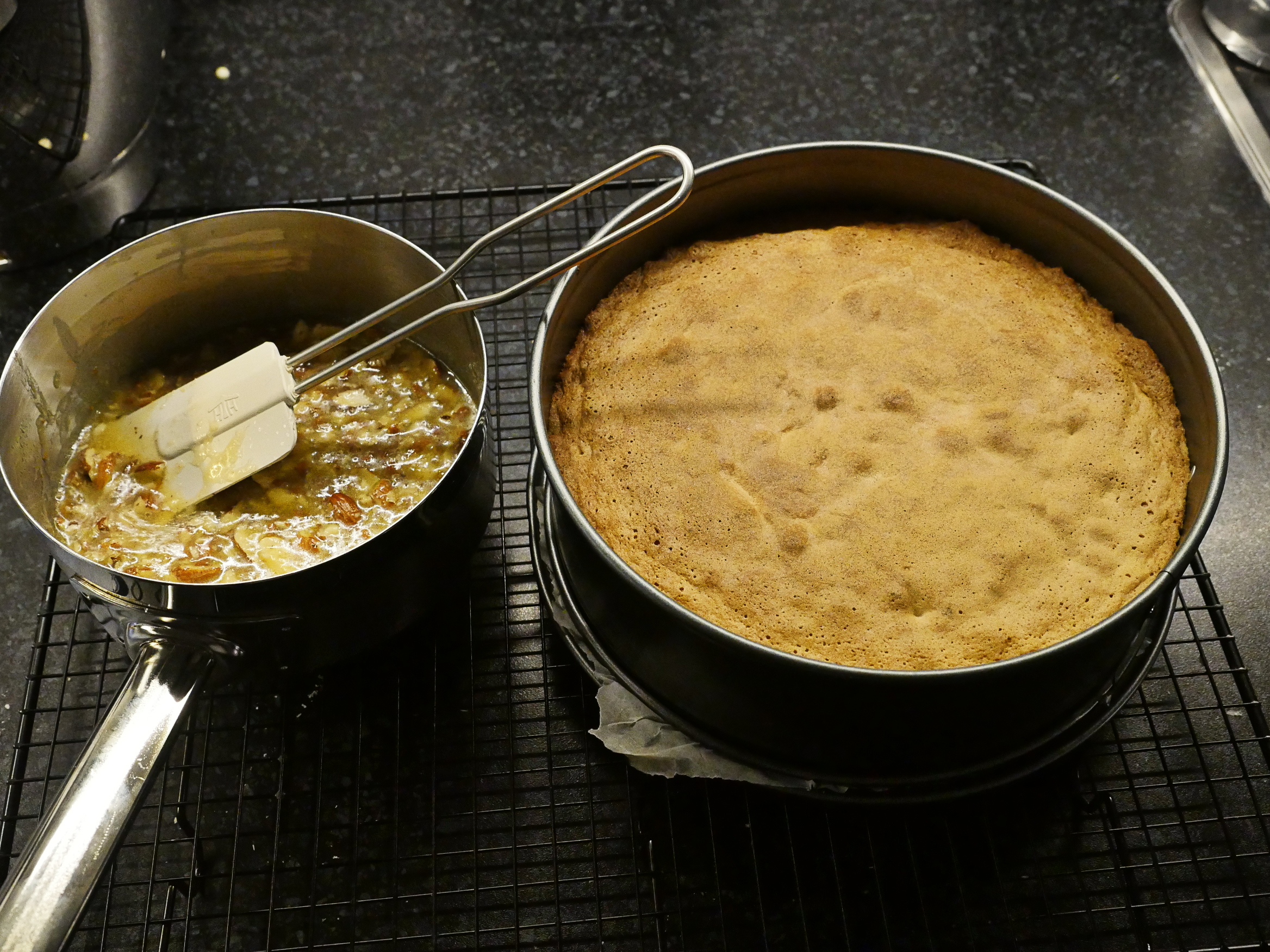
Bake for 25 minutes, which seems a bit on the long side? Because we’re gonna be baking more…
… after we’ve make the topping, which is more butter (melted)…
Add sugar, a dash of milk and a dash of flour.
And then the sliced almonds.
Wow! That tastes really nice already! It looks a mess, but it has a wonderfully fresh, slightly caramelley flavour going on.
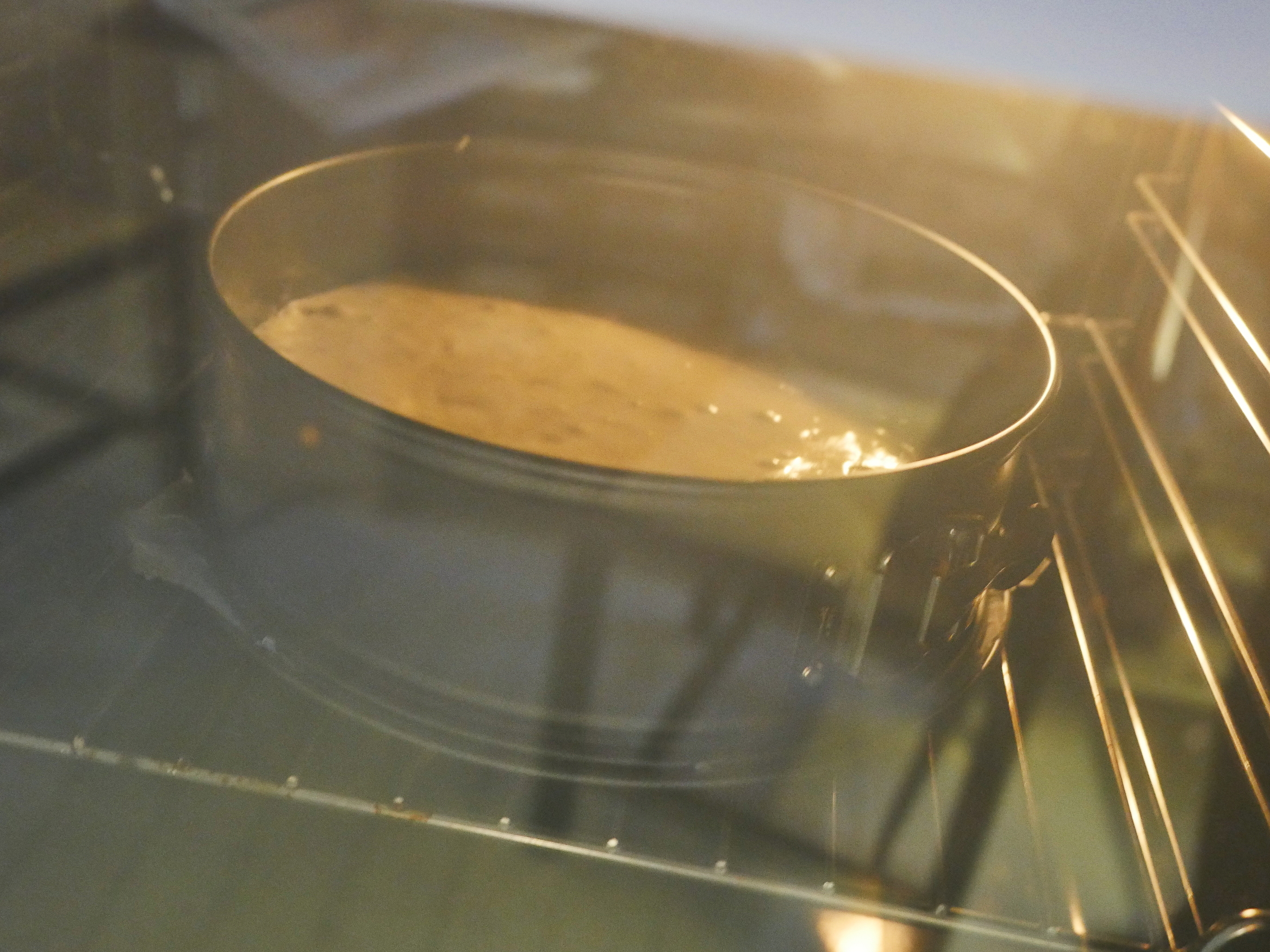
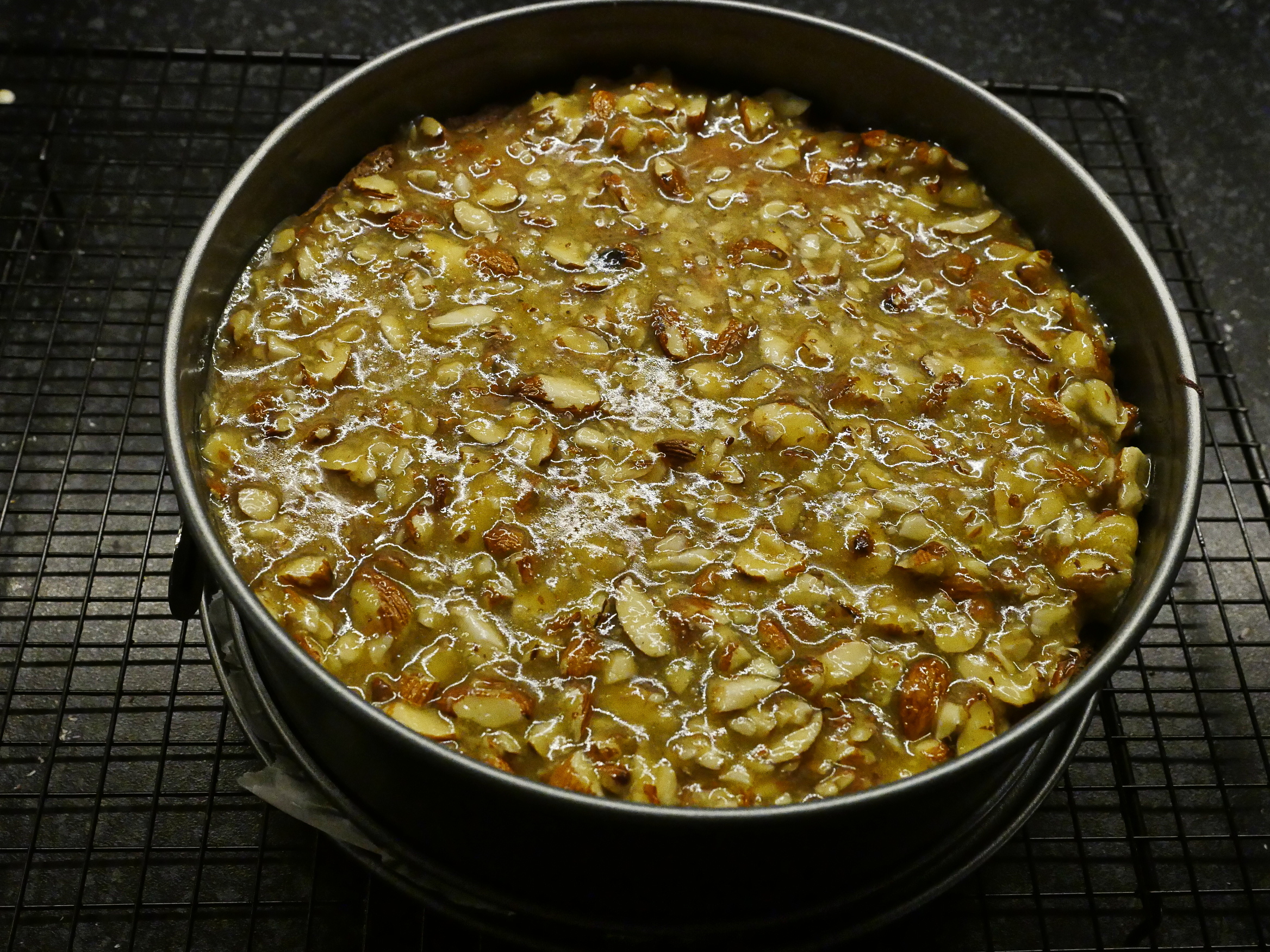
Then take the cake out of the oven.
Slather the goop over the cake and pop it back in the oven for 20 minutes more.
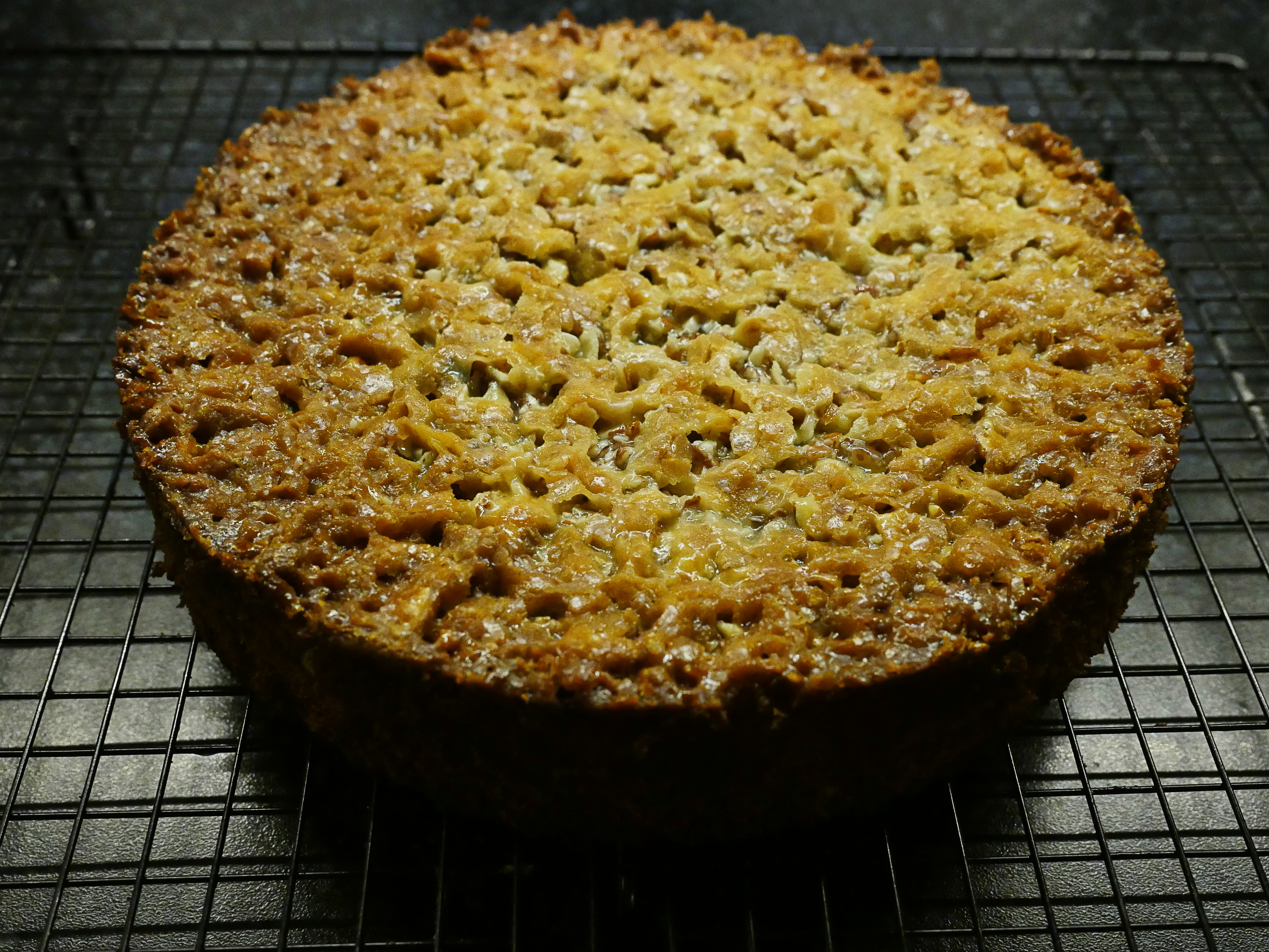
And this is what it looks like. Hm… I think I was right: I should have baked it less before adding the goop, and more after, to get a darker caramel look and flavour to the “lid”.
Let’s taste!
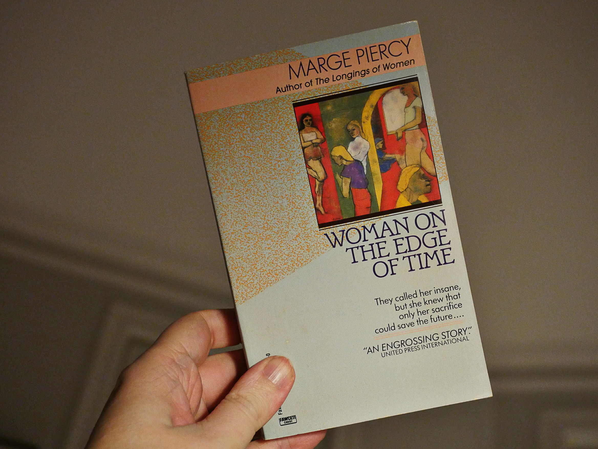
And now I have to pick a book from among those I bought in the early 90s but have somehow avoided reading for mumble years. Not that many to go…
I pick… Should I do Ulysses after doing Downriver last week? No, let’s go in the opposite direction! Yes! I pick:
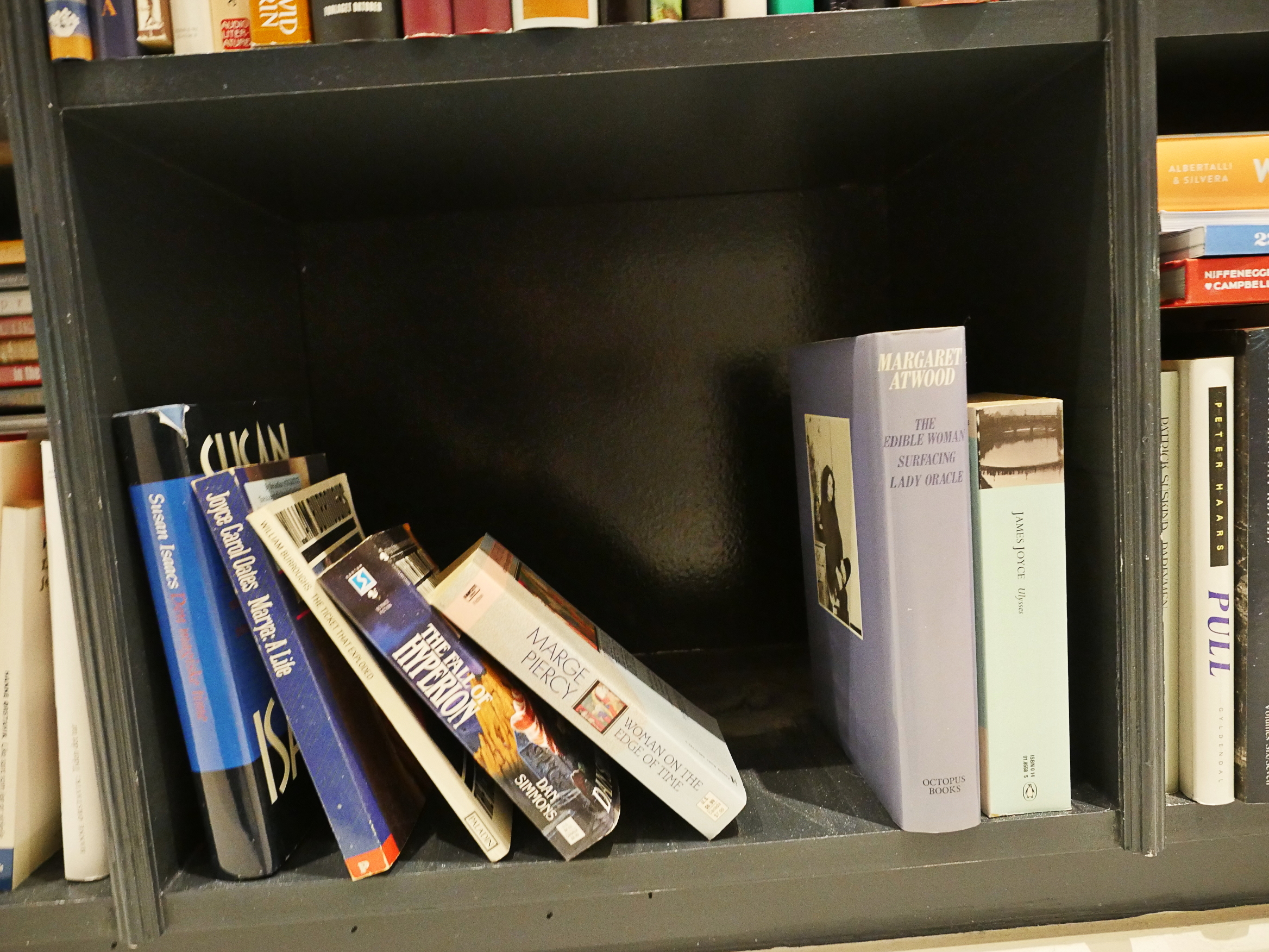
Woman on the Edge of Time by Marge Piercy.
I’ve had pretty clear reasons for not reading the other books in this blog series before, but I don’t really know why I’ve skipped this one for so long. It’s just become a habit. Every time I’m looking at my bookcase for something to read I’m going “oh, there’s that sf book” and then I choose something else.
I have read two other books by Marge Piercy: He, She and It and The High Cost of Living, and I liked them enough to buy this one, apparently? But then I never read it.
Oh, wow: It’s from 1976, and it was a selection of The Woman Today Book Club. And this is the twenty-second printing!? So it’s a very commercially successful book, especially for a science fiction book. Or, at least I’m assuming it’s a science fiction book: As usual, I haven’t read the back cover or the blurbs or anything.
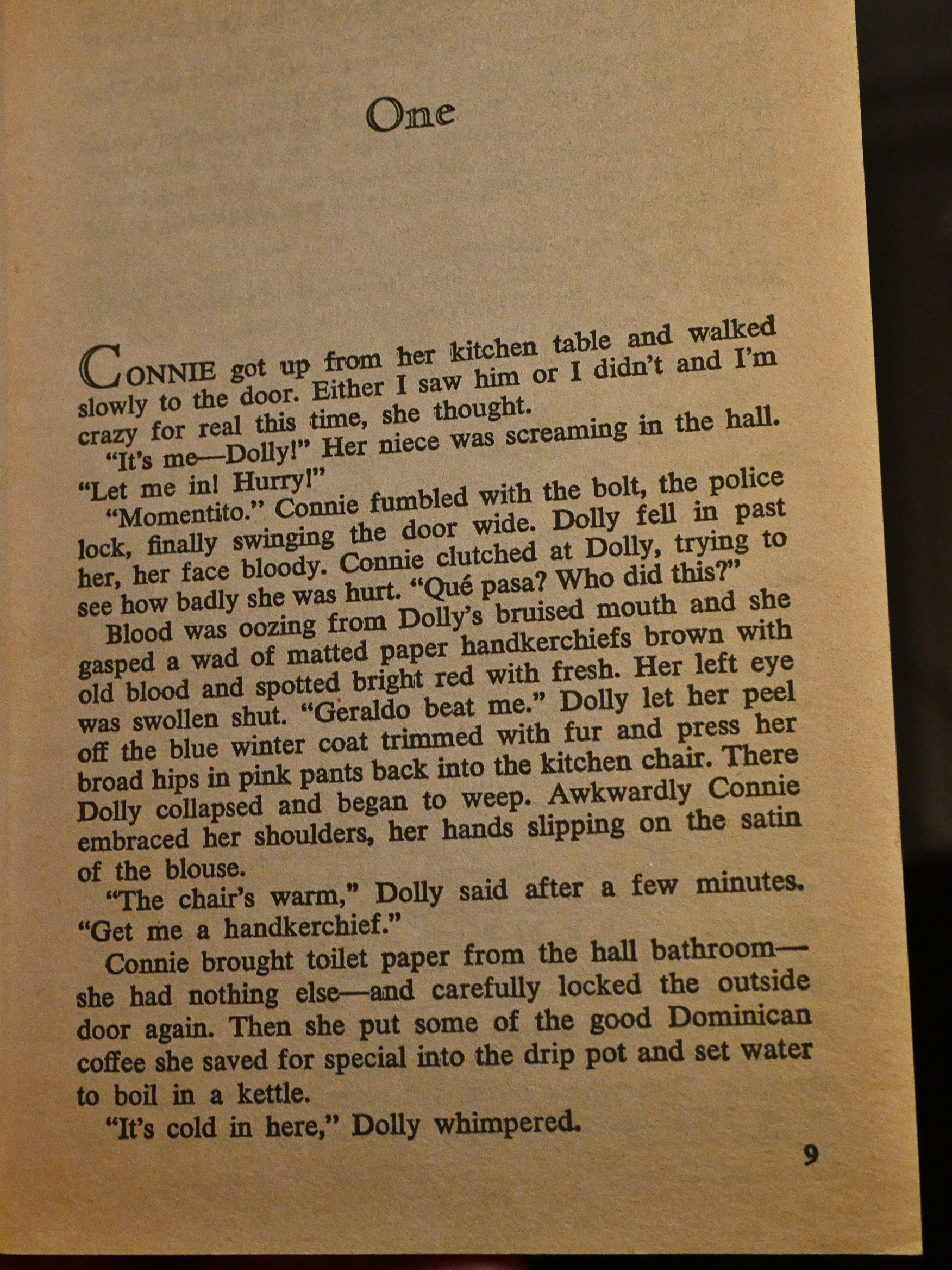
Let’s read the first two pages together and see what it’s like.
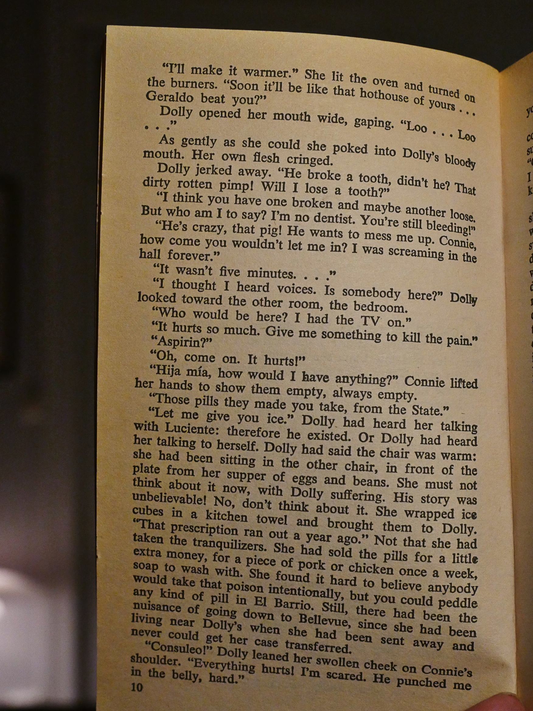
Well, OK, I can’t really say that I’m responding to the writing enormously. We seem to be starting off with a woman that’s been beat up by some guy, but the descriptions of what the protagonist is doing is sprinkled with things like “the satin of the blouse” and “the good Dominican coffee”, which seems kinda pedestrian.
And, by Emacs, what a relief reading something written in this style on the heels of the Ian Sinclair book! This is going to breeze right on by.
Yay!
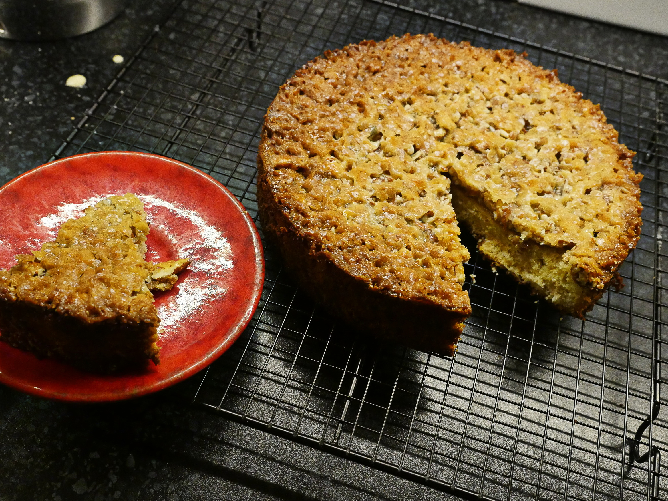
Let’s taste the cake with the book.
Uhm, yum. It has a deep and nice caramel flavour, especially out at the edges. The sponge is, as I feared, a bit on the dry side because it’s been in the oven too long, but it’s pretty good.
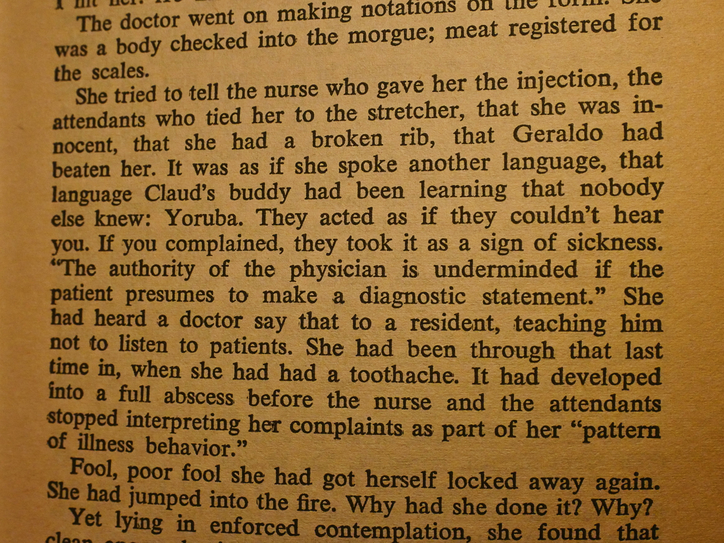
There’s a lot of good rage towards our society in general and the health industry in particular. Reading this, I sometimes found myself going “but they’re not that bad”, what with all the doctors and their insane experiments, but then I remember the Tuskegee “experiment” and I go “oh yeah”.
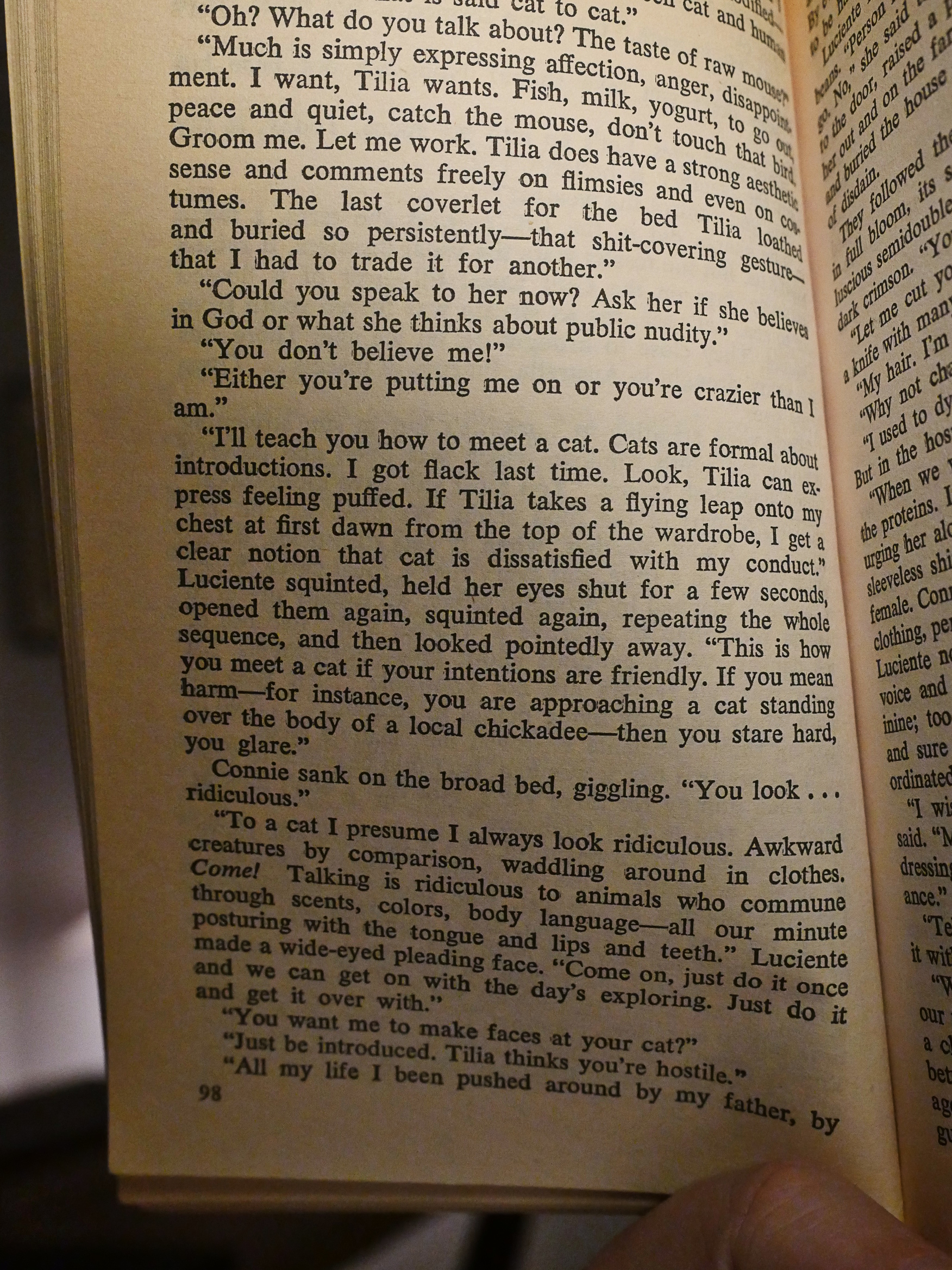
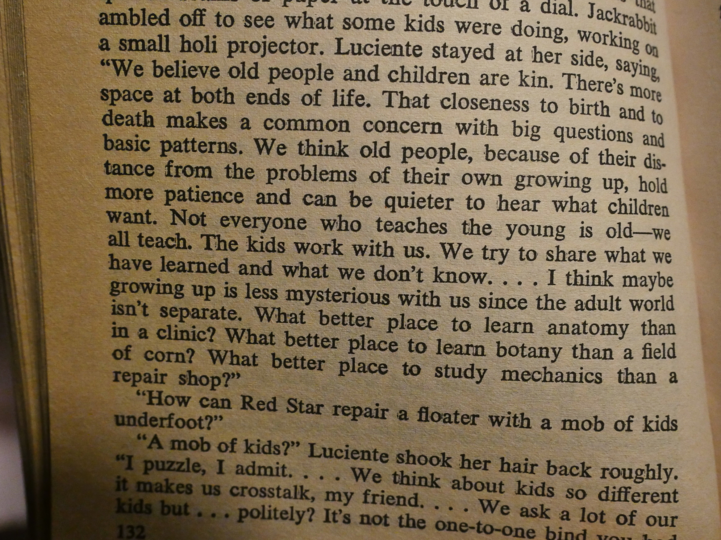
But this is, indeed, a science fiction novel, as I guessed from the title (and the author being Marge Piercy). We follow a woman locked up in a mental institution who can project into the future, which is all utopia and stuff. There’s pages and pages of the future people (who are kinda androgynous, live in harmony with nature, and are, like, you know, good people) explain their lives to her.
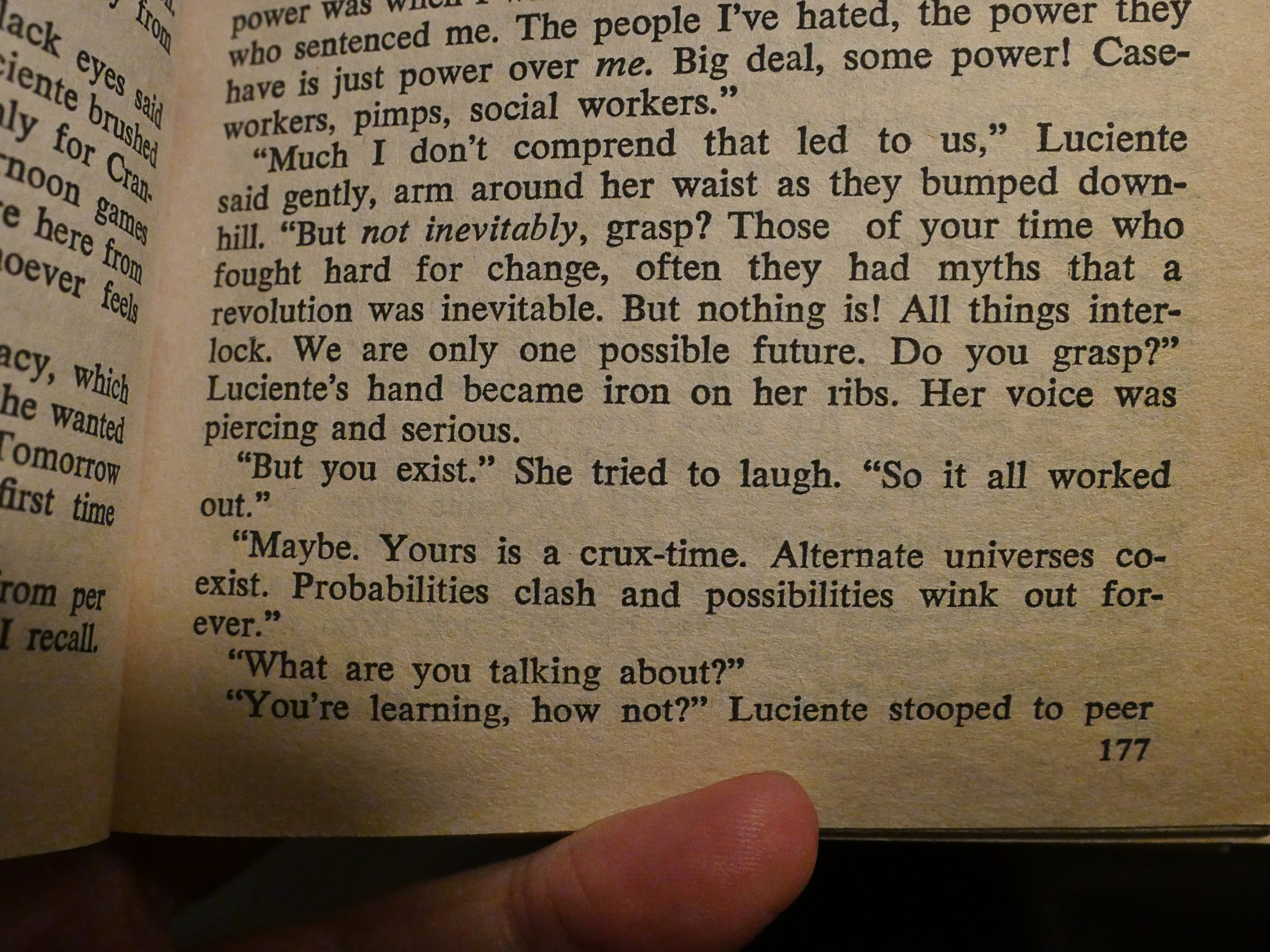
I think I understand what Piercy is trying to do: To present utopia as a real possibility. This is literature as a rallying cry; a call to revolution: A better future is possible.
But I don’t think it works storytelling wise. They say they don’t want to change the past, so they don’t help her much with her predicament, but they’re not shy about telling her everything about how society should be. And perhaps I just found the utopia presented to be a bit undercooked; it’s random musings on any subject of our lives about how they should be done to be better.
More plot is hinted at, but not really resolved.
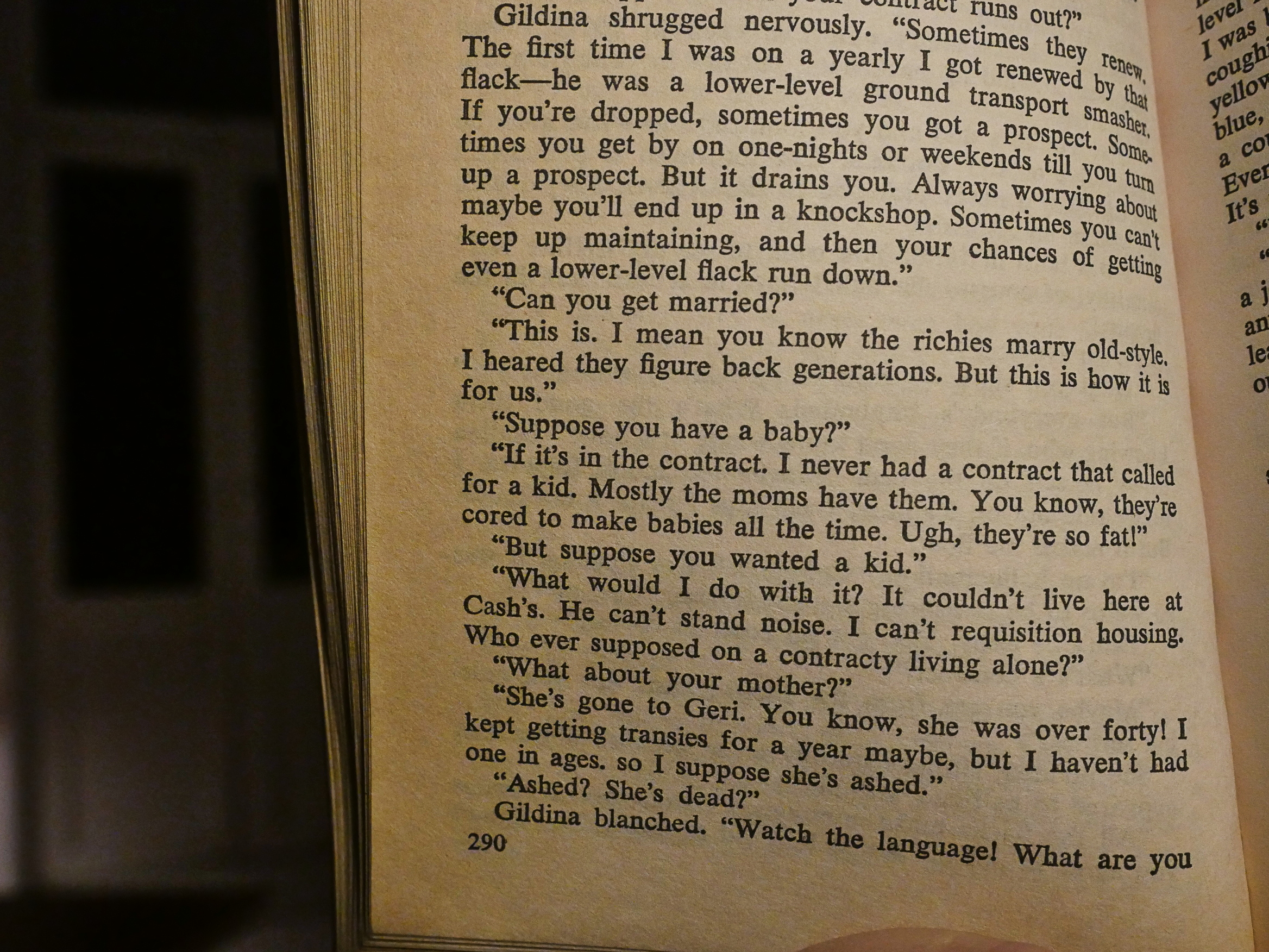
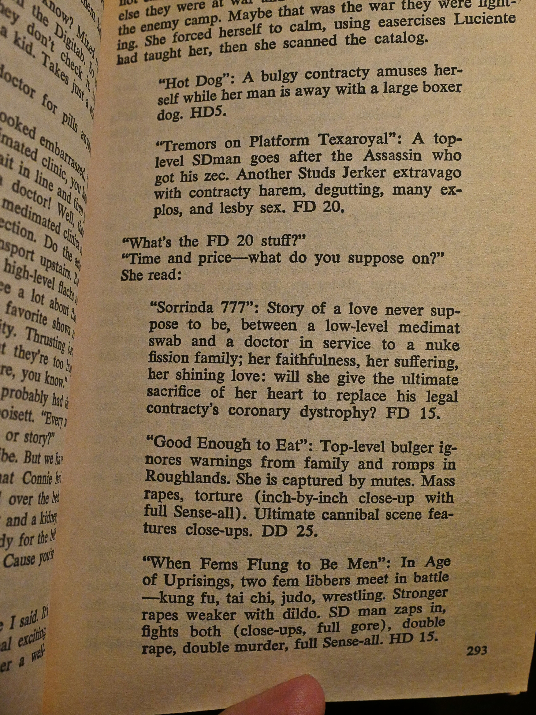
We make one brief foray into an alternate future where things have gone very wrong: Everything is hyper-gendered, brutal, and the Earth is basically dead. And that does seem more real, doesn’t it?
Especially the listing of what’s on TV that day.
I found the book to be somewhat frustrating. I really felt for the protagonist, and there were exciting bits in there. The rage against the helpless situation she found herself in is effective. But I didn’t find the long protracted explanations about the future world to be compelling, although it certainly sounds like a nice place to live.