I got a package today that had this mysterious item…

Epic unpackaging:


It’s a cassette! Inside a cardboard thingie!
It’s the latest thing.
I got a package today that had this mysterious item…
Epic unpackaging:
It’s a cassette! Inside a cardboard thingie!
It’s the latest thing.
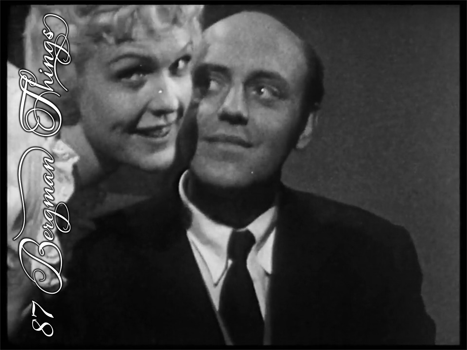
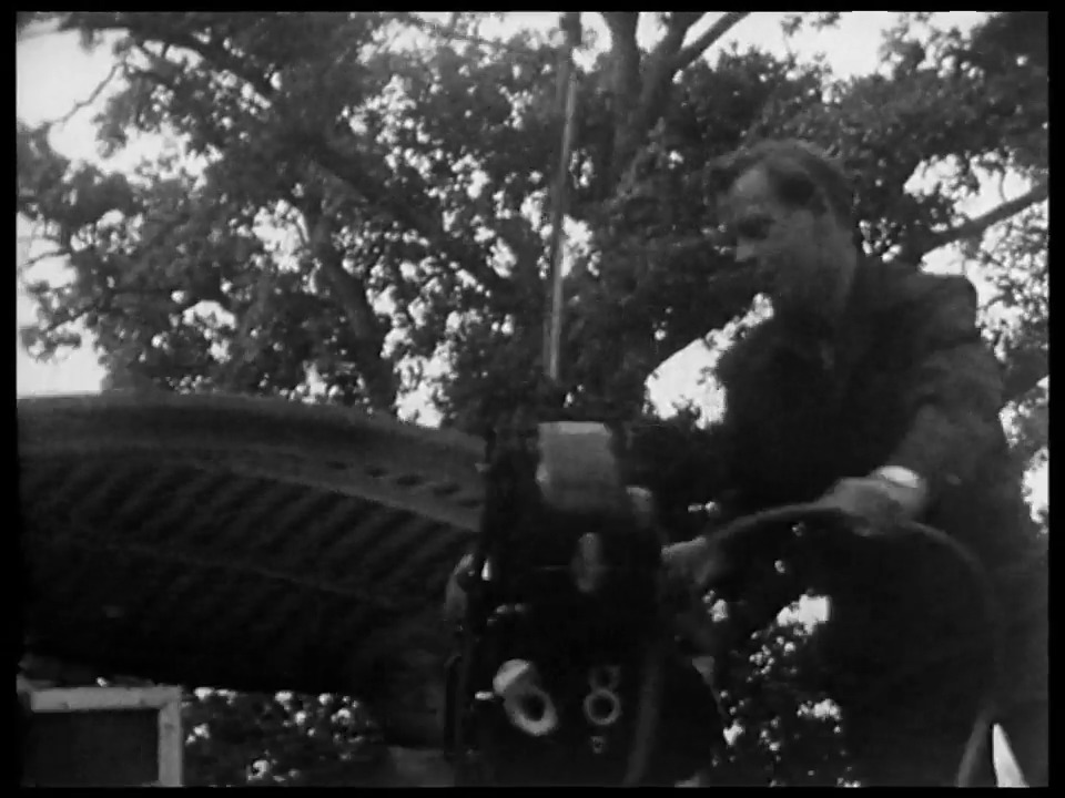
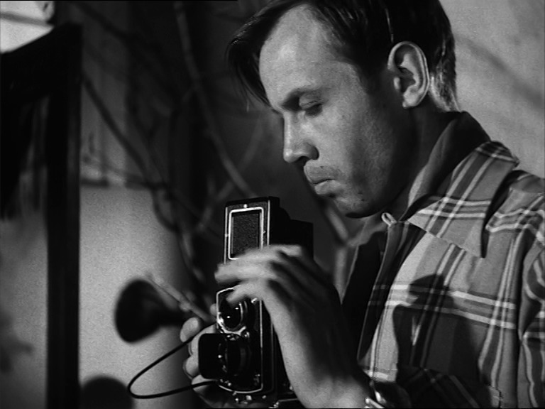
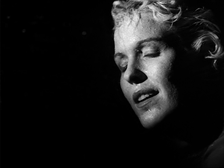
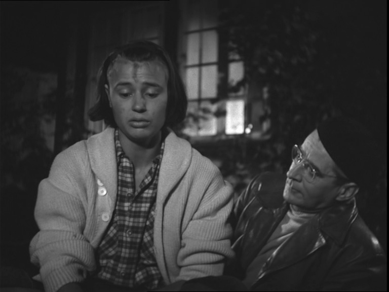
Behind Dreams (Bakomfilm Kvinnodröm). Ingmar Bergman. 1954. ⭐⭐★★★★.
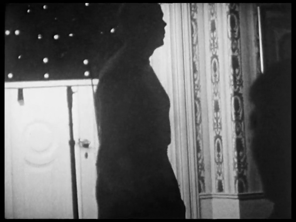
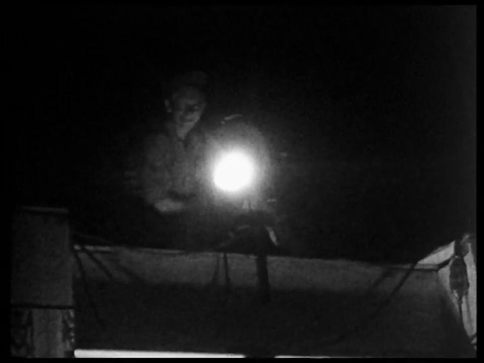
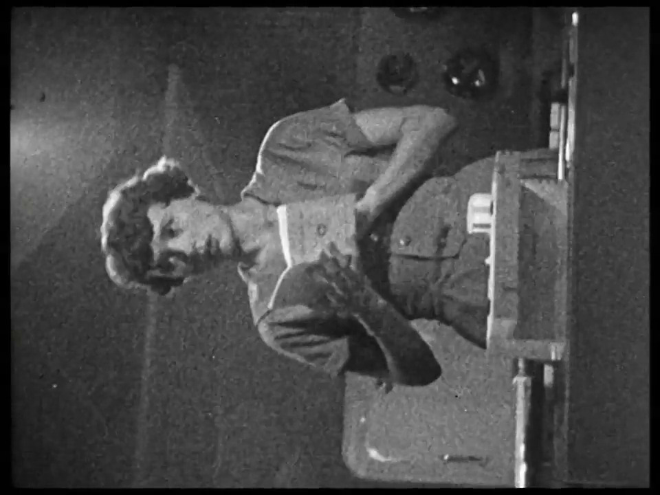
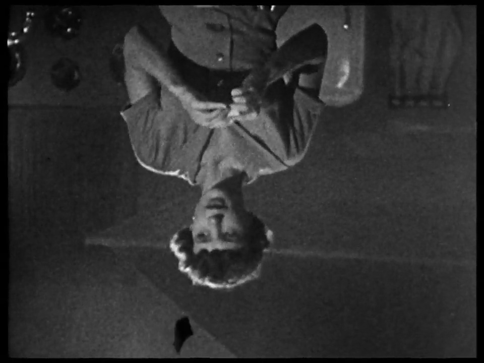
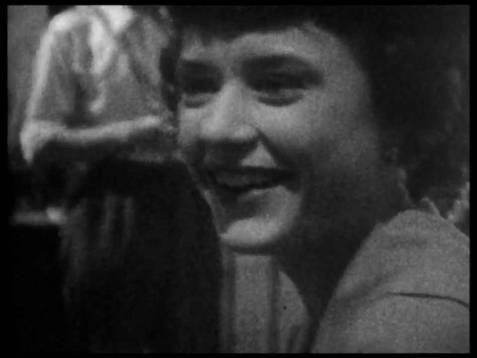
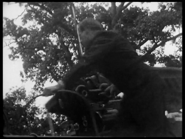
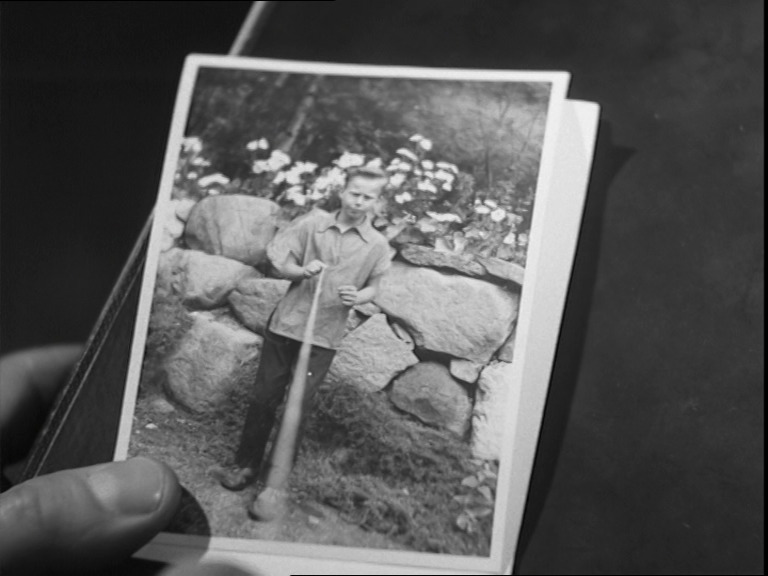
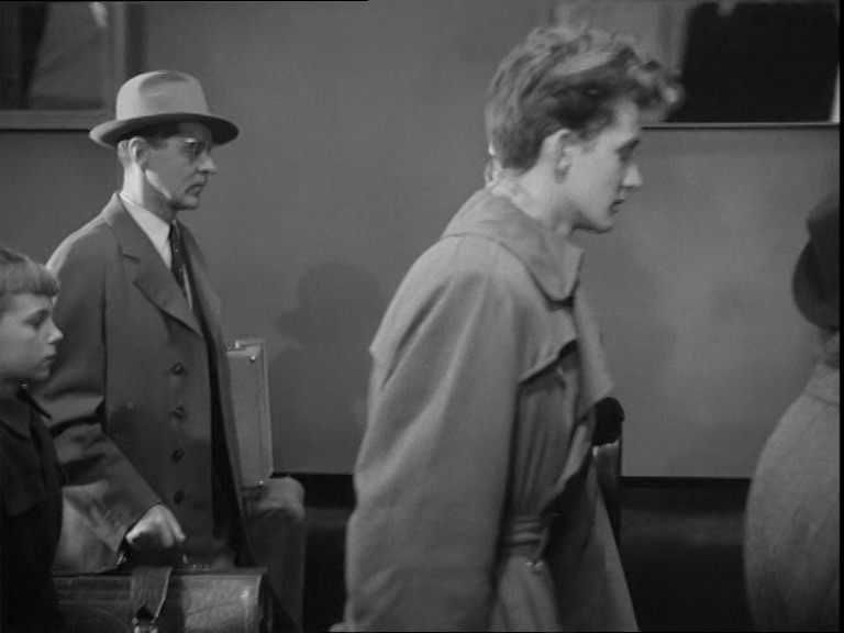
This is the behind the scenes documentary for Dreams: The first one of these that were created for Bergman films.
We get reminiscences by an unnamed female voice that says things like “that’s a lot of blurry images; I think those should be edited out”. It’s hard to disagree, but it’s fun. We get interesting titbits like how the lighting techs sometimes fell down from their perches on top of the sets (because it was really hot up there (and they drank a lot)).
It’s unclear whether Bergman was involved with the making of this or not. It doesn’t have an imdb page or anything, but the voiceover seems to imply that these were all shot by Bergman himself.
This post is part of the 87 Bergman Things series.
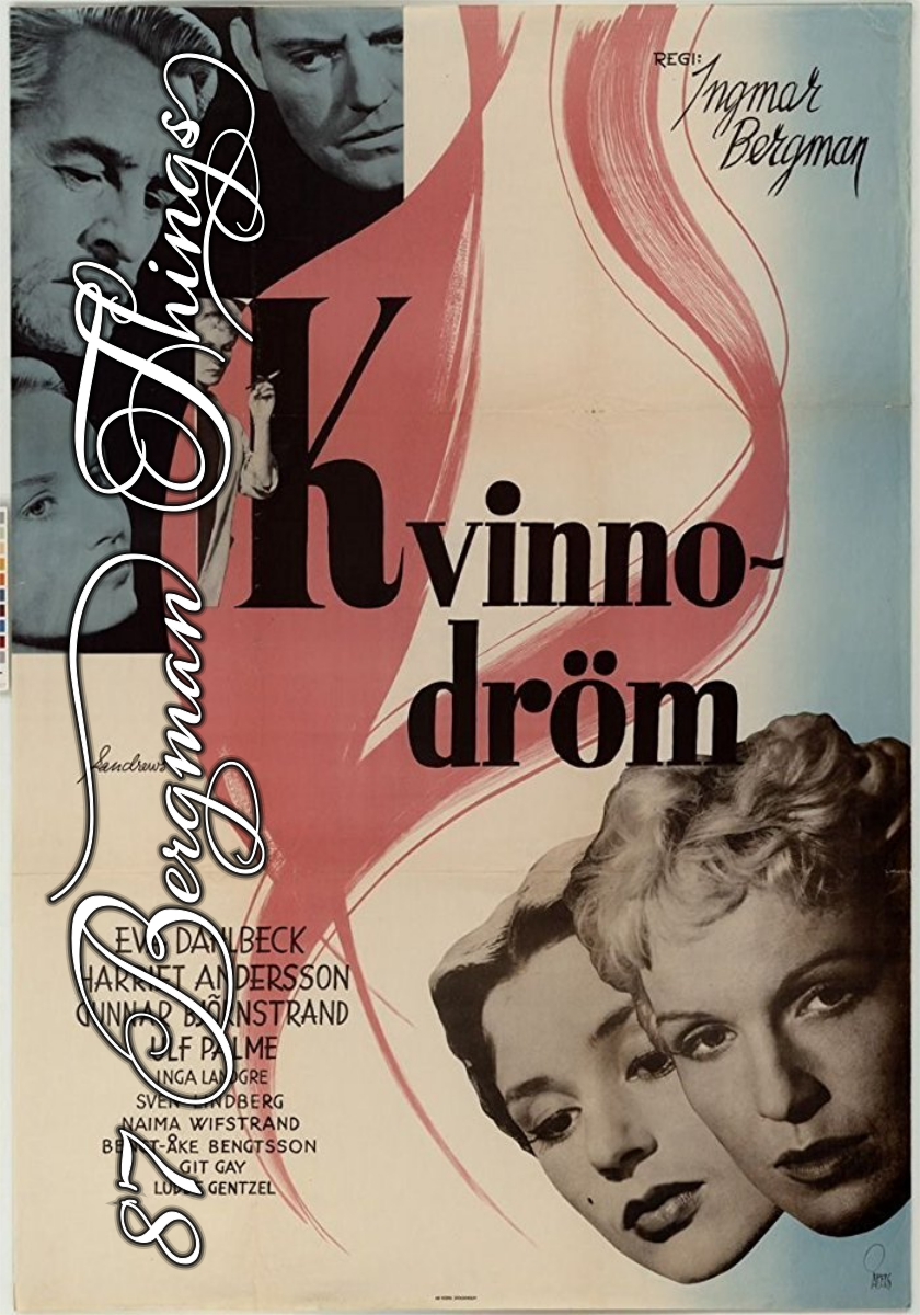
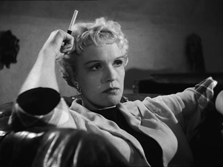
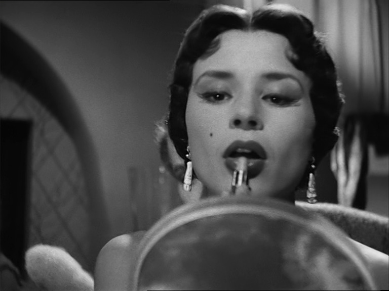

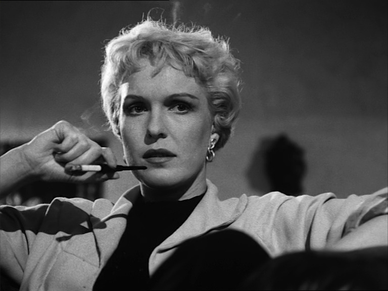
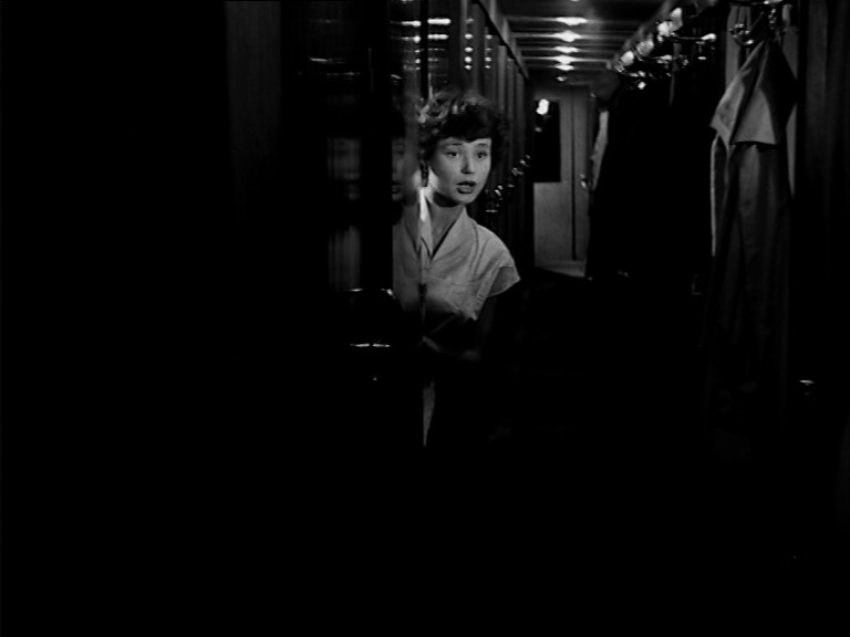
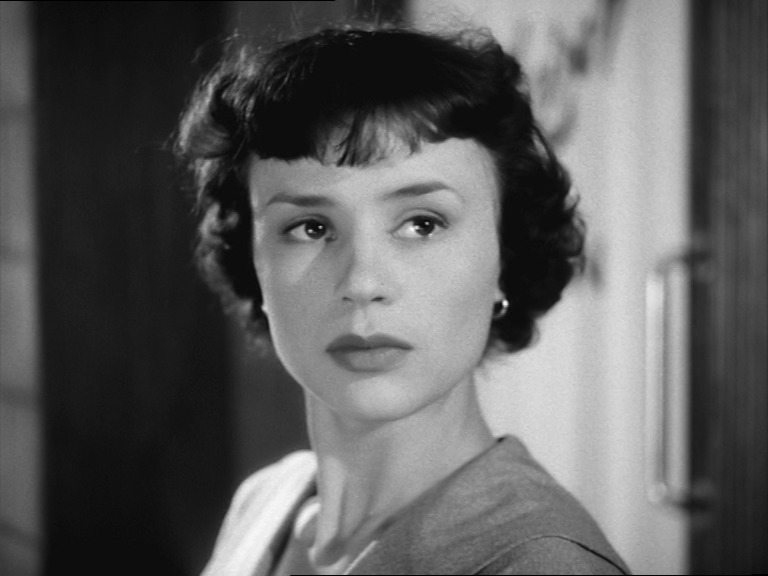
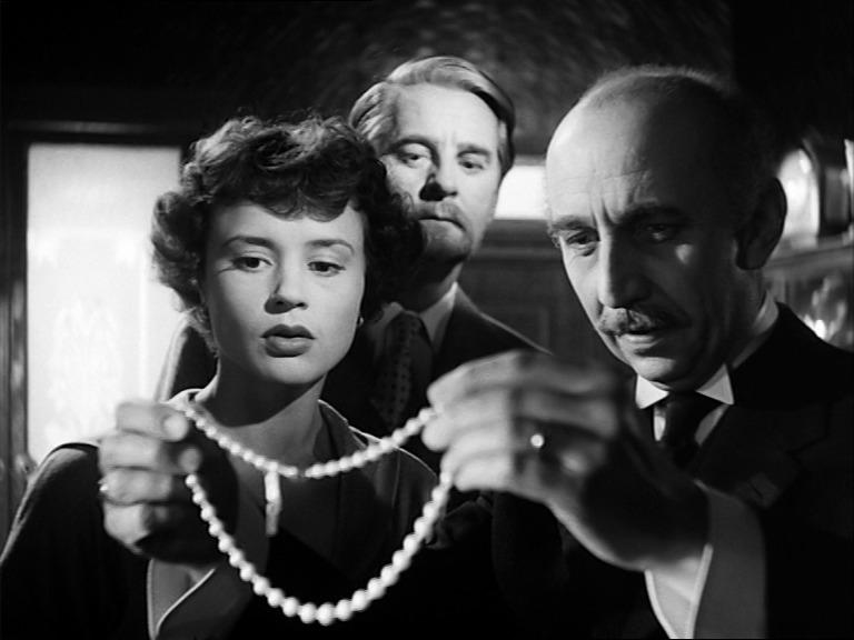
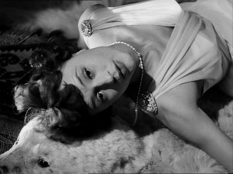
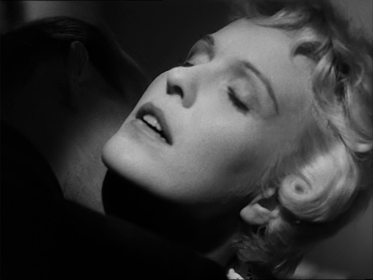
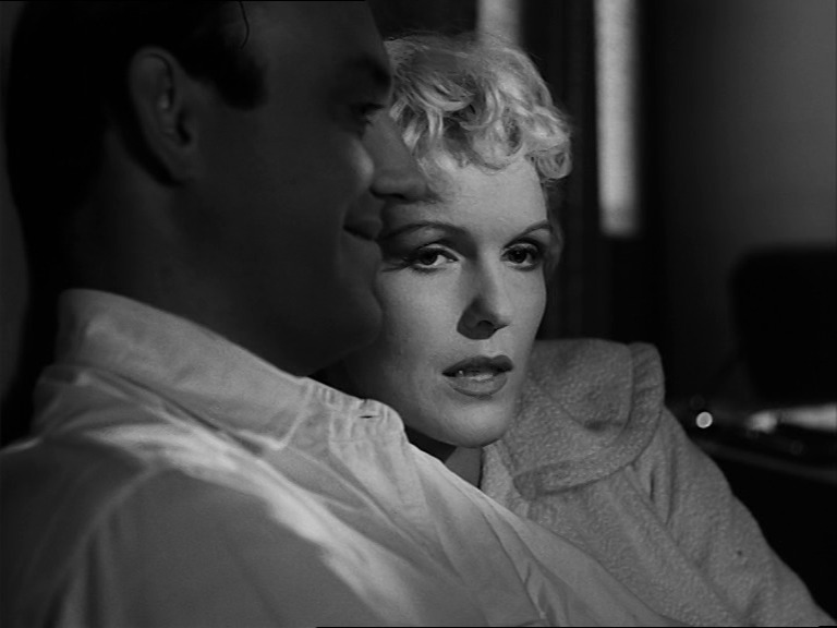
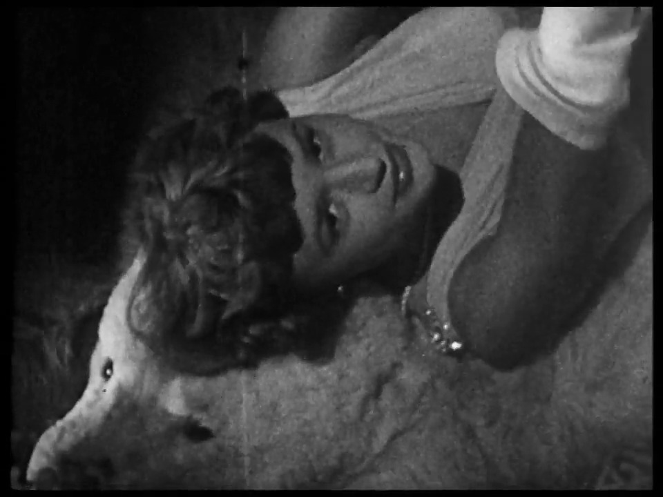
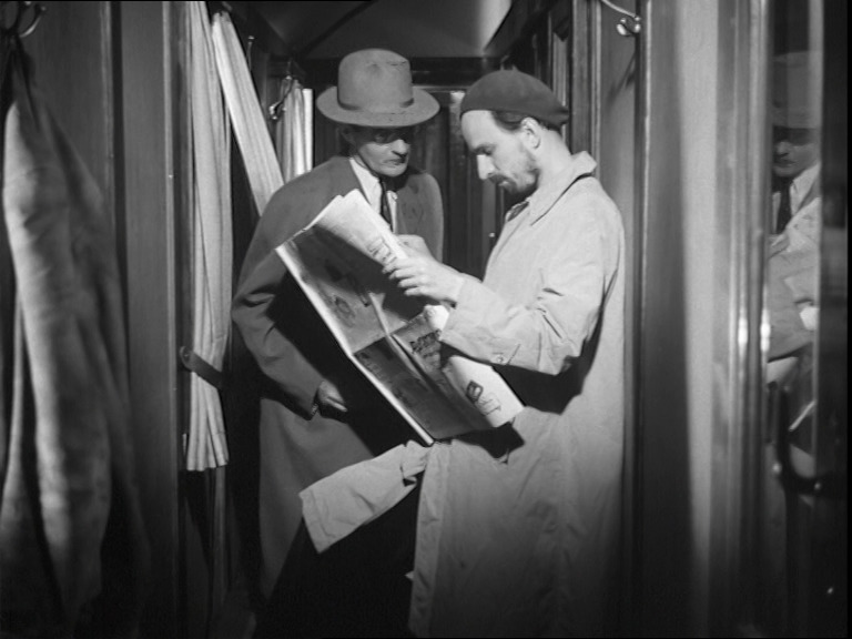
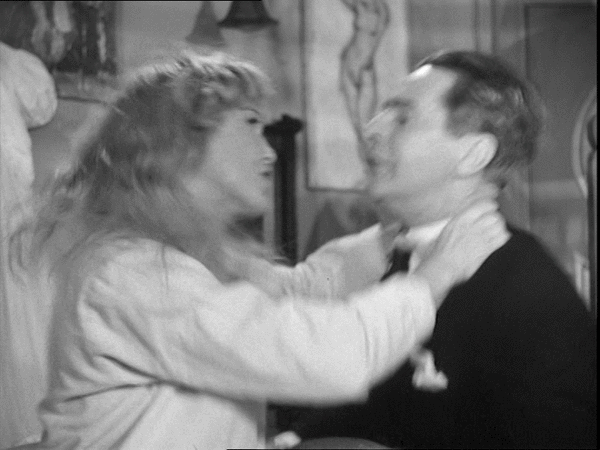
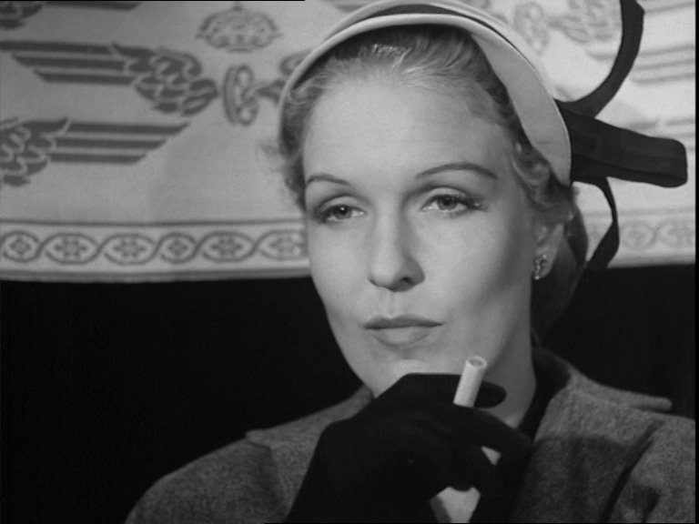
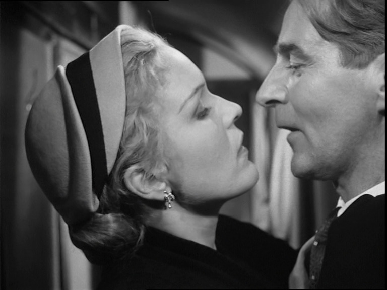
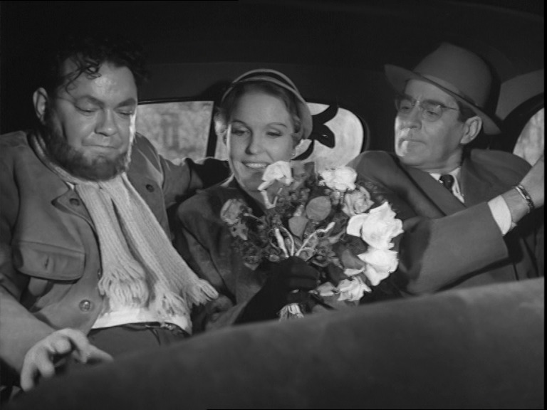
Dreams (Kvinnodröm). Ingmar Bergman. 1955. ⭐⭐⭐⭐⭐★.
After the success of A Lesson in Love, you’d think that making the follow-up (with basically the same cast and crew) would be easy enough. But it just doesn’t have the same sparkle.
While it isn’t as effortlessly brilliant as the previous movie, it does demonstrate that Bergman the director has found his own language. Gone are the obvious swipes from Italian neorealist cinema and the Hitchcock scenes: It’s all Bergman all the time now.
The actors are wonderful as usual, but the Eva Dahlbeck character’s storyline seems kinda incomprehensible because it’s impossible to understand why she’s obsessing over a man that seems completely unremarkable.
This post is part of the 87 Bergman Things series.
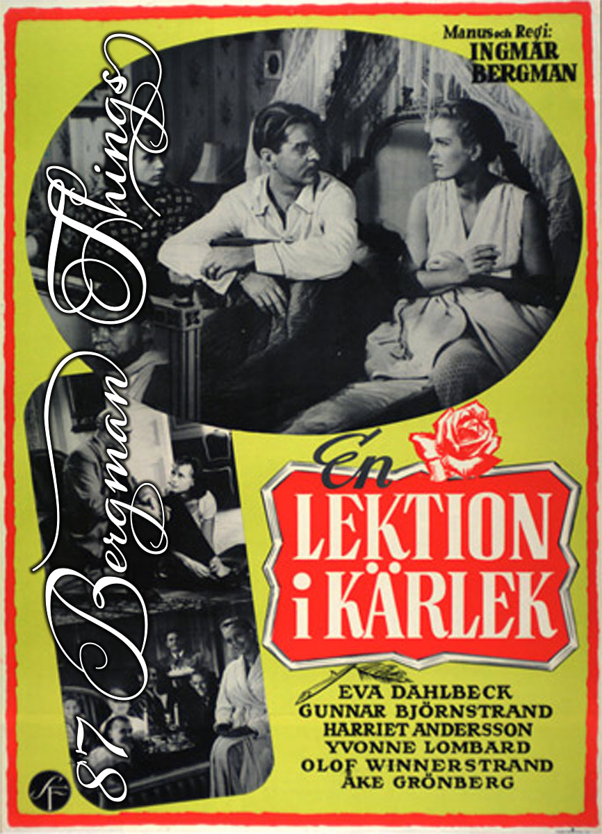
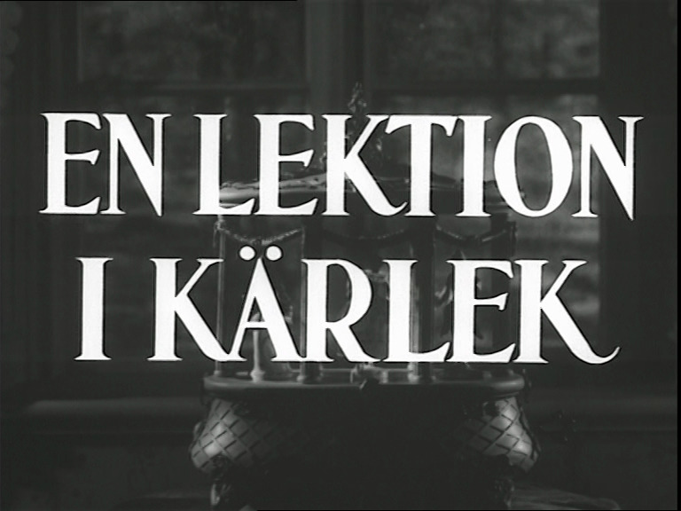
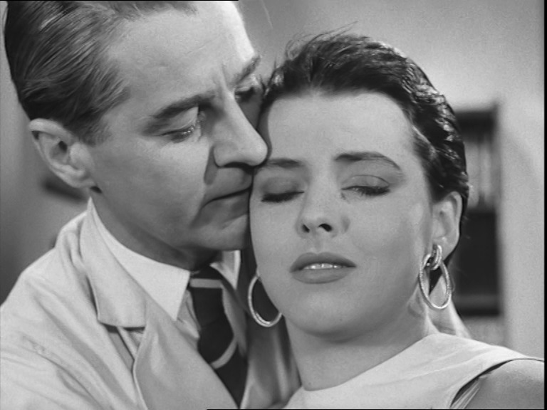
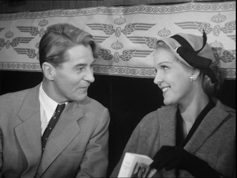
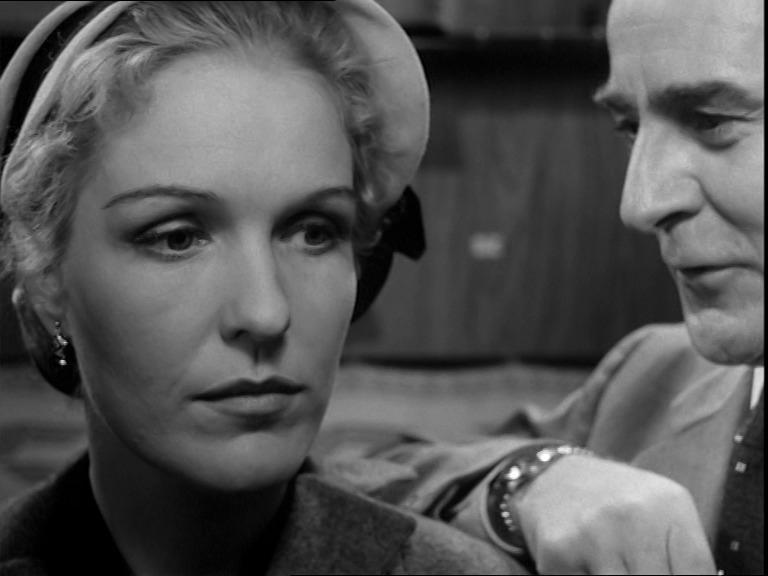
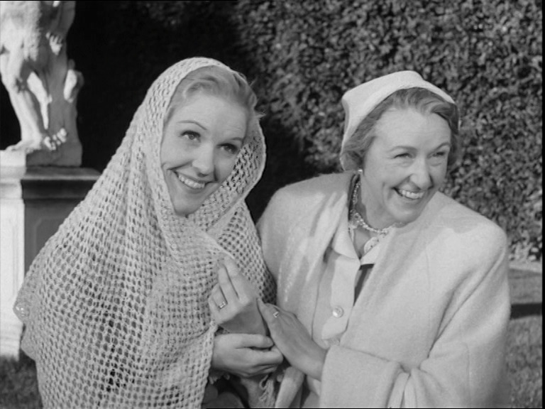
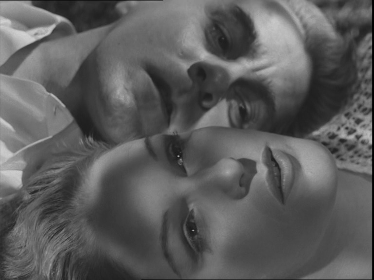
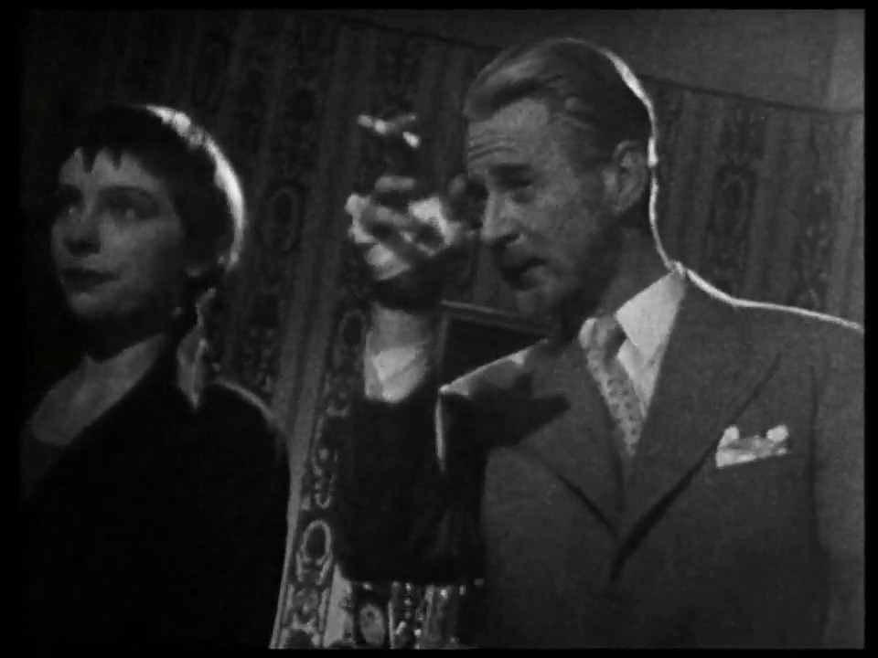
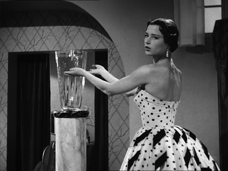
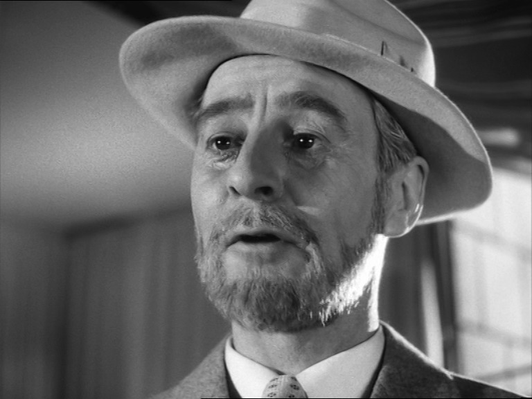
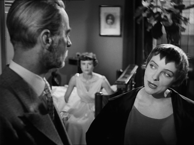
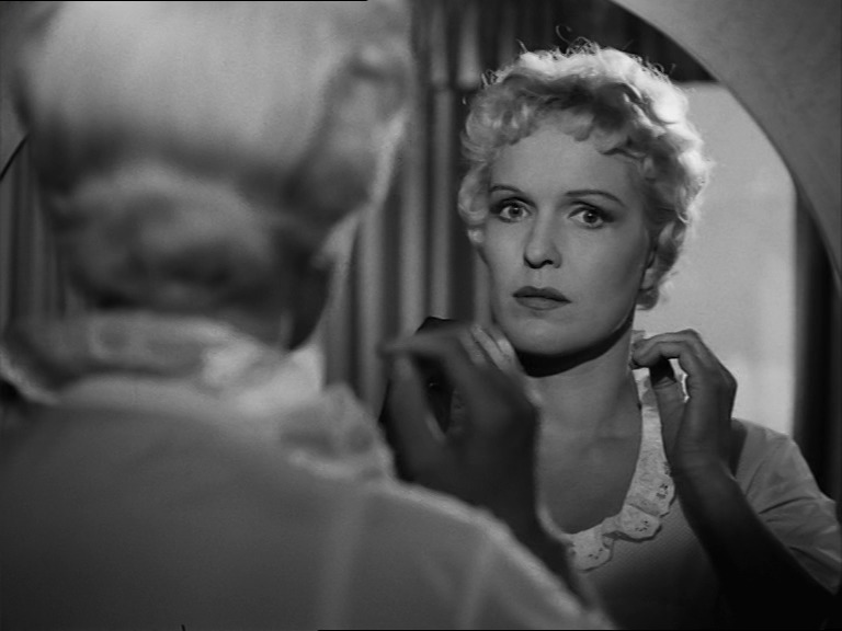
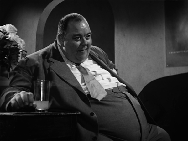
A Lesson in Love (En lektion i kärlek). Ingmar Bergman. 1954. ⭐⭐⭐⭐⭐⭐.
Yay. Eva Dahlbeck and Gunnar Björnstrand (Sweden’s Katharine Hepburn and Cary Grant) are back in this delicious comedy (which is Bergman’s first real comedy). Harriet Andersson does a wonderful performance as a tomboy 15-year-old, too.
It’s a thoroughly entertaining film.

This post is part of the 87 Bergman Things series.
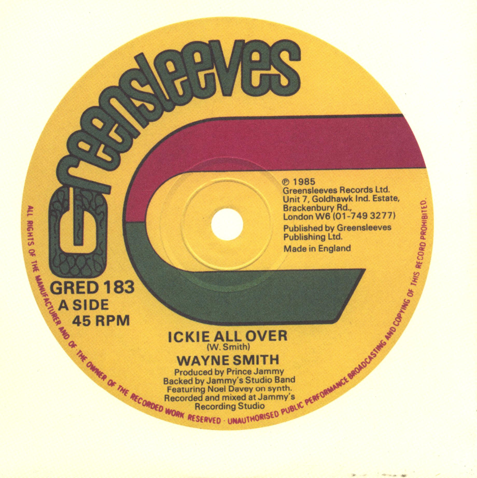
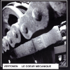
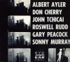
Music I’ve bought this month.
 |  |  |  |  |
 |  | %3A+Portfolio) | %3A+Fame) | %3A+Muse) |
 | ) | ) | +(1)) | +(2)) |
 |  |  |  | ) |
) |  |  |  |  |
 | ) | ) |  |  |