If there’s one thing an amateur cook shouldn’t attempt (and there’s nobody more amateur than me), it’s croissants, apparently. So I wanted to give it a try.
It’s 3x more futzy than any other recipe I’ve attempted. It’s not that any single step is particularly daunting, but there’s just so many of them with hours between each step.
And reading a few recipes, I had no idea, really, what it all meant. The descriptions (“fold like an envelope”) I couldn’t really visualise, but then I found the youtube clip above.
It’s very nice and very clear: He describes each step very nicely, and even explains why they’re performed, and what to do if things don’t quite go as planned.
Excellent.
So let’s try it!
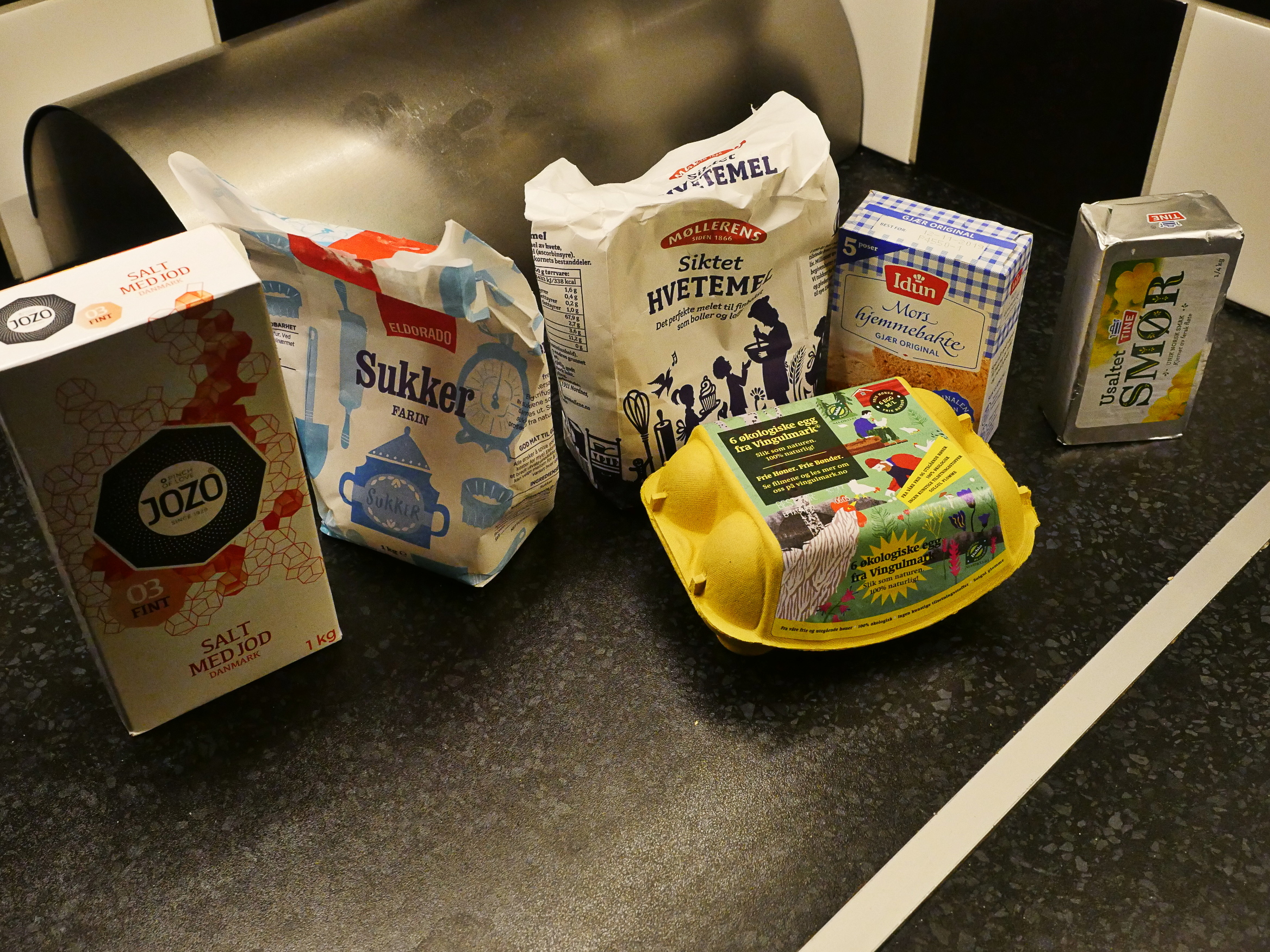
The ingredients are very basic.
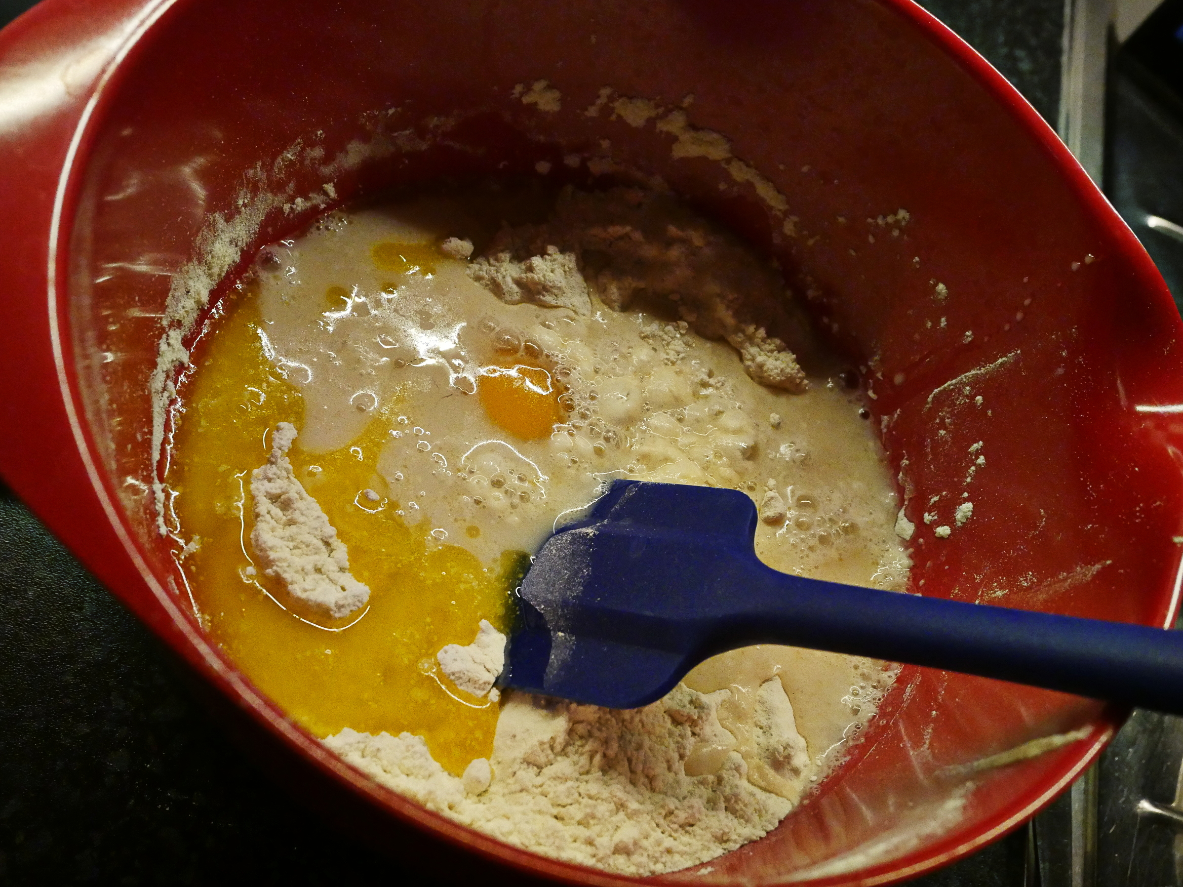
And you just mix them a bit…
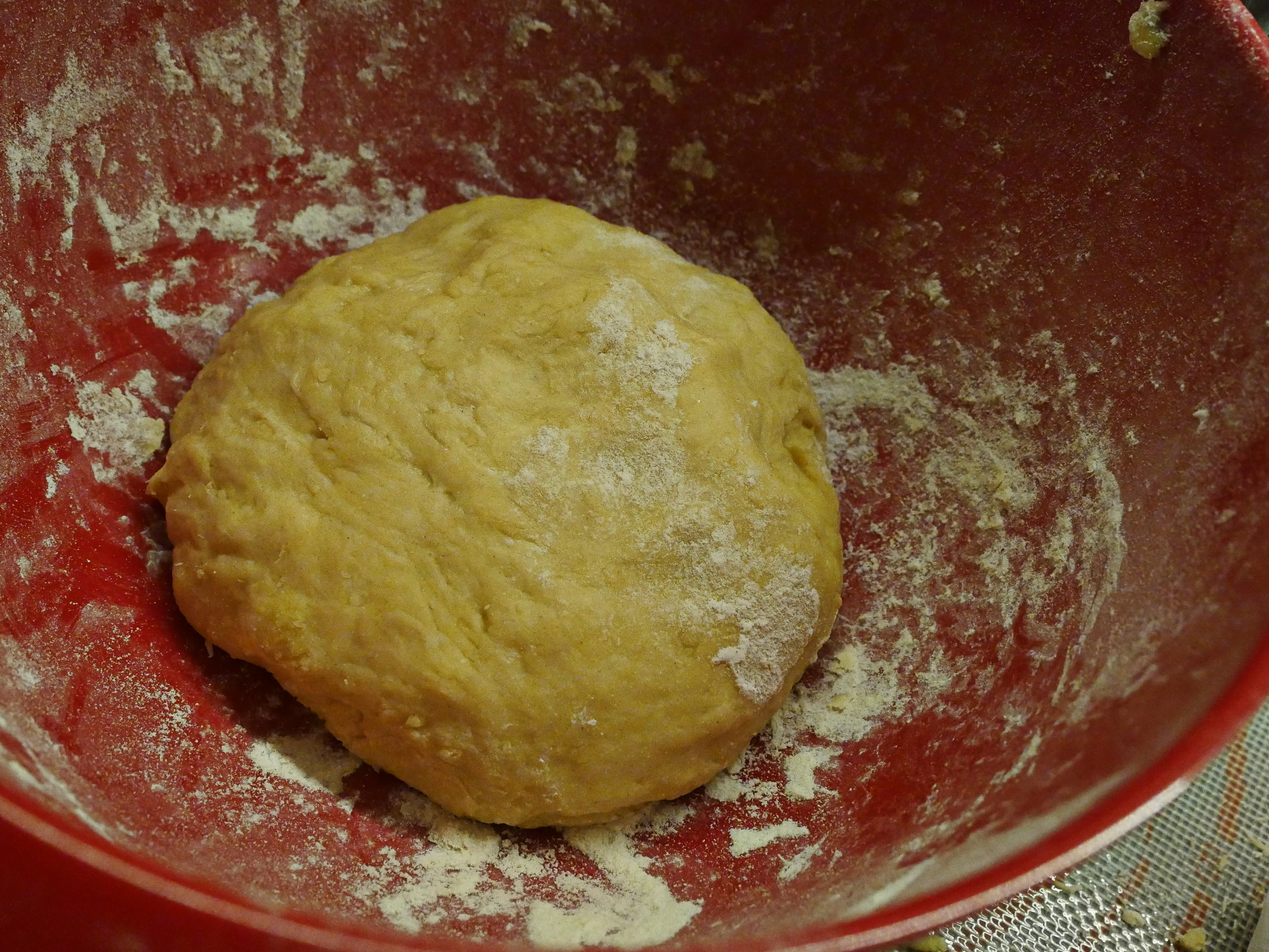
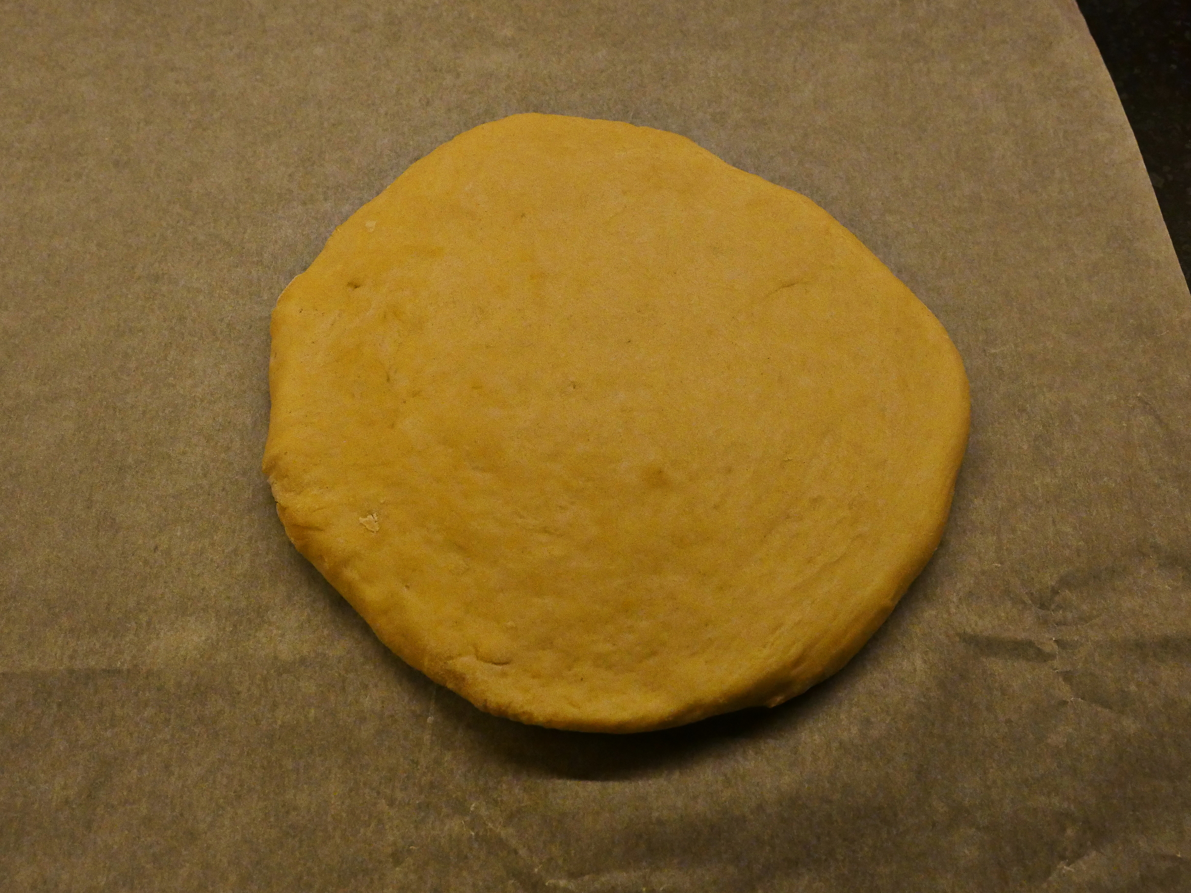
… and then you have the dough. Which you then let rest for an hour in the fridge.
The thing that almost made me ditch the project was the nerdy insistence on measuring stuff for each step, but that’s kinda fun, anyway.
At this point I did have some problems. The dough was just too wet and sticky for me to work with at all, so I added some more flour, and that seemed to fix the problem, but I didn’t realise at the time why the dough turned out that way, since the recipe was nerdily precise. But re-reading it now that I’m writing this, I realise that I made a boo-boo: I added a whole egg instead of an egg yolk to the dough, which made it too wet. And I hope the egg whites aren’t doing anything bad to the dough…
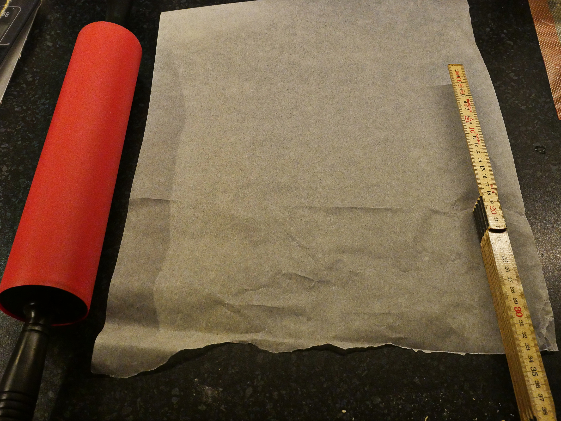
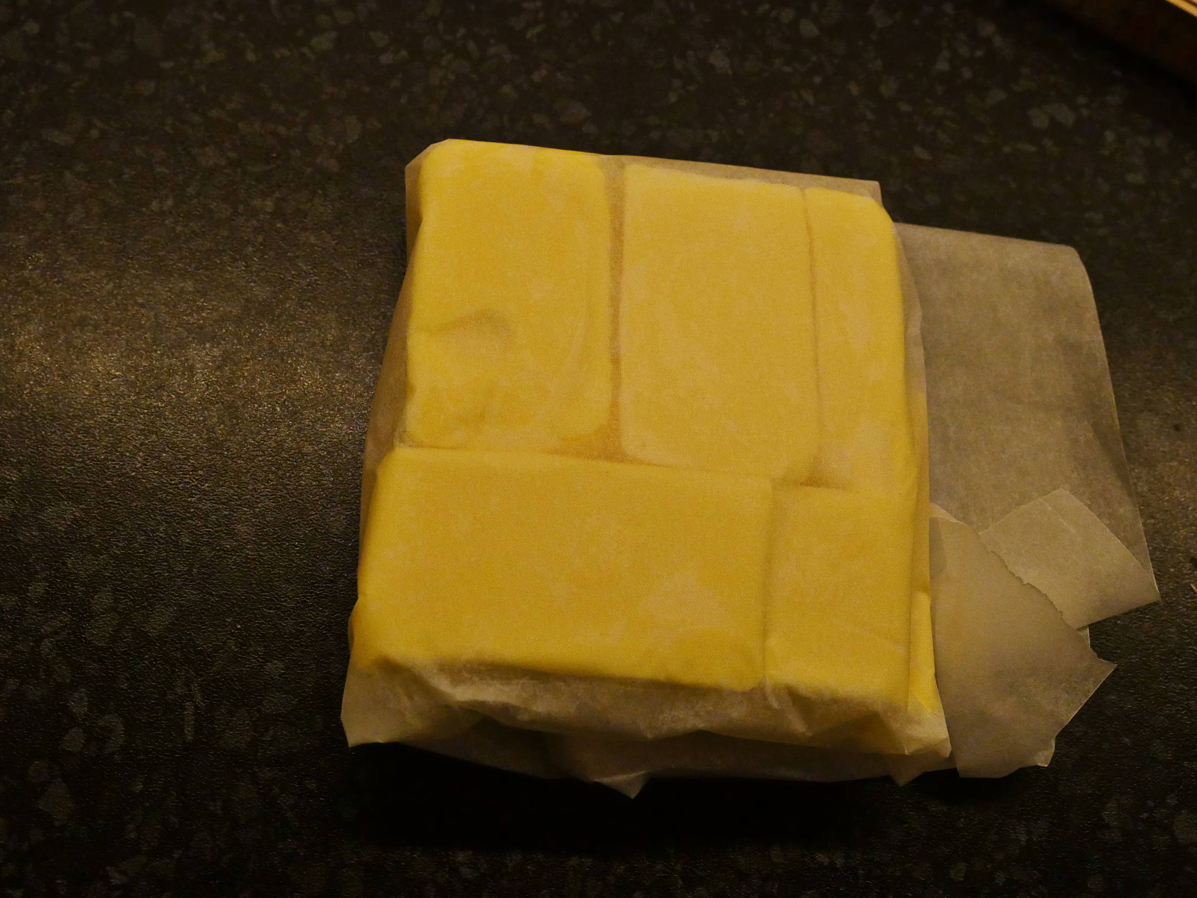
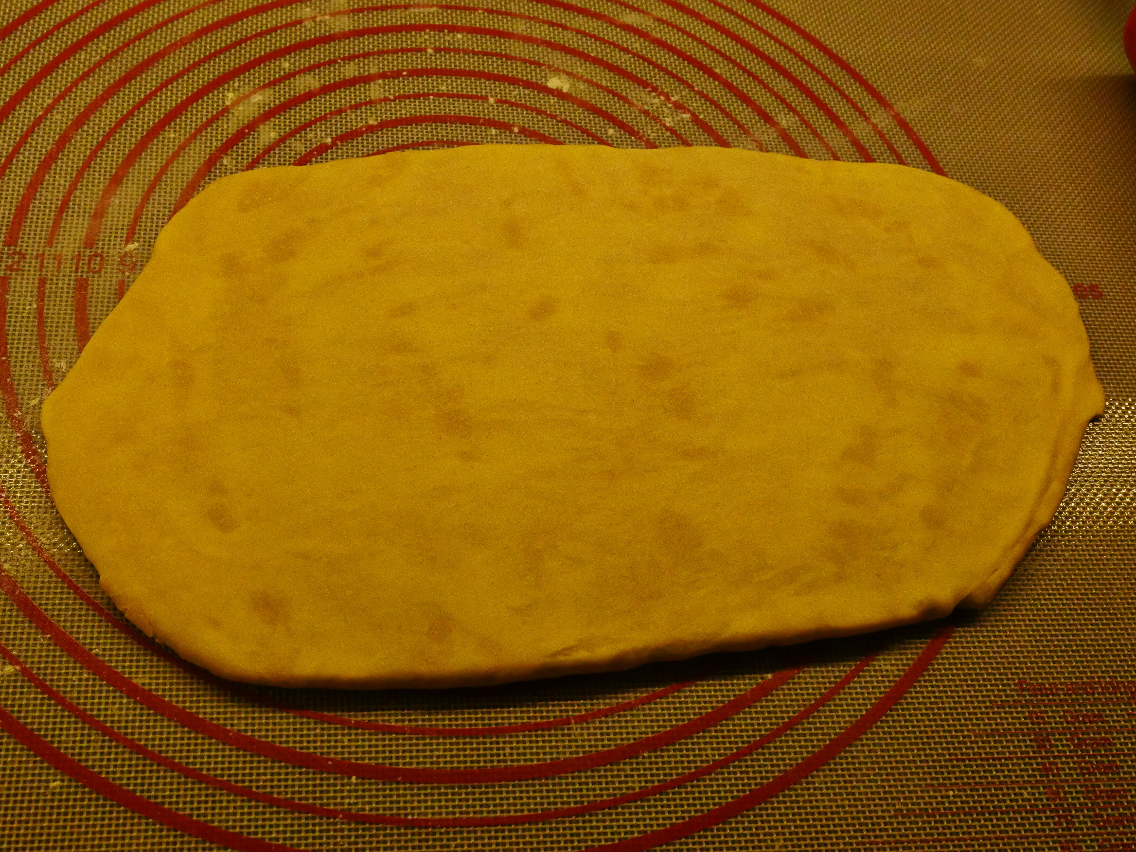
So you put it in a 18x18cm baking paper envelope and roll it until the dough conforms to the square. And then into the fridge for 12 hours. *sigh*
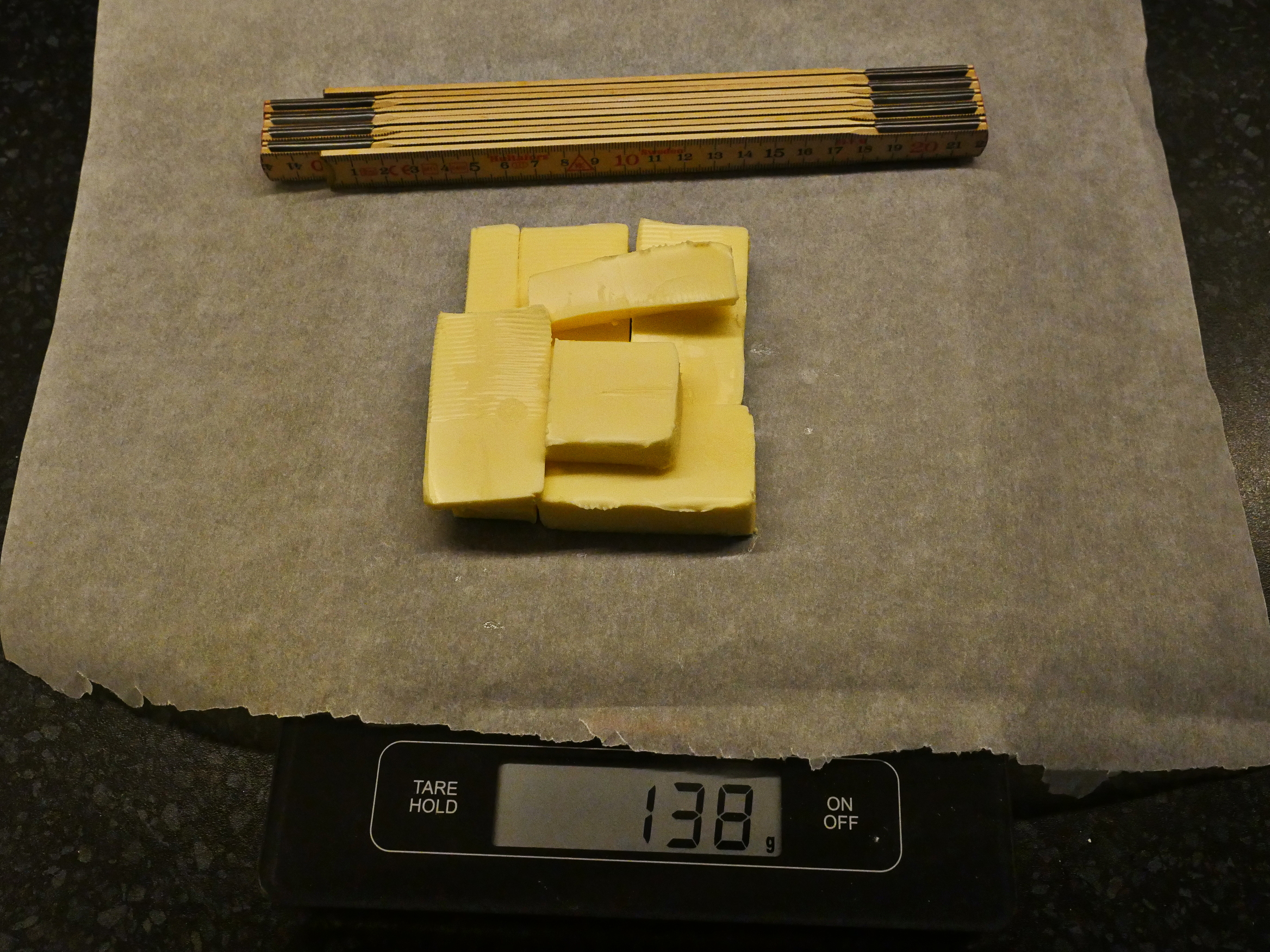
And then it’s the same thing with the butter. And, yes, he specified 138g of butter. 140g would probably be way too much!
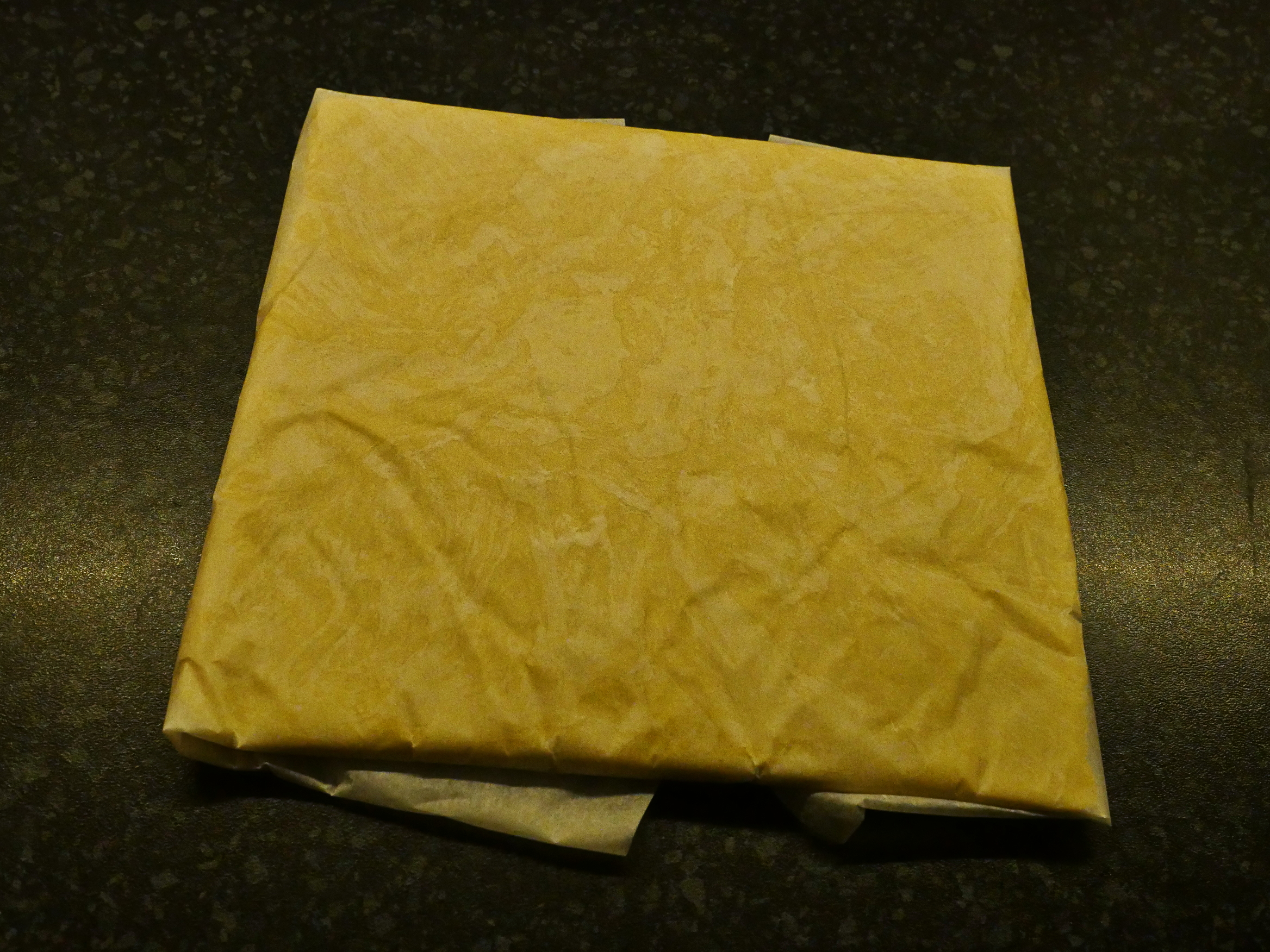
So wrap it in a square of baking paper…
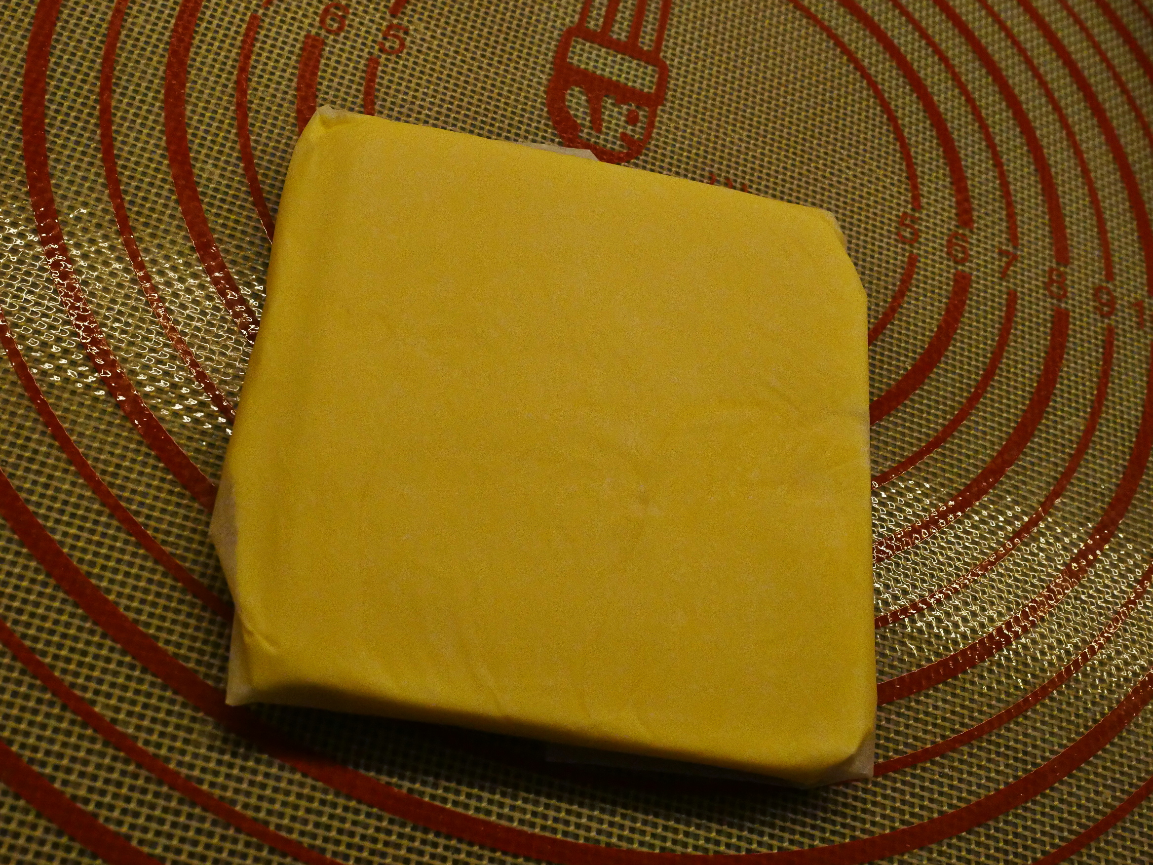
And then roll until it’s even, and into the fridge again.
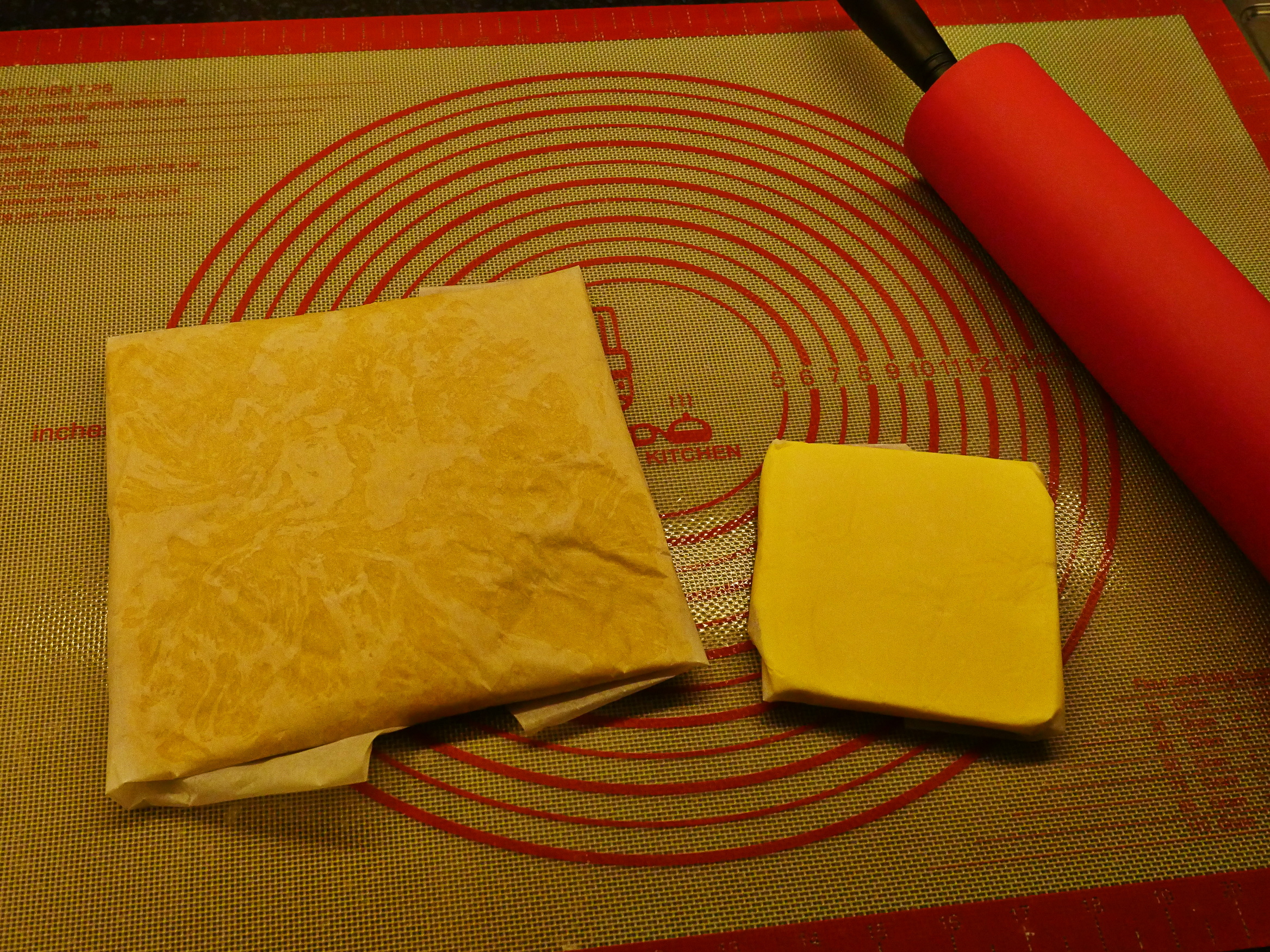
So now I have two cold squares…
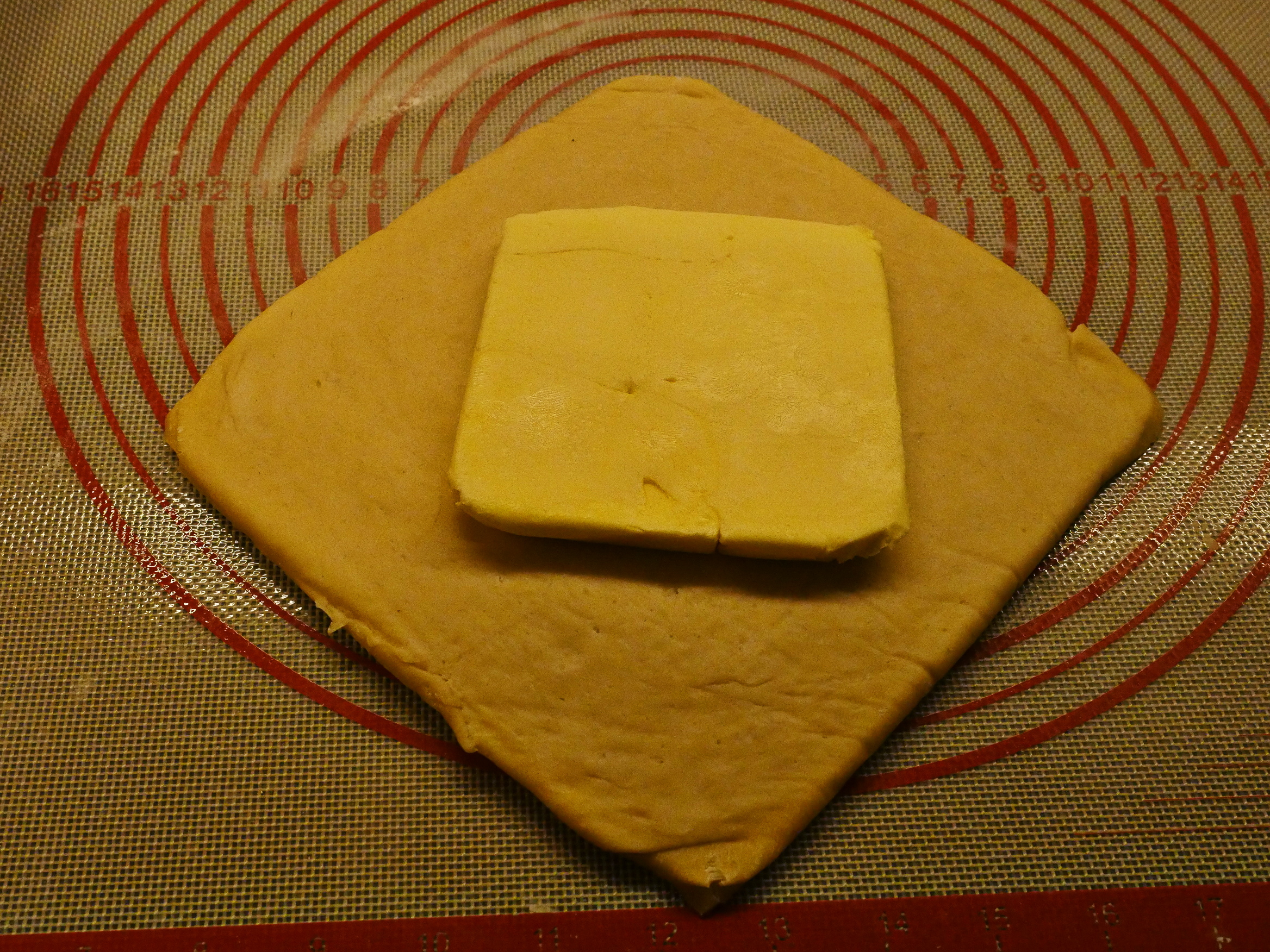
And place them like this…
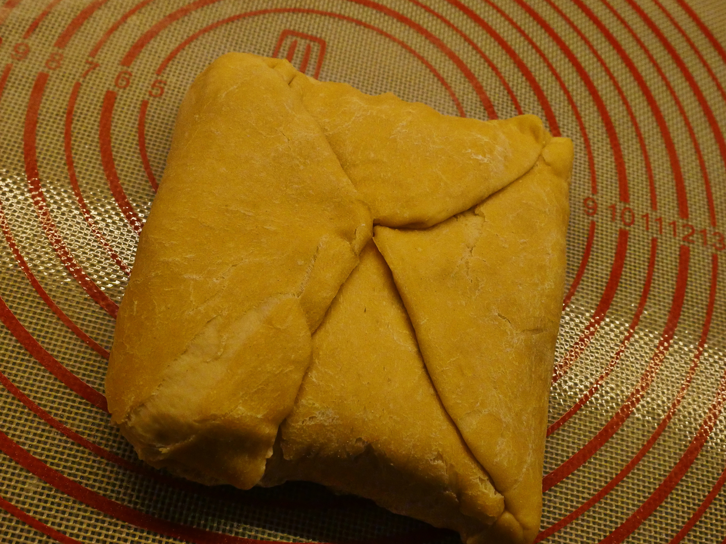
And wrap up into a letter shape.
And then roll. Oops! The dough has formed a bit of a skin from the 12 hours in the fridge? Perhaps I should have wrapped the baking paper in plastic cling foil to keep all air out? Eep. Hope it’ll work anyway…
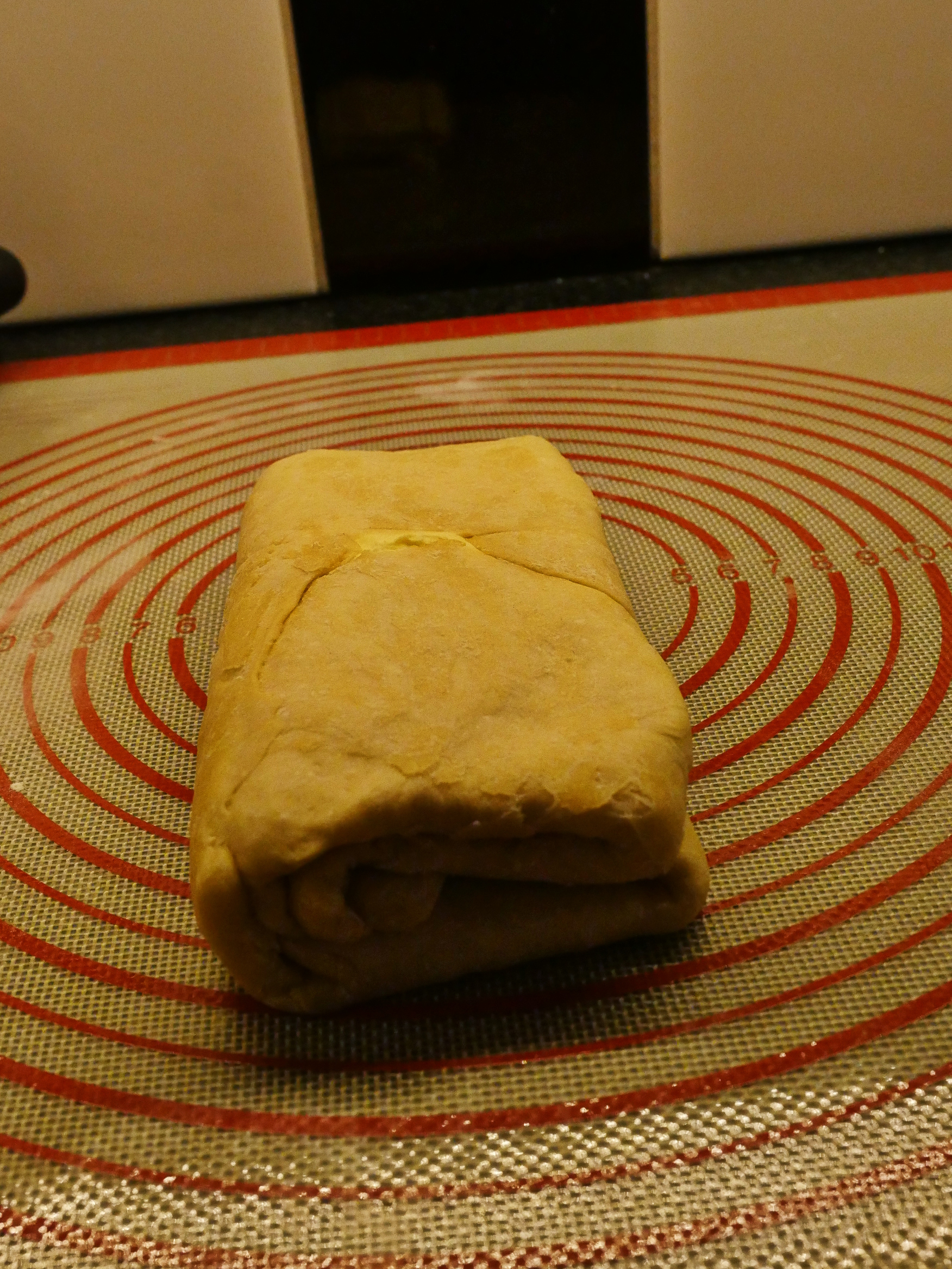
And then wrap and into the fridge for an hour. *sigh*
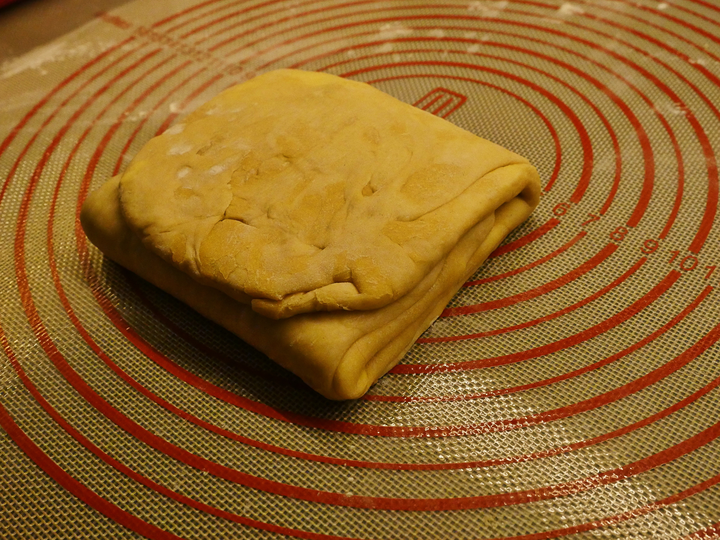
And then roll again and then wrap again into a square and then into the fridge again for an hour. *sigh*
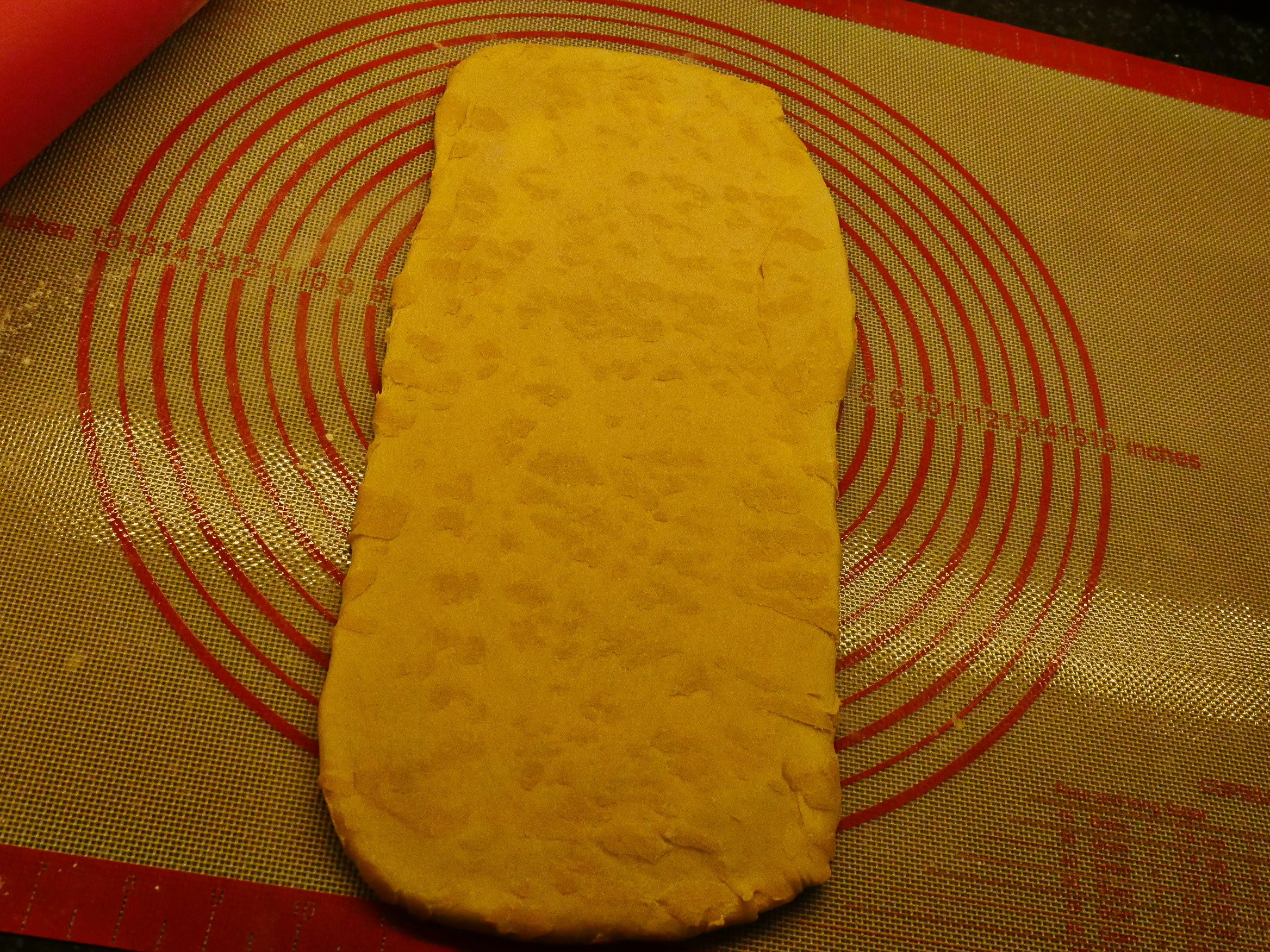
But then! We’re getting close to the finish! Roll it!
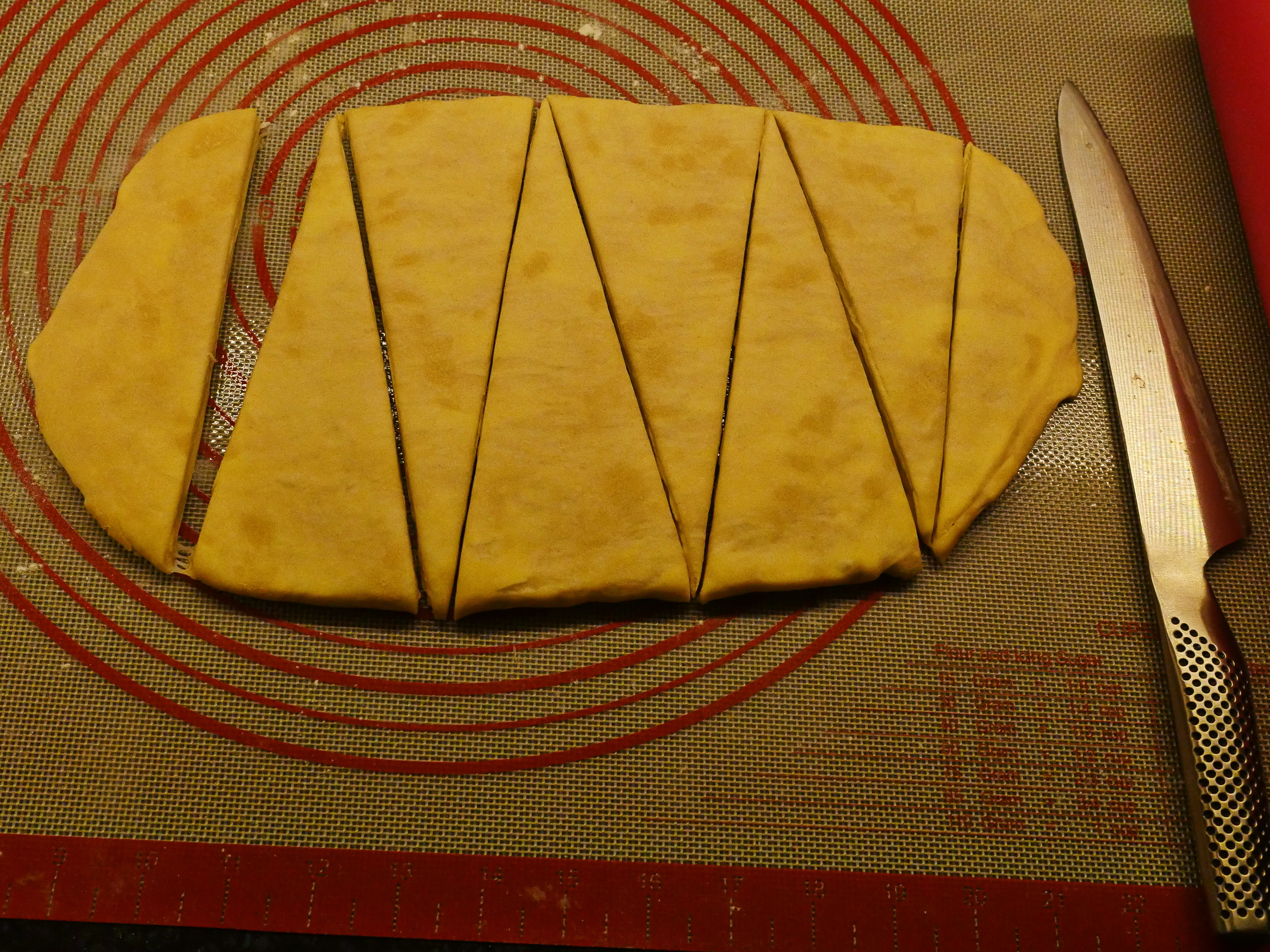
Then cut into triangles! The guy on youtube used a tape measure to figure out how to cut, but I just eyeballed it. I’m going to have a least a couple of mutant croissants.
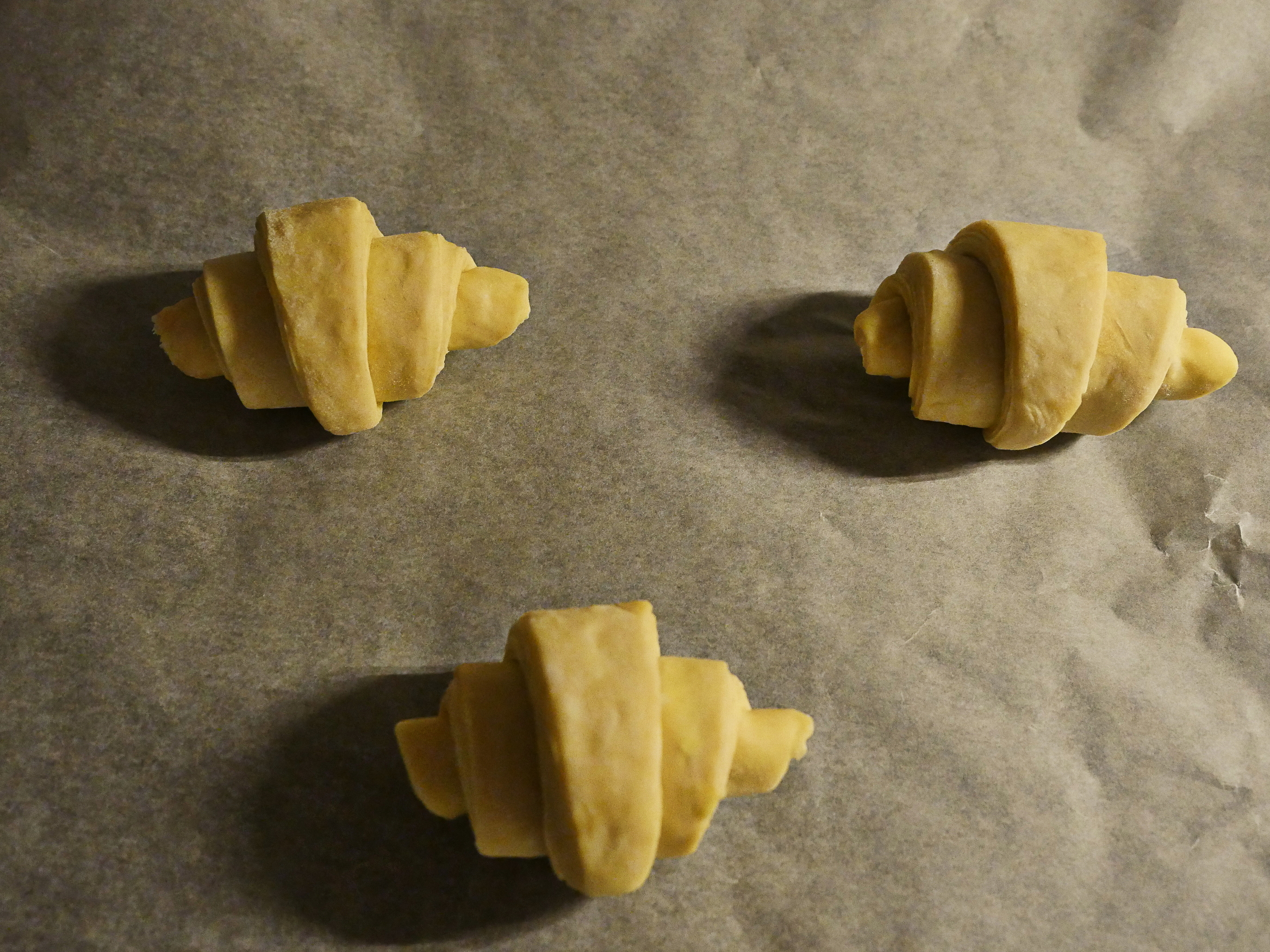
And then I rolled three of the triangles (and wrapped the rest in cling foil and back into the fridge; according to the interweb they’ll keep for a day or two and I can bake them tomorrow).
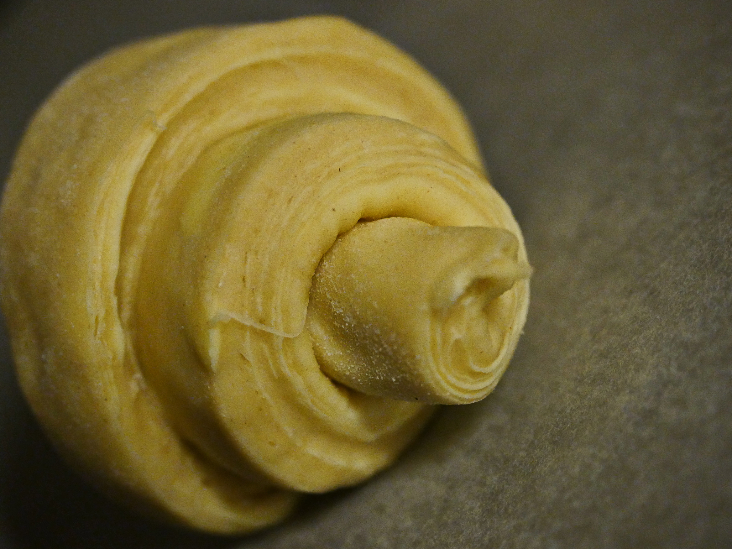
That’s nice lamination, eh? Eh?

And then they’re supposed to proof for two hours on the bench. *sigh* I cleverly used a pot to keep them from drying out. I hope.
Meanwhile, I can pick a book to read!
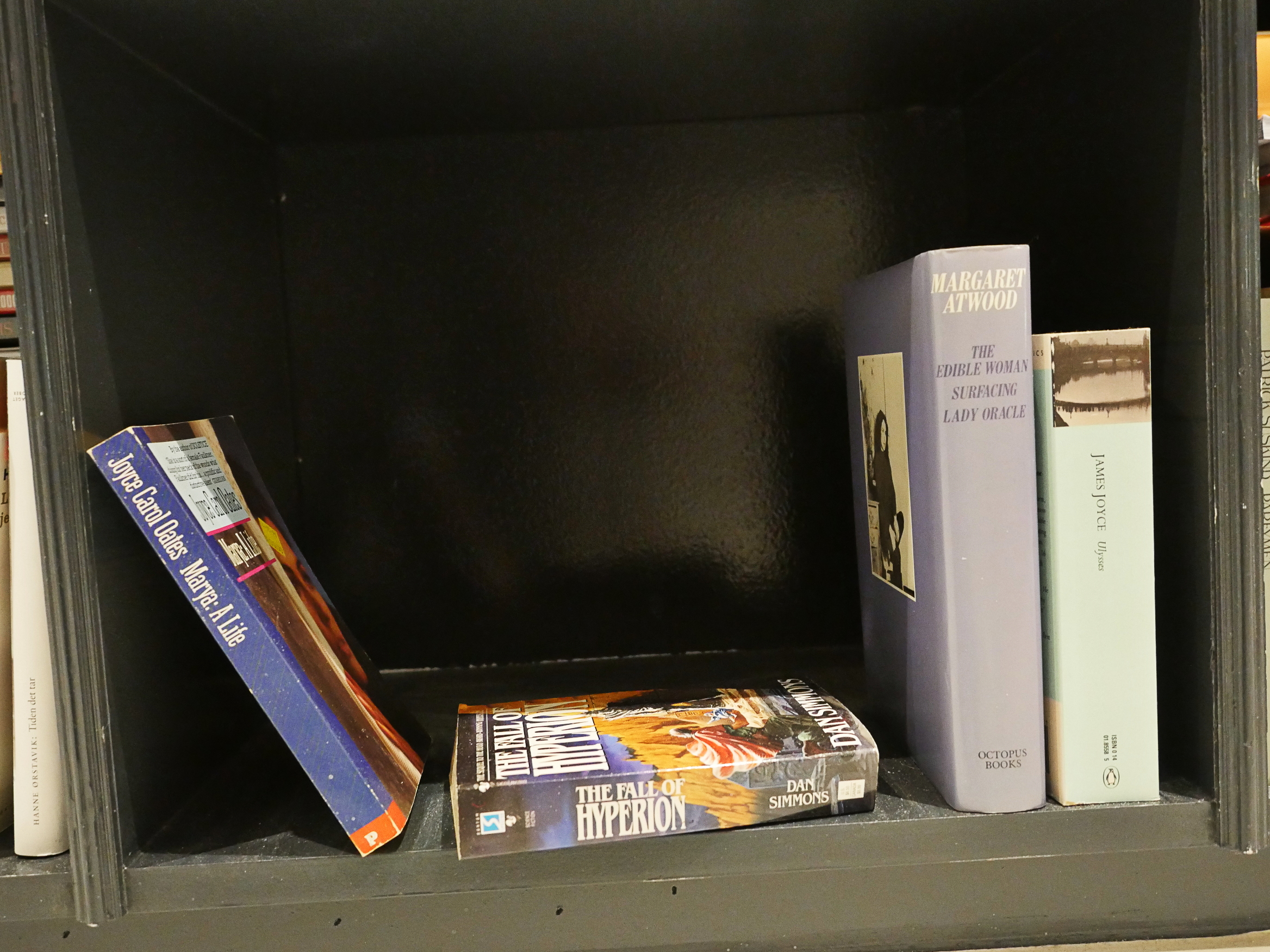
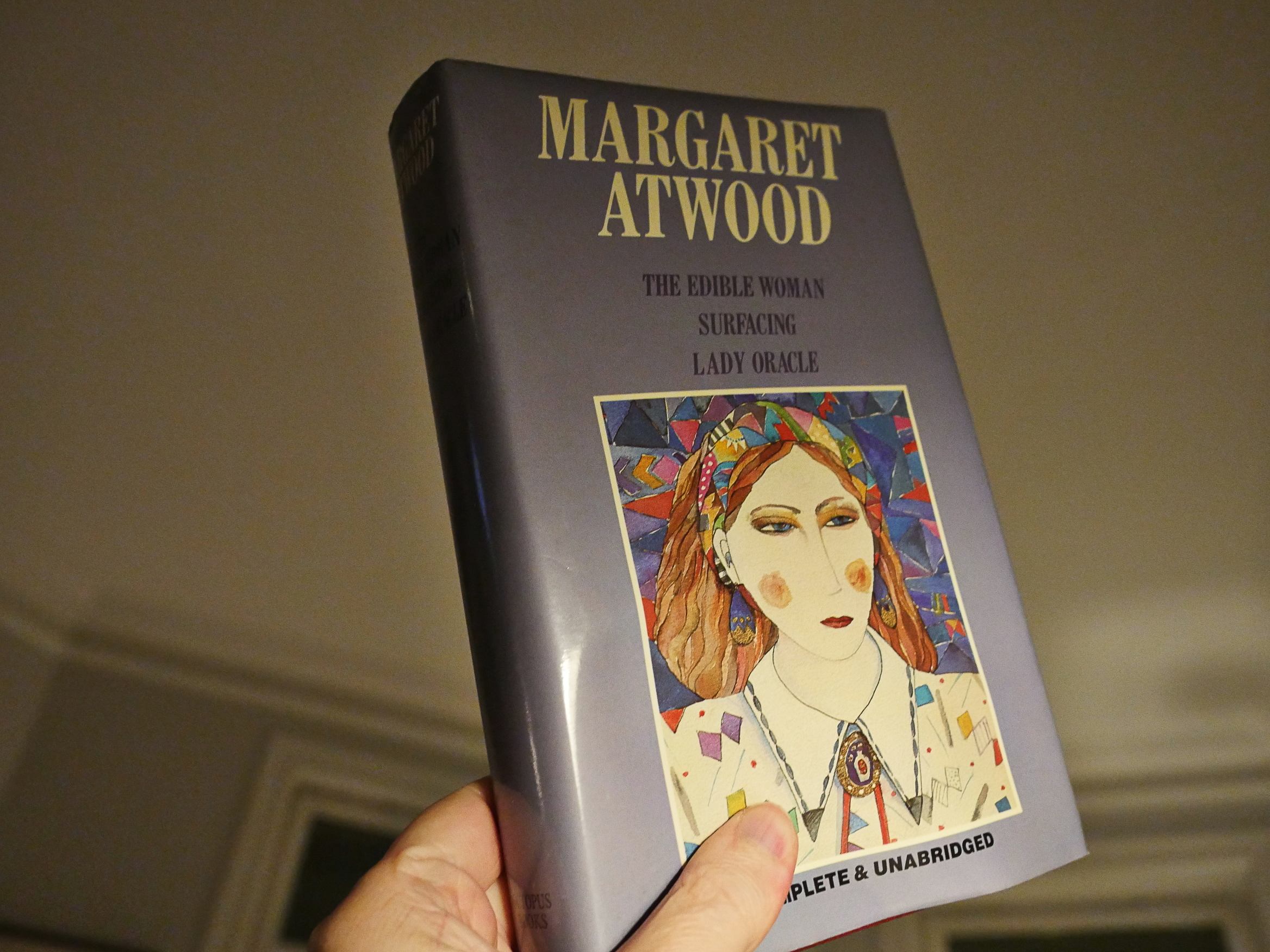
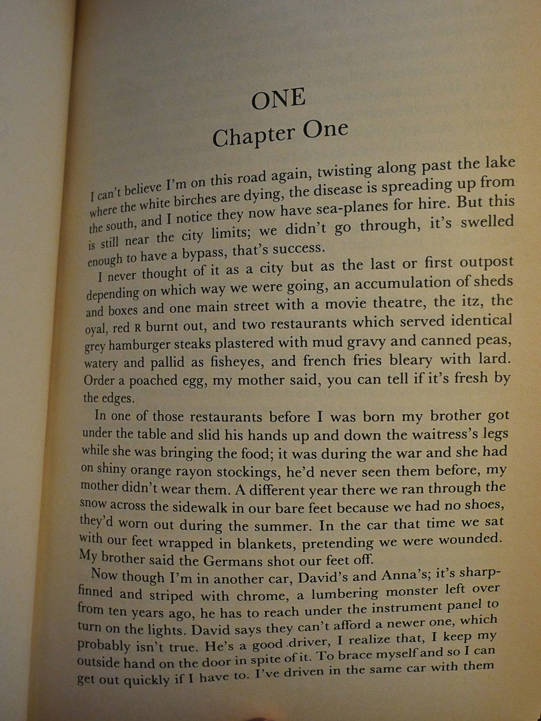
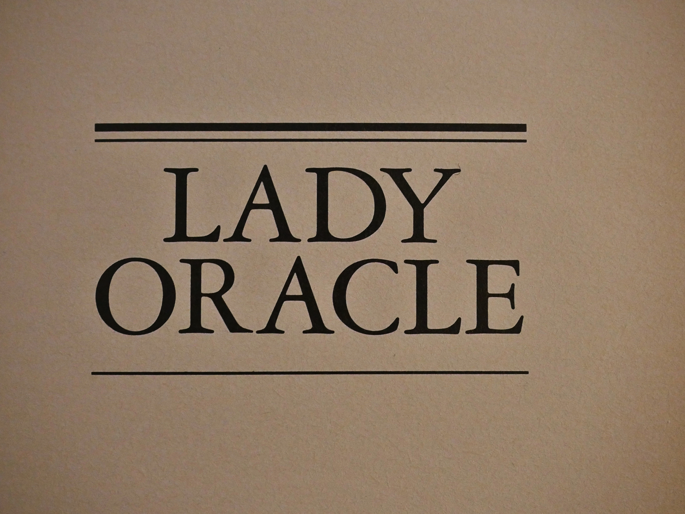
We’re getting close to the end in my quest to read my collection of oldest bought-but-never-read books, so to avoid pooling up the biggest two at the end, I’m going with the three-novel collected edition by Margaret Atwood: The Edible Woman/Surfacing/Lady Oracle that I probably bought on sale in the late 80s.
And I know exactly why I haven’t read this book before: It’s a collected edition, and I have an irrational dislike of collected editions. It’s not just that they’re unwieldy physical to hold while reading, but once I’ve read a novel, it’s so pleasant to put it away on a bookshelf where I can look at it admiringly afterwards.
With a collected edition it’s “I”VE GOT MORE TO READ?!?” Which is incredibly stupid, because I presumably bought the book because I wanted to read everything in it.
So these days I go out of my way to buy uncollected editions, even if it makes no economical sense. But back in those days I was a poor student, and I probably saw this on sale and thought OH BOY!
And now, thirty years later, I’m going to read it.
*gasp* It’s falling apart! Tsk! Virago! Tsk!
Oh, right. It’s a collection of her earliest (published) novels? This was published in the UK in 1987 on the heels of Atwood’s blockbuster Handmaid’s Tale novel. Which was also the impetus for me buying this book: I’d read it and loved it.
Let’s read the first two pages together.
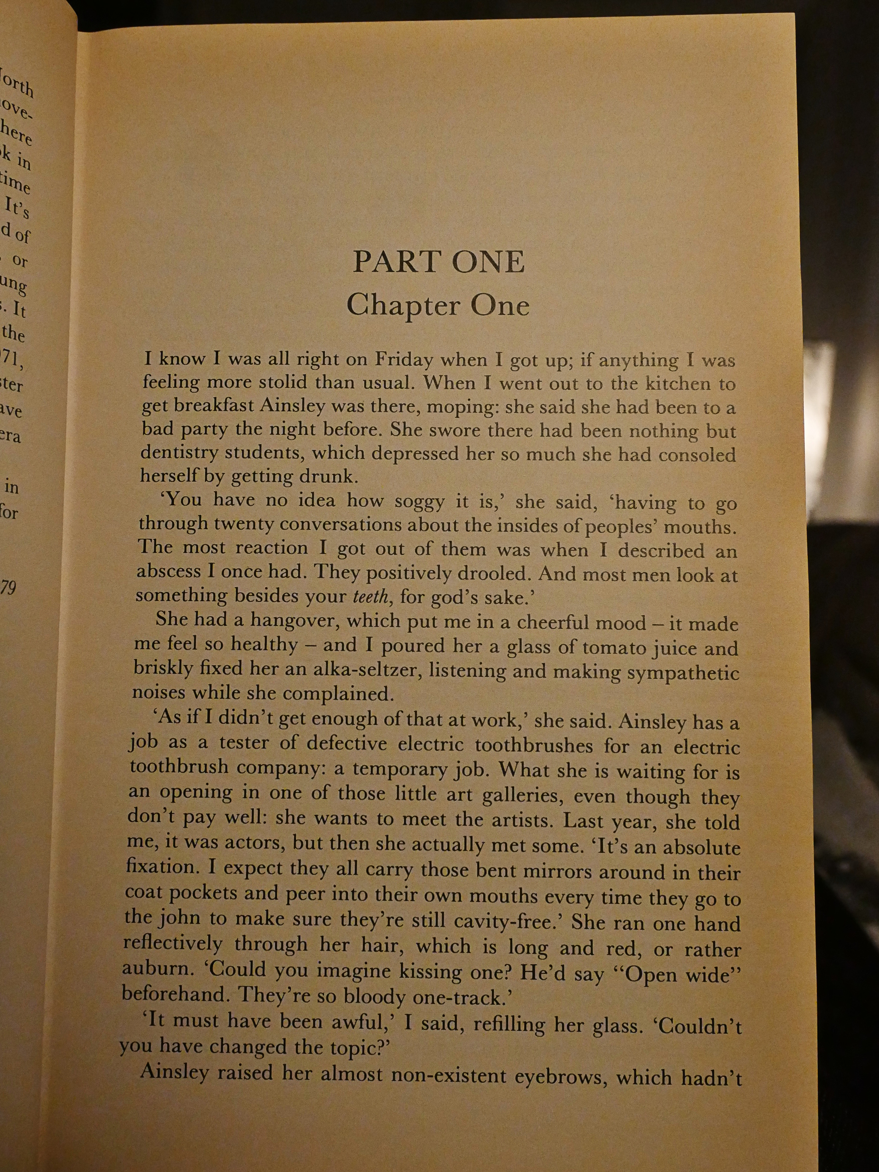
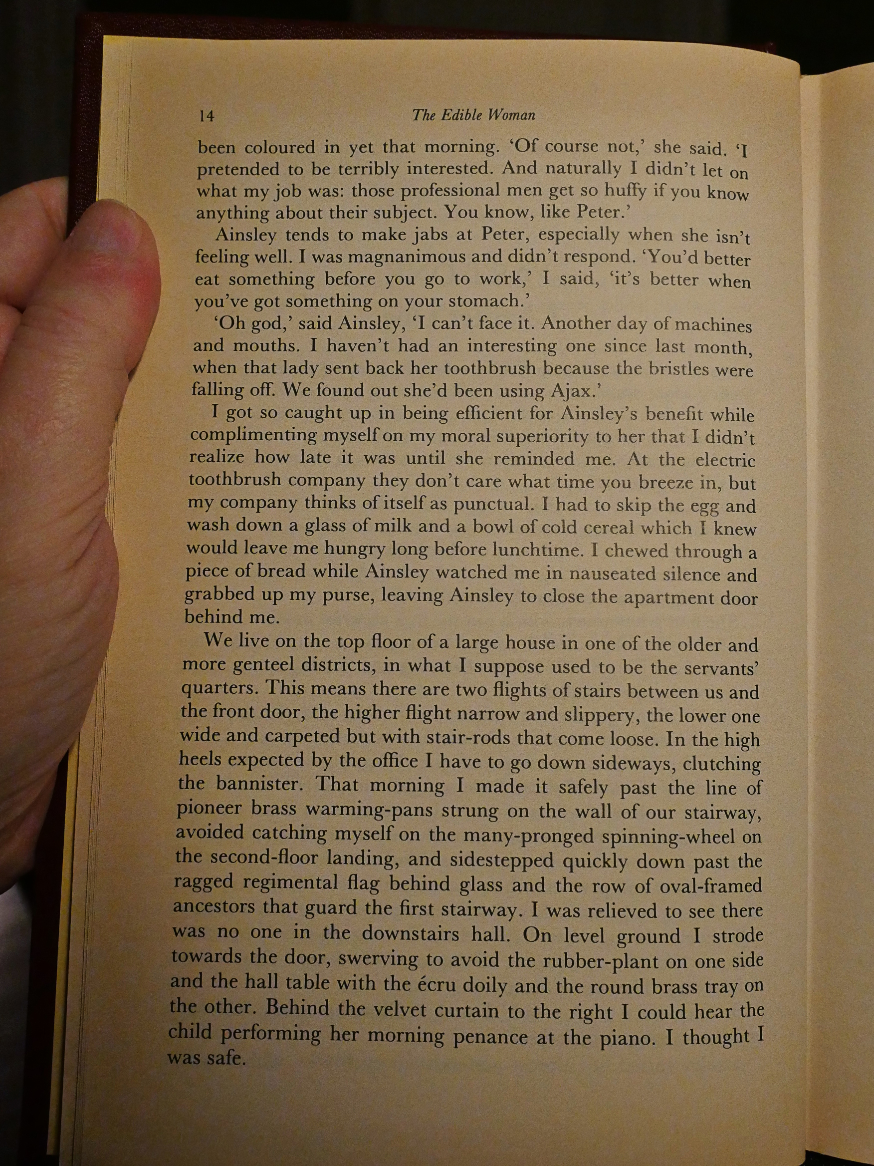
Well, that’s seems quite promising, doesn’t it? It’s as well-written as I remember Atwood being: It flows well, it’s witty and we already get some interesting character sketches.
And… it’s, like normal literature? I mean, it’s contemporary (in 1965); it’s not genre; it’s not experimental… It feels positively odd! Is this the first contemporary literary book in this blog series? Surely not!
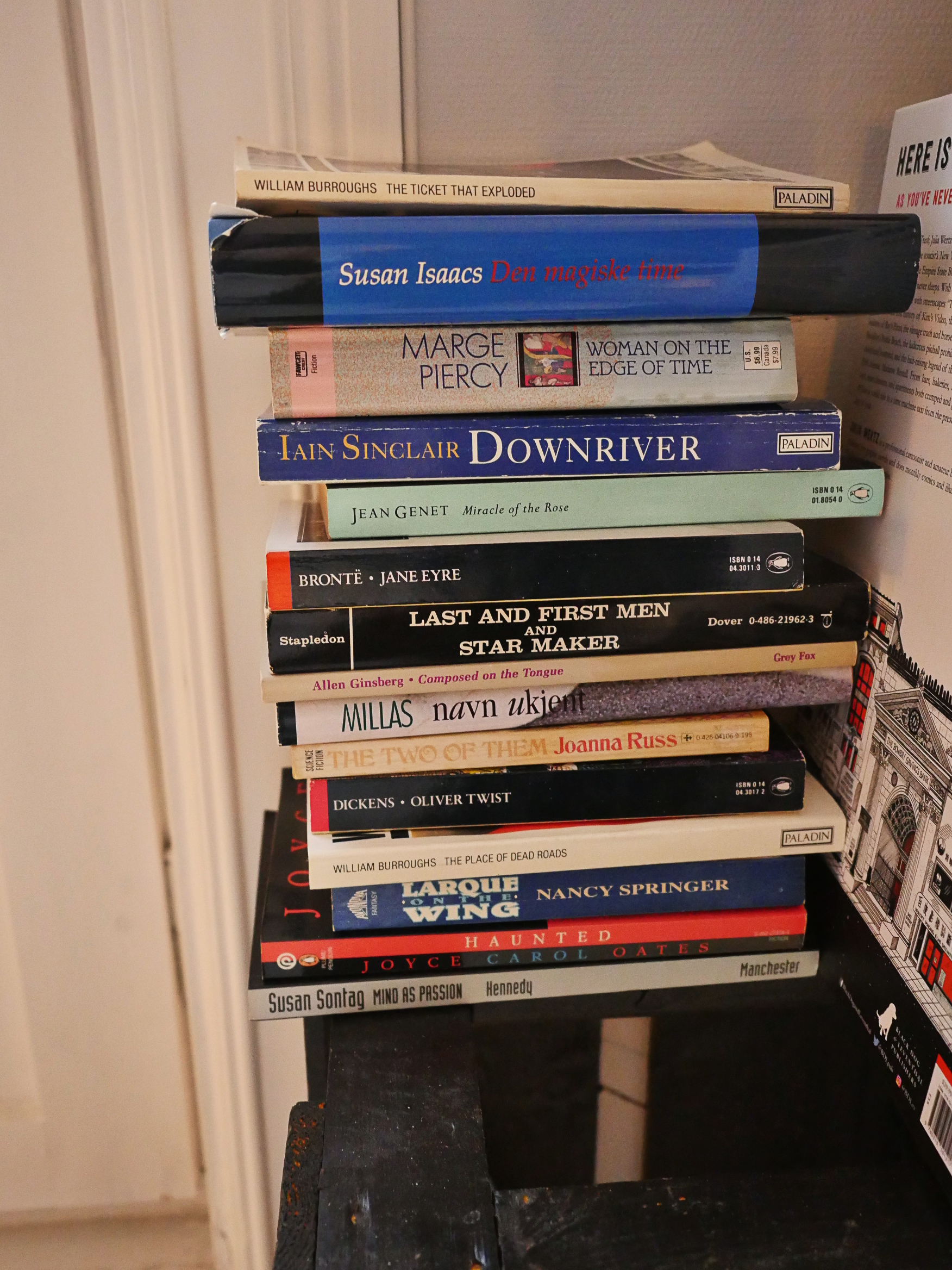
Let’s see… we’ve got science fiction (Woman on the Edge of Time, The Two of Them, Larque on the Wing, Last and First Men), horror (Haunted), mysteries (Magic Hour), avant-garde/experimental (The Ticket That Exploded, Downriver, Miracle of the Rose, The Place of Dead Roads, El desorden de to nombre), essays (Mind as Passion, Composed on the Tongue), classics (Jane Eyre, Oliver Twist)…
Yes! This is the first book of the kind that’s, like, what normal people actually read. The ones that are on the New York Times bestseller lists.
How odd. Either I just don’t buy those books, or they’re books that I don’t avoid reading. I think it’s the latter.
It’s a young writer’s book, kinda? Whenever possible, it goes for the funnier options. It doesn’t have much structure, but just seems to veer off into odd directions as it goes along. Which is both good and bad: It’s completely unpredictable.

At the start, I was thinking this was going to be a totally “realistic” story, but at times it feels like we’re going into proto magic realism territory, although nothing overtly magical happens. Instead these unnerving stabs of irreality take over, and they feel important in a scary way.
In the second section of the book, Atwood shifts to third person for no particular reason: When authors do stuff like that, it’s either because they want to be able to stop focusing on one particular character, but we remain as closely bound to Marian as ever, and partake in her thoughts just like before.
The other reason authors do that sort of thing is that they grow tired of writing “I” so much.
[time passes]
Oh! There is a reason! It’s brilliant! And it made me laugh out loud!
I should have had faith in Atwood. I mean, I didn’t distrust her, really, but I totally didn’t see that coming.
That was a thoroughly enjoyable read. It’s got some problems, but it’s a very smart novel. But I wonder what other people think of it, because it’s so original.
Man, that’s way off base:
This book though would only appeal to those that truly enjoy reading good English and are not looking for a good ending because this is where it definitely falls short.
But the writing is excellent, that’s right…
Well, that was strange. Very, very strange. Probably the strangest book I’ve ever read.
I gave it two stars because this book did create strong emotions for me, even if it was strong annoyance, and not all books do that.
Boring! Disjointed! No saving grace! Only one person in our book club liked it at all.
Other enjoyed it but noted that it was a bit dated. It was written in the mid-60s, and to me it was very easy to forget that for long periods: It felt very fresh and modern.
Well, now I’m excited to read the other two novels in this book. The next one is Surfacing, which I suspect I once saw the movie adaptation of? Let’s read the first two pages:
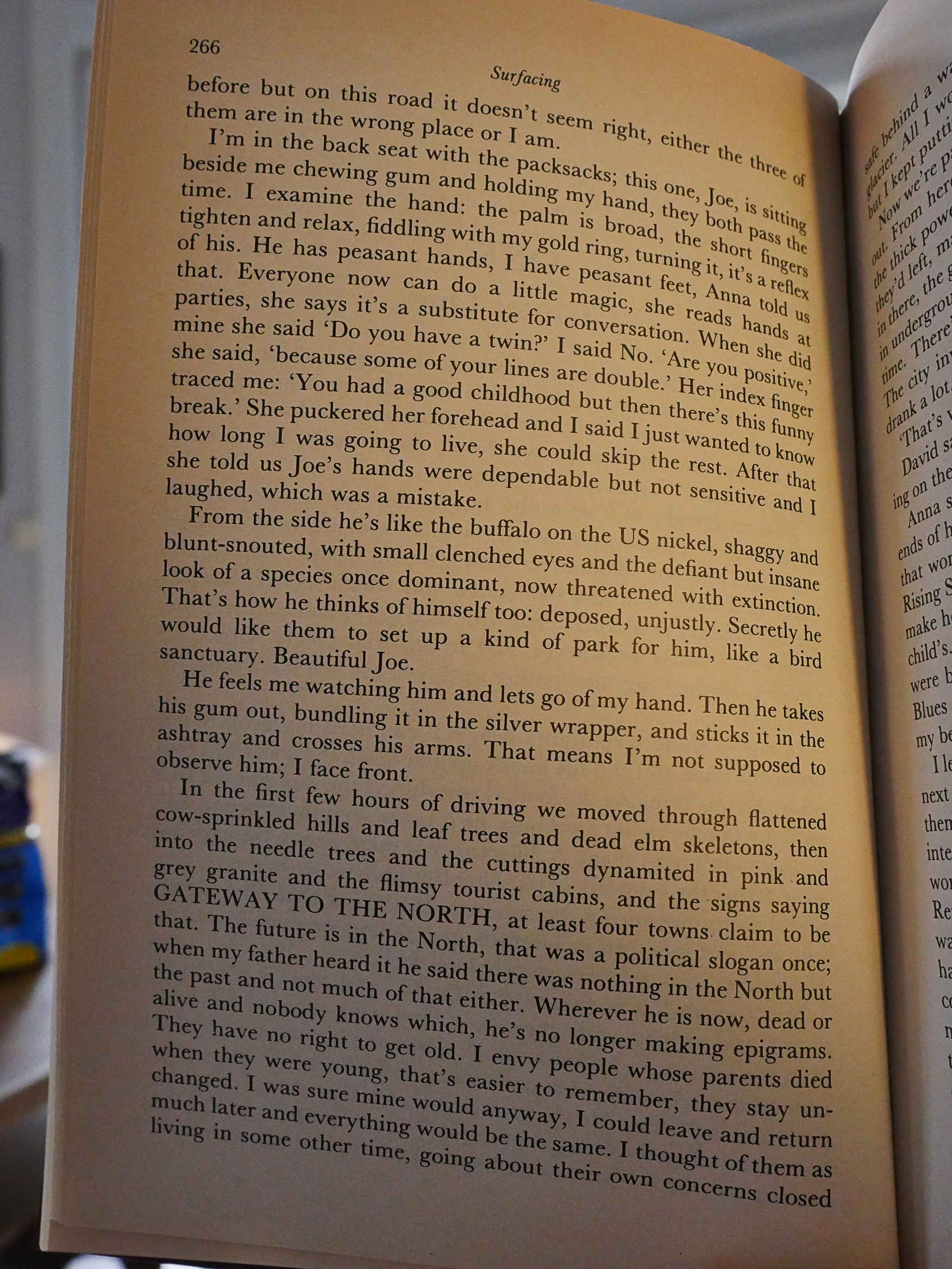
Well, this is a very different novel. The first one was selfconsciously funny, but Atwood is going for a totally different effect here: It’s more mature and observant.
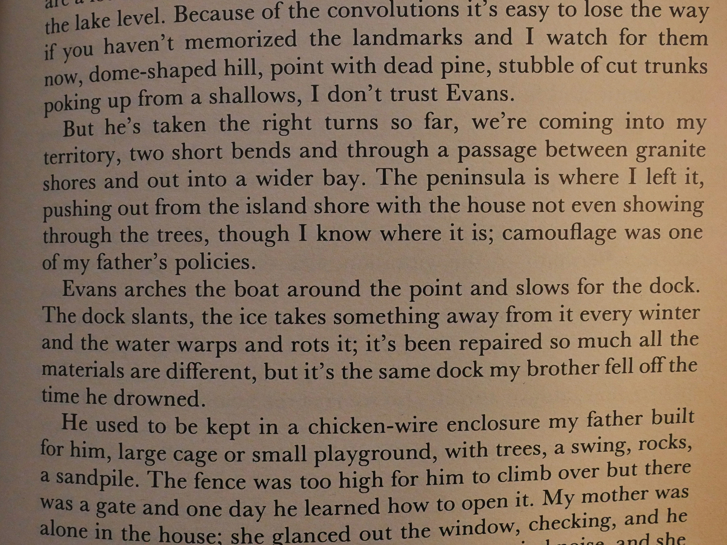
On the surface (heh heh) it’s a straightforward story of a group of people in a cabin in the woods where the protagonist is looking for her missing father. The way Atwood hints at a certain wrongness is masterful: She slowly unveils the past in a circular, oblique manner that’s riveting.
And you gotta love the undercurrent of Canadian hostility to the invading Americans.
It’s a more accomplished novel than the first one for sure. It’s got an interesting structure to it, and it’s just as well-written on the micro level. It’s just… well… more mature and smart.
But there’s less of a smart alec book, which is a shame.
But wait, there’s more!
OK, you know the drill… let’s read the first two pages together…
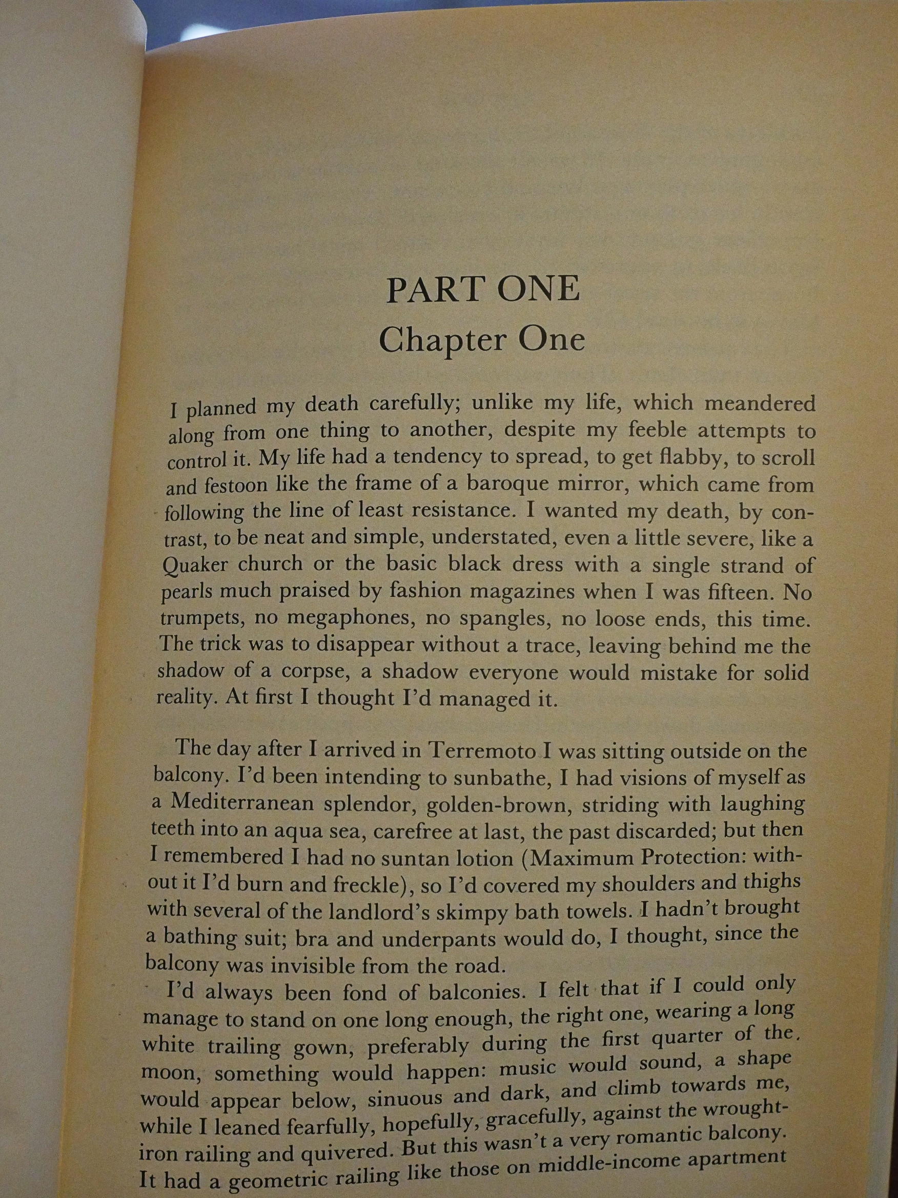
Well, that’s a way to start a novel:
I planned my death carefully; unlike my life, which meandered along from one thing to another, despite my feeble attempts to control it.
There’s a saying that if you hook the reader with the first sentence, you’ll land them. Or something. I think. And I’m totes hooked.
The first bit of the novel is fascinating and original. It’s not surprising that Atwood continues to grow as an author, and that’s what she does: This feels even more true and honest than the previous book.
But once we get to the flashbacks to the protagonist’s childhood, I felt the book lost something. It’s not that these are bad flashbacks or anything, but it feels like something I’ve read so many times before, while the stuff that happens “in the present” felt very fresh and exciting.
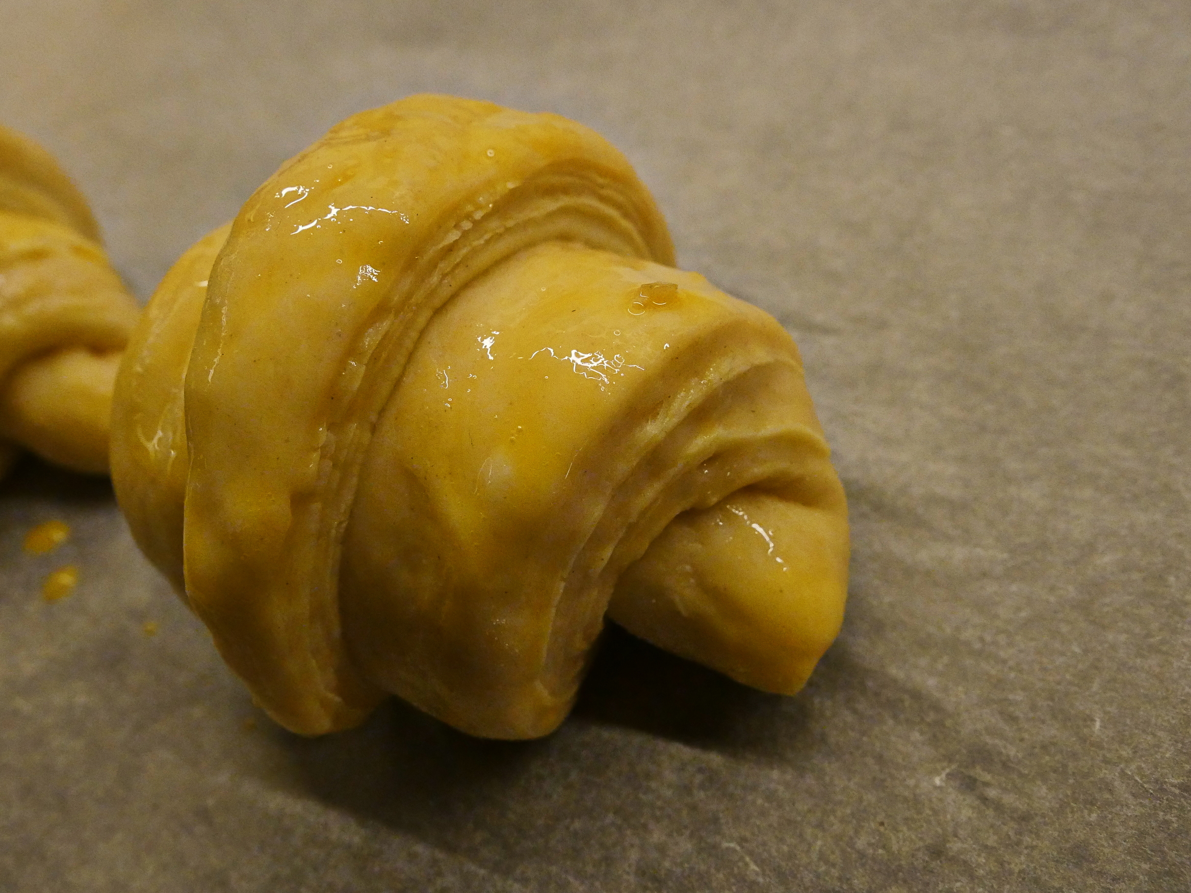
Oh, but I have to bake the croissants. Splash some egg wash over them…
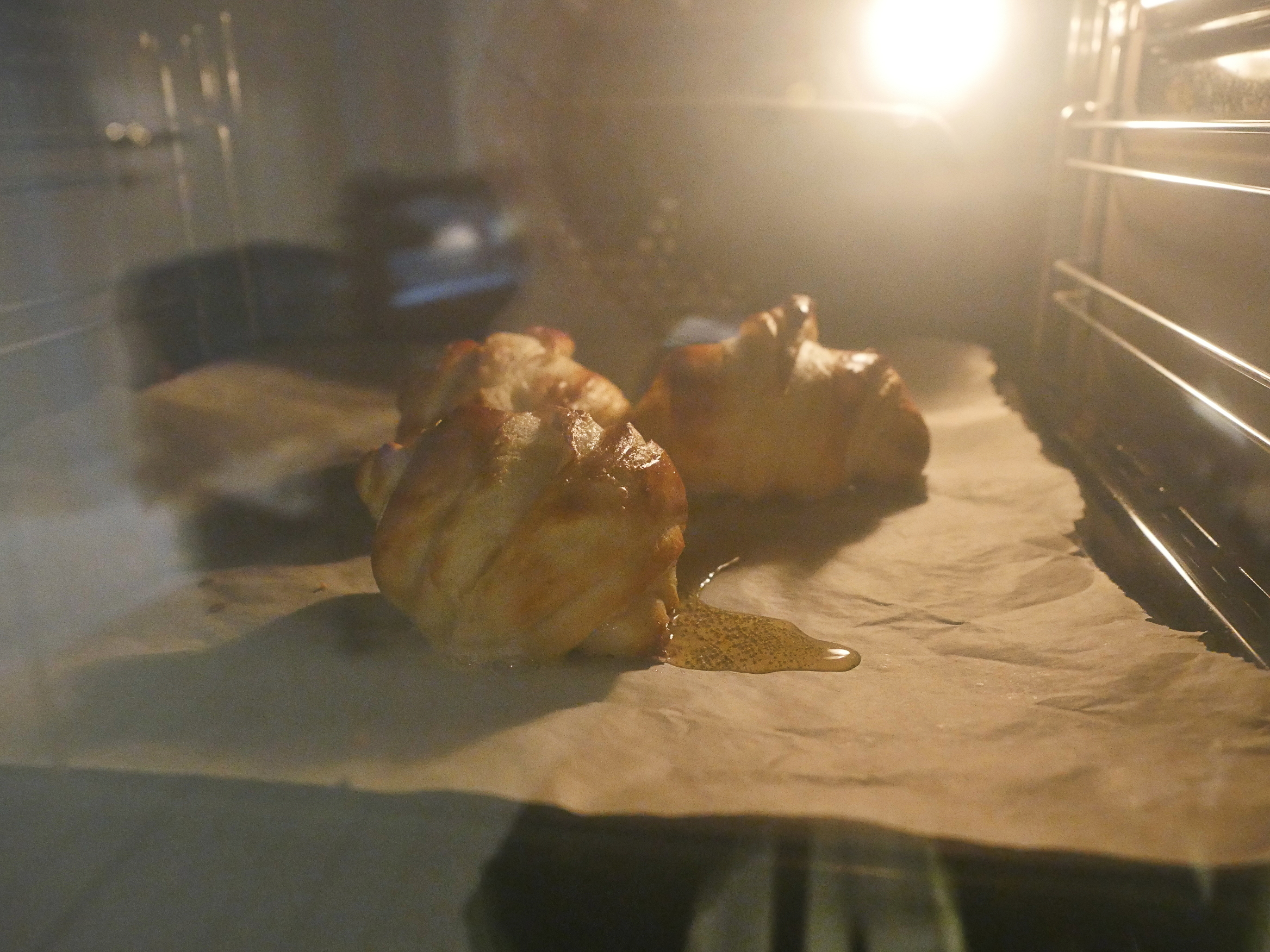
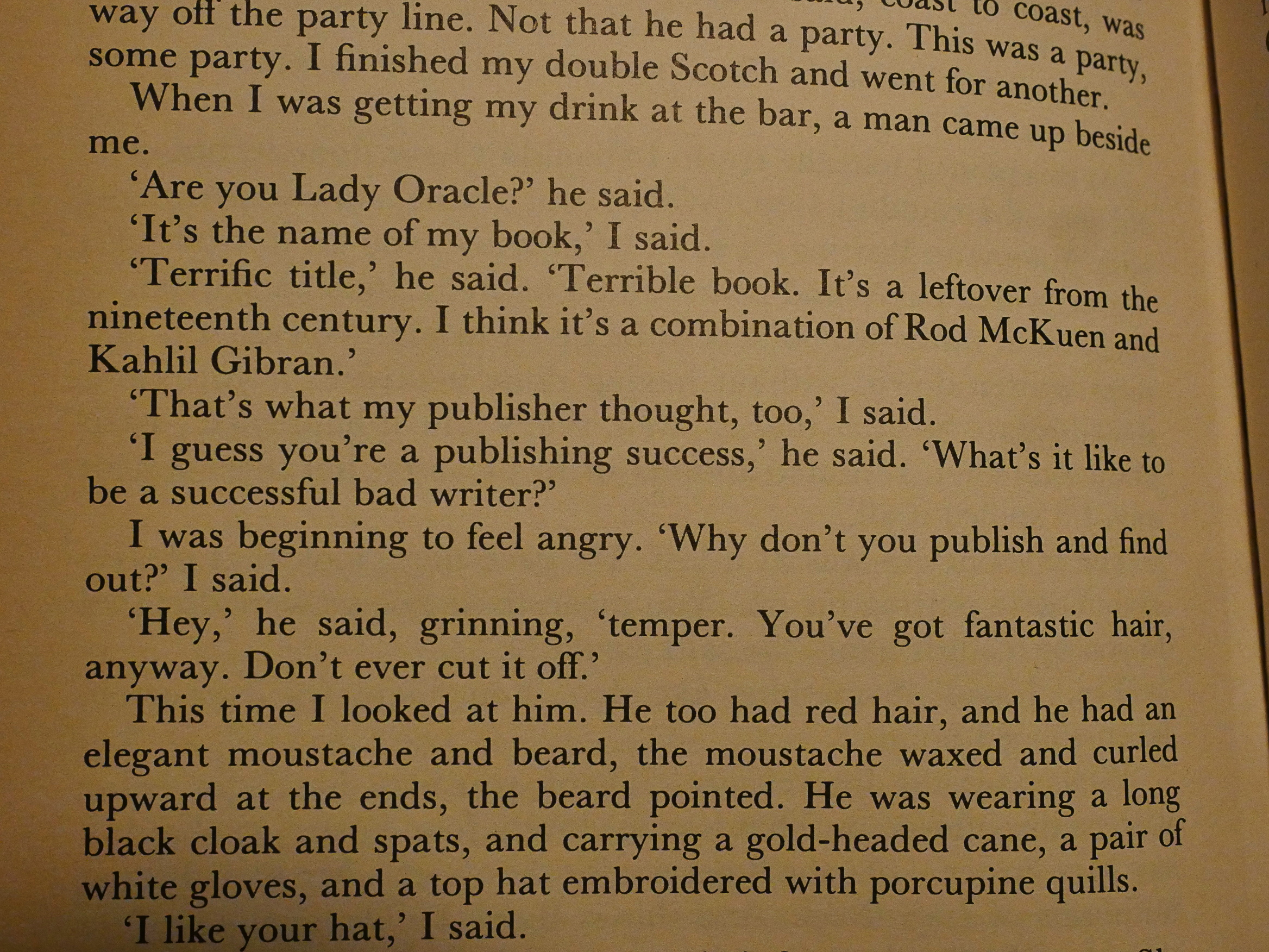
Hm… they’re… bigger than I thought they would be.
Oops. Is that going to be raw on the inside?
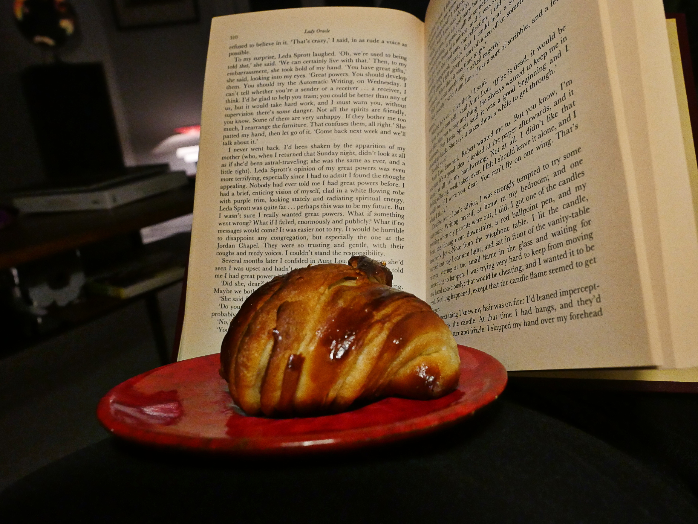
Let’s eat some while reading Lady Oracle.
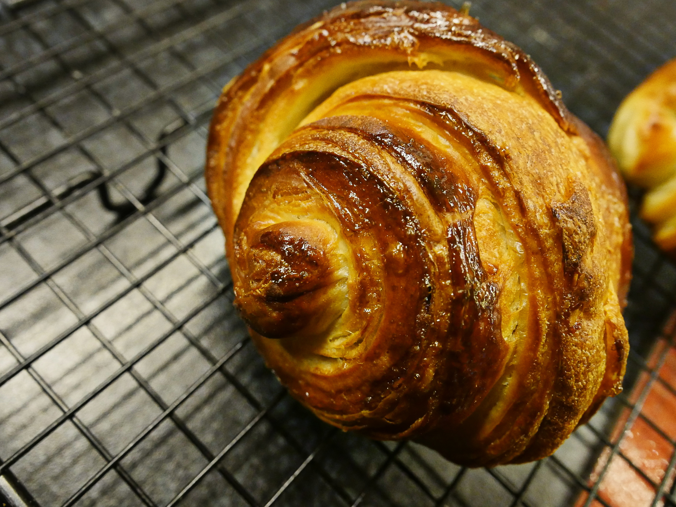
Well, it’s not actually raw, but it doesn’t look quite right. Some of the butter leaked out while baking, and the flavour isn’t better than “eh”. I’ve got some more dough, so I think I’ll make some smaller ones…
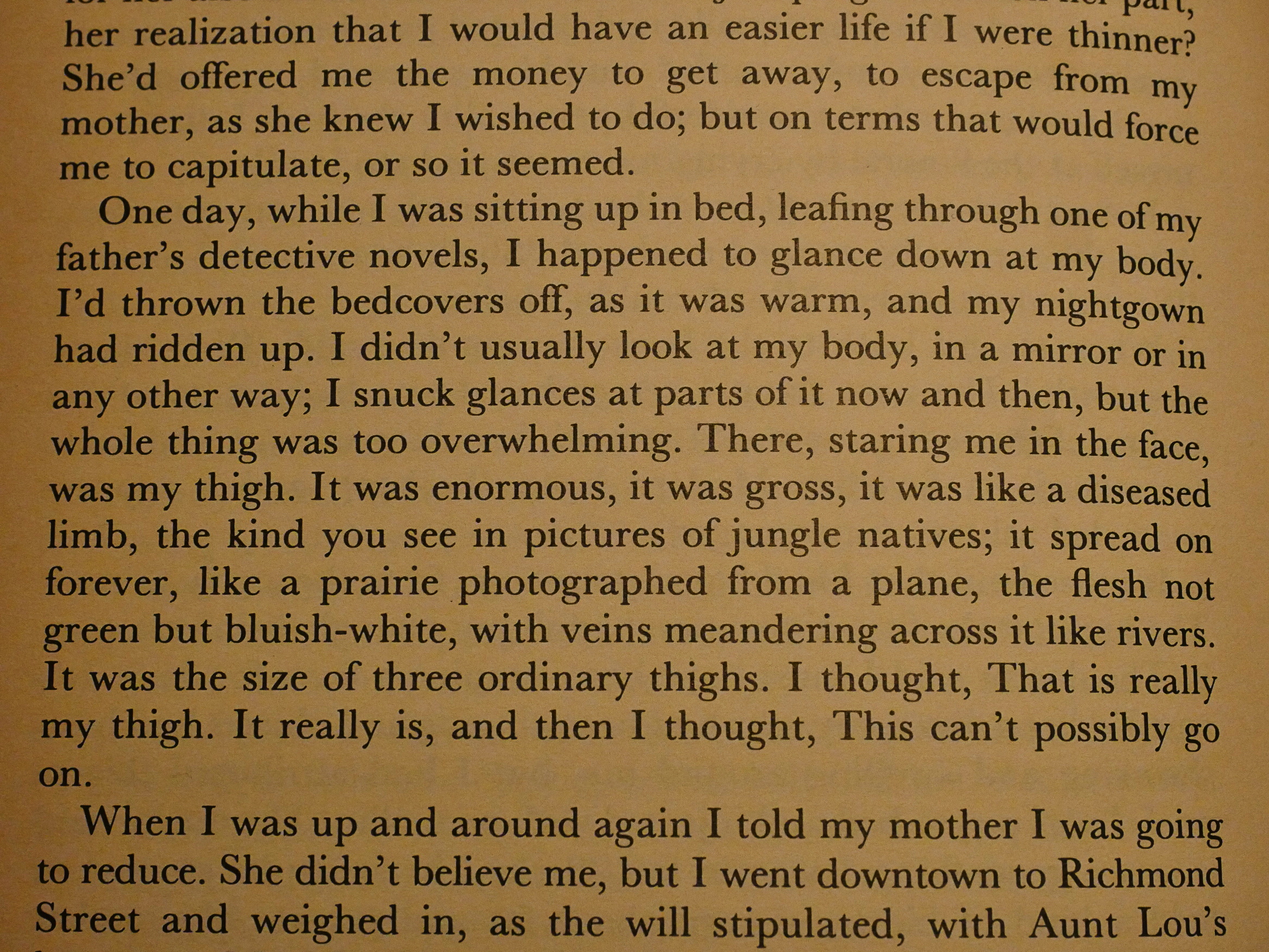
A lot of Lady Oracle deals with the author being fat as a child and a teenager, and it’s put in a way I think would make some people wince these days.
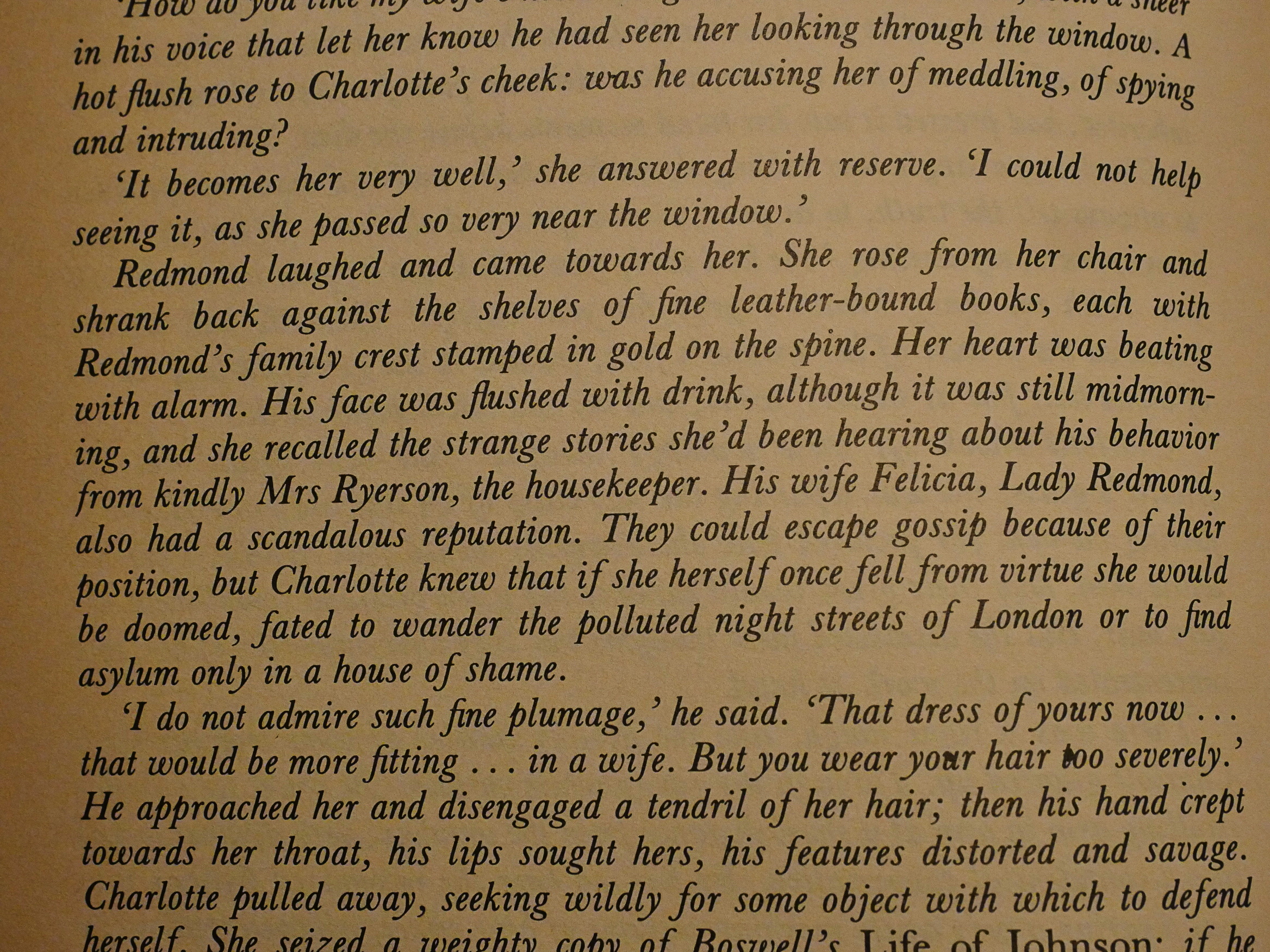
It’s a somewhat meta novel: The protagonist writes a book called Lady Oracle, but also writes a whole bunch of Gothic Romances, and we get some excerpts from them. They’re hilarious: Atwood gets them down to a T, what with the extraneous descriptions of… everything, and the overwrought drama.
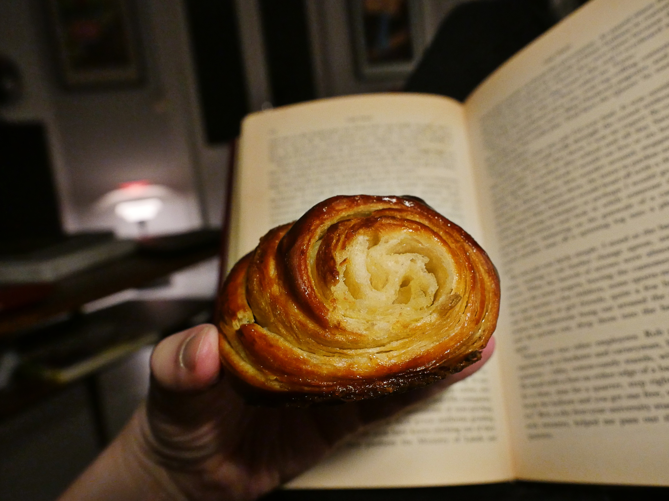
OK, next day and smaller croissants.

Hey, that’s better! Fluffy on the inside; flaky on the outside. But I have to admit: These just aren’t the best croissants of the world. I think I fucked up the recipe.
Oh, well.
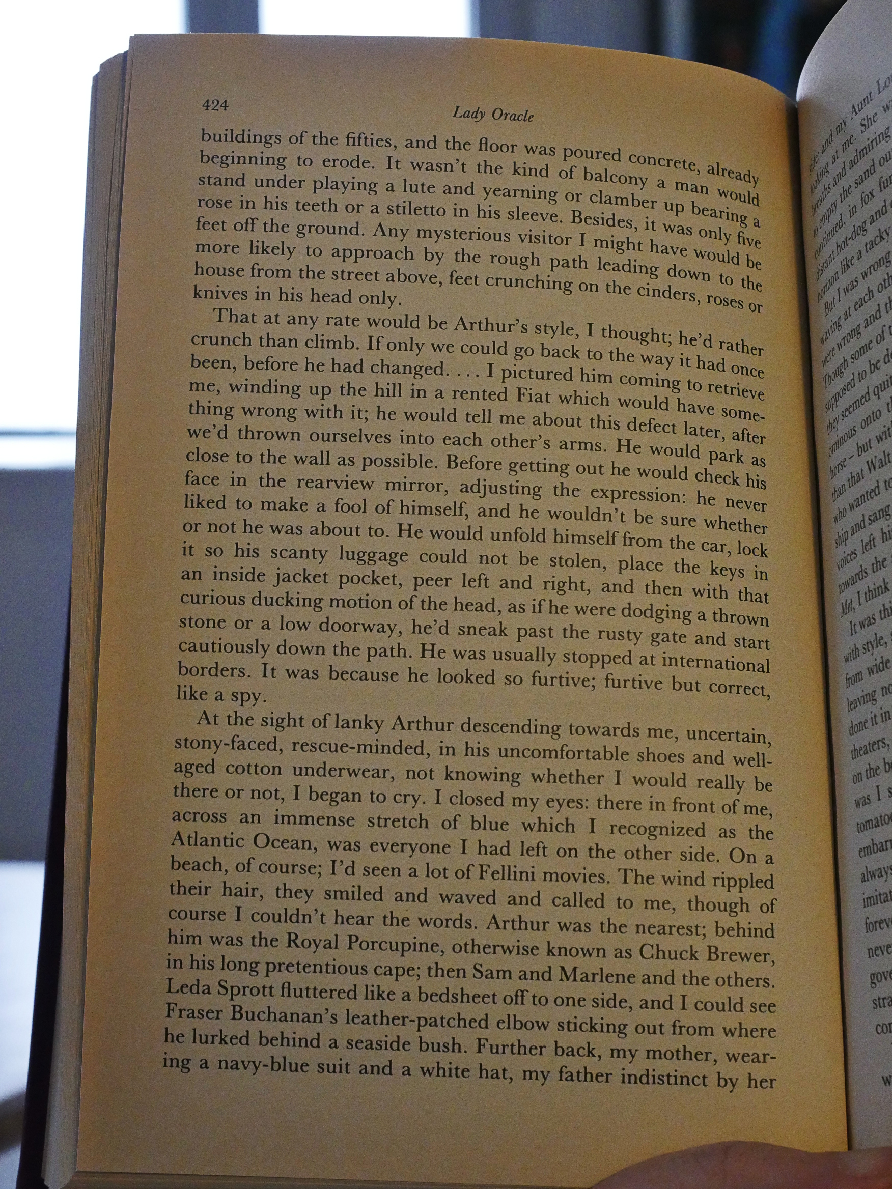
Back to the novel again: It’s the longest one in the book, and it seemed so well-structured at first. You’ve got the protagonist in Italy, “dead”, thinking about her past and writing more Gothic Romances. But as things progressed, they, er, didn’t. Progress, that is. Instead it reads like if Atwood was just winging it, adding one funny scene and one preposterous character after another.
It’s not that it’s not ever not unfunny (is that the correct number of negations?). Atwood always write well, and when she wants to be witty, she’s witty. And she wants that here. But two thirds in I found myself going “oh no, not more. NOT MORE!” It just doesn’t hold structurally.
I admire the way she’s able to swerve in one direction and then another, surprising the reader totally, but at the end there, it was just too abrupt. I was like “eh? eh? Was this whole book just a joke? A long improvisation over some funny themes?”
It’s the least satisfying of the three novels that way, although it’s a fun read.