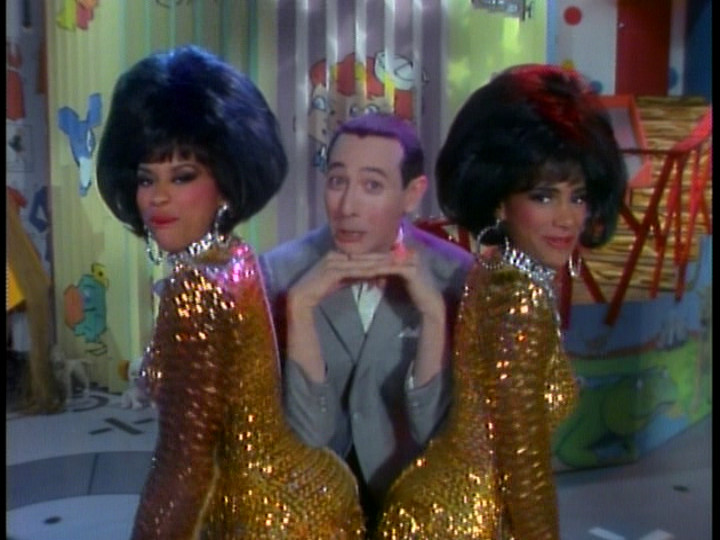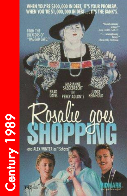
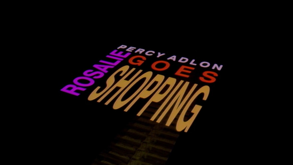


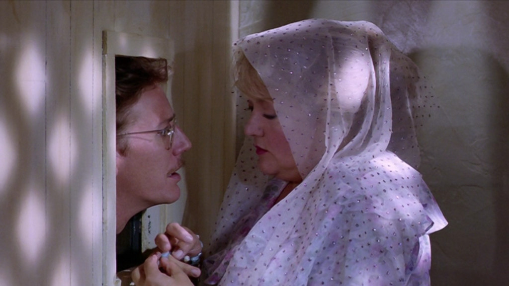
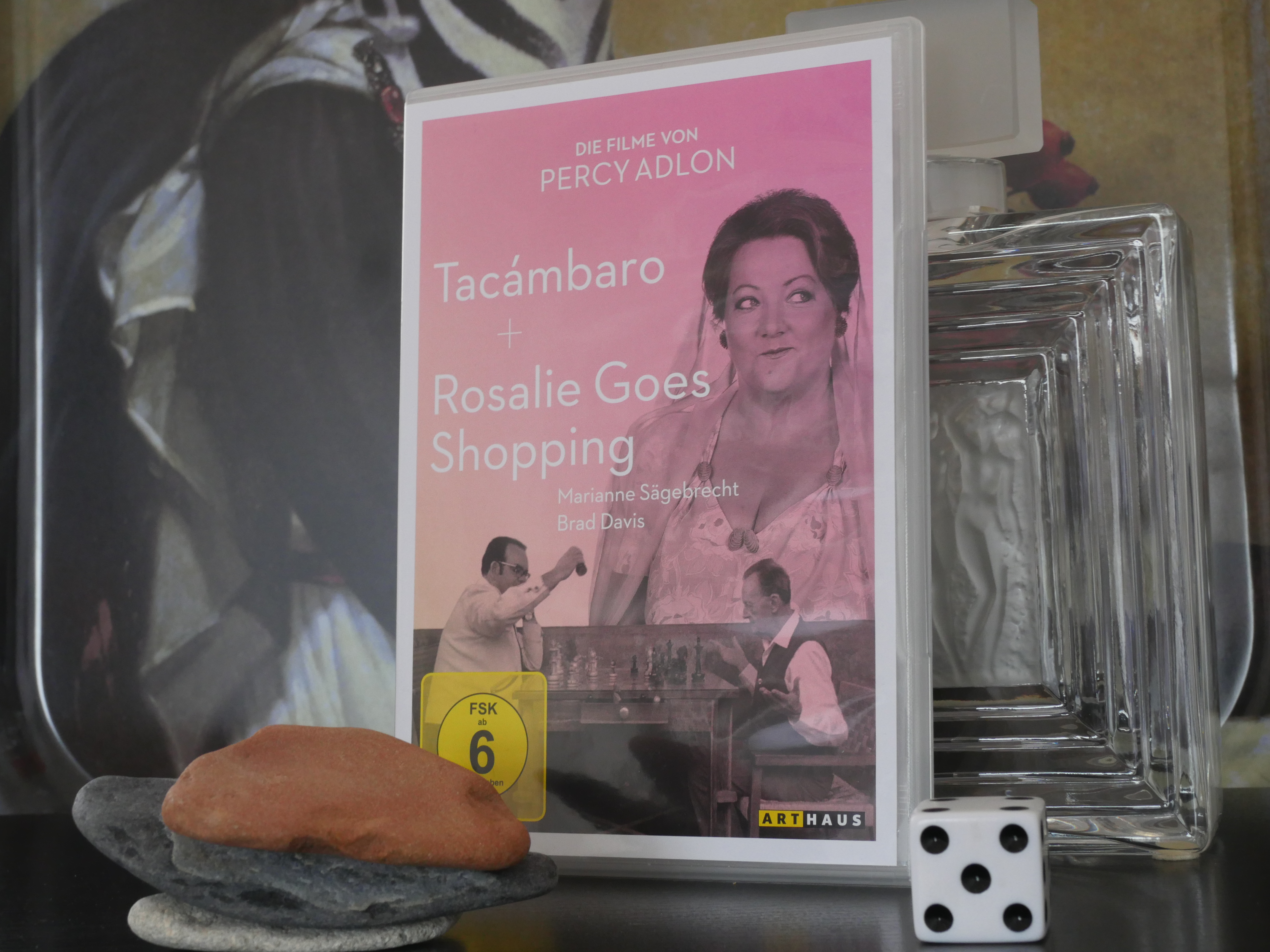
Rosalie Goes Shopping. Percy Adlon. 1989.

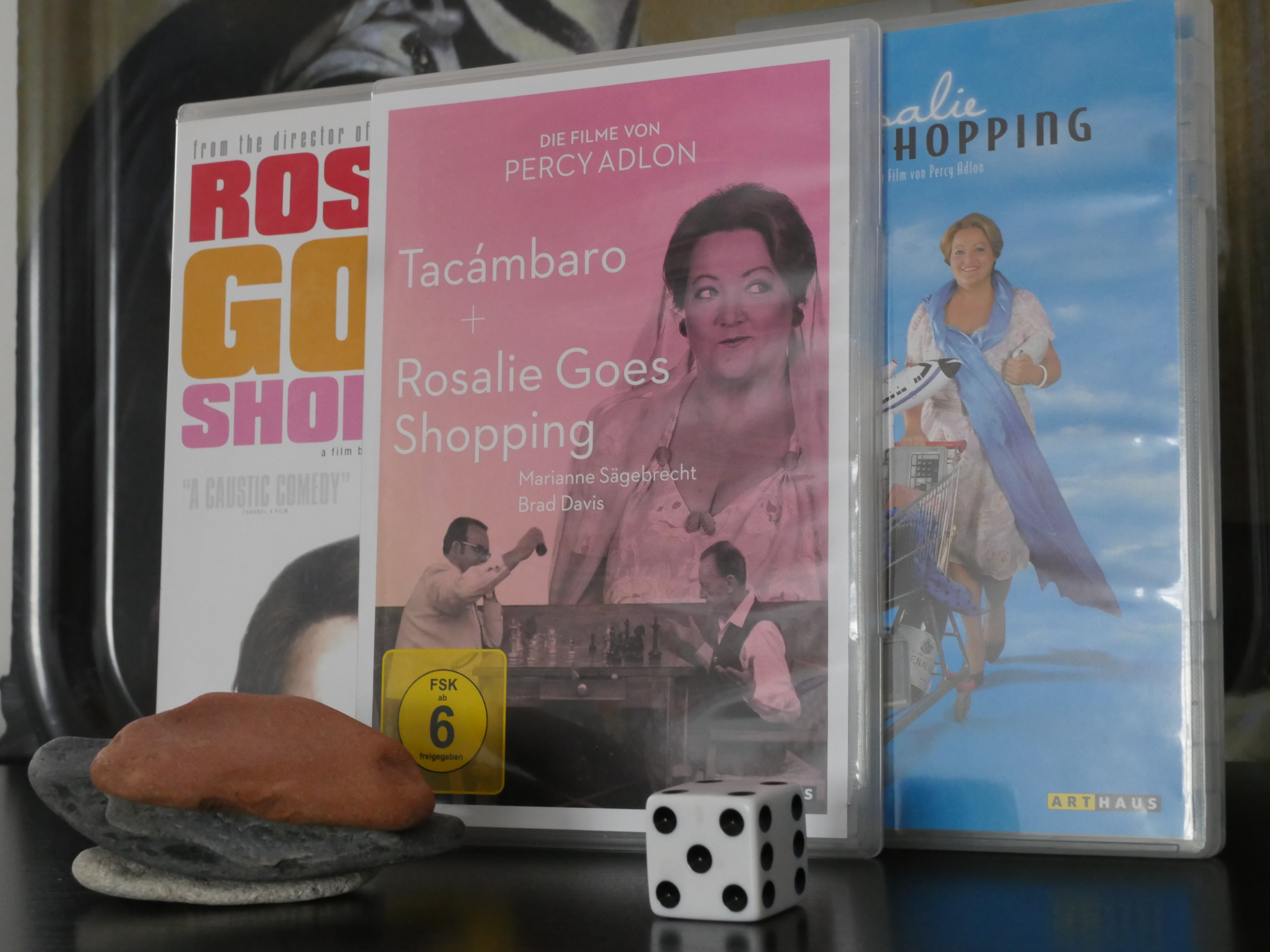
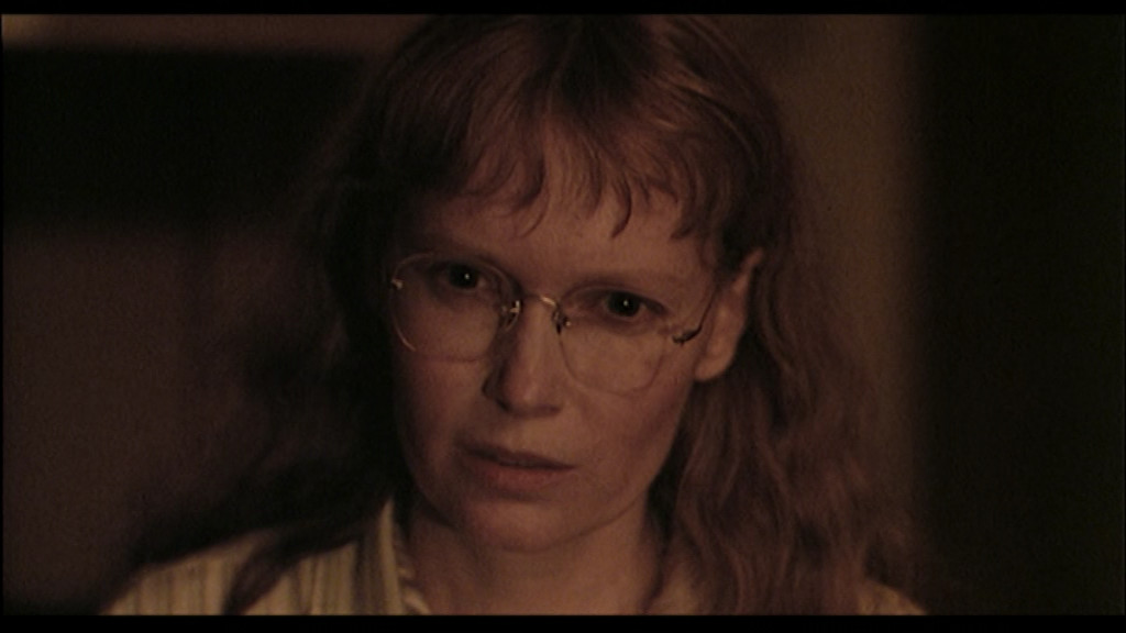
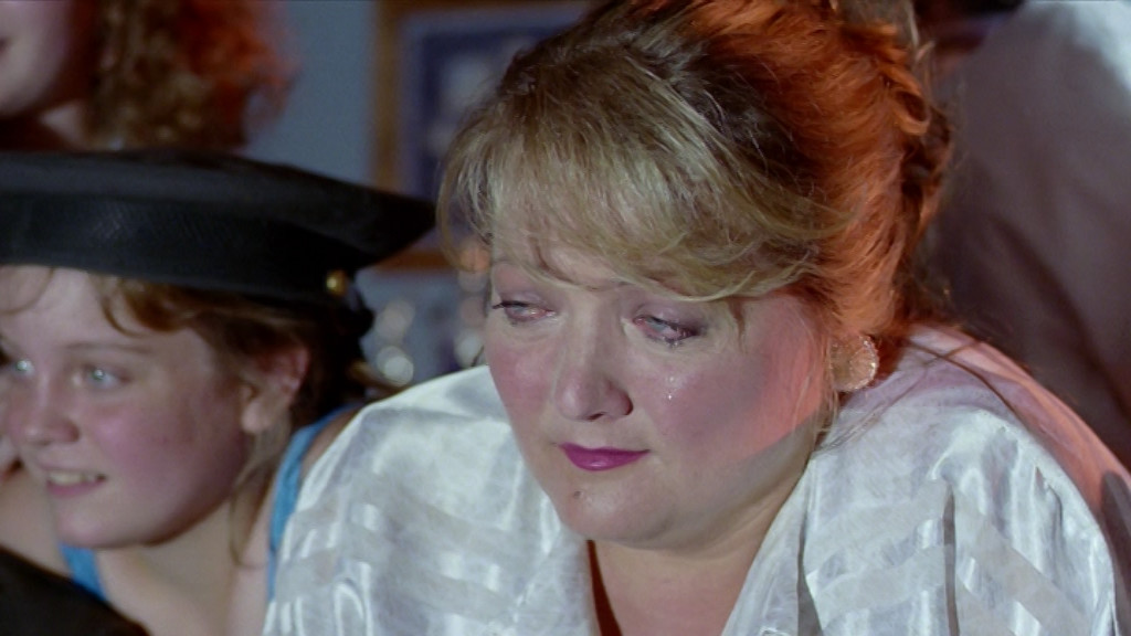
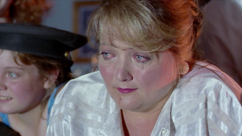
This is one of the less-than-handful of films from the Percy Adlon DVD box set I bought that I can actually watch (most of the rest are in German without subtitles in any language I understand), but, oh, what a film. I remember watching this when it was new and being absolutely transfixed. Not as mesmerised as I was by Adlon/Sägebrecht in Zuckerbaby, but it’s still a pretty special film.
And I apparently bought it three times on DVD.
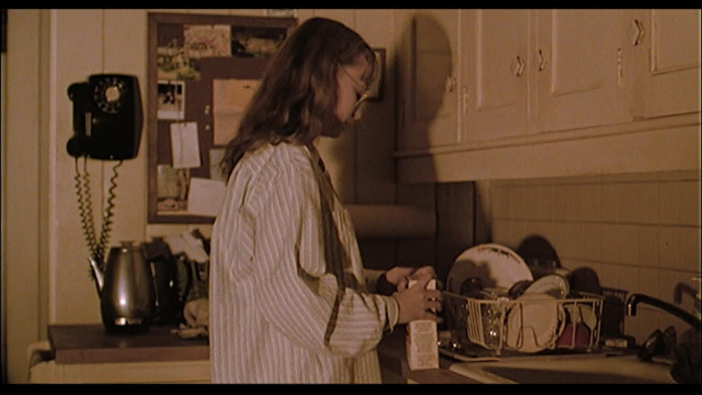
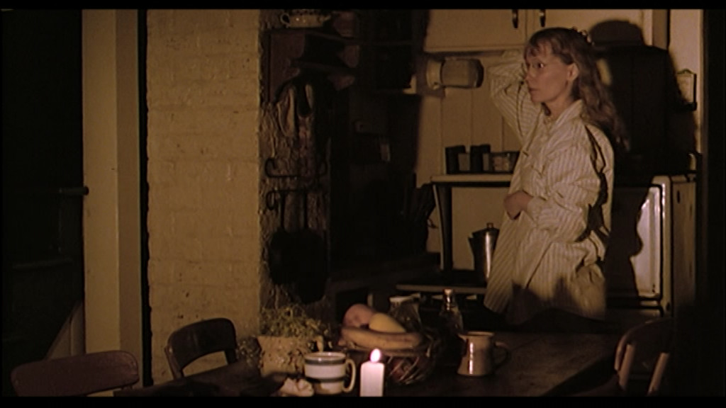
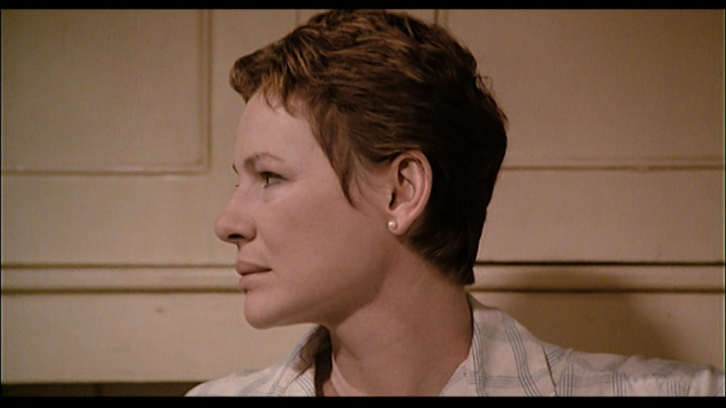
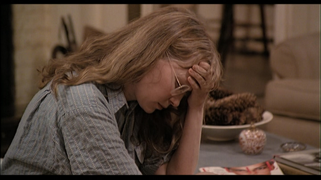
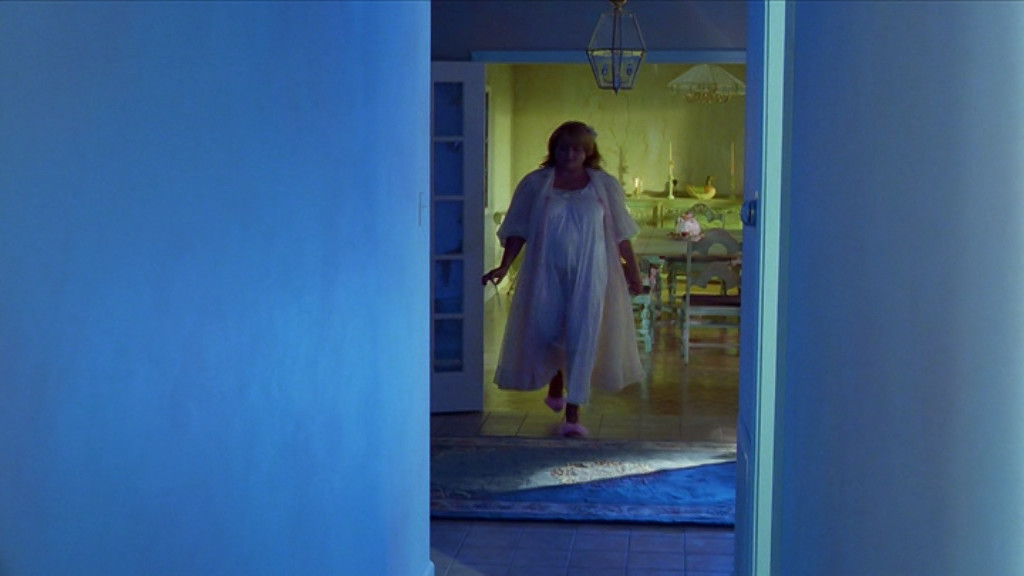
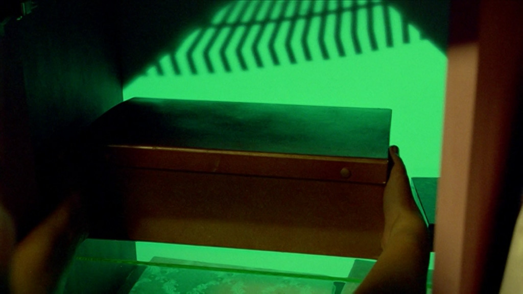
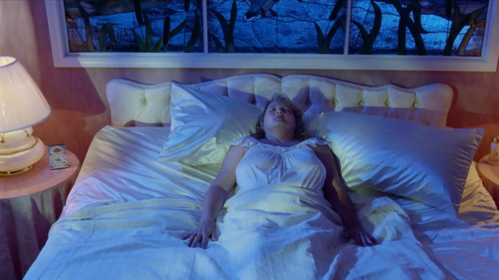
It’s quite similar to that film in some ways. Of course, this one is set in the US and is in English while Zuckerbaby was in Germany and in German, but it’s got that somewhat heightened reality thing going on: The colours are a touch too vivid and the people are a bit more extreme than in reality.
I love it to bits.
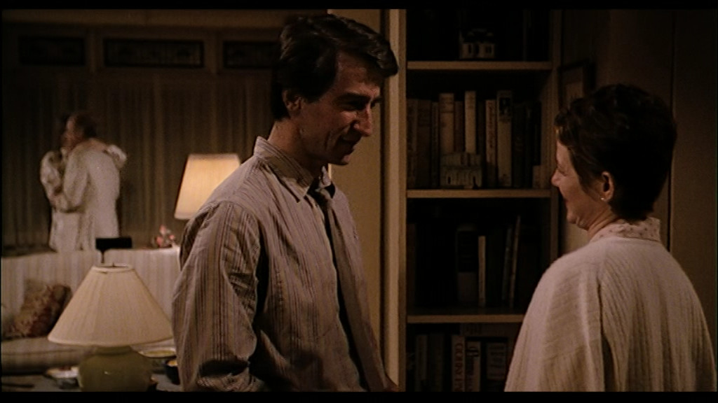
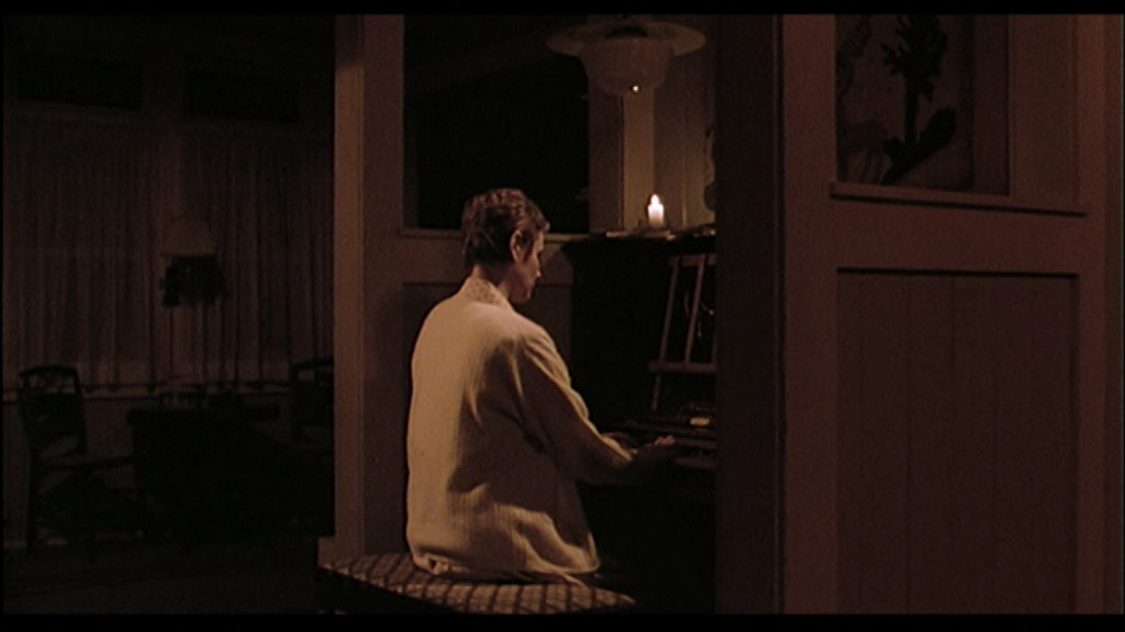
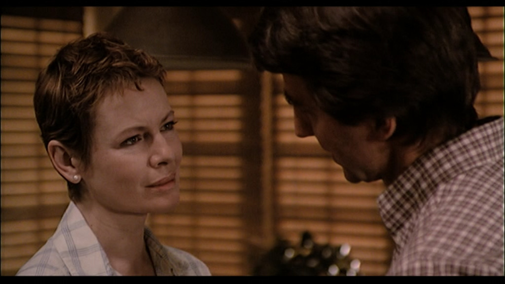
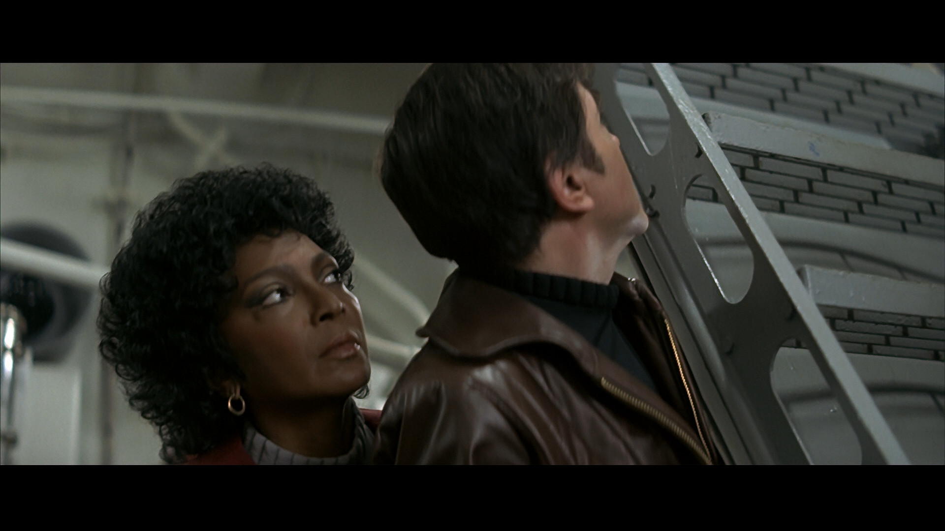
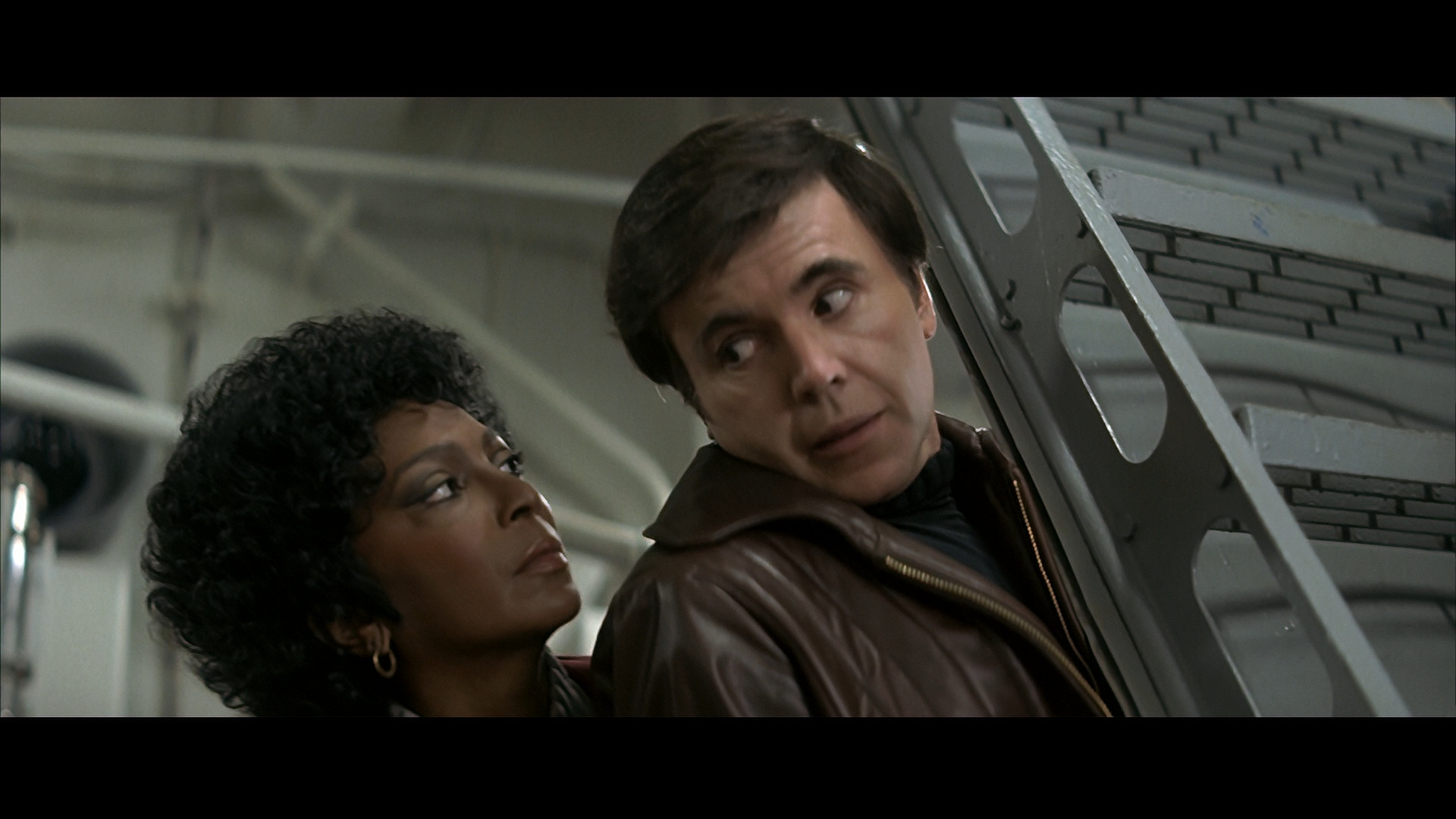
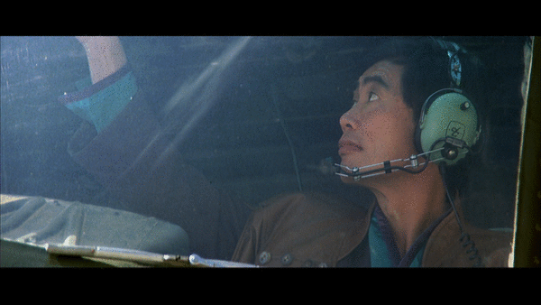
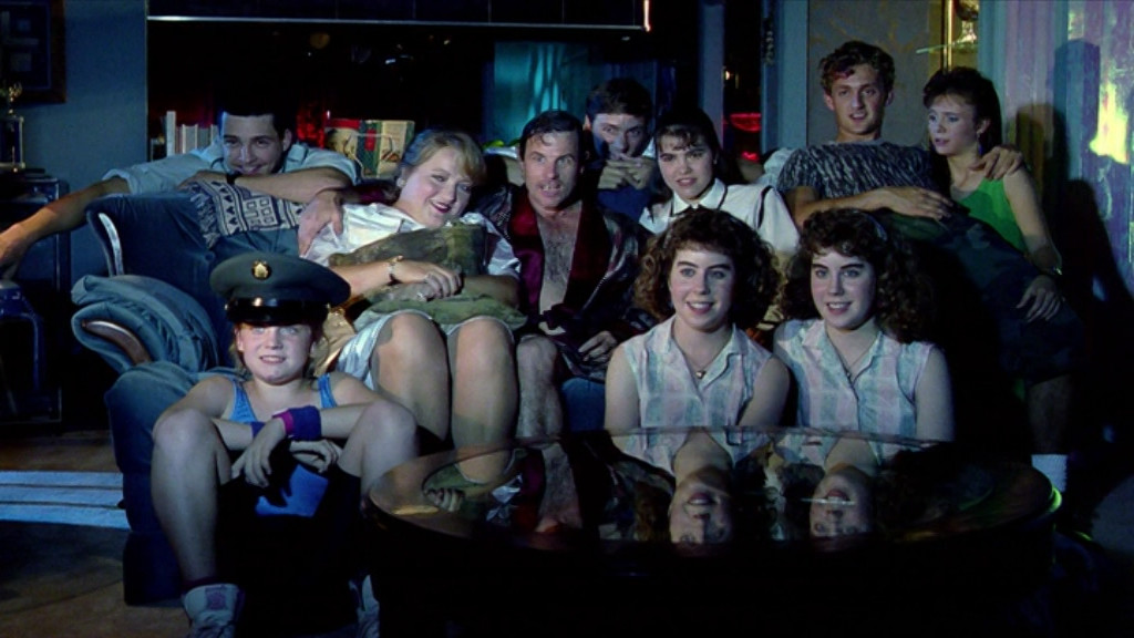
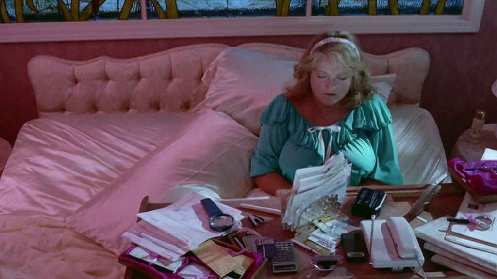
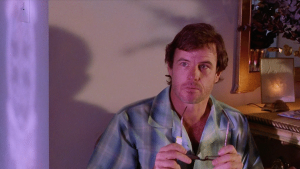
And did I mention that Brad Davis is in this? Brad Davis is in this.
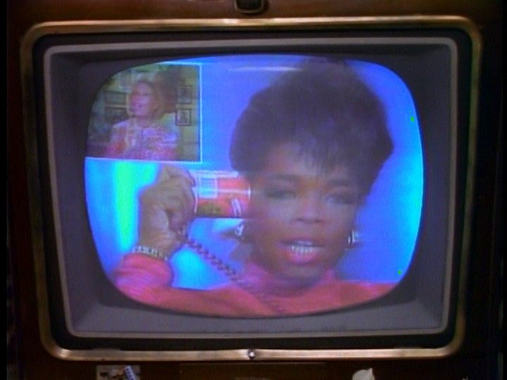
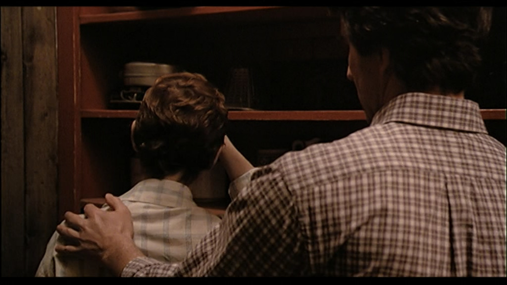
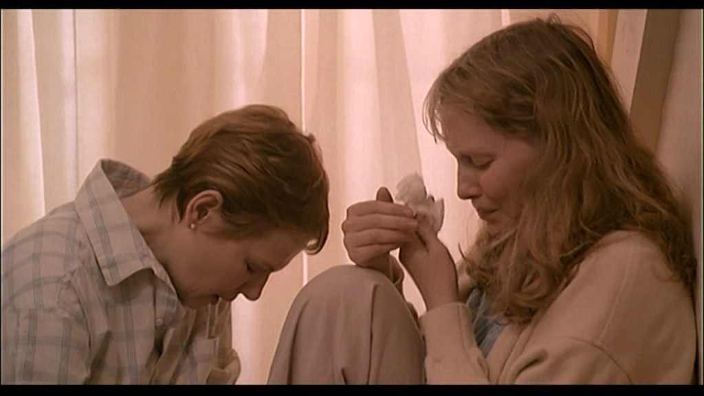
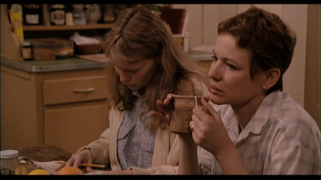
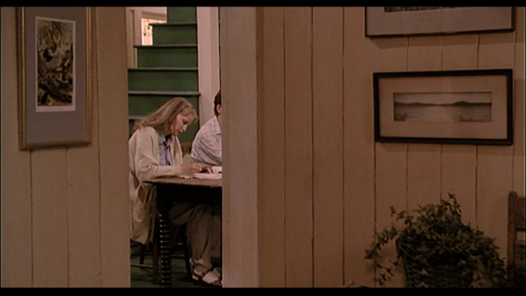
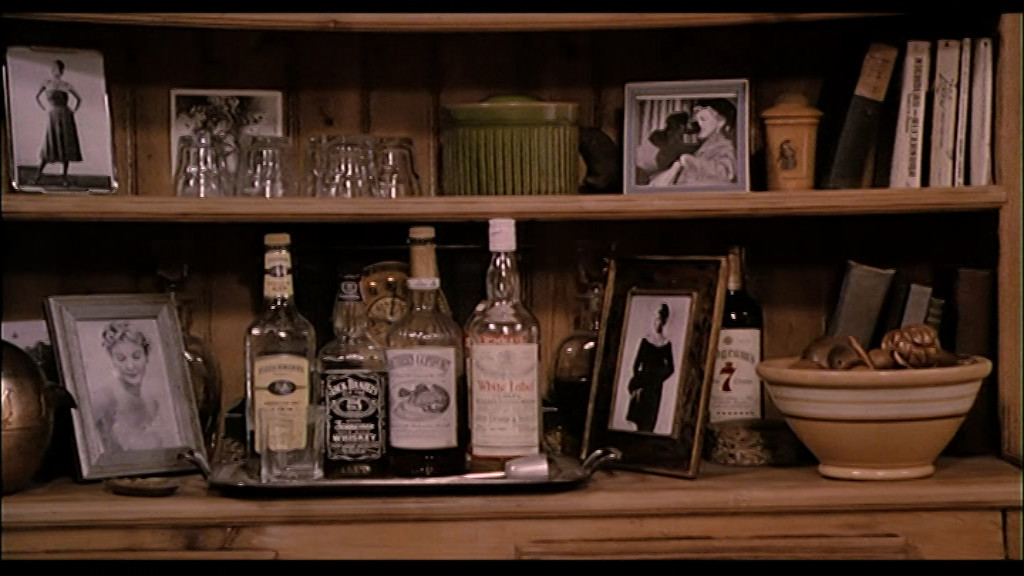
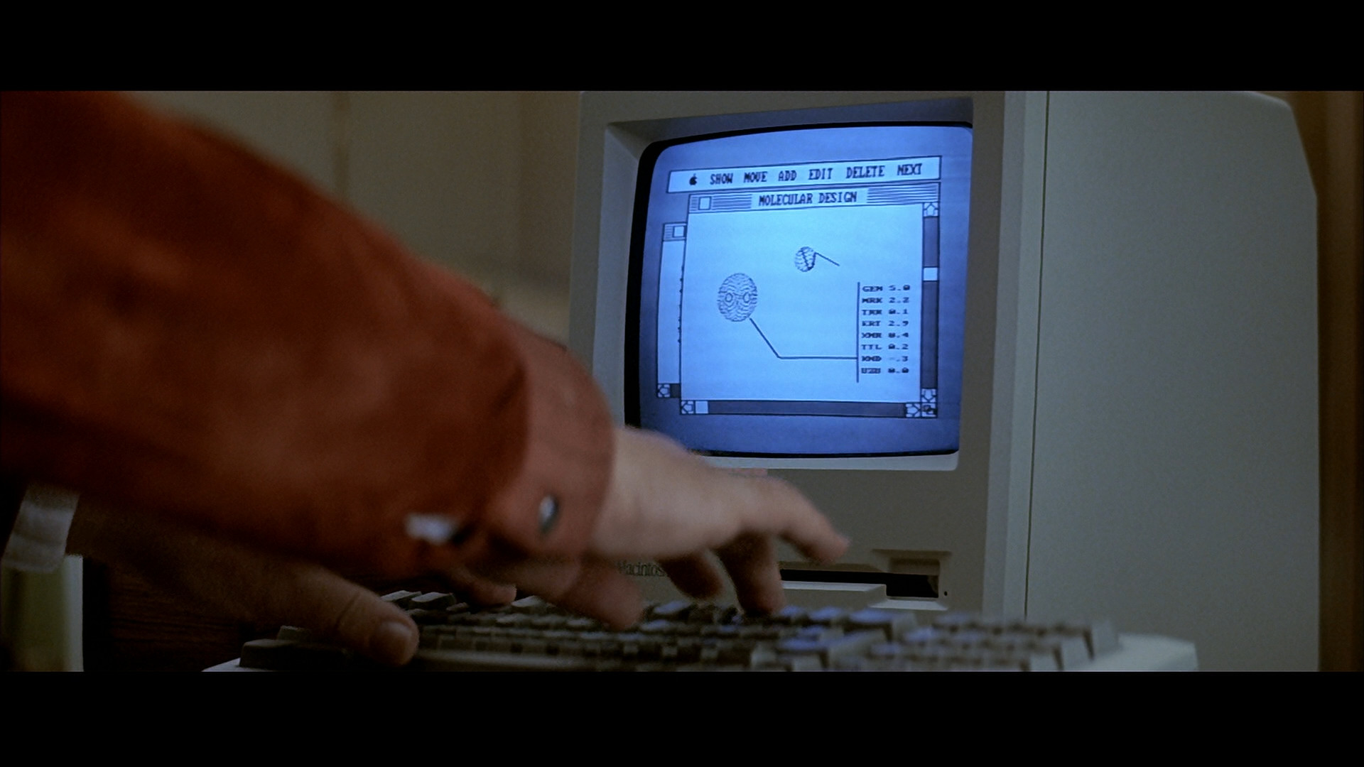
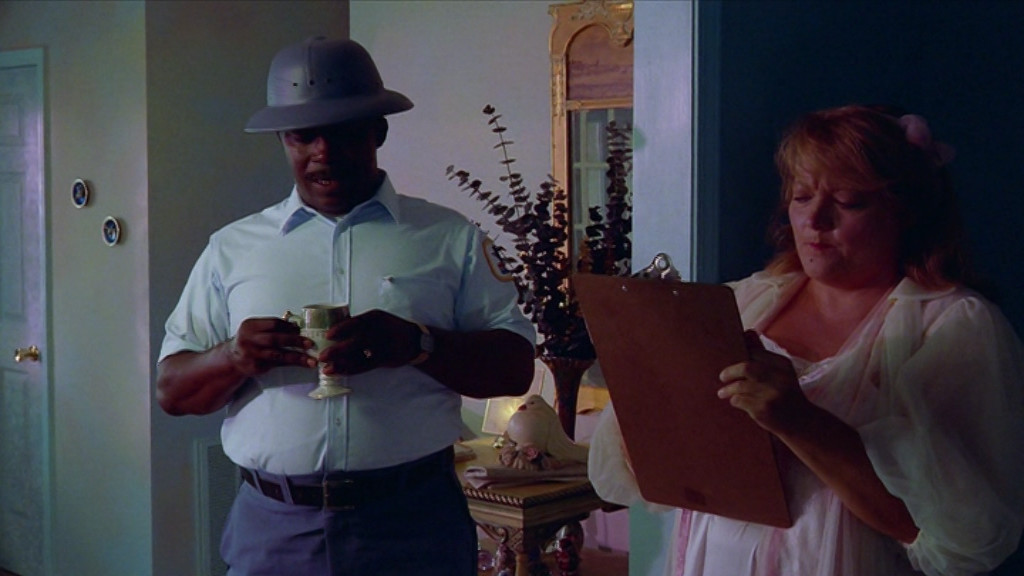
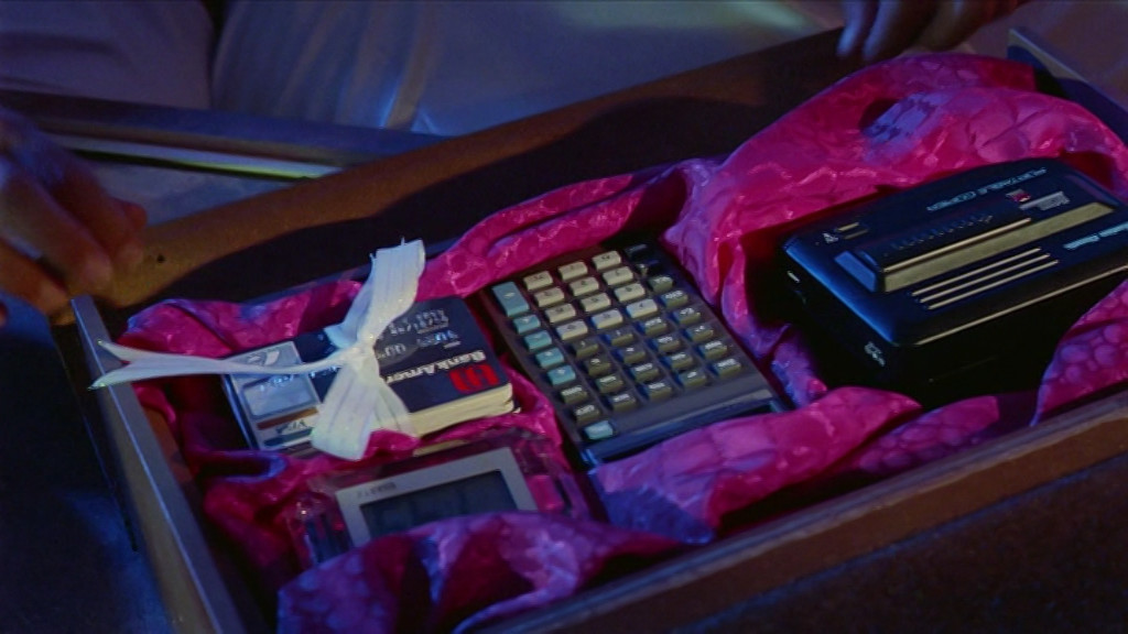
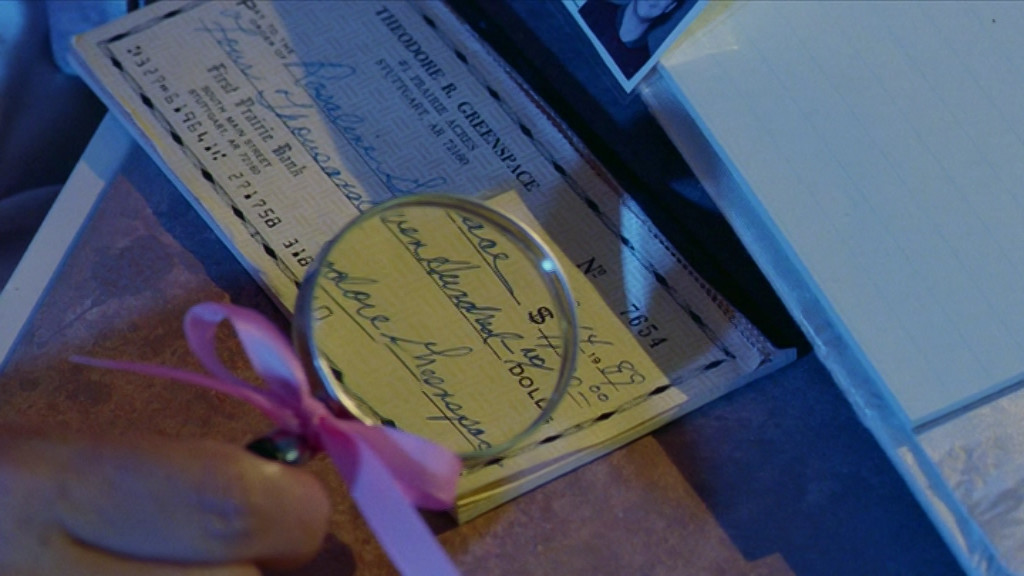
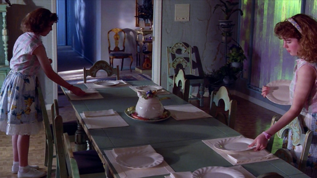
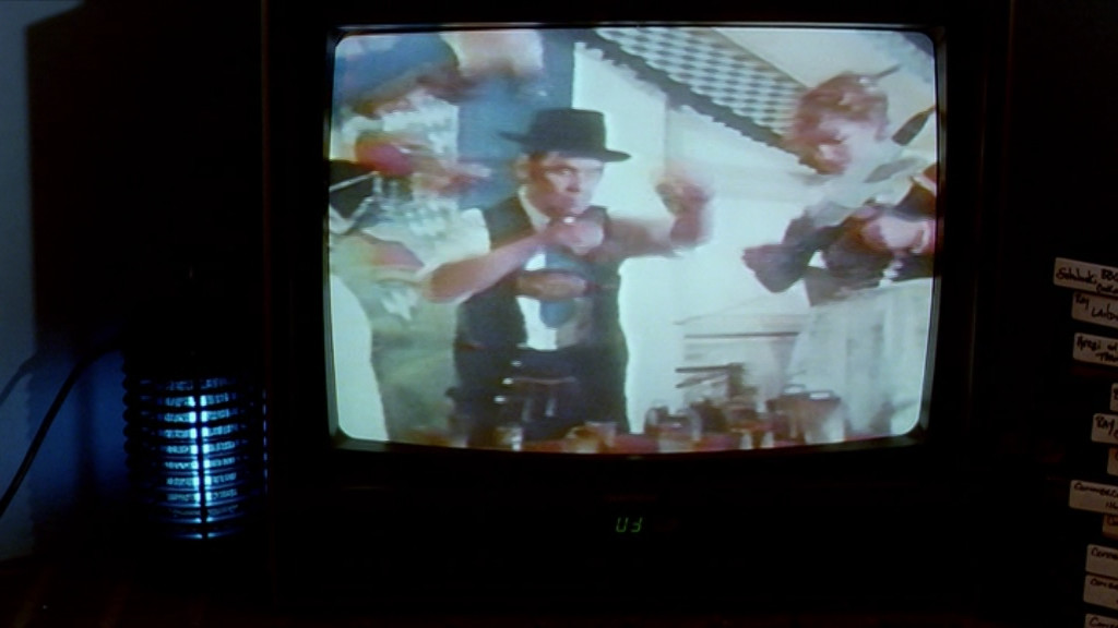
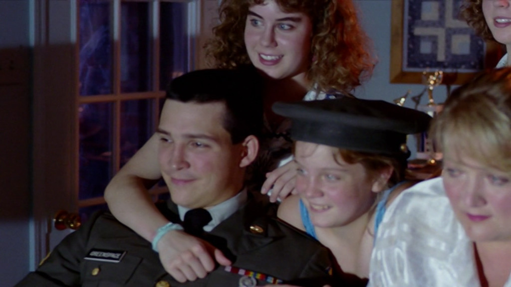
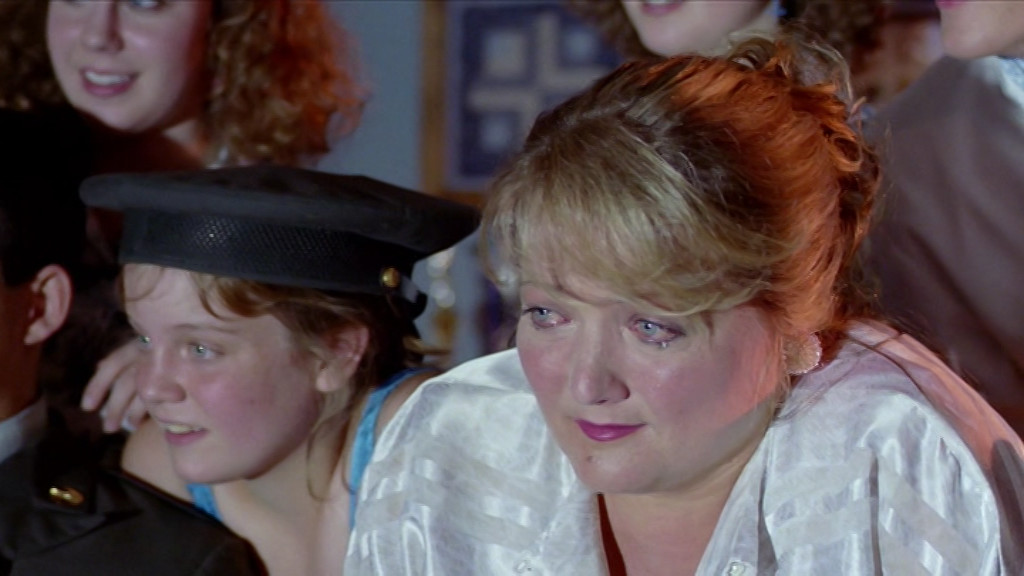
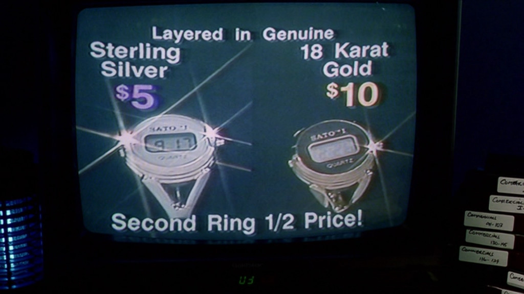
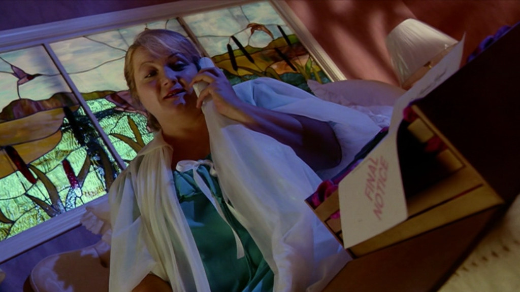
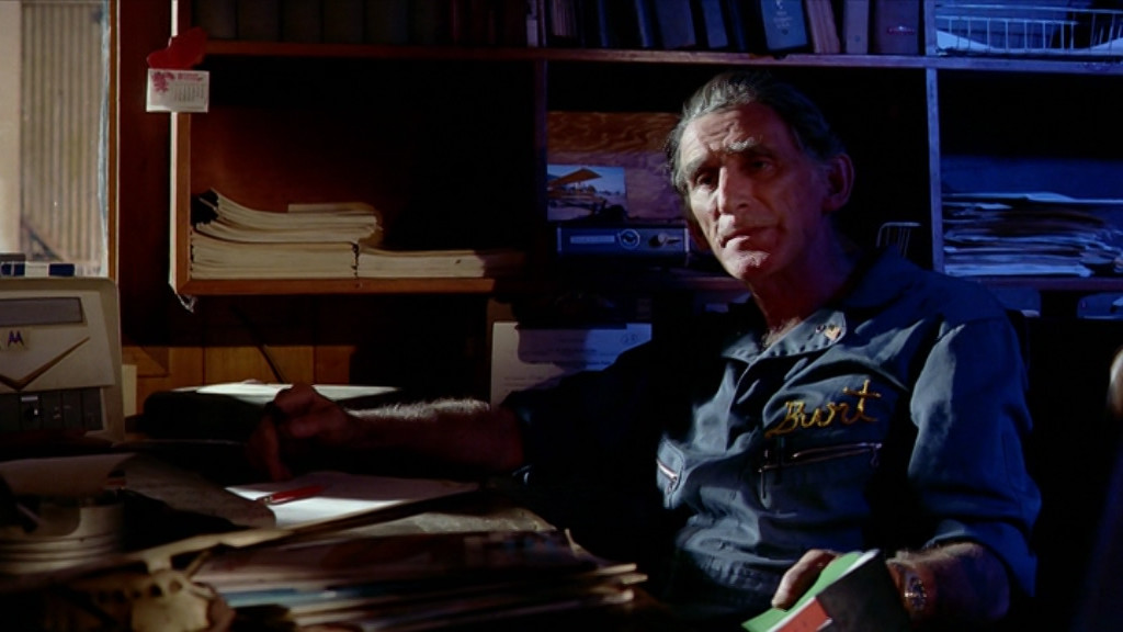
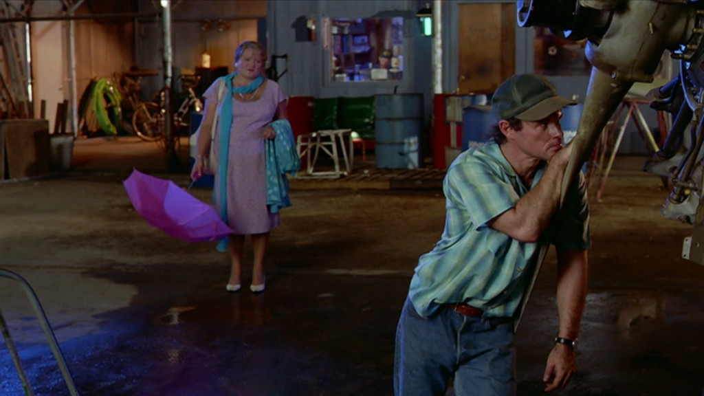
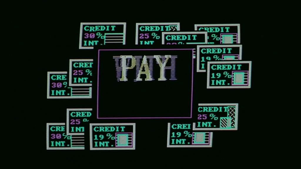
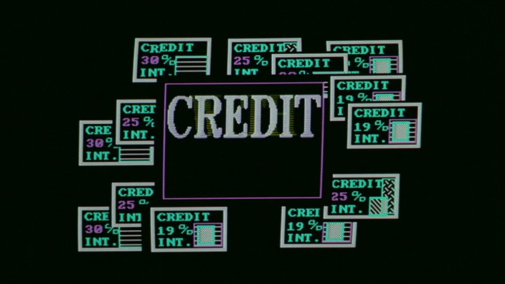
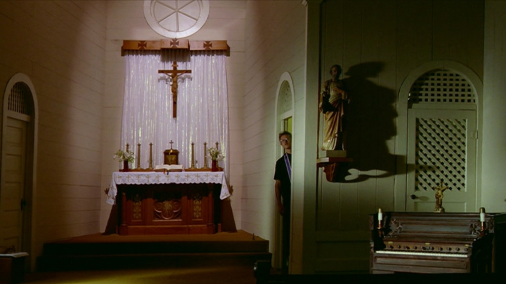
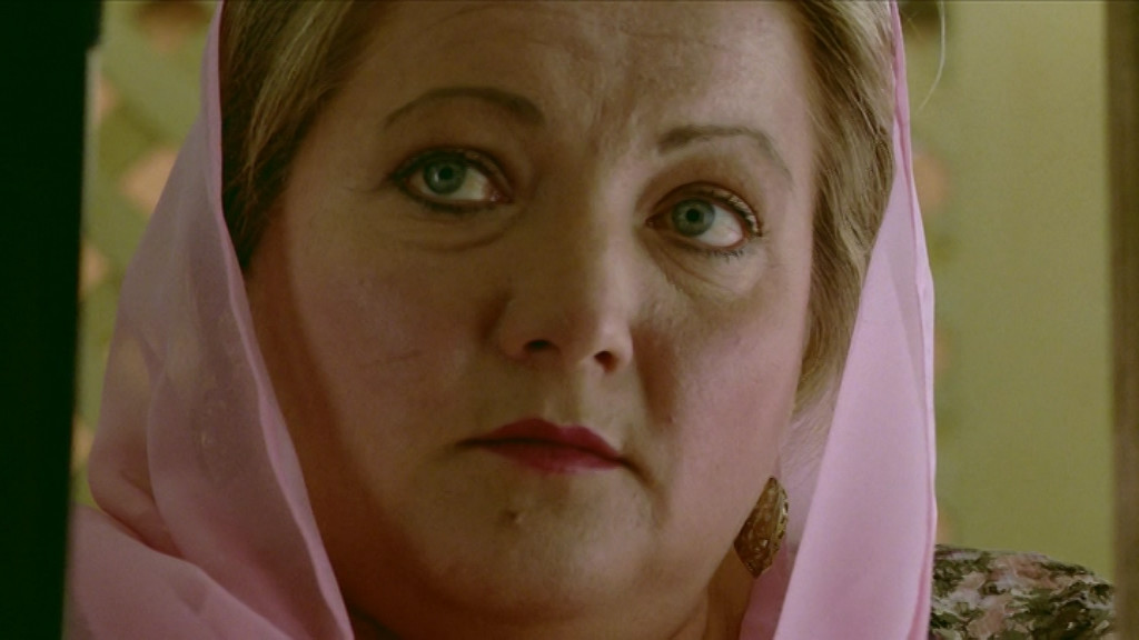
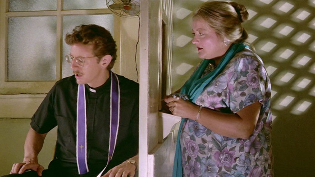
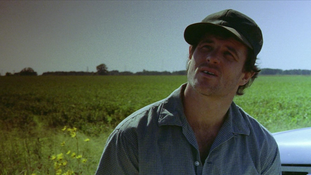
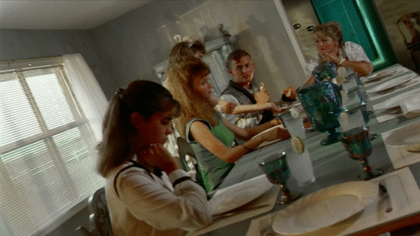
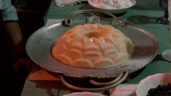
It does have some pacing problems just when they switch to the incomprehensible computer heist bit (i.e., the third act), but making a computer heist work dramatically is difficult. So it’s not perfect, but there’s still so much to love here, from the different children, all with their quirks, to the father, the airplane enthusiast, to the evil grandmother, to the nightly entertainment (watching TV ads), to the priest who gets more and more involved.
There’s so much in here. Percy Adlon is a genius.
This blog post is part of the Century series.


)
)


)
)
)


)