Lucky for some.
So that’s another 10% of the bugs in the Emacs bug tracker closed, so let’s natter on a bit.
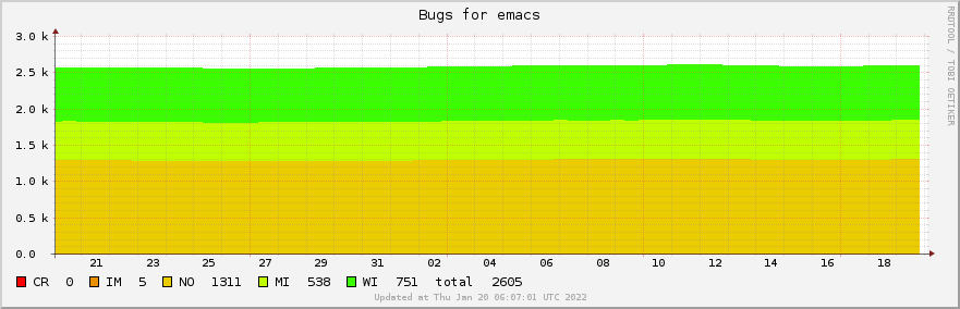
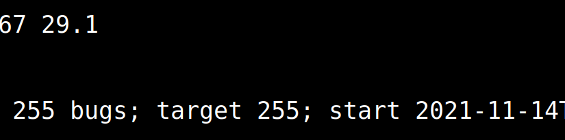
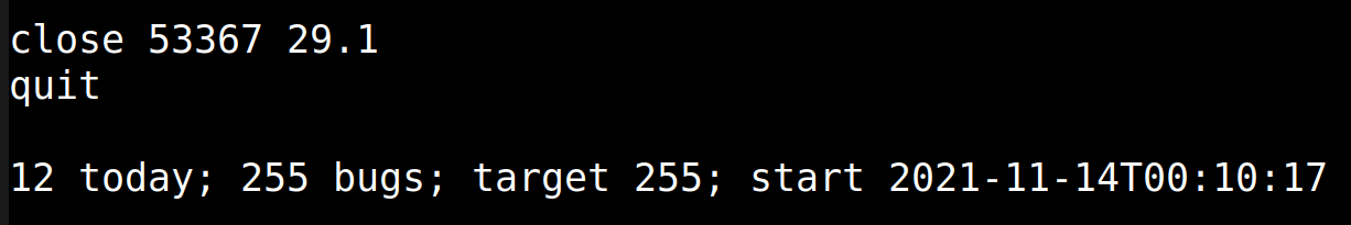
So the most striking thing here is, of course, that we started with 2550 open bugs, and we’re now at… 2605.
That’s not much of a reduction!
Yeah yeah. This stretch took two months, and instead of hacking away at the bugs, I’ve been hacking away at implementing stuff, and… then I took three weeks off. Oops!
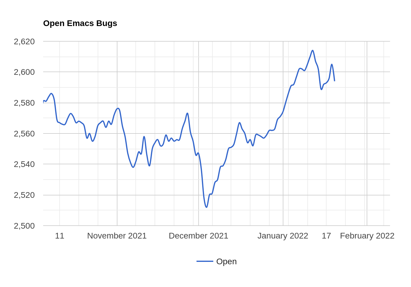
See if you can identify the weeks I was chillin’.
But it’s been pretty productive anyway. There’s been 1778 commits in the period, and among the bigger things is that we now support the Haiku OS, and we’ve merged the PGTK (pure GTK) branch (both things courtesy of developer Po Lu, but the PGTK branch was originally written by Yuuki Harano).
And one internal Emacs development thing I appreciate is that Stefan Kangas has fixed all the warnings in the Emacs test suite. I mean, you’d normally only look at the test results, but without any byte compilation warnings, it’s a more… calm… experience.
Zen.
But of the time I’ve spent typing myself, it’s been mostly three things:

Multisession variables are variables that get saved to disk automatically, so that they’re restored when you restart Emacs. Emacs has many ways of persisting session state, of course, and has always had, but it’s all so… manual. I mean, you pick a file name, and then write some code to write the data out, and then read it in, and then you get it wrong and the data disappeared, and then you fix it and then aaaargh!
So people only bother with the larger things. But with small things, like saving the recently used emojis, it’s just too much work for too little utility, so few programmers bother.
But with this interface, hopefully it’ll allow people who make packages to do easier persistence for smaller stuff. And one advantage of centralisation of this sort of data is that you can make a command that allows Emacs to list the data, and then edit/remove it:

It’ll work out OK, I think. (Note that this is for session state only — configuration stuff is still handled by Customize.)
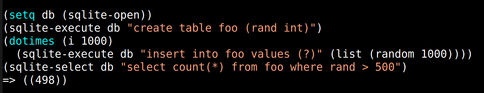
Semi-related, Emacs now comes with built-in support for SQLite. This is based on Syohei Yoshida’s Emacs module, but has been somewhat rewritten. I think it’s a shame that Emacs hasn’t had built-in support for a database for years — Emacs is used to handle large amounts of data, but has been hampered by how slow it is to write that data out naively, and then reading it back in again to work with it.
Having SQLite built in will open up new vistas, and make some things (like the Gnus registry and some Org databases) much more performant. We should probably add something Linq-like for interacting with SQLite, though, because writing SQL as strings is yucky.
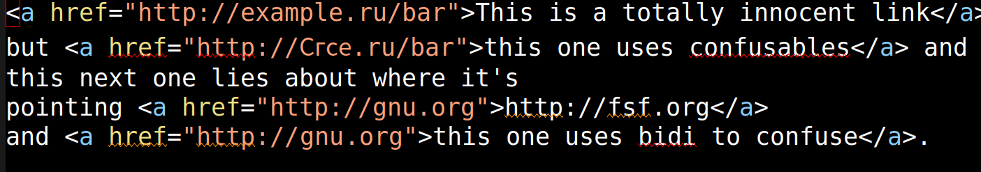
Finally, there’s been a lot of chatter (over the last few years) about the interesting attack surfaces that have opened up fot confusing people by using homoglyphs and bidirectional text for various fun things. Emacs has stuff to deal with those on various levels, but hasn’t really implemented the recommendation in Unicode® Technical Standard #39 for identifiers.
For “identifiers” read “URLs and email addresses”, basically. Well, there’s more, but that’s the most important bits — if you can fool people into thinking you’re sending an email to somebody by using shenanigans in the email address, that’s not cool.
(As an aside, I was amused to see that the main editor of that document has a Phd in Philosophy, but it explains so much about the way the document is written. Here’s the typical start of a description of an algorithm:
Consider Q, the set of all strings that are confusable with X.
And here’s how it ends:
The logical description above can be used for a reference implementation for testing, but is not particularly efficient. A production implementation can be optimized as long as it produces the same results.
I appreciate the attempt to be precise, and they’re using maths to be precise, but I’m a programmer, so: Herp derp, I eat paste while considering Q.)
So I’ve typed away at a library that ended up being called “textsec”, and it has a bunch of functions like “textsec-url-suspicious-p”, and after typing supscious approx. nine million times for that library, I can now spell it correctly 100% of the time.

and it’s true:

And so on and on and on. But after importing about 14K lines worth of data from Unicode, and writing… fewer lines of Emacs Lisp code, eww can now tell you about sus links:
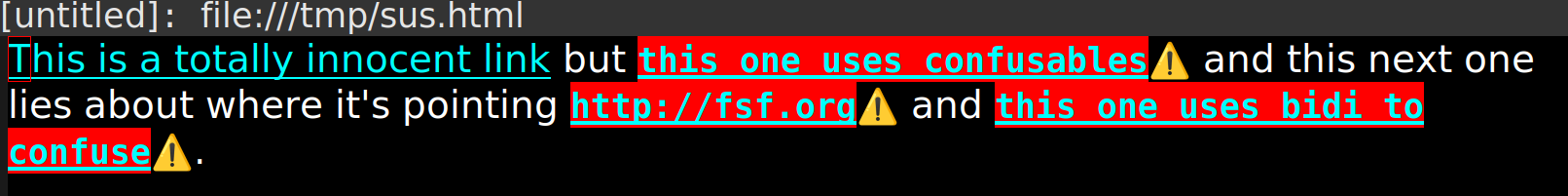
Err… Perhaps the visual look should be… tweaked… a bit…
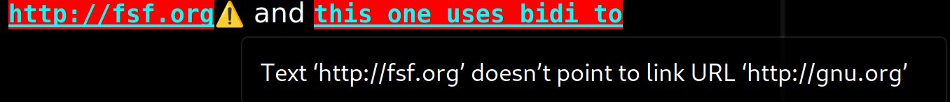
Hovering over the warning will tell you what’s suspicuos about the link.
And there are similar things in Message and Gnus, and will eventually find its way throughout all bits of Emacs that deal with these sort of things.
(And users can disable it, of course. This is Emacs, after all.)
Anyway!
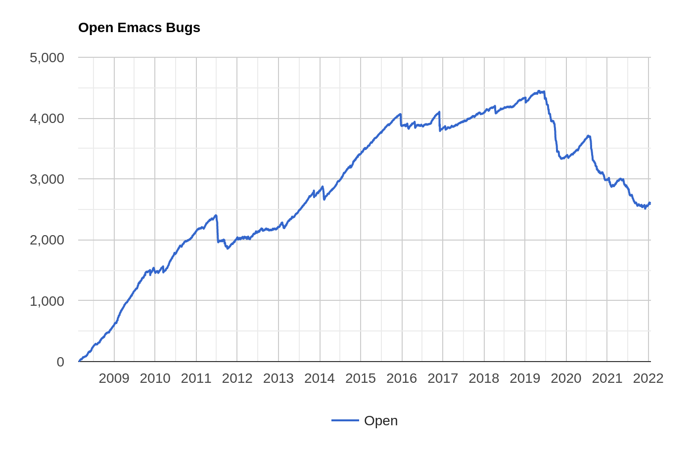
This is what’s going on in the bug sitch more long term. Next stretch should go faster, I hope, because I don’t really have anything bigger planned (implementation wise) this time.
Thank you for attending my TED talk.