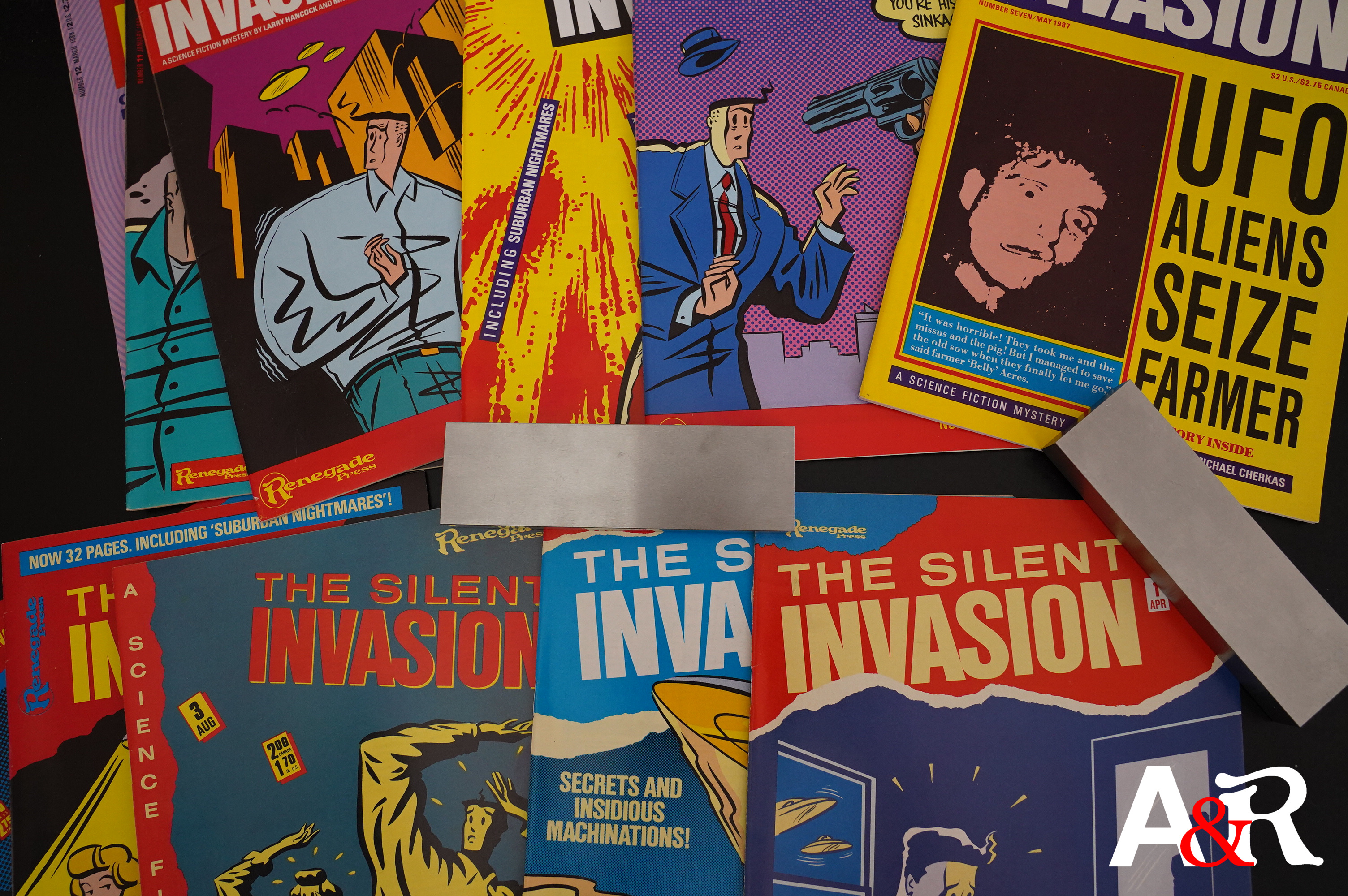
The Silent Invasion (1986) #1-12 by Larry Hancock, Michael Cherkas and others
I do remember Silent Invasion from when I was a teenager. However, I wasn’t really a fan — that is, I bought the first couple of issues, and then I dropped it. But I have no idea why… I can’t recall what I thought of the series, really.
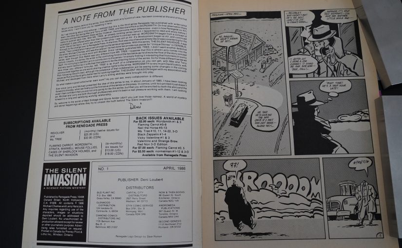
Let’s read the first couple pages and perhaps that’ll jog some memories.
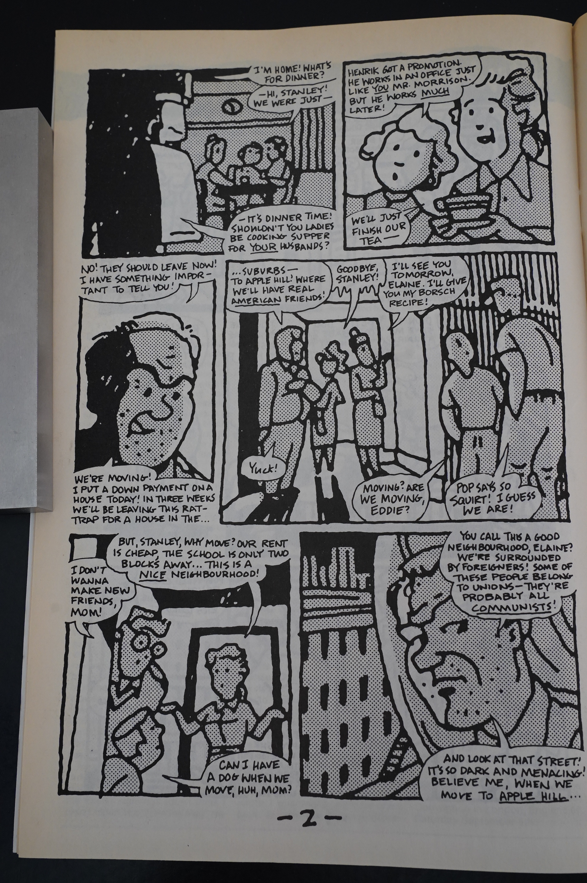
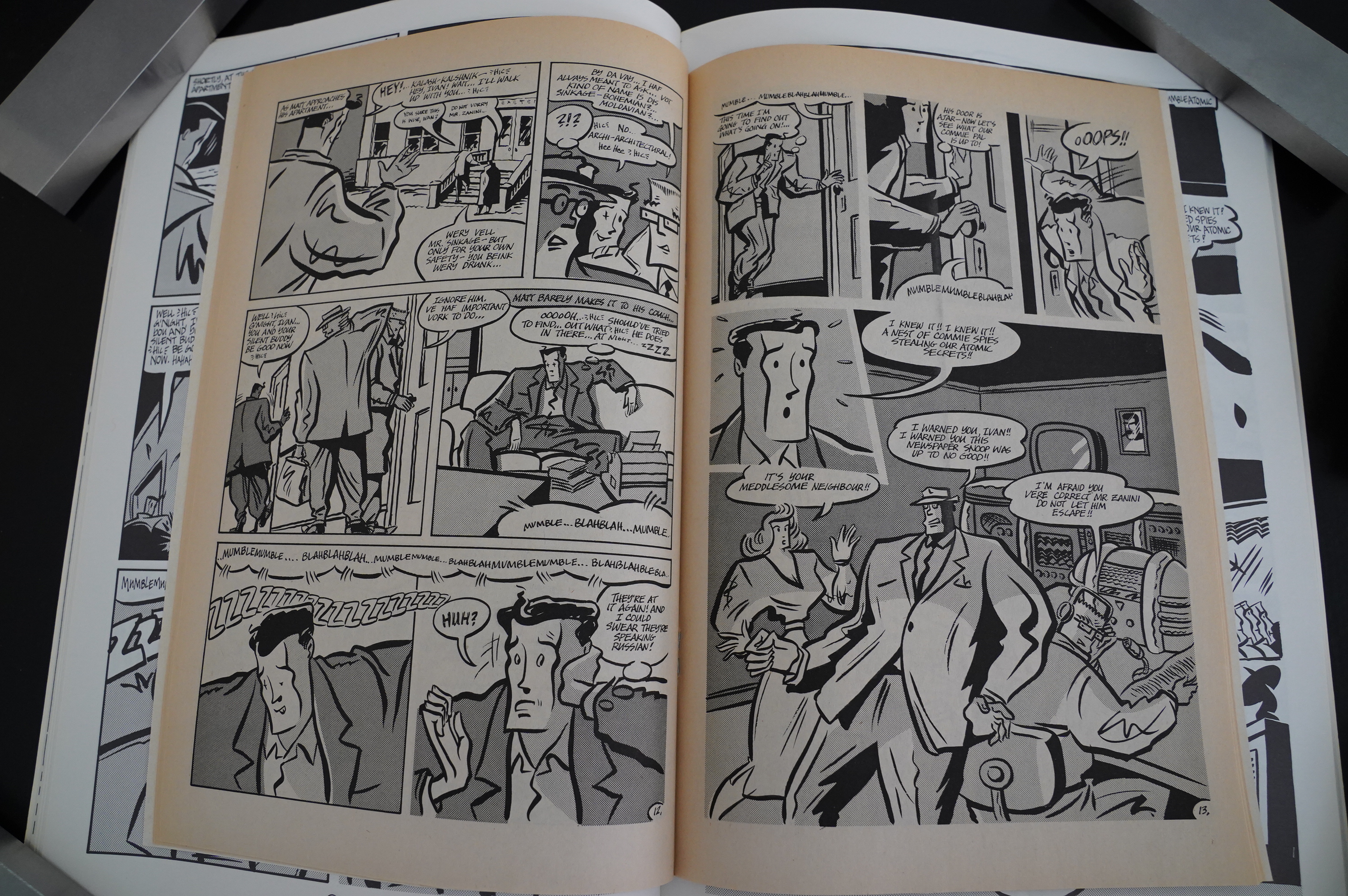
Right, right — it’s drawn in a kind of super-stuffed version of neo ligne claire. Like… er… Daniel Torres? Or… Serge Clerk? That is, like those people, it’s got a super strong and really attractive line, but there’s also an underground quality to Cherkas’s objects and people: Everything looks as if there’s balloons hiding underneath the metal; everything’s bulging.
And I do remember now that I found this art style to be… I don’t want to overstate it, but, yes, I found it nauseating. It’s all coming back to me.
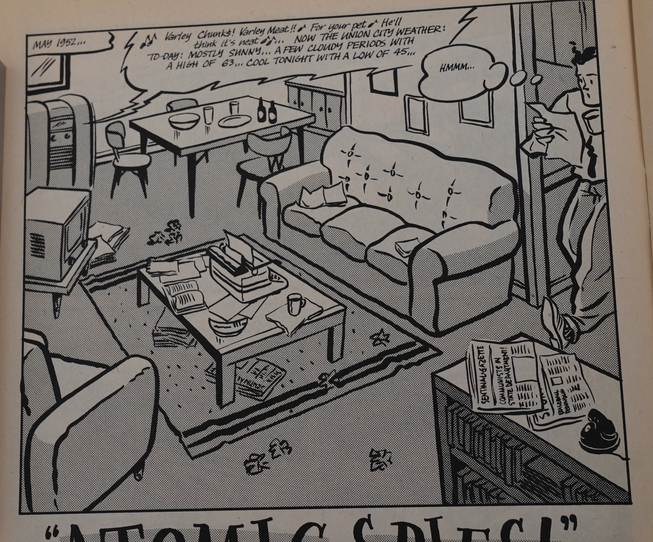
I don’t find it uncomfortable at all now, though. But there’s something… wrong about it. I love the line work, but it’s as Cherkas has amazing embellishing skills without really having the basic underlying drawing chops: Everything in this splash panel seems to be wrong in one way or another. The perspective on the table in the middle there is off; the size of the phone seems too small, the foot seems to have an extra joint in the middle of the ankle…
I don’t mean to dump on the artwork here, really: I’m just trying to work out why I found it offputting as a teenager, and I think it’s this mix of assured rendering and wonky basics that’s distressing to the eye (and stomach).
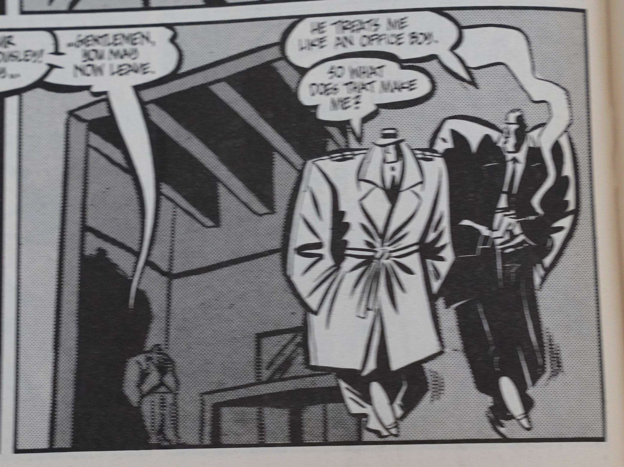
So it’s a curious mix of accomplished and … not. With these super-stylised character designs, you’d think it would be difficult to keep the characters apart (and there’s a lot of them to keep track of), but it’s a breeze: Cherkas manages to design every one of them in a super distinctive way… except for a couple that’s perhaps meant to sow confusion in the reader.
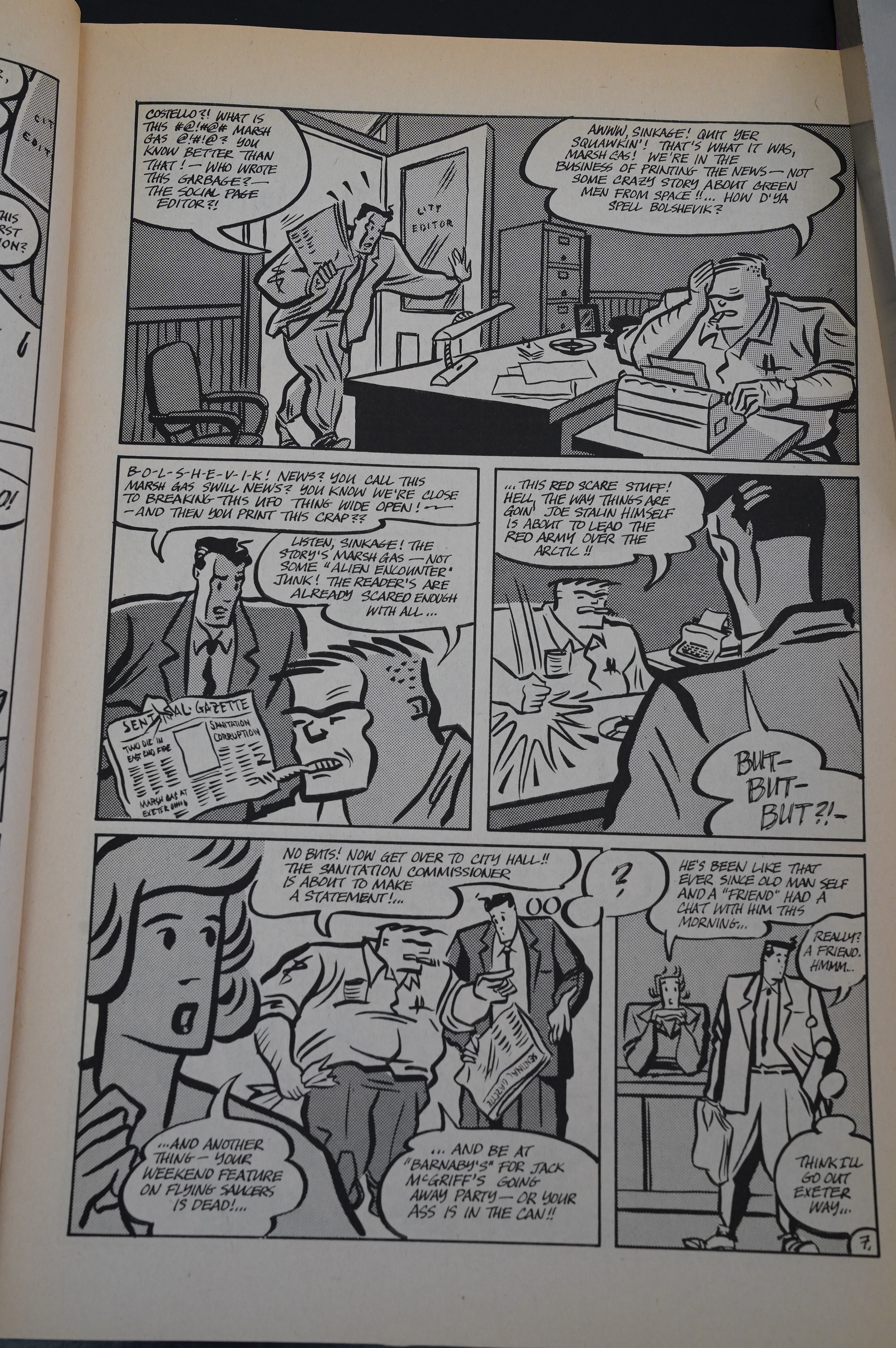
The storytelling is also mostly on point: This is a story of conspiracies, possible unreliable narrators, possible insanity and possible aliens. It’s hugely entertaining and well thought out.

That’s a very tiny child in the left panel.
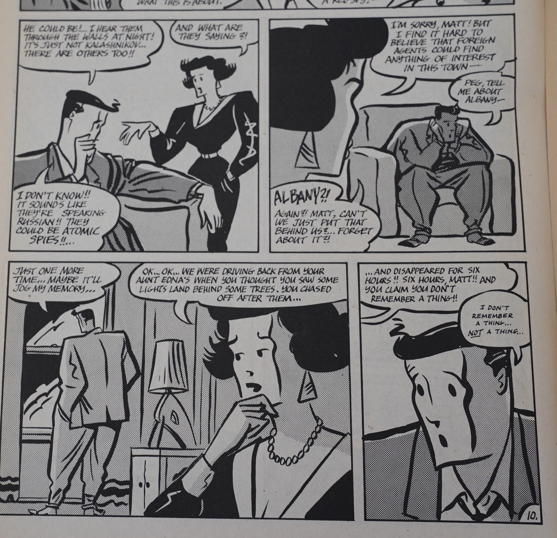
It’s so complicated! Albany!
Sometimes the characters go way deformed — all the guys basically look like the guy standing there: Big and bulging in a 50s way, and all the dames have a tiny waist — but here the head on that guy just grows really strangely small, and that posture makes no sense.

The Silent Invasion was released in the middle of the black and white boom, so you could be forgiven if you assumed that it had been whipped up in a hurry to catch the wave… but it really does seem like it grew organically out of ideas that Hancock and Cherkas had while doing some Dick Mallet shorts.
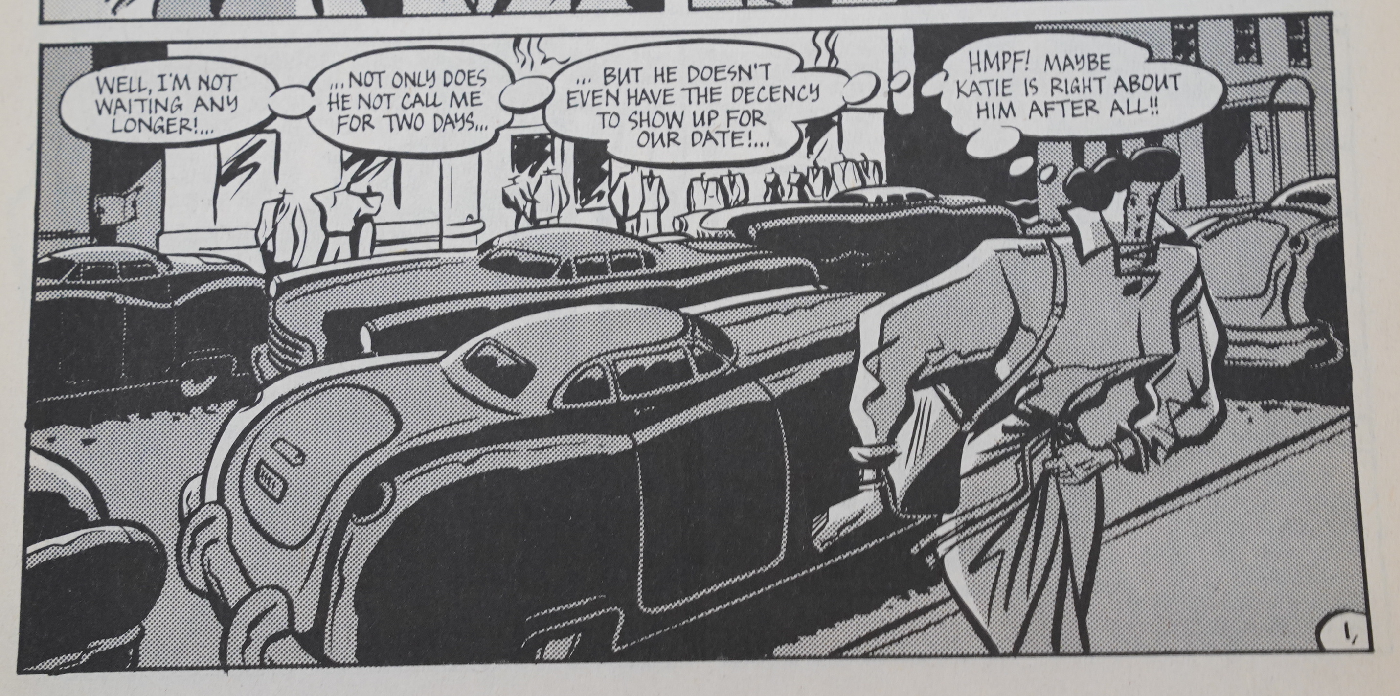
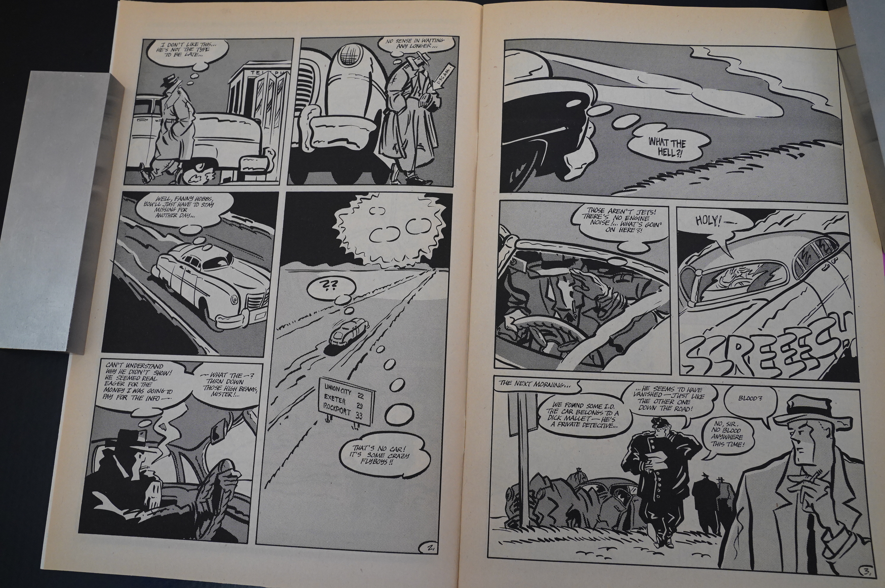
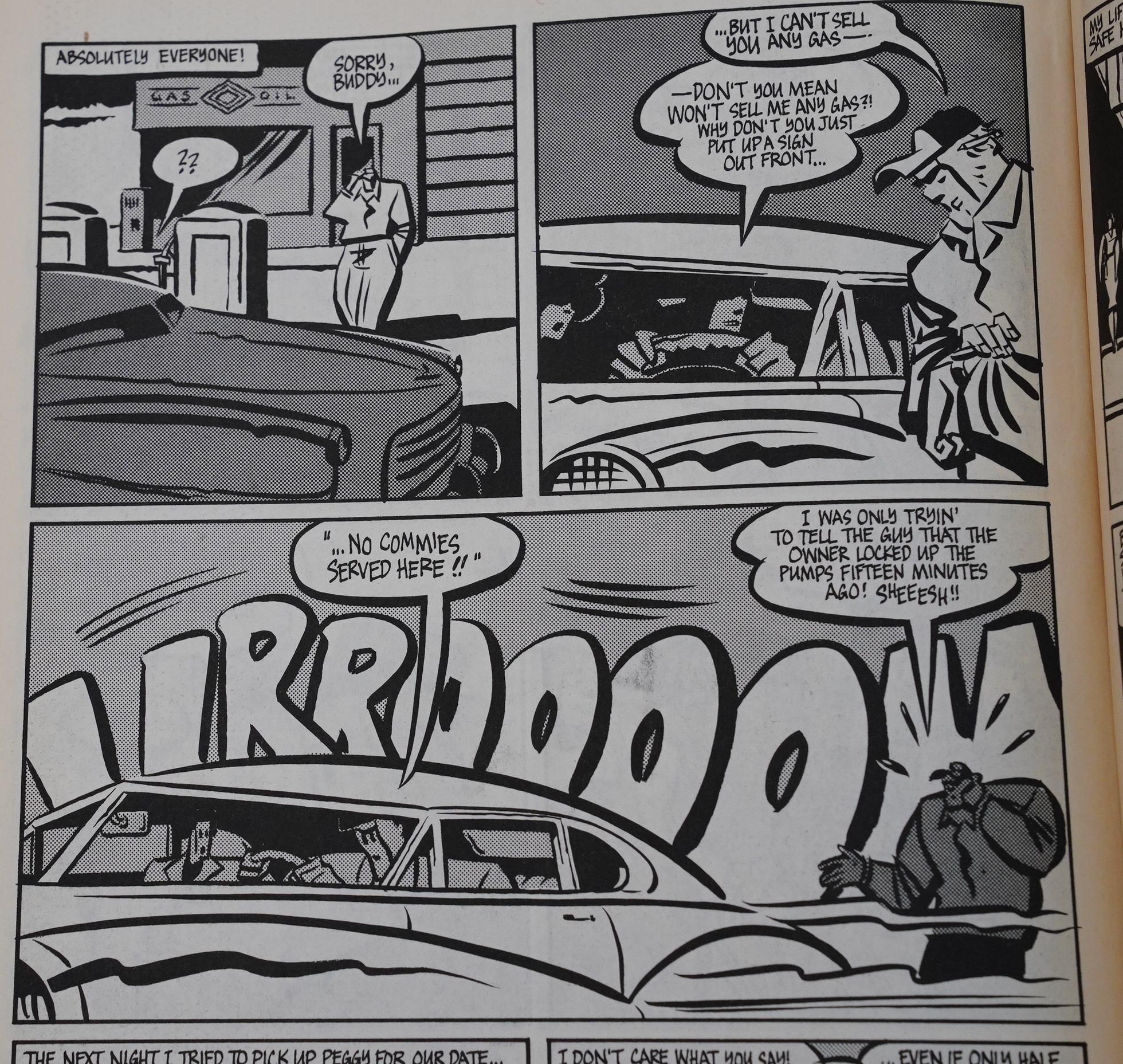
I’ve gotta mention the cars. They look as if somebody had described huge American 50s cars to somebody who’ve never seen one… and then they captured the essence of the look better than anybody had ever done before. I love these. They’re totally deranged.
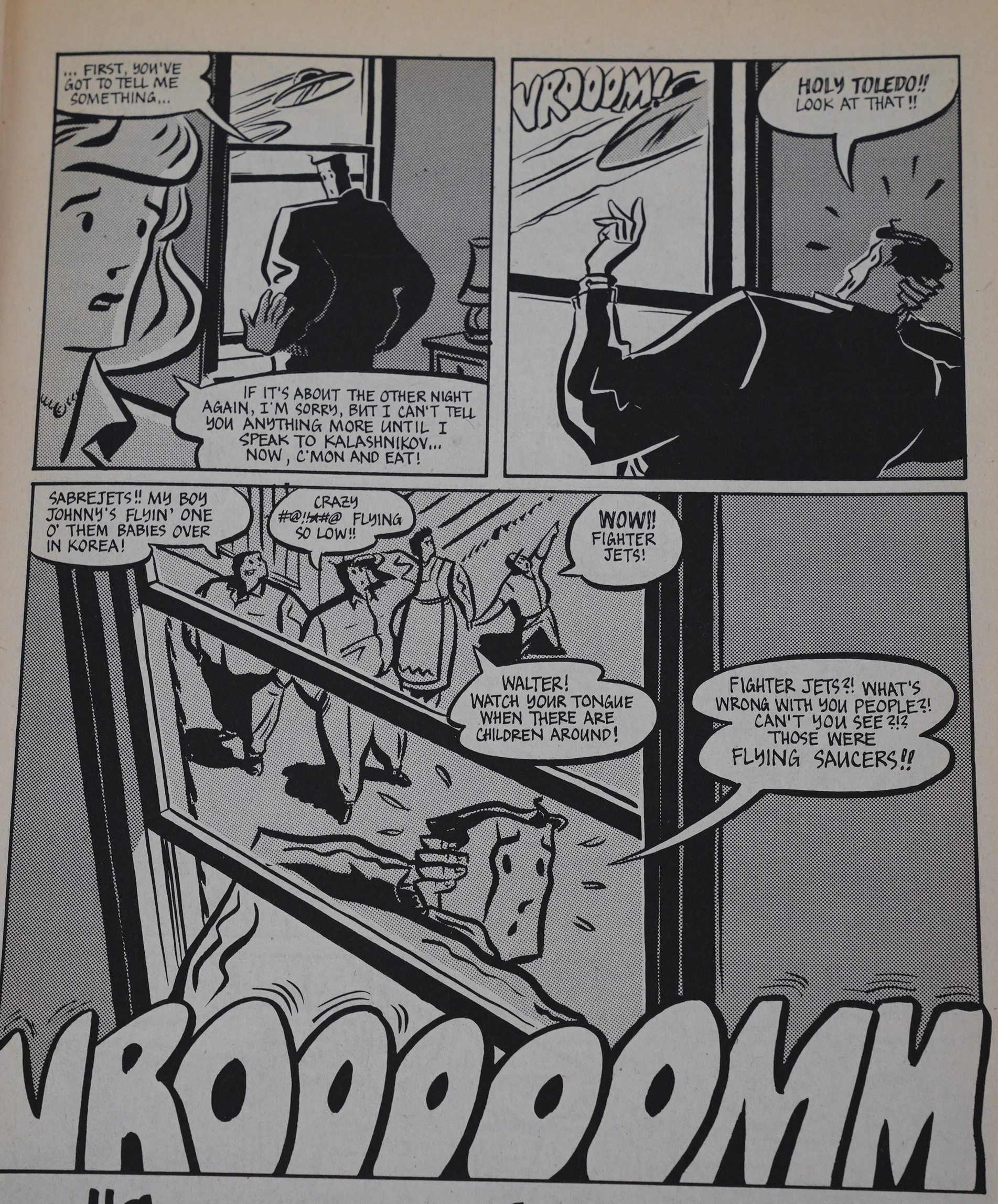
I also love how we’re never really sure what’s real and what’s not: Just because we see the flying saucers, is that just because Matt Sinkage is imagining them or not?
These cartooney reaction shots are a lot of fun, too.
Oh! These remind me of Chris Ware’s Floyd Farland (which was released after this, I believe). I wonder whether Ware was influenced by Cherkas…
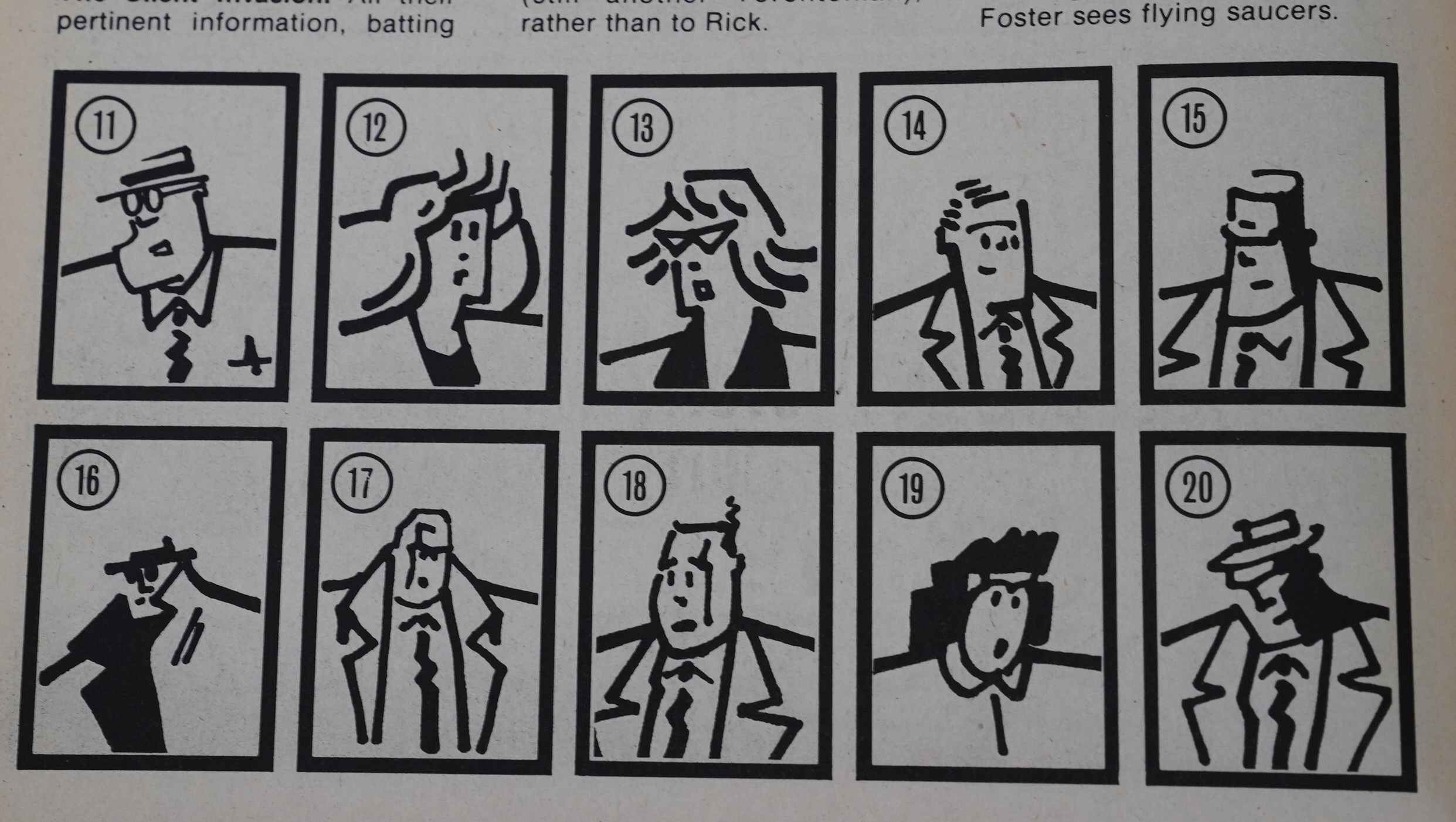
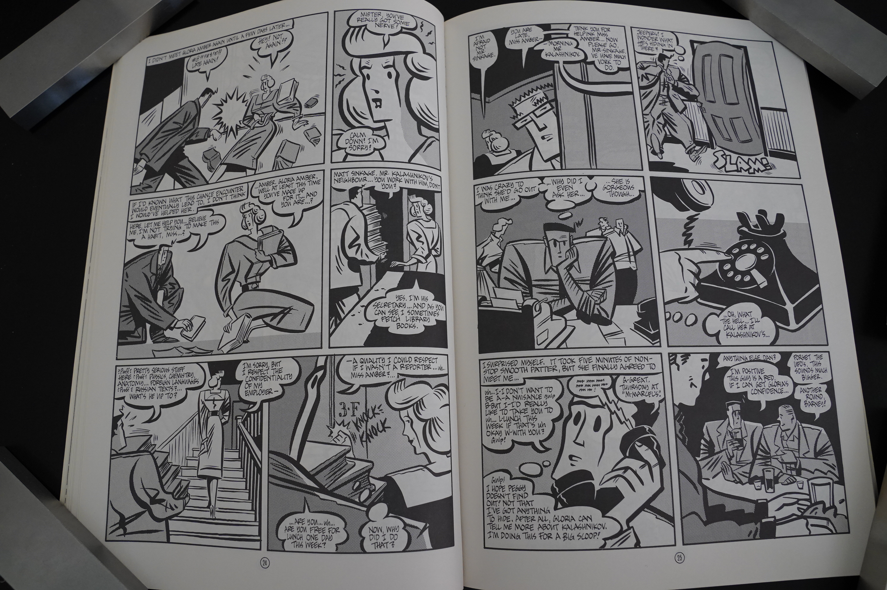
Anyway, I find these character sketches fascinating — with just a few rough-hewn lines, Cherkas makes all these really distinctive characters.
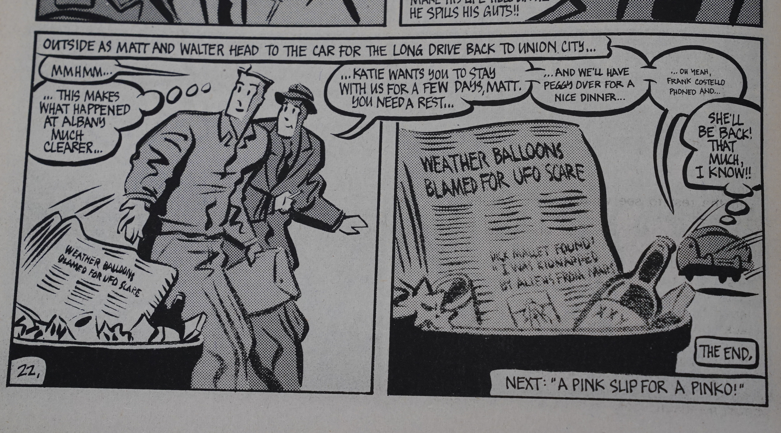
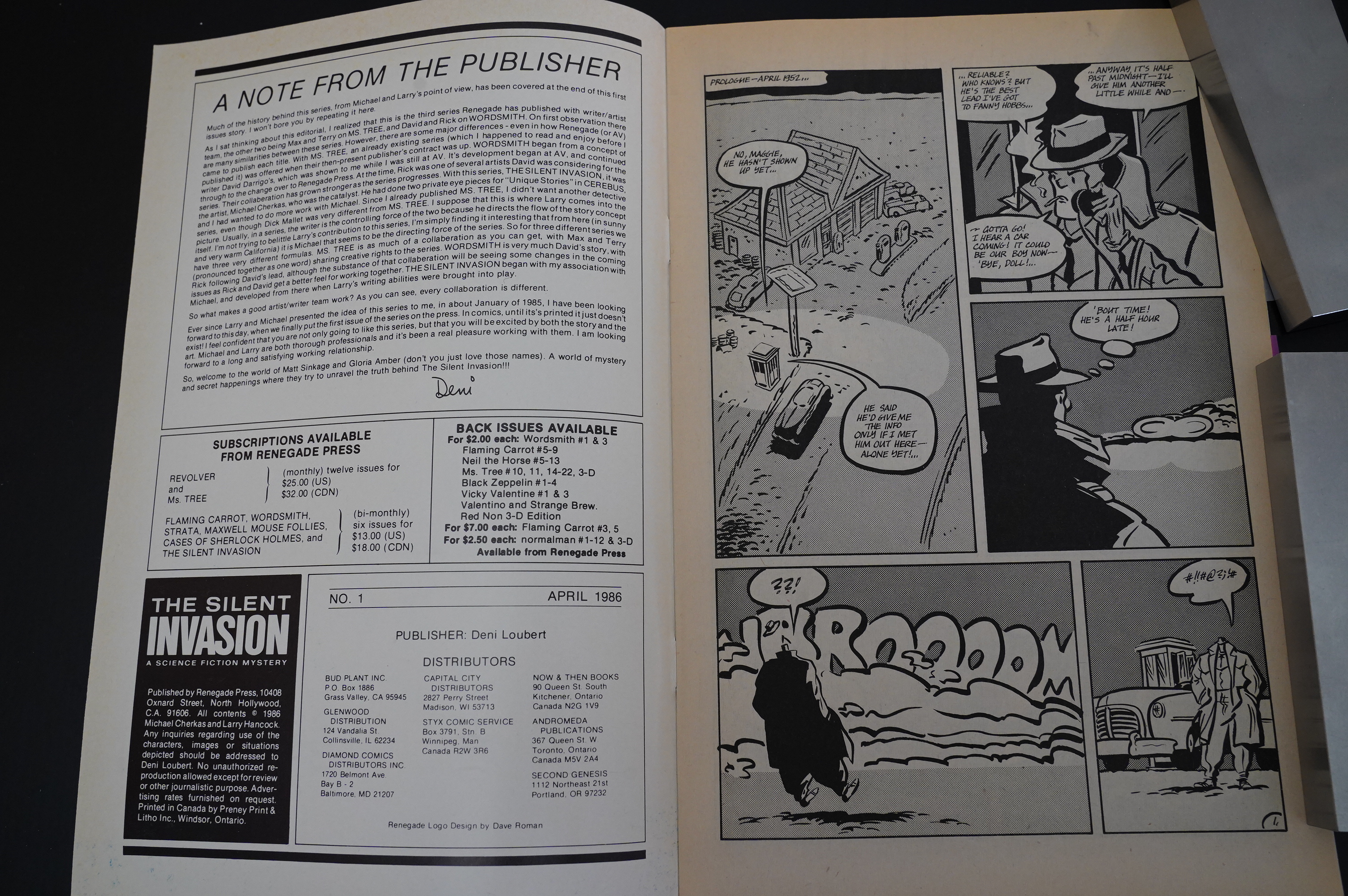
The first three issues have one collective name, and there’s a “the end” there, but the first six issues are really one single storyline.
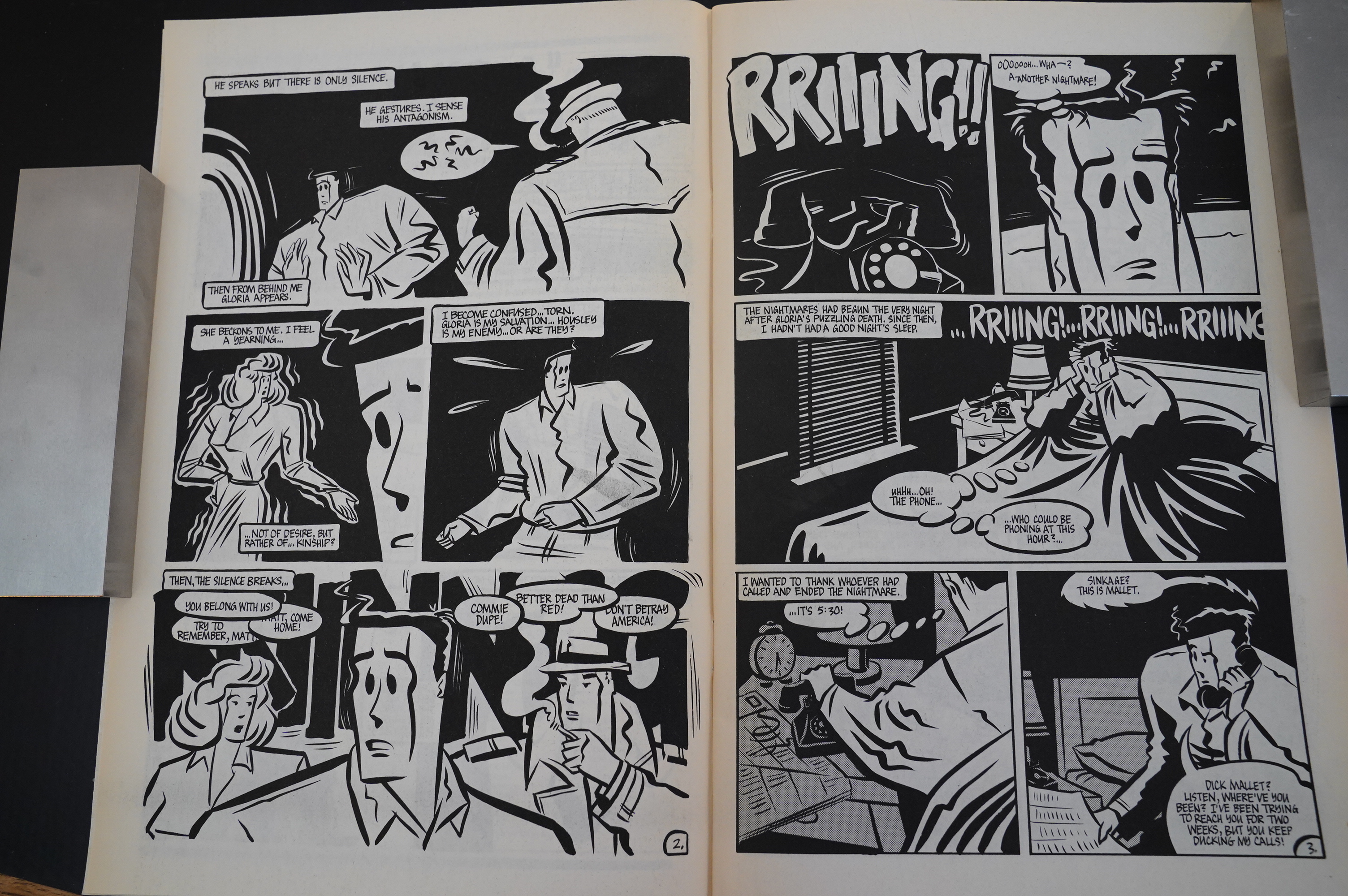
Cherkas’ artwork gets even better as the series progresses. This dream sequence is very sharp indeed.
The cars also change a bit, and become less bulging; more streamlined — but still as odd as ever.
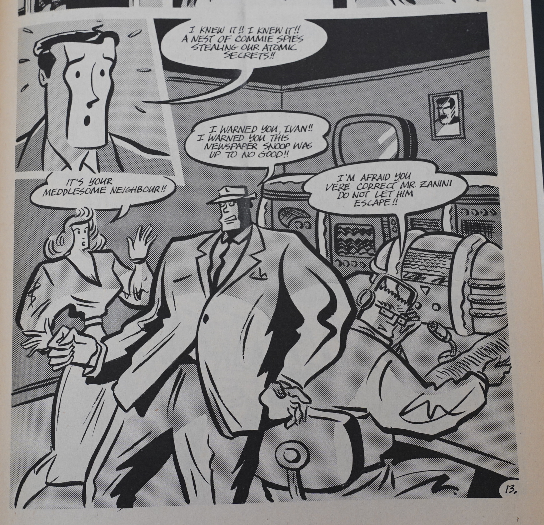
The paranoia is taking over!
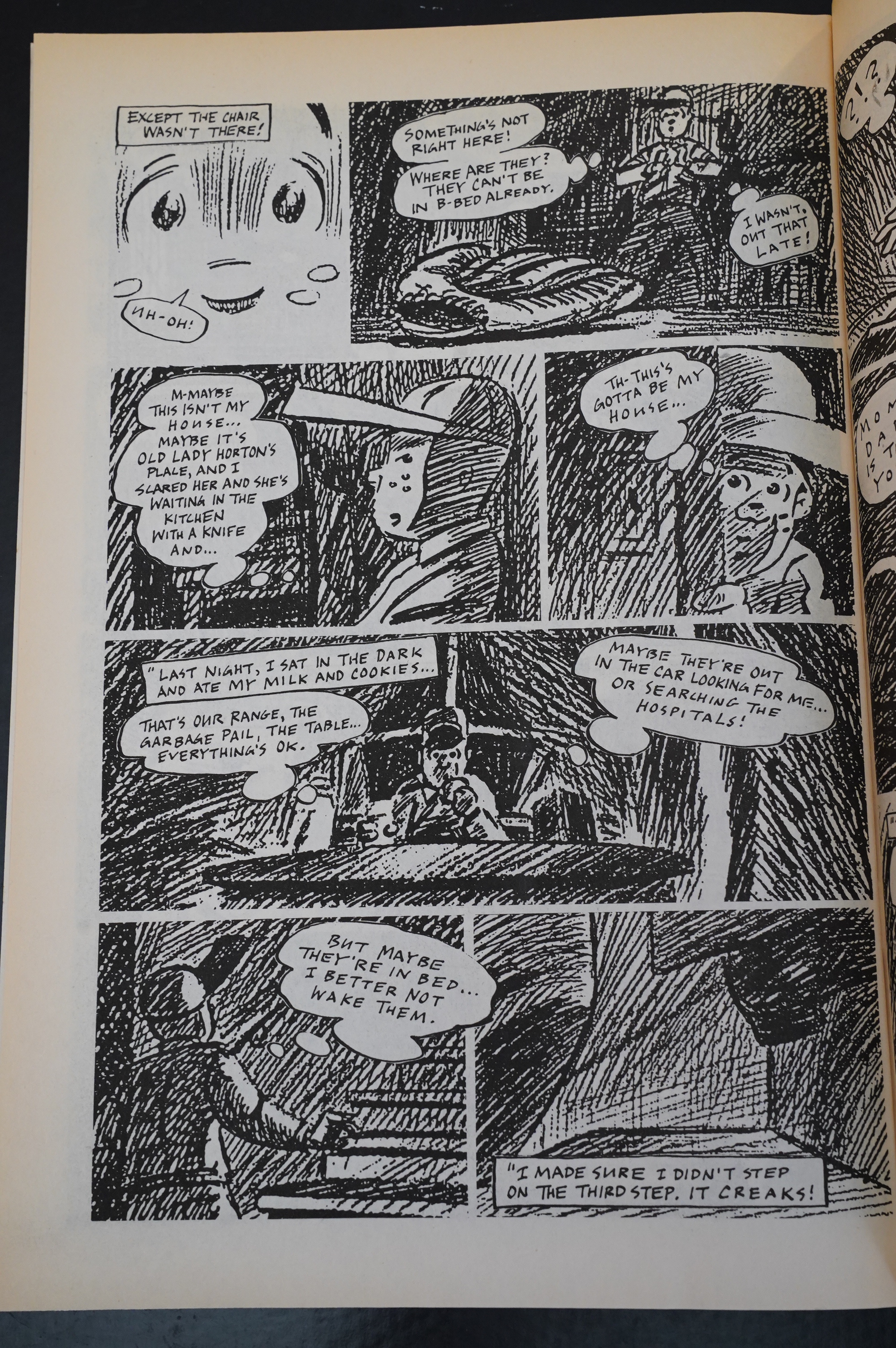
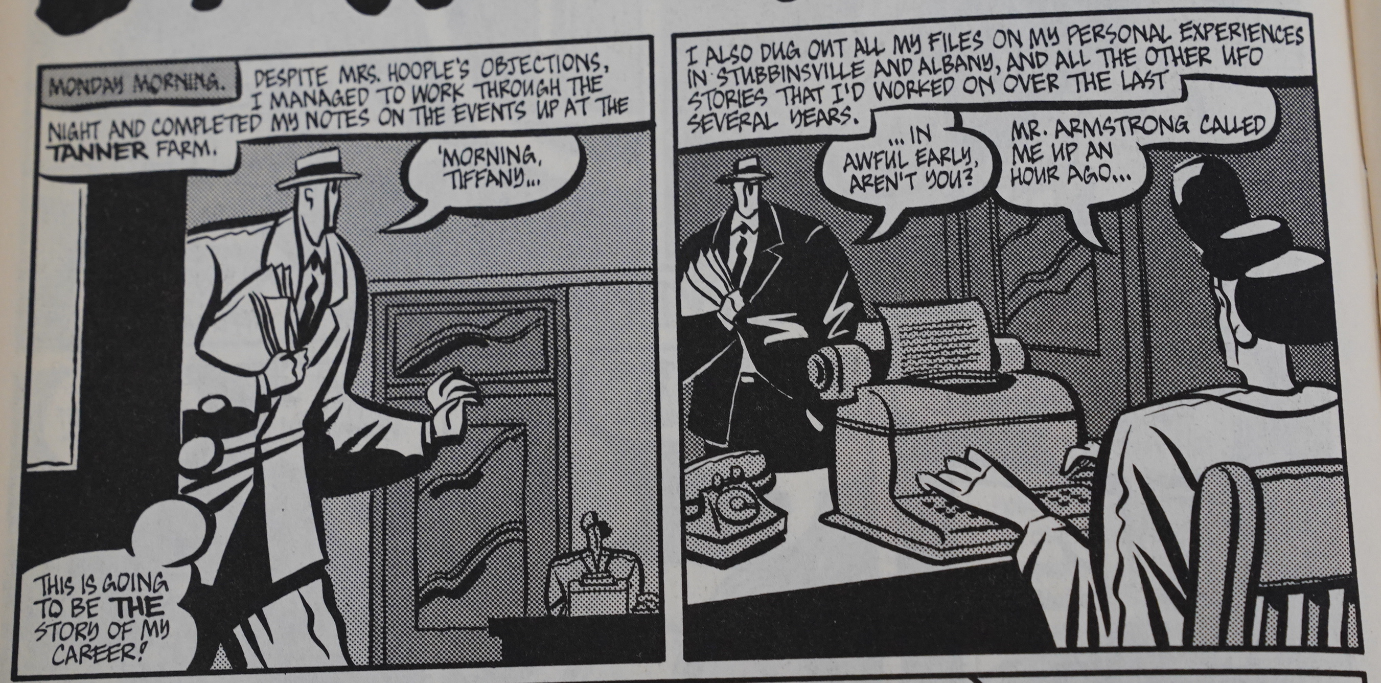
We mostly follow Matt Sinkage, and we’re always made privy to his thoughts. Whenever we see somebody else, we only see what they’re saying or doing. However, there’s these infrequent lapses, like in the panel above, where suddenly somebody else drops an “as you know, Bob” thought balloon so that we’re kept up to date. It’s cheating, and it kinda disrupts the flow.
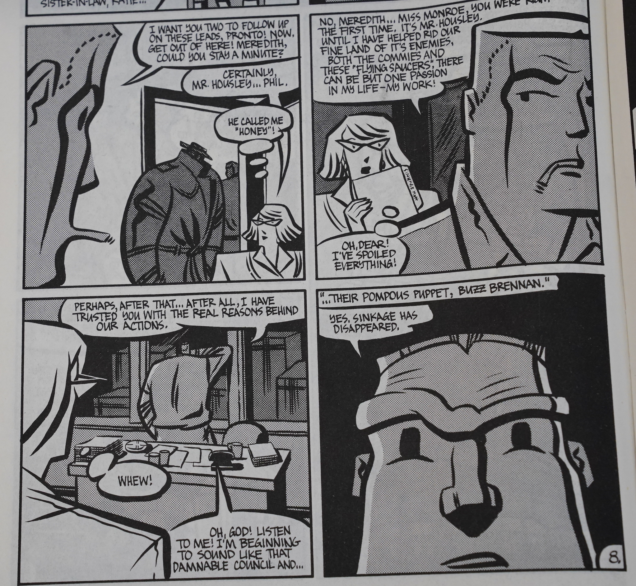
But sometimes it’s used for comedic effect, and that works better.
A reader notes that it’s surprisingly easy to tell the characters apart.

With the fifth issue, we go to 32 pages (up from 24), and we get backup features in every issue; mostly drawn by John Van Bruggen (and written by Hancock). This one is pretty amusing, but there’s a very groan-worthy twist ending.
And then the first storyline is over, and they managed to land all the conspiracies and character arcs in a very successful manner. I was thoroughly entertained.

As a back-up story, we get Cherkas inked by Van Bruggen, which is kinda interesting to look at. The story is a prequel to The Silent Invasion, and manages to give some satisfying shivers of “IT ALL CONNECTS”.
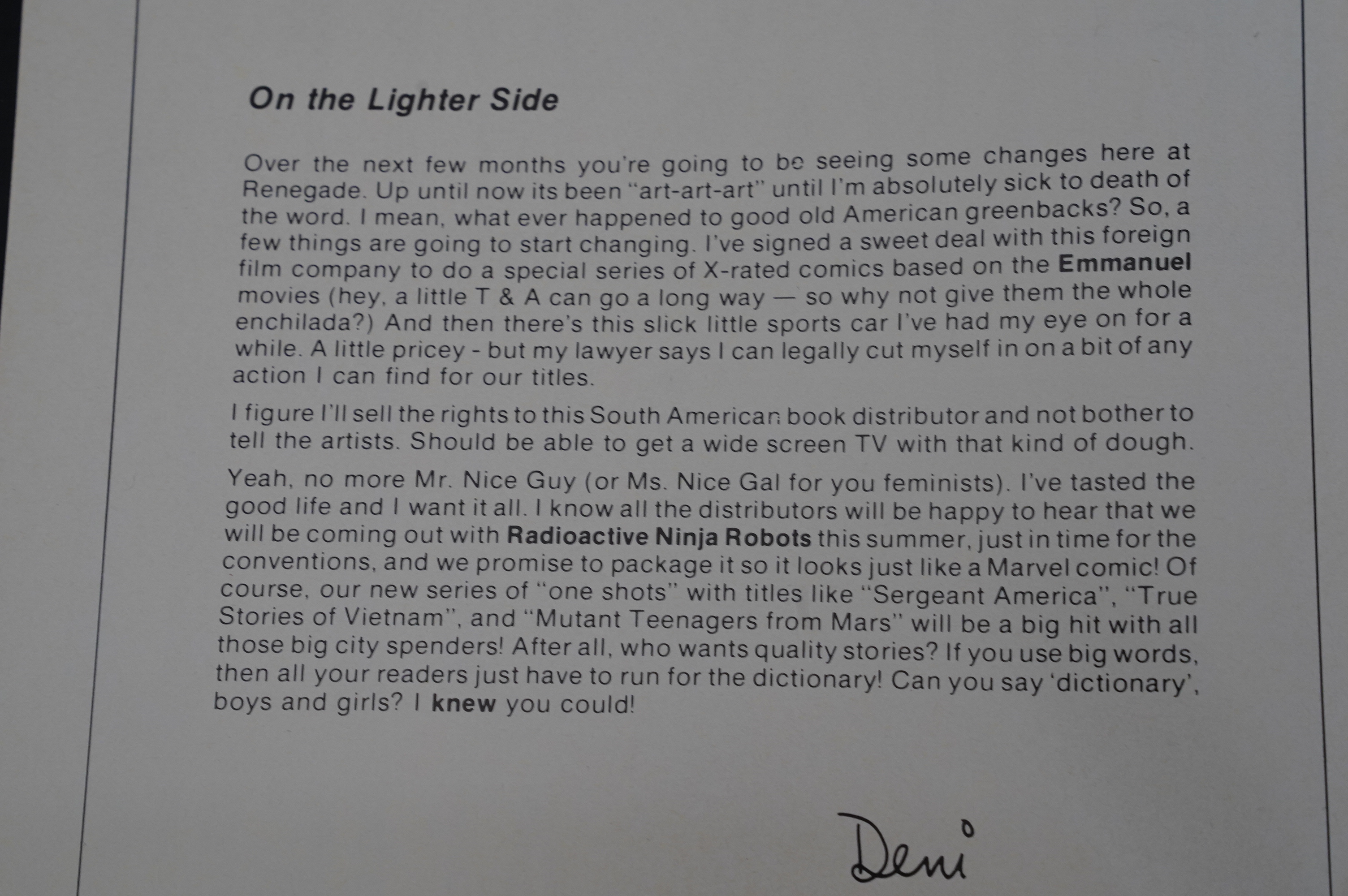
This is in early 1987, when the black and white boom was busting, so Deni Loubert is starting to feel the effects of declining sales, if I interpret this editorial correctly.
The line work is getting a bit chunkier, I think, which looks really great, too.
Did Ted Rall base his entire art style on this single panel?
Van Bruggen experiments with xeroxing his pencils in this back-up feature, I think…
We’re now in the summer of 87, and the black and white boom had truly busted, and apparently Renegade comics were shipping late (because Renegade pays royalties only, and not page rates at all, if I understand correctly, and creators had to find other things to do to make money). (Page rates would have meant that Renegade would have gone bankrupt, which is a different kind of failure mode, but with much the same results, though.)
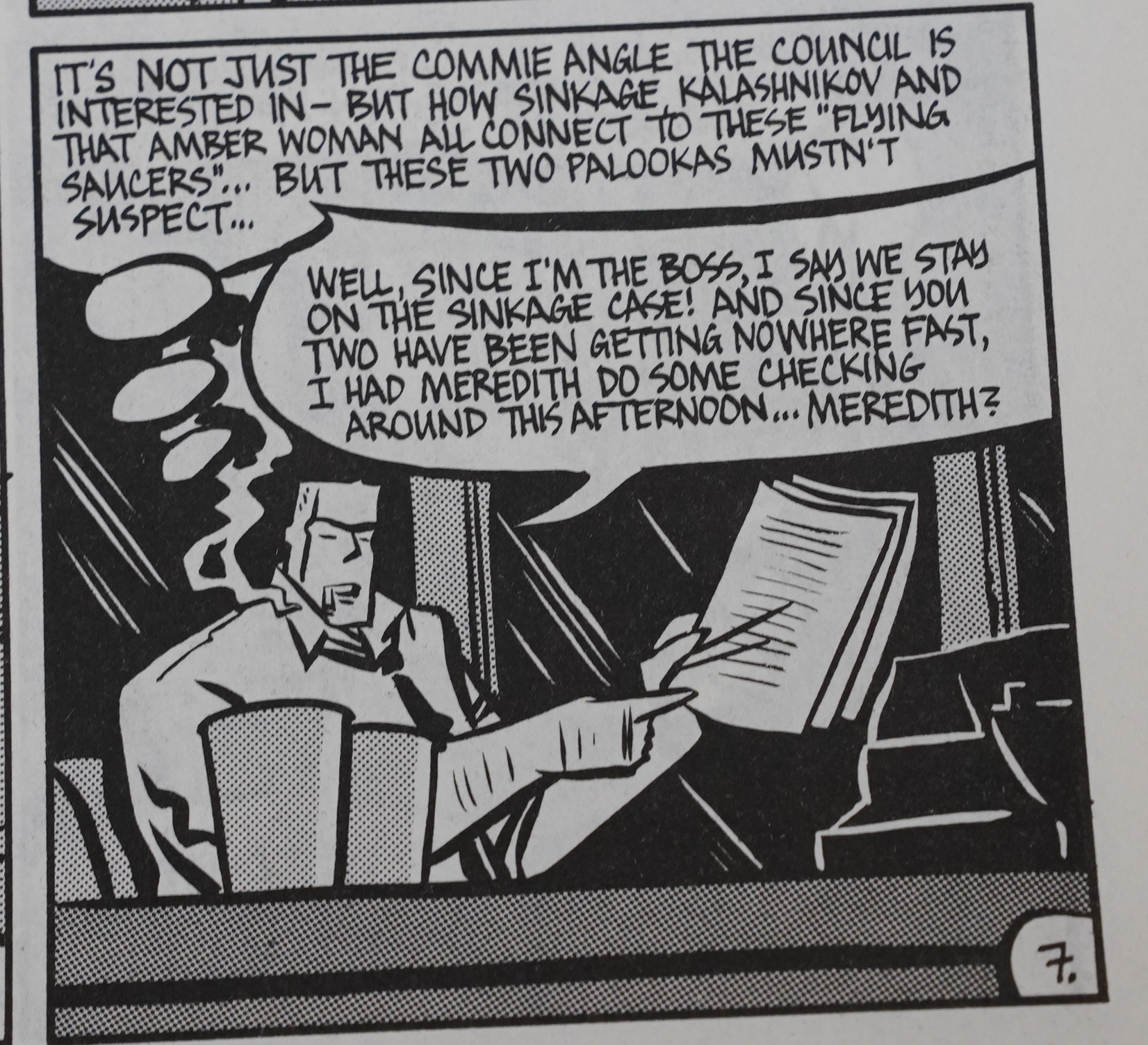
Anyway, back in the storyline, Matt Sinkage is growing ever more paranoid… which is a good choice, I guess, but since we know that the UFO conspiracy is real (… OR DO WE?!), it’s a bit frustrating?
Cherkas character designs are so out there that almost anything goes, but … this is way beyond. Cherkas draws cigarettes as part of the faces; fine. And this guy has a protruding jaw; fine. But combine those two things, and it’s “whaaaa”.
The backup artwork experimentation continues — here Van Bruggen’s pencils have been reduced to a tiny size, and then blown up and inked. Sure, why not.
I kinda like these super-stylised heads.
Sinkage’s descent into insanity gives the creators opportunity to do some amusing gags.
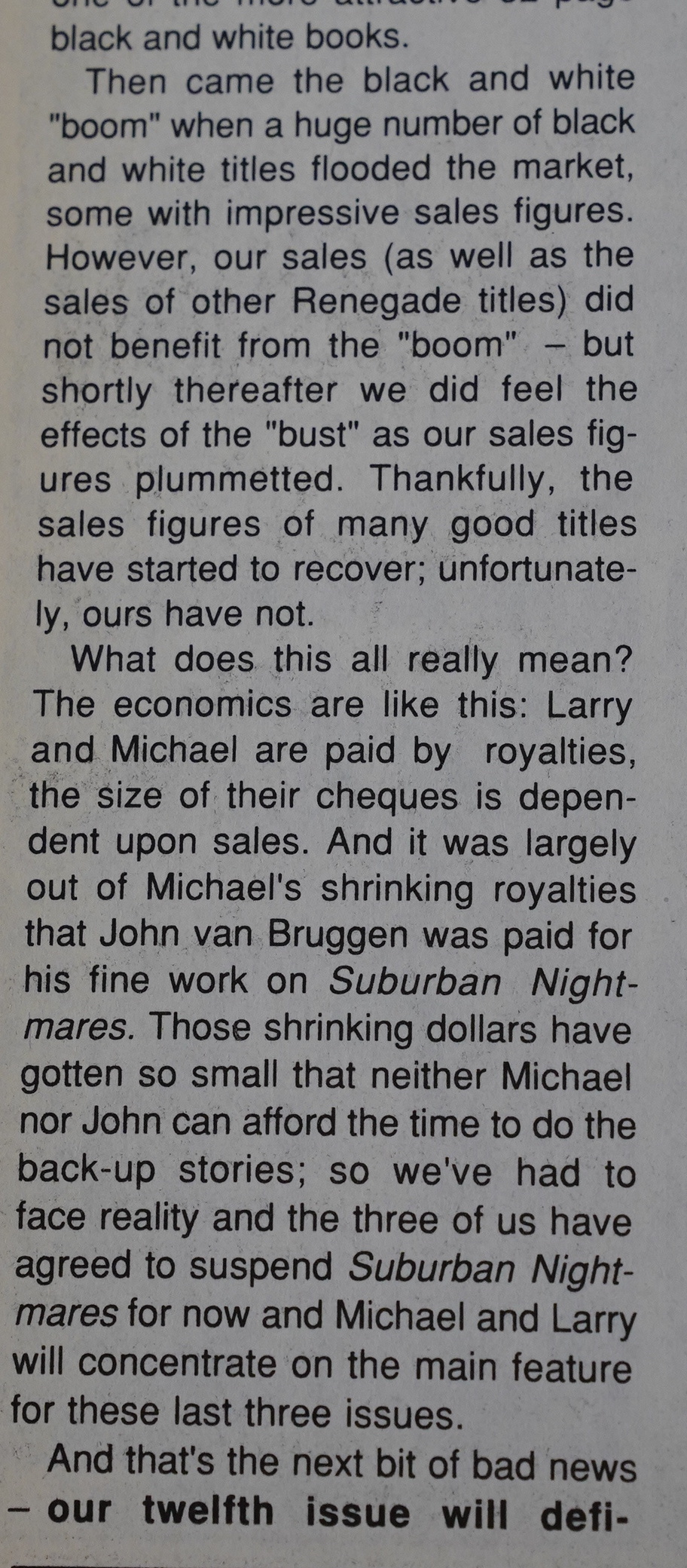
Hancock announces that Silent Invasion will end with issue 12 (because of low sales), but that there may be more later.
Was Cherkas getting inspired by Seth’s work on Mister X by this point? Those more rounded shoulders in that out-of-focus snap to the right are very Seth (on Mister X).
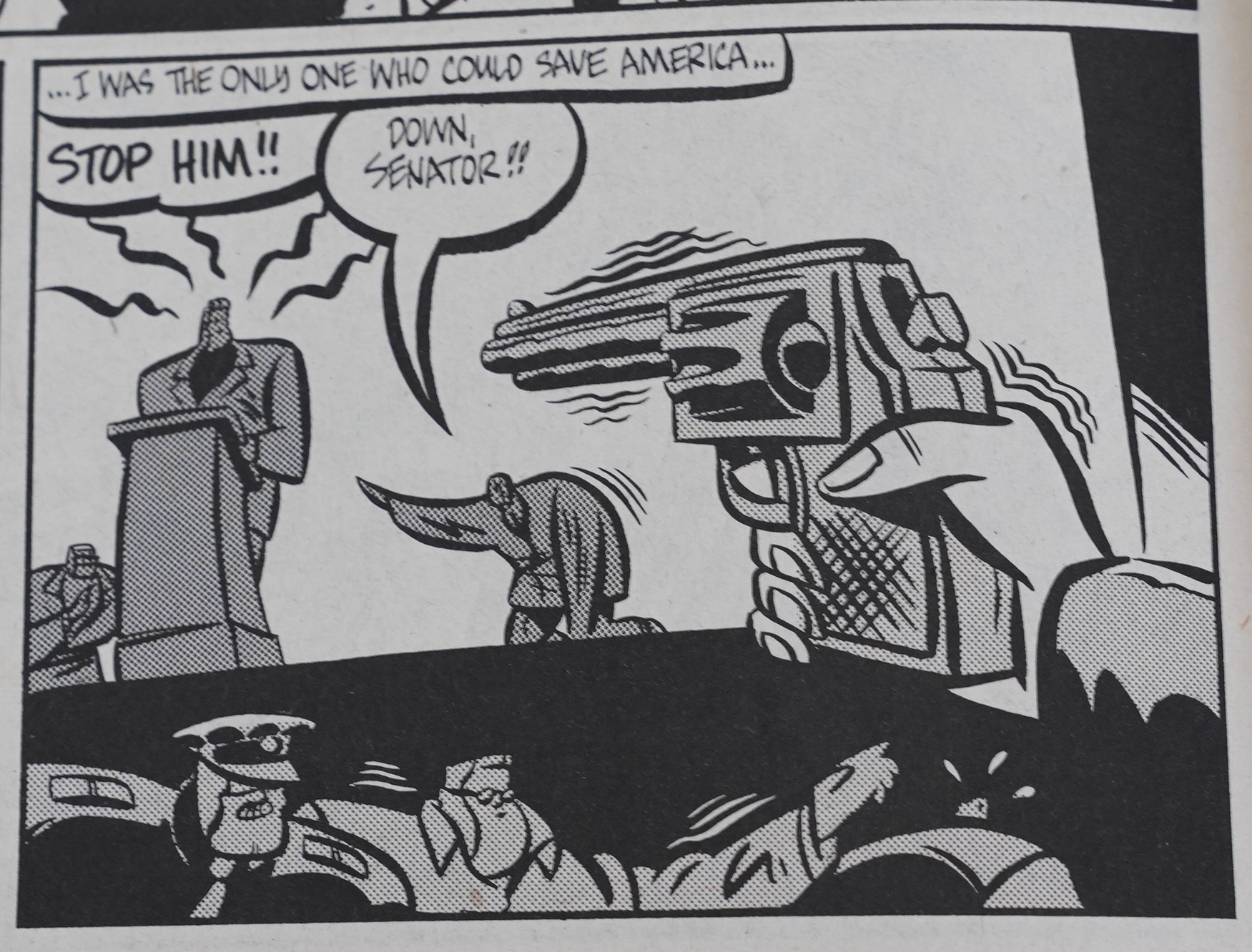
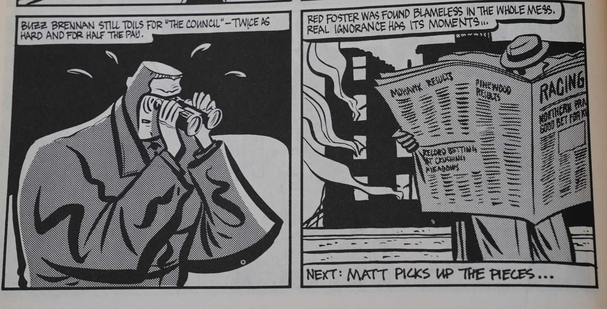
I have to say that I’m disappointed at how The Silent Invasion ends. Hancock says that the ending isn’t hurried, but was planned this way may well be true, but it’s a let-down, because it doesn’t really tie up much of anything: All the mysteries remain stubbornly mysterious.
And the Sinkage story arc feels overly familiar — I feel like I’ve read the same story many times before.
That’s not to say that I didn’t enjoy reading these comics: They’re dense, entertaining and there’s something fun to look at on every page.

Hancock announces that NBM is going to reprint the series, and that they’re redoing a bunch of pages, because they feel like the artwork on some of the earlier issues wasn’t up to snuff.
Hm… don’t I have those? But where?
I did! And I managed to find them, even! Whoa.
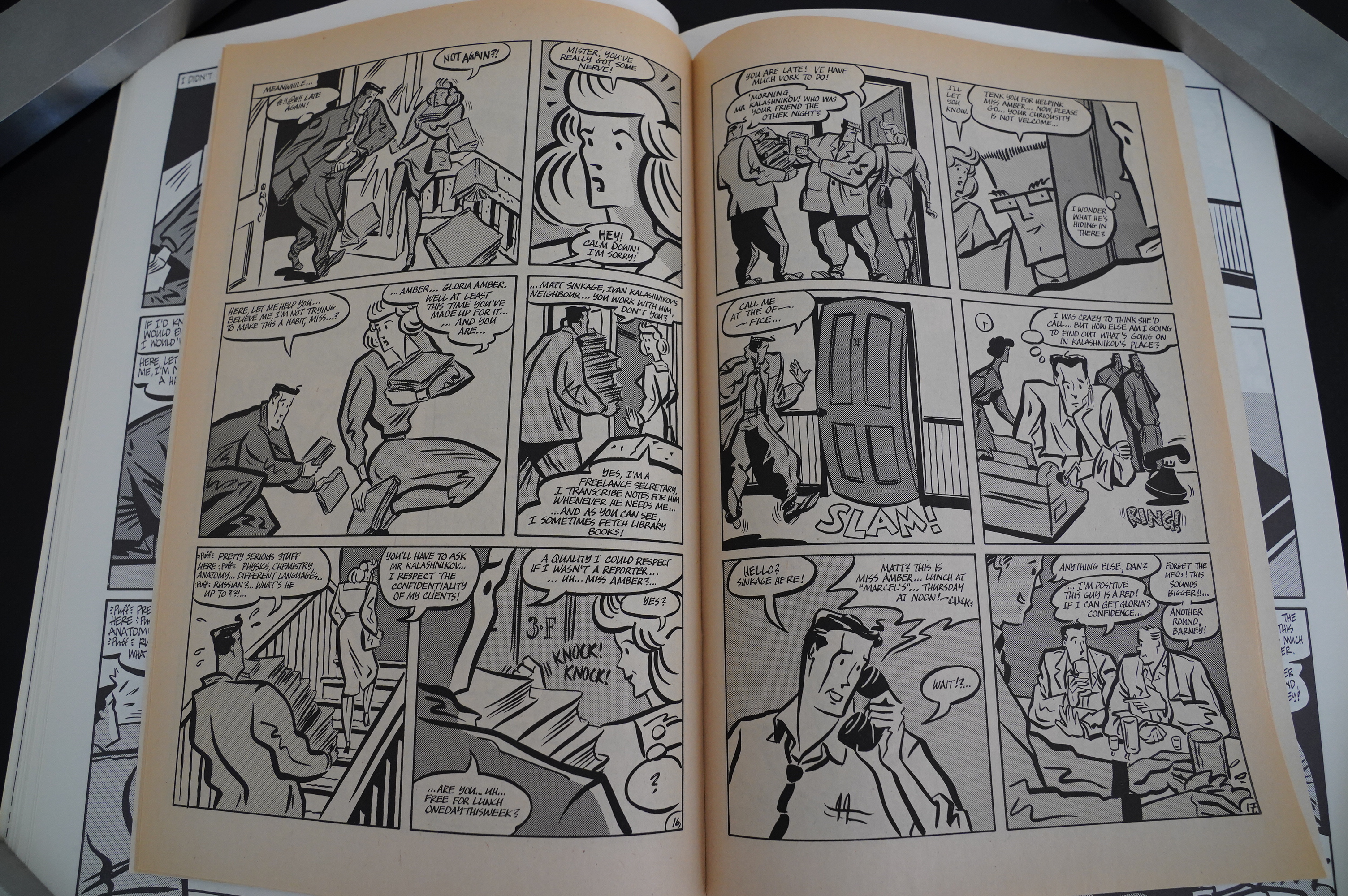
I apparently bought these at a half price sale in the early 90s. So let’s look at the art changes of some random pages…
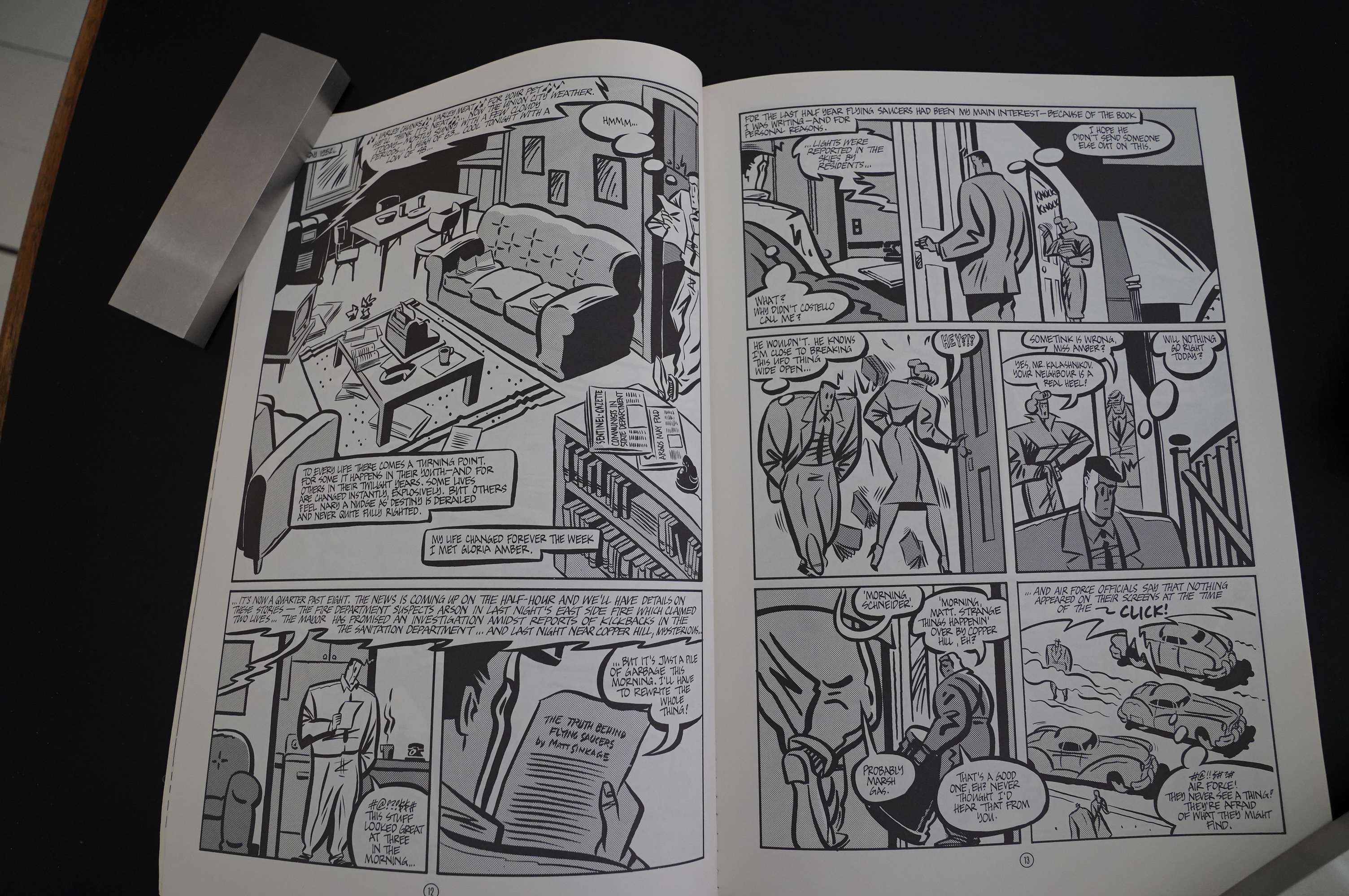

Well, those changes are very small indeed. They’ve gotten rid of the title, which makes sense, and the zip-a-tone is different here and there, but otherwise it’s … Hm… oh! There’s all these small changes in every panel — Sinkage’s face is drawn differently, and the third panel on the right-hand page is a lot less awkward.

Here the changes are much more extensive — they’ve thrown out the entire big panel that I was kvetching about at length up at the start of this blog post… and pretty much everything has been redrawn, I guess?
And same thing here — things have been rejiggered and redrawn.
Anyway!
From an interview in Amazing Heroes #148, page 28:
Back
to The Silent Invasion: The headlines
on the supermarket tabloids always in-
trigue me—and we tried to get that
feeling into the book. As a kid, I
bought Fate magazine to read the gar-
bage about abductions by aliens, the
stuff about George Adamski, or the
Exeter incident. But Fate scared the
bejeesus out of me: alien contact, ESP
powers, ghosts.
With The Silent Invasion, we’re do-
ing a comic book that we would like
to read. We’re not doing it for that big
unknmvn out there. We know what the
comic fan wants and I don’t think
we’re writing for the average comic
book fan.
HANCOCK: Oh, definitely not.
CHERKAS: We’re really trying to
reach an audience, I think, that read
comics as a kid, but are not reading
them now. They probably would if
they found something interesting. At
this point, we’re not writing comics
for the people who frequent comic
book shops.
HANCOCK: That’s one reason we’re
so excited about NBM publishing our
book and putting it into general book
stores. We want to reach those peo-
ple who don’t normally go into a com-
ic book shop.
AH: Is that why you re-worked some
of The Silent Invasion?
actually,
HANCOCK: well,
Michael’s art style changed drastically
after the first two issues around into
the third issue.
CHERKAS: It’s not that the style
changed. That is, I didn’t conscious-
ly change it with issue #3 or #4. It
took me two or three issues to feel
comfortable with this “European” ap-
proach. It took me two or three issues
to feel comfortable with a brush.
Before The Silent Invasion, I’d never
really used a brush, so the first two
issues have this real tentative quality
about them. Another thing here is that
I did the first issue in 3 or 4 weeks.
The more issues I did, the longer they
took to draw. I was averaging 6 to 7
weeks on the later issues.
HANCOCK: His art style evolved
over the entire series.
CHERKAS: Yeah. It evolved as 1
taught myself how to use a brush.
HANCOCK: We wanted to put out
the best professional package. So we
went back and re-did the artwork on
the first three issues, the first graphic
novel. Artwork-wise we figure
Michael re-drew the equivalent of
about twenty pages; he also went
through and re-lettered the entire
thing. We re-wrote some of the
dialogue balloons and we wrote a
whole bunch of brand new
captions…
CHERKAS: Just to bring it into the
style of the later issues…
Somebody writes in Amazing Heroes #113, page 67:
THE 10 BEST OF 1986
10. THE SILENT INVASION (Renegade
Press, limited series?)
Larry Hancock has woven a
strange and fascinating mystery
around cornmunist spies, FBI
agents, private eyes, newspapermen,
and UF()s in the early 1950s.
Michael Cherkas has brought it to
life with a weird, chunky, distorted,
moody, and unfailingly dramatic
cartooning style that takes off from
bulbous post-War industrial design,
zooms through the shadowy claus-
trophobia of a low-budget film noir,
and soars off into uncharted realms.
Both the writer’s and the artist’s
vision seem to spill from the same
fever-dream of dimly remembered
images and horrors that it’s hard to
believe this is the Vtork of a team and
not a lone, obsessed cartoonist. This
is one of the most unsettling com-
ics I’ve ever read; everything in -it
is based on missing memories, false
identities, unconfirmed suspicions,
hidden networks. Even its faults
work for it: Cherkas has trouble
making his characters’ faces distinct
from one another, which muddies
up the story a little but also
heightens the sense of paranoia and
uncertainty. But The Silent Invasion
isn’t just Kafka with Buicks. It’s a
very lively, quick-paced, forward-
driving story. Most impressively,
Hancock and Cherkas have been
able to dig back into the popular
culture icons of 1950s they never ex-
perienced without ever falling into
the trap of pastiche. Yes, this is a
Cold War paranoia story, but it’s by
no means a rehash of Imusion of the
Body Snatchers or Kiss Me Deadly.
This is a very original of great
potential.
Somebody writes in Amazing Heroes #105, page 75:
The finer comics cuisine is a
repast to be savored, and lately
several such establishments have
made a repeat customer out of me.
One such is The Silent Invasion from
that purveyor of unusual fare,
Renegade. In many ways, this is an
old-fashioned quick hamburger
lunch, but what a juicy and delicious
burger it is, and what wonderful
fries! Traditional themes served up
fresh and delicious are hard to argue
with. Communist plots, Hitch-
cockian confusion of identity, a
mysterious blonde, and spaceships.
Burgers just taste better when served
in the old-fashioned decor of old
Coca-Cola signs, short-skirted
waitresses, and a rocking Wurlitzer.
The gristle in Silent Invasion is that
the various male characters some-
times do not have enough visual
individuality to clearly differentiate
them. Which is a shame, because
otherwise Michael Cherkas’ unusual
brand of wavy, thick-lined brush-
work, high-constrast use of blacks,
angular faces, and simplicity of
layout bring the perfect flavor to
Larry Hancock’s story (plot assisted
by John Ellis Sech).
Russell Freund writes in The Comics Journal #110, page 58:
Two issues of The Silent Invasion have
reached my desk to date. It’s another ex-
ample of the ’50s B-movfe setting and sensi-
bility that is infiltrating more and more
comics these days (I call this phenomenon
“Creeping Llewellynism”). Larry Hancock,
the writer, has hammered together an ami•
ably convoluted Story about an investigative
reporter With flying saucers on his mind and
commie spies in his rooming house. It took
me two full issues to get theidea that this
was essentially a straight adventure story.
salted With a few Wisecracks and funny
names, but to be played for action and in-
trigue. Easy laugh that am, the loopy art-
work Of Michael Cherkas had me convinced
the book was a joke.
Cherkas’s cartcx•ning is big, broadstroked,
and funny. He’s great with cars, bringing the
big fat Studebakers and DeSotos of the early
Ike era to bulging, honking. The women
have bodies like prison matrons and shoe-
box heads. The similarly shoe-box-headed
men all 100k like they go out With prison
matrons. R’rtunately, Cherkas knows Where
to put things in a panel, and how to keep
a page movinB In fact, Cherkas’s funny pic-
tures are a large part of The Silent Invasion’s
appeal. This same material drawn by a more
conventionally accomplished artist wouldn’t
Offer anything like the fun Of watching these
big Studebaker men chase these shoe
headed commie DeSoto spies.
Heh heh “Creeping Llewellynism”.
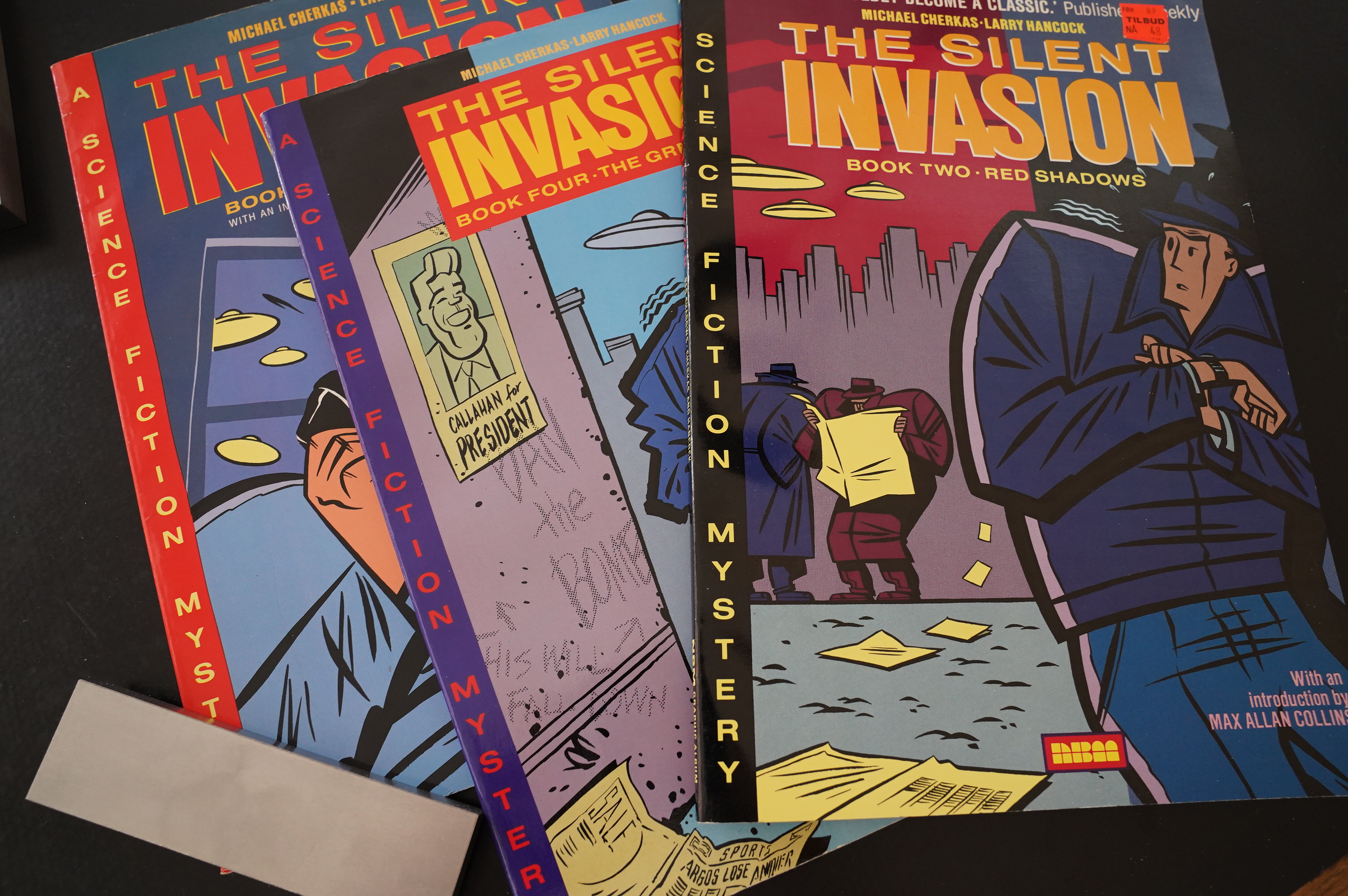
NBM has issued new editions of The Silent Invasion:
The Silent Invasion was enormously satisfying as comics produced in the 1980s, when during a period of greater optimism it looked back on the darkness from another time. It was enormously satisfying as four graphic novels in the 1990s, when it ran parallel to X-Files utilising a similar mood of sinister repression of truth out there, and it remains enormously satisfying in 2018/19.
There was also a reprint by Caliber in the 90s, and a continuation from NBM about 20 years ago.
The series seems to be generally positively reviewed:
I enjoyed ‘Red Shadows’ and I liked ‘The Great Fear’, too. I look forward to part three, ‘The Silent Invasion: Abductions!’ Intelligent, original indie comics like this make a nice change of pace from the ubiquitous super-heroes taking over the cinema.
Gripping and utterly addictive, The Silent Invasion is a uniquely beguiling confection rendered in a compelling, spectacularly expressionistic style: an epic that perpetually twists and turns, leaving readers dazed, dazzled and always hungry for more. Tragically, its warped Machiavellian shenanigans have never been more relevant than now and lead me to conclude that the infiltration is complete and that weird inexplicable non-humans already stalk all earthly corridors of power…
This blog post is part of the Renegades and Aardvarks series.