Devin and Gary Go Outside
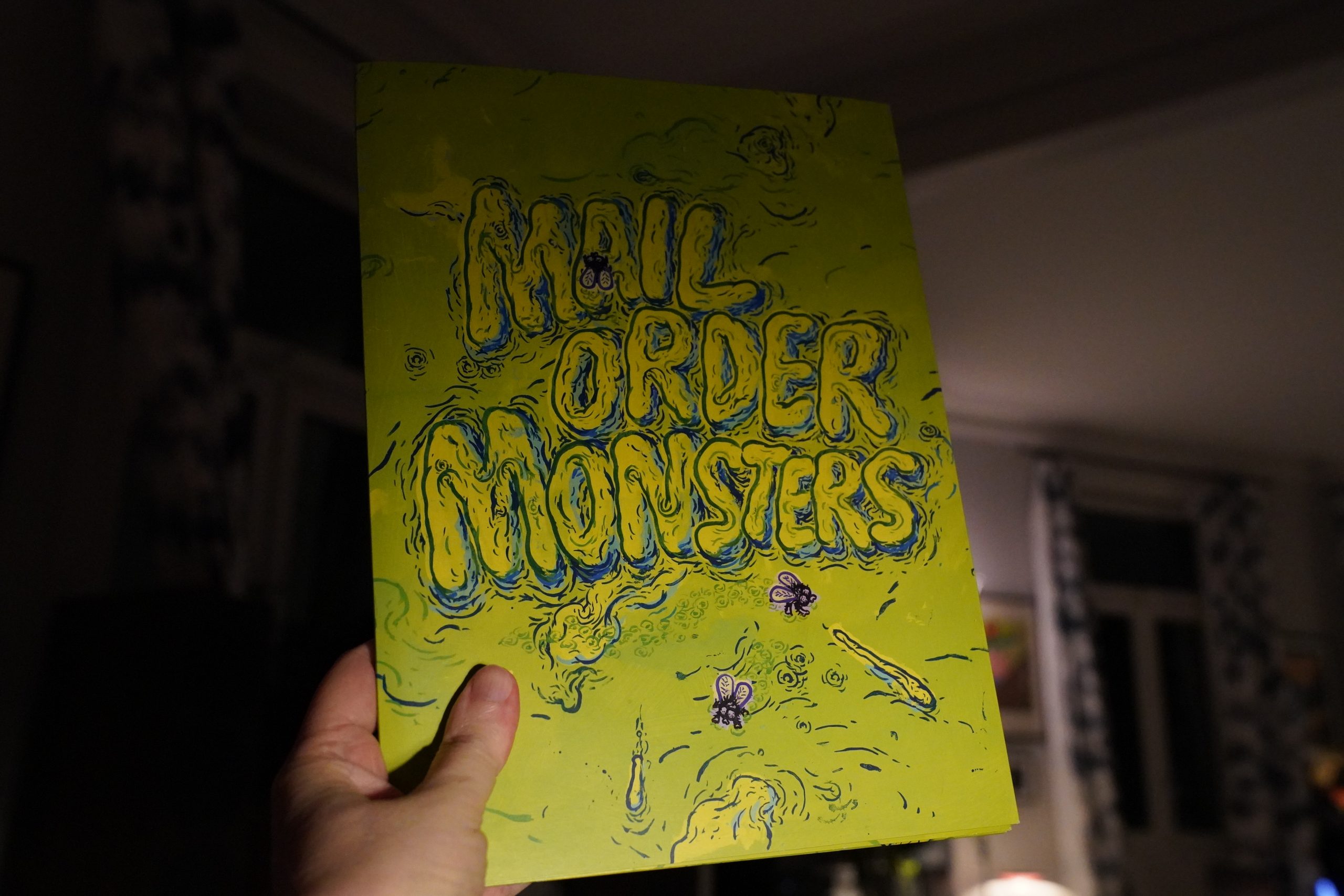
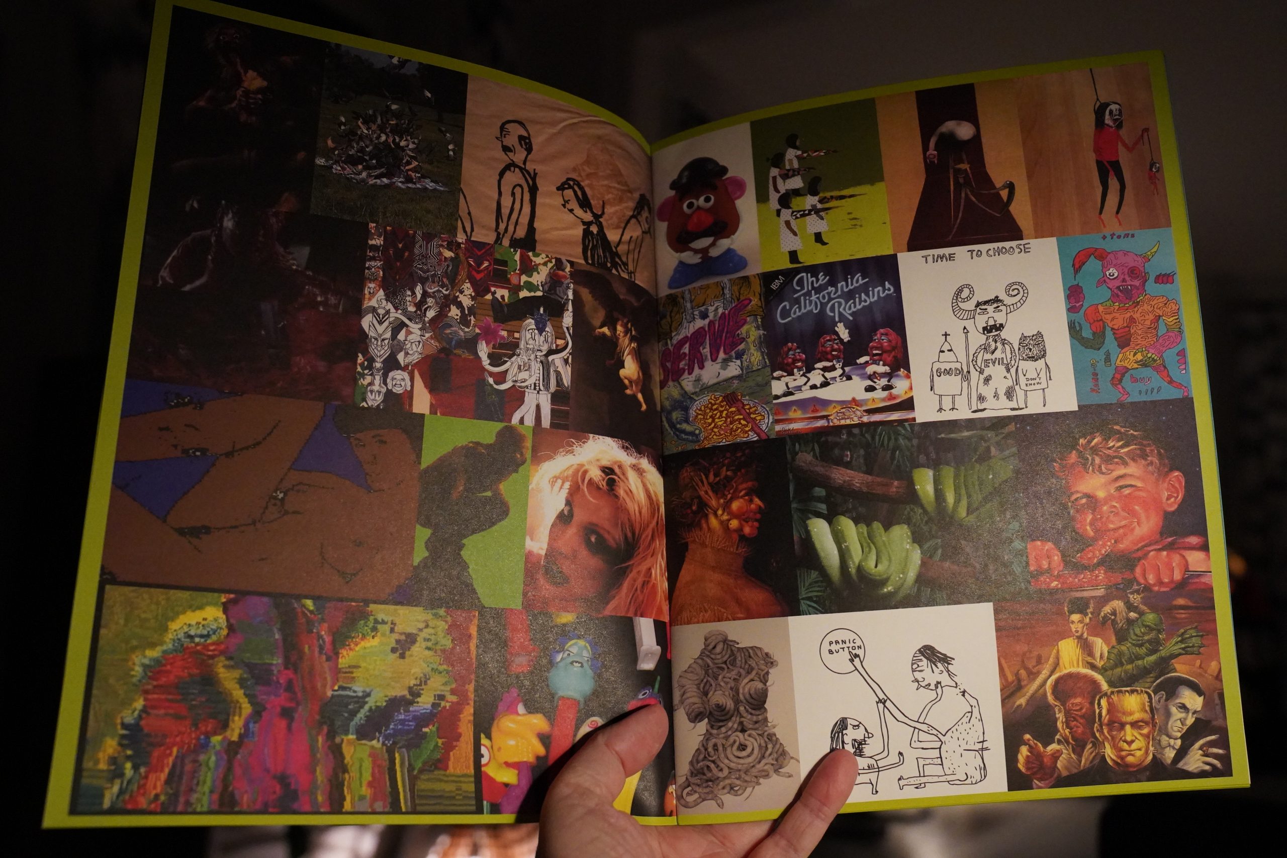
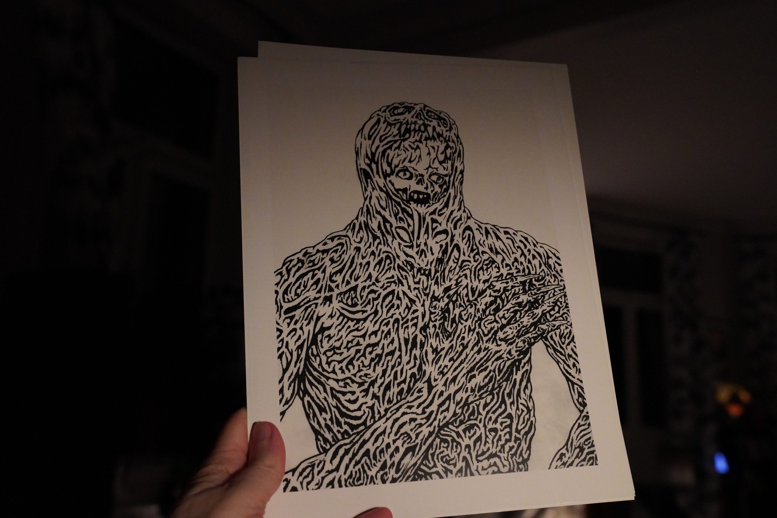
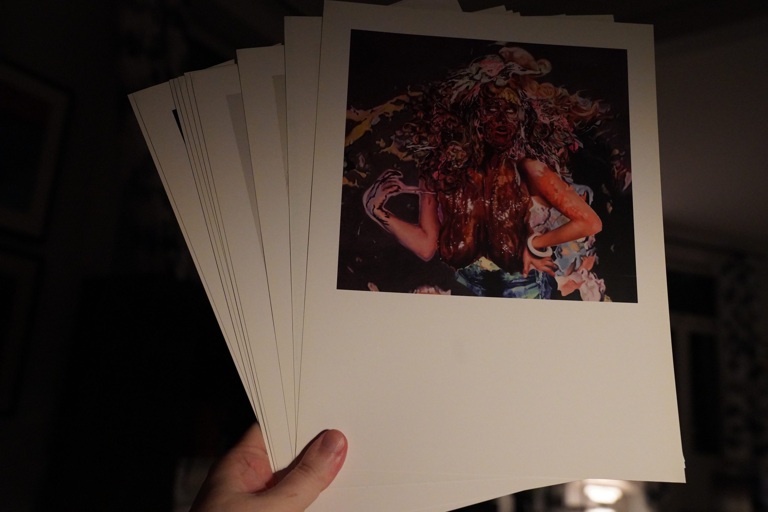
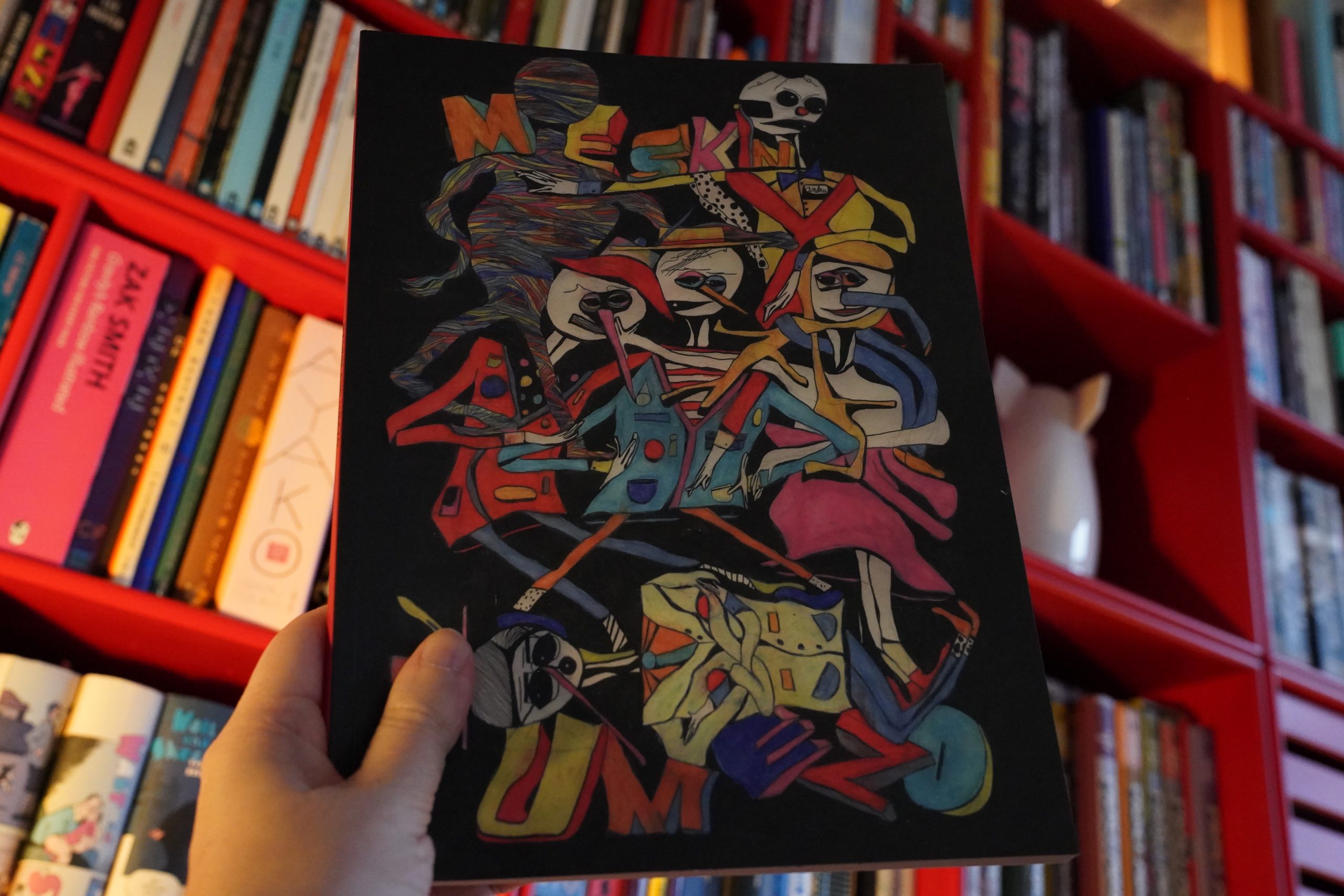
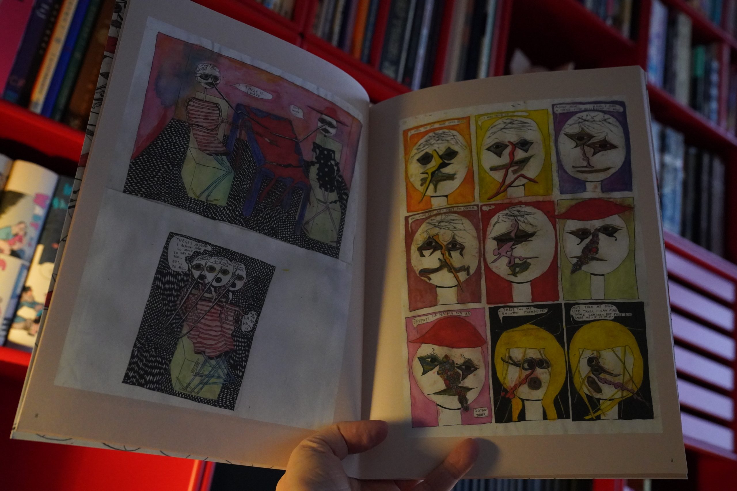
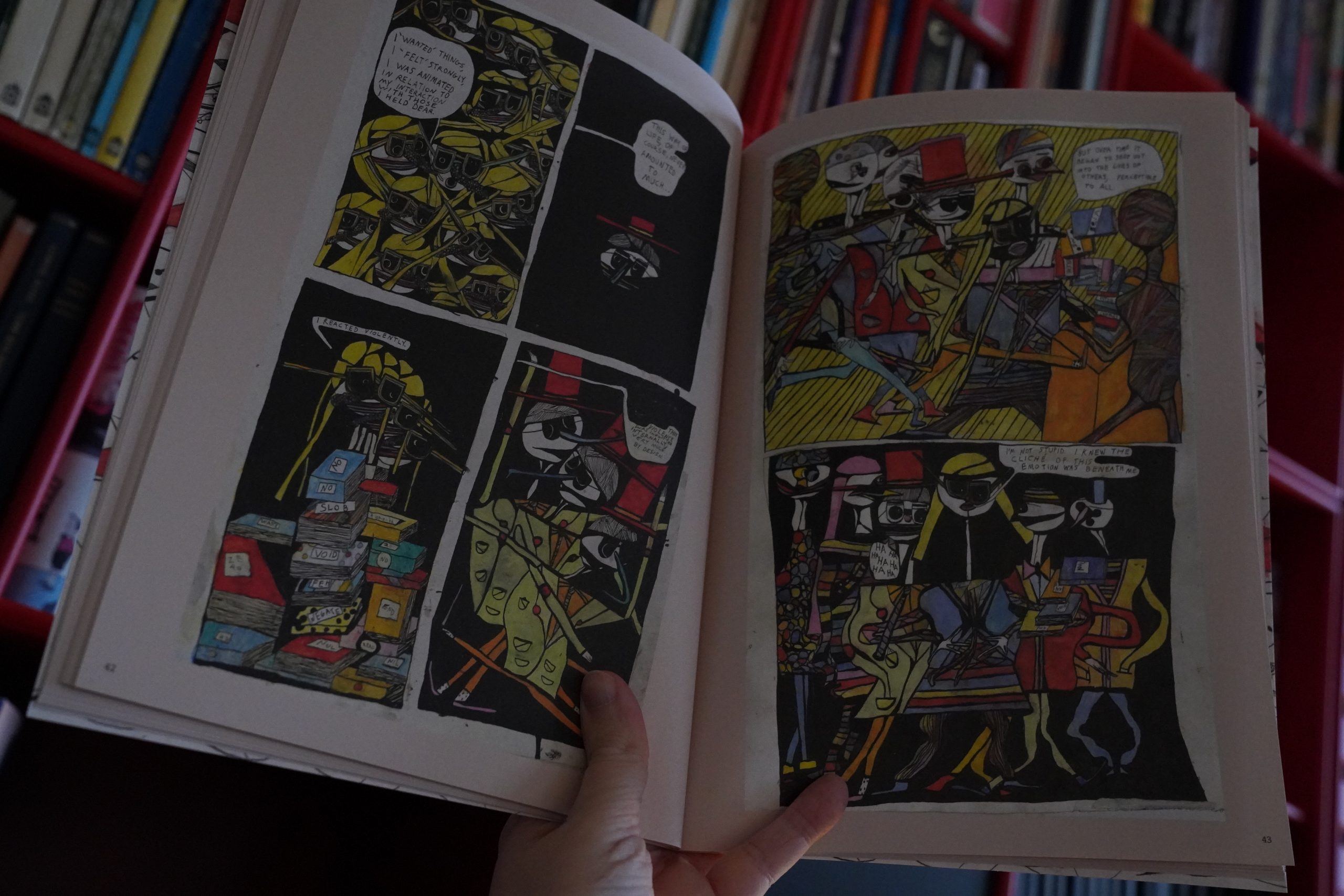
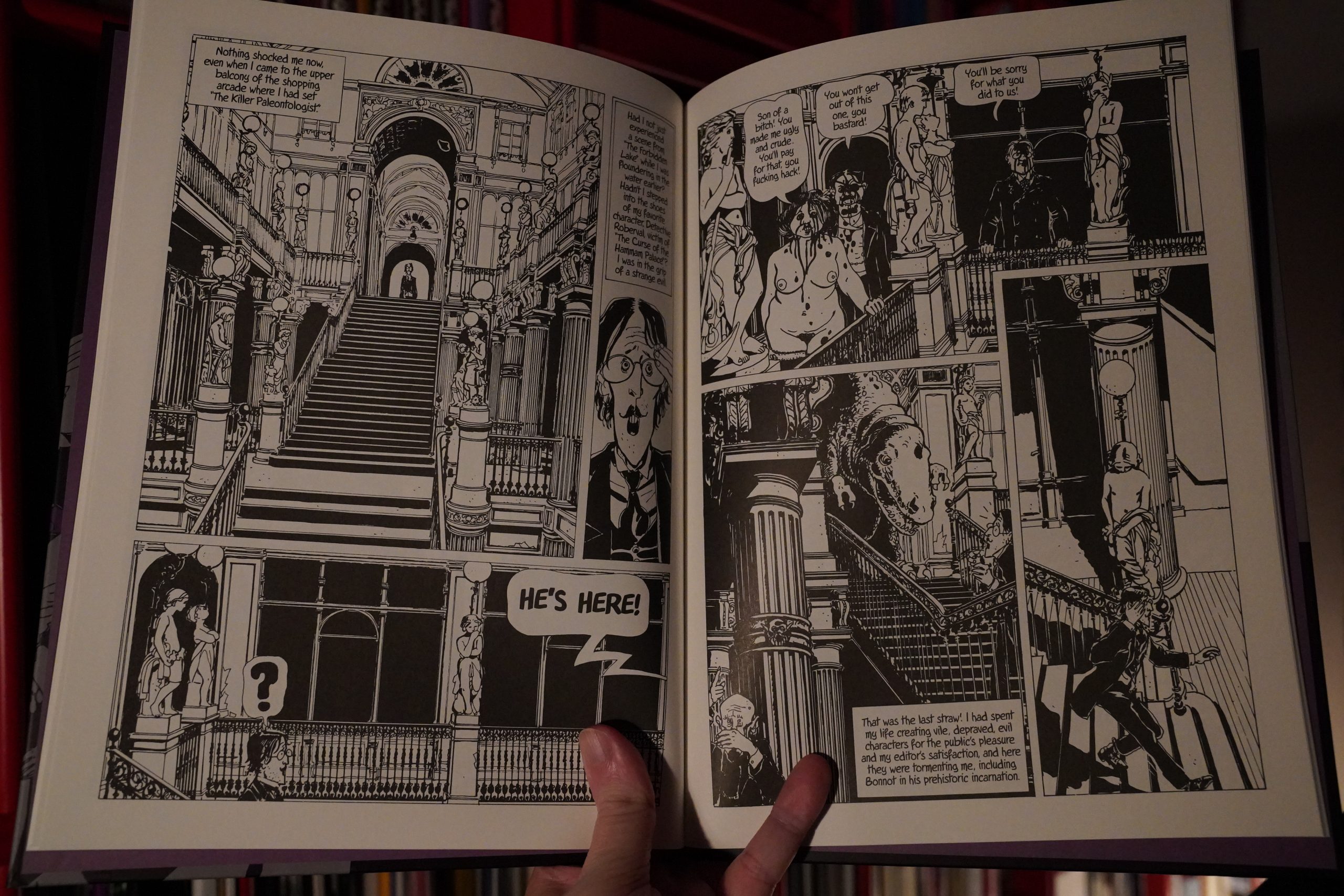
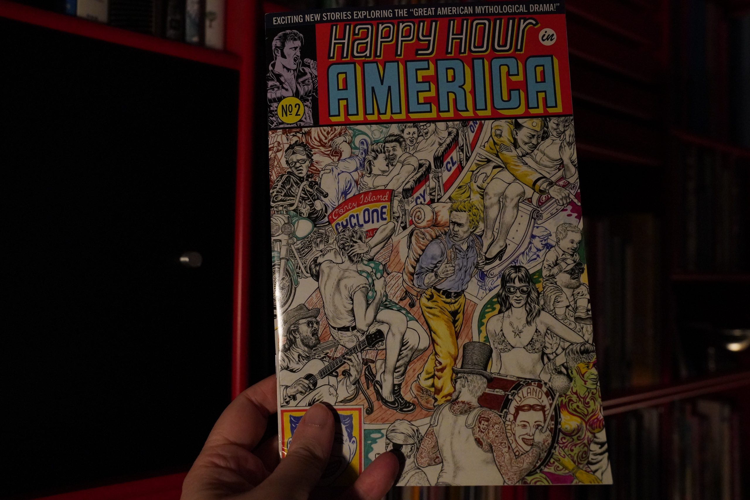
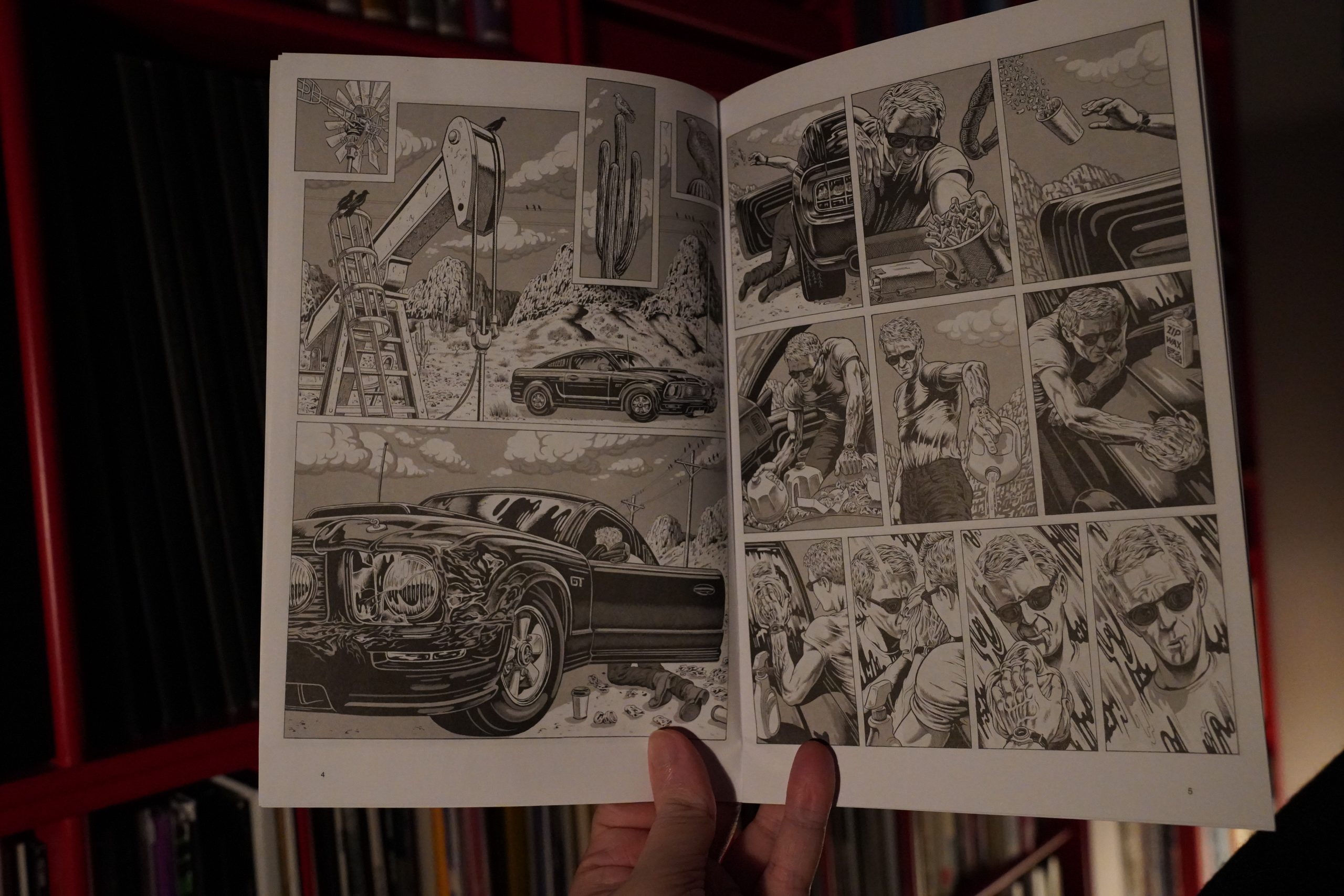
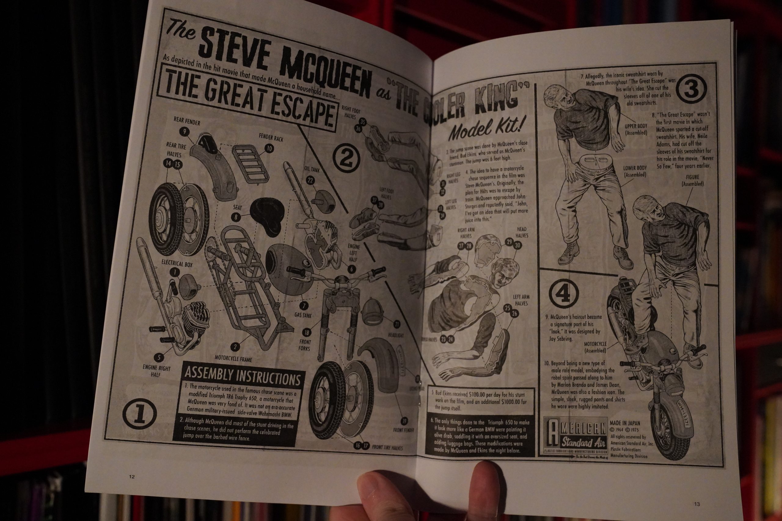
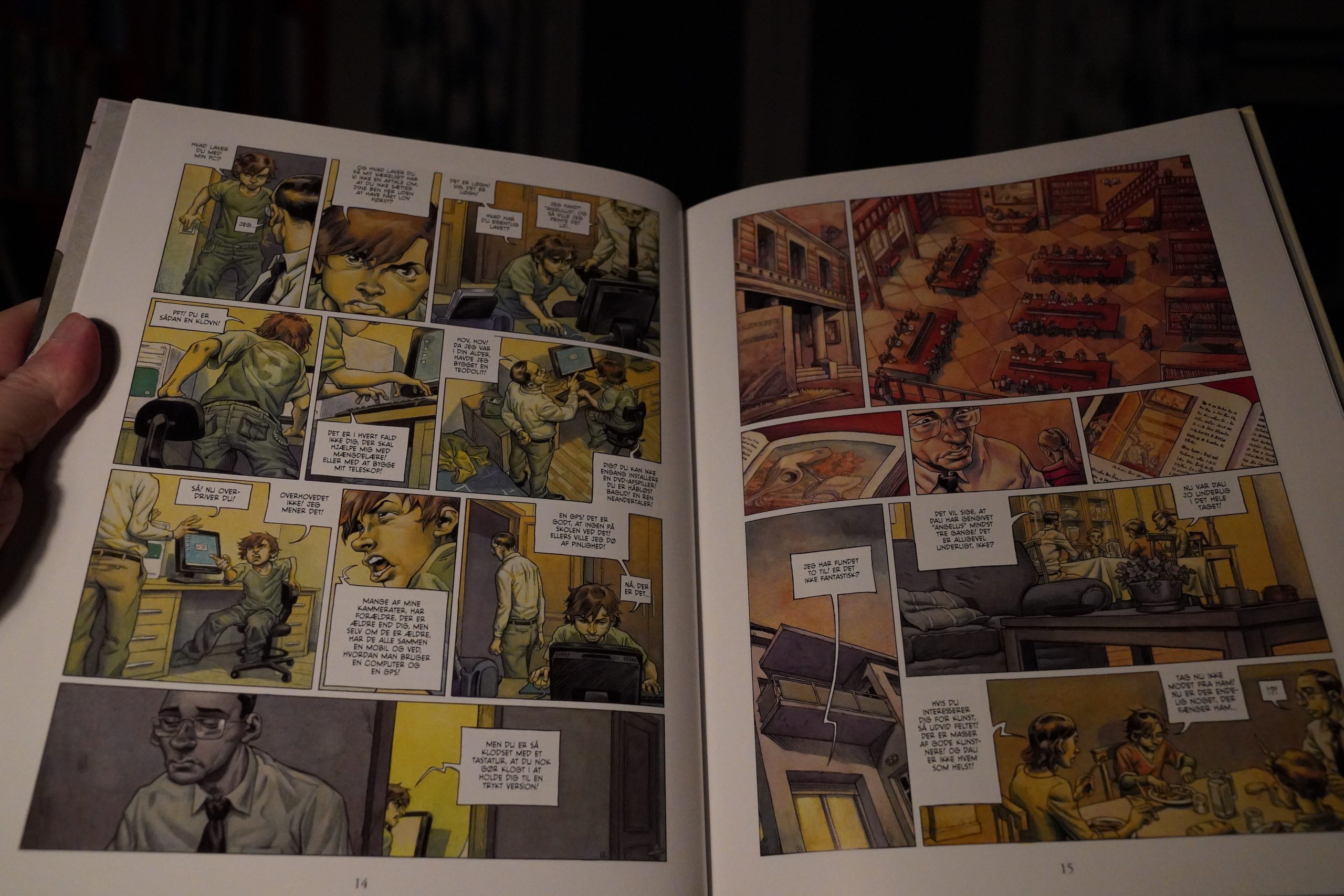
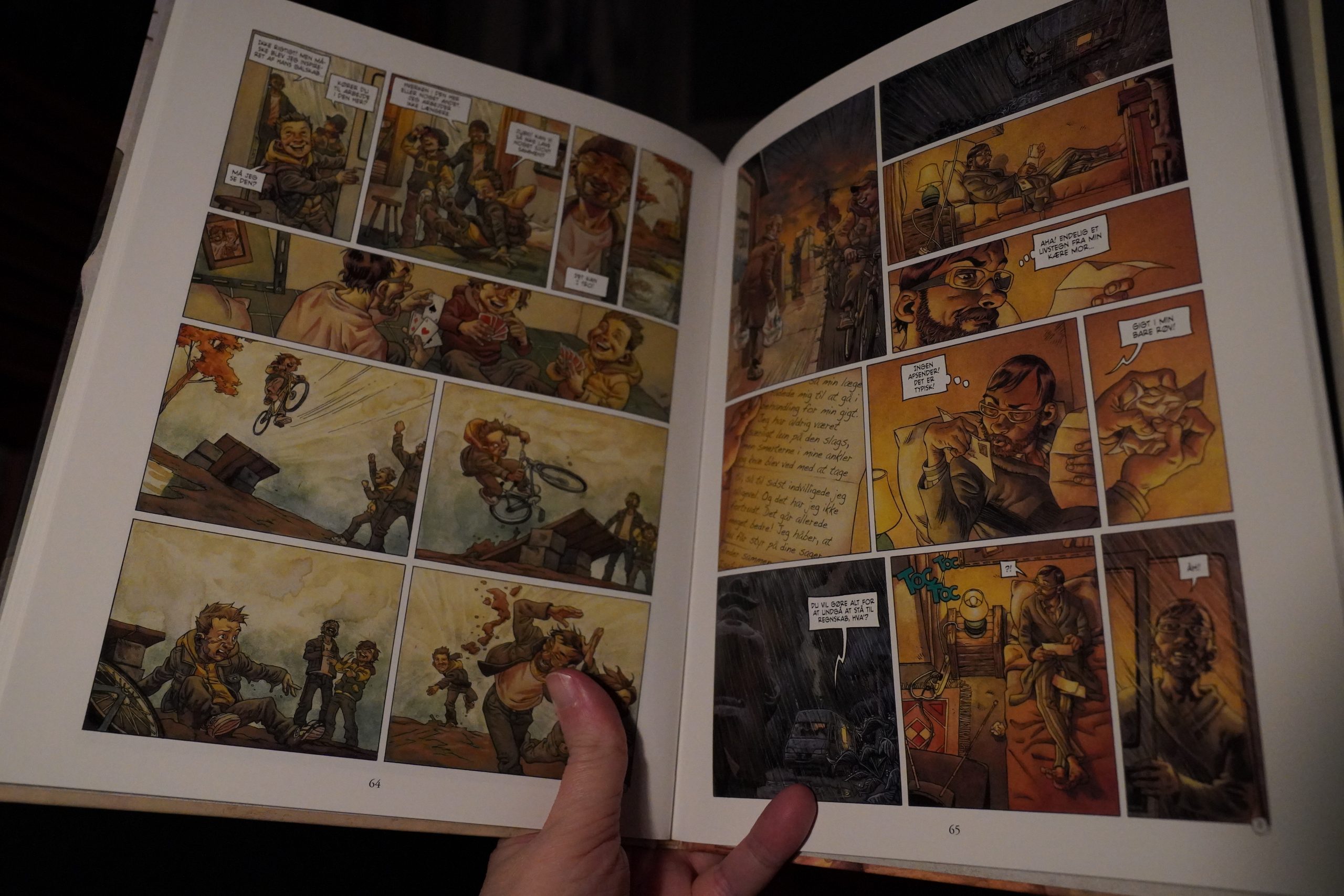
This is a CD by Devin Flynn and Gary Panter, published by Picturebox, apparently.
It’s far out.
This blog post is part of the Punk Comix series.
Devin and Gary Go Outside
This is a CD by Devin Flynn and Gary Panter, published by Picturebox, apparently.
It’s far out.
This blog post is part of the Punk Comix series.
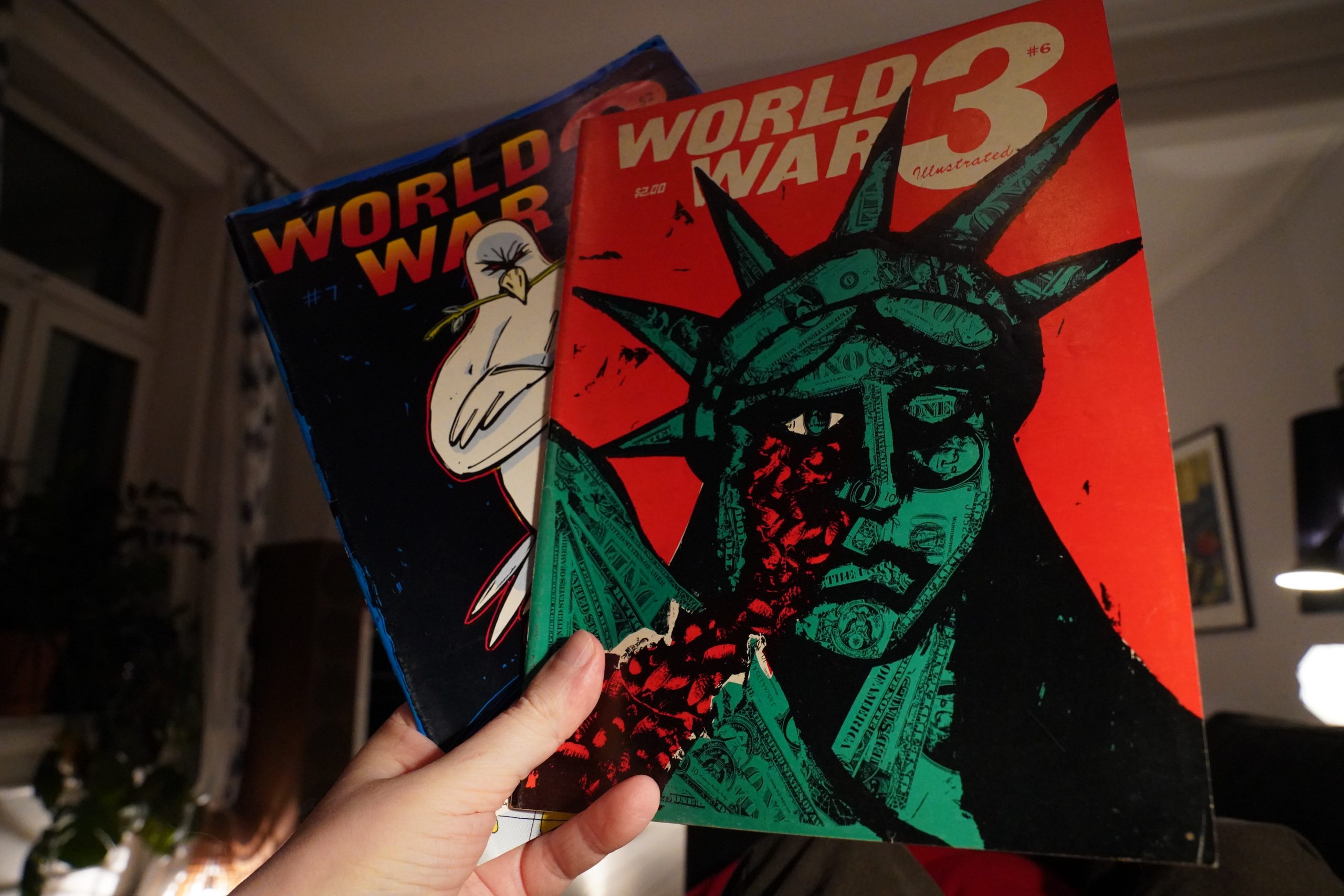
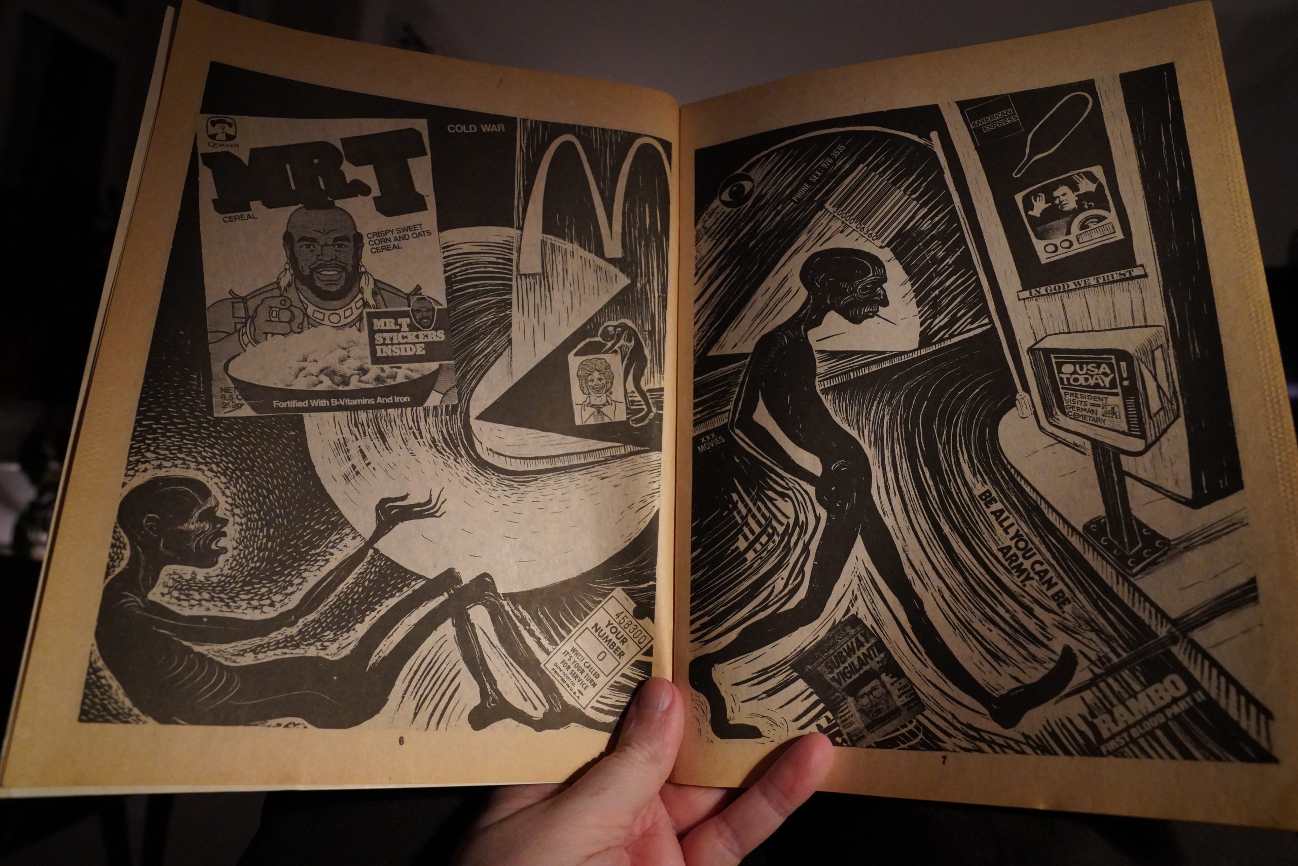
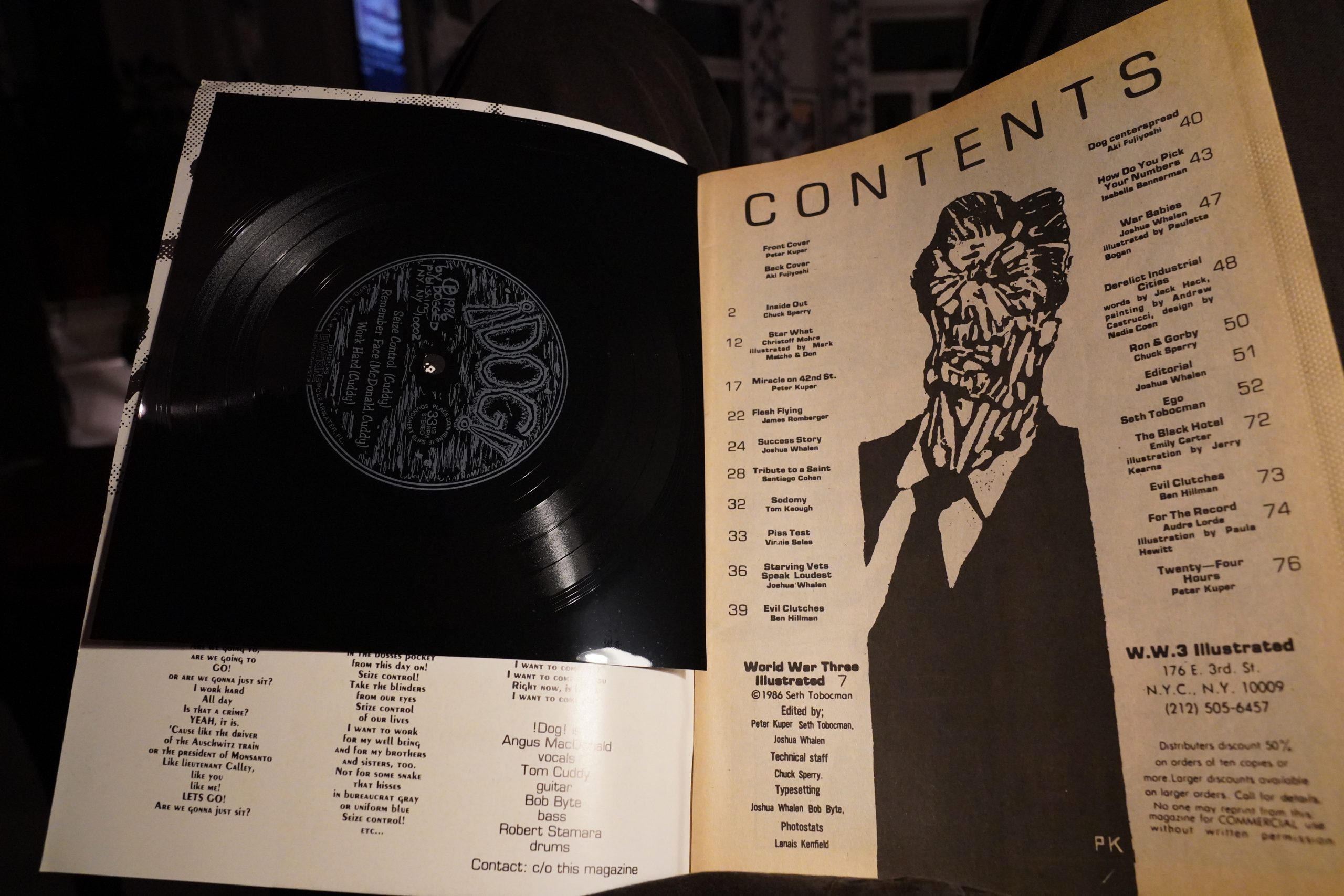
World War 3 Illustrated #1 edited by Seth Tobocman, Peter Kuper and Christof Kohlhofer (202x270mm)
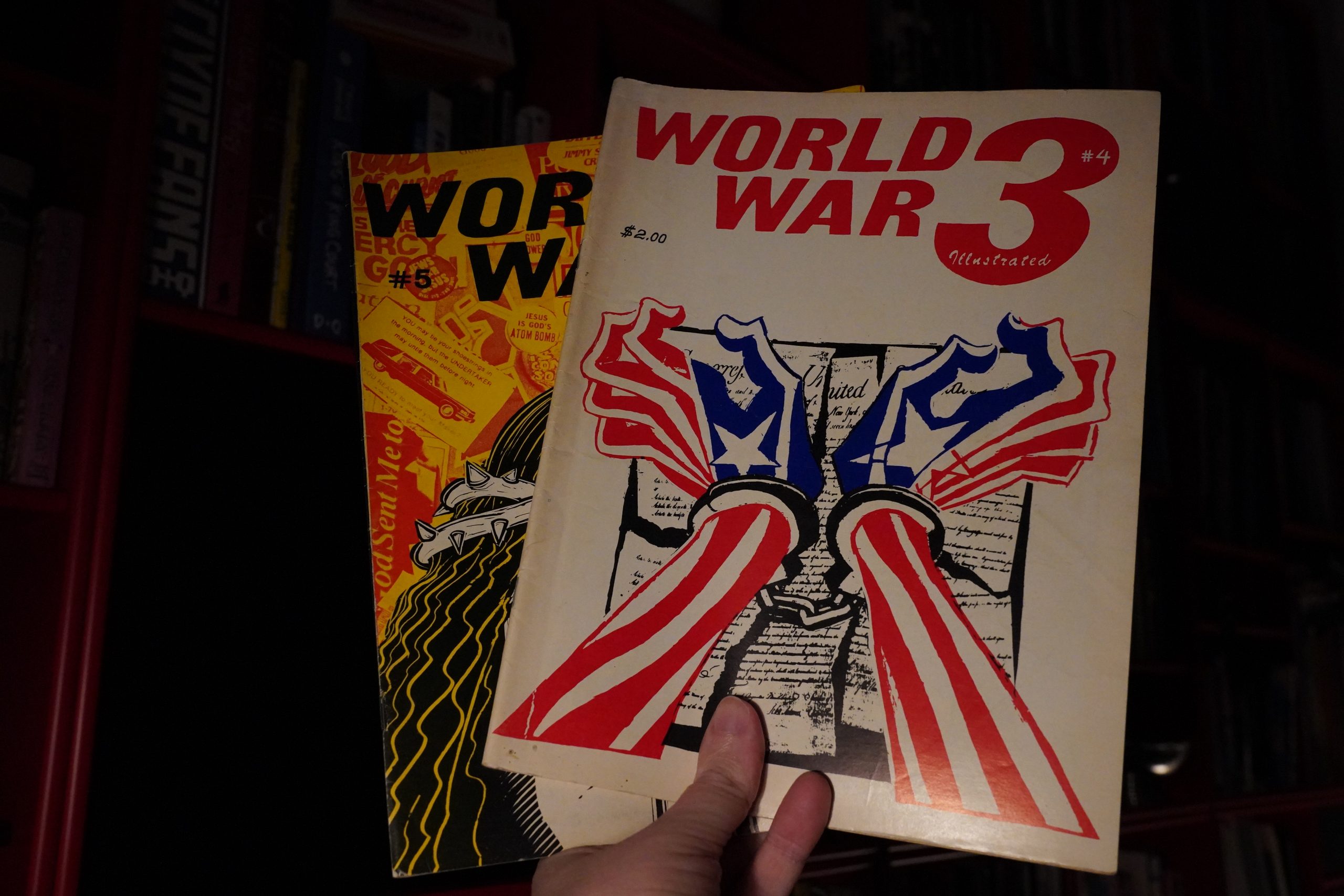
When starting this Raw-focused blog series, I wondered whether I should do some World War 3 Illustrated, too — it was another anthology started in New York around the same time, and with as much claim on the phrase “punk comix” than Raw has, really… But it’s virtually impossible to find any of the early issues. It’s not that they’re very expensive when they do pop up on ebay, but… they never do! It took me half a year to score this issue.
What about the traditional comics sellers?
One issue (out of 50) in stock.
I think that grid from Mile High Comics means that they never had it.
So World War 3 Illustrated has existed in a world separate from the comics and traditional bookstore worlds — I’m guessing it’s been distributed in anarchist bookstores and stuff? And then people just threw them away? It’s not a “precious” art object like Raw Magazine, that’s for sure.
But I did find #1, so let’s look at that.
Heh heh.
Wow, that’s gorgeous… S Montano? That’s a name I’m not familiar with.
Hm… ah! The production for this was done at Brooklyn Bridge Publications, who published the first Picture Story magazine. (I’m guessing Brooklyn Bridge was mainly just Ben Katchor.)
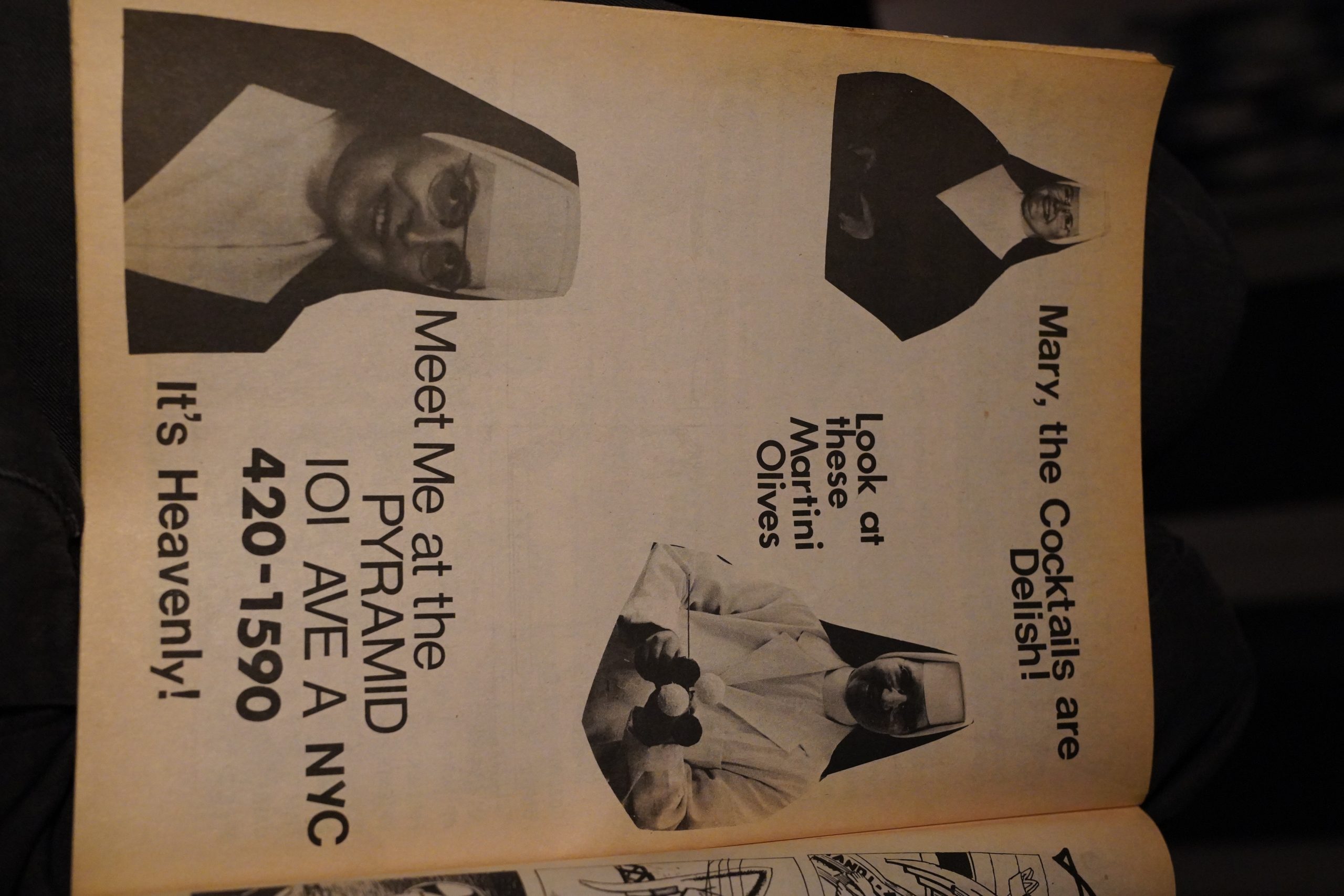
And an ad? For a radio station? With an EC-is sci-fi illustration?
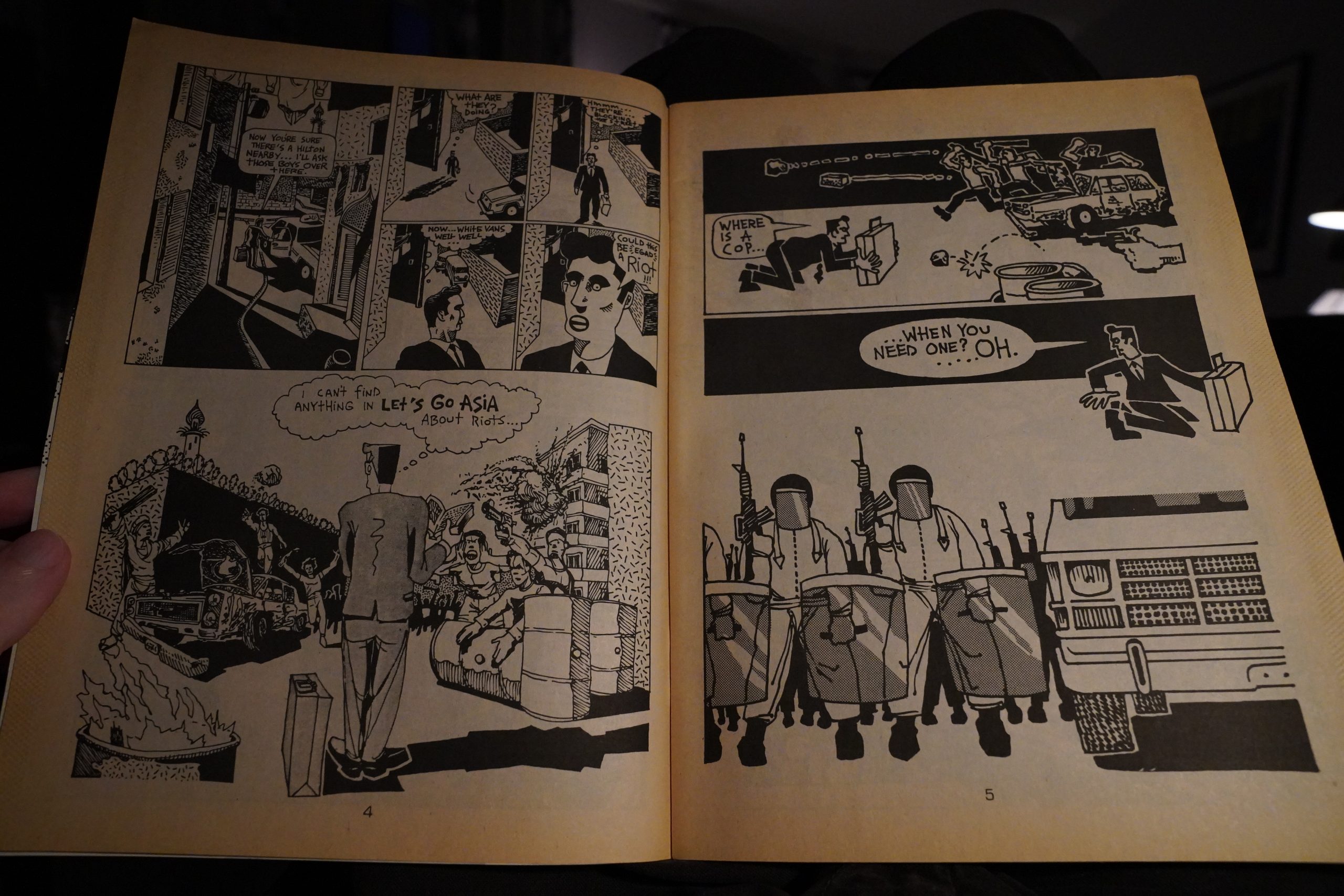
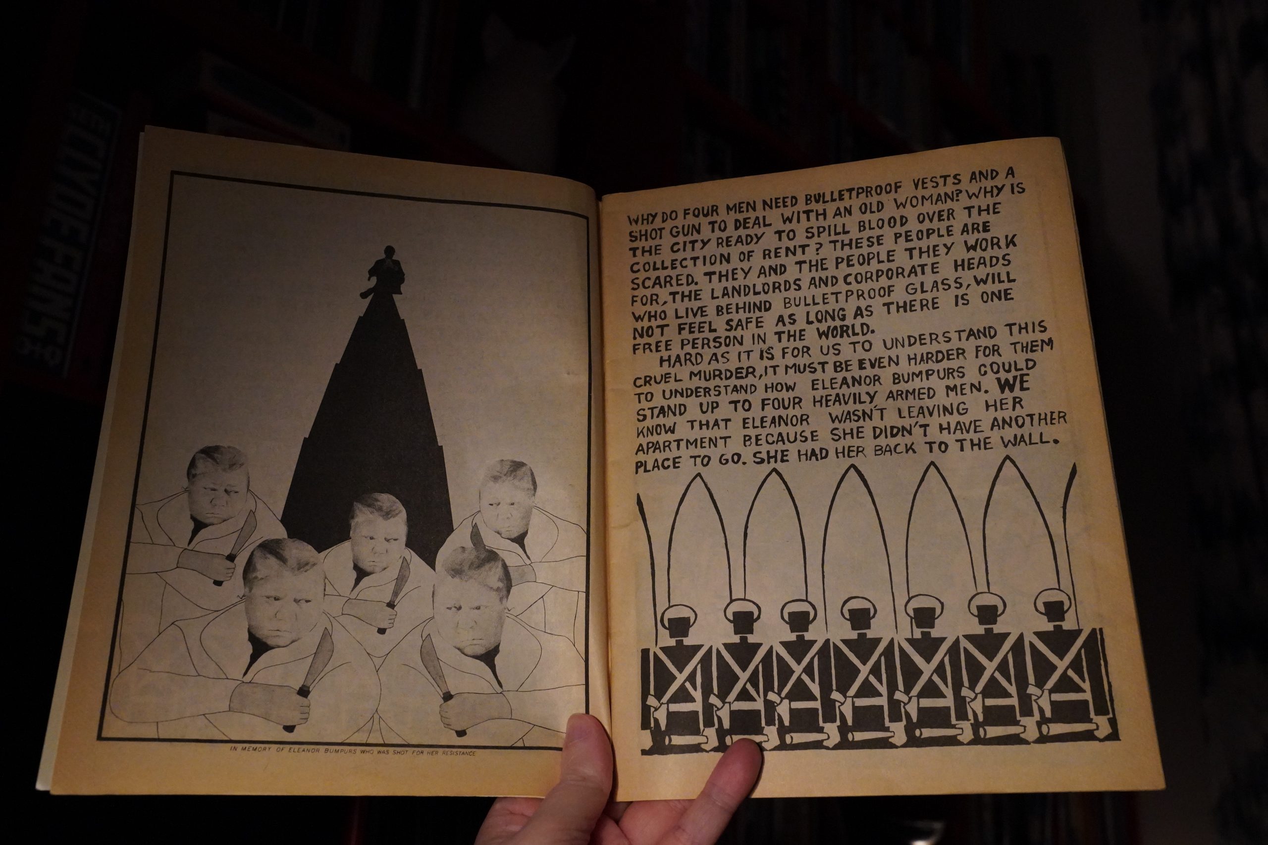
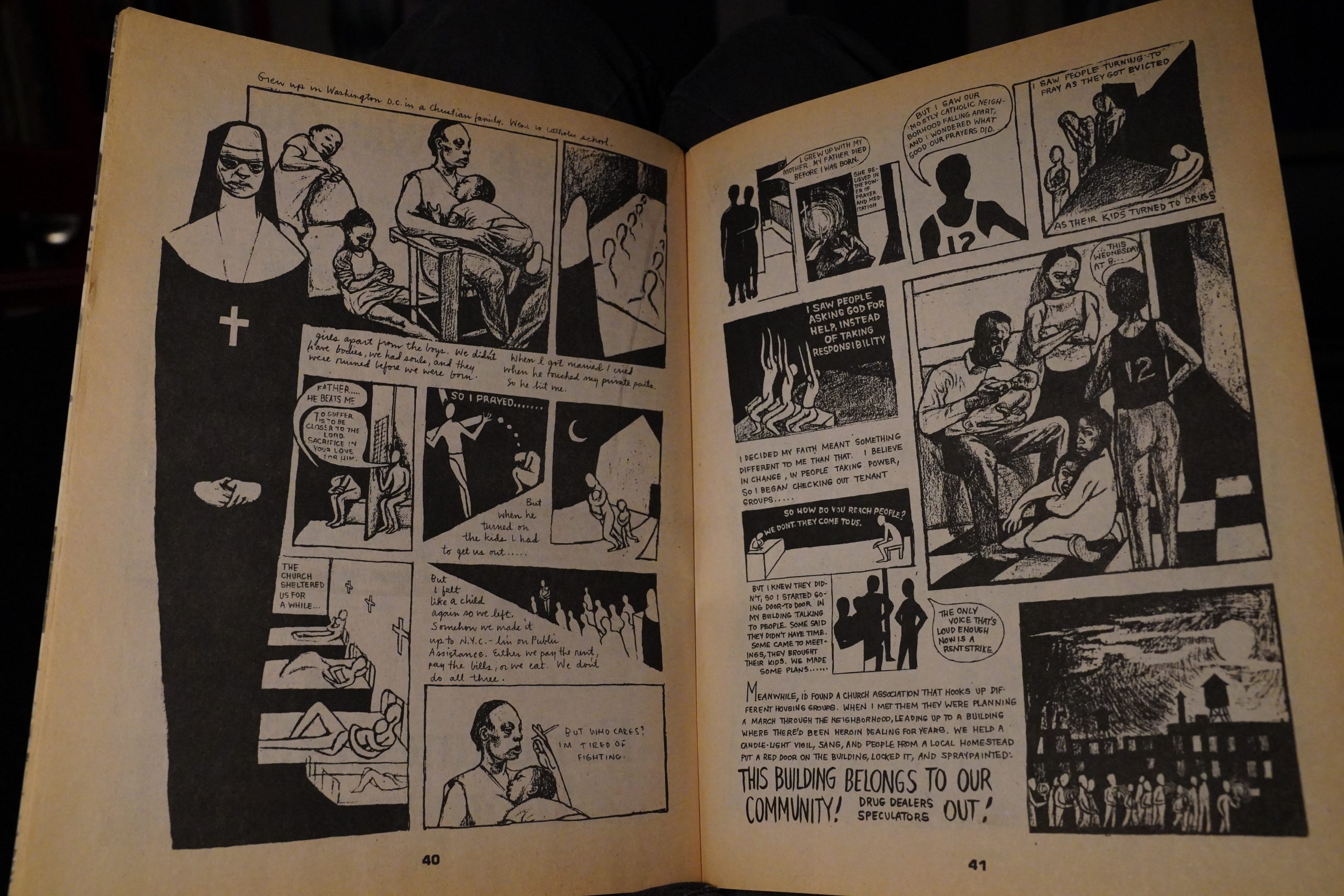
OK, this is more like it. (Seth Tobocman.)
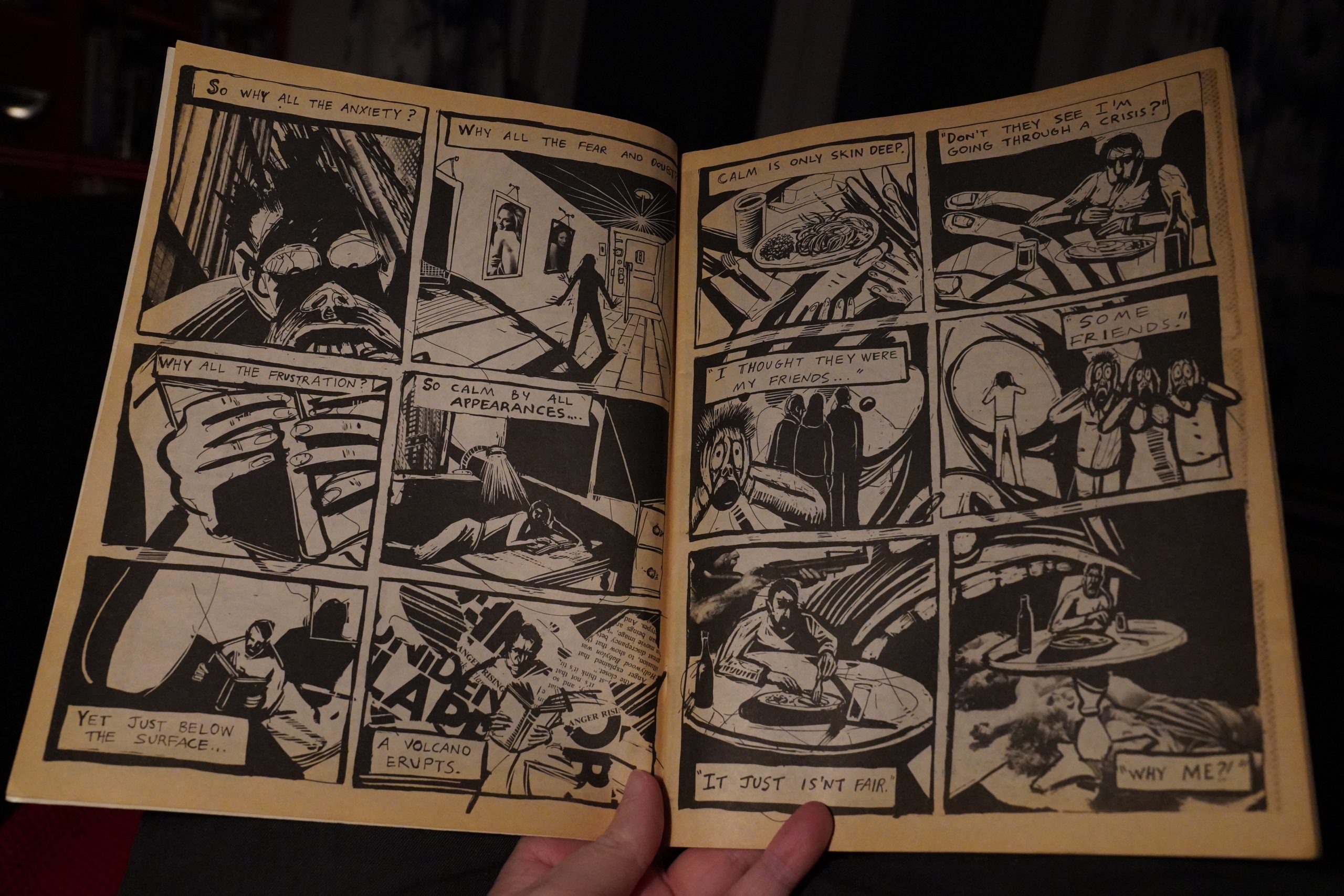
And I think I’ve read this story by Peter Kuper somewhere before? It’s a good little story about those weird thoughts we have, but it’s not what I’d expected to find here, really.
This Bill Hillman two-page is more like what I expected.
What the!? Peter Bagge!? Doing a “boy, conservatives are evil” thing that he probably regrets now? (He’s a “Libertarian” these days.) Hah hah!
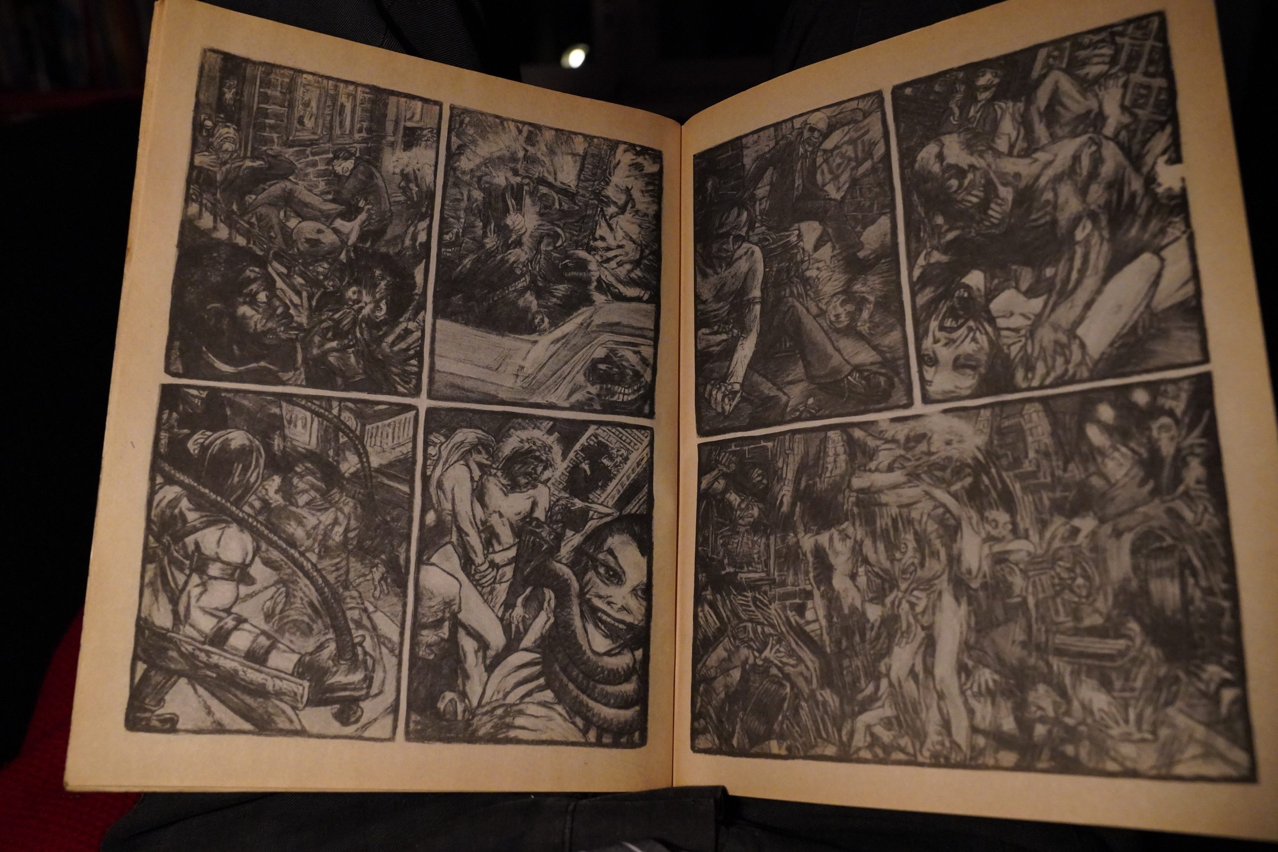
This is also Peter Kuper, and it’s a longish sci-fi story about a boy and his mutant dog. Rendered in a kinda… Corbenish way? I had no idea!
Finally, Kristof Kohlhofer pipes up with something that’s more like I expected to find here…
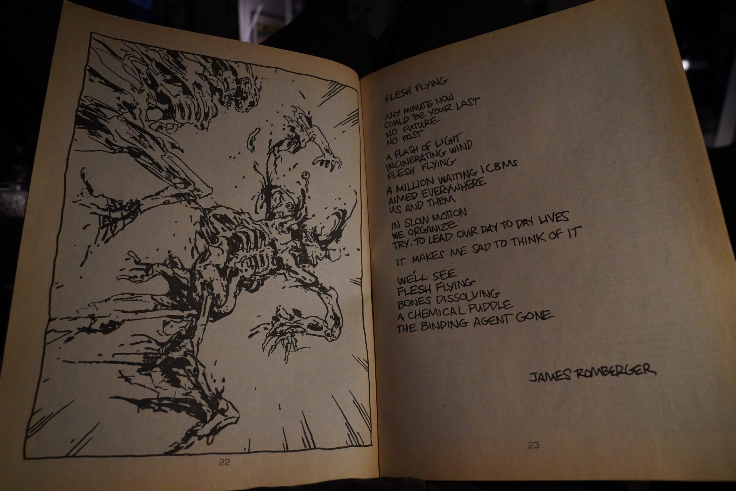
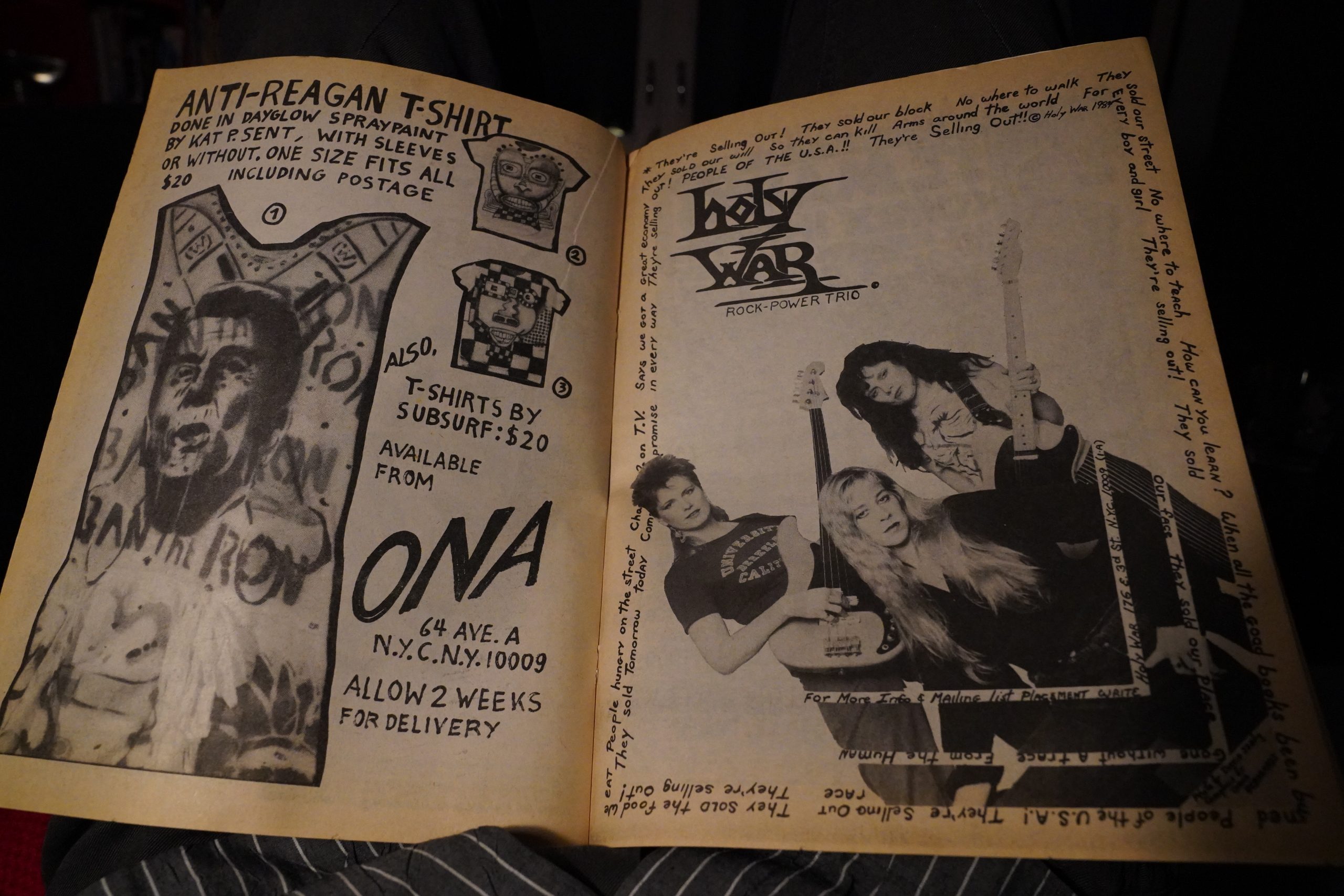
So… About two thirds of the pages in here were done by Kuper and Tobocman, and few of the pieces were directly political. Very different from later issues of the magazine, I must say. It’s… it’s pretty good? I’d say it shows “great promise”, but then I know that both Tobocman and Kuper had major, major careers ahead of them after this. But it’s less “Raw adjacent” than I had expected. I mean, it’s not even “Weirdo adjacent” — it’s more like a random Underground comix from ca. 1973.
So now I’m even more curious and want to read the subsequent issues, which is… difficult. But I guess I’ll just have to keep trolling ebay, because I imagine it became a lot more punk pretty fast? But I may be wrong again.
Ted White writes in The Comics Journal #81, page 36:
At virtually the opposite end of the spec-
trum lies World War 3 Illustrated, a $2.00
black-and-white magazine. WW3 is a real
curiosity: a throwback to the earliest days
Of the underground comics, obviously both
ambitious and amateur, an failure
but an interesting artistic failure.
The magazine is clearly published for
love rather than money, and has thus far
appeared only once a year, which may well
be all its publishers can afford. Both and
‘2 brim with a nearly incoherent and only
sometimes focused energy which draws in
part from punk nihilism and in part from
youthful idealism. There is a lot Of rage and
anger let loose in these pages, and some-
times it overwhelms the available talent of
the artists and writers. The best of these are
Peter Kuper, Seth Tobocman, and Milton
Knight, Jr., each of whom shows real abil-
ity, although none appears to have yet
gained suffcient discipline.
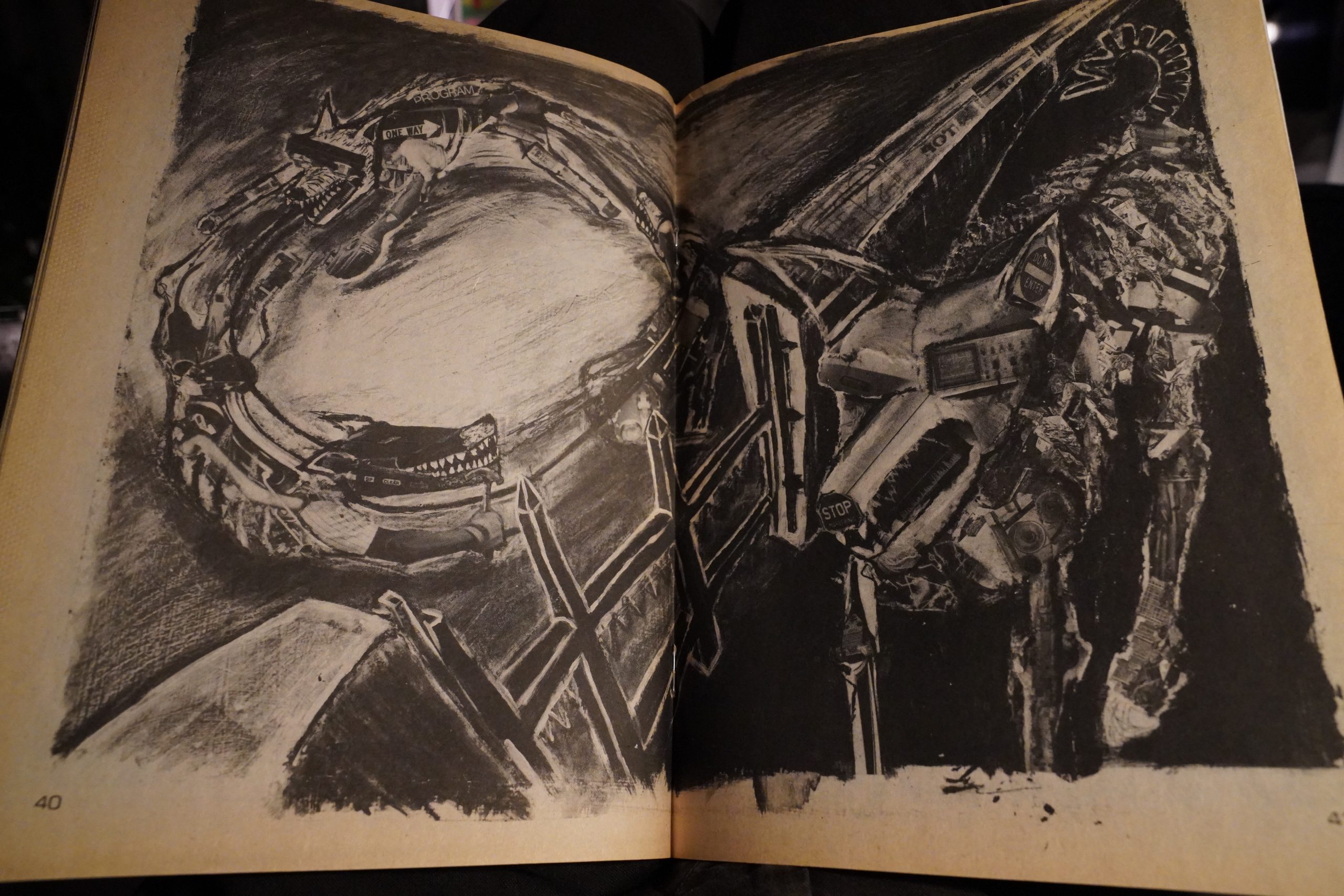
In terms of production WW3 is flawed.
Apparently some of the artists worked with
collages and mixed media, even charcoal,
and ,the printer didn’t have it fully under
control, shooting halftones that printed as
smudged grays and insufficiently masked
areas.
If World War 3 Illustrated falls short of
professional quality its ambitions soar far
higher than those Of any professional com-
ics, and that contrast may contribute to
the tensions that energize it.
This blog post is part of the Punk Comix series.
Everything in the World by Lynda Barry (230x149mm)
“Love the hurly ding-dong.”!?
Anyway, it’s been fun reading these early Lynda Barry books chronologically — I sorta knew that her style had changed a lot during her first (say) five years… but now we’re kinda getting near to the style she was going to use when her strip had the major mainstream breakthrough (which happened a couple years later). Gone are most of the angular, aggressive lines, and everything’s kinda rounded and busy…
In some of these strips, she does seem to be casting about for something new to write about — sometimes more successfully than others…
This book is divided into themed chapters and I think it’s pretty obvious what her prime subject matter was going to be:
Childhood.
The strips that focus on childhood and teen-age stuff are both funnier and sadder than the rest of the book. Not that the rest of the book is bad or anything, but this stuff positively sparkles.
I don’t think anybody else does this thing with their linework — you have the figures and faces outlined in a pretty solid, thick line, but then there’s a plethora of thinner, more tentative lines inked on either side of the more solid line.
Barry wouldn’t really become a megastar until she hit upon writing about the Maybonne/Marlys/Freddie family (i.e., using continuing characters), but in this book we see some tentative steps taken towards slightly longer continuities… and she uses herself (as a teenager) as the focal character. It’s kinda thrilling to read these, because you can just tell that she knows that she’s uncovering a seam of material here that she’ll be mining for years to come…
Anyway, it’s another fabulous collection. I don’t plan on covering her entire career in this blog series: She’s moving away from the “punk comix” thing I’m vaguely nattering on about here, so I think I’ll just be doing a couple more and that’s it.
Rob Rodi writes in The Comics Journal #114, page 59:
As with Groening, two trade-paperback
collections of these early strips are available
at bookstores. But her newest collection,
Everything in the World, also incorporates
some Of her strips on a new theme: the
tribulations of growing up. Like Groening,
Barry has moved on (or moved back) from
the sexual frontline to the realm of
childhood, (That Groening and Barry are
friends and occasional collaborators may ex-
plain this simultaneous shift in focus.)
She •seems to have little to say about
romance any more, and looking over her
phenomenal coverage Of that sphere you
don’t wonder—there may be in fict, nothing
left to say. Ever. But she has plenty to say
akX)ut her juvenile days, and the remarkable
thing about that is how her style mellowed
so abruptly; astonishingly, she writes about
the terrors and humiliations of childhood
without bitterness, without rancor, almost
without judgment. Despite the unpleasant-
ness of some of her memories, despite the
fact that again, there is pain here, and she
must feel it, she’s utterly honest about grow-
ing up. She seems to want to record exactly
what happened, exactly what she felt, ex-
actly what shaped her. This isn’t situation
comedy, as is the case with John Stanley,
or even at times with Groening; the humor
in her reminiscences is never that forced.
Everything has a natural ambience; it’s her
juxtapostion of events and feelings, her time
ing, and above all her uncanny gift for the
vernacular that make them funny. “Bit-
tersweet” is a debased word, having been
lent too Often to phony romance movies,
but it applies, in its original sense, to Barry”s
current work.
Her art style, too, has softened, has
become distinctive. It’s rounder and more
careful, still earmarked by the appealing
crudity, but with a real cartoonist’s eye for
faces and body language. When she relates
how the boys in her neighborhood fell in-
to an obsession with “pimp walking” (“Boy’s
Life”), the slack jive of their bodies is
hilariously realized; despite the crudity of
the rendering, you can, after you’ve read it,
get up and do the “pimp walk” yourself; it’s
that complete a picture. •And when Barry
gets down to faces, her prejudices can’t be
hidden. If there is a villain in this series of
strips, it’s her cousin, Marlys, who figures’
as a spoiler in just about every scheme
Barry’s gang devises; Marlys’ face iS like a
mass of boils with pigtails. Ugly is as ugly
does—as just about any kid knows
instinctively.
The strips themselves run the gamut of
childhood experiences, to a much greater
extent than Groening’s; Barry relates her
adventures from her earliest childhood
through her teen years, and occasionally
does a strip with a child protagonist Other
than herself (including boys.) As such, she
has a much broader scope than does
Groening, whose Bongo is more-or-less fixed
in the fifth grade.
And whereas Groening is interested in
youthful alienation, Barry is much more in-
terested in the entire social Structure that
surrounded her. She was part of her world
in a way that Groening perhaps was not.
One Of her most telling strips in this respect
is “How Things Turn Out,” where she deals
with social class. “In school,” she tells us,
“there were the queen girls and then there
were the rest and at the bottom of the rest
were the ones, whatever you want to call
them, the ones you Would be ashamed to
have to touch.” Okay, nothing we all didn’t
know already; we’ve live it. But she goes on
to examine this particulai-ly hierarchical
phenomenon inadetail, discussing the fixi-
ty of social position (“Occasionally someone
could get lowered for, say, wetting their
pants on a field trip, but it was almost im-
possible to move up”) and concluding with
an analysis of the origins of class assignment
that is nothing short of brilliant, and which
would have shaken Karl Marx to his very
bootstraps: It had nothing to do with how
smart you were. And even if you weren’t that
cute’, if you were a queen, people would copy
you. It was just something decided between us,
even though it wasn’t us who decided it. It was
something we all knew about. It was Our main
rule of life.
This blog post is part of the Punk Comix series.
Hercules Amongst the North Americans by Mark Marek (218x279mm)
Marek’s previous book was published by a New York design firm… but now “new wave” comics is starting to become a thing, commercially, so Penguin dips their toes into the waters with this book.
Wow. That’s the most accurate map of the US ever.
I like the design of this book — it’s very unpretentious. Marek letters (almost) everything himself, down to the indicia, and it’s printed on thin, off-white paper. Not quite newsprint, though.
These strips originally appeared in The National Lampoon and/or High Times, and the vast majority are one or two pages long, and have a sort of punchline. The central gag — Hercules living in the US now — is open to an almost endless number of variations, and Marek doesn’t repeat himself at all over these pages.
Some of these strips seem to be reproduced more enlarged than others…
We’ve all been there.
These are very funny strips, and I love how clear Marek’s storytelling is, even if the pages initially look like total chaos. It’s a neat trick.
I wonder whether this was initially meant to be saddle-stitched instead of squarebound: If I counted correctly, this spread is in the middle of the book, and it would have been perfect there as a two-page spread. With a squarebound book, the middle of the painting disappears, and it’s all rather disappointing.
But Penguin doesn’t publish spine-less books, so I dunno.
I mean, these are gag comics, but there’s an underlying pathos and melancholy on these pages… Even if there’s no “plot progression” to discern in the book, it feels emotionally coherent, and it reads like a cohesive book anyway.
And then we end with some pages of reviews of Greek restaurants. As one does.
Dale Luciano writes in The Comics Journal #110, page 70:
[…]
If Pekar makes a significant contribution
to the medium by means of the superbly
rnanaged naturalist approach, Mark Marek
brings a wholly different sensibility to Her-
cules Amongst The North Americans. Gary
Panter once described his own work as a
form of “protest against seamless illusion,”
a sharp break from conventional forms Of
comic representation toward an idiom that
values spontaneity, idiosyncrasy, even the
“rattiness” which is part of an unpolished,
untutored style. Mark Marek has a visual
style—it’s a primitive, scrawly mode, a
child’s goofy, silly way Of looking at reality
—but it is a style. The fact that Marek has
found an audience in National Lampoon and
now see+ his work gathered in this slick
Penguin volume seems evidence that the
impact and influence of Matt Groening,
Lynda Barry, and Gary Panter ‘has been
absorbed into a specific subculture of artists
and readers that is large enough (or grow-
ing large enough) to sustain the commer-
Cial hopes Of a major publishing house like
Penguin for this volume.
The stories in Hercu!es The North
Americans are hioek-faéetious in the terribly
hip, self-amused manner of an artist who
revels, Zippy-like, in the inanities and absur-
dities of Arnerigan culture. rvlarek’s basis for
humor is the intongruity of the classic
Greek hero-god (Hercules) being plunked,
uninitiated and at a hopeless disadvantage,
into the middle Of middle-class American
culture. Marek is mostly interested in wring-
ing “dumb humor” from that incongruity.
By “dumb humor,” I mean humor that is,
to a large extent, calculatedly stupid; it’s a
carefully worked-out clunkiness. The inten-
tionality behind the monumental inanity of
the strips testifies to a hip sophistication on
the part Of the creator—but you do have
wondering whether a gifted, semilunatic kid
on a cartoon rampage could have created
most of these strips. There are episodes with
Hercules wreaking havoc in a “Midas”
muffler shop, mistaking a giant Bullwinkle
balloon in the Macy’s parade for a Trojan
horse- like treachery—that last is my favorite
strip—slaughtering football players (whom
he mistakes for gladiators), etc. The satirical
overtones are implicit rather than formu-
lated: the concept Of Hercules is lampooned
(and diminished) by the action, as the
American pop culture machine diminishes
and devalues anything that is fed into it.
And’ it’s all presented as a child’s slapstick
spectacle.
Like Panter, Marek approaches comix
from a painterly perspective That might not
seem obvious until, making your way
through Hercules, you encounter an epic
IX)rtrait Of Hercules tied to the masts Of a
Texonn ship making its way through a
blustering, -storm-tossed sea. It’s broad,
punk-style, kitchen-sink lampooning, but
the composition, control of color, and the
boldness Of the execution in that single
image are excitingly managed. I found the
pure experience Of the painterly’ vision
here more viscerally powerful than anything
else. in the book.
I’m not without a measure Of respect for
the Jarry/schoolboy-jokester mentality
behind such arts of comic dada, but I con-
fess to finding the strips, intended as a
“lark,” cramped, adolescent, and tiresome.
Hercules Amongst the North Americans
intrigues me more for what it represents as
a marketable commodity than for what it is.
Dude.
This book has never been reprinted, which is darn strange. I can’t find any copies for sale on ebay, either (I’ve had my copy since the 90s).
It looks like it’s a sought-after item? That’s a ridiculously high price, I would have thought: I mean, it’s a Penguin book, so surely there has to be tens of thousands of these in circulation?
Mark Marek hasn’t done a lot of comics after this, and is mostly known for the cartooning work. But as this reddit thread points out, beware if you’re googling his name: There’s also a different Mark Marek that runs a gore site, and you don’t want to go there.
It seems like many people are rather ambivalent about the book:
Marek’s artistic approach can best be described as “hurried.” His ratty, meandering line recalls both Gary Panter and Lynda Barry, maybe a touch of Nicole Hollander as well. It’s deliberately ugly, and yet it kind of works. It feels like something scribbled on a napkin between bites of souvlaki, but there’s an urgency and sincerity to it that’s actually kind of appealing.
This is a f^&*ing funny book. It’s also incredibly rare these days. If you’re lucky enough to get your hands on a copy, grab it!
This blog post is part of the Punk Comix series.
The Previous Future edited by Pete Friedrich (215x275mm)
This is published by Look Mom, Comics — the same people who published Psycho Comics. So I wasn’t going to cover this magazine in this blog series, but I had already bought it, and the cover looks pretty intriguing… so let’s give it a go.
Oh, well: It’s more of the same amateurish stuff, except for the cover, which is done by a French guy called Eric Cartier, which kinda sounds like a fake name? But isn’t.
As with Psycho Comics, this isn’t so much “adjacent” to the comics I’m covering in this blog as stuff presumably by teenagers in New York. Here’s Daniel Clowes — he’s perfected his signature, but the artwork’s pretty rough. But it’s a somewhat amusing story.
Is that a parody of one of these scam ads, or is it one of those scam ads?
The most timely story here is the one about the dangers of using that new-fangled “Walkman” technology.
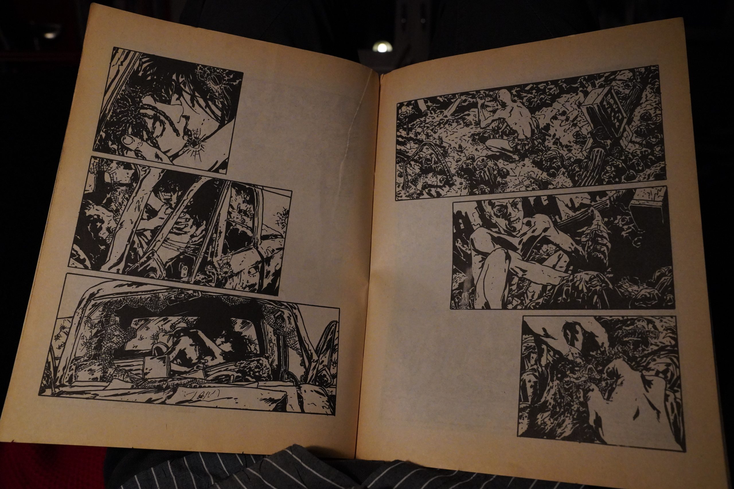
The most successful story here is this one by Gene Fama. I mean, it’s an O. Henry story, but it’s pretty inspired.
The editor explains that, yes, they’re doing ads, but only if they’re of the same professionalism and attractiveness as the contents of the book.
I think this ad for… “Vonozat”?… nails it.
(I’m not sure whether that’s a joke or not? It seems too on the nose for it not to be a joke?)
… Oh! It’s “Sohozat”! And it Existed!
The American version of Axiom is not really a store, but a stall located in the back of Sohozat, 307 West Broadway, a New Wave emporium where one can buy thrift-shop-grade smoking jackets or old monster magazines.
So it’s not a joke?
Sheesh.
The Comics Journal #73, page 47:
From the same EC-inspired band of writers
and artists that released Psycho Cornics
last year (see the Journal #66) now comes
the first issue of Look Mom Comics pre-
sents, subtitled The Previous Future. It’s
a loose-knit assemblage of pieces coming
under the various headings of “Urban Fan-
‘tasy,” “Science Fantasy,” “Urban Fiction”
and “Science Fiction.” (The Look Mom
staff is infatuated with genre designations.
Promised for future release are such special
“theme” issues as True Psycho Romances,
psycho Crime Stories, and Psycho Animals On
parade; also, Look Mom Comics Presents #2
will have as its theme, “All-Genre Comics
…all the genres comics have been through
and then some! Editor/ Art Director Pete
Friedrich has a taste for the bizarre and
the apocalyptic, as evidenced by the fancy
title which, truth be told, doesn’t accurate-
ly mirror the various moods Or thematic
preoccupations of the pieces. (I’m not
certain whac title would.) Most of the
contributions are short, pungent tales of
the macabre that build toward an “unex-
pected,” twist ending; there is an attempt
in each story to . end with @ touch of
irony.
Because I had such ambivalent feelings
about psycho Comics I approached The
Previous Future with particular interest,
hoping to glean more of creators’
motives and aspirations as they ventured
into these new realms (“Urban Fantasy,
“Science Fantasy,” etc.); I also hoped for
more evidence of solid, sustained achieve.
ment than was apparent in Psycho Comics
Alas, the results are mixed—promising
ideas only half-realized in the execution.
The material ranges from Eel O’Brien’s
frenzied, Lurid writing and Mort Todd’s
overwrought art in “Eddie’s
space jockey is transported back through
time by his “empath ship,” the Oedipus,
and fathers himself—to the naturalistic,
sordid, “Paranoid,” a tale of a “prize panty-
waist” who, tormented at every turn
throughout a dismal life, comes to a miser-
able end in a violent subway incident. This
latter piece could easily have appeared in
Friedrich’s “ShockSubway Stories,” in
Psycho ComicS.) A lot of energetic, promis-
ing talent is expended on material that isn’t
nearly so daring, imaginative or engrossing
as Friedrich and company may suppose.
Here’s something, though. The Belgian
artist Gene Fama contributes the seven-
page “Squirrel Juice,” a nightmare fantasy
of a man who confronts his “davof reckon-
ing” aboard an airliner. He is offered the
alternatives of Hell or reincarnation,
chooses reincarnation, becomes a fly, and
is subsequently dispatched from this Earth
in a most unpleasant manner by the foot of
a passenger strolling to the bathroom.
Fama’s violent black-and-white imagery is
disturbing and grotesque, involving distor-
tion and metamorphosis. The piece is an
authentic slice of dementia; its fear and
despair are not easily dismissed. It’s bizarre,
grotesque stuff, probably an apt indication
of the kind of overt weirdness that
Friedrich is looking to capture in the book.
There’s an amusing trifle from Daniel
Clowes that features private eye Bill Trou-
ble,” in a story that has the baby-faced
hero searching out the whereabouts of a
girl for Death, then challenging Death to a
game of checkers for the girl’s life. (Natural-
ly, Death loses, and says, “You must have
cheated!”) It’s a bit humdrum in the actual
telling—Clowes devotes two pages to the
least interesting aspect of the narrative
—and the checker game with Death is a bit
anticlimactic. There’s a funny throwaway
bit early on in which Death, asked to
validate his identity, casually summons up
a creature that demolishes an entire city
street. (It feels like an homage to Steve
Ditko and Marvel horror comics.) Light-
weight but diverting.[…]
The French illustratOr Eric Cartier con-
tributes an extremely handsome color
cover depicting an automobile graveyard,
countless wrecks piled atop one another in
a lumbering pyramid of junk. I trust I am
not alone in thinking this is an icon Of
that has lost much Of
its power through overuse. (A press release
from Look Mom Presents notes. “The cover
was a risk because it does nor your
usual Superhero or Woman with big T’s
and A’s.” This strikes me as an unwar-
ranted solicitation of approval—in essence,
seeking praise for Look Mom Presents’ virtue
in not doing something. Not is not
enough. )
The Look Mom crew is an enthusiastic,
spirited bunch, The Previous Future is
printed handsomely on very good quality
stock, and the anthology approach is
appealing. I wish the art work were more
skillfully executed and, more to the point,
the writing more effectively worked out
and sustained. On the plus side, there is an
NO superheroes or Women with
big Ts and As on the cover here,
folks, just wrecked cars.
obsessive, visionary fervor to the Fama
piece that redeems the surreal parable from
its more banal implications. And in
“Paranoid,” Friedrich and Michael Delle
Femine (“Dr. Death”) again exhibit their
fascination with aberrant, psychotic be-
havior. They have no wish to explore it,
but simply to document its more flam-
boyant, violent aspects. It is absorbing,
however, to see the results of their col-
laboration, even if it’s not fully satisfying
work,
This blog post is part of the Punk Comix series.