
Blowsy
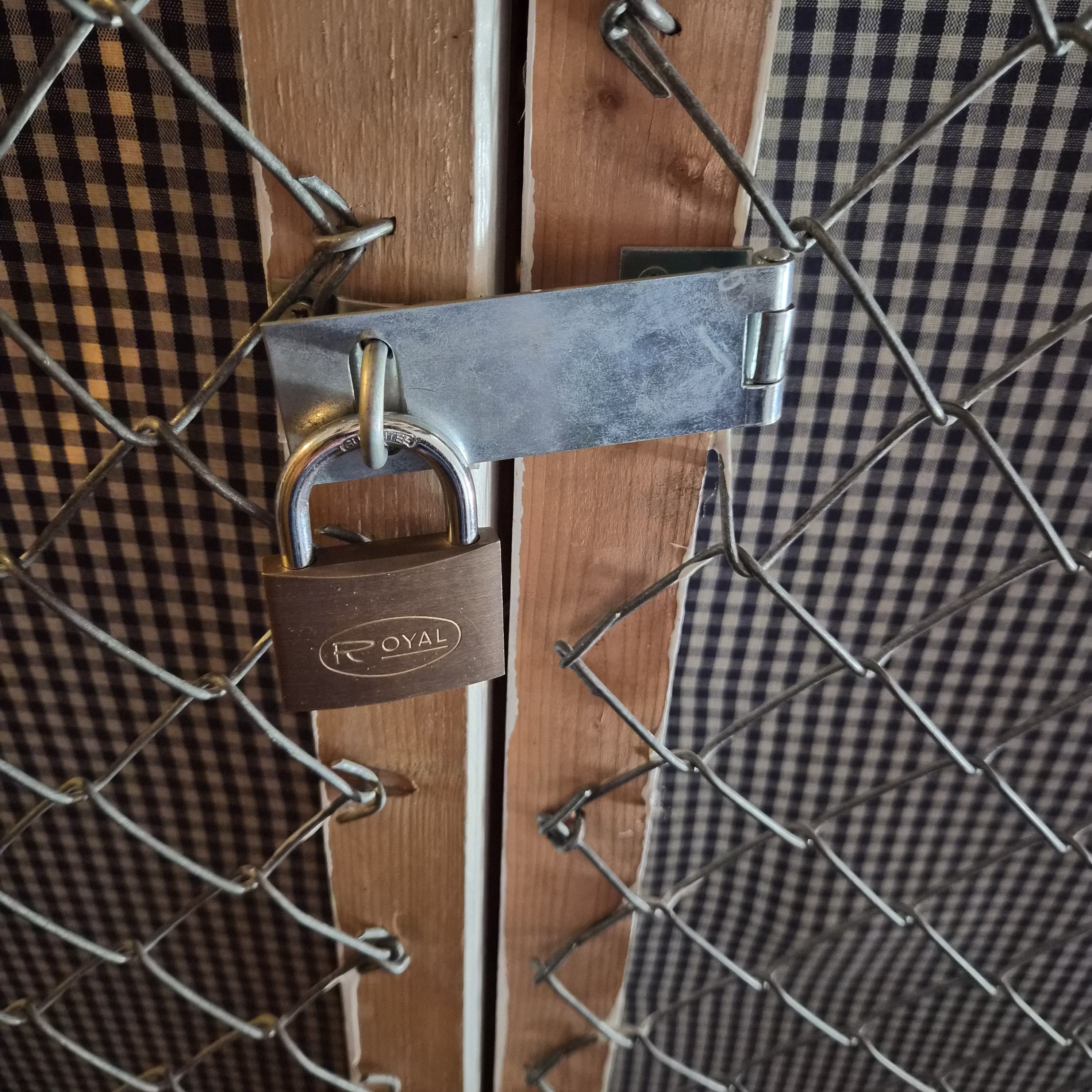
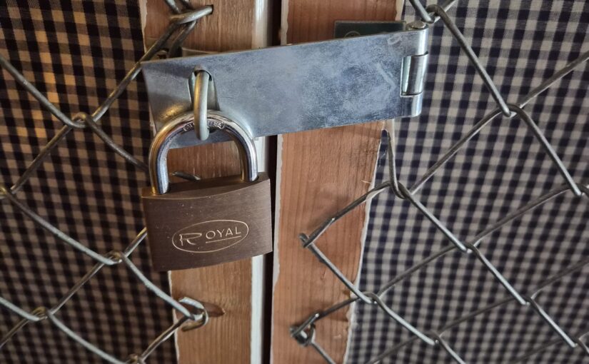
For years, the above has annoyed me: It’s the padlock to the attic storage. Every time I go up there to stash something away, I have to put that something down in order to unlock that stupid padlock. Opening it requires holding it with one hand and using the key with the other hand.
And, I mean… the lock is just there to discourage kids from rummaging around — if somebody wants to do some looting, they can just pull off the netting easily with their hands. Or gently kick the door in. But it’s in a locked area anyway, so the lock is just a polite hint.
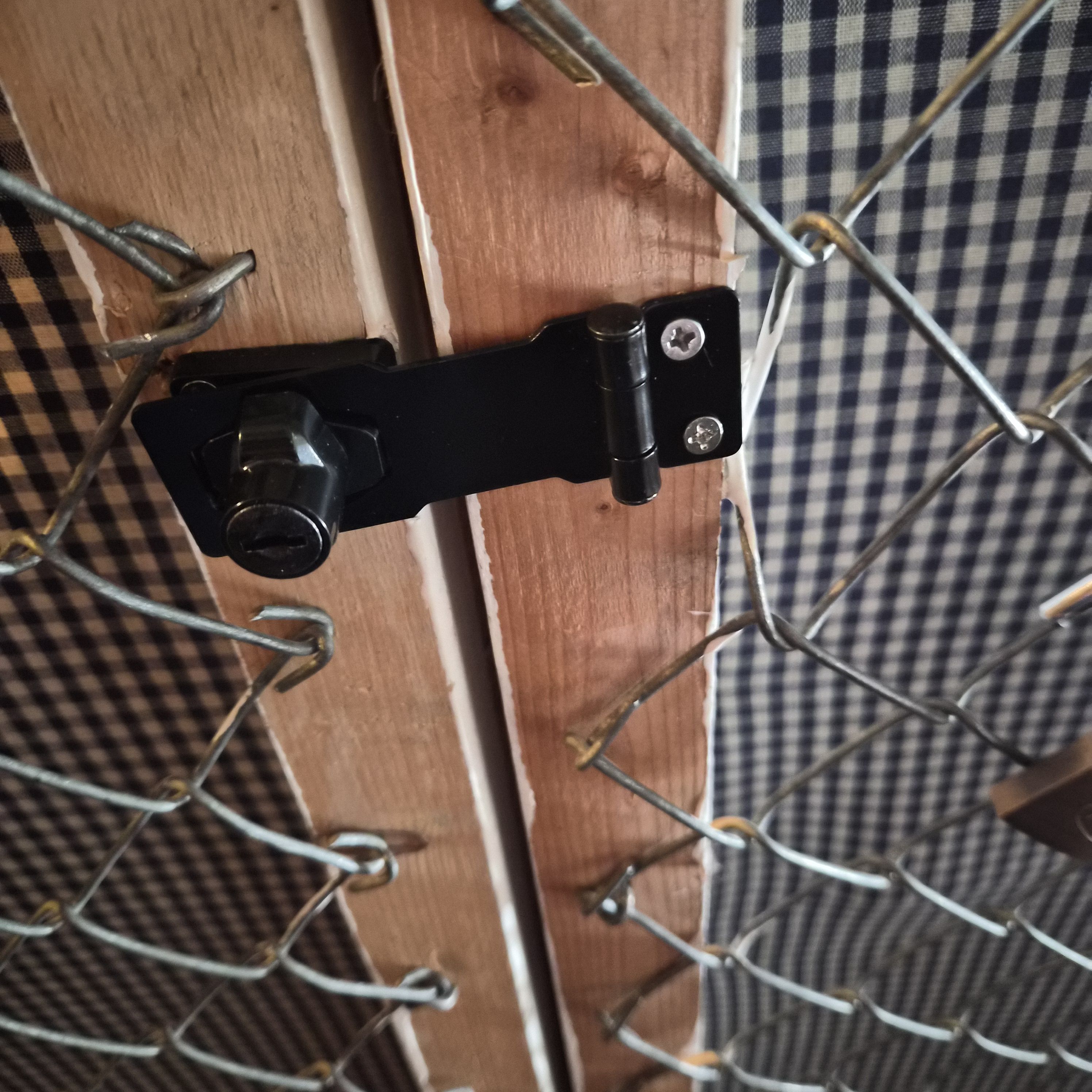
Tada! Now I can open it single handedly… er… wait a minute; with the lock being on the door side, I have to hold the door (which is wobbly) to use the key! D’oh!
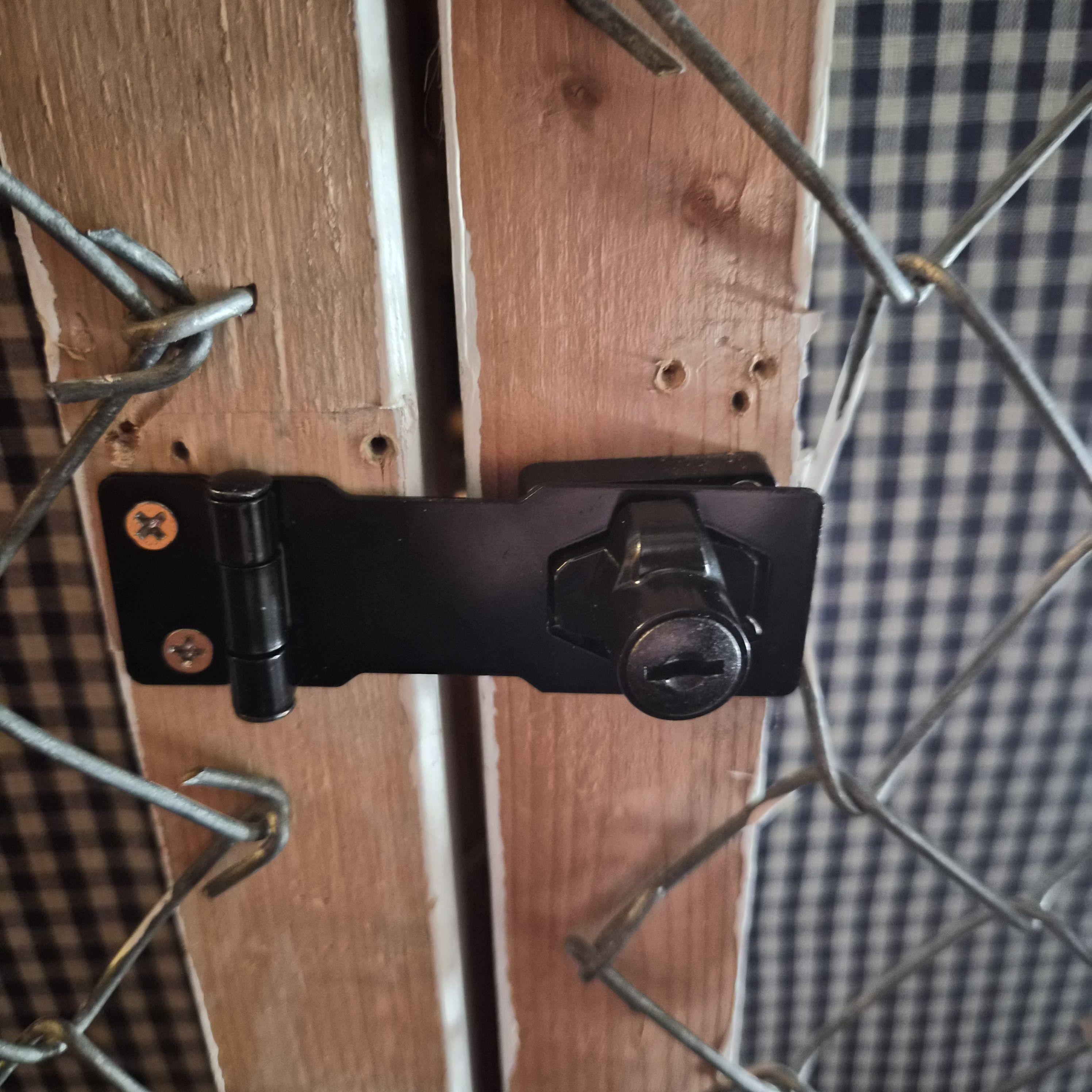
OK, remount on the other side…
Yes! The system works! I carry something in my left hand while opening it with my right! This is going to save me (cumulatively) seconds! seconds I tell you! over the next decade.
Showing this to some friends, they pointed out that I’ve mounted it wrong again — the screws are supposed to be hidden by the hingy thingy.
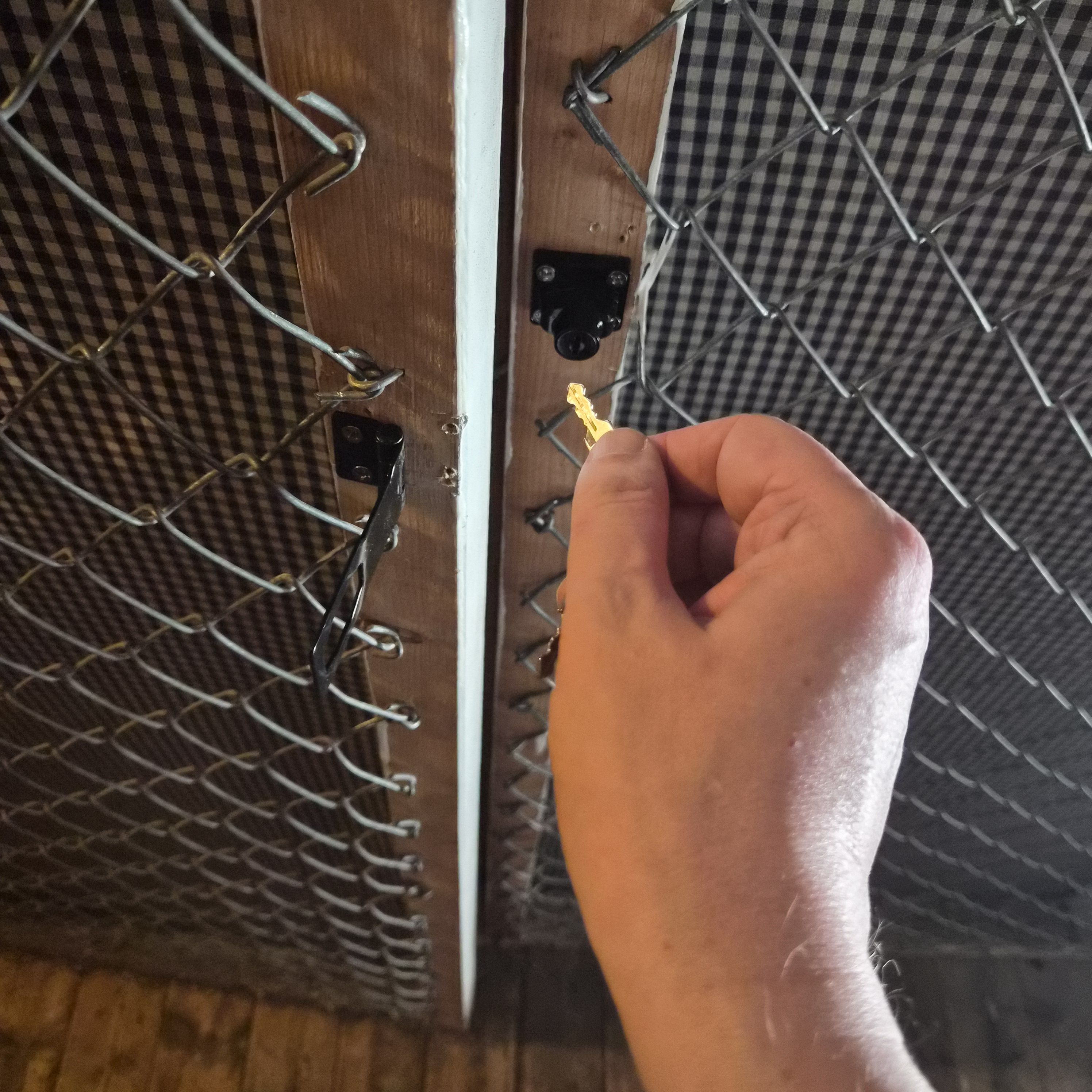
OK, remount… but it’s very tight… Getting the hingy bit just right is very fiddly.
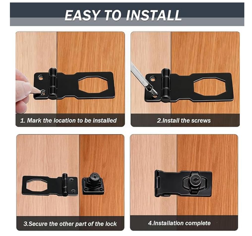
OK, perhaps I should have read the instructions first? *sigh*
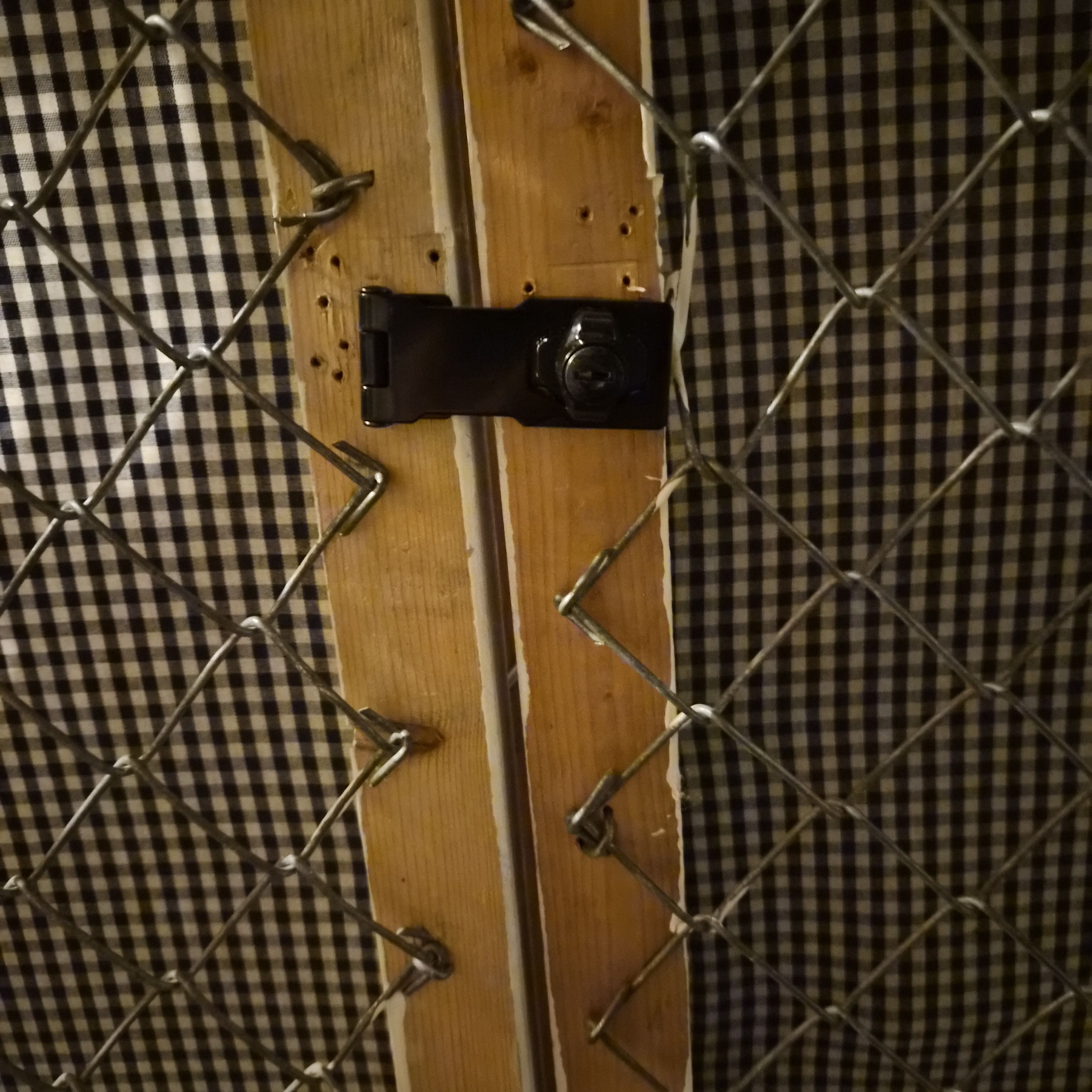
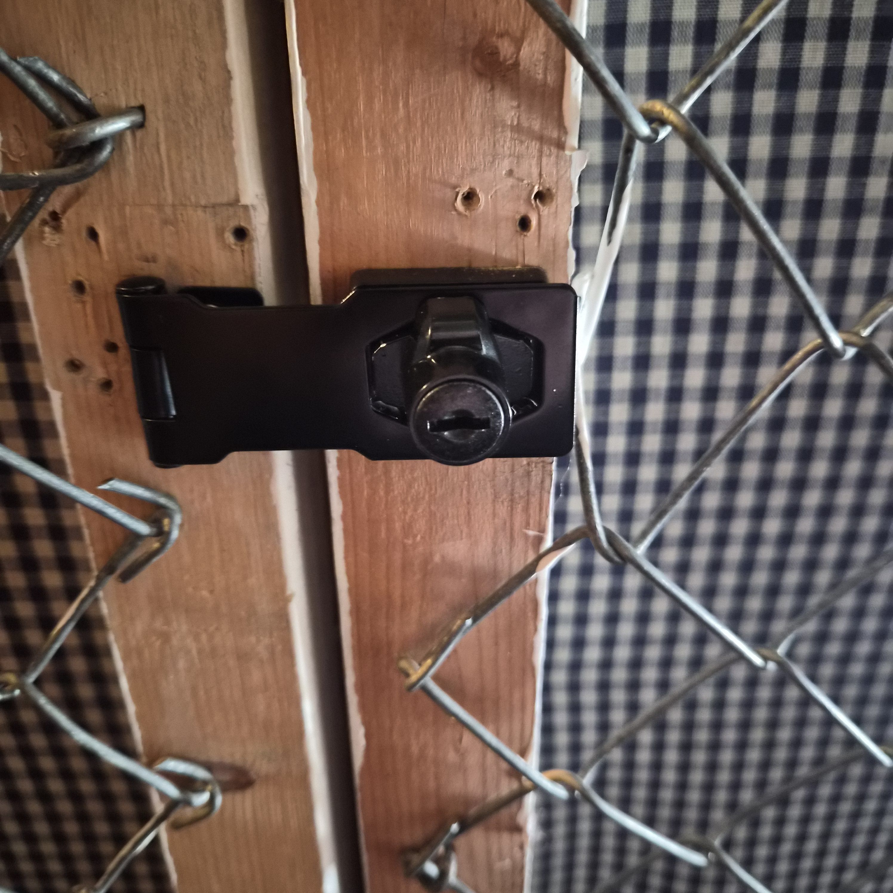
Remount once again and tada! Perfect! Except for all the screw holes.
So that was just… four tries to get it right? “Measure once and cut twice”; check.
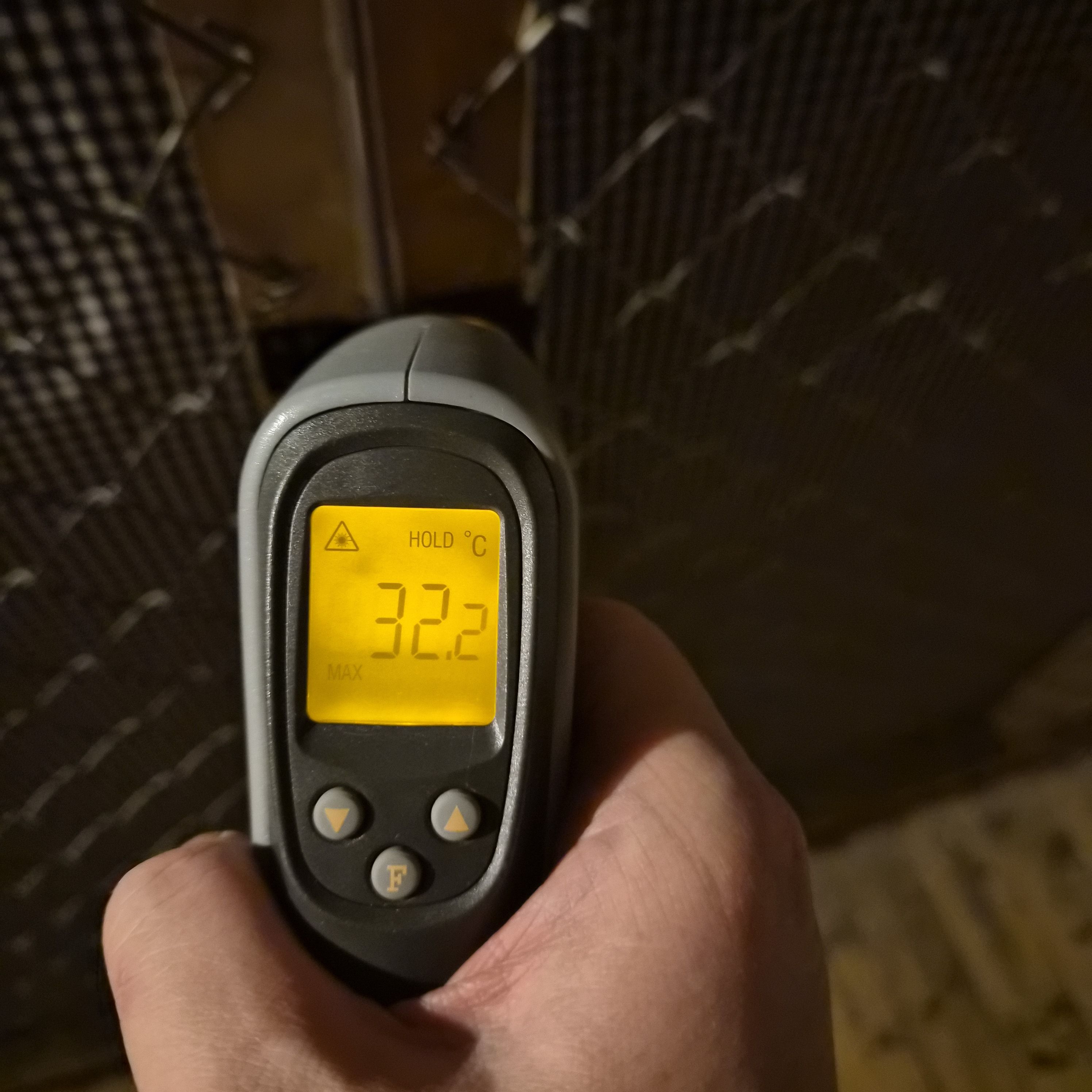
I feel I have to point out that it’s very warm up there. And also:

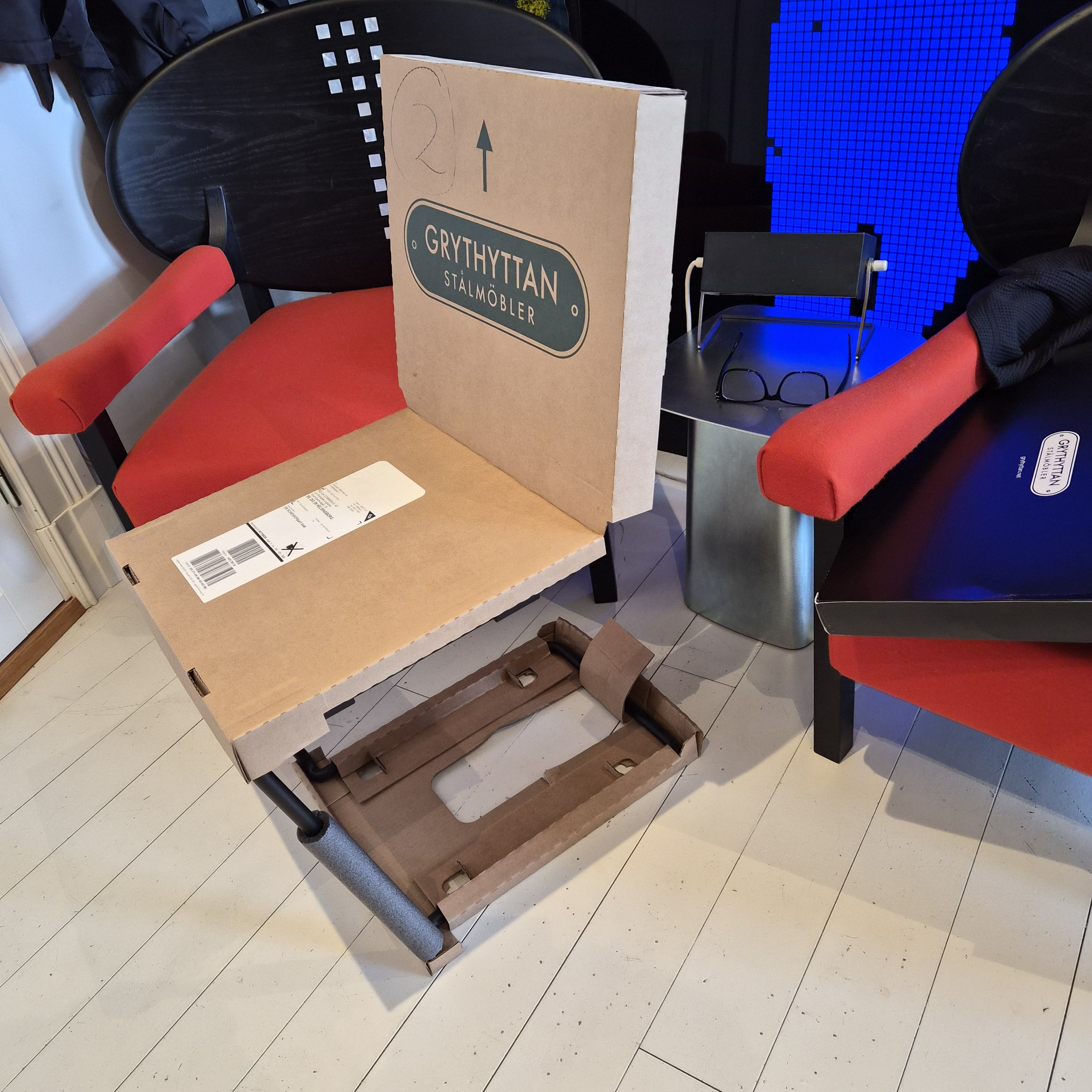
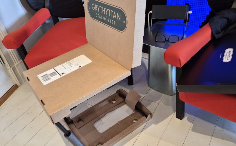
I ordered some furniture for my balcony some months ago, and today it arrived. It’s a small balcony, so I thought some small chairs would make sense…
The shipping company said they were going to be delivered in one 47kg package:
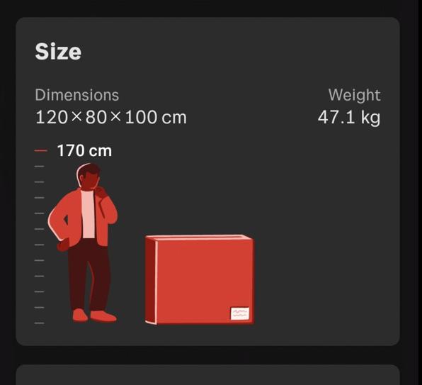
And I got heart palpitations, because I hadn’t ordered carry-stuff-up-all-the-stairs service, and how on earth could two small chairs and a small table be 47kg!?
It turned out they’d just strapped the three curiously, but efficiently packaged things onto a big wooden pallet, and the delivery guys fortunately took that thing with them.
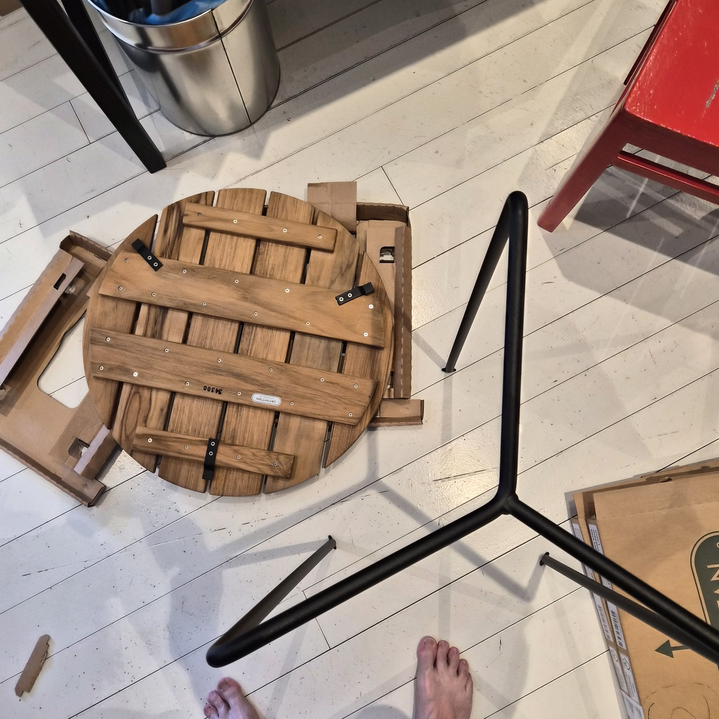
Which left me with this IQ test — how do I get those black metal tabs onto the rounded leg section of the table? D’oh! That’s not how it works… rounded things go on the bottom, not the top. Hah! I’m a genius! It only took me *mumble* minutes to figure that out!
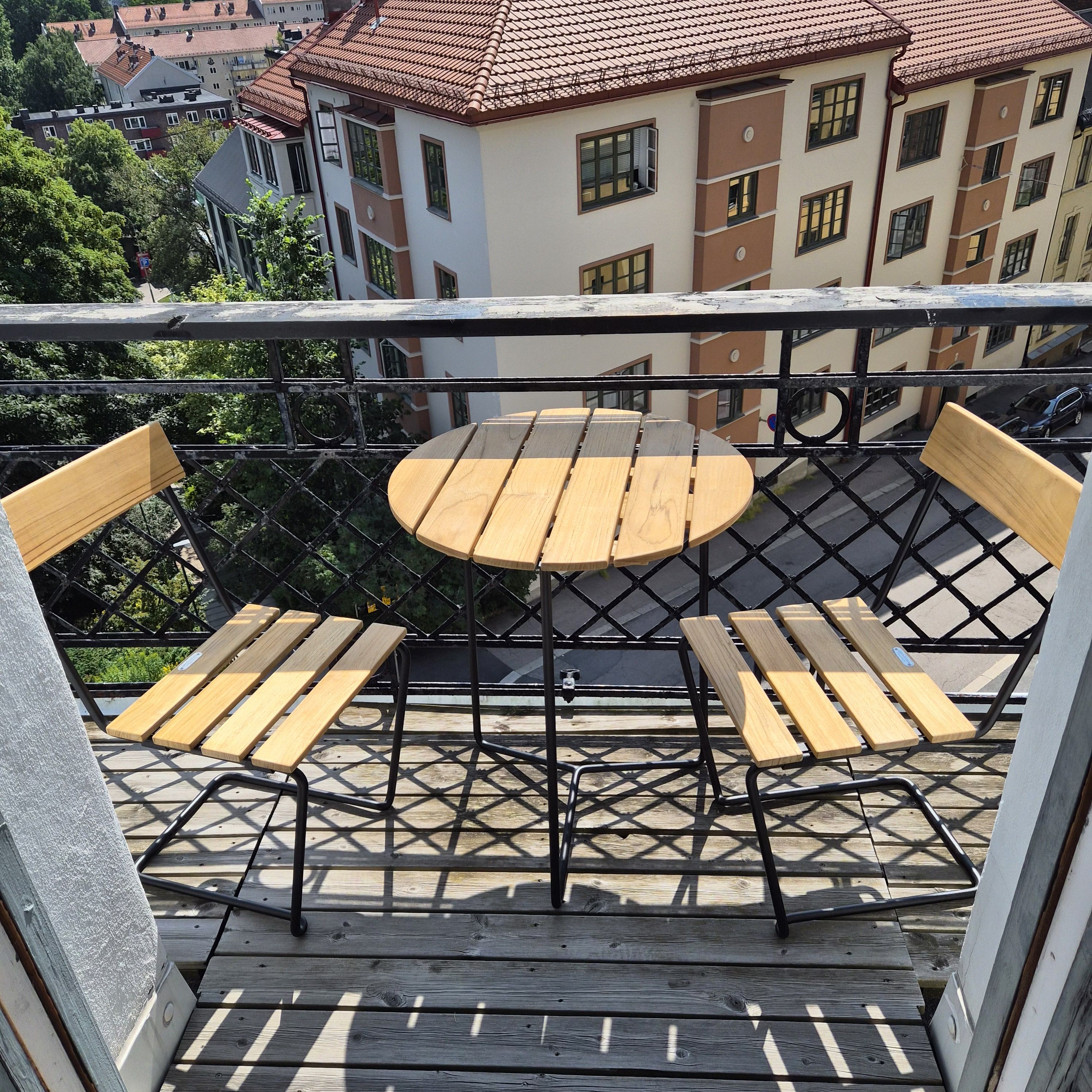
Et voilà! Now I can sit out on the balcony like a proper French man, smoking cigarettes and drinking coffee for breakfast while reading Libération!
(I just have to start smoking and drinking coffee first.)
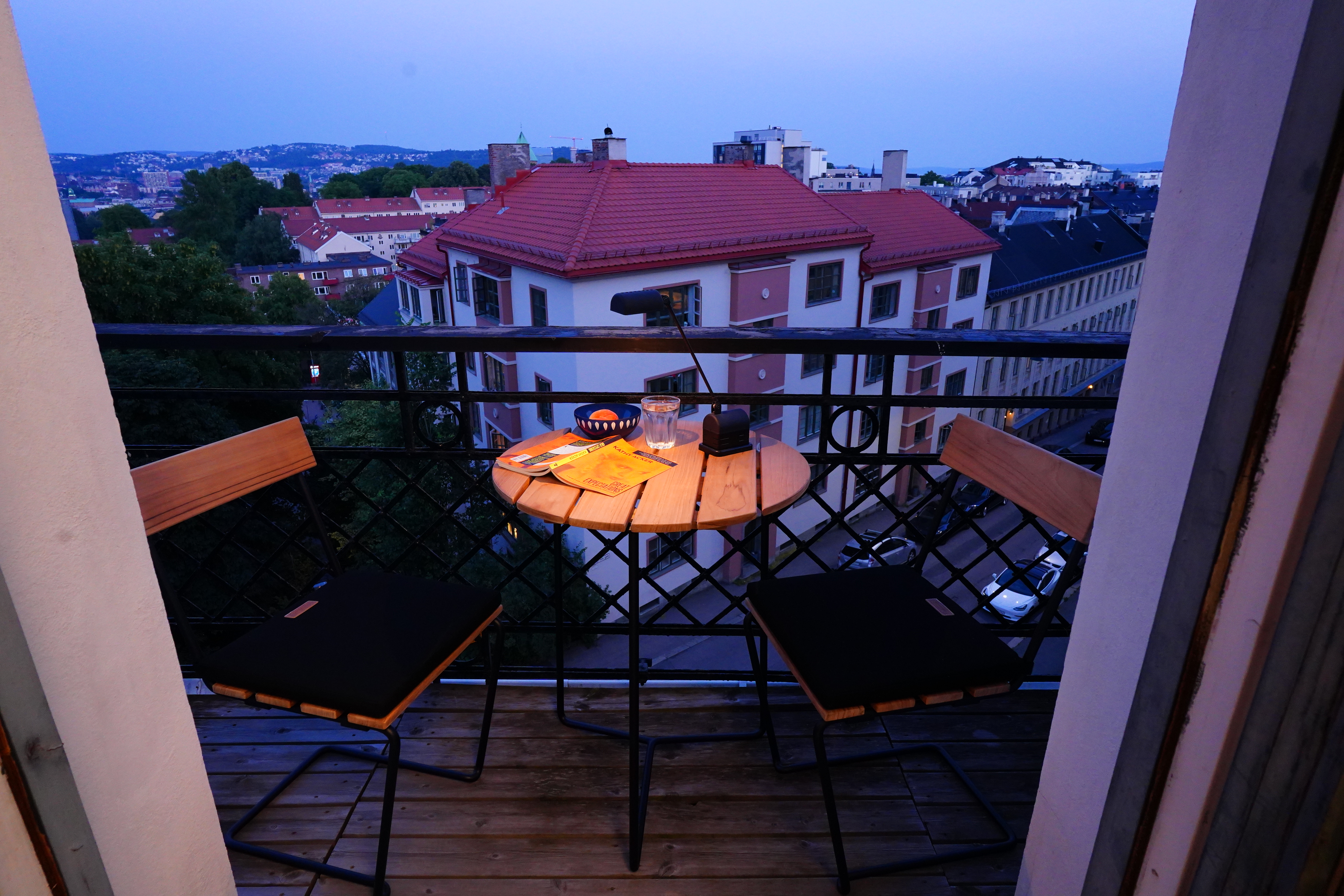
I suddenly remembered that I had bought a battery powered reading lamp some years back… perfect for reading at midnight.
Finally a place I can read performatively in the privacy of my own home.