Mister X (1989) #1-13
by Jeffrey Morgan, D’Israeli, Ken Holewczynski, Shane Oakley and others
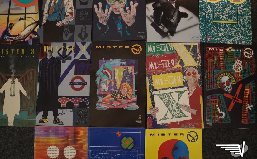
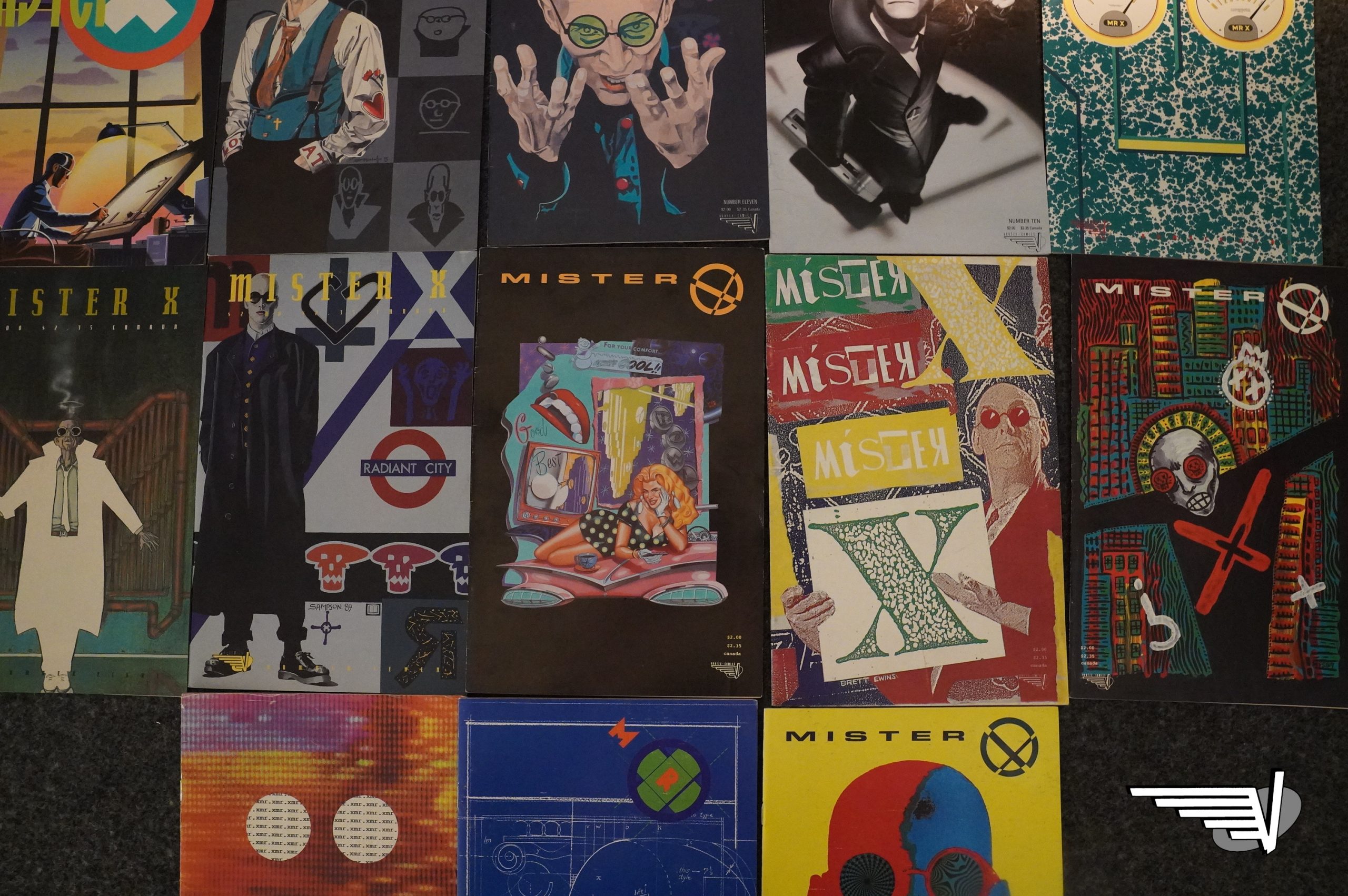
So this is the second Mister X series, and shopping the issues I didn’t have was an er interesting experience. Most of these covers don’t have an issue number, and you have to read the often-minuscule indicia printed on the inside back cover (usually in colour combinations that makes it difficult to read) to find out what you have. So when shopping “Mister X vol 2 issue 5”, for instance, I’ve gotten another copy of vol 1, or a different issue, or just something totally different sometimes.
But now I have them all! Haha! Well, at least I think so…
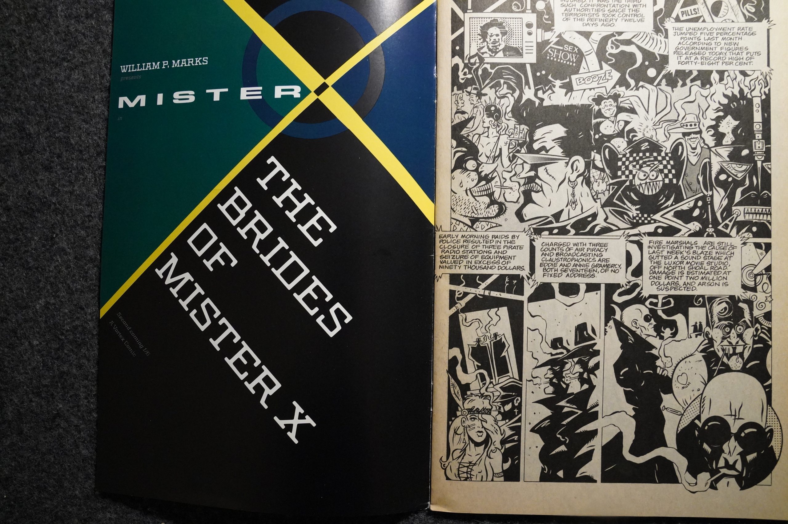
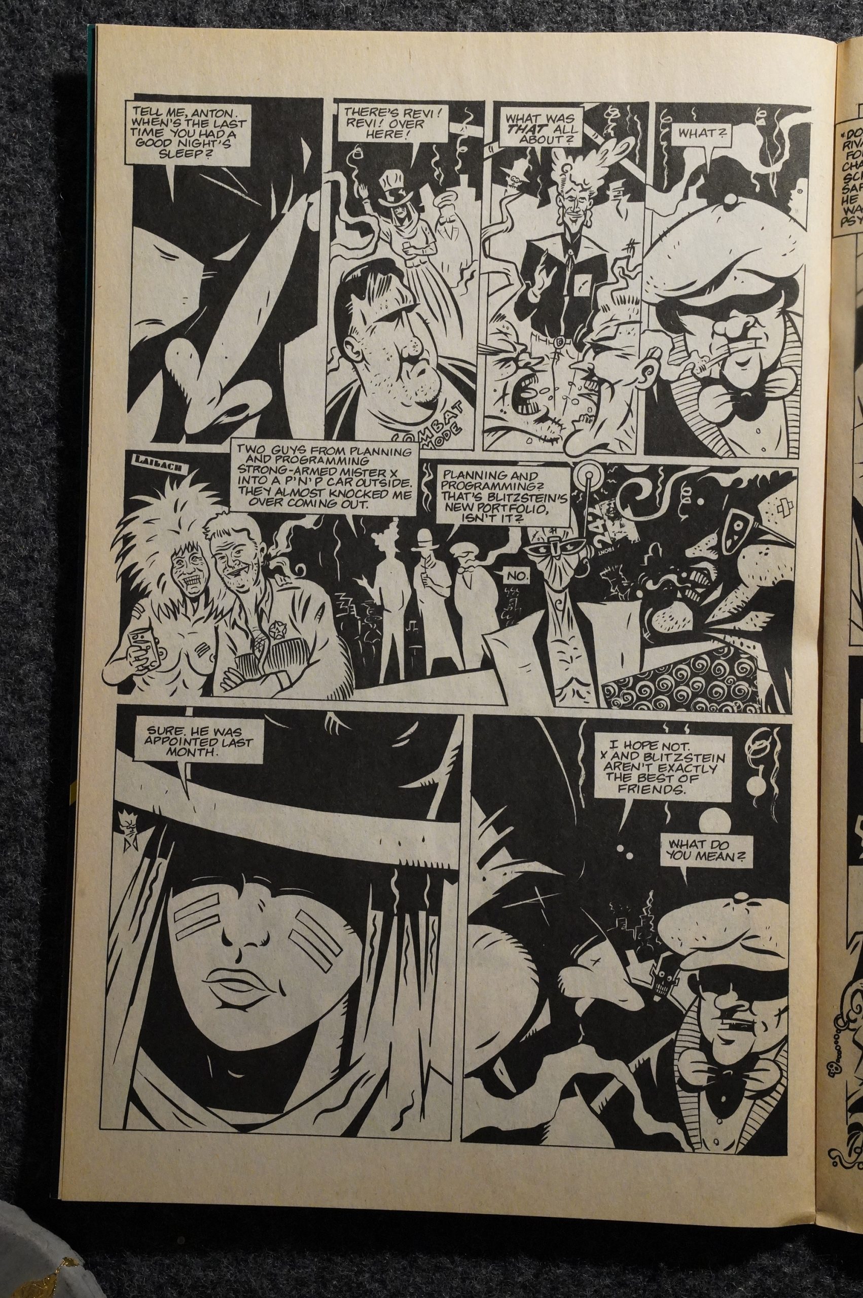
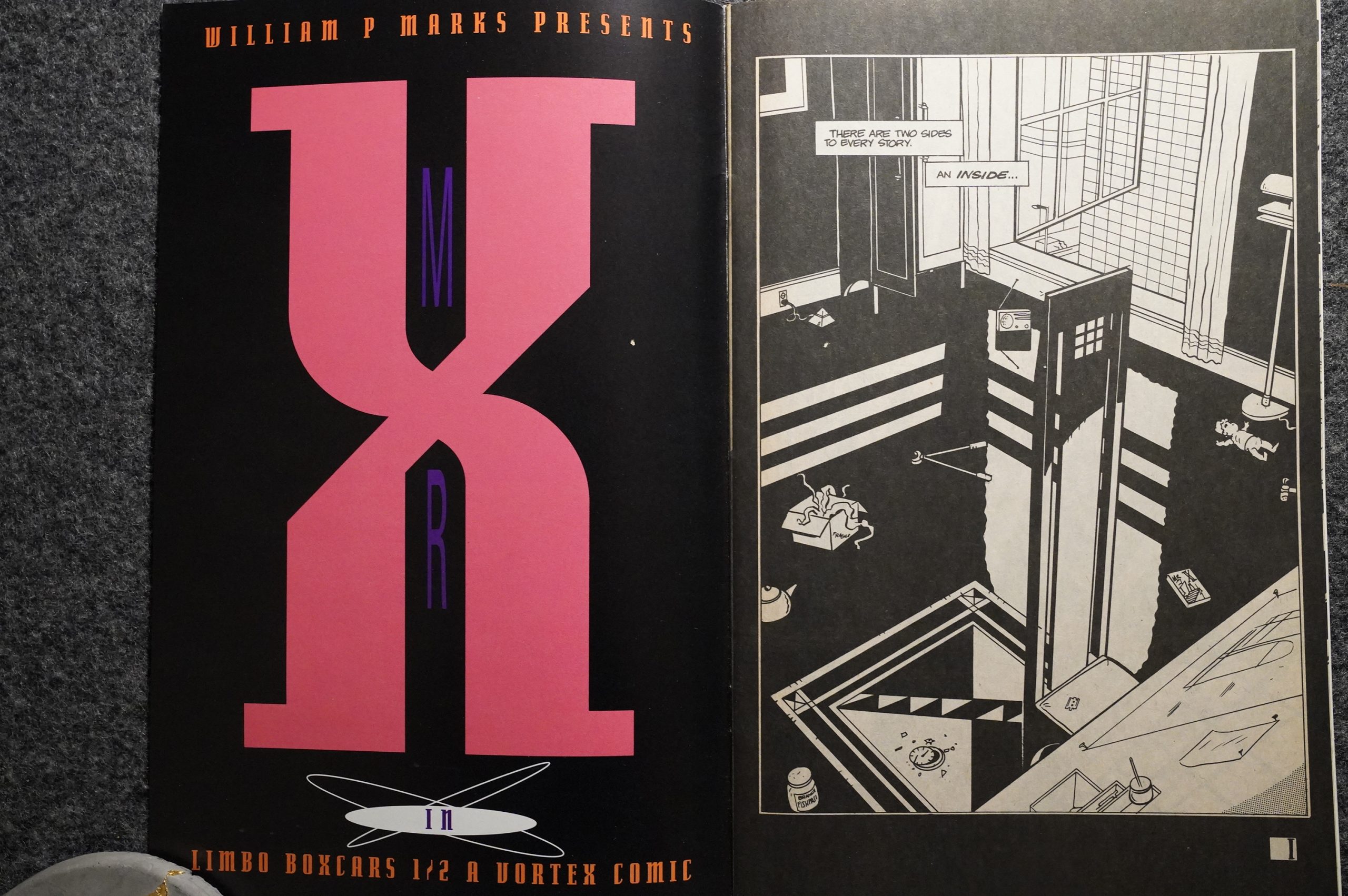
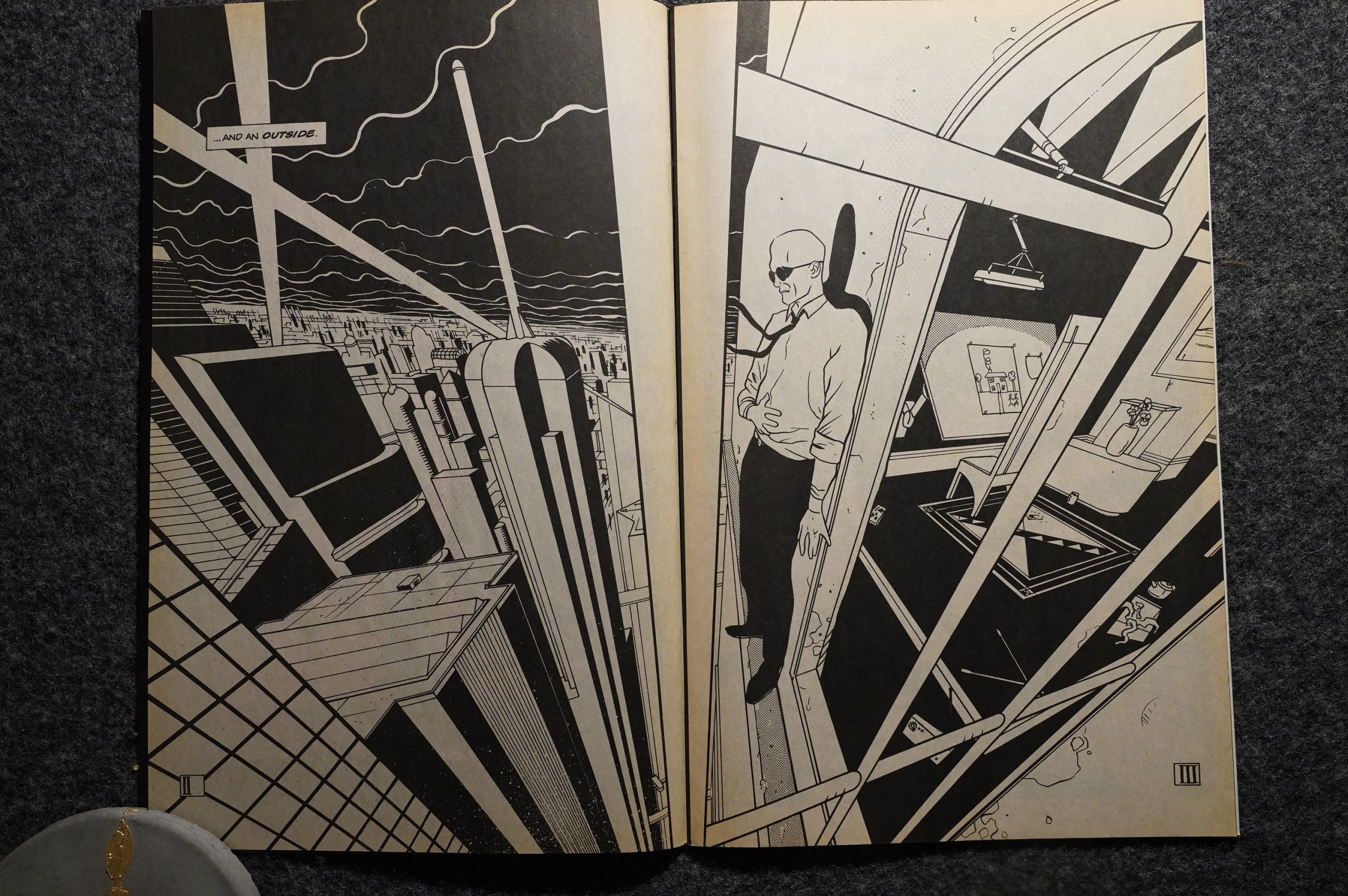
Let’s read the first four pages.
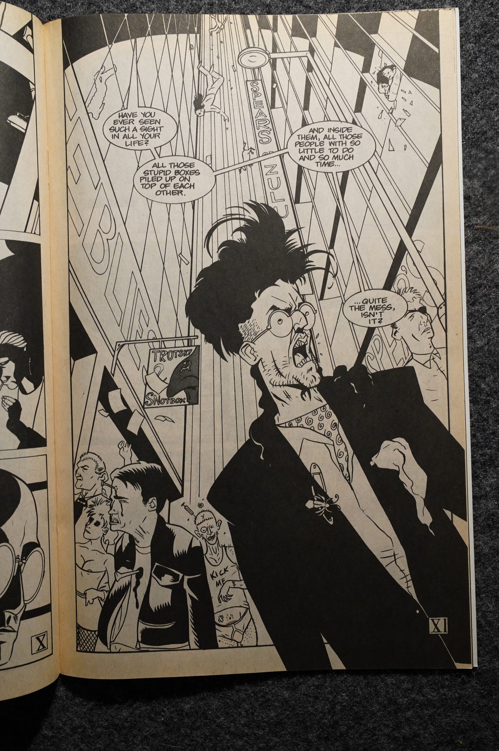
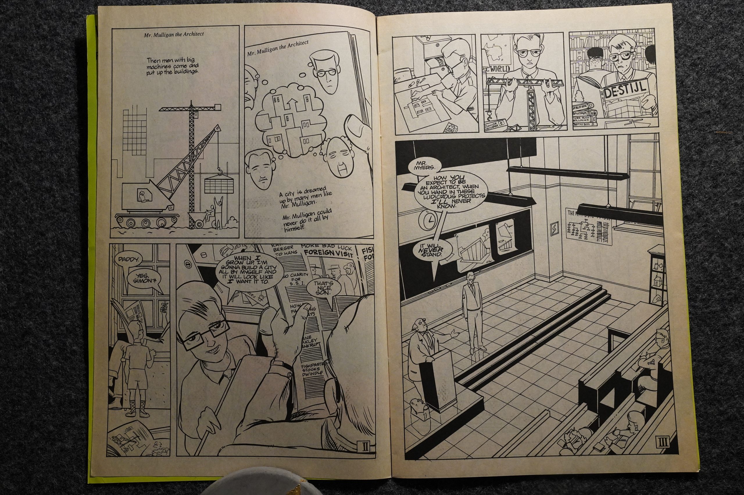
Wow. That’s… something? Shane Oakley does the pencils on the first six issues (and Ken Holewczynski does the inking on the entire series). This doesn’t look anything like what the original vision of the series was: It’s a lot more cartoony and it’s not real art deco at all. Is Oakley British? It has a kind of 2000 AD thing going on, I think? And what’s up with those enormous rounded shoulders?
Shane Oakley is a British illustrator and comic book artist from Stoke-on-Trent, England.
The guy in the sixpence is a dead giveaway.
Anyway, Jeffrey Morgan did a really fun serial in the Vortex anthology, so I was excited to read this. And it does have a lot of the Mister X mystery and charm: Once again, Mister X wants to fix Radiant City, and this time he’s being offered money to do just that, which is a logical development, plot-wise.
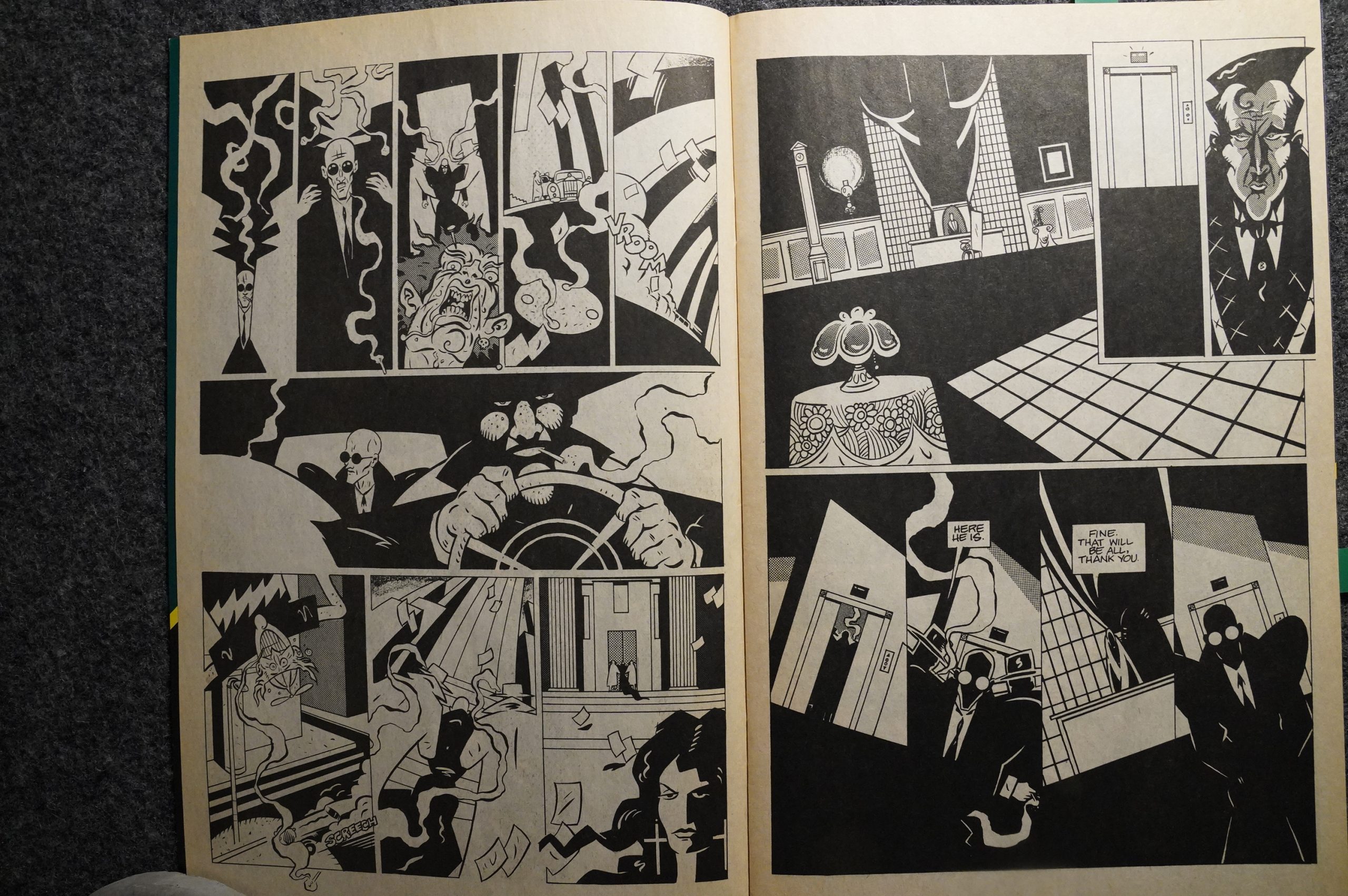
Oakley’s artwork is really all over the place. I love these bits, both the ultra-stylised Mister X and the rough-hewn mask-like face of the villain (oops spoilers), but coming a few pages after that guy in the sixpence, it’s… odd? And those shoulders? That’s not a good design.
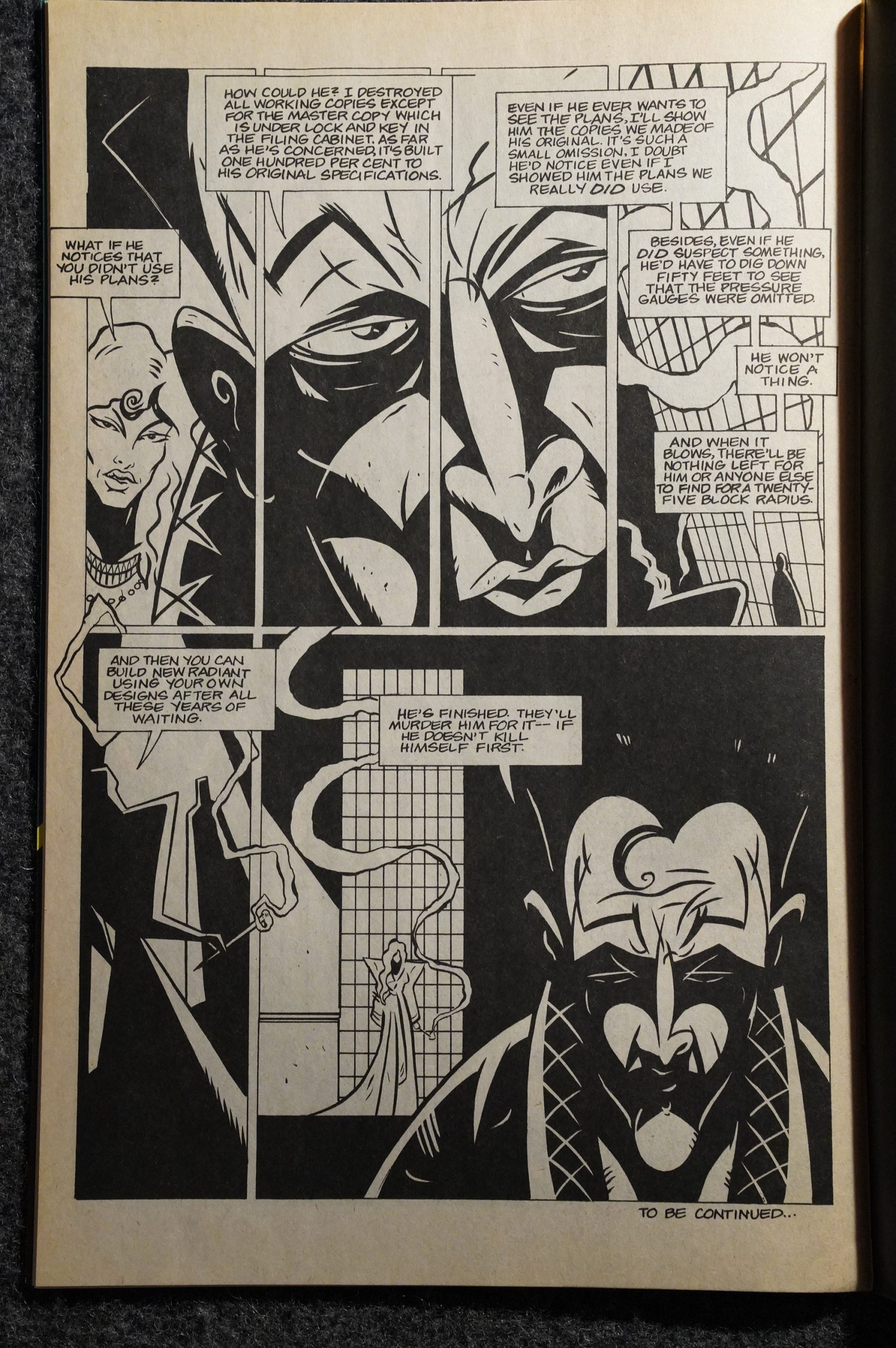
And then, of course, after a pleasant issue of mysteries and strange developments, the villains outright state their evil plans at each other for the convenience of the reader, and that’s just boring.
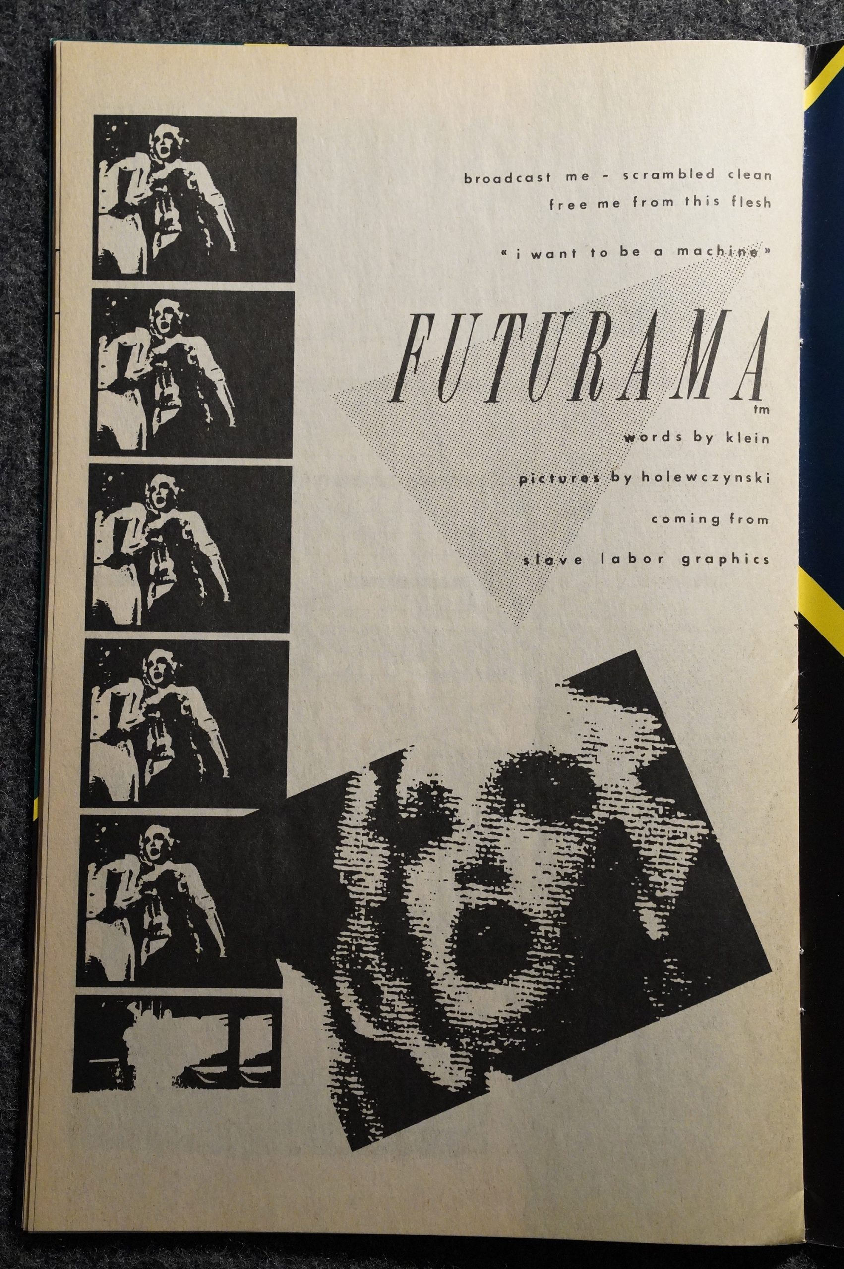
Oh! I remember reading Futurama… Holewczynski did some really stylish artwork on that one, I seem to remember.
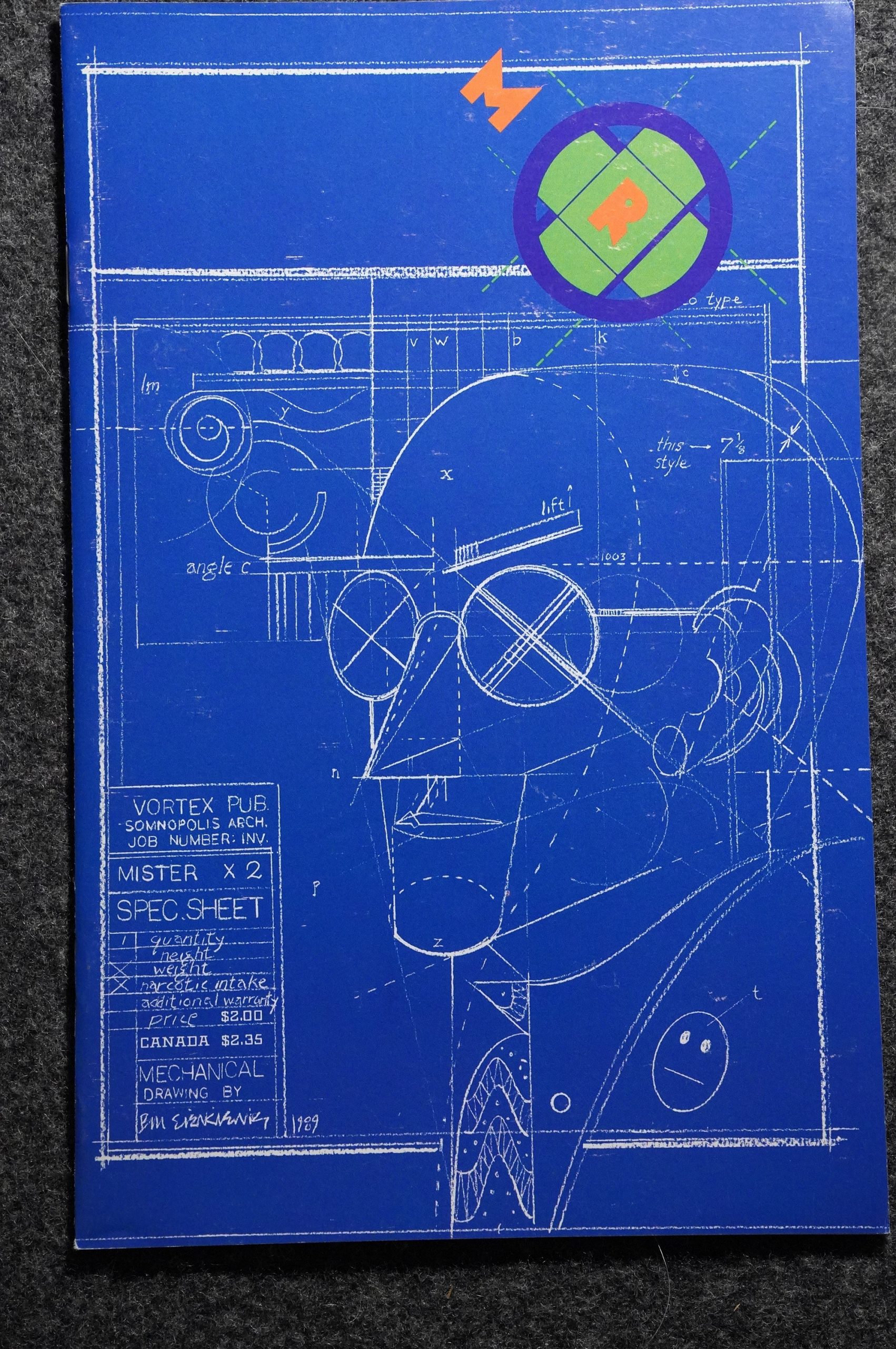
Almost all the covers are from somebody otherwise not involved with Mister X, which was a sore point with some of the interior artists involved, I seem to recall from an interview or two. Here we have Bill Sienkiewicz, for instance. I do like how unafraid they are of befuddling the readers — this doesn’t really scream “Mister X” in big letters, does it?
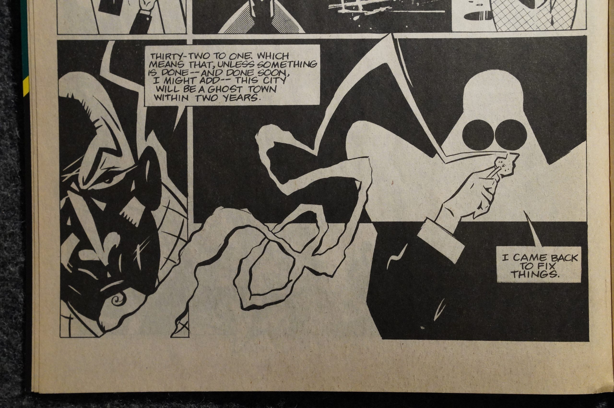
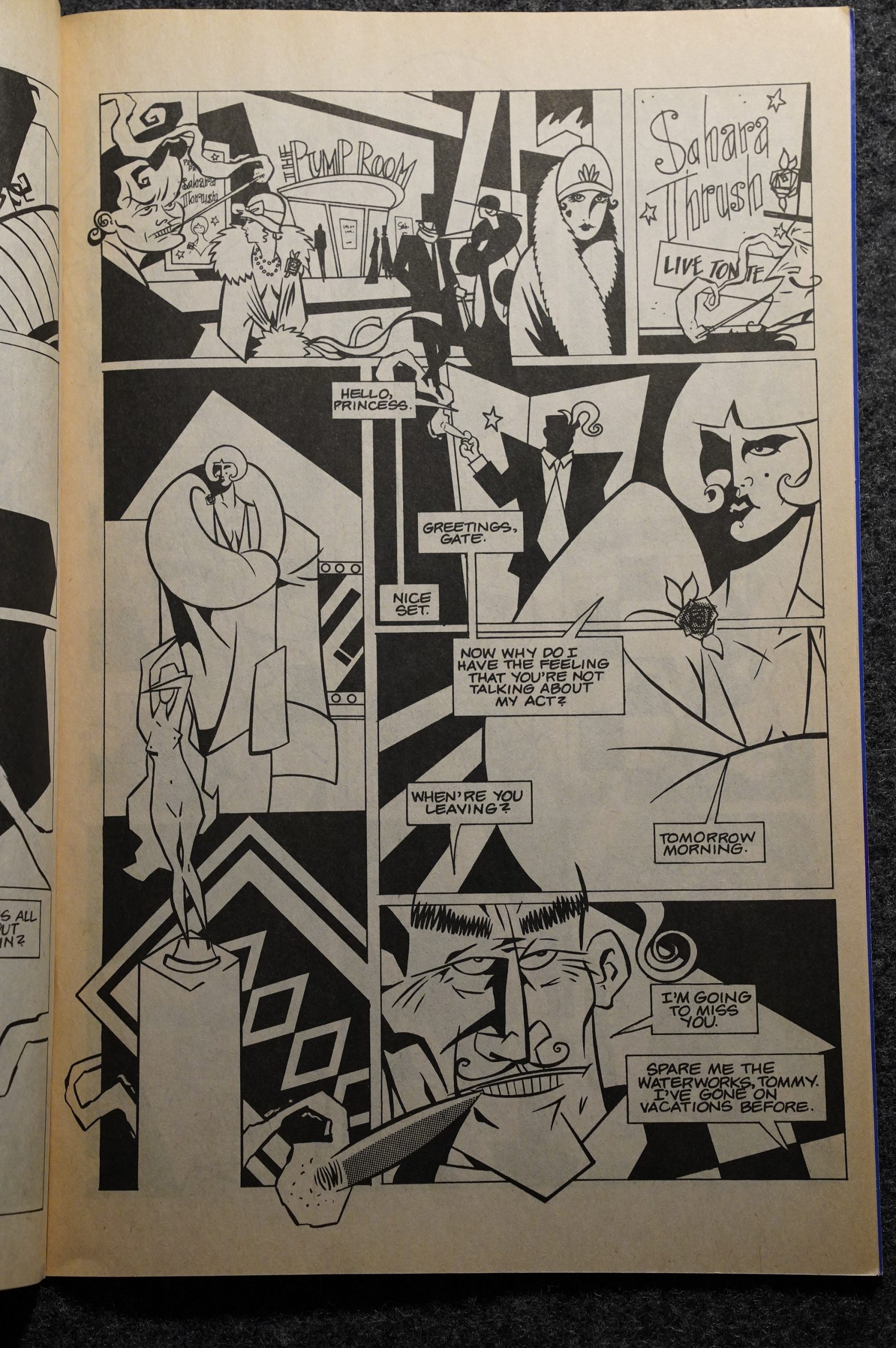
OK, here Oakley is onto something. We’ve got art deco, we’ve got a Louise Brooks hairdo, and … er… then we have a Kevin O’Neill-a-like guy with huge ears. Well, almost!
The pages work better when Oakley doesn’t try so hard.
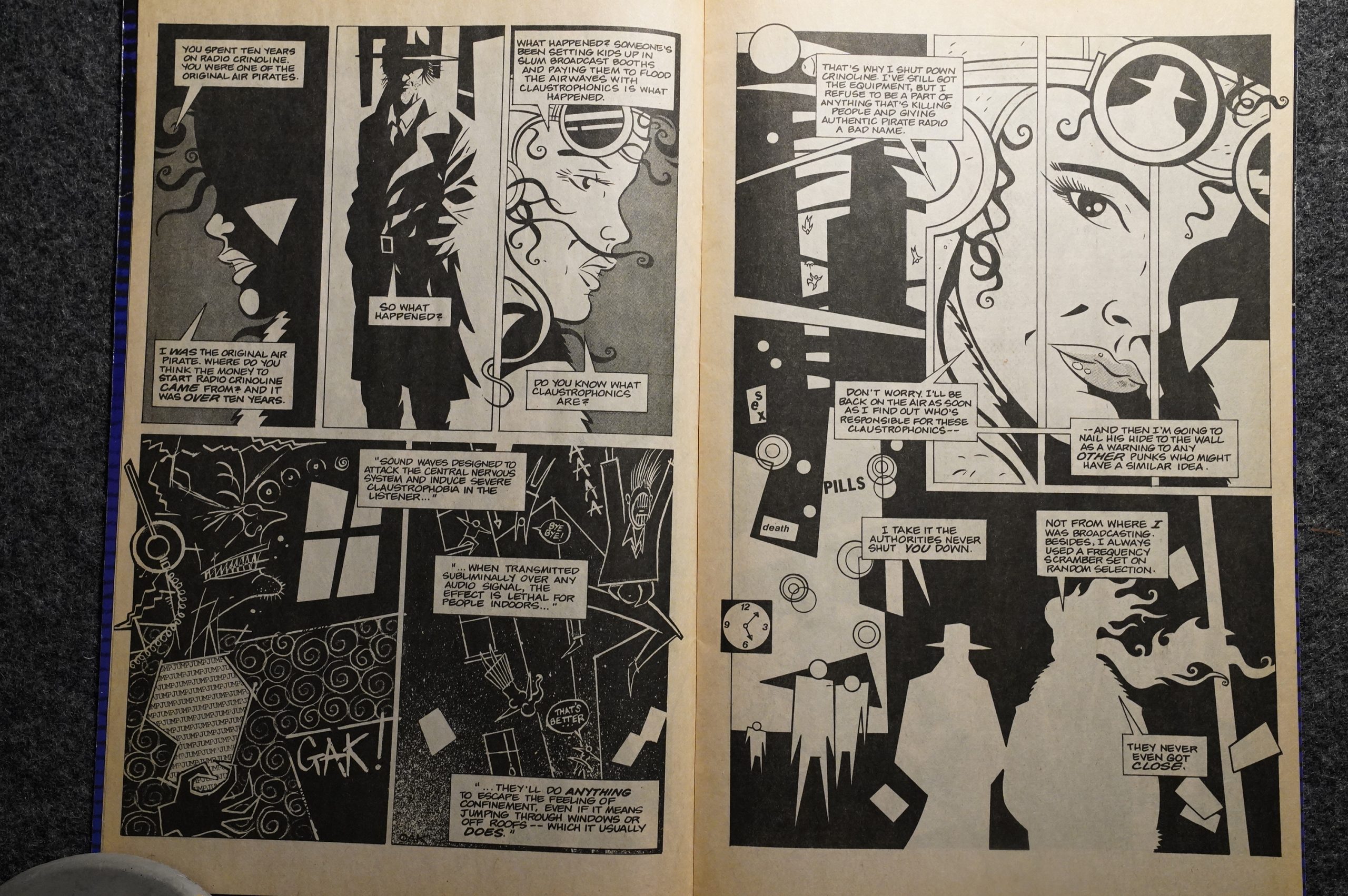
But, yes, the exposition is a bit hard to take. But, really, the first six-part story is fine: It’s an entertaining read.
Lloyd Llewellyn! Tor! Of course they’d live in Radiant City.
After the first story arc, Oakley leaves and D’Israeli starts doing the pencils. Let’s read his first pages:
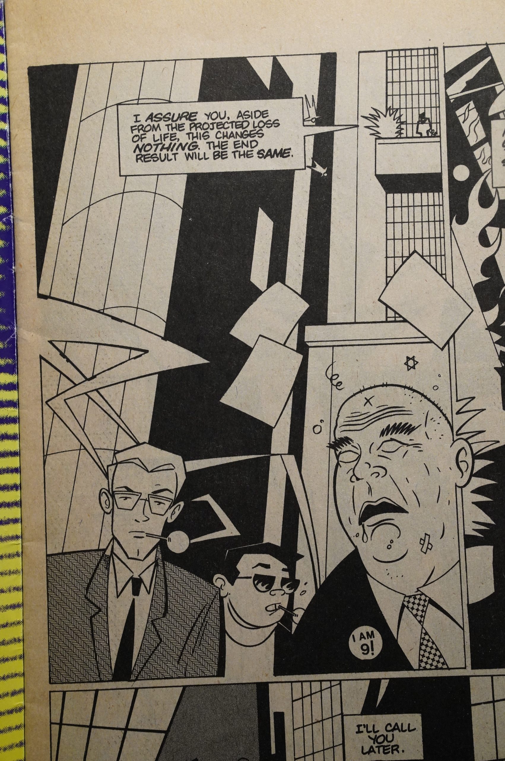
Hey! This looks great! It’s much more in tune with Dean Motter’s original Somnopolis designs.
And I’m guessing D’Israeli is also British? Those are good punks. Right again:
Matt Brooker, whose work most often appears under the pseudonym D’Israeli (sometimes “D’Israeli D’Emon D’Raughtsman”), is a British comic artist, colorist, writer and letterer.
I’m so observant.
Unfortunately, I think Morgan lost interest in Mister X after the first story. The second storyline is a two-parter where Mister X talks to God, and it’s as boring as that sounds.
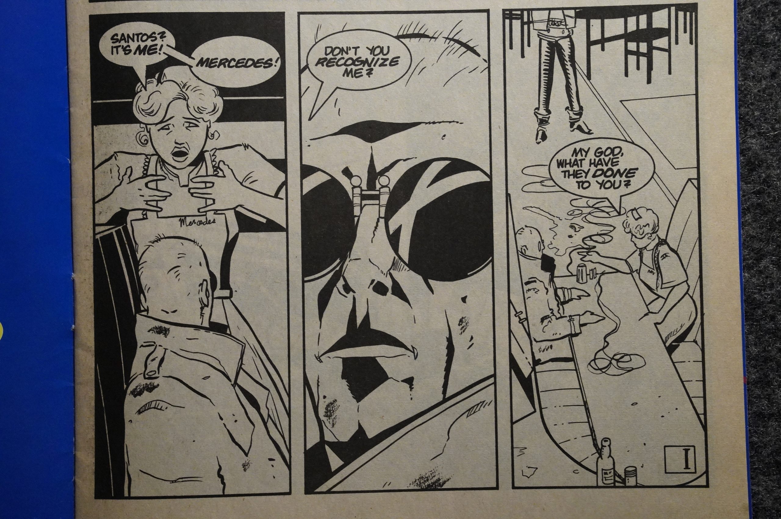
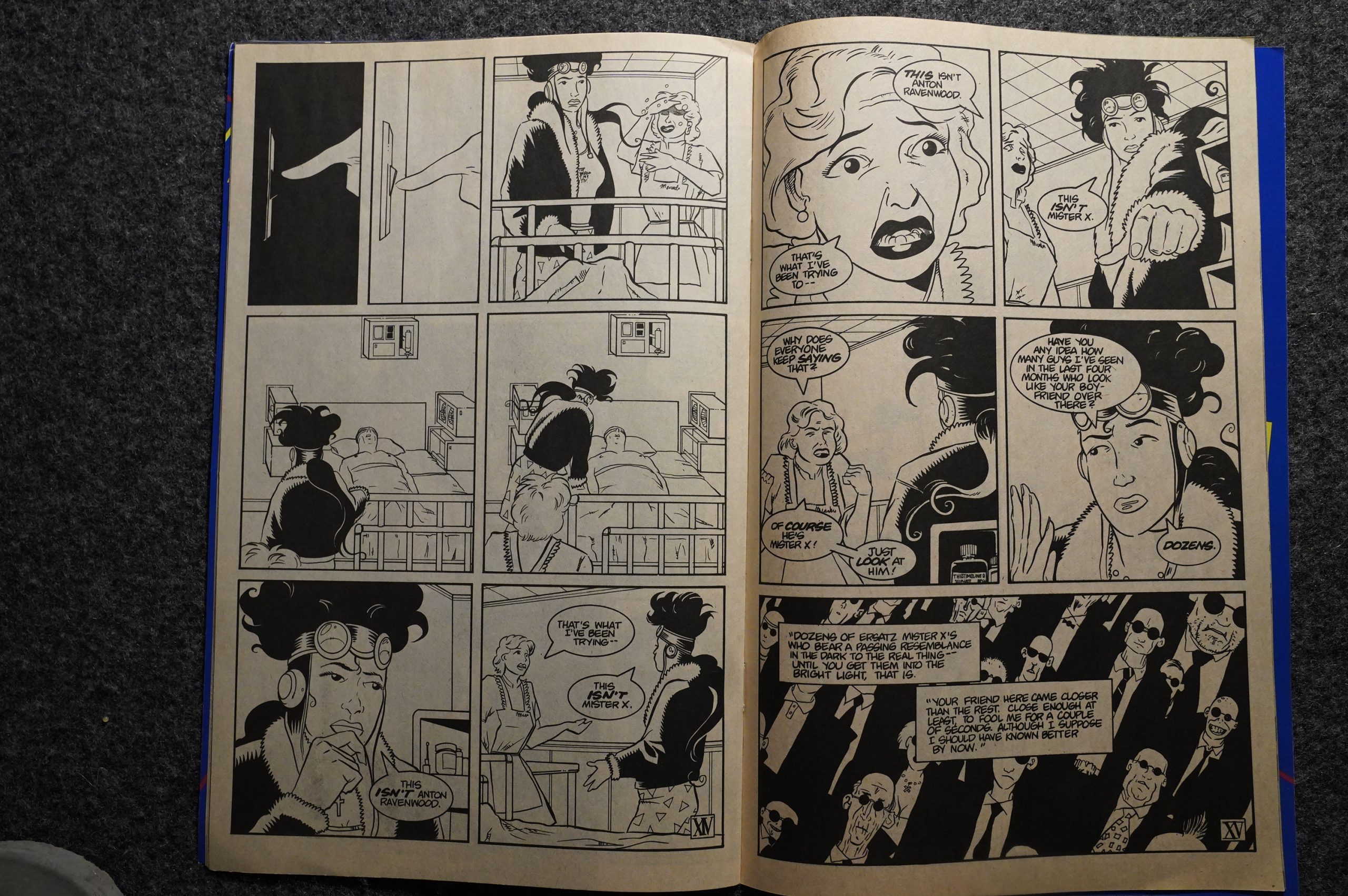
Then we get a four-part story where a guy who may or may not be Mister X meets Mercedes (from the Hernandez Bros incarnation of Mister X).
And basically nothing happens, except people wondering whether this really is Mister X and not. For four issues. And I think D’Israeli started losing interest, too, because his first two issues looked striking and imaginative (both the cityscapes and heaven), while this is just a scenes from a hospital. I mean, it’s well-told and well-drawn and everything, but it’s not interesting.
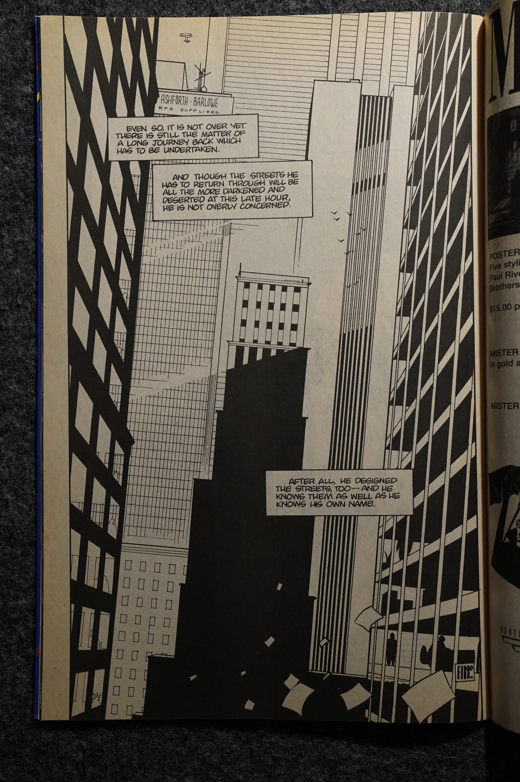
And then Morgan signs off with a kinda bitter-sweet half issue, which kinda works.
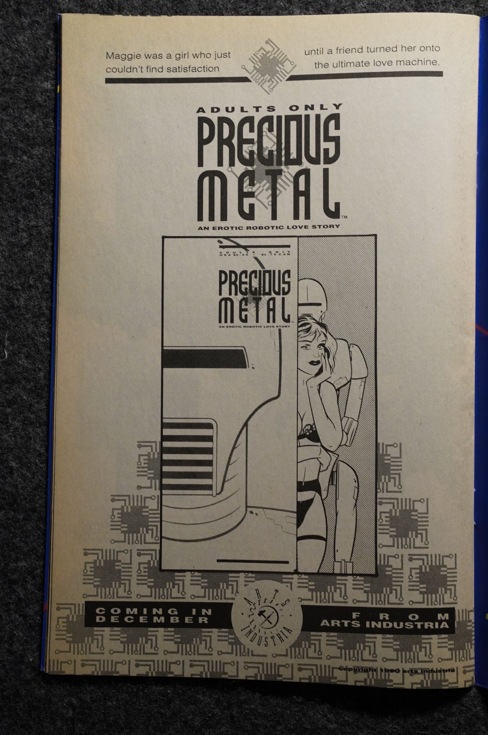
Oh, I remember that one… Precious Metal from Arts Industria? I wonder why there’s an ad for this in Mister X — it’s the only ad that’s not either a house ad or a project from somebody involved with Mister X. It’s apparently the only thing released by Arts Industria. Was this a front for Vortex or something?
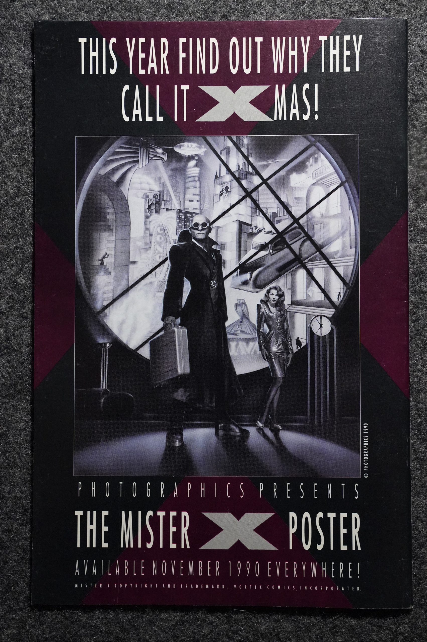
Mister X was probably more famous for the posters than for the actual comic books, but this “Photographics” poster looks a bit naff.
But! It isn’t over! Issue 13 starts a new sequence with new writer Wilbur R. Webb. And it’s an origin story: The origin of Radiant City, so we get the background on the other architect (I mean, the guy who’s not Eichmann/Mister X).
It’s pretty good! It’s a pretty thankless task, since we’ve been over the same story so many times by now, but Webb manages to give us a new angle.
But then the series got cancelled. The only thing surprising about that is that publisher Bill Marks managed to keep the series going for as long as he did. And with excellent cover/inside cover designs.
Somebody writes in Amazing Heroes #157, page 150:
Issues to 17 of Mister X will consist
of a mini-series within the series.
Entitled “The Radiant City Story,” the
series will explore the origins of the city
and its many denizens. Shock, surprise
and dismay may ensue,
One thing is certain, by the conclusion
of “The Radiant City Story,” we will
knmv the answers to some surprising and
intriguing questions concerning both the
city and its mysterious, bald, bespect-
acled little protagonist.
Following the completion of the three-
part “Radiant City Story,” the book will
undergo a complete revamping.
As a symbol of the restructuring of the
book, numbering will begin again with
Volume 2, #1.
The three Seth-penned issues described here never happened. Or rather, the 13th issue of Vol 2 is what’s described here:
Although a 13th issue of Volume II was published, beginning a story by Seth (writing as “Wilbur Webb”) the rest of the story remained unpublished until it appeared in New Worlds Anthology.
Publisher Bill Marks assures us that
the book will be “completely different
and completely the same. Something you
could only say about Mister X!”
This new series will feature a much
more in-depth look into the character of
Mister X gets yet another new artist (Shane Oakley),
as well as a new writer, a
new inker, a new frequency, and a new #1.
Mister X and will show us pans of
Radiant City we’ve never seen before
(and may not want to see again).
Marks says that new scripter Jeffrey
Morgan has a wealth of great ideas for
the book and everyone involved is real-
ly excited by the new direction.
Marks also adds that the proposed
monthly schedule for Mister X is no
joke. He feels thit he has a team that can
produce the book on a monthly basis and
that this can only be good for the book.
“It’s not that people don’t love the
book,” he says, “it’s just that they hard-
ly ever see it on their racks. We want to
change that.”
The first twelve issues were collected and reprinted by Dark Horse some years back.
For the second volume in 1989, the bulk of The Brides of Mister X, Motter recruited stark, black-and-white art from highly overlooked Shane Oakley and another singularly named indie luminary, D’Israeli. The twelve-issue story was scripted by Jeffrey Morgan, a writer whose main experience took place in the much cooler area of rock and roll journalism. As a writer and editor for CREEM, Morgan hung out with the likes of The Stooges while learning from the most accomplished prose stylist of the magazine trade, Lester Bangs. Overall, it’s a much darker take on the themes and characters than the first volume, carried off in a style that’s strangely reminiscent of the music of the Berlin period of David Bowie, Lou Reed, and Iggy Pop. No, really.
No. Really.
This blog post is part of the Into the Vortex series.
Lars, I sincerely thank you for the very kind words!
Your pal,
Jeffrey Morgan
Authorized biographer – Alice Cooper
Authorized biographer – The Stooges
https://www.facebook.com/jeffrey.morgan.writer/