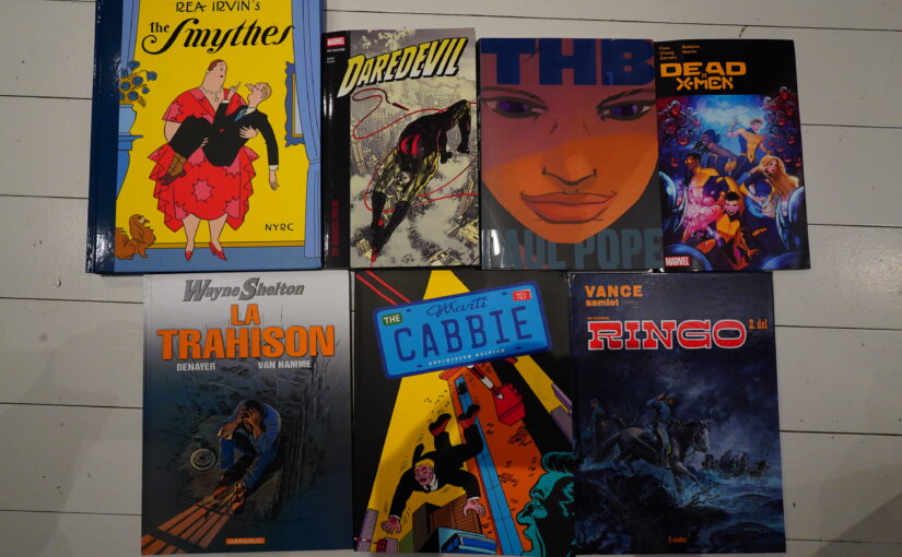
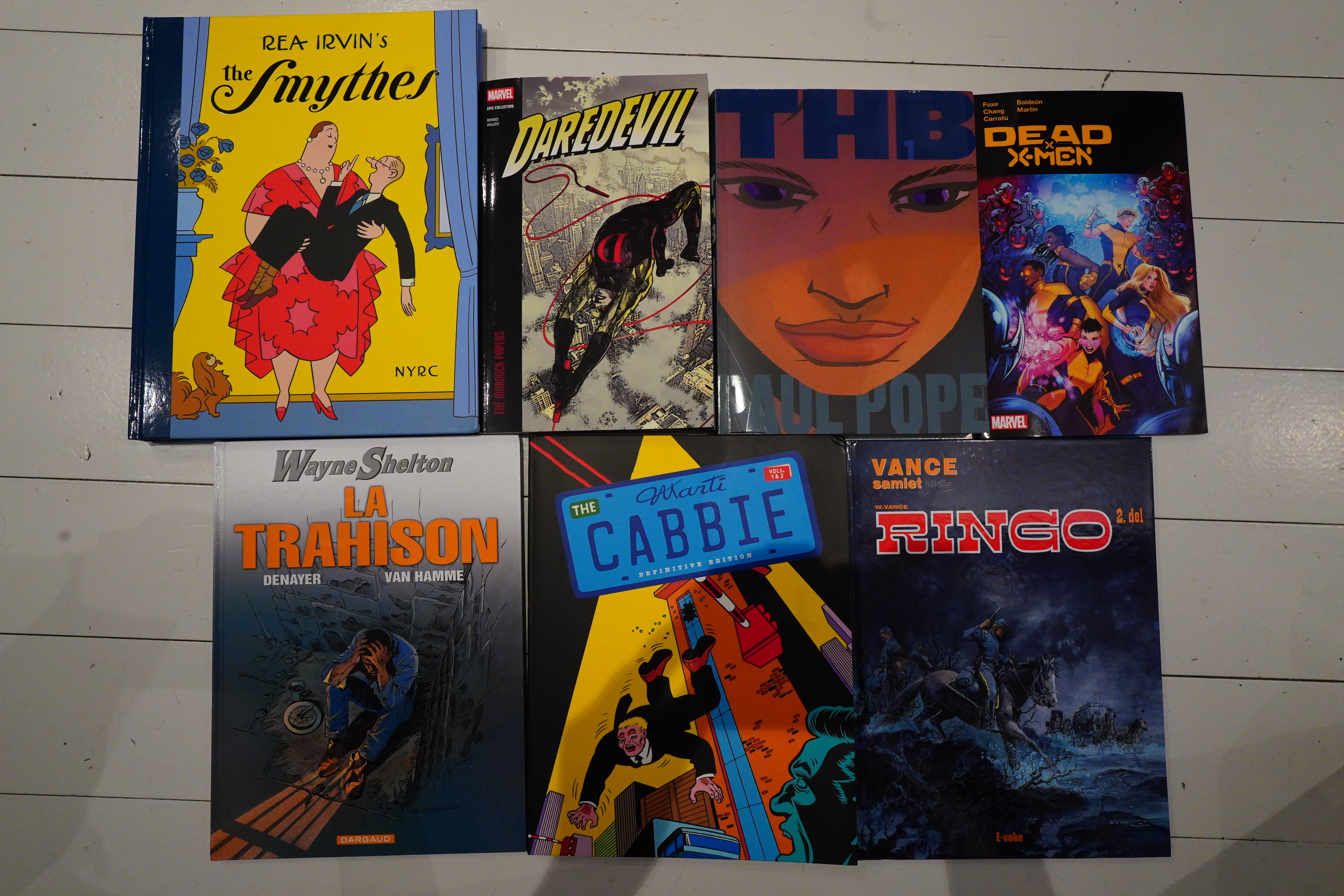
I read some comics over the past few days.
Or rather… I think I actually read only four of these books?
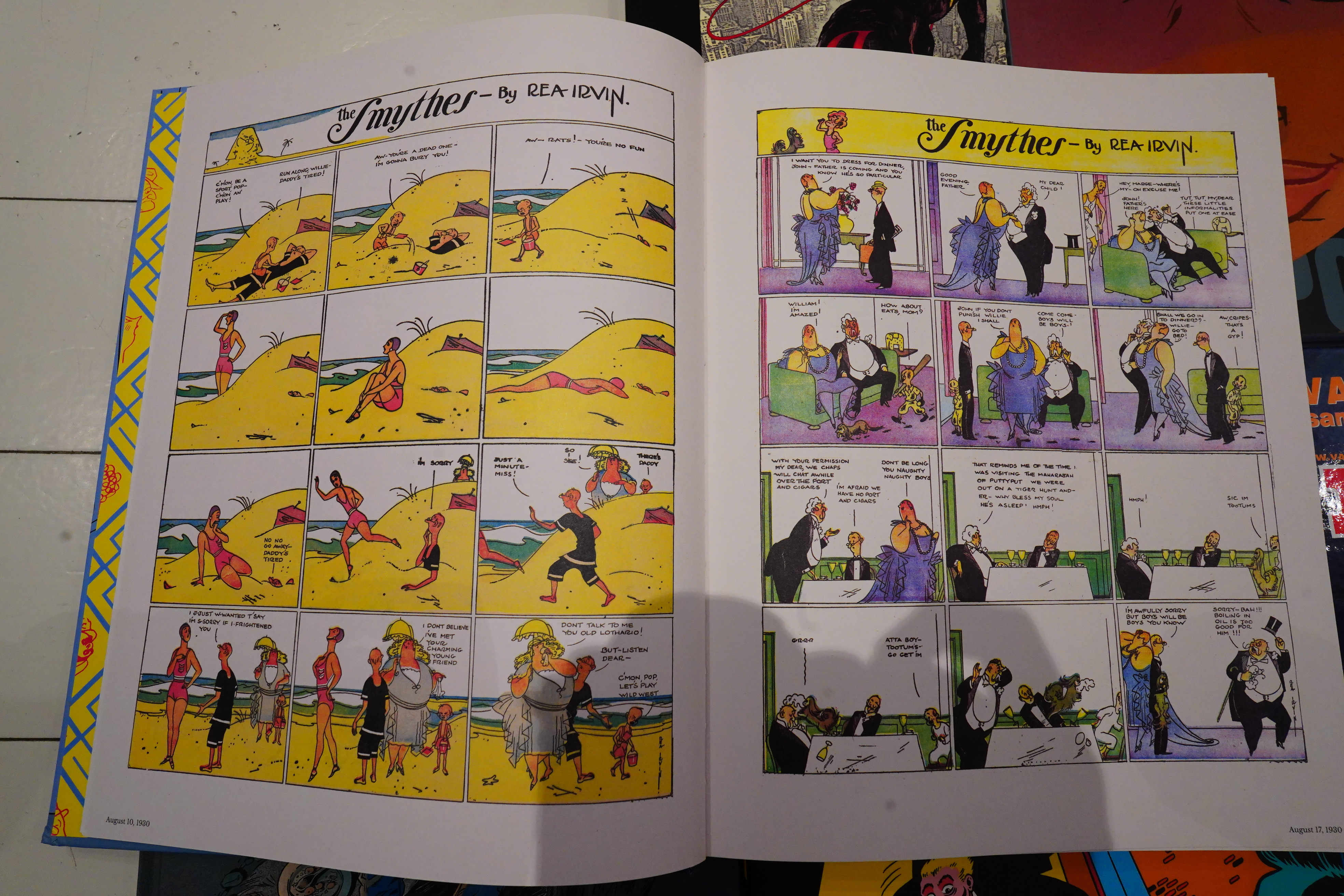
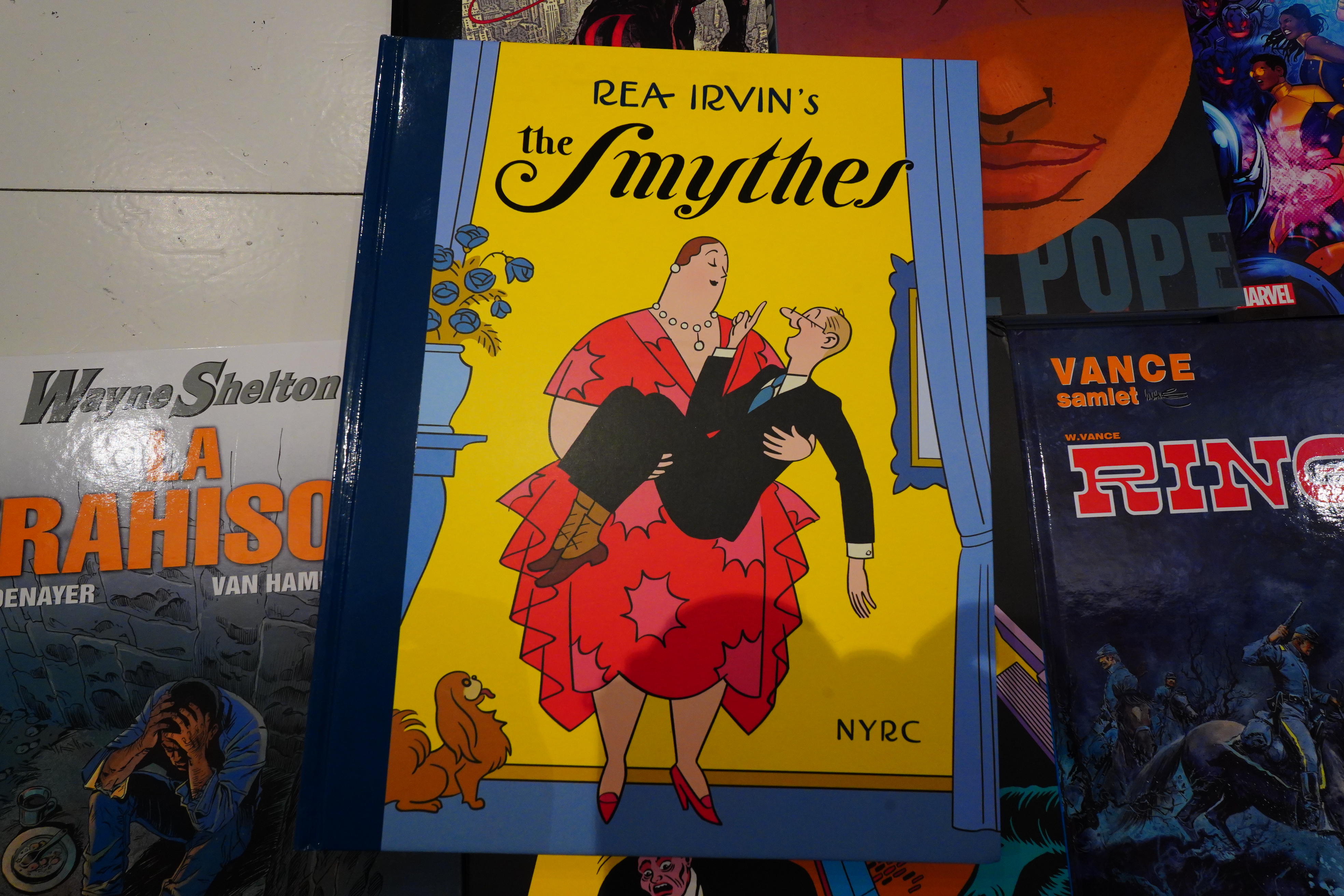
Rea Irvin’s artwork is quite stylish, but man — even in 1930 people must have been going “well, this is a bit trite, innit?”
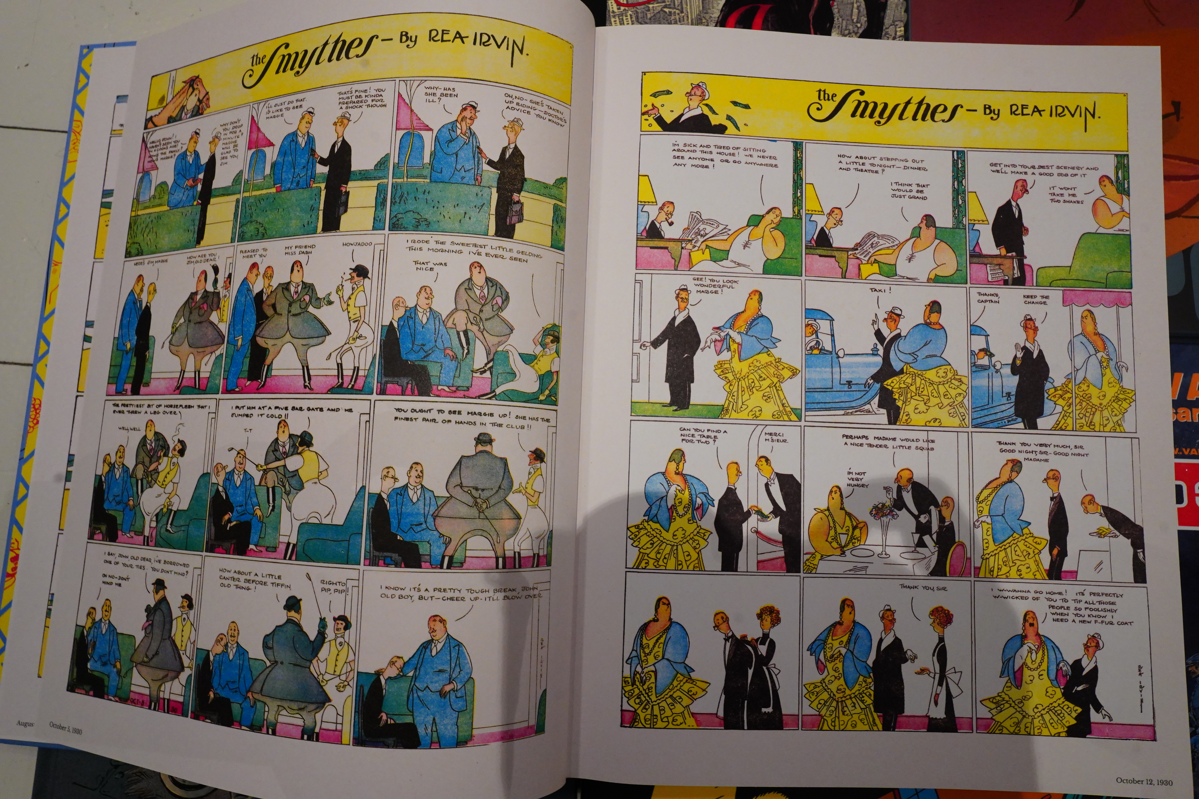
It’s just not funny, so I ditched this book after a couple dozen pages.
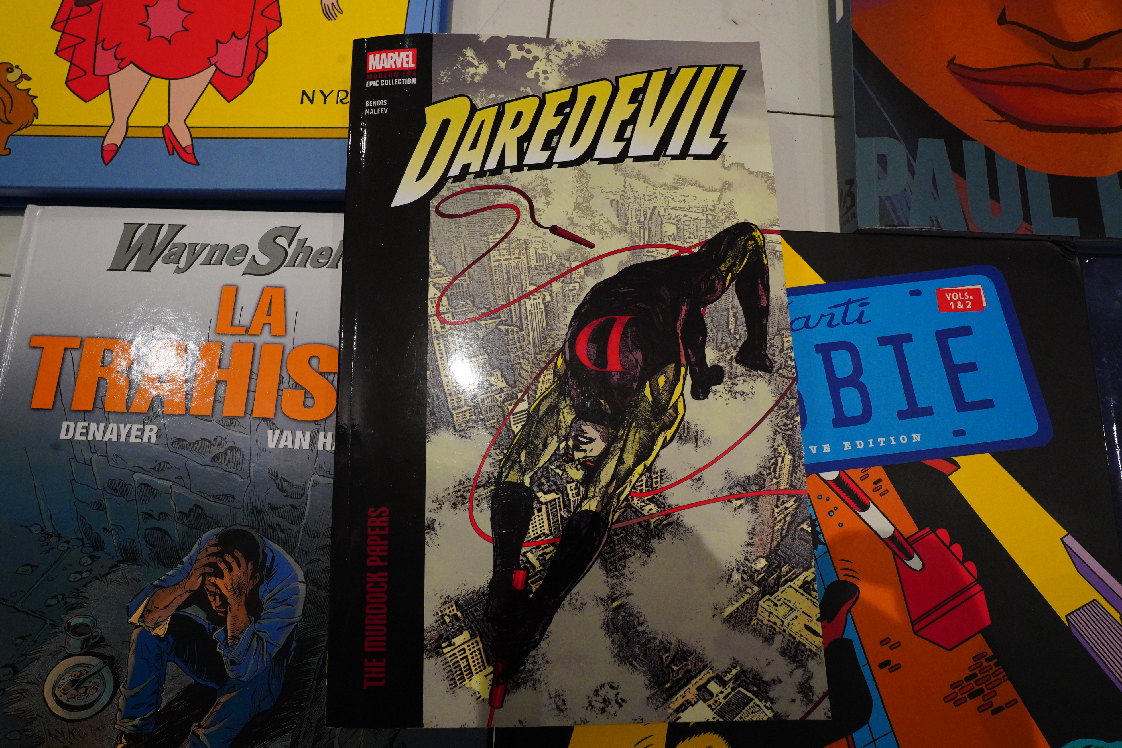
I did read the entirety of this “Modern Age” Daredevil collection. “Modern age” apparently means 2005?
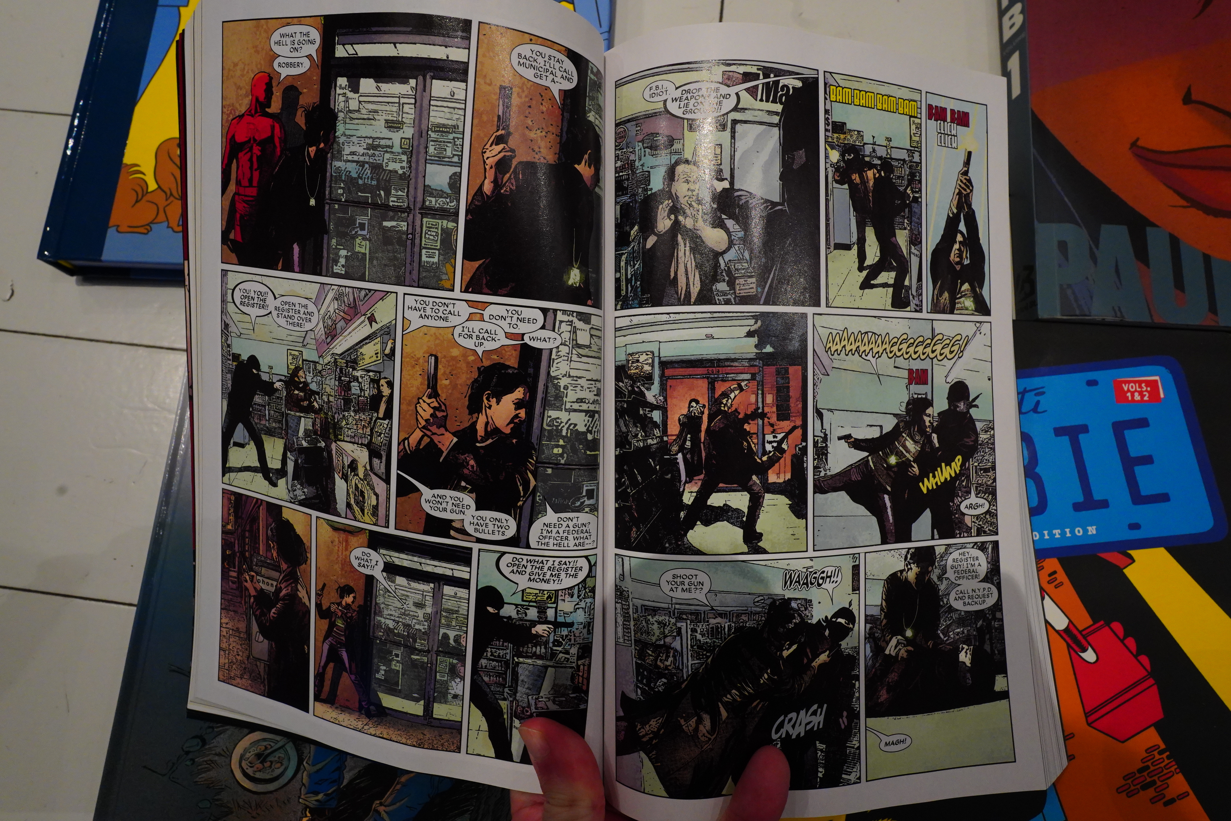
The main attraction here is Alex Maleev’s artwork, which is just not the kind of thing you expect to find in a Marvel comic book.
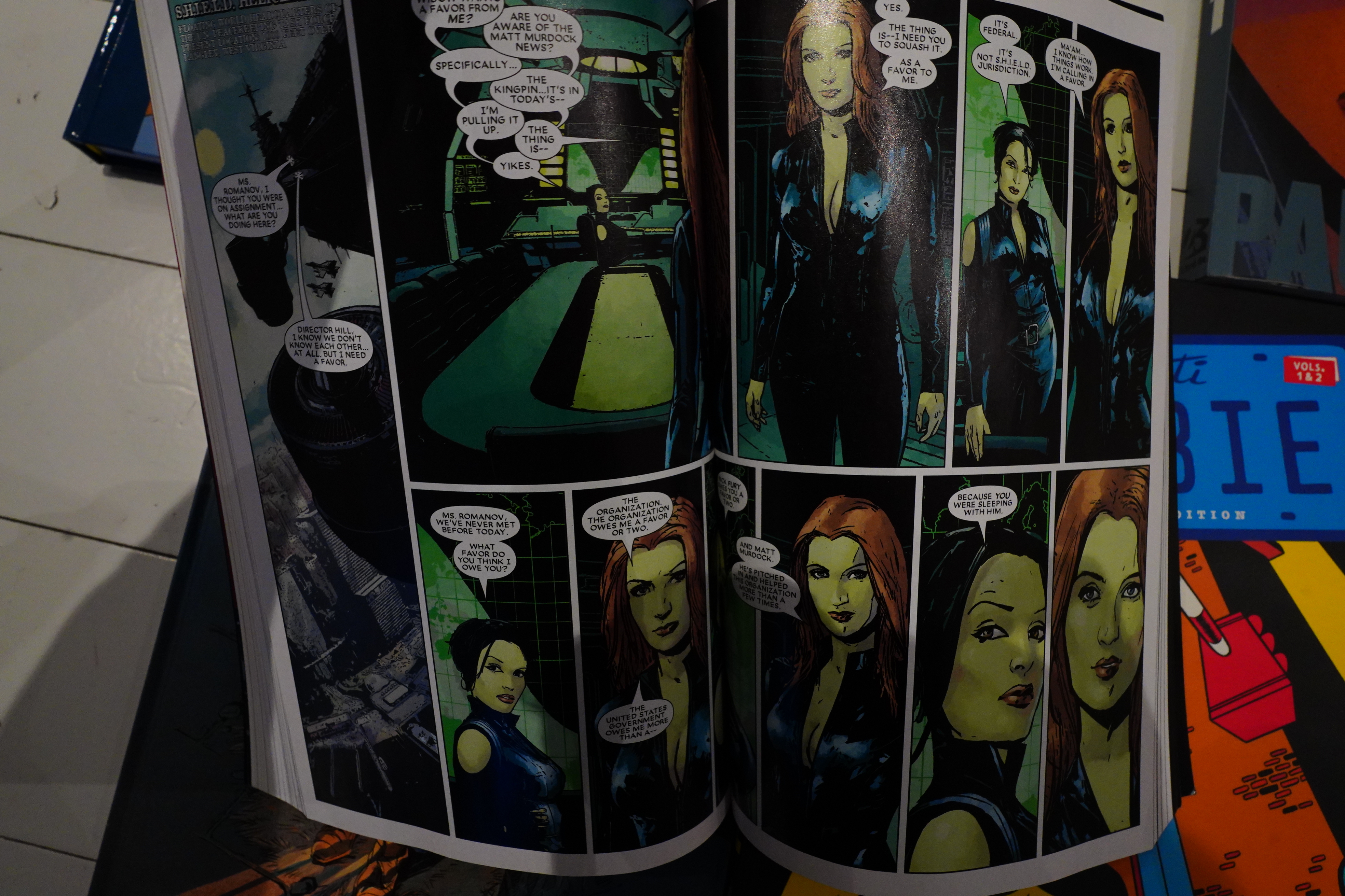
My main problem with this book has mostly to do with the binding. This is one of those “Epic” collections, which means that the spine is very, very tight. Maleev has a tendency to draw panels horizontally over two pages, which means that many panels are just swallowed up by the binding. Couldn’t Marvel have spend a couple more millimetres of paper in the middle? Or just shifted everything out towards the opposite edges of the pages? It’s so annoying.
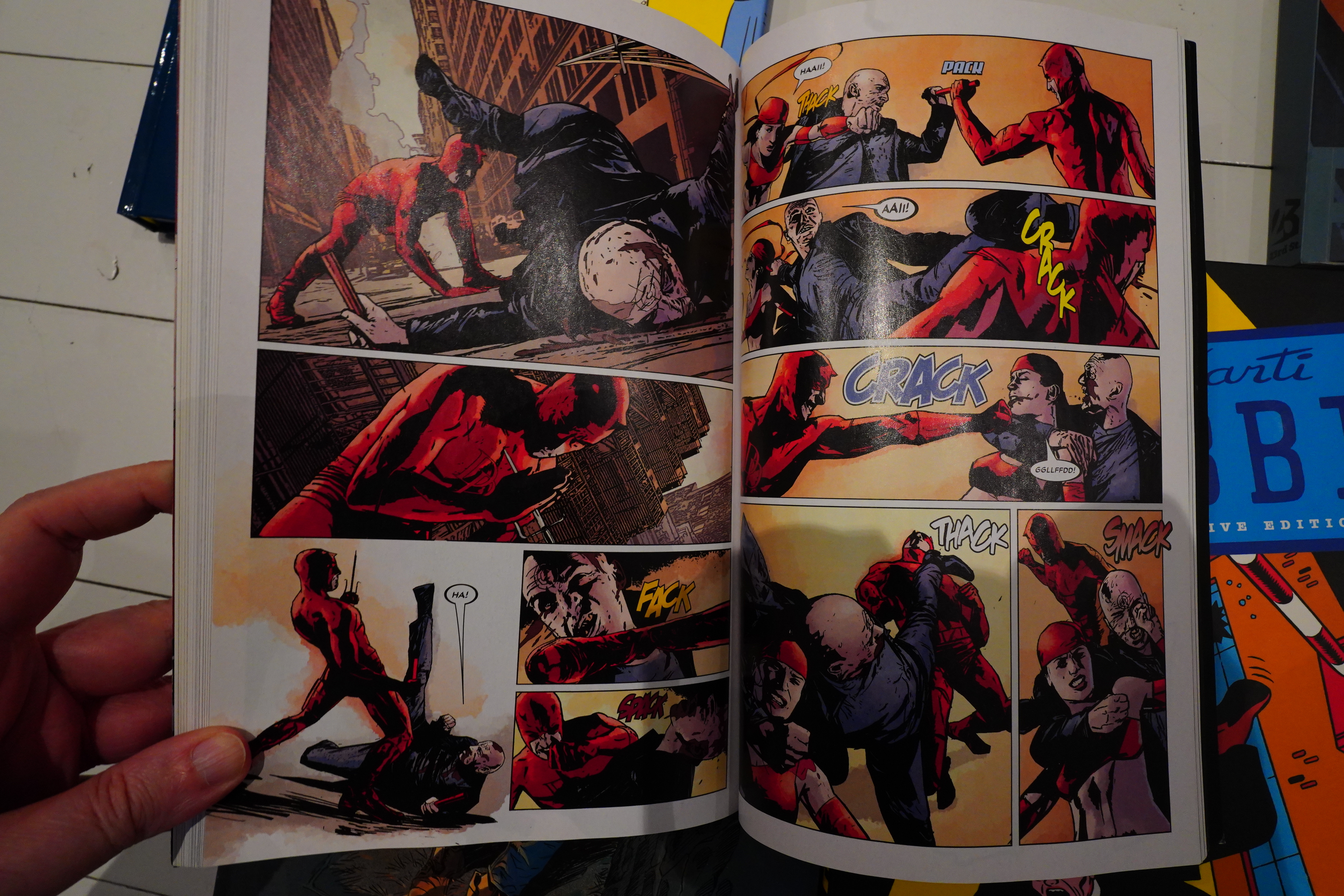
I quite enjoyed these comics overall, but, I mean, it’s… Daredevil. It’s OK.
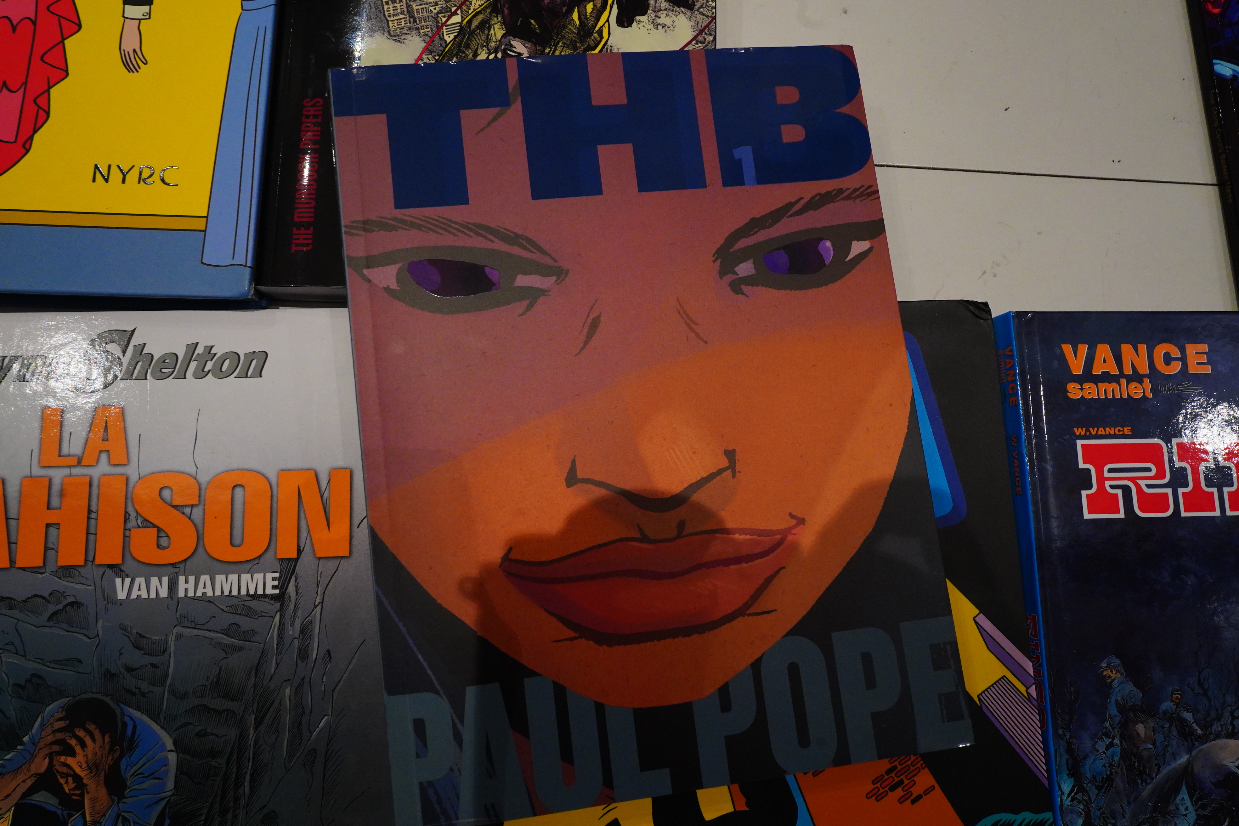
Wow, what an ugly cover for this Total THB 1 collection.
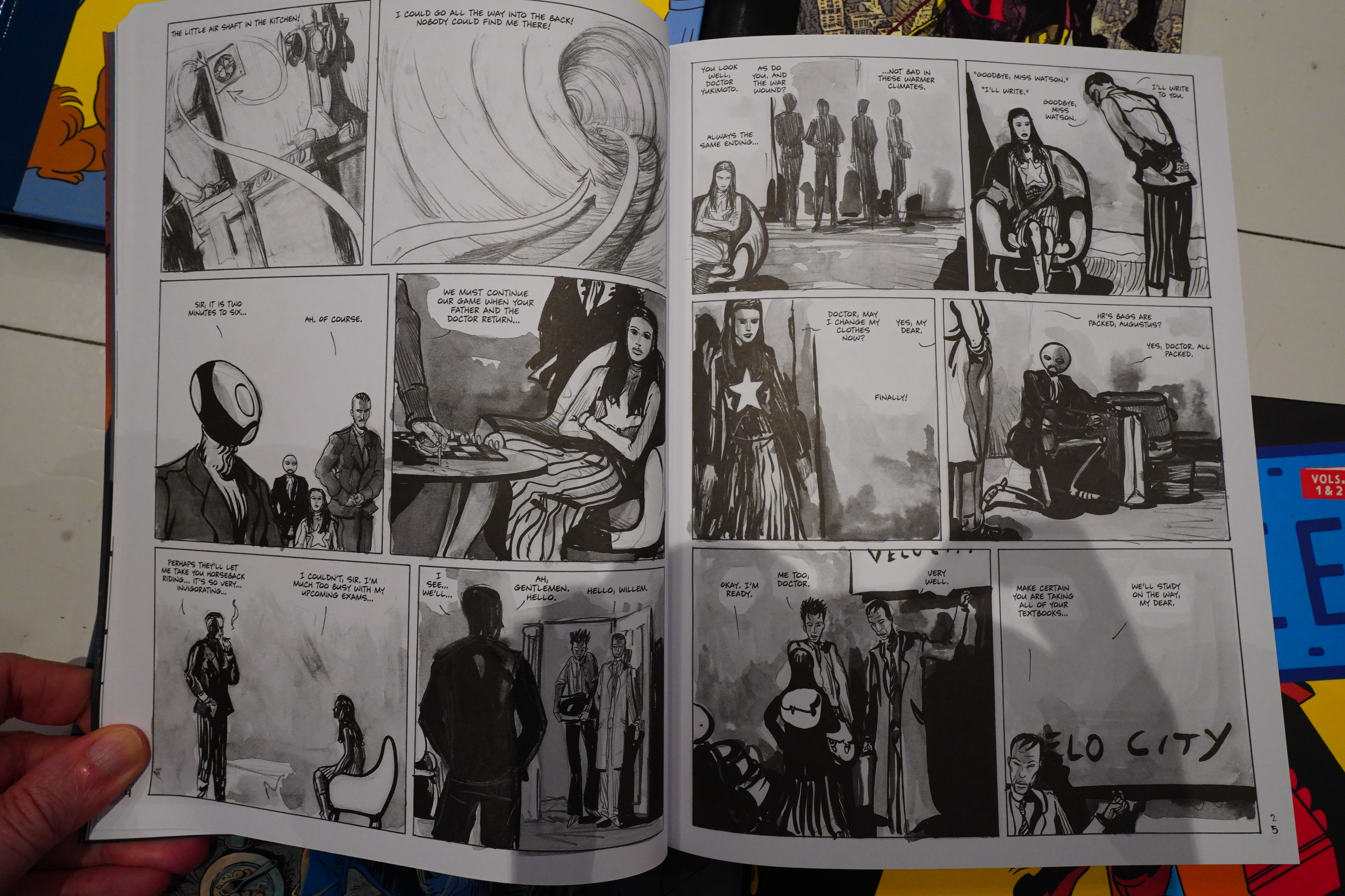
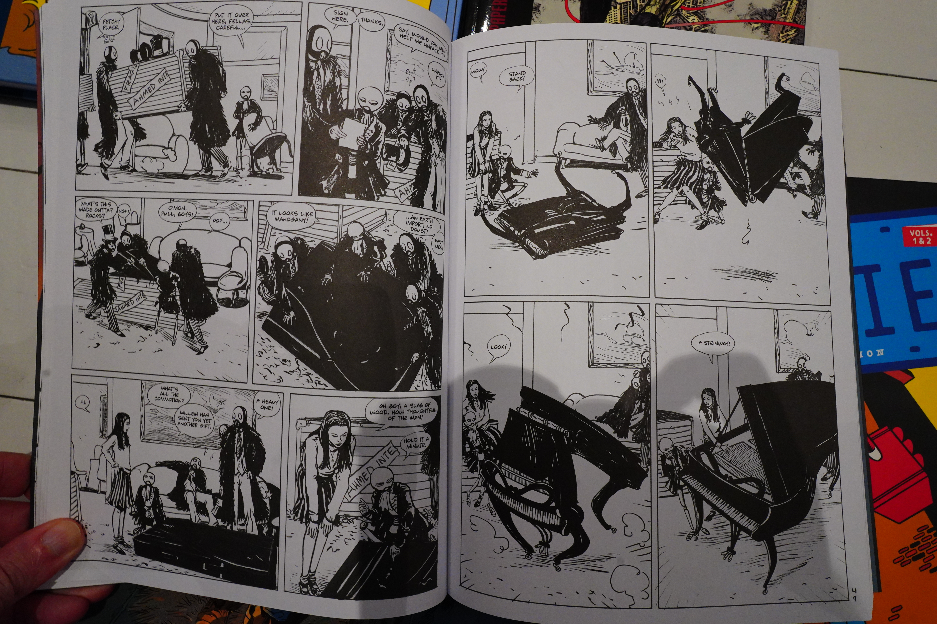
The interior artwork is so beautiful.
I remember reading these comics back in the 90s and just being flabbergasted at the talent on display in the five THB issues. They were 64 pages each, weren’t they? And released monthly or something? So it just felt like we were witnessing some kind of prodigal genius working on a level rarely seen — not only were these comics original, interesting and engrossing, but they were beautifully drawn and done so fast!
And then there was the rest of Pope’s career, which I don’t think we have to talk about. Such a let-down.
I wondered whether Pope was going to redraw THB for this collection, because he’d already started doing that in the 90s, but I don’t think so? This all looks very familiar to me. The only thing is that the book seems more streamlined than I remember? One of the attractive things about THB was that it seemed to hint at an intriguing world outside the story, with various digressions and other characters? Or do I misremember? This is just focused on HR’s story, and it moves fast and is less mysterious than I remember.
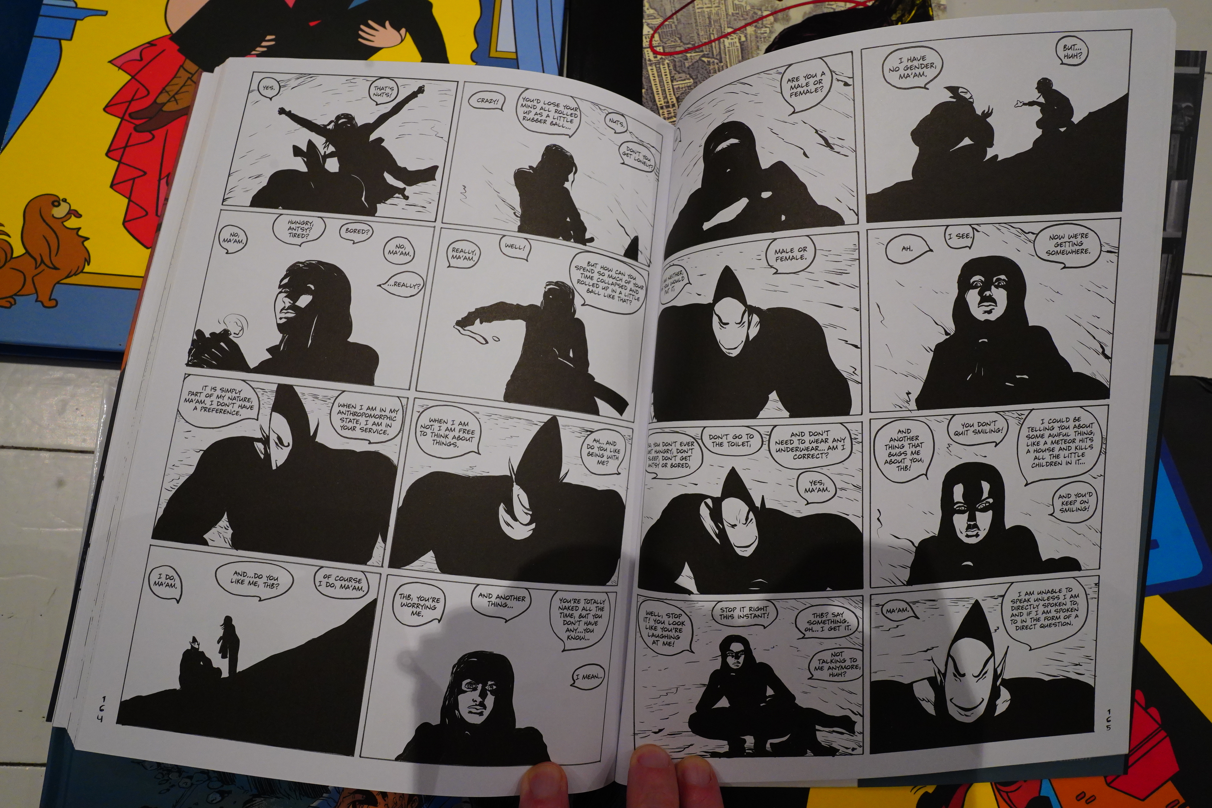
Oooo, this is a scene I’ve thought about often since reading it. It’s so simple — just HR and THB sitting in the desert, talking, while HR is waving her flashlight around. But it was totally magical when I read it back then, and it still is now.
Let’s see… I’ve gotta google whether Pope’s been doing some editing… Or First Second, because this is published by them. Whenever I read that a comics artist I quite like is being published by them, my heart sinks — not because they don’t publish good stuff, but because their editing process seems to result in more “streamlined”, “readable” books. Either because the creators restrain themselves because it’s going to reach a more mainstream audience, or because the editors there suck.
Heh heh, I see that lots of people are saying “finally we’ll get the all the THB material collected!” I’ll believe that when I see it — I feel like a complete reprint has been announced quite a lot of times, but perhaps First Second will be able to pull it off. Won’t believe it until I have the final volume in my hands, though.
OK, Brian Nicholson has the goods:
What readers will receive from the collection is pretty close to what Pope drew in 1994. There are exceptions, which are partly marks against it. The cover design is pretty bad: For a guy whose work is clearly drawn very large then reduced in size for print, it’s an odd choice to focus on a small detail and blow it up large, even before the addition of gradient coloring and spot gloss. This is a minor complaint, as the interiors look pretty damn good. Rescanned artwork adds a great deal of depth to the textures of a sequence done with wash so it is now clear it was printed much too dark originally.
[…]
Total THB favors the initial printing of THB 1 over Version 2, and none of the new parts are included. However, in that first version of THB issue one, there is an extended silent sequence of HR chasing a bat she’s accidentally released from a jar. It is a scene which, in context, is perfectly charming as a showcase of visual storytelling, but version 2 deletes it because it doesn’t really do anything storywise, and it’s absent from Total THB as well. Another sequence, focused on a bureaucrat working as a censor, who secretly loves the material he suppresses, as do the people above him, was completely redrawn for its appearance in Version 2 and is likewise deleted. It strikes me as a shame that this sequence was removed: It expanded the sense of the book’s scope, although this is also the argument against its inclusion, from an editorial perspective: Deletion of this scene keeps the focus on HR Watson.
I didn’t hallucinate! Digressive sequences (that gave this world more depth) have been deleted! But apparently Pope edited these out already in the 90s.
Anyway, Total THB 1 is a great read — kinda magical.
I seem to remember THB 6 (which was published years later) being kinda naff, and that’s coming up in Total THB 2, but I guess I’ll be buying it, too.
This is not good.
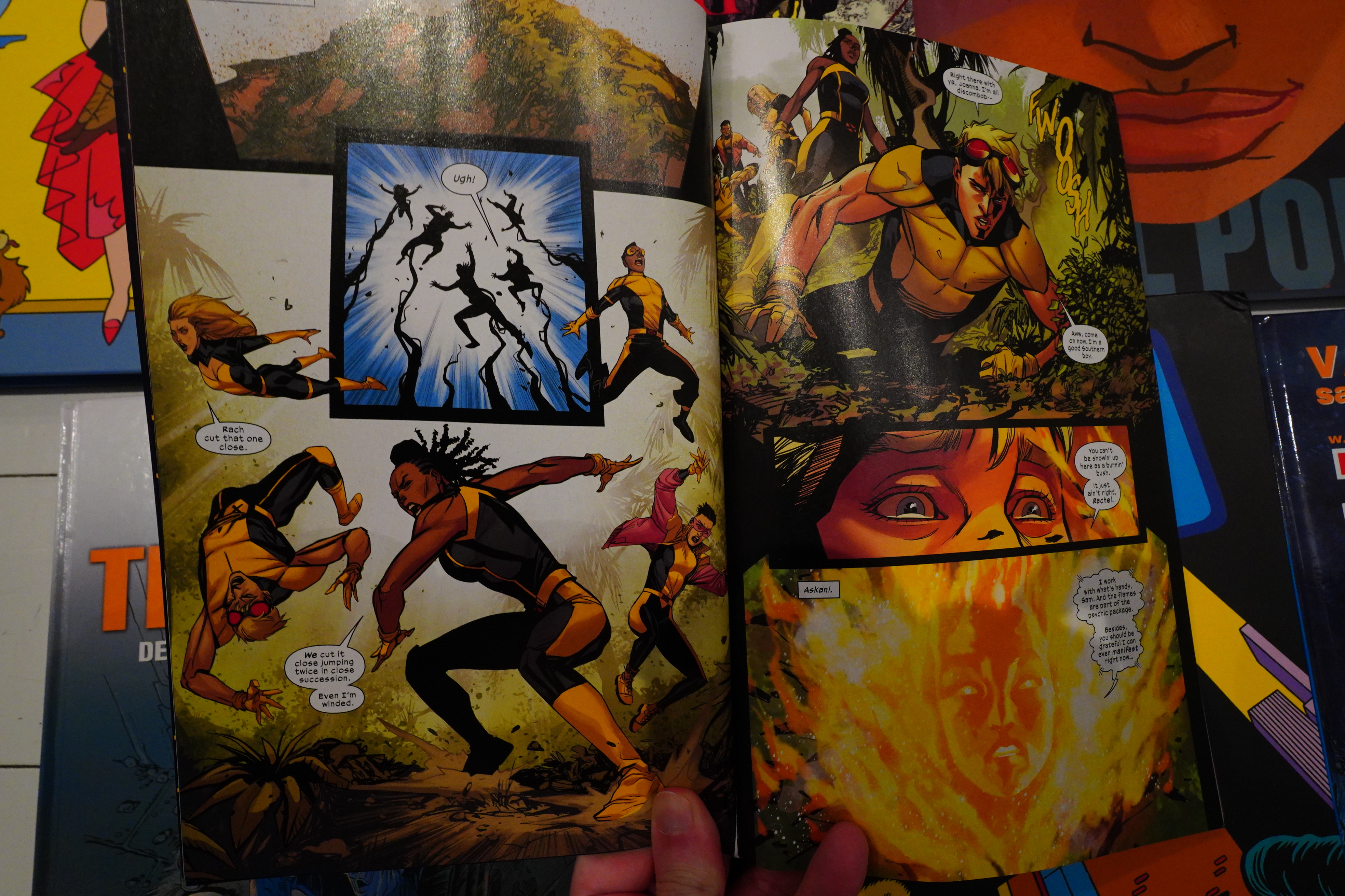
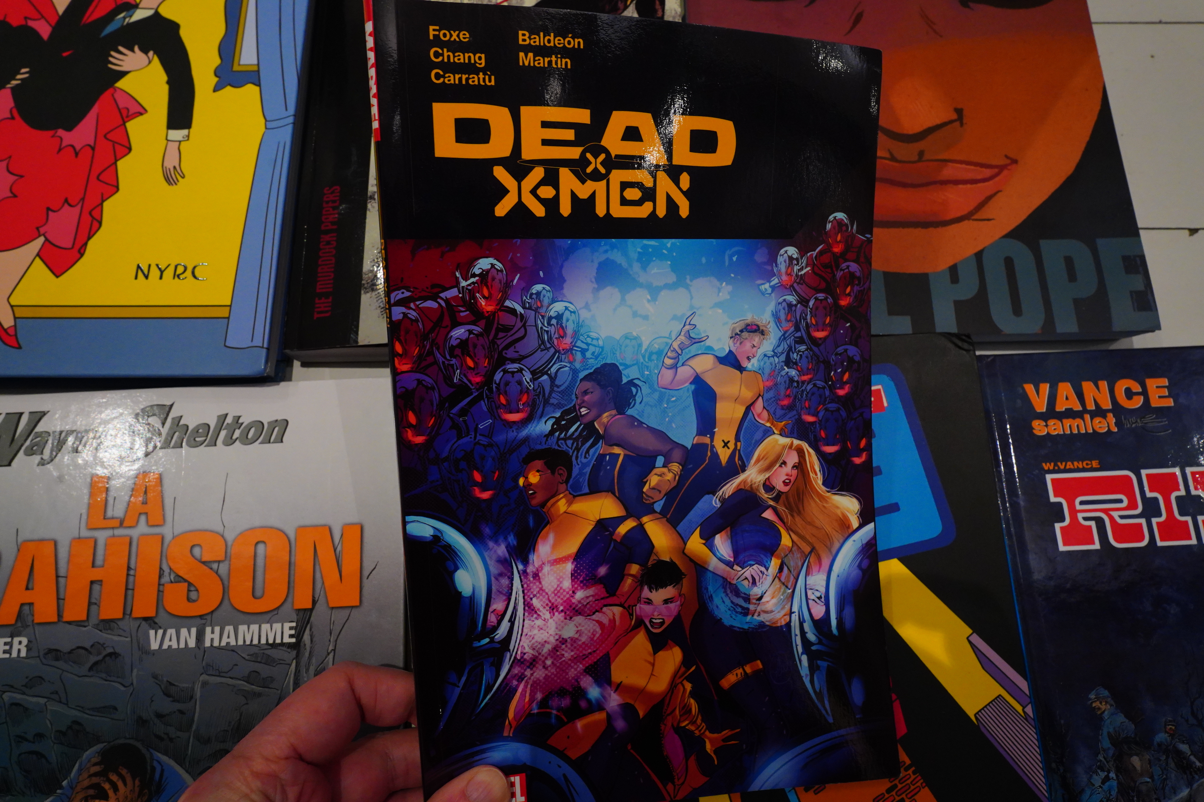
I have no idea why I bought this, and I shouldn’t have. It’s a spin-off of some X-Men special event or other? I have no idea what’s happening here.
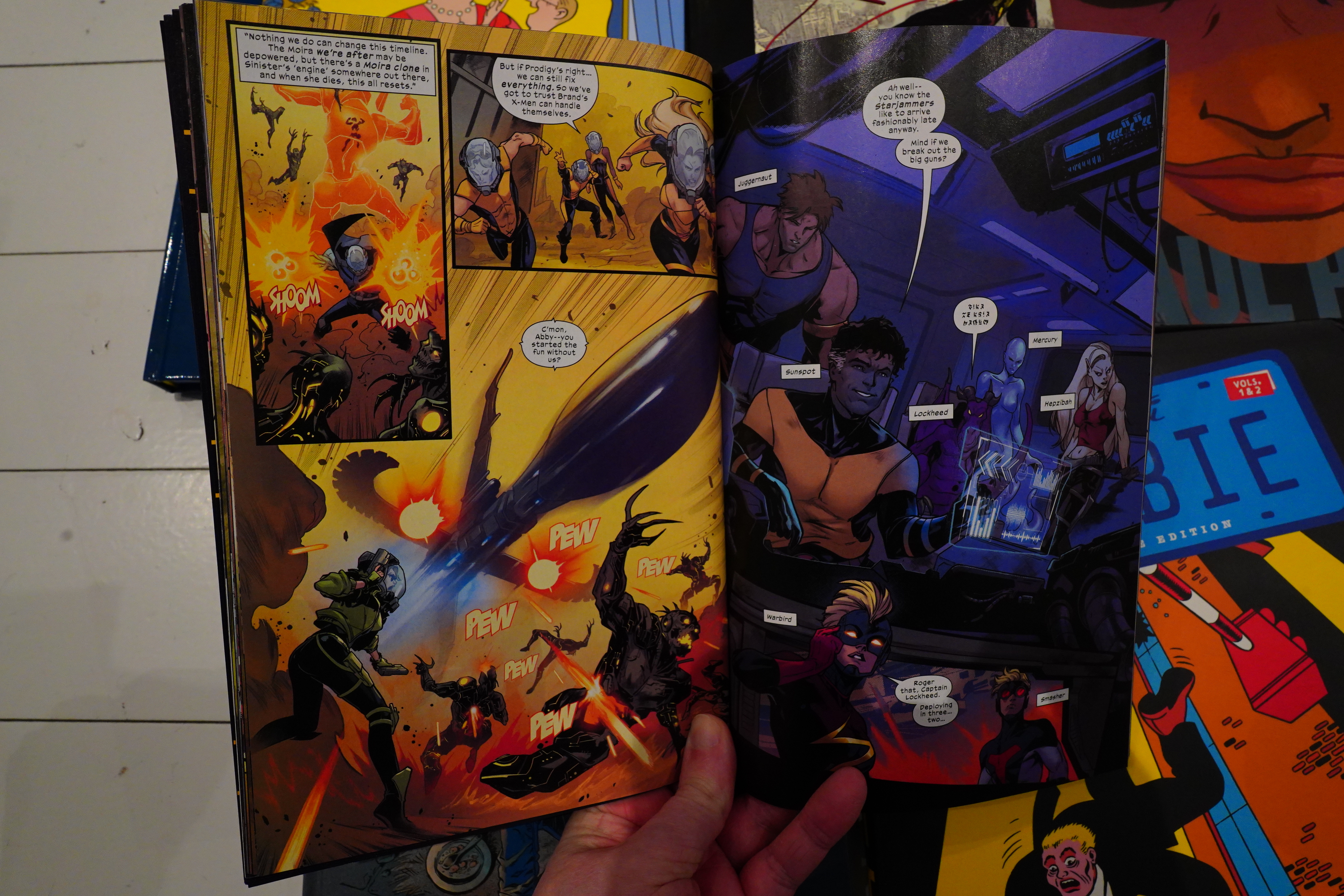
And this scene just made me go *sigh* and I ditched to book. It seems like the point of this book is to just trot out alternate universe versions of the characters people liked as children? It feels like reading a summary of adults playing with dolls.
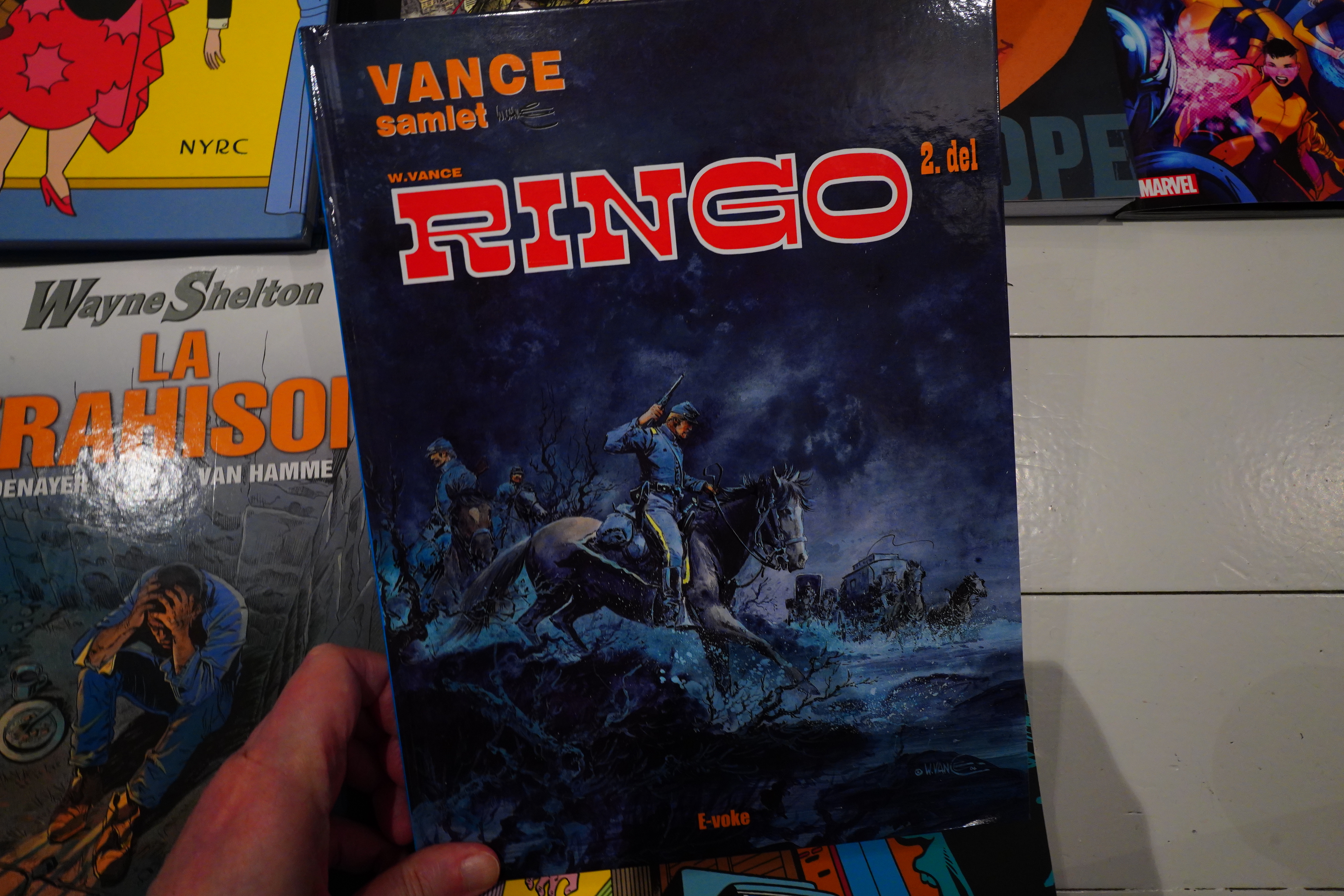
William Vance is huge in French(ey) pap pap comics circles, so even his least distinguished work is being translated.
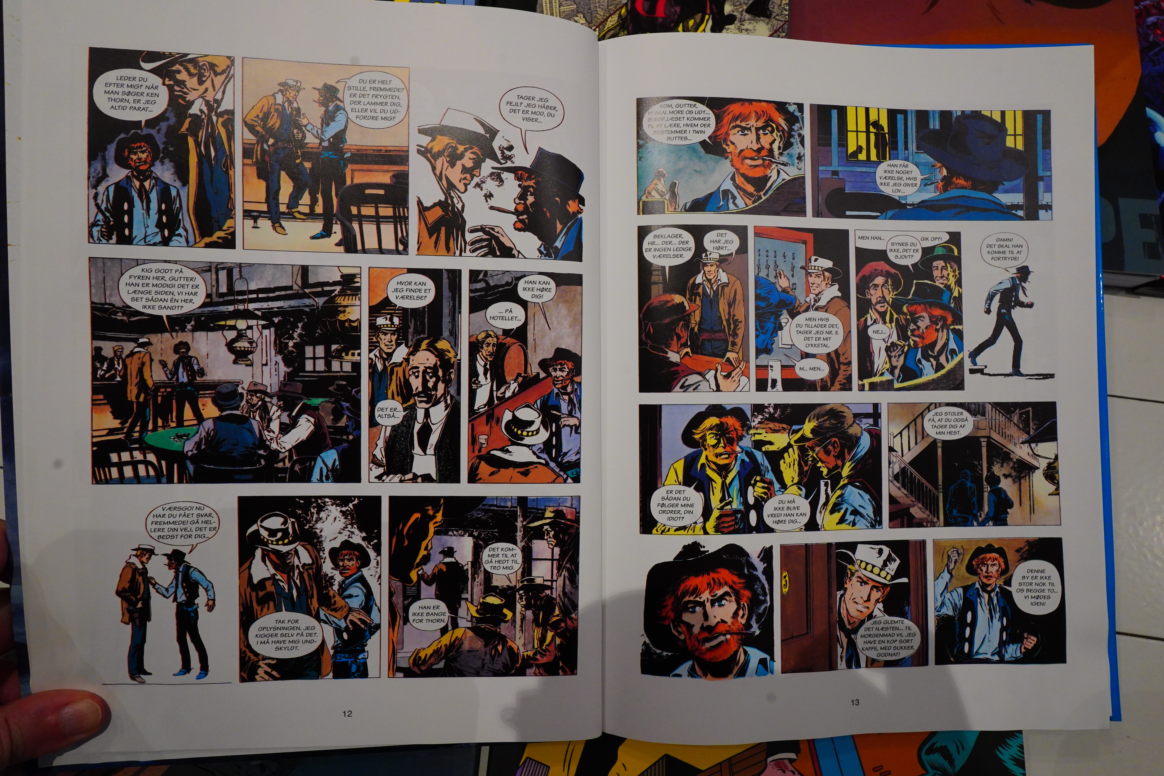
This is from the mid 60s, and mostly written by Jacques Acar. The reproduction is bad, and the storylines are almost non-existent.
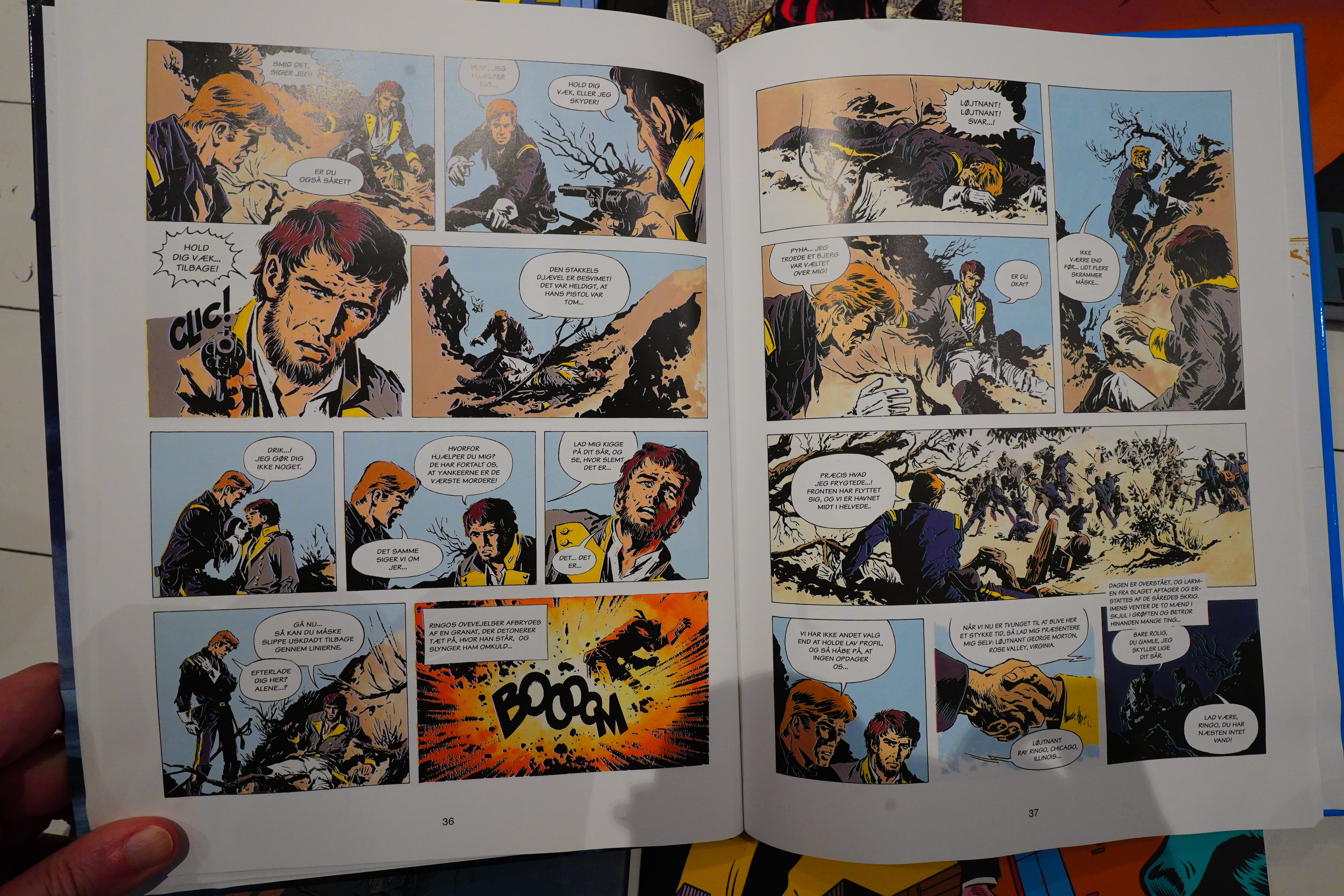
Just one cliché after another. Didn’t finish this one, either.
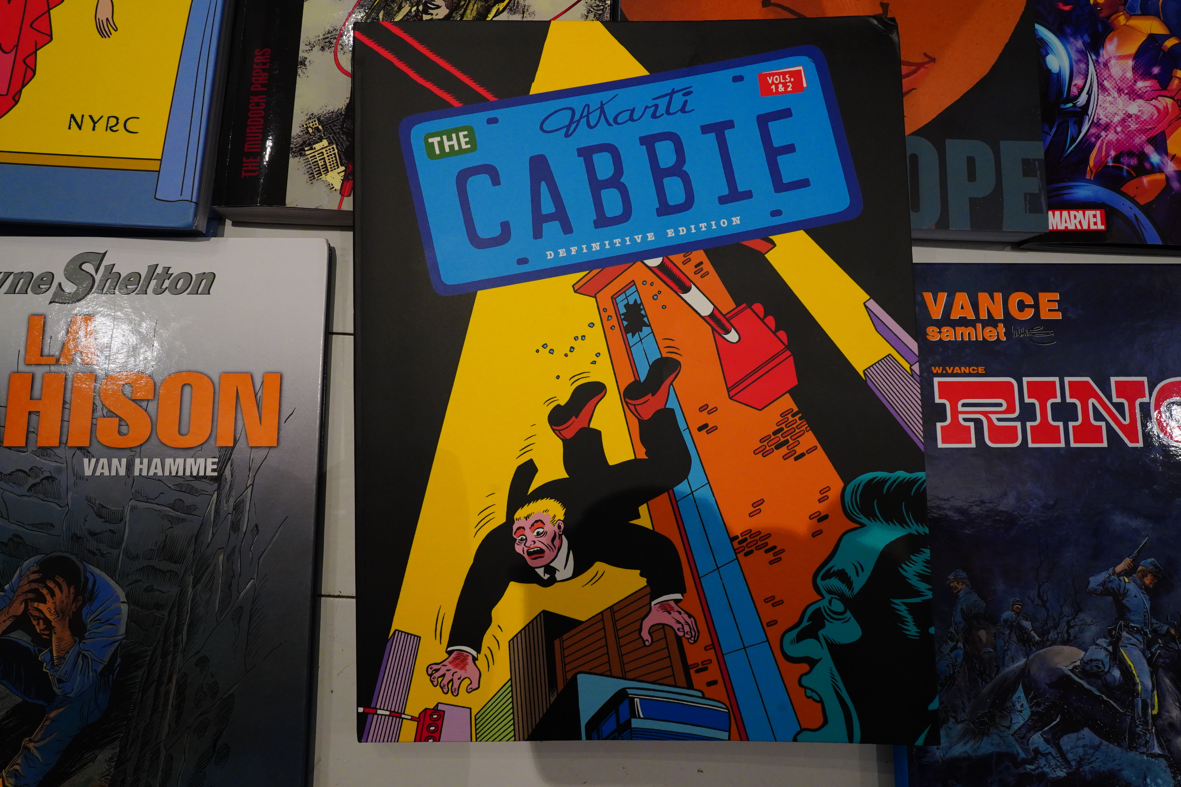
I remember Cabbie popping up randomly in various European anthologies in the 80s.
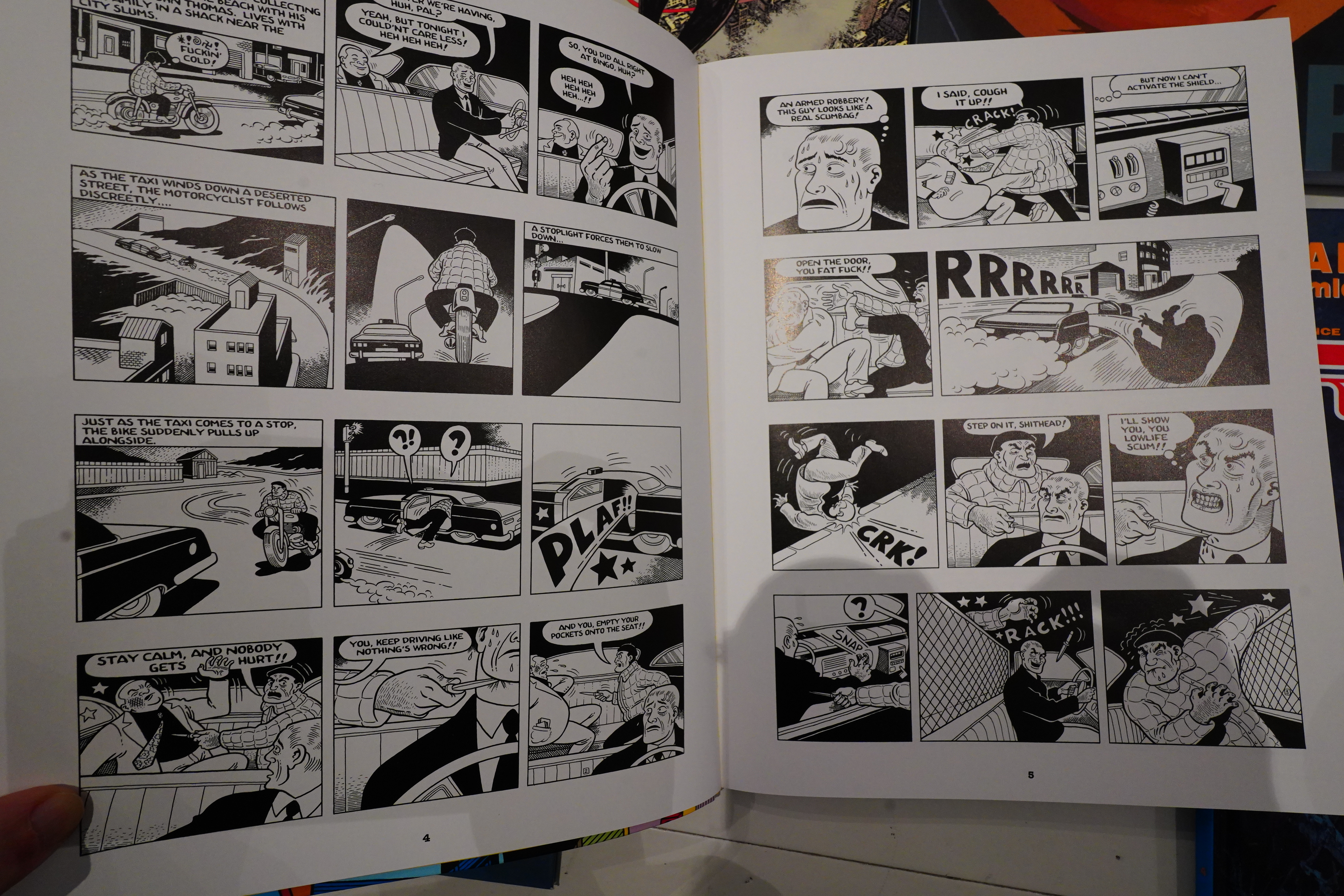
Martí’s fevered version of Dick Tracy’s universe seemed so on point for the decade — it felt like outsider art, somehow: Super violent and not holding back any weird obsession.
So I found it fascinating, even though I never actually, er, liked it.
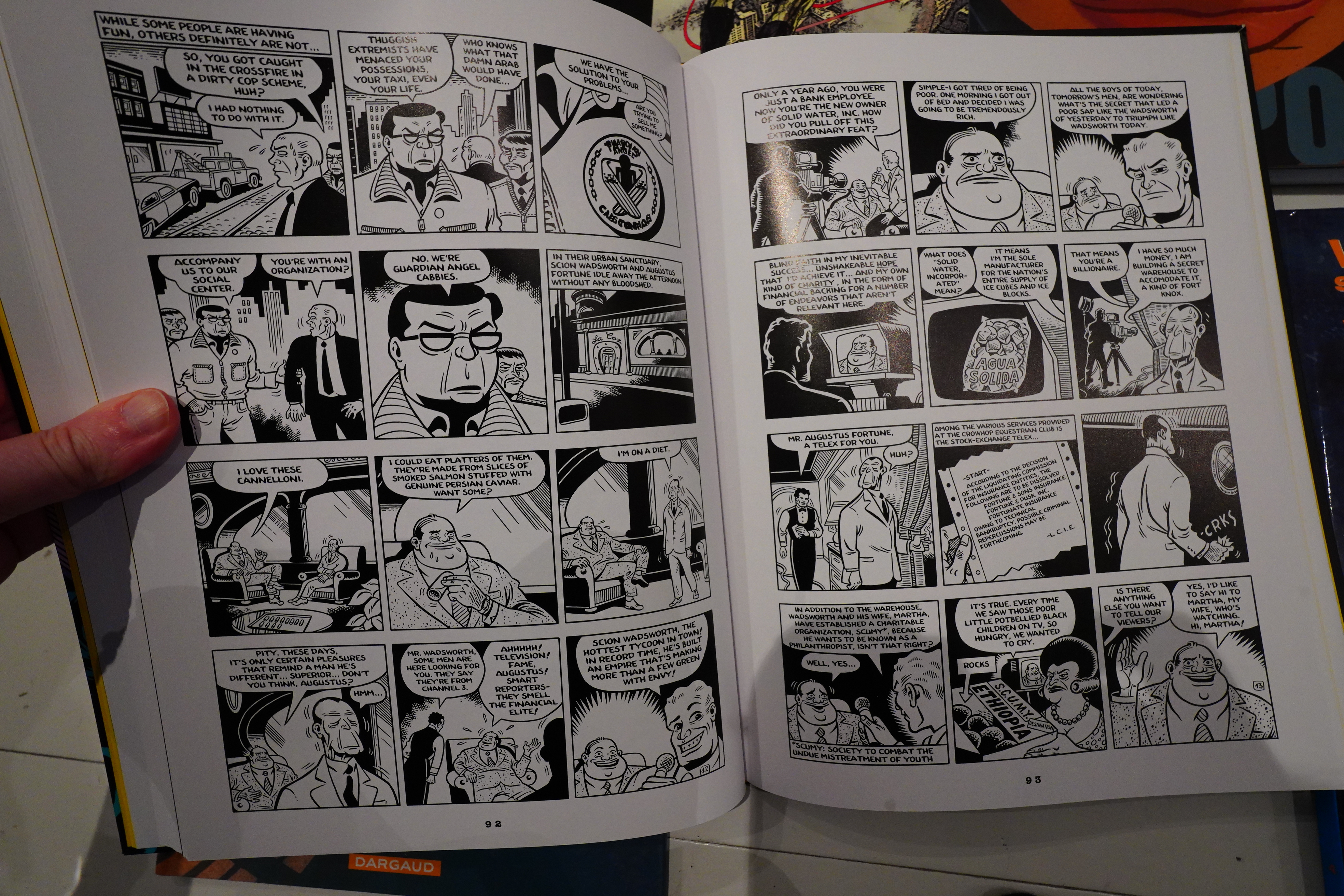
This edition collects the all Cabbie material, apparently. The first album I’ve read before, because it was widely translated back then. The second I haven’t (because it wasn’t), and while reading it now, it became clear why not — the first album had an insane kind of clarity of vision, while the second album is just a jumble of … stuff. It doesn’t work on any level, really. Even the artwork is less striking.
Oh, and while I’m complaining — Fantagraphics printed this on glossy paper, and while that does make the black ink pop more, it just doesn’t suit the material.
I found this at a used bookstore.
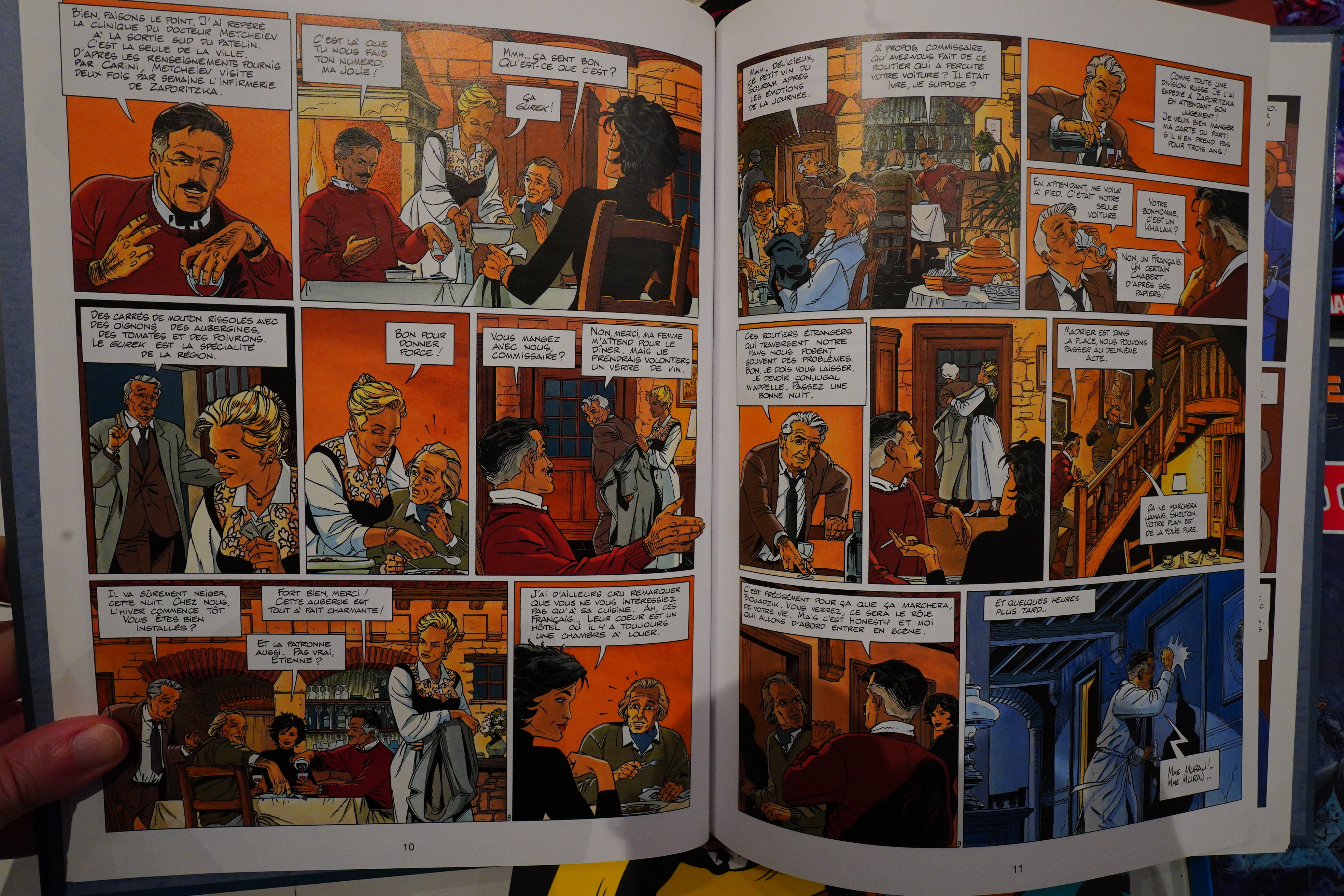
We’re talking very, very standard French early 80s action comics. But done very professionally, too. Denayer’s artwork isn’t very distinctive (to say the least), but it’s done very well.
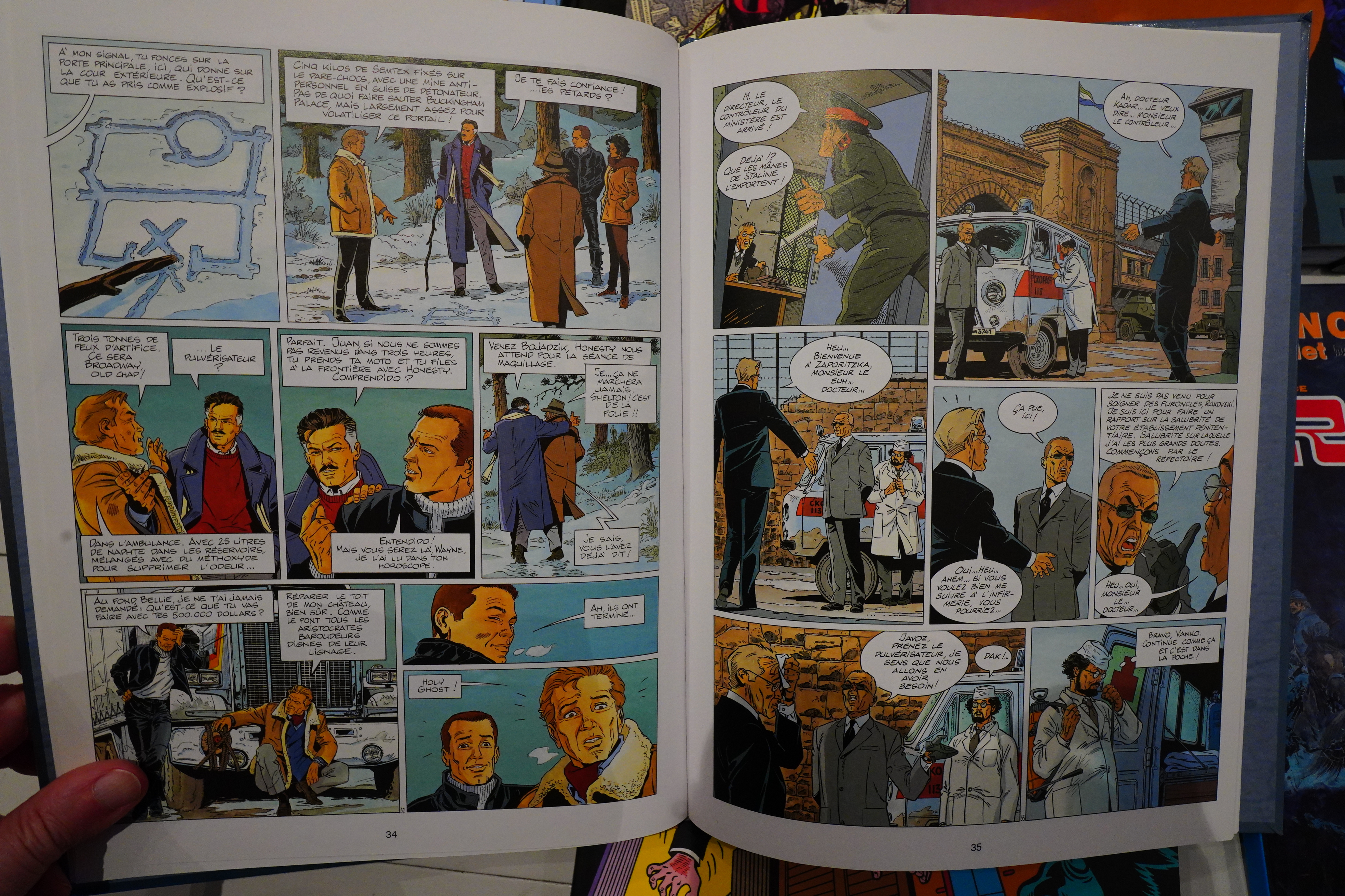
And there’s a heist. Who doesn’t like a heist?
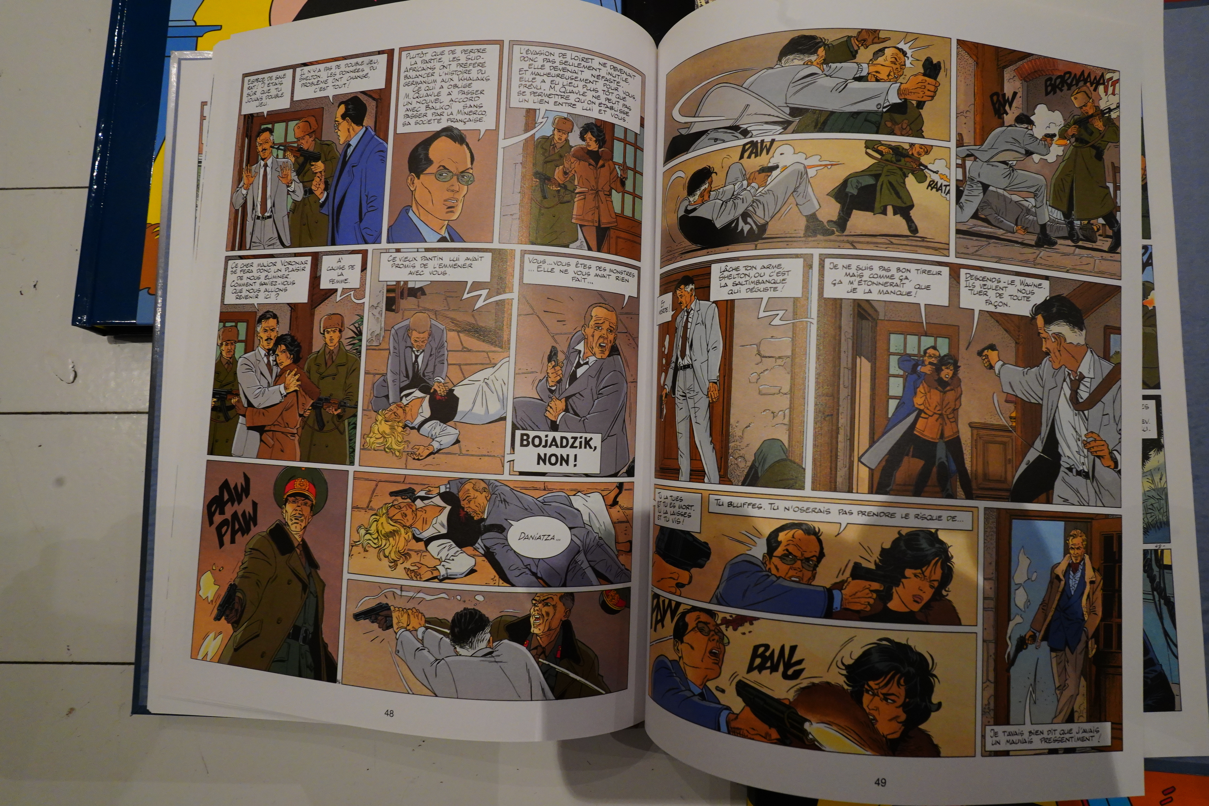
Van Hamme ends up killing off two thirds of the heist team, though, which is an unusual choice.
Oops spoilers!
And that’s it.