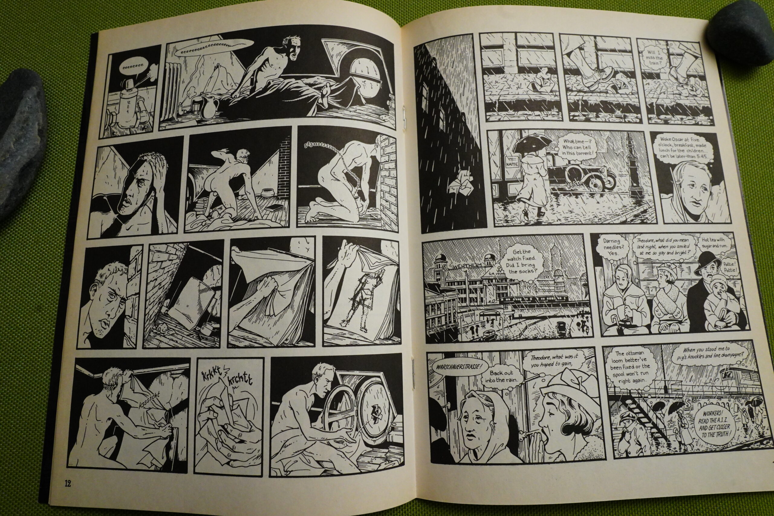
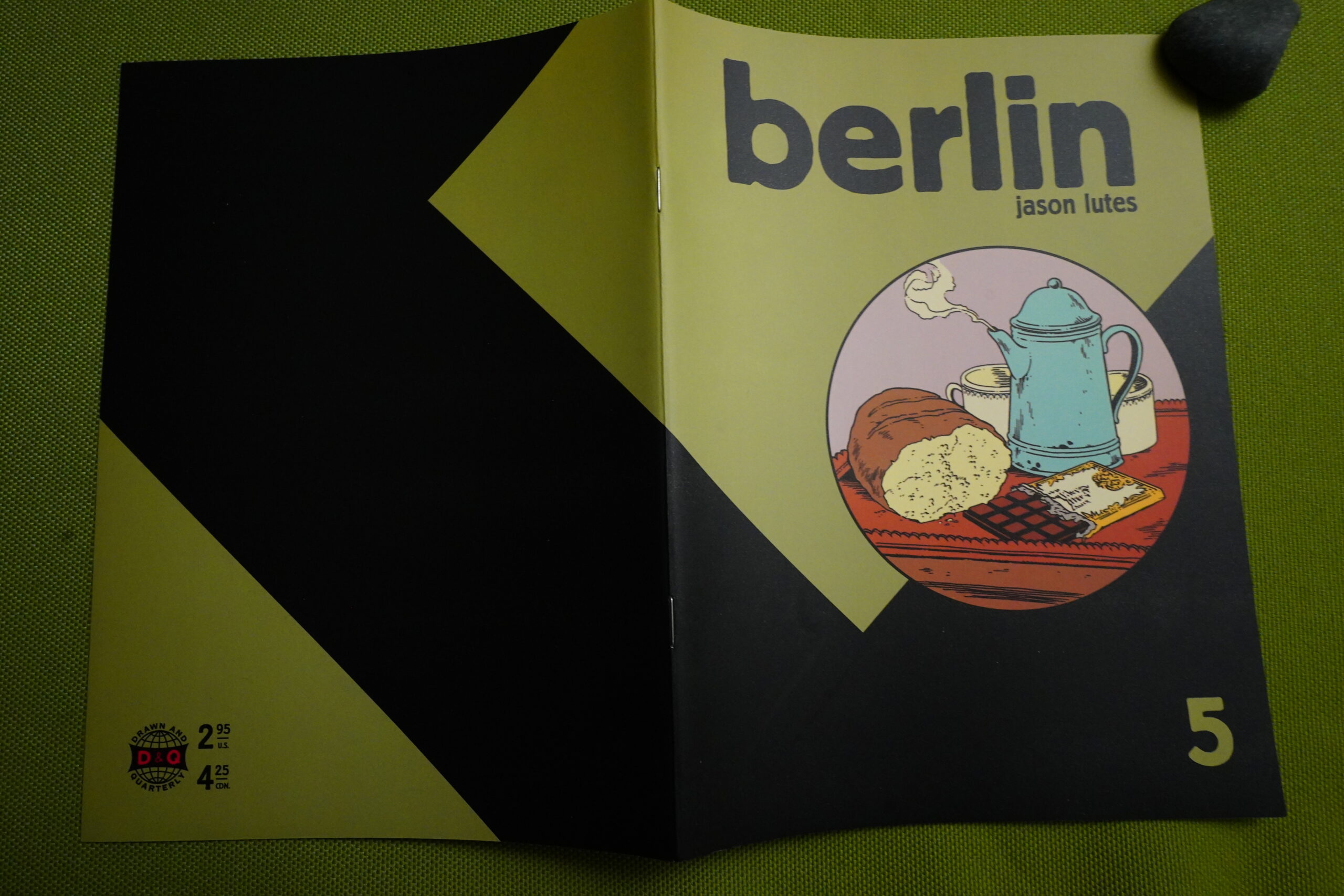
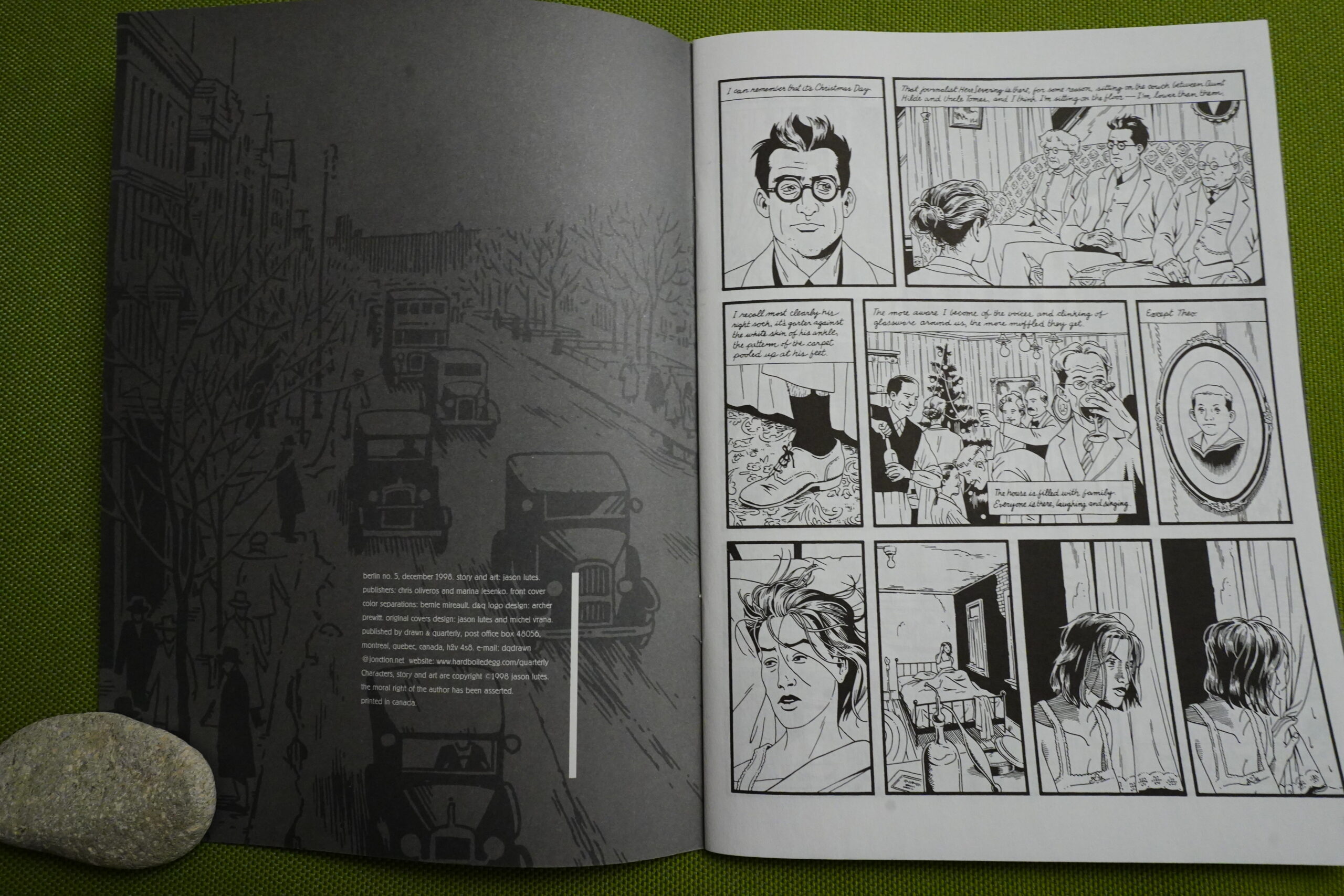
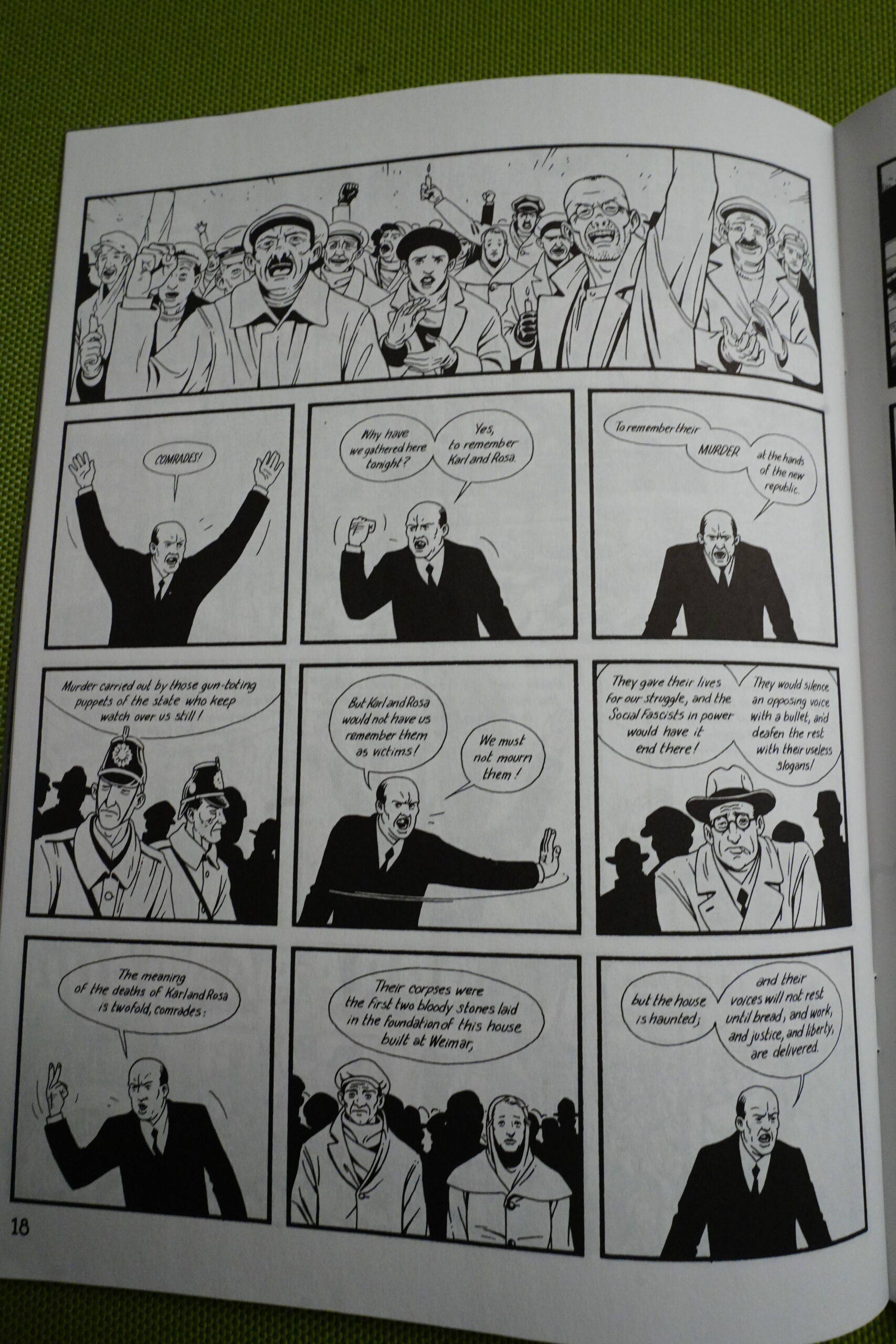
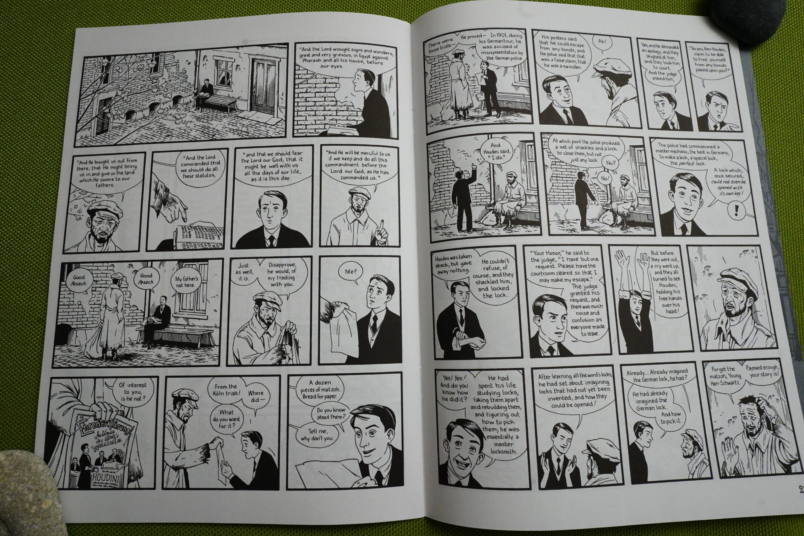
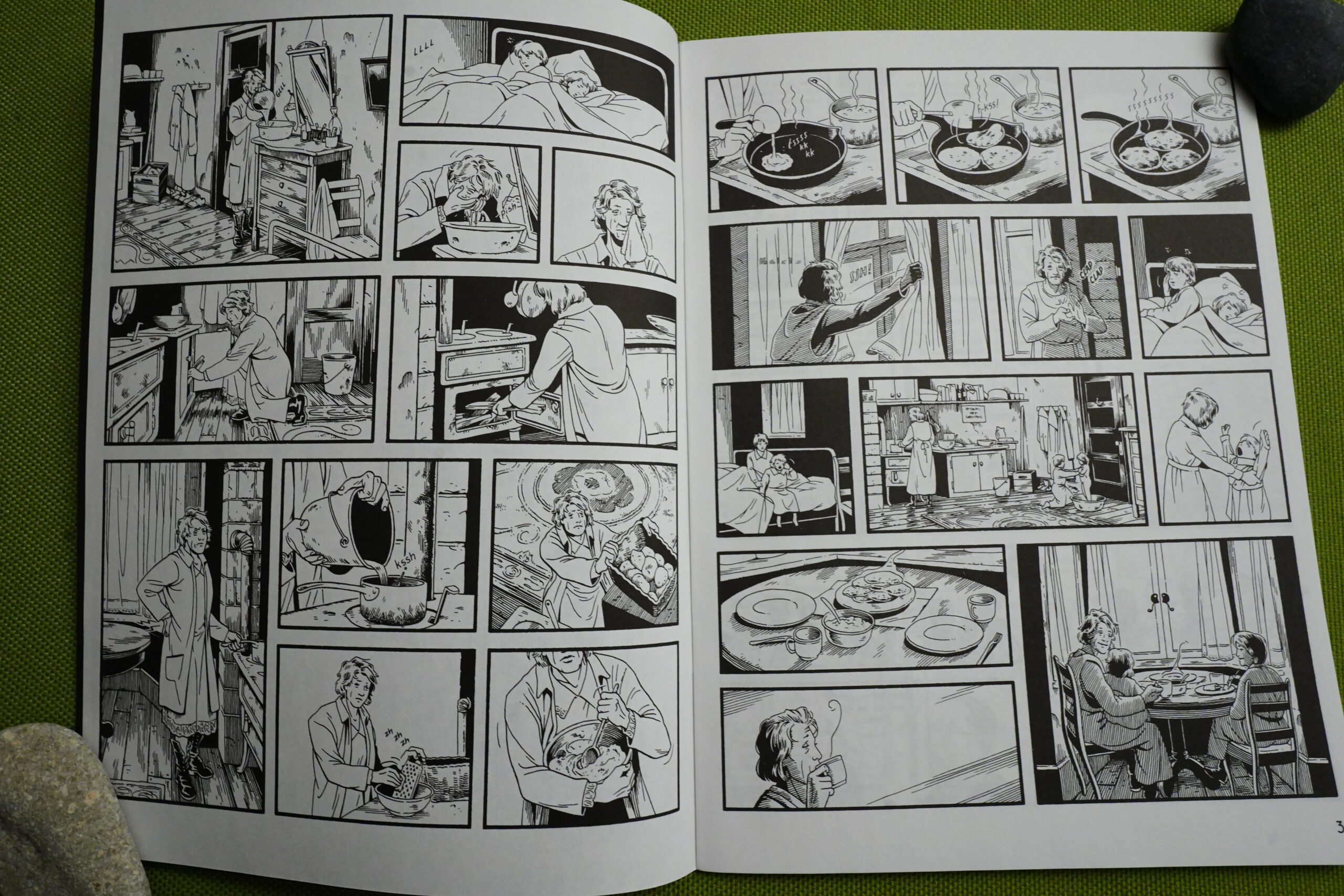
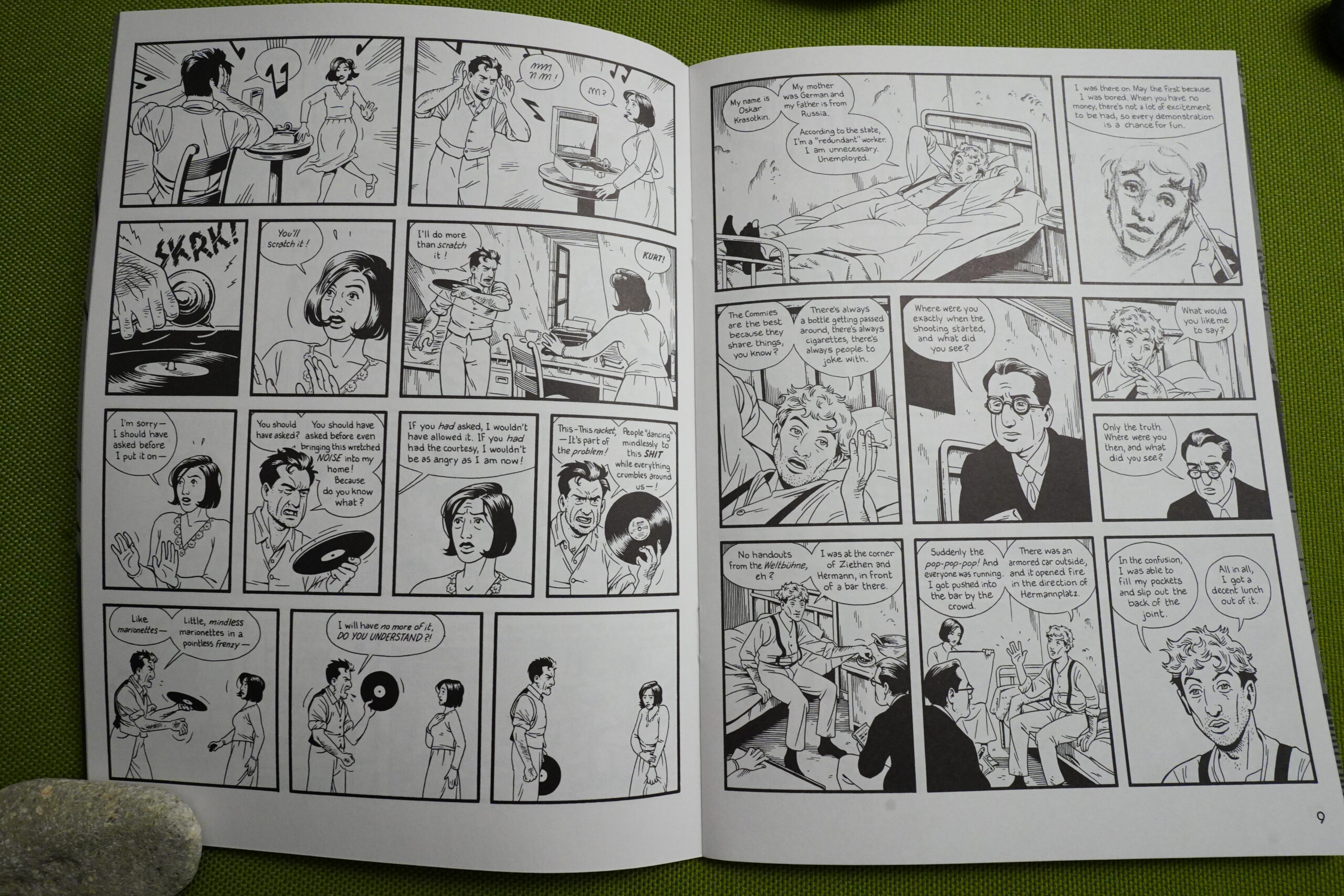
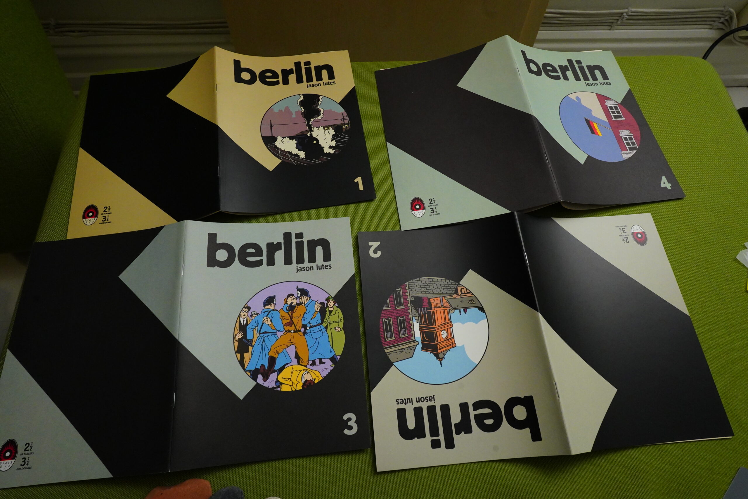
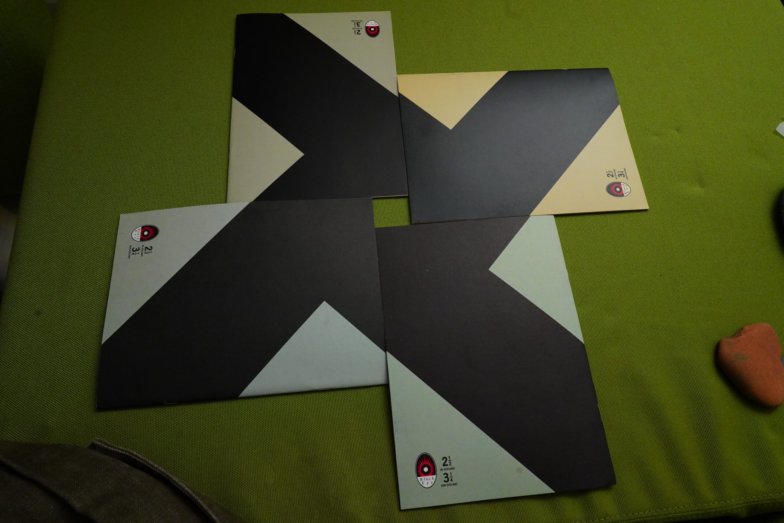
Berlin (1996) #1-4 by Jason Lutes
There are few comics that all well-stocked comics shops feel that they have to have — perhaps just a dozen that you can expect to find anywhere? Maus, Persepolis, Fun Home… and perhaps Berlin? Of those perennials, it’s definitely less well known than the ones I mentioned, but it’s still up there, I think?
Case in point: While sitting down to do the reading for this blog post, I discovered to my Shock & Horror that I only had the first 16 issues — and the series had 22 issues. I have no idea whether I’ve just mislaid those remaining issues, or whether I’ve just never bought them. Perhaps they fell off my subscription list and I never noticed?
And the reason I might not have noticed is that this series was published at perhaps the most lethargic rate of any comic that was actually finished. The first issue was published in 1996, and the final issue (#22) was published in 2018, which sorta makes for a tidy “one issue per year” schedule, but it was more bumpy than that, I think?
(When people talk about a movie being “in the making” for 22 year, it means that the director wrote an outline 22 years ago, couldn’t get financing, and then it sat it a drawer for all those years while the director made 10 other movies. When a comic book is in the making for 22 years, it means that it took 22 years to create.)
Anyway!
Back to that perennial status: When I discovered that I apparently didn’t have the last six issues, I walked down to the comics store here and bought the collected edition, which, of course, they had in stock. Because it’s a good store and good comics shops have Berlin in stock.
Anything else I’m gonna say before starting to read? Uhm… Oh yeah, I’ll be reading the floppies, because this is (after all) a Black Eye blog series. Black Eye published the first four issues, and then Drawn & Quarterly took over, and they also published the collected edition.
So I’ll be reading four Black Eye books, twelve Drawn & Quarterly books, and then finish up by reading the last 150-ish pages from the collected edition. Allons-y!
(Or perhaps that should be “Lass uns gehen!”)
*time passes*
OK, done!
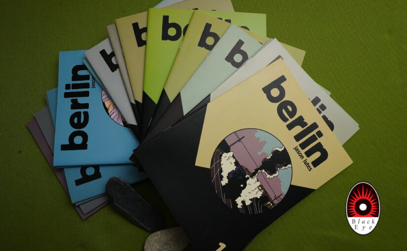
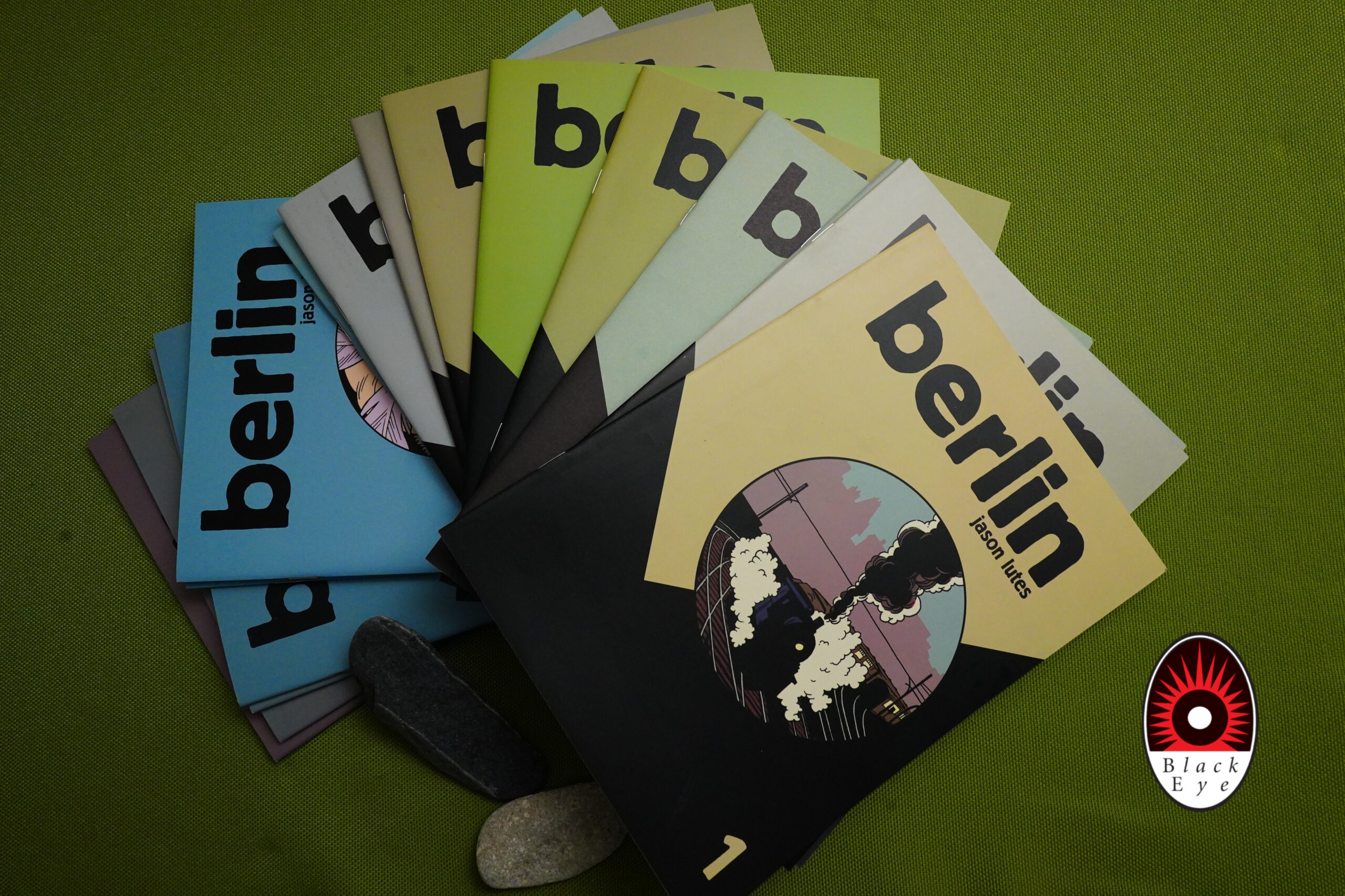
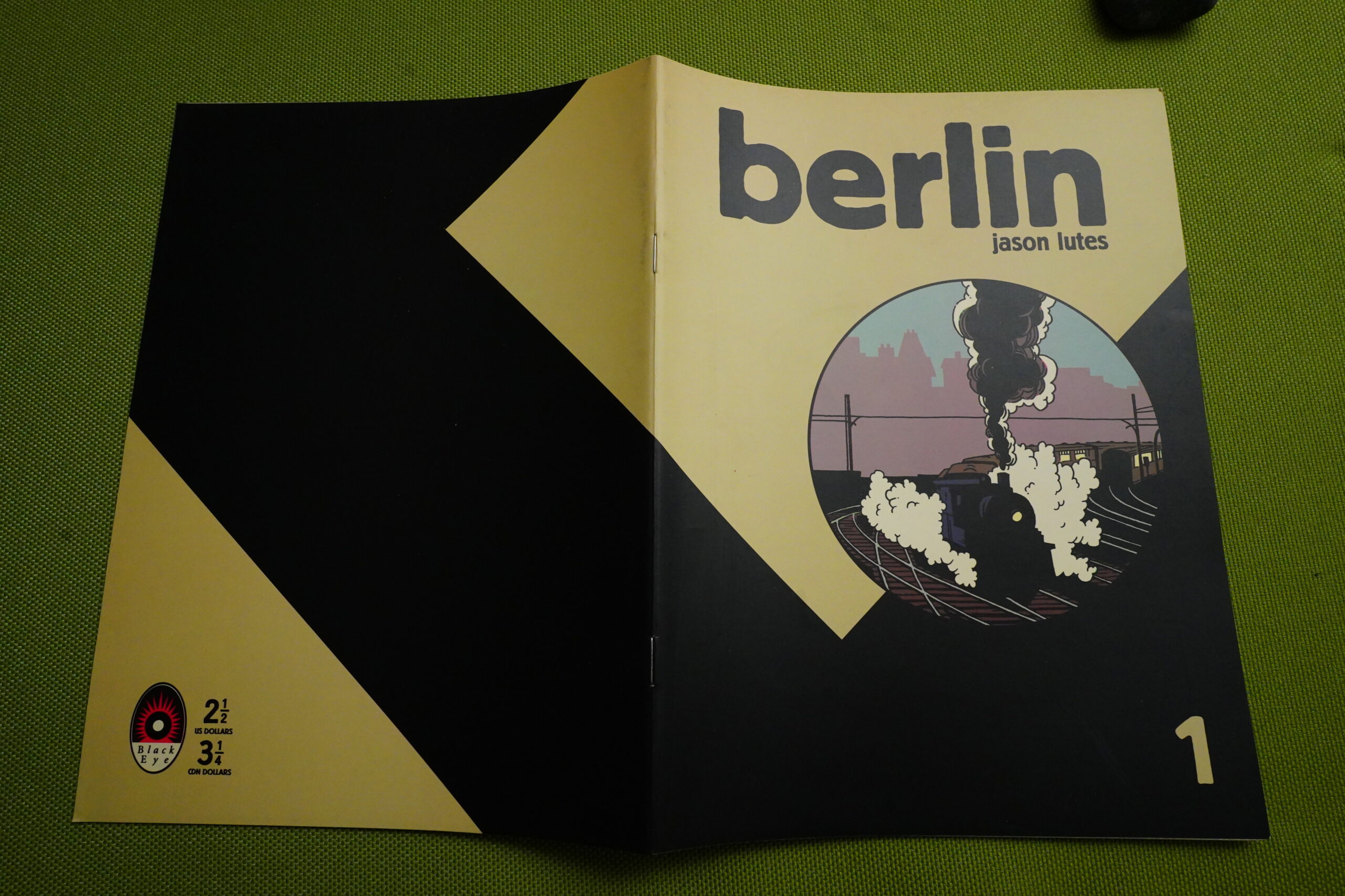
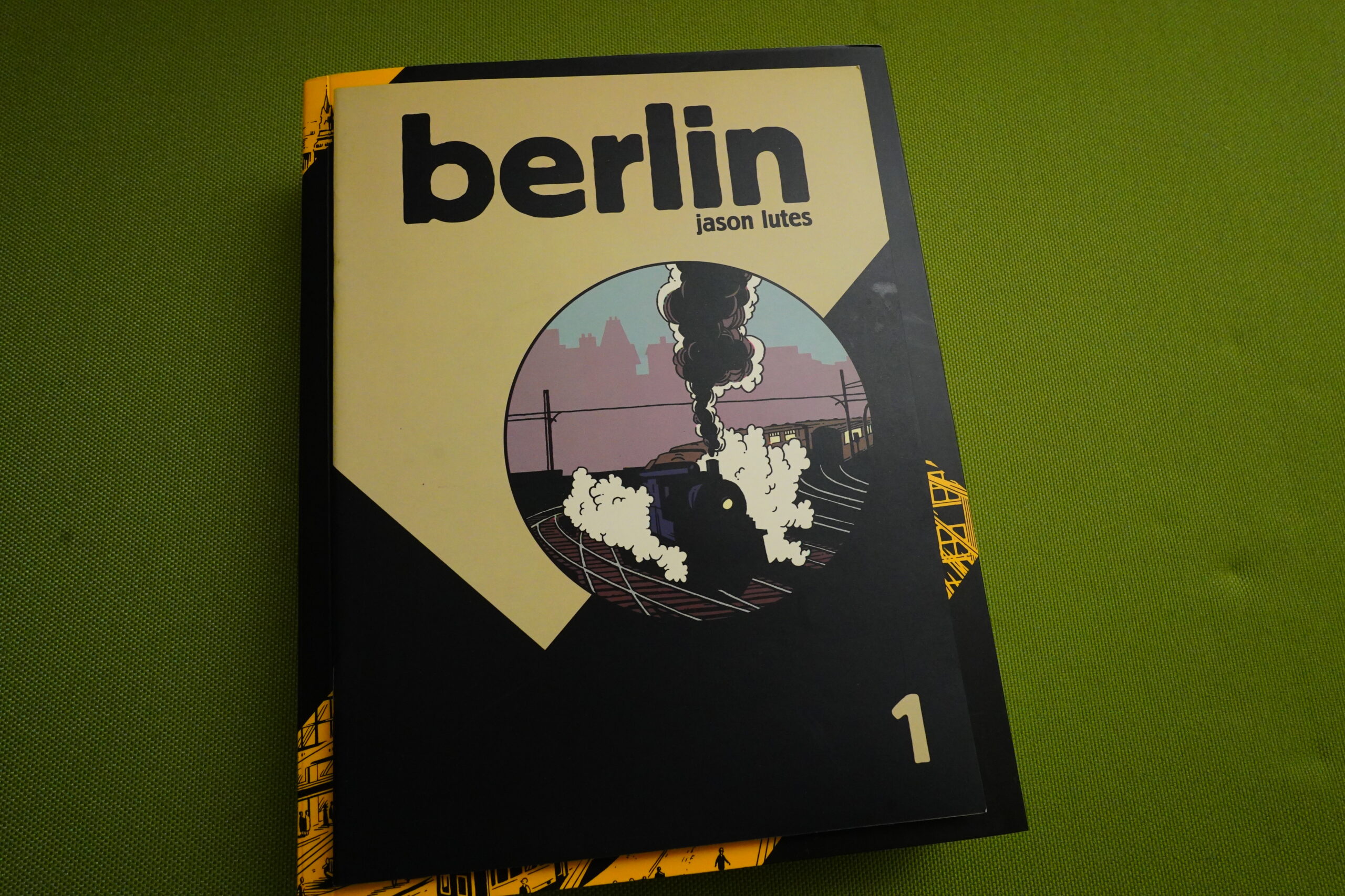
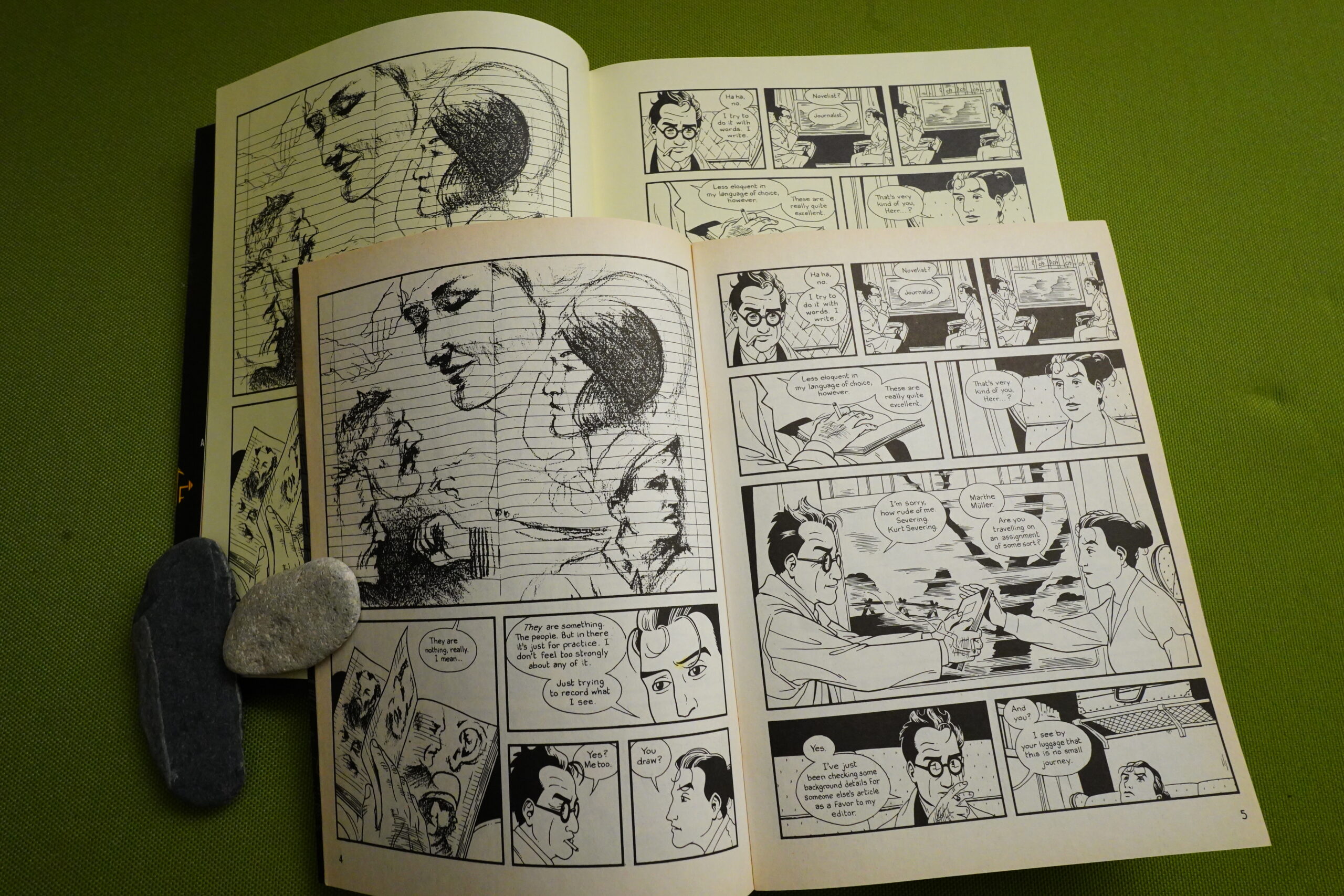
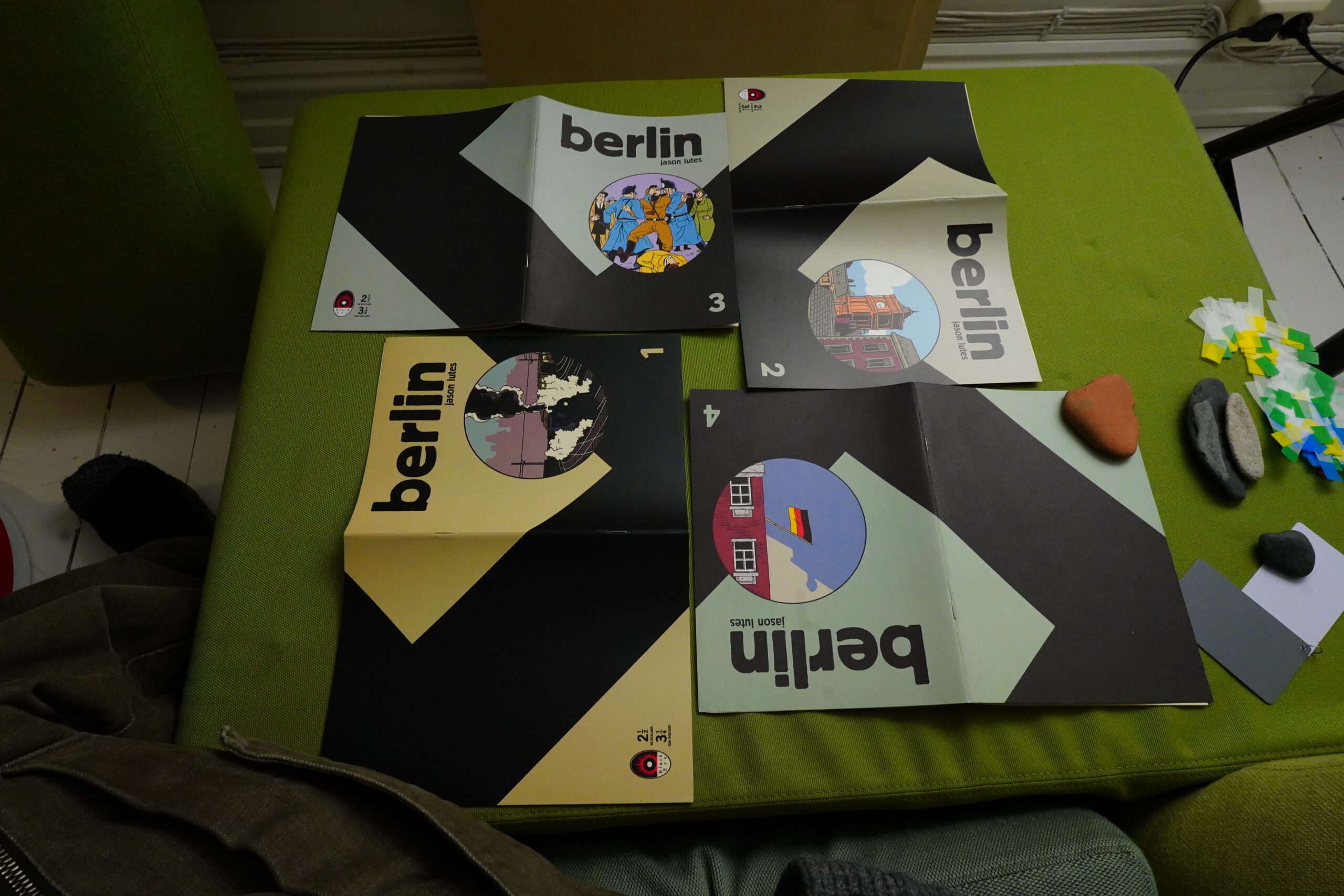
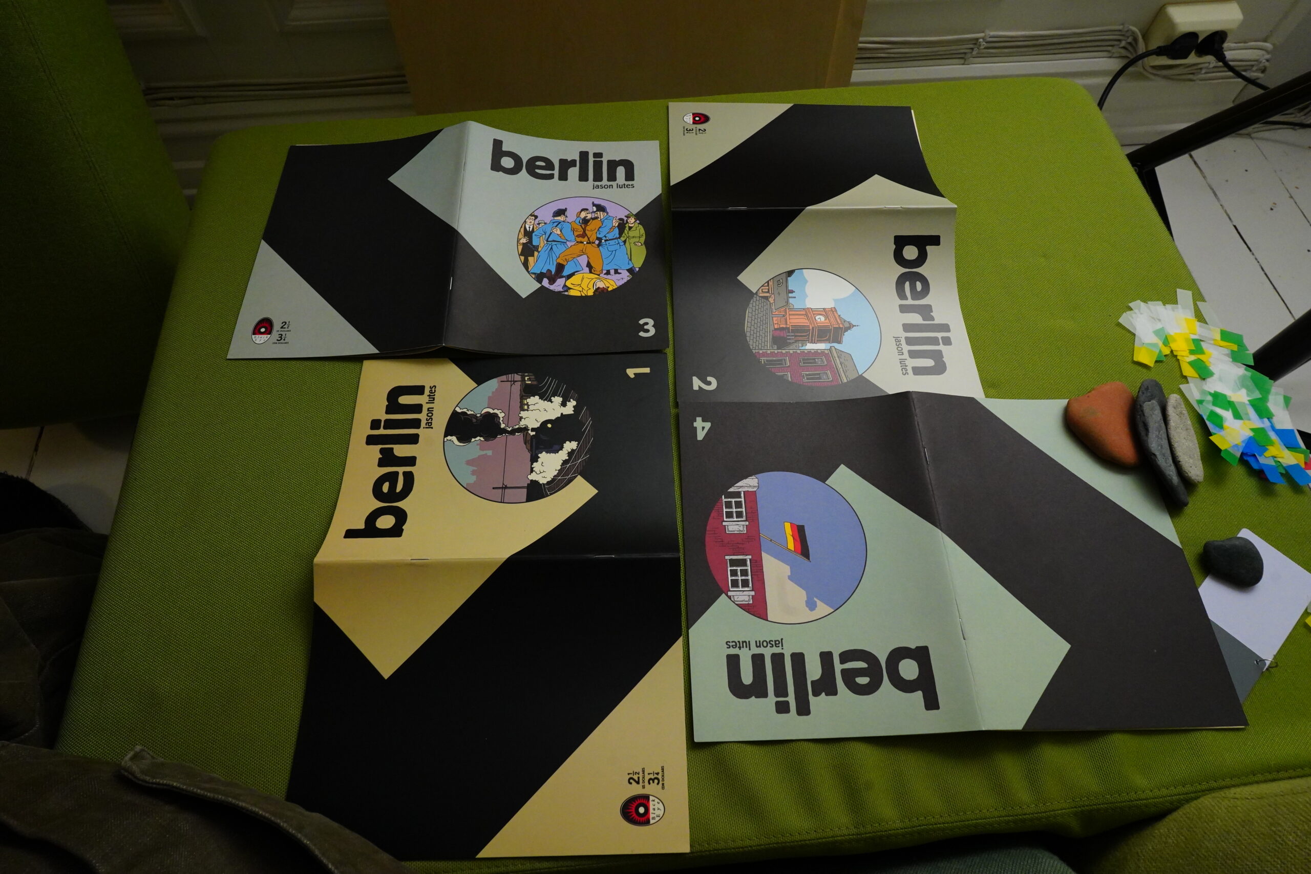
First of all, I have to remark on what a great design these books have. Michel Vrána is a very talented designer, and here everything comes together perfectly. We have this very attractive, and very distinctive covers, telling us that this is a serious, dramatic work. And the size is slightly smaller than normal US comics size, so that feels playful..
… and the paper stock is unassuming — it’s not newsprint, but newsprintey and pleasing.
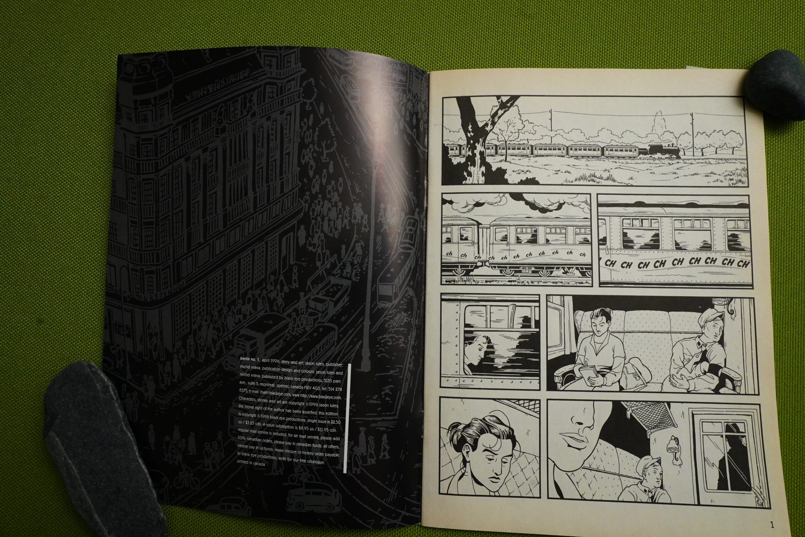
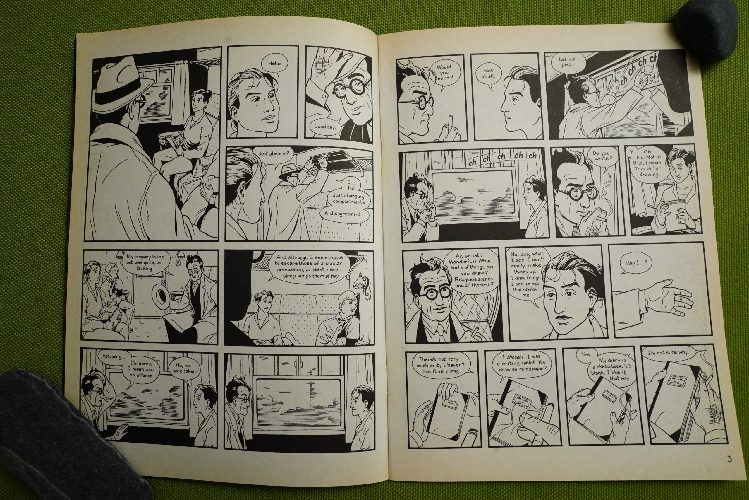
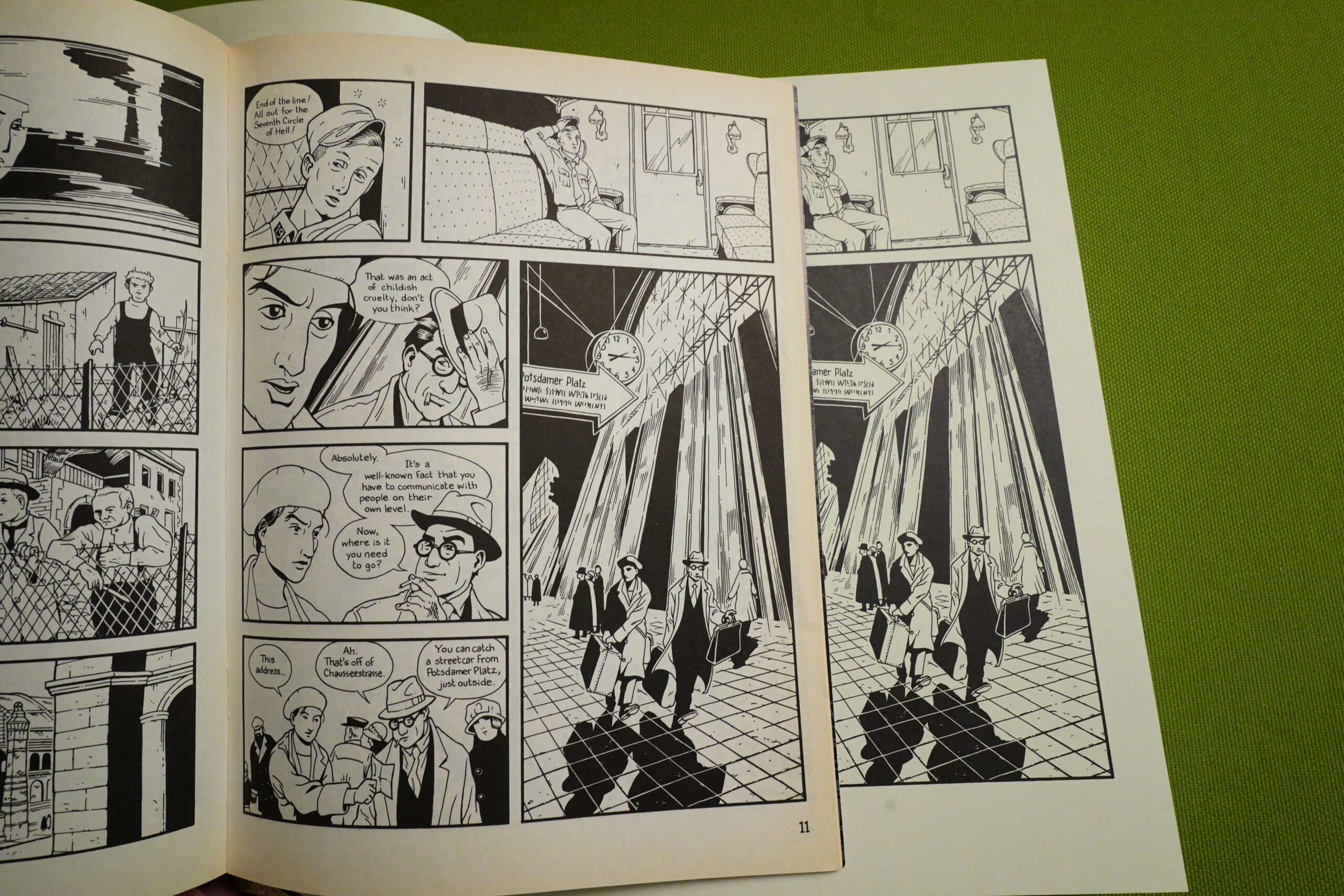
And from the get go, we have really nice storytelling chops on display — we get a standard meet cute on a train, basically, but with these great pauses… it seems very well considered and worked through.
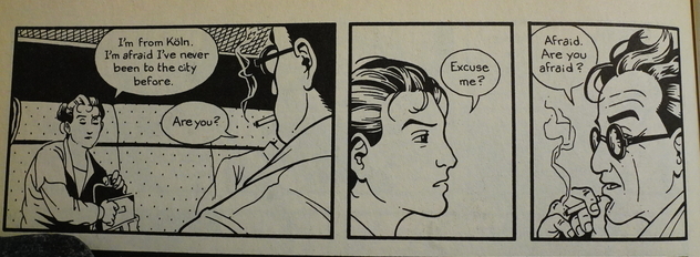
Perhaps a bit too worked through? Nobody outside a movie has ever uttered lines like these.
Or these.
Lutes said in an interview that his first book, Jar of Fools, had been mostly improvised and seemed to imply that that was a big mistake. But improvised comics can often be lively and fun to read, and you can call this dialogue a lot, but not lively.
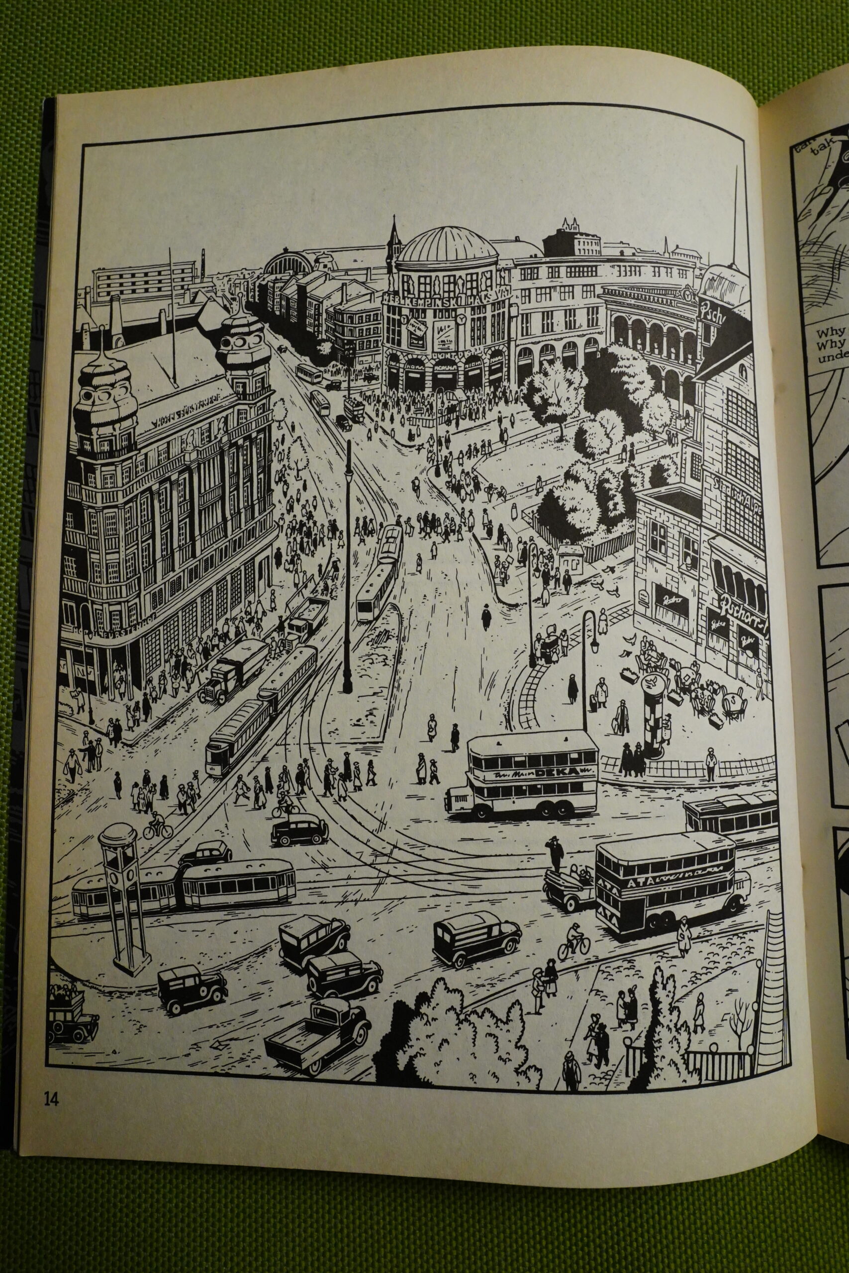
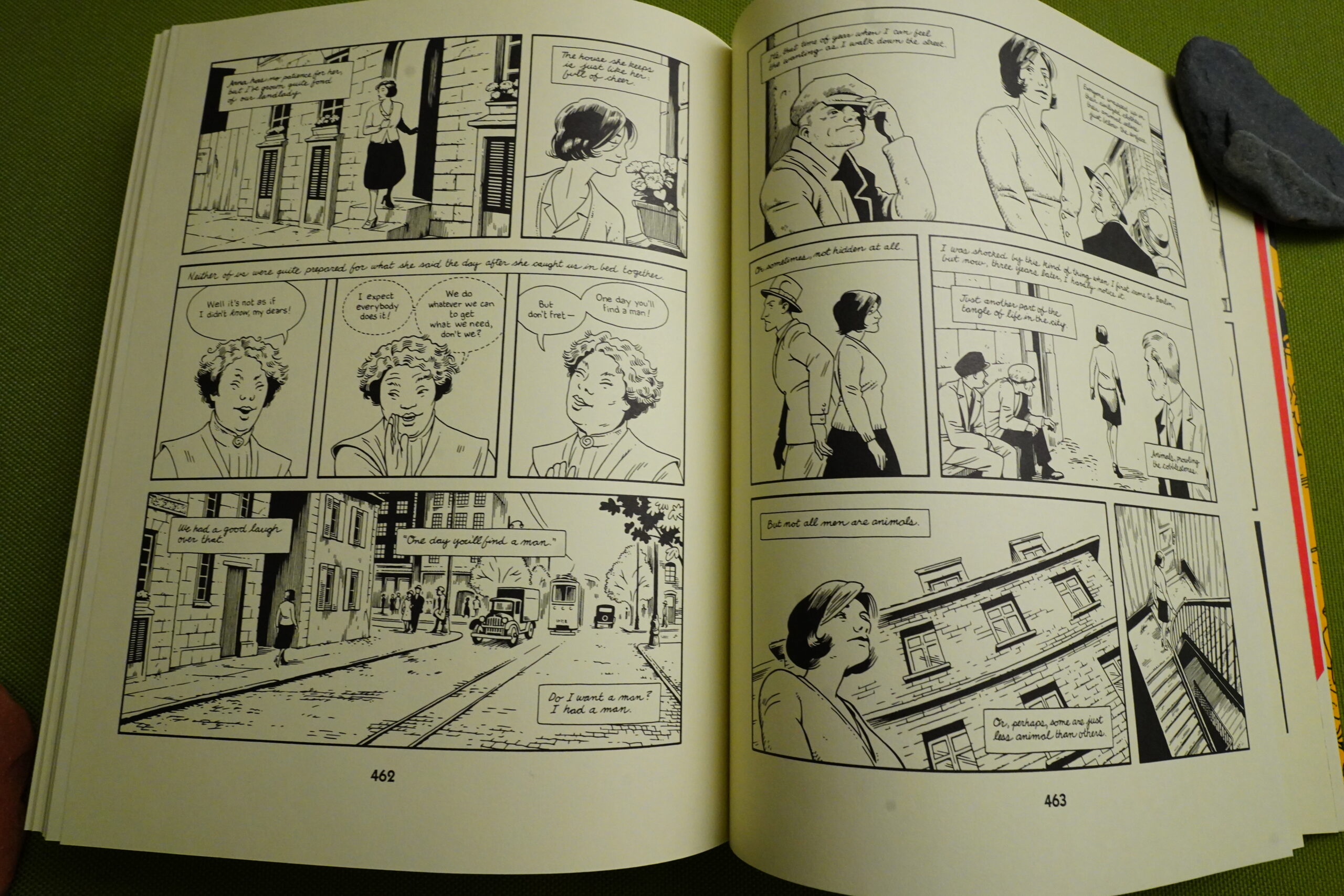
The book is called Berlin, and we get a lot — I mean, a lot — of great drawings of Berlin. Lutes’ perspectives are often slightly wonky, but that just lends it a certain charm, don’t you think? I enjoy the obsessiveness of images like this.
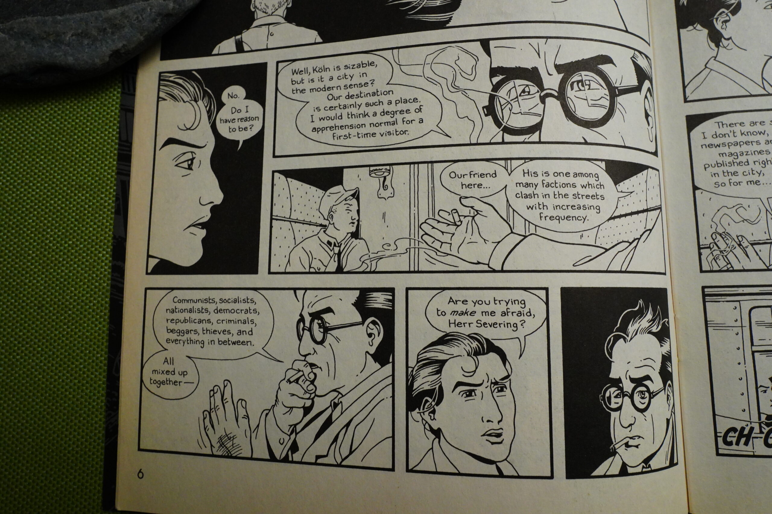
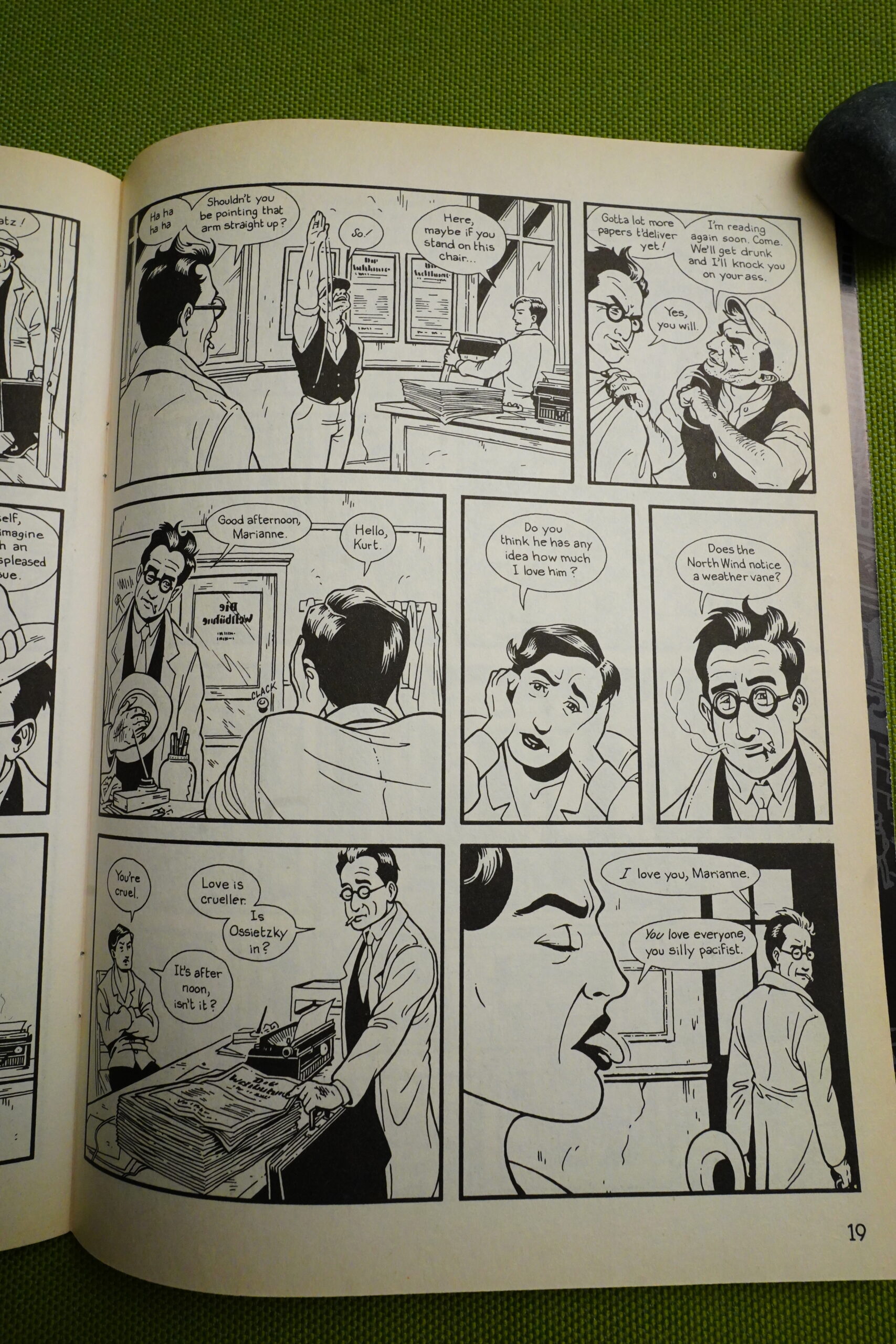
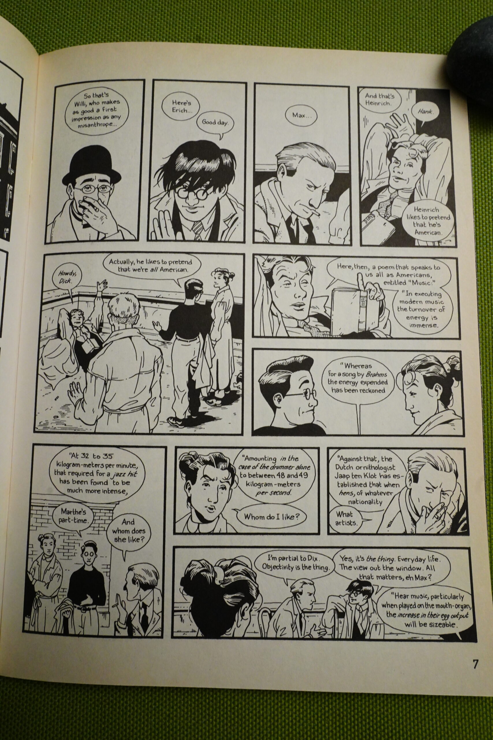
In the first part of Berlin, Lutes is economical (perhaps to a fault) in introducing his many characters. There’s like a dozen that we follow more closely, but there’s barrels of people, so it helps having people spout their characteristics at each other like this. But it feels, again, like dialogue from a movie (derogatory).
Lutes also obviously tries to make the characters distinctive by giving them different hairdos or glasses or whatever, which I appreciate — like Leslie Winer said, it’s always good if one character has an eye patch or a wooden leg — but it’s a real problem in this book how similarly Lutes draws many of the characters.
We get Wings of Desire-like snippets of many people’s thoughts, and it works well — but it’s unfortunate that every times Lutes does this, we’re reminded of Wings of Desire, which is (let’s face it) better than Berlin is. (And it doesn’t help that Wings of Desire is also set in Berlin.)
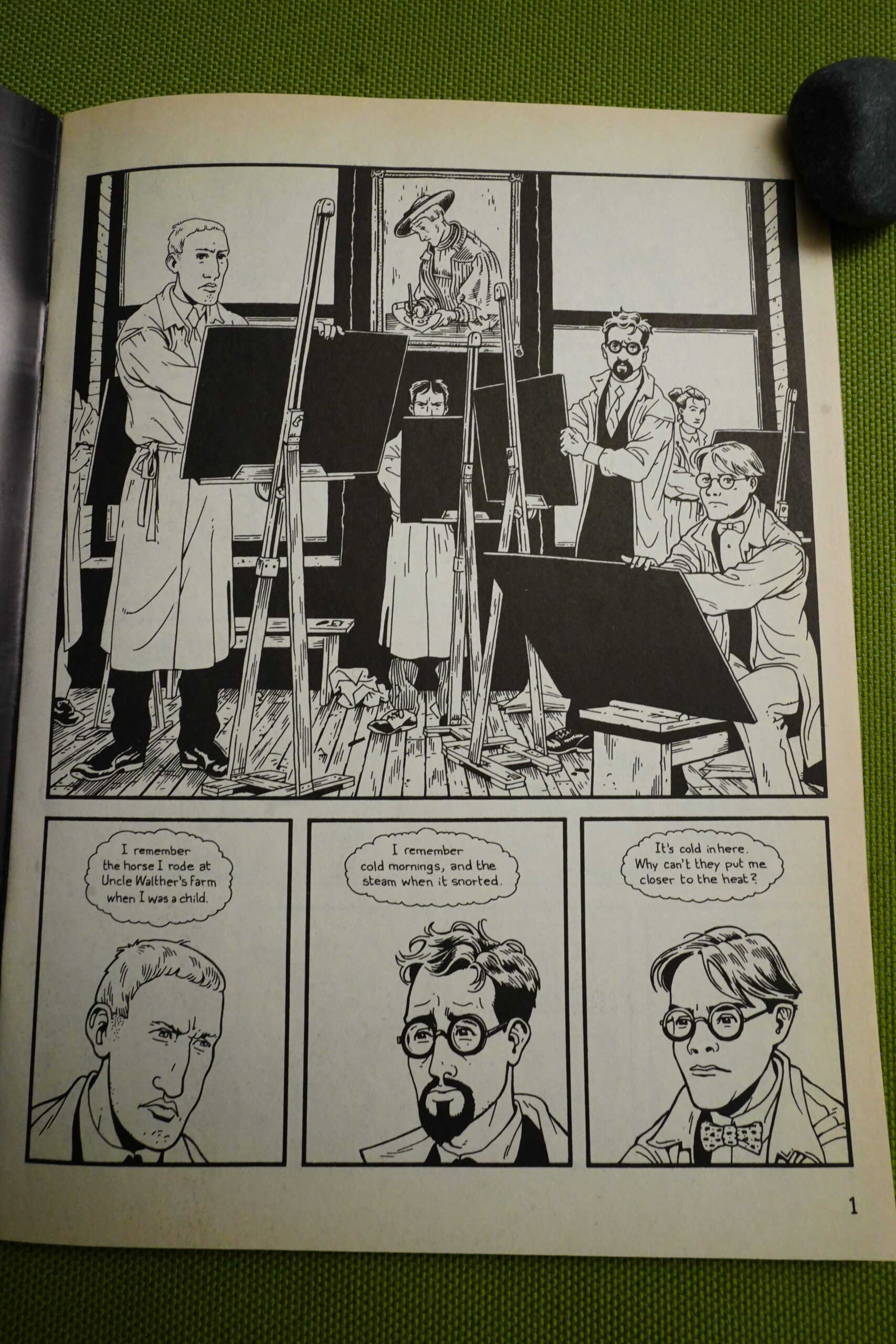
The initial focal point of the book is this group of young artists, which felt a bit eyeroll inducing — if you’re doing a book about Berlin between the wars and the rise of fascism, doing yet another book about how this affects artists feels like a cop out. But that’s not a mistake Lutes actually does: After this we’re quickly introduced to a varied cast, many of whom are working class.
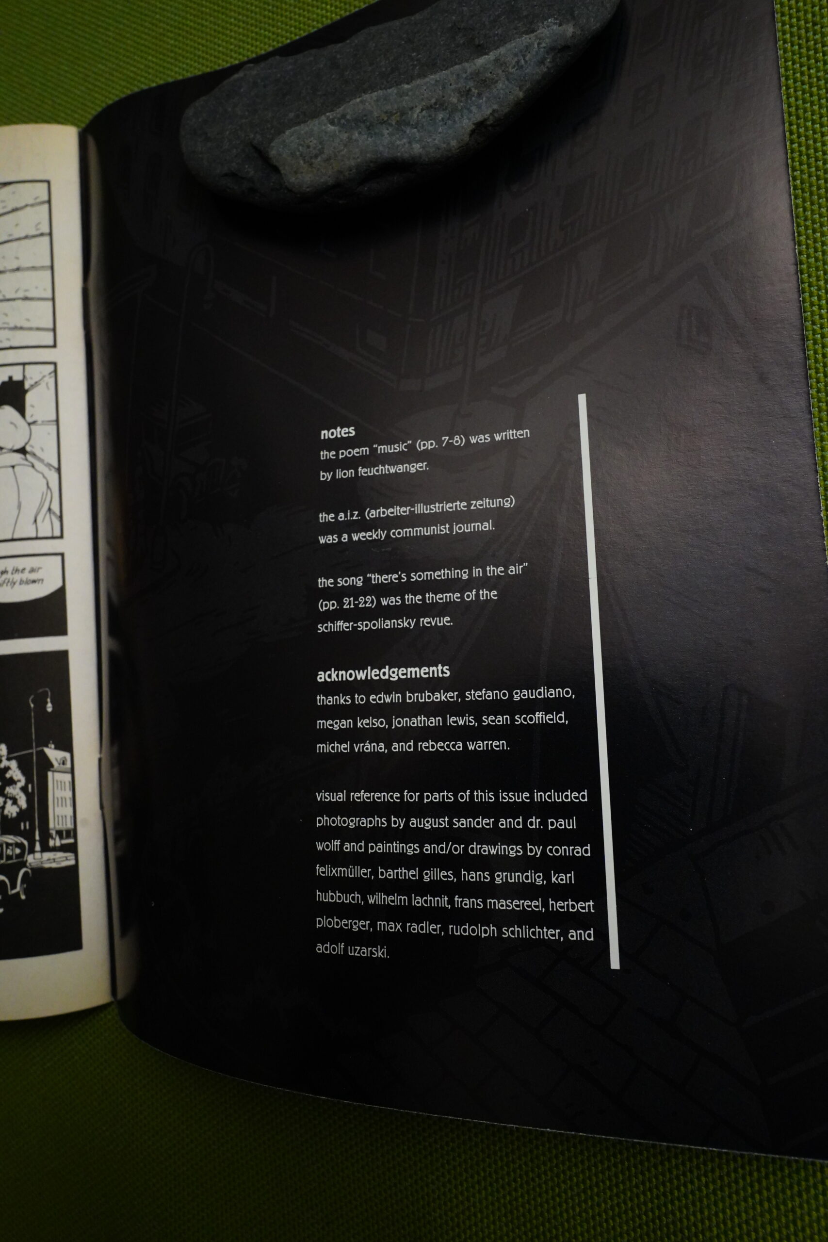
At the end of the second issue, we get some notes. But notably, this is the only one during the series, and I think that’s a grand idea. Notes can suck the life out of a work by over explaining and telling you how to feel about what you’ve read. In later issues, after the Internet had taken off, there would be a reference to a web site where you could read background material, which seems like a good compromise.
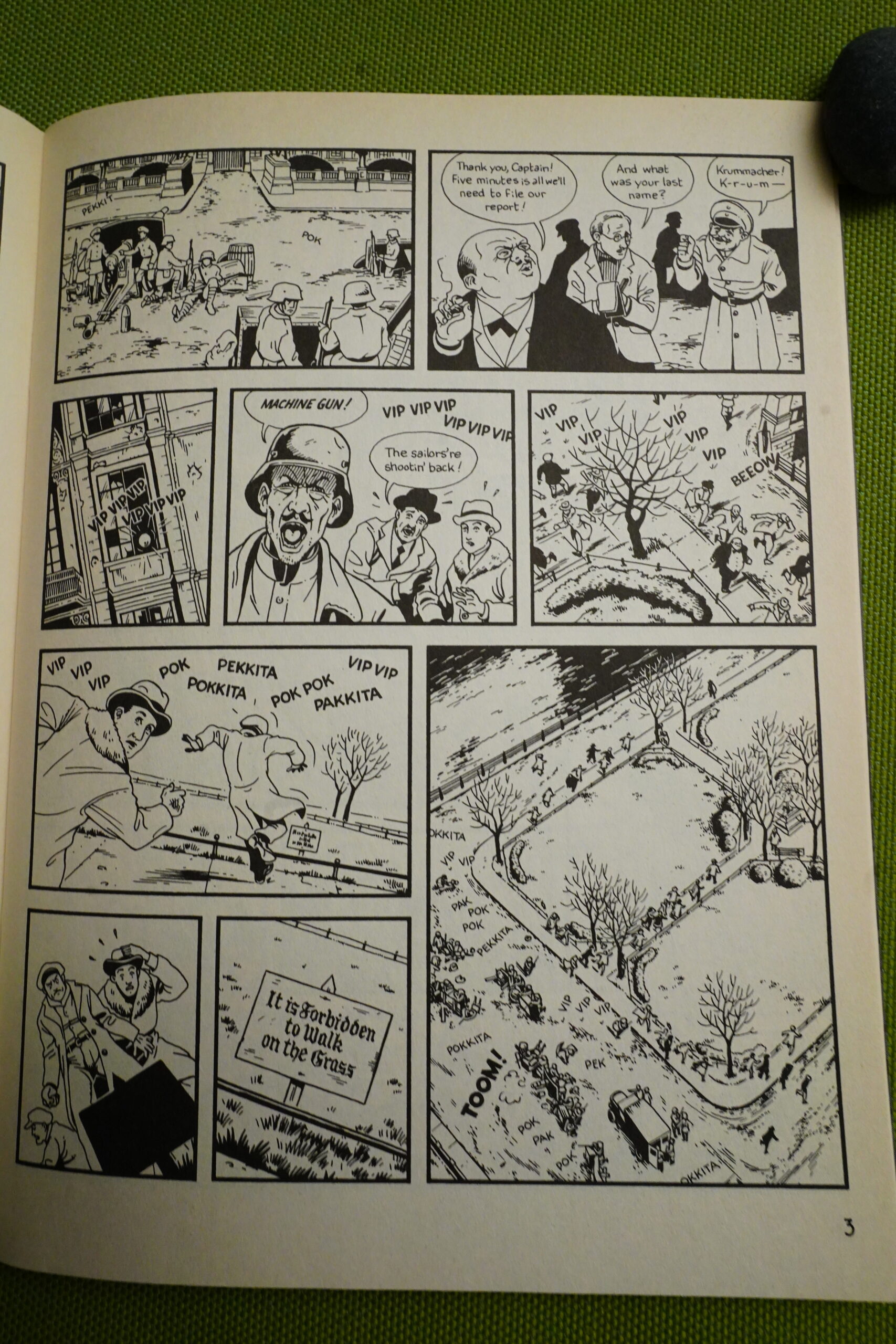
Berlin is sometimes pretty amusing, although not actually “ha ha” — like this bit where the Germans are shooting at each other, but not stepping on the grass, because that’s forbidden. “So typically German! *slaps knee*” is, I guess, supposed to be the reaction, but… I mean, it is amusing.
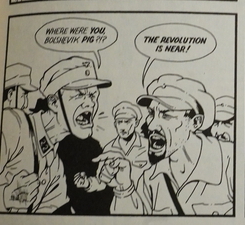
Lutes goes more cartoony in scenes where there a lot of action — and it can be jarring, but it’s also kind of fun.
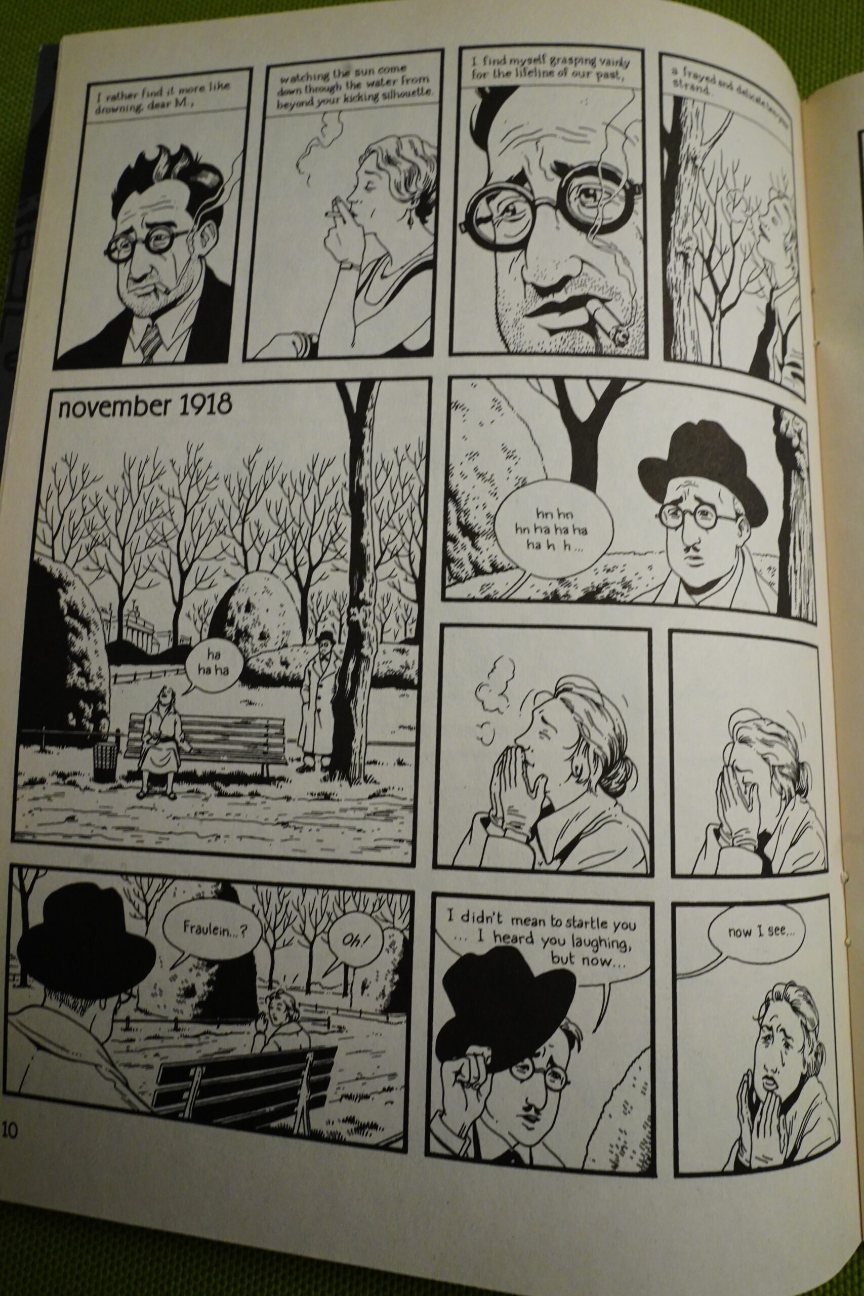
In the first few issues, we skip back and forth a bit between 1918 and 1928, and it’s marked like this. But after getting us into the rhythm, it stops, and that’s was a bit “eh?”.
The one focal point of Berlin is those artists and the woman we saw on the train — Anna — but the other is this family, where the father is a Nazi and the mother ends up hanging out with the Communists.
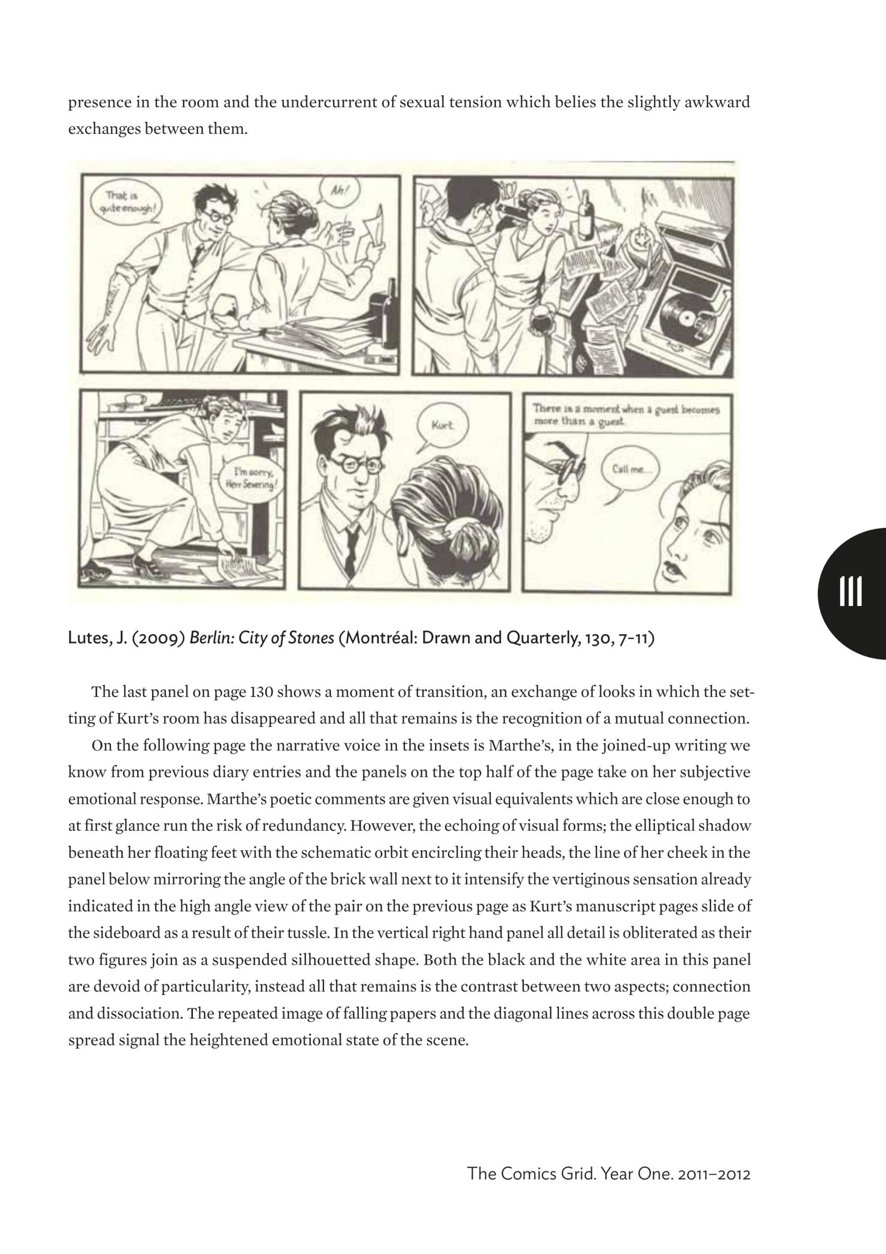
It’s a counterpoint that works, but what doesn’t really work is the way Lutes sometimes tries to segue between these narratives — here we see one of the artists throwing a crumpled piece of paper out the window, and the mother from that family walks past it. Again, it’s very filmic and feels strained.
Black Eye closed up shop in 1998, and Drawn & Quarterly took over Berlin with the fifth issue. Wisely, they didn’t change the design of the book at all.
Except for using whiter paper.
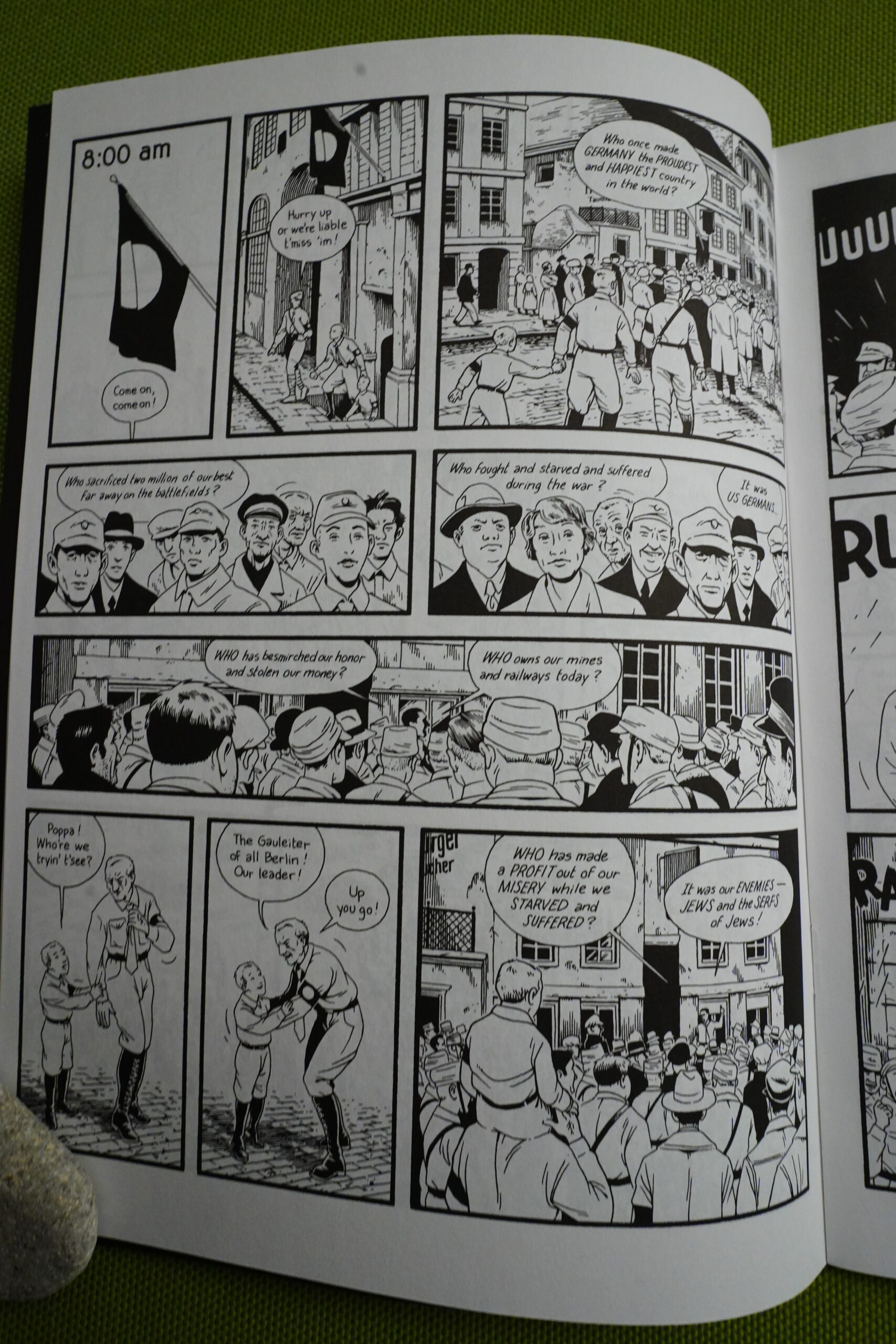
Lutes presents us with quite a few political speeches and rallies, and while these do shed light on what’s going on in Berlin at the time, they’re not riveting.
Even worse is when Lutes drops in a tale or two that people tell to each other — it just stops the book in its tracks.
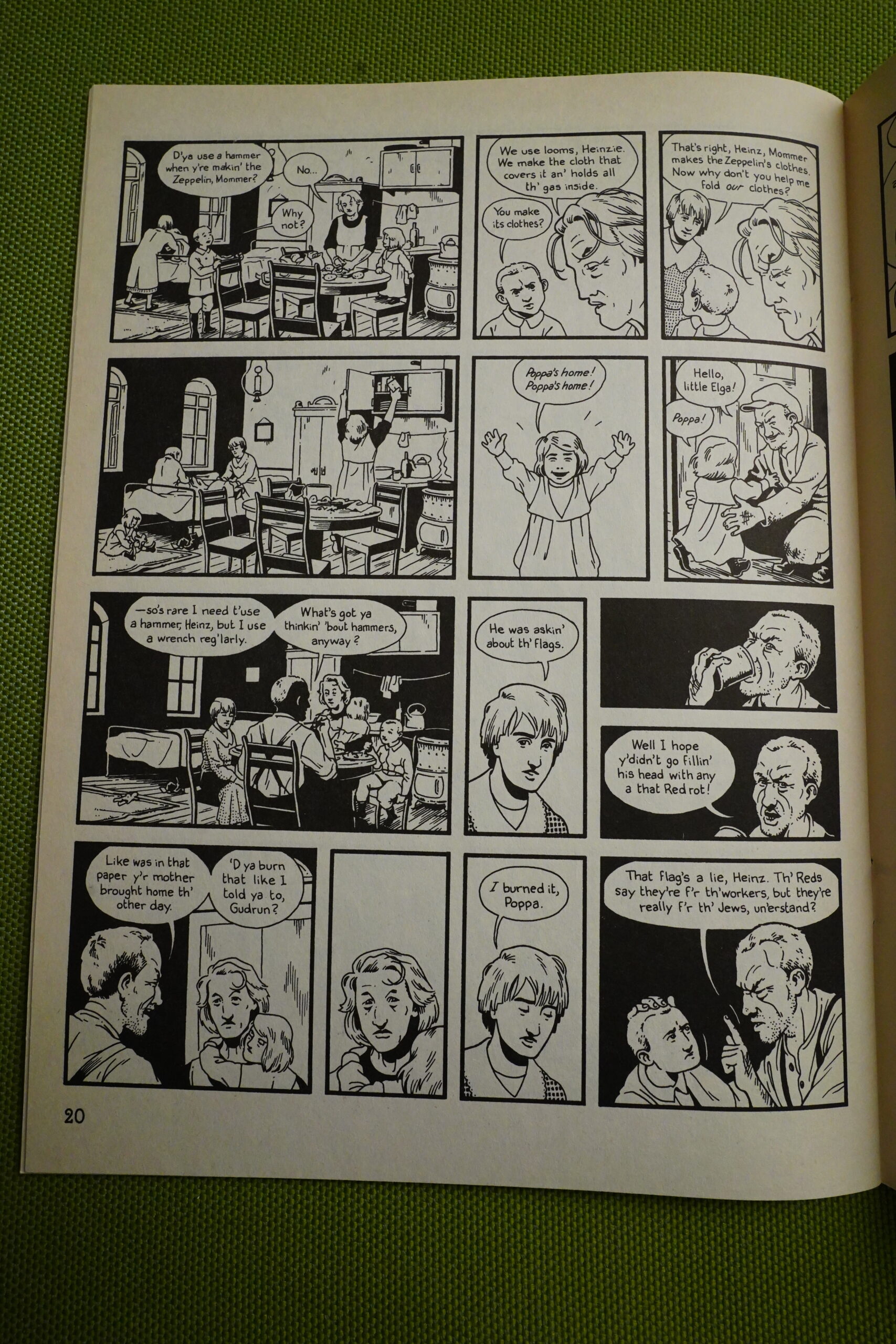
But to be fair, there’s lots of lovely sequence like this, too. The pacing here is so good, with the mixture of panel sizes and shapes to keep things interesting, and the well rendered interiors and the slightly stiff (but pleasing) line work.
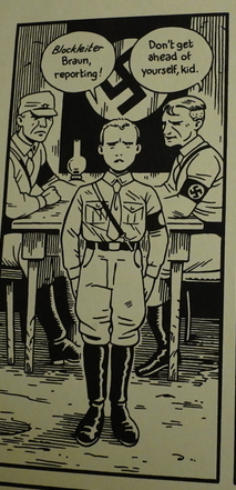
At first I didn’t get these flags and arm bands — a white circle on a black background? Then I wondered whether Lutes is just censoring out the swastika and this is the Nazi flag? Because that made sense. And then I wondered whether the Nazis really had a different flag before they invented the one we all know and hate?
I googled now, and the answer seems to be the second. So… er… perhaps not a totally successful artistic choice?
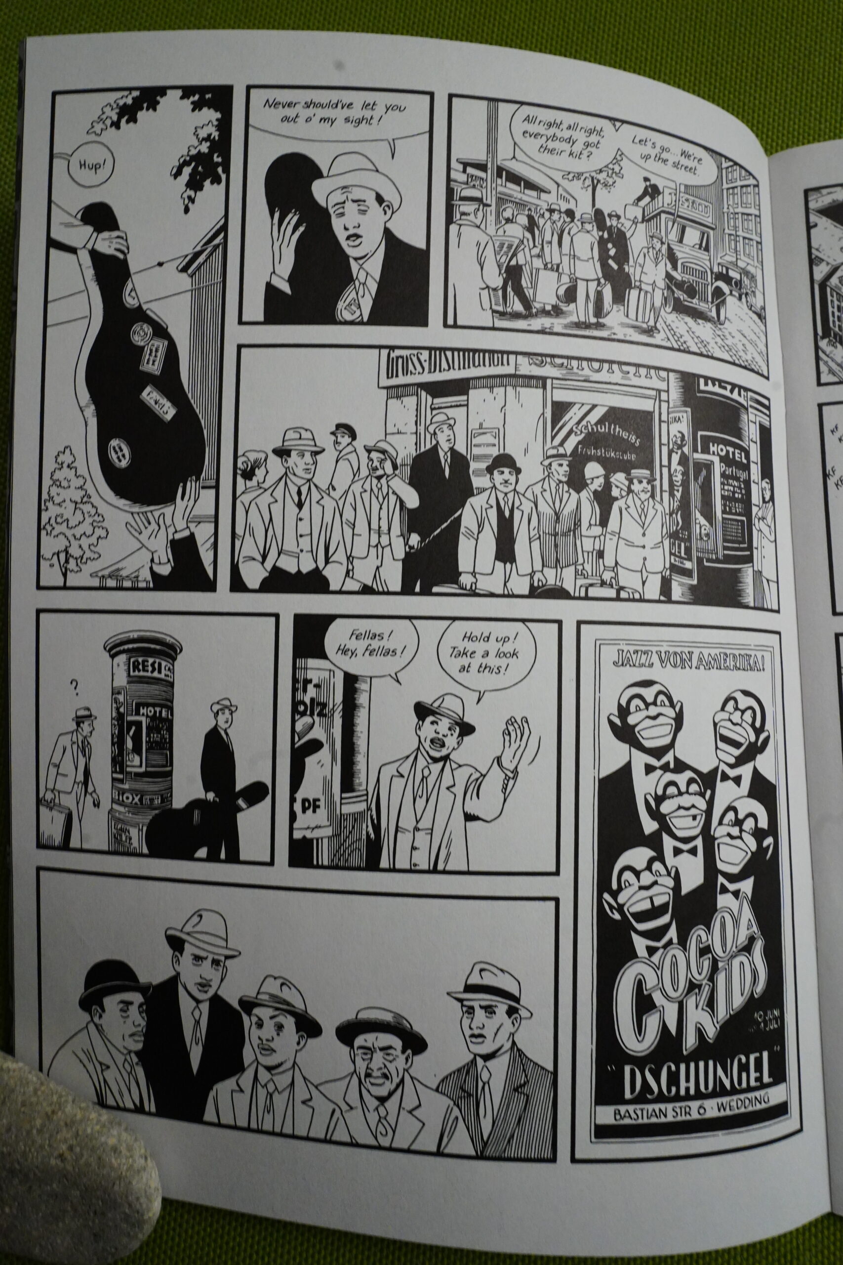
After the first eight issues had been published, they were collected into one volume. That volume concluded some plot strands, and with the second volume, we get this jazz band as new characters. I guess it makes sense, but reading it now, it felt a bit forced — as a thing to give the story a clearer structure. Not a three act thing, really — this band leaves at the end of the second volume, so it’s… like… ehm.
Not all the leftists liked jazz. Shocking!
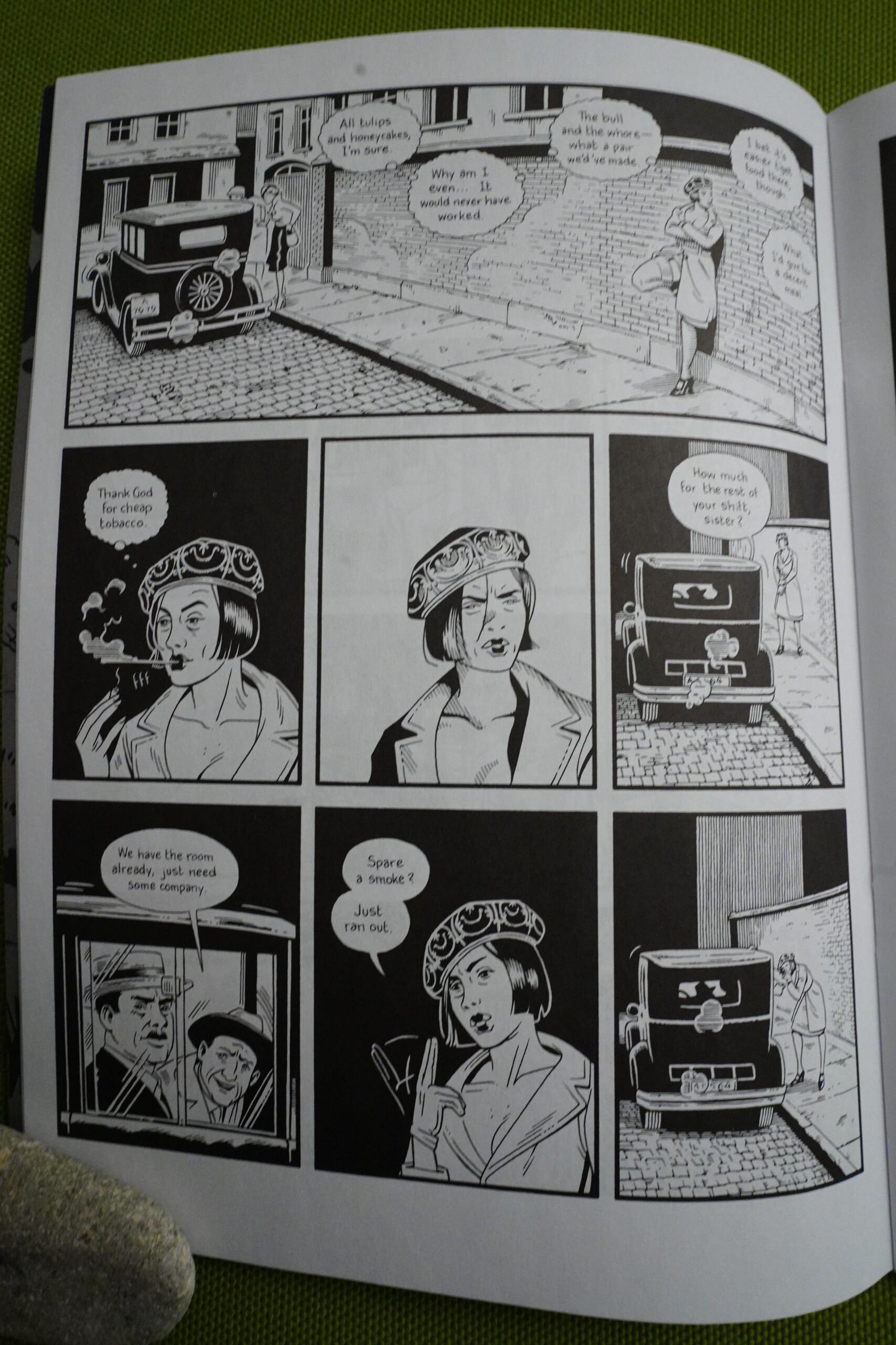
What I said earlier about Lute’s characters — I spent quite a lot of time reading Berlin wondering just who I was looking at on any given page. Just to give an example, on this page I was wondering whether Anna suddenly had become a prostitute (well, we saw her snorting coke just a few pages earlier, and time had passed, so it’s possible), but nope.
Making the reader confused can be a wonderful storytelling element, but I don’t think that’s what Lutes is going for, really.
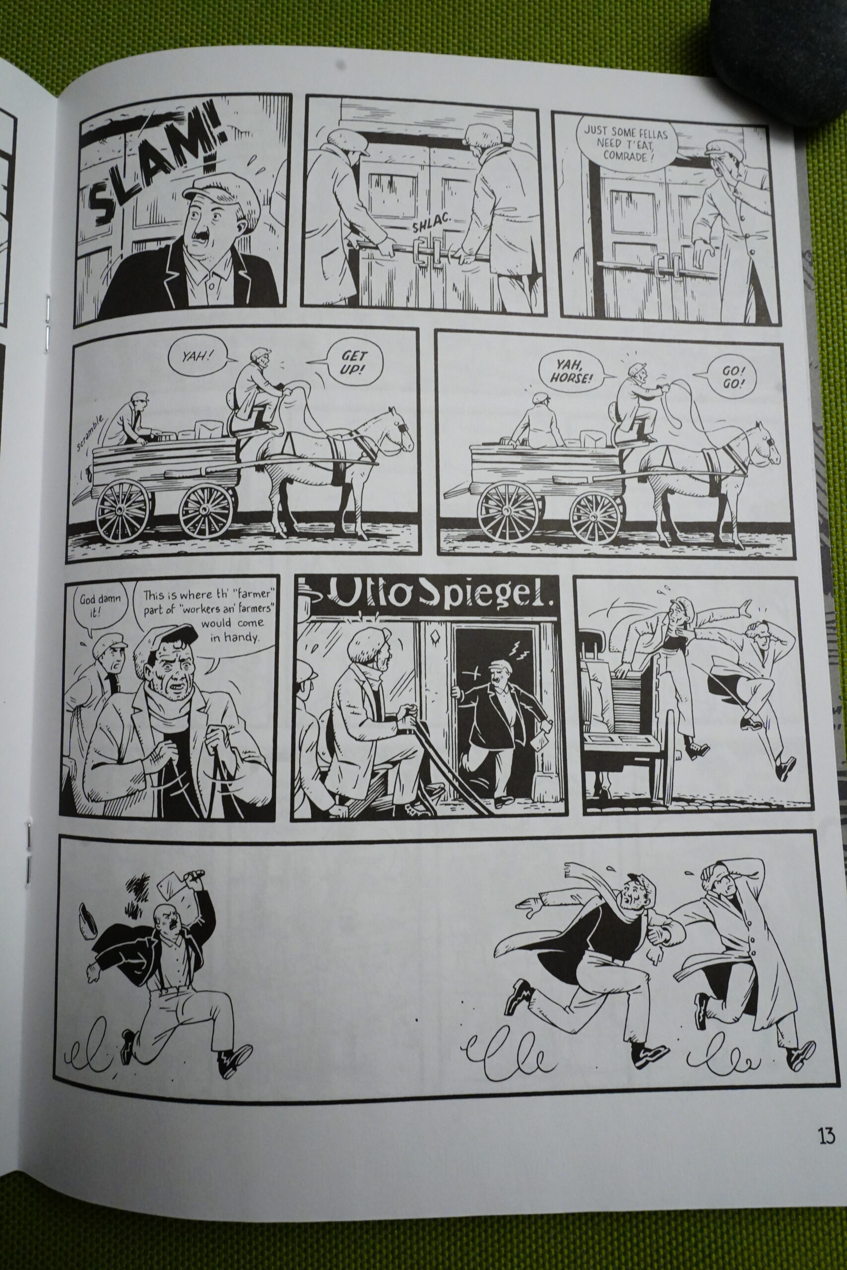
Here he’s going for Tintin, though. And doing it very well.
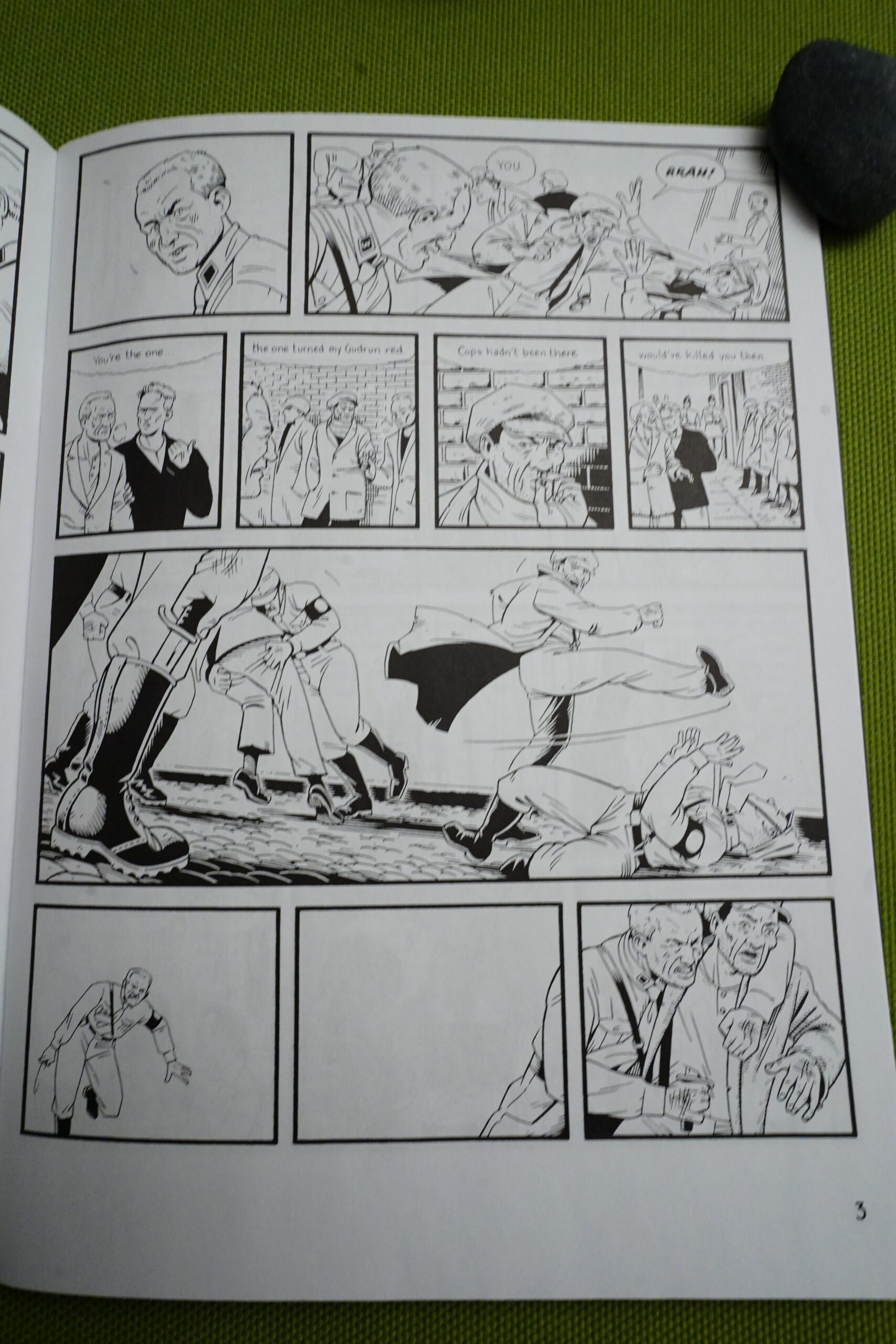
As the series progresses, the artwork becomes less detailed. On pages like this, there’s so little background that it just feels lazy instead of an artistic choice. But perhaps “lazy” isn’t the right word — perhaps this was the only way Lutes could get the work done? He’s obviously put so much work into this (especially the first half)…
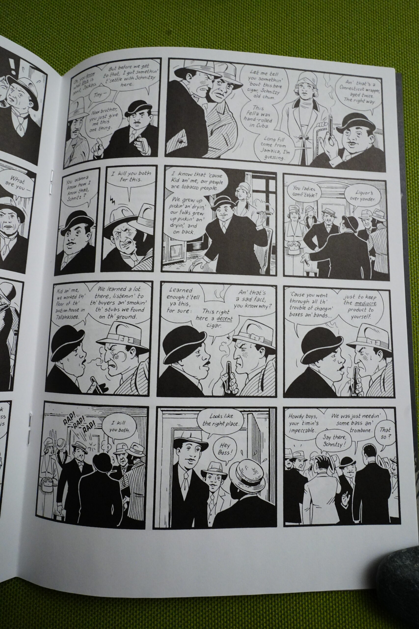
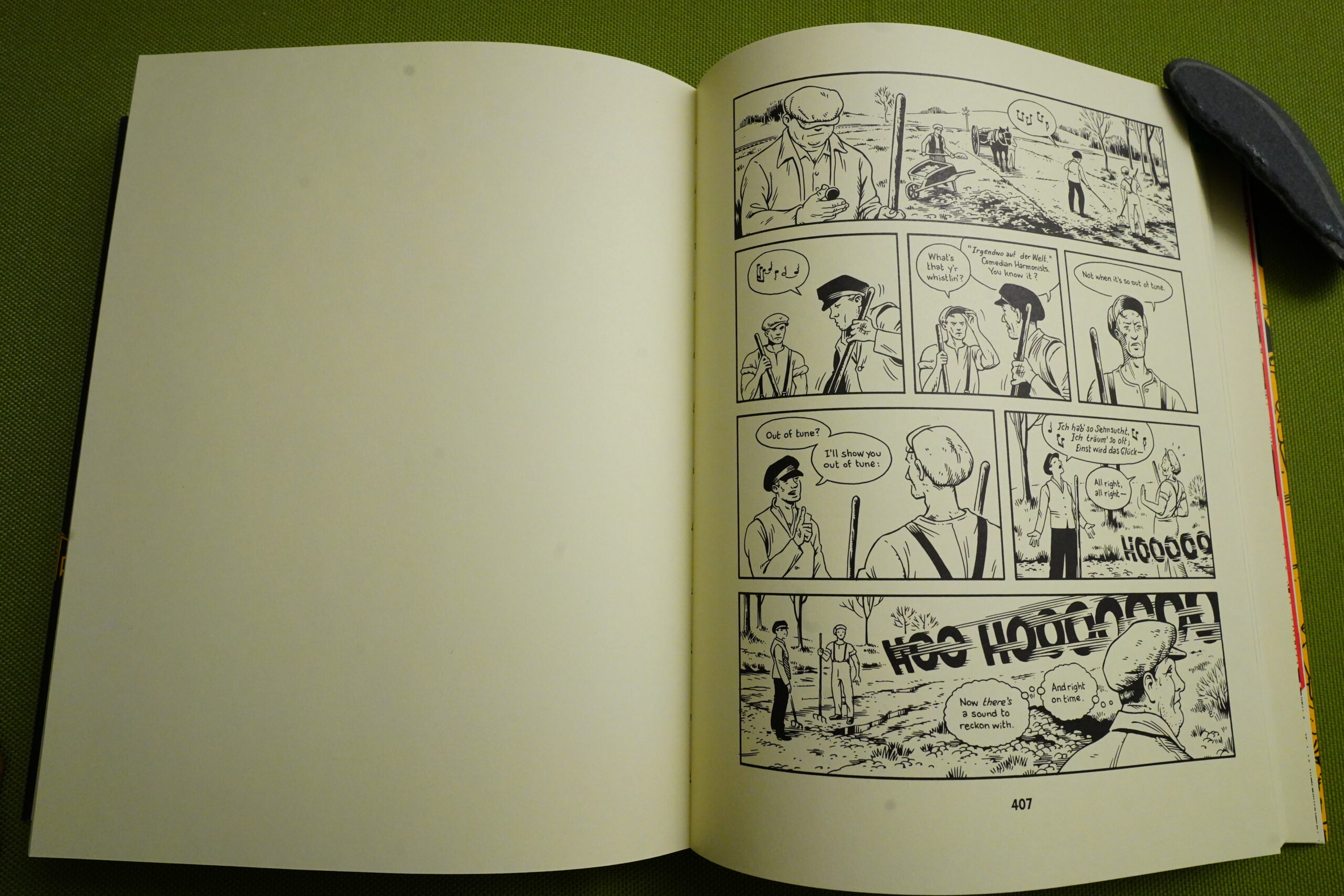
The dialogue gets better, I think, as the series progresses, but there’s still relapses into movie dialogue territory — like this tough guy scene above. I mean, it’s a fun scene, but…
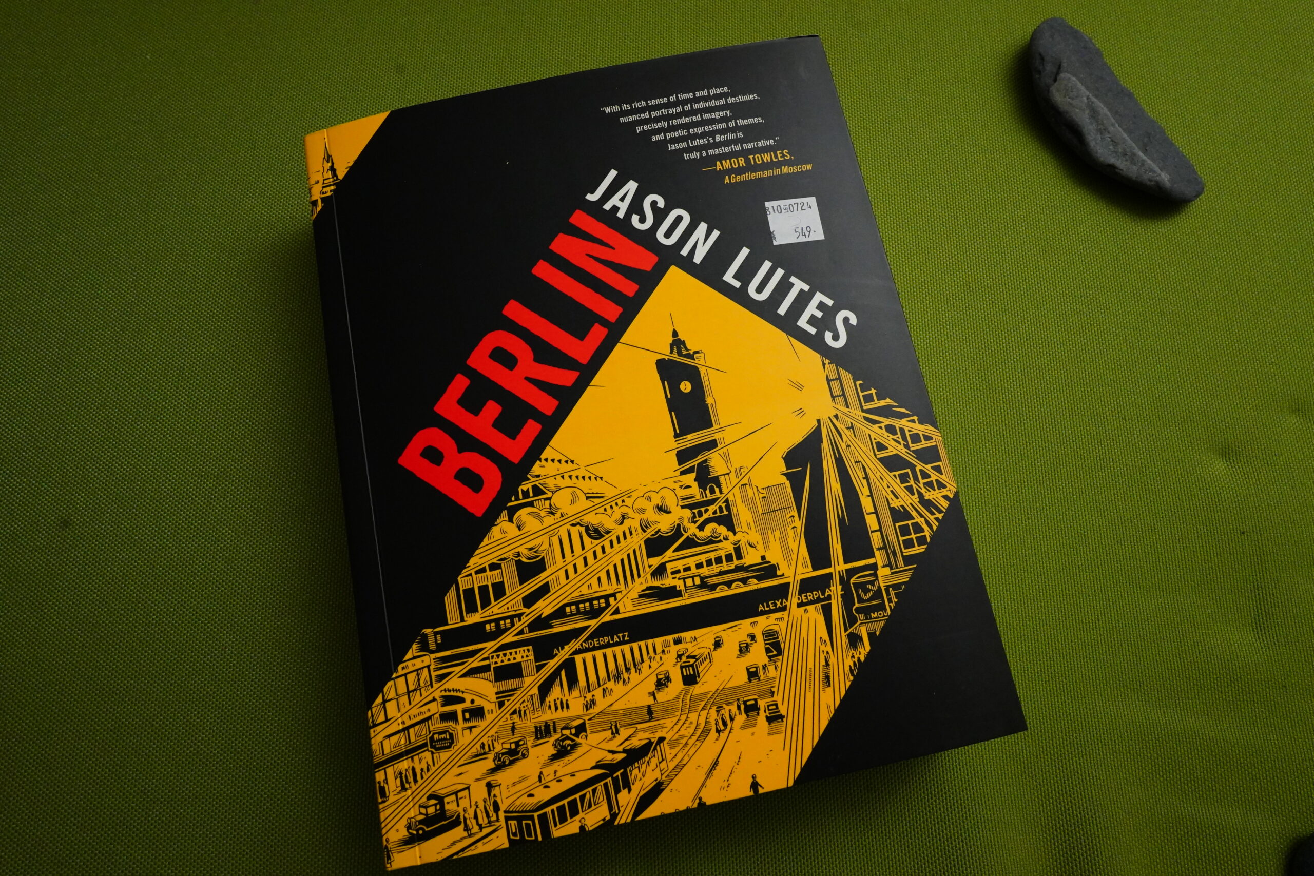
OK, now I ran out of floppy issues, so I have to switch to the collected edition. It’s really hefty.
The page size is slightly larger than the issues were.
But the printed size is identical. So there’s basically just larger margins — and larger margins in the gutters are nice, but they’ve printed this on such thick and heavy paper that the original, slightly smaller size would have felt nicer, I think?
And also — the paper choice is not good at all. Well, OK, it’s not a paper choice per se — they’ve dyed the paper a sickly yellow tone. Look how much better the original issues looked, colour wise — the yellow tone used in the collection looks affected, fake and offputting.
(Yes, this is The Paper Quality Review Blog now.)
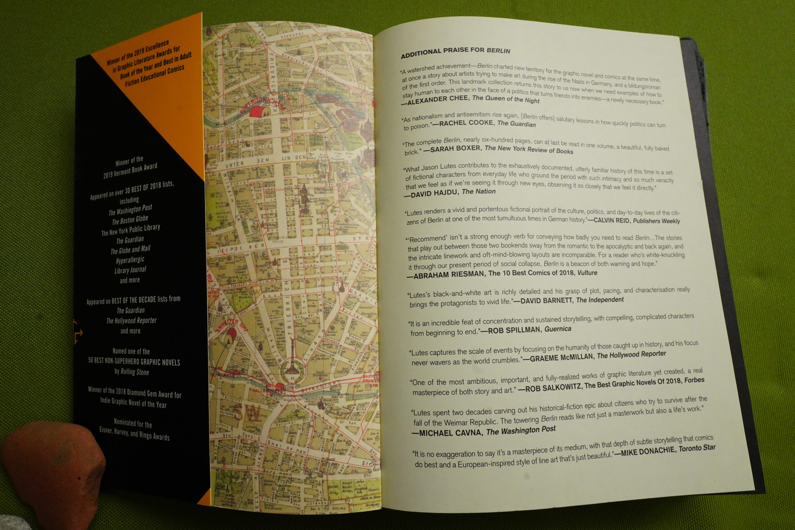
As we can see, there’s been a lot of praise for Berlin by this time. This edition is from 2022, after one hardcover edition in 2018 and a softcover in 2020.
Anyway, let’s continue to read…
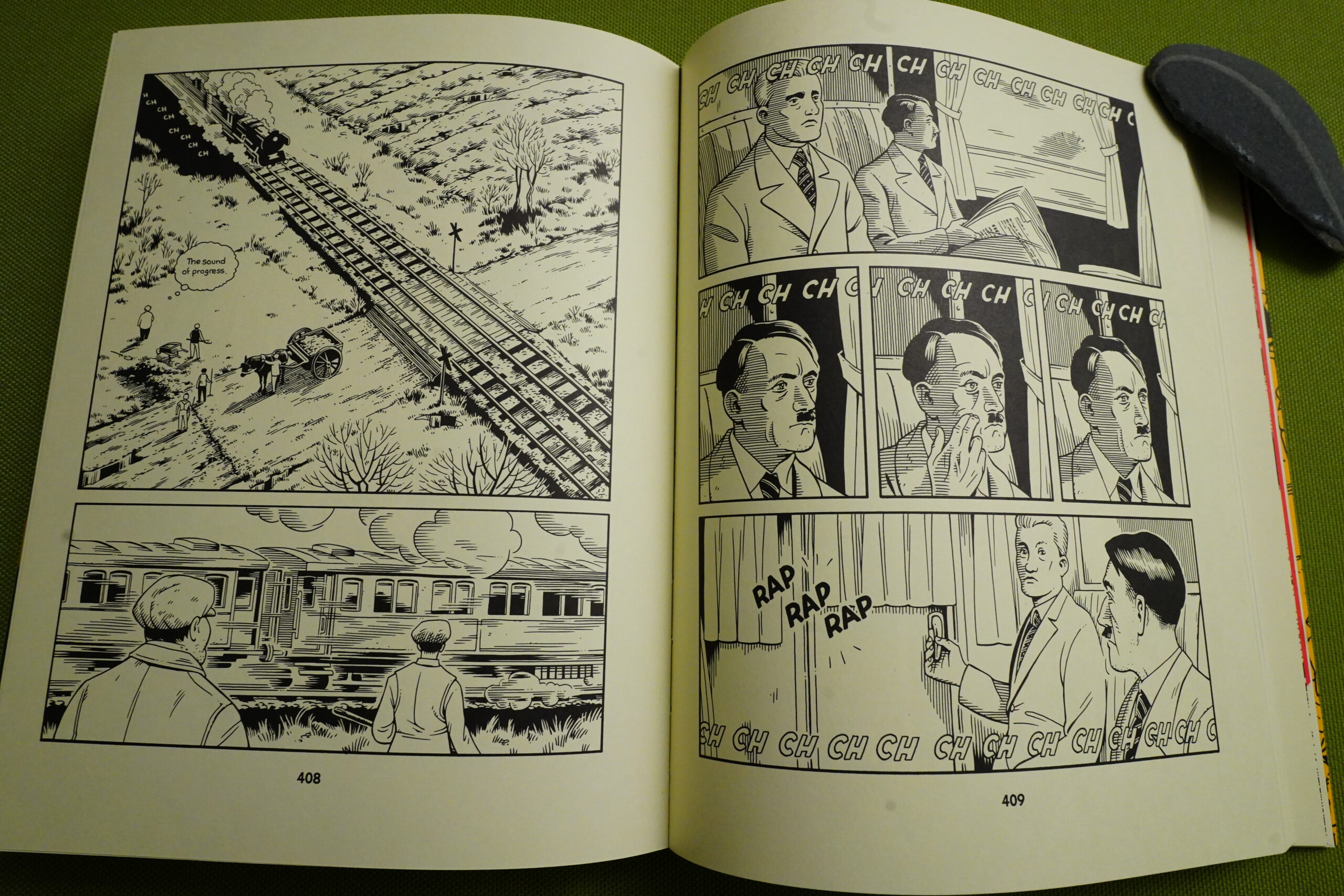
What!? Hitler makes an actual appearance? I guess I didn’t expect that, and now I know that I’ve never read this before.
(That’s not a very good Hitler rendition.)
I guess you could say that Lutes’ artwork stays amazingly consistent on this book, considering that it took 22 years to make. But… it has changed quite a bit. His line is looser now, there’s fewer details, and he doesn’t render as many impressive exteriors. I like it, but I liked the original approach better.
And then all of a sudden we get swastikas!
That’s an odd choice.
Oh, I guess I forgot to say anything about the plot in this book… Nah, go read any of the other three million reviews for a plot recap.
I’ll just say that I think the book has a pretty satisfying end, without trying to desperately tie all the plot threads neatly together. What can I say, it’s a good book.
OK, let’s look at some contemporary reviews and stuff.
Christopher Brayshaw writes in The Comics Journal #187, page #43:
BERLIN IS JASON LUTES’ followup
to his unmistakably ambitious two-volume
graphic novel, Jar of Fools. While Ja,r’s first
volume evoked widespread, and well-deserved,
critical acclaim, the second volume was met
with puzzling (and for Lutes, undoubtedly
frustrating) silence. The indifferent response to
Jar’s second volume seemed to indicate a
falling-off. or relaxation of the formidable
cartooning skills Lutes brought to bear in the
first volume, which still stands as a benchmark
ofLutes’ achievement. Ifitscompanion volume,
or, for that matter, Berlin fails to reach it, it’s as
important to acknowledge that early success as
it is to note that. while Berlin still falls short of
Lutes’ personal best, it’s nonetheless a
competently conceived and executed read.
Geography and psychology are
interchangable for Lutes — the places in which
his characters find themselves are invariably
related to their lives and emotional conditions.
Jar of Fools was set in rainy Seattle; much of
that book took place in the dark beneath el-
evated portions ofthe 1-5, where the characters’
invisibility from the traffic overhead served as
a reflection on their marginal lives. Berlin is not
set in the present day, but in Germany, circa
1928.[…]
Berlin’s first sequence — a long conversation
between Kurt and Marthe inside a train car
bound for Berlin — time, like the tracks under
the train, only moves forward, toward the fu-
ture. A completely black page, blank save for
the story’ s title, separates this opening sequence
from the train’s arrival in Berlin. But the black
page also alludes to the as-yet unexplained
relationship between Marthe and her father,
which Lutes at one poini represents as a vast
darkness inside Marthe’s skull, broken by a
soldier’s silhouette, whose back is turned to us.
Lutes’ juxtaposition of the soldier’s figure with
darkness in turn links the all-black page with
the Still-recent First World War, whose signs
are scattered everywhere in the September coun-
tryside, like harbingers of the Second World
War to come. In the second full-page panel, rail
tracks fork and branch off through Berlin, sym-
bolizing the variety of life choices offered by
the specifically European notion of the great
city. Lutes marks the richness and variety of
Berlin life in a number of ways. ‘There is more
of everything and everything moves faster than
ever before,” says Kurt to Marthe during their
train conversation, and his observation is later
confirmed as the two walk along n’ s streets.
“Into the flow of [the city] as into a river.
Through warring currents of flesh and smell:
cigars and sausage, lavender and roses, the
sourness of neglect.” Lutes’ panels encompass
a number of historically accurate details: street
architecture; expressions on the faces of pass-
ersby; the nearby clamor of traffic and street-
cars. “I am losing myself,” thinks Marthe, and,
as if to underscore her observation, Lutes’
camera pulls back to a full-page view of Berlin
and its branching streets, from an angle so high
that Kurt and Marthe vanish in the rush.
There’s real pleasure in Lutes’ detailed
evocation of Berlin’s streets. A brief
acknowledgement calls attention to Lutes’ ju-
dicious citation Of photographs by August
Sander, and art works by Otto Dix, Rudolf
Dischinger, and other Weimar Republic artists.
And in the book’s most impressive sequence,
Lutes employs a kind of literary expressionism,
reminiscent of the early chapters of Joyce’s
Ulysses, to map the thoughts of the “poor fel-
low” operating the signals at a traffic round-
about, whose disgust with the drivers below
him is contrasted with Kurt and Marthe’s en-
thusiastic views of the city.Not all Of Berlin is as successful as this
sequence, which to my mind ranks with Lutes’
best. In particular, I note two tendencies in Berlin
which represent a step down from Lutes’ best
work. first is Lutes’ inclusion Of panels whose
odd angles seem designed not to simply convey
information, but to inflect readers’ responses to
them. For example, a tall panel on page 11
depicts Kurt and Marthe walking through the
Berlin train station. The panel’s point of view is
skewed to emphasize the sunlight falling through
the station’s high windows overhead. which
seems unneccessary. In this case, Lutes seems to
think that the components of the scene aren’t
sufficient to influence readers’ responses to it, so
he interferes, and the panel consequently stands
out from his more dispassionate views else-
where. A second, related problem is Lutes’ pac-
ing. Some scenes, like Kurt and Marthe’s long
conversation On the train, are punctuated by
panels that don’t provide any new visual infor-
mation, but rather seem inserted arbitrarily, to
pace the sequence more slowly. Obviously Lutes
is trying to develop slower, more complicated
rhythms than the stylish cuts Of Jar of Fools’
action sequences. But I don’t think his present
solutions to this problem are successful.
Berlin is a love letter to the amazing city
of stones that the fascists tried to snuff
out. Of the people who lived and loved
in that city of smoke. And its ending
reveals that through it all, through all
the destruction and repression and
limitation, the city of light survived
and thrived.
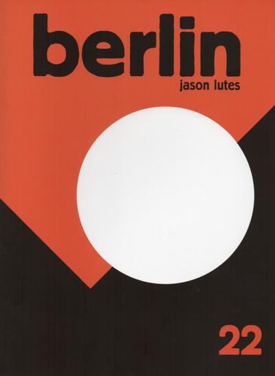
I wondered what the final floppy looked like… Quite striking.
The Comics Journal #228, page #54:
GREG STUMP: to get your take on What it like to go to Berlin
ing drawn it, and then actually getting to see tvhat you’ve envisioned in your
head an d What the difference Was between the two. Youjust got backfom Berlin
in late July.
JASON LUTES: Yeah. It was my first time there.
STUMP: What surprisedyou about the uay it was in reahty as opposed to what
you imagined?
LUTES: Unfortunately, I get to stay very long. I came in on a train
from Frankfurt, and the sun was setting. The train was moving, it was like
practically silent. It really, really quiet, it felt like we were coasting. It
was a pretty intense experience to see the buildings slide into view. I was
very apprehensive, because I was really’ worried if I saw the real place and
it was very different than what I imagined it to be, it would throw the
whole project into crisis. [Laughter] I was actually concerned it would be
so disheartening that wouldn’t be able to go on. I was really nervous about
it. But actually, the parts that still remain from the period I’m writing about
were exactly the way I imagined them to be. It was really grati$’ing.
STUMP: Because you’ve done such a thoroughjob ofusing
LUTES: I guess so. Yeah. And I read enough stuff, and tried to imagine it
thoroughly. The beginning for me was looking at all the photos and read-
ing all the stuff, that’s the map. It’s not the territory. The big thing I was
worried about was that the feel Of it would be very different than what I
imagined. I saw the Berlin I imagined there. It was a very positive experi-
Ill (l
Rarely has a comic series been so hyped in the American press as
Berlin by Jason Lutes„ The ‘most sophisticated work of historical
fiction in the medium’ and ‘a comic of impressive scope’ are just
two of the many jubilant comments from which the publisher could
choose to adorn the cover of the now published first collection
(City of stones). Often the reader is somewhat sceptical after such a collective
praise. In the case of Berlin not entirely without reason, because although it is one of the better
comics of recent years, it is not yet the instant classic that many media
have already made it.[…]
It is a pity that the strong scenario of Berlin is eroded by the stiff lettering. Lutes’s frail handwriting is wooden in the pages and therefore distracts from the story. Lutes’s drawing is also not equally strong everywhere. He is what Americans call a clear-line artist, but that name does not fit Lutes’ detailed drawings and frequent use of hatching. Apart from that, his style is not always consistent. His figures sometimes suddenly no longer match anatomically from one picture to the next, which looks unkempt and amateurish. Nevertheless, Lutes is a great talent. He has a good sense of composition. His page structure is strong and his ideas for transitioning one scene into the next are often brilliant. In this way, he sometimes simply changes the point of view to let someone else experience a scene in a different way,
The two following parts of Berlin that are yet to be published deal with the period up to Hitler’s seizure of power in 1933.
If Lutes develops his undeniable qualities a little further,
the superlatives already expressed for his comic strip will still apply.
There’s so much written about Berlin…
Ron Evry writes in The Comics Journal #242, page #61:
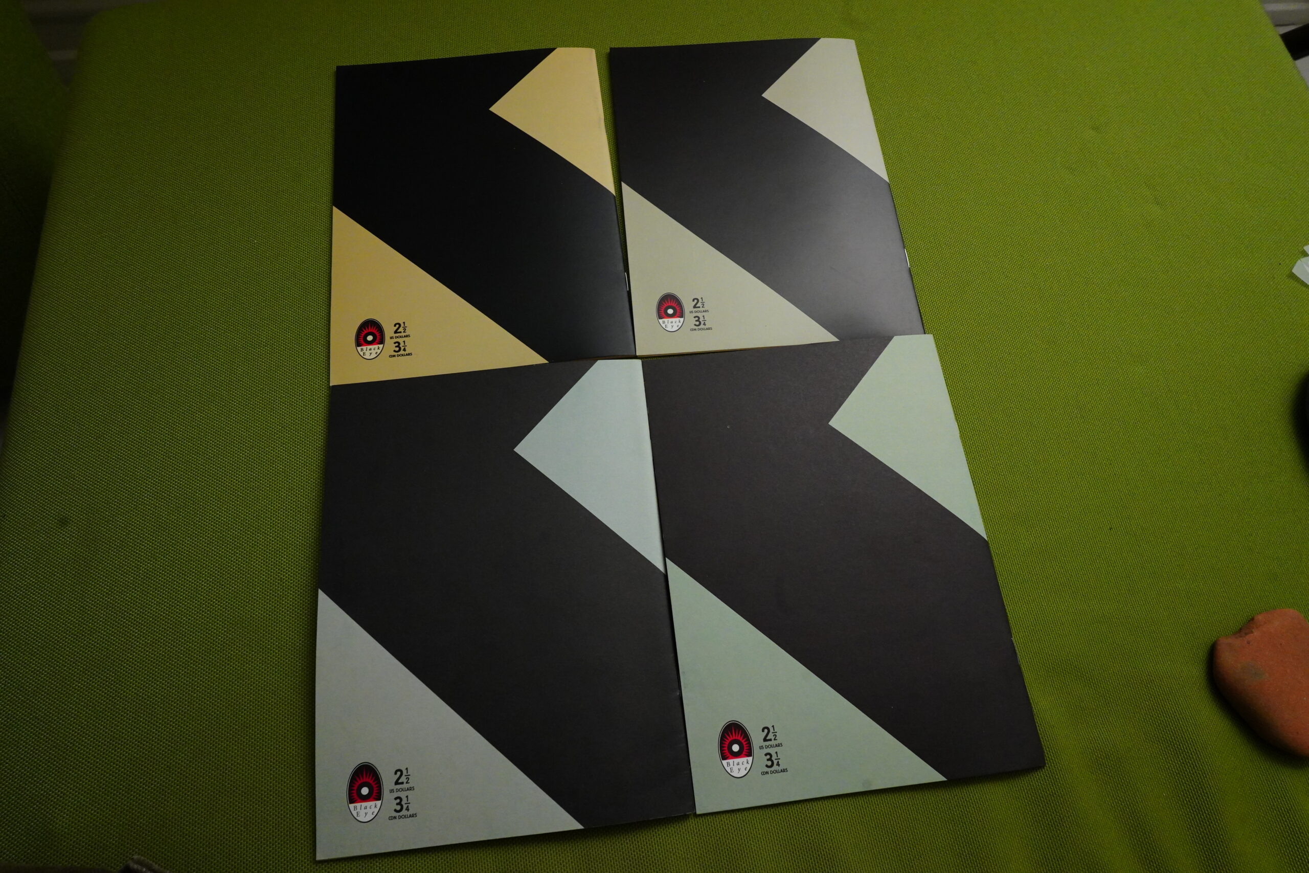
The original publication of Jason
Lut& Berlin was a series Of eight comic
books published over a four-year period,
and has since been repackaged in this
graphic-novel format. While a convenient
read, the 209-page book is missing some-
thing found only in the original comics.
If one takes any four issues, flips each of
them over to the back cover, and sets
them in a pinwheel arrangement With
each other, a swastika appears: hidden,
yet overwhelming.
Oooh! I didn’t know that! Lemme check…
Errr…
Uhm…
Uhm…
Oh, he said back cover…
Let’s see…
I think I somehow made an anti swastika!?
I give up. I guess I’m not swastika qualified.
In the eight chapters
covering that many months in the lives of
the characters from September 1928 until
May Day, 1929, the specter Of Nazism
looms large as well, and the swastikas
remain hidden. Lutes’ depictions of
brown-shirted National Socialists usually
feature their black armbands askew, so
the Symbol is not visible, but there have
been panels showing a blank circle on
armbands and flags as well.
Lutes himself has informed the
Journal that this was done for artistic rea-
sons, and not particularly to enable Berlin
to be sold in Germany, where depictions
of swastikas are forbidden (this turns out
to be fortuitous, since the graphic novel is
being distributed in Europe now). Lutes
also stated that quite a few people were
sure they saw that there were st,vastikas all
over, testifring to the power of sugestion
in a visual medium.
Or that people gonna people.
The absence of the
symbol from the comic may be a symbol-
ic act in itself. The myriad assortment Of
characters depicted living in Berlin dur-
ing the late 1920s were aware of the
Nazis, but generally considered them to
be just another political faction among
many hovering in the background. Yet
the reader knows the terrible future
awaiting them all, overwhelming every
doomed action they take.[…]
It seems a shame that an artist such as
Jason Lutes cannot sell enough copies of
this masterpiece to make producing it his
full-time profession. It is obviously a
work, and hopefully will be enough of a
commercial success for him to produce it
for many more issues. The eighth issue of
the comic book came out in December of
2000, and there hasn’t been another new
one since. He has drawn an Ed Brubaker-
written comic book called The Fall, also
published by D&Q, which is diverting
and intelligently done, but it isn’t Berlin.
There are a projected 400-more pages to
go in the series. If readers have to wait
eight or nine more years to get them, then
that is testimony to the fact that some-
thing is terribly wrong with the comic
industry and needs fixing.
Yeah, readers had to wait 18 years more to get the end.
Comics Scene Volume 2 #56, page #59:
Lutes is ready to move On to new
projects including Berlin, a piece of
historical fiction which takes place
after World War I in Germany. Berlin is
published quarterly by Black Eye Pub-
lications. “I’d like to tell as many dif-
ferent kinds of stories as I can,” says
Lutes. “One of the strange things about
being where we are in the history of
comics right now is that there’s such a
broad range of stories that haven’t been
told. That’s some part of my choice to
do historical fiction. It’s simply a reac-
tion to that. For instance, Kings in Dis-
guise is a Depression-era story that was
pretty well received, but not a whole
lot of people saw it, It hasn’t
been often in American
comics that you have gotten
the straightforward histori-
cal fiction divorced from
something like the Invaders
in World War II Germany.
That will probably continue
to be a concern for me.
When I finish Berlin, the
choice of what I do next will
be partially based On what I
think hasn’t been done.
The Comics Journal #205, page #91:
I don’t mean to make Lutes’ work
out as perfection itself. Despite his early
.chievement with Jar of Fools and his
grand project of Berlin, Jason Lutes re-
mains a developing artist. m•rlin does
have its share ofmissteps: particularly in
the first two issues. the artwork can
Seem a bit stiff, too reliant on photo
reference; while his dialogue is usually
quite precise, a recent episode involving
elderly Jewish man is so melodra-
matic it sounds as if it was transcribed
from Tie Jazz Singer. But these are
minor faults for a devoted artist to over-
come. And if anything, Jason Lutes
appears devoted to his craft.
This blog post is part of the Total Black Eye series.
