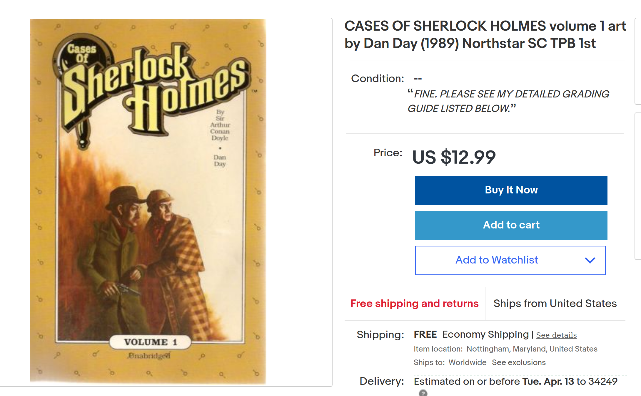
Cases of Sherlock Holmes (1986) #1-15 by Dan Day and Arthur Conan Doyle
We’re in May 1986, a low point in American comics publishing: These are the hectic days of the dreaded Black and White Boom, when dozens and dozens of fly-by-night publishers would get their cousins to draw up something, anything that could be published in a couple months time and earn a few dollars.
And publishing public domain Sherlock Holmes stories in pamphlet form seems like the easiest money grab possible, right?
Right.
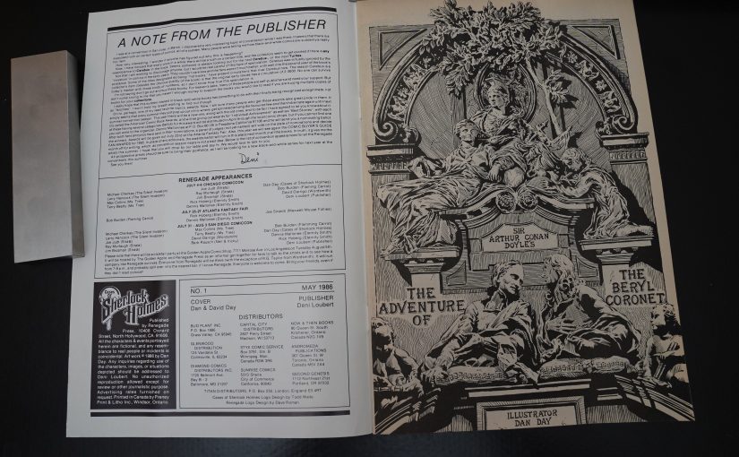
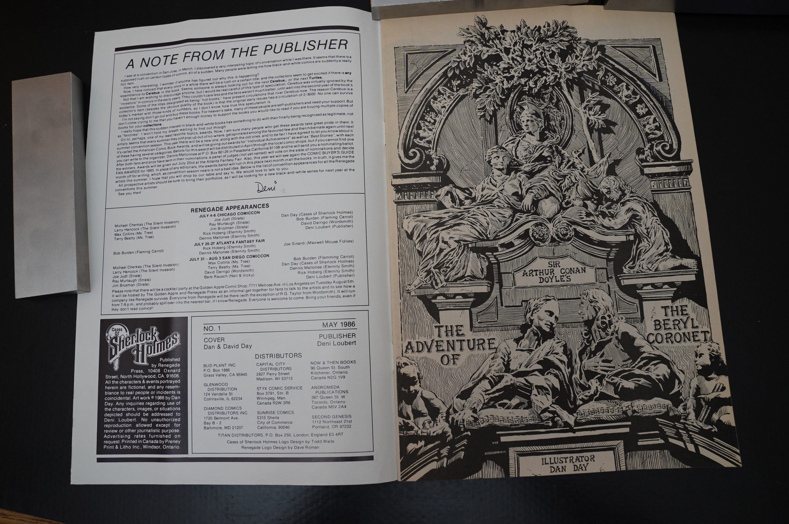
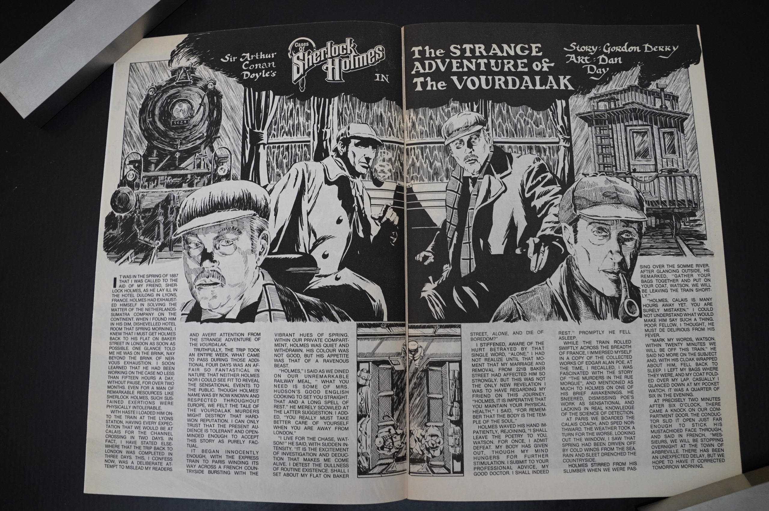
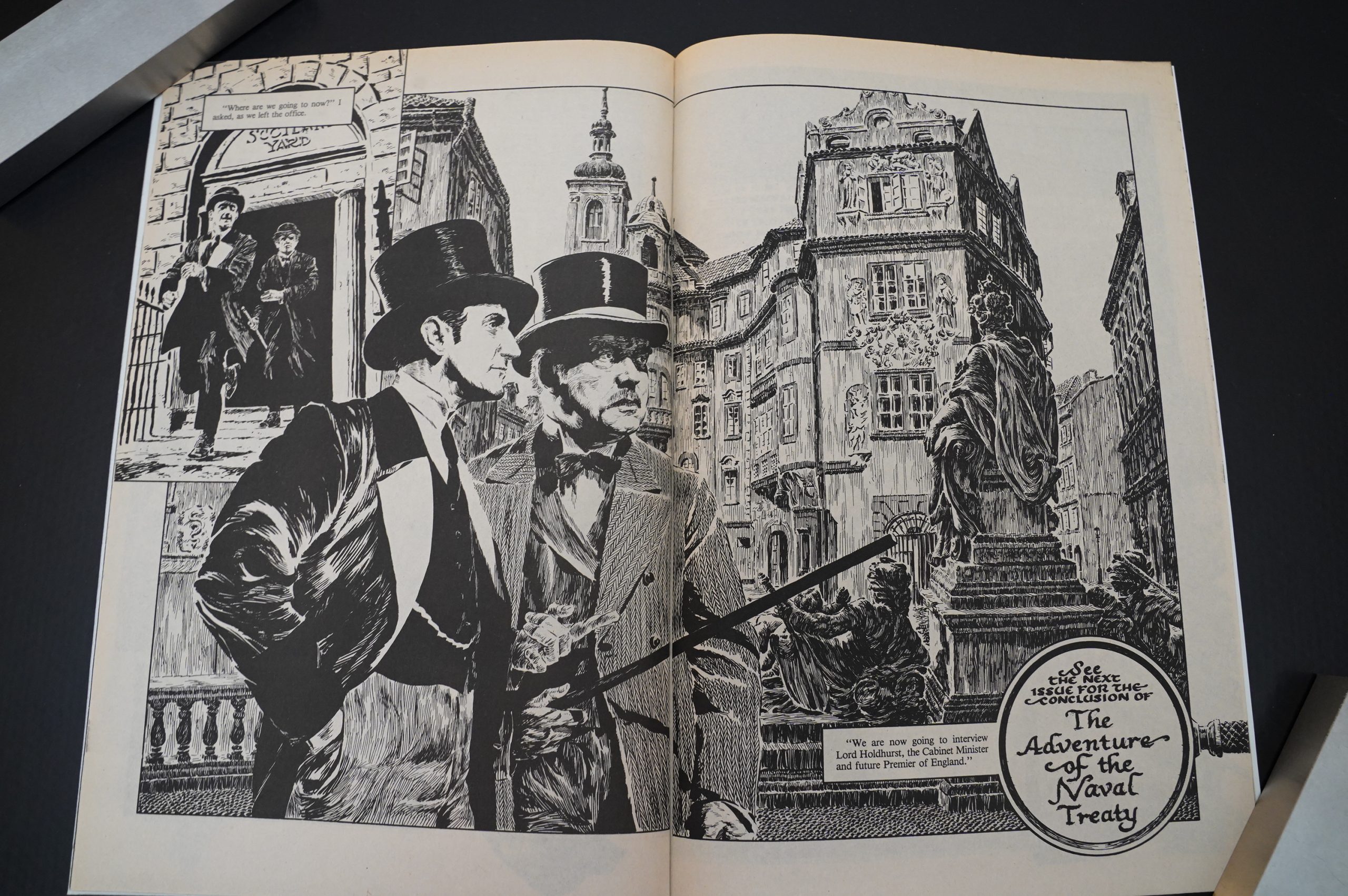
Let’s read the first few pages.
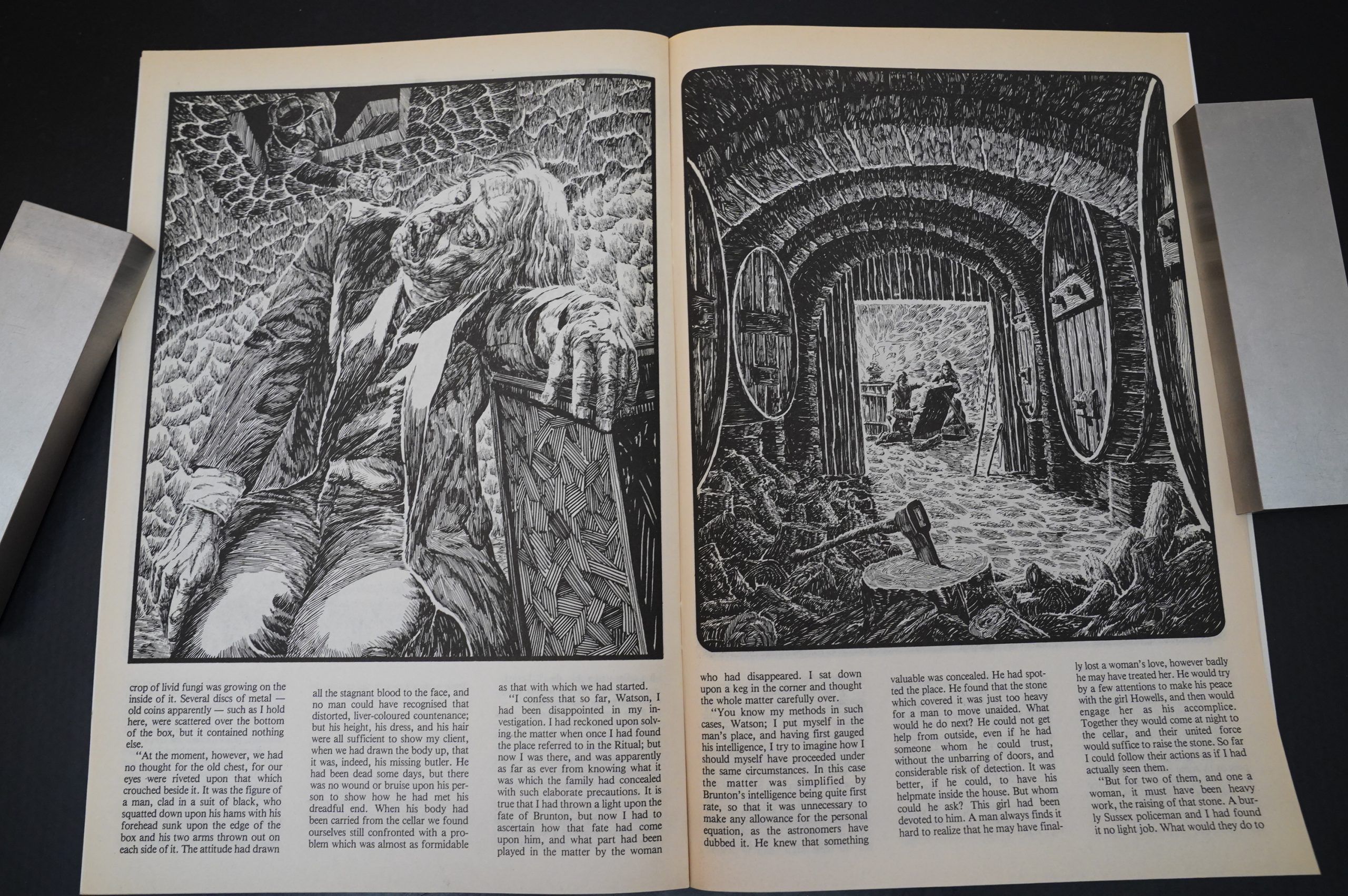
But… this looks great! Obviously a lot of work has gone into this, and this isn’t a black and white boom thing at all.
Dan Day was (at this point) quite well known for illustrating the Aztec Ace series (and doing a really good job).
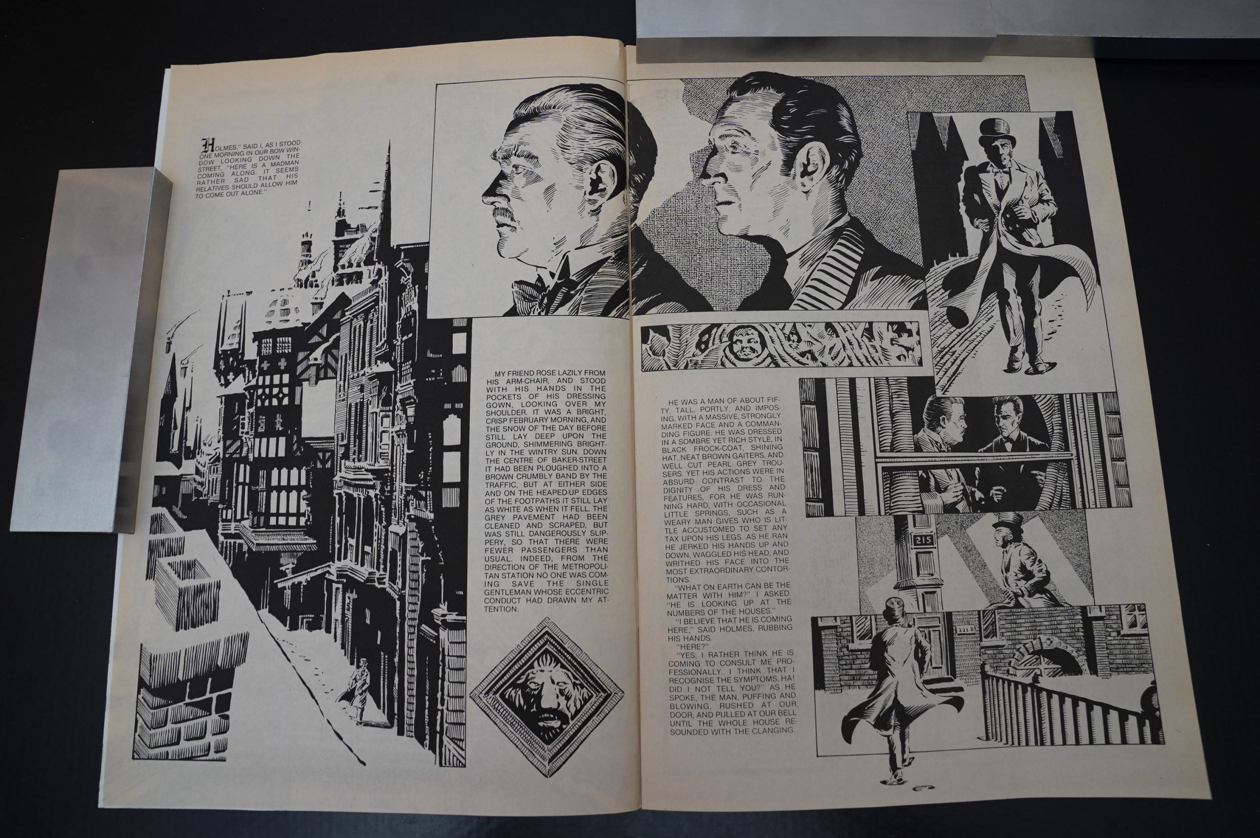
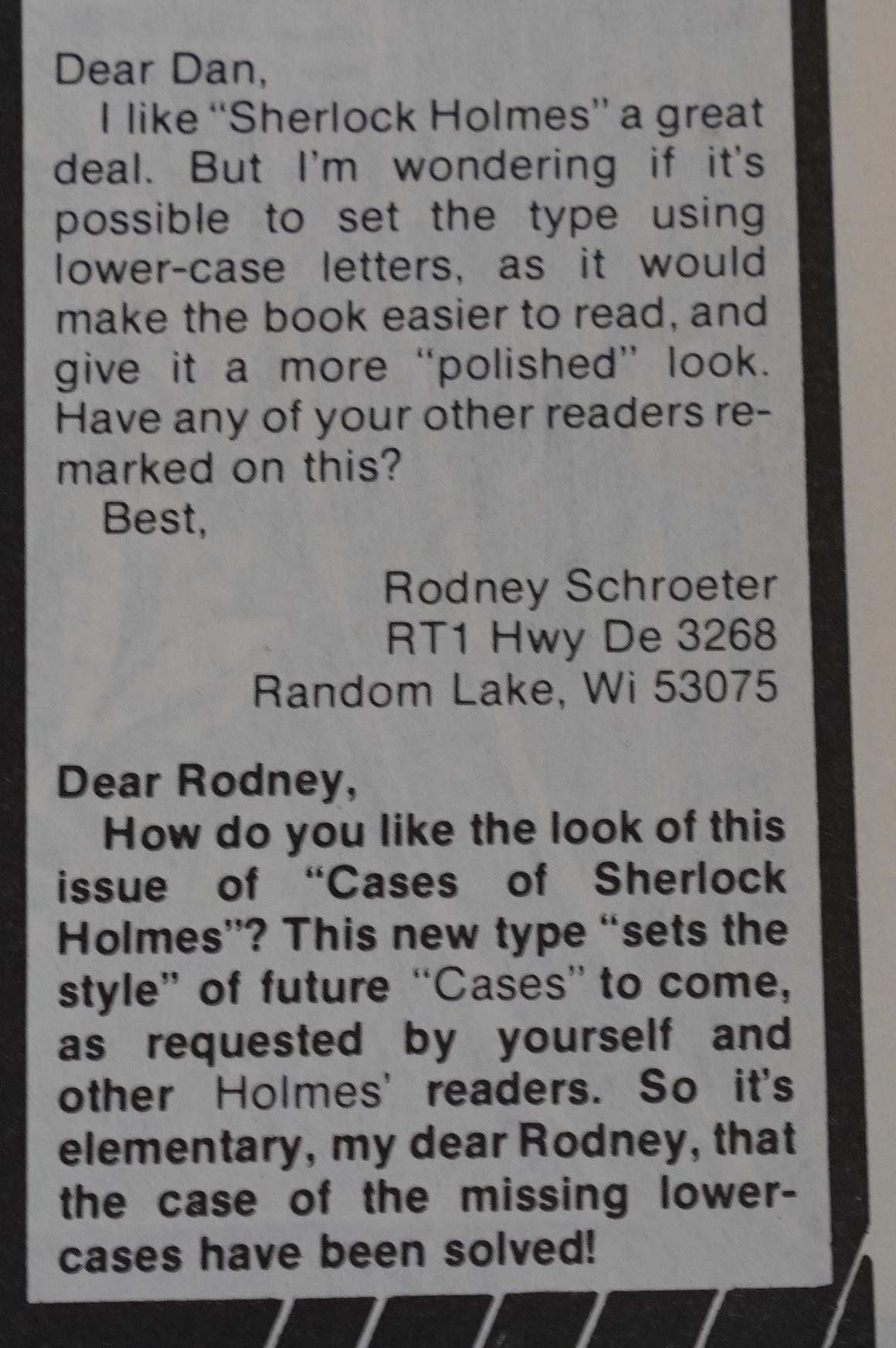
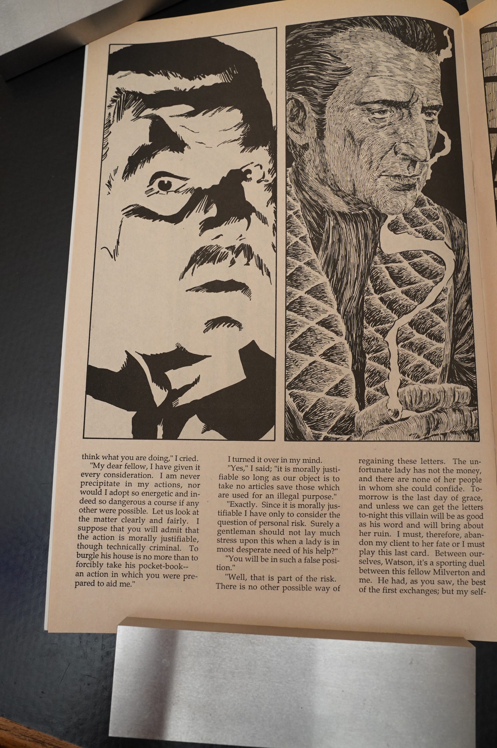
I don’t like the typesetting here much: Using upper case exclusively like this is wearying to the eye, and makes it seems like the text is shouting to the reader all the time.
I think I understand why this curious choice has been made: In comics, mixed case is rarely used when doing hand lettering, but the hand lettering itself provides variation. Here, it’s just… annoying.
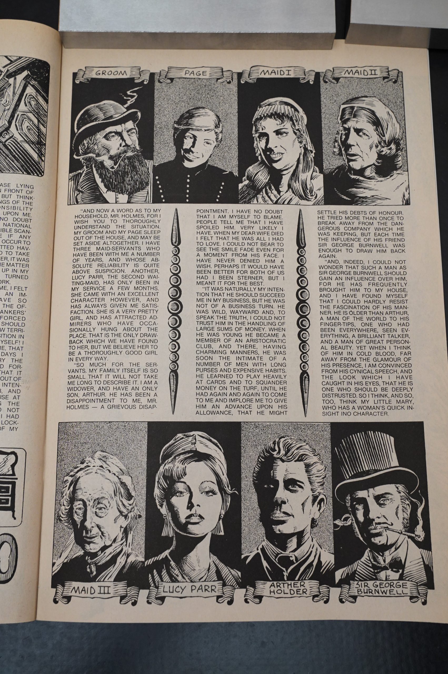
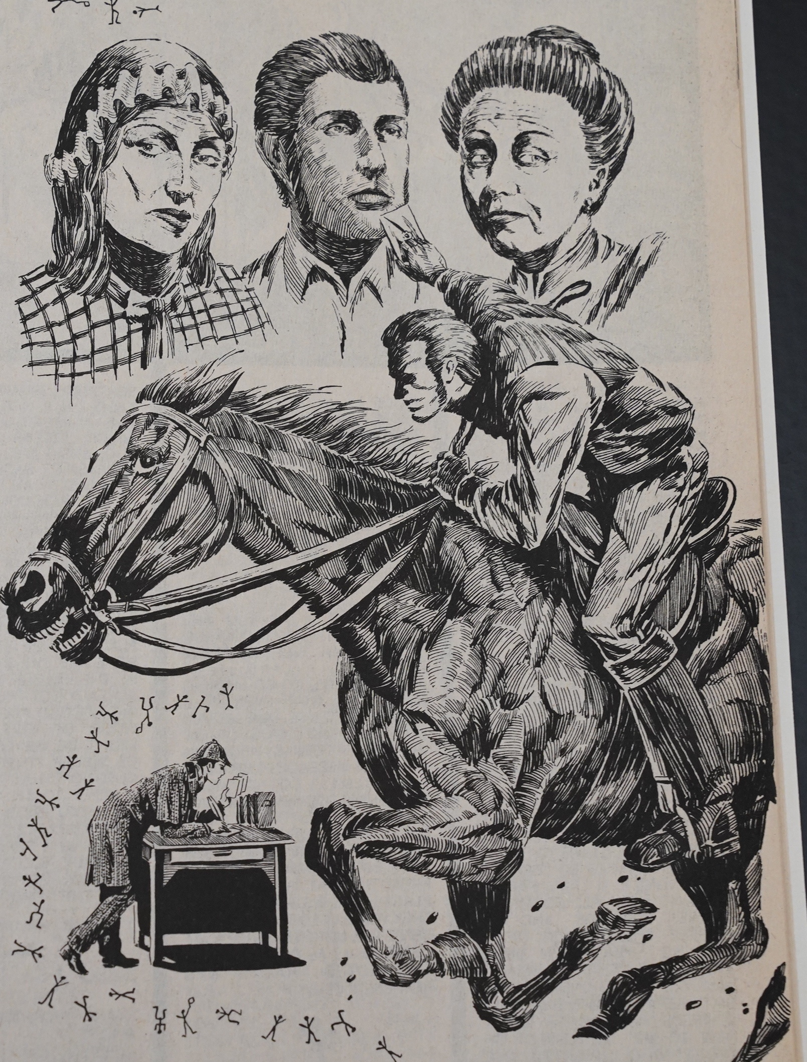
But looks at all those characters! Day is going way beyond the call of duty here.
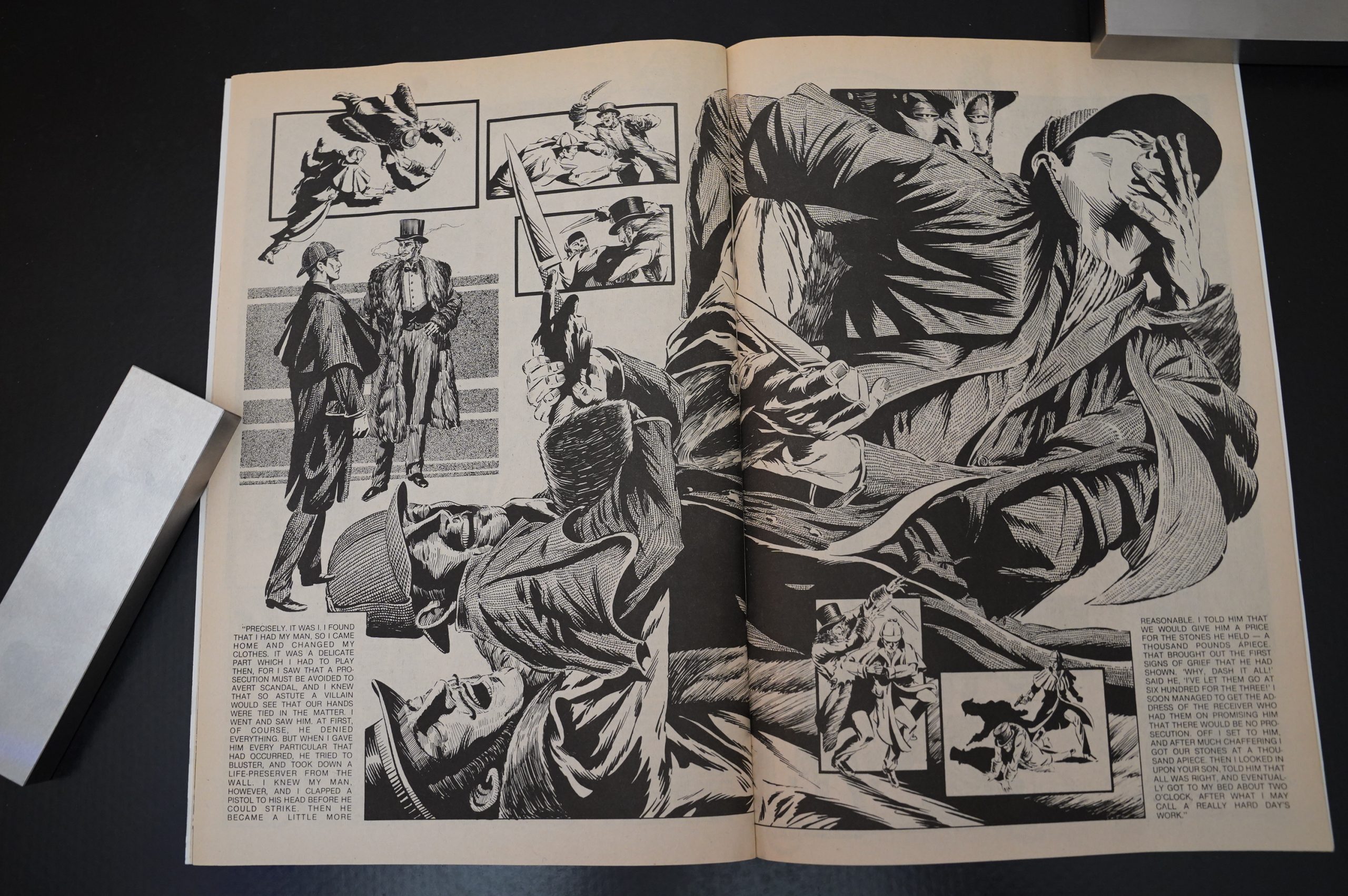
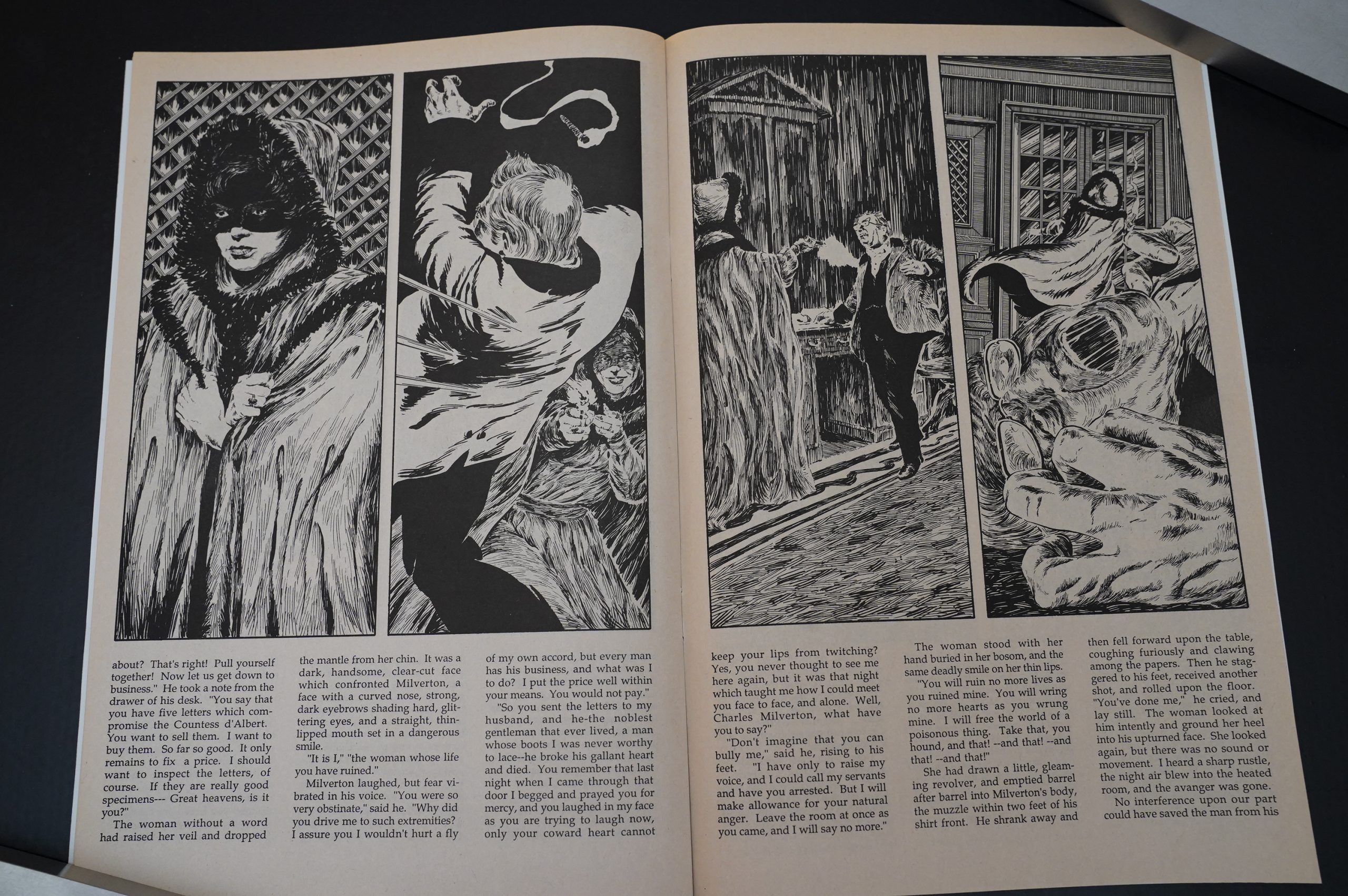
And look at this climax in the story! It’s wonderful!
Anyway, I did have these comics when I was a teenager… but I stopped buying them after about half a dozen, because I figured (as much as I like Sherlock Holmes) that reading the stories with this sort of typesetting was just too much work.
Even if I did like the artwork.
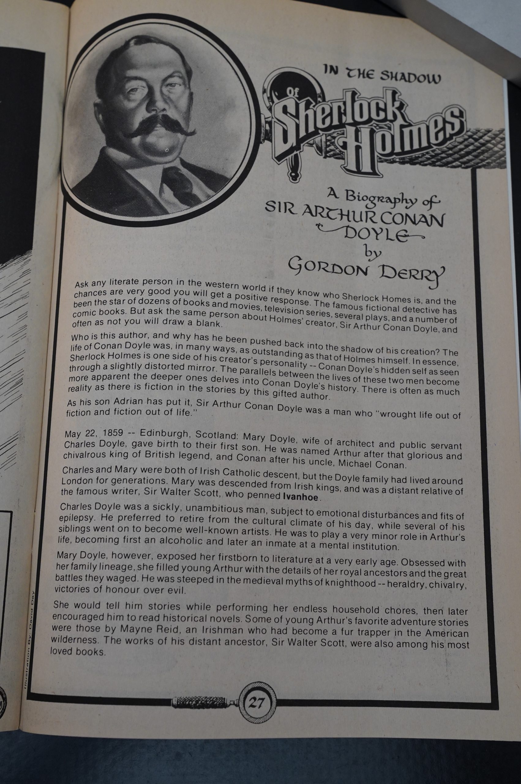
And there’s a biography here by Gordon Derry.
You probably didn’t notice, but there was a ten day delay between the previous sentence and this one, because it just took me a long while to get through these issues. It’s not that each individual issue takes that long… but the more I read these Sherlock stories, the more I found myself doing something else; anything else…
And I’m not quite sure why, because… while I’m not really that much of a fan of Conan Doyle, and the stories become somewhat repetetive, they’re entertaining enough…
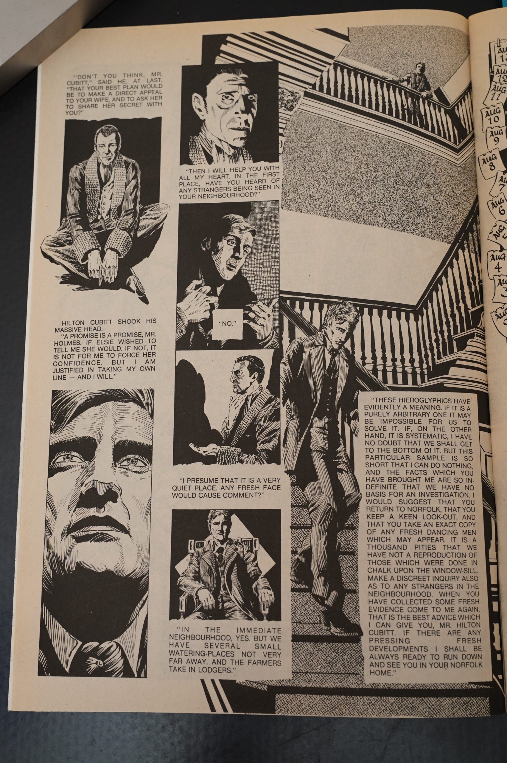
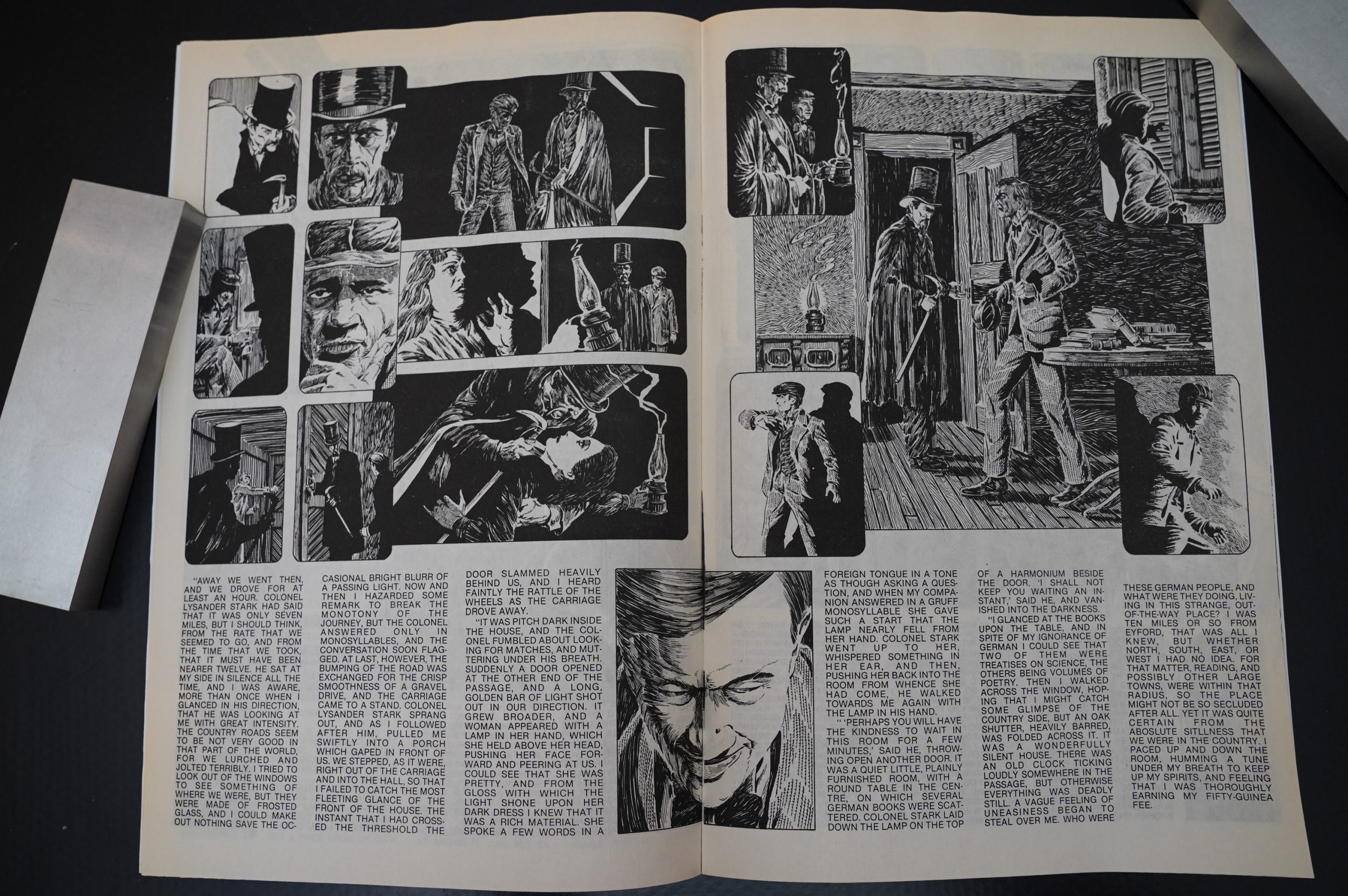
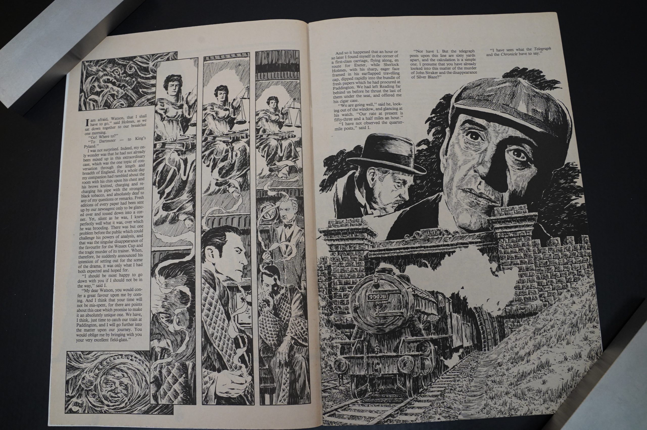
Uhm… back to the page above: As we can see, Day varies the approach to illustrating these stories a lot. These are unabridged versions of the stories, but sometimes Day manages to arrange the text in a more comic-bookey fashion with some panels and stuff. It’s nice.
Uhm… does that horsie have an extra joint in that leg? It looks… odd…
Yeah, I think so? Hm…
No, that pic confirms the number of joints. NEVER MIND.
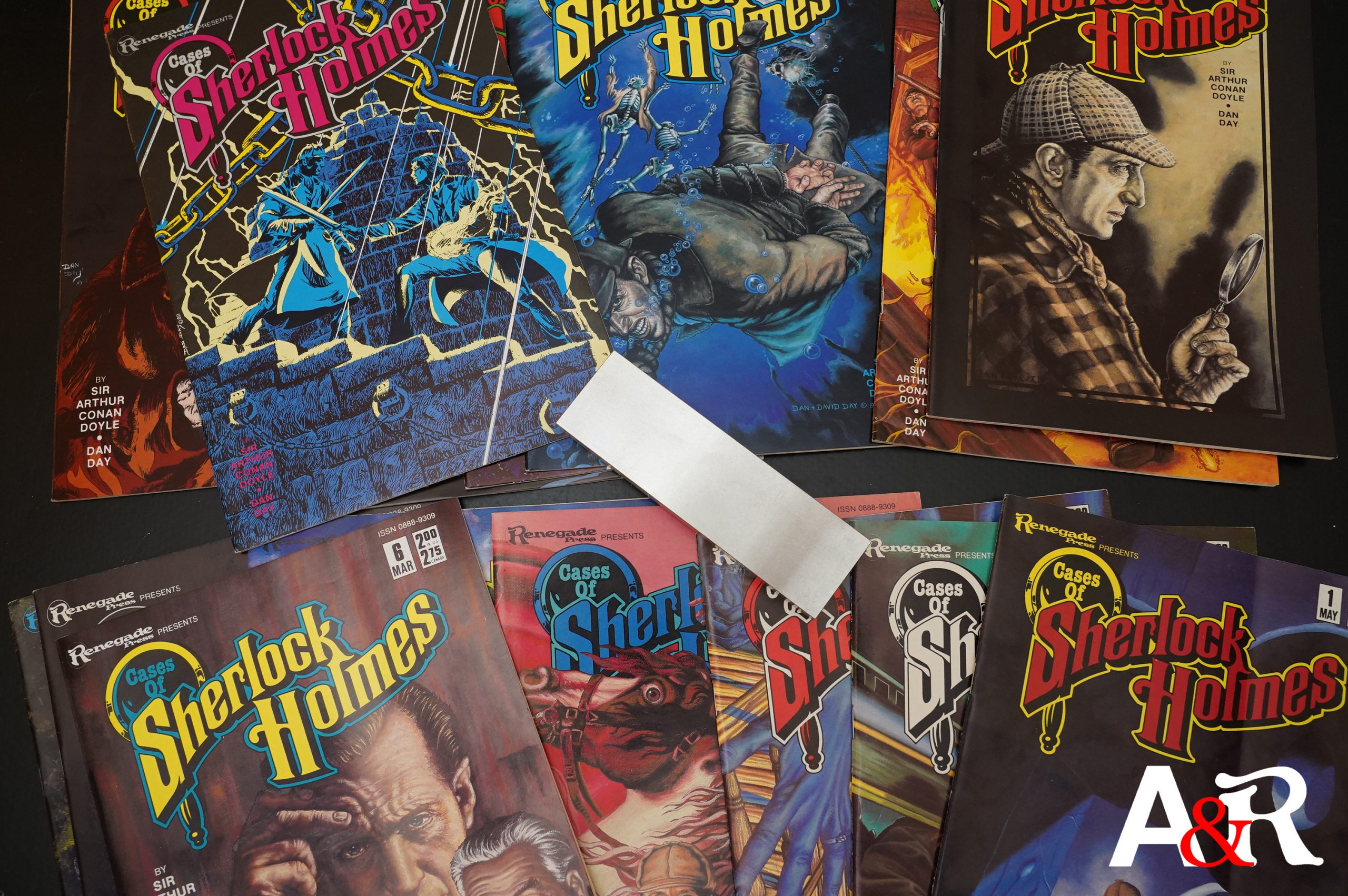
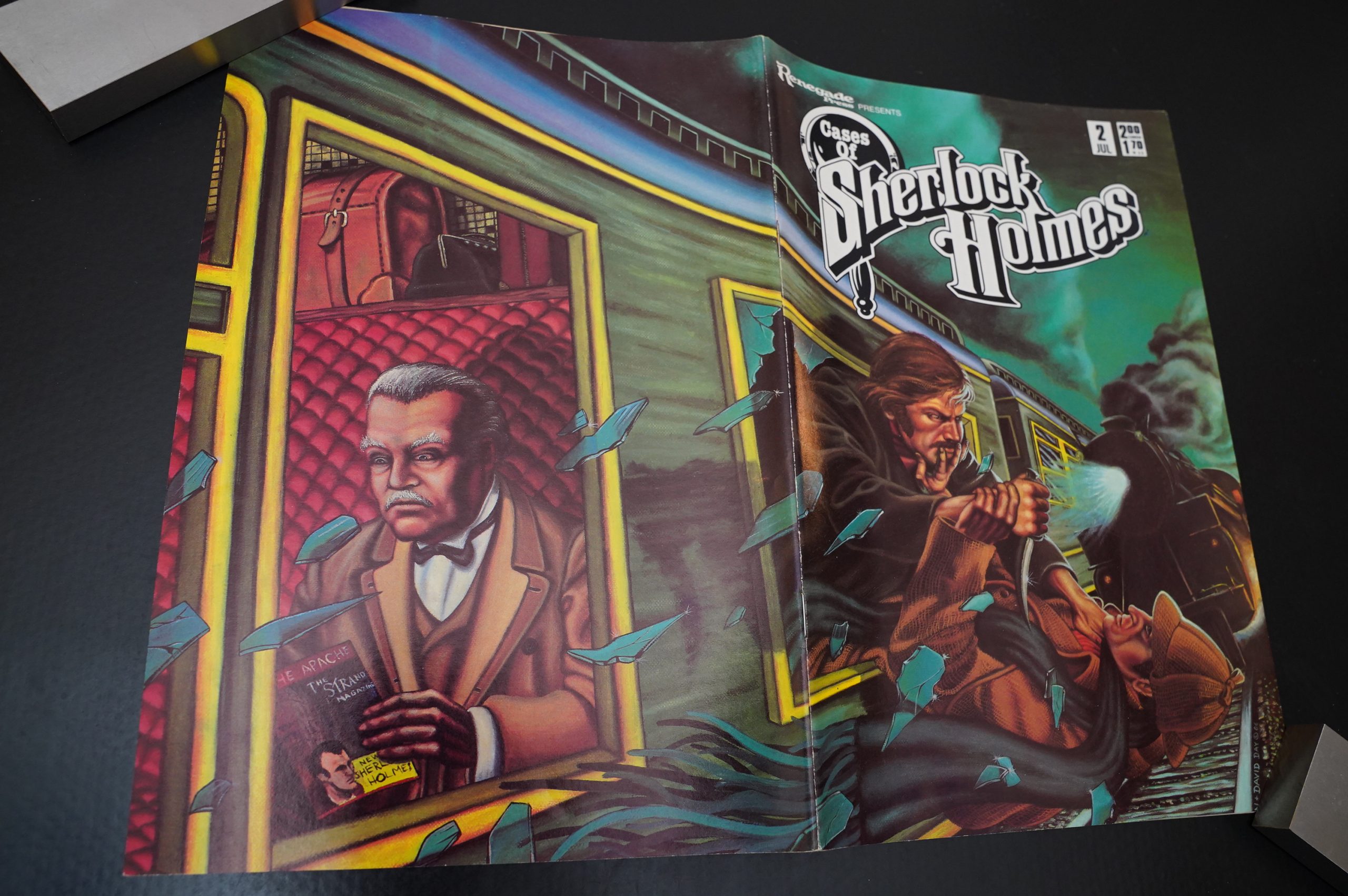
The covers are all painted, and Dan is joined by his brother David Day on most of them. They’re a bit stiff, I guess?
One of the issues is written by Gordon Derry, but it’s the only non-Conan Doyle issue. Day explains later that he wanted to illustrate a story with more action.
The prose is… not up to Conan Doyle’s standards.
Day obviously wants to illustrate the more striking and interesting scenes, and presenting it this way sometimes gives away some of the plot before you get around to reading the text (since the eye will naturally scan the page a bit first). But what happens is usually so mysterious that it doesn’t really act as “spoilers”… after reading the text it becomes clearer what’s happening in the drawings.
For one issue, Day goes in a kinda Berni Wrightsonesque direction…
And! Finally! The all-caps text is gone by issue seven, and reading becomes a whole lot more pleasant.
And this is apparently something that’s been requested by a few readers.
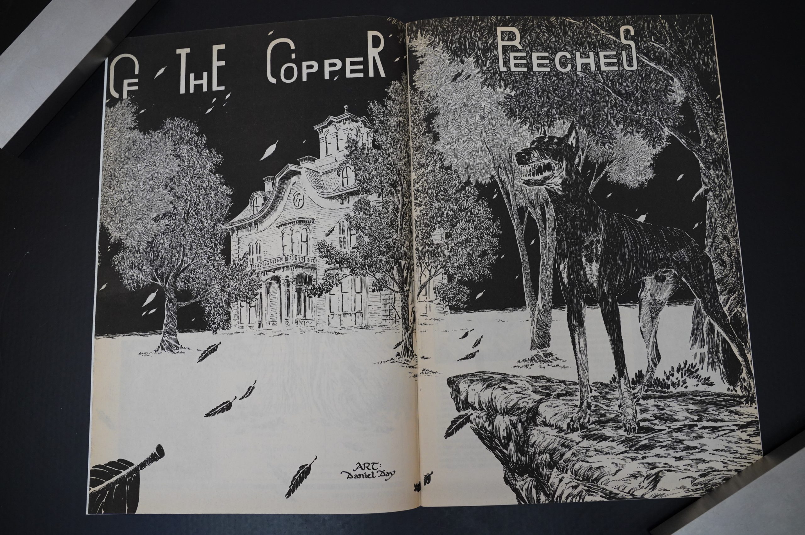
That’s a very nice splash page!
The artwork is really way beyond the call of duty… Day doesn’t seem to skimp on anything.
It’s very nice indeed — the style kinda evokes older styles of illustration without imitating it.
All the stories are over in one issue… except this single two-parter, which allows Day to put even more illustration into it.
Well, that’s a fun style…
Here’s an example where the illustration really does give away the action — you can’t help catching that the woman killed that guy.
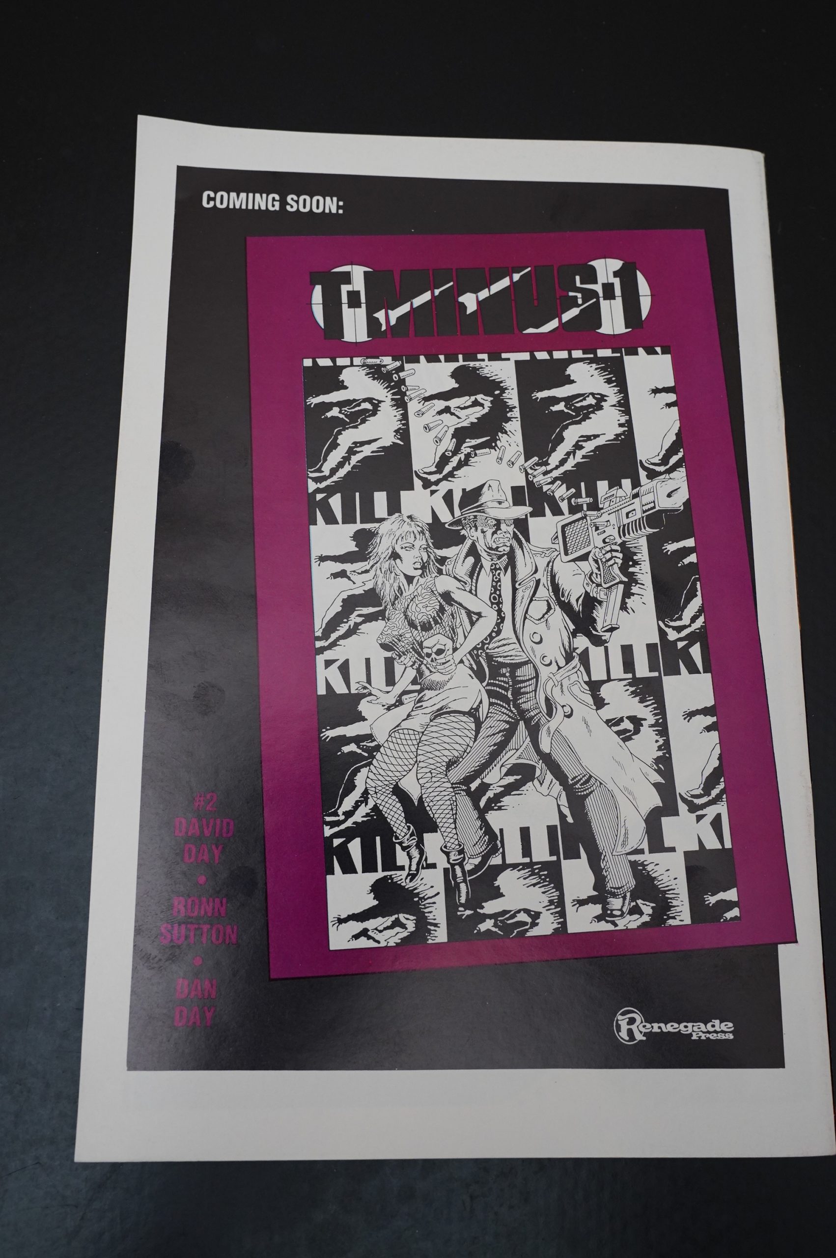
And then… it’s over. Renegade shut down, but there’s no chatter about the state of affairs in the book. The ad here is for the second issue of T-Minus 1 (by David Day and others) that was never published, I think…
The series continued publication over at Northstar, but shut down after five issues. Northstar then went on to publish other Sherlock Holmes books, that are apparently totally unrelated? Perhaps they were just really big Sherlock fans?
Some googling seems to indicate that these comics have never been reprinted? I’m surprised, because Day’s artwork really works, and Sherlock Holmes never goes out of style…
Oh, Northstar published one trade paperback collecting the first four issues… but nothing after that.
I’m unable to find anybody talking about this series at all on the intertubes. No, hang on; it’s just that there’s so much effluvia at the top of the Google rankings.
Uhm:
The artwork unfortunately is not quite consistent throughout the run of the series and occasionally becomes quite simplistic, which I assume was due to the pressure of looming deadlines. When it is good though, it is the most ornately rendered linework to be found anywhere within the medium. How much of it stems from Dan Day or from his brother David is impossible to tell.
I thought it was all Dan Day?
These are a fun, quirky addition to my collection, and could be enjoyed by any Sherlockian who is a fan of comics or illustrated editions of the stories. They’re certainly worth keeping an eye out for at your local used books or comics store, or online.
Day is interviewed in The Comics Journal #111, page 116:
My Sherlock Holmes project is a word-
for-word printing of the Conan Doyle
stories. One short Story per book. There Will
be many illustrations integrated with blocks
of print. It’s not traditional comic art but
more like what some people would call
graphic narrative. I’ve always been intrigued
by the Holmes period and mystique. It will
not be a watered-down version of the stories
like Classics Illustrated unas.
This blog post is part of the Renegades and Aardvarks series.
