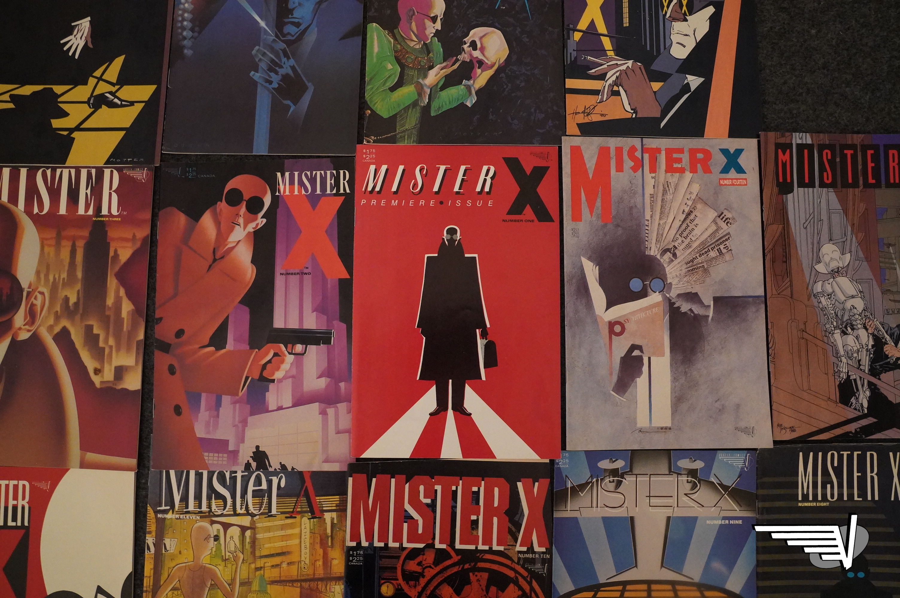
Mister X (1984) #1-14
by Dean Motter, Jaime & Mario & Jaime Hernandez, Seth, and a whole bunch of other people
Mister X is an interesting book: Not really for the contents, which are uneven, but for its publishing history. Well… Its history of… not being published.
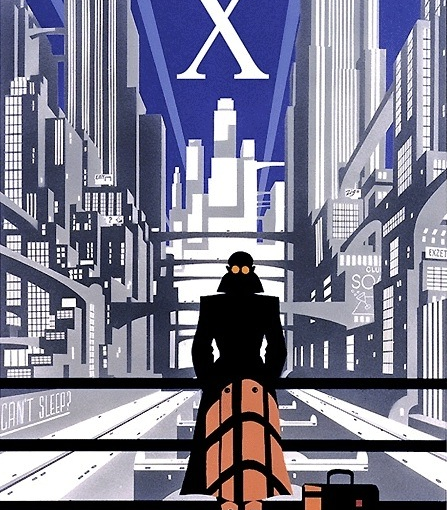
In 1982 (I think it was), Vortex announced that they’re publishing this fantastic new series, and took the unprecedented step of sending four (count em four) posters to comics shops:
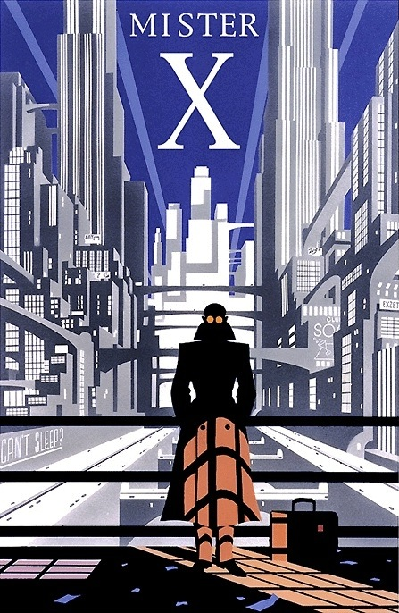
People thought the posters were really cool and mysterious: They’re done by Paul Rivoche, and look all retro-futuristic as shit.
The comic itself was announced in the press… and then announced again… and then the ads for Mister X by Dean Motter and Paul Rivoche started happening (in 1983?), and then…
Reading between the lines (and the er comic à clef in Vortex, where somebody looking suspiciously like Rivoche is described as being more into comics theoretically than practically), it sounds like Rivoche just didn’t, like… want actually do the comic itself.
The posters and the covers were really stylish, but drawing an entire (supposedly) bi-monthly series is a lot of work.
So:
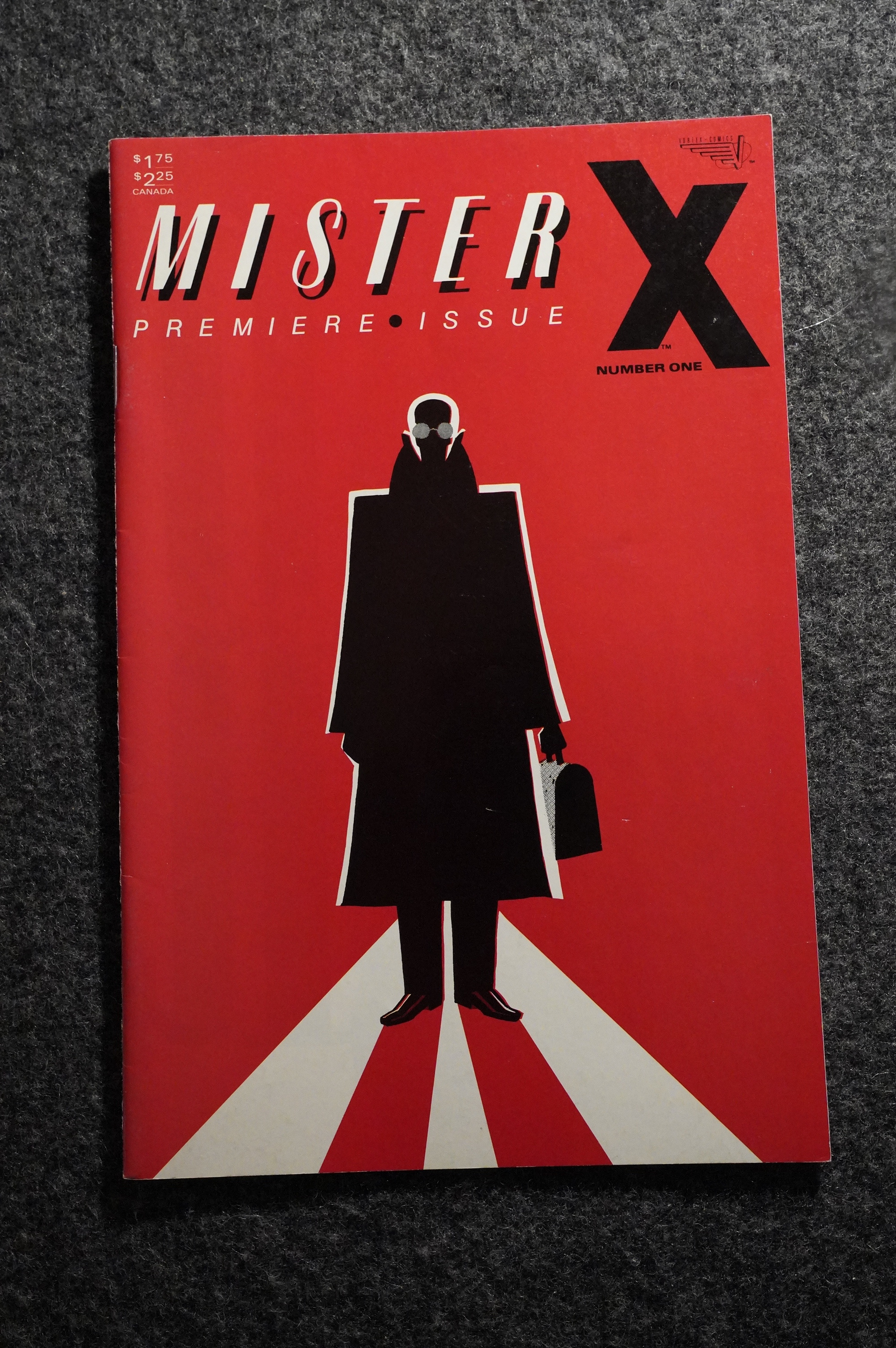
In 1984, the book finally happens, and it’s a super duper stylish cover, and it’s printed with really vibrant colours on shiny, white paper. It’s in a format that I think Vortex may actually have pioneered (or, more probably, Dean Motter, who’s a designer): The “self covered” comic book. (Comics usually have an interior paper stock, and then a cover with a better paper stock.) Mister X uses the same paper on the cover as on the interior, and is therefore just two 16 page “signatures” (I think the term is). This, of course, means that the book is four pages shorter than a 32 page comic normally would be, which is economically… advantageous.
(These days, I think Marvel is only using the “self covered” format?)
So, the book is here, and it looks and feels like nothing else on the stands, but… Rivoche is off the book (except some covers), and instead it’s drawn by Jaime Hernandez, and written by Mario and Gilbert Hernandez (all of Love and Rockets fame).
If there’s one thing they’re not famous for, it’s doing retro-futuristic art decoish comics.
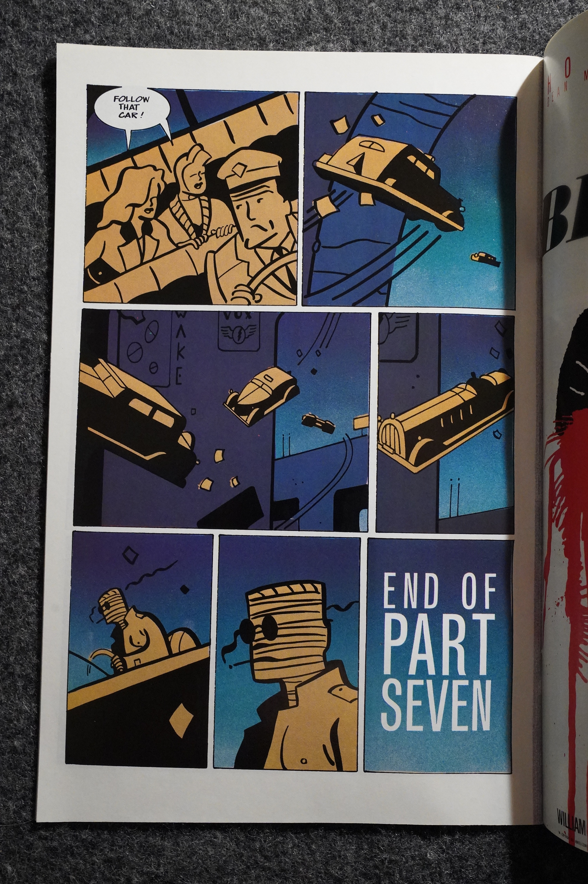
So let’s read the first three pages:
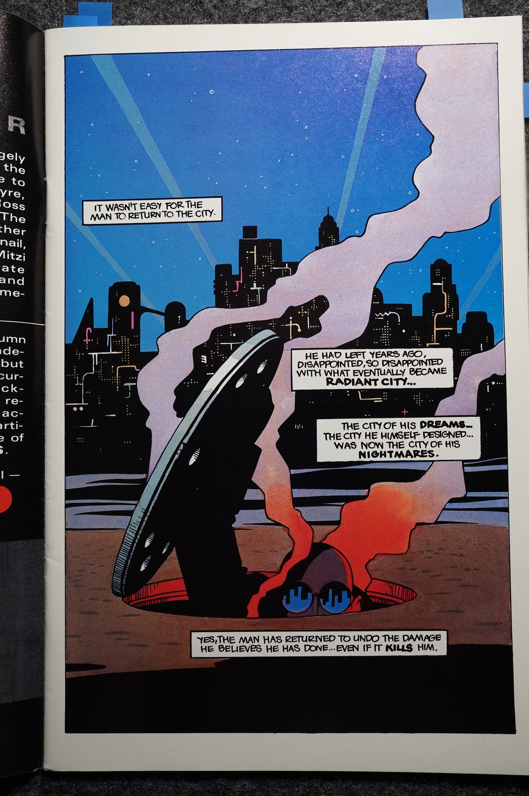
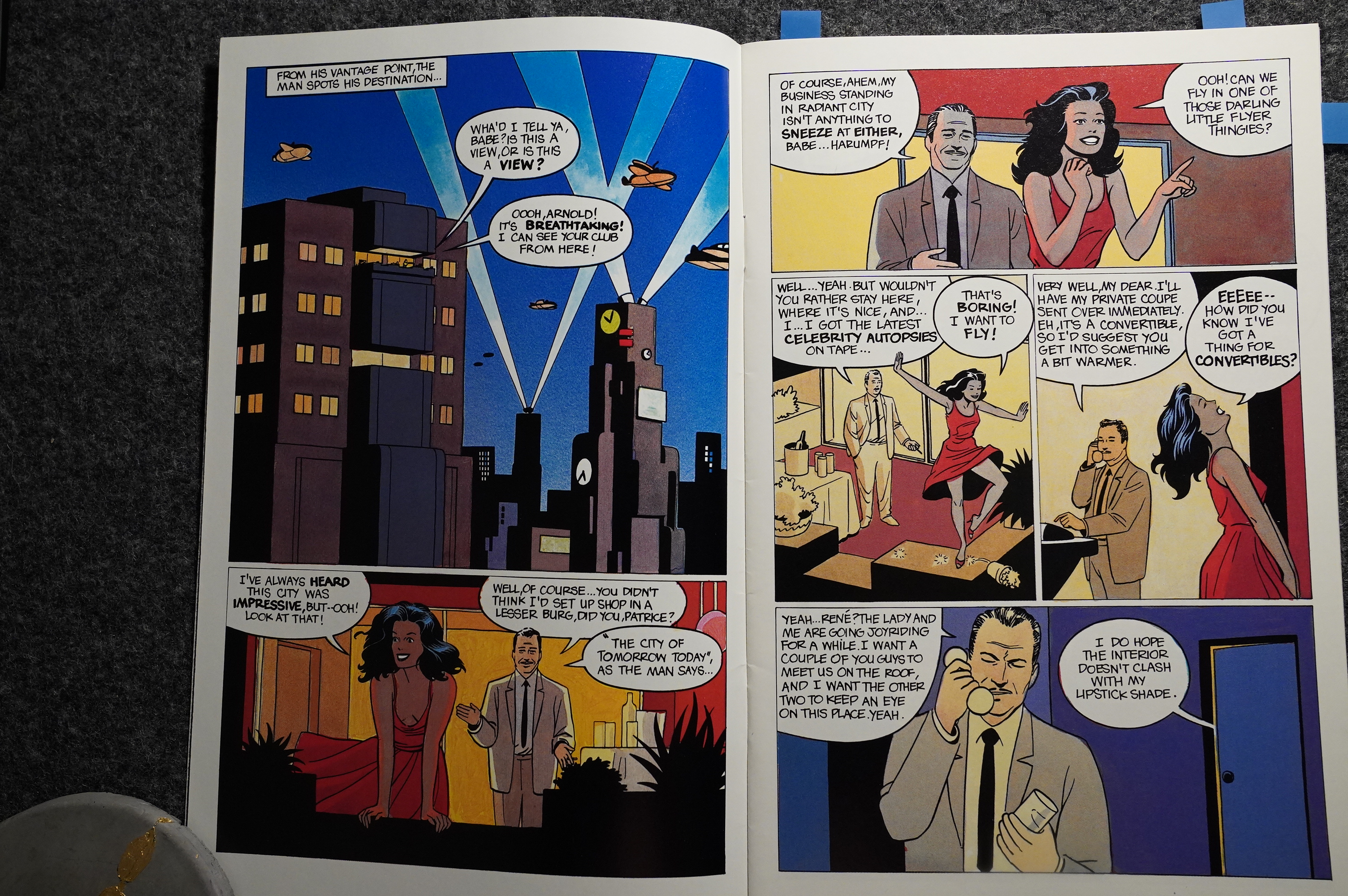
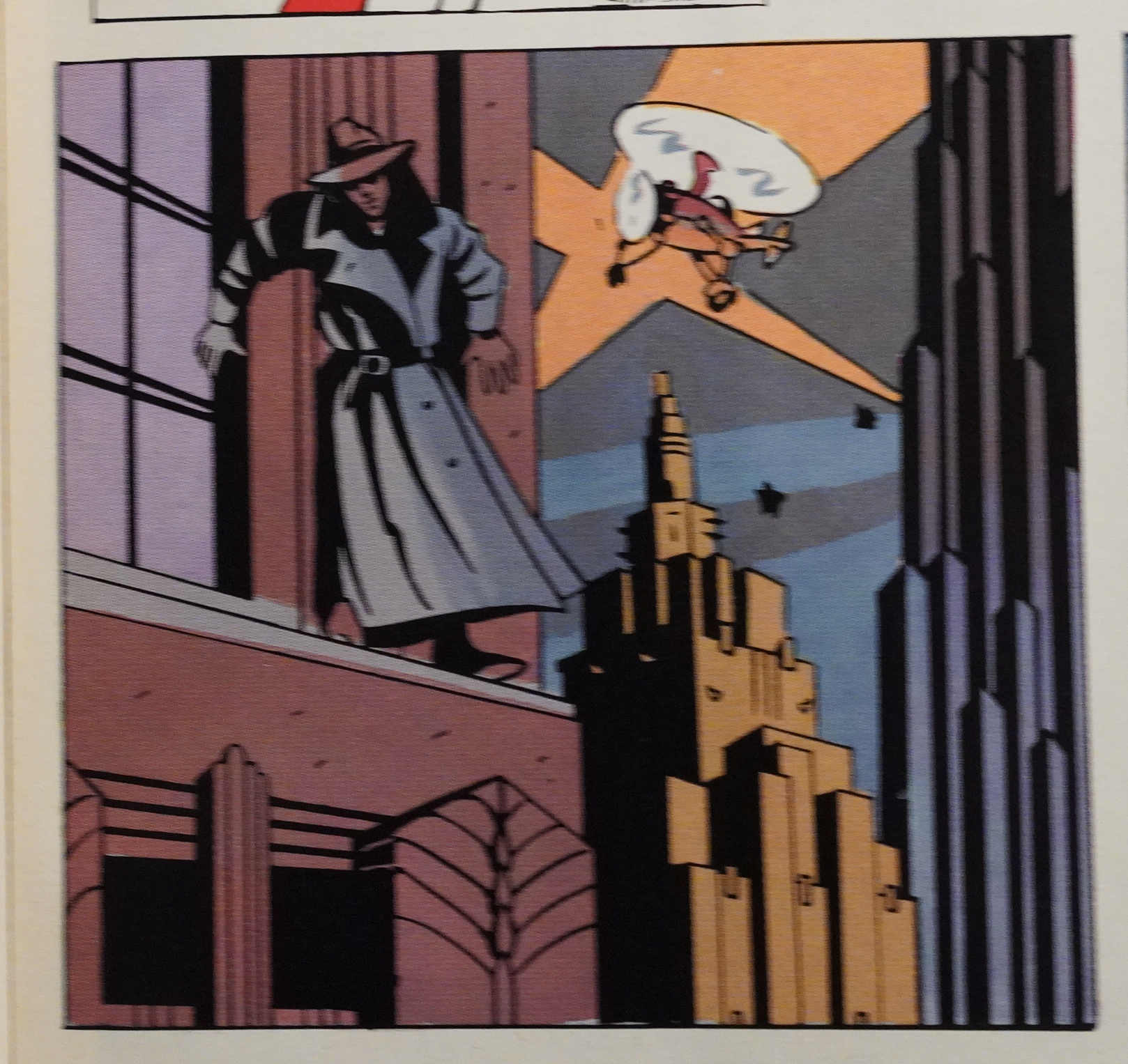
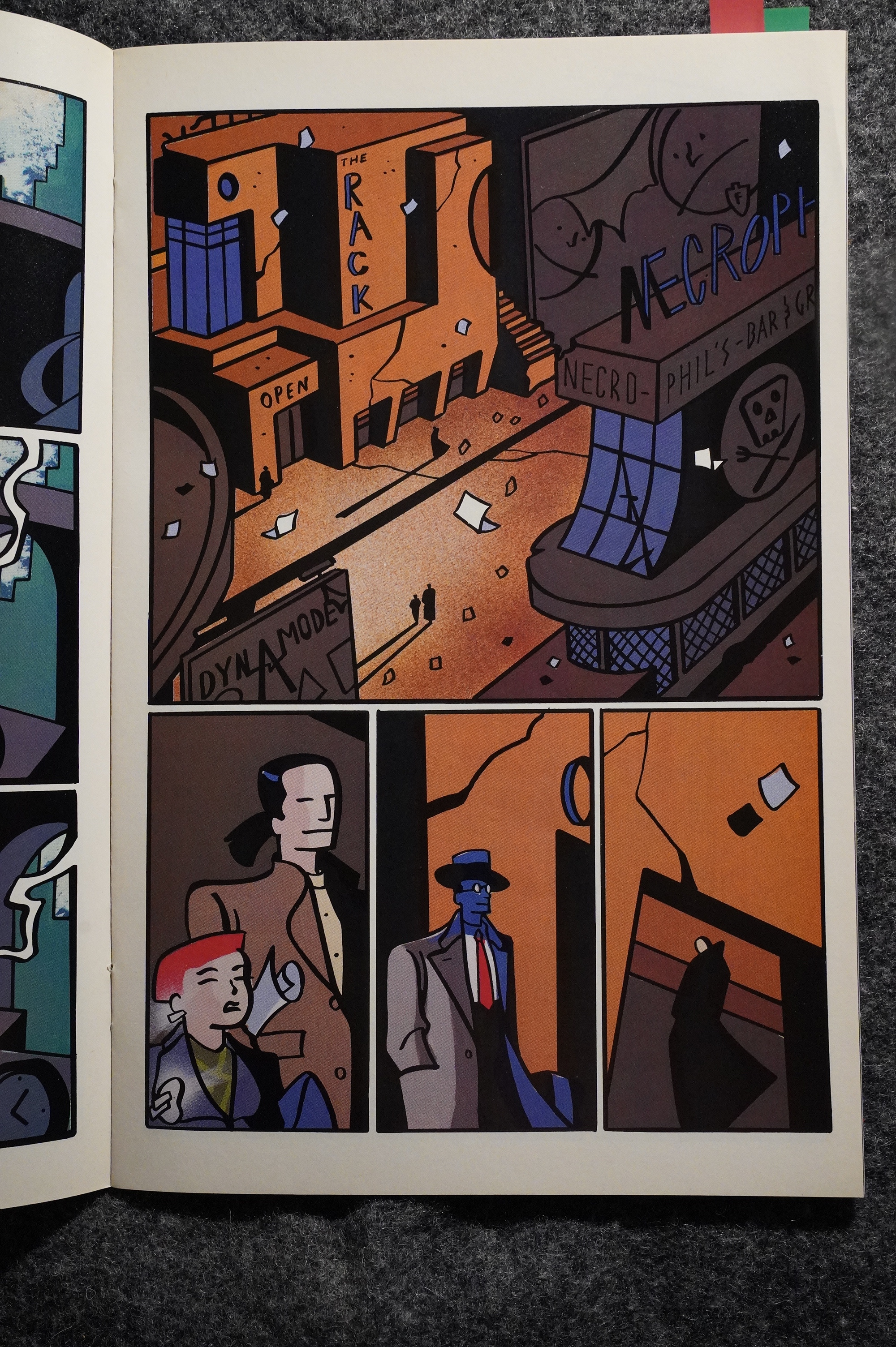
It looks amazeballs! J. Hernandez’ figures are as fun to watch as ever as they gambol across the pages, and the city (of sleeps and of nightmares) looks awesome! Not exactly art deco, but very retro-futuristic in a way that makes sense, but also looks kinda insane.
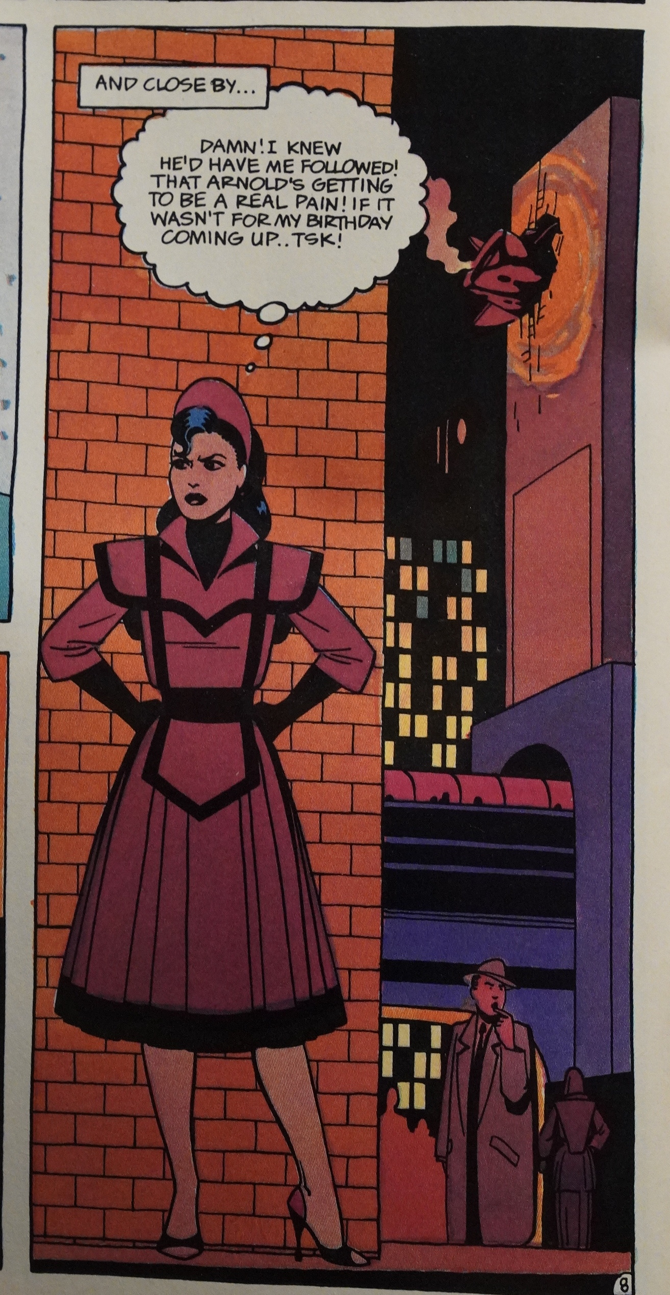
Rivoche does the colouring on the first issue, and it all looks just… right. The heavy, inky spotted black silhouettes really pop, and the plot in the first issue is satisfyingly confusing as it seems to hint at so many things going on. We’re introduced to a large cast of interesting characters (most of them women, of course), and there’s a general feeling of mystery and intrigue.
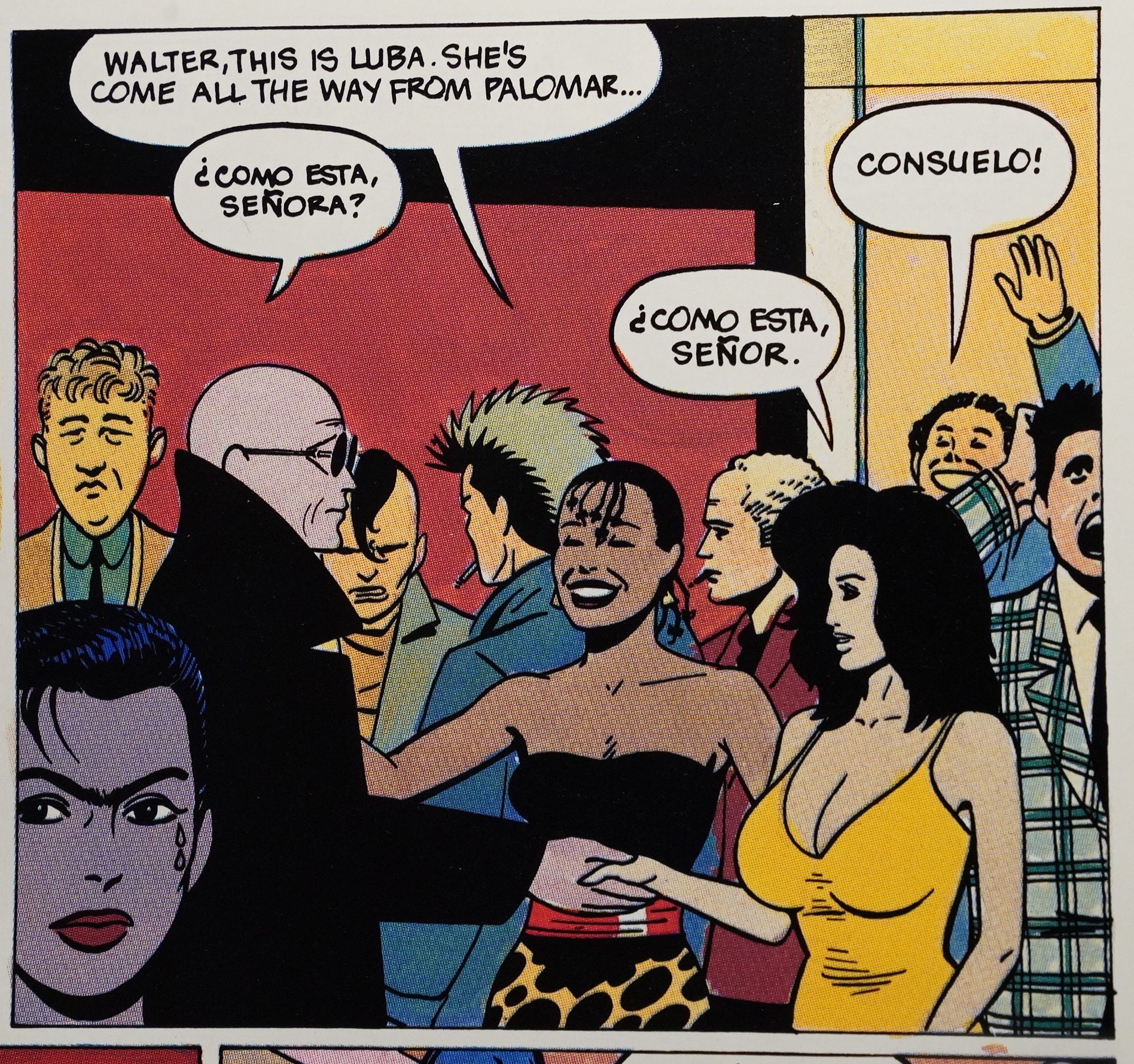
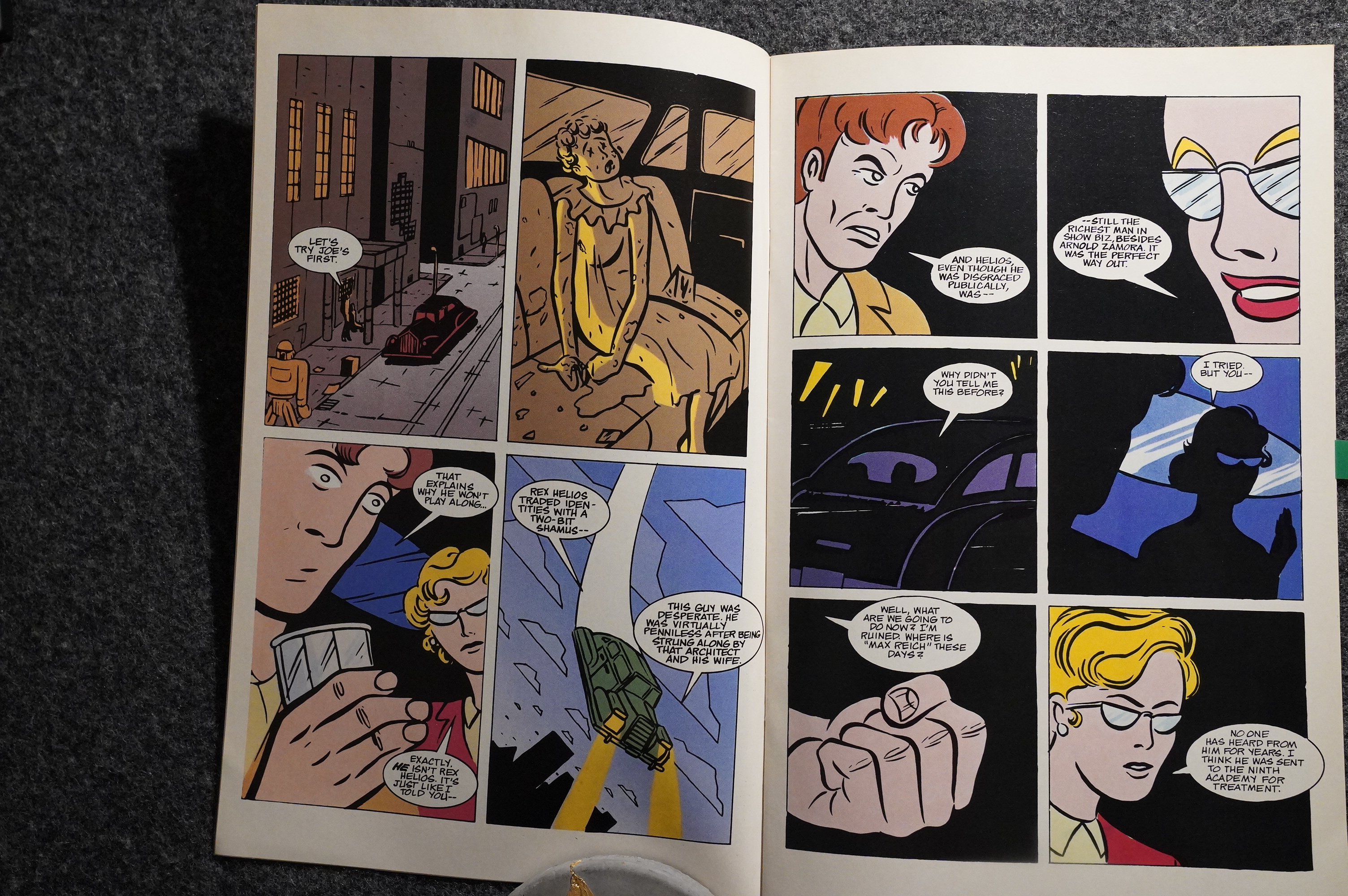
That’s a rare drawing of Luba by Jaime… no, hang on. Those lines on her abdomen look more like Beto?
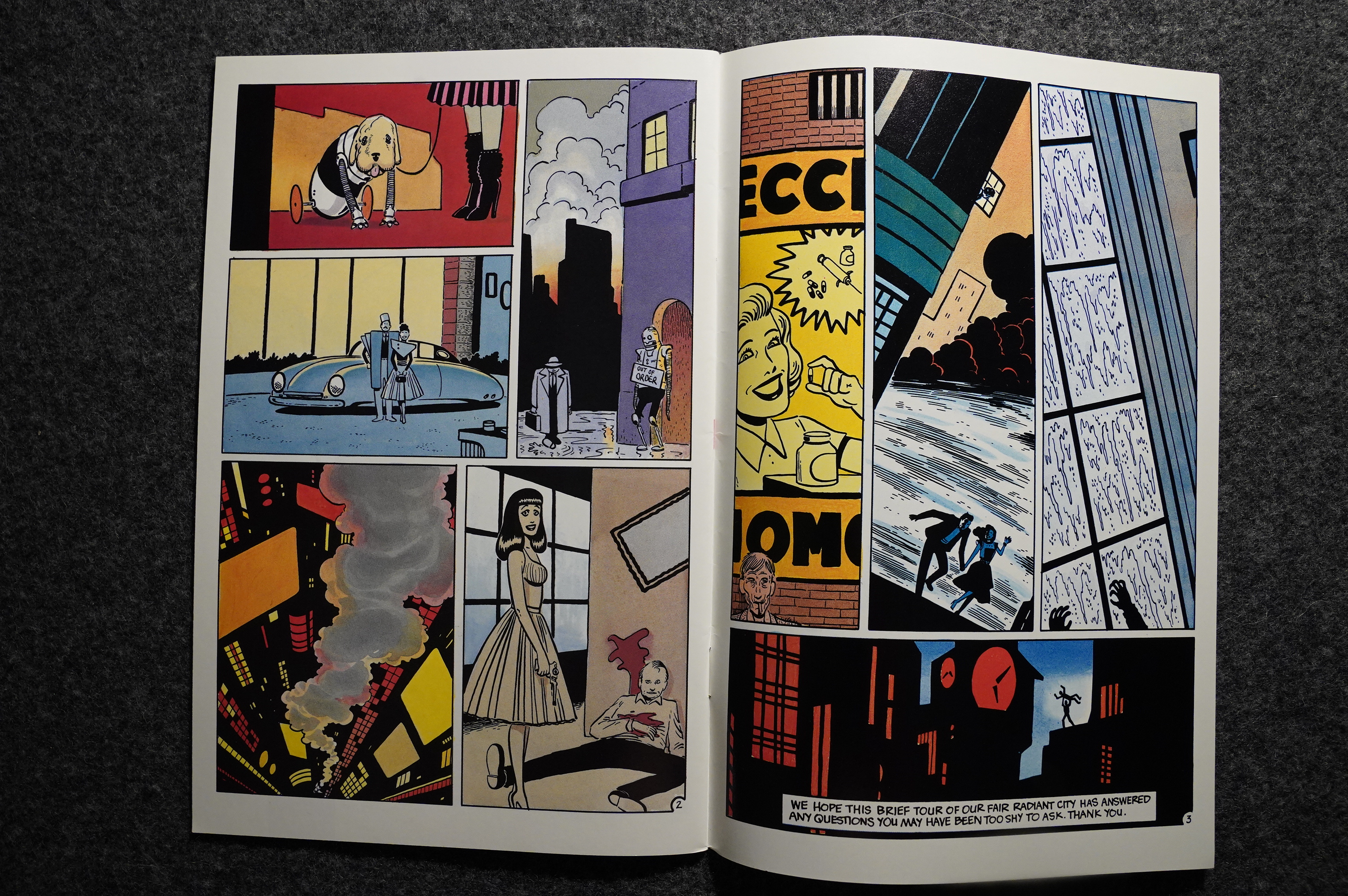
Speaking of which, he does a couple of short, mysterious backups with scenes from Radiant City.
Yes. Perfection.
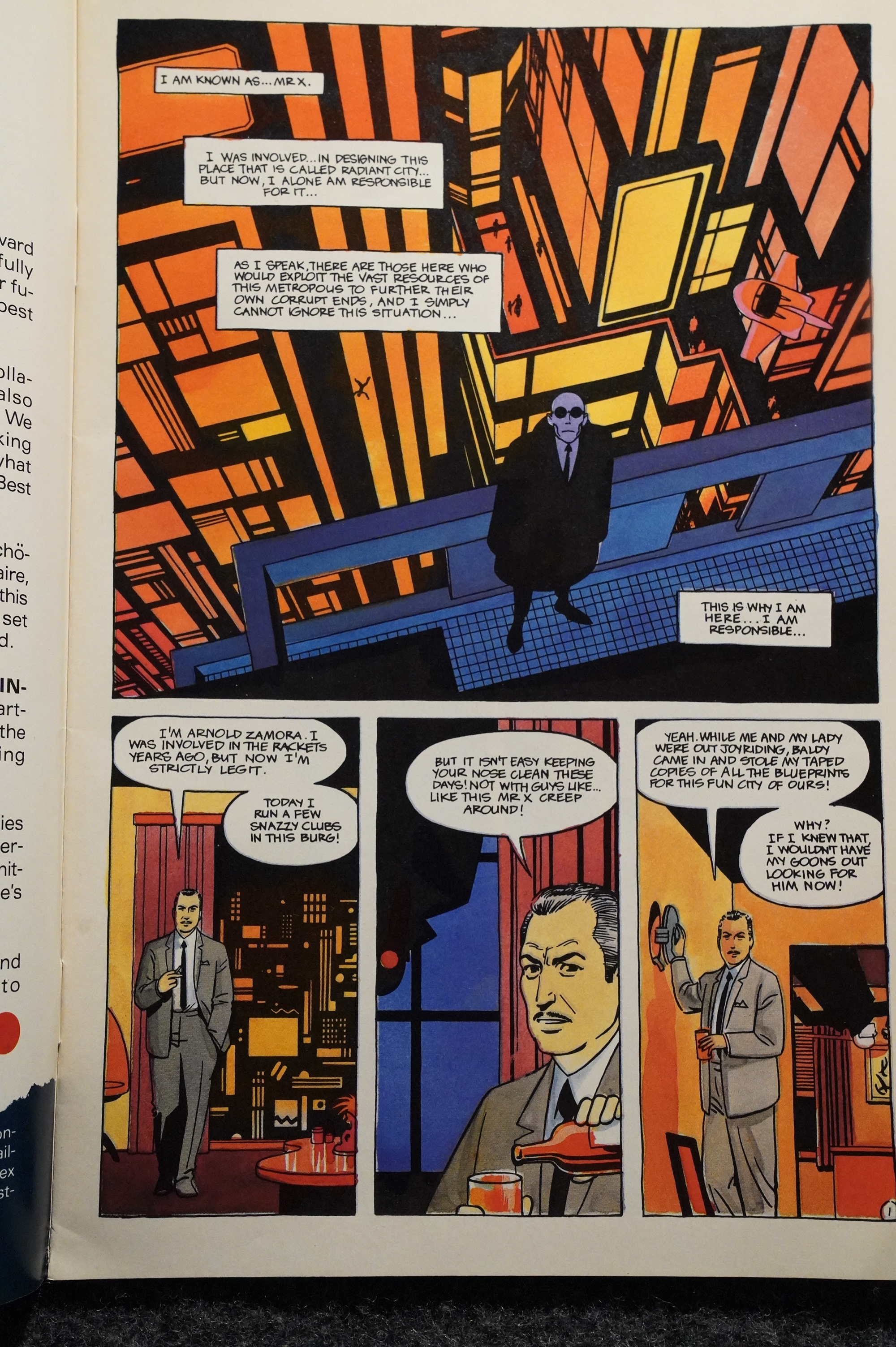
Klaus Schönefeld takes over as the colourist on the second issue and does a swell job, too. Slighly less futuristic than Rivoche, though.
But look at that cityscape in the first panel. Just look at it!
The Hernandezes (is that the correct plural?) have the characters do the recaps in the second issue, which is cute.
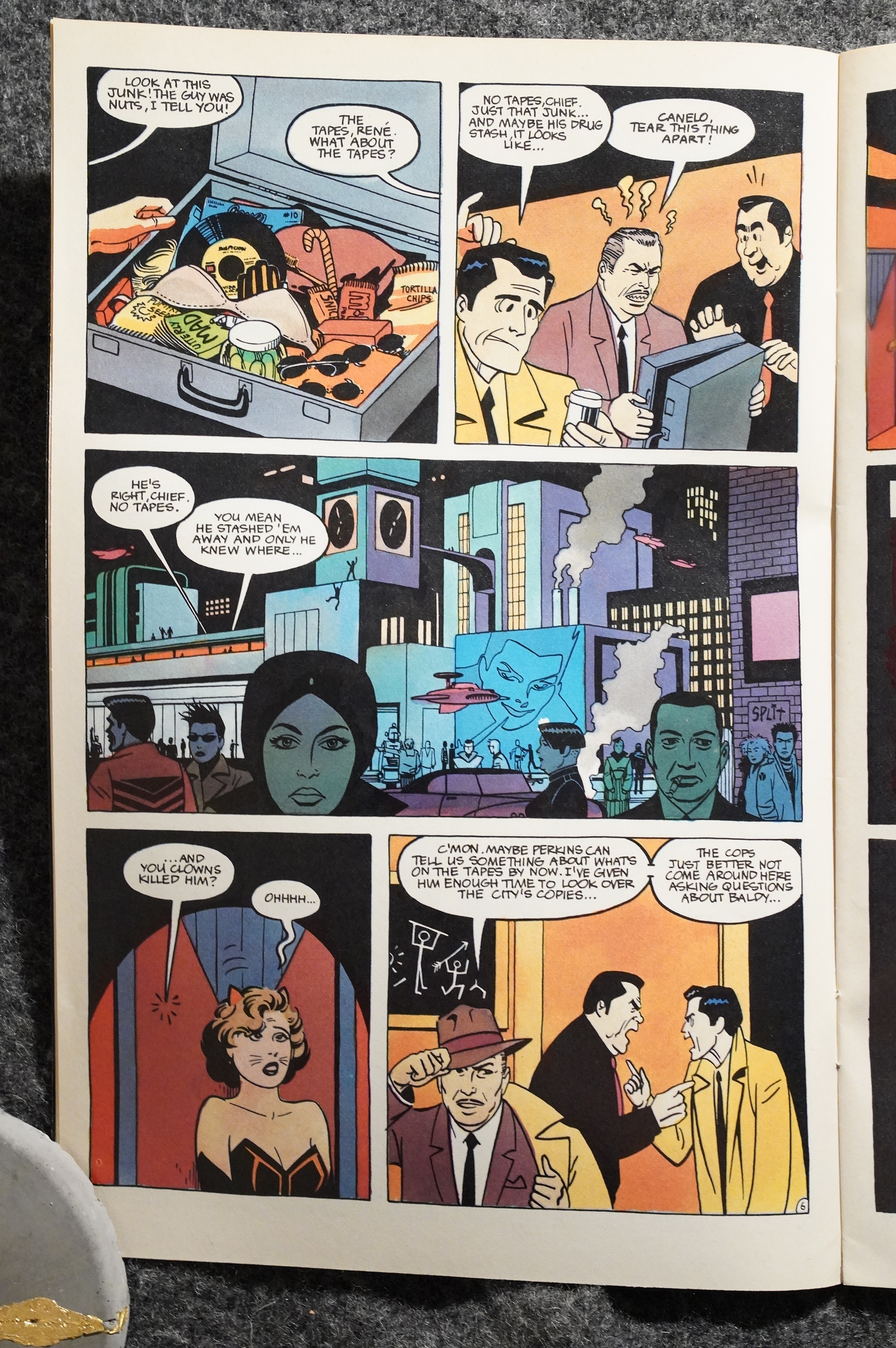
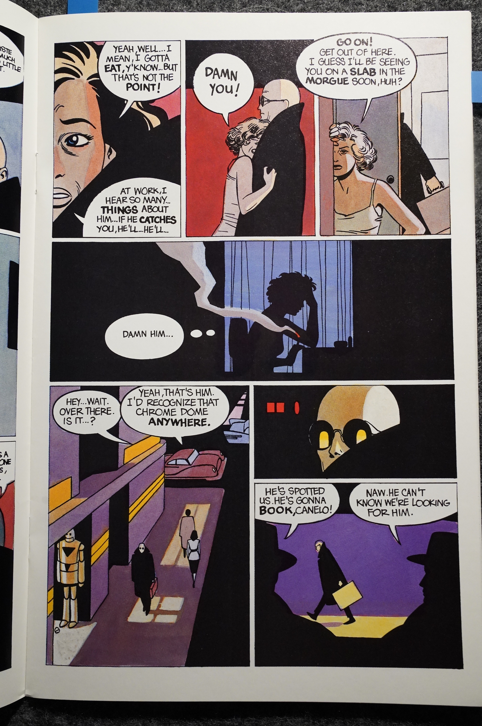
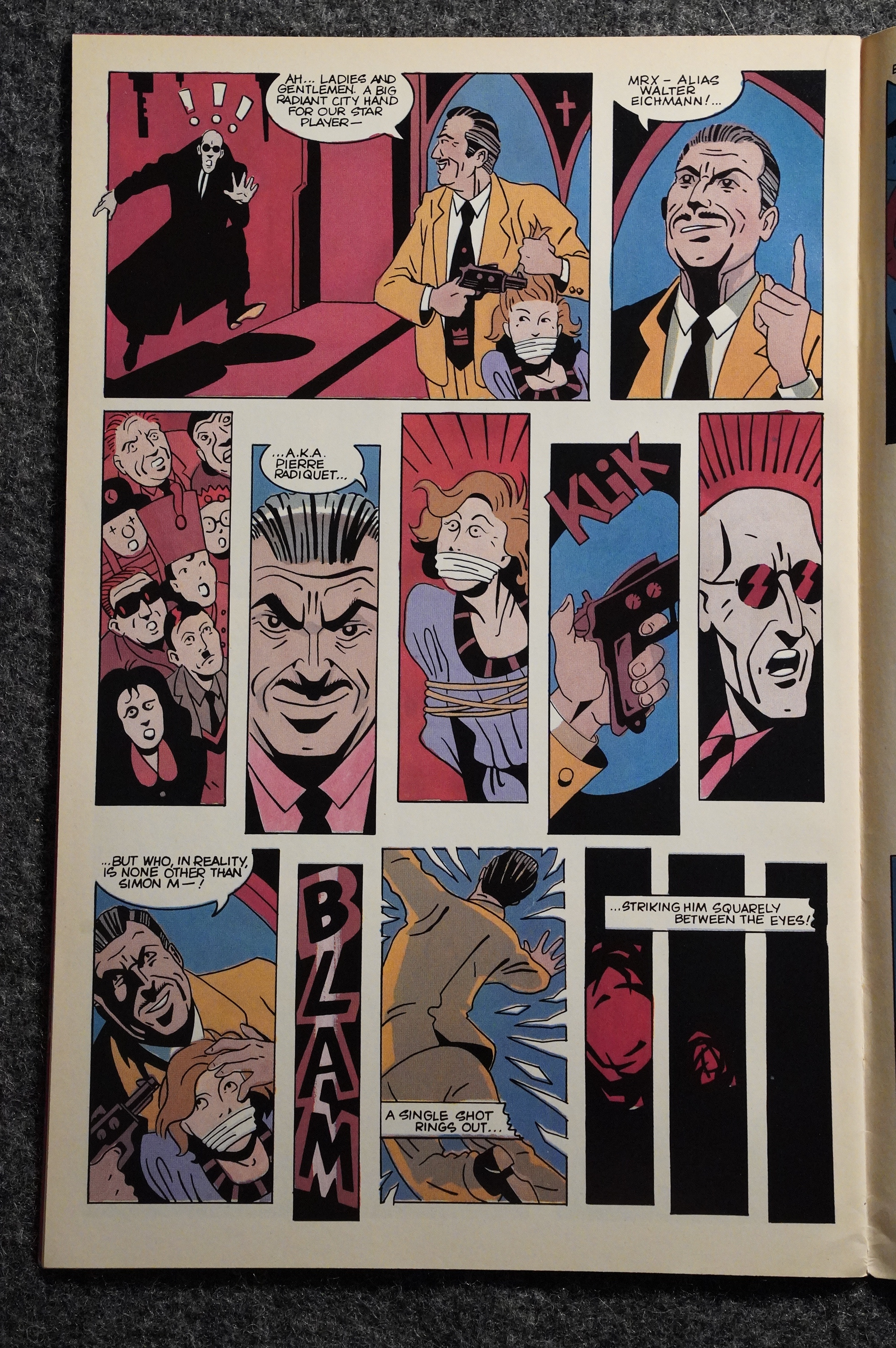
Oh, yeah. The plot. It’s about… a crime lord… stealing a MacGuffin and then Mister X has to get it back, because otherwise… stuff. It’s pretty basic.
Or rather, Mister X steals the MacGuffin from the crime lord… god, it’s an hour since I read this, and I already forgot. That’s how important the plot is.
Instead, what kept my attention were the characters and all these little bits from the city in the background. There’s always something going on in the background, and it always looks great.

I had really expected the crime lord plot to last several issues, but they wrap it up so fast that it’s kinda disappointing.
It’s very neat, but perhaps a bit too neat?
Mario and Beto team up on a couple of back-up stories, and they’re all kinds of fun. Beto draws in a style that’s a bit different from what he did at the time. More… arty.
It seems like the trio had a lot of fun doing these issues.
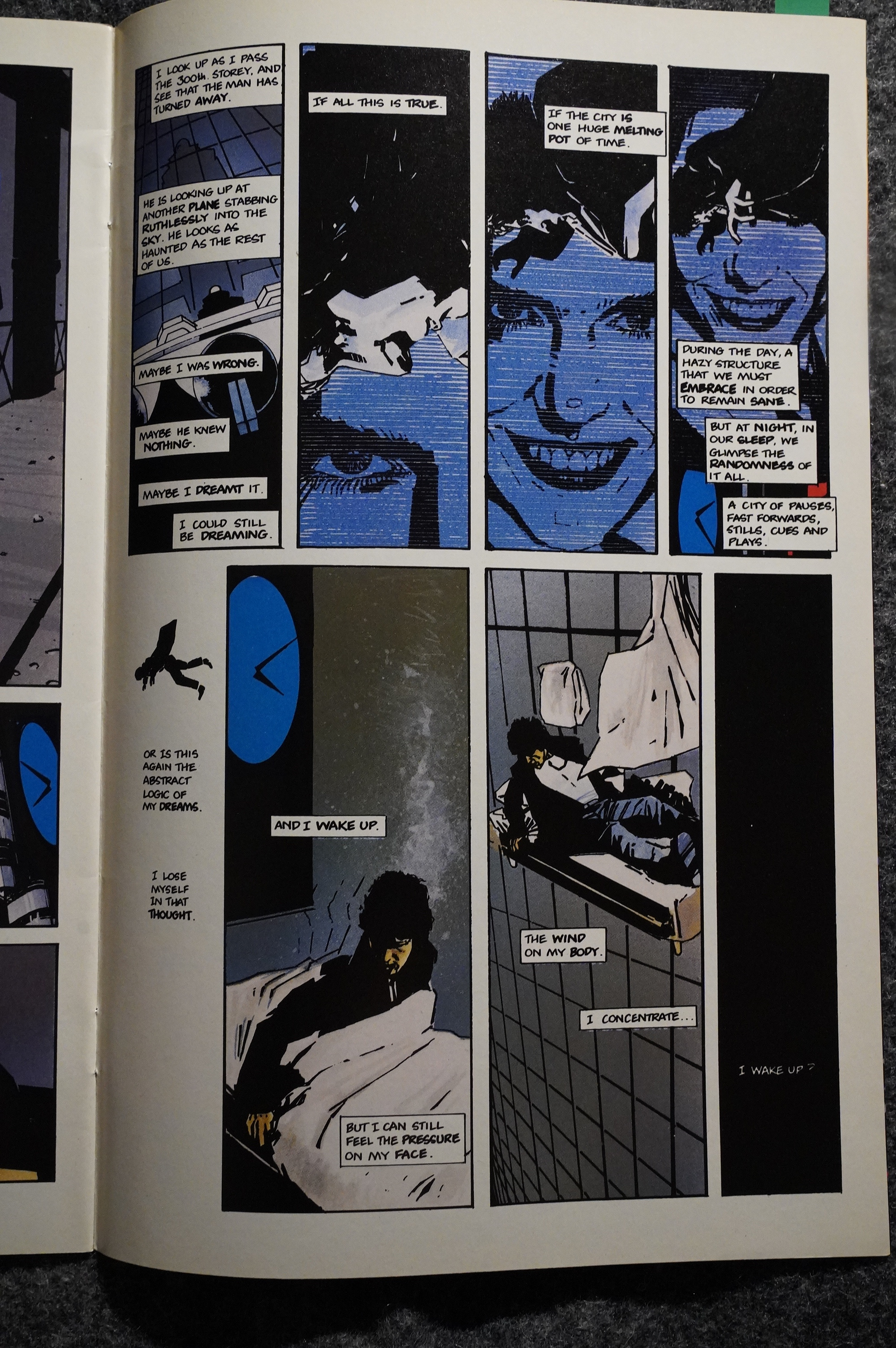
But then the third and fourth issues happen, and I’m all confused. Because I’m not confused any more.
See, the first two issues hinted at a bunch of mysteries and stories and backstories… and the next two issues just tell us everything, straight up. We get the entire Mister X backstory in excruciating detail, and learn how everything connects to everything else. It’s like… they could have spent years on this stuff, but instead it’s just an infodump, and it’s really disappointing.
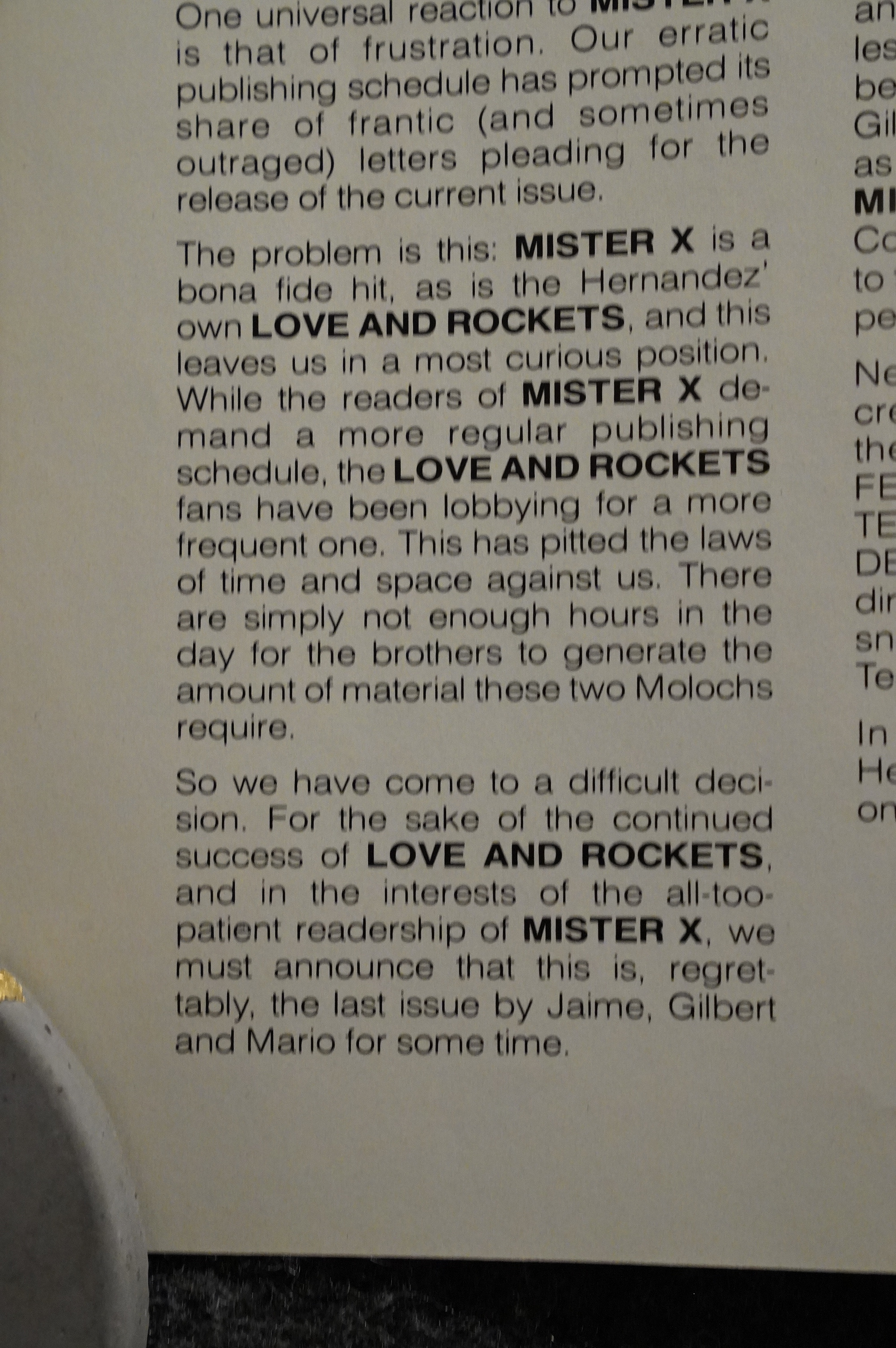
In the fourth issue, Motter tells us that the Hernandez brothers are leaving the series because they’re just too busy. But he hints at two Mister X specials coming from them later.
Them being busy may have been a factor, certainly, but more important was probably that Bill Marks wasn’t paying them for their work.
Thom Heintjes (I think?) writes in The Comics Journal #101, page 19:
Hernandez Brothers leave
Mister X over payment disputeAlthough the editorial in Vortex’s
Mister X #4 said Los Bros.
Hernandez left the book because
they were unable to meet their
professional commitments,
according to the Hernandezes.
they actually left the book
because they were owed over
S8.O00 for writing and drawing
Mister X #2-4.Signing on: Ken Steacy. who was
originally the editor Of Mister X.
convinced•-Jaime, Gilbert. and
Mario Hernandez to take over the
art and script chores.on the book.
Los Bros.. as the three are
commonly known. first came into
prominence through Love and
Rockets published by
Fantagraphics Books. “Ken Steacy
called us up. and liked our stuff.”
Jaime Hernandez said. He added
that Vortex had been running into
snags with the book. and had
been publicizing it without a
finished product to print. Los
Bros. took up the offer simply
“to pay the bills,” Gilbert
Hernandez said. with the contract
stating that they uould get S165
per page. to be split among the
three brothers.Los Bros. eventually did sign a
contract that committed them to
Mister X for six issues. although
they signed with the knowledge
that they wouldn’t be paid upon
completion of the first two issues.• •He told us he had cash now
problems. so he couldn’t afford uto
pay us for the first two issues.”
Gilbert Hernandez said. “We told
him it was all right.” It was after
the first two issues. though. that
the trouble started.
Los Bros. said that although
they were doing the work. “the
book was coming out faster than
the checks were coming in.”
according to Gilbert Hernandez.
After four issues Of Mister X. LOS
Bros had been paid 9,445, while
they were still owed S8,255.Puzzlement: Both Jaime and
Gilbert said they realize that
Vortex Publisher Bill Marks and
VOrtex have cash flow problems.
but they also say they are
perplexed by Marks’s inability to
pay them. even over a period Of
time. ‘ •l don’t know Why he can’t
pay us—he’s got a graphics studio
he boasts about,” Jaime
Hernandez said. Marks said that”
while the graphics studio does
make money for him. it only
subsidizes Vortex Publications to
a small extent.Jaime Hernandez told a story of
when he and Marks attended the
Lucca Comics Festival in Italy
last Fall. “During the whole trip.
he was always talking about
money. almost bragging about
how much money he could make
and save,” he said. “Then he
goes out shopping for luggage and
other things. showing it off right
in front of me.”Marks explained that he could
afford to go to Italyu while he
couldn’t afford to pay three of his
creators by saying that his flight
cost to and from Italy was paid
for by the Canadian government.
under an export market
development program. He said
the government would haye paid
for one-third the cost of a hotel
room. but he chose to stay With
Jaime Hernandez. “It’s easier for
free than for two-thirds the cost.”
he said. “But my meals were
paid for by my personal money—
and my personal finances and the
finances Of Vortex are separate.”Gilbert Hernandez told of an
incident that happened When
Marks was visiting Los Bros. in
California. “We were talking
about the money he owed us. and
he reached inside his pocket,” he
said. “He tossed a quarter at me
and said, “Here, here’s your
money.’ ” Marks said that while
he couldn’t recall that particular
incident. he said it could have
happened. “But you have to look
at it in -context.” he said. “If I’d
just sucked down a Couple Of
cases of Stroh’s. I might have just
done it as a joke—I didn’t mean
to hurt Gilbert’s feelings.'”Short on capital: Marks said
there were several reasons for the
delay in paying creators. Marks
said he lost more than $6,000 to
Seu Gate Distribution and
Longhorn Book Distributors, two
distributors that recently went
bankrupt. Also, he said he lost
money to Pacific Comic Distribu-
tors. which went bankrupt last
September. “It caused a basic
cash-now problem,” he said.Beyond this. though. Marks
said that sales on Mister X are
not strong enough to turn a
sufficient profit to pay the
Hernandezes. According to Marks
and the Hernandezes, sales Of
Misrer X hover around the 22000
mark. “Mister X hasn’t put any
money in my pocket, but it•s put
a lot in the Bros.’ pockets.”
Marks said. He added that
although the graphics firm he co-
owns. Modern Image works
Design. Ltd.. turns a consistent
profit. it doesn’t subsidize the
comics arm to the extent that he
could pay the creators. preferring
a cleaner corporate division.
“Eventually the comics will be
making money, and then I’ll be
able to pay people right away.”
Marks said. • ‘I’m just not always
in a position to do that right
Marks added that he realizes
his failure to pay the Hernandezes
is causing them trouble. adding
that he’s not holding the money
back for himself. I’ve seen how
they live—five Of them living
With their mother in a slum in
California.” he said. I’m
living in a tenement in Toronto.
and I have roaches.. . at least they
don’t have roaches.”Jaime Hernandez said that
when Marks was visiting them in
California. he stayed at their
home. “He invited himself to stay
at our house.” he said. “He
wouldn’t Stay in a hotel.
“He can say what he wants
about us—we just want to get
paid.” he added.Holding out: Since LOS felt
that Marks was taking overly long
to pay them for their work. they
resorted to a new strategy with
issue #s 3, and 4, in an effort to
get money sent more quickly:
they began withholding art until
money was sent to pay for
previous work. There was limited
success with this tactic, they said.
Marks sent S2000 when the art
for Mister X #3 was withheld.
and more when Los Bros
held back the art for issue #4.
“The contract never said When he
would pay us—but it never said
When we would send in the art.
either,” Gilbert Hernandez said.
The contract that LOS Bros.
signed does not stipulate any sort
of payment schedule, and they
said they regret having signed the
contract so quickly. “When we
signed it, that was when we were
trusting everyone,” Jaime
Hernandez said. “In fact. when
Bill was giving us the contract to
sign. he said. •Spend $50 to have
a lawyer look it over:
“But we didn’t do it, and we’re
not getting our money: • he added.In fairness to Marks. Los Bros.
said that he has been sending
money from time to time. such as
a check for $1.000 that came on
May 26. “He does pay us. it just
takes so Iohg. and he owes us so
much.” Jaime Hernandez said.
“That’s the main reason we left
the book. It just got to be too
much.”Why four issues?: Los Bros. said
that they stayed on the book as
long as they did because they had
created most the characters save
the title one and two supporting
characters. and felt strongly about
them. “We wanted to finish the
six issues that our contract said
we would, but we had to draw
the line.” Gilbert Hernandez said.
The editorial in issue #4 said
Los Bros. would return at an
unspecified time to do the two
remaining issues that their
contract specified. “Sure. we’ll do
them if we’re paid up front for
them,” Gilbert Hernandez said.
“Which means ‘no,’ ‘Earlier pmblems:originally, Paul
Rivoche was commissioned to
color Mister X. He colored the
first issue, and a portion of the
second one. “The reason I left
the book is because I wasn•t
paid,” Rivoche said. He didn’t
specify the amount of money
involved. “but it was substantial
enough to warrant my leaving.”
he said.Rivoche said he considered
suing Marks. but declined to do
so. knew I’d end up wasting a
few years. and probably not even
get all the money back.” he said.
Finally, after a few months. he
and Marks settled privately.
leaving Rivoche content, but
determined not to work for Vortex
in the future. “I’ve just chalked it
up to experience,” he said. “I’m
uninvolved. and that’s where it
stands.”
Yeah… the Hernandez brother were just too darn busy.
Does that Bill Marks guy start to sound like a douchecanoe to you too? “I’ve seen how they live—five of them living with their mother in a slum in California” That’s really charming, dude.
But all this makes me wonder whether this situation also explains the really odd storytelling in their last two issues: They basically tie up all the loose ends, so that any continuation would be pretty… difficult? Where do you go from here? I mean, they didn’t burn down the universe: There’s at least half a dozen interesting characters that have been established, and the city is fascinating, so there’s all kinds of things you can do, but the basic mystery of the setting has been scotched.

So in the fifth issue, for some reason Lou Stathis does this… charming introduction of the new people on the series (it’s now written by Dean Motter himself, with artwork by Ty Templeton and Klaus Schönefeld).
Hm… Oh yeah. Rock Hudson had just died of AIDS.
Charming, I’m sure.
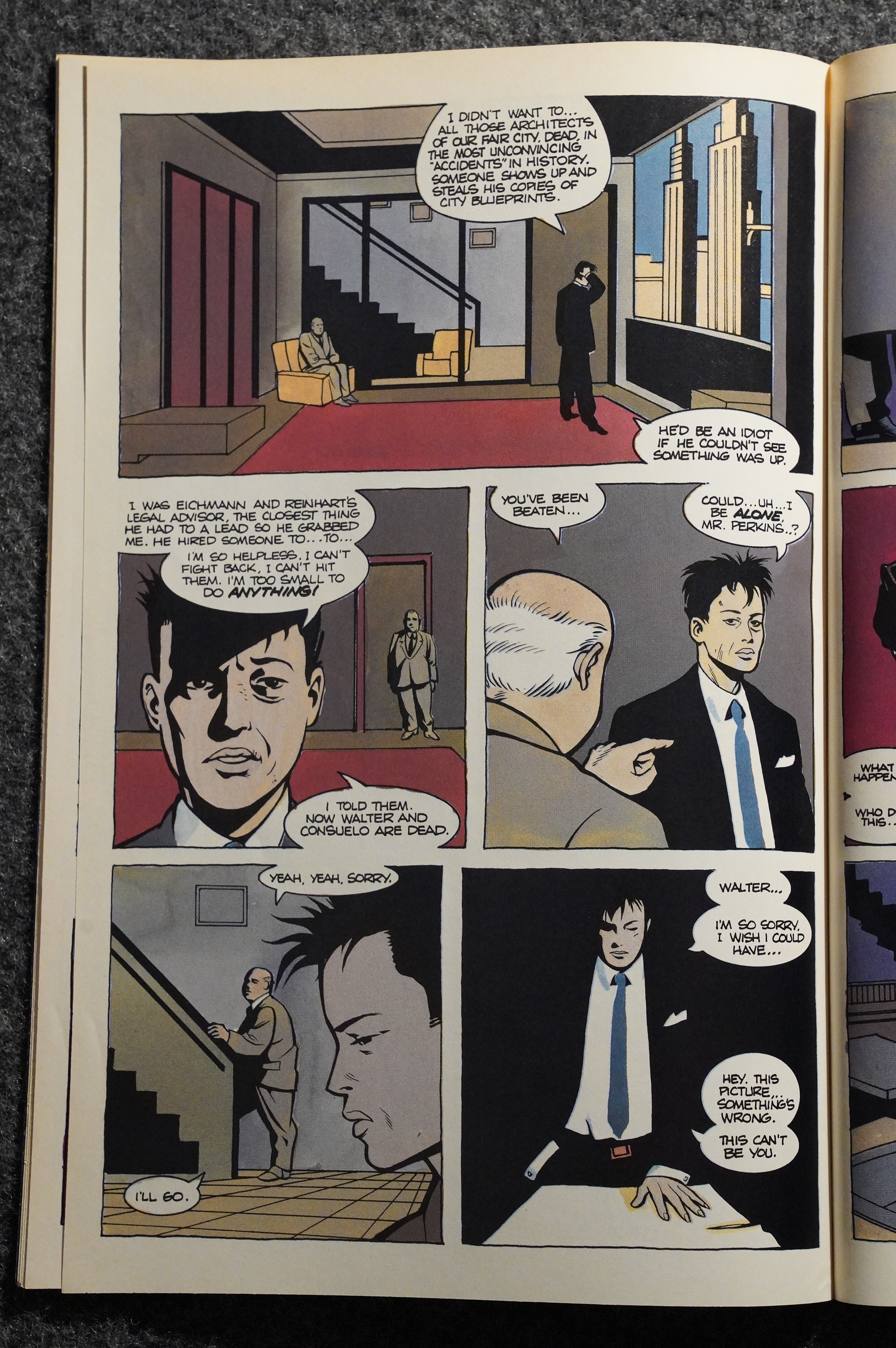
It’s a confusing issue. Somehow Mister X is back in hospital, and then… Motter tries to unwind everything that happened in the previous two issues, by explaining that the backstory we got was er like wrong fer shure, dude.
Crossover! Kelvin Mace was Schönefeld’s main book at the time.
Yeah, you can see that the artwork is going off into territories that aren’t well suited for Motter’s mysterious, paranoid setting.
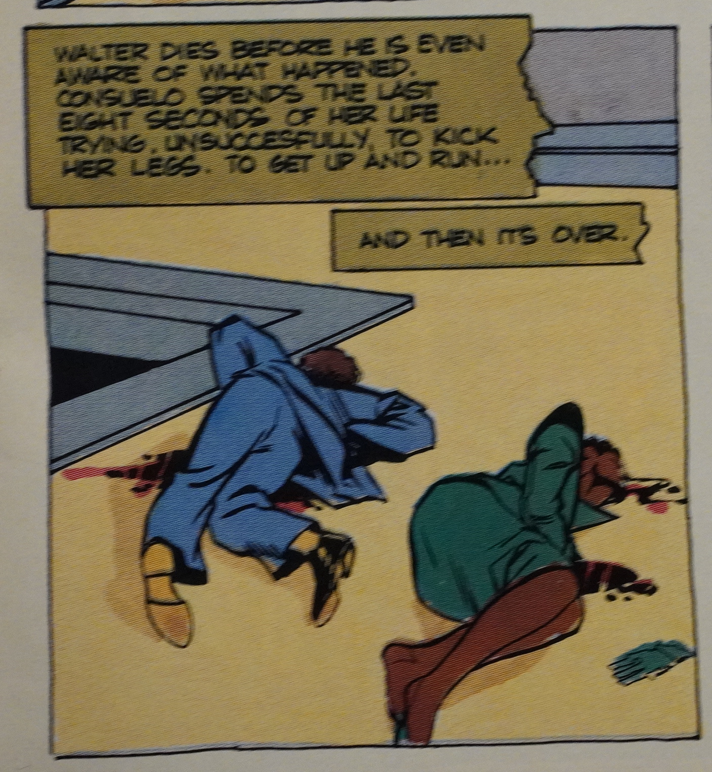
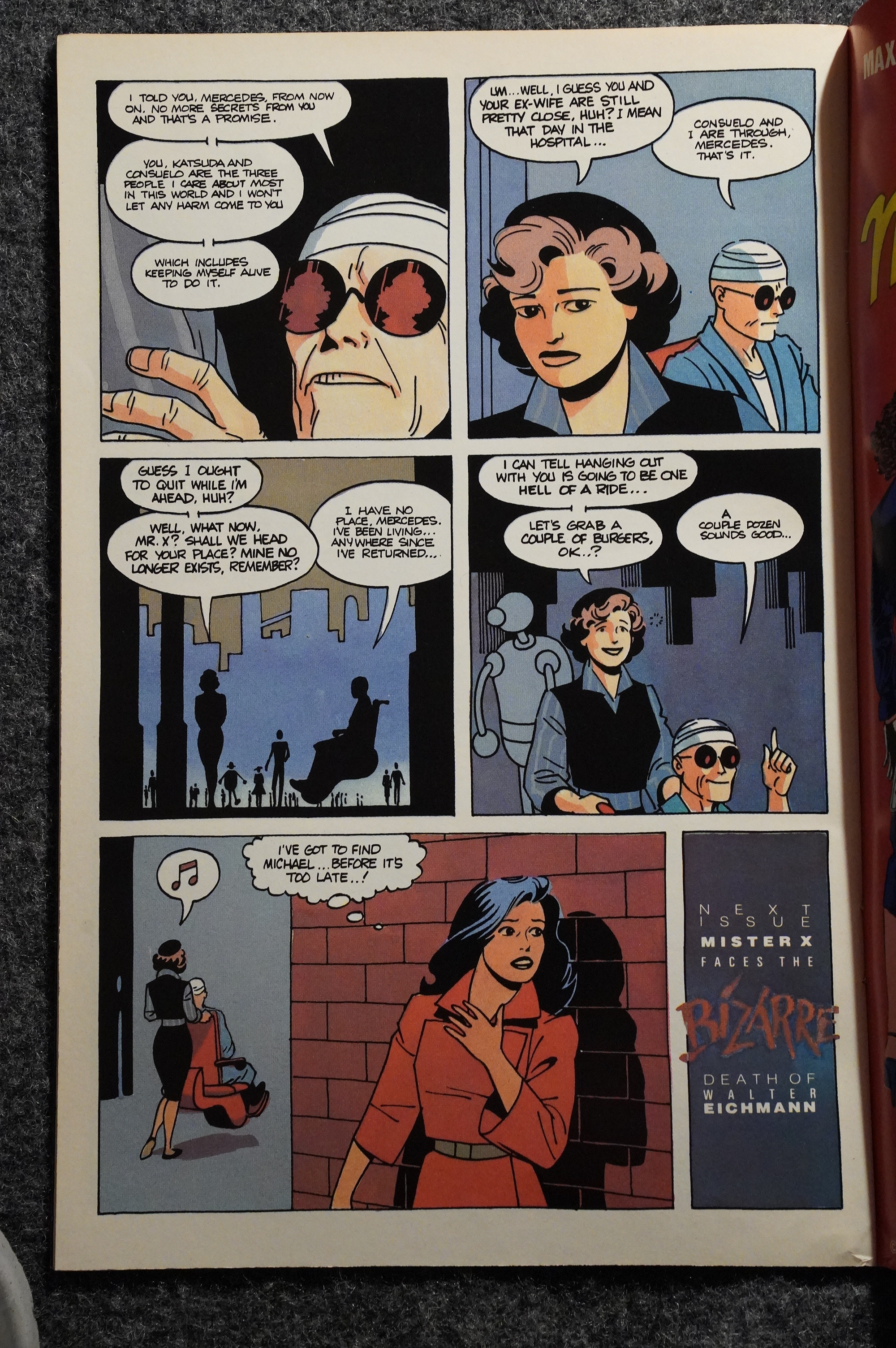
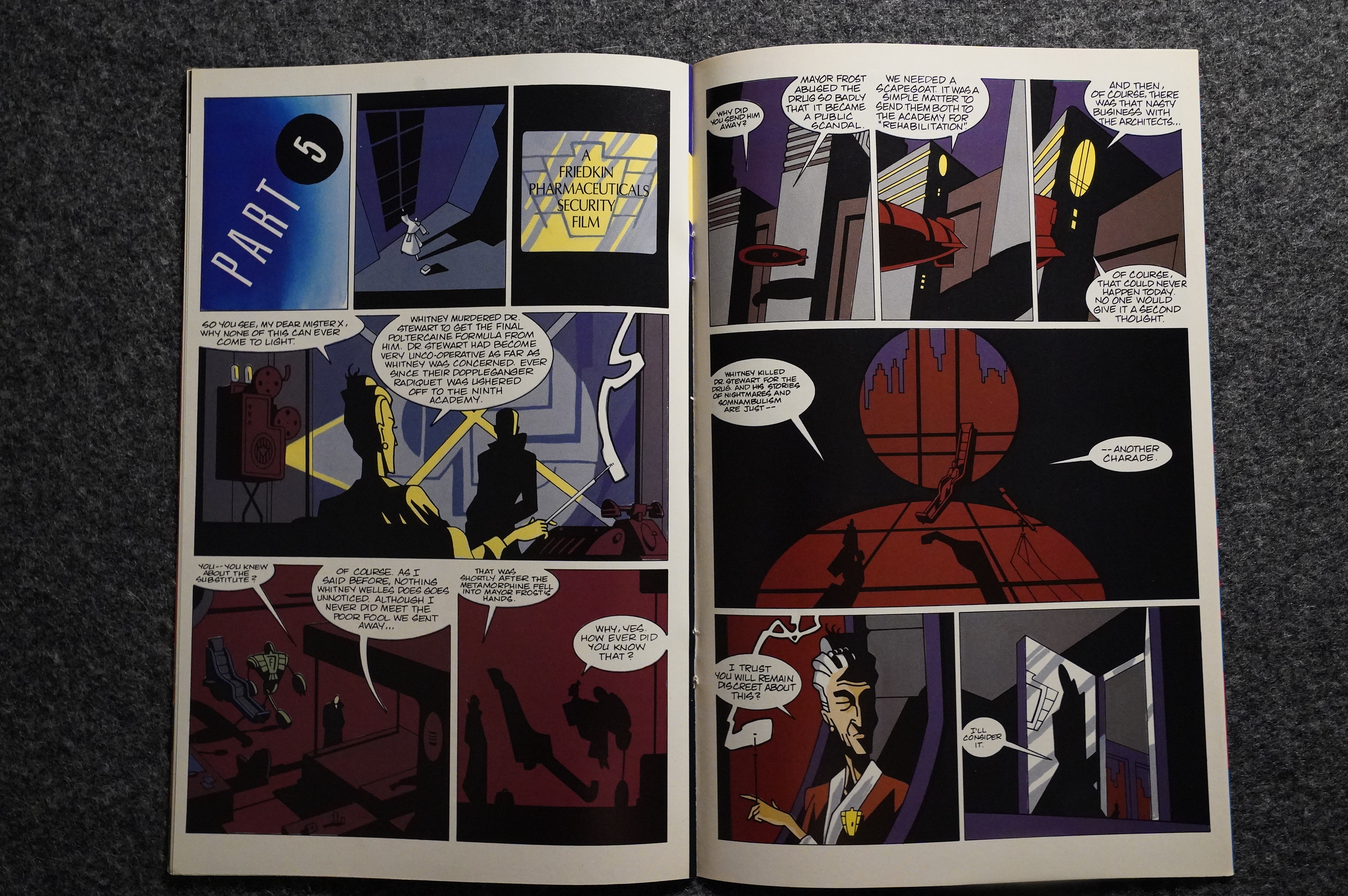
Did I mention that the Hernandi (is that the correct pluralisation?) introduced a bunch of female characters? Well, Motter kills off one (without any reason, plot wise)…
… has one kidnapped and beat up several times…
… and one is given a leprosy drug.
It’s very subtle! It’s almost like Motter was resentful or something.
But it might just be the normal reaction of a male writer finding himself with all these womenfolk: Better kill them off, otherwise who knows; you might even have to write scenes where they talk to each other! EWWW! COOTIES!!!1!

A weird tic in these books (after Motter took over) is that every issue is told in two parts: One half before the letters column and one after. I’m not sure it makes much sense, but… it’s a thing.
So, of course, Templeton and Schönefeld leave the book, because they’re… too busy. Which might not be a lie this time — who knows?
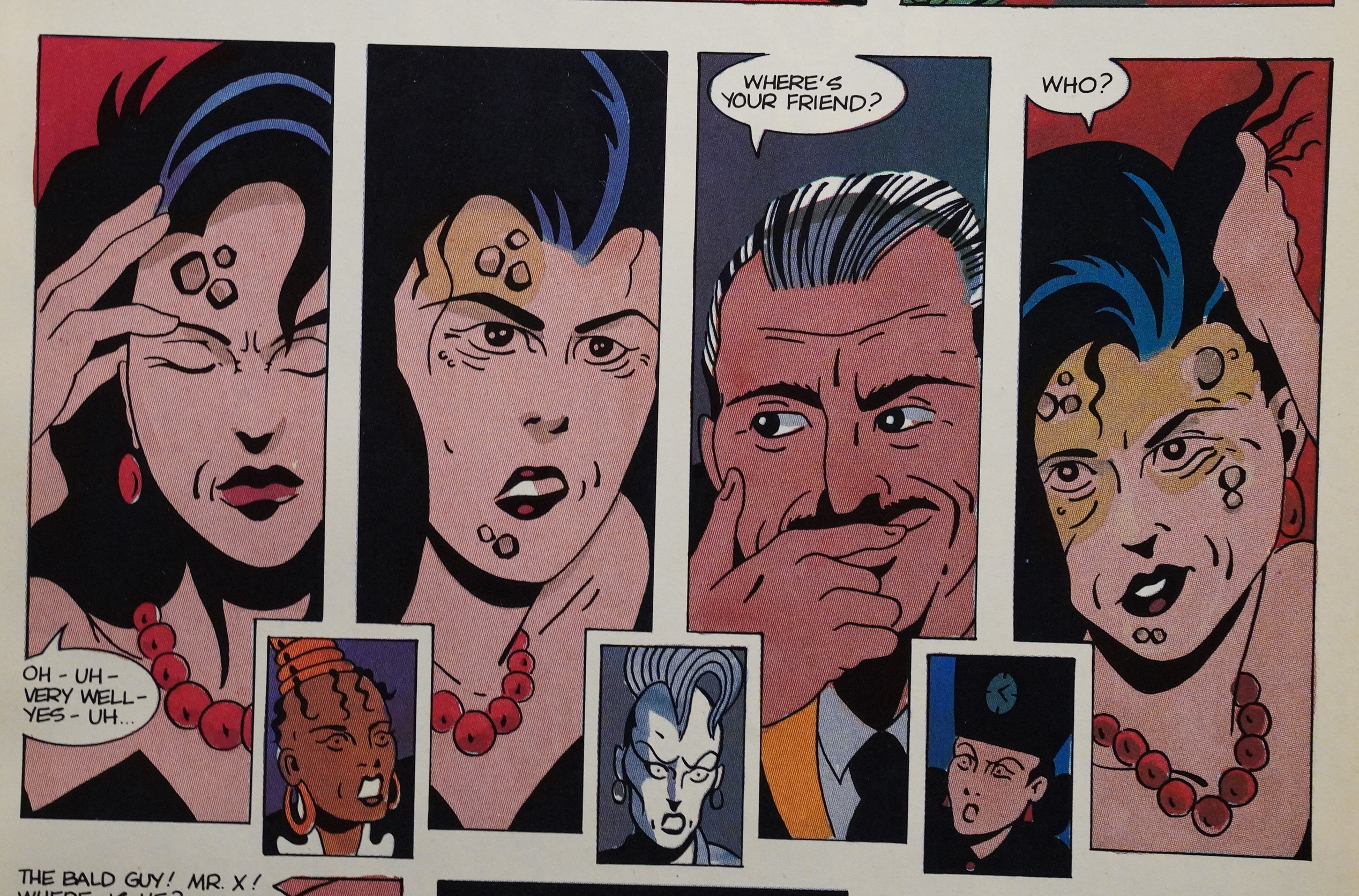
Seth and William Diamond take over the artwork. Instead of a retro-futuristic look, we instead just get a retro look: Everything looks like it’s happening in the 30s, all of a sudden.
I mean, there’s still odd-looking buildings in the backgrounds, but they don’t make any sense and look like after-thoughts instead of being the point, like they were in the first four issues.
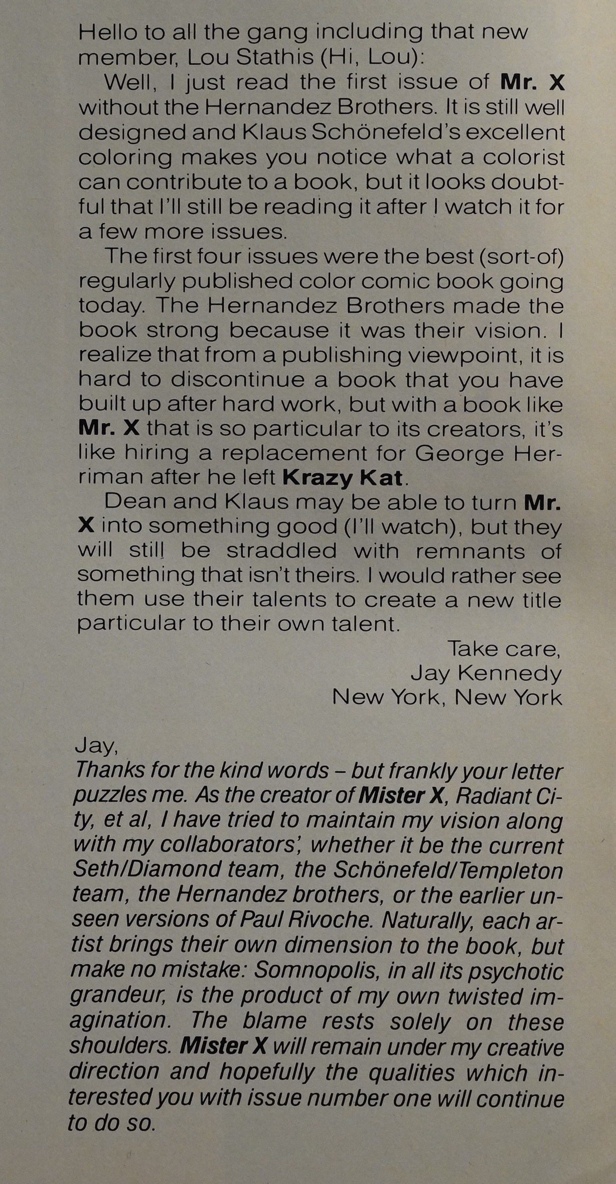
Jay Kennedy writes in to express concern with the book after Los Bros left, and Motter writes (and I’m paraphrasing very, very slightly) HOW DARE YOU! EVERYTHING EVER IN MISTER X IS MY IDEA! ME ME ME I DID IT ALL!
Motter seems to think that it’s a riveting mystery to find out what Mister X’s real name is, but in his two issues (so far) he’s given us no reason to care, because there’s no personality behind any of those names. IS HIS NAME JOE! OR JOHN! YOU MUST BE SO EXITED TO FIND OUT! Er, no?
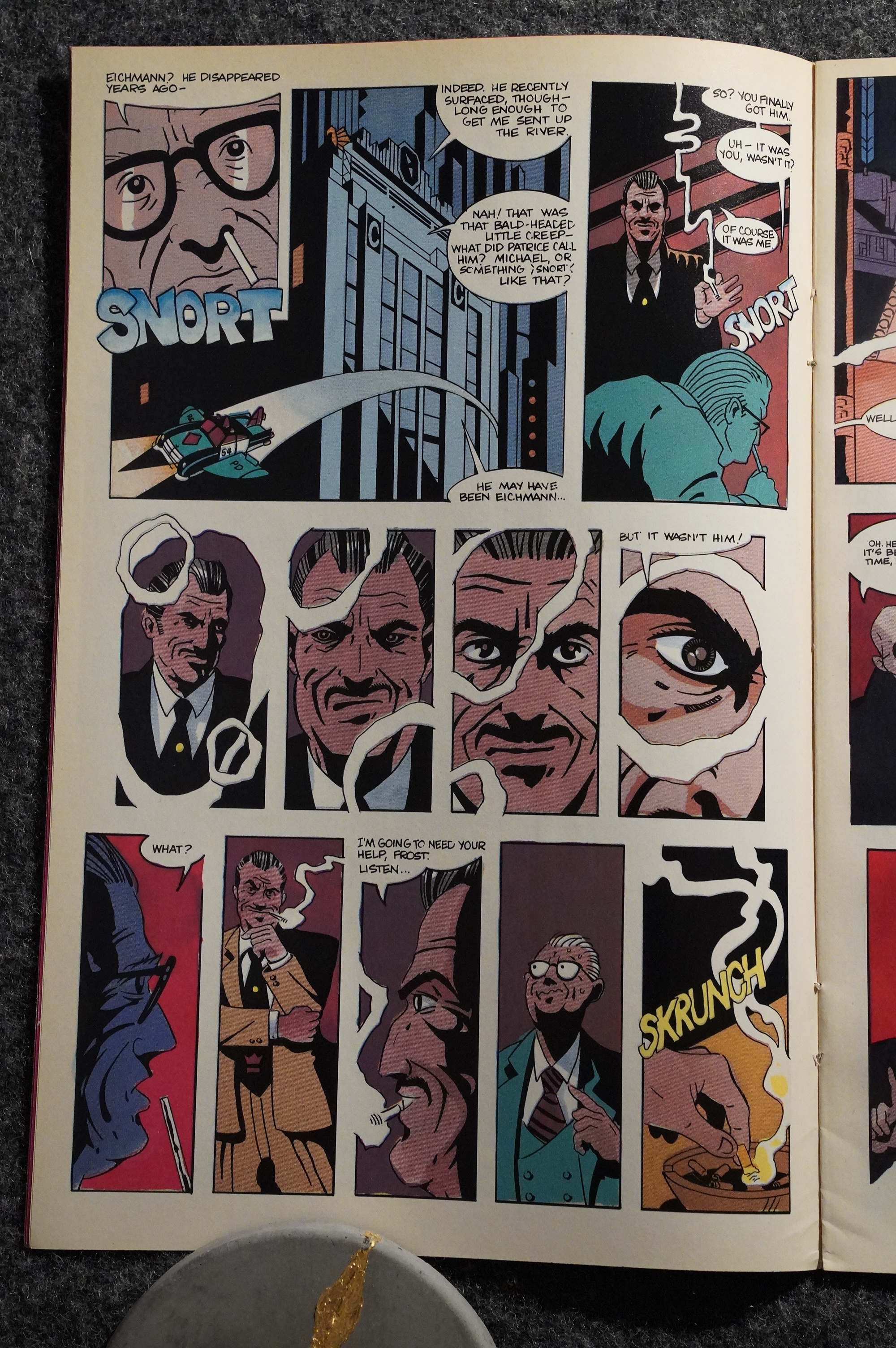
But that’s a nice sequence, and, yes, that’s the fourth female Hernandez character that he’s almost killing off there, but… instead he kills off the mobster (that we thought was in prison in issue two already).
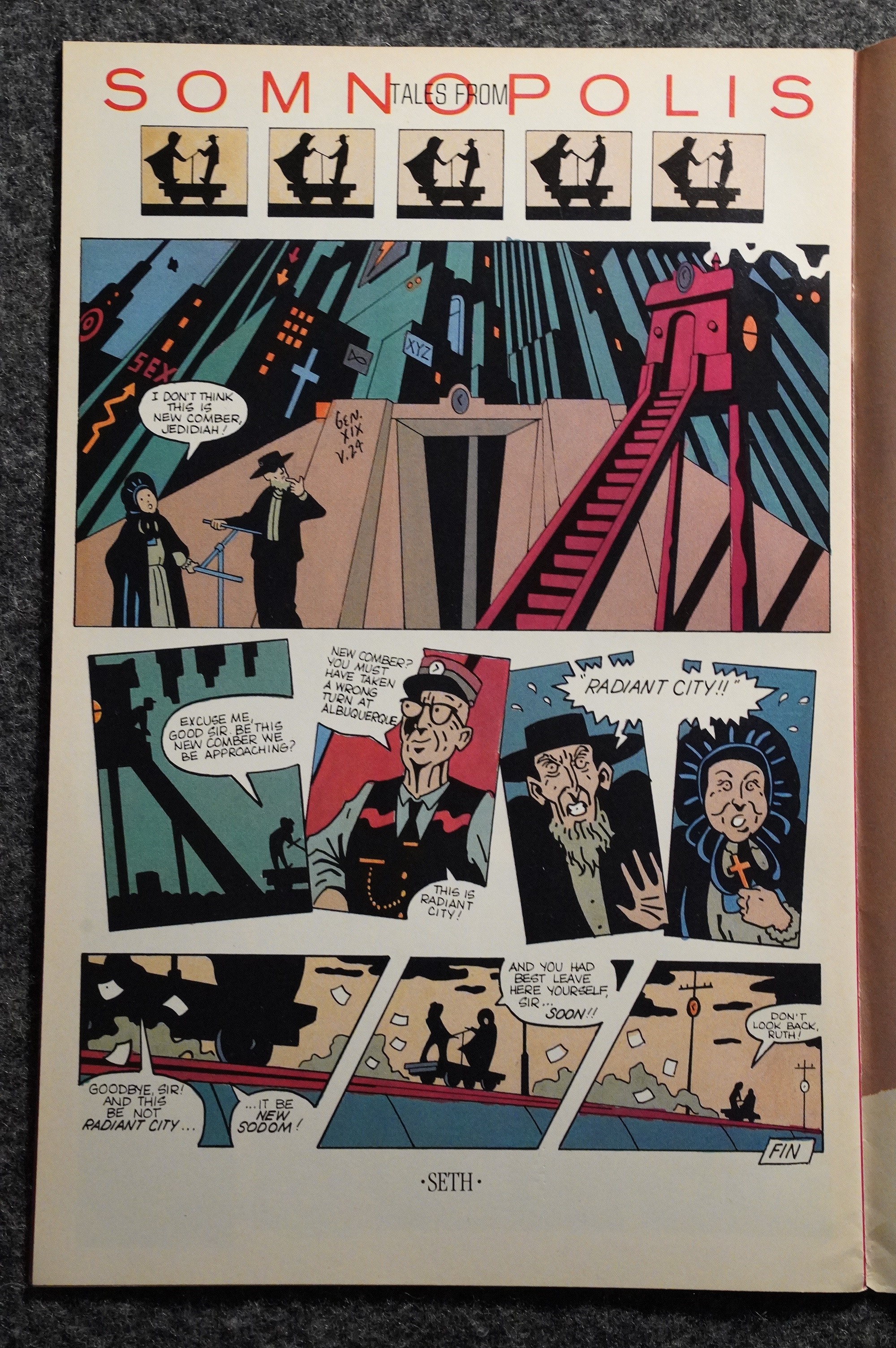
Seth does a page all on his own. Cute.
And speaking of cute: The design on these comics is great. Publisher Bill Marks also owns a design firm, and it looks like they know what they’re doing. It’s very… of its time.
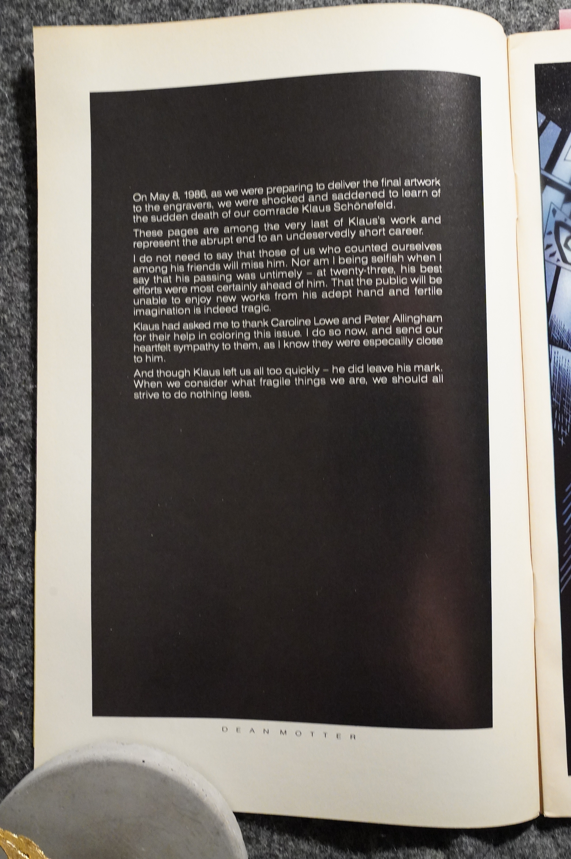
Klaus Schönefeld, 23, died of a heart attack after completing the colouring of this issue, and we get a very very brief eulogy.
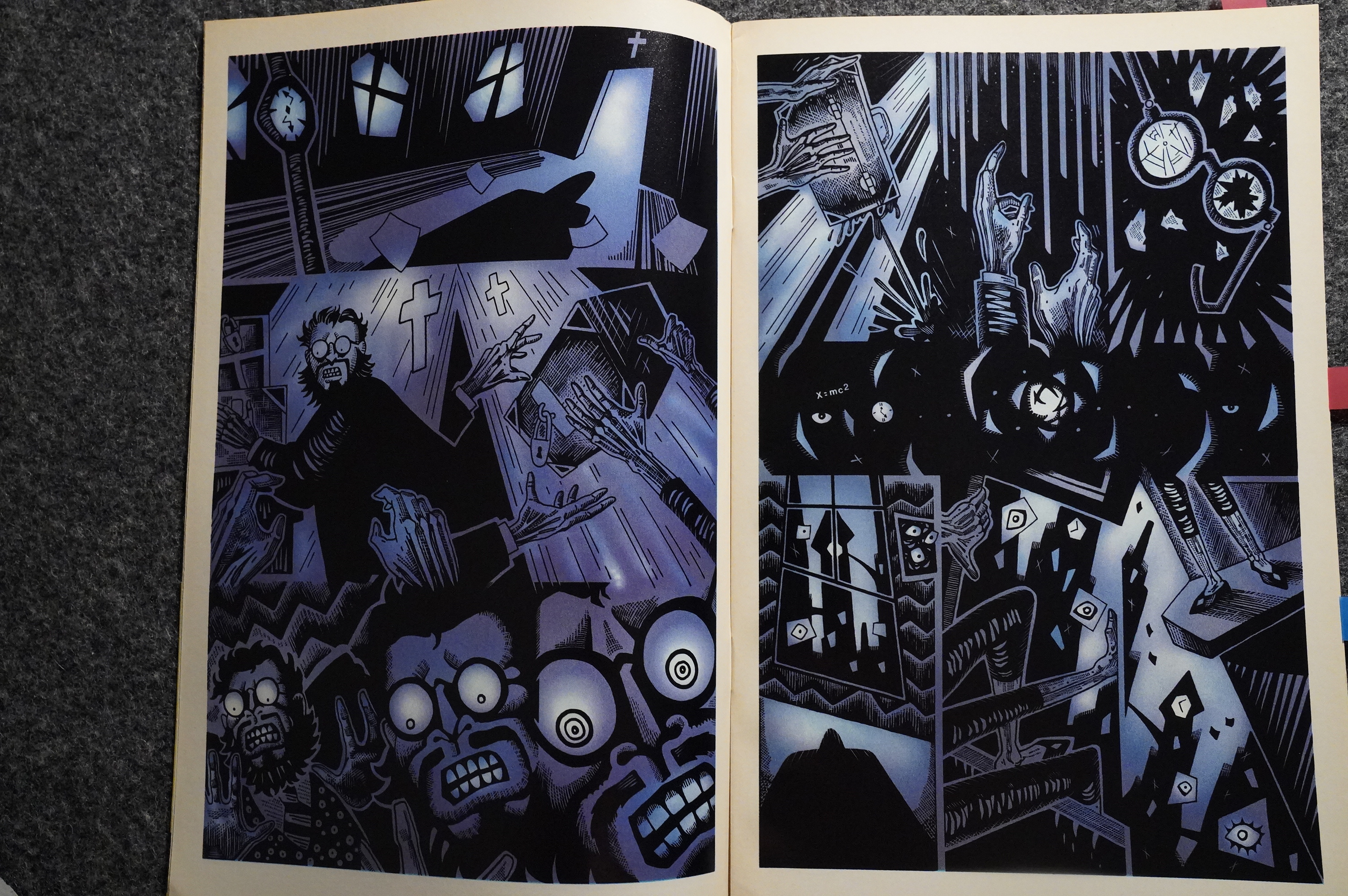
Wow. That’s a very different style from Seth (and Diamond) on this dream sequence. Very… Peter Kuper? I like it.
I don’t much like Seth’s storytelling or layouts in general here, though. They’re just clumsy. This page tries to hard to be clever with the repeating panel layouts (and reverse), but it just looks odd: Everything’s out of balance and nothing really flows.
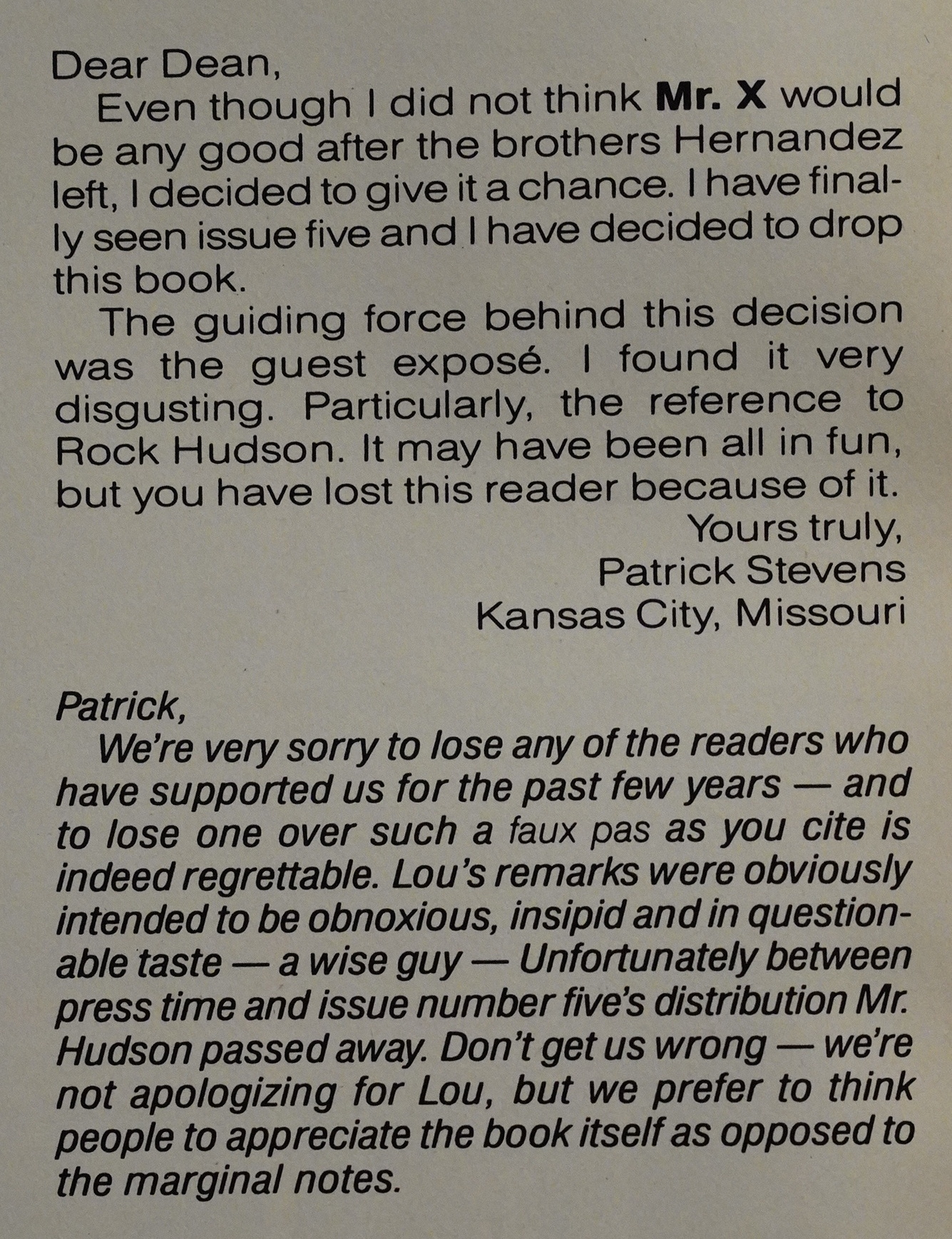
A person writes in to tell us he wasn’t charmed by the Lou Stathis introduction a couple of issues ago. But Hudson died after the issue was published? What was the “joke” in reference to then? Was it general knowledge that he was HIV-positive before he died?
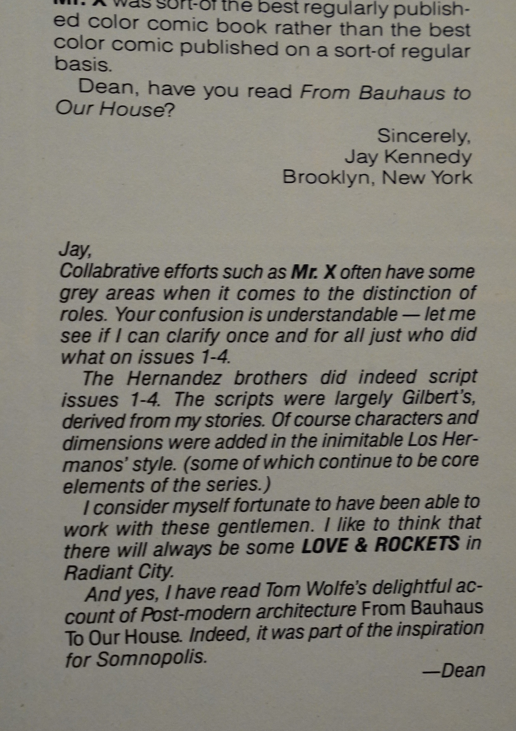
Jay Kennedy writes in again and apologises for assuming that Motter didn’t create the Hernandez issues all on his own, and Motter explains that perhaps they had some slight input after all? “The scripts were largely Gilbert’s, derived from my stories. Of course characters and dimensions were added”. Dimensions. But it’s all “derived” from his “stories”.
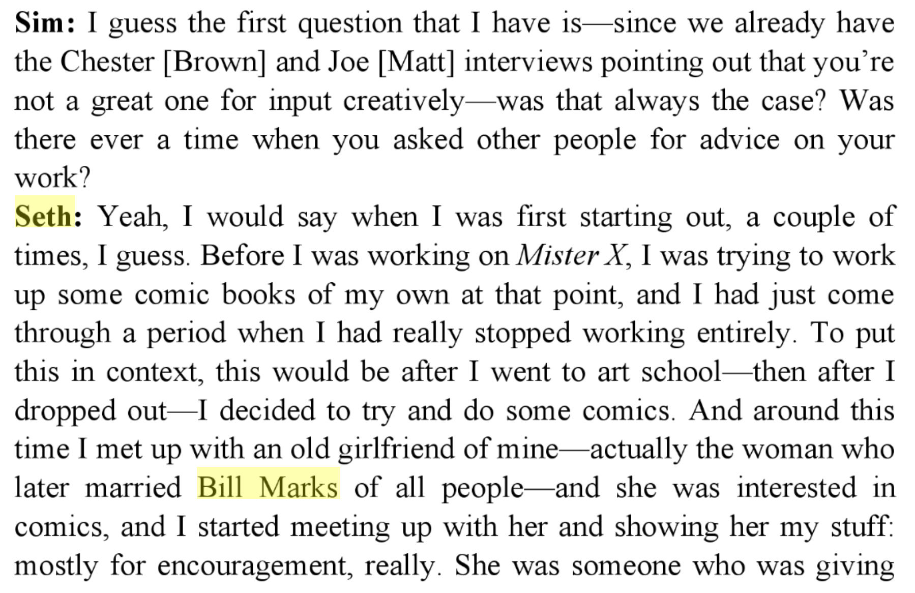
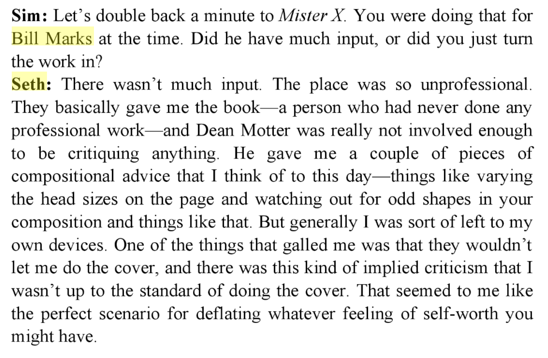
This is perhaps as good a place as any to mention the Dave Sim/Bill Marks feud! Behold! Cerebus #92:
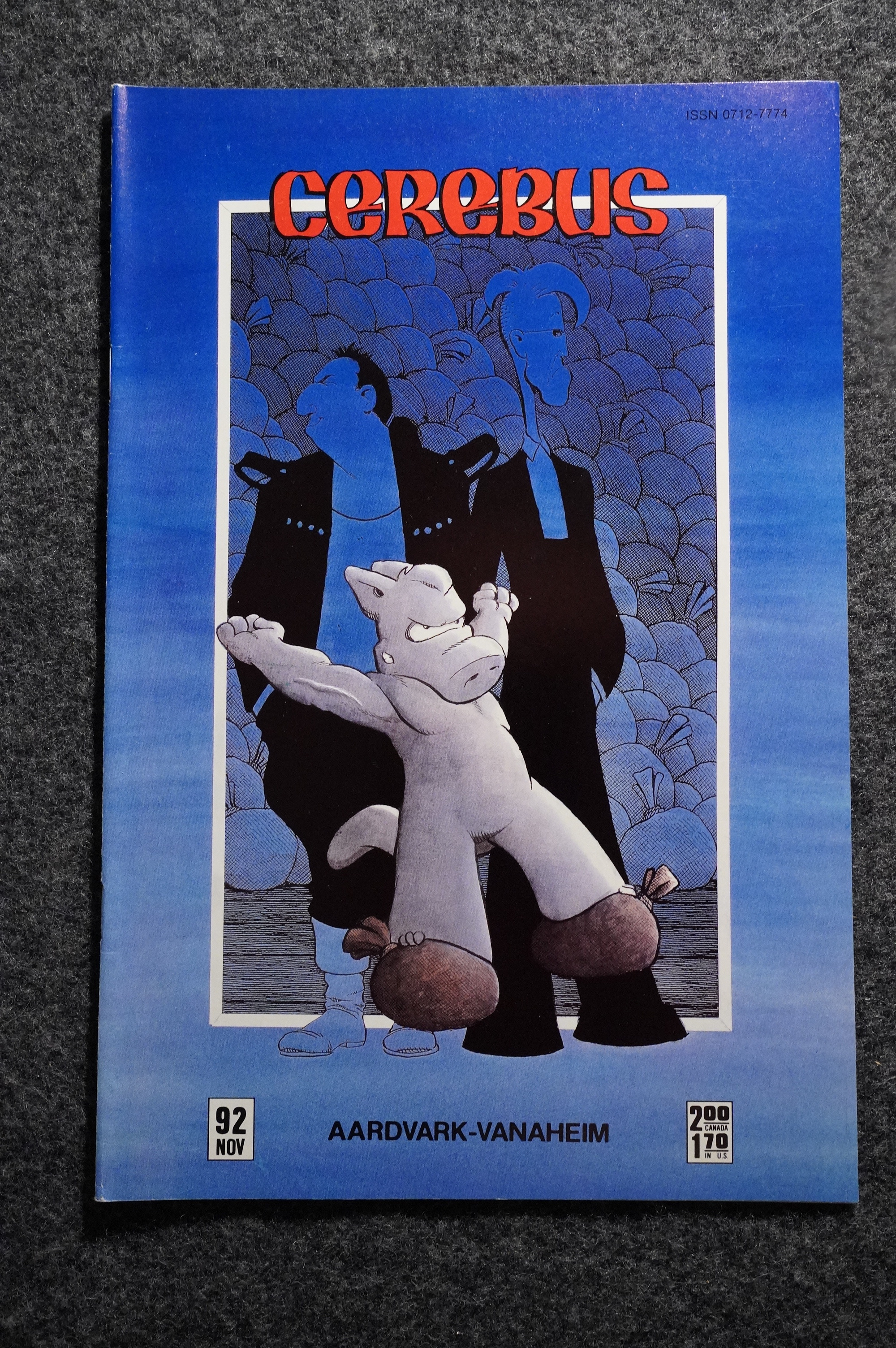
That’s Bill Marks and Seth on the background of the cover.
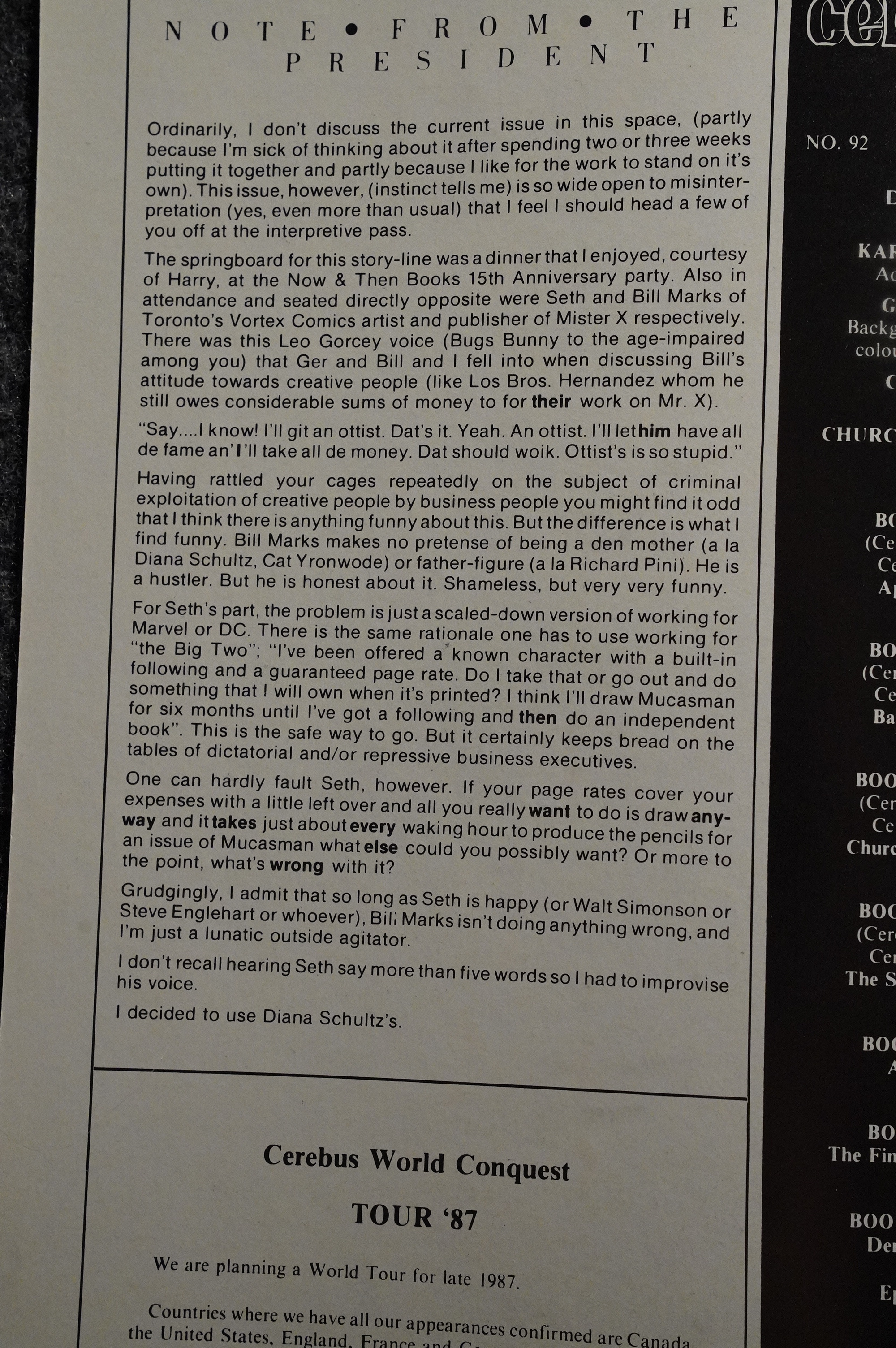
Sim explains that he met Marks and Seth at a dinner, and Marks came off (to him) like a shameless, charming hustler. (And that Seth didn’t say a lot, so in the following excerpts from Cerebus, he’s talking with Diana Schultz’ voice (I think Sim meant that to be funny; he’s the kind of person to find that just hilarious.))
Let’s read:
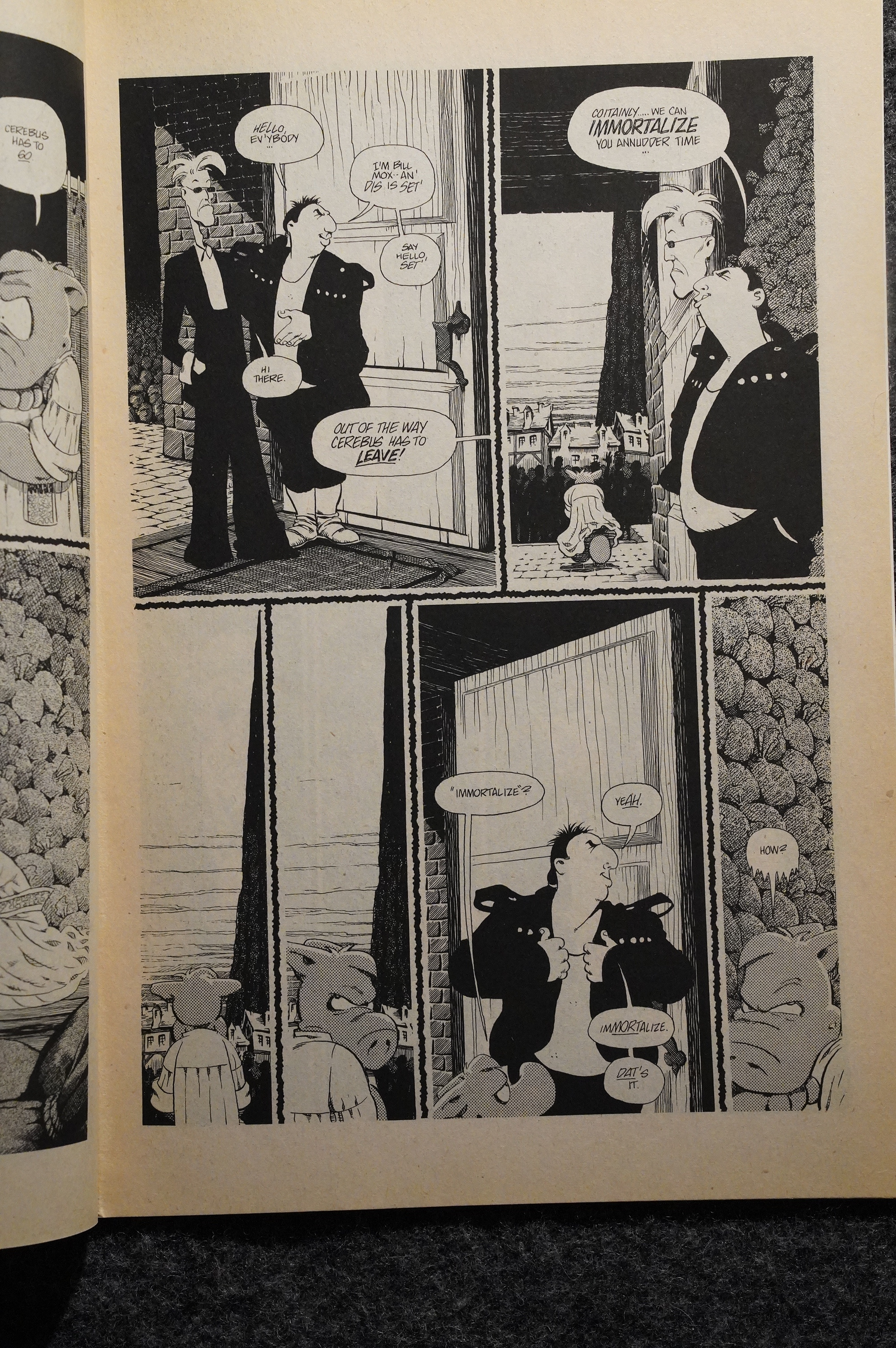

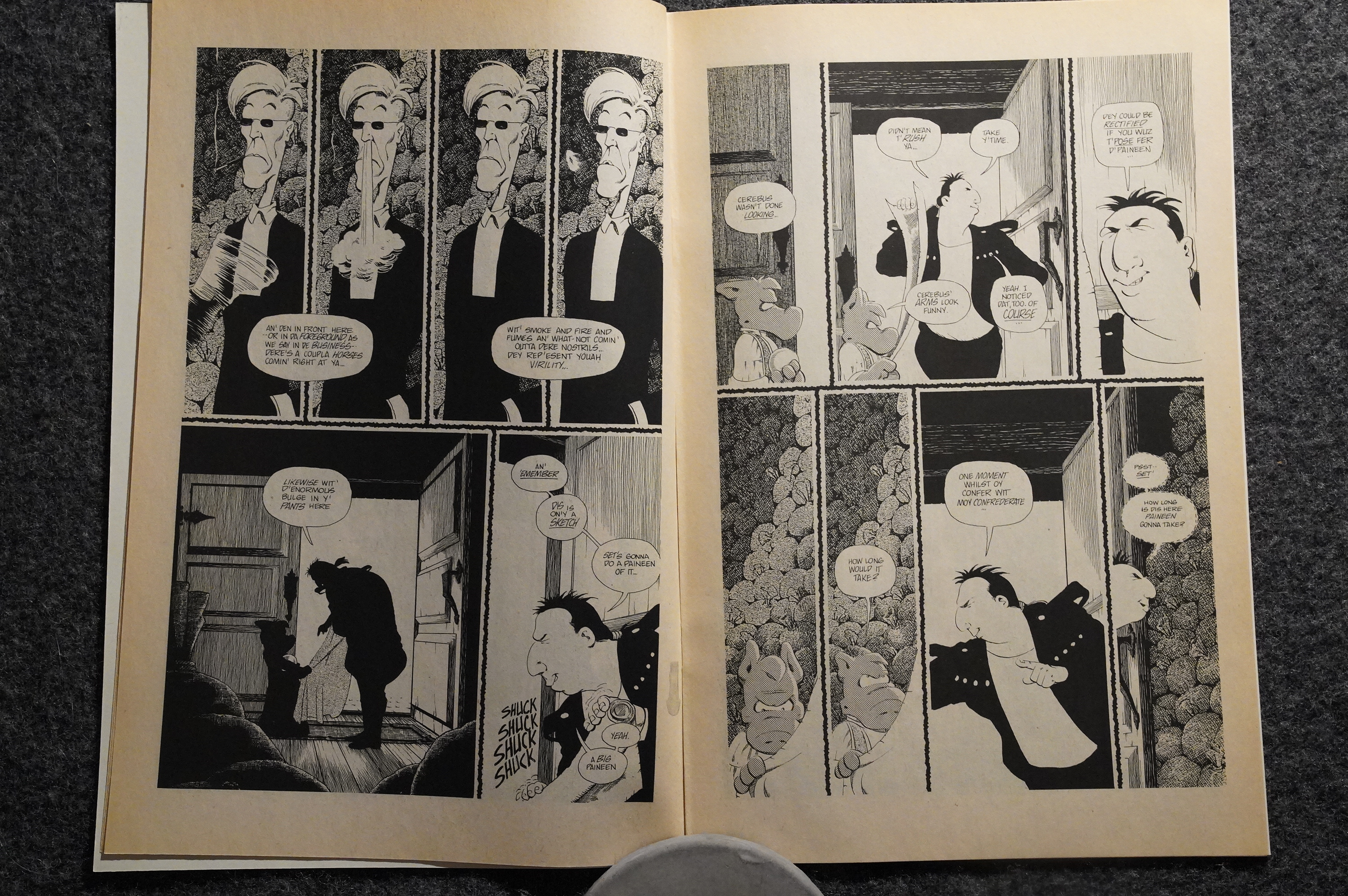
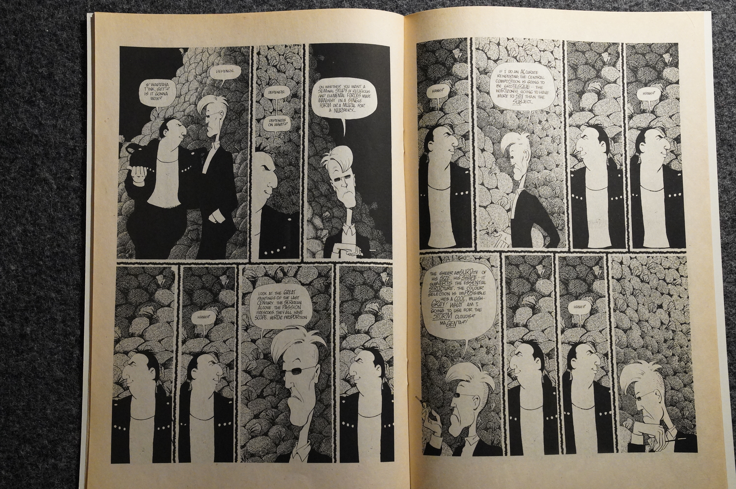
So, to recap: Marks shows up at Cerebus’ doorstep and offers to paint a painting of him. However, it turns out that Marks is such a cheapskate that he hasn’t bought Seth a sufficient number of tubes of paint, so with the tools available to him, the resulting painting wouldn’t be very striking (a grey Cerebus against a purple background), and so would lose money.
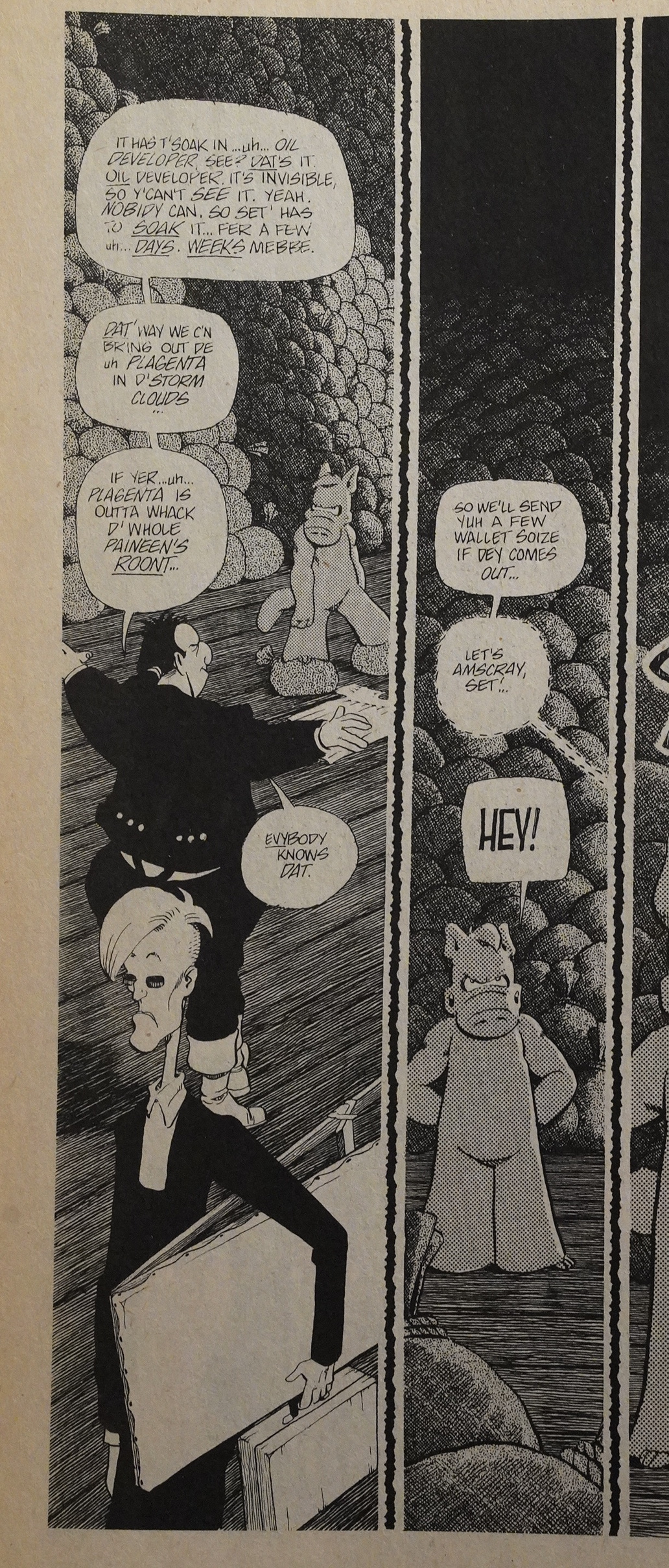
They then make a retreat, leaving Cerebus painting-less (and it turns out they distracted Cerebus so much that he didn’t … ascend or whatever it was that he was in the middle of doing (it’s been a while since I read this issue)).
(Cerebus by Dave Sim, Gerhard, and a Xerox machine.)
I wonder whether Marks ever reacted to this in public? Let’s see whether there’s anything on the intertubes…
Well there’s this, but that’s not very informative.
Oh, I found this on Google Books, from an interview book with Seth (called Conversations). Here’s a couple of semi-relevant excerpts:
But otherwise, I can’t find much on the websies.
OK, back to Mister X:
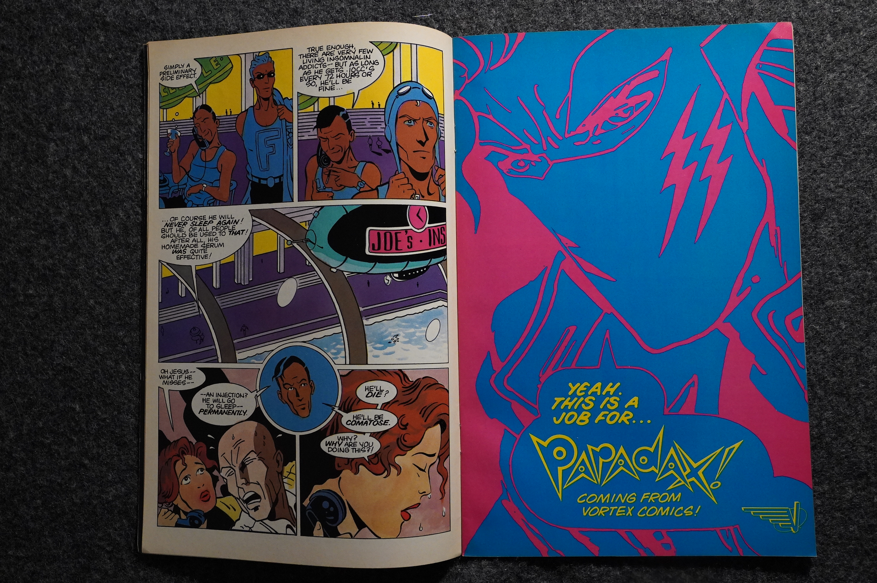
Hey! That’s a stylish ad for Paradax! But… in the middle of the story? Very odd. But it turns out that there’s just seventeen story pages in this issue, so perhaps they wanted to confuse us all by dropping in some ads.
It is fun, I must say, to watch Seth’s artwork evolve over the issues. He’s doing his own inking now, and things have improved noticeably. We’re not at his mature style yet by any means, but it’s… pretty good?
He gets (un)steadily more cartoonish, too. That’s a good fight scene, right?
But I mean… this is getting good. Is he aping Yves Chaland here? His line is getting more French…

Aha! Some of the readers read the article in The Comics Journal about Los Bros not getting paid. It’s not specified who’s doing the answering here, but circumstantially, it looks like it’s Dean Motter? Anyway, they didn’t want to “dignify” the “rumours” (i.e., the news report) with an answer: It’s just so preposterous! Hah! So preposterous I tells ya! “The Brothers have been and are being paid for all their efforts for Vortex.” They were “released from their contracts” because they were too late handing in their work, and “for their own piece of mind” (!). And… they have never denied that they owe “a great deal more than money” to Los Bros.
No, of course not. It’s those “dimensions”. They owe some of the “dimensions” to them.
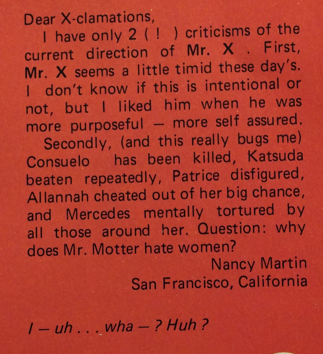
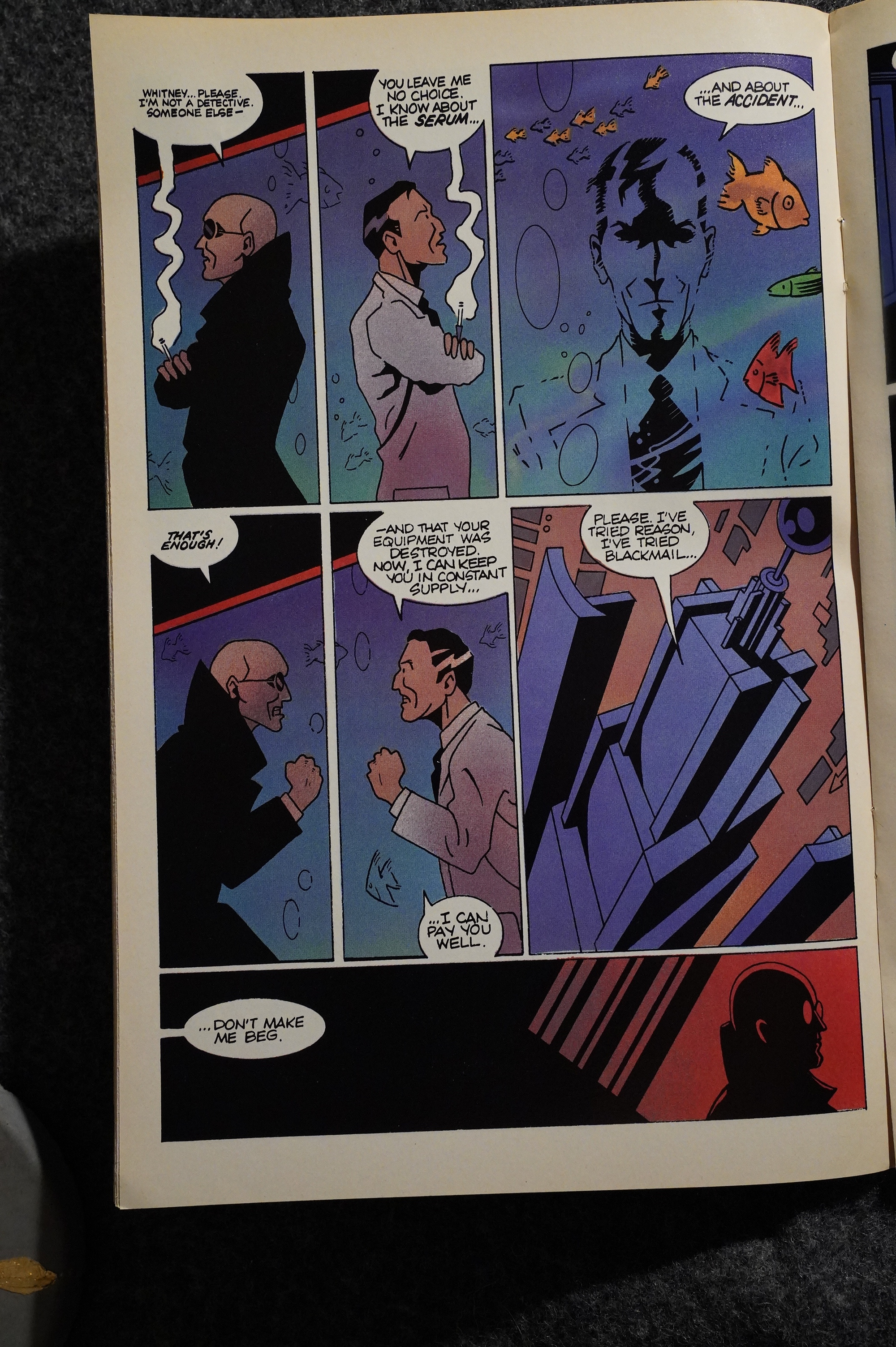
Hey — somebody else also noticed the violence to the female characters created by the Hernandezes. Motter responds cogently.

Paul Rivoche contributes artwork to a backup story… Perhaps this is what Mister X would have ended up looking like if Marks had paid him on time?
That’s a nice, moody page by Seth…
Oh? Should I say something about the plot in this er arc? Please. Please!
OK, I have to admit to not having the faintest idea what’s going on. There’s a bewildering number of characterless characters in here, all looking kinda vaguely the same, and they’re… doing stuff… and… then stuff… happens…
I love vague storytelling, but if there isn’t enough there to give you confidence that it’s worth trying to grok what’s really going on, it all starts turning into white noise. And I have zero confidence in there being anything worth puzzling out here.
People are still fascinated by the Somnopolis concept: Dave McKean contributes a three-page story that he apparently did without talking to Vortex first.
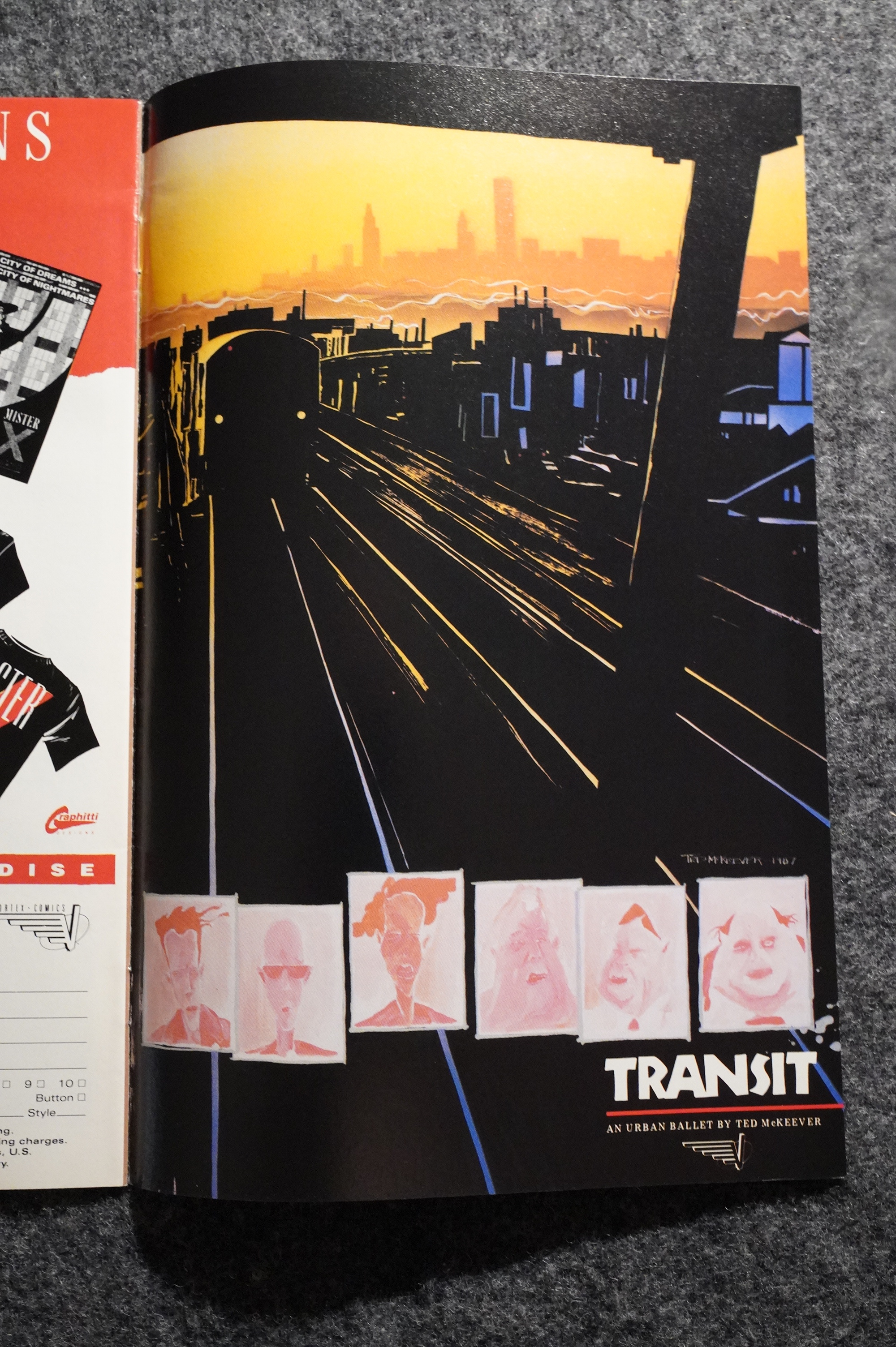
Nice and very unusual ad for Transit, the Ted McKeever series. I mean, it’s unusual, because it doesn’t look much like a McKeever design at all…
In the final Seth issue, he’s gone 100% Franco-Belgian ligne claire… Looks just like… oh what’s the name of that guy… How annoying; I just can’t remember the name of the guy. It’s not Serge Clerc, not Ted Benoit… gah! Branes! Why u so stoopid.
And that’s the final Seth page.
Deborah Marks did the colouring on the last half dozen issues, by the way, and probably does the best job of them all. Very moody.
Rodney Dunn takes over for the final issue of the first Mister X series, and… it’s pretty basic?
And I have absolutely no idea whether the plot(s) were resolved or not; I’m as confused as these people are.
So! That’s it! Done with the first Mister X series. There’s another to follow, and a special, but I’ll do those in a separate posts.
This series was reprinted in this edition, I think?
Doesn’t sound like these people actually read it:
With nods to historical design styles known as Brutalist, Bauhaus, and even German eExpressionism, the artists of the Mister X series were—and are still—hugely influential; the Hernandez brothers and Seth going on to create, respectively, Love and Rockets and Palookaville.
Oh!:
Again, it’s really the art that drives it. Which is why the very last chapter disappoints, newly redrawn by Motter himself, after being unhappy with the issue that was published so long ago. The man can draw, obviously, but it’s not up to the caliber of the rest of the series, which came to life under the sure hand of Seth (DRAWN AND QUARTERLY) and the Hernandez Brothers of LOVE AND ROCKETS fame.
Motter was so unhappy with the artwork in the final issue that he redrew it himself for the collection? Makes sense.
Somebody writes in The Comics Journal #105, page 97:
[…]
Maybe I should clarify myself. I like the
book. Or, at least, I’m intrigued by it.
The pleasant surprise of the early issues
was that Los Brothers Hernandez brought
style and satirical Nerve—a leavening Of the
same sensibility that infuses the more eccen-
tric elements of Love and Rockets—to the tell-
ing of what could easily have lapsed into
gloomy portentousness. Jaime Hernandez’s
clean, stylized images brought the book an
appealing lightness of touch. Visually, Mister
X is never as gloomy as its premise might
and in the use of space and arrange
ment Of figures within the panel, the visual
approach is extremely deft. (On the basis
of the fifth issue, Schonenfeld arid Temple-
ton will be attempting to provide continui-
ty with the Hernandez look; it’s a facsimile.)
In the first four issues, Gilbert Hernandez
concocted several distinctive characteriza-
tiOnS that were rgalized in a more complex
manner than one might have expected from
this sort of material. (As might be expected
from the creator? of Love and Rockets, the
yomen are particularly interesting and
appealing as peoplg). There were also minor
details in throwaw:ay bits—an irate taxpayer
bellowing in impotent rage at the ineffi-
ciency Of a government robot, the FX)pu•
larity Of “celebrity autopsies” on videotape
among the classes—which amusing-
ly revealed fagets of life in this future
metropolis.
Neil Gaiman interviews Gilbert Hernandez in The Comics Journal #178, page 111:
GAIMAN: You did thefamous Mister X thing where you got
badly ripped off.
GILBERT: I think we just got ripped off the way people
normally get ripped off. I don’t think it was that big an
issue. We just took umbrage with Bill Marks himself. We
just didn’t like him after a while, you know what I mean?
There are just some people you don’t forgive.
GAIMAN: The thing about Bill is, when you meet Bill and
he says, “Hi. I’m ascumbagandlrippeopleoff ” you go,
“What endearing honesty this guy has!” [laughter] It
comes across kind Of sweet, it’s really fun! He tells you
upfront he’s a scumbag, and you think, “Everyone else
here is saying, •I’m a great guy, and he’s saying ‘I’m a
scumbag, ‘ ” well… cool! Actually, just the action Of
saying “I’m a scumbag” doesn’t make one any less a
scumbag! [laughs/
GILBERT: He had to do that after the fact of Mister X
though because he wasn’t that way before. He was the
smiling scumbag who did not admit he was a scumbag.
GAIMAN: Oh. By the time I met him.
GILBERT: Yeah. See now he’s saying, “Oh, it’s all very
funny, it’s all very cute,” and he can be as cute to people
as he wants, but there’ s some shit you just scrape off your
shoe and just keep it off.
Heidi MacDonald writes in Amazing Heroes #119, page 66:
MISTER X Written and designed by
I)ean Motter, pencilled by Seth; inked by
William Diamond; M)rtex Comics; $1.75.
Yet despite tuy whiney dissatisfac-
tion, a new issue of Mister X is
always worth running down to the
comics shop for. Only 9 issues of
Mister X have been publßhed in the
nearly three years of its existence.
There ain’t much, but what there is
is cherce. Honestly. you couldn’t ask
for a less promising scenario: crea-
tor comes up with a dynamite con-
cept, but for various reasons is
unable to actually pmduce the story,
and has to pass it on to hired hands
to work on, with his minimal super-
vision. Except that the hired hands
in this case happened to be the Her-
nandez Brothers. It’s hard to imagine
more diametrically opposed styles
than the rounded fluidity of Jaime
Hernandez and the angular, highly
designed Dean Motter look. but the
unlikely marriage of warm natural-
ism and cold expressionist symbol-
ism has produced a decadent treat
of a comic, something wickedly,
delightfully twisted. The Hernandez
foundation saves Motter’s frigid
mannerism from being mere self-in-
dulgent priggishness.
In the mysterious, chameleon-like
penciller Seth, Motter has found a
remarkable artist, one who com-
bines the best of the Hernandez
characters and their masterful use of
blacks with Motter’s abstract design
work. I mean it only as a compli-
ment when I say that Seth is in the
highest echelon of swipe-artists of
them all, leavening Motter with Her-
nandez earthiness. While Mister X
doesn’t cut deep, it’s a perfect enter-
tainment for those who like their
mysteries seasoned with arsenic and
Art Deco.
Of course plots and storylines are
distinctly of secondary importance
in Mister X. It’s all style, mood. But
what a perfectly mordant style.
Nothing is just business in Mister X,
it always has some sort of twist—
witness the Club of Sons in #9, and
Mercedes’ meeting with Whitney in
the bizarre aviary. What kind of
name is Club of Sons, anyway? The
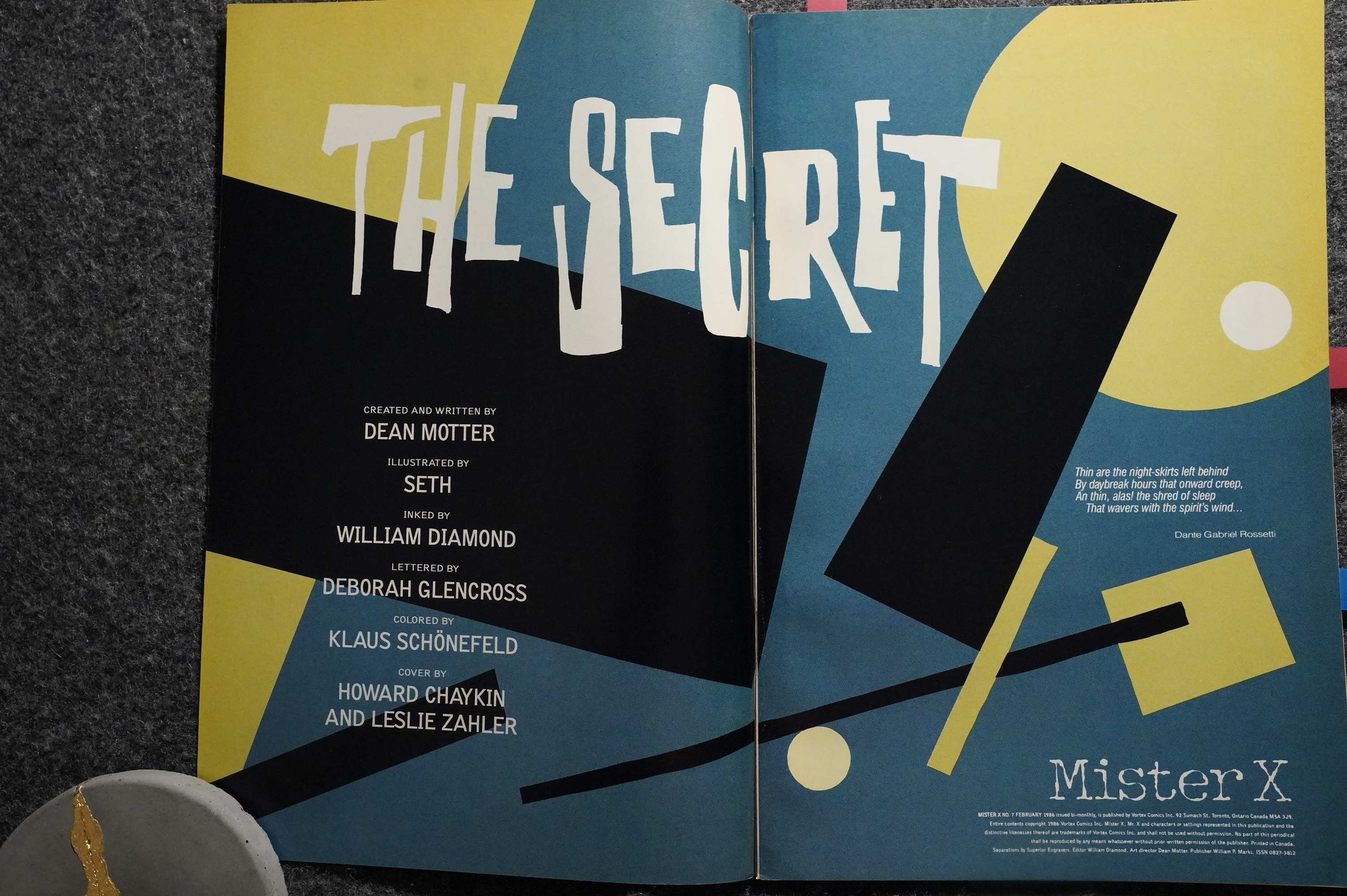
ninth issue wraps up “The Secret,”
Motter’s first complete storyline
since taking the book back after
#4. Mr. X now has more changes
of identities than most people have
underwear. Is he Michael? Santos?
Myers? Reinhardt? Eichmann?
Pierre Radiquet, mad chemist?
Pelham Welles, black sheep heir?
Every time he adopts a new iden-
tity, the real person shows up, only
to be bumped off soon after. It’s all
frightfully byzantine, and I don’t
think anyone could care less about
solving the mysteries of the book—
the search is all, after all.
And who could want it to end
when the book is played out against
such a fascinating background?
Mister X is a shining example of
comics’ all-too-rarely-used ability to
create a milieu,a fashion—Radiant
City, which borrows from a zillion
pop and high culture sources, is as
finely drawn as the worlds of Blade
Runner or Brazil. More than any-
thing it reminds me of Gene Wolfe’s
Book of the New Sun nwels. Though
Wolfe’s books are clearly science
fiction, and Mister X is clearly a
mystery, both are irresistably sick
and perverse—strange hot* house
orchids that could never live in the
sunlight. Radiant City is a world of
huge empty spaces of searing spot-
lights, of gothic robots, and Seth and
Motter absolutely go to town with
this concept.
Besides all that, Mister X has got
to be the most consistently well col-
ored comic book that Lynn Varley
doesn’t work on—the coloring is
never less than superb, and it’s all
the more remarkable since it’s had
so many colorists—Paul Rivoche, Ty
Templeton, and now Deborah
Marks. Despite the financial prob-
lems that Vortex comics has had,
Mister X is also an excellent example
of a book with a look. The printing
and paper stock are first rate. The
graphics by Motter—the award-win-
ning designer of countless record
albums—are also as sharp as you’d
expect. The covers by Motter, Ri-
voche and guest stars like Hmvard
Chaykin, are outstanding. Every
issue, no matter how tardy, is cause
for pause. Mister X has been a cult
book from the very first ad, and few
creations could stand up to this
expectation, but the folks at Vortex,
and especially Dean Motter have
actually managed to live up to their
own pretension. Bravo.
SW writes in Amazing Heroes #157, page 150:
MISTER X
Witten by SETH. ÆFFREY MORGAN; percil}ed
by PAUL RIVæHE, SHANE OAKLEY; inked by
PAUL RIVOCHE. KEN HOLEWCÜNSKI;
direction by LOUIS FISHAUFF
28 full-color pages. $2.25, then $1.75; bi-montNy,
then monthtY (yean, fight) from VORTEX COMICS
Issues to 17 of Mister X will consist
of a mini-series within the series.
Entitled “The Radiant City Story,” the
series will explore the origins of the city
and its many denizens. Shock, surprise
and dismay may ensue,
One thing is certain, by the conclusion
of “The Radiant City Story,” we will
knmv the answers to some surprising and
intriguing questions concerning both the
city and its mysterious, bald, bespect-
acled little protagonist.
Following the completion of the three-
part “Radiant City Story,” the book will
undergo a complete revamping.
As a symbol of the restructuring of the
book, numbering will begin again with
Volume 2, #1.
Publisher Bill Marks assures us that
the book will be “completely different
and completely the same. Something you
could only say about Mister X!”
This new series will feature a much
more in-depth look into the character of
Mister X gets yet another new artist (Shane Oakley),
as well as a new writer, a
new inker, a new frequency, and a new #1.
Mister X and will show us pans of
Radiant City we’ve never seen before
(and may not want to see again).
Marks says that new scripter Jeffrey
Morgan has a wealth of great ideas for
the book and everyone involved is real-
ly excited by the new direction.
Marks also adds that the proposed
monthly schedule for Mister X is no
joke. He feels thit he has a team that can
produce the book on a monthly basis and
that this can only be good for the book.
“It’s not that people don’t love the
book,” he says, “it’s just that they hard-
ly ever see it on their racks. We want to
change that.”
That’s interesting — this item from the Preview Special says that Seth was supposed to write #15-17, but that never happened, obviously…
Heidi MacDonald writes in Amazing Heroes #48, page 30:
“Mister X had a lot of
sources,”
says Motter. “Some
of it came from the experiences I
had working in design and
marketing. I had also become
very interested in the themes of
sleep and sleeplessness.” He
also mentions two parodies of
the detective genre, Dreams of
Babylon by Richard Brautigan,
and Who is Teddy Villanova? by
Thomas Berger, as books that
he read/ around this time. The
result of these various influences
was the basic premise of Mr. X,
the sleepless detective.’
“I’d created the premise of the
series,” Motter continues, “but
because of my other commit-
ments, I realized I wouldn’t have
the time to do it myself, and
would have to collaborate.”It’s at this point, in 1982, that
artist Paul Rivoche enters the
picture. Rivoche has worked
mostly in animation and illus-
tration, although his work ap-
peared in Andromeda a while
back. He was sharing a studio
with Motter, Steacy, and some
others, and there he . saw the
painting of Mr. X.
“Dean’s idea was unfleshed,”
says Rivoche. “We just started
talking about this character, who
he was, and so forth, and it just
evolved from there.”
“Paul was instrumental in the
shape •it took,” Motter explains,
“both by criticizing it and in
visualizing it.” Both of them had
a very strong interest in design
and architecture—particularly
from the ’20s and ’30s—and this
was the springboard from which
their enthusiasm was launched.
They had bounced a lot of ideas
around, but by the end of 1982,
it was uncertain where or even if
they would be doing the project.
“Up to that time, we’d both
been busy just making a living,”
says Rivoche. “We could only
devote so much time to some-
thing that was just a hobby.”
Bill Marks, publisher of
Vortex Comics, picks up the
story. “Vortex magazine was
just starting, and I wanted to
publish something ,more sub-
stantive, something that would
take the market by storm. My
original idea was to approach
Ken Steacy, but he had too
many commitments. But he
knew that Dean and Paul had
an absolutely wonderful idea,
and he steered me in their direc-
tion.”[…]
Creators Motter and Rivoche
remain on, the book in pivotal
roles. “I’m remaining as a con-
sultant,”
says Motter.
supplying plot ideas, which they
can do with as they wish. As
Design Director, I’ll be in charge
of the entire design of the book,
the format, the typography. I’m
trying for a more mature attitude
in design. If you took Vanity
Fair, Face magazine, and Rus-
Sian Constructionist paintings,
you might have something like
it. My basic principles are based
in the ’30s however. I want it to
look quite different from other
comics—something more adult,
more sophisticated.”
Fred Patten writes in Amazing Heroes #162, page 55:
Mister X has a deserved reputation as
one of the most daring, cryptic comics
currently being published. All that is
known for sure after 14 issues is that
Radiant City, which was built to be the
dream city of the future, has turned
into a city of madness and death; and
that the mysterious Mister X is appar-
ently the architect who designed the
city and who is now trying to undo
the harm that he unwittingly created.
Issue #15 begins “The Radiant City
Story,” a three-issue serial which fea-
tures a more straightforward plot than
usual.[…]
The last several issues have shown
a Radiant City that is far gone in de-
cay, its streets almost deserted. Issue
#15 swings to the opposite extreme,
showing a city whose streets are
packed with frenetic, hyperactive rev-
ellers who are on the verge of a
psychotic explosion. This powerful
imagery matches the tempo of the
plot. Both seem to be rapidly building
to new intensities of pressure and
tension. If you have not been follmving
Mister X, this first issue of the new
story is largely self-explanatory and
is a good point at which to start.
GRADE: PRISTINE MINT
What? But there is no #15? Was this based on a preview copy that was never actually printed?
This is even more mysterious than the plot lines in the book!
R A Jones writes in Amazing Heroes #115, page 77:
[…]
The premiere issue of Mister X
firmly gripped me, and it has yet to
release its grasp. There is no ques-
tion that the book lost a bit of its
edge when the Hernandez Brothers
departed, but it has still managed to
maintain that air of somnambulistic
surrealism that makes it unique
among comics.
Part of this is due no doubt to the
fact that current scripter Dean Mot-
ter was the original conceptualizer
to the series. His vision of the strik-
ing yet seemingly heartless city of
Somnopolis remains intact. There is
about the book an aura of demen-
tia, as though it and everything
within it was nothing more than an
illusion.[…]
Also working in the series’ favor
is its visual look, which is one of
the most striking in comics. Again,
there was a slight decline in quality
following the departure of Los Bros,
but replacement artist Seth (should
we call him Mr. S?) has done an ad-
mirable job of maintaining the flavor
of the original four issues. It is one
of the best examples of style fitting
substance. The Art Deco graphics
depict a city that seems to have been
regurgitated rather than built–
thrown upeby an architect hopeless-
ly addicted to drugs (as indeed it
may have been). There is almost no
sense of motion, as if everyone and
everything is frozen in amber.
Vibrant coloring also marks this as
one of the few comics deserving of
a slick paper format.
The interminable delays between
issues almost guarantees that Mister
X will never garner a large fan
following, but the haunting storyline
and striking visual sense make it
more than worthy of your attention.
And finally, Shane Oakley does a Swimsuit Special drawing of Mister X:
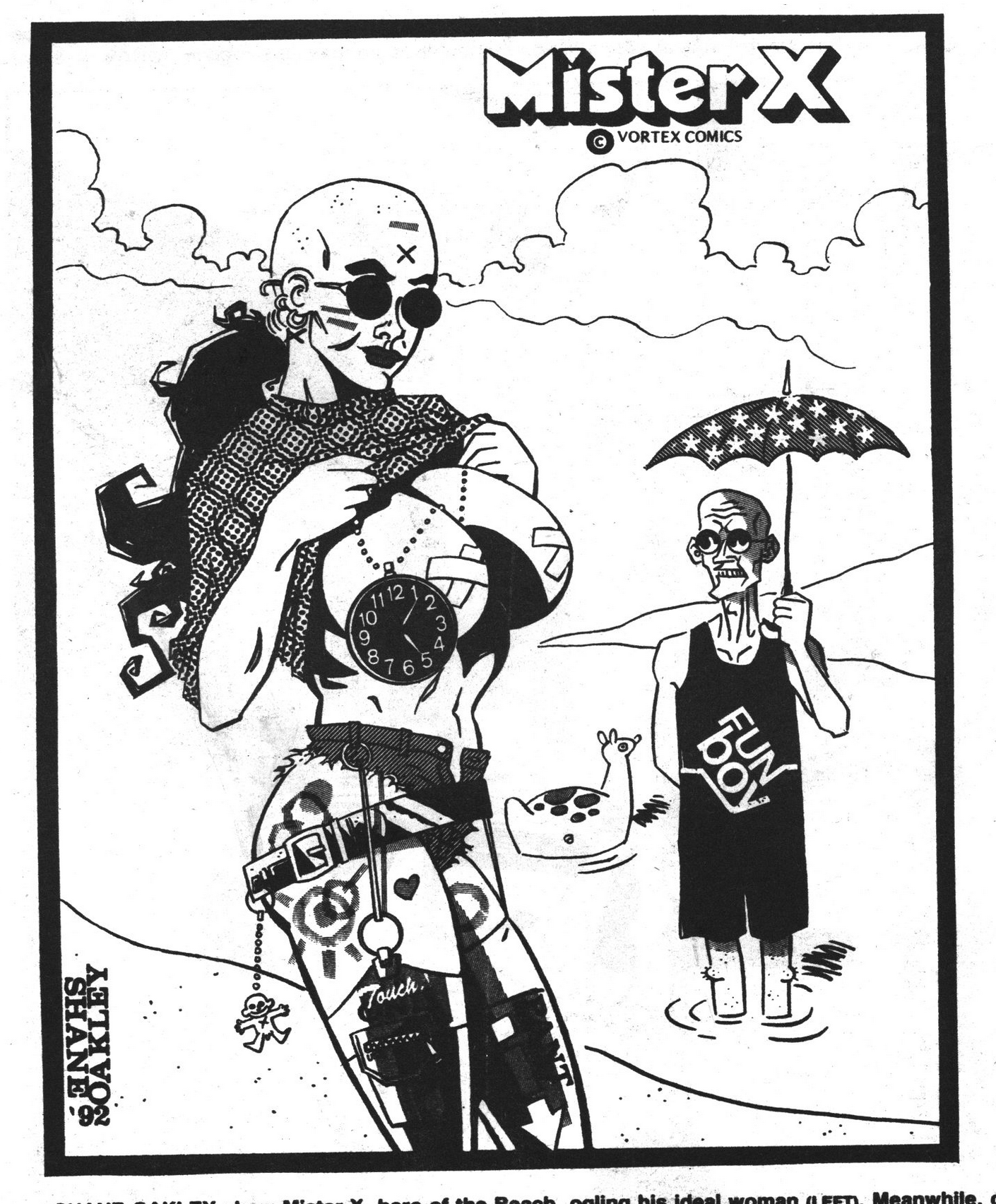
Sort of.
This blog post is part of the Into the Vortex series.
Hey Lars, OK, so you shrug off my moans about typos, but please do tell why it is that your quotes from various magazine reviews are especially garbled like this example:
“bi-montNy, then monthtY (yean, fight) from…”
While it can be fun trying to decipher, it would be good to know how/why this happens so frequently with quotes from other sources.
ps. Mr X is a prime example of style over substance.
It’s OCR. OCR sucks, and I’m not going to copy-edit those bits.
And I didn’t shrug off your moans; I asked for examples.
Rock Hudson did indeed announce he had AIDS (pretty sure this was before HIV was discovered) before he died. It was a big deal because nobody famous had admitted to having it before. I remember at my friend’s work they had a betting pool going for when he would die.
Also, Mister X #1 seriously changed my life. I was in junior high when a friend loaned me his copy, and after that I got deep into alternative comics (and stopped reading X-Men, etc.).