Alex #1-6 by Mark Kalesniko.
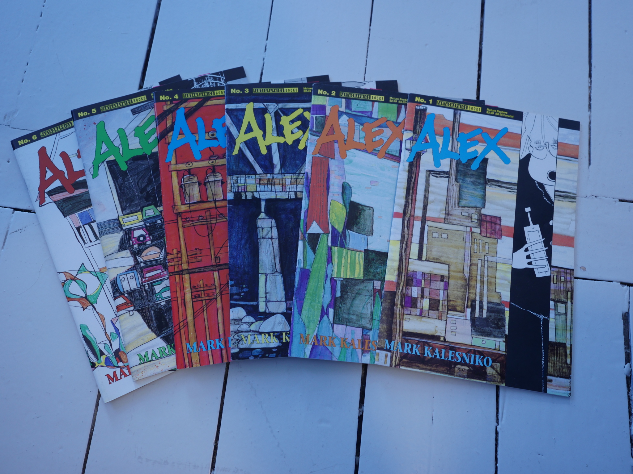
This is a quite unusual Fantagraphics floppy series: 1) It’s not a single-author anthology, but a proper story that 2) seems to be designed to last for six issues and 3) wasn’t cancelled before it was completed and 4) was published on a strict bi-monthly schedule (which may be a first (and last) for Fantagraphics) and 6) isn’t very good.
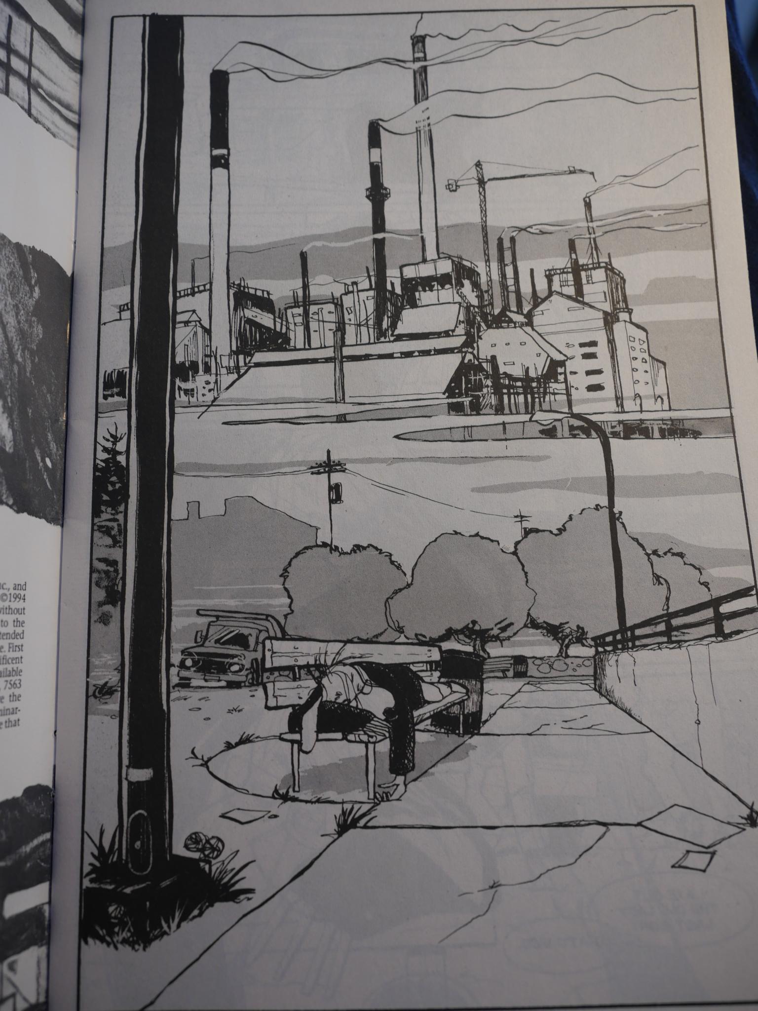
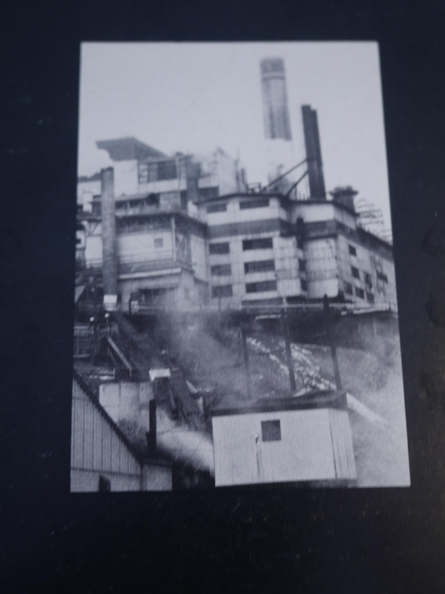
There are good things about it. Kalesniko draws beautiful ugly factories.
All the exteriors are great. They look organic and real and have personality. More personality than the characters. The protagonist is a funny animal, while all the other characters are human, and not all that convincingly rendered.
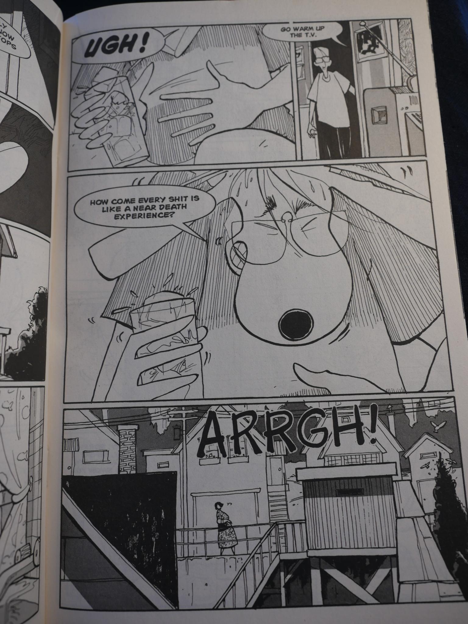
But the problem here isn’t the drawing, which varies between fine and great, but the histrionic storyline, which is about a alcoholic cartoonist (with a similar name to Kalesniko) who’s not very inspired (except by one new painting he’s made) and is alienating all his friends and drinking himself to death.
OK, perhaps that sounded kinda interesting, but the pages are filled with references we’re supposed to get (and if we don’t, are really boring).
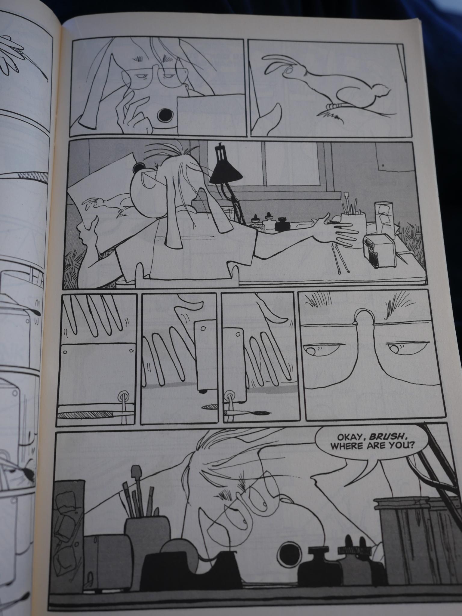
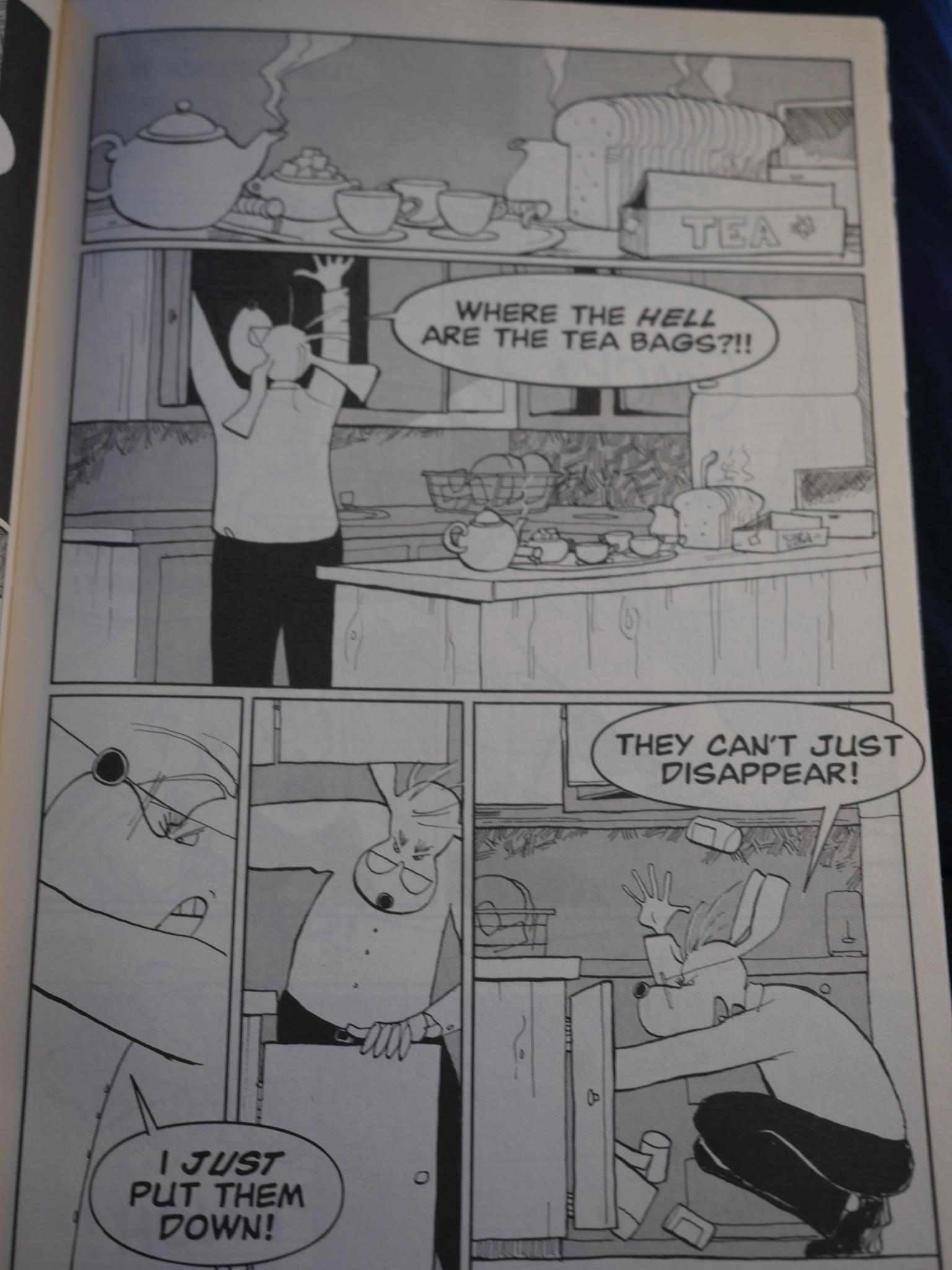
But here’s the main problem here. We see the artist losing his brush…
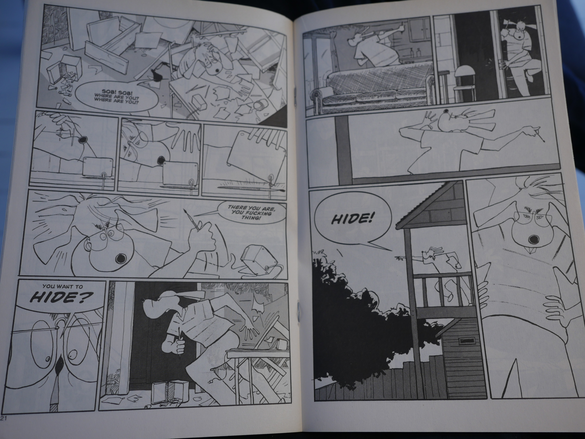
And then the natural result: He flips completely out, trashes the apartment and then throws the brush from the balcony. And then goes to looks for it, which is the fun part. This is repeated with… uhm… three more objects? I forget. So it’s meant to be funny, and the repetitions are meant to provide structure (and further amusement), but after seeing him trash his apartment for the ninth time, it all starts feeling very silly. And not good silly.
Kalesniko includes some of the reference material on the back pages, which probably means that there are autobiographical elements to the story, I would guess. Hm, yes, I just duckduckwent a bit, and his biographical details seem to be the same as the Alex character.
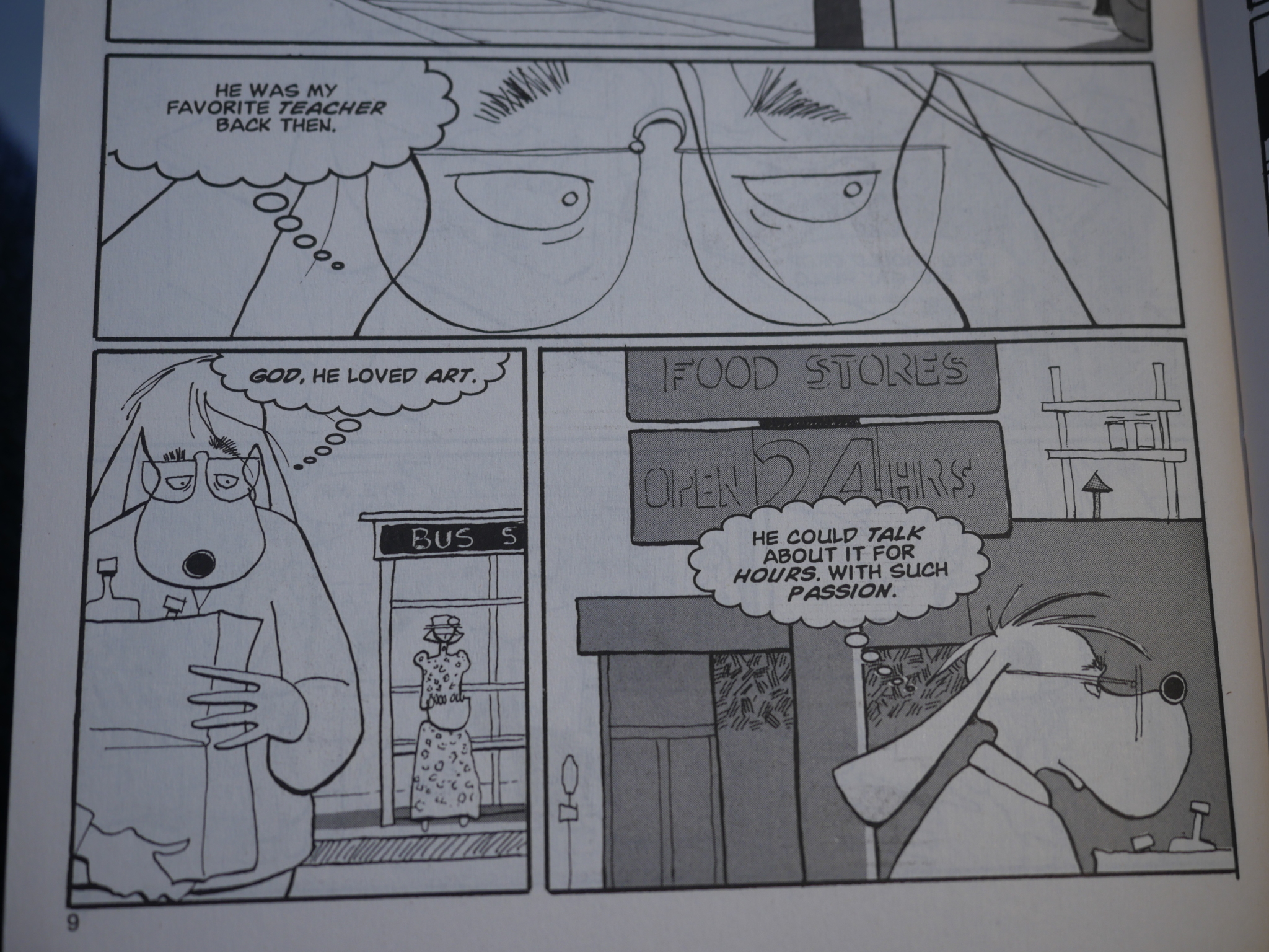
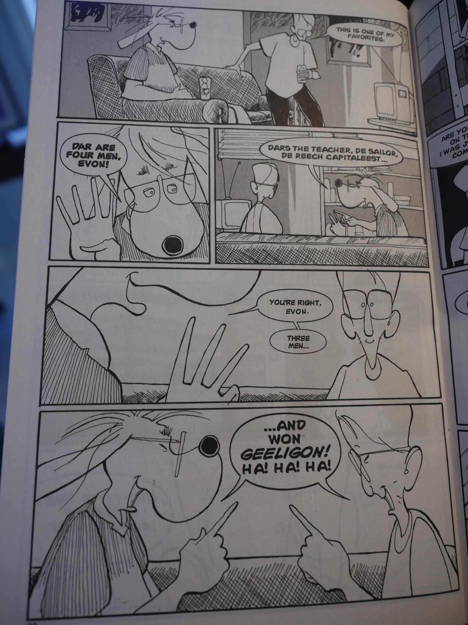
This is a pet peeve of mine: Over-emphasising. Why is “teacher” in bold oblique? “Talk”? Really, why is bold oblique used here at all? Sometimes when I’m extra cranky I feel that it would be better not to model prosody and emphasis at all when lettering, especially here where it’s an internal monologue. (In speech bubbles it’s really common to go bold oblique in comics, and that’s usually fine.) If he’s really THINKING that WAY all the TIME then the inside of his head has to BE REALLY annoying.
Besides, trying to dictate reading to that extent is a sure sign of KOOKERY.
(And I won’t mention this is an example of pretty early computer lettering (1994), because I”M NOT A nerd.)
Every other scene is like this.
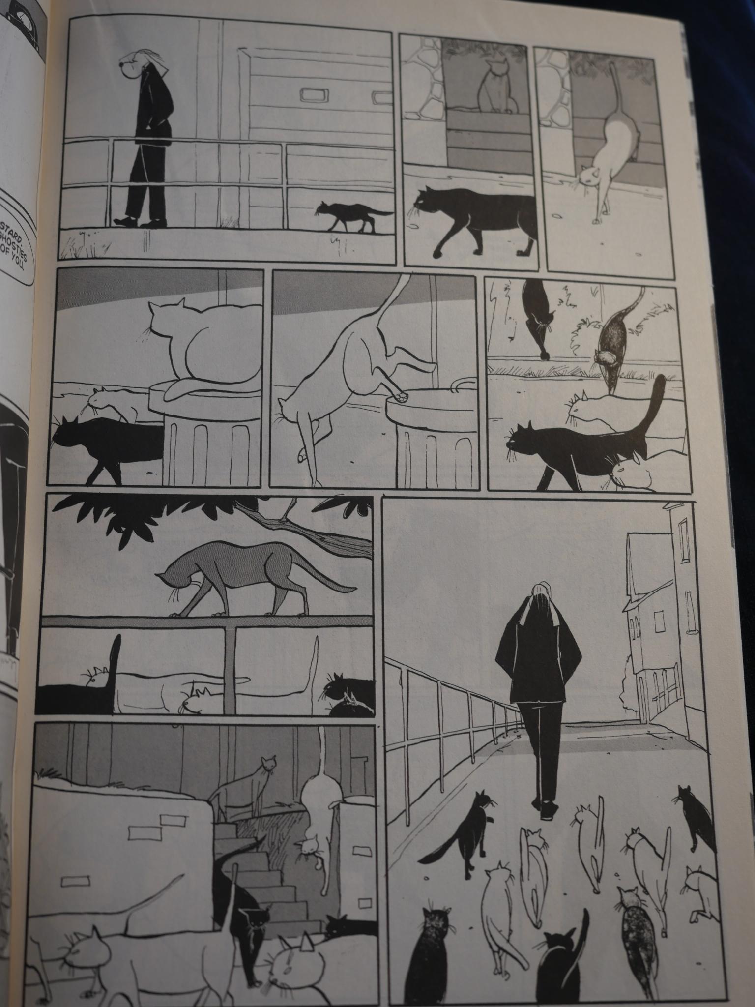
One bit I liked here was the way he used the cats as harbingers of death (or something). They ghost the guy who’s next to die (or something).
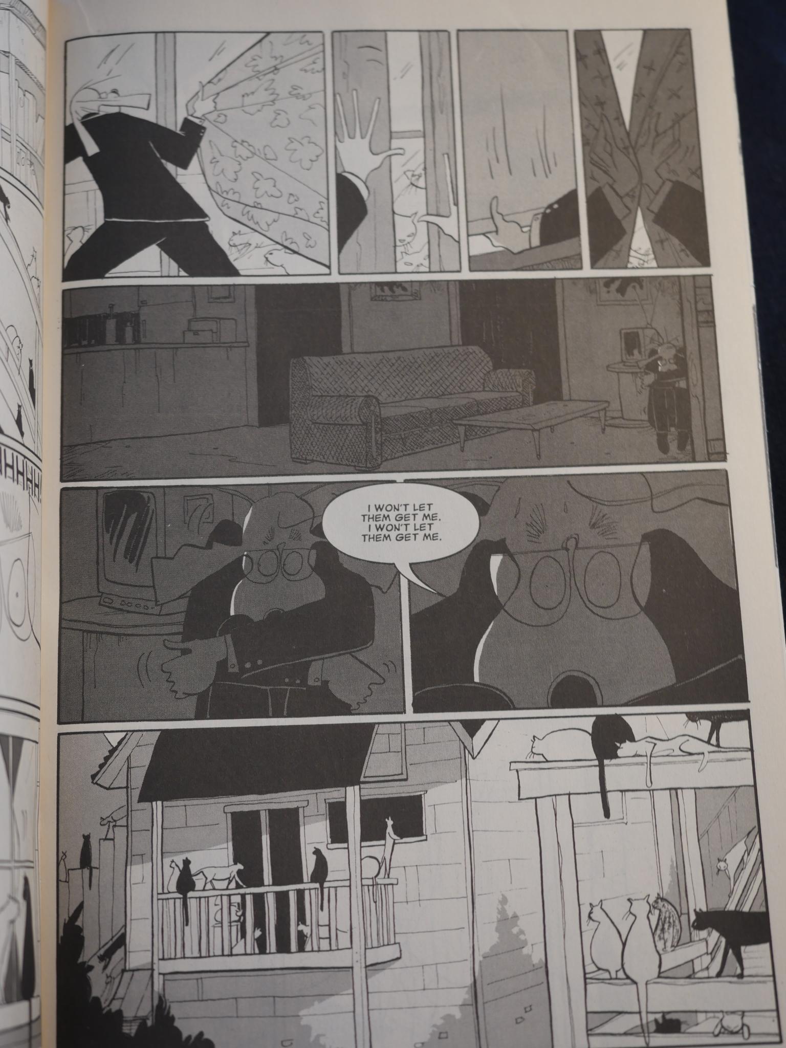
With all the subtlety of a knife to the eye.
Kalesniko has continued to publish sporadically via Fantagraphics. His latest work was Freeway from 2011, I think.
This post is part of the Fantagraphics Floppies series.
One thought on “FF1994: Alex”