Lloyd Llewellyn #1-6 by Daniel Clowes.
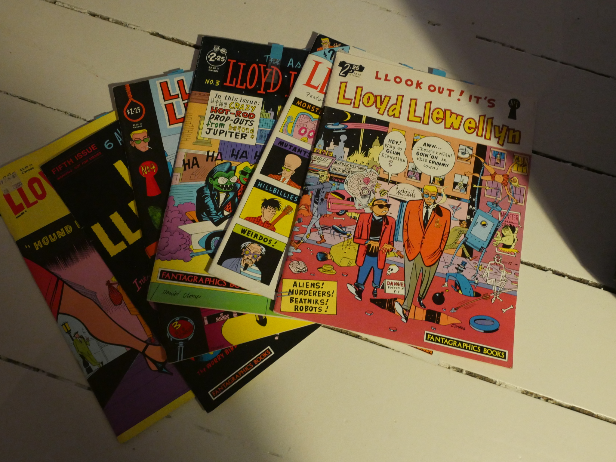
Daniel Clowes is one of the most celebrated comics artists working today, but back in 1986 (when he was 25), he created his first comic book series: Lloyd Llewellyn. To say that it was an overwhelming success would probably to be overwhelmingly generous.
Before doing this series, he had contributed a number of pieces to the Cracked magazine, which was a cheaper but weirder Mad knock-off, and Clowes is on that mode for the first few issues.
The stories hover around an eight page length, and they are mostly semi-parodies of detective stories set somewhere in a mythical very late 50s setting. Lots of dames and beatniks and zany aliens.
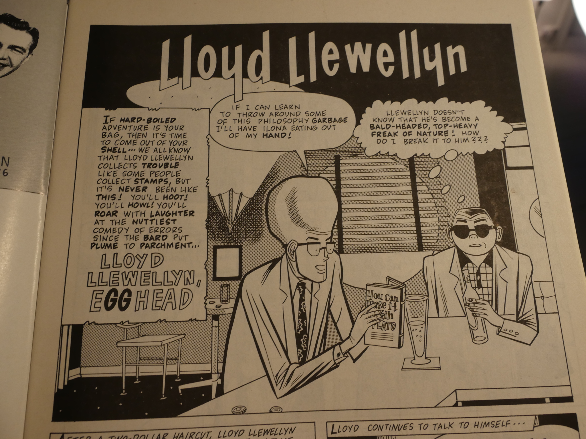
Looking at the earliest pages here (like the one above), it’s not easy to tell whether this is an artist who has honed his skill and style carefully down to its essence, or whether it’s just someone who doesn’t really draw very well, but has learned some stylistic ticks and applied them consistently.
I kid.
But it’s still quite attractive. The extremely stiff postures, the unvarying lines, the zip-a-tone… It’s got something interesting going on, and I remember being quite enthused by the artwork as a teenager. But I did stop buying this magazine after the first issue, because I just didn’t find it to be funny enough.
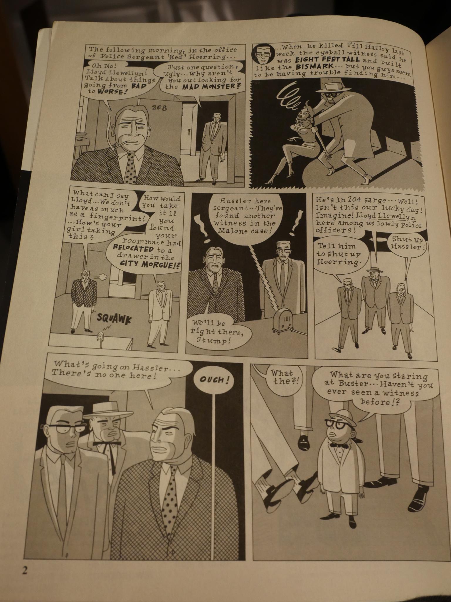
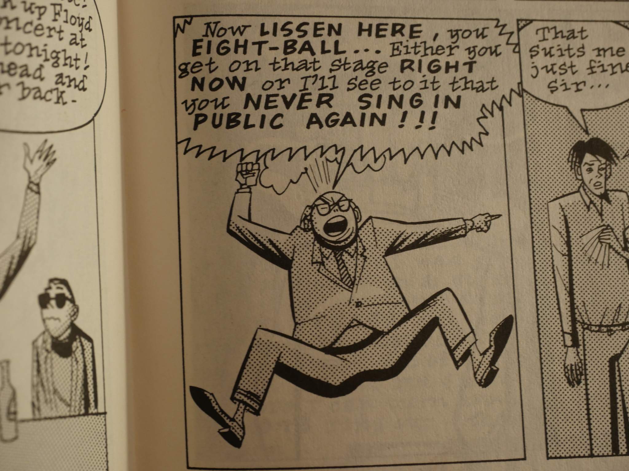
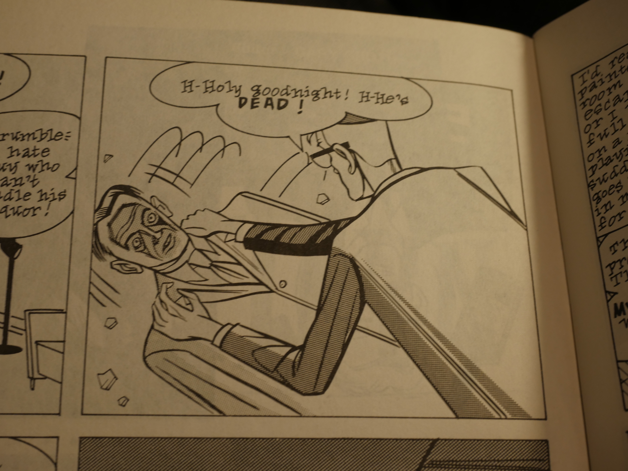
And is that a Richard Sala strangler up there in the top right-hand panel?
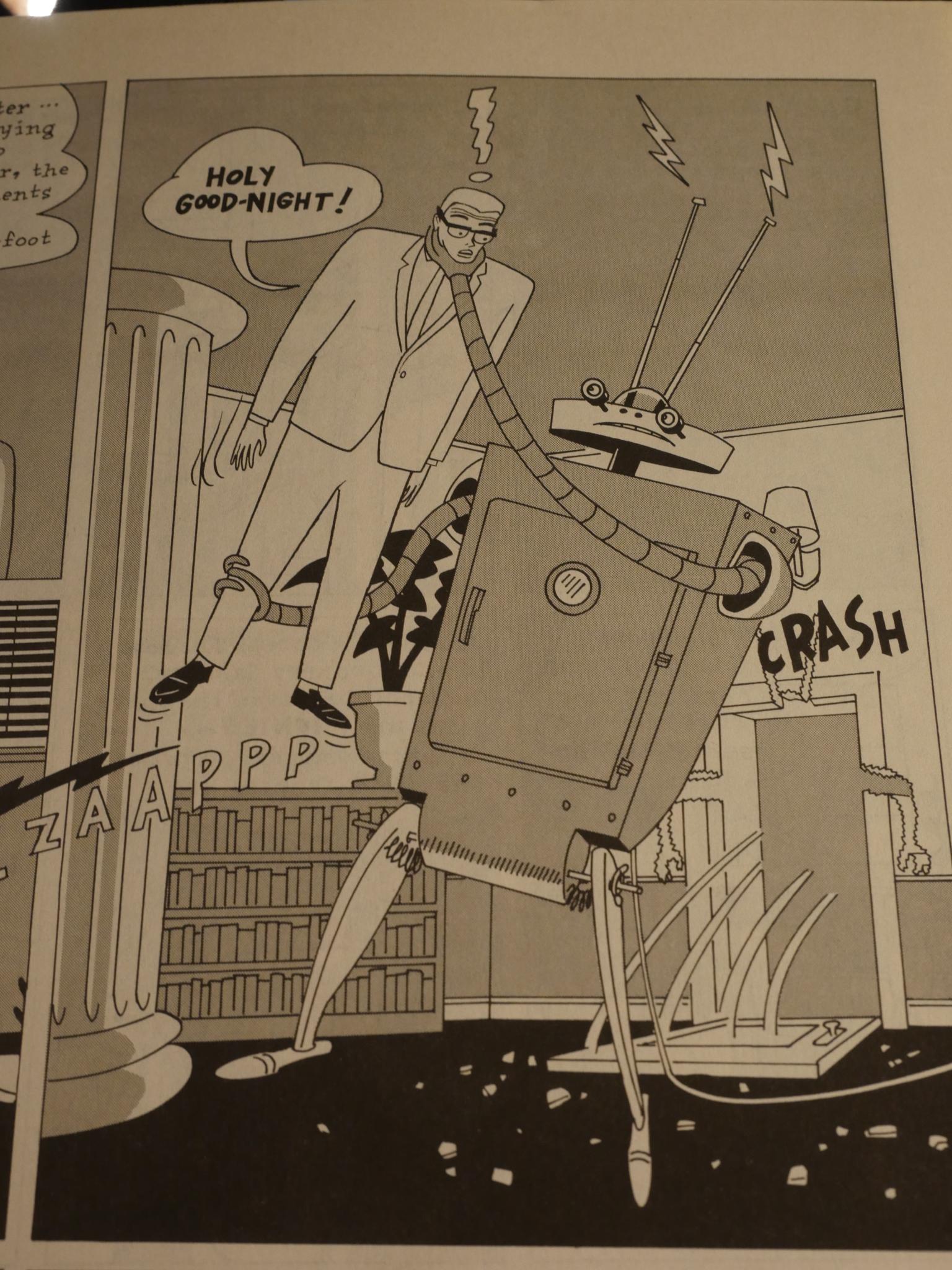
I’m enjoying it more now, I think. The Joost Swarte-ish robot is nice…
But, of course, the most striking thing about Clowes’ art style here is that it’s very Bernie Krigstein inspired. If by “inspired” you substitute “it looks like Clowes has the complete works of Krigstein stapled to the wall over his drawing desk”, which is fine by me. There can never be too much Krigstein in the world.
Heh, heh. “Eight-ball”. When Clowes launched his much more successful (critical and commercial) series a few years later, that’s what he called it, but it’s a word he used even at this early stage.
The other obvious point of reference for these stories are all those silly comics DC published in the 60s. Something wacky would always seemed to have happened to Our Hero, and the story explain how.
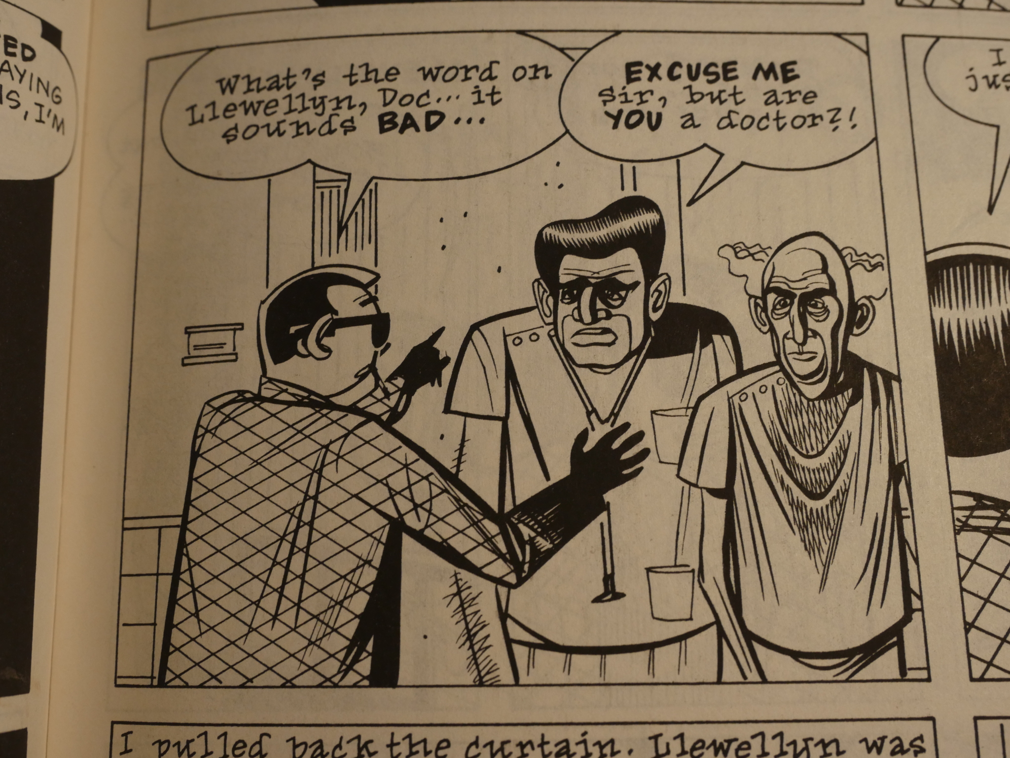
Gotta love those faces.
The third issue breaks with the format somewhat, by having just a single longer story, but it’s broken up into four chapters, so it’s not that much of a departure. The storyline is exactly what you’d expect from that title up there.
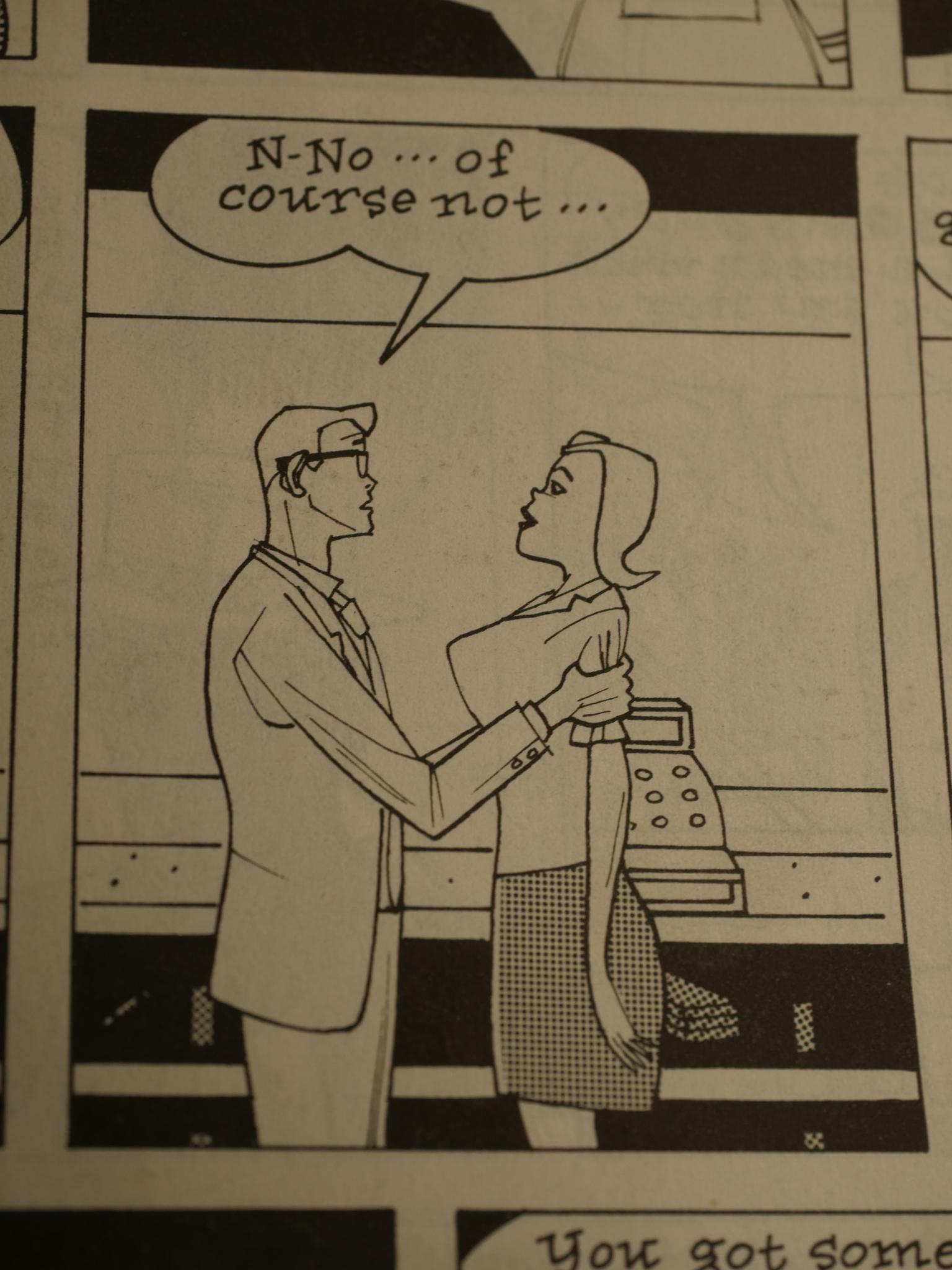
Clowes’ art evolves quite a bit over the Lloyd Llewellyn period. I think this is the first appearance of what came to be the “classical Clowes face”. The thick-and-thin lines in a staring face inexplicably covered by a shadow. In the early Eightball years, he’d continue to render and render and render variations of it to great success.
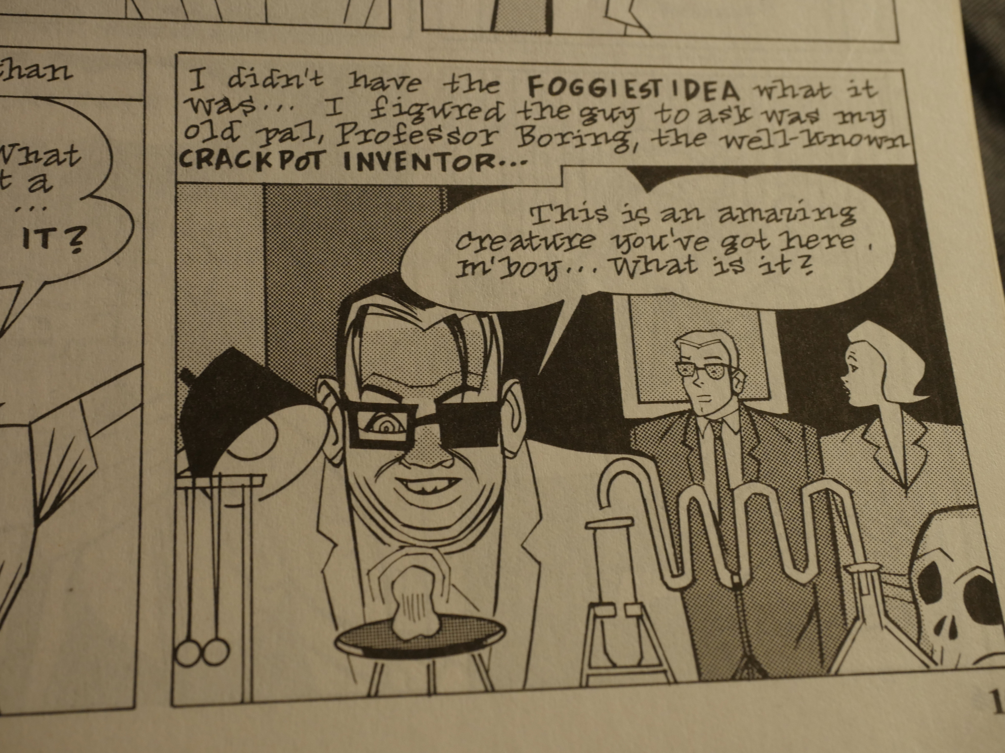
One of Clowes’ later graphic novels is called “David Boring”, but it was a name he’d liked for quite a while. Here as “Professor Boring”. And it is a good name.
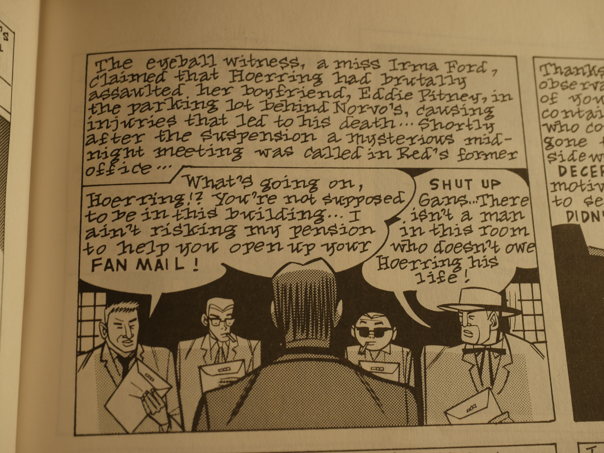
The main problem I had with Lloyd Llewellyn as a teenager, and that I still have, is that its verbiage doesn’t pay off. If you’re going to do this much text, it should be funnier, or at least … better. But much of it just sits there.
Whodathunk it! Lloyd Llewelling looks just like Clowes!
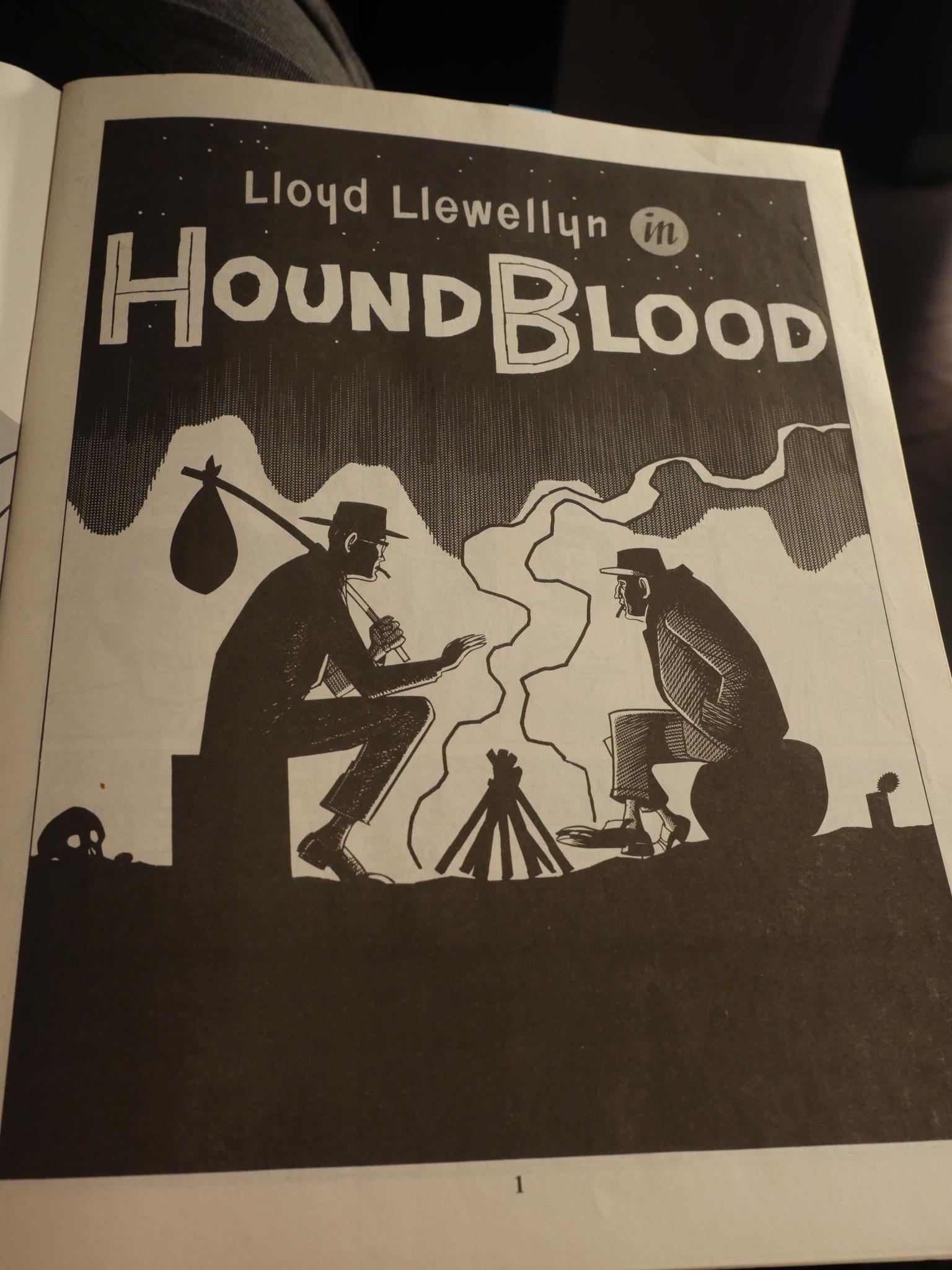
That’s a very pretty splash page. Leaps and bounds over how this series started, I think.
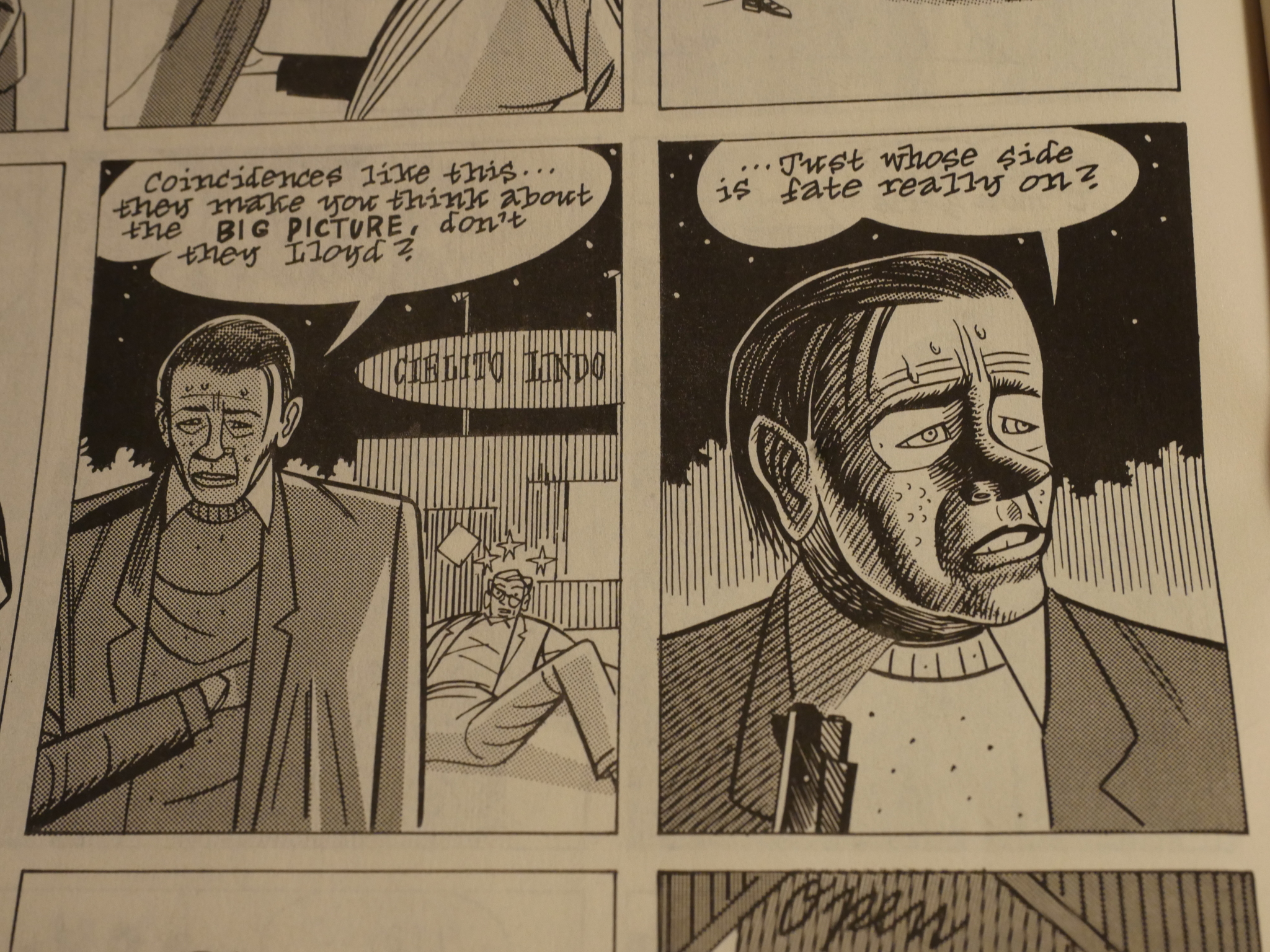
The final issue of Lloyd Llewellyn is something of a transitional issue. There’s less 50s hipster talk and Llewellyn is a drifter instead of a private dick (at least in the first, and most Eightball like story). Instead of trying to solve some mystery (which is what most of the stories up until this point had been about, however wacky), it’s more of a descent into a nightmare world where coincidences drive the story.
In Eightball, the major first serial would pick up on this very majorly, as the next US president would put it.
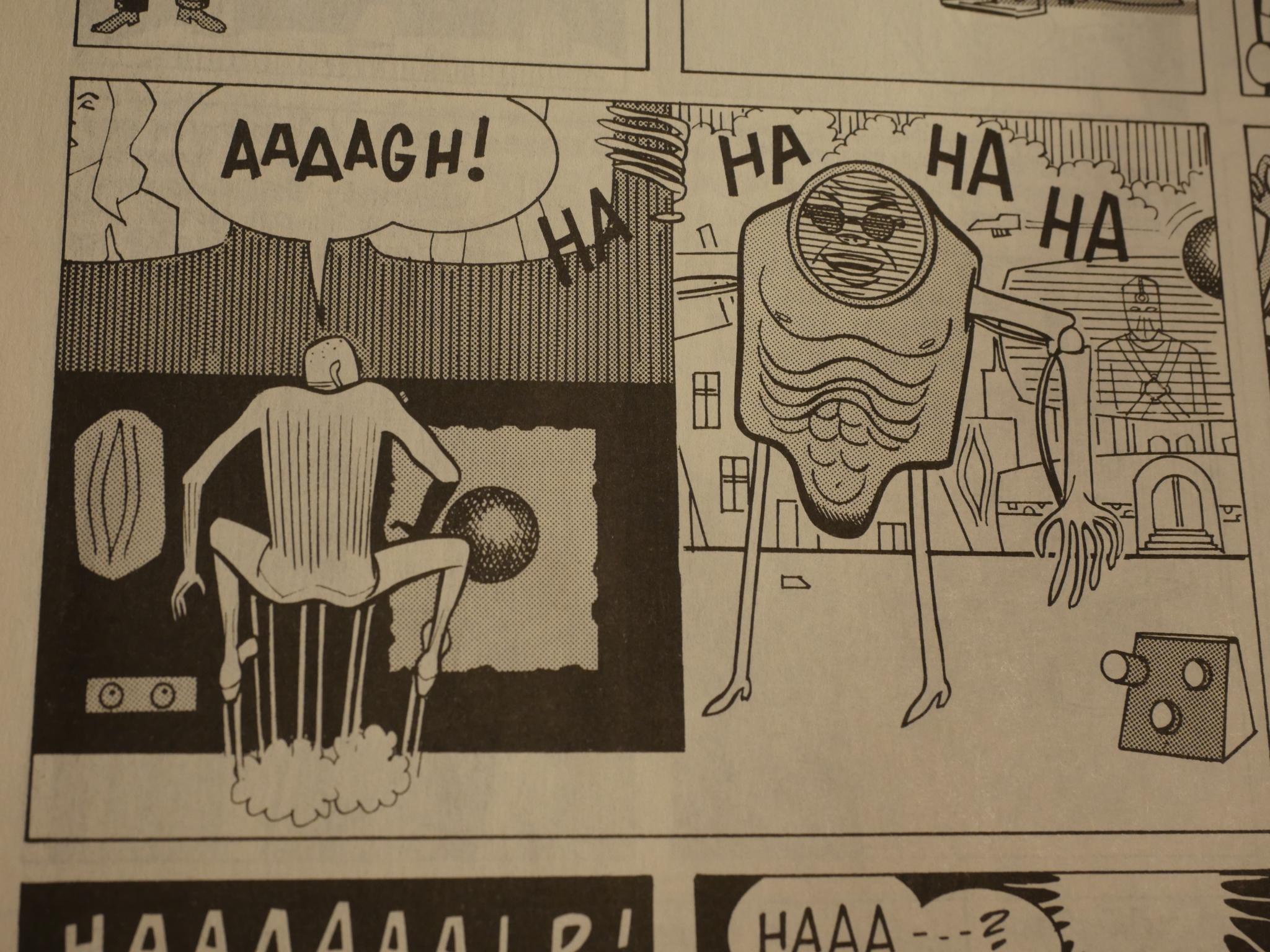
And I’m including this panel because it’s a depiction of the future, which Clowes would revisit this year in his major success of the year, Patience. I think, basically, this panel could have been dropped into that book. So Clowes had arrived at his final style here in this book from 1987, which was earlier than I had imagined.
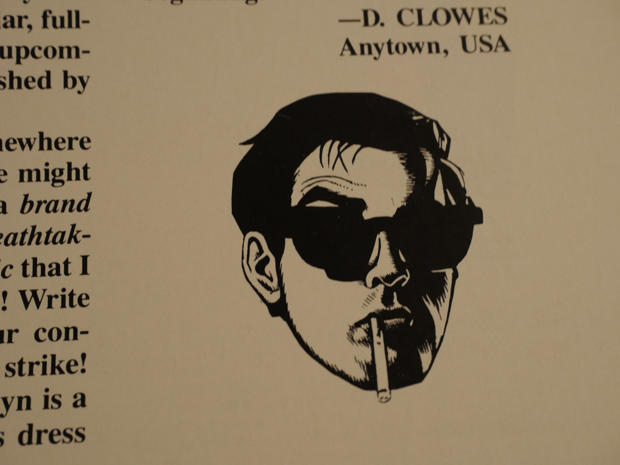
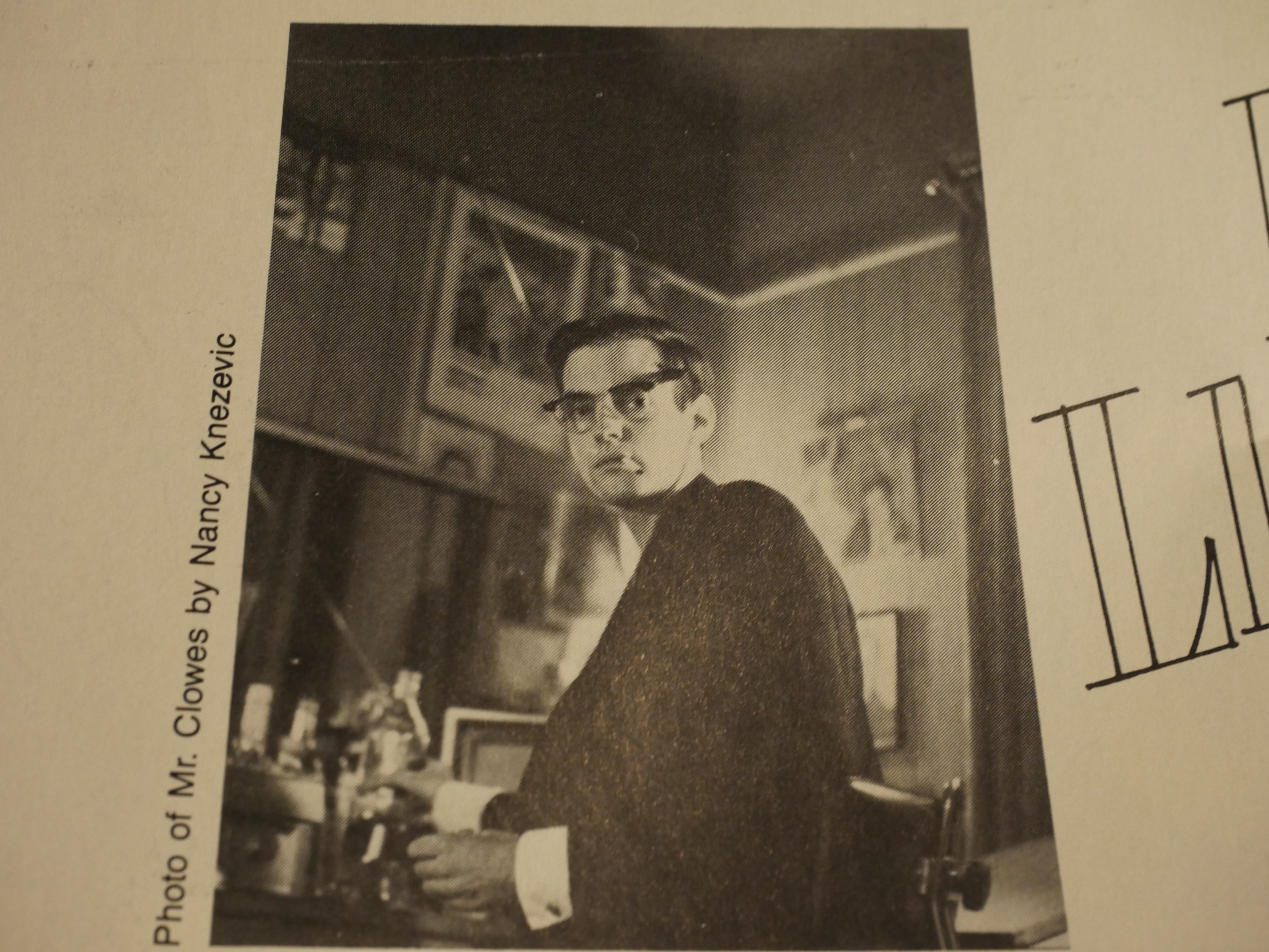
I finish here with what I assume is a self portrait by Clowes, done in a very un-Clowsey style. Nice!
I think Lloyd Llewellyn is perhaps the best example of Fantagraphics picking up on a talented (if in-the-rough) artist and sticking by them, even if what they were making didn’t exactly set the world on fire. Sometimes it paid off big, as with Clowes and Peter Bagge, and sometimes they were unable to convince the world of the artist’s greatness.
This post is part of the Fantagraphics Floppies series.
One thought on “FF1986: Lloyd Llewellyn”