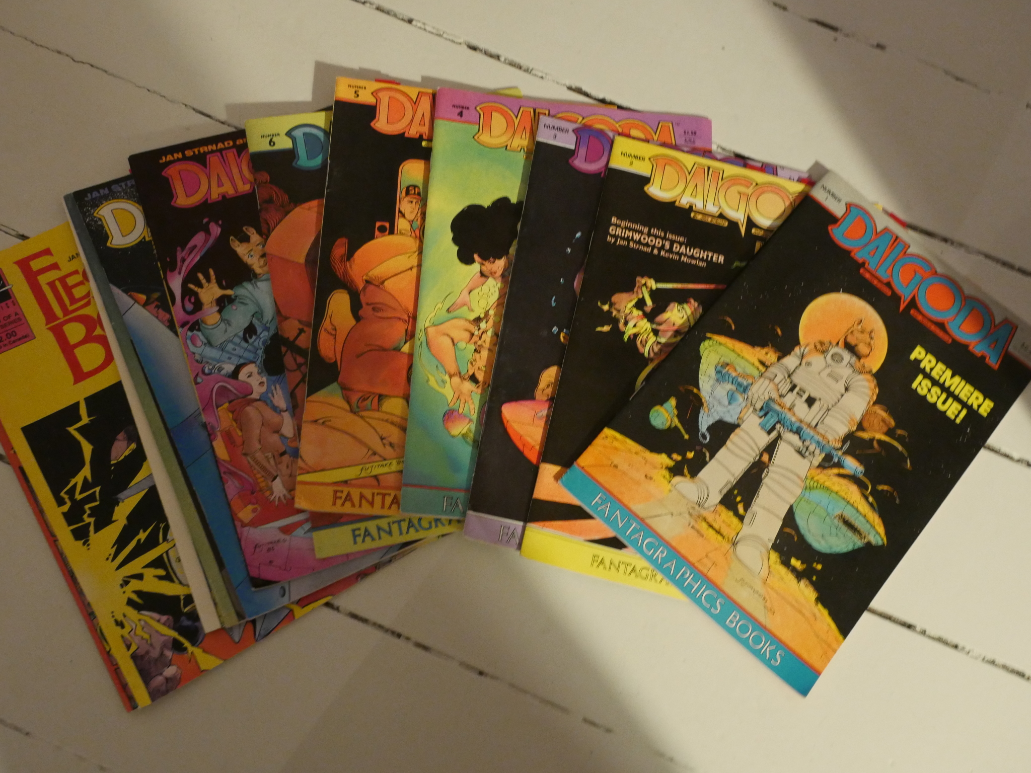
Dalgoda #1-8 Flesh & Bones #1-4
By Jan Strnad and Dennis Fujitake.
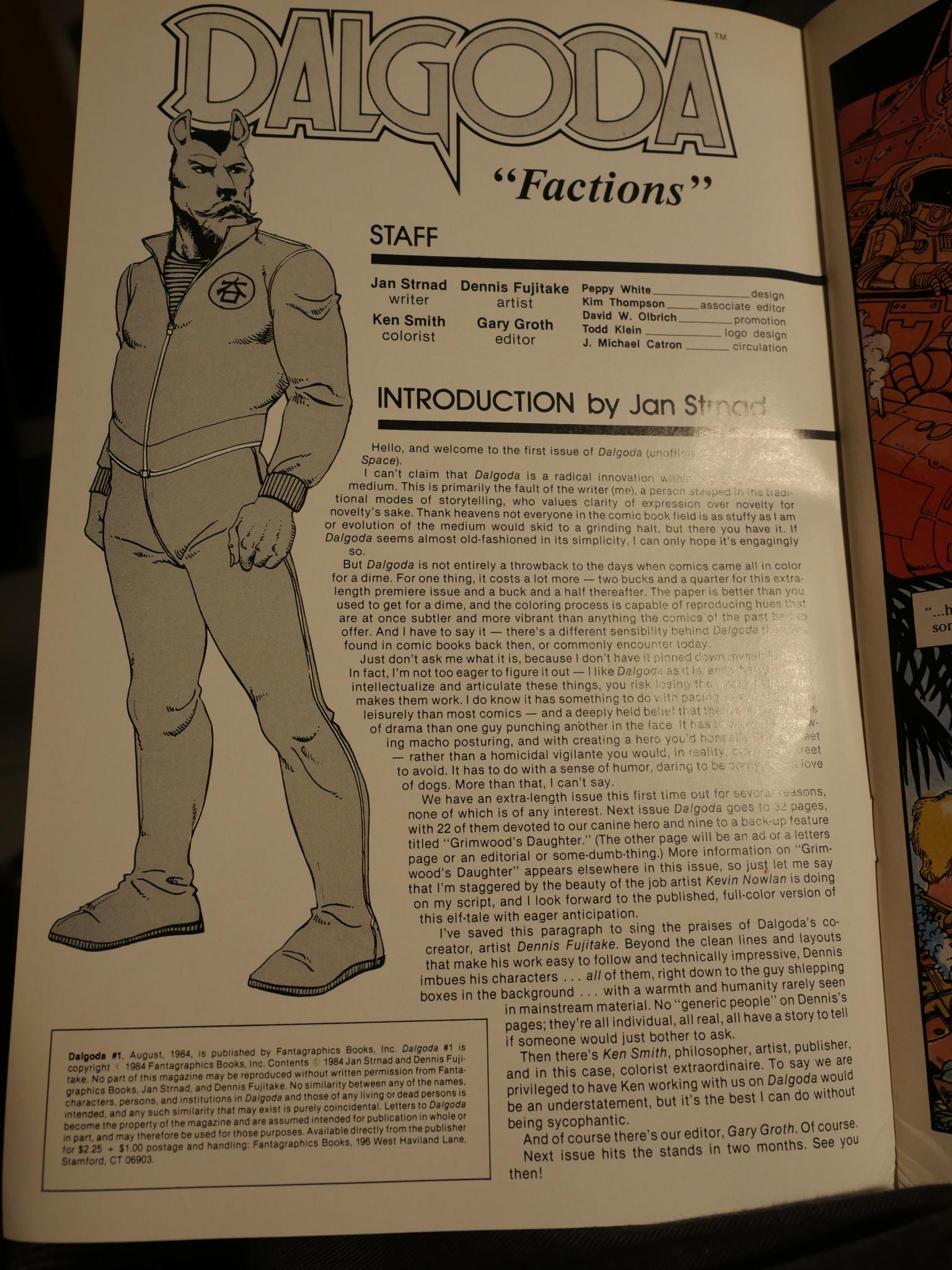
I think this may be Fantagraphic’s first colour comic book. They’d released a couple of albums (“graphic novels”) in colour, but every comic book comic was in black and white. According to the editorial by Gary Groth, it was something of a financial gamble, which, of course, leads to the question… Why Dalgoda?
Strnad is probably most famous as the writer for numerous stories drawn by Richard Corben in the 70s, as well as a couple of shorter stints writing super hero stories for Marvel and DC. The only one I can remember off the top of my head is Sword of the Atom (or something), drawn by Gil Kane. I remember it being… er… better than most, but still not that exciting.
In the introduction above, Strnad explains that there’s something ineffably different about Dalgoda from mainstream comics, but nothing so radical that it should scare anybody off.
So here we are with the first colour comic book from Fantagraphics, and it’s a science fiction tale involving alien invasions and…
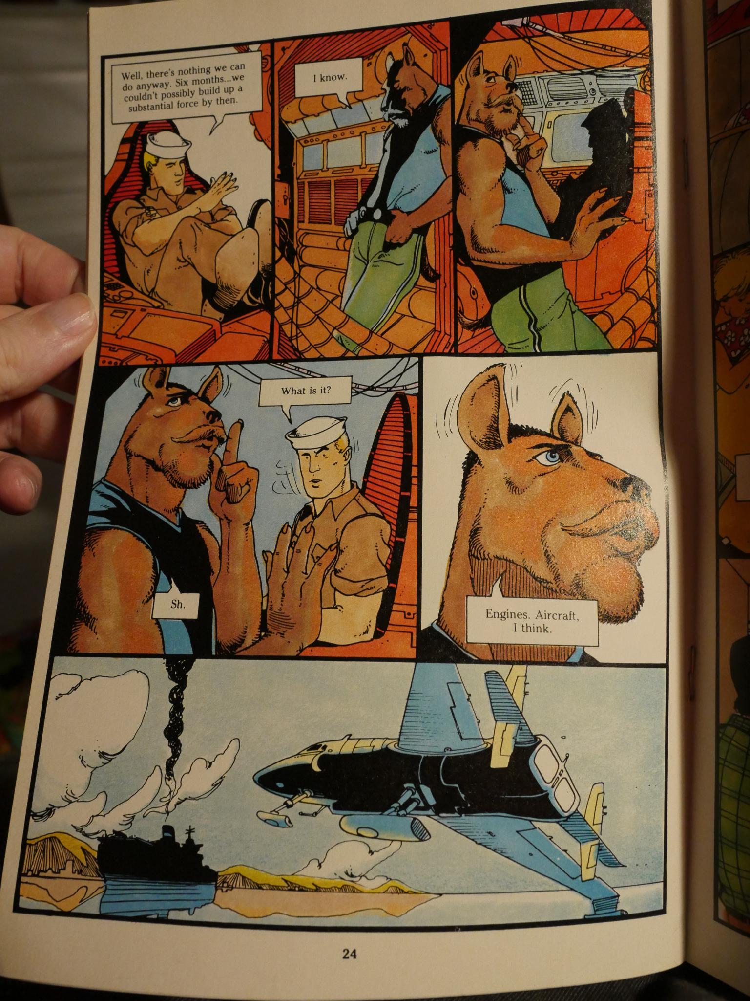
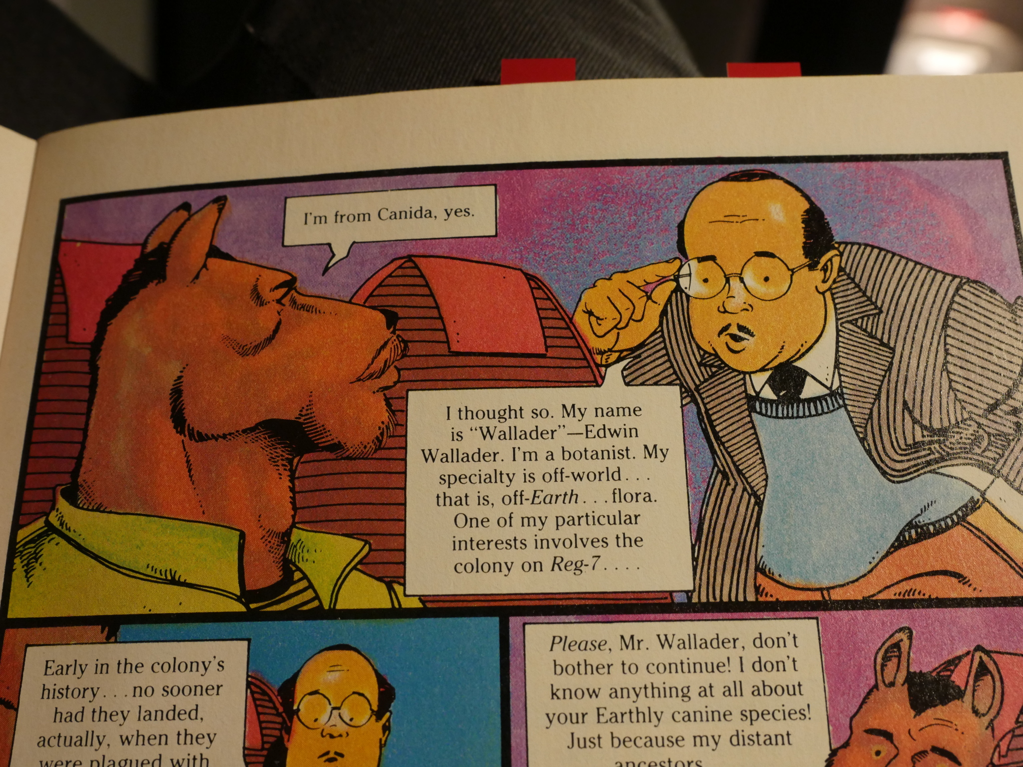
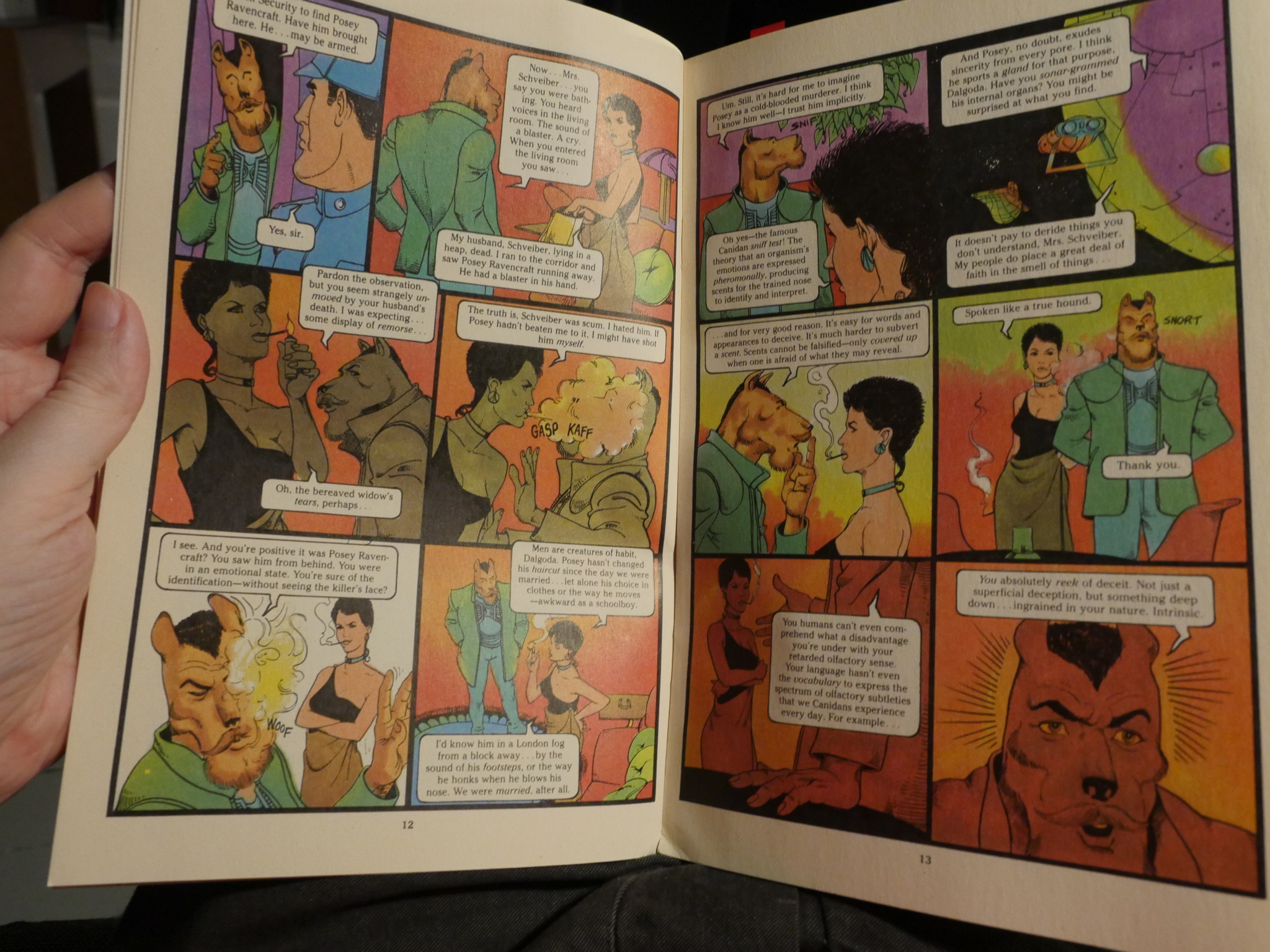
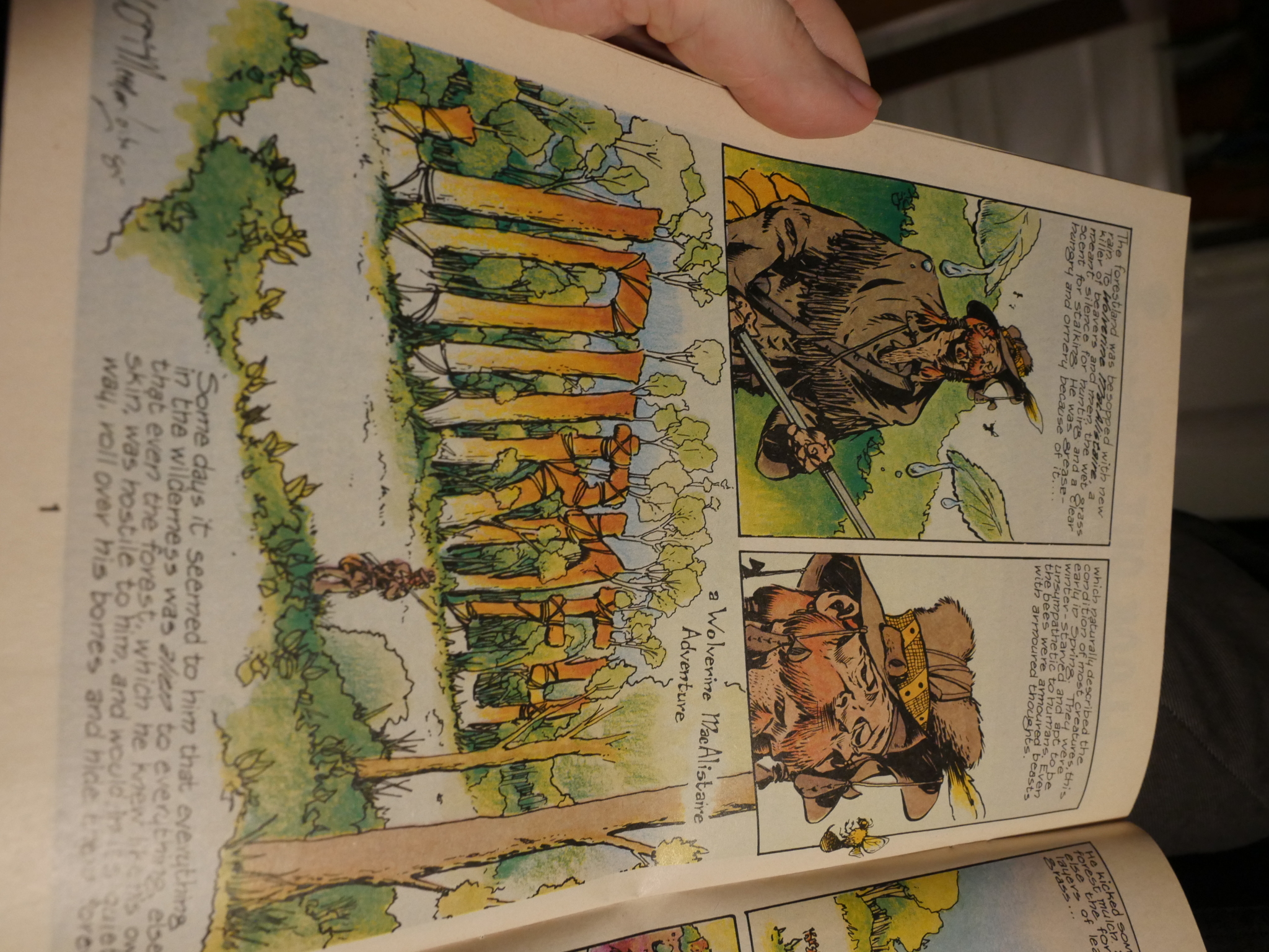
… an ally species from a planet called Canida. Who look like dogs. Yes. This is surely a financially prudent move.
(I love Dalgoda’s pose in the second panel above. It’s so expressive.)
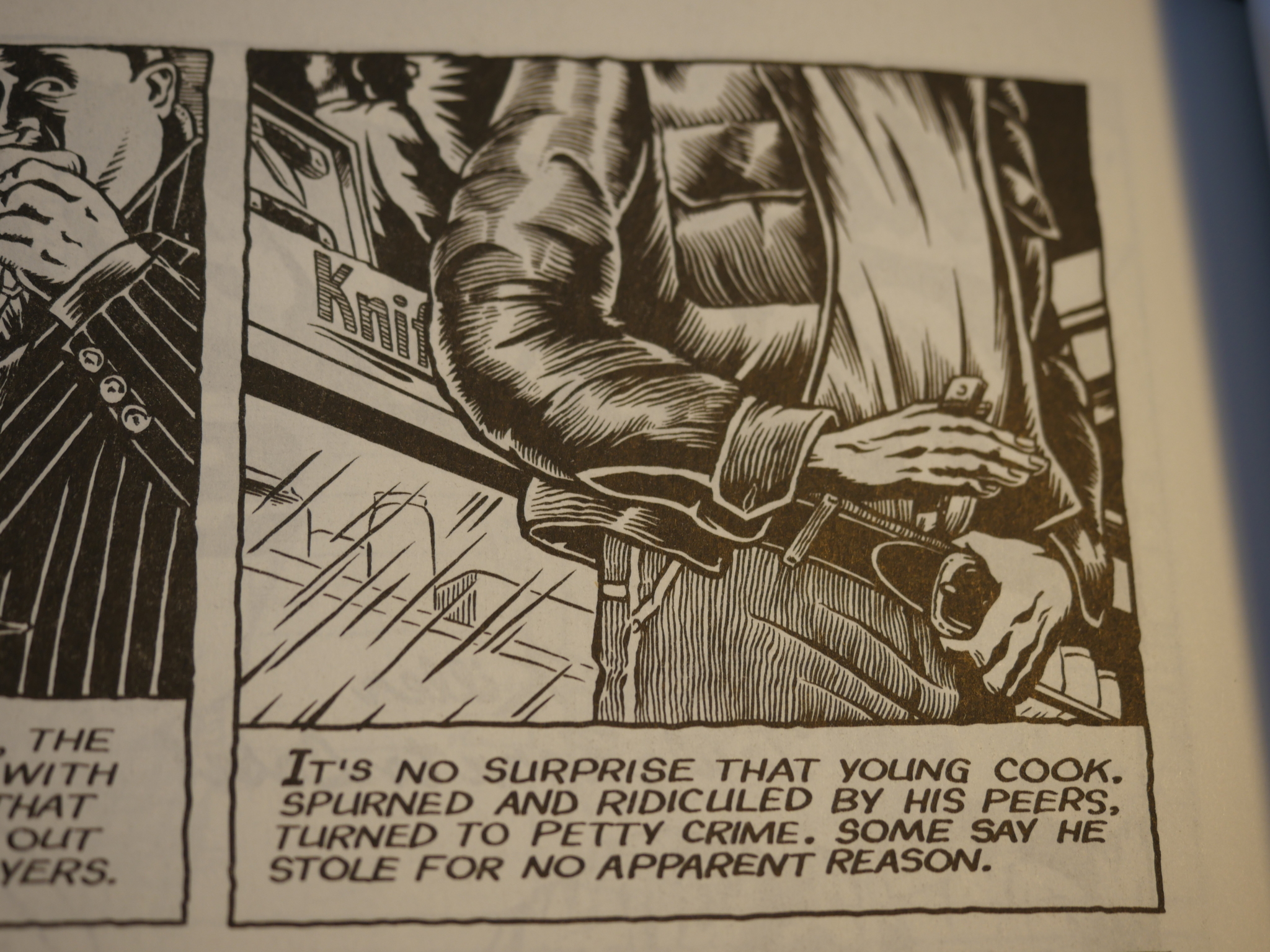
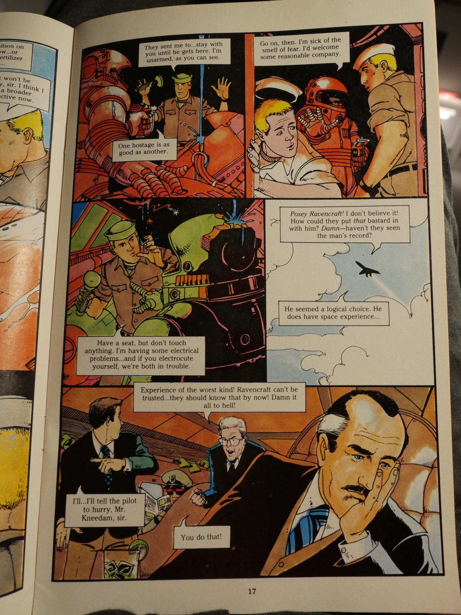
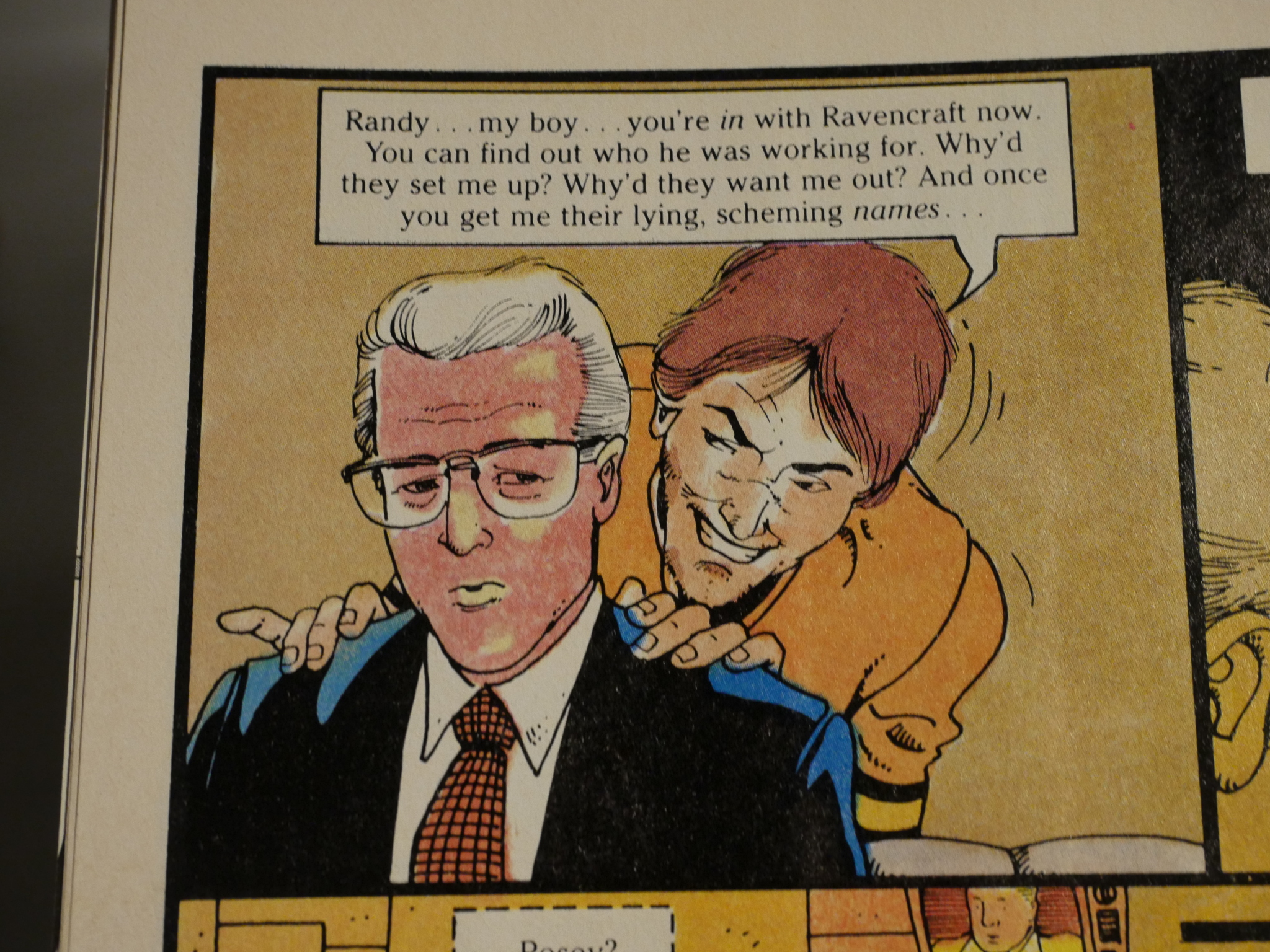
Strnad has a way of dropping a lot of exposition into the mouths of his characters, and almost every single issue starts with a recap. Re-reading it now, it’s somewhat annoying, but there’s so much good humour and excitement in the story that it’s bearable.
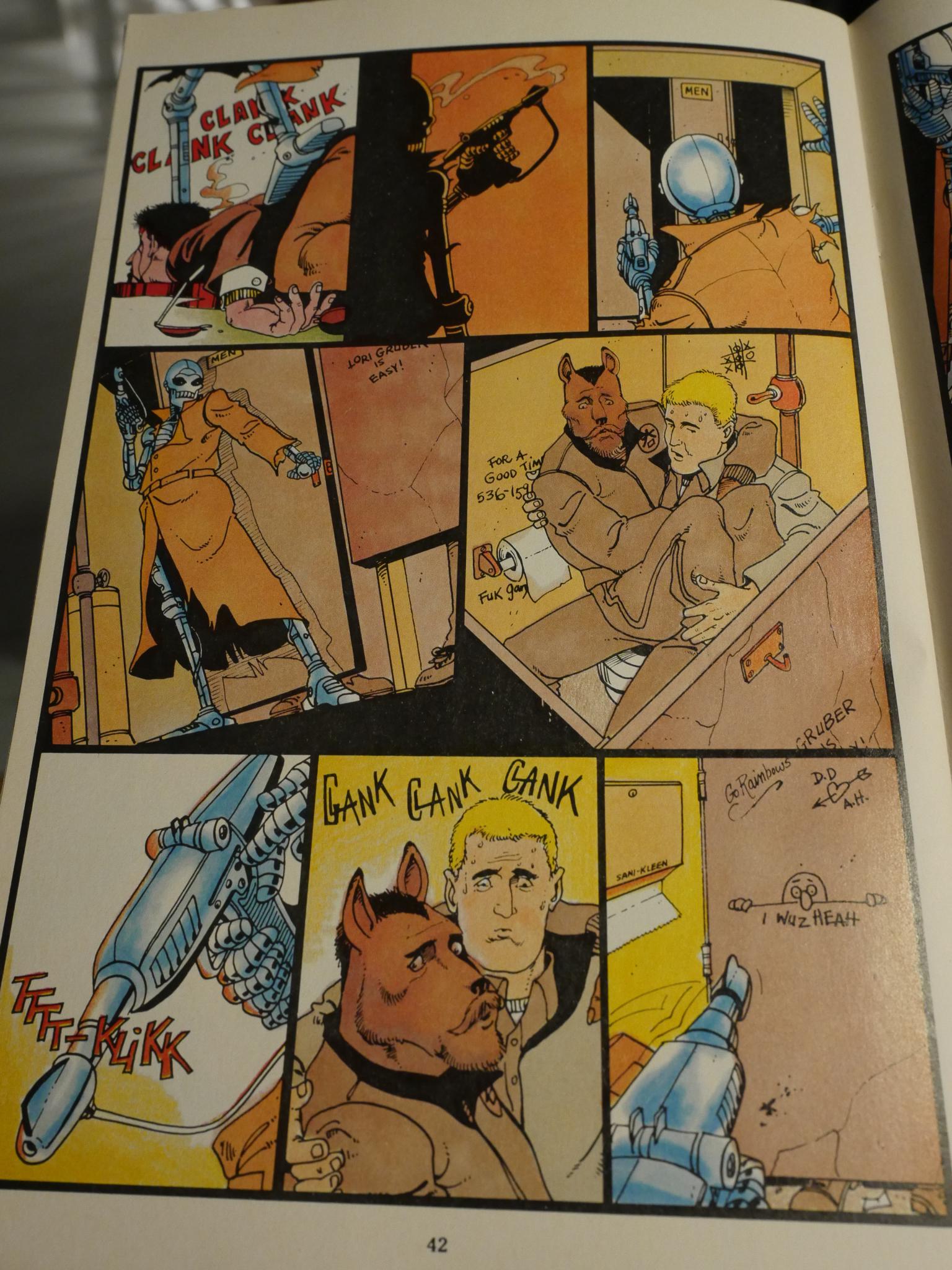
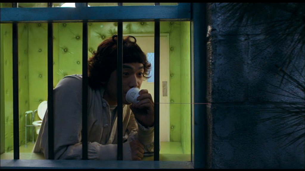
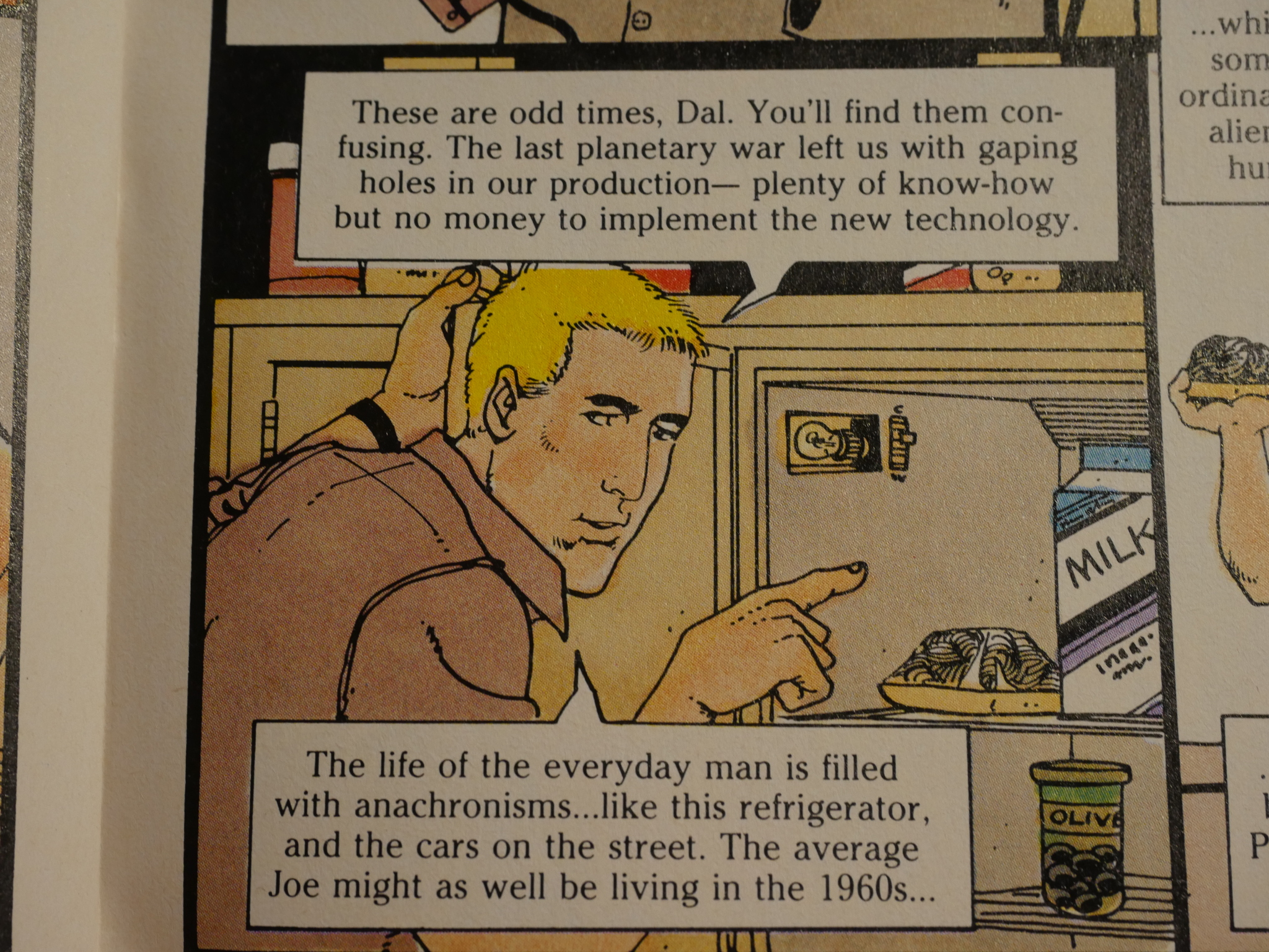
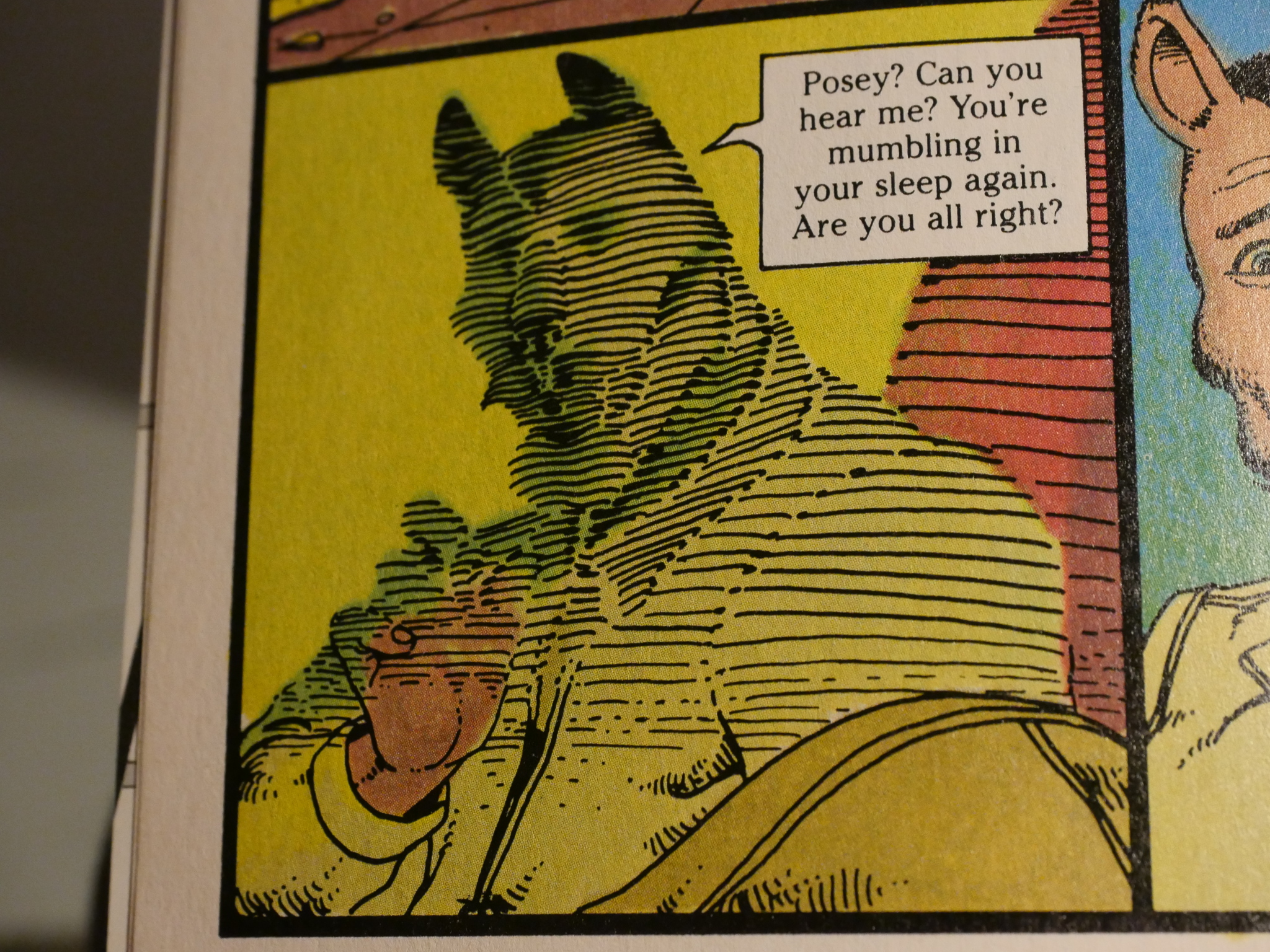
And I love Dennis Fujitake’s artwork. When I read this as a teenager, I didn’t make the connection to Moebius. Fujitake names him as a major influence in his introduction in this issue, but I just didn’t see it back then. I thought it was some kinda weird mash up of Tintin and (what I assumed to be) an unknown … Thai? … comics tradition. Everybody looks kinda realistic, but also somewhat cartoonish, which makes the things that don’t exist in our world looks completely natural. Dalgoda and that robot look just as home in that restroom as the human guy does.
And this is Fujitake’s first published comic book, although he’d been doing illustrations for quite a while before this book. And he lives in Hawaii.
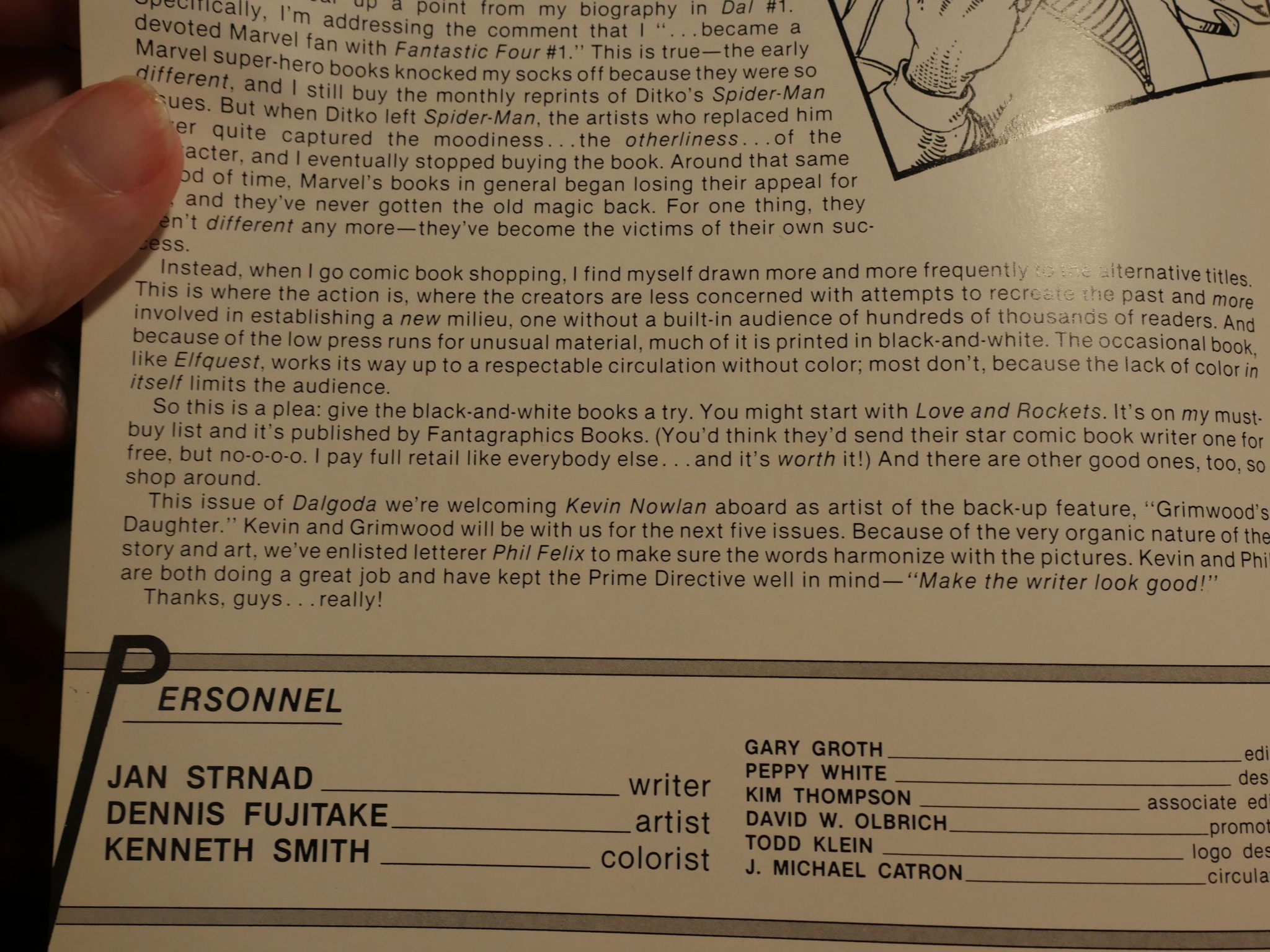
I found this bit from the introduction to the second issue interesting in a “how things have changed” manner. Strnad is begging the readers to please try out some black and white comics. Some of them are good, honest! These days, I don’t think people who read comics care any more. They’re as fine with b&w as with colour… so perhaps Strnads plea worked!
Or perhaps Japanese comics happened.
Hm… That looks quite Moebius-via-Frank-Miller-circa-Ronin, doesn’t it? *checks dates* Yup, Ronin was published the previous year…
Here’s another example of the odd-looking realism Fujitake is going for. People don’t have peanut shaped heads. Not really. But it looks totally natural. And I think it’s time to talk about the colouring.
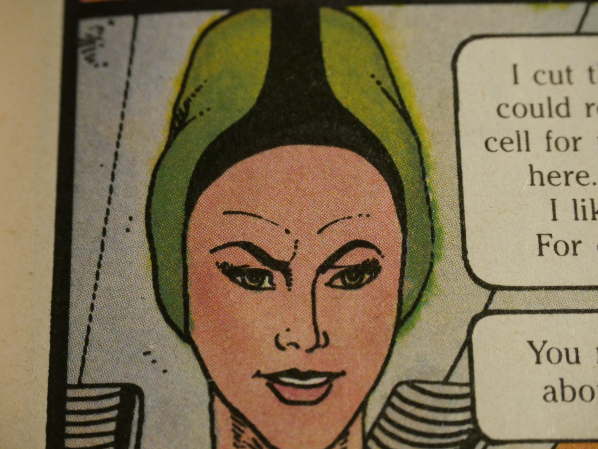
This being Fantagraphics’ first colour book, you’d expect some oddities, but the colour is just weird. It’s by Kenneth Smith (the guy who wrote those philosophical bits in the back of the Comics Journal), and not only isn’t he always colouring inside the lines, but the mixes of colours are very strange. Or perhaps it’s the person doing colour separations? I mean, look at the blotchy reddish purple splotching all over the bluish purple in the background above…
And look at this guy’s skin. Is that supposed to be a tan? Is it a mistake? Everything is quite blotchy all over. Is it supposed to add grit and texture? I don’t know, but I do know that you can spot a Fantagraphics colour comic from the mid 80s from ten paces.
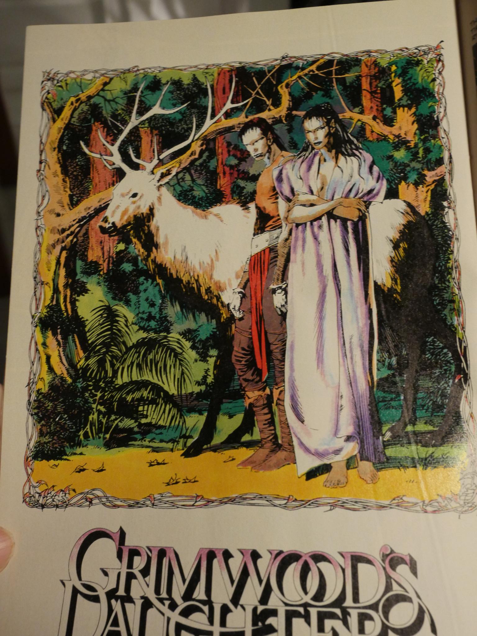
A backup feature written by Strnad, with artwork by Kevin Nowlan started in the second issue. The artwork, as you can see, is gorgeous. The story I found to be rather snooze-worthy.
I think Smith’s er distinctive colouring works on Dalgoda, but on Nowlan’s work it obscures more than it enhances. That doorway pose is very moody and the colours work great there, but in the preceving panels? Why are some of them green and some of them orange? Why is the background suddenly bright green? What’s going on?
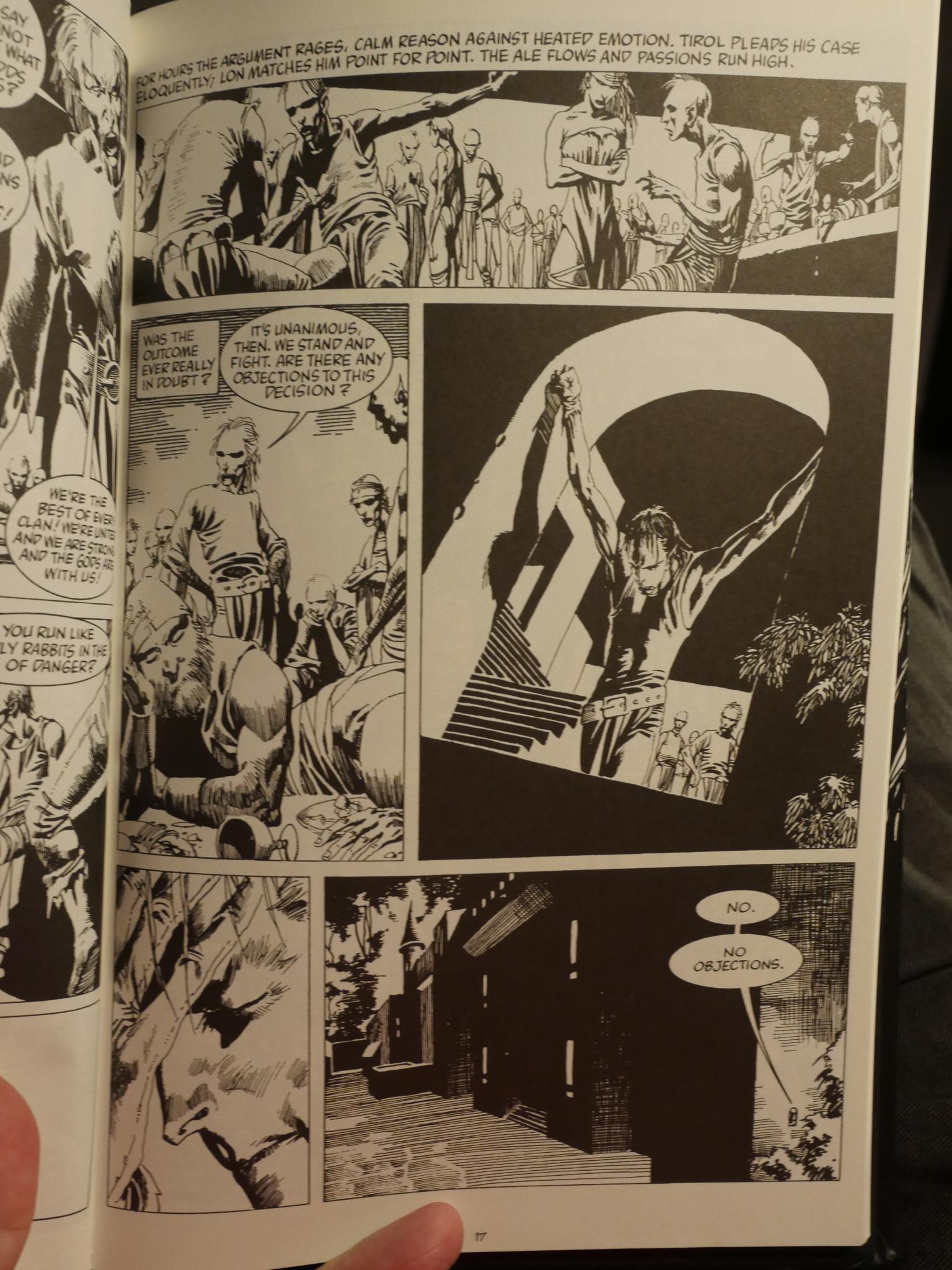
Grimwood’s Daughter was recently republished, and Nowlan opted for black-and-white, and you can really see all the details now.
I didn’t mean to go on about the colouring to this extent, but I just find it too interesting. I can understand the decision to do everybody in orange in the final two panels, because feelings are getting intense, but why are they that sickly green colour in panels three and four? Why is the background suddenly white in panel five (the background has a strong hue in all the other panels)?
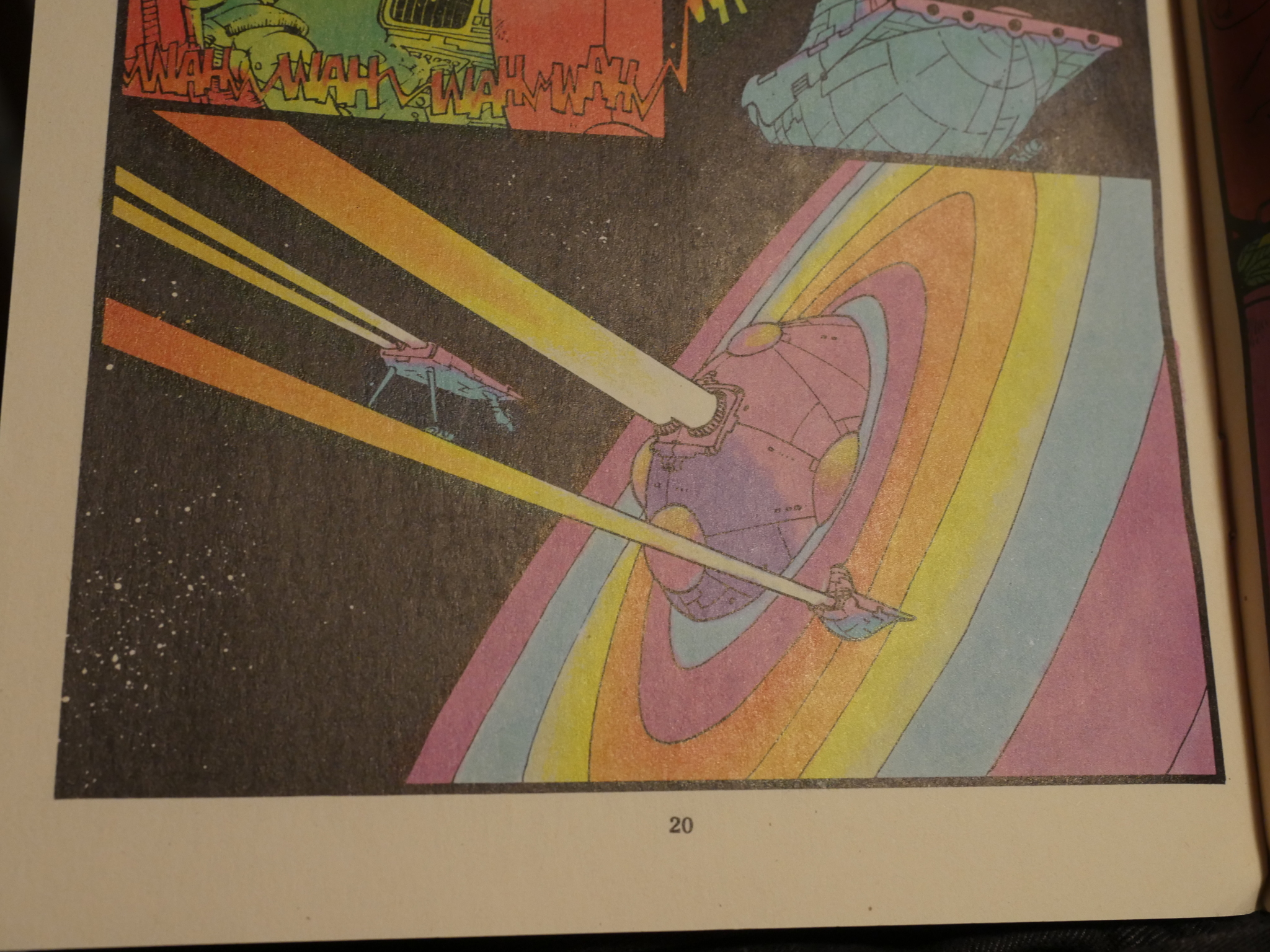
Hm… Anyway. Here’s a really Moebius space ship panel:
And then we’re back to colouring again, because in issue six Nowlan is colouring himself. And it looks completely different, with more traditional sculpted colours in most of the panels.
So… perhaps he wasn’t all that enthused by the colouring.
Smith colours William Messner-Loebs’ backup in issue seven in a completely different style than he’s been using until now. It’s downright pretty.
And then new colourists took over the main feature (Mark Wheatley and Kathryn Mayer), and Dalgoda started looking more traditional, too. But there’s still stuff like the detail above, where the green from the … hat? is leaking into the air… somehow… so perhaps all the oddities are down to the colour separations people. Who also changed! Or the printer! Who also changed!
Gah. Perhaps Gary Groth just wanted this look.
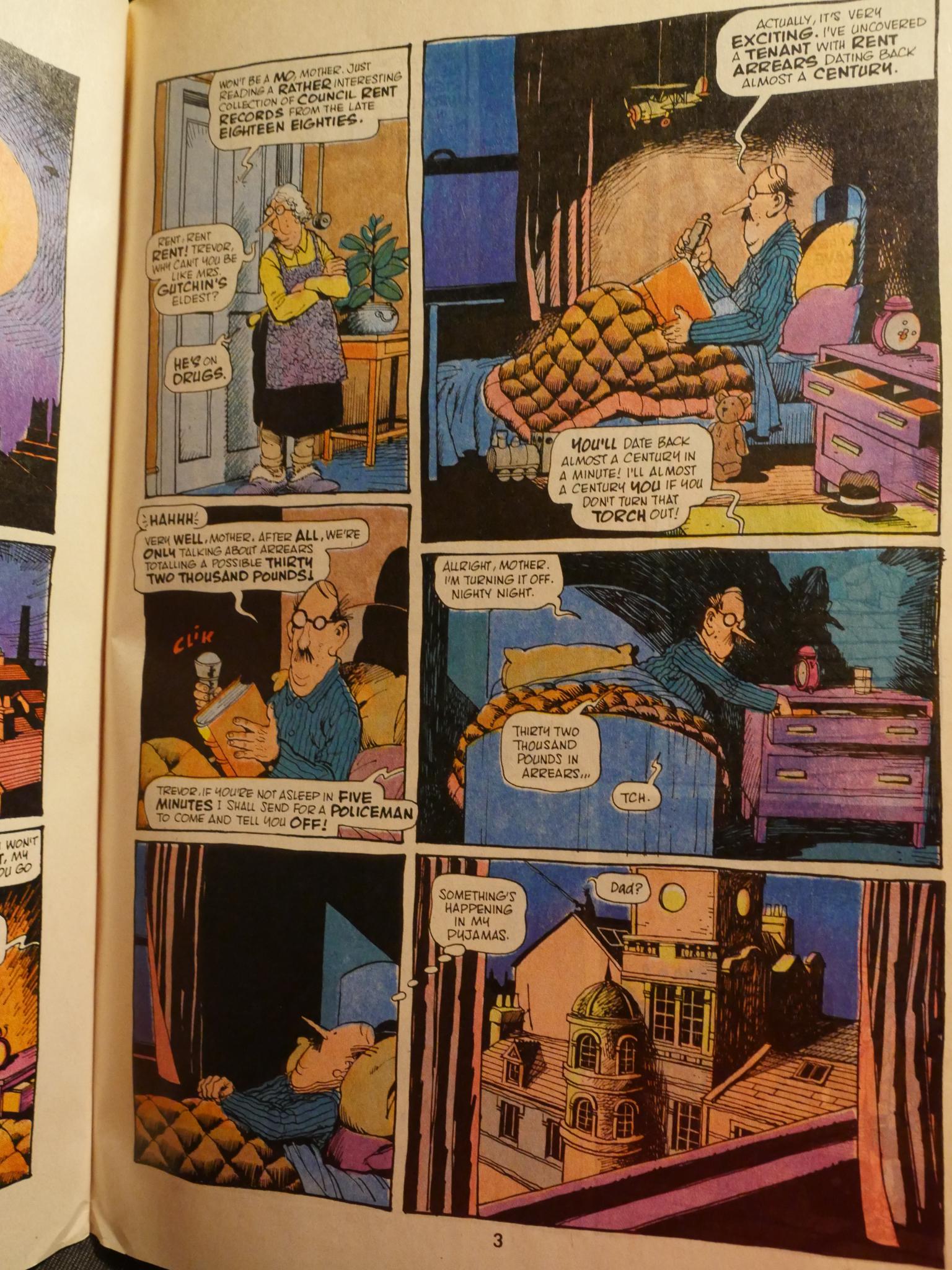
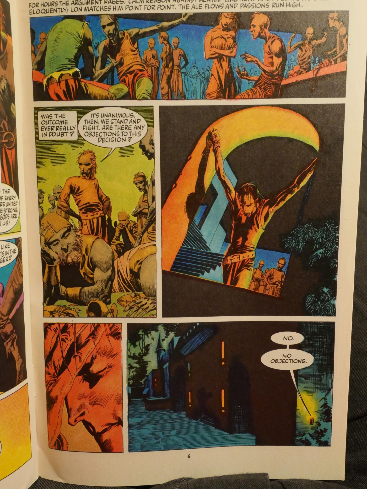
The remaining five issues features The Bojeffries Saga by Alan Moore and Steven Parkhouse. It’s hilarious, and I think it was published in a collected edition later. (But then again, everything that Alan Moore writes ends up that way.)
For the last four issues, Dalgoda changed name to Flesh & Bones, probably as a way to get a new #1 and pick up more readers. Fantagraphics established a new imprint called Upshot Comics, overseen by Strnad. (And three of the four series it managed to published were written by him.)
The first issue picks up the story from the end of Dalgoda and trundles along nicely. And there’s three essays by Heidi MacDonald about “The Gods of Comics” (Hergé, Tezuka and Kirby), one in each of the first three issues. They’re more historical introductions than appraisals, but I was taken with the end of the Jack Kirby essay:
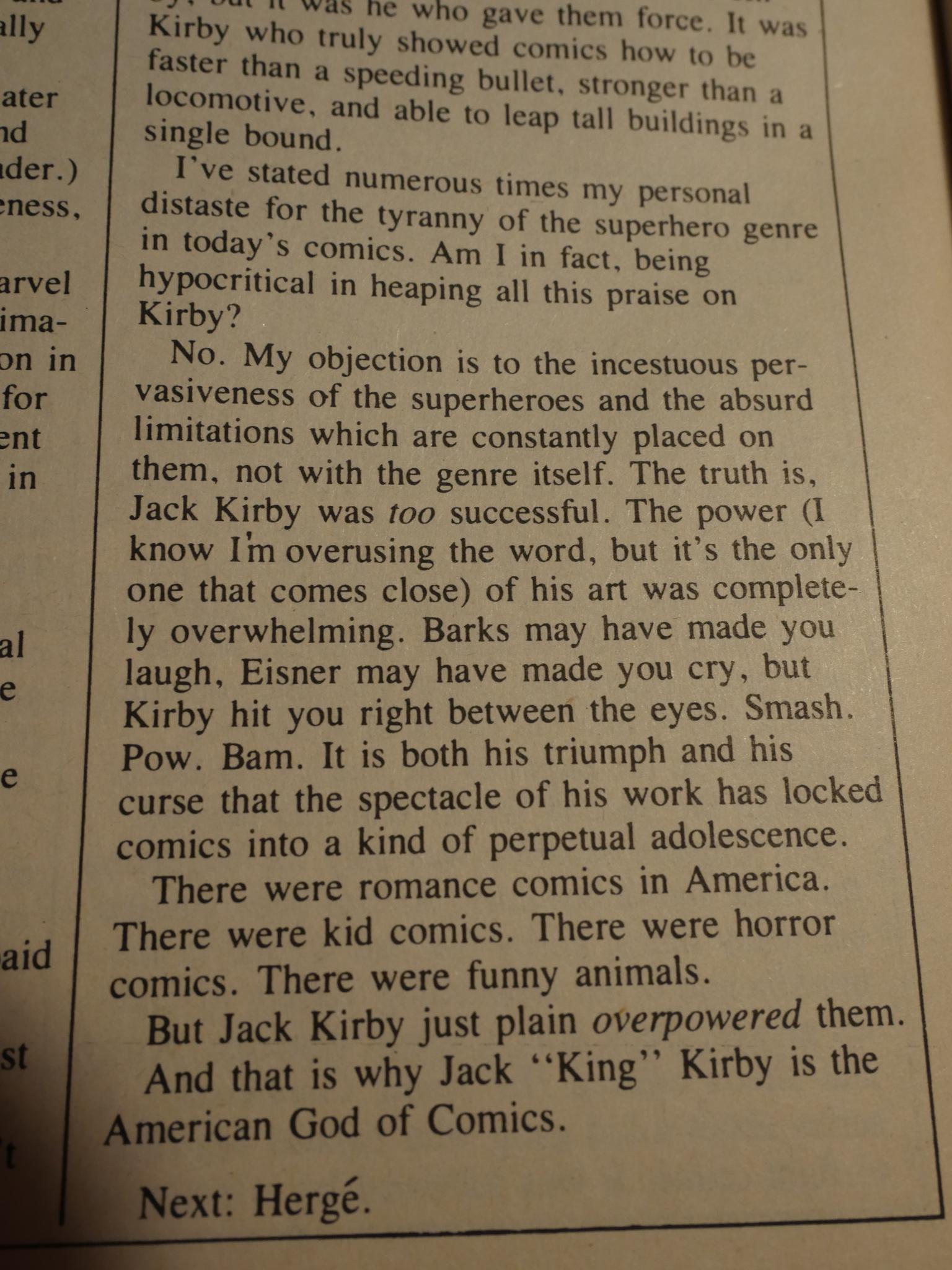
I’m not sure I agree, but I like it anyway.
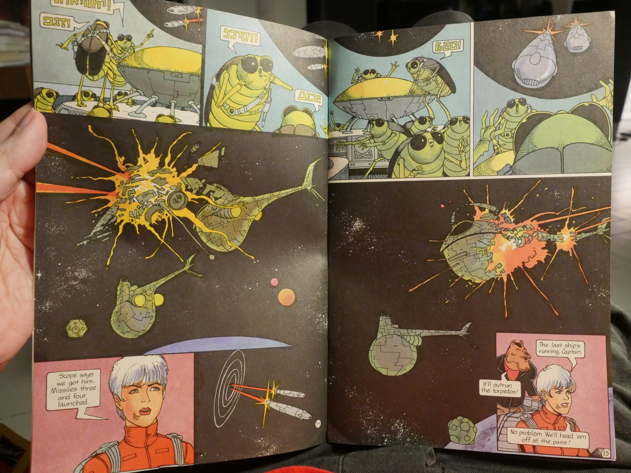
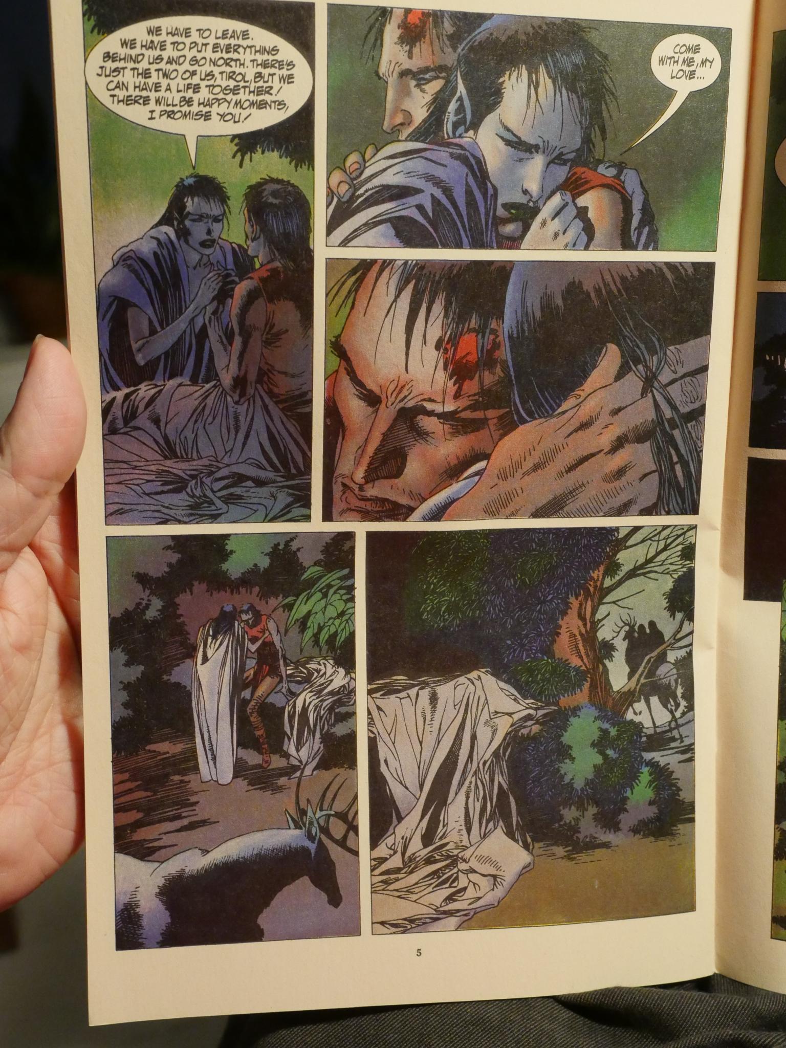
This two page spread is very pretty. And it reminds me a bit of Brandon Graham’s sci fi work from recent years. But he’s another Moebius acolyte, so that’s perhaps not surprising.
Oh, and they moved to hand lettering.
So: Is Dalgoda any good? Yes, it is, but I feel that it’s lacking somewhat in scope. There’s not much of a feeling of a tangible universe or world building. It’s just an exciting straight-forward action adventure story with lots of funny moments. Some of the plot twists veer toward clichés (like the machinations of the world government), but it’s pretty solid.
If slight.
I really liked it as a teenager, and I enjoyed re-reading it now. Somebody should publish a collection.
Strnad has written a number of other comics after this one, and we’ll be visiting them later in this series of articles.
This post is part of the Fantagraphics Floppies series.
 But I was putting some of them away just now, and I er dropped one of them onto another a stack of them:
 The glass broke and totally disintegrated! Into a gazillion teensy bits!