I’ve been trying to use Android (instead of a Linux laptop) for various things lately, because some Android devices have a pretty nice form factor, and I don’t really need a keyboard for all things. But time and time again, I find that the apps that are available on Android just aren’t good enough. They are at the “will this do?” level: They almost basically do what they’re supposed to, but they have no polish and are REALLY ANNOYING.
Take watching films and stuff.
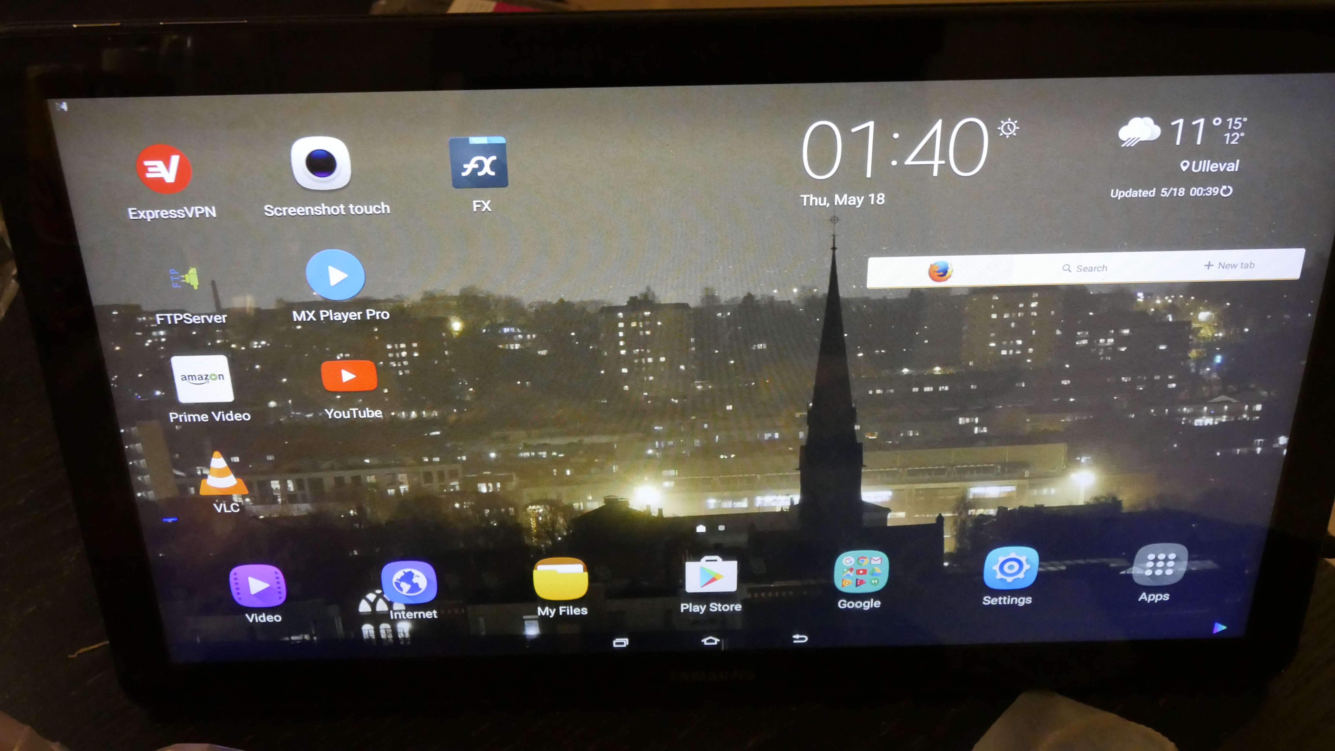
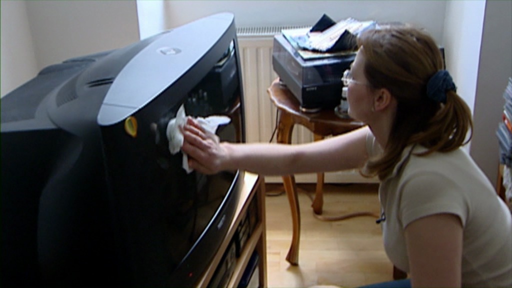
For about a month, I’ve been trying to use a Galaxy View as my “moving around the house and tidying stuff up” device. You know, I drag it around while watching Saturday Night Live, basically.

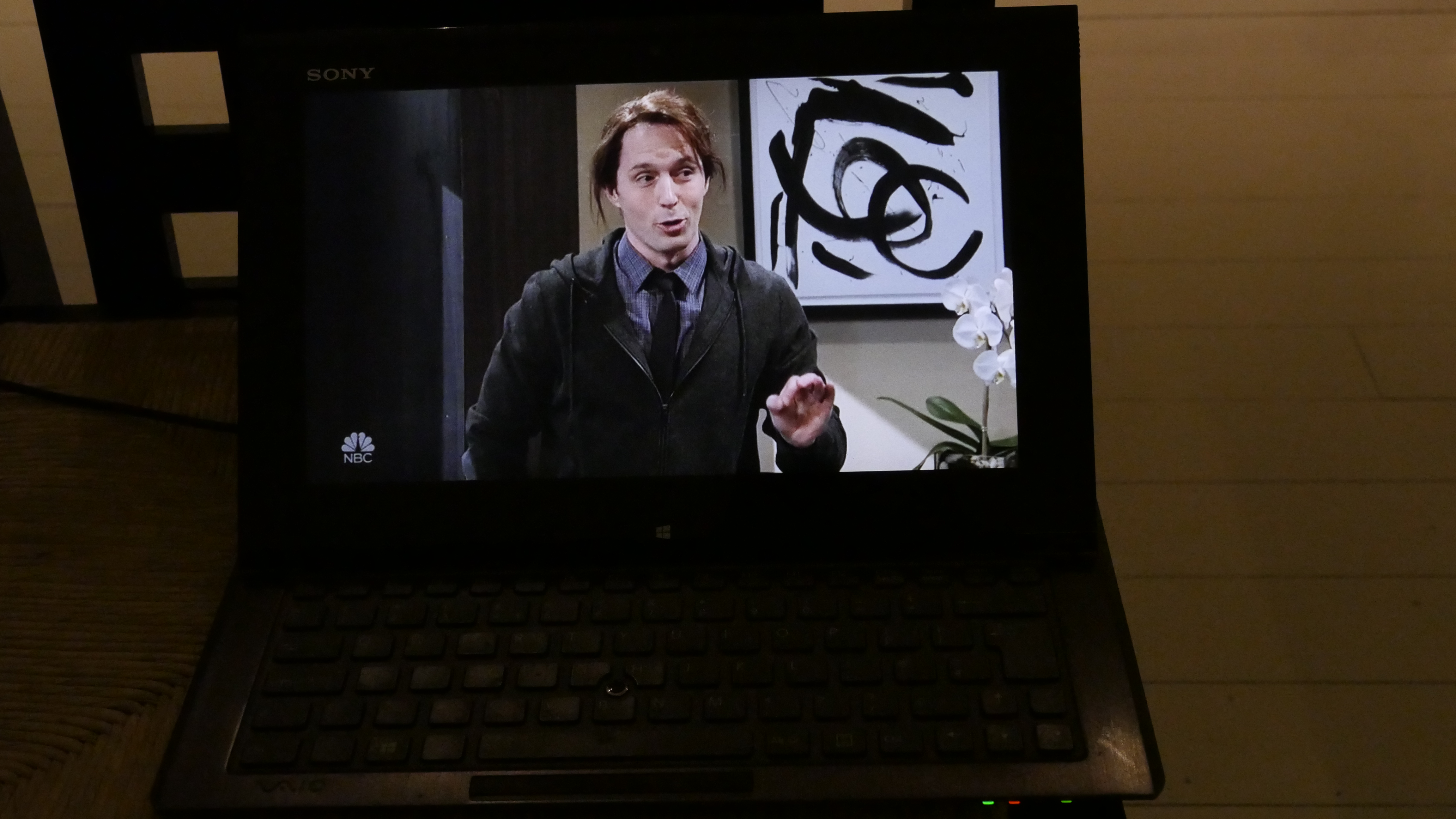
This is what it looks like. It’s an 18 inch huge “tablet” that I carry around while doing chores.
My previous device here was a Linux laptop, but it had a kinda small screen and there’s a keyboard I don’t need and you know, I thought that surely the Android ecology would have progressed beyond my simple sshfs + mplayer setup.
So: I got a Samsung Galaxy View, and it’s pretty nice. The screen is all reflective and stuff, but very clear. And I get the recommended apps, which is the “FX” file browser and “MX Player Pro” for watching films.
(Very X.)
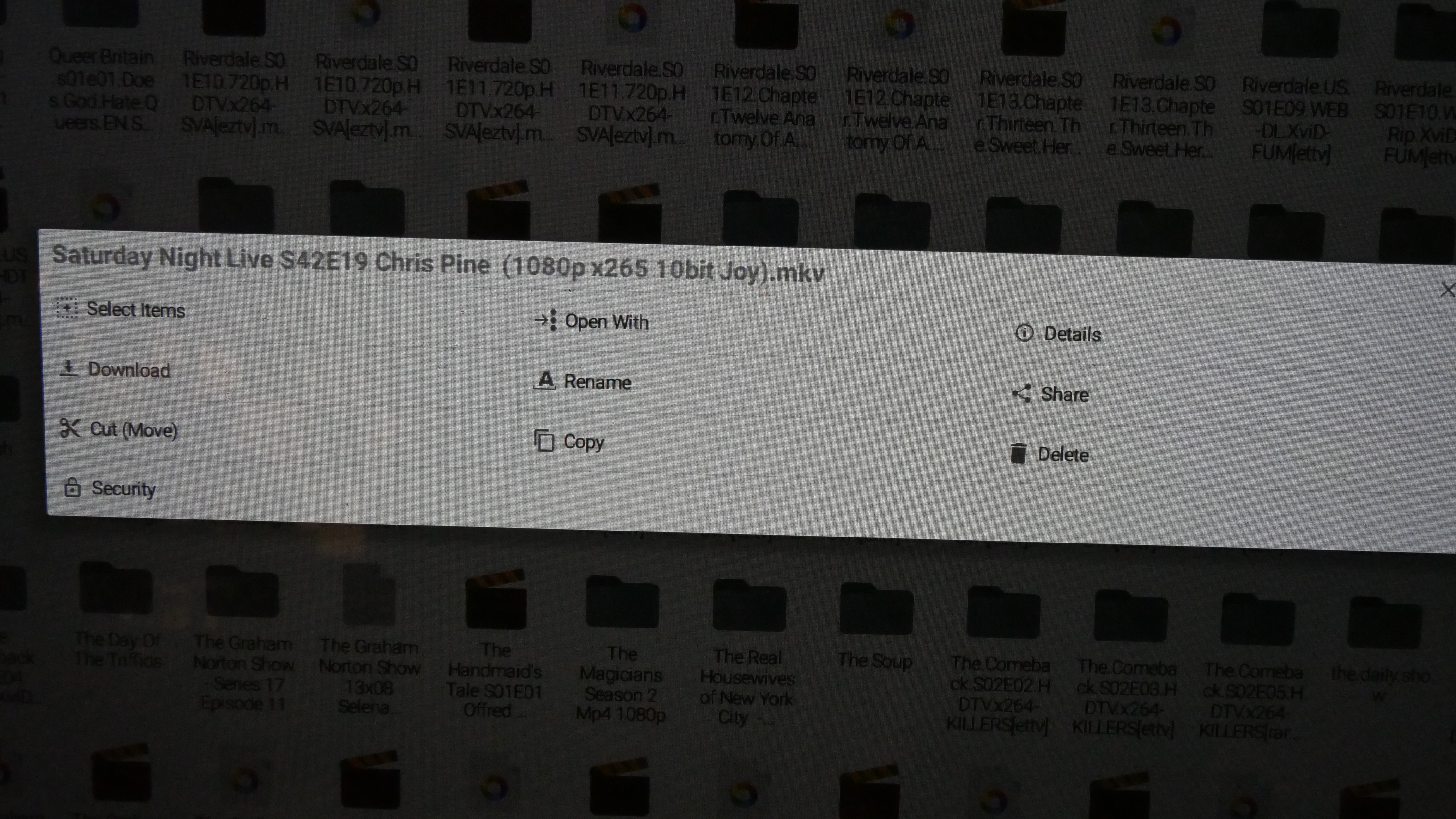
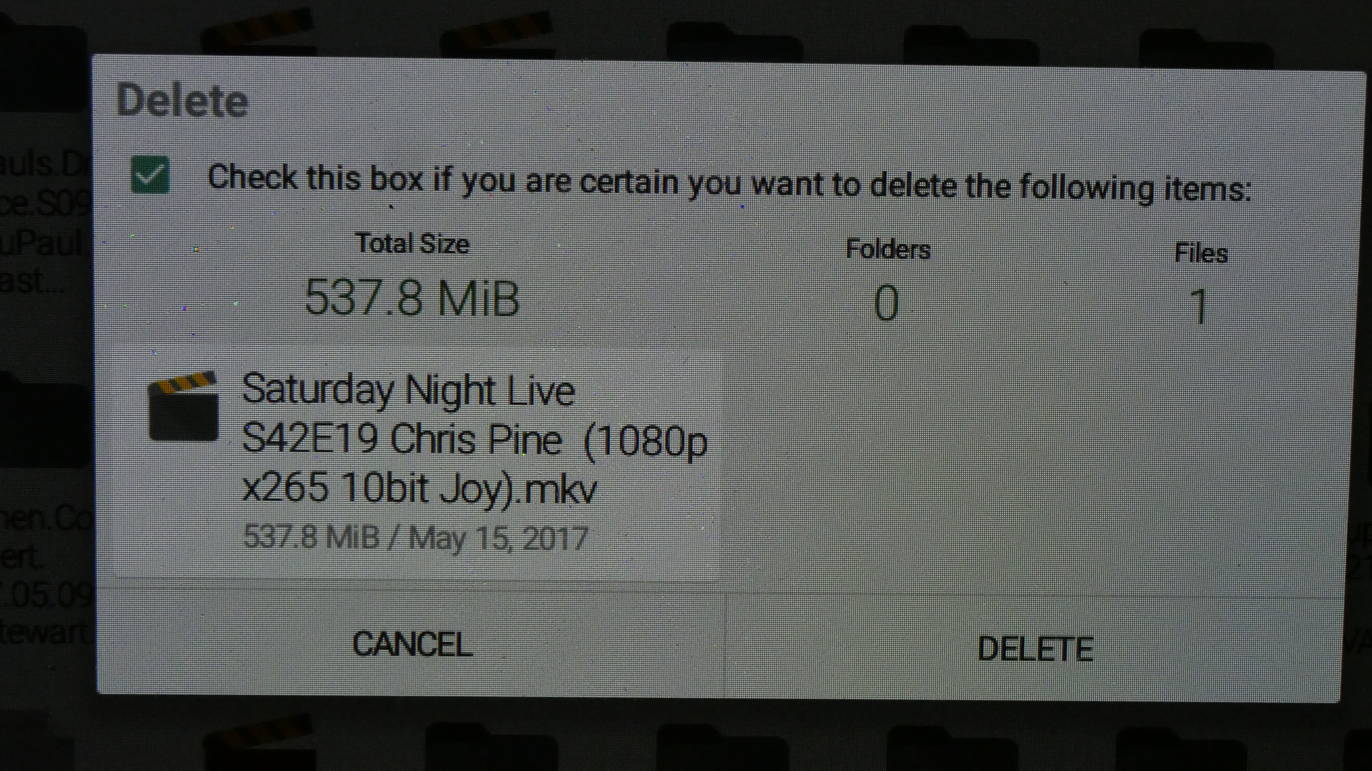
And it all kinda sorta works. When deleting files in “MX”, you go through this:
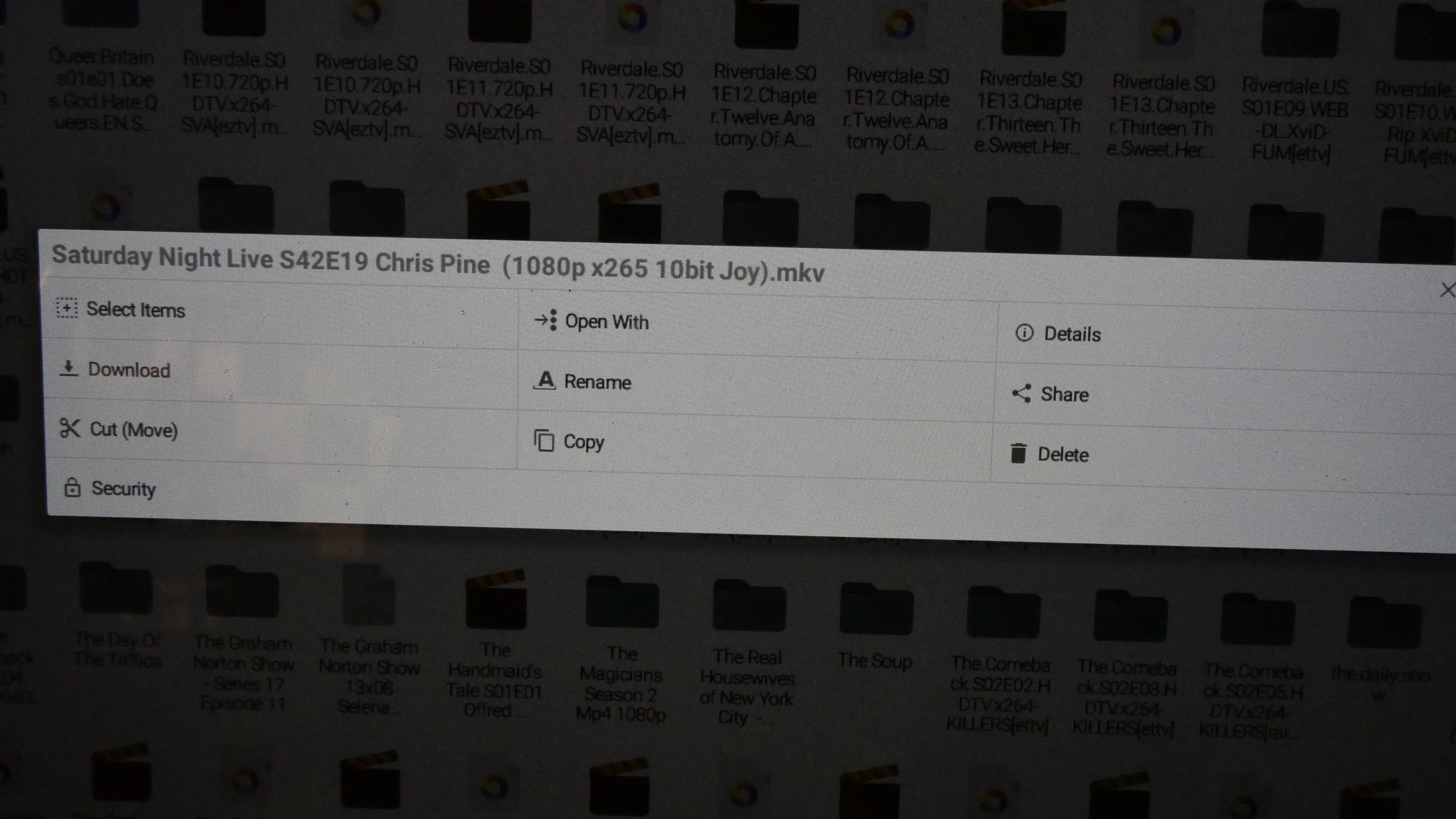
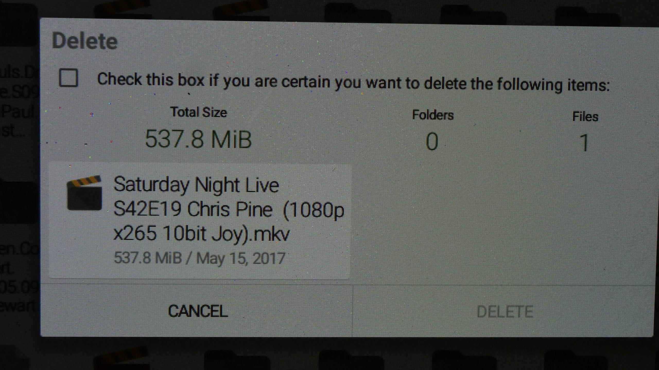

Yes, that’s a long hold to get the menu, then press “Delete”, and then check off the checkbox and then press “delete”. If you think that’s ridiculous as a default, then there’s a setting for fixing this, so you just hold “long”, then press “delete”, and then press “delete”. Yes! The “dangerous” setting makes the checkbox in-between the “delete” and the “delete” go away!
ANYWAY!
I could live with all this nonsense, but when playing from sftp, MX Player would not recall where I had left off when playing the last time.
The audio/visual sync in MX player would also require manual adjustment up to about a minute to get in sync.
AND! In addition, FX would drop connections after being inactive for a few minutes, meaning that after pausing for some minutes in MX, I would have to exit, go to the menu in FX and press “reload”, and then find the file again, and then go to where I left off.
STILL!
This wasn’t enough to make me abandon the setup.
It’s like Stockholm syndrome, but for gadgets.
The breaking point came tonight, when I was watching Saturday Night Live (making fun of Trump, as usual).
It didn’t manage to decode the video fast enough, so everything lagged and stuttered and general sadness.
It’s like every app took the hint from Google Central and thought: “Will this do?” Then clicked on “publish”.
So I’m back to my six year old Linux laptop:
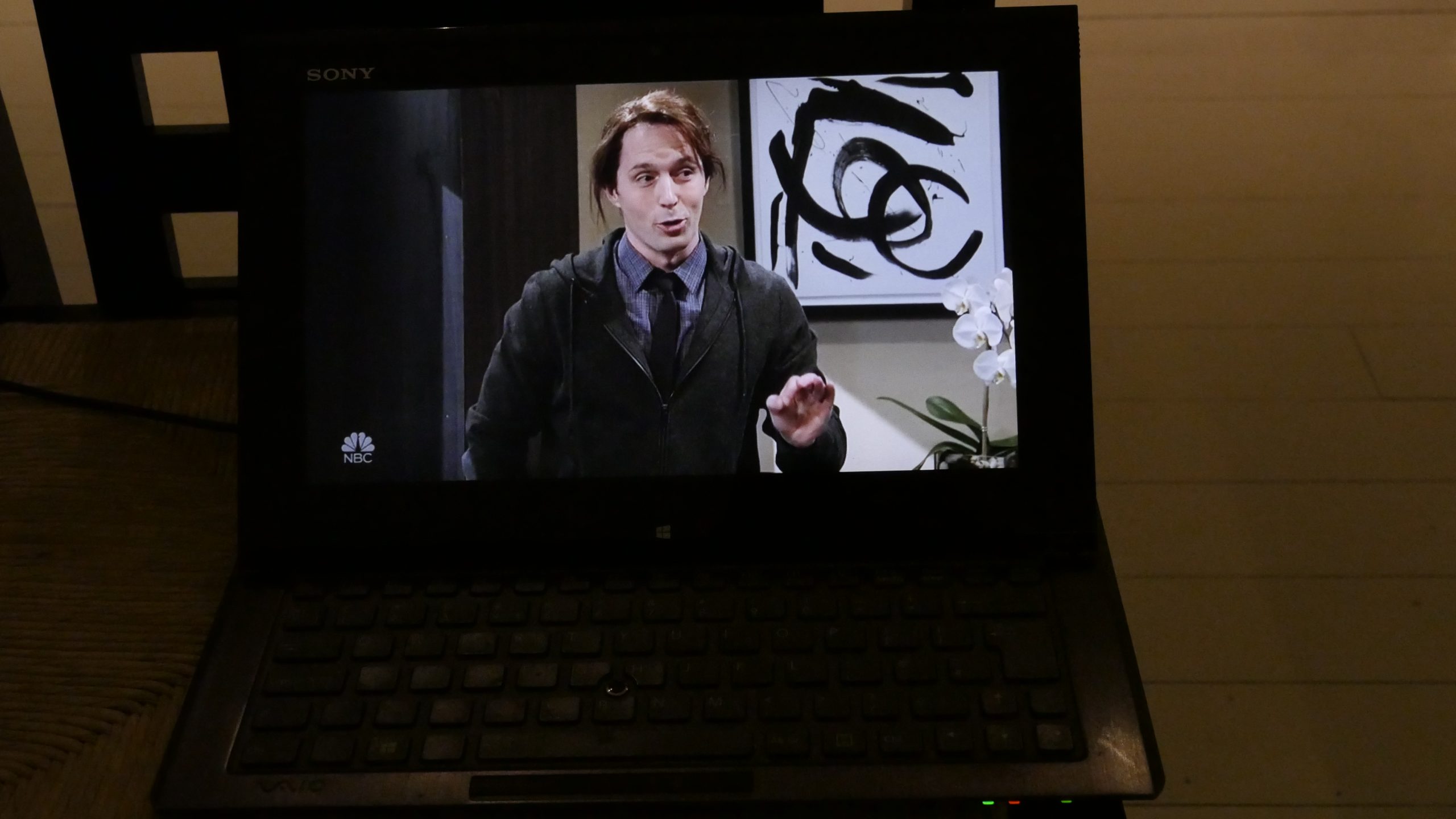
That has exactly none of these problems. No audio/visual sync things, no reconnecting over sftp, no lags.

Android app people: This is sad.
Sad.