

This movie is fun.
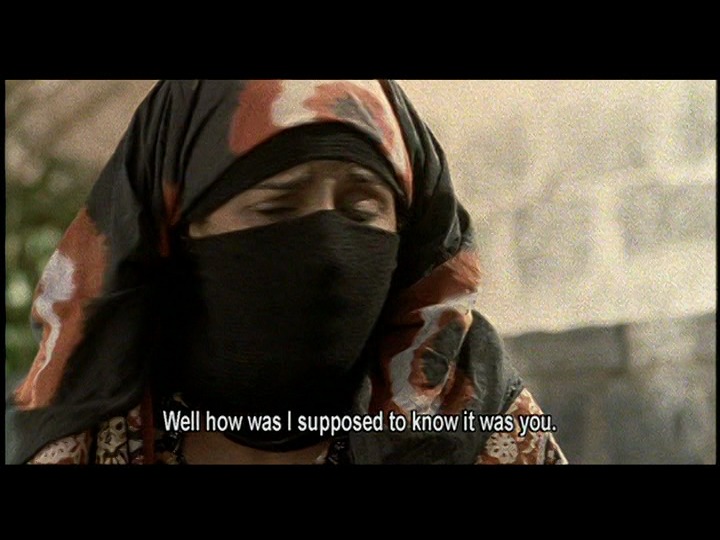
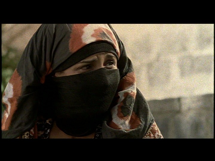
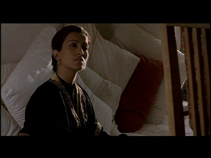
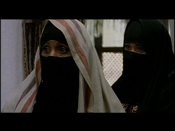
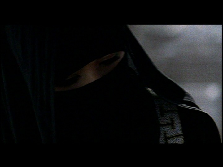
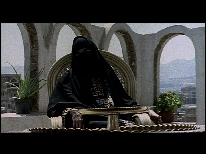
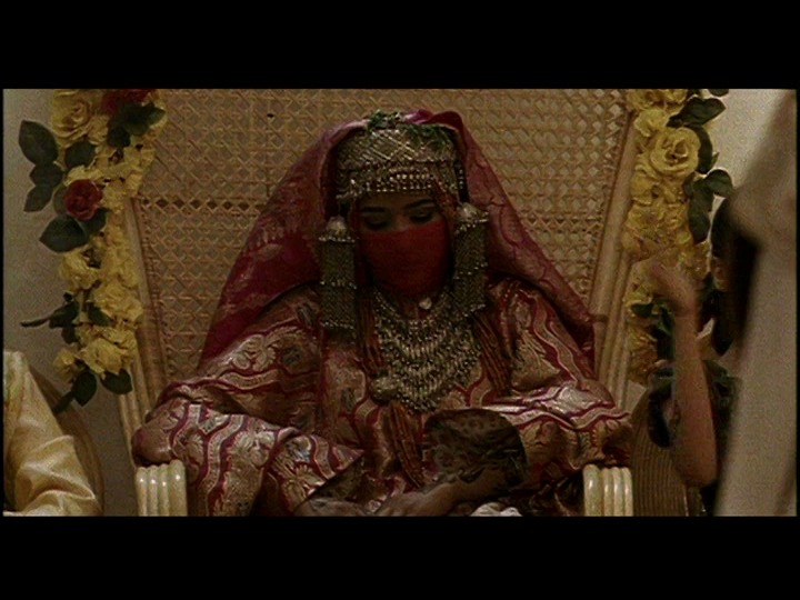
Some of the performances are kinda stylised, but when you’re delivering your lines from behind a veil, you have to go big or you don’t deliver the lines at all.
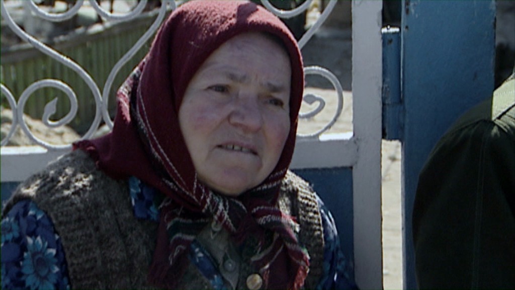
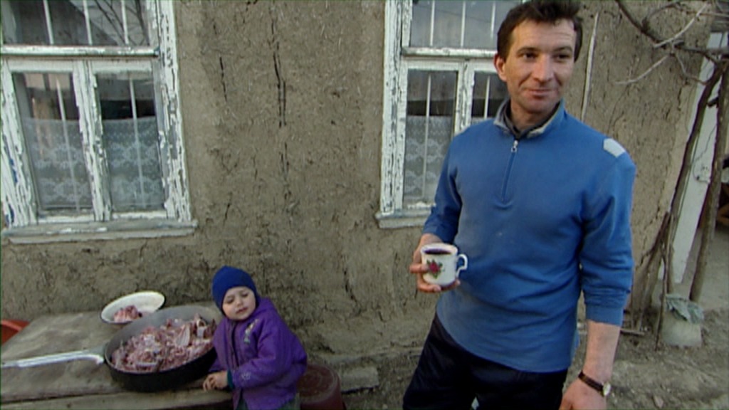
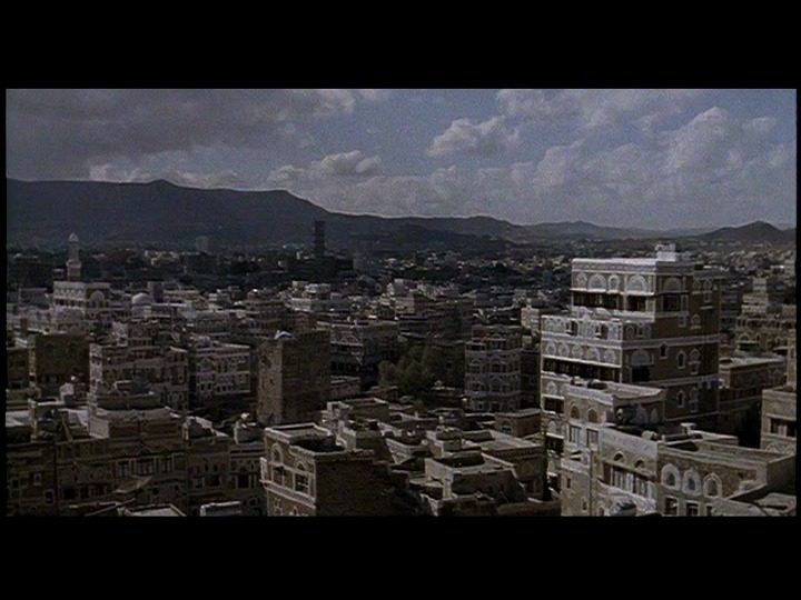
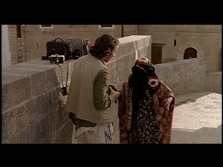
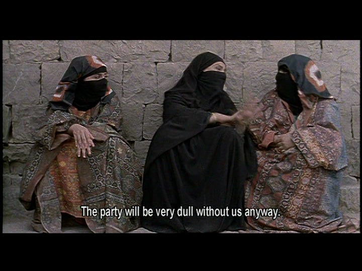
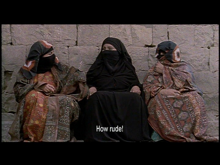
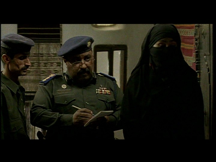
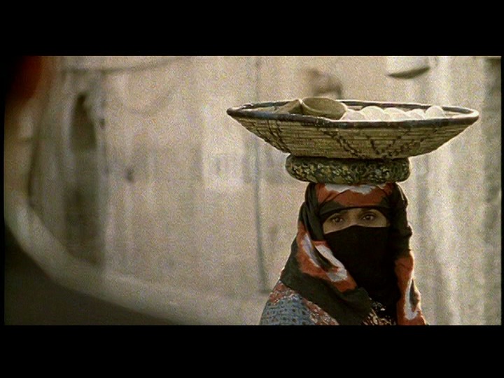
This is a romantic comedy with mistaken identities and all kind of complications and it’s really funny. I love the actors, especially the er Greek choir (Yemenese choir?) of the three women gossiping on the streets. Well, all the women actors are wonderful, really.
It’s got some pacing problems, though, and then ending is kinda dreary.
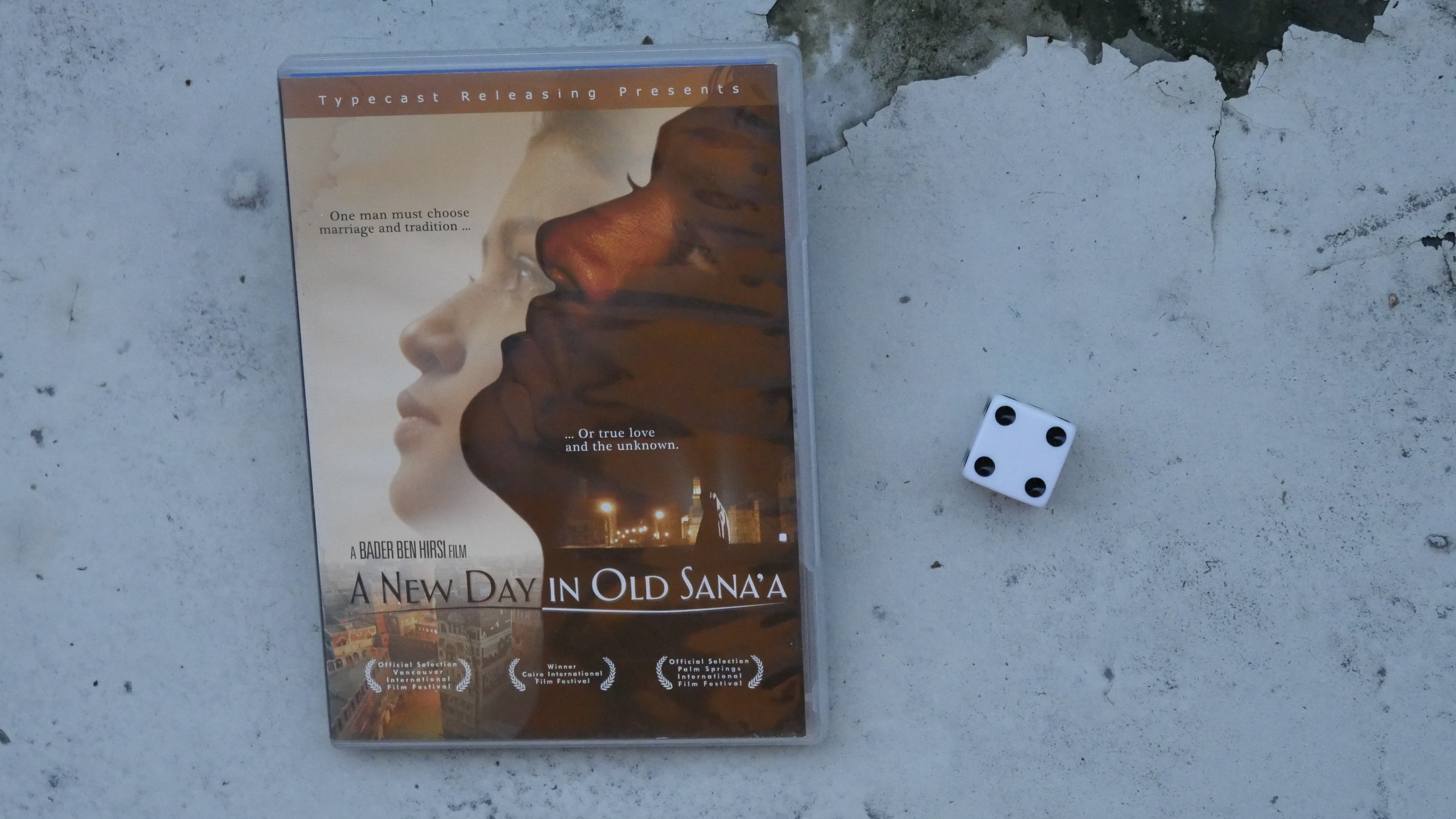
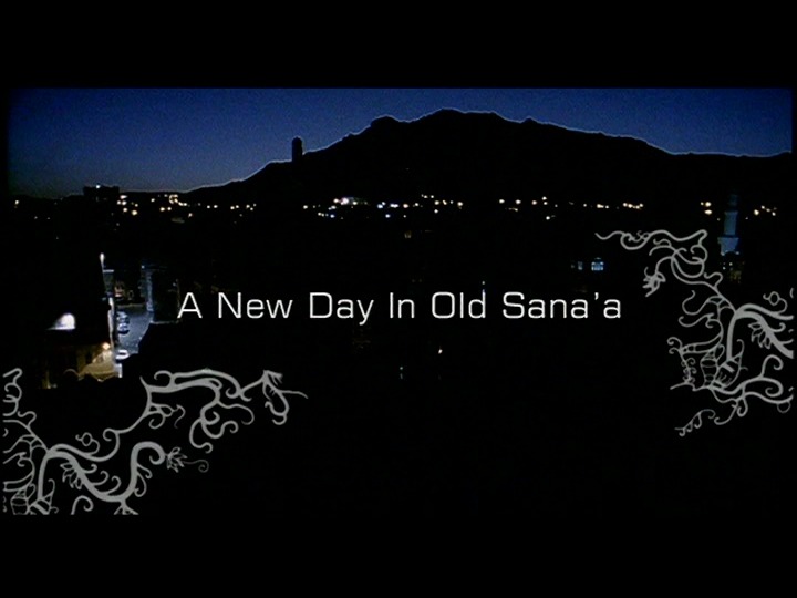
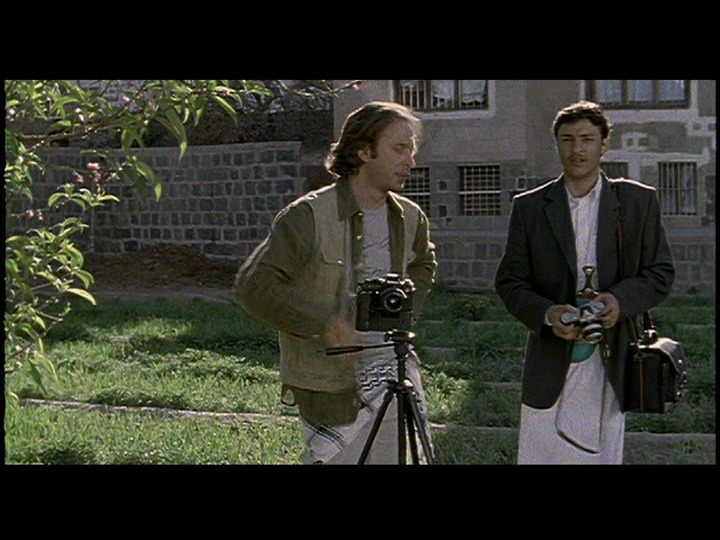
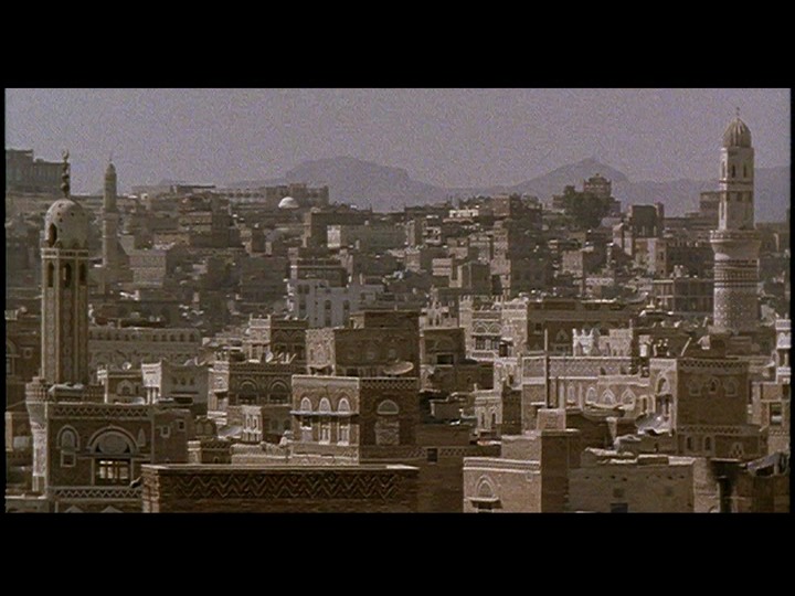
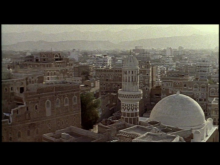
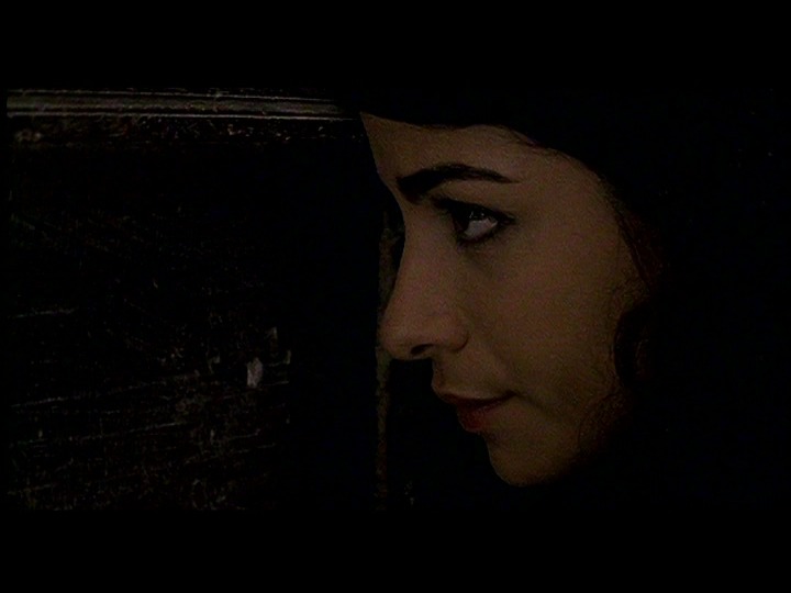
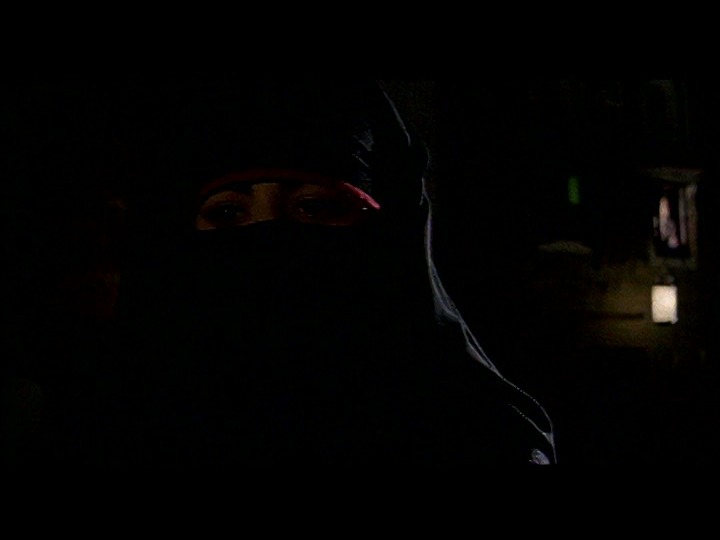
A New Day In Old Sana’a. Bader Ben Hirsi. 2005. Yemen.

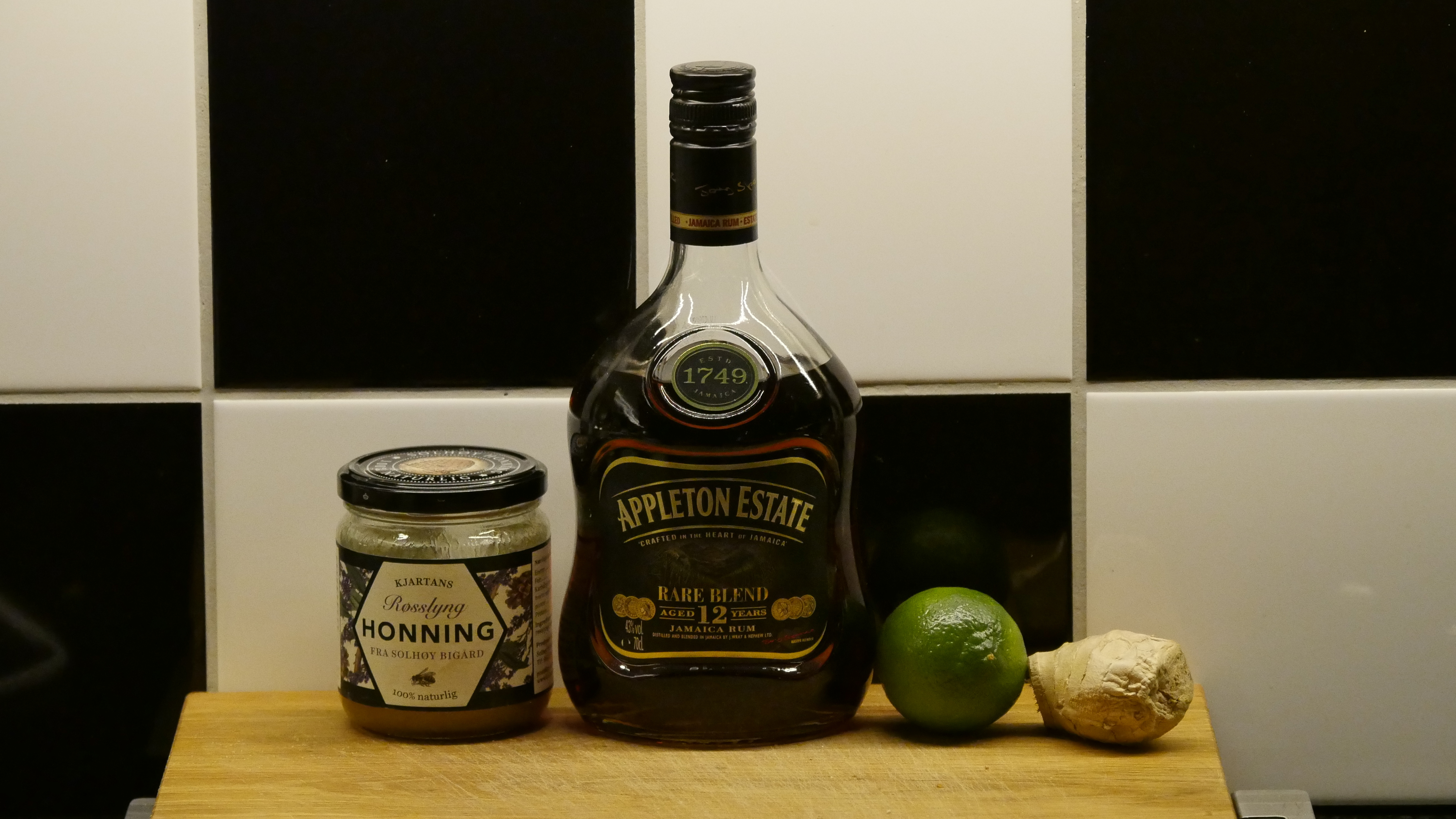
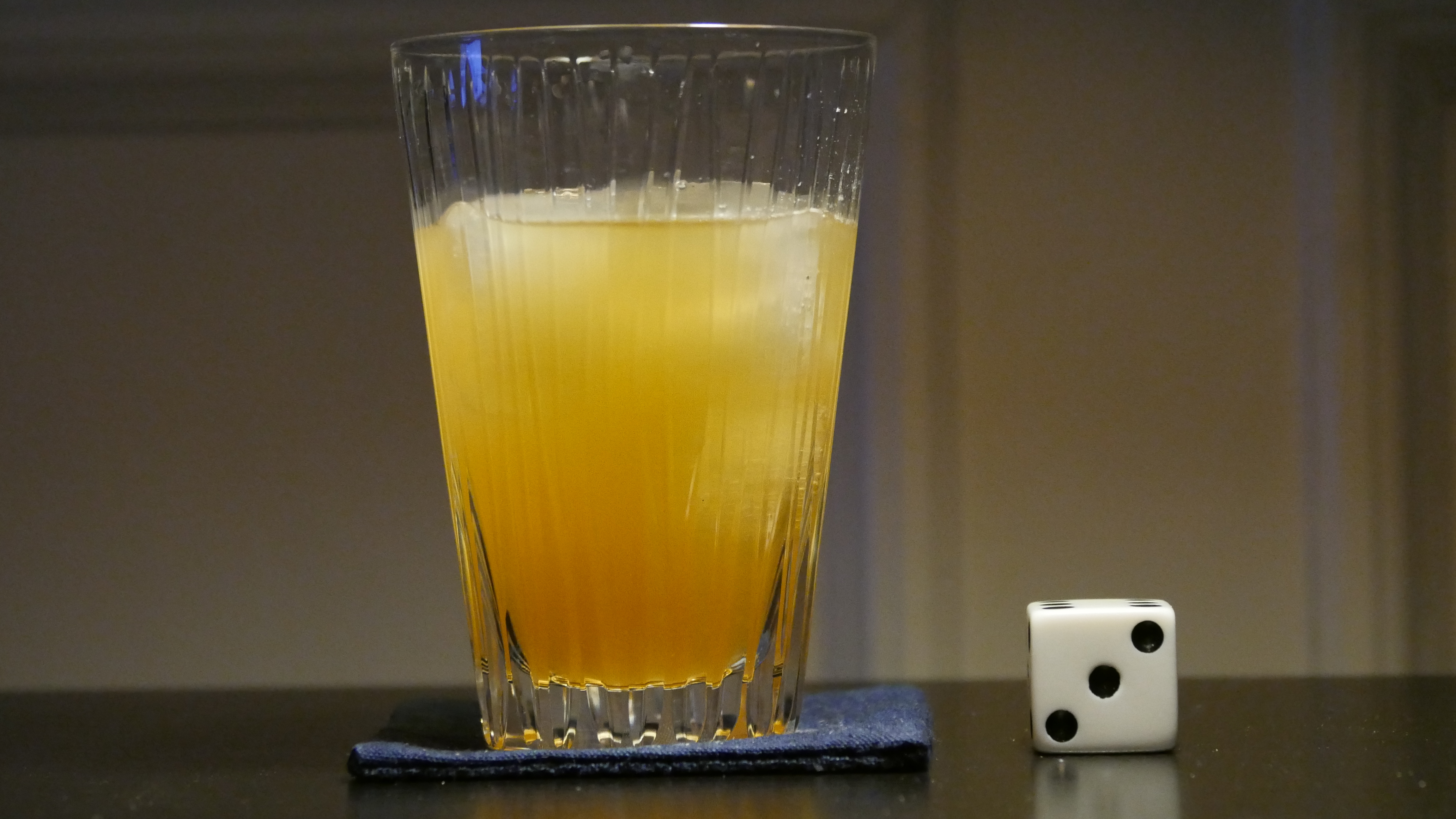
Yemen fizz
- red grapes
- 3 parts gin
- 2 parts crème de cassis
- 28 parts champagne
Muddle the grapes. Add the gin and the crème de cassis and shake with ice. Strain into a champagne glass and top up with champagne. Garnish with floating small red grape.

This post is part of the World of Films and Cocktails series. Explore the map.