Wow, it’s been a month since I read some comics last… it’s been busy.
| jasmine.4.t: You Are The Morning |  |
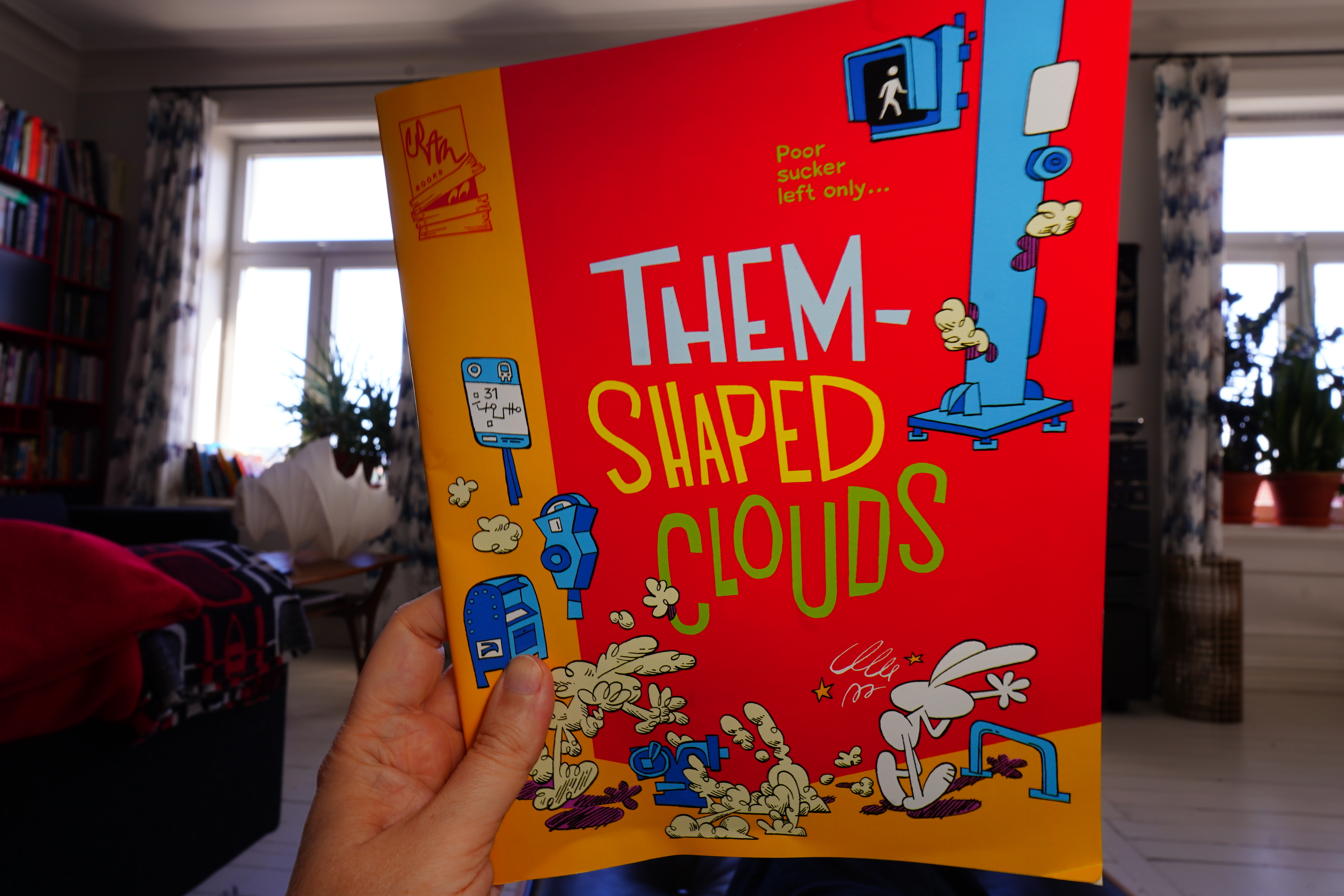
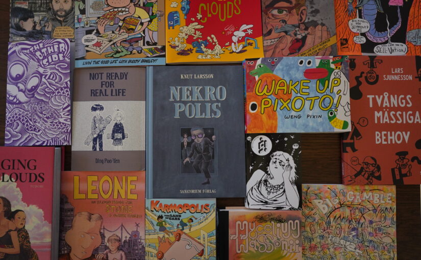
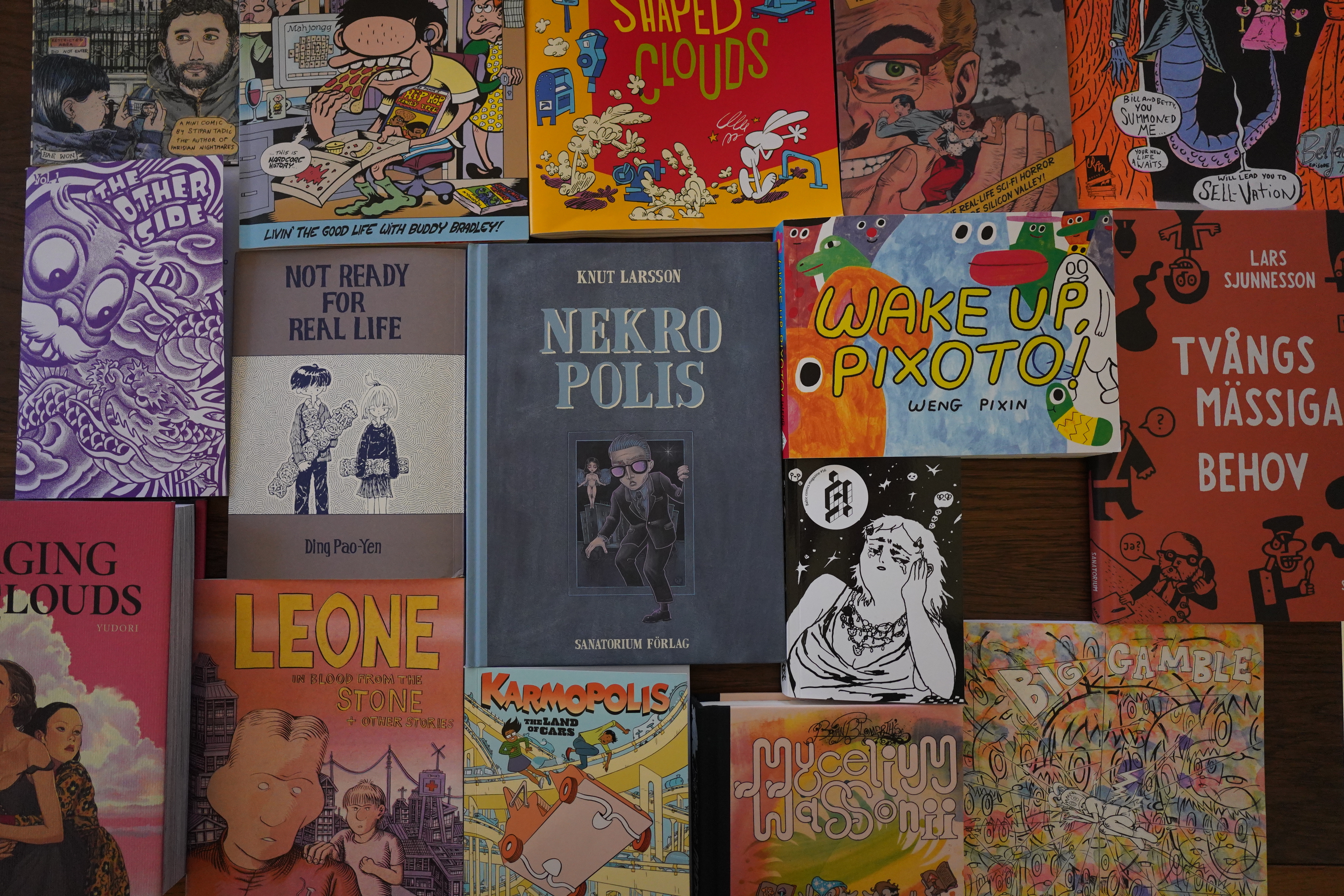
14:14: Them-Shaped Clouds by Max Huffman (Cram Books)
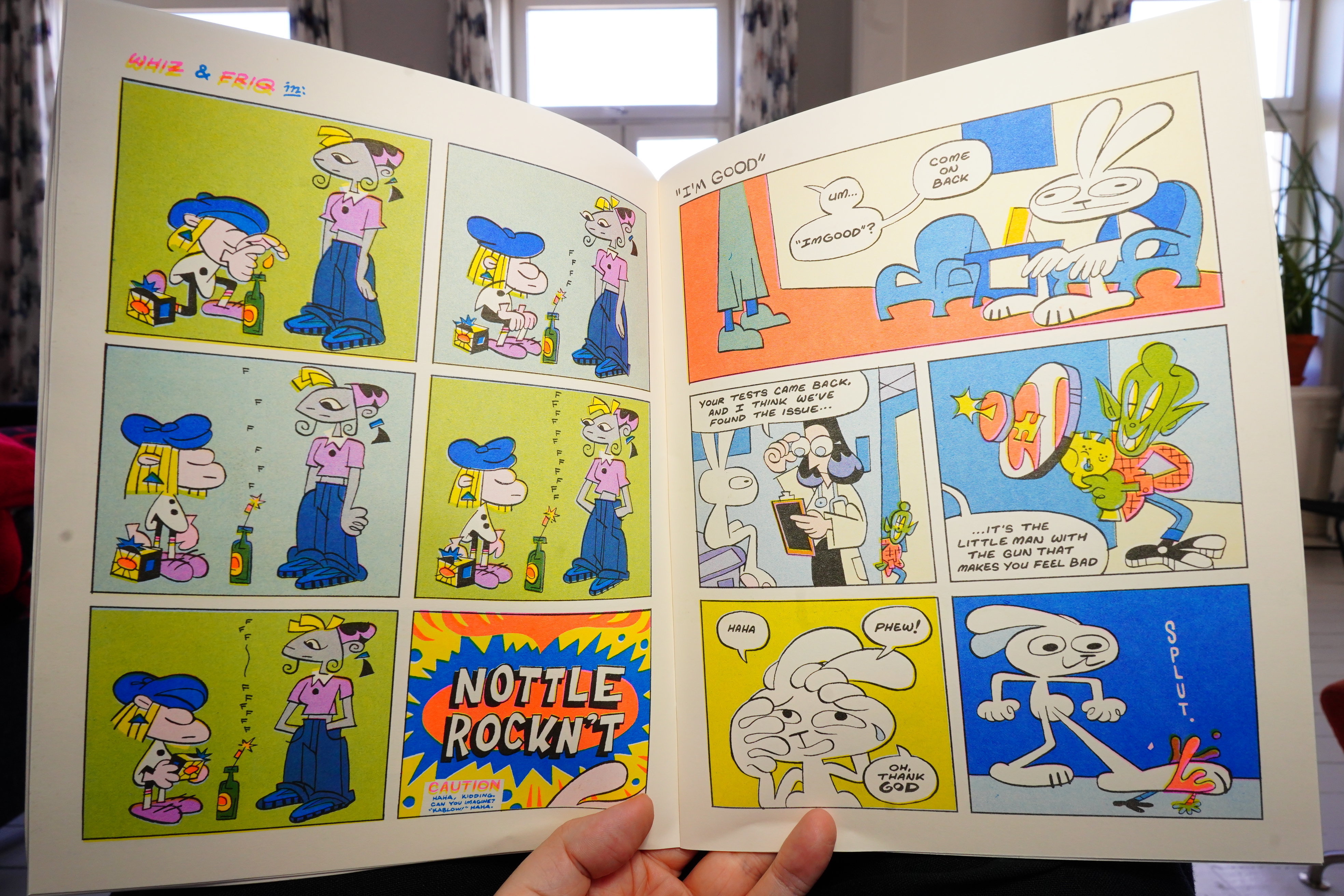
This is very funny.
It’s a collection of shorter pieces, but they work extremely well together. It feels like one of those classic single person anthologies. Class!
| Bill Callahan: Sometimes I Wish We Were An Eagle |  |
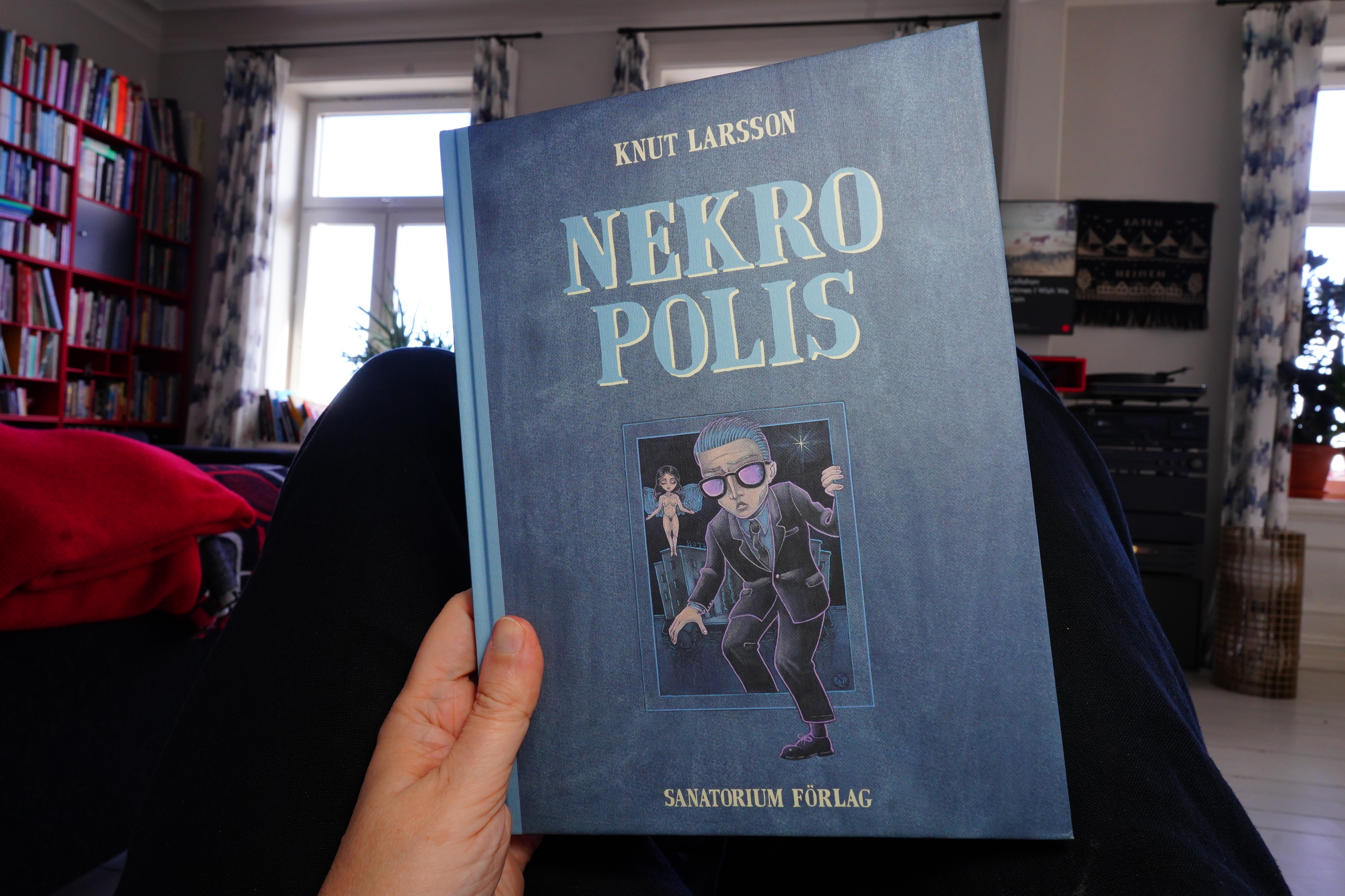
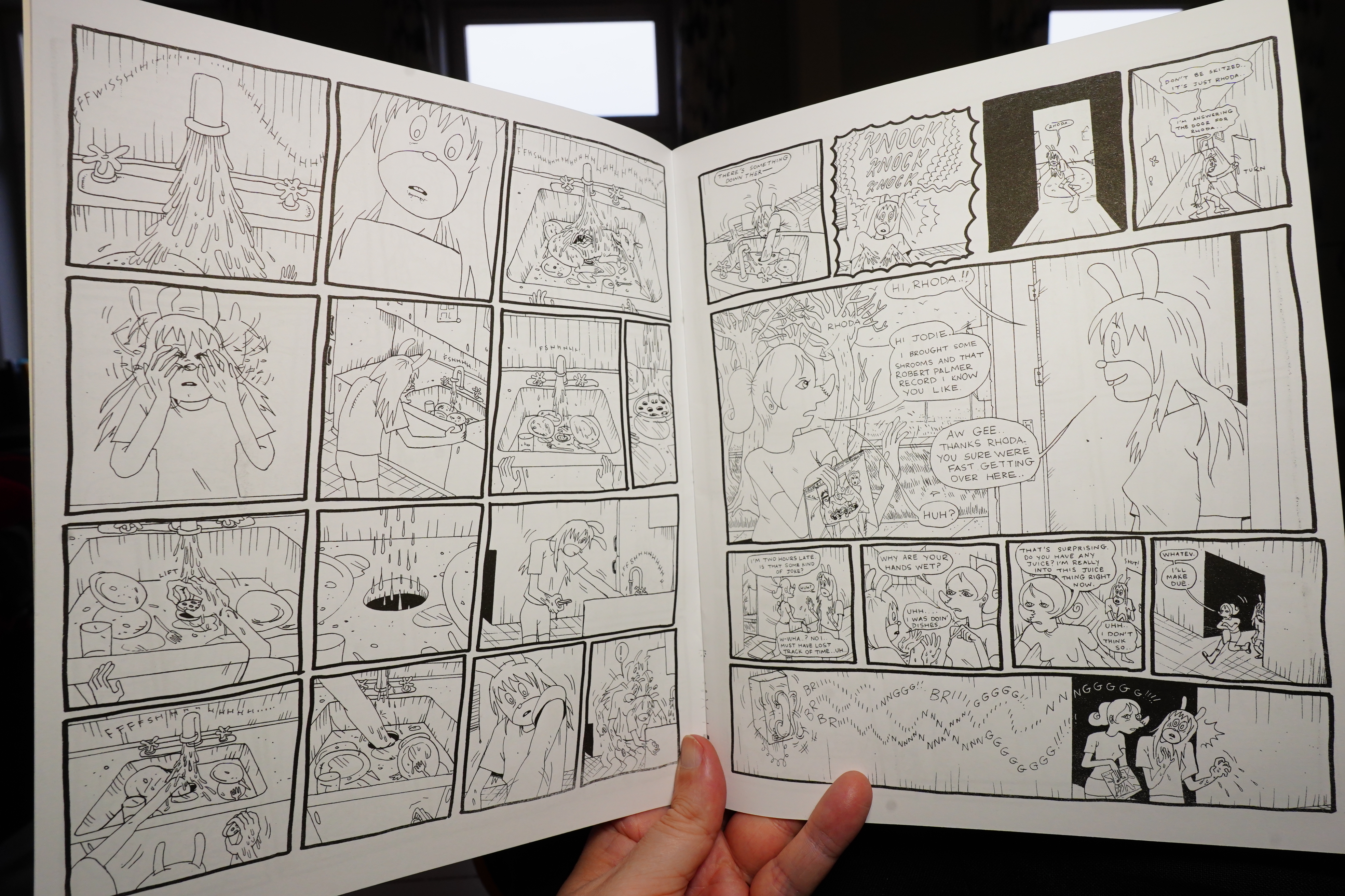
14:27: Nekropolis by Knut Larsson (Sanatorium Förlag)
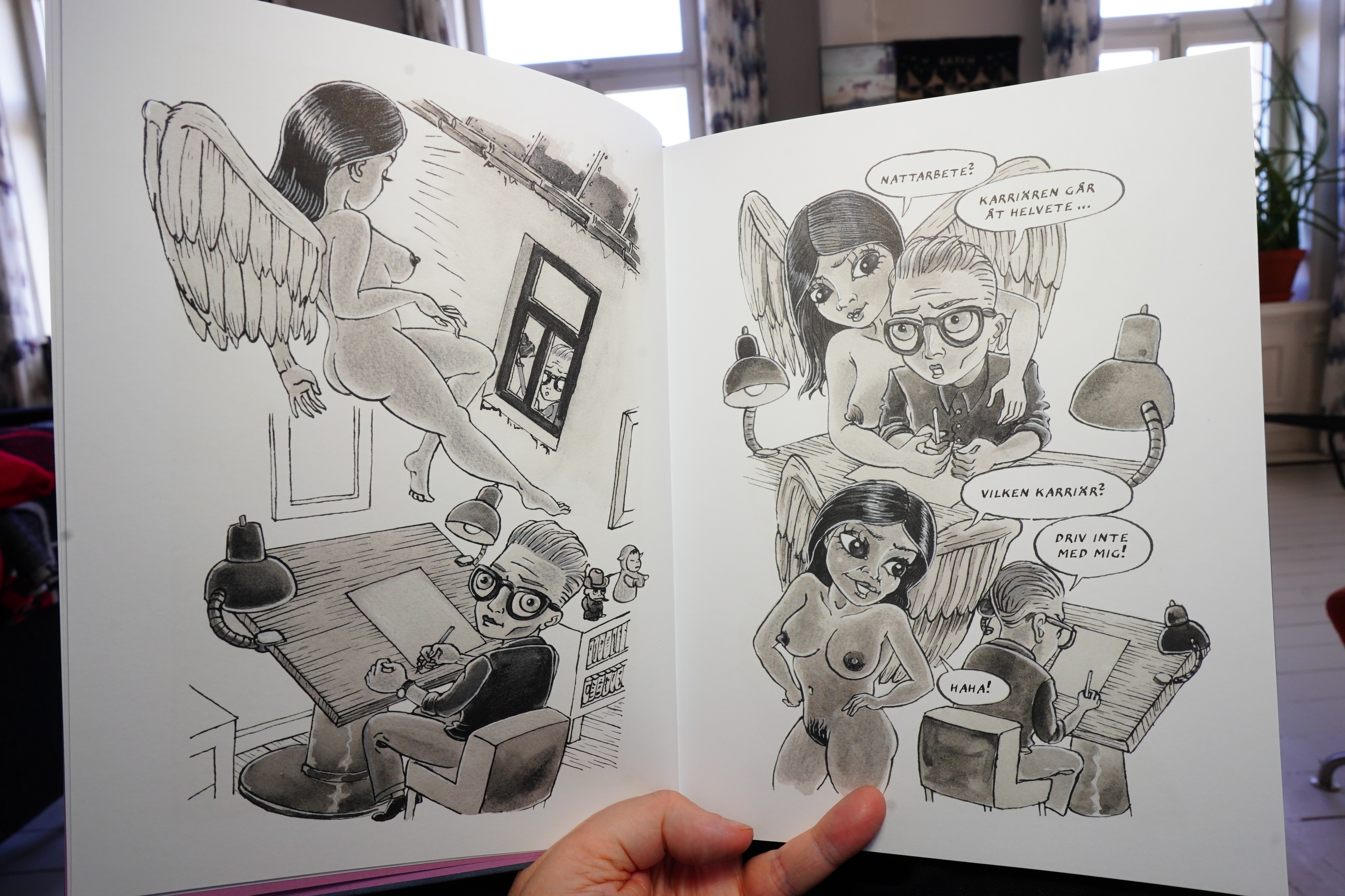
This is a dreamlike book about being a cartoonist.
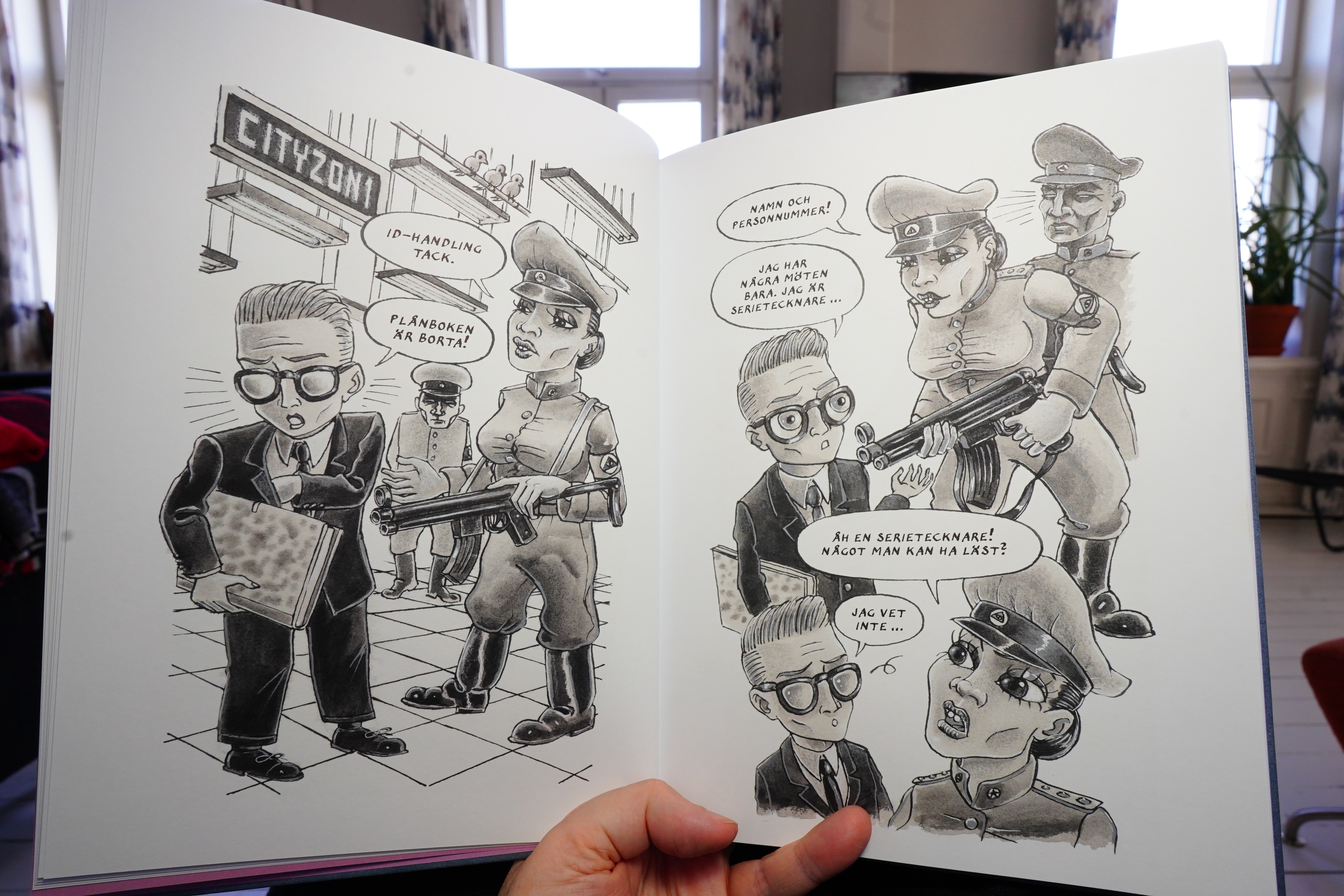
It has sort of 70s underground vibes, but way more extended than those comics were. It’s pretty good.
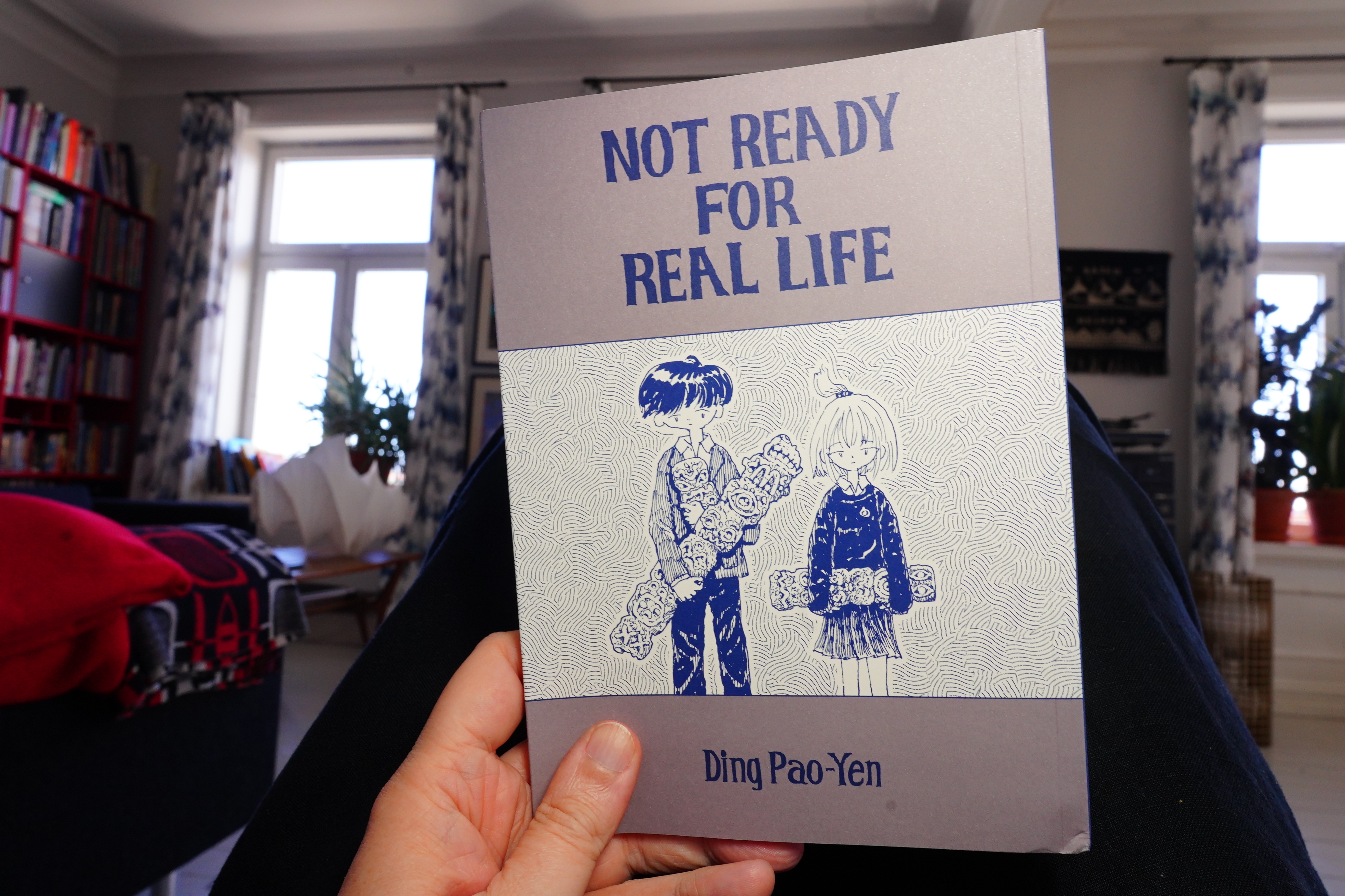
14:40: Not Read For Real Life by Ding Pao-Yen (Glacier Bay Books)
This is also very dreamlike.
It’s a collection of short pieces that are thematically linked, and it’s really well done. It’s got a proper mood going on.
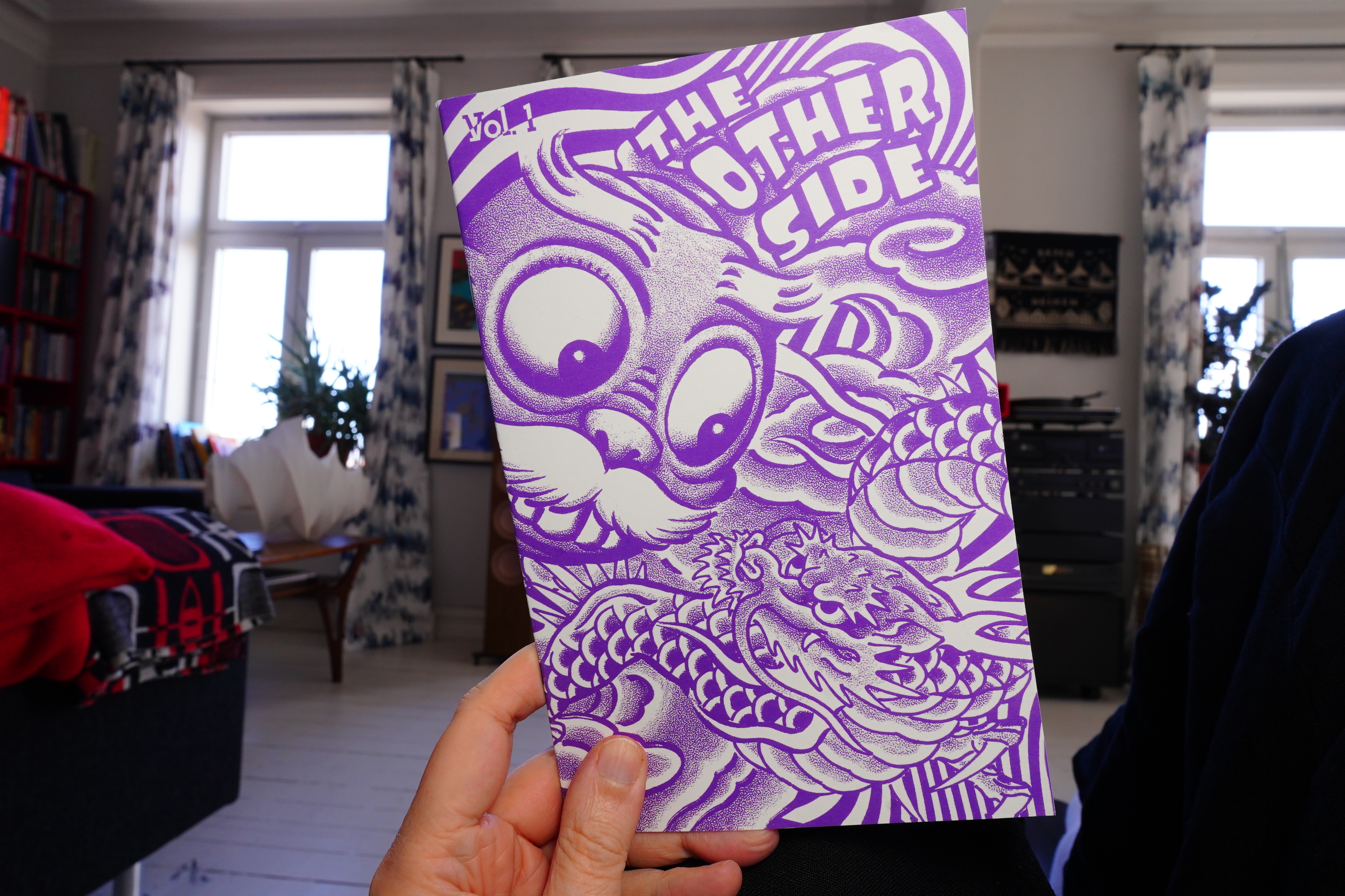
14:54: The Other Side Vol. 1 (Desert Island)
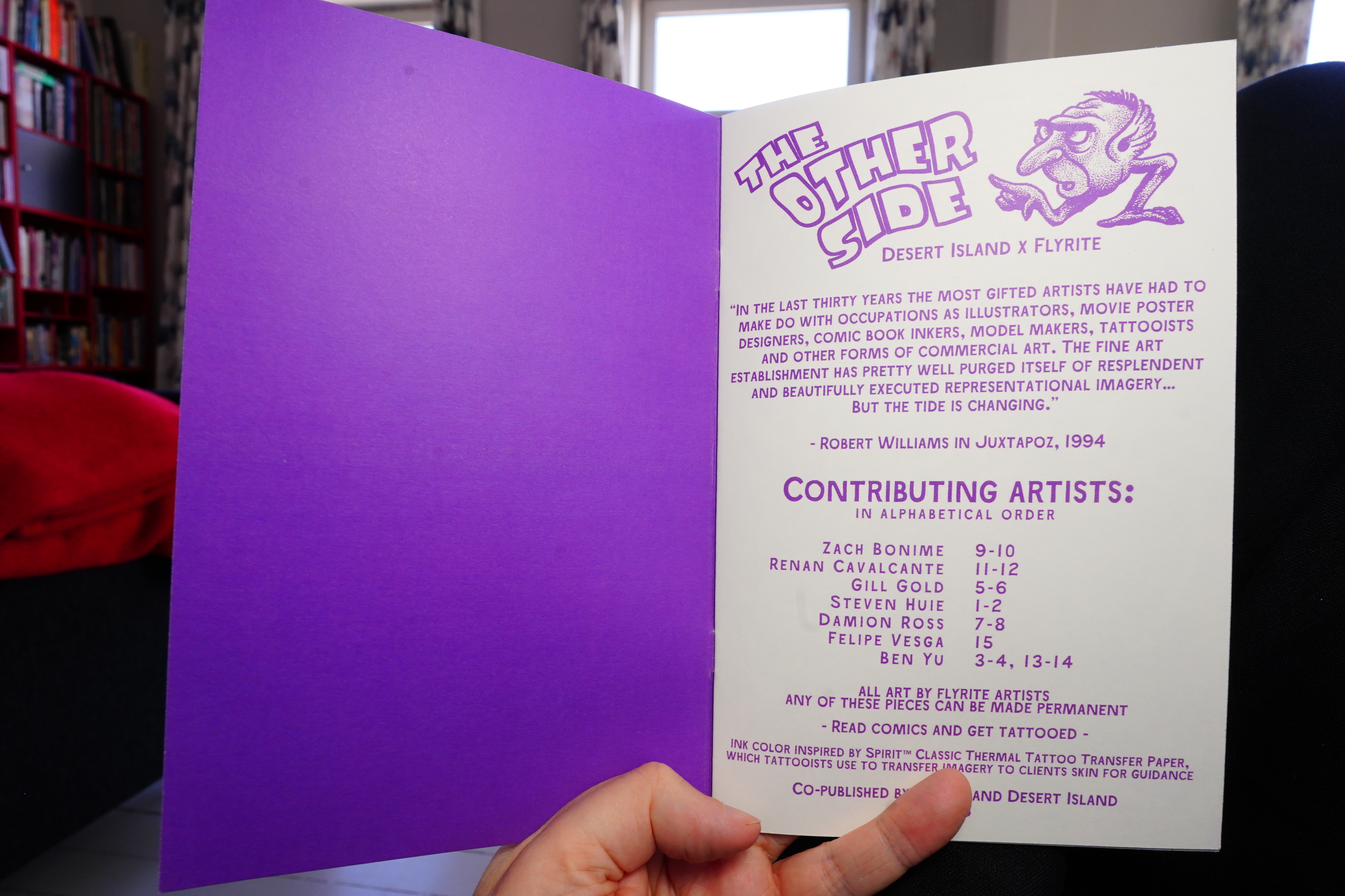
Oh, this is like a catalogue of tattoos you can get?
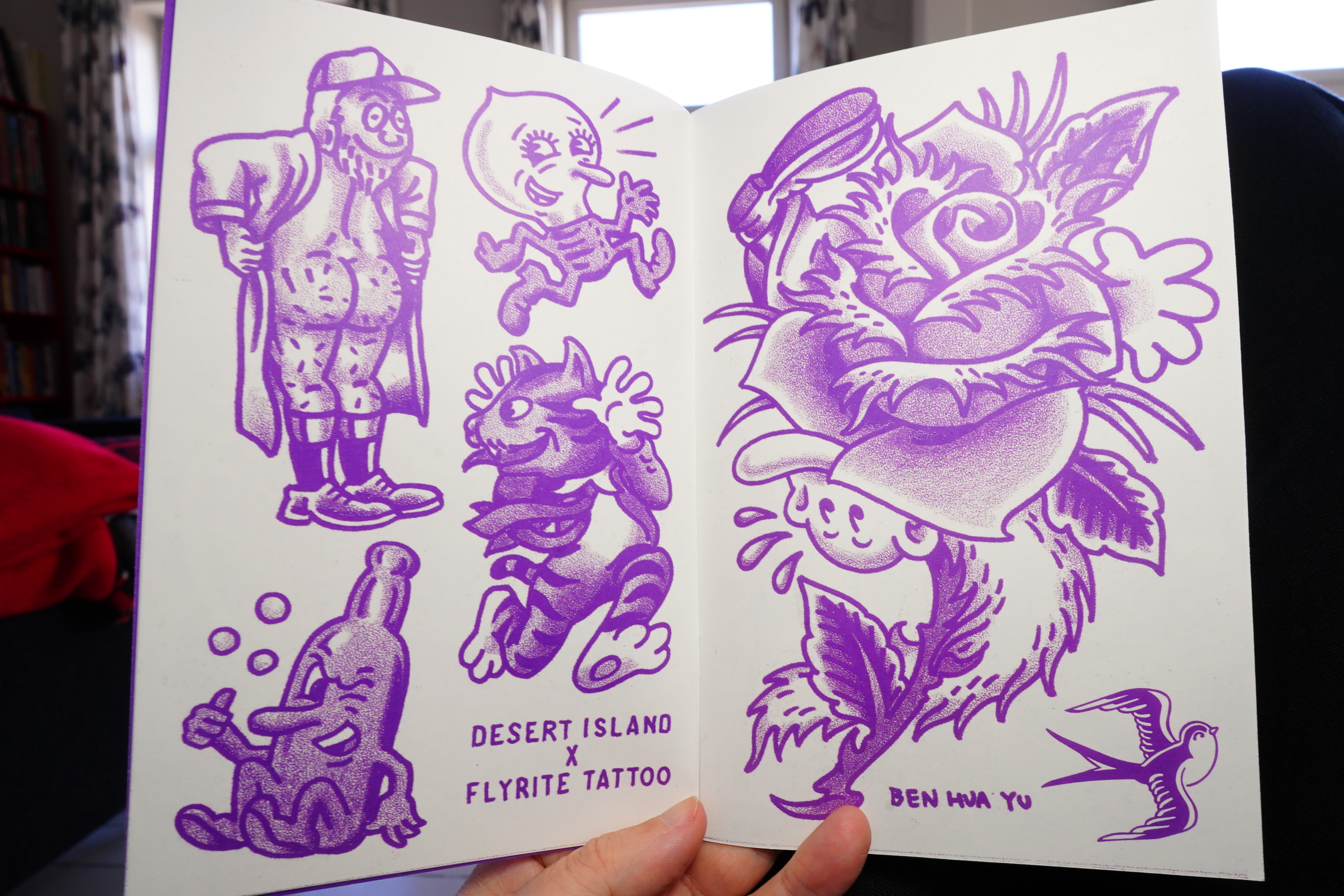
Hm… should I get any of these?
It’s fun.
| Barbara Morgenstern: Innocence and Desolation (The Fish Prints Reworks) |  |
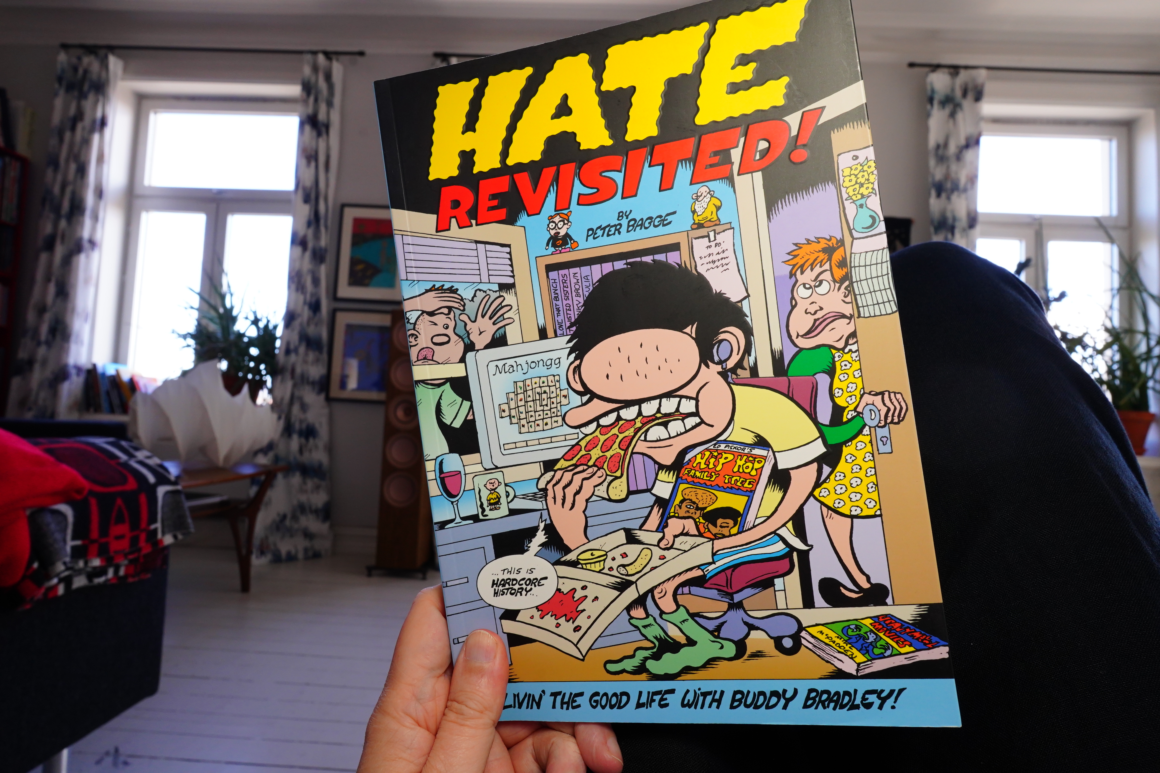
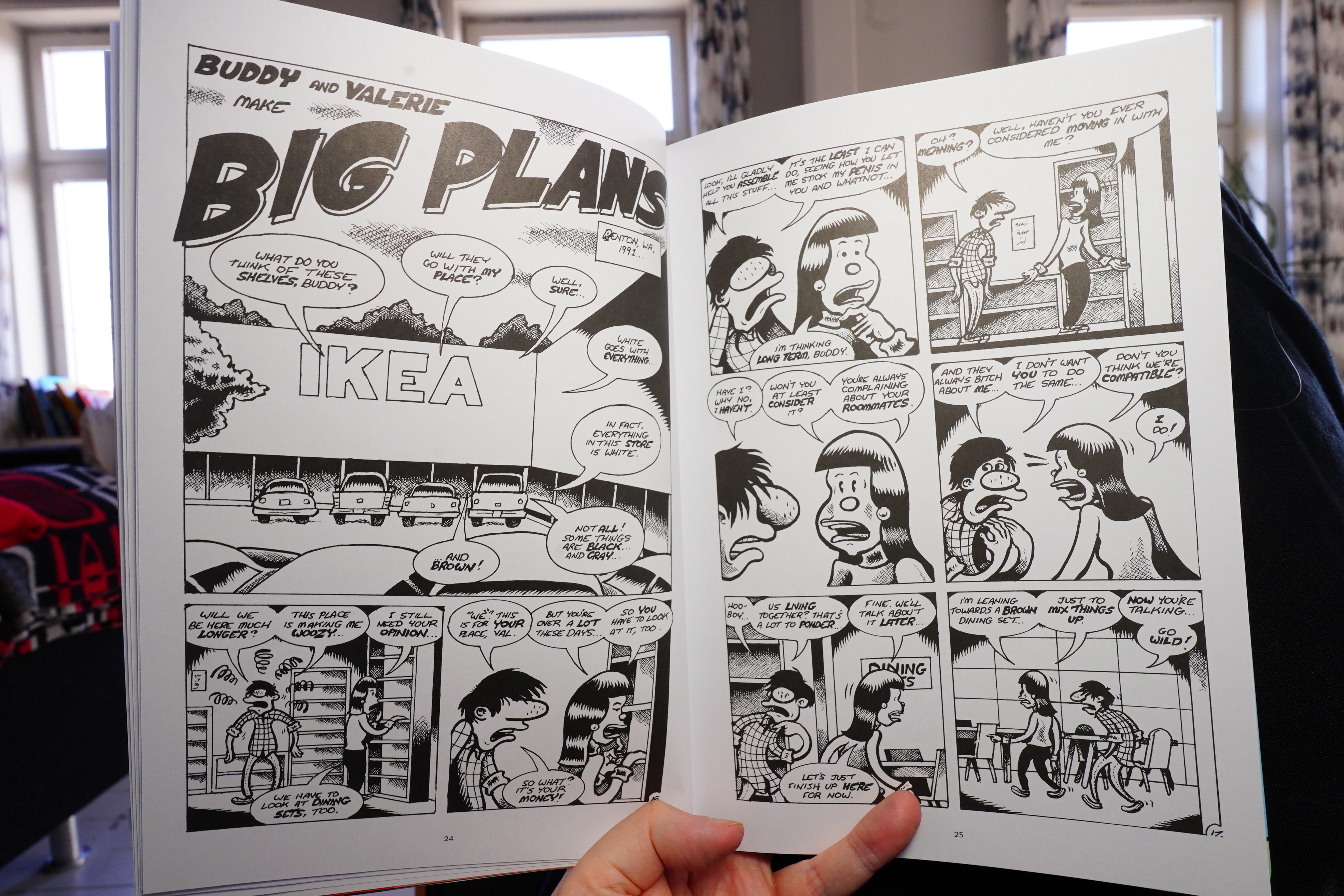
14:56: Hate Revisited! by Peter Bagge (Fantagraphics)
What with the distributor meltdown and how my comics suppliers seem to have died off more or less, I only managed to get one issue of the series when it was published, so I bought the collected edition instead.
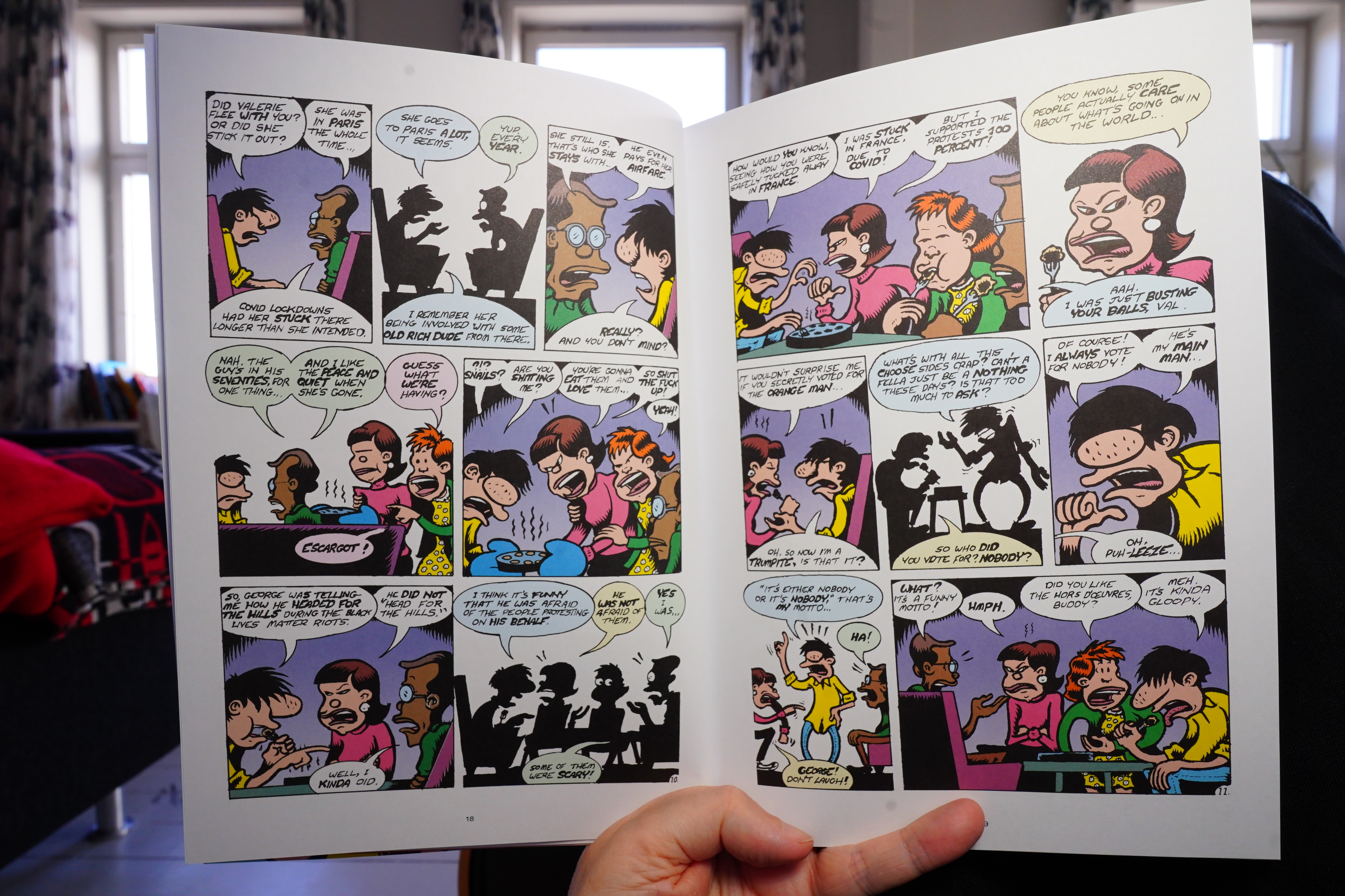
The printing on this is weird — it’s like it’s smudged? Especially the lettering? But that’s impossible these days, so I guess it’s the artwork itself? Was this, like, done almost at printed size or something? I guess it might be a deliberate choice — to make the look more “punk”.
Oh, other people have noted this, too.
It shifts between looking at the characters in the 80s/90s and at the present time in a very considered way. It’s a good read, but it’s not actually funny, so that’s a disappointment. (Except for the Stretchpants stuff at the end — I’m surprised Bagge included that — it seems specially designed to piss people off.)
I think the response to this series was pretty muted?
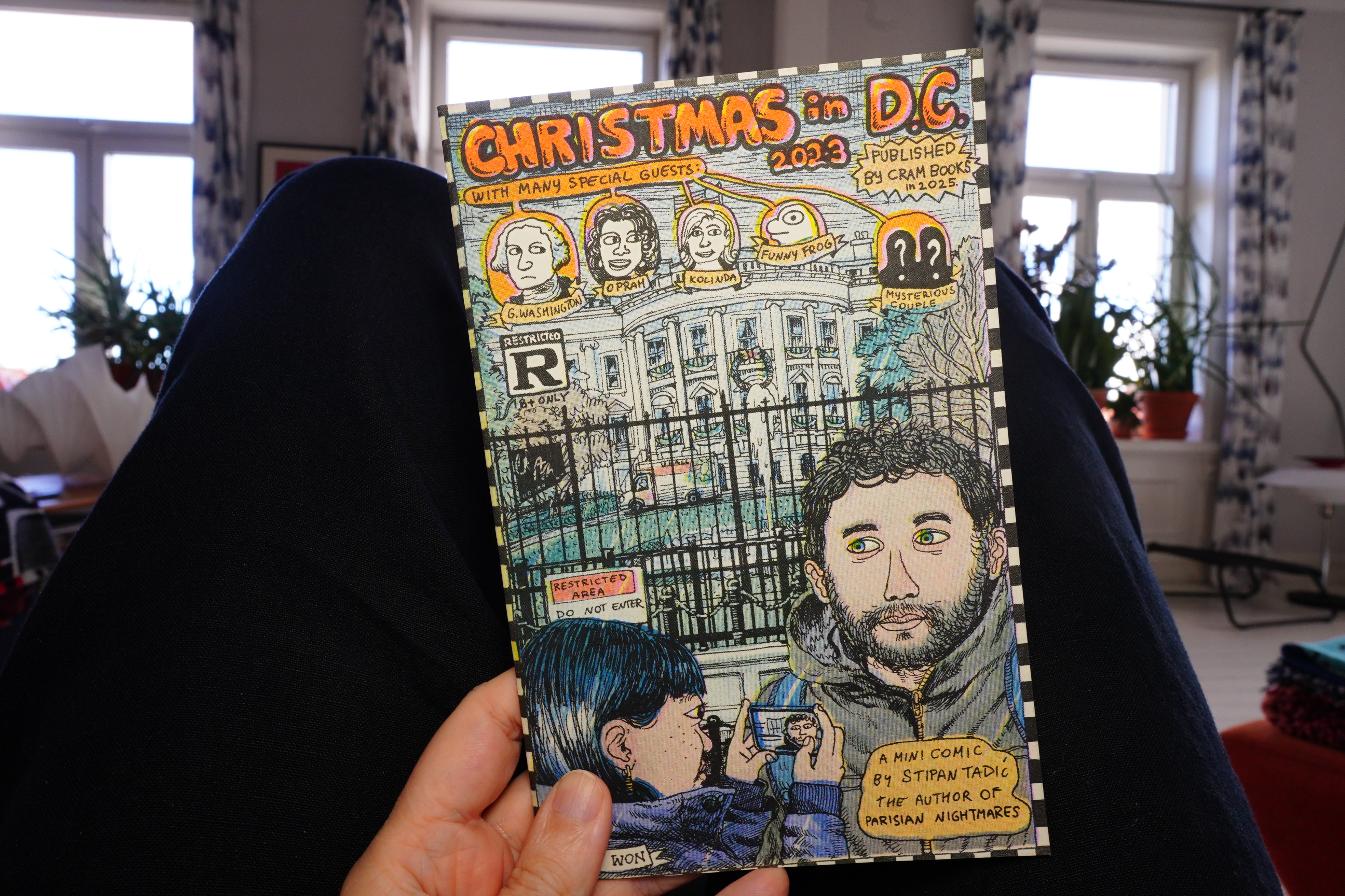
16:10: Christmas in DC 2023 by Stipan Tadić (Cram Books)
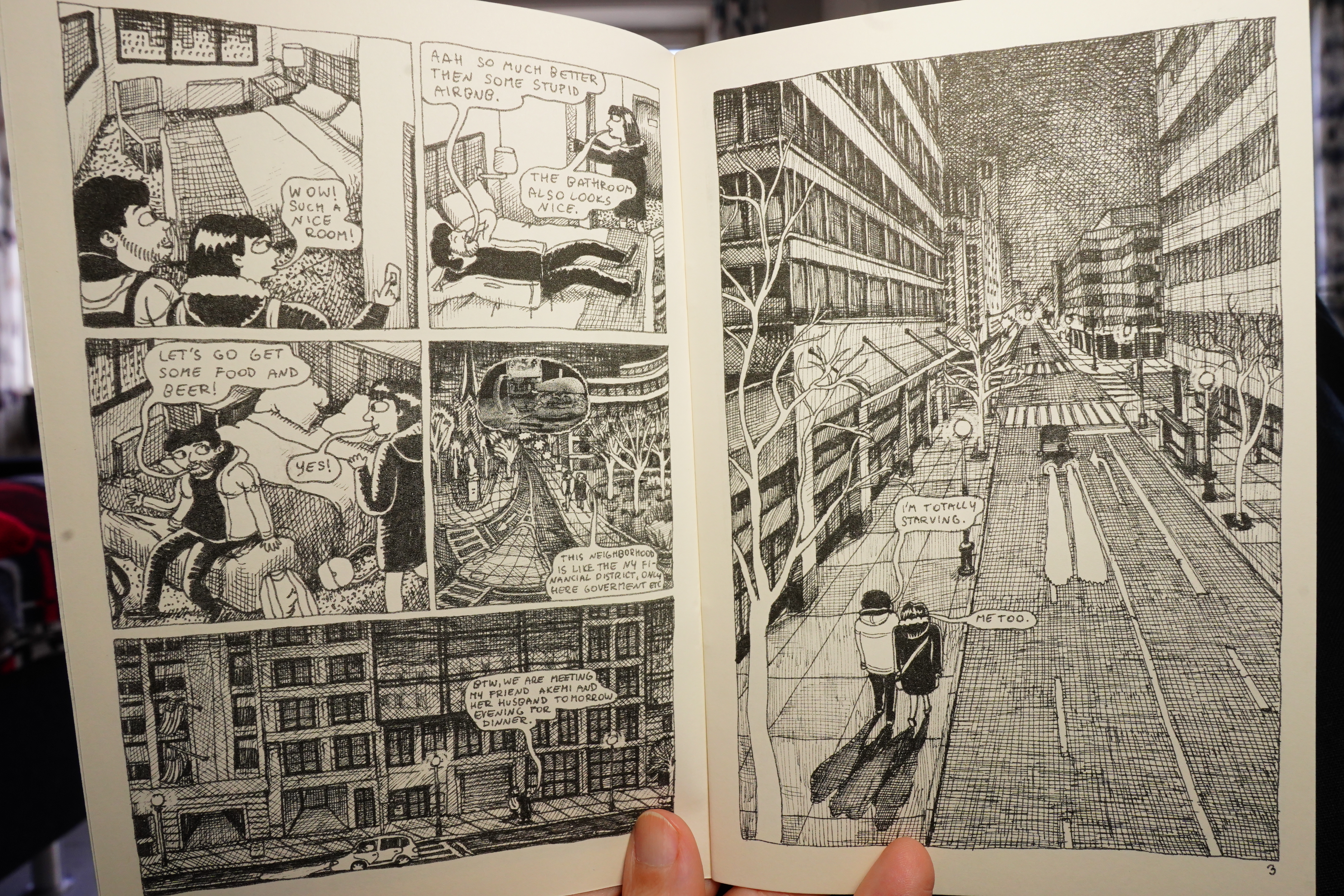
This is classic travelogue autobio.
I really like the art, and the flow is great.
| The Ex: Starters Alternators |  |
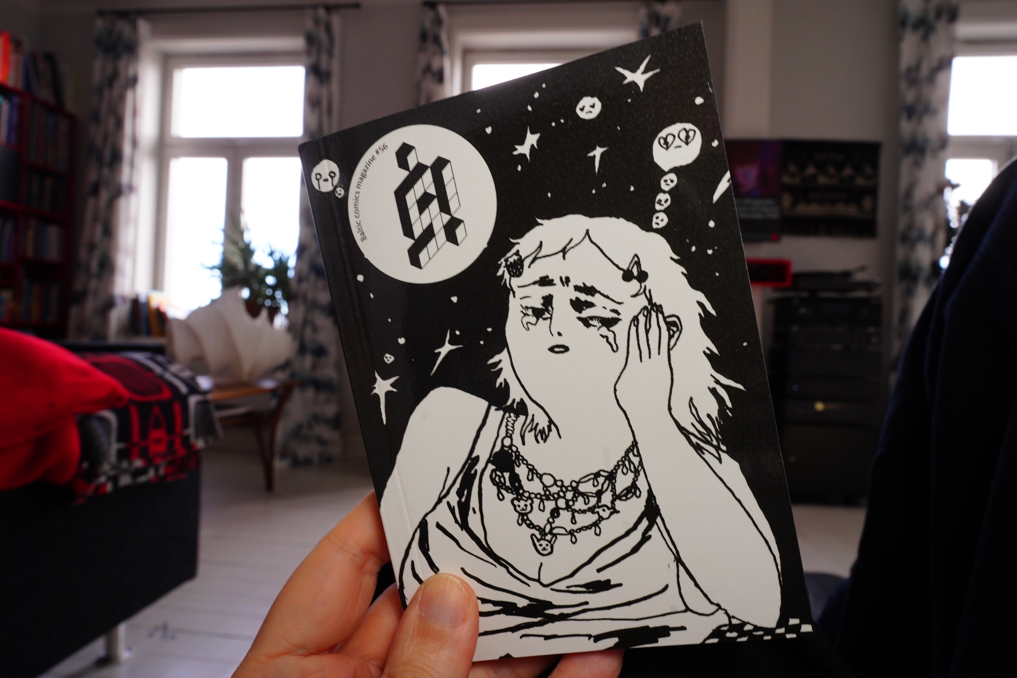
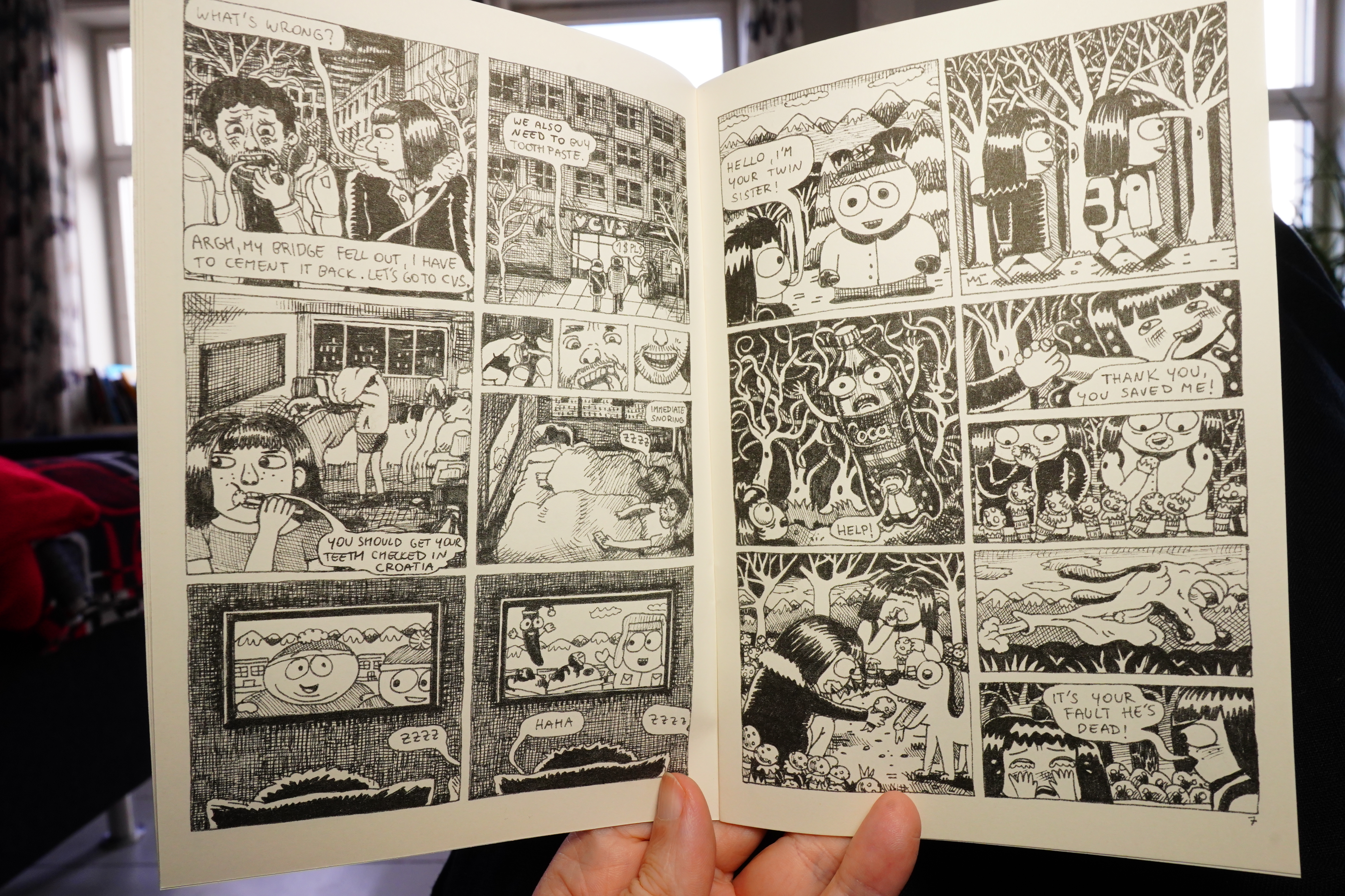
16:26: Š! #56 (Kuš)
I got this from here.
I think this is the first black and white issue of this anthology?
As usual, it’s good stuff, but I particularly liked the above piece.
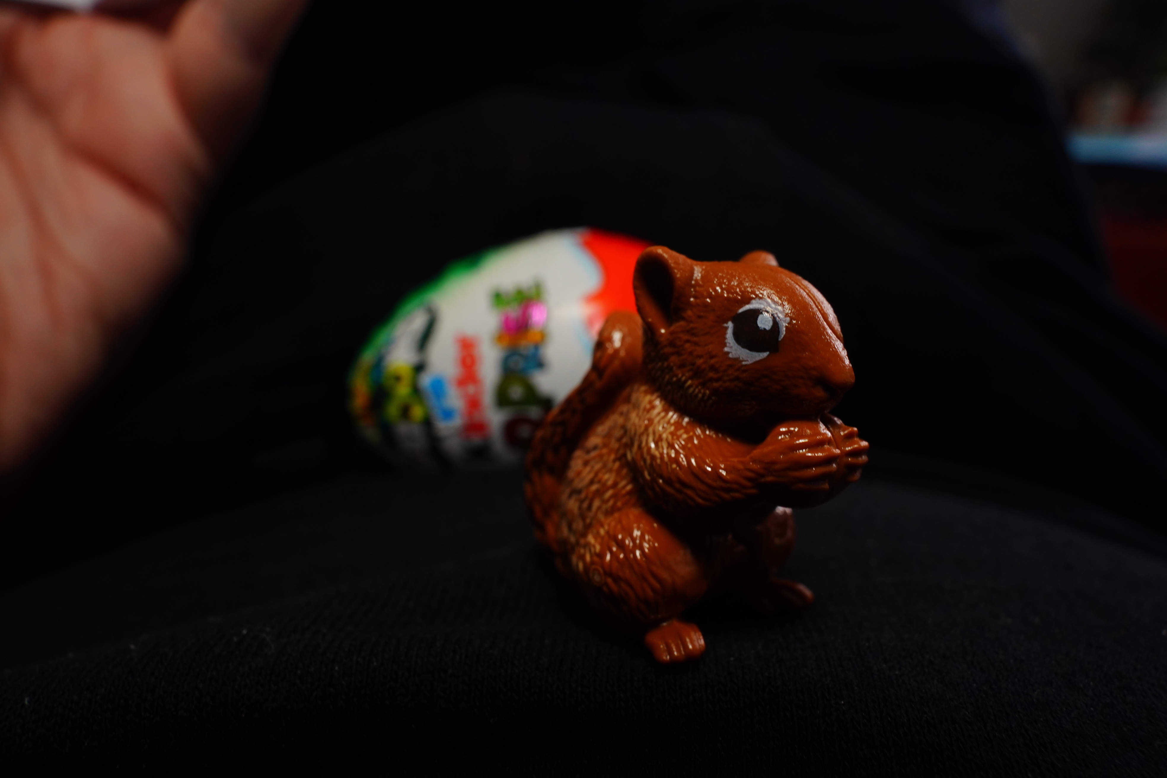
And look! I got a lil ecureuil in my Kinder Surprise!
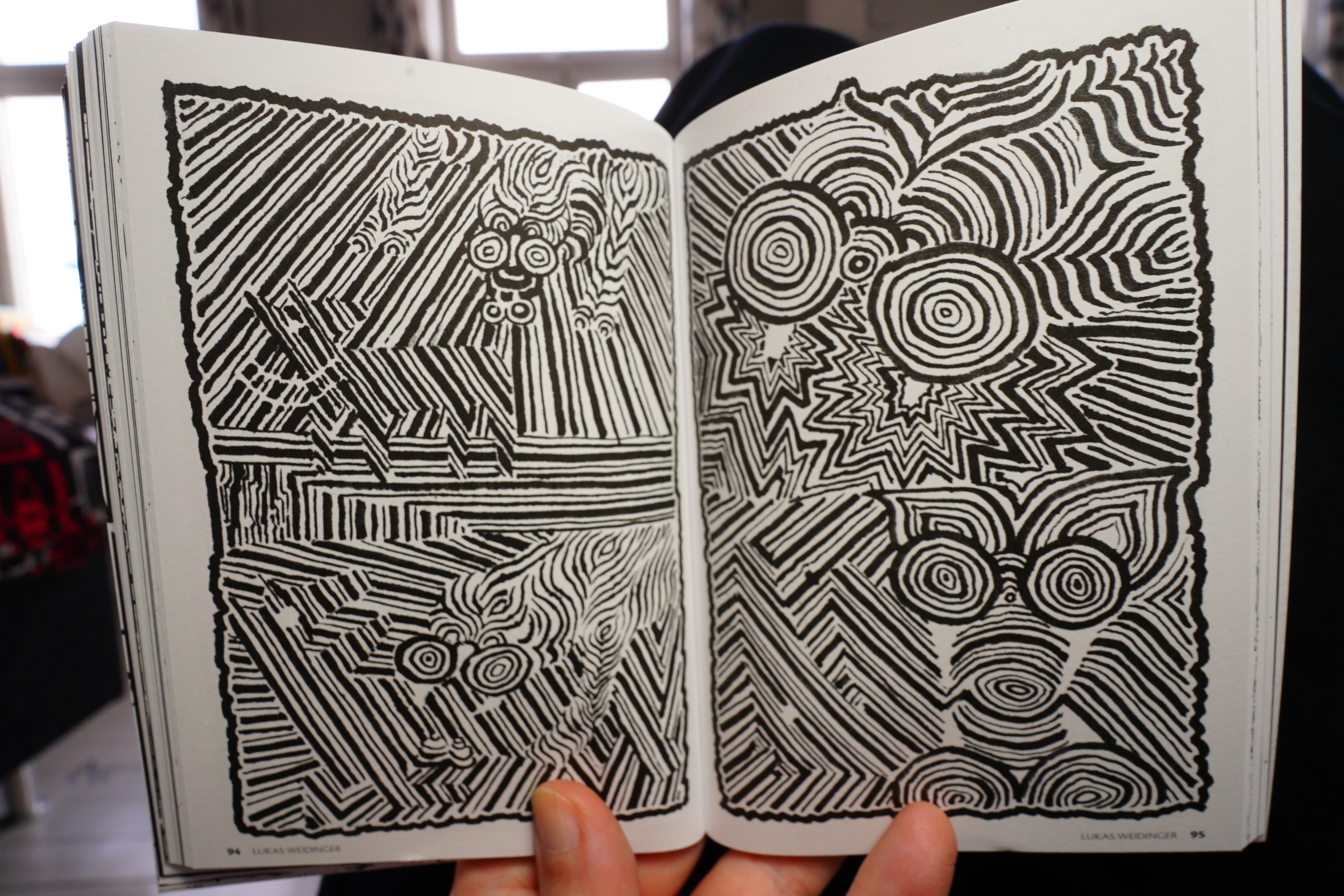
The pieces in this issue are tend towards being more abstract than usual…
And there’s a lil micro comic included.
Very nice.
| Xiu Xiu: My Forever |  |
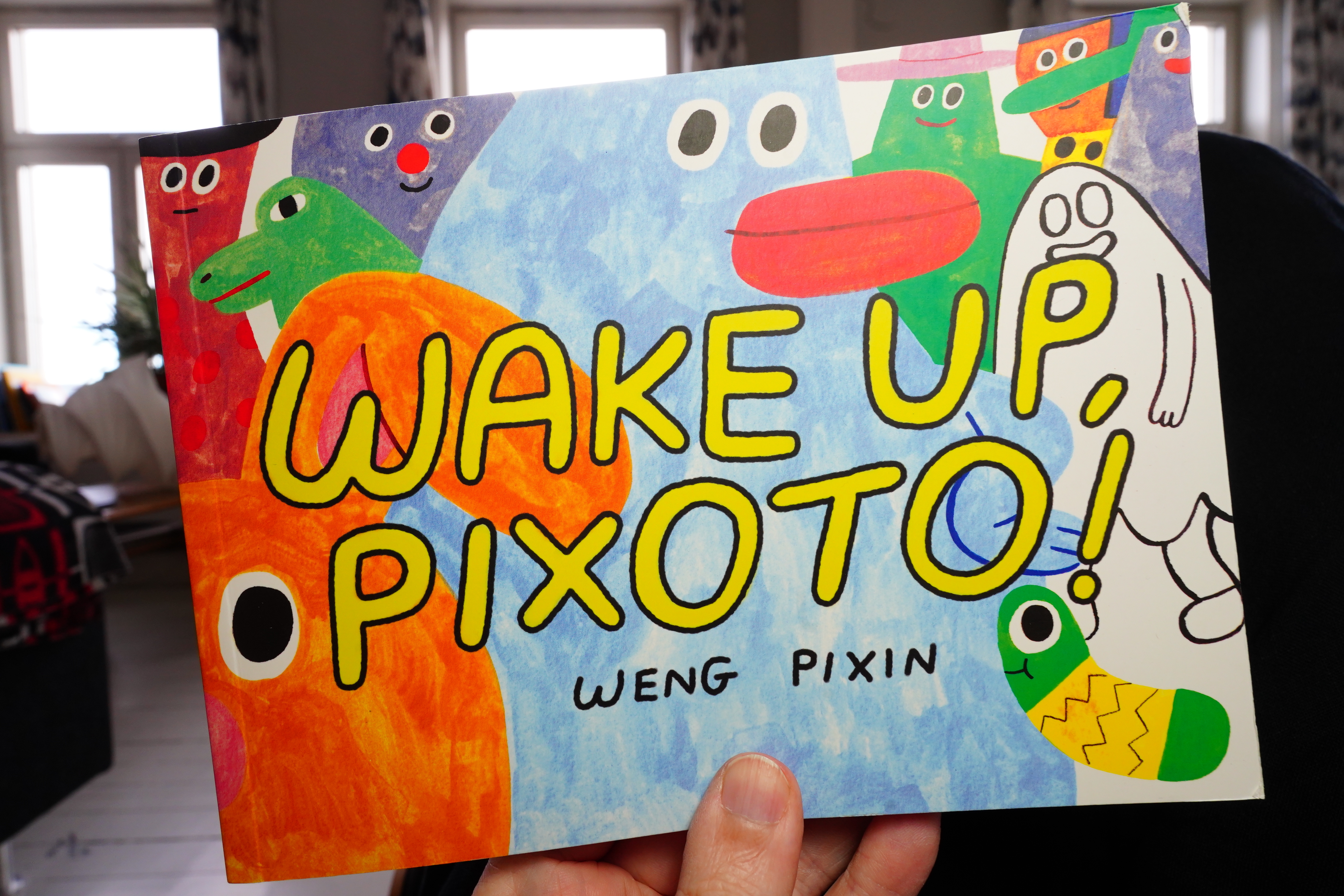
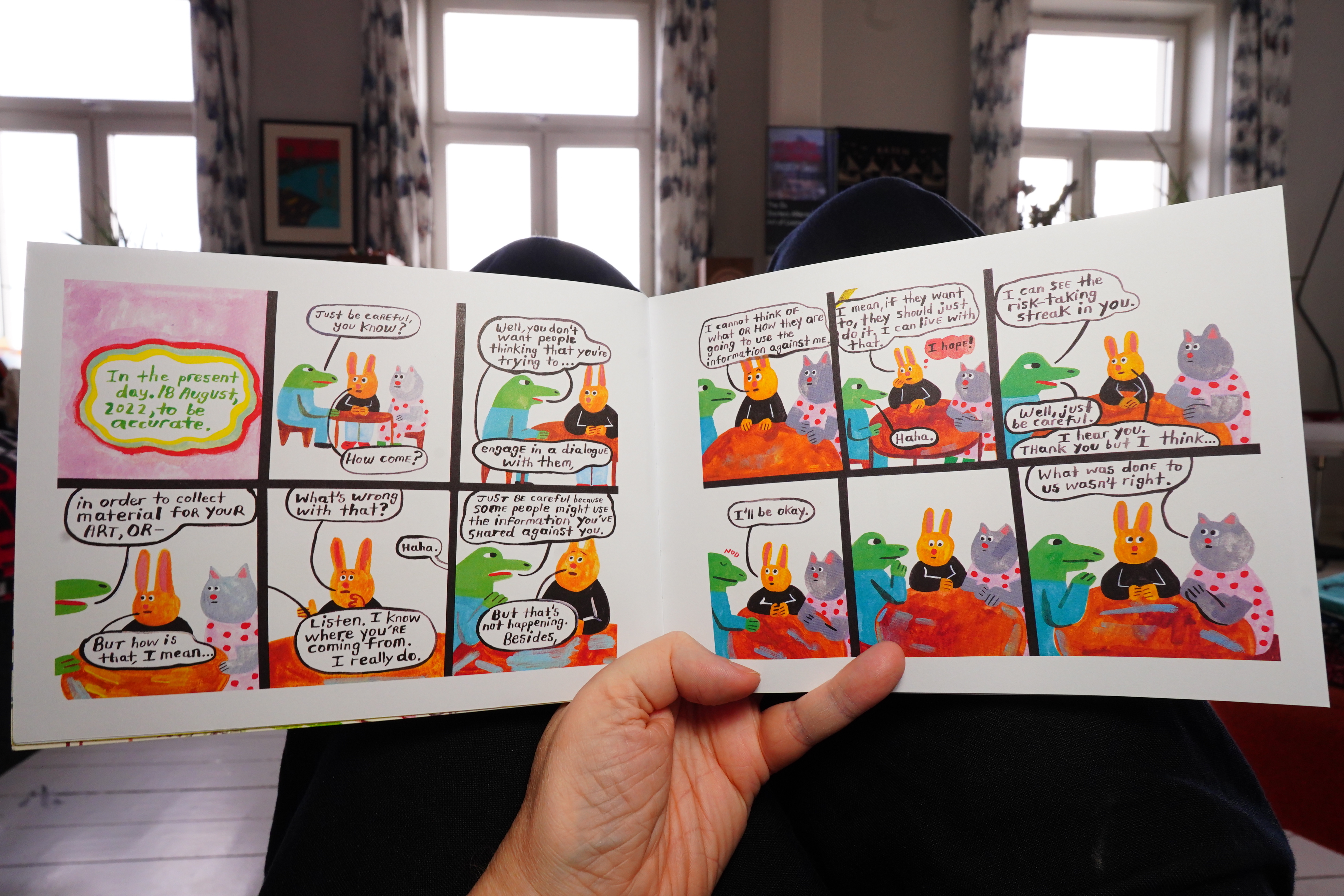
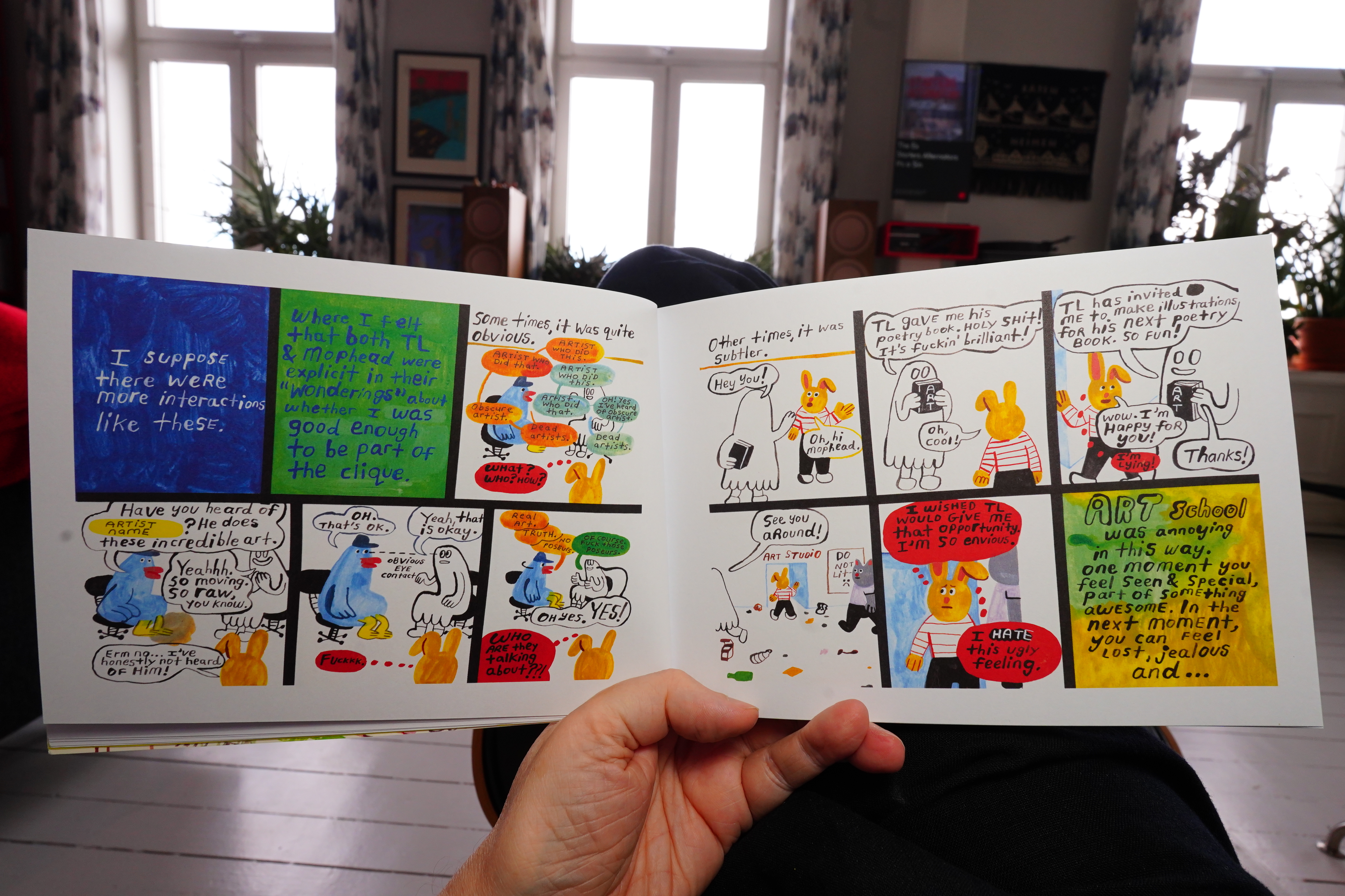
16:45: Wake Up, Pixoto by Weng Pixin (Drawn & Quarterly)
Love the colours… I guess she’s talking about being an autobio comics artist and the responsibilities…
So it’s the classic setting for an autobio comics artist — art school. The storytelling is kinda choppy?
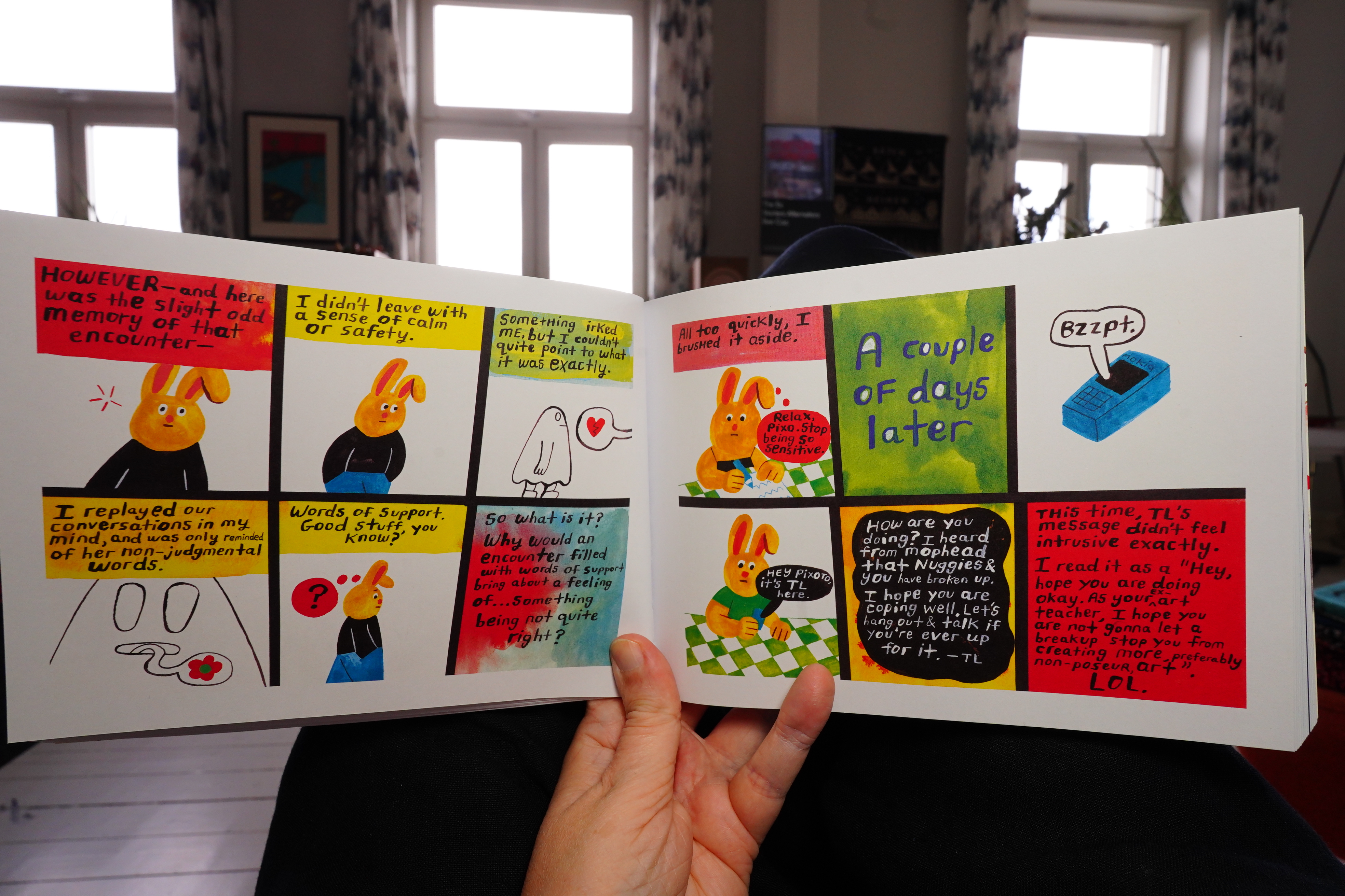
But a bigger problem is that everything feels so thoroughly digested before being presented to the reader — we’re not just getting the events as they occurred to her while they were occurring. Instead everything is being informed by her later thoughts about the events, and that’s just downright annoying after a while.
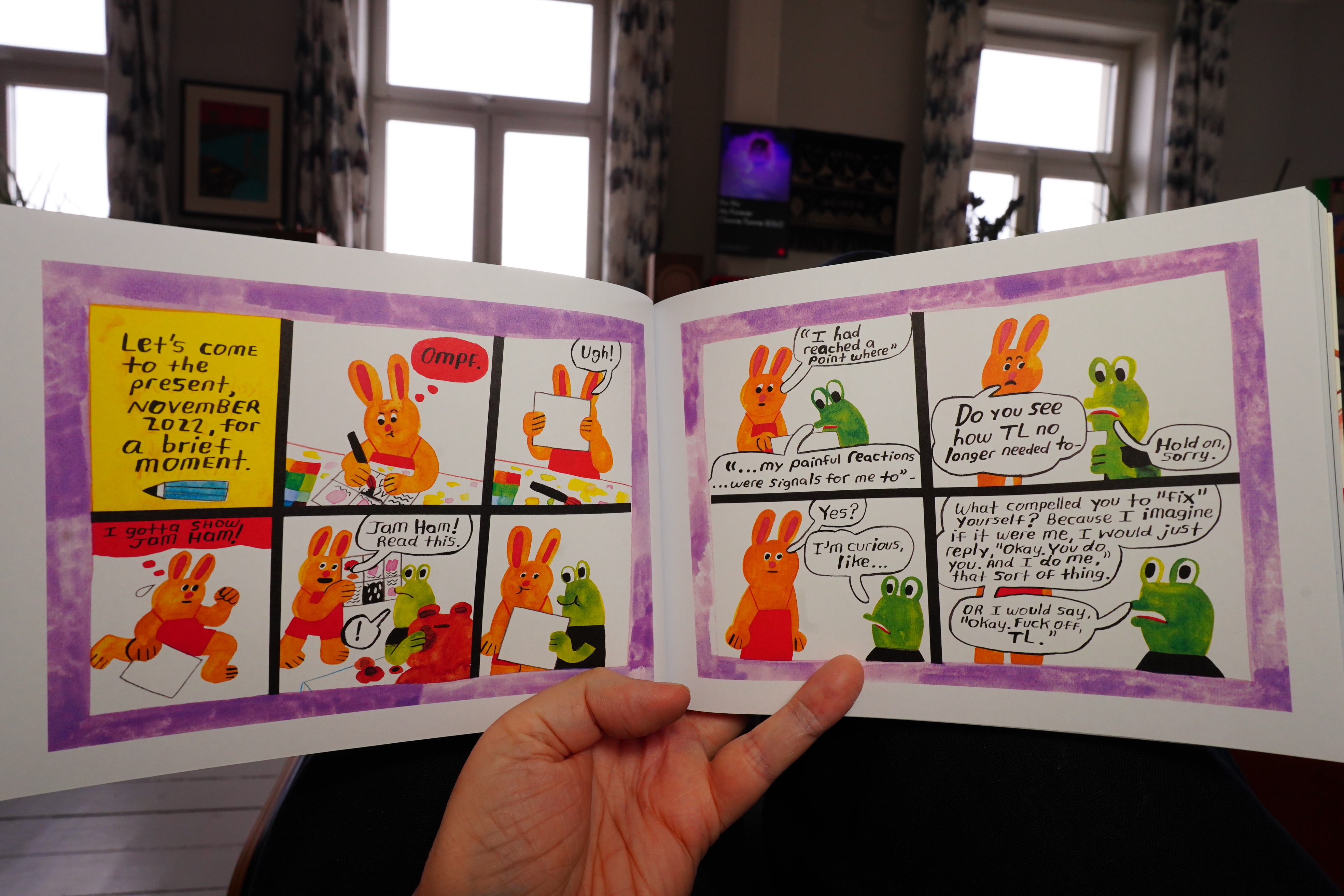
She also uses that old trick of incorporating a critique of the book in the book itself to defuse any subsequent criticism.
The book is about an art teacher that gathered a bunch of students and ex-students around him and held court — what the author describes as an “everyday cult”. To me he just sounded like a blowhard asshole, and it’s incomprehensible to me why these kids would subject themselves to his boring lectures. The author tries to explain this by handwaving to “the culture”, but…
I can understand wanting to make a book out of the experience, but in the end, I just found the book to be deathly dull.
| Snapped Ankles: Dancing In Transit: Live 2025 |  |
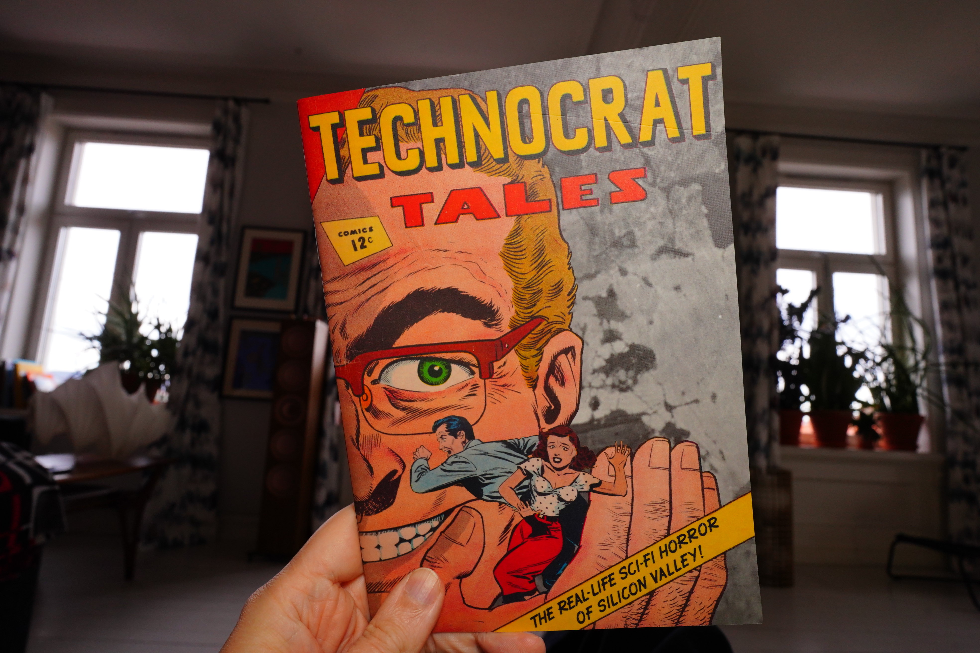
18:06: Technocrat Tales by Johnny Damm
I got this from here.
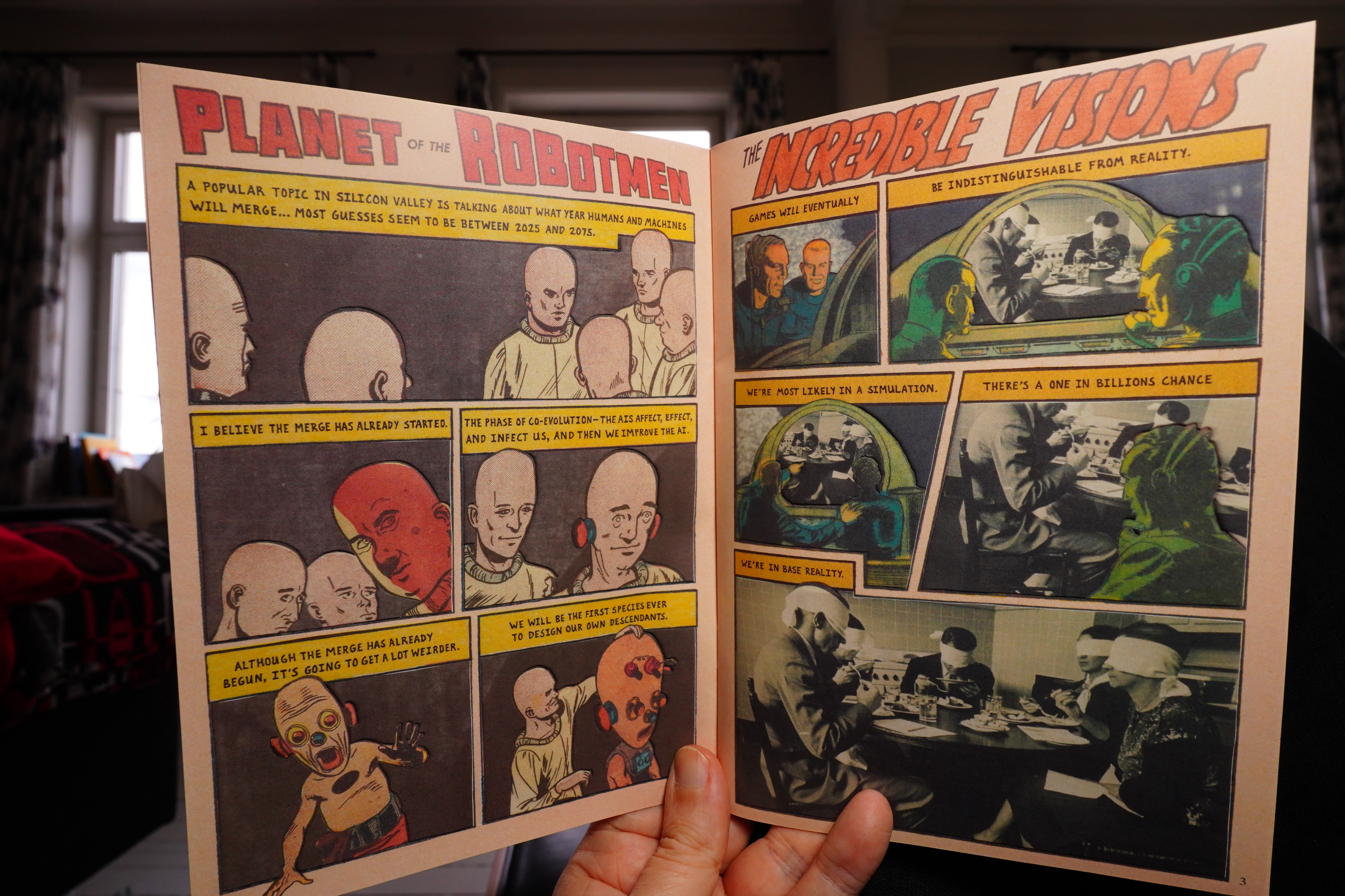
This book juxtaposes quotes from various tech morons (Musk, Thiel, Altman) with old comics art (and images).
I’ve really enjoyed Damm’s previous books, but this was just a chore to get through, because the quotes (all real) are just so moronic… There’s nothing there. The earlier books — for instance the one that used quotes from cops — were more gripping.
| m(h)aol: Something Soft |  |
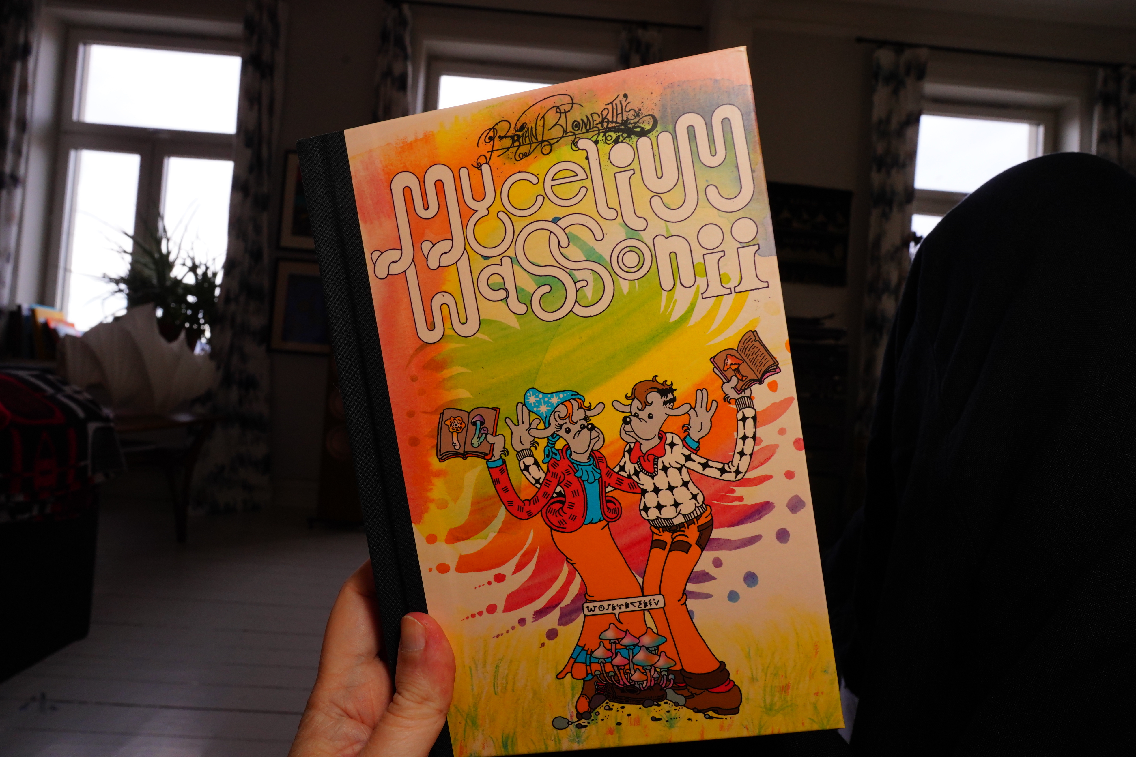
18:15: Mycelium Wassonii by Brian Blomerth (Lystring)
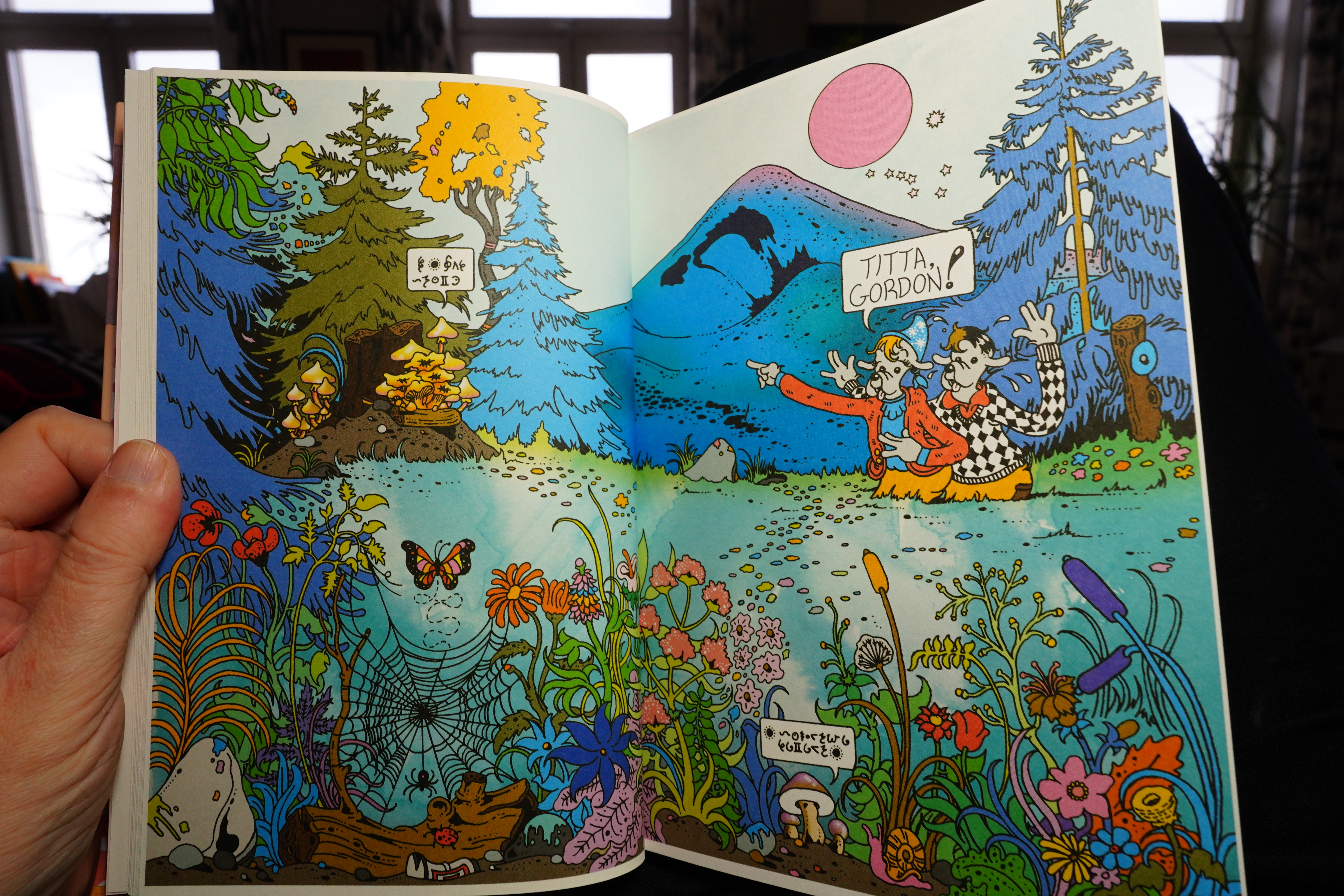
Love the artwork!
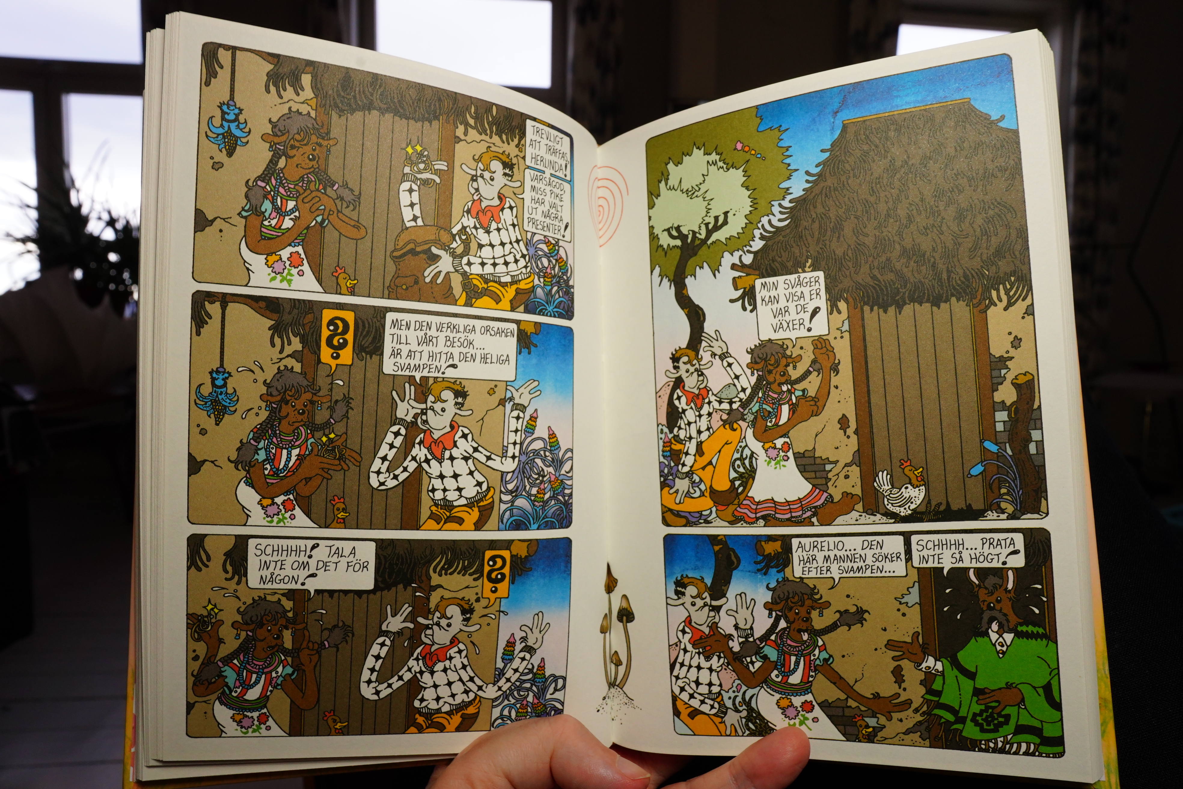
And the characters’ movements are so expressive. It’s like 30s cartooning, I guess? Fantastic, anyway.
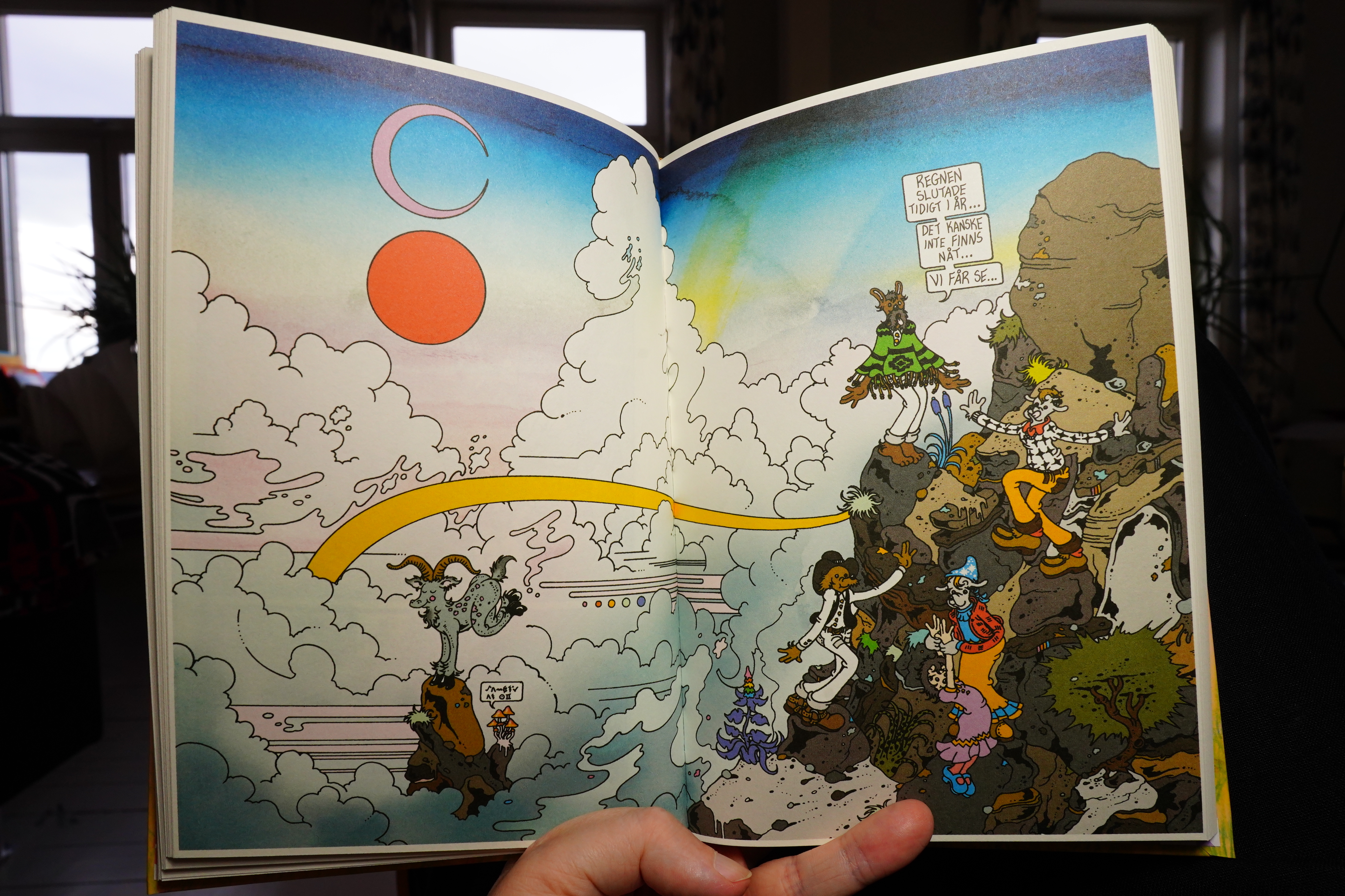
The book is about mushrooms in general, and then the last part is about psychedelic mushrooms, which I guess is kinda predictable (given the art style).
It’s good, though.
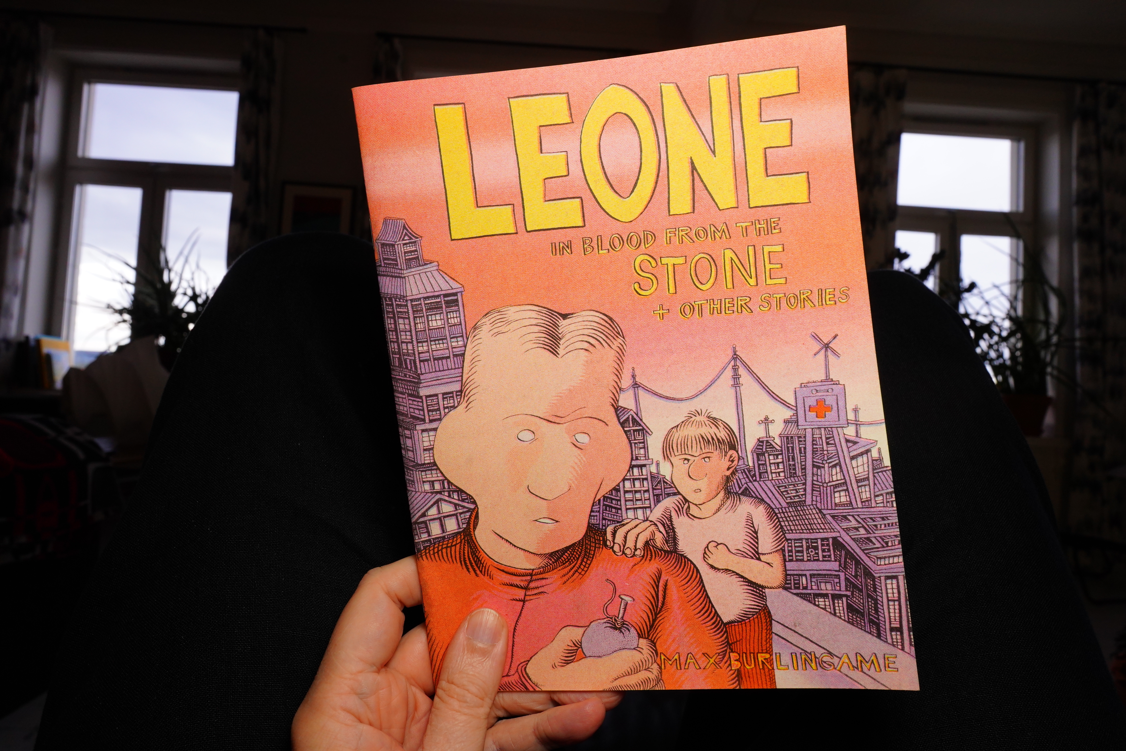
18:32: Leone by Max Burlingame (Cram Books)
Yeah, I got all these Cram books from here.
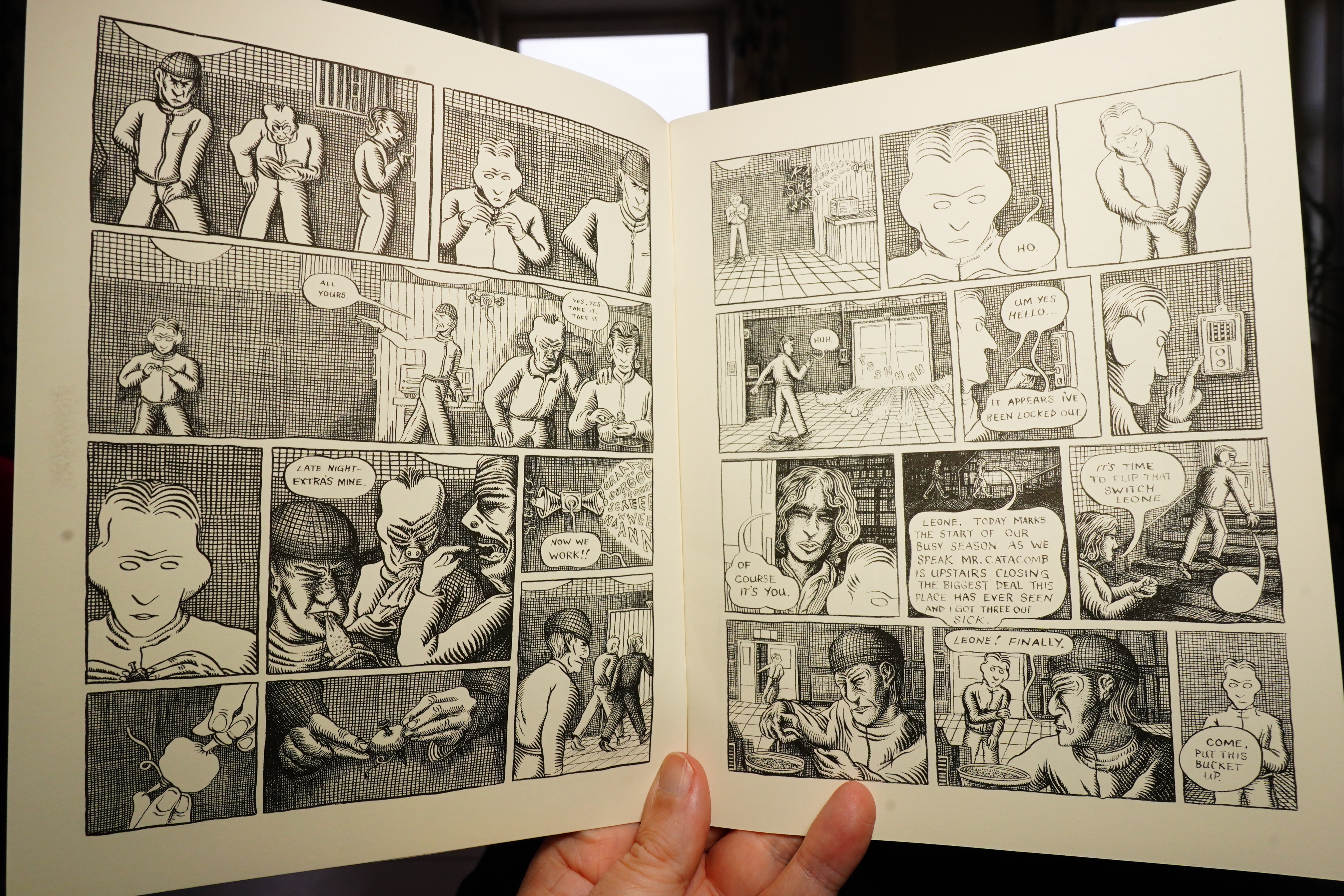
I like the artwork.
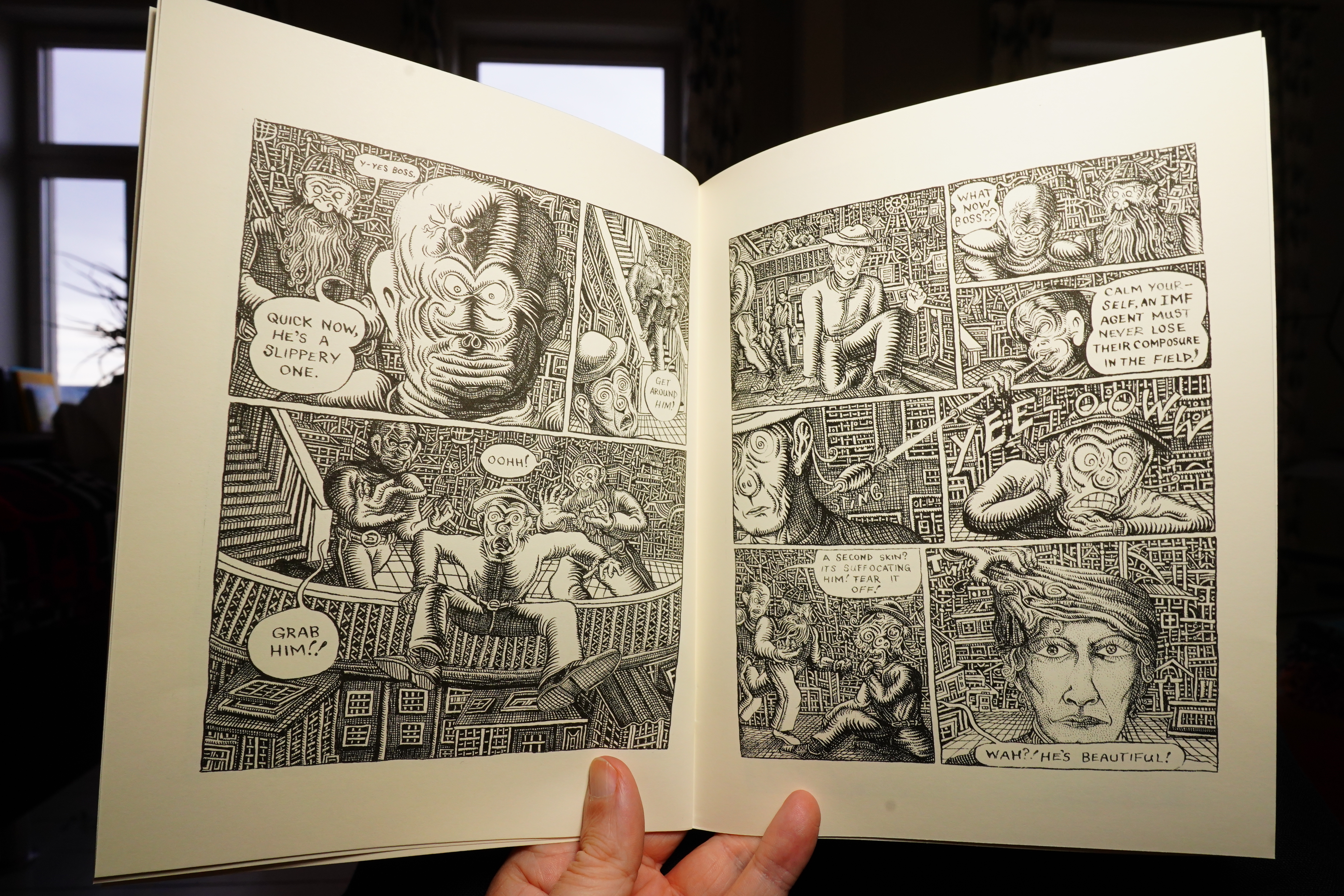
The stories are very confusing indeed.
| Little Simz: Lotus |  |
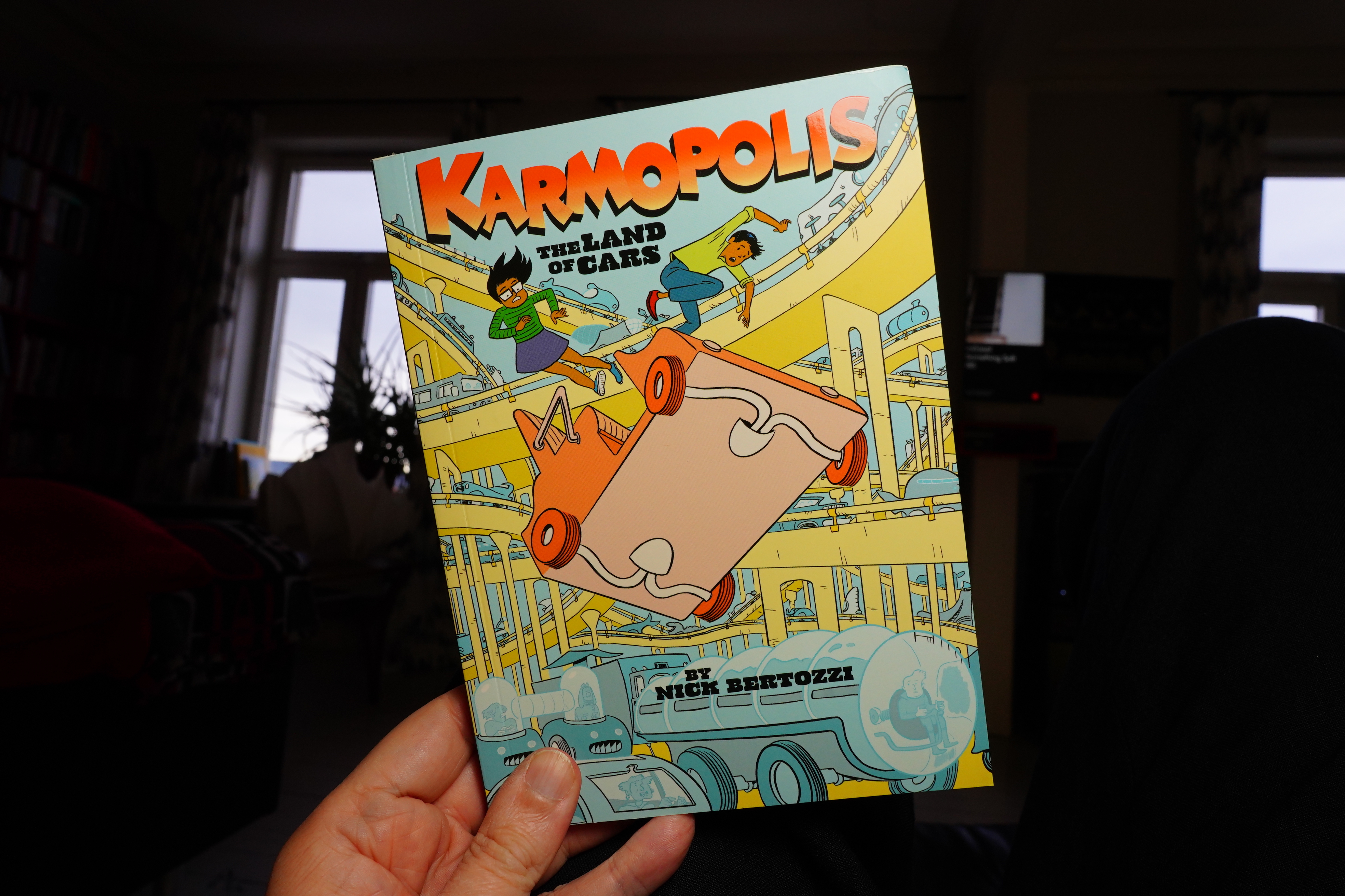
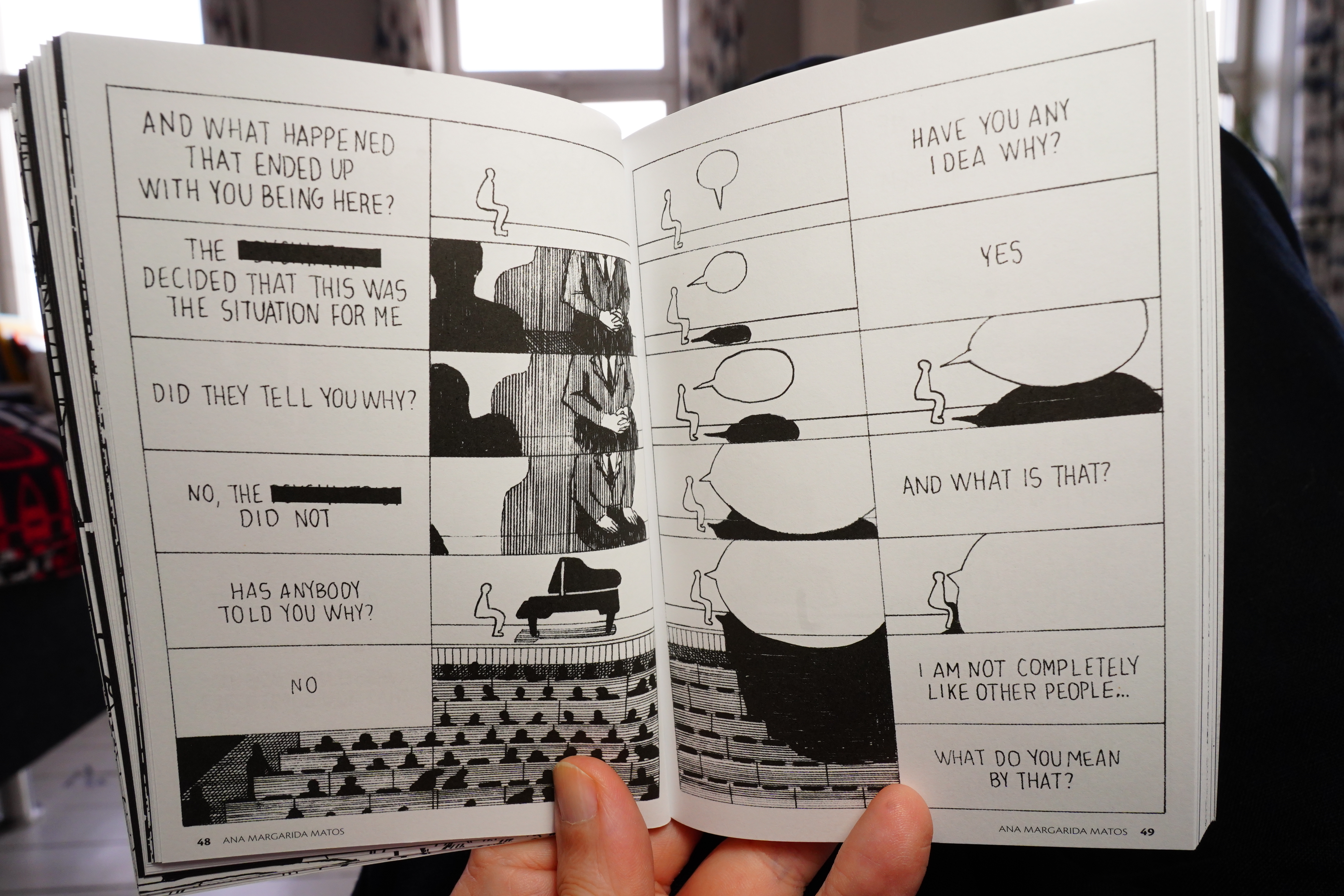
18:41: Karmopolis by Nick Bertozzi (Top Shelf)
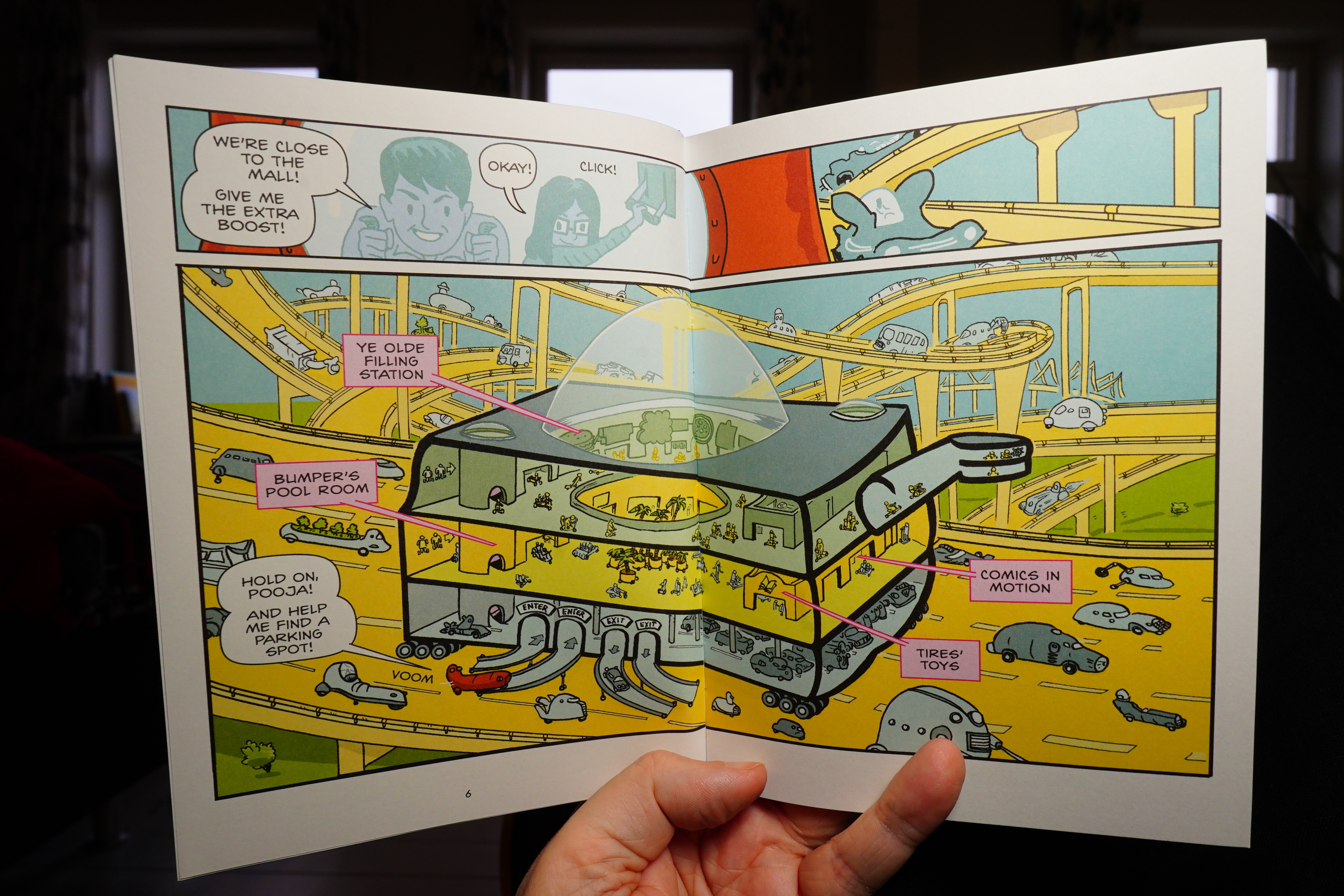
This is a very inventive book about an even more carcentric society than ours.
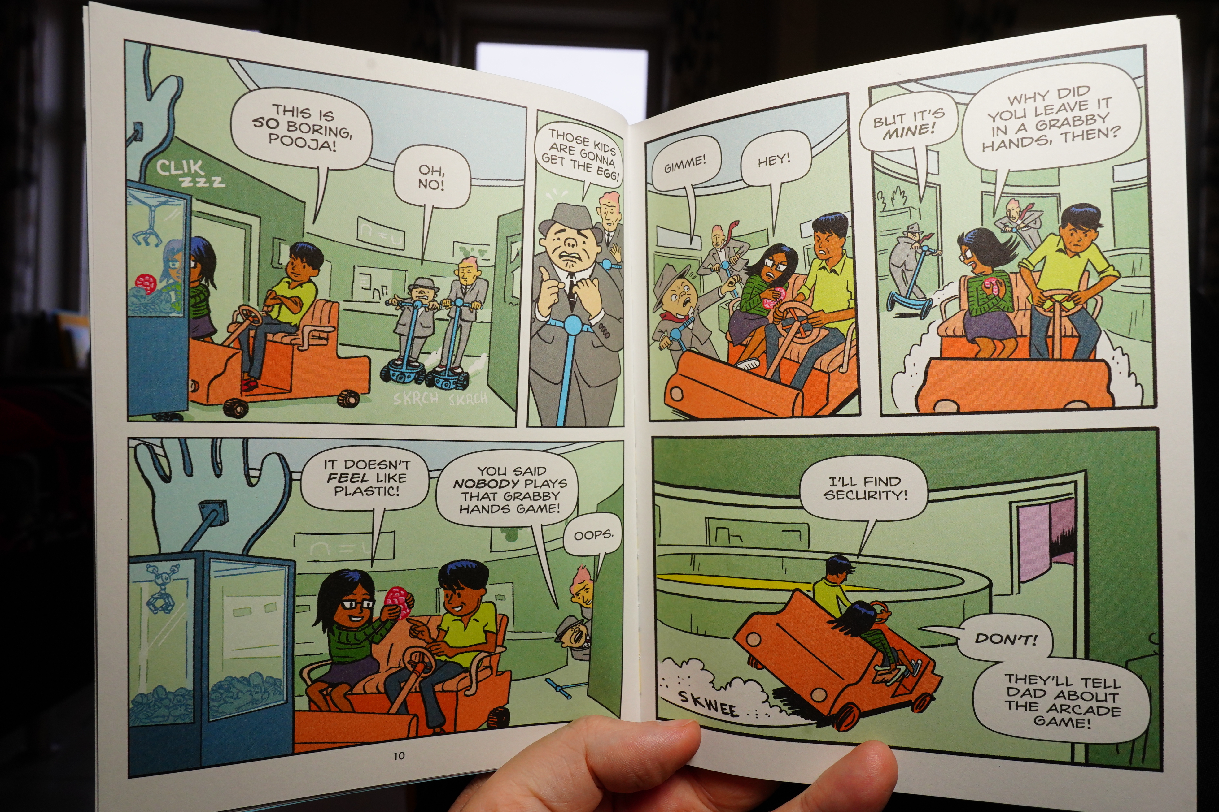
It’s fun, but… it’s just so oddly structured. It’s in four parts, and the first part is a complete adventure. Then the last three are a MacGuffin search adventure, that ends with a reveal that we already knew from the first part.
Just very odd.
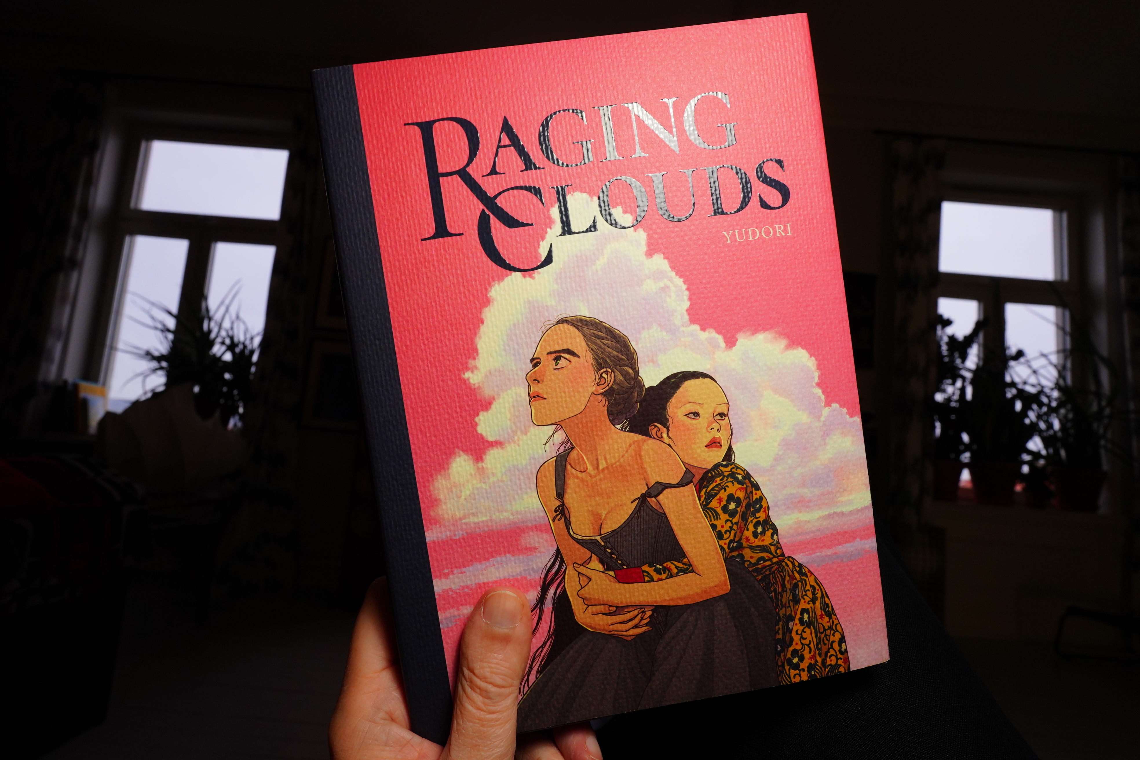
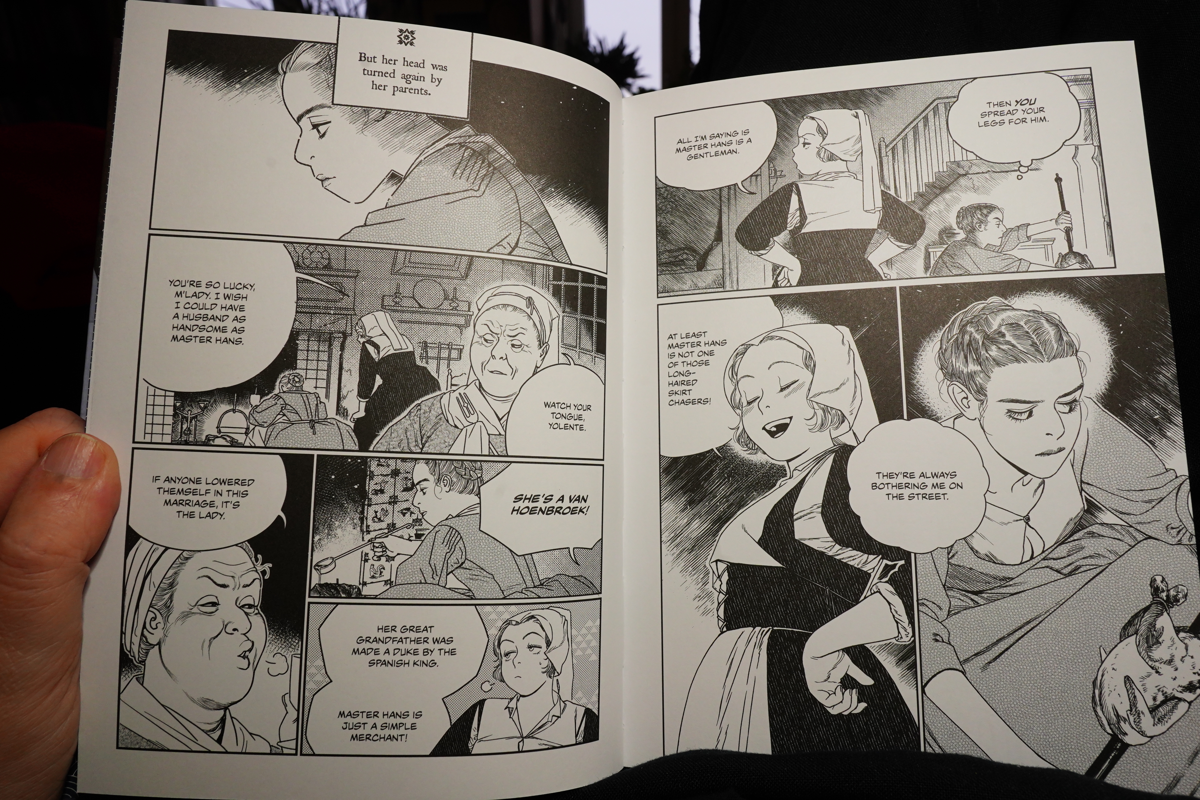
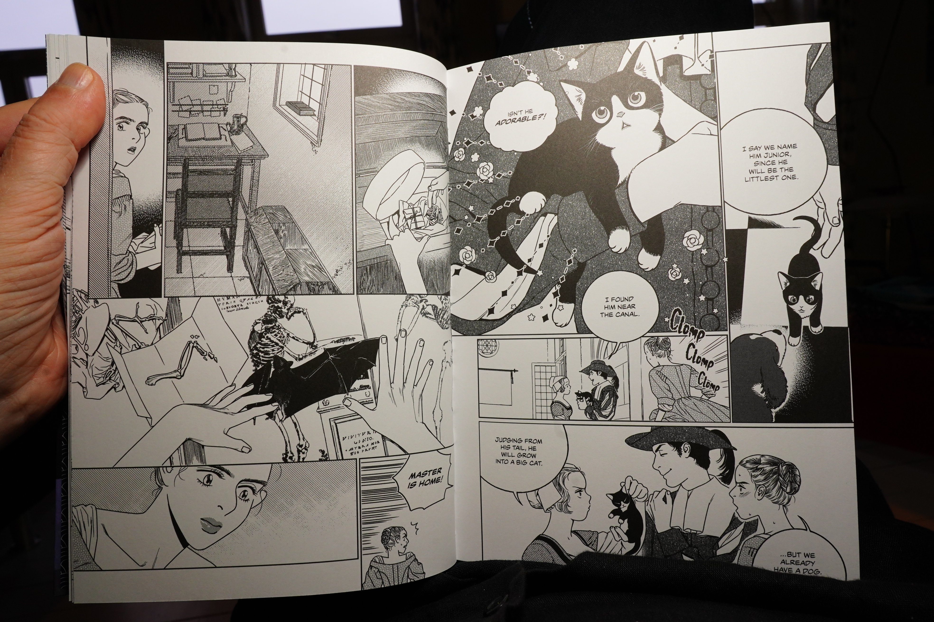
19:05: Raging Clouds by Yudori (Fantagraphics)
Uhm… I guess this is one of those European “manga” books?
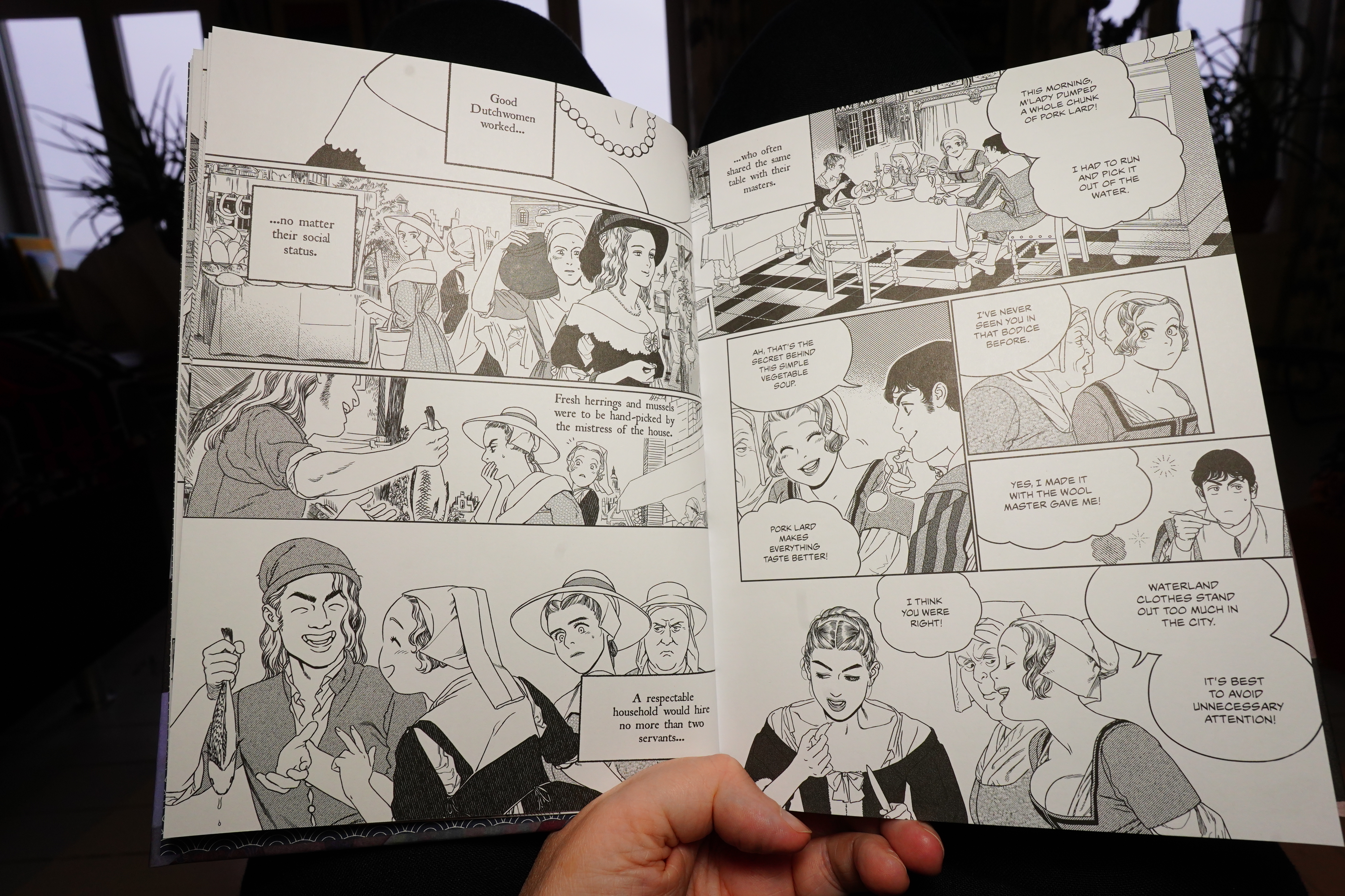
The storytelling is just… it’s the choppiest ever. Nothing flows naturally — not scene to scene, not dialogue to dialogue. It reads like a random jumble that’s been dribbled into the page. I tried reading a couple pages right-to-left to see whether they made more sense that way, but nope.
Aww!
No, I can’t take this any more — I had to ditch this after 50 pages.
Perhaps I’m just hangry? I should probably make some food.
| Little Barrie & Malcolm Catto: Electric War |  |
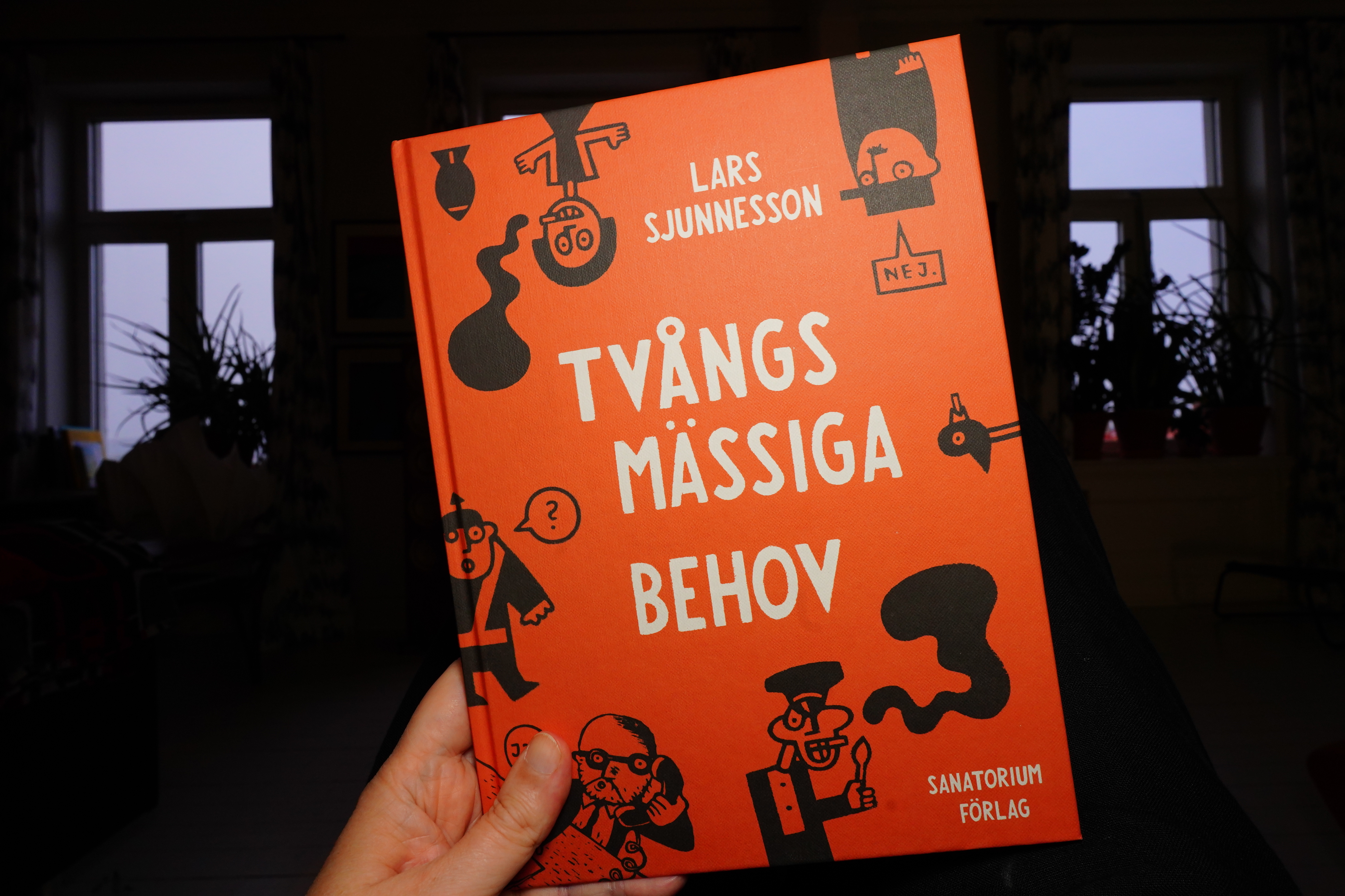
19:38: Tvånsmässiga behov by Lars Sjunnesson (Sanatorium Förlag)
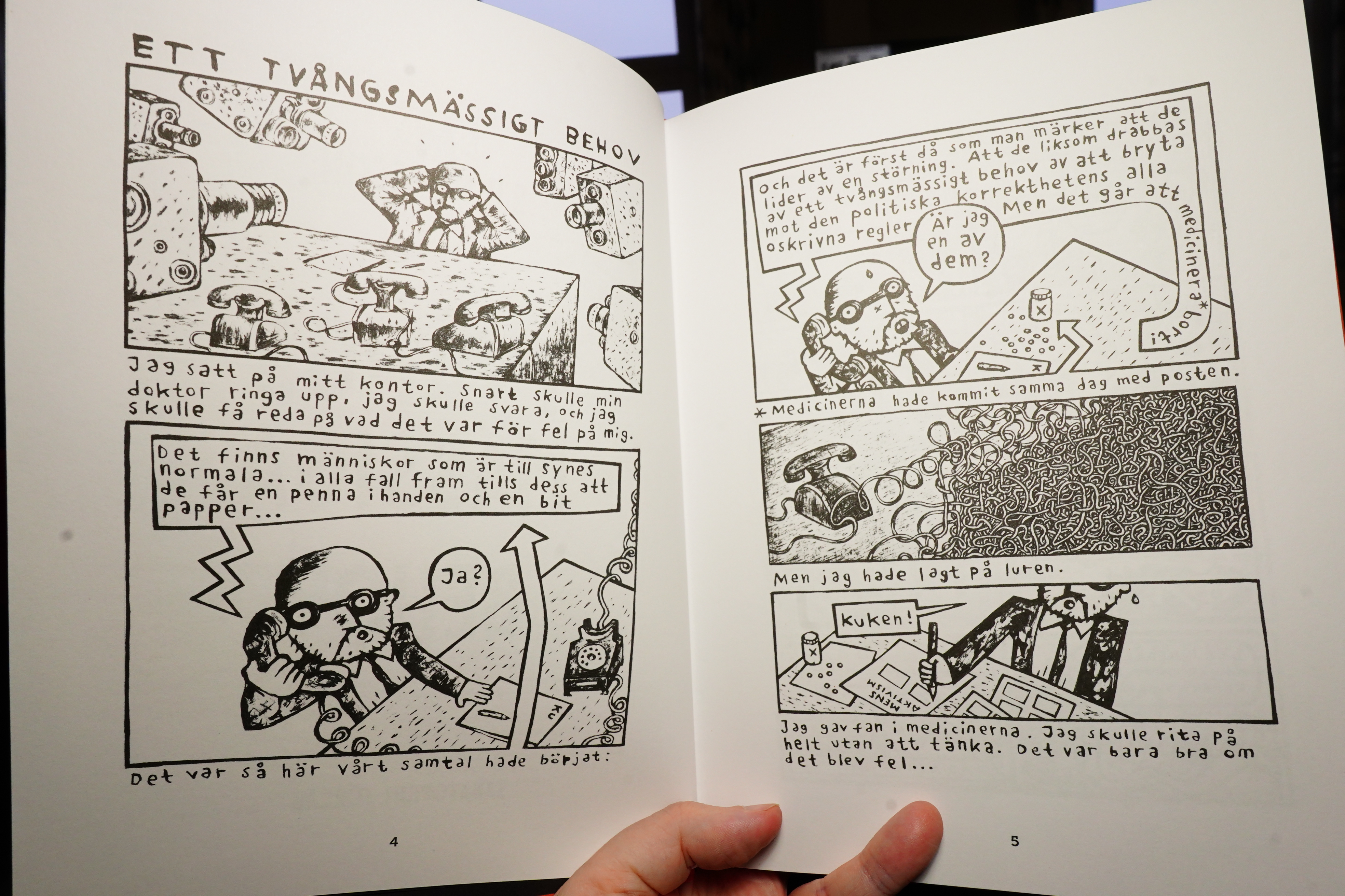
This is apparently a collection of previously published pieces.
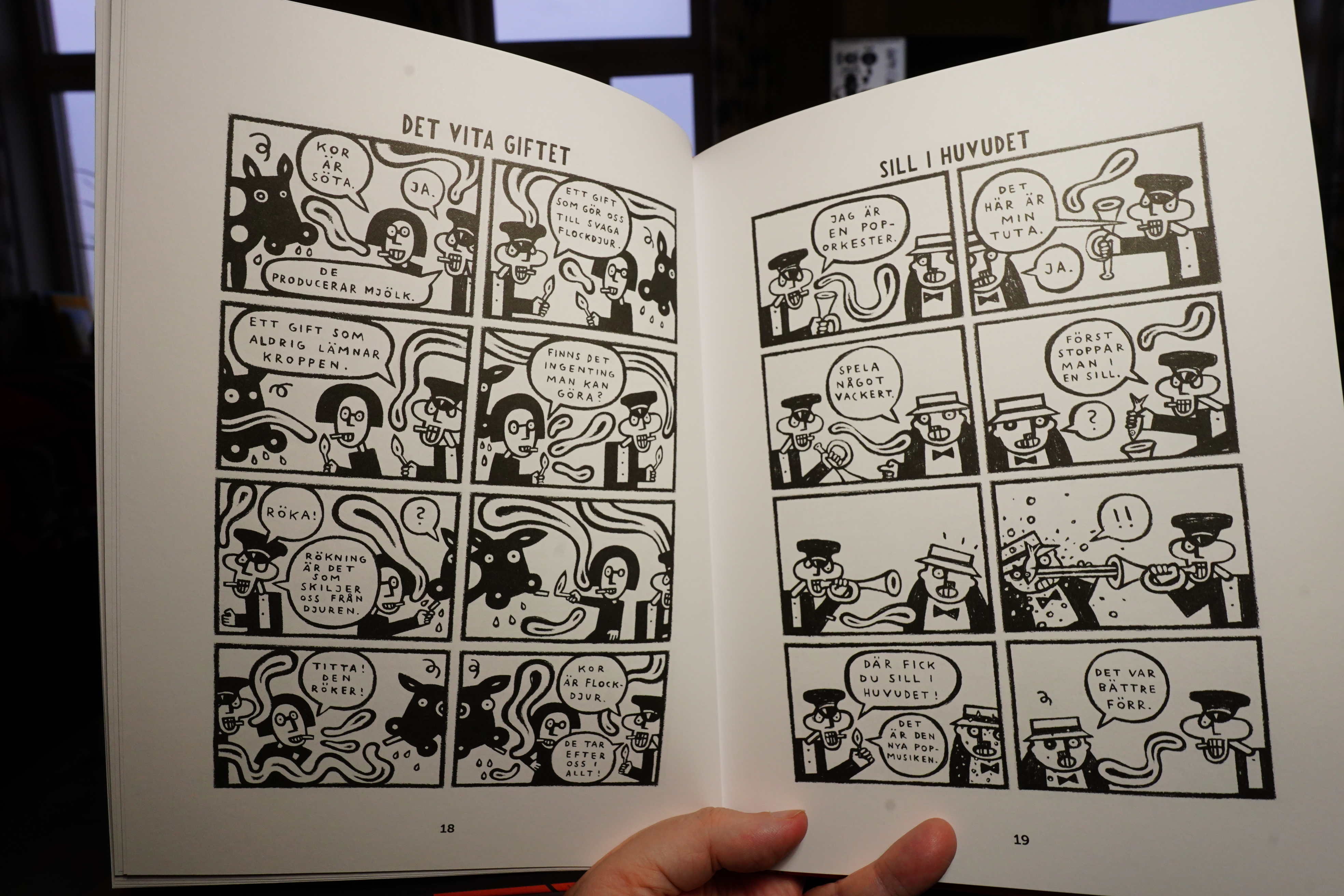
Most of them are one pagers, but there’s also longer stuff.
I like the art work in general — it’s got a stark thing going on. But it’s mostly gags, and the gags aren’t really that funny, for the most part?
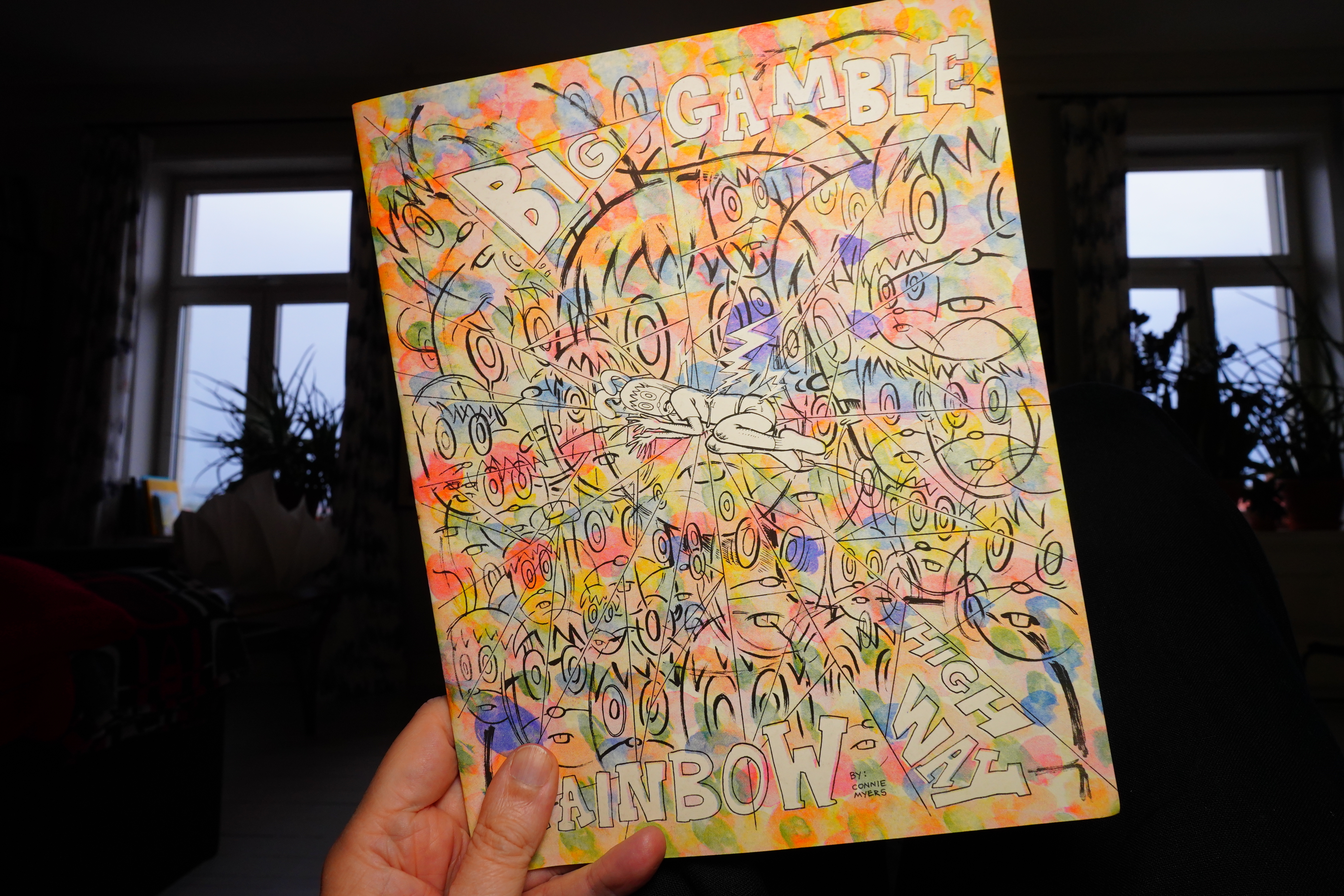
20:09: Big Gamble Rainbow Highway by Connie Meyers (Cram Books)
This is a horror story.
And it’s scary! I like it.
| Chat Pile: God’s Country |  |
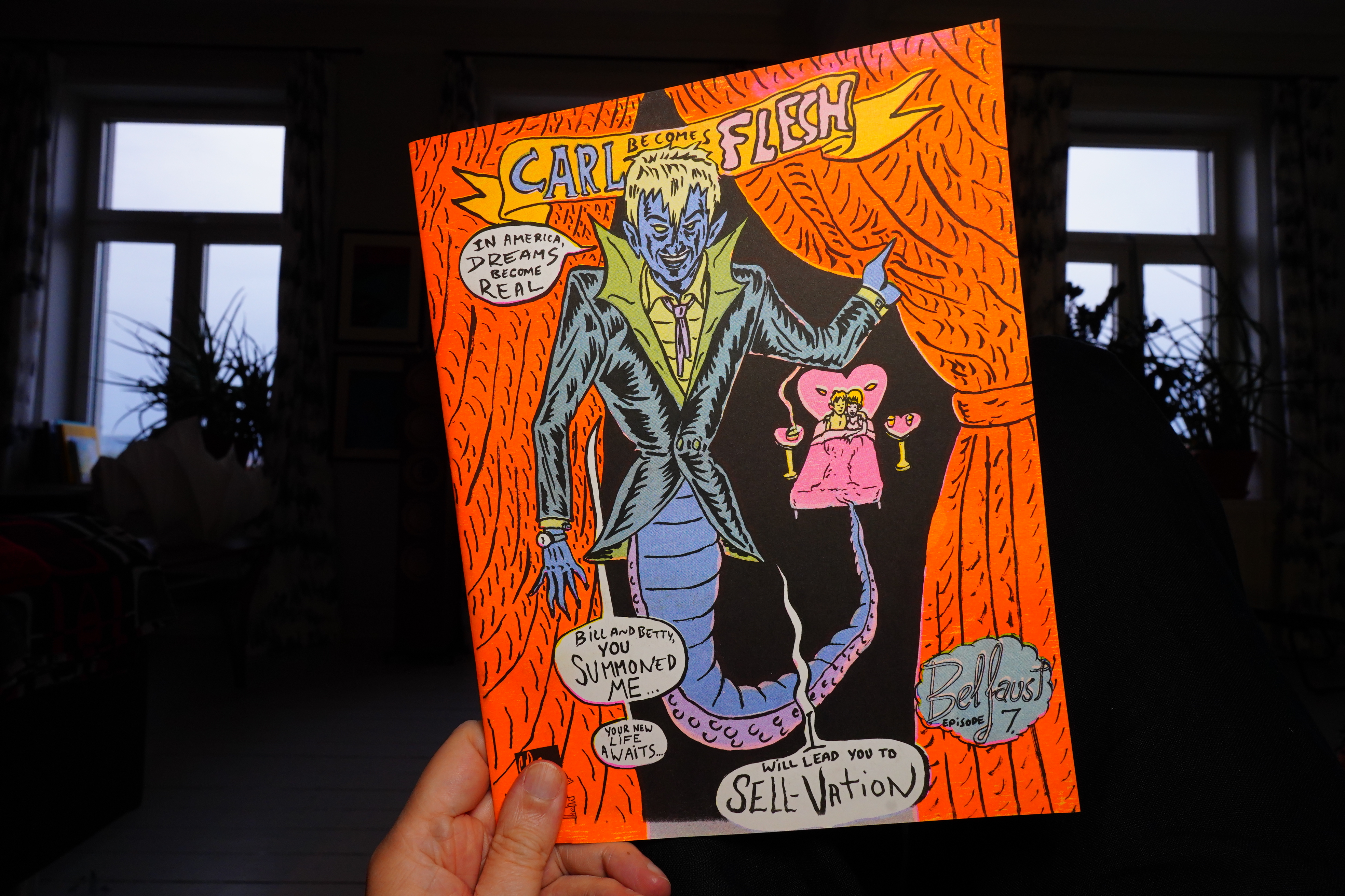
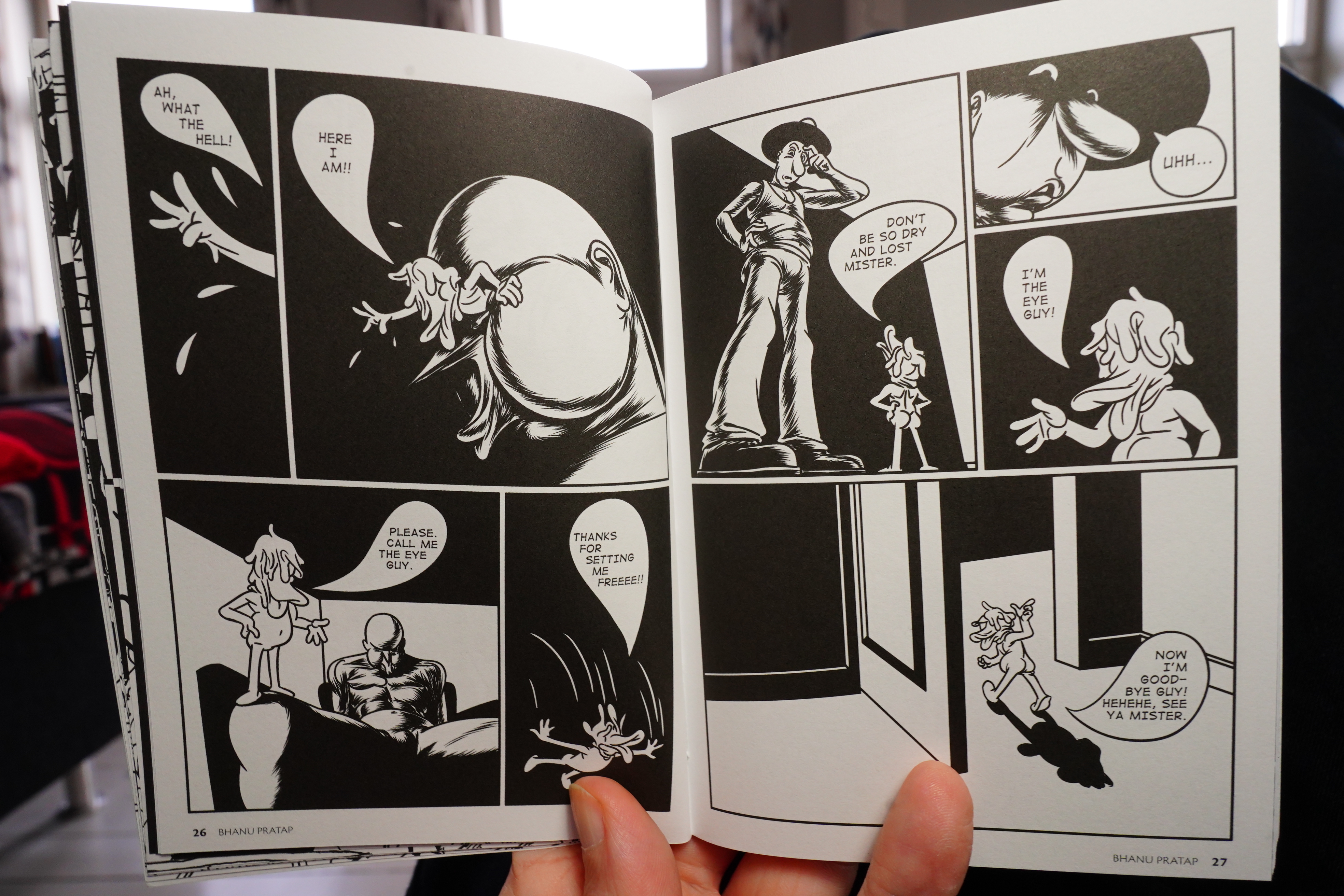
20:15: Carl Becomes Flesh (Cram Books)
This kinda looks like David Sandlin? I can’t find any name in the book…
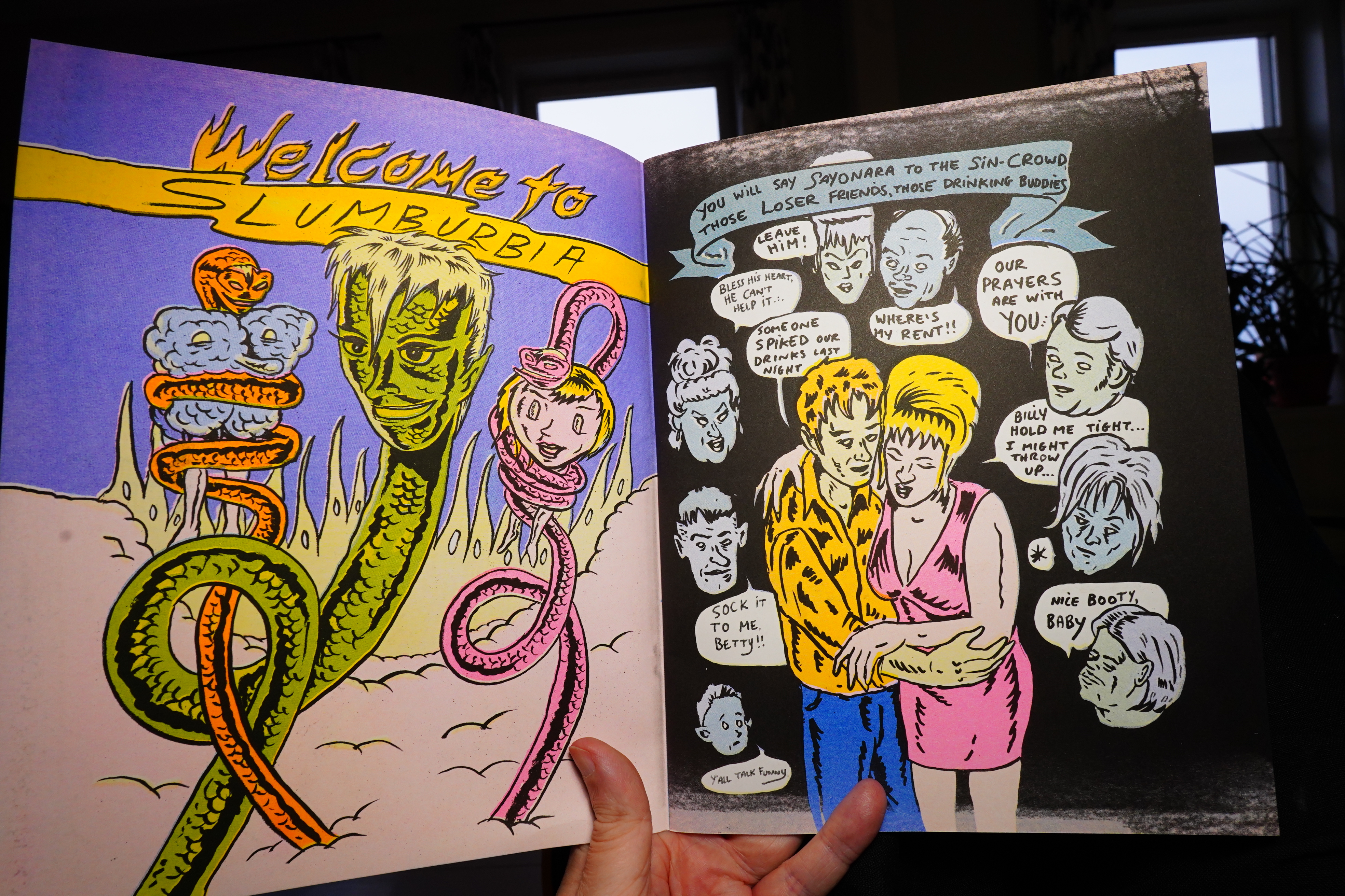
See?
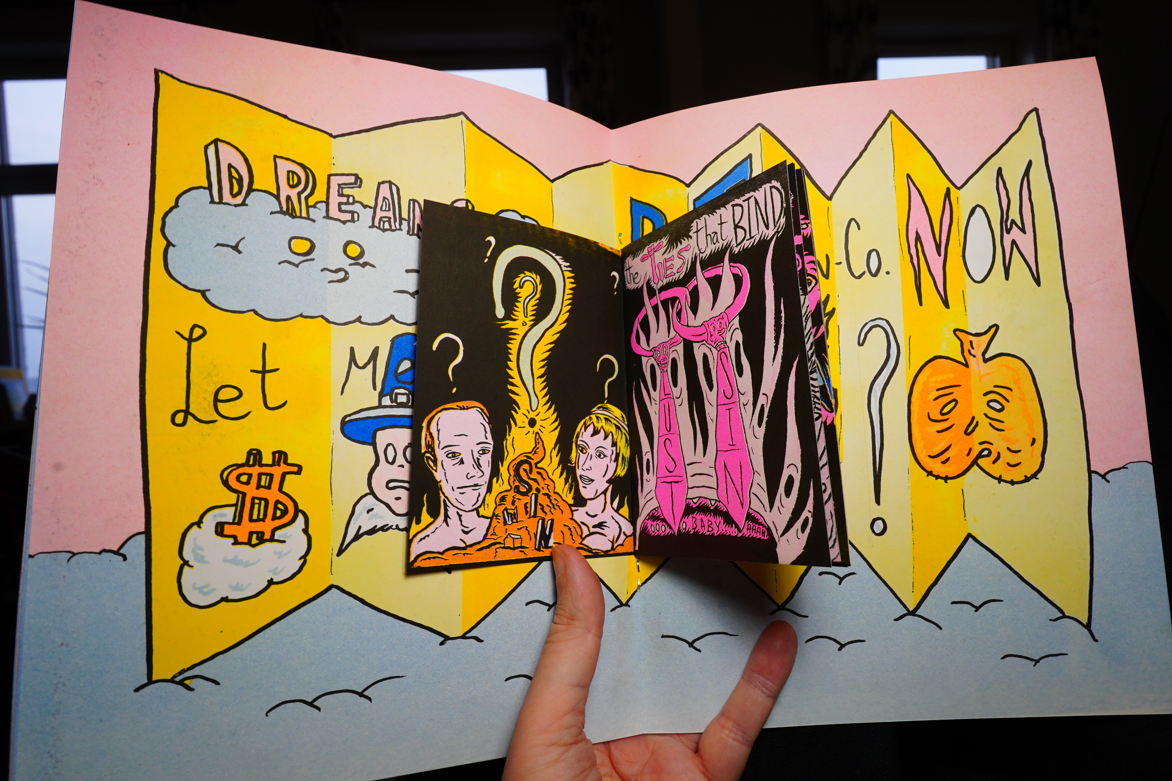
And there’s a little booklet in the book. Nice.
20:23: The End
And perhaps that’s enough comics for today.