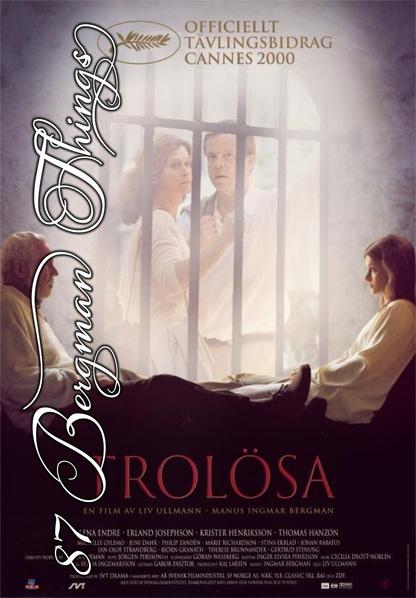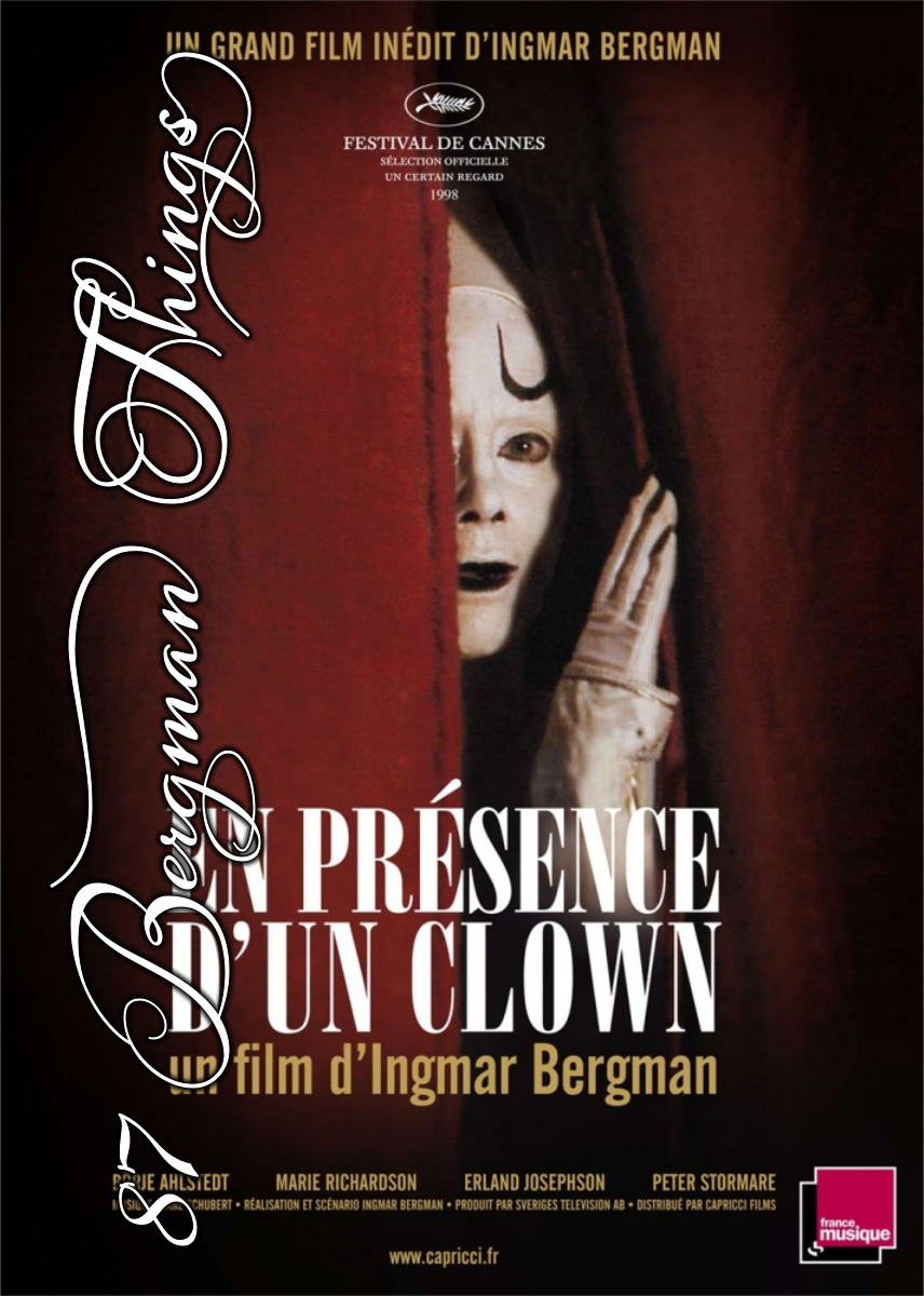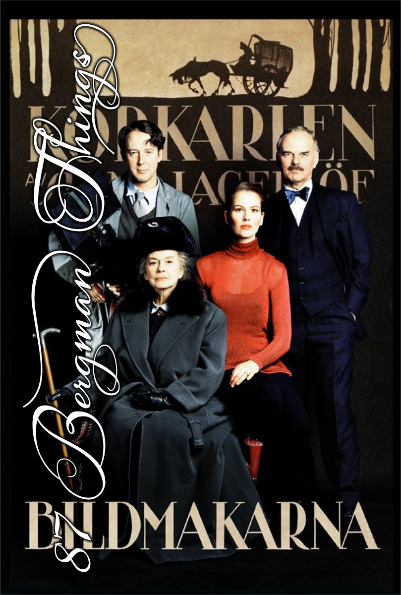

The Image Makers (Bildmakarna). Ingmar Bergman. 2000. ⭐⭐⭐⭐⭐★.
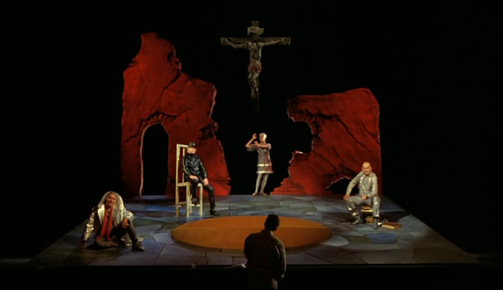
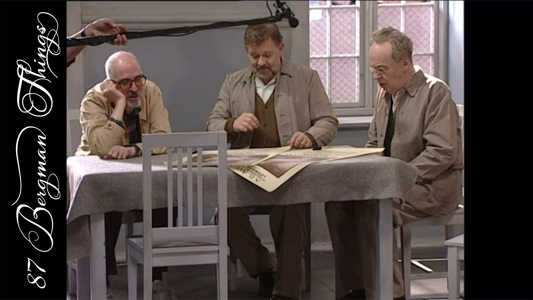
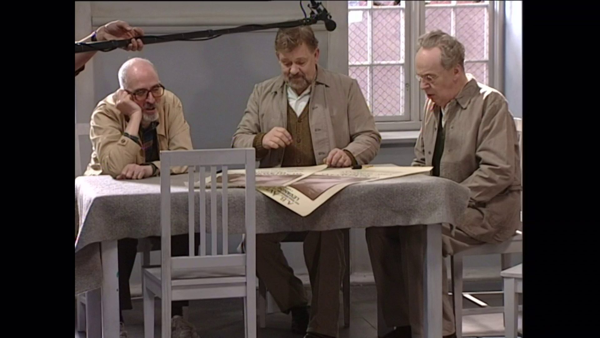
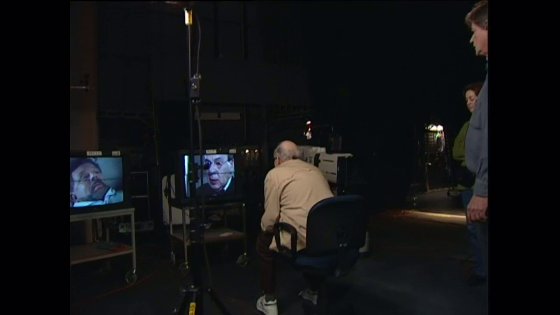
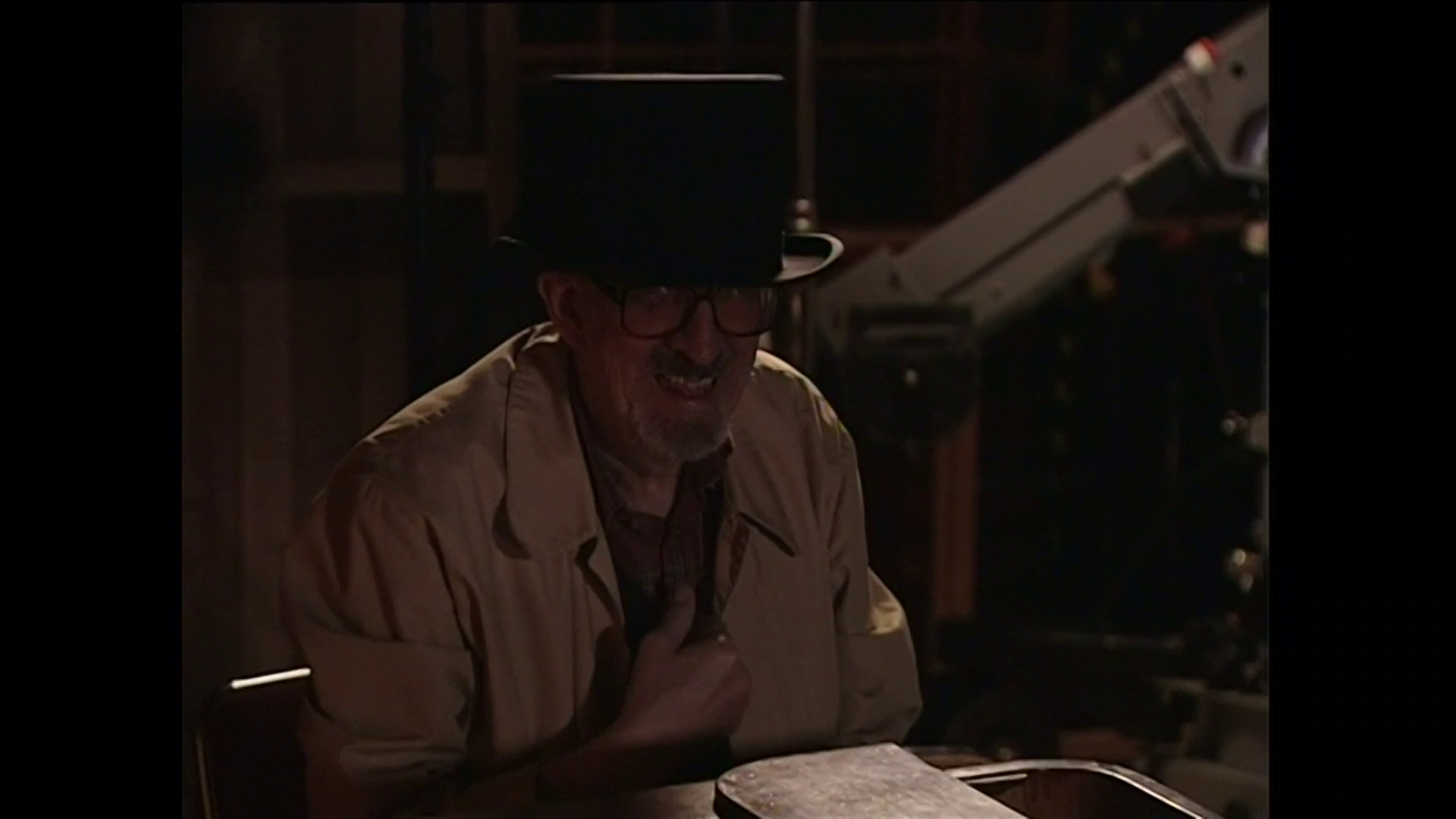
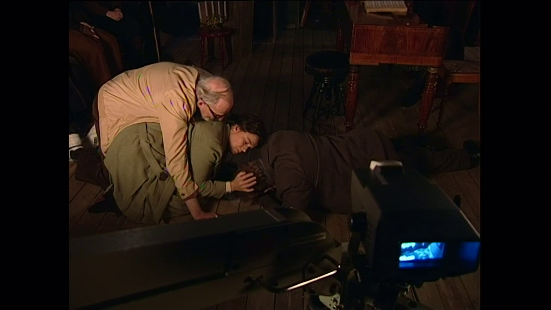
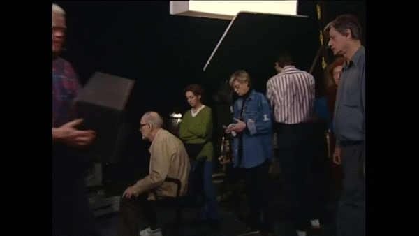
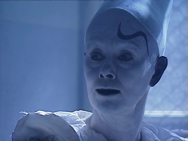
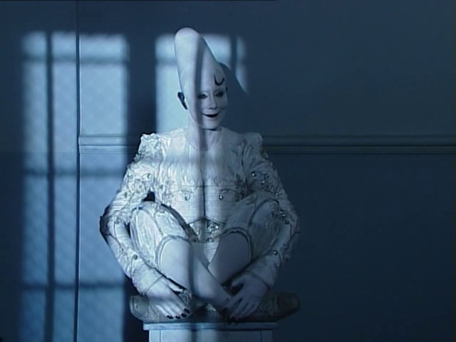
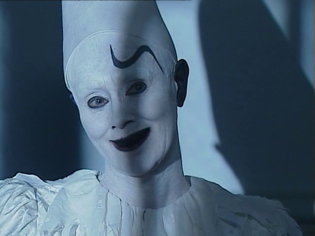
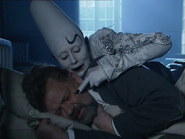
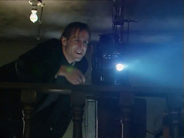
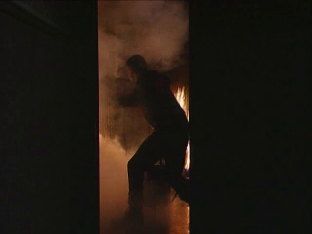
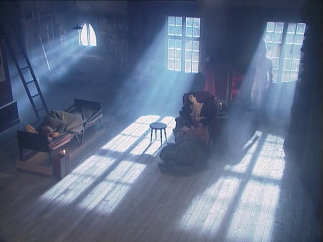
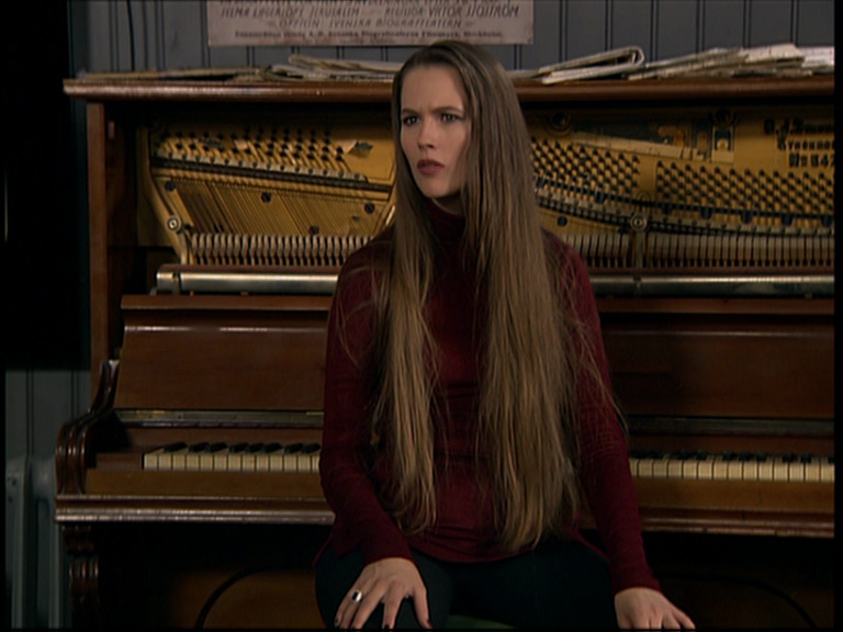
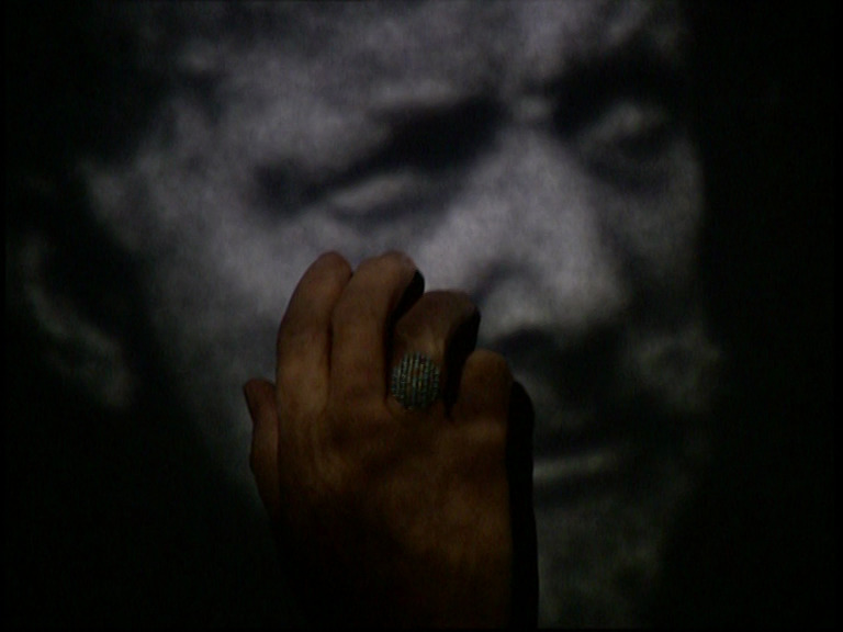
This is the TV version of what Bergman wanted to be his final theatre staging. If you think “TV theatre”, this is it: It has an aesthetic that harks back to (or emulates perfectly) the first wave of “TV theatre” in the 60s and 70s when they could finally do video editing.
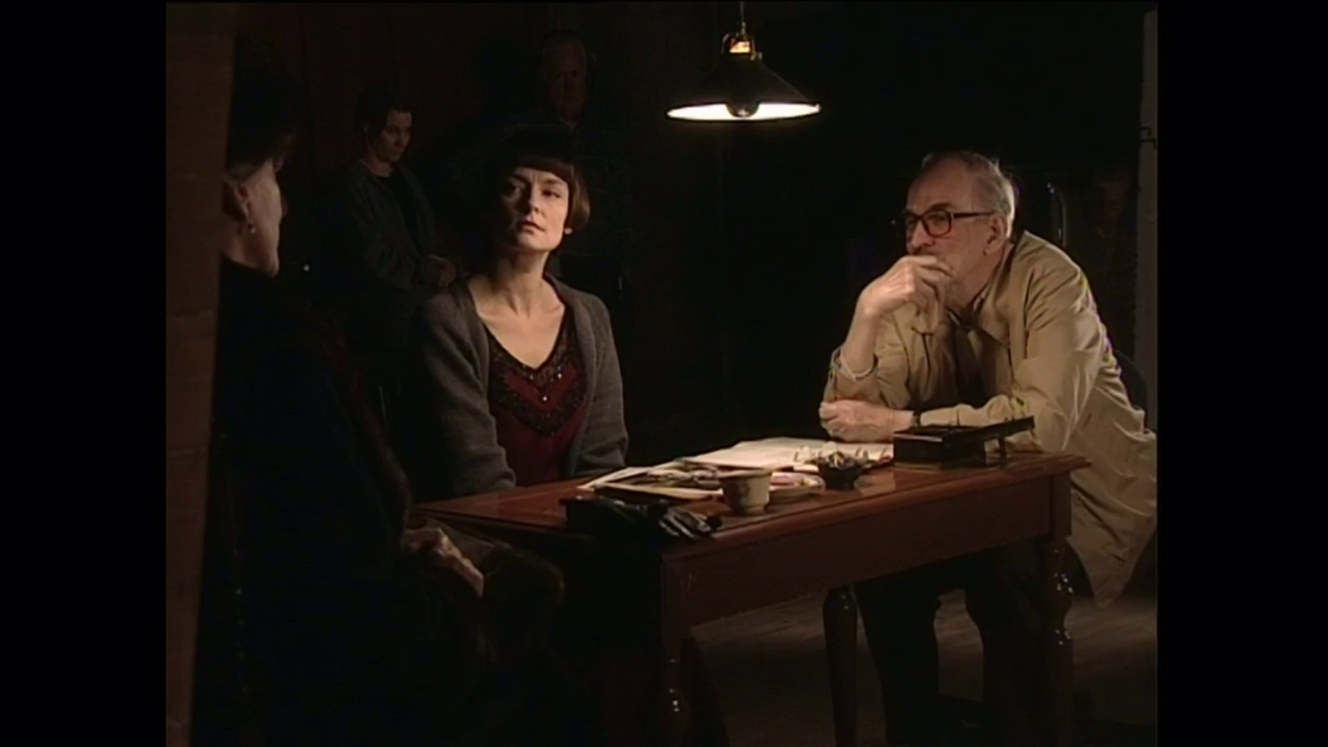
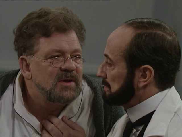
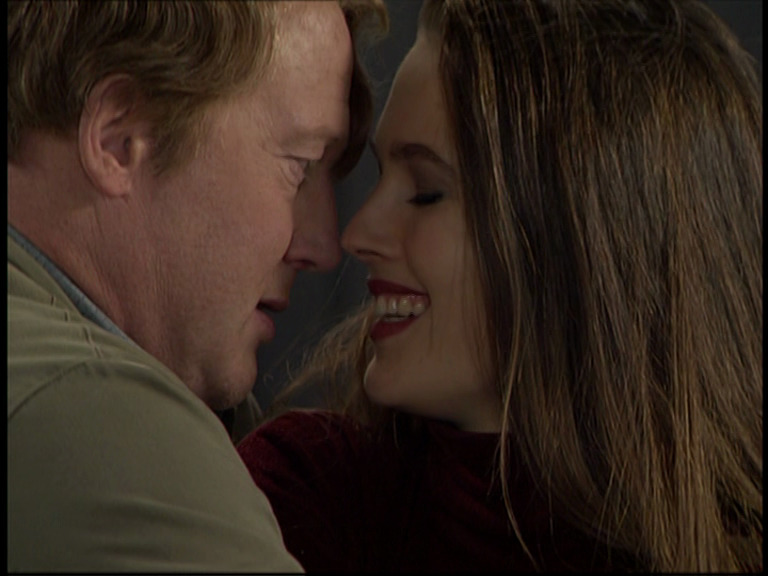
So it looks quite unadjusted from the theatre staging, I assume. Unlike his other TV versions of things he’s done on the stage, the actors are really acting out and not dialling it back for the camera.
I love it.
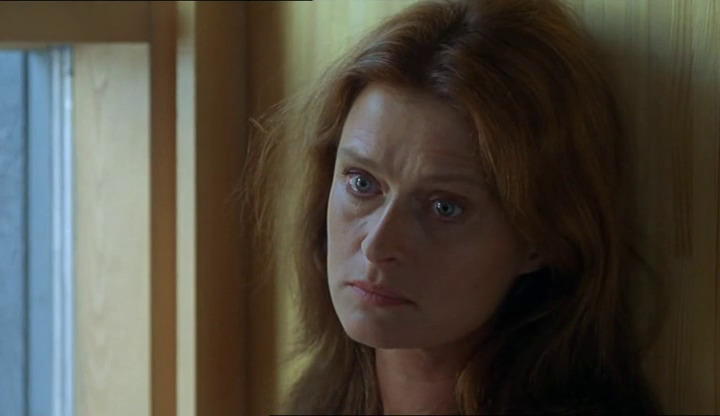
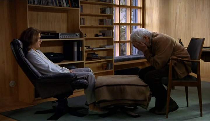
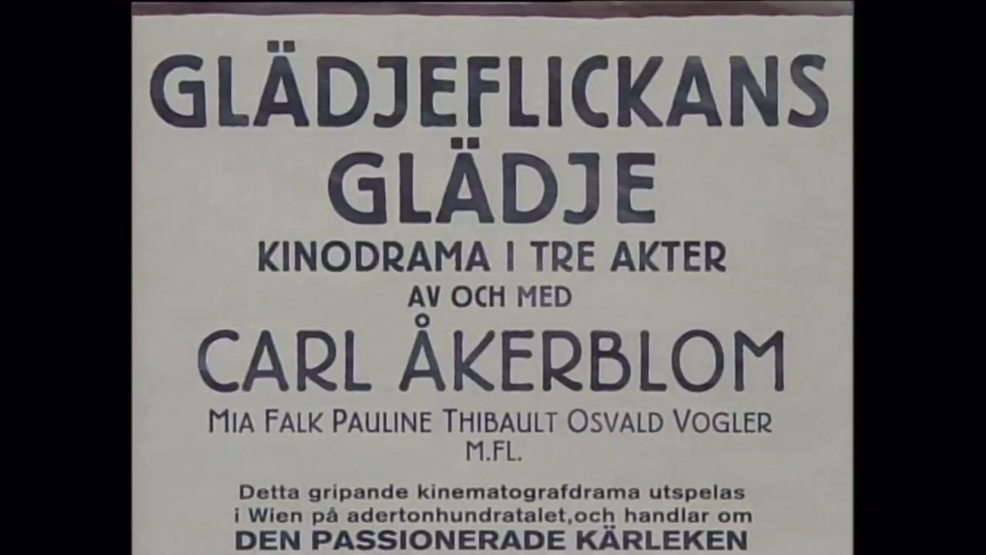
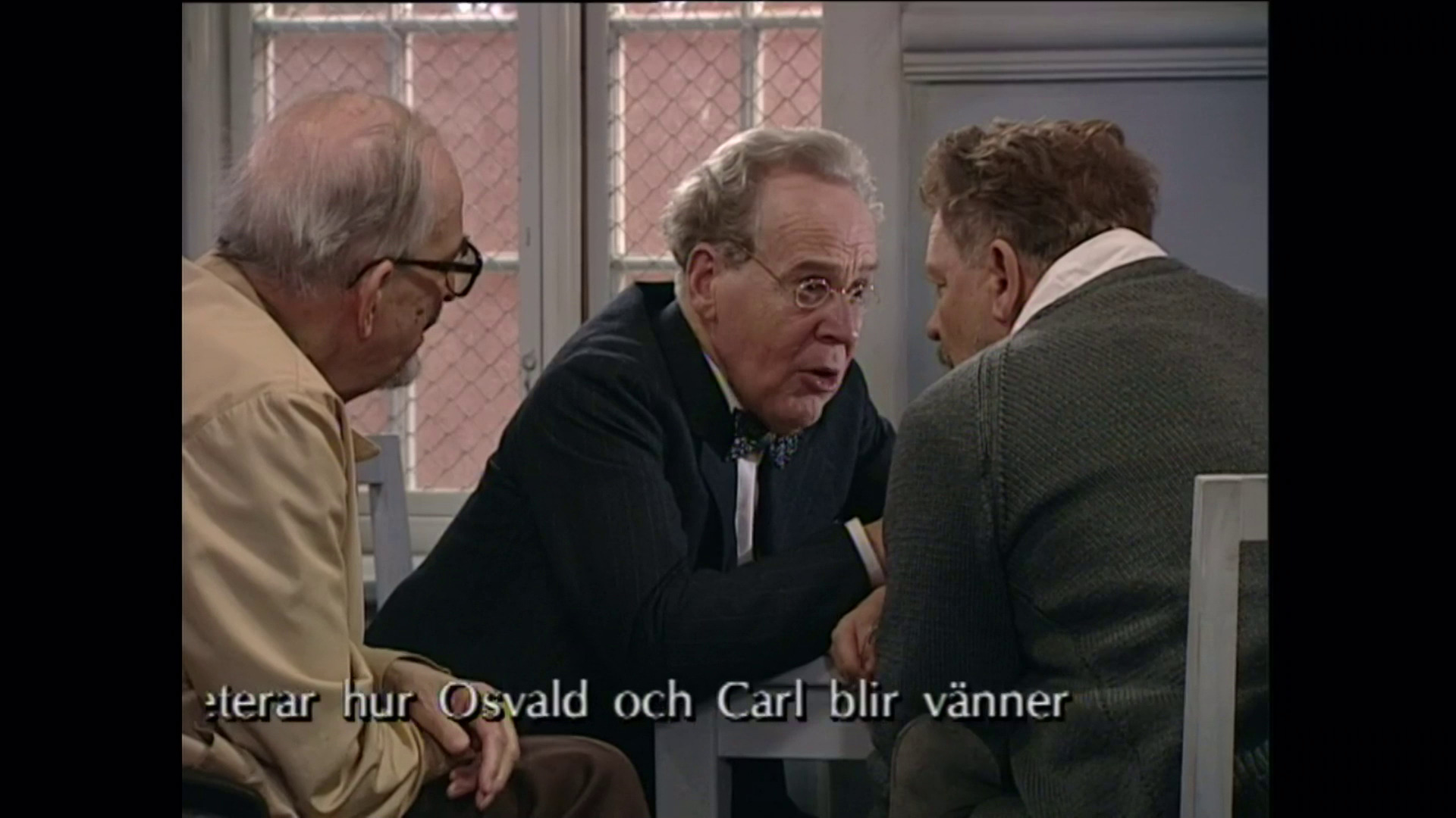
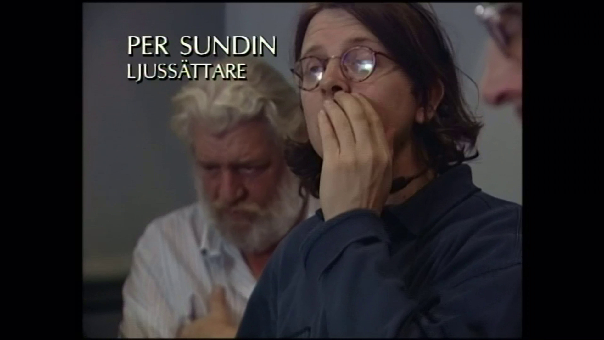
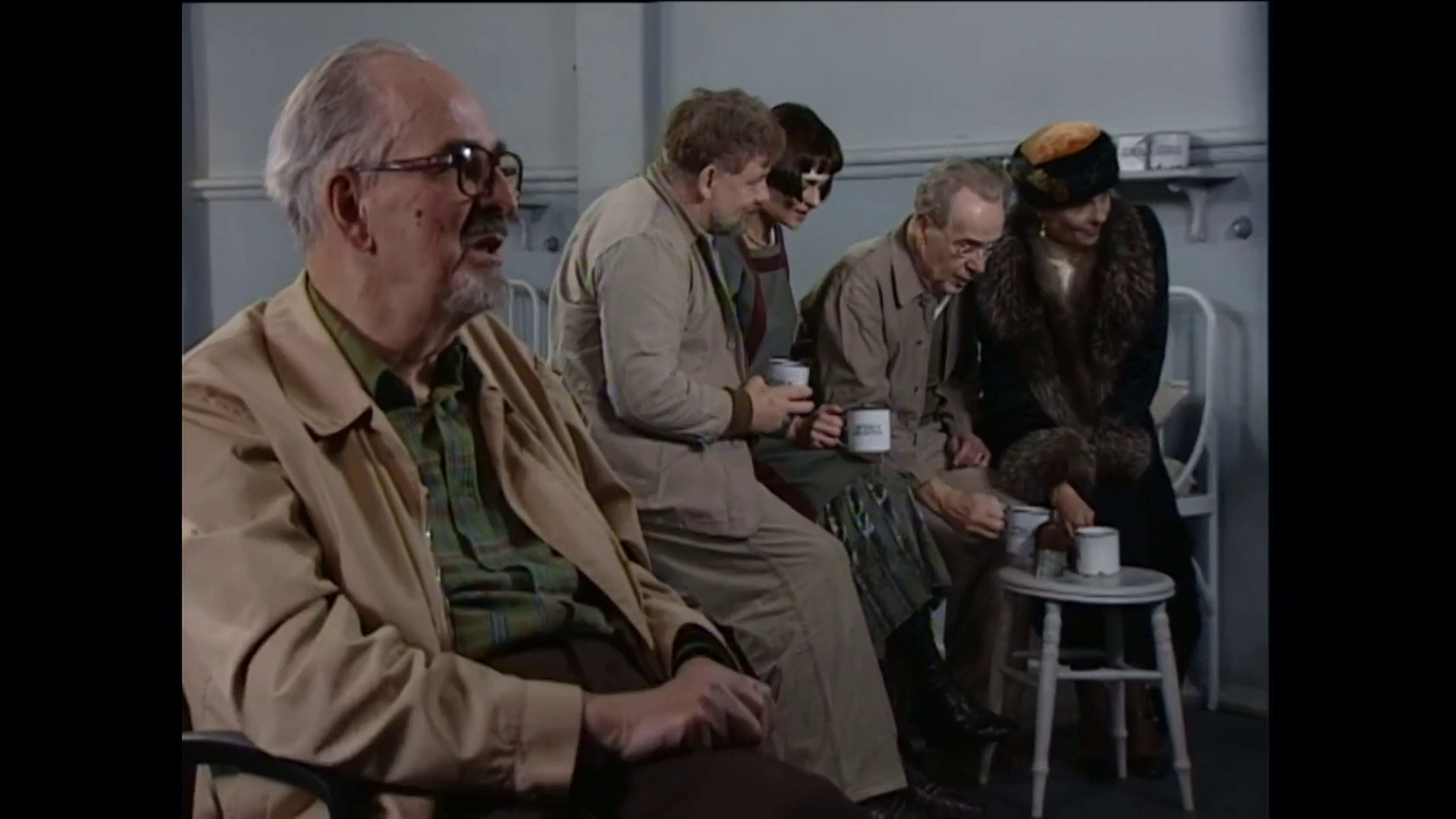
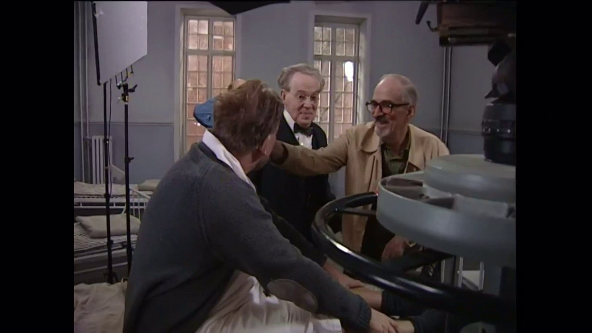
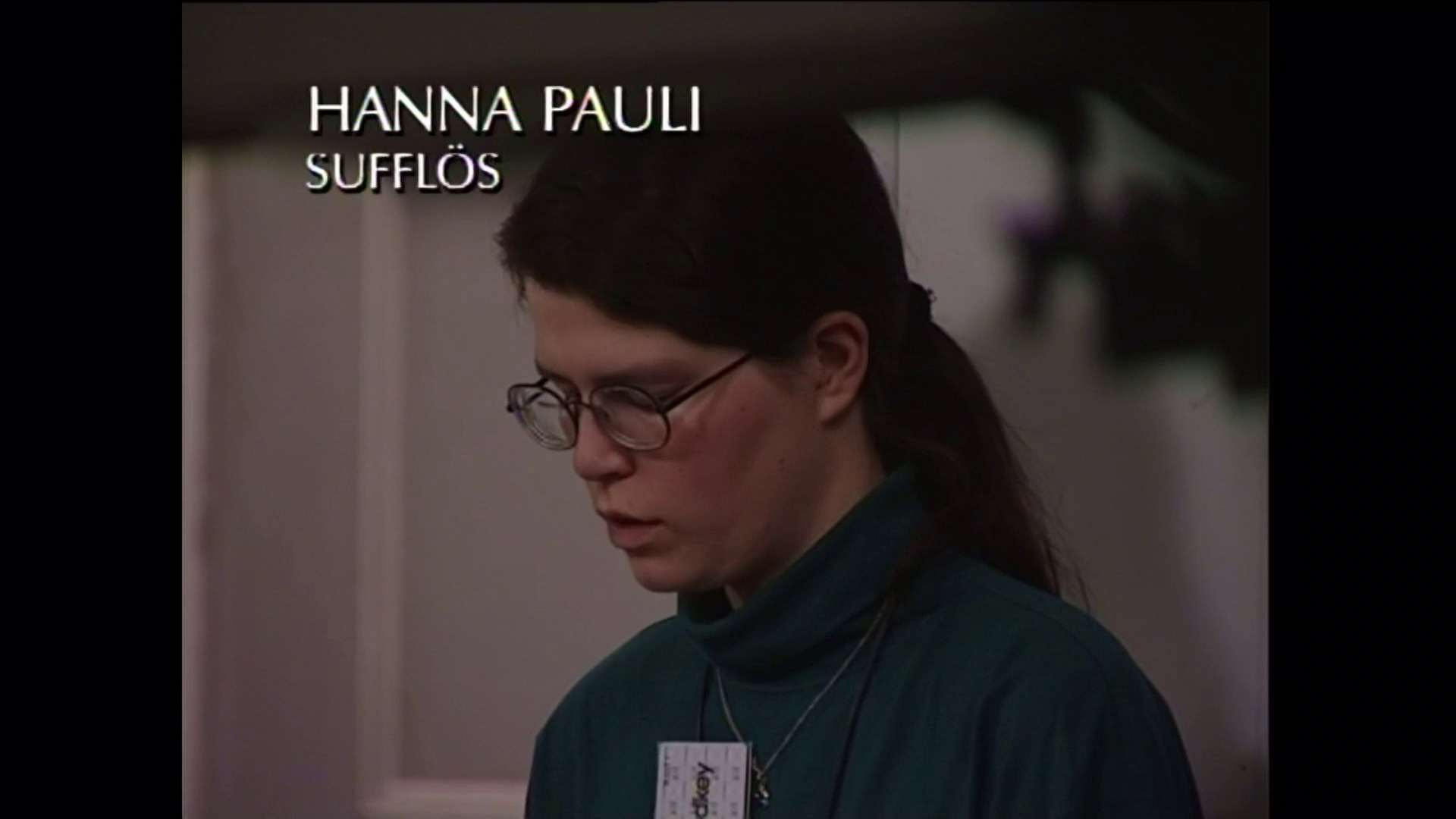
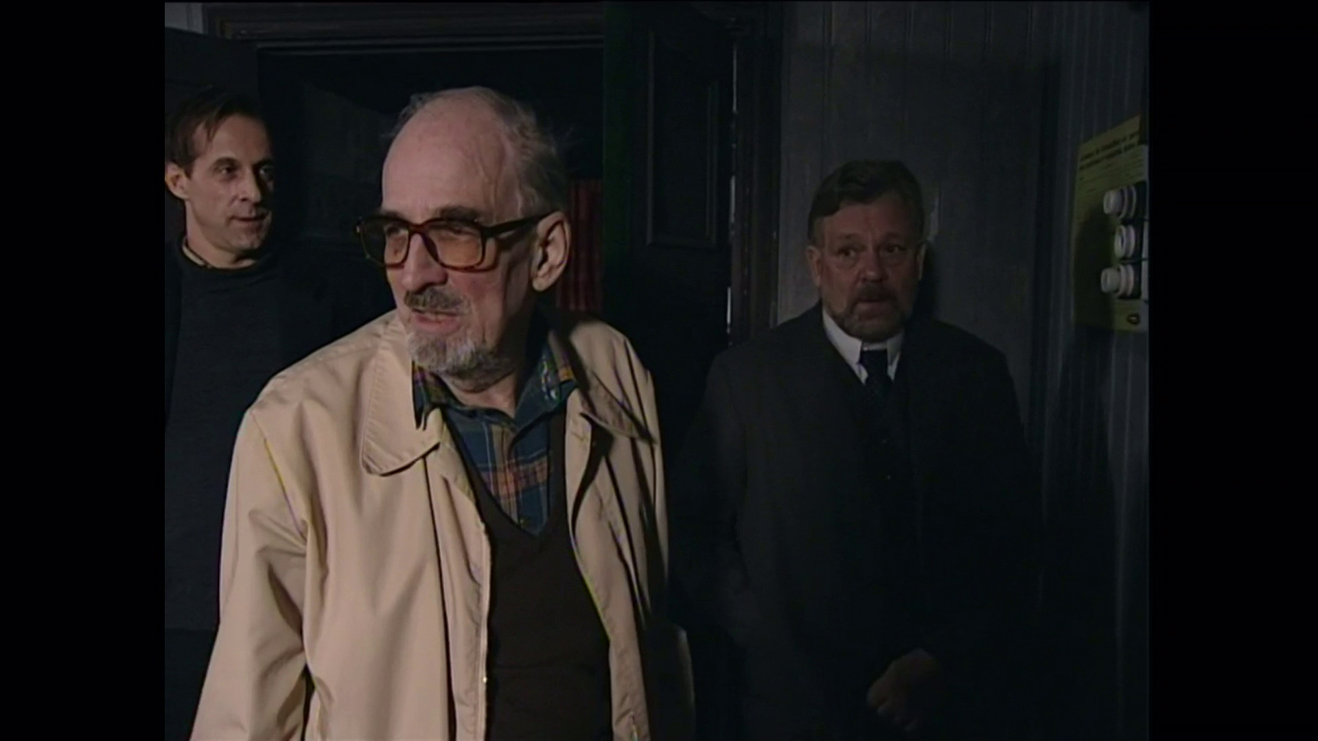
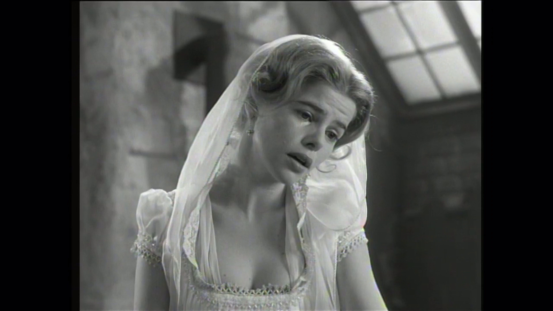
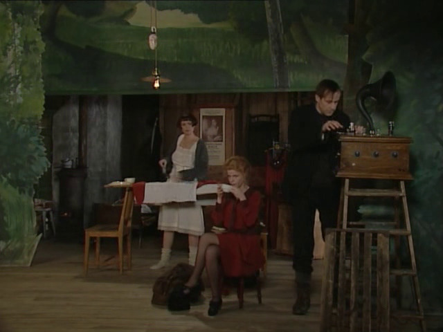
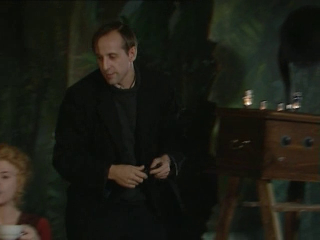
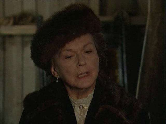
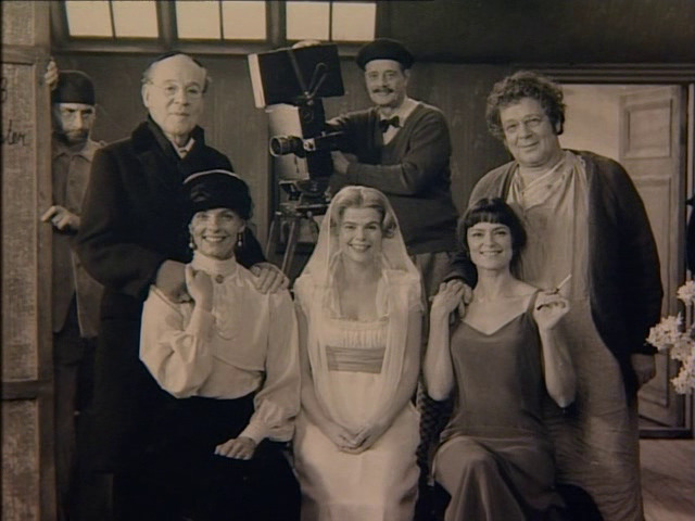
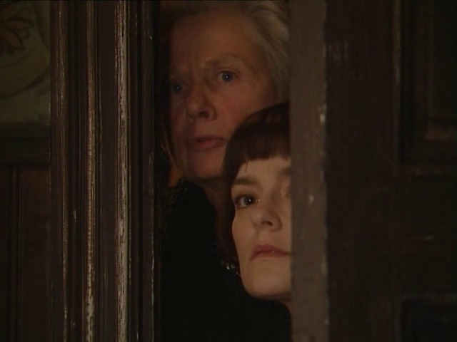
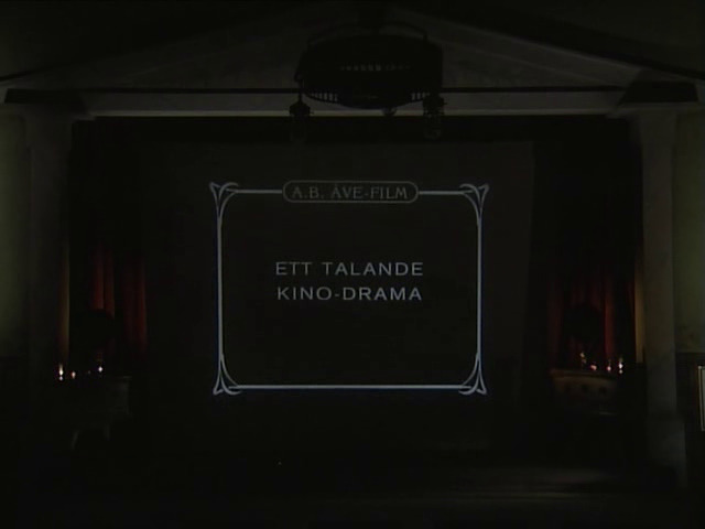
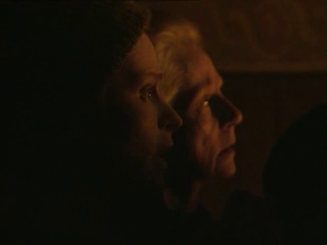
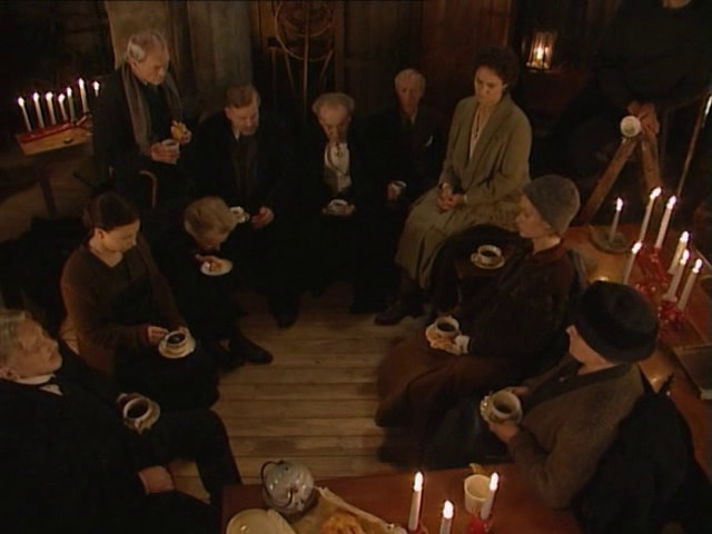
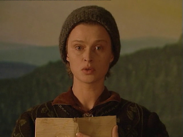
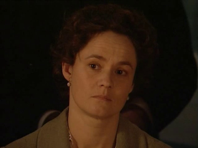
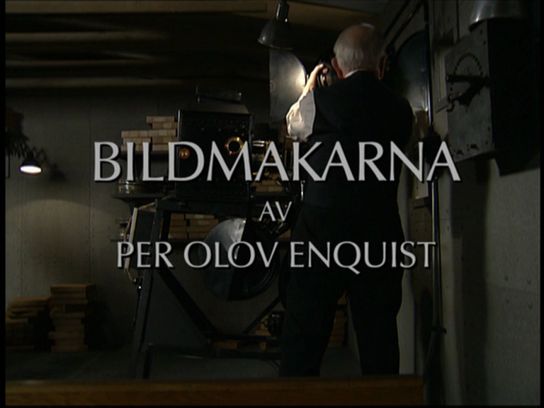
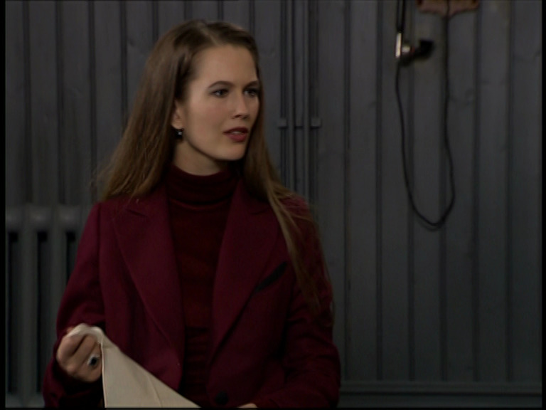
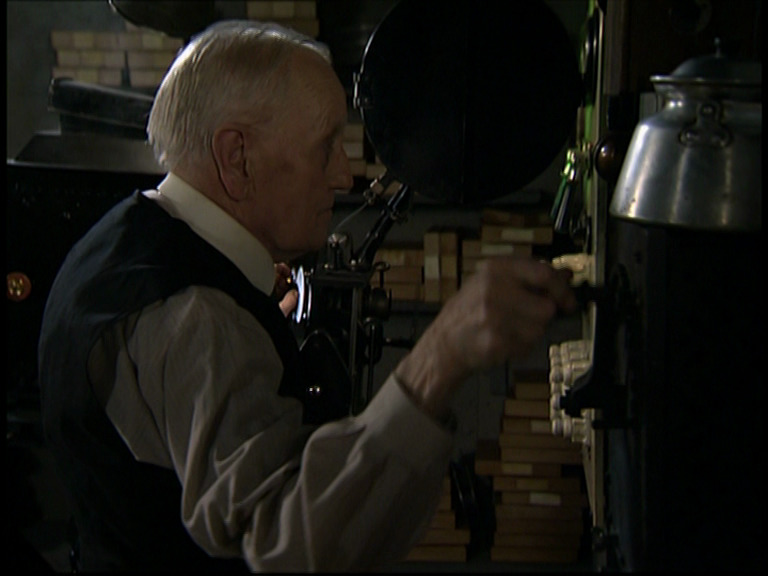
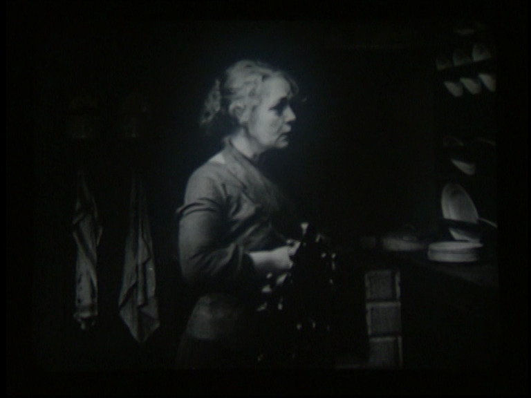
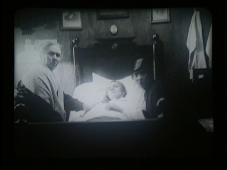
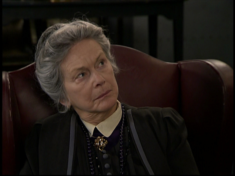
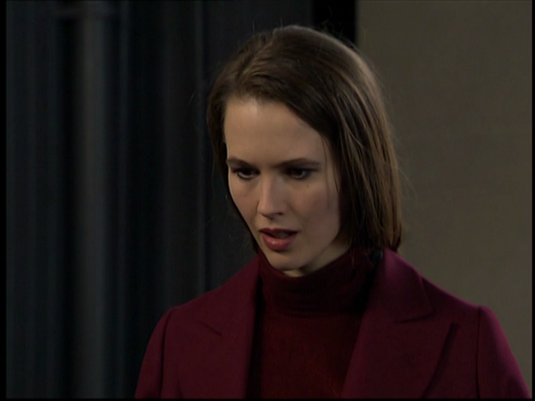
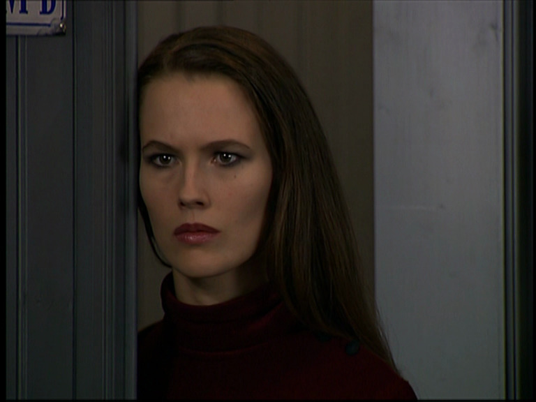
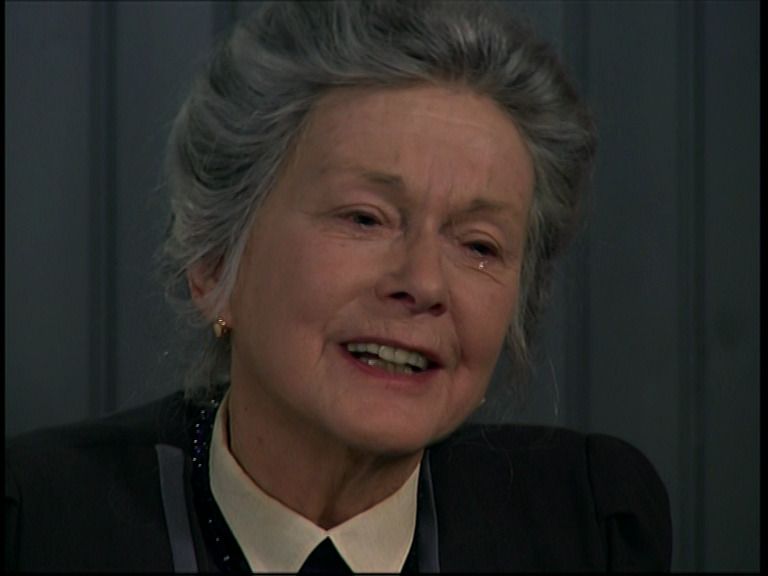
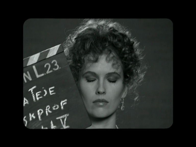
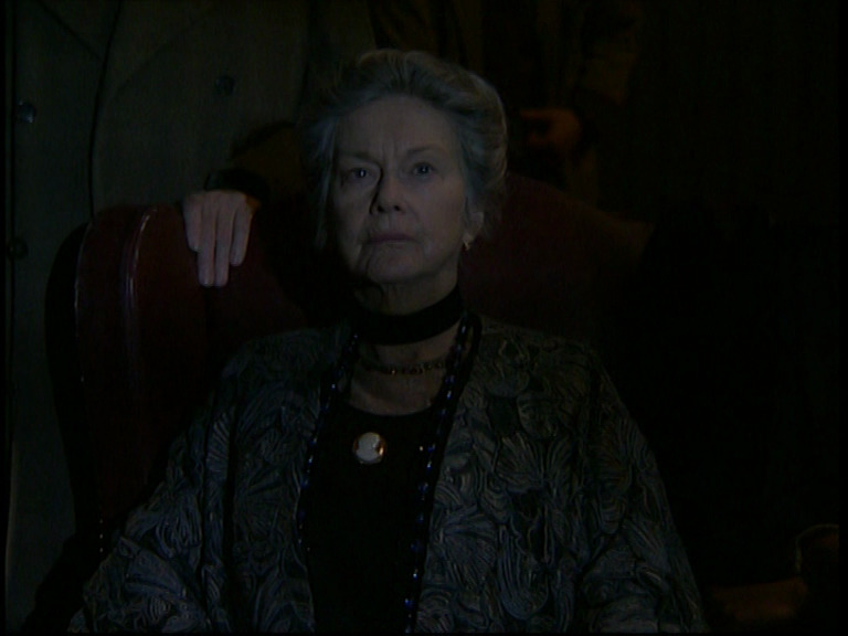
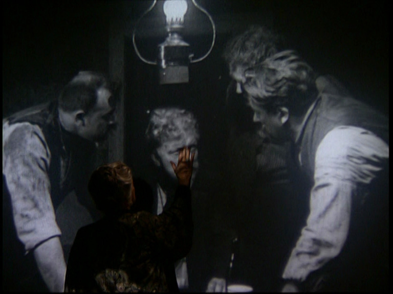
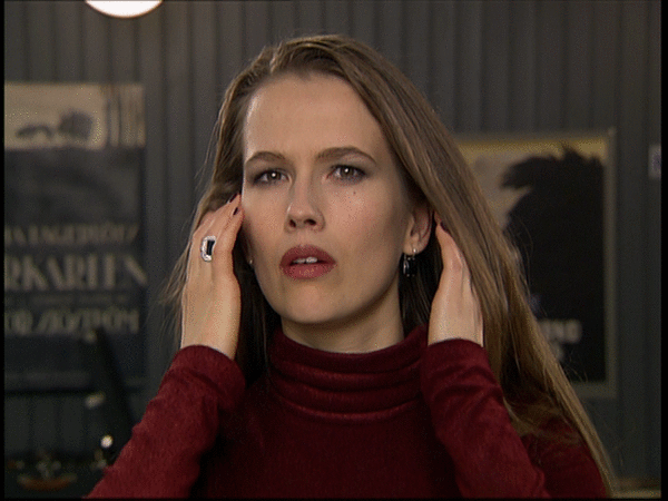
It’s the perfect Bergman project: It’s about Selma Lagerlöf watching the movie version of her 1912 novel Kórkarlen in 1921. So we get Lagerlöf (who’s the most famous author in Sweden at the time) interacting with some definitely low rent movie people, and drama ensues.

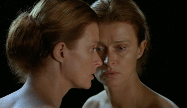
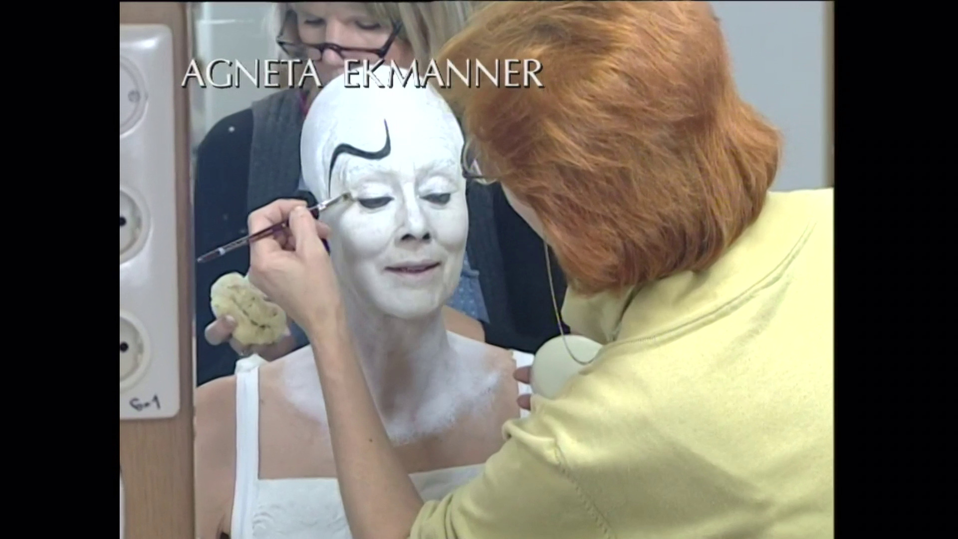
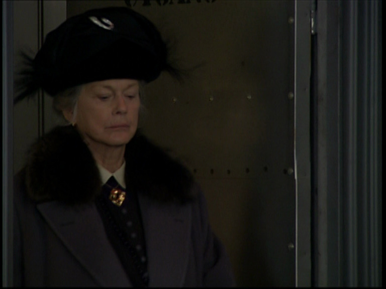
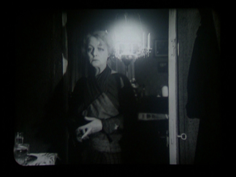
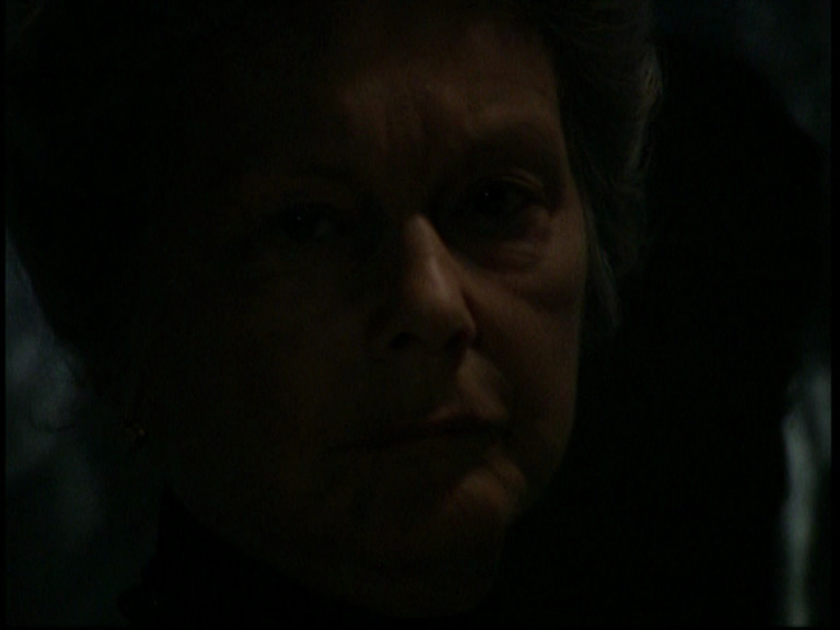
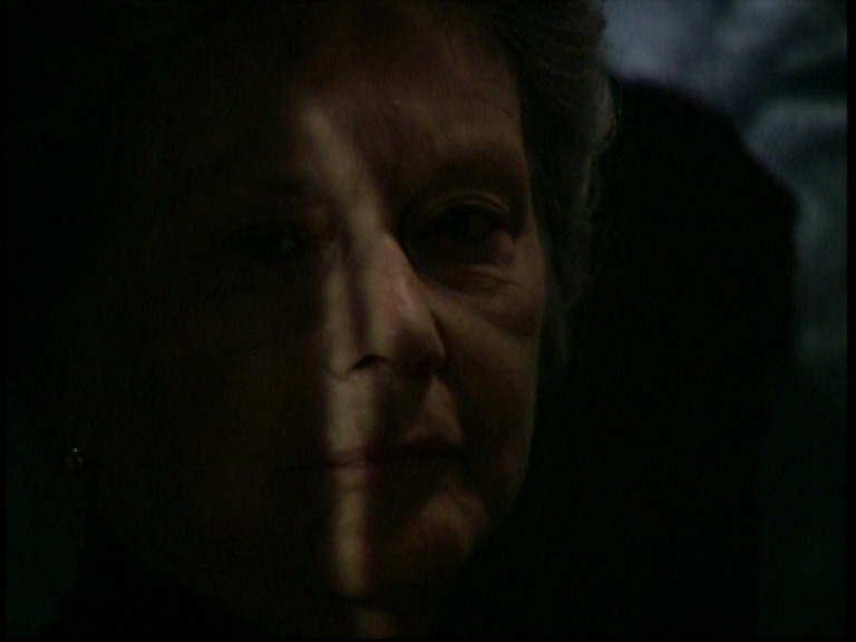
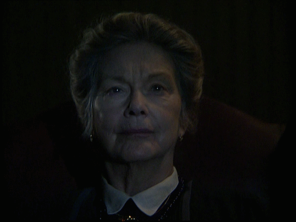
Anita Björk is absolutely riveting. However, it loses a bit of its tension in the second act when she’s not present.
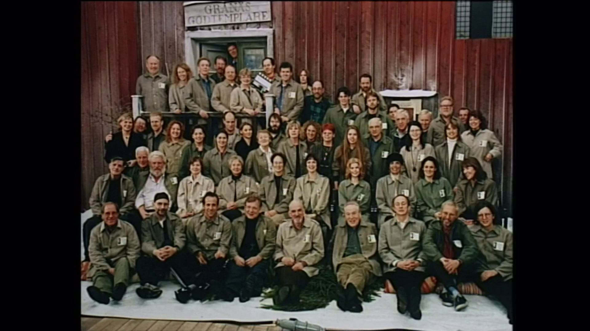
It is, curiously enough, the only of Bergman’s TV plays (I think) that have been given a DVD release (with the 1921 Körkarlen film as a double feature; bless Tartan Video). All the other ones I had to get from torrents, pirates and region-blocked web sites.
This post is part of the 87 Bergman Things series.