Almost a year ago I foolishly decided to watch all “Netflix Originals” movies to see what it’s like.
Here’s the tl;dr: Based on these movies, Netflix is doomed. There were some movies I enjoyed, but none I could recommend without any caveats.
However, it’d be a mistake to think that these movies have that much to do with Netflix’ survival, and if you’re interested in reading somebody nattering on way too long about movies, Netflix, and movies and Netflix, then be my guest.
The Project
I’d been watching a bunch of movies from the 40s, and as I like finding new methods to watch movies I’d otherwise not be watching, it occurred to me that I’d never before done a concerted effort to watch brand-new movies. And it seemed to me that the freshest movies (except the ones at the cinema) would happen on Netflix.
I enjoy blogging about movies in a casual way, but as opposed to basically everybody else, I think giving the reader an impression of the movie visually is the most important thing. So easy screenshotting is vital to me. I also like watching movies that look nice, so I want 4K with a high bitrate. This proved difficult to achieve while using the official Netflix app. It’d be trivial to do by just torrenting everything instead, but I wanted the real experience. This led to extensive quadruped defollication, and an electronics setup that ended up looking like this:
Fun!
Thems are the joys of DRM: They don’t stop people who want to pirate the stuff from pirating, but it makes it hard for people (who choose to pay) to watch movies in the way they want to watch movies.
(The blog post ended up on Hacker News some time later, and it seems like most of them were amused. The recurring “that’s so stupid! why not just use the app on the TV!” comments (missing the point entirely) all have somebody that patiently explains why not, which is a pleasant surprise.)
The Movies
So what are “Netflix Originals” anyway? I used this Wikipedia page as an oracle, and it seems like the methodology there is to list all movies that Netflix have exclusive distribution rights to. The page doesn’t list movies where Netflix have just bought rights to just some territories, or (as seems to sometimes be the case) all territories except the country it’s made in.
These are not Netflix criteria for granting a movie the “A Netflix Original” designation, so there’s a bunch of stuff that was new last year that I haven’t watched. In the end, there were 77 Netflix Originals (as per the Wikipedia definition) made in 2019, and I watched all of them. (But I bailed half-way through on a couple.)
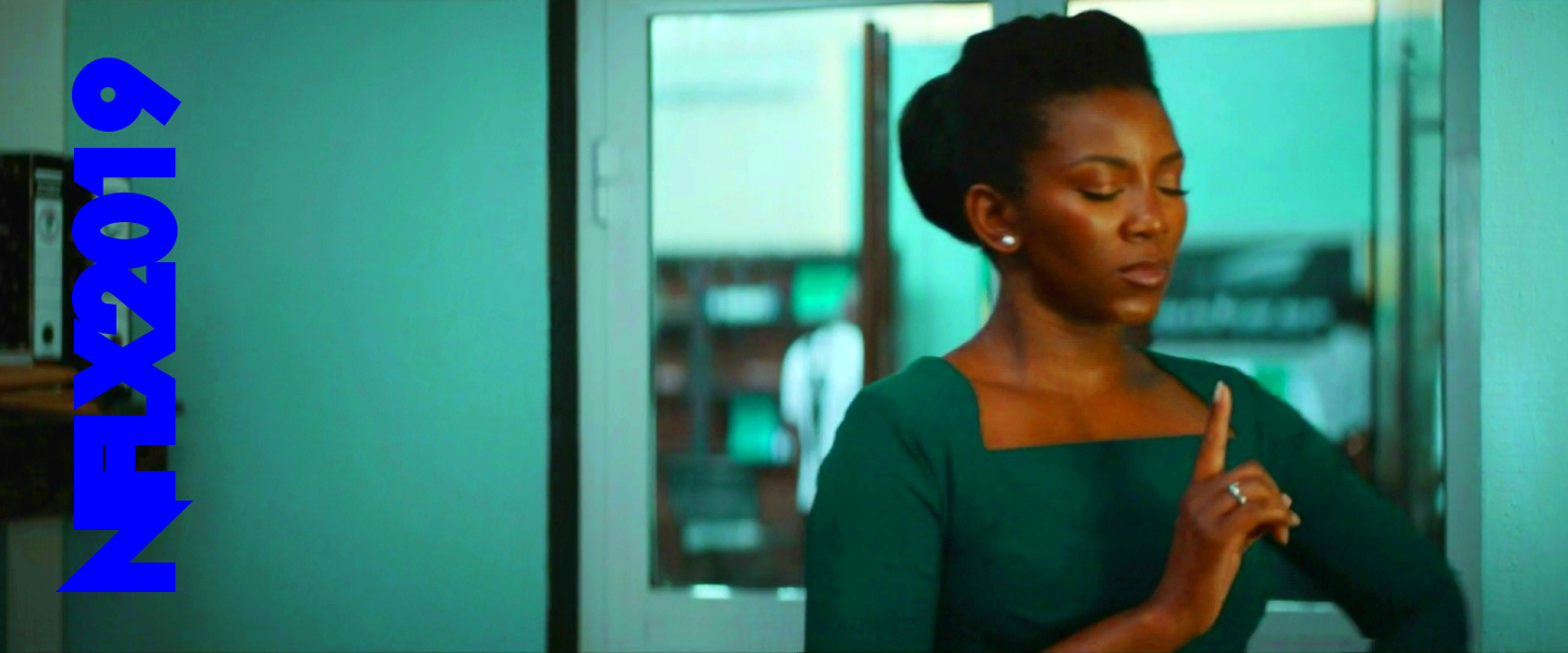
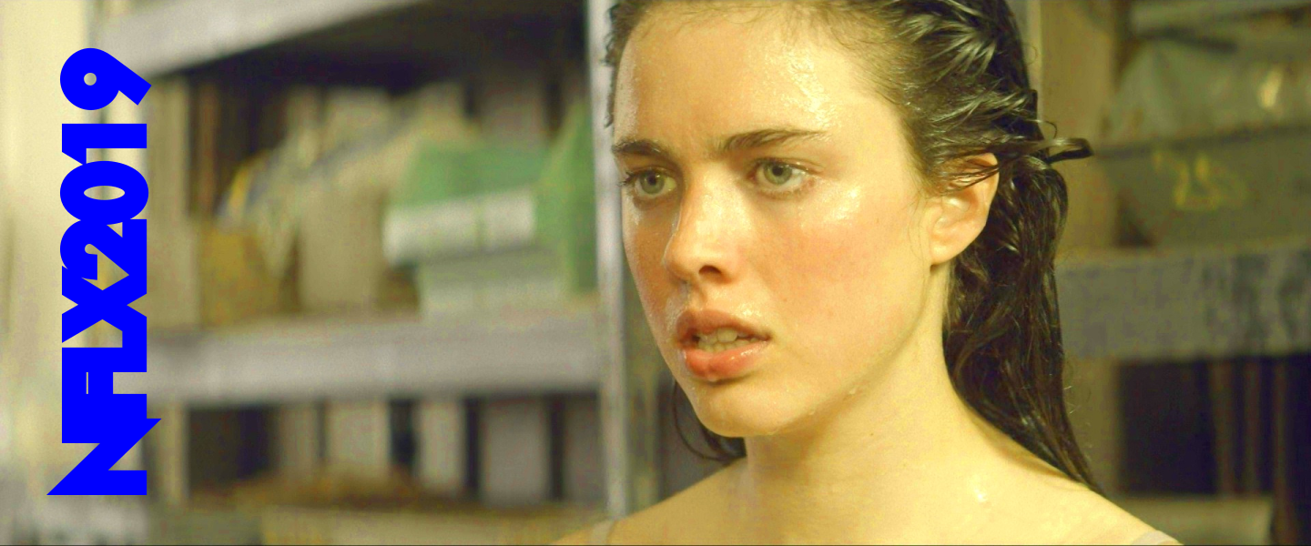
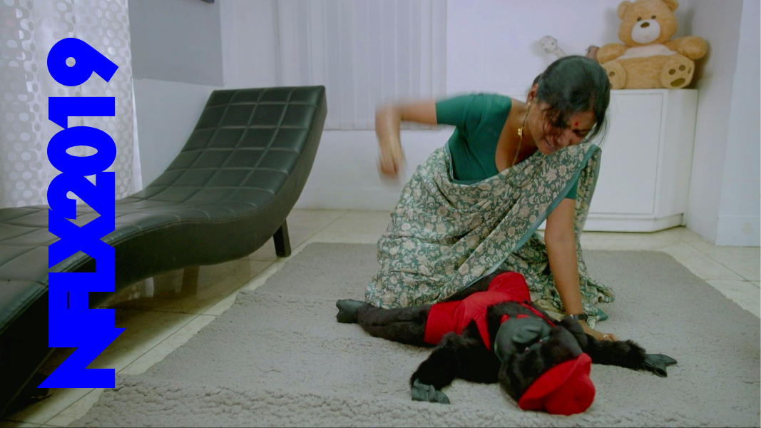
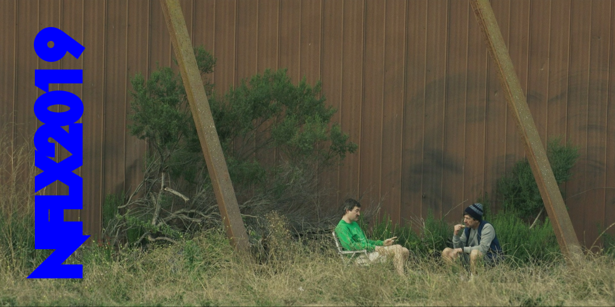
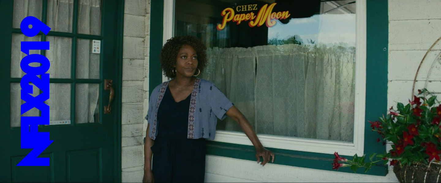
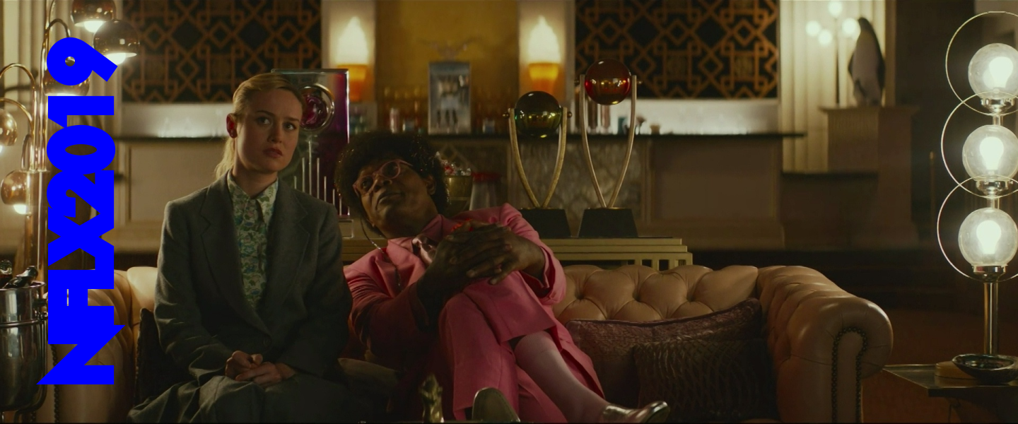
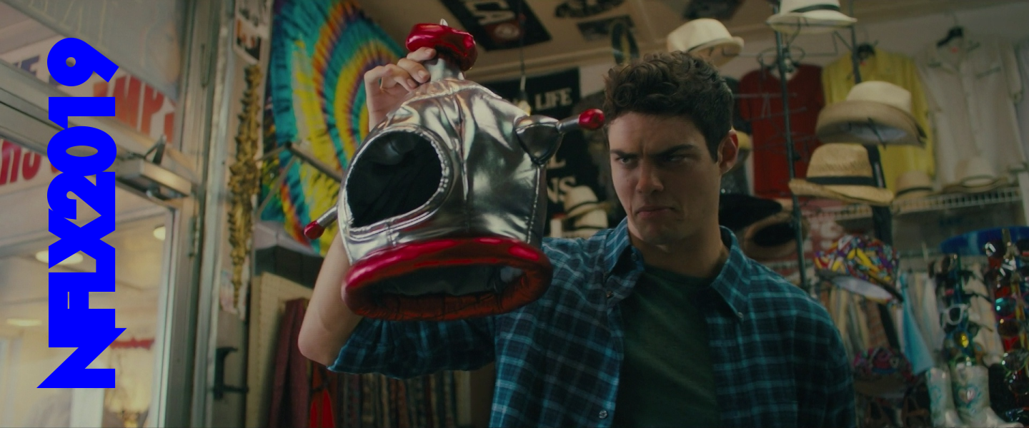
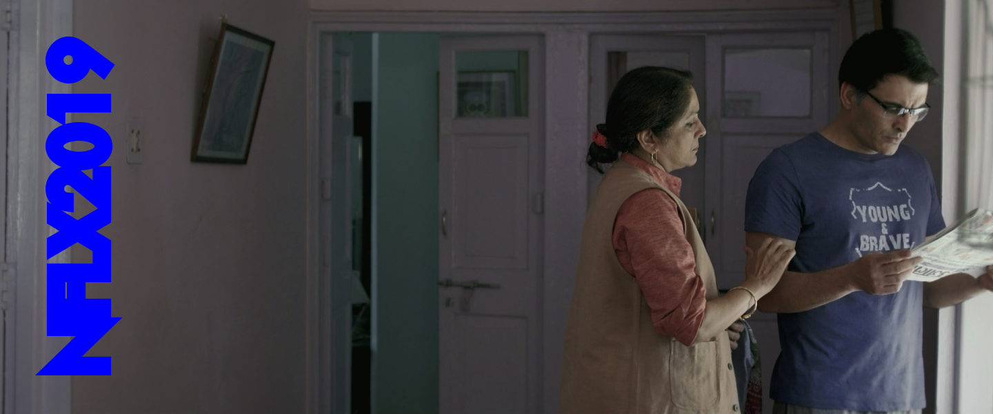
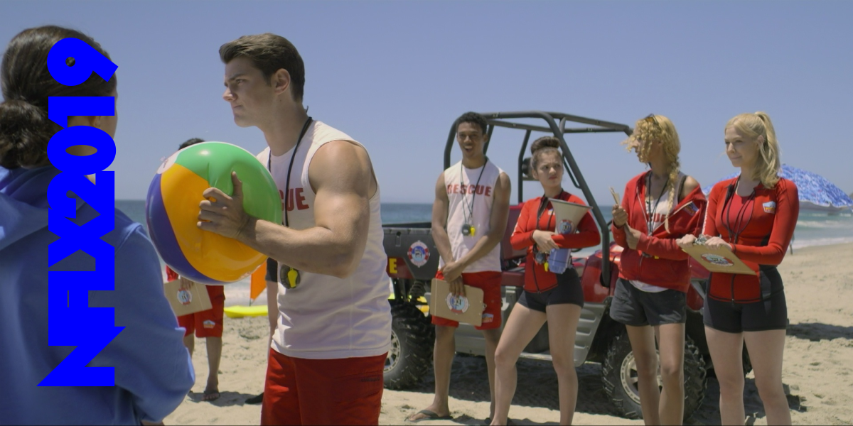
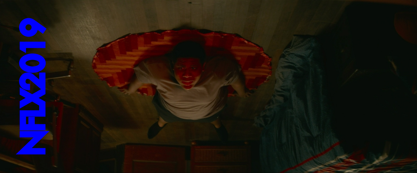
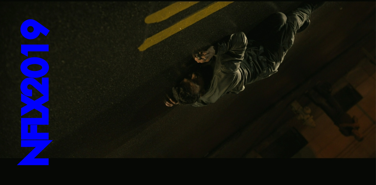
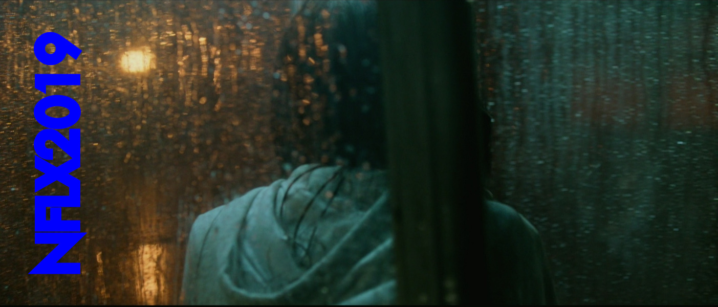
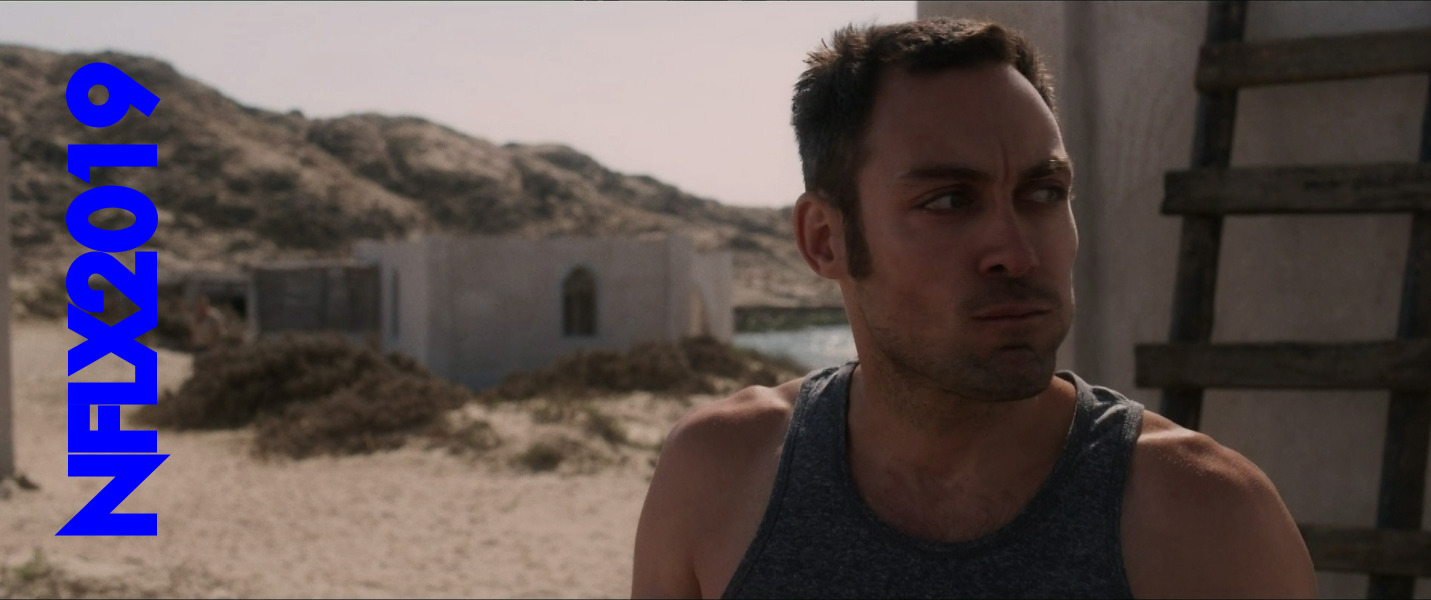
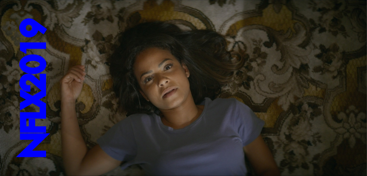
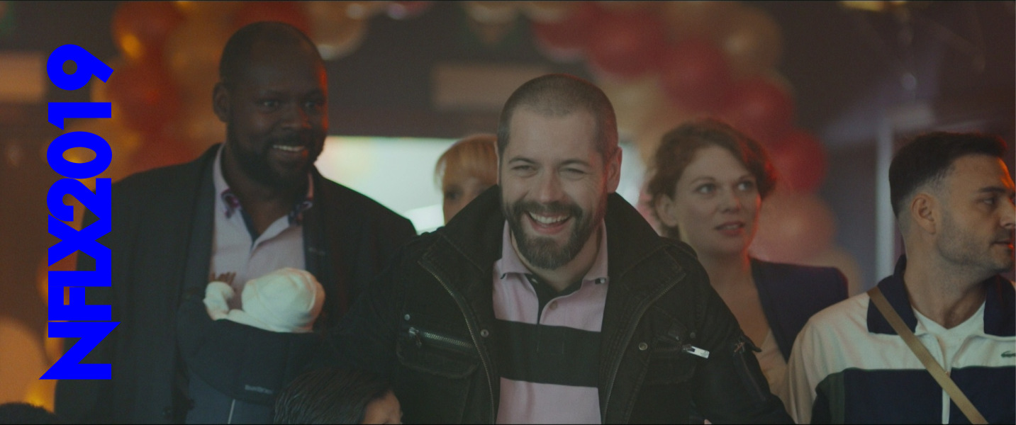
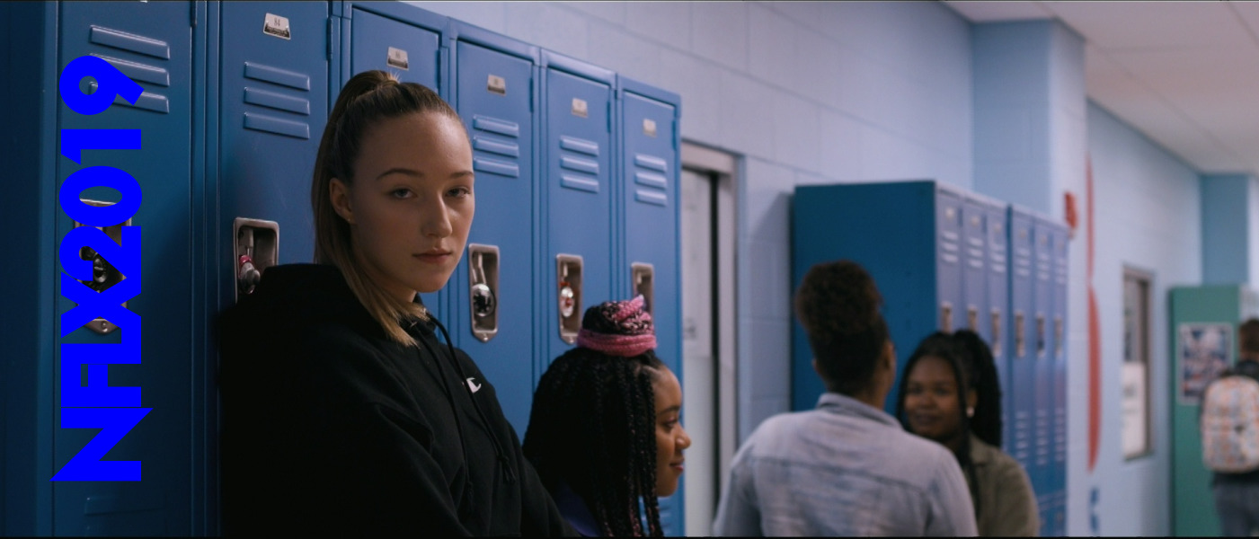
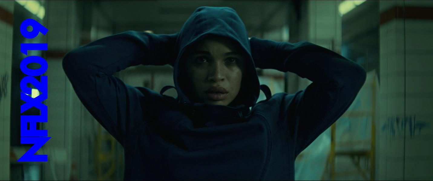
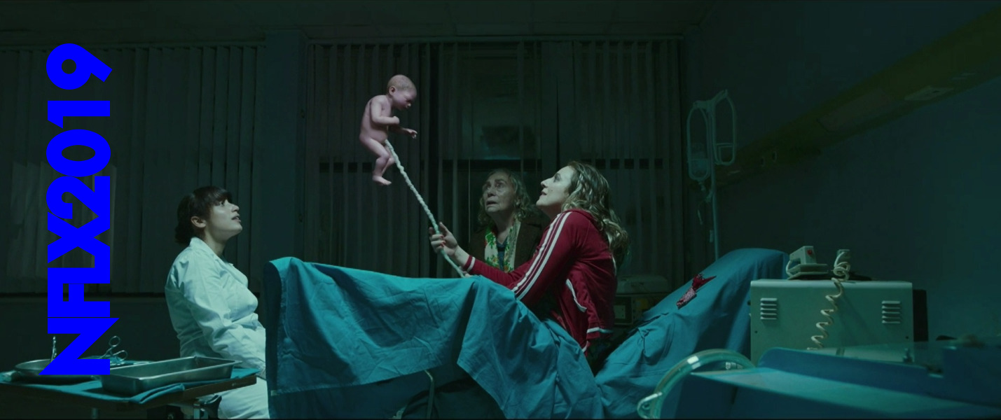
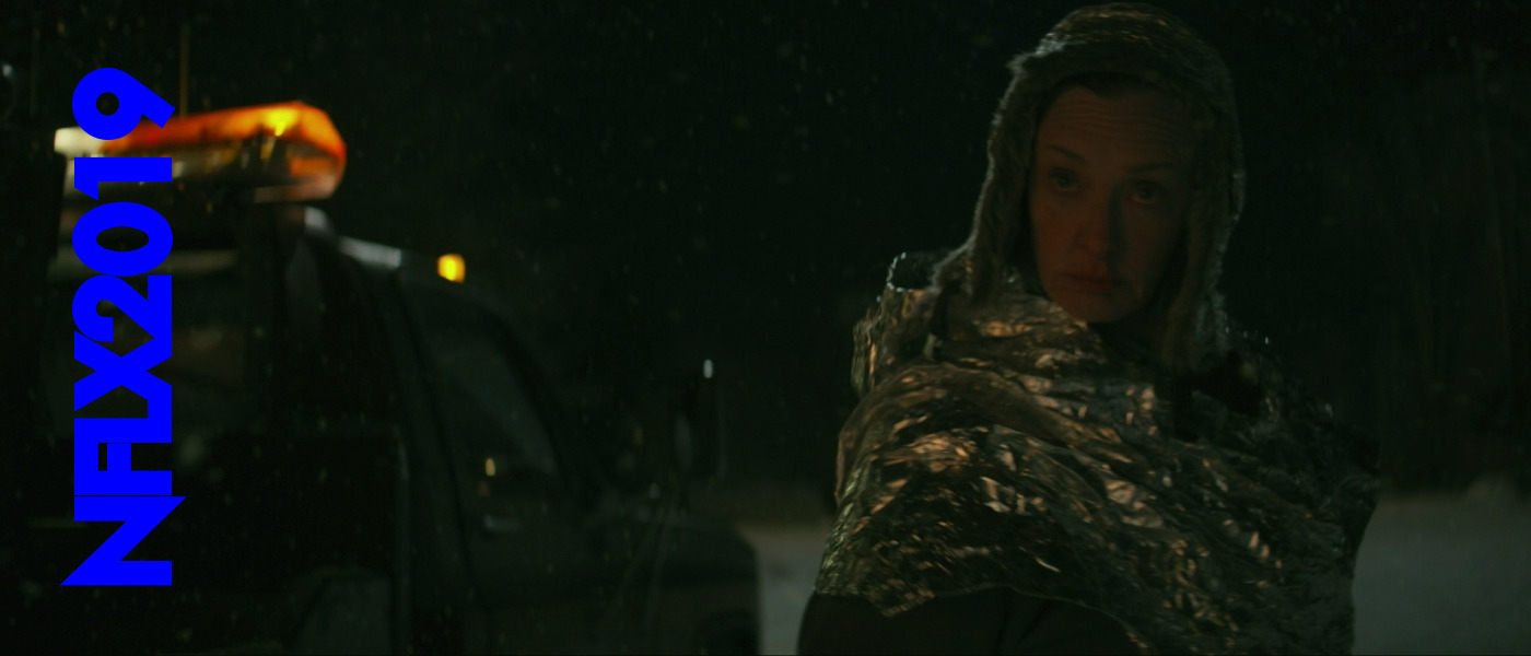
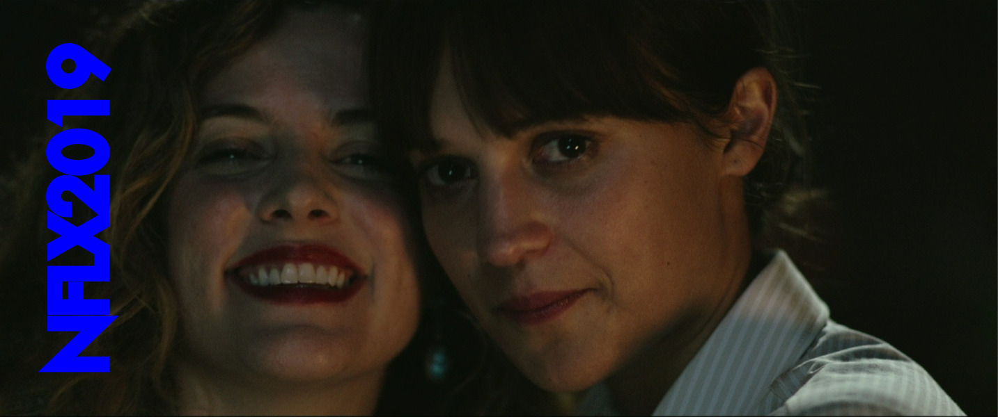
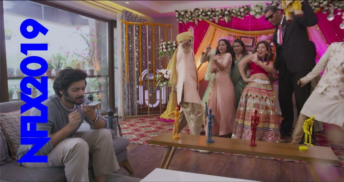
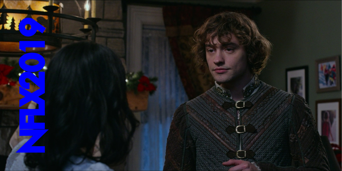
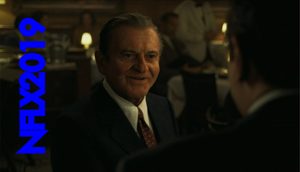
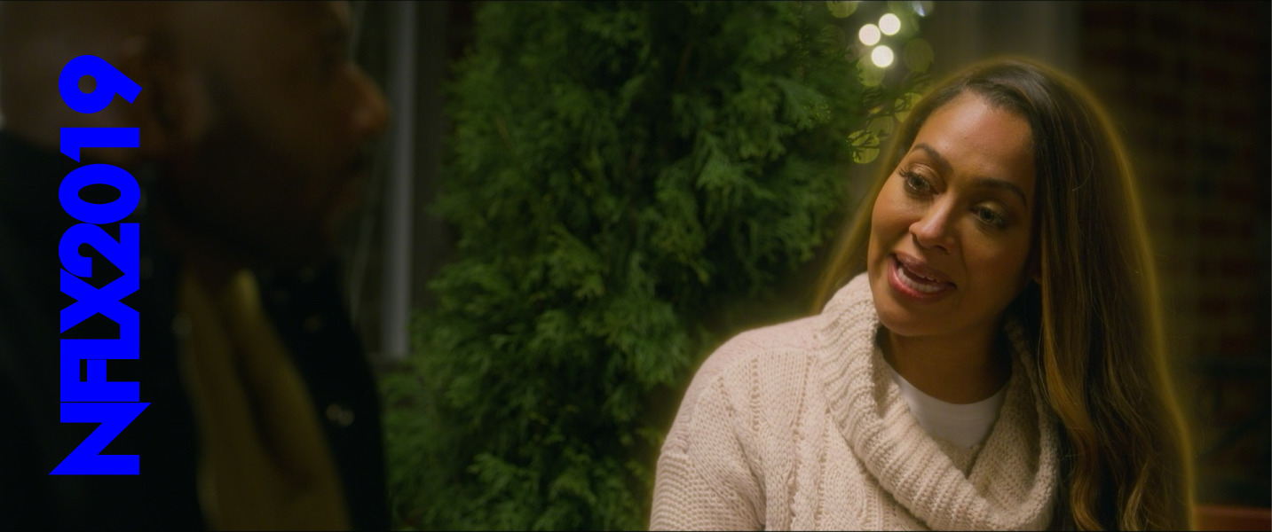
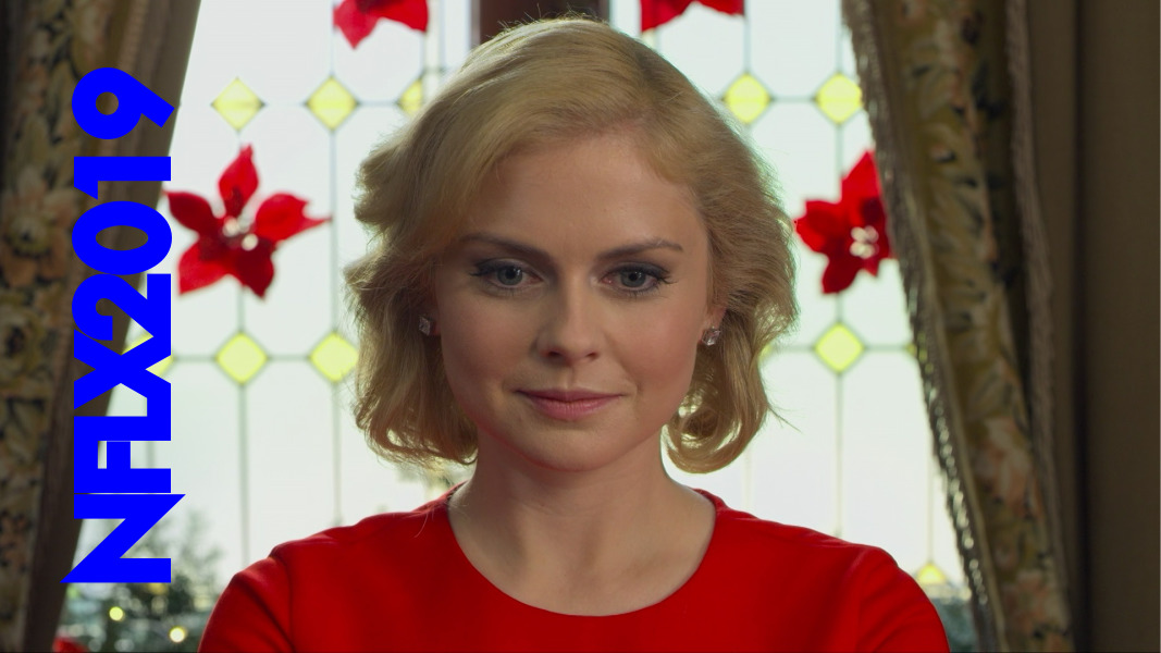
Here are the movies:
The Good
As I said in the start, some of the movies are good, but any recommendation I’d give would have to come with caveats. As in “I liked Foo… but…”
Here’s the ones I thought were good or interesting or I just liked.
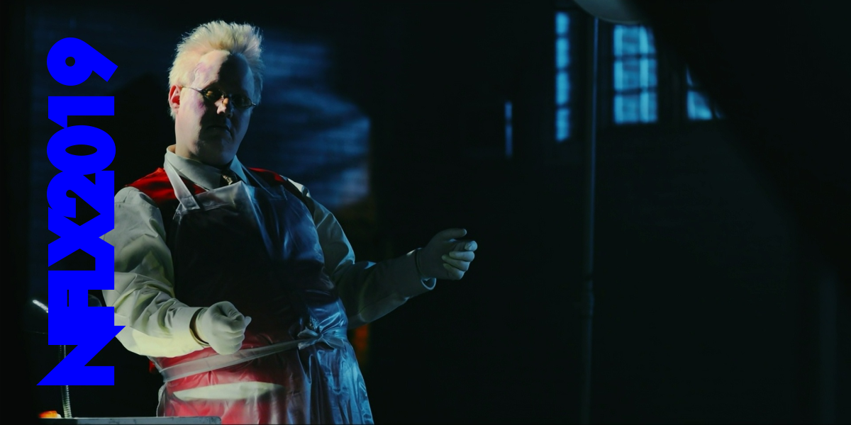
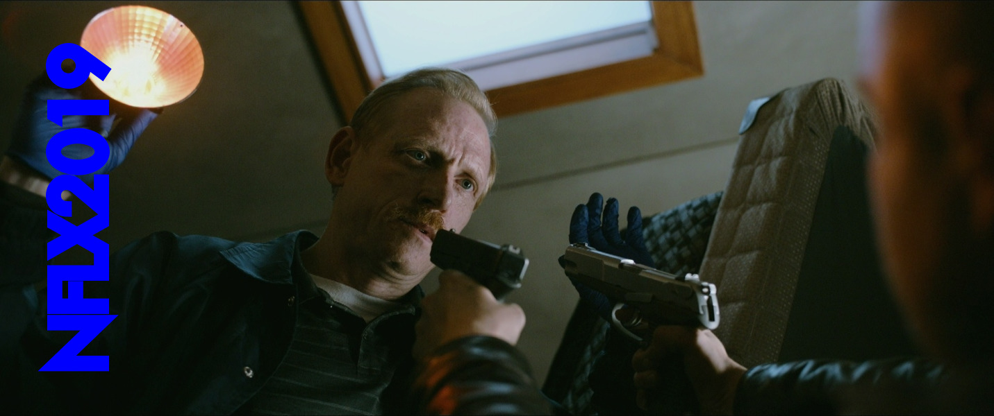
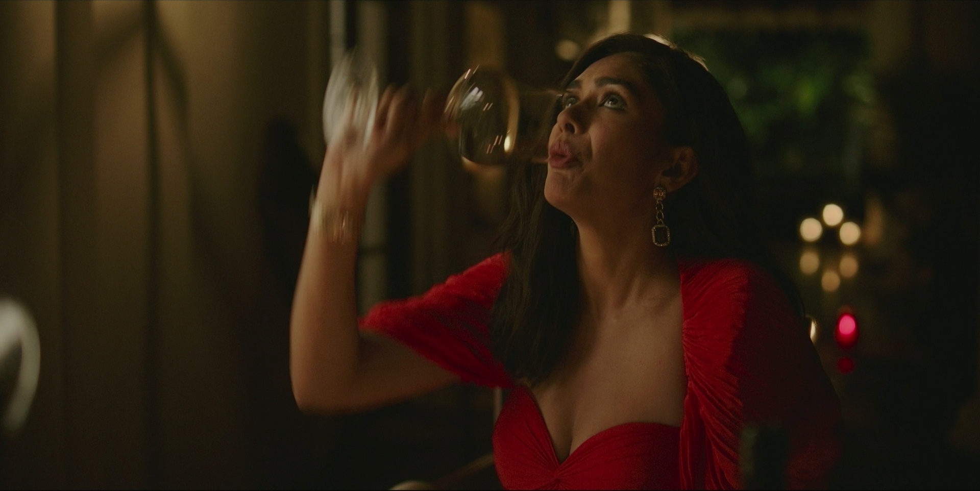
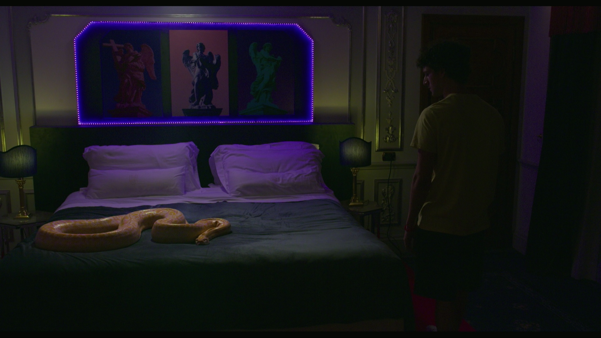
Polar is a batshit crazy movie by batshit crazy Swede Jonas Åkerlund, but… It’s universally reviled, and I can totally see why.

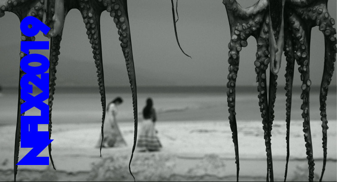
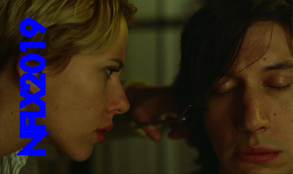
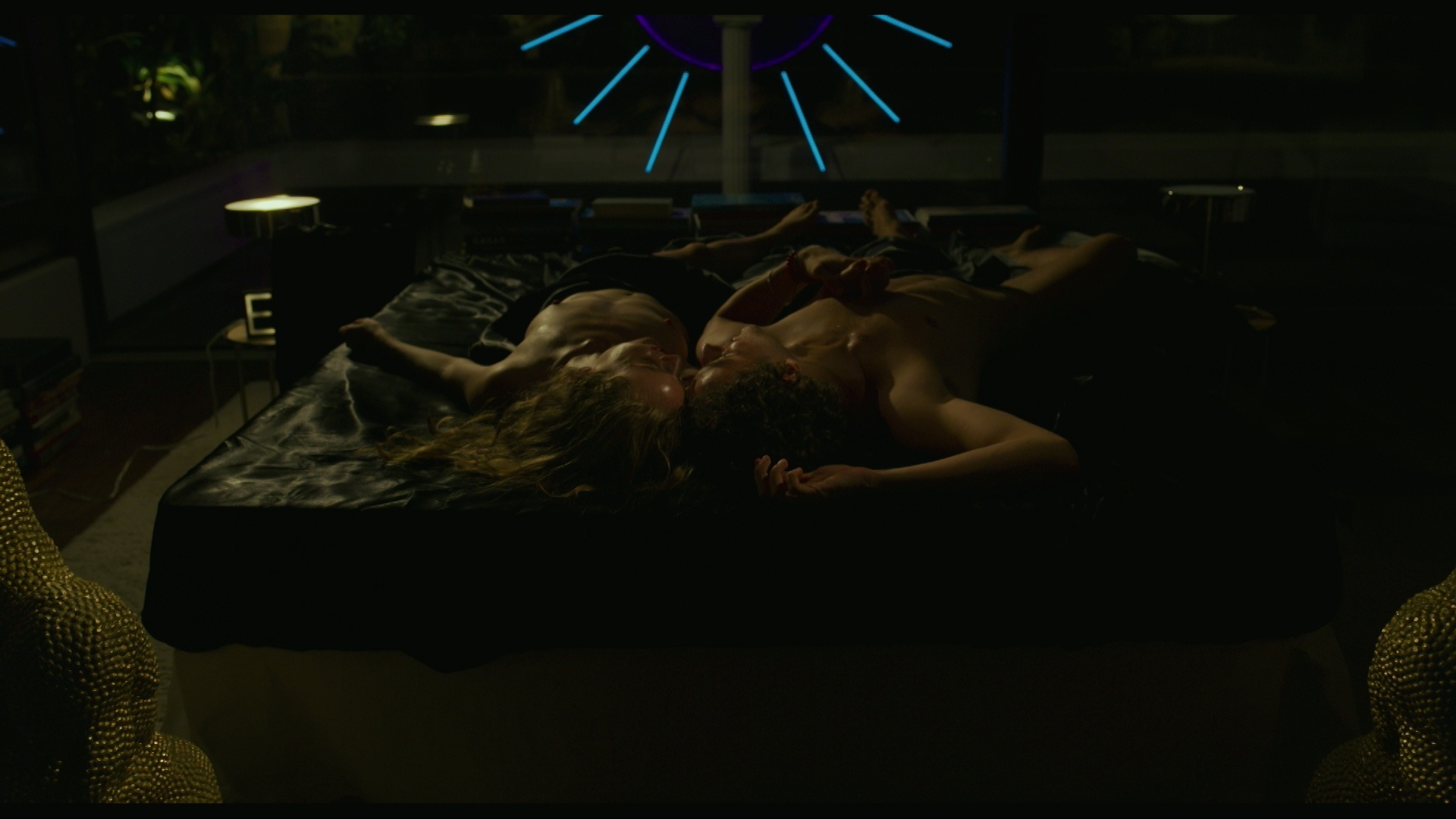
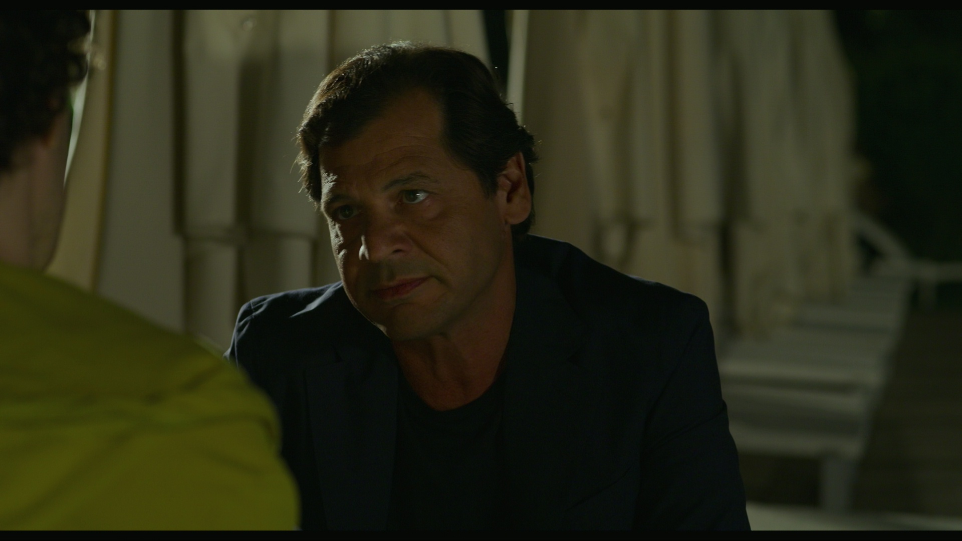
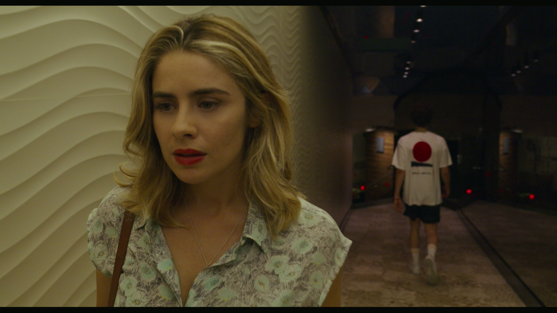
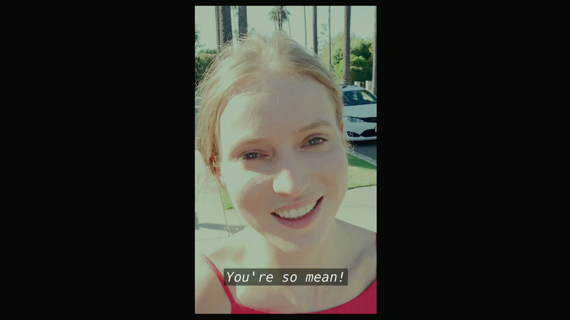
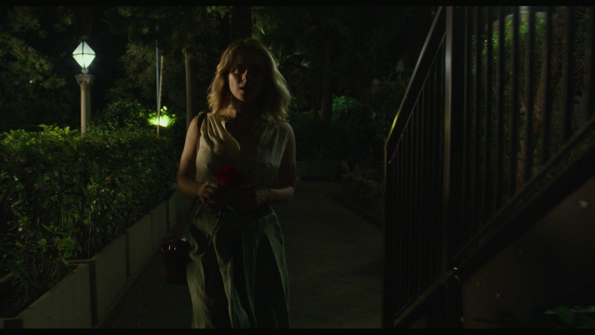
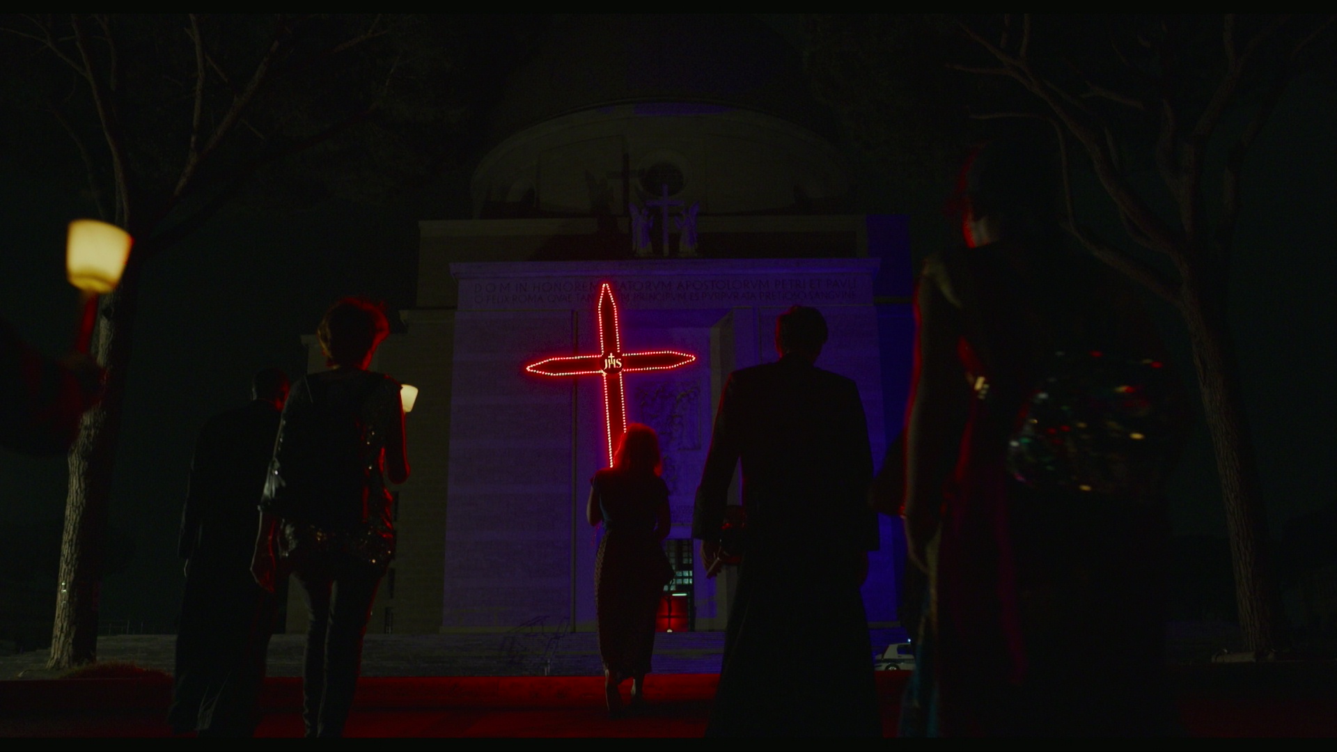
Paris is Us is a hypnotic French meditation on existence (and non-existence) and stuff, but… it’s totally possible that I was just reading too much into it (a la the original version of Donnie Darko): Basically everybody else seems to think there’s no there there.
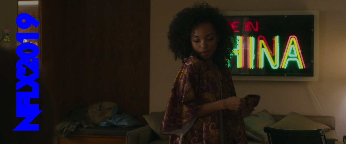
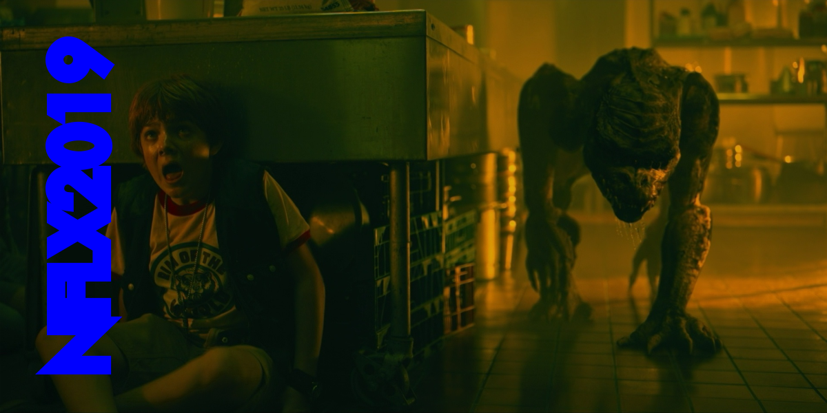
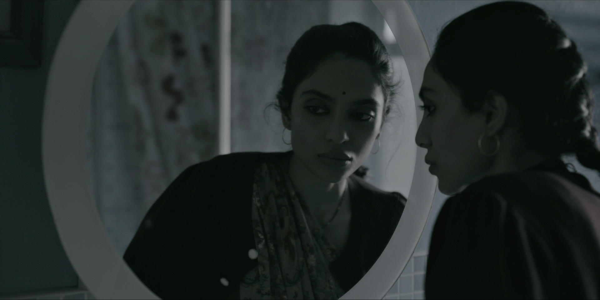
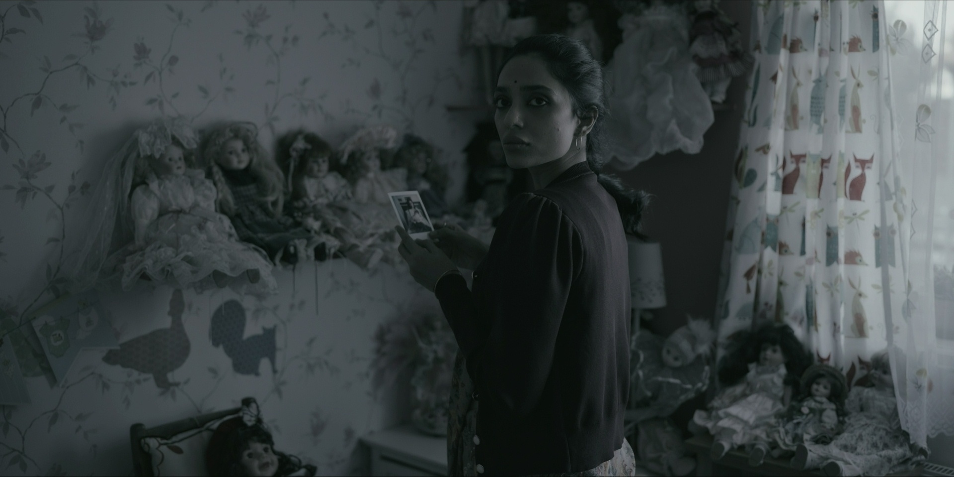
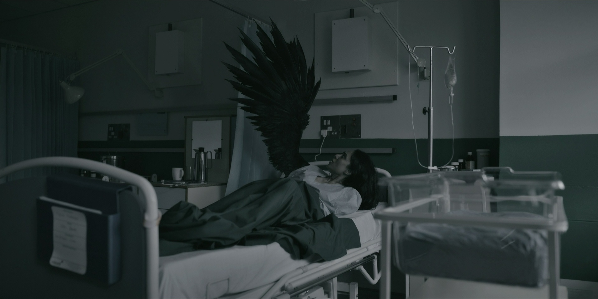
The Perfection is a neat little horror movie with many twists, but… all the viscera is rather hard to take and if you know anything about the twists it’s a snooze-fest.
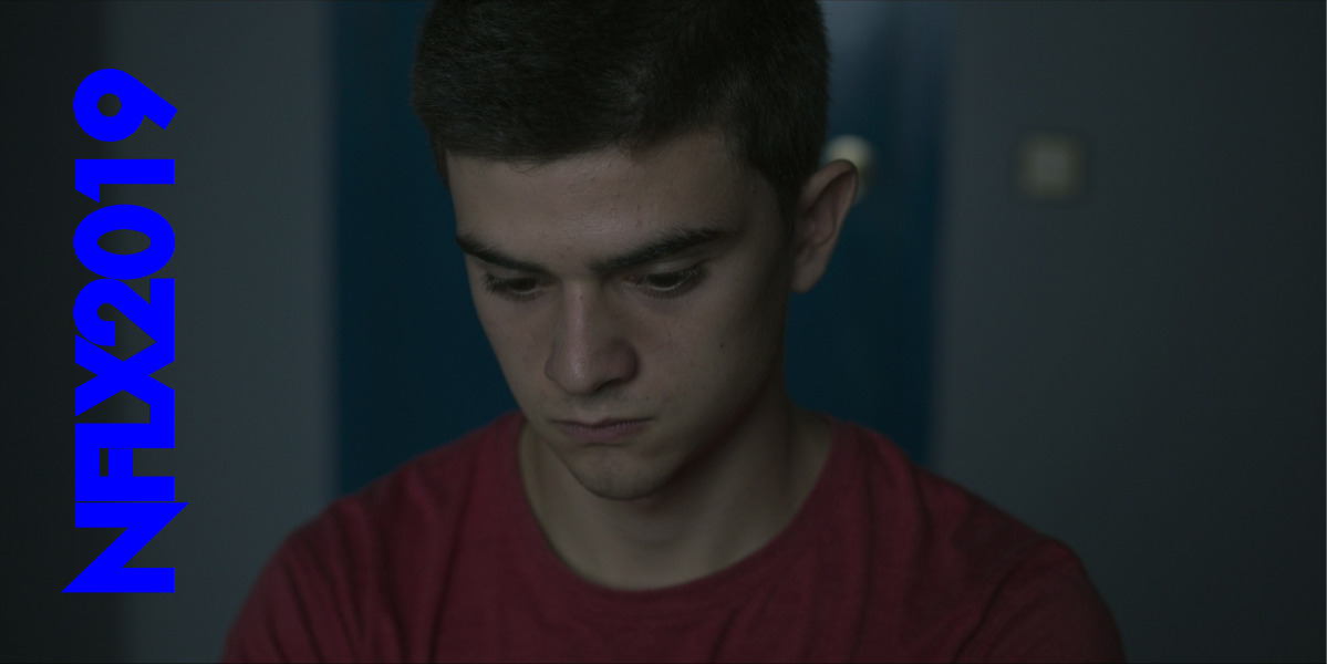
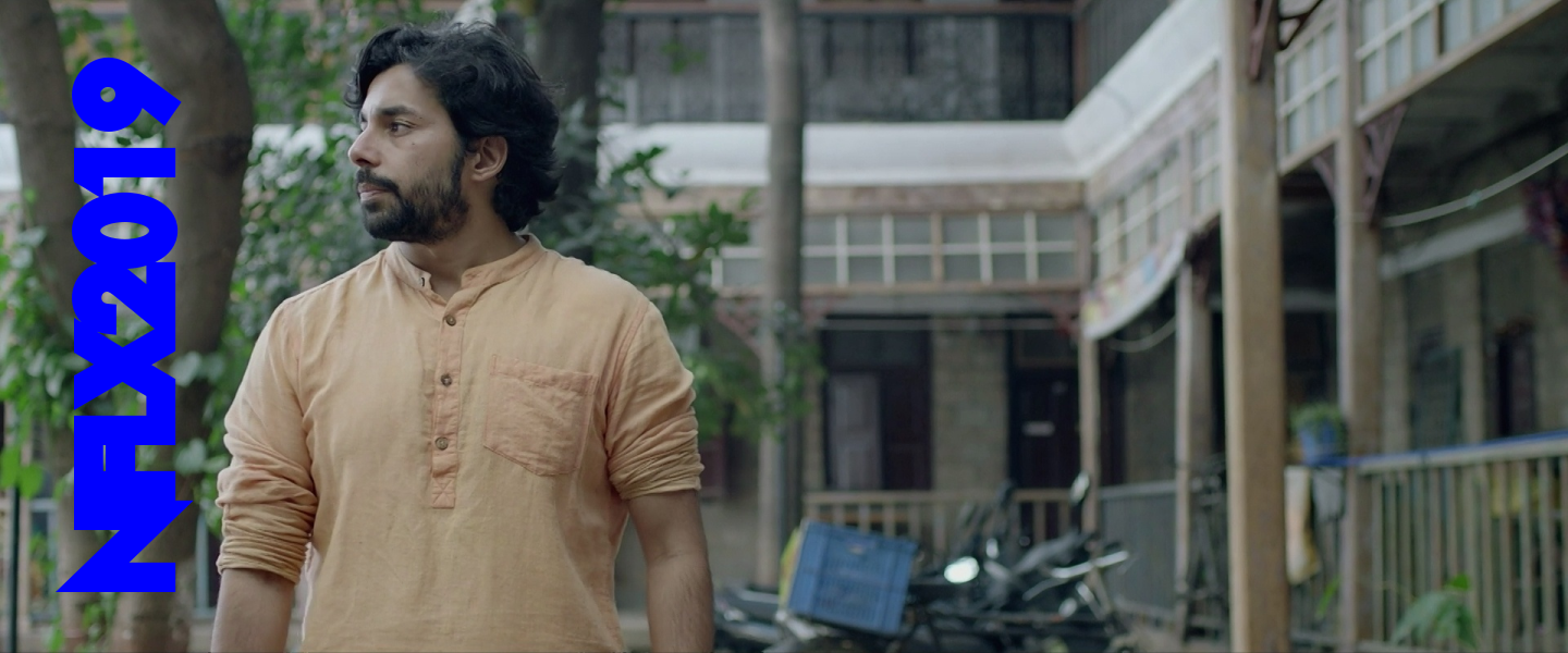
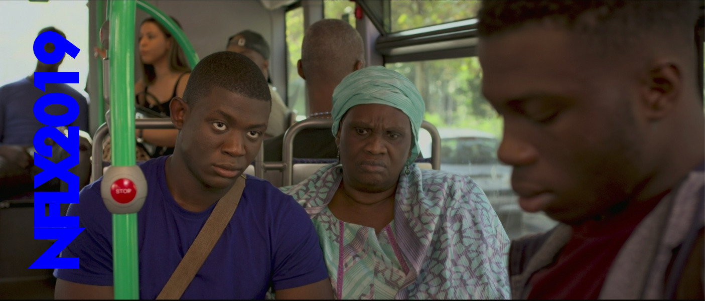
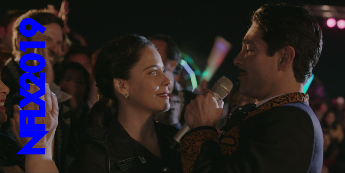
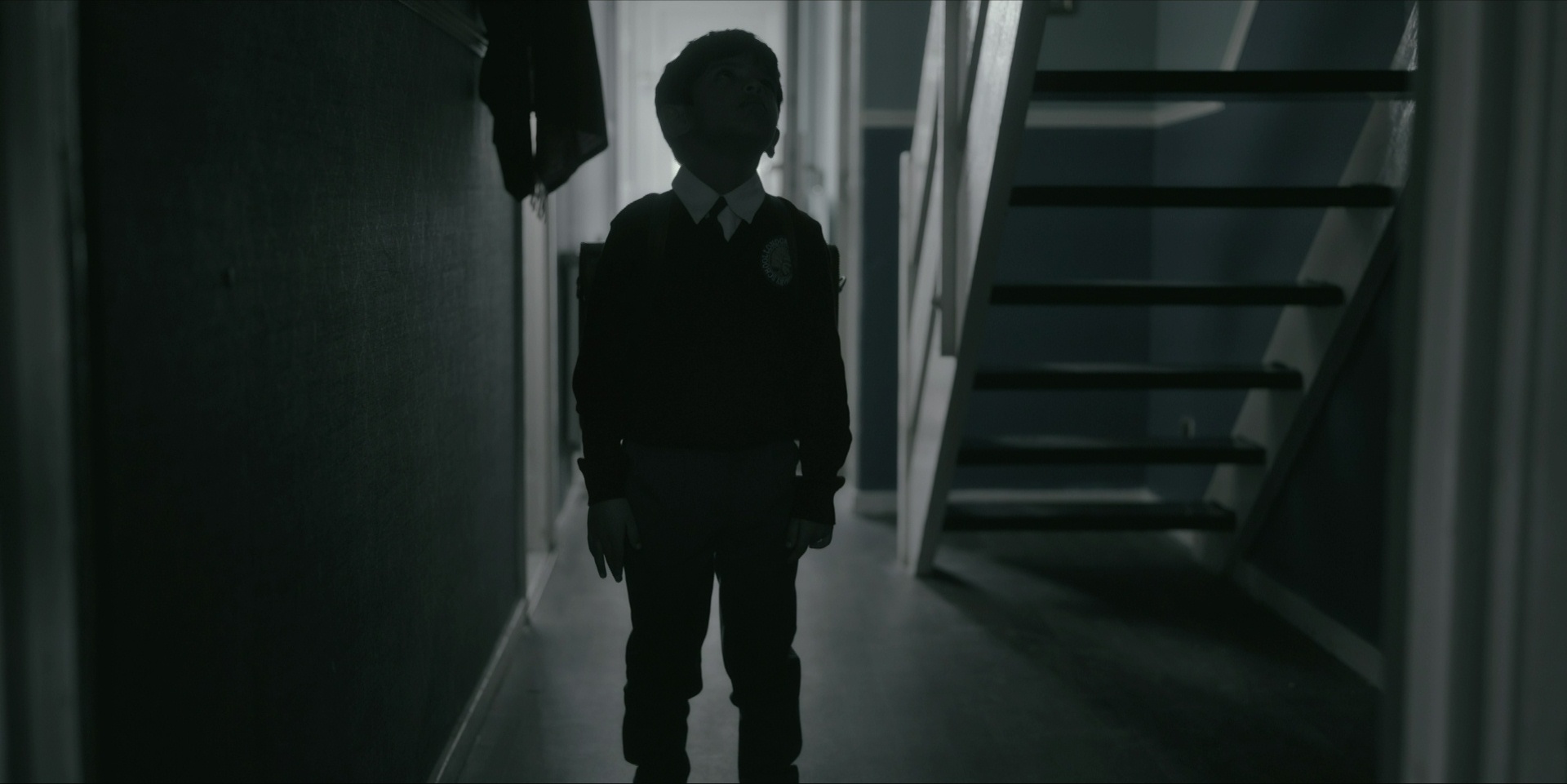
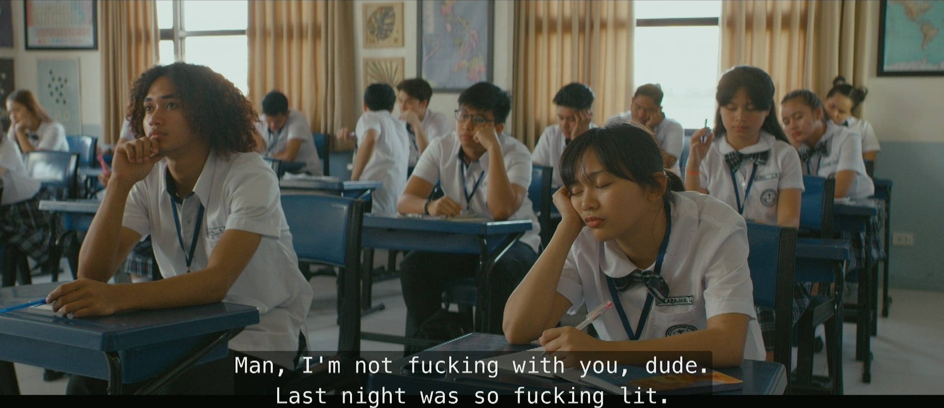
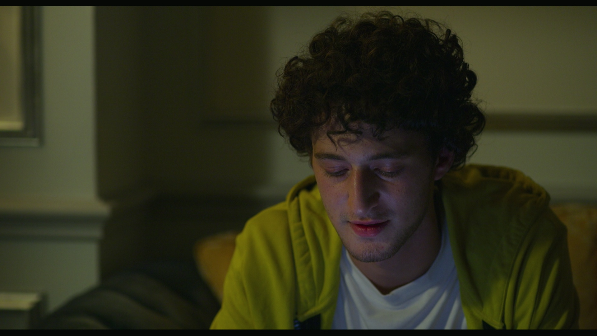
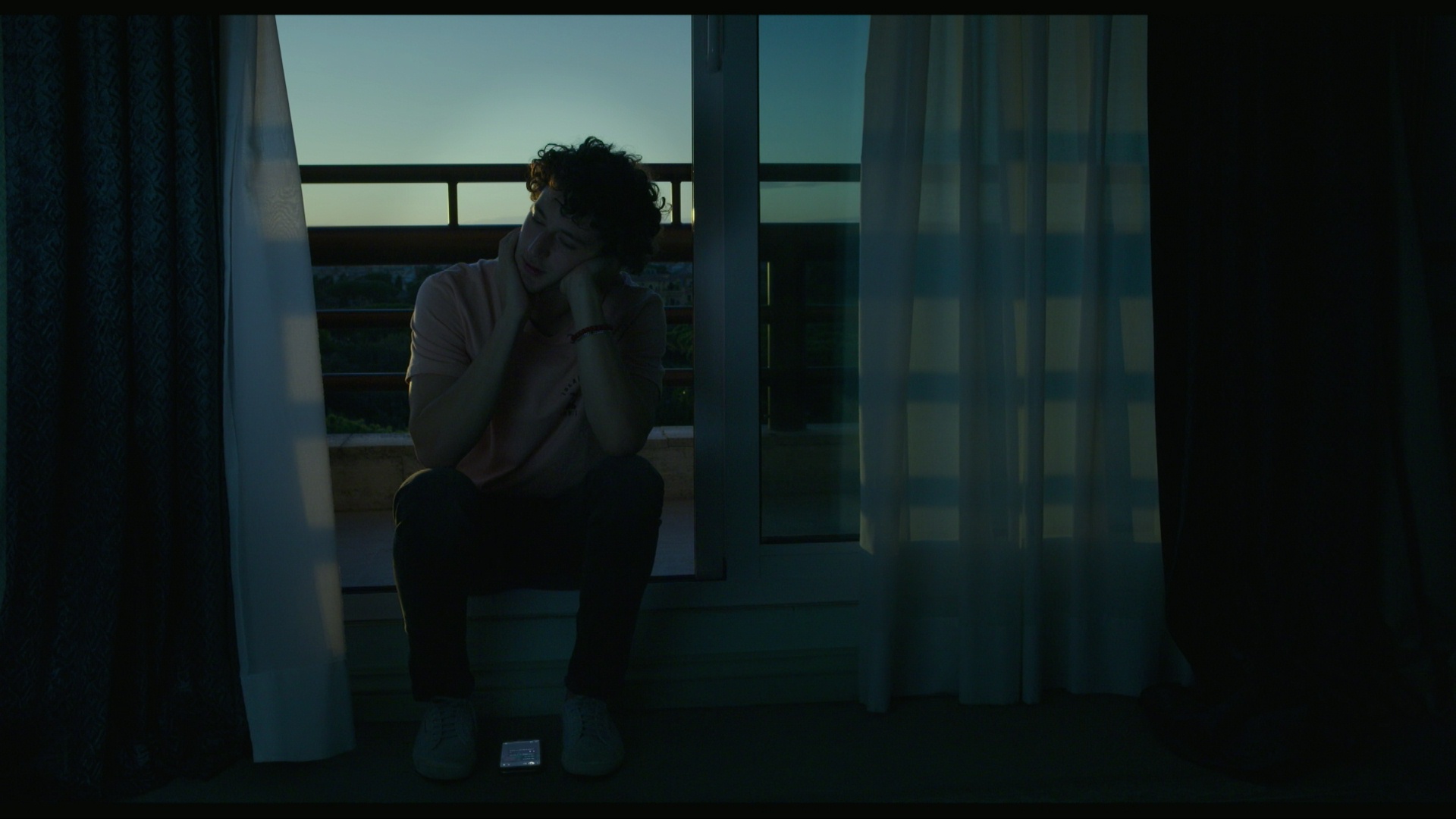
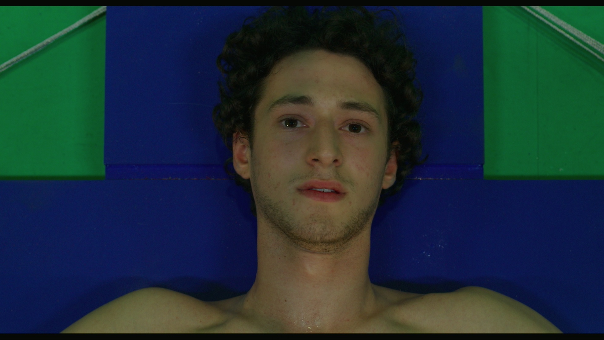
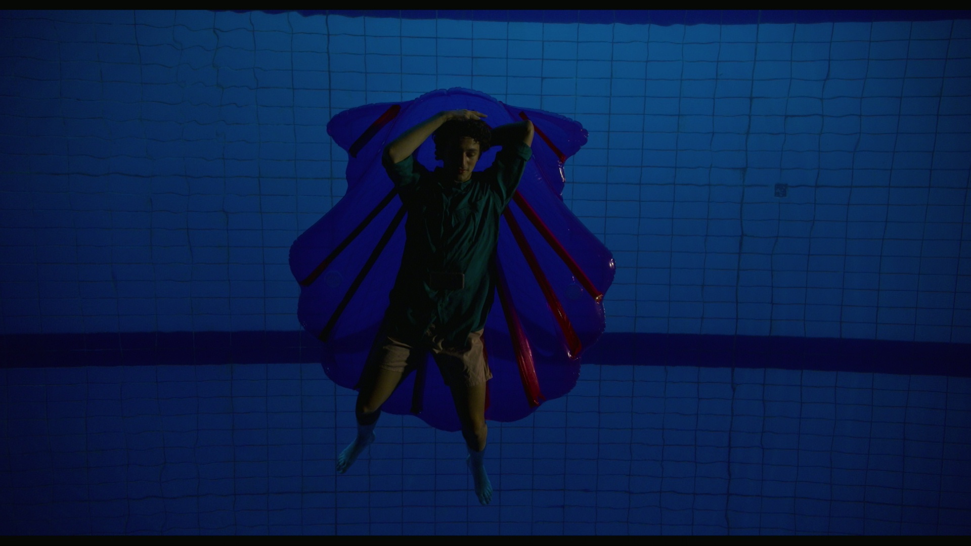
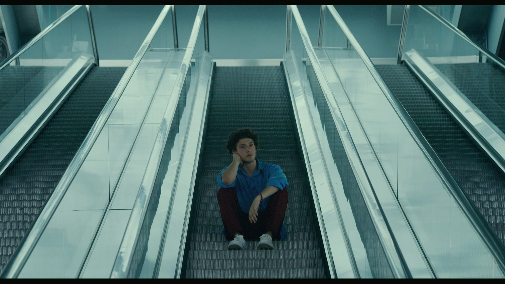
Seventeen is a really funny and touching coming-of-age movie, but… if you have a low saccarine tolerance, or hate movies not in English, you’re not going to enjoy this. Tarapara.
Klaus is a proper Xmas movie, but… it’s animated. OK, this is probably the movie I have the least qualms about recommending, really.

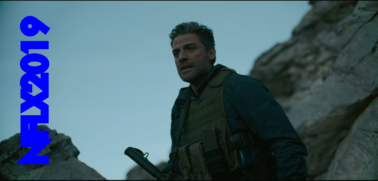
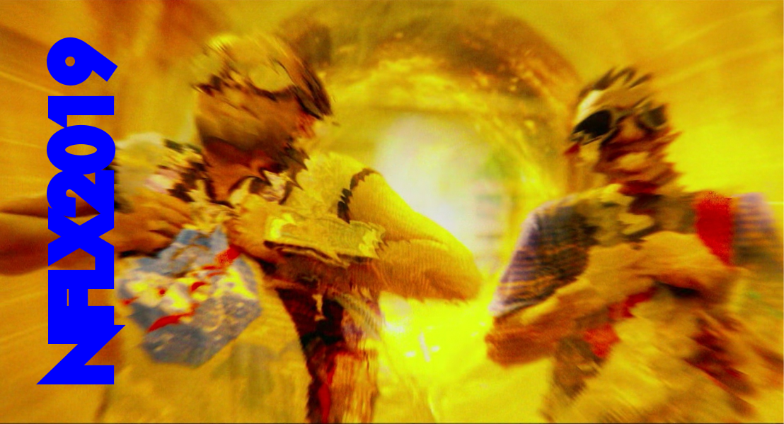
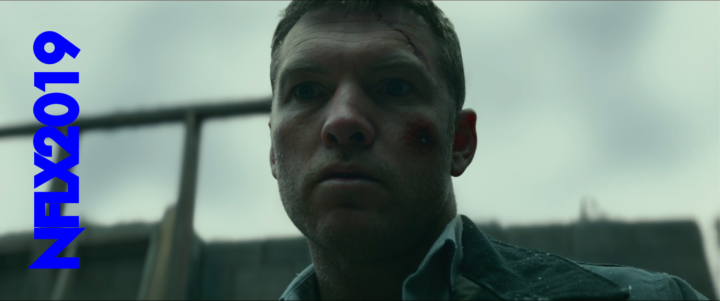
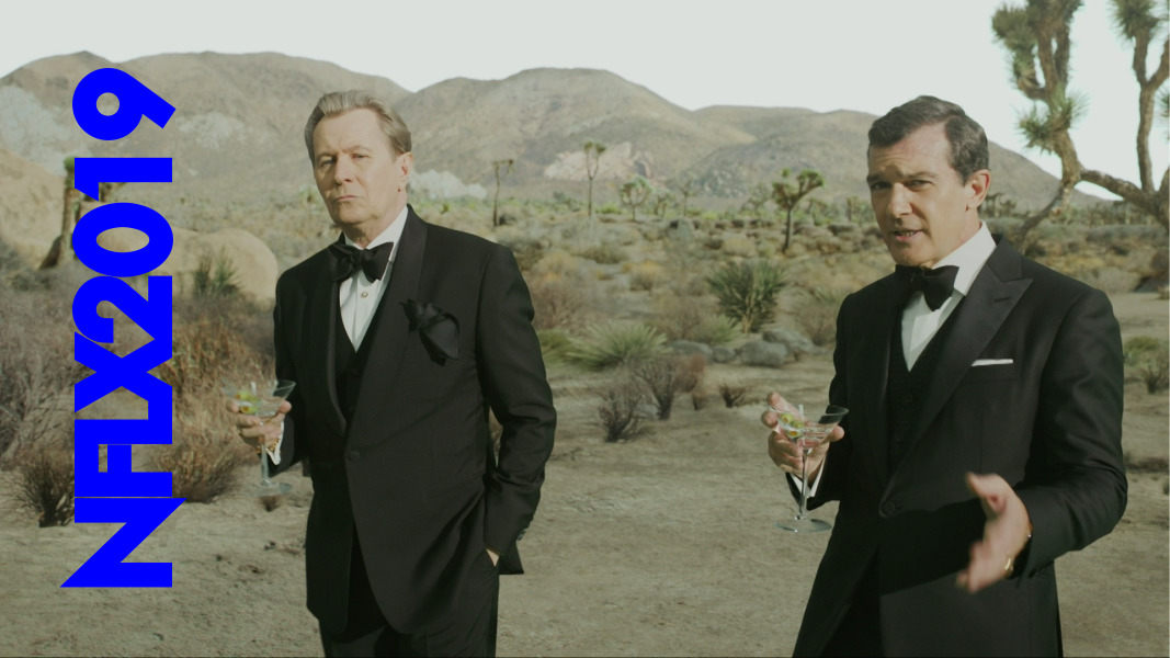
6 Underground in an exhilarating action movie, but… it’s a Michael Bay movie. Everything explodes all the time: This is Michael Bay unfettered. Did anybody even imagine that Bay had been fettered before? Any sensible person will loathe this movie.
And… that’s it? That’s not a very good crop for one year of movie-making for Netflix.
The rest of the movies are mostly “here’s a movie that will remind you of that other movie you liked, if you like that kind of movie”: Totally cookie cutter, and with a reduced budget. Perhaps you can’t claim that there’s a “Netflix aesthetic”, but most of these movies have that in common that they look professionally-made. I mean, the colours pop, the actors are fine, their lines are audible, the audio is fine. That is, there’s a basic competency to these movies, despite many of them being made on the cheap, from scripts that have been kicked around by the other studios for years, and by directors that do not have much experience.
I’ve watched a lot of no-budget movies, and movies can get really amateurish very fast, and none of these movies have that problem. They all look good enough on the screen.
But the vast majority of these movies are, and I don’t want to resort to hate speech, “made for TV” movies. Because that’s what they are. These are not Hallmark movies, but the distinction is sometimes subtle. The normal formula Netflix seems to use is to put one (or if they’re desperate, two) well-known actors into a movie and have the rest be unknowns, and couple that with a script that could have been auto-generated from more popular movies, and then film it quickly, but competently. Presto! Something to fill the library with so that you won’t notice that there’s fewer and fewer proper movies available on Netflix.
Ersatz cinema. And people are starting to notice:
What People Like
My taste in movies is somewhat off-kilter: I like art, and I like trash, and I don’t like much of the stuff in-between. For instance, I thought The Irishman was nothing special (beyond the disturbing vision of saran-wrapped bobblehead on ancient, tottering bodies), and that’s, by far, the best-received movie critically that Netflix did in 2019. Here’s my prediction: Nobody’s going to talk about that movie when doing a Scorsese career summary in twenty years time (beyond noting the aforementioned horrific CGI heads).
I knew that “brigading” was a thing (when groups team up to vote a movie up/down), but a surprising thing to me is that is happens with movies like this, that are (to these eyes) completely inoffensive. But it’s not like the people who participate in these actions explain why they do so (that’d give the game away), so it’ll have to remain a mystery.
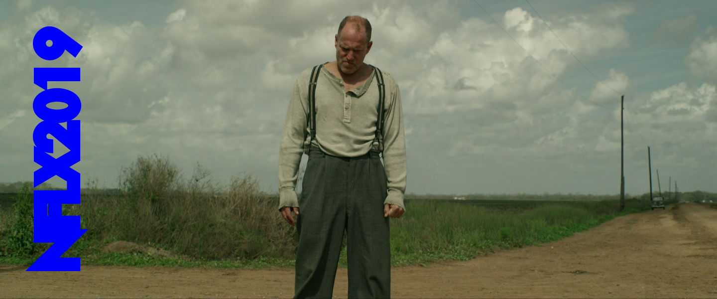
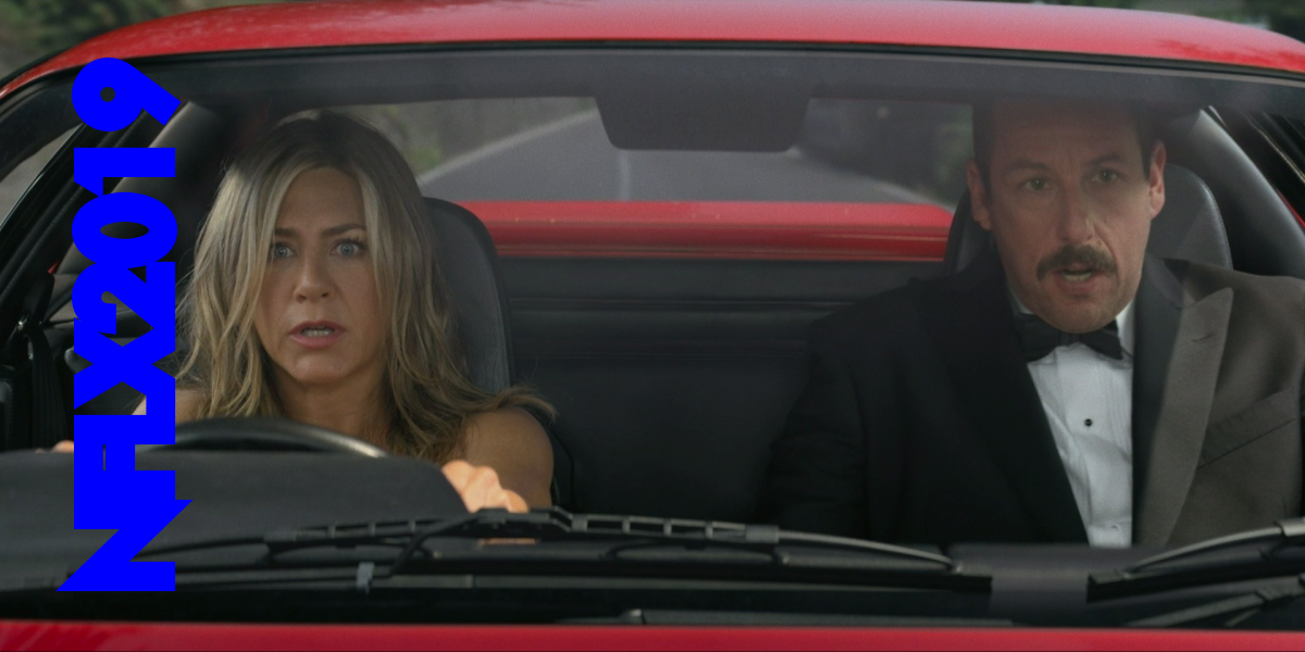
Here’s the things that Netflix claims are most popular. (They’ve obviously fudged the numbers somewhat to get 6 Underground in, since it was just a few days old when they released the list.) Of the movies I’ve covered here, the list has Murder Mystery (I quite liked it, but it’s not very noteworthy), 6 Underground (check), The Irishman (yeah, right), The Triple Frontier (I think Netflix did three big budget movies, and they all three got on the highest-watched list? Anyway, Triple Frontier is a snooze), The Highwaymen (incredibly boring), and… OK, that was it, really. The other things are TV series and non-Netflix Originals. (And a documentary, which I haven’t covered.)
It’s an interesting list in that there’s nothing interesting about it: There’s no word-of-mouth oddity (like Bird Box in a previous year) here. Whatever Netflix spent the most money on is what ended up on the most-watched list… and the methodology for the list is that you have to have watched two minutes of the programme to be counted as “have watched it”.
So whatever Netflix is pushing in their app will be on their list because of this:
The App
Let’s talk a bit about the app. I used an Apple TV to watch Netflix, and while I don’t have experience with Netflix on other platforms, I have to say that the Netflix app is the most maddening and discouraging thing it’s been my misfortune to have to use. (Yes, I know, my own fault. Nobody forced me to do anything.)
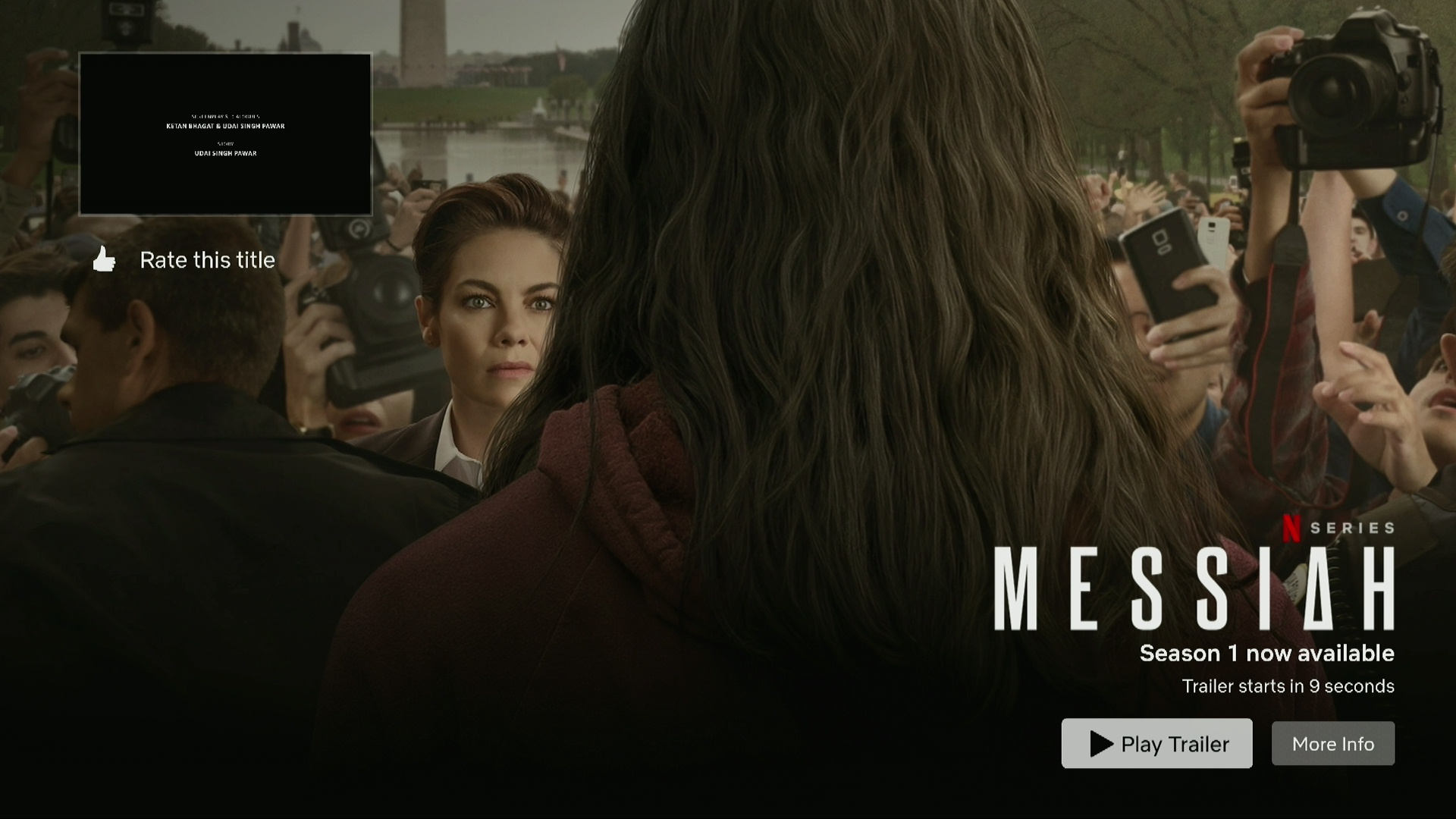
So you’re sitting there basking in the afterglow of having just seen a moving film… and one second later the end titles shrink into the size of a stamp, and you then have ten seconds to find the remote and try to stop whatever horrid thing Netflix wants you to watch next. So you find it and hit pause! THE BUTTON DOES NOTHING!!! Already the trailer for MESSIAH is blaring out of the speakers! So you hit the “back button”… and then it starts playing a trailer for something else! So you pry the TV loose from the wall and chuck it out of the window.
Or perhaps that’s just me.
The Netflix app is so stressful to use.
There’s apparently no way to switch all these auto-play behaviours off. According to insiders, allowing people to switch off this behaviour has been suggested, but refused by the powers that be, presumably because it would lessen “engagement”.
Well, it gets me engaged, at least. I don’t use the app unless I really have to.
(It’s fun to read on Hacker News the various strategies people have developed to deal with this behaviour; most of them involve learning just what timing to use to go to the next item in the list to avoid the auto-play. My strategy is to go to the text input bit of the search page whenever I’m done watching something: Nothing auto-plays there. (Perhaps I shouldn’t have written that; somebody at Netflix may read this and fix that, er, bug.))
(While doing the screenshots for this blog article, the Netflix app popped up a notice that I no longer had any valid payment methods for my Netflix account. Granted, I’d gotten mails daily about this from Netflix, but I assumed that they were all phishing attempts (because that’s what they normally are). I even inspected all the URLs on the last one and found that they all pointed to netflix.com, and I was wondering whether this was a higher-order phishing attempt somehow: Bombarding me with mails where some had valid URLs and the rest are the actual phishing posts. My payments were via Google Play anyway… but it turned out to be true. So… Netflix doesn’t want to do payments via Google Play any more? I was not presented with that as an option when adding a new payment method right now, so I guess that Netflix is pinching their income pennies and do not want to pay, er, 30%? 15%? to Google.)
But Does It Matter?
After losing so much of its library (as the owners of the TV series and movies are creating their own streaming services), Netflix has to do something. The movies are, I think, a way for Netflix to get some attention in the press. Raining money on Scorsese gave Netflix more press kilometers than everything else they did combined in 2019, is my guess. (And Marriage Story also got some traction.)
Because Netflix have painted themselves into a corner with their batch-view-first strategy on their TV series.
If you look at what’s been dominating the media the last half year, it’s The Mandalorian, Watchmen and (to a lesser degree) His Dark Materials. These have all been rolled out the traditional way, week by week, and have kept the excitement and the conversation going for months. (Disney did a slight cheat with The Mandalorian, doing the second episode just a few days after the first one, and that felt strangely like a benevolent gift.)
Compare that to the reaction to Amazon dropping a season of The Expanse all of a sudden: There was some chatter a couple of days, and then… crickets. Now, The Expanse s4 wasn’t as noteworthy as The Mandalorian, anyway, so even if it had been rolled out on a weekly basis, it wouldn’t have dominated, but it’s a show with a fierce fan base, and there would have been a lot more excitement surrounding it than the batch-based release schedule pioneered by Netflix.
Because, really: Did any of the TV series Netflix dropped last year make an impact? (Beyond ending up on lists of “Shows You Didn’t Know You Missed”.)
Netflix Is Doomed
So here’s my take on the sitch: Netflix is creating a lot of “content” that very few people would watch willingly. They’re creating a ton of movies and TV series that are almost like the ones you remember liking, but aren’t quite.
It’s like when your mother bought fake sneakers and everybody at school makes fun of you.
According to an article I read somewhere, what people mostly use Netflix for is watching Friends while getting ready for bed. So Netflix paid $100M to be allowed to stream it in 2019, because without Friends, the customers will be very unhappy. Netflix has been unable to create anything like that, and have instead done quirky shows (like Kimmy Schmidt (which I love)).
Netflix had a revenue of $15B in 2018, and they reportedly had $15B in debt. Not that those two numbers have anything to do with each other, but they need to come up with a crowd pleaser soon, or it’s endsville. AT&T won’t be licensing Friends to Netflix forever, now that it has its own streaming service.
In happier Netflix news, The Witcher seems to be very popular with the 9gag crowd. I watched the first half of the first episode (downloaded from the torrents, of course) yesterday, and it looked very Netflix: Designed to appeal to a very specific crowd, looked cheaply made (for what it is), and as usual, had one single “name” actor.
So business as usual, and if they were hoping for a phenomenon like Game of Thrones… it’s not going to be that.
OK, bloviating achieved. You can now go back to watching Seinfeld.
[Edit two days later: The Golden Globes are over, and Netflix had 34 nominations, including three of the five for best film (drama). They won… two (Laura Dern (well deserved; she was fantastic) and Olivia Coleman (haven’t seen)). The Irishman didn’t take home a single win. Is this Hollywood’s way of telling Netflix to go fuck themselves?]













































)
+(1))



)







)

)
)
)
