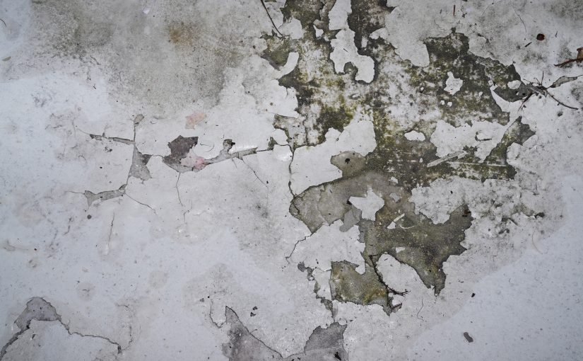
It’s a grey, rainy Sunday… perhaps today is a good day to spend reading comics?
It is?
Great!
| Zonal: Wrecked |  |
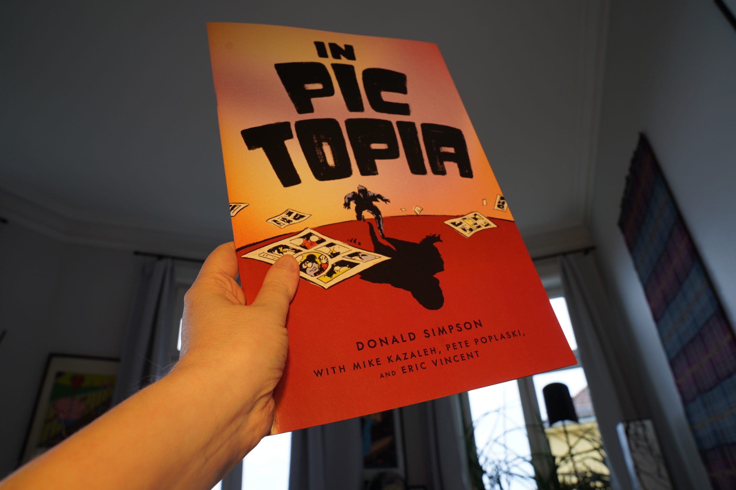
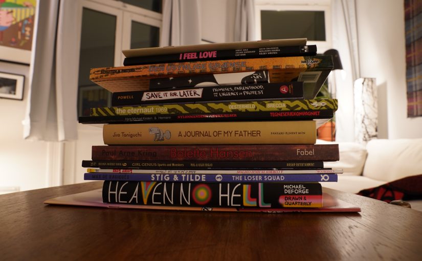
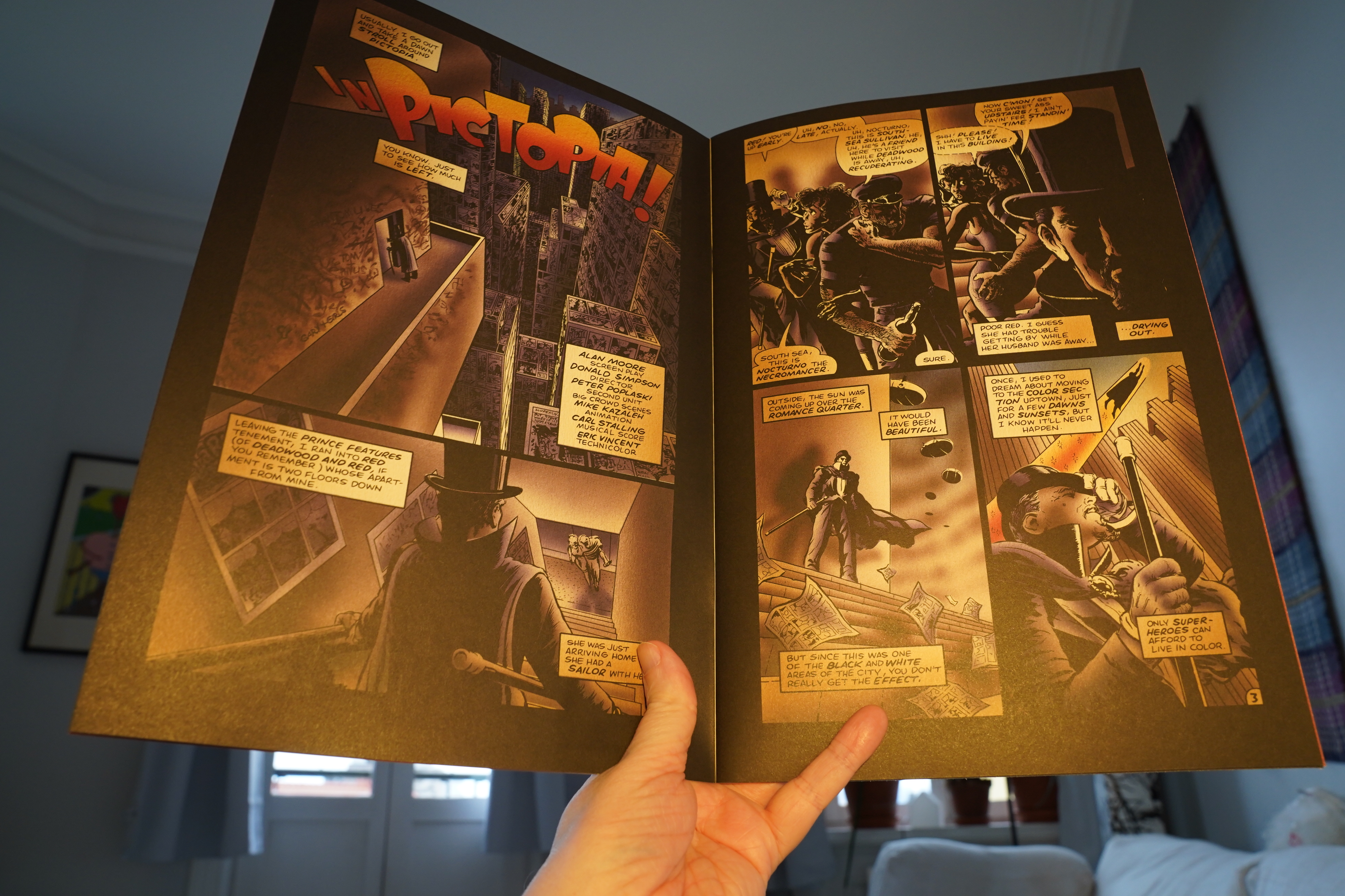
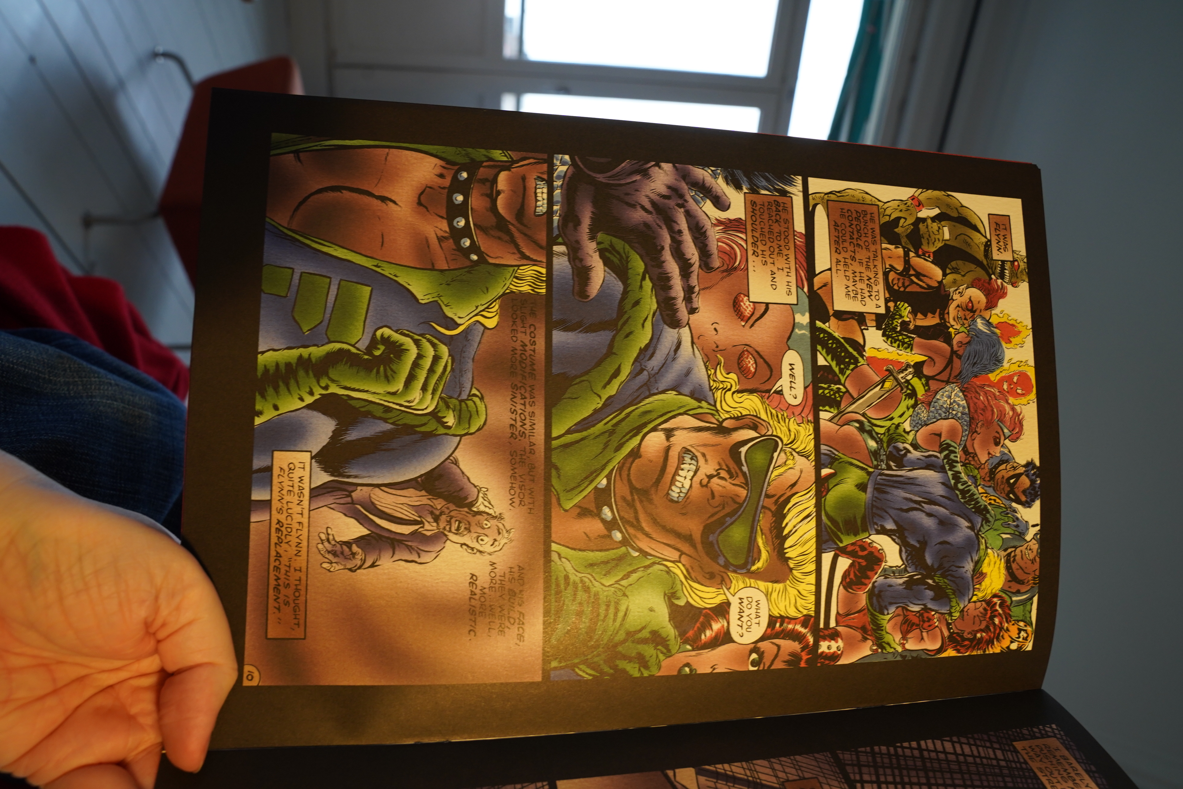
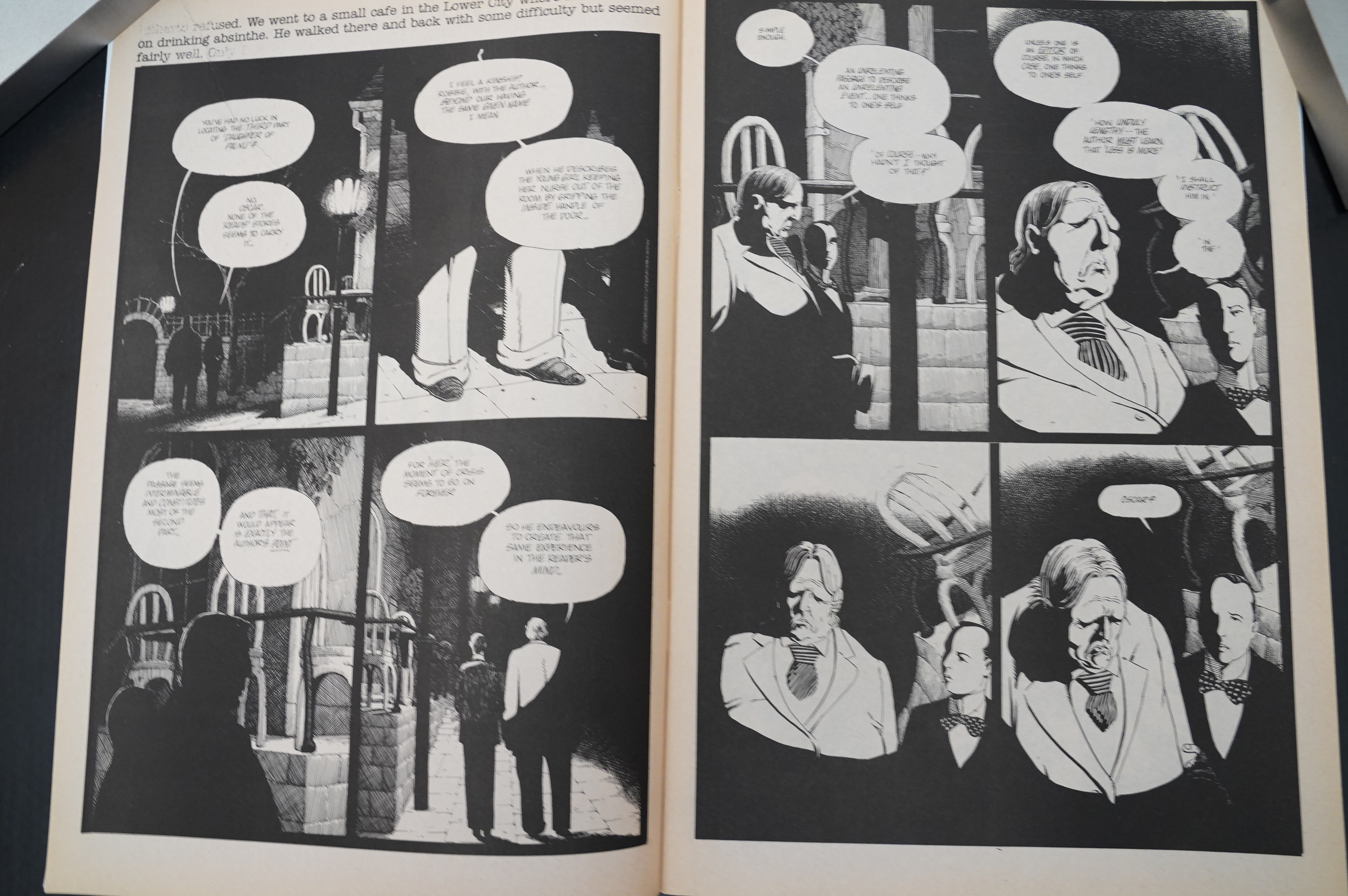
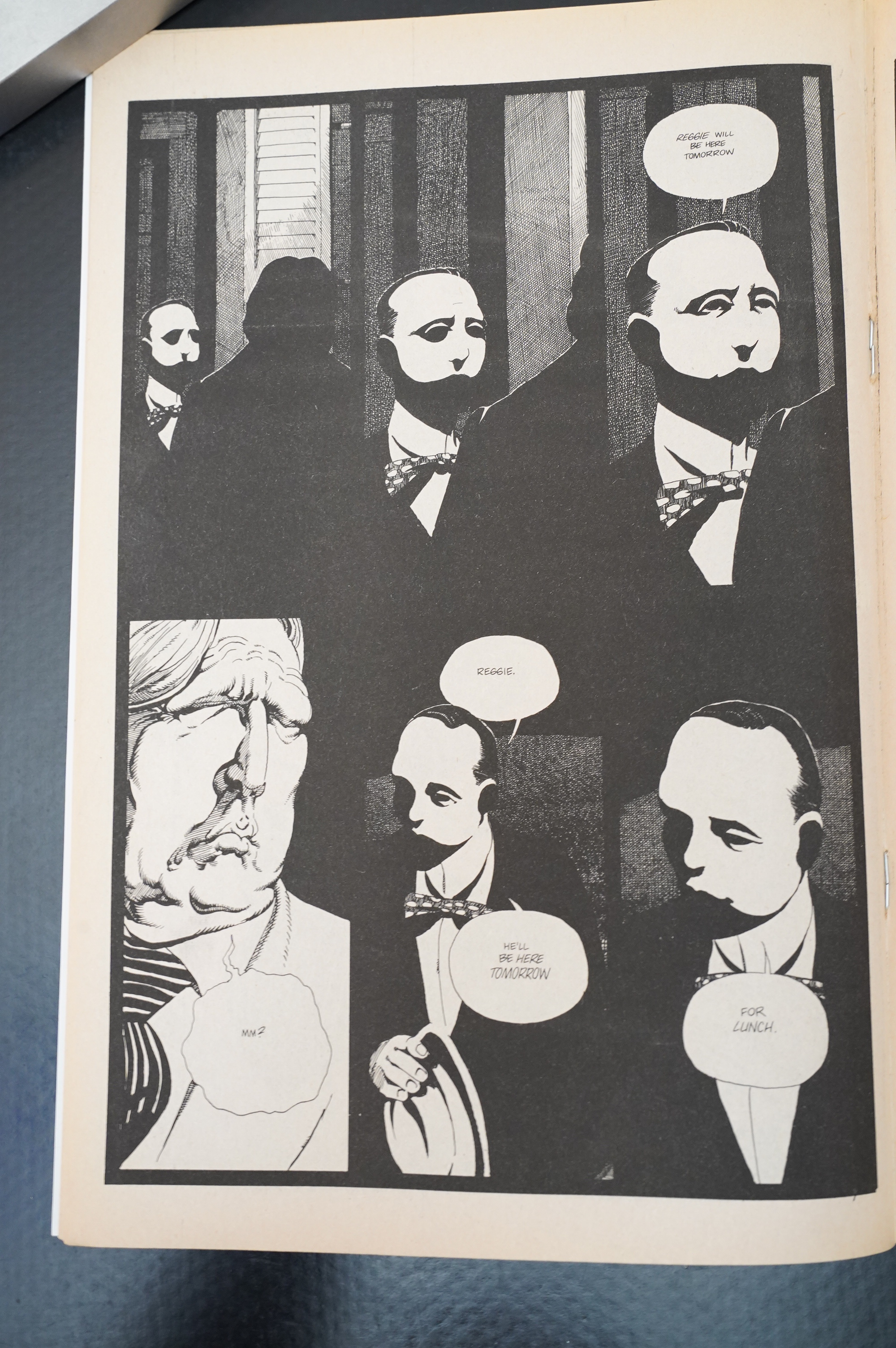
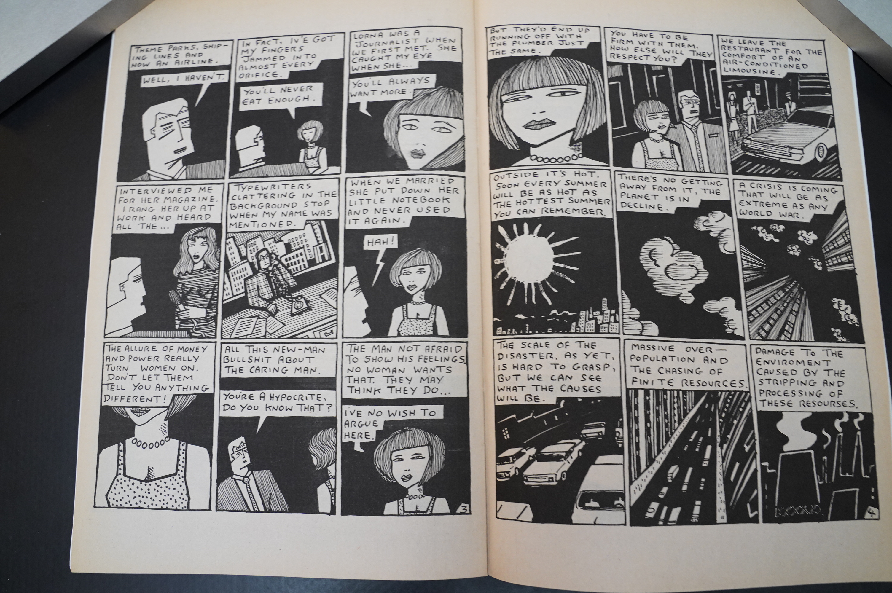
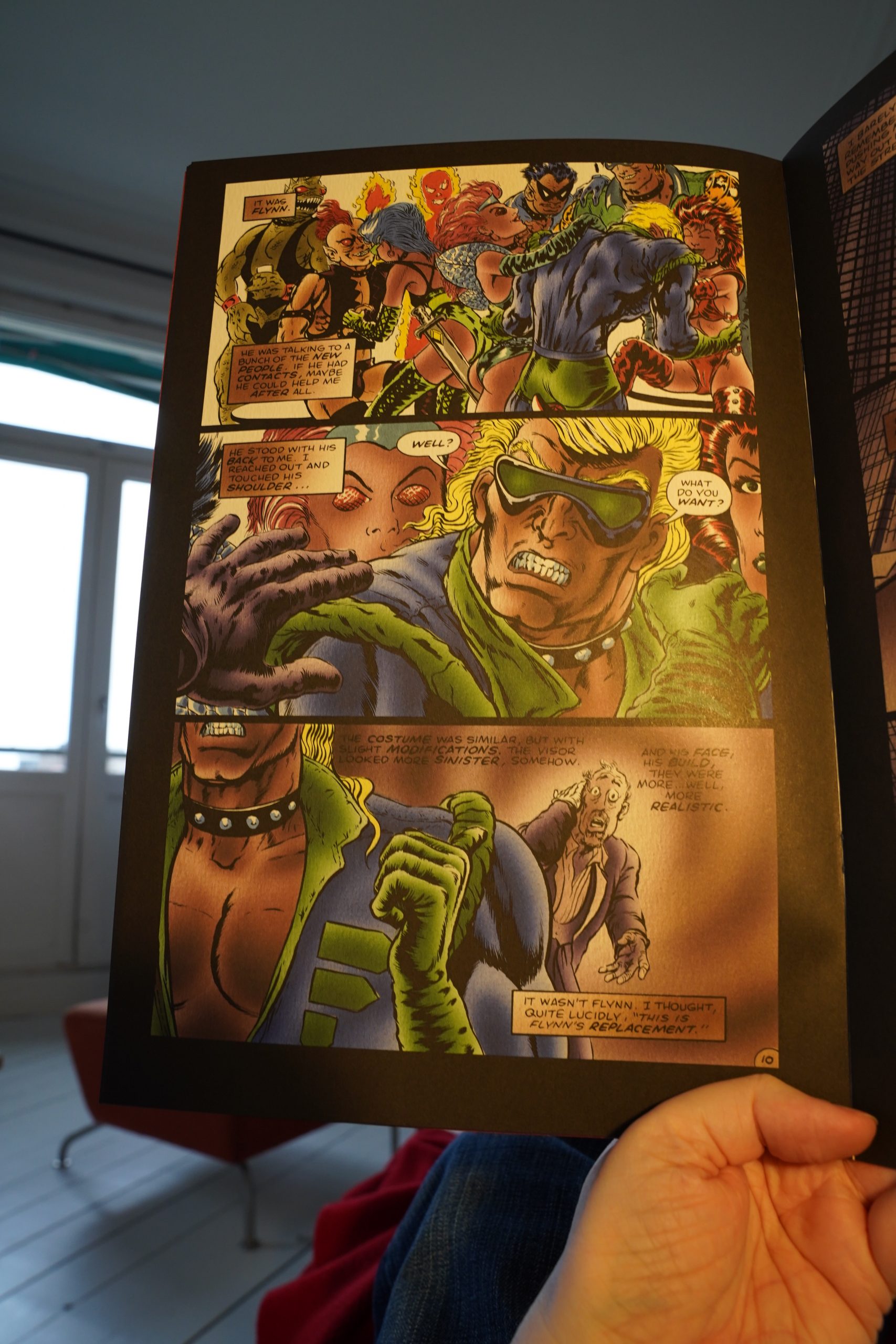
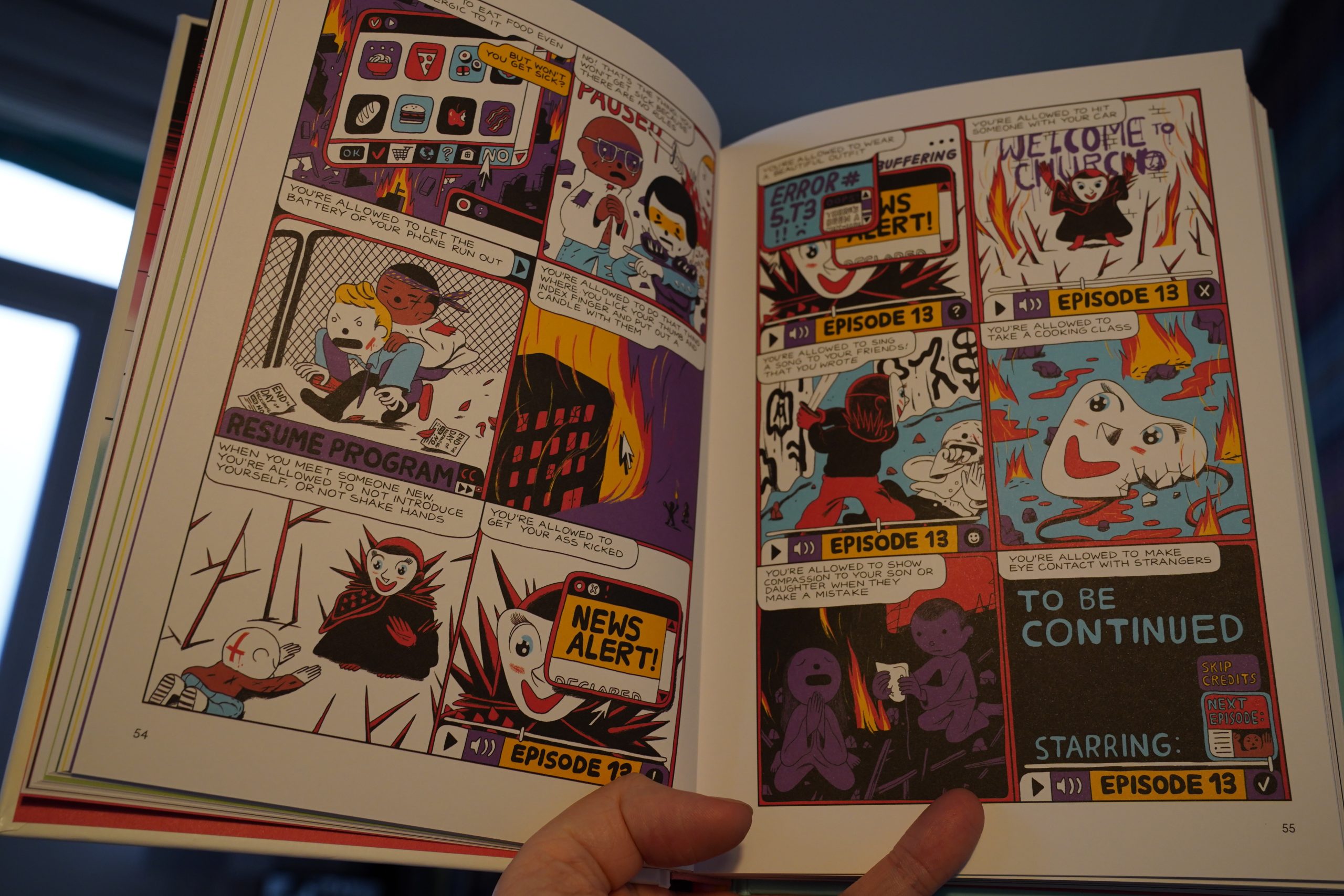
12:29: In Pictopia by Alan Moore, Donald Simpson and others (Fantagraphics)
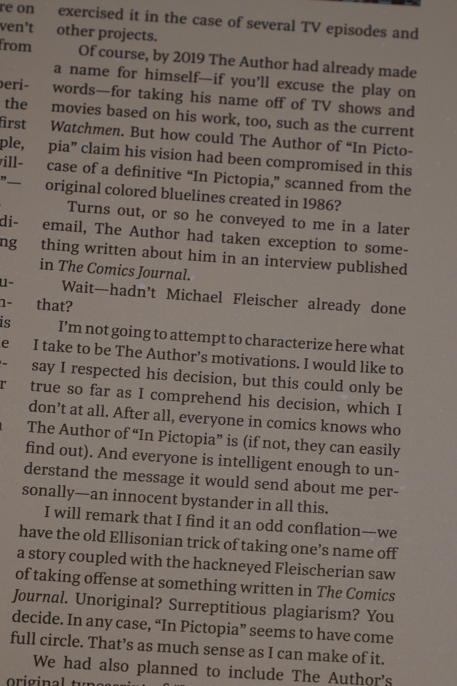
This is that story from Anything Goes, the Fantagraphics benefit series, right? (Somebody had sued The Comics Journal because they were mad about something somebody said about them in an interview.)

It is indeed! But without Alan Moore’s name on the cover.
Looks great in this edition, too!
The story is just a dozenish pages, but there’s lot of padding at the end. And… it turns out that Moore took his name off this book because he was mad about somebody saying something about him in an Comics Journal interview.
And the circle is complete.
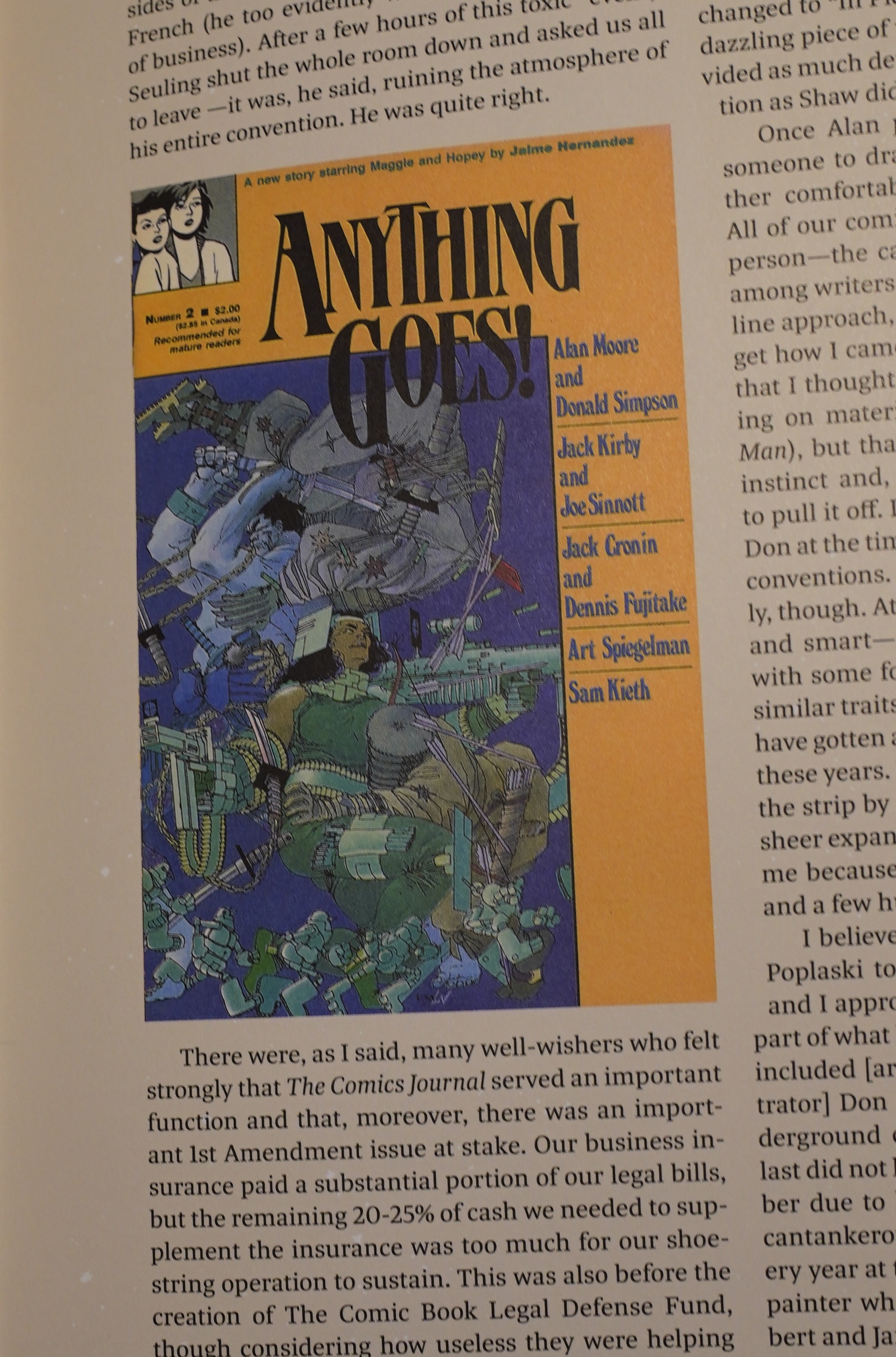
Oh, yeah… Groth sent me an email asking me for hi-res scans of the covers of Anything Goes (since they couldn’t find their copies), so that may be a scan of my copy! I’m so honoured!
Or something.
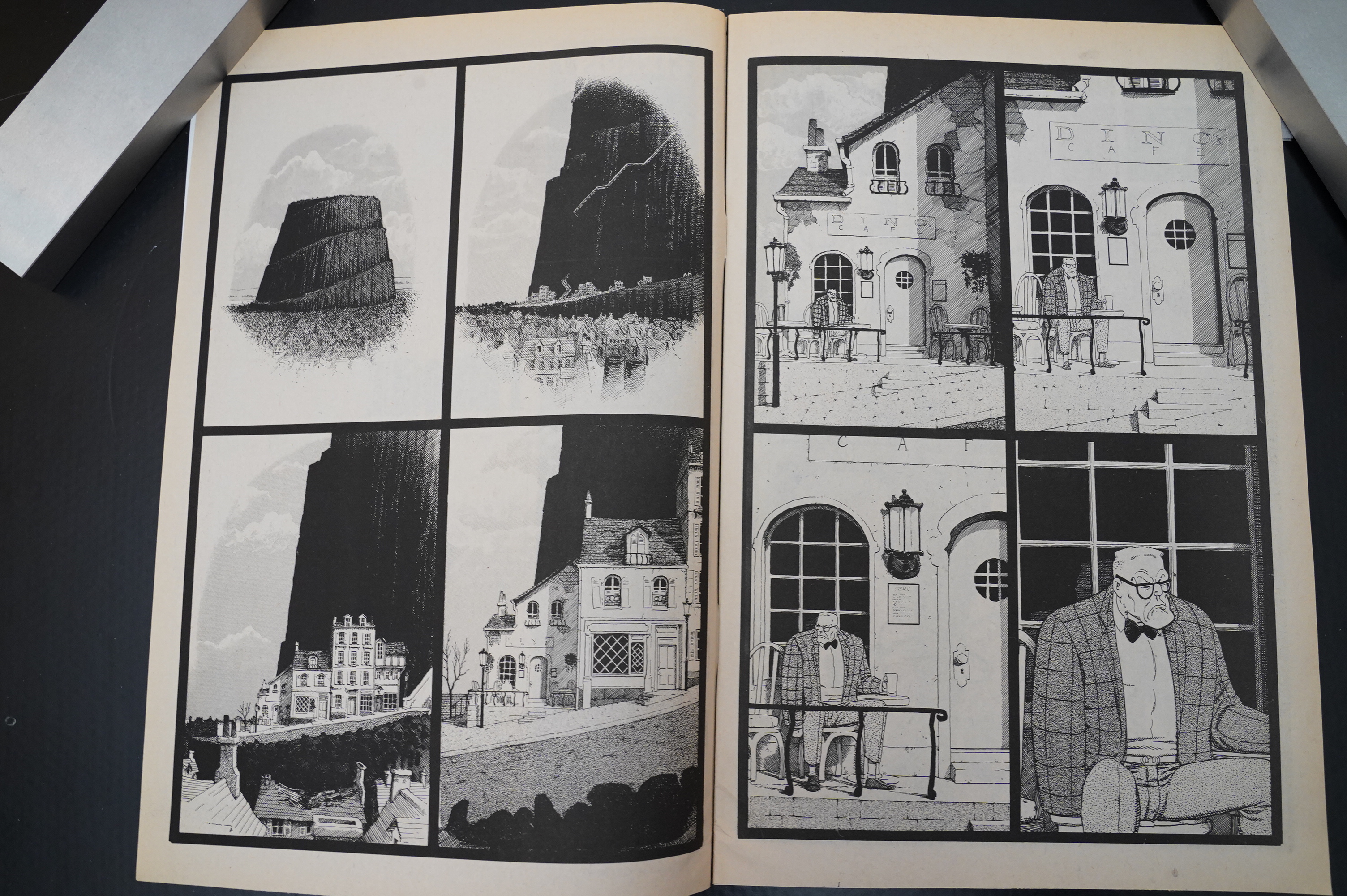
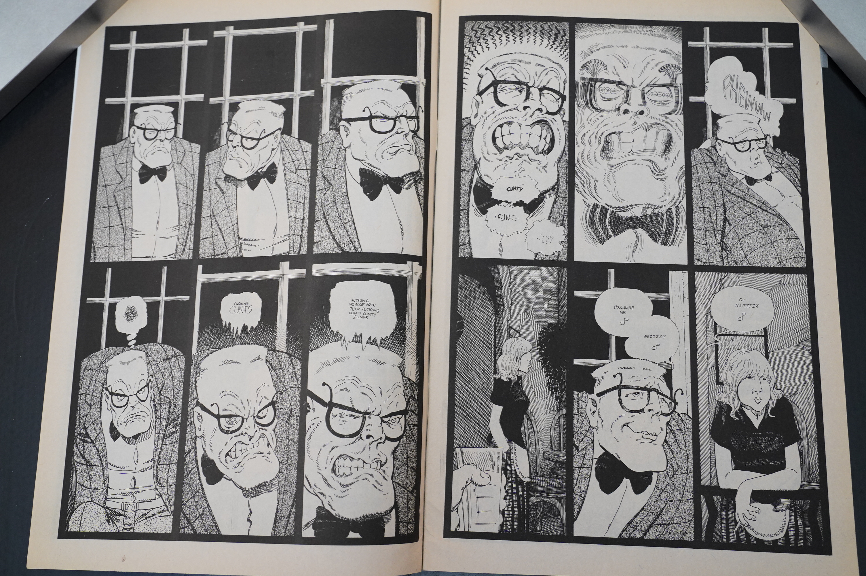
| Scorn: Cafe Mor |  |

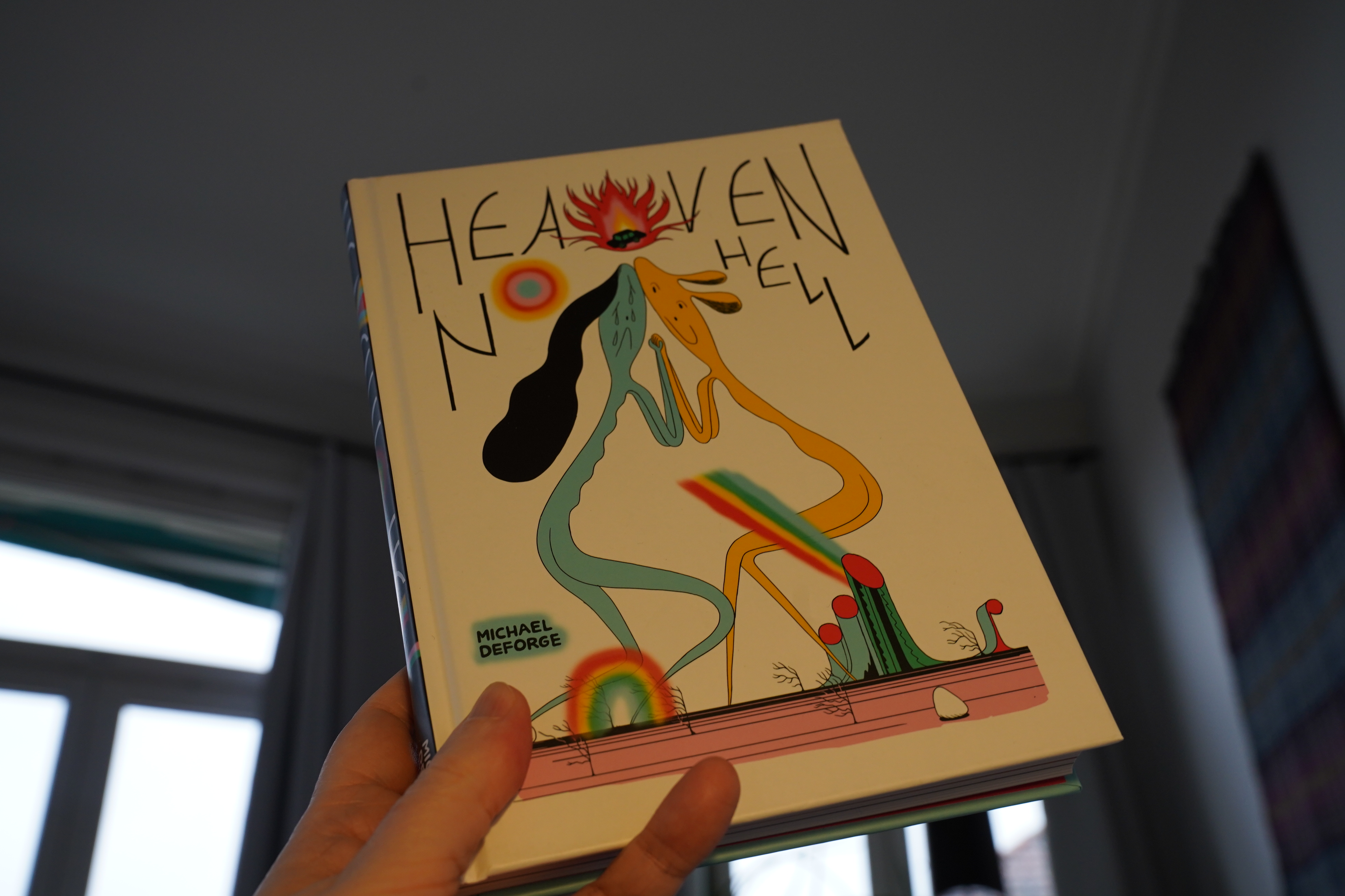
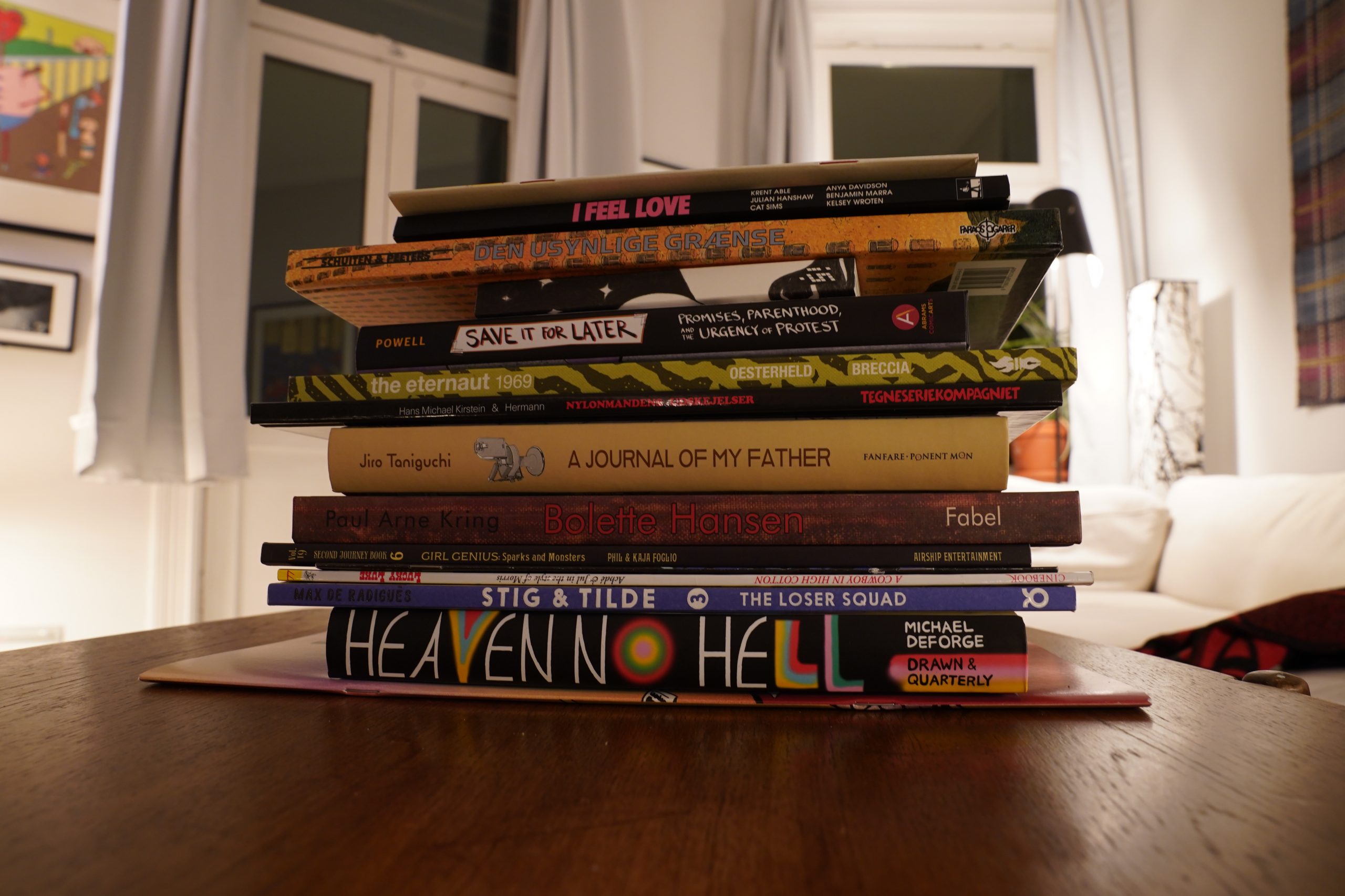
13:09: Heaven No Hell by Michael Deforge (Drawn & Quarterly)
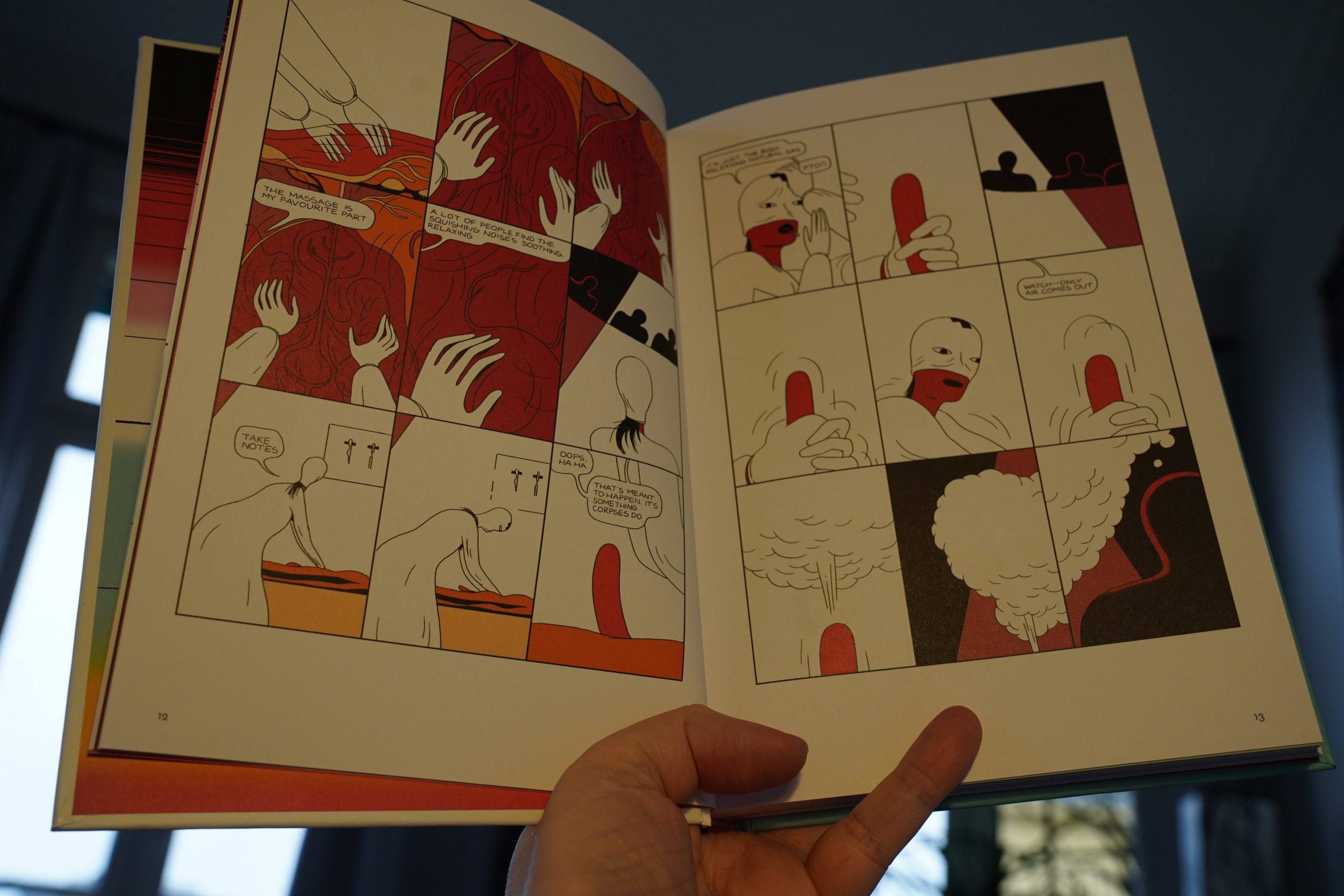
Deforge is, of course, the most influential cartoonist of his generation, and he’s made a bunch of really strong comics. This is a collection of shorter works?
And… er… how do I put this politely… this book sucks? Yeah, that’s the ticket.
These stories feel like doodles he’s making while watching Netflix and while typing his phone with his other hand. So many of the stories read like they’re recaps of longer works that he could be doing, and there’s nothing I loathe more than plot recaps.
And then he adds a “poignant” last page so that you feel bad about hating the story so much. Are these works that were originally published on Instagram or something? Probably went viral.
I do like the variety of art styles, though, but several of these pieces were sheer torture to get through.
And not in a good way, like his older, more depressing work.
| d’Eon: LP |  |
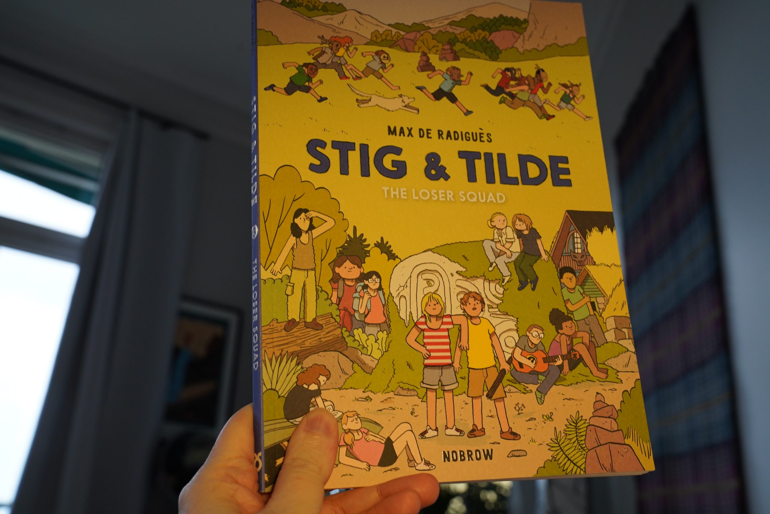
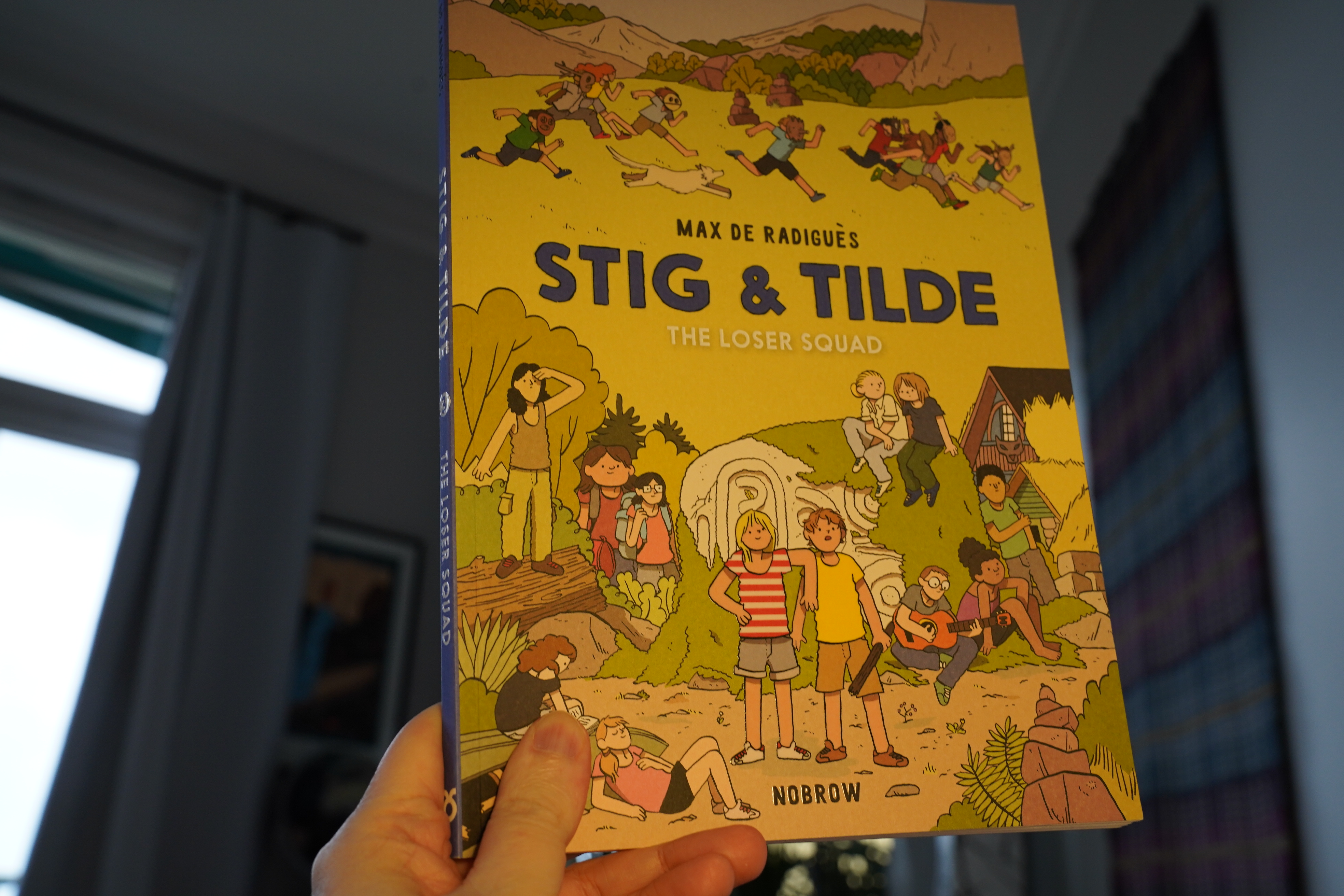
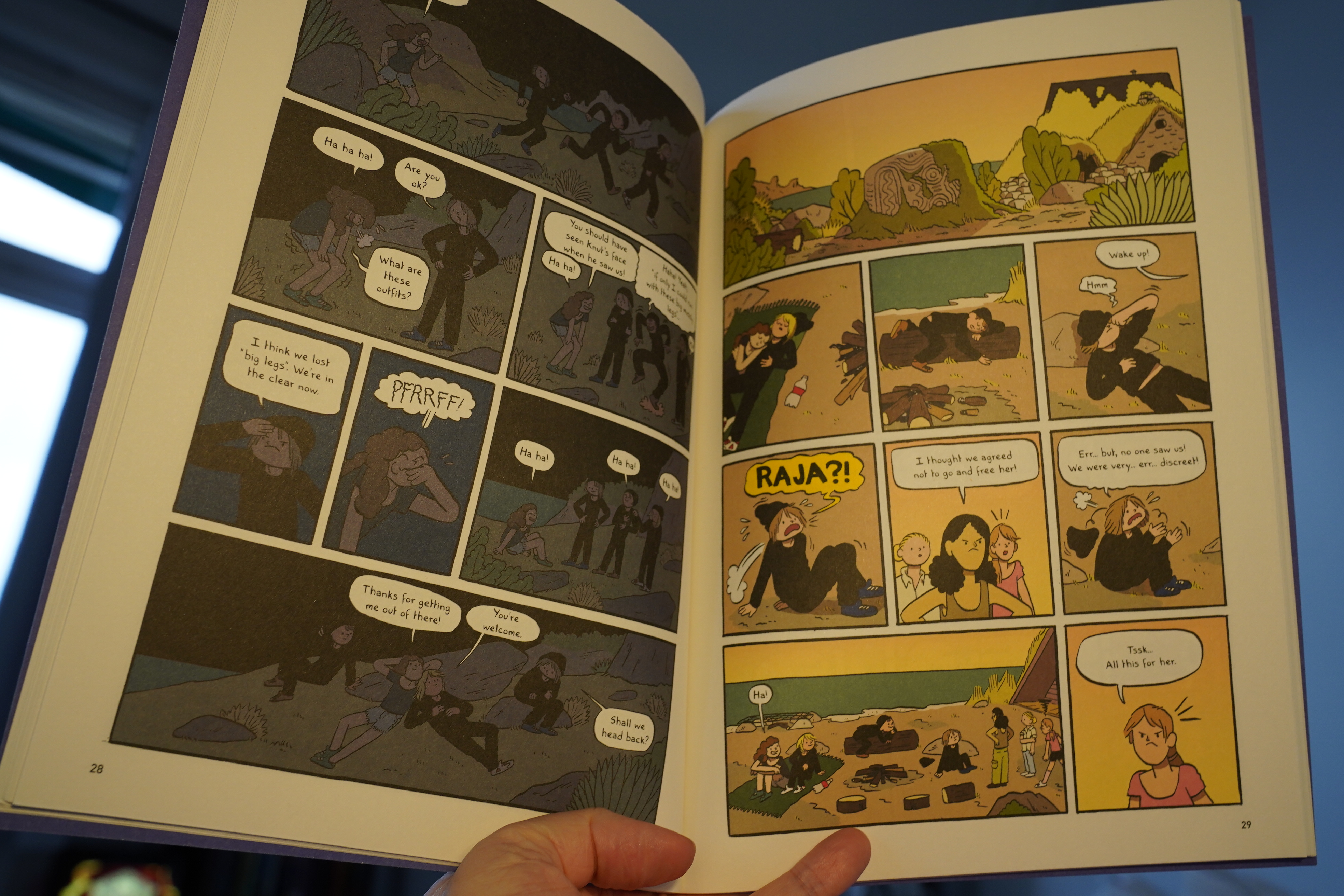
13:58: Stig & Tilde: The Loser Squad by Max de Radiguès (Nobrow)
The printing on this is kinda… odd? I mean, the paper is of the very absorbent, non-shiny kind — but more than usual, so it looks like it swallowed all the ink, and everything is so washed out…

And the story is kinda swallowed up by the subtext (i.e., “Lord of the Flies-ish fascist rule sucks!”)… but it’s pretty entertaining nevertheless.
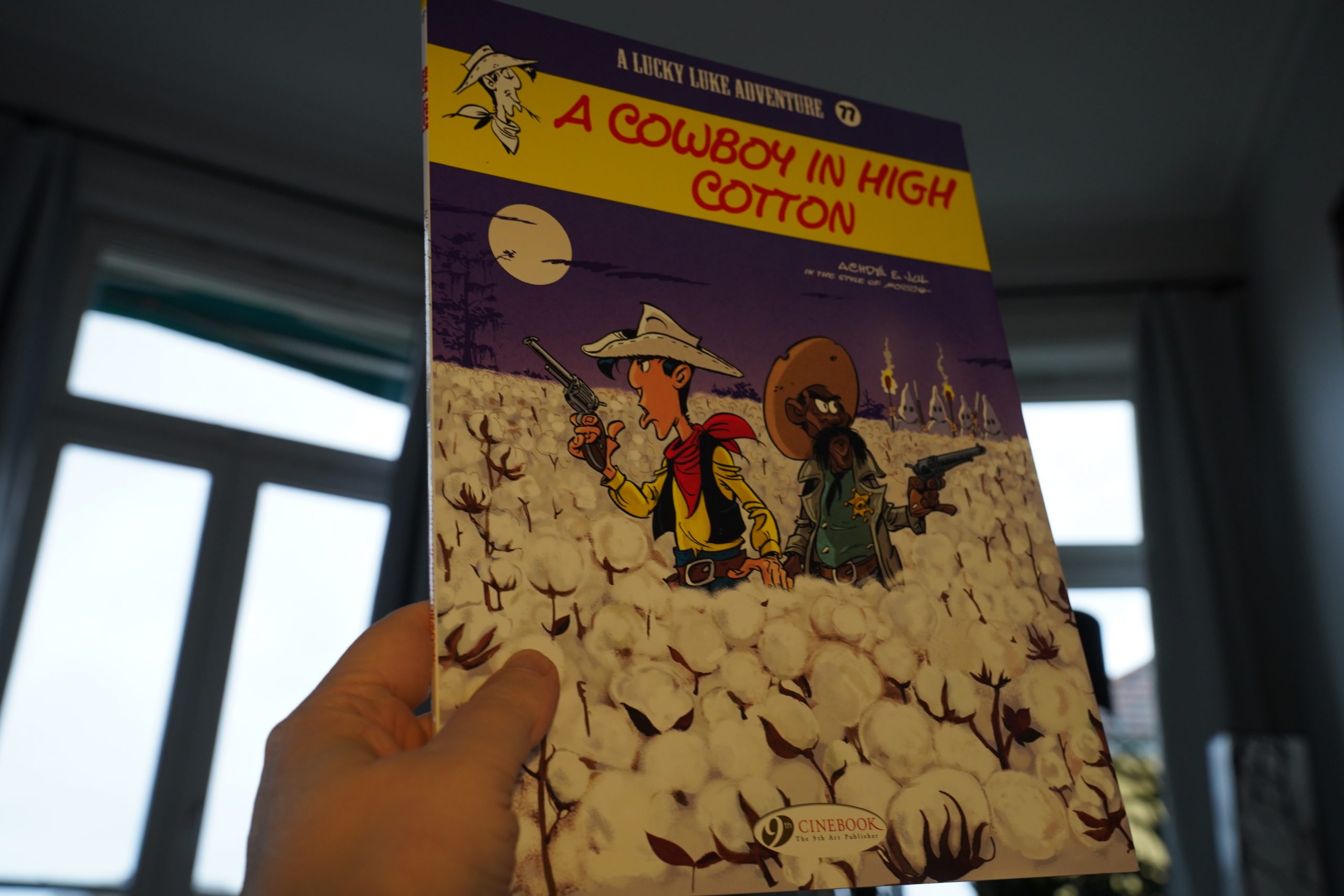
14:14: Lucky Luke: Un cow-boy dans le coton by Achdé & Jul (Cinebook)
Oh, yeah, I’d forgotten that I’d started buying these new-style Lucky Luke things (Cinebook edition)…
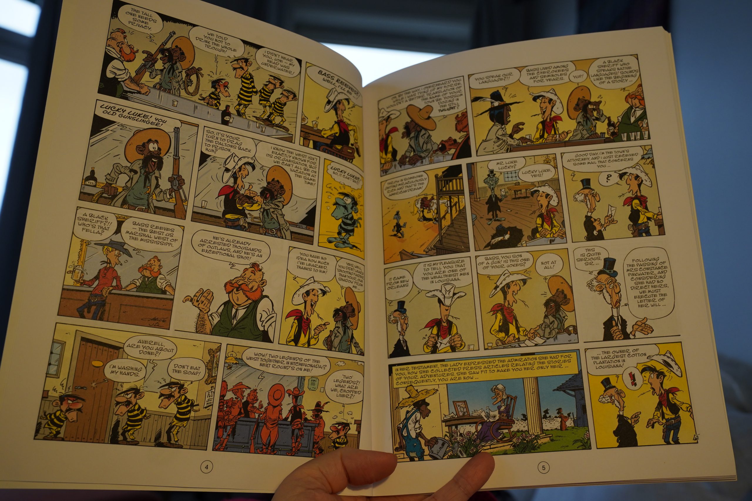
This is classic Lucky Luke — the artwork’s pitch perfect mid-era Morris, and it’s a dense, rollicking adventure. And as we often did in the olden days, we get a historical figure as the guest star, and this time it’s Bass Reeves.
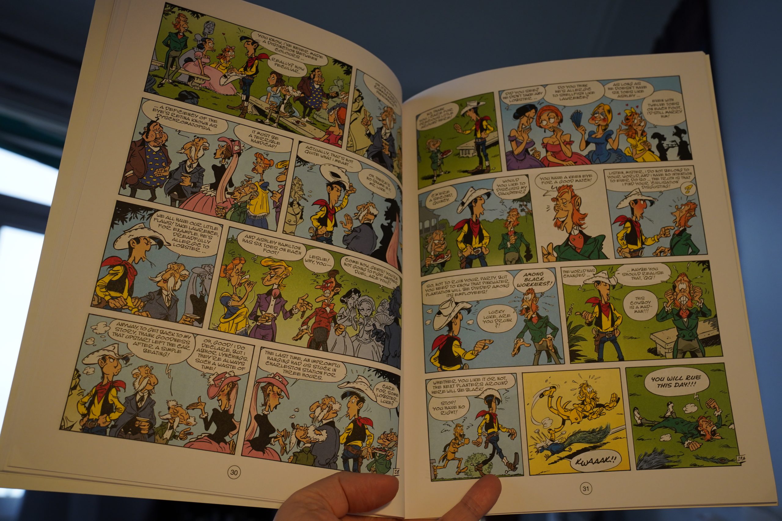
The story is about Luke inheriting a plantation in Louisiana (after the Civil War), and the villains are, well, all the white, racist people there. But don’t worry, it has a happy ending: All these Southern white people are killed.
OOPS SPOILERS.
| Satomimagae: awa |  |
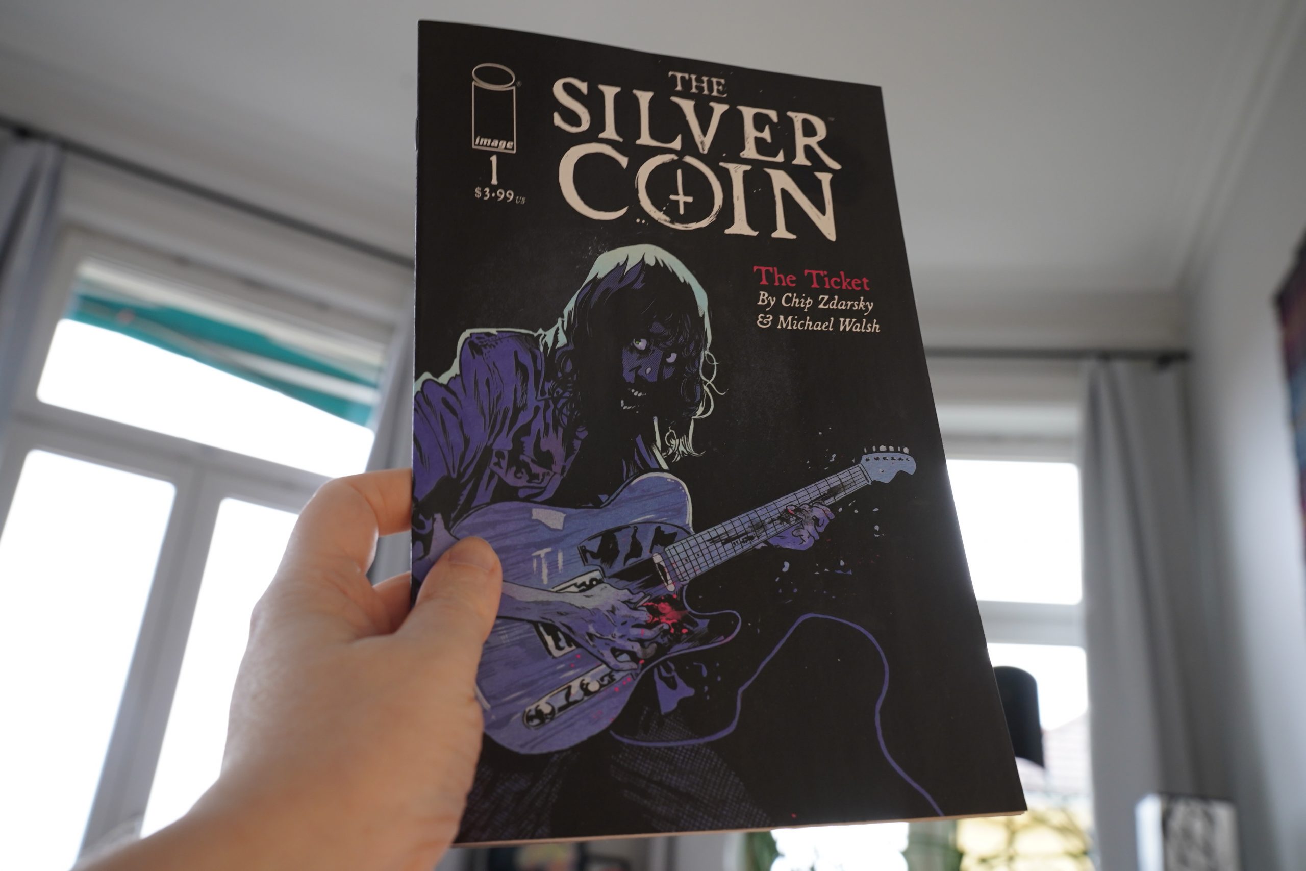
14:41: The Silver Coin by Chip Zdarsky & Michael Walsh (Image)
I’ve been picking up these series by Zdarsky because I really liked that first series he did for Marvel… whatever that was; I’ve forgotten.
But I haven’t really been that impressed with his stuff lately? If this sucks, too, I’m gonna stop buying these series.
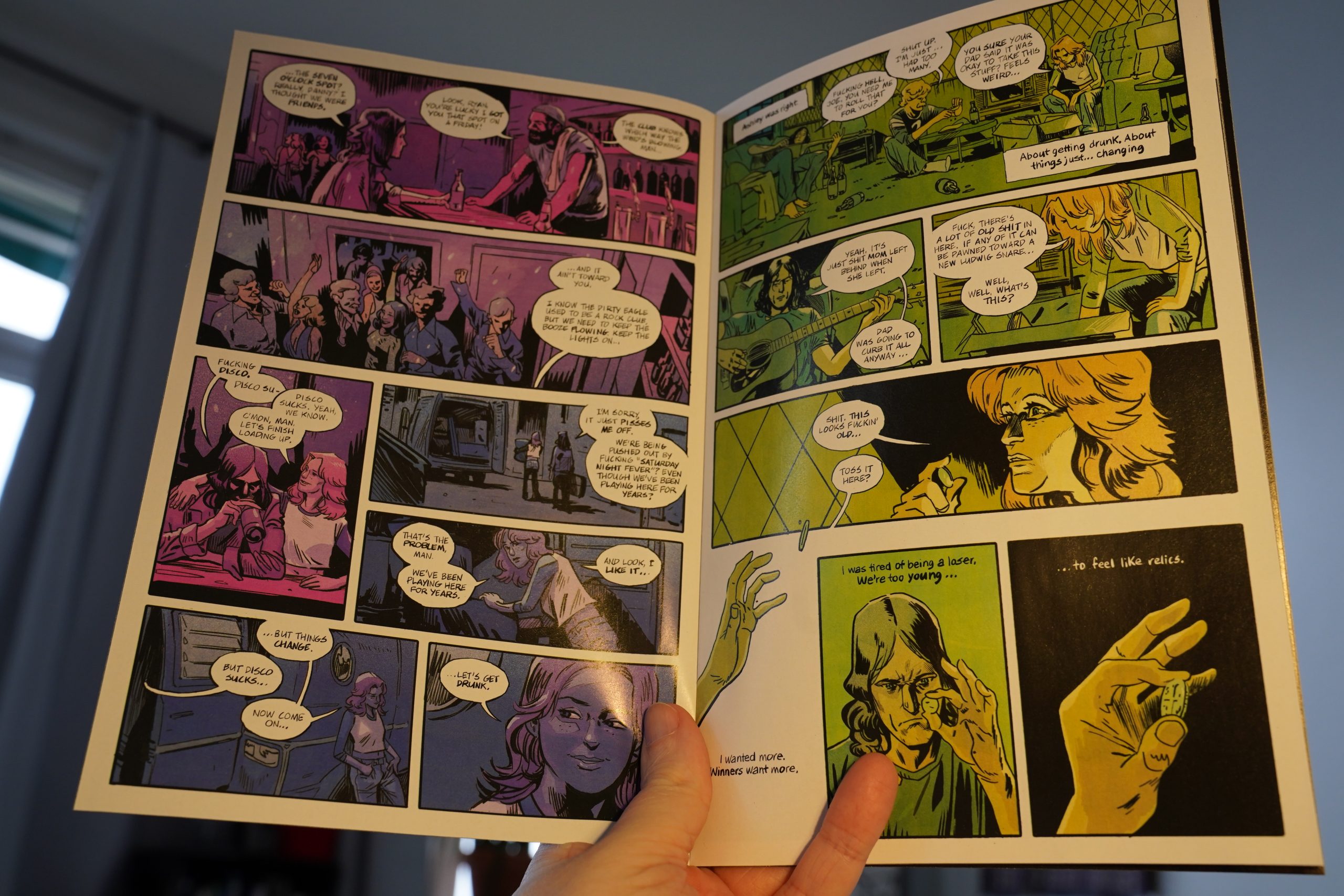
So this one is about a cursed coin that makes a sucky rock band (in the fabulous disco era) suck less.
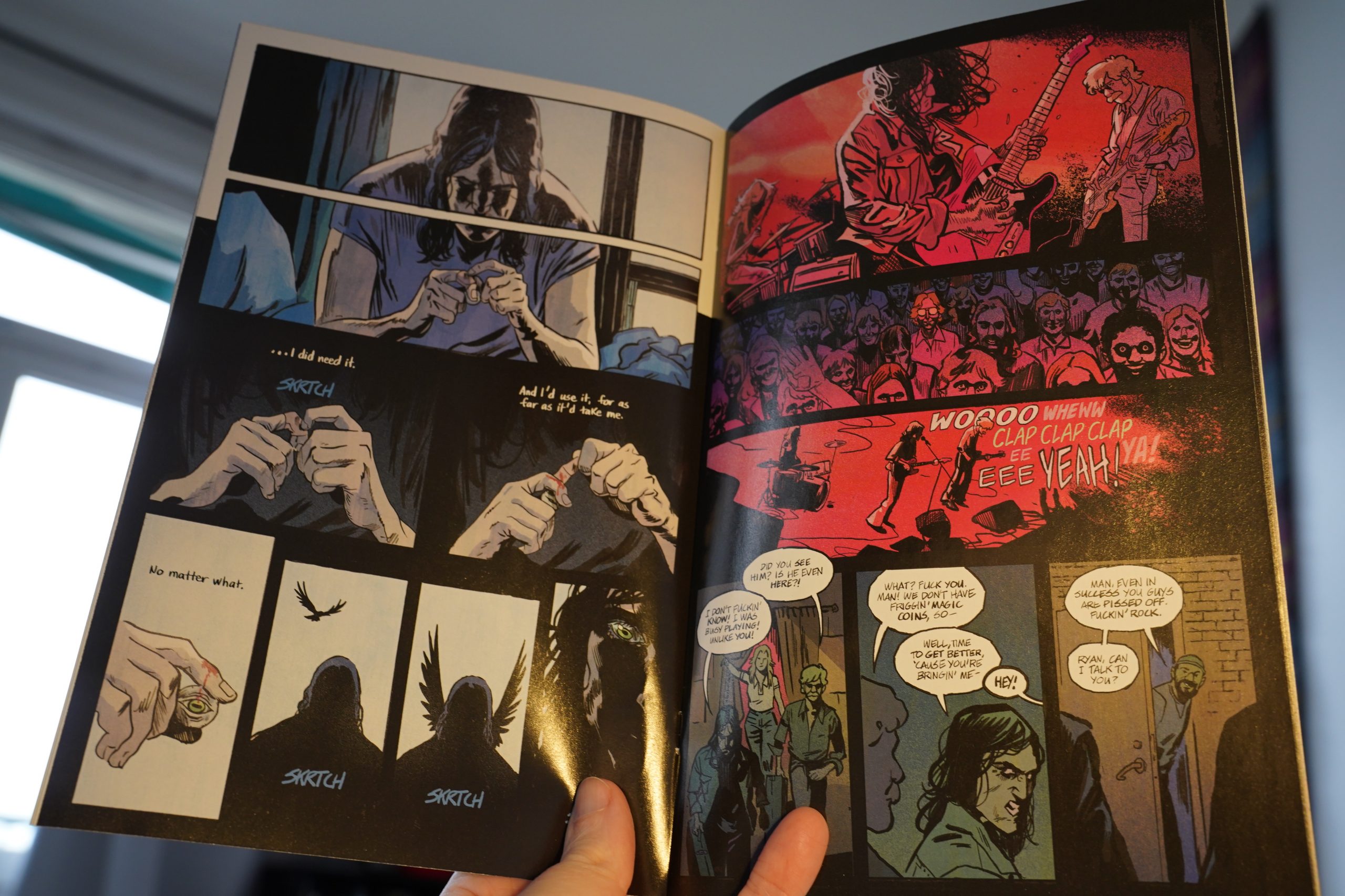
It turns out that it’s a Red Shoes situation! Whodathunk!
OK, it didn’t suck, really, but I think that’s the end of my Zdarsky thing.
| Mochipet: Girls Love Breakcore |  |
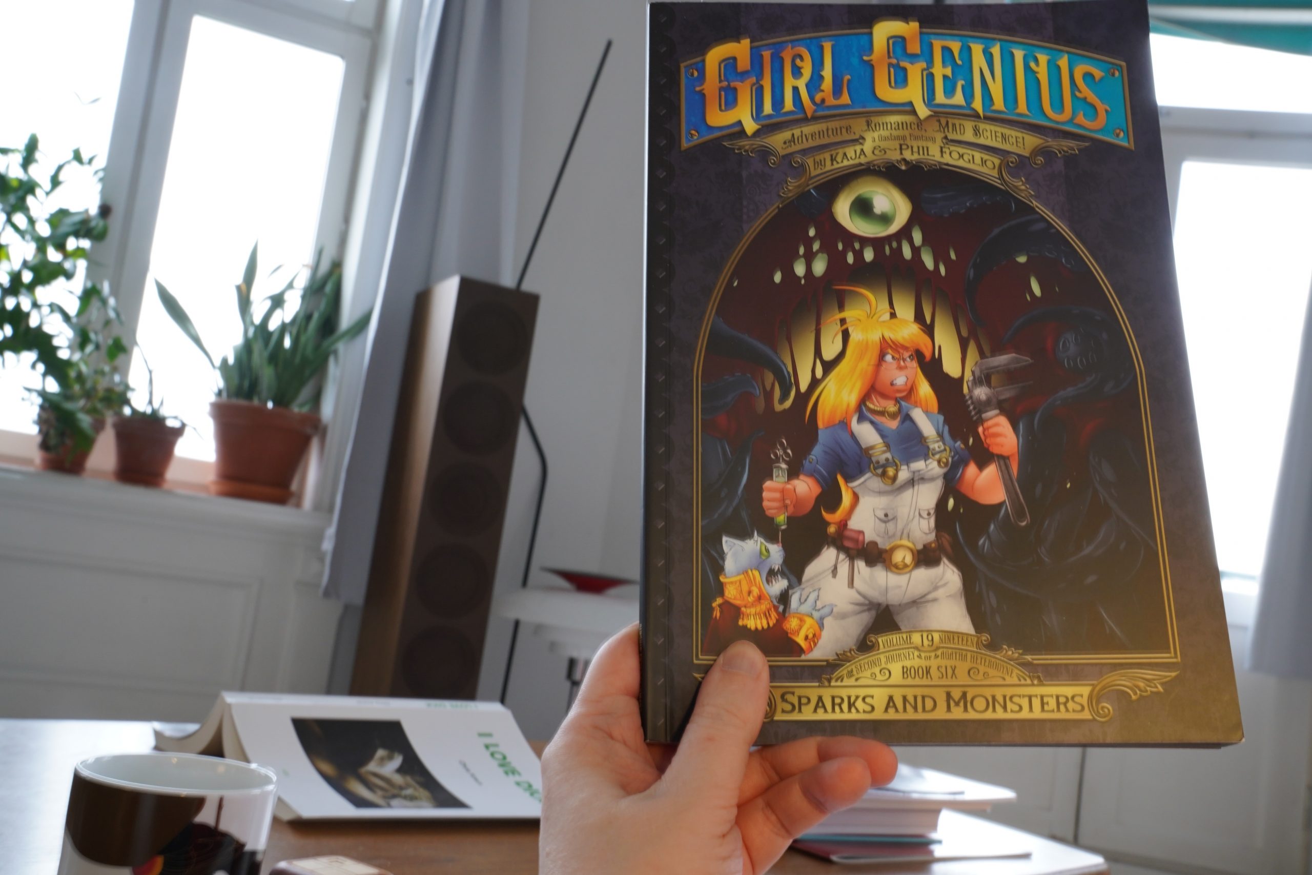
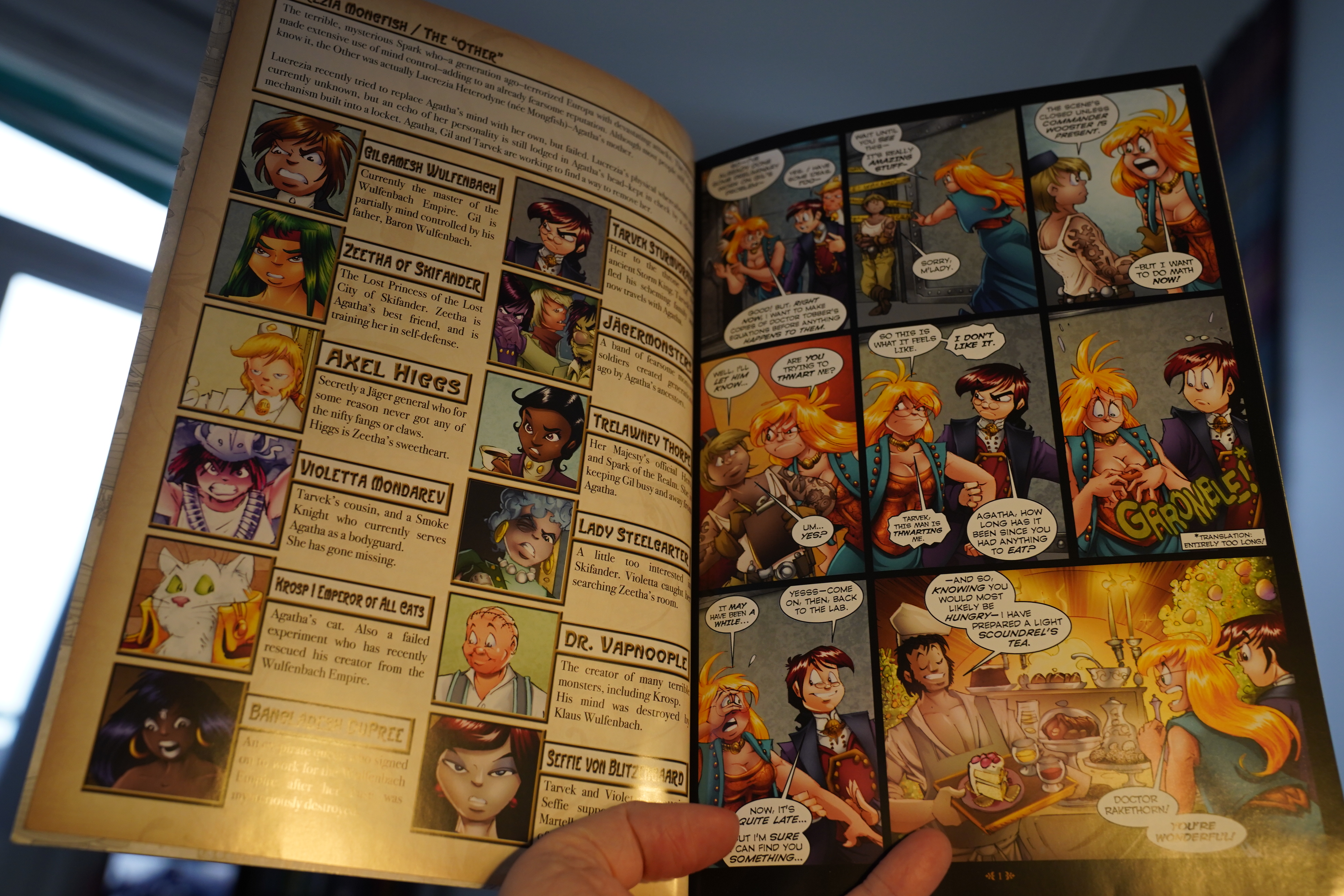
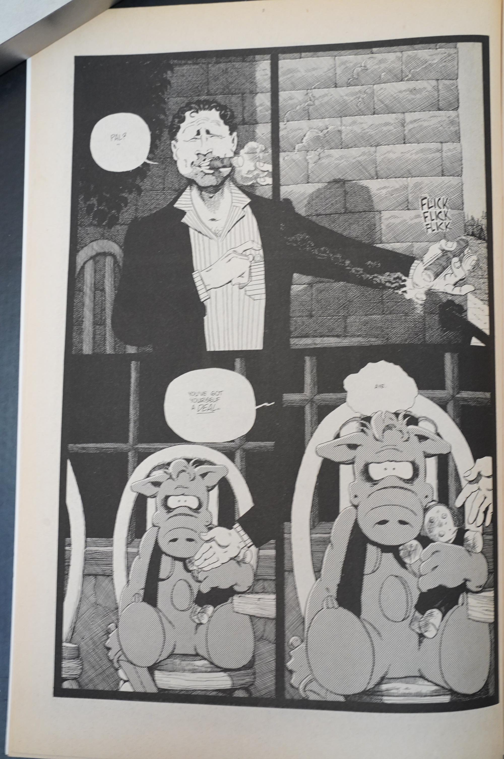
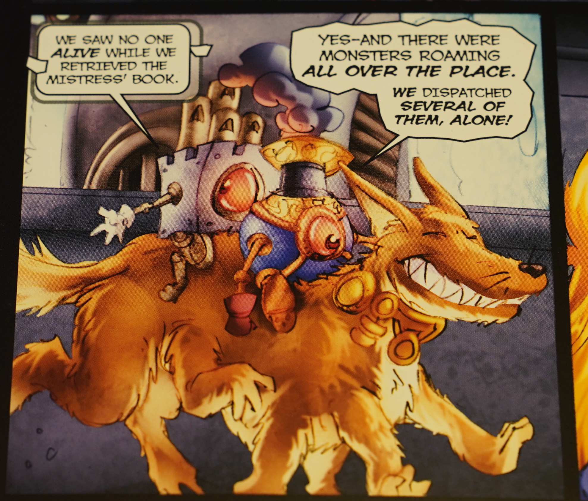
14:52: Girl Genius Volume 19: Sparks and Monsters by Kaja and Phil Foglio (Airship)
Ah! Girl Genius! How long have I been reading this thing? It feels like decades… Oh, only since 2001. That’s practically yesterday.

This thing has so many characters it makes your head swoon. Well, my head. And I’ve never re-read Girl Genius — ever — so it’s always a bit vague to me what’s going on…
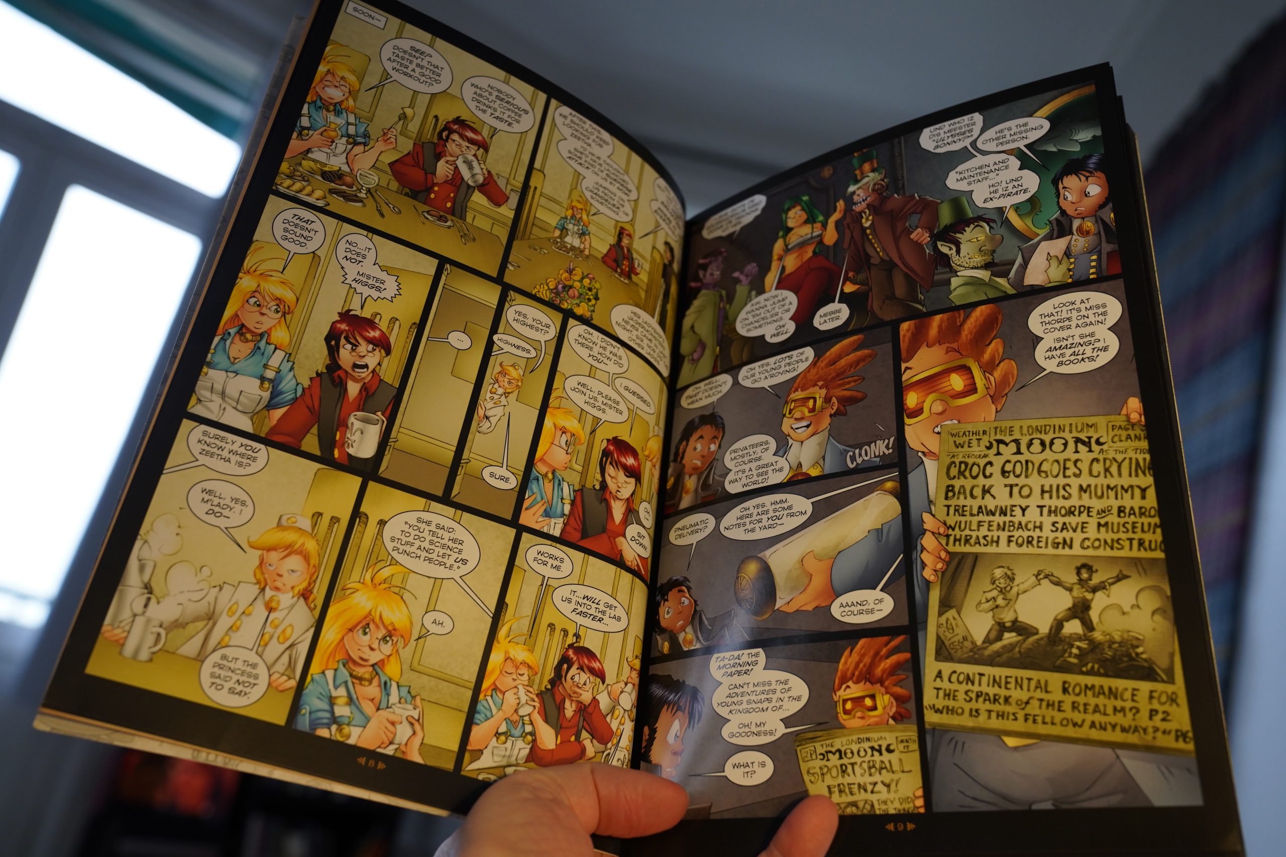
But that’s a strength this series has — it’s all witty repartee and chaos, so it doesn’t really matter that much if you can’t remember which character is plotting what. I mean, it does matter, but even if you can’t remember, it’s still a really fun, engrossing read.
Foglio’s artwork has gone more computerey now than it used to be? It’s still very attractive, but it’s got a glossiness to it now that’s … not as appealing as it used to be?
On the other hand, there’s panels like this. You can’t argue with panels like this.
| Mochipet: Girls Love Breakcore |  |

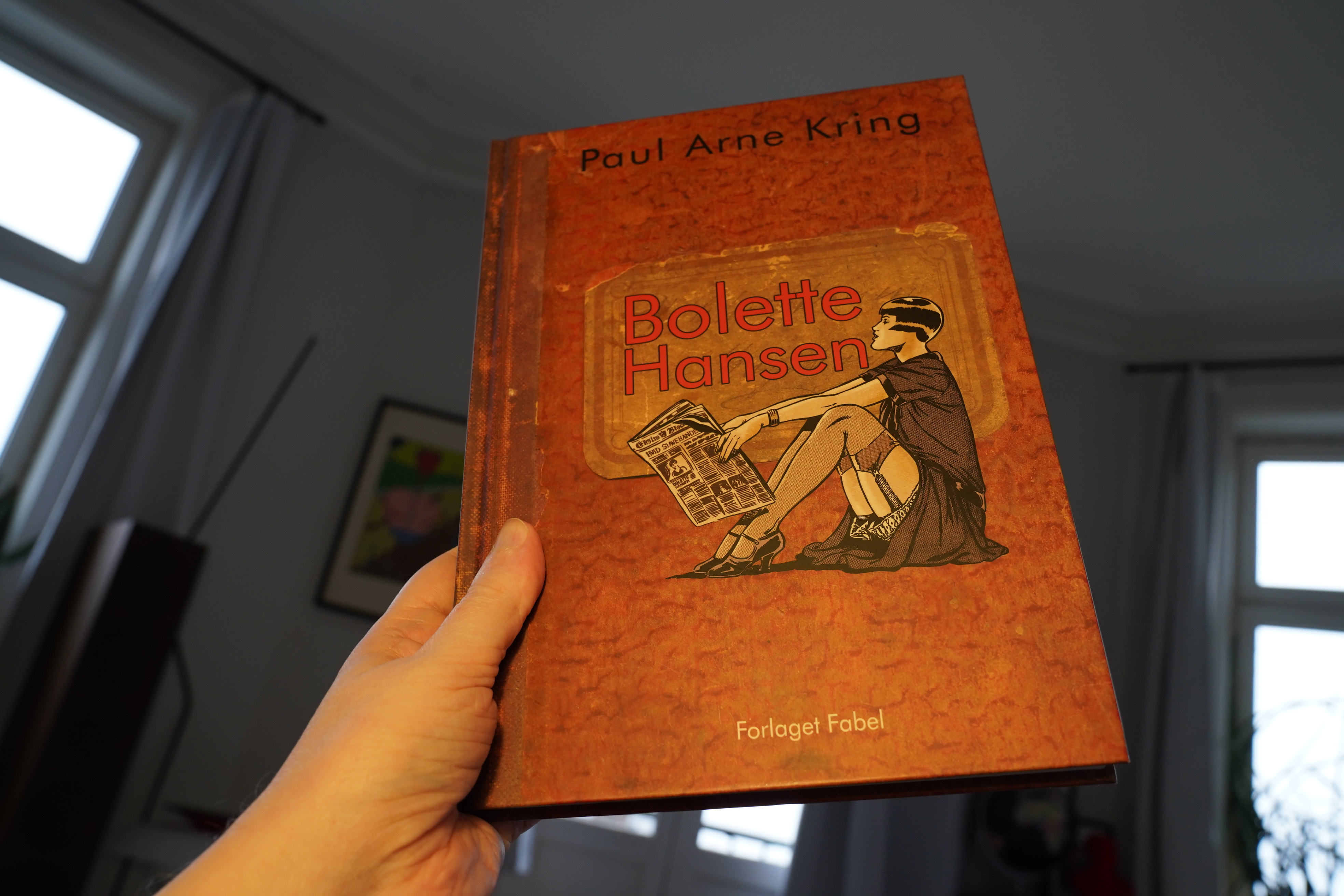
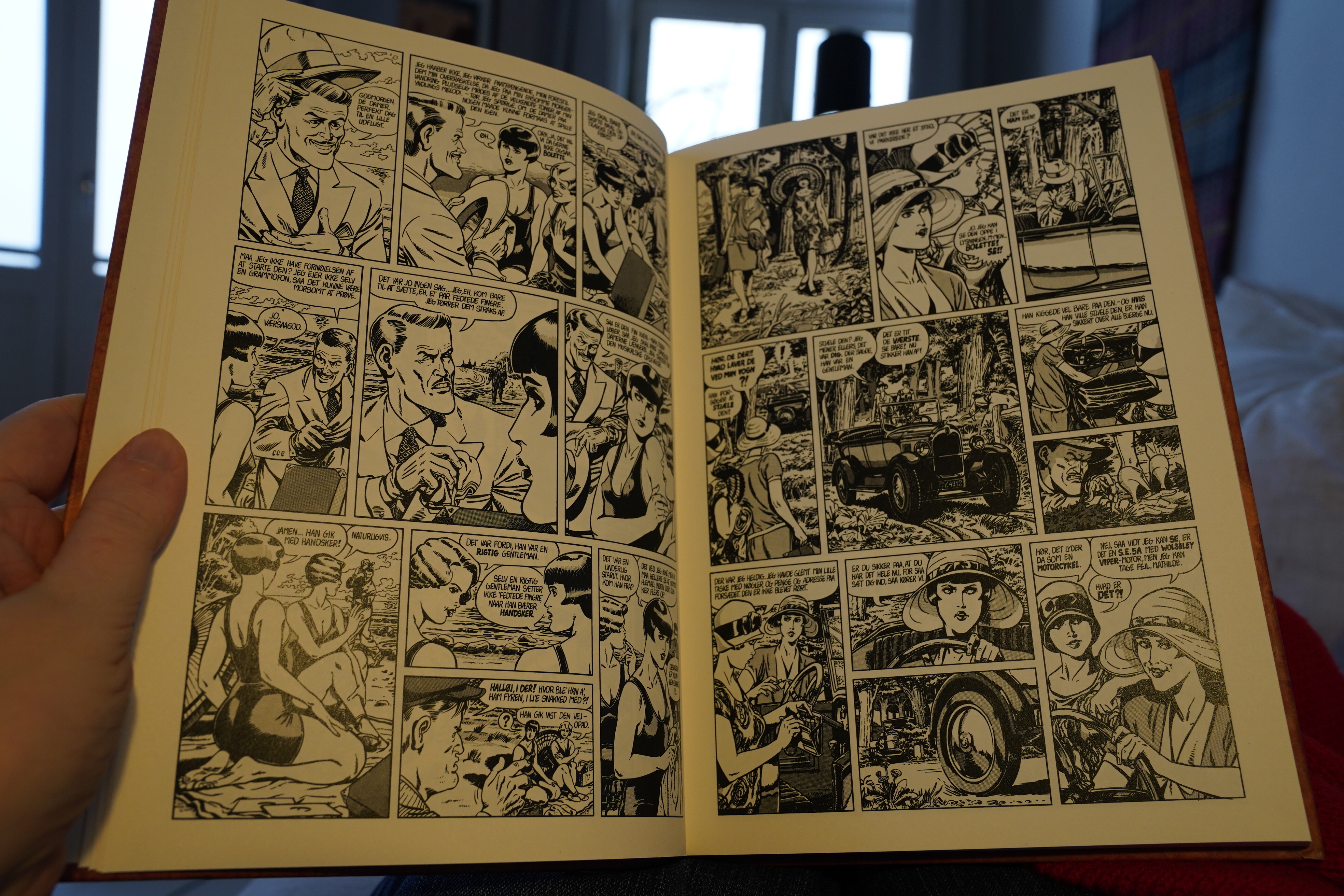
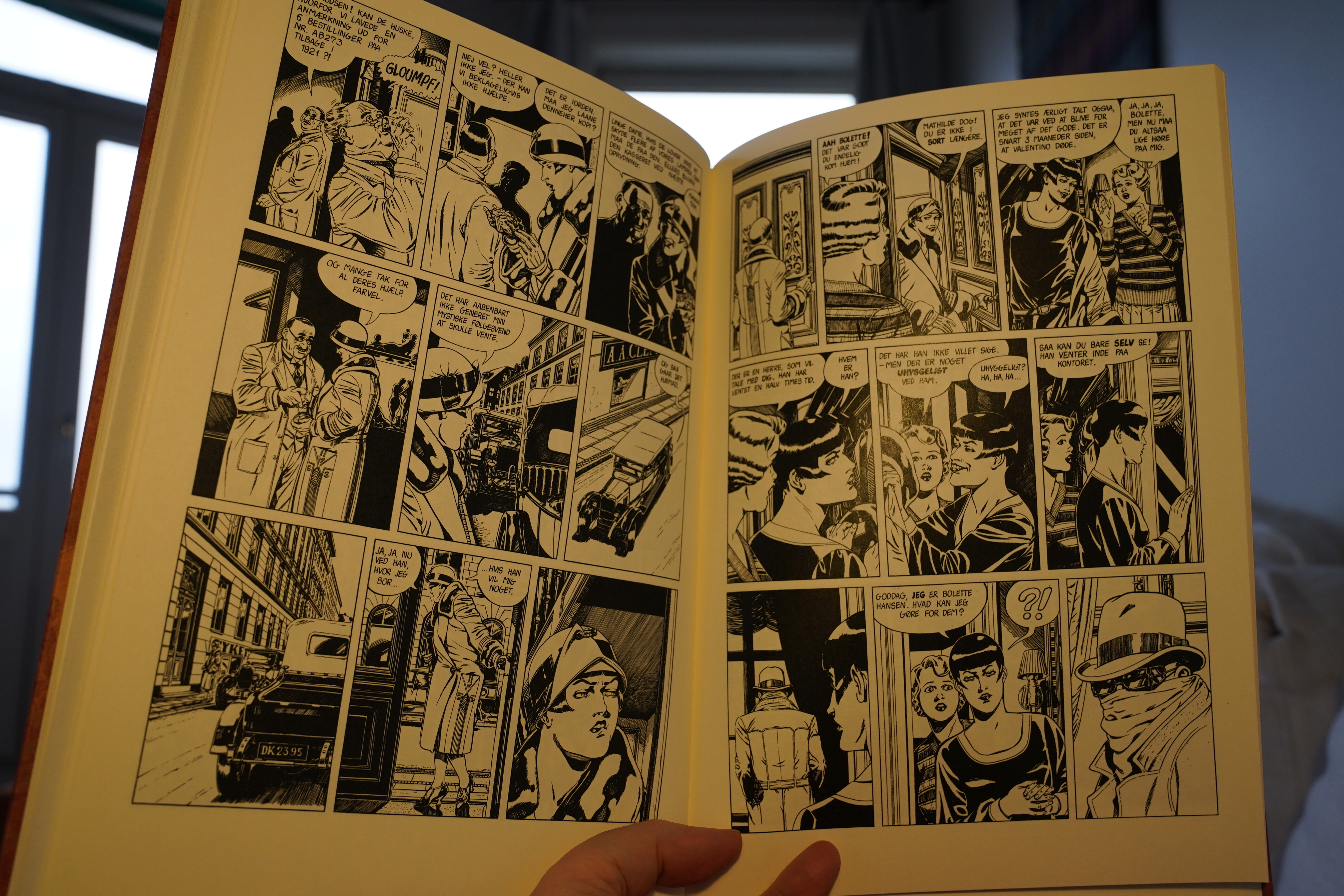
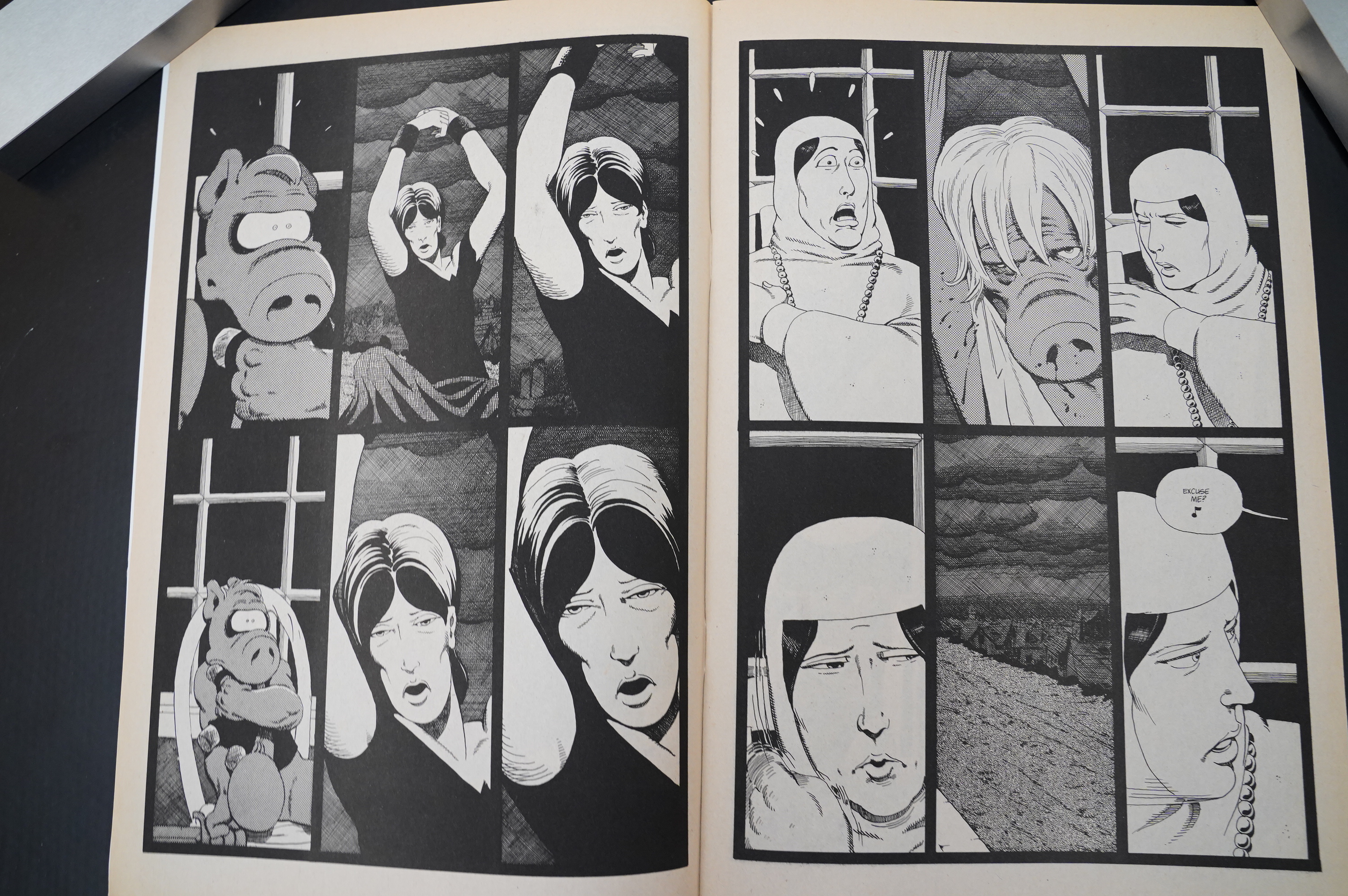
16:26: Bolette Hansen by Paul Arne Kring (Fabel)

This is a Danish comic from the mid-to-late 80s, which was mostly serialised in some newspaper supplement, and had remained uncollected until now. Not being Danish myself, I’ve never heard of this thing, and it certainly looks striking: The inking is incredibly detailed and accomplished… but the faces look all kinds of odd: The chins grown and shrink between panels, and… as Kring points out in the introduction, he’d forgotten to draw ears on the Louise Brooksalike main character.
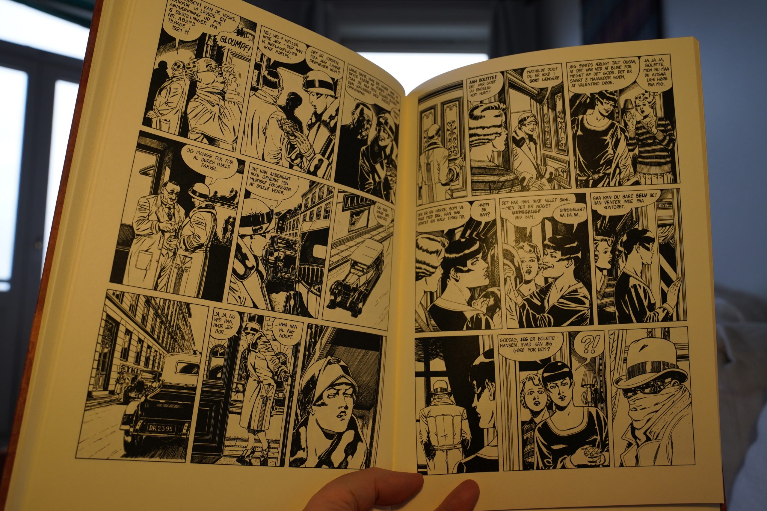
Three stories are collected here, and I ditched the first one after a dozen pages, because it wasn’t really very interesting. I skipped to the third story, and it’s not bad, really: The artwork’s kinda fascinating: The exteriors and interiors are kinda gorgeous? The characters are still pretty odd, but better than before.
And it’s a pretty amusing story. But…
| Boris: Kanau Re-master + Live |  |
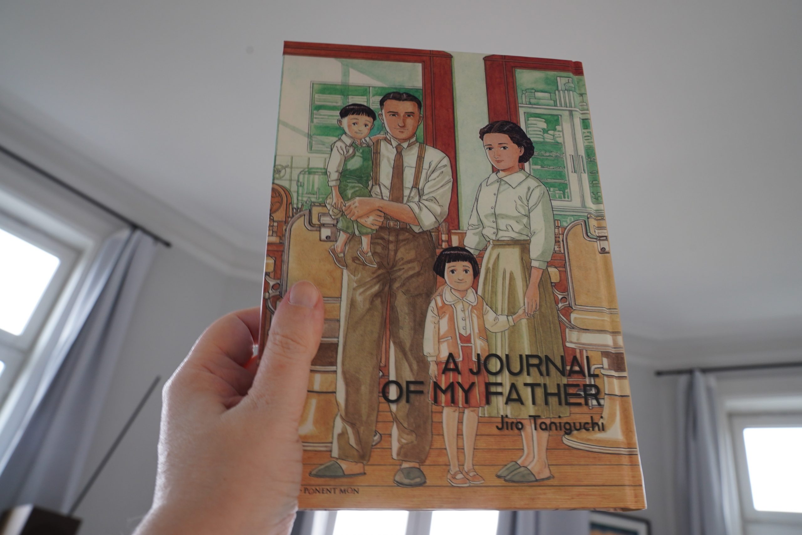
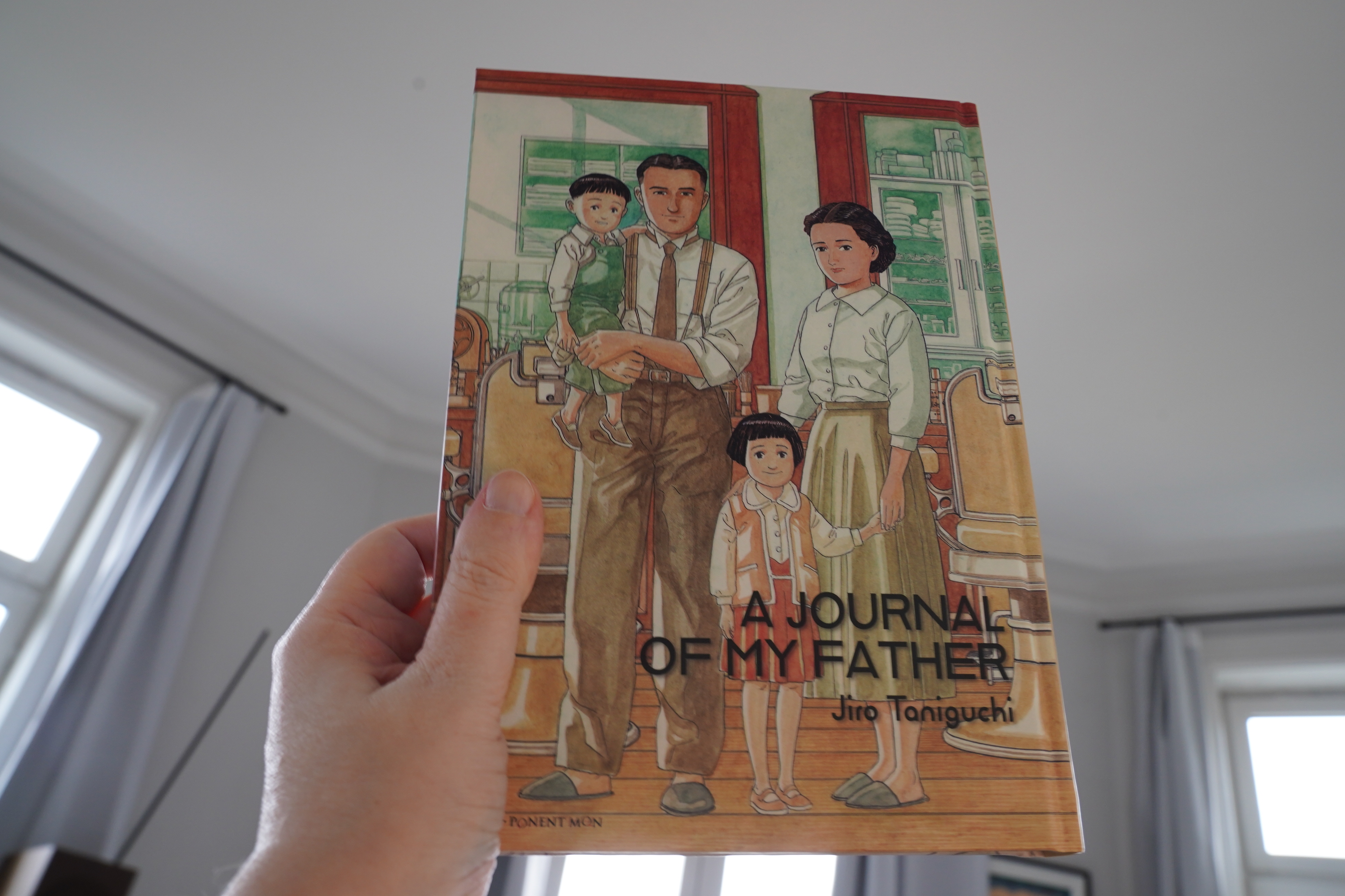
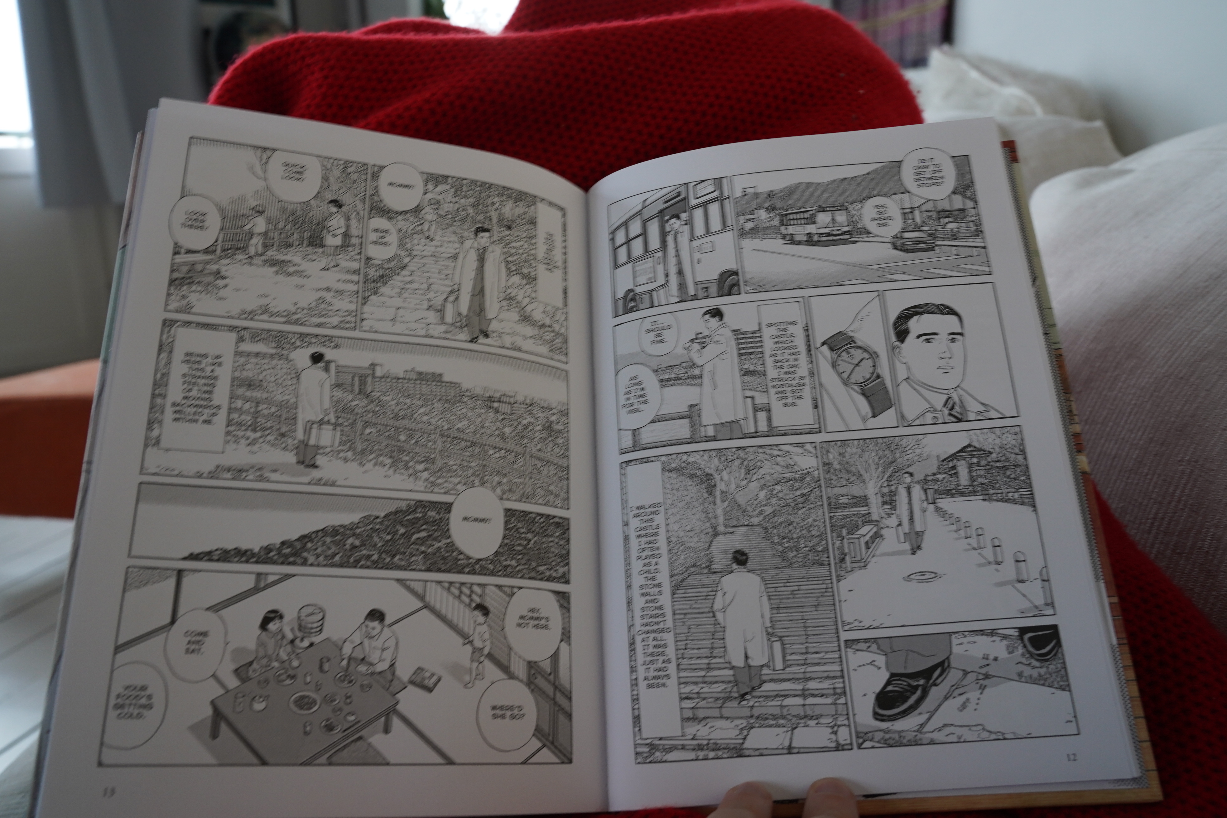
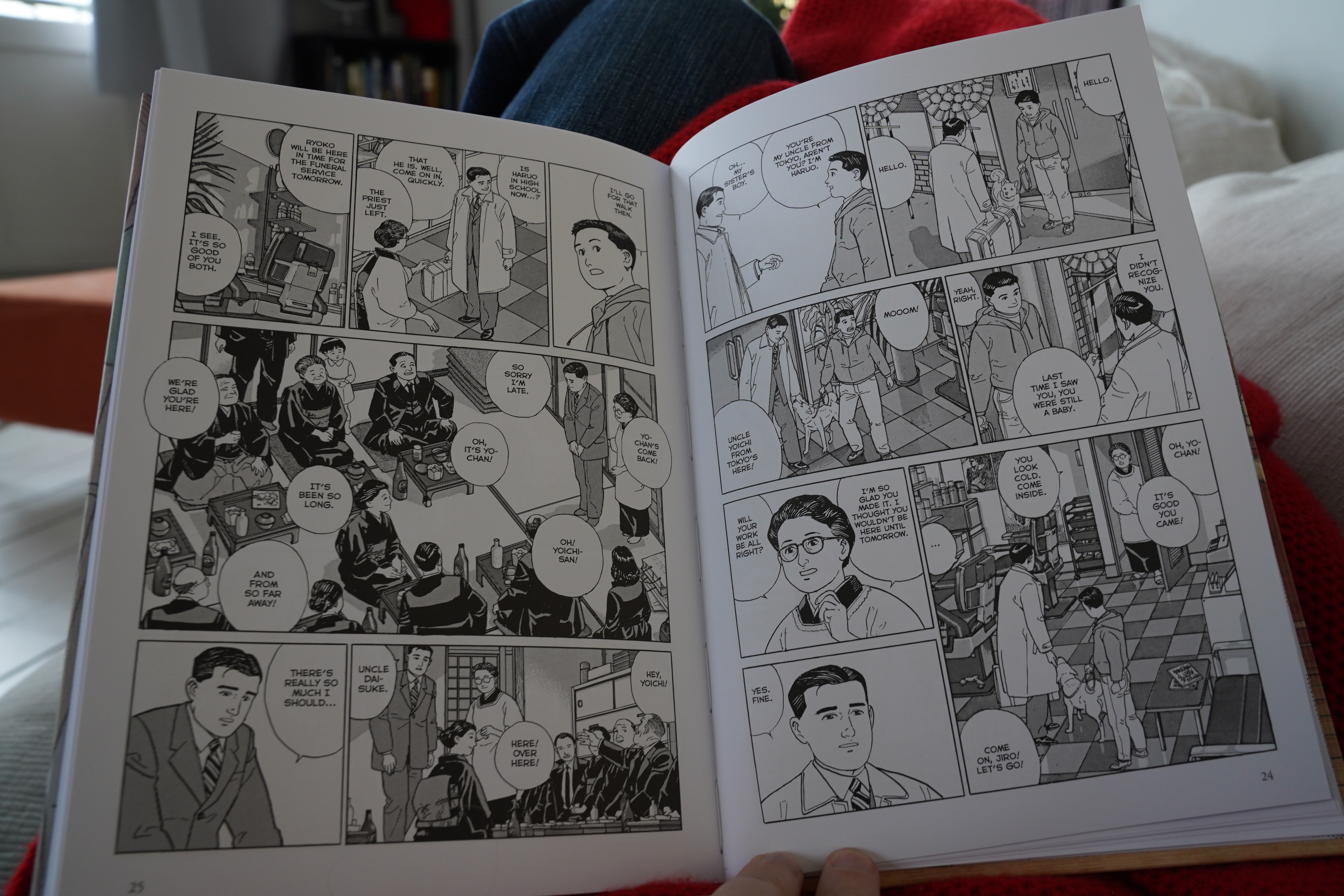
17:11: A Journal of My Father by Jiro Taniguchi (Ponent Mon)

I really like Taniguchi’s comics. He’s got his own thing going — there’s a stillness, a calmness that’s incredibly appealing.
It’s a bit disturbing that the main character of so many of his comics look the same, though. It’s that not-very-expressive male one up there. But I guess that goes with the semi-autobiographical feeling these comics have.

Heh heh. The dog is named Jiro.
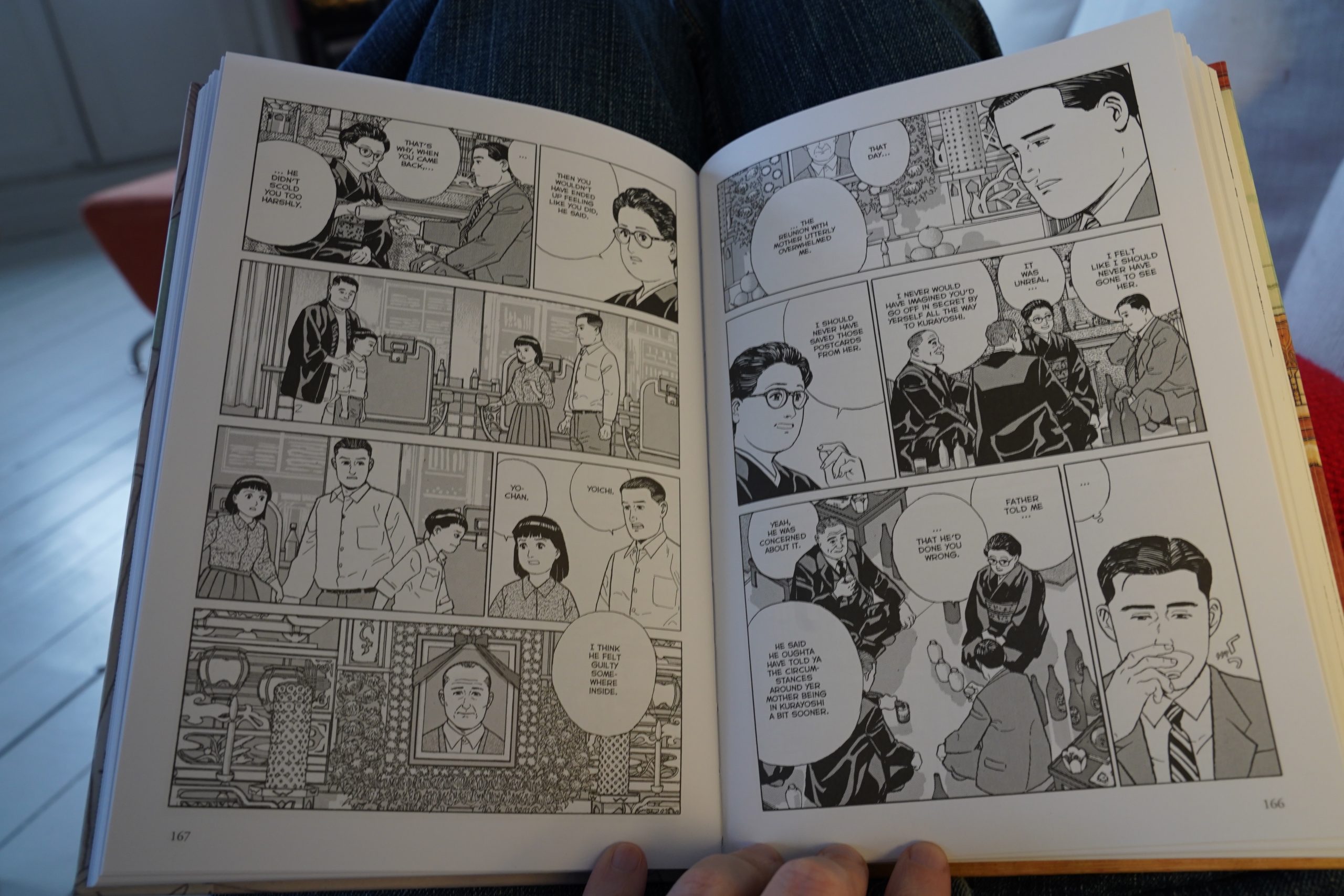
Anyway, this is about a man returning home for the funeral of his father, and it’s set at the wake where the guy learns a lot about his parents, and remembers his childhood.
I rate this comic two hankies.
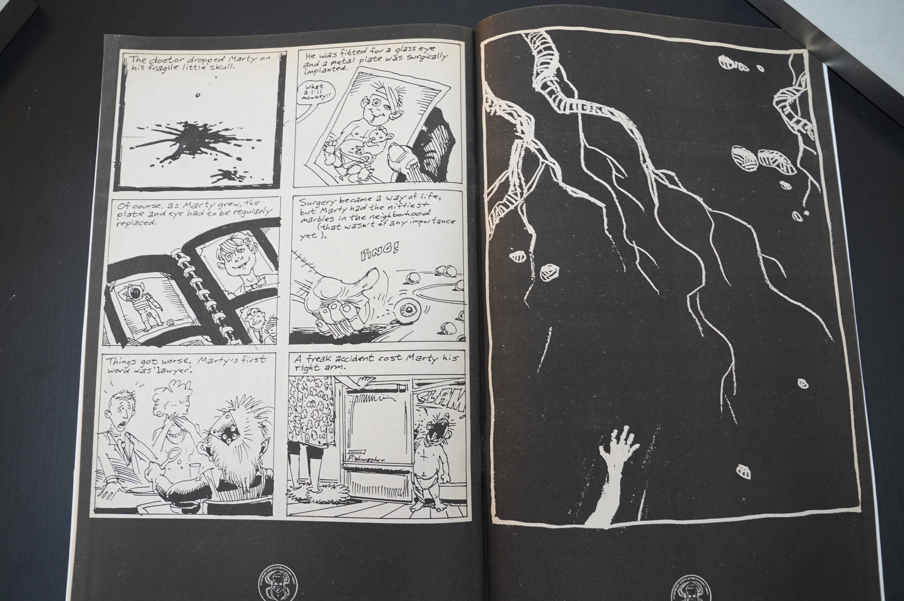
| Crash Course In Science: Situational Awareness |  |
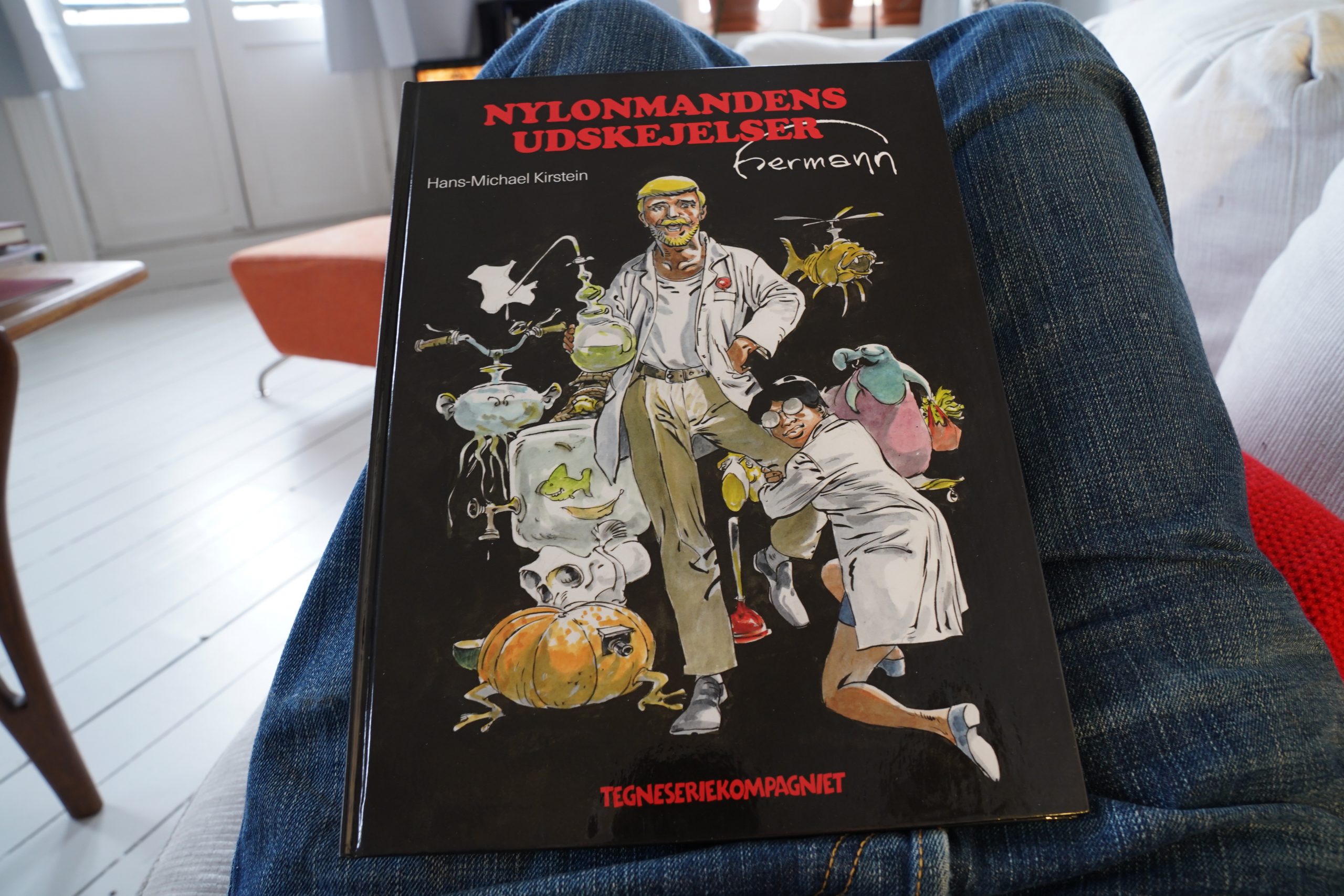
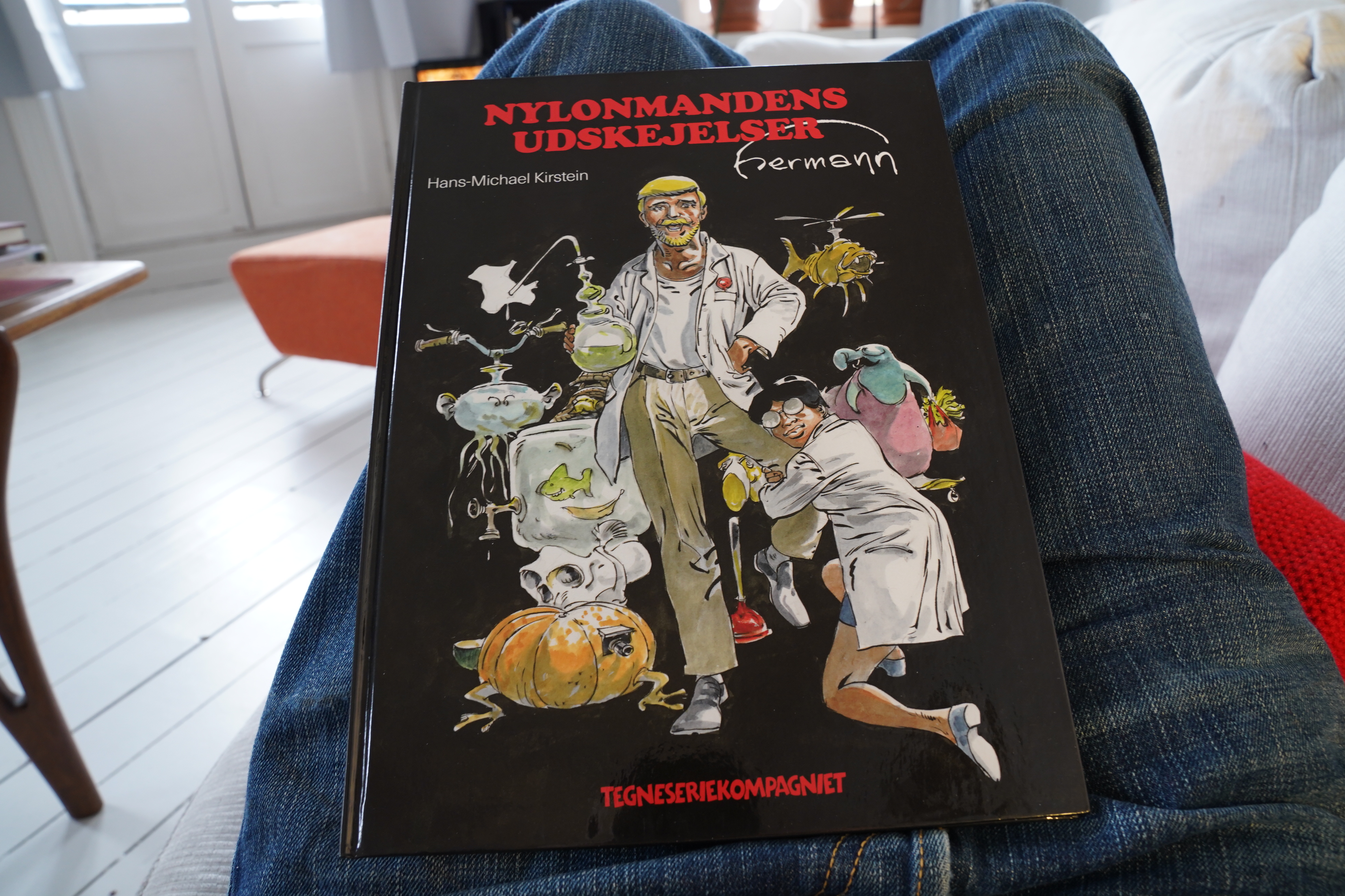
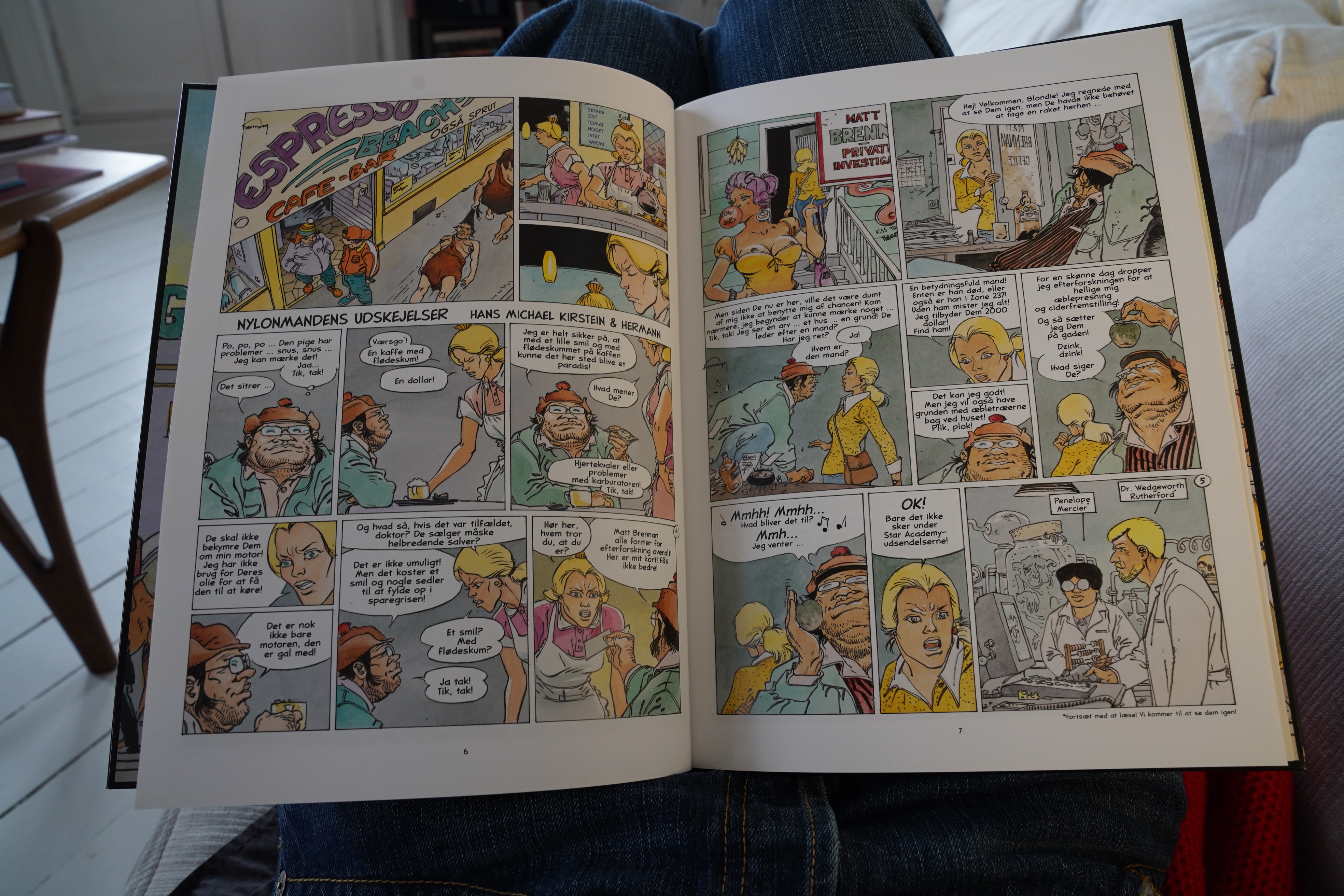
18:57: La vie exagérée de l’Homme Nylon by Hans-Michael Kirstein & Hermann (Tegneseriekompagniet)
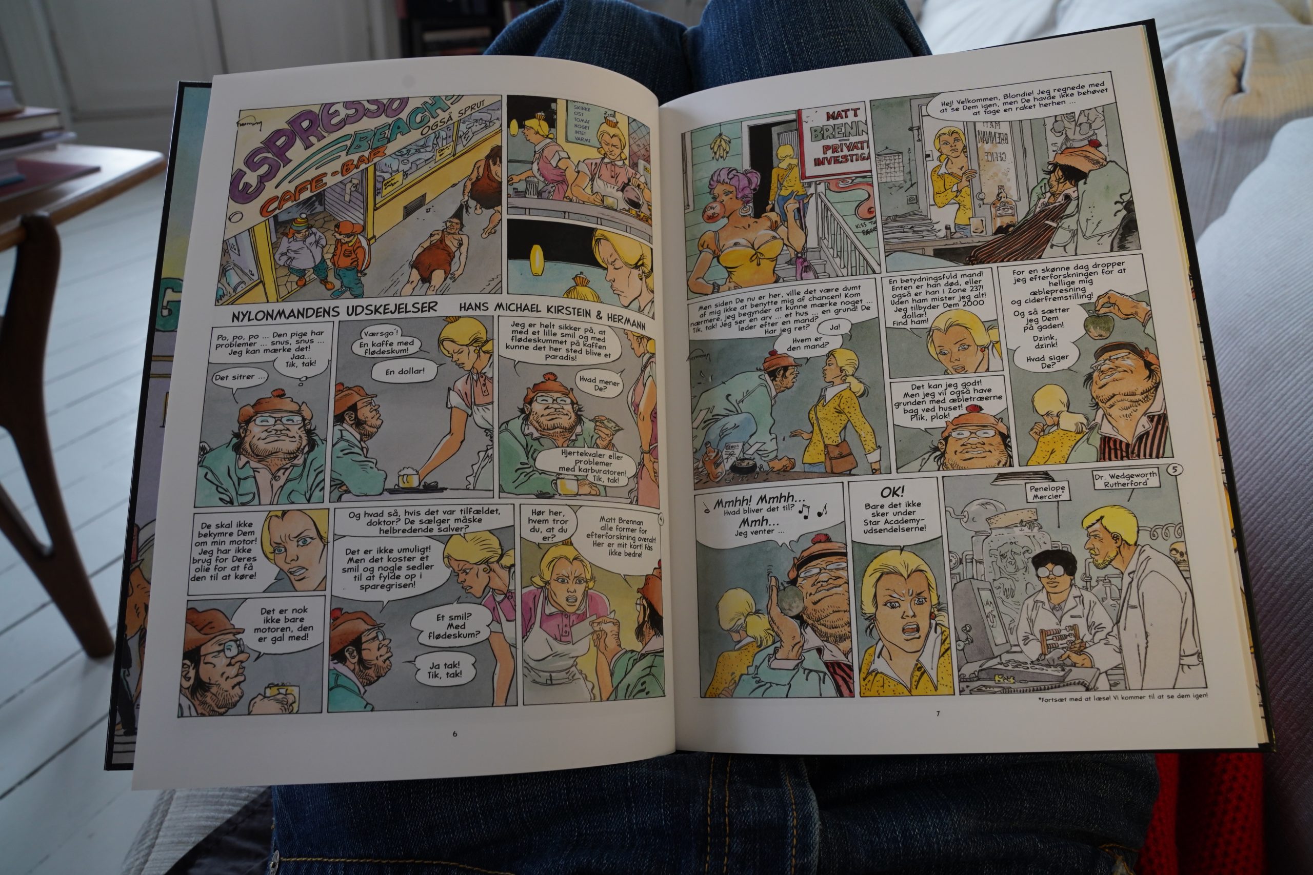
Huh. This doesn’t look much like Hermann’s normal rendering style… it’s more sketch-like? And I’ve never heard of Kirstein.
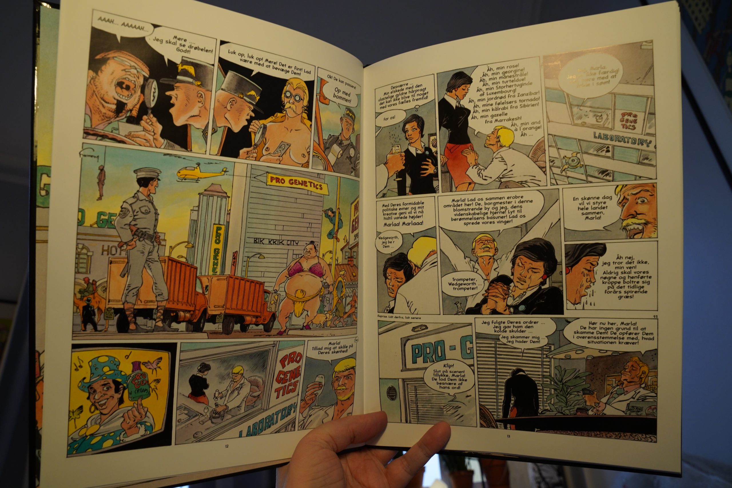
Well, OK, this is supposed to be funny, but… it’s… beyond tedious. It’s so charmless and dull that I’m almost fascinated, but I ditched it after reading about half the album, because I just have to google what this monstrosity is.
So it’s from 2007, and it’s got this rating by the people at Bedetheque:
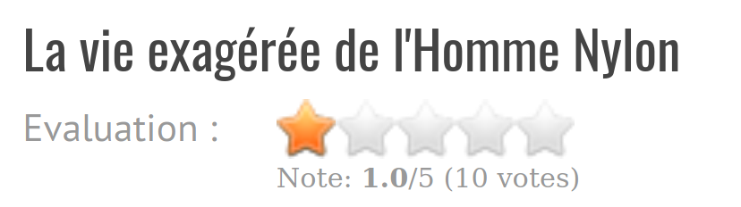
So it’s not just me.
This is apparently the only other thing Kirstein has written other than a Japanese paedophile-looking porn comics.
| Various: Anthology of American Folk Music Volume 1: Ballads | 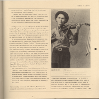 |
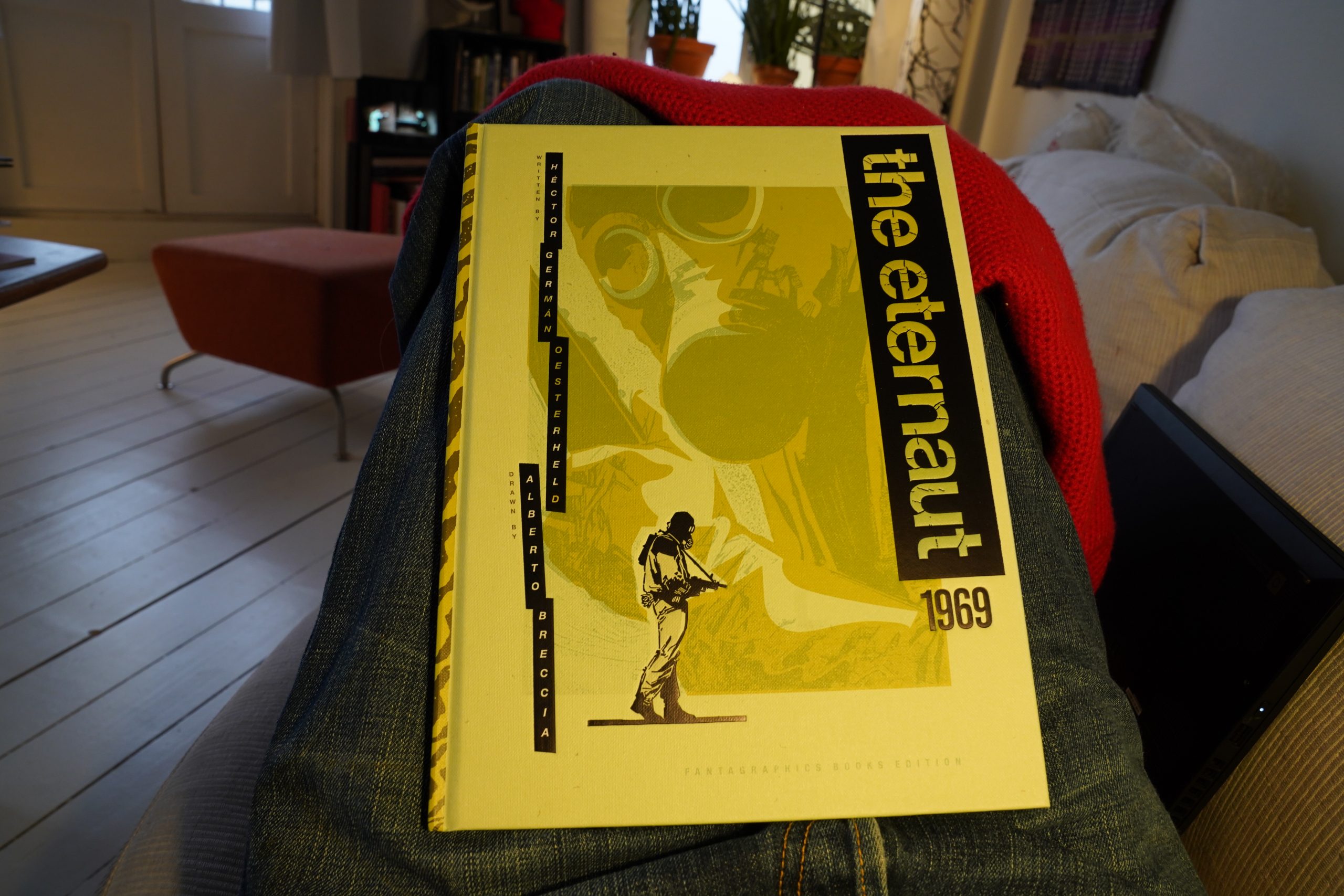
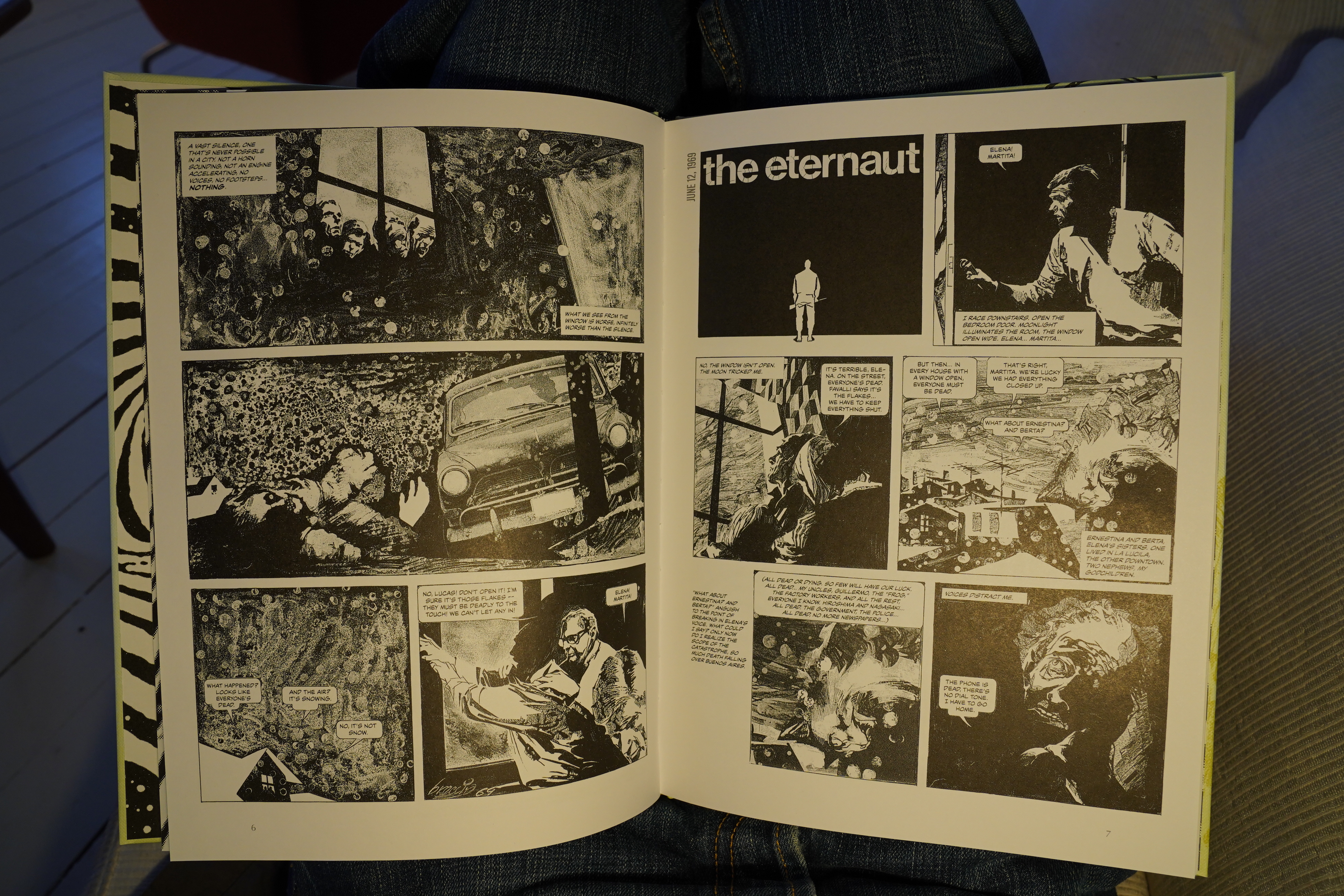
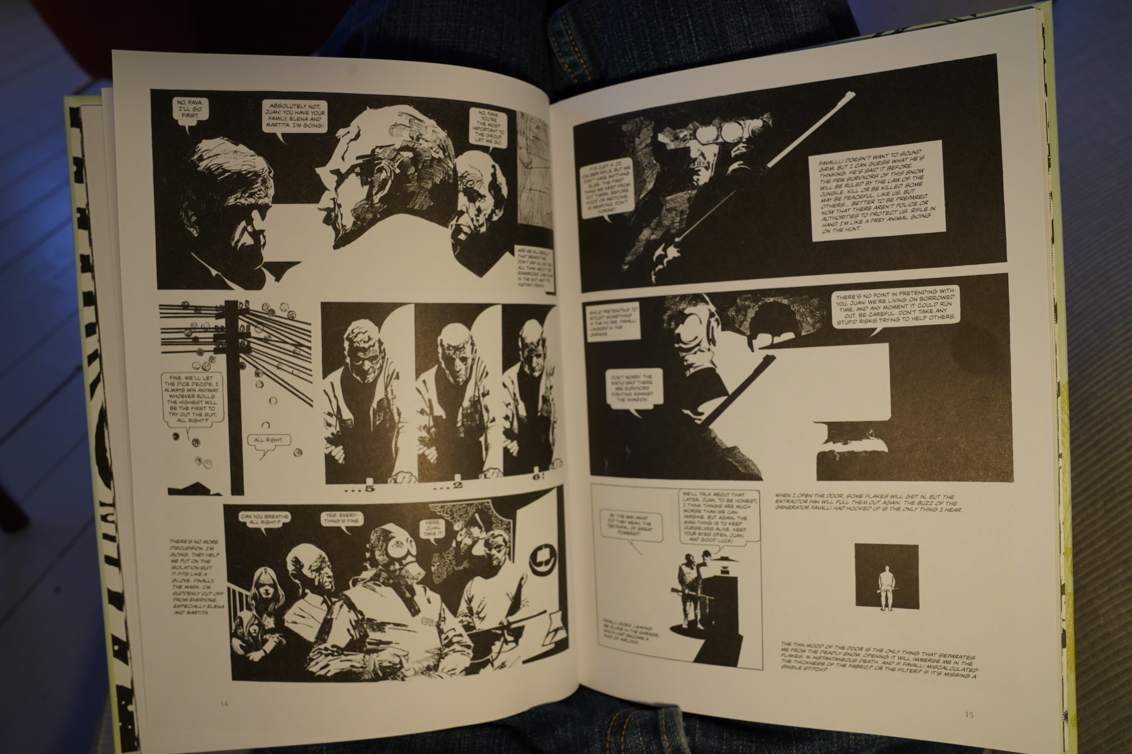
19:23: The Eternaut 1969 by Héctor Germán Oesterheld & Alberto Breccia (Fantagraphics)
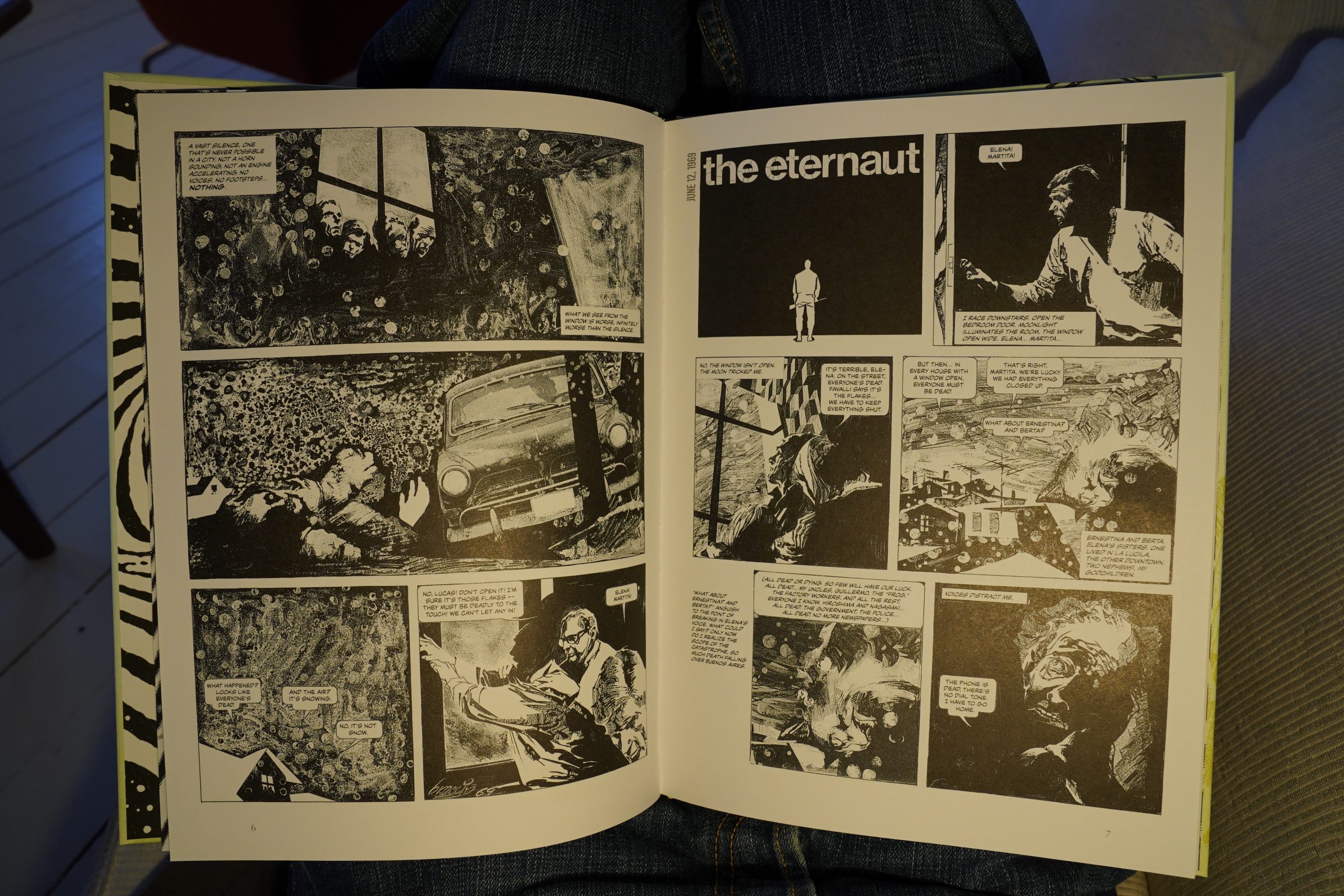
So — this is a remake of Oesterheld’s 50s strip of the same name. Which is pretty odd, but the original strip was a big success, so I guess it makes sense.
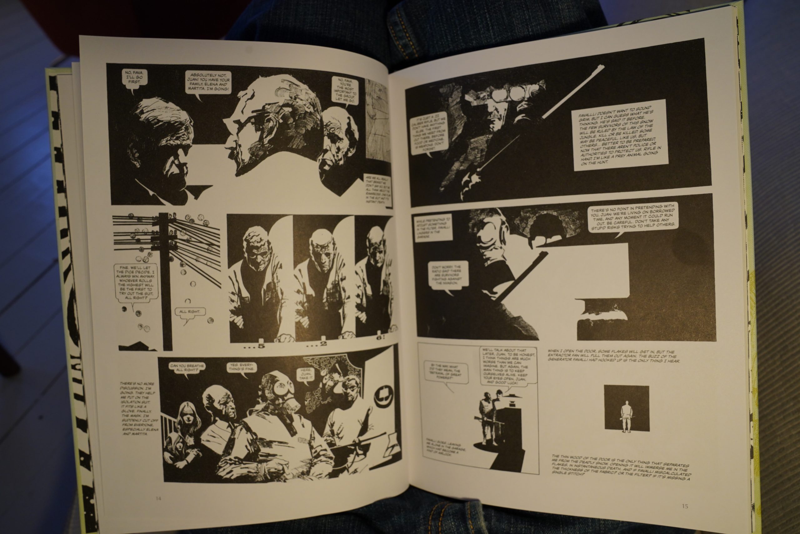
This is pretty spiffy? Breccia’s artworks is totally original, and it’s got so much mood… it’s a shame that it was prematurely cancelled, but they managed to fit the last half of the story into five pages. The last half of the original story was the weakest bit, really, so it’s not that much of a tragedy. It’s eminently readable in its current state.
| Stephen Mallinder: Pow Wow |  |
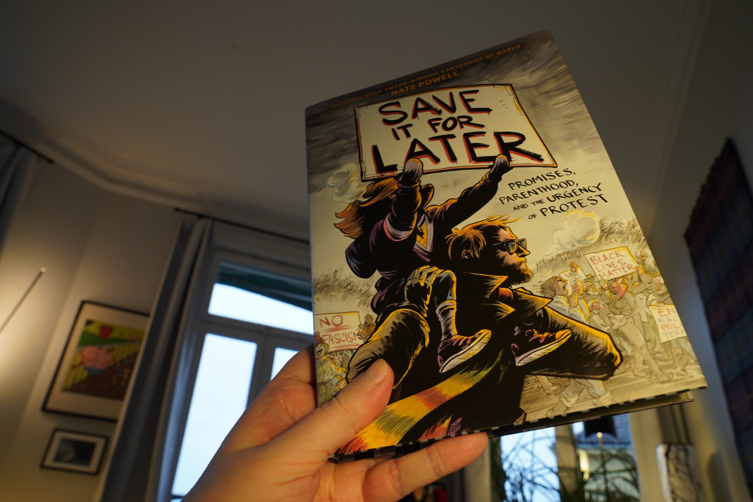
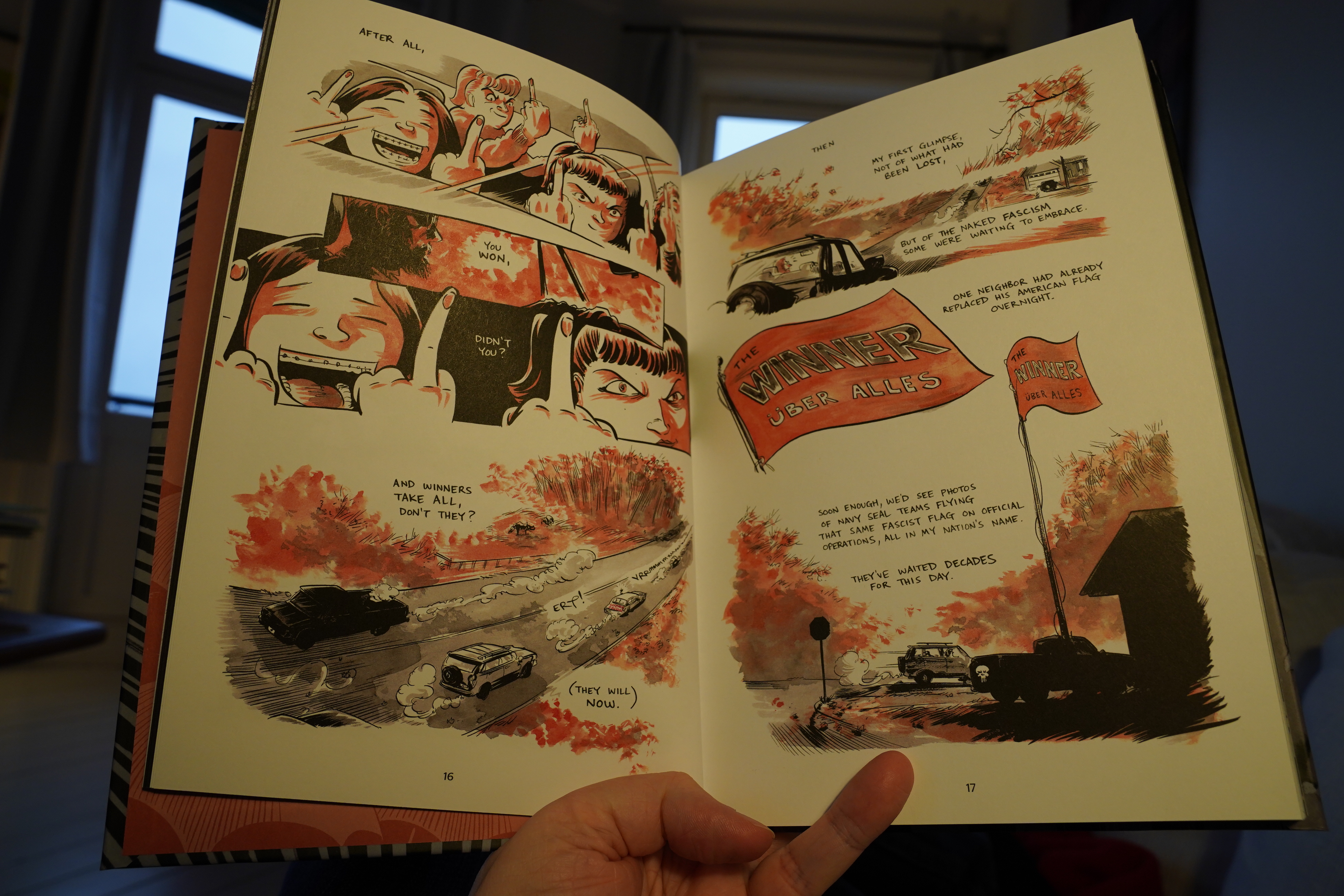
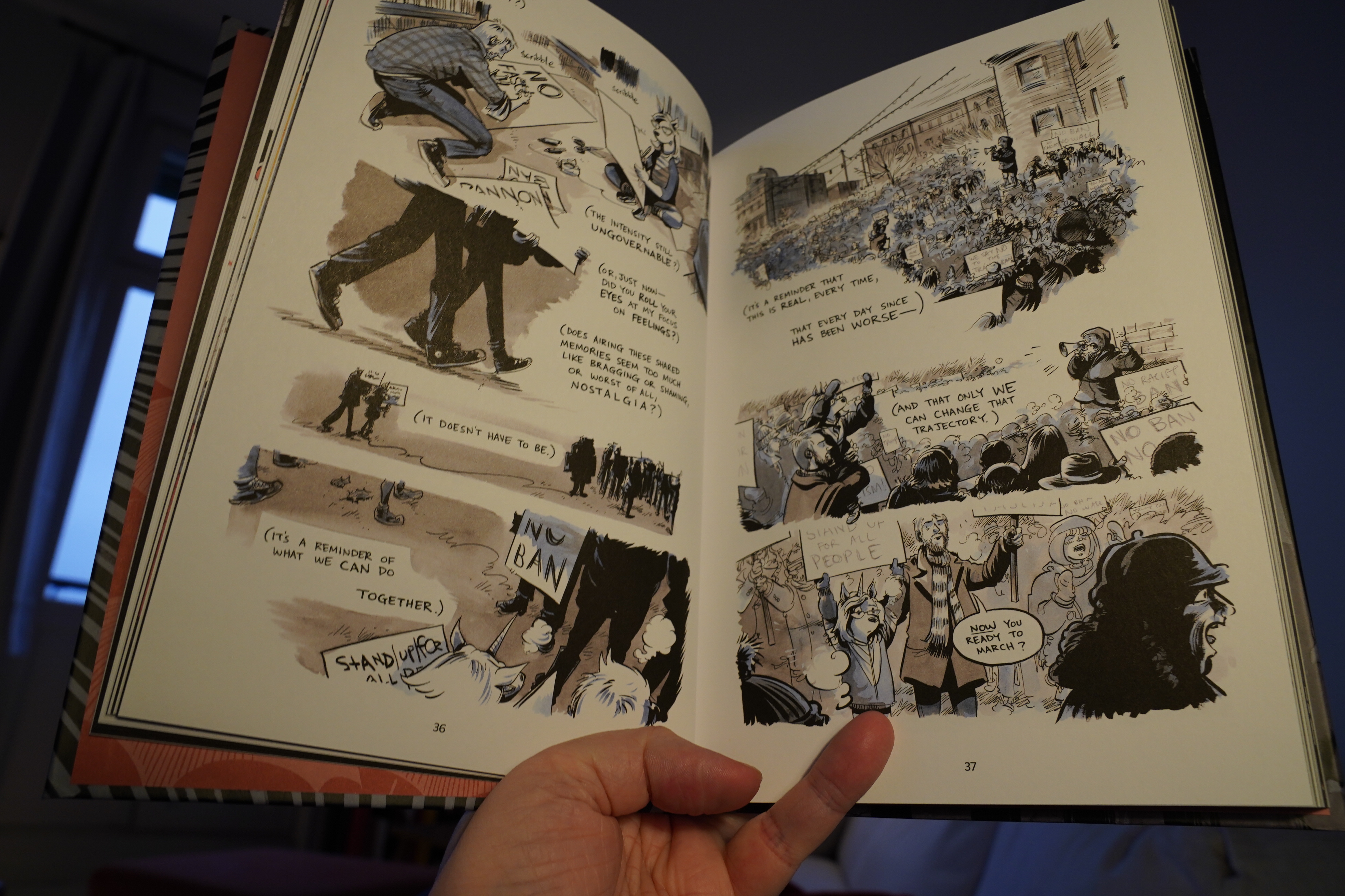
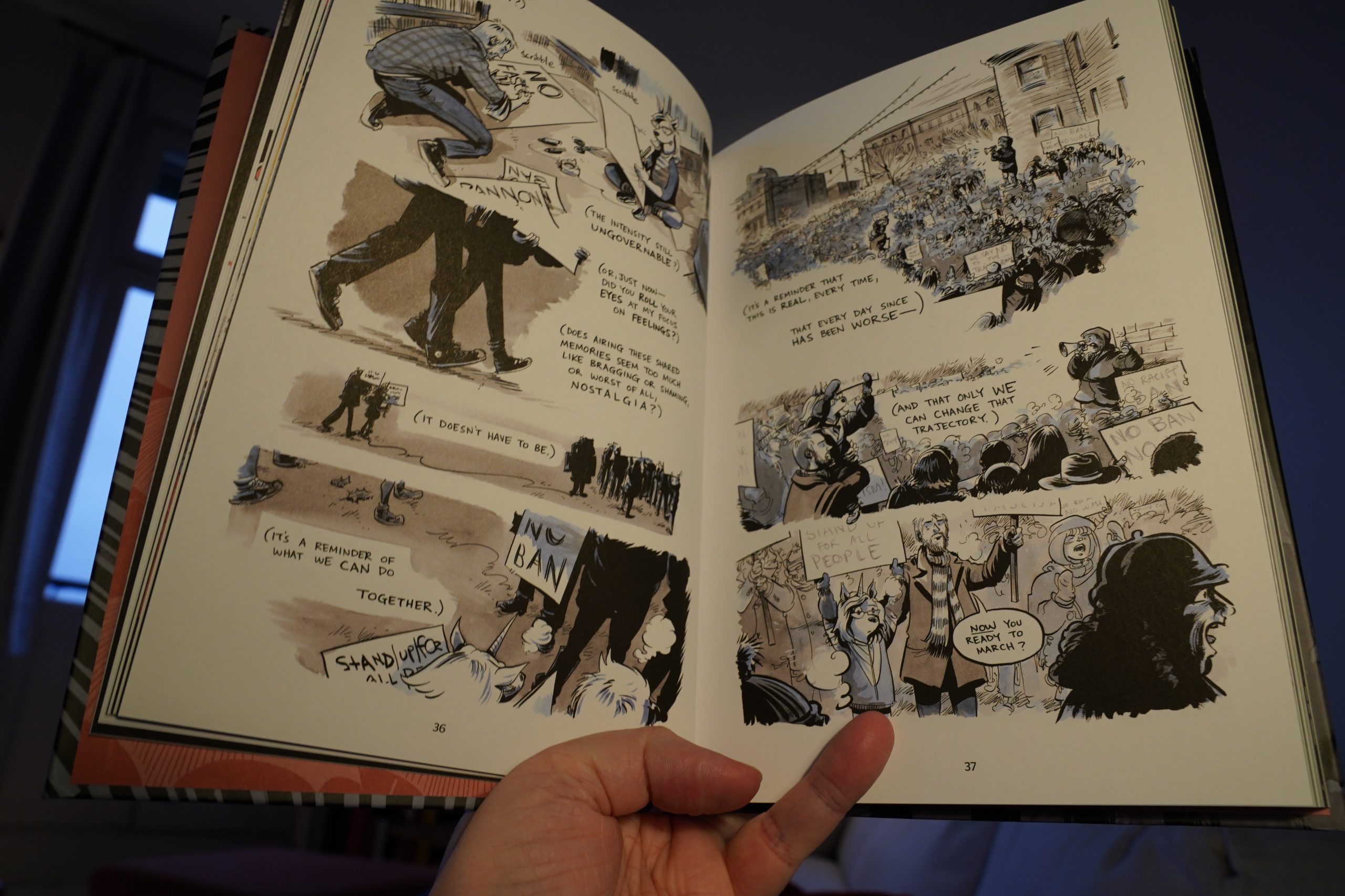
20:08: Save It For Later by Nate Powell (Abrams)

Powell’s got amazing cartooning chops.
21:03: Food

I wondered what the idea was with drawing his children with animal heads… but perhaps it’s a way to protect their privacy?
Anyway, this is a really good book. I think the personal bits (the first half and the last chapter) are stronger than the political overview things (if only because those things are things we already know perfectly well), but it’s an enjoyable book.
And infuriating, of course.
| Coil: First Dark Ride |  |
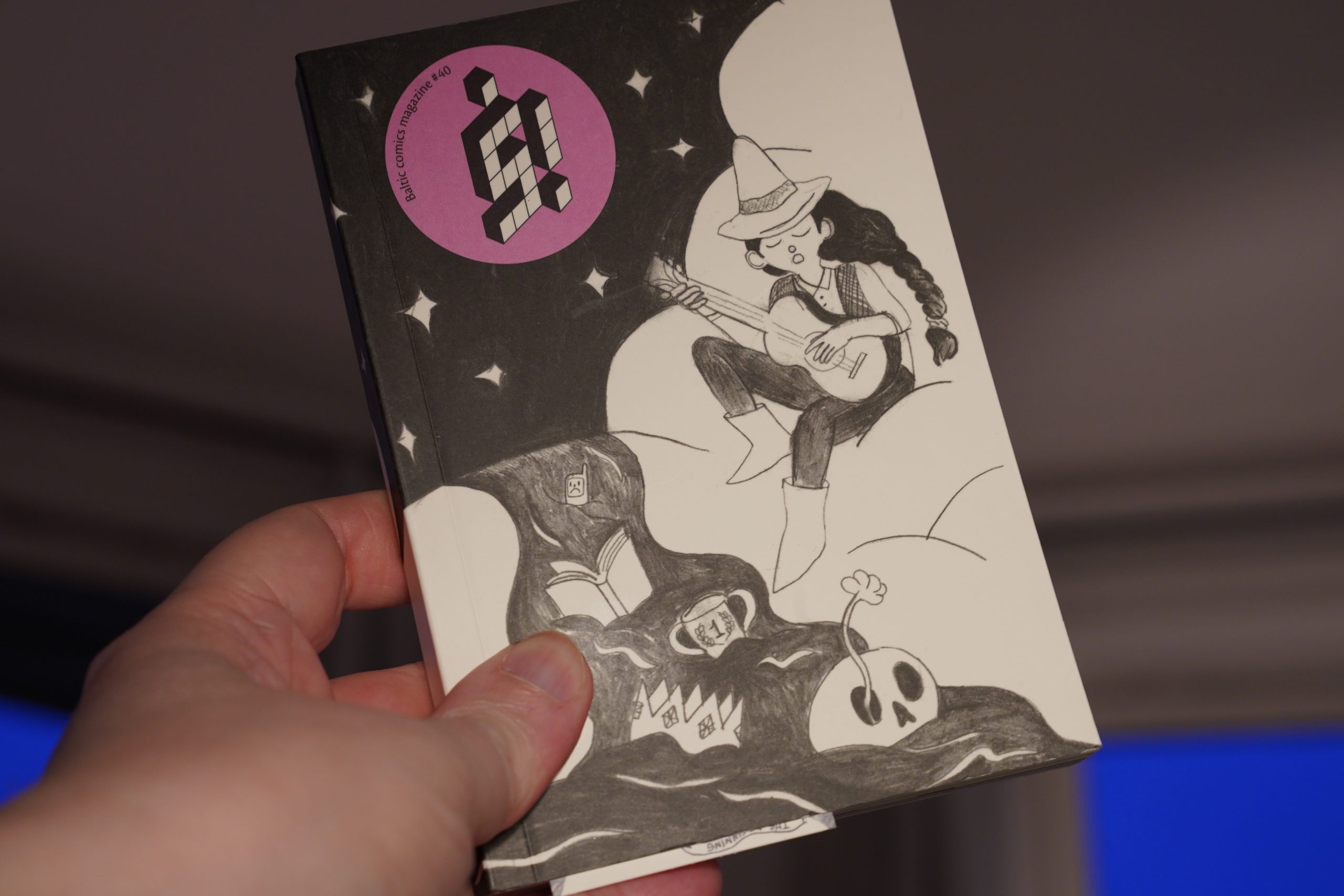
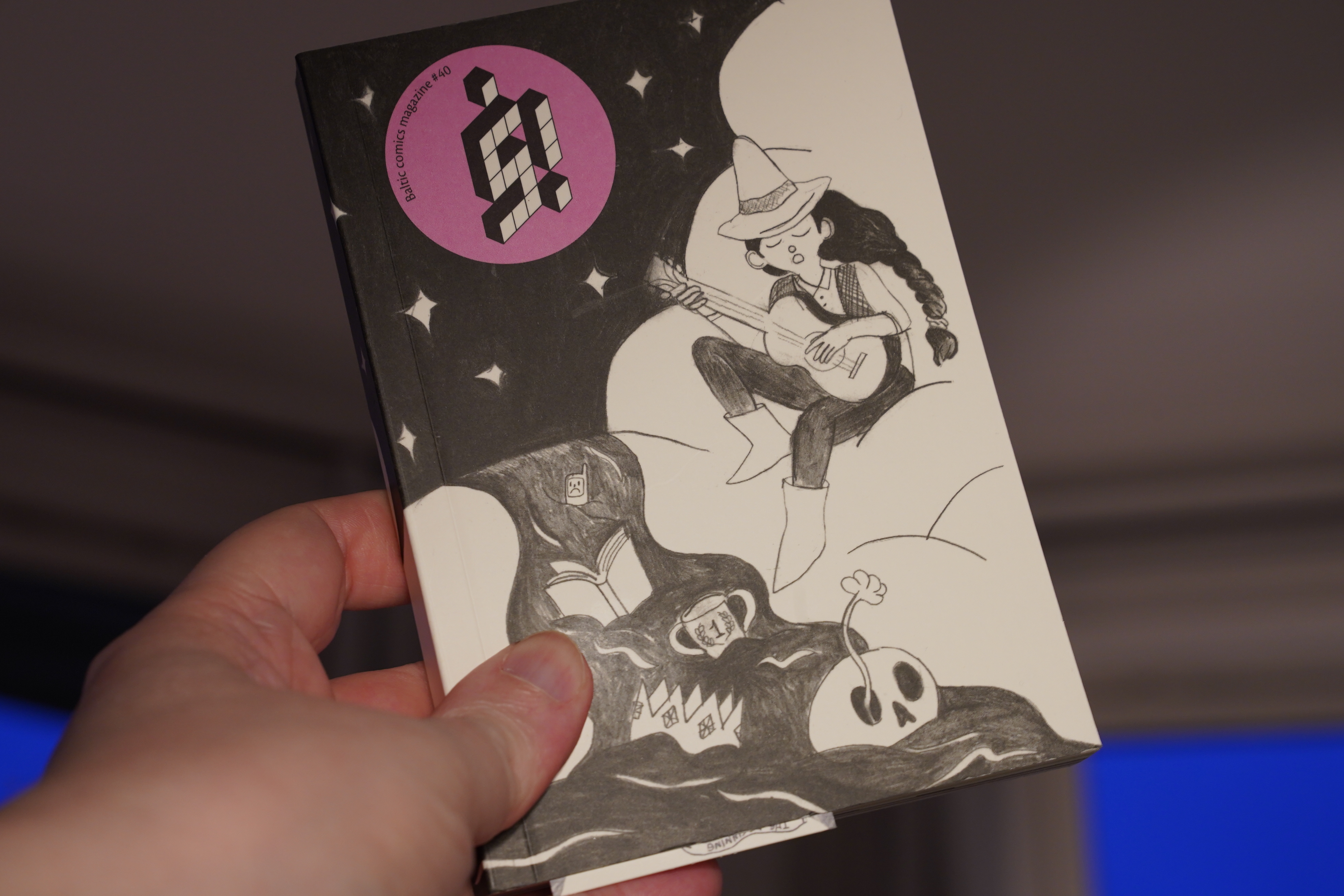
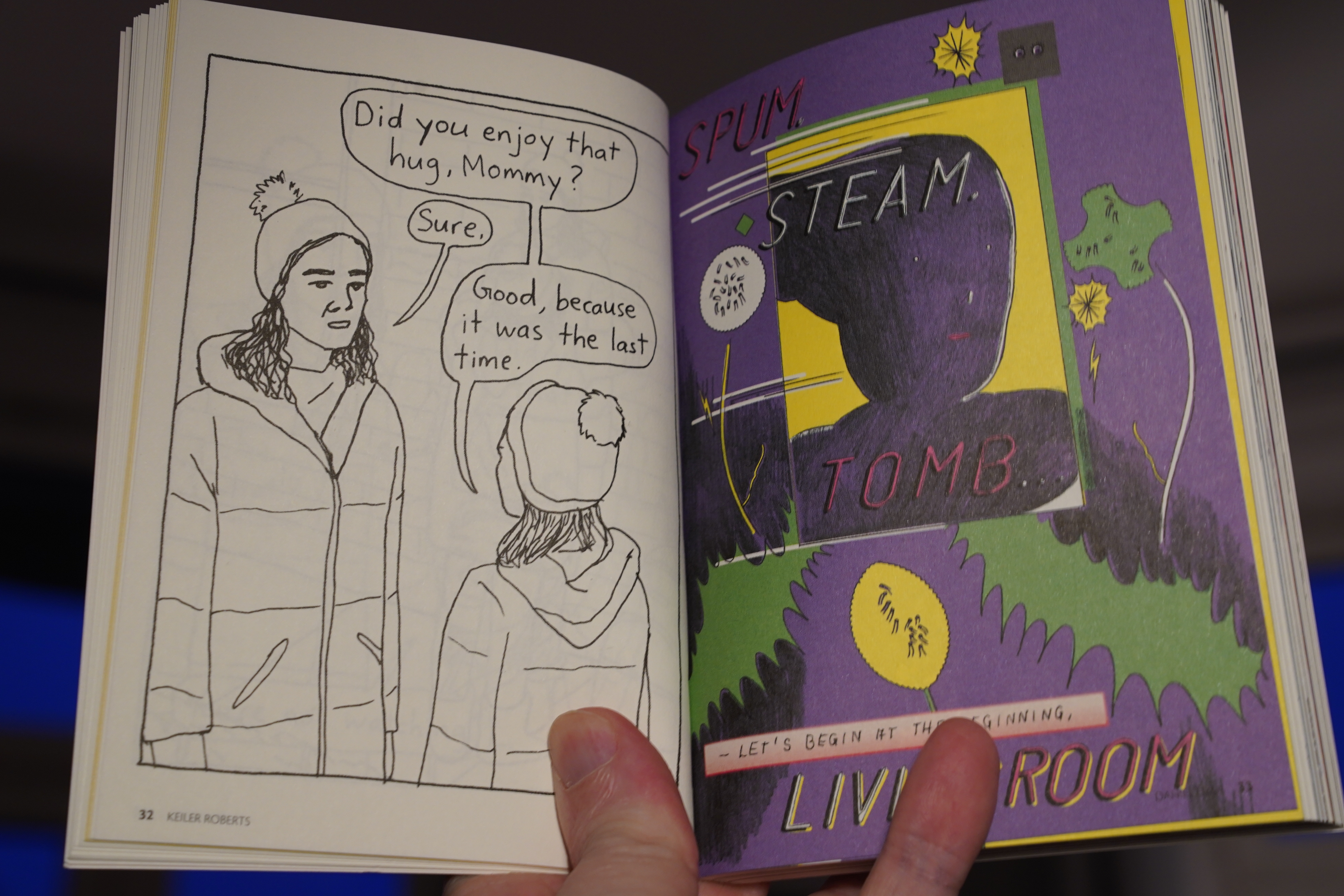
21:38: Š! #40 (Kuš)

Hey! Keiler Roberts! Didn’t she have a book out recently? Did I forget to buy it? Oh. It hasn’t been published yet…
Comics get promoted so many months ahead of time these days…
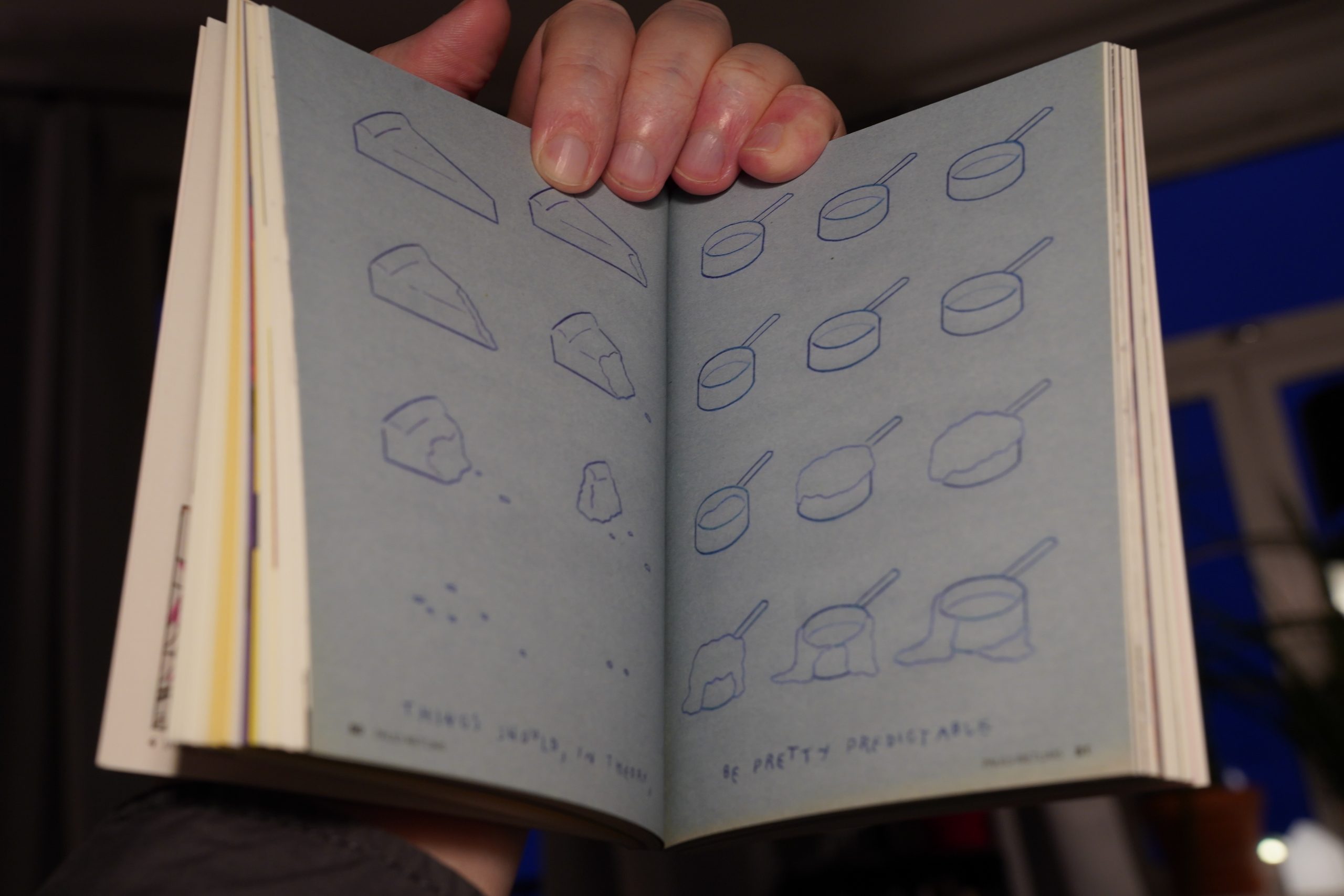
Anyway, this is yet another pretty strong issue of this Baltic international anthology.
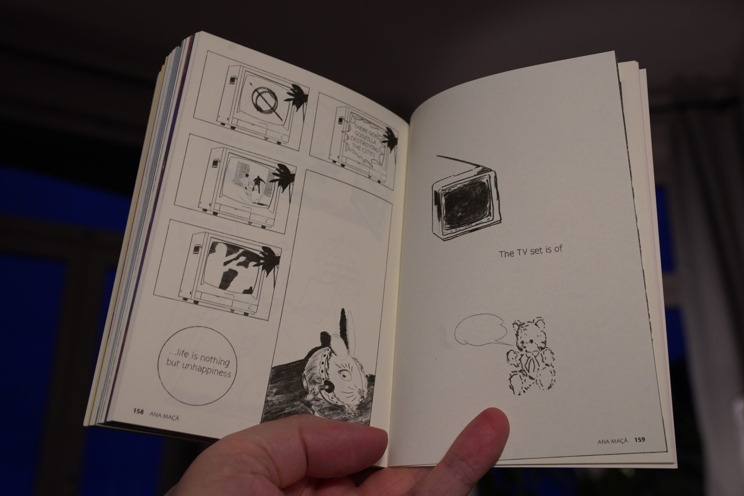
A huge variety of approaches to one subject, as usual, and this time it’s “The End”.
| Microtub: Sonic Drift |  |

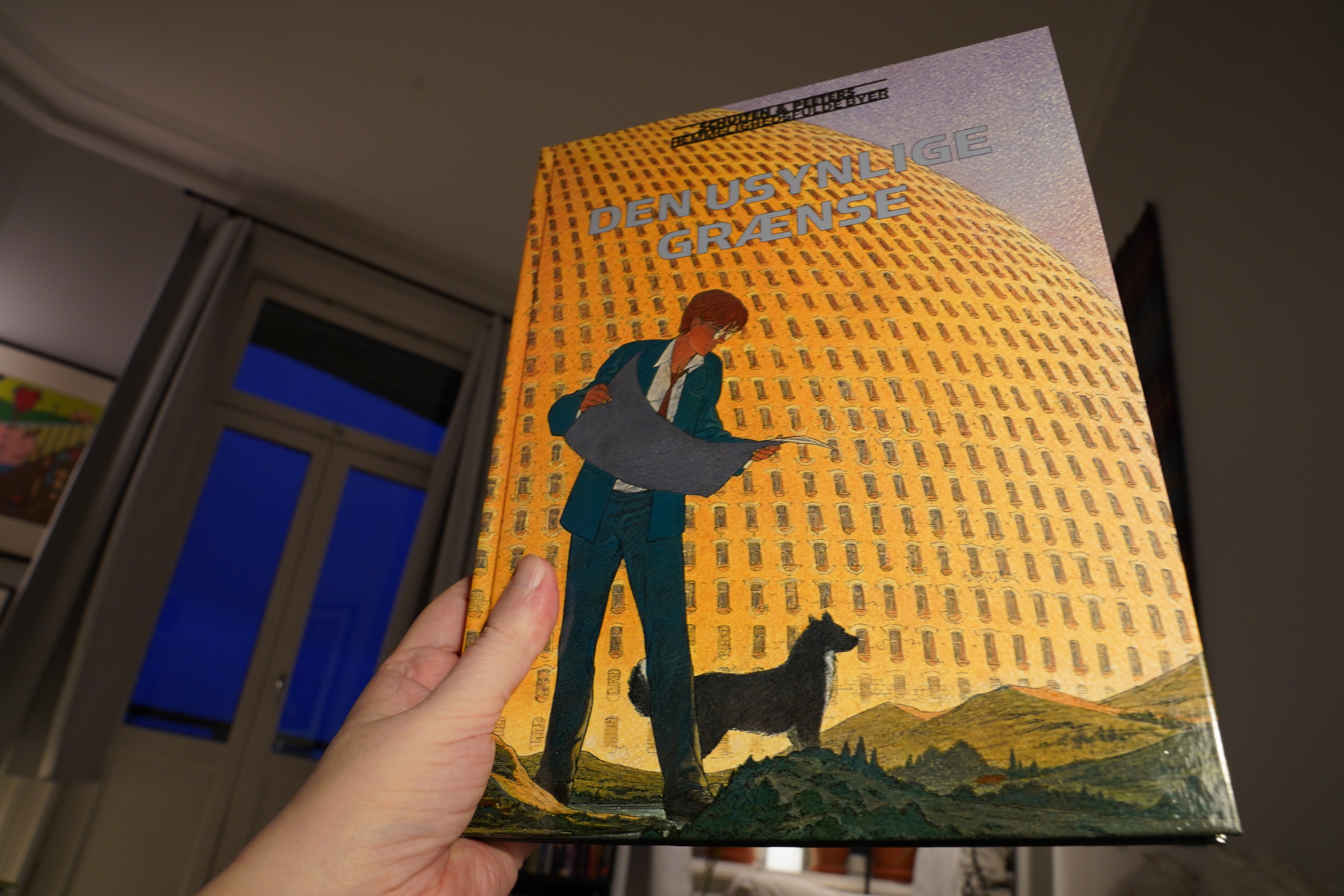
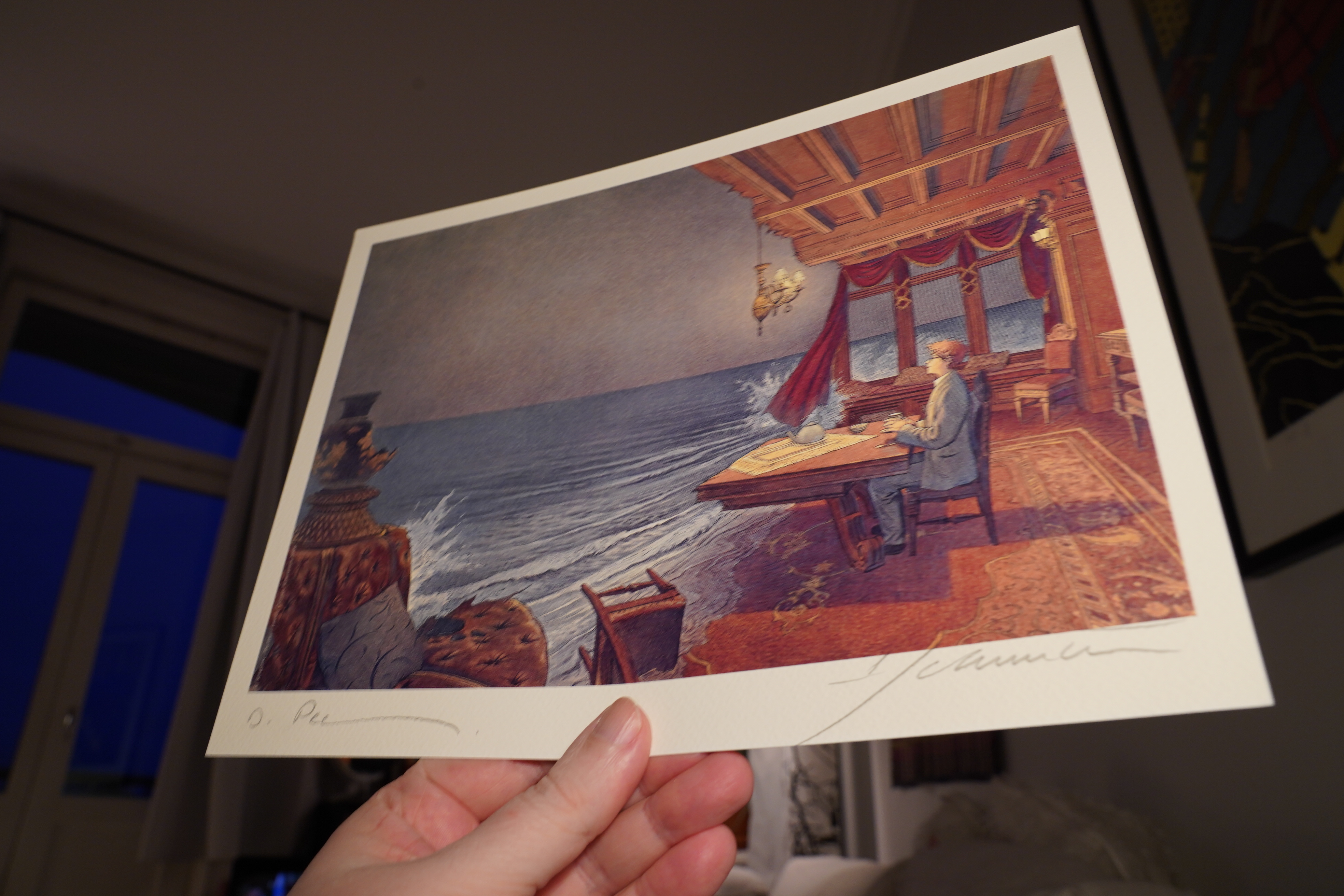
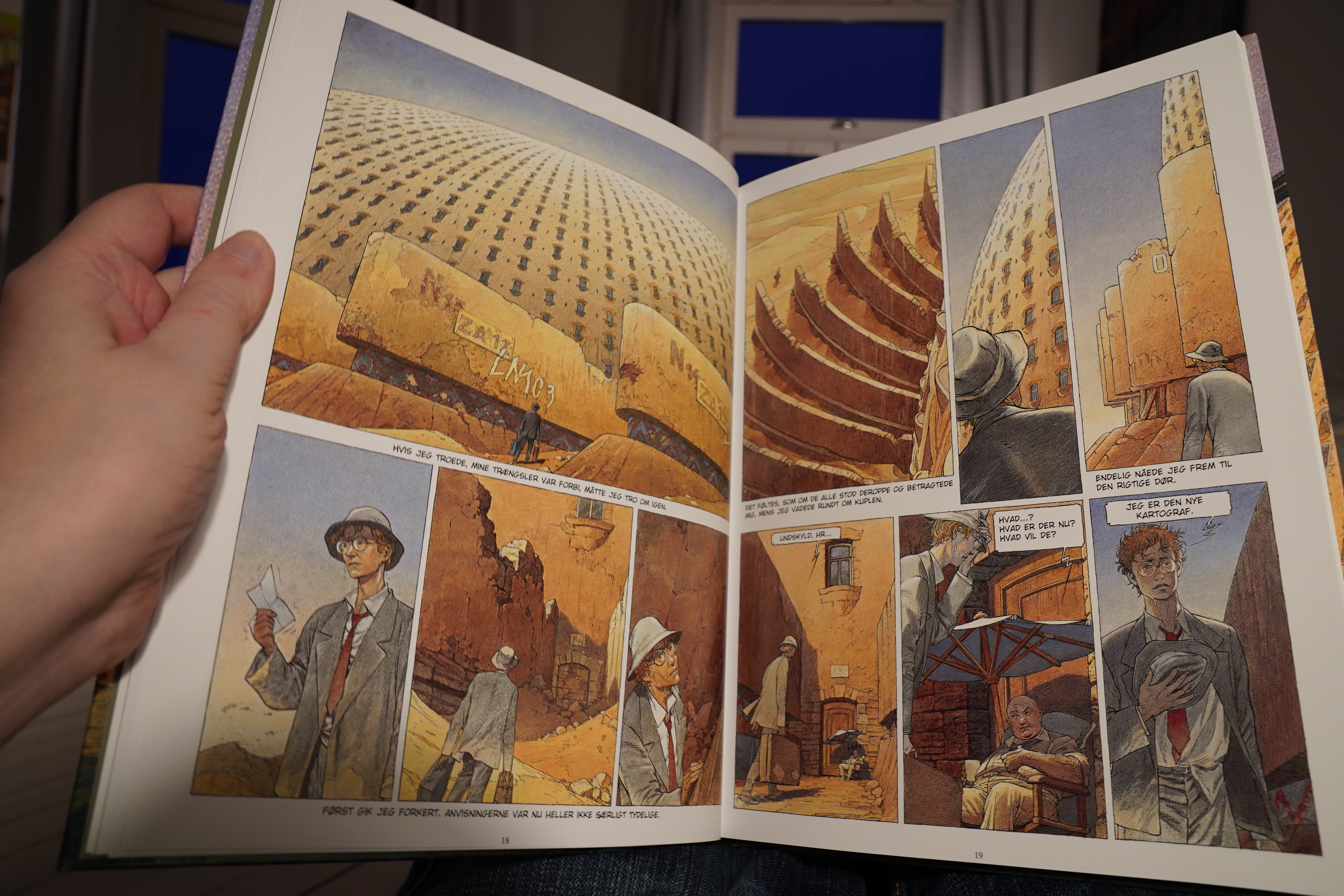
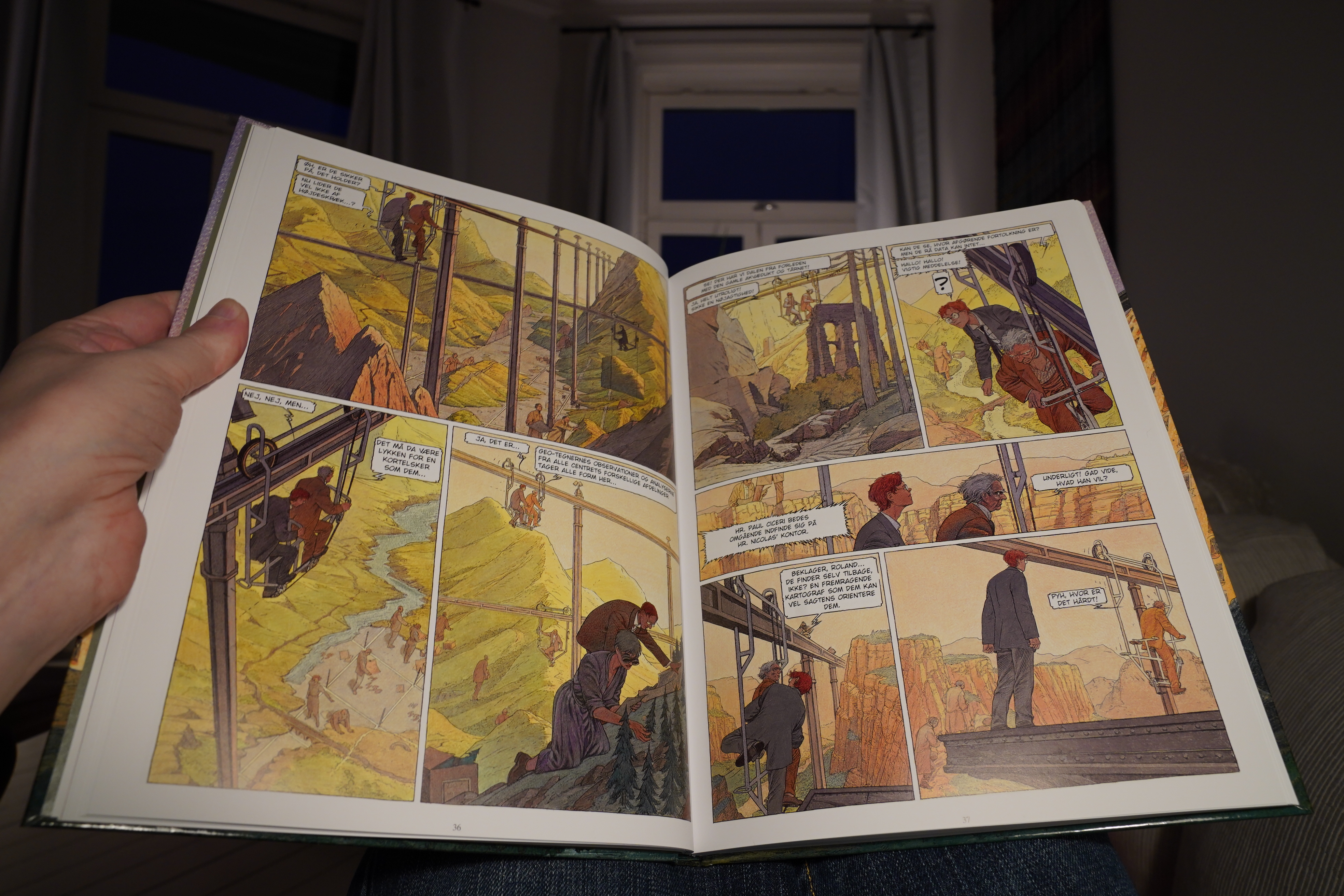
21:58: Les cités obscure: La Frontiere Invisible tome 1 & 2 by Schuiten & Peeters (Faraos)
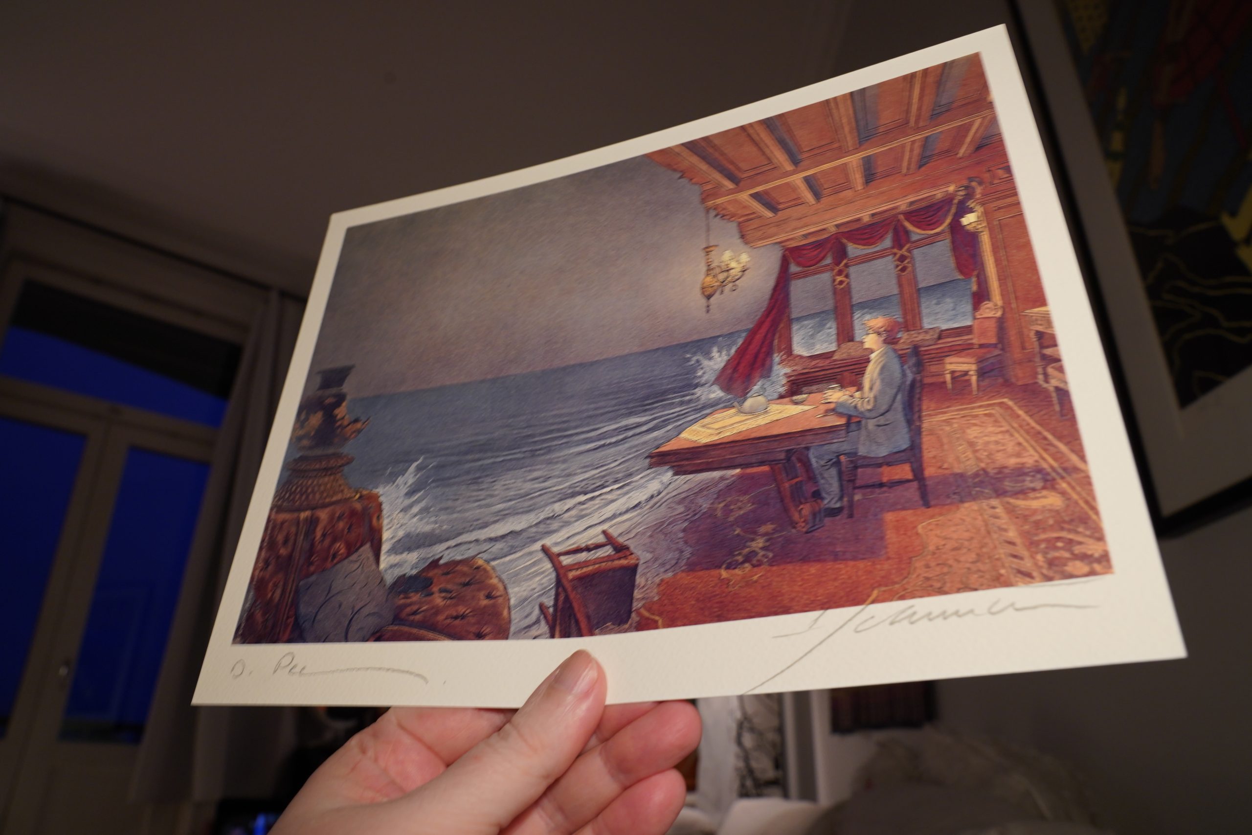
Heh, there’s a print in here, signed by… er… “Pee______”. I think.

Anyway, this is yet another entry in the “Obscure Cities” series — this is from 2004. And as usual, it’s drawn in a different style than the other entries in the series.
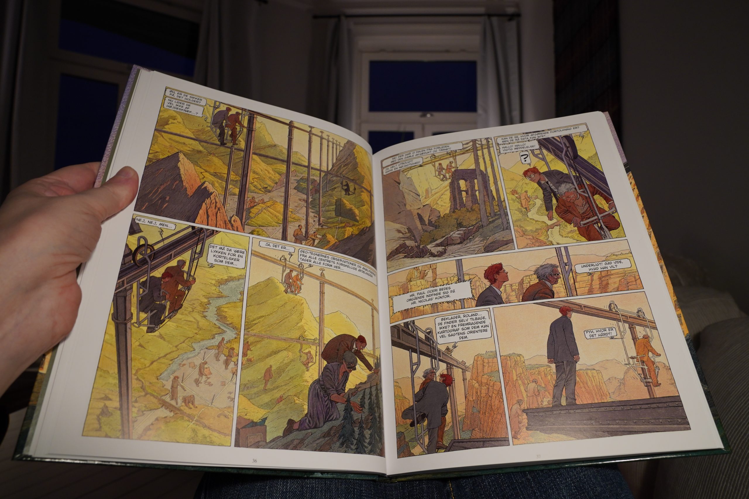
This isn’t my favourite style of theirs, but… it’s still pretty nice, eh? They always push the architectural designs — into a sort of dream-like logic.
The story itself is a kind of shaggy dog story, and the twist is SPOILERS that the protagonist is kinda a moron.
Which is refreshing! It’s a good read.
Looks like the final tome was published in 2008.
| Sam Amidon: The Following Mountain |  |

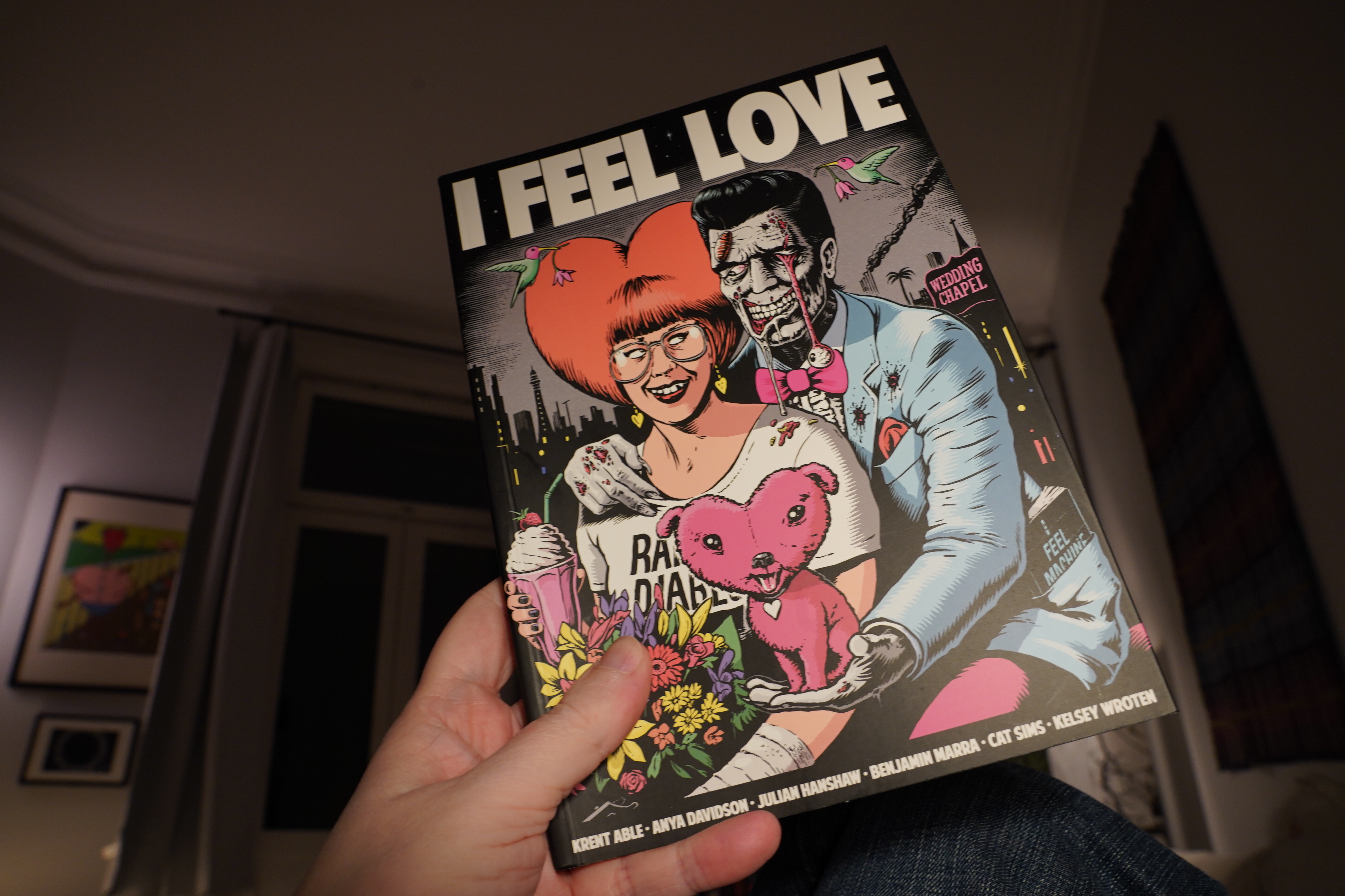
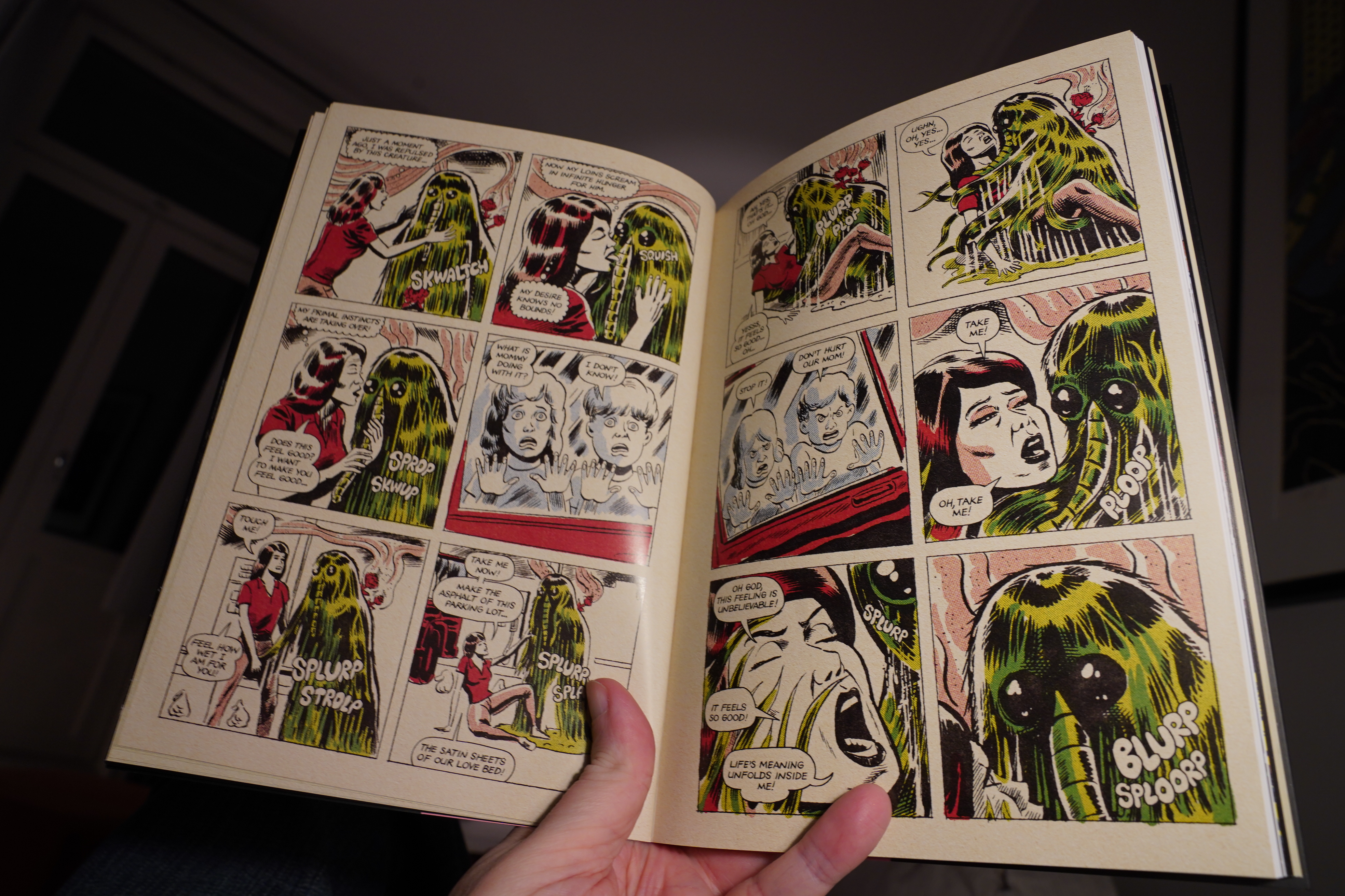
22:56: I Feel Love edited by Krent Able and Julian Hanshaw (Selfmadehero)

This is a quite strong anthology. The funniest piece is this one by Benjamin Marra…
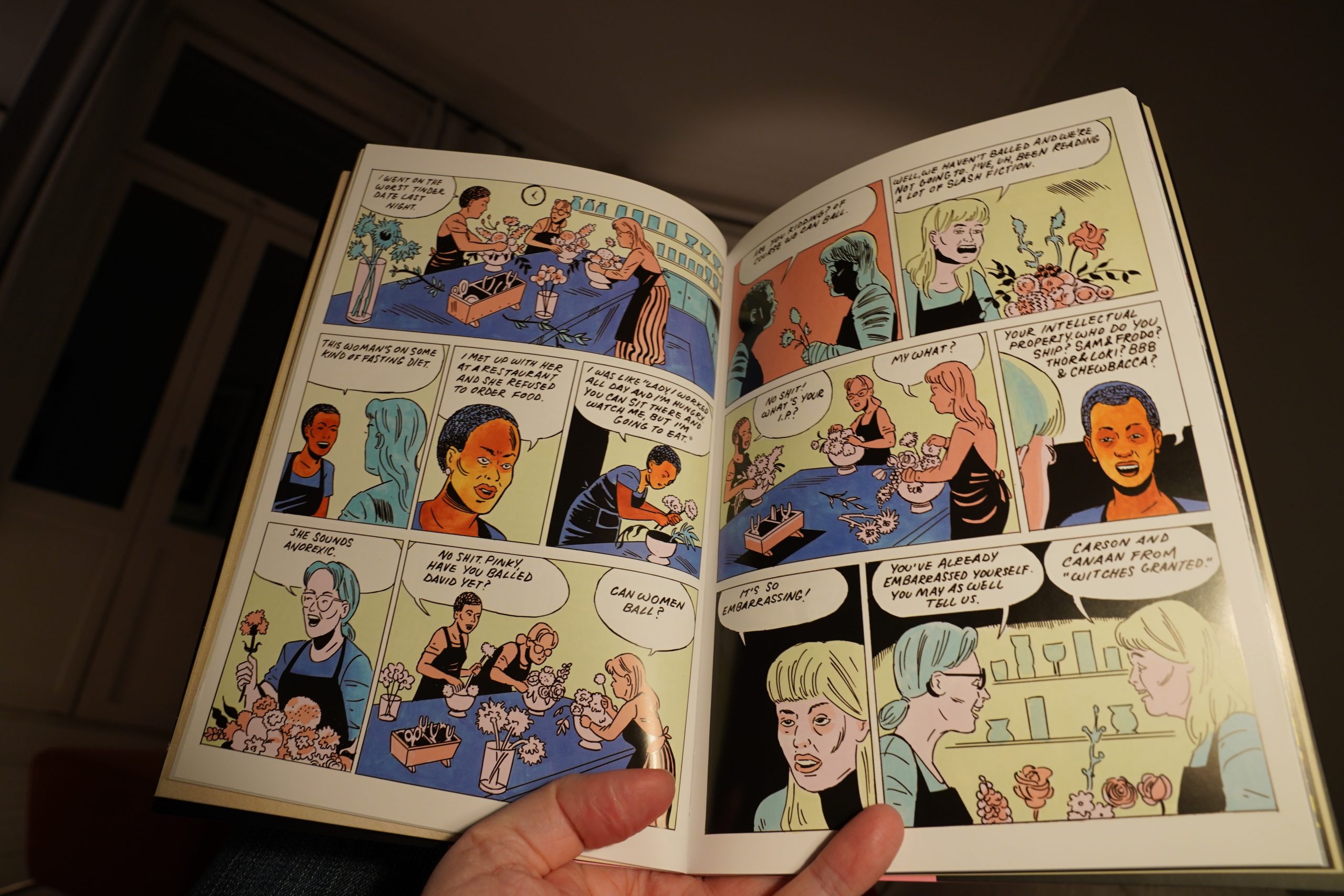
… and the best one is this by Anya Davidson. It’s amazing how she manages to make her characters come alive over these few pages, which makes the ending absolutely shattering. Marvellous.
| Espen Reinertsen: Nattsyntese |  |

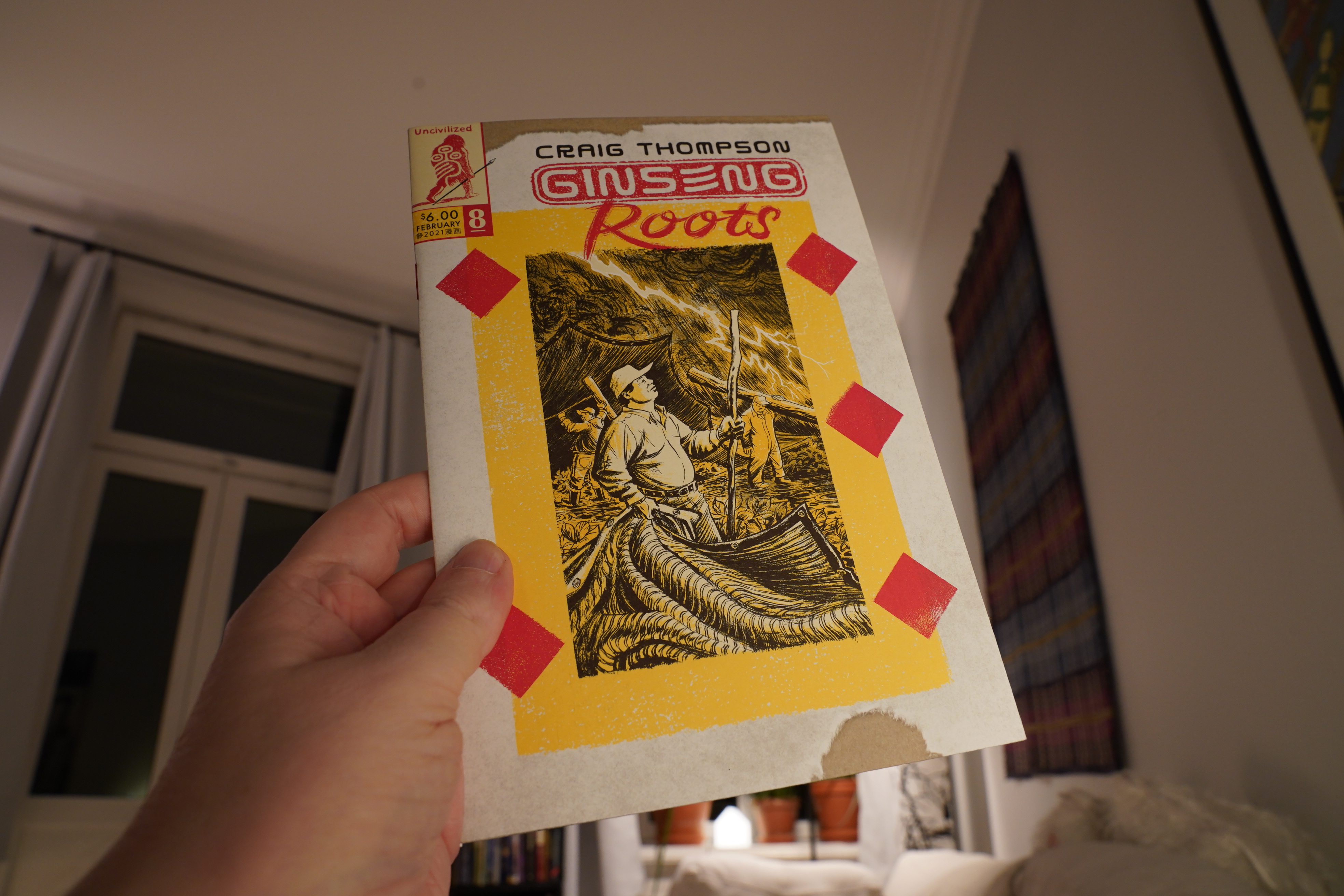
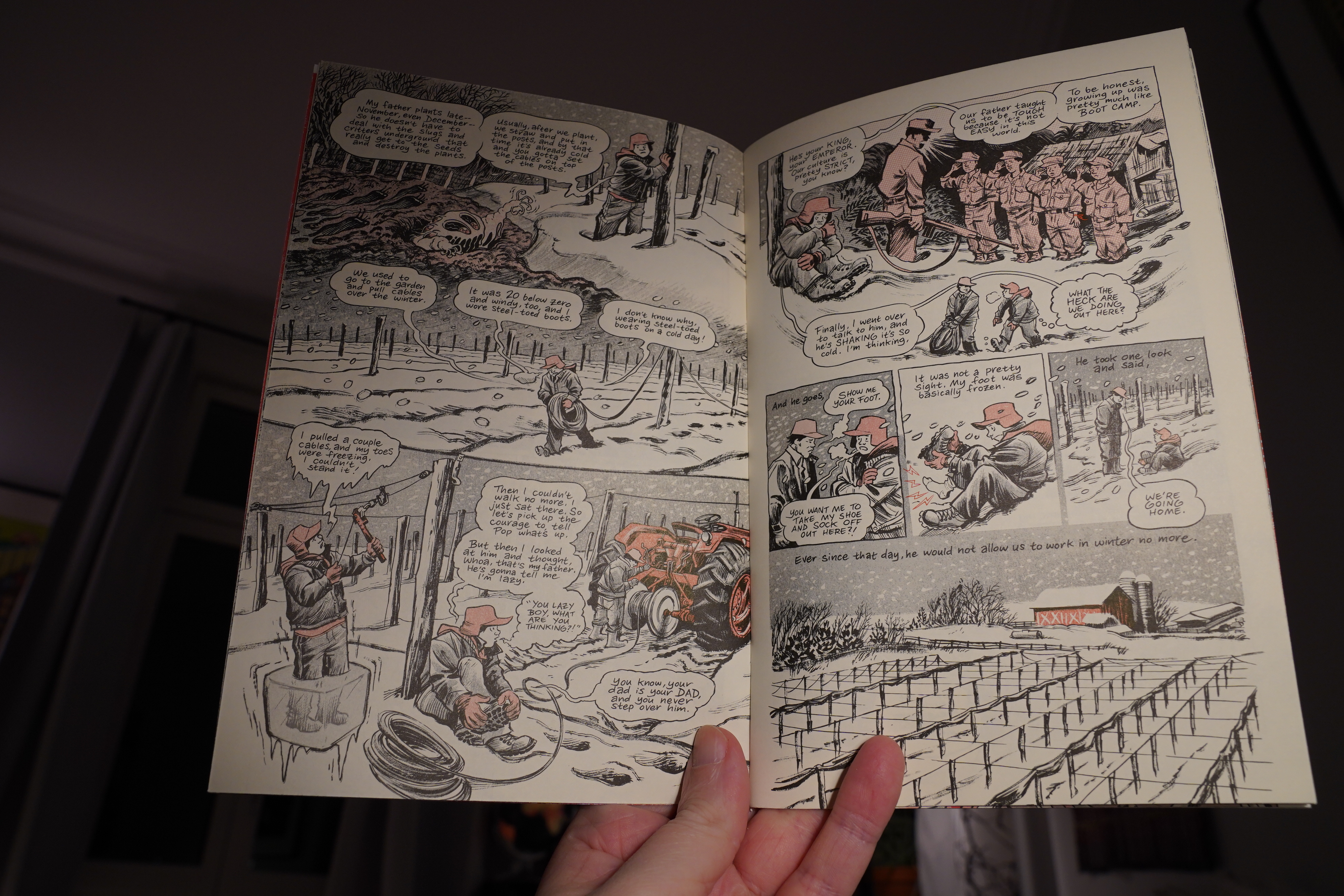
23:26: Ginseng Roots #8 by Craig Thompson (Uncivilized)
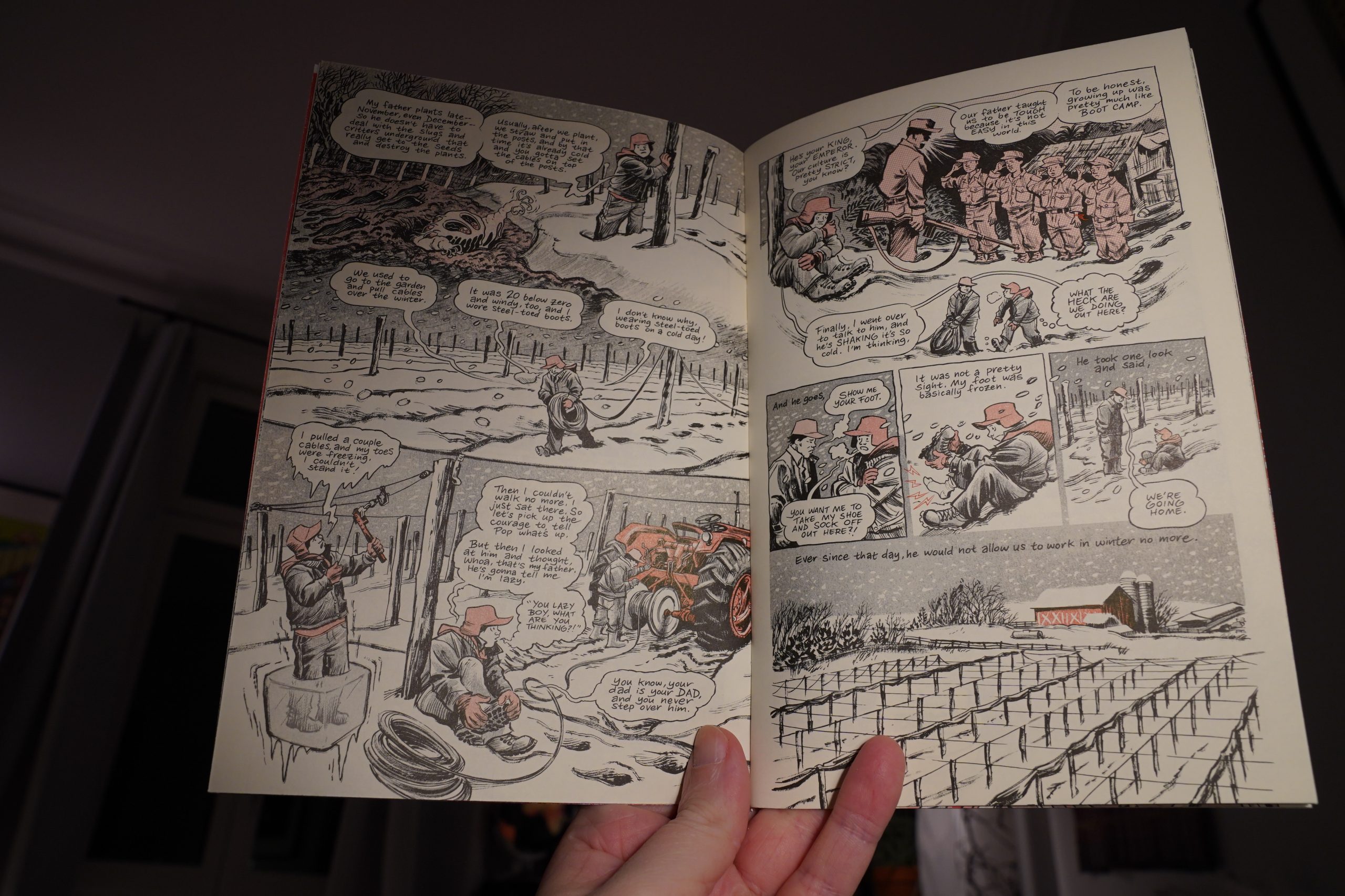
This series has mostly been about Thompson’s childhood (working the ginseng fields), but now he’s branching out, and he’s hardly in this one at all.
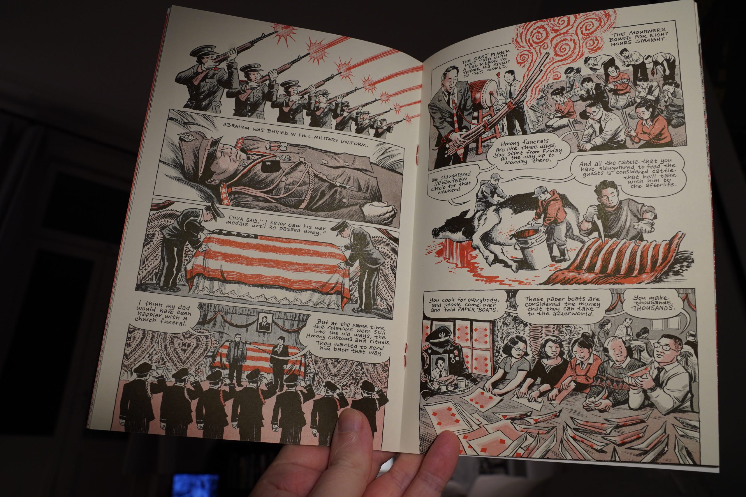
So it feels a bit… digressive? But not in a bad way?
| Moor Mother & billy woods: BRASS |  |
23:43: The End
I think it’s time to go to bed, perhaps.
That was quite a varied batch of comics… and just one out-and-out clunker?
Comics comics comics buzz buzz goes my head.