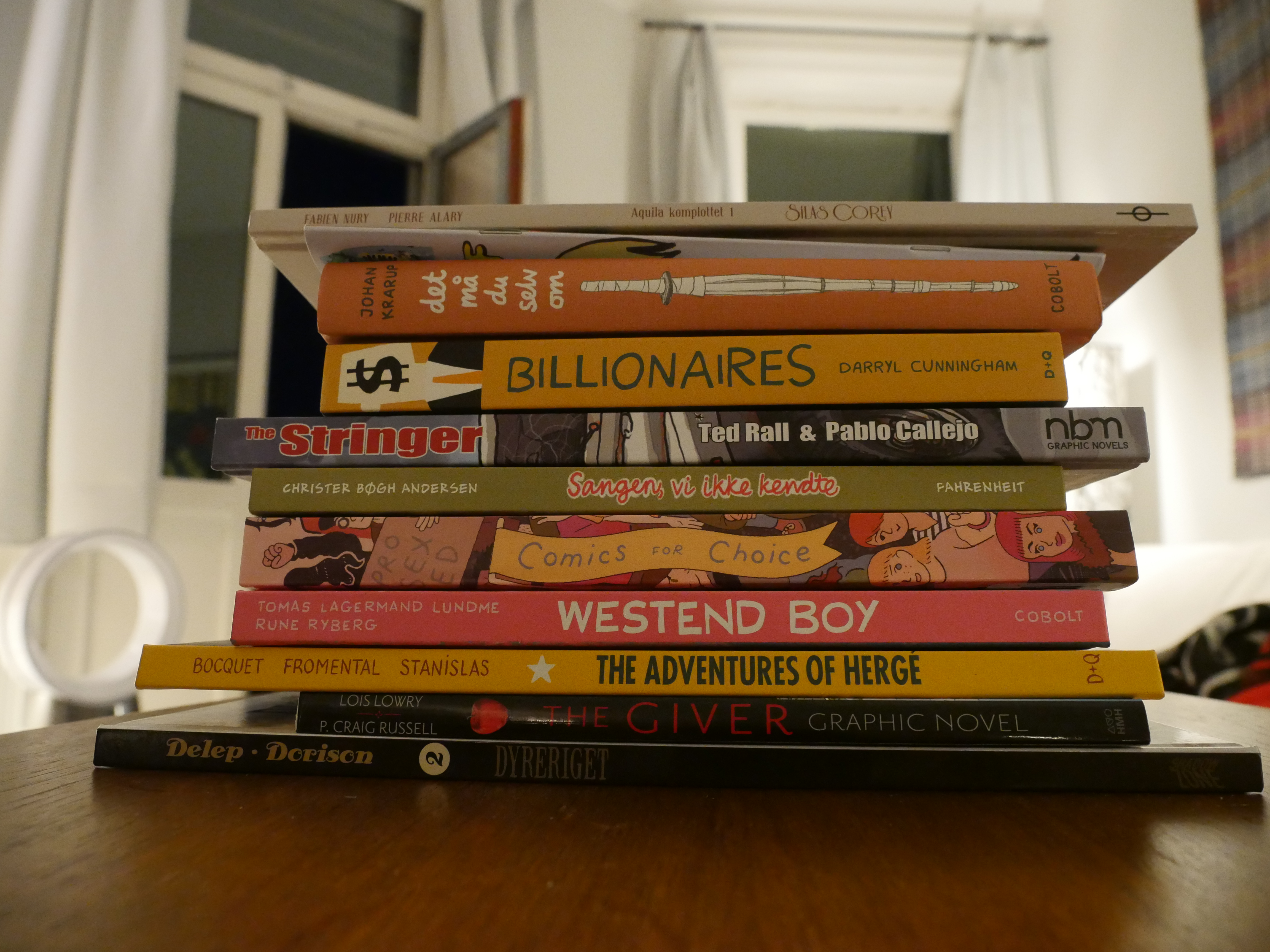
It’s a nice afternoon, so I thought I’d try reading out on the balcony…
| Sō Percussion, Dawn Upshaw, and Gil Kalish: Caroline Shaw: Narrow Sea |  |
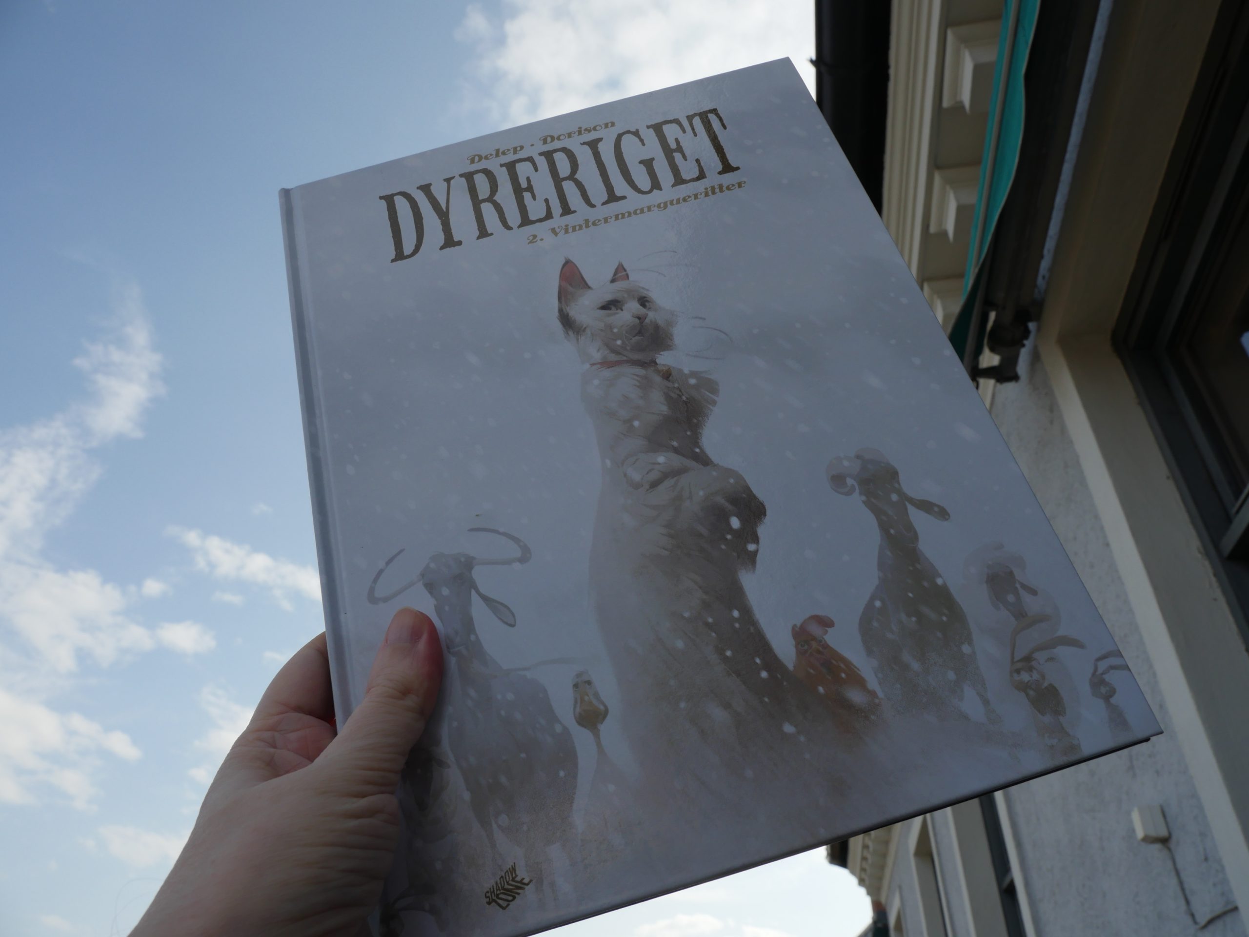
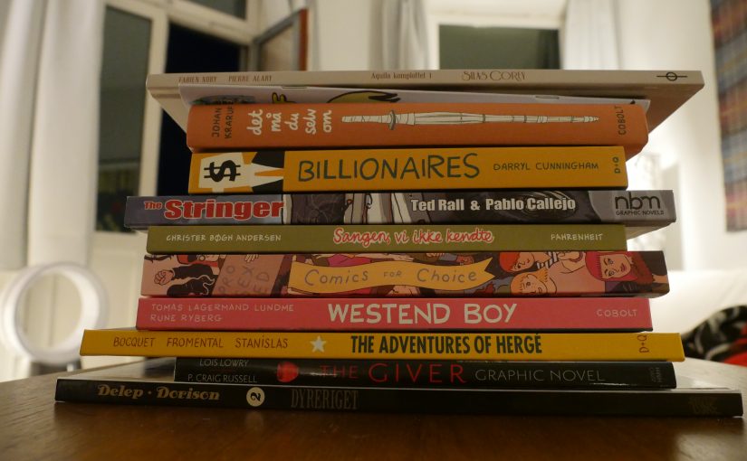
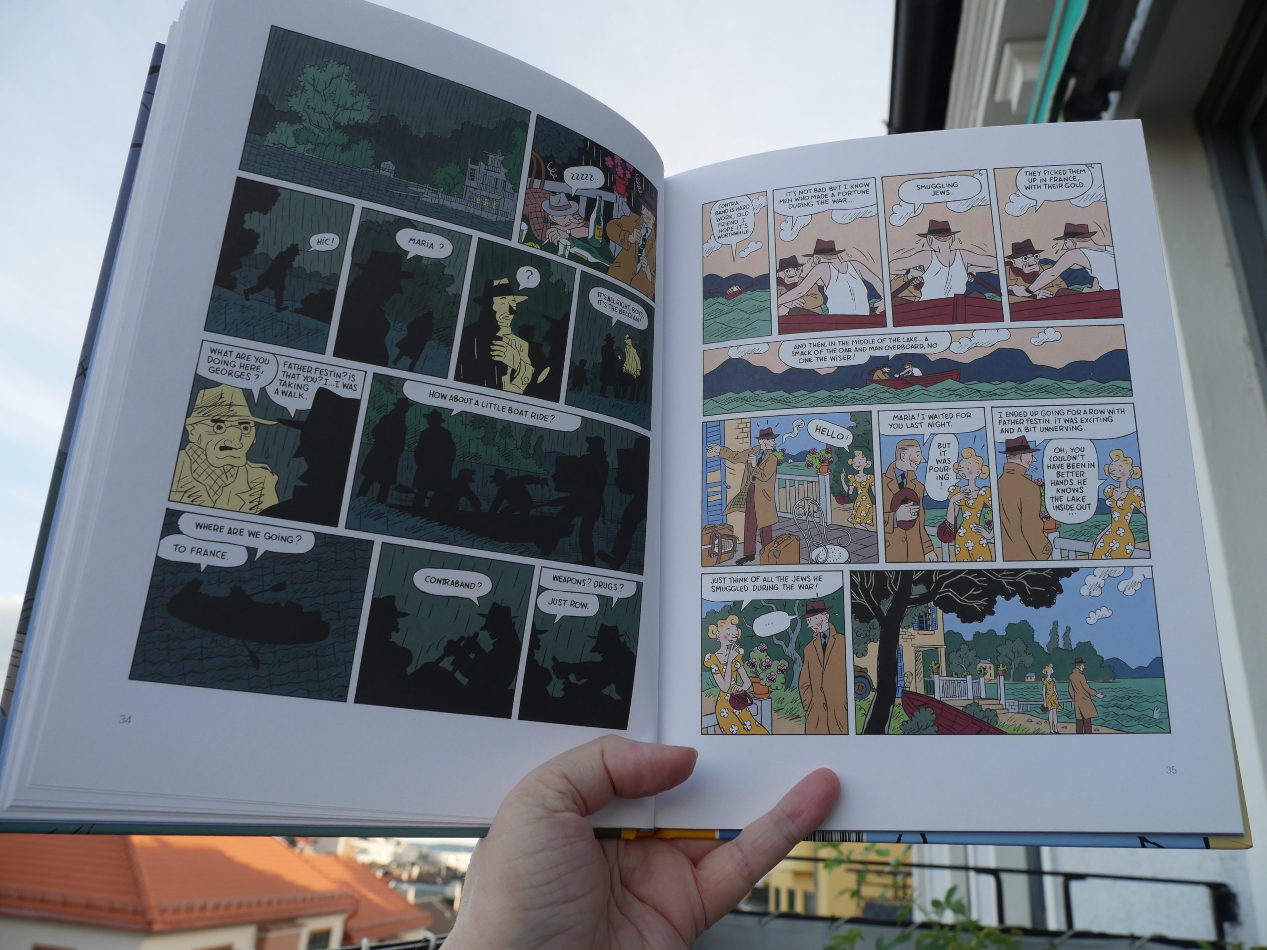
17:27: Le château des animaux vol 2 by Delep & Dorison (Shadow Zone)
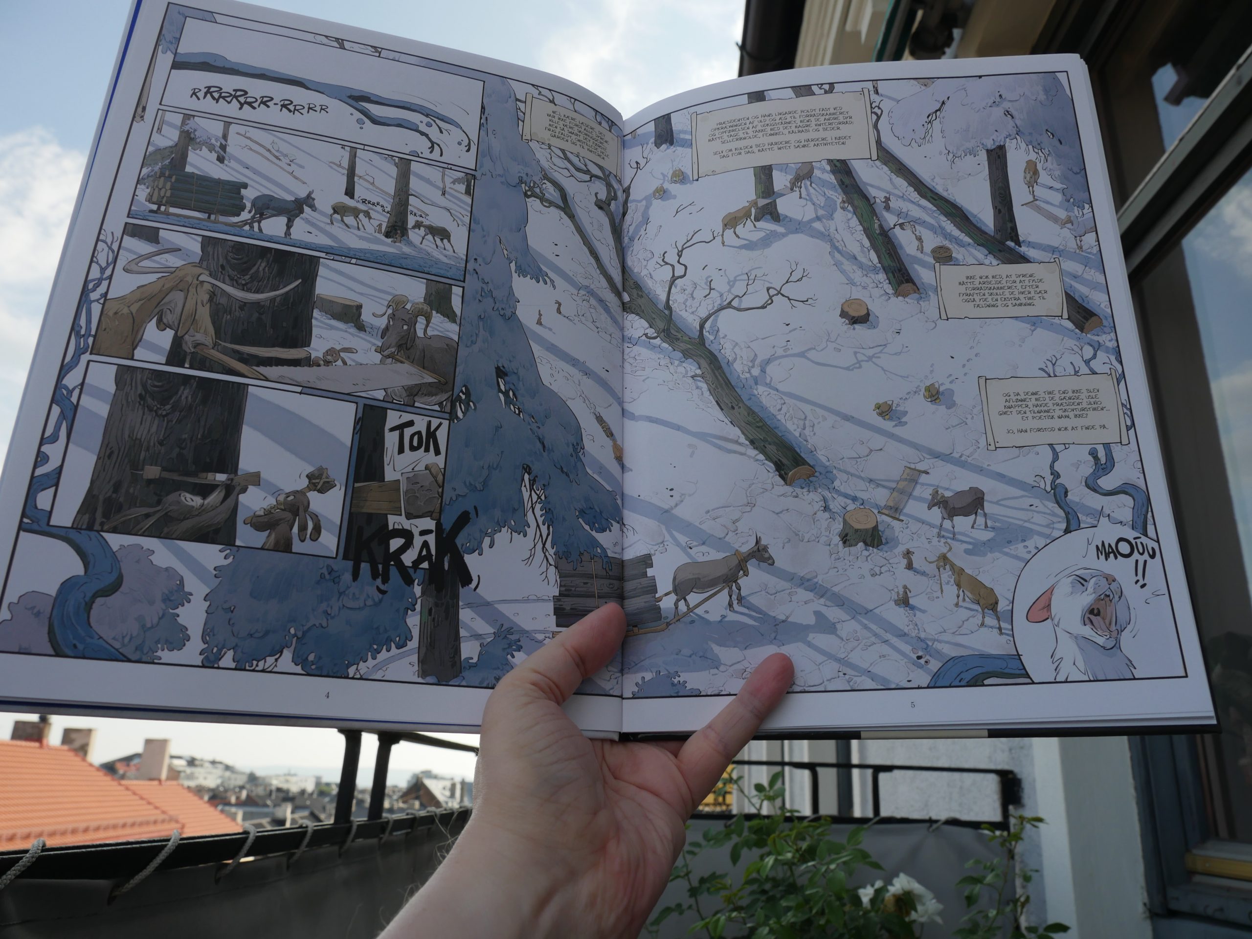
Oh, so this is basically a riff on Animal Farm? The level of anthropomorphism here is interesting: All the animals look like perfectly normal animals, except that some of them can somehow grasp tools in their paws… but these animals look very real otherwise.
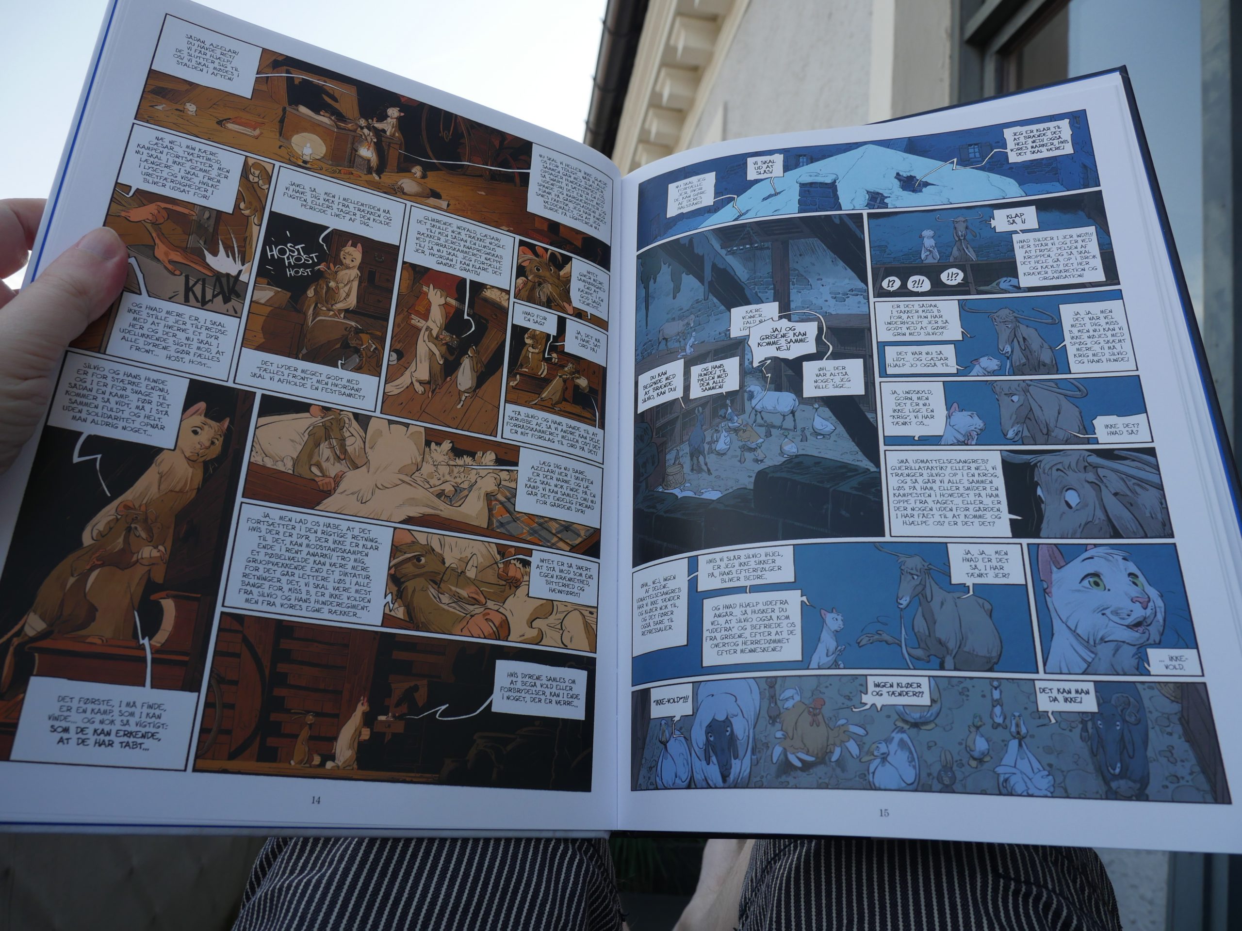
I haven’t read the first volume, but this was just excruciating to read. It’s basically about how a cat Gandhi protests against the new farm overlord. It goes on forever, and nothing interesting happens.
| Blue Iverson: Hotep |  |
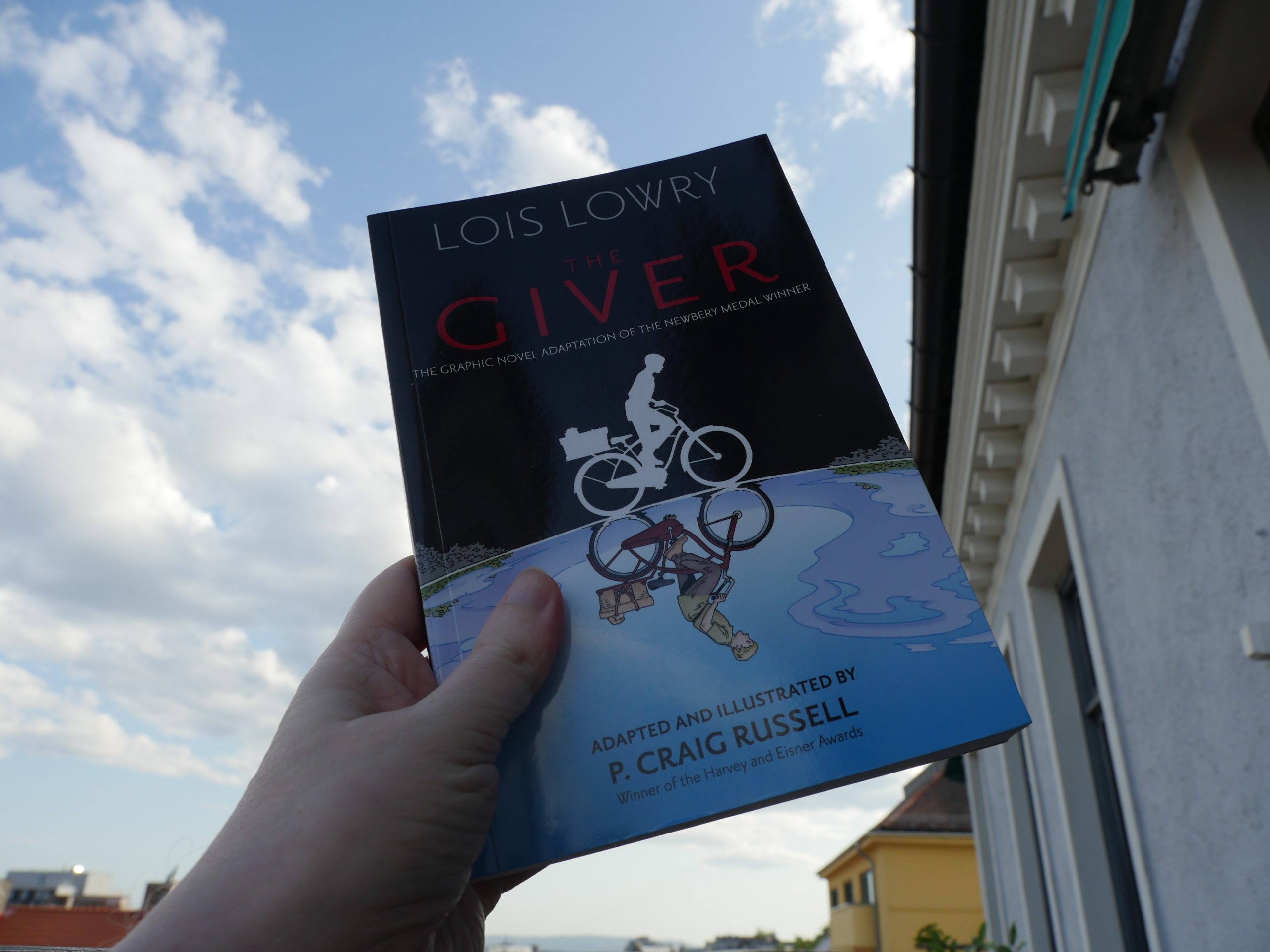
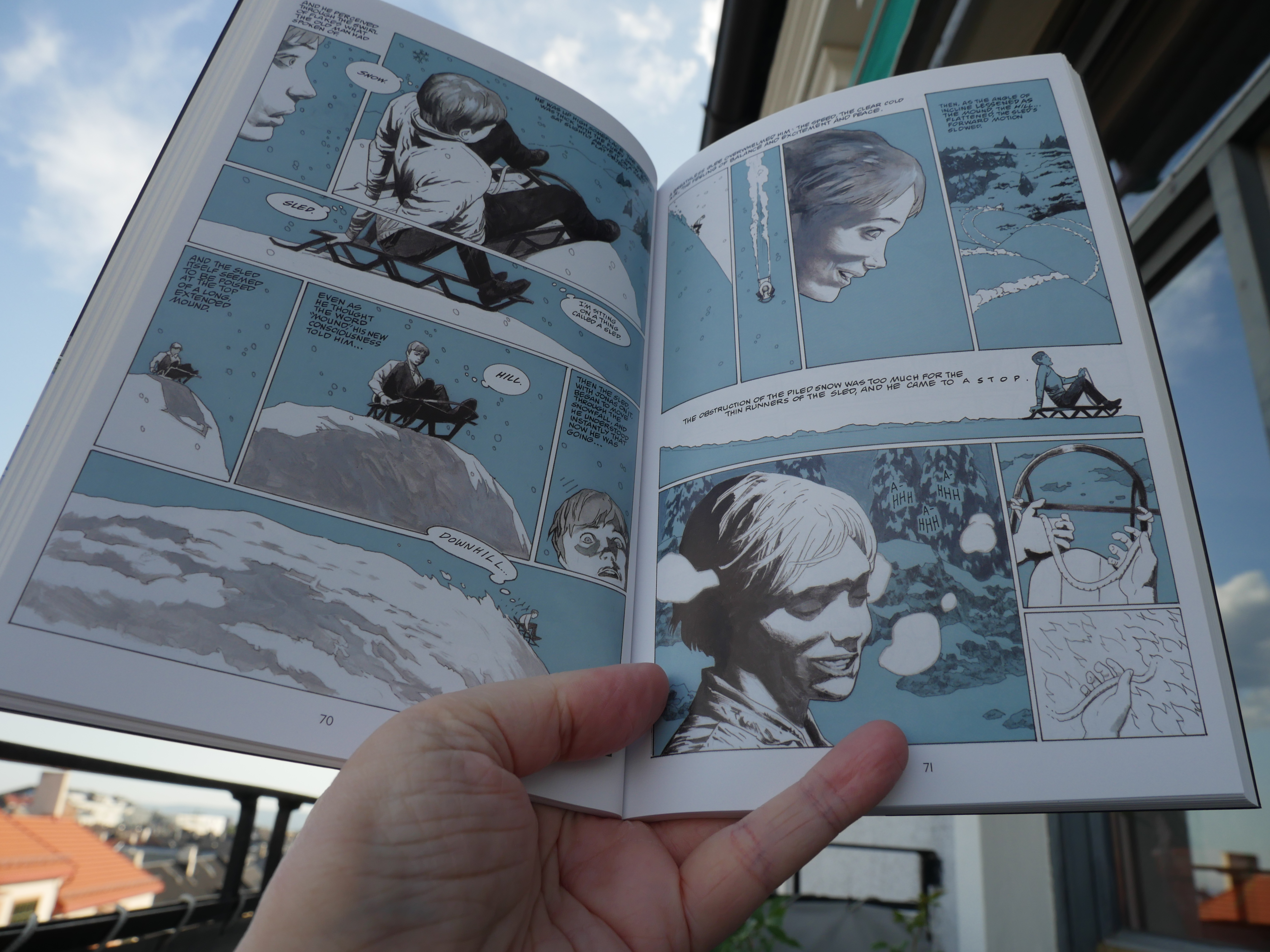
18:18: The Giver by Lois Lowry adapted by P. Craig Russell (Haughton Miffin)
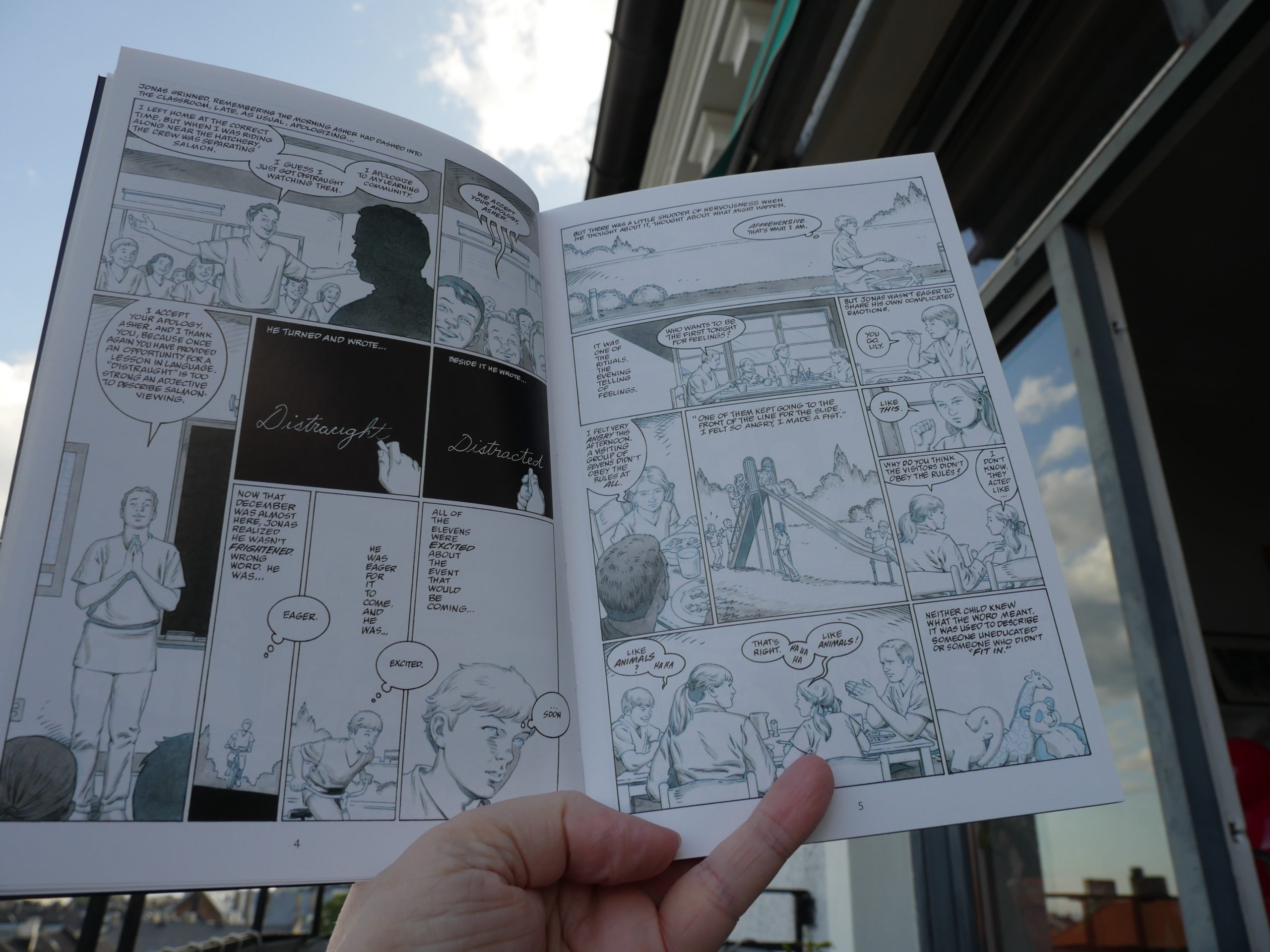
I’ve read the novel before (a long time ago), but I’m a Russell fan, so I thought I’d give this adaptation a go.
Russell makes a lot of interesting choices (that work well), like doing the first … half? of the book in this vague style — with almost looks like he’s reproducing blueline work, but it isn’t quite that. (It’s a sci fi book about a very, very regimented society.)

And then we get more distinctly rendered artwork when the protagonists learns more about what the world. It’s a choice that makes absolutely perfect sense… but it gives us a whole bunch of pages to get through before we finally get some beautiful artwork in the final chapter.
| Coil: Swanyard (1) |  |
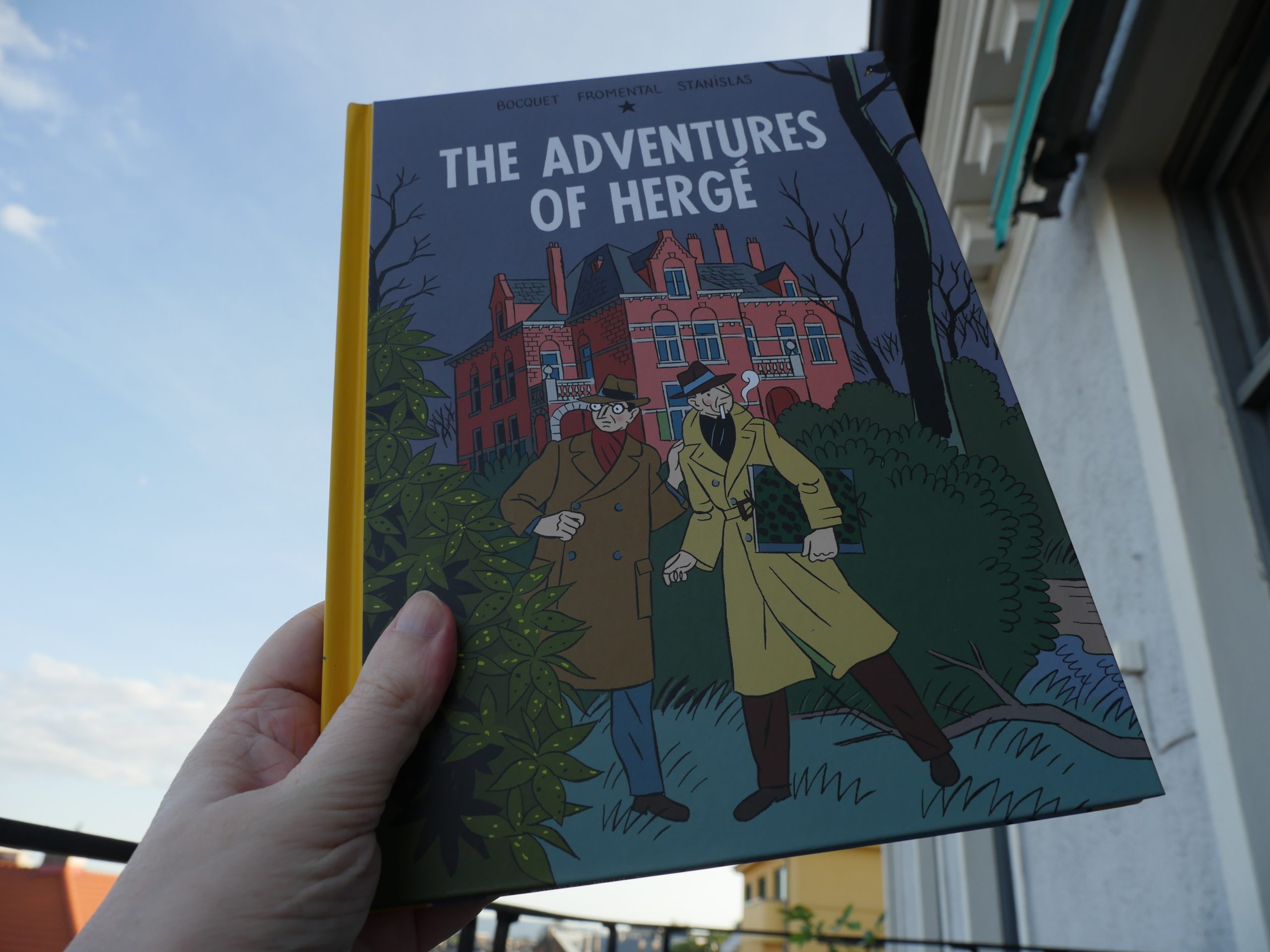
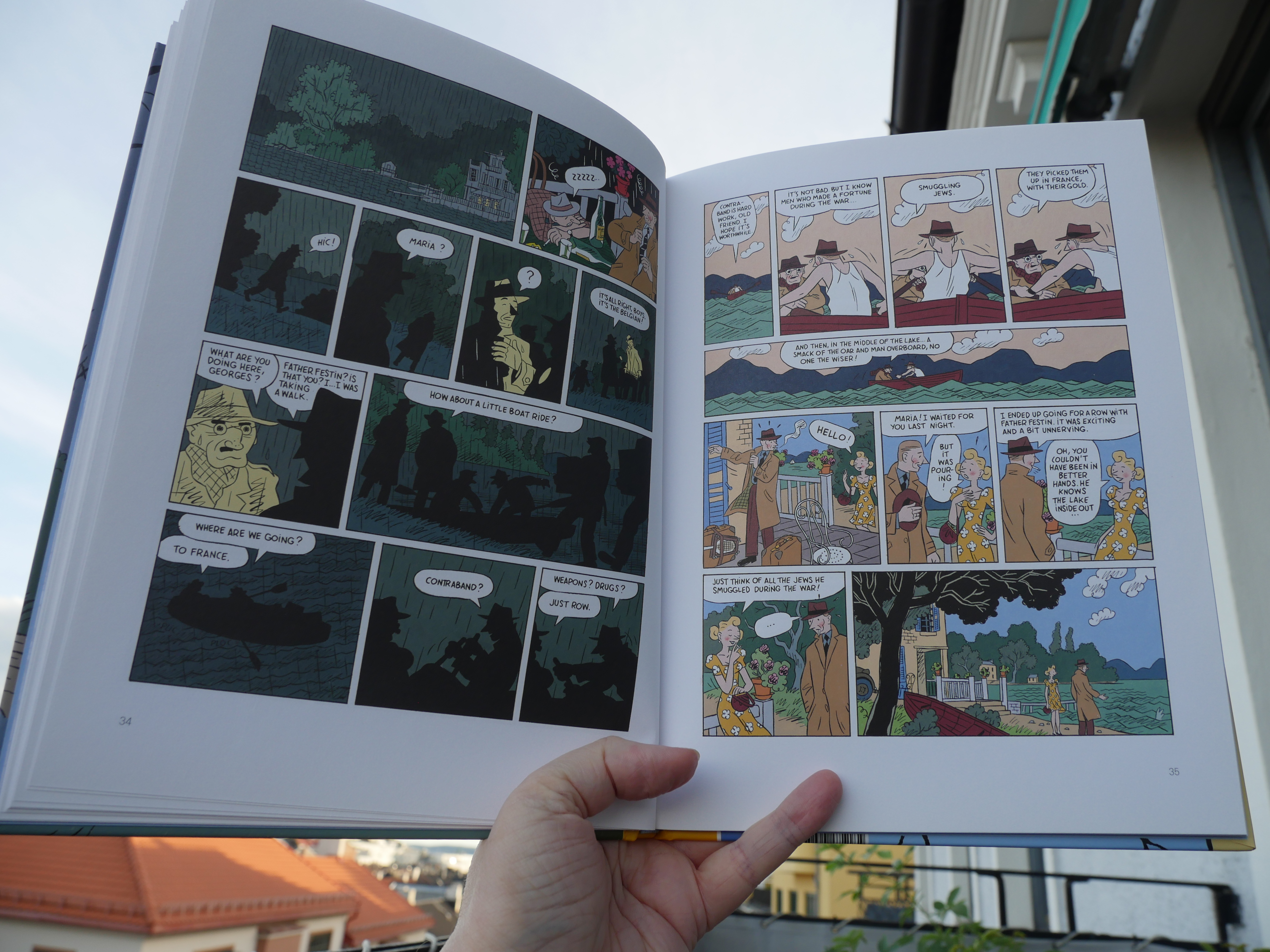
19:26: The Adventures of Hergé by Boquet, Fromental and Stanislas (Drawn & Quarterly)
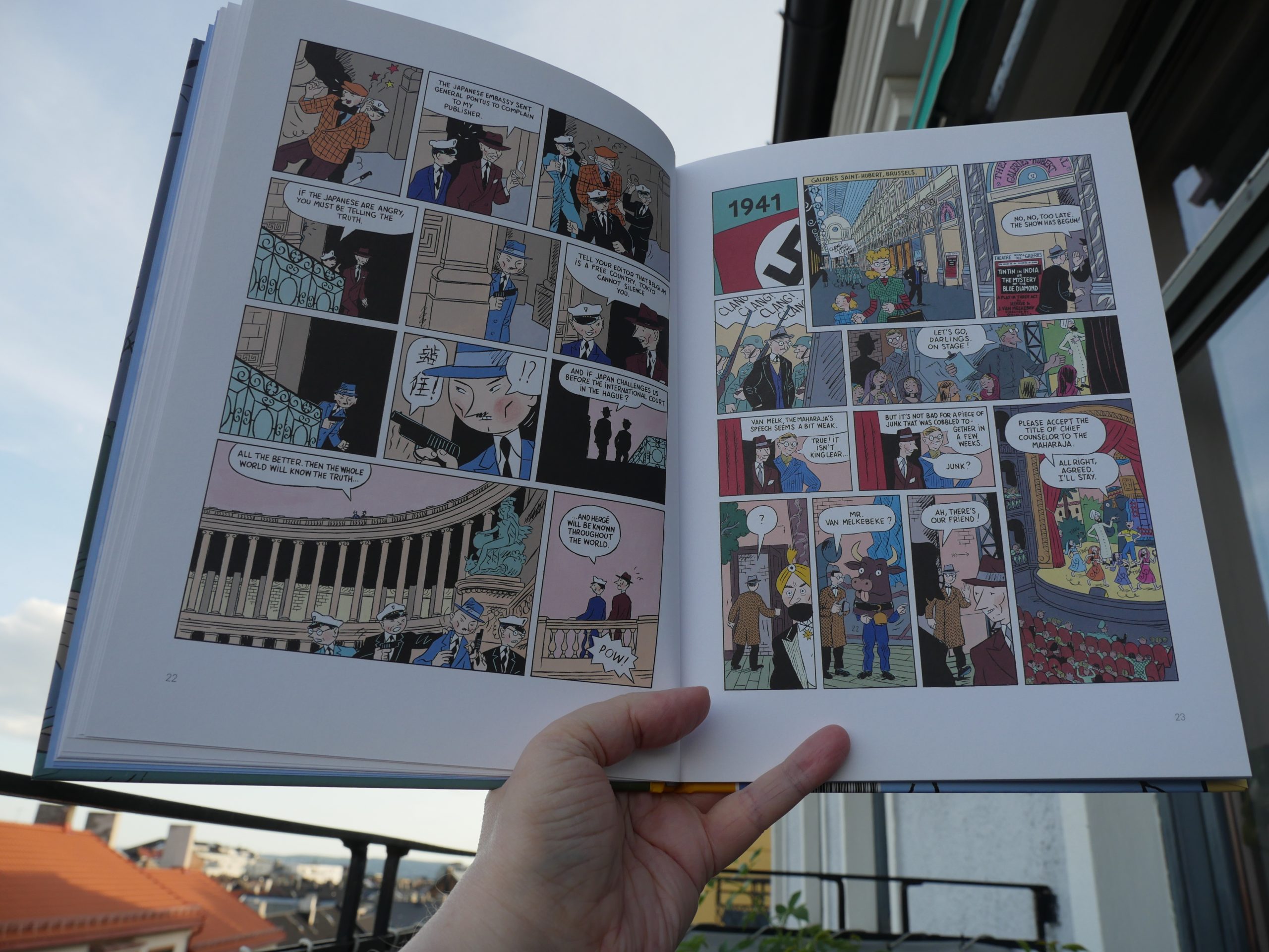
Oh, yeah — wasn’t this published in the Drawn & Quarterly anthology many decades ago? … ah, yes. But that was slightly abridged. No wonder this seemed eerily familiar.
So this is a biography of Hergé, drawn in his style. It’s telegraphs a lot of the story — if I didn’t know a lot of this already, I don’t think I could have made any sense out of much of this.
So it kinda functions like a … souvenir? for people who are already really into Hergé? “Ah yes, here’s the bit where he did that thing, and here’s that bit with the guy that co-wrote the Moon books”…
But, I mean, it’s pretty good?
| Stereolab: Transient Random-Noise Bursts With Announcements (1) |  |
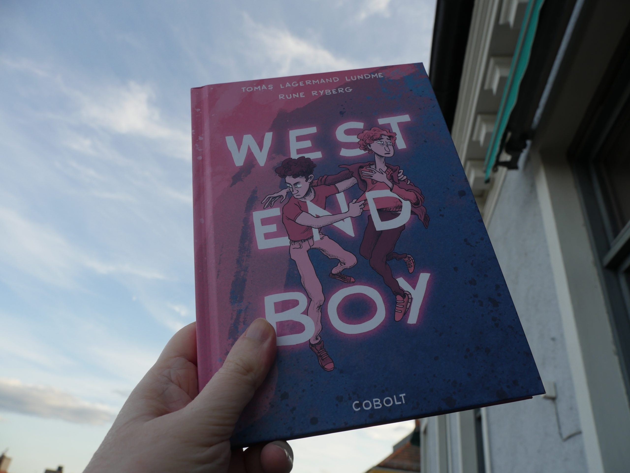
20:01: West End Boy by Tomas Lagermand Lundme & Rune Ryberg (Cobolt)
This is a very odd book. Except for the first few pages, it all takes place in a hotel room. Which makes me wonder whether this was adapted from a stage play? Or a very low-budget indie movie?
So Much Drama! It’s about a sex worker who *gasp* finds out that the older, married guy who’s paying him isn’t actually planning on them spending their lives together in the countryside.
OOPS SPOILERS.
| Xeno & Oaklander: Hypnos | 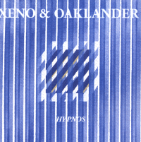 |
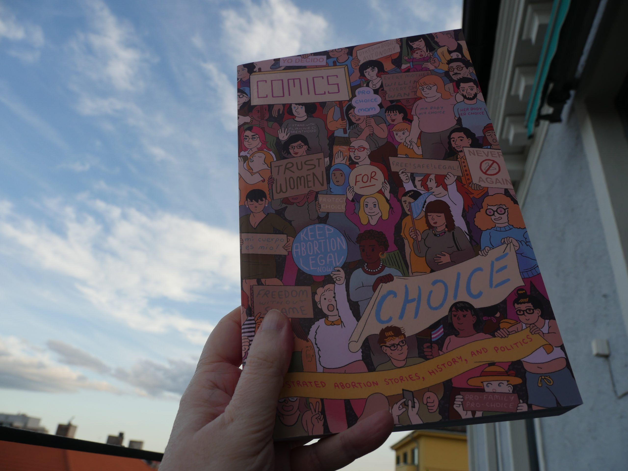
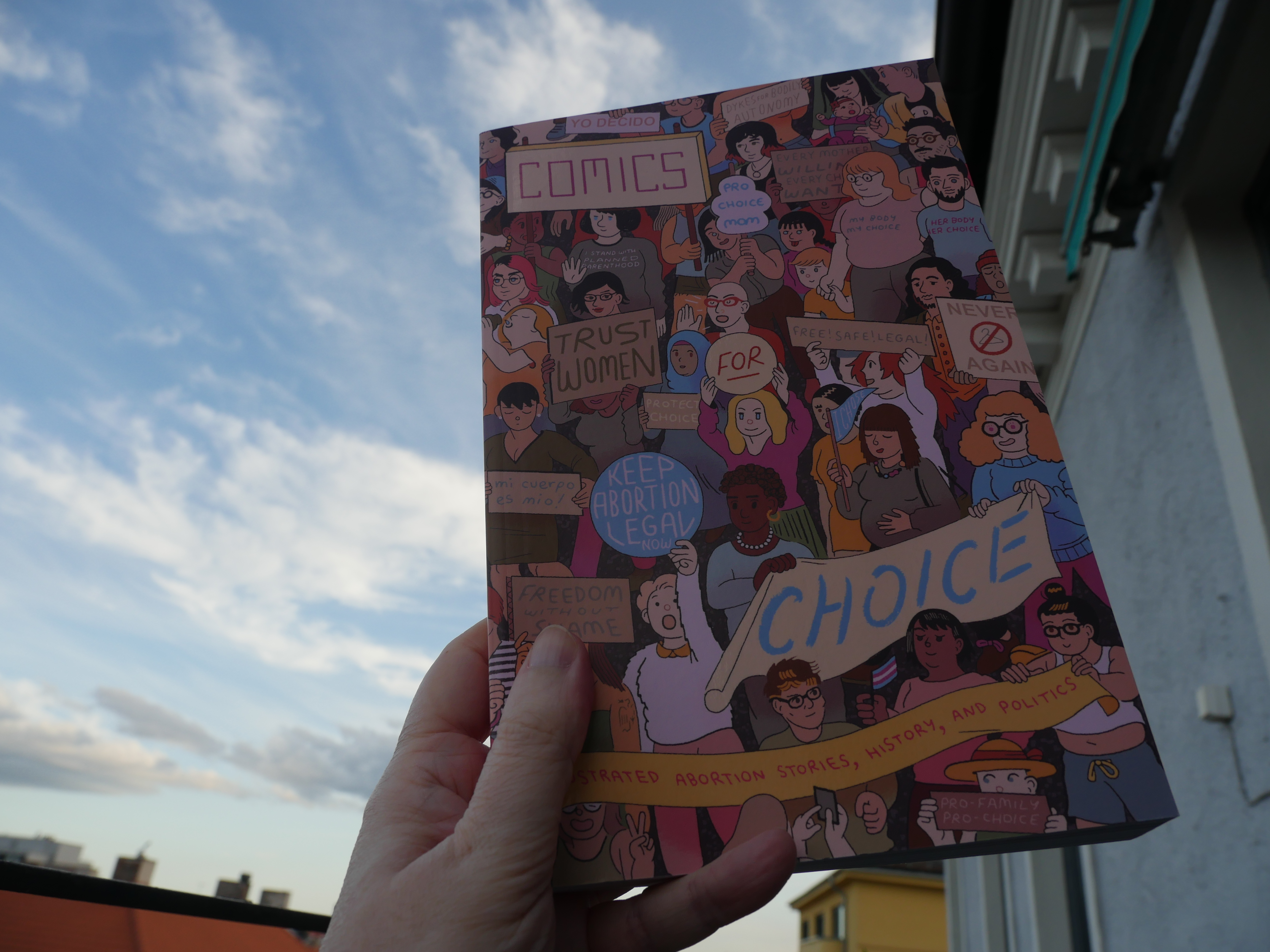
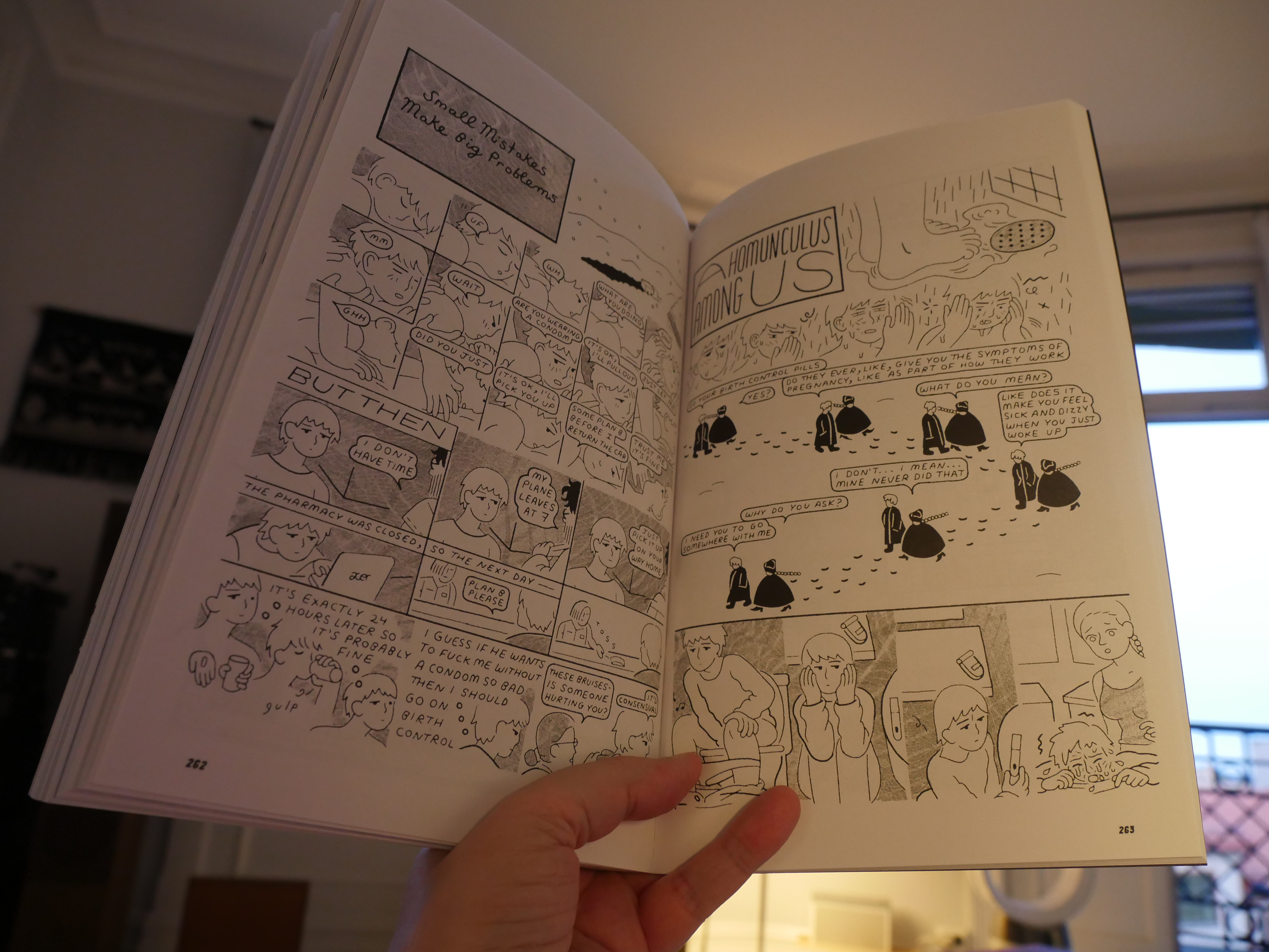
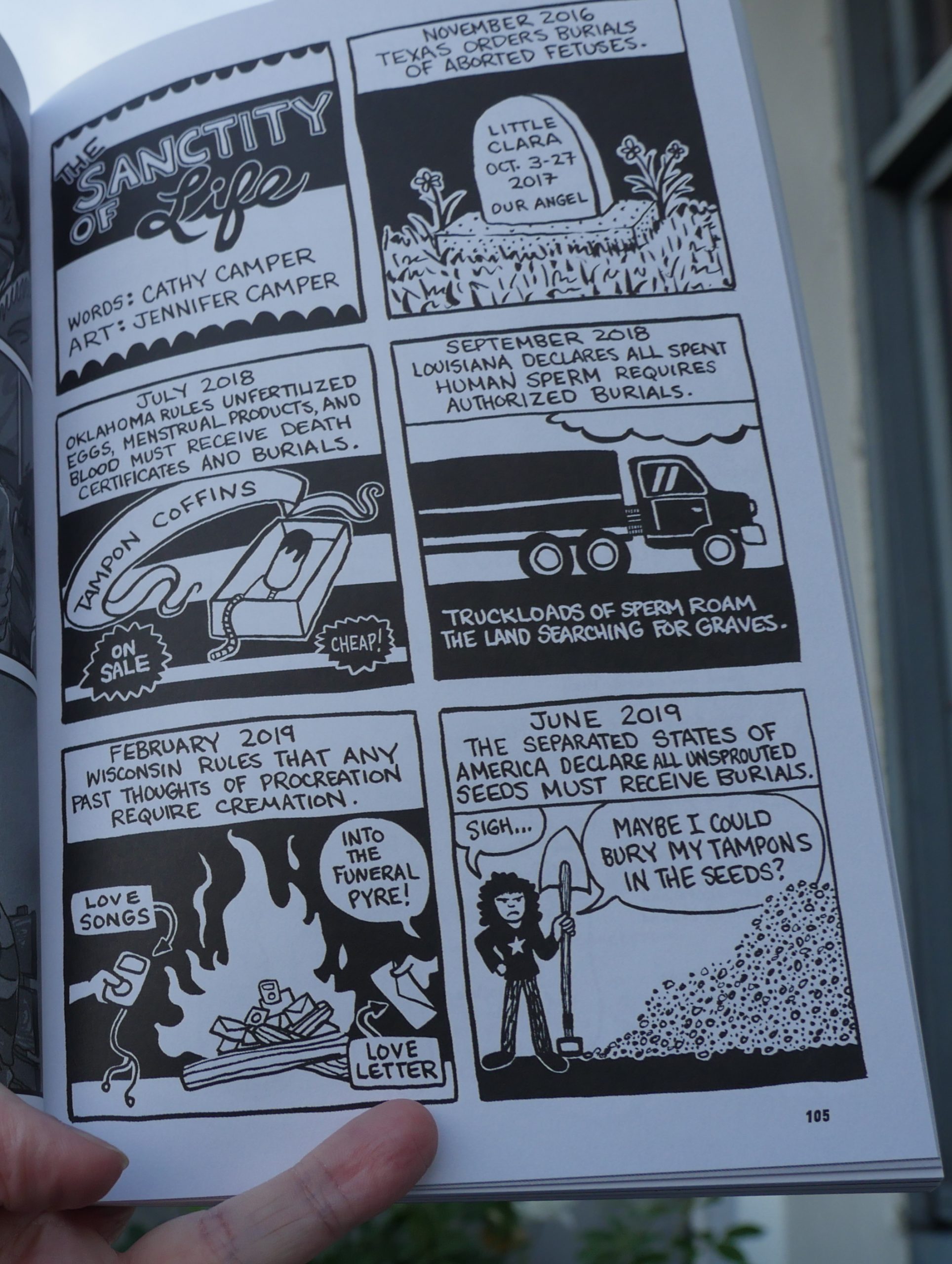
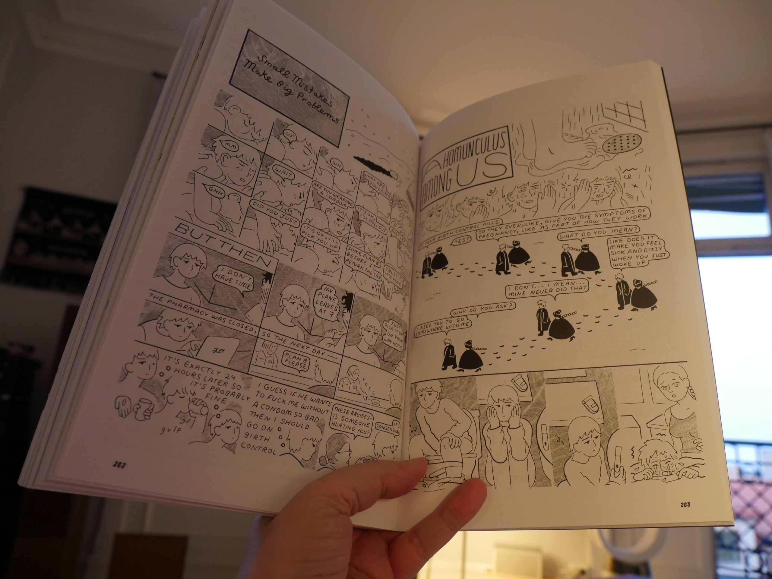
20:19: Comics For Choice edited by Ø. K. Fox & Whit Taylor
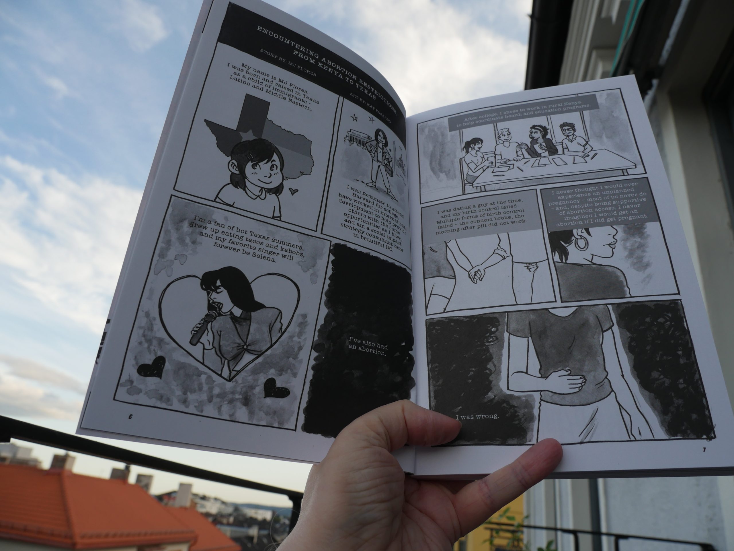
This is an anthology about abortion. There’s a wide range of approaches — but most of them are really straightforward.
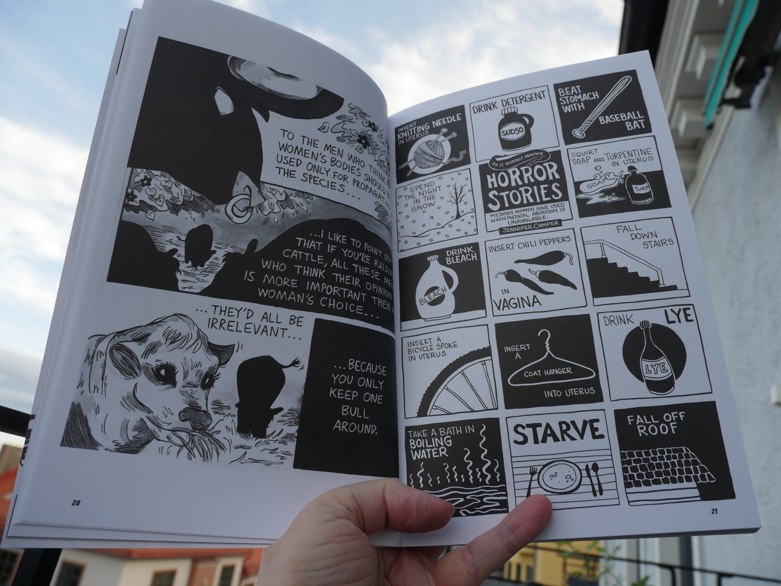
Some are appropriately angry.
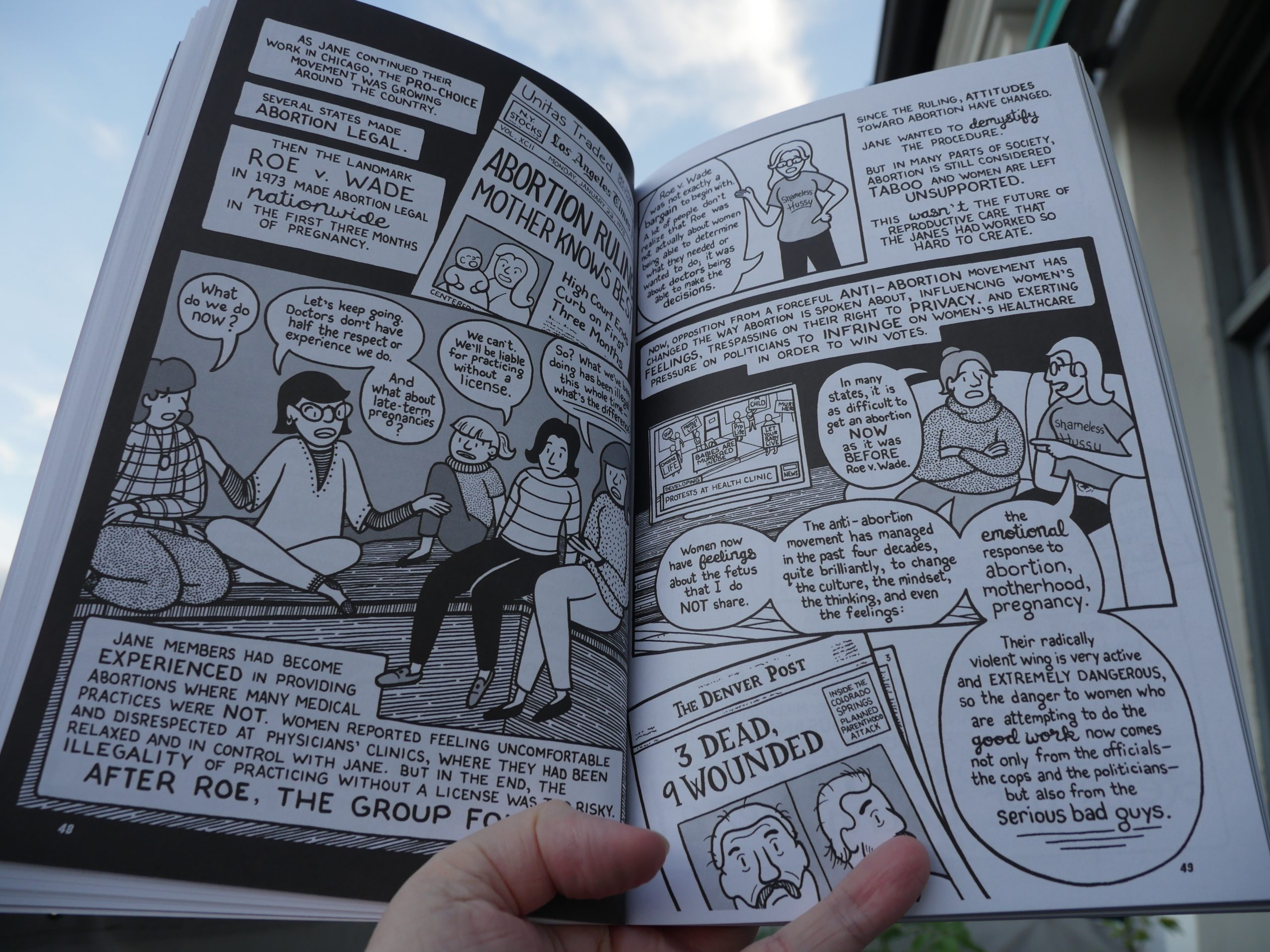
And some of this I didn’t know about, like the Jane network that performed abortions in the early 70s? Wild!
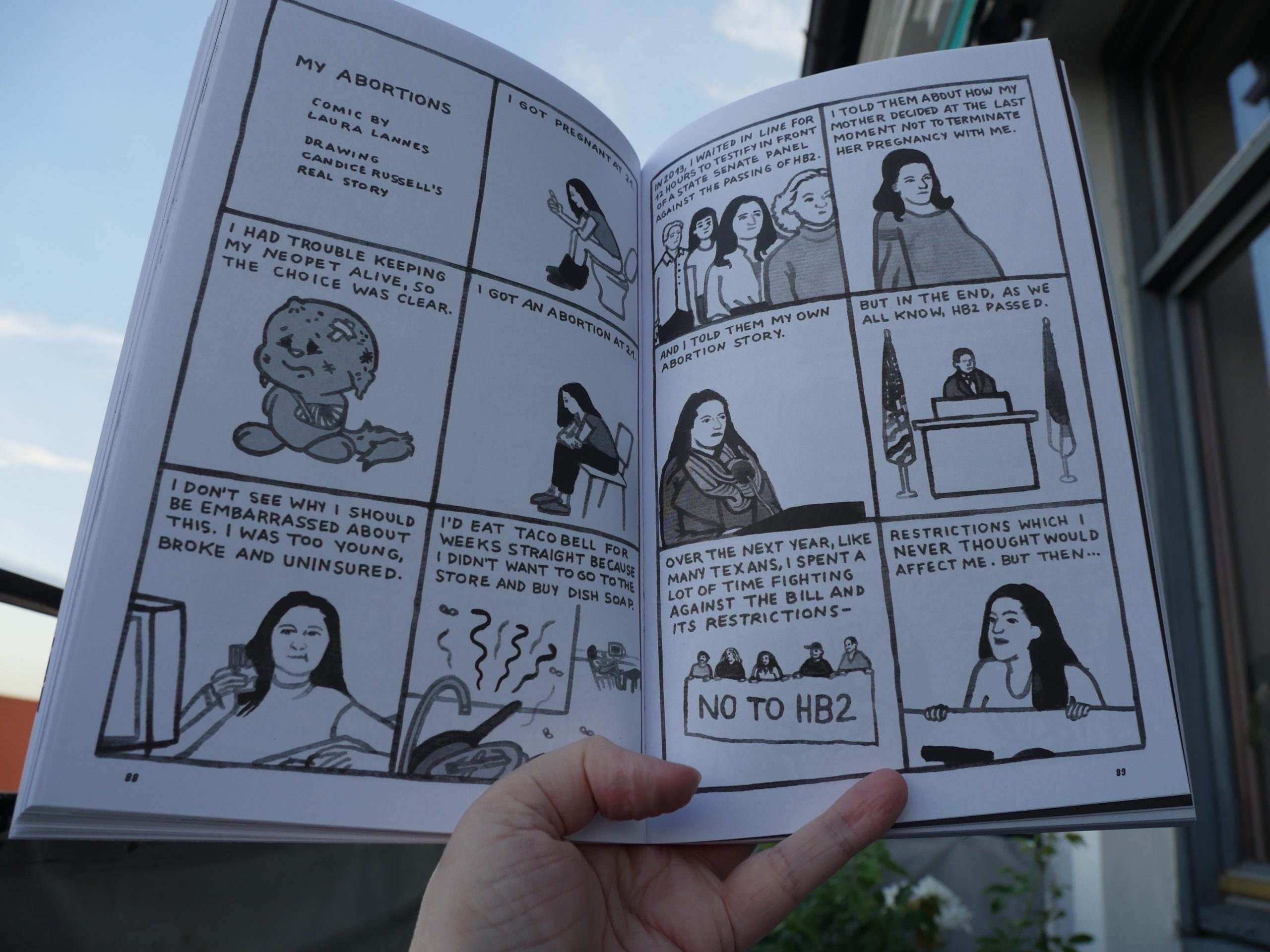
There’s a few pretty…. er… amateurish things in here, but quite a few like the above, are cool.
Heh heh.
(It was getting too windy outside, so I moved inside.)
The Sophie Foster-Dimino thing is absolutely devastating.
| Neil Young: Archives Vol. II (8): Dume (1975) |  |
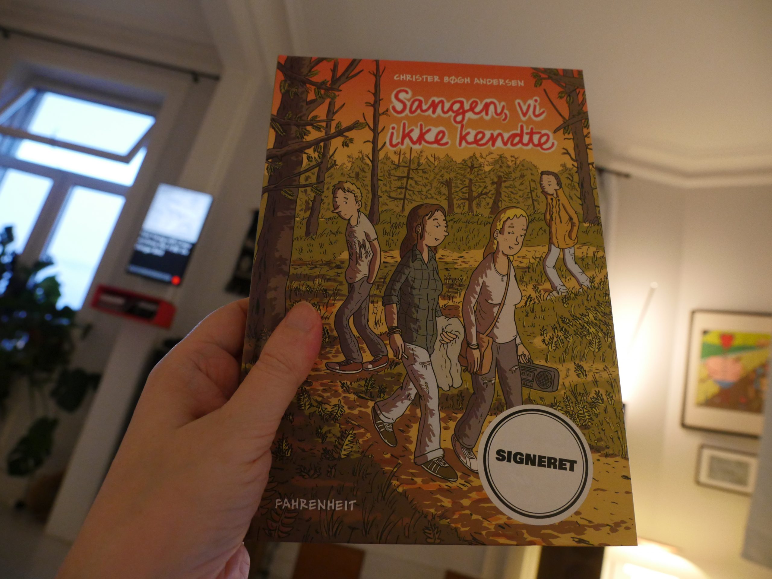
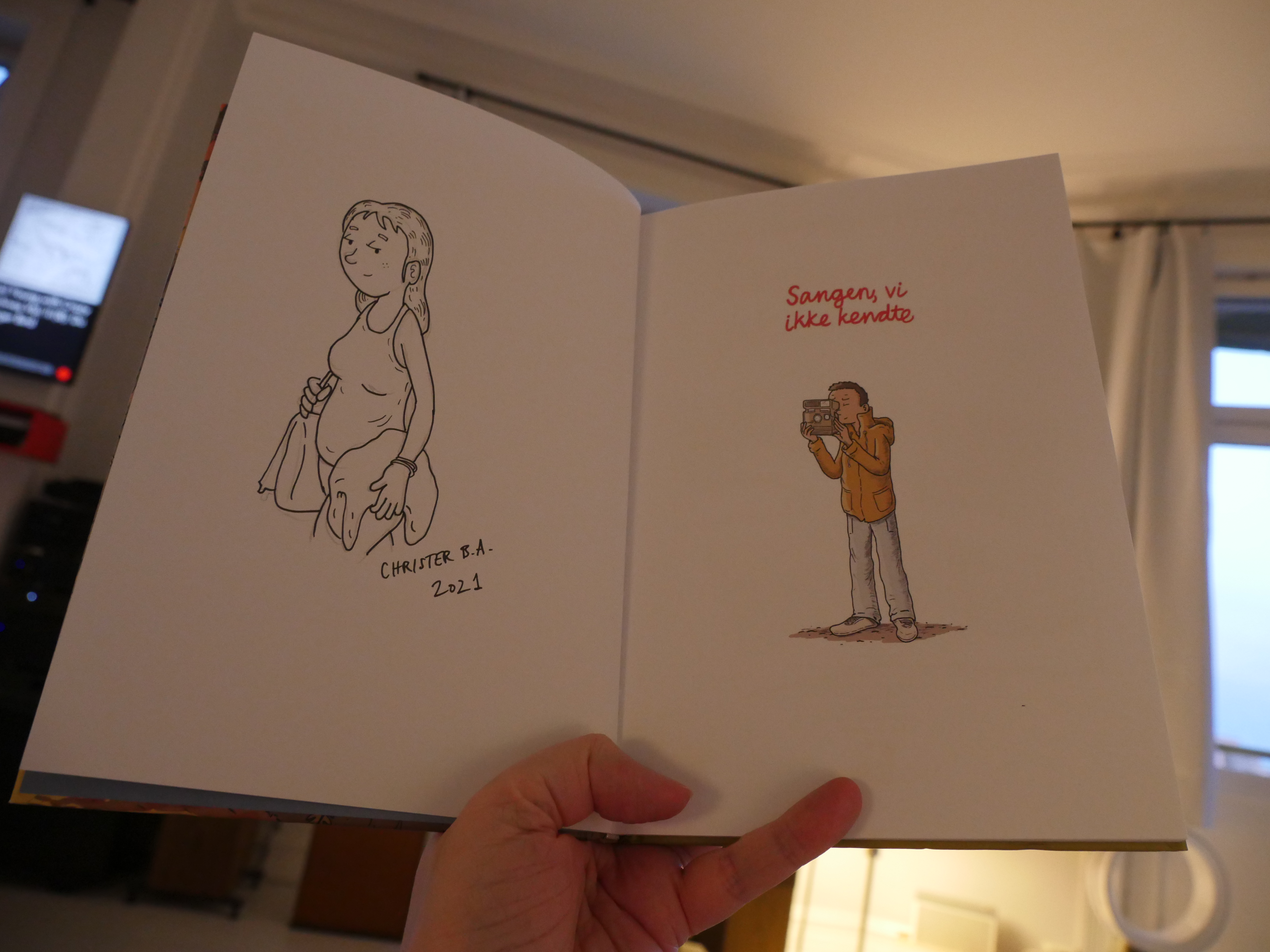
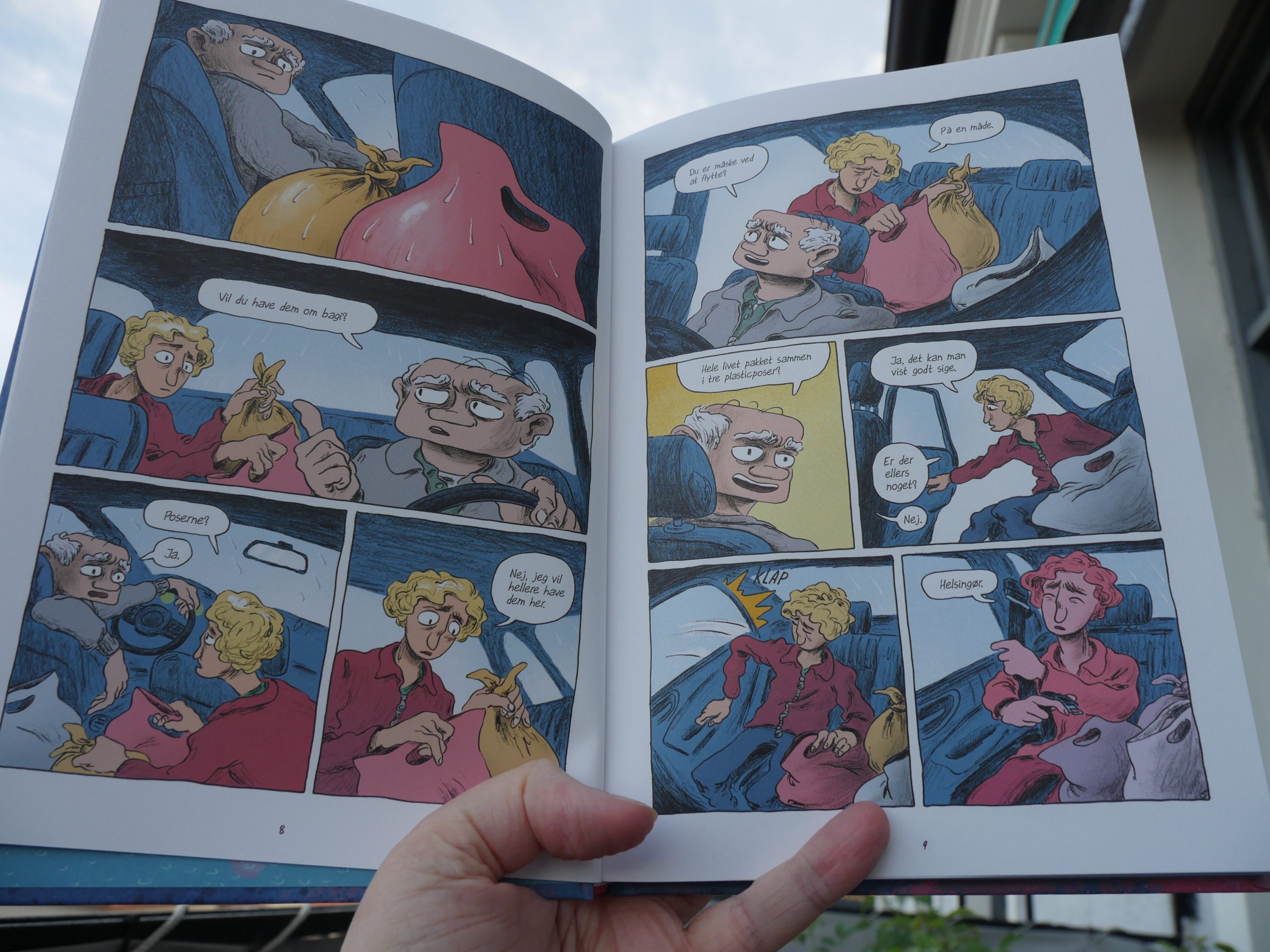
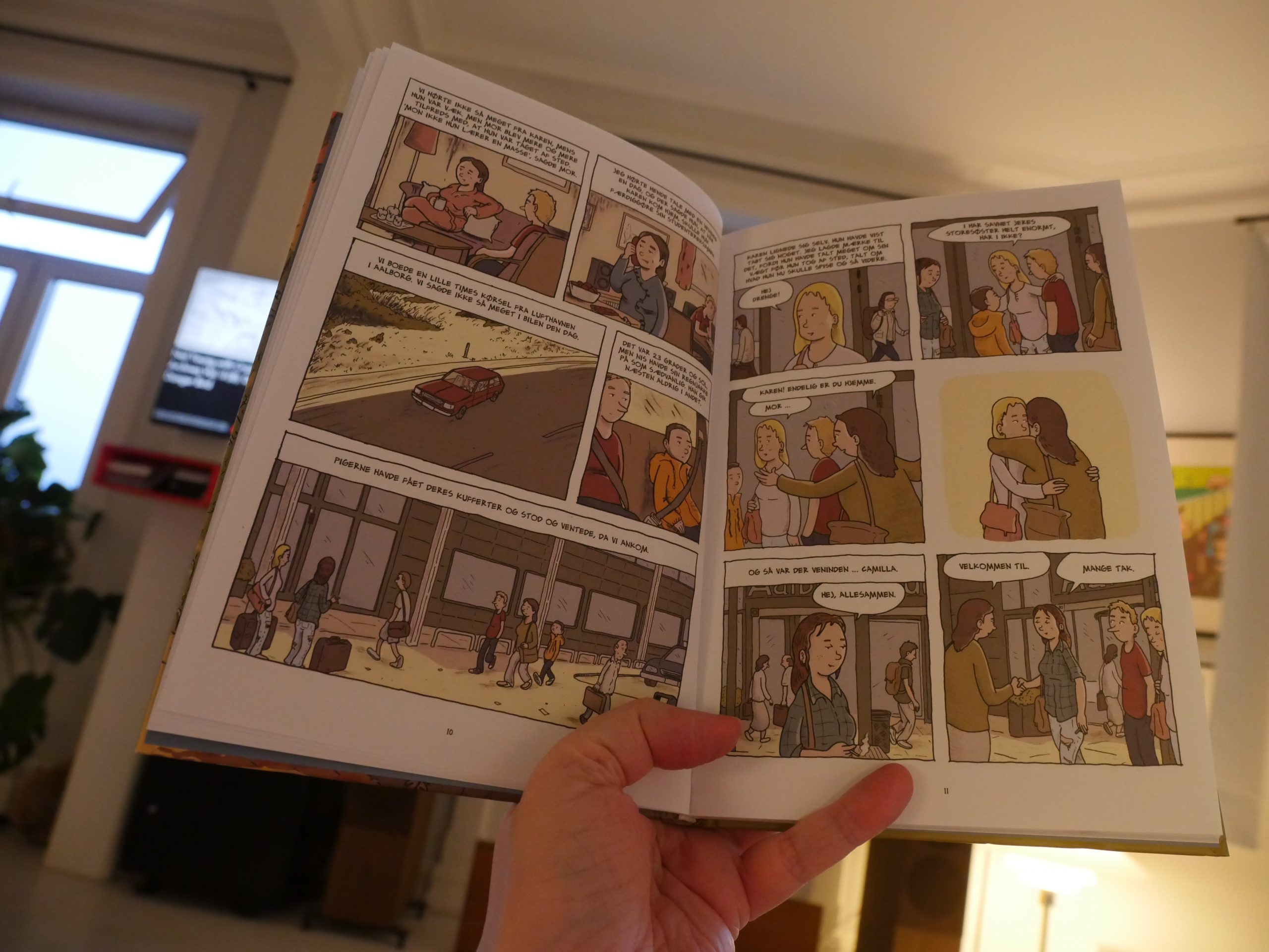
22:08: Sangen, vi ikke kendte by Christer Bøgh Andersen (Fahrenheit)

Hey! This is signed and with a sketch from the artist? Thank you, Faraos.
I’m not super excited about the palette — everybody’s doing this desaturated thing now?

But it’s a really lovely book. I don’t know whether it’s autobio or not, but if it is, it’s been really well digested and considered. Autobio people often drop into an axe-grinding mode that’s offputting, but this is really smart. The point-of-view character is this teenage guy with an older sister and a younger brother, and the book is more about them than himself.
The central scene, with the dinner at the neighbour’s house, is pure magic. Perhaps too magical? It does feel very real and it is moving, but it’s also a scene that feels very calculated in this book. That is, the structure of this book is totally perfect — and that can start to feel fake?
Anyway, it’s a fantastic book.
| Stian Westerhus: Redundance |  |
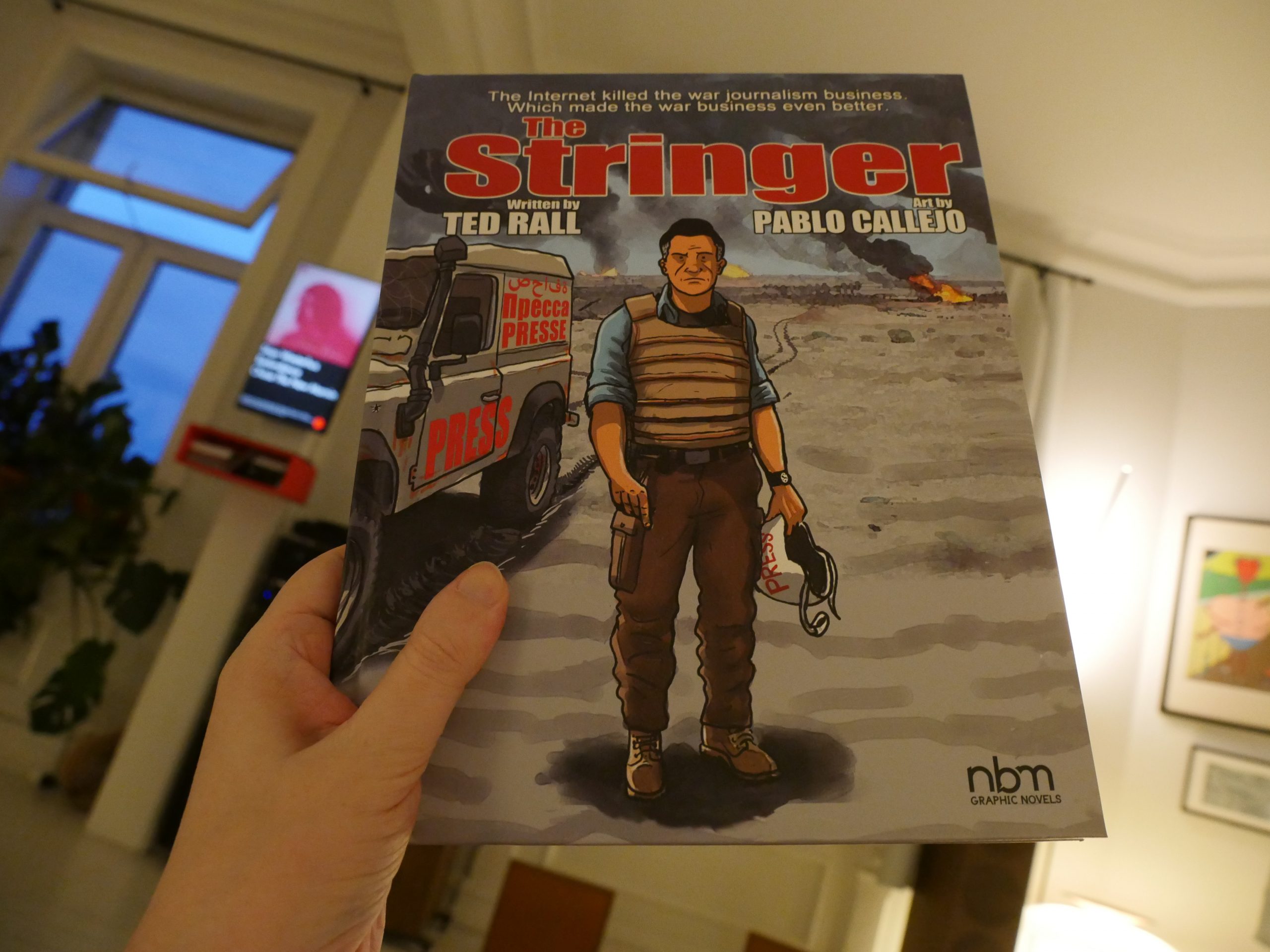
22:51: The Stringer by Ted Rall & Pablo Callejo (NBM)
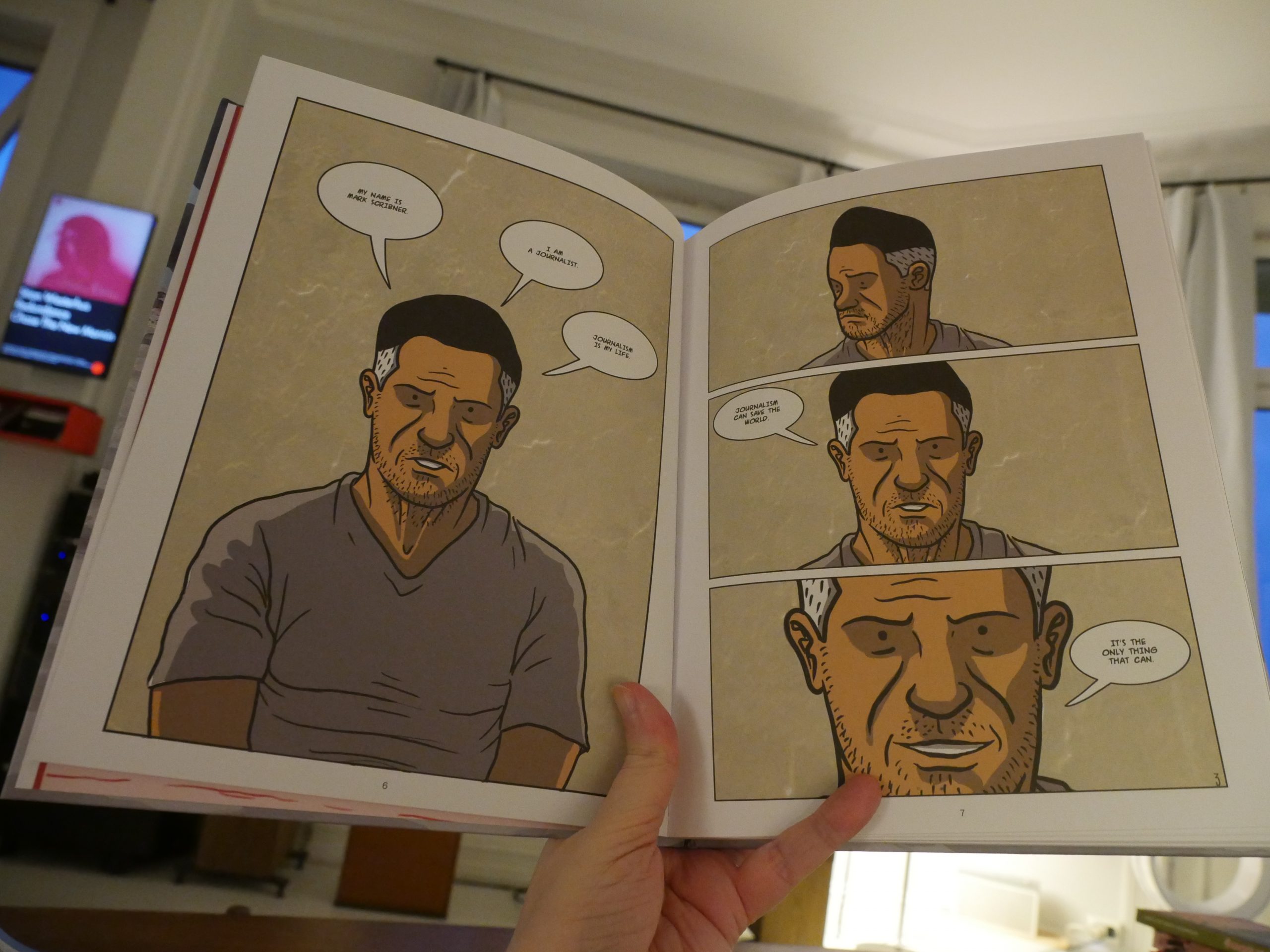
Oh god, not another journalist biography comic book! I hate these so much!
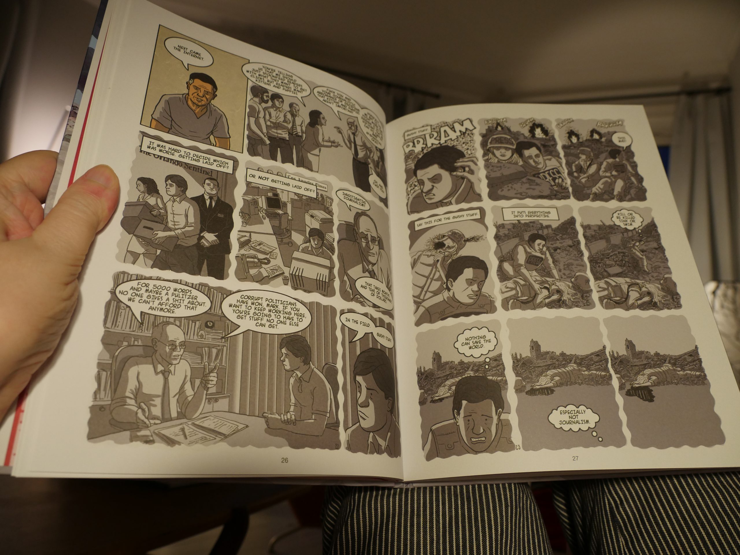
And this flashback style gets really boring really fast.
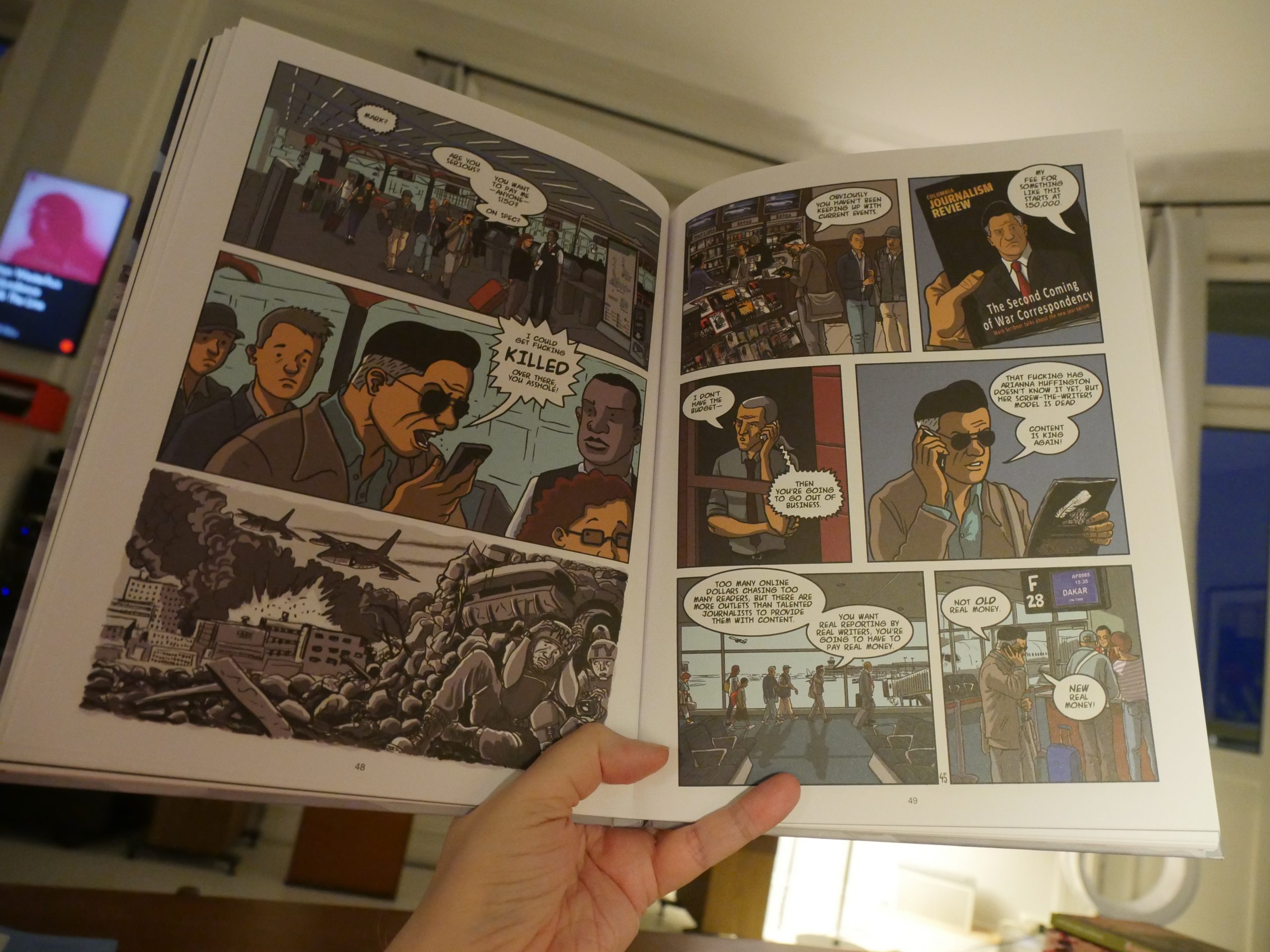
But… but… WHOHO! Rall pulled a fast one on us! It’s not a book like that at all! Wow! That’s cool. Good one, Rall.
Callejo’s artwork is quite pleasing — he sometimes goes kinda Tardi in his lines, and that’s even better, but even when he’s not doing that, the pages are quite attractive.
Now, I imagine everybody hates this book, and, yes, the storytelling gets really choppy after about the halfway point. It’s like things don’t quite connect? It manages to feel like it’s too long and there’s not enough connecting tissue… at the same time? That’s a unique achievement. So … this isn’t a good book, but I like the concept of it.
The Comics Journal:
Ted Rall knows nothing about journalism, just as he knows nothing about anything. The Stringer is another impressive low point in a career composed of little else.
Tee hee. Score!
| JPEGMAFIA: All My Heroes Are Cornballs |  |
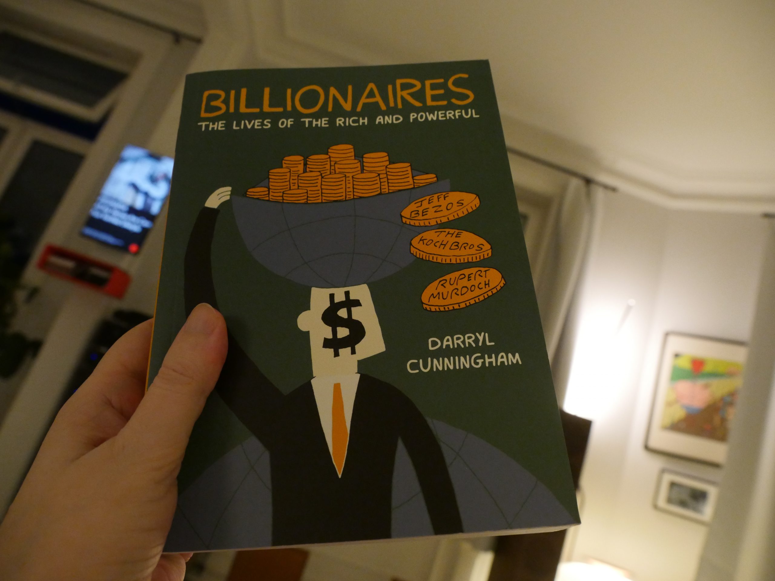
00:10: Billionaires by Darryl Cunningham (Drawn & Quarterly)

What the…
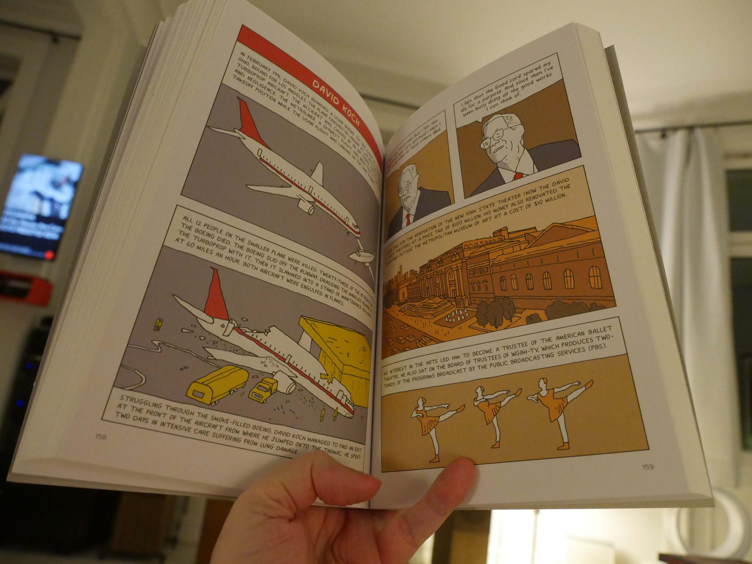
What the…
This is just a straight-up Wikipedia dump of some evil people?
Not today, Satan.
| JPEGMAFIA: All My Heroes Are Cornballs |  |

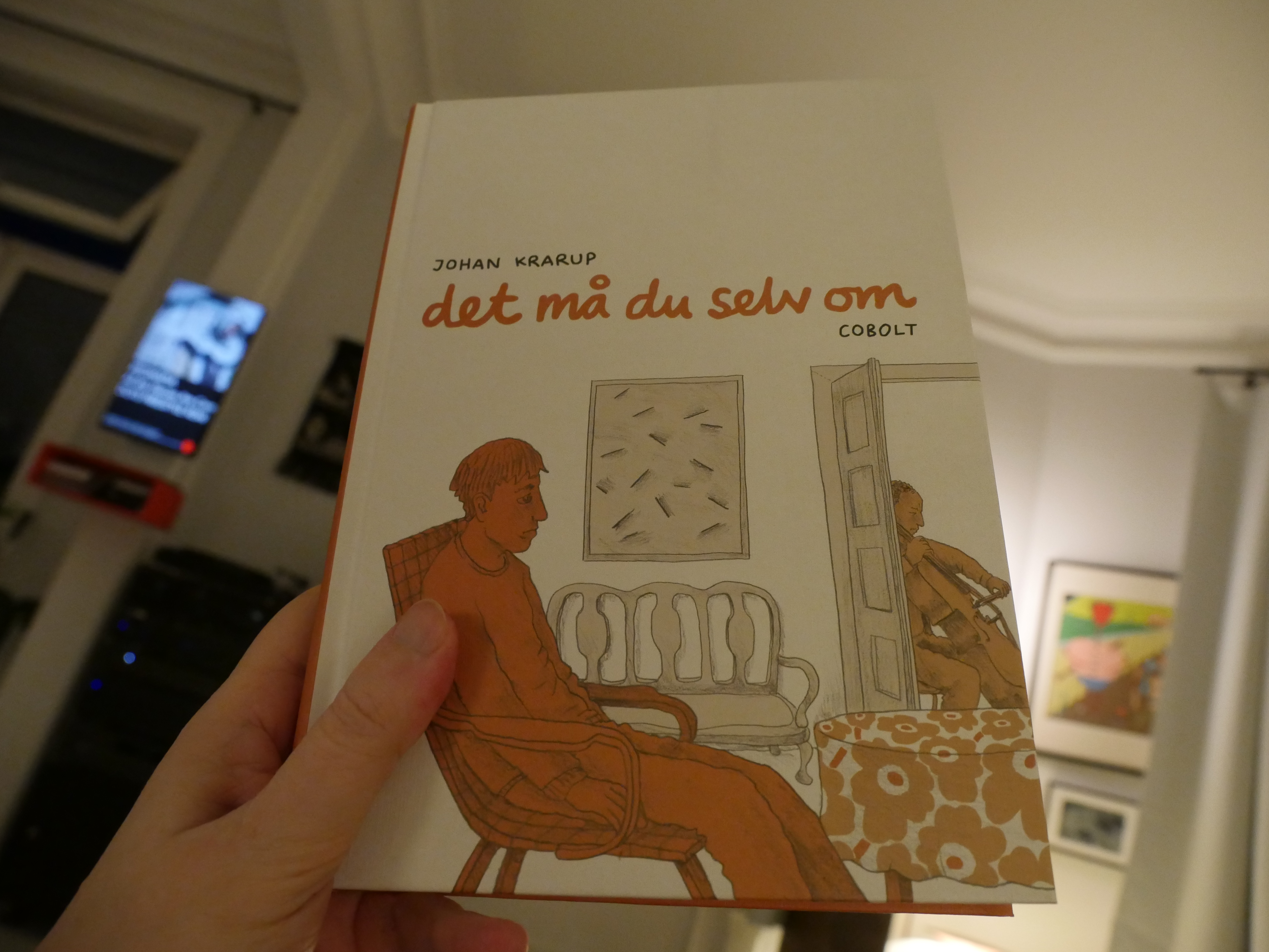
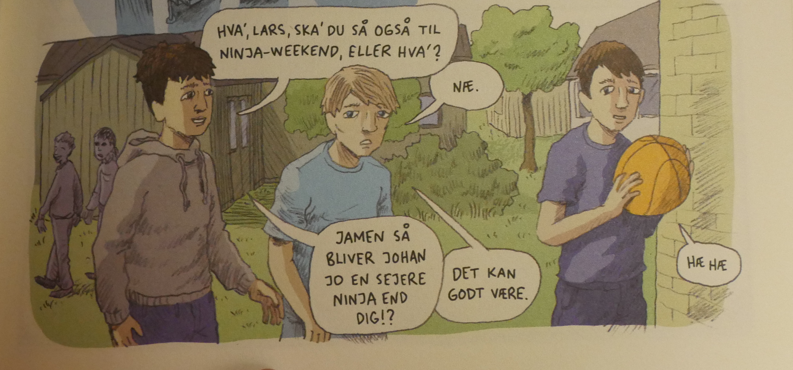
00:14: Det må du selv om by Johan Krarup (Cobolt)
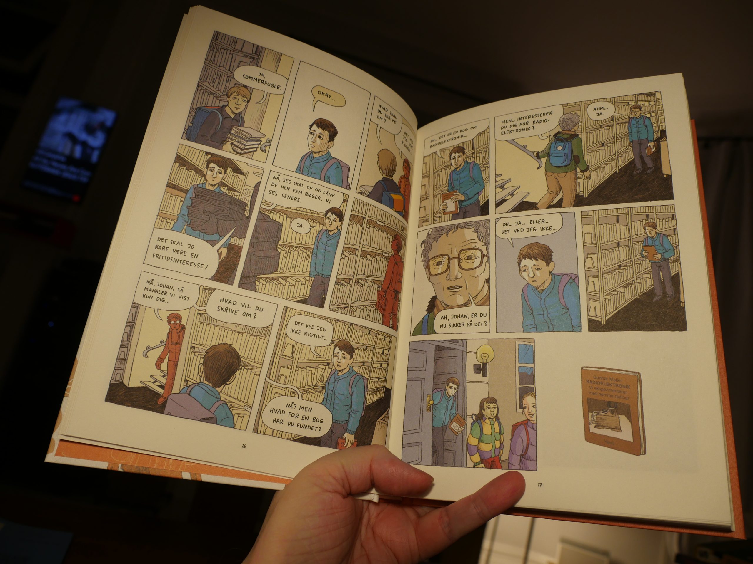
Oh, deer. This is kinda exactly what I was worried that other Danish book was going to be.
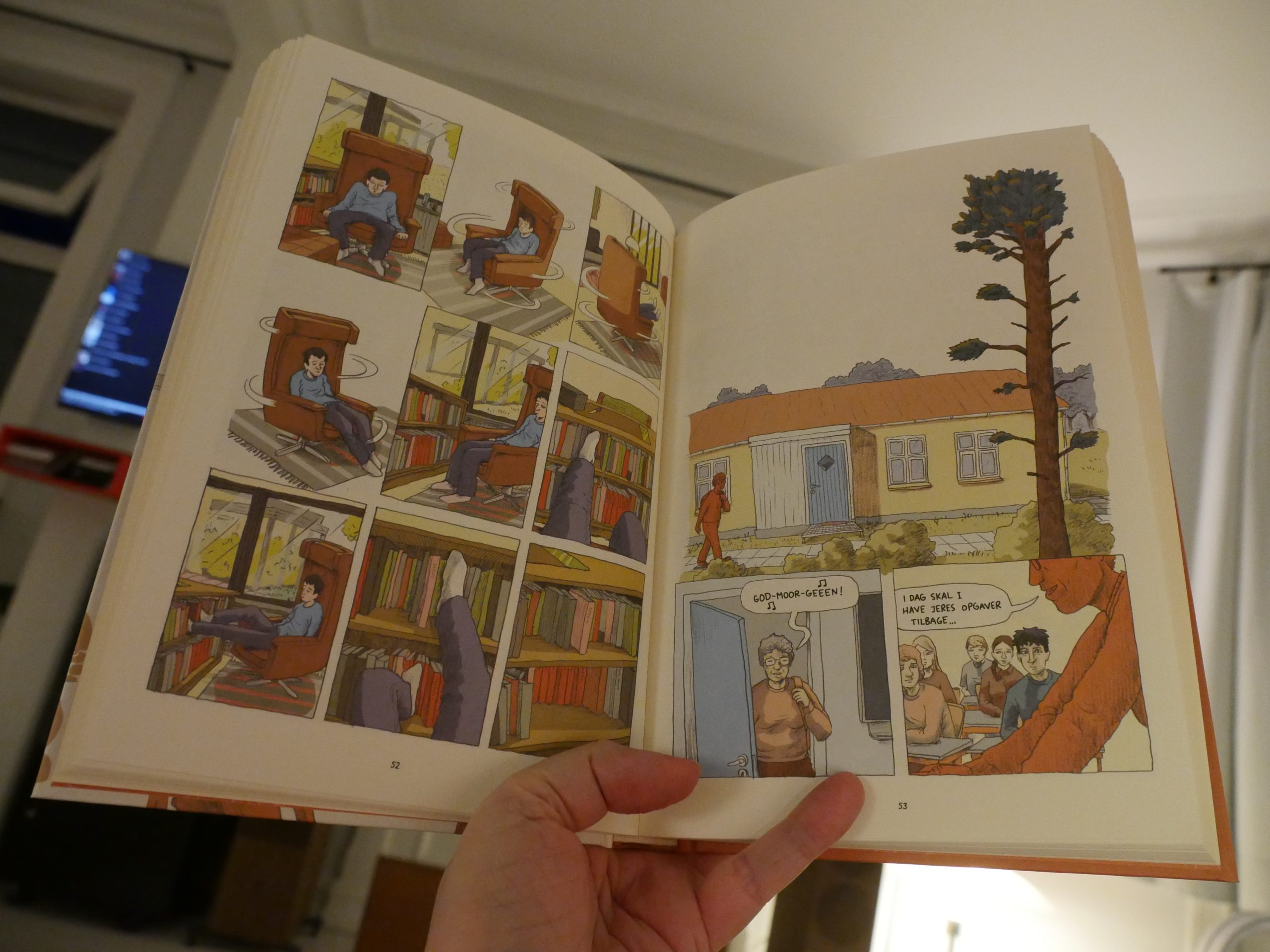
It’s about a dorkish kid, and it’s all about him, him, him — and how his parents just sucked, and his teacher sucked, and his sports trainer sucked. (And, to be fair, how he, himself, sucked.) So many axes to grind.
I mean, it’s not… awful or anything? But it’s so undigested.

And I just had huge problems keeping the Jeff Lemire-looking characters separate. Fortunately they keep calling each other by names in ever other speech balloon — otherwise it would have been impossible to tell who’s who.
| Jane Siberry: 2020: A World Without Music |  |
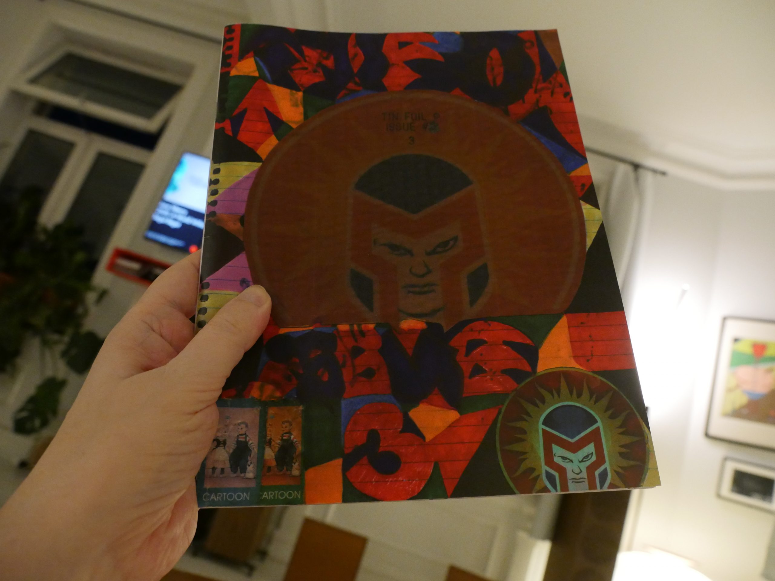
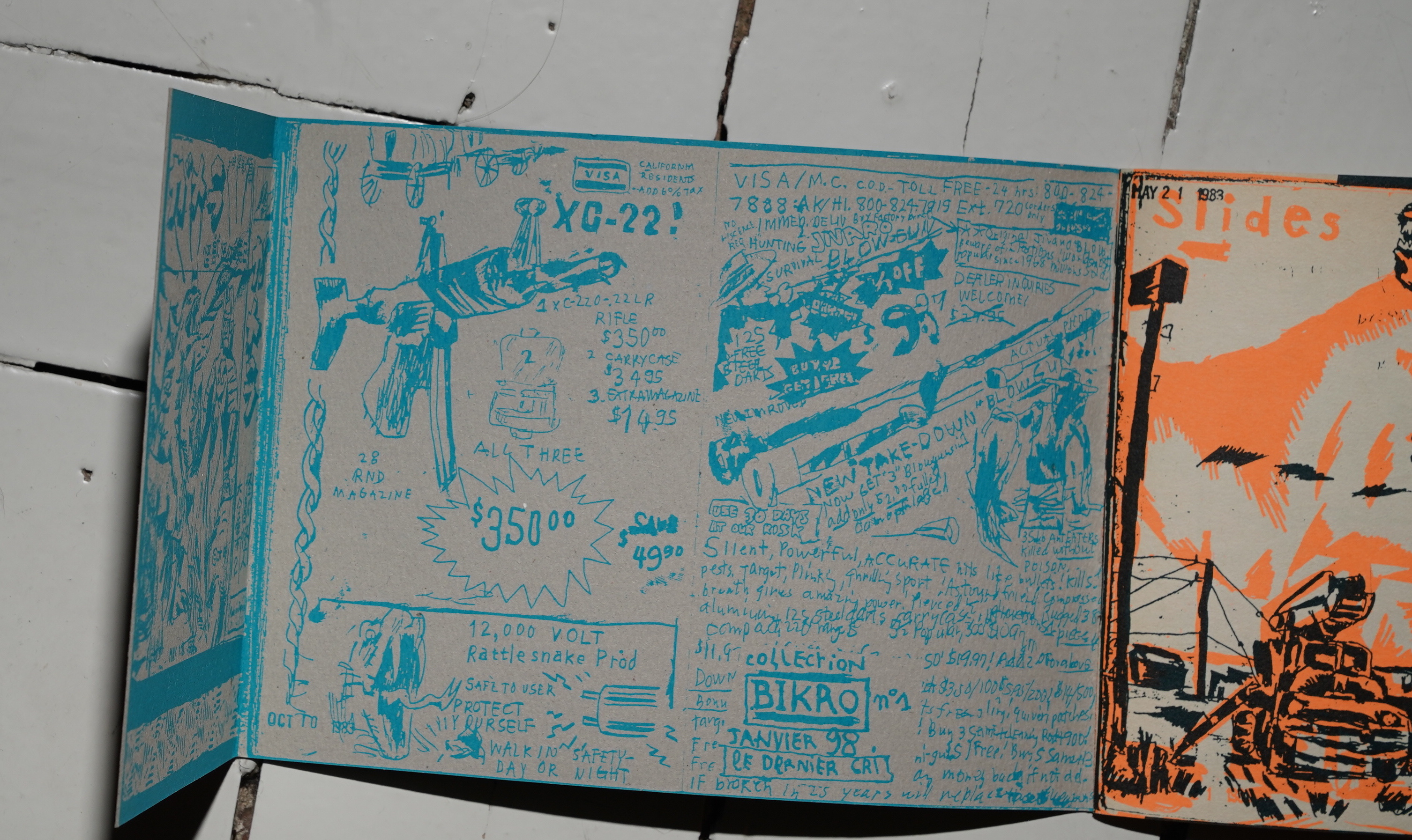
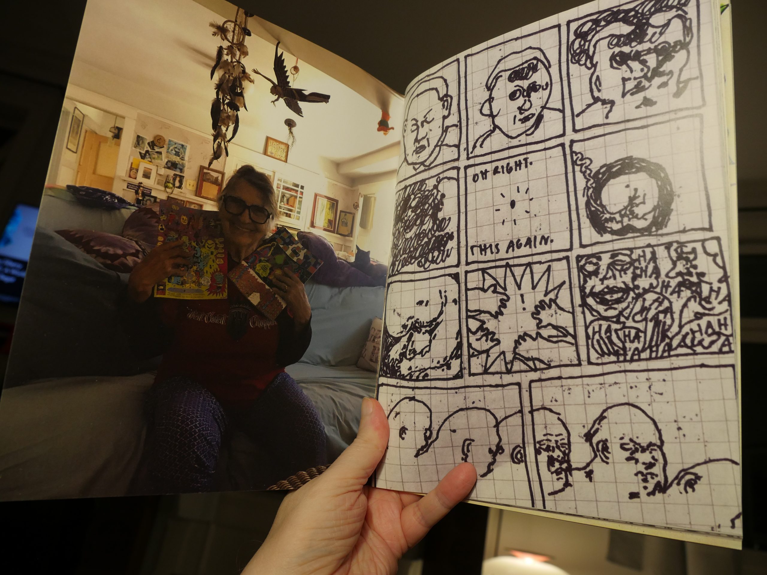
00:51: Tin Foil #3 by “Floyd” Tangeman
Is that the perfect way to open the book or what?

Is the theme of the issue different medias? Here’s something that seems drawn unto skin…
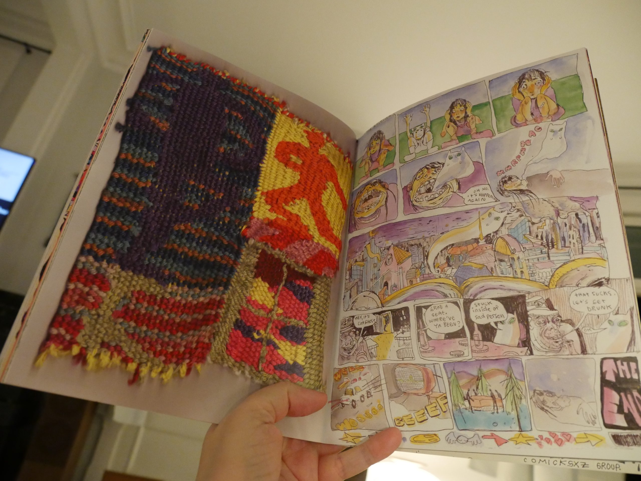
And here’s some knitted work, and there’s other stitched things, and pieces that look like they’ve made with food and glue?
Anyway, it’s a pretty thrilling issue. Every piece is a surprise. Love it.
| Various: The Wire Tapper 52 | 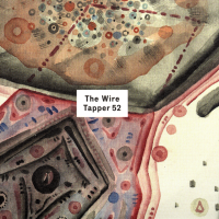 |

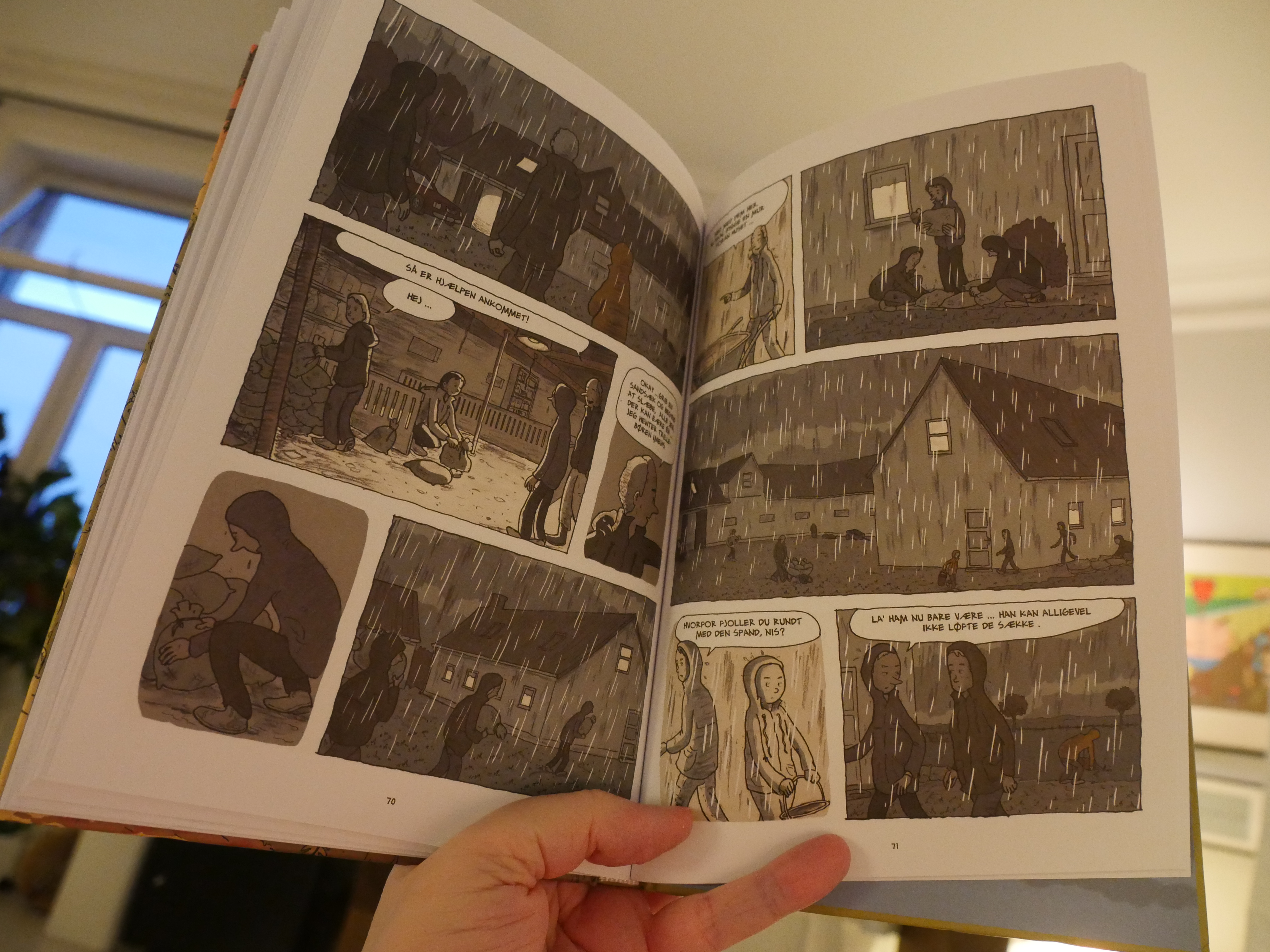
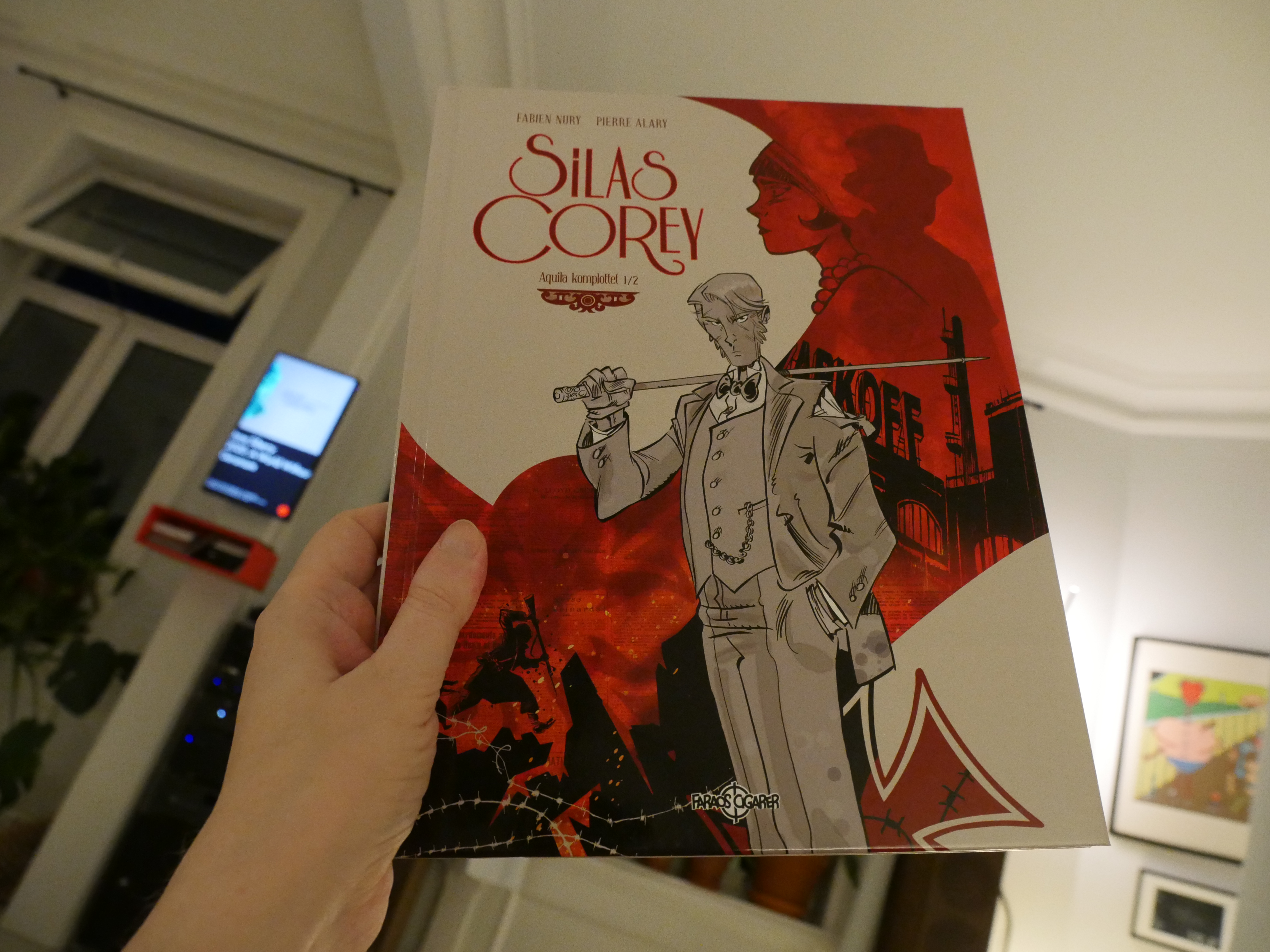
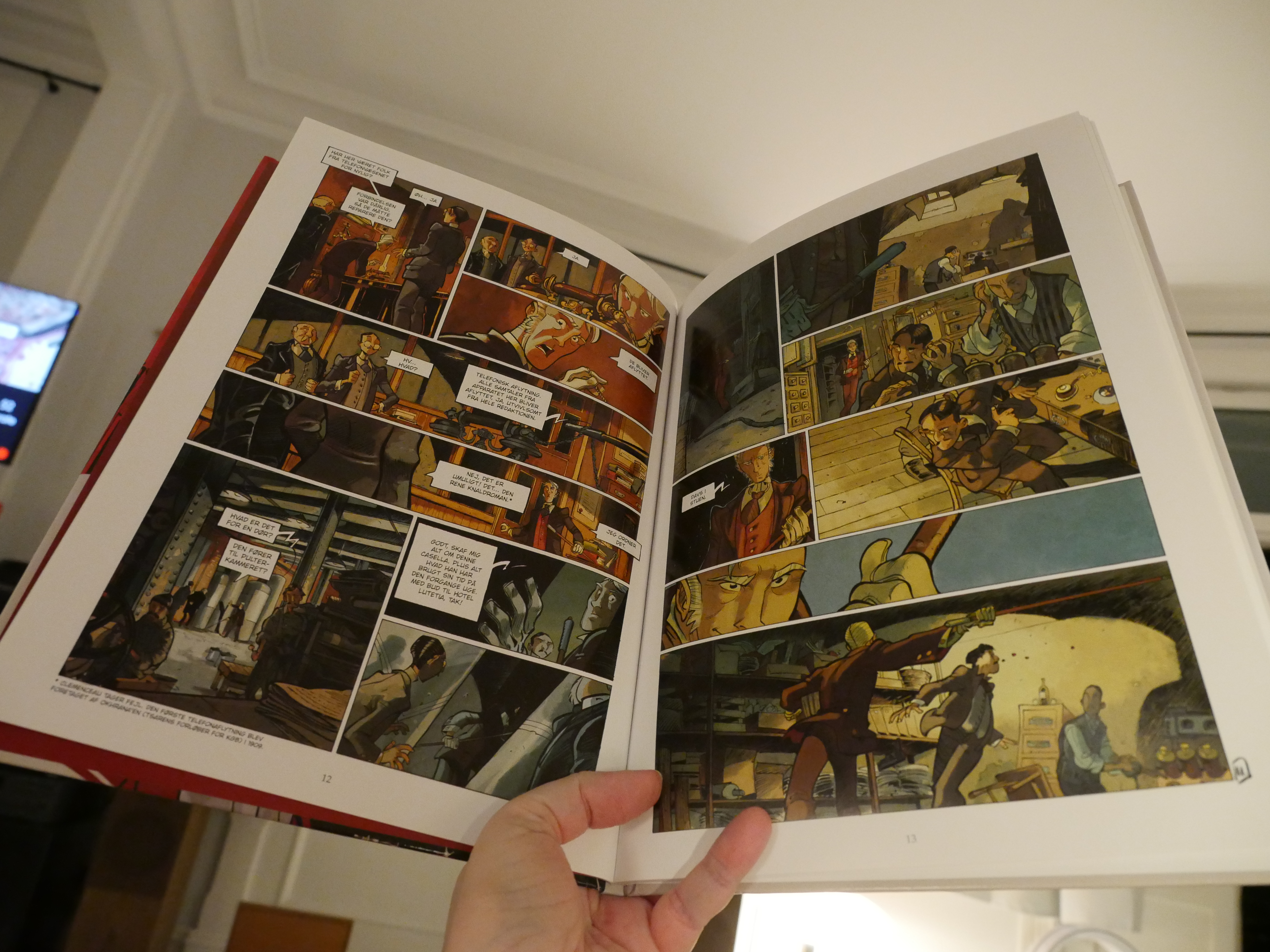
01:27: Silas Corey 1 by Fabien Nury & Pierre Alary (Faraos Cigarer)
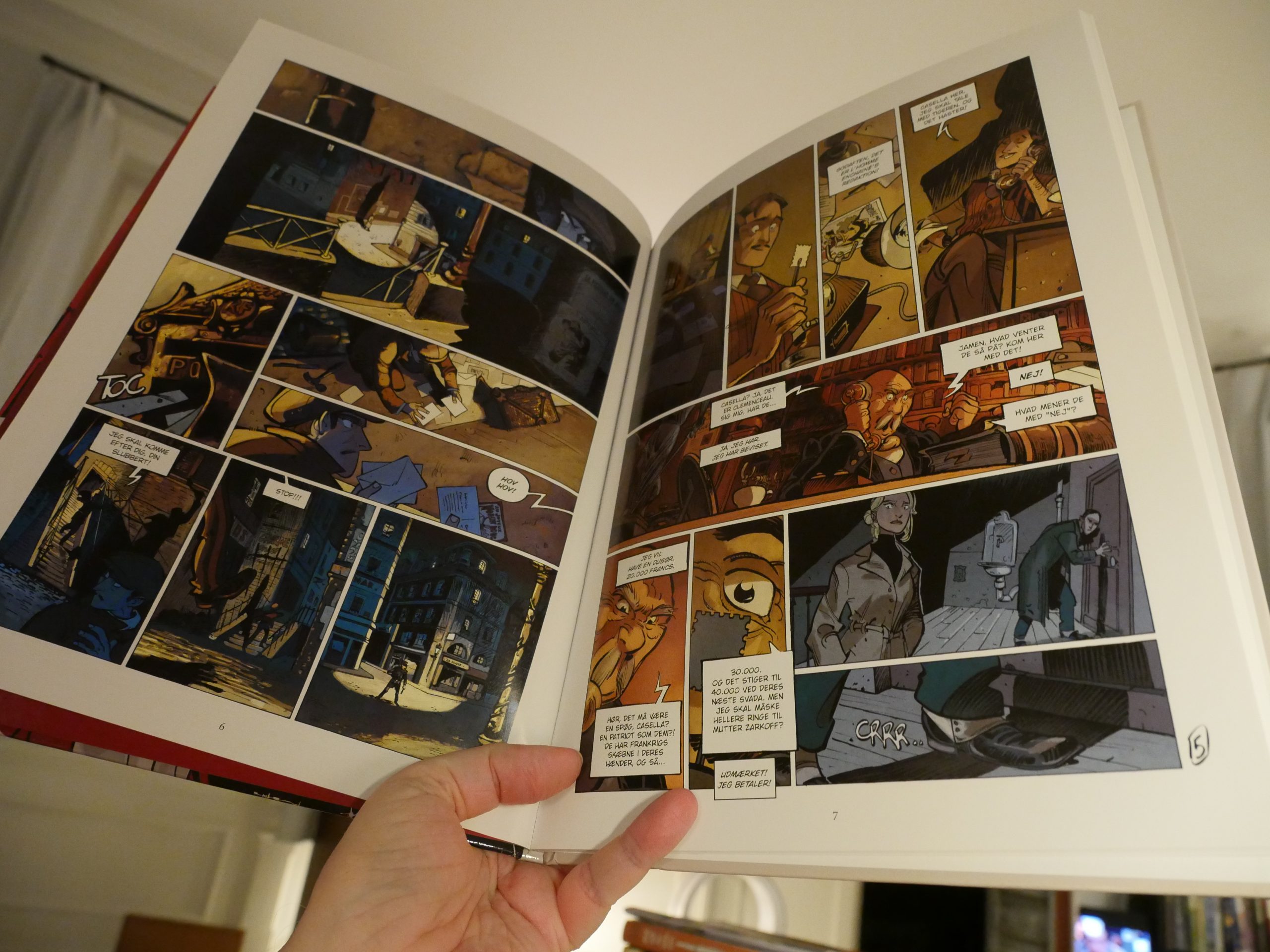
Oh, this sort of art style has been hegemonic in French(ey) comics for a decade now. It’s a sort of mix of… er… let’s go with post-Jandy classic children’s comics style (which is a post-Franquin style) mixed with Japanese dynamics.
And I’m pretty sick of it.
But perhaps it’ll be good anyway.

Well… it’s not so bad? It’s a fairly standard plot, but much more convoluted than normal. But it was just kinda boring? I think I won’t buy any further volumes in this series.
And now I’m all comicsed out.
Nighty night.