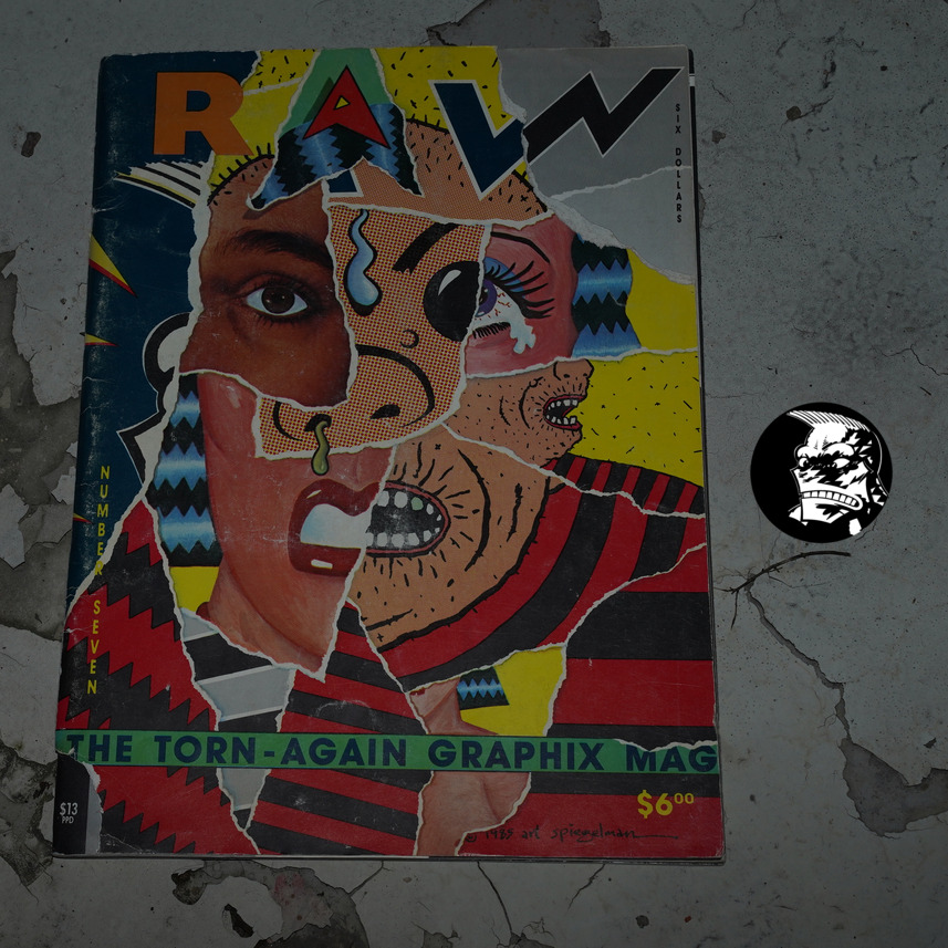
Raw #7: The Torn-Again Graphix Mag edited by Françoise Mouly and Art Spiegelman (265x360mm)
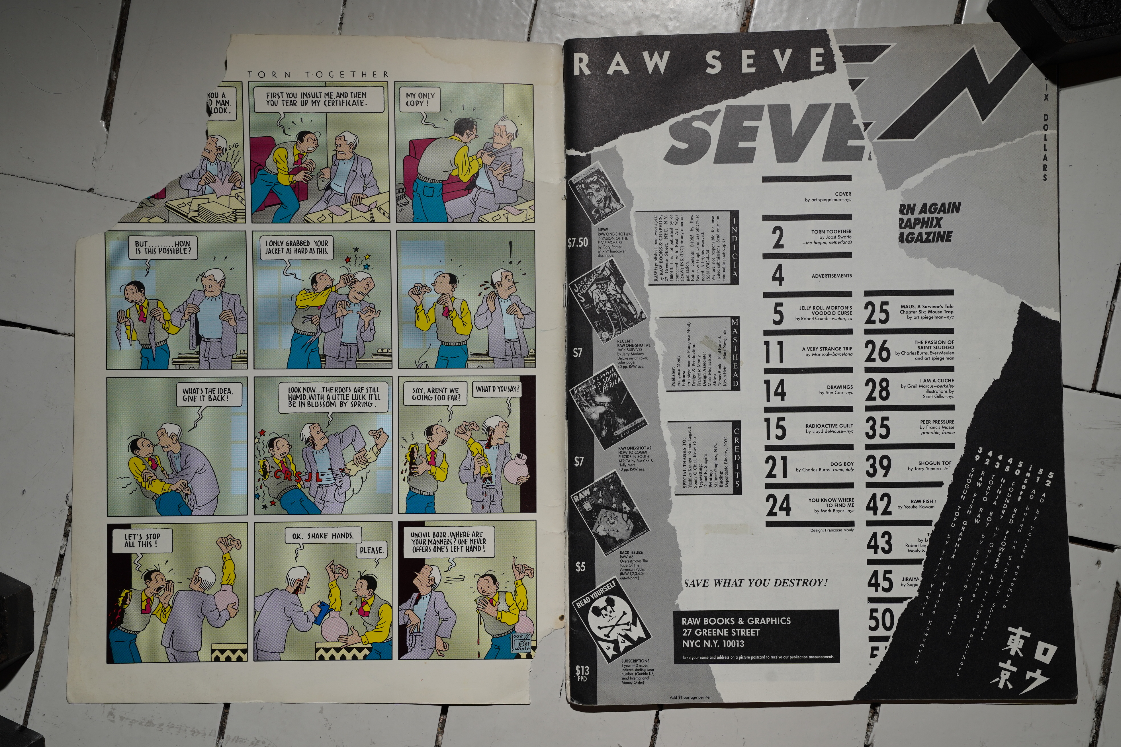
This is the infamous “torn” edition of Raw: Every cover is hand-torn… although this edition seems to be more torn than others. (I don’t think they’re usually torn in the left-hand bottom corner, too?)

*gasp* This copy is incomplete! The torn-off bit is supposed to be sticky-taped above the “Save what you destroy!” text — which it was in the copy I had as a teenager, but hangs framed on a wall now. I was fascinated at the time to note that the bit that was taped to the page wasn’t the bit that had been torn off of my copy. So I guess they had a bit of mix’n’match action going on when they were assembling the issue.
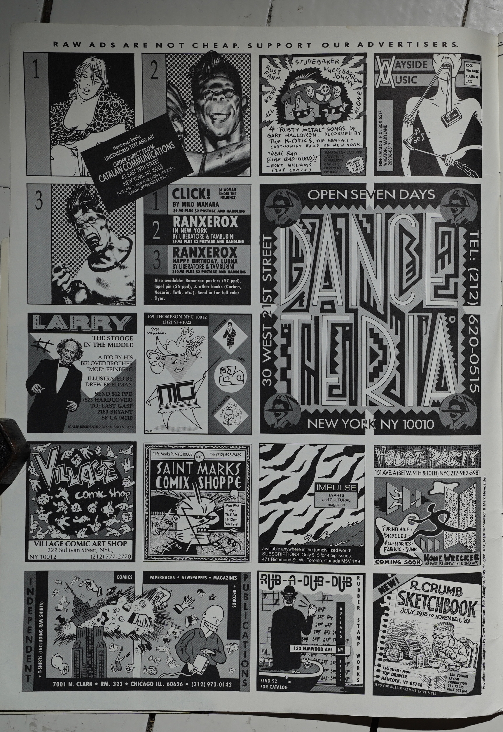
Just one page of these stylish ads this issue. I think Danceteria were the most consistent advertisers? I think they’re in all the issues (as well as many other comics magazine from New York around this time).
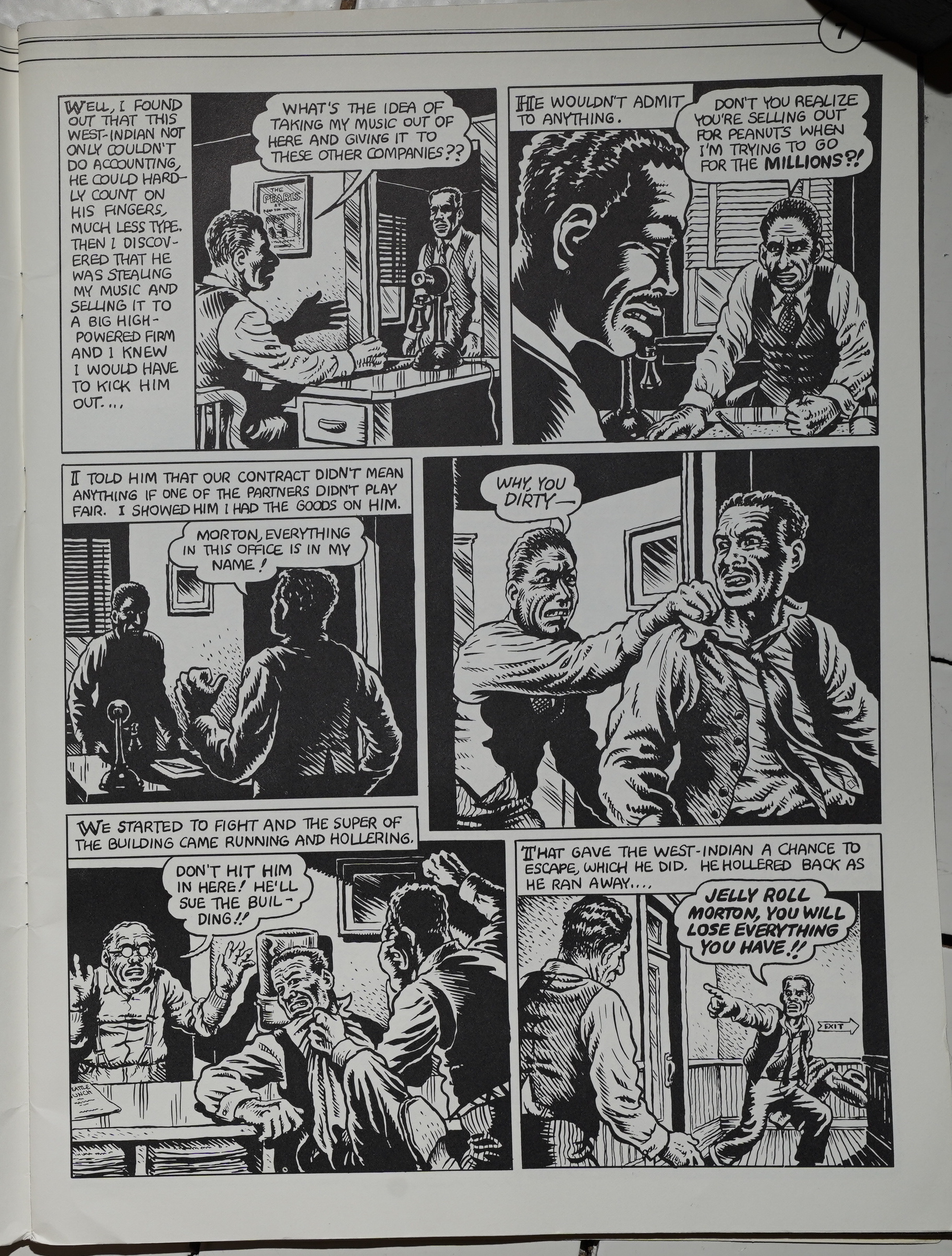
Perhaps the most surprising inclusion in this issue is a Blues thing from R. Crumb. And… it reads like any Crumb story from this era, so he didn’t really adapt the artwork to the larger format.
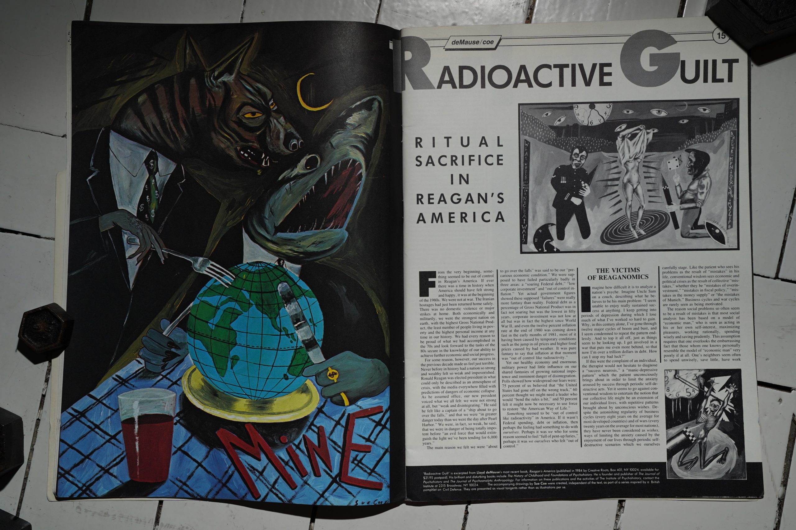
Sue Coe and Lloyd deMause do a long thing about nuclear war and stuff…
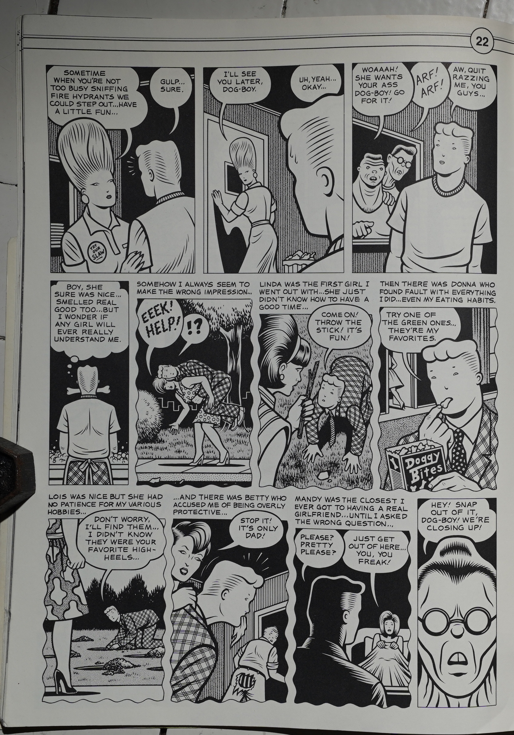
… Charles Burns does a pretty amusing Dog Boy thing…
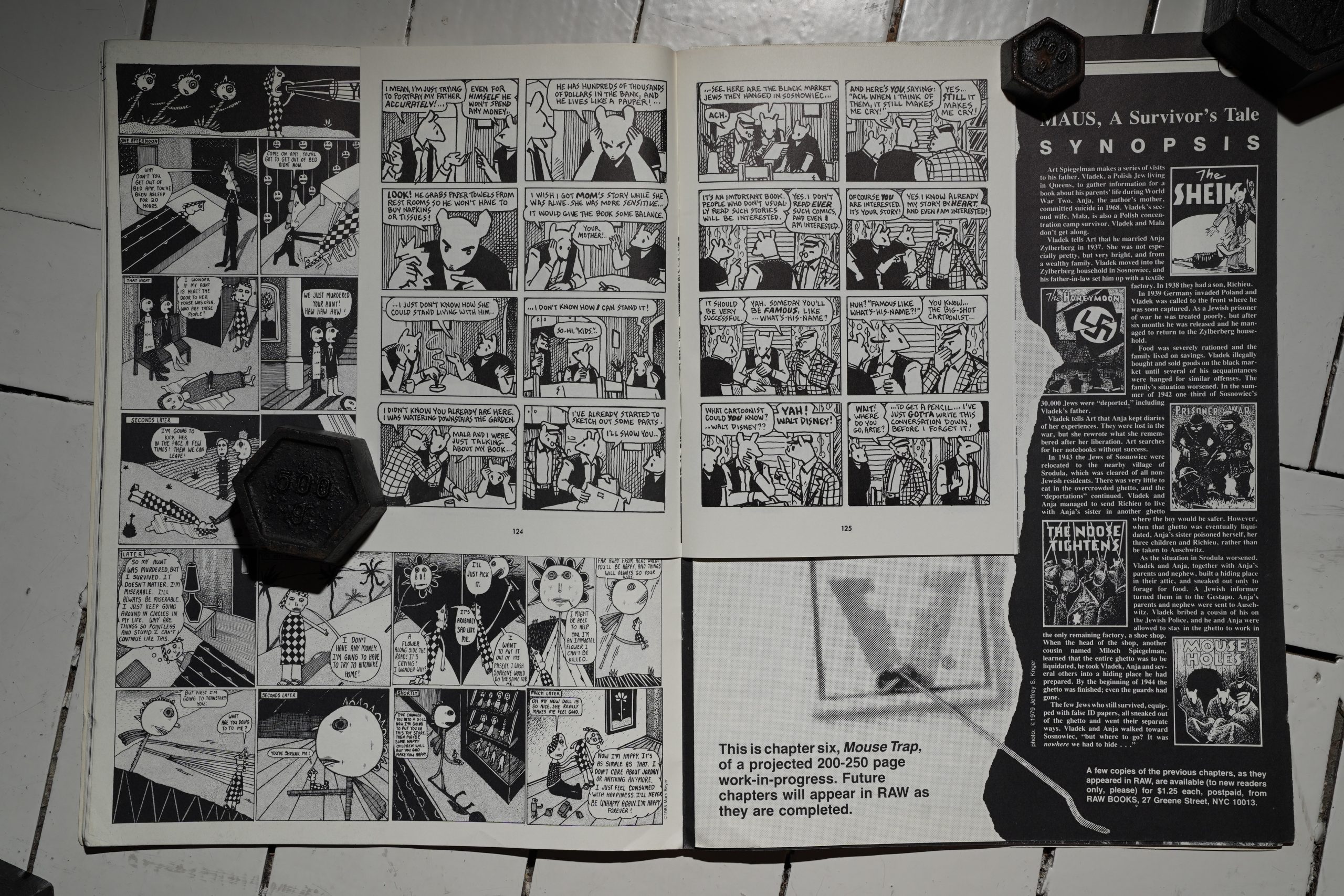
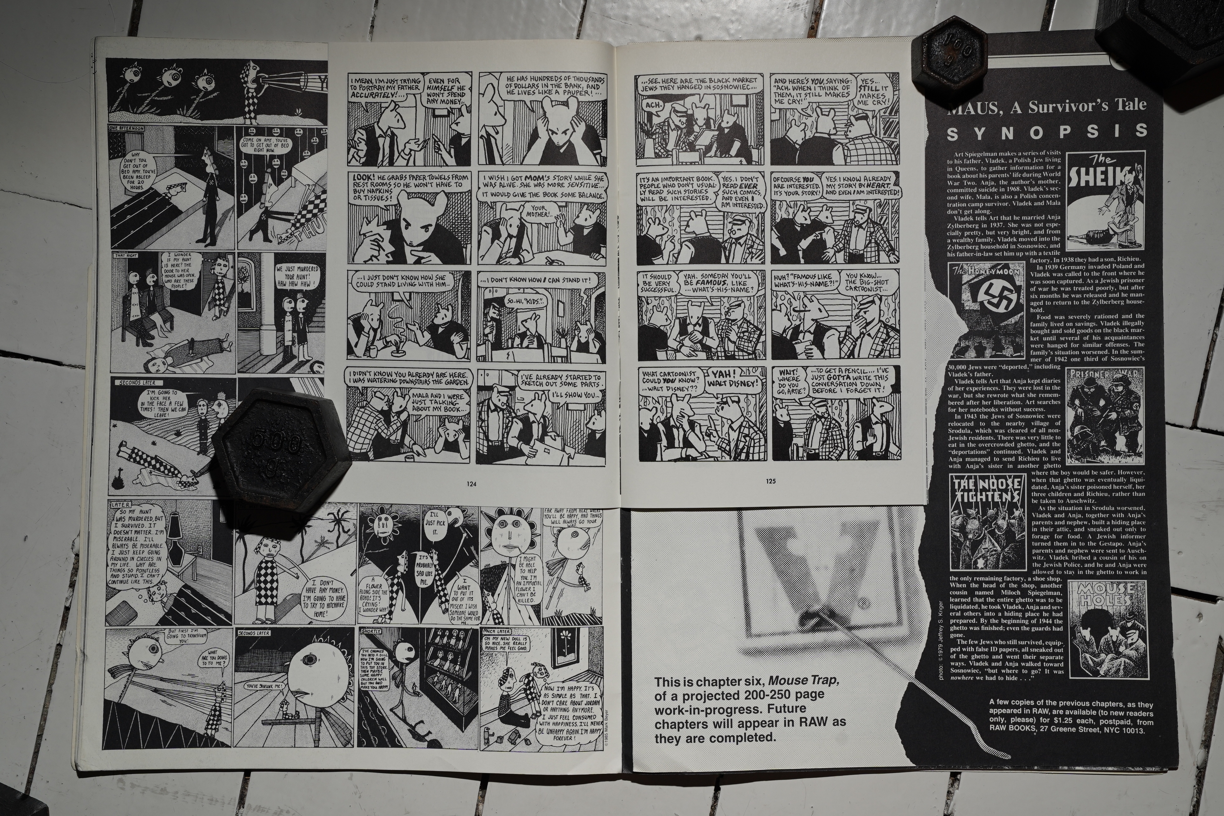
There’s the required Maus insert, of course, and here we have (again) Spiegelman’s dad and step-mother complimenting him on how good his comics are.
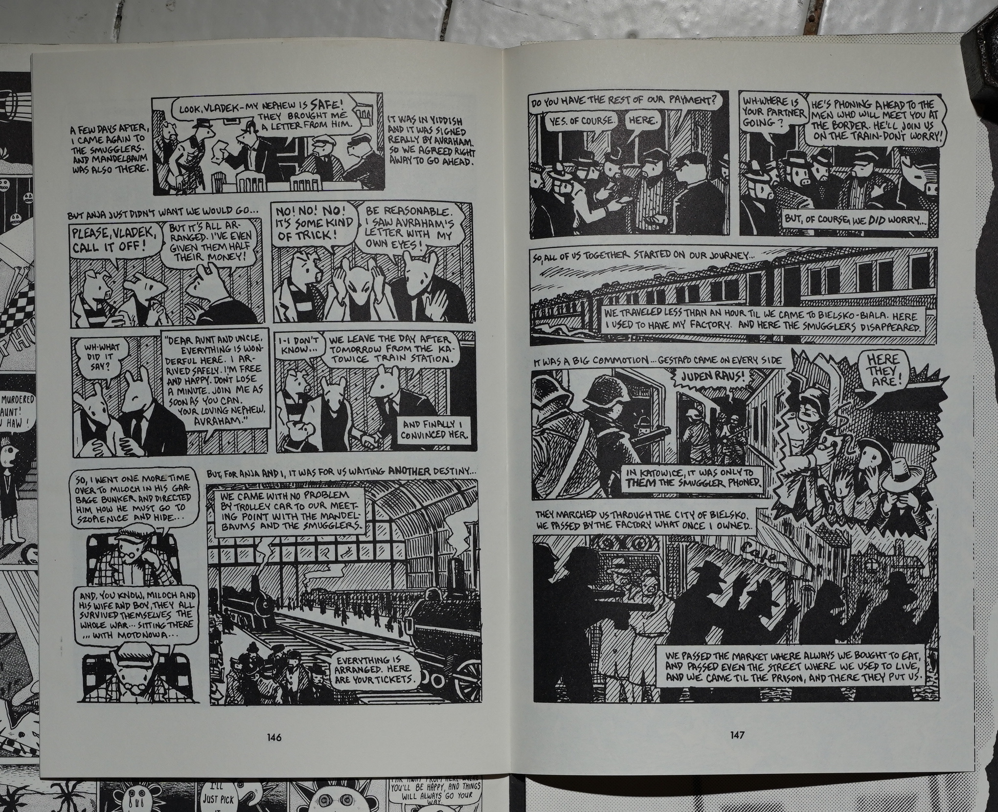
In his father’s story, they’re still hiding from the Nazis, but they’re eventually caught and sent to Auschwitz, so this is perhaps a natural place to take a pause. Which is what Spiegelman did, sort of: Pantheon would publish a collection of the chapters completed so far next year as Maus I, and that changed everything, of course.
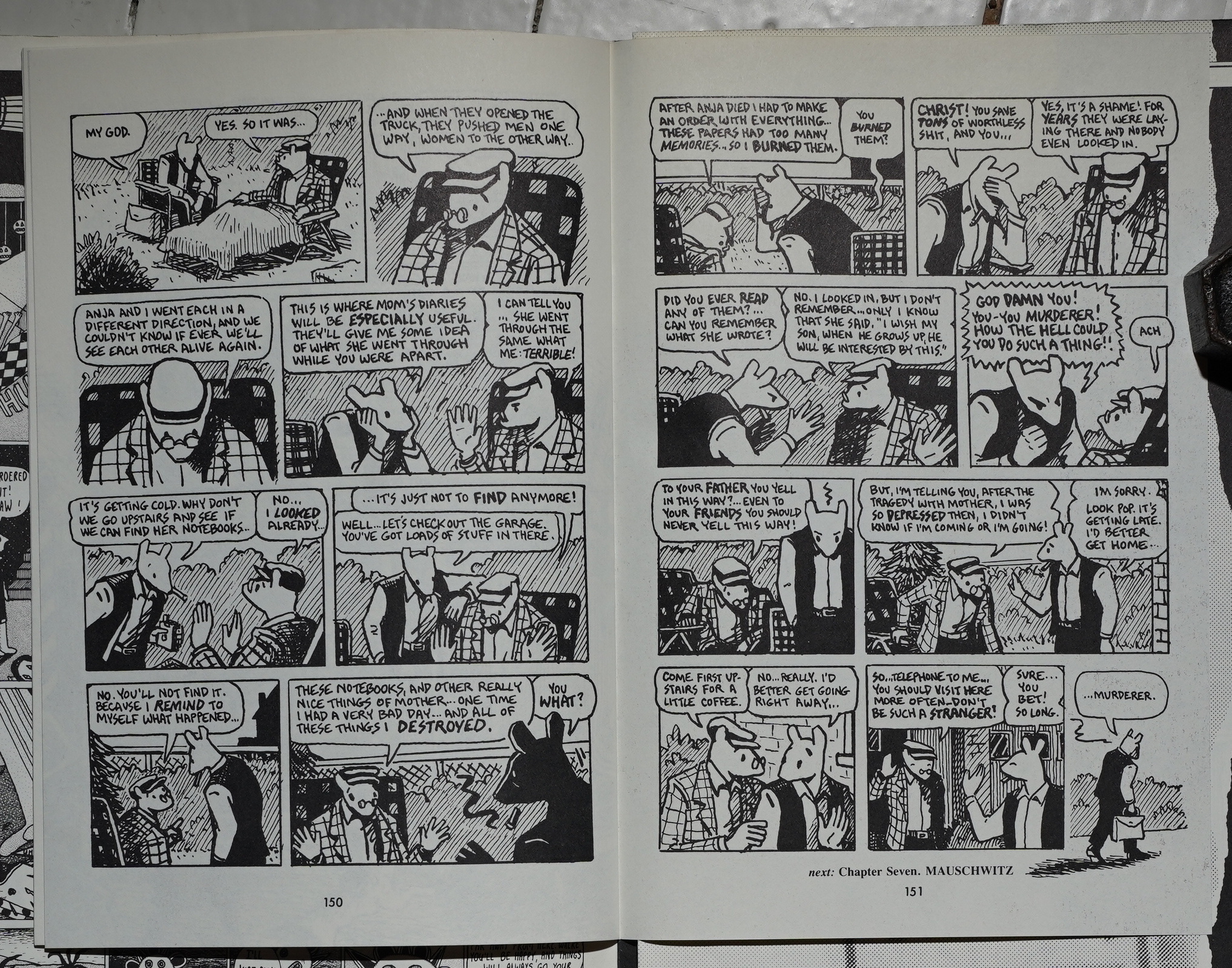
But Auschwitz isn’t how the volume ends: It ends with Spiegelman discovering that his father has burned his mother’s diaries… and this is really the emotional clencher.
And I mean, it is: It’s a horrible thing to have done. But this leaves Art Spiegelman as the primary victim here, and that’s pretty eh?
I’m sure I’m not saying anything original here.
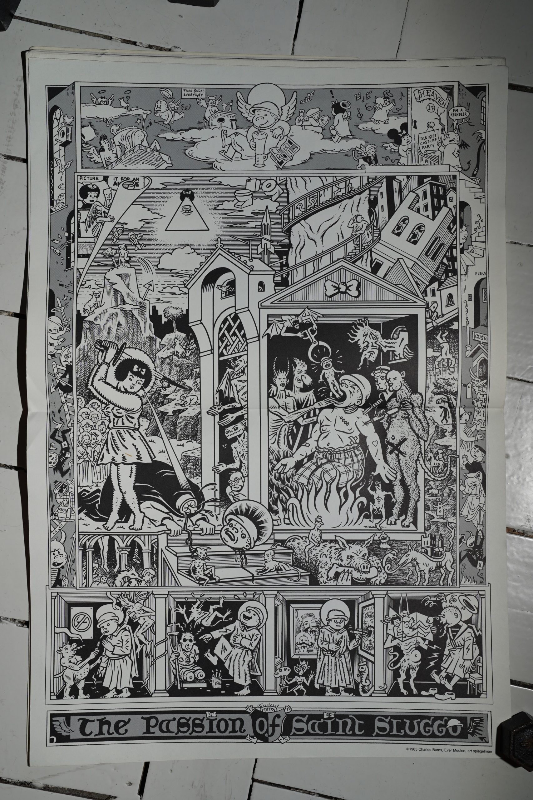
Charles Burns, Ever Meulen and Spiegelman collaborate on the centre spread… which has been loosened from this copy, so I guess the previous owner had it on his wall or something?
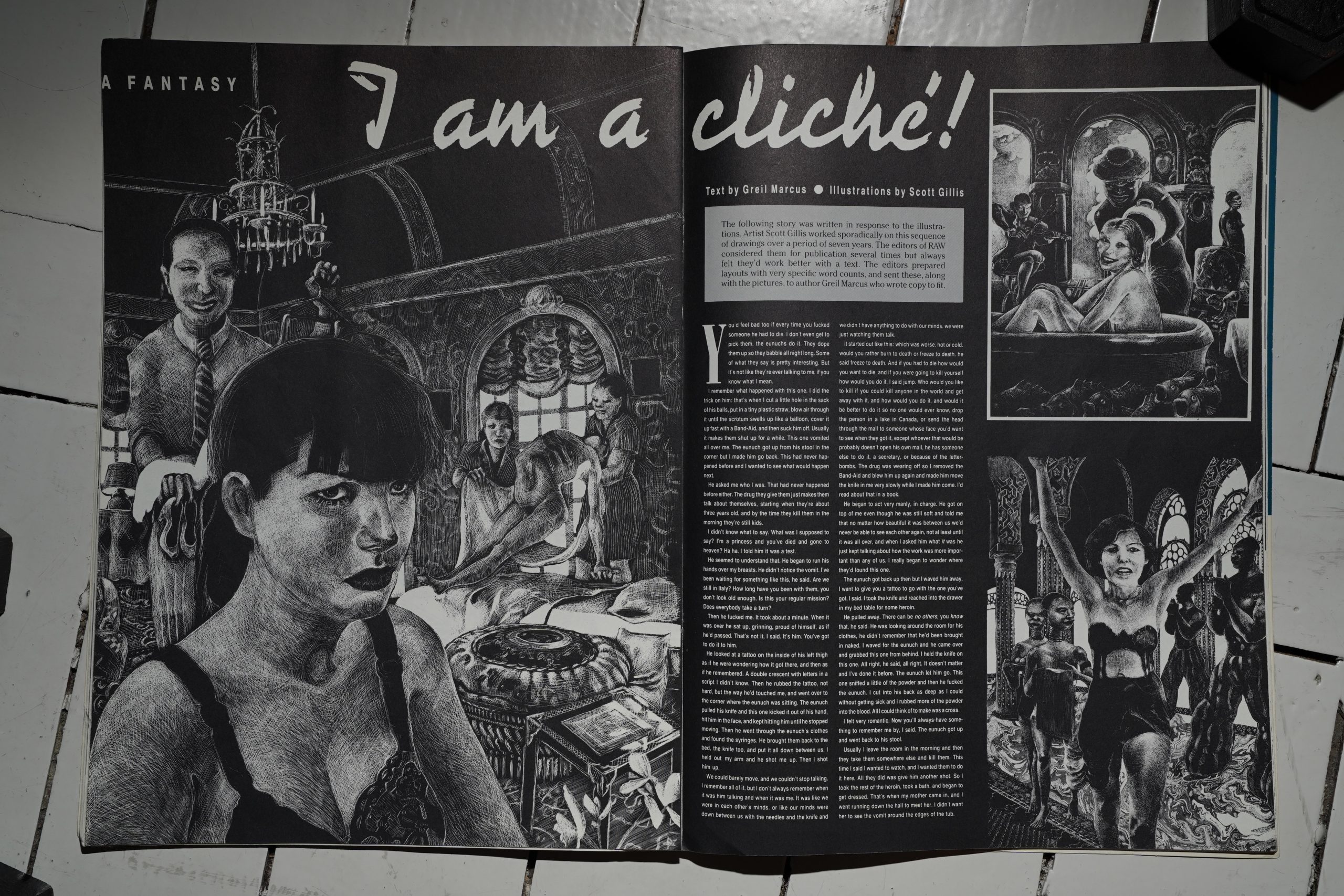
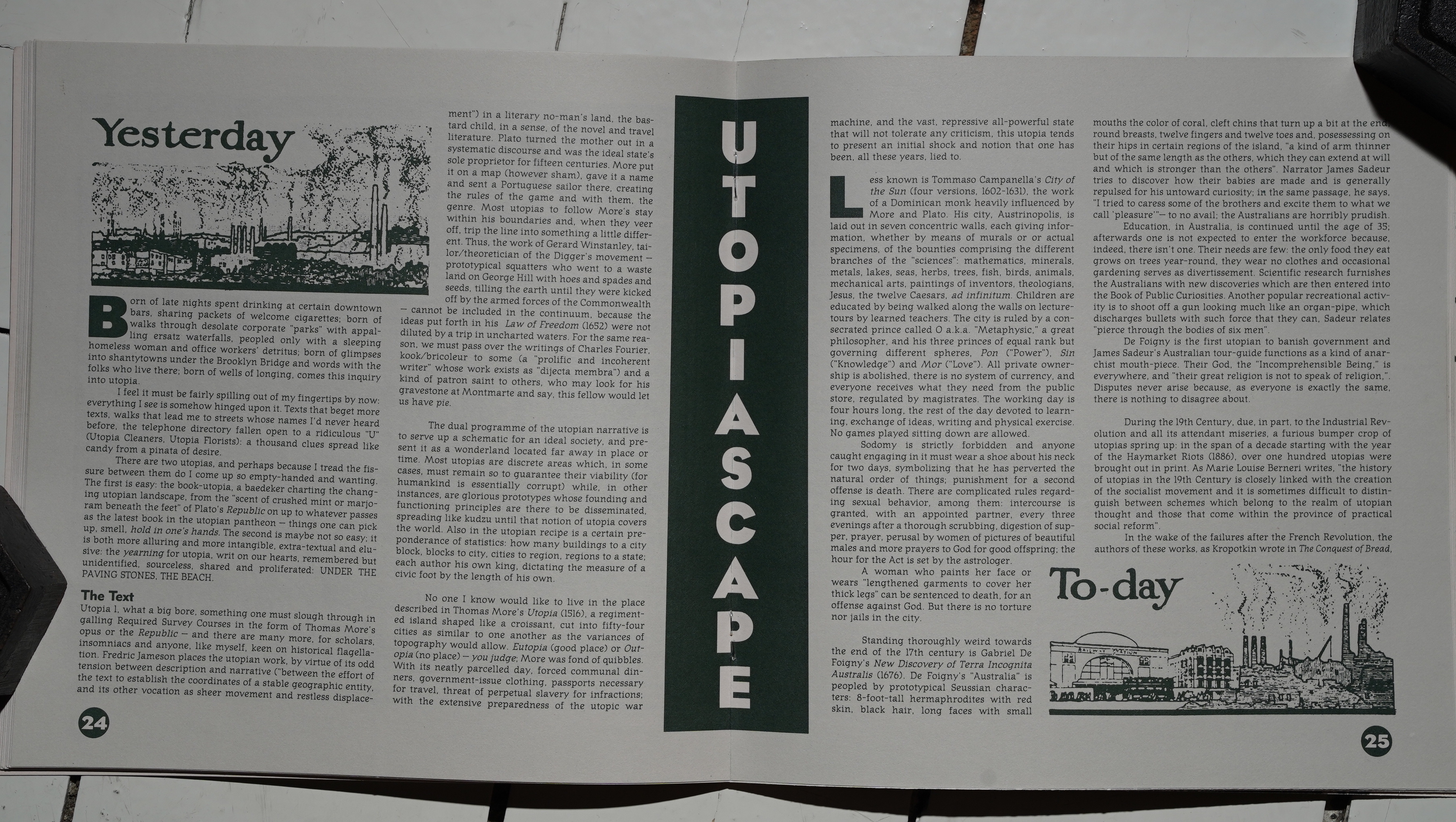
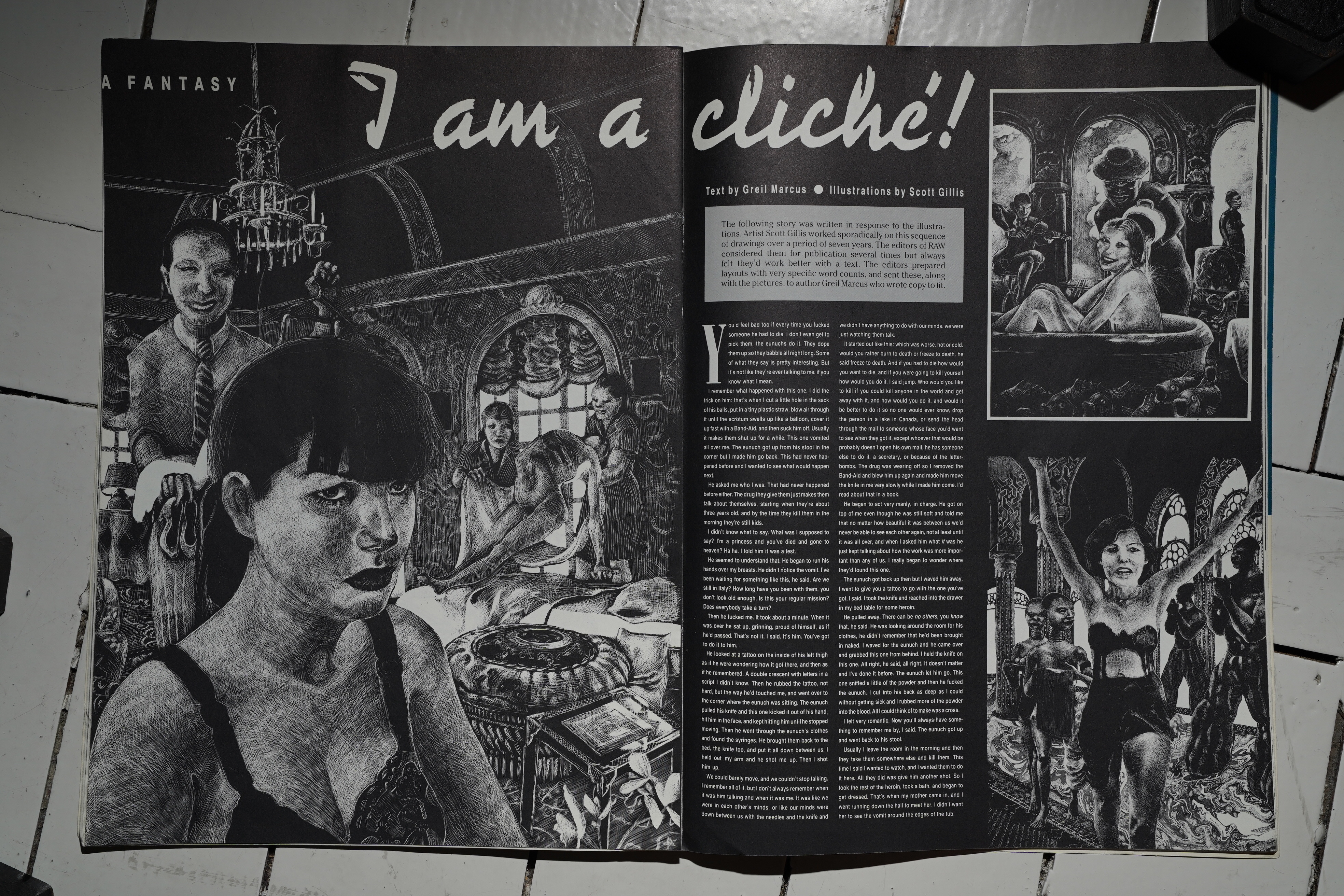
This is an unusually chatty issue of Raw. While the previous issues had kept the editorial voices to a minimum, here they’re spilling out all over the place. Here they explain that they had all these drawings by Scott Gillis around, and then they got Greil Marcus to write a text to fill out all the blank bits on the pages.
The thing about the plastic straw had me scratching my head as a sixteen-year-old.
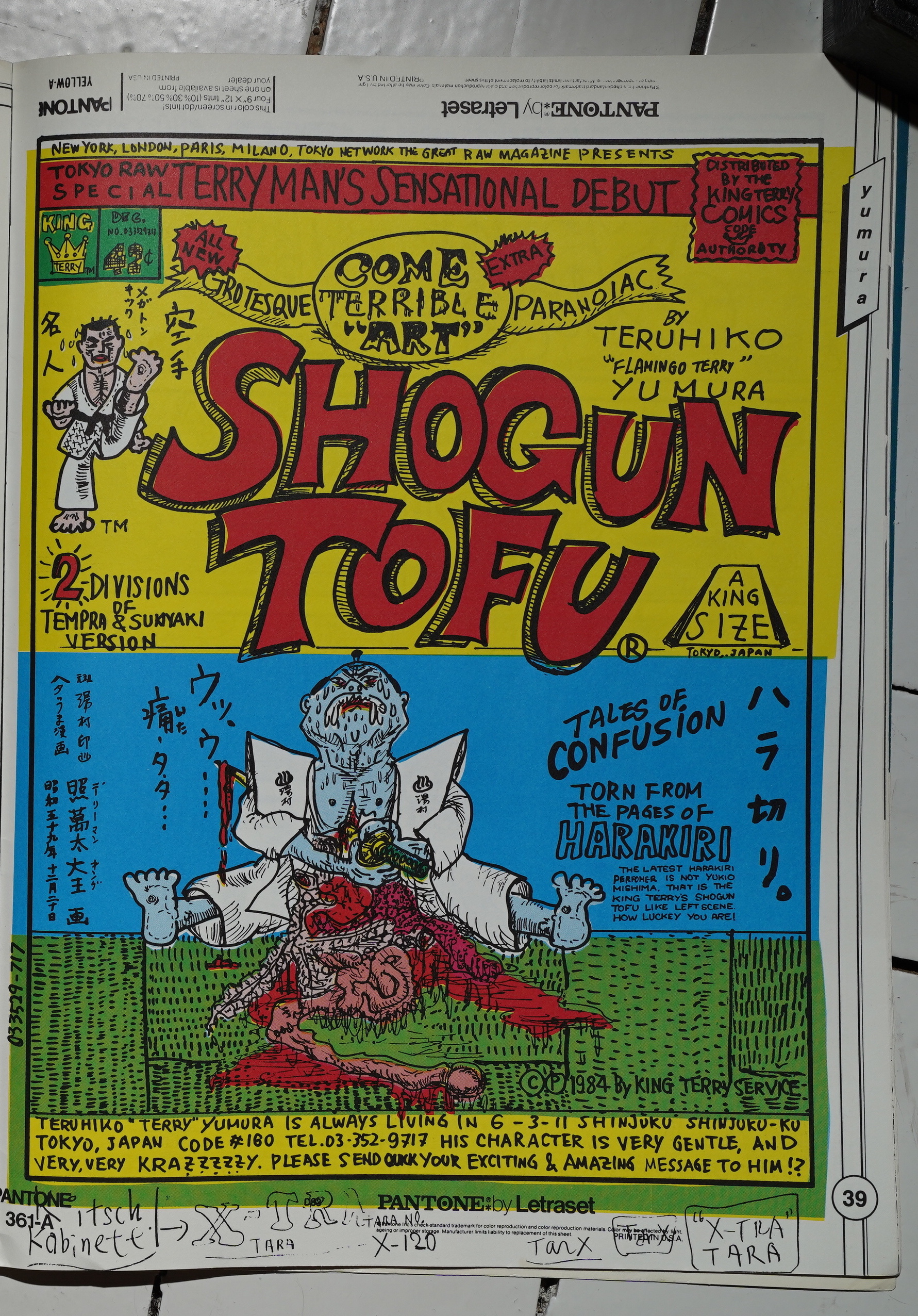
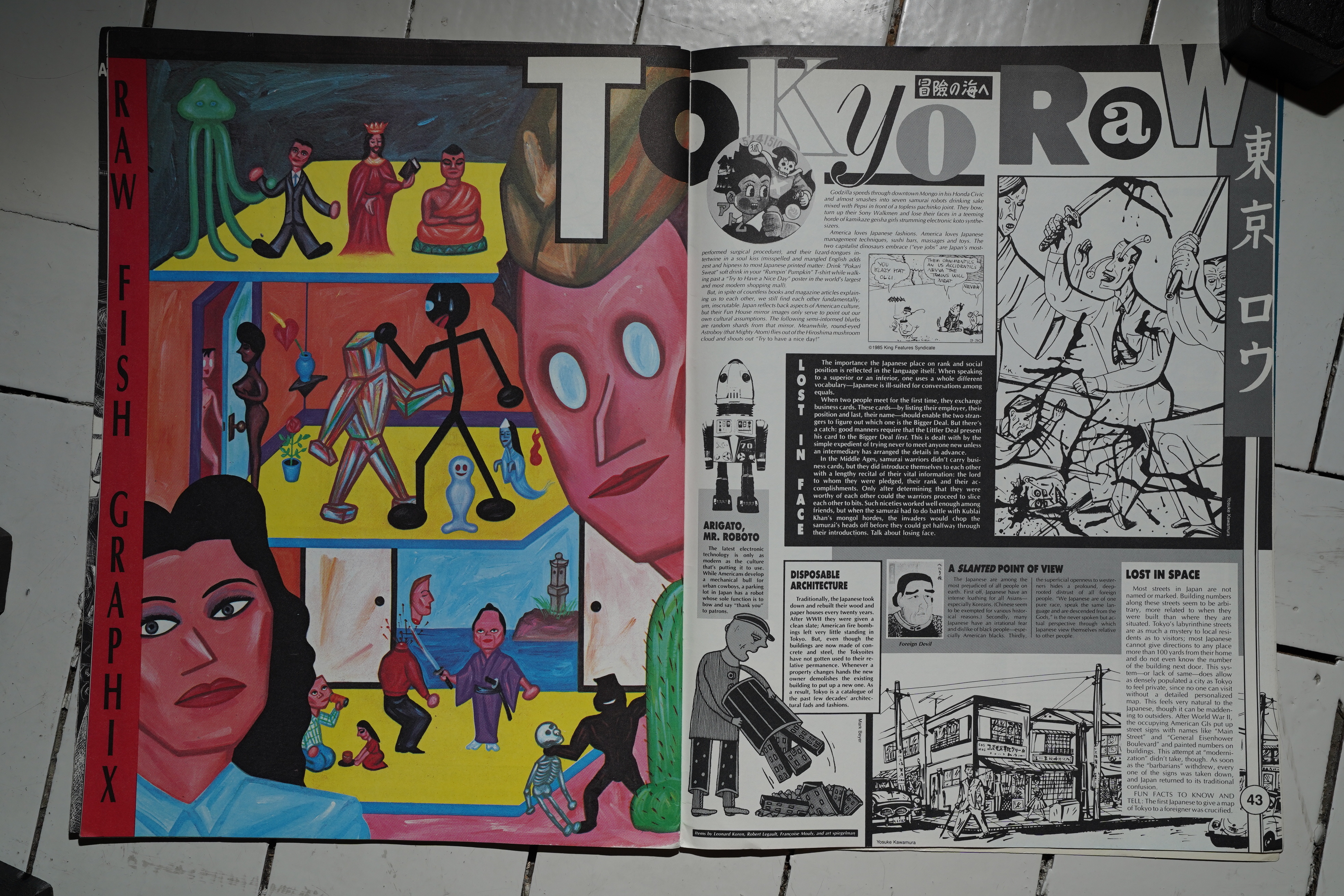
And then! A bunch of pages of Japanese comics. Terry Yumura starts the party off…

And then we get a lot more chatter from the editors about Japan, and they explain everything about Japanese culture, like how racist it is etc.
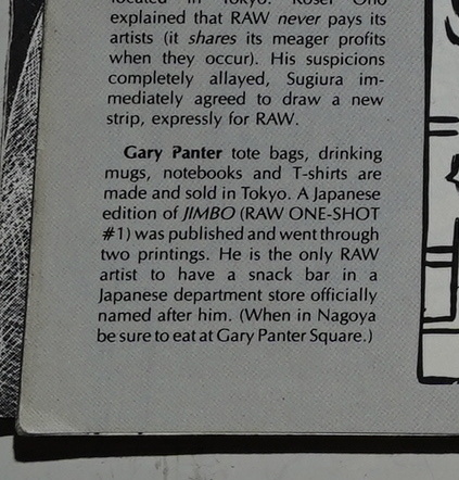
And there’s a Gary Panter Square in Nagoya?
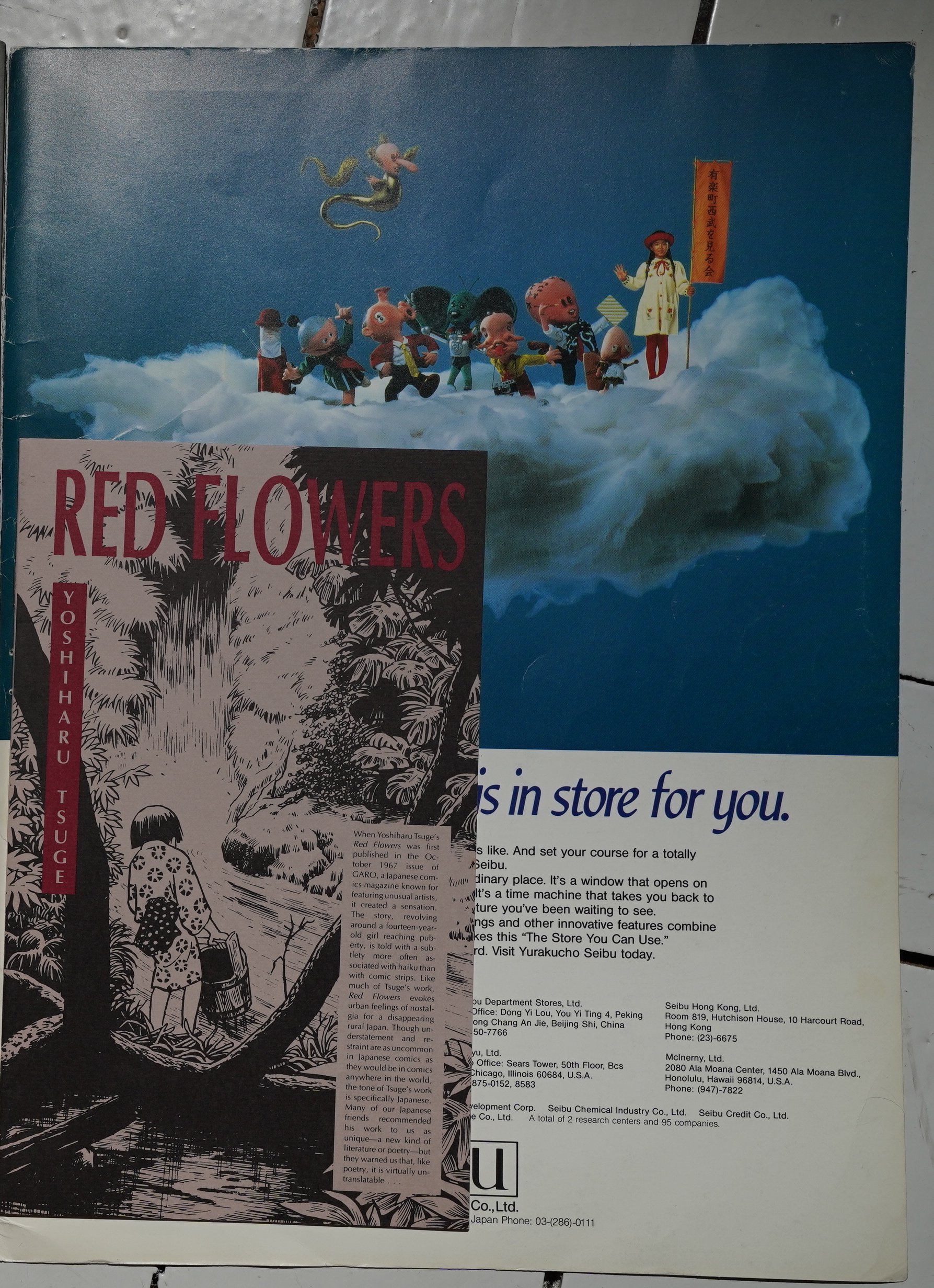
And there’s another booklet! This time by Yoshiharu Tsuge.
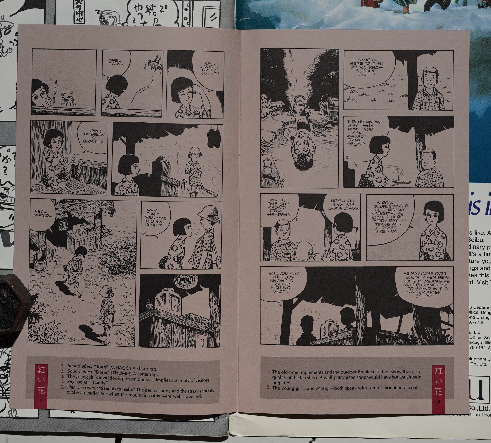
And even that doesn’t stop the splainin! Do we really need to have the editors splain at us that that girl is a bit aggressive in her sales technique? It seems pretty obvious…
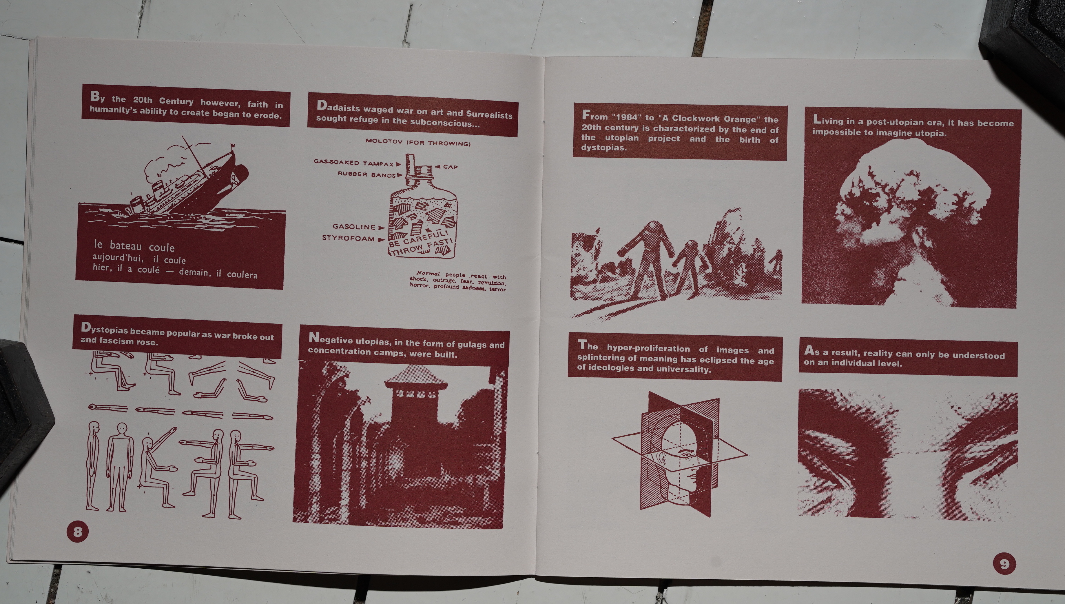
This issue of Raw doesn’t seem as meticulously put together as the previous issues. For one, it’s got sixteen text-dominated pages, and that seems pretty lopsided. The Crumb strip doesn’t seem to communicate with anything else here, and then there’s the Japanese stuff that doesn’t seem to have anything to do with anything.
Individually, all the pieces in the issue are good, and it’s the most extravagant production (ripped cover with taped in detritus, two booklets, different paper stocks and colour pages), but it seems less like a cohesive magazine than “let’s just put all the stuff we have in here”.
They were apparently publishing 20K copies of Raw at this point — growing each month. It must be starting to become pretty exhausting…
This blog post is part of the Punk Comix series.


)


%3A+Sessions+5)