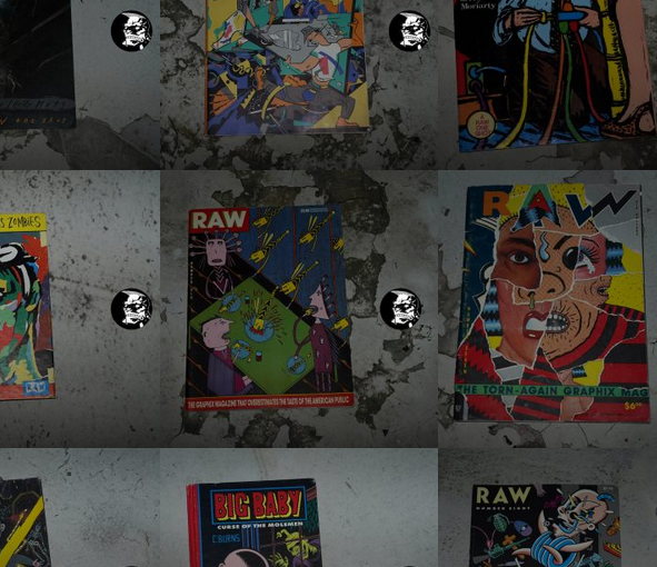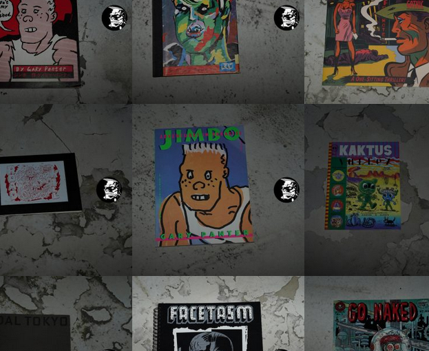
Click on the images below to read the blog articles about Gary Panter’s books.
")
")
")
")
")
")
")
")
")
")
")
")
")
")
")
")
")
")
")
")
")
")
")
")
")
")
")
")
")
This blog post is part of the Punk Comix series.
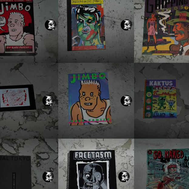
Click on the images below to read the blog articles about Gary Panter’s books.
This blog post is part of the Punk Comix series.

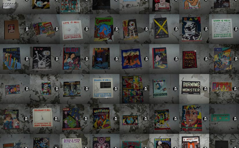
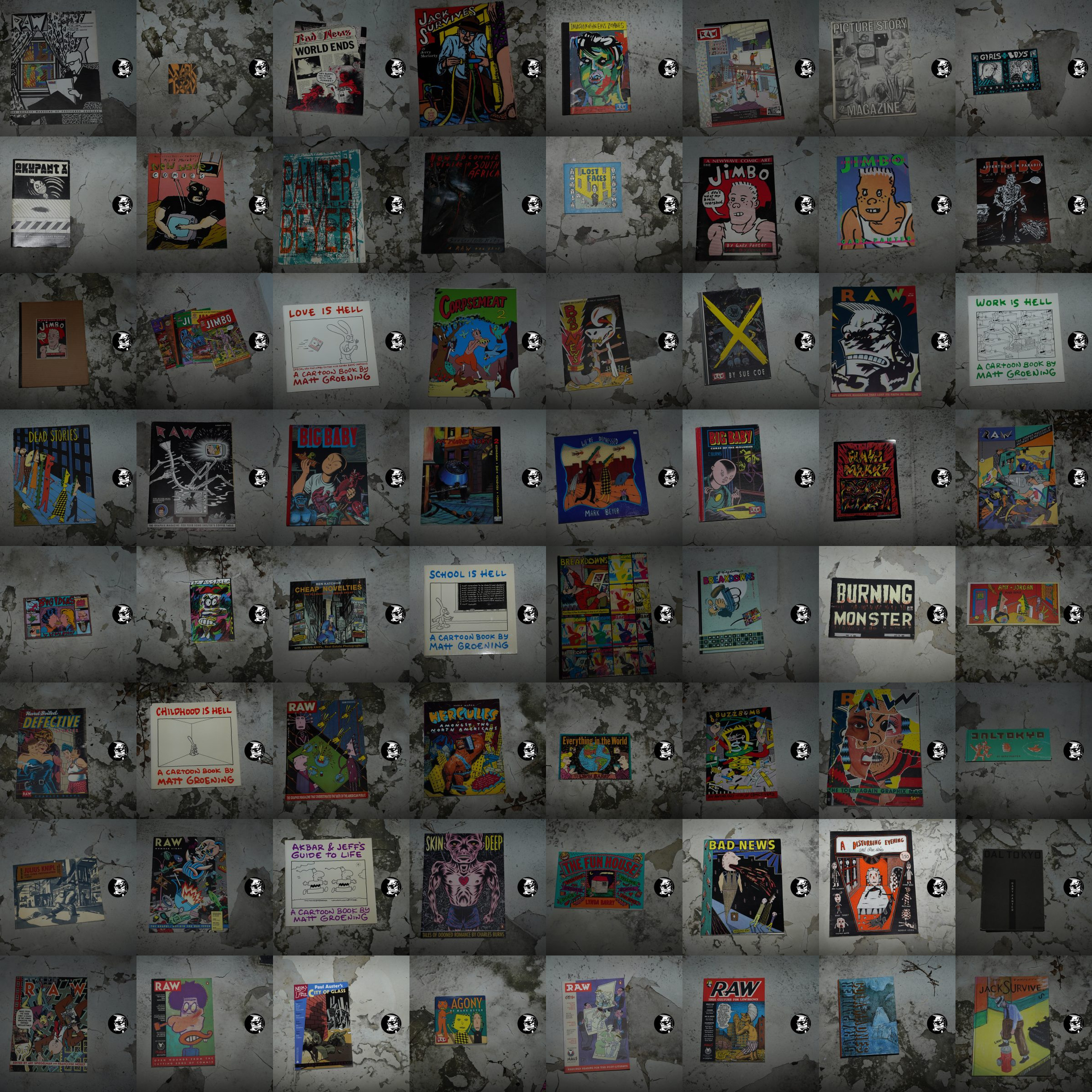
Below are the comics published by Raw Graphics (more or less). At the end, it also includes books packaged by Raw for publication by other publishers (mostly Penguin and Pantheon).
Click on the images below to read the posts.
")
")
")
")
")
")
")
")
")
")
")
")
")
")
")
")
")
")
")
")
")
")
")
")
")
This blog post is part of the Punk Comix series.
When I started this blog series half a year ago, I wanted to have a look at the comics from the “Raw generation” or whatever you want to call them. There seemed to be a quite particular aesthetic in comics happening in the early 80s, mostly in New York, mostly among younger comics artists, that incorporated impulses from punk, art and literature, and it all crystallised into something almost like a coherent movement, before dissipating after a handful of years.
I had meant to focus on the books that I saw as being part of this aesthetic, but it was too tempting to continue reading all the artists involved, even after they’d stopped working in these idioms (as well as covering comics that seemed “adjacent” to what I’m talking about).
So the blog series ballooned from a planned 70 posts to about 180 posts.
This index lists, more or less, the books that I’d originally planned on covering, and there’ll be further index posts in the coming days that focuses more on particular artists and formats.
Click on the images below to read the posts.
")
")
")
")
")
")
")
")
")
")
")
")
")
")
")
")
")
")
")
")
")
")
")
")
")
")
")
")
")
")
")
")
")
")
")
")
")
")
")
")
This blog post is part of the Punk Comix series.
My blog series about “punk comix”/”the Raw generation”/whatchamacallit is finally over. I had originally planned on about eighty posts — but it ended up being one hundred and seventy posts.
Good Lord! *choke*
I had meant to focus on just Raw and the artists surrounding Raw — in the 80s. But then things got away from me.
Let me ramble on a bit here…
The subject matter is somewhat nebulous. The comics I was talking about here were never a genre, and never even really got a “name”. But it’s not as if people weren’t discussing these artists as a group at the time.
Bhob Stewart writes in The Comics Journal #89, page 14:
Boredom With Mainstream Spawns “As-yet-Unnamed” Cartoon Movement
A Cover story in the Washington
D.C. weekly City paper finds
underground comics
“practically dead,” recent
independent companies such as
Pacific “mean-spirited retreads
Of 1950s EC,” and mainstream
comics a situation of “boys
drawing for other boys (the
same old story).” The three-
page article, in the January 6
1984 issue, concludes that
“enough kids are bored by the
space barbarians and skintight
suits to make a small market for
some more adventurous maga-
zines” and spur an “as-yet-
unnamed cartoon/art movement
that will have increasing
repercussions in the hip graphics
that we will all pore over in the
next five years.
Author Matt Groening, artist
of “Life In Hell,” sums up the
current mainstream/ independent
company titles: “Death, blood
and decapitation are back in
style, along with an
unprecedented preoccupation
with impossibly huge breasts
and male muscles bulging
everywhere except in the crotch.
The comic book industry may
someday redeem itself with a
well written book, but right now
things are in as pulpy a State as
ever... ” In contrast, writes
Groening, “The new cartoons
say: All that technique by the
big guys doesn’t matter if you
don’t have anything to say.”
This reactionary cartoon/art
movement, which embraces
“punk, new wave, newave,
artoons, scratch art, messy art,
ugly comics,” is dated by
Groening as beginning in 1977.
‘ •The new cartoonists,” states
Groening, “offer a humanistic
reaction to media slickness and
an almost technophobic disdain
for the future, portraying in
their crude markings the
clumsinesses of everyday life
and all its little lumps.” They
• ‘work to please themselves
first,” and their output is
sometimes characterized by an
“unashamed amateurishness.”According to Groening,
“dozens, perhaps hundreds” Of
artists “began drawing Oddly
for the first time in the
mid-’70s, some of them aware
of each other and others
creating in isolation. ” He cites
Pennsylvania artist Mark Beyer
(Dead Stories), Lynda J. Barry
(Girls & Boys, “Ernie pook’s
Comeek”), Flick Ford (cartoon
editor Of the East Village Eye),
NYC artist Mark Marek (New
Wave Comics), “the Harvey
Kurtzman-intluenced cartoons
of J.D. King and John
Holmstrom” (Punk, Stop!) and
LA artist Gary Panter (Jimbo).Titled “Why Cartoonists
Can’t Draw Nice Or Think
Clear Or Write Good
Anymore,” the article is
illustrated with front covers
from the French comics
magazine Viper, Beyer’s Dead
Stories, Japanese cartoonist
Yoshikzau Ebisu’s My Man Is
punk, Lynda Barry’s Big Ideas,
the Spanish comics magazine
Makoki, and Stop!, plus
Eraserhead director David
Lynch’s “Angriest Dog In the
World” comic strip (L4
Reader) and a drawing by
Raymond Pettibon from
Capricious Missives. The color
cover art is a 1982 panel,
Mutantis, by Charles Burns
(Raw, Heavy Metal). A sidebar
lists ten alternative weekly
papers around the U.S. which
carry strips discussed by
Groening.As GroeninÅ sees it, since
“taboos have crumbled” and
“audiences are more
sophisticated,” a change is
happening on all levels, even
syndicated strips which “have
loosened up considerably.” He
cites Norman Fagan’s Drabble
(“the only strip more poorly
drawn than my own”),
Guindon’s Guindon, Nicole
Hollander’s Sylvia (“the oddest
looking strip in the dailies”),
Jim Unger’s Herman (“which
would have been rejected in the
past for the ugliness of its
eyeless characters alone”) and
Gary Larson’s The Far Side
(“the funniest offering in the so-
called funny pages today”).
Changes are also happening in
mainstream comics, says
Groening, but “as yet these
changes have not amounted to
much artistically.”
In attempting to define the
Nu Mutant art sensibility,
Groening often achieves a tone
highly reminiscent of Susan
Sontag’s famed 1964 Partisan
Review essay, “Notes on
•Camp’. Sontag prefaced her
notes with the comment, “Taste
has no system and no proofs.But there is something like a
logic of taste: the consistent
sensibility which underlies and
gives rise to a certain taste. A
sensibility is almost, but not
quite, ineffable. Any sensibility
which can be crammed into the
mold of a System, Or handled
with the rough tools Of proof, is
no longer a sensibility at all. It
has hardened into an idea… To
snare a sensibility in words,
especially one that is alive and
powerful, one must be tentative
and nimble.” Groening nimbly
nails down the roots Of the
movement—a generation that
“lapped up the lousiest,
cheesiest junk in kid culture
right along with the best,
cheesiest stuff.. ”
AS usually seems to be the
case these days, the Japanese are
several Steps ahead. In Japan it
has hardened into an idea, been
given a name—the “Bad-nice”
style—and is packaged for a
mass audience through ads,
postcards, calendars, animation,
book jackets, and magazine
covers. Leader Of the ‘ ‘Bad-
nice” style is the much-imitated
Flamingo Terry (Teruhiko
Yumura), a cartoonist who
often draws Bad-nice scenes of
America. The highly popular
Yumura, who became
disenchanted with his studies in
graphic design at Tama Art
School, found more latitude for
personal expression in Bad-nice,
which he describes as
s’ something that doesn’t 100k
like it was the work Of a
professional, or somebody who
went to the art academy. It
looks like something that any
kid could draw.”
Groening is onto something, but is (I think) trying to frame this “Nu Mutant art” thing in a too populist way.
I think it’s basically much simpler: It’s comics by people who either went to art school, or ended up teaching at art school.
(Plus Mark Beyer.)
There’d been plenty of comics by people who drew “primitive” before (the early Underground movement) or had an expressive, wild style (Aline Kominsky, for instance). But these were artists that had an… shall we say… uneasy? relationship with the art world. Well, let’s face it — a significant number of them were downright hostile towards it. I feel you could create many anthologies just consisting of comics artists hissing at the art world. And to this day, there’s this “woe is poor widdle me” thing about how unfair the world is to hard-working comics people. Here’s Chris Ware:
When you don’t understand a painting, you assume you’re stupid. When you don’t understand a comic strip, you assume the cartoonist is stupid.
This is moronic on so many levels that I don’t even know where to start. Most people assume that art you don’t understand is stupid art, and would rather have something nice that matches the drapes instead. Most people want their art (and comics) to come nicely digested and easy to understand.
This is what made the comics I’m talking about here so thrilling: In issue after issue of Raw, we could see comics artists that didn’t give a fuck whether you understood what they were doing or not. They present works of astounding emotional impact, but do not didactically explain to you how it’s supposed to make you feel. Doing vignettes that hint at something much larger, and then stop. It’s art comics, pure and simple, doing the same in comics that’s been going on in art cinema, contemporary literature and, yes, fine art.
(To see how awful comics that insist on telling you how to feel about what you’re reading can get, look no further than Seth’s Clyde Fans.)
The undergrounds were cool, but they were mostly about making jokes or being gross. Or both at the same time. Being really heartfelt was looked at askance, most of the time: Underground were mostly just working in the EC tradition with O. Henry endings, but with more sex. The Raw generation didn’t work in opposition to this, per se, but as if that lineage of comics didn’t even exist. Instead we got intensely personal expression, satire and art. (And less sex, because punks don’t really find sex that intriguing.)
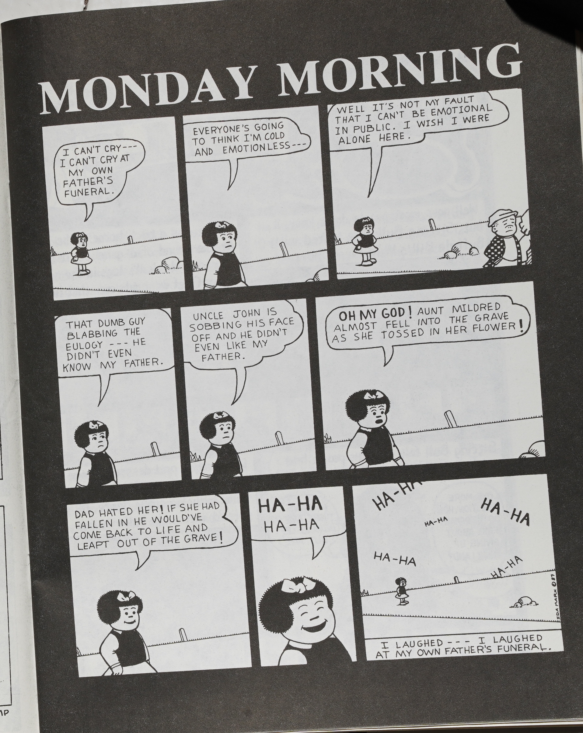
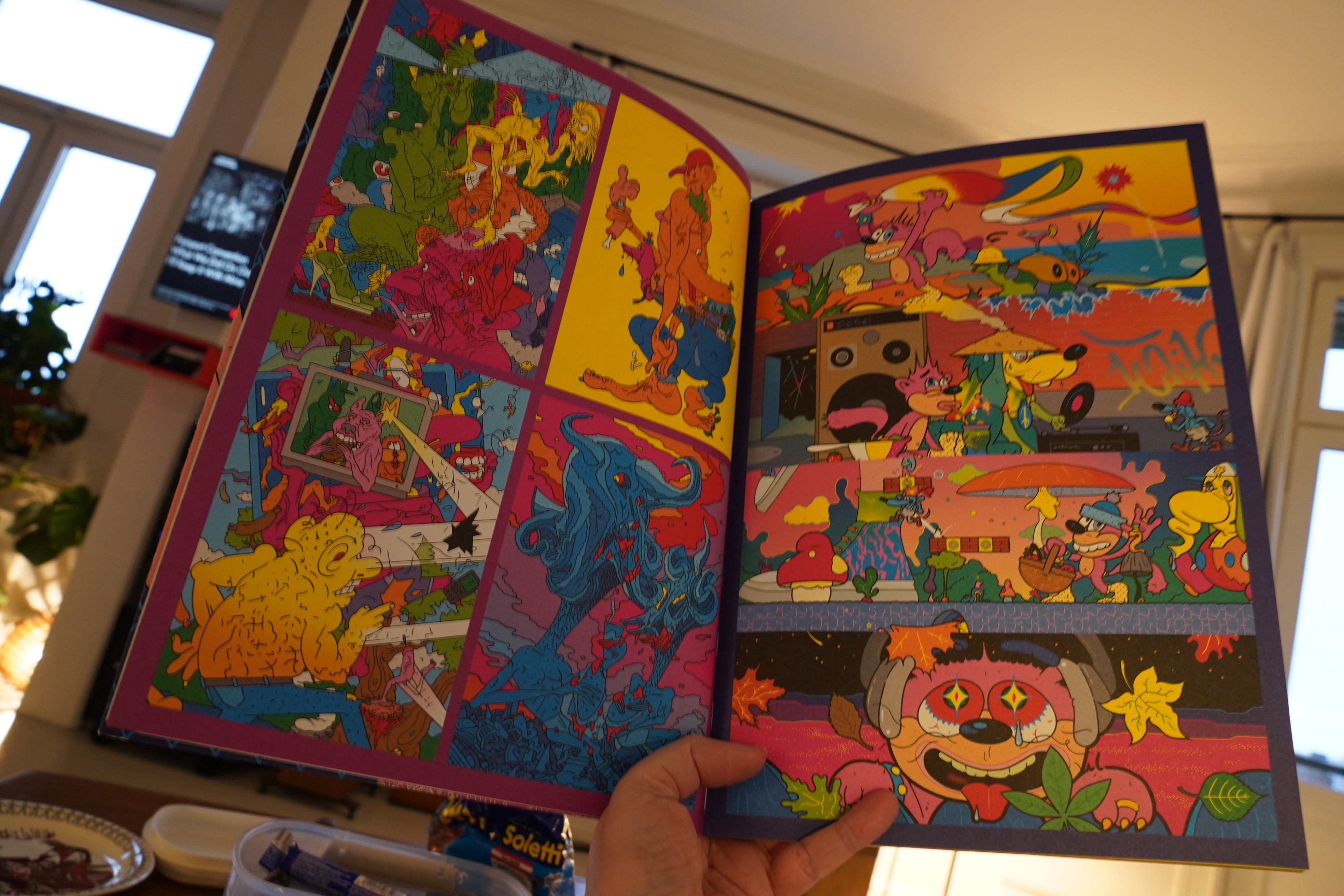
The wonderful This Isn’t Happiness blog has been linking to a few of the images I’ve been posting in this blog series, and they excerpted this page by Ida Marx (from Bad News #3), and it made me realise that this single page sums up many of the qualities I find interesting about this non-genre.
The page apparently had its origin in a class assignments at the School of Visual Arts: The assignment was to do a strip detailing a personal experience using Ernie Bushmiller’s Nancy character.
So we get this story of Marx laughing at her father’s funeral, as told by Nancy. It seems like this distancing device should turn the story into a joke or something, but the result is a chilling, heartbreaking piece.
Imagine this story coming out of a different comics culture… for instance as a 70s underground comic. It’s not that hard to imagine — but instead of being a retelling, we’d see Aunt Mildred almost falling into the grave, and it’d basically be a gag strip, meant to elicit laughter. (And it probably would have been funny.) The eerie distancing here means that Marx can really lean into the abject without becoming mawkish or sentimental, and without having to lessen the effect by adding a punchline.
Or imagine this story coming appearing in a late-90s autobio anthology. You’d likely have drawings of the “I” character tearfully talking at the reader, and also explaining the relationship she had with her father and Aunt Mildred… and I’d be sitting there, reading, thinking “well, that sucked for her… but… why should I be interested?” That is, instead of being intensely personal, it’d tip into being private. (See the horrible Stitches memoir for an example of the genre.)
The artwork on this page is very straightforward, but combines two things many of the people in “Nu Mutant” comics were interested in: Formal comics play, and the history of comics. It’s definitely on the Herriman side on the Herriman/Caniff scale.
So to sum up what I think makes this page so good: It’s not afraid to use the whole range of emotions, without making excuses. It’s doesn’t feel the need for contextualisation or closure. It’s pure comics — this isn’t a storyboard for a short indie film. It’s playful — it has fun with comics conventions and history. It’s got a striking visual quality as a page.
Vagueness is an underappreciated element in comics. Recently there was a survey of comics artists that had been/are working in animation, and they were asked things like “how has working in animation changed your work?” and I was waiting for somebody to say “well, of course working for commercial machinery breaks your soul, but I hope I have retained some personality”, but no: They were all “my comic are so much better, because they’re so clear and structured now”.
Which explains why I run away, screaming, from works of so many of that cohort in this generation. Most of it’s pure shit.
I loved reading this interview:
It’s Unfortunate That So Many Cartoonists Talk About Structure As If It Were Something Desirable
Yeah! Fuck structure!
Well, OK, perhaps not, but there’s something that’s just deadly about the structures many younger animation-influenced cartoonists apply to their work these days.
But… death to the three act structure! Fuck that shit! In any art form: Comics, movies, whatever.
Er… where was I… oh yeah, punk comix.
Groening’s “Nu Mutant” label is pretty much on point, although you can’t really use the word “mutant” about comics without everybody jumping to the wrong, Marvellian, conclusions. The Ze record label (also from New York, also from the late 70s/early 80s) called their retrospective releases “Mutant Disco: A Subtle Dislocation of the Norm”. There was something mutating in New York at the time, and Raw was part of that.
And then, as all movements do, it fizzled. In this case, it’s easy to pinpoint when it did: It ended when Penguin published the first Maus collection in 86.
Not because that was a bad book. No, the opposite — it was such a fantastic book that it seemed like everything had to change. Suddenly mainstream publishers, all over the world, had their first break-through comics hit, and it came from this milieu, so they tried publishing all the other artists from the Raw generation in bookstores…
And they all failed dismally. I mean, commercially.
What the mainstream audience wanted to read, to put it coarsely indeed, was a book about daddy issues, because that’s the only worthwhile subject that exists, apparently. (OK: “The uneasy relationship between children and their fathers.” OK?) It took a couple decades for the next mainstream breakthrough comic to arrive — which was Fun Home, which is about, yes, you guessed it…
Daddy issues didn’t much interest the rest of the Nu Mutant generation, so of course they didn’t sell. And it’s one thing to be a successful artist in relative obscurity (the Nu Mutant comics artists before 86) — it’s quite another thing to be a commercially unsuccessful artist in the mainstream. The former is awesome, the latter is disheartening.
So most of the people involved went into fine art or into illustration and never really looked back. Even the ones that didn’t leave comics behind (Beyer and Panter, for instance) reduced their comics output radically, which is why I’ve got a gazillion Beyer prints on my walls instead of twenty Beyer books on my shelves.
Gary Panter published the Rozz Tox manifesto, which was about infecting the mainstream with their weirdness. And that was certainly a successful strategy — selected people from this generation of comics artists are among the most successful (critically and popularly) ever (i.e., Matt Groening and Art Spiegelman). But you have to ask to what extent the infection went the other way — I don’t think many people are claiming that anybody involved here did their most interesting work after their successes.
There’s always a next generation of artists, but the 90s was pretty slim pickings for someone who was into this sort of thing. In the 90s, most of the leading art comics proponents used a more Underground aesthetic. Things didn’t really change, I’d say, until we got to the Paper Rad people, which led to PictureBox, and then things really got swinging again, with art for art’s sake.
And, of course, then came 2d cloud, the most important publisher of this century: Maggie Umber, Blaise Larmee, Austin English, Gina Wynbrandt, etc, etc, but things seem to be in the doldrums now. FU Press and Domino are trying to pick up the slack, but are too lacking in… volume… to be a real movement, I think.
I’m waiting for the next quixotic publisher to step up and lose a whole bunch of dollars.
Is that enough kvetching and bloviating? OK?
Thank you for attending my TED talk.
This is finally the final blog post in this series… except for a bunch of index-type posts that will follow over the next few days.
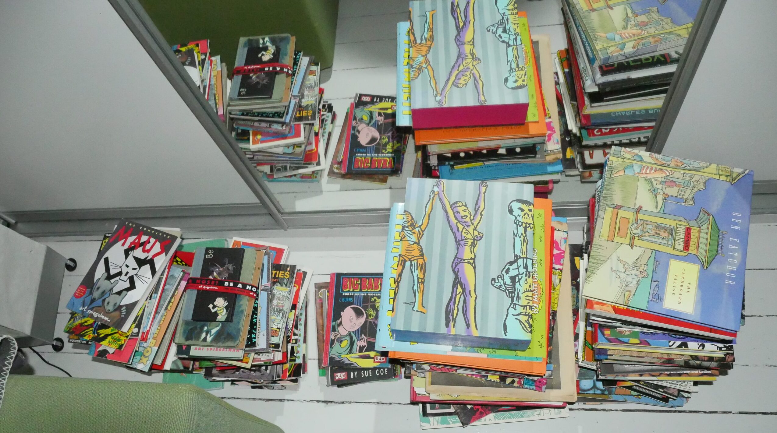
Meanwhile, here’s my setup for this blog series. I wanted to get a kind of stark, sharp look to the snaps of the pages (trey punk, you know), so I got a big flash and some arms and stuff for my camera rig:
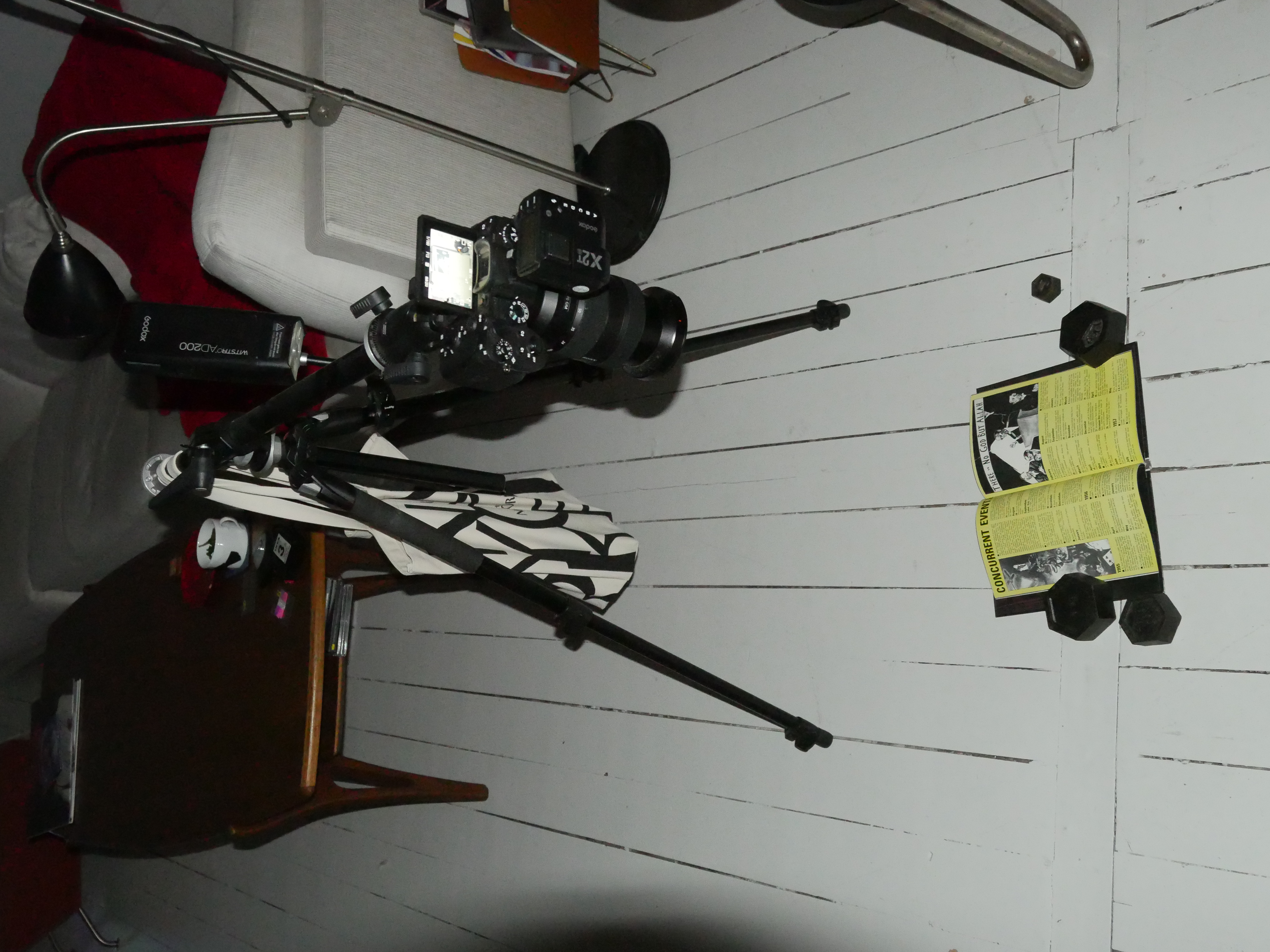
Expert set-up for snapping pics of comics, eh? Eh? EH!!!
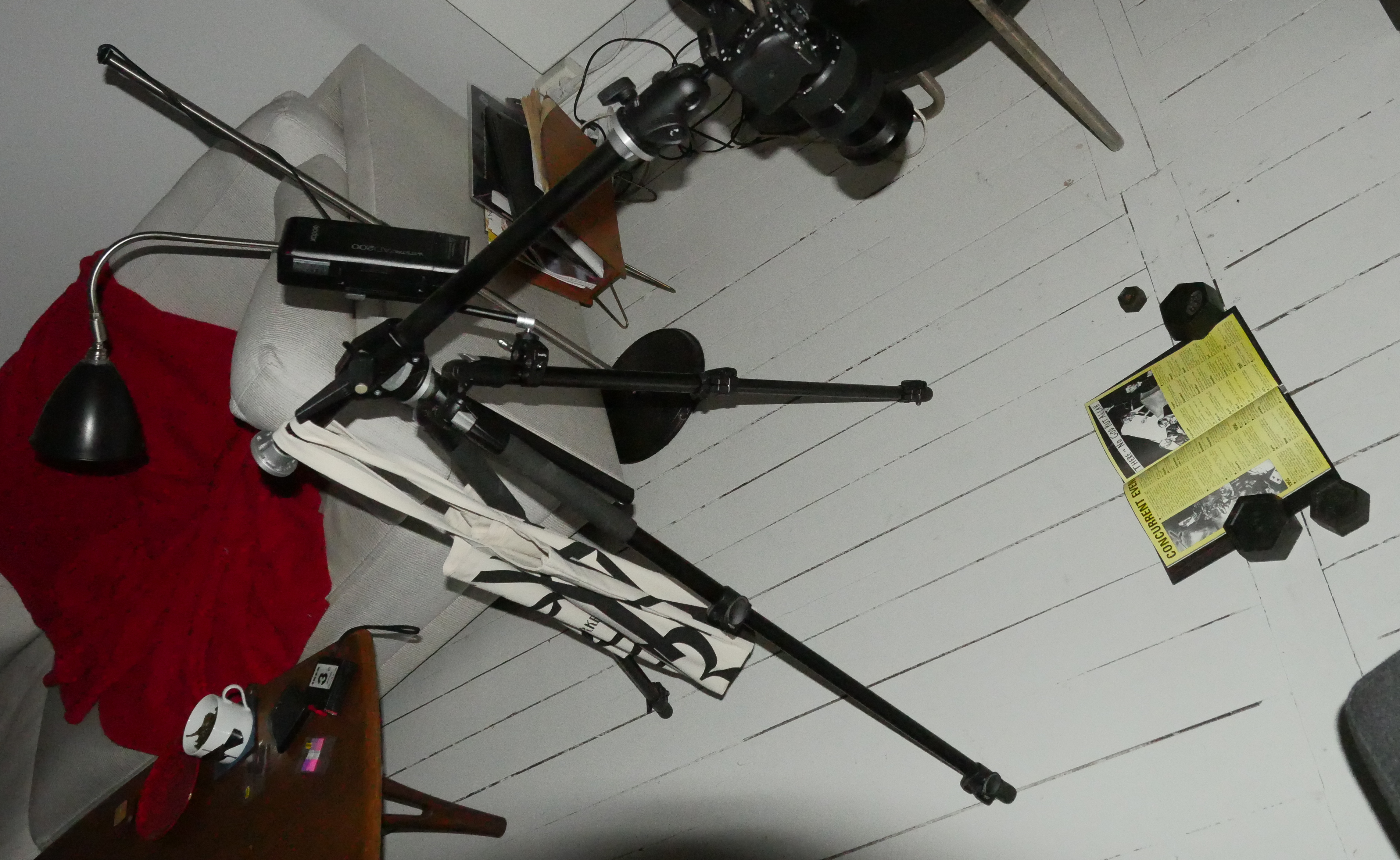
I’m not sure actual photographers would recommend using a tote bag filled with steel blocks as a counterweight, but what the hey.
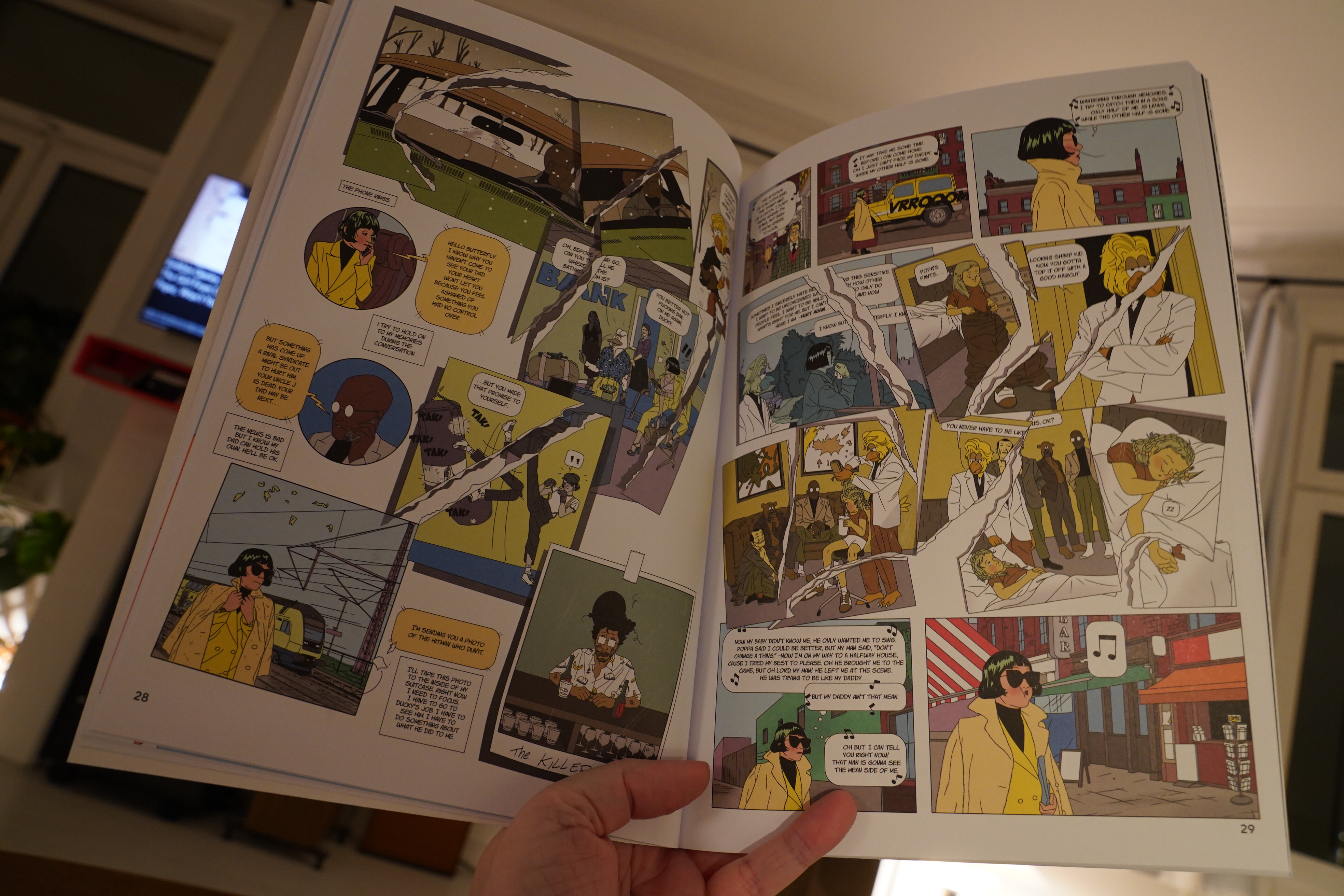
I was gonna do a computerey thing that I thought was gonna occupy my entire day today, but then it only took like half and hour, and now I’m too restless to do anything else. So: It’s a comic book reading day. Yay!
| Snapped Ankles: Come Play The Trees |  |
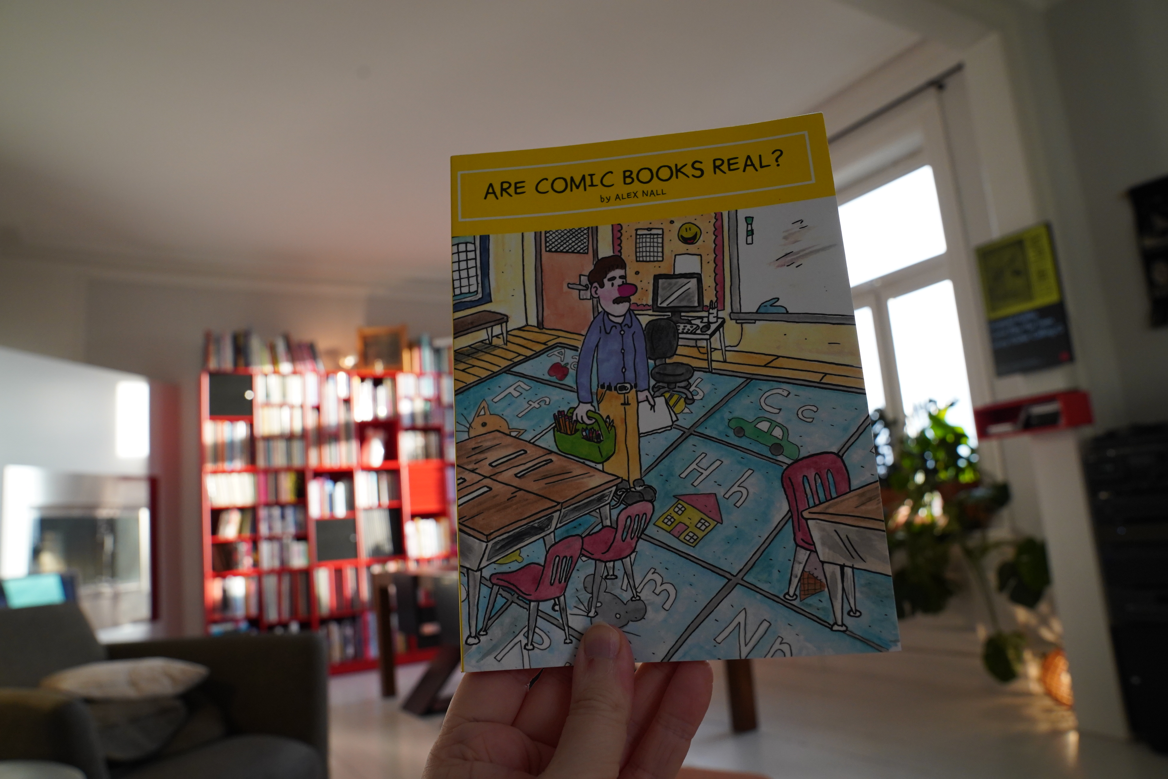
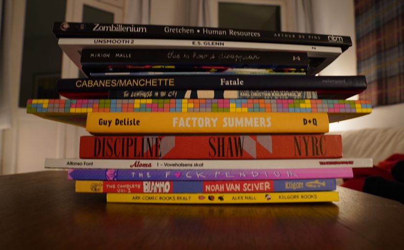
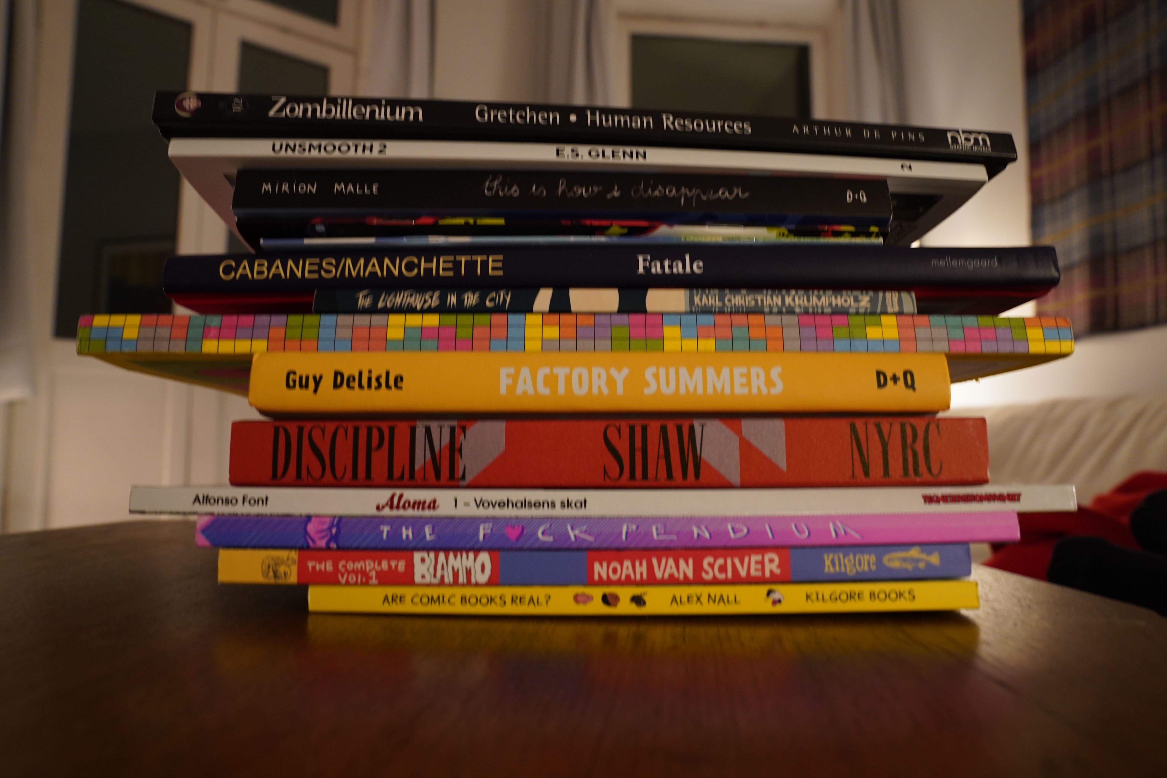
10:11: Are Comics Books Real? by Alex Nall (Kilgore Books)
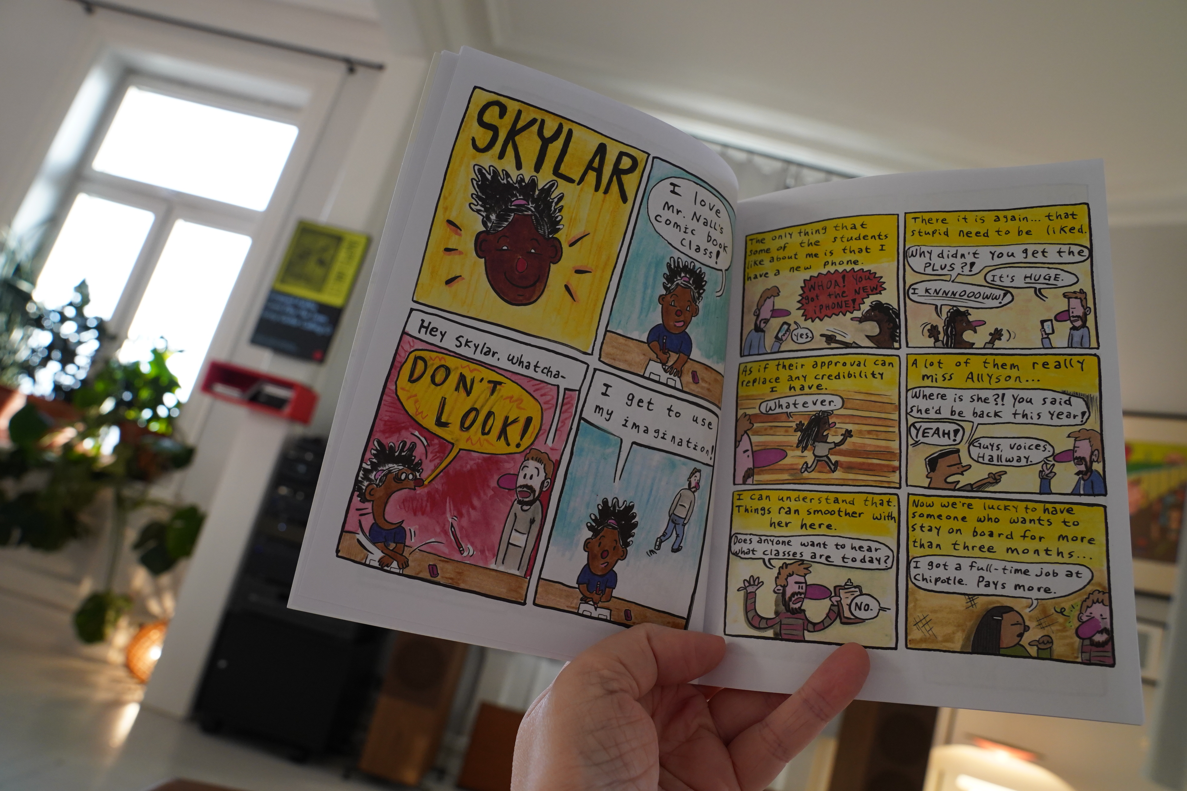
This is a book about being an art teacher at a school, and there’s some funny bits in here.
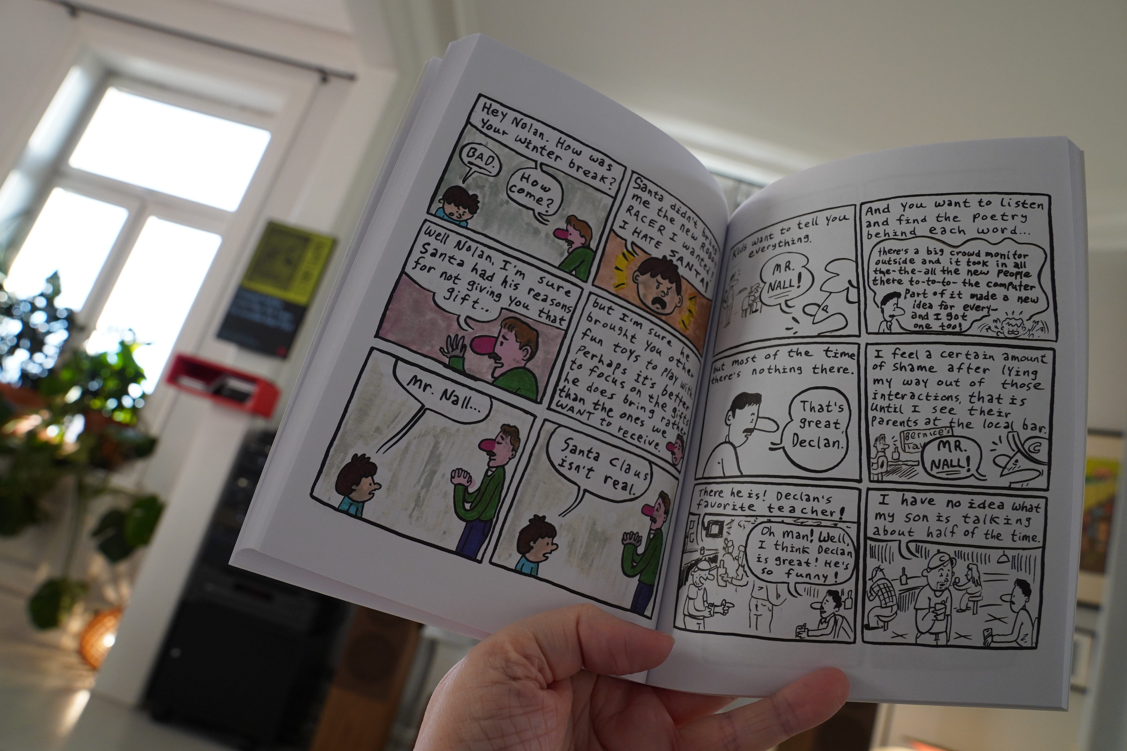
But as he observes here, children often don’t say the darndest things, and that’s reflected in this book, too. It’s just not that amusing, and many of the pieces seem to be geared towards getting likes on Facebook or something.
| Black Midi: Schlagenheim |  |
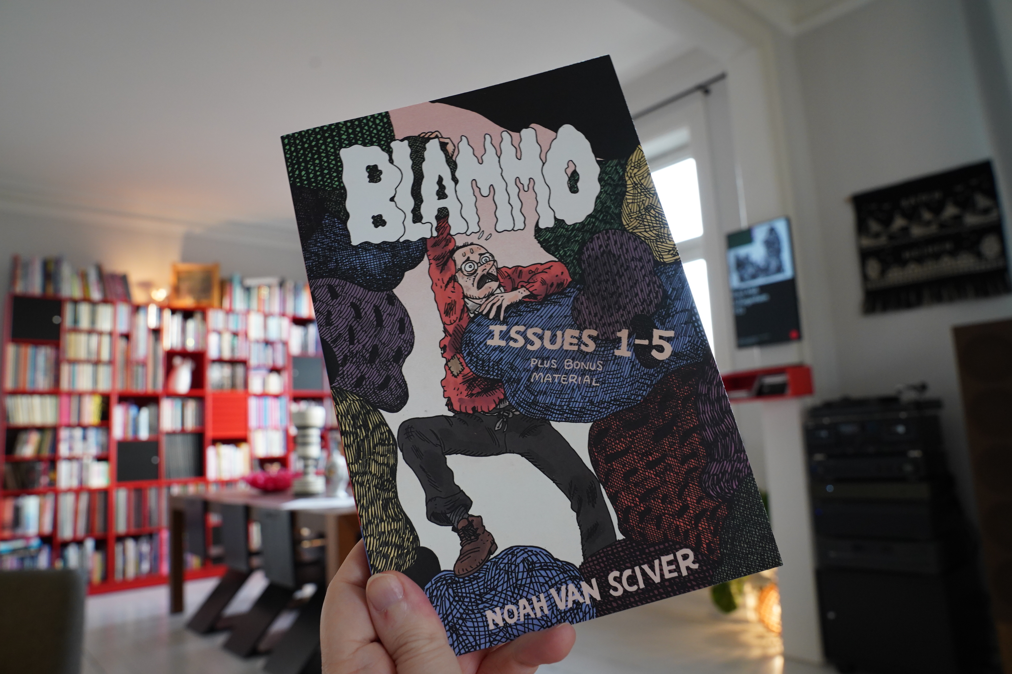
10:42: Blammo Issues 1-5 by Noah Van Sciver (Kilgore Books)
I think I’ve read most (all?) of these issues collected here before…

No I haven’t — this is a collection of the early Blammo issues that I haven’t been able to find. Yay!
I love Van Sciver’s more recent work, and it’s fun to see him trying out stuff here…

… but it’s not actually very good now, is it? I wish I could say that it gets better issue by issue, but that’s not really the case, either. The cartooning and storytelling chops grow by leaps and bounds, but if anything the stories get even less interesting. I guess he didn’t really find his subject matter until a couple years later.
I mean, there’s good stuff in here, but also stuff that perhaps shouldn’t have been included.
| Sam Amidon: Lily-O |  |
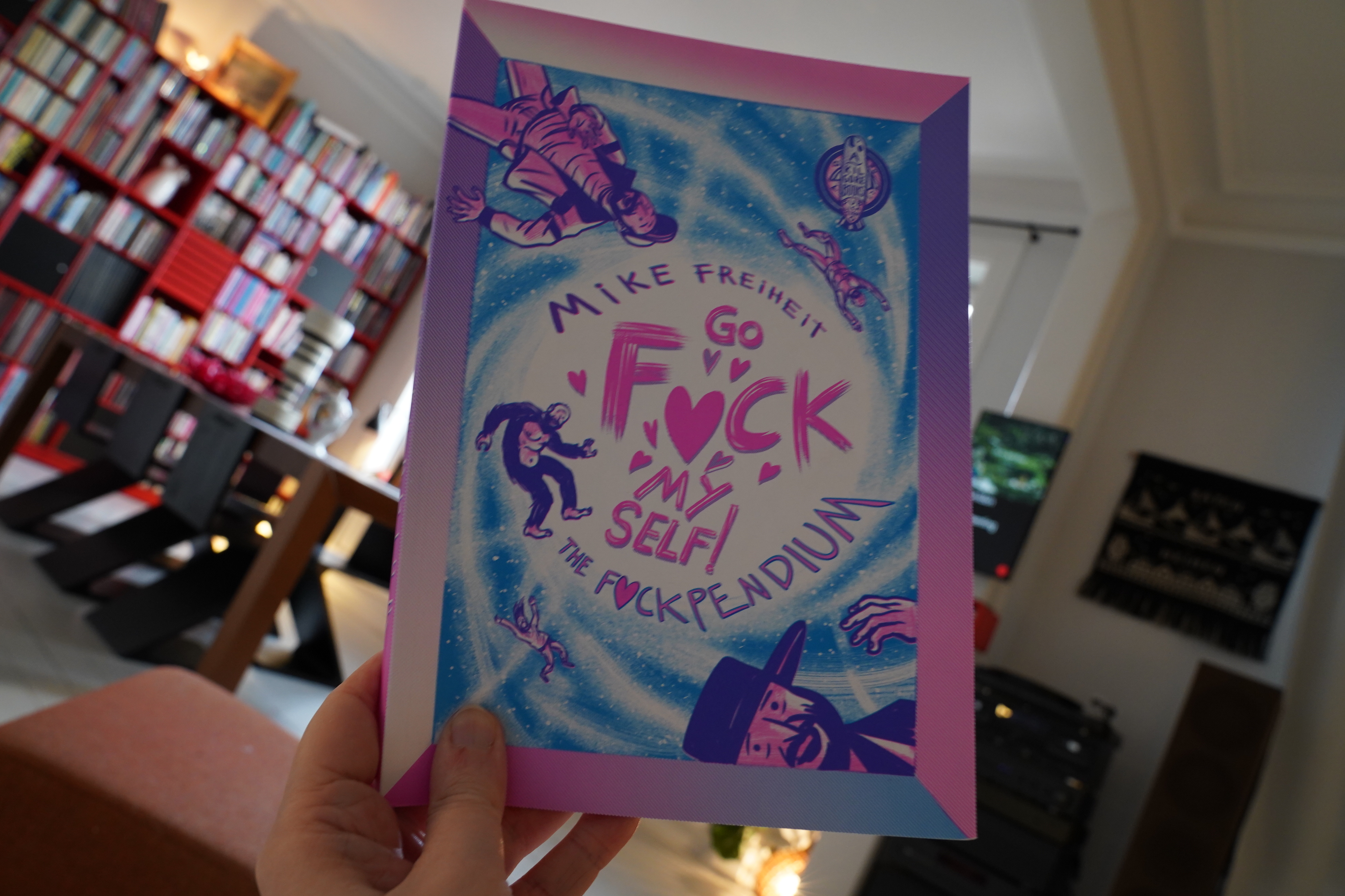
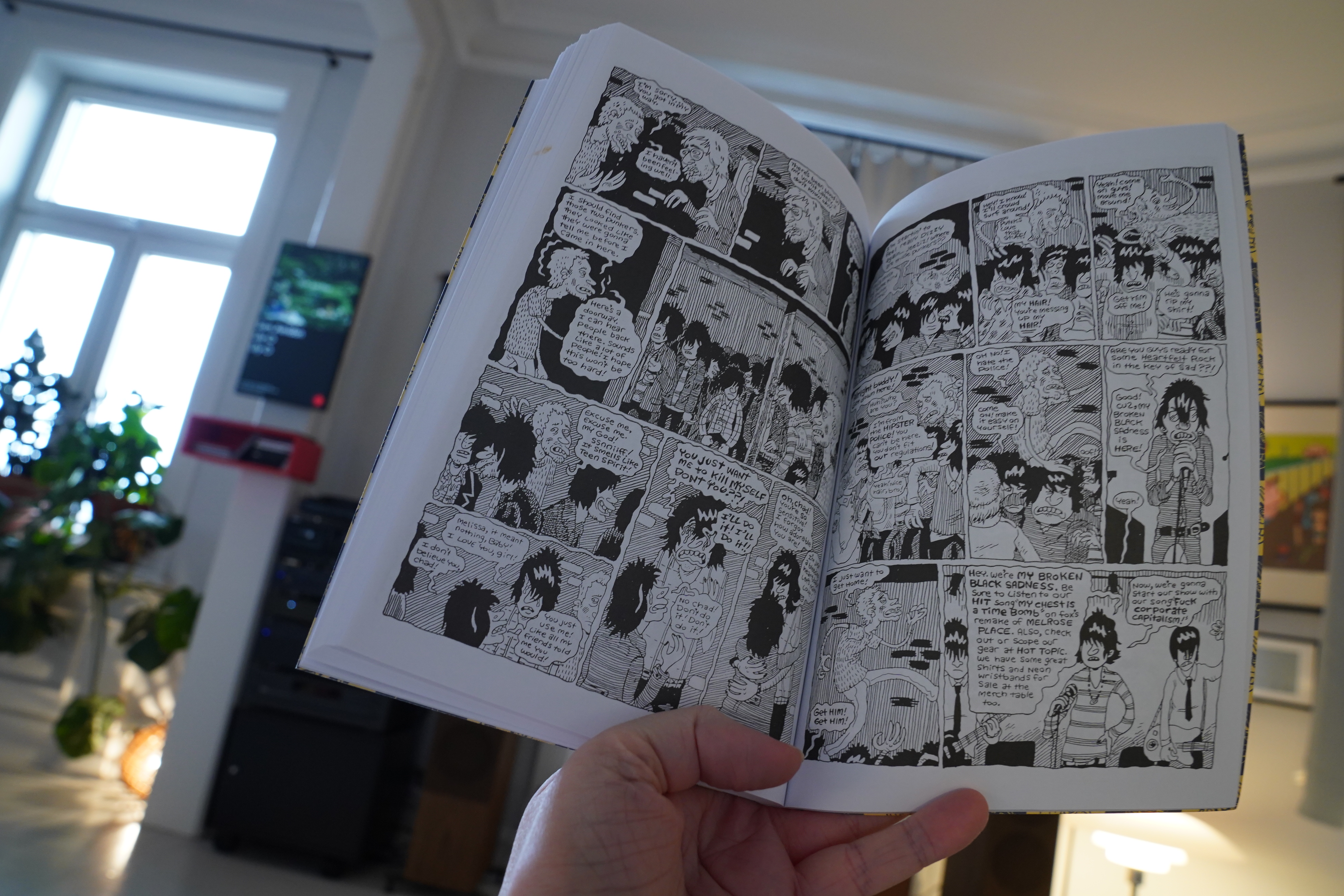
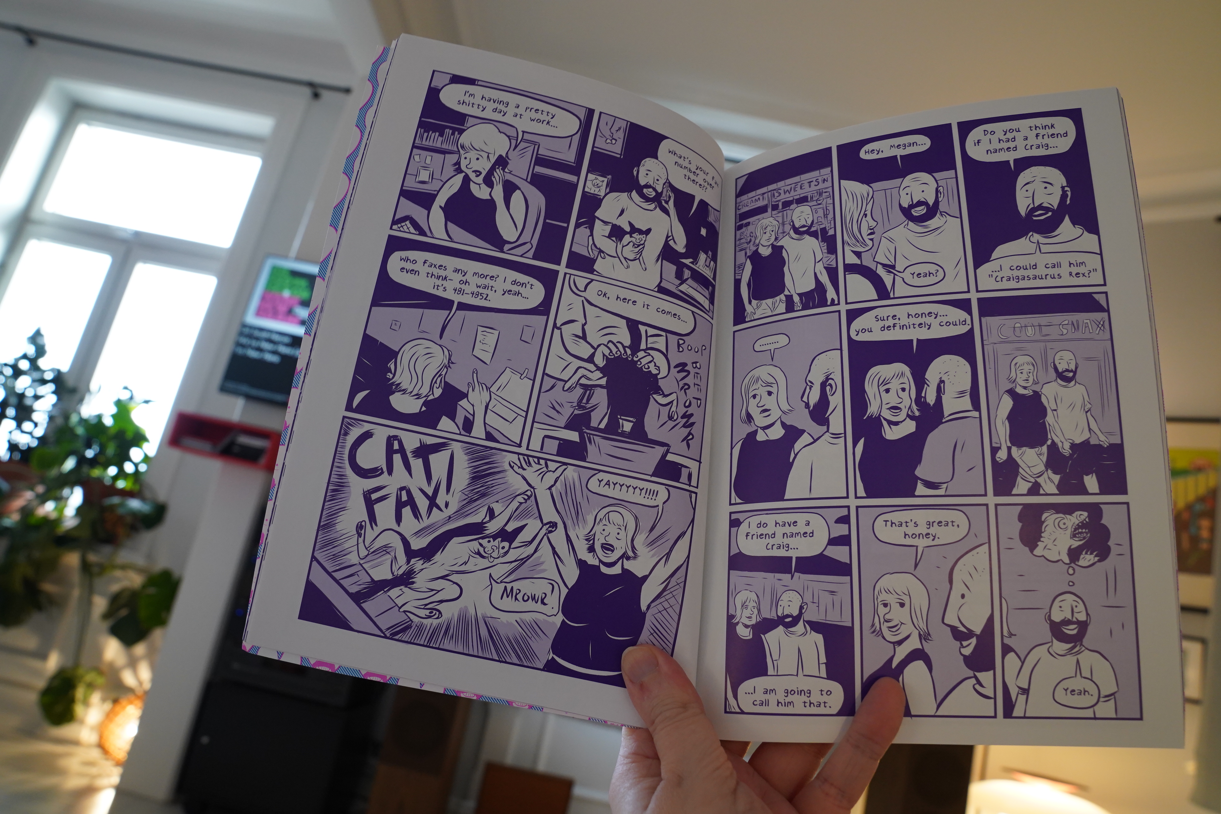
11:58: Go Fuck Myself by Mike Freiheit (Kilgore Books)
What’s with all these Kilgore Books? Hm… oh! This is from a Kickstarter or something? I’d forgotten.
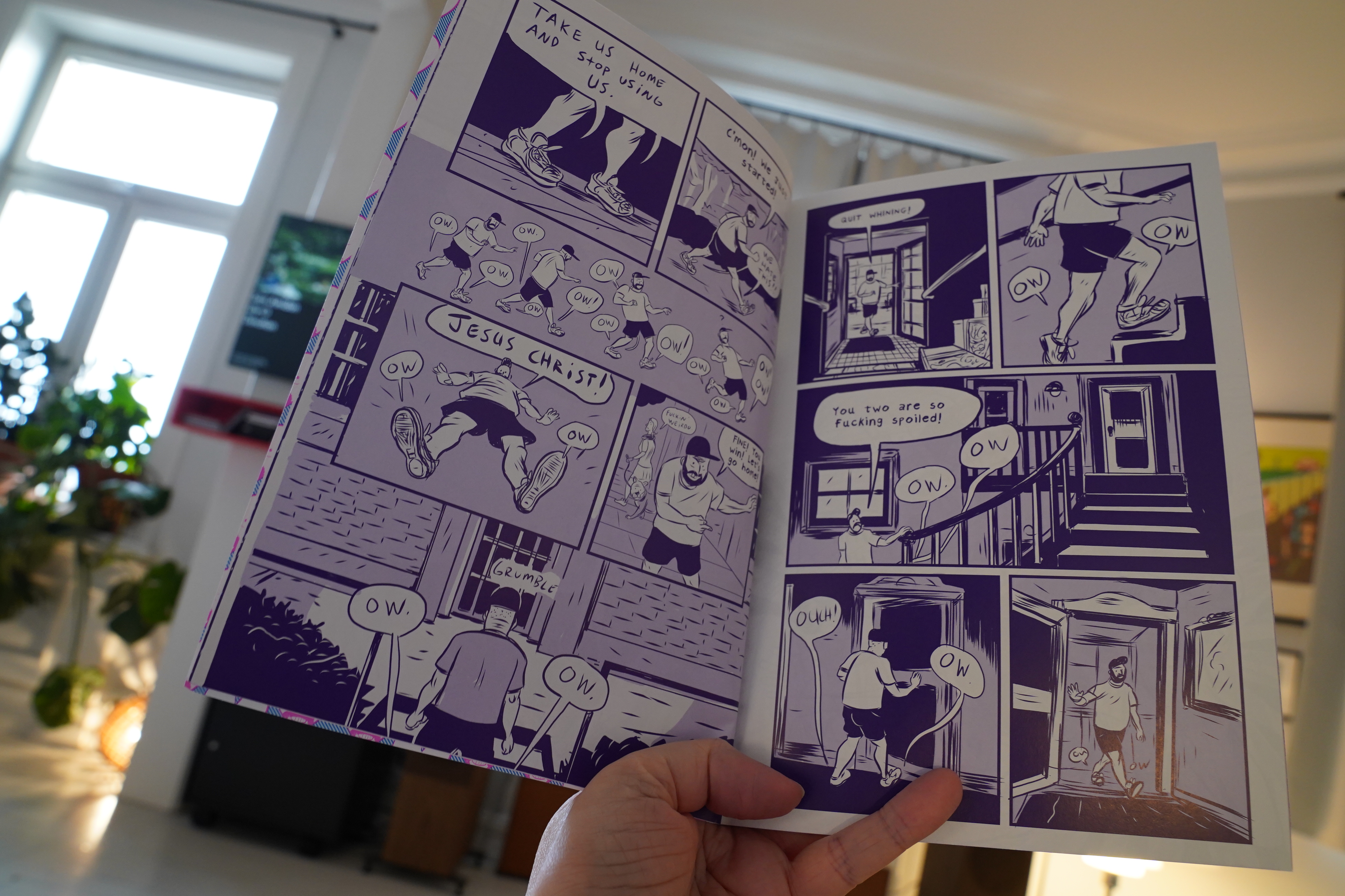
This starts off very absurdist…

… and then we get a bunch of one-page jokes, and I’m sitting here going “oh deer, is this a compilation of insta strips?” But then! Things start to cohere and turn into this big, interesting narrative.
Very very sneaky.
It’s a good read, and oddly touching.
| Gil Scott-Heron: We’re New Here (a Reimagining by Makaya McCraven) |  |
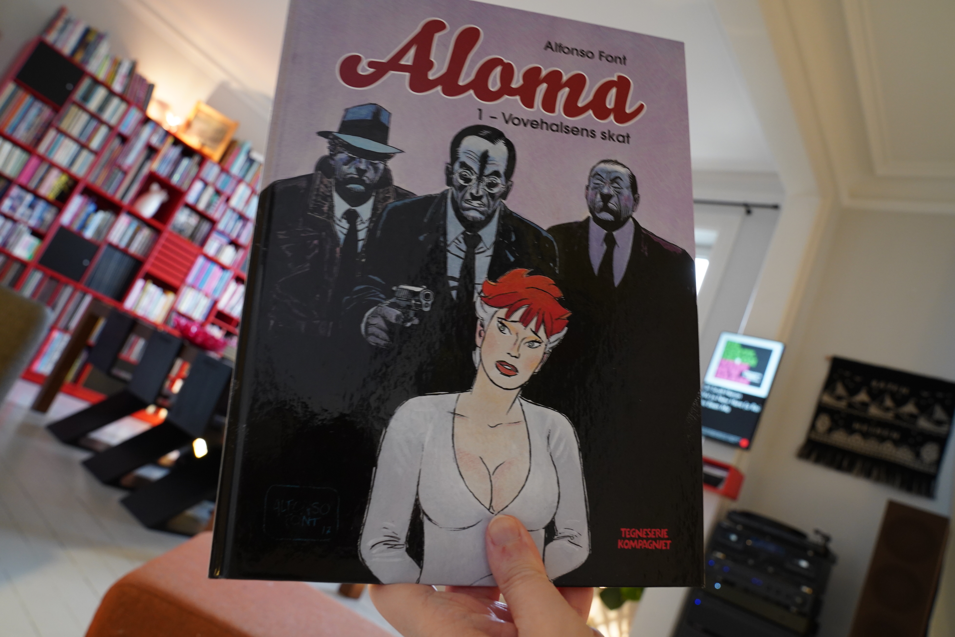
12:34: Alome 1 by Alfonso Font (Tegneseriekompagniet)
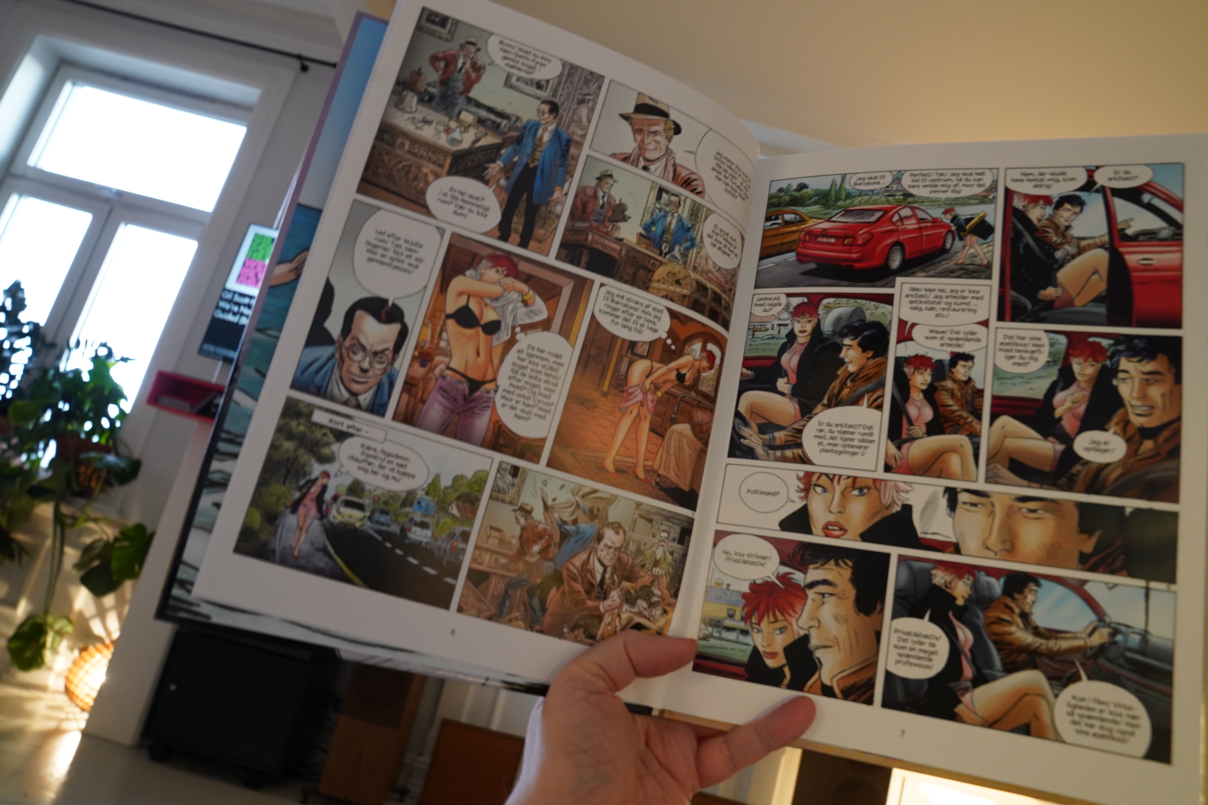
This starts off as a standard Spanish action thing…
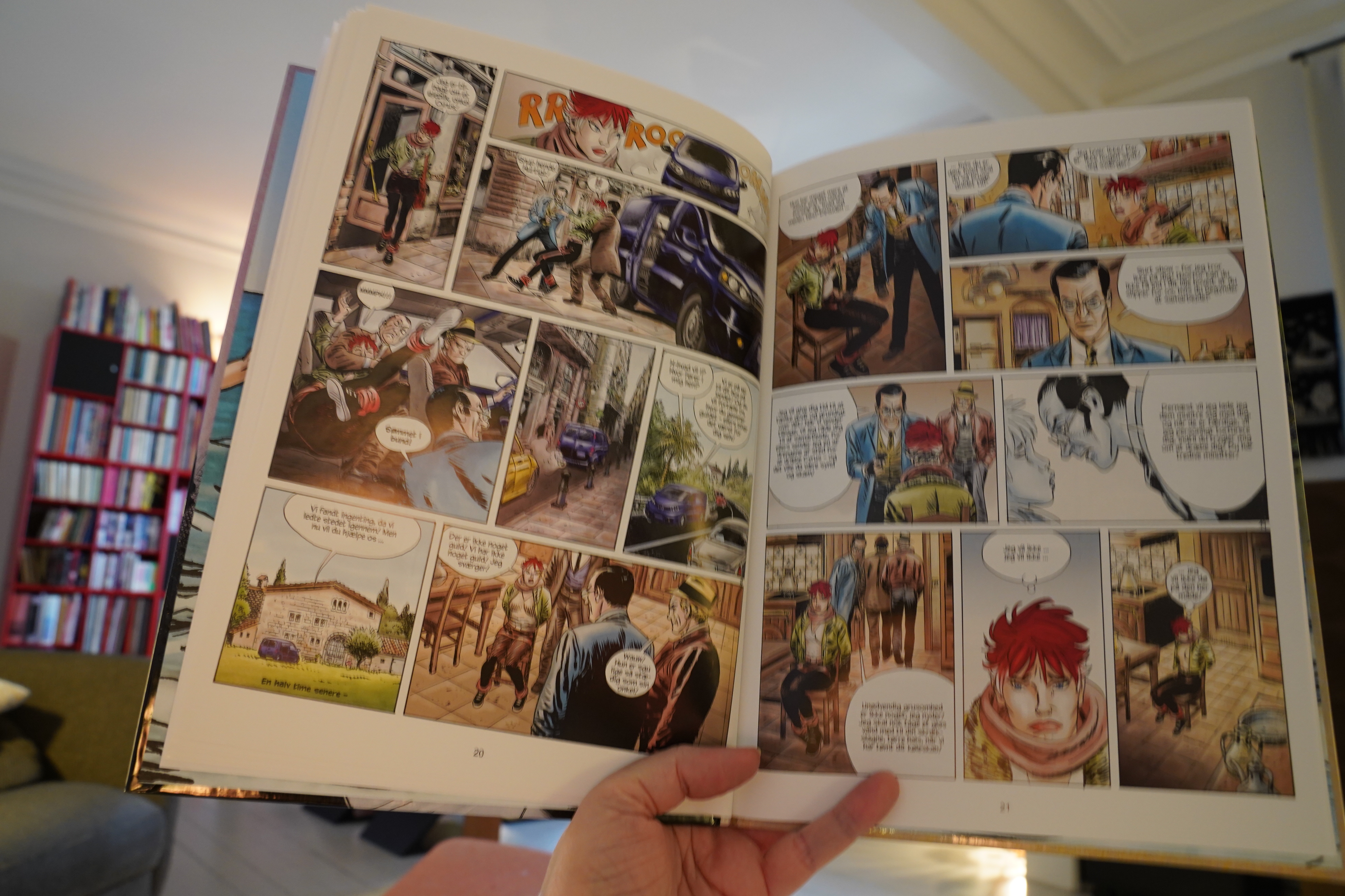
… but then it kinda just never gets started? I mean, it seems like the exposition goes on forever, and then at around page 40 the story starts. Very odd.
The artwork’s nice, in any case.
| Chuck Person: Chuck Person’s Eccojams Vol. 1 |  |

13:06: Discipline by Dash Shaw (New York Review Comics)
Wow. Reading this is like being submerged in a different reality. Shaw is doing something awesome here.
I mean, I’ve liked all of Shaw’s books, but he’s reaching new heights here. The storytelling just flows so well here — the lack of traditional comics panels leads to a different sort of urgency. It’s just fascinating. I mean, it’s not just “hm, interesting”; it’s a gripping, moving reading experience.
Comic book of the year?
| Arthur Russell: Iowa Dreams |  |
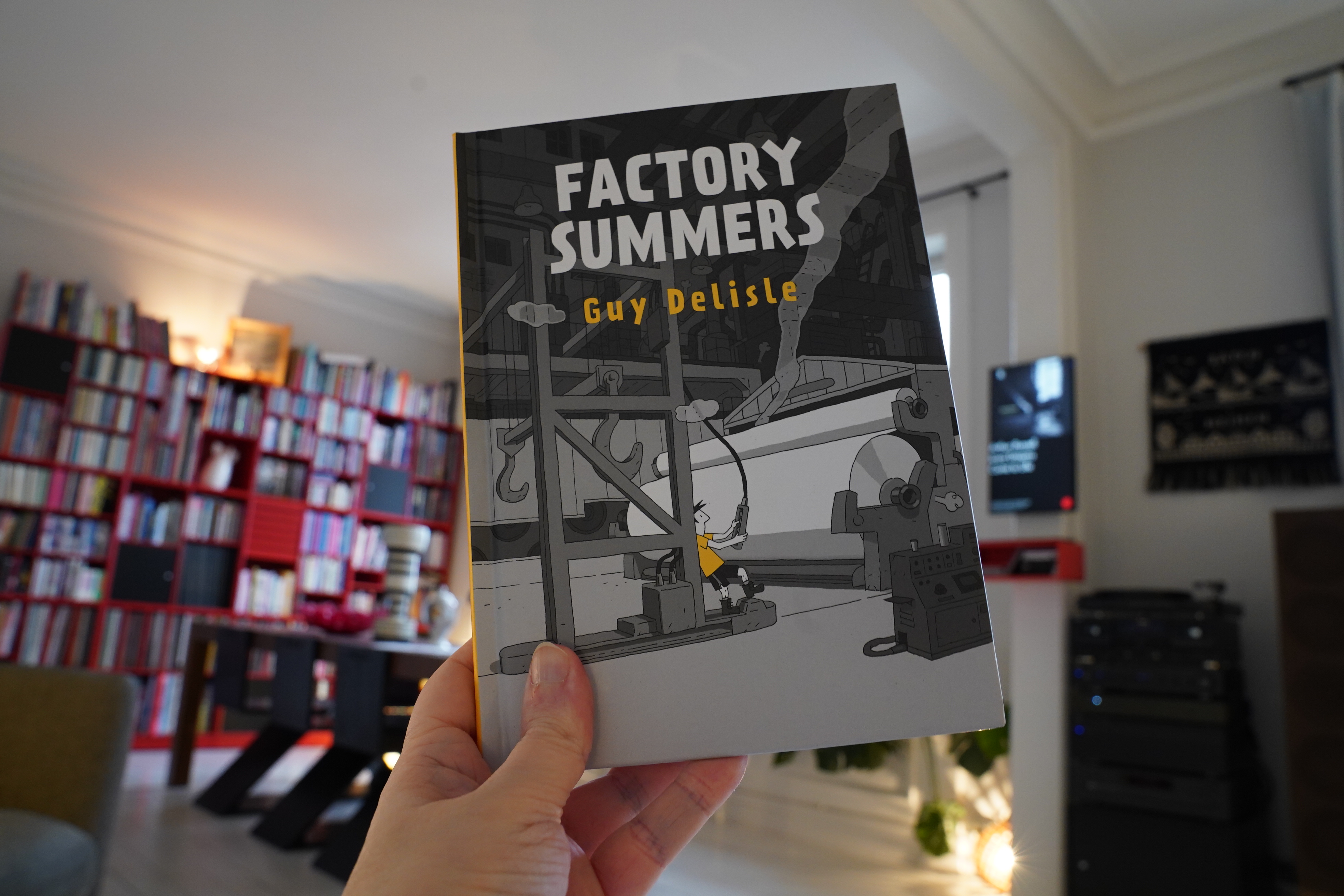
13:53: Factory Summers by Guy Delisle (Drawn & Quarterly)

I really liked Delisle’s earliest books, but they’ve been getting less compelling? If I remember correctly. That Hostage book, for instance, wasn’t all that.

This one is better — but it’s feels like a book that’s mostly surfaces. I mean, we’re introduced to a milieu that we don’t often see in comics — a factory — but we just get the observations we expect from a seventeen-year-old (or whatever), which makes sense, but it feels a bit slight.
Still, Delisle’s storytelling is on point, and there’s some magical scenes in here. (Like going up to the roof of the factory.) And it’s interesting and likeable. But it just didn’t quite click for me?
| Fairport Convention: What We Did On Our Holidays |  |
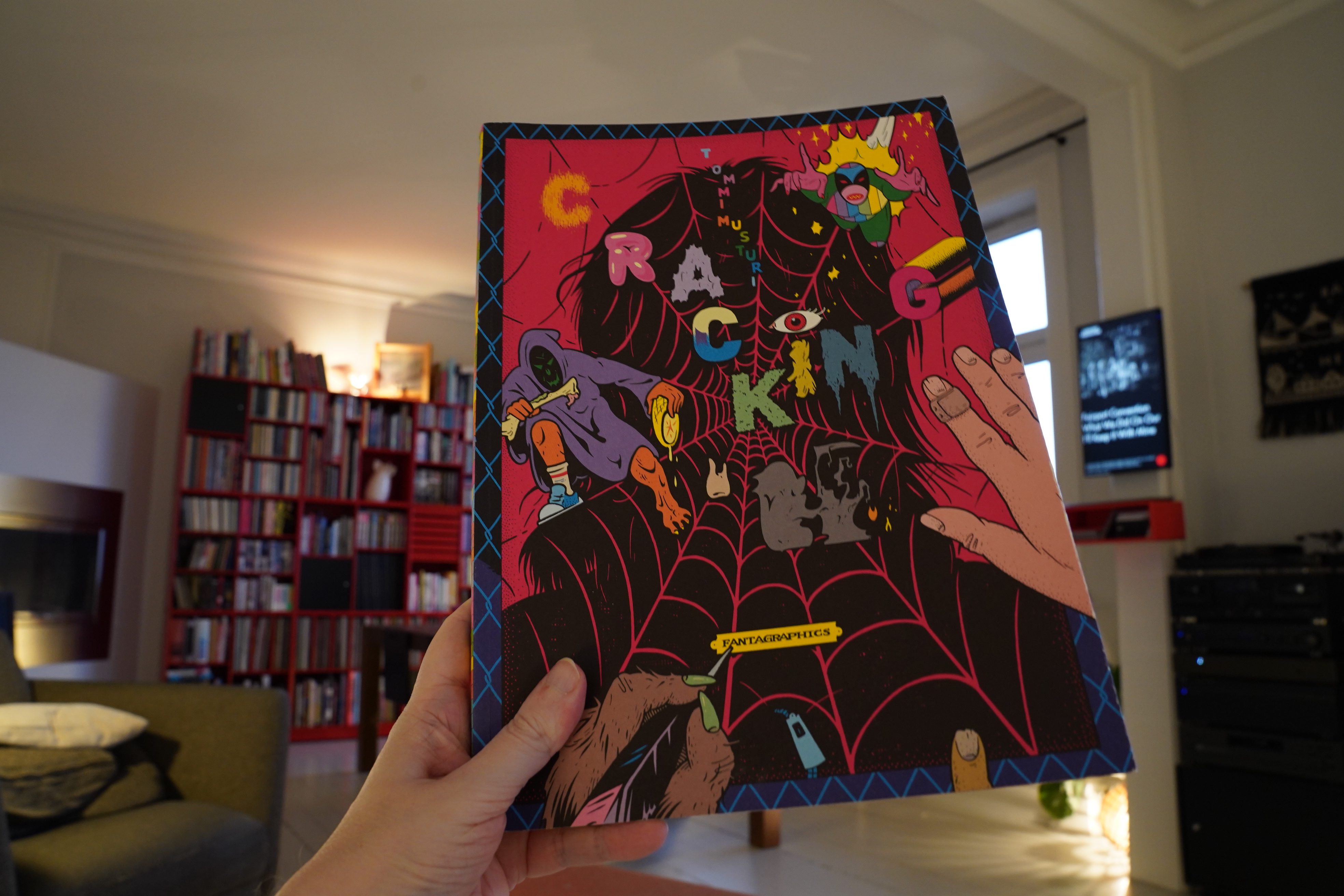
14:59: Cracking by Tommi Musturi (Fantagraphics)
Oh right. I’ve read those The Future books of his (which are narrative comics). This is basically just a collection of illustrations.
But it’s pretty awesome. It’s a very large book with excellent reproduction. (And apparently financed by grants from Finnish export institutions, which is nice.)
| Fairport Convention: What We Did On Our Holidays |  |
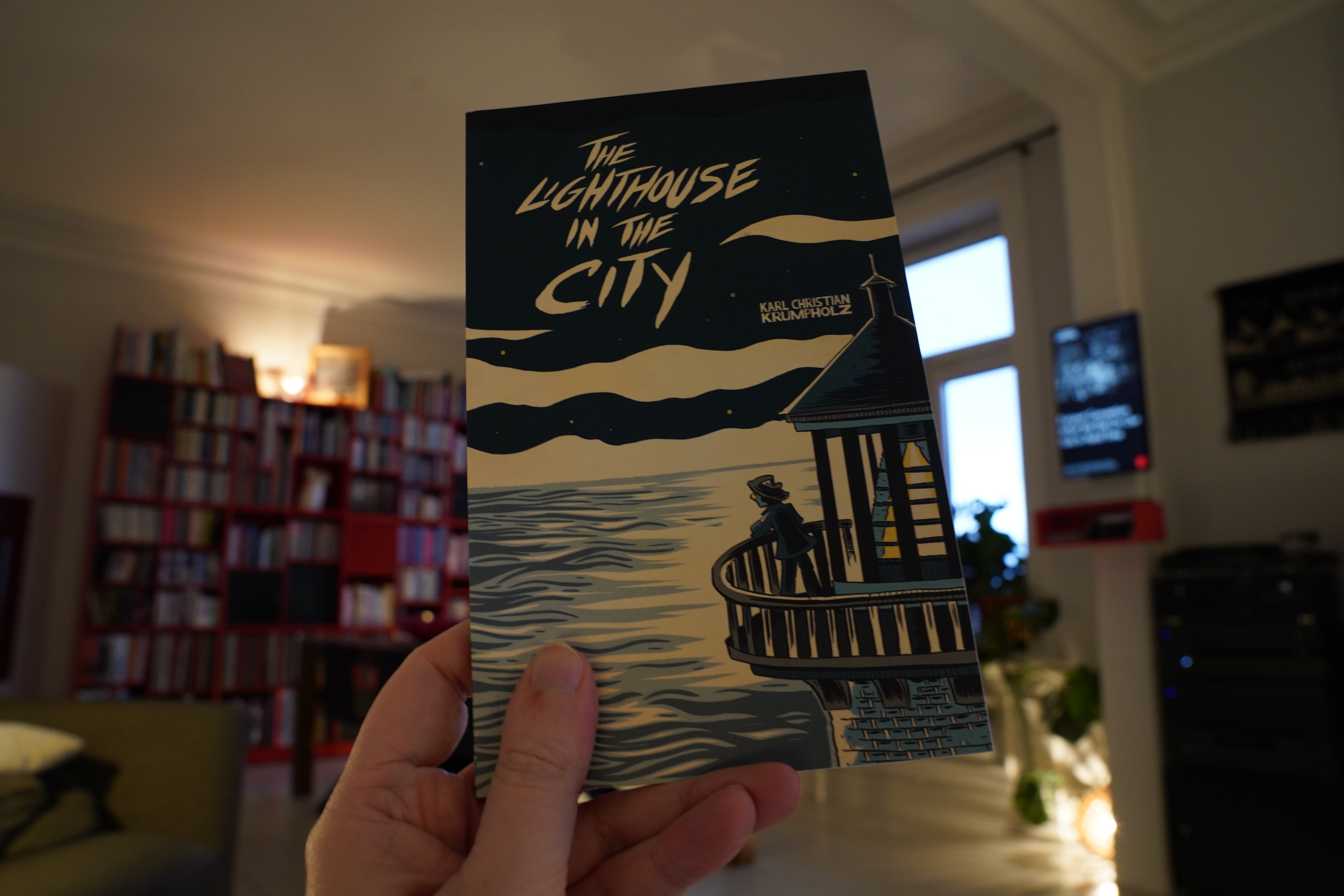
15:10: The Lightshouse in the City by Karl Christian Krumpholz (Kilgore Books)
I’ve read a whole bunch of diary comics…
… but… I’m just not feeling this one. I’m having a hard time understanding why I should be interested in reading these pages, you know? It feels more private than personal.
| Fairport Convention: Unhalfbricking |  |
15:38: Fatale by Cabanes/Manchette (Mellemgaard)
Hm… That looks awfully familiar? Have I bought it before in some other language? This is the Danish edition…
I like the artwork and the colouring here…
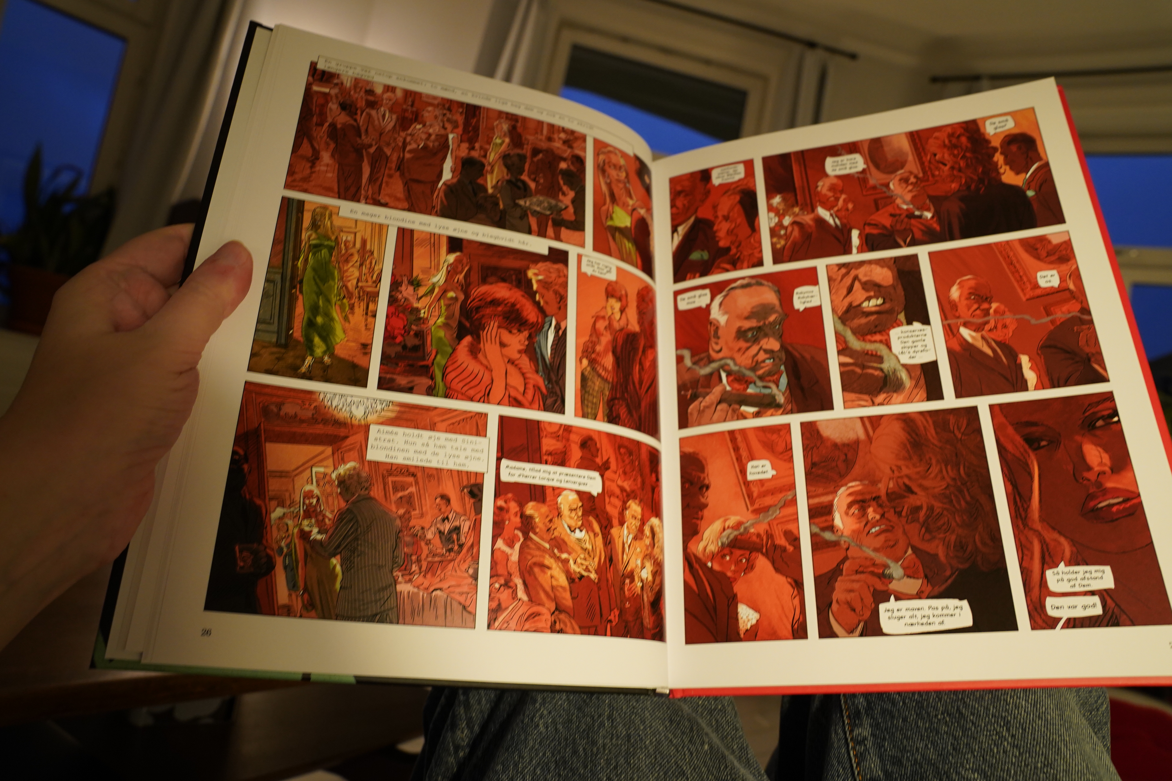
I’ve only read Tardi’s Manchette adaptations, and they’re really er complicated. This one is even more so. At the start of this I wasn’t really that interested, but it gets wilder and wilder, and the plot takes some really unexpected turns, and before I knew it, I was totally into it. It’s great!
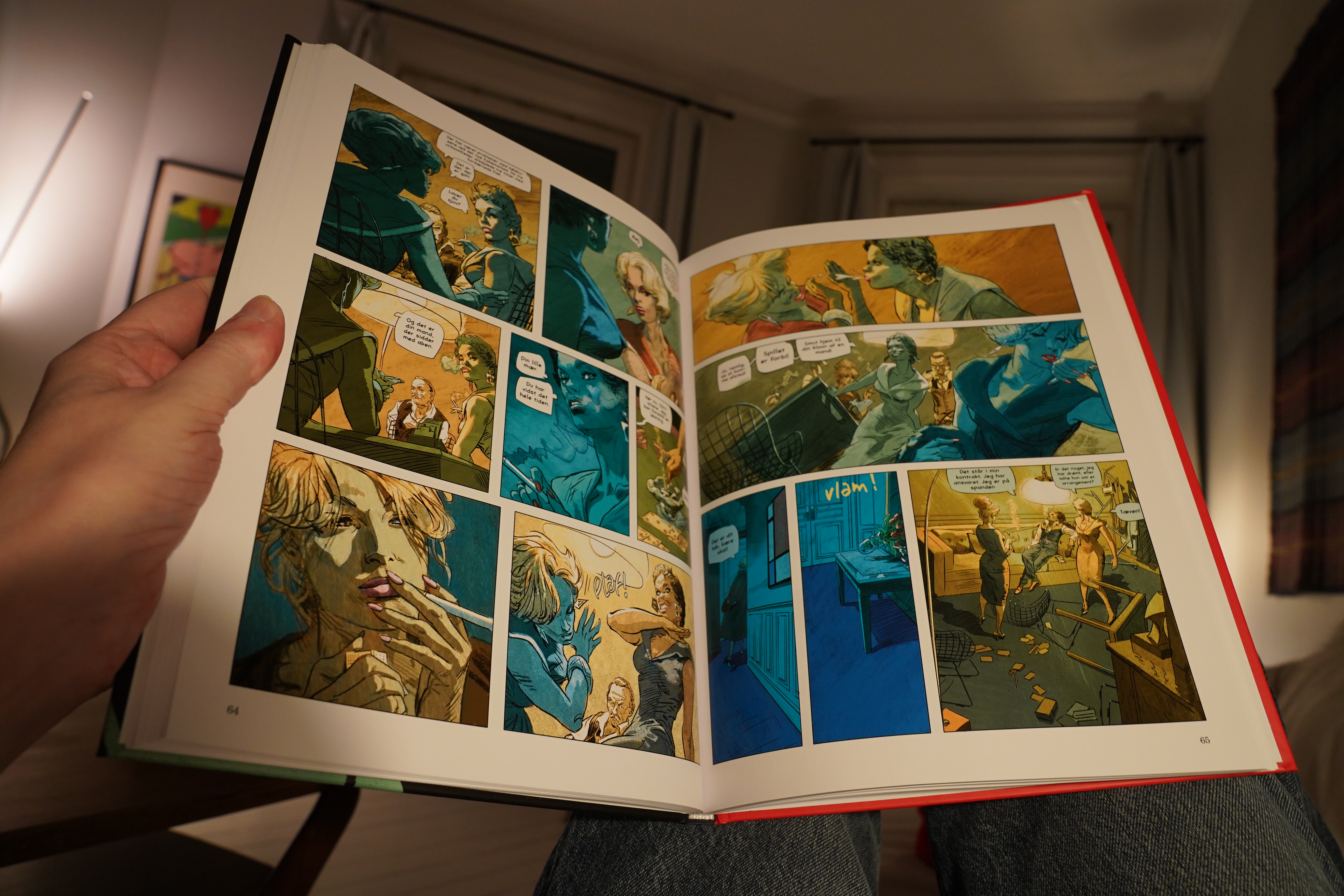
Cabanes does have a tendency to draw people the same, though, so it’s a bit hard to tell who’s saying what to whom. Especially since he’s fond of doing 180 degree shifts in perspective, so you have to go “oh, that’s the one with the square earring, and that’s the one with the pointy earring, so it’s those two in that panel, and not the third one without the earrings”…
But I’m quibbling. This is a lot of nihilist fun.
| David Bowie: Hunky Dory |  |
18:09: Montana Diary by Whit Taylor (Silver Sprocket)
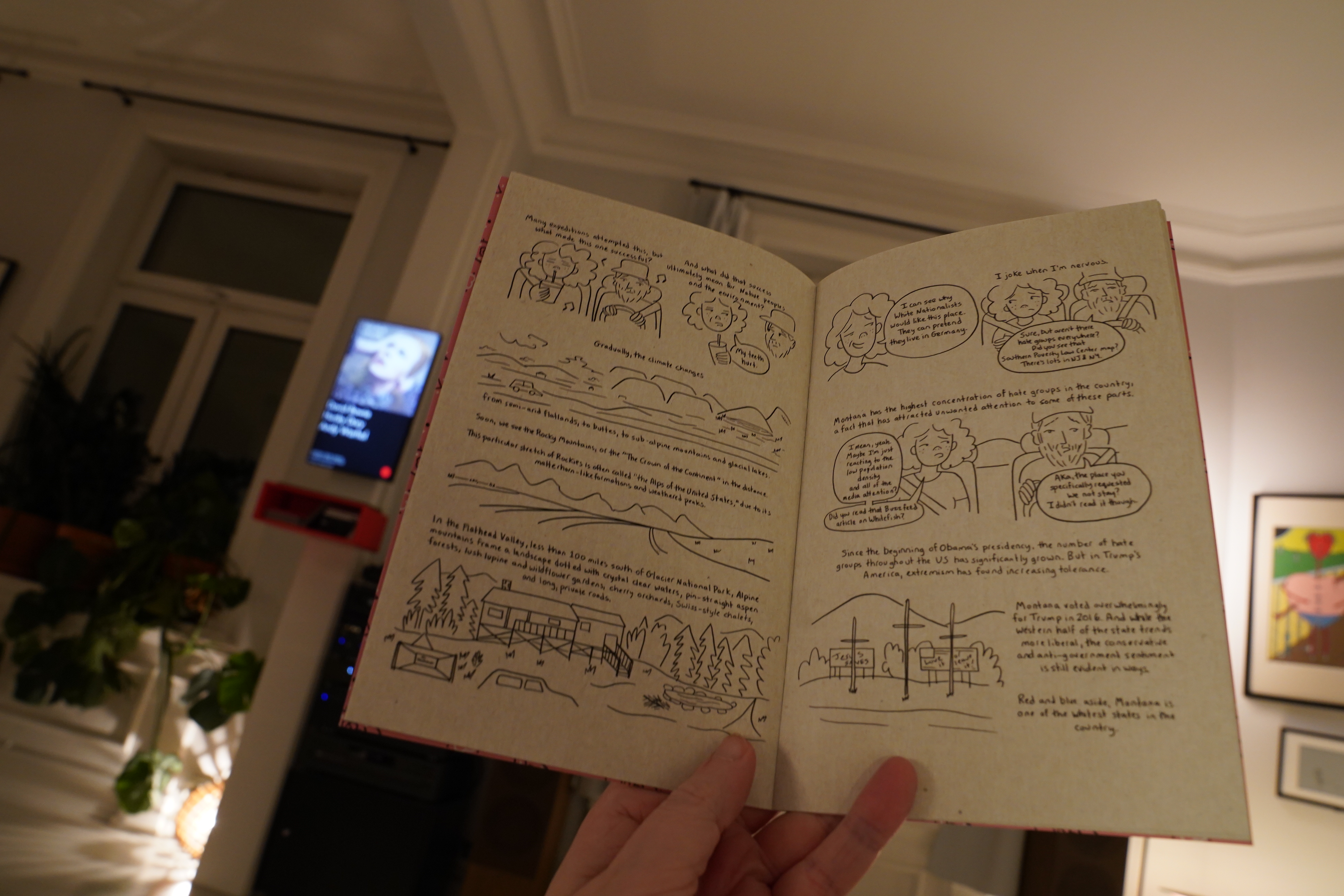
This isn’t really a diary comic — it’s more of a traditional travelogue thing. It’s got a very likeable vibe — it flows well, blending information with a personal experience.
| Jung Body: Real Eternal Bliss |  |
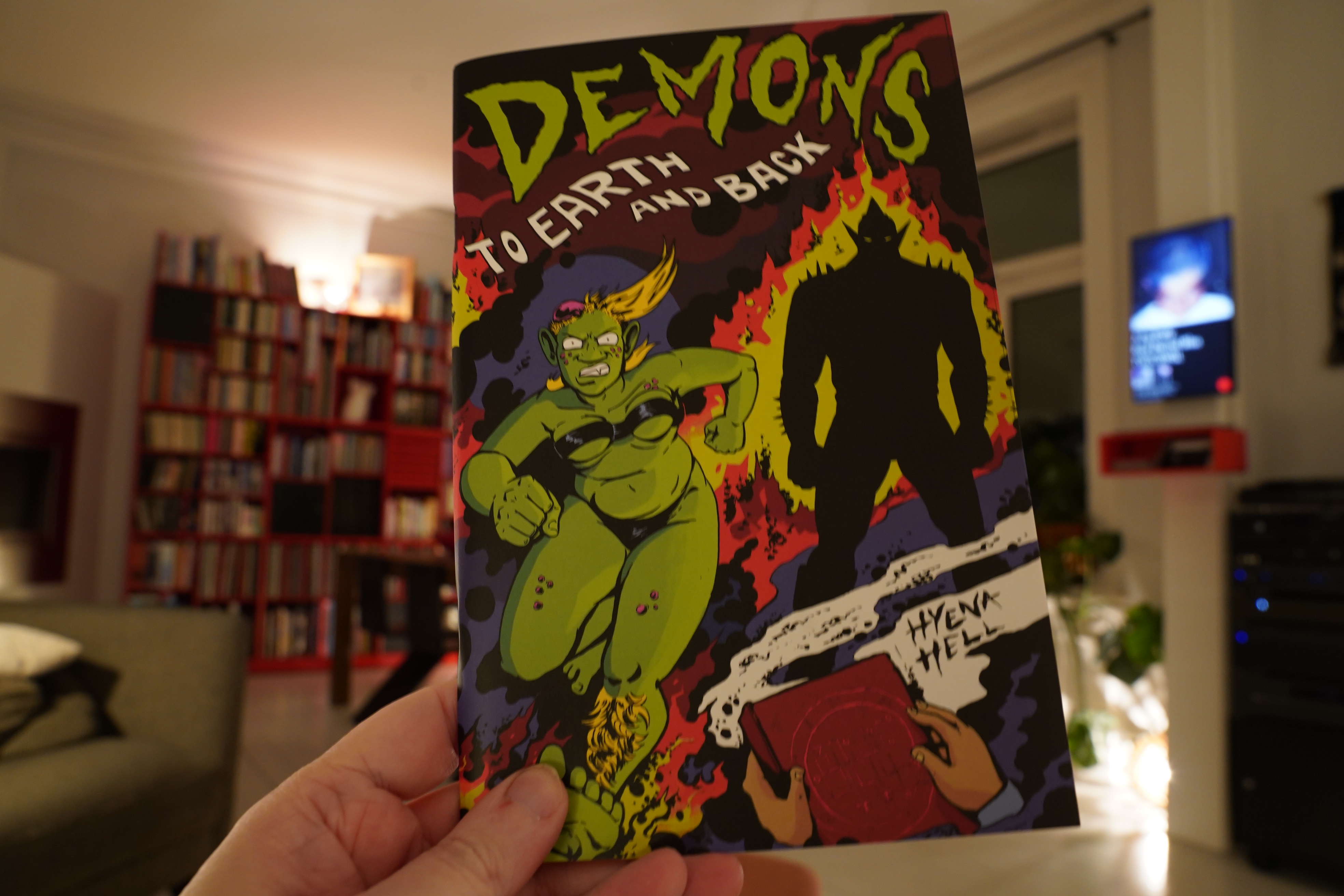
18:28: Demons: To Earth and Back by Hyena Hell (Silver Sprocket)
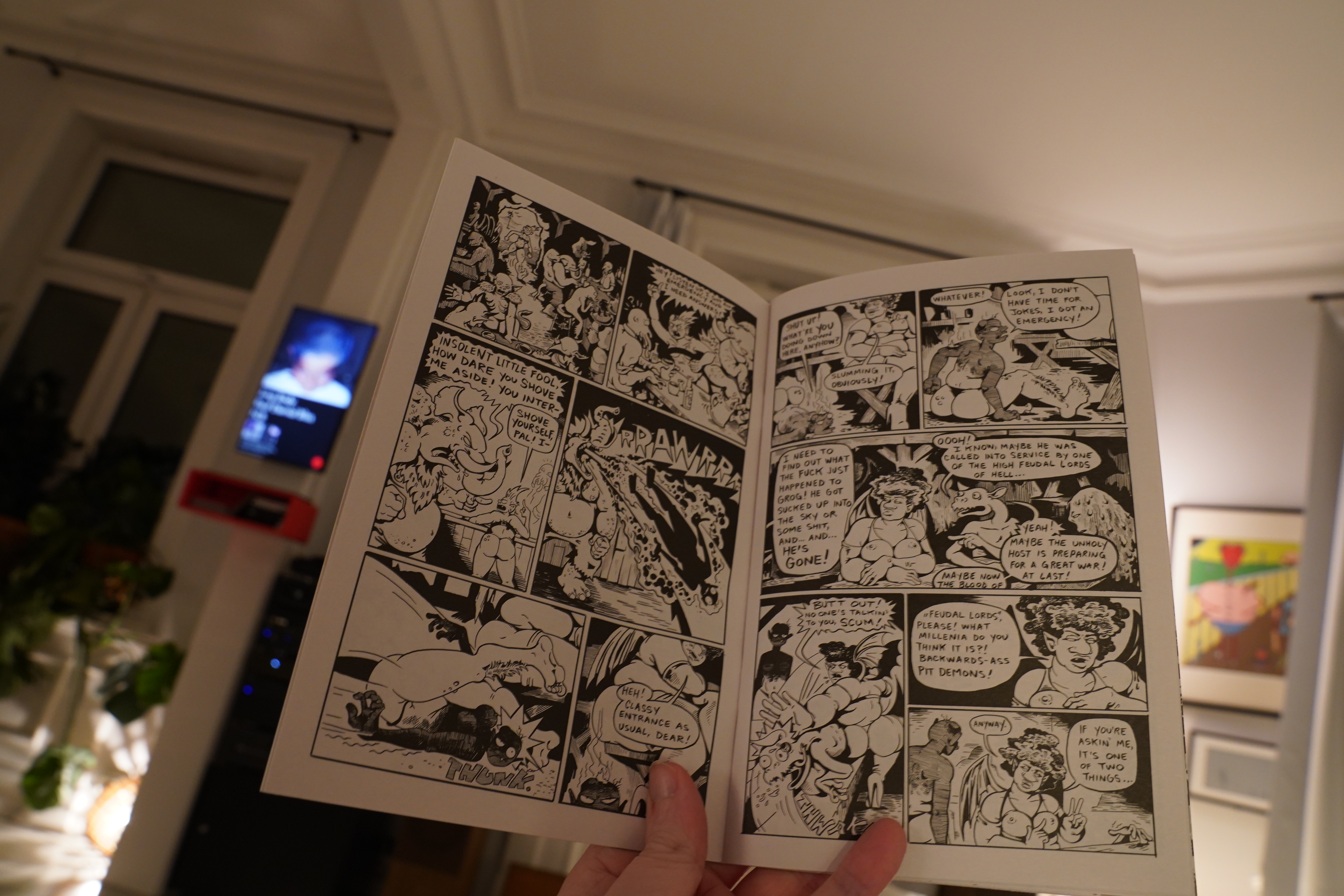
I’ve read a couple of issues of this before, but I think this is the best one?
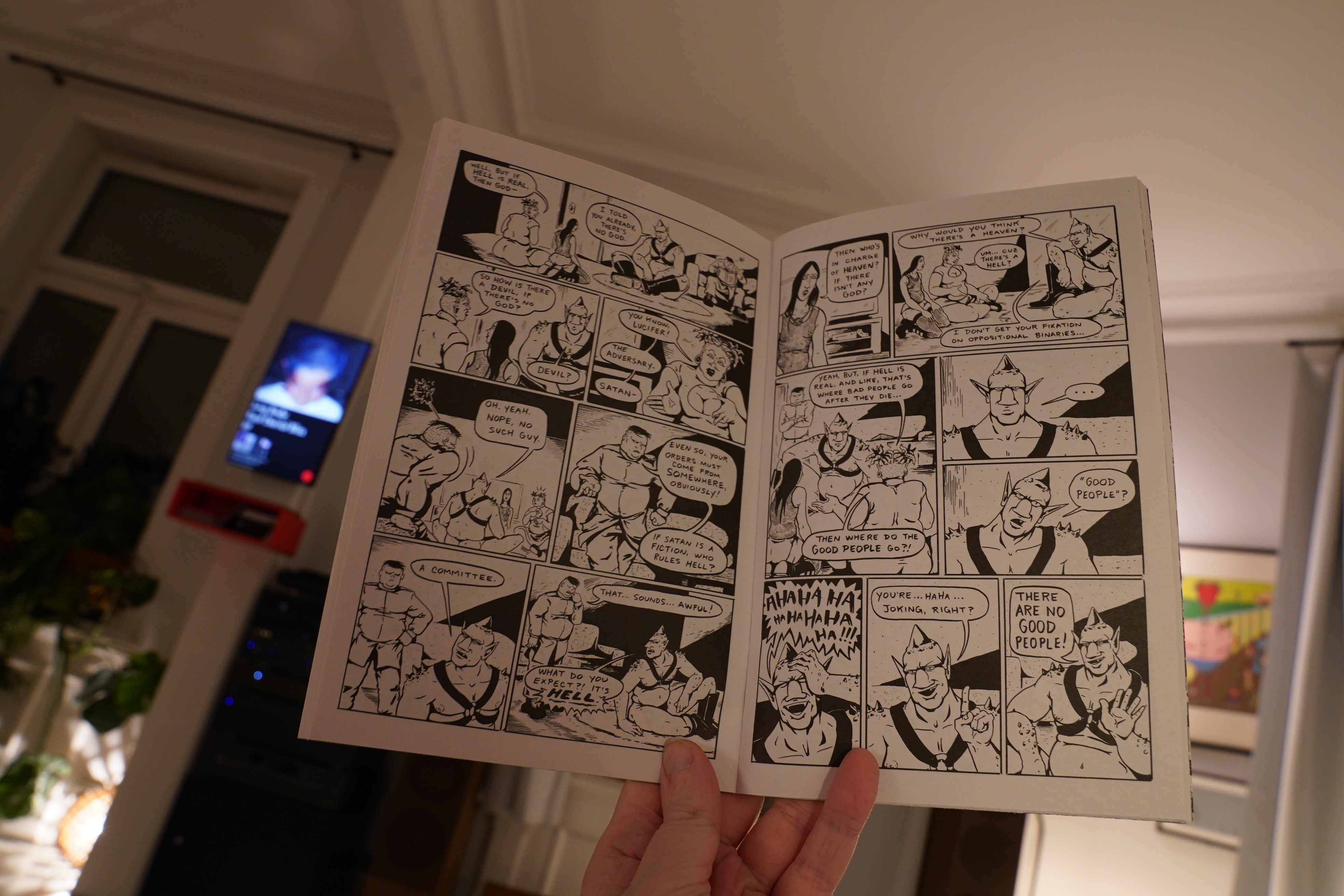
It’s got an easy, no-nonsense approach: It’s just a goofy story about demons and stuff. It’s pretty entertaining.
| Melanie de Biasio: Lilies |  |
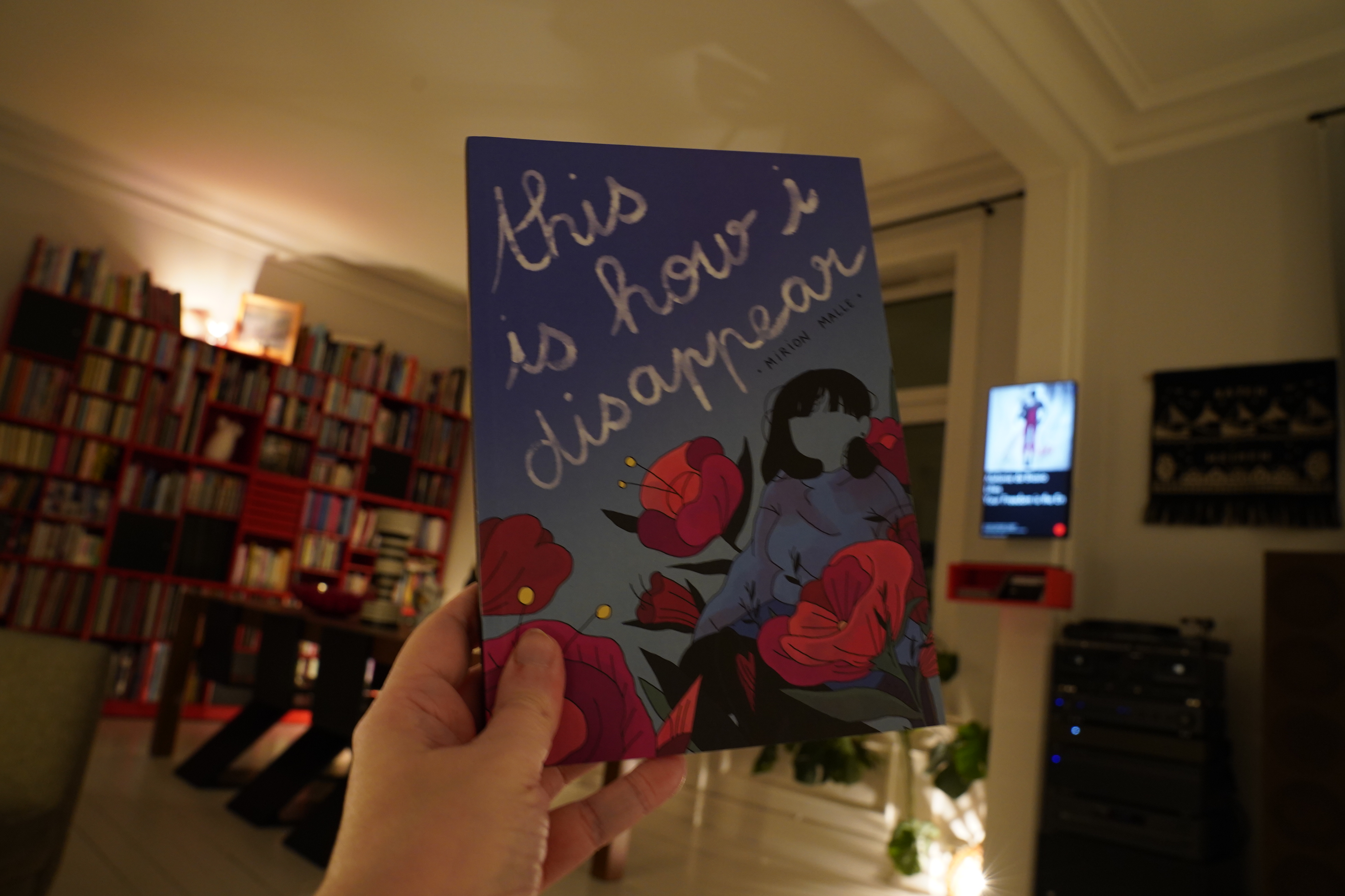
18:47: This is How I Disappear by Mirion Malle (Drawn & Quarterly)
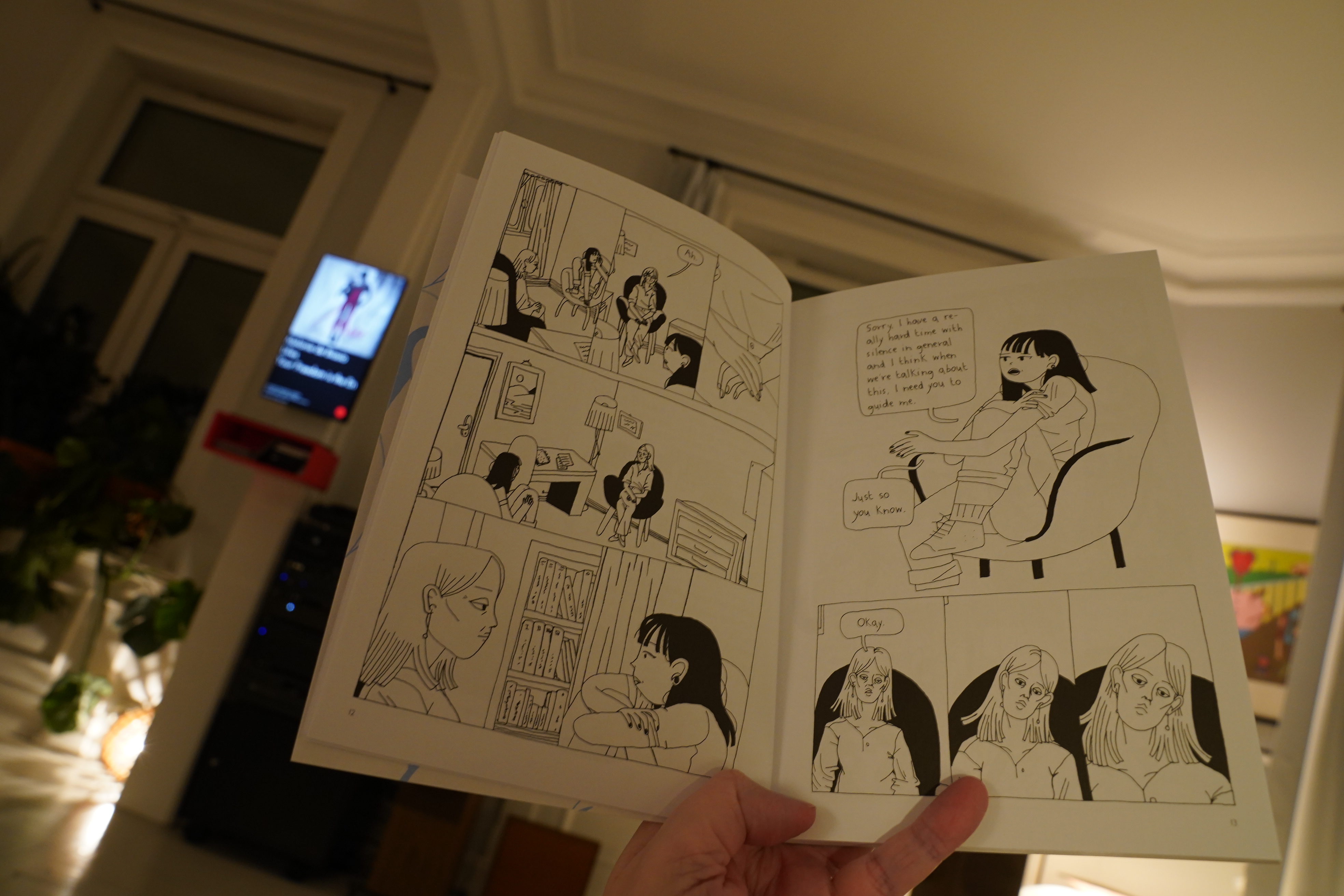
Again, I was pretty sceptical when I started reading this…
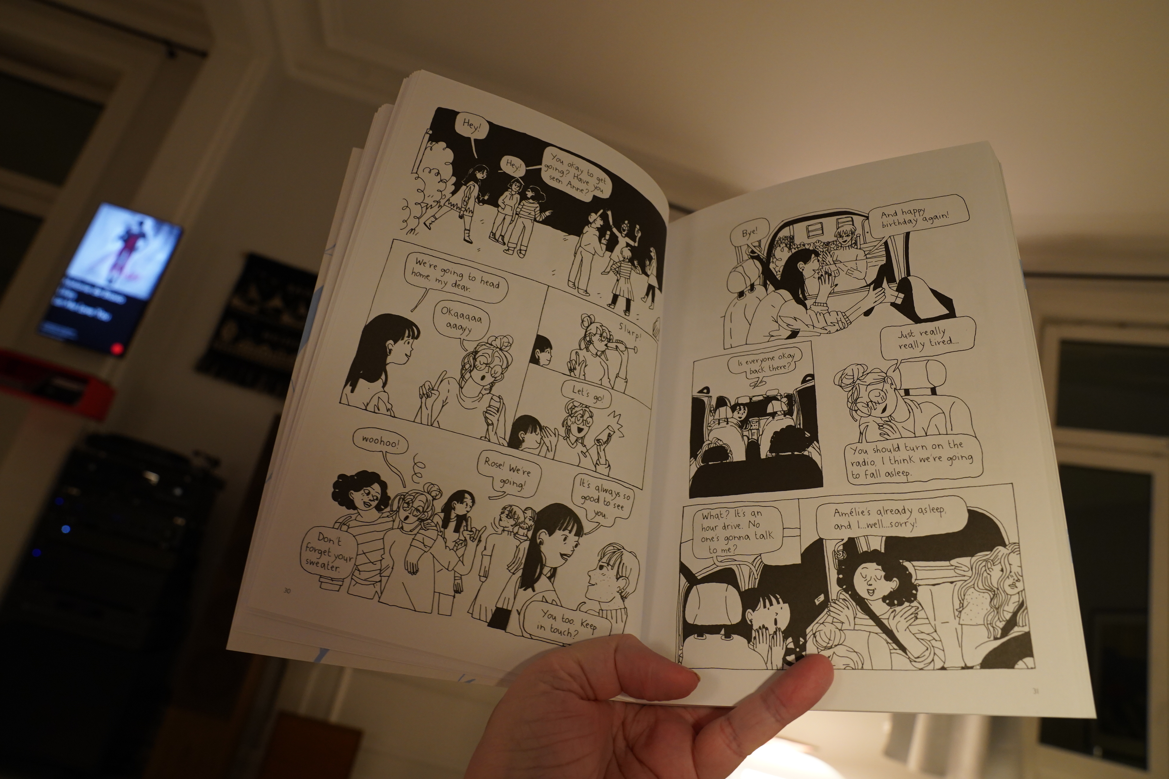
… but it pulled me in. It’s got great flow.
| Sudan Archives: Sudan Archives |  |

19:39: Unsmooth 2 by E. S. Glenn (Floating World)

This is absolutely insane. It’s like it’s a thing from an alternate time line where Herge via Joost Swarte was the dominant form for art comics.
This is so gorgeous that it’s hard to accept how incomprehensible the stories are. I think this is some kind of pure genius? I’m not sure.
But it’s fantastic! I love it! I have no idea what it’s all about, but I love it.
What an amazing book.
| Lal & Mike Waterson: Bright Phoebus |  |

20:22: Zombillenium by Arthur de Pins (NBM)
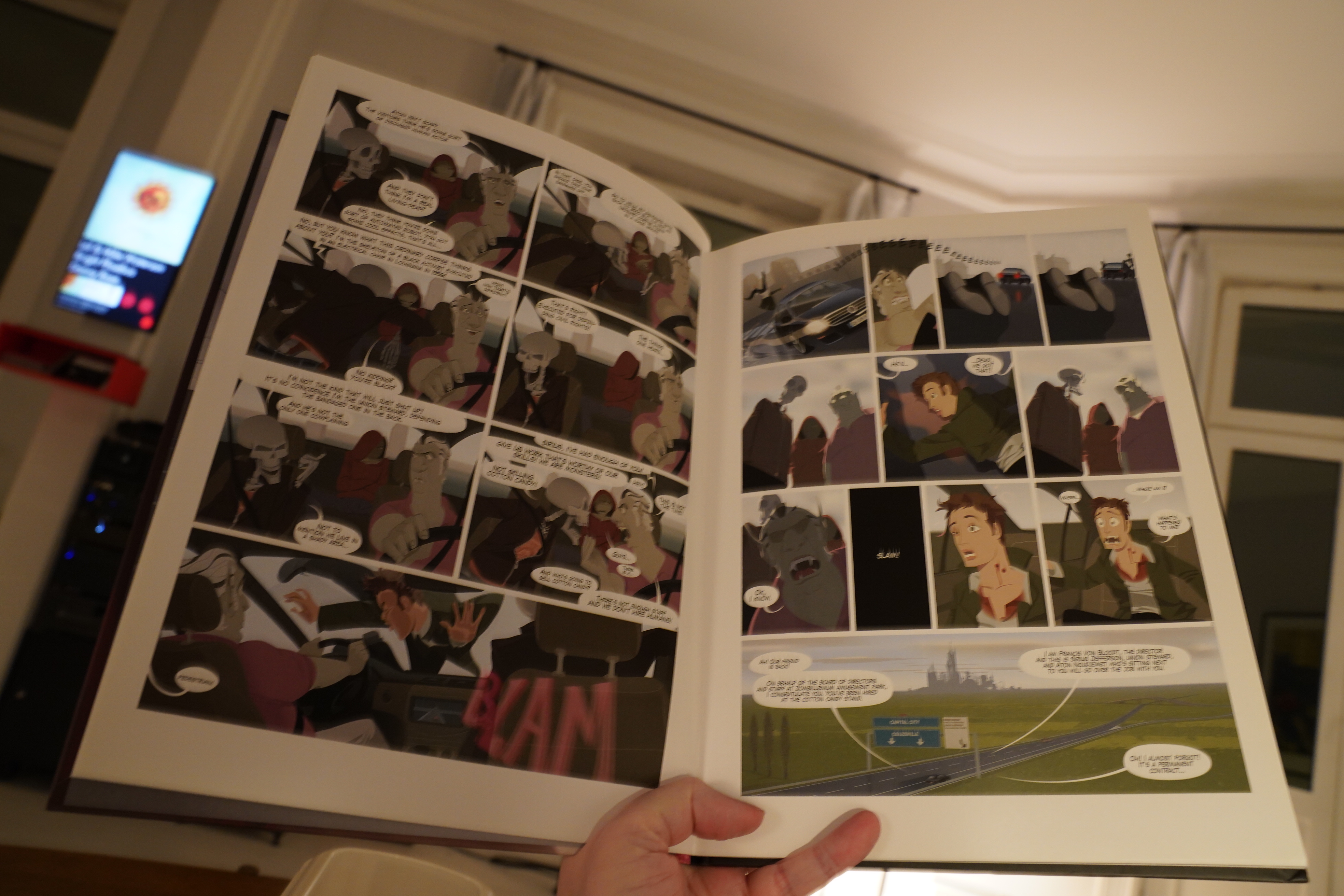
This art style is doing nothing for me… and the story is boring me silly. It’s not that this is a bad comic or anything; I think many people would find it pretty amusing, but I’m not one of those.
So I ditched the book halfway through.
20:41: Sleepytime
I might also just be zonked; I got up at five this morning, so I think it’s time to sleep.
But, hey, this was a solid batch of comics. The standouts were… the Dash Shaw and the E. S. Glenn. Those were both awesome (in very different ways).
Nighty.